1
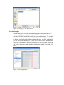
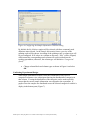
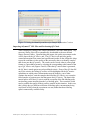
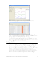
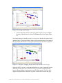
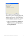
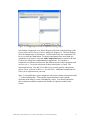
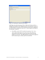
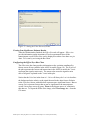
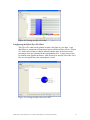
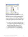
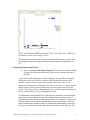
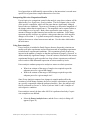
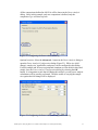
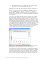
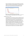
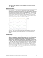
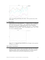
Analyzing Disease vs. Normal in Partek® Express™: A Down Syndrome Study This tutorial will provide a step-by-step walk through of analyzing a gene expression data set using the Partek® Express™ software package. The purpose of this exercise is to provide a description of the tools available in Partek Express and a description on how to use these tools. Starting with how to import the data into Partek, it will then be possible to perform quality control checks, exploratory analysis to identify variation themes in the data, and by using ANOVA to generate statistical results to identify significantly expressed genes. Additional analysis will be covered including using statistical power analysis and exporting the results into Ariadne® Pathway Studio Explore™. The data set used for this tutorial is from an experiment conducted in 2005 exploring the gene expression on Down syndrome individuals against control individuals that do not have Down syndrome. Down syndrome is caused by an extra copy of chromosome 21 and is the most common whole-chromosomal disorder in humans. The experiment in this tutorial was performed using the Affymetrix GeneChip Human U133A and includes 25 samples taken from 10 human subjects across 4 different tissues. The data for this study is on the Gene Expression Omnibus: http://www.ncbi.nlm.nih.gov/geo/ available as experiment number GSE1397. The data files used for this tutorial can be downloaded at the URL: http://www.partek.com/~devel/PEXData.exe. Download and install the data to your local disk. For this example, the data is stored at the following location, C:\Partek Express Demo Data. This 25 array experiment will focus on two basic variables – differences in Disease Type – Down syndrome vs. Normal, and differences in Tissue – Astrocyte, Cerebrum, Cerebellum, and Heart. The labels for these variables will be referred to throughout this tutorial. Differences in Type refer to genes that are differentially expressed across the two categorical variable labels in Type – Down syndrome and Normal. Differences in Tissue refer to the genes that are differentially expressed across any or all of the four categorical variable labels in Tissue – Astrocyte, Cerebellum, Cerebrum, and Heart. This tutorial will illustrate how to: Create a new study Select samples for the study Edit sample information Import of the Affymetrix® CEL files and performing the QC check Visualize sample-level grouping using PCA Define differentially expressed genes using ANOVA Partek Express: Analyzing Disease vs. Normal in Partek Express: A Down Syndrome Study 1 Perform power analysis to determine optimal experiment size Invoke pathway analysis The Partek Express software download page and installation guide can be found at URL: http://www.partek.com/html/Partek_Express_Updates.html. Upon the successful installation of Partek® Express™, double-click the Partek Express icon on the desktop to launch the Partek Express software. A Quick Word to Those Using Partek® Express™ for the First Time Partek Express will automatically detect when support files, such as library files or annotation files, are required for the importation of the data and to annotate the spreadsheets during analysis. The software will either automatically download the file or ask you to specify the file if a suitable download is unavailable. The location for those files that are auto-downloaded is set during the installation of Partek Express and by default is called Microarray Libraries (Figure 1). Figure 1: The default library folder, Microarray Libraries, is created during the installation of Partek Express There is no requirement that the Microarray Libraries be set as the location for the support files. You can manually specify a different folder to locate and download support files under the File > Manage Library Path tool (Figure 2). For the purposes of this tutorial, the default location of C:\Microarray Libraries is used. Partek Express: Analyzing Disease vs. Normal in Partek Express: A Down Syndrome Study 2 Figure 2: Use File > Manage Library Path to designate a new default library folder Creating a New Study The creation of a study is always the first step in an analysis when using Partek Express. This step designates where the data and analysis will be saved on the computer as a .pex file. The .pex file contains all of the information of the study in one file that allows for an easy transfer of the study from one computer to another or when returning to a study at a later date. Select the Create Study button at the bottom right of application screen (Figure 3) Follow the instructions to name your study file and select the Save button. For this tutorial, name the study file DownSyndrome.pex and save it in the same folder as the study‟s data (Figure 4) If the study is not saved in the same location as the .CEL files, it will be necessary to browse to the folder containing the .CEL files when asked to select the samples Figure 3: Creating a New Study Partek Express: Analyzing Disease vs. Normal in Partek Express: A Down Syndrome Study 3 Figure 4: Viewing the New Study Dialog Selecting Samples After the study file is created to hold the data and the subsequent analyses, a sample selector dialog will appear (Figure 5). The sample selector is used to select the .CEL files, which will be used for import into the study. The sample selector automatically identifies any .CEL files in the selected folder for import. By default, it will map to the folder containing the study .pex file. As the study .pex file was saved to the folder C:\Partek Express Demo Data\ containing the .CEL files, it should not be necessary to browse to a different folder. Select the Add Samples button to continue the study thereby selecting all 25 available .CEL files. Figure 5: Selecting Samples Partek Express: Analyzing Disease vs. Normal in Partek Express: A Down Syndrome Study 4 Populating Sample Information Affymetrix .CEL files contain information such as the probe intensities for the different genes but do not contain sample attribute information such as which organ the tissue was taken from or if the subject had a treatment or was a control sample. If the .ARR files are available for intensity (CEL) files and stored in the same folder, the sample attribute information stored in them will be automatically extracted and filled into the sample editing table. You can then use the sample editor in Partek Express to add more attributes, delete unnecessary attributes, rearrange samples or sample attribute order. Such information can be added either during import or after import. This information can be added at any time before the ANOVA is run. In this tutorial, splitting a file name containing the sample information will be described as the .ARR files were not included with the .CEL files. Adding sample information to the data in Partek Express can be done one of three ways: Including the richly populated .ARR files with the .CEL files Splitting a column containing the sample information (shown below) Use the Add Attribute button to manually enter or paste sample information To learn more about the different ways sample information can be included in a study, see Chapter 5: Edit Sample Information of the Partek Express User‟s Manual or click on the Tell Me More button in the lower left of the application screen. Populating Sample Information from an Existing Column Label In this example, the sample attribute information is contained within the CEL file name, which is imported automatically during the CEL file import. The file names are generally formatted as <type-tissue-subjectID-gender.CEL>. The file name needs to be split on each instance of a hyphen to give the correct values in each field for each sample. To split the filename of the .CEL files into the sample information for the study, follow these steps: Right click on the column header of the first column CEL File Name, and select Split to Get attributes…; the Sample Information Creation dialog will appear (Figure 6) Partek Express: Analyzing Disease vs. Normal in Partek Express: A Down Syndrome Study 5 Figure 6: Configuring the Sample Information Creation Dialog By default, the By delimiters option will be selected with three commonly used delimiters auto-selected. In the Sample Information frame, a preview of the splitting result will be shown. According to the splitting result, a column type will be pre-configured. If all values in a column are the same, “Skip” will be assigned, which means the corresponding result column will not be inserted into the resulting spreadsheet; otherwise, the column type will default to “Categorical (fixed)”. Change column labels and column types as shown in Figure 6 and select OK Confirming Experimental Design After sample information creation, select the column title or any cell in a categorical column to view a histogram showing the distribution of categories in that column. Viewing the distribution of the categories can be used to quickly ensure that the correct sample information was assigned to the experiment. A graph of how the samples are distributed across the selected categorical variable is display in the bottom pane (Figure 7). Partek Express: Analyzing Disease vs. Normal in Partek Express: A Down Syndrome Study 6 Figure 7: Viewing the Result Spreadsheet after Sample Information Creation Importing Affymetrix® CEL Files and Performing QC Check After finishing the editing of the sample information, select the Next button. Any necessary library files will be automatically downloaded to the user-defined library directory folder. Upon finishing the import, the quality assessment results will be shown in the QC Metrics tab. The QC Metrics tab provides quality control information from control and experimental probes on the Affymetrix chips to provide confidence in the quality of the microarray data or to identify samples that do not pass the QC metrics. The results can be viewed either in a line graph format or a spreadsheet format by selecting the corresponding radio buttons at the top of QC Metrics tab (Figures 8 and 9). When the QC metrics data is generated, the QC data is tested against several predefined criteria. If any of the QC data fail any of the criteria, the failing QC metrics will be highlighted in the QC metrics spreadsheet at which point a determination must be made by you to either continue the analysis, omit the samples that failed the QC criteria, or to rerun the failed samples to generate new data that passes the QC criteria. The data in this tutorial passes all of the QC criteria with the exception of the Phe labeling spike not showing greater intensity than the Lys labeling spike. The researcher would need to confirm the quality of their positive controls in this situation. In this case, this is likely due to a different collection of labeling spike concentrations being used (back in 2002 when the experiment was run) rather than those labeling spikes commercially available today. Partek Express: Analyzing Disease vs. Normal in Partek Express: A Down Syndrome Study 7 Figure 8: Viewing the QC Metrics Line Graph for Hybridization Spikes Figure 9: Viewing the QC Metrics Spreadsheet. Column 7 is highlighted because it fails the default criteria specifying that Dap < Phe < Lys For additional information regarding the QC metrics including how to set custom criteria and how to identify those samples that do not pass the QC metrics criteria, please see Appendix A at the end of this tutorial. Viewing the PCA Plot PCA is an excellent method for visualizing high dimensional data by reducing the variation across all of the many thousands of probes being interrogated on the chip into a two or three dimensional representation. In a PCA plot, each point represents a sample (microarray) and corresponds to a row in the Sample Information tab. The positions of the dots are relative to each other. The dots that are closer to each other represent samples in which the transcriptome measurements over the whole chip are similar. The dots that are further away from each other represent samples in which the transcriptome measurements over the whole chip are more dissimilar. Samples that have similar overall gene Partek Express: Analyzing Disease vs. Normal in Partek Express: A Down Syndrome Study 8 expression levels will group together into clusters. Identifying separate clusters in a PCA provides valuable information, such as which of the phenotypic variables are driving the major sources of variation within the experiment. One example would be if an experiment only had one factor, treated and untreated. Assuming that all the samples in the data set are the same except for this one factor, it is possible to quickly identify if the treatment had a significant effect on the overall gene expression. If all of the samples clustered together into one group with the two colors mixed equally among the cluster, then there is no distinctive difference between the gene expressions over the samples based upon treatment. However, if the samples cluster into two distinct groups, one cluster containing only treated samples and the other cluster containing only untreated samples, then there is a difference in the gene expression profiles between the treated and untreated samples. If there are multiple factors in an experiment, the factor in which the samples cluster on would likely be the factor with the greatest variation once the ANOVA was run. Without even doing any statistical analysis, it is possible to identify the factor having the greatest effect on the overall gene expression of the experiment. Select the Next button to invoke the PCA Plot on the Down syndrome data set In the resulting PCA plot, the default color of the dots is dependent on the first column after the filename in the Sample Information tab. In this data set the first column is the header Type with 2 groups: red dots represent the Down syndrome sample and blue dots represent the normal samples. Choose the Rotate Mode option ( ) to allow the rotation of the plot Press and drag the left mouse button to rotate the plot to examine the grouping pattern or outliers of the data on the first 3 principal components (PCs). Rotating the PCA allows you to see the separation of samples from a variety of angles. There is not a clear separation between the Down syndrome and normal samples in this data. Once finished rotating the graph, reset the graph by clicking on the Home ( ) button (Figure 10) Partek Express: Analyzing Disease vs. Normal in Partek Express: A Down Syndrome Study 9 Figure 10: Viewing the PCA Plot Use the drop-down menus at the top of the PCA plot viewer to configure the plot so that the dots are colored by Tissue and sized by Type (Figure 11) Now that the dots are colored by tissue, it is easy to see that the dots cluster based upon this factor. This means that the tissues are the greatest source of variation in the experiment and effect the overall gene expression more than Down syndrome. Figure 11: PCA plot - changing the plot to color by size and to size by type Once the ANOVA is run, it can be shown that there are a lot of genes that express differently among the 4 tissues, but not as many genes that express differently between Down syndrome and normal across the whole genome. The PCA plot supports and predicts the conclusion of greater variance due to tissue than type. Partek Express: Analyzing Disease vs. Normal in Partek Express: A Down Syndrome Study 10 PCA is a great tool to quickly inspect the data but it does not provide any specific statistical analysis, in particular, it does not answer the questions regarding which individual genes are being differentially expressed over the factors in the experiment. To discover which genes are differentially expressed, Partek Express will use ANOVA in the next step to provide this information. To export a static image of the PCA plot, simply go to the File menu and select Save Image As…, and then select the desired export format and the name and location of the resulting exported file. In addition to seeing how samples group in the PCA and predicting whether one categorical variable has more variance than another does, PCA can also be used to identify outlier samples. In this example, there aren‟t clear anomalous samples. But through the visual grouping available in PCA, you can see if any given sample isn‟t grouping with other replicates. If such a sample is identified, then you can select the sample in PCA and the row corresponding to the sample will be selected in the Sample Information tab. Right clicking on that row allows you to delete the sample from the experiment and rerun the signal estimation. Detecting Differentially Expressed Genes using the ANOVA Analysis of variance (ANOVA) is a very powerful technique for identifying differentially expressed genes in a multi-factor experiment such as this one. In this data set, the ANOVA will be used to generate a spreadsheet of genes with statistical information regarding the expression levels. For every factor included in the ANOVA model, two columns will be created in the spreadsheet, one column will list the p-values for the genes of the factor, and the other column will provide F ratio for the genes of the factor. Those genes with the lowest p-values are perceived as the genes with the highest likelihood of differential expression. The F ratio is ANOVA‟s language for “signal to noise” ratio. The higher the Fratio for a given gene means that there was a larger amount of “signal” detected than “noise”. Hence, a small F-ratio for a given gene means there was less “signal” detected against the background “noise” so there is not as much confidence in the test. Besides generating statistical information on just the factors included in the ANOVA model, pair wise comparisons can be set up that will provide fold change and ratio information for the genes as well as a p-value for the comparison. The comparisons that are included in analysis are dependent on the factors included in the ANOVA model. First, selecting the factors in the ANOVA model will be demonstrated and then selecting the comparison will be demonstrated. Select the Next > button from the PCA tab. A dialog box, Detect Differentially Expressed Genes will appear (Figure 12). This dialog box starts the selection of the factors to be included in the ANOVA model Partek Express: Analyzing Disease vs. Normal in Partek Express: A Down Syndrome Study 11 The ANOVA model should include Type (Down syndrome vs. Normal) since it is a factor of interest. To include Type, simply drag it from the Unassigned Effects in the left pane to the Effect of Interest 1 pane on the top right From the exploratory analysis, Tissue (covering all four tissues) was found to be a big source of variation; therefore, Tissue should be included in the model. Select Tissue from Unassigned Effects of Interest frame and drag it over to the Effect of Interest 2 pane in the middle right Note: When two factors are selected for analysis, such as Type and Tissue in this example, then Partek Express will automatically include the interaction between both factors in the ANOVA model. Further, the order of first effect and the second effect is not important. Assigning Type or Tissue as Effect of Interest 1 will not affect the results and only affect the order of the p-value columns in the resulting gene table. Figure 12: Configuring the Detect Differentially Expressed Genes Dialog There were multiple tissues taken from some subjects and because ANOVA assumes that all samples within groups are independent of each other, it is important that the ANOVA model include Subject ID to account for this. To account for the pairing within this experiment, drag the header SubjectID from Unassigned Effects pane on the left to the Grouping Effect pane on the bottom right (Figure 13). The grouping effect needs to be specified and accounted for; otherwise, the assumption that samples within groups are independent will be violated Select Next Partek Express: Analyzing Disease vs. Normal in Partek Express: A Down Syndrome Study 12 Figure 13: Configuring the Detect Differentially Expressed Genes Dialog for Subject ID The ANOVA model has now been set to include Type and Tissue with the Type:Tissue interaction automatically included, and Subject ID for a 3-way ANOVA with an interaction. Note: Partek Express supports up to two main biological factors of interest plus another factor for a potential paired design. If an experiment has three or more biological factors of interest, we recommend upgrading to Partek® Genomics Suite™, which supports a larger number of ANOVA factors. Next, pair wise comparisons will be set up between two specific experimental variables within an experimental factor. The resulting analysis table will include fold changes and ratios for each comparison. Follow the steps below to set up a comparison between Down syndrome and Normal: In the Create Comparison – step 1 of 2 dialog box, select the categorical header that contains the specific variables that will be compared. For the Down syndrome vs. Normal comparison, select the Type radio button and select Next (Figure 14). If a comparison between two tissues is desired, then the Tissue radio button should be selected Partek Express: Analyzing Disease vs. Normal in Partek Express: A Down Syndrome Study 13 Figure 14: Configuring the Create Comparison Dialog, Page 1 In the Create Comparison – step 2 of 2 dialog box specific variables to compare are selected. A list of the experimental variables (a.k.a., groups) from the factor selected in the previous dialog appears in the left window labeled Unassigned. As Type was selected, the two groups of Type, Down syndrome and Normal are listed. The two groups in the right window can be thought of as the numerator and denominator of the fold change equation, where typically, a baseline is used in the denominator and the experimental condition is in the numerator. The groups set in Group 1 will be compared against the groups set in Group 2 . Set the group(s) by dragging and dropping the Down syndrome group from the Unassigned box into the Group 1 box and then drag and drop the Normal group into the Group 2 box. Once completed the Create Comparison – step 2 of 2 will match Figure 15. The resulting pair wise comparison will identify gene most likely to be differentially expressed between Down syndrome and Normal Once the comparison is set up, select OK Partek Express: Analyzing Disease vs. Normal in Partek Express: A Down Syndrome Study 14 Figure 15: Configuring the Create Comparison Dialog, Page 2 Now that the comparison is set, Partek Express will return to the third page of the Detect Differentially Expressed Genes dialog box (Figure 16). This box displays all of the comparisons set for analysis. In this tutorial, only one comparison will be set, so select the Next button. For those experiments where more than one comparison is of interest, select the Add Comparison button to return to the Add Comparison dialog box to add additional comparisons. For example, a comparison can also be made between the different tissues in the experiment such as Astrocyte vs. Cerebrum or between all three brain tissues vs. heart. The interaction between Type and Tissue allows for yet more specific comparisons, such as Down syndrome in Heart vs. Normal Heart. Additional comparisons are left to you to experiment on your own. Note: it is possible that a given comparison will yield a column of question marks “?” in the resulting table. This typically means that there wasn‟t enough replicates in the study to create a meaningful p-value. You should consult the power analysis methods to optimize the number of replicates needed in the system. Partek Express: Analyzing Disease vs. Normal in Partek Express: A Down Syndrome Study 15 Figure 16: Finalizing the comparisons for analysis After Next is selected, the last page of Detect Differentially Expressed Genes dialog will be brought up before displaying a gene level results table (Figure 17). An FDR multiple test correction will be performed and the number of genes that pass the test will be recorded in the Report tab. The percentages of the FDR test are by default 5% and 10%. Select OK to run the ANOVA model and comparisons. Note: the pvalues reported in the table are true gene-level p-values and are not adjusted for the total number of genes analyzed based upon the FDR multiple test correction. This FDR adjustment is most correctly applied at the list creation step, not within a gene-level results table Partek Express: Analyzing Disease vs. Normal in Partek Express: A Down Syndrome Study 16 Figure 17: Setting the False Discovery Rates Viewing Gene Significance Estimate Results After the calculation has finished, the Effect Sizes tab will appear. Effect sizes provide information on the importance of each experimental factor to the transcriptome overall. Effect sizes can be displayed as either a bar chart or a pie chart. Let‟s start by reviewing the Bar Chart. Configuring the Effect Sizes Bar Chart The effect sizes bar chart provides information on the variation contributed by factors across all test variables in the ANOVA model (Figure 18). The X-axis of the plot represents the factors and interactions in the ANOVA model; the Y-axis represents the signal to noise ratio. The mean value across the signal to noise ratio of all genes is plotted on the Y axis in this plot. Notice that the Noise bar in the chart is 1. Noise will always be 1 as it is describes the background noise relative to the signal detected in the other factors. Relative to the Noise bar, factors with taller bars represent more significant factors. Bars at or near Noise represent factors that are not as significant to the transcriptome overall. On average across all genes, Tissue is the biggest source of variation in this data set. To export the Effect Sizes image, select Save Image As… from the File menu. Partek Express: Analyzing Disease vs. Normal in Partek Express: A Down Syndrome Study 17 Figure 18: Viewing the Effect Sizes Bar Configuring the Effect Sizes Pie Chart The Effect Sizes chart can be plotted as either a bar chart or a pie chart. A pie chart shows a comparison of importance between different factor effects. (Figure 19) Each section of the pie chart is labeled with the name of the factor and a percentage of the pie contained in the corresponding slice. Larger pieces of the pie indicate more significant factors, while factors at or near the size of the Noise slice are not significant to the transcriptome overall. Figure 19: Viewing the Effect Sizes Pie Chart Partek Express: Analyzing Disease vs. Normal in Partek Express: A Down Syndrome Study 18 Viewing and Interpreting the Gene Significance Spreadsheet Select Next, and the Gene Significance table will appear, showing individual gene results (Figure 20) One of the most critical pieces of information contained in the Gene Significance table is the p-value per gene per categorical variable. A p-value is a test statistic (between zero and one) used to rank significance of results starting with the null hypothesis that a gene is similarly expressed across conditions, meaning that the smaller the p-value for a given gene, the more likely that the gene shows differential express across the given categorical variables. Each biological factor included in the ANOVA model will produce one additional column in the Gene Significance table. Each pair-wise comparison included in the ANOVA will add three additional columns into the table. A dot plot is shown in the right pane of this tab for the currently selected row. In the dot plot, each dot is an individual sample data point. The X-Axis represents the different types and the Y-Axis displays the log2 expression level of the gene. The box & whiskers are colored by Type and the dots are colored by Tissue. The data is converted into log2 space to ensure that the data is more “normally” distributed so that an ANOVA test can be performed. When using statistical tests such as ANOVA or t-tests one of the assumptions of the test is that the data is „normalized‟ and with the log2 transformation this assumption is met. When data is in log2 space, it is important to remember that the scale is typically between zero and 16, and that any increment change of one represents a two fold change in abundance. So if a gene changes from 6 in one condition to 8 in another condition, that represents a four fold change between the two conditions. The first p-value column in the Gene Significance table is the Type column. This column should be automatically sorted ascending with the genes with the smallest p-values at the top. Genes in the top rows are the most significant differentially expressed genes across the variables in Type in the experiment. In this example, there are only two classes within Type – Down syndrome and Normal. Focusing on the top gene, DSCR3, a detailed view of the individual signal intensities for this gene can be viewed in the dot plot in the left pane. The median of DSCR3 in the Down syndrome samples is around 6.3, while the median of normal samples is around 6.0. The fold change was calculated for this gene and displayed in column 11 (assuming a pair wise comparison was made between Down syndrome and normal). The fold change was 1.33546 implying that the DSCR3 gene is increased on average 34% in Down syndrome samples over Normal samples, fitting with the median change from 6.0 to 6.3, roughly 30% increase. Note that p-value is a statement of significance, not magnitude. Genes can significantly change with small overall shifts (in this case just 30%), but still remain statistically significant. Partek Express: Analyzing Disease vs. Normal in Partek Express: A Down Syndrome Study 19 Figure 20: Gene Significance Spreadsheet and Dot Plot, grouped by Type and colored by Tissue At the top of the Gene Significance Estimates tab, a search bar is provided for gene name searches. To search the spreadsheet, type your search string such as gene symbol or gene title in the entry box and select Next or Previous. You can also specify if you want the search to be case sensitive and/or to match the whole cell by checking the respective check boxes. Any column of the spreadsheet can be sorted ascending or descending by left-clicking on the column header. This is useful in searching for the lowest or highest values in a column or to sort a text column alphabetically. Next, find the gene with the smallest p-value based up the differences in Tissue by left clicking on the column header labeled p-value(Tissue). An arrow will appear at the top of the column signifying that the spreadsheet is now sorting the entire spreadsheet on ascending order based upon the pvalue of Tissue. The gene HSPB7 is now the gene in row 1 of the spreadsheet as it is the gene with the smallest p-value by Tissue <Left+click> on the row header of row 1 to see the dot plot for gene HSPB7 Configure the dot plot to group by tissue by selecting Tissue from the drop down menu next to Group by at the top of the dot plot (Figure 21) Partek Express: Analyzing Disease vs. Normal in Partek Express: A Down Syndrome Study 20 Figure 21: Dot Plot of HSPB7 grouped by Tissue, colored by Type. HSPB7 has the smallest p-value in the category Tissue The dot plot shows all the brain tissues being expressed between 6.4 and 7 with the exception of the heart samples that are expressed almost 60 fold greater at 12.3. Interpreting Interaction Results Select column 8 p-value(Type:Tissue); this will sort the results ascending to bring all of the genes with small p-values in this column to the top of the table. A gene with a small interaction p-value is indicative of a gene that is changing expression across one of the two variables but differentially across the other variable. In other words, if a gene has a small p-value in the Type:Tissue interaction, then that gene is changing Type (Down syndrome vs. Normal), but the change between Down syndrome and Normal is not the same across all of the tissues. The effect of Type is dependent on Tissue, and the reciprocal statement is true as well; the effect of Tissue is dependent on Type. It‟s important to realize that the list of genes that are significant in an interaction between two terms is different from a list of genes that are an intersection of significant genes that change in each category alone. For example, if a gene is up in Down syndrome in one tissue and then down in Down syndrome in a second tissue, then that gene would not likely be significantly differentially expressed if only Type was considered because the effects would cancel each other out. The Partek Express: Analyzing Disease vs. Normal in Partek Express: A Down Syndrome Study 21 list of genes that are differentially expressed due to the interaction is a much more specific list of genes than a simple intersection of two lists. Interpreting Pair-wise Comparison Results For each pair-wise comparison created in the analysis setup, three columns will be added to the Gene Significance Results window. The first column is the p-value of the specific comparison, which will list genes that are significantly changed between the two conditions. The next two columns give data on the magnitude of the change (rather than its significance). The magnitude can be reported either as a fold change or as a log ratio. Both values represent the same concept – the amount of change in signal intensity between the two conditions. Fold Change represents positive increases as a positive value greater than one, while negative changes are less than -1. Log Ratio treats positive changes the same way, but displays decreases as values between zero and one. Use the value which makes the most sense. Using Power Analysis Power Analysis is included in Partek Express because frequently scientists run smaller scale pilot experiments and are often interested in expanding experiments to include more experimental conditions. This expansion typically requires an increase in the number of samples so that the experiment is properly “powered” to define statistically significant changes. Here the variance calculated in the current experimental design is used to predict how large a future experiment would need to be in order to find differential expression at various sensitivity levels. Power analysis conducts prospective analysis to answer two basic questions: What is an estimate of the range of sample sizes required to provide adequate power for a given fold change? What is an estimate of the range of fold changes required to provide adequate power for a given sample size? Since Power Analysis compares how changes in sample number affect the variation of a fold change estimate, the Power Analysis calculation is performed on a specific comparison within the performed analysis. Here, the analysis will first be performed on Normal vs. Downs Syndrome with 11 and 14 samples of each respective condition. Power analysis can only be done after ANOVA is performed and only if a pairwise comparison was defined. Select the Power Analysis button, and the Power Analysis dialog will appear (Figure 22) Partek Express: Analyzing Disease vs. Normal in Partek Express: A Down Syndrome Study 22 All the comparisons defined in ANOVA will be shown in the Power Analysis dialog. Since in this example, only one comparison is defined, only the comparison Type will show up here. Figure 22: Configuring the Power Analysis Dialog Optional exercise: Select the Advanced… button in the Power Analysis dialog to open the Power Analysis Configuration dialog (Figure 23). Effect size (fold change), sample size, significance, and power can be configured in this dialog. For this example and for most experimental situations, use the default values and simply close the Power Analysis Configuration dialog by selecting the OK button. It is important to note that in running this analysis, several power analysis calculations will be actually performed. Then the results of varying the sample size against the fold change will be displayed. Figure 23: Configuring the Power Analysis Configuration Dialog Partek Express: Analyzing Disease vs. Normal in Partek Express: A Down Syndrome Study 23 Select OK in the Power Analysis dialog. After power analysis is done, a new tab, Power Analysis will be brought up (Figure 24) Regardless of the question, the results of the power analysis are visualized by a box plot. The box plot provides a way to graphically visualize the range of numeric data by plotting the 10th percentile, 25th percentile, 50th percentile, 75th percentile and 90th percentile to describe the range. You can switch between two different views (described below) by selecting the corresponding radio buttons on the top of the tab. Given a desired fold change, how many samples are needed to achieve adequate power to detect that fold change? The box plot of Fold Change to Sample Size (Figure 24) indicates the minimum sample size (shown in Y-axis) to achieve the adequate power on the given fold change (shown in X-axis). Mouse over a box, a balloon message will pop up and show the five percentile values. In this example, we can see that the comparison between the Normal and Down syndrome samples will not benefit greatly from additional samples as a small fold change of 1.25 can be confidently detected, even though there some variance in the fold change estimate. Additional samples will decrease the variance associated by the smaller fold change estimates. The larger fold change estimates have much smaller variances with the sample size of 25 as can be seen from the graph. Figure 24: Power Analysis Box Whiskers Plot addressing the question, given a fold change, how many samples do I need to achieve that sensitivity. Given a sample size, how small of a fold change can be detected given adequate power? Once the power analysis is run, it is easy to switch between two graphical representations, which addresses each of these questions. Simply use the radio buttons near the top of the graph. The box plot of Sample Size to Fold Change (Figure 25) shows the range of fold change sensitive for the given comparison Partek Express: Analyzing Disease vs. Normal in Partek Express: A Down Syndrome Study 24 between Normal and Down syndrome at a variety of sample sizes. The current sample size is designated by the blue horizontal line at 25 total samples. The data suggest that this comparison could benefit slightly by increasing the number of replicates. It is up to you to determine what the optimal balance is to strike between number of samples and sensitivity (as measured by fold change). Figure 25: Power Analysis Box and Whiskers Plot – Sample Size to Fold Change. Given a fixed sample size, what fold change sensitivity can be achieved? Examining Astrocyte vs. Heart The comparison between Normal and Downs syndrome is well powered. It might be more informative to examine a less, well-powered comparison in this same experiment. It‟s necessary to rerun the analysis with a new comparison within the Tissue category between Astrocyte and Heart. Each category has only 4 biological replicates, rather than the 11 or 14 replicates that exist in the Downs syndrome vs. Normal comparison. The results are displayed in Figure 26. The current number of samples is designated as the blue line at 25. This results in roughly a 1.5 fold sensitivity detection. If the researcher was able to increase the total number of samples to 60, then it would be possible to achieve greater sensitivity to consistently detect as low as a 1.25 fold changes. Note that this represents the total number of samples where Astrocyte and Heart have only four replicates each. When interpreting other points on the y-axis, researchers should consider the number of increased Astrocyte or Heart samples as maintaining the same percentage of those samples relative to the total number of samples. Partek Express: Analyzing Disease vs. Normal in Partek Express: A Down Syndrome Study 25 Figure 26: Fold Change to Sample Size Box plot from Power Analysis of the Astrocyte versus Heart comparison. Each category has only four samples each in the current experiment. Pathway Analysis Select Pathway Analysis to export the analyzed gene expression data into Ariadne® Explore™ for pathway analysis (Figure 27). Ariadne Explore needs to be installed to perform the pathway analysis. Please refer to Ariadne Explore documentation on how to perform pathway analysis. By selecting the Launch Explore button, Partek Express will export a list of all genes along with the Ratio and p-value then launch and push the information to Ariadne Explore. Figure 27: Pathway Analysis Dialog End of Tutorial This is the end of the Disease vs. Normal tutorial. If you need additional assistance with this data set, you can call our technical support staff at +1-314878-2329 or email [email protected]. Partek Express: Analyzing Disease vs. Normal in Partek Express: A Down Syndrome Study 26 Appendix Partek Express enables scientists to examine various quality control metrics used in Affymetrix gene expression studies. We‟ll quickly review some of the concepts used to determine if a sample is of acceptable quality to include in the analysis. However, any questions regarding these metrics should be directed to Affymetrix Technical Support. Partek Express allows you to define thresholds for various quality control metrics and then flags samples that are outside of the user-defined bounds. It is subsequently up to you to remove these samples from the analysis. It‟s important to realize that simply triggering of these metrics may not be sufficient information to remove a sample from the experiment. Removing a sample is a very subjective determination and is very dependent on the overall structure of the experiment as well as the replication available. There isn‟t a “right” answer as to whether a sample should be removed. It is completely dependent on the scientist to make these decisions. The values and graphs in Partek Express simply provide data to the researcher to enable this decision. Select the ( 28) ) button to see the default QC Metrics criteria (Figure Figure 28: Viewing the default QC Metrics criteria The QC metrics used are designated in the Criteria file pull down. For most experiments, the default criteria are acceptable. However, it is possible to save custom criteria. Partek Express: Analyzing Disease vs. Normal in Partek Express: A Down Syndrome Study 27 There are four main categories of quality parameters: Hybridization, Labeling, 3’/5’, and Other. Hybridization Metrics Four exogeneous (E. coli derived) pre-labeled molecules are spiked into the hybridization cocktail before hybridization but after sample labeling. These spikes test to ensure that hybridization correctly occurred on the array. These molecules are spiked in at increasing concentrations: BioB < BioC < BioD < Cre. A graph of these values is automatically created and displayed in the Hybridization tab within the QC Metrics section. Make sure that each of the spikes has the correct relative abundance in the samples as displayed in Figure 29. Figure 29: Line graph of Hybridization Spikes. In each sample, the four hyb spikes have increasing concentrations from BioB as the lowest to Cre as the highest Labeling Metrics Up to five unlabeled polyA control spikes are available for you to spike into your samples to control for the sample labeling reaction. These spikes are inserted into the sample prior to labeling and their resulting detection is dependent on the labeling reaction that labels the biological sample. These spikes are derived from B. subtilis. They are typically spiked in at increasing concentrations of Lys < Phe < Thr < Dap. Make sure to confirm that these spikes were used in your samples and also to confirm the correct concentrations were used. This Down syndrome experiment was run before these spikes were commercialized, and they show a different intensity pattern. The graph of these spikes (Figure 30) is displayed in Partek Express in the QC Metrics section under the Labeling tab. Partek Express only extracts the Dap, Phe, and Lys spikes. Partek Express: Analyzing Disease vs. Normal in Partek Express: A Down Syndrome Study 28 Figure 30: Labeling spikes of Dap, Phe, and Lys. This experiment shows DAP < LYS < PHE 3’ / 5’ Ratio Metrics Partek Express will calculate and plot the 3‟ / 5‟ ratio of GAPDH. It is displayed under the QC Metrics section in the 3’/5’ tab. GAPDH has separate probe sets at the 3‟ and 5‟ end of the gene. In high-quality samples, reverse transcriptase should process from the 3‟ through towards the 5‟ end. The 3‟ / 5‟ ratio compares the abundance of the signal at the 3‟ end over the abundance at the 5‟ end. A ratio of 3 or less is considered acceptable. Figure 31: 3’ / 5’ Ratio for Human GAPDH across all samples in the experiment. All values are less than 3 Other Quality Control Metrics Three additional quality control metrics are displayed in the Other tab within the QC Metrics section: PM Mean, Mad_Residual Mean, and RLE Mean. For more information on these values consult the Quick Reference Card from Affymetrix entitled, “QC Metrics for Exon and Gene Design Expression Arrays”. Partek Express: Analyzing Disease vs. Normal in Partek Express: A Down Syndrome Study 29 PM Mean is the mean raw probe intensity from a sample. It is a measure of how bright or dim an array is. Samples within an experiment should have roughly similar PM Means. There are not any default criteria regarding PM Mean. Samples should be scanned for “outlier” values as you determine through visual inspection. MAD Residual Mean is a bit of a complex measurement. It is the mean across all probe sets of the Median Absolute Deviation (MAD) of the residuals between the predicted and actual probe values. During signal estimation, a model is created based on the trends for each probe across the whole experiment. This model can be used to “predict” how a probe will respond. The residual is the difference between the predicted and actual values. When examined at a sample level (across all probe sets) the MAD Residual Mean value is a measure of how well the individual sample fits the model for the experiment. Samples with higher values fit less well. RLE Mean is the mean of the absolute relative log expression (RLE) across all probe sets on each array. Consult Chapter 6 of the Partek Express User Manual for more information on its calculation. RLE Mean compares the signal each probe set (gene) in a sample compared to the median gene-level signal value across the experiment (all samples). If a sample has a high RLE Mean that implies that that sample isn‟t quite as similar to all of the samples. High RLE Mean values will flag outliers. Affymetrix states that RLE Mean values across a diverse tissue panel range from 0.27 to 0.61, while values across an experiment of only technical replicates range of 0.1 to 0.23. Remember that if you have a collection of diverse samples in the experiment the RLE Mean values will be higher than if the samples were very similar. Partek Express: Analyzing Disease vs. Normal in Partek Express: A Down Syndrome Study 30