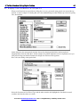
1
Computers Stink
Jack Bellis
How to Make Today’s Technology as
Productive as It Is Powerful
Note: This is conversion of what had been a glued-binding book, to a PDF file. Sadly, though this
book was written in 1997, most of the complaints about software design are just as valid today.
—Jack Bellis, November 8, 2004
>>>No Marketing, No Spam, No Registration<<<
This book is provided courtesty of
http://www.UsabilityInstitute.com
to promote our service of performing inexpensive usability reviews. Contact us for a
complimentary review. And make sure to check out our free product, GenericUI, a
style sheet and accompanying design elements for software applications presented in
Web browsers. It will save large companies thousands of dollars during just the first
few days of creating a new system, and it’s free, period.
Free from UsabilityInstitute.com Get a complimentary usability review now!
This book is free to copy as you please. No copyright is claimed by the author.
ISBN 0-9655109-8-0
All brand names used in this book are the trademarks, registered trademarks, or brand names of the
respective holders.
For Susan, Jessica,
and all the computer users
waiting for the promise to be fulfilled without the problems.
Free from UsabilityInstitute.com Get a complimentary usability review now!
Contents
1. Introduction
7
Is This Book For You?
7
Cut to the Chase!
7
Mass Market Improvements Haven’t Filtered Down to Business Software 9
What About Popular Style Guides?
10
Topics in this Book
10
Programs and the Complexity of Machines: How Bad Is It?
About Me
My First Computer Idea
Changeable Neon
Programming Mysteries
Ideas and Solutions
11
12
12
12
13
15
2. A Computer User’s Bill of Rights
17
3. The Underlying Problems
One Central Problem
Electronic Troubles
Walking the High Wire
A Beginner’s Guide to Backup
The Invisible World: Directory or Hiding Place?
'Distributed Processing'
Most Programs Are Only Half Finished
User-Friendliness is Long-Term Marketing in a Short-Term Market
Lack of Knowledge or Concern
UNIX
Windows 95, or... Computers Still Stink
20
20
20
21
21
22
23
23
24
24
24
25
4. The User Interface: Hit Any Key to Continue
26
Importance of the Interface
26
What Is Human Factors Engineering?
26
The Communication Burden: Interface or Documentation
27
Elements of the User Interface
28
The Machine Makes You a Machine
28
There Are Very Few User Interface Designers
29
Major Problems with User Interface Design
30
Form Follows Function?
30
Most Development Starts Over Again from the Beginning
31
Complex Procedures That are Never Converted to Program Functions 32
Special Values that Never Get Built into the System
32
Bad Design
32
Developer’s Indifference
34
Paranoia? Mistaking Secrecy for Security
35
Lost Productivity Hall of Fame... Can You Guess?
36
Free from UsabilityInstitute.com Get a complimentary usability review now!
No Usability Testing
36
Rules For User Friendliness
37
#1: Put All (ALL ALL ALL) functions, Mouse Methods, Fancy Keystrokes, and
Instructions on Menus
37
#2: Use Verbose Phrasing
39
#3: Use Perfectly Accurate Words
40
#4: Be Explicit, Not Implicit
41
#5: Put All Orders on ‘Menus’: Alpha, Functional, Learning, Date
44
#6: Provide a Master Menu, Integrating All features
45
#7: Display from the General to the Specific
46
#8: Always Let Users Navigate by Descriptive Values, Not Internal Codes
47
#9: Use Buttons as an Additional Option—Not an Alternative—to Menus49
#10: Put Functions Where Users Will Look for Them
49
#11: Always Show the Level at Which Options Are Invoked
50
#12: Use Dynamic Communication, Not Dynamic Menus and Dialogs 50
#13: Always Provide Visual Cues
51
#14: Default to Saving Work
52
#15: Tune for Learning, Not Just Cruising Speed
52
#16: Usability Testing
53
#17: Build Error Message Details Right into the Program
53
#18: When the User Does Not Have Control, Announce it Prominently 54
#19: Use Color to Speed Recognition, and Sound for Feedback
54
Some Not-So-Easy Recommendations
54
Microscope: Detailed View of Internal Data
55
Trace: Detailed View of Program Commands
56
Layer-Testing Diagnostics
57
Mixing Metaphors
57
5. The Nine Levels of Help
1. None
2. Bad Books or Help
3. Good Books
4. Good Books, Online, Context Sensitive, Interactive
5. Better Books
6. Good Programming
7. User-Sensitive Help
8. User Contributory Help
9. Wizards: Step-Through Dialogs
Summary
59
59
59
60
60
60
60
61
61
62
63
6. PC Hardware
Modular Hardware?
Write It Down
The Computer as a Household Appliance
65
65
67
69
Free from UsabilityInstitute.com Get a complimentary usability review now!
7. Documentation: One Step Forward, Two Steps Back
71
Why Documentation Stinks
71
Reason #1 Why Computer Books Stink: Insufficient Emphasis on Valuable
Information
71
Reason #2: Books Are Often Written From 'Specs'
73
Reason #3: Companies Expend Resources on Superficial Editing, Not Usability
Testing
73
Reason #4: ‘Cookbooks’ Without Troubleshooting
74
Reason #5: Failing to Roll the Books Back into the Product
75
To Print or Not to Print...
75
What is the Real Issue?
75
Strengths of Paper and Electronic Documentation
76
Put All of the Information Online
76
Print a Short Read-Through Guide
76
What Should Be in a Read-Through
77
Videos and Other Passive Learning Tools
77
8. Inside Computer Programs: 'Source Code'
Make Descriptive Terminology a User Option
Provide Menu Support For Program Syntax
79
79
80
9. Training
83
10. Support and Troubleshooting
Knowledgebases
A Primer on Technical Troubleshooting
Questions to Ask About Support
84
84
84
86
11. Action Summaries
So What Are You Going to Do About It?
Actions for Hands-Off Executives
Actions for Purchasers of Software
Actions for All Users
Actions for Programmers
Actions for Development Managers
Actions for Tech Writers
87
87
87
88
88
88
89
90
Index
91
Free from UsabilityInstitute.com Get a complimentary usability review now!
1. Introduction
6
Preface
I’ve got to stop writing this book! But every day I come home from work with more examples of how much
time is being wasted with stupid, avoidable computer problems. There seems to be no end. To make this
book, I’ve taken every example and asked myself, “How could computer software be improved to make the
problem go away?” I’m convinced that a significant portion of the answers are now contained in the
following pages, so I will force myself to stop and leave the results in your hands.
Just remember as you read, I’m not opinionated, I’m right.
Those who agree with us may not be right,
but we admire their astuteness.”
— Cullen Hightower
Free from UsabilityInstitute.com Get a complimentary usability review now!
1. Introduction
7
1. Introduction
I called a professional printer to get an estimate on producing the book you are reading now.
His estimating software crashed as he was entering the job information—yes, really. He said he’d
call me back.
Productivity. That was the promise, right? And what a payoff we got. I can now operate the equivalent of a
publishing house from my home office. With programs like Ventura Publisher or Macromedia Director, I can
learn in weeks what used to take a lifetime apprenticeship, and get results with a fraction of the time and
money that used to be required. That’s the good news. But the average computer user does not go half a day
without some sort of unnecessary frustration, problem, or time loss. That’s the bad news that I want to turn
around.
The printer whose program crashed was using an estimating program that he had created
himself, and he probably deserves a lot of credit for the accomplishment. In fact, he gave me the first
part of the pricing information in a matter of seconds, just before the program had a problem. This
put him head-and-shoulders above the other printers I called, who all seemed to act as if obtaining a
price estimate required conjuring spirits. So his experience was very typical: computers both elevate
his business and make it more frustrating. Go figure.
This book describes why computer programs are so difficult to use, why more time is often lost than gained,
and what can be done about it. The concepts discussed in this book apply to all software and hardware, and
the perplexing array of technologies and activities that intertwine the two.
Take your own informal survey of computer efficiency—I did. Ask the people you work with
when the last time was that they wasted time with a computer problem. Then ask them what
percentage of time they think they lose to those problems. I routinely get responses of “yesterday”
and “10-20 percent.”
Is This Book For You?
Most of the recommendations in this book are for programmers and their bosses. But you will benefit from
this book if you use or buy programs, or manage people who do. Even if you don’t, you should find much of
interest here, if you are 'Howard-Beal-mad-as-hell' about the troubles you've had using computers and want to
understand why, whose fault it is, and what to do about it.
Cut to the Chase!
If you’re in a hurry, I’ll summarize the entire book for you right here.
Although the problems of computers can’t be reduced to a single item, they do have a single origin:
computers are a worst-case-scenario of an already invisible technology, electronics. Combined with the usual
machinations of the business world, this has spawned a morass of problems with an equally complex range of
solutions.
The premise of this book however is that complicated or expensive solutions are not needed to cure most of
what’s wrong with the computer world. The lion’s share of the problems can be fixed by simply improving
communication, mostly in the form of the user interface—the design of the software components with which
users interact. Often these changes are as simple as more and better words on the screen, and these are usually
the easiest, least expensive changes to make.
Free from UsabilityInstitute.com Get a complimentary usability review now!
1. Introduction
8
This increased role of wording is not an incidental trend. It is the direct result of a major shift in computer job
responsibilities. In the past, programs and their documentation were entirely separate things created by
different people. Now, much of the documentation is right on the screen, so programmers must learn to be
good communicators—they must pay attention to matters traditionally the province of technical writers. If
you’re a programmer, you might want to skip directly to Chapter 4, “The User Interface: Hit Any Key to
Continue.” The world will be a better place. In fact, that chapter is so important, that I’ll paraphrase its most
urgent recommendations right here:
! Put all (all all all) functions on menus: this includes typical dialog-supported functions, mouse methods,
fancy keystrokes, and points of instruction. Failure to put all functions on menus is the number one
mistake of user interface design. The menu system is not an option—it is the primary improvement that
has popularized software, and the limiting factor in learning a system.
! Use verbose phrasing. Spell everything out. Brevity is a virtue when you are reducing a complex
paragraph to a simple one, not when you strip off valuable words from already-terse instructions.
! Use perfectly accurate words. Computers impose unyielding requirements on users, so make sure your
words give them every chance of understanding exactly what they need to know.
! Be explicit, not implicit. Strive to use wording that requires the least amount of interpretation.
! Display from the general to the specific. Put the most general information or functions in the top and left
portions of dialogs.
! Always let users work with descriptive values, not internal codes.
No matter how easy this stuff is, I don’t suggest that it is common sense. If it were, it would already be
common practice.
By some estimates, businesses spend more on computer technology than on the natural gas, automotive,
petrochemical, steel, and mining industries combined. Now imagine how the results of your survey impact
such a huge expenditure.
In a nutshell, more technology—in and of itself—is not the answer. But the entire computer industry loves to
make you think it is. That way, they can foist on us all the latest techno-miracle, and by the time we realize it
hasn’t reduced the inefficiency, they’ll have another one.
The current flavor-of-the-month is called Java, the latest in an endless parade of programming languages,
which developers must learn again from a standing start. According to the industry it cures cancer, makes you
live forever, and gives you wealth beyond imagination. According to me, it’s another distraction from the real
goal: following through on established practices to fully capitalize on the great technology that we already
have.
Free from UsabilityInstitute.com Get a complimentary usability review now!
1. Introduction
Mass Market Improvements Haven’t Filtered Down to Business Software
9
The emphasis of this book is the PC world, the platform that has commanded the greatest audience and
therefore the greatest expenditure of time and money. And within the PC world, the most important target of
the ideas in this book is business systems, not mass market software... business systems like the one referred
to in the following little blurb in the Philadelphia Inquirer, recently:
Mass market software, is seeing not just rapid improvement, but an increase in the rate of improvement!
Fierce competition and other factors—those that represent what's good about the PC world—are improving
this category at a pace far beyond my meager capacity to impact. But the rest of the software world, not just
business software but home-made programs, student work, chaotic network software, and arcane operating
systems comprise a huge portion of the day-to-day use of computers. Unfortunately these categories are
getting little or none of the warm breezes of progress that the mass market is experiencing.
I visited my in-laws this weekend. They recently upgraded their computer to include a CDROM and sound board, but couldn’t get a golf game to work. Little did they realize, they didn’t have
the slightest chance of getting it to work because they failed to spend the last ten years learning DOS
batch programming. Even with my extensive years in the business, I spent the better part of the
weekend in the typical trial-and-error process of massaging their startup files before they could tee
off.
If this type of situation were an isolated incident, this book would be unneeded. Or if this type of situation
were completely eradicated by the wonderful world of Windows 95, this book would be unneeded. But
neither is the case. In fact, this book lingered in semi-completion while Windows 95 was being released, in
the hope that all our problems had been answered, but I was sadly mistaken. To the average user at home or at
work, the PC cure is often worse than disease. Although the causes are many and varied, the solutions are
often straightforward and inexpensive.
Free from UsabilityInstitute.com Get a complimentary usability review now!
1. Introduction
What About Popular Style Guides?
10
There are several books about user friendliness, notably IBM's Common User Access and a huge tome from
Microsoft on design. Judging by the software I use, these books have somehow missed the mark. I suspect
that these books are so detailed that they miss the larger message. They typically describe every type of field
and on-screen control, putting you too close to the forest to see the trees. My book aims at much broader
targets.
Perhaps my book will also be more effective because it is shorter.
Topics in this Book
This book will explain what makes some computer programs better to use and work with than others. It
covers user friendliness, maintainability, design, documentation, and administrative activities that go along
with using a program and computer. Recommendations are presented to combat many of the problems.
It’s both curious and convenient that I could get almost every example I need for this book from one single
program, Microsoft Word for Windows. And through the miracle of computers, this includes both good and
bad examples. That’s because the computer business creates the most complicated ‘machines’ in the history of
technology. It can’t help but mix up and lose some pieces in the R&D department.
In his book, The Underground Guide to Microsoft Word, Woody Leonard aptly refers to Word
as “The worst word processor in the world, except for all the other ones.” Thus I hope you can
appreciate the predicament we have. Even the best is a beast.
Before charging off into battle let me state, up front, that while I’ll pick on MS Word for demonstration
purposes, Microsoft deserves credit for no less than delivering the USA to the forefront of world leadership in
software, and therefore the computer world in general. I especially applaud the contribution offered by Visual
Basic; I believe history will eventually measure VB as the single greatest catalyst ever to software
proliferation, with Windows itself a close second. By my measure it already is. Hopefully my contribution
can assure that this leadership position is fortified, not undermined.
Free from UsabilityInstitute.com Get a complimentary usability review now!
Programs and the Complexity of Machines:
How Bad Is It?
11
Programs and the Complexity of Machines:
How Bad Is It?
Have you ever seen a huge, complicated machine like a newspaper-printing press? Such a behemoth can fill a
city block and have a seemingly infinite tangle of parts hidden behind each other in layers, 50-feet deep.
Imagine if the tens of thousands of lines of programming code in a computer program were turned into the
gears, motors, and belts of such a machine. What sort of effort would it take to build, maintain, and reengineer such a monster?
It’s only because computer programs have so little physical weight that today’s programmers can even
pretend to maintain them with so little manpower. When the programs work OK they bear little resemblance
to the printing press. When they break or need some work, programs are more like mechanical nightmares,
with the pieces barely fitting together.
A man purchased a new car, and, after signing the paperwork was mortified when the
salesman said “Now go down the street to the Joe’s Engine Store and buy an engine.” “You mean
there’s no engine in this car?” he asked. No, the salesman explained, “This way you have the
freedom to buy whatever engine you like, and the competition of the free market system encourages
manufacturers to develop the best engines in the world.”
As silly as the notion sounds for cars, this is basically how the PC world has evolved, having the software and
all of the hardware components designed and made separately from one another. And it’s true, the
competition has made it the platform with the world’s most powerful engines at the lowest prices. Paired with
Microsoft’s menus-a-la-Macintosh at just the right time, this has translated, plain-and-simple, into market
dominance for PCs.
Continuing the car analogy, I read about a new feature offered by a car manufacturer, underscoring the extent
to which ‘bells and whistles’ have evolved in the auto world: you can now get his-and-hers keyless entry that
automatically sets the radio station presets, seat height, and interior temperature. Car manufacturers are
justified spending their time pursuing this extreme extent of indulgence and detail—their products don’t
routinely crash and burn through no fault of the operator.
Especially bothersome about most computer problems is that most of them are very old problems, and very
easily solved, but so many bright people are incapable of seeing the light. The computer industry instead
Free from UsabilityInstitute.com Get a complimentary usability review now!
Programs and the Complexity of Machines:
How Bad Is It?
12
concentrates on reinventing itself every 18 months, ignoring the unsolved problems and emphasizing instead
its self-serving love of technology.
As nice as all of the new features and speed are, they have pushed well into the realm of diminishing returns...
certainly when taken in the context of the productivity losses accounted for by computer problems. It is my
personal belief that somewhere around 1993 desktop PCs exceeded the speed necessary to match any manual
process, the way it was done before computers. Having been involved with retail point-of-sale systems, I
know that there was a time when our systems were slower than the old way; now the machine is always
waiting for you. I’m not against faster and better features—I just want to see an equal priority placed on
achieving 100% productivity.
Now that we have the world’s most powerful, inexpensive cars-with-separately-sold-engines, what are we
going to do? Let me tell you. But first a commercial announcement.
About Me
My First Computer Idea
I've used computers since 1982. At that time, I had an idea for a program, bought a cheap computer, and
thought I'd make the necessary program and sell it. Although I didn't have any expectations about how long it
would take me to make the program —I had no experience in programming— I suppose I thought it might be
several months.
Two years later, the program was ready to sell. In the interim, I learned just how far computers had come in a
few short years and just how far they still had to go if they were to fulfill the expectations that had developed.
Changeable Neon
The program that I wanted to make would put very large letters and pictures on a television screen. Retailers
and others who used signs of various sorts would then be able to use a television as a sign. It’s similar to what
you see on cable TV’s info channels, or in hotel lobbies to announce meetings. Every once in a while, a new
use for this type of sign crops up, but back in '84 it was a little too kooky for easy sales. I called it 'changeable
neon.'
SimaxTM, the Author’s First Program
One of the more popularized stories in computerdom is about the original computer game,
Pong, created by Nolan Bushnell, who also created Atari. He made his first prototype of Pong and
installed it in a friend’s bar in California, but it was always breaking, or so the bar owner thought. It
Free from UsabilityInstitute.com Get a complimentary usability review now!
Programs and the Complexity of Machines:
How Bad Is It?
13
had a most pleasant ‘problem,’ however—it was so popular that its cash box was always filling up
over the brim, jamming the mechanism.
Since my project was a graphics application I bought the then-unrivaled Atari 800 computer, a sight-andsound powerhouse for less than $1000. I thought that when the price broke below the $1000 barrier, any
retailer would embrace the chance to have a changeable neon sign in their window. Before long the computer
itself was available for $77, and the floppy disk drive for $150, but retailers still weren't doing a terrible
amount of embracing.
Another less publicized story concerns the fascinating business exploits of Jack Tramiel who
built up Commodore Computers into the quickest company ever to gross $1 billion in sales. Jack was
a pure businessman, not a corporate type, but an innovator and dealmaker who could create value
where there previously was none. His shrewd positioning of the Commodore 64 at half the price of
the Atari 800 at Christmas time in 1985 literally cut the legs out from under Atari, which I believe
had just been bought by Time Warner.
Commodore, just after that, forced Tramiel out because he wasn’t enough of a corporate type
guy. He didn’t believe in reports, presentations, meetings, and all that jazz, just making money. Can
you guess what Tramiel did?
Jack Tramiel, Founder of Commodore Computers
He took the $75 million buyout from Commodore and bought the bones of Atari from Time
Warner. The tricky part however, was that with Atari came the store merchandise from all over the
country— the computers that had languished on shelves for a year because they were twice as
expensive as Commodores. The very next Christmas, he did the same thing to Commodore that he
did to Atari, now selling Atari’s for $200—half the price of the C-64! This was the beginning of the
end for Commodore which recently went bankrupt. You gotta love it!
Programming Mysteries
It took me months to determine that the manuals they give you with the computer told you only the most
superficial elements of the machine’s tricks. A few more months passed before I found the secret insiders'
documentation; this stuff was probably sold on newsstands in California, but in Philadelphia it was like a
deep, dark secret. After months of evenings I had cracked most of the secret codes, and gotten the machine to
do what I needed.
Free from UsabilityInstitute.com Get a complimentary usability review now!
Programs and the Complexity of Machines:
How Bad Is It?
14
Along the way I learned something called 'machine language' or 'assembler code'. These are the most expert
levels of computer programming reserved only for genuine propeller-heads, but the advertised strengths of the
computer are possible only by using machine language. This inconvenient fact is conveniently omitted from
the glossy advertising.
I particularly remember one night when I stayed up ‘till about 4 AM trying to get letters to
scroll smoothly across the top of the screen. (A coarse, bumpy, scroll was built into the machine, but
smooth scrolling required something akin to decoding the Rosetta Stone.) When I finally got it, I
thought it was the happiest day of my life. It was the hardest problem I had solved since Rubik’s
Cube.
Machine language, the way I was learning to do it, was like building a sand castle with a pair of tweezers... in
the dark. And believe me I was in the dark. I later found out that one didn't have to produce machine language
programs the way I was doing it, one instruction at a time— there were actually programs that let you type
things out a little more clearly. My first machine language program looked something like this:
169
7
141
212
165
99
120
230
217
204
193
182
64
Pretty exciting stuff, eh? (I’ll bet some of you propeller heads are out there mumbling to yourselves, “Add
accumulator 7, store accumulator 212...”) To make a long story short, the whole thing taught me that
computers stink. No matter how much more powerful they keep getting, the power doesn’t seem to
consistently translate into productivity. The same mistakes seem to occur time and time again. With each new
technology, we seem to start at the beginning again. All over the place the machines are mastering their users
instead of vice-versa. Why?
At a distant outpost in the universe, the Certifier of Intelligent Lifeforms attended to his in and
out bins.
An envoy arrived one day to apply for one of the universe’s most cherished honors, a
certificate offering formal recognition that his world's people had at last attained bona-fide
intelligence.
The Certifier proceeded with the usual questioning of first-time applicants (a 'no-brainer' for
the accomplished civilization):
"First, have you harnessed the power of atomic energy?"
"Yes, we have,” replied the envoy.
"Very good. Where do you operate your nuclear crucibles?"
Unsure of exactly what the certifier meant, the envoy replied "On the surface of the planet, of
course, sir."
With that, the certifier sent the envoy away, disappointed, with an ugly red blot across the top
of his application, "REJECTED."
Free from UsabilityInstitute.com Get a complimentary usability review now!
Programs and the Complexity of Machines:
How Bad Is It?
Ideas and Solutions
15
This book is a sort of a philippic.
Philippic: A severe scolding; a speech full of acrimonious invective. So called from the
orations of Demosthenes against Philip of Macedon, to rouse the Athenians to resist his
encroachments (Brewer’s Dictionary of Phrase & Fable). There—you learned something.
But I'm not hammering away at this keyboard for cynical commentary and scathing indictments alone—I have
ideas. This is a book of solutions, many short and sweet. My ideas, while sometimes idealistic, are neither
born in a vacuum nor the product of viewing the world through rose-colored glasses. For 14 years in the
computer business, I’ve done all sorts of jobs, from machine language programming, to high-level
languages... I’ve personally sold systems to 15 types of businesses in many states... installed over 100 systems
with hundreds of workstations... conducted about 30 training classes... supported systems on the phone... and
written the user literature for about 20 systems.
As far as credentials, however, I would place much more significance on the following magazine review,
demonstrating that my understanding and appreciation of user friendliness goes way back to 1985. Notice the
circled comments:
Free from UsabilityInstitute.com Get a complimentary usability review now!
Programs and the Complexity of Machines:
How Bad Is It?
16
In the words of the immortal Howard Beal of the movie Network, I'm mad as hell and I'm not going to take it
any more. I've used hundreds of computer programs, learned 17 languages for talking to computers, and I've
seen the same mistakes repeated over and over for 14 years now...
I've seen one company after another have endless meetings to solve the same customer support problems...
I've suffered through the same troubleshooting scenarios on my own and coworkers' computers time and time
again... and I've heard the same excuses over and over. And, while I see improvements, they’re hit-or-miss. I
don’t see organized, steady progress.
What concerns me isn’t simply that computers stink. As every user seems to learn, you can quickly get used
to the shortcomings of your present tools. (I once heard this put another way: you can get used to hanging, if
you hang long enough!) What I’m worried about is that they will continue to stink. Enough! Let's fix it.
The point of the little story about the Certifier of Intelligence was this: It's not enough to create
and wield power. It must produce more benefit than harm.
Free from UsabilityInstitute.com Get a complimentary usability review now!
2. A Computer User’s Bill of Rights
17
2. A Computer User’s Bill of Rights
You shouldn't have to read a manual,
certainly not a huge one.
For large business systems, certainly manuals might be unavoidable. But documentation is not a substitute for
making the user interface do most of the work. It’s true that many of today’s programs replace what was once
a lifelong apprenticeship with what is now a $100 program. The training required to eventually equal the skill
of the trained artisan might still take a considerable investment of time and energy, but good programs make it
possible to get results with a minimum of effort.
I recall reading in a recent book about the Internet that it takes a certain seriousness of effort to jump the first
few days’ hurdles of navigating the net, because all programs must choose between power and friendliness.
That’s nonsense—it’s the same old excuse we’ve been hearing forever. One software house after another is
proving this false.
Take Intuit, for instance, whose recent campaign includes the following slogan—now posted to my cubicle
wall:
It gets strange looks from my cohorts at work, knowing that I’m a tech writer. But Intuit is stating it from the
user’s perspective: “Give me a program whose power is in its friendliness, as well as its depth of
functionality.
You should be able to do things out of order without
being penalized.
If a specific order is required, it shouldn’t be some sort of hide-and-seek game. Instead the user interface
should lead you by the hand. That’s what programs are for. At the core of this issue is the notion of
‘protecting your investment’—the investment you make in time, using the program.
Free from UsabilityInstitute.com Get a complimentary usability review now!
2. A Computer User’s Bill of Rights
You should be able to make mistakes without being
terminated, executed, canceled, re-booted,
or erased.
18
Developers say the program should be forgiving. In the worst case, you want to be warned before having your
mistake punished.
You should be able to understand why the program
does what it does.
Menus and dialogs shouldn’t change inexplicably. Nor should functions refuse to work without informative
messages. Long delays should be explained.
You expect that all of what you type into the
computer is saved, by default.
The computer should assume that all routine data entry, transactions, settings, options, and so on are retained
without the user bearing the burden of remembering to perform additional steps, such as clicking a Save
button. In computer terms, Save should be the default.
When any work is over-written, undone, or erased,
you expect to be forewarned.
Good programs don’t replace one file with another, without confirming your intentions.
You expect to have most of your work retained after
the power is interrupted.
In fourteen years, I’ve only seen a few methods of programmatic backup. In other words, there are not many
options nor a great deal of complexity here. So there’s no excuse for omitting at least the option of timed,
automatic backup.
You should be able to accomplish every task and
entry with the fewest possible keystrokes.
Users are not stupid—they know when they are being forced to repeat something that they already told the
computer. One of my favorite examples of wasted keystrokes is entering dates. I’ve seen dozens of methods
for having users enter dates, some of the more recent ones using very handy, point-and-click calendars with
every feature in the world. These are nice and friendly, but slow. But I’ve only seen one or two programs that
emphasized minimizing the required keystrokes, and none of them took the concept to its ultimate. I will now
present you with the universal, ultimate logic for soliciting a date from user while respecting the user’s right
to enter the fewest possible keys (in the following examples, today’s date is January 12, 1996.):
! Hitting Enter gives you today’s date.
! If the user enters a single digit, such a 8, the system assumes he means the 8th of the current month, and
fills in the full date January 8, 1996.
! If the user enters 3 or 4 digits, such a 110, the system assumes that the final two digits are the month (for
DD/MM/YY users such as in the U.S.) and interprets the date as January, 10 of the current year, 1996.
Free from UsabilityInstitute.com Get a complimentary usability review now!
2. A Computer User’s Bill of Rights
Of course, this logic could be fine-tuned for specific purposes, such as order entry systems, where the
assumption might always yield a future date. For instance, a customer might never ask to have a product
delivered in the past! This is not difficult programming... it just requires that we all put our heads and
priorities together to deliver the absolute best possible software.
Don’t think of this page as intentionally blank...
it is ‘paragraphically challenged.’
Free from UsabilityInstitute.com Get a complimentary usability review now!
19
3. The Underlying Problems
20
3. The Underlying Problems
One Central Problem
There is one central problem that is ultimately at the root of all of this trouble:
Electronic processes are invisible to the naked eye.
More to the point, the inner workings of the computer are so microminiaturized as to be completely beyond
our ability to cope when things are not entirely as we expect. Almost all other problems are really results of
this one deadly killer; don't be fooled.
What Can You Do?
Use every countermeasure to battle against the most hidden aspects of the computer. Improve
the hardware, software, documentation, training, purchasing demands, support, and record
keeping. Insist on every countermeasure that increases the visibility of the machine’s inner
workings. That’s what the rest of this book is about.
Electronic Troubles
How can I blame so much on so singular a factor? The limiting factor with today's computer systems is not
their performance when things are working right, but their ability to frustrate us when things are less than
perfect. With mechanical systems, by my rough estimate, one in three people can understand or even fix a
problem; two in three can at least understand what's causing the problem. This is even true for what are called
'electro-mechanical' systems such as automobiles of the 1960's.
But once electronics enter the scene, I’m sure the numbers change dramatically for the worse. Perhaps only
one in a hundred people can diagnose an electronic system. In fact, true root-cause diagnosis is almost never
done. Instead, whole electronic modules and even whole products are replaced when there are problems. This
is often done without genuine diagnosis, but with a process that requires less expertise: swapping parts in a
crude process of elimination. Too many times the underlying problem goes unresolved and rises again to
destroy the newly installed part.
From a troubleshooting perspective,
computers are an insidious subset of electronic
appliances, exacerbating the already disastrous
nature of electronic troubleshooting with more
levels of intricacy and variability.
In the sentence above, it took me a long time to settle on the word 'disastrous,' after rejecting softer
alternatives such as difficult, troublesome, and untenable. Too strong a word? Tell that to the folks at a
nuclear power plant. Or how about the many folks who insist that their automobiles accelerated without their
having pressed the gas pedal?
I hate having electronic appliances fixed because I expect the repairman to replace what is essentially the
entire electronic device. At one point, our house had a microwave oven that worked whenever it wanted, a TV
remote control that worked by appointment only, an electronic air cleaner that worked sometimes, and a
furnace fan that worked incessantly when the mood struck it—all electronic marvels.
Free from UsabilityInstitute.com Get a complimentary usability review now!
3. The Underlying Problems
21
What can you do?
Make sure at every step of the way that you are mastering the technology and not vice versa.
Strive to understand the layers of technology that have brought us to this level of performance,
or get people who do.
Walking the High Wire
Computers are as fragile and vulnerable
as they are powerful.
The story of computers in the workplace is really the story of our complete and utter dependence on
electronics. The dependence becomes more complete as more organizations adopt what are called 'mission
critical' software. This name is reserved for systems that totally replace an aspect of your business that you
previously accomplished without a computer, so that you don't even keep the paper alternative around for
'backup.' Mission critical systems are used in 'real time,' meaning that as the work is being done, the computer
is used. You don't scribble some notes and say to your customer, "I'll get back to you."
What can you do?
Get down from the high-wire every so often. Prove that YOU determine when you get up and
down, not the technology. Do backups and prove you can restore them. Test your operation with
various aspects of your computer not functioning.
If failure can happen, you can bet it will happen at the worst time, and it’s not always just coincidental bad
luck. Many system failures occur at the worst times because those are the times when the system is stressed or
tested the most. Expect the unexpected.
A Beginner’s Guide to Backup
The following advice is primarily for users who are relatively new to computers. If you’ve never lost any
work on a computer, you are relatively new! Computer backup has at it’s core a very simple tenet realized a
long time ago when thrill-seekers would perform stunts on the wings of flying airplanes:
The first law of wing-walking: don’t let go of one
wing until you grab hold of the other wing.
If you’re a computer veteran, of course, the following advice is unnecessary for you... right?
! Establish your pain threshold for repeating work, and save your work that often. In other words, let’s say
the most work that you could bear repeating is 20 minutes of work. Save your work every 20 minutes. If
your program has an automatic, timed backup, set it for 20 minutes. And even though you have an
automatic timed save, still save your work manually every 20-30 minutes.
I have to interrupt this good advice for my most recent computer horror story. I was using the
previously-most-popular word processing program in the world recently when it started giving me
trouble. It would freeze, indefinitely, and wouldn’t let me enter any text, click on anything, or even
restart it without restarting Windows 95.
Then I noticed that it was happening like clockwork. Aha! I turned off Timed Backup and the
problem went away. Something was making the Timed Backup fail, and instead of issuing a message,
the best it could do was its own version of what some folks call the Black Screen of Death. Let this be
a warning to you—I just don’t know what the warning is.
! Once a project consumes more than a day of work, save at least one older copy under a different name,
still on your hard disk drive. Having only a single copy of your data on your hard disk drive is a
prescription for misery. Sooner or later you will use a program that corrupts your data and the authoring
Free from UsabilityInstitute.com Get a complimentary usability review now!
3. The Underlying Problems
22
program will not be able to read the copy of the file you are working with. By having an alternate version,
you can revert to that one.
! After adding days of work to a project, copy your data files out of your computer to another medium such
as a diskette. Sooner or later your hard disk drive will fail due to static electricity, voltage surges,
electronic deterioration, disintegration of the magnetic drive surface, or degradation of the rotating
mechanism.
! After working on a project for more than a few days, get your backup diskettes or tape out of the building.
I keep copies of this book in my car, to protect against theft, flood, and fire, and randomly rotate new
copies back and forth to the car or office.
When I worked at the Franklin Institute, I took a trip one time to bring back an entire
holography laboratory. I came back after museum hours, so I put everything away as well as I could.
The only problem was a big can of holographic film, about the size of a five-gallon paint drum—it
had to be put in the refrigerator, which was behind locked doors. After looking around a little, I
found a good spot. Being in the basement, the cool weather made the ten-foot-deep window wells a
good choice.
I hesitated as I walked out our door, thinking to myself, “What are the chances that someone
will come in our shop to clean the window wells for probably the first time in the 70-year history of
the building... no, don’t be paranoid, it says in big letters right on the can, “Holographic Film, Do
Not Expose To Light.”
The next morning, I was busy with some chores when I passed by the building engineers
walking into our shop as I walked out. Halfway down the hall, my eyes bulged out and my neck
stiffened. What are they doing in our shop!? Yes, less than 10 hours from the return of my trip, the
basement window wells of the Franklin Institute were being cleaned. I’m certain it was the first time
ever, and yes, the can was already open, the bright yellow Kodak label lying on the ground, the three
layers of tape ripped from around its tightly sealed top, and the dark black paper peeled back. As I
told you, expect the unexpected.
Months later, I learned that much of the film ended up working quite well. I don’t know how
much was lost.
The Invisible World: Directory or Hiding Place?
One of the most repetitive problems with software is just finding your work. The typical computer disk drive
has hundreds, sometimes thousands, of directories. With the DOS limitation of 8-letter filenames, most
organized folks create a deep hierarchy of cubbyholes in which to store their many projects. The result is that
the disk drive can become a huge hiding place, despite its surprisingly compact size. But programs and
operating systems have made slow, hit-or-miss progress at addressing this problem.
All applications, utility programs, and operating systems must take more responsibility for finding things.
Search features must not be treated as an afterthought or optional accessory. Features which search or sort
must work across all directories and disk drives.
What can you do?
1) Create separate directories for all categories of data. When in doubt about whether a
directory should be a subdirectory or at the same level as the previous one, make it at the same
level.
2) Store all of your creations in subdirectories under a directory named MYDATA or similar.
Name them by project purpose. Don’t store them with the relevant authoring programs, as many
programs encourage you to do.
3) Store all of your programs in subdirectories under a directory named MYTOOLS or similar.
Free from UsabilityInstitute.com Get a complimentary usability review now!
3. The Underlying Problems
23
By relegating all projects and tools to two subdirectories, the highest level directory on your drive (the root
directory) will be less cluttered, which will make your directories easier to work with. And it will be easier to
identify what must be moved or copied when it is time to rebuild your system or move it to another machine
or hard drive. That day will surely come.
'Distributed Processing'
A trend that is now only a few years old, called distributed processing, is taking things to new extremes of
frustration. Distributed processing means splitting up programs into pieces that are then put on multiple
computers instead of on a central system. It is synonymous with ‘client-server’ computing and has resulted in
software solutions that use between seven and ten layers of technology.
Eventually this approach will be refined to a point where a successful balance is reached between the costs
and rewards of this complexity. Until then it is a pot of gold for software developers because creating the full
solutions—not simply the programs—is an incredibly tenuous process, fraught with finger-pointing at ever
turn.
None of distributed processing’s problems are unique. Its problems are simply more and ‘better’ versions of
what the technology already offers: invisible behavior, poor diagnostic methods, piecemeal engineering, and
for the pièce de résistance, new state-of-the-art tools every month.
Most Programs Are Only Half Finished
The pressure to be first to market is intense in the computer business. You know that. It’s one excuse that
most programs don’t do everything they should. As programming standards have improved, we are starting to
understand just how much a program can do when it is as good as it can be. The recent method which
Microsoft calls a wizard is, if not the ultimate, close enough. Wizards prompt you for the minimum required
information, and lead you by the hand through what would otherwise be a complex process. An example is
presented in Chapter 5, The Nine Levels of Help. In earlier generations of programs, such processes would
have been lengthy written procedures in the documentation, supported by many separate menu functions of a
program.
But wizards demand the ultimate expenditure of effort from the programming staff. After all of the basic
functions have been built into a program, a wizard puts them together, adds elaborate instructions, and even
makes assumptions and suggestions about how those functions will be tied together. The following quote,
possibly attributed to Peter Norton, a prominent computer expert, summarizes this unfortunate tradeoff for
users:
There is always a tradeoff between the convenience
of the programmer and the convenience of the user.
Another way of saying it is that good user interface design takes more work. Wizards, however, are only one
type of thorough program, one suited to predictable procedures.
Free from UsabilityInstitute.com Get a complimentary usability review now!
3. The Underlying Problems
24
Incomplete programs come in all flavors. A common example is Microsoft’s Windows 95 with its hundreds
of options that are not represented on clickable dialogs, but instead must be invoked by manually editing what
are called registry entries. Most business programs quickly develop a litany of supporting programs called
fixes, or utilities that are never fully incorporated into the system. Still more programs have documented
work-arounds that never see the light of consumer day.
What can you do?
If you are buying custom-made business software, get a written commitment that all options,
settings, utilities, conversions, fixes, work-arounds, and functions with predictable entries will be
supported by menu options that invoke dialog boxes with values selected from lists, rather than
by typing the characters at a command prompt.
Remember, the vendor will do anything reasonable to get a sale. Is such a request unreasonable?
User-Friendliness is Long-Term Marketing in a Short-Term Market
It takes a disproportionate amount of time to make a program ‘bullet-proof.’ If a programmer can make a
function work with one man-week of effort, it might take her 3-4 weeks to make it bullet-proof, self-training,
and easily discoverable.
The marketplace, however, buys functionality first. This is the big lesson of WordPerfect for DOS. This was
one of the goofiest interfaces ever, but it was first-to-market with a wide range of powerful features, so it
dominated many demanding environments, such as law firms. Only recently has its grasp on the marketplace
been slipping away to friendlier alternatives.
Lack of Knowledge or Concern
The more energy and thought that is put into making a program goof-proof, the friendlier the program will be.
But this requires that you have some idea what makes a program friendly. And not everyone knows or cares
what makes a program friendly.
Friends talk to you. They help you when you are in need, they let you be you (when it's not bad for you), and
they are forgiving. These are also the qualities that make a program friendly.
Making software friendly is, like any other human endeavor, a matter of caring. All the knowledge in the
world is worthless if there is not someone who cares enough to make it a priority... a mission... a cornerstone
of your trade in which you take pride and fight feverishly against compromises.
What can you do?
If you are a software buyer, write friendliness criteria into your purchasing requirements. Include
my Bill of Rights.
Try to envision later spending huge amounts of time on the phone, to the support department,
and then quantify penalties for unfriendly software design against support dollars.
UNIX
When one is challenged to list what’s wrong with computers, there’s one mega-no-brainer... UNIX.
It’s hard to say what UNIX epitomizes best, the arrogance, brilliance, and power of technical-dom, or the sad
inability to turn accomplishment into usable and lasting progress. UNIX was best described as a ‘user hostile
system for serious propeller heads.’ It is a beauty of a machine, but hopelessly complex, secretive, and arcane.
Even the smartest computer dude takes about two years to learn enough to fix UNIX system problems.
UNIX has gotten a new lease on life because it is the mother tongue of the Internet, and will linger for about
ten more years, but will ultimately be bowled over by Microsoft. This will happen because UNIX will
Free from UsabilityInstitute.com Get a complimentary usability review now!
3. The Underlying Problems
25
continue to be more labor intensive than Microsoft’s alternative, plain-and-simple. It was allowed to happen
because of UNIX’s failure to popularize a single format with a discoverable menu system. I read recently that
a common menu system was established, but it is not widely marketed.
In terms of the problems that UNIX causes, what was true about distributed processing is true about UNIX: its
problems are not unique or special, just bigger. UNIX, in fact, is the mother of distributed processing.
However, unlike distributed processing, which will eventually be cleaned and laundered nicely, UNIX will
take a more elegant approach... it will pass away. UNIX lovers would appreciate that—they’re always talking
about elegance.
Windows 95, or... Computers Still Stink
The May 14, 1996 issue of PC magazine starts off with this hook:
PC Labs Tests 170 Problem-Solving Tools for Windows 95 and the Internet.
Excuuuuuse me... one-hundred-and-seventy? That’s not 170 problems—it’s 170 tools for solving problems. If
there are that many tools, how many problems must there be?
This is typical for the computer industry. The most successful software company spends countless millions to
turn out a product that ignores many past lessons, starts some things back at ‘square one,’ actually eliminates
some past capabilities, and doesn’t fix everything that was wrong with its last product. For instance, a single
keystroke still doesn’t get us back to the highest figurative spot in the environment, a clear desktop! Another
favorite example I have for Windows 95’s shortcoming is the simple act of copying files from one drive to
another; early magazine articles made it quite clear that there was no single method as convenient as that in
Windows 3.1! And, many system functions are not supported by menu options! The list goes on and on.
Well what did I expect for a billion dollar development effort... I already told you most computer programs
are incomplete. Why should Windows 95 be an exception? The fundamental problem epitomized by
Windows 95 is that, in addition to all of the technical problems presented by computers, we must put up with
marketing strategies. Despite all of Microsoft’s pride and technical leadership, Windows 95 is no better than it
must be for Microsoft to achieve its marketing goals.
I don’t know what the question is, but the answer, as usual, is money!
Free from UsabilityInstitute.com Get a complimentary usability review now!
4. The User Interface: Hit Any Key to Continue
26
4. The User Interface: Hit Any Key to
Continue
The Little Things that make the difference between
good business and bad are only little when you do
them. If you don’t do them, they’re very big things.
Despite all of the progress made in making programs friendlier, there is still a great deal of ignorance and
indifference about program design. The following excerpt is a typical rationalization from someone who
simply lacks the imagination to envision how a program could be as powerful as it is easy to learn.
He just good doesn’t get it. Unfortunately this quote is not from 1980 but from 1995. It’s altogether fitting
that it’s from a book on the Internet, the towering inferno of obtuse, opaque, and arcane commands. Today’s
best programs, despite being very complex and powerful, are easy to learn and easy to use. Today’s best
programmers recognize that the statement above is a relic of days long gone.
Importance of the Interface
The goal of user interface design is to reduce the
need for training and documentation to a reasonable
level, such as zero.
The user interface must help you cope with the fragile, invisible electronics, the hiding places called disk
drives, the unfriendly operating systems, and the incomplete programs described in Chapter 3. The relative
success of an interface is determined by the skill and desire of the programmers and the usual business
limitations: time and money. Designing user interfaces involves a special area of expertise that has come to be
know by the high-falutin’ name of ‘human factors engineering.’
What Is Human Factors Engineering?
Imagine you’re on an elevator, and as the doors are closing, you hear someone out in hallway, running up to
the door saying, “Hold the door.” You hurriedly look at the array of buttons to find the Open Door button.
There are two columns of perhaps ten or twenty buttons, perhaps with one row that has “Open Door” and
“Close Door” in small letters. Can you find the right one in the two seconds before the door has closed?
Sometimes yes, sometimes no.
Now consider if the Open Door button was a large, arrow shaped button, immediately beside the doors, rather
than being the same shape as lots of other buttons which are less time-sensitive:
Free from UsabilityInstitute.com Get a complimentary usability review now!
4. The User Interface: Hit Any Key to Continue
27
That’s human factors engineering—designing things for the way they are used, and the way we interact with
them. In the computer world, 95 percent of the human factors involve communication. And this
communication occurs through the user interface.
The Communication Burden: Interface or Documentation
As programs have evolved from the command prompt systems of the 70’s to the menu systems of the 80’s
and the full graphical user interface (GUI) of the 90’s, the significance of the words on the screen has evolved
too.
Command prompt systems, with only a C: staring at you, required you to get all of your instructions from
documentation or training. You communicated with the computer, but it did almost no communicating with
you.
Menu systems provided more words on the screen to guide you. Today’s most advanced systems do
everything for you except those tasks that absolutely require a human operator.
Free from UsabilityInstitute.com Get a complimentary usability review now!
4. The User Interface: Hit Any Key to Continue
28
During this evolution, the mission of the user interface has changed to fully encompass communication.
Today’s wizard techniques epitomize this: the screen is full of pictures and text, guiding the user through a
relatively small number of critical decisions. In other words, the screen is mostly documentation! Here’s a
Wizard panel from Microsoft Publisher:
(We’ll discuss wizards in more detail later, in Chapter 5.) This is the expected progression of events. After all,
users shouldn’t need books to use programs. The information should be embedded in the system! The goal of
a computer program is to perform actions, but the goal of the user interface is to communicate with the user.
This enlarged communication role now highlights the significance of the words being used. Sparse words,
wrong words, and indirect words are a blight on the user interface landscape. Fortunately, the cost of
correcting these problems is low.
Programs that have a good user interface are said to be user friendly. That is, they are easy to learn and use.
When using a particularly unfriendly program one day, a co-worker and I mused if this particular product's
methods might more appropriately be dubbed a 'user in-your-face?'
Elements of the User Interface
There’s some debate these days over whether the user interface includes the physical environment, training
situation, work culture and so on, but that’s a didactic discussion for people who have too much time on their
hands. From a program design point of view, the user interface consists of these ingredients:
! The words and images on the screen
! The answers that you type on the keyboard
! The use of the mouse and the keys on the keyboard
! The sounds that the computer or other devices make
! The way that the computer responds when you do things
The rest of this chapter will discuss how these elements are used or misused.
The Machine Makes You a Machine
A basic tenet of user interface design is that programs must behave very consistently—that shouldn’t come as
a surprise. What was a surprise to me, however, was how quickly users become trained to do what the
Free from UsabilityInstitute.com Get a complimentary usability review now!
4. The User Interface: Hit Any Key to Continue
29
computer teaches them to do... and how blindly they apply it once learned. If you condition people to hit the
ESC key to go back to a previous state, they will quickly start hitting ESC to reverse, no matter what.
The machine makes you a machine.
This finding was an interesting by-product of my work with a point-of-sale system. Although our system was
head-and-shoulders above our few competitors, our customers' learning difficulties were painfully apparent.
The machine made them into automatons, but the user interface didn’t apply the rules uniformly.
A great example involved the method for exiting our menus. The menus on the system were
alphabetical menus. That is, they offered A, B, C choices and if the menu had only 2 functions, you
exited it by hitting 'C.' If the menu had 4 features, you exited it by hitting 'E' and so on:
A.
B.
C.
D.
DO THIS
DO THAT
DO SOMETHING ELSE
EXIT
We had perhaps five programmers who had written the programs and used different ways to
exit from the specific features that the menus accessed, my favorite being 'HIT 99 TO END' which I
vaguely recall we also used in Mrs. Murphy's 11th grade Algebra/computer class, circa 1972.
One day, I told our company president that we really should clean up this mess and make all
features end with one technique. I bet him that there must be "20 different exit techniques on our
system," to which he remarked that the system needed work but surely there weren't 20! I counted
them and was stuck at 19 until I found one that was on a password request and instructed users to
‘Enter EN to END.’ That's right, to get out, you would type E-N followed by the [ENTER] key.
This expectation of consistency is a great thing when everything is designed well and working smoothly. But
it means that any serious departures from a consistent interface can become a serious Achilles’ heel.
A postscript to the previous anecdote... When I recommended to the main programmer that all
menus end with ‘Z’ irrespective of how many items they had, I was pleasantly surprised to learn that
he implemented it in the next release of the software. But when I looked at the new system, I was
disappointed to find the same old menus. I asked the programmer why he didn’t do it.
He told me he did make them all exit when the user presses ‘Z’; he just didn’t display the letter
Z on the menus! Which brings us to the next subject.
There Are Very Few User Interface Designers
Every day, thousands of programming jobs are advertised in newspapers, but there is virtually no mention
ever made of program interface design as a skill, let alone a job classification. Only the largest companies
have someone whose sole job it is to design the human engineering of the programs.
What can you do?
IS Managers: Make user interface design a job category, even if it’s part-time, contracted out, or
a portion of a current job.
The mandate of this job should be to make your systems comply with my Computer User’s Bill of
Rights.
Free from UsabilityInstitute.com Get a complimentary usability review now!
4. The User Interface: Hit Any Key to Continue
30
Major Problems with User Interface Design
Bellis’’s Law:
For every computer problem,
even hardware problems, there is a corresponding
improvement waiting to be done to the design of the
software or user interface. It is not your fault... the
problem is not ‘user error!
Form Follows Function?
A common saying about design in general—not just programming—is that 'form follows function,' meaning
that a thing becomes what it is because of what it does or how it is used. But in my experience, this is
decidedly not true in many manufacturing instances, and computer programming is no exception.
Bad design is often the result of designing things for the convenience of the manufacturing process, rather
than the end user. In the example of the elevator’s Open Door button, earlier in this chapter, the button is
usually camouflaged among all of the other buttons because that’s the easiest way to manufacture it.
A classic example of this problem is the location of the Print Preview feature in many programs. It’s on the
File menu, near Print, instead of on the View menu. In this case ‘form’ has followed the convenience of the
programmer, instead of the function expected by the user. These functions are shown on the following menus:
Previewing a document as it would be printed should be on the View menu, since it is simply another viewing
option. Instead, because the programmer must perform the same tasks when previewing as when preparing
the document for printing, it is placed on most File menus, adjacent to Print.
Free from UsabilityInstitute.com Get a complimentary usability review now!
4. The User Interface: Hit Any Key to Continue
31
Examples of this phenomenon are endless, but I’ll stop at one more. I use an alternative keyboard layout
called the Dvorak layout. It places the most commonly used keys, A-E-I-O-U-T-R-S-N-L, on or near the
home row, so typing is easier—once you learn it of course. In Windows, it is selected by one of the Control
Panel options, shown in the following figure. Notice International and Keyboard:
Which one do you think controls the Dvorak keyboard layout?
The choice is under International, not Keyboard, because most keyboard choices refer to alternative language
characters. Microsoft fixed this minor transgression on Windows 95.
Do you know why the conventional keyboard layout —called ‘QWERTY’ for the keys on the top
left area—has the keys in their current positions? The first mechanical keyboards were quickly
outpaced by the fast fingers of typists, and they frequently jammed. So Remington or Smith or Corona
concocted the most inconvenient placement of the keys to slow people down. Ingenious.
This means that if you are a Qwerty user, you are using a layout designed to increase the
strain you get from repetitive work! If so, raise your right hand and repeat after me: “I am doing it
the inefficient way because that’s the way it’s always been done.” Of course, you probably stick to
Qwerty because it’s too hard to learn a new way. (Windows, by the way, supports Dvorak pretty
nicely at no additional cost.) Contact me for a free, simple keyboard training game that will teach
you the Dvorak layout in about 10 hours. Or look for it on my web page, which is currently
http://www.netaxs.com/~jbellis.
On a related topic, here’s a little puzzle. What is the longest word that can be formed from the
letters on any single row of your regular QWERTY keyboard layout. Answer later in this chapter.
Most Development Starts Over Again from the Beginning
Things have changed so much so quickly in the computer business that everything is usually started over
again with each new project. As a result, techniques and features that you came to appreciate from one
program are often nowhere to be found in another program, even from the same company. Yesterday’s
program development tool of choice is unknown today. But this is starting to change as a some programming
tools become entrenched and are consistently providing results. It’s still a problem because of how much
work it takes to make a program really friendly.
The Internet and its jumble of tools demonstrates this starting-over phenomenon in painful
detail. One example is the arcane addressing scheme you must use to access a page:
“http://www.mycompany.com” is a typical address.
Give me a break. Within a few years, you will only have to type in ‘mycompany’ and the system
will add the ‘http://www.’ and ‘.com’ for you. If it finds http://www.mycompany.com, it will display
the page. If it doesn’t it will either append different prefixes or suffixes, or simply search for it. That’s
childishly simple code for today’s programming experts. Users shouldn’t have to start over again
with all that command-line mumbo jumbo with every new technology.
Free from UsabilityInstitute.com Get a complimentary usability review now!
4. The User Interface: Hit Any Key to Continue
32
Windows itself has been a big factor in providing a quick start to new projects with reusable components. A
tenet of today’s much hyped ‘object oriented’ programming is the notion of creating reusable modules whose
properties are inherited by new creations. But this method is still so new and complicated that the rewards are
only beginning to be realized. Most companies that are investing heavily in object-oriented code are actually
struggling to figure out how to get programmers to share their creations.
What can you do?
1) If you manage programmers, allocate a greater portion of time to active, not passive, code
sharing. Assign a librarian, and build a catalog. Conduct training sessions as often as you
release projects, to introduce reusable modules to all team members.
2) Keep a master list of all of the best features (as opposed to program code) of all programs,
for use in all new programs. Make it a working prototype, or printed functional specification
if that’s not possible.
Complex Procedures That are Never Converted to Program Functions
Most programs have numerous menu functions enabling users to perform lots of little tasks. Frequently,
however, these little tasks are part of larger business procedures. To figure out how to put the pieces together
to complete the larger procedure, users typically must resort to tedious written explanations in the books.
Slowly, these procedures are becoming built into computer programs. The old developers’ excuse that ‘no
two users do it the same so we can’t make a procedure out of it,’ is dying off to good competition.
A common example of this is provided by the reports that were part of the point-of-sale system that I
installed. As it existed, store owners would have to learn which of the 50 available reports were of interest to
them, and exactly which way to generate them. Then they would have to decide which reports to print when,
and ultimately ferret out of the reams of resulting paper the specific business problems that demanded
attention, such as inventory discrepancies, late service, and so on.
If the design of this system were completed, the reports could be configured for automatic, timed generation
as a group—or better yet, constant monitoring—and the system would distill out only the needed information,
often called exception data. The computer would then be elevated to it greatest role, a business partner that
tells you just what you need to know, at the proverbial push of a button. To put it another way, wherever
possible, the computer should tell you what to do, instead of vice-versa.
Here’s a clue on the QWERTY typewriter keyboard anagram problem: it’s a very ironic
answer.
Special Values that Never Get Built into the System
Another example of incomplete interface design is special codes or conventions that must be used in what are
otherwise free-form text fields. For instance an imaging system on which I worked let you set up your own
‘resources,’ and name them however you want: Jack’s Printer, Archive1, and so on. But you are told in the
manuals that you must also add resources specifically named “Printer1,” “Scanner1,” and “End” for use by
the system. These should be built right into the program.
Bad Design
Bad is bad.
I worked on a system used by retailers, with tape backups. When one customer’s system
crashed and we had to restore their data from their tapes, we were disappointed to find little or no
useful data on the tapes that they religiously used each night. Here’s why.
Every morning they would come in and the screen on their main computer would be blank
because of the screen-saver feature. They would hit Enter to restore the screen. For some reason, the
Free from UsabilityInstitute.com Get a complimentary usability review now!
4. The User Interface: Hit Any Key to Continue
33
tape drive would jump into action at that point. That’s because the screen actually had a message
which they couldn’t see because of the screen saver, that said “Tape is full, put in tape #2 and hit
Enter.” When they hit Enter, the tape already in the drive was being overwritten with the second half
of the backup! Unfortunately, on this system, the second half of the backup was meaningless without
the first half. I don’t know how much they ever recovered.
This is an example of a system that simply needed more design work. It needed lots of things, in fact, but this
programming issue required more testing, interaction with the users, and responsiveness to their needs.
What can you do?
All users: There is no substitute for proven, tested backup, not even good design. Always copy
your data to more than one medium. Always keep copies of critical data in multiple buildings.
Before an emergency occurs , test that you can reload the data. It is simply not a backup if you
have never successfully reinstalled it.
Notorious Screwups Award: Secret Mouse Button
Continuing the topic of bad design, I offer this little hardware story.
When I was out of the office one day, I got a call from our receptionist who had to get a file off
of my publishing system. She couldn’t get the mouse to do anything. No matter what she pointed to on
the screen, nothing happened when she clicked. I ‘rounded up the usual suspects,’ including
rebooting, restarting Windows, checking the cable, and so on, to no avail. I almost gave up until I
asked, “Which mouse button are you pushing?” She responded, “There’s only one, what do you
mean?” Can you figure out this little tech support problem?
The receptionist had trouble with the mouse because it actually had three buttons, but only the
center button looked like a button—it had a depression in its center. The first and third ‘buttons’
matched the shape of the corners of the mouse so they were unwittingly camouflaged.
Free from UsabilityInstitute.com Get a complimentary usability review now!
4. The User Interface: Hit Any Key to Continue
34
Just Plain Stupid Stuff
Some user interface problems don’t fit into any neat category, other than just plain goofy design. One of my
favorite examples is in a graphics program where you can put arrowheads on lines. The dialog that enables
you to set the arrowheads shows a left-facing arrowhead and a right-facing arrowhead.
To get a left-facing arrowhead, you just click on that icon. But no amount of clicking works for the rightfacing one. I’ve shown it to many people who have been unable to divine the mysterious method. Can you
guess the trick?
I came upon this dilemma in my early days with Windows. Perhaps now it’s an easy solve. The answer is that
you must click with the right mouse button. After you learn the technique, it might seem childishly simple but
the real design flaw isn’t the simple action... it’s the lack of instructions. Notice there’s no help button or
instructions on the screen.
Another strange one comes from a program that uses your sound board to announce out loud any text string
that you copy to the clipboard. This was the very first thing I wanted to do, so to me, this was a major
function of the program, not an obscure detail. I looked all over the program’s menus trying to find this
fundamental procedure, to no avail. Any guesses? You had to run the program, minimize it to an icon, and
after copying some text to the clipboard, right-click on the minimized icon.
I don’t necessarily insist that either of these two methods—the arrowheads or the sound function—or any
other bizarre methods beyond my grasp, are inherently unjustified. I only ask that if a program uses them, it
should directly communicate the method to the users. For the arrowhead method, put the instruction right on
the dialog: “Use right mouse button.” A solution to the sound program’s situation is described later under my
first rule of user friendliness: “Put All (ALL ALL ALL) functions, Mouse Methods, Fancy Keystrokes, and
Instructions on Menus.”
Developer’s Indifference
I once worked at an office where visiting guests frequently arrived about 10 minutes late,
complaining about having missed the exit off of the main road. It happened often enough that any
Free from UsabilityInstitute.com Get a complimentary usability review now!
4. The User Interface: Hit Any Key to Continue
35
reasonable person must start to question the conditions instead of the individuals. I decided to take a
more careful look.
In my area of Pennsylvania, many limited-access roads have exit signs a mile or a half-mile
before an exit, as in most locales. But, unlike some other areas, at the exit itself, there is only a rightpointing arrow, accompanied by the word, “Exit.” Ordinarily this is not a problem.
But at the exit for this particular office there are several exits in quick succession, so much so
that the advance-notice signs come upon you fast-and-furious, several in the space of about 1/2 mile.
When you get to the relevant, but inexplicit sign saying “Exit,” you have no idea if it was for the road
to our office. Mystery solved.
If one person fell for a pitfall like this, it would be user error; when it happens repeatedly, the system—in this
case road signs—is at fault. The principle is no less true with programs.
How does this apply to programming? A business system for which I was a trainer had a very ‘reliable’ pitfall
which you could always count on. After accessing a screen of user-settable options, the user was required to
hit Enter an extra time, to save the settings. But there was no instruction of this on the screen. If the user hit
Escape from the settings screen, no warning was announced and the changes were discarded. The developers
insisted that user carelessness or ignorance was the disease, and that training and documentation were the
medicine of choice.
Paranoia? Mistaking Secrecy for Security
Too often software developers fall into the trap of thinking that the best way to protect users is to hide things
from them. However, controlling access to dangerous information or processes is quite different from making
them unusable, hidden, or inefficiently accessible. This bias is so pervasive that it resembles paranoia; but I
think it’s from much more common, uncomplicated motivations: fear and misunderstanding.
All functions, secret or not, must be on menus; all
information must be published and distributed.
Establish security by protecting dangerous
functions with passwords. Where appropriate,
record the date and name of the individual making
changes in a log file.
Free from UsabilityInstitute.com Get a complimentary usability review now!
4. The User Interface: Hit Any Key to Continue
36
Lost Productivity Hall of Fame... Can You Guess?
My candidate for the all-time winner for user interface problems is so pervasive and trivial that it fades into
the background. But it’s also obscure because it involves hardware. It’s the way that the Caps Lock feature
works on most computers, and specifically, the lost time accounted for, all over the world, as users start
entering text in the wrong case. How many times have you done this:
“oNCE UPON A TIME...”
Since I spend a lot of time training other people and diagnosing their problems, I’ve been looking over others’
shoulders for a long time. It’s incredible—but quite understandable—the number of times I’ve seen people
start a sentence with the caps lock in the wrong state, and go back and forth trying to get it right. Imagine in a
country of 200 million people, how many times this happens every day. Add it up every week, month and
year... it’s unfathomable for such a stupid oversight of interface design. It persists because it’s related to the
hardware, which is controlled by a few manufacturers.
I don’t expect to instantly prescribe a perfect solution to this problem. This one will require some
experimentation and might also require user-configurable options. One potential software-only solution is to
change the display background or border color when caps are on. If this were done, even peripheral vision
would clue the typist to the current state.
Other possible solutions relate to the key itself; notice that unlike its predecessor on manual typewriters, the
Caps key on computers does not stay down when ‘locked’—it offers no tactile feedback. That’s the root cause
of the problem. Instead most keyboard manufacturers, following the convenience of the manufacturing
process instead of the convenience of the user, place an indicator light on the extreme other side of the
keyboards as their only feedback.
The best solution is probably to make the key work the way mechanical ones did, staying depressed when
active. Or perhaps the surface angle of the key, or its location should be modified to prevent so many
accidental strikes. As I said, this is a difficult problem to simply predict a perfect solution. It requires working
things out. Which brings us to the next topic, ongoing design.
While on the topic of keyboards, the answer to the QWERTY typewriter keyboard anagram
problem, as near as anyone can tell is “Typewriter!”
No Usability Testing
A man walked into a computer store to buy a custom-tailored suit. (Bear with me, this is an
analogy. If you must, imagine the year is 2010 and you have to go to a computer store no matter what
you want to buy.) The salesman took a few measurements, did some clipping with his scissors and
sewing with his machine, and immediately wrapped up the new suit. The customer remarked, “Don’t
you want me to try it on?” The salesman replied, “Oh, no sir, that’s not how we do things in the
computer industry.”
Computer people are starting to acknowledge the importance of usability testing, which means—imagine
this—actually trying to see if people can do what they bought your program for. Wow, what a concept! Most
of today’s business software, is designed, developed, and sold in a 1-2-3 sequence, a one-way street, if you
will. Even good developers don’t routinely expect to involve the users in the design process. If they do, it’s
for verbal input, not an actual examination of the system in use.
Funny things happen when you actually work with end users, not just the people buying
systems and deciding what they want the program to do. I was installing a system at a drycleaner and
was struggling to set up a discount method that the store manager needed. It turns out that when a
customer gets clothes altered by the tailor, they can get 30% off on the drycleaning. (A little industry
info here: by law, tailors can only work on clean clothes.)
Free from UsabilityInstitute.com Get a complimentary usability review now!
4. The User Interface: Hit Any Key to Continue
37
The owner of the store—he recently added this store to his chain—stopped in as we were
working on this and inquired what the ordeal was. When I told him we were setting up the drycleanwith-tailor-30% discount, he said “WHAAAAAAT DISCOUNT?” Surprise.
This is starting to change, slowly. Testing labs understand and sell ‘usability.’ The distinction between easeof-learning and ease-of-using is becoming apparent as the end user community realizes that training costs are
a do-or-die business factor. Some systems, even though they are eventually easy to use, take a huge amount of
training and indoctrination. With today’s employee turnover, the training impact on usability is crucial, and
can be the limiting factor in the successful rollout of a new system.
What can you do?
Whether you are a user, writer, purchaser, manager, or developer, learn more about usability
testing. Build usability testing into your written and spoken expectations, particularly your
timelines. Watch untrained users try to cope with your program. Don’t tell them what to do; don’t
ask or answer too many questions. Just watch and take notes.
Rules For User Friendliness
Welcome. You’ve arrived at the most important part of the whole book... specific recommendations to
improve user interface design and make your software self-training, easily discoverable, and as fun to use as it
should be. If you can implement even one of the first five recommendations, you can go a long way toward
turning a difficult system into a beneficial one.
#1: Put All (ALL ALL ALL) functions, Mouse Methods, Fancy Keystrokes, and
Instructions on Menus
This is probably the single greatest piece of advice I have for the entire computer community. One might
think that the success of Windows has made it a safe assumption that all, or even most, functions of Windows
programs are accessible from menus. But that’s hardly the case, even from the purveyors of Windows itself...
even in Windows itself.
For instance, in Program Manager, try to save your screen appearance—the way you've arranged your
groups—without exiting Windows. There is no "Save Screen Layout" or save of any sort except the Save
Settings on Exit option. But there is a hidden keystroke, one of ten thousand tips and tricks being foisted on
us:
Hold the Shift key while selecting File/Exit. Voila, you've saved your Program Manager
settings.
This should be on the File menu.
The Purpose of Menus Is for Training
The purpose of menus is to teach you how to use a system, not simply to enable you to invoke functions.
Therefore, even functions that might be infrequently invoked from a menu should be learnable and accessible
from a menu. A case in point (pardon the pun) is changing from uppercase to lowercase in Word for Windows
(Version 2). You had to hit Shift-F3, and only the online help could clue you in.
Free from UsabilityInstitute.com Get a complimentary usability review now!
4. The User Interface: Hit Any Key to Continue
38
Put Even Non-Menu Functions on Menus
Even functions which cannot be invoked from menus should be placed on menus. By doing so, the menus can
show you hot-keys (fancy key combinations such as Control-K) if appropriate. Even when no key
combination applies, a dialog box can display brief instructions explaining how to invoke the function with
the mouse. An example of this in MS Word is the technique for selecting a column of text within normal
paragraphs: you must hold down the Alt key while dragging, as shown below. In this case the menu item
might be as shown below, Edit/Select/Free-form Column......Alt-Drag:
Selecting Columns in Word with Alt-Drag
Earlier in this chapter, we discussed a sound program that used a contrived keystroke (right mouse clicking a
minimized icon) to invoke a function. Even a peculiar technique like that could be made somewhat userfriendly by adding menu function, perhaps as shown below: “Announce Clipboard Text.” Even if the function
doesn’t do anything but display an instructive message, telling how to click the minimized icon, it will do the
job:
The real purpose of menus is to communicate with users and to teach them how to use the program, no matter
how contrived the usage is.
Outlaw Secret INI File Parameters that Don’t Have Menu/Dialog Control
Another frequent violation of the rule that Windows applications are primarily menu-driven concerns the
configuration options that are most often placed in a file called an INI file. As problems and issues are found
with programs, options are very often added by placing additional settings in INI files but it usually takes
several releases of the program before these options are controlled through the menu system.
Free from UsabilityInstitute.com Get a complimentary usability review now!
4. The User Interface: Hit Any Key to Continue
39
The most recent example that I encountered was with the Microsoft Developers Platform CD where users
were instructed that they should enter the following INI parameter to activate a certain button that was
mysteriously dropped from one release to the next:
INFOVIEW.INI File:
[ControlSection]
PaneButtons=1
With business systems, every one of these instances costs computer companies untold lost time in the support
department, as users at all levels, in and out of the company struggle to discover and decipher the new
options.
#2: Use Verbose Phrasing
Many of today's programmers got into the field when there was as little as 64K of RAM and fixed-disk
storage was 10 MB. This might explain why, when you drop down a menu, the captions are very terse. You
might think that each letter was expensive, or that brevity was a virtue for some other reason. Indeed, brevity
can be a virtue when a function’s purpose is perfectly apparent, in which case scanning a list of single words
is quicker than scanning one of full sentences.
But as programs have become more sophisticated, more detailed functions have been appearing. The tendency
has remained, however, to try to identify these functions with one-word or two-word names. Here’s an
example of a menu as it is typically worded with terse labels:
Recently, you can see that programmers are placing almost full sentences on menu—a change for the better.
The following diagram shows the earlier menu reworded with verbose labels.
Here’s another excellent example that drives home the point. A very good graphic conversion program has
the following three functions on a menu:
! Resize
! Redimension
! Crop
It takes several minutes of experimenting to decode these choices into these verbose descriptions:
! Rescale (Stretch/Shrink) Image or Selection
Free from UsabilityInstitute.com Get a complimentary usability review now!
4. The User Interface: Hit Any Key to Continue
40
! Change Size of Selection Frame
! Crop Window Size to Current Selection
This is an admittedly difficult set of functions to describe well in only a few words. But the awkwardness of
the terse names is highlighted by the fact that it was hard for me to remember which was which, among the
first two items, even after I figured out what they do. Notice in the verbose suggestions that nouns have been
added, identifying what the object of the action is.
Even on buttons, there’s no longer any reason to be stingy with words. Spell out exactly what the button does.
The following figure shows two buttons, one terse, one verbose, when formatting pictures in Word:
The first button requires you to guess whether the picture will be reset to the previous state or its original
state. The second leaves no doubt.
#3: Use Perfectly Accurate Words
I went up in a friend’s small plane one clear, sunny day for a little jaunt around the
neighborhood. We flew into a nearby, uncontrolled airport, which means there is no tower operator.
My friend checked the gauges, the situation on the ground and in the air, and everything looked AOK for landing.
When we descended and got about 200 feet from the ground he acted a little flustered. We
landed without a hitch, but it turns out that the ground came up on him about 500 feet too soon,
because he momentarily mistook elevation for altitude—a harmless mistake unless you’re piloting an
airplane. Fortunately he wasn’t flying by instruments. Splat.
Some wording choices are not as easily made as in the previous story. Often there are two points of view, and
there are some good reasons why the words used in the user interface could be one way or the other. But
sometimes wrong is wrong.
One day my computer’s power got interrupted, or perhaps the system locked up for some
inexplicable reason—I really don’t remember. Upon restarting my word processor, its automatic,
timed backup feature tried to help me out: it reloaded the file that I was editing, and prompted me to
save it. I subsequently found that I lost the last half-hour’s work, even though I saved my work a
minute before the power loss. Can you figure out this little glitch? Answer later.
Free from UsabilityInstitute.com Get a complimentary usability review now!
4. The User Interface: Hit Any Key to Continue
41
When you turn on Microsoft Word’s automatic, timed backup feature, it periodically saves a backup copy of
the current file. In the status bar at the bottom of the screen, it says something like “Now backing up
CH04.DOC”:
However, it is not saving a copy named CH04.DOC... it is saving a specially named, temporary file, perhaps
named ~MY999.ASD (the ASD stands for Auto Save Document). It also doesn’t list the directory in which it
is saved, but that’s a matter of explicitness, which we’ll talk about next, not accuracy. This inaccurate labeling
is not a big deal until you lose some work and are bound-and-determined to unravel the mysterious workings
of the backup method, as I was.
For those who are curious, here’s the interesting twist that got me to investigating this
inaccurate wording in the first place. It turns out that there is, or at least was, a big-time pitfall—it’s
a scheme that could be improved so the developers would say it’s not a bug—in Word’s backup
scheme. Let me walk you through a demonstration of it.
Let’s say you set timed backup to 30 minutes, and at some point the 30 minutes elapses and the
timed backup occurs. After that, you work for 28 minutes, then save your file, manually. On the 29th
minute the system crashes. When you reboot the program notices a 29-minute old ASD file, which
would ordinarily be deleted by a ‘graceful shutdown.’ It prompts you to save the 29-minute old file
(not the newer one!) with the same name as the newer file that has 28 more minutes of work. If you
don’t take the time to figure out which one is older, you lose your recent work. Ouch.
In the backup example above, more than just wording is at fault. The program should display the date and
time of the backup and your deliberately saved file and prompt you to choose between the two. But improved
wording would not require any additional programming and would go a long way toward clarifying the
situation.
What can you do?
If you are a development manager, have an interface designer or technical writer critique your
specifications or interfaces for wording, and recommend more exact, complete wording
as needed.
#4: Be Explicit, Not Implicit
Explicitness is different from accuracy. The more explicit your wording is, the less interpretation it requires.
For instance, a graphics program has an option entitled “Use stretchy lines.” This feature, when activated,
enables the size of the selection box to be changed, instead of having a fixed size. (A selection box lets you
drag a rectangle around a portion of artwork.) A more explicit name would have been “Changeable Selection
Box Size.”
Free from UsabilityInstitute.com Get a complimentary usability review now!
4. The User Interface: Hit Any Key to Continue
42
I worked at one of the world’s foremost science museums. The exhibit coordinator one time
told me and my boss, in reference to a minor prototype that just wasn’t developing into a usable
exhibit, “Can it.”
So we threw it out.
Some time later, much to our surprise, he asked us to resurrect it. Our jaws dropped open and
we looked at him dumbfounded as we explained that there was nothing to resurrect. He meant ‘can it’
in the theatrical sense, where movie films are put in tin cans for safe-keeping. Oops.
Often explicitness means expressing things directly in terms of the user interface. For instance, instead of
presenting a message that might say: “If you insert a new index entry you will have to update all fields...” it
should say “If you insert a new index entry you will have to use Edit/Update All Fields.” This is applicable to
both documentation and the user interface.
Here’s another example from a transportation system that managed railroad schedules and shipments. It had a
function to search for shipments based on date. One dialog prompted for the relevant date with the expression
“As of <date>.” Does “As of” mean before or after? An explicit phrasing would have asked for shipments
before or after a certain date.
I installed a modem board recently, for perhaps the thousandth time, this time because my own
board was returned to me after burning out, and the manufacturer replaced it under warranty. (They
didn’t fix it; nothing gets fixed anymore except cats.) My old one probably got zapped by an electrical
storm, but how can anyone know? Nothing else got damaged, and there’s no mechanism to track the
damage.
Anyway, I removed my older, slower modem, which I was using while the newer, faster one
was being ‘fixed,’ and put in the new one. It didn’t do diddly. I checked the ‘port assignment,’ which
is ascertainable with software and it was OK. Then I suspected the IRQ (Interrupt Request) number. I
looked at the old board. It had a set of switches called jumpers that were responsible for selecting the
IRQ number. They looked like this:
The point here is that even though you might have no idea what an IRQ is, you might guess
from the picture above that my old board was set to IRQ 4. Stay with me now.
Free from UsabilityInstitute.com Get a complimentary usability review now!
4. The User Interface: Hit Any Key to Continue
43
My new board had a set of jumpers, responsible for selecting the IRQ, that looked like this:
This block of jumpers did double-duty. It also selected the IO (input/output) port number. Pins
1 through 4 select the IRQ; 5 and 6 select the port. This is an example of implicit labeling. My old
board had explicit labeling. See the difference?
When computer programs are made, many new functions are created and must be named. In naming these
functions, I've noticed that there almost always seems to be a choice to be made between a descriptive phrase
that spells out the purpose of the function, and a sort of shorthand nickname. I think that programmers have
felt an obligation to name their features, rather than just describe them. The nicknames are almost always a
disservice. Here are some examples:
! An imaging system has two different functions for attaching editors' comments to a scanned image. They
are Notes (one per document) and Annotations (one or more per page). The user has to investigate the
difference, then try to remember which is which. Instead, they could simply have been named Document
Annotations, and Page Annotations.
! At the bottom of the File menu on many programs, the most recently saved files are listed, for convenient
re-opening. In an INI file, this list was identified as the ‘Pick List.’ A more explicit name would be the
Recently-Saved File List, eliminating the need for documentation explaining what a Pick list is.
! Even some of what is otherwise considered progress in Windows standardization has had a negative
effect on programmers' understanding of explicitness. Recently I encountered two programs that had
dialog boxes with these options:
These are actually very good, explicit buttons, but they were criticized by programmers who have become
accustomed to presenting only the standard (but implicit) options, OK and Cancel. This is because, in addition
to the belief that standardization is better, it is usually less work for the programmer to use the built-in
OK/Cancel choices.
Free from UsabilityInstitute.com Get a complimentary usability review now!
4. The User Interface: Hit Any Key to Continue
44
A more important and worrisome problem that this example highlights, however, is that even bright
programmers, over time, lose their ability to relate to the new user’s perspective, one in which OK and Cancel
have much less inherent, explicit significance. This lack of perspective turns a groove into a rut.
What can you do? Development managers:
Have someone specialize in user interface design and weed out (excuse me, find and remove)
implicit, metaphorical, indirect wording. Always use words that directly describe things in
common terms or terms used elsewhere in the program.
#5: Put All Orders on ‘Menus’: Alpha, Functional, Learning, Date
This recommendation applies mostly to larger systems, those with more than 50 functions.
Traditionally, program menus provide one ‘order’ of accessing a program’s capabilities. This order, which
you might not even notice is an ordered list, arranges the capabilities of the program by related function. Part
of the disguise is that menus are not a consecutive list, but a set of separate, hierarchical drop-down lists. The
almost unnoticeable value of this particular order is that if you know what you want to do, you should be able
to instantly find the required function.
What is missing, however, is an additional alphabetical ordering of the functions. For instance, if you know a
feature by a different name than it has been implemented under, or you are looking for a function that is
several levels down on submenus, you start browsing around the menus or you must use the documentation,
online or otherwise. It would be a tremendous advantage to have a drop-down list box with all of a program’s
functions listed alphabetically, accessible by several synonyms. Here’s a simplified example for a retail
system:
Notice above, that Balance Cash Drawer and Reconcile Cash Drawer would invoke the same function, but it
is listed under multiple names to make the program more self-discoverable.
The same technique would be valuable for other orders such as order-of-development. Imagine the same list
box sorted by the date in which features are added to a system. For business systems that are frequently
updated, this would provide—directly within the program itself—one of the functions that is usually relegated
to the rarely-read release notes.
Free from UsabilityInstitute.com Get a complimentary usability review now!
4. The User Interface: Hit Any Key to Continue
45
Another, more subtle order is the learning sequence, which for business systems is often similar to the order
in which you start using the features of a system. This applies to some programs more than others. While not
all functions of a system necessarily have a specific priority for learning, some features usually stand out. For
instance, a retail system usually has functions to enter products and prices; these would be at the top of the
list. Very detailed functions might not be on the list at all. Here’s the same system as in the previous example,
but sorted in order of implementation:
Notice above that each function is only listed once. There is no need for synonyms, since a new user will use
each function in order, to learn how to set up and use the system. This will make the program much more
learnable.
What can you do?
If you are a development manager, have a programmer create a tool that registers newly
developed, independent functions, and automatically adds them to all access indexes:
alphabetical, date of development, and learning sequence.
#6: Provide a Master Menu, Integrating All features
With many computer systems, once the system is rolled out, programmers add features as they see fit,
wherever they want, often adding new, independent sets of menus. This is where the user-friendliness of
many systems starts to unravel. Even if the additional features are appropriately accessed from their own
independent menu, a master menu for administrators should tie all of the parts together.
Often, the rationale for making the new features separate is that they are “not appropriate for most users.” But
this protectionist logic is misplaced. If the features are sensitive or dangerous in some way, they should be
protected by a password, not by being isolated or inaccessible.
Free from UsabilityInstitute.com Get a complimentary usability review now!
4. The User Interface: Hit Any Key to Continue
46
#7: Display from the General to the Specific
When several functions are provided on a dialog box or screen, present the most general ones toward the top
and left. A classic example of violating this rule is the standard dialog box that Windows provides for opening
files, shown below.
In this dialog box, the most general selection, the one for choosing the disk drive, has been placed
inappropriately below the other three. In this example, the problem might not seem too important, but as you
find yourself using less familiar functions the design error becomes more apparent.
Here’s the same dialog, redesigned a little:
Notice the line between List Files of Type and the other controls; this highlights the fact that this control
combines with the other three as a whole.
Free from UsabilityInstitute.com Get a complimentary usability review now!
4. The User Interface: Hit Any Key to Continue
47
I recall seeing a very experienced user misplace all of his template macros in Word. We ultimately determined
that the accident was encouraged because the selection for the range of visible macros was below the list of
macros, not above it. So he didn't realize he was saving the macros to a different template.
Another prominent example is the arrangement of the main menus on the Macintosh. The menu that controls
all of the current tasks is on the extreme right side of the top menu bar. The tasks as a whole are more general
than the currently active program, so this menu should be the leftmost.
And one final example is the addressing scheme used on the Internet. In this awkward notation, addresses
typically list the person, then the organization, then the type of organization, for instance:
[email protected]
Jbellis is my name, Net Access is the company that carries my home page, and com indicates that it is a
company instead of, for instance, a government agency. These nincompoop addresses cannot be sorted
alphabetically to yield any sort of helpful list... and this thing was invented by the best and brightest???
#8: Always Let Users Navigate by Descriptive Values, Not Internal Codes
At their deepest core, computers deal with nothing but ones and zeros. Each successive layer of programming
insulates us from this internal gibberish, but at the expense of programming effort. There’s a constant tension
between the need of users to work with friendly, descriptive terms and the starting point of all those ones and
zeros. So there’s still a lot of places where internal codes sneak through into the user interface.
A nice example is in Word, where right on the same dialog are two features, one using internal codes and the
other using more descriptive identifiers. First the one with codes. Notice the Field Names list, with mostly
meaningless codes such as RD, TA, TC, and so on.
Free from UsabilityInstitute.com Get a complimentary usability review now!
4. The User Interface: Hit Any Key to Continue
48
Then look at the Field Names that appear when you select Document Information:
All of a sudden, the Field Names are meaningful! Strictly speaking though, this example doesn’t violate my
rule because the Description box at the bottom of the dialog provides a nice, descriptive translation of each
code. But it does provide a nice side-by-side demonstration of the difference between internal codes and
descriptive values. (Editors Note April 5, 2003: MS Word for XP still hasn’t fixed this. Despite a newer
dialog that provides more features the abbreviated codes are still there.)
A prominent use of internal codes that causes lost time every hour of every day in my office is DOS’s ‘drive
letters.’ These are internal codes representing our shared, network hard disk drive volumes, such as F:, G:,
and so on. These letters are masquerading as helpful abbreviations, but the net result (finally, a decent pun) is
that whenever you want to tell someone where to find something on the network, you have to go through a
little hide-and-seek game with each other. The solution is simple: the primary identifier by which the interface
should refer to these volumes must be an explicit, descriptive phrase (e.g., Accounting, Design), not an
implicit internal code.
Another state-of-the-art failure that wastes inestimable hours is Internet addressing. Some day, obnoxious
internal codes such as http:\\www.whitehouse.gov will be replaced by the descriptive phrases that they
ultimately represent: White House, US President, and so on with synonyms equally accessible in a lookup list.
The capability to build this type of functionality into the Internet is much simpler than the technology
achieved thus far.
In fact, this particular misapplication of internal codes instead of descriptive values is at the core all the recent
bickering —which is almost completely unnecessary—over Internet domain names. If you haven’t followed
the story prior to this, shrewd individuals have obtained the rights (for a small fee) to use such popular
‘addresses’ such as MacDonalds.com, and have made big companies pay them to get the rights.
But if the Internet had set things up right in the first place, the addresses would be a list of descriptive names
that are retrieved when you enter an ambiguous value. You could then browse through the list, just as you
might already do with most mail programs. After choosing the right name, the real address (an internal,
numerical code) would be invoked. It would be up to the owners of matching names to distinguish themselves
by providing more detailed descriptions. For example, if 10 entities wanted to be listed under ‘IBM,’ the
serious owners would just add more qualification, such as ‘IBM Corp.- NY USA.’ The frivolous addresses
would then simply be ignored after users set their systems up to memorize the legitimate addresses as
‘favorite sites.’
Free from UsabilityInstitute.com Get a complimentary usability review now!
4. The User Interface: Hit Any Key to Continue
49
#9: Use Buttons as an Additional Option—Not an Alternative—to Menus
This rule is really a corollary of Rule #1, Put All Functions on Menus, but it warrants separate coverage.
Buttons are a great way to place more and more functions within one click of your mouse. But in the zeal to
use them, some systems have created a wealth of buttons that seem to turn the interface into a puzzle instead
of a tool. The balloon help that tells you what a button does, shown below, is a helpful antidote but not a cure.
Solution: supply a menu-driven equivalent for every button.
MS Word does a great job of making buttons customizable and completely configurable, but I think the best
implementation of them would require a substantial enhancement to Windows itself: imagine if every menu
function had the relevant button/graphic right on the menu drop-down item, and you could drag it onto the
toolbar from the menu. The system could even prompt you to do it automatically after sensing that you have
used a function repetitiously.
Here’s a little productivity tip for those of you who do word processing. I promise this will be
the only one. Notice the buttons I’ve added to the menu bar above. The fourth from the left opens the
most recent file you worked on(the small text says #1), and the fifth saves your work and closes the
file without confirmation, in one action. (The likeness of the diskette in the second button is
predominantly red to suggest caution.) These are two of the most repeated functions you do and each
of these buttons saves a couple of actions.
#10: Put Functions Where Users Will Look for Them
Put functions where users will look for them, not where they are most relevant in the eyes of the programmer.
For instance, as we previously pointed out, in MS Word the Print Preview function should be on the View
menu with other viewing options, not on the File menu. And the Page Setup function should be on the Format
menu with other format-setting functions.
You might even find it necessary to put functions in two different places on your menus. There’s nothing
wrong with this. A reasonable analogy could be drawn to rooms in a building: would it necessarily be the case
that all rooms should have only one entrance? Of course not.
What can you do?
If you are a programmer, when in doubt, ask a few people where to put functions; put them in
more than one place; and make your menus customizable.
Free from UsabilityInstitute.com Get a complimentary usability review now!
4. The User Interface: Hit Any Key to Continue
50
#11: Always Show the Level at Which Options Are Invoked
Most programs have many options that can be set to the liking of the user, sometimes numbering well into the
hundreds. And each option has a sphere of influence such. In other words, each usually affects only a specific
range of action or data, such as the file you are currently working on, or all files. The problem is that today’s
programs can have five to ten layers of technology and data, and users have a difficult time working with
some features because it is unclear at which level the options are put into effect.
Consider Microsoft Word; here are the levels at which options might work:
! All sessions and documents
! The current session
! The current window
! All templates
! The current template
! All documents
! The current document
! All Microsoft Office programs (yes, some Word options such as spelling even affect other programs)
And, when you consider other programs, the following levels add to the confusion:
! Power on/off.... and ROM BIOS restart
! Operating system restart (DOS)
! Hardware/software drivers that control your monitor, sound card, and so on
! Windows restart
A great deal of wasted time could be prevented by clarifying which level every option is associated with, and
when the option is invoked if you select a new setting. Usually the level implies the time at which the setting
is invoked, but not always. For instance, if you change your Windows screen colors, you do not have to
restart Windows; on the other hand, if you change your screen colors from 16 to 256 you must restart.
Indicating the levels at which options are invoked is not sophisticated work. They can easily be indicated by
providing words directly on the screen, grouping the options according to level, or explicitly describing the
levels in context-sensitive help.
#12: Use Dynamic Communication, Not Dynamic Menus and Dialogs
Dynamic menus change as features become applicable. Some programs also change the appearance of items
on dialog boxes, an equally offensive practice, depending on the extent to which the items change. For
instance, in Microsoft Word, the Tools/Option/View dialog displays an item called Style Area Width, but not
in Page Layout view. In this case the item disappears, leaving the user disoriented, until you start poking
around to find out why it has changed. In this example, perhaps the reason seems obvious; at other times it
might not be.
Free from UsabilityInstitute.com Get a complimentary usability review now!
4. The User Interface: Hit Any Key to Continue
51
In all cases, it would be better if the appearance of the menus and items did not change, but rather, behave
differently if they must, perhaps displaying a message, as shown below. That’s what friendliness is all
about—communicating.
Another example is in Microsoft Mail, where the View New Messages item disappears from the menus when
you are not viewing a particular folder, the Inbox. Ordinarily most programmers disable an option such as this
which they deem inappropriate based on context. Even disabling it represents a failure to communicate with
the user. Instead, the option should be there, and if clicked on from a completely inappropriate point, should
bring up a message explaining why it has been disabled. Perhaps in a few more years, programs will routinely
take you to the right context, automatically.
What can you do?
Programmers: Don’t change menus and dialogs based on context. Instead, make the interface
inform the user differently.
#13: Always Provide Visual Cues
Whenever a program does something, it should tell the user or give some sort of visual feedback. A
particularly subtle example occurs in Microsoft Mail, which uses a clever but secretive method on its main
addressee look-up list, shown below.
Here’s what it does when you don’t know a recipient’s name, and you try to get it from the list: if you type
the first few letters of the recipient’s name, it goes deeper into the list, matching all of the letters you type (not
just the first one). That’s fairly conventional, and apparent, as you watch the screen. But if you delay a few
seconds before typing more letters, it starts over again as if you were typing the first letter of their name
again.
Free from UsabilityInstitute.com Get a complimentary usability review now!
4. The User Interface: Hit Any Key to Continue
52
The concept is fine, in fact I like it—the problem is that until you decipher what it is doing you might go
crazy, because there is no indication on the screen when it times out and discards the letters you typed. All
they have to do to make it a great feature is highlight the letters which currently comprise the search criteria;
and when it times out, clear the entry box, indicating that the next letter you type will start things over again.
What can you do?
Programmers: provide visual cues for every action the system takes.
#14: Default to Saving Work
There was a time when everyone was new to computers, and the assumption that the designers made was that
every keystroke entered might be mistaken. A plausible reason for this was that commands were generally
entered in irrevocable batches or whole lines. Therefore the pattern developed of making users perform
deliberate, additional steps to save their work, not just for whole files, but even simple settings. A current
example includes Netscape Navigator’s options, where a separate menu function must be chosen to save the
selections you tediously made. Notice the Save Options function below:
Those days are over. The assumption should be that the keys a user hits are generally intentional, and all work
should be regarded as savable. Before the computer overwrites anything, including settings, the user should
be prompted to confirm, but the burden of remembering to save should be carried by the computer, not the
user.
What can you do?
Programmers: don’t add extra steps that users must invoke in order to save their work. Assume
that all work is potentially savable and prompt the user to confirm.
#15: Tune for Learning, Not Just Cruising Speed
This rule concerns a problem that occurs on business systems when installing the systems and training new
users. Invariably there are features which only make sense after the system has real data in it, when the user is
faced with actual circumstances. For instance on a transportation system with which I worked, there was no
feature to browse for a railroad car number—you had to know the number of a car already on the system.
The absence of a browse capability was rationalized by the fact that in actual use, you would always be
looking for a specific car whose number would be supplied to you by an outside party... and by the expected
large quantity of car numbers. But when first using the system, the inability to browse through the available
data makes the learning process very difficult and unnecessarily time-consuming.
What can you do?
Programmers: stop rationalizing your design decisions based on ‘actual use.’ Allow in your design
for those who don’t know what they’re doing, as well as those who do. Never presume what people
will or won’t know to do.
Free from UsabilityInstitute.com Get a complimentary usability review now!
4. The User Interface: Hit Any Key to Continue
53
#16: Usability Testing
Usability testing means watching untrained users as they try to learn and use your system, to find out if it’s
actually possible to make it work. Ideally, you should not help them but just watch and take notes. Of course,
the assumption is that you will actually modify your system based on what you see. You will, won’t you?
What can you do?
Development Managers: start out small, if you must, but learn how people struggle with your
systems and do something about it. When contracts are negotiated, ask to build in at least one
or two rounds of feedback and design improvement.
#17: Build Error Message Details Right into the Program
One system that I worked on had about a thousand error messages listed in the appendices of its 21 books,
along with the causes and resolutions. All of this information should be directly reported on the screen, rather
than making the user seek out the full story in the literature. Here’s an example of a typical error message that
the user would see on the screen:
The user would then read a more detailed explanation in the back of the user guide, or just call support.
Instead, it could go right on the screen, like this:
The additional half-megabyte of text is nothing compared to today’s software size, and it is infinitesimal
compared to the time lost.
What can you do?
Programmers: put the information right into the code. Don’t wait for the tech writers to track
you down for the inside story. Or work with the tech writers to add problem resolution
info to your messages.
Big system purchasers: preview the documentation. If you see lots of error messages, make sure
you talk to several satisfied users to prove you won’t be reading them too often.
Free from UsabilityInstitute.com Get a complimentary usability review now!
4. The User Interface: Hit Any Key to Continue
54
#18: When the User Does Not Have Control, Announce it Prominently
Often when using a program, you will encounter lengthy internal processes that keep the computer busy,
while you must wait. For instance, if you tell Microsoft Word to count the words in your document, you will
not be able to use any other Word functions (other than cancel the process) while it is busy counting. The
problem is that most programs use the Status Bar at the bottom of the screen to tell you that the system is not
paying attention to you:
Experienced users are learning to look in the status bar when the machine seems non-responsive, but the
Status Bar is so subtle as to be unnoticeable. It has a passive presence, not an active one. The Status Bar is
entirely appropriate for reporting the mode you are in, file information, screen coordinates, and other
continually changing data. But if the ‘status’ is so severe that the program is ignoring you the message should
be right in the center of the screen:
#19: Use Color to Speed Recognition, and Sound for Feedback
I don’t want to get too deep into the nitty-gritty of this particular issue, but color and sound can be great
additions when used effectively, and they deserve mention because they are often ignored.
A color example: a customized troubleshooting database that I made had four main screens: Search, Results,
Details, and Add Record. I made the background color of each screen a different color and it made it very
quick to recognize your context.
The most important uses of sound are to signal the completion of a lengthy process, and to alert the user to
interruptions or failed processes.
Use color and sound as supporting—not replacement—methods, but use them cautiously. If you use them,
make the colors configurable, and make sure the sounds can be disabled.
Some Not-So-Easy Recommendations
A premise of this book has been that many of the changes needed in the computer world could be
implemented with easy, almost trivial, changes. The following few recommendations are a little more
Free from UsabilityInstitute.com Get a complimentary usability review now!
4. The User Interface: Hit Any Key to Continue
55
ambitious, but not revolutionary. They build on techniques that are already in place in many programs but not
in a uniform, combined fashion.
Microscope: Detailed View of Internal Data
When programmers are developing a program, they have a feature, usually called debug mode, that lets them
look inside programs to see what’s causing problems. I suggest that this be taken to the ‘nth degree,’ made
available to end users, and called ‘microscope.’
For instance, the problems with client-server systems have become so complex and hard to pinpoint that the
finger-pointing between vendors is now a common joke among users. The software department says “That’s a
hardware problem.” The hardware department says “That’s a Microsoft problem.” Microsoft says “That’s a
network problem. Have a great day!” As a result, when programs misbehave, it requires a Herculean effort to
pinpoint the problem.
I hardly need to scour my memory banks for examples supporting my ideas. This one occurred
today, as I write this page. At work, a programmer with 12 years in the business—no spring
chicken—was going crazy with a Microsoft Word problem. The table of contents wouldn’t rebuild
itself correctly.
I was brought in as the resident Word guru. I suggested using a less automated way to insert
the code that builds the TOC, and it worked. But nothing we could do would get the automated
method to work. It kept turning the subsequent paragraph into a fancy code (Word calls them fields),
as if the document was corrupted. We used every tool that Word has to expose the internal values that
represent the text and other codes that comprise the document. Nothing helped. I think she ultimately
rebuilt the file piece-by-piece.
Another prominent word processor, which one of my co-workers poignantly referred to as “a wretched little
application,” actually has a feature to reveal the internal codes that make up the document. This goes part way
toward solving the problem. But my experience with it 7 years ago pointed out even its flaw: when
investigating serious corruption situations, it shows you what the program thinks the codes represent, so it
just gives you a more detailed, but nonetheless misrepresented view.
Free from UsabilityInstitute.com Get a complimentary usability review now!
4. The User Interface: Hit Any Key to Continue
56
To be able to solve problems like this once-and-for-all, we need a feature that provides a raw, exhaustively
detailed view of the values in a document’s data along with tools to evaluate the data with our flexible human
intelligence, not the program’s inflexible intelligence. Simply put—to programmers that is—we need an
ASCII dump with a simultaneous, dynamic translation chart. In some contexts, this would be called a
disassembler. A mockup of such a feature is shown below.
In the sample shown above, the Word Processing Codes would show you why the program might not be
doing what you want, even when it is working right. For instance, I’ve shown the space after the word
‘details’ accidentally underlined. In the gray area, you can see the reason: the second ‘<Toggle Underline>’
command is after the space, not before it.
The Numeric Values section would be useful only by experienced users, when the program is not working
right. By advancing the cursor through the numerical values and watching the interpretation in the Word
Processing area, an advanced user can detect where a corrupted file needs to be fixed.
Trace: Detailed View of Program Commands
Another measure that is needed to minimize the time that is lost to troubleshooting is to enable full logging of
processing status that could report on every command in a program. Although the most detailed information
would only be useful to experts, it would at least put the user community in the driver’s seat. The current
predicament often spells nothing but dead ends and unrecoverable lost time.
Many programs already offer varying levels of trace capability that log errors as they occur. These trace
modes are often hidden from users, and activated only by typing peculiar commands. Here’s an example of a
pretty good log file from CorelDRAW!:
;;; Setup Log File Opened 05/17/96 18:36:45
-------------------User Name: jack bellis
Install Type: Normal
Source Path: F:\
Destination Path: E:\COREL50
[22] Using Windows VER.DLL to copy file: 'F:\CONFIG\CORELDRW.REG',
'E:\COREL50\CONFIG\CORELDRW.REG'
\/\/\/\/\/\
;;; Setup Log File Closed 05/17/96 19:10:50''
Free from UsabilityInstitute.com Get a complimentary usability review now!
to:
4. The User Interface: Hit Any Key to Continue
57
We need this type logging to be uniformly and easily available. And it must be configurable to let you choose
how much detail to track, even including processing that is not regarded by the program as erroneous. Then
we would have a chance of working around even problems that the program creators did not anticipate.
A typical situation that would be improved by a detailed trace occurred to me and a co-worker recently. We
were trying to use a utility program and got a vague error message saying that a file couldn’t be found. A lot
of trial-and-error investigation proved that the file was quite ‘findable,’ but it couldn’t be loaded because of
memory limitations (actually the Windows ‘resource’ limitation). While better error messages might have
helped in this situation, there are simply too many similar but unpredictable situations to base a solution on
improved messages alone. We need a systematic solution.
A somewhat more proactive measure is described next, Layer Accountability.
What can you do?
Programmers: make your program support configurable, exhaustive logging, with an openly
accessible on/off switch.
Programming Managers: make a single programmer responsible for an error trapping
methodology and managing its implementation by all programmers. Put it in your library.
Layer-Testing Diagnostics
I mentioned earlier that today’s client-server systems have seven or more layers of technology. When a
breakdown occurs, you will learn how few people can truly and unequivocally confirm the health of each
layer, but you might notice that they do various hit-or-miss tests to prove the viability of the layers.
For example, when toady’s Internet connections go kerphlooey, some techie type will eventually type “ping
123.663.9.03” or some such gibberish on your system. She’s proving that you have a healthy TCP/IP layer.
Another example: I had trouble with my modem, and the vendor told me to type in “c:\echo atdt1234>com3”
to see if the modem was working, irrespective of Windows and the other software I was using. It failed the
test. Every vendor must supply diagnostic tools like this, that isolate their layer and prove that theirs is not the
problem.
The problem gets worse when the individual layers test OK but the relationship between them is to blame.
The most common example of a so-called ‘relationship’ problem is timing. In this case, computer problems
can reach infuriating proportions, often resulting in extensive finger-pointing and painful, protracted periods
of diagnosis. That’s why our only way out is microscopic logging, impeccable diagnostics, and user interface
design that leaves absolutely nothing to the imagination!
What can you do?
Software Purchasers: make a written requirement that all independent components must have
independent, menu-driven diagnostic tools that clearly establish the health of their layers.
Establish the delivery of these tools as milestones in your implementation and payment plan(!)
Mixing Metaphors
One last recommendation from the Future Thinking department.
Many of today’s programs use a single design metaphor to guide the way they are used, and they invariably
limit the user to the techniques of that one method. For instance, graphics programs are now known as either
‘draw’ programs or ‘paint’ programs:
! Draw programs use lines and filled patterns, which the programmers implement with mathematical
equations.
! Paint programs, on the other hand, use dots of color, as if you were filling in graph paper with a paint-bynumbers technique.
Free from UsabilityInstitute.com Get a complimentary usability review now!
4. The User Interface: Hit Any Key to Continue
58
Both have special advantages. We are only recently seeing programs which enable you to get the advantages
of both; previously, users had to use one technique or the other. Another example is multimedia authoring
programs. Some use a frame-at-a-time metaphor, others use timelines, and still others use a diagramming
technique. It’s time to stop making users choose between valuable but mutually exclusive methods.
Imagine if you had a custom house made for you and the contractor said “Would you like a house made with
a wood saw or a metal-cutting saw?” What sort of nonsense is that? But that’s what this single-metaphor
model is like.
Today’s machines are powerful enough to let you pick and choose metaphors, and we’ve got 20 years of
experience creating the individual metaphors. Let’s put them together.
What can you do?
Return bad software for a refund. Show your support for companies that write
good software.
Stubbornness does have its helpful features.
You always know what you are going to be thinking tomorrow.
— Glen Beaman.
Free from UsabilityInstitute.com Get a complimentary usability review now!
5. The Nine Levels of Help
59
5. The Nine Levels of Help
It’s no longer easy to tell where a good program ends and the online help begins. This is a good thing and I
guarantee you that it will be even harder as time goes on. As programs continue to do more and more of the
tasks that we used to think only we could do, we will eventually find out just how little documentation you
really need to read, to learn to use even a powerful program. This minimum amount of text will be in helpful
panels that appear as a function of either the program or its training mode.
These trends are already well underway, demonstrated by intro panels that can be disabled after you read
them, and wizards that guide you through major procedures. As more of the procedural information is
converted to these sort of user interface techniques, I predict that the only substantial need for considerable
text will be introductory concepts and troubleshooting. More on that later. Now let’s look at a breakdown of
where Help has been going for the last 15 years.
1. None
That’s right, none. You’ve seen it plenty of times, so I thought I’d mention it as a tribute to those who’ve
given you no help. They deserve it. And it provides a starting point. Let’s get fancy and call it a baseline.
2. Bad Books or Help
Online or not, a bad book is better than none, if only for moral support. At least someone can say they tried.
Bad books repeat what is on the screen and make the information accessible only in the order of the system,
with the same words the program’s authors use. Here’s a nice example of a circular reference in—of all
things—the online help from a Help authoring tool. Try to figure out what a hidden link is:
Let me see if I understand this now... I should check the Make Hidden Links option if I want to create hidden
links. Wow, thanks. (What, you may wonder, is a hidden link? One that is not underlined as links generally
are.)
Another example: using a word-protesting—er, I mean word-processing—program, I searched the literature
for information on ‘hotkeys,’ ‘function keys,’ ‘keyboard,’ and ‘accelerator keys.’ But the documentation only
listed it under the term ‘shortcut keys.’ Well, excuuuuuuuse me. Or consider another word processor where I
searched for ‘right justified,’ ‘justified,’ ‘right aligned,’ and ‘aligned right’ but the authors only indexed it as
‘flush right.’ Bad, very bad.
Free from UsabilityInstitute.com Get a complimentary usability review now!
5. The Nine Levels of Help
60
3. Good Books
Good books answer the questions why and why not. For example: I installed a video capture board—that’s
video, not audio—that came with a microphone input and speaker output connector, but nowhere in the books
did it explain what they were for or how to use them.
On this count, genuine congratulations to Lotus Screencam’s writers for actually including an explicit
statement clarifying something that cannot be done. They noted that “you can't add captions to a movie that
has already been recorded, you must do so while recording, or re-record the movie.”
Good books give you all of the information, rather than trying to protect you; protection is the job of
passwords, not documentation. Good books have sections organized for reading in order, like a textbook,
going from one concept to its siblings and offsprings. When other orders are helpful, they use indexes and
tables to let you access the information in those orders.
4. Good Books, Online, Context Sensitive, Interactive
Take the information in a good book and put it in a context sensitive help file, and you’ve got the next level.
Context sensitivity adds an element of convenience that makes electronic documentation so much easier to
use than printed books that what might have been a good—but unused—book might get used quite often.
With a little collaboration between the help author and programmers, cue cards can also be supplied that
actually launch functions in the program, and work back-and-forth between the help system and application.
Perhaps you’ve seen some systems like this where you click on buttons within the help to perform the steps in
a procedure.
5. Better Books
Better books have not just the basic information but all the bells-and-whistles that make the book easier and
more encouraging to read: graphics, liberal examples, nuances of operation, what-if questions, complete
business scenarios, and good trouble-shooting information. Adding this richness of truly valuable content
takes perhaps three times the effort and requires significant input from the end user world. If you’re waiting
for some sort of ‘business case’ to justify this sort of effort, don’t hold your breath; in my experience, this
type of virtue must be its own reward.
6. Good Programming
Good programs communicate. No amount of add-on information, whether printed or online, is a substitute for
embedding the instructions right in the interface.
Good programming has verbose text that doesn’t get in the way, configurable labeling for icons, balloon help,
introductory help for procedures, status bar elaboration of selections, a menu system that doesn’t act like a
chameleon, complete feedback and logging, meaningful error messages, and so on, and so on.
Free from UsabilityInstitute.com Get a complimentary usability review now!
5. The Nine Levels of Help
61
The following figure shows a good example of introductory help, from Corel Capture, a screen capture utility:
7. User-Sensitive Help
Context-sensitive help is now commonplace. User-sensitive help is another evolutionary step waiting in the
wings. It adjusts the help based on username, and can be controlled or disabled entirely, at the option of the
user (so that experts don’t threaten to shoot me). Here’s how it works. When you start using the program, it
prompts you for your user name, suggesting the most recent username, if available. For new users, it defaults
to display a lot of introductory help screens, as some programs do now, and offers you the option to disable
those screens. Unlike the way that most programs implement introductory help, however, user-sensitive help
would identify each user and adjust the level of help accordingly.
User-sensitive help tracks which functions users have accessed, and how many times. At appropriate
intervals, based on this information, it alerts you to under-used features. For instance, after using a wordprocessor for months, you might get a message that the system is surprised that you’ve never used the Styles
feature, a feature that professional writers depend on for consistency and productivity.
This would help solve what I call the ‘toolbox’ problem: complex programs are like huge toolboxes, with
hundreds of unfamiliar tools. Most users, in their understandable struggle to get work done, familiarize
themselves with only the most easily reached tools and rely on them to the exclusion of all the other goodies.
User sensitive help could periodically dump the whole toolbox out help you see what you’ve been missing.
That’s all. It just has to be completely configurable by the user. Various companies have incorporated
elements of user-sensitive help, but in a patchwork fashion. Some have coaches, others have de-selectable
intro help or tips. I haven’t seen one that puts it all together.
8. User Contributory Help
This level of help applies primarily to large, specialized business systems used by many users over a
corporate network.
In such systems, especially when the software is used by experts in a sophisticated field, it is unrealistic to
expect that the software creators will be able to put genuinely valuable information in the user literature. The
literature will usually emphasize the rose-colored-glasses view of the world and will explain how to use the
interface, not how to make the system work with your actual circumstances and problems. More and more,
Free from UsabilityInstitute.com Get a complimentary usability review now!
5. The Nine Levels of Help
62
this is inevitable, because the systems are developed faster and the application areas are becoming more
esoteric. Accordingly, it is time for help systems to ‘grow up.’
I recommend that we let users add to the help system, and enter questions and issues directly from the help
screens. Today’s plain old Windows help already lets you add your own comments, called annotations, but
these are stored on the user workstation, so they are not shared; and there is no capability to send messages to
the help desk, when information is lacking. The system I envision would have a button in the button bar of the
help system, labeled Notes. This button would bring up a dialog like this:
Users could add comments based on their experience, and declare the comments as public or private. They
could also enter questions and issues that would automatically result in an e-mail to the help desk. This would
reduce the vicious cycle of frustration that occurs when users can’t find the information they need and can’t
get assistance quickly enough.
With such a system, a truly user-centric application could evolve, because the help—and the software—could
be updated based on accurate, real world information.
9. Wizards: Step-Through Dialogs
There is little question that what Microsoft calls a wizard is a big part of the future of programming design.
Despite the cutesy name, wizards are not a trend or incidental development. They represent the culmination of
the last 15 years of interface design. Don’t be fooled just because they are not applicable to all design tasks.
Where they are applicable, they raise a computer product to its highest, most profitable rung for both user and
developer.
As much as possible, the computer should tell the
user what to do, and not vice-versa.
If you disagree with this law, just be patient, dig your
heels in, and ignore what is going on around you.
Eventually your competition will help you see the
light.
Free from UsabilityInstitute.com Get a complimentary usability review now!
5. The Nine Levels of Help
63
With a wizard, the computer does the maximum amount of work possible for a given task, and requires you to
do the minimum. At each step, the screen presents either information or choices and asks you to make limited
decisions. Here’s a good example from Microsoft Publisher:
As programmers learn to always ask themselves, “What is the most the computer can do to automate this
task?” the wizard approach will be applied to a surprising range of functions. Whenever a sequence of three
or more mandatory decisions must be made, a wizard should be considered.
I’d like to suggest that we start referring to this technique generically by the descriptive name of ‘step-through
dialog’ rather than the metaphorical name, wizard. Maybe then, programmers won’t sneer when the technique
is mentioned.
Summary
Help at its best isn’t separate from a program but a natural part of the evolving improvement in user interface
design. Even the most sophisticated help system is easy, inexpensive work compared to the effort that goes
into most programming, so there’s no reason for it to be shortchanged.
Free from UsabilityInstitute.com Get a complimentary usability review now!
6. PC Hardware
65
6. PC Hardware
Hardware’s the fun part. In fact there are very few hardware solutions, only funny stories.
I used to sell my own computer program, dragging around an Atari 800 with a separate floppy
disk drive and a 5-inch TV, in a suitcase the size of a small refrigerator. One time I did a ‘cold call’
at a small business that sold car phones—real future-tech at the time— about 1984.
After telling the prospective customer why he couldn’t possibly live another day without my
program, I proceeded to open the refrigerator and put on my dog-and-pony show. When I threw the
switch on that lightning-fast 3 megahertz Atari, on came a basketball game (not a bad game by the
way). It was a cartridge that I had left in the machine by mistake. I had left my Basic language
cartridge at home on my desk, making a demo impossible. Arrghhhh.
The customer, however, agreed to buy my program sight-unseen! This was mostly because he
was just a modern sort of guy, what the marketing weenies call an ‘early adapter’ (or is it adapter?),
but also due to my silver-tongued salesmanship, no doubt.
Modular Hardware?
PC hardware stinks and there is little prospect for serious change. It got this way because of the public’s
justifiable need for a single, interchangeable format. The need to honor this ‘legacy’ hardware has left us with
a persistent, very old hardware design, the familiar desktop box or tower with its awkward boards and noninterchangeable main circuit board and microprocessor.
In an ideal design world, PCs should be made of completely pull-out/push-in boards that can be removed by
simply throwing a bar which also cuts off the power. Unisys (stop groaning) actually made such a modular
machine that had levers between the ‘slices,’ to separate them, so you could swap parts, such as hard-drives
and modems, in a jiffy. But they were doomed from the start because the entire system was proprietary
hardware—the components could only be bought from Unisys.
The Unisys Modular PC
While on the subject of Unisys, I offer Funny Story Number Two. I have no idea if it’s true, but
fortunately, that’s not a criteria for a good story.
As the story goes, Unisys had been supplying high-speed line printers (for all you youngsters,
this is a printer that prints a line-at-a-time with mechanical impact wheels) to a state transportation
authority who used them to print drivers’ registration cards. At one point, they improved the design of
Free from UsabilityInstitute.com Get a complimentary usability review now!
6. PC Hardware
66
the printers, eliminating an annoying waviness to the lines of printed letters. Subsequently, the state
police were upset because, prior to the ‘improvement,’ it had been easy to distinguish counterfeit
cards- the print on counterfeits was perfectly straight!
This is believed to be the origin of the hackneyed computer saying, “That’s not a bug, that’s a
feature.”
I’m not ‘crying sour grapes’ over the failure of the Unisys modular computer. After all, I’m part of the user
community that has voted, with my dollars, for the system we have today, with its inconvenient, screw-in
boards from a thousand different manufacturers. But a modular solution is still worth pursuing.
The only thing I can imagine, if the industry won’t create a new plug-together standard, is for someone to
make boxes that would individually accommodate the add-on boards and drives we use today. The boxes
would snap together, as a tower, with a an electrical connection in the back for power and data. Look:
Funny story number three. If you’re a mechanic at heart, you’ll like this story.
I installed a computer system at a drycleaner in Cincinnati. Usually we would connect the
main computer to the retail cash register terminals with wires that we ran on the floor or stapled to
the walls. But sometimes a helpful store owner would get ready in advance and have an electrician
run the wires. This guy, however, went all-out, running conduit in the ceiling, about 300 feet to the
furthest terminal. What a guy!
When I got there I hooked up the terminals and tested them out. Wouldn’t you know it, the
furthest one from the computer wouldn’t work. I tested it every which way, being quite experienced by
then, to no avail. I tested the wire for continuity... the electricity was going through, all right. Then I
tested it for a short! Aha, it was shorting out. So I cut the cable at the various junction boxes until I
isolated the shorted segment, then pulled the segment out. I cut the 50-foot segment in halves until I
isolated the shorted piece, stripped the insulation away and didn’t believe what I saw: the four wires
of the cable, inside the insulation, were actually braided together, deliberately. Do you know why?
Free from UsabilityInstitute.com Get a complimentary usability review now!
6. PC Hardware
67
My boss explained that the braid was the end of a cable run at the manufacturer, where the guy
who runs the wire machine stops one production run and starts another. But he forgot to flag the
braid, so the guy who winds the reels didn’t know to cut the braid out.
Write It Down
If communication is important in software it is desperately important in hardware. Every time you realize—
too late—that you need a piece of information about your hardware that you didn’t write down, you will pay
dearly. Your best protection from wasting time on hardware problems is labeling everything meticulously,
prominently, and fanatically. And keep elaborate, organized written records.
I got into a most peculiar situation with a laptop computer when I set it up to use a full-size
monitor instead of the liquid crystal display (LCD) screen that is built into it. I worked all day with
the laptop’s keyboard connected to the full-sized monitor. Then I turned it off.
The next morning I disconnected the monitor, re-connected the LCD screen, and went off to
work somewhere else. When I turned on the laptop, the screen was blank because it was configured to
output only to an external monitor. I had to figure out what keystrokes to enter—blindly—to
reconfigure it for the LCD. I believe the NEC tech support talked me through it. From then on I kept
the following little blurb in indelible ink right on the frame of the LCD panel: SSALEEY. It means
press the first letters of the words: Setup, Screen, Active, LCD, Exit, Exit, Yes.
This was on a 4.77 megahertz monochrome, dual-floppy (no hard-drive) laptop in about 1989.
I thought it was a bizarre, one-of-a-kind problem, but I eventually found myself in the same situation
7 years later on a 120 megahertz, 1-gig, color, multimedia laptop. In the computer world, when you
have the same problems with more powerful equipment, that’s called upgrading.
You’ll notice that some heavily computerized offices have stickers on all of their PC’s with critical
information that is either not well stored by the system itself, or unrecoverable if the system fails. Most
recently, this includes Internet addresses, host computer names, and mumbo jumbo like that:
For PC’s in general you should keep a written card with port addresses and interrupt settings, expansion slot
contents, hard drive parameters, modem settings, and the choices that have been made for what are called
‘jumpers’ on hardware cards. These are little switches that are set by connecting (jumping) pins together to
specify how the devices should work.
Free from UsabilityInstitute.com Get a complimentary usability review now!
6. PC Hardware
68
Below is a sample chart. Use a pencil when you enter values in the right-hand column so you can change
them easily.
Resource
Com 1
Com 2
Com 3
Com 4
IO Port 2AD6
IO Port 220
IO Port 240
IO Port 260
IO Port 280
IO Port 300
IO Port ...
IRQ 2
IRQ 3
IRQ ...
Used For
Modem
Mouse
Fax
Video Capture
Sound Card
Video Capture
Sound Board
Some of these settings can be retrieved from the system, but only when everything is working perfectly.
Others such as the port addresses and interrupt settings need to be written down because there are a limited
number of them available and you must not assign the same one twice; since no feature of Windows 3.1 (or
older) handles the task of allocating them, you always need to be able to see them at-a-glance on paper to
assure that they don’t overlap with one another.
Funny Story Number Three. I installed a system at a drycleaner, in Puerto Rico—the first time
that I installed a new style of keyboard that my company had just developed. I couldn’t get the new
keyboard to work so I called ‘the hardware guys’ back home, who asked if I tried the little switch on
the bottom of the keyboard.
I immediately reached under the keyboard and flipped the little switch, at which point the screen went
blank, the computer power stopped, and the fan whirred to a stop.
Sweat started pouring out of my face in buckets—bear in mind the average temperature in a
Puerto Rican drycleaner is 150 degrees, even without system meltdown. Yes, I had fried the system.
Meanwhile, the hardware guys are on the phone saying “You’re not supposed to do that with
the power on! Didn’t you read the label on the bottom of the keyboard?” Duh gee, you don’t say. I
asked that in the future they consider putting the label physically on top of the switch, so that one
must remove the label before ruining the system.
I spent the rest of the day driving frantically around Puerto Rico—did you know that they drive
right off the side of the highway on the grass to make a new lane wherever they want to—looking for
a special fuse. I actually soldered leads to the mother board to circumvent the existing fuse, and
installed a removable fuse on the back panel. Another victory for Rube Goldberg, if your parents ever
told you who he was.
What can you do?
Label it, write it down, put it in your log book, keep it in your files. For advanced PC users keep a
single chart of your ‘interrupt’ (IRQ) and port settings, drive specs, and every
hardware add-on.
Free from UsabilityInstitute.com Get a complimentary usability review now!
6. PC Hardware
69
The Computer as a Household Appliance
For several years now, computer industry experts have been wondering aloud what it will take to make
computers as prevalent—and useful—in the household as other appliances. Even if the technology continues
along its unfriendly way, there is little question that the sheer numbers will match other appliances soon, as
more and more computer-age individuals bring their work home and computer games gain ground. But the
notion of making computers a fixture of routine, day-to-day home life seems to be eluding the industry.
The answer is not entirely mystical, however. In France, the computer-as-household-appliance has already
arrived, and long ago. It’s Minitel, the French information system, delivered to virtually every household, if I
understand things correctly. At a home I visited, it sat on a bureau in an unused bedroom, and was an all-inone computer/monitor/keyboard unit like some of the early 1980’s systems we used to have, only smaller.
Now, with the advent of the Internet and the advancements made in laptop design, the household PC is ready
to happen in the U.S. Here’s the ‘requirements spec’ that I believe can make it happen. A computer as
household appliance must be...
! A PC-compatible laptop...
! that snaps in and out of a wall-mounted docking base...
! probably in or near your kitchen, but that’s your problem...
! with a modular, but otherwise common telephone that works whether the computer is there or not...
! ready-to-go Internet software, voice mail, modem, and fax...
! home banking and finance software, pre-loaded...
! modular, stacking add-on units below the keyboard/screen using the architecture that I described earlier in
this chapter, so the modules can be replaced without a screwdriver...
! for, among other options, a continuous-roll-fed printer, (or any other printer, since it’s a regular PC).
! That’s it.
And here’s my brainchild, in stunning 2D:
Free from UsabilityInstitute.com Get a complimentary usability review now!
6. PC Hardware
70
The one thing I don’t know is whether this type of approach can get enough momentum with today’s
telephone line situation, meaning relatively slow modems. It might have to wait for the cable-modem
technology to speed things up.
Recently a popular PC columnist observed that there seems to be an unavoidable chasm between two different
ways of using a PC: the user is either at arm’s length from the monitor, or sitting on a sofa several feet away.
There is no in-between. For information use, you will be close, for entertainment you will be far away.
One leading manufacturer is trying to sell an entertainment computer and everyone is wondering, is this the
elusive home-appliance PC? It’s a PC with a big-screen TV and some necessary hardware to accommodate it.
This fine concept will have to fight it out with the cable-modem technology, to see who ultimately gets the
game market, but it will remain that—the game market. It will not be the holy grail home-appliance PC.
An entertainment PC might be able to do double duty as an Internet browser, and multi-purpose homeinformation machine, but its reliance on distance viewing will always relegate its use to games, not
information gathering or synthesis. And information is where the computer-as-home-appliance will find its
greatest value. In the entertainment realm, PCs will certainly become an increasingly prevalent household
fixture, but the creative work will be supplied by professional authors, not the person using the computer.
That’s the big difference. PCs will be most valuable—as PCs—when they’re placed at arms length, combined
with the telephone technology, as an information and communication system.
How much friendlier will PCs have to be to leap this marketing hurdle? I think if the developers simply
applied the rules in my book, that would do it.
Free from UsabilityInstitute.com Get a complimentary usability review now!
7. Documentation: One Step Forward, Two Steps Back
71
7. Documentation: One Step Forward, Two
Steps Back
I’m a technical writer and I’m embarrassed. As a group, we’re not part of the solution—we’re part of the
problem. The following example epitomizes the often laughable ‘state of the art’ in software documentation.
It is an excerpt from the training manual for a data entry system, showing the content of an entire page:
If Gosh, I wish I’d read this pearl of documentation in 1982—imagine the lost time I would have saved with
all of my software problems.
Why Documentation Stinks
Long before computer books were lambasted for their low quality, most other instruction manuals were the
universal object of derision. How many comedians have poked fun at the Christmas tradition of struggling
with the assembly instructions for Johnny's new bicycle? If the situation was funny with bicycles, it is
infuriating with computers. And the newest trend—to eliminate the books altogether—and provide only the
online equivalent threatens to take a bad situation and simply turn it into a moving target, rather than nailing it
down and killing it.
Reason #1 Why Computer Books Stink: Insufficient Emphasis on Valuable
Information
Computer books stink because they are a low priority—an afterthought—to many companies. Often the
writers contribute to the low quality by falling into the same general syndrome as the technologists: they
concern themselves more with their craft than the ultimate value of their product and the outcome that the
books must achieve. In other words, they work on punctuation, grammar, nifty new methods, perfectionism,
editorial dogmas, and stylistic issues ad nauseum. They do this because it’s easier and usually more fun than
providing real information. The result is that the books often look good but don’t really have the information
you need. Well, folks, I have news for you:
Users don’t want good technical writing,
they want answers!!!
Free from UsabilityInstitute.com Get a complimentary usability review now!
7. Documentation: One Step Forward, Two Steps Back
72
My favorite example of this problem concerns a very detailed feature of Word called ‘Lock Anchor,’ which
controls the placement of frames on the page:
For those of you without word processing experience, frames are boxes that keep pictures in place. The
problem is that the online help offers this pathetic explanation:
“Locks the anchor of the frame to the paragraph that currently contains the anchor.”
Excuse me? How is this explanation helping? It is nothing but a fancy circular reference. What is it telling us
about why we would choose to have the check box on or off? (If it is not locked to a paragraph, what does it
do, move around at random?) I struggled with this for quite a while because I really needed control over
where things were on a page. The full documentation of this feature requires a much more detailed
explanation—daunting, actually. If you’re not a writer, skip it:
“Frame anchors are always attached (anchored) to a paragraph and the anchor is displayed in
the left margin of the page. Anchors always move with the paragraph mark as text is inserted
or deleted, or when the paragraph mark itself is cut and pasted elsewhere. When you lock the
anchor, it prevents you from dragging the frame itself to a different page than the one where
its anchored paragraph mark currently is. It also prevents you from dragging the frame’s
anchor (an alternate way to move the frame) to a different paragraph. By preventing both of
these actions, you can ensure, for instance, that a frame containing a picture will always be on
the same page as its referencing text...”
Whew! The reason this option requires such an elaborate explanation is that the program, MS Word, is just is
not well suited to page layout. It is a paragraph-oriented program, so explaining something that should be
easy isn’t. But explaining difficult functions is the only reason to bother with tech writing in the first place.
Users want and need to have the gaping holes in the design of the computer program filled in by unvarnished
information. They want to know the things that the program doesn’t tell them. And they want to know how to
fix the damn thing when it breaks.
Establishing valuable information is hard work.
The degree of difficulty is directly proportional
to its value.
This is the fundamental issue facing software documentation—the value of information. Sometimes, value is
established by providing an intense level of detail. At other times, it is established by better choosing which
information to zero in on. And, as programs have become more friendly, value can even be increased by
making shorter documentation. More on that later.
Free from UsabilityInstitute.com Get a complimentary usability review now!
7. Documentation: One Step Forward, Two Steps Back
73
What can you do?
Writers: spend your time writing about the things that you can’t discover directly from the user
interface: startup concepts, non-intuitive and incomplete things, and problems.
Documentation department leaders: revolutionize your direction. Stop documenting everything.
Isolate and target the genuinely valuable issues.
Reason #2: Books Are Often Written From 'Specs'
If you've ever read a computer book and doubted whether the writer ever used the program, your suspicion
might have been right. With business software, there's a 50-50 chance that the words were written without
ever using the feature in question, perhaps without ever using any part of the program. That's because some
books are written from 'specs.' Specifications are the documents that tell the programmer what she must make
the program do.
Companies often use three kinds of specs: requirements specs from the marketing department describe the
features that they would like to sell; functional specs from the engineering department establish which of
those functions will be implemented, and how; and then the programmers might respond with a design spec,
describing in detail how they expect to program the functions.
With programs from the 60’s and 70’s, where there was very little instruction on the screen, even the sugarcoated information in the specs was potentially valuable to users, so writing from specs was reasonable. With
today’s programs, where most of the spec information is on the screen, writing from specs creates useless
books that simply repeat the words already on the screen. Who needs that...talk about a prescription for
failure! The only thing that is sometimes in the specs, but not on the screen is how the business processes
relate to the program. Too often, however, this information is lost between the customer and the sales force.
What can you do?
Writers: write from interaction with customers, experimentation, and experience, not from
written promises. If your company tells you to document, from specs, an application that you
can’t document by using, use all of your persuasive resources to convince the powers-that-be
that it is a poor use of the company’s money and not the most profitable way to serve your
customers.
Reason #3: Companies Expend Resources on Superficial Editing, Not Usability
Testing
Just like programs, computer books can benefit from being tested. Instead, most companies pour their time
and money into proofreaders who critique the spelling, grammar, and technical accuracy, not the usefulness of
the information.
When I worked at a big company, I had a very knowledgeable editor proofreading my work,
and I learned a lot about some style and grammar issues. I specifically remember learning to use
‘might’ instead of the more common ‘may’ when the issue was likelihood, not permission. (“You may
perform function A or B. You might find function B more useful in long procedures.”) There are very
few instances in software documentation where ‘may’ is appropriate. I finally got it drilled into my
head when I was corrected a thousand times.
Then I moved to a small company where the owner proofread my work. He ‘corrected’ every
might to may.
Traditional proofreading is great stuff, but not if it displaces time and money that might (may?) be spent
proving that the information in the books is what users need, and that users can find it. Why is more effort put
into proofreading? Because it’s easier!
Free from UsabilityInstitute.com Get a complimentary usability review now!
7. Documentation: One Step Forward, Two Steps Back
74
No amount of traditional prufreeding seems to attain
even the superficial goal of aesthetic perfection, so
you should not allocate resources to it, resources
that could be used instead to improve content.
To prove to myself that no amount of money seems to produce grammatically perfect documentation—so
why emphasize it at the expense of real testing—I started collecting publishing mistakes. My favorite
proofreading failure is from a user manual of a presentation program. One section had the following heading:
If you’re desinging documentation, don’t fool yourself into thinking that proofreading makes it effectuve. It
only makes you feel better about documentation whose value you haven’t proven.
Usability testing of a book is inseparable from that of the computer program itself. It consists of having a new
user try to get results out of the system, while you watch them. You watch how they use the documentation, if
at all, and whether it works. What do they read? What do they look for and not find? What do they do right or
wrong after reading? What do they have trouble understanding?
I had an editor at one company who was an expert at traditional proofreading and spent untold hours proofing
my work. If those hours were instead spent trying to use the system about which I wrote, using my books as a
guide, perhaps our entire department wouldn’t have been laid off.
What can you do?
Writers: Ask your boss if your department can devote as many labor dollars proving your books
as proofing them. Stomp your feet. Yell and scream. Say you’re mad as hell and you’re not going
to take it any more.
Reason #4: ‘Cookbooks’ Without Troubleshooting
Another serious problem is the general goal of much computer documentation. As programs have become
more and more friendly, there is less need for routine instruction and more need for troubleshooting
information.
What I often find is that the books tell me step-by-step what to do—or they certainly try. But the
circumstances are so variable that the procedure is rarely straightforward, instead bouncing around quite a lot.
Usually the writers have no alternative. As soon as you have trouble with the exact procedure as published,
you realize that the books almost never tell you how to analyze your current state to establish which steps
have and haven’t worked and what you must do next.
My most recent experience with this phenomenon was when I upgraded my hard-disk drive. In fact, I think it
was the proverbial straw that broke the camel’s back and made this camel finish writing his book. Thank
goodness I upgraded when I did!
What can you do?
Writers: put more effort into troubleshooting, documenting checkpoints, and defining ‘sufficient
conditions.’ You’ll notice that this type of information is much more difficult information to
collect and organize. But that’s good... it’s a sign that you are actually creating something of
value.
Free from UsabilityInstitute.com Get a complimentary usability review now!
7. Documentation: One Step Forward, Two Steps Back
75
Reason #5: Failing to Roll the Books Back into the Product
And now, here it is, the greatest sin of all, the Mt. Everest of documentation screw-ups: computer programs
will not live up to their expectations until we stop expecting the problems to go away by creating better
books. Some software makers are keenly aware of this, as evidenced by the Quicken slogan “I don’t do
manuals,” mentioned in Chapter 2. And recent press coverage has pointed to an awareness of this, but the
ripple is slow to reach the shores of Userdom. In an interview, a guy from Microsoft was asked if
computerized interactive video tutorials were the next great step in the evolution of computer books. He
wisely pointed out that his company is trying, instead, to make their systems more discoverable. Hallelujah.
Documentation is a stop-gap measure, and extremely valuable as a checklist for the next round of software
enhancement. Programmers should take everything in the documentation and find a way to put it in the user
interface or the processes of the program. Let’s look at some examples:
! Perpetual chores should be changed into pre-built functionality. For example, when you are instructed to
always set up a user named 'Administrator,' the program should do this for you.
! Documented workarounds and contrivances should be changed into menu-supported features. For
example, with a notoriously lambasted publishing program, to make white text on a black background,
you had to make a black line above the text, and then adjust the thickness of the line and set its vertical
alignment to a negative number. The manual had a great formula to establish the alignment value:
...approximately one half the sum of the ruling line overall
height plus the font size...
How could any book with stuff like this ever expect to get regarded as good documentation, when it’s
trying to do exactly the sort of job that a computer program should be doing? That it took them so long to roll
this documentation back into the product (I'm assuming they have) literally cost an otherwise awesome
product its market supremacy—it was gobbled up by another company as it was swamped with bad reviews.
What can you do?
Writers: diplomatically recommend to your engineers that certain procedures might be good
candidates for code on the next go round. (Don’t ask me for help on the diplomacy part.)
To Print or Not to Print...
Is that really the question? On my three most recent technical writing projects, all of which documented
Windows business software, the question has arisen, "Which portion of the product information should be
printed and which should be online?" This is a big issue these days in documentation, as companies look for
ways to cut costs. In this section I will propose a strategy to provide the best product at the lowest cost.
What is the Real Issue?
The issue is not whether paper books are better than online help. Both have their strengths. But the higher cost
of printing has forced many companies to transfer the burden of printing to the customer. A hidden factor in
this high cost is the practice that has developed over time, of providing verbiage about every single feature of
a program. The backlash is the increasing trend to print little or nothing.
Rather than resorting to minimization, however, manufacturers should be seeking the strategy that takes the
greatest advantage of both methods. The most win-win view of the issue then is this: "Of all the information
about the product, which portion provides the maximum benefit for the manufacturer to offer as a highquality, printed document?" The answer starts with an examination of the key strengths of the two methods.
Free from UsabilityInstitute.com Get a complimentary usability review now!
7. Documentation: One Step Forward, Two Steps Back
76
Strengths of Paper and Electronic Documentation
When you must read more than a few sentences, printed paper is easier to read than a computer monitor.
When the amount becomes more than a few minutes of reading, the advantage of paper becomes even
stronger, since you can take paper wherever you go and read it when you have time.
Electronic documentation, on the other hand, can provide instantaneous access to relevant information.
Another distinguishing strength of online info is that, wherever there’s a computer, there’s access to
information. Many other factors distinguish the two methods, but it all boils down to this: for reading, paper
is better; for reference information, good online help is far more powerful than paper.
Put All of the Information Online
The first part of my recommendation is that your electronic media should include every bit of the product
information. It should contain your getting started information, tutorials, guides, reference books and cards,
marketing info, and troubleshooting. Obtaining information costs everyone a huge amount of money—failing
to make it accessible is bad business. If some of the information is sensitive, protect it or the system to which
it refers with passwords, but don't solve the problem by minimizing its distribution.
Print a Short Read-Through Guide
The second part of my recommendation is to print an introductory book of up to 75 pages, with the highest
possible quality. I suggest 75 pages as the maximum because that's the most that any reader is ever likely to
read in a continuous effort, even over the course of a few days. This is based on my own surveying of
computer users, and my own experience. I’ve never found anyone who has read the greater part of any user
guide.
Let me interrupt this discussion about good reading with a story about a good book. A friend
lent me a 1945 book about electronics, called Elements of Radio, which I liked because it presented
very simple explanations. I left it on a chair at the Franklin Institute, where I worked, and it
disappeared.
There was a guy who worked at the Institute forever, a typical museum ‘fixture’... the sort of
guy who checked the dumpster every day to rescue treasures that the museum officials were not
sophisticated enough to value. A few days after I told him of my lost book, he came in and gave me a
copy of the very book, with a different colored cover, but otherwise the identical 1945 book! I was
amazed. And then I realized that I shouldn’t have been—he probably had several copies, at home...
one in every color. In fact, he probably had my friend’s copy at home by now, but was too
embarrassed to give me that one, thinking I might blame him for taking it even though it was
abandoned.
I suggest that we start referring to this up-to-75-pages-introductory printed matter as a 'read-through.' The
closest word we currently have is 'guide,' but there are guides of 1000 pages out there. No one reads them
through! Delivering them on paper adds incremental value but considerable cost. Worse, they are a disservice
because they hide vital concepts in a cloud of minutia that can be learned later from the product itself.
Microsoft has figured out how to condense its literature. The following figure shows an
edgewise view of the binding of a typical Microsoft technical manual that is approximately 1/4” thick.
Can you guess how many pages a book this thick might be?
Microsoft’s innovative approach—don’t laugh—is to make the pages thinner. The book above
would be about 250 pages. Their other options were to print increasingly thicker books, split the
Free from UsabilityInstitute.com Get a complimentary usability review now!
7. Documentation: One Step Forward, Two Steps Back
77
topics into more volumes, or make the systems themselves transfer the knowledge, by using verbose
menus, more wizards, and many of the other techniques I’ve covered.
What Should Be in a Read-Through
The most important information in a read-through is a conceptual introduction to your system, information
that is key to understanding the way the system is meant to be used, often called theory of operation.
Alternatively you might say that this section describes how your business processes map to the computer
system. A read-through also should describe the major features of the system and generalizations about their
use, particularly concepts that might be counter-intuitive. Remember, the whole point is that this book can be
read in a sitting.
Another type of information that is important to put in front of all users, rather than wait for them to seek it
out has to do with ‘technique.’ For instance, I did a lot of sound editing recently. It took me a long time to
realize that the efficiency of the cut-and-paste process was dramatically affected by the zoom level (how
many ‘words’ of sound you see on the screen at once). Although there is certainly no ‘requirement’ that you
zoom to a specific level, the experienced user eventually establishes a technique of adjusting the zoom level
so that selections can be made accurately and with little wasted effort. Although this type of information is
sometimes presented under the offensive term ‘tips and tricks’—implying it is in some way extraneous—it is
often vital getting-started information. In the sound editing program, zooming efficiently was vital.
The read-through that I am suggesting is different than the minimal documentation that some packages now
ship as a getting started booklet; in my experience, those booklets rarely discuss vital concepts or
implementation considerations. Let's look at some examples of the type of information that should be in
printed read-throughs:
! Microsoft Word stores its paragraph formatting information in the marks at the end of paragraphs. Every
new user must be told this information. A read-through is the ideal vehicle.
! Corel Photopaint has great features called objects and masks—features that I need to use and which are
central to its design—but whose use is unlike any of the simple bitmap editors I’ve used. An overview of
the design premise must be accessible without wading through all of the reference information, as I had to
do with the online help.
! A system for managing railroad cars represents the physical world in carefully-structured layers of data,
on which your entire understanding of the system is based. There are locations, facilities, junctions,
segments, routes, and so on. The design of such a scheme must be put in front of every user’s eyes.
An imaging system on which I worked had 17 books. For such a large system I would print a read-through for
each key user: business manager, administrator, clerk, and integration programmer. This still achieves my
goal of giving each user an amount that they can read in a sitting.
By segregating the key information in short read-throughs, and providing all information online, technical
writers can provide the best, readable, documentation and get the best value for the printing dollar.
Videos and Other Passive Learning Tools
With large, complex systems, users must exert a tremendous amount of effort to learn all of the necessary
information. Video training, computer-based training, and interactive multimedia can all play a role in this
transfer of knowledge. The important difference between these tools and their primary alternatives, books and
person-to-person training, is that multimedia does not require the user to do as much work—the demand on
the user shifts from active to passive.
Consider the imaging system that I helped document, with its 21 books of 100-200 pages each. Is it any
wonder that no administrator ever became a bonafide trouble-shooter? It took too much work, too much active
Free from UsabilityInstitute.com Get a complimentary usability review now!
7. Documentation: One Step Forward, Two Steps Back
78
effort. Of course it was a UNIX system, so there were also some fatalities before the learning process ever had
a chance.
I wish I could tell you that I’ve had some good experiences with video or multimedia substitutes for text
documentation. Unfortunately, my only experience with videos has been intro tapes that have been painfully
basic, to the point that the viewer was assumed to be a moron. Almost every tape I’ve seen starts off saying
something like “We won’t try to teach you Windows on this tape...” and then proceeds to tell you one
Windows technique after another. Video is a tremendous tool and I can’t wait until it starts being properly
used.
I’ve started to see some improvement with multimedia and other tutorial methods that require less active
effort from users. I’m confident that this will be an improving trend that is only now beginning to gain
momentum and acceptance as authors become more skilled with it.
The most valuable of all talents is that of never using two words
when one will do. —Thomas Jefferson
Free from UsabilityInstitute.com Get a complimentary usability review now!
8. Inside Computer Programs:
'Source Code'
79
8. Inside Computer Programs:
'Source Code'
The following command was in a sample piece of program code I was reading about. Can you guess what the
ticks are?
set MyRandomValue = the ticks
Talk about buggy code. If you’re a programmer or shrewd logician, perhaps you guessed from the word
‘random’ that ticks refer to ticks of the clock—actually the amount of time since the computer was turned on.
It could have been called TimeSinceStart or Seconds or TimeSecondsAccumulated... anything but ‘ticks’
would make the language more readable, learnable and less expensive for training, development, and
debugging. But there seems to be no getting away from contrived terminology in programming languages, no
matter how many billions of hours are wasted learning, deciphering, and debugging this stuff.
In the most recent issue of PC Magazine, the following statement was made about the leading software
product in a category called groupware, which coordinates tasks among many workers:
“Then you have to develop a cadre of trained maintenance and support people who can handle
the arcane commands and tricks of the proprietary groupware package.”
Fifteen years have elapsed since the computer revolution, yet this kind of statement is still the rule, not the
exception. Every new generation of software language seems to start over again, as unfriendly and hard to
learn as the first one.
I asked a programmer friend of mine how his company dealt with the problem of incredibly
complicated programs whose commands were understood by only their original authors. Did they for
instance have standards for ‘internal documentation,’ the notes that programmers put inside
programs for the next poor slob who has to decipher 20,000 lines of spaghetti code?
He responded “They pay us enough so that no one leaves.”
Make Descriptive Terminology a User Option
I have only two issues to take up with programming. The first concerns the failure of the programming world
to make programs English-like. Now before you programmers out there blow a gasket at my hopeless naiveté
and petty insistence on chasing a mirage, hear me out.
In the 60’s the COBOL language had a partial goal of making programs legible. Some would have us believe
that the motivation was to free the business world from dependence on high-priced programmers. Whether
this was true is immaterial. COBOL is now the object of programmers’ derision because it stinks by today’s
standards—apparently it was designed too specifically for business use. COBOL’s goal of legibility was
soundly trounced with its fall from grace. We in the metaphor business refer to this as ‘throwing out the baby
with the bath water.’
Visual Basic has made some strides in legibility, and has, by my estimation, been responsible for the greatest
short-term burst of development and productivity in the history of computing. But VB is being overshadowed
for serious development by C, the champion of illegible, arcane nonsense.
C and its endless array of strange commands supplied by the Microsoft Foundation Class library is the
mother-tongue of Windows development, but it is incomprehensible. A big selling point of C is that it is
terse—it requires a minimum of keystrokes to type in the commands. My complaint is this: the capability for
terse input shouldn’t mean that we are limited to terse output. The computer should do the work to convert the
Free from UsabilityInstitute.com Get a complimentary usability review now!
8. Inside Computer Programs:
'Source Code'
80
input, terse or otherwise to meaningful phrases. And there’s no reason that the Foundation Class functions
can’t read clearly. If programmers want to see or enter the code in a terse format, that option should certainly
exist. But verbose, descriptive phrasing should be an equal goal.
Another programmer friend helped me one time with a graphics program I made. The program
produced super-sized letters on the screen, but too slowly.
He took a routine of mine that was about 200 lines and reduced it to perhaps 12 lines. If you’re
an engineer, I don’t have to tell you it ran 10 times as fast. Obviously, he saw an underlying world
that I simply had no idea existed. To this day I couldn’t possibly diagnose a problem, if it ever
occurred, with those 12 lines of code. Of course it never did.
I asked that same programmer if the terse, symbolic appearance of C was really a benefit to the programmer,
other than simply saving keystrokes on input. In other words, did the symbolic appearance, such as double
colons (::), asterisks, and ampersands, actually make it more legible. He said that yes, it was possible to scan
some well written code and visualize the logic more easily than if it were prose. I can understand this point,
and concede the value of symbolic representation. I maintain, however that it should be an option, with the
computer doing the labor of converting the code to legible text which could be learned more easily and would
therefore be less expensive to maintain.
To restate: you should be able to enter a program, with even the most sophisticated, most powerful
development system, with descriptive, English-like phrasing instead of terse, symbolic contrivances. As you
become experienced, you should be able to abbreviate or symbolize as you enter code. It should be an option
how the code is displayed: symbolic or descriptive.
The point of this argument is for computers to carry the maximum proportion of the training burden that they
can possibly bear. There’s no reason that this burden shouldn’t apply to the realm of expert programming, just
like it does with application interfaces. I’ve never believed that there must be a tradeoff between learnability
and eventual power. Time will prove me right, as the competition in the marketplace will bring legible,
‘power code’ to the market by 2005. A decent step has apparently been taken in that direction by Borland’s
Delphi.
Provide Menu Support For Program Syntax
You might recall from an earlier chapter that Bellis’s first rule of user friendliness was
Put All (ALL ALL ALL) functions, Mouse Methods,
Fancy Keystrokes, and Instructions on Menus
It applies no less forcefully to the commands and syntax of programming languages. This means that, in
addition to being able to type commands with the keyboard as most programming is done, you should be able
to build program lines by selecting commands and options from menus.
Free from UsabilityInstitute.com Get a complimentary usability review now!
8. Inside Computer Programs:
'Source Code'
81
I’d be proud to say I thought of this myself, but I didn’t. And the idea is more than ten years old. Dan
Bricklin, one of the early geniuses in programming who is known for creating the first popular spreadsheet
program, Visicalc, built this capability into a program called Demo2, shown here:
You simply select functions from the commands at the bottom and the system prompts you for the relevant
arguments (variables and other items on which the commands operate). There was even a selection that
showed you all of the punctuation (also called ‘operators’: +, &, = and so on) that the language used.
While this type of prompting might not be applicable to all programming languages or tasks, its value is clear.
It reduces the learning time for programmers, so it saves time and money. This type of improvement, despite
the fact that some programmers might see it as unnecessary hand-holding is simply the logical conclusion of
the relentless process in which computers bear more and more of the burden of information transfer.
Language syntax is not immune.
Free from UsabilityInstitute.com Get a complimentary usability review now!
9. Training
83
9. Training
I almost didn’t include a chapter on training, because a main theme of this book is that good program design
should reduce the need for training. But then I remembered:
The future belongs to companies that train.
Why? Because anything that doesn’t require training will eventually be done by machines, most of them
computers in one form or another. And the machines themselves will not make good money, trust me.
Good computer programs will continue to reduce the need for training, and many programs will actually
conduct the training. But the greater portion of business volume remaining for workers to profit from will
invariably be accounted for by two phenomena: change and problems.
The geniuses out there will develop the changes and deal with the difficult problems. The companies that can
drag along the greatest number of non-geniuses, the most quickly, will be the most competitive. And the only
sure-fire way to do this is with systematic training, computerized or personal, or both.
You’ve been warned.
Free from UsabilityInstitute.com Get a complimentary usability review now!
84
10. Support and Troubleshooting
How many support technicians does it take to screw in a lightbulb?
Please hold and someone will be with you shortly.
Support will kill you if you don’t kill it first, trust me. But you probably know this already from your own
experiences. If you’re an optimist, or you experienced your worst computer nightmares so long ago that they
are now fond memories, perhaps you’d prefer the maxim: What doesn’t kill you makes you stronger.
I handled some support calls at one job. My favorite call was one where we eventually tracked
the problem down to the big red power switch on the side of the computer. It was in the off position.
Honest.
A somewhat more interesting situation was on-site at a Manhattan drycleaner. Often our
customers would report just plain erratic performance, and there was not much we could do to
diagnose it. Attempts at serious power monitoring devices were not too successful.
One time, while training the customer at this Manhattan store, before our very eyes, ‘garbage
characters’ streamed across the terminal monitor! It happened a few times before the store owner
realized that it occurred whenever the old-fashioned cash register did its quaint ‘kerrrrr-ching’ as the
cash drawer popped open. The motor in the register was generating interference that got through to
the computer terminals. Finally, we had some reproducible, eyewitness corroboration of corrupted
data due to electrical power problems.
Knowledgebases
Your only protection against being caught in an infinite loop of troubleshooting problems is to keep a better
database of problems and solutions than everyone else. Update it religiously and publicize it to all users. The
goal is to make sure that no mistake consumes your time twice.
Fool me once, shame on you.
Fool me twice shame on me.
Microsoft offers their knowledgebase as part of the quarterly package that they sell to developers, called the
Developers Platform or the Developers Library. The knowledgebase is pretty good and it’s called Technet. It
has a full-text search and other powerful navigation tools. If you have more than 25 computer users get it, at
least once.
Make your knowledgebase in whatever tool is suitable to your needs. It can be as simple as a table in a word
processor or a full-fledged database system. Include columns for the program that had a problem, the
hardware component, the problem, the resolution, and any other valuable information.
A Primer on Technical Troubleshooting
A member of my family had trouble with a brand new $6000 laptop. It had gotten into a state
where Windows appeared on the screen but neither the keyboard nor the mouse would do anything,
even after rebooting. It was returned to the friendly, in-house support department, who promptly fixed
it and sent it back. When asked what they did, the support department gave a typical, vague answer:
“We’re not sure what we did that made it work.”
Don’t settle for this sort of mumbo-jumbo that keeps the user community in a state of perpetual
non-motion. The computer was probably stuck in a laptop hell called “Suspend mode,” which is a
great feature until you try to use it. What they probably did to resuscitate it was stick the point of a
Free from UsabilityInstitute.com Get a complimentary usability review now!
85
straightened-out paper clip into a hole somewhere on the back of the laptop, to press on a hidden
reset switch.
I certainly can’t make you an expert in PC troubleshooting but I do have some ideas that might help you out,
based on the thousands problems I’ve worked through. Here is my short training course on technical support.
The First Law of Software Support: Reboot.
I don’t care what the problem was. Turn your computer off and start all over again. Even an exorbitantly
priced consultant will probably suggest this first.
Don’t overlook the possibility that the computer is
actually doing what it’s supposed to.
Some of the hardest problems to diagnose are not even problems, sort of. For instance, I once had trouble with
a Help window that would not appear. It seemed like it wasn’t working at all. But it was ‘displaying’ after
all—it was just too far off the right side of the screen to see. (I had recently changed my screen from 800 x
600 dots to 640 x 480 dots, and the window was residually set to display at perhaps at the 700th horizontal
position.
When you are pounding your head against the wall, try to imagine that the computer is actually doing what
it’s supposed to. Think of things in a different way to accommodate this possibility, then work from that
vantage point.
Let your fingers do the walking.
Before you pull out a screwdriver to start swapping parts, check for software solutions that don’t require such
rash measures.
Swap, swap, swap.
OK, now it’s time for rash measures. Almost all electronic diagnosis these days is done by swapping out
components, until the behavior of the system changes. With computers, this consists of swapping both
software and hardware.
For instance, a co-worker once had trouble putting a Lotus ScreenCam display into a Microsoft Word
document. We fiddled with Word, we fiddled with ScreenCam. Nothing we did would get it to work. Then we
‘swapped’ ScreenCam with another program, Windows Paintbrush; lo and behold, no external data could be
pasted into Word, meaning the problem had nothing to do with ScreenCam!
Next we ‘swapped’ her PC for another, pasting her ScreenCam movie into another computer’s Word
document, via our office network, and it worked. The problem then was something peculiar about the setup of
the laptop computer she was temporarily using for a presentation. It either had an incompatible program
called a Dynamic Linked Library (DLL) or had unacceptable settings in a thing called the Registry.
Free from UsabilityInstitute.com Get a complimentary usability review now!
86
This whole swapping thing is just the computer version of the ol’ process of elimination. If you must become
self sufficient with your computer, become an expert in this process.
One last recommendation, some advice for support technicians when working with inexperienced computer
users:
Support technicians should never tell the user what
he or she should see; instead they should always ask
the user what he actually does see,
and work from there.
In other words, never put words in the user’s mouth, or expectations in their head. The communication
process is so difficult with inexperienced users that a lot of effort will be wasted with every mistake. You will
be surprised at how many times a user can be looking at an entirely different screen or function than you think
they are. If you develop the habit of constantly asking them what they see, and working from what they
describe (in very small steps), instead of having them work from what you describe, you will make consistent
progress.
End of troubleshooting course.
Questions to Ask About Support
If you’re buying a serious business system, ask as many questions as you can about the vendor’s support
operation. Here are some suggestions:
! How many support people are there are? (This is just preparation for the next question.)
! How many customers are there per support person?
You’ll have to decide whether the ratio is sensible for the type of application you are expecting to buy.
The vendor of a point of sale system thought that 100 customers per support person was reasonable. At
times it was; often it wasn’t.
! What is the average response time to actually work on a problem, not just return the phone call?
! Do you have a call-tracking system to assure that all calls are returned and issues resolved?
! If they have a call-tracking system, tell the vendor, “We’ll consider you product after we see the printouts
of last week’s calls.”
! What is your procedure for enhancement requests?
! Ask other customers about their support experiences.
! Can we sit in with support for a while?
I once installed a system in Hawaii. And it was one of the very few times I actually had time to
do any sight-seeing on the road. I took a helicopter flight to see the active volcano on the big island.
We flew around and saw the devastation; roads overrun by now-cold lava, vast gray-black
moonscapes, smoldering pools of lava. Then our helicopter arrived at the edge of the ocean.
There was a flowing spout of molten lava, about 3 feet in diameter, squirting out into the water
like a huge spigot of blood, with another helicopter sticking its nose right into the stuff—what a
whirling idiot, I thought. We remained a cautious hundred yards away.
The other helicopter headed off to other sights and we proceeded to do exactly as he had done,
stare head-on from about 25 feet into an unregulated funnel of 2000-degree liquid rock. Sort of like
buying a computer... I paid a lot of money to flirt with disaster.
Free from UsabilityInstitute.com Get a complimentary usability review now!
87
11. Action Summaries
This chapter summarizes the various recommendations made throughout the book, grouped by audience so
everyone knows what they must do.
So What Are You Going to Do About It?
“I am the problem.” Repeat that a few times while I explain.
It’s been fifteen years since the computer revolution. Without question, there have been many great
achievements and remarkable improvements in the technology. But the rate of progress in user friendliness is
not fast enough for me. If you’ve made it this far in Computers Stink, it’s probably not fast enough for you
either. What can you do?
It is a complex problem that makes many of us feel powerless, even when we are the programmers, project
leaders, or purchasers... we don’t have enough time...we can’t spend enough money... we can’t change the
hardware companies... we can’t tell the big software houses what to do... we’re not the decision makers. How
can we solve any of the problems?
I won’t deny that anyone is often justified in their sense of frustration or helplessness. But at a certain point
we must all say to ourselves, “They are us. We are them.” We are all responsible to some degree, or it
wouldn’t have gotten this bad.
There is no magic fence between us and them. When I accept deadlines that predestine a product for poor
quality, I am the problem. When I buy bad software and accept it without objection, I am the problem. When I
don’t educate those around me about solutions to software design, I am the problem. When I let someone tell
me to write a program without getting ongoing feedback from users, I am the problem. When I don’t
encourage my company to strive for methods that learn from the past, I am the problem. You get the point.
The most important thing you can do, you’ve already done. You’ve educated yourself about the problem, and
read at least one person’s opinions on the solution.
The next most important thing is to spread the word. Post my “Computer User’s Bill of Rights,” and “Rules
for User Friendliness,” prominently. Copies are at the end of the book. Most importantly, publicize these
expectations among new programmers. They are next week’s project leaders and next month’s IS directors.
And if you are in a position to tell others what to do, use the remaining portions of this chapter to hand out
assignments. Lastly, give this book to someone else to keep the process moving.
Good luck and thanks for listening.
Actions for Hands-Off Executives
1. Delegate the job of photocopying and cutting up the pages of this appendix and handing them out to the
appropriate hands-on folks. Tell them that the next time they ask for a raise you will ask them to show
you their list, and whether they did any of the stuff.
The list as a whole is an ideal set of circumstances; any compliance is a step in the right direction and
represents a genuine accomplishment.
2. Make everyone know that you value user friendliness, and that it is one of the things that puts people in
your good graces.
Free from UsabilityInstitute.com Get a complimentary usability review now!
88
Actions for Purchasers of Software
1. If you are buying custom made business software, get a written commitment that ‘all options, settings’
utilities, conversions, fixes, work-arounds and functions with predictable entries will be supported by
menu options that invoke dialog boxes with values selected from lists, rather than by typing the
characters at a command prompt or text box.
2. Write friendliness criteria into your purchasing requirements by including my Bill of Rights. Quantify
penalties for unfriendly software design against support dollars.
3. Build usability testing into your written and spoken expectations. Watch untrained users try to cope with
your program. Don’t ask or answer too many questions. Just watch and take notes.
4. Big system purchasers: preview the documentation. If you see lots of error messages, make sure you talk
to several satisfied users to prove your users won’t be reading them too often. Visit and observe the
support staff unannounced.
5. Make a written requirement that all independent components must have independent, menu-driven
diagnostic tools that clearly establish the health of their layers. Establish the delivery of these tools as
milestones in your implementation and payment plan.
6. Return bad software for a refund. Promote and support companies that write good software.
7. Call the support department before you buy the software. See how long it takes them to answer the phone.
If they ask for your serial number, say “This is a pre-sales technical question,” and ask some sort of
hypothetical configuration question.
Actions for All Users
1. Use every countermeasure to battle against the most hidden aspects of the computer. Improve the
hardware, software, documentation, training, purchasing demands, support, and record keeping.
2. Create separate directories for all categories of data. When in doubt about whether a directory should be a
subdirectory or at the same level as the previous one, make it at the same level.
3. Store all of your creations in subdirectories under a directory named MYDATA or similar. Name them by
project purpose. This will make it easier to back up files, find them later, and move them to a new hard
drive when you upgrade or move.
4. Store all of your programs in subdirectories under a directory named MYTOOLS or similar. This will
enable you to rebuild your hard drive more quickly when it is broken, or move to a new hard drive.
5. Always copy your data to more than one medium. Always keep copies of critical data in multiple
buildings. Before an emergency occurs, test that you can reload the data.
6. Label all hardware related information, write it down, put it in your log book, and keep it in your files.
7. Keep a single chart of your ‘interrupt’ (IRQ) and port settings, drive specs, and every hardware add-on.
Actions for Programmers
1. Put all functions, mouse methods, fancy keystrokes, and instructions on menus.
2. Use verbose phrasing.
3. Use perfectly accurate words.
4. Be explicit, not implicit.
5. Put all orders on ‘menus’: alpha, functional, learning, date.
Free from UsabilityInstitute.com Get a complimentary usability review now!
89
6. Provide a master menu, integrating all features.
7. Display from the general to the specific.
8. Always let users navigate by descriptive values, not internal codes.
9. Use buttons as an additional option—not an alternative—to menus.
10. Put functions where users will look for them. When in doubt, ask users where to put functions; put them
in more than one place; and make your menus customizable.
11. Always show the level at which options are invoked.
12. Use dynamic communication, not dynamic menus and functions. Don’t change menu or dialog text,
labels, or appearances based on context. Instead, make the interface inform the user of the situation.
13. Provide visual cues for every action the system takes.
14. Don’t add extra steps that users must invoke in order to save their work. Assume that all work is intended
to be saved, and prompt the user to confirm.
15. Stop rationalizing your design decisions based on ‘actual use.’ Allow in your design for those who don’t
know what they’re doing, as well as those who do. Never presume what people will or won’t know.
16. Build usability testing into your written and spoken expectations. Watch untrained users try to cope with
your program. Don’t ask or answer too many questions. Just watch and take notes.
17. Put elaborate error messages and error recovery information right into the interface.
18. When the user does not have control, announce it prominently.
19. Use color to speed recognition, and sound for feedback.
20. Give users access to the most detailed level of their data, to recover from corruption situations.
21. Make your program support configurable, exhaustive logging, with a menu driven on/off switch.
22. Provide diagnostic tools for every layer of technology that you provide.
23. Don’t limit users to a single design metaphor.
Actions for Development Managers
1. Allocate a greater portion of time to active, not passive, code sharing. Assign a librarian, and build a
catalog. Conduct training sessions as often as you release projects, to introduce reusable modules to all
team members.
2. Keep a master list of all of the best features of all programs, for use in all new programs. Make a
functional specification out of it, or a working prototype.
3. Make user interface design a job category, even if it’s part-time or contracted out.
4. Include in each project development timeline the following discrete task: have an interface designer or
technical writer critique your specifications or builds for wording, and substitute exact, explicit wording
as needed.
5. Build usability testing into your written and spoken expectations. Watch untrained users try to cope with
your program. Don’t ask or answer too many questions. Just watch and take notes.
6. For larger systems, have a programmer create a tool that supports the registration of newly developed,
independent functions, and automatically adds them to all access indexes: alphabetical, date of
development, and learning sequence.
Free from UsabilityInstitute.com Get a complimentary usability review now!
90
7. Make a single programmer responsible for an error trapping methodology, including data microscope,
logging, and layer diagnostic tools, and helping with their implementation by all programmers.
Actions for Tech Writers
1. Documentation department leaders: revolutionize your focus. Stop documenting everything. Isolate and
target different issues, the difficult things that users are likely to struggle with.
2. Build usability testing into your written and spoken expectations. Watch untrained users try to cope with
your program. Don’t ask or answer too many questions. Just watch and take notes.
3. Spend your time writing about the things that you can’t discover directly from the user interface: startup
concepts, non-intuitive and incomplete functions, and user technique.
4. Write from interaction with customers, experimentation, and experience, not from written promises. If
your company tells you to document, from specs, an application that you can’t actually get your hands on,
use all of your persuasive resources to convince the powers-that-be that it is a poor use of the company’s
money and not the most profitable way to serve your customers.
5. Put more effort into troubleshooting info, identification of checkpoints, and defining ‘sufficient
conditions.’ You’ll notice that this type of information is much more difficult information to collect and
organize. But that’s good... it’s a sign that you are actually creating something of value.
6. Diplomatically recommend to your engineers that certain procedures might be good candidates for code
on the next go round.
7. Restrict your printed publications to volumes that can be read entirely in a single sitting, emphasizing
vital conceptual information.
Free from UsabilityInstitute.com Get a complimentary usability review now!
91
Index
airplane anecdote, 40
anecdote
airplane, 40
Atari Company, 13
Atari game cartridge, 63
backup failure, 32
'can it', 41
CAPS LOCK, 36
car purchasing, 11
cash register, 82
expert programming, 78
fuse on motherboard, 66
Hawaii helicopter, 84
holography film, 22
intelligent lifeforms, 14
Jack Tramiel, 13
laptop, 65
menus, 29
Microsoft literature, 74
Microsoft Word description, 10
mouse button, 33
multimedia upgrade, 9
PC Labs tests, 25
Philippic, 15
Pong, 13
Qwerty keyboard, 31
retaining programmers, 77
road signs, 35
support joke, 82
Suspend mode, 82
timed backup, 40
wiring, 64
Word Table of Contents, 54
arrowhead, 34
Atari
company anecdote, 13
game cartridge anecdote, 63
backup
failure anecdote, 32
in Word, 41
Bill of Rights, 17
Bushnell, Nolan, 13
business expenditure anecdote, 8
buttons vs. menus, 48
Can it, anecdote about wording, 41
Caps Lock anecdote, 36
car anecdote, 11
cash register anecdote, 82
CD-ROM, 9
central problem, 20
Commodore Computers, 13
communication, 27
descriptive, 46
descriptive terminology, 77
diagnostics, 56
Dvorak, 31
dynamic menus, 50
electronics, 20
electronics book anecdote, 74
elements of the user interface, 28
error messages, 52
expert programming anecdote, 78
fuse on motherboard anecdote, 66
general to specific, 45
half-finished programs, 23
hardware, 63
Hawaii helicopter anecdote, 84
Help, 58
holography film anecdote, 22
INI files, 38
Intelligent Lifeforms anecdote, 14
Internet, 31
jumpers, 42
keyboard, 31
knowledgebases, 82
laptop anecdote, 65
layer-testing diagnostics, 56
learning vs. cruising, 52
Machine Makes You a Machine, 29
magazine review, 15
master menu, 45
menus, 37
menus anecdote, 29
microscope, data viewer, 54
Microsoft literature anecdote, 74
Microsoft Word description anecdote, 10
Modular Hardware, 63
mouse button anecdote, 33
multimedia upgrade anecdote, 9
options levels, 49
PC Labs Tests anecdote, 25
Philippic, 15
Pong anecdote, 13
print vs. help, 73
Free from UsabilityInstitute.com Get a complimentary usability review now!
92
printer, anecdote, 7
problems, 20
productivity tip, 48
Qwerty anecdote’, 31
read-through guide, 74
retaining programmers anecdote, 77
review, 15
roadsign anecdote, 35
Simax review, 15
sound board, 9
source code, 77
special values, 32
specs, 71
style guides, 10
support, 82
support joke, 82
suspend mode anecdote, 82
timed backup anecdote, 40
trace, detailed view of program commands, 55
training, 81
Tramiel, Jack, anecdote, 13
underlying problems, 20
UNIX, 24
usability testing, 71
usability testing, 36
user interface, 26
designers, 29
user-sensitive help, 60
videos, 75
Visual Basic, 10
visual cues, 51
Windows 95, 25
wiring anecdote, 64
wizards, 61
Word table of contents anecdote, 54
Free from UsabilityInstitute.com Get a complimentary usability review now!
93
UsabilityInstitute.com
A Computer User’s Bill of Rights
1. You shouldn't have to read a manual, certainly not a huge one.
2. You should be able to do things out of order
without being penalized.
3. You should be able to make mistakes without being terminated, executed, canceled, rebooted, or erased.
4. You should be able to understand why the program does
what it does.
5. You expect that all of what you type into the computer is saved,
by default.
6. You expect to be forewarned when any work is over-written, undone, or erased.
7. You expect to have most of your work retained
after the power is interrupted.
8. You should be able to accomplish every task and entry with the fewest possible
keystrokes.
Free from UsabilityInstitute.com Get a complimentary usability review now!
94
UsabilityInstitute.com
Rules for User Friendliness
1. Put all functions, mouse methods, fancy keystrokes, and instructions on menus.
2. Use verbose phrasing, or at least make it an option.
3. Use perfectly accurate words.
4. Be explicit, not implicit.
5. Put all orders on ‘menus’: alphabetical, functional, learning, date, and so on.
6. Provide a master menu, integrating all features.
7. Display from the general to the specific.
8. Always let users navigate by descriptive values, not internal codes.
9. Use buttons as an additional option—not an alternative—to menus.
10. Put functions where users will look for them. When in doubt, ask users.
11. Always show the level at which options are invoked.
12. Use dynamic communication, not dynamic menus and functions..
13. Provide visual cues for every action the system takes.
14. Don’t add extra steps that users must invoke in order to save their work.
15. Design for the learning period as well as ‘actual use.’
16. Build usability testing into your written and spoken expectations.
17. Put elaborate error messages right into the interface.
18. When the user does not have control, announce it prominently.
19. Use color to speed recognition, and sound for feedback.
20. Give users access to the most detailed level of their data.
21. Make your program support configurable, exhaustive logging.
22. Provide diagnostic tools for every layer of technology that you provide.
23. Don’t limit users to a single design metaphor; combine the best of them all.
Free from UsabilityInstitute.com Get a complimentary usability review now!
95
About the Author
[2004] Jack Bellis does user interface design and usability consulting. His earlier background is technical
writing, most recently with a software consulting company in Wayne, Pennsylvania, near Philadelphia. He got
into computers in 1982 when he bought a home computer and created a graphics program that he sold to
video stores and other retailers. He’s programmed in all sorts of languages, from machine language and
assembler to high-level languages and about a dozen flavors in between. He’s sold systems to 15 types of
businesses in as many states... installed over 100 systems with hundreds of workstations... conducted about 30
training classes... supported systems on the phone... and written the user literature for 20 systems.
As a member of the Society for Technical Communication, his work has been published at the regional and
national levels. At Unisys, where he worked for two years, his interactive training demos and help systems
earned the second highest level of corporate excellence award.
>>>No Marketing, No Spam, No Registration<<<
This book is provided courtesty of
http://www.UsabilityInstitute.com
to promote our service of performing inexpensive usability reviews. Contact us for a
complimentary review. And make sure to check out our free product, GenericUI, a style
sheet and accompanying design elements for software applications presented in Web
browsers. It will save large companies thousands of dollars during just the first few days of
creating a new system, and it’s free, period.
Free from UsabilityInstitute.com Get a complimentary usability review now!