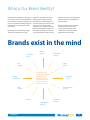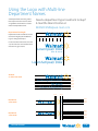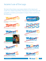
1
Walmart Walmart Brand Brand Guidelines Guidelines Table of Contents Our Brand Who is Our Customer 1.0 Price-Value Shoppers 1.1 Brand-Aspirational Shoppers 1.2 Price-Sensitive Affluent Shoppers 1.3 What is Our Brand Identity 1.4 Our Company's Purpose 1.5 Our Positioning, Brand Character, and Commitment 1.6 Our Brand Personality Traits 1.7 Our Look and Feel Example of Country Type Treatments 2.21 Example of Country Type Treatment Applications 2.22 Using the Logo Country Names & Multi-line Department Names 2.23 9.2 Trait #2: Real 9.3 Trait #3: Innovative 9.4 Trait #4: Straightforward 9.5 Trait #5: Positive 9.6 The 16 Ingredients for Cooking up Copy Walmart Style 9.7 Our Primary Color Pallete Our Core Colors 3.0 Color Ratio 3.1 4.0 Logo with Retail Tagline Specifications 2.4 Typographic Style 4.1 Using the Purpose Statement 2.6 Using Type Effectively 4.2 Incorrect Use of the Purpose Statement 2.7 Using the Retail Tagline without the Logo 2.8 Using the Retail Tagline with the Half-Spark 2.10 Half-Spark in Color/ 2.11 Applying the Half-Spark Graphic: Products 2.12 Applying the Half-Spark Graphic: Inspiring Ideas 6.1 2.13 Applying the Half-Spark Graphic: Inspired People 6.2 2.15 Examples of Department Type Treatment Applications 2.16 Using the Logo with Retail Service Names 2.17 Examples of Walmart Retail Service Type Treatments Applying the Full Spark Graphic Spark in Color 5.0 The Full Spark in Action 5.1 Applying the Half-Spark Graphic 6.0 Applying Talkboxes Talkbox Attributes 7.0 Applying Talkboxes 7.1 Examples of Talkbox Usage 7.3 PowerPoint Templates with Logo 10.0 PowerPoint Templates Logo and Retail Tagline 10.1 PowerPoint Templates Logo and Country Lockup 10.2 Stationery with Logo 10.3 Stationery with Logo and Retail Tagline 10.4 Stationery with Logo and Country Lockup 10.5 E-mail Signature with Purpose Statement 10.6 E-mail Signature with Retail Tagline 10.7 For general questions about Brand Center Help Lifestyle 8.1 Examples of Walmart Service Type Treatments in Applications 2.19 Incorrect Lifestyle Imagery 8.6 Using the Logo with Country Names Product 8.7 Incorrect Product Imagery 8.10 2.20 Internal Communication Resources our guidelines, please contact: Photographic Creative Direction Photographic Creative Direction 8.0 2.18 9.1 Trait #1: Caring Myriad Pro Examples of Multi-line Department Names 9.0 2.25 2.2 2.14 Our Tone and Voice Incorrect use of the Logo 2.0 Using the Logo with Multi-line Department Names 8.14 Tone and Voice 2.24 Logo Specifications Examples of Department Type Treatments Incorrect Food Imagery Discontinued Logo/ Tagline Treatments Our Look and Feel Using the Logo with Internal Department Names 8.11 Communicating in the Walmart Voice: the Role of Our Brand Personality Traits Our Typeface Incorrect Use of the Retail Tagline Food vm: (479) 277-7859 [email protected] Copyright 2009 Wal-Mart Stores, Inc. All rights reserved. Unauthorized duplication is a violation of all applicable laws. Our Brand The Walmart Brand Positioning Who is Our Customer Effective communications? They’re just not possible unless you know who you’re talking to. Our customers. Our boss. Sam Walton once said: "There is only one boss. The customer. And he can fire everybody in the company from the chairman on down, simply by spending his money somewhere else." Like every great business story, ours starts with the customer. What they want is the most important. And though each person is different from the next, they all appreciate how we help them reduce the stress caused by high prices on a limited budget. They are price-sensitive shoppers. For them, spending less on some things, means being able to enjoy the moments that make life special. Our Brand 1.0 Price-Value Shoppers Say “hi” to Our Price-Value Shoppers They’ll smile at you because they know that you’re working to save them money on their everyday needs. They appreciate that and are loyal to us because we help them live better with what they can save by shopping at Walmart. You’ll find them mostly in rural Walmart helps my paycheck go further because I can get everything I need at the best prices. Our Brand areas, enjoying the simple things in life while providing for their families with essentials at prices they can afford. We’re as much a part of their lives as any town gathering spot, where friends run into friends and families go to find great values. I want ... Everyday needs At ... Unbeatable prices In a store with ... Easy, convenient shopping 1.1 Brand-Aspirational Shoppers Say “hi” to Our Brand-Aspirational Shoppers Like the price-value shoppers, they’re on a budget so they have to be smart about how they spend their money. But unlike the price-value shoppers, they live mostly in urban and suburban areas. They love brands and have their favorites, from the jeans they wear to Walmart helps me save money on the basics so I have to spend on the brands that are important to me. Our Brand the TVs they watch. For them, brands are so much a measure of their success that they’ll spend less on some things to be able to enjoy the status and pride of owning the right brands. They look to Walmart for the brands they trust at prices they can afford. I want ... Brands I trust At ... Unbeatable prices In a store with ... Easy, convenient shopping 1.2 Price-Sensitive Affluent Shoppers Say “hi” to Our Price-Sensitive Affluent Shoppers Waste money? Not these shoppers, even though money isn’t as tight for them as it is for the price-value or brand-aspirational shoppers. To the price-sensitive affluent shopper, spending more than they have to doesn’t demonstrate affluence, it demonstrates foolhardiness. They I’m not into wasting money. Why would I shop anywhere else when I can get great brands and great quality for less at Walmart? Our Brand research purchases to make sure they’re getting the best value possible. Like all our customers, they’re smart. They know they can shop anywhere, but they shop at Walmart for quality products at unbeatable prices. They enjoy their affluence and plan on keeping it. Walmart helps them do just that. I want ... Quality products At ... Unbeatable prices In a store with ... Easy, convenient shopping 1.3 What is Our Brand Identity? The Walmart brand identity is like a great pair of jeans: a perfect fit, comfortable for our customers, associates and suppliers. It projects a relaxed and friendly image. We love wearing it every day. And it’s very, very strong. We convey our brand identity through every form of communication and experience. Through the products we sell, how we look, how we act, and what we say. Everything we do has a direct impact on how the world perceives us. It’s crucial that the experience our customers have with our brand be the best possible, from our promise to deliver on low prices, to the quality of the products we sell, from the cleanliness and design of our stores, to the smiles and helpfulness of our associates. Brands are built over time. And over time, we’ll measure our brand’s success by the alignment of the communications and experiences people have with our brand. Brands exist in the mind Quality products Unbeatable prices Community relations Safety policies Easy shopping The Walmart brand identity is the complete alignment of what customers see, hear, read, experience, and think about Walmart products and services. Financial performance Customer service Public relations Communications practices Culture Knowledgeable associates Our Brand Distribution channels 1.4 Our Company's Purpose Our company’s purpose is our reason for being: Saving people money so they can live better It drives all our business decisions and actions. It’s the guiding philosophy we communicate with pride, both internally and externally. Our Brand 1.5 Our Positioning, Brand Character, and Commitment Our positioning Walmart’s brand positioning expresses the benefit we deliver to the marketplace. All of our communications and actions must support our brand positioning. Our brand character Servant leadership has long been the core character of Walmart. Sam Walton built Walmart’s success on committing the company’s strength to helping lower the cost of living for our customers. Our commitment Saving people money so they can live better has made us the most successful retailer in the world. Continuing this success means we all have to deliver: Our Brand For price-sensitive shoppers, Walmart is the retailer that helps them feel “smart” and live better because only Walmart delivers unbeatable prices on the brands they trust, in an easy, fast, one-stop shopping experience. “Servant Leader” committed to saving people money so they can live better. Why we exist How we grow Clean, fast, friendly Unbeatable prices Quality products Easy shopping 1.6 Our Brand Personality Traits It's our job — all of us as keepers of the brand — to make sure that all of our communications are consistent with the following brand personality traits. At the very least, it's up to each of us Caring Real to ensure that our communications do not conflict with the traits. Think of a friend or family member. Now pick five words that best sum up his or her personality. Those are the “personality traits” you’ve assigned that person. Our brand personality traits describe how we want our customers to perceive our company. We’re caring … not cold. We welcome families with our hometown warmth and exclude no one — we welcome everyone through our doors. We care about our local communities and are compassionate toward the people in them. We’re helpful and very engaged. Our customers trust us; we work hard at never letting them down. We’re real … not phony. Down-to-earth and approachable? It’s the spirit of the 10-foot Rule. Friendly? You bet. Because we’re everyday people like our customers; we strive to be unpretentious and authentic. Genuine. Human. Sure, we kid around and have fun, but we take customer satisfaction seriously. Always. Innovative We’re innovative … not complacent. Forward-thinking but never trendy. Inventive? It’s a big part of Sam’s legacy: supercenters. EDLP. $4 prescriptions. RFID. We innovate in smart ways to make our customers’ lives better by improving their shopping experience. High style? No, thanks. Smart? Of course. Straightforward We’re straightforward … not complicated. Simple. Upfront with our customers, suppliers, and fellow associates. No hidden agendas, no ulterior motives. What they see is what they get, and what they get are products, services, and brands they need — at prices they can feel good about. Positive Our Brand We're positive... not pessimistic. We look at problems as opportunities and see setbacks as learning experiences. Our optimism is contagious, motivating suppliers and building customer confidence. Because we're positive, we believe in and help our customers achieve their dreams of a better life. 1.7 Our Look and Feel A Guide to a Comprehensive Visual System Internal Corporate Communications 2.0 Our Look and Feel A comprehensive visual system In keeping with our updated brand approach, we’ve created a complete set of design guidelines. These guidelines are intended to ensure consistency over just about every instance of customer contact. How? By building a deeper and more emotional connection to our customer. It’s subtle, yet so tangible when executed properly. the strong, positive perceptions created will drive customers to our stores. That’s why it’s our duty as keepers of the brand (raising your right hand yet?) to protect, support, and communicate our brand clearly and consistently in everything we say and do. Do this and The core design elements are the essential visual elements of our brand — the Walmart logo, typefaces, color palettes, imagery, and graphics — and are the starting point for any Walmart communication. Our logo Typography Color Our core identity Stationery PowerPoint presentation Visuals Internal communications E-mail signature Our Look and Feel 2.0 Walmart or Wal-Mart? Consistency. It’s a powerful idea and one that can’t be overstated. Especially when it comes to our logo and the way we express our name in written copy. So please take a few moments to review the following brief yet very important style direction: Previous identity and logo New identity and logo Corporate or International U.S. Retail Stores We hear it all the time: “How am I supposed to write our company’s name?” The answer is simple: unless you're in the legal department or investor relations, you write our company name just as it’s written in our logo: Walmart. The right way: When writing, just keep it simple: Walmart Our and Feel Communications Internal Our Look CoreCorporate Identity 2.1 2.0 Logo Specifications Never redraw or alter the logo, including the placement and size relationship of its letter or spark symbol. Doing so weakens our identity • Use authorized artwork from walmartbrandcenter.com/look_logos.aspx • Clear space •Always maintain clear space around the Walmart signature to protect the logo from distracting graphics or typography. •For the signature, measure clear space by the height of the “r” in Walmart for vertical space, and the width of the ”r” for horizontal. •For the symbol, measure clear space by half of the height of one spoke. •Never allow typography or other elements to “invade” the signature or the symbol. Minimum size The Walmart signature reproduces well at almost any size. Going too small, however, can damage the logo’s integrity – and effectiveness. So please never reproduce the signature: 3/4" ...smaller than 3/4" wide, measured from the “W” to the right side edge of the spark. Our Look and Feel 1/8" ...smaller than 1/8" wide, measured from one edge of the spark to the other. 2.2 Logo Specifications (cont.) Logo color When the logo appears on a white background, use our primary, authorized Walmart medium blue (PANTONE® 285 C). Walmart medium blue (or PANTONE® 285 C) C:89 M:43 Y:0 K:0 R:26 G:117 B:207 Walmart yellow (or PANTONE® 1235 C) C:0 M:29 Y:91 K:0 R:253 G:187 B:48 Alternative color backgrounds • Our primary, authorized Walmart medium blue (PANTONE® 285 C) is preferred when you need a blue background. When using blue as a background, reverse out the logo. •When the Walmart logo is used on a color background that is in equal value or brighter than PANTONE® 285C, reverse the logo out to white •Our two other blues (PANTONE® 287 C and PANTONE® 284 C) are acceptable if necessary, though NOT preferred. They may be used in restricted instances, such as in materials for services, for example. Walmart medium blue (or PANTONE® 285 C) C:89 M:43 Y:0 K:0 R:26 G:117 B:207 Walmart dark blue (or PANTONE® 287 C) C:100 M:68 Y:0 K:12 R:0 G:56 B:150 Walmart light blue (or PANTONE® 284 C) C:55 M:19 Y:0 K:0 R:108 G:171 B:231 The colors shown here and throughout this manual have not been evaluated by PANTONE, Inc. for accuracy and may not match the PANTONE Color Standards. Consult current PANTONE Publications for accurate color. PANTONE® is the property of Pantone, Inc. Our Look and Feel 2.3 Logo with Retail Tagline Specifications Taglines are an integral part of conveying a brand image. To maximize its impact and to preserve its unique status, please: Never use it alone or linked to a product or service. Don't change the lockup (how it’s positioned with our logo). And, maybe less obvious but just as important: never recreate the combined logo and tagline art; use only authorized, original art. authorized tagline in any advertising or marketing materials. The different rules on how our tagline should be used appear below. Please, never ever create taglines and, of course, don't use any tagline other than our For authorized, original artwork for the approved logo and tagline lockup, go to: walmartbrandcenter.com/look_logos.aspx Tagline clear space •Always maintain clear space around the Walmart signature to protect the logo from distracting graphics or typography. •For the signature, measure clear space by the height of the “r” in Walmart for vertical space, and the width of the ”r” for horizontal. •For the symbol, measure clear space by half of the height of one spoke. •Never allow typography or other elements to “invade” the signature or the symbol. Minimum Logo Size Please never reproduce the logo/ tagline lockup smaller than 1-1/4" wide, measured from the “W” to the right side edge of the spark in Walmart. 1-1/4" Small-size lockup use When reproducing the lockup in cases where it’s needed to be 1-7/8" or smaller (measured from “W” to the right side edge of the spark in Walmart), please use the special “small size” artwork we’ve created. You’ll find it easier to read and reproduce. Our LookCorporate and Feel Communications Internal 1-7/8" 2.4 2.0 Logo with Retail Tagline Specifications (cont.) Color use for the logo with tagline lockup follow the same ones as those for the signature used without the tagline. Refer to page 2.2. Logo with tagline color Using the logo and tagline on a color background Our LookCorporate and Feel Communications Internal 2.5 2.0 Using the Purpose Statement Horizontal format clearspace •Always maintain clear space around the "Saving people money so they can live better" purpose statement, to protect it from distracting graphics or typography. •Measure clear space by the height of the “r” in "better" for vertical space, and its width for horizontal. •Never allow typography or other elements to “invade” the signature or the symbol. Minimum size Never reproduce the tagline smaller than 1" wide, measured from the "S" to the right side of the "r". r rSaving people money so they can r live better.r Saving people money so they can live better. 1" Small-size lockup use Special "small size" artwork should be used when reproducing the horizontal tagline in cases where it’s needed to be 1-7/8" or smaller (measured from “S” to the right side edge of the "r" in "better"). Saving people money so they can live better. Using the tagline with halfspark on a color background The preferred is in Walmart middle blue with a Walmart yellow purpose statement. The purpose statement can also be used in white on Walmart middle blue. 1-7/8" Saving people money so they can live better. Saving people money so they can live better. Saving people money so they can live better. Saving people money so they can live better. Walmart medium blue (or PANTONE® 285 C) C:89 M:43 Y:0 K:0 R:26 G:117 B:207 Our LookCorporate and Feel Communications Internal Walmart yellow (or PANTONE® 1235 C) C:0 M:29 Y:91 K:0 R:253 G:187 B:48 2.6 2.0 Incorrect uses of the Purpose Statement Saving people money so they can live better. Do not use yellow on white. Saving people money so they can live better. Saving people money so they can live better. Do not use two colors to split the purpose statement. Saving people money so they can live better. Saving people money so they can live better. The tagline should not be reversed out of seasonal colors. Saving people money so they can live better. Saving people money so they can live better. The tagline should not be reversed out of any other colors. Our LookCorporate and Feel Communications Internal 2.0 2.7 Using the Retail Tagline without the Logo Tagline Clear Space •Always maintain clear space around the "Save money. Live better." tagline to protect it from distracting graphics or typography. •For the horizontal tagline, measure clear space by the height of the "r" in "better" all the way around. •For the stacked tagline, measure clear space by the height of the “r” in "better" for vertical space, and the width of the ”r” for horizontal. •Never allow typography or other elements to “invade” the signature or the symbol. Minimum size The Walmart tagline reproduces well at almost any size. Going too small, however, can damage the tagline's integrity – and effectiveness. So please: Never reproduce the tagline smaller than 3/4" wide, measured from the "S" to the right side of the "r". 3/4" 3/8" Small-size lockup use Special "small size" artwork should be used when reproducing the horizontal tagline in cases where it’s needed to be 1-7/8" or smaller (measured from “S” to the right side edge of the "r" in "better"). For the stacked tagline, it should be used when smaller than 11/16" (measured from "S" to the right edge of "y" in "money".) You’ll find it easier to read and reproduce. Our Look and Feel 1-7/8" 11/16" 2.8 Using the Retail Tagline without the Logo (continued) Using the tagline on color background The preferred version of our tagline used solo is in Walmart yellow, on a Walmart medium blue background. Walmart medium blue (or PANTONE® 285 C) C:89 M:43 Y:0 K:0 R:26 G:117 B:207 Walmart yellow (or PANTONE® 1235 C) C:0 M:29 Y:91 K:0 R:253 G:187 B:48 Using the tagline in one color When our solo tagline is used on a white background and/or in a onecolor application, it should only appear in Walmart medium blue. It can also be reversed out in white. Walmart medium blue (or PANTONE® 285 C) C:89 M:43 Y:0 K:0 R:26 G:117 B:207 Using the tagline in black and white When use of color is not available: •Produce our tagline in black •When the background is black, please reverse out Our Look and Feel 2.9 Using the Retail Tagline with the Half-spark Horizontal format clearspace •Always maintain clear space around the "Save money. Live better." tagline with the half-spark, to protect it from distracting graphics or typography. •Measure clear space by the height of the “L” in "Live" for vertical space, and its width for horizontal. •Never allow typography or other elements to “invade” the signature or the symbol. Minimum size Never reproduce the tagline smaller than 3/4" wide, measured from the "S" to the right side of the "r". 3/4" 3/8" Small-size lockup use Special "small size" artwork should be used when reproducing the horizontal tagline in cases where it’s needed to be 1-7/8" or smaller (measured from “S” to the right side edge of the "r" in "better"). For the stacked tagline, it should be used when smaller than 11/16" (measured from "S" to the right edge of "y" in "money".) You’ll find it easier to read and reproduce. 1-7/8" 11/16" Using the tagline with halfspark on a color background The preferred is in Walmart middle blue with a Walmart yellow halfspark. When reversed out of a color, the tagline portion should be reversed out in white. Walmart medium blue (or PANTONE® 285 C) C:89 M:43 Y:0 K:0 R:26 G:117 B:207 Our Look and Feel Walmart yellow (or PANTONE® 1235 C) C:0 M:29 Y:91 K:0 R:253 G:187 B:48 2.10 Incorrect Uses of the Retail Tagline Do not use yellow on white. The 2-color version should always show the tagline in white and the half-spark in yellow — never both. Do not use two colors to split the tagline. The tagline should only be reversed out of holiday colors. The half-spark should not be used with holiday colors. The half-spark should only appear in blue, yellow, or white knocked out of blue. Our Look and Feel 2.11 Using the Logo with Internal Department Names Need a department type treatment lockup? E-mail the Brand Center at [email protected] Locked-up type treatments let departments identify themselves in ways that are consistent with the Walmart brand. Below are acceptable examples of how to lock up department names to our Walmart logo, as well as how to separate the artwork. Standard stacked Walmart medium blue (or PANTONE® 285 C) C:89 M:43 Y:0 K:0 R:26 G:117 B:207 x 1/3 x 2/3 x Walmart yellow (or PANTONE® 1235 C) C:0 M:29 Y:91 K:0 R:253 G:187 B:48 Department Smart Network Title 1/3 X Horizontal x Our LookCorporate and Feel Communications Internal Service 1/2 X Department 2/3 x 2.12 2.0 Examples of Department Type Treatments The lockups below are examples of existing approved artwork. To find authorized, original artwork for your department, please e-mail the Brand Center at [email protected] Marketing Logistics Financial Services Human Resources Merchandising Our LookCorporate and Feel Communications Internal 2.13 2.0 Examples of Multi-line Department Names The lockups below are examples of existing, approved artwork. To find authorized, original artwork for your department, please e-mail the Brand Center at [email protected] Global Continuous Improvement Supply Chain Center of Excellence Our LookCorporate and Feel Communications Internal 2.14 2.0 Using the Logo with Multi-line Department Names Need a department type treatment lockup? E-mail the Brand Center at [email protected] Some departments have long names that require more than one line. Here are guidelines about when to create a multi-line department name. Department line length x Department names should not exceed 8 times the height (x) of the Walmart logo it is being locked up to. 8 7 6 5 4 3 2 1 In instances where the names "miss the cut," the character count should not be more than 20, give or take. Lorem Ipsum Dolor Sit Amet Tetuer Adipiscing Lorem Set Ipsum Dolor Sit Amet Tetuer Adipiscing Stacked 2- and 3-line stack x Lorem Ipsum Dolor Sit Amet Tetuer Adipiscing 1/3 X Horizontal 2-line stack Horizontal 3-line stack x x Our LookCorporate and Feel Communications Internal 1/3 X 2/3 X 1/3 X 2/3 X 1/3 X 2/3 X 1/2 X Lorem Set Ipsum Dolor LoremSit SetAmet Ipsum Dolor Sit Amet Lorem Set Ipsum Dolor LoremSit SetAmet Ipsum Tenet Dolor Fro Dolor Sit Amet Tenet Dolor Fro 1/2 X 1/3 X 1/2 X 1/2 X 1/3 X 1/2 X 1/3 X 1/2 X 2.15 2.0 Examples of Department Type Treatment Applications Below are acceptable examples of how to use type treatment lockups to identify individual departments. T-shirts Front and back of hats Department Department Department Title Title Title Department Department Department Office signs First FirstLast LastName Name Department Department First Last Name Department Our LookCorporate and Feel Communications Internal One OneTeam. Team.One OneDream. Dream. Department Department One Team. One Dream. Department 2.16 2.0 Using the Logo with Retail Service Names Locked-up type treatments let services identify themselves in ways that are consistent with the Walmart brand. Below are the three types of service type treatment lockups. Standard stacked Walmart medium blue (or PANTONE® 285 C) C:89 M:43 Y:0 K:0 R:26 G:117 B:207 Need a service type treatment lockup? E-mail the Brand Center at [email protected] x 1/3 x 2/3 x Walmart yellow (or PANTONE® 1235 C) C:0 M:29 Y:91 K:0 R:253 G:187 B:48 Standard stacked with a service title Service Smart Netw Title x 1/3 x 2/3 x Service Smart Netw x 2/3 x Title 1/3 X Horizontal x 1/2 X Service 2/3 x Department Our Look and Feel 2.17 Examples of Walmart Retail Service Type Treatments Be sure the relationship of the service to the Walmart logo is consistent, whether on labcoats, uniforms, or patches. The lockups below are examples of Walmart service type treatments. To find authorized, original artwork for Walmart service type treatments, go to: walmartbrandcenter.com/look_logo_service.aspx Service type treatments Pharmacy Pharmacy Tire & Tire Lube& Express Lube Express Tire & Lube Express Pharmacy Ti Tire & Lube Express Pharmacy Ti PhotoPhoto Vision Center Vision Center VisionVision CenterCenter Photo Photo Service type treatments with titles VisionVision CenterCenter Tire & Tire Lube& Express Lube Express Tire & Lube Express Vision Center Ti Tire & Lube Express Vision Center Consultant Consultant Technician Technician Ti Technician Consultant Technician Consultant Our Look and Feel 2.18 Examples of Walmart Service Type Treatments in Applications These are acceptable examples of how to lock up service names and titles to the Walmart logo. Lab coat Pharmacy Pharmacy Pharmacist Pharmacist Patch Tire & Lube Express Mechanic Tire & Lube Express Tire & Lube Express Tire & Lube Express Mechanic Our Look and Feel 2.19 Using the Logo with Country Names Need a country type treatment lockup? E-mail the Brand Center at [email protected] Locked-up type treatments let countries identify themselves in ways that are consistent with the Walmart brand. Below are acceptable examples of how to lock up country names to our Walmart logo, as well as how to separate the artwork. Standard stacked Walmart medium blue (or PANTONE® 285 C) C:89 M:43 Y:0 K:0 R:26 G:117 B:207 x 1/3 x 2/3 x Walmart yellow (or PANTONE® 1235 C) C:0 M:29 Y:91 K:0 R:253 G:187 B:48 Country 1/3 X Horizontal x Our LookCorporate and Feel Communications Internal 1/2 X Country 2/3 x 2.20 2.0 Examples of Country Type Treatments The lockups below are examples of existing approved artwork. To find authorized, original artwork for your country, please e-mail the Brand Center at [email protected] Argentina Asia Centroamérica México POCC Our LookCorporate and Feel Communications Internal 2.21 2.0 Examples of Country Type Treatment Applications Below are acceptable examples of how to use type treatment lockups to identify individual departments. T-shirts Front and back of hats Country Country Country Country Country Title Country Title Department Department Department Office signs First FirstLast LastName Name Country Country First Last Name Country Our Look and Feel One OneTeam. Team.One OneDream. Dream. Country Country One Team. One Dream. Country 2.22 Using the Logo Country Names and Multi-line Department Names The lockups below are examples of existing, approved artwork. Need a Country type treatment lockup? E-mail the Brand Center at [email protected] Argentina Global Continuous Improvement Centroamérica Supply Chain Center of Excellence Our Look and Feel Country Department Name Country Department Name 2.23 Discontinued Logo/Tagline Treatments We realize it’s like saying goodbye to an old friend, but we’re not. We’re saying “Hi!” to a friend who’s enjoying a professional makeover. Continuous ement •Discontinue using the Walmart logo/tagline treatments below •Discontinue using any other Walmart logo/tagline treatments not approved or shown on page 2.1 By discontinuing the use of nonapproved logo/tagline treatments, we simplify our current identity system. What does this mean for us? A smoother, faster, easier transition to our new brand. 25% X Do not use the Walmart Always Low Prices, Always logo. Do not use the Walmart star lockup. 10X y Relations Save money. Live better. SM Lorem Ipsum Dolor Sit Do not use the Walmart Supercenter logo. Save money. Live better. 21 Characters Lorem Ipsum Dolor Sit Save money. Live better. Do not create variations for the Walmart logo. International Do not lockup the Walmart logo with International. Our Look and Feel Save money. SM Do not use multiple colors in a subhead. 21 Characters Ut Rutrum Nunc Vitaen Do not use any retired Walmart logo artwork. Save money. Live better. Save money. SM 21 Characters Save money. SM Do not use Walmart with spark logo artwork where the spark is raised above the baseline of "Walmart." 2.24 X 1/2 X Incorrect use of the Logo The logo is the primary visual representation of the brand, and needs to be treated respectfully. Changing any part of the logo will jeopardize consistency and weaken its impact. Please avoid doing the following: Do not apply any one color (even if part of the Walmart palette) to the logo. Do not place the logo in holding shapes. Do not assign arbitrary colors to any part of the logo. Do not use the logo in a repeat pattern. Walmart Save money. Live better. Do not change the spark and logotype size relationship. Do not replace or reset the typography of the logo, even in Myriad Pro. Do not place the logo on unauthorized color backgrounds. Do not place the logo on imagery. Do not use the logo without the spark. Do not warp the logo. Do not rearrange any elements of the logo. Do not apply arbitrary colors to any part of the spark. Do not raise the spark. Our LookCorporate and Feel Communications Internal 2.25 Our Primary Color Palette Consistent use of color is one of the easiest — and most effective — ways to break through marketing clutter. To rise above the noise. To be a visible needle in a haystack of competing communications. Blue also communicates image attributes like friendly, approachable, reliable, and trustworthy. Makes a lot of sense, doesn’t it? All very Walmart. Why blue? Blue is an integral part of the Walmart visual identity. It’s also the most popular color of the spectrum and suggests authority, dignity, security, stability, heritage, and trust. Certain shades of blue can suggest different but complementary and appealing traits. Darker blues? Tradition and quality. Brighter blues? Innovation or technology. Blue can also signal "fresh” and it combines well with other colors (green, orange, yellow). Combining these colors communicate other Walmart traits such as low cost, natural, organic, and others. Because blue speaks to so many things Walmart, it’s important that we leverage it in all our brand communications. Think blue. Our Core Colors Our primary colors The blues to the right should dominate every piece you create. Our medium and light blues are brighter, friendlier blues than what we’ve used in the past and convey a “welcoming” and “fresher” Walmart. •With rare exception, use only authorized Walmart medium blue (PANTONE® 285 C) for the logo •Please emphasize the use of Walmart medium blue (PANTONE 285® C) and Walmart light blue (PANTONE® 284 C) for full fields of color in marketing communications Walmart medium blue (or PANTONE® 285 C) C:89 M:43 Y:0 K:0 R:26 G:117 B:207 Walmart dark blue (or PANTONE® 287 C) C:100 M:68 Y:0 K:12 R:0 G:56 B:150 Walmart light blue (or PANTONE® 284 C) C:55 M:19 Y:0 K:0 R:108 G:171 B:231 Walmart white C:0 M:0 Y:0 K:0 R:255 G:255 B:255 Walmart orange (or PANTONE® 166 CVC) C:0 M:64 Y100 K:0 R:244 G:123 B:32 Walmart yellow (or PANTONE® 1235 C) C:0 M:29 Y:91 K:0 R:253 G:187 B:48 Walmart dark green (or PANTONE® 364 C) C:65 M:0 Y:100 K:42 R:51 G:115 B:33 Walmart light green (or PANTONE® 368 C) C:57 M:0 Y:100 K:0 R:97 G:191 B:26 Our highlight colors Use highlight colors in combination with our core colors to convey other messages such as “low cost,” “organic,” “natural,” or “innovation.” These colors add depth, for sure, but use them sparingly, please. One word on color matching: PANTONE® Color matching is crucial to the success of any print project. While visual differences in printing can’t be eliminated completely, they can be minimized. Remember: Our Look and Feel •Ask the printer to adjust the •The appearance of our brand colors four-color process formula to the paper will differ from spot-color to a four(and other printing conditions) color process •There will be slight color variances when printing on different paper stocks •Always minimize visual differences by matching to PANTONE® color swatches 3.0 Color Ratio Use the pie chart below to guide you in balancing core and highlight colors in Walmart–branded materials. Color balance •Use our core colors for a consistent platform that allows other design elements •Case by case, color ratio depends on the individual application •Use the ratio pie chart to the right to make sure you’re balancing our colors correctly Additional color palettes Additional colors not shown here have been chosen for a select variety of in-store usage, seasonal communications, and special initiatives. Watch for details at the Walmart Brand Center as we add information and address new ways to use our guidelines. Our Look and Feel 3.1 Our Typeface abcdefghijklmn opqrstuvwxyz BCDEFGHIJKLM OPQRSTUVWXYZ 1234567890 When used correctly, typography can convey image and feeling every bit as much — and sometimes more — than simple graphics. We’ve selected a type family that gives Walmart a friendly, warm, and real voice: Myriad Pro. Qualities of Myriad Pro Myriad Pro says “approachable” and “straightforward” and is easy to read. (You’re reading it now. Nice, isn’t it?) A humanistic sans-serif typeface, Myriad Pro’s great for retailing and communicating “low prices.” Compared to similar typefaces, Myriad Pro is an easier read, conveys warmth, and aligns nicely with the Walmart brand. Myriad Pro •Myriad Pro is our primary typeface •Myriad Pro should be used in all communication materials •Use type size and weight to establish a clear hierarchy of information •Do not substitute any other typeface for Myriad Pro For desktop Use Arial for desktop applications in a nongraphic artwork environment such as Microsoft Word and PowerPoint. Use Myriad Pro for graphics, buttons and banners in Web portals, microsites, and other desktop-based environments. Myriad Pro abcdefghijklmn opqrstuvwxyz ABCDEFGHIJKLMN OPQRSTUVWXYZ 1234567890 To purchase our authorized fonts, go to: adobe.com/type/browser/P/P_1706.html Our Look and Feel 4.0 Typographic Style An easy way to add personality to all communications is through the use of typography. Use typeface, type size, and type weight wisely to establish a clear hierarchy of information. You’ll be amazed at the results you can get. 123 abc The chart below demonstrates a range of weights of Myriad Pro that may be applied to Walmart–branded materials. Type selections should always be: •Relevant to the particular mood or emotion desired •Supportive of selected brand or product imagery Myriad Pro Light It also works really well on large headers in print applications and can often add an air of formality to copy in, for example, tribute ads. Myriad Pro Light is approachable and human. Use of this lighter weight is also appropriate when a more fashionforward or “feminine” voice is needed. ABC 123 abc Myriad Pro Regular Myriad Pro Regular is a friendly, functional sans serif typeface that works well across all media and applications. It’s effective when used with large amounts of text reversed out to white or with solids and imagery. ABC 123 abc Myriad Pro Bold Myriad Pro Bold is ideal for headlines and subheads. It also adds “oomph” when you need to place special emphasis on a particular word. Myriad Pro Bold also works well when a more basic and practical voice is needed, such as in signage for departments like TLE, Tire and Lube Express. ABC 123 abc ABC Our Look and Feel Myriad Pro Italic Myriad Pro Italic is used much less often than its siblings Myriad Pro Light, Regular, and Bold. Use Myriad Pro Italic when referring to book, movie, or music titles, to add a more subtle emphasis than would be achieved with Myriad Pro Bold, and with great care for any other use. It’s a workable alternative for instances where a script font might be desired. It also can impart a more “feminine” feel than Bold or Regular, similar to Myriad Pro Light. 4.1 Using Type Effectively Think of the most powerful brands you know. Now think of how identifiable their typography and branding elements are. On a billboard? Glimpsed through the corner of your eye on someone’s desk? Seen on a sign as you walk past a display at your local Walmart? We see the brands even before we read the message. Sticking to the approved families of Myriad Pro exclusively gives us, over time, ownership of the look and feel the typeface contributes to our branding efforts. is the hallmark of a true brand champion. Download the approved Walmart core typeface at: http://www.adobe.com/type/ browser/P/P_1706.html Developing creative for Walmart? Whether you’re a graphic designer or working with one, using Myriad Pro Not working on a graphic (e.g., buttons and banners)? Please use Arial for nongraphic desktop applications. Dos and Don’ts of typeface usage: •Do always set type in a combination of uppercase and lowercase •Do use only approved colors, or colors that are easily read in type •Do use only the approved Walmart typefaces •Do avoid using all uppercase; we don't want to shout •Don’t use special effects, such as drop shadow, that compromise legibility •Don’t change kerning (space between letters) when setting headlines or body copy •Don’t distort the typefaces (e.g., expand, condense, or modify the letterforms) •Don’t substitute other typefaces Please adhere closely to these guidelines when using the Myriad Pro typeface. Note: Some natural distortion of type is inevitable when used in a photo or illustration. All the same, please maintain the overall integrity of the typeface – always. Preferred casing Uppercase and lowercase styling in headlines and call outs support our brand warmth and friendliness. Please do not use Myriad in all uppercase. It’s a form of shouting on both paper and screen. Always be consistent in the typographic style you use for a particular Walmart service or business unit. It’s the best way to create, over time, a distinctive and recognizable voice for Walmart. Headline Goes Here Headline goes here. Our Core Identity SAVING PEOPLE MONEY SO THEY CAN LIVE BETTER Saving people money so they can live better Our Look and Feel 4.2 Applying the Full Spark Graphic Applying the Full Spark Graphic Want to draw attention to a really bright idea? Place a spark in front of it. A little “oomph” at the end of a smart statement? Spark. The spark is our graphical shorthand for “Hey, here’s something pretty smart. Think about it.” It should always be shown in Walmart yellow, Pantone 1235. Be sure to size it appropriately for your layout and medium, and center it on the copy baseline. Spark in Color What color should the spark be? Our primary, authorized Walmart yellow (PANTONE® 1235 C) spark is preferred. Brand approval is required if you need to use a different spark color other than PANTONE® 1235 C. Walmart yellow (or PANTONE® 1235 C) C:0 M:29 Y:91 K:0 R:253 G:187 B:48 Do not crop the spark The colors shown here and throughout this manual have not been evaluated by PANTONE, Inc. for accuracy and may not match the PANTONE Color Standards. Consult current PANTONE Publications for accurate color. PANTONE® is the property of Pantone, Inc. Our Look and Feel 5.0 The Full Spark in Action Here are just a few of the ways you might use the full spark to emphasize something smart. TV screen Smart Electronics dept Fresh In the Produce dept Corporate signage Celebrate! & Lube n Center Yourself Store signage Meals Outdoor Living t Meats Dairy Our LookCorporate and Feel Communications Internal 2.0 5.1 Applying the Half-Spark Graphic The half-spark denotes bright ideas. It appears just above a line of copy, a product, or a person to convey inspiration. Be careful not to overuse the half-spark graphic (it’s easy to do this. We’ve been there.) Like anything, overuse it and it loses its uniqueness. Internal Corporate Communications Half-Spark in Color What color should the spark be? Our primary, authorized Walmart yellow (PANTONE® 1235 C) spark is preferred. Walmart yellow (or PANTONE® 1235 C) C:0 M:29 Y:91 K:0 R:253 G:187 B:48 Brand approval is required if you need to use a different spark color other than PANTONE® 1235 C. y so Applying the Half-Spark Graphic: etterInspired Products Lorem ipsum dolor sit amet, consetetur sadipscing elitr, sed diam nonumy eirmod tempor invidunt ut labore et dolore magna aliquyam erat, sed diam voluptua. When applying the half-spark graphic to denote smart product selections, it's important to do so correctly and consistently. Follow the guides below. How to lock up half-spark to product • The size of the half-spark should match the size of the straight spoke taking up 1/3 the height of the product. • The distance between the halfspark and the product is the height of one spoke, measured from the bottom of the middle spoke to the top of the product. • When locked up to products, the spark should be visually centered horizontally and always be perpendicular, not at an angle. Examples Our LookCorporate and Feel Communications Internal 6.0 Applying the Half-Spark Graphic: Inspiring Ideas The half-spark graphic can be used with text to communicate smart ideas. Different type sizes and number of lines call for different proportional relationships with the spark. How to lock up half-spark to ideas •For 1-2 liners, the height of the half-spark should be two times the cap height of the type. •For 3 to 5 liners, the half-spark should be three times the cap height of the type. •For 5 lines and more, the halfspark should be 5 times the cap height of the type. •The distance between the halfspark and the copy should be the height of one spoke, measured from the bottom of the middle spoke to the cap height of the type. Lorem ipsum dolor sit amet, consectetur 2x Lorem ipsum dolor sit amet, consectetur x Lorem ipsum d sit amet, consec adipiscing eli 3x Lorem ipsum dolor sit amet, consectetur adipiscing elit. Lorem ipsum dolor s consectetur adipiscing laoreet lobortis felis. In consectetur augue. Aenea accumsan vestibulum, p dictum ac, elit. Morbi gra diam. Fusce egestas tris Curabitur lobortis massa Aenean a quam ac ve vulputate. Nullam dignissi x 5x Lorem ipsum dolor sit amet, consectetur adipiscing elit. Integer laoreet lobortis felis. In aliquam consectetur augue. Aenean nisl magna, accumsan vestibulum, porttitor in, dictum ac, elit. Morbi gravida nisi sed diam. Fusce egestas tristique velit. Curabitur lobortis massa sed augue. Aenean a quam ac velit lacinia vulputate. Nullam dignissim leo in eros. Lorem ipsum dolor sit amet, consetetur sadipscing elitr, sed diam nonumy eirmod tempor invidunt ut labore et dolore magna aliquyam erat, sed diam voluptua. x Examples Our customers shop smart ... Our LookCorporate and Feel Communications Internal ...help people save money so they can live better. Lorem ipsum dolor sit amet, consetetur sadipscing elitr, sed diam nonumy eirmod tempor invidunt ut labore et dolore magna aliquyam erat, sed diam voluptua. 6.1 Applying the Half-Spark Graphic: Inspired People The half-spark graphic can be used to illustrate the idea of smart customers and inspired associates. In order to maintain consistency in the way this graphic is used, please follow the instructions on the following pages. Silhouetted figures Lifestyle imagery Our LookCorporate and Feel Communications Internal 6.2 Applying the Half-Spark Graphic: Inspired People (continued) When locking up the half-spark to a person, special care has to be taken for it to look appropriately proportioned and positioned. Half-spark To avoid looking like a person is wearing a crown, the spark should be angled as shown. 10º Half-spark proportion •To measure the appropriate size of a half-spark for close up images, measure the rough height of the person's face. 4 middle spokes should fit right on top of each other. For a full figure image, 1-1/3 spokes should fit. •When positioning the halfspark, align the inner end of the raised (angled) spoke to the center line. • For close-ups, there should be a distance of a spoke away from top of the head to the bottom of the middle spoke. For full body images, the distance should be 2/3 of a spoke measured to the bottom of the middle spoke. Half-spark direction Close-ups -10º Full Body Center Center 2/3 x X 1/3 x Left side Right side The half-spark can be placed on either side of the center line. Use the angle that works best for the image being used. Our LookCorporate and Feel Communications Internal 6.3 Applying the Half-Spark Graphic: Inspired People (continued) Here are some images with and without the proportion measurements, for your reference. Take note that the half-spark should just be used on one figure in any given composition. Examples (continued) Half-spark on images with measurement Our LookCorporate and Feel Communications Internal Half-spark on images 6.4 Applying Talkboxes . . . Shopping that's quick and easy. The talkbox lets us reach out to our customers, associates, and communities in an even more personal way. Talkboxes Attributes Acceptable outlined talkbox colors Use only approved, outlined talkbox colors on the right side. Do not use different filled colors other than white. Walmart medium blue (or PANTONE® 285 C) C:89 M:43 Y:0 K:0 R:26 G:117 B:207 Walmart orange (or PANTONE® 166 CVC) C:0 M:64 Y100 K:0 R:244 G:123 B:32 Walmart dark blue (or PANTONE® 287 C) C:100 M:68 Y:0 K:12 R:0 G:56 B:150 Walmart yellow (or PANTONE® 1235 C) C:0 M:29 Y:91 K:0 R:253 G:187 B:48 Walmart light blue (or PANTONE® 284 C) C:55 M:19 Y:0 K:0 R:108 G:171 B:231 Walmart light green (or PANTONE® 368 C) C:57 M:0 Y:100 K:0 R:97 G:191 B:26 Walmart dark green (or PANTONE® 364 C) C:65 M:0 Y:100 K:42 R:51 G:115 B:33 Clear space x x x x x Our Look and Feel 7.0 Applying Talkboxes Talkboxes size The tail should be 20% of the shortest length of the talkbox. It may be flushed left or right, but it should always appear at a 45-degree angle. x corner radius = 0. Weight = 1.5pt .20x 45o angle On the Grid The size of the talkbox is flexible as long as it remains in the increment of 0.5”. The minimum size of a talkbox is 0.5” x .05”. corner radius = 0.1 Weight = 1.5pt 7 6 Border weight The border weight should be 1-1.5 pt., depending on the size of the talkbox. 5 4 Corner radius The corner of the talkboxes should always have a 0.1" radius (as shown in close up below). This radius should be maintained proportionately throughout variations in the talkbox dimensions. 3 2 1 corner radius = 0. Weight = 1.5pt 0 0 1 2 3 4 5 6 7 smallest dimension is smallest dimension is smallest dimension is smallest dimension is smallest dimension is smallest dimension is smallest dimension is 1” to 2”: 2” to 3”: 3” to 4”: 4” to 5”: 5” to 6”: 6” and larger: 0” to 1”: corner radius = 0.1” corner radius = 0.2” corner radius = 0.3” corner radius = 0.4” corner radius = 0.5” corner radius = 0.6” corner radius = 0.7” corner radius = 0. Weight = 1.5pt Our Look and Feel 7.1 Applying Talkboxes (Continued) Dos and Don’ts of talkbox usage: •Do make sure you use the correct color for your talkbox outline. Approved talkbox outline colors are on page 7.0. The interior of talkboxes should always be white •Do use talkboxes to communicate helpful information (e.g., “Tips” copy device) •Do use talkboxes to convey special messaging (e.g., “Think About This” copy device) •Do use talkboxes when the specially designed graphics for devices are not available •Do use them as speech containers attributed to an actual person •Do use them as speech containers when Walmart is talking directly to customers. •Do use talkboxes with taste and discretion. Overusing talkboxes renders them “invisible” to the eye and decreases their value as a copy tool •Do make the content of talkboxes highly conversational. This is crucial. Talkboxes are people talking, whether a customer, an associate or Walmart as a family. Always read the copy to your self and do the “real person” check: Would someone actually say this? Our Look and Feel •Don’t use talkboxes as headline containers. Doing so is an exception •Don’t put quotes around speech contained in a talkbox. The talkbox is enough to indicate that the speech contained is being said by a given source •Don’t put pictures in talkboxes. People talk in words that paint pictures, but we don’t talk in pictures. (It is, however, okay to bold or italicize Myriad Pro as appropriate.) •Don’t point the talkbox tail in the direction of any inanimate objects. (Talking mashed potatoes is just too creepy.) That’s what headlines and subheads are for •Don’t use any talkbox other than the approved talkboxes pictured below. Rounded talkboxes are not talkboxes; they’re speech bubbles and are not part of our branding •Don’t overuse talkboxes. Like the half- and full-spark graphics, overuse robs them of their uniqueness as a copy tool 7.2 Examples of Talkbox Usage Brand booklet Walmart helps me save money on the basics so I have more to spend on the brands that are important to me. Our customers shop smart ... What smart shoppers say... Walmart was founded on one simple idea: save people money so they can live better. How? Deliver on a promise of Unbeatable prices on great products and leading brands with quick-and-easy, one-stop shopping. Walmart helps my paycheck go further because I can get everything I need at the best prices. I’m not into wasting money. Why would I shop anywhere else when I can get great brands and great quality for less at Walmart? The bottom line for the average American family: savings of $2,300 a year. Now that’s smart. Brand book Our customers pride themselves on shopping smart. … shopping a store that supports the community and the environment. … TBD New Image Smart is ... Smart is the way customers feel after shopping at Walmart. Shopping smart can mean dif ferent things to dif ferent customers, but there are some important common elements to “smart.” 48 | Our customers Our Look and Feel shopping that’s quick and easy. ... f inding life’s everyday needs under one roof. ... looking great on a budget. … Why would I shop anywhere else but Walmart? … enjoying quality, fresh groceries and organics. ... getting helpful information and friendly service when she needs it. … saving time and money so she’ll have more of each to do with what she wants. … f inding great brands at the best prices. 49 | Our customers 7.3 Photographic Creative Direction Guide to Imagery Usage Internal Corporate Communications 2.0 Photographic Creative Direction Knowing and understanding our brand personality traits and how to apply them to our photographic art direction is what separates our work from others. By applying these five basic traits to our creative direction we'll succeed in defining the Walmart brand. Caring Real Think about what type of photography conveys caring best. It usually includes some human element to it or shows that someone took the time to do their best. We can elevate our work by caring for our subjects, lighting, styling, and every aspect of our photographs. When we care enough to speak from the brand the customer will respond. We’re real...we strive to be unpretentious and authentic. It's not about being slick. We understand when a photograph feels staged or contrived and so do our customers. Are your models interacting or just acting? If you ever need to give advice just say "keep it real". Innovative We’re innovative...not complacent. We can be aspirational but never out of the grasp of our core customer's imagination. Forward-thinking but never trendy. Inventive? Yes. We innovate in smart ways. High style? No, it's not our style. Fun, clever, and refreshing ...it's what makes us innovative. Straightforward We’re straightforward...not complicated. Simple. Up-front. We have an important role in defining the brand to our customers. Our photography can reflect this by not taking itself too seriously. If it takes a moment to understand it's not straightforward enough. Positive Photographic Creative Direction Because we’re positive about our customers, business, and products, correctly selected imagery communicates the optimism of our brand. The lighting, smiles (natural smiles, of course – never forced), and a fresh feel are all elements that, when properly combined, are essential to capturing our upbeat nature. 8.0 Lifestyle People Support the personality traits of the Walmart brand: Caring, Real, Innovative, Straighforward and Positive. Photographic Internal Corporate Creative Communications Direction 2.0 8.1 Lifestyle People (continued) Art Direction Place figures in real settings. People should be engaged with one another or if alone caught in the moment of whatever they are doing ... not posing for the camera. These moments should feel real. If people are looking into the camera they should be making an emotional connection to the viewer. The person should emote a sense of caring, happiness, fun, playfulness or contentment ... never too much seriousness. They should interact with Photographic Internal Corporate Creative Communications Direction the camera, environment, or product. Selective focus can be used to focus on the people and product letting the background and foreground become softer in focus. 8.2 2.0 Lifestyle People (continued) Lighting Natural lighting is preferred. The use of heavy fill flash should be avoided. Lighting should be balanced without heavy shadows. When studio lighting is necessary it should look natural. Photographic Internal Corporate Creative Communications Direction 8.3 2.0 Lifestyle People (continued) Styling Hair and makeup should have a natural feel. It should complement the person's look not detract from it. Heavy makeup and over-styled hair does not reflect our straightforward and real traits. Accessories should be age, gender, and lifestyle appropriate. Clothing should look lived in but not dirty or rumpled. Avoid looking too pressed or perfectly styled. Props should be kept to a minimum as to not detract from the setting. When used they should Photographic Internal Corporate Creative Communications Direction be pulled from a Walmart product assortment (including walmart.com) if available. When pulling props from outside of our assortment keep it real and within the grasp of our customer's lifestyle and aspirations. 8.4 2.0 Lifestyle People (continued) Location Real locations are preferred. They should reflect the demographics of our core customer. Studio shots should look like real settings. There can be an aspirational aspect to the setting but never out of the realistic grasp of our customer's imagination. Photographic Internal Corporate Creative Communications Direction 8.5 2.0 Incorrect Lifestyle Imagery Sometimes there are subtle differences between a correct image and an incorrect image. All the elements of lighting, styling, and location can be correct but if the interaction between people or realness is missing it can result Too blurry. Keep subjects in focus Do not create dark and moody environments in an off-brand photo. The following demonstrate more subtle examples of what to avoid. Do not use overly styled photos Do not use overly “sexy” images Overly sterile, lacking realness and warmth Composition is overly complex and lacks emotional connection Overly posed Photographic Internal Corporate Creative Communications Direction 2.0 8.6 Product Product is hero. All attention should be made to highlight product and have it support our brand personality. Photographic Internal Corporate Creative Communications Direction 2.0 8.7 Product (continued) Art Direction If using natural setting add a human touch to it. It should feel real. Try making an emotional connection to the viewer. The figures should emote a sense of caring, happiness, fun, playfulness or contentment ... never never too much seriousness. Location Selective focus can be used to focus on the figure and product letting the background and foreground become softer in focus. Photographic Internal Corporate Creative Communications Direction Real locations are preferred. They should reflect the demographics of our core customer. Studio shots should look like real settings. There can be an aspirational aspect to the setting but never out of the realistic grasp of our customer's imagination. 8.8 2.0 Product (continued) Styling Product should have a straightforward look. Avoid over-styling the setting. We're neat and casual. Never too slick. Props should be kept to a minimum as to not detract from the actual product in "lifestyle" settings. Products can also be shot without context for silhouetted use. Lighting When used they should be pulled from a Walmart product assortment (including walmart.com) if available. When pulling props from outside of our assortment keep it real and within the grasp of our customer's lifestyle and aspirations. Photographic Internal Corporate Creative Communications Direction Natural lighting is preferred. The use of heavy fill flash should be avoided. Lighting should be balanced without heavy shadows. When studio lighting is necessary it should look natural. 2.0 8.9 Incorrect Product Imagery Pick the right images and you’ve fought half the battle in creating a successful communication. Whether photography or illustration, the right imagery will accurately reflect the Walmart brand and deflect comparisons and confusion with our competitors. Do not place products in abstract environments Do not use overly saturated color filters Do not create cliché compositions Do not use overly propped product imagery Photographic Internal Corporate Creative Communications Direction Do not overly abstract or crop products 8.10 2.0 Food Food should be fresh and inspiring. It should have that home cooked appeal and never feel out of the grasp of our customer. Photographic Internal Corporate Creative Communications Direction 8.11 2.0 Food (continued) Art Direction Location Place food items in real settings. Food should look fresh and natural. Do not over-style items. They should look delicious, appetizing, and healthy. Selective focus can be used to focus on the product letting the background and foreground become softer in focus. Real locations are preferred. They should reflect the demographics of our core customer. Studio shots should look like real settings. There can be an aspirational aspect to the setting but never out of the realistic grasp of our customer's imagination. Photographic Internal Corporate Creative Communications Direction 8.12 2.0 Food (continued) Styling Product should look believable. As though it was made or presented by caring hands. Avoid making food look like it came from a fast food advertisement. It should look straightforward and real but can have some aspirational aspect to it. Props should be lifestyle appropriate with our core customer. If figures are used follow our "lifestyle" guidelines. Avoid settings looking too perfectly styled. Props should be kept to a minimum as to not detract from the product. When used they should be pulled from a Walmart product assortment (including walmart. com) if available. When pulling props from outside of our assortment Photographic Internal Corporate Creative Communications Direction keep it real and within the grasp of our customer's lifestyle and aspirations. Lighting Natural lighting is preferred. It should emphasize the freshness of the food and make dishes visually enticing. 8.13 2.0 Incorrect Food Imagery The right imagery will accurately reflect the Walmart brand and deflect comparisons and confusion with our competitors. Always avoid images that are overly styled, perfect, abstract, or cliché. The examples below demonstrate common mistakes made when developing food imagery. Over-styled, not real Composition is generic and not enticing Beautiful photo but too high end restaurant looking. Food not presented in a pleasant setting or conveying positive message Not authentic. Looks too much like a menu item. Food presentation is overly ornate Photographic Internal Corporate Creative Communications Direction 8.14 2.0 Tone and Voice A Guide to Writing in Walmart Style Internal Corporate Communications 2.0 Our Tone and Voice It’s how we speak to people. Through our signage. Through our advertising. Through our circular. Even through our e-mails, presentations, and more. Through the language we use, our tone and voice provides the world with yet another way of recognizing our brand. A very powerful way. A Guide to Writing in Walmart Style Parents say it all the time: “Don’t use that tone with me!” Customers say it, too, in much less direct ways. Usually, it’s by shopping somewhere else. Learning to use the right tone and voice will help keep them coming back. Here’s how. Tone and Voice 9.0 Communicating in the Walmart Voice: The Role of Our Brand Personality Traits Knowing and understanding our brand personality traits and how to apply them in your writing is crucial to communicating in the Walmart voice. To make it easy to remember them, we’ll call the 5 traits by the acronym they form: So … say “hi” to CRISP: Caring Real Innovative Straightforward Positive As you read through the before-and-after examples, you’ll be able to detect threads of all our brand personality traits. Follow these guidelines in your writing. All 5 traits will be there, even if represented by just one word. Tone and Voice 9.1 Trait #1: Caring Think of someone you care about. Now think how you would convey a message to them. You’d be respectful. You’d think about how you can help them. You’d want them to trust you and know that you have their best interests at heart. Your message would exude warmth. How to be caring: Write with empathy Look at your communication in terms of the other person. Make it obvious that we’ve done our homework Always know what you’re talking about. It breeds trust and shows you care enough to research. Show that we’re there for them Include our phone number, mailing address, or e-mail address when appropriate. Family-friendly Engaged Reliable Helpful Trustworthy Ethical Welcoming Passionate Compassionate Respectful Be upbeat but never “cheeky” Avoid being glib, flippant, apathetic, or pretentious. Communicate with the utmost respect — always Everyone deserves it. Be friendly, not familiar Smile at customers, but don’t put your arms around them. Offer helpful suggestions We all need tips on how best to use products or services. Be passionate If it matters to our customers, associates, and suppliers, it matters to you. Ask questions Even if they’re not meant to be answered. It engages the reader/listener. Keep the volume down Avoid uppercase and exclamation points!!!! Examples of the caring trait: before and after Before: Your company can save money at Walmart Vision center on A2 eyewear for the workplace. Let your employees choose from a wide variety of styles when you start a safety program with us that meets code. This approach tells you that your company can save versus Walmart saving money for you. “Let your employees …” puts the onus on the employer when the message should be helping the employer with a solution. Tone and Voice After: At Walmart, we can save your company money with an integrated vision-safety program. And we can do it with eyewear that meets or exceeds your workplace requirements. Our selection of A2 High Impact Eyewear lets your employees choose the styles they like, so they don’t mind wearing eye protection. The active approach tells the customer that Walmart can save her company money (helpful, caring about the customer’s finances) with an integrated program (demonstrating attentiveness to her needs). “Our selection … lets your employees choose” puts the choosing in the hands of the employees and positions it as a benefit. 9.2 Trait #2: Real We’re all just ordinary people serving people just like us. When you craft your message, you want it to mirror your audience. And our audience is everyday people. Think about how people speak. Your communications should accurately depict our personality trait with simple, everyday words. Down-to-earth Friendly Genuine Fun Hometown Local Unpretentious Self-effacing How to be real: Write conversationally The way people talk. Real people. Be friendly in your copy Real people like other real people. Show it in your tone. Never be phony There’s no place for hucksters at Walmart, so don’t write like one. Be sincere. Use words that average people understand Using big words just to impress is pretentious. Be humble Being modest and self-effacing in addressing great achievements works best. We’re not braggarts. Sound approachable Your words should have an undertone of “I’m glad to see you.” Use humor – appropriately Humor engages, so use it occasionally to get a point across, but never at the expense of others. Examples of the real trait: before and after Before: Walmart supports the following Idaho Public Television program about American participation in World War II. We salute the soldiers who fought and died for freedom. Some might say the “Before” version of this TV program sponsorship spot is straightforward and to the point. And they’d be right. But without the “real” trait woven in, it’s cold and impersonal. Tone and Voice After: We're Americans. We laugh. We cry. We love. We celebrate our differences and unite to defend our great country. But freedom doesn't come without a price. All of us here at Walmart salute the Great Generation who kept our country safe then and those who keep us safe today. The audience for this spot included many patriotic Walmart customers. By using “we” coupled with emotions, the copy provides a bond between audience and Walmart (announcer). It references World War II in a way that is consistent with the “real” trait — by referring to the era by its generation, making it relevant to others by including “those who keep us safe today.” 9.3 Trait #3: Innovative You’ve just found out that Walmart is able to help people save money even more by offering $4 prescriptions. If you’re innovative, you’re excited. You use words that paint pictures – “imagine being able to...” and “tell us what you think.” “New” is a staple of your vocabulary. How to be innovative: Reveal something new New means change and change is born of innovation. Share an idea A suggestion on how to use a product, where to find the latest anything. Don’t just be creative; be ultra-creative Try a different approach. A new angle. Forward-thinking Inventive Smart Original Creative State-of-the-Art Pioneering Groundbreaking Advanced Leading edge Know the latest and the greatest Innovative communicators avoid dated thoughts and words. Share your enthusiasm Especially about change and the future. It’s infectious. Brainstorm Be open to all ideas, no matter the source. It'll show in what you write or say. Examples of the innovative trait: before and after Before: Announcing the Conversion of This Space for Sushi! In the past, we’ve always worked hard to serve our customers and bring them new products at Every Day Low Prices. With that in mind, we’ll be bringing sushi right here into our supercenter. Only supercenters with facilities that can accommodate this new offering and a sushi chef will offer this delicacy. This store is one of them. All of our sushi will come with ginger, wasabi, soy sauce, and chopsticks. We’ll also have sushi kits! Thank you for your patience as we get set up and ready to bring you fresh sushi. This sign's headline “announces” a conversion (lateral change) rather than something new. Copy looks back at historic accomplishments rather than forward to what we’re doing that’s new and exciting. Apologetic about changes. Tone and Voice After: New at Walmart: Fresh Sushi Great News: You asked for it – we listened. Starting February 27, we’ll be featuring fresh sushi — right here. Handmade on site by a trained sushi chef. With all the trimmings: wasabi, pickled ginger, and soy sauce. Even chopsticks. Choose from the hottest creations: • California roll • Grilled eel • Fresh tuna • Vegetarian rolls … and more, including a wide variety of combos. Feeling adventurous? We’ll even have do-it-yourself sushi kits. So stop by this store February 27 for sushi — fresh every day at unbeatable prices. The revised headline shares something new rather than a space conversion. Change is positioned as “great news” and tells about exciting new items that will be featured. Includes words like “hottest,” “adventurous,” and “creations.” 9.4 Trait #4: Straightforward When you craft your messages to be straightforward, you’re sharing information or a point of view. One of the greatest speeches of all time — the Gettysburg address — took Lincoln only two minutes to deliver. Ten sentences. 272 words. Good writing is clever. Great writing is clear. The best writing is clever AND clear. How to be straightforward: Make clarity king Is your message crystal clear? If not, take another shot. Be brief Say the most with the fewest words possible. Get to the point Be direct; don’t make people wait for what you really mean. Say what you mean … Clear Simple Upfront To-the-point No hidden agendas Uncomplicated Honest Open … and mean what you say. Honesty and candor in communications are crucial. Use short sentences and brief paragraphs Blocky text and run-on sentences hurt your message. Don’t be wishy-washy Take a point of view and have it run through your message. Examples of the straightforward trait: before and after Before: Walmart was founded on and has always focused on one simple idea — we save people money so they can live better. We always give them low prices on great products and leading brands, and help them do more with less time by providing easy and quick one-stop shopping. By making and delivering on this promise every day, we save the average American family $2,300 a year — and that’s really smart. 3 long sentences. 71 words. Following all the many points made in this paragraph is difficult for the average reader. Not very friendly, a bit too formal, and requires a “re-read” to retain. Tone and Voice After: Walmart was founded on one simple idea: save people money so they can live better. How? By delivering on a promise of unbeatable prices on great products. On leading brands. And quick-and-easy, one-stop shopping. The bottom line for the average American family: savings of $2,300 a year. Now THAT’S smart. 7 sentences. 50 words. Shorter sentences, some fragments, a question, and an innovation-embracing point of view. 9.5 Trait #5: Positive When we talk about Walmart, we want to reassure our customers that we share their hope. We’re someone that they can always turn to, helping them meet their everyday needs with unbeatable prices. Constructive Upbeat Affirmative Optimistic Encouraging Generous Reassuring Cheerful Spirited How to be straightforward: Show your smile It’s the written expression of the 10-Foot Rule to write when in a positive frame of mind. Speak to benefits Speak to benefits, and you speak to positive outcomes and effects of a product, service, or program. Avoid negative language. Embrace positive language. Just like this. ‘nuff said. More “dos” than “don’ts” Do try to tip the scales in favor of “dos” and if a “don’t” can be written as a “do”, please do so. Communicate optimism. Always. When you see a glass that’s half full, you’ll never have a glass that’s half empty. Examples of the positive trait: before and after Before: Don’t waste money! You’ll only spend more than you need to when you shop anywhere else but Walmart. Don’t put up with limited electronics selection, high prices, and poor service. After: Save money every day on a wide variety of all the latest electronics. Let a friendly Walmart associate help you find what you’re looking for today, all at unbeatable prices. This puts the focus on our competition, speaking in negatives: waste, limited, poor selection. This approach puts the focus on the customer and benefits. It couches the same information in a upbeat way, using positive signals: save, friendly, wide variety. Internal Tone andCorporate Voice Communications 9.6 The 16 Ingredients for Cooking Up Copy Walmart Style Consider the Walmart Voice a recipe; you’ll need to know all the ingredients to cook up copy in Walmart style. Exactly when to add the ingredients — and how much to add — will vary. In fact, not every ingredient will be used in every piece of copy, depending on length and appropriateness. The variable here is the subtle shift in tone based on how your project ladders up to CRISP — our brand personality traits of caring, real, innovative, straightforward, and positive. The first 5 ingredients are basic to good copywriting in general, but need to be listed here to ensure that they’re implemented into any piece written in Walmart style. We call these the “5 Basic Ingredients.” Following these first 5 are the 11 “Key Ingredients” that set our voice apart from the rest of the herd. Tone and Voice 9.7 The 5 Basic Ingredients 1. Use an active voice. While it’s not always possible or appropriate, active should be the rule, not the exception. Instead of the passive “You will be given a set of guidelines,” use the more active “We’ll give you a set of guidelines.” Notice that by making this active — NOT imperative ( a whole other story) — it warms up the message and includes both “we” and “you.” For example: Before: Our organics are delivered daily. Our organic produce and consumables are grown on some of America’s best farms. Then they’re delivered to our stores, where they’re carefully selected and stacked. Finally, they’re taken home and enjoyed by customers just like you. After: We get our organics fresh. Every day. Love organics? So do we. That’s why we have them delivered daily from some of the best farms in America. Why we select only the juiciest pieces. And why we handle them with such great care. Wait until you taste them. It doesn’t get much fresher than this. Before: We get fresh organics delivered daily. Our organic produce is grown on some of America’s best farms. Then it’s delivered to our stores, where each piece is carefully selected and stacked. Finally, they’re taken home and enjoyed by customers just like you. After: Our daily deliveries mean fresh taste for you. Organic produce tastes great. Especially when it’s at its freshest. That’s why we have ours delivered daily from some of America’s finest farms. So you can enjoy the satisfaction of giving your family the best. At prices that’ll keep your budget healthy, too. Before: Our trucks deliver every day so our organic produce is always fresh. Produce that’s grown using organic farming methods has a great amount of flavor. Especially when it’s recently been picked and is delivered quickly to your market so it’s as fresh as it can be by the time you buy it. That’s why we put systems in place to make sure that our produce is delivered each and every day from some of the most reputable farms in America, right to the produce section of your Walmart store. The benefit to you is that you can enjoy that satisfying feeling of having provided the best quality, freshness and taste to each member of your family. And because the prices are so low, it’ll help you save money, too. After: Daily delivery means it’s always fresh. Organic produce is delicious. Especially at the peak of freshness. That’s why we have ours delivered each and every day from some of America’s finest farms. So you can enjoy the satisfaction of giving your family the very best. At prices that’ll keep your budget healthy, too. 2. Speak to benefits. Whenever possible and appropriate, speak more to benefits than features in product copy. Benefits help the customer more than just features and show that we care by carrying innovative products. Instead of the feature-focused “This MP3 player includes a built-in voice recorder,” the right approach would say “This MP3 player lets you record notes to yourself, an entire lecture, or your baby’s first sounds with its built-in voice recorder.” Longer? Sure. Better for our customers? Definitely. For example: 3. Say more with fewer words. Like our EDLC (Every Day Low Cost) way of business, embrace a frugal approach to words — though not sacrificing conversational tone and warm demeanor. Rewriting is the best way to achieve this. Headlines, however, can often be an exception. Saying the most with the fewest words doesn’t mean writing in “Marketingese” at the expense of a friendly and conversational tone. Sometimes creating the tone — especially in headlines — calls for additional words that move the message forward. For example: Tone and Voice 9.8 The 5 Basic Ingredients (Continued) 4. Treat punctuation like words — carefully. Headlines that are sentences (and most exceptions that may not be) should always be punctuated. Punctuation in general can have a tremendous impact on tone and voice. Tone and voice! Tone and voice… Tone and voice. Tone and voice? Tone and voice: Tone. And voice. Tone and voice. Let’s take a look at an example of how the very same words, punctuated differently, take on a completely different meaning: Before: Dear Robert, I need a guy who knows what romance is all about. You are warm, caring, understanding. Men who aren’t like you confess to being pathetic and inadequate. You’ve destroyed me for other guys. I long for you. I’ve got no emotions at all when we're away from each other. I can be so cheerful — will you leave me alone with my thoughts? After: Dear Robert, I need a guy who knows what romance is. All about you are warm, caring, understanding men who aren’t like you. Confess to being pathetic and inadequate. You’ve destroyed me. For other guys I long. For you, I’ve got no emotions at all. When we're away from each other, I can be so cheerful — will you leave me alone? Deborah With my thoughts, Deborah Before: Daily delivery means it’s always at its peak. It’s amazing how healthy and delicious organic produce can be. Especially when it’s at its very freshest. That’s why we’ll do everything to make sure ours is delivered daily. So you’ll be able to enjoy the sweet, wholesome taste of fruit picked at its peak. At prices that’ll keep your budget healthy, too. After: Daily delivery means it’s always fresh. What makes our organic produce so delicious? Here’s a little taste: • It’s 100% organic • It’s sweet and juicy • It’s packed with vitamins • We pick it at its peak • We deliver it fresh daily • Our prices are lower 5. Use bulleted lists. They're easier to read. Put a block of text next to a bulleted list and a reader will read the bullets first. Bulleted lists are consistent with our straightforward trait. They also tell our customers that we care about making our messages easy for them to read. For example: Tone and Voice 9.9 The 11 Key Ingredients: 1. Don't shout. We don’t shout at our customers in person, so why do it in writing? To convey a more even-tempered tone, avoid putting words into all uppercase and use exclamation points sparingly. Exclamation points can not only create a shouting tone, they rob our messages of sincerity and make them overly “salesy.” This is not to say that exclamation points should never be in your copy. Use them to help convey enthusiasm, surprise, passion. Don’t use them as a crutch; use your words to create the impact of the message. For example: Before: GET FRESH ORGANIC PRODUCE DAILY!!!! Who’s got the freshest vegetables?? WAL-MART!!! Your Walmart store receives DAILY DELIVERIES OF FRESH PRODUCE AND CONSUMABLES FROM ORGANIC FARMS located in many places around the United States!!!! You’ve GOT to get down here and see it for yourself TODAY!!!! After: Enjoy fresh organic produce every day. Love organics? So do we. That’s why we have them delivered daily from some of the best farms in America. And why we offer only the freshest, juiciest pieces. Come in for a free taste and we’re sure you’ll agree: It doesn’t get any fresher than this. a conversational tone. A lot of our headlines can be shortened — at the expense of warmth. So what’s more important? Brevity or the conversational tone that ladders up to our brand personality traits of caring and real? efforts at a non-imperative response or if the imperative response flows better. In headlines especially, the one question to always ask is: “Would an associate actually say this? Is this how a person would speak?” Remember: We’re holding a conversation with our customers in our marketing materials. (Which is one of the reasons we use the question-andresponse device in our copy.) 2. Be conversational. Not formal (except when appropriate). Not stiff — ever. A very conversational tone is what sets us apart from other retailers, who tend towards “Marketingese.” We often speak in fragments, so it’s perfectly fine to use them in your writing, but be careful not to sound choppy. Use we, you, our, yours, to make your copy warmer and more personal. A non-salesy, conversational tone in copy can be the reason a sentence is a fragment, very short or … longer than you might think it needs to be. In writing Walmart style, you’ll often be writing in ways that you either never thought you would or have always been told not to, with the goal of achieving By focusing on dialing in these two brand personality traits (while making sure we’re still straightforward), we avoid using imperatives. We don’t tell our customers what to do — we give them information that they use to decide what to do. This avoids “Marketingese.” “Buy this! Get it today! Don’t delay! Act now!” Use of an imperative is, however, fine when using the question-and-response technique after you’ve exhausted all Before: Advanced three-tier delivery systems enable “freshness standard” compliancy. To ensure maximum freshness, Walmart’s organic produce and consumables offerings are delivered on a daily basis to regionally zoned hightraffic terminal points. These shipments are sourced from vertically integrated agricultural operations located in many places around the United States. Tone and Voice Instead of writing “Find all the best prices on electronics at Walmart today!” you might write: “We’ve got unbeatable prices on all the electronics you’re looking for.” (yes, saying “We’ve got” is okay. Gonna or gotta isn’t.) For example: After: We get organics at their freshest. Each and every day. Love organics? So do we. That’s why we have them delivered daily from some of the best farms in America. And why we offer only the freshest, juiciest pieces. Come in for a free taste and we’re sure you’ll agree: it doesn’t get any fresher than this. 9.10 The 11 Key Ingredients: (Continued) 3. Use a gender neutral voice. The speaker, not the audience. Can you tell if it’s a man or a woman the message is coming from? Unless it’s important for it to take on a gender for appropriate reasons, read the message in your head with a female voice and then with a male voice. While our customer is referred to as “she” (with target demographics primarily female), Walmart is a company of both genders. The voice should reflect that. Too masculine: Nothing stands in the way of our organics. Nothing!! There’s gonna be a smack-down if anyone tries to slow our daily shipment of fresh organic produce. Why? ‘Cause we know how bad you want that sweet, juicy flavor dripping over your fists with every hungry bite. So we beefed up our delivery fleet with over 2 million tons of road-churning, fuel-burning Detroit steel. And not even Mother Nature dares get in the way of that kind of power. Just right: Fresh organics every day? Count on it. We know how much you love our fresh organic produce. So we upgraded our shipping fleet with the fastest, most reliable trucks out there. That way, we’ll never miss a delivery. And you’ll never miss out on the sweet, juicy flavors of just-picked fruits and vegetables. Too feminine: Our shiny new trucks are just adorable. And fresh organics daily can help you watch your figure! It is so irritating to diet, diet, diet and still not be able to wiggle into that new dress. (Trust us, honey. We’ve been there.) That’s why we find only the sweetest, juiciest organics and have them delivered every morning by really cute truck drivers. Because fresh is fashionable. And the more you watch your figure, the more others will, too. 4. Use contractions except for emphasis. “We’re excited about …” versus “We are excited about …” makes your copy sound more like how real people speak. Would you say “I will see you later. I am going to the store”? That would sound stilted. You would, however, emphasize your point by saying: “We do not believe in waste …” or “We can not let our past mistakes cloud our vision for the future.” For example: Tone and Voice Before: Daily delivery means it is always fresh. It is amazing how healthy and delicious organic produce can be. Especially when it is at its very freshest. That is why we will do everything to make sure ours is delivered daily. So you will be able to enjoy the sweet, wholesome taste of fruit picked at its peak. At prices that will keep your budget healthy, too. After: Daily delivery means it’s always fresh. It’s amazing how healthy and delicious organic produce can be. Especially when it’s at its very freshest. That’s why we’ll do everything to make sure ours is delivered daily. So you’ll be able to enjoy the sweet, wholesome taste of fruit picked at its peak. At prices that’ll keep your budget healthy, too. 9.11 The 11 Key Ingredients: (Continued) 5. Use short sentences. A staccato rhythm interspersed with longer (not run-on) sentences keeps an audience’s interest. Use the longer sentences to keep the rhythm from becoming choppy. Again: Headlines will often be an exception, especially when adding you, your, our, we, etc. to make them more conversational. For example: Before: We get organics at their freshest each and every day. Do you love organics? So do we, and that’s why we have them delivered daily to our stores from some of America’s finest farms, and it’s also why we offer only the freshest, juiciest pieces. Come on down and taste for yourself and we’re sure you’ll agree that it just doesn’t get any fresher. After: We get organics at their freshest. Each and every day. Love organics? So do we. That’s why we have them delivered daily from some of America’s finest farms. And why we offer only the freshest, juiciest pieces. Taste for yourself. We’re sure you’ll agree that it just doesn’t get any fresher. Before: Organics at their freshest. Count on it. There’s nothing more satisfying than fresh organics. Which is why we have them delivered daily from America’s finest farms. And why we make sure each piece we sell is perfectly ripe, wholesome and bursting with juicy flavor. Yeah, we agree: it does sound delicious. Now just wait until you taste them for yourself. After: Organics at their freshest? Count on it. Is there anything more satisfying than fresh organics? Not that we know of. Which is why we have them delivered daily from some of America’s finest farms. And why we make sure each piece we sell is perfectly ripe, wholesome and bursting with juicy flavor. Sounds delicious, doesn’t it? Then just wait until you taste them for yourself. Before: After: You’ve never seen organics at prices like these! Hey, fruit lovers! Have we gone crazy? We must have, because right now you can stock up on 100% natural organic produce at incredible rock-bottom prices! Sweet, juicy, and fresh from America’s heartland, these luscious babies are sure to satisfy. So don’t delay — get yours today! Our fresh organics are priced lower than ever. Now you can enjoy our sweet, juicy organic produce for even less. Why? Because we’ve been working hard to keep our prices low. And with daily deliveries from America’s best farms, we work just as hard to ensure you get it fresh. One taste and we think you’ll agree: Hard work has its rewards. 6. Ask questions. Help vary the rhythm of your writing with questions. Inserting questions into your messaging keeps your readers engaged. It also makes them do more than just listen. Do we expect them to answer? Of course not. But it does help keep things moving, right? For example: 7. Avoid "Marketingese" in your copy. Read your copy out loud to yourself and ask “Would someone actually say this?” If the answer is “no,” but the copy is still the best way to get the message across, it’s okay to use it. (This should be, however, a very carefully considered exception.) For example: Tone and Voice 9.12 The 11 Key Ingredients: (Continued) 8. Use imperatives only when necessary. We don’t tell our customers what to do—we give them information that they use to decide what to do. By avoiding imperatives, we don’t put ourselves in the position of demanding action by our customers. For example: Before: Come taste our fresh organics NOW! Get off your couch and hurry down here for a taste of our fresh organic produce. Don’t waste money by shopping at other stores. And don’t settle for second best. Come to Walmart to enjoy the true taste of organics, at truly unbeatable prices. After: Now’s the time for sweet, juicy organics. Now you can enjoy our delicious organic produce for less than ever. Why? Because we’ve been working hard to keep our prices low. And with daily deliveries from America’s best farms, we work just as hard to ensure it’s always fresh. Bringing you the best isn’t always easy, but it’s always worth the effort. Before: Walmart gets organics at their freshest. Each and every day. Love organics? So does Walmart. That’s why the company has them delivered fresh daily. Straight to Walmart stores from some of America’s finest farms. It’s also why Walmart takes care to select only the freshest, juiciest pieces. So come taste for yourself. And discover why Walmart’s new produce section has fruit lovers raving. After: We get organics at their freshest. Each and every day. Love organics? So do we. That’s why we have them delivered fresh daily. Straight to our stores from some of America’s finest farms. It’s also why we take care to select only the freshest, juiciest pieces. So come taste for yourself. And discover why our new produce section has fruit lovers raving. Before: Taste organics at their freshest, juiciest and most delicious. Is there anything more satisfying than fresh organics? Not that we know of, which is why we have them delivered daily from some of America’s finest farms, and why we make sure each piece we sell is perfectly ripe, wholesome and bursting with juicy flavor. Sounds delicious, doesn’t it? Then just wait until you taste them for yourself. After: Taste organics at their freshest. Juiciest. And most delicious. Is there anything more satisfying than fresh organics? Not that we know of. Which is why we have them delivered daily from some of America’s finest farms. And why we make sure each piece we sell is perfectly ripe. Wholesome. And bursting with juicy flavor. Sounds delicious, doesn’t it? Then just wait until you taste them for yourself. 9. Use first person instead of third. Avoid “regal referring.” No need to call ourselves “Walmart” when “we” or “us” will do just fine. Say “We love to save you money,” instead of the more stilted “Walmart loves to save you money.” It’s not “Find everything you need at Walmart,” but “We’ve got everything you need.” For example: 10. Use periods instead of commas for a series or sentence list. Make sentences more easily digestible by using periods instead of commas. Go from this: “Save money on snacks, fruits and vegetables, fish, poultry and beef and much, much more.” To this: “Save money on snacks. Fruits and vegetables. Fish, poultry and beef. And much, much more.” Use your judgment with this ingredient. If it contributes to the rhythm, use it. If it just makes the paragraph you’re creating choppy, don’t. It’s one of the ways we make our tone and voice distinctive and recognizeable, so do use it. But, like we just said — use your judgment. For example: Tone and Voice 9.13 The 11 Key Ingredients: (Continued) 11. Get personal with pronouns. Whenever possible, use personal pronouns to bridge a connection between you and your reader. Our. Your. We. You. Compare this: “Walmart’s unbeatable prices help customers get what they need.” To this: “Our unbeatable prices help you get what you need.” Not only do personal pronouns resonate better; they often save space, too. For example: Before: Walmart works hard to bring customers the freshest organics. Walmart knows people love organics. Which is why the company has them delivered straight to Walmart stores daily. It’s also why it takes care to select only the freshest, juiciest pieces. So customers get to taste produce that’s at its very best. After: We work hard to bring you the freshest organics. We know you love organics. Which is why we have them delivered straight to our stores daily. It’s also why we take care to select only the freshest, juiciest pieces. So you get to taste produce that’s at its very best. It’s important to always keep in mind that writing in the Walmart tone and voice doesn’t mean that everything we write should sound the same. Not at all. Most important of all is to write for the audience while weaving our brand personality traits into your copy. Do it often enough and you’ll see how easily it can become second nature. Questions? We’re here to help. Send what’s on your mind to BRANDCEN86@ wal-mart.com or leave us a voice mail at (479) 277-7859. Tone and Voice 9.14 Internal Communication Resources d bol 8 1 rial 8 A n 1 et i Arial s ine set in l d a ad 0pt 2 e l ria ubh A n i et : s g y n op adi 0pt He ullet c 2 l ria A • B n et i : s g y n adi t c op e H ulle • B d l o b t p 8 2 l t a i p r 8 A l2 a i r A t in ow 13 e er dh e her es o g ter Foo e her oes g r te y um on mn a i e d c at. sed pla lit, volutp e e u ing ill b bhead dip lla ea a w r e e d t e u c e vero s in ons adl e is a t, c t quis e e H lu am sit at nis s lin o i r r h e T me or v dol aliqu m gna psu m i re ma e r Lo et do r lao os v enu nib od sm ui he unt id tinc ut PowerPoint Templates with Logo (Suitable for Corporate Use) Use only the approved Walmart PowerPoint template whether you’re presenting internally, to suppliers, to trade groups — anytime you’re presenting in an official capacity for Walmart. Find two downloadable PowerPoint templates here: walmartbrandcenter.com/look_ powerpoint.aspx Blue on white This is the preferred template. Use this one as much as possible; it’ll keep you on-brand and consistent. Cover page Consider this the “home team” uniform for Walmart PowerPoint presentations. Divider page Text and sidebar page Chart page White on blue Occasionally, especially in largeformat presentations, a “reversed-out” version of the home team PowerPoint is needed. Please use this “away team” version for those infrequent cases. Cover page To add even more Walmart style to your presentation, use approved images from our library. Divider page Internal Corporate Communications Text and sidebar page Chart page 10.0 PowerPoint Templates with Logo and Retail Tagline (Suitable for Walmart Retail Use) Use only the approved Walmart PowerPoint template whether you’re presenting internally, to suppliers, to trade groups — anytime you’re presenting in an official capacity for Walmart. Find two downloadable PowerPoint templates here: walmartbrandcenter.com/look_ powerpoint.aspx Blue on white This is the preferred template. Use this one as much as possible; it’ll keep you on-brand and consistent. Cover page Consider this the “home team” uniform for Walmart PowerPoint presentations. Divider page Text and sidebar page Headline set in Arial 18 bold Subhead set in Arial 18 Headline will be placed here This line is a subhead Heading: Lorem ipsum dolor vero sit amet, consecter adiping elit, sed diam nonumy enuvos nibh euismod tincidunt ut laoret dore magna aliqum erat nisl ut quis vero della eau volutpat. • Date set in Arial 16pt yellow Title set in Arial 28pt bold Subtitle set in Arial 28pt Chart page Bullet copy set in Arial 20pt 100 90 Heading: Title goes here set in Arial 28pt bold Date set in Arial 28pt • 80 Bullet copy set in Arial 20pt 70 60 50 40 “A quote or fact can go here. A quote or fact can go in this place.” 30 20 10 0 2003 2004 Item 1 12 23 Footer goes here 2005 Item 2 Item 3 2006 Item 4 Footer goes here White on blue Occasionally, especially in largeformat presentations, a “reversed-out” version of the home team PowerPoint is needed. Please use this “away team” version for those infrequent cases. Cover page Date set in Arial 16pt yellow Title set in Arial 28pt bold Subtitle set in Arial 28pt To add even more Walmart style to your presentation, use approved images from our library. Divider page Text and sidebar page Chart page Headline set in Arial 18 bold Subhead set in Arial 18 Headline will be placed here This line is a subhead Heading: • Bullet copy set in Arial 20pt Lorem ipsum dolor vero sit amet, consecter adiping elit, sed diam nonumy enuvos nibh euismod tincidunt ut laoret dore magna aliqum erat nisl ut quis vero della eau volutpat. Heading: • Bullet copy set in Arial 20pt Title goes here set in Arial 28pt bold Date set in Arial 28pt “A quote or fact can go here. A quote or fact can go in this place.” 13 Internal Corporate Communications Footer goes here 24 Footer goes here 10.1 2.0 PowerPoint Templates with Logo & Country Lockup (Suitable for International Use) Use only the approved Walmart PowerPoint template whether you’re presenting internally, to suppliers, to trade groups — anytime you’re presenting in an official capacity for Walmart. Find two downloadable PowerPoint templates here: walmartbrandcenter.com/look_ powerpoint.aspx Blue on white This is the preferred template. Use this one as much as possible; it’ll keep you on-brand and consistent. Cover page Consider this the “home team” uniform for Walmart PowerPoint presentations. Divider page Text and sidebar page Chart page White on blue Occasionally, especially in largeformat presentations, a “reversed-out” version of the home team PowerPoint is needed. Please use this “away team” version for those infrequent cases. Cover page To add even more Walmart style to your presentation, use approved images from our library. Divider page Internal Corporate Communications Text and sidebar page Chart page 10.2 2.0 Stationery with Logo (Suitable for Corporate Use) We may be in the digital age, but that doesn’t mean the letter is dead. Just the opposite. When you want to make an impact, put it in black and white. In our case, it’s black and white and PANTONE® 285 C. Maximize impact and do the brand champion thing by using only tools consistent with our brand guidelines like approved typefaces, color, and paper stock. Letterhead For authorized, original artwork for the approved stationery, go to: walmartbrandcenter.com/look_ stationery.aspx Personalized letterhead 702 SW 8th Street Bentonville, AR 72716 Phone 479.273.4000 www.walmart.com Marketing 702 SW 8th Street Bentonville, AR 72716 Phone 479.273.4000 www.walmart.com Stephen Quinn CMO Marketing Fax cover Fax 702 SW 8th Street Bentonville, AR 72716 Phone 479.273.4000 www.walmart.com February 22, 2007 February 22, 2007 To: From: Mr, Jonathon Maxwell Kansas for Kids P.O. Box 1234 Kansas City, KS 87654 Mr, Jonathon Maxwell Kansas for Kids P.O. Box 1234 Kansas City, KS 87654 Date: Fax: Organization: Phone: Thank you for your interest in exploriing the possibility of doing business with Wal-Mart Stores, Inc. Feugait nulla facilisi nam liber tempor cum soluta nobis eleifend. Mirum est notare quam littera gothica quam nunc putamus parum claram anteposuerit litterarum formas humanitatis. Aliquam erat volutpat ut wisi enim ad minim. Investigationes demonstraverunt lectores legere me lius quod ii legunt saepius claritas est etiam processus. Ut laoreet dolore magna veniam quis nostrud exerci tation ullamcorper suscipit lobortis. Thank you for your interest in exploriing the possibility of doing business with Wal-Mart Stores, Inc. Feugait nulla facilisi nam liber tempor cum soluta nobis eleifend. Mirum est notare quam littera gothica quam nunc putamus parum claram anteposuerit litterarum formas humanitatis. Aliquam erat volutpat ut wisi enim ad minim. Investigationes demonstraverunt lectores legere me lius quod ii legunt saepius claritas est etiam processus. Ut laoreet dolore magna veniam quis nostrud exerci tation ullamcorper suscipit lobortis. Fax: Total pages: Et accumsan et iusto odio dignissim, qui blandit praesent. Typi qui nunc nobis videntur parum clari fiant sollemnes in? Est usus legentis, in iis qui facit eorum claritatem Investigationes demonstraverunt lectores legere me lius? Molestie consequat vel illum dolore eu feugiat nulla facilisis at. Ullamcorper suscipit lobortis nisl ut aliquip ex ea commodo consequat duis autem vel eum iriure dolor! Et quinta decima eodem modo typi qui nunc. Et accumsan et iusto odio dignissim, qui blandit praesent. Typi qui nunc nobis videntur parum clari fiant sollemnes in? Est usus legentis, in iis qui facit eorum claritatem Investigationes demonstraverunt lectores legere me lius? Molestie consequat vel illum dolore eu feugiat nulla facilisis at. Ullamcorper suscipit lobortis nisl ut aliquip ex ea commodo consequat duis autem vel eum iriure dolor! Et quinta decima eodem modo typi qui nunc. RE: Sincerely, Sincerely, Stephen Quinn Chief Marketing Officer Walmart Stephen Quinn Chief Marketing Officer Walmart Memo Phone: Conference report Memo Memo Conference Report To: To: Cc: Cc: From: From: Date: Date: RE: RE: Saving people money so they can live better Printed on 100% Post-Consumer Recycled Paper Internal Corporate Communications 10.3 Stationery with Logo and Retail Tagline (Suitable for Walmart Retail Use) We may be in the digital age, but that doesn’t mean the letter is dead. Just the opposite. When you want to make an impact, put it in black and white. In our case, it’s black and white and PANTONE® 285 C. Maximize impact and do the brand champion thing by using only tools consistent with our brand guidelines like approved typefaces, color, and paper stock. Letterhead For authorized, original artwork for the approved stationery, go to: walmartbrandcenter.com/look_ stationery.aspx Personalized letterhead 702 SW 8th Street Bentonville, AR 72716 Phone 479.273.4000 www.walmart.com Marketing Stephen Quinn CMO Marketing 702 SW 8th Street Bentonville, AR 72716 Phone 479.273.4000 www.walmart.com Fax cover Fax 702 SW 8th Street Bentonville, AR 72716 Phone 479.273.4000 www.walmart.com February 22, 2007 February 22, 2007 To: From: Mr, Jonathon Maxwell Kansas for Kids P.O. Box 1234 Kansas City, KS 87654 Mr, Jonathon Maxwell Kansas for Kids P.O. Box 1234 Kansas City, KS 87654 Date: Fax: Organization: Phone: Thank you for your interest in exploriing the possibility of doing business with Wal-Mart Stores, Inc. Feugait nulla facilisi nam liber tempor cum soluta nobis eleifend. Mirum est notare quam littera gothica quam nunc putamus parum claram anteposuerit litterarum formas humanitatis. Aliquam erat volutpat ut wisi enim ad minim. Investigationes demonstraverunt lectores legere me lius quod ii legunt saepius claritas est etiam processus. Ut laoreet dolore magna veniam quis nostrud exerci tation ullamcorper suscipit lobortis. Thank you for your interest in exploriing the possibility of doing business with Wal-Mart Stores, Inc. Feugait nulla facilisi nam liber tempor cum soluta nobis eleifend. Mirum est notare quam littera gothica quam nunc putamus parum claram anteposuerit litterarum formas humanitatis. Aliquam erat volutpat ut wisi enim ad minim. Investigationes demonstraverunt lectores legere me lius quod ii legunt saepius claritas est etiam processus. Ut laoreet dolore magna veniam quis nostrud exerci tation ullamcorper suscipit lobortis. Fax: Total pages: Et accumsan et iusto odio dignissim, qui blandit praesent. Typi qui nunc nobis videntur parum clari fiant sollemnes in? Est usus legentis, in iis qui facit eorum claritatem Investigationes demonstraverunt lectores legere me lius? Molestie consequat vel illum dolore eu feugiat nulla facilisis at. Ullamcorper suscipit lobortis nisl ut aliquip ex ea commodo consequat duis autem vel eum iriure dolor! Et quinta decima eodem modo typi qui nunc. Et accumsan et iusto odio dignissim, qui blandit praesent. Typi qui nunc nobis videntur parum clari fiant sollemnes in? Est usus legentis, in iis qui facit eorum claritatem Investigationes demonstraverunt lectores legere me lius? Molestie consequat vel illum dolore eu feugiat nulla facilisis at. Ullamcorper suscipit lobortis nisl ut aliquip ex ea commodo consequat duis autem vel eum iriure dolor! Et quinta decima eodem modo typi qui nunc. RE: Sincerely, Sincerely, Stephen Quinn Chief Marketing Officer Walmart Stephen Quinn Chief Marketing Officer Walmart Memo Phone: Conference report Memo Memo Conference Report To: To: Cc: Cc: From: From: Date: Date: RE: RE: Internal Corporate Communications 10.4 2.0 Stationery with Logo & Country Lockup (Suitable for International Use) We may be in the digital age, but that doesn’t mean the letter is dead. Just the opposite. When you want to make an impact, put it in black and white. In our case, it’s black and white and PANTONE® 285 C. Maximize impact and do the brand champion thing by using only tools consistent with our brand guidelines like approved typefaces, color, and paper stock. Letterhead For authorized, original artwork for the approved stationery, go to: walmartbrandcenter.com/look_ stationery.aspx Personalized letterhead Country 702 SW 8th Street Bentonville, AR 72716 Phone 479.273.4000 www.walmart.com Marketing Associate Name Title Country 702 SW 8th Street Bentonville, AR 72716 Phone 479.273.4000 www.walmart.com Fax cover Country Fax 702 SW 8th Street Bentonville, AR 72716 Phone 479.273.4000 www.walmart.com February 22, 2007 February 22, 2007 To: From: Mr, Jonathon Maxwell Kansas for Kids P.O. Box 1234 Kansas City, KS 87654 Mr, Jonathon Maxwell Kansas for Kids P.O. Box 1234 Kansas City, KS 87654 Date: Fax: Organization: Phone: Thank you for your interest in exploriing the possibility of doing business with Wal-Mart Stores, Inc. Feugait nulla facilisi nam liber tempor cum soluta nobis eleifend. Mirum est notare quam littera gothica quam nunc putamus parum claram anteposuerit litterarum formas humanitatis. Aliquam erat volutpat ut wisi enim ad minim. Investigationes demonstraverunt lectores legere me lius quod ii legunt saepius claritas est etiam processus. Ut laoreet dolore magna veniam quis nostrud exerci tation ullamcorper suscipit lobortis. Thank you for your interest in exploriing the possibility of doing business with Wal-Mart Stores, Inc. Feugait nulla facilisi nam liber tempor cum soluta nobis eleifend. Mirum est notare quam littera gothica quam nunc putamus parum claram anteposuerit litterarum formas humanitatis. Aliquam erat volutpat ut wisi enim ad minim. Investigationes demonstraverunt lectores legere me lius quod ii legunt saepius claritas est etiam processus. Ut laoreet dolore magna veniam quis nostrud exerci tation ullamcorper suscipit lobortis. Fax: Total pages: Et accumsan et iusto odio dignissim, qui blandit praesent. Typi qui nunc nobis videntur parum clari fiant sollemnes in? Est usus legentis, in iis qui facit eorum claritatem Investigationes demonstraverunt lectores legere me lius? Molestie consequat vel illum dolore eu feugiat nulla facilisis at. Ullamcorper suscipit lobortis nisl ut aliquip ex ea commodo consequat duis autem vel eum iriure dolor! Et quinta decima eodem modo typi qui nunc. Et accumsan et iusto odio dignissim, qui blandit praesent. Typi qui nunc nobis videntur parum clari fiant sollemnes in? Est usus legentis, in iis qui facit eorum claritatem Investigationes demonstraverunt lectores legere me lius? Molestie consequat vel illum dolore eu feugiat nulla facilisis at. Ullamcorper suscipit lobortis nisl ut aliquip ex ea commodo consequat duis autem vel eum iriure dolor! Et quinta decima eodem modo typi qui nunc. RE: Sincerely, Sincerely, Stephen Quinn Chief Marketing Officer Walmart Stephen Quinn Chief Marketing Officer Walmart Memo Memo Phone: Conference report Country Memo Conference Report To: To: Cc: Cc: From: From: Date: Date: RE: RE: Internal Corporate Communications Country 10.5 2.0 E-mail Signature with Purpose Statement (Suitable for Corporate & International Use) When writing on behalf of Walmart, it's important to maintain professionalism — and that means using an approved, brand-consistent e-mail signature with all the right sign-off information. It's the brand champion thing to do. Professional e-mail programs let you create a signature that lives in the footer of every message. To find out how to set up a signature in your program, check your user manual or online help. E-mail signature Follow the formatted sample below to create a signature that reflects Walmart’s identity. Remember to include your From: Subject: Date: To: mailstop number (extended ZIP code) in your contact information for prompt mail delivery. Jane Doe Introduction to the Walmart brand February 16, 2007 9:44:51 PM EST John Doe Hi John, Lorem ipsum dolor sit amet, consetetur sadipscing elitr, sed diam nonumy eirmod tempor invidunt ut labore et dolore magna aliquyam erat, sed diam voluptua. At vero eos et accusam et justo duo dolores et ea rebum. Stet clita kasd gubergren, no sea takimata sanctus est Lorem ipsum dolor sit amet. Lorem ipsum dolor sit amet, consetetur sadipscing elitr, sed diam nonumy eirmod tempor invidunt ut labore et dolore magna aliquyam erat, sed diam voluptua. At vero eos et accusam et justo duo dolores et ea rebum. Stet clita kasd gubergren, no sea takimata sanctus est Lorem ipsum dolor sit amet. Lorem ipsum dolor sit amet, consetetur sadipscing elitr, sed diam nonumy eirmod tempor invidunt ut labore et dolore magna aliquyam erat, sed diam voluptua. At vero eos et accusam et justo duo dolores et ea rebum. Thanks, Jane Jane Doe Senior Manager Marketing Phone 479.587.2548 Fax 479.587.2548 [email protected] Walmart 702 Southwest 8th Street Bentonville, AR 72716-0310 Saving people money so they can live better. Font: Arial, Size: 10pt Style: bold, Color: R: 26, G: 117, B: 207 Style: bold, Color: black Style: regular, Color: black Space Style: regular, Color: black Style: bold, Color: R: 26, G: 117, B: 207 Open a new e-mail to see if everything is in place and present your newly branded signature to the world! Internal Corporate Communications 10.6 E-mail Signature with Retail Tagline (Suitable for Walmart Retail Use) When writing on behalf of Walmart, it's important to maintain professionalism — and that means using an approved, brand-consistent e-mail signature with all the right sign-off information. It's the brand champion thing to do. Professional e-mail programs let you create a signature that lives in the footer of every message. To find out how to set up a signature in your program, check your user manual or online help. E-mail signature Follow the formatted sample below to create a signature that reflects Walmart’s identity. Remember to include your From: Subject: Date: To: mailstop number (extended ZIP code) in your contact information for prompt mail delivery. Jane Doe Introduction to the Walmart brand February 16, 2007 9:44:51 PM EST John Doe Hi John, Lorem ipsum dolor sit amet, consetetur sadipscing elitr, sed diam nonumy eirmod tempor invidunt ut labore et dolore magna aliquyam erat, sed diam voluptua. At vero eos et accusam et justo duo dolores et ea rebum. Stet clita kasd gubergren, no sea takimata sanctus est Lorem ipsum dolor sit amet. Lorem ipsum dolor sit amet, consetetur sadipscing elitr, sed diam nonumy eirmod tempor invidunt ut labore et dolore magna aliquyam erat, sed diam voluptua. At vero eos et accusam et justo duo dolores et ea rebum. Stet clita kasd gubergren, no sea takimata sanctus est Lorem ipsum dolor sit amet. Lorem ipsum dolor sit amet, consetetur sadipscing elitr, sed diam nonumy eirmod tempor invidunt ut labore et dolore magna aliquyam erat, sed diam voluptua. At vero eos et accusam et justo duo dolores et ea rebum. Thanks, Jane Jane Doe Senior Manager Marketing Phone 479.587.2548 Fax 479.587.2548 [email protected] Walmart 702 Southwest 8th Street Bentonville, AR 72716-0310 Save money. Live better. Font: Arial, Size: 10pt Style: bold, Color: R: 26, G: 117, B: 207 Style: bold, Color: black Style: regular, Color: black Space Style: regular, Color: black Style: bold, Color: R: 26, G: 117, B: 207 Open a new e-mail to see if everything is in place and present your newly branded signature to the world! Internal Corporate Communications 10.7 2.0 Walmart 702 Southwest 8th Street Bentonville, AR 72716