1
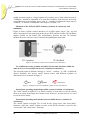
JOURNAL OF OBJECT TECHNOLOGY
Online at http://www.jot.fm. Published by ETH Zurich, Chair of Software Engineering ©JOT, 2007
Vol. 6, No. 3, March – April 2007
Minimalist and Intuitive User Interface
Design Guidelines for Consumer
Electronics Devices
Seonghoon Kang and Won Kim, Samsung Electronics and
SungKyunKwan University, Suwon, S. Korea
Abstract
People today come in contact with many consumer electronics (CE) devices in their
daily lives. CE devices have become increasingly complex with added functionality;
devices from different vendors provide different user interfaces for the same
functionality; similar devices from the same vendor provide different user interfaces
for common functionality. As a result, usability of CE devices has become a serious
challenge for most users. In this paper, we put forth design guidelines for making
user interfaces for CE devices easy to understand for most everyday users. To do
this, we first present a taxonomy of user interface dimensions for CE devices. We
then present our design guidelines against core elements of the taxonomy, and
apply them against various popular CE devices. The designing guidelines, when
applied consistently and diligently, can help bring some order to the current state of
user interfaces for CE devices. The results of this paper should be applicable to a
good extent to general digital systems
Keywords: User Interface, UI, Human Computer Interface, HCI, Usability, CE
devices,
1 INTRODUCTION
People today use many types of consumer electronics (CE) products, including
cellular phones, music players, DMB (digital multimedia broadcast) players, personal
digital assistants, digital televisions, video recorders, digital cameras, smart
refrigerators, video security systems, automobile navigators, digital clocks,
calculators, etc., besides personal computers, laptops, and computer-based systems
and equipment at home and work. All the functions these devices (and systems)
provide, all the information they contain, and all the responses they make to user
commands are exposed through the user interface (UI). Ideally, the UI should be
designed so that most everyday users can, without having to consult the user manual,
easily figure out how to use all of the primary functions of the devices and systems,
easily comprehend all of the basic information they contain, and easily comprehend
Cite this column as follows: Seonghoon Kang and Won Kim: “Minimalist and Intuitive User Interface
Design Guidelines for Consumer Electronics Devices”, in Journal of Object Technology, vol. 6, no. 3,
March – April 2007, pp. 39 - 52 http://www.jot.fm/issues/issue_2007_03/column5
MINIMALIST AND INTUITIVE USER INTERFACE DESIGN GUIDELINES FOR CONSUMER
ELECTRONICS DEVICES
most of the responses from them. Sadly, however, the state of UI for CE devices, and
many of the general digital systems, today is well short of the ideal.
Many of the CE devices have become rather complex, as vendors have added
new features and functions in order to differentiate from competitors and also to
justify raising the price. CE devices of different types have some frequently used
common functions, such as power on/off, channel up/down, date/time setting, etc;
however, different vendors offer very different UIs for these functions. Even worse,
vendors of the same family of CE devices offer different UIs for the devices. Further,
the UIs are often inconsistent, and difficult or impossible to follow without consulting
user manuals. For those features that are not often used, each time they are used, the
manuals need to be consulted.
The UI may not be the most important factor that determines the commercial
success of CE devices. For example, the commercial success of digital televisions is
determined by the picture quality, price, design, functionality, and the brand name.
However, once parity is established on these factors, UI becomes a key differentiator
among competing products. Today, due to competitive pressures in the market, parity
has been established on most of the important factors, and UI remains a factor that can
help vendors differentiate from others.
As CE devices are used by everyday users, not just engineers or artists, their UIs
must be designed for ease use and comprehension by everyday users. Various
researchers have suggested guidelines for designing a UI. Shneiderman and Plaisant
suggested “8 golden rules” [1]: A good UI should have consistency, provide universal
usability, provide meaningful feedback, include an exit interface, prevent errors, make
rollback easy, be always controllable, and reduce data which should be memorized to
operate the device. Ferré et al. suggested 5 characteristics of determining usability [2]:
learnability, efficiency, repeatability, error rate, and satisfaction. Norman suggested
that basic principles of a good design for human are providing good a conceptual
model and being visible [3]. Smith and Mosier offer guidelines for designing the UI
for software in six functional areas: data entry, data display, sequence control, user
guidance, data transmission, and data protection [4].
These are all valid guidelines. However, in our view, they have not been wellheeded by UI designers of CE devices on the market today, as evidenced by the sad
state of the UI. As a result, we have decided to see if we can help to bring some order
into the UI of CE devices by proposing a minimum set of very practical design
guidelines. To do it, we first developed a taxonomy of user interface dimensions in
CE devices. The taxonomy provides a framework for understanding more precisely
how we apply our design guidelines.
For our research, we analyzed MP3 music players, digital TVs, DVD recorders,
digital still cameras, DMB players, PMPs (Personal/Portable Multimedia Players),
and cellular phones. The vendors included Samsung Electronics, LG Electronics,
TiVO, and Apple Computers. By analyzing the UI of these devices, we arrived at a
minimum set of design guidelines. (* Although we are not at liberty to divulge our
findings with respect to Samsung Electronics products, suffice it to say here that we
have reported our findings and recommendations to the top management for action,
and the top management has accepted most of our recommendations. *)
40
JOURNAL OF OBJECT TECHNOLOGY
VOL. 6, NO. 3
The contribution of our research is the minimum practical set of guidelines for
designing the UI of CE devices to substantially help everyday users to comprehend
the functionality and information contents of the devices. We believe the set of
guidelines can apply to a large extent to general digital systems, and should also be
useful to technical users.
The remainder of this paper is organized as follows. In Section 2, we present a
taxonomy of user interface dimensions for CE devices. In Section 3, we discuss a
minimum practical set of design guidelines for CE devices. In Section 4, we make the
design guidelines concrete, and illustrate the effectiveness of our guidelines by
identifying how each of them is violated in CE devices. Section 5 concludes the
paper.
2 A TAXONOMY OF USER INTERFACE DIMENSIONS
Before proceeding, let us see the reasons for the current sad state of the UI for CE
devices.
1. There are many types, and many models for each type, of CE devices
2. Increasingly many functions are crammed into many of the devices.
3. The increasing number of functions leads to many types of information to
store and display.
4. There are many methods to represent the information
5. There are many modes of interaction with the users
6. There are many ways to appeal to the user’s sense of aesthetics and emotions.
Beyond these, the UI has not been a high-priority item for the vendors, as they have
chosen to focus on the other, more pressing, items to survive in the market, such as
cost reduction, pricing, distribution, marketing, design, hardware quality, features, and
name branding. Further, as we will see shortly, the UI have several dimensions, in our
view, user interface designers have devoted time on those dimensions that appeal to
the emotions of the users, and devoted much less energy and thought on those
dimensions that deal with how everyday users can comprehend the functions and
information contents of the devices.
Some researchers proposed taxonomies of the UI and human-computer
interaction systems. Chignell made an early attempt at a taxonomy of humancomputer interaction and standardizing terminology [5]. Coomas and Timmermans
proposed a taxonomy of physical media, representational modalities, and humancomputer dialogue semantics [6]. Barr et al. considered a principled understanding of
user-interface metaphors, and provided a taxonomy for discussing and analyzing them
[7].
We developed our own taxonomy1 as a framework for understanding all
dimensions of the UI, and identifying more precisely where we should apply our
design guidelines. The taxonomy, shown in Figure 1, consists of five parts,
corresponding to five dimensions of the UI for CE devices; namely, physical vs. non1
We note that an earlier version of this taxonomy was the subject of a very short paper by us in Korean
that we presented in a domestic Korean conference [8]. We include an upgraded version here to
provide a basis for presenting our design guidelines.
VOL. 6, NO. 3
JOURNAL OF OBJECT TECHNOLOGY
41
MINIMALIST AND INTUITIVE USER INTERFACE DESIGN GUIDELINES FOR CONSUMER
ELECTRONICS DEVICES
physical, aesthetics and emotion, convenience, operation mechanisms, information
and information architecture. When designing a user interface, every dimension has to
be accounted for.
2.1 Physical vs. Non-Physical
The first dimension is whether the user interface is physical or non-physical.
PUI (Physical User Interface)
• Physical user interface refers to the physical user interface elements on the CE
device with which the users interact. This includes physical buttons, switches,
wheels, knobs, stylus, touch screen, keypad, microphone, monitor, speaker, digital
camera, video recorder, etc. on CE devices, including remote controls.
NPUI (Non-Physical User Interface)
• Non-physical user interface refers to logical user interface elements, such as
alphanumeric information or images or video displayed on the monitor, voice or
sound heard via the speaker, etc. Such information is the result of a command the
user issues, an action (e.g., turning the power on/off) the user takes, or the
occurrence of an abnormal condition. Often there are many categories of such
information, and many of the categories may logically best be decomposed into
sub-categories. As such, the information has to be organized in a hierarchical
structure, known as information architecture. Information architecture refers to the
organization of such information.
2.2 Aesthetics and Emotions
The next dimension in user interface refers to user interface elements that appeal to
the aesthetics and emotions of the users. This dimension applies to both the physical
and non-physical aspects of the user interface. This has five aspects, corresponding to
the five sensory functions of the human. In practice, though, only three aspects are
relevant.
•
•
•
•
42
Visual aspect
color, brightness, contrast, etc.
shape, size, arrangement of the PUI and NPUI user interface elements
graphics, images, animation, video, symbols, etc.
design and appearance of a device
JOURNAL OF OBJECT TECHNOLOGY
VOL. 6, NO. 3
Physical
PUI
NPUI
Aesthetics and Emotions
Visual aspect
Auditory aspect
Tactile aspect
Convenience
Ease of operation
Ease of Element Identification
Operating mechanisms
Common operating mechanisms
Device-specific operating mechanisms
Information and Information Architecture
Device-facing information
User-facing information
Figure 1. Taxonomy of CE User Interfaces
Auditory aspect
• tone, loudness of sound, intonation, accent, etc.
• sound effects (bell sound, animal sound, etc.)
Tactile aspect
• texture, weight, elasticity of a device, etc.
2.3 Convenience
The next dimension of the UI is convenience to the users. This refers to ease of use,
and is certainly an important determinant of the usability of a device. In particular,
there are two types of convenience. One is ease of operating a device, and applies to
the physical aspect of the user interface. Another is ease of identifying user interface
elements, and applies to both the physical and non-physical aspects of the user
interface.
Ease of Operation
• shape, size, and layout of PUI elements,
• sound, flashing or blinking light,
• other characteristics of a device
that make it easier to see, understand, press, grasp, touch and feel a device, etc.
Ease of Identification
• shape, size, and color of PUI elements,
• font size, font style, font color, and background color of text, etc.,
VOL. 6, NO. 3
JOURNAL OF OBJECT TECHNOLOGY
43
MINIMALIST AND INTUITIVE USER INTERFACE DESIGN GUIDELINES FOR CONSUMER
ELECTRONICS DEVICES
• shape, size, color, and layout of NPUI elements, etc.,
• sound, flashing or blinking light, etc.
• other characteristics of PUI and NPUI elements
that make it easier to identify a user interface element.
2.4 Operating Mechanisms
The next dimension in user interface is the operating mechanisms for the devices.
Broadly, this may be classified into those that are common to many types of devices,
and those that are specific to a given type of device. The operating mechanisms apply
to both the physical and non-physical aspects of the user interface. There are many
mechanisms for operating devices physically, such as, moving a cursor, pressing a
button, throwing a switch, touching a touch screen, typing on a keypad, gesture,
motion, etc.
Common operating mechanisms
• power on/off
• menu operations: open/close, 4 way navigation, select/release, exit/back
• alphanumeric data input and manipulation of displayed alphanumeric data
Device-specific operating mechanisms
• TV: channel up/down, display modes, picture in picture mode, etc.
• digital still cameras: zoom in/out, shot mode, flash mode, etc.
• MP3 music players: media play control (play/pause, fast forward, etc.)
• other devices: tilting, shaking, touching,……
Both types of mechanisms have a very important common sub-mechanism, namely,
error-handling mechanisms. Error-handling mechanisms typically use visual or audio
information. Sometimes, however, they involve a device lockout. There are two ways
to handle error.
• Error prevention: ignoring input, requiring confirmation, circulative menu
navigation, etc.
• Error warning: issuing of a warning message (and/or sound, blinking light, etc.)
2.5 Information and Information Architecture
The information and information architecture dimension refers to the information
content and the organization of the information. In our taxonomy, this refers only to
the non-physical aspect of the user interface, and does not include the aesthetics and
emotions dimension. There are two types of information in terms of whether it is to be
input by the user or to be viewed and manipulated by the user. The use of information
may be for the installation and operation of a device, or for viewing by the user, as
shown below.
Device-facing information
• installation: initial setting values, etc.
44
JOURNAL OF OBJECT TECHNOLOGY
VOL. 6, NO. 3
• operation: input for menu navigation, control and data input, input for error
handling, etc.
User-facing information
• installation: cable connection, help information for initial setting (including on-line
manual), etc.
• operation: operating mechanisms for the menus, buttons, switches, etc.
• representation: labels, icons, symbols, buttons, etc., feedback on user input, device
status information, error feedback, etc.
The information may also be classified in terms of the types of data to be input or
output, as follows.
Device-facing information
• visual information
- image: finger print, pupil, picture, etc.
- text: title, name, description, etc.
- numeric: channel, setting values, etc.
- date and time: system time, reservation time
- scalar: volume, play position, etc.
• audio information: voice, sound, etc.
User-facing information
• visual information
- image: icon, image, graphic, animation, video, etc.
- text: menu label, description, message, etc.
- numeric: channel, setting values, etc.
- date and time: system time, reservation information, program
information, etc.
- scalar: volume, play position, etc.
- attributes: color, font size, font style, blinking, etc.
• audio information: voice, melody, sound effect, etc.
• other modalities: vibration (haptic information)
3 DESIGN GUIDELINES
We now present our minimal set of guidelines for designing the user interface of CE
devices with the view to making it as easy as possible for everyday users to
comprehend all primary functions and primary information contents of CE devices.
The guidelines apply to all five dimensions in our taxonomy.
We start with a very simple premise, that is, the UI must be simple. To be simple,
the types and number of UI elements must be minimal; all UI elements and their
combinations must be intuitively comprehensible to everyday users with minimal
exposure to some CE devices; and there must be consistency among all UI elements
and their combinations. Further, the minimum and intuitiveness guidelines must be
applied consistently throughout the UI design. Below we examine each of these three
guidelines for making the UI simple.
VOL. 6, NO. 3
JOURNAL OF OBJECT TECHNOLOGY
45
MINIMALIST AND INTUITIVE USER INTERFACE DESIGN GUIDELINES FOR CONSUMER
ELECTRONICS DEVICES
3.1. Minimum
As the number and types of features keep increasing, it is easy for UI designers to
increase the number and types of UI elements. The number and types of UI elements
must be kept to a minimum. Specifically, the number of symbols, icons, labels, font
styles, font sizes, text colors, background colors, modalities, the number of items and
depth of the menu hierarchy, etc. should be kept to the minimum. If some redundancy
is to be built in, it must be done in very careful consideration of the business
requirements. The following explains what it means to minimize various UI elements.
• The number of physical UI elements, such as input buttons on a device, should be
minimized to correspond to the most frequently used functions. Less frequently
used functions should be manifested as non-physical UI elements, that is, as items
on a menu. For example, there should not be buttons on a television remote control
for functions such as “memorize or erase a channel”; the users should be directed
to the menu to find items corresponding to such functions. In this way, UI
designers should prevent the remote control from being crowded with buttons and
labels for non-frequently used functions.
• When it is necessary to overlay several functions on one button, the number of
overlaid functions should be limited to 2. The general public has been accustomed
to toggle switches, and, for example, it is reasonable to overlay the “on” and “off”
functions on the “power” button. However, it causes confusion if 3 or more
functions are overlaid on a button, for example, the “open/close/back” functions
on a single menu button.
• The use of icons, symbols, and labels for both physical and non-physical UI
elements should be minimized. In other words, no icons, symbols, and labels
should be used unless they are necessary. Icons, symbols, and labels that make no
sense to the users or are difficult or impossible for them to easily comprehend and
remember are regarded as “unnecessary,” and should be eliminated or modified.
• The number of font sizes, font styles, and colors used should be minimized.
Mixing more than a few font sizes, font styles, and colors in general distracts the
users.
• Labels, phrases and sentences on both the physical and non-physical UI elements
should be brief (and clear).
• The number of items on a menu screen should be kept to fewer than 7 or 8 to avoid
cluttering the screen.
• The depth of a menu hierarchy should be limited to 3 or fewer. It is difficult to
trace the menu structure and be aware of the nodes and paths followed, if the depth
is more than 3.
3.2. Intuitiveness
The labels, symbols, icons, words, phrases and sentences on many CE devices and on
the menu are often difficult to comprehend intuitively. Sometimes, words, phrases,
and sentences that only engineers can understand appear on the menu or even the
devices. Further, icons are often not symbolic of the corresponding functions, and
only their designers can appreciate their meanings. The users need to consult the user
manuals to be able to operate the devices or navigate the menu. However, to
46
JOURNAL OF OBJECT TECHNOLOGY
VOL. 6, NO. 3
compound the matter, the manuals too are often difficult to understand or may have
long been misplaced.
People in reasonably industrialized parts of the world today are exposed to
everyday UI elements in their daily lives. These include a variety of doors (home,
office, hotel, automobile,…), combination locks, public transportation systems,
automobile dashboards, automobile and airplane seatbelts, road signs, traffic signals,
signs in public places, elevators, toasters, washing machines, hair dryers, treadmills,
etc. Beyond these, many use some of the many CE devices, personal computers, and
the World Wide Web. Further, many are exposed to UI elements in performing their
jobs, such as machine tools, heavy industrial and farming equipment, weapons,
airplanes, trains, ships, etc. As such, everyday users may reasonably be expected to
possess some common knowledge and experience-based intuition about the meanings
and basic ways to operate various UI elements. This includes, for example, the fact
that the red color or flashing light implies a warning; the power button on a CE device
is an on/off toggle switch, the lines on a road sign near an exit ramp on the highway
correspond to streets or other highways, etc.
Figure 2. Intuitive Symbols
The meaning of each physical and non-physical UI element on a CE device must be
intuitively clear to everyday users. Figure 2 shows some UI symbols whose meanings
should be intuitively clear to everyday users. The sequence and combination of UI
elements, too, must be intuitively clear. To design the UI for CE devices to be
intuitively clear to everyday users, the designers must exploit the common knowledge
and acquired intuition of the users, and must be very careful not to venture outside of
the scope of such knowledge and intuition. The ultimate goal of the UI for CE devices
should be to make it possible for most everyday users to be able to use the CE devices
without having to consult the user manuals. The following further explains what it
means for the UI to be intuitive.
• When it is necessary to overlay several functions on one button, there should be
relationships among the functions that are intuitively clear. For example, the left
and right navigation functions are overlaid on the message box button on some
cellular phones, and the flash mode button on some digital still cameras. This is
not intuitive, since there is no obvious relationship between the navigation
function and the messaging function on cellular phones, or between the navigation
function and the flashing function on digital still cameras. Even if the user is able
to operate this function by first reading the manual, the user is likely to have to
consult the manual again after not using the functions for a while.
• The icons and symbols must be symbolic of the functions they represent. For
example, on a 4-way navigation button, there should be up/down/left/right
VOL. 6, NO. 3
JOURNAL OF OBJECT TECHNOLOGY
47
MINIMALIST AND INTUITIVE USER INTERFACE DESIGN GUIDELINES FOR CONSUMER
ELECTRONICS DEVICES
symbols; and on a volume up/down button, there should be corresponding
symbols, such as +/-.
• The symbols, labels, icons, words, phrases, etc. should be easily comprehensible to
everyday users. In other words, such technical phrases as “700 Mbytes of storage
remaining” on a music player should be eliminated. Appropriate color should be
used for warnings and emphasis.
3.3. Consistency
Consistency cuts across all aspects of every UI element in every CE device. Once a
particular symbol is chosen for a particular function, it should be applied consistently
throughout the UI. This should certainly be done within a particular device, and
preferably also across devices of different types that happen to share the same
function. We define inter-device consistency to be consistency between different
types or models of CE devices, either from the same vendor or different vendors; for
example, digital televisions and digital still cameras. We define intra-device
consistency to be consistency among UI elements on one particular type and model of
device.
In general, there should be inter-device and intra-device UI consistency. Today,
as we will illustrate in the next section, both inter-consistency and intra-consistency
are inadequate. As a result, everyday users have to learn to operate each device,
separately, because each device has a different menu structure, different icons and
symbols for the same or similar functions, different words and symbols even on the
same device, etc. As CE devices of the same type, and even of different types, share
common functions, the ultimate goal of consistency should be unification (i.e.,
standardization) of the UI elements for these common functions. The following
explains further what it means for the UI elements to be consistent.
• The menu layout, and the navigation and selection of menu items should be
consistent.
• The selection of the font style, font size, colors, etc. should be consistent.
• The selection of icons, symbols, and labels should be consistent for the same or
similar functions. For example, if a left arrow is used for left navigation on the
menu of a digital television, it should be used not only on all left navigations on
the menu, but also on the remote control, and even on the music players from the
same vendor.
4 APPLYING THE DESIGN GUIDELINES TO CE DEVICES
In this section, we apply the three design guidelines to the non-physical aspect of the
UI of several representative CE products from leading vendors. The discussions serve
two purposes: one is to illustrate each of the design guidelines in concrete contexts,
and another is to demonstrate the merit of applying the design guidelines in
identifying the problems and fundamental reasons for the problems with the UI in
today’s CE devices. To protect the commercial interests of the vendors, we shall not
name them.
48
JOURNAL OF OBJECT TECHNOLOGY
VOL. 6, NO. 3
Nested menu structure (violation of minimum)
It has long been established that the depth of a menu hierarchy should be limited to 3
or under. We have found, for example, that the external connection setting function on
some digital TV menus is 4-level deep, as shown in Figure 3. Either the top or the
second level of the menu hierarchy may be eliminated to fix this problem.
Channel
External connection
External Input 1
VCR/ DVD/ STB/ …
External Input 2
VCR/ DVD/ STB/ …
Component Input 1
VCR/ DVD/ STB/ …
…
Level 1
Level 2
Level 3
Level 4
Figure 3. The menu structure for the external input connection setting function on a DTV
Overlaying of functions (violation of minimum and intuitiveness)
The “menu” button on some digital TV remote controls has three functions overlaid
on it: open, close, and back. Only the open and close functions should be overlaid to
make the button a toggle button that the ordinary users would expect. Either the back
function should be removed from the remote control, or should be placed on the
menu, or perhaps even overlaid with some other function on another button on the
remote control.
Hidden functions (violation of intuitiveness)
The “program reservation” function on some digital TV does not exist on the remote
control, and it is an item on the “Program Guide” menu screen. This presumes that the
users will browse through the programs and, upon finding a desired program, will
reserve a desired program. However, the label “Program Guide” would convey to
ordinary users the notion that the menu screen would only provide program
information, and does not convey the notion that the act of reserving programs would
be a part of it. To fix this problem, either the label “Program Guide” should be
changed to “Program Guide and Reservation,” or a separate menu screen should be
created for “Program Reservation” at the same level as “Program Guide”
Use of difficult or non-helpful words or phrases (violation of intuitiveness)
Some digital TVs and DVD recorders are found to use technical terms or words and
phrases whose meanings are not clear on the menu screens and help screens. These
include such words and phrases as “display mode, “audio mode”, “SRS”, “internal
amplifier”, “v-mode”, “equalizer”, “free space remaining: 70Mbyets”, etc. These
VOL. 6, NO. 3
JOURNAL OF OBJECT TECHNOLOGY
49
MINIMALIST AND INTUITIVE USER INTERFACE DESIGN GUIDELINES FOR CONSUMER
ELECTRONICS DEVICES
would not mean much to a large segment of everyday users. Such technical term as
“70Mbytes” should be translated to a term that would be both relevant and easily
comprehensible to the ordinary users, such as “x number of additional songs may be
recorded”, “x minutes of additional video may be recorded,” etc.
Mismatch of the PUI and NPUI elements (violation of consistency and
minimum)
Figure 4 shows volume control interfaces of an MP3 music player. The “up and
down” movement of the touch pad on the player (PUI) and the circular GUI feedback
display (NPUI) do not match. The inconsistency between the two UI elements
burdens the users with one extra UI element and paradigm to deal with.
Figure 4. Inconsistent volume control interfaces (PUI and NPUI)
Use of different words, symbols and labels for the same functions within the
same devices or across different devices (violation of consistency)
The selection button is labeled variously as “select,” “confirm,” or “OK” on different
devices Similarly, the “power on/off” button comes with different symbols on
different devices, as shown in Figure 5.
DTV
HDDR
Cell. Phone
Figure 5. Examples of the use of different symbols for the same function
Inconsistent operating mechanisms within a menu (violation of consistency)
The “back” button on digital TVs or DVD recorders is used either to exit the current
menu or to return to the upper-level menu screen. However, in some devices it is used
to exit all active menus.
Inconsistent operating mechanisms between similar devices (violation of
consistency)
The “menu” button on digital TVs is used for the “menu open” and “menu back”
functions, while the “menu” button on some of the DVD recorders is used for the
“menu open” and “menu close” functions.
50
JOURNAL OF OBJECT TECHNOLOGY
VOL. 6, NO. 3
5 CONCLUSION
As the number of types and models, and the features and capabilities of consumer
electronics (CE) devices have increased during the past decade, usability of the
devices has become a major challenge to everyday users. Unfortunately, the vendors
have not satisfactorily addressed this challenge. Although there have been a number
of sensible guidelines for usability of digital systems in general, they appear not to
have had sufficient impact on the design of the UI for CE devices.
In this paper, we started with the obvious notion that in order for the CE devices
to be usable to everyday users, the UI must be simple. To be simple, we believe that
the UI must diligently and consistently adhere to three principles: minimum,
intuitiveness, and consistency. To make the discussions of the three principles
concrete, we first described our taxonomy of UI elements for CE devices, and then
applied the principles to various UI elements in a number of popular CE devices on
the market We believe that the set of principles, being minimal and intuitively
obvious in themselves, should be able to serve as very practical guidelines for the
designers of UI and CE product development executives in the vendors.
ACKNOWLEDGEMENTS
This research was supported in part by the Korean Ministry of Information and
Communication, under the ITRC (Information Technology Research Center) support
program supervised by the IITA (Institute of Information Technology Assessment),
IITA-2006-(C1090-0603-0046).
REFERENCES
[1]
Shneiderman, B. and Plaisant, C, Designing the User Interface: Strategies
for Effective Human-Computer-Interaction, Addison-Wesley Computing,
2004.
[2]
Ferré, X. et al., “Usability Basics for Software Developers,” IEEE
Software, 18(1), 22-29, 2001.
[3]
Norman, D.A., The Psychology of Everyday Things, Basic Books, 1988.
[4]
Smith, S.L. and Mosier, J.N., “Guidelines for Designing User Interface
Software,” Tech. Rep. ESD-TR-86-278. Hanscom Air force Base, Mass.
USAF Electronic Systems Division(NTIS No. AD A177198), 1996.
[5]
Chignell, M.H., “A Taxonomy of User Interface Terminology,” In
Proceedings of ACM SIGCHI, 21(4), April, 27-34, 1990.
[6]
Coomans, M.K.D. and Timmermans, H.J.P., “Towards a Taxonomy of
Virtual Reality User Interfaces,” In Proceedings of the International
Conference on Information Visualization, London, August, 27-29, 1997.
VOL. 6, NO. 3
JOURNAL OF OBJECT TECHNOLOGY
51
MINIMALIST AND INTUITIVE USER INTERFACE DESIGN GUIDELINES FOR CONSUMER
ELECTRONICS DEVICES
[7]
Barr, P., Biddle, R., Noble, J., “A Taxonomy of User-Interface
Metaphors,” Tech. Rep. CS-TR-02-11, School of Mathematical and
Computing Sciences, Victoria University of Wellington, New Zealand,
2002.
[8]
Kang, S. and Kim, W., “Taxonomy of CE User Interface,” In Proceeding
of the Next Generation PC 2006 Conference,” Ilsan, Korea, Nov., 2006
(available only in Korean)
About the authors
Won Kim, Professor and Univeristy Fellow with the School of
Information and Communication Engineering at Sungkyunkwan
University, Suwon, S. Korea. He is Editor-in-Chief of ACM
Transactions on Internet Technology (www.acm.org/toit). He is
Global General Chair of the Human.Society@Internet International
Conference. He is the recipient of the ACM 2001 Distinguished
Services Award, and is an ACM Fellow. He can be reached at [email protected]
Seonghoon Kang is a researcher at Samsung Electronics, Suwon,
Korea. He received a Ph.D. in computer science from Korea
University. His research interests include user interface, digital
content management, computer vision and pattern recognition. He
can be reached at [email protected].
52
JOURNAL OF OBJECT TECHNOLOGY
VOL. 6, NO. 3