1
GeneLinker™ Gold 3.1
GeneLinker™ Platinum 2.1
User Manual
GeneLinker Gold 3.1 / GeneLinker Platinum 2.1
1
Copyright
The documentation contained herein is copyright 2003 by Molecular Mining Corporation (MMC)
and may be changed by Molecular Mining Corporation without notice. Use of this copyright
notice is precautionary and does not imply publication or disclosure of the documentation. No
part of this documentation may be reproduced, transmitted, transcribed, stored in a retrieval
system, or translated into any language, in any form, by any means, electronic or mechanical, for
any purpose, without the prior written consent of Molecular Mining Corporation. All rights
reserved.
© 2003 Molecular Mining Corporation. All rights reserved.
Acknowledgements
GeneLinker™ is a trademark of Molecular Mining Corporation.
SLAM™ is a patented, proprietary data mining technology of Molecular Mining Corporation.
All other brand or product names contained within are trademarks or registered trademarks owned
by their respective companies or organizations.
How This Manual is Organized
1. Installing GeneLinker™. Topics relating to installing, upgrading or uninstalling
GeneLinker™.
2. Getting Started With GeneLinker™. An introductory product tour and a series of
comprehensive tutorials.
3. Using GeneLinker™. Detailed descriptive and procedural topics covering all of
GeneLinker™’s functionality.
Additional Sources of Information
Readme.txt
This file contains last minute additions to the documentation.
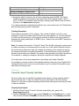
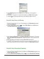
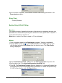
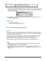
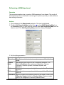
Tips
Most GeneLinker™ dialogs have a Tips button. Clicking a Tips button displays a brief hint
about the functionality invoked by the dialog.
Online Help
GeneLinker™ has comprehensive online help built into the product. The content of the
online help is the same as this printed manual.
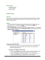
Contact Information
Kingston, ON
Cambridge, MA
Molecular Mining Corporation
55 Rideau Street
Kingston, ON
K7K 2Z8
Molecular Mining Corporation
41 Linskey Way
Cambridge, MA
02142
Phone: 613-547-9752
Fax: 613-547-6835
Phone: 617-547-6373
Fax: 617-547-6626
www.molecularmining.com
GeneLinker Gold 3.1 / GeneLinker Platinum 2.1
3
GeneLinker Gold 3.1 / GeneLinker Platinum 2.1
4
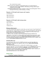
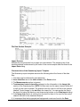
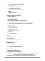
Table of Contents
TABLE OF CONTENTS ....................................................................................... 5
INSTALLING GENELINKER(TM) ...................................................................... 10
Installing GeneLinker(TM)............................................................................................ 10
System Specification ...............................................................................................................10
GeneLinker™ Database..........................................................................................................11
Setting Up a DB2 GeneLinker™ Database.............................................................................11
Setting Up an Oracle GeneLinker™ Database .......................................................................12
Installation Procedure..............................................................................................................13
Upgrading GeneLinker(TM) ......................................................................................... 19
Upgrading GeneLinker™ Gold................................................................................................19
Upgrading GeneLinker™ Platinum .........................................................................................23
Uninstalling GeneLinker(TM) ....................................................................................... 27
Uninstallation Procedure .........................................................................................................27
GETTING STARTED WITH GENELINKER(TM)................................................ 29
GeneLinker(TM) Tour .................................................................................................. 29
GeneLinker™ Tour - Introduction............................................................................................29
GeneLinker™ Tour - Main Window Layout .............................................................................30
GeneLinker™ Tour - Clustering and PCA...............................................................................31
GeneLinker™ Tour - Platinum SLAM™ Classification............................................................32
GeneLinker™ Tour - Platinum IBIS Classification ..................................................................33
GeneLinker™ Tour - Common Functions ...............................................................................34
GeneLinker™ Tour - Conclusion.............................................................................................35
Product Information...................................................................................................... 35
GeneLinker™ Product Suite ...................................................................................................35
GeneLinker™ Feature List ......................................................................................................36
Tutorials/Use Case Scenarios ..................................................................................... 37
Tutorial 1: Gene Expression During Rat Spinal Cord Development ............................ 38
Tutorial 1: Introduction ............................................................................................................39
Tutorial 1: Step 1 Start GeneLinker™ and Import the Data ....................................................40
Tutorial 1: Step 2 View and Normalize the Data .....................................................................42
Tutorial 1: Step 3 View Parameters and Rename Experiment ...............................................45
Tutorial 1: Step 4 Perform Hierarchical Clustering..................................................................46
Tutorial 1: Step 5 Create a Matrix Tree Plot ...........................................................................46
Tutorial 1: Step 6 Perform Partitional Clustering.....................................................................48
Tutorial 1: Step 7 Create a Centroid Plot ................................................................................50
Tutorial 1: Step 8 Create a Cluster Plot ..................................................................................51
Tutorial 1: Step 9 Generate Report and Export Image ...........................................................52
Tutorial 1: Conclusion..............................................................................................................55
Tutorial 2: Clustering of NCI60 Dataset ....................................................................... 55
Tutorial 2: Introduction ............................................................................................................55
GeneLinker Gold 3.1 / GeneLinker Platinum 2.1
5
Tutorial 2: Step 1 Start GeneLinker™ and Import the Data ....................................................56
Tutorial 2: Step 2 Estimate Missing Data Values....................................................................58
Tutorial 2: Step 3 Rename the Dataset...................................................................................60
Tutorial 2: Step 4 Display Color Matrix Plots ..........................................................................61
Tutorial 2: Step 5 Import a Gene List ......................................................................................63
Tutorial 2: Step 6 Perform Hierarchical Clustering..................................................................65
Tutorial 2: Step 7 Create a Matrix Tree Plot ...........................................................................66
Tutorial 2: Step 8 Import Cancer Class Variable.....................................................................68
Tutorial 2: Step 9 Color Samples by Class .............................................................................71
Tutorial 2: Step 10 Generate Report and Export Image .........................................................73
Tutorial 2: Conclusion..............................................................................................................75
Tutorial 2: Figure 1 - Clustering of the cancer cell lines according to gene expression profiles76
Tutorial 3: Jarvis-Patrick Clustering ............................................................................. 77
Tutorial 3: Introduction ............................................................................................................77
Tutorial 3A: Step 1 Normalize the Data...................................................................................78
Tutorial 3A: Step 2 Perform Partitional Clustering ..................................................................80
Tutorial 3A: Step 3 Create a Matrix Tree Plot .........................................................................80
Tutorial 3B: Step 1 Estimate Missing Values ..........................................................................82
Tutorial 3B: Step 2 Perform Partitional Clustering ..................................................................83
Tutorial 3B: Step 3 Create a Matrix Tree Plot .........................................................................84
Tutorial 3: Conclusion..............................................................................................................86
Tutorial 4: Self Organizing Maps (SOMs) .................................................................... 87
Tutorial 4: Introduction ............................................................................................................87
Tutorial 4: Step 1 Import the Data ...........................................................................................88
Tutorial 4: Step 2 View the Data .............................................................................................89
Tutorial 4: Step 3 Display Summary Statistics ........................................................................90
Tutorial 4: Step 4 Remove Negative Values ...........................................................................90
Tutorial 4: Step 5 Remove Genes that have Missing Values .................................................91
Tutorial 4: Step 6 Normalize the Data .....................................................................................92
Tutorial 4: Step 7 Display Summary Statistics ........................................................................93
Tutorial 4: Step 8 Create a SOM Experiment .........................................................................94
Tutorial 4: Step 9 Create a SOM Plot......................................................................................96
Tutorial 4: Conclusion..............................................................................................................98
Tutorial 5: Principal Component Analysis .................................................................... 99
Tutorial 5: Introduction ............................................................................................................99
Tutorial 5: Step 1 Import the Data .........................................................................................100
Tutorial 5: Step 2 Principal Component Analysis..................................................................102
Tutorial 5: Step 3 Display a Scree Plot .................................................................................103
Tutorial 5: Step 4 Display a Loadings Line Plot ....................................................................104
Tutorial 5: Step 5 Display a Loadings Color Matrix Plot........................................................105
Tutorial 5: Step 6 Display a Score Plot .................................................................................106
Tutorial 5: Step 7 Display a 3D Score Plot............................................................................107
Tutorial 5: Conclusion............................................................................................................110
Tutorial 6: Learning to Distinguish Cancer Classes ................................................... 111
Tutorial 6: Introduction ..........................................................................................................111
Tutorial 6: Step 1 Import the Data .........................................................................................112
GeneLinker Gold 3.1 / GeneLinker Platinum 2.1
6
Tutorial 6: Step 2 Import Variable Data.................................................................................114
Tutorial 6: Step 3 Discretize the Data ...................................................................................117
Tutorial 6: Step 4 Run SLAM ................................................................................................118
Tutorial 6: Step 5 Display SLAM Association Viewer............................................................120
Tutorial 6: Step 6 Create a Gene List....................................................................................122
Tutorial 6: Step 7 Filter Datasets Using Gene List................................................................123
Tutorial 6: Step 8 Create an ANN Classifier .........................................................................124
Tutorial 6: Step 9 Classify Test Data.....................................................................................126
Tutorial 6: Step 10 Display a Confusion Matrix.....................................................................127
Tutorial 6: Step 11 Display a Classification Plot ...................................................................129
Tutorial 6: Step 12 Set URL for Lookup Gene Operation .....................................................132
Tutorial 6: Step 13 Lookup Genes ........................................................................................134
Tutorial 6: Conclusion............................................................................................................135
Tutorial 7: IBIS ........................................................................................................... 136
Tutorial 7: Introduction ..........................................................................................................136
Tutorial 7: Step 1 Import the Data .........................................................................................137
Tutorial 7: Step 2 Import Variable Data.................................................................................138
Tutorial 7: Step 3 Perform IBIS 1D LDA Search ...................................................................141
Tutorial 7: Step 4 View IBIS LDA Search Results.................................................................143
Tutorial 7: Step 5 Display IBIS Gradient Plot ........................................................................144
Tutorial 7: Step 6 Perform IBIS 2D LDA Search ...................................................................145
Tutorial 7: Step 7 View IBIS 2D LDA Search Results ...........................................................148
Tutorial 7: Step 8 Display IBIS Gradient Plot ........................................................................149
Tutorial 7: Conclusion............................................................................................................150
Tutorial 7: Appendix: Minimum Standard Deviation in IBIS ..................................................150
Tutorial 8: Affymetrix Data ......................................................................................... 152
Tutorial 8: Introduction ..........................................................................................................152
Tutorial 8: Step 1 Import Affymetrix Data ..............................................................................152
Tutorial 8: Step 2 Import Gene List .......................................................................................156
Tutorial 8: Step 3 Set Gene Display Name ...........................................................................158
Tutorial 8: Step 4 Import a Variable ......................................................................................159
Tutorial 8: Step 5 Remove Genes With Poor Reliability .......................................................161
Tutorial 8: Step 6 Estimate Missing Values ..........................................................................162
Tutorial 8: Step 7 Perform F-Test and View Results.............................................................164
Tutorial 8: Step 8 Gene List Filtering.....................................................................................167
Tutorial 8: Step 9 Hierarchical Clustering..............................................................................167
Tutorial 8: Step 10 Display Matrix Tree Plot .........................................................................168
Tutorial 8: Step 11 Principal Component Analysis................................................................169
Tutorial 8: Step 12 Display 3D Score Plot.............................................................................170
Tutorial 8: Conclusion............................................................................................................171
Sample Workflow Using Spotted Array N-Fold Culling With Log Transformation...... 172
USING GENELINKER(TM) .............................................................................. 175
Main Program Functions List ..................................................................................... 176
About GeneLinker and This Manual .......................................................................... 176
Acknowledgements ...............................................................................................................176
GeneLinker Gold 3.1 / GeneLinker Platinum 2.1
7
Disclaimer..............................................................................................................................177
Audience Assumptions..........................................................................................................178
General Formatting Conventions ..........................................................................................178
Help Window Functions ........................................................................................................179
Starting GeneLinker and Setting Preferences............................................................ 179
Starting the Program .............................................................................................................179
Changing Your User Preferences .........................................................................................180
Saving ...................................................................................................................................182
Exiting the Program...............................................................................................................183
Application Interface .................................................................................................. 183
The Navigator........................................................................................................................183
Navigator Pane Functions.....................................................................................................185
The Description Pane............................................................................................................191
The Plots Pane......................................................................................................................192
The Toolbar ...........................................................................................................................194
The Menus ............................................................................................................................195
Data: Expression Measurements and Variables ........................................................ 204
Datasets Overview ................................................................................................................204
Importing Expression Data....................................................................................................207
Variables ...............................................................................................................................234
Viewing, Renaming, Deleting ................................................................................................242
Preprocessing .......................................................................................................................247
Statistics ................................................................................................................................288
Clustering and Self-Organizing Maps (SOMs)......................................................................298
Principal Components Analysis (PCA)..................................................................................314
Classification and Prediction .................................................................................................318
Plots ......................................................................................................................................341
Exporting a Dataset...............................................................................................................413
Genes: Structures and Functions .............................................................................. 416
Genes Overview....................................................................................................................416
Lookup Gene.........................................................................................................................416
Predefined Identifier Types ...................................................................................................417
Gene Lists: Structures and Functions ........................................................................ 420
Gene Lists Overview .............................................................................................................420
GeneLinker™ Gene List Native File Format .........................................................................420
Importing a Gene List ............................................................................................................422
Conflict Resolution ................................................................................................................424
Creating a Gene List Within GeneLinker™ ...........................................................................425
Platinum ................................................................................................................................426
Creating a Gene List from the SLAM™ Association Viewer .................................................426
Modifying or Deleting Gene Lists ..........................................................................................428
Exporting a Gene List............................................................................................................429
Annotations and Report Generation .......................................................................... 430
Annotations Overview ...........................................................................................................431
Annotations Viewer/Editor.....................................................................................................431
GeneLinker Gold 3.1 / GeneLinker Platinum 2.1
8
Generating Reports ...............................................................................................................432
Reference .................................................................................................................. 434
Cancelling an Operation or Experiment ................................................................................434
Keyboard Shortcuts...............................................................................................................435
Glossary of Terms/Acronym List ...........................................................................................446
Default Experiment Naming Convention ...............................................................................459
Changing Your License Information........................................................................... 466
License Overview ..................................................................................................................466
Demo License Time Extension .............................................................................................468
License Changes...................................................................................................................469
Computer or Network Changes.............................................................................................475
Troubleshooting/Technical Support ........................................................................... 484
Troubleshooting.....................................................................................................................484
Handling a System Crash or Hang........................................................................................487
List of System Messages ......................................................................................................488
Contact Information for Molecular Mining Corporation .........................................................494
GENELINKER(TM) TOUR - IMPORTING, VIEWING, AND PREPROCESSING DATA
......................................................................................................................... 496
GENELINKER(TM) TOUR - STATISTICAL FUNCTIONS ............................... 499
INDEX .............................................................................................................. 500
GeneLinker Gold 3.1 / GeneLinker Platinum 2.1
9
Installing GeneLinker(TM)
Installing GeneLinker(TM)
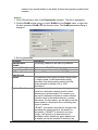
System Specification
Overview
GeneLinker™ Gold requires a system that meets or exceeds the following
specification:
• Microsoft Windows® NT 4.0 Service Pack 6a, Windows® 2000, XP, 95, 98 and ME.
Windows® 2000, NT and XP are the preferred platforms as they are more
stable and manage memory more effectively
• 256 MB RAM (512 MB RAM recommended)
• PII 400 MHz processor or better
• 500 MB hard disk space
GeneLinker™ Platinum is typically pre-installed on an IBM system that meets
or exceeds the following specification:
• Microsoft Windows® 2000 Professional
• 2.5 GB of RAM
• Single Intel Xeon-2200 2.2 GHz processor
• NVIDIA 64MB Video card
• 18.2 GB Hard Drive
• 48X IDE CD-ROM
• 10/100 Ethernet card
• 3.5 inch 1.44MB Floppy drive
Network Requirements
• For floating licenses (Floating Server, Floating Client), GeneLinker™ requires a
TCP/IP network, and that the TCP/IP protocol be installed on both the license
server and the user workstations. In addition, one of the three protocols SNMP,
NetBEUI, or IPX/SPX must be installed on both the server and the workstations
(GeneLinker™ uses the protocol service to determine the hostid of the system).
Any mix of the three protocols on the server and on different workstations is
acceptable. By default, many of these protocols are available.
• For other licenses (Licensed Client (node-locked), Demo), there are no network
requirements.
We recommend that license servers (for floating licenses) be installed on machines that
are running the Windows® NT or Windows® 2000 operating system.
Related Topics:
GeneLinker™ Database
GeneLinker Gold 3.1 / GeneLinker Platinum 2.1
10
Installation
GeneLinker™ Database
Overview
GeneLinker™ stores all of its dataset, experiment, gene, gene list, and annotation data
in a database on the local file system under the GeneLinker™ directory (MMC) in a
folder named Repository. GeneLinker™ currently supports a MySQL, DB2, or Oracle
database. The MySQL source code is provided on the GeneLinker™ CDROM in the
MySQLSrc directory.
MySQL
The default database used by GeneLinker™ is MySQL. If you are using this database,
you are not required to install, configure, or maintain the database in any way. When
GeneLinker™ is started, it will start the database, and when GeneLinker™ is shut down,
it will shut down the database.
DB2 and Oracle
If you choose to use a DB2 or Oracle database, then you will have to install DB2 or
Oracle on the GeneLinker™ computer and create a valid account for GeneLinker™ to
use. You will have to start and stop the database manually. See Setting Up a DB2
GeneLinker™ Database for details of the DB2 setup process. See Setting Up an Oracle
GeneLinker™ Database for details of the Oracle setup process.
Notes
• The GeneLinker™ database should not be tweaked or configured outside of
GeneLinker™.
• It is recommended that you do not use the GeneLinker™ database with any other
application or data. Doing so could result in an unusable, corrupted database.
• The GeneLinker™ uninstall procedure has an option to keep or remove the
database.
• As an example, a typical file size would be approximately 0.5 Megabytes for a
dataset consisting of 1000 genes by 100 samples.
Related Topics:
Setting Up a DB2 GeneLinker™ Database
Setting Up an Oracle GeneLinker™ Database
Saving
Setting Up a DB2 GeneLinker™ Database
GeneLinker Gold 3.1 / GeneLinker Platinum 2.1
11
Overview
Using a DB2 GeneLinker™ database requires some preliminary setup.
Actions
1. If you do not already have access to a running DB2, install one. Visit the following site
for full details: http://www.ibm.com/software/data/db2/
2. As the database administrator, create a database in DB2 called, for example,
BIO_DB.
3. Create an account (user name and password) for accessing the BIO_DB database.
4. Configure your DB2 installation so that the BIO_DB database is accessible using the
above account on the computer where GeneLinker™ is installed.
5. Run the DB2ConfigurationUtility.bat application found in the Maintenance folder of
the GeneLinker™ installation folder. You will be prompted for the name of the
database (BIO_DB in this example), the user name, and password.
Warning: this password appears in plain text in the GeneLinker™ configuration
file (GeneLinker.conf). Please take whatever precautions are required to
secure this file or use a unique password for this application (to limit the risk if
this password becomes known to others).
6. Start GeneLinker™.
If there are any problems during step 5 (for example, you mistype the name of the
database), then GeneLinker™'s configuration will not be changed.
Note that a DB2 GeneLinker™ database cannot be shared by multiple users.
Attempting to do so will corrupt the database and cause valuable information to be lost.
Related Topic:
GeneLinker™ Database
Setting Up an Oracle GeneLinker™ Database
Overview
Using an Oracle GeneLinker™ database requires some preliminary setup.
Actions
1. If you do not already have access to a running Oracle database, install one. Visit the
following site for full details: http://www.oracle.com/ip/deploy/database/oracle9i/
2. As the database administrator, create a database in Oracle called, for example,
BIO_DB.
3. Create an account (user name and password) for accessing the BIO_DB database.
GeneLinker Gold 3.1 / GeneLinker Platinum 2.1
12
4. Configure your Oracle installation so that the BIO_DB database is accessible using
the above account on the computer where GeneLinker™ is installed.
5. Run the OracleConfigurationUtility.bat application found in the Maintenance folder
of the GeneLinker™ installation folder. You will be prompted for the name of the
database (BIO_DB in this example), the user name, and password.
Warning: this password appears in plain text in the GeneLinker™ configuration
file (GeneLinker.conf). Please take whatever precautions are required to
secure this file or use a unique password for this application (to limit the risk if
this password becomes known to others).
6. Start GeneLinker™.
If there are any problems during step 5 (for example, you mistype the name of the
database), then GeneLinker™'s configuration will not be changed.
Note that an Oracle GeneLinker™ database cannot be shared by multiple users.
Attempting to do so will corrupt the database and cause valuable information to be lost.
Related Topic:
GeneLinker™ Database
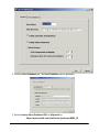
Installation Procedure
Overview
If you are upgrading GeneLinker™ Gold to Version 3.1, please follow the instructions in
Upgrading GeneLinker™ Gold.
If you are upgrading GeneLinker™ Platinum to Version 2.1, please follow the instruction
in Upgrading GeneLinker™ Platinum.
Please follow the installation process appropriate to your license type.
Licenses
GeneLinker™ license types.
• A Demonstration Client is a time-limited single license for a single copy of
GeneLinker™ to run on a single computer.
• A Licensed Client (node-locked) is a single license for a single copy of
GeneLinker™ to run on a single computer.
• Floating License Server / Floating Client license types provide a network solution
for multiple users. When GeneLinker™ is started on a client workstation, it
requests a license from the GeneLinker™ license server. If a license is
available, GeneLinker™ will run on the client workstation.
See License Overview for further information on licenses.
Actions
GeneLinker Gold 3.1 / GeneLinker Platinum 2.1
13
All License Types Start Here
GeneLinker™ uses an installer program to make the installation process simple.
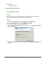
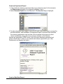
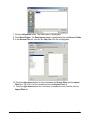
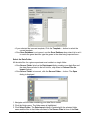
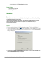
1. Insert the GeneLinker™ CD into your drive. The installation process should start
automatically. Skip to step 7 if you see the installation welcome dialog on your
screen.
2. With the GeneLinker™ CD in your drive, click the Windows Start button.
3. Select Run.
4. Navigate to the appropriate directory on the GeneLinker™ CD-ROM.
5. Double-click on the file setup.exe. The installation process initializes.
GeneLinker Gold 3.1 / GeneLinker Platinum 2.1
14
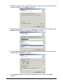
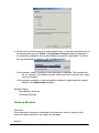
6. The Welcome dialog is displayed.
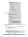
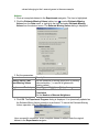
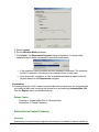
7. Click Next to continue.
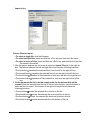
8. It is recommended that you close any other applications you may be running. Click
Next to continue.
9. Read the license agreement displayed in the dialog and click Yes to continue.
GeneLinker Gold 3.1 / GeneLinker Platinum 2.1
15
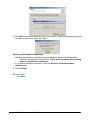
10. Read the ReadMe.Txt file displayed in the dialog and click Next to continue. If you
are installing GeneLinker™ Platinum, skip to step 12.
11. Select the type of license you have.
• If you have a demo or a single, node-locked license, click Licensed Client.
• If you have a floating license and your machine is not to be the license server,
click Floating Client.
• If you have a floating license and your machine is to be the license server,
click License Server.
GeneLinker Gold 3.1 / GeneLinker Platinum 2.1
16
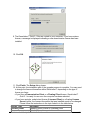
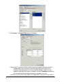
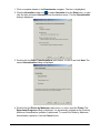
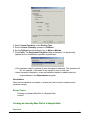
12. If the information shown in the dialog is incorrect, type over the provided name and
company information. Click Next to continue.
13. If the default destination folder is not where you want GeneLinker™ installed, click
Browse and select the correct folder. Click Next to continue.
14. If the default program folder is not where you want the program icon placed, select
another folder. Click Next to continue.
15. The installation system information is displayed for you to read. Click Next to
continue.
GeneLinker Gold 3.1 / GeneLinker Platinum 2.1
17
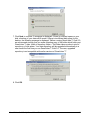
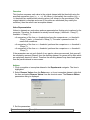
16. The GeneLinker™ files are transferred onto your computer.
17. The GeneLinker™ license manager is configured.
18. Click Finish. The Setup dialog closes.
19. At this point, the installation process is complete. You may need to change the
license information within GeneLinker™ depending on the type of license you have.
• If you have a Demonstration Client or a Floating Client license, GeneLinker™ is
ready for use.
• If you have a single, node-locked license (Licensed Client) or a floating License
Server license, the license information that was installed needs to be changed.
Please follow the instructions in the topic linked to in the table below.
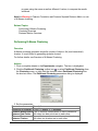
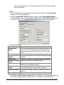
License Type
Procedure
Updating Demo License to Licensed Client
Licensed Client
Updating Demo License to License Server
License Server
Related Topics:
Starting the Program
GeneLinker Gold 3.1 / GeneLinker Platinum 2.1
18
If you have an expired Demonstration Client license:
If your demo license expires, please contact Molecular Mining Corporation (MMC)
sales to purchase GeneLinker™.
Updating Demo License to Licensed Client
Updating Demo License to License Server
Demo License Time Extension
If your license changes:
Changing from Licensed Client to License Server
If your system or server changes:
Licensed Client: Configuration Change
Licensed Client: Moving from One Computer to Another
License Server: Moving from One Computer to Another
License Server: Configuration Change
Updating Floating Client after Server Move
Upgrading GeneLinker(TM)
Gold
Upgrading GeneLinker™ Gold
Overview
Please follow these instructions for upgrading GeneLinker™ Gold to Version 3.1.
• If your current version of GeneLinker™ Gold is less than Version 2.5, you will
need to Uninstall the old version of GeneLinker™ before installing the new one.
If you try to do the upgrade without uninstalling the old version first, you will see
the message, 'The GeneLinker™ data repository on this computer predates
GeneLinker™ Gold 2.5 and cannot be upgraded by this installer. Before
installing this new version of GeneLinker™, you must first remove the old
version using Add/Remove Programs from the Control Panel.'
• If you have a floating client license, this upgrade should be performed only after
the license server has been upgraded.
GeneLinker™ Gold uses an installer program to make the upgrade process simple. If
you are running GeneLinker™ Gold, please exit the application before starting the
upgrade process.
Actions
1. Insert the GeneLinker™ CD into your drive. The upgrade process should start
automatically. If you have GeneLinker™ running, you will be prompted to exit it. Skip
to step 7 if you see the welcome dialog on your screen.
2. With the GeneLinker™ CD in your drive, click the Windows Start button.
3. Select Run.
GeneLinker Gold 3.1 / GeneLinker Platinum 2.1
19
4. Navigate to the appropriate directory on the GeneLinker™ CD-ROM.
5. Double-click on the file setup.exe. The upgrade process initializes.
6. The Welcome dialog is displayed.
GeneLinker Gold 3.1 / GeneLinker Platinum 2.1
20
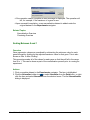
7. Click Next to continue. A message is displayed. If there is sufficient space on your
disk, a backup of your data will be made. If there is insufficient disk space for the
backup, the following message is displayed, 'Before running GeneLinker™ Gold 3.1,
we recommend strongly that you make a backup copy of the folder which holds your
GeneLinker™ data: <path of repository folder>. This folder takes up about <size of
repository> of disk space. Your data repository will be upgraded automatically to a
new format the first time you run GeneLinker™ Gold 3.1. The new, upgraded
repository is not compatible with earlier versions of GeneLinker™.'
8. Click OK.
GeneLinker Gold 3.1 / GeneLinker Platinum 2.1
21
9. The GeneLinker™ Gold 3.1 files are copied to your computer. If you have a demo
license, a message is displayed indicating a new demonstration license has been
installed.
10. Click OK.
11. Click Finish. The Setup dialog closes.
12. At this point, the installation part of the upgrade process is complete. You may need
to change the license information within GeneLinker™ depending on the type of
license you have.
• If you have a Demonstration Client or a Floating Client license, GeneLinker™
Gold 3.1 is ready for use once the computer has been rebooted.
• If you have a single, node-locked license (Licensed Client) or a floating License
Server license, the license information that was installed needs to be changed.
Please follow the instructions in the topic linked to in the table below.
License Type
Procedure
Updating Demo License to Licensed Client
Licensed Client
Updating Demo License to License Server
License Server
GeneLinker Gold 3.1 / GeneLinker Platinum 2.1
22
Related Topic:
Starting the Program
Platinum
Upgrading GeneLinker™ Platinum
Overview
Please follow these instructions for upgrading GeneLinker™ Platinum to Version 2.1.
• If your current version of GeneLinker™ Platinum is less than Version 1.2, you
will need to Uninstall the old version of GeneLinker™ before installing the new
one. If you try to do the upgrade without uninstalling the old version first, you
will see the message, 'The GeneLinker™ data repository on this computer
predates GeneLinker™ Platinum 1.2 and cannot be upgraded by this installer.
Before installing this new version of GeneLinker™, you must first remove the
old version using Add/Remove Programs from the Control Panel.'
GeneLinker™ Platinum uses an installer program to make the upgrade process simple.
If you are running GeneLinker™ Platinum, please exit the application before starting the
upgrade process.
Actions
1. Insert the GeneLinker™ CD into your drive. The upgrade process should start
automatically. If you have GeneLinker™ running, you will be prompted to exit it. Skip
to step 7 if you see the welcome dialog on your screen.
2. With the GeneLinker™ CD in your drive, click the Windows Start button.
3. Select Run.
4. Navigate to the appropriate directory on the GeneLinker™ CD-ROM.
GeneLinker Gold 3.1 / GeneLinker Platinum 2.1
23
5. Double-click on the file setup.exe. The upgrade process initializes.
6. The Welcome dialog is displayed.
GeneLinker Gold 3.1 / GeneLinker Platinum 2.1
24
7. Click Next to continue. A message is displayed. If there is sufficient space on your
disk, a backup of your data will be made. If there is insufficient disk space for the
backup, the following message is displayed, 'Before running GeneLinker™ Gold 3.0,
we recommend strongly that you make a backup copy of the folder which holds your
GeneLinker™ data: <path of repository folder>. This folder takes up about <size of
repository> of disk space. Your data repository will be upgraded automatically to a
new format the first time you run GeneLinker™ Gold 3.0. The new, upgraded
repository is not compatible with earlier versions of GeneLinker™.'
8. Click OK.
GeneLinker Gold 3.1 / GeneLinker Platinum 2.1
25
9. The GeneLinker™ Platinum 2.1 files are copied to your computer. If you have a demo
license, a message is displayed indicating a new demonstration license has been
installed.
10. Click OK.
11. Click Finish. The Setup dialog closes.
12. At this point, the installation part of the upgrade process is complete. You may need
to change the license information within GeneLinker™ depending on the type of
license you have.
• If you have a Demonstration Client license, GeneLinker™ Platinum 2.1 is ready for
use once the computer has been rebooted.
• If you have a single, node-locked license (Licensed Client), the license information
that was installed needs to be changed. Please follow the instructions in the
topic linked to in the table below.
License Type
Procedure
Updating Demo License to Licensed Client
Licensed Client
GeneLinker Gold 3.1 / GeneLinker Platinum 2.1
26
Related Topic:
Starting the Program
Uninstalling GeneLinker(TM)
Uninstallation Procedure
Overview
Use this procedure to remove the GeneLinker™ application from your computer. If
GeneLinker™ is running, close it before you begin to uninstall.
Actions
1. Click the Windows Start button. Under Settings, click Control Panel.
2. On the Control Panel, double-click Add/Remove Programs.
3. Click on GeneLinker. The program is highlighted.
4. Click the Change/Remove button next to GeneLinker™. The Reinstall or Remove
dialog is displayed.
5. Click the Remove option to select it. Click Next. The Confirm File Deletion dialog is
displayed.
GeneLinker Gold 3.1 / GeneLinker Platinum 2.1
27
6. Click OK to remove the application from your system. A dialog is displayed giving you
the option to remove or delete your data.
Removing (Deleting) the Repository
• Deleting the repository completely removes all genes, datasets that have been
imported, experiments, and gene lists. If you want to preserve your working
data, do not delete the repository.
7. If you want to delete the repository, check the Remove GeneLinker's data
repository box.
8. Click Continue.
Related Topic:
Installation
GeneLinker Gold 3.1 / GeneLinker Platinum 2.1
28
Getting Started With GeneLinker(TM)
GeneLinker(TM) Tour
GeneLinker™ Tour - Introduction
Welcome to GeneLinker™
Thank you for choosing GeneLinker™ as your gene expression analysis system. The
GeneLinker™ family of products are designed to help you discover underlying patterns
in the data generated by modern high-throughput gene expression measurement
techniques; the first step in discovering new relationships among genes.
Introduction
This tour describes the GeneLinker™ main window and outlines the program's major
functionality groups (e.g. data import, preprocessing, clustering, visualization, and for
platinum - classification). The fastest way to learn to use GeneLinker™ is to finish this
tour and then run the tutorials.
Terminology
Term
Definition
Dataset A dataset is either a raw or preprocessed set of expression values for
a number of genes over a number of samples. A dataset can have
reliability measurements or variables associated with it. For a
complete description see Datasets Overview and Reliability Measures.
• A standard dataset contains a single value for each gene for
every sample (some may be replicate measurements within or
between chips; in an incomplete dataset, one or more values
are null or missing).
A two-color dataset contains two values for each gene for every
sample. One value is the treatment expression level and the other is
the control expression level. See Two-Color Data.
Experime An experiment is a dataset that has had its gene or sample order
organized by the application of an experiment process such as
nt
clustering.
Variable In GeneLinker™, a variable is a column of data other than gene
expression values used to differentiate samples. See Variables
Overview.
A variable can store:
• Phenotypic observations about the samples.
e.g. malignant vs. benign.
• Predictions of phenotypes by a trained classifier.
e.g. predicted malignant vs. predicted benign.
• Information about experimental conditions.
GeneLinker Gold 3.1 / GeneLinker Platinum 2.1
29
e.g. high dose vs. low dose; time the sample was taken; animal A vs.
animal B vs. animal C, etc.
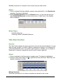
GeneLinker™ Tour - Main Window Layout
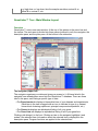
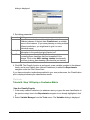
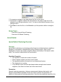
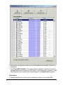
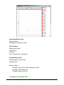
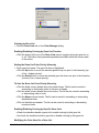
Overview
GeneLinker™ runs in one main window. At the top of the window is the menu bar and
the toolbar. The work area is divided into three panes (outlined in red): the navigator, the
description pane, and the plots pane. At the bottom is the status bar.
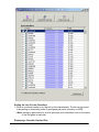
The Navigator (upper left)
The navigator organizes your data and gives you access to it. All items listed in the
navigator have already been saved into the GeneLinker™ database. There are three
tabs in this pane, each listing a specific type of data.
• The Experiments tab displays a hierarchical tree of your datasets and experiments.
Each item in the tree is tagged with an icon to indicate its type (e.g. dataset,
hierarchical clustering experiment, principal components experiment, etc.).
• The Genes tab displays an alphabetical listing of all your genes.
• The Gene Lists tab displays an alphabetical listing of all of your gene lists.
Clicking a tab brings it to the front. Clicking an item in the navigator highlights it and
makes it the selected item. Information about the selected item is displayed in the
description pane. Program functions are applied to the selected item.
GeneLinker Gold 3.1 / GeneLinker Platinum 2.1
30
The Description Pane (lower left)
The description pane displays information about the item selected in the navigator, or a
gene selected in a table or plot. This information can include the name of the item, the
number of genes and samples it contains, its creation date, parameters used in its
creation (if it is an experiment), and so forth.
The Plots Pane (right)
The plots pane is the place for visualizing your data and experiments. When you use the
table viewer or a create a plot, it is displayed in the plots pane. The plots in the plot pane
can be arranged by dragging them or by using the Cascade Windows item on the
Window menu.
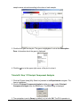
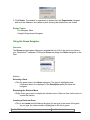
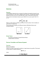
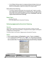
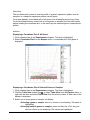
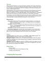
Shortcuts and Tips
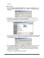
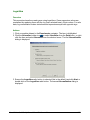
GeneLinker™ was designed for ease of use. Right-clicking an item (such as a dataset,
or gene in the navigator or on a plot) displays a shortcut menu giving you quick access
to its functions.
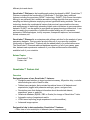
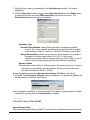
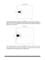
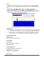
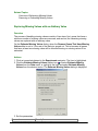
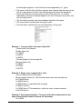
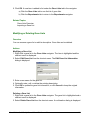
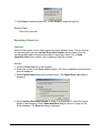
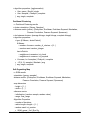
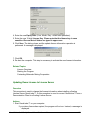
Most dialogs (such as normalization or filtering) have a Tips button. Clicking Tips
displays a brief description of the function and how to use it. For example:
If you want to know what function an icon invokes, hover the mouse over the icon for a
moment. A tooltip is displayed naming the function.
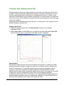
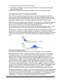
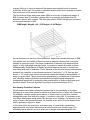
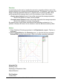
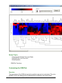
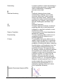
GeneLinker™ Tour - Clustering and PCA
Clustering / PCA and Visualization
Introduction to Clustering
Clustering is used to group biological samples or genes into separate clusters based on
their statistical behavior. The main objective of clustering is to find similarities between
experiments or genes (given their expression ratios across all genes or samples,
GeneLinker Gold 3.1 / GeneLinker Platinum 2.1
31
respectively), and then group similar samples or genes together to assist in
understanding relationships that might exist among them.
Clustering
• Apply K-Means, Jarvis-Patrick, or agglomerative hierarchical clustering to your
dataset, or perhaps try a Self-Organizing Map (SOM). The results of each
clustering experiment is listed in the Experiments navigator under the dataset
it was based on. Each experiment result item is tagged with an icon to indicate
the experiment type.
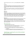
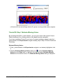
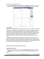
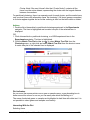
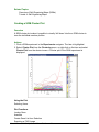
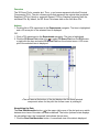
• Visualize the Clustering Experiment Results - GeneLinker™ has an extensive set of
plots that can be used to visualize the results of clustering hopefully revealing
interesting or significant patterns.
{image}
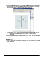
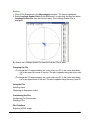
Introduction to Principal Component Analysis
Component Analysis is an unsupervised or class-free approach to finding the most
informative or explanatory features in data. In particular, Principal Component
Analysis (PCA) substantially reduces the complexity of data in which a large number of
variables (e.g. thousands) are interrelated, such as in large-scale gene expression data
obtained across a variety of different samples or conditions. PCA accomplishes this by
computing a new, much smaller set of uncorrelated variables which best represent the
original data. PCA is a powerful, well-established technique for data reduction and
visualization. 2D and 3D PCA plots often place objects with similar patterns near each
other.
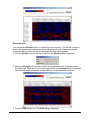
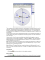
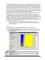
Principal Component Analysis (PCA)
• Apply PCA by genes or by samples. Again, the experiment results are listed in the
Experiments navigator tagged with the PCA icon.
• Visualize the PCA Results - GeneLinker™ offers a variety of 2D plots and a 3D
Score plot to give a clear picture of the hidden structure in the data.
{iamge}
Platinum
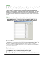
GeneLinker™ Tour - Platinum SLAM™ Classification
Platinum Data Mining, Classification, and Prediction Using
SLAM™
Please note: these functions are introduced within a conceptual 'workflow' for the
purpose of introduction only. Within GeneLinker™, you are free to apply any
appropriate function to your data at any time.
1. Import Gene Expression Data
GeneLinker Gold 3.1 / GeneLinker Platinum 2.1
32
A training dataset (expression values with known classes) is required to train an
artificial neural network (ANN) classifier. A test dataset can be imported to test a
trained classifier. The two datasets must be studies of the same phenomenon (i.e. the
variable type for both is the same, e.g. SRBC Tumors).
2. Import Variable Data
Import the classes (e.g. EWS, NB, BL, RMS) for the training dataset.
3. Discretize the Expression Data
Expression data is continuous. To apply the SLAM™ data mining algorithm, the data
must first be discretized.
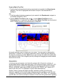
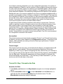
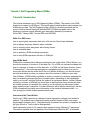
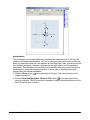
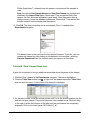
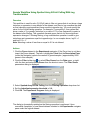
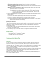
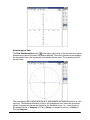
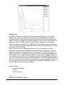
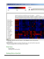
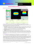
4. Apply SLAM™ Association Mining and Visualize the Results
SLAM™ (Sub-Linear Association Mining) is a technology that finds hidden linear and
non-linear correlations in discretized gene expression data. The SLAM™ association
viewer displays the results of running SLAM™ and allows you to work with the results.
{image}
5. Create Gene List
As an aid to supervised learning, a gene list is created from the genes (features)
identified as significant by SLAM™. If necessary, this gene list can be used to filter the
test dataset to ensure it contains the same genes as the training dataset.
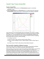
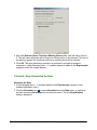
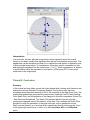
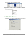
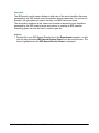
6. Create an ANN Classifier and View Training Results
Creating an ANN classifier is the process of exposing a committee of neural networks
to data with known classes of a particular type. The training results can be displayed in
a classification plot or an MSE plot.
{image}
7. Classify Data and Visualize the Classification Results
Classification is the process of using a trained classifier to predict the classes of the test
dataset.
Platinum
GeneLinker™ Tour - Platinum IBIS Classification
Overview
IBIS (Integrated Bayesian Inference System) is a system that is able to predict class
membership for a gene expression dataset containing measurements for the same
phenomenon as the dataset used to train the IBIS classifier. One of the major strengths
of the IBIS method is its ability to reveal nonlinear and non-monotonic associations
GeneLinker Gold 3.1 / GeneLinker Platinum 2.1
33
between pairs of genes and their concerted response to a particular stimulus such as a
drug.
Platinum Classification and Prediction Using IBIS
Please note: these functions are introduced within a conceptual 'workflow' for the
purpose of introduction only. Within GeneLinker™, you are free to apply any
appropriate function to your data at any time, in any order.
1. Import Data
A training dataset (expression values with known classes) is required for creating an
IBIS classifier. A test dataset can be used to test the classifier. The two datasets must
be studies of the same phenomenon (the variable type for both is the same).
2. Import Variable Data
Import the class observations for the training dataset.
3. Preprocess Your Data
GeneLinker™ offers a variety of preprocessing options which can be applied one or
more times to a dataset. You can then view the preprocessed data as you would raw
data (table viewer or color matrix plot).
4. Optionally, Perform an IBIS Search
The IBIS search process creates a list of proto-classifiers, one for each gene or gene
pair. Each proto-classifier consists of the gene/gene pair identifier, an accuracy value,
and the MSE value. The proto-classifier list can be viewed in the IBIS search results
viewer.
5. Create a Classifier and View Results
You can create a Linear Discriminant Analysis (LDA), Quadratic Discriminant Analysis
(QDA), or a Uniform/Gaussian Discriminant Analysis (UGDA) classifier from a protoclassifier (IBIS search results), or from any gene or gene pair. The results can be
viewed in an IBIS Gradient plot.
6. Classify Data and Visualize Results
Classification is the process of using a trained classifier to predict the classes of data (of
the same type). An IBIS classifier can be applied to a dataset that contains the gene or
gene pair used to create the classifier. The results can be viewed in a Classification plot
or an IBIS Gradient plot.
GeneLinker™ Tour - Common Functions
Creating Gene Lists
GeneLinker Gold 3.1 / GeneLinker Platinum 2.1
34
A gene list is a list of one or more genes. Gene lists can be used to filter datasets to
create smaller datasets for detailed study, or to share gene information with colleagues.
Lookup Gene in a Public Database
Select a gene in the Genes navigator or on a plot and lookup information about it in a
public database. The gene information is displayed in your web browser.
Recording Your Work - Annotations and Reports
You can annotate your genes, datasets or experiments. These annotations are included
within appropriate GeneLinker™ reports.
GeneLinker™ can generate a report on a specific item such as a gene, dataset, or
experiment. Another type of report that can be generated is a workflow report. It
includes all of the steps from the raw data to the selected experiment item.
Exporting Data and Images
A dataset can be exported to a text file.
Images can be exported to .png files.
GeneLinker™ Tour - Conclusion
Overview
You have now completed the introductory product tour. You have been introduced to the
GeneLinker™ main window, concepts and workflows. The next step in mastering
GeneLinker™ is to run the tutorials. Each tutorial leads you through an analysis of a real
dataset exercising the majority of GeneLinker™'s powerful functionality.
Related Topics:
List of Tutorials
Product Information
GeneLinker™ Product Suite
Overview
GeneLinker™ Gold is the first member of the GeneLinker™ family of products
developed by Molecular Mining Corporation (MMC). This application gives you powerful
tools to explore the data gathered from your gene expression experiments. With
GeneLinker™ Gold, you can preprocess your data, perform clustering experiments, or
principal components analysis and view the results of those experiments in many
GeneLinker Gold 3.1 / GeneLinker Platinum 2.1
35
different plots and charts.
GeneLinker™ Platinum is the breakthrough product developed by MMC. GeneLinker™
Platinum contains all the functionality of GeneLinker™ Gold plus many additional
features including the proprietary SLAM™ technology. SLAM™ (Sub-Linear Association
Mining) is an extremely fast, scalable association-mining algorithm that uses a novel
sampling and binning scheme employing various hypothesis testing methods. This new
technology breaks the combinatorial barriers that previously prevented the discovery
and measurement of statistically interesting higher-order correlations in gene expression
datasets. SLAM™ can be applied to gene-gene and gene-phenotype interactions. It can
also be used in the construction of predictive models relating any of: expression,
proteomics, SNPs/haplotypes, toxicity response, therapeutic response, environmental,
clinical outcomes, etc.
GeneLinker™ Diamond is an enterprise-wide software solution for the analysis of gene
expression datasets. This innovative product offers all of your users the complete
functionality of GeneLinker™ Platinum with the added benefit of a unified data source.
The GeneLinker™ Diamond relational database repository of all of your genes, gene
lists, datasets and experiments makes all of your data and discoveries immediately
available to all of your scientists.
Related Topics:
GeneLinker™ Tour
Feature List
GeneLinker™ Feature List
Overview
Designed for ease of use, GeneLinker™ features:
•
•
•
•
•
•
•
Straightforward interface to import spotted microarray, Affymetrix® chip, or similar
data including two-color GenePix data;
Tabbed pane navigator that provides hierarchical views of all datasets and
experiments (tagged with parameter settings), genes, and gene lists;
Description pane that displays information about the selected dataset,
experiment, gene, or gene list;
Relational database (MySQL, DB2 or Oracle) for storage of GeneLinker™ data.
Automatic saving of experiment results.
HTML-based reporting (single experiment or entire workflow);
Advanced image capture.
Designed to help in data exploration, GeneLinker™ features:
• Table view or color matrix plot of datasets (raw or preprocessed);
GeneLinker Gold 3.1 / GeneLinker Platinum 2.1
36
• Estimation/elimination of missing data values;
• Value removal;
• Advanced filtering and gene prioritization based on N-Fold induction and repression
and difference measures;
• Preprocessing and data normalization capabilities (e.g. scaling, transformation,
Lowess);
• F-Test with results viewer;
• Summary statistics chart;
• Hierarchical clustering of genes or samples using single, average, or complete
linkage with distance metric options including Euclidean, Manhattan, Pearson
Correlation, etc;
• Non-hierarchical clustering of genes or samples using K-Means or Jarvis-Patrick
methods;
• Self Organizing Map clustering with plots;
• Principal Component Analysis with 2D plots and 3D Score plot;
• A wide variety of plots including Scatter, Coordinate, Centroid, Cluster, Matrix Tree,
etc. with user-selectable data range, color schemes, and shared selection;
• Profile Matching to one or more reference genes;
• Annotations editor/viewer;
• Direct links to external data sources such as GenBank, UniGene, Affymetrix, etc.
• Gene list creation and filtering.
Platinum
GeneLinker™ Platinum builds on the functionality introduced in GeneLinker™
Gold
•
•
•
•
•
Patented SLAM™ association mining technology to aid in feature identification for
use in supervised learning;
Supervised Learning (training of neural networks to predict gene expression data
classes) with informative plots.
IBIS Classification (Integrated Bayesian Inference System) including IBIS Search
(with viewer), classifier creation from search results or a selected gene or gene
pair.
Visualize IBIS classifier in an IBIS Gradient plot.
Classification using an ANN or an IBIS classifier.
Related Topics:
GeneLinker™ Tour
Tutorials
Tutorials/Use Case Scenarios
Tutorial 1: Gene Expression During Rat Spinal Cord Development
GeneLinker Gold 3.1 / GeneLinker Platinum 2.1
37
• This tutorial covers data import and transposition, normalization, renaming
experiments, K-Means clustering, matrix tree, centroid, and cluster plots,
generating experiment and workflow reports, and exporting images.
Tutorial 2: Analysis of NCI60 Data
• This tutorial covers importing and preprocessing data, renaming datasets, estimating
missing values, agglomerative hierarchical clustering, matrix tree plots, color
matrix plots, resizing and customizing plots, and generating reports.
Tutorial 3: Jarvis-Patrick Clustering
• This tutorial covers estimating missing values, normalization, performing JarvisPatrick clustering analysis on the datasets from the first two tutorials, and
displaying data in a matrix tree plot.
Tutorial 4: Self-Organizing Maps (SOMs)
• This tutorial covers importing data, using the table viewer, the summary statistics
chart, value removal, filtering, normalization, using Self-Organizing Maps to
cluster Leukemia data, visualizing SOM results in a SOM plot and in a cluster
plot.
Tutorial 5: Principal Component Analysis (PCA)
• This tutorial demonstrates how to use Principal Component Analysis as a method of
extracting more information from data. The tutorial covers data import and
displaying PCA results in various plots including: scree, loadings line, color
matrix, score (raw and normalized) and 3D score (raw and normalized) plots.
Sample Workflow Using Spotted Array N-Fold Culling With Log Transformation
• This workflow is used for ratio (Cy3/Cy5) data to filter out genes that do not show a
large induction or repression in any sample in the dataset, and then to log
normalize the data so that inductions and repressions have equal but opposite
sign.
Platinum Tutorial 6: Learning to Distinguish Cancer Classes
• This tutorial demonstrates how to train GeneLinker™ Platinum's artificial neural
networks ANNs) to distinguish between sample classes. As an example, data
on four similar tumor types is studied. Program features covered include
importing variables, the SLAM™ association-mining technology (algorithm and
viewer), creating gene lists for filtering, filtering, classification, and classification
plots.
Platinum Tutorial 7: IBIS Classification
• This tutorial demonstrates how to search for a gene to use as an IBIS classifier. One
IBIS classifier is produced using Linear Discriminant Analysis (LDA) and a
second is produced using Quadratic Discriminant Analysis (QDA). An IBIS
Gradient plot is used to analyze the results of the classifier creation.
Tutorial 8: Affymetrix Data
• This tutorial demonstrates how to use Affymetrix data in GeneLinker™.
Tutorial 1: Gene Expression During Rat Spinal Cord Development
GeneLinker Gold 3.1 / GeneLinker Platinum 2.1
38
Tutorial 1: Introduction
Welcome to the first tutorial. This tutorial introduces you to clustering by walking you
through a simple analysis of a real dataset. You will be shown how to normalize the
data, cluster it, and then visualize the clustering results in different types of plots.
Skills You Will Learn:
How to import gene expression data from a file into the GeneLinker™ database.
How to use the table viewer.
How to normalize a dataset.
How to perform clustering experiments.
How to display plots.
How to generate a report and export an image.
Dataset Information
This tutorial uses a dataset described in a 1998 paper (see URL
http://www.pnas.org/cgi/content/abstract/95/1/334) by Xiling Wen, Stefanie Fuhrman,
George S. Michaels, Daniel B. Carr, Susan Smith, Jeffrey L. Barker and Roland
Somogyi, 'Large-scale temporal gene expression mapping of central nervous system
development.' Proc. Nat. Acad. Sci. USA, Vol. 95, pp.334-339, January 1998. You may
find it useful to have a copy of the paper on hand -- either on your screen, or printed out
-- while working through this tutorial. In this tutorial this paper is referred to as 'Wen et
al.', or simply 'Wen'.
The raw data represent RT-PCR product ratios (sample/control densities from gel
images), averaged over three measurements. This expression study was designed to
discover relationships between members of important gene families during different
phases of rat cervical spinal cord development, assayed over nine time points before
(E=embryonic) and after birth (P=postnatal). The selection covers a range of
developmental markers and intercellular signaling genes, involving neurotransmitters
and growth factors.
Wen et al. first clustered the genes 'from the combined 17 dimensional vectors of nine
expression values (ranging between 0 to 1) and eight slopes (ranging between -1 and
+1; slopes were calculated based on a reduced time interval of 1, not taking into
account the variable time intervals). [They] included slopes to take into account offset
but parallel patterns.' Computing this difference information (which they call 'slope')
cannot be done entirely within GeneLinker™. For the purpose of this tutorial, slopes are
ignored, and the software is used only to investigate the expression levels.
Tutorial Length
This tutorial should take about an hour, depending on how long you spend investigating
the data, and how fast your machine is. Note that if you must stop part way through the
tutorial, simply exit the program by selecting Exit from the File menu. The data and
experiments you have performed to that point are saved automatically by GeneLinker™.
GeneLinker Gold 3.1 / GeneLinker Platinum 2.1
39
The next time you start GeneLinker™, you can continue on with the next step in the
tutorial.
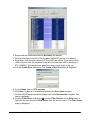
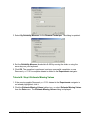
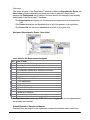
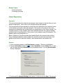
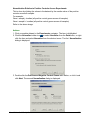
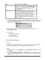
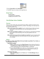
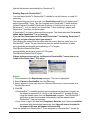
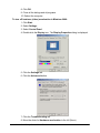
Tutorial 1: Step 1 Start GeneLinker™ and Import the Data
Start GeneLinker™
1. Double-click the GeneLinker™ program icon
application.
on your desktop to start the
• See GeneLinker Tour - Main Window Layout for a brief introduction to the
GeneLinker™ program window.
• In the upper left pane (navigator), you will see three tabs: Genes, Gene Lists and
Experiments. They give you three views of the data in the GeneLinker™
database. Clicking a tab brings that view to the front.
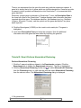
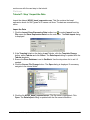
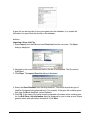
Import the Gene Expression Data
1. Click the Experiments tab to display the Experiments navigator. All datasets and
experiments present in the database are listed here in a hierarchical tree.
2. If the dataset Spinal_cord is present, skip the rest of this step and continue with step
2 - View and Normalize the Data.
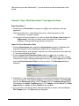
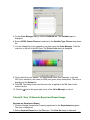
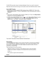
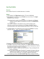
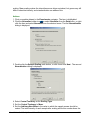
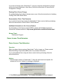
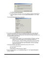
3. Click the Import Gene Expression Data toolbar icon (far left on toolbar - to
discover what function an icon invokes, hover the mouse pointer over it for a couple
of seconds. A tooltip is displayed naming the function), or select Import from the File
menu and Gene Expression Data from the sub menu. The Data Import dialog is
displayed.
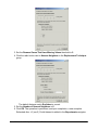
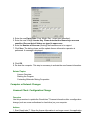
4. GeneLinker™ uses a template to interpret or parse the data values as they are read
in from the data file. The installed default for the template is Tabular. If the Template
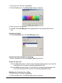
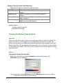
listed on the Data Import dialog is NOT Tabular, click the Template Change button.
This displays the Import Templates dialog. Click Tabular and click Select. The Data
Import dialog is updated showing Tabular as the template.
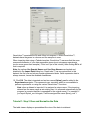
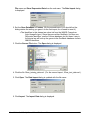
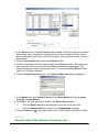
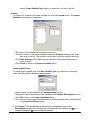
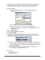
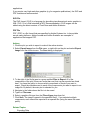
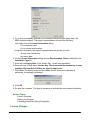
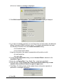
5. You now have to tell GeneLinker™ where the data file is located. Click the Source
File Change button. The Open dialog is displayed.
GeneLinker Gold 3.1 / GeneLinker Platinum 2.1
40
6. Navigate to the GeneLinker™ Tutorial folder (if necessary) and click the file
Spinal_cord.txt. The file is highlighted.
7. Click Open. The Data Import dialog is updated with the source file.
8. Ensure that the Gene Database is set to GenBank (use the drop-down list to choose
GenBank if necessary). If you import a file that has gene identifiers other than
GenBank, set the Gene Database to match your data. For the Spinal_cord dataset,
GenBank is correct.
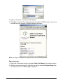
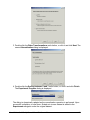
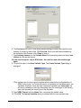
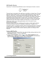
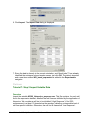
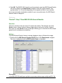
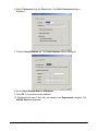
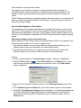
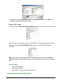
9. Click Import. The Import Data dialog is displayed.
GeneLinker Gold 3.1 / GeneLinker Platinum 2.1
41
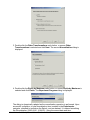
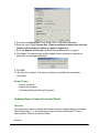
GeneLinker™ examines the file and offers to transpose it. Within GeneLinker™,
datasets have the genes in columns and the samples in rows.
When importing data using a Tabular template, GeneLinker™ assumes that the more
numerous dimension of your data represents genes (most microarray experiments
involve more genes than samples). If this is so (as in this tutorial), then clicking OK is all
that is required.
Note: the options Use Sample Names and Use Gene Names are checked and
disabled in the Import Data dialog box. GeneLinker™ has recognized that in this
dataset, the first row and column contain alphameric labels. Gene expression data is
always numeric, hence the disabled checkboxes.
10. Click OK. The data is imported and an item named Spinal_cord is added to the
Experiments navigator. This represents your raw data, which is now available to
perform experiments on using the various GeneLinker™ functions.
Note: when a dataset is imported, it is assigned a unique name. If the incoming
dataset has the same name as an existing one, it is renamed automatically by the
program (a numeric identifier is appended to the original name). For example, if
you import Spinal_cord.txt again, it will be assigned the name Spinal_cord 1.
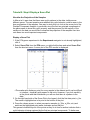
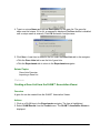
Tutorial 1: Step 2 View and Normalize the Data
The table viewer displays a spreadsheet-like view of the data in a dataset.
GeneLinker Gold 3.1 / GeneLinker Platinum 2.1
42
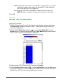
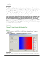
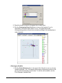
View the Data with the Table Viewer
1. If the Spinal_cord dataset in the Experiments navigator is not already highlighted,
click it.
2. Click the Table View toolbar icon , or select Table View from the Explore menu, or
right-click the item and select Table View from the shortcut menu. The data is
displayed in table form in the right-hand pane (plots pane).
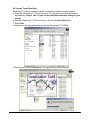
3. Click the right scrollbar arrow at the bottom of the table viewer to scroll right about 6
or 8 genes so you see the genes L1, NFL, and NFM.
Note: NFL expression ranges up to 14.92 and NFM up to 27.69 over the control, while
L1 never gets above 0.96 of the control concentration. While the difference between
strongly expressed and weakly expressed genes is interesting, it's not what we're
currently after. Instead, normalize each gene by dividing by its maximum expression
ratio.
To learn more about how to use the table viewer, please see Table Viewer Functions.
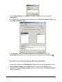
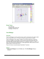
Normalize the Data
GeneLinker™ offers multiple normalization, filtering, and other data preprocessing
techniques which can be applied one or more times (in various combinations) to a
dataset. In this tutorial, the data is normalized by dividing by the maximum. Please see
Normalization Overview for details on all of the normalization operations.
1. If the Spinal_cord dataset in the Experiments navigator is not already highlighted,
click it.
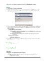
2. Click the Normalize toolbar icon , or select Normalize from the Data menu, or rightclick the item and select Normalize from the shortcut menu. The first Normalization
parameters dialog is displayed.
GeneLinker Gold 3.1 / GeneLinker Platinum 2.1
43
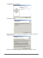
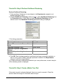
3. Double-click the Other Transformations radio button, or ensure Other
Transformations is selected and click Next. The second Normalization dialog is
displayed.
4. Double-click the Divide by Maximum radio button, or ensure Divide by Maximum is
selected and click Finish. The Experiment Progress dialog is displayed.
The dialog is dynamically updated as the normalization operation is performed. Upon
successful completion, a new Normalization item is added to the Experiments
navigator, attached to and below the Spinal_cord raw dataset. It is named something
like Normalization (2002-08-01 16:04:50) - using the current date and time.
GeneLinker Gold 3.1 / GeneLinker Platinum 2.1
44
To learn about cancelling an operation or experiment, please see Cancelling an
Operation or Experiment.
Tutorial 1: Step 3 View Parameters and Rename Experiment
View Experiment Parameters
Thinking ahead, what would happen if you tried out six different normalizations on the
same dataset today, and then came back in tomorrow and wanted to re-examine those
results? How would you determine which node on the experiment tree corresponds to a
particular analysis sequence?
• You can always determine which parameters generated a certain node on the
experiment tree by right-clicking it and selecting Show Parameters from the
shortcut menu (or by clicking the experiment and selecting Show Parameters
from the Tools menu). Try this now.
• When you click on an item in the Experiments navigator, look at the information
displayed about it in the Description Pane (lower left). It is similar in content to
the Parameters dialog.
Rename an Experiment
Default names are provided for all datasets and experiments based on either the name
of the file being imported, or on the type of experiment being performed. Any item listed
in the navigator can be renamed at any time. This gives you the opportunity to apply
your own naming convention to the data.
1. Right-click the Normalization item that was just generated in the Experiments
navigator, and select Rename Experiment from the shortcut menu. A box is drawn
around the item with a blinking cursor at the end of it.
2. Press (and hold) the <Backspace> key to delete the program-generated name, and
type in something significant to you (e.g. 'Divided by max' or 'maxdiv'). Press <Enter>
to accept this new name.
Note: GeneLinker™ saves all files automatically. Once an item is visible in the
Experiments navigator, it has already been saved to the database.
GeneLinker Gold 3.1 / GeneLinker Platinum 2.1
45
Tutorial 1: Step 4 Perform Hierarchical Clustering
In this step of the tutorial, you will perform a hierarchical clustering experiment on the
normalized data to reveal its intrinsic structure. For complete details on the clustering
operations available in GeneLinker™, please see Clustering Overview.
Perform Hierarchical Clustering:
1. If the renamed normalization dataset in the Experiments navigator is not already
highlighted, click it.
2. Click the Hierarchical Clustering toolbar icon , or select Hierarchical Clustering
from the Clustering menu, or right-click the item and select Hierarchical Clustering
from the shortcut menu. The Hierarchical Clustering parameters dialog is displayed.
3. Set dialog parameters.
Parameter
Clustering Orientation
Distance Measurement: Between Data
Points
Distance Measurement: Between Clusters
Setting
Cluster Genes
Euclidean
Average Linkage
4. Click OK. The clustering operation is performed and upon successful completion, a
new Gene Hierarchical Clustering experiment is added to the Experiments navigator
under the normalized dataset. You can rename it if you wish.
If you have automatic visualizations enabled in your user preferences, a matrix tree plot
of the clustering results is displayed.
Tutorial 1: Step 5 Create a Matrix Tree Plot
GeneLinker™ has an excellent set of plots for examining your data. These are
described in detail in the Plots section of the online manual.
If the matrix tree plot is already displayed, there is no need to recreate it. Read the
Interpretation section below for information about the plot.
GeneLinker Gold 3.1 / GeneLinker Platinum 2.1
46
Create a Matrix Tree Plot
1. Double-click the hierarchical clustering experiment just created in the Experiments
navigator. The item is highlighted and a matrix tree plot of the selected item is
displayed.
OR
1. If the hierarchical clustering experiment just created in the Experiments navigator is
not already highlighted, click it.
2. Click the Matrix Tree Plot toolbar icon , or select Matrix Tree Plot from the
Clustering menu, or right-click the item and select Matrix Tree Plot from the shortcut
menu. A matrix tree plot of the selected item is displayed.
A tree plot can take up a lot of space on your screen. You may want to maximize the
GeneLinker™ window if it's not already maximized, and/or stretch the pane displaying
the tree plot as wide as possible. Note that you can increase the width of the plots pane
and reduce the width of the navigator pane by clicking-and-dragging the frame between
them with the mouse.
Interpretation
In the hierarchy just created, note that at the extreme left of the plot is a cluster of
several genes that are highly expressed early in the embryonic stage, at days E11, E13
and E15. This cluster includes the established early developmental markers nAChRd,
G67I86, G67I80/86, nestin and nAChRe, as well as SC6, PDGFb, Ins1, keratin, SC7
and trk (see Wen et al. for explanation of gene name abbreviations).
Another cluster of genes with slightly broader expression profiles, but still mostly
embryonic, appears at the extreme right of the plot (use the scrollbars to view the right
of the plot). This cluster includes nAChRa6, PDGFR, MK2, NT3, GDNF, TH, cellubrevin,
cyclin B, Brm, Ka1, and is enriched in members of the insulin-like growth factor signaling
GeneLinker Gold 3.1 / GeneLinker Platinum 2.1
47
pathway, IGFR1, IGF II, IGFR2, the latter being a receptor/ligand gene pair.
Between them, these clusters map well to Wen's 'Wave 1'. Note that the combined
clusters contain another receptor/ligand pair, PDGFb and PDGFR.
Just to the left of the right-most group is a cluster of nearly constantly expressed genes,
easily picked out by eye as a nearly-solid mass of red. This cluster includes
'housekeeping' genes such as actin, TCP, SOD, CCO1 and CCO2, and maps well to
Wen's 'Constant' class.
•
Examine the tree plot for other groups with similarly simple characterizations,
such as high expression in the adult mouse (Wen's Wave 4) or in the perinatal
timepoints (Wen's Wave 3).
There are two reasons why the early-expressed genes don’t all appear side-byside:
1. In the normalization and metric used above, the genes in the cluster including
PDGFR, GDNF, and cellubrevin are mathematically closer to the constant genes than
to the very early genes such as PDGFb, Ins1, and keratin. The mathematics don't
always reflect qualitative ideas about similarity. However, if you try different
normalizations and metrics you will obtain different clusterings. For example, if you try
Scaling between 0 and 1 (instead of Divide by Maximum as you did above) you will
find that the 'constant' cluster disappears, because this will magnify each gene's
range of expression so that none will appear to be constant.
2. There is some arbitrariness in the construction of a tree diagram. At each branch
point, GeneLinker™ must decide which branch to draw to the left and which branch to
draw to the right. Consequently, the subcluster on the extreme right of our tree is no
further mathematically from the subcluster on the extreme left than any other
subcluster in the right half of the plot.
Tutorial 1: Step 6 Perform Partitional Clustering
From visual examination of a hierarchical clustering, Wen et al. identified five groups or
'waves' plus a small number of outliers or 'other' genes. This step will demonstrate that
GeneLinker™ can be used to get a similar clustering, using the K-Means clustering
function.
The key feature of K-Means clustering is that you choose a priori the number of clusters
you think the data should be divided into. This number is the 'K' in K-Means.
The K-Means algorithm uses the same Euclidean Average-Linkage distance metric
used for hierarchical clustering earlier.
Perform Partitional Clustering
1. If the renamed normalization item in the Experiments navigator is not already
highlighted, click it.
2. Click the Partitional Clustering toolbar icon , or select Partitional Clustering from
the Clustering menu, or right-click the item and select Partitional Clustering from
the shortcut menu. The Partitional Clustering parameters dialog is displayed.
GeneLinker Gold 3.1 / GeneLinker Platinum 2.1
48
3. Set dialog parameters.
Parameter
Clustering Orientation
Distance Measurements: Between Data
Points
Distance Measurements: Between Clusters
Algorithm Properties: Type
Algorithm Properties: Number of Means
Algorithm Properties: Random Seed
Setting
Cluster Genes
Euclidean
Average Linkage
K-Means
5
999
3. Click OK. The clustering operation is performed and upon successful completion, a
new Gene Partitional Clustering experiment is added to the Experiments navigator
under the original dataset. Rename it if you like.
If you have automatic visualizations enabled in your user preferences, a matrix tree plot
of the clustering results is displayed. You can close this plot when you are finished
looking at it.
Use of the Random Seed Parameter
In normal use, setting the random seed is neither necessary nor recommended. In a
tutorial you set the random seed to a consistent value so that you will obtain precisely
the same results that we depict and discuss, which makes the tutorial easier to
understand. When you are not following a tutorial, you should generally not adjust the
random seed at all.
The random seed setting may affect irrelevant details, such as the labelling and ordering
of clusters. In other cases the random seed may affect relevant details, such as which
genes occur together in clusters. Because of this latter possibility, it is sometimes worth
repeating an experiment with different random seeds to see what the effects are. (In
step 7 see 'The Centroid Plot: Variability in K-Means Clustering' below.) GeneLinker™
helps with this by setting a new random seed every time an operation is carried out, so
you don’t need to.
On occasion you may need to determine whether a certain variation in results is due to
the random element, or some other cause. For this reason you are able to set the
random seed to a fixed value, thus controlling that source of variation.
GeneLinker Gold 3.1 / GeneLinker Platinum 2.1
49
Tutorial 1: Step 7 Create a Centroid Plot
Create a Centroid Plot
1. If the partitional clustering item in the Experiments navigator is not already
highlighted, click it.
2. Select Centroid Plot from the Clustering menu, or right-click the item and select
Centroid Plot from the shortcut menu. A centroid plot of the dataset is displayed.
The Centroid Plot is so named because each line represents the centroid or average
element of a cluster. It is conceptually identical to the average waves plotted in Figure
3a of Wen et al. You should be able to see a clear visual resemblance between the
clusters shown here, the clusters you just computed, and Wen’s clusters. Comparing
just the figure above with Wen, note the following:
• A ‘constant’ cluster (4);
• a cluster (2) with an early maximum, similar to Wen’s Wave 1;
• a cluster (1) with a maximum at the 'A' (adult) timepoint, similar to Wen’s Wave 4,
and
• two other clusters (3 and 5) with maxima at intermediate timepoints.
The Centroid Plot: Variability in K-Means Clustering
The colors and the cluster numbering in your Centroid Plot will probably be different
from the above image, since clusters are arbitrarily labeled and colored.
More importantly, though, the line shapes will probably be slightly different. An important
point about K-Means clustering is there is a random element in it. K-Means first
randomly allocates items to clusters, and then systematically moves one item at a time
from cluster to cluster in such a way as to minimize distances within clusters and
maximize distances between clusters. However, there is no guarantee that all random
starting allocations will lead to the same final clustering, only that the final clustering will
GeneLinker Gold 3.1 / GeneLinker Platinum 2.1
50
have reasonably low intracluster distances compared to the inter-cluster distances.
This can be viewed as the cost of obtaining clusters quickly, but you can also look at it
as a tool to show how meaningful your clusters are. If you rerun K-Means clustering a
few times and get wildly different results, your data probably does not have any
significant natural divisions, and you should probably not read anything into the clusters
it produces. Conversely, if you rerun K-Means clustering twice and get similar results,
the corresponding clusters are probably well-separated and meaningful.
For more information on clustering, refer to Clustering Overview.
Tutorial 1: Step 8 Create a Cluster Plot
There are several ways to examine cluster membership in detail. One is to create a
Matrix Tree Plot as you did for the hierarchical clustering. In the case of partitional
clustering, the 'tree' is flat, not hierarchical. Another way is to create a Cluster Plot from
the clustering item in the Experiments navigator.
Create a Cluster Plot:
1. If the partitional clustering item in the Experiments navigator is not already
highlighted, click it.
2. Select Cluster Plot from the Clustering menu, or right-click the item and select
Cluster Plot from the shortcut menu. A cluster plot of the dataset is displayed.
A Cluster Plot of the entire dataset shows a line for each gene (because genes, not
samples, were clustered). Each line is colored according to the cluster it belongs to. As
you can see, the plot is fairly busy and not terribly informative even for a moderate
amount of data like this. It is more informative to plot the individual clusters.
GeneLinker Gold 3.1 / GeneLinker Platinum 2.1
51
To Plot an Individual Cluster:
1. Click on the Centroid plot to make it the active window.
2. Click on a cluster name in the legend to highlight it and its line in the Centroid Plot.
You can also click on the line itself, but with other lines nearby this may be difficult.
For the purposes of this tutorial, select only one cluster (cluster 1 for the image
below).
• To select multiple clusters, press and hold the <Ctrl> key and click on cluster
names in the legend.
• To select a series of clusters, press and hold the <Shift> key and click on the
first and last cluster names in the series.
3. Select Cluster Plot from the Clustering menu, or right-click on the plot and select
Cluster Plot from the shortcut menu. A cluster plot of the selected cluster is
displayed.
The new Cluster Plot shows the individual gene profiles for the genes in the selected
cluster only, and also shows their names in the legend on the right. This illustration
shows Cluster 1 from the Centroid Plot above. If you compare the genes present in the
picture above with those in Wen’s Wave 4, you will see considerable but not perfect
overlap.
• See if there is a similar cluster in your clustering of the data. What genes does it
have in common with the example shown here, and with Wen’s Wave 4?
Tutorial 1: Step 9 Generate Report and Export Image
Sometimes you may wish to have something printed on paper or saved in a file to show
your colleagues or retain for your records.
GeneLinker Gold 3.1 / GeneLinker Platinum 2.1
52
Create an Experiment Report
1. If the partitional clustering experiment (the one produced in step 6 of this tutorial) in
the Experiments navigator is not already highlighted, click it.
2. Select Generate Report from the File menu. The Save As dialog is displayed.
3. Provide information about where to store the file and under what name (or accept the
provided defaults), and click Save. An experiment report is produced that describes
the clustering parameters used and lists all the clustered items (genes) by their
cluster membership, along with some summary statistics on the clusters.
Reports are generated in HTML format. Once the report has been generated (and
saved), GeneLinker™ starts up your default web browser (specified in your User
Preferences) and displays the report.
Create a Workflow Report
GeneLinker Gold 3.1 / GeneLinker Platinum 2.1
53
1. Click the hierarchical clustering experiment (from step 4) in the Experiments
navigator.
2. Select Generate Workflow Report from the File menu. The Save As dialog is
displayed.
3. Again, provide information about where to store the file and under what name (or
accept the provided defaults) and click Save. A workflow report is generated. It
contains the same information as the experiment report, and also describes the entire
'descent' of the data, from the raw dataset down to the node being reported on. For
example, a workflow report on this clustering experiment also summarizes the
originating dataset and the normalization parameters used.
Workflow reports are generated in HTML format. Once the report has been generated
(and saved), GeneLinker™ starts up your default web browser (specified in your User
Preferences) and displays the report.
GeneLinker Gold 3.1 / GeneLinker Platinum 2.1
54
Export an Image
1. Click on a plot to make it the active window.
2. Select Export Image from the File menu or right-click on the plot and select Export
Image from the shortcut menu. The Save dialog is displayed.
3. Enter a File name.
4. Select a file format (PNG, SVG, or PDF) from the Files of type drop-down list.
5. Click Save. The image is saved to a file of the specified type in the specified location.
A message is displayed in the status bar when the image file save operation is
complete.
Tutorial 1: Conclusion
When you are finished, you can close all the open plots either by clicking on the 'x' box
in the upper-right hand corner of each, or by selecting Close All from the Window
menu.
Where To Go From Here
•
•
•
•
•
•
Go through the other tutorials.
Read the Online Help to learn more about the various functions of GeneLinker™.
Further explore GeneLinker™ by using additional features.
Load up your favorite dataset and try out all the buttons and menu items.
Don't forget to right-click on things like plots - many details of graphics can be
customized.
Visit the Molecular Mining website at http://www.molecularmining.com/ for the
latest information on GeneLinker™ enhancements and additional products.
Tutorial 2: Clustering of NCI60 Dataset
Tutorial 2: Introduction
GeneLinker Gold 3.1 / GeneLinker Platinum 2.1
55
This tutorial leads you through the process of preparing a dataset that has missing
values, clustering it, and then visualizing the clustering results.
Skills You Will Learn:
How to import gene expression data from a tabular file into the GeneLinker™ database.
How to import a gene list.
How to import a variable (class labels).
How to estimate missing values.
How to rename a dataset in the Experiments navigator.
How to perform a hierarchical clustering experiment.
How to view experiment results in a matrix tree plot.
How to generate a report and export an image.
Dataset Information
The National Cancer Institute (NCI) maintains a set of 60 human cancer cell lines
(NCI60). They are used in cDNA microarray studies to assess the gene expression
profiles, as well as in screening anti-cancer drugs Reference 1.
The purpose of this tutorial is to demonstrate GeneLinker™ analysis and how it creates
new perspectives on important biomedical relationships. A number of GeneLinker™
functions are used to go through the analysis in a step-by-step fashion. The approach is
similar to that in Reference 1.
The data consists of expression measurements for 1416 differentially expressed genes
(normalized log(Cy3/Cy5)) for 60 cancer cell lines. This is referred to in Reference 1 and
in this tutorial as the t-matrix. Other NCI60 datasets, including the gene expression data
for all 9,703 genes (all_genes), drug activities against the 60 cell lines (A-matrix and
A118-matrix), and the gene-drug correlation data (AT-matrix), are not discussed here.
Please see Reference 1 and Reference 2 for more detailed discussions of the original
experiments and data.
Tutorial Length
This tutorial should take about 20 minutes, depending on how long you spend
investigating the data, and how fast your machine is.
If you must stop part way through the tutorial, exit the program by selecting Exit from
the File menu. The data and experiments you have performed to that point will be saved
automatically by the application. The next time you start GeneLinker™, you can
continue on with the next step in the tutorial.
Tutorial 2: Step 1 Start GeneLinker™ and Import the Data
Start GeneLinker™
1. Double-click the GeneLinker™ program icon
GeneLinker Gold 3.1 / GeneLinker Platinum 2.1
on your desktop to start the
56
application.
Import the Data
1. Click the Import Gene Expression Data toolbar icon , or select Import from the
File menu and Gene Expression Data from the sub menu. The Data Import dialog
is displayed.
2. GeneLinker™ uses a template to interpret or parse the data file being imported.
Ensure that the template listed on the dialog is Tabular.
3. The next step is to identify the name and location of the data source file. Click the
button to the right of the Source File box. The Open dialog is displayed.
4. The tutorial data files are located in the Tutorial folder. This is the folder listed in Look
in, so you do not need to navigate to it. Click the file t_matrix.csv, and click Open.
The Data Import dialog is updated with the file name.
5. Ensure the Gene Database is set to GenBank. The IMAGE Consortium clone IDs in
the original data file have been mapped to GenBank accession numbers in the
tutorial data file by taking the 5’ accession number if there is one, and taking the 3’
accession number otherwise. For an example of how to use IMAGE clone ids as
gene identifiers, see Tutorial 6.
6. Click Import. The Import Data dialog is displayed.
GeneLinker Gold 3.1 / GeneLinker Platinum 2.1
57
GeneLinker™ examines the file and offers to transpose it. Within GeneLinker™,
datasets have the genes in columns and the samples in rows.
When importing data using a Tabular template, GeneLinker™ assumes that the more
numerous dimension of the data represents genes (most microarray experiments
involve more genes than samples). If this is so (as in this tutorial), then clicking OK is all
that is required.
Note: the options Use Sample Names and Use Gene Names are checked and
disabled. GeneLinker™ has recognized that in this dataset, the first row and column
contain alphameric labels. Gene expression data is always numeric, hence the disabled
checkboxes.
7. Click OK. The data is imported into the database and a dataset item named t_matrix
is added to the Experiments navigator. This represents your raw data, which is now
available to perform experiments on using the various GeneLinker™ functions.
Tutorial 2: Step 2 Estimate Missing Data Values
The NCI60 studies rejected some data due to low signal or for quality control reasons.
GeneLinker™ has functionality for eliminating genes that meet a specified threshold
number of missing values, and for estimating missing values.
Estimate Missing Data Values
1. If the t_matrix dataset in the Experiments navigator is not already highlighted, click
it.
GeneLinker Gold 3.1 / GeneLinker Platinum 2.1
58
2. Click the Estimate Missing Values toolbar icon , or select Estimate Missing
Values from the Data menu, or right-click the item and select Estimate Missing
Values from the shortcut menu. The Estimate Missing Values dialog is displayed.
3. Set dialog parameters.
Parameter
Remove Genes That Have Missing
Values
Replacement Technique
Distance Metric
Number of Nearest Neighbors
Setting
30
Nearest Neighbors
Euclidean
3
4. Click OK. The Experiment Progress dialog is displayed.
The dialog is dynamically updated as the Estimate Missing Values operation is
performed. Upon successful completion, a new Estimated: #mv < 30 | median complete
dataset is added to the Experiments navigator under the original dataset. This new
dataset has the complete dataset icon before its name. (An incomplete dataset has
the incomplete dataset icon .)
Note: in addition to estimating missing values, GeneLinker™ provides facilities for
normalizing and filtering data. Use of these functions is described in detail in the
preprocessing section of the help. The dataset we are using was suitably normalized by
the original authors.
GeneLinker Gold 3.1 / GeneLinker Platinum 2.1
59
Tutorial 2: Step 3 Rename the Dataset
Default names are provided for all datasets and experiments based on either the name
of the file being imported, or on the type of experiment being performed. Any item listed
in the navigator can be renamed at any time. This gives you the opportunity to apply
your own naming convention to the data.
Rename a Dataset
1. Right-click the Estimated: #mv < 30 | median dataset in the Experiments navigator,
and select Rename Experiment from the shortcut menu. A box is drawn around the
dataset name, with a blinking cursor at the end of the name.
2. Press the <Backspace> key to delete the program-generated name.
3. Type in something significant to you (e.g. 3-nearest-neighbors estimation).
4. Press <Enter> to accept this new name. The experiment is renamed with the new
name.
Please note that GeneLinker™ saves all files automatically. Once an item is visible in
the Experiments navigator, it has already been saved to the GeneLinker™ database.
The renaming facility is for convenience. For instance, the name recommended in this
example allows you to see at a glance, the type of missing value estimation which
produced that dataset. This would be particularly valuable were you, for instance,
comparing different methods for missing value estimation. The parameters used to
generate every dataset are captured automatically by GeneLinker™ and can always be
viewed by selecting the item and examining the Description Pane in the lower left of
the application window.
5. Do that now: The dataset is still highlighted. Look at the information provided in the
Description Pane. Among other things, notice that there are 1374 genes in this
dataset.
GeneLinker Gold 3.1 / GeneLinker Platinum 2.1
60
6. Click the parent dataset, ‘t_matrix’, and examine the information about it in the
Description Pane. Notice that there are 1375 genes in the parent dataset.
The Estimate Missing Values operation filtered out one gene because it had more
missing values than we wanted. In the next step we will demonstrate one way of
identifying that filtered gene.
Tutorial 2: Step 4 Display Color Matrix Plots
In this step, we use the Shared Selection feature to see which gene was filtered out
during missing value estimation.
1. Double-click the 3-nearest-neighbors estimation dataset in the Experiments
navigator. The item is highlighted and a color matrix plot of the dataset is displayed.
2. Click the first gene name on the plot. The gene name is highlighted.
3. Use the scrollbar on the bottom of the plot to scroll to the far right.
4. Press and hold down the <Shift> key and click the last gene name on the plot. All of
the gene names are highlighted.
GeneLinker Gold 3.1 / GeneLinker Platinum 2.1
61
5. Double-click the t_matrix dataset in the Experiments navigator. The item is
highlighted and a color matrix plot of it is displayed.
Notice that the genes that you selected on the first plot are highlighted in the new plot.
This facility called shared selection helps you locate selected genes on any table or plot
in which they appear.
6. Scroll slowly to the right. You will see one gene that is not highlighted. This is the
gene that was filtered out when you estimated missing values.
GeneLinker Gold 3.1 / GeneLinker Platinum 2.1
62
7. Click the non-highlighted gene (gene H12289). The gene is highlighted and the rest
are un-highlighted. Look at the information about the gene in the Description Pane.
In the next step, we will import a gene list that contains additional information about the
genes in the dataset.
Tutorial 2: Step 5 Import a Gene List
File t_matrix_genelist.csv contains descriptions for each gene in the dataset. The way to
bring these descriptions into GeneLinker™ is to perform a gene list import. Since the
genes already exist in the GeneLinker™ database (genes are imported when you import
a dataset), they are not imported again when you import a gene list. Instead, the existing
genes are updated with the additional information in the gene list file. The gene list itself
is imported into the Gene Lists navigator. For complete details on this process, please
see Importing a Gene List.
You may wish to examine the file ‘t_matrix_genelist.csv’ in a spreadsheet, or by using
an editing tool. The file contains, in the first column, gene identifiers matching those
appearing in the expression data file. (Order is not important.) The second column may
contain a gene symbol or short gene name (if one is known) and the third column
contains a longer description of the gene.
GeneLinker Gold 3.1 / GeneLinker Platinum 2.1
63
Import a Gene List
1. Review the information about the filtered gene in the Description Pane.
2. Select Import from the File menu and Gene List from the sub menu. The Open
dialog is displayed.
The tutorial files are located in the Tutorial folder. This is the folder listed in the Look in
box, so you do not need to navigate to it.
3. Since the gene list file does not have the extension .txt, you will need to change the
Files of type selection. Use the drop-down list to select All files (*.*).This displays all
of the files in the Tutorial folder (including the gene list file t_matrix_genelist.csv).
4. Click the file t_matrix_genelist.csv. The file name is highlighted.
5. Click Open. The Import Gene List dialog is displayed.
6. Ensure GenBank is set in the Gene Database drop-down list.
7. Click OK. The gene list and gene descriptions are imported into the GeneLinker™
database. A new gene list item is added to the Gene Lists navigator.
GeneLinker Gold 3.1 / GeneLinker Platinum 2.1
64
There is no requirement that the gene list match any particular expression dataset. A
gene list is simply that: a list of genes which can include descriptions. Gene lists provide
a means to import symbols and descriptions into GeneLinker™ to be associated with
gene identifiers.
Whenever a single gene is selected in a GeneLinker™ view, the Description Pane in
the lower left corner of the GeneLinker™ window displays what information has been
imported about that gene: The database identifier, the database type (e.g. GenBank,
Unigene, Affymetrix, Custom), and the symbol and the gene description if any have
been imported.
8. Click the filtered gene (H12289) on the t-matrix color matrix plot. The gene is
highlighted.
9. Look at the Description Pane just below the navigator. Note the additional
information about the gene that was added by importing the gene list.
Tutorial 2: Step 6 Perform Hierarchical Clustering
Perform Hierarchical Clustering
1. Click the 3-nearest neighbors dataset in the Experiments navigator (Click the
Experiments tab to display the Experiments navigator). The item is highlighted.
2. Click the Hierarchical Clustering toolbar icon , or select Hierarchical Clustering
from the Clustering menu, or right-click the item and select Hierarchical Clustering
from the shortcut menu. The Hierarchical Clustering dialog is displayed.
3. Set parameters.
Parameter
Setting
GeneLinker Gold 3.1 / GeneLinker Platinum 2.1
65
Cluster Samples
Clustering Orientation
Pearson Correlation
Data Measurements: Between Data
Points
Data Measurements: Between Clusters Average Linkage
• Note that Agglomerative (the default option) is set as the Type parameter in the
Algorithm Properties group.
4. Click OK. The clustering operation is performed, and upon successful completion, a
new Sample Hierarchical Clustering experiment is added to the Experiments
navigator under the original dataset.
GeneLinker™ provides many different clustering algorithms, and there are other
clustering methods listed under Partitional Clustering. Genes can be clustered in
addition to samples by using the same command sequence as above but changing the
choice of clustering orientation from Samples to Genes.
If you have automatic visualizations enabled in your user preferences, a matrix tree plot
of the clustering results is displayed.
Tutorial 2: Step 7 Create a Matrix Tree Plot
GeneLinker™ has an excellent set of plots for examining your data. These are
described in detail in the Plots section of the online manual.
If the matrix tree plot is already displayed, there is no need to recreate it. Read the
sections below the image for information about the plot.
Create a Matrix Tree Plot
1. Double-click the Sample Hierarchical Clustering experiment in the Experiments
navigator. It is tagged with the Hierarchical Clustering icon . The item is
highlighted and a matrix tree plot of the selected item is displayed. The gene names
appear as the column headings and the sixty cancer cell lines are labels for the rows.
OR
1. If the Sample Hierarchical Clustering experiment in the Experiments navigator is not
already highlighted, click it.
2. Click the Matrix Tree Plot toolbar icon , or select Matrix Tree Plot from the
Clustering menu, or right-click the item and select Matrix Tree Plot from the shortcut
menu. A matrix tree plot of the selected item is displayed.
GeneLinker Gold 3.1 / GeneLinker Platinum 2.1
66
Matrix tree plots can be manipulated, resized or customized. Please give the following a
try:
To Scroll a Matrix Tree Plot
Use the scrollbars to move the plot. Clicking an arrow moves the plot one color tile width
at a time. To move more rapidly, click and drag the scroll thumb.
To Identify a Gene or Sample and See the Expression Value
Hover the mouse cursor over the colored tile for which you want to know the value. A
tooltip appears displaying the gene name, sample name, and gene expression value.
The tooltip disappears as you move the pointer off that tile.
To Change the Color or Scale of the Gradient
1. Double-click the plot legend. The Customize dialog is displayed.
2. Set the parameters to customize the plot.
Parameter
Function
Data Range: Type a new value into the Minimum and/or the Maximum
field(s) and press <Enter> or use the scroll arrows to set the
Minimum /
value(s). The plot is re-drawn using the new values.
Maximum
GeneLinker Gold 3.1 / GeneLinker Platinum 2.1
67
Use actual
range
Palette
Click the Use actual range button to set the minimum and
maximum for the display from the actual minimum and
maximum values in the dataset. The plot is re-drawn using the
Actual Range values.
Click a new color scheme in the Palette drop-down list. The plot
is dynamically re-drawn using the new colors.
3. Click OK to keep the new settings, or click Cancel to revert to the previous ones.
To Resize the Plot
1. Click Resize at the top of the plot. The Resize dialog is displayed.
2. Use the sliders to set the width and/or height of the color tiles. The column and/or row
labels are not displayed if you set the width or height too small.
3. Click the icon in the upper corner of the Resize dialog to close it.
To See Only the Dendrogram (with Sample Labels)
•
Right-click on the plot, and select Hide Color Matrix from the shortcut menu. The
color matrix is removed from view leaving the dendrogram side-by-side with the cell
line labels.
•
Right-click on the plot again and select Show Color Matrix to bring the color matrix
back.
When you are finished examining the plots, you can close them.
Tutorial 2: Step 8 Import Cancer Class Variable
For complete details on variables, please see Variables Overview.
1. Click the t_matrix dataset in the Experiments navigator. The item is highlighted.
2. Select Import from the File menu and Variable from the sub menu. The Import
Variable dialog is displayed.
• The Dataset name is displayed at the top of the dialog and the number of samples
in the dataset is listed under the name.
GeneLinker Gold 3.1 / GeneLinker Platinum 2.1
68
3. To set the source file for the variable data, click the ... button to the right of the
Source File box. The Open dialog is displayed.
4. The tutorial data files are located in the Tutorial folder. This is the folder listed in the
Look in box, so you do not need to navigate to it. Click the file t_matrix_classes.csv.
5. Click Open.
• The Source File name is displayed with the number of observations and classes in
the file listed underneath.
• The default Variable Name and Description are displayed.
• The Create Variable Type dialog is displayed because there are no existing
variable types.
GeneLinker Gold 3.1 / GeneLinker Platinum 2.1
69
6. Enter NCI60 Cancer Classes into the Name box on the Create Variable Type
dialog.
7. Click OK. The variable type is created and is listed in the Choose a Variable Type
box on the Import Variable dialog.
8. The Preview allows you to view which sample belongs to which class and the total
number of entries for each class. Click Preview. When you are finished examining
the contents of the Preview, click Close to close it.
9. Enter Cancer Classes for the Variable Name.
GeneLinker Gold 3.1 / GeneLinker Platinum 2.1
70
10. Click Import. The variable data is imported into the database, and in the
Experiments navigator, the t_matrix dataset icon is marked with the variable tag .
Tutorial 2: Step 9 Color Samples by Class
To Color the Samples by Class
We will need to refresh the Matrix Tree Plot in order to view the new class variable on it.
1. Close all the open plots by selecting Close All from the Window menu.
2. Double-click the Sample Hierarchical Clustering experiment in the Experiments
navigator. The item is highlighted and a new matrix tree plot is displayed.
GeneLinker Gold 3.1 / GeneLinker Platinum 2.1
71
3. Click the Color by Variable button at the top of the plot. A block of color appears to
the left of each row indicating which cancer class that sample belongs to. This makes
it easy to compare a sample clustering to known classes.
4. To see the key of colors, click the Color Manager button on the plot, or select Color
Manager from the Tools menu. The Color Manager dialog is displayed.
GeneLinker Gold 3.1 / GeneLinker Platinum 2.1
72
5. On the Color Manager dialog, click the Variables tab. The Variables pane is
displayed.
6. Ensure NCI60 Cancer Classes is selected in the Variable Type Classes drop-down
list.
7. You can change the color mapped to any class using the Color Manager. Click the
color box to the left of the ME class. The Pick a Color dialog is displayed.
8. Click a dark blue color swatch. You can choose colors from swatches, or by their
HSV (hue, saturation, and value) or RGB (red, green, blue) descriptions. The color is
displayed in the Recent list.
9. Click OK. The dialog closes and the new color is applied to the ME class on the
matrix tree plot.
10. Click the icon in the upper right corner of the Color Manager to close it.
Tutorial 2: Step 10 Generate Report and Export Image
Generate an Experiment Report
1. Click the Sample Hierarchical Clustering experiment in the Experiments navigator.
The item is highlighted.
2. Select Generate Report from the File menu. The Save As dialog is displayed.
GeneLinker Gold 3.1 / GeneLinker Platinum 2.1
73
3. Type in a file name or use the provided default.
4. Click Save. A report of the clustering results is created in HTML format. It is saved to
your disk and your browser is started displaying the report.
Note: the length of the report is proportional to the size of the dataset.
Export an Image
1. Right-click in the matrix tree plot and select Hide Color Matrix in the shortcut menu.
2. With the color matrix turned off, right-click on the plot and select Export Image from
the shortcut menu. The Save dialog is displayed.
GeneLinker Gold 3.1 / GeneLinker Platinum 2.1
74
3. Navigate to the folder where you want the image file saved.
4. Type in a File name for the image file.
5. Select an image file format from the Save as type drop-down list. The options are
.png, .svg and .pdf. See Exporting an Image for full details.
6. Click Save. GeneLinker™ exports an image file of the specified type to the specified
location.
Other methods for visualizing clustered data are available, such as a Centroid Plot or
Cluster Plot. Creating these is described in detail in Tutorial 1.
Tutorial 2: Conclusion
Discussion of the Results
The matrix tree plot from clustering the cancer cell lines is included here as the
following:
Figure 1. Clustering of the cancer cell lines according to gene expression profiles
Colon, renal, and CNS cancers, leukemias and melanomas all form fairly homogeneous
clusters with these genes in this metric. Ovarian cancers show somewhat more
disparity. The two prostate cancer samples show no strong association with any other
group nor with each other, and the lung cancers seem to have almost no cohesion at all
in this space. The breast cancers are scattered as well, two of them clustering with the
melanomas, two with the CNS cancers, two beside the colon cancers, and one more in
a heterogeneous cluster which also includes a prostate, two ovarian, two lung, one renal
and one CNS cancer, and one melanoma cell line.
Note that 'BR:MDA-N' and 'BR:MDA-MB-435' form a sub-cluster inside the melanoma
cluster. This is also indicated in Reference 1. GeneLinker™ confirms that several cancer
cell lines (such as 'ME:LOX IMVI', 'RE:SN12C' and 'OV:OVCAR-8') do not cluster
according to their origins, as was also found by Reference 1.
Note the similarity between the clustering of the t_matrix and the results presented in
Figure 1 and Fig. 2a in Reference 1. Slight variations in the clustering parameters
account for the differences.
When you are finished, you can close all the open plots either by clicking on the 'x' box
GeneLinker Gold 3.1 / GeneLinker Platinum 2.1
75
in the upper-right hand corner of each, or by selecting Close All from the Window
menu.
Summary
This tutorial demonstrated how to obtain and preprocess the dataset from the NCI60
studies, how to import the data, how to estimate missing values and how to do
clustering calculations. A Matrix Tree Plot of the clustering of gene expression was
created.
There are other commands in GeneLinker™ for handling data, analyzing data and
visualizing analysis results. These are illustrated in other tutorials included in the
release.
References
Reference 1
'A gene expression database for the molecular pharmacology of cancer' by Uwe Scherf,
Douglas T. Ross, Mark Waltham, Lawrence H. Smith, Jae K. Lee, Lorraine Tanabe, Kurt
W. Kohn, William C. Reinhold, Timothy G. Myers, Darren T. Andrews, Dominic A.
Scudiero, Michael B. Eisen, Edward A. Sausville, Yves Pommier, David Botstein, Patrick
O. Brown & John N. Weinstein. Nature Genetics, 24(3), pp 236-244, March 2000.
A copy of the paper can be obtained at: http://discover.nci.nih.gov/nature2000/
Reference 2
'Systematic variation in gene expression patterns in human cancer cell lines' by Douglas
T. Ross, Uwe Scherf, Michael B. Eisen, Charles M. Perou, Christian Rees, Paul
Spellman, Vishwanath Iyer, Stefanie S. Jeffrey, Matt Van de Rijn, Mark Waltham,
Alexander Pergamenschikov, Jeffrey C.F. Lee, Deval Lashkari, Dari Shalon, Timothy G.
Myers, John N. Weinstein, David Botstein & Patrick O. Brown, Nature Genetics, 24(3),
pp 227-235, March 2000.
Where To Go From Here
• Go through the other tutorials provided.
• Read the online Help to learn more about the various functions of GeneLinker™.
• Further explore GeneLinker™ by using additional features.
• Load up your favorite dataset and try out all the buttons and menu items.
• Don't forget to right-click on things like plots - many details of graphics can be
customized.
• Visit the Molecular Mining website at http://www.molecularmining.com/ for the latest
information on GeneLinker™ enhancements and additional products.
Tutorial 2: Figure 1 - Clustering of the cancer cell lines according to
gene expression profiles
GeneLinker Gold 3.1 / GeneLinker Platinum 2.1
76
Tutorial 3: Jarvis-Patrick Clustering
Tutorial 3: Introduction
This tutorial introduces you to data normalization and Jarvis-Patrick partitional
clustering. The results of the clustering experiments are viewed in a matrix tree plot.
Skills You Will Learn:
How to import gene expression data from a file into the GeneLinker™ database.
How to normalize data.
How to estimate missing values.
How to perform a partitional clustering experiment.
How to view experiment results in a matrix tree plot.
Jarvis-Patrick Partitional Clustering
Also known as mutual nearest neighbors clustering, Jarvis-Patrick clustering is a very
fast non-stochastic clustering method. It has seen considerable use in the
cheminformatics community, but has not been widely used in gene expression analysis
until now.
GeneLinker Gold 3.1 / GeneLinker Platinum 2.1
77
Jarvis-Patrick clustering depends on two user-configurable parameters: the number of
nearest Neighbors to Examine, and the number of those neighbors that must be shared
in order for the two items (genes, for instance) to be clustered together. The two items
must also be among each other’s nearest neighbors. The appropriate values to use for
these parameters depend on the data being clustered and the objective of the analysis.
Starting with one or two common neighbors out of five or six nearest neighbors tends to
produce a manageable number of clusters on datasets of 100-200 items. The larger the
list of Neighbors to Examine, the more likely it is that common neighbors will be found to
join any two items, and so increasing this number tends to lead to fewer and larger
clusters. Conversely, the more common neighbors are required, the fewer joins are
found, and this tends to lead to more and smaller clusters.
A typical Jarvis-Patrick clustering contains a wide variety of cluster sizes. There are
usually a significant number of singleton genes in any Jarvis-Patrick clustering, along
with a small number of very large clusters, and a smattering of fairly tight clusters
containing between 1 and 10 genes. As well, the clusters are not constrained to be as
globular as in, for example, average-linkage K-Means clustering. When combined with
the number of singletons, this means that a centroid plot will often not illustrate the
clusters’ characteristics very clearly. Instead, using a Matrix Tree Plot is recommended
for a comparative overview of the clusters.
Assumptions
This tutorial assumes you have already completed Tutorial 1 and Tutorial 2 thus having
the Spinal_cord and t_matrix datasets in the Experiments navigator. If the Spinal_cord
and/or t_matrix datasets are missing, follow the Data Import procedure in Tutorials 1
and 2 to import them.
Tutorial Length
This tutorial is split into two parts: part A deals with the Spinal_cord dataset and part B
deals with the t_matrix dataset. The entire tutorial should take about 20 minutes,
depending on how long you spend investigating the data, and how fast your machine is.
If you must stop part way through the tutorial, simply exit the program by selecting Exit
from the File menu. The data and experiments you have performed to that point are
saved automatically by GeneLinker™. The next time you start GeneLinker™, you can
continue on with the next step in the tutorial.
Tutorial 3A: Step 1 Normalize the Data
Normalize the Data
1. If the Spinal_cord dataset in the Experiments navigator is not already highlighted,
click it.
2. Click the Normalize toolbar icon , or select Normalize from the Data menu, or
right-click the item and select Normalize from the shortcut menu. The first
Normalization parameters dialog is displayed.
GeneLinker Gold 3.1 / GeneLinker Platinum 2.1
78
3. Double-click the Other Transformations radio button, or click it and click Next. The
second Normalization dialog is displayed.
4. Double-click the Scaling between 0 and 1 radio button, or click it and click Finish.
The Experiment Progress dialog is displayed.
The dialog is dynamically updated as the normalization operation is performed. Upon
successful completion, a new Norm: Scaled min to max dataset is added to the
Experiments navigator under the original dataset.
GeneLinker Gold 3.1 / GeneLinker Platinum 2.1
79
Tutorial 3A: Step 2 Perform Partitional Clustering
Perform Partitional Clustering
1. If the new Norm: Scaled min to max dataset in the Experiments navigator is not
already highlighted, click it.
2. Click the Partitional Clustering toolbar icon , or select Partitional Clustering from
the Clustering menu, or right-click and select Partitional Clustering from the
shortcut menu. The Partitional Clustering parameters dialog is displayed.
3. Set dialog parameters.
Parameter
Clustering Orientation
Distance Measurements: Between Data
Points
Algorithm Properties: Type
Algorithm Properties: Neighbors to
Examine
Algorithm Properties: Neighbors in
Common
Setting
Cluster Genes
Euclidean
Jarvis-Patrick
6
2
4. Click OK. The clustering operation is performed and upon successful completion, a
new J-P (6,2): genes | Euclid | average experiment is added to the Experiments
navigator under the original dataset.
If you have automatic visualizations enabled in your user preferences, a matrix tree plot
of the clustering results is displayed.
Tutorial 3A: Step 3 Create a Matrix Tree Plot
If the matrix tree plot is already displayed, there is no need to recreate it. Read the
sections below the image for information about the plot.
GeneLinker Gold 3.1 / GeneLinker Platinum 2.1
80
Create a Matrix Tree Plot
1. Double-click the J-P (6,2): genes | Euclid | average experiment in the Experiments
navigator . The item is highlighted and a matrix tree plot is displayed.
OR
1. If the J-P (6,2): genes | Euclid | average experiment in the Experiments navigator is
not already highlighted, click it.
2. Click the Matrix Tree Plot toolbar icon , or select Matrix Tree Plot from the
Clustering menu, or right-click and select Matrix Tree Plot from the shortcut menu.
A matrix tree plot of the experiment is displayed.
Scroll the Matrix Tree Plot
1. Use the bottom scrollbar to scroll to the far right of the plot. The 'comb' under the grid
of color tiles illustrate cluster membership.
• At the far right of the Matrix Tree Plot are seven singleton genes including SC2,
EGFR and trkB, which were also nominated as outliers by Wen et al. using
FITCH clustering and a divide-by-max normalization.
• Just to the left of that you can see four very tight clusters: three characterized by late
expression maxima, and one (SC6 and nAChRd) by an early expression
maximum. These are shown in the figure just above.
• Three groups to the left of the singletons is a cluster of six genes including three
mGlu receptors, all highly expressed in the late embryo and perinatal
timepoints.
• Two groups to the left of that is a large cluster (41 genes) including a large number
of neurotransmitter receptors: three of four serotonin (5HT) receptors; three
acetylcholine receptors (plus acetylcholinesterase); NMDA1/2B/2C;
mGluR3/4/5/7; GABA receptors GRa1/2/3/4/5 and GRg1/2/3. This cluster's
expression profiles are characterized by minimal expression in the E11 and
E13 timepoints, followed by fairly uniform expression thereafter.
2. Use the bottom scrollbar to scroll back to the left of the plot.
GeneLinker Gold 3.1 / GeneLinker Platinum 2.1
81
• At the far left is a second large cluster (47 genes) covering a wide variety of genes.
Tutorial 3B: Step 1 Estimate Missing Values
By clustering the NCI60 t_matrix dataset , you can get an idea of the speed of JarvisPatrick clustering. First, missing values in the dataset must be estimated.
If you have completed Tutorial 2 (you have a 3-nearest-neighbors dataset under the tmatrix dataset in the Experiments navigator already) skip to Step 2 Perform Partitional
Clustering.
Estimate Missing Values
1. If the t_matrix dataset in the Experiments navigator is not already highlighted, click
it.
2. Click the Estimate Missing Values toolbar icon , or select Estimate Missing
Values from the Data menu, or right-click the item and select Estimate Missing
Values from the shortcut menu. The Estimate Missing Values dialog is displayed.
GeneLinker Gold 3.1 / GeneLinker Platinum 2.1
82
3. Set dialog parameters.
Parameter
Remove Genes That Have Missing
Values
Replacement Technique
Distance Metric
Choice of Median or Mean
Setting
30
Nearest Neighbors Estimation
Euclidean
3
4. Click OK. The Estimate Missing Value operation is performed and upon successful
completion, a new complete Estimated: #mv <30 | medians dataset is added to the
Experiments navigator under the original dataset.
Tutorial 3B: Step 2 Perform Partitional Clustering
Perform Partitional Clustering
1. If the 3-nearest-neighbors (or Estimated: #mv <30 | median) dataset in the
Experiments navigator is not already highlighted, click it.
2. Click the Partitional Clustering toolbar icon , or select Partitional Clustering from
the Clustering menu, or right-click the item and select Partitional Clustering from
the shortcut menu. The Partitional Clustering parameters dialog is displayed.
GeneLinker Gold 3.1 / GeneLinker Platinum 2.1
83
3. Set dialog parameters.
Parameter
Clustering Orientation
Distance Measurements: Between Data
Points
Algorithm Properties: Type
Algorithm Properties: Neighbors to
Examine
Algorithm Properties: Neighbors in
Common
Setting
Cluster Genes
Euclidean
Jarvis-Patrick
6
2
4. Click OK. The partitional clustering operation is performed and upon successful
completion, a new J-P (6,2) genes | Euclid | average experiment is added to the
Experiments navigator under the original dataset.
If you have automatic visualizations enabled in your user preferences, a matrix tree plot
of the clustering results is displayed.
Tutorial 3B: Step 3 Create a Matrix Tree Plot
If the matrix tree plot is already displayed, there is no need to re-create it. Read the
sections below the image for information about the plot.
Create a Matrix Tree Plot
1. Double-click the J-P (6,2) genes | Euclid | average experiment in the Experiments
navigator. The item is highlighted and a matrix tree plot is displayed.
OR
1. If the J-P (6,2) genes | Euclid | average experiment in the Experiments navigator is
not already highlighted, click on it.
2. Click the Matrix Tree Plot toolbar icon , or select Matrix Tree Plot from the
Clustering menu, or right-click the item and select Matrix Tree Plot from the shortcut
menu. A matrix tree plot of the dataset is displayed.
GeneLinker Gold 3.1 / GeneLinker Platinum 2.1
84
Resize the plot
You can use the Resize function to reduce the size of the plot. You will still be able to
identify the genes and samples associated with particular color tile by hovering the
mouse pointer over the color tile and reading the tooltip which appears.
1. Click the Resize button at the top of the plot. The Resize dialog is displayed.
2. Reduce the height until you can see all of the samples and the clustering comb at
the same time. Click the 'x' in the upper right corner of the Resize dialog to dismiss it.
The reduced height causes the sample labels to not be displayed on the plot.
3. Click the Find toolbar icon. The Find dialog is displayed.
GeneLinker Gold 3.1 / GeneLinker Platinum 2.1
85
4. Type the gene name W47225 into the Find what box.
5. Click Find. The plot scrolls to the right so that the gene W47225 (an EST highly
similar to interleukin-1 beta) is visible and highlighted.
Notice the strong resemblance between W47225 (IL1B) and its immediate neighbor
W46667 (another EST), both highly overexpressed in melanoma LOXIMVI (sample 1).
Also in that cluster are a number of ESTs and SIDs.
When you are finished, you can close all the open plots either by clicking on the 'x' box
in the upper-right hand corner of each, or by selecting Close All from the Window
menu.
Tutorial 3: Conclusion
References
1. R. A. Jarvis and Edward A. Patrick, 'Clustering Using a Similarity Measure Based on
Shared Nearest Neighbors.' IEEE Transactions on Computers, C-22, pp.1025-1034
(1973).
Where To Go From Here
• Go through the other tutorials provided.
• Read the Online Help to learn more about the various functions of GeneLinker™.
• Further explore GeneLinker™ by using additional features.
• Load up your favorite dataset and try out all the buttons and menu items.
• Don't forget to right-click on things like plots - many details of graphics can be
customized.
• Visit the Molecular Mining website at http://www.molecularmining.com/ for the latest
information on GeneLinker™ enhancements and additional products.
GeneLinker Gold 3.1 / GeneLinker Platinum 2.1
86
Tutorial 4: Self Organizing Maps (SOMs)
Tutorial 4: Introduction
This tutorial introduces you to Self-Organizing Maps (SOMs). The results of the SOM
clustering is viewed in a SOM plot. This tutorial uses Leukemia data to demonstrate how
SOMs can be used. The Self-Organizing Map (SOM) is a clustering method with its
roots in Artificial Neural Networks [Kohonen2001]. SOMs have been used in the
literature to explore several different gene expression datasets [for example,
Golub1999; Tamayo1999; Toronen1999; and Hill2000].
Skills You Will Learn:
How to import gene expression data from a file into the GeneLinker database.
How to display summary statistics about a dataset.
How to remove values and genes with missing values.
How to normalize data.
How to perform a SOM clustering experiment.
How to view SOM experiment results in a SOM plot.
How SOMs Work
SOMs work somewhat like K-Means clustering but are a little richer. With K-Means, you
choose the number of clusters to fit the data into. For a SOM you choose the shape and
size of a network of clusters to fit the data into. In a SOM, we call these clusters 'nodes'.
In GeneLinker™, the nodes are arranged in a rectangular grid for which you need to
choose the height and the width. Much like for K-Means clustering, you should choose
an initial size based on what you suspect about the number of classes in your data.
Like K-Means, a SOM initially populates its nodes or clusters by randomly sampling the
data (or randomly generating points in the data space, depending on the initialization
option you choose), and then refines the nodes in a systematic fashion. Unlike K-Means
clustering, however, a SOM will not force there to be exactly as many clusters as there
are nodes, because it is possible for a node to end up without any associated cluster
items when the map is complete. A further difference with K-Means clustering is that the
SOM automatically provides some information on the similarity between nodes - i.e.,
how strongly the certain nodes resemble each other.
Overview of the Tutorial Data
Golub et al. (1999) reported on a dataset of gene expression patterns from leukemia
patients. The problem was to distinguish acute myeloid leukemia (AML) from acute
lymphoblastic leukemia (ALL). They additionally considered the question of whether the
cell type (B-cell or T-cell) could be distinguished.
Gene expression levels for 72 patients were measured using Affymetrix™ equipment.
This data is available from the website of the Whitehead Institute at MIT. A formatted
GeneLinker Gold 3.1 / GeneLinker Platinum 2.1
87
version of the data is provided with GeneLinker™.
Tutorial Length
This tutorial should take about 30 minutes, depending on how long you spend
investigating the data, and how fast your machine is.
If you must stop part way through the tutorial, simply exit the program by selecting Exit
from the File menu. The data and experiments you have performed to that point are
saved automatically by GeneLinker™. The next time you start GeneLinker™, you can
continue on with the next step in the tutorial.
Tutorial 4: Step 1 Import the Data
Import the Data
1. Click the Import Gene Expression Data toolbar icon , or select Import from the
File menu and Gene Expression Data from the sub menu. The Data Import dialog
is displayed.
2. Set the Gene Database to Affymetrix using the drop-down list.
3. The next step is to identify the name and location of the data source file. Click the
button to the right of the Source File box. The Open dialog is displayed.
4. The tutorial data files are located in the Tutorial folder. This is the folder listed in Look
in, so you do not need to navigate to it. Click the file aml_all.csv.
5. Click Open. The Data Import dialog is updated with the file name.
GeneLinker Gold 3.1 / GeneLinker Platinum 2.1
88
6. Click Import. The Import Data dialog is displayed.
GeneLinker™ examines the file and offers to transpose it. Within GeneLinker™,
datasets have the genes in columns and the samples in rows.
When importing data using a Tabular template, GeneLinker™ assumes that the
more numerous dimension of your data represents genes (most microarray
experiments involve more genes than samples). If this is so (as in this tutorial),
then clicking OK is all that is required.
Note: the options Use Sample Names and Use Gene Names are checked and
disabled in the Import Data dialog box. GeneLinker™ has recognized that in this
dataset, the first row and column contain alphameric labels. Gene expression data
is always numeric, hence the disabled checkboxes.
7. Click OK. The dataset is imported into GeneLinker™ and a new item, aml_all, is
added to the Experiments navigator.
Tutorial 4: Step 2 View the Data
GeneLinker Gold 3.1 / GeneLinker Platinum 2.1
89
View the Data with the Table Viewer
1. If the aml_all dataset in the Experiments navigator is not already highlighted, click it.
2. Click the Table View toolbar icon , or right-click the item and select Table View
from the shortcut menu. This dataset is large (7129 genes), so displaying the data in
the table viewer may take a few seconds.
Note: each sample is numbered according to the supplementary material provided by
the Whitehead Institute, and is further labeled by its cancer class (AML or ALL). AML
samples are further labeled by cell type (B-cell or T-cell).
Tutorial 4: Step 3 Display Summary Statistics
Display Summary Statistics
1. If the aml_all dataset in the Experiments navigator is not already highlighted, click it.
2. Click the Summary Statistics toolbar icon , or select Summary Statistics from the
Statistics menu. The Summary Statistics chart is displayed.
•
Notice the large number of negative values in what is considered to be count data.
Tutorial 4: Step 4 Remove Negative Values
GeneLinker Gold 3.1 / GeneLinker Platinum 2.1
90
Remove Negative Values
1. If the aml_all dataset in the Experiments navigator is not already highlighted, click it.
2. Select Remove Values from the Data menu, or right-click on the item and select
Remove Values from the shortcut menu. The Remove Values dialog is displayed.
3. Set the parameters.
Parameter
Setting
Removal Technique by Expression Value
Expression Value
Set the comparison type to <=.
Set the threshold value to 0.
4. Click OK. The Experiment Progress dialog is displayed.
The dialog is dynamically updated as the Remove Values operation is performed. Upon
successful completion, a new incomplete dataset (containing strictly positive values) is
added to the Experiments navigator under the original dataset.
Tutorial 4: Step 5 Remove Genes that have Missing Values
Remove Genes that have Missing Values
1. If the Removed: v <= 0.0 dataset in the Experiments navigator is not already
highlighted, click it.
2. Click the Estimate Missing Values toolbar icon , or select Estimate Missing
Values from the Data menu, or right-click the item and select Estimate Missing
Values from the shortcut menu. The Estimate Missing Values dialog is displayed.
GeneLinker Gold 3.1 / GeneLinker Platinum 2.1
91
3. Move the Remove Genes That Have Missing Values slider until the value is set to
1. This will cause all genes with at least one missing value to be removed. The rest of
the dialog is grayed out since there will be no missing values left to estimate.
4. Click OK. The gene elimination operation is performed, and upon successful
completion, a new Estimated: #mv < 1 | median dataset is added to the Experiments
navigator under the original dataset.
Tutorial 4: Step 6 Normalize the Data
Normalize the Data
1. If the Estimated: #mv < 1 | median dataset in the Experiments navigator is not
already highlighted, click it.
2. Click the Normalize icon , or select Normalize from the Data menu, or right-click
the item and select Normalize from the shortcut menu. The first Normalization
dialog is displayed.
GeneLinker Gold 3.1 / GeneLinker Platinum 2.1
92
3. Double-click Logarithm or ensure Logarithm is selected and click Next. The second
Normalization dialog is displayed.
4. Double-click the base 2 radio button or ensure the base 2 button is selected and click
Finish. The normalization operation is performed, and upon successful completion, a
new Norm: log2 dataset is added under the Estimated: #mv < 1 | median dataset the
Experiments navigator.
Tutorial 4: Step 7 Display Summary Statistics
Display Summary Statistics
1. If the Norm: log2 dataset in the Experiments navigator is not already highlighted,
GeneLinker Gold 3.1 / GeneLinker Platinum 2.1
93
click it.
2. Click the Summary Statistics icon , or select Summary Statistics from the
Statistics menu. The Summary Statistics chart is displayed.
3. The Summary Statistics chart shows an approximately normal distribution reflecting
the roughly log-normal shape of the normalized data.
Tutorial 4: Step 8 Create a SOM Experiment
Create a SOM Experiment
1. If the Norm: log2 dataset in the Experiments navigator is not already highlighted,
click it.
2. Click the Self-Organizing Map toolbar icon , or select Self-Organizing Map from
the Clustering menu, or right-click the item and select Self-Organizing Map from the
shortcut menu. The Self-Organizing Map parameters dialog is displayed.
GeneLinker Gold 3.1 / GeneLinker Platinum 2.1
94
3. Set dialog parameters.
Parameter
Orientation
Distance Metric
Map Dimensions: Height
Map Dimensions: Width
Algorithm Properties: Random seed
Setting
Samples
Pearson Correlation
2
2
99
4. Accept all the other defaults and click OK. The SOM operation is performed and a
new SOM: samples | 2x2 | Pearson item is added to the Experiments navigator
under the original dataset.
If you have automatic visualizations enabled in your user preferences, a SOM plot is
displayed.
We are using a low number of nodes in this SOM because we are only looking for a
small number of classes among the samples, namely: AML or ALL, and possibly the cell
type, B or T.
Note on use of the Random seed parameter: In normal use, setting the random seed
is neither necessary nor recommended. In a tutorial you set the random seed to a
consistent value so that you will obtain precisely the same results as we depict and
discuss, which makes the tutorial easier to understand. When you are not following a
tutorial, you should generally not adjust the random seed at all.
The random seed setting may affect irrelevant details, such as the orientation and
labelling of the SOM map. In other cases the random seed may affect relevant details,
such as which genes occur together in clusters. Because of this latter possibility, it is
sometimes worth repeating an experiment with different random seeds to see what the
effects are. GeneLinker™ helps with this by setting a new random seed every time an
operation is carried out, so you don't need to.
On occasion you may need to determine whether a certain variation in results is due to
GeneLinker Gold 3.1 / GeneLinker Platinum 2.1
95
the random element, or some other cause. For this reason you are able to set the
random seed to a fixed value, thus controlling that source of variation.
Tutorial 4: Step 9 Create a SOM Plot
If the SOM Plot is already displayed, there is no need to recreate it. Read below the
image for information about the plot.
Create a SOM Plot
1. Double-click the SOM: samples | 2x2 | Pearson experiment in the Experiments
navigator. The item is highlighted and a SOM plot of the selected item is displayed.
OR
1. If the SOM: samples | 2x2 | Pearson experiment in the Experiments navigator is not
already highlighted, click it.
2. Select SOM Plot from the Clustering menu, or right-click the item and select SOM
Plot from the shortcut menu. A SOM plot of the selected item is displayed.
A Tour of the Plot
The 'architecture' of the SOM, which you input as Height and Width values in the
example above, forms the heart of the plot. Each node of the SOM is depicted as a
small solid circle. These are arranged in an array, in this case, of 4 nodes (= 2x2).
Each node is also surrounded by an open circle of varying size. The radius of this open
circle indicates the number of cluster items associated with each node (e.g. the number
of samples, if you clustered samples).
• Hover the mouse pointer over the node for about 2 seconds. A tooltip appears
showing the number of items in that cluster, and the cluster name (e.g. 'Cluster
#1').
• Click on one of the gray circles to select that cluster.
In the right-hand pane is the list of items in the selected cluster, and in the lower pane is
GeneLinker Gold 3.1 / GeneLinker Platinum 2.1
96
a characteristic profile of that cluster.
Similarity Between Nodes
Each node in a SOM is defined by its reference vector, and the similarity or distance
between these reference vectors is part of the plot. This similarity is represented two
ways:
1. By the coloration of the background behind the array of nodes.
2. By the lines linking adjacent nodes.
By default, the background color scheme uses dark blue to represent high similarity and
white to indicate low similarity. Thus groups of similar nodes can be recognized as dark
blue areas separated by light blue areas. Conversely, the lines linking adjacent nodes
are colored light to represent high similarity, and dark to represent low similarity, so they
should stand out against the background.
• If you forget this convention, you can look up the significance of the color scheme by
right-clicking anywhere in the main SOM display and choosing Customize from
the shortcut menu.
You can see that in our example the most similar pair of neighboring nodes is the pair at
the bottom, Clusters #1 and #2.
• Click on Cluster #4 (the upper right node) to see what samples cluster there. From
the sample names shown in the right-hand pane of the SOM display, you can
see that this cluster is composed entirely of ALL samples drawn from T cells.
Cluster #3 to its left is purely composed of AML samples, while Clusters #1 and
#2 are principally made up of ALL samples from B cells - as might be expected
from their high similarity mentioned above.
Node Membership
Display a line graph showing all the items in the cluster by clicking a node and selecting
Cluster Plot from the Clustering menu, or by right-clicking a node and selecting
Cluster Plot from the shortcut menu.
GeneLinker Gold 3.1 / GeneLinker Platinum 2.1
97
Tutorial 4: Conclusion
Discussion of the Results:
If you create new SOMs of the same data but with different random seeds, you should
find slightly different distributions of samples each time. However, you should also find
that there are certain features that do not change. For instance, there are consistently a
small cluster of ALL-T samples, two clusters dominated by ALL-B samples, and a
cluster of AML samples. The position of each of these clusters in the SOM will change,
and certain samples will move from one cluster to another. Note, however, that certain
samples do seem to cluster together consistently. For instance, sample AML-66 has a
tendency to cluster with ALL-B samples. This indicates that sample AML-66 has a gene
expression profile more like those of other ALL-B samples than of other AML samples,
under this clustering protocol. This sample might therefore be considered a candidate
for further investigation. A good first step would be to repeat the analysis varying other
parameters such as the gene filtering method, the normalization, and the type of metric,
to determine whether the interesting observation holds.
When you are finished, you can close all the open plots either by clicking on the 'x' box
in the upper-right hand corner of each, or by selecting Close All from the Window
menu.
References:
1. The basic reference on SOMs from the machine-learning perspective is Teuvo
Kohonen Self-Organizing Maps, 2nd edn. (Berlin: Springer, 1997). Contains no
discussion of application to gene expression data.
2. T. R. Golub, D. K. Slonim, P. Tamayo, C. Huard, M. Gaasenbeek, J. P. Mesirov, H.
Coller, M. L. Loh, J. R. Downing, M. A. Caligiuri, C. D. Bloomfield, and E. S. Lander in
GeneLinker Gold 3.1 / GeneLinker Platinum 2.1
98
'Molecular Classification of Cancer: Class Discovery and Class Prediction by Gene
Expression Monitoring' [Science 286: 531, 1999] applied 2x1 and 4x1 SOMs to the
first 38 samples of the AML/ALL dataset.
3. P. Tamayo, D. Slonim, J. Mesirov, Q. Zhu, S. Kitareewan, E. Dmitrovsky, E. S.
Lander, and T. R. Golub, in 'Interpreting patterns of gene expression with selforganizing maps: methods and application to hematopoietic differentiation' [Proc Natl
Acad Sci USA 96: 2907-2912, 1999] used a 6x5 SOM on 828 yeast genes.
4. P. Toronen, M. Kolehmainen, G. Wong, and E. Castren, in 'Analysis of gene
expression data using self-organizing maps' [FEBS Lett 451: 142-146, 1999]
analyzed 6400 yeast genes using a 16x16 SOM on the diauxic shift dataset.
5. A. Hill, C. P. Hunter, B. T. Tsung, G. Tucker-Kellogg, and E. L. Brown, in 'Genomic
Analysis of Gene Expression in C. elegans' [Science 290: 809, 2000] used a 6x6
SOM on 4221 genes.
Where To Go From Here
• Go through the other tutorials provided.
• Read the Online Help to learn more about the various functions of GeneLinker™.
• Further explore GeneLinker™ by using additional features.
• Load up your favorite dataset and try out all the buttons and menu items.
• Don't forget to right-click on things like plots - many details of graphics can be
customized.
• Visit the Molecular Mining website at http://www.molecularmining.com/ for the latest
information on GeneLinker™ enhancements and additional products.
Tutorial 5: Principal Component Analysis
Tutorial 5: Introduction
This tutorial introduces you to Principal Component Analysis (PCA). You will be shown
how to perform the PCA experiment and then visualize the results in different types of
plots.
Skills You Will Learn:
How to import gene expression data from a file into the GeneLinker™ database.
How to perform a PCA experiment.
How to visualize the results of a PCA experiment in various plots.
How to use the 3D plot functions.
Principal Component Analysis
A number of recently published analyses of gene expression data have centered their
attention on Principal Component Analysis (PCA) as a method of extracting more
information from data. We will study this application using the yeast elutriation dataset
GeneLinker Gold 3.1 / GeneLinker Platinum 2.1
99
studied by Alter, Brown & Botstein [Alter2000].
The traditional application of PCA is to reduce the dimensionality of data. In gene
expression experiments, where there are typically thousands of variables, it can be
extremely useful to collapse the genes into a smaller set of principal components. This
makes most types of plots easier to interpret, which can help to identify structure in the
data.
In Alter et al, they discuss a dataset that explores the gene expression over time in
yeast during an elutriation study. They include 14 measurements at half-hour intervals.
One of the goals of the study was to verify whether there were cyclic patterns in gene
expression that were commensurate with the yeast cell cycle. A related question was
whether the genes known to be involved in various stages of the cell cycle would show
time-shifted expression waves.
Tutorial Length
This tutorial should take about 30 minutes, depending on how long you spend
investigating the data, and how fast your machine is.
If you must stop part way through the tutorial, simply exit the program by selecting Exit
from the File menu. The data and experiments you have performed to that point are
saved automatically by GeneLinker™. The next time you start GeneLinker™, you can
continue on with the next step in the tutorial.
Tutorial 5: Step 1 Import the Data
Import the Data
1. Click the Import Gene Expression Data toolbar icon , or select Import from the
File menu and Gene Expression Data from the sub menu. The Data Import dialog
is displayed.
2. Set the Gene Database field to Custom using the drop-down list. The gene ids in the
Elutriation dataset are SGD ids.
3. GeneLinker™ uses a template to interpret data files being imported. Ensure that the
template is Tabular.
4. The next step is to identify the name and location of the data source file. Click the
button to the right of the Source File box. The Open dialog is displayed.
GeneLinker Gold 3.1 / GeneLinker Platinum 2.1
100
5. The tutorial data files are located in the Tutorial folder. This is the folder listed in Look
in, so you do not need to navigate to it. Click the file Elutriation.csv and click Open.
The Data Import dialog is updated with the file name.
6. Click Import. The Import Data dialog is displayed.
GeneLinker™ examines the file and offers to transpose it. Within GeneLinker™,
datasets have the genes in columns and the samples in rows.
GeneLinker Gold 3.1 / GeneLinker Platinum 2.1
101
When importing data using a Tabular template, GeneLinker™ assumes that the more
numerous dimension of your data represents genes (most microarray experiments
involve more genes than samples). If this is so (as in this tutorial), then clicking OK is all
that is required.
Note: the options Use Sample Names and Use Gene Names are checked and
disabled in the Import Data dialog box. GeneLinker™ has recognized that in this
dataset, the first row and column contain alphameric labels. Gene expression data is
always numeric, hence the disabled checkboxes.
7. Click OK. The data is imported and an item named Elutriation is added to the
Experiments navigator. This represents the raw, publicly available data which has
already been normalized.
Tutorial 5: Step 2 Principal Component Analysis
Principal Component Analysis
1. If the Elutriation dataset in the Experiments navigator is not already highlighted, click
it.
2. Click the Principal Component Analysis toolbar icon , or select Principal
Component Analysis from the PCA menu, or right-click the item and select
Principal Component Analysis from the shortcut menu. The PCA parameters
dialog is displayed.
3. You may choose to perform PCA calculation on either Genes or Samples. The
typical use of PCA is to reduce the genes to a smaller number of 'variables' as in this
tutorial. Ensure that Genes is selected. (In other applications, where the samples are
being thought of as 'variables' or measurements for particular genes, you would
select Samples).
4. Click OK. The Experiment Progress dialog is displayed.
The dialog is dynamically updated as the PCA calculation is performed. Upon
successful completion, a PCA: genes item is added to the Experiments navigator under
the original dataset.
If you have automatic visualizations enabled in your user preferences, a 3D Score Plot
is displayed.
GeneLinker Gold 3.1 / GeneLinker Platinum 2.1
102
Tutorial 5: Step 3 Display a Scree Plot
Principal components can be used to determine how many real dimensions there are in
the data. There is a particular mathematical meaning to number of dimensions, but an
intuitive understanding can be achieved by considering the amount of variation in the
data that is explained by various principal components. If a small number of components
accounts for most of the variation in the data, then the other components can be thought
of as noise variables.
Determining which principal components account for which parts of the variance can be
done by looking at a Scree Plot.
Display a Scree Plot
1. If the PCA: genes experiment in the Experiments navigator is not already
highlighted, click it.
2. Select Scree Plot from the PCA menu, or right-click the item and select Scree Plot
from the shortcut menu. A scree plot of the PCA results is displayed.
Interpretation:
The Scree Plot has two lines: the lower line shows the proportion of variance for each
principal component, while the upper line shows the cumulative variance explained by
the first N components. The principal components are sorted in decreasing order of
variance, so the most 'important' principal component is always listed first. In this
dataset the first two principal components explain much more of the variance in the data
(roughly 25% and 20% respectively) than do any of the subsequent principal
components (all less than 10%). In this data, most of the important biological behavior is
somehow being captured in these two components, leading us to take a closer look at
them and their meaning in the context of the yeast cell cycle.
GeneLinker Gold 3.1 / GeneLinker Platinum 2.1
103
Tutorial 5: Step 4 Display a Loadings Line Plot
Visualize the Principal Components
The principal components are new variables made up of combinations of the original
data variables, in this case, genes. Each component is some linear combination of the
original gene variables, and often looking at which genes or gene families have a large
contribution to a principal component can be an indication of shared function of
behavior, similar to the inferences that can be made using clustering.
Three plots are available to view the coefficients or loadings: Loadings Scatter Plots,
Loadings Line Plots and Loadings Color Matrix Plots. Loadings Scatter Plots with many
thousands of variables tend to be non-informative: they are better suited to PCA on
smaller gene sets or on samples. As a results, we will focus our attention on the other
two plot styles.
Display a Loadings Line Plot
1. If the PCA: genes experiment in the Experiments navigator is not already
highlighted, click it.
2. Select Loadings Line Plot from the PCA menu, or right-click the item and select
Loadings Line Plot from the shortcut menu. A loadings line plot of the PCA results is
displayed.
• If you want the plot to be wider, right-click on the plot and select Resize from the
shortcut menu to set the desired dimensions of the plot.
Interpretation
Even in this traditional Loadings Line Plot it is difficult to see much structure. In
particular, the first two principal components, which are of most interest because of their
GeneLinker Gold 3.1 / GeneLinker Platinum 2.1
104
ability to explain most of the variance in the data, are quite difficult to see in this plot. A
Loadings Line Plot can be more helpful when PCA is done by samples or if a relatively
small number of genes is being studied.
Tutorial 5: Step 5 Display a Loadings Color Matrix Plot
To get a finer resolution of the coefficients, it can be more effective to look at a Loadings
Color Matrix Plot. These represent exactly the same numbers that were in the Loadings
Line Plot, but they are displayed in a way that is easier to interpret when large numbers
of variables are present.
Display a Loadings Color Matrix Plot
1. If the PCA:genes item in the Experiments navigator is not already highlighted, click
it.
2. Click the Loadings Color Matrix Plot toolbar icon , or select Loadings Color
Matrix Plot from the PCA menu, or right-click the item and select Loadings Color
Matrix Plot from the shortcut menu. A loadings color matrix plot of the PCA results is
displayed.
Note: This plot initially displays genes’ or samples’ rows in descending numerical order
as established by the loadings on the first principal component (PC1). You can
change the display order of rows by clicking the respective up/down arrow at the top
of each PC column in the color matrix. For each PC, you may choose to sort the
genes in descending order of absolute value, simple descending order, or ascending
order. This allows you to identify easily genes which are most strongly correlated or
anti-correlated with the first principal component, for example.
3. To see more gene components at once, click Resize and move the Height slider to
the far left (minimum).
GeneLinker Gold 3.1 / GeneLinker Platinum 2.1
105
Tutorial 5: Step 6 Display a Score Plot
Visualize the Projection of the Samples
In Alter et al. it was clear that there were cyclic patterns in the data, visible across
different genes. The next question was whether this cyclic behavior could be seen in the
time progression of the samples. One way to study this is to look at the score plot of the
Principal Component Analysis. In particular, since the first two principal components of
the genes seem to show this cyclic property, and they account for the majority of the
variance in the data, we would like to examine the projection of the samples over time
onto these two most important components.
Display a Score Plot
1. If the PCA:genes experiment in the Experiments navigator is not already highlighted,
click it.
2. Select Score Plot from the PCA menu, or right-click the item and select Score Plot
from the shortcut menu. A score plot of the PCA results is displayed.
• The scatter plot displays a point for every sample in the dataset and it can be difficult
to interpret , especially with respect to the units. However, if you look carefully
at the points and their distribution you will see that there is a pattern to the
data.
3. On the right hand side of the Score Plot in the legend, click the first data point, e_0m.
The name is highlighted as is its point in the bottom of the plot.
4. Press the <down arrow> to select successive samples (e_30m, e_60m, etc) and
watch as the highlighted point walks clockwise around the plot.
This general clockwise layout of the points as they lie in time is another indicator that a
cyclic behavior is being captured by the first two principal components. To better see
GeneLinker Gold 3.1 / GeneLinker Platinum 2.1
106
this pattern, normalize the Score Plot:
5. Click the Raw Data/Normalize Score Plot button
in the upper right of the score
plot window. The score plot is updated to show a normalized version of the data.
Interpretation
In this plot, the original samples are again projected onto the new variables or principal
components. The difference is that the projections have been normalized so the values
in the plot reflect how similar each sample is to a given principal component. Alter
referred to this as the correlation between a sample and a principal component. Using
this type of plot we can make more direct comparisons of the amount each principal
component represents of each sample. Again, we can see the points that fall
successively in time also follow each other in a clockwise direction around the unit
circle.
In both the raw and normalized versions of the score plot, the 300 minute sample
(e_300m) seems to break the circular pattern. In such cases, where one or two point
seem to be anomalous, or break a general pattern in the data, it can be helpful to study
these exceptional points using other sources of information. For example, with PCA, we
do not need to limit ourselves to the first two principal components.
Tutorial 5: Step 7 Display a 3D Score Plot
Display a 3D Score Plot
1. Double-click the PCA:genes experiment in the Experiments navigator. The item is
highlighted and a 3D score plot of the selected item is displayed showing the first
three PCs.
OR
1. If the PCA:genes experiment in the Experiments navigator is not already highlighted,
GeneLinker Gold 3.1 / GeneLinker Platinum 2.1
107
click it.
2. Click the 3D Score Plot toolbar icon , or select 3D Score Plot from the PCA menu
or right-click the item and select 3D Score Plot from the shortcut menu. A 3D score
plot of the selected item is displayed showing the first three PCs.
• Notice that this view is similar to the 2-dimensional plots from before, but with the
depth of the points reflecting their scoring relative to the third principal
component.
3. In the right-hand list of points (legend), click the point 'e_300m'. The item and its point
are highlighted.
Rotate the plot
1. Click on the plot and slowly drag the mouse to the left to spin the plot until it is similar
to the one below.
GeneLinker Gold 3.1 / GeneLinker Platinum 2.1
108
Interpretation
This plot brings out a dramatic difference between the measurements at 300 minutes
relative to the other measurements. Not only do the gene expression levels at this time
seem not share the same cell cycle patterns as the other time points, this time point has
very different properties, reflected in the abnormally high score in the third principal
component. This indicates that something fundamentally different occurred during this
measurement, with either experimental error or some type of significant biological
change being the natural candidates.
2. Click the Home button
in the upper right of the plot. This returns the plot to its
original orientation.
3. Click the Raw Data/Normalize 3D Score Plot button
in the upper right of the
score plot window. The 3D score plot is updated to show a normalized version of the
data. Rotate the plot as above.
GeneLinker Gold 3.1 / GeneLinker Platinum 2.1
109
Interpretation
In a score plot, the later principal components, which represent less of the overall
variance, can seem visually less significant than the first few principal components. This
appearance can be deceptive and lead you to neglect the real impact or separation due
to later principal components. To compensate, score plots may be normalized so that
each principal component has the same range (-1 to +1). When normalization is applied
to the Elutriation data, the separation of time point e_300m along PC3 is even more
visible than in the original plot.
Tutorial 5: Conclusion
Summary
In this tutorial we have taken a yeast cell cycle dataset with a strong cyclic behavior and
examined it through Principal Component Analysis. During this survey we have
considered three important elements of PCA: the variances in the data (Scree Plot), the
relationship between the genes and the components (Loadings Line Plot and Loadings
Color Matrix Plot), and the projection of the samples in the new components (Score Plot
- Raw Data and Normalized). The Scree Plot indicated that the first two principal
components captured most of the behavior of the data. The Loadings and Score Plots
brought into relief the periodicity of the yeast cell cycle, both in genes and in time.
When you are finished, you can close all the open plots either by clicking on the 'x' box
in the upper-right hand corner of each, or by selecting Close All from the Window
menu.
GeneLinker Gold 3.1 / GeneLinker Platinum 2.1
110
References
1. Orly Alter, Patrick O. Brown & David Botstein, 'Singular value decomposition for
genome-wide expression data processing and modeling', Proc. Nat. Acad. Sci. USA,
97, 10101-10106 (2000).
Where To Go From Here
• Go through the other tutorials provided.
• Read the Online Help to learn more about the various functions of GeneLinker™.
• Further explore GeneLinker™ by using additional features.
• Load up your favorite data set and try out all the buttons and menu items.
• Don't forget to right-click on things like plots - many details of graphics can be
customized.
• Visit the Molecular Mining website at http://www.molecularmining.com/ for the
latest information on GeneLinker™ Gold enhancements and additional
products.
Tutorial 6: Learning to Distinguish Cancer Classes
Platinum
Tutorial 6: Introduction
This tutorial introduces you to data mining and prediction. You will use the integrated
SLAM™ technology to mine a dataset for sets of gene associations. A gene list will be
created from the most interesting features (genes). You will create and evaluate an ANN
classifier.
Skills You Will Learn:
How to import gene expression data from a file into the GeneLinker™ database.
How to import variable class data.
How to discretize expression data.
How to run SLAM.
How to use the SLAM association viewer.
How to create a gene list.
How to create, evaluate, and predict classes using an ANN classifier.
Scientific Background
This tutorial is a reanalysis of the data reported by Khan, Wei, Ringnér et al. in Nature
Medicine (2001) [Ref.1]. We refer to this paper simply as 'Khan' in this tutorial.
The object of the paper and of this tutorial is to learn to distinguish, at the molecular
level, between types of small round blue-cell tumors (SRBCTs) such as Ewing sarcoma
(EWS), Burkitt lymphoma (BL), neuroblastoma (NB) and rhabdomyosarcoma (RMS).
GeneLinker Gold 3.1 / GeneLinker Platinum 2.1
111
These tumors are difficult to distinguish by visual methods, and respond to different
treatments.
The data is available on the World Wide Web as supplementary material, at
http://www.thep.lu.se/pub/Preprints/01/lu_tp_01_06_supp.html. The authors prefiltered the data for a minimal level of expression, leaving measurements for 2308
genes.
Tutorial Workflow
The purpose of the workflow covered by this tutorial is to select a small number of genes
(called features) that as a set are able to predict the cancer type of a given tissue
sample. Once this small set of genes has been selected by SLAM™, a committee of
artificial neural networks (ANNs) is trained using the expression levels of only those
genes.
Feature selection and ANN training take place on the same set of data, called the
training dataset. The samples in this dataset have known classes, so the ANN training
is done under the supervision of this available knowledge. Once the ANN committee has
been trained, it can be used on new data of the same phenomenon (SRBCTs), to
predict the classes of its samples. This new data is called the test dataset.
This tutorial demonstrates how a combination of SLAM™ and a committee of trained
ANNs can be used to effectively classify difficult-to-distinguish cancers using as few as
eight genes.
What You Will Learn:
1. How to run SLAM™ and use the results to create gene lists.
2. How to train artificial neural networks (ANNs)
3. How to use trained ANNs to distinguish and predict sample classes.
Tutorial Length
This tutorial should take about an hour, depending on how long you spend investigating
the data, and how fast your machine is.
If you must stop part way through the tutorial, simply exit the program by selecting Exit
from the File menu. The data and experiments you have performed to that point are
saved automatically by GeneLinker™. The next time you start GeneLinker™, you can
continue on with the next step in the tutorial.
Platinum
Tutorial 6: Step 1 Import the Data
Import the Data
Two datasets need to be imported to perform this tutorial. The first is
'Khan_training_data' and the second is 'Khan_test_data'. Follow the procedure for
importing the first dataset and then repeat it for the second (using the correct dataset file
name).
1. Click the Import Gene Expression Data toolbar icon , or select Import from the
GeneLinker Gold 3.1 / GeneLinker Platinum 2.1
112
File menu and Gene Expression Data from the sub menu. The Data Import dialog
is displayed.
2. Set the Gene Database to Custom. (On the second import, you should find the
dialog retains the setting you gave it on the first import, so no need to reset it.)
• The identifiers in this dataset are clone ids from the IMAGE Consortium
(http://image.llnl.gov). Since they are neither GenBank, UniGene nor
Affymetrix identifiers, use the Custom database slot for these. Later in
the tutorial we will look up the genes in the GenBank database via their
IMAGE identifiers.
3. Click the Source File button. The Open dialog is displayed.
4. Click the file 'Khan_training_data.csv'. (For the second import, 'Khan_test_data.csv').
5. Click Open. The Data Import dialog is updated with the file name.
6. Click Import. The Import Data dialog is displayed.
GeneLinker Gold 3.1 / GeneLinker Platinum 2.1
113
7. Click OK. The dataset is imported and a new item is added to the Experiments
navigator. Repeat the import process for the second dataset.
For detailed information on importing data, see Data Import Step 1: Selecting a
Template.
Platinum
Tutorial 6: Step 2 Import Variable Data
For complete information on variables, see Variables Overview.
Variable (class) data for both Khan datasets needs to be imported. The first class data
file is Khan_training_classes.csv and the second is Khan_test_classes.csv. Follow the
procedure to import the first and then repeat it to import the second using the additional
information in parentheses.
Import Variable Data
1. Click the Khan_training_data dataset (Khan_test_data for the second import) in the
Experiments navigator. The item is highlighted.
2. Select Import from the File menu, and Variable from the sub menu. The Import
Variable dialog is displayed.
• The Dataset name is displayed at the top of the dialog and the number of samples
in the dataset is listed under the name.
GeneLinker Gold 3.1 / GeneLinker Platinum 2.1
114
3. Click the Source File ... button. The Open dialog is displayed.
4. Click the file Khan_training_classes.csv (Khan_test_classes.csv for the second
import). The item is highlighted.
5. Click Open.
• The Source File name is displayed with the number of observations and classes in
the file listed underneath.
• The default Variable Name and Description are displayed.
GeneLinker Gold 3.1 / GeneLinker Platinum 2.1
115
6. The Preview allows you to view which sample belongs to which class and the total
number of entries for each class. Click Preview. When you are finished examining
the contents of the Preview, click Close to close it.
7. Type training classes into the Variable Name field overwriting what was there (test
classes for the second import).
For the second import, skip to #12 below - no need to create the variable type
again.
8. For the first import, click New Variable Type. The Create Variable Type dialog is
displayed.
• This variable type is used to group together all the observations and predictions of
SRBC tumor types. For further discussion of variables and variables types, see
Variables Overview. Once we have created the variable type tumor type, we
will import variables of that type describing (first) the tumor type of the training
data, and (second) the tumor type of the test data.
9. Type SRBC Tumors into the Name field, overwriting the default name.
10. Click OK. The Import Variables dialog is updated with the new variable type.
GeneLinker Gold 3.1 / GeneLinker Platinum 2.1
116
Note: the number of samples (listed under the Dataset name at the top of the
dialog) equals the number of observations listed below the Source File. It is
essential that these numbers match - that is, there is a class value for each and
every sample.
11. Click Import. The variable (class) data is imported and the Khan_training_data
(Khan_test_data) dataset in the Experiments navigator is tagged with the variable
information indicator icon .
For detailed information on variable import, see Importing Variables.
Platinum
Tutorial 6: Step 3 Discretize the Data
The first step in our analysis of this dataset is to use SLAM™ to look for associations
between multiple genes and the tumor type.
SLAM™ finds associations between genes based on identical patterns of gene
expression. For example, if Gene A is HIGH whenever Gene B is LOW, SLAM™
identifies an association between Gene A and Gene B. Because the number of possible
patterns is enormous, particularly when looking for patterns between five or ten genes
rather than just two, we need a fast, simple means of comparing expression levels. By
discretizing the data, it becomes possible to compare expression levels in terms of a
small number of discrete categories (e.g. HIGH/MEDIUM/LOW) rather than continuous
values. This speeds up the comparison process by many orders of magnitude.
Discretize the Data
GeneLinker Gold 3.1 / GeneLinker Platinum 2.1
117
1. Click the Khan_training_data dataset in the Experiments navigator. The item is
highlighted.
2. Click the Discretize toolbar icon , or select Discretize Data from the Predict menu,
or right-click the item and select Discretize Data from the shortcut menu. The
Discretization parameters dialog is displayed.
Operation Type
• Quantile Discretization means dividing the data into equally-populated
groups. Thus 3-way quantile discretization per gene will yield a roughly
equal number of high (2), medium (1) and low (0) values for each gene.
• Range Discretization makes the groups cover equal ranges. For example, if
the gene had values ranging from 0.0 to 24.0, a 3-way range
discretization would consist of values between 0 and 8, 8 and 16, and 16
and 24, and the three groups might be quite differently populated.
Number of Bins
Choosing the number of bins is a balancing act. The more bins you use, the less
information is discarded by the discretization. But the more bins there are,
the fewer associations SLAM™ will find.
Accept the default parameters (Quantile discretization, Per Gene, and 3 bins).
3. Click OK. The Experiment Progress dialog is displayed. It is dynamically updated as
the discretization operation is performed.
Upon successful completion, a new Discretized: 3 bins/gene | quantile dataset is added
under Khan_training_data in the Experiments navigator.
Platinum
Tutorial 6: Step 4 Run SLAM
Associations in Data
Sub-Linear Association Mining (SLAM™) is a method for finding associations in discrete
GeneLinker Gold 3.1 / GeneLinker Platinum 2.1
118
data. An association is a set of variables (genes) and values which occur together in a
dataset at a rate higher than that expected by chance. For instance, it might happen that
in kidney tissue repression of gene A results in the up-regulation of genes B and C, and
down-regulation of gene Q. In this case, we would expect to find an association in the
dataset like this:
• Kidney Tissue: Gene A: low, gene B: high, gene C: high, gene Q: low.
Note: this says nothing about how B, C, and Q are regulated when A is not repressed,
or when a different tissue is being considered.
Such sets of variables have several potential uses. In GeneLinker™, they are used to
identify key sets of genes which might be predictive of a given sample classification.
This use, called feature selection, is vital to making predictions because of the
enormous number of genes in a microarray experiment which are typically not
connected to the class of interest.
The SLAM™ Parameters
Imagine you are searching for a book in a library, and you know it's Dewey Decimal
number. One way you could find it would be to start at 100.00 and walk along the
shelves until you get to the number of your book. This is not very efficient. Instead, you
might walk around at random and glance at numbers now and then, making a random
sampling of what books are near you at any given time. This is a surprisingly efficient
strategy, and SLAM™ uses something like it to find associations in gene expression
data.
Two of the parameters in the dialog above relate to SLAM™'s random sampling
behavior. One is the Number of Iterations. This is the number of random subsets of
your data SLAM™ uses to find associations. The higher the number of iterations, the
more and better associations will be found, but the longer the algorithm will take to run.
The second parameter is the Random Seed. This controls the sequence of random
numbers that are used by the algorithm to select subsets. If the seed is set to the same
value, and SLAM™ is run again, it will produce identical results. Running SLAM™ on
the same data with different random seeds will produce similar, but not identical, results,
because slightly different subsets will have been selected from the data.
The Representative Variable is the variable you want to classify on. Datasets may
have several variables associated with them (cancer type, tissue type, gender, etc.) and
you can use SLAM™ to search for features that discriminate between values of any
variable.
Support is the number of subsets an association must appear in before it is considered
significant. Associations with less than the minimum support will not be reported.
Matthews Number is a measure of how good an association is at discriminating
between classes. Perfect discrimination is represented by a Matthews number of 1.
Useful values are typically between 0.5 and 0.7.
Run SLAM™ on the Discretized Data
1. If the newly created Discretized: 3 bins/gene | quantile dataset in the Experiments
navigator is not highlighted, click it.
2. Click the SLAM™ toolbar icon , or select SLAM from the Predict menu, or rightclick the item and select SLAM from the shortcut menu. The SLAM™ parameters
GeneLinker Gold 3.1 / GeneLinker Platinum 2.1
119
dialog is displayed.
3. Set the dialog parameters.
Parameter
Setting
training classes
Representative Variable
30000
Number of Iterations
4
Support
0.7
Matthews Number
Return all results found.
Results
999 (see Note below)
Random Seed
4. Click OK. The SLAM™ operation is performed. This may take fifteen minutes or
so, on an IBM box as described in the System Specification. Upon successful
completion, a new item (SLAM) is added under the Discretization item in the
Experiments navigator.
If you have automatic visualizations enabled in your user preferences, the SLAM
Association Viewer is displayed.
Note on Use of the Random Seed Parameter
In normal use, setting the random seed is neither necessary nor recommended. In a
tutorial you set the random seed to a consistent value so that you will obtain precisely
the same results as we depict and discuss, which makes the tutorial easier to
understand. When you are not following a tutorial, you should generally not adjust the
random seed at all.
In SLAM™, the random seed can be thought of as prescribing the starting point for the
search for associations. If SLAM™ is allowed to run long enough, it will find all of an
enormous set of associations which inhabit any given dataset, but the smaller you set
the number of iterations, the greater will be the effect of the random seed. Conversely,
the random seed matters less and less as the number of iterations grows greater. It is
usually better to set the iteration number high and let SLAM™ run overnight than to do
repeated runs with different random seeds.
Platinum
Tutorial 6: Step 5 Display SLAM Association Viewer
GeneLinker Gold 3.1 / GeneLinker Platinum 2.1
120
If the SLAM association viewer is already displayed, there is no need to recreate it.
Read the sections below the image for information about the SLAM Association Viewer.
View SLAM™ Results
1. Double-click the newly created SLAM: training classes | 30000 | 4| 0.7 item in the
Experiments navigator. The item is highlighted and the SLAM association viewer is
displayed.
OR
1. If the newly created SLAM: training classes | 30000 | 4| 0.7 item in the Experiments
navigator is not already highlighted, click it.
2. Click the Association Viewer toolbar icon , or select Association Viewer from the
Predict menu, or right-click the item and select Association Viewer from the
shortcut menu. The SLAM™ association viewer is displayed.
The SLAM™ Association Viewer has three functional areas:
Associations:
The Associations list displays a list of all the associations found during the SLAM™
run. To sort the list by a particular characteristic, click on the column header for that
characteristic. Clicking again on the same header reverses the order of the sort
(ascending or descending).
The Associations list can be sorted by:
• Matthews statistic (a measure of the predictive power of the association),
• Support (the number of samples in the dataset which match the pattern),
• Class, or
• The number of genes in the association.
Genes:
GeneLinker Gold 3.1 / GeneLinker Platinum 2.1
121
The Genes list box in the upper right lists the genes in the checked associations. A
gene list can be created from the checked genes in the Genes box. The gene list can be
used to identify interesting genes (features) for use in supervised learning experiments.
Note: only one copy of a gene name is listed in the Genes list box. The Count column
indicates the number of associations the gene occurs within.
Association Filter
Since SLAM™ can potentially find hundreds or even thousands of associations, some
methods are provided in the Association Filter group for reducing the number of
associations displayed. You can display only associations with a Matthews statistic
above an adjustable cutoff, or you can display only associations containing certain
genes, or not containing certain genes.
Platinum
Tutorial 6: Step 6 Create a Gene List
The next objective is to find genes that are key indicators or features which can be used
to discriminate between cancer classes. The first step is to create a gene list from the
discovered associations using the Create Gene List function built into the SLAM™
Association Viewer.
Create a Gene List
1. If you changed the sorting of the association list, click the Matthews column header
until the associations are sorted in decreasing order of Matthews statistic (this is the
default order for associations).
2. Click the top checkbox in the Associations list. Then press and hold down the
<Shift> key and click the checkbox beside the highest association involving class BL.
This selects the top eleven associations and adds their 123 genes to the Genes list
box displayed to the right of the Associations list. This captures at least some
associations for three of the four classes we are trying to distinguish.
Because classes with few samples (such as class BL in this dataset) tend to generate
associations with many genes, these 11 associations have given us 123 genes in the
Genes list box. This is too many features to use for training a classifier when we only
have 63 samples. Using closer to 1/10th as many features as samples is a much better
idea, so we will now reduce the number of genes.
GeneLinker Gold 3.1 / GeneLinker Platinum 2.1
122
3. In the Genes list box, click the Count column header so that the genes are sorted in
descending order of number of associations (the column header contains a small
down arrowhead). Notice that only the top 8 genes occur more than once in these 11
associations.
4. Click the Uncheck All button below the Genes list box.
5. Click the checkbox to the left of the top gene in the Genes list box. Then press and
hold down the <Shift> key and click the checkbox beside the eighth gene. This
selects the 8 genes with a count greater than 1. The text below the Genes list box
says '8 of 123 genes selected'.
6. Click the Create Gene List button. The Create a Gene List dialog is displayed.
7. In the Name field, type Tutorial 6 list and in the Description field, type 8 genes
from top 11 associations.
8. Click Save. The new gene list is added to the Gene Lists navigator.
•
Click the Gene Lists tab in the navigator to see the list of gene lists.
•
Click the Experiments tab to return to the Experiments navigator.
9. Click the Close icon in the upper right corner of the SLAM™ Association Viewer.
Platinum
Tutorial 6: Step 7 Filter Datasets Using Gene List
GeneLinker Gold 3.1 / GeneLinker Platinum 2.1
123
In this step, new datasets, containing only the expression values for the genes in the
gene list, are created from the training and test datasets by the process of gene list
filtering. This step ensures that the dataset used to train the ANN classifier contains the
same genes as the test dataset.
Note: gene list filtering does not change the order of genes in a dataset, and for
classifying with an ANN classifier, the test dataset must contain not only the same
genes as the training dataset, but they must also be in the same order and without any
extra genes.
Filter Original Datasets Using the Gene List
Follow the procedure for the 'Khan_training_data' dataset and then repeat it for
'Khan_test_data'.
1. Click the 'Khan_training_data' ('Khan_test_data' for the second filter) item in the
Experiments navigator. The item is highlighted.
2. Click the Filter toolbar icon , or select Filter Genes from the Data menu, or rightclick the item and select Filter Genes from the shortcut menu. The Filter Genes
parameters dialog is displayed.
3. Set dialog parameters.
Parameter
Setting
Gene List Filtering
Filtering Operation
Filtering Operation Type Keep only genes that are in this list
Tutorial 6 List
Gene List
4. Click OK. The gene list filtering operation is performed, and a new item (Filter Genes)
is added under the 'Khan_training_data' ('Khan_test_data') item in the Experiments
navigator.
• Since the classifier that is to be created must have the same inputs (genes) to work
on when it makes predictions as it does when it is trained, the training and test
datasets are filtered the same way. If this is not done, the classifier may
produce nonsensical predictions. It is not strictly necessary to filter both the
training and test data at the same time. You could filter the test data after you
have created a classifier, but before running the classifier on the test data.
Platinum
Tutorial 6: Step 8 Create an ANN Classifier
GeneLinker Gold 3.1 / GeneLinker Platinum 2.1
124
ANN Classifier Structure
GeneLinker™'s Artificial Neural Networks consist of three layers of nodes or neurons.
The input layer is connected to the output layer via a hidden, or internal, layer. The input
layer has a single node per gene, so if you have eight genes that you want to train the
ANNs on, GeneLinker™ automatically builds networks with eight input nodes. The
output layer has a single node per class, so if the data have four classes, GeneLinker™
automatically builds a network with four output nodes. The number of nodes in the
hidden layer should be greater than or equal to the number of nodes in the input layer,
and fewer than twice the number of nodes in the input layer. Too many nodes in the
hidden layer results in poor training performance, and too few results in poor
classification performance.
Because individual ANNs can sometimes perform poorly on certain inputs, having a
committee architecture improves the reliability of classification. Typically 10 is a
reasonable number of committee members, with the requirement that 80% of committee
members agree for a classification to be made. For a complete description of all of the
parameters for creating an ANN committee classifier, please see Creating an ANN
Classifier.
Create an ANN Classifier
1. Click the Filtered:keep {Tutorial 6 list} item under the Khan_training_data item in the
Experiments navigator. The item is highlighted.
2. Click the Create Classifier toolbar icon , or select Create Classifier from the
Predict menu, or right-click the item and select Create Classifier from the shortcut
menu. The Create Classifier parameters dialog is displayed.
3. Set dialog parameters.
GeneLinker Gold 3.1 / GeneLinker Platinum 2.1
125
Parameter
Representative Variable
Training Parameters: Hidden Units
Miscellaneous: Random Seed
Setting
training classes
5
999 (See Note below)
4. Accept the default values for the all other parameters and click OK. The Create
Classifier operation is performed, and a new item (ANN: training classes | 8-5-4 |
N=10 | 0.0010 | 10) is added under the Khan_training_data Filtered: keep {Tutorial 6
list} item in the Experiments navigator.
If you have automatic visualizations enabled in your user preferences, the Classification
plot showing training results is displayed.
Training Parameters
The number of classifiers (10) is arbitrary. The number of hidden units (5) is more
significant. Using more hidden units than there are input classes (i.e. 4 in this example)
is a little risky but not wrong. In this case the number of hidden units is the number of
classes we're really dealing with: 4 SRBCTs plus 1 class for the non-SRBCT samples in
the test dataset.
Note: For reasons discussed in 'Tutorial 6: Step 5 Run SLAM', setting the random seed
is neither necessary nor recommended in normal use. In the Create Classifier function,
the random seed determines how the samples are divided up into subsets for training
the component learners (committee members). It also determines how the individual
learners (neural nets) are initialized. The random seed generally only affects predictions
for borderline or ambiguous samples, which the committee also helps diagnose.
For a discussion of the other parameters in this dialog, see Create Classifier.
It is possible to view the results of the classifier training at this point (see Classifier Plot
Training Results), but it is even more informative to go on and test the classifier using
data it has not already seen.
Platinum
Tutorial 6: Step 9 Classify Test Data
We now further test our classifier by predicting the classes of some samples which it
has not already seen. These are in the Khan_test_data dataset. We have already
filtered it, so we have a subset containing exactly those same genes we have just used
to train the classifier.
Classify New Samples
1. Click the Filtered: keep {Tutorial 6 list} item under Khan_test_data in the
Experiments navigator.
2. Click the Classify toolbar icon , or select Classify from the Predict menu, or rightclick the item and select Classify from the shortcut menu. The Classify parameters
GeneLinker Gold 3.1 / GeneLinker Platinum 2.1
126
dialog is displayed.
3. Set dialog parameters.
Parameter Setting
Type in a name for the variable which will contain the
Name
predicted classes of the test data. Predictions is a suitable
name in this instance. (If you were planning on doing multiple
different predictions, you might want to give it a more
distinctive name.)
Descriptio If you wish, click in the field and type in a long, informative
description to the prediction being carried out.
n
Classifier This displays a subset of the Experiments navigator
containing those classifiers that can be applied to the
dataset. Click on the ANN: training classes item beneath
the Khan_training_data heading (the classifier just trained).
4. Click OK. The Classify function is performed, a new variable is added to the dataset
family, and a new Classify item (named Predictions) is added the Experiments
navigator under the Filter Genes item.
If you have automatic visualizations enabled in your user preferences, the Classification
plot is displayed showing the classification results.
Platinum
Tutorial 6: Step 10 Display a Confusion Matrix
View the Classify Results
1. If the newly created Predictions (or whatever name you gave the new classification in
the previous step) item in the Experiments navigator is not already highlighted, click
it.
2. Select Variable Manager from the Tools menu. The Variables dialog is displayed.
GeneLinker Gold 3.1 / GeneLinker Platinum 2.1
127
You see a list of the variables GeneLinker™ currently has associated with the
Khan_test_data dataset family. Each variable has a name, a type, and whether it was
imported (Observed) or generated by a classifier (Predicted).
3. Click on test classes. It is highlighted.
4. Hold down the <Ctrl> key and click on the Predictions item. Both variables are
highlighted.
5. Click Show Confusion Matrix at the bottom of the dialog. The Confusion Matrix
plot is displayed.
Description of the Confusion Matrix
The confusion matrix is an array which summarizes the comparison between two
variables relating to a dataset. Typically the variables are an observation and a
prediction. Each row in the confusion matrix represents an observed class, each column
represents a predicted class, and each cell counts the number of samples in the
intersection of those two classes. Entries on the diagonal of the matrix (in dark green)
count the correct calls or predictions. Entries off the diagonal (in red, if there are any)
count the misclassifications.
At the top of the confusion matrix display are two bars representing the overall accuracy
of the prediction and the error rate.
Observations labelled 'Unknown' are not included in calculating the accuracy of the
learner, since they are taken to represent cases where the scientist really does not know
the class of the sample. Therefore any prediction made by GeneLinker™ in these cases
can neither be counted as correct or incorrect.
In contrast, a prediction of 'Unknown' from GeneLinker™ means that the program could
not confidently assign a class to the sample. Such a prediction is counted as an error if
GeneLinker Gold 3.1 / GeneLinker Platinum 2.1
128
there is an observed class available for the sample (that is, a class other than
'Unknown').
This behaviour of the confusion matrix summary can be modified by checking or unchecking the box at the left of each row and the head of each column. You can also use
the checkboxes, for example, to restrict the accuracy summary to consider only two
classes of a multi-class problem.
Discussion of the Example Data
Five samples in this test data do not belong to any of the four training classes: TEST-3,
TEST-5 and TEST-11 are other cancers, and TEST-9 and TEST-13 are normal muscle
tissue. They are labelled 'Unknown' in this tutorial and are represented by the last row in
the confusion matrix above. Four of these five non-SRBCT samples are predicted to
belong to one or the other of the training classes, which illustrates an important point:
the classifier cannot be relied upon to detect classes which lie outside the domain of the
training data. It tries, but it does not always succeed.
This is an important point about machine learning, and worth reinforcing with an
imaginary example from human learning. Suppose a young child had seen lots of dogs,
but never seen a wolf – not even a picture. When first presented with a picture of a wolf,
the child will very likely proclaim 'Dog!' The child would probably do the same with a
picture of a fox. Machine learners are no smarter, and in fact tend to be less able to
distinguish outlying cases. When training a machine learner, it is important that the
samples chosen for training represent all the classes that the learner will eventually be
expected to distinguish.
Platinum
Tutorial 6: Step 11 Display a Classification Plot
Display a Classification Plot
1. If the Predictions item (or whatever you named it) in the Experiments navigator is not
already highlighted, click it.
2. Select Classification Plot from the Predict menu, or right-click the item and select
Classification Plot from the shortcut menu. The Classification Plot is displayed
showing the predicted classes, the raw votes of the component classifiers and other
information.
3. From the Comparison Variable drop-down list box in the upper right corner, select
test classes. Some of the rectangles in the view turn red, signifying
misclassifications.
GeneLinker Gold 3.1 / GeneLinker Platinum 2.1
129
Interpretation
This is a very rich display, and it may take some experience before you are able to
interpret it easily.
Each row represents a sample. On the left of each row is a Sample name and
Prediction or predicted class. The rest of the display consists of boxes representing the
outputs of the artificial neural networks for each of the possible classes for that sample.
Each column represents a class. The colors of the boxes are significant:
• A box highlighted in dark green is the predicted class for that sample.
• A box highlighted in red is the true class of that sample if one is known. (See the
discussion in Step 10 about observations of ‘Unknown’.) The class of a sample
that has a dark green box and a red box has been predicted incorrectly. If the
classifier predicts the sample class correctly, or if the correct value is not
known, only a dark green box appears.
• A box that is colored gray represents neither the predicted class nor the true class.
• If GeneLinker™ refuses to make a prediction for a sample, it will have 'Unknown'
listed under prediction and no dark green box.
• If the sample's true class is 'Unknown', it will not have a red box. (This will not
happen when viewing training data since true classes must be known for all
training samples.)
Hence the number of red boxes in the display indicates the number of misclassifications.
Reducing the rate of misclassifications is discussed below.
Component Classifier Votes
Inside each box is a representation of the votes of each of the neural networks in the
committee. Each of 10 neural networks was trained on a different 90% of the training
data. Each of the horizontal rectangles in the view above represents the output of all 10
GeneLinker Gold 3.1 / GeneLinker Platinum 2.1
130
neural networks for a given class on a given sample. If all 10 neural networks are in
agreement (i.e. have the same output value) then there will be a solid bar - at the right
end if they all have high output (i.e. that is the sample's class), at the left end if they all
have low output (i.e. that is not the sample's class).
Class Prediction Process
The class prediction (or call) is done by a simple vote. For a given sample, each neural
network votes for the class with the highest output. If 2/3 (default setting) of the
networks agree on a single class, we call that a prediction. In any other case, no
prediction is made and the sample is labelled 'Unknown'.
Example:
• Look at TEST-10 in the image above. Because 2/3 of the neural networks could not
agree on which class it was, 'Unknown' was entered as the prediction.
However, there is more information about TEST-10 in the display than just
its misclassification.
• Look at the outputs for class BL: the box in the second column. There is a solid gray
bar at the left end of the histogram - this indicates that the ANN outputs for that
class were uniformly zero. None of the neural networks gave any weight to
classifying the sample as BL. Under class EWS, the results were almost the
same: one or two ANNs gave a result only marginally greater than zero. In
other words, the ANNs were unanimous that the sample did not fall into
the BL or EWS classes.
• The ANN outputs for the other two classes are mixed - some ANNs voted for NB and
some for RMS. In the context of the input genes, we conclude that the sample
more nearly resembles RMS and NB than it does EWS or BL. In other words,
the sample lies somewhere near the decision boundary between classes
RMS and NB.
• As the red box indicates, the true class for this sample is RMS. Perhaps if we have
set the voting threshold lower - around 50% - then the classifier would have
made a prediction of RMS for this sample.
• The other sample which was not given a prediction (or predicted to be ‘Unknown’, if
you wish) was TEST-11. Interestingly, TEST-11 was one of the five test
samples which did not fall into the original four training classes. TEST-11 was a
non-SRBCT cancer sample.
Reasons For Misclassifications:
There are often no misclassifications in the training data – artificial neural networks are
fairly powerful and adaptable learners. If there are misclassifications, however, it may be
for one of several possible reasons:
• We may be using a set of genes which do not discriminate between the sample
classes.
• The training set may be unbalanced. That is, it may have too many examples of one
class and not enough of another.
• We may have set the number of hidden units in the neural networks too small.
• The data may contain errors such as mislabelled samples or incorrect
measurements.
GeneLinker Gold 3.1 / GeneLinker Platinum 2.1
131
• The voting threshold may be set too low.
• The stopping criteria may have been set too loose (maximum iterations too small).
The above reasons may affect either training or test results. If the training results are
excellent but the test results are poor, it may be for one of the following additional
reasons:
• The test data may be drawn from a significantly different population than the training
data (such as the non-SRBCTs in the example above).
• The test data may not have been normalized in a similar fashion to the training data.
• The test dataset may have been filtered with different genes than the training
dataset. (GeneLinker™ checks only that the number of genes used in training
and prediction is the same, not their identities).
• We may have set the number of hidden units in the neural networks too large.
• We may have too many features (genes) for the number of samples in the training
set.
• The stopping criteria may have been set too tight (maximum iterations too large).
These last three conditions correspond to a condition called ‘overtraining’. You can think
of this as analogous to a child learning a certain set of examples by rote, but failing to
be able to generalize from the examples to new cases. When a neural network is either
given too much memory for detail (too many hidden nodes or input nodes) or is forced
to learn the input examples too well (stopping criteria too tight), then it may simply
‘memorize’ the training data to the detriment of generalizing well on test data.
Platinum
Tutorial 6: Step 12 Set URL for Lookup Gene Operation
Set URL for Lookup Gene Operation
You can create different sets of genes and evaluate the discriminant power of each by
training and testing a new classifier using each gene list. You might create these
alternate gene lists by running SLAM™ longer, by choosing different genes from the
SLAM™ output, or from your existing knowledge of which genes participate in a given
process or disease state. One way to determine what is known about a gene is to use
the Lookup Gene function of GeneLinker™. If you imported your expression data using
GenBank or UniGene identifiers, you can look them up simply by choosing the Lookup
Gene icon. It is enabled whenever you have a gene or a gene list selected.
If you don't have GenBank or UniGene identifiers associated with your expression data,
you may still be able to look up genes directly from GeneLinker™. The dataset for this
tutorial, for example, uses IMAGE Consortium clone ids. Steps 12 and 13 demonstrate
how GeneLinker™ can look up genes via their clone ids.
1. Select Preferences from the Tools menu. The User Preferences dialog is
displayed.
GeneLinker Gold 3.1 / GeneLinker Platinum 2.1
132
2. Click the Gene Database tab. The User Preferences dialog is updated.
3. Under Lookup Gene Database URLs, click in the text box next to Custom. The text
in the box is highlighted.
4. Either:
a) Use the right arrow key to move the cursor right until you see MMC_ID.
b) Use the mouse to highlight MMC_ID.
c) Type "IMAGE:MMC_ID" including the quotation marks.
Or:
a) Press <Delete>. The text box is cleared.
b) Copy and paste the following URL into the text box (all on a single line):
http://www.ncbi.nlm.nih.gov/entrez/query.fcgi?cmd=Search&term="IMAG
E:MMC_ID"&db=Nucleotide&doptcmdl=GenBank
• All that changes is that the string MMC_ID becomes "IMAGE:MMC_ID".
Note the addition of the quotation marks.
GeneLinker Gold 3.1 / GeneLinker Platinum 2.1
133
• Note that the URL must remain on a single line. Any line break you see in the
tutorial text is due to word wrap in the GeneLinker™ Help viewer. Be
sure to type the URL in on a single line.
• The actual gene identifier (e.g. 207274) is substituted for the sub-string
MMC_ID when you perform a Lookup Gene operation on that gene.
5. Click OK.
Platinum
Tutorial 6: Step 13 Lookup Genes
Lookup Gene 207274
1. Click the Filtered: keep {Tutorial 6 list} dataset under the khan_training_data item in
the Experiments navigator (created in Step 7: Filter Datasets Using a Gene List).
The item is highlighted.
2. Click the Color Matrix Plot toolbar icon , or select Color Matrix Plot from the
Explore menu, or right-click the item and select Color Matrix Plot from the shortcut
menu. A color matrix plot of the dataset is displayed.
3. Click the gene 207274 (2nd from left). The gene is highlighted.
4. Click the Lookup Gene toolbar icon , or select Lookup Gene from the Tools menu.
Your HTML browser is launched displaying the GenBank entry for the selected gene.
IMAGE close 207274 is insulin-like growth factor II (human).
GeneLinker Gold 3.1 / GeneLinker Platinum 2.1
134
Platinum
Tutorial 6: Conclusion
Conclusion
In this tutorial, you learned about the SLAM™ algorithm and how to use it to select a
small set of genes (features) that can be used to train a committee of artificial neural
networks (ANNs) to predict the classes of new samples. For further information, please
see ANN Classification and Prediction Overview.
When you are finished, you can close all the open plots either by clicking on the 'x' box
in the upper-right hand corner of each, or by selecting Close All from the Window
menu.
References
Reference 1:
'Classification and diagnostic prediction of cancers using gene expression profiling and
artificial neural networks.' Javed Khan, Jun S Wei, Markus Ringner, Lao H Saal, Marc
Ladanyi, Frank Westermann, Frank Berthold, Manfred Schwab, Cristina R Antonescu,
Carsten Peterson & Paul S Meltzer. Nature Medicine 7(6) pp.673-679 (June 2001).
Where To Go From Here
•
Go through the other tutorials.
GeneLinker Gold 3.1 / GeneLinker Platinum 2.1
135
•
•
•
•
•
Read the Online Help to learn more about the various functions of GeneLinker™.
Further explore GeneLinker™ by using additional features.
Load up your favorite dataset and try out all the buttons and menu items.
Don't forget to right-click on things like plots - many details of graphics can be
customized.
Visit the Molecular Mining website at http://www.molecularmining.com/ for the
latest information on GeneLinker™ enhancements and additional products.
Tutorial 7: IBIS
Platinum
Tutorial 7: Introduction
Overview
IBIS (Integrated Bayesian Inference System) offers powerful search capabilities into
your data. It can identify non-linear and combinatorial patterns of gene expression that
characterize different toxicity responses, disease states, or treatment outcomes.
Furthermore, it can be used to build classifiers that can identify these patterns in new
samples.
IBIS is used most commonly as a search tool, to identify single genes and small gene
sets that show interesting expression patterns relative to the sample classification. We
will work through an example related to personalized medicine. We will attempt to
identify patterns of basal gene expression that are predictive of drug response, using the
NCI 60 data from the Developmental Therapeutics Program and the Genomics and
Bioinformatics Group, both from the National Cancer Institute, National Institutes of
Health. In this experiment 60 cancer cell lines from various tissues had their basal gene
expression level measured. Each cell line was also exposed to a number of anti-cancer
treatments, and the GI50 was measured. A valuable question to ask is whether the pretreatment basal expression can be used to predict the effectiveness of a compound.
This would provide a molecular basis for selecting appropriate therapies. IBIS can help
to answer these types of questions by identifying gene expression patterns that are
characteristic of effective or ineffective compounds.
IBIS has a number of different parameters that allow you to search for different types of
biologically plausible relationships in the data. We will start with identifying simple but
perhaps less predictive patterns, and introduce more effective models.
The simplest type of predictive gene expression patterns involve only a single gene, and
are linear in nature. These patterns are often expressed as rules, such as when PSA
levels are high, prostate cancer is likely. IBIS can be used to identify these types of
patterns.
Tutorial Length
This tutorial should take about 45 minutes, depending on how long you spend
investigating the data, and how fast your machine is.
If you must stop part way through the tutorial, simply exit the program by selecting Exit
from the File menu. The data and experiments you have performed to that point are
saved automatically by GeneLinker™. The next time you start GeneLinker™, you can
GeneLinker Gold 3.1 / GeneLinker Platinum 2.1
136
continue on with the next step in the tutorial.
Platinum
Tutorial 7: Step 1 Import the Data
Import the dataset NCI60_basal_expression.csv. This file contains the basal
expression levels for1041 genes in 60 cancer cell lines. The data are normalized log
ratios.
Import the Data
1. Click the Import Gene Expression Data toolbar icon , or select Import from the
File menu and Gene Expression Data from the sub menu. The Data Import dialog
is displayed.
2. If the Template listed on the dialog is not Tabular, click the Template Change
button, select Tabular and click Select. The Data Import dialog is updated with the
Tabular template.
3. Ensure the Gene Database is set to GenBank. Use the drop-down list to set it if
needed.
4. Click the Source File Change button. The Open dialog is displayed. If necessary,
navigate to the tutorial folder.
5. Click the file NCI60_basal_expression.csv. The file name is highlighted. Click
Open. The Data Import dialog is updated with the file name information.
GeneLinker Gold 3.1 / GeneLinker Platinum 2.1
137
6. Click Import. The Import Data dialog is displayed.
7. Since the data is already in the correct orientation, and GeneLinker™ has already
identified the existence column header names, just click OK. The data is imported
and a new item entitled NCI_basal_expression is added to the Experiments
navigator.
Platinum
Tutorial 7: Step 2 Import Variable Data
Overview
Import the variable NCI60_thiopurine_response.csv. This file contains, for each cell
line in the expression dataset, whether that cell line was inhibited by the application of
thiopurine. We consider a cell line to be inhibited (‘High Response’) if its GI50
measurement is at least 10 times below the average, indicating a reasonable level of
cell-line specific inhibition. Otherwise, the cell line is classed as ‘Low Response’.
GeneLinker Gold 3.1 / GeneLinker Platinum 2.1
138
Actions
1. If the NCI60_basal_expression dataset item in the Experiments navigator is not
already highlighted, click it.
2. Select Import from the File menu and Variable from the sub menu. The Import
Variables dialog is displayed.
3. Click the Source File ... button. The Open dialog is displayed.
4. Click the file NCI60_cmpd_response.csv. The file name is highlighted. Click Open.
The Import Variables dialog is updated with the Source File name and the number
of observations and classes below it.
GeneLinker Gold 3.1 / GeneLinker Platinum 2.1
139
5. Type Thiopurine into the Variable Name field.
6. Click the New Variable Type button. The Create Variable Type dialog is displayed.
7. Type High/Low into the Name field. Click OK. The Import Variables dialog is
updated.
GeneLinker Gold 3.1 / GeneLinker Platinum 2.1
140
8. The Preview allows you to view which sample belongs to which class and the total
number of entries for each class. Click Preview. When you are finished examining
the contents of the Preview, click Close to close it.
9. Click Import. The variable information is imported and the NCI60 basal expression
dataset item in the Experiments navigator is tagged with the variables icon .
Platinum
Tutorial 7: Step 3 Perform IBIS 1D LDA Search
Overview
Perform an IBIS Linear Discriminant Analysis (LDA) search. This search should be
relatively quick. The IBIS search process evaluates the accuracy of each gene (in the
1D case) when used as a linear discriminator.
A discriminator is a feature that distinguishes between classes. A linear discriminator
can be thought of as a straight line drawn between classes. For example, when two
football teams line up for the kickoff at the start of the game, they can be separated by a
straight line at center field. After play begins, however, there is not likely to be any
straight line which can be drawn that is likely to have all the players from one team on
one side and the other team on the other.
Occasionally there may be a simple curved line which can be drawn between the
players – or the classes. A quadratic discriminator and a Gaussian discriminator are two
simple types of discriminators which can yield curved lines.
GeneLinker Gold 3.1 / GeneLinker Platinum 2.1
141
Actions
1. If the NCI60_basal_expression dataset item in the Experiments navigator is not
already highlighted, click it.
2. Select IBIS Classifier Search from the Predict menu, or right-click the item and
select IBIS Classifier Search from the shortcut menu. The IBIS Classifier Search
dialog is displayed.
3. Set the parameters.
Parameter
Setting
Thiopurine
Representative
Variable
Linear
Classifier Type
1 (singleton gene)
Dimension
0.1
Minimum
Standard
Deviation
Committee Size
60
Committee Votes 40 of 60 (66%)
Required
999
Random Seed
Description
Training variable.
Linear, Quadratic, or Uniform/Gaussian.
1D or 2D
Use the minimum standard deviation to
capture your estimate of the error in the
measurements. With too small a value, you
will find degenerate looking patterns that
are not believable. With too large a value,
you risk missing important patterns due to
over-smoothing the classifier.
Number of component classifiers in the
IBIS classifier.
Threshold for making a class prediction.
Initial value for the random number
generator.
4. Click OK. The IBIS LDA search is performed and a new item Thiopurine IBIS search
LDA 1D is added to the Experiments navigator under the original dataset.
If you have automatic visualizations enabled in your user preferences, the IBIS Search
Results Viewer is displayed.
GeneLinker Gold 3.1 / GeneLinker Platinum 2.1
142
Platinum
Tutorial 7: Step 4 View IBIS LDA Search Results
Overview
The IBIS Search Results Viewer consists of a 3-column listing. The first column contains
gene identifiers, the second contains MSE values, and the third contains accuracy
figures. The results are initially sorted by the accuracy values. Both the MSE and
accuracy values are indications of the ability of the classifier (gene) to separate the
inhibited cell lines form the uninhibited cell lines, given the treatment of Compound A.
The MSE values reflect the level to which the data matched the linear model, with lower
values being better, while the accuracy values reflect the predictive accuracy of a linear
model in separating the inhibited from uninhibited cell lines. When comparing two genes
that have the same accuracy value, the one with the lower MSE is generally to be
preferred.
Actions
If the IBIS Search Results Viewer is already displayed, skip to #2 below the image.
1. Double-click the Thiopurine IBIS search LDA 1D item in the Experiments navigator
(or click the item and select IBIS Search Results from the Predict menu). The item
is highlighted and the IBIS Search Results Viewer is displayed .
2. Click the MSE column header. The genes or proto-classifiers are re-sorted according
to their mean-squared error.
3. Click the Accuracy header. The genes are once again sorted by their accuracy as
GeneLinker Gold 3.1 / GeneLinker Platinum 2.1
143
classifiers.
Discussion
The IBIS Search Results Viewer has three columns of information. The first column
contains gene identifiers, the second contains cross-validation accuracy scores, and the
third contains mean squared error (MSE) values. The results are initially sorted by
accuracy. Both the MSE and accuracy values are indications of the ability of the
classifier (gene) to separate the high-response samples (cell lines) from the low
response samples. The MSE values reflect how well the data match the linear model,
with lower values being better. Accuracy values reflect the predictive accuracy of a
linear model in separating the high responses from low responses.
When comparing two genes that have the same accuracy value, the one with the lower
MSE is generally to be preferred. You will find, though, that accuracy and MSE tend to
be highly correlated, a high accuracy generally indicating a low MSE and vice versa.
Let us examine the top gene AA046755, which has an accuracy of 82% and an MSE of
0.18. We will display the actual gene expression measurements for this gene
superimposed on the output of the IBIS linear classifier to get a sense of which samples
are correctly and incorrectly classified.
Platinum
Tutorial 7: Step 5 Display IBIS Gradient Plot
Actions
1. Click the top gene (AA046755) in the IBIS Search Results Viewer. The gene is
highlighted.
2. Click Gradient Plot. The Classifier Gradient Plot is displayed.
Discussion
In this plot, we see three areas. The most important area for now is the scatter plot in
GeneLinker Gold 3.1 / GeneLinker Platinum 2.1
144
the center.
The left-right position of each point on the plot represents the expression level of gene
AA046755 in one of the 60 cell lines. Because this is 1D IBIS, only one dimension of the
plot is meaningful: The horizontal axis. The height of each point is assigned randomly to
minimize visual overlap, so be careful not to impute any meaning to the vertical position
of the points.
Each point is colored according to the cell line’s observed response to thiopurine, as
shown in the legend at the bottom left. The background of the scatter plot is a color
gradient that corresponds to the IBIS classifier’s prediction, in the same basic color
scheme as the point coloring. We can see which samples are incorrectly classified by
comparing the color of the points to the color of the background. We can see that downregulation of AA046755 (negative values) occur more frequently with high response to
thiopurine. The line where high response crosses over to low response – where blue
crosses over to red – is at about a log ratio of -1.
When we imagine the complexity of a cell’s response to a treatment, it is unsurprising
that we cannot achieve perfect separation using a single gene and a linear classifier.
IBIS allows you to explore relationships between pairs of genes, and to use non-linear
classifiers to identify patterns.
Platinum
Tutorial 7: Step 6 Perform IBIS 2D LDA Search
Overview
Perform an IBIS 2-dimensional search over gene pairs. A 2-dimensional search takes
longer than the 1-dimensional search performed previously. IBIS can examine every
possible pair of genes in the dataset (1041 * 1040 / 2 = 541320 pairs) and evaluate the
MSE and accuracy of each classifier (gene pair) on that data.
For the purposes of this tutorial, we will use the 1D IBIS results to filter down the number
of genes that will be searched by 2D IBIS. However, if we were to simply choose the
best 1D classification genes, we would expect that two-dimensional combinations of
them would also produce fairly good classification just because the individual genes
were already fairly good. So instead we shall use 2D IBIS to examine the genes that are
not good 1D predictors, to see if there are cases where combinatorial effects are
prominent.
Actions
1. Click the IBIS Search Results: 1D LDA window to bring it to the front. If you closed
the window, double-click on the Thiopurine IBIS search results item in the
Experiments navigator. The IBIS Results Viewer is displayed.
GeneLinker Gold 3.1 / GeneLinker Platinum 2.1
145
2. Ensure that the results are sorted by Accuracy (the default).
3. Click the checkbox to the left of the top gene (AA046755) so that it is checked.
4. Scroll down until accuracy values of 67% and 65% are visible. Press and hold the
<Shift> key and click the checkbox to the left of the last gene with an accuracy of
67% (H26883). This checks every gene from the top gene down to this one.
5 Click the Create Gene List button. The Create a Gene List dialog is displayed.
6. For the Name, type in >67% accuracy.
7. Click Save. A gene list is created and added to the Gene Lists navigator.
7. Click the NCI60 basal expression dataset item in the Experiments navigator. The
item is highlighted.
8. Click the Filter Genes toolbar icon , or select Filter Genes from the Data menu, or
right-click the item and select Filter Genes from the shortcut menu. The Filter Genes
dialog is displayed.
GeneLinker Gold 3.1 / GeneLinker Platinum 2.1
146
9. Select Gene List Filtering from the Filtering Operation drop-down list.
10. Select Remove all genes that are in this list.
11. Select the gene list > 67% accuracy from the Gene List drop-down list.
12. Click OK. A new Filtered: removed {> 67% accuracy} dataset is added to the
Experiments navigator. It contains the 110 genes which had less than 67% accuracy
as 1D linear predictors of thiopurine response.
13. If the new Filtered: removed {> 67% accuracy} dataset in the Experiments
navigator is not already highlighted, click it.
14. Click the IBIS Classifier Search toolbar icon , or select IBIS Classifier Search
from the Predict menu, or right-click the item and select IBIS Classifier Search from
the shortcut menu. The menu. The IBIS Classifier Search dialog is displayed.
3. Set the parameters.
Parameter
Representative Variable
Classifier Type
Dimension
Minimum Standard
Deviation
Committee Size
Committee Votes Required
Random Seed
Setting
Thiopurine
Linear
2 (gene pairs)
0.1
60
40 of 60 (66%)
999
GeneLinker Gold 3.1 / GeneLinker Platinum 2.1
147
4. Click OK. The IBIS 2D LDA search is performed and a new item IBIS Search Results
LDA 2D is added to the Experiments navigator under the original dataset. This
typically takes 5 to 10 minutes depending on the speed and load of your machine.
If you have automatic visualization enabled in your user preferences, the IBIS Search
Results Viewer is displayed.
Platinum
Tutorial 7: Step 7 View IBIS 2D LDA Search Results
Overview
This plot is similar to the one for the 1D results seen earlier. The changes are in the
Genes column, where instead of having single genes, each entry is a pair of genes.
Also, there is a new Genes list box at the right, allowing you to view and sort the unique
genes found in multiple proto-classifiers.
Actions
If the IBIS Search Results Viewer is already displayed, skip to #2 below the image.
1. Double-click the IBIS Search Results LDA 2D item in the Experiments navigator.
The item is highlighted and the IBIS Results Viewer is displayed.
Discussion
In the IBIS 2D LDA results we see that our accuracy values range as high as 83%. So
GeneLinker Gold 3.1 / GeneLinker Platinum 2.1
148
using genes which were filtered so as to omit the best individual genes, we can still
obtain classification accuracies comparable to those obtained with single genes, which
were in this case as high as 83%. This highlights the potential of combinatorial
classifiers and predictors.
Platinum
Tutorial 7: Step 8 Display IBIS Gradient Plot
Overview
This plot is similar to the one shown for the 1D LDA results, except that now two genes
are used in the scatter plot. The vertical dimension signifies the expression level of one
of the genes, rather than random jitter. Furthermore the gradient behind the scatter plot
now reflects the two dimensional nature of the classification pattern. We shall examine a
gene pair with an easily interpreted pattern.
Actions
1. Click the MSE column header in the IBIS Results Viewer. The search results are
sorted by mean square error.
2. Click the top item, the gene pair H59368 and W51913 with accuracy 78% and MSE
0.1657. The item is highlighted.
3. Click Gradient Plot. The IBIS Gradient Plot is displayed.
Discussion
This gene pair depicts an AND relationship: If basal expression of W51913 is low AND
basal expression of H59368 is high, then response to thiopurine tends to be high (blue).
This rule has 78% accuracy, determined by leave-one-out cross-validation which was
the result of setting the number of committees equal to the number of samples.
Furthermore, since the genes involved were not individual predictors with >67%
accuracy, the predictive power of this relationship is at least partly a combinatorial
GeneLinker Gold 3.1 / GeneLinker Platinum 2.1
149
effect: One cannot get the same result by considering the genes independent of one
another.
Platinum
Tutorial 7: Conclusion
In general, it is best to start identifying simpler patterns in the data first. This usually
means using IBIS with single genes and Linear Discriminant Analysis (LDA) to begin
with. Only if the accuracy or MSE values are unsatisfactory should you try Quadratic
Discriminant Analysis (QDA) and Uniform/Gaussian Discriminant Analysis (UGDA) as
well as gene pairs.
Remember that single gene IBIS searches are always relatively quick, even for tens of
thousands of genes. However, when looking for patterns over gene pairs, the run time
will be multiplied by the number of genes in the dataset again. For instance, if running
1D IBIS took 1 minute on 500 genes, then 2D IBIS will take about 500 minutes (8 hours)
on the same data. Effective filtering of genes is an important step to make gene pair
searches practical.
Use the minimum standard deviation to capture your estimate of the error in the
measurements. With too small a value, you will find degenerate looking patterns that are
not believable. With too large a value, you risk missing important patterns due to oversmoothing the classifier.
When you are finished, you can close all the open plots either by clicking on the 'x' box
in the upper-right hand corner of each, or by selecting Close All from the Window
menu.
Where To Go From Here
•
•
•
•
•
•
Go through the other tutorials.
Read the Online Help to learn more about the various functions of GeneLinker™.
Further explore GeneLinker™ by using additional features.
Load up your favorite dataset and try out all the buttons and menu items.
Don't forget to right-click on things like plots - many details of graphics can be
customized.
Visit the Molecular Mining website at http://www.molecularmining.com/ for the
latest information on GeneLinker™ enhancements and additional products.
Tutorial 7: Appendix: Minimum Standard Deviation in IBIS
This appendix describes the choice and effect of the Minimum Standard Deviation
parameter in IBIS.
Minimum Standard Deviation Too Small
In some datasets IBIS will find patterns like the one shown below:
GeneLinker Gold 3.1 / GeneLinker Platinum 2.1
150
The points for the class colored red nearly fall all on one straight line. If too small a value
is chosen for the Minimum Standard Deviation, QDA or UGDA IBIS will create very
narrow region covering those points and compute a very high accuracy.
However, the likelihood that such a classifier reflects biological reality is exceedingly
small if the width of the class region is smaller than the random variation in gene
expression inherent in the system.
Similarly an LDA classifier could compute an unrealistically high accuracy by forming a
class boundary between samples which are separated by less than the natural random
variation in expression in the genes.
Minimum Standard Deviation Too Large
On the other hand significant effects can be obscured by setting the Minimum Standard
Deviation too large. Consider the same dataset as depicted above, only this time with a
larger Minimum Standard Deviation.
It is reasonable to suppose that the pattern here might be significant (up to the
limitations of the number of samples). But as the Minimum Standard Deviation is
increased, the region predicted as 'red' gets increasingly broad – and eventually circular
– until the legitimate linear correlation between the two genes for the red class samples
is lost. At the same time, the accuracy score for these genes as predictors goes down
rapidly, as the broadening of the prediction region takes in more and more blue
samples. Therefore setting the Minimum Standard Deviation much larger than the
natural variation in the expression values can result in real patterns going undetected.
Default Value
GeneLinker computes a suggested Minimum Standard Deviation each time the IBIS
Classifier Search dialog box is opened. The suggested or default value is computed
from a random sample of the data, and so the number may be different each time.
GeneLinker Gold 3.1 / GeneLinker Platinum 2.1
151
Because the Minimum Standard Deviation only has an effect in rare cases, and because
the random variation in the default value is small, it is not usually necessary to change
the default value. If you believe you have a case like one of those described above you
may wish to use a fixed estimate of the standard deviation for all IBIS runs. You may
also wish to try several different values to see what effect they have on the classification
accuracy and Mean Squared Error.
Tutorial 8: Affymetrix Data
Tutorial 8: Introduction
This tutorial leads you through the process of importing and performing experiments on
Affymetrix MAS 5.0 data.
Skills You Will Learn:
How to import Affymetrix MAS 5.0 gene expression data into the GeneLinker™
database.
How to import a gene list.
How to set the gene display name.
How to import a variable (class labels).
How to remove genes by reliability measure.
How to estimate missing values.
How to perform an F-Test and view the results.
How to create a gene list.
How to perform gene list filtering.
How to perform a hierarchical clustering or a principal component analysis experiment.
How to display and manipulate a matrix tree plot and a 3D score plot.
Dataset Information
Tutorial Length
This tutorial should take about 20 minutes, depending on how long you spend
investigating the data, and how fast your machine is. Note that if you must stop part way
through the tutorial, exit the program by selecting Exit from the File menu. The data and
experiments you have performed to that point will be saved automatically by the
application. The next time you start GeneLinker™, you can continue on with the next
step in the tutorial.
Tutorial 8: Step 1 Import Affymetrix Data
GeneLinker Gold 3.1 / GeneLinker Platinum 2.1
152
1. Click the Import Gene Expression Data toolbar icon , or select Import from the
File menu and Gene Expression Data from the sub menu. The Data Import dialog
is displayed.
2. Click the button next to the Template. The Import Templates dialog is displayed.
3. Click Affymetrix 5.0.
4. Click Select. The Data Import dialog is updated with the new template and the dialog
changes conformation to support importing from multiple data files in a single folder.
5. Set the Gene Database to Affymetrix by selecting it from the drop-down list.
6. The Source Folder by default is the Tutorial folder. Click the ... button to the right.
This displays the Open dialog.
GeneLinker Gold 3.1 / GeneLinker Platinum 2.1
153
7. Click the Affymetrix folder. The folder name is highlighted.
8. Click Select Folder. The Data Import dialog is updated with the new Source Folder.
9. In the Source Files list, click the file Chip1.txt. The file is highlighted.
10. Click the right arrow button at the top between the Source Files and the Import
Files lists. The Chip1.txt file is transferred into the Import Files list.
11. Click the right arrow button five more times to transfer the next five files into the
Import Files list.
GeneLinker Gold 3.1 / GeneLinker Platinum 2.1
154
Each data file contains gene expression values for one sample. The files are
imported from top to bottom, with the top file becoming the first sample in the
dataset, the second file becoming the second sample, and so on to the last. This
means that it is essential that the files listed in the Import Files list be in sample
order before you click Import. The buttons to the right of the Import Files list can
be used to reorder the files. In this tutorial it is not necessary to do this since the
files are already in the correct order for import.
12. Click Import. After several seconds, the Import Data dialog is displayed.
GeneLinker Gold 3.1 / GeneLinker Platinum 2.1
155
Within GeneLinker™, datasets have the genes in columns and the samples in
rows.
Note: the options Use Sample Names and Use Gene Names are checked and
disabled in the Import Data dialog. GeneLinker™ has recognized that in this
dataset, the first values are alphameric gene labels. Gene expression data is
always numeric, hence the disabled checkboxes. GeneLinker™ has derived the
sample names from the sample data files names.
13. Click OK. The data is imported and a new dataset (Chip 1) is added to the
Experiments navigator.
The dataset name is derived from the first sample file name. If you like, you can
rename the dataset by right-clicking on the dataset in the navigator, selecting
Rename Experiment from the shortcut menu and typing in a new name.
Tutorial 8: Step 2 Import Gene List
A gene list is imported to bring in additional meta-data about the genes in the dataset.
1. Click the Chip1 dataset in the Experiments navigator. The item is highlighted.
2. Click the Table View toolbar icon , or right-click the dataset and select Table View
from the shortcut menu. A table view of the dataset is displayed.
3. On the table viewer, move the mouse pointer until it is on the border between the first
and second gene names. The pointer becomes a two-headed arrow. Click and drag
to the right to widen the columns in the table until the gene names are completely
displayed. Click on the fourth gene (AFFX-MurlL2_at).
GeneLinker Gold 3.1 / GeneLinker Platinum 2.1
156
4. Look at the Description pane in the lower left corner of the window. It displays the
information about the gene that is currently in the database.
5. Close the table view by clicking the icon in its upper right corner.
6. Select Import from the File menu and Gene List from the sub menu. The Open
dialog is displayed.
7. Double-click the Affymetrix folder.
8. Set the Files of type to All Files (*.*).
9. Click the file Hum-U95a.csv.
10. Click Open. The Import Gene List dialog is displayed.
11. The Gene Database is correctly set to Affymetrix, so all you need to do is click OK.
The gene list is imported and is added to the Gene Lists navigator.
12. Click the Experiments tab in the navigator. The Experiments navigator is
displayed.
13. Click the Chip1 dataset in the Experiments navigator. The item is highlighted.
14 Click the Table View toolbar icon , or right-click the dataset and select Table View
GeneLinker Gold 3.1 / GeneLinker Platinum 2.1
157
from the shortcut menu. A table view of the dataset is displayed.
15. Click on the fourth gene name (AFFX-MurFAS_at) on the table view. The gene is
highlighted.
16. Look at the Description Pane. The information about the gene that was in the gene
list has been added to the database.
Tutorial 8: Step 3 Set Gene Display Name
1. Select Preferences from the Tools menu. The User Preferences dialog is displayed.
2. Click the Gene Database tab. The Gene Database pane is displayed.
GeneLinker Gold 3.1 / GeneLinker Platinum 2.1
158
3. Set the Gene Display Name to Gene Name.
4. Click OK. Your preferences are updated.
Tutorial 8: Step 4 Import a Variable
1. If the Chip1 dataset in the Experiments navigator is not already highlighted, click it.
2. Select Import from the File menu and Variable from the sub menu. The Import
Variables dialog is displayed.
• The Dataset is set to Chip1. The number of samples it contains is listed below it.
GeneLinker Gold 3.1 / GeneLinker Platinum 2.1
159
3. Click the Source File ... button. The Open dialog is displayed.
4. Double-click the Affymetrix folder. The files in the Affymetrix folder are displayed.
5. Click the file affy_var.txt. The file is highlighted.
6. Click Open.
• The Source File name is displayed with its number of observations and classes
listed below.
• The default Variable Name and Description are displayed.
7. The Preview allows you to view which sample belongs to which class and the total
number of entries for each class. Click Preview. When you are finished examining
the contents of the Preview, click Close to close it.
8. Enter Affy Variable in the Variable Name text box.
9. Optionally, enter a new description for the variable in the Description text box.
10. Click the New Variable Type button. The Create Variable Type dialog is displayed.
GeneLinker Gold 3.1 / GeneLinker Platinum 2.1
160
11. Enter Affy Example for the Name of the new variable type, and optionally a
Description.
12. Click OK. The new variable type is displayed in the Choose a Variable Type list on
the Import Variables dialog.
13. Click Import. The variable data is imported into the database, and in the
Experiments navigator, the Chip1 dataset icon is marked with the variable tag .
Tutorial 8: Step 5 Remove Genes With Poor Reliability
1. If the Chip1 dataset in the Experiments navigator is not already highlighted, click it.
2. Select Remove Values from the Data menu, or right-click the dataset in the
navigator and select Remove Values from the shortcut menu. The Remove Values
dialog is displayed.
GeneLinker Gold 3.1 / GeneLinker Platinum 2.1
161
3. Select By Reliability Measure for the Removal Technique. The dialog is updated.
4. Set the Reliability Measure threshold to 0.101 by moving the slider or using the
arrow keys on your keyboard.
5. Click OK. The operation is performed, and upon successful completion, a new
Removed: p > 0.101 incomplete dataset is added to the Experiments navigator.
Tutorial 8: Step 6 Estimate Missing Values
1. If the new incomplete Removed: p > 0.101 dataset in the Experiments navigator is
not already highlighted, click it.
2. Click the Estimate Missing Values toolbar icon, or select Estimate Missing Values
from the Data menu. The Estimate Missing Values dialog is displayed.
GeneLinker Gold 3.1 / GeneLinker Platinum 2.1
162
3. Set the Remove Genes That Have Missing Values threshold to 2.
4. Click the radio button next to Nearest Neighbors in the Replacement Technique
group.
The default distance metric Euclidean is correct.
5. Set the Number of Nearest Neighbors to 5.
6. Click OK. The operation is performed, and upon completion, a new complete
Estimated: #mv <2 | nn=5 | Euclid dataset is added to the Experiments navigator.
GeneLinker Gold 3.1 / GeneLinker Platinum 2.1
163
Tutorial 8: Step 7 Perform F-Test and View Results
1. If the new complete Estimated: #mv <2 | nn=5 | Euclid dataset in the Experiments
navigator is not already highlighted, click it.
2. Select ANOVA from the Statistics menu. The ANOVA dialog is displayed.
• The Operation is set to F-Test.
• The Grouping Variable is set to affy_var.
3. Click OK. The F-Test is performed and a new F-Test: affy_var dataset is added to the
Experiments navigator.
4. If you have automatic visualizations enabled in the user preferences, the ANOVA
Viewer is displayed. If not, double-click the new F-Test: affy_var dataset in the
Experiments navigator to display the ANOVA Viewer.
In step 3 of this tutorial, you set the gene display name to gene name in your user
preferences. The gene names are what you currently see in the ANOVA Viewer. In
this step you will change the gene display name setting to see Affymetrix gene
identifiers displayed in the ANOVA Viewer.
5. Click the
icon in the upper right corner of the ANOVA Viewer to close it.
GeneLinker Gold 3.1 / GeneLinker Platinum 2.1
164
6. Select Preferences from the Tools menu. The User Preferences dialog is
displayed.
7. Click the Gene Database tab. The Gene Database pane is displayed.
8. Set the Gene Display Name to Affymetrix.
9. Click OK. Your preferences are updated.
10. Double-click the new F-Test: affy_var dataset in the Experiments navigator. The
ANOVA Viewer is displayed.
GeneLinker Gold 3.1 / GeneLinker Platinum 2.1
165
11. Click the first gene checkbox. The gene is highlighted and a checkmark appears in
the checkbox.
12. Press and hold down the <Shift> key and scroll down until you see the p-value
0.0497 (gene 34378_at).
13. Click the checkbox for gene 34378_at. All the genes from the first to that gene are
highlighted and checked. Release the <Shift> key.
14. Click Create Gene List. The Create Gene List dialog is displayed.
GeneLinker Gold 3.1 / GeneLinker Platinum 2.1
166
15. Type Affy Gene List into the Name text box. Optionally, you may type in a
description.
16. Click Save. The gene list is created and is added to the Gene Lists navigator.
17. Click the icon in the upper right corner of the ANOVA Viewer to close it.
Tutorial 8: Step 8 Gene List Filtering
1. Click the Estimated: #mv <2 | nn=5 | Euclid dataset in the Experiments navigator.
The item is highlighted.
2. Click the Filter Genes toolbar icon , or select Filter Genes from the Data menu.
The Filter Genes dialog is displayed.
3. Select Gene List Filtering from the Filtering Operation drop-down list. The option
Keep only genes that are in this list is selected by default. This is correct for this
tutorial.
4. Select the gene list Affy Gene List from the Gene List drop down list.
5. Click OK. The filtering operation is performed, and upon successful completion, an
new Filtered: keep {Affy Gene List} dataset is added to the Experiments navigator.
Tutorial 8: Step 9 Hierarchical Clustering
1. If the new Filtered: keep {Affy Gene List} dataset in the Experiments navigator is not
already highlighted, click it.
2. Click the Hierarchical Clustering toolbar icon , or select Hierarchical Clustering
GeneLinker Gold 3.1 / GeneLinker Platinum 2.1
167
from the Clustering menu. The Hierarchical Clustering dialog is displayed.
3. The default values are correct, so just click OK. The hierarchical clustering operation
is performed, and upon successful completion, a new Hier: genes | Euclid | average
experiment is added to the Experiments navigator.
If automatic visualizations are enabled in your user preferences, a matrix tree plot is
displayed.
Tutorial 8: Step 10 Display Matrix Tree Plot
If the matrix tree plot is already displayed, skip to #2.
1. Double-click the Hier: genes | Euclid | average experiment in the Experiments
navigator. The item is highlighted and a matrix tree plot is displayed.
2. Click the Color by Variable button
. Blocks of color are displayed to the right of the
GeneLinker Gold 3.1 / GeneLinker Platinum 2.1
168
sample names colored according to the class of each sample.
3. Click the first gene on the plot. The gene is highlighted. Look at the Description
Pane. Information about the gene is displayed.
4. Click the
icon in the upper right corner of the plot to close it.
Tutorial 8: Step 11 Principal Component Analysis
1. Click the Filtered: keep {Affy Gene List} dataset in the Experiments navigator. The
item is highlighted.
2. Click the Principal Component Analysis toolbar icon , or select Principal
Component Analysis from the PCA menu. The PCA dialog is displayed.
3. The orientation is set to Genes by default, so just click OK. The PCA operation is
GeneLinker Gold 3.1 / GeneLinker Platinum 2.1
169
performed, and upon successful completion, a new PCA: genes experiment is added
to the Experiments navigator.
If you have automatic visualizations enabled in your user preferences, a 3D score plot is
displayed.
Tutorial 8: Step 12 Display 3D Score Plot
If the 3D Score Plot is already displayed, skip to #2.
1. Double-click the PCA: genes experiment in the Experiments navigator. The item is
highlighted and a 3D score plot is displayed.
2. Click the Color by Variable button. The points on the plot are colored by their
respective classes.
GeneLinker Gold 3.1 / GeneLinker Platinum 2.1
170
Tutorial 8: Conclusion
In this tutorial you learned how to import Affymetrix MAS 5.0 gene expression data, a
gene list and variable data into the GeneLinker™ database. Next, genes were removed
by reliability measure and missing values were estimated. You performed an F-test,
viewed the results, created a gene list and performed gene list filtering. Finally, you
performed a hierarchical clustering and a principal component analysis experiment and
viewed the results in appropriate 2D and 3D plots.
Where To Go From Here
•
•
•
•
•
•
Go through the other tutorials.
Read the Online Help to learn more about the various functions of GeneLinker™.
Further explore GeneLinker™ by using additional features.
Load up your favorite dataset and try out all the buttons and menu items.
Don't forget to right-click on things like plots - many details of graphics can be
customized.
Visit the Molecular Mining website at http://www.molecularmining.com/ for the
latest information on GeneLinker™ enhancements and additional products.
GeneLinker Gold 3.1 / GeneLinker Platinum 2.1
171
Sample Workflow Using Spotted Array N-Fold Culling With Log
Transformation
Overview
This workflow is used for ratio (Cy3/Cy5) data to filter out genes that do not show a large
induction or repression in any sample in the dataset, and then to log normalize the data
so that inductions and repressions have equal but opposite sign. You must specify the
value for the N-fold filtering operation. For example, if you specify 2, then genes that
show a value of 2 or greater (induction) or a value of 1/2 or less (repression) remain in
the dataset after filtering. This operation discards genes that do not show significant
expression changes. Following filtering, a log normalization operation is used to give
inductions and repressions equal but opposite sign. In our example above, log2 2 = 1
and log2 1/2 = -1.
Note: selecting a value of less than or equal to 0.0 is not allowed.
Actions
1. Click the Perou dataset in the Experiments navigator (if the Perou item is not there,
import the Perou dataset). The item is highlighted. Note that the Description Pane
(under the Navigator) reports the number of genes/samples (approximately 5600
genes in this example).
2. Click the Filter toolbar icon , or select Filter Genes from the Data menu, or rightclick the item and select Filter Genes from the shortcut menu. The Filter Genes
parameters dialog is displayed.
3. Select Spotted Array N-Fold Culling from the Filtering Operation drop-down list.
4. Set the Induction/repression threshold to 3.0.
5. Click OK. The Experiment Progress dialog is displayed.
The dialog is dynamically updated as the filtering operation is performed. Upon
successful completion, a new filtered dataset is added to the Experiments navigator
pane under the original dataset.
GeneLinker Gold 3.1 / GeneLinker Platinum 2.1
172
• Setting the threshold value to 3.0 in this example reduces the number of genes
down to approximately 460.
6. Click the filtered dataset in the Experiments navigator. The dataset is highlighted.
7. Click the Normalize toolbar icon , or select Normalize from the Data menu, or rightclick the item and select Normalize from the shortcut menu. The first Normalization
parameters dialog is displayed.
8. Double-click the Logarithm radio button, or ensure Logarithm is selected and click
Next. The second Normalization dialog is displayed.
9. Double-click the base 2 radio button, or ensure base 2 is selected and click Finish.
The normalization operation is performed and upon successful completion, a new
normalization item is added to the Experiments navigator pane under the filtered
dataset.
10. At this point you can try applying Hierarchical or K-Means partitional clustering on
GeneLinker Gold 3.1 / GeneLinker Platinum 2.1
173
the data. (Right-click the item in the Experiments navigator and make selections
from the shortcut menu.)
Related Topics:
Performing Agglomerative Hierarchical Clustering
Performing K-Means Clustering
GeneLinker Gold 3.1 / GeneLinker Platinum 2.1
174
Using GeneLinker(TM)
Installing
GeneLinker™
How to install, upgrade,
or uninstall
GeneLinker™.
Getting Started With
GeneLinker™
Product Tour and
comprehensive
Tutorials.
Using GeneLinker™
Detailed descriptive
and procedural
topics.
How to Find Information
• Display the Main Program Functions List and follow the links.
• Expand the chapters in the table of contents to display specific topics.
• Type in or search for a keyword in the index.
• Troubleshooting and Technical Support.
This manual applies to both the Gold and Platinum versions of GeneLinker™. See
General Formatting Conventions for version identification information.
Demonstration Versions
The demonstration version of GeneLinker™ Gold and GeneLinker™ Platinum gives you
access to all of the powerful functionality of the purchased version.
•
•
•
The only limitation of a demonstration version compared to a purchased version
is that demonstration licenses expire after a short time.
Run through all of the tutorials (tutorial 6 Learning to Distinguish Cancer
Classes and tutorial 7 IBIS Classification are only available in GeneLinker™
Platinum).
Please contact our sales staff for a demonstration or pricing information. We
would love to hear from you!
Molecular Mining Corporation
(617) 547-6373
or send an email to:
[email protected]
GeneLinker Gold 3.1 / GeneLinker Platinum 2.1
175
Main Program Functions List
Data
Importing Gene Expression Data
Variables
Genes and Gene Lists
Exporting Data
Preprocessing
Eliminating & Estimating Missing
Values
Filtering
Normalization
Value Removal
Clustering
K-Means Clustering
Jarvis-Patrick Clustering
Agglomerative Hierarchical
Clustering
Self-Organizing Maps (SOMs)
Other Functions
Principal Components Analysis
3D Score Plot
Annotations
Plots
Matrix Tree Plot
Centroid Plot
Summary Statistics Chart
SOM Plot
Plot Functions
Shared Selection
Profile Matching
Color By Gene Lists or Variables
Exporting Images
Platinum
Platinum
SLAM
ANN Classification & Prediction
Overview
SLAM Association Viewer
Classification Plot
Generating Reports
IBIS
IBIS Overview
IBIS Search
IBIS Gradient Plot
About GeneLinker and This Manual
Acknowledgements
This product includes software developed by the Apache Software Foundation
http://www.apache.org/.
• The complete license is available in MMC/GeneLinker Gold/ApacheLicense.txt for
GeneLinker™ Gold and in MMC/GeneLinker Platinum/ApacheLicense.txt for
GeneLinker™ Platinum.
This product also includes Sitraka's JClass product. Sitraka can be found on the web at:
http://www.sitraka.com/software/jclass/.
• The complete license is available in MMC/GeneLinker Gold/JClassLicense.txt for
GeneLinker™ Gold and in MMC/GeneLinker Platinum/JClassLicense.txt for
GeneLinker™ Platinum.
GeneLinker Gold 3.1 / GeneLinker Platinum 2.1
176
As part of our compliance with the MySQL license agreement, the source for MySQL
has been included on the GeneLinker™ CD-ROM.
Disclaimer
Overview
Copyright
The documentation contained herein is copyright 2003 by Molecular Mining Corporation
(MMC) and may be changed by Molecular Mining Corporation without notice. Use of this
copyright notice is precautionary and does not imply publication or disclosure of the
documentation. No part of this documentation may be reproduced, transmitted,
transcribed, stored in a retrieval system, or translated into any language, in any form, by
any means, electronic or mechanical, for any purpose, without the prior written consent
of Molecular Mining Corporation. All rights reserved.
GeneLinker™ is a trademark of Molecular Mining Corporation. SLAM™ is patented. All
other brand or product names contained within are trademarks or registered trademarks
owned by their respective companies or organizations.
Links to External Sites
By providing links to external sites, Molecular Mining Corporation does not guarantee,
approve or endorse the information, data or products available at these sites, nor does a
link indicate any association with Molecular Mining Corporation or the GeneLinker™
family of products. Linking to a third party site through any GeneLinker™ product may
subject you to such third party's terms of use, and use of data available through that site
may require a third party licensing agreement. Before using any third party site, you
should review the terms governing use of that site. Because a link may not take you
directly to a page on a third party site displaying that site's terms of use, you should
always navigate to, and review, that site's terms of use policy prior to using that site. If
you have any questions regarding this notice, or if you are a third party site
representative or owner of data available through a site and wish to request that we no
longer link to the site or your data, please contact us at:
[email protected].
Data Backup
GeneLinker™ makes every effort to ensure that your GeneLinker™ database will not be
corrupted, but we still recommend the use of third-party backup solutions that would
allow you to recover older versions of your GeneLinker™ database. The GeneLinker™
database resides in the Repository folder in the directory where you installed
GeneLinker™:
• the MMC/GeneLinker Gold(Platinum)/Repository folder
and in the DB2 or Oracle database, if either is used as the GeneLinker™ database
instead of the default MySQL database.
GeneLinker Gold 3.1 / GeneLinker Platinum 2.1
177
Related Topics:
GeneLinker™ Tour
GeneLinker™ Product Suite
Audience Assumptions
Overview
It is assumed that you are familiar with the basics of running a Windows® application
including navigation and file management.
While some background information is provided, it is assumed that you have a working
knowledge of the terminology and techniques used in molecular biology, as well as
basic familiarity with data mining goals and statistical techniques.
Related Topic:
Disclaimer
GeneLinker™ Functions List
General Formatting Conventions
Overview
General Formatting Conventions Used in the GeneLinker™ Online Manual
•
•
•
•
•
Each topic has one or more of the following sections: Overview, Actions,
Related Topics.
All menu and menu item names appear in bold.
Buttons, icons, and tab headings appear in bold.
Window, dialog, and field names are displayed in bold.
Keyboard keys to be pressed are denoted in angle brackets (e.g. <Enter> key).
Version Identification (Gold, Platinum)
•
Platinum specific topics are marked with a green-and-platinum stripe in the
left margin and the word Platinum (in platinum) in the top line.
•
Gold specific topics are marked with a green-and-gold stripe in the left
margin and the word Gold (in gold) in the top line.
• Mixed-version topics have a blank first line and an empty left margin.
Platinum Title of Section
Within a mixed version topic, a section that is for Platinum only begins with a
platinum banner containing the word 'Platinum' in white. Where appropriate, the
banner contains a title for the section.
GeneLinker Gold 3.1 / GeneLinker Platinum 2.1
178
Help Window Functions
Overview
The Help window is divided vertically into two separate areas, or panes. The left pane
displays the table of contents or index, and the right pane displays information about the
topic selected in the left pane.
Actions
Table of Contents
• To display the table of contents, click the Contents tab.
• To open or close a book under the Contents tab, double-click on the book icon .
• To open a book under a book, click the plus icon beside it.
• To close a book under a book, click the minus icon beside it.
• Click on a topic to display its contents in the right pane.
Index
• To display an alphabetical keyword index, click the Index tab.
• Scroll through the keywords in the list and click one of interest. The topic associated
with that keyword is displayed in the right pane.
• To find a word (or part of a word) in the index, type the word (or part of a word) into
the Find box at the top of the index and press <Enter>. Note: if you search on
more than one word at a time, please use whole words only. If you use partial
words in a multi-word search, the search may fail to find the topic.
Related Topics:
GeneLinker™ Tour
GeneLinker™ Function List
Starting GeneLinker and Setting Preferences
Starting the Program
Actions
During the installation process the GeneLinker™ program icon
is placed on your
computer’s desktop. Double-click this icon to start the application.
Note: if you have a large amount of data, it may take a few minutes for GeneLinker™ to
load it into the database.
GeneLinker Gold 3.1 / GeneLinker Platinum 2.1
179
GeneLinker™ Gold 3.0 Upgrade from GeneLinker™ Gold 2.x
If you have upgraded from GeneLinker™ Gold 2.x to GeneLinker™ Gold 3.0, the data
repository is upgraded to the new format the first time you run the new version of
GeneLinker™. A message is displayed.
Related Topic:
Exiting the Program
Changing Your User Preferences
Overview
This facility allows GeneLinker™ to remember your preferences from one session to the
next.
Actions
1. Select Preferences from the Tools menu. The User Preferences dialog is
displayed.
2. Click the General tab to display the general preferences pane.
3. Set the parameters.
Element
Description
User Name
Your user identifier that appears in annotations and
reports containing annotations.
Web Browser
The path to your preferred HTML browser.
Enable automatic
If this checkbox is checked then whenever any analysis
visualizations
experiment (any experiment other than data import,
normalization, filtering, or missing value estimation)
GeneLinker Gold 3.1 / GeneLinker Platinum 2.1
180
completes, the default visualization that is associated with
the experiment will be opened automatically as soon as
the experiment completes. By default this preference is
checked.
Enable Shared
If this checkbox is checked, items such as genes and
Selection
samples that are selected in one visualization will also be
highlighted in other visualizations. By default this
preference is checked.
PCA Components to The default number of principal components to display in a
Display
loadings line plot or loadings color matrix plot (display
only - does not affect the calculation).
Histogram Bins for The default number of bins for the Summary Statistics
Summary Statistics chart.
4. Click the Gene Database tab to display the gene database pane.
5. Set the parameters.
Element
Gene Display Name
Lookup Gene Database URL:
Affymetrix
Description
The default type of gene identifier used for display.
Database URL for looking up a gene with an
Affymetrix gene identifier. See Affymetrix URL
Format below.
Lookup Gene Database URL: Database URL for looking up a gene with a
GenBank
GenBank gene identifier. See GenBank URL
Format below.
Lookup Gene Database URL: Database URL for looking up a gene with a
UniGene
UniGene gene identifier. See UniGene URL
Format below.
Lookup Gene Database URL: The URL used to access another gene database.
Custom
Use the correct URL format for the database you
are accessing.
6. Click OK to save changes to the settings or click Cancel to keep the previous values.
GeneLinker Gold 3.1 / GeneLinker Platinum 2.1
181
For more information about forming query strings, refer to Linking to PubMed and
other Entrez databases:
http://www.ncbi.nlm.nih.gov/entrez/query/static/linking.html
Affymetrix URL Format:
•
https://www.netaffx.com/index2.jsp
GenBank URL Format:
•
http://www.ncbi.nlm.nih.gov/entrez/query.fcgi?cmd=Search&term=MMC_ID&d
b=Nucleotide&doptcmdl=GenBank
Note the use of the term MMC_ID. This term must appear in the URL. The
application will replace this term with the identifier of a gene.
For example, if the gene being queried has the identifier AF098020, then the
application will use the following URL to obtain information about that gene:
http://www.ncbi.nlm.nih.gov/entrez/query.fcgi?cmd=Search&term=AF098020&db=
Nucleotide&doptcmdl=GenBank
UniGene URL Format:
•
http://www.ncbi.nlm.nih.gov/UniGene/clust.cgi?ORG=MMC_ORGANISM&CI
D=MMC_ID
Note: the use of the terms MMC_ORGANISM and MMC_ID. These terms must
appear in the URL. The application will replace these terms with the appropriate
components of a UniGene gene identifier.
For example, if the gene being queried has the UniGene identifier Ht.9573, then
the application will use the following URL to obtain information about that gene:
http://www.ncbi.nlm.nih.gov/UniGene/clust.cgi?ORG=Ht&CID=9573
Related Topics:
Lookup Gene
Principal Component Analysis
Summary Statistics
Saving
Overview
Experiments Navigator Items
Datasets and experiments do not have to be explicitly saved. When an experiment is
run, the results are immediately and automatically saved to the GeneLinker™ database.
The completion of this is indicated by the appearance of an item in the Experiments
navigator as a 'child' under the original dataset.
If you want to back up or access your data for use in another application, simply export
GeneLinker Gold 3.1 / GeneLinker Platinum 2.1
182
the data to a file.
Annotations
Annotations do not have to be explicitly saved either. Once any addition or change is
made to an annotation, the database is updated automatically. An annotation icon
appears next to any item in a navigator tree that has an annotation.
Profile Matching Results
Profile Matching results are saved when you answer yes to the save profile match
prompt. You also have the opportunity to save an unsaved profile match when you exit
GeneLinker™.
Gene Lists
Gene lists are saved when they are created. Click the Save List button and provide a
file name.
Related Topics:
GeneLinker™ Database
Annotating Data
Creating a Gene List
Exiting the Program
Actions
1. Ensure any required data/experiment information has been exported or reported on,
as appropriate.
2. It is not necessary to save any datasets or experiments. GeneLinker™ automatically
saves all datasets and experiments to its database in the Repository folder in the
GeneLinker™ directory on your disk as you work.
3. Select Exit from the File menu. The GeneLinker™ application closes.
Related Topics:
Saving
Starting the Program
Application Interface
The Navigator
GeneLinker Gold 3.1 / GeneLinker Platinum 2.1
183
Overview
The upper left pane of the GeneLinker™ window is called the Experiments, Genes, or
Gene Lists navigator depending on which of the tabs is selected. GeneLinker™
displays the Experiments tab by default. All items listed in the navigator have already
been saved to the GeneLinker™ database.
• The Experiments tab displays all your datasets and experiments in a hierarchical
tree.
• The Genes tab displays an alphabetical list of all of the genes in your repository.
• The Gene Lists tab shows an alphabetical list of all of your gene lists.
Navigator (Experiments, Genes, Gene Lists)
Icons Used in the Experiments Navigator
Icon Type of Item
A complete dataset (raw, preprocessed).
An incomplete dataset.
A complete dataset with variable information.
An incomplete dataset with variable information.
F-Test results item.
A hierarchical clustering experiment.
A partitional clustering experiment.
A SOM experiment.
A PCA experiment.
Discretized data.
SLAM results.
Trained ANN classifier.
IBIS search results.
Trained IBIS classifier.
Classification results.
An annotated item (icon to the right of the name).
An experiment item (clustering, SOM, PCA, etc.) is tagged with an icon appropriate to
the process that created it.
Default Dataset or Experiment Names
Imported files, see Import for an explanation of where the dataset name comes from.
GeneLinker Gold 3.1 / GeneLinker Platinum 2.1
184
For all generated datasets or experiments, GeneLinker™ provides a default name. The
default name is based on the type of process (and its parameter settings) used to create
it.
Example Dataset/Experiment Names
Removed: v <= 7.6
Removed: p > 0.65
Estimated: #mv < 5 | mean
Estimated: #mv < 8 | nn=2 | euclid
Estimated: #mv < 5 | v=17.078
Filtered: keep {myGeneList}
Filtered: remove {your Favourite Gene List}
Filtered: n-fold with n >= 2.5
Filtered: range #=256
Norm: log2
Norm: Sample scaling: divide, mean=6.7
Norm: Sample scaling: subtract mean
Norm: LinReg: [16-ALL B] | {likelyC56}
Norm: Lowess: window=0.25
Norm: Neg ctrls: {u14-P inhibitors} | median | all samples
Norm: Pos ctrls: {some other gene list} | mean | each
sample
Norm: Divided by max
F-test: "my Variable name here"
K-W test: "my Variable name here"
Hier: genes | Euclid | single
K-means, k=4: samples | Chebych | complete
J-P (4, 2): samples | Manhatn | avg
SOM: samples | 5x4 | Spear
PCA: genes
Discretized: 6 bins/sample | quantile
SLAM: "my Rep Variable #2" | 10,000 | 2 | 0.6
ANN: "leukemia-Dr D" | 16-5-3 | N=10 | 0.001 | 15
IBIS search: "Awl or AML test" | LDA | 1D
IBIS: "leukemia-Dr C" | QDA | 2D | N=10
IBIS: "leukemia-Dr A" | UGDA, ALL | 1D | N=10
myNewVariableName
Profile: {avg custom} | Spear
Related Topics:
Using the Experiments Navigator
Using the Genes Navigator
Using the Gene Lists Navigator
Navigator Pane Functions
GeneLinker Gold 3.1 / GeneLinker Platinum 2.1
185
Using the Experiments Navigator
Overview
The Experiments navigator displays a hierarchical tree listing of all of the datasets and
experiments you have in your GeneLinker™ database. Clicking the Experiments tab
brings the Experiments navigator to the front.
Actions
Expanding the Tree
• Click the plus icon beside the item. The item’s sub-experiments are displayed.
Collapsing the Tree
• Click the minus icon beside the item. The item's sub-experiments are hidden.
Toggling Between the Expanded and Collapsed State
• Double-click the item name. In the expanded state, the branch collapses; in the
collapsed state, the branch expands.
Selecting an Item
• Click the item name. The item is highlighted and information about it is displayed in
the Description pane just below the navigator pane.
Displaying the Shortcut Menu
• Right-click an item. A shortcut menu is displayed. Select an item on the shortcut
menu to invoke the function.
Scrolling
• Clicking on the scrollbar at the side or bottom of the pane (when they are visible)
moves the display.
Double-Click an Item
Dataset (complete or incomplete, raw data,
GeneLinker Gold 3.1 / GeneLinker Platinum 2.1
Function Invoked
Color Matrix Plot
186
preprocessed, discretized, with or without variables,
etc.)
Clustering experiment (hierarchical or partitional)
SOM experiment
PCA experiment
F-Test results
Platinum SLAM results
Platinum Classification results
Platinum IBIS search results
Platinum IBIS classifier
Matrix Tree Plot
SOM Plot
3D Score Plot
F-Test Viewer
SLAM Association Viewer
Classification Plot
IBIS Search Results Viewer
Classifier Gradient Plot
Related Topics:
The Navigator Pane
Renaming Datasets or Experiments
Viewing Experiment Parameters
Viewing Experiment Parameters
Overview
When reviewing an experiment, you can examine the parameters with which it was run.
Actions
1. Click a dataset or an experiment in the Experiments navigator. The item is
highlighted.
2. Look at the information displayed in the Description Pane just below the navigator.
3. Select Show Parameters from the Tools menu, or right-click the item and select
Show Parameters from the shortcut menu. The Parameters for dialog is displayed.
Related Topics:
The Navigator
The Description Pane
GeneLinker Gold 3.1 / GeneLinker Platinum 2.1
187
Renaming a Dataset or Experiment
Overview
It is possible to rename a dataset or experiment listed in the Experiments navigator.
Actions
1. Click a dataset or experiment in the Experiments navigator. The item is highlighted.
2. Select Rename Experiment from the Edit menu, or right-click the item and select
Rename Experiment from the shortcut menu. The item name is bounded in an edit
box.
3. Overtype the existing name with a new unique name.
4. Press <Enter> when finished to accept the new name.
Related Topics:
The Navigator
The Description Pane
Deleting a Dataset or Experiment
Overview
Deleting a dataset or experiment from the Experiments navigator deletes it from the
database. This action does not delete any genes or gene lists from the database.
Deleting a dataset or experiment closes all tables or plots of it.
Actions
1. Right-click a dataset or experiment in the Experiments navigator. The item is
highlighted and the shortcut menu is displayed.
2. Select Delete Experiment from the shortcut menu. A confirmation dialog is
displayed.
GeneLinker Gold 3.1 / GeneLinker Platinum 2.1
188
3. Click Delete. The dataset or experiment is deleted from the Experiments navigator
and from the database. Any tables or plots showing the deleted item are closed.
Related Topics:
The Navigator Pane
Using the Experiments Navigator
Using the Genes Navigator
Overview
The Genes navigator pane displays an alphabetical list of all of the genes you have in
your GeneLinker™ database. Clicking the Genes tab brings the Genes navigator to the
front.
Actions
Selecting a Gene
• Click the gene name in the Genes navigator. The gene is highlighted and
information about it is displayed in the Description pane just below the
navigator.
Displaying the Shortcut Menu
• Right-click a gene name to display the shortcut menu. Select an item on the menu to
invoke the function.
Locating a Particular Gene
• Click in the Locate text field above the gene list and type in the name of the gene.
As you type, the closest match is highlighted in the list of genes.
Double-Click an Item
GeneLinker Gold 3.1 / GeneLinker Platinum 2.1
Function Invoked
189
Gene
Lookup Gene
Related Topics:
The Navigator
The Description Pane
Lookup Gene
Using the Gene Lists Navigator
Overview
The Gene Lists navigator pane displays an alphabetical list of all of the gene lists you
have in your GeneLinker™ database. Clicking the Gene Lists tab brings the Gene
Lists navigator to the front.
Actions
Displaying the Genes in a Gene List
• Click on the plus icon beside it to expand the list of genes under the gene list
name.
Editing the Properties of a Gene List
• Double-click on a gene list name, or click on a gene list name and then click the edit
gene list properties button just above the list of gene lists.
Saving a Gene List
• Click on a gene list name and then click the save gene list button
list of gene lists.
just above the
Deleting a Gene List
• Click on a gene list name and then click the delete gene list button
list of gene lists.
Double-Click an Item
Gene list name
Gene
GeneLinker Gold 3.1 / GeneLinker Platinum 2.1
just above the
Function Invoked
Edit Gene List
Lookup Gene
190
Related Topics:
Gene Lists Overview
Creating a Gene List Within GeneLinker
Gene List Filtering (Subsetting)
The Description Pane
Overview
The Description pane is located in the lower left of the main window. It shows
information about the item highlighted in the navigator pane, or a gene highlighted in a
table or on a plot. This information can include:
• Name of dataset, experiment, gene (name possibly truncated), or gene list,
• Gene ID type,
• Gene description,
• Creation date/time,
• Annotations count,
• Gene list description,
• Number of genes,
• Number of samples.
In GeneLinker™, we refer to a dataset which has both treatment and control values
stored as Two-Color Data. In the description pane for such a dataset it will say Two
Channels Available: Yes. If the description pane does not say this, then
GeneLinker™ does not have the required two values for each spot and cannot
treat the data as Two-Color Data. If you believe you imported two-color data but the
description pane says Two Channels Available: No, re-examine your data and your
choice of a data import template. Two-Color Data can be imported using GenePix,
Quantarray and Scanarray templates, but not all templates of those types import twocolor data.
GeneLinker Gold 3.1 / GeneLinker Platinum 2.1
191
Actions
Changing the Height of the Description Pane
• Click and hold the border between the navigator and the description pane. Drag up
to increase the description pane height, drag down to shrink it.
Hiding the Description Pane
• Click down arrow on top border of Description pane. The navigator is extended to
the bottom of the window. The Description pane (below the navigator) is
reduced to a thick border with an up and a down arrow on it.
Restoring the Description Pane
• Click on the up arrow on the thick border that is the Description pane below the
navigator. The Description pane is restored to the size it was before it was
hidden.
Related Topics:
Viewing Experiment Parameters
The Plots Pane
Overview
The right pane of the GeneLinker™ main window is called the Plots pane. This is where
all tables, charts and plots are drawn. Each table, chart or plot is a separate window.
GeneLinker Gold 3.1 / GeneLinker Platinum 2.1
192
Actions
Bringing a Plot to the Front
• Click on the plot.
Arranging the Plot Windows
• Select Cascade Windows from the Window menu.
Closing a Plot Window
• Click on the plot and then select Close from the Window menu, or click the
the upper right corner of the plot.
icon in
Closing All the Plot Windows
• Select Close All from the Window menu.
Related Topics:
Creating a Table View of Gene Expression data
Creating a Color Matrix Plot
Creating a Summary Statistics Chart
GeneLinker Gold 3.1 / GeneLinker Platinum 2.1
193
The Toolbar
Overview
The toolbar is located at the top of the GeneLinker™ window under the menu bar. The
toolbar icons give you quick access to most of the program functionality.
This image is of the GeneLinker™ Platinum toolbar. The GeneLinker™ Gold toolbar has
all the same icons except the Platinum specific ones (see list below).
The top of the following icon list corresponds to the left of the toolbar; the bottom of the
list corresponds to the right of the toolbar. Click an item to view detailed information
about that function.
Data Import Step 1: Selecting a Template
Create Gene List from Selection
Find
Annotate
Estimate Missing Values
Filter Genes
Normalize
Table View
Color Matrix Plot / Loadings Color Matrix Plot (for a PCA experiment)
Variable Viewer
Summary Statistics
Hierarchical Clustering
Partitional Clustering
Self Organizing Map
Matrix Tree Plot
Two Way Matrix Tree Plot
Principal Components Analysis
3D Score Plot
Platinum Discretize Data
SLAM
Create ANN Classifier
IBIS Search
Classify
Lookup Gene
Profile Matching
Help
Toolbar Features
The GeneLinker™ toolbar icons are context sensitive. That is, only the icons
representing functions appropriate for the selected item are enabled.
• An enabled icon is drawn in color.
GeneLinker Gold 3.1 / GeneLinker Platinum 2.1
194
• A disabled icon is grayed-out appearing to be embossed into the toolbar.
When the mouse pointer passes over an enabled toolbar icon, the icon is drawn with a
border. Also, its description appears in the main window status bar.
When the mouse pointer hovers over a toolbar icon for a short time, a tooltip naming the
icon function is displayed.
At the far right of the toolbar is the molecule spinner
when GeneLinker™ is performing a task.
. The molecule spinner spins
The toolbar icons cannot be moved, rearranged or otherwise customized.
Actions
1. Click on an item in the Experiments, Genes, or Gene Lists navigator, or select one
or more items on a plot. The icons representing functions appropriate to that item are
enabled (drawn in color).
2. Click on an enabled toolbar icon to apply that function to the selected item.
Related Topic:
Keyboard Shortcuts
The Menus
File Menu
Overview
The File menu items provide access to the data, image saving, and reporting facilities of
GeneLinker™. Exit closes the application.
Menu Item
Import: Gene
Expression
Data
Import: Gene
List
Import:
Variable
Export Data
Description
Import data from formatted text files into the
repository.
Import a gene list file.
Import variable information for a dataset.
Save the selected data as a comma-separated
value (.csv) file, for use in other programs.
GeneLinker Gold 3.1 / GeneLinker Platinum 2.1
195
Export Image
Generate
Report
Generate
Workflow
Report
Exit
Save the selected plot to an image file.
Generate a report for the selected experiment.
Generate a workflow report that includes the entire
branch of the Experiments tree, from the root
dataset to the selected experiment.
Exit GeneLinker™. Note that all datasets and
experiments listed in the Experiments tree are
saved automatically by the program.
Related Topics:
Importing Gene Expression Data
Exporting a PNG Image
Generating a Report
Exporting to DecisionSite
Edit Menu
Overview
These menu items provide access to editing tools.
Menu Item
Create Gene
List from
Selection
Find
Find Next
Find Previous
Annotate
Rename
Experiment
Delete
Experiment
Description
Create a gene list from the highlighted selection in a
table view or plot.
Find a specific gene in a table or plot. See Find for
more information.
Find the next occurrence of a gene in a table or plot.
See Find Next for more information.
Find the previous occurrence of a gene in a table or
plot. See Find Previous for more information.
Opens the annotations editor allowing you to add,
change, delete, or view annotations. See
Annotations Overview.
Rename the selected experiment.
Delete the selected experiment or dataset and all of
its sub-experiments.
GeneLinker Gold 3.1 / GeneLinker Platinum 2.1
196
Related Topics:
Creating a Gene List from Within GeneLinker™
Annotations Overview
View Menu
Overview
These menu items provide tools for customizing the active plot.
Menu Item
Customize
Resize
Zoom
Description
Customize the appearance of a plot.
Resize a plot.
Zoom a SOM plot.
Related Topic:
Configuring Plot Components
Data Menu
Overview
These menu items provide access to editing tools.
Menu Item
Remove Values
Description
Remove values from the selected dataset,
above, at or below the specified threshold.
Estimate Missing Fill in the missing values in the selected
incomplete dataset.
Values
Filter the genes from the selected experiment.
Filter Genes
Normalize the data from the selected
Normalize
experiment.
Related Topics:
GeneLinker Gold 3.1 / GeneLinker Platinum 2.1
197
Overview of Estimating Missing Values
Filtering Overview
Normalization Overview
Statistics Menu
Overview
These menu items provide access to statistics tools.
Menu Item
Reliability
Measures
F-Test
F-Test Viewer
Summary
Statistics
Description
View the reliability measures associated with the
selected dataset in a spreadsheet-like format.
Generate p-values for genes in the selected dataset
based on a grouping variable.
View a table of the results of the F-Test.
View the Summary Statistics for a dataset. The
Summary chart is a histogram that shows the
distribution of the data values among a number of
bins (20 is the default). The Summary Statistics text
display lists the minimum and maximum values,
mean, median, standard deviation, co-efficient of
variance and the number of data and missing
values.
Related Topics:
Creating a Table View of Reliability Data
F-Test
Summary Statistics
Explore Menu
Overview
These menu items provide access to editing tools.
GeneLinker Gold 3.1 / GeneLinker Platinum 2.1
198
Menu Item
Table View
Description
View the data in the selected dataset in a
spreadsheet-like format.
View the results of the selected experiment as a
Color Matrix
Color Matrix Plot.
Plot
View a pair of selected genes or samples in a
Scatter Plot
Scatter Plot.
Intensity-Bias View a sample to determine if Lowess
normalization is needed.
Plot
Coordinate Plot View the results of the selected experiment as a
Coordinate Plot.
Variable Viewer View the variable data associated with a dataset.
Related Topics:
Creating a Table View of Expression Data
Creating a Color Matrix Plot
Variable Viewer
Clustering Menu
Overview
These menu items provide tools for manipulating the experiment selected in the
Experiments navigator pane.
Menu Item
Hierarchical
Clustering
Partitional
Clustering
Description
Cluster the data using a hierarchical clustering method (e.g.
agglomerative clustering). Hierarchical clusters may include
other clusters, forming a tree-like structure.
Cluster the data using a partitional clustering method (e.g. KMeans, Jarvis-Patrick clustering). Partitional clusters are flat or
non-hierarchical. They do not contain other clusters.
GeneLinker Gold 3.1 / GeneLinker Platinum 2.1
199
A SOM can be used to explore the groupings and relations
within data by projecting the data onto a 2D image that clearly
indicates regions of similarity. A SOM can also be used to view
clusters.
Export Partitional Exports the selected cluster from a partitional clustering plot to
a file at the specified location. The file contains gene or sample
Cluster
names with their cluster identifiers.
Matrix Tree Plot View the results of the selected experiment as a Dendrogram
Plot or a Partitional Plot that shows the clustering relationships
of the genes or samples.
Two Way Matrix View the results of two clustering experiments simultaneously one on genes, and the other on samples. Both must be derived
Tree Plot
from the same original dataset.
View the results of the selected clustering experiment as a
Centroid Plot
Centroid Plot (each line corresponds to the profile of a cluster
centroid).
View the results of the selected experiment as a Cluster Plot
Cluster Plot
with items colored according to cluster membership.
View SOM results via the composition of a proximity-gradient
SOM Plot
map, a list of the items (genes/samples) contained in a specific
cluster and (optionally) a profile plot.
Self-Organizing
Map
Related Topics:
Clustering Overview
Self-Organizing Maps
PCA Menu
Overview
These menu items provide tools for manipulating the experiment selected in the
Experiments navigator.
Menu Item
Principal
Component
Analysis
Scree Plot
Description
PCA can be used to reduce the complexity of multivariate data in
which a large number of variables (e.g., thousands) are
interrelated, such as in large-scale gene expression data obtained
across a variety of different samples or conditions.
View PCA results in a Scree Plot. It is a simple line segment plot
that shows the fraction of total variance in the data as explained or
GeneLinker Gold 3.1 / GeneLinker Platinum 2.1
200
represented by each PC.
View the PCA results in a Score Plot. It is a scatter plot with the x
Score Plot
axis representing a user-selected PC. The y axis represents
another user-selected PC. The plot contains points that represent
the original 'samples' (e.g., projected Samples if PCA by Genes
(the 'variables'), projected Genes if PCA by Samples (the
'variables')) projected onto the user-selected PCs. By default, the
Score Plot shows data on the first two PCs.
3D Score Plot View the PCA results in a 3D Score Plot. It is a scatter plot with the
x, y and z axes representing user-selected PCs. The plot contains
points that represent the original 'samples' (e.g., projected
Samples if PCA by Genes (the 'variables'), projected Genes if
PCA by Samples (the 'variables')) projected onto the userselected PCs. By default, the 3D Score Plot shows data on the first
three PCs.
Loadings Line View PCA results in a Loadings Line Plot. It displays the individual
elements of the PCs in Principal Components Analysis, allowing
Plot
you too see the relative influence of genes or samples on the PCs.
View PCA results in a Loadings Scatter Plot. The loadings of a
Loadings
Scatter Plot given PC represent the relative extent to which the original
'variables' (genes or samples, depending on the Orientation
selected for the PCA) influence the PC. The Loadings Scatter Plot
displays these loadings compared to one another in a scatter plot
of one selected PC vs. another selected PC.
View PCA results in a Loadings Color Matrix Plot. re-order genes
Loadings
Color Matrix in plot by selecting a PC and an ordering (ascending, descending,
absolute descending).
Plot
Related Topics:
Overview of Principal Component Analysis (PCA)
Creating a 3D Score Plot
Platinum
Predict Menu
Overview
These menu items provide tools for manipulating the experiment selected in the
Experiments navigator.
GeneLinker Gold 3.1 / GeneLinker Platinum 2.1
201
Menu Item
Discretize Data
Description
Create a dataset of discrete values reflecting the
expression levels of the original data.
Use the SLAM technology to find associations in a
SLAM
dataset.
View a listing of the associations found by SLAM. The
Association Viewer
association viewer can also be used to create gene lists.
Create ANN Classifier Use a dataset with known variables to train an ANN
classifier.
View the results of training an ANN classifier or
Classification Plot
classification of a dataset using either an ANN or an IBIS
classifier.
Display a plot of the mean squared error of training an
Mean Squared Error
ANN classifier.
Plot
IBIS Classifier Search Search a dataset for potential gene or gene pair IBIS
classifiers.
Display a table of IBIS proto-classifiers with statistics.
IBIS Results Viewer
Create IBIS Classifier Create an IBIS classifier from IBIS search results or a
gene or gene pair.
Classifier Gradient Plot Display an IBIS gradient plot of training or classification
results.
Use a trained classifier (ANN or IBIS) to classify a
Classify
dataset (predict a variable).
Related Topics:
ANN Classification and Prediction Overview
IBIS Overview
Tools Menu
Overview
These menu items provide access to the GeneLinker™ tool set.
GeneLinker Gold 3.1 / GeneLinker Platinum 2.1
202
Menu Item
Lookup Gene
Description
Lookup the selected gene in a specific gene
database. Selecting this item spawns an external
web browser displaying information about the
selected gene. (The gene database web address
(URL) is configurable via the Preferences item on
the Edit menu).
Displays a list of variables associated with a
Variable
dataset.
Manager
Color Manager Manages the colors for plots.
Sort genes in a plot using a user specified
Profile
expression profile as a reference.
Matching
View the parameters used in the selected
Show
experiment.
Parameters
Update the GeneLinker™ product license
License
information.
Information
Edit your user preferences. Refer to Changing Your
Preferences
User Preferences for more information.
Related Topics:
Color Manager
Profile Matching
License Information Overview
Window Menu
Overview
This menu provides tools for manipulating the windows that appear within the
application's main window. It also displays a list of open windows, any of which you may
click to bring it to the front to view.
Menu Item
Close
Description
Close the active window.
GeneLinker Gold 3.1 / GeneLinker Platinum 2.1
203
Close all open windows.
Arrange open windows in the right pane of the
application in a partially overlapping stack. To bring a
window to the front, click on its title bar.
<window list> A list of all open windows.
Close All
Cascade
Windows
Help Menu
Overview
This menu provides access to help and company/product information.
Menu Item
GeneLinker Help
View Printable Version
of Help
Visit Molecular Mining
GeneLinker™
Technical Support
About
Description
Show the online help table of contents.
Spawns Acrobat reader to show the help
.PDF.
Spawn web browser displaying the MMC
Web Site.
Spawn web browser displaying the MMC
technical support page.
Show details about GeneLinker™ and
your system.
Related Topic:
Help Window Functions
Data: Expression Measurements and Variables
Datasets Overview
Overview
GeneLinker™ imports three different kinds of data: expression data, variables, and
gene lists. Of these three, only expression data is absolutely essential, which is why it
is imported separately from the other two. However, variables and gene lists are very
useful if they are available. Please see Variables Overview and Gene Lists Overview for
more information.
The basic requirement for all GeneLinker™’s analysis capabilities is a set of expression
values for a number of genes over a number of samples. In GeneLinker™ we refer to
GeneLinker Gold 3.1 / GeneLinker Platinum 2.1
204
this imported data as a root dataset because it lies at the root of a data family, a
hierarchy or tree of datasets appearing in the Experiments navigator. (Like many trees
in computer programs, these family trees of related datasets grow from the top left to the
right and down.)
A root dataset can have any - or none - of the following characteristics associated with
it:
Two-Color Data: Data from experiments involving paired dyes (red-green or Cy3-Cy5)
can be treated specially by GeneLinker™. Please see Two-Color Data for more
information.
Reliability Measures: Each spot or measurement may have associated with it a
measure of its reliability or quality. Please see Reliability Measures for more
information.
Variables: Each sample in a dataset may have associated with it a variety of
phenotypes, experimental factors, treatments or conditions. Please see Variables
Overview for more information.
Missing Values: Data may be missing for some genes in some samples, perhaps due
to quality control filtering or due to minor version changes between different
microarrays. For more information about the handling of missing values, please see
Overview of Estimating Missing Values.
There are several mathematical distinctions among expression data which you should
be aware of. Here are the most common mathematical classes of data and their
significant characteristics.
Abundance Data
Synonyms: Count data, positive abundance data.
Example: Affymetrix data, CodeLink data.
Characteristics: All values are positive (or zero) since this type of data answers the
question how many of <something> are there? The <something> might be molecules,
but more likely it is some instrumental proxy, like phosphor intensity, which must also
be non-negative. The histogram of count data for mRNA abundance is usually
strongly peaked near the theoretical minimum of zero and tails off to the right.
Problems:
Zero values are theoretically possible (there may be none of a given thing
there), but can cause numerical difficulties when doing various things like
converting to ratios (division by zero is undefined) or taking logarithms (log
zero is also undefined). Since instrumental measurements of very small
values are usually unreliable in practice, it is often a good idea to eliminate
zeroes in count data and replace them with some small positive value which
lies near or below the instrumental detection limit.
Negative values may occur, but are generally symptomatic of a problem which
ought to be fixed. For instance, much abundance data is computed by
subtracting a background count from a foreground count. If the background
exceeds the foreground, a negative value occurs which should be corrected.
A common interpretation of this circumstance is unknown value, probably
small.
GeneLinker Gold 3.1 / GeneLinker Platinum 2.1
205
Ratio Data
Example: Data from two-color experiments. GenePix, Genomic Solutions, Quantarray,
ScanArray data.
Characteristics: All values are (theoretically) positive. Ratios are always defined with
respect to some baseline or control sample. The histogram for mRNA ratios typically
looks a lot like an abundance histogram, strongly tailed to the right. If the data were
not too noisy and you could zoom in very tightly you might see that the histogram is
peaked at 1.0 instead of near 0.
Data described as Two-Color Data by GeneLinker™ displays and is processed as ratio
data. All Two-Color Data is ratio data, but not all ratio data is Two-Color Data.
Problems:
Ratio data can have negative values just like abundance data, most frequently
because they are derived from abundances which have the backgroundsubtraction problems described above. Zeros can also occur, and infinities as
well if a zero happens to occur in the denominator (control sample) of a given
treatment/control pair.
Related to the problem of zeros and infinities is the problem of large unreliable
values. If the control value for a given sample is not actually zero, but
nonetheless very small and unreliable, then the ratio may be deceptively
large – and even more unreliable. It is extremely difficult to diagnose this
problem when one only has the ratios to work with, so the user is advised to
be careful of this in their data generation and upstream data processing.
See Also: Two-Color Data.
Log Ratio
Example: Usually generated by performing logarithm on imported ratio data. Common
in published datasets (e.g. NCI60).
Characteristics: Values are positive and negative. The histogram for mRNA log ratios
is typically a symmetric bell curve with a peak near zero.
Problems:
Logarithms cannot be computed for negative or zero values, so many of the
problems are absent from log ratio data because they have been of necessity
addressed upstream.
The problem of unreliable large ratios can nonetheless propagate into log ratio
data undetected if care is not taken.
Frequently, zeroes or negatives in the ratio data are converted to missing
values in the log ratio data derived therefrom.
Log Abundance
It is not uncommon to take the logarithm of abundance data without first nominating a
baseline and taking ratios.
Example: Performing a log normalization on Affymetrix data yields log abundance data.
Characteristics: Values are positive and negative. The histogram for mRNA log
GeneLinker Gold 3.1 / GeneLinker Platinum 2.1
206
abundance is typically a bell curve.
Problems:
Logarithms cannot be computed for negative or zero values, so many of the
problems described for the other data types are absent from log abundance
data because they have been of necessity addressed upstream.
Frequently, zeroes or negatives due to background subtraction in the
abundance data are converted to missing values in log abundance data
derived therefrom.
Related Topics:
Renaming Datasets or Experiments
Viewing Experiment Parameters
How to Import Expression Data
Importing Expression Data
How to Import Expression Data
Overview
Importing expression data into GeneLinker™ is a four-step process.
1. Choose a template that matches the format of the data in your file(s).
The template to choose usually has the same name as the software which
generated your data files, although there may be several to choose between
in some cases. See Selecting a Template for Data Import for more
information.
2. Select the source files in which GeneLinker™ should look for the data. This process
is slightly different depending on whether you have all your data in one file, or
whether it is spread across several files. Selecting a Template for Data Import gives
you directions appropriate to your situation.
3. Ensure that the gene database matches the gene identifiers in the data. This may be
done either before or after you select the source files. See Selecting the Gene
Database Type for more information.
4. After GeneLinker™ has read the source files, a preview of the data is presented on
the Import Data dialog so you can verify that the imported dataset is correct before it
is saved to GeneLinker™’s database.
Note: In GeneLinker™, we refer to a dataset which has both treatment and control
values stored as Two-Color Data. In the description pane for such a dataset it will say
Two Channels Available: Yes. If the description pane does not say this, then
GeneLinker™ does not have the required two values for each spot and cannot
treat the data as Two-Color Data. If you believe you imported two-color data but the
description pane says Two Channels Available: No, re-examine your data and your
GeneLinker Gold 3.1 / GeneLinker Platinum 2.1
207
choice of a data import template. Two-Color Data can be imported using GenePix,
Quantarray and Scanarray templates, but not all templates of those types import twocolor data.
Related Topics:
Two-Color Data
Selecting a Template for Data Import
Selecting the Gene Database Type
Importing One File Containing All Samples
Importing Multiple Files With One Sample Each
File Formats and Templates
Importing Data from Tabular Files
Overview
A Tabular file is a single file of expression values for multiple samples or chips. This is a
generic format, not specific to any particular microarray software. If your data is not in
one of the other formats described in Selecting a Template for Data Import, then you
should use tabular format.
You can transform your data into tabular format in a number of ways, but the simplest is
to use a spreadsheet program (like Microsoft Excel®, for example). Cut-and-paste your
expression measurements into a simple table, and then export the table to an
intermediate file. In order for it to import properly into GeneLinker™, the intermediate file
should have the following characteristics:
• The data must all be in one text file (DOS®/Windows®, UNIX, or Macintosh).
• The data must be in a table. That is, it must be organized into rows of equal lengths
and columns of equal lengths.
• By default GeneLinker™ expects the rows of the file to represent samples and the
columns genes, but this is not required. If the data file represents genes as
rows and samples as columns, then you can orient it properly by ensuring the
Transpose box is checked during the verification step of the data import
process.
• The first row should contain column names. The first column should contain row
names. Absent column or row names may cause parts of your data to be
misinterpreted.
• A single character must delimit fields. Example delimiter characters are the comma
or the tab character. Comma-delimited is recommended over tab-delimited.
For best results ensure your data is in a .csv file before importing. In a
Comma Separated Values (.csv) file, each record (row) is stored as text with a
comma delimiter separating each field and a carriage return/line feed character
pair marking the end of each record (row).
• At least one row and one column of data must be present. These are in addition to
GeneLinker Gold 3.1 / GeneLinker Platinum 2.1
208
the row and column names.
• Missing values are signified by leaving blank space or no space between a
consecutive pair of column delimiters. Alternatively, missing values may be
signified by the string 'NA'.
• Anything preceding the first column separator in the first row will be ignored. That is,
the upper left cell may contain anything, or nothing.
Example of a CSV data file with 4 genes and 3 samples:
,G1,G2,G3,G4
S1,1.1,1.2,1.3,1.4
S2,2.1,2.2,2.3,2.4
S3,3.1,3.2,3.3,3.4
Example of a CSV data file with missing values:
,G1,G2,G3,G4
S1,1.1,1.2,1.3,1.4
S2,2.1,,2.3,
S3,,NA,3.3,3.4
Merging replicate genes:
If you have replicate spots (genes) on each chip, you may choose to have GeneLinker™
merge these into a single average measurement. The spread between the replicates will
be converted into a reliability measure. For more background on this process, read
Merging Within-Chip Replicate Measurements.
In order to do this, you have to select the template that properly describes the
organization of your data. If you have a table in which each column represents a gene
and each row a sample, then use the Tabular Merge Replicate Columns template. If
you have a table in which each row represents a gene and each column a sample, then
use the Tabular Merge Replicate Rows template.
Reliability Measures:
If you have some other source for reliability measures, you can import them into
GeneLinker™ along with your expression data. Use the Tabular with Reliability
Measures template.
The reliability measures must be in a tabular file of identical shape to your gene
expression data file. If your gene expression data file is named FileName.ext then your
reliability measures must be in a file named FileName_rm.ext in the same folder.
GeneLinker™ expects that reliability measures will be between 0 and 1 inclusive, and
that values close to 0 will indicate highly reliable data.
See Reliability Measures for more information.
Related Topics:
Selecting a Template for Data Import
GeneLinker Gold 3.1 / GeneLinker Platinum 2.1
209
Importing One File Containing All Samples
Importing Data from Affymetrix MAS 4.0 Files
Overview
The data files must be in Affymetrix MAS 4.0 tabular file format.
Import Process
Multiple files are processed into a single dataset. The sample order of the imported
dataset is determined by the order of the source sample data files listed in the Import
Data dialog.
• The file headers are discarded.
• Gene identifier information is retrieved from the Probe Set column of the first file
and is stored as an Affymetrix Identifier.
• Gene expression data is retrieved from the Avg Diff column and the reliability
measure is translated from the Present/Absent/Marginal P/A/M flags (P=0.0;
M=0.5; A=1.0) of each file in the order they are placed in the Import Data
dialog.
Related Topics:
Selecting a Template for Data Import
Importing Multiple Files With One Sample Each
Importing Data from Affymetrix MAS 5.0 Files
Overview
The data files must be in Affymetrix MAS 5.0 tabular file format.
GeneLinker Gold 3.1 / GeneLinker Platinum 2.1
210
In MAS 5, the data should be exported from the Pivot Tab in tab delimited .txt format.
Ensure that the exported files all contain the Signal and Detection p-value columns.
Import Process
Multiple files are processed into a single dataset. The sample order of the imported
dataset is determined by the order of the source sample data files listed in the Import
Data dialog.
• The file headers are discarded.
• Gene identifier information is retrieved from the first column of the first file and is
stored as an Affymetrix Identifier.
• Gene expression data is retrieved from the Signal column and the reliability
measure is retrieved from the Detection p-value column of each file in the
order they are placed in the Import Data dialog.
Related Topics:
Selecting a Template for Data Import
Importing Multiple Files With One Sample Each
Importing Data from CodeLink XML Files
Overview
The data files must be in the CodeLink PROFILE XML file format.
CodeLink may associate up to three XML files with each slide or sample: A PATTERN
file, a PROFILE file and an ID file. The PROFILE file contains the expression data which
GeneLinker™ imports.
Example PROFILE.XML viewed with Microsoft Internet Explorer:
GeneLinker Gold 3.1 / GeneLinker Platinum 2.1
211
When selecting files for import, you need only select the PROFILE.XML files as in the
picture below. The PATTERN and ID files should not be selected.
Import Process
Multiple files are processed into a single dataset. The sample order of the imported
dataset is determined by the order of the source sample data files listed in the Data
Import dialog as shown above.
You should use the GenBank gene database type when importing CodeLink data.
Characteristics of the CodeLink Import Template
GeneLinker Gold 3.1 / GeneLinker Platinum 2.1
212
The CodeLink import template has the following characteristics.
1. GenBank accession numbers are used as gene identifiers. These are obtained by
stripping the reporter name of its '_PROBEn' extension. Although the systematic
names are also GenBank accession numbers, they are sometimes non-unique: That
is, two different probes may be mapped to a single systematic name. In order to
preserve the distinct identities of the probes GeneLinker™ uses the reporter names.
If the systematic names are desired, they can be imported as descriptions via gene
list import.
2. GeneLinker™ reads the normalized iod value as the expression value. These
values are already background-subtracted and normalized by division by the median
value of the DISCOVERY probes on the slide.
Related Topics:
Selecting a Template for Data Import
Importing Multiple Files With One Sample Each
Importing Data from dChip xls Files
Overview
The data files must be in the dChip tabular file format.
Import Process
One or two files are processed into a single dataset. For Affy chips that are broken
across two files, such as HU133A/B use the DCHIP paired xls files template and select
both files in the pair. For unpaired files use the DCHIP single xls file template.
• Gene identifier information is retrieved from the first column of the first file and is
stored as an Affy Identifier.
• For paired chips, samples are ordered according to their order in the first file.
Samples that are present in one file but not the other will have missing values
GeneLinker Gold 3.1 / GeneLinker Platinum 2.1
213
for the file they are missing from.
Related Topics:
Selecting a Template for Data Import
Importing Multiple Files With One Sample Each
Importing Data from GenePix Files
Overview
The data files must be in the Axon .gpr file format.
Sample Order
The sample order of imported datasets is determined by the order of the source sample
data files listed in the Import Data dialog.
Template
Result of Import
Multiple files are processed into a single dataset.
GenePix
GenePix Merge Replicates Multiple files are processed into a single dataset.
Multiple files are processed into a single ratio
GenePix Green/Red
dataset (treatment/control).
Multiple files are processed into a single ratio
GenePix Red/Green
dataset (treatment/control).
GeneLinker Gold 3.1 / GeneLinker Platinum 2.1
214
If you are importing using one of the two-color data templates (the dye colors are listed
as treatment/control in the template name), all data values <0 are replaced with missing
values (null values). Between-chip replicate measurements are imported as samples
with the same names.
When the import process is complete, a dataset that is the ratio of treatment/control is
added to the Experiments navigator. A selected sample ratio can be displayed in an
intensity-bias plot to determine whether Lowess normalization is appropriate for the
dataset.
Import Process for GenePix and GenePix Merge Replicates
• The file headers are discarded.
• Gene identifier information is retrieved from the Name column of the first file and is
stored as a GenBank Identifier.
• Gene expression data is retrieved from the Ratio of Medians column of each file in
the order they are placed in the Import Data dialog.
• The resulting dataset is not be amenable to Lowess Normalization or Intensity-Bias
plots. See Two-Color Data for more information.
• The GenePix Merge Replicates merges any duplicate gene identifiers and
computes reliability measures from the spread. See Merging Within-Chip
Replicate Measurements for more information.
Import Process for GenePix Green/Red
• The file headers are discarded.
• The RatioFormulation field is ignored.
• Gene identifier information is retrieved from the Name column of the first file and is
stored as a GenBank Identifier.
• The control (green dye) expression data is calculated by subtracting the B532
Median column from the F532 Median column.
• The treatment (red dye) expression data is calculated by subtracting the B635
Median column from the F635 Median column.
• The resulting dataset is amenable to Lowess Normalization and Intensity-Bias plots.
Import Process for GenePix Red/Green
• The file headers are discarded.
• The RatioFormulation field is ignored.
• Gene identifier information is retrieved from the Name column of the first file and is
stored as a GenBank Identifier.
• The control (red dye) expression data is calculated by subtracting the B635
Median column from the F635 Median column.
• The treatment (green dye) expression data is calculated by subtracting the B532
Median column from the F532 Median column.
• The resulting dataset is amenable to Lowess Normalization and Intensity-Bias plots.
Related Topics:
Selecting a Template for Data Import
GeneLinker Gold 3.1 / GeneLinker Platinum 2.1
215
Importing Multiple Files With One Sample Each
Two-Color Data
Merging Within-Chip Replicate Measurements
Importing Data from Genomic Solutions Files
Overview
The data files must be in the Genomic Solutions tabular file format.
Import Process
Multiple files are processed into a single dataset. The sample order of the imported
dataset is determined by the order of the source sample data files listed in the Import
Data dialog.
• The file headers are discarded.
• Gene identifier information is retrieved from the first column of the first file and is
stored as a GenBank Identifier.
• Gene expression data is retrieved from the Spot Ratio column of each file in the
order they are placed in the Import Data dialog.
Related Topics:
Selecting a Template for Data Import
Importing Multiple Files With One Sample Each
Importing Data from Quantarray Files
Overview
The data files must be in the Quantarray file format.
File Header Section Example:
GeneLinker Gold 3.1 / GeneLinker Platinum 2.1
216
File Data Section Example:
Import Process
Multiple files are processed into a single two-color dataset. The sample order of the
imported dataset is determined by the order of the source sample data files listed in the
Import Data dialog.
Characteristics of the Quantarray Import Template
The Quantarray import template assumes the following about the format of the data
files:
1. The data must be delimited by tab characters.
2. Gene identifiers are in the sixth column of the Data section.
3. The Measurements section is ignored.
4. Treatment and control channels are based on the information in the Image Info
section of the Quantarray files. NOTE: All files must use the same channel (either ch1
or ch2) for the control channel. The channel used for control in all files is the channel
labelled 'Control Image' in the last file in the import list. You can reorder the files in
the import list using the black up- and down-arrow buttons on the Data Import dialog.
5. If the Image Info section is missing from the last file, then ch1 is used for the control
channel and ch2 for the treatment channel.
6. It is assumed that the foreground and background counts are found in the Data
GeneLinker Gold 3.1 / GeneLinker Platinum 2.1
217
section in the columns headed ch1 Intensity, ch1 Background, ch2 Intensity and
ch2 Background. The substrings 'ch1' and 'ch2' must match the lines in the Image
Info section, if present.
7. GeneLinker™ stores the resulting ratios and associated intensities in a two-color
dataset listed in the navigator. This makes it possible (for instance) to apply a Lowess
correction to the dataset.
8. Spots for which the background count exceeds the foreground count are imported
into GeneLinker™ as missing values. Negative ratios are not imported.
Related Topics:
Selecting a Template for Data Import
Importing Multiple Files With One Sample Each
Importing Data from ScanArray Files
Overview
The data files must be in the Perkin-Elmer ScanArray file format.
Sample Order
The sample order of imported datasets is determined by the order of the source sample
data files listed in the Import Data dialog.
Template
Result of Import
Multiple files are processed into a single
ScanArray
dataset.
ScanArray Merge Replicates Multiple files are processed into a single
dataset.
Multiple files are processed into a single ratio
ScanArray Ch1/Ch2
dataset (treatment/control).
Multiple files are processed into a single ratio
ScanArray Ch2/Ch1
GeneLinker Gold 3.1 / GeneLinker Platinum 2.1
218
dataset (treatment/control).
Import Process for ScanArray and ScanArray Merge Replicates
• The file headers are discarded.
• Gene identifier information is retrieved from the Name column of the first file and is
stored as a GenBank Identifier.
• Gene expression data is retrieved from the Ch2 Ratio of Medians column of each
file in the order they are placed in the Import Data dialog.
Import Process for ScanArray Ch1/Ch2
• The file headers are discarded.
• The RatioFormulation field is ignored.
• Gene identifier information is retrieved from the Name column of the first file and is
stored as a GenBank Identifier.
• The control (Ch2) expression data is calculated by subtracting the Ch2 B Median
column from the Ch2 Median column.
• The treatment (Ch1) expression data is calculated by subtracting the Ch1 B
Median column from the Ch1 Median column.
Import Process for ScanArray Ch2/Ch1
• The file headers are discarded.
• The RatioFormulation field is ignored.
• Gene identifier information is retrieved from the Name column of the first file and is
stored as a GenBank Identifier.
• The control (Ch1) expression data is calculated by subtracting the Ch1 B Median
column from the Ch1 Median column.
• The treatment (Ch2) expression data is calculated by subtracting the Ch2 B
Median column from the Ch2 Median column.
Related Topics:
Selecting a Template for Data Import
Importing Multiple Files With One Sample Each
Selecting a Template for Data Import
Overview
GeneLinker™ can read expression data files produced by a wide variety of other
software. GeneLinker™ uses a template to interpret the contents of your data file or
files.
Data files containing one sample each:
Template Name
Template Description
GeneLinker Gold 3.1 / GeneLinker Platinum 2.1
219
Affymetrix 4.0
Affymetrix 5.0
CodeLink
dChip paired xls
files
GenePix
GenePix Green/Red
Import Affymetrix MAS 4.0 data files.
Import Affymetrix MAS 5.0 data files.
Import CodeLink XML files.
Import dChip paired xls files.
Import GenePix ATF data files.
Import GenePix ATF two-color data values
(treatment=green/control=red).
Import GenePix ATF data files and generate reliability
GenePix Merge
measures by merging replicates (see Merging Within-Chip
Replicates
Replicate Measurements).
GenePix Red/Green Import GenePix ATF two-color data values
(treatment=red/control=green).
Genomic Solutions Import Genomic Solutions files.
Genomic Solutions Import Genomic Solutions data files and generate reliability
measures by merging replicates (see Merging Within-Chip
Merge Replicates
Replicate Measurements).
Import Quantarray data values into a two-color dataset.
Quantarray
Import ScanArray data files.
ScanArray
Import ScanArray data files and generate reliability
ScanArray Merge
measures by merging replicates (see Merging Within-Chip
Replicates
Replicate Measurements).
ScanArray TwoColor Import ScanArray two-color data values
(treatment=Ch1/control=Ch2).
(Ch1/Ch2)
ScanArray TwoColor Import ScanArray two-color data values
(treatment=Ch2/control=Ch1).
(Ch2/Ch1)
Data files containing all samples in one file:
Multi-Sample Data Template Description
File
DCHIP single xls file Import dChip single xls data file.
Import tabular data from a single multi-sample data file.
Tabular
Import tabular data with genes represented by columns and
Tabular Merge
Replicate Columns generate reliability measures by merging replicate genes
(see Merging Within-Chip Replicate Measurements). Be
sure this is what you want. Tabular files more typically
have genes in rows!
Import tabular data with genes represented by rows and
Tabular Merge
generate reliability measure by merging replicate genes
Replicate Rows
(see Merging Within-Chip Replicate Measurements).
If you have generated reliability measures for tabular data
Tabular with
Reliability Measures independently of GeneLinker™, it is possible to import them
along with your data. They must be in a tabular file of
identical shape to your gene expression data file. If your
gene expression data file is named FileName.ext then your
reliability measures must be in a file named
FileName_rm.ext in the same folder. GeneLinker™
expects that reliability measures will be between 0 and 1
GeneLinker Gold 3.1 / GeneLinker Platinum 2.1
220
inclusive, and that values close to 0 will indicate highly
reliable data.
If you do not see a format in the lists above that matches the format of your data, your
best course of action is to transform your data into Tabular format. See Importing Data
from Tabular Files for more information.
Actions
1. Click the Import Gene Expression Data toolbar icon , or select Import from the
File menu and Gene Expression Data from the sub menu. The Data Import dialog
is displayed.
2. Select a Gene Database from the drop-down list. This tells GeneLinker™ which type
of gene identifier the genes being imported have (GenBank, Affymetrix, UniGene, or
custom). If you need more information about this, see Selecting the Gene Database
Type. You can also select the gene database after you have changed templates if
you wish.
The name of the selected template appears on the Data Import dialog. If this is the
appropriate template for your data, go to either Importing One File Containing All
Samples, or Importing Multiple Files With One Sample Each, as appropriate to the
template you have selected.
If the appropriate template name is not showing on the dialog, then continue:
3. Click the Template Change button. The Import Templates dialog is displayed.
4. Click the template that is appropriate for your data file(s). The template is highlighted.
5. To set the selected template as the default, click the checkbox next to Make this the
default template. If you will be importing data of the same format repeatedly, you
GeneLinker Gold 3.1 / GeneLinker Platinum 2.1
221
should check this box so you will not need to re-select the same template each time
you import data.
6. Click Select.
• If you selected one of the Tabular or DCHIP single xls file templates, the Data
Import dialog is updated to permit you to specify a single data file to import,
which should contain data about all the samples.
Go to Importing One File Containing All Samples.
• If you selected an Affymetrix, CodeLink, DCHIP paired xls files, GenePix,
Genomic Solutions, Quantarray or ScanArray template, the Data Import
dialog layout changes to permit you to select a set of single-sample data files
from one folder.
Go to Importing Multiple Files With One Sample Each.
Note: gene identifiers have a length restriction of 25 characters. This means that on
import of a dataset or a gene list, identifiers that are longer than 25 characters are
truncated.
Related Topics:
Importing One File Containing All Samples
Importing Multiple Files With One Sample Each
Merging Within-Chip Replicate Measurements
Selecting the Gene Database Type
Overview
Genes can be identified by a large number of different synonyms and looked up in a
number of different databases. In order to provide database lookup of genes
GeneLinker™ needs to know what database the imported gene identifiers refer to.
GeneLinker™ recognizes four different types of gene identifiers, corresponding to four
different gene databases. These are:
1. Affymetrix identifiers: Referred to as probe set identifiers in Affymetrix literature.
This is the Gene Database type to choose when you are importing data which
originated on Affymetrix chips.
Examples: 100_g_at 41848_f_at AFFX-BioB-3_at
See Affymetrix Identifiers for more information.
2. GenBank identifiers: GenBank accession numbers which refer to the GenBank
sequence database maintained by NCBI.
Examples: AF111785 NM_002128 X12597
See GenBank Identifiers for more information.
3. UniGene identifiers: Cluster numbers which refer to the UniGene database
GeneLinker Gold 3.1 / GeneLinker Platinum 2.1
222
maintained by NCBI.
Examples: Hs.172028 Mm.3037
Rn.36437
See UniGene Identifiers for more information.
4. Custom identifiers: If your gene or spot identifiers do not fall into one of the
categories above, we recommend you designate them as Custom identifiers. You
may be able to instruct GeneLinker™ how to look up Custom identifiers by changing
a setting in your User Preferences. See Changing Your User Preferences for more
information.
Note: gene identifiers have a length restriction of 25 characters. This means that on
import of a dataset or a gene list, identifiers that are longer than 25 characters are
truncated.
Related Topics:
How to Import Expression Data
Importing One File Containing All Samples
Importing Multiple Files With One Sample Each
Lookup Gene
Importing Multiple Files With One Sample Each
Overview
It is assumed that you have already selected a multiple data files each containing a
single sample type template (Affymetrix, CodeLink, DCHIP paired xls files, GenePix,
Genomic Solutions, Quantarray, ScanArray) for data import (see Selecting a
Template for Data Import or the appropriate Formats and Templates page). Follow the
steps in this procedure to transfer your data from the files into the GeneLinker™
database.
If you selected a template that includes replicate merging, you may wish to read
Merging Within-Chip Replicate Measurements for detailed information on this process.
For DCHIP paired xls files, there can be more than one sample per data file. In this
case, samples are ordered according to their order in the first file. Samples that are
present in one file but not the other will have missing values for the file they are missing
from.
Actions
For these templates, the Data Import dialog looks like this:
GeneLinker Gold 3.1 / GeneLinker Platinum 2.1
223
• If you selected the incorrect template, Click the Template ... button to select the
correct template.
• If the Gene Database is not correct, use the Gene Database drop-down list to set it
to match the gene identifier type the genes in the data being imported have .
Select the Data Folder
All the data files for a given experiment must reside in a single folder.
• If the Source Folder listed on the Data Import dialog contains your data files and
the data files are listed in the left list box, skip down to Choose Files for
Import (below).
• If the Source Folder is incorrect, click the Source Folder ... button. The Open
dialog is displayed
1. Navigate until the folder containing your data files is visible.
2. Click the folder name. The folder name is highlighted.
3. Click Select Folder. The Data Import dialog is updated with the selected folder
name and the files in that folder are listed in the Source Files list box of the Data
GeneLinker Gold 3.1 / GeneLinker Platinum 2.1
224
Import dialog.
Choose Files for Import
• To select a single file, click the file name.
• To select multiple files, press and hold the <Ctrl> key and click each file name.
• To select a series of files, press and hold the <Shift> key and click the first and last
file names in the series.
1. Use the buttons between the list boxes to create an Import Files list in the right list
box. The buttons between the left and right list boxes have the following functions:
• The top button transfers the selected file(s) from the left to the right list box.
• The second button transfers the selected file(s) from the right to the left list box.
• The third button transfers all files (selected or not) from the left to the right list box.
• The bottom button transfers all files (selected or not) from the right to the left list
box.
2. Order the import file list to be the sample order for the dataset that will be
created. Files are imported from the top of the list to the bottom. Use the buttons to
order the files for import. The buttons to the right of the right list box have the
following functions:
• The top button moves the selected file to the top of the list.
• The second button moves the selected file up one position in the list.
• The third button moves the selected file down one position in the list.
• The bottom button moves the selected file to the bottom of the list.
GeneLinker Gold 3.1 / GeneLinker Platinum 2.1
225
3. Click Import. The Import Data dialog is displayed.
• GeneLinker™ assumes that the number of genes is greater than the number of
samples and orients the data so that the larger dimension (genes) is in
columns. If this assumption is incorrect and the number of genes in your
dataset is less than the number of samples, click the Transpose checkbox to
pivot the data so that the larger dimension (samples) is in rows.
• If the first column and/or row contain text, GeneLinker™ uses the text as column
GeneLinker Gold 3.1 / GeneLinker Platinum 2.1
226
and/or row header names. If you have column and/or row names that are
numeric, click the column and/or row name checkbox to indicate this to
GeneLinker™.
4. When the data displayed in the Preview looks correct, click OK. Once the dataset
has been successfully imported into the GeneLinker™ database, a new dataset item
is added to the Experiments navigator.
Notes
If the name of the dataset being imported already exists in the Experiments navigator,
the new dataset is given a new, unique name (a numerical identifier is appended to the
original name) to make it distinct from the existing dataset.
If your data file is not in the correct format, the import process will fail. For complete file
format details see:
Importing Data from Affymetrix MAS 4.0 Files
Importing Data from Affymetrix MAS 5.0 Files
Importing Data from CodeLink XML Files
Importing Data from dChip xls Files
Importing Data from GenePix Files
Importing Data from Genomic Solutions Files
Importing Data from Quantarray Files
Importing Data from Scanarray Files
Related Topics:
Selecting a Template for Data Import
Selecting the Gene Database Type
Merging Within-Chip Replicate Measurements
Importing One File Containing All Samples
Overview
It is assumed that you have already selected a single, multi-sample data file type
template (e.g. Tabular, DCHIP single xls file) for data import (see Selecting a
Template for Data Import). Follow the steps in this procedure to transfer your data from
the file into the GeneLinker™ database.
If you selected a template that includes replicate merging, you may wish to read
Merging Within-Chip Replicate Measurements for more detailed information on that
process.
Actions
Select the Data Folder and File, then Import.
1. Click the Source File ... button. The Open dialog is displayed.
GeneLinker Gold 3.1 / GeneLinker Platinum 2.1
227
2. Navigate to the correct folder and click the file to be imported. The file name is
highlighted.
3. Click Open. The source file is listed on the Data Import dialog.
4. Select a Gene Database identifier from the drop-down list. This tells GeneLinker™
which type of gene identifier the genes being imported have. The options are
GenBank, Affymetrix, UniGene and Custom.
5. Click Import. The Import Data dialog is displayed.
GeneLinker Gold 3.1 / GeneLinker Platinum 2.1
228
• GeneLinker™ assumes that the number of genes is greater than the number of
samples and orients the data so that the larger dimension (genes) is in
columns. If this assumption is incorrect and the number of genes in your
dataset is less than the number of samples, click the Transpose checkbox to
pivot the data so that the larger dimension (samples) is in rows.
• If the first column and/or row contain text, GeneLinker™ uses the text as column
and/or row header names. If you have column and/or row names that are
numeric, click the column and/or row name checkbox to indicate this to
GeneLinker™.
GeneLinker Gold 3.1 / GeneLinker Platinum 2.1
229
6. When the data displayed in the Preview looks correct, click OK. Once the dataset
has been successfully imported into the GeneLinker™ database, a new dataset item
is added to the Experiments navigator.
Notes
If the name of the dataset being imported already exists in the Experiments navigator,
the new dataset is given a new, unique name (a numerical identifier is appended to the
original name) to make it distinct from the existing dataset.
If your data file is not in the correct format, the import process will fail. For complete file
format details see Importing Data from Tabular Files or Importing Data from dChip xls
Files, as appropriate.
Related Topics:
Selecting a Template for Data Import
Selecting the Gene Database Type
Merging Within-Chip Replicate Measurements
Merging Within-Chip Replicate Measurements
Overview
Certain import templates allow you to merge replicate genes occurring on the same chip
into a single measurement. When this is done, GeneLinker™ uses the spread between
the replicates to estimate a reliability measure for the resulting (average) measurement.
The statistical method used to merge replicate genes and generate a reliability measure
is designed for use with small numbers of replicates (as few as two) and to give usable
results even if there are missing data. To achieve this, the method assumes that the
variability between the replicate measurements increases proportional to the abundance
of the gene product, but otherwise has a roughly normal (Gaussian) distribution which is
the same across all genes on the chip.
The figure below plots the difference between replicates against the average abundance
(in arbitrary units) for a typical experiment with within-chip duplicate measurements.
Notice that genes with greater abundance tend to have greater difference between the
replicates.
GeneLinker Gold 3.1 / GeneLinker Platinum 2.1
230
By scaling the replicates according to the abundance, we obtain the plot in the figure
below. Note how the scaled residuals tend to be large when the average abundance is
near zero. This is to be expected since measurements near the detection threshold are
relatively more error-prone.
The resulting distribution of residuals has the shape of a 'bell curve' but has very long
tails representing measurements with abnormally high variation between the replicates.
In statistical terms, this example has a very large kurtosis.
GeneLinker Gold 3.1 / GeneLinker Platinum 2.1
231
The integral of the tails of this distribution can be interpreted loosely as the probability of
getting such an extreme residual by chance. We compute this probability and then take
its complement in order to put this reliability measure on the same scale as the P-values
many researchers are accustomed to. A value near zero means a reliable
measurement; a value near one means an unreliable measurement.
Detailed Algorithm Used to Merge Within-Chip Replicate Measurements On Import
Here is a detailed description of the algorithm used to merge within-chip replicate
measurements on import.
1. Read x[chip,gene,rep] from datafile
2. Compute abundance[chip,gene] = mean(x[chip,gene,:])
3. Save the abundance as the GeneLinker™ expression measurement
4. Compute resid[chip,gene,rep] = (x[chip,gene,rep]abundance[chip,gene])/abundance[chip,gene].
These are the residuals plotted in the Figures 2 and 3 above.
5. Compute s = stdev(resid[:,:,:])
6. Set r[chip,gene] = max(abs(resid[chip,gene,:])) and compute the integral under the
normal curve N(0,s) between -|r| and +|r|.
• This step is quite conservative if you have more than three replicates, essentially
taking the most extreme replicate as an indicator of the quality of the whole set.
7. Save this integral p[chip,gene] as the GeneLinker™ reliability measure
If due to missing data there are no replicates for a given chip/gene pair, then that
measurement is arbitrarily assigned a reliability measure of zero (perfectly reliable).
Therefore measurements for which you have no reliability information will not be filtered
out by the Value Removal by Reliability Measure operation.
Naturally the assumptions of this model may be tested if you have enough replicates for
GeneLinker Gold 3.1 / GeneLinker Platinum 2.1
232
each condition and gene. If you have more than three replicates and you feel this model
is inappropriate, we recommend you use general-purpose statistical software to
preprocess your data outside GeneLinker™, merging replicates before importing it in
tabular format. You may eliminate unreliable measurements from the dataset before
using the Tabular import template, or you may compute reliability measures and import
them along with the expression data using the Tabular with Reliability Measures import
template.
Related Topics:
Creating a Table View of Reliability Data
Removing Values by Reliability Measure
Two-Color Data
Overview
Many microarray experiments are carried out on paired samples, a treatment sample
and a control sample, and the resulting expression levels measured on the same chip
with two different fluorescent dyes. The most common fluorescent dyes used are Cy3
(green) and Cy5 (red), so these experiments are referred to as two-color experiments,
Cy3/Cy5 experiments, or red/green experiments.
GeneLinker™ can carry out certain operations when it has both the treatment and
control measurements, operations it cannot carry out if it has only the ratios. In
GeneLinker™, we refer to a dataset which has both treatment and control values stored
as Two-Color Data. In the description pane for such a dataset it will say Two Channels
Available: Yes. If the description pane does not say this, then GeneLinker™ does
not have the required two values for each spot and cannot treat the data as TwoColor Data. If you believe you imported two-color data but the description pane says
Two Channels Available: No, re-examine your data and your choice of a data import
template. Two-Color Data can be imported using GenePix, Quantarray and Scanarray
templates, but not all templates of those types import two-color data. Please see the
appropriate Formats and Templates pages for more information.
Certain operations are possible on Two-Color Data which are not applicable to regular
data. These operations include Lowess Normalization and the Intensity-Bias Plot.
When you make a table view, color matrix plot, or other visualization of a table with two
channels available, the data displayed are the ratios.
Related Topics:
Selecting a Template for Data Import
Importing Data from GenePix Files
Importing Data from Quantarray Files
Importing Data from Scanarray Files
GeneLinker Gold 3.1 / GeneLinker Platinum 2.1
233
Reliability Measures
Overview
A reliability measure in GeneLinker™ is a numerical indication of the quality or reliability
of a the measurement of an individual gene’s expression in an individual sample.
GeneLinker™ expects reliability measures to fall between 0 and 1, with 0 representing
very reliable and 1 representing unreliable. This is patterned off the interpretation of pvalues in traditional statistical tests, where small numbers indicate significance.
Reliability measures can come from several sources:
Some microarray analysis programs can generate an estimate of the measurement of
each spot on each chip. For example, Affymetrix MAS 4.0 can export a Call with a value
of Present (P), Marginal (M), or Absent (A) for each spot. Affymetrix MAS 5.0 can export
a Detection p-value which lies between zero (definitely present) and one (definitely
absent).
If you have microarray data which replicates genes on a single chip, some of
GeneLinker™’s import templates can convert those replicated values into a merged
(averaged) value and an associated reliability measure. See Merging Within-Chip
Replicate Measurements for more information.
Finally, you can generate reliability measures yourself in tabular format and import them in
concert with tabular data by choosing the Tabular With Reliability Measures import
template.
Related Topics:
Creating a Table View of Reliability Data
Removing Values by Reliability Measure
Importing One File Containing All Samples
Importing Multiple Files With One Sample Each
Variables
Variables Overview
Overview
Definition of a Variable
In GeneLinker™, a variable is a column of data other than gene expression values used
to differentiate samples. A variable can store:
• Phenotypic observations about the samples.
e.g. malignant vs. benign.
• Predictions of phenotypes by a trained classifier.
GeneLinker Gold 3.1 / GeneLinker Platinum 2.1
234
e.g. predicted malignant vs. predicted benign.
• Information about experimental conditions.
e.g. high dose vs. low dose; time the sample was taken; animal A vs. animal B vs. animal
C, etc.
Variable File Formats
One-column: A one-column format file consists of the class name of each sample, one
per line, in the same sample order as in the expression data file. The first row must
not contain a column header.
Two-column: The two-column format has the sample names in the first column and the
variable values (class names) in the second. The two-column format can be tabseparated or comma-separated. If you want class names which include commas, you
must use two-column format with tab separators between the sample names and class
labels. The first row must contain column headers.
Uses of a Variable
Variables can be used many ways in GeneLinker™.
• You can color the samples in certain plots by a variable.
• A variable can group replicates together for statistical differentiation using the FTest. All members of the same group have the same variable value.
• SLAM™ can search for gene sets associated with the values of a variable.
• A variable can be used as training data for an ANN classifier or an IBIS classifier
and a trained classifier can predict the values of a variable for new samples.
• Two variables of the same type can be compared using a confusion matrix.
Note on the Value 'Unknown'
Any GeneLinker™ variable may take on the special value of 'Unknown'. In the output of
a trained classifier, this means that the classifier could not make a reliable prediction of
the sample class. In other contexts, 'Unknown' is treated in the same manner as any
other class. To reduce confusion we recommend that you use more informative class
GeneLinker Gold 3.1 / GeneLinker Platinum 2.1
235
labels and reserve 'Unknown' for the output of the classifier.
Variable Types
Variables which attempt to describe the same phenomenon are grouped together into a
Variable Type. GeneLinker™ does not intuit which variables refer to the same
phenomenon the way a person does, so you must define a variable type for each
variable you import.
• For example, variables of type 'leukemia class' might have possible values of
'myeloblastic' and 'lymphoblastic'. Once you have created the variable type
'leukemia class', you could then import variables of that type like 'Diagnosis of
pathologist A', 'Diagnosis of pathologist B', etc. You could then go on to train
GeneLinker™ to classify the samples by leukemia type, and use GeneLinker™
to construct further variables like 'Prediction based on gene Q', 'Prediction
based on a set of 10 genes', and so on.
If you wished to study disease outcomes with the same expression dataset, you could
define a new variable type 'outcome' which might have values such as 'survived' and
'died'. You could then import a variable of that type, train classifiers and attempt further
predictions.
Observed vs. Predicted Variables
In GeneLinker™, imported variables are referred to as observed variables, and
variables generated by a classifier are predicted. You can see the values of any or all of
the variables associated with a given dataset using the Variable Viewer. You can edit,
delete, compare or export variables using the Variable Manager.
Variable Indicator
In the Experiments navigator, a root dataset that has one or more variables associated
with it has the variables tag on the icon next to its name. The same variables are
associated with all the descendants of this dataset.
for a complete dataset.
for an incomplete dataset.
Variables and Classification
Variables are typically imported into GeneLinker™ for one of two purposes related to
Classification: A variable may be a training target, providing known classes for training
a classifier, or a variable may be a set of test results for comparison with the predictions
of a trained classifier. Note that for a given prediction problem, both the training variable
and the test variable must be imported as the same Variable Type.
Related Topics:
Importing Variables
Variable Viewer
Variable Manager
Variables in Supervised Learning
GeneLinker Gold 3.1 / GeneLinker Platinum 2.1
236
Importing Variables
Overview
See Variables Overview for a detailed discussion of variables.
Actions
1. Click a dataset in the Experiments navigator. The item is highlighted.
2. Select Import from the File menu and Variable from the sub menu. The Import
Variables dialog is displayed.
{image}
• The dataset that the variable information applies to is displayed as the Dataset.
Variable information applies to all datasets in a branch of the Experiments
navigator tree.
• The number of samples in the dataset is shown under the dataset name.
• All existing variable types are displayed in the Choose a Variable Type box.
• All existing classes in the selected variable type are listed in the box on the right.
3. The Source File for the variable data is listed just below the Dataset. To set the
source file, click the ... button. This displays the Open dialog.
4. Navigate to the correct folder and click on the variable data file name.
5. Click Open. The source file name is displayed on the Import Variables dialog and
the number of observations in the file is listed. The number of observations in the file
must match the number of samples in the dataset.
• GeneLinker™ supplies a variable name and description. They are displayed at the
bottom of the dialog.
• If there are existing variable types, GeneLinker™ compares the classes in the new
variable file to the classes of the existing types. If the classes are contained
within an existing variable type, a message is displayed indicating this.
• If no variable type exists, the Create Variable Type dialog is displayed. See the
GeneLinker Gold 3.1 / GeneLinker Platinum 2.1
237
section Create Variable Type below for instructions on how to do this.
Preview
To preview the contents of the new variable file, click the Preview button. The Import
Variable preview dialog is displayed.
• The name of the variable file is displayed at the top.
• The class entries in the file are displayed under the Preview heading in the order
they exist in the file. The scrollbar can be used to look through the entire list.
• The Class Summary on the right lists the names of all the classes and gives a
count for each.
• Click Close to return to the Import Variables dialog.
Create Variable Type
To create a new variable type, click New Variable Type (or if there are no existing
types, this dialog will be displayed automatically).
• Enter a name for the variable in the Variable Name text box.
• Optionally, enter a description for the variable in the Variable Description text box.
• Click OK to return to the Import Variables dialog.
• The 'unknown' class is automatically added to all new variable types. It will be listed
on the Import Variables dialog.
6. Click Import. The variable data is imported into the database, and in the
Experiments navigator, the dataset icon is marked with the variable tag ( for a
complete dataset or for an incomplete dataset).
GeneLinker Gold 3.1 / GeneLinker Platinum 2.1
238
Related Topics:
Variables Overview
Variable Manager
Variable Viewer
Variable Viewer
Overview
The variable viewer displays a list of all the variable types associated with the selected
dataset. It also shows the relationships between the samples and the classes of the
selected variable type(s).
Actions
1. Click on a dataset that has associated variable information (it is tagged with one of
the variable icons - a complete dataset or an incomplete dataset ) in the
Experiments navigator. The item is highlighted.
2. Click the Variable Viewer toolbar icon , or select Variable Viewer from the Explore
menu, or right-click the item and select Variable Viewer from the shortcut menu. The
Variable Viewer is displayed.
Dataset Variables Table (left):
• The first column has checkboxes for selecting variable types to be displayed in the
sample and class table. The second column lists all of the variable types
associated with the dataset.
Sorting the Left Table by Variable Type
a) Click on the Variable column header. The table is sorted in ascending order
and an upward pointing triangle is displayed in the column header.
b) Click on the Variable column header again to sort in descending order. A
downward pointing triangle is displayed in the column header.
GeneLinker Gold 3.1 / GeneLinker Platinum 2.1
239
Note: sorting the left table does not affect the right table.
Sample and Class Table (right):
• The first column contains the index for the sample in the dataset. The sample names
are listed in the second column. Each subsequent column, labelled with the
variable type it describes, contains sample-specific class entries.
Sorting the Right Table by Sample Index
a) Click on the Sample index column header. The table is sorted in ascending
order and an upward pointing triangle is displayed in the column header.
b) Click on the Sample index column header again to sort in descending order.
A downward pointing triangle is displayed in the column header.
Sorting the Right Table by Sample Name
a) Click on the Sample name column header. The table is sorted in ascending
order and an upward pointing triangle is displayed in the column header.
b) Click on the Sample name column header again to sort in descending order.
A downward pointing triangle is displayed in the column header.
Sorting the Right Table by Variable Type
a) Click on a variable type column header. The table is sorted in ascending
order and an upward pointing triangle is displayed in the column header.
b) Click on the same variable type column header again to sort in descending
order. A downward pointing triangle is displayed in the column header.
Related Topics:
Variables Overview
Importing Variables
Variable Manager
Overview
The Variable Manager is used to view, edit, delete, or export variable data or to display
a confusion matrix of variables associated with the selected dataset.
Actions
1. Click a dataset that has an associated variable (it is tagged with one of the variable
icons - a complete dataset or an incomplete dataset ) in the Experiments
navigator. The dataset is highlighted.
GeneLinker Gold 3.1 / GeneLinker Platinum 2.1
240
2. Select Variable Manager from the Tools menu. The Variable Manager is displayed.
Editing a Variable
a) Click on a variable name. The item is highlighted.
b) Click the Edit button. The Edit Variable dialog is displayed.
c) Type in a new name and/or description for the variable.
d) Click OK to keep the changes, or click Cancel to keep the original name and
description.
Deleting a Variable
a) Click on a variable name. The item is highlighted.
b) Click the Delete button.
c) The variable is deleted
• If the variable being deleted is a prediction associated with a classification, the
classification is also deleted. Note: the reverse is also true - that is, if you
delete a classification the predicted variable is also deleted.
Exporting a Variable
a) Click on a variable name. The item is highlighted.
b) Click the Export button. The Save As dialog is displayed.
GeneLinker Gold 3.1 / GeneLinker Platinum 2.1
241
c) Type in a name for the data file or accept the file name GeneLinker™
generates.
d) Click Save. The variable data is exported to the file in two-column format. For
example:
Related Topics:
Displaying a Confusion Matrix
Variables Overview
Viewing, Renaming, Deleting
Creating a Table View of Gene Expression Data
Overview
Datasets can be viewed by displaying them in a spreadsheet-like table. Genes are in
columns and samples are in rows. If a gene does not have an identifier of the type
specified for display in the user preferences, it is displayed in the column label using the
gene identifier type that was imported for that gene.
GeneLinker Gold 3.1 / GeneLinker Platinum 2.1
242
• For a regular dataset, each cell in the table contains the expression level of that
gene (gene name in column label) in that sample (sample name in row label).
• For a two-color dataset, each cell in the table contains a ratio expression level
(Cy5/Cy3) of that gene in that sample.
• A missing value is blank.
• Selected column(s) or row(s) are displayed in dark blue with white text. See
Interacting With the Table Viewer for full details on Table Viewer functions.
Actions
1. Click a dataset in the Experiments navigator. The item is highlighted.
2. Click the Table View toolbar icon , or select Table View from the Explore menu, or
right-click the item and select Table View from the shortcut menu. A table view of the
dataset is displayed.
Related Topics:
Interacting With the Table Viewer
Find
Creating a Gene List
Creating a Table View of Reliability Data
Overview
GeneLinker Gold 3.1 / GeneLinker Platinum 2.1
243
Reliability measures for a dataset can be viewed using the table viewer.
Actions
1. Click on a dataset that has reliability measures associated with it in the Experiments
navigator. The item is highlighted.
2. Select Reliability Measures from the Statistics menu, or right-click the item and
select Reliability Measures from the shortcut menu. A table view of the reliability
data is displayed.
Related Topics:
Reliability Measures
Removing Values by Reliability Measure
Table Viewer Functions
Overview
The Table Viewer displays the gene expression values for the selected dataset. You can
select a single, multiple, or a series of genes or samples for display in a Coordinate Plot
or Summary Statistics chart. If you select a pair of genes or samples, you can display a
Scatter plot. A selection of genes also can be used to create a gene list.
Actions
1. Click on a dataset in the Experiments navigator pane. The dataset is highlighted.
2. Click the Table View toolbar icon , or right-click the item and select Table View. The
dataset is displayed in a table.
Making Selections
Genes are assumed to be in columns; samples are assumed to be in rows.
GeneLinker Gold 3.1 / GeneLinker Platinum 2.1
244
• Selecting a single column or row: click on the column or row header.
• Selecting multiple columns or rows: press and hold <Ctrl>, then click the column
or row headers.
• Selecting a series of columns or rows: press and hold <Shift>, then click on the
first and last column or row headers.
• De-selecting an item within a series: release the <Shift> key and hold the
<Ctrl> key and click on the item(s) to be de-selected. The rest of the
series remains selected.
To use the highlighted items in a plot, right-click on the table viewer and select from the
shortcut menu.
• If column(s) are selected, genes will plot (as series) across (all) samples.
• If row(s) are selected, samples will plot (as series) across (all) genes.
• You cannot selectively plot specific genes against specific samples (i.e. you cannot
select columns and rows concurrently).
Resizing the Columns
The columns in the table viewer are equal in width, so when you perform a column width
adjustment, it affects all columns equally. Note that on large datasets, resizing the
columns can be slow.
1. Position the mouse cursor on the divider between two column names. The cursor is
drawn as a two headed arrow.
2. Click and drag right to widen the columns, or drag left to shrink the columns.
Related Topics:
Data Import Step 1: Selecting a Template
Creating Gene Lists from Selections
Creating a Color Matrix Plot
Overview
A color matrix plot is used to visualize the values in a dataset. The plot consists of a
legend at the top and a grid of colored cells, with the genes in the columns and the
samples in the rows. The legend consists of a color gradient above an expression value
scale. The default range for the scale is from the minimum to the maximum value
contained within the dataset.
Missing values are colored using the color value at the mid-point of the scale and have a
white 'X' drawn through the colored tile (this is only visible if the dimensions of the
colored tiles are large enough to display it).
Note: you cannot create a color matrix plot for an experiment (clustered dataset). For
those, create a Matrix Tree Plot.
GeneLinker Gold 3.1 / GeneLinker Platinum 2.1
245
Actions
1. Double-click a dataset (raw, preprocessed, discretized, etc.) in the Experiments
navigator. The item is highlighted and a color matrix plot of the dataset is displayed.
OR
1. Click a dataset in the Experiments navigator. The dataset is highlighted.
2. Click the Color Matrix Plot toolbar icon , or select Color Matrix Plot from the
Explore menu, or right-click the item and select Color Matrix Plot from the shortcut
menu. A color matrix plot of the dataset is displayed.
Plot Indicators
• As you move the mouse pointer over a gene or sample name, a gray bounding box
is drawn around its column or row so you can easily see which tiles belong to it.
• The names of one or more selected genes or samples are highlighted in dark blue
with white text. It is not possible to select genes and samples concurrently.
Interacting With the Plot
Selecting Items
Displaying a Gene Expression Value
Plot Functions
Profile Matching
Color by Gene Lists or Variables
Exporting an Image
Customizing the Plot
Changing the Gradient Color and Scale
Resizing Cells in a Color Grid
Toggling the Color Grid On or Off
Related Topic:
GeneLinker Gold 3.1 / GeneLinker Platinum 2.1
246
Displaying a Summary Statistics Chart
Preprocessing
Eliminating and Estimating Missing Values
Overview of Estimating Missing Values
Overview
Missing (null) values can lead to erroneous conclusions about data. Similarly,
substitution of missing values may introduce inaccuracies and inconsistencies. Missing
data values can negatively impact discovery results, and errors or data skews can
proliferate across subsequent runs and cause a larger, cumulative error effect. As well,
most analysis methods cannot be performed if there are missing values in the data.
Missing values may prevent proper classification, and poor substitution schemes for
missing values may cause classification errors. If all the values substituted are
determined by the most likely value, then the individual values are less likely to help
define class (cluster) boundaries.
Actions
Two Step Process for Resolving Missing Values:
1. Remove (filter out) genes that have a minimum number of missing values.
•
Eliminate genes with a high number of missing values, since estimating high
numbers of missing values may introduce bias to further analysis. The criteria to
eliminate genes with missing values may be situation-dependent.
• If you set the elimination threshold value to 1, all genes with missing values are
removed.
2. Replace the remaining missing values. GeneLinker™ offers three techniques for
estimating missing values:
•
•
•
Estimating values by a measure of central tendency;
Estimating missing values by nearest neighbors;
Replacing missing values with an arbitrary value.
Related Topics:
Estimating Missing Values by a Measure of Central Tendency
Missing Value Estimation by Nearest Neighbors
Replacing Missing Values With an Arbitrary Value
Estimating Missing Values by a Measure of Central Tendency
GeneLinker Gold 3.1 / GeneLinker Platinum 2.1
247
Overview
The process of handling missing values consists of two steps: first, genes that have a
minimum number of missing values are removed; and second, the remaining missing
values are estimated using a measure of central tendency (mean or median).
On the Estimate Missing Values dialog, when the Remove Genes That Have Missing
Values slider is set to 1, the rest of the dialog is grayed out. This is because all genes
that have at least one missing value will be removed leaving no missing values to be
estimated.
Actions
1. Click an incomplete dataset in the Experiments navigator. The item is highlighted.
2. Click the Missing Value Estimation toolbar icon , or select Estimate Missing
Values from the Data menu, or right-click the item and select Estimate Missing
Values from the shortcut menu. The Estimate Missing Values dialog is displayed.
3. Set the parameters.
Parameter
Description
Set the threshold for culling genes prior to missing
Remove Genes That
value estimation (1 = remove all genes that have
Have Missing Values
missing values).
Select Measure of Central Tendency.
Replacement
Technique
Select which measurement to use: Median or
Options
Mean.
4. Click OK. The Experiment Progress dialog is displayed. It is dynamically updated as
the Estimate Missing Values operation is performed. To cancel the Estimate Missing
GeneLinker Gold 3.1 / GeneLinker Platinum 2.1
248
Values operation, click the Cancel button.
• If the operation cannot complete an error message is displayed. The operation will
fail, for example, if the resulting dataset will be empty.
• Upon successful completion, a new dataset is added under the original dataset in
the Experiments navigator.
Related Topics:
Overview of Estimating Missing Values
Nearest Neighbors Missing Value Estimation
Nearest Neighbors Missing Value Estimation
Overview
The process of handling missing values consists of two steps: first, genes that have a
minimum number of missing values are removed; and second, the remaining missing
values are estimated using Nearest Neighbors estimation.
Nearest Neighbors estimation is a process by which missing values in a dataset are
filled in with estimated values based on similarity between genes.
To estimate a missing value in a gene, the k genes with the closest profile (smallest
distance) to the gene containing the missing value are determined. The missing value is
then computed as a weighted average of the k values in that sample of the neighbors.
Note: the k nearest neighbors can be computed only on complete datasets. Missing
values have to be filled in with an initial approximation. The distance between two genes
is computed using either Euclidean distance or Pearson Correlation.
The input to this function is an incomplete dataset; the output is a complete dataset. K is
an integer representing the number of nearest neighbors to be taken into consideration.
On the Estimate Missing Values dialog, when the Remove Genes That Have Missing
Values slider is set to 1, the rest of the dialog is grayed out. This is because all genes
that have at least one missing value will be removed leaving no missing values to be
estimated.
Process Outline
• All missing values in the selected dataset are initially approximated with their gene's
mean.
• For each gene, the distances to all other genes are computed.
• For each gene, select the k genes with the smallest distances to it.
• Replace each value that was missing in the gene with the weighted average of the k
GeneLinker Gold 3.1 / GeneLinker Platinum 2.1
249
values belonging to the k nearest genes in the same sample.
Actions
1. Click an incomplete dataset in the Experiments navigator. The item is highlighted.
2. Click the Estimate Missing Values toolbar icon , or select Estimate Missing
Values from the Data menu, or right-click the item and select Estimate Missing
Values from the shortcut menu. The Estimate Missing Values dialog is displayed.
3. Set the parameters.
Parameter
Remove Genes That
Have Missing Values
Description
Set the threshold for culling genes prior to missing
value estimation (1 = remove all genes with
missing values).
Replacement Technique Select Nearest Neighbors Estimation.
Options
Set the Distance Metric to Euclidean or Pearson
Correlation.
Set the Number of Nearest Neighbors.
4. Click OK. The Experiment Progress dialog is displayed. It is dynamically updated as
the Estimate Mising Values operation is performed. To cancel the Estimate Missing
Values operation, click the Cancel button.
Upon successful completion, a new complete dataset is added under the original
dataset in the Experiments navigator.
GeneLinker Gold 3.1 / GeneLinker Platinum 2.1
250
Related Topics:
Overview of Estimating Missing Values
Removing or Estimating Missing Values
Replacing Missing Values with an Arbitrary Value
Overview
The process of handling missing values consists of two steps: first, genes that have a
minimum number of missing values are removed; and second, the remaining missing
values are replaced with an arbitrary value.
On the Estimate Missing Values dialog, when the Remove Genes That Have Missing
Values slider is set to 1, the rest of the dialog is grayed out. This is because all genes
that have at least one missing value will be removed leaving no missing values to be
estimated.
Actions
1. Click an incomplete dataset in the Experiments navigator. The item is highlighted.
2. Click the Estimate Missing Values toolbar icon , or select Estimate Missing
Values from the Data menu, or right-click the item and select Estimate Missing
Values from the shortcut menu. The Estimate Missing Values dialog is displayed.
3. Set the parameters.
Parameter
Description
GeneLinker Gold 3.1 / GeneLinker Platinum 2.1
251
Set the threshold for culling genes prior to
missing value estimation (1 = remove all missing
values).
Replacement Technique Select Arbitrary Value for All Genes.
Set the Replacement Value.
Options
Remove Genes That
Have Missing Values
4. Click OK. The Experiment Progress dialog is displayed. It is dynamically updated as
the Estimate Missing Values operation is performed. To cancel the Estimate Missing
Values operation, click the Cancel button.
Upon successful completion, a new complete dataset is added under the original
dataset in the Experiments navigator.
Related Topics:
Overview of Estimating Missing Values
Nearest Neighbors Missing Value Estimation
Filtering
Filtering Overview
Overview
Filtering provides a number of gene prioritization options. The processes generally take
a large number of genes and apply selection criteria so that the output includes fewer
genes.
Some methods remove all of the genes that do not meet specified criteria, while others
allow you to specify the number of genes that will be left after the filtering.
Filtering and normalization processes can be applied one or more times to a dataset.
Note that for Affymetrix® data, it is recommended that genes with a high signal-to-noise
ratio be used, since some experts believe that Affymetrix® values below 150 tend to be
unreliable.
Complete and Incomplete Datasets
The only filtering operation that can be applied directly to an incomplete dataset is gene
list filtering. If you do not have a gene list that contains one or more genes in the
incomplete dataset, the gene list filtering option is disabled on the Filter Genes dialog.
To resolve this, close the Filter Genes dialog, create an appropriate gene list, and then
perform the gene list filtering operation.
To apply other filtering techniques to an incomplete dataset, the missing values first
GeneLinker Gold 3.1 / GeneLinker Platinum 2.1
252
need to be estimated or eliminated (resulting in a complete dataset). All filtering
techniques can be applied to complete datasets.
Note on N-Fold Culling
N-Fold Culling cannot complete and displays a message if the minimum value for any
gene is 0.0 ('The experiment could not be completed. Check that the operation and its
parameters are appropriate to the data.') If the dataset contains negative values (but no
zeroes) no error message is displayed, but N-Fold Culling may remove highly-changing
genes.
Both these problems can be avoided this way:
Before applying N-Fold Culling, display a Summary Statistics chart of the dataset to see
what its minimum value is. If it is zero or negative, then:
1. Use Remove Values to remove values less than some small threshold (e.g. the
smallest positive value your equipment can meaningfully detect).
2. Use Missing Value Estimation to replace the removed values with some small
positive constant (e.g. the same number used as a removal threshold).
Filtering Techniques Available in GeneLinker™:
Maximum Culling
Range Culling
N-Fold Culling with N
N-Fold Culling with a Specified Number of Genes
Spotted Array N-Fold Culling
Gene List Filtering
F-Test
Related Topic:
Overview of Estimating Missing Values
Maximum Culling
Overview
Maximum culling retains the specified number of genes that have the highest absolute
values. The maximum value associated with each gene is calculated, and the specified
number of genes with the highest expression values are retained. All others are culled.
Actions
1. Click a dataset in the Experiments navigator. The item is highlighted.
2. Click the Filter toolbar icon , or select Filter Genes from the Data menu, or rightclick the item and select Filter Genes from the shortcut menu. The Filter Genes
dialog is displayed.
GeneLinker Gold 3.1 / GeneLinker Platinum 2.1
253
3. Select Maximum Culling from the Filtering Operation drop-down list.
4. Set the number of genes to be retained in the Number of genes to keep field.
5. Click OK. The Experiment Progress dialog is displayed. It is dynamically updated as
the Maximum Culling operation is performed. To cancel the Maximum Culling
operation, click the Cancel button.
Upon successful completion, a new dataset is added under the original dataset in the
Experiments navigator.
Related Topic:
Filtering Overview
Range Culling
Overview
Range culling retains the genes that have the largest ranges in values. The maximum
and minimum expression values associated with each gene are calculated, and the
range is calculated as the maximum - minimum.
The number of genes specified by the user that have the largest ranges are retained. All
others are culled.
Actions
1. Click a complete dataset in the Experiments navigator. The item is highlighted.
2. Click the Filter toolbar icon , or select Filter Genes from the Data menu, or rightclick the item and select Filter Genes from the shortcut menu. The Filter Genes
dialog is displayed.
GeneLinker Gold 3.1 / GeneLinker Platinum 2.1
254
3. Select Range Culling from the Filtering Operation drop-down list.
4. Enter the number of genes that will be retained in the Number of genes to keep
field.
5. Click OK. The Experiment Progress dialog is displayed. It is dynamically updated as
the Range Culling operation is performed. To cancel the Range Culling operation,
click the Cancel button.
Upon successful completion, a new dataset is added under the original dataset in the
Experiments navigator.
Related Topic:
Filtering Overview
N-Fold Culling with N
Overview
This operation allows you to specify a minimum n-fold change that must occur in a gene
so that it is retained. For example, if you specified an n-fold of 2.5, any genes that do not
show an n-fold increase over the samples of at least 2.5 would be culled.
The maximum and minimum expression values associated with each gene are
calculated and the n-fold for that gene is calculated as the maximum/minimum.
N-Fold Culling is intended to be applied to positive abundance data, not to ratio data (for
which you should use Spotted Array N-Fold Culling) or to log ratio data (for which you
should use Range Culling).
How to Handle Negative or Zero Values
This operation cannot complete and displays a message if the minimum value for any
gene is 0.0 ('The experiment could not be completed. Check that the operation and its
parameters are appropriate to the data.') If the dataset contains negative values (but no
zeroes) no error message is displayed, but N-Fold Culling may remove highly-changing
genes.
GeneLinker Gold 3.1 / GeneLinker Platinum 2.1
255
Both these problems can be avoided this way:
Before applying N-Fold Culling, display a Summary Statistics chart of the dataset to see
what its minimum value is. If it is zero or negative, then:
1. Use Remove Values to remove values less than some small threshold (e.g. the
smallest positive value your equipment can meaningfully detect).
2. Use Missing Value Estimation to replace the removed values with some small
positive constant (e.g. the same number used as a removal threshold).
Actions
1. Click a complete dataset in the Experiments navigator. The item is highlighted.
2. Click the Filter toolbar icon , or select Filter Genes from the Data menu, or rightclick the item and select Filter Genes from the shortcut menu. The Filter Genes
dialog is displayed.
3. Select the N-Fold culling with N operation from the Filtering Operation drop-down
list.
4. Enter the minimum n-fold change to be retained, in the N-Fold min/max ratio field.
5. Click OK. The Experiment Progress dialog is displayed. It is dynamically updated as
the N-Fold Culling With N operation is performed. To cancel the N-Fold Culling With
N operation, click the Cancel button.
Upon successful completion, a new dataset is added under the original dataset in the
Experiments navigator.
Related Topic:
Filtering Overview
N-Fold Culling With a Specified Number of Genes
Overview
This operation allows you to retain a specified number of genes that have the highest nGeneLinker Gold 3.1 / GeneLinker Platinum 2.1
256
fold increases in their expression values.
The maximum and minimum expression values associated with each gene are
calculated and the n-fold for that gene is calculated as the maximum/minimum. The
number of genes specified that have the largest n-folds are retained. All others are
culled.
N-Fold Culling is intended to be applied to positive abundance data, not to ratio data (for
which you should use Spotted Array N-Fold Culling) or to log ratio data (for which you
should use Range Culling).
How to Handle Negative or Zero Values
This operation cannot complete and displays a message if the minimum value for any
gene is 0.0 ('The experiment could not be completed. Check that the operation and its
parameters are appropriate to the data.') If the dataset contains negative values (but no
zeroes) no error message is displayed, but N-Fold Culling may remove highly-changing
genes.
Both these problems can be avoided this way:
Before applying N-Fold Culling, display a Summary Statistics chart of the dataset to see
what its minimum value is. If it is zero or negative, then:
1. Use Remove Values to remove values less than some small threshold (e.g. the
smallest positive value your equipment can meaningfully detect).
2. Use Missing Value Estimation to replace the removed values with some small
positive constant (e.g. the same number used as a removal threshold).
Actions
1. Click a complete dataset in the Experiments navigator. The item is highlighted.
2. Click the Filter toolbar icon , or select Filter Genes from the Data menu, or rightclick the item and select Filter Genes from the shortcut menu. The Filter Genes
dialog is displayed.
3. Select N-Fold Culling with Number of Genes in the Filtering Operation drop-down
list.
4. In the Number of genes to keep field, type in the number of genes to be retained.
5. Click OK. The Experiment Progress dialog is displayed. It is dynamically updated as
the N-Fold Culling With a Specified Number of Genes operation is performed. To
cancel the N-Fold Culling With a Specified Number of Genes operation, click the
Cancel button.
GeneLinker Gold 3.1 / GeneLinker Platinum 2.1
257
Upon successful completion, a new dataset is added under the original dataset in the
Experiments navigator.
Related Topic:
Filtering Overview
Spotted Array N-Fold Culling
Overview
This operation keeps all genes that have an n-fold induction or repression above a user
specified value. Genes are kept if they have at least one value greater than or equal to x
or one value less than or equal to 1/x.
Note that an x value of less than or equal to 0.0 is not allowed.
Actions
1. Click a complete dataset in the Experiments navigator. The item is highlighted.
2. Click the Filter toolbar icon , or select Filter Genes from the Data menu, or rightclick the item and select Filter Genes from the shortcut menu. The Filter Genes
dialog is displayed.
3. Select Spotted Array N-Fold culling from the Filtering Operation drop-down list.
4. Set the value of ‘x’ in the Induction/repression threshold field.
5. Click OK. The Experiment Progress dialog is displayed. It is dynamically updated as
the Spotted Array N-Fold Culling operation is performed. To cancel the Spotted Array
N-Fold Culling operation, click the Cancel button.
GeneLinker Gold 3.1 / GeneLinker Platinum 2.1
258
Upon successful completion, a new dataset is added under the original dataset in the
Experiments navigator.
Related Topic:
Filtering Overview
Gene List Filtering (Subsetting)
Overview
Gene List filtering can be used to reduce the number of genes (features) for exploration
and analysis. Gene list filtering can be applied to complete or incomplete datasets. To
apply gene list filtering to a dataset, at least one gene list for that dataset must exist.
Actions
1. Click a dataset in the Experiments navigator. The item is highlighted.
2. Click the Filter toolbar icon , or select Filter Genes from the Data menu, or rightclick the item and select Filter Genes from the shortcut menu.
• For a complete dataset, this Filter Genes parameters dialog is displayed.
• For an incomplete dataset, this Filter Genes dialog is displayed.
3. Set the parameters.
Element
Description
Filtering Operation Set this to Gene List Filtering (for incomplete datasets
this is the only option).
Set to keep or remove genes listed in the gene list.
Filtering Option
Gene List
The name of the gene list to be used to filter the dataset.
GeneLinker Gold 3.1 / GeneLinker Platinum 2.1
259
Note: only the gene lists relevant to the dataset are
visible in the drop-down list. If no gene lists are available
for the selected dataset, this operation cannot be
performed. Create a gene list for the dataset and then
apply gene list filtering.
4. Click OK. The Experiment Progress dialog is displayed. It is dynamically updated as
the Gene Filtering operation is performed. To cancel the Gene Filtering operation,
click the Cancel button.
Upon successful completion, a new Gene Filtering item is added under the original item
in the Experiments navigator.
Related Topics:
Creating a Gene List
Gene Lists Overview
Supervised Learning
Normalizing
Normalization Overview
Overview
In GeneLinker™ the term normalization is used to describe scaling, translation, or any
other numerical transformation of the data besides filtering. These transformations fall
into three broad categories:
• You may need to correct for non-biological variations between different samples. For
example, unintentional differences in hybridization procedures or between
microarray chip manufacturing batches may cause systematic differences
between samples. Normalizations which can help correct these sources of
variation include mean scaling, median scaling, linear regression and control
gene normalizations.
• Two-color data must be merged into ratios, and dye biases can also be corrected for
at the same time.
• If you are going on to study the data by clustering, you may need to put different
genes on a single scale of variation. Normalizations which may accomplish this
include logarithm, standardization, division by maximum and scaling between 0
and 1.
Any number of these normalizations can be applied to dataset in succession. For
instance, it may be appropriate to scale samples to correct for non-biological variations,
GeneLinker Gold 3.1 / GeneLinker Platinum 2.1
260
and then place genes on a common scale before clustering, association mining or
supervised learning takes place.
Techniques for Correcting Non-Biological Variation Between Samples
• Linear Regression: This procedure scales the values relative to a baseline sample
so that the best-fit slope of each sample is equivalent. All genes can be fitted,
or only a user-selected set of 'housekeeping' genes.
• Division by Central Tendency (Mean): This procedure scales the expression values
so that all samples have a common mean.
• Division by Central Tendency (Median): This procedure scales the expression
values so that all samples have a common median.
• Positive and Negative Control Genes: In some experiments there may be one or
more control genes whose values are expected to be constant. With multiple
controls, the median or mean is calculated over all of the controls.
• Normalization relative to negative controls subtracts the median or mean of
the controls within the sample. Negative control genes are understood to
be absent or below a detection threshold.
• Normalization relative to positive controls divides each sample by the mean or
median of the controls. Positive control genes are understood to be
present in constant abundance in all samples.
Techniques for Adjusting Two-Color Data
• Lowess: The log-ratio expression values are adjusted by a locally-weighted linear
regression on each sample to account for intensity-dependent dye bias.
• Logarithm: Gene expression values are replaced with the logarithm of their values.
Taking the logarithm equalizes the influence of up- and down-regulated genes
in ratio experiments.
• Subtraction of Central Tendency: This procedure transforms the expression values
such that all samples have zero mean or median.
The Lowess normalization automatically merges the treatment and control channels into
adjusted ratios. Any other operation on a two-color table automatically uses the
unadjusted ratios.
Note: Lowess is the only normalization option for incomplete two-color datasets.
Techniques for Placing Different Genes on a Similar Scale
• Logarithm: Gene expression values are replaced with the logarithm of their values.
In non-ratio experiments, taking the logarithm reduces the influence of highabundance genes in comparison to low-abundance genes.
• Divide by Maximum: Gene expression values are scaled such that the largest value
for each gene becomes one.
• Scaling Between 0 and 1: Gene expression values are scaled such that the smallest
value for each gene becomes zero and the largest value becomes one. Also
known as Min-Max Normalization.
• Standardize: Gene expression values are scaled such that each gene has an
average of zero and a standard deviation of one.
GeneLinker Gold 3.1 / GeneLinker Platinum 2.1
261
Related Topics:
Filtering Overview
Clustering Overview
Linear Regression
Overview
This procedure scales the values across samples (gene chips) so that the slope of each
sample is equivalent. This is done for all samples except the baseline.
This procedure fits a linear regression model using the intensities of the common genes
in the baseline and each of the other samples. The inverse of the slope of the linear
regression line becomes the (multiplicative) re-scaling factor for the current sample. The
re-scaled intensity of the samples (other than baseline) becomes the original intensity
multiplied by the re-scaling factor. This is done for all samples except the baseline. The
baseline gets a re-scaling factor of 1.
Before clustering, it is recommended that standardization be performed after scaling
using a baseline. Baseline scaling makes the intensities across chips equivalent, but
genes may still differ in absolute intensity, and standardization can address this.
Actions
1. Click a complete dataset in the Experiments navigator. The item is highlighted.
2. Click the Normalize toolbar icon , or select Normalize from the Data menu, or rightclick the item and select Normalize from the shortcut menu. The first Normalization
dialog is displayed.
3. Double-click the Sample Scaling radio button, or click it and click Next. The second
GeneLinker Gold 3.1 / GeneLinker Platinum 2.1
262
Normalization dialog is displayed.
4. Select Linear Regression as the Scaling Type.
5. Set the Baseline Sample from the drop-down list. If no baseline sample is selected,
the sample displayed in the box is used for the normalization operation.
6. The Control Genes (housekeeping genes) can either be 'all genes in dataset' or the
genes specified in a gene list.
• If 'all genes in dataset' is selected, the operation that is performed is scaling using a
baseline.
• If a gene list is selected, the operation that is performed is scaling using
housekeeping genes. For this option, the gene list must contain at least two
genes from the dataset (min. required to calculate slope) and less than all the
genes in the dataset (the control genes are always discarded prior to returning
the normalized dataset).
• If an appropriate gene list does not exist, click Create Gene List. The Gene List
Creator dialog is displayed.
a) Type in a Name for the list and optionally a Description.
b) Click the checkboxes next to the genes to be included in the list.
c) Click Save. The gene list is then displayed in the Control Genes list on the
Normalization dialog.
7. Select the Control Genes from the drop-down list.
GeneLinker Gold 3.1 / GeneLinker Platinum 2.1
263
8. Click Finish. The Experiment Progress dialog is displayed. It is dynamically
updated as the Sample Scaling Normalization operation is performed. To cancel the
Sample Scaling Normalization operation, click the Cancel button.
• If the operation cannot complete an error message is displayed. The operation will
fail, for example, if the slope of the linear regression is zero or infinity (if a
sample is constant).
• Upon successful completion, a new normalization dataset is added under the
original dataset in the Experiments navigator.
Related Topics:
Normalization Overview
Clustering Overview
Gene Lists Overview
Division by Central Tendency (Mean)
Overview
This procedure scales the values across samples (gene chips) so that the mean or total
intensity of each sample is equivalent. This is done for all samples.
This scaling is useful if you have reason to believe that the total amount of mRNA
measured in each sample should be approximately equivalent, but there may be nonbiological sample-dependent factors influencing the raw measurements. For instance, if
your data contains an entire genome but your experimental conditions are only expected
to perturb a small number of genes then this type of scaling may be useful. Similarly, if
you expect a large number of genes to be perturbed but both up- and down-regulation
are equally likely, then the total amount of mRNA will probably be constant and this
would be a reasonable operation.
The fewer non-responding genes there are in your dataset, the less sound is this
scaling. For instance, if your data has been pre-filtered to retain only genes known to be
affected by the experimental conditions, then this normalization may introduce
undesirable distortions into your data. In the same vein, we recommend that you apply
this normalization before applying any variation filtering.
This normalization is usually only meaningful if applied to count data. We do not
recommend applying this normalization to ratio data or data which has already been
subject to a logarithm transformation, both of which may yield zero or negative values.
Applying mean scaling to samples with negative means may yield drastically distorted
data. Applying mean scaling to samples with zero or near-zero means will cause
GeneLinker™ to fail to complete the operation, and generate an error message.
Before clustering, it is recommended that standardization be performed after mean
GeneLinker Gold 3.1 / GeneLinker Platinum 2.1
264
scaling. Mean scaling makes the intensities across chips equivalent, but genes may still
differ in absolute intensity, and standardization can address this.
Actions
1. Click a complete dataset in the Experiments navigator. The item is highlighted.
2. Click the Normalize toolbar icon , or select Normalize from the Data menu, or rightclick the item and select Normalize from the shortcut menu. The first Normalization
dialog is displayed.
3. Double-click the Sample Scaling radio button, or click it and click Next . The second
Normalization dialog is displayed.
4. Select Central Tendency as the Scaling Type.
5. Set the Central Tendency to Mean.
6. Set the Arbitrary New Mean to the value to which the sample means should be
scaled. The total intensity of each sample after scaling will be this number times the
GeneLinker Gold 3.1 / GeneLinker Platinum 2.1
265
number of genes in the table.
7. Click Finish. The Experiment Progress dialog is displayed. It is dynamically
updated as the Mean Scaling Normalization operation is performed. To cancel the
Mean Scaling Normalization operation, click the Cancel button.
•
•
If the operation cannot complete an error message is displayed. The operation
will fail, for example, if the mean of any sample is zero or near zero.
Upon successful completion, a new normalization dataset is added under the
original dataset in the Experiments navigator.
Related Topics:
Normalization Overview
Filtering Overview
Clustering Overview
Division by Central Tendency (Median)
Overview
This procedure scales the values across samples (gene chips) so that the median of
each sample is equivalent. This is done for all samples.
This scaling is useful if you have reason to believe that the most genes will be relatively
unchanged, but there may be non-biological sample-dependent factors influencing the
raw measurements. Similarly, if you expect a large number of genes to be perturbed but
both up- and down-regulation are equally likely, then this would be a reasonable
operation.
The greater the fraction of responding genes in your dataset, the less reliable is this
scaling. For instance, if your data has been pre-filtered to retain only genes known to be
affected by the experimental conditions, then this normalization may introduce
undesirable distortions into your data. We therefore recommend that you apply this
normalization before any variation filtering.
This normalization is usually only meaningful if applied to count data. We do not
recommend applying this normalization to ratio data or data which has already been
subject to a logarithm transformation, both of which may yield zero or negative values.
Applying median scaling to samples with negative medians may yield drastically
distorted data. Applying median scaling to samples with zero or near-zero medians will
cause GeneLinker™ to fail to complete the operation, and generate an error message.
Median scaling is similar in principle to mean scaling, but the median is less susceptible
to outliers and therefore preferred.
Before clustering, it is recommended that standardization be performed after median
GeneLinker Gold 3.1 / GeneLinker Platinum 2.1
266
scaling. Median scaling makes the scales of the chips approximately equivalent, but
genes may still differ in scale and standardization can address this.
Actions
1. Click a complete dataset in the Experiments navigator. The item is highlighted.
2. Click the Normalize toolbar icon , or select Normalize from the Data menu, or rightclick the item and select Normalize from the shortcut menu. The first Normalization
dialog is displayed.
3. Double-click the Sample Scaling radio button, or click it and click Next . The second
Normalization dialog is displayed.
4. Select Central Tendency as the Scaling Type.
5. Set the Central Tendency to Median.
6. Set the Arbitrary New Median to the value to which the sample medians should be
scaled. The total intensity of each sample after scaling will be this number times the
GeneLinker Gold 3.1 / GeneLinker Platinum 2.1
267
number of genes in the dataset.
7. Click Finish. The Experiment Progress dialog is displayed. It is dynamically
updated as the Median Scaling Normalization operation is performed. To cancel the
Median Scaling Normalization operation, click the Cancel button.
•
•
If the operation cannot complete an error message is displayed. The operation
will fail, for example, if the median of any sample is zero or near zero.
Upon successful completion, a new normalization dataset is added under the
original dataset in the Experiments navigator.
Related Topics:
Normalization Overview
Filtering Overview
Clustering Overview
Positive and Negative Control Genes
Overview
In some microarray experiments, there may be one or more control genes that can be
used to normalize between samples. With multiple controls, the median or mean is
calculated over all of the controls.
The control genes are always discarded prior to returning the normalized dataset.
Normalization Relative to Negative Controls
For each sample, this is done by subtracting the median or mean of the negative
controls within the sample. If you have only one control gene, the median or mean of the
negative control is the value itself.
For example:
Gene i sample j - median of the negative control genes within sample j
Gene i sample k - median of the negative control genes within sample k
Below is an example that illustrates the application with three control genes for each
sample:
GeneLinker Gold 3.1 / GeneLinker Platinum 2.1
268
Normalization Relative to Positive Controls
For each sample, this is done by dividing the median or mean of the positive controls
within the sample. If you have only one control gene, the median or mean of the positive
control is the value itself.
For example:
Gene i sample j / median of the positive control genes within sample j
Gene i sample k / median of the positive control genes within sample k
Refer to the above image.
Normalization Relative to Negative Controls Across Experiments
This is done by subtracting the median or mean of the negative control (one sample at a
time) from all the values in the dataset.
For example:
Gene i sample j - median (all negative control genes across all samples)
Gene i sample k - median (all negative control genes across all samples)
Below is an image that illustrates the application with a single control for each sample:
GeneLinker Gold 3.1 / GeneLinker Platinum 2.1
269
Normalization Relative to Positive Controls Across Experiments
This is done by dividing the values in the dataset by the median value of the positive
controls across all samples.
For example:
Gene i sample j /median (all positive control genes across all samples)
Gene i sample k / median (all positive control genes across all samples)
Refer to the above image.
Actions
1. Click a complete dataset in the Experiments navigator. The item is highlighted.
2. Click the Normalize toolbar icon , or select Normalize from the Data menu, or rightclick the item and select Normalize from the shortcut menu. The first Normalization
dialog is displayed.
3. Double-click the Positive and Negative Control Genes radio button, or click it and
click Next. The second Normalization dialog is displayed.
GeneLinker Gold 3.1 / GeneLinker Platinum 2.1
270
4. For this operation, you must select or create a gene list of the control genes. The
gene lists listed in the drop-down list are only those lists that are relevant to this
dataset (that is, the list contains one or more genes that are in the dataset).
To create a gene list:
a) Click the Create Gene List button. The Gene List Creator dialog is
displayed.
b) Type in a Name for the list and optionally a Description.
c) Click the checkboxes next to the genes to be included in the list.
d) Click Save. The gene list is then displayed in the Control Genes list on the
Normalization dialog.
5. Select the Control type.
6. Select the Mean or Median for the Value.
7. Set the type of Range.
8. Click Finish. The Experiment Progress dialog is displayed. It is dynamically
updated as the Control Genes Normalization operation is performed. To cancel the
Control Genes Normalization operation, click the Cancel button.
• If the operation cannot complete an error message is displayed. The operation will
fail, for example, if the mean/median is zero or if the gene list contains all the
genes in the dataset (the control genes are always discarded prior to returning
the normalized dataset).
• Upon successful completion, a new normalization dataset is added under the
original dataset in the Experiments navigator.
Related Topics:
Normalization Overview
Clustering Overview
GeneLinker Gold 3.1 / GeneLinker Platinum 2.1
271
Logarithm
Overview
This procedure transforms each gene using logarithms. Gene expression values are
normalized by replacing them with the log (user selected base) of their values. For ratio
data, log normalization makes inductions and repressions equal with opposite sign.
Actions
1. Click a complete dataset in the Experiments navigator. The item is highlighted.
2. Click the Normalize toolbar icon , or select Normalize from the Data menu, or rightclick the item and select Normalize from the shortcut menu. The first Normalization
dialog is displayed.
3. Ensure the Logarithm radio button is selected (this is the default) and click Next or
double-click on the Logarithm radio button. The second Normalization dialog is
displayed.
GeneLinker Gold 3.1 / GeneLinker Platinum 2.1
272
4. Double click the radio button next to the desired base, or click the radio button next to
the desired base and click Finish. The Experiment Progress dialog is displayed. It
is dynamically updated as the Log Normalization operation is performed. To cancel
the Log Normalization operation, click the Cancel button.
• If the operation cannot complete an error message is displayed. The operation will
fail, for example, if the dataset contains values less than or equal to zero (they
cannot be logged).
• If the operation succeeds, a new normalization dataset is added under the original
dataset in the Experiments navigator.
Related Topics:
Normalization Overview
Clustering Overview
Divide by Maximum
Overview
Gene expression values are normalized by dividing each value for a gene by the
maximum value observed in any sample for that gene.
Actions
GeneLinker Gold 3.1 / GeneLinker Platinum 2.1
273
1. Click a complete dataset in the Experiments navigator. The item is highlighted.
2. Click the Normalize toolbar icon , or select Normalize from the Data menu, or rightclick the item and select Normalize from the shortcut menu. The first Normalization
dialog is displayed.
3. Double-click the Other Transformations radio button, or click it and click Next. The
second Normalization dialog is displayed.
4. Double-click the Divide by Maximum radio button, or click it and click Finish. The
Experiment Progress dialog is displayed. It is dynamically updated as the Divide by
Maximum Normalization operation is performed. To cancel the Divide by Maximum
Normalization operation, click the Cancel button.
GeneLinker Gold 3.1 / GeneLinker Platinum 2.1
274
• If the operation cannot complete an error message is displayed. The operation will
fail, for example, if the maximum of a gene is zero.
• Upon successful completion, a new normalization dataset is added under the
original dataset in the Experiments navigator.
Related Topics:
Normalization Overview
Clustering Overview
Scaling Between 0 and 1
Overview
Gene expression values are normalized by subtracting the minimum value for each
gene followed by dividing by the adjusted maximum value for that gene. This is also
known as 'Min. to Max. Scaling'.
This procedure scales all of the values for each gene so that they all fall in the range
from 0 to 1. This can be done as part of the normalization process prior to running an
experiment.
Actions
1. Click a complete dataset in the Experiments navigator. The item is highlighted.
2. Click the Normalize toolbar icon , or select Normalize from the Data menu, or rightclick the item and select Normalize from the shortcut menu. The first Normalization
dialog is displayed.
GeneLinker Gold 3.1 / GeneLinker Platinum 2.1
275
3. Double-click the Other Transformations radio button, or click it and click Next. The
second Normalization dialog is displayed.
4. Double-click the Scaling Between 0 and 1 radio button, or click it and click Finish.
The Experiment Progress dialog is displayed. It is dynamically updated as the
Scaling Between 0 and 1 Normalization operation is performed. To cancel the Scaling
Between 0 and 1 Normalization operation, click the Cancel button.
• If the operation cannot complete an error message is displayed. The operation will
fail, for example, if the dataset contains a constant gene.
• Upon successful completion, a new normalization dataset is added under the
GeneLinker Gold 3.1 / GeneLinker Platinum 2.1
276
original dataset in the Experiments navigator.
Related Topics:
Normalization Overview
Clustering Overview
Standardize
Overview
Gene expression values are normalized by subtracting the mean, followed by dividing
the standard deviation for each gene.
This procedure standardizes each gene. The mean and standard deviation for each
gene is calculated, and each value for the gene (x) is standardized using (x mean)/standard deviation.
Actions
1. Click a complete dataset in the Experiments navigator. The item is highlighted.
2. Click the Normalize toolbar icon , or select Normalize from the Data menu, or rightclick the item and select Normalize from the shortcut menu. The first Normalization
dialog is displayed.
3. Double-click the Other Transformations radio button, or click it and click Next. The
second Normalization dialog is displayed.
GeneLinker Gold 3.1 / GeneLinker Platinum 2.1
277
4. Double-click the Standardize radio button, or click it and click Finish. The
Experiment Progress dialog is displayed. It is dynamically updated as the
Standardize Normalization operation is performed. To cancel the Standardize
Normalization operation, click the Cancel button.
• If the operation cannot complete an error message is displayed. The operation will
fail, for example, if the standard deviation of a gene is zero.
• Upon successful completion, a new normalization dataset is added under the
original dataset in the Experiments navigator.
Related Topics:
Normalization Overview
Clustering Overview
Overview of Lowess Normalization
Overview
In experiments where two fluorescent dyes (red and green) have been used, intensitydependent variation in dye bias may introduce spurious variations in the collected data.
Lowess normalization merges two-color data, applying a smoothing adjustment that
removes such variation.
Lowess Normalization Characteristics
• Lowess normalization may be applied to a two-color array expression dataset.
• All samples in the dataset are corrected independently.
GeneLinker Gold 3.1 / GeneLinker Platinum 2.1
278
• Lowess normalization can be applied to complete or incomplete datasets. If either
the red or green intensity value is missing for a certain gene, there will be a
missing value at the corresponding position in the log-ratio table which is
generated.
Lowess Normalization Method
Lowess normalization assumes that the dye bias appears to be dependent on spot
intensity. The adjusted ratio is computed by:
log(R/G) -> log(R/G) – c(A)
where c(A) is the Lowess fit to the log(R/G) vs log(sqrt(R*G)) plot.
If green has been chosen as the treatment dye and red as the control dye, then R and G
are reversed in the above formula. Treatment and control dyes are designated when the
data is imported into GeneLinker™.
Lowess regression, or locally weighted least squares regression, is a technique for
fitting a smoothing curve to a dataset. The degree of smoothing is determined by the
window width parameter. A larger window width results in a smoother curve, a smaller
window results in more local variation.
Upon successful completion of the normalization, a new dataset with the Lowesscorrected (R/G) values (or (G/R) if appropriate) is stored in the repository and is added
to the Experiments navigator. The result is a dataset of corrected ratios (not log ratios).
Reference
Y. H. Yang, S. Dudoit, P. Luu and T. P. Speed. Normalization for cDNA Microarray
Data. SPIE BiOS 2001, San Jose, California, January 2001.
Related Topics:
Lowess
Subtraction of Central Tendency
Lowess
GeneLinker Gold 3.1 / GeneLinker Platinum 2.1
279
Overview
Lowess normalization is a method used to normalize a two-color array gene expression
dataset to compensate for non-linear dye-bias. In this approach, the log-ratio for each
sample is adjusted by the Lowess fitted value. The result is a dataset of corrected ratios
(not log ratios). See Overview of Lowess Normalization for complete information.
Visualization
To determine whether or not Lowess normalization is appropriate for a dataset, display
an intensity-bias plot of a sample ratio.
Actions
1. Click a two-color dataset in the Experiments navigator. The item is highlighted.
2. Click the Normalization toolbar icon , or select Normalize from the Data menu, or
right-click the item and select Normalize from the shortcut menu. The first
Normalization dialog is displayed.
3. Select Sample Scaling. The second Normalization dialog is displayed.
GeneLinker Gold 3.1 / GeneLinker Platinum 2.1
280
4. Select Lowess.
5. Set the Window Width parameter.
7. Click Finish. The Experiment Progress dialog is displayed. It is dynamically
updated as the Lowess normalization operation is performed.
•
•
If the operation cannot complete an error message is displayed. The operation
will fail, for example, if the mean of any sample is zero or near zero.
Upon successful completion, a new normalization dataset is added under the
original dataset in the Experiments navigator.
Visualization
An intensity-bias plot of the Lowess-corrected data can be made from the corrected data
by creating a table view, selecting the desired row, and selecting Intensity-Bias Plot
from the Explore menu as described above.
Related Topics:
Creating an Intensity-Bias Plot of a Sample Ratio
Subtraction of Central Tendency
Subtraction of Central Tendency
Overview
Subtraction of central tendency adjusts each sample in a dataset to have a median or
GeneLinker Gold 3.1 / GeneLinker Platinum 2.1
281
mean of zero.
Subtraction of central tendency is typically used to adjust log-ratio values to result in a
median (or mean) log-ratio of zero for each sample. This is appropriate, for instance, if
the treatment and control dyes in a two-color experiment are incorporated with some
bias independent of intensity.
Lowess normalization produces an adjustment almost identical to subtraction of a
constant mean if the dye bias is, in fact, independent of intensity. But Lowess is not
constrained to produce only a constant correction as subtraction of central tendency is,
so it is more general. We therefore recommend Lowess normalization over subtraction
of central tendency as a means of normalizing two-color datasets.
Subtraction of Central Tendency Characteristics
• All samples in the dataset are corrected independently.
• This normalization can be applied to complete or incomplete datasets. If either the
red or green intensity value is missing for a certain gene, a missing value is
placed at the corresponding position in the generated ratio dataset.
Actions
1. Click on a two-color dataset in the Experiments navigator. The item is highlighted.
2. Click on the Normalization toolbar icon , or select Normalize from the Data menu,
or right-click the item and select Normalize from the shortcut menu. The first
Normalization dialog is displayed.
3. Select Sample Scaling. The second Normalization dialog is displayed.
GeneLinker Gold 3.1 / GeneLinker Platinum 2.1
282
4. Select Central Tendency as the Scaling Type.
5. Set the Central Tendency operation to Subtract.
6. Set the Subtract central tendency type to Mean or Median.
7. Click Finish. The Experiment Progress dialog is displayed. It is dynamically
updated as the normalization operation is performed.
• If the operation cannot complete an error message is displayed. The operation will
fail, for example, if the mean of any sample is zero or near zero.
• Upon successful completion, a new normalization dataset is added under the
original dataset in the Experiments navigator.
Visualization
Once the normalization is complete, a scatter plot can be used to examine each
corrected sample.
Related Topics:
Creating an Intensity-Bias Plot of a Sample Ratio
Lowess
Creating an Intensity-Bias Plot of a Sample Ratio
Overview
GeneLinker Gold 3.1 / GeneLinker Platinum 2.1
283
An intensity-bias plot can be used to view dye biases to determine whether
normalization is required. An intensity-bias plot is a scatter plot of the log-ratio versus
the log-intensity.
Actions
1. Click a two-color dataset in the Experiments navigator. The item is highlighted.
2. Click the Table View toolbar icon , or select Table View from the Data menu, or
right-click the item and select Table View from the shortcut menu. A table view of the
dataset is displayed.
3. Click on the name of a sample. The sample is highlighted.
4. Select Intensity-Bias Plot from the Explore menu. An intensity-bias plot of the
highlighted sample is displayed.
Related Topics:
Lowess
Subtraction of Central Tendency
Removing Values
Removing Values by Expression Value
GeneLinker Gold 3.1 / GeneLinker Platinum 2.1
284
Overview
This function compares each value in the original dataset with the threshold using the
specified comparison type (<= , = , >=). All values (v) that satisfy the condition (e.g.: v
>= threshold) are replaced with missing values (null values) in the new dataset. If the
original dataset is complete and some of its values are eliminated (they satisfy the
condition), then the result is an incomplete dataset.
Value Representation
Values in datasets are real values and are represented as floating point numbers by the
computer. Therefore, the threshold is actually a small range: ( threshold - 10exp(-7),
threshold + 10exp(-7) ).
• A comparison of the form v = threshold performs the comparisons v >= threshold 10exp(-7) and v <= threshold +10exp(-7). The value v passes the test if it
meets both conditions.
• A comparison of the form v <= threshold, performs the comparison v <= threshold +
10exp(-7).
• A comparison of the form v >= threshold, performs the comparison v >= threshold 10exp(-7).
If the parameters are set such that all of any gene's values are removed, that gene will
be completely removed (filtered) from the resulting dataset. No genes will be kept which
are completely devoid of values. Therefore the resulting dataset may have fewer genes
than the parent dataset in some cases.
Actions
1. Click a complete or incomplete dataset in the Experiments navigator. The item is
highlighted.
2. Select Remove Values from the Data menu, or for an incomplete dataset, right-click
the item and select Remove Values from the shortcut menu. The Remove Values
parameters dialog is displayed.
3. Set the parameters.
Parameter
Description
GeneLinker Gold 3.1 / GeneLinker Platinum 2.1
285
Removal Technique
Expression Value
Select by Expression Value to perform value removal
by the gene expression data values.
Set the comparison type and the threshold value.
4. Click OK. The Experiment Progress dialog is displayed. It is dynamically updated as
the Value Removal operation is performed. To cancel the Remove Values operation,
click the Cancel button.
Upon successful completion, a new dataset is added under the original dataset item in
the Experiments navigator.
Related Topics:
Cancelling an Operation
Overview of Estimating Missing Values
Removing Values by Reliability Measure
Overview
This function is used to create missing values from unreliable gene expression values.
Unreliability might be implied by a poor reliability measurement, or it might be implied by
an extreme expression measurement.
This function can only be applied to top-level datasets that have associated reliability
measurement data. The reliability measure may be a P-Value imported from an
Affymetrix MAS 5.0 file, or computed on import from within-chip replicates.
The result of this operation can be either a complete or an incomplete dataset.
Actions
1. Click a complete or incomplete dataset with associated reliability measures in the
Experiments navigator. The item is highlighted.
2. Select Remove Values from the Data menu, or right-click the item and select
Remove Values from the shortcut menu. The Remove Values parameters dialog is
displayed.
GeneLinker Gold 3.1 / GeneLinker Platinum 2.1
286
3. Click by Reliability Value as the Removal Technique. The dialog is updated.
4. Use the slider to set the reliability measure threshold. The reliability scale is from 1.0
(low reliability) to 0.0 (high reliability).
5. Click OK. The Experiment Progress dialog is displayed. It is dynamically updated as
the value removal operation is performed.
Upon successful completion, a new dataset is added under the original dataset item in the
Experiments navigator.
• If the dataset you selected is not a top-level dataset, or if it does not have reliability
data associated with it, the dialog is updated to indicate this. Click OK to exit
this operation.
GeneLinker Gold 3.1 / GeneLinker Platinum 2.1
287
Related Topic:
Creating a Table View of Reliability Data
Statistics
Creating a Summary Statistics Chart
Overview
The Summary Statistics chart is a combination of a histogram plot of the values in a
dataset (user selectable parameters) and a textual display of several key statistical
values describing the dataset. This information could be used to see how many of the
dataset’s values fall outside an expected range (possibly due to experimental error or
other sources of ‘noise’). Another use could be to estimate whether the data values
conform to an approximately normal or other sort of distribution. Since microarray data
are almost never normal, this may be more useful after, for instance, log-transformation.
The numeric statistics given in the lower half of the display could be used to summarize
and compare different datasets. For instance, the coefficient of variation is a onenumber summary of how the data's variation compares to its magnitude.
Histogram Chart
The histogram shows the distribution of the data values among a number of bins (15 is
the default). A bin is a container for data values. Each bin has a minimum and a
maximum bound. All data points that are greater than (and in the first bin equal to) the
minimum bound and less than or equal to the maximum bound of a certain bin are
placed into this bin.
The chart’s x-axis is labeled with the minimum bound for the first bin and the maximum
bound for the last bin. If the minimum cutoff value is changed, the first bin is given a
lower bound of -infinity. If the maximum cutoff value is changed, the last bin is given an
upper bound of +infinity.
The chart’s y-axis is labeled with the frequency of data values. The sum of the
GeneLinker Gold 3.1 / GeneLinker Platinum 2.1
288
frequencies from all the bins equals the number of data values in the selected table,
gene(s) or sample(s) (excluding missing values).
Statistics Textual Display Items
• minimum value
• maximum value
• mean
• median
• number of values (excluding missing ones)
• number of missing values
• standard deviation
• co-efficient of variance.
Chart Parameters
The chart parameters area is the place to specify the number of bins. Changing the
number of bins causes the data range (minimum to maximum bound) for each bin to
change. To have a smaller range per bin, increase the number of bins. Conversely, to
have a larger range per bin, decrease the number of bins. Note that only integer values
are accepted.
The chart parameters area is also the place to change the cutoff values. The minimum
and maximum cutoff values are the upper bound of the first bin and the lower bound of
the last bin respectively. When the Manual radio button is first clicked, the present cutoff
value is displayed in the appropriate text box. To change the cutoff value, type over the
displayed value.
The minimum and maximum cutoff values can be used to separate outliers from the
main data by placing the outliers in bins outside the main data grouping. This is done by
setting the minimum and maximum cutoff values at or near the outer bounds of the main
grouping. For example, if the minimum cutoff value is set to .5 and the maximum cutoff
value is set to 7.5, then all values less than or equal to .5 are grouped into one outlier
bin that appears to the left of the ‘.5’ data co-ordinate label on the x-axis and all values
greater than 7.5 are grouped into one outlier bin that appears to the right of the ‘7.5’
data co-ordinate label on the x-axis. All bins other than outlier bins maintain a
contiguous linearity with respect to the x axis.
Actions
1. Click a complete or incomplete dataset in the Experiments navigator, or select
gene(s) or sample(s) from a plot. The item is highlighted.
2. Click the Summary Statistics toolbar icon , or select Summary Statistics from the
Statistics menu, or right-click the item and select Summary Statistics from the
shortcut menu. The Summary Statistics chart is displayed.
GeneLinker Gold 3.1 / GeneLinker Platinum 2.1
289
Changing the Number of Bins
1.Parameters area. The minimum number of bins is 1 (without outlier bins), 2 (with 1
outlier) or 3 (with 2 outliers). The maximum number of bins is 1000. If you enter a
value that is out of range, the Refresh button is disabled (grayed out).
2. Click the Refresh button to display the chart using the new parameters.
• To change the default number of bins, see Changing Your User Preferences.
Changing the Cutoff Values
1. Click the Manual radio button and/or type the value into the First bin upper
boundary and/or Last bin lower boundary text box. You do not have to change
both.
2. Click the Refresh button to display the chart using the new parameters.
Note: the Refresh button is disabled (grayed out) when the values (# of bins and
cutoff values) match the current chart characteristics.
Exporting the Image
1. Click the histogram to make it the active window.
2. Select Export Image from the File menu, or right-click on the chart and select
Export Image from the shortcut menu. The Save As dialog is displayed.
3. Navigate to the destination folder and fill in the name for the image file or accept the
default name. The export image file includes the title, histogram, and summary
statistics text. (For a complete dataset, the title could be the experiment name. For a
single gene or sample, the gene or sample name could be used.)
Note: When a report on a complete or an incomplete dataset is generated, the
textual representation of the summary statistics is included within it.
Related Topics:
Normalization Overview
Filtering Overview
Generating Reports
GeneLinker Gold 3.1 / GeneLinker Platinum 2.1
290
ANOVA
Overview of ANOVA
Overview
GeneLinker™ provides two different methods for performing a one-way Analysis of
Variance, or ANOVA: The F-Test and the Kruskal-Wallis test. These methods are used
to determine which genes vary most significantly between a set of conditions. If one has
replicate chips measuring, for example, subjects treated with a drug and treated with a
placebo, ANOVA can be used to rank the genes according to their change between the
treatment and control conditions. ANOVA can be used to compare several conditions
simultaneously, not just two at a time. ANOVA is most effective when all groups are the
same size, each containing at least three samples (replicates).
When you carry out an ANOVA GeneLinker™ calculates a p-value for each gene. The
p-value is the probability that the variation between conditions may have occurred by
chance, so genes with smaller p-values are varying more significantly. The gene’s
variation is less likely to have occurred by chance, and is conversely more likely to be
connected to the difference in conditions. When you view an ANOVA result in
GeneLinker™, the most significantly-varying genes – those with the smallest p-values –
appear at the top of the list.
The conditions are specified by importing a variable, called the Grouping Variable. The
different values of the Grouping Variable represent the different conditions between
which significant variation may take place. For example if the Grouping Variable chosen
looks like this:
A
A
A
B
B
B
then the first three samples will be considered replicates under one condition (A), and
the second three samples will be considered replicates under another condition (B). The
ANOVA will determine whether the variation between group A and group B is
significantly greater than the (presumably random) variation within each group.
Note: If you do not have any replicates in your data, GeneLinker™ will display
'Undefined' for the p-value of every gene. 'Undefined' can also be computed for
individual genes in certain circumstances, e.g. if there is no variation in the expression
level of the gene.
A common use of the ANOVA is to remove invariant genes from a dataset. To do this:
1. Carry out an ANOVA.
2. Select the most significant genes in the ANOVA viewer. You may either choose a
threshold p-value or choose some number of genes that is useful to you.
GeneLinker Gold 3.1 / GeneLinker Platinum 2.1
291
3. Create and save a gene list from this selection.
4. Use Gene List Filtering to generate a new data table containing only those genes
which vary significantly.
See ANOVA Viewer for instructions on creating a gene list from ANOVA results.
Choosing between the F-Test and Kruskal-Wallis
The F-Test is a parametric test which is based on certain assumptions of normality
about the data. The Kruskal-Wallis Test is a non-parametric test which makes no such
assumptions. Because the Kruskal-Wallis Test uses only the rankings of the data points
and not their absolute values, it is a less powerful test than the F-Test and may
underestimate the significance of the changes in some genes (ie. compute too large a pvalue). If your data is approximately normal, or can be transformed so that it is, you
should use the F-Test. If not, then use the Kruskal-Wallis Test.
Gene expression abundances are rarely normal, but are frequently log-normal. You can
estimate the normality of your data visually using the Summary Statistics Chart in
GeneLinker™. If the data is strongly skewed to the left, as in the first picture below, then
you should first transform it using a Logarithm normalization. Viewing the Summary
Statistics on the log-normalized data table should produce a normal histogram much like
the one in the second picture. The second data table is suitable for application of the FTest.
P-values and multiple testing
The p-value computed by GeneLinker™ is to be interpreted for each gene as the
probability that the variation in that gene is random. When the test is being applied to
thousands of genes – as is usually the case in microarray experiments – then even
purely random data will contain some genes with small (significant) p-values. For
example, if you choose to consider for further experimentation any gene with a p-value
of less than 5% or 0.0500, then you can reasonably expect that about 5% of those
genes are false positives, or genes which have obtained a small p-value by random
chance. If you are using ANOVA as a gene filter and it is important to you to minimize
the number of false positives, then you should choose a smaller p-value as a cutoff. For
instance, if you are testing 1000 genes and want only a 50% chance of having one false
positive in your gene list, then you should select only genes with p < 0.50/1000, or
0.0005. Be warned, however, that you will also be discarding genes which have real
differential expression by so doing, ie. you will increase the number of false negatives as
you decrease the number of false positives. The systematically varying genes and the
randomly varying genes will be intermixed in any real dataset. The only way to separate
them better – the only way to decrease both the false positive rate and the false
negative rate – is to do more experiments and obtain more replicates.
GeneLinker Gold 3.1 / GeneLinker Platinum 2.1
292
The simple adjustment of the p-value described above is technically known as a
Bonferroni correction. The Bonferroni correction is rather conservative (ie. severe) but
has the virtue of simplicity. For more discussion of multiple testing corrections to
microarray data, see for example S. Dudoit, Y. H. Yang, M. J. Callow and T. P. Speed,
"Statistical methods for identifying differentially expressed genes in replicated cDNA
microarray experiments" (2000), Stanford University Technical Report #578.
F-Test Algorithm
For a gene with M groups of samples, where each group I has Ni replicates (I = 1,2,...M)
we want to determine if the gene has significantly changed between any pair of groups.
The F-statistic is the ratio of two variances:
F = var_1/var_2
The null hypothesis is that the two variances are the same. The statistic follows a
distribution parameterized by nu_1 = n1 – 1 and nu_2 = n2 – 1, where n1 and n2 are the
number of samples in the populations used to calculate var_1 and var_2.
To use the F-test to filter genes, the F-statistic is first determined by calculating the total
variations between and within samples. The result can be proven to follow the Fdistribution.
variation_between_samples = [S[i=1..M] S[j=1..Ni](Yi – Y)2], n1 = M -1
variation_within_samples = [S[i=1..M](S[j=1..Ni](Yij – Yi)2)], n2 = (S[i=1..M]Ni)-M
The relevant F-statistic is then formed by taking:
F = (variation_between_samples/n1)/(variation_within_samples/n2)
The probability of this F-value arising from two identical distributions gives us a measure
of the significance of the between-sample variation as compared to the within-sample
variation. Small p-values indicate a low probability of the between-sample variation
being due to sampling of the within-sample distribution, so small p-values indicate
interesting genes.
Kruskal-Wallis Algorithm
The Kruskal-Wallis algorithm is analogous to the F-Test, except that instead of operating
on the expression values directly it operates on the ranks of the expression values. That
is, each gene first has its expression values sorted and a rank assigned to each value
based on its position in the sorted list. The variances of the rank numbers within each
group are computed, and the test proceeds as the F-Test described above.
Related Topics:
Performing an ANOVA
ANOVA Viewer
Overview of Estimating Missing Values
GeneLinker Gold 3.1 / GeneLinker Platinum 2.1
293
Performing an ANOVA
Overview
This operation calculates p-values for the genes in a complete dataset. For details of the
ANOVA algorithms, see Overview of ANOVA.
The input to this operation must be a complete dataset. If your dataset has missing
values, see Overview of Estimating Missing Values for techniques available to eliminate
or estimate missing values.
Actions
1. Click a complete dataset with variable information identifying the replicate samples
in the Experiments navigator. The item is highlighted.
2. Select ANOVA from the Statistics menu, or right-click on the item and select
ANOVA from the shortcut menu. The ANOVA dialog is displayed.
Note: if an appropriate grouping variable is not associated with the dataset, this is
indicated on the dialog. In this situation, click Cancel and import an appropriate variable
before trying again. See Overview of ANOVA for a discussion of appropriate variables.
3. Set the Operation (style of ANOVA) to F-Test or Kruskal-Wallis. See Overview of
ANOVA for how to choose the right method.
4. Select the Grouping Variable from the drop-down list.
5. Click OK. The ANOVA operation is performed and upon successful completion, a
new F-Test or Kruskal-Wallis Results item is added to the Experiments navigator
under the original dataset.
The results can then be viewed using the ANOVA Viewer.
Related Topics:
Overview of ANOVA
ANOVA Viewer
Overview of Estimating Missing Values
ANOVA Viewer
GeneLinker Gold 3.1 / GeneLinker Platinum 2.1
294
Overview
The ANOVA Viewer displays a list of the genes and their associated p-values from an FTest Results or a Kruskal-Wallis Results item in the Experiments navigator. The list can
be sorted, and genes can be selected for creating gene lists.
The first column of the viewer contains checkboxes indicating whether a gene is
checked or not (unchecked). The second column contains index numbers. The index
numbers are not associated with the genes, they merely indicate position within the
current sort context. The third column contains gene names, and the fourth contains pvalues.
Actions
1. Double-click an F-test Results or Kruskal-Wallis (K-W test) Results item in the
Experiments navigator, or click the item and select ANOVA Viewer from the
Statistics menu. The item is highlighted and the ANOVA Viewer is displayed.
Sorting the Genes
The default sort for the contents of the ANOVA Viewer is by ascending P-Value. This
sort places the genes with the most significant P-values at the top of the list.
The list can be sorted by Gene (alphabetical, or reverse alphabetical) or by P-Value
(ascending or descending).
Checking Genes
A checked box in the first column indicates that the gene is checked.
To check a gene, click on the empty checkbox next to the gene.
To uncheck a gene, click on the checked checkbox next to the gene.
To check a series of genes, press and hold the <shift> key and click on the first and
GeneLinker Gold 3.1 / GeneLinker Platinum 2.1
295
last gene checkboxes. All the genes between the first and last inclusive are selected.
Creating a Gene List
1. Check one or more genes.
2. Click Create Gene List. The Create a Gene List dialog is displayed.
3. Provide a Name and optionally a Description for the gene list.
4. Click OK. The gene list is created and a new item is added to the Gene Lists
navigator.
Related Topics:
Overview of ANOVA
Performing an ANOVA
Gene Lists Overview
Sample Merging
Sample Merging
Overview
This feature provides you with the capability to merge samples based on variables.
Samples that have the same variable value (observation) are collapsed into a single
representative sample using the mean or median. Variation within each group is
captured in a deviation table that is associated with a sample merging experiment. The
standard deviation is used if the samples are merged using the mean, and the absolute
deviation around the median is used if the samples are merged using the median.
This feature can be used to handle between chip replication (where different samples
represent replicates of other samples). It can also be used to visually identify genes that
either vary significantly or hardly at all for each class. This feature can also be used as a
complement to classification. You can look at the profile of each class to help pick out
features (genes) that might assist in creating a good classifier, or to see the average
behavior of genes which have been picked out by other means such as SLAM or
ANOVA.
Actions
GeneLinker Gold 3.1 / GeneLinker Platinum 2.1
296
1. Click a regular gene expression dataset in the Experiments navigator. The item is
highlighted.
2. Select Sample Merging from the Statistics menu. The Sample Merging dialog is
displayed.
3. Set the Operation to Mean or Median.
4. Select the Sample Variable from the drop-down list.
5. Click OK.
The dataset is collapsed so that the new number of samples corresponds to the number
of distinct variable values in the imported variable. The merged dataset has the variable
that was used to identify the samples in each group attached to the resulting dataset.
The results can be viewed using the Sample Merging Viewer.
Note: you can import new variables against Sample Merging experiments. Variables are
propagated upwards and downwards in the experiment tree. Descendent samples are
marked as unknown if their observations for a given variable aren't unanimous.
Related Topics:
Sample Merging Viewer
Variable Import
Summary Statistics
Sample Merging Viewer
Overview
The Sample Merging Viewer displays a profile plot of each sample with the deviations
indicated using error bars. Each representative sample is plotted as a line with an
expression value for each gene.
Actions
1. Double-click a Sample Merging item in the Experiments navigator, or click the item
and select Sample Merging Viewer from the Statistics menu. The item is
highlighted and the Sample Merging Viewer is displayed.
GeneLinker Gold 3.1 / GeneLinker Platinum 2.1
297
Related Topic:
Sample Merging
Clustering and Self-Organizing Maps (SOMs)
Clustering Overview
Overview
Clustering is a type of multivariate statistical analysis also known as cluster analysis,
unsupervised classification analysis, or numerical taxonomy. In molecular biology,
clustering is used to group biological samples or genes into separate clusters based on
their statistical behavior. The main objective of clustering is to find similarities between
experiments or genes (given their expression ratios across all genes or samples,
respectively), and then group similar samples or genes together to assist in
understanding relationships that might exist among them.
Cluster analysis is based on a mathematical formulation of a measure of similarity.
There are a number of characteristics that distinguish different approaches to cluster
analysis.
Cluster Analysis Characteristics:
•
•
•
•
Numerical, statistical, and conceptual clustering.
Agglomerative vs. divisive.
Overlapping vs. disjoint clusters.
Incremental vs. non-incremental.
GeneLinker Gold 3.1 / GeneLinker Platinum 2.1
298
•
Flat vs. hierarchical representations.
In GeneLinker™, the following clustering methods are available:
• K-Means
• Jarvis-Patrick
• Agglomerative Hierarchical
• Self Organizing Maps
All of the above methods are applicable to both genes and samples.
Related Topic:
Distance Metrics Overview
Distance Metrics
Distance Metrics Overview
Overview
Distance Measurements Between Data Points
This parameter specifies how the distance between data points in the clustering input is
measured. The options are:
• Euclidean: Use the standard Euclidean (as-the-crow-flies) distance.
• Euclidean Squared: Use the Euclidean squared distance in cases where you would
use regular Euclidean distance in Jarvis-Patrick or K-Means clustering.
• Manhattan: Use the Manhattan (city-block) distance.
• Pearson Correlation: Use the Pearson Correlation coefficient to cluster together
genes or samples with similar behavior; genes or samples with opposite
behavior are assigned to different clusters.
• Pearson Squared: Use the squared Pearson Correlation coefficient to cluster
together genes with similar or opposite behaviors (i.e. genes that are highly
correlated and those that are highly anti-correlated are clustered together).
• Chebychev: Use Chebychev distance to cluster together genes that do not show
dramatic expression differences in any samples; genes with a large expression
difference in at least one sample are assigned to different clusters.
• Spearman: Use Spearman Correlation to cluster together genes whose expression
profiles have similar shapes or show similar general trends (e.g. increasing
expression with time), but whose expression levels may be very different.
Distance Measurements Between Clusters
This parameter specifies how the distance between clusters is measured. The options
are:
• Average Linkage: The distance between two clusters is the average of the
GeneLinker Gold 3.1 / GeneLinker Platinum 2.1
299
distances between all the points in those clusters.
• Single Linkage: The distance between two clusters is the distance between the
nearest neighbors in those clusters.
• Complete Linkage: The distance between two clusters is the distance between the
furthest points in those clusters.
Related Topics:
Overview of K-Means Clustering
Overview of Jarvis-Patrick Clustering
Overview of Agglomerative Hierarchical Clustering
Euclidean and Euclidean Squared
Overview
Euclidean Distance Metric:
The Euclidean distance function measures the ‘as-the-crow-flies’ distance. The formula
for this distance between a point X (X1, X2, etc.) and a point Y (Y1, Y2, etc.) is:
Deriving the Euclidean distance between two data points involves computing the square
root of the sum of the squares of the differences between corresponding values.
The following figure illustrates the difference between Manhattan distance and
Euclidean distance:
Euclidean Squared Distance Metric
The Euclidean Squared distance metric uses the same equation as the Euclidean
distance metric, but does not take the square root. As a result, clustering with the
Euclidean Squared distance metric is faster than clustering with the regular Euclidean
distance. The output of Jarvis-Patrick and K-Means clustering is not affected if
Euclidean distance is replaced with Euclidean squared. However, the output of
hierarchical clustering is likely to change.
Related Topics:
GeneLinker Gold 3.1 / GeneLinker Platinum 2.1
300
Clustering Overview
Distance Metrics Overview
Manhattan
Overview
The Manhattan distance function computes the distance that would be traveled to get
from one data point to the other if a grid-like path is followed. The Manhattan distance
between two items is the sum of the differences of their corresponding components.
The formula for this distance between a point X=(X1, X2, etc.) and a point Y=(Y1, Y2,
etc.) is:
Where n is the number of variables, and Xi and Yi are the values of the ith variable, at
points X and Y respectively.
The following figure illustrates the difference between Manhattan distance and
Euclidean distance:
Related Topics:
Euclidean and Euclidean Squared Distance Metric
Distance Metrics Overview
Pearson Correlation and Pearson Squared
Overview
Pearson Correlation
Pearson Correlation measures the similarity in shape between two profiles. The formula
for the Pearson Correlation distance is:
d=1-r
where
r = Z(x)·Z(y)/n
GeneLinker Gold 3.1 / GeneLinker Platinum 2.1
301
is the dot product of the z-scores of the vectors x and y. The z-score of x is constructed
by subtracting from x its mean and dividing by its standard deviation.
Pearson Squared
The Pearson Squared distance measures the similarity in shape between two profiles,
but can also capture inverse relationships. For example, consider the following gene
profiles:
In the figure on the left, the black profile and the red profile have almost perfect Pearson
correlation despite the differences in basal expression level and scale. These genes
would cluster together with either Pearson Correlation or Pearson Squared distance. In
the figure on the right, the black and red profiles are almost perfectly anti-correlated.
These genes would be placed in remote clusters using Pearson Correlation, but would
be put in the same cluster using Pearson Squared.
The formula for the Pearson Squared distance is
d = 1 – 2r
where r is the Pearson correlation defined above.
Warning: While most combinations of clustering algorithm and distance metrics provide
meaningful results, there are a few combinations that are difficult to interpret. In
particular, combining K-Means clustering with the Pearson Squared distance metric
can lead to non-intuitive centroid plots since the centroid represents the mean of the
cluster and Pearson Squared can group anti-correlated objects. In these cases,
visually drilling into clusters to see the individual members through the use of Cluster
Plots produce better results. Alternatively, the results of the clustering run can be
visualized using the Matrix Tree Plot.
Related Topics:
Clustering Overview
Distance Metrics Overview
Chebychev
Overview
The Chebychev distance between two points is the maximum distance between the
points in any single dimension. The distance between points X=(X1, X2, etc.) and Y=(Y1,
GeneLinker Gold 3.1 / GeneLinker Platinum 2.1
302
Y2, etc.) is computed using the formula:
Maxi |Xi - Yi|
where Xi and Yi are the values of the ith variable at points X and Y, respectively.
The Chebychev distance may be appropriate if the difference between points is
reflected more by differences in individual dimensions rather than all the dimensions
considered together.
Note that this distance measurement is very sensitive to outlying measurements.
Related Topics:
Clustering Overview
Distance Metrics Overview
Spearman Rank Correlation
Overview
Spearman Rank Correlation measures the correlation between two sequences of
values. The two sequences are ranked separately and the differences in rank are
calculated at each position, i. The distance between sequences X = (X1, X2, etc.) and Y
= (Y1, Y2, etc.) is computed using the following formula:
Where Xi and Yi are the ith values of sequences X and Y respectively.
The range of Spearman Correlation is from -1 to 1. Spearman Correlation can detect
certain linear and non-linear correlations. However, Pearson Correlation may be more
appropriate for finding linear correlations.
Related Topics:
Clustering Overview
Distance Metrics Overview
K-Means
K-Means Clustering Overview
Overview
K-Means clustering generates a specific number of disjoint, flat (non-hierarchical)
clusters. It is well suited to generating globular clusters. The K-Means method is
numerical, unsupervised, non-deterministic and iterative.
GeneLinker Gold 3.1 / GeneLinker Platinum 2.1
303
K-Means Algorithm Properties
• There are always K clusters.
• There is always at least one item in each cluster.
• The clusters are non-hierarchical and they do not overlap.
• Every member of a cluster is closer to its cluster than any other cluster because
closeness does not always involve the 'center' of clusters.
The K-Means Algorithm Process
• The dataset is partitioned into K clusters and the data points are randomly assigned
to the clusters resulting in clusters that have roughly the same number of data
points.
• For each data point:
• Calculate the distance from the data point to each cluster.
• If the data point is closest to its own cluster, leave it where it is. If the data
point is not closest to its own cluster, move it into the closest cluster.
• Repeat the above step until a complete pass through all the data points results in no
data point moving from one cluster to another. At this point the clusters are
stable and the clustering process ends.
• The choice of initial partition can greatly affect the final clusters that result, in terms
of inter-cluster and intracluster distances and cohesion.
K-Means Clustering in GeneLinker™
The version of the K-Means algorithm used in GeneLinker™ differs from the
conventional K-Means algorithm in that GeneLinker™ does not compute the centroid of
the clusters to measure the distance from a data point to a cluster. Instead, the
algorithm uses a specified linkage distance metric. The use of the Average Linkage
distance metric most closely corresponds to conventional K-Means, but can produce
different results in many cases.
Advantages to Using this Technique
• With a large number of variables, K-Means may be computationally faster than
hierarchical clustering (if K is small).
• K-Means may produce tighter clusters than hierarchical clustering, especially if the
clusters are globular.
Disadvantages to Using this Technique
• Difficulty in comparing quality of the clusters produced (e.g. for different initial
partitions or values of K affect outcome).
• Fixed number of clusters can make it difficult to predict what K should be.
• Does not work well with non-globular clusters.
• Different initial partitions can result in different final clusters. It is helpful to rerun the
GeneLinker Gold 3.1 / GeneLinker Platinum 2.1
304
program using the same as well as different K values, to compare the results
achieved.
Note the Warning in Pearson Correlation and Pearson Squared Distance Metric on use
of K-Means clustering.
Related Topics:
Performing K-Means Clustering
Clustering Overview
Distance Metrics Overview
Performing K-Means Clustering
Overview
K-Means clustering generates a specific number of disjoint, flat (non-hierarchical)
clusters. It is well suited to generating globular clusters.
For further details, see Overview of K-Means Clustering.
Actions
1. Click a complete dataset in the Experiments navigator. The item is highlighted.
2. Click the Partitional Clustering toolbar icon , or select Partitional Clustering from
the Clustering menu, or right-click the item and select Partitional Clustering from
the shortcut menu. The Partitional Clustering parameters dialog is displayed.
3. Set the parameters.
Parameter
Description
Clustering Orientation Cluster by Genes or by Samples.
Distance Measurement Type of distance measurement to use to determine
Between Data Points how close two data points are to each other.
Distance Measurement Type of distance measurement to use to determine
how close two clusters are to each other.
Between Clusters
GeneLinker Gold 3.1 / GeneLinker Platinum 2.1
305
Type
Number of Means
Random Seed
Set this parameter to K-Means.
This value specifies the number of clusters the
algorithm forms. The value must be greater than or
equal to 2, and less than or equal to the number
of clusterable items (genes or samples) in the
selected dataset.
The seed value for the random number generator. In
normal use, setting the random seed is neither
necessary nor recommended. On occasion, you may
need to determine whether a certain variation in
results is due to the random element, or some other
cause. For this reason, you are able to set the
random seed to a fixed value, thus controlling that
source of variation.
4. Click OK. The Experiment Progress dialog is displayed. It is dynamically updated as
the K-Means Clustering operation is performed. To cancel the K-Means Clustering
operation, click the Cancel button.
Upon successful completion, a new item is added under the original item in the
Experiments navigator.
Related Topics:
Distance Metrics Overview
Clustering Overview
Export Partitional Cluster
Export Partitional Cluster
Overview
You can export a comma-delimited file (.csv) that contains the genes or samples from a
partitional clustering experiment with their associated cluster identifiers.
Actions
1. Click on a Partitional Clustering experiment in the Experiments navigator. The item
is highlighted.
2. Select Export Partitional Cluster from the Clustering menu, or right-click the item
and select Export Partitional Cluster from the shortcut menu. The Save As dialog is
displayed.
GeneLinker Gold 3.1 / GeneLinker Platinum 2.1
306
3. If necessary, navigate to the folder where the file is to be saved.
4. GeneLinker™ supplies a default file name based on the name of the item in the
navigator and a file type extension (.csv). You can use the default file name or you
can type over it.
5. Click Save to save the file, or click Cancel to quit the operation without saving the
file.
Related Topics
Overview of Jarvis-Patrick Clustering
Overview of K-Means Clustering
Jarvis-Patrick
Jarvis-Patrick Clustering Overview
Overview
Jarvis-Patrick clustering is a clustering method based on similarity between neighbors.
Similarity (or closeness) is determined by using a distance metric. One or more
Neighbors in Common are used to judge the cluster membership of the objects under
study. The function is deterministic and non-iterative.
Algorithm Properties
•
•
•
•
•
The algorithm chooses the number of clusters.
There is always at least one item in each cluster.
The algorithm partitions the input into non-hierarchical clusters.
The clusters do not overlap.
If two different items from the input dataset share enough mutual nearest
neighbors, then those two items are in the same cluster.
Parameters
General clustering parameters, distance measurements between data points, and
distance measurements between clusters are used to perform this procedure. In
addition to these general clustering parameters, there are two parameters specific to the
GeneLinker Gold 3.1 / GeneLinker Platinum 2.1
307
Jarvis-Patrick algorithm:
• the number of Neighbors to Examine
• the minimum required number of Neighbors in Common.
The first parameter, Neighbors to Examine, specifies how many of each item's
neighbors to consider when counting the number of mutual neighbors shared with
another item. This value must be at least 2. Lower values cause the algorithm to finish
faster, but the final set of clusters will have many small clusters. Higher values cause
the algorithm to take longer to finish, but may result in fewer clusters and clusters that
form longer chains.
The second parameter, Neighbors in Common, specifies the minimum number of
mutual nearest neighbors two items must have for them to be in the same cluster. This
value must be at least 1, and must not exceed the value of the Neighbors to Examine
parameter. Lower values result in clusters that are compact. Higher values result in
clusters that are more dispersed.
Basic Procedure
•
•
For each object, find its J-nearest neighbors where ‘J’ corresponds to the
Neighbors to Examine parameter on the Partitional Clustering dialog.
Two items cluster together if they are in each other’s list of J-nearest neighbors
and K of their J-nearest neighbors are in common, where the K value
corresponds to the Neighbors in Common parameter on the Partitional
Clustering dialog.
In GeneLinker™, input provided to the algorithm is as follows:
•
•
•
•
The dataset.
A distance metric.
The number of nearest Neighbors to Examine.
The number of nearest neighbors two data points must share to be in the same
cluster (Neighbors in Common).
When to Use The Jarvis-Patrick Algorithm
Use this algorithm when you need to work with non-globular clusters, when tight clusters
might be discovered in larger loose clusters, when a deterministic partitional clustering
result is desired, or when clustering speed is an issue since the algorithm is not iterative.
Related Topics:
Performing Jarvis-Patrick Clustering
Clustering Overview
Tutorial 3: Jarvis-Patrick Clustering
Performing Jarvis-Patrick Clustering
GeneLinker Gold 3.1 / GeneLinker Platinum 2.1
308
Overview
The Jarvis-Patrick clustering algorithm is good for detecting chain-like or non-globular
clusters. It partitions data into clusters, generating a set of non-overlapping clusters.
For further details, see Overview of Jarvis-Patrick Clustering.
Actions
1. Click a complete dataset in the Experiments navigator. The item is highlighted.
2. Click the Partitional Clustering toolbar icon , or select Partitional Clustering from
the Clustering menu, or right-click the item and select Partitional Clustering from
the shortcut menu. The Partitional Clustering parameters dialog is displayed.
3. Set the parameters.
Parameter
Clustering Orientation
Distance Measurements
Between Data Points
Type
Neighbors to Examine
Neighbors in Common
Description
Cluster by Genes or Samples.
Type of distance measurement to use to
determine how close two data points are to
each other.
Set this parameter to Jarvis-Patrick.
This value must be at least 2.
This value must be at least 1, and must not
exceed the value of Neighbors to Examine.
4. Click OK. The Experiment Progress dialog is displayed. It is dynamically updated as
the Jarvis-Patrick Clustering operation is performed. To cancel the Jarvis-Patrick
operation, click the Cancel button.
Upon successful completion, a new item is added under the original item in the
Experiments navigator.
Related Topics:
Distance Metrics Overview
GeneLinker Gold 3.1 / GeneLinker Platinum 2.1
309
Clustering Overview
Export Partitional Cluster
Agglomerative Hierarchical
Agglomerative Hierarchical Clustering Overview
Overview
Agglomerative hierarchical clustering is a bottom-up clustering method where clusters
have sub-clusters, which in turn have sub-clusters, etc. The classic example of this is
species taxonomy. Gene expression data might also exhibit this hierarchical quality (e.g.
neurotransmitter gene families). Agglomerative hierarchical clustering starts with every
single object (gene or sample) in a single cluster. Then, in each successive iteration, it
agglomerates (merges) the closest pair of clusters by satisfying some similarity criteria,
until all of the data is in one cluster.
The hierarchy within the final cluster has the following properties:
• Clusters generated in early stages are nested in those generated in later stages.
• Clusters with different sizes in the tree can be valuable for discovery.
A Matrix Tree Plot visually demonstrates the hierarchy within the final cluster, where
each merger is represented by a binary tree.
Process
•
•
•
•
•
•
•
Assign each object to a separate cluster.
Evaluate all pair-wise distances between clusters (distance metrics are described
in Distance Metrics Overview).
Construct a distance matrix using the distance values.
Look for the pair of clusters with the shortest distance.
Remove the pair from the matrix and merge them.
Evaluate all distances from this new cluster to all other clusters, and update the
matrix.
Repeat until the distance matrix is reduced to a single element.
Advantages
•
•
It can produce an ordering of the objects, which may be informative for data
display.
Smaller clusters are generated, which may be helpful for discovery.
Disadvantages
•
No provision can be made for a relocation of objects that may have been
'incorrectly' grouped at an early stage. The result should be examined closely to
ensure it makes sense.
GeneLinker Gold 3.1 / GeneLinker Platinum 2.1
310
•
Use of different distance metrics for measuring distances between clusters may
generate different results. Performing multiple experiments and comparing the
results is recommended to support the veracity of the original results.
Divisive Hierarchical Clustering
•
A top-down clustering method and is less commonly used. It works in a similar
way to agglomerative clustering but in the opposite direction. This method starts
with a single cluster containing all objects, and then successively splits resulting
clusters until only clusters of individual objects remain. GeneLinker™ does not
support divisive hierarchical clustering.
Related Topics:
Clustering Overview
Performing Agglomerative Hierarchical Clustering
Performing Agglomerative Hierarchical Clustering
Overview
Agglomerative hierarchical clustering starts with each gene or sample as a single
cluster, then in each successive iteration, it merges two clusters together until all genes
or samples are in one big cluster.
For further details, see Overview of Agglomerative Hierarchical Clustering.
Actions
1. Click a complete dataset in the Experiments navigator. The item is highlighted.
2. Click the Hierarchical Clustering toolbar icon , or select Hierarchical Clustering
from the Clustering menu, or right-click the item and select Hierarchical Clustering
from the shortcut menu. The Hierarchical Clustering parameters dialog is displayed.
3. Set the parameters.
Parameter
Description
Cluster by Genes or by Samples.
Clustering Orientation
GeneLinker Gold 3.1 / GeneLinker Platinum 2.1
311
Distance Measurement
Between Data Points
Distance Measurement
Between Clusters
Type of distance measurement to use to
determine how close two data points are to each
other.
Type of distance measurement to use to
determine how close two clusters are to each
other.
4. Click OK. The Experiment Progress dialog is displayed. It is dynamically updated as
the Agglomerative Hierarchical Clustering operation is performed. To cancel the
Agglomerative Hierarchical Clustering operation, click the Cancel button.
Upon successful completion, a new item is added under the original item in the
Experiments navigator.
Related Topics:
Distance Metrics Overview
Clustering Overview
Self-Organizing Maps (SOMs)
Self Organizing Maps Overview
Overview
The Self-Organizing Map (SOM) is a clustering algorithm that is used to map a multidimensional dataset onto a (typically) two-dimensional surface. This surface (a map) is
an ordered interpretation of the probability distribution of the available genes/samples of
the input dataset. SOMs have been used extensively in many domains, including the
exploratory data analysis of gene expression patterns.
There are two particularly useful purposes for this: visualization and cluster analysis.
Visualization has typically been a difficult matter for high-dimensional data. SOMs can
be used to explore the groupings and relations within such data by projecting the data
on to a two-dimensional image that clearly indicates regions of similarity. Even if
visualization is not the goal of applying SOM to a dataset, the clustering ability of the
SOM is very useful.
Related Topics:
Performing a SOM Experiment
Creating a SOM Plot
Tutorial 4: Self-Organizing Maps
GeneLinker Gold 3.1 / GeneLinker Platinum 2.1
312
Performing a SOM Experiment
Overview
This procedure explains how to create a SOM experiment for a dataset. The results of
this experiment can be visualized in various types of plots to provide you with additional
data mining information.
Actions
1. Click a dataset in the Experiments navigator. The item is highlighted.
2. Click the Self-Organizing Map toolbar icon ,or select Self-Organizing Map from
the Clustering menu, or right-click the item and select Self-Organizing Map from the
shortcut menu. The Self-Organizing Map parameters dialog is displayed.
3. Set the dialog parameters.
Parameter Description
Orientation This indicates whether to cluster samples or genes. The default is
Genes.
This indicates which metric to use to determine distances. The
Distance
default is Euclidean. Other options are Manhattan, Pearson
Metric
Correlation, Pearson Squared, Euclidean Squared, and
Chebychev.
This indicates how many nodes high the map shall be. The default
Height
height is 4.
This indicates how many nodes wide the map shall be. The default
Width
width is 4.
Initialization Method to initialize the reference vectors of the nodes. It can be set
to Random Sample (default) or Random Value. Random sample
refers to the assignment of randomly selected items
GeneLinker Gold 3.1 / GeneLinker Platinum 2.1
313
Range
Number of
iterations
Radius
length
Random
seed
(genes/samples) from the dataset to be the initial reference vectors
of the map.
If the reference vectors are initialized by Random Values, then
Range sets the bounds on random values, where values are
chosen from the real number range [-value_range, value_range].
The default is 1.
Indicates the number of iterations to perform on the SOM. During
each iteration, the SOM learns from one item (sample or gene).
This must be an integer greater than zero. A good rule-of-thumb is
to use the number of cluster items or 500 times the number of
nodes, whichever is greater. The default is 8000 to match the
default map size (4*4*500 =8000).
This is an integer that indicates the initial area on the map that can
be affected during an iteration of learning (i.e. the bubble
neighborhood). The unit of measure is the number of nodes. The
default is 3.
This is an integer value that indicates the random seed used by the
SOM algorithm, and allows you to perform repeatable experiments.
The default is a random number.
4. Click OK. The Experiment Progress dialog is displayed. It is dynamically updated as
the SOM operation is performed. To cancel the SOM operation, click the Cancel
button.
Upon successful completion, a new SOM item is added under the original item in the
Experiments navigator.
Plotting a SOM Experiment:
SOM Plot
Centroid Plot
Cluster Plot
Matrix Tree Plot
Related Topics:
Overview of Self-Organizing Maps (SOMs)
Tutorial 4: Self-Organizing Maps
Principal Components Analysis (PCA)
Overview of Principal Component Analysis (PCA) Functionality
GeneLinker Gold 3.1 / GeneLinker Platinum 2.1
314
Overview
Component Analysis is an unsupervised or class-free approach to finding the most
informative or explanatory features in data. In particular, Principal Component Analysis
(PCA) substantially reduces the complexity of data in which a large number of variables
(e.g. thousands) are interrelated, such as in large-scale gene expression data obtained
across a variety of different samples or conditions. PCA accomplishes this by computing
a new, much smaller set of uncorrelated variables which best represent the original
data. PCA is a powerful, well-established technique for data reduction and visualization.
2D and 3D PCA plots often place objects with similar patterns near each other.
GeneLinker™ provides one option for PCA analysis: Orientation by Genes or
Orientation by Samples. In brief, PCA oriented by genes is useful for distinguishing
sample classes or sample clusters, while PCA oriented by samples is useful for
distinguishing gene classes or gene sets.
Mathematical Details and Examples of Orientation
To understand the difference and interpretive implications between the two different
orientations - PCA by Genes or PCA by Samples - it is helpful to conceptualize the
data analysis from the point of view of covariance matrices. A dataset can be thought of
as comprising distinct mathematical or statistical variables (e.g. columns) for which there
are statistical samples (e.g. rows).
a) Genes vs. Genes (Orientation by Genes)
• Typically, genes are considered the mathematical or statistical variables and
samples are considered the statistical samples. The corresponding covariance
matrix (if it were computed) would carry the covariance of one gene vs. another
gene, assessed over the samples, and recorded for each pairwise combination
of genes (i.e., pairwise combinations of the statistical variables). Thus, if there
are n genes and m samples, the corresponding covariance matrix would
comprise n by n entries, each entry being the covariance of the ith gene vs. the
jth gene, i and j running from 1 through n. The ith element along the diagonal of
this covariance matrix is simply the conventional variance of the ith variable, in
this case the variance of the ith gene over all the m samples.
b) Samples vs. Samples (Orientation by Samples)
• However, if the samples are considered to be the mathematical or statistical
variables, then the genes would play the role of the statistical samples. This
case is less typical, but is still useful for biological interpretation in some
situations (e.g., when the samples are different specific times of the cell cycle).
In this case, the corresponding covariance matrix (if we were to compute it)
would comprise m by m entries, each entry being the covariance of the ith
sample vs. the jth sample from the data matrix. However, this time i and j run
from 1 through m. Again, the ith element along the diagonal of this covariance
matrix is simply the conventional variance of the ith variable. In this case, it is
the variance of the ith sample (i.e., the ith mathematical or statistical variable)
over all the n genes (the statistical samples).
In GeneLinker™, a Principal Component (PC) is defined as a mathematical entity (i.e.,
vector) computed from the data which is equivalent to a characteristic vector (i.e.,
GeneLinker Gold 3.1 / GeneLinker Platinum 2.1
315
eigenvector) of a covariance matrix derived from the data.
This is equivalent to finding the best lower dimensional linear basis set in which to
represent the original data under the constraint of minimizing residual variance. The
results obtained from the GeneLinker™ implementation are equivalent to a classical
PCA of the data's covariance matrix; however, for computational speed and accuracy,
covariance matrices are not explicitly computed by GeneLinker™ for PCA. From a
covariance point of view, for example, a dataset typically comprises n genes by m
samples. One can conceptualize two different kinds of covariance matrices for this data
archetype:
a) Orientation by Genes: n by n covariance matrix (genes in the role of the
math/statistics variables; hence, n genes vs. n genes, aggregated over all samples)
OR
b) Orientation by Samples: m by m covariance matrix (samples in the role of the
math/statistics variables; hence, m samples vs. m samples, aggregated over all
genes).
For example, if there are n=1000 genes and m=12 samples (12 different human
subjects, for example), the covariance matrix for case (a) would have 1000000 elements
(1000 x 1000), but the covariance matrix for case (b) would have only 144 elements (12
x 12).
Technical Notes
Whether PCA orientation by genes or by samples, the maximum number of bona fide
Principal Components that can be returned is the smaller of the number of genes or the
number of samples. This is an inherent mathematical constraint.
PC calculation does not require parameters, and none are set by you beyond selecting
the orientation of the calculation. The PCA Components to Display setting in the
Preferences (accessed from the Edit menu) only affects display and reporting. The
default limit on the number of PCs displayed in the Scree and Loadings plots is 15. This
setting does not affect the actual calculation of the PCs. It sets an upper limit only on the
number of PC's to display in these plots; therefore it does not have to be set before the
PCs are calculated.
Whether the user requests PCA of count data, log data, max-min normalized data,
missing value-replaced data, etc., GeneLinker™ automatically zero-means the data
'variables' before the PCA calculation, as is required for the results to be mathematically
equivalent to the PCA of the covariance matrix.
GeneLinker™ limits the number of PCs by their contribution towards representing
fractions of the total variance of the date (i.e., their numerical relevance). Only PCs
associated with respective eigenvalues greater than or equal to 10-8 are included in the
calculation result set. But in practice PCs with respective eigenvalues (i.e., fractions of
data total variance) less than about 0.1 are rarely of much interpretive use or value.
Note also that a PC's pointing direction (e.g., southeast rather than northwest) along the
line co-linear with the PC is irrelevant. Therefore, reversing the algebraic signs of all the
constituent values of a PC in, for example, a Loadings Line Plot, is irrelevant.
Related Topics:
GeneLinker Gold 3.1 / GeneLinker Platinum 2.1
316
Performing PCA for a Dataset
Creating a 3D Score Plot
Tutorial 5: Principal Component Analysis (PCA)
Performing PCA for a Dataset
Overview
GeneLinker™ has the facility to perform Principal Components Analysis (PCA) on a
dataset. For a complete description of PCA, see Overview of Principal Components
Analysis.
Actions
1. Click a complete dataset in the Experiments navigator. The item is highlighted.
2. Click the Principal Component Analysis toolbar icon , or select Principal
Component Analysis from the PCA menu, or right-click the item and select
Principal Component Analysis from the shortcut menu. The PCA parameters
dialog is displayed.
3. Select whether to perform PC calculation on either Genes or Samples.
4. Click OK. The Experiment Progress dialog is displayed. It is dynamically updated as
the PCA operation is performed.
Upon successful completion, a new Gene or Sample Principal Components Analysis
item is added under the original item in the Experiments navigator.
Plotting PCA Results
1. Click a Gene or Sample Principal Component Analysis item in the Experiments
navigator. The item is highlighted.
2. Select a plot type from the PCA menu. For a complete description of the plot, please
see:
• Scree Plot
• Loadings Line Plot
• Loadings Scatter Plot
• Loadings Color Matrix Plot
GeneLinker Gold 3.1 / GeneLinker Platinum 2.1
317
• Score Plot
• 3D Score Plot
Related Topics:
Overview of Principal Component Analysis (PCA) Functionality
Tutorial 5: Principal Component Analysis (PCA)
Classification and Prediction
SLAM
Platinum
ANN Classification and Prediction Overview
Overview
ANN Classification, in GeneLinker™, is the process of learning to separate samples into
different classes by finding common features between samples of known classes. For
example, a set of samples may be taken from biopsies of two different tumor types, and
their gene expression levels measured. GeneLinker™ can use this data to learn to
distinguish the two tumor types so that later, GeneLinker™ can diagnose the tumor
types of new biopsies. Because making predictions on unknown samples is often used
as a means of testing the ANN classifier, we use the terms training samples and test
samples to distinguish between the samples of which GeneLinker™ knows the classes
(training), and samples of which GeneLinker™ will predict the classes (test).
Types of Learning
ANN Classification is an example of Supervised Learning. Known class labels help
indicate whether the system is performing correctly or not. This information can be used
to indicate a desired response, validate the accuracy of the system, or be used to help
the system learn to behave correctly. The known class labels can be thought of as
supervising the learning process; the term is not meant to imply that you have some sort
of interventionist role.
Clustering is an example of Unsupervised Learning where the class labels are not
presented to the system that is trying to discover the natural classes in a dataset.
Clustering often fails to find known classes because the distinction between the classes
can be obscured by the large number of features (genes) which are uncorrelated with
the classes. A step in ANN classification involves identifying genes which are intimately
connected to the known classes. This is called feature selection or feature extraction.
Feature selection and ANN classification together have a use even when prediction of
unknown samples is not necessary: They can be used to identify key genes which are
involved in whatever processes distinguish the classes.
Manual Feature Selection
Manual feature selection is useful if you already have some hypothesis about which
GeneLinker Gold 3.1 / GeneLinker Platinum 2.1
318
genes are key to a process. You can test that hypothesis by:
i. constructing a gene list of those genes,
ii. running an ANN classifier using those genes as features, and
iii. displaying a plot which shows whether the data can be successfully classified.
Feature Selection Using the SLAM™ Technology
The genes that are frequently observed in associations are frequently good features for
classification with artificial neural networks. In GeneLinker™, ANN classification is done
using a committee of artificial neural networks (ANNs). ANNs are highly adaptable
learning machines which can detect non-linear relationships between the features and
the sample classes. A committee of ANNs is used because an individual ANN may not
be robust. That is, it may not make good predictions on new data (test data) despite
excellent performance on the training data. Such a neural network is referred to as
being overtrained.
Each ANN (component neural network or learner) is by default trained on a different
90% of the training data and then validated on the remaining 10%. (These fractions can
be set differently in the Create ANN Classifier dialog by varying the number of
component neural networks.) This technique mitigates the risk of overtraining at the
level of the individual component neural network.
The committee architecture further enhances robustness by combining the component
predictions in a voting scheme. Finally, by examining a chart of the voting results,
difficult-to-classify samples can often be identified for re-examination or further study.
Related Topics:
An Introduction to Classification: Feature Selection
Association Mining Using SLAM™
Creating an ANN Classifier
Classify New Data
An Introduction to Classification: Feature Selection
This document introduces the topic of classification, presents the concepts of features
and feature identification, and ultimately discusses the problem that GeneLinker™
Platinum solves: finding non-linearly predictive features that can be used to classify
gene expression data. Many examples, some very simple, are used clarify subtle and
sometimes difficult concepts.
Classification
There are several types of classification:
Type of
Description
Example
Classification
GeneLinker Gold 3.1 / GeneLinker Platinum 2.1
319
Categorical
(Nominal)
Ordinal
Adjectival or
Predicative
Cardinal
Classification of
entities into particular
categories.
Classification of
entities in some kind of
ordered relationship.
That thing is a dog.
That thing is a car.
You are stronger than him.
It is hotter today than
yesterday.
Classification based on That car is fast.
some quality of an
She is smart.
entity.
Classification based on He is six feet tall.
a numerical value.
It is 25.3 degrees today.
Categorical classification is also called nominal classification because it classifies an
entity in terms of the name of the class it belongs to. This is the type of classification we
focus on in this document.
Features
If we think for a minute about how we classify common everyday objects such as people
and cars, it's pretty clear that we are using features of those objects to do the job.
People have legs, that's a feature that cars don't have. Cars have wheels, that's a
feature that people don't have. By selecting the appropriate set of features, we can do
a good job of classification.
To make this kind of feature-based classification work, we need to have some
knowledge of what features make good predictors of class membership for the classes
we are trying to distinguish. For example, having wheels or not distinguishes people
from cars, but doesn't distinguish cars from trains. These are two different classification
tasks. Depending on the classification task we are facing, different features or sets of
features may be important, and knowing how we arrive at our knowledge of which
features are useful to which task is essential.
Learning
The general process by which we gain knowledge of which features matter in a given
discrimination task is called learning. For those of us who are parents, one example of
this type of learning (feature selection) involves teaching our children about types of
animals. We (endlessly) point to animals and say words like dog or cat or horse. We
don't generally give our children a feature list that a biologist might use to define Canis
familiaris or Felis catus. Instead, we present examples and expect our children to figure
out for themselves what the important features are. And when they make a correct
guess about an animal (a correct classification or prediction), we give copious amounts
of positive feedback.
This procedure is called supervised learning. We present our children or our computer
programs with examples and tell them what category each example belongs to, so they
learn under our supervision. This is in contrast to unsupervised learning. In
unsupervised learning objects are grouped together based on perceptions of similarity
(or more properly, relative lack of difference) without anything more to go on. While
unsupervised learning is indispensable, supervised learning has a substantial
GeneLinker Gold 3.1 / GeneLinker Platinum 2.1
320
advantage over unsupervised learning.
In particular, supervised learning allows us to take advantage of our own knowledge
about the classification problem we are trying to solve. Instead of just letting the
algorithm work out for itself what the classes should be, we can tell it what we know
about the classes: how many there are and what examples of each one look like. The
supervised learning algorithm’s job is then to find the features in the examples that are
most useful in predicting the classes.
The clustering algorithms in GeneLinker™ Gold are examples of unsupervised learning
algorithms. The classification workflows of GeneLinker™ Platinum are examples of
supervised learning algorithms. They are more complex than clustering, and sometimes
more frustrating due to their additional complexity, but they have considerable
advantages.
The classification process with supervised learning always involves two steps:
1. Training (with assessment) – this is where we discover what features are
useful for classification by looking at many pre-classified examples.
2. Classification (with assessment) – this is where we look at new examples
and assign them to classes based on the features we have learned about
during training.
This process isn’t perfect, particularly if the number of examples used in training is
small. A difficult problem is how to handle objects that don't fall into any of the classes
we know about. There is a tendency to categorize them as belonging to one of the
classes we do know about, even if the fit is rather poor. For example, upon seeing a
horse for the first time, my son announced, 'Look! Big dog!' GeneLinker™ Platinum's
classification algorithms are capable of making this kind of error.
The Problem
The problem that GeneLinker™ Platinum is the solution to is the classification
problem, which is:
1. How do we find a set of features that is a good predictor of what class a
sample belongs to?
2. Having found a good set of features, how do we use it to predict what classes
new samples belong to?
The first part of the classification problem, which is by far the hardest, is solved by the
Sub-Linear Association Mining (SLAM™) and other Molecular Mining Corporation
proprietary data mining algorithms. The second is solved by our committee of artificial
neural networks (ANNs).
Feature Selection
Features in Data
Before getting into feature selection in more detail, it's worth making concrete what is
meant by a feature in gene expression data. The figure below shows two genes with
100 samples each. One gene, call it Gene A, clearly has an enhanced expression value
around sample 50. This expression level ‘bump’ is a feature. If every gene expression
GeneLinker Gold 3.1 / GeneLinker Platinum 2.1
321
profile from tissues of the same class showed the same bump, this feature would be a
good predictor of what tissue class a new sample of tissue belonged to.
Suppose we observed the following data:
Tissue Class
Average Expression Level
Gene A, Sample 50 Gene B, Sample 50
3.5
2.5
Normal
2.5
2.5
Cancer
In this case, Gene A has a feature, an enhanced expression level for sample 50, that is
a good predictor of which class (Normal or Cancer) a tissue belongs to. Gene B has no
such feature, its average expression level at sample 50 is independent of tissue class.
Probability
So far, it may seem as though a nice clean distinction between features that distinguish
classes clearly and those that don't always exists. In fact, this is rarely the case. Most of
the time all we see is an enhanced correlation between a feature and a class.
For example, tall people tend to be stronger than short people. There are several
reasons for this: tall people have longer arms and legs, which gives their muscles more
mechanical advantage; tall people tend to have bigger muscles, simply because they
are bigger people; and tall people tend to be men, who have higher testosterone levels,
which helps them build more muscle. The fact remains, however, that some short
women can lift more weight than some tall men. So if we were to try to classify people
into two groups, ‘strong’ and ‘weak’, without actually measuring how much they can lift,
height might be one feature we would use as a predictor. But, it couldn't be the only one
if we wanted our classification to be highly reliable.
If a single feature is not a good class predictor on its own, the alternative is to look for
one or more sets of features that together make a good predictor of what class an object
falls into. For example, neither height nor weight are particularly good predictors of
obesity; but taken together, they predict it fairly well.
GeneLinker Gold 3.1 / GeneLinker Platinum 2.1
322
Linearly Predictive Features
The tissue data above is an example of a linearly predictive feature. That is, when the
expression level of gene A goes up at sample 50, the probability that the tissue is
normal goes up too. This can be expressed mathematically by the linear equation:
P(normal) = k*XA
where P(normal) is the probability the tissue is Normal, XA is the expression level of
gene A, and k is a constant that depends on the specifics of the data. The expression
level of gene A at sample 50 is also a linear predictor of the probability that the tissue is
a cancer:
P(cancer) = 1 - P(normal) = 1 - k*XA
In this case, the linear relationship is inverted: the higher the expression level of gene A
at sample 50, the lower the probability of the tissue being in the cancer class.
Combinations of Linearly Predictive Features
The wonderful thing about linearly predictive features is that they combine linearly. This
means that they obey the familiar laws of arithmetic when they are combined: literally, 2
+ 2 = 4 for linearly predictive features. This is not the case for non-linearly predictive
features. Not only does this make linearly predictive features easy to understand, it
makes the algorithmic mathematical problem of finding them tractable.
For example, consider the example of height and weight as predictors of obesity.
Although not strictly linear, they are approximately so. They are in fact an example of
monotonic predictors - as they increase or decrease, the probability of a sample being in
a particular class increases or decreases as well. It is never the case, for example, that
a light person is more likely to be obese than a heavy person. The heavier you are, the
more likely you are to be obese, no matter how tall you are. Monotonic predictors can
usually be approximated by linear predictors, at least over a limited range, as shown in
the following figure.
Biologically, saturation is a common cause of non-linear but still monotonic behavior.
For example, if a given enzyme binds to a particular receptor, more enzyme will result in
GeneLinker Gold 3.1 / GeneLinker Platinum 2.1
323
a larger effect up to the point where all the receptors are already bound to enzyme
molecules. At that point, the system is saturated and the effect won't increase no matter
how much more of the enzyme is added.
The figure below shows body mass index (BMI) as a function of height and weight. A
BMI of greater than 25 indicates a person who is overweight, and greater than 29
indicates a person who is obese. The dark gray surface is BMI, the light gray surface is
a linear approximation to BMI:
BMI(Height, Weight) = 40 - 0.29*Height + 0.46*Weight
As can be seen from the size of the coefficients, height has a smaller influence on BMI
than weight does, but neither of them has such a dramatic influence that it would be
possible to ignore the other. The linear combination of features, high weight and low
height, or very high weight and high height, is required to classify a person as obese.
Mathematically, combinations of linearly predictive features are easy to extract from
even fairly small sets of examples. This is because of the fact that linearly mathematical
problems are invertible: in one-dimensional terms, if we know Y = k*X, then we also
know k = Y/X, which gives us the constant that relates the feature to the probability of
being in a given class. This process can be generalized to combinations of features as
well, ultimately meaning that there are tedious but straightforward deterministic
mathematical algorithms for extracting linear combinations of features that have good
predictive power. One such algorithm is principal component analysis (PCA).
Non-linearly Predictive Features
Not all classes have linearly predictive features: that is, the probability of an object
belonging to a given class cannot be written as a linear function of some set of features.
For example, consider weight as a predictor of vehicle class. In particular, consider
distinguishing cars from aircraft by weight. If a vehicle is very light, it is probably an aircraft. Most small planes weigh quite a bit less than a car. However, if a vehicle is in the
range of one to two thousand pounds, it's probably a car, and if it's much heavier than
that it's probably a light jet or larger.
In this case, unlike the monotonic, non-linear case, it is practically impossible to
approximate the non-linear features with a linear function over a small range. The
probability that a vehicle is a car as a function of weight looks something like this:
GeneLinker Gold 3.1 / GeneLinker Platinum 2.1
324
As this is not a straight line, linear approximations don’t apply.
Combinations of Non-linearly Predictive Features
Combinations of non-linearly predictive features are the most general case a feature
selector has to handle. Many biological classification problems can only be solved by
such combinations, and unfortunately, the problem of finding a good set of non-linearly
predictive features is very nearly intractable.
The reason for this is that unlike linear problems, non-linear problems cannot be
inverted. There is no way of turning the equation around and extracting the parameters
(the equivalents of the linear constants) that will give us good predictions. This means
that the only way we have of finding the combinations of features that give us good
predictive power is to search for them, checking combinations of features one by one
and trying to figure out what combination gives us the best ability to classify objects into
different categories of interest.
The Combinatoric Explosion
The simplest way to search for combinations of features that give us good predictive
power is to start by looking at features one at a time, and trying to find ones that are
predictive of the classes we are interested in. But we've already seen that sometimes
features that have little or no predictive power on their own, like height for obesity, but
are very powerful predictors when combined with other features. Therefore, we have to
search not only individual features, but also combinations.
If we have ten genes and look at all pairs, we have 10^2 = 100 possible combinations. If
we look at all possible triples we have 10^3 = 1000 possible combinations, and so on for
quads and quintuplets. For a typical 10,000 gene Affymetrix chip, the number of pairs
we have to search through is a hundred million, the number of triples is a trillion, and the
number of quads and quintuplets is astronomical.
This dramatic increase in the number of possible combinations as the number of
samples goes up is known as the combinatoric explosion, and it is the source of
intractability in non-linear combinatoric feature selection. Non-linearity forces us to use a
GeneLinker Gold 3.1 / GeneLinker Platinum 2.1
325
search technique to find the features that give us the best classification of our objects of
interest, and the combinatoric explosion makes simple exhaustive search impossible on
all but the smallest datasets.
An example of a non-linear combinatoric problem we're all familiar with is time
management. At any given time there are dozens of things we might plausibly be doing.
Time management is essentially a problem of task categorization. There are two classes
of task: ‘critical’, which is the one we should be doing right now; and ‘non-critical’, which
is everything else.
Each task that faces us has many possible features we might use to categorize it as
‘critical’: how important is it to our long-term goals, to our short-term goals? How much
fun would it be? How important is it to our boss or our spouse or our children or our
friends? How long have we been putting it off? Do we need to do it to fulfill some
condition on another task we need to get done? And so on. Even selecting a few good
features out of this short list to let us classify tasks is a hard problem.
People often focus on the single feature that seems to have the most predictive power
on its own. They may use features such as ‘serves my short-term goals’ or ‘makes my
spouse or boss happy’ to identify ‘critical’ tasks. They forget that even if we are highly
focused on productivity, it's still the case that sometimes the most important task is to go
lie on the beach and relax. This is a highly non-linear effect. By itself, ‘makes me feel
good’ is not a good predictor of a whether or not a task is ‘critical’, but taken in
combination with other task features, it becomes a valuable member of the most
predictive feature set.
The classification problem is hard because features have non-linear effects, and
combine together in non-linear ways. This means that there is no way to select features
that have good classifying power without doing some kind of search through
combinations of features. Because the number of possible combinations of features is
impossibly large, simply searching through all feature combinations is not practical.
The Platinum Solution
In the gene expression analysis arena, the solution to this problem is the SLAM™
algorithm embodied in GeneLinker™ Platinum. This algorithm uses intelligent heuristics
to guide the search for combinations of features with high predictive value toward a
small subset of combinations that have a good chance of correctly classifying all the
examples presented to the algorithm. Once a feature set has been identified by SLAM, it
can be used to train a committee of artificial neural networks that can be used to classify
new examples. This combined workflow of feature selection, neural network training,
and applying the trained classifier to new samples is the core of GeneLinker™
Platinum’s powerful classification solution.
Platinum
Discretization
Overview
Discretization is the process of converting real gene expression data into a typically
small number of finite values (e.g. high, medium, low). The variation in the original data
is maintained in the discretized dataset. Discretization is a necessary precursor to using
GeneLinker Gold 3.1 / GeneLinker Platinum 2.1
326
association mining algorithms such as SLAM™ to find associations.
Discretization is accomplished by assigning each value in a dataset to a bin. The data
ranges (bin boundaries) and number of bins are set on the Discretization parameters
dialog.
Quantile Discretization
• In quantile discretization each bin receives an equal number of data values. The
data range of each bin varies according to the data values it contains.
Range Discretization
• In range discretization the data range of each bin is equal. The number of data
values in each bin varies according to the bin range.
Discretization Target
Discretization can be based on the genes, samples or all of the data in a dataset.
• Per Gene: each gene is divided up into appropriate ranges.
• Per Sample: each sample is divided up into appropriate ranges.
• All Data: all values in the dataset are used to determine the bin ranges.
Actions
1. Click a dataset in the Experiments navigator. The item is highlighted.
2. Click the Discretize Data toolbar icon , or select Discretize Data from the Predict
menu, or right-click the item and select Discretize Data from the shortcut menu. The
Discretization dialog is displayed.
3. Set the parameters.
Parameter
Description
Type of discretization: Quantile or Range.
Operation
Discretize Per Gene, Per Sample or All Data.
Target
Number of Bins The number of discrete groups (bins) to put the values
into.
4. Click OK. The Experiment Progress dialog is displayed. It is dynamically updated as
the Discretization operation is performed. To cancel the Discretization operation, click
GeneLinker Gold 3.1 / GeneLinker Platinum 2.1
327
the Cancel button.
Upon successful completion, a new dataset is added under the original dataset in the
Experiments navigator.
Related Topics:
ANN Classification and Prediction Overview
SLAM™
Platinum
SLAM™
Overview
SLAM™ (Sub-Linear Association Mining) is a proprietary data mining algorithm of
Molecular Mining Corporation (MMC) that is used to find correlations between
discretized variables or to predict the outcome of a categorical variable. As an aid to
supervised learning, SLAM™ is used to find associations in gene expression data so
that a list of interesting genes (features) can be created.
Association Mining Overview
Association mining is a machine learning technique which detects when sets of
variables have certain values occuring together at a rate greater than would happen by
chance. In GeneLinker™, the variables are genes. SLAM™ finds sets of gene
expression values which co-occur frequently within each dataset. Such sets are called
associations. For instance, it may happen that in kidney tissue, repression of gene A
results in the up-regulation of genes B and C, and down-regulation of gene Q. In this
case, we would expect to find an association like this in the dataset :
Kidney Tissue: Gene A: low, gene B: high, gene C: high, gene Q: low.
Note: this says nothing about how B, C, and Q are regulated when A is not repressed,
or when a different tissue is being considered.
Such an association can be used in GeneLinker™ to find genes which are connected to
certain sample classes. Genes which occur in many such associations, or in
associations with very high support (see below), are likely to be good predictors – that
is to say, good candidates for classification features.
Association Statistics
• Support: the support statistic of an association is the number of samples in the
dataset in which that association appears.
• Matthews correlation: a measure of the predictive power of an association: How
well those gene values predict that particular class. (Note that this is not
GeneLinker Gold 3.1 / GeneLinker Platinum 2.1
328
related in any simple fashion to the ability of those same genes to predict other
classes.)
Actions
1. Click a Discretization item in the Experiments navigator. The item is highlighted.
2. Click the SLAM toolbar icon , or select SLAM from the Predict menu, or right-click
the item and select SLAM from the shortcut menu. The SLAM parameters dialog is
displayed.
3. Set the parameters.
Parameter
Description
The training variables to be used for prediction
Representative
Variable
The number of SLAM™ iterations.
Number of Iterations
Support Lower Bound Minimum support threshold for SLAM™.
Minimum Matthews threshold for SLAM™.
Matthews Number
Lower Bound
If the Matthews and Support bounds settings result
Results
in a large number of valid associations being
discovered, this setting can be used to limit the
results returned to the best 100 or 1000
associations.
Random Seed
The seed value for the random number generator. In
normal use, setting the random seed is neither
necessary nor recommended. On occasion, you
may need to determine whether a certain variation
in results is due to the random element, or some
other cause. For this reason, you are able to set the
random seed to a fixed value, thus controlling that
source of variation.
In SLAM™, the random seed can be thought of as
prescribing the starting point for the search for
associations. If SLAM™ is allowed to run long
enough, it will find all of an enormous set of
associations which inhabit any given dataset, but
the smaller you set the number of iterations, the
GeneLinker Gold 3.1 / GeneLinker Platinum 2.1
329
greater will be the effect of the random seed.
Conversely, the random seed matters less and less
as the number of iterations grows greater. It is
usually better to set the iteration number high and
let SLAM™ run overnight than to do repeated runs
with different random seeds.
4. Click OK. The Experiment Progress dialog is displayed. It is dynamically updated as
the SLAM operation is performed. To cancel the SLAM operation, click the Cancel
button.
Upon successful completion, a new item (SLAM) is added under the Discretization item
in the Experiments navigator.
If automatic visualizations are enabled in your user preferences, the SLAM Association
Viewer is displayed upon completion of the SLAM run.
Related Topics:
Discretization
SLAM™ Association Viewer
ANN Classification and Prediction Overview
Platinum
Creating an ANN Classifier
Overview
In GeneLinker™, an ANN Classifier is actually a committee of artificial neural networks
(ANNs).
Note: The terms Learner, Component Classifier, and Artificial Neural Network (ANN) are
interchangeable. The term Classifier refers to an ensemble (committee) of learners.
Classify Parameter Descriptions
Learners
• The number of learners to train. The samples are divided into N subsets. Each
learner is trained on a different (N-1)/N samples and validated on the remaining
1/N samples. The default number is 10, corresponding to a conventional 10fold cross-validation scheme. The number can be made as high as the number
of samples (corresponding to leave-one-out cross-validation) or as low as 3.
For most problems the default of 10 is fine.
Learner Votes Required
• This is the number of learners which must vote for the same class in order for the
GeneLinker Gold 3.1 / GeneLinker Platinum 2.1
330
Classifier to make a call (prediction) on a given sample. If fewer learners than
this number agree, then the Classifier will make a class prediction of
'Unknown'. Raising this number may result in fewer misclassifications.
Lowering it may lead to fewer 'Unknown' calls.
Hidden Units
• This is the number of nodes in the hidden layer of each ANN. All ANNs have the
same three-layer architecture: input nodes , hidden nodes, and output nodes.
You can think of each node as corresponding to a neuron, and the
interconnections between them as synapses, but this model should not be
taken too literally.
• There are as many nodes in the input layer as there are input features (genes) in the
training dataset. There are as many nodes in the output layer as there are
output classes. The number of hidden nodes in the middle layer is typically
between these two numbers.
• Setting the number of hidden nodes higher will usually result in overtraining, leading
to poor results on test data. Setting the number of hidden nodes too low might
result in an inability to learn even the training data, but this is easily detected by
examining the results of the Create Classifier experiment. If the default number
of hidden nodes yields good training results but poor test results, reduce the
number of hidden nodes. If the default yields poor training results, try
increasing the number of hidden nodes.
Conjugate Gradient Method
• Polak-Ribiere and Fletcher-Reeves are two variants of the conjugate gradient
algorithm used to optimize the neural network internal parameters during
training. They differ in the formula used to update the search direction in
internal parameter space. For details see, for example, C.M. Bishop, 'Neural
Networks for Pattern Recognition', Clarendon Press, Oxford, 1995.
Steps
• This is the number of conjugate gradient steps which the learner takes between
evaluations of the stopping criteria.
Stopping Criteria: MSE Fractional Change
• Training of each ANN is stopped when the MSE (mean squared error) drops by less
than this fraction between two successive iterations. The MSE is computed on
the validation samples -- see 'Learners' above.
Stopping Criteria: Maximum Iterations
• The maximum number of times to evaluate the MSE for any individual ANN. An ANN
may occasionally fail to reach the Stopping Criterion Threshold (above) even
after running for a long time. This parameter limits the number of training cycles
and prevents infinite loops.
Random Seed
• Randomization is used to select out the validation data for each learner, and to seed
the internal parameters of each learner. Setting the random seed to a constant
GeneLinker Gold 3.1 / GeneLinker Platinum 2.1
331
value is sometimes useful to determine exact sources of variation between
different classifiers.
Actions
1. Click a dataset that has variable information associated with it in the Experiments
navigator. The item is highlighted.
2. Click the Create ANN Classifier toolbar icon , or select Create ANN Classifier
from the Predict menu, or right-click the item and select Create ANN Classifier from
the shortcut menu. The Create ANN Classifier parameters dialog is displayed.
3. Set the parameters.
Parameter
Description
A list of all the variables associated with this dataset are
Representative
shown in the listbox. Select the one that specifies the
Variable
correct class values that the classifier is to be trained to
predict.
The number of component learners in the classifier.
Learners
The threshold at which the classifier will make a
Learner Votes
prediction.
Required
The number of nodes in the hidden layer of the learner.
Hidden Units
Conjugate Gradient Specifies the variant of the method to use.
Method
The number of conjugate gradient steps between
Steps
evaluations of the stopping criteria.
Learner training stops when the MSE drops less than
MSE Fractional
this threshold between two successive iterations.
Change
Maximum Iterations The maximum number of times to evaluate the MSE for
a learner.
Seed value for the random number generator.
Random Seed
4. Click OK. The Experiment Progress dialog is displayed. It is dynamically updated as
the Create Classifier operation is performed. To cancel the Create Classifier
GeneLinker Gold 3.1 / GeneLinker Platinum 2.1
332
operation, click the Cancel button.
Upon successful completion, a new item (Trained Classifier) is added under the original
item in the Experiments navigator.
Related Topics:
ANN Classification and Prediction Overview
Classify New Data
Classification Plot
MSE Plot
IBIS
Platinum
IBIS Overview
Overview
IBIS (Integrated Bayesian Inference System) is a system that is able to predict class
membership for a gene expression dataset containing measurements for the same
phenomenon as the dataset used to train the IBIS classifier. One of the major strengths
of the IBIS method is its ability to reveal nonlinear and non-monotonic associations
between pairs of genes and their concerted response to a particular stimulus such as a
drug. Three types of classifiers are available in GeneLinker™: Linear Discriminant
Analysis (LDA), Quadratic Discriminant Analysis (QDA), and Uniform/Gaussian
Discriminant Analysis (UGDA). Different classifiers predict different responses to a
stimulus for a gene or pair of genes. Each prediction has an associated accuracy
percentage and an MSE value.
The concept that gene expression levels for a single gene can be used to predict
stimulus response in every case is quite primitive. Although LDA classifiers are able to
capture this relationship, there are certainly associations in which the response to a
particular stimulus fluctuates as a function of the products of multiple genes. QDA and
UGDA classifiers are able to uncover such associations.
Dataset Requirements
IBIS requires a complete dataset with an associated variable. The variable must contain
more than one class value with at least three observations each (meaning the dataset
must have at least six samples). Also, the variable cannot include the class 'unknown'.
Generating IBIS classifiers can be time and resource intensive, so filtering to remove
genes of no interest first is recommended.
Classifier Types
GeneLinker Gold 3.1 / GeneLinker Platinum 2.1
333
LDA can be used to discover linear association between pairs of genes.
QDA can be used to discover non-linear associations between pairs of genes.
UGDA can be used to discover nonlinear, non-monotonic associations between pairs of
genes.
In general, it is best to start by creating classifiers using LDA and single genes. Only if
the accuracy and MSE values are unsatisfactory should you try QDA/UGDA as well as
gene pairs.
IBIS Workflow
If you do not have a specific gene or gene pair in mind, the first step is to search the
dataset for a gene or gene pair that would act as a good classifier. The IBIS Search
process does this generating a set of proto-classifiers with accuracy and MSE statistics.
The results of this process can be viewed in the IBIS Search Results Viewer and in the
Classifier Gradient Plot.
Next, create a classifier from one of the proto-classifiers or using the gene or gene pair
that is of particular interest to you. The results of this step can be visualized in the
Classifier Gradient Plot.
Finally a dataset can be classified using the IBIS classifier and the results of that
classification can be visualized in the Classification Plot or in the Classifier Gradient
Plot.
Related Topics:
IBIS Search
Create IBIS Classifier From IBIS Search Results
Create IBIS Classifier Using a Gene or Gene Pair
Platinum
IBIS Search
Overview
The IBIS search examines all of the genes (or gene pairs) in a dataset as predictors for
a target variable. If you already know which gene or gene pair you would like to use to
create an IBIS classifier, you do not need to perform an IBIS search. Please see Create
IBIS Classifier Using a Gene or Gene Pair.
The IBIS search process creates proto-classifiers using the specified parameters and
generates accuracy and MSE statistics for each. An item is added to the Experiments
navigator which contains a list of the proto-classifiers and their associated statistics. At
the end of the search process, no true classifiers exist, only the information about them
and how to produce them, hence the term proto-classifier.
There are three models available for creating classifiers: Linear Discriminant Analysis
(LDA), Quadratic Discriminant Analysis (QDA), and Uniform/Gaussian Discriminant
Analysis (UGDA). In general, it is best to start by creating classifiers using LDA and
single genes. Only if the accuracy and MSE values are unsatisfactory should you try
GeneLinker Gold 3.1 / GeneLinker Platinum 2.1
334
QDA/UGDA as well as gene pairs.
For a single gene search, one proto-classifier is created for each gene in the dataset (to
a maximum of 10000). For a gene pair search, one proto-classifier is created for each
pair of genes in the dataset (to a maximum of 1000). Generating a list of IBIS protoclassifiers for gene pairs takes much longer than for single genes. It is recommended
that you filter your dataset before performing the search to remove any genes that are
not relevant to the search.
Actions
1. Click a complete dataset with variable information item ( dataset name) in the
Experiments navigator. The item is highlighted.
2. Select IBIS Classifier Search from the Predict menu, or right-click the item and
select IBIS Classifier Search from the shortcut menu. The IBIS Classifier Search
dialog is displayed.
3. Set parameters.
Parameter
Description
It cannot contain the class 'unknown' and it must have at
Representative
least two classes with a minimum of three observations
Variable
(samples) for each class.
Representative variable class to be used as the
Background Class
background reference. Suggestion: select the variable
(UGDA only)
value with the highest frequency in the training data.
Select Linear, Quadratic, or Uniform/Gaussian.
Classifier Type
Classifier Dimension Dimension of the resultant classifier (1 or 2 genes).
Minimum Standard Use this value to capture your estimate of the error in the
data measurements. If the value is too small, degenerate
Deviation
non-useful patterns may be created. If the value is too
large, you may miss important patterns due to oversmoothing the classifier. As the name suggests, an
GeneLinker Gold 3.1 / GeneLinker Platinum 2.1
335
Committee Size
Committee Votes
Required
Random Seed
appropriate value would be the smallest standard
deviation of the expression of any gene/sample pair over a
number of replicate measurements. For full details on this
parameter, see Tutorial 7: Appendix.
Number of individual classifiers in the classifier.
Threshold for classifier to make a prediction.
An initial value for the random number generator. In IBIS,
randomization is only used in cross-validation and the
committee structure, that is, in designating training and
internal validation samples.
4. Click OK. The IBIS search is performed and upon successful completion, a new IBIS
Search item is added under the original dataset in the Experiments navigator.
Visualization
The IBIS Search Results Viewer can be used to examine the results of the IBIS search
operation.
Related Topics:
IBIS Overview
Create IBIS Classifier From IBIS Search Results
Platinum
Create IBIS Classifier From IBIS Search Results
Overview
An IBIS classifier can be created from a proto-classifier created by the IBIS search
process. It is created using the parameters that were specified for the search. A protoclassifier has a better chance at being a good classifier if it shows high accuracy and
low error. Another path from this point is to create a gene list of genes that show up
multiple times in higher ranking gene pair classifiers.
Actions
1. Double-click an IBIS Search Results item in the Experiments navigator. The item is
highlighted and the IBIS Search Results Viewer is displayed.
GeneLinker Gold 3.1 / GeneLinker Platinum 2.1
336
2. Click on the gene/gene pair name of one of the listed proto-classifiers. The item is
highlighted.
3. Click Create IBIS Classifier. The create classifier operation is performed recycling
the parameters used to perform the IBIS search. Upon successful completion, a new
IBIS Classifier item is added under original dataset in the Experiments navigator.
Visualization
A Classifier Gradient Plot can be used to examine the results of the Create IBIS
GeneLinker Gold 3.1 / GeneLinker Platinum 2.1
337
Classifier operation.
Related Topics:
IBIS Overview
IBIS Search
Platinum
Create IBIS Classifier Using a Gene or Gene Pair
Overview
An IBIS classifier can be created from a specified gene or gene pair. There are three
models available for creating classifiers: Linear Discriminant Analysis (LDA), Quadratic
Discriminant Analysis (QDA), and Uniform/Gaussian Discriminant Analysis (UGDA). In
general, it is best to start by creating classifiers using LDA and single genes. Only if the
accuracy and MSE values are unsatisfactory should you try QDA or UGDA as well as
gene pairs.
Actions
1. Display a table or plot and select a gene or pair of genes.
2. Select Create IBIS Classifier from the Predict menu. The Create IBIS Classifier
dialog is displayed.
3. Set parameters.
Parameter
Representative Variable
Description
It cannot contain the class 'unknown' and it must
GeneLinker Gold 3.1 / GeneLinker Platinum 2.1
338
have at least two classes with a minimum of three
observations (samples) for each class.
Background Class (UGDA Representative variable class to be used as the
background reference. Suggestion: select the
only)
variable value with the highest frequency in the
training data.
Select Linear, Quadratic, or Uniform/Gaussian.
Classifier Type
This will be set to 1 for a single gene, or set to 2 for
Classifier Dimension
a gene pair. You cannot change this setting.
Minimum standard deviation.
Minimum Standard
Deviation
Number of individual classifiers in the classifier.
Committee Size
Committee Votes Required Threshold for classifier to make a prediction.
Initial random seed value.
Random Seed
At the bottom of the dialog, the gene/gene pair that will be used to create the IBIS
classifier is listed.
4. Click OK. The create classifier operation is performed. Upon successful completion, a
new IBIS Classifier item is added to the Experiments navigator under the original
dataset.
Visualization
An Classifier Gradient Plot can be used to examine the results of this operation.
Related Topics:
IBIS Overview
IBIS Search
Platinum
Classify New Data
Overview
Classification is the process of using a trained classifier to predict the classes of the
items in a dataset.
• If you use an ANN Classifier, the dataset to be classified must have the same
genes as the training dataset, in the same order and without any extra genes.
• If you use an IBIS classifier, the dataset must contain the gene or gene pair used
to create the IBIS classifier.
Actions
1. Click a raw or filtered dataset in the Experiments navigator. The item is highlighted.
2. Click the Classify toolbar icon , or select Classify from the Predict menu. The
Classify dialog is displayed.
GeneLinker Gold 3.1 / GeneLinker Platinum 2.1
339
3. Set the parameters.
Parameter Description
The name of the new item which will be seen in the
Name
Experiments navigator.
Description An optional description of the item.
The classifier to be used for the class prediction.
Classifier
4. Click OK. The Experiment Progress dialog is displayed. It is dynamically updated as
the Classify operation is performed. To cancel the Classify operation, click the
Cancel button.
Upon successful completion, a new item (Name) is added under the original item in the
Experiments navigator.
Reasons For Misclassifications:
There are often no misclassifications in the training data – artificial neural networks are
fairly powerful and adaptable learners. If there are misclassifications, however, it may be
for one of several possible reasons:
• We may be using a set of genes which do not discriminate between the sample
classes.
• The training set may be unbalanced. That is, it may have too many examples of one
class and not enough of another.
• We may have set the number of hidden units in the neural networks too small.
• The data may contain errors such as mislabelled samples or incorrect
measurements.
• The voting threshold may be set too low.
• The stopping criteria may have been set too loose (maximum iterations too small).
The above reasons may affect either training or test results. If the training results are
excellent but the test results are poor, it may be for one of the following additional
reasons:
• We may have set the number of hidden units in the neural networks too large.
• We may have too many features (genes) for the number of samples in the training
GeneLinker Gold 3.1 / GeneLinker Platinum 2.1
340
set.
• The test data may be drawn from a significantly different population than the training
data.
• The test data may not have been normalized in a similar fashion to the training data.
• The test dataset may have been filtered with different genes than the training
dataset. (GeneLinker™ checks only that the number of genes used in training
and prediction is the same, not their identities).
• The stopping criteria may have been set too tight (maximum iterations too large).
Related Topics:
ANN Classification and Prediction Overview
Classifier Viewer
IBIS Overview
Plots
Clustering Plots
Creating a Scatter Plot
Overview
The scatter plot can be used for the pair-wise comparison of either two samples or two
genes. This plot can be launched from the table viewer, color matrix, or matrix tree plot
by selecting either two samples or two genes.
In the case of samples, this plot can be used to visually determine those genes that
show significant induction or repression between the two selected samples since
differentially expressed genes will lie either above or below the line of slope=1.
Similarly, if two genes are selected, the plot will visually display the relative proportion of
the two selected genes across all samples. This plot could be used in the case where a
great deal of information exists about two genes - for example in the case of coregulated genes. In this case you might expect the genes to maintain a constant
proportion across all samples. Such a plot could be used to visually inspect this
hypothesis.
Actions
1. Display a table view or color matrix plot of a dataset, or a matrix tree plot of a
clustering experiment.
2. Select two rows (to plot sample vs. sample) or two columns (to plot gene vs. gene) in
the table by clicking on the row/column names while holding down the <Ctrl> key.
3. Select Scatter Plot from the Explore menu. A scatter plot of the two rows/columns is
displayed.
GeneLinker Gold 3.1 / GeneLinker Platinum 2.1
341
Interacting With the Plot
Selecting Items
Displaying an Expression Value
Plot Functions
Exporting an Image
Lookup Gene
Annotate
Color by Gene Lists or Variables
Customizing the Plot
Configuring Plot Components
Resizing a Plot
Related Topics:
Creating a Table View of Gene Expression Data
Creating a Color Matrix Plot
Creating a Matrix Tree Plot
Creating a Coordinate Plot
GeneLinker Gold 3.1 / GeneLinker Platinum 2.1
342
Overview
The coordinate plot is used to view the profile of a gene's expression pattern over all
samples, or a sample's expression pattern over all genes.
For a large dataset, a coordinate plot of all genes over all samples may be very busy.
For more refined behavior, select one or more genes or samples from the table viewer
before creating the coordinate plot. In this case only the selected genes or samples are
plotted.
Actions
Displaying a Coordinate Plot of All Genes
1. Click a dataset item in the Experiments navigator. The item is highlighted.
2. Select Coordinate Plot from the Explore menu. A coordinate plot of all genes is
displayed.
Displaying a Coordinate Plot of Selected Genes or Samples
1. Click a dataset item in the Experiments navigator. The item is highlighted.
2. Click the Table View toolbar icon , or select Table View from the Explore menu, or
right-click the item and select Table View from the shortcut menu. A table view of the
dataset is displayed.
3. Select one or more genes or samples for display:
• Selecting a gene or sample: click on a column or row heading. The name is
highlighted.
• Selecting multiple genes or samples: press and hold the <Ctrl> key and
click on column or row headings. The names are highlighted.
GeneLinker Gold 3.1 / GeneLinker Platinum 2.1
343
• Selecting a series of genes or samples: press and hold the <Shift> key and
click on column or row names. The names are highlighted.
4. Select Coordinate Plot from the Explore menu. A coordinate plot of the selected
gene(s) is displayed.
Interacting With the Plot
Selecting Items
Displaying an Expression Value
Plot Functions
Exporting an Image
Lookup Gene
Annotate
Create Gene List from Selection or Cluster
Customizing the Plot
Configuring Plot Components
Resizing a Plot
Related Topics:
Summary Statistics
Creating a Centroid Plot
GeneLinker Gold 3.1 / GeneLinker Platinum 2.1
344
Overview
A centroid plot can be used to visualize the centroid or exemplar profile for each of the
clusters resulting from a partitional clustering experiment. For example, if you select a KMeans clustering experiment where K=5, a centroid plot of it shows 5 profiles. Each
profile represents the average value for all of the members of one of the clusters.
• If genes were clustered, each of the profiles represents the average expression
value for the genes in a cluster over all samples.
• If samples were clustered, each of the profiles represents the average expression
value for the samples in a cluster over all genes .
By selecting one or more cluster centroids and then launching a cluster plot, it is
possible to visually 'drill down' into the clusters to view the individual member profiles.
Actions
1. Click a Partitional Clustering experiment in the Experiments navigator. The item is
highlighted.
2. Select Centroid Plot from the Clustering menu, or right-click the item and select
Centroid Plot from the shortcut menu. A plot of all cluster centroids is displayed.
Using the Plot
Selecting Items
Displaying an Expression Value
Shared Selection
Plot Functions
Lookup Gene
GeneLinker Gold 3.1 / GeneLinker Platinum 2.1
345
Annotate
Create Gene List from Selection or Cluster
Exporting an Image
Customizing the Plot
Configuring Plot Components
Resizing a Plot
Related Topics:
Summary Statistics
Cluster Plot
Creating a Cluster Plot
Overview
A cluster plot can be used to display the profiles of individual members within a cluster.
The cluster plot can be launched from a partitional clustering experiment in the
Experiments navigator or from a centroid plot. By selecting one or more cluster
centroids and then launching the cluster plot it is possible to visually 'drill down' into the
clusters to view the individual member profiles.
Actions
Showing a Cluster Plot of All Clusters
1. Click a Partitional Clustering experiment in the Experiments navigator. The item is
highlighted.
2. Select Cluster Plot from the Clustering menu, or right-click the item and select
Cluster Plot from the shortcut menu. A cluster plot of the experiment is displayed.
GeneLinker Gold 3.1 / GeneLinker Platinum 2.1
346
Showing a Cluster Plot of Selected Cluster(s)
1. Click a Partitional Clustering experiment in the Experiments navigator. The item is
highlighted.
2. Select Centroid Plot from the Clustering menu, or right-click the item and select
Centroid Plot from the shortcut menu. A centroid plot of the experiment is displayed.
3. Select one or more clusters:
• Selecting a single cluster: click on a cluster on the plot or click on a name in the
legend.
• Selecting multiple clusters: press and hold the <Ctrl> key and click on clusters on
GeneLinker Gold 3.1 / GeneLinker Platinum 2.1
347
the plot or in the legend.
• Selecting a series of clusters: press and hold the <Shift> key and click on the first
and last cluster name in the legend.
4. Select Cluster Plot from the Clustering menu, or right-click on the plot (or a selected
legend item) and select Cluster Plot from the shortcut menu. A cluster plot of the
selected cluster(s) is displayed.
Using the Plot
Selecting Items
Plot Functions
Lookup Gene
Annotate
Create Gene List from Selection
Exporting an Image
GeneLinker Gold 3.1 / GeneLinker Platinum 2.1
348
Customizing the Plot
Configuring Plot Components
Resizing a Plot
Related Topic:
Summary Statistics
Creating a Matrix Tree Plot
Overview
Tree plots visually highlight clustering relationships. They are indispensable for
hierarchical clusterings, and can also be used to view partitional clusterings (K-Means
and Jarvis-Patrick), and SOMs.
The matrix tree plot is a combined display of a tree plot and a color matrix. At the top,
the plot legend consists of a color gradient above an expression value scale. The default
range for the scale is from the minimum to the maximum value contained within the
dataset. The cluster tree appears to the right of the color array when samples are
clustered, or below it when genes are clustered.
The tree for a hierarchical clustering is a close reflection of the agglomerative algorithm
that produced it. Consider gene clustering: two very similar genes are joined at a 'node',
representing a cluster. That line is joined to the next nearest gene or sub-cluster by
another line a little lower, and so on. In the end, closely related genes tend to appear
beside each other in the diagram. (Note that the converse is not true - genes appearing
beside each other in the tree diagram are only closely related if they are also linked by
lines).
In the picture above:
• Cluster Node 1 contains A and B
• Cluster Node 2 contains A, B, and C
• Cluster Node 3 contains A, B, C, D and E
• Cluster Node 4 contains D and E
• Cluster Node 1 merged together the 'closest', Cluster Node 4 the next 'closest', and
GeneLinker Gold 3.1 / GeneLinker Platinum 2.1
349
Cluster Node 2 the next 'closest' after that. Cluster Node 3 contains all the
items from the entire dataset, representing the cluster with the largest distance
between its members.
For partitional clustering, there is a separate comb for each cluster, and the combs have
only one level (hence the alternative name 'flat clustering'.) All items (genes or samples)
in a cluster appear together but no further ordering is done on the items within a cluster.
Actions
1. Double-click a hierarchical or partitional clustering experiment in the Experiments
navigator. The item is highlighted and a matrix tree plot of the selected item is
displayed.
OR
1. Click a hierarchical or partitional clustering, or a SOM experiment item in the
Experiments navigator. The item is highlighted.
2. Click the Matrix Tree Plot toolbar icon , or select Matrix Tree Plot from the
Clustering menu, or right-click and select Matrix Tree Plot from the shortcut menu.
A matrix tree plot of the selected item is displayed.
Plot Indicators
As you move the mouse pointer over a gene or sample name, a gray bounding box is
drawn around its column or row so you can easily see which tiles belong to it.
The name of selected genes or samples are highlighted in dark blue with white text. It is
not possible to select genes and samples concurrently.
Interacting With the Plot
Selecting Items
GeneLinker Gold 3.1 / GeneLinker Platinum 2.1
350
Displaying a Gene Expression Value
Plot Functions
Profile Matching
Color by Gene Lists or Variables
Exporting an Image
Customizing the Plot
Changing the Gradient Color and Scale
Resizing Cells in a Color Grid
Toggling the Color Grid On or Off
Related Topic:
Creating a Summary Statistics Chart
Creating a Two Way Matrix Tree Plot
Overview
A two way matrix tree plot is useful for visualizing the results of two clustering
experiments simultaneously. One must be based on genes, and the other on samples
and both must be derived from the same original dataset.
Actions
1. Press and hold the <Ctrl> key, and then click on two clustering experiments under the
same original dataset in the Experiments navigator. One must be sample-based; the
other gene-based. Both items are highlighted.
2. Click the Two Way Matrix Tree Plot toolbar icon , or select Two Way Matrix Tree
Plot from the Clustering menu, or right-click on of the highlighted items and select
Two Way Matrix Tree Plot from the shortcut menu. The plot is displayed with the
sample clusters on the right side and the gene clusters on the bottom, relative to the
color matrix portion of the plot.
GeneLinker Gold 3.1 / GeneLinker Platinum 2.1
351
Plot Indicators
As you move the mouse pointer over a gene or sample name, a gray bounding box is
drawn around its column or row so you can easily see which tiles belong to which gene
or column.
As you move the mouse pointer over the dendrogram portion of the plot, the gray
bounding box surrounds the genes that are in that node cluster and a tooltip is displayed
listing the number of members and a cluster merge distance reference value.
The name of a selected item (genes or samples) is highlighted in dark blue with white
text. One or more items can be selected, however, it is not possible to select genes and
samples concurrently.
Interacting With the Plot
Selecting Items
Displaying a Gene Expression Value
Plot Functions
Profile Matching
Color by Gene Lists or Variables
Exporting an Image
Customizing the Plot
Changing the Gradient Color and Scale
Resizing Cells in a Color Grid
Toggling the Color Grid On or Off
Related Topic:
GeneLinker Gold 3.1 / GeneLinker Platinum 2.1
352
Creating a Summary Statistics Chart
SOM Plots
Creating a SOM Plot
Overview
The SOM plot is a composition of a proximity-gradient map, a cluster membership list
showing the items (samples/genes) contained in the selected cluster, and a node/cluster
profile plot comparing node and cluster profiles.
The Proximity Gradient Map
The main part of the chart is the proximity-gradient map (it appears as the background
in the upper-left hand pane of the chart). This proximity-gradient map is a high-level
view of the average proximity (or similarity) between the reference vectors of the SOM.
One end of the gradient is used to indicate areas of high average similarity, and the
other end of the gradient indicates low average similarity.
Each node in the map is depicted as a small, filled-in circle, and each node represents a
single cluster. The nodes of the map are numbered first from left to right, then from
bottom to top. Nodes are numbered starting at one. You can see the node's number in a
tooltip that appears when you hover the mouse pointer over that node in the map.
The dashed circles around the nodes, called cardinality rings , indicate how many items
are contained in the cluster represented by the node. Nodes with the largest radius
contain the most items. The selected node has a dashed cardinality ring and its items
are listed in the cluster membership list.
The vertical and horizontal lines that connect adjacent nodes are collectively referred to
as the proximity-grid. Just as the gradient-map shows the average similarity of nodes in
particular areas, the proximity grid shows more accurately the similarity between
adjacent nodes. One color indicates high similarity and another color indicates low
similarity. Shades in between those two specific colors indicate intermediate degrees of
similarity.
The Cluster Membership List
The list to the right of the proximity-gradient map is the cluster membership list. This list
always shows the items (samples/genes) in the cluster represented by the selected
node.
The Node/Cluster Profile
The plot below the proximity-gradient map is the node/cluster profile. This plot provides
information about the map node and the cluster that it represents for the selected node.
The blue line in the plot is the profile of the reference vector of the selected node. The
red line is the profile of the centroid of the cluster represented by that node. Comparing
GeneLinker Gold 3.1 / GeneLinker Platinum 2.1
353
these two profiles allows you to determine how well the characteristic profile of the
cluster matches the profile of the node.
The pink area behind the node and centroid profiles is the area of one standard
deviation around the centroid. The size of that area indicates the fitness of the cluster.
Large areas indicate low fitness and small areas indicate high fitness.
Actions
1. Double-click a SOM experiment in the Experiments navigator. The item is
highlighted and a SOM plot of the selected item is displayed.
OR
1. Click a SOM experiment in the Experiments navigator. The item is highlighted.
2. Select SOM Plot from the Clustering menu, or right-click on the SOM experiment
and select SOM Plot from the shortcut menu. A SOM Plot of the selected item is
displayed.
Selecting a Node
1. Click on a node (cluster) in the proximity-gradient map (upper left of plot). The node is
ringed by a rotating dashed circle. To the right, a list of the members in the cluster is
displayed and below, there is a plot of the cluster profile.
GeneLinker Gold 3.1 / GeneLinker Platinum 2.1
354
Displaying a Cluster Plot of a Node
1. Click on a node to select it.
2. Select Cluster Plot from the Clustering menu, or right-click on the proximity-gradient
map or on the profile plot and select Cluster Plot from the shortcut menu. A cluster
plot of the selected node is displayed.
Using the Cluster Membership List Shortcut Menu
1. Right-click in the cluster membership list to display the shortcut menu. Select an item
on the menu to activate that function.
• Lookup gene in a database.
• Annotate a gene.
• Create a gene list.
Related Topics:
Customizing the SOM Plot
Resizing the SOM Plot
Tutorial 4: Self-Organizing Maps
Creating a SOM Centroid Plot
Overview
A centroid plot from a SOM plot can be used to see the profiles of the values in the
dataset that have been associated with a particular node.
Actions
1. Click on a SOM experiment in the Experiments navigator. The item is highlighted.
2. Select Centroid Plot from the Clustering menu, or right-click on the item and select
Centroid Plot from the shortcut menu. A centroid plot of the SOM experiment is
displayed.
GeneLinker Gold 3.1 / GeneLinker Platinum 2.1
355
Interpretation
The SOM centroid plot shows the characteristics of the clusters, i.e., the representative
profile (the centroid) and the fitness of the cluster in terms of the standard deviation
above and below the representative. This provides important abstract information about
how the gene expression data relates to the clustering provided by the SOM. It also
shows the corresponding node's reference vector, which allows comparison of the
representative profile of the cluster with the node's reference vector to determine how
well (on average) the points associated with that node actually match that node's
characteristics.
Using the Plot
Selecting Items
Displaying an Expression Value
Shared Selection
Plot Functions
Lookup Gene
Annotate
Create Gene List from Selection or Cluster
Exporting a .PNG Image
Customizing the Plot
Configuring Plot Components
Resizing a Plot
GeneLinker Gold 3.1 / GeneLinker Platinum 2.1
356
Related Topics:
Overview of Self-Organizing Maps (SOMs)
Tutorial 4: Self-Organizing Maps
Creating a SOM Cluster Plot
Overview
A SOM cluster plot makes it possible to visually 'drill down' into the a SOM cluster to
view the individual member profiles.
Actions
1. Click a SOM experiment in the Experiments navigator. The item is highlighted.
2. Select Cluster Plot from the Clustering menu, or right-click on the item and select
Cluster Plot from the shortcut menu. A cluster plot of the SOM experiment is
displayed.
Using the Plot
Selecting Items
Plot Functions
Lookup Gene
Annotate
Create Gene List from Selection
Exporting a .PNG Image
GeneLinker Gold 3.1 / GeneLinker Platinum 2.1
357
Customizing the Plot
Configuring Plot Components
Resizing a Plot
Related Topics:
Overview of Self-Organizing Maps (SOMs)
Tutorial 4: Self-Organizing Maps
Creating a SOM Matrix Tree Plot
Overview
Tree plots are used to visualize clustering relationships. GeneLinker™ displays a tree
plot in conjunction with a color matrix display of values, typically gene expression levels.
A legend displays a color gradient and the scale from the minimum to maximum
expression value range. The cluster tree appears to the right of the color array (when
samples are clustered), or below the color matrix plot (when genes are clustered).
Actions
1. Click on a SOM experiment in the Experiments navigator. The item is highlighted.
2. Click the Matrix Tree Plot toolbar icon , or select Matrix Tree Plot from the
Clustering menu, or right-click the item and select Matrix Tree Plot from the shortcut
menu. A matrix tree plot of the SOM experiment is displayed.
Plot Indicators
As you move the mouse pointer over a gene or sample name, a gray bounding box is
drawn around its column or row so you can easily see which tiles belong to it.
The names of one or more selected items (genes or samples) are highlighted in dark
blue with white text. It is not possible to select genes and samples concurrently.
GeneLinker Gold 3.1 / GeneLinker Platinum 2.1
358
Hover the mouse pointer over a colored tile to see the gene name, sample name and
value in a tooltip.
Interacting With the Plot
Selecting Items
Displaying a Gene Expression Value
Plot Functions
Profile Matching
Color by Gene Lists or Variables
Exporting a PNG Image
Customizing the Plot
Changing the Gradient Color and Scale
Resizing Cells in a Color Grid
Toggling the Color Grid On or Off
Related Topics:
Overview of Self-Organizing Maps (SOMs)
Tutorial 4: Self-Organizing Maps
PCA Plots
Creating a Scree Plot
Overview
A Scree Plot is a simple line segment plot that shows the fraction of total variance in the
data as explained or represented by each PC. The PCs are ordered, and by definition
are therefore assigned a number label, by decreasing order of contribution to total
variance. The PC with the largest fraction contribution is labeled with the label name
from the preferences file. Such a plot when read left-to-right across the abscissa can
often show a clear separation in fraction of total variance where the 'most important'
components cease and the 'least important' components begin. The point of separation
is often called the 'elbow'. (In the PCA literature, the plot is called a 'Scree' Plot
because it often looks like a 'scree' slope, where rocks have fallen down and
accumulated on the side of a mountain.)
Note: the maximum number of Principal Components to display is set in Preferences
under the Edit menu. This only applies to what is displayed in the Scree Plot and the
Loadings Line Plot. This setting does not affect the actual calculation of the PCs. It
solely sets an upper limit on the number of PC's to display in these two plots; therefore it
does NOT have to be set before the PCs are calculated.
GeneLinker Gold 3.1 / GeneLinker Platinum 2.1
359
GeneLinker™ also limits the number of PCs by their contribution towards representing
fractions of the total variance of the date (i.e., their numerical relevance). Only PCs
associated with respective eigenvalues greater than or equal to 1E-8 are included in the
calculation result set. But in practice, PCs with respective eigenvalues (i.e., fractions of
data total variance) less than about 0.1, are rarely of much interpretive use or value.
Note also that a PC's pointing direction (e.g., southeast rather than northwest) along the
line co-linear with the PC is irrelevant. Therefore, reversing the algebraic signs of all the
constituent values of a PC in, for example, a Loadings Line Plot, is irrelevant.
Actions
1. Click a PCA Experiment in the Experiments navigator. The item is highlighted.
2. Select Scree Plot from the PCA menu, or right-click the item and select Scree Plot
from the shortcut menu. The Scree Plot is displayed:
The x axis contains the Principal Components sorted by decreasing fraction of total
variance explained. (The numerical labels assigned to each PC are according to this
GeneLinker Gold 3.1 / GeneLinker Platinum 2.1
360
ordering, and persist whether or not the Scree Plot is actually displayed.) The y axis
contains the fraction of total variance explained. Along the red line, numerical values of
each PC can be seen in a tool tip. Note the 'elbow' in the red line at PC3 in this
example; hence, PC1 and PC2 are the most important. PC3 through PC7 are
interpreted then as unimportant. Sometimes the PC at the 'elbow' can be considered
important too if its fraction of the total is substantial (it is not in this example).
The cumulative fraction of total variance explained is also shown in yellow-orange.
Numerical values can be seen in a tooltip.
Interpretation:
The Scree Plot has two lines: the lower line shows the proportion of variance for each
principal component, while the upper line shows the cumulative variance explained by
the first N components. The principal components are sorted in decreasing order of
variance, so the most important principal component is always listed first.
Using the Plot
Selecting Items
Displaying an Expression Value
Customizing the Plot
Configuring Plot Components
Resizing a Plot
Plot Functions
Exporting a PNG Image
Lookup Gene
Annotate
Related Topics:
Overview of Principal Component Analysis (PCA) Functionality
Tutorial 5: Principal Component Analysis (PCA)
Creating a Loadings Color Matrix Plot
Overview
The Loadings Color Matrix Plot is one of three closely related plots (Loadings Line Plot,
Loadings Scatter Plot, and Loadings Color Matrix Plot) that displays the individual
elements the PCs. (Since a PC is a vector, it has constituent elements which are called
the loadings. By mathematical definition of PC adopted by GeneLinker™, the Euclidean
norm, i.e., vector length, of each PC is 1.) The loadings of a given PC represent the
relative extent to which the original 'variables' (Genes or Samples, depending on the
GeneLinker Gold 3.1 / GeneLinker Platinum 2.1
361
Orientation selected for the PCA) influence the PC. The Loadings Color Matrix Plot
displays these loadings as a tiled grid of colored rectangles such as those typically used
to view tables and clustering results.
The PCs are in the columns and the 'variables' are in the rows (e.g., Genes if PCA by
Genes). The legend displays a color gradient, and the scale of values from the minimum
to maximum coefficient value. Often there are so many variables in gene expression
data that this type of visualization makes it easier to gain an overview and to interpret
than the Loadings Line Plot and Loadings Scatter Plot.
The loadings (color-coded rectangular tiles) can be interpreted as the derived relative
weightings of the original 'variables' in the derived linear combination that constitutes
each PC. Thus, the color-coded tiles express the relative weights of association
between the original 'variables' and the computed PCs.
The default sort for the Loadings Color Matrix plot is in absolute descending order of the
first PC.
Actions
1. Click a PCA Experiment in the Experiments navigator. The item is highlighted.
2. Click the Loadings Color Matrix Plot toolbar icon , or select Loadings Color
Matrix Plot from the PCA menu, or right-click the item and select Loadings Color
Matrix Plot from the shortcut menu. The Loadings Color Matrix Plot is displayed.
Sorting by Principal Component
At the top of the plot, under each PC label is a button. Only one of these buttons is
active at a time. It indicates the current plot sort and by which PC.
The rows of the plot can be sorted by a single PC in:
• Absolute descending order (highest to lowest value regardless of sign).
GeneLinker Gold 3.1 / GeneLinker Platinum 2.1
362
• Descending order (highest to lowest value).
• Ascending order (lowest to highest value).
The default sort for the Loadings Color Matrix plot is in absolute descending order of the
first PC.
To sort by a PC, click on the button under the PC label. This button operates in a cyclic
fashion. The cycle is as follows:
1. Click once, the sort is in absolute descending order.
2. Click the same button again, the sort is in descending order.
3. Click the same button again, the sort is in ascending order.
• Click the same button again and the cycle begins again (absolute descending
order).
Each time a sort button is clicked, the plot is updated to reflect the new sort status. In
the example below, the samples are sorted in descending order by the 6th PC.
Launching a Loadings Line Plot
1. Select one or more PCs by clicking on the PC label. Press and hold the <Ctrl> key to
select multiple PCs. To select a series of PCs, press and hold the <Shift> key and
click on the first and last PC labels in the series.
2. Select Loadings Line Plot from the PCA menu, or right-click on the color grid and
select Loadings Line Plot from the shortcut menu.
Launching a Loadings Scatter Plot
1. Press and hold the <Ctrl> key and click on two PC labels.
2. Select Loadings Scatter Plot from the PCA menu, or right-click on the color grid and
select Loadings Scatter Plot from the shortcut menu.
GeneLinker Gold 3.1 / GeneLinker Platinum 2.1
363
Other Plot Operations
Displaying Expression Values
Changing the Gradient Color and Scale
Resizing Cells in a Color Grid
Exporting a PNG Image
Related Topics:
Color by Variables
Overview of Principal Component Analysis (PCA) Functionality
Tutorial 5: Principal Component Analysis
Creating a Loadings Line Plot
Overview
The Loadings Line Plot is one of three closely related plots (Loadings Line Plot,
Loadings Scatter Plot, and Loadings Color Matrix Plot) that displays the individual
elements of the PCs. (Since a PC is a vector, it has constituent elements which are
called the coefficients or loadings. By mathematical definition of PC adopted by
GeneLinker™, the Euclidean norm, i.e., vector length, of each PC is 1.) The loadings of
a given PC represent the relative extent to which the original 'variables' (Genes or
Samples, depending on the Orientation selected for the PCA) influence the PC. The
Loadings Line Plot displays these loadings of a particular PC as a connected line graph.
The coefficients or component loadings can be interpreted as the derived relative
weightings of the original 'variables' (Genes or Samples, depending on selected
Orientation) in the derived linear combination that constitutes each PC. Thus, the
coefficients or component loadings express the relative weights of association between
the original 'variables' (Genes or Samples) and the computed PCs.
The Loadings Line Plot x axis shows the original 'variables' (e.g., Genes) in the same
order in which they appear in the dataset from which the PCs were derived. The y axis
shows the numerical values of the loadings. GeneLinker™ assumes the original
measurements reflect gene expression levels; hence, the y axis label is ‘Loading’
regardless of which normalizations may have been performed in producing the dataset
upon which the PCA was performed. The y axis ranges across a continuum restricted
between -1 and 1, by mathematical definition of PCs (i.e., PCs form an orthonormal
basis).
Note that the maximum number of Principal Components (PCs) to display is set in
Preferences under the Edit menu. This only applies to what is displayed in the Scree
Plot and the Loadings Line Plot. This setting does not affect the actual calculation of the
PCs. It solely sets an upper limit on the number of PC's to display in these two plots;
therefore it does not have to be set before the PCs are calculated.
GeneLinker™ also limits the number of PCs by their contribution towards representing
fractions of the total variance of the date (i.e., their numerical relevance). Only PCs
associated with respective eigenvalues greater than or equal to 1E-8 are included in the
GeneLinker Gold 3.1 / GeneLinker Platinum 2.1
364
calculation result set. But in practice, PCs with respective eigenvalues (i.e., fractions of
data total variance) less than about 0.1, are rarely of much interpretive use or value.
Note also that a PC's pointing direction (e.g., southeast rather than northwest) along the
line co-linear with the PC is irrelevant. Therefore, reversing the algebraic signs of all the
constituent values of a PC in, for example, a Loadings Line Plot, is irrelevant.
If you choose the same principal component for both axes, the points may fall outside
the unit circle.
Actions
1. Click a PCA Experiment in the Experiments navigator. The item is highlighted.
2. Select Loadings Line Plot from the PCA menu, or right-click the item and select
Loadings Line Plot from the shortcut menu. The PCA Loadings Line Plot is
displayed:
A Loadings Line Plot allows you too see the relative influence of Genes (if PCA by
Genes) or Samples (if PCA by Samples) on the PCs. The numerical values can be
GeneLinker Gold 3.1 / GeneLinker Platinum 2.1
365
interrogated by selecting individual curves for clarity and viewing tooltips. Because the
maximum possible range for loadings is the same for all PCs (-1 to 1), it makes
comparisons of loadings commensurable. Thus, you could compare, for example, the
loading for a given gene on the x axis across each PC as well as compare different
genes among one another in their respective contributions to a given PC. In some
contexts where the Genes or Samples have been pre-sorted or clustered into
meaningful groups, it is possible to identify which groups are most heavily represented
in each PC. This can help to identify good PCs for separating gene or sample classes.
Plot Operations
Selecting Items
Configuring Plot Components
Resizing a Plot
Exporting a PNG Image
Related Topics:
Overview of Principal Component Analysis (PCA) Functionality
Tutorial 5: Principal Component Analysis (PCA)
Creating a Loadings Scatter Plot
Overview
The Loadings Scatter Plot is one of three closely related plots (Loadings Line Plot,
Loadings Scatter Plot, and Loadings Color Matrix Plot) that displays the individual
elements the PCs. (Since a PC is a vector, it has constituent elements which are called
the loadings. By mathematical definition of PC adopted by GeneLinker™, the Euclidean
norm, i.e., vector length, of each PC is 1.) The loadings of a given PC represent the
relative extent to which the original 'variables' (Genes or Samples, depending on the
Orientation selected for the PCA) influence the PC. The Loadings Scatter Plot displays
these loadings compared to one another in a scatter plot of one selected PC vs. another
selected PC.
The component loadings or coefficients can be interpreted as the derived relative
weightings of the original 'variables' (Genes or Samples, depending on selected
Orientation) in the derived linear combination that constitutes each PC. Thus, the
component loadings or coefficients express the relative weights of association between
the original 'variables' (Genes or Samples) and the computed PCs.
The x axis contains a user-selected PC, and the y axis contains another user-selected
PC. The resulting scatter plot then displays the relative associations the original
'variables' with the user-selected PCs. You can then directly change selection of the
PCs in the Loadings Scatter Plot on an axis.
Note: Plotting a PC against itself will correctly result in points falling outside the unit
circle as expected. This is the only case that will do so. However, you should not plot a
PC against itself because this provides no useful information.
GeneLinker Gold 3.1 / GeneLinker Platinum 2.1
366
Actions
1. Click a PCA Experiment in the Experiments navigator. The item is highlighted.
2. Select Loadings Scatter Plot from the PCA menu, or right-click the item and select
Loadings Scatter Plot from the shortcut menu. The Loadings Scatter Plot is
displayed:
By default, the Loadings Scatter Plot uses the first two PCs as axes.
Changing the PCs
• To change the PC represented by the x-axis, click on a PC in the x-axis drop-down
list in the upper left corner of the plot. The plot is updated using the new x-axis
PC.
• To change the PC represented by the y-axis, click on a PC in the y-axis drop-down
list in the upper center of the plot. The plot is updated using the new y-axis PC.
Using the Plot
Selecting Items
Displaying an Expression Value
Customizing the Plot
Configuring Plot Components
Resizing a Plot
Plot Functions
Exporting a PNG Image
GeneLinker Gold 3.1 / GeneLinker Platinum 2.1
367
Lookup Gene
Annotate
Related Topics:
Overview of Principal Component Analysis (PCA) Functionality
Tutorial 5: Principal Component Analysis (PCA)
Creating a Score Plot
Overview
The Score Plot involves the projection of the data onto the PCs in two dimensions. The
PCs were computed to provide a new space of uncorrelated 'variables' which best carry
the variation in the original data and in which to more succinctly represent the original
'samples'. The typical application of PCA is to find the PCs of the Genes ('variables'),
and then project the Samples ('samples') onto those PCs. Since typically there are
many fewer PCs than genes, it is often easier to see structure in your data with this
projection-based plot than it would be in the original data.
The Score Plot is a scatter plot. The x axis contains a user-selected PC. The y axis
contains another user-selected PC. The plot contains points that represent the original
'samples' (e.g., projected Samples if PCA by Genes (the 'variables'), projected Genes if
PCA by Samples (the 'variables')) projected onto the user-selected PCs. By default, the
Score Plot shows data on the first two PCs.
Actions
1. Click a PCA Experiment in the Experiments navigator. The item is highlighted.
2. Select Score Plot from the PCA menu, or right-click the item and select Score Plot
from the shortcut menu. The Score Plot is displayed.
GeneLinker Gold 3.1 / GeneLinker Platinum 2.1
368
Normalizing the Data
The Raw Data/Normalize button
in the upper right corner of the plot acts as a switch
between two views of the data: raw and normalized. The button 'pressed' state displays
the normalized view, the 'unpressed' state shows the raw view. The normalized view is
shown below:
The normalized view is strictly analogous to, and presents the same information as, the
raw view. The essential difference is that in the normalized view, before the points are
plotted, the projected values are divided by the Euclidean norm, i.e., vector length, of
the respective row of Samples (if PCA by Genes) or respective column of Genes (if
PCA by Samples).
GeneLinker Gold 3.1 / GeneLinker Platinum 2.1
369
In some cases, the PCs can be interpreted biologically. This normalized view allows you
to easily identify the genes or samples that share the properties of the PCs selected for
axes of the plot.
Values close to 1 (one) for any normalized view indicate that the sample or gene is
almost parallel to the principal component; -1 implies anti-parallel. This view provides a
relative measure of how closely correlated each Sample (if PCA by Genes) or Gene (if
PCA by Samples) is to an axis PC.
Note: Plotting a PC against itself may correctly result in points falling outside the unit
circle. This is the only case that will do so. Plotting a PC against itself provides no useful
information.
Note: The term ‘normalized’ here refers to the re-scaling of projections for the 3D Score
Plot. It does not refer to any normalizations of the raw data that may, or may not, have
been done prior to performing the PCA.
Changing the PCs
• To change the PC represented by the x-axis, click on a PC in the x-axis drop-down
list in the upper left corner of the plot. The plot is updated using the new x-axis
PC.
• To change the PC represented by the y-axis, click on a PC in the y-axis drop-down
list in the upper center of the plot. The plot is updated using the new y-axis PC.
Using the Plot
Selecting Items
Displaying an Expression Value
Customizing the Plot
Configuring Plot Components
Resizing a Plot
Plot Functions
Exporting a PNG Image
Lookup Gene
Annotate
Related Topics:
Overview of Principal Component Analysis (PCA) Functionality
Tutorial 5: Principal Component Analysis (PCA)
Creating a 3D Score Plot
GeneLinker Gold 3.1 / GeneLinker Platinum 2.1
370
Overview
The 3D Score Plot is a scatter plot. The x, y and z axes represent individual Principal
Components (PCs). The plot contains points that represent the original data (projected
Samples if PCA by Genes or projected Genes if PCA by Samples) projected onto the
individual PCs. By default, the 3D Score Plot shows data on the first three PCs.
Actions
1. Double-click a PCA experiment in the Experiments navigator. The item is highlighted
and a 3D score plot of the selected item is displayed.
OR
1. Click a PCA experiment in the Experiments navigator. The item is highlighted.
2. Click the 3D Score Plot toolbar icon , or select 3D Score Plot from the PCA menu,
or right-click the item and select 3D Score Plot from the shortcut menu. A 3D score
plot of the selected item is displayed.
• The text area at the bottom of the plot displays the first three principal
component values for the point the mouse cursor is pointing at.
Normalizing the Data
The Raw Data/Normalize button
in the upper right corner of the plot acts as a switch
between two views of the data: raw and normalized. The button 'pressed' state displays
the normalized view, the 'unpressed' state shows the raw view.
1. Click the Raw Data/Normalize button. A normalized view of the data is displayed.
GeneLinker Gold 3.1 / GeneLinker Platinum 2.1
371
The normalized view is strictly analogous to, and presents the same information as, the
raw view. The essential difference is that in the normalized view, before the points are
plotted, the projected values are divided by the Euclidean norm, i.e., vector length, of
the respective row of Samples (if PCA by Genes) or respective column of Genes (if PCA
by Samples).
In some cases, the PCs can be interpreted biologically. This normalized view allows you
to easily identify the genes or samples that share the properties of the PCs selected for
axes of the plot.
Values close to 1 (one) for any normalized view indicate that the sample or gene is
almost parallel to the principal component; -1 implies anti-parallel. This view provides a
relative measure of how closely correlated each Sample (if PCA by Genes) or Gene (if
PCA by Samples) is to an axis PC.
Note: The term ‘normalized’ here refers to the re-scaling of projections for the 3D Score
Plot. It does not refer to any normalizations of the raw data that may, or may not, have
been done prior to performing the PCA.
Note: Plotting a PC against itself may correctly result in points falling outside the unit
circle. This is the only case that will do so. Plotting a PC against itself provides no useful
information.
Home Button
• The Home
button returns the plot to its original orientation.
Refresh Button
• The Refresh
button refreshes the display after you change the choice of principal
GeneLinker Gold 3.1 / GeneLinker Platinum 2.1
372
components.
Changing the PCs
• To change the PC represented by the X-axis, click on a PC in the X-axis drop-down
list in the upper left corner of the plot. Click the Refresh button to update the
plot.
• To change the PC represented by the Y-axis, click on a PC in the Y-axis drop-down
list in the upper center of the plot. Click the Refresh button to update the plot.
• To change the PC represented by the Z-axis, click on a PC in the Z-axis drop-down
list in the upper center right of the plot. Click the Refresh button to update the
plot.
Plot Functions
3D Plot Functions
Related Topics:
Overview of Principal Component Analysis (PCA) Functionality
Tutorial 5: Principal Component Analysis (PCA)
Troubleshooting
Classification Plots
Platinum
SLAM™ Association Viewer
Overview
The SLAM™ association viewer is used to visualize the associations found by SLAM™
and to create gene lists. Associations are patterns of a certain value of the target
variable co-occurring with certain values of certain genes. For each association, the
viewer displays its Matthews correlation, support statistic (the number of samples in the
dataset which contain the pattern), class, number of genes in the association, and the
list of the gene identifiers.
The Matthews correlation measures the 'interestingness' of an association. More
precisely, it measures how well the association can be used to predict its class. If all the
samples in a dataset are labelled as true positive (TP), true negative (TN), false positive
(FP) or false negative (FN)depending on whether both the expression pattern and the
class match the association, then:
This gives a value between 1 (very interesting) and -1 (anti-predictive), with a value of
zero representing no useful information. Thus values of the Matthews correlation below
about 0.5 are unlikely to be of great interest, and values below zero are unlikely to
occur.
GeneLinker Gold 3.1 / GeneLinker Platinum 2.1
373
Support is easier to understand but less powerful than Matthews correlation. The
support is simply the number of instances (samples) in the dataset which match the
association pattern. In other words, it is the number of true positives (TP) in the
Matthews computation. Because SLAM may identify patterns which only cover part of a
certain class -- e.g. previously unrecognized molecular subtypes of a cancer -- it is
important to remember that a large support number does not necessarily identify a
useful association: There may be very interesting (high Matthews) patterns which
characterize only parts of the entire dataset and hence have low support.
Actions
1. Double-click a SLAM experiment in the Experiments navigator. The item is
highlighted and the SLAM association viewer is displayed.
OR
1. Click a SLAM experiment in the Experiments navigator. The item is highlighted.
2. Click the Association Viewer toolbar icon , or select Association Viewer from the
Predict menu, or right-click the SLAM item and select Association Viewer from the
shortcut menu. The SLAM association viewer is displayed.
GeneLinker Gold 3.1 / GeneLinker Platinum 2.1
374
Creating a Gene List
The SLAM™ association viewer lists the associations on the left and has a place to
create a gene list on the right. To populate the gene list, select associations by clicking
on the checkboxes next to them in the associations list.
Sorting
To sort the Association list, click on a column header (except Genes). The association
list is sorted by that characteristic in the direction indicated by the arrowhead in the
column header. The sorting process behaves in a cumulative multi-level manner. Each
successive time you click on a column header to sort the list, that characteristic
becomes the primary sort key. Previous sorts are maintained in descending order of
importance.
To sort the Gene List, click on a column header.
Using the Association Filter
This filter is a real-time control of what is seen in the association list. Click and drag the
Minimum Matthews Number slider to expand or contract the number of associations
displayed in the association list. The list is updated when you release the mouse button.
To filter the associations by a gene name characteristic, select the characteristic using
the drop down list (choices are: is, starts with, contains, does not contain and ends with)
and type the gene name or fragment into the text box. The association list is updated
(with a slight delay) as you type.
Related Topics:
Creating Gene Lists
Prediction using SLAM™
Platinum
Classification Plot Training Results
Overview
The Classification plot can be used to display the results of training a classifier .
Description
At the top of the viewer is the legend. Dark green is the color of the predicted class and
red is the color of a true class.
Each row (sample) has:
• Sample name;
• Prediction (predicted class);
• Class boxes showing the distribution of the votes for each of the possible classes.
• A box that is highlighted in dark green is the predicted class for that sample.
GeneLinker Gold 3.1 / GeneLinker Platinum 2.1
375
• A box that is highlighted in red is the true class of that sample as specified in the
training classes dataset.
Actions
1. Click a Trained Classifier item in the Experiments navigator. The item is highlighted.
2. Select Classification Plot from the Predict menu, or right-click the item and select
Classification Plot from the shortcut menu. A Classification plot of the training
results is displayed.
Interpretation
• The class of a training sample (that has a true class) that has a dark green box and
no red box has been predicted correctly.
• The class of a training sample that has a dark green box and a red box has been
predicted incorrectly.
• If no prediction has been made for a sample, it will have no class listed under
prediction and no dark green box.
• If a training sample has no true class, it will not have a red box.
Related Topics:
Create ANN Classifier
Classify
MSE Plot
Platinum
Classification Plot Classification Results
Overview
The Classification plot can be used to show the results of classification using a trained
GeneLinker Gold 3.1 / GeneLinker Platinum 2.1
376
classifier.
Description
At the top of the viewer is the legend. Dark green is the color of the predicted class and
red is the color of the comparison class, if one is selected. You may choose as a
comparison variable any variable of the same variable type as the classifier associated
with the same dataset as you are making predictions for.
Each row (sample) has:
• Sample name;
• Prediction (predicted class);
• Class boxes showing the distribution of the votes for each of the possible classes.
• A box that is highlighted in dark green is the predicted class for that sample.
• A box that is highlighted in red is the true class of that sample as specified in the
training classes dataset.
Actions
1. Click a Classified item in the Experiments navigator. The item is highlighted.
2. Select Classification Plot from the Predict menu, or right-click the item and select
Classification Plot from the shortcut menu. A Classification plot of the classification
results is displayed.
3. In the legend, set the Comparison Variable. The classification plot is updated using
the comparison variable information.
GeneLinker Gold 3.1 / GeneLinker Platinum 2.1
377
Interpretation
• The class of a training sample (that has a true class) that has a dark green box and
no red box has been predicted correctly.
• The class of a training sample that has a dark green box and a red box has been
predicted incorrectly.
• If no prediction has been made for a sample, it will have no class listed under
prediction and no dark green box.
• If a training sample has no true class, it will not have a red box.
If the variable you want does not appear in the Comparison variable drop-down list, it
may have been imported as a different variable type. Use the Variable Manager to see
all the variables available for a given dataset, and what types are assigned to each.
Related Topics:
Create ANN Classifier
Classify
IBIS Overview
Confusion Matrix
Overview
A confusion matrix is a plot used to evaluate the performance of a classifier during
supervised learning. It is a matrix plot of the predicted versus the actual classes of the
gene expression data.
Actions
1. Select Variable Manager from the Tools menu. The Variable Manager is displayed.
2. Press and hold the <Ctrl> key and click on the two variables of interest (for example,
one predicted and one observed).
3. Click Show Confusion Matrix. The Confusion Matrix is displayed.
GeneLinker Gold 3.1 / GeneLinker Platinum 2.1
378
Interpretation
A confusion matrix is an array showing relationships between true and predicted
classes. Entries on the diagonal of the matrix, in blue, count the correct calls. Entries
off the diagonal, in red, count the misclassifications. The totals are shown in light blue.
Note that the unknown class is not included in calculating the accuracy of the classifier.
Related Topics:
Run Classifier
Classifier Viewer
Variable Manager
Platinum
MSE Plot
Overview
The Mean Squared Error plot shows the results for each component learner in a training
run.
Actions
1. Click an ANN Classifier in the Experiments navigator. The item is highlighted.
2. Select Mean Squared Error Plot from the Predict menu, or right-click on the item
and select Mean Squared Error Plot. The training results are displayed.
GeneLinker Gold 3.1 / GeneLinker Platinum 2.1
379
Interpretation
The MSE is computed by taking the differences between the target and the actual
neural network output, squaring them and averaging over all classes and internal
validation samples. Because the neural network outputs are real numbers between 0
and 1, this results in a Mean Squared Error between 0 and 1. As the neural network is
iteratively trained, the MSE should drop to some small, stable value. Each neural
network (component classifier) has its MSE plotted independently. Some components
may stop if they reach stability earlier than others, and hence have MSE plots which do
not extend over all iterations.
This plot may be used to diagnose certain types of training problems. If several
component classifiers show large MSE values even at the end of training, it may be
desirable to adjust the training parameters and try again. For instance, the number of
hidden units might be increased, the maximum iterations in the stopping criteria might
be increased, or the conjugate gradient method or steps number might be changed. If
on the other hand only one or two component classifiers show large MSEs at the end, it
may indicate inconsistencies between training samples. Consult the Classification Plot
and look for samples which show inconsistent voting or 'untidy' histograms. In this case
the voting structure of the classifier might result in reasonable classification despite
problems with individual component learners.
Related Topics:
Create ANN Classifier
Classify
Classifier Viewer
Platinum
IBIS Search Results Viewer
GeneLinker Gold 3.1 / GeneLinker Platinum 2.1
380
Overview
The IBIS search results viewer displays a table view of the proto-classifiers that were
generated by the IBIS Search using the specified search parameters. For each protoclassifier, the gene/gene pair name, accuracy, and MSE values are listed.
The information displayed in this viewer can be used to assess the proto-classifiers
generated by the IBIS search process as a pretext to creating an IBIS classifier.
Interesting genes can also be used to create a gene list.
Actions
1. Double-click on an IBIS Search Results item in the Experiments navigator, or rightclick the item and select IBIS Search Results Viewer from the shortcut menu. The
item is highlighted and the IBIS Search Results Viewer is displayed.
GeneLinker Gold 3.1 / GeneLinker Platinum 2.1
381
Sorting the List of Proto-Classifiers
1. Click on a column header to sort the list by that characteristic. The list can be sorted
in ascending or descending order of gene/gene pair name, accuracy, or MSE.
• Note: sorting by gene name for a list of gene pair proto-classifiers sorts on the name
of the first gene in each pair.
Displaying a Classifier Gradient Plot
GeneLinker Gold 3.1 / GeneLinker Platinum 2.1
382
A classifier gradient plot of a single selected proto-classifier can be displayed. A
selected proto-classifier is highlighted in blue (whether or not its box is checked).
1. Click on a single gene/gene pair name to select the proto-classifier. The line is
highlighted.
2. Click Classifier Gradient Plot. A classifier gradient plot of the selected protoclassifier is displayed.
Creating an IBIS Classifier
An IBIS classifier can be made from a single selected proto-classifier. A selected protoclassifier is highlighted in blue (whether or not its checkbox is checked).
1. Click on the gene/gene pair name of a single proto-classifier to select it. The line is
highlighted.
2. Click Create IBIS Classifier. The IBIS classifier is created recycling the parameter
settings from the IBIS search. An IBIS Classifier item is added under the training
dataset in the Experiments navigator.
Creating a Gene List
1. For Single Gene Proto-Classifiers: Check one or more proto-classifier checkboxes.
You can use the <Ctrl> key to check multiple checkboxes, or the <Shift> key to check
a series.
For Gene Pair Proto-Classifiers: Check one or more proto-classifier checkboxes to
add their genes to the Genes list box. If the gene is already in the Genes box, then
the count for that gene is incremented instead. Check the gene checkboxes in the
Genes list box.
2. Click Create Gene List. The Create Gene List dialog is displayed.
3. Provide a Name for the gene list.
4. Optionally provide a Description for the gene list.
5. Click OK. The gene list is created and is added to the Gene Lists navigator.
Related Topics:
IBIS Overview
IBIS Gradient Plot
Create IBIS Classifier From IBIS Search Results
Platinum
GeneLinker Gold 3.1 / GeneLinker Platinum 2.1
383
Classifier Gradient Plot
Overview
A classifier gradient plot can be used to visualize the results of creating an IBIS
classifier, an IBIS search operation, or classification of a dataset using an IBIS classifier.
Plot Description
Data points: The points on the plot represent the gene expression values for the
samples in the displayed dataset. By default, the points are colored by the training
variable. They may be colored by any associated variable, not just the training variable,
to show how well the classifier predicts the other variable. You may display the data
points from a compatible dataset or no data points at all.
Background Gradient: The plot grid coordinates are run through the classifier to create
a background gradient. The color of each pixel in the background represents the
classifier's class prediction for that coordinate location. For example, if you represent
class x with bright red, then any spot on the background that is red is in a region that the
classifier would predict that a sample belongs in class x.
In cases where the classifier is not able to make a certain prediction. (For instance in
regions where the predictions shift from class x to y), you may notice that the
background blends from one color to the next. The actual color does not change with
the strength of the classifier vote; its transparency does. At a point where the committee
is 80% sure that the point is blue and 20% sure that the point is red, the final color will
be a translucent blue which is 20% transparent and a red which is 80% transparent. (0%
being opaque and 100% being invisible). In many cases, the IBIS classifiers are quite
certain with their predictions, so a tight boundary usually exists between classes. If you
de-select the dominant color, then the other colors become visible.
If you look at the bottom right corner of the left plot, you will notice the color is neither
red, green, nor blue. If you uncheck all of the colors and enable them one at a time, you
will see that the corner is a combination of red and blue, indicating that the committee of
IBIS classifiers was unsure about the class in that region. Some of the committee
members voted for red and others voted for blue. The relative intensity of the color tells
you if one is more probable than the other.
GeneLinker Gold 3.1 / GeneLinker Platinum 2.1
384
The blending of colors is much more obvious in the rainbow plot on the right. This plot is
of the same data, but the classifier used on it was created with a smaller committee
size. With a smaller committee, the chances of it settling on a prediction at a boundary
decreases, resulting in much larger shifts in the predictions. You can see regions where
the classifier thought there was a chance of the prediction being red, blue and green all
at the same time. So although this is a good example on how to interpret the coloring
scheme, in general, this exemplifies the value of having a larger committee size (at least
10 or the number of samples in the dataset, whichever is smaller).
Plot Size: The X and Y axis ranges are determined by the gene expression values for
the data that was used to create the classifier (the training dataset). If you drag a
compatible dataset (a dataset that contains the classifier gene or gene pair) onto the
viewer, the data points on the plot are replaced with the expression values from the new
dataset. If the range of the new data is larger than that of the training data, the scales of
the X and/or Y axes are increased to accommodate the new data values. If this
happens, a new gradient is produced. The original plot area (training data value ranges)
is highlighted by a rectangle on the new plot.
•
Note: the classifier will not necessarily make informative decisions about a
prediction if the data to be predicted is well outside the range that was used to
create the classifier.
Actions
1. Click an IBIS item in the Experiments navigator. The item is highlighted.
2. Select Classifier Gradient Plot from the Predict menu, or right-click the item and
select Classifier Gradient Plot from the shortcut menu. A classifier gradient plot of
the item is displayed.
Scatter Plot Data Series
Setting
Description
Turns off the display of the data points from the plot leaving the
None
background gradient.
GeneLinker Gold 3.1 / GeneLinker Platinum 2.1
385
Training
Data
Other
Dataset
This is the default setting. The data points are the expression values
for the classifier gene or gene pair in the training dataset.
A dataset that contains the classifier gene or gene pair, with or without
associated variables. Drag a dataset from the navigator and drop it on
the box. The points on the plot are replaced with the values from the
new dataset.
Note: only one set of data points can be displayed at one time.
Color by Variable
Click the Color by Variable icon to turn the coloring of the displayed data points on or
off.
The variable drop-down list is used to select the variable for coloring the data points.
The default setting is coloring by the classes of the training variable.
Gradient Legend
This is a list of the classes in the training variable. Each class has a checkbox next to it.
If the checkbox is checked, that background gradient color is displayed. To turn off the
display of a background class color (e.g. to show a less dominant color as in the
example), click the checkbox next to it to uncheck it.
To display the Color Manager, double-click in the Gradient Legend box on the dialog,
or select Color Manager from the Tools menu. Use the Color Manager to customize
the colors used for the plot points and the gradient legend. In the example above, the
dominant colors in the background gradient have been turned off.
Samples
To the right of the plot is a list of the samples in the currently displayed dataset.
• To highlight a point and its sample name, click on a sample in the Samples list or
a point on the plot.
GeneLinker Gold 3.1 / GeneLinker Platinum 2.1
386
• To highlight multiple points and their sample names, press and hold the <Ctrl>
key and click on the sample names in the Samples list or on points on the plot.
• To highlight a series of points and their sample names, press and hold the
<Shift> key and click on the first and last sample names in the Samples list.
Interpretation
This plot could be useful in creating general cause and effect rules. For example, you
might be able to tell that there is a correlation between gene expression levels and
variable class.
Related Topics:
IBIS Overview
IBIS Search
Classification Plot - Classification Results
Plot Functions
Selecting Items
Overview
You can select one or more genes, samples or clusters on a plot. This can be done on
the plot itself or on the plot legend.
Actions
Selecting a Single Gene or Sample
Click on the gene or sample name. The gene is highlighted in the legend and on the plot
where appropriate.
Selecting Multiple Genes or Samples
Press and hold the <Ctrl> key and click on the item names.
Selecting a Series of Genes or Samples
Press and hold <Shift> and click on the first item in the series. This becomes the anchor
point until the <Shift> key is released. Keep holding the <Shift> key and click another
item name. All item from the first clicked to the last clicked (inclusive) are selected.
If you click on another item name, the selected series is de-selected and a new series
from the anchor item to the last item clicked is selected.
De-selecting Individual Items in a Series
Release the <Shift> key and press and hold the <Ctrl> key and click on the selected
item(s) to be de-selected.
GeneLinker Gold 3.1 / GeneLinker Platinum 2.1
387
Selecting a Node
Click on the dendrogram when the gray bounding box surrounds the items in the node.
The names of the items are highlighted.
• To display a coordinate plot of the selected node, right-click on the plot and select
Coordinate Plot from the shortcut menu.
• To display a summary statistics chart of the selected node, right-click on the plot and
select Summary Statistics from the shortcut menu.
Select All
To select all of the items in the plot legend and their corresponding items on the plot,
right-click on the plot and select Select All from the shortcut menu.
Select None
To de-select all of the items in the plot legend and their corresponding items on the plot,
right-click on the plot and select Select None from the shortcut menu.
Related Topics:
Changing the Gradient Color and Scale
Resizing Cells in a Color Grid
Toggling the Color Grid On or Off
Displaying an Expression Value
Overview
Actions
Hover the mouse pointer over the cell in the color grid for which you want to know the
value. A tooltip appears displaying the column name, row name and expression value.
The tooltip disappears when you move the mouse pointer off that tile. If the expression
value is missing then 'N/A' is displayed.
Related Topics:
Changing Your User Preferences
Color by Gene Lists or Variables
Shared Selection
GeneLinker Gold 3.1 / GeneLinker Platinum 2.1
388
Overview
When studying a dataset, it is common practice to examine it from many perspectives.
In GeneLinker™, this is done by displaying the dataset values in a table or color matrix
plot, or by performing experiments (such as clustering) on the data and displaying the
results in different types of plots.
Shared selection is the process by which selecting one or more elements of the same
type (such as genes, samples, or clusters) in one table or plot, selects the same
element or elements in all other applicable tables or plots instantaneously. This powerful
facility makes the features you want to study distinct in all locations concurrently.
For example, if you have a table view and a color matrix plot of a dataset, and a matrix
tree and cluster plot of a clustering experiment based on that dataset, selecting a gene
in the table viewer instantly selects the same gene in all the other plots.
Element Scope
• A gene has global scope. This means that if a gene is present in more than one
dataset, selecting it in a table or plot of one dataset selects it in the tables or
plots of the other dataset.
• A sample is relevant to all datasets and experiments derived from a single source
dataset. In the Experiments navigator, this means the scope of a sample is a
single branch of the tree.
• A cluster is relevant only to the experiment it was created within.
• A principal component is relevant only to the experiment it was created within.
If you have a gene selected, and you display another table or plot that contains that
gene, the gene will be highlighted when the new table or plot is displayed.
Actions
Highlight a gene on any table or plot or in the Genes, or Gene Lists navigator. The
gene is highlighted wherever it exists (tables, plots, navigators).
Highlight a sample in a table or plot. The sample and all samples related by sample
merging are highlighted on all other tables or plots of datasets or experiments derived
from the same dataset.
Highlight a cluster (or node) on a centroid or SOM plot (either in the legend or on the
plot). One or more of the genes or samples in that cluster are highlighted on any other
plots derived from the same source dataset.
Related Topics:
Selecting Items
Creating a Table View of Gene Expression Data
Creating a Color Matrix Plot
Configuring Plot Components
GeneLinker Gold 3.1 / GeneLinker Platinum 2.1
389
Overview
Several plots - the centroid, cluster, scatter, coordinate, scree, score, loadings line, and
loadings scatter plots can be configured using this function to highlight certain features
or otherwise enhance the plot. For example, you may find it helpful to customize one or
more of the following properties:
• foreground/background colors
• line styles and colors
• axis properties (e.g. logarithmic scale)
• titles
All customizations made to the appearance of a plot using this function are lost
once the plot or GeneLinker™ is closed.
Actions
1. Right-click on an appropriate type of plot.
2. Select Customize from the shortcut menu. The Properties dialog is displayed.
3. Click the item you wish to change, and edit the values accordingly. The plot is
updated using the new values.
4. Click the icon in the upper right corner of the dialog to close it.
Related Topic:
Exporting Images
Resizing a Plot
Overview
The graph portion of a plot can be resized.
Actions
1. Right-click on a plot to display a shortcut menu.
2. Select Resize from the shortcut menu. The Resize dialog is displayed.
GeneLinker Gold 3.1 / GeneLinker Platinum 2.1
390
3. Set the New width and/or New height.
4. Click OK. The plot is re-drawn at the specified size.
Related Topics:
Selecting Items
Configuring Plot Components
Displaying an Expression Value
Color By Gene Lists or Variables
Overview
The color matrix, matrix tree, two way matrix tree, scatter, and 3D score plots can be
colored by gene list membership and/or by variable. The loadings color matrix plot can
be colored by variable only.
• When color by gene list is enabled, the color indicator box just below each gene
name label is colored according to the color plan specified in the color
manager.
• When color by variable is enabled, the color indicator box just beside each sample
name label is colored according to the color plan specified in the color
manager.
• When both color by gene list and variable are enabled, the gene list and variable
color indicator boxes are colored according to the color plan specified in the
color manager..
Actions
Color Matrix, Loadings Color Matrix (Color by Variable only), Matrix Tree, Scatter, or
Two Way Matrix Tree Plot
• Coloring by Variable
1. Select a variable item from the Color Scheme list box at the top of the plot in
the Color by group. Note: the Color by group is on the plot only if there are
variables associated with the displayed dataset or experiment.
2. Click the Color Variable button at the top of the plot (pressed = on). The
indicator boxes are colored according to the selected class variable item
using the color scheme defined in the Color Manager.
• Coloring by Gene List
1. Select Color Manager from the Tools menu. The Color Manager dialog is
displayed.
GeneLinker Gold 3.1 / GeneLinker Platinum 2.1
391
2. Click the Gene Lists tab.
3. Check the boxes to the left of the gene lists to select them.
4. Click the Coloring by Gene List button to turn on this feature ('is on' is
appended to the button name when it is on). The gene names are colored
according to list membership in order of priority.
Note: for the color indicator boxes to be drawn for genes and/or samples, the color tiles
must be at least 10 pixels in width and/or height.
3D Score Plot
• Coloring by Gene List
1. Select Color Manager from the Tools menu. The Color Manager dialog is
displayed.
GeneLinker Gold 3.1 / GeneLinker Platinum 2.1
392
2. Check the boxes to the left of the gene lists to select them.
3. Click the Coloring by Gene List button to turn on this feature ('is on' is
appended to the button name when it is on). The gene names and
corresponding points on the plot are colored according to list membership in
order of priority.
• Coloring by Variable
1. Click the Color Scheme button in the upper left of the plot to turn on color by
variable (pressed = on). The sample names and corresponding points on the
plot are colored according to their class. To edit the color scheme, use the
Color Manager (variables tab).
GeneLinker Gold 3.1 / GeneLinker Platinum 2.1
393
Related Topics:
Color Manager
Creating a Color Matrix Plot
Creating a 3D Score Plot
Color Manager
Overview
The Color Manager is used to set the colors used for coloring the color matrix, matrix
tree, two way matrix tree, or 3D score plot items by gene list and/or variable.
The Color Manager is also used to create the color priority hierarchy for gene list
coloring. If a gene is in more than one list, the color used for that gene is the color
associated with that genes highest priority list. For example, if gene 'A' is in lists 1, 2,
and 3, and the lists are prioritized with 1 as the highest and 3 as the lowest, the color
used for gene 'A' is the color for list 1.
The color scheme is saved between GeneLinker™ sessions.
Actions
1. Select Color Manager from the Tools menu. The Color Manager dialog is
displayed.
GeneLinker Gold 3.1 / GeneLinker Platinum 2.1
394
Coloring by Gene List
1. Click the Gene Lists tab on the Color Manager dialog.
Enabling/Disabling Coloring by Gene List Function
• Click the button at the top of the Gene Lists pane to toggle coloring by gene list on
or off. The button state (pressed/unpressed) and label reflect the current state
of the button.
Setting the Gene List Color Priority Hierarchy
1. Click a gene list name. The gene list item is highlighted.
• Click the Up button to move the selected gene list up one spot in the hierarchy (top
of list = highest priority).
• Click the Down button to move the selected gene list down one spot in the hierarchy
(bottom of list = lowest priority).
To Sort the Gene List Color Priority Hierarchy
• Click the blank column header above the check boxes. The list can be sorted in
ascending or descending order of inclusion in display.
• Click the blank column header above the colors. The list can be sorted in ascending
or descending order of color.
• Click the Name column header. The list can be sorted in ascending or descending
alphabetical order.
• Click on the # column header. The list can be sorted in ascending or descending
numerical order.
Enabling/Disabling Coloring by Specific Gene Lists
• Check the checkbox beside a gene list to enable coloring by that gene list.
• Un-check the checkbox beside a gene list to disable coloring by that gene list.
Modifying the Color Used for a Gene List
GeneLinker Gold 3.1 / GeneLinker Platinum 2.1
395
1. Click a gene list. The item is highlighted.
2. Click the Color button. The Pick a Color dialog is displayed.
3. Select a color for the gene list.
4. Click OK. The Color Manager and all applicable plots are updated with the new
color.
Coloring by Variable
1. Click the Variables tab on the Color Manager dialog.
To Select the Class Variables for Coloring
1. Select a variable item from the Variable Type drop-down list.
To Sort the Class List
• Click the Class list header. A small upward pointing triangle appears next to the title
indicating the list is sorted in ascending alphabetical order.
• Click the Class list header again. A small downward pointing triangle appears next
to the title indicating the list is sorted in descending alphabetical order.
Modifying the Color Used for a Class
1. Click on a class. The item is highlighted.
2. Click the Color button. The Pick a Color dialog is displayed.
GeneLinker Gold 3.1 / GeneLinker Platinum 2.1
396
3. Select a color for the class.
4. Click OK. The Color Manager and all applicable plots are updated with the new
color.
Related Topic:
Color By Gene Lists or Variables
Exporting an Image
Overview
You can export the image of a plot to a graphics file. The choices for image file type are
PNG, SVG and PDF. PNG (Portable Network Graphics) is a raster graphics format,
while SVG (Support Vector Graphics) and PDF (Portable Document Format) are vector
graphics formats.
Raster graphics are pictures made up of pixels. A photo is the perfect example of a
raster graphic. One limitation of raster graphics is that clarity is dependent on resolution.
The resolution of a raster graphic is the number of dots, pixels, or lines per inch of
graphic. The higher the resolution, the crisper the image.
Vector graphics are line based art. A vector image can be scaled to any size because
the lines themselves have no resolution and the fills are mathematical expressions.
Vector graphics have a number of advantages over raster graphics:
• easily scale to different display sizes and resolutions.
• compact.
• can be enlarged without loss in quality.
• can be edited more easily since you can resize or alter the components that make
up the image (extracting features like this from raster images is difficult).
• provide efficient color support for geometrical shapes.
• support advanced interactive content.
• support metadata and text search.
PNG File
The PNG format (.PNG) is supported by all major browsers and image processing
GeneLinker Gold 3.1 / GeneLinker Platinum 2.1
397
applications.
If you require very high resolution graphics (e.g for magazine publications), the SVG and
PDF formats are recommended.
SVG File
The SVG format (.SVG) is a language for describing two-dimensional vector graphics in
XML. SVG 1.0 is a Web standard (a W3C Recommendation). SVG images can be
edited using the latest versions of Corel Draw and Adobe Illustrator.
PDF File
PDF (.PDF) is a file format that was specified by Adobe Systems Inc. to be portable
across many platforms. Adobe Acrobat and Adobe Illustrator are examples of
applications that support PDF.
Actions
1. Click the plot you wish to export to make it the active window.
2. Select Export Image from the File menu, or right-click on the plot and select Export
Image from the shortcut menu. The Save dialog is displayed.
3. To the right of the file list area is a group entitled Files to Export. All of the
components of the plot (if there are more than one) that can be exported are listed
here. You have the option to choose which components of the plot you want to
export. Check the checkbox next to each of the components you want to export to an
image file. By default, the main plot is selected for you.
4. Navigate to the folder where the file is to be saved.
5. Type in a File name.
6. Select a graphics file type from the Files of type drop-down list.
7. Click Save. The image is saved to the specified file(s). If you selected multiple
components, each one will be exported to a separate file (using the same file name
prefix).
Related Topics:
Exporting Data
GeneLinker Gold 3.1 / GeneLinker Platinum 2.1
398
Generating Reports
Finding a Gene
Find
Overview
The Find function highlights the first gene (or cluster that contains the gene) which
matches or contains the search string. This function applies to most plots and table
views.
Actions
1. Display a dataset in a table or color matrix plot or display a plot of an experiment.
2. Click the Find toolbar icon , or press <Ctrl> F, or select Find from the Edit menu.
The Find dialog is displayed.
3. Set the Find parameters.
Parameter
Description
Type the search string into this text box.
Find what
Match Case Check this box to search in a case-sensitive manner.
Find whole Check this box to find only whole words that match the
words only search string. For example, if you check this option and
search for the string ‘G52’, the gene ‘AG52’ would not be
found even though it contains the search string.
4. Click Find. The Find operation is performed and the name of the first gene that
matches the search string (or cluster containing the gene) is highlighted in the table
or plot. The search string and the gene containing it are listed in the status bar.
• If no gene matches the search string, a message is displayed in the status bar.
Related Topics:
Find Next
Find Previous
Find Next
GeneLinker Gold 3.1 / GeneLinker Platinum 2.1
399
Overview
The Find Next function highlights the next gene (or cluster containing the gene) which
matches or contains the search string. The Find Next function is active immediately
after the Find, Find Next, or Find Previous function has been used.
• This function wraps around. Searching begins at the gene after the highlighted gene
and continues to the end of the list. If no match is found, searching continues
from the start of the list.
Actions
1. Press <F3>, or select Find Next from the Edit menu. The Find Next operation is
performed and the name of the next gene that matches the search string (or cluster
containing the gene) is highlighted in the table or plot. The search string and the gene
containing it are listed in the status bar.
Related Topics:
Find
Find Previous
Find Previous
Overview
The Find Previous function highlights the previous gene (or cluster containing the gene)
which matches or contains the search string. The Find Previous function is active
immediately after the Find, Find Next, or Find Previous function has been used.
• This function wraps around. Searching begins at the gene before the highlighted
gene and continues to the start of the list. If no match is found, searching
continues from the end of the list.
Actions
1. Press <Shift><F3>, or select Find Previous from the Edit menu. The Find Previous
operation is performed and the name of the previous gene that matches the search
string (or cluster containing the gene) is highlighted in the table or plot. The search
string and the gene containing it are listed in the status bar.
Related Topics:
Find
Find Next
Color Grid Plot Functions
GeneLinker Gold 3.1 / GeneLinker Platinum 2.1
400
Profile Matching
Overview
The Profile Matching function is used to reorder the display in a Color Matrix, Matrix
Tree, or Two Way Matrix Tree plot based on the profile of one or more selected genes.
Profile Matching can be applied to complete datasets only. If you have an incomplete
dataset, you could apply missing value estimation or a filtering operation to create a
complete dataset from your original one. Use the new complete dataset for profile
matching operations.
Actions
1. Display a Color Matrix Plot of a complete dataset, or a Matrix Tree Plot of a clustered
dataset, or a Two Way Matrix Tree Plot of two appropriate clustered datasets.
2. Select a reference.
• To select a single gene, click on the name of the gene on the plot. The gene name
is highlighted.
• To select multiple genes, press and hold the <Ctrl> key and click on the names of
the genes on the plot. The selected genes are highlighted.
3. Click the Profile Matching toolbar icon , or select Profile Matching from the Tools
menu, or right-click on the plot and select Profile Matching from the shortcut menu.
The Profile Matching dialog is displayed.
4. Set the Distance Metric for the profile matching calculations.
Note: If you try to perform profile matching using less than the necessary number items,
a message is displayed, then the dialog is displayed again so you can select more
items.
• Pearson Correlation or Pearson Squared, at least two items must be checked.
• Spearman, at least three items must be checked.
• All others, at least one item must be checked.
5. Under the Include heading, a sample with a checkmark is included in the profile
matching calculations. The default is all samples included.
• Click an included sample to exclude it.
GeneLinker Gold 3.1 / GeneLinker Platinum 2.1
401
• Click an excluded sample to include it.
6. For a single gene profile match, the values listed under the Profile heading are the
actual values for those samples. For a multiple gene profile matching, the values
listed under the Profile heading are the average value for those samples for the
selected genes. These are the values used in the profile matching calculations.
Double-click on a value to edit it. The value you enter is used in place of the original
value in the profile matching calculations.
7. Click OK. The Experiment Progress dialog is displayed. It is dynamically updated as
the Profile Matching operation is performed. To cancel the Profile Matching operation,
click the Cancel button.
The genes in the plot are rearranged with the genes sorted from the best match at the
left to the worst match at the right. Note: on a Matrix Tree or Two Way Matrix Tree
plot, the tree portion is no longer displayed.
Saving a Profile
a) To save a profile, right-click on the plot and select Save Profile from the
shortcut menu or close the plot, and then click Yes on the Save Profile
dialog. The Profile Matching item is added to the Experiments navigator
pane under the original dataset.
Note that if you exit the application without saving a profile, you will be prompted to do
so.
Related Topics:
Creating Color Matrix Plots
Creating Matrix Tree Plots
Creating a Two Way Matrix Tree Plot
Matrix Tree Plot Node Selection
Overview
The node selection feature gives you a quick way to select all the genes (or samples) in
one or more nodes on a Matrix Tree Plot. The selected genes or samples can then be
displayed in a plot, or used to create a gene list (genes only), or apply Profile Matching
to the Matrix Tree Plot (genes only).
Actions
1. Display a matrix tree plot of a Hierarchical Clustering experiment.
GeneLinker Gold 3.1 / GeneLinker Platinum 2.1
402
2. Move the mouse pointer over the dendrogram portion of the plot (below the color tiles
for gene clustering; to the right of the color tiles for sample clustering). A rectangle
outlines the genes belonging to the current node.
3. Click the mouse while the rectangle outlines the genes (or samples) you are
interested in. The genes (or samples) in the node are highlighted.
• Selecting multiple nodes: press and hold the <Ctrl> key and click on each node.
• Selecting a series of nodes: press and hold the <Shift> key and click on the first
and last node in the series.
4. Use the selected genes to:
Create a Gene List
• Click the Create Gene List toolbar icon .
GeneLinker Gold 3.1 / GeneLinker Platinum 2.1
403
Display a Plot or Perform Profile Matching
• Right-click on the plot to display the shortcut menu.
Menu Option
Description
Display a Scatter Plot of the two selected genes or
Scatter Plot
samples.
Display a Coordinate Plot of the selected genes or
Coordinate Plot
samples.
Summary Statistics Display a Summary Statistics chart of the selected
genes or samples.
Apply Profile Matching to the Matrix Tree Plot using the
Profile Matching
selected genes as the reference.
Related Topics:
Creating a Matrix Tree Plot
Hierarchical Clustering
Changing the Gradient Color and Scale
Overview
At the top of the color matrix, matrix tree and two way matrix tree plots is a legend. The
legend consists of a color gradient and a corresponding expression level scale. The
scale shows the minimum, middle and maximum expression values mapped on the plot.
Each colored tile on the plot represents the expression level of that gene (column name)
for that sample (row name). The color of a tile is determined by the color gradient at that
expression level.
Actions
Changing the Scale of the Gradient
1. Right-click on the plot and select Customize from the shortcut menu. The
Customize dialog is displayed.
• Type a new value into the Minimum and/or the Maximum field and press <Enter>
or use the scroll arrows to set the value(s).
GeneLinker Gold 3.1 / GeneLinker Platinum 2.1
404
• Click the Use actual range button to set the minimum and maximum for the display
from the actual minimum and maximum values in the dataset.
As the new values are entered or set, the plot is re-drawn using the new values
giving you a chance to preview your changes.
4. Click OK to keep the new values, or click Cancel to revert to the previous ones.
Changing the Color of the Gradient
1. Right-click on the plot, and select Customize from the shortcut menu. The
Customize dialog is displayed.
2. Click a new color scheme from the Palette drop-down list. The plot is re-drawn using
the new values giving you a chance to preview your changes.
GeneLinker Gold 3.1 / GeneLinker Platinum 2.1
405
3. Click OK to keep the new color scheme, or click Cancel to revert to the previous
color scheme.
Note that the color scheme is universal. All matrix tree, color matrix and two way matrix
tree plots displayed will use the selected color scheme.
Related Topics:
Selecting Items
Resizing Cells in a Color Grid
Resizing Cells in a Color Grid
GeneLinker Gold 3.1 / GeneLinker Platinum 2.1
406
Overview
The size of the color tiles on the color matrix, matrix tree and two way matrix tree plots
can be changed by using the resize function. The size of the dendrogram or partitional
comb height on a matrix tree or two way matrix tree plot can be changed using the same
function.
Actions
1. Right-click on a color matrix, matrix tree, or two way matrix tree plot, and select
Resize from the shortcut menu. The Resize dialog is displayed.
For a Color Matrix Plot:
For a Matrix Tree Plot (hierarchical clustering / partitional clustering):
For a Two Way Matrix Tree Plot:
2. Type in or use the scroll arrows to set the Cell width and/or Cell height of the color
tiles.
Note: if you choose a value for the width or height that designates less space
than is required to display the row or column names, the names are not
displayed.
3. For the matrix tree or two way matrix tree plots, type in or use the scroll arrows to set
the Dendrogram or Partitional Comb height.
4. Click OK to display the plot using the new values, or click Cancel to revert to the
previous ones.
Related Topics:
Changing the Gradient Color and Scale
Toggling the Color Grid On or Off
Selecting Items
GeneLinker Gold 3.1 / GeneLinker Platinum 2.1
407
Toggling the Color Grid On or Off
Overview
Turning off the color grid makes it easier to discern cluster membership as this action
will place the cluster lines adjacent to their associated labels. In the shortcut menu there
is an item that toggles the color grid on and off.
Actions
Toggling the Color Grid Off
• When the color grid is visible, right-click and select Hide Color Matrix to turn the
color grid off.
Toggling the Color Grid On
• When the color grid is not visible, right-click and select Show Color Matrix to turn
the color grid on.
GeneLinker Gold 3.1 / GeneLinker Platinum 2.1
408
Related Topics:
Changing the Gradient Color and Scale
Resizing Cells in a Color Grid
Selecting Items
SOM Plot Functions
Customizing the SOM Plot
Overview
The appearance of the SOM plot proximity-gradient map can be customized. The color
gradient used in the background to indicate areas of similarity and several other
GeneLinker Gold 3.1 / GeneLinker Platinum 2.1
409
characteristics can be changed. For complete details about the SOM plot, see Creating
a SOM Plot.
Actions
1. Right-click on the proximity-gradient map to display a shortcut menu.
2. Select Customize. The SOM Properties dialog is displayed.
Parameter
Similarity
Show Cardinality
Rings
Ring Color
Show Nodes
Description
The color gradient to use for the proximity-gradient map.
Toggle on (checked) or off (unchecked) to show and hide
the cardinality rings.
The color of the cardinality rings.
Toggle on (checked) or off (unchecked) to show and hide
the nodes on the map.
The color of the nodes on the map.
Node Color
Toggle on (checked) or off (unchecked) to show and hide
Show Proximity
the proximity grid.
Grid
Strong Connection The color associated with high similarity in the proximity
grid.
Weak Connection The color associated with low similarity in the proximity
grid.
Toggle on (checked) or off (unchecked) to show/hide the
Show Profile
profile.
3. Set the parameters.
4. Click OK to apply the changes, or click Cancel to keep the previous plot settings.
Related Topics:
Performing a SOM Experiment
Creating a SOM Plot
Resizing the SOM Plot
Resizing the SOM Plot
Overview
GeneLinker Gold 3.1 / GeneLinker Platinum 2.1
410
Both the proximity-gradient map and the node/cluster profile can be resized.
Actions
Zooming the Proximity-Gradient Map
1. Select Zoom from the View menu, or right-click the proximity-gradient map and
select Zoom from the shortcut menu. The Resize dialog is displayed.
2. Set the Zoom percentage.
3. Click OK. The map is zoomed to the specified percentage.
Resizing the Node/Cluster Profile
1. Right-click on the node/cluster profile (displayed in the lower pane of the window).
2. Select Resize from the shortcut menu. The Resize dialog is displayed.
Element
Width (in pixels)
Height (in pixels)
Maximum
Minimum
Set to cluster range
Set to dataset range
Description
The width of the profile plot.
The height of the profile plot.
The maximum value of the y-axis.
The minimum value of the y-axis.
Automatically adjust the y-scale to fit the cluster.
Automatically adjust the y-scale to fit the entire dataset.
3. Set the parameters.
4. Click OK to apply the changes, or click Cancel to keep the previous plot settings.
Related Topics:
Performing a SOM Experiment
Creating a SOM Plot
Customizing the SOM Plot
3D Plot Functions
GeneLinker Gold 3.1 / GeneLinker Platinum 2.1
411
3D Plot Functions
Overview
This describes the various techniques available for interacting with 3D plots.
Actions
Displaying the Coordinates of a Point
Hover the mouse pointer over the point. The coordinates show in the area below the
plot.
Selecting a Point
Click a point on the plot or click on an item in the legend. The selection is highlighted on
the plot and in the legend.
Selecting Multiple Items
Press and hold the <Ctrl> key and click on items in the legend or points on the plot. The
items are highlighted in the legend and on the plot.
Selecting a Series of Items
Press and hold the <Shift> key and click on the first and last item in the series on the
legend. The items are highlighted in the legend and on the plot. (<Shift>-click has the
same behavior as <Ctrl>-click on the plot).
Rotating the Plot
Click on the plot and drag. The plot rotates in the direction the mouse moves.
Zooming the Plot
Press the <Alt> key and then click and drag up or down on the plot.
• Drag up to shrink.
• Drag down to enlarge.
Panning the Plot
Right-click and drag on the plot.
Displaying the Plot Shortcut Menu
Right-click on the legend to display a shortcut menu:
GeneLinker Gold 3.1 / GeneLinker Platinum 2.1
412
Select an enabled function item.
Element
Description
Select all items on a plot.
Select All
De-select all items on a plot.
Select None
Select a color from the color context menu. The selected
Color
item is re-drawn using the new color.
Export Image Export an image of the plot.
Using Plot Buttons
• Click Home
on the upper part of the plot to return the plot to its original state.
• Click Normalize/Raw Data on the upper part of the plot to switch between viewing
a plot of the raw data and a plot of the data after it has been normalized.
Related Topics:
Color By Gene Lists or Variables
Troubleshooting
Exporting a Dataset
Exporting Data
Overview
Gene expression data can be exported to a .csv file (comma separated values). If your
dataset has variable information associated with it, you are given the option to embed
the variable data within the exported file.
Actions
1. Click a dataset in the Experiments navigator. The dataset is highlighted.
2. Select Export Data from the File menu. If the dataset has variable information, the
Export Gene Expression Values dialog is displayed.
GeneLinker Gold 3.1 / GeneLinker Platinum 2.1
413
• Select GeneLinker Tabular to export data to a file without embedding variable data,
or select GeneLinker Tabular with Variables to export data to a file with
embedded variables.
3. Click Export. The Save As dialog is displayed.
4. If necessary, navigate to the folder where the file is to be saved.
5. GeneLinker™ supplies a default file name based on the name of the item in the
navigator and a file type extension (.csv). You can use the default file name or you
can type over it.
6. Click Save. The data is saved to the specified file.
Note on Embedded Variable Data
GeneLinker™ imports data and variable information from separate files. Some
programs, such as Spotfire®'s DecisionSite™, import data and variable information from
a single combined source file.
Related Topics:
Exporting Images
Generating Reports
Exporting to DecisionSite
Exporting to DecisionSite
Overview
Gene expression data can be exported directly into Spotfire®'s DecisionSite™application
GeneLinker Gold 3.1 / GeneLinker Platinum 2.1
414
(that will be launched automatically by GeneLinker™).
Enabling Export to DecisionSite™
You must have Spotfire®'s DecisionSite™ installed to use this feature, so install it if
necessary.
The second thing you must do is edit your GeneLinker.conf file to tell GeneLinker™
where DecisionSite™ lives. This file is created in the GeneLinker™ install directory
(default Program Files\MMC\GeneLinker Platinum or Gold) the first time you run
GeneLinker™, so if you haven't run GeneLinker™ since installing it, please start
GeneLinker™ and then exit the program.
If GeneLinker™ is running, please exit the program. The GeneLinker.conf file must be
edited while GeneLinker™ is not running.
If you edit the GeneLinker.conf file while GeneLinker™ is running, GeneLinker™
will wipe out your changes when you restart it.
The following two entries must be edited with the correct directory paths from your
DecisionSite™ install. The two lines below show the default directories for each.
mmc.genelinker.decisionsite.workingdirectory=C\:\\Program
Files\\Spotfire\\DecisionSite\\Data
mmc.genelinker.decisionsite.location=C\:\\Program
Files\\Spotfire\\DecisionSite\\Program
If these preferences are not set, the Export to DecisionSite™ menu item is not
visible in the GeneLinker™ File menu.
Actions
1. Click a dataset in the Experiments navigator. The item is highlighted.
2. Select Export to DecisionSite from the File menu.
3. Select whether to write each gene as a DecisionSite record, or each sample as a
DecisionSite record.
4. Click OK.
• If DecisionSite™ is installed properly and the preferences have been properly set,
the dataset is exported to a .csv file in the DecisionSite™ working directory
using the dataset name from the Experiments navigator. The DecisionSite™
application is then launched and automatically loads the dataset which
GeneLinker™ has just exported.
• If you chose to export the data with Samples as Records, and if there are variables
associated with the selected experiment, then they will also be included in
the exported file and will appear in DecisionSite.
Once the dataset is in DecisionSite™, it can be saved to a DecisionSite™ format file.
GeneLinker Gold 3.1 / GeneLinker Platinum 2.1
415
Related Topics:
Exporting Data
Exporting a Gene List
Genes: Structures and Functions
Genes Overview
Overview
A gene, in the context of GeneLinker™, consists of an identifier of a specific type, an
optional short name, optional description, and an associated lookup URL.
Please note that gene identifiers have a length restriction of 25 characters. This means
that on import of a dataset or a gene list, identifiers that are longer than 25 characters
are truncated.
Genes are imported into your GeneLinker™ database when you import a dataset or a
gene list. All of the genes in your database are listed in an alphabetical list in the Genes
navigator. Genes can be annotated, looked up in an external database, or included in a
gene list.
Related Topics:
Changing Your User Preferences
Lookup Gene
Overview
You have the option of looking up gene information in a database on the World Wide
Web from the Genes or Gene Lists navigators, the table viewer, and many of the plots.
The results of a lookup gene operation are displayed using the HTML browser specified
in your user preferences. See Disclaimer.
Actions
1. On a plot or in a table view, click on one or more genes (the Find function can be
used to locate a gene). Alternatively, you can click on the Genes tab in the navigator
and click on one or more genes, or click on the Gene Lists tab, and click on a gene
list. The items are highlighted.
2. Click the Lookup Gene toolbar icon , or select Lookup Gene from the Tools menu,
or right-click a selected item and select Lookup Gene from the shortcut menu.
3. Your HTML browser is launched displaying the available information for those genes.
GeneLinker Gold 3.1 / GeneLinker Platinum 2.1
416
If you selected more than one gene, the gene names are displayed in the left frame,
and the information about the selected gene is displayed in the right frame.
•
The database accessed for gene information is dependent on which Gene ID the
genes have. For example, if the genes you are looking up have GenBank Gene
IDs, GeneLinker™ will use the GenBank URL specified in the user preferences
when it launches the HTML browser.
Related Topics:
GenBank Identifiers
UniGene Identifiers
Affymetrix Identifiers
Predefined Identifier Types
Affymetrix Identifiers
Overview
Affymetrix identifiers are also known as Affymetrix probe set identifiers. They are used
by Affymetrix to identify the probe included on their GeneChips®. They resemble
GenBank identifiers, but usually also contain a suffix or prefix. These identifiers can be
used in conjunction with the NetAffx™ website to provide information and links to gene
specific information. See Disclaimer.
Actions
To set the Affymetrix URL to the NetAffx website:
1. Select Preferences from the Tools menu. The User Preferences dialog is displayed.
GeneLinker Gold 3.1 / GeneLinker Platinum 2.1
417
2. Click the Gene Database tab. The Gene Database pane is displayed.
3. Set the Lookup Gene Database URL for Affymetrix to:
https://www.netaffx.com/LinkServlet?probeset=MMC_ID
GeneLinker Gold 3.1 / GeneLinker Platinum 2.1
418
Related Topic:
Lookup Gene
User Preferences
GenBank Identifiers
Overview
GenBank identifiers are used to index GenBank sequence entries, and thus can be
used to retrieve information about a particular gene or DNA sequence from the
GenBank database. This information also includes links to similar sequence entries and
other public databases.
GenBank is the National Institute of Health (NIH) genetic sequence database, an
annotated collection of all publicly available DNA sequences. It is maintained by the
National Center for Biotechnology Information (NCBI) within the National Institute of
Health (NIH). It is part of the International Nucleotide Sequence Database Collaboration,
which also includes the DNA DataBank of Japan (DDBJ) and the European Molecular
Biology Laboratory (EMBL).
The GenBank database and related resources can be freely accessed via the National
Center for Biotechnology Information (NCBI) home page at the following URL (see
Disclaimer):
http://www.ncbi.nlm.nih.gov/
Related Topic:
Lookup Gene
User Preferences
UniGene Identifiers
Overview
UniGene is a database of non-redundant sequence clusters where each entry
represents a unique gene. UniGene identifiers contain both an organism tag as well as a
unique numerical index. These identifiers can be used to query UniGene to retrieve
gene specific information, which includes the chromosomal map location in addition to
tissue specific expression information.
UniGene is produced and maintained by the National Center for Biotechnology
Information (NCBI) within the National Institute of Health (NIH).
Related Topics:
Lookup Gene
GeneLinker Gold 3.1 / GeneLinker Platinum 2.1
419
User Preferences
Gene Lists: Structures and Functions
Gene Lists Overview
Overview
A Gene List is a set of gene identifiers that has a name and optionally a description.
Gene lists can be created within GeneLinker™ from one of its many plot or experiments,
or gene lists can be imported. Importing a gene list imports any genes that are not
already in the database. Importing a gene list can also be used to add descriptive
information to genes that already exist in the GeneLinker™ database.
Gene lists can be used to reduce the number of features (genes) in a dataset under
study or to specify the features for a supervised learning experiment.
Gene Lists Navigator
All gene lists are listed alphabetically in the Gene Lists navigator.
• Click on a gene list to display information about it (name, description, creation date,
etc.) in the description pane located below the navigator.
• Double-click on a gene list to expand the list of genes under the gene list name in
the Gene Lists navigator.
• Click on a gene list name or genes within a gene list to lookup gene information in a
database.
Related Topics:
Modifying or Deleting a Gene List
Gene List Filtering
Exporting a Gene List
GeneLinker™ Gene List Native File Format
Overview
Features
•
•
•
•
Text following a comment character ';' is ignored if the ';' is at the beginning of the
line or is immediately preceded by a whitespace (a blank or a tab).
Blank lines are ignored.
Text enclosed in '[' and ']' on a single line marks the beginning of a list. Genes
listed thereafter belong to this list
Text between the '[' and ']' is the name, and optionally a description of the list. If
GeneLinker Gold 3.1 / GeneLinker Platinum 2.1
420
•
•
•
•
•
the description appears, it must follow the name separated by a '|' (pipe).
The name of the first list in the file is optional, and if absent then the name of the
first list is assumed to be that of the file being imported (minus the extension).
Genes are listed with one gene entry per line. Each entry has 1 to 3 fields
separated by commas (if commas appear in the text of the gene entry, then that
text must be quoted).
The first field is required, and is the database identifier of the gene.
The second field is optional and is the gene name.
The third field is optional and is a short description for the gene.
Example 1: Two gene lists in the same import file.
; Simple Gene List Example
[Simple Gene List]
Hs.178452
Hs.48876
Hs.99910
; Second Simple List in the same file
[Second Simple List]
Hs.289271
Hs.75593
Hs.91379
Example 2: Single, more complex list in a file.
; More Complex Gene List Example
[More Complex Gene List | This list adds names and some descriptions.]
Hs.178452,Gene 1
Hs.48876,Gene 2
Hs.99910,Gene 3,I particularly like this gene.
Hs.289271,Gene 4
Hs.75593,Gene 5,"This description, unlike the other, contains commas."
Hs.91379,Gene 6
Example 3: The simplest example. The name of this list is assumed to be the
name of the file that contains it (minus the extension).
Hs.178452
GeneLinker Gold 3.1 / GeneLinker Platinum 2.1
421
Hs.48876
Hs.99910
Hs.289271
Hs.75593
Hs.91379
Related Topic:
Importing a Gene List
Importing a Gene List
Overview
GeneLinker™ can import gene lists from files in two different formats. The acceptable
formats are:
• A file containing a simple list of gene identifiers, or
• A file containing one or more lists of gene identifiers, a header for each list giving the
list name, and optionally a short and a long name or description for each gene.
Gene identifiers may be one of the following: GenBank, Affymetrix, UniGene, or
custom. Please note that gene identifiers have a length restriction of 25 characters. This
means that on import of a dataset or a gene list, identifiers that are longer than 25
characters are truncated.
If you are importing a file with multiple gene lists, all gene identifiers in the file should be
from the same database, e.g. all GenBank, or all UniGene - not some of each. If you
want to associate both identifiers with a single gene, choose one to be the gene
identifier and incorporate the other into the description. If you are using the gene list
import feature to update short names or descriptions for your genes, it is best to do all
the genes from a given database at once, rather than one gene list at a time. The short
names and descriptions only need be updated once per gene, not once per gene list in
which that gene appears.
File Formats
A file in the first format (simple list) looks like the following:
A file in the second format (containing headers) looks like the following:
GeneLinker Gold 3.1 / GeneLinker Platinum 2.1
422
A gene list can be imported to bring new genes into the database, or to update the
information for genes that are already in the database.
Actions
Importing a Gene List File
1. Select Import from the File menu and Gene List from the sub menu. The Open
dialog is displayed.
2. Navigate to the correct folder and click on the file to be imported. The file name is
highlighted.
3. Click Open. The Import Gene List dialog is displayed.
4. Select the Gene Database from the drop-down list. This should match the type of
identifier the genes being imported have. For example, if the gene list contains genes
that have GenBank identifiers, select GenBank.
5. Click OK. If the name of the gene list being imported is the same as an existing gene
list, the Edit Gene List Information dialog is displayed for you to enter a new, unique
gene list name and optionally a description. Click Save.
GeneLinker Gold 3.1 / GeneLinker Platinum 2.1
423
If the gene list being imported contains genes that are not yet in the database, they are
imported.
If it contains genes that are already in the database, a conflict arises if a gene's name or
description in the gene list file differs from the corresponding entry in the GeneLinker™
database. See Conflict Resolution for details on how to resolve conflicts.
6. The gene list(s) are imported and the new item(s) are added to the Gene Lists
navigator.
Related Topics:
Gene Lists Overview
Creating a Gene List
Conflict Resolution
Overview
When importing a gene list, a conflict arises if a gene's name or description in the gene
list file differs from the corresponding entry in the GeneLinker™ database. When a
conflict arises, the Conflict Resolution dialog is displayed.
The dialog lists information about the gene that is in conflict:
Data File: The name of the gene list file.
GeneLinker Gold 3.1 / GeneLinker Platinum 2.1
424
Gene Database: The type of gene identifiers the genes in the gene list file have.
Gene Identifier: The identifier of the gene that is in conflict.
The mid portion of the dialog displays the gene Name and Description from both
sources - the gene list file and in the database. Please note that if the Description is
longer than 40 characters, it is displayed on the dialog in truncated form.
Actions
1. Read the gene information displayed on the dialog.
2. Select the gene information Source that is correct (the gene list file or the database)
by clicking the radio button next to it.
3. You have the option to set the source to resolve any subsequent conflicts for the
remainder of the current gene list import operation. If you do not check the checkbox
in the Don't ask again group, you will have to resolve conflicts on a gene by gene
basis.
4. Click OK.
Once all the conflicts are resolved, the gene list import completes.
Related Topic:
Importing a Gene List
Creating a Gene List Within GeneLinker™
Overview
A gene list can be created from a selection in a table view or plot.
Actions
1. Display a table view of a dataset or a plot of an experiment.
2. Select the genes to be included in the gene list.
• Selecting a single gene: click on the gene name in the table or plot.
• Selecting multiple genes: press and hold down the <Ctrl> key and click on the
gene names.
• In a SOM Plot, click on a plot cluster, or select one or more genes in the legend.
3. Click the Create Gene List from Selection toolbar icon , or select Create Gene
List from Selection from the Edit menu. The Create a Gene List dialog is
displayed.
GeneLinker Gold 3.1 / GeneLinker Platinum 2.1
425
4. Type in a unique Name and optional Description for the gene list. The gene list
name must be unique. If it is not, a message is displayed (the Save button is disabled
until a unique name is entered). Click OK and enter a unique name.
5. Click Save. A new item is added to the list under the Gene Lists tab in the navigator.
• Click the Gene Lists tab to see the list of gene lists.
• Click the Experiments tab to return to the Experiments navigator.
Related Topics:
Gene Lists Overview
Importing a Gene List
Platinum
Creating a Gene List from the SLAM™ Association Viewer
Overview
A gene list can be created from the SLAM™ Association Viewer.
Actions
1. Click on a SLAM item in the Experiments navigator. The item is highlighted.
2. Select SLAM Results from the Predict menu. The SLAM™ Association Viewer is
displayed.
GeneLinker Gold 3.1 / GeneLinker Platinum 2.1
426
3. Click the checkbox to the left of the desired associations in the Associations list.
Their genes are added into the Genes list box displayed to the right of the
Associations list.
• As genes are added to the Genes list box, their include check boxes are checked.
Only checked genes are included when you save a gene list.
• Note that only one copy of a gene name is listed in the Genes list box. The Count
column in the Genes list box indicates the number of associations the gene
occurs within.
4. Click the Save As button. The Create a Gene List dialog is displayed.
5. Type in a unique name and optional description for the gene list.
GeneLinker Gold 3.1 / GeneLinker Platinum 2.1
427
6. Click OK. A new item is added to list under the Gene Lists tab in the navigator.
a) Click the Gene Lists tab to see the list of gene lists.
b) Click the Experiments tab to return to the Experiments navigator.
Related Topics:
Gene Lists Overview
Importing a Gene List
Modifying or Deleting Gene Lists
Overview
You can rename a gene list or edit its description. Gene lists can be deleted.
Actions
Modifying a Gene List
1. Right-click a gene list in the Gene Lists navigator. The item is highlighted and the
shortcut menu is displayed.
2. Select Edit Gene List from the shortcut menu. The Edit Gene List Information
dialog is displayed.
3. Enter a new name for the gene list.
4. Optionally enter, edit, or delete the existing description.
5. Click OK to update the gene list information, or click Cancel to keep the original
information.
Deleting a Gene List
1. Right-click a gene list in the Gene Lists navigator. The gene list is highlighted and a
shortcut menu is displayed.
2. Select Delete Gene List from the shortcut menu. A confirmation dialog is displayed.
GeneLinker Gold 3.1 / GeneLinker Platinum 2.1
428
3. Click Delete to delete the gene list, or click Cancel to keep the gene list.
Related Topic:
Gene Lists Overview
Exporting a Gene List
Overview
Gene list files can be used to share gene information between users. The two formats
for exporting gene lists are: Include GeneLinker Header, which creates a text file
containing the header information described in Importing a Gene List, or Gene
Identifiers Only which creates a file containing a bare list of genes.
Actions
1. Click the Gene Lists tab in the navigator.
2. Right-click an item in the Gene Lists navigator. The item is highlighted and a shortcut
menu is displayed.
3. Select Export Gene List from the shortcut menu. The Export Gene List dialog is
displayed.
4. Select Include GeneLinker Header to export to a GeneLinker™ native file format
gene list (with headers). Select Gene Identifiers Only to export to a gene list file
without headers. The Save As dialog is displayed.
GeneLinker Gold 3.1 / GeneLinker Platinum 2.1
429
5. Navigate to the destination folder, type in a name for the file, and click Save. The
gene list is exported (saved) to the file.
Note on File Formats:
The first format, Include GeneLinker Header, creates a file that looks like the following:
For full details on this format, please see GeneLinker™ Gene List Native File Format.
The second format, Gene Identifiers Only, creates a .lst file that looks like the
following:
Note: If you select multiple gene lists for simultaneous export, and choose Gene
Identifiers Only, the resulting file contains the concatenation of all the selected gene
lists.
Related Topics:
Gene Lists Overview
Importing a Gene List
GeneLinker™ Gene List Native File Format
Annotations and Report Generation
GeneLinker Gold 3.1 / GeneLinker Platinum 2.1
430
Annotations Overview
Overview
An annotation is a text note that can be associated with a gene, sample, dataset or
experiment. Annotations can be added, viewed, edited, output in a report, or deleted.
Annotations can be used to record your intentions and discoveries at each step of an
analysis run from the initial raw dataset, through preprocessing of the data, to a final
clustering, classification, or other experiment. These annotations can then be output as
part of a workflow report.
Annotation Components
• user identification,
• date and time (time created, last modified),
• subject heading,
• body text.
Gene Annotations
The scope of a gene is global, so the scope of a gene annotation is global. Wherever
you view a gene (Genes navigator, gene list, dataset, or experiment), you can view its
annotations.
Sample Annotations
The scope of a sample is local to a dataset and its descendent experiments (but not
derived datasets). For example, if you annotate the first sample in a dataset and then
you cluster it, the first sample in the clustered experiment has the annotation. If,
however, instead of clustering, you normalized the dataset, the first sample in the
normalized dataset will not have the annotation.
Dataset/Experiment Annotations
Any dataset or experiment listed in the Experiments navigator can be annotated.
Related Topics:
Annotations Editor/Viewer
Generating Reports
Annotations Viewer/Editor
Overview
The annotations viewer/editor is used to view, add, edit, or delete annotations for a item.
An item can be a gene in the Genes or Gene Lists navigator, a gene or sample in a
GeneLinker Gold 3.1 / GeneLinker Platinum 2.1
431
table or plot, or a dataset or experiment listed in the Experiments navigator.
Actions
1. Click an item. The item is highlighted.
2. Click the Annotate toolbar icon , or select Annotate from the Edit menu, or rightclick the item and select Annotate from the shortcut menu. The Annotations for
editor dialog is displayed.
3. Click an annotation (blank to add) in the upper list box. The annotation is highlighted
and the details of that annotation appear in the Subject and text boxes in the lower
part of the dialog.
Adding/Editing an Annotation
• To change the subject information, click in the Subject field, and then type
in the new information.
• To change the text content, click in that area, and then type in the new
information.
Deleting an Annotation
• Press the <Delete> key.
4. Click OK to apply the changes, or Cancel to discard changes made since the editor
was opened.
Related Topic:
Annotations Overview
Generating Reports
Overview
GeneLinker™ can generate two types of reports:
• A Single experiment report is a report for the experiment selected in the
Experiments navigator.
GeneLinker Gold 3.1 / GeneLinker Platinum 2.1
432
For example, generating a single experiment report for a clustering experiment
produces a report that includes information just about that clustering experiment.
• A Workflow report is a report for the workflow leading up to and including the
experiment selected in the Experiments navigator.
For example, generating a workflow report for the same clustering experiment produces
a report that includes information about the original dataset, any intermediate elimination
or estimation of missing values, any normalization and/or filtering steps, and the
clustering experiment.
Information provided in the reports includes (where applicable):
• Dimensions of the dataset,
• Experiment parameters,
• Experiment results,
• Experiment annotations,
• Sample annotations,
• List of genes,
• Gene annotations.
Actions
1. Click an item in the Experiments navigator. The item is highlighted.
2. Select Generate Report or Generate Workflow Report from the File menu. The
Save As dialog is displayed.
3. Navigate to the folder where the file is to be saved.
4. GeneLinker™ provides a default file name, based on the selected item’s name, with
an extension of .html. You may rename the default path and file name by typing over
them.
5. Click Save. The report is saved as an HTML file in the specified folder. When the
report generation is finished, GeneLinker™ automatically spawns your browser
displaying the report. The browser is specified in your user preferences.
GeneLinker Gold 3.1 / GeneLinker Platinum 2.1
433
Gene Lookup
If the report includes a list of genes (such as the cluster membership list on a partitional
clustering experiment, click on one or more gene names to look them up in an external
database.
Related Topics:
Exporting Data
Exporting Images
Lookup Gene
Reference
Cancelling an Operation or Experiment
Overview
An operation or experiment can be cancelled while it is running. Cancelling an operation
or experiment returns the database to the state it was just before the
operation/experiment was started.
Actions
1. While an operation or experiment is running, the Experiment Progress dialog is
GeneLinker Gold 3.1 / GeneLinker Platinum 2.1
434
displayed. It is dynamically updated as the operation or experiment progresses.
2. To cancel the running operation or experiment, click the Cancel button, or press
<Esc>. A confirmation dialog is displayed.
•
•
If you click No, the operation/experiment proceeds.
If you click Yes, the operation/experiment is cancelled (even if it completed after
you clicked Cancel). The Experiment Progress dialog is updated indicating the
cancel process is in progress.
The dialog disappears once the cleanup of the database is complete.
Related Topic:
GeneLinker™ Functions List
Keyboard Shortcuts
Shortcut
<Ctrl>+D
F
u
n
c
ti
o
n
I
n
v
o
k
e
d
I
m
p
GeneLinker Gold 3.1 / GeneLinker Platinum 2.1
435
<Ctrl>+I
<Ctrl>+P
<Alt>+F4
o
rt
G
e
n
e
E
x
p
r
e
s
s
i
o
n
D
a
t
a
E
x
p
o
rt
I
m
a
g
e
G
e
n
e
r
a
t
e
R
e
p
o
rt
E
x
it
G
e
n
GeneLinker Gold 3.1 / GeneLinker Platinum 2.1
436
<Ctrl>+S
<Ctrl>+F
F3
e
L
i
n
k
e
r
™
C
r
e
a
t
e
G
e
n
e
L
i
s
t
F
r
o
m
S
e
l
e
c
ti
o
n
F
i
n
d
a
g
e
n
e
F
i
n
d
n
GeneLinker Gold 3.1 / GeneLinker Platinum 2.1
437
<Shift>+F3
<Ctrl>+E
F2
e
x
t
g
e
n
e
F
i
n
d
p
r
e
v
i
o
u
s
g
e
n
e
O
p
e
n
t
h
e
A
n
n
o
t
a
ti
o
n
s
E
d
it
o
r
R
e
n
a
GeneLinker Gold 3.1 / GeneLinker Platinum 2.1
438
<Delete>
<Ctrl>+T
m
e
E
x
p
e
ri
m
e
n
t
D
e
l
e
t
e
E
x
p
e
ri
m
e
n
t
C
r
e
a
t
e
a
T
a
b
l
e
V
i
e
w
o
f
t
h
e
s
GeneLinker Gold 3.1 / GeneLinker Platinum 2.1
439
e
l
e
c
t
e
d
it
e
m
<Ctrl>+<Shift C
r
>+T
e
a
t
e
a
T
a
b
l
e
V
i
e
w
<Ctrl>+M
o
f
r
e
li
a
b
ili
t
y
m
e
a
s
u
r
e
s
C
r
e
a
GeneLinker Gold 3.1 / GeneLinker Platinum 2.1
440
<Ctrl>+B
<Ctrl>+U
t
e
a
C
o
l
o
r
M
a
tr
i
x
P
l
o
t
o
f
t
h
e
s
e
l
e
c
t
e
d
it
e
m
V
a
ri
a
b
l
e
V
i
e
w
e
r
C
r
e
GeneLinker Gold 3.1 / GeneLinker Platinum 2.1
441
a
t
e
a
S
u
m
m
a
r
y
S
t
a
ti
s
ti
c
s
c
h
a
rt
o
f
t
h
e
s
e
l
e
c
t
e
d
it
e
m
<Ctrl>+<Shift C
r
>+M
e
a
t
e
a
M
a
tr
GeneLinker Gold 3.1 / GeneLinker Platinum 2.1
442
<Ctrl>+2
<Ctrl>+3
i
x
T
r
e
e
P
l
o
t
C
r
e
a
t
e
a
T
w
o
W
a
y
M
a
tr
i
x
T
r
e
e
P
l
o
t
C
r
e
a
t
e
a
3
D
S
c
o
GeneLinker Gold 3.1 / GeneLinker Platinum 2.1
443
r
e
P
l
o
t
C
<Ctrl>+4
r
e
a
t
e
a
L
o
a
d
i
n
g
s
C
o
l
o
r
M
a
tr
i
x
P
l
o
t
L
<Ctrl>+L
o
o
k
u
p
G
e
n
e
<Alt>+<Enter S
h
>
o
w
GeneLinker Gold 3.1 / GeneLinker Platinum 2.1
444
<Ctrl>+F4
F1
P
a
r
a
m
e
t
e
r
s
C
l
o
s
e
t
h
e
a
c
ti
v
e
w
i
n
d
o
w
D
i
s
p
l
a
y
o
n
li
n
e
h
e
l
p
GeneLinker Gold 3.1 / GeneLinker Platinum 2.1
445
Glossary of Terms/Acronym List
Clicking the Index tab in the left pane of the online help may find additional information
on terms not listed below
A
Annotations
Annotations editor
ANOVA or Analysis of Variance
Application
Apriori
Artificial Neural Network (ANN)
Association
Association mining
Attribute
B
Bubble neighborhood
Comments or suggested links to additional
information. Annotations are associated with
items such as genes, samples, or datasets.
The window that allows annotations to be
viewed, added, modified and/or deleted.
A statistical procedure to estimate the
significance of differential expression
between two or more groups of samples.
The test involves comparing the variance of
the whole sample set to the variances within
the groups – hence the name. In
GeneLinker the term ANOVA is used
generically to describe both the F-test and
the Kruskal-Wallis test. (Some statistical
texts use the term ANOVA for the F-test but
not for the Kruskal-Wallis test.)
The GeneLinker™ software.
An association mining algorithm.
A type of classifier (learner) loosely inspired
by the interconnected nature of biological
neurons. There are numerous excellent texts
which discuss ANNs. Two are: Christopher
M. Bishop, Neural Networks for Pattern
Recognition (Oxford: Clarendon/Oxford
University Press, 1995), and Simon Haykin,
Neural Networks: A Comprehensive
Foundation (New York: MacMillan, 1994).
A pattern of feature values which occurs in a
dataset more often than would be expected
randomly. In GeneLinker™, a set of genes
and their expression levels which co-occur
with a certain sample class more often than
would be expected randomly.
The process of searching a dataset for
associations. The algorithm used in
GeneLinker™ Platinum is SLAM™.
A single property of the dataset.
A rectangular neighborhood around a node,
where the bounds are based on the current
GeneLinker Gold 3.1 / GeneLinker Platinum 2.1
446
radius. The left boundary is radius nodes to
the left of the node (including the node itself).
Similarly, the top, right and bottom
boundaries are radius nodes up, to the right
and down from the node respectively. A
neighborhood with a radius of one contains
only a single node.
C
Centroid Plot
Chebychev distance metric
Classification
Classifier
Clustering
Cluster Plot
Color Matrix Plot
Comb
Useful for visualizing the centroid or
exemplar points for each of the resulting
clusters of a non-hierarchical experiment.
The maximum distance between two points
X=(X1, X2, etc.) and Y=(Y1, Y2, etc.) along a
single dimension.
(1) A division of a set of samples into
classes; a discrete categorical variable. (2)
The process of assigning or predicting the
class of a sample.
A device which assigns or predicts classes
based on the pattern of features shown by a
sample. For example, a classifier might be
trained to predict whether a gene expression
pattern arises from one cancer type or
another. GeneLinker™ Platinum uses a
committee of neural networks as a classifier.
Also referred to as Cluster Analysis, this is a
technique for sorting cases (genes, samples,
etc.) into groups, or clusters, so that the
degree of association is strong between
members of the same cluster and weak
between members of different clusters. Data
subsets of genes or samples get grouped
together (clustered) based on their
similarities. Clustering techniques include
Agglomerative Hierarchical, K-Means, JarvisPatrick and SOM.
Used to display the profiles of the individual
members within a cluster.
A color plot used to visualize a dataset of
values (e.g. gene expression levels). The
display consists of a tiled grid of colored
squares, samples in the rows, genes (note
that gene names are case-sensitive) in the
columns, and a legend. It can also be used
to view a results of Principal Component
Analysis.
A comb is a structure used in a Matrix Tree
or Two Way Matrix Tree plot of a dataset that
has a flat (non-hierarchical) cluster structure.
GeneLinker Gold 3.1 / GeneLinker Platinum 2.1
447
Committee of neural networks
Component classifier
Continuous data, continuous variable
CSV file
Cy5/Cy3
D
Data mining
Data point
Delimiter
Dendrograms
Discrete data, discrete variable
Distance metrics
E
EST
The comb is analogous to the dendrogram
which is used to show hierarchical structure.
An ensemble of neural networks, each one
of which is trained slightly differently, that
together makes predictions.
A member of a committee of neural networks
(see above). Also known as a learner.
A trait or variable which can assume any of a
range of numerical values. For instance,
gene expression data is continuous. Contrast
'discrete'.
A Comma Separated Value file is a typical
file type used for storing data. Each record is
stored as text, a comma delimiter separates
each field, and a line feed and a return
character mark the end of the record.
The ratio of two fluorescent intensities (Cy5
dye and Cy3 dye) on a spotted array.
Also known as Knowledge Discovery and
Data mining (KDD). Data mining is an
automated analysis process used for
gleaning valid, previously unknown,
potentially useful information from stored
data.
A single item in a dataset. Each item has one
value for each attribute (or feature) of the
data space in which the dataset exists.
A separator between data values (see CSV
File).
A pictorial description of the hierarchy
created through hierarchical clustering. It
shows at a glance which clusters are
strongly or weakly joined by indicating the
distance between them when they were
joined. See also Matrix Tree Plots and
Partitional Clustering Plots. Contrast 'comb'.
A trait or variable which can only assume a
small number of distinct values is said to be
discrete. For instance, 'gender' is a discrete
variable which can typically assume one of
two values in humans. Contrast 'continuous'.
Quantitative measurements of similarity
between two data points under study.
1. Eastern Standard Time
2. Expressed Sequence Tags, short
segments of cDNA used to uniquely identify
a gene.
GeneLinker Gold 3.1 / GeneLinker Platinum 2.1
448
Euclidean distance metric
Exemplar
Exemplar point
Experiments navigator pane
Expression level
F
Feature
Feature Selection
Filtering
Flat Classification Structure
F-Test
G
GenBank
Gene Chip
Gene expression
Gene Expression Profile
The straight line distance between any two
points.
A model attribute value derived from
example of that attribute. This can be done
statistically or by selecting a representative
example.
A data point with attribute values such that
its attribute signature represents the attribute
signature of the collection or data points it
represents.
The hierarchical tree control for datasets and
experiments. It is the upper left pane of the
GeneLinker™ main window. The pane has
three tabs (Experiments, Genes and Gene
Lists). Experiments is the default.
mRNA abundance, commonly measured by
fluorescent intensities on gene chips.
In machine learning, a trait used as input to
supervised or unsupervised learning
experiment. In GeneLinker™, genes are
features.
The process of deciding which available
features a classifier will use as inputs.
Methods that allow the exclusion of some
genes from further analysis.
A classification structure in which no cluster
contains any other cluster. See also
Partitional Clustering.
A parametric ANOVA intended to estimate
the significance of differential expression
between two or more groups of samples.
The F-test is designed for normallydistributed data and can give misleading
results if applied to severely non-normal
data.
A public repository of DNA, maintained by
the NCBI (Website:
http://www.ncbi.nlm.nih.gov/GenBank see
Disclaimer).
See Microarray.
The relative abundance of all mRNA species
in a cell or tissue as they vary with
environmental or biological factors or
conditions.
Line plot showing how gene properties vary
with environmental or biological factors or
conditions.
GeneLinker Gold 3.1 / GeneLinker Platinum 2.1
449
Globular Cluster
Green dye intensity
H
Hierarchical clustering
Housekeeping genes
Hybridization array
I
Iteration
J
Jarvis-Patrick clustering
A cluster which is very roughly spherical or
elliptical is referred to as globular. A more
precise mathematical term is convex, which
roughly means that any line you can draw
between two cluster members stays inside
the boundaries of the cluster. Contrast 'nonglobular cluster' - it may have a very
complicated, convoluted boundary. Members
of globular clusters typically bear some
resemblance to the mean of the cluster. The
mean of a non-globular cluster is often
irrelevant, and can even lie outside the
cluster.
The sample of interest, or denominator, in a
spotted array relative gene expression ratio
experiment. Also described as a Cy5/Cy3,
test/background experiment, where in this
case it represents Cy3 or background.
A method of cluster analysis in which data is
organized into a tree-like graph based on
similarity. Agglomerative Hierarchical
Clustering is a bottom up clustering method
in which all data points start in individual
clusters, and at each step of the clustering
process the two closest clusters are merged
until only one cluster remains. Divisive
Hierarchical Clustering is a top-down
clustering method and is essentially the
reverse of agglomerative hierarchical
clustering. GeneLinker™ does not support
divisive hierarchical clustering.
A housekeeping gene is a gene that is
assumed to be constitutively expressed at a
constant level. Common examples include
beta-actin and GAPDH. Although they are
assumed to be constitutive, they are often
expressed at different levels and hence need
to be normalized.
An array where hybridization occurs between
the pre-attached genetic materials (DNA,
RNA etc.) and relevant complementary
genetic materials (DNA, RNA etc.) under
study.
(SOM) A single step within which the map
'learns' a single item from the input dataset.
A clustering method; see Overview of Jarvis-
GeneLinker Gold 3.1 / GeneLinker Platinum 2.1
450
Patrick Clustering for detailed information.
K
K-Means clustering
Kruskal-Wallis
An algorithm that generates fixed-sized, flat
classifications and clusters based on
distance metrics for similarity. The specified
K value will determine the number of clusters
that are created. See Overview of K-Means
Clustering for detailed information.
A non-parametric ANOVA intended to
estimate the significance of differential
expression between two or more groups of
samples. The Kruskal-Wallis test is
applicable to any sort of data, whether
normally-distributed or not, but is less
powerful than the analogous F-test.
L
Linear Discriminant Analysis (LDA)
Loadings Line Plot
Loadings Scatter Plot
Loadings Color Matrix Plot
A probabilistic classification model that
produces linear boundaries between
samples from different classes.
The Loadings Line Plot is one of three
closely related plots (Loadings Line Plot,
Loadings Scatter Plot, and Loadings Color
Matrix Plot) that displays the individual
elements of the PCs in Principal Component
Analysis, allowing you too see the relative
influence of genes or samples on the PCs.
The component loadings are the linear
combinations for each principal component,
and express the correlation between the
original variables and the newly formed
components. This type of scatter plot is used
for PCA, where the x and y axes represent
user-selected principal components. This
shows the correlation of the variables with
the user-selected principal components.
The loadings of a given PC represent the
relative extent to which the original variables
(genes or samples, depending on the
Orientation selected for the PCA) influence
the PC. The Loadings Color Matrix Plot
displays these loadings as a tiled grid of
colored rectangles such as those typically
used to view tables and clustering results.
GeneLinker Gold 3.1 / GeneLinker Platinum 2.1
451
Lowess
M
Manhattan distance metric
Map
Matrix Tree Plot
Matthews correlation
Microarray
Microarray process
MMC
N
Navigator
Neighborhood
Locally Weighted Regression and Smoothing
Scatter plots.
The distance between two points X=(X1, X2,
etc.) and Y=(Y1, Y2, etc.) computed as the
sum of the distances along every dimension.
(SOM) A collection of interconnected nodes.
A tree plot used to visualize clustering
relationships for hierarchical clusterings; can
also be used to represent partitional
clusterings. See Dendrograms and
Partitional Clustering.
Matthews correlation measures the
predictive accuracy of an association for its
class. If all samples in the dataset at labelled
true positive, true negative, false positive or
false negative, and their frequencies
represented by TP, TN, FP, FN then the
Matthews correlation = (TP*TNFP*FN)/sqrt[(TP+FP)*(TN+FN)*(TP+FN)*(FP
+TN).
A group of DNA features arranged on a
microchip; may be high-density (i.e. more
than 2500 features per chip) or low-density
(2500 features or fewer per chip). Some
researchers prefer to use high density
microarrays which provide more information,
some of it not required; others prefer to use
customized low-density microarrays that
contain only the data of interest.
The process of moving a sample from a
source plate to the microarray, hybridizing
the microarray with probes, scanning the
slide, and evaluation of the spots. Example:
collect the mRNA sample, isolate the nucleic
acid, purify the products, deposit the DNA to
create a microarray, hybridize a fluorescent
probe to the microarray, detect the
fluorescence using a scanner, and analyze
the fluorescent image.
Molecular Mining Corporation
The upper left pane of the GeneLinker™
main window. Referred to as the
Experiments, Genes or Gene Lists
navigator pane, depending on which of the
three tabs is selected. Experiments is the
default.
On a map, a node's neighborhood consists
GeneLinker Gold 3.1 / GeneLinker Platinum 2.1
452
Neighbors in Common
Neighbors to Examine
Neural network
N-Fold Culling
Node
Non-globular clusters
Normality, normally-distributed
Normalization
O
Outlier
of all nodes that are in close proximity to it.
Refers to the number of data points in the
nearest neighbor list that two data points
must have in common for the two data points
to be clustered together. The Jarvis-Patrick
clustering algorithm clusters two data points
together if they are in each other's near
neighbor list and have at least a minimum
(specified) number of Neighbors in Common.
Refers to the minimum required number of
near neighbors to examine for a particular
data point. The Jarvis-Patrick clustering
algorithm clusters two data points together if
they are in each other's nearest neighbor list
and have at least a minimum (specified)
number of nearest Neighbors in Common.
This value limits the number of nearest
Neighbors to Examine when determining the
number of Neighbors in Common.
See Artificial Neural Network.
A filtering method that allows genes without
a large enough relative change to be ignored
during analysis.
(SOM) A single unit within a map.
In contrast to globular clusters, non-globular
clusters do not have well defined centers.
Non-globular clusters can have a chainlike
shape. Algorithms such as Jarvis-Patrick are
good at finding chainlike clusters.
Data which have a histogram with a
particular bell-shape, also referred to as a
Gaussian distribution, are normallydistributed. See any basic statistical text for
a detailed discussion. You can examine a
histogram of your data in GeneLinker using
the Summary Statistics function.
A family of techniques intended to ensure
that all variables have equivalent status and
all samples have equivalent status during
analysis. This may involve adjustments to
remove non-biological sources of variability,
or to remove biological sources of variability
which are known to be irrelevant to the
scientific question at hand.
An outlier refers to a data point that exists
outside the main grouping of data points.
Outliers can be the result of experimental
error or other environmental causes.
GeneLinker Gold 3.1 / GeneLinker Platinum 2.1
453
Overtraining
P
Partitional clustering
PC
PCA
Pearson Correlation
Preprocessing
P-Value
A common problem in supervised learning in
which increasing accuracy on training data
results, paradoxically, in decreasing
accuracy on test data.
Partitional clustering shows cluster
membership by drawing a set of 'comb'
structures, where each 'comb' connects
entries in the same cluster. These plots
visualize the results of partitional clustering
algorithms (e.g. K-Means, Jarvis-Patrick).
See also Dendrograms and Matrix Tree
Plots.
Principal Component
Principal Component Analysis, a method of
projecting data onto a lower-dimensional
subspace in a way that is optimal in a sumsquared error sense.
A measurement of the linear dependencies
between two variables.
The act of arranging data so that it is in an
acceptable format for optimal use in a
software application.
The probability that a given effect is due to
random chance as opposed to a systematic
influence. More precisely, the p-value is the
probability of observing the data or observing
the effect when a null hypothesis is true, the
null hypothesis asserting that there is no
systematic influence. The observed effect,
for example, might be the difference between
the expression of a certain gene under a
treatment condition and its expression under
a different condition. A p-value must fall
between 1 and zero. A p-value near one
implies an observed effect that can easily
occur by chance (i.e., an insignificant effect).
Whereas, a p-value near zero (e.g., 0.01 or
smaller) implies little role for chance to
account for the observed effect (i.e., a
statistically significant effect due to some
kind of systematic influence).
Q
Quadratic Discriminant Analysis (QDA)
GeneLinker Gold 3.1 / GeneLinker Platinum 2.1
454
A probabilistic classification model that
produces non-linear, curved boundaries
between samples from different classes.
R
Radius length
Random Seed
Record
Red dye intensity
Reference vector
Representative variable
(SOM) The distance, counted in nodes, over
which a new cluster item's influence is felt
during learning.
The random seed allows you to always get
identical results when you repeat any type of
analysis that uses a random number
generator (e.g. the initial random assignment
of points in K-means clustering, or the
random sampling of rows in SLAM).
Since computers are deterministic, they don't
really generate random numbers. They use
pseudo random number generators to mimic
random numbers. A pseudo random number
generator is essentially a function that
produces a sequence of numbers that
appear random. The actual pseudo random
number generator takes the current number
in a sequence and produces the next
number in the sequence. The random seed
is essentially a way of specifying exactly
where to start in this sequence. If you specify
the same random seed, you will always get
the same behaviour if you try to repeat an
analysis. If you specify a different random
seed, you will probably get slightly different
results. You might be able to get a sense of
how robust your results are if you tend to see
the same results with different random
seeds.
In a comma-delimited file (.csv) a record is a
row of data. A record generally refers to a
sample as samples are usually in the rows of
a dataset.
The sample of interest, or numerator, in a
spotted array relative gene expression ratio
experiment. Also described as a Cy5/Cy3,
test/background experiment, where in this
case it represents Cy5 or test.
(SOM) A sequence of feature values. The
reference vector is comparable to (i.e. has
the same dimensions as) items to be
clustered.
The designated key variable in training a
classifier or running SLAM™. Typically this
will be the variable which you are trying to
GeneLinker Gold 3.1 / GeneLinker Platinum 2.1
455
Robust
S
Sample
Scaling
Scatter Plot
Score Plot
Scree Plot
Session
SLAM™
SOM (Self Organizing Map)
predict, e.g. tissue type or disease class.
Contrast 'feature'.
A classifier which makes accurate
predictions on test data is said to be robust.
All gene expression measurements from a
single hybridization or chip or microarray
experiment. A single row in GeneLinker
(usually).
Adjusting the values across samples (gene
chips) so that the slope of each sample is
equivalent.
A summary of the data showing the
relationship between two variables
(represented by X and Y axes).
The component scores are the data on the
principal components. They project the
original individuals onto the newly formed
components, and currently support 2D and
3D score plots. The Score Plot is a scatter
plot used for PCA, where the axes represent
user-selected principal components. The plot
contains the individuals projected onto those
principal components.
A simple line or bar plot for PCA; shows the
ordered percentage of variance explained by
each principal component. It resembles a
scree slope (where rocks have fallen down
the side of a mountain).
The time span between starting (opening)
and stopping (closing, exiting) the
GeneLinker™ application.
An acronym for Sub-Linear Association
Mining, SLAM™ is MMC's proprietary fast
stochastic method for association mining in
discrete data.
A SOM is an algorithm that forms a
topologically ordered mapping from the input
signal space onto a neural network. It can be
thought of as a non-linear projection of the
probability density function of the input signal
space onto a two-dimensional map. It
organizes a set of samples on a map such
that their distribution indicates their relative
similarities. SOMs can be used for
preprocessing patterns for their recognition,
or, if the neural network is a regular twodimensional array, to project and visualize
high-dimensional signal spaces on such a
GeneLinker Gold 3.1 / GeneLinker Platinum 2.1
456
Spearman Correlation
Spotted array
Spotted array scaling
Statistic
Status bar
Stochastic
Sub-experiment
Supervised analysis, Supervised learning
Support
two dimensional display.
A measure that identifies certain linear and
non-linear correlations between sequences.
Spearman Correlation ranks the values of
two sequences and finds the linear
correlation of the ranks.
A microarray of genes (printed by a robot,
usually spot cDNA) containing many features
(spots), where each spot corresponds to a
specific gene. Therefore, the intensity of the
spots on the array indicates where more
information is present for a specific gene.
The process of taking the multiple
measurements taken for each gene and
reducing them to a single value less biased
or more representative than the constituent
measurements if taken alone. The most
common case will involve measuring Cy5
and Cy3 fluorescent intensity values and
calculating their ratio. The process can also
include background measurements for Cy5
and Cy3, subtracting their values before
calculating the ratio.
Used to rank associations (all and within a
class) in terms of their relevance to the target
variable (Matthews column, phenotype,
potential consequent).
The bar that appears in the lower right corner
of the application used to display information
to the user.
Describes any algorithm which employs
random sampling and therefore may show
some variation in results when run over and
over again on the same data.
An experiment derived from another
experiment.
Supervised analysis finds patterns in highdimensional data by initially relying upon
some assumptions of particular categories or
relationships in the data. Commonly used
techniques include classifiers such as linear
discriminants, artificial neural networks, and
support vector machines. These have been
successfully applied to many different kinds
of data. For gene expression data, these
methods are often used to assign an
observed expression profile to a
predetermined class.
In association mining, the number of
GeneLinker Gold 3.1 / GeneLinker Platinum 2.1
457
SVM
T
Tab-delimited
Tabular
Target node
Target variable
Test data
Training
Training data
Transformation
samples in a dataset in which a given
association appears.
Support Vector Machine. Algorithm used to
identify patterns in datasets.
A data file which uses the tab character
(ASCII character 9) to separate entries within
a row.
A data file in the form of a regular table is
described as tabular. Each line of a tabular
data file has the same number of fields (or
columns, or delimiters). Each row
corresponds to a sample and each column to
a gene, or vice versa.
(SOM) The node in the map that is most
similar to the selected item from the input
dataset.
See Representative variable.
Data held back from a classifier until after it
is trained. The classifier is then used to make
predictions about the test data. The accuracy
of those predictions is a fair measure of the
accuracy that the classifier can be expected
to make on any similar data in the future.
A classifier must be exposed to known
samples before it can be used to make
predictions on unknown samples. This
process of optimizing the classifier's internal
parameters is called training.
Data used as examples to train a classifier.
Training samples must have known classes
associated with them. These known classes
comprise the representative variable for
training.
A technique to achieve a different dataset by
applying some user-defined functions to the
original data.
U
Uniform/Gaussian Discriminant Analysis
(UGDA)
Unsupervised analysis, Unsupervised
A probabilistic classification model that treats
one class as a diffuse ‘background’ class,
and the other classes as ‘hot spots’, defined
by elliptical boundaries.
Unsupervised analysis finds patterns in high-
GeneLinker Gold 3.1 / GeneLinker Platinum 2.1
458
learning
V
Validation data
Variable
Variable type
Vector
Visualization
W
X
XML
Y
Z
dimensional data without relying upon a
priori assumptions of particular categories or
relationships in the data. Techniques include
hierarchical clustering, K-Means clustering,
and Self-Organizing Maps (SOM). These
have been successfully applied to a wide
variety of complex data including
microarrays.
Data used to validate or control the training
of a classifier.
In GeneLinker™, a set of observations
associated with samples. For instance, if a
pathologist determined a tumor type for each
sample in a dataset those observations
might comprise a variable named 'known
tumor type'. Such a variable could be
compared against other variables of the
same type (see below), e.g. 'predicted tumor
type'.
Variables which comprise distinct
measurements of the same phenomenon are
grouped together in GeneLinker™ into
variable types. An example of a variable
type is 'tumor type', and two variables of that
type might be 'known' and 'predicted by
model #4'.
Mathematically, this is a sequence of
numbers; biologically, this is an agent that
transfers material (usually DNA).
A method used to view gene expression data
profiles using tables or graphs (e.g. Scatter
Plots, Matrix Tree Plots, Color Matrix Plots,
etc.).
eXtensible Markup Language
Default Experiment Naming Convention
Legend
Symbol
Definition
v
value, short for gene expression value
rel
reliability measure
GeneLinker Gold 3.1 / GeneLinker Platinum 2.1
459
p
#mv
max
NN
Euclid
Pearson
Chebych
Eucl Sq
Manhatn
Pear Sq
Spear
avg
#
{}
[]
()
""
N
|
or
,
/
p-value
number of missing values
maximum
nearest neighbors
Euclidean
Pearson Correlation
Chebychev
Euclidean Squared
Manhattan
Pearson Squared
Spearman
average
number of genes to keep
enclose a gene's or gene list's name
enclose a sample's name
enclose a list of parameters
enclose a variable's name
committee size
separate independent parameters; use | when
there's less
contextual clues or a longish list
join closely related parameters
per
Default Names for Experiments
Remove Values
=> table
- by Expression
- {<=, =, >=} numeric_value
> Removed: v <= 7.6
> Removed: v = 10.2
> Removed: v >= 33.3
- by Reliability Measure
- pvalue-ish thing (numerically high values are removed)
> Removed: p > 0.65
Estimate Missing Values
=> table
+ min_number_of_missing_values required for gene removal
+ replace with
- central tendency: mean or median
GeneLinker Gold 3.1 / GeneLinker Platinum 2.1
460
> Estimated: #mv < 5 | mean
> Estimated: #mv < 2 | median
- nearest neighbours: number_of_neighbours, {euclidean, pearson correlation}
> Estimated: #mv < 8 | nn=2 | euclid
> Estimated: #mv < 1 | nn=4 | pear sq
- arbitrary value: the_value
> Estimated: #mv < 5 | v=17.078
filter genes
=> table
- gene list: name_of_gene_list (keep or remove)
> Filtered: keep {myGeneList}
> Filtered: remove {your Favourite Gene List}
- maximum culling: number_of_genes_to_keep
> Filtered: max #=25
- N-Fold Culling with N: minimum_n_fold_min/max_ratio
> Filtered: n-fold with n >= 2.5
- N-Fold Culling with number of genes: number_of_genes_to_keep
> Filtered: n-fold #=100
- range culling: number_of_genes_to_keep
> Filtered: range #=256
- spotted array n-fold culling: induction/repression_threshold
> Filtered: spotted array n >= 1.26
Normalize
=> table
- logarithmic
- base {2, e, 10}
> Norm: log2
> Norm: ln
> Norm: log10
- sample scaling
- Central Tendency
- divide by {mean, median} user-specified arbitrary_new_{mean, median}
> Norm: Sample scaling: divide, mean=6.7
> Norm: Sample scaling: divide, median=150
- subtract {mean, median}
> Norm: Sample scaling: subtract mean
GeneLinker Gold 3.1 / GeneLinker Platinum 2.1
461
> Norm: Sample scaling: subtract median
- Linear Regression
+ baseline sample: sample_name
+ control genes: {all, gene_list}
> Norm: LinReg: [16-ALL B] | {likelyC56}
- Lowess
- window_width = {0..1}
> Norm: Lowess: window=0.25
- positive and negative control genes
+ gene list: gene_list
+ control: {negatives, positives}
+ value: {mean, median}
+ range: {within each sample, across all samples}
> Norm: Neg ctrls: {u14-P inhibitors} | median | all samples
> Norm: Pos ctrls: {some other gene list} | mean | each sample
- other transformations
- divide by maximum
> Norm: Divided by max
- scaling between 0 and 1
> Norm: Scaled min to max
- standardize
> Norm: Standardized
F-Test
=> F-Test results
- grouping variable
> F-test: "my Variable name here"
Kruskal-Wallis Test
=> K-W Test results
- grouping variable
> K-W test: "my Variable name here"
Hierarchical Clustering
=> Hierarchical Clustering results
+ cluster orientation: {Genes, Samples}
+ distance metric (points): {Chebychev, Euclidean, Euclidean Squared, Manhattan,
Pearson Correlation, Pearson Squared, Spearman}
+ dm between clusters: {average linkage, single linkage, complete linkage}
GeneLinker Gold 3.1 / GeneLinker Platinum 2.1
462
+ algorithm properties: {agglomerative}
> Hier: genes | Euclid | single
> Hier: samples | Chebych | complete
} avg, single, complete
Partitional Clustering
=> Partitional Clustering results
+ cluster orientation: {Genes, Samples}
+ distance metric (points): {Chebychev, Euclidean, Euclidean Squared, Manhattan,
Pearson Correlation, Pearson Squared, Spearman}
+ dm between clusters: {average linkage, single linkage, complete linkage}
+ algorithm properties:
+ type: {K-Means, Jarvis-Patrick}
K-Means:
+ number of means: number_of_clusters = {2...}
+ random seed: random_integer
Jarvis-Patrick:
+ neighbours to examine: int_check
+ neighbours in common: int_required
> K-means, k=4: samples | Chebych | complete
> J-P (4, 2): samples | Manhatn | avg
} avg, single, complete
Self-Organizing Map
=> SOM results
- orientation: {genes, samples}
- distance metric: {Chebychev, Euclidean, Euclidean Squared, Manhattan,
Pearson Correlation, Pearson Squared, Spearman}
- map dimension
- height = {1...}
- width = {1...}
- reference vector
- initialization: {random sample, random value}
- range: float_range
- Algorithm Properties
- number of iterations:
- radius length: rlength = {1...}
- random seed: int_random
> SOM: genes | 3x4 | Euc Sq
GeneLinker Gold 3.1 / GeneLinker Platinum 2.1
463
> SOM: samples | 5x4 | Spear
* widthxheight
Principal Component Analysis
=> PCA results
- PCA orientation: {Genes, Samples}
> PCA: genes
> PCA: samples
Discretize Data
=> Discritization results
+ operation: {Quantile Discretization, Range Discretization}
+ target: {per gene, per sample, all data}
+ number of bins: number_of_bins = {2...}
> Discretized: 3 bins/sample | quantile
> Discretized: 6 bins/gene | quantile
> Discretized: 4 bins/all data | range
SLAM
=> SLAM results
+ representative variable: variable
+ number of iterations: number_of_iterations
+ minimum support: = minimum_support = {2...}
+ minimum Matthews Number: min_Matthews
+ random seed: random_seed
> SLAM: "my Rep Variable #2" | 10,000 | 2 | 0.6
Create ANN Classifier
=> ANN classifier
+ representative variable: variable
+ committee size: committee_size
+ committee votes required: committee_votes_required
+ hidden units: hidden_units
+ Conjugate Gradient Method
- Polak-Ribiere
- Fletcher-Reeves
+ steps: number_of_steps
+ MSE Fractional Change: minimum_mean_squared_error_fractional_change_to_stop
+ max iterations: maxiumum_iterations_before_stopping
GeneLinker Gold 3.1 / GeneLinker Platinum 2.1
464
+ random seed: random_seed
> ANN: "leukemia-Dr D" | 16-5-3 | N=10 | 0.001 | 15
* where the last g-h-c bit is
g # of genes in training dataset
h # of hidden units
c # of classes in representative variable
IBIS Classifier Search
=> IBIS search results
+ representative variable: variable
+ classifier type: {linear, quadratic, uniform/gauussian}
- background class: {n/a, a_class_from_variable}
+ dimension {1 gene, 2 genes}
+ minimum standard deviation: min_std_dev
+ committee size: committee_size
+ committee votes required: committee_votes_required
+ random seed: random_seed
> IBIS search: "Awl or AML test" | LDA | 1D
} LDA, QDA, UGDA
* IBIS search: "varName" xDA nD
Create IBIS Classifier
=> IBIS classifier
+ representative variable: variable
+ classifier type: {linear, quadratic, uniform/gauussian}
- background class: {n/a, a_class_from_variable}
+ gene or genes
+ minimum standard deviation: min_std_dev
+ committee size: committee_size
+ committee votes required: committee_votes_required
+ random seed: random_seed
> IBIS: "leukemia-Dr B" | LDA | 1D | N=10
> IBIS: "leukemia-Dr C" | QDA | 2D | N=10
> IBIS: "leukemia-Dr A" | UGDA, ALL | 1D | N=10
Classify
=> classification/variable
+ variable name
GeneLinker Gold 3.1 / GeneLinker Platinum 2.1
465
+ classifier used to produce
> myNewVariableName
* no change from today; the output is the variable name as specified
Profile Matching
=> Profile Matching results
+ Distance Metric = {Chebychev, Euclidean, Euclidean Squared, Manhattan,
Pearson Correlation, Pearson Squared, Spearman}
+ starting profile: gene or average of selected genes
+ gene expression values per sample
> Profile: {avg custom} | Spear
> Profile: {custom} | Chebych
> Profile: {D86874_at} | Pearson
* today: Profile Matching: Average of Selected Genes
Profile Matching: Artificial Profile 1
Profile Matching: D86974_at
// single gene, no changes
Changing Your License Information
License Overview
Overview
When you start GeneLinker™, your license is checked for validity in accordance with
your license agreement before the application can run.
License Types
Type
Description
A demo license is a temporary, time-limited license for
Demo
running GeneLinker™ on a single computer.
Licensed Client A licensed client is a single license for running a single
copy of GeneLinker™ on a single computer.
(Node-locked)
A floating client is part of a network solution for multiple
Floating Client
users of GeneLinker™. A floating client requests a license
from the license server.
A license server is part of a network solution for multiple
License Server
users of GeneLinker™. The license server has a fixed
number of licenses available to assign to floating clients.
Floating Licenses
Floating licenses are a network solution for multiple users of GeneLinker™. On one
GeneLinker Gold 3.1 / GeneLinker Platinum 2.1
466
network computer, GeneLinker™ runs as a license server. On all other network
computers that have GeneLinker™ installed, GeneLinker™ runs as a floating client.
We recommend that license servers (for floating licenses) be installed on machines that
are running the Windows® NT or Windows® 2000 operating system.
When a floating client GeneLinker™ starts up, it requests a license from the license
server The floating client must receive a license back from the license server before
GeneLinker™ can run. If there are more network computers that have GeneLinker™
installed than there are floating licenses supported by the license server, then the
floating clients must compete for the available licenses.
• If the license server has a license available, it assigns it to the floating client that
requests it. When the floating client receives the license from the license
server, GeneLinker™ can start.
• If the license server has no license available (that is, they are all in use by other
floating client GeneLinker™ users), the license server will deny a license to the
requesting floating client. In this case, the requesting floating client
GeneLinker™ will not start and the user is informed of the situation.
Actions
Changing Your License Type
If your license changes, you will have to update the license information within
GeneLinker™. Please follow the instructions appropriate to the type of change you are
making.
From:
To:
Instructions:
Demo
Licensed Client Updating Demo License to Licensed Client
(Node-locked)
Demo
License Server Updating Demo License to License Server
Licensed Client License Server Changing from Licensed Client to License
Server
(Node-locked)
Licensed Client: System Changes
For GeneLinker™ Platinum, if your machine name has been changed, on startup, a
dialog is displayed indicating that your license information has been updated and that
you need to reboot the computer.
If you have a licensed client (node-locked) GeneLinker™ and your computer
configuration changes (such as a new motherboard or hard drive), follow the instructions
in Licensed Client: Configuration Change to update the GeneLinker™ license
information.
To move a licensed client (node-locked) GeneLinker™ from one computer to another
computer, follow the instructions in Licensed Client: Moving from One Computer to
Another to update the GeneLinker™ license information on the new computer.
License Server: System Changes
To move a GeneLinker™ license server from one computer to another, follow the
instructions in License Server: Moving from One Computer to Another.
GeneLinker Gold 3.1 / GeneLinker Platinum 2.1
467
If you have a license server GeneLinker™, and your computer configuration changes
(such as a new motherboard or hard drive), follow the instructions in License Server:
Configuration Change.
Floating Client: Server Change
To update floating clients after a license server move, follow the instructions in Updating
Floating Client after Server Move.
Demonstration Client: Time Extension
If you need a bit more time running the GeneLinker™ demo version before purchasing,
follow the instructions in Demo License Time Extension.
Additional Information on the License Product
For information on the licence product FLEXlm, please visit the Macrovision and
Globetrotter Software website at: http://www.globetrotter.com/flexlm/flexlm.shtml.
Related Topic:
Starting the Program
Demo License Time Extension
Demo License Time Extension
Overview
When your demo license expires, GeneLinker™ will no longer run. Please contact
Molecular Mining Corporation (MMC) sales for purchase information.
If you need additional time using the demo version before purchasing, follow the
instructions below.
Actions
1. Start the demo version of GeneLinker™. Since the old license has expired, the
program will not run. Instead, a message is displayed.
2. Click Edit License Information. The License Information dialog is displayed.
GeneLinker Gold 3.1 / GeneLinker Platinum 2.1
468
3. If you have not already received your new demo license key and expiry date, call
MMC technical support. The support representative will need the following
information from the License Information dialog:
• Your machine name.
• Your volume serial number.
Using this information, the support representative will provide you with:
• A new demo license key.
• An expiry date.
4. On the License Information dialog, ensure Demonstration Client is selected in the
Installation Type list.
5. Enter the new Expiry Date (Year, Month, Day - mixed case permitted).
6. Enter the new 12-digit demo License Key. Please note that the license key is case
sensitive. Be sure that all letters are typed in upper case.
7. Click Save. The dialog closes and the update license information operation is
performed. A message is displayed.
8. Click OK.
9. Re-boot the computer. This step is necessary to activate the new license information.
Related Topics:
License Overview
Starting the Program
Contacting Molecular Mining Corporation
License Changes
GeneLinker Gold 3.1 / GeneLinker Platinum 2.1
469
Changing from Licensed Client to License Server
Overview
Use this procedure to convert GeneLinker™ from a licensed client (node-locked) to a
floating license server.
Actions
1. Start GeneLinker™ on your computer.
2. Select License Information from the Tools menu. The License Information dialog
is displayed.
3. If you have not already received your new extended license key, expiry date, and
number of floating licenses to support, call Molecular Mining Corporation (MMC)
technical support. The support representative will need the following information:
• Your machine name (on the License Information dialog)
• Your computer MAC address. If your computer has the Windows® operating
system, this information can be found by typing ipconfig/all at a
command prompt. The MAC address is listed as the Physical Address.
For other operating systems, the support representative will direct you
on how to find this information and if necessary, on how to manually
create the license file.
Using this information, the support representative will provide you with:
• A new extended license key.
• An expiry date.
• The number of floating licenses to support.
4. Select License Server from the Installation Type list. The License Information
dialog is updated.
GeneLinker Gold 3.1 / GeneLinker Platinum 2.1
470
5. Enter the new Expiry Date (Year, Month, Day - mixed case permitted).
6. Enter the new 24-digit License Key. Please note that the license keys are case
sensitive. Be sure that all letters are typed in upper case.
7. Enter the Number of Licenses (floating) the license server is to support.
8. Click Save. The dialog closes and the update license information operation is
performed. A message is displayed.
9. Click OK.
10. Re-boot the computer. This step is necessary to activate the new license
information.
Related Topics:
License Overview
Starting the Program
Contacting Molecular Mining Corporation
Updating Demo License to Licensed Client
Overview
This procedure is used to change the license information when installing a Licensed
Client GeneLinker™, or this procedure is used to convert GeneLinker™ from a
Demonstration Client to a Licensed Client.
Actions
GeneLinker Gold 3.1 / GeneLinker Platinum 2.1
471
1. Start GeneLinker™ on your computer.
If your demo license has expired, the program will not run. Instead, a message is
displayed.
• Click Edit License Information.
If your demo license is still valid or if you are installing a Licensed Client, after
the program has started, select License Information from the Tools menu.
The License Information dialog is displayed.
2. If you have not already received your new license key and expiry date, call Molecular
Mining Corporation (MMC) technical support. The support representative will need
the following information from the License Information dialog:
• Your machine name.
• Your volume serial number.
Using this information, the support representative will provide you with:
• A new license key.
• An expiry date.
3. Select Licensed Client from the Installation Type list. The License Information
dialog is updated.
GeneLinker Gold 3.1 / GeneLinker Platinum 2.1
472
4. Enter the new Expiry Date (Year, Month, Day - mixed case permitted).
5. Enter the new 12-digit License Key. Please note that the license key is case
sensitive. Be sure that all letters are typed in upper case.
6. Click Save. The dialog closes and the update license information operation is
performed. A message is displayed.
7. Click OK.
8. Re-boot the computer. This step is necessary to activate the new license information.
Related Topics:
License Overview
Starting the Program
Contacting Molecular Mining Corporation
Updating Demo License to License Server
Overview
This procedure is used to change the license information when installing a floating
License Server GeneLinker™, or this procedure is used to convert GeneLinker™ from a
Demonstration Client to a floating License Server.
Actions
1. Start GeneLinker™ on your computer.
If your demo license has expired, the program will not run. Instead, a message is
displayed.
GeneLinker Gold 3.1 / GeneLinker Platinum 2.1
473
• Click Edit License Information.
If your demo license is still valid or if you are installing a floating License Server,
after the program has started, select License Information from the Tools
menu.
The License Information dialog is displayed.
2. If you have not already received your new extended license key, expiry date, and
number of floating licenses to support, call Molecular Mining Corporation (MMC)
technical support. The support representative will need the following information from
the License Information dialog:
• Your machine name.
• Your computer MAC address. If your computer has the Windows® operating
system, this information can be found by typing ipconfig/all at a
command prompt. The MAC address is listed as the Physical Address.
For other operating systems, the support representative will direct you
on how to find this information and if necessary, on how to manually
create the license file.
Using this information, the support representative will provide you with:
• A new extended license key.
• An expiry date.
• The number of floating licenses to support.
3. Select License Server from the Installation Type list. The License Information
dialog is updated.
GeneLinker Gold 3.1 / GeneLinker Platinum 2.1
474
4. Enter the new Expiry Date (Year, Month, Day - mixed case permitted).
5. Enter the new 24-digit License Key. Please note that the license keys are case
sensitive. Be sure that all letters are typed in upper case.
6. Enter the Number of Licenses (floating) the license server is to support.
7. Click Save. The dialog closes and the update license information operation is
performed. A message is displayed.
8. Click OK.
9. Re-boot the computer. This step is necessary to activate the new license information.
Related Topics:
License Overview
Starting the Program
Contacting Molecular Mining Corporation
Computer or Network Changes
Licensed Client: Configuration Change
Overview
Use this procedure to update the GeneLinker™ license information after a configuration
change (such as a new motherboard or hard drive) on your computer.
Actions
1. Start GeneLinker™. Since the license information is no longer correct, the application
GeneLinker Gold 3.1 / GeneLinker Platinum 2.1
475
will not run. Instead, a message is displayed.
2. Click Edit License Information. The License Information dialog is displayed.
3. If you have not already received your new license key and expiry date, call Molecular
Mining Corporation (MMC) technical support. The support representative will need
the following information from the License Information dialog:
• Your machine name.
• Your volume serial number.
Using this information, the support representative will provide you with:
• A new license key.
• An expiry date.
4. On the License Information dialog, ensure Licensed Client is selected in the
Installation Type list.
5. Enter the new Expiry Date (Year, Month, Day - mixed case permitted).
6. Enter the new 12-digit License Key. Please note that the license key is case
sensitive. Be sure that all letters are typed in upper case.
7. Click Save. The dialog closes and the update license information operation is
performed. A message is displayed.
8. Click OK.
GeneLinker Gold 3.1 / GeneLinker Platinum 2.1
476
9. Re-boot the computer. This step is necessary to activate the new license information.
Related Topics:
License Overview
Starting the Program
Contacting Molecular Mining Corporation
Licensed Client: Moving From One Computer to Another
Overview
Use this procedure to move a licensed client GeneLinker™ from one computer to
another.
Repository
To preserve your data, you will have to move your repository from the old computer to
the new one. The repository is located in the Repository folder under the GeneLinker™
main directory (the default main directory is MMC in Program Files).
Actions
1. If desired, copy your repository from the old computer to a temporary location on the
new computer or to a disk or CD-ROM.
2. Uninstall GeneLinker™ from the old computer.
3. Install GeneLinker™ on the new computer as a Licensed Client. See GeneLinker™
Installation for detailed instructions on how to install GeneLinker™.
4. Start GeneLinker™. Since the license information is not valid, the program will not
start. A message is displayed.
5. Click Edit License Information. The License Information dialog is displayed.
GeneLinker Gold 3.1 / GeneLinker Platinum 2.1
477
6. If you have not already received your new license key and expiry date, call Molecular
Mining Corporation (MMC) technical support. The support representative will need
the following information from the License Information dialog:
• Your machine name.
• Your volume serial number.
Using this information, the support representative will provide you with:
• A new license key.
• An expiry date.
7. On the License Information dialog, ensure Licensed Client is selected in the
Installation Type list.
8. Type in the new Expiry Date (Year, Month, Day - mixed case permitted).
9. Type in the new License Key. Please note that the license key is case sensitive.
Be sure that all letters are typed in upper case.
10. Click Save. The dialog closes and the update license operation is performed. A
message is displayed.
11. Click OK.
12. If you saved a copy of your repository, copy the files to the Repository folder under
the GeneLinker™ main directory overwriting the files that were installed. Note: if you
copy the Repository folder (instead of its files), be sure that you do not end up with a
Repository folder inside the GeneLinker™ Repository folder.
13. Re-boot the computer. This step is necessary to activate the new license
information.
Related Topics:
License Overview
Starting the Program
GeneLinker Gold 3.1 / GeneLinker Platinum 2.1
478
Contacting Molecular Mining Corporation
License Server: Configuration Change
Overview
Use this procedure to update the GeneLinker™ license information after a configuration
change (such as a new motherboard or hard drive) on the license server computer.
Actions
1. Start GeneLinker™. Since the license information is no longer correct, the application
will not run. Instead, a message is displayed.
2. Click Edit License Information. The License Information dialog is displayed.
3. If you have not already received your new extended license key, expiry date, and
number of floating licenses to support, call Molecular Mining Corporation (MMC)
technical support. The support representative will need the following information from
the License Information dialog:
• Your machine name.
• Your computer MAC address. If your computer has the Windows® operating
system, this information can be found by typing ipconfig/all at a
command prompt. The MAC address is listed as the Physical Address.
GeneLinker Gold 3.1 / GeneLinker Platinum 2.1
479
For other operating systems, the support representative will direct you
on how to find this information and if necessary, on how to manually
create the license file.
Using this information, the support representative will provide you with:
• A new extended license key.
• An expiry date.
• The number of floating licenses to support.
4. On the License Information dialog, ensure License Server is selected in the
Installation Type list.
5. Enter the new Expiry Date (Year, Month, Day - mixed case permitted).
6. Enter the new 24-digit License Key. Please note that the license keys are case
sensitive. Be sure that all letters are typed in upper case.
7. Enter the number of floating licenses to support.
8. Click Save. The dialog closes and the update license information operation is
performed. A message is displayed.
9. Click OK.
10. Re-boot the computer. This step is necessary to activate the new license
information.
Related Topics:
License Overview
Starting the Program
Contacting Molecular Mining Corporation
License Server: Moving from One Computer to Another
Overview
Use this procedure to move the GeneLinker™ license server from one computer to
another.
Repository
To preserve your data, you will have to move your repository from the old computer to
the new one. The repository is located in the Repository folder under the GeneLinker™
main directory (the default main directory name is MMC).
Actions
GeneLinker Gold 3.1 / GeneLinker Platinum 2.1
480
1. If desired, copy your repository from the old computer to a temporary location on the
new computer or to a disk or CD-ROM.
2. Uninstall GeneLinker™ from the old computer.
3. Install GeneLinker™ to the new computer as a Floating License Server. See
GeneLinker™ Installation for detailed instructions on how to install GeneLinker™.
4. Start GeneLinker™. Since the license information is not valid, the program will not
start. A message is displayed.
5. Click Edit License Information. The License Information dialog is displayed.
6. If you have not already received your new extended license key, expiry date, and
number of floating licenses to support, call Molecular Mining Corporation (MMC)
technical support. The support representative will need the following information from
the dialog:
• Your machine name.
• Your computer MAC address. If your computer has the Windows® operating
system, this information can be found by typing ipconfig/all at a
command prompt. The MAC address is listed as the Physical Address.
For other operating systems, the support representative will direct you
on how to find this information and if necessary, on how to manually
create the license file.
Using this information, the support representative will provide you with:
• A new extended license key.
• An expiry date.
• The number of floating licenses to support.
GeneLinker Gold 3.1 / GeneLinker Platinum 2.1
481
7. On the License Information dialog, ensure License Server is selected in the
Installation Type list.
8. Type in the new Expiry Date (Year, Month, Day - mixed case permitted).
9. Enter the new 24-digit License Key. Please note that the license keys are case
sensitive. Be sure that all letters are typed in upper case.
10. Enter the number of floating licenses to support.
11. Click Save. The dialog closes and the update license information operation is
performed. A message is displayed.
12. Click OK.
13. If you saved a copy of your repository, copy the files to the Repository folder under
the GeneLinker™ main directory overwriting the files that were installed. Note: if you
copy the Repository folder (instead of its files), be sure that you do not end up with a
Repository folder inside the GeneLinker™ Repository folder.
14. Re-boot the computer. This step is necessary to activate the new license
information.
15. Inform the users of the floating client computers of the new license server name so
they can update their license information.
Related Topics:
License Overview
Starting the Program
Contacting Molecular Mining Corporation
Updating Floating Client after Server Move
Overview
Use this procedure to update the license information for GeneLinker™ floating clients
when the GeneLinker™ license server moves from one computer to another.
Required Information
You will need the following information from you system administrator:
• The new server name.
Actions
GeneLinker™ Floating Client Running When License Server Changes
1. A message is displayed indicating that GeneLinker™ has lost contact with the license
GeneLinker Gold 3.1 / GeneLinker Platinum 2.1
482
server.
• Note: this message can occur for other reasons, so please check with your system
administrator to determine the cause of the message. See Troubleshooting for
further information.
2. Select License Information from the Tools menu. The License Information dialog
is displayed.
3. Enter the new Server Name (mixed case permitted).
4. Click Save. The dialog closes and the update license information operation is
performed.
5. Exit GeneLinker™. This step is necessary to activate the new GeneLinker™ license
information.
6. Restart GeneLinker™. Rebooting the computer is not necessary.
GeneLinker™ Floating Client Not Running When License Server Changes
1. Start the GeneLinker™ floating client. The application will not start because it does
not know the name of the new license server. Instead, a message is displayed.
2. Click Edit License Information. The License Information dialog is displayed.
3. Enter the new Server Name (mixed case permitted).
4. Click Save. The dialog closes and the update license information operation is
performed.
5. Start GeneLinker™.
Related Topics:
GeneLinker Gold 3.1 / GeneLinker Platinum 2.1
483
License Overview
Starting the Program
Contacting Molecular Mining Corporation
Troubleshooting/Technical Support
Troubleshooting
Overview
License Issues
• If you are running the demo version of GeneLinker™ and your temporary license
expires, contact Molecular Mining Corporation (MMC) sales to purchase a
license.
• If you move GeneLinker™ from one machine to another or if your license server
changes, you will need to update GeneLinker™. See the Maintenance section
for full details.
Floating Client Lost Contact With the License Server
It is possible for a floating client to lose contact with the license server. Some possible
causes for this could be:
• The network card in the floating client computer has become unplugged.
• The license server has crashed.
• The license server has been moved to another computer. See Updating Floating
Client after Server Move for instructions on how to update the floating client
license information.
If the problem is resolved and contact is reestablished with the license server, the
floating client GeneLinker™ will not terminate (a message is displayed).
If the problem is not resolved within ten minutes, the floating client GeneLinker™ will
terminate. Please note: any running experiment will complete even if it takes more
than ten minutes and all data is saved.
3D Plots are Black
The PCA color plots can appear black if the color for the monitor is set to 256 colors.
Sometimes games change the color setting but forget to set it back.
To check your current color settings:
1. Click Start.
2. Select Settings.
3. Select Control Panel.
4. Double-click on Display.
5. Click the Settings tab.
6. If Colors is set to 256 Colors, change it to the highest setting appropriate for your
system.
GeneLinker Gold 3.1 / GeneLinker Platinum 2.1
484
7. Click OK.
3D Plots Crashing
The most common cause for crashes when displaying 3D plots is having older video
drivers. To determine what video card and driver you have, and to update to the latest
driver:
1. Click Start.
2. Select Settings.
3. Select Control Panel.
4. Double-click the System icon.
5. Click the Hardware tab (Windows 2000).
6. Click Device Manager.
7. Click the plus next to Display Adapters. This shows the name and type of video card
on your system.
8. Click on the video card entry to highlight it.
9. Click the Properties button, or right-click on the video card name and select
Properties.
10. Click the Driver tab. The driver version number is listed.
• Go to the video card manufacturer website (e.g. www.ati.com) to find out what
the latest driver is for your video card and download it. This process
transfers the new driver to your system so it can be installed.
• Most video card manufacturer websites have a find a driver or download
driver option or page. For example, on the ATI site, the option is at the
left of the main page in the Customer Service column. Be sure to
download the correct driver for your operating system and video card.
11. To update the driver on your system, click Update Driver button on the Properties
dialog. Follow the instructions in the Update Device Driver wizard.
12. Re-boot your computer to activate the new video driver.
13. Display a 3D plot.
In rare instances, the above procedure will not resolve the problem. In this case, you
need to turn off hardware acceleration. This solves the problem by slowing things down
a bit.
To turn off hardware (video) acceleration in Windows 95/98/ME:
1. Click Start.
2. Select Settings.
3. Select Control Panel.
4. Double-click the System icon.
5. Click the Performance tab.
6. Click the Graphics button.
7. Move the slider for Hardware acceleration to the left (None).
GeneLinker Gold 3.1 / GeneLinker Platinum 2.1
485
8. Click OK.
9. Close all the dialogs and all programs.
10. Reboot the computer.
To turn off hardware (video) acceleration in Windows 2000:
1. Click Start.
2. Select Settings.
3. Select Control Panel.
4. Double-click the Display icon. The Display Properties dialog is displayed.
5. Click the Settings tab.
6. Click the Advanced button.
7. Click the Troubleshooting tab.
8. Move the slider for Hardware acceleration to the left (None).
GeneLinker Gold 3.1 / GeneLinker Platinum 2.1
486
9. Click OK.
10. Close all the dialogs and all programs.
11. Reboot the computer.
Note About Power Saving
If you intend to run long experiments, we recommend not enabling your computer's
power save features.
Related Topics:
List of System Messages
Handling a System Crash or Hang
Handling a System Crash or Hang
Overview
Program Operation Indicators
Check the molecule spinner in the upper right corner of the window. While
GeneLinker™ is busy performing a function (such as preparing to display a plot), this
indicator is active. It may be that the experiment you are performing is complex and
hence taking a long time to finish. In this situation, wait for the experiment to complete.
The Experiment Progress dialog reflects the progress of the running experiment. To
cancel an experiment while it is running, click the Cancel button on the Experiment
Progress dialog. When an experiment is cancelled, the data repository is returned to
the state it was in as the experiment was started.
Program Hang
One indication that the application is hung is if the mouse cursor indicates that the
application is busy, but it never returns from this busy state. Alternatively, the system
may be hung if the mouse pointer appears normal but there is no response to input.
If the application crashes, GeneLinker™ may simply disappear, or the operating system
may crash. Alternately, the operating system may report that GeneLinker™ or Java has
caused a problem and GeneLinker™ is going to be terminated.
While inconvenient, a hang or a crash may also cause data to be lost. GeneLinker™
uses a data caching mechanism as a means to recover smoothly from hangs or
crashes. When GeneLinker™ is restarted, it attempts to recover as much data as
possible from its cached files.
Actions
If GeneLinker™ appears to be hung, on Windows® NT or 2000 it may be possible to
see if it is still working by checking the Windows® Task Manager, as follows:
GeneLinker Gold 3.1 / GeneLinker Platinum 2.1
487
• Right-click on an empty section of the Windows® Taskbar and select Task
Manager. This launches the Task Manager applet.
• Display the programs currently running by selecting the Processes tab.
GeneLinker™ appears in this list as 'java.exe' or 'javaw.exe'. The number under the
CPU column header indicates the percentage of processor power that 'java.exe' or
'javaw.exe' is using.
• If this number is zero, then GeneLinker™ is probably hung.
• If it is not zero, then GeneLinker™ may be busy completing some task and you may
wish to wait for it to complete.
• If it stays at a high value (95+) for an inordinate length of time, GeneLinker™ may be
hung. Note: the SLAM™ operation can take a very long time to complete its
data processing. If you are running SLAM™, wait for the operation to complete.
Warning: Closing GeneLinker™ by ending the process from the Task Manager may
lose recent changes to the data.
• If GeneLinker™ is hung, you can try to close the application by clicking the close
icon in the top right corner of the window. Closing GeneLinker™ in this way
preserves changes to the data.
• If GeneLinker™ crashes, restart the application. If the operating system crashes,
reboot the computer.
Related Topic:
Contact Information for Molecular Mining Corporation
List of System Messages
Initialization Messages
'Warning: GeneLinker™ has failed to initialize correctly - Perhaps there is another
instance already running.'
• One common reason for this is that you may have clicked too many times and
started more than one instance of GeneLinker™. After this message is
displayed GeneLinker™ exits. To fix this problem, ensure GeneLinker™ is not
already running, then restart the application.
'Warning: GeneLinker™ will expire on: Expiry Date.'
'Preference file missing a mmc.genelinker.license.filename entry. GeneLinker™ cannot
start.'
'Could not find license manager file. GeneLinker™ cannot start.'
'License for GeneLinker™ has expired. GeneLinker™ cannot start.'
'Couldn't get license for GeneLinker™. GeneLinker™ cannot start.'
• Ensure the files listed as ‘missing’ or ‘not found’ are present in the license folder in
the GeneLinker™ directory, or obtain a new license if required, then restart the
application. Alternatively, call Technical Support.
GeneLinker Gold 3.1 / GeneLinker Platinum 2.1
488
Messages on Startup
'Thank you for evaluating GeneLinker. Its free demonstration period has expired. To
purchase a license, contact sales at Molecular Mining Corporation.'
'The GeneLinker license for this computer has expired. To renew your license, please
contact sales at Molecular Mining Corporation. If you have an up-to-date GeneLinker
license key for this computer, click 'Edit License Information'.
'The GeneLinker license for the license server 'Your Server Name' has expired. To
revew your license, please contact sales at Molecular Mining Corporation. If you have
an up-to-date license key for this computer, click 'Edit License Information'.
'The GeneLinker license for this computer is invalid. To obtain a license, please contact
sales at Molecular Mining Corporation. If you have a GeneLinker license key for this
computer, click 'Edit License Information'.
'The GeneLinker license for the license server 'Your Server Name' is invalid. To obtain a
license, please contact sales at Molecular Mining Corporation. If you have a GeneLinker
license key for this computer, click 'Edit License Information'.
'The GeneLinker license server 'Your Server Name' was not found on your network. If
the name or address of your GeneLinker license server has changed, click 'Edit License
Information'.
'GeneLinker requires the GeneLinker License Manager Service, but it isn't currently
running on this computer. Restarting the computer should restart the service. Failing
that, reinstalling GeneLinker may help. If problems persist, contact technical support at
Molecular Mining Corporation.'
'GeneLinker could not connect to the license server on the network computer 'Your
Server Name'. If the name or address of your GeneLinker license server has changed,
click 'Edit License Information'.
'The GeneLinkerPlatinum.conf file is missing an entry for the license file name. The
application can not start.'
• No license file name entry in the configuration file.
'Could not find the license.dat file at the location specified within
GeneLinkerPlatinum.conf. The application can not start.'
• No license file in specified location.
'Could not connect to the FlexLM license manager. The application can not start.'
• The server (lmgrd) has not been started yet, or the wrong port@host or license file is
being used, or the port or host name in the license file has been changed.
'GeneLinker Platinum could not obtain license from server. All available licenses are
checked out.'
• Licensed number of users already reached.
'The feature requested could not be found in the license file for GeneLinker Platinum.
The application can not start.'
• The feature could not be found in the license file.
GeneLinker Gold 3.1 / GeneLinker Platinum 2.1
489
'GeneLinker Platinum's license server does not support the feature requested. The
feature may have expired or the version number is not supported.'
• The feature has expired (on the server), or has not yet started, or the version is
greater than the highest supported version.
'GeneLinker Platinum's license server has detected invalid license keys. Please see
your system administrator to obtain valid license keys.'
• The code in the license file line does not match the other data in the license file.
Messages after Startup
'GeneLinker has lost communication with its licence manager service running on the
network computer '<server name>'. GeneLinker is now trying to re-establish contact, but
will automatically shut itself down if it fails to do so before <current time + 10 minutes>.
Any experiments in progress at that time will run to completion and will be saved
automatically before GeneLinker quits.'
• Three possible reasons. Connectivity problems (physical), the server has crashed,
or the license manager is not running.
'Connection has been re-established with the license manager. GeneLinker will not shut
itself down.'
• The problem that caused the lost communication with the license manager has been
resolved within the time out period (10 minutes).
'There has been no connection to License Manager for the past 10 minutes. Application
is being shut down.'
• All attempts to reconnect to the license manager have failed during the last 10
minutes.
License Messages
'A problem was encountered while initializing the dialogue needed to update your
license file. The application will exit after this dialog is closed. Please check the log files
for the problem details.'
'The licensing information for GeneLinker has been updated. You must restart this
computer for these changes to take affect.'
'The server name for this GeneLinker floating client has been updated. You must restart
GeneLinker for this change to take affect.'
Upgrade Messages
'Welcome to GeneLinker! GeneLinker is upgrading your data repository to the latest
format.'
'This should take less than a minute or two.'
'This may take a few minutes.'
Data Import Messages
'Could not open <filename> for reading.'
• This means that the file <filename> is either not present on the system or the user
GeneLinker Gold 3.1 / GeneLinker Platinum 2.1
490
does not have permission to read it.
'Could not open <filename> for writing.'
• This means that the user does not have permission to open the file <filename>,
which will generally be a temporary output file opened by a script.
'Could not find header in file: <filename>.'
• This means the file is corrupt or has the wrong format, and the script cannot detect
the data header.
'Could not find data in file: <filename>.'
• This means the file is corrupt or has the wrong format, and the script could not
detect the start of the numeric data in the file.
'Could not understand expression column: <column name>.'
• This means the script could not find a column of the given name in the file. The
header is probably corrupt, or the file is of the wrong format.
'Could not understand confidence column: <column name>.'
• This means the script could not find a column of the given name in the file. The
header is probably corrupt or the file is of the wrong format.
'Script did not get any input files!'
• The script has been run without any input files selected.
'Script did not get any expression output file!'
• The script was not passed a temporary filename for the preprocessed results.
'Incorrect file format.'
• The GenePix header string (ATF) was not detected in a GenePix Axon Text File.
'The name 'dataset' is already taken. Enter a unique name for this dataset.'
Variable Import Messages
'A variable named 'variable name' already exists. To create a new variable type, you
must use another name.'
'A variable named 'variable' already exists in this dataset. To import a new variable, you
must use another name.'
Navigator Messages
'Are you sure you want to delete 'your experiment' experiment? This action cannot be
undone.'
'Are you sure you want to delete 'your experiment' and all of its derived experiments?
This action cannot be undone.'
'Are you sure you want to delete these experiments? This action cannot be undone.'
'Are you sure you want to delete these experiments and all of their derived
experiments? This action cannot be undone.'
Filtering Messages
For N Fold Culling With N:
GeneLinker Gold 3.1 / GeneLinker Platinum 2.1
491
'The user specified value can not be less than or equal to zero.'
For N Fold Culling With Number of Genes, Range Culling, Maximum Culling,
Spotted Array N Fold Culling:
'The user specified value can not be less than or equal to zero.'
'The user specified value cannot be larger than or equal to the number of genes.'
Normalization Messages
'The Gene List just created cannot be used in this experiment. You have selected 'one
gene (for example). Please see the Help topics on using gene lists in Normalization.
This new Gene List will still be available for other experiments.'
'The Gene List just created cannot be used in this experiment. You have selected all the
genes. Please see the Help topics on using gene lists in Normalization. This new Gene
List will still be available for other experiments.'
Clustering Messages
For K Means For the Number of Means:
'The number of clusters must not be less than 2.'
'The number of clusters must not exceed the number of clusterable items: #.'
For Jarvis-Patrick for the Neighbors to Examine:
'The number of Neighbors to Examine must not be less than 2.'
'The number of Neighbors to Examine must not exceed the number of clusterable items:
#.'
For the Neighbors in Common:
'The required number of Neighbors in Common must not be less than 1.'
'The required number of Neighbors in Common must not be greater than or equal to the
number of Neighbors to Examine.'
• Make the required changes to the clustering parameter Gold(s) and try again. If that
is unsuccessful, call Technical Support.
Message when Launching Summary Statistics
'Summary Statistics requires a selection that contains at least two data values. Change
your selection and try again.'
• Select a dataset or gene/sample with more than one value to view summary
statistics.
Messages when Exporting Images
'Error encoding PNG file: <filename>'
'Ran out of memory making PNG file: <filename>'
GeneLinker Gold 3.1 / GeneLinker Platinum 2.1
492
'Error writing out file: <filename>'
• If any other applications are running, close them to free up some memory. Try the
export operation again. If that is unsuccessful, exit GeneLinker™, restart the
application (and possibly reboot the computer), and try the export again. If that
fails, call Technical Support.
Experiment Messages
'The experiment couldn't be completed. Check that the operation and its parameters are
appropriate to the data.'
• The most common cause of this message is GeneLinker™ attempting to carry out
an impossible mathematical operation, such as dividing by zero or taking the
logarithm of a negative number.
• Create a table view of your data and inspect it for negative numbers, genes with
zero expression or other features that might invalidate the operation you
requested. Once you have determined the source of the problem, try filtering or
preprocessing the data then run the operation that previously failed.
'Are you sure you want to cancel the experiment?'
Gene Lists Messages
'Are you sure you want to delete gene list 'Your Gene List'? This action cannot be
undone.'
'Are you sure you want to delete these 'Your Gene Lists' gene lists? This action cannot
be undone.'
Create Classifier Messages
'The number of learners must be between 2 and the number of samples in the dataset
(inclusive).'
'The number of hidden units must be between 1 and four times the number of genes in
the dataset (inclusive). In general, the number of hidden units should be much smaller
than the number of genes.'
'The number of conjugate gradient steps must be between 2 and 2147483647
(inclusive). In general, the number of steps should be much less than 1,000.'
'The maximum number of iterations must be between 1 and 2147483647 (inclusive). In
general, the maximum number of iterations should be less than 10,000.'
SLAM Messages
'This value must be at least zero.'
'The number of iterations must be greater than zero.'
'The range for Matthews numbers is -1 through 1, inclusive. In general, associations
with Matthews numbers that are less than 0.5 or so are not of interest.'
'The minimum support measure must be between one and the number of samples
(inclusive).'
GeneLinker Gold 3.1 / GeneLinker Platinum 2.1
493
Related Topics:
Handling a System Crash or Hang
Troubleshooting/Technical Support
Contact Information for Molecular Mining Corporation
Sales
To purchase a GeneLinker™ product license or for a free onsite, in-depth presentation
on the GeneLinker™ application suite, please call the Molecular Mining Corporation
sales team at:
1 - 877 - 454 - 8570
or send an email to:
[email protected]
Customer Technical Support
A Help Desk representative will make every effort to get back to you within one business
day.
Toll-free within North America, call
1 - 877 - 454 - 8570
Monday-Friday, 9:00am - 5:00pm EST.
International callers, call
1 - 613 - 547 - 9752
Monday-Friday, 9:00am - 5:00pm EST.
or send an email to:
[email protected]
Suggestions
We are very interested in your feedback and suggestions on our GeneLinker™ family of
products. Please send an email to:
[email protected]
Addresses
Kingston, ON
Molecular Mining Corporation
55 Rideau Street
Kingston, ON
K7K 2Z8
Cambridge, MA
Molecular Mining Corporation
41 Linskey Way
Cambridge, MA
02142
Phone: 613-547-9752
Fax: 613-547-6835
Phone: 617-547-6373
Fax: 617-547-6626
GeneLinker Gold 3.1 / GeneLinker Platinum 2.1
494
GeneLinker Gold 3.1 / GeneLinker Platinum 2.1
495
GeneLinker(TM) Tour - Importing, Viewing, and
Preprocessing Data
Importing a Dataset and its Genes
The import process copies a dataset of expression values and all of its genes from your
files into the GeneLinker™ database. This process consists of three major steps:
1. Select a template (such as Affymetrix MAS 5.0 or GenePix Green/Red). This
template tells GeneLinker™ how to interpret the contents of your data files.
2. Select the file or folder where your data file or files are located.
3. Select how to orient your data (genes in columns is the default for GeneLinker).
Once imported, the dataset is listed in the Experiments navigator and the genes are
listed in the Genes navigator.
Importing a Gene List
Genes can be imported separately from expression data by importing a gene list. This
can be done to add new genes to the database, or to update the information associated
with genes already in the database.
Viewing a Gene Expression Dataset
A dataset can be viewed in two different ways: the table viewer (left half of image)
shows a spreadsheet-like view of the values in the dataset, and the color matrix plot
(right half of image) shows a color grid with its cells colored along a gradient
representing the data values.
Preprocessing Your Data
GeneLinker™ offers a variety of preprocessing options which can be applied one or
more times to a dataset. You can then view the preprocessed data as you would raw
data.
Eliminate or estimate missing values
• If your dataset contains missing (null) values, you can apply techniques for
GeneLinker Gold 3.1 / GeneLinker Platinum 2.1
496
estimating them. You can also eliminate genes that have too many missing
values.
Filtering
• Filtering operations can be applied to your data to create a new dataset containing a
reduced number of genes.
Normalization
• Normalization is used to minimize uninteresting sources of variation. GeneLinker™
provides multiple techniques for normalizing your data.
Remove values
• Data values can be eliminated from a dataset by value or by reliability measure.
GeneLinker Gold 3.1 / GeneLinker Platinum 2.1
497
GeneLinker Gold 3.1 / GeneLinker Platinum 2.1
498
GeneLinker(TM) Tour - Statistical Functions
ANOVA
• F-test
• Kruskal-Wallis test
Summary Statistics chart.
GeneLinker Gold 3.1 / GeneLinker Platinum 2.1
499
Index
3D plot functions, 412
3D score plot
creating, 370
3D Score Plot
color by gene list or variables, 391
Abundance data description, 204
Acknowledgements, 176
Affymetrix 4.0 file format, 210
Affymetrix 5.0 file format, 210
Affymetrix gene identifiers, 417
Agglomerative hierarchical clustering
performing, 311
Agglomerative hierarchical clustering overview,
310
ANN Classification
Overview, 318
ANN Classifier
how to create, 330
Annotations overview, 431
Annotations viewer/editor, 431
Apache License Information, 176
Association Mining
Discretization for SLAM, 326
Association mining using SLAM, 328
Association viewer
create gene list, 426
SLAM, 373
Audience assumptions, 178
Automatic visualization
how to enable, 180
Backup Data, 177
Cancelling an experiment, 434
Centroid Plot, 344
Changing the gradient color and scale, 404
Changing your user preferences, 180
Chebychev distance metric, 302
Class observations
variables overview, 234
Class variable import, 237
Classifer
IBIS
create from gene or gene pair, 338
Classification
an introduction, 319
Association mining using SLAM, 328
Discretization for SLAM, 326
IBIS search, 334
overview of IBIS, 333
Reasons for Misclassification, 339
Classification and prediction using ANNs
overview, 318
Classification plot
training results, 375
Classification Plot
classification results, 376
Classifier
ANN creation, 330
GeneLinker Gold 3.1 / GeneLinker Platinum 2.1
IBIS
create from IBIS search results, 336
IBIS search results viewer, 380
Classifier Gradient Plot, 384
Classify new data using ANNs, 339
Classify new data using IBIS, 339
Cluster Plot, 346
Clustering
agglomerative hieararchical clustering
performing, 311
agglomerative hierarchical clustering overview,
310
Chebychev distance metric, 302
distance metrics overview, 299
Euclidean and Euclidean Squared distance
metrics, 300
export partitional cluster, 306
Jarvis-Patrick
performing, 308
Jarvis-Patrick overview, 307
K-Means
performing, 305
K-Means overview, 303
Manhattan distance metric, 301
Pearson Correlation distance metric, 301
Pearson Squared distance metric, 301
Spearman Rank Correlation distance metric,
303
Clustering menu, 199
Hierarchical Clustering, 311
Partitional Clustering (Jarvis-Patrick), 308
Partitional Clustering (K-Means), 305
Clustering overview, 298
Clustering workflow
introduction, 31
Color by gene lists or variables, 391
Color manager, 394
Color matrix plot, 245
Color Matrix Plot
color by gene list or variables, 391
Common GeneLinker functions, 34
Configuration of plots, 389
Conflict resolution on gene list import, 424
Confusion matrix, 378
display, 240
Contact Molecular Mining Corporation, 494
Coordinate plot, 342
Copyright, 177
Crash
handling, 487
Create ANN classifier, 330
Create gene list, 425
Create gene list using SLAM association
viewer, 426
Create IBIS classifier from gene or gene pair, 338
Create IBIS classifier from IBIS search results,
336
500
Creating a 3D Score plot, 370
Creating a loadings color matrix plot, 361
Creating a loadings line plot, 364
Creating a loadings scatter plot, 366
Creating a score plot, 368
Creating a scree plot, 359
Data
estimating missing values by a measure of
central tendency, 247
expression
how to import, 207
filtering
maximum culling, 253
spotted array n-fold culling, 258
filtering overview, 252
nearest neighbors missing value estimation, 249
n-fold culling with a specified number of genes,
256
n-fold culling with n, 255
overview of estimating missing values, 247
range culling, 254
replacing missing values with an arbitrary value,
251
table viewer, 242
table viewer functions, 244
tabular file format, 208
Data Backup, 177
Data export, 413
Data export - DecisionSite, 414
Data import
Affymetrix
GenePix
Genomic Solutions, 223
Affymetrix 4.0 file format, 210
Affymetrix 5.0 file format, 210
GenePix file format, 214
GenePix Two-Color Data, 223
Genomic Solutions
file formats, 216
Quantarray, 216, 223
selecting a template, 219
selecting the gene database type, 222
Data Import
Tabular, 227
Data menu, 197
Filter Genes (Gene list filtering), 259
Data mining using SLAM, 328
Data preprocessing
normalization overview, 260
removing values by expression value, 284
removing values by reliability measure, 286
Data types
reliability measures, 234
two-color data, 233
Database
DB2
setting up, 11
gene lookup in, 416
GeneLinker repository, 11
GeneLinker Gold 3.1 / GeneLinker Platinum 2.1
setting up an Oracle database, 12
Dataset delete, 188
Dataset renaming, 188
Datasets overview, 204
DB2 Database
setting up, 11
DB2 GeneLinker database repository, 11
DecisionSite
gene list, 429
DecisionSite - data import to, 414
Definitions, 446
Delete gene list, 428
Delete variable, 240
Deleting a dataset or experiment, 188
Demo license
changing to licensed client, 471
Demo license time extension, 468
Demo license to license server update, 473
Description of data types, 204
Description pane, 191
Diamond GeneLinker, 35
Disclaimer, 177
Discretization for SLAM, 326
Display confusion matrix, 240
Displaying a gene expression value on a plot, 388
Distance metric
chebychev, 302
manhattan, 301
Spearman Rank Correlation, 303
Distance metrics
Euclidean
Euclidean squared, 300
Pearson and Pearson Squared, 301
Distance metrics overview, 299
Divide by maximum normalization, 273
Division by central tendency (mean) normalization,
264
Division by central tendency (median)
normalization, 266
Edit gene list, 428
Edit menu, 196
Edit variable, 240
Editor for Annotations, 431
Enable automatic visualization, 180
Enabling shared selection, 180
End program, 183
Error messages
list, 488
Estimating missing values by a measure of central
tendency, 247
Euclidean and Euclidean Squared distance
metrics, 300
Exiting GeneLinker, 183
Experiment
SOM
performing, 313
Experiment cancel, 434
Experiment delete, 188
Experiment parameters - viewing, 187
501
Experiment renaming, 188
Experimental conditions
variables overview, 234
Experiments navigator pane, 183
using, 186
Explore menu, 198
Export data, 413
Export data to DecisionSite, 414
Export gene list, 429
Export image
PDF, 397
PNG, 397
SVG, 397
Export partitional cluster, 306
Export variable, 240
Expression data
how to import, 207
Feature List, 36
Feature Selection
Introduction to Classification, 319
File
gene list export, 429
gene list import, 422
File format for gene list, 420
File menu, 195
File saving, 182
Filtering
maximum culling, 253
n-fold culling with a specified number of genes,
256
n-fold culling with n, 255
range culling, 254
spotted array n-fold culling, 258
Filtering - gene list, 259
Filtering overview, 252
Find a gene, 399
Find next gene, 399
Find previous gene, 400
Floating client
updating after license server move, 482
Format of help, 178
Front page of help, 175
F-Test, 294
F-Test Overview, 291
F-Test Viewer, 294
Functions
common GeneLinker, 34
Functions for 3D plots, 412
functions of help window, 179
Functions of table viewer, 244
GenBank identifiers, 419
Gene
find, 399
Gene database type for data import, 222
Gene expression data
table viewer, 242
Gene identifiers
Affymetrix, 417
UniGene, 419
GeneLinker Gold 3.1 / GeneLinker Platinum 2.1
Gene list creation, 425
Gene list creation - SLAM association viewer,
426
Gene list delete, 428
Gene list edit, 428
Gene list export, 429
Gene list file format, 420
Gene list filtering, 259
Gene list for DecisionSite, 429
Gene list import, 422
conflict resolution, 424
Gene list overview, 420
Gene list saving, 182
Gene Lista navigator pane, 183
Gene lists
color by, 391
color manager, 394
Gene lists navigator pane
using, 190
Gene lookup, 416
Gene or gene pair as IBIS classifier, 338
GeneLinker
start program, 179
GeneLinker database repository, 11
GeneLinker DB2 database
setting up, 11
GeneLinker Diamond, 35
GeneLinker exit, 183
GeneLinker Feature List, 36
GeneLinker functions list, 176
GeneLinker Gold, 35
upgrading, 19
GeneLinker Installation, 13
GeneLinker Platinum, 35
upgrading, 23
GeneLinker Tour
Basic Clustering Workflow, 31
conclusion, 35
introduction, 29
main window layout, 30
Platinum IBIS Workflow, 33
SLAM workflow, 32
Universal Functions, 34
GeneLinker Uninstall, 27
GenePix file formats, 214
GenePix Two-Color Data
importing, 223
Generating reports, 432
Genes
overview, 416
Genes navigator pane, 183
using, 189
Genomic Solutions file formats, 216
Glossary, 446
Gold GeneLinker, 35
Gradient plot
IBIS, 384
Handling a system crash or hang, 487
Hang
502
handling, 487
Help format, 178
Help menu, 204
Help window functions, 179
Hierarchical clustering, 310
How to import expression data, 207
How to use the help, 179
IBIS
create classifier from gene or gene pair, 338
create classifier from search results, 336
IBIS gradient plot, 384
IBIS overview, 333
IBIS search, 334
IBIS search results viewer, 380
IBIS Workflow
introduction, 33
Icons on the toolbar, 194
Identifiers
gene
Affymetrix, 417
GenBank, 419
UniGene, 419
Image export
PDF, 397
PNG, 397
SVG, 397
Import data
Affymetrix 4.0 file format, 210
select gene database type, 222
tabular file format, 208
Import gene list, 422
conflict resolution, 424
Import Quantarray data, 216
Import variable, 237
Importing data
Affymetrix 5.0 file format, 210
Genomic Solutions
file formats, 216
selecting a template, 219
Importing data from Tabular files, 227
Importing expression data, 207
Importing from Affymetrix
GenePix
or Genomic Solutions files, 223
Importing from GenePix files
file format, 214
Importing Two-Color GenePix Data, 223
Importing Two-Color Quantarray Data, 223
Incomplete dataset
estimating missing values
overview, 247
estimating missing values by a measure of
central tendency, 247
estimating missing values by nearest neighbors,
249
estimating missing values with an arbitrary
value, 251
Installation, 13
system specification, 10
GeneLinker Gold 3.1 / GeneLinker Platinum 2.1
Intensity Bias Plot of a Sample Ratio, 283
Introduction
list of tutorials, 37
Introduction to classification, 319
Introduction to clustering workflow, 31
Introduction to IBIS workflow, 33
Introduction to SLAM workflow, 32
Jarvis-Patrick clustering
performing, 308
Jarvis-Patrick Clustering Overview, 307
Keyboard shortcuts, 435
K-Means clustering
performing, 305
K-Means clustering overview, 303
License
changing from licensed client to license
server, 470
demo time extension, 468
demo to licensed client, 471
updating floating client after server move,
482
updating from demo to license server, 473
License Overview, 466
License server
configuration change information, 479
moving from one computer to another, 480
Licensed client
configuration change information, 475
moving from one computer to another, 477
Linear regression normalization, 262
Linkage distance metrics, 299
Links to URLs - Disclaimer, 177
List of Features, 36
List of GeneLinker functions, 176
List of system messages, 488
Loadings color matrix plot
creating, 361
Loadings Color Matrix Plot
color by variable, 391
Loadings line plot
creating, 364
Loadings scatter plot
creating, 366
Log Abundance data description, 204
Log Ratio data description, 204
Logarithm normalization, 272
Lookup gene, 416
Lowess normalization, 279
overview, 278
Main window layout, 30
Manhattan distance metric, 301
Matrix tree plot, 349
Matrix Tree Plot
color by gene lists or variables, 391
Matrix tree plot node selection, 402
Maximum culling, 253
Menu
clustering, 199
data, 197
503
edit, 196
explore, 198
file, 195
help, 204
PCA, 200
predict, 201
statistics, 198
tools, 202
view, 197
window, 203
Merging within-chip replicates
overview, 230
Messages
system list, 488
Misclassification reasons, 339
Missing values
estimating missing values overview, 247
estimating using a measure of central tendency,
247
estimating using nearest neighbors, 249
estimating with an arbitrary value, 251
MMC Products, 35
Modify gene list, 428
Molecular Mining Corporation
contacting, 494
MSE plot, 379
MySQL GeneLinker database repository, 11
MySQL Source, 176
Navigator
shared selection with plots, 388
Navigator function
delete dataset or experiment, 188
rename dataset or experiment, 188
Navigator pane, 183
experiments
using, 186
gene lists
using, 190
Genes
using, 189
Nearest neighbors missing value estimation, 249
Neighbors in Common parameter
Jarvis-Patrick Clustering, 307
Neighbors to Examine parameter
Jarvis-Patrick Clustering, 307
N-fold culling with a specified number of genes,
256
N-fold culling with n, 255
Node selection on matrix tree plot, 402
Normalization
divide by maximum, 273
division by central tendency (mean), 264
division by central tendency (median), 266
linear regression, 262
logarithm, 272
Lowess, 279
positive and negative control genes, 268
scaling between 0 and 1, 275
standardize, 277
GeneLinker Gold 3.1 / GeneLinker Platinum 2.1
subtraction of central tendency, 281
Normalization overview, 260
Oracle database, 12
Overview of agglomerative hierarchical clustering,
310
Overview of ANN classification and prediction, 318
Overview of annotations, 431
Overview of clustering, 298
Overview of datasets, 204
Overview of distance metrics, 299
Overview of estimating missing values, 247
Overview of filtering, 252
Overview of gene lists, 420
Overview of genes, 416
Overview of IBIS, 333
Overview of Jarvis-Patrick clustering, 307
Overview of K-Means clustering, 303
Overview of licenses, 466
Overview of Lowess normalization, 278
Overview of merging within-chip replicates,
230
Overview of Normalization, 260
Overview of PCA, 314
Overview of Self-Organizing Maps (SOMs), 312
Overview of the F-Test, 291
Overview of Variables, 234
P- Values - generating using the F-Test, 294
Pane
description, 191
navigator, 183
plots, 192
Parameters of experiment
how to view, 187
Partitional cluster
export cluster, 306
Partitional Clustering
Jarvis-Patrick, 307
K-Means, 303
PCA
performing for a dataset, 317
PCA 3D Score Plot, 370
PCA menu, 200
PCA Overview, 314
PCA plot
2D score, 368
loadings color matrix, 361
loadings line, 364
loadings scatter, 366
scree, 359
PDF image export, 397
Pearson and Pearson Squared distance metrics,
301
Performing a SOM experiment, 313
Performing agglomerative hierarchical clustering,
311
Performing Jarvis-Patrick clustering, 308
Performing K-Means clustering, 305
Performing PCA for a dataset, 317
Phenotypic observations
504
variables overview, 234
Platinum
ANN Classification Overview, 318
Classify New Data, 339
create gene list from SLAM association
viewer, 426
Creating an ANN Classifier, 330
Discretization, 326
Introduction to Classification, 319
SLAM, 328
Platinum GeneLinker, 35
Plot
3D
functions, 412
3D score
creating, 370
Centroid, 344
classification
classification results, 376
training results, 375
cluster, 346
color grid
changing cell size, 406
color matrix, 245
confusion matrix, 378
coordinate, 342
displaying a gene expression value, 388
export image, 397
find a gene, 399
find next gene, 399
find previous gene, 400
gradient
IBIS, 384
Intensity-Bias of a Sample Ratio, 283
loadings color matrix
creating, 361
loadings line
creating, 364
loadings scatter
creating, 366
matrix tree, 349
MSE, 379
resize, 390
scatter, 341
score
creating, 368
scree
creating, 359
selecting items, 387
SOM, 353
customization, 409
resizing, 410
SOM centroid, 355
SOM cluster, 357
two-way matrix tree, 351
Plot configuration, 389
Plot SOM matrix tree, 358
Plots
changing the gradient color and scale, 404
GeneLinker Gold 3.1 / GeneLinker Platinum 2.1
color by gene lists or variables, 391
color grid
toggling on and off, 408
color grids
profile matching, 401
color manager, 394
shared selection, 388
Plots pane, 192
PNG image export, 397
Positive and negative control genes normalization,
268
Predict menu, 201
Create Classifier (ANN), 330
Discretize Data, 326
SLAM, 328
Prediction
Reasons for Misclassification, 339
Prediction and Classification using ANNs
overview, 318
Preferences
user, 180
Preprocessing
estimating missing values by a measure of
central tendency, 247
filtering
maximum culling, 253
filtering overview, 252
Lowess normalization overview, 278
nearest neighbors missing value estimation, 249
n-fold culling with a specified number of genes,
256
n-fold culling with n, 255
normalization
divide by maximum, 273
division by central tendency (mean), 264
division by central tendency (median), 266
linear regression, 262
logarithm, 272
Lowess, 279
positive and negative control genes, 268
scaling between 0 and 1, 275
standardize, 277
subtraction of central tendency, 281
normalization overview, 260
overview of estimating missing values, 247
range culling, 254
removing values by expression value, 284
removing values by reliability measure, 286
replacing missing values with an arbitrary value,
251
spotted array n-fold culling, 258
Principal Component Analysis
performing, 317
Principal Component Analysis (PCA) overview,
314
Profile matching, 401
Profile matching saving, 182
Program exit, 183
Program functions list, 176
505
Program start, 179
Quantarray data import, 216
Range culling, 254
Ratio Data description, 204
Reliability data
table viewer, 243
Reliability Measures, 234
Removing Values by expression value, 284
Removing values by reliability measure, 286
Renaming a dataset or experiment, 188
Replacing missing values with an arbitrary value,
251
Replicate Measurements - generating p-values
using the f-test, 294
Replicates
within chip merging
overview, 230
Report generation, 432
Repository
DB2 database setup, 11
setting up an Oracle database, 12
Requirements
system
installation, 10
Resize plot, 390
Resizing cells in a color grid, 406
Results viewer
IBIS search, 380
Sample ratio intensity-bias plot, 283
Sample Workflow Using Spotted Array N-Fold
Culling and Log Transformation, 172
Saving, 182
Scaling between 0 and 1 normalization, 275
Scatter Plot, 341
color by gene list or variables, 391
Score plot
creating, 368
Score Plot
3D, 370
Scree plot
creating, 359
Search
IBIS, 334
Search results viewer
IBIS, 380
Select node on matrix tree plot, 402
Selecting items on a plot, 387
Self-Organizing Maps (SOMs) overview, 312
Setting up a DB2 GeneLinker database, 11
Shared selection
how to enable, 180
Shared selection between plots, 388
Shortcut keys, 435
Sitraka J-Class License Information, 176
SLAM, 328
discretization, 326
SLAM association viewer
create gene list, 426
SLAM Association viewer, 373
GeneLinker Gold 3.1 / GeneLinker Platinum 2.1
SLAM workflow
introduction, 32
SOM
performing an experiment, 313
SOM centroid plot, 355
SOM cluster plot, 357
SOM matrix tree plot, 358
SOM overview, 312
SOM plot, 353
SOM plot customization, 409
SOM plot resizing, 410
Spearman Rank Correlation distance metric, 303
Spotfire DecisionSite
exporting to, 414
Spotfire DecisionSite Gene List, 429
Spotted array n-fold culling, 258
Standardize normalization, 277
Start GeneLinker, 179
Statistics
summary
chart, 288
Statistics menu, 198
subsetting - gene list filtering, 259
Subtraction of central tendency normalization, 281
Summary statistics chart, 288
SVG image export, 397
System messages
list, 488
System specification, 10
Table view of gene expression data, 242
Table view of reliability data, 243
table viewer functions, 244
Tabular data
file format, 208
Tabular data file
importing, 227
Template
selecting for data import, 219
Terms, 446
Toggling the color grid on and off, 408
Toolbar, 194
Tools menu, 202
Preferences, 180
Variable Manager, 240
Troubleshooting, 484
Tutorials
list of, 37
Two-color data, 233
Two-color data import
GenePix file, 214
Quantarray files, 216
Two-color data normalization
Lowess, 279
Lowess overview, 278
subtraction of central tendency, 281
Two-Color GenePix Data
importing, 223
Two-color Quantarray data
importing, 223
506
Two-way matrix tree plot, 351
Types of data, 204
UniGene identifiers, 419
Uninstall GeneLinker, 27
Upgrading GeneLinker Gold, 19
Upgrading GeneLinker Platinum, 23
User preferences - changing, 180
Using the Experiments navigator pane, 186
Using the gene lists navigator pane, 190
Using the genes navigator pane, 189
Value removal by expression value, 284
Variable delete, 240
Variable edit, 240
Variable export, 240
Variable import, 237
Variable Manager, 240
Variable viewer, 239
Variables
color by, 391
color manager, 394
Variables - F-Test Overview, 291
GeneLinker Gold 3.1 / GeneLinker Platinum 2.1
Variables - F-Test Viewer, 294
Variables overview, 234
View experiment parameters, 187
View menu, 197
View variable, 239
Viewer
IBIS Results, 380
Viewer - F-Test, 294
Viewer/editor for annotations, 431
Window
description pane, 191
GeneLinker
layout, 30
navigator, 183
plots pane, 192
toolbar icons, 194
Window menu, 203
Within-chip replicates
overview of merging, 230
Workflow report generation, 432
507