1
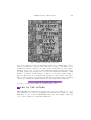
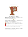
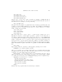
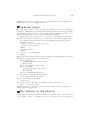
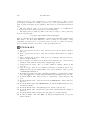
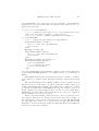
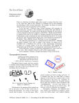
TYPE
W1lodek Bzyl
[email protected]
Nowadays, a great number of documents are produced every day.
Many authors would like their documents to stand out from the
rest not only by content but also by typographic design. For this
purpose one may use decorative letters, ornaments, dingbats
and special fonts. If each document would have to look different
from all the others a great many fonts and font deviations are
needed. This could be achieved by combining the METAPOST
language with the type 3 font format. This new font creation
technology enables users endless single-use-only variations in
weight and width, style and size, and in color. A new level of
control over the embellishment level of fonts in documents is
thereby achieved.
INTRODUCTION
For the past five centuries type has been cut in wood and cast in metal. The idea
that a computer program could design type where letterforms are represented by
procedures which draw each letter with lines and beziér curves has appeared recently.
More than twenty centuries of build-up knowledge about geometry and curves proved
to be applicable in this transition.
In 1977 the first METAFONT fonts were created by D. E. Knuth. In 1984 the
first PostScript Type 1 fonts were created by Adobe Systems.
In Knuth’s approach, shapes are designed in a declarative manner and are drawn
with ‘simulated pens’. In other words, the relationships which convey the idea of
the design are encapsulated in a set of parameters and described in the language of
algebra. Computer has to figure how to satisfy those conditions and produce the
digitized image. For example, we could state that one curve should touch another in
the middle, or that a pair of curves should cross at right angle. The Adobe approach
is simpler. Shapes are described in an imperative manner. The outline of the letter is
desribed by a series of curves and this outline is filled with ‘ink’. Although Knuth’s
programs allow to generate endless variations of shapes, the world wide standard
become Adobe’s Type 1 outline font system, possibly because it is much easier to
draw something than to explain how to draw it.
220
wlodek bzyl
The PostScript language contains another method for defining a font named
Type 3. It employs almost all the usual PostScript operators including color. Color
inclusion could be vieved as an important extension to the old metal technology
where letters are printed in ink color. Unfortunately current versions of PostScript do
not cache color or grey images, so they are executed each time they are printed. This
could slow down printing considerably. Maybe this extra added inefficiency made
Type 3 fonts so rare species. But, even with today technology, there are areas where
these fonts could make printed texts more readable, personalized and attractive.
These include [2, p. 8–9]:
Display fonts — designed to catch the eye. Used in titles, headings, posters, signs
and adverbs.
Decorative fonts — designed to convey a statement or a particular mood. Their
choice depends on the job at hand. They are very susceptible to the vagaries
of fashion. These include: initial caps, ornaments, tilings, emotional (smileys),
logos.
Speciality fonts — designed for particular purposes. Areas catered for include:
phonetic symbols, mathematical operators, musical notation, dingbats and
various oddities.
In 1989 the METAPOST system appeared. The author, J. D. Hobby, realised the
power of Knuth’s approach and its weakness in outputing black & white bitmaps.
So he created a system which implements a picture drawing language like Knuth’s
METAFONT except it outputs PostScript commands instead of bitmaps. Because
Type 3 fonts have a very simple format it is possible to postprocess METAPOST
output and to create a Type 3 font.
I start with a quick glance into the past to show the use of special fonts in old
books. Then, back to the future. In this section, I would like to draw your attention
to several examples of Type 3 fonts usage. In the next two sections, I describe how
to create a Type 3 font with METAPOST and how easy is to open Pandora’s fonts
box. There I propose a way of controling of multitude derived fonts. In appendices,
I present a detailed description of Type 3 font format and basic METAPOST library
supporting development of Type 3 fonts.
TYPOGRAPHICAL JOURNEY
The first two figures are taken from the books published by the Kelmscott Press.
This publishing house was established and run by William Morris. Letterforms are
derived from his own studies in printing history. The letterforms are chosen for
their decorative quality. The third figure is taken from “The Art of Illuminating”
by Matthew Dingby Wyatt and W. R. Tymms. This book described the pioneering
efforts of its authors in the research of letterforms and manuscript illumination.
Note the use of ornaments and initial caps in Fig. 1. There is no ‘bézierness’
in their shapes, so I can hardly imagine to program them. In Fig. 2, in the text at
reintroducing type 3 fonts
221
Fig. 1. Kelmscott Press: The Story, 1891
the bottom, dingbats are used to fill unwanted white space. Similar shapes can be
found in contemporary computer fonts. The letter ‘P’ in Fig. 3 was hand colored.
I think that existing computer tools cannot make creating such a beauty possible.
Knuth [8] writes: “I do not believe that mathematical methods will resolve all the
problems of digital typography; but I do believe that mathematics will help.” This
should be no suprise. It will always be possible to create shapes with a brush or
chisel for which there is no mathematical description of their elegance and magic.
But I do believe that new font technologies will make typographers and programmers
collaborate eventually in a similiar manner as today designers and architects do.
So, let’s go on and explore what new computers have to offer.
BACK TO THE FUTURE
Colored fonts. In traditional typography fonts could not be multicolored. “Poor
men” substitutes for coloring is overlaying letters with patterns or using color inks.
With Type 3 fonts created in METAPOST, shape, size, sidebearings, weight and
colors could be adjusted to match surrounding text.
222
wlodek bzyl
Fig. 2. Frontispiece: News form Nowhere, 1892
Computer
Typography
1. Introduction to MetaPost
2. Constructions with compass and ruler
3. Introduction to TEX
4. Typography basics
5. Computer fonts
reintroducing type 3 fonts
223
Fig. 3. M. D. Wyatt. The Art of Illuminating
Special symbols. In [11, p. v] Knuth writes: “In order to make it possible for
many types of users to read this manual effectively, a special sign is used to designate
material that is for wizards only: When the symbol
appears at the beginning of a paragraph, it warns of a ‘dangerous bend’ in the train
of thought; don’t read the paragraph unless you need to.” This idea calls for more
special symbols. Here are a few more examples [18, 19, 10].
No man can be a pure specialist without being in the strict sense an idiot.
Were we faultless, we would not derive such satisfaction from remarking the
faults of others.
Type design can be hazardous to your other interests. Once you get hooked,
you will develop intense feelings about letterforms; the medium will intrude on
the messages that you read. And you will perpetually be thinking of improvements
to the fonts that you see everywhere, especially those of your own design.
STOP
Frames. In [5] Gibbons writes: “Sadly, there is a shortage of good symbols for
creating such ornaments; not many typographic elements come in eight different
orientations! However, there is nothing to stop you designing your own symbols.”
You can not agree with that statement, can you [19].
224
wlodek bzyl
A life without festivities is
a long road without inns
Various oddities Math is plenty difficult in normal type. Programmers realized
that their programs are easier to comprehend when typeset in color. So, what about
coloring math formulas?
Or about having your own signature and stamps:
15
225
92653
58
23
43
WB
9793
3 3.14
reintroducing type 3 fonts
84626
In this article I have used more Type 3 fonts than was really necessary, so it is high
time to show how to create one.
DEVELOPING TYPE 3 FONT
Fonts are collections of shapes. A computer font is prepared in the form of a computer
program. There are several kinds of fonts. Each type of font has its own convention
for organizing and representing the information within it. The PostScript language
defines the following types of fonts [3, p. 322]: 0, 1, 2, 3, 9, 10, 11, 14, 32, 42. Text
fonts are mostly of Type 1. They are programmed with the special procedures. To
execute efficiently and to produce more legible output, these procedures, use features
common to collection of black & white letter-like shapes. They may not be used
outside Type 1 font. While any graphics symbol may be programmed as a character
in a Type 1 font, non-letter shaped symbols are better served by the Type 3 font
program which defines shapes with ordinary PostScript procedures including these
which produce color. Other font types are used infrequently.
Although Type 3 fonts are PostScript programs I prefer to program shapes in
the METAPOST language and convert mpost output into Type 3 font, because the
METAPOST language simplifies the programming due to its declarative nature. In
PostScript each curve is build from lines, arcs of circle and beziér curves. For
complicated shapes this requires a lot of nontrivial programming. METAPOST
implements ‘a magic recipe’ [10] for joining points in a pleasing way. This helps a lot.
Even if you are not satisfied with the shape, you can give the program various hints
about what you have in mind, therefore improving upon automatically generated
curve.
To use a font with TEX the font metric file is required. It contains data about
width, height and depth of each shape from the font. Because mpost could generate
metric file on demand, fonts prepared with METAPOST are immediately usable with
TEX.
Creation of a Type 3 font is multi step process.
1. A font must be imagined and designed.
2. It must be programmed. METAPOST does not support that, but a specially
created library of procedures does.
3. The program must be compiled.
4. The files thus created must be assembled into a font. This task is done by a
PERL program.
226
wlodek bzyl
Additionally, the font must be made available to TEX and instructions must be given
to tell TEX to switch to this font.
METAPOST itself does not support font creation. So I have written a special
type3 library. It provides very basic routines for font creation. These include macros
for glyph and font administration, macros for annotations of hardcopy proofs, and
finally, macros which helps in the process of converting separate glyphs into a font.
The convertion is done by a PERL program named mptot3. This program was
designed after MF2PT3 tool [16] that generates a Type 3 font that correspond to a
METAFONT program.
Here is an example.
Let us create a font which contain one character — plus. Use an ascii text editor,
it does not have to be your favorite — any such editor works, to create a file called
plus-000.mp that contains the following lines of text.
Each font program should name the font it creates.
font_name "Plus-000";
These names are merely comments which help to understand large collections of
PostScript fonts.
family_name "Plus";
font_version "0.0final";
is_fixed_pitch true;
and following names play similiar rôle in the TEX world.
font_identifier:="PLUS 000";
font_coding_scheme:="FONT SPECIFIC";
The mpost program does all its drawing on its internal ‘graph paper’. We establish
100 × 100 coordinate space on it.
grid_size:=100;
The font matrix array is used to map all glyphs to 1 × 1 coordinate space. This
PostScript convention allows consistent scaling of characters which come from different
fonts.
font_matrix
(1/grid_size,0,0,1/grid_size,0,0);
This particular font matrix will scale a plus shape by the factor 1/100 in the x
dimensions and by the same factor in the y dimension. If we had choosen scaling
by the factor 1/50 then plus shape would have appeared twice bigger comparing to
characters from other fonts.
The data below provides information about how to typeset with this font. A font
quad is the unit of measure that a TEX user calls one ‘em’ when this font is selected.
The normal space, stretch, and shrink parameters define the interword spacing when
text is being typeset in this font. A font like this is hardly ever used to typeset
anything apart from the plus, but the spacing parameters have been included just in
case somebody wants to typeset several pluses separated by quads or spaces.
reintroducing type 3 fonts
227
font_quad:=100;
font_normal_space:=33;
font_normal_stretch:=17;
font_normal_shrink:=11;
Another, more or less, ad hoc unit of measure is x_height. In TEX this unit is
available under the name ‘ex’. It it used for vertical measurements that depend on
the current font, for example for accent positioning.
font_x_height:=100;
The plus font is an example of a parametrized font. A single program like this could
be used to produce infinite variations of one design. For example, by changing the
parameters below we could make the plus character to paint in different color, change
width or change the stem width.
color stem_color;
stem_color:=red;
u:=1; % unit width
stem_width:=10;
The mode_setup macro could be used to override all the settings done above.
Typically, it is used to tell the mpost program to generate a font metric file or
proofsheets. Additionaly, mode_setup could execute any piece of valid METAPOST
code at this point. For example, we could change the stem color to blue and the stem
width to 5 units. The code to be executed could be read from a separate file (see the
next section how to prepare and use such a file). Thus we can make a variation of
this design or re-parameterize the font without changing the master plus-000.mp file.
Such a mechanism is required. Otherwise, we populate our hard disks with similiar
files.
mode_setup;
Type3 library makes it convenient to define glyphs by starting each one with:
beginpic (code, width, height, depth)
where code is either a quoted single character like "+" or a number that represents
the glyph position in the font. The other three numbers say how big the glyph
bounding box is. The endpic finishes the plus glyph.
Each beginpic operation assigns values to special variables called w, h, and d,
which represent respective width, height, and depth of the current glyph bounding
box. Other pseudo-words are part of METAPOST language and are explained in [6].
beginpic("+",100u,100,0); "+ plus";
interim linecap:=butt;
drawoptions(withcolor stem_color);
pickup pencircle scaled stem_width;
draw (0,h/2)--(w,h/2);
draw (w/2,0)--(w/2,h);
endpic;
Finally, each font program should end with the bye command.
228
wlodek bzyl
SIGN-000.MP
0
1
2
3
4
5
beginpic(127, 250, 125, 0); "Dangerous bend";
draw post; draw info signboard ;
clearxy;
% the dangerous bend
numeric heavyline; heavyline := 27;
x5 = w − x0 ; x5 − x0 = 80; x1 = x2 = x5 ; x0 = x3 = x4 ;
y0 = −y5 = 1/2 h; y1 = −y4 = 1/3 h; y2 = −y3 = 1/11 h;
pickup pencircle scaled heavyline;
interim linecap := butt;
draw z0 - - z1 {z1 − z0 } . . z2 - - - z3 . . z4 {z5 − z4 } - - z5
withcolor c.Dangerous Bend ;
labelcolor := white; dotcolor := white;
labels lft(1, 2, 3, 4, 5); labels rt(0);
endpic;
11:57
11 VII 2001
7
Fig. 4. Hardcopy proof of Signpost-500
bye
The last two steps are easy. We compile this file under LINUX with a command (or
something analogous for other operating systems)†:
mpost -mem=type3 plus-000.mp
This step produces the font metric file and the PostScript commands which draw the
plus shape. Finally, we collect the results of compilation into a Type 3 font with the
PERL program:
mptot3 plus-000
To use ‘plus font’ in a TEX document it suffices to insert these lines:
\font\plusf=plus-000 at 10pt
\centerline{\plusf +\quad+ +++ +\quad+}
This code produces the seven pluses below.
A font cannot be proved faultless. If some glyphs are defective, the best way to
correct them is to look at big hardcopy proof that shows what went wrong. For
example, the hardcopy proof above could be be generated with the following shell
commands:
mpost -mem=type3 ’\mode=proof ; \
input sign-000.mp’
tex \\input mproof sign-000.127
dvips mproof -o
† Unfortunately, the author does not know such commands for other operating
systems.
reintroducing type 3 fonts
229
Actually, the proof above contains some code which was pretty printed with mft tool
(which is also a part of any TEX distribution).
MANAGING FONTS
Note that it is not wise to make one-time-only variation of a font by changing the
font source. This kind of data multiplication resembles viruses spreading. To change
font parameters mode_setup in conjuction with change_mode macro should be used.
Again, I think that this concept is best explained by an example.
Assume that fictitious document doc.tex uses two fictitious Type 3 fonts named:
SuperFoo, SmashingBar , and the font programs reside in the files foo.mp, bar.mp.
To re-parameterize these fonts create file doc.mp with the following content:
mode_def doc_foo =
final_; % create metric file and execute:
metapost code for SuperFoo
enddef;
mode_def doc_bar =
final_;
metapost code SmashingBar
enddef;
Then create font metric files, Type 3 fonts, and dvips fontmap files with the following
commands (see Appendix B for an explanation):
mpost -mem=type3 \
’\change_mode("doc","doc_foo"); \
input foo.mp’
mptot3 -fontmap=foo.map foo.mp
mpost -mem=type3
’\change_mode("doc","doc_bar"); \
input bar.mp’
mptot3 -fontmap=bar.map bar.mp
It is convenient to concatenate fontmap files:
cat foo.map bar.map > doc.map
Now, we can compile doc.tex with:
tex doc.tex
and convert produced doc.dvi to PostScript with the command:
dvips -u doc.map doc.dvi -o
This should generate file named doc.ps which could be viewed and printed, for
example with the gv program.
FONT DESIGN TO THE PEOPLE
Although the problems of letterform design are extremely subtle, more than most
people think, because our machines and our eyes interact with the shapes in
230
wlodek bzyl
complicated ways [8], these arguments do not necessarily apply to Type 3 fonts.
Special purpose designs, for example geometric ones, could be programmed even by a
rank one amateur designer and programmer. The article proves this last statement, I
hope.
The font design is a fun. So, I decided to make available over a WEB all the
tools and fonts created during preparation of this manuscript.
The master sources, which hopefully reached the beta stage, could be picked up
from the following URL:
ftp.gust.org.pl/pub/TeX/fonts/mtype3.
There you will find the file named README. It contains detailed installation instructions.
Then turn to the files called Makefile. Most of them are very simple. They
encapsulate actions needed to create hardcopy proofs, fonts, etc. There are separate
directories with examples of use and a booklet presenting all fonts.
REFERENCES
[1] Adobe Systems Incorporated. 1985. Tutorial and Cookbook. Addison Wesley,
221–228.
[2] Adobe Systems Incorporated. 1992. The PostScript Font Handbook. Addison
Wesley.
[3] Adobe Systems Incorporated. 1999 (3rd ed.). PostScript Language Reference
Manual. Addison Wesley.
[4] Per Cederqvist et al. 1993. Version Management with CVS (for version 1.10.8).
Available online with the CVS package. Signum Support AB.
[5] Jeremy Gibbons. 1999. “Hey — it works!” (Hints & Tricks). TUGboat 20,
367–370.
[6] John D. Hobby. 1992. A user’s Manual for MetaPost. Technical Report 162.
AT&T Bell Laboratories, Murray Hill / New Jersey. Available online as a part
of METAPOST distribution.
[7] Bogus1law Jackowski at all. 1999. “Antykwa Pó1ltawskiego: a parametrized outline
font”. EuroTEX 99 Proceedings. Ruprecht-Karls-Univerität Heidelberg, 117–141.
[8] Donald E. Knuth. 1982. “The Concept of a Meta-Font”. Visible Language 16,
3–27.
[9] Donald E. Knuth. 1985. “Lessons Learned from METAFONT”. Visible Language
19, 35–53.
[10] Donald E. Knuth. 1986. The METAFONTbook. American Mathematical Society
and Addison Wesley.
[11] Donald E. Knuth. 1988. “A Punk Meta-Font”. TUGboat 9, 152–168.
[12] Donald E. Knuth. 1988. “Virtual Fonts: More Fun for Grand Wizards”. TUGboat
11, 13–23.
[13] Donald E. Knuth. 1992. Computer Modern Typefaces. Addison Wesley.
[14] Donald E. Knuth. 1994. The TEXbook. American Mathematical Society and
Addison Wesley.
reintroducing type 3 fonts
231
[15] Richard M. Stallman and Roland McGrath. 2000. GNU Make (for version 3.79).
Available online as a part of GNU MAKE package.
[16] Apostolos Syropoulos. 2000. The MF2PT3 tool. Available online from www.
obelix.ee.duth.gr/~apostolo.
[17] La Rochefoucauld. 1655-1678. Maxims.
[18] George B. Shaw. 1903. From the Revolutionist’s Handbook.
[19] Democritus. ca 400 B.C. Ethical Precepts.
APPENDIX A
Here the format of Type 3 font is described. This description is somehow
simplified with the respect to examples to be found in [1] and [3].
Each font should begin with two lines of comments.
%!PS-Adobe-2.0: Square 1.00
%%CreationDate: 1 May 2001
A Type 3 font consists of a single dictionary, possibly containing other
dictionaries, with certain required entries. The dictionary of size 99 should suffice
for fonts which consists of several characters.
99 dict begin
This dictionary should include following entries:
Variable FontType indicates how the character information is organized; for
Type 3 fonts it has to be set 3.
Variable LanguageLevel set to minimum language level required for correct
behavior of the font.
Array FontMatrix transforms the character coordinate system into the user
coordinate system. This matrix maps font characters to one-unit coordinate
space, which enables PostScript interpreter to scale font characters properly.
This font uses 1000-unit grid.
Array of four numbers FontBBox gives lower-left (lx , ly ) and upper-right
(ux , uy ) coordinates of the smallest rectangle enclosing the shape that would
result if all characters of the font were placed with their origins coincident,
and then painted. This information is used in making decisions about
character caching and clipping. If all four values are zero, no assumptions
about character bounding box are made.
/FontType 3 def
/LanguageLevel 2 def
/FontMatrix [ 0.001 0 0 0.001 0 0 ] def
/FontBBox [ 0 0 1000 1000] def
FontInfo dictionary is optional. All info stored there is entirely for the benefit
of PostScript language programs using the font, or for documentation.
FamilyName — a human readable name for a group of fonts. All fonts that
are members of such a group should have exactly the same FamilyName.
232
wlodek bzyl
FullName — unique, human readable name for an individual font. Should
be the same name as one used when registering the font with definefont
operator below.
Notice — copyright, if applicable.
Weight — name for the “boldness” attribute of a font.
version — version number of the font program.
ItalicAngle — angle in degrees counterclockwise from the vertical of the
dominant vertical strokes of the font.
isFixedPitch — if true, indicates that the font is a monospaced font;
otherwise set false.
UnderlinePosition — recommended distance from the baseline for positioning underlining strokes (y coordinate).
UnderlineThickness— recommended stroke width for underlining, in units
of the character coordinate system.
/FontInfo <<
/FamilyName (Geometric)
/FullName (Square)
/Notice (Type 3 Repository.
Copyright \(C\) 2001 Anonymous.
All Rights Reserved.)
/Weight (Medium)
/version (1.0)
/ItalicAngle 0
/isFixedPitch true
/UnderlinePosition 0.0
/UnderlineThickness 1.0
>> def
Array Encoding maps character codes (integers) to character names. All unused
positions in encoding vector must be filled with the name .notdef. It is special in
only one regard: if some encoding maps to a character name that does not exist
in the font, .notdef is substituted. The effect produced by executing .notdef
character is at the discretion of the font designer, but most often it is the same
as space.
/Encoding 256 array def
0 1 255 {Encoding exch /.notdef put} for
CharacterProcedures dictionary contains individual character definitions. This
name is not special. Any name could be used, but this name is assumed by the
BuildGlyph procedure below.
/CharacterProcedures 256 dict def
Each character must invoke setcachedevice or setcharwidth operator before
executing graphics operators to define and paint the character. The setcachedevice operator stores the bitmapped image of the character in the font
cache. However, caching will not work if color or gray is used. In such cases
reintroducing type 3 fonts
233
the setcharwidth operator should be used. It is similiar to setcachedevice
(explained below), but it declares that the character being defined is not to be
placed in the font cache.
wx wy lx ly ux uy setcachedevice –
wx , wy — comprise the basic width vector, ie. the normal position of the
origin of the next character relative to origin of this one
lx , ly , ux , uy — are the coordinates of this character bounding box
wx wy setcharwidth –
wx wy — comprise the basic width vector of this character
CharacterProcedures /.notdef {
1000 0 0 0 1000 1000 setcachedevice
1000 0 moveto
} put
Encoding 32 /space put
CharacterProcedures /space {
1000 0 0 0 1000 1000 setcachedevice
1000 0 moveto
} put
Encoding 83 /square put % ASCII ‘S’
CharacterProcedures /square {
1000 0 setcharwidth
0 1 1 0 setcmykcolor % red
0 0 1000 1000 rectfill
} put
Procedure BuildGlyph is called within the confines of a gsave and a grestore,
so any changes BuildGlyph makes to the graphics state do not persist after it
finishes.
BuildGlyph should describe the character in terms of absolute coordinates
in the character coordinate system, placing the character origin at (0, 0) in this
space.
The Current Transformation Matrix (CTM) and the graphics state is
inherited from the environment. To ensure predictable results despite font
caching, BuildGlyph must initialize any graphics state parameters on which
it depends. In particular, if BuildGlyph executes the stroke operator, it
should explicitly set: dash parameters, line cap, line join, line width. These
initializations are unnecessary, when characters are not cached, for example if
the setcachedevice operator is not used.
When a PostScript language interpreter tries to show a character from a
font, and the character is not already present in the font cache it pushes on
the operand stack: current font dictionary and character name. The BuildGlyph
procedure must remove these two objects from the operand stack and use this
information to render the requested character. This typically involves finding the
character procedure and executing it.
234
wlodek bzyl
/BuildGlyph { % stack: font charname
exch
begin
% initialize graphics state parameters
% turn dashing off: solid lines
[ ] 0 setdash
% projecting square cap
2 setlinecap
% miter join
0 setlinejoin
% thickness of lines rendered by
% execution of the stroke operator
50 setlinewidth
% the miter limit controls the stroke
% operator’s treatment of corners;
% this is the default value and it
% causes cuts off mitters at
% angles less than 11 degrees
10 setmiterlimit
CharacterProcedures exch get exec
end
} bind def
currentdict
end % of font dictionary
Finally, we register the font name as a font dictionary defined above and associate
it with the key Square. Additionally the definefont operator checks if the font
dictionary is a well-formed.
/Square exch definefont pop
If the following lines are not commented out the Ghostscript program (a
public domain PostScript interpreter) will show the text below online. Obviously,
these lines should be commented out in the final version of the font program.
/Square findfont
72 scalefont setfont
0 72 moveto (S) show
showpage
METAPOST MACROS FOR TYPE 3 FONTS
TYPE 3 DRIVER FILE
This driver file serves as chief executive for the files which supports Type 3 font
generation process.
reintroducing type 3 fonts
235
When the equality below is true, this file has been input.
if base name = "type3": endinput fi
The first few lines usually give the base file a name and version number.
string base name, base version; base name = "type3"; base version = "1.27";
message "Preloading the type3 mem file, version " & base version;
Supporting macros are divided into several files.
input
input
input
input
type3adm % glyph and font administration.
type3mop % modes of operation
type3pf % support for hardcopy proofs
type3ps % PostScript specific items.
endinput
GLYPH AND FONT ADMINISTRATION
Each glyph is build between beginpic . . . endpic. The beginpic was designed
after plain beginchar macro. Each beginpic begins a group, which end at the
next endpic. Then the given glyph code is stored and character box dimensions
in mpost internal variables charwd, charht, chardp and it sets box dimensions w,
h, and d. Finally it clears the z variables, the current picture, and the current
pen. TEX needs to know the size of each characters’s “bounding box”. A total of
four dimensions is given for each character:
• charwd, the width of the bounding box
• charht, the height above baseline of the bounding box
• chardp, the depth below baseline of the bounding box
• charic, the character “italis’s correction”.
The mpost records the value of its internal quantities, and writes them onto tfm
file, at the time of shipit command.
def
#
= /(grid size/designsize) enddef ;
def beginpic(expr c, width, height , depth) = % character code c
begingroup
charcode := if known c: byte c else: 0 fi;
w := width; h := height ; d := depth;
charic := 0; clearxy; clearit; clearpen;
drawoptions();
scantokens extra beginpic;
enddef ;
def italcorr expr x = if x > 0: charic := x# fi enddef ;
newinternal proofscale; proofscale := 1;
236
wlodek bzyl
Glyph widths are written onto file named jobname.pcw. These widths are read
by mptot3 script which uses them as parameters to the PostScript setcharwidth
operator.
def endpic = scantokens extra endpic;
write decimal charcode & ":" & decimal w to jobname & ".pcw";
charwd := w#; charht := h#; chardp := d#;
if proofing > 0: makebox(proofrule);
currentpicture := currentpicture scaled proofscale;
fi
shipit;
endgroup
enddef ;
def shipit = if proofing ≥ 0:
shipout currentpicture transformed (identity shifted (xoffset , yoffset )) fi
enddef ;
newinternal xoffset, yoffset ;
string extra beginpic, extra endpic;
extra beginpic = extra endpic = "";
The designsize of a font is another internal quantity that is output to tfm file.
When a TEX user asks for a font ‘at’ a certain size, the font is scaled by the
ratio between the “at size” and the “design size”.
The designsize must be at least 1 pt and must be less than 2048 pt and every
dimension of the font should be less than 16 times the design size in absolute
value.
The “design size” is an imprecise notion, because there need be no connection
between the design size and any specific measurement in a font. It is something
like dress size or shoe sizes. For Type 3 fonts we set the design size to
100 bp, which seems to be a good compromise between the accuracy of the
mpost calculations and the maximum size of a grid.
designsize := 100;
It is suggested that fonts use a 1000-unit grid. This is the default grid size used
in Type 1 fonts programs.
newinternal grid size; grid size := 1000;
The other type information that appears in tfm file applies to a font as a whole.
These include numeric data specified in “fontdimen” commands. Note that math
symbols fonts are required to have at least 22 fontdimen parameters and math
extensions at least 13.
def font slant expr x = fontdimen 1: x enddef ; % no hash here!
def font normal space expr x = fontdimen 2: x# enddef ;
def font normal stretch expr x = fontdimen 3: x# enddef ;
reintroducing type 3 fonts
def
def
def
def
font
font
font
font
237
normal shrink expr x = fontdimen 4: x# enddef ;
x height expr x = fontdimen 5: x# enddef ;
quad expr x = fontdimen 6: x# enddef ;
extra space expr x = fontdimen 7: x# enddef ;
def font identifier expr x = font identifier := x enddef ;
def font coding scheme expr x = font coding scheme := x enddef ;
string font identifier , font coding scheme ;
font identifier = font coding scheme = "UNSPECIFIED";
TEX relies on lots of parameters when it typesets math formulas. He will not
typeset a math formula unless symbol fonts contain at least 22 fontdimen
parameters.
vardef font num @# expr x = if (@# < 1) or (@# > 3):
errmessage "Wrong suffix to font_num: " & decimal @#
else: fontdimen 7 + @#: x# fi
enddef ;
vardef font denom @# expr x = if (@# < 1) or (@# > 2):
errmessage "Wrong suffix to font_denom" & decimal @#
else: fontdimen 10 + @#: x# fi
enddef ;
vardef font sup @# expr x = if (@# < 1) or (@# > 3):
errmessage "Wrong suffix to font_sup" & decimal @#
else: fontdimen 12 + @#: x# fi
enddef ;
vardef font sub @# expr x = if (@# < 1) or (@# > 2):
errmessage "Wrong suffix to font_sub" & decimal @#
else: fontdimen 15 + @#: x# fi
enddef ;
def font sup drop expr x = fontdimen 18: x# enddef ;
def font sub drop expr x = fontdimen 19: x# enddef ;
vardef font delim @# expr x = if (@# < 1) or (@# > 2):
errmessage "Wrong suffix to font_delim" & decimal @#
else: fontdimen 17 + @#: x# fi
enddef ;
def font axis height expr x = fontdimen 22: x# enddef ;
Extension fonts should contain at least 13 fontdimen parameters.
def font default rule thickness expr x = fontdimen 8: x# enddef ;
vardef font big op spacing @# expr x = if (@# < 1) or (@# > 5):
errmessage "Wrong suffix to font_big_op_spacing"&decimal @#
238
wlodek bzyl
else: fontdimen 8 + @#: x# fi
enddef ;
endinput
MODES OF OPERATION
The standard way to create a Type 3 font is to start up the mpost program by
saying
mpost -mem=type3 \mode=mode name; input font program
and afterwards to collect glyphs created by mpost into a Type 3 font with Perl
script
mptot3 font program
The mode is omitted if mode=final. The mode name should have been predeclared
in your base file, by the mode def routine below. If, however, you need special
modes that aren’t in the base, you can put its commands into a file (e.g.,
‘specmodes.mp’) and invoke it by saying
mpost -mem=type3 \change mode("specmodes", mode name);
input font program
instead of giving a predeclared mode name.
Here is the mode setup routine, which is usually one of the first macros to be
called after a font program establishes the values of all font parameters. The first
‘scantokens’ in mode setup either reads a special file or calls a macro that
expands into commands defining the mode.
transform currenttransform; def t = transformed currenttransform enddef ;
def mode setup = if unknown mode: mode = final; fi
numeric aspect ratio; transform currenttransform;
if unknown aspect ratio: aspect ratio = 1; fi
if string mode: scantokens("input " & mode);
for i := 1 upto number of modes:
if mode name[i] = requested mode : scantokens mode name[i]; fi
endfor
else: scantokens mode name[mode];
fi
scantokens extra setup; % the user’s special last-minute adjustments
currenttransform :=
if unknown currenttransform: identity else: currenttransform fi
yscaled aspect ratio;
clearit;
enddef ;
def change mode(expr file name, mode name) =
string mode; mode := file name;
reintroducing type 3 fonts
239
requested mode := mode name & "_"
enddef ;
string requested mode ;
string extra setup, mode name[];
extra setup = ""; % usually there’s nothing special to do
When a mode is defined (e.g., ‘proof’), a numeric variable of that name is
created and assigned a unique number (e.g., 1). Then an underscore character
is appended, and a macro is defined for the resulting name (e.g., ‘proof_’).
The mode name array is used to convert between number and name (e.g.,
mode name1 = proof_).
def mode def suffix $ =
$ := incr number of modes;
mode name[$] := str $ & "_";
expandafter quote def scantokens mode name[$]
enddef ;
newinternal number of modes;
Three basic modes are now defined, starting with two for proofing.
Proof mode — for initial design of characters.
mode def proof =
proofing := 2; % yes, we’re making full proofs
fontmaking := 0; % no, we’re not making a font
tracingtitles := 1; % yes, show titles online
enddef ;
Smoke mode — for label-free proofs.
mode def smoke =
proof ; % same as proof mode, except:
proofing := 1; % yes, we’re making unlabeled proofs
fontmaking := 0; % no, we’re not making a font
let makebox = maketicks; % make the boxes less obtrusive
enddef ;
Final mode — a typical mode for font generation (note, that we get a TEX font
metric file if mpost internal quantity f ontmaking is positive at the end of our
job).
mode def final =
proofing := 0; % no, we’re not making proofs
fontmaking := 1; % yes, we are making a font
tracingtitles := 0; % no, don’t show titles at all
prologues := −2; % high resolution bounding box.
enddef ;
240
wlodek bzyl
newinternal grayproofing;
mode def grayproof =
proofing := 2; % yes, we’re making full proofs
fontmaking := 0; % no, we’re not making a font
tracingtitles := 1; % yes, show titles online
grayproofing := 1; % use ‘proofcolor’ for drawing
enddef ;
localfont := final; % the mode most commonly used to make fonts
It is not likely that additional modes are needed, but if they are, additional
mode def commands should be in another input file that gets loaded after the plain
base. The auxiliary file should set base version := base version & "/localname"
PROOF LABELS AND RULES
The next main section of type3.mp is devoted to macros for the annotations on
proofsheets.
newinternal proofing; % < 0 to supress output; > 1 to do labels
color proofcolor ; % color for output when proofing > 0
proofcolor = .3[white, black ];
color background ; background = white;
color dotcolor , labelcolor ; dotcolor = black ; labelcolor = black ;
newinternal defaultdotsize; defaultdotsize := 3;
newinternal defaultrulethickness; defaultrulethickness := 1;
Labels are generated at the lowest level by makelabel and makepiclabel:
Put string s near point z.
vardef makelabel @#(expr s, z) = picture p;
if proofing > 1: if known z:
p = s infont defaultfont scaled defaultscale;
draw p shifted
(z + labeloffset ∗ laboff @# −
(labxf @# ∗lrcorner p+labyf @# ∗ulcorner p+(1−labxf @# −labyf @# )∗llcorner p))
withcolor labelcolor ;
interim linecap := rounded ;
draw z withpen pencircle scaled defaultdotsize
withcolor dotcolor ;
fi
fi
enddef ;
Put string s near point z shifted by shift and scaled by scale.
vardef makepiclabel @#(expr s, z, shift , scale) =
reintroducing type 3 fonts
241
save zz ; pair zz ; zz = z shifted shift scaled scale;
makelabel @#(s, zz );
enddef ;
Users generally don’t invoke makelabel directly, because there’s a convenient
shorthand. For example, ‘labels(1, 2, 3)’ expands into ‘makelabel("1", z1 );
makelabel("2", z2 ); ‘makelabel("3", z3 )’ (But nothing happens if proofing ≤
1.)
vardef labels @#(text t) =
forsuffixes $ = t: makelabel @#(str $, z$ ); endfor
enddef ;
vardef piclabels @#(expr shift , scale)(text t) =
forsuffixes $ = t: makepiclabel @#(str $, z$ , shift , scale); endfor
enddef ;
vardef penlabels @#(text t) = forsuffixes $$ = l, , r: forsuffixes $ = t:
makelabel @#(str $$$ , z$.$$ ); endfor endfor
enddef ;
vardef picpenlabels @#(expr shift , scale)(text t) =
forsuffixes $$ = l, , r: forsuffixes $ = t:
makepiclabel @#(str $$$ , z$.$$ , shift , scale); endfor endfor
enddef ;
When there are lots of purely numeric labels, you can say, e.g.,
labels(1, range 5 thru 9, range 100 thru 124, 223)
which is equivalent to ‘labels(1, 5, 6, 7, 8, 9, 100, 101, . . . , 124, 223)’. Labels are
omitted from the proofsheets if the corresponding z value isn’t known, so it
doesn’t hurt (much) to include unused subscript numbers in a range.
def range expr x = numtok[x] enddef ;
def numtok suffix x = x enddef ;
tertiarydef m thru n = m for x = m + 1 step 1 until n: , numtok[x] endfor
enddef ;
A straight line will be drawn on the proofsheet by proofrule.
def proofrule(expr w, z) =
begingroup interim linecap := squared;
draw w . . z withpen pencircle scaled defaultrulethickness
withcolor proofcolor
endgroup
enddef ;
You can produce lots of proof rules with makegrid, which connects an arbitrary
list of x coordinates with an arbitrary list of y coordinates:
242
wlodek bzyl
def makegrid(text xlist , ylist ) =
xmin := min(xlist ); xmax := max(xlist );
ymin := min(ylist ); ymax := max(ylist );
for x = xlist : proofrule((x, ymin ), (x, ymax )); endfor
for y = ylist : proofrule((xmin , y), (xmax , y)); endfor
enddef ;
vardef labelfont suffix $ = defaultfont := str $ enddef ;
def makebox(text r) =
for y = 0, h, −d: r((0, y), (w, y)); endfor
for x = 0, w: r((x, −d), (x, h)); endfor
enddef ;
def maketicks(text r) =
for y = 0, h, −d: r((0, y), (w/10, y)); r((w − w/10, y), (w, y)); endfor
for x = 0, w: r((x, h/10 − d), (x, −d)); r((x, h − h/10), (x, h)); endfor
enddef ;
MACROS FOR FILLING AND ERASING
def pc = hide(if grayproofing > 0: def pc = do pc enddef ; else: def pc =
enddef ; fi) pc
enddef ;
def do pc = withcolor proofcolor enddef ;
def fill expr c = addto currentpicture contour c t
op pc enddef ;
def draw expr p = addto currentpicture
if picture p: also p
else: doublepath p t withpen currentpen
fi op pc
enddef ;
def filldraw expr c = addto currentpicture contour c t withpen currentpen
op pc
enddef ;
def drawdot expr z = addto currentpicture contour makepath currentpen
shiftedz t op pc
enddef ;
endinput
TYPE 3 SPECIFIC ITEMS
One of required entries in each font dictionary is the array FontMatrix. This
array is used by a PostScript interpreter to transform glyph coordinate system
reintroducing type 3 fonts
243
into the user system coordinate system. This matrix maps font characters to
one-unit coordinate space, which enables PostScript interpreter to scale font
characters properly. It is suggested that fonts use a 1000-unit grid. This implies
the following FontMatrix:
FontMatrix [ .001 0 0 .001 0 0 ] def
But what matrix is used is up to user, as long as the FontMatrix would
be adjusted accordingly. The FontMatrix will be read from a file named
jobname.par. The parameters written to this file are read by the mptot3 script.
A two dimensional transformation is described in math as 2 × 3 matrix
a b tx
c d tx
In the PostScript language, this matrix is represented as a six-element array
object
[ a b c d tx ty ]
For example, scaling by the factor sx in the x dimension and sy in the y
dimension is accomplished by the matrix:
sx 0 0
0 sy 0
or by an array object:
[ sx 0 0 sy 0 0 ]
def font matrix(expr a, b, c, d, tx , ty) = write "FontMatrix [ "&
decimal a & " " & decimal b & " " & decimal c & " " & decimal d&
" " & decimal tx & " " & decimal ty & " ]" to jobname & ".par"
enddef ;
Each PostScript font has a name and belongs to some family, has attached
version etc. These parameters are written onto jobname.par file too.
def font name expr name = write "FontName "&name tojobname&".par"
enddef ;
def family name expr name = write "FamilyName " & name to jobname &
".par"
enddef ;
def font version expr x = write "FontVersion " & x to jobname & ".par"
enddef ;
def is fixed pitch expr b = write "isFixedPitch "&
if b: "true" else: "false" fi to jobname & ".par"
enddef ;
endinput