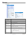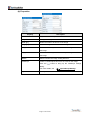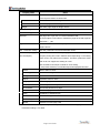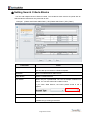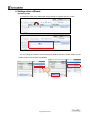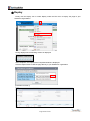
1
SkyVisualEditor User Manual Ver 3.5.2.2.0 20 August 2014 TerraSky Inc. Contact Information For inquiries about licensing please contact our sales department at [email protected] For support or inquiries about the product itself please contact our development team at [email protected] ※ Please note that due to volume we may not be able to respond to all inquiries. ※ Additional support packages are available. Please contact your sales representative or email our sales department at [email protected] for additional information. ※ TerraSky Inc. is a wholly owned U.S. subsidiary of TerraSky Co., Ltd. ※ Please refer to the Japanese document to contact a Japanese corporation. https://www.skyvisualeditor.com/help/skyvisualeditor_help.pdf#pagemode=bookmarks&zoom=100 Table of Contents Revision History .................................................................................................................. 8 1. Introduction ......................................................................................................................10 1-1 Introduction ................................................................................................................................................ 10 1-2 Notice ........................................................................................................................................................... 11 ① Request to the customer ............................................................................................................................... 11 ② Trademarks ................................................................................................................................................... 11 2. Setup ...............................................................................................................................12 2-1 System Requirements ................................................................................................................................ 12 ① Web Browser ................................................................................................................................................ 12 ② Salesforce1 Application ................................................................................................................................ 13 ③ SkyVisualEditor / salesforce.com license type compatibility matrix ............................................................. 13 ④ Supported Languages .................................................................................................................................. 14 2-2 Installation of Silverlight .......................................................................................................................... 15 2-3 Registration ................................................................................................................................................ 16 2-4 Reset Password .......................................................................................................................................... 17 2-5 Login ........................................................................................................................................................... 18 2-6 Permission setting on Salesforce .............................................................................................................. 19 2-7 Installation of SkyVisualEditor AppExchange Package ......................................................................... 20 2-8 Salesforce Setup ......................................................................................................................................... 22 ① License Management ................................................................................................................................... 22 ② Security setup in Salesforce ......................................................................................................................... 23 ③ Permission setup in Salesforce .................................................................................................................... 25 ④ Run ApexCode test ...................................................................................................................................... 27 2-9 Release by changeset ................................................................................................................................. 27 3. SkyVisualEditor Studio ....................................................................................................28 3-1 Portal Screen (Home) ................................................................................................................................. 28 3-2 User Settings .............................................................................................................................................. 28 3-3 Group Users ............................................................................................................................................... 29 3-4 Credit card payment .................................................................................................................................. 31 3-5 Studio Screen(Connect to Salesforce) .................................................................................................. 33 3-6 Studio Screen ............................................................................................................................................. 35 ① Header / Menu.............................................................................................................................................. 36 ② Field Type ..................................................................................................................................................... 58 ③ Object Panel ................................................................................................................................................. 58 ④ Component panel ......................................................................................................................................... 76 ⑤ Design Canvas ........................................................................................................................................... 177 ⑥ Wizard Properties ....................................................................................................................................... 179 ⑦ Page property ............................................................................................................................................. 182 ⑧ Component properties ................................................................................................................................ 201 ⑨ Footer area ................................................................................................................................................. 201 4. Page Design ..................................................................................................................202 4-1 Open Page ................................................................................................................................................. 202 ① New ............................................................................................................................................................ 202 ② Open ........................................................................................................................................................... 203 4-2 SkyVisualEditor layouts .......................................................................................................................... 204 ① Salesforce Layout....................................................................................................................................... 204 ② Free Layout ................................................................................................................................................ 204 ③ [Template] Search Screen .......................................................................................................................... 205 ④ [Template] Relational Object Entry ............................................................................................................. 205 ⑤ [Template] Custom Lookup ........................................................................................................................ 206 ⑥ [Template] Page Assignment...................................................................................................................... 206 ⑦ [Template] Wizard....................................................................................................................................... 207 ⑧ DashBoard Layout...................................................................................................................................... 207 4-3 Create a page with the Salesforce Layout .............................................................................................. 208 ① Set Page Block Sections ............................................................................................................................ 209 ② Set Fields ................................................................................................................................................... 210 ③ Set Buttons ................................................................................................................................................. 212 ④ Save ........................................................................................................................................................... 213 ⑤ Deploy ........................................................................................................................................................ 214 4-4 Create a page with the Free Layout ....................................................................................................... 215 ① Set Background .......................................................................................................................................... 215 ② Set Fields, Grids, and Tables ..................................................................................................................... 217 ③ Button ......................................................................................................................................................... 219 ④ Save ........................................................................................................................................................... 219 ⑤ Deploy ........................................................................................................................................................ 220 4-5 Create a page with the Search Screen Template ................................................................................... 221 ① Pre-conditions ............................................................................................................................................ 222 ② About the search conditions ....................................................................................................................... 223 ③ Set Search Criteria Fields .......................................................................................................................... 224 ④ Setting Search Criteria Blocks ................................................................................................................... 230 ⑤ Set Results Table Properties ...................................................................................................................... 232 ⑥ Set Search Results Fields .......................................................................................................................... 235 ⑦ Settings after a Wizard ............................................................................................................................... 238 ⑧ Save ........................................................................................................................................................... 241 Page 4 of 333 ⑨ Deploy ........................................................................................................................................................ 242 ⑩ Display Search Conditions after Deploy .................................................................................................... 244 4-6 Create a page with the Relational Object Template .............................................................................. 245 ① Set Main Object .......................................................................................................................................... 246 ② Select Relative Objects .............................................................................................................................. 247 ③ Select Relative Object Fields ..................................................................................................................... 248 ④ Set Formulas .............................................................................................................................................. 248 ⑤ Set Layout Properties ................................................................................................................................. 254 ⑥ Save ........................................................................................................................................................... 255 ⑦ Deploy ........................................................................................................................................................ 256 4-7 Create a page with the Custom Lookup Template ................................................................................ 257 ① Pre-conditions ............................................................................................................................................ 258 ② Set Search Criteria Fields .......................................................................................................................... 258 ③ Set Results Table Properties ...................................................................................................................... 261 ④ Set Search Results Fields .......................................................................................................................... 263 ⑤ Set Layout Properties ................................................................................................................................. 263 ⑥ Save ........................................................................................................................................................... 264 ⑦ Deploy ........................................................................................................................................................ 265 ⑧ Set Calling Screen...................................................................................................................................... 266 ⑨ Usage in Salesforce ................................................................................................................................... 269 ⑩ Screen Display on Salesforce1 .................................................................................................................. 273 4-8 Create a page with the Page Assignment Template .............................................................................. 274 ① Assign Pages ............................................................................................................................................. 275 ② Deploy ........................................................................................................................................................ 277 4-9 Create a Page with the Wizard Template ............................................................................................... 278 ① Choose Layout ........................................................................................................................................... 280 ② Create a page............................................................................................................................................. 280 ③ Set Destination Page ................................................................................................................................. 281 ④ Deploy ........................................................................................................................................................ 282 4-10 Create a Page with the DashBoard Layout.......................................................................................... 283 ① Set Layout (column) ................................................................................................................................... 283 ② Component Layout ..................................................................................................................................... 285 ③ Save Page .................................................................................................................................................. 286 ④ Deploy ........................................................................................................................................................ 287 4-11 Convert a Page to a Reference Page ..................................................................................................... 288 4-12 Salesforce Settings after deploying ....................................................................................................... 289 ① Enable Visualforce Page Access ............................................................................................................... 289 ② Settings for opening pages ........................................................................................................................ 290 Page 5 of 333 5. Advanced Customization ...............................................................................................293 5-1 Apex Class Extension .............................................................................................................................. 293 ① Customizable Scope .................................................................................................................................. 294 ② Setting Procedure....................................................................................................................................... 294 ③ Implementation Definition ........................................................................................................................... 295 ④ Sample code .............................................................................................................................................. 300 5-2 JavaScript functions ................................................................................................................................ 309 ① Setting procedure ....................................................................................................................................... 309 ② Sample code .............................................................................................................................................. 309 6. Reference – Component Compatibility Matrix ...............................................................310 6-1 List of Component Layout Control ......................................................................................................... 310 6-2 List of Salesforce1 Screen Transition ..................................................................................................... 314 7. Frequently Asked Questions ..........................................................................................318 7-1 Logging in SkyVisualEditor / User Registration ................................................................................... 318 ① Message [Incorrect code. Please enter the corresponding code for the security image] is shown upon new user registration, but no capture image was displayed. .................................................................................. 318 ② When checking the Web Site Identity, the owner is listed as [This web site does not supply ownership information]. Is this website secure? ............................................................................................................... 319 ③ I cannot log into SkyVisualEditor ................................................................................................................ 319 ④ Is it possible to change a regular user to a Group User?........................................................................... 319 7-2 SkyVisualEditor Studio ........................................................................................................................... 320 ① Which web browsers and versions are supported? ................................................................................... 320 ② SkyVisualEditor Studio runs slowly ............................................................................................................ 320 ③ A message about a new version of Studio was shown but the version has not changed. ........................ 320 ④ SkyVisualEditor Studio does not launch. ................................................................................................... 320 ⑤ System error occurs when saving a page .................................................................................................. 321 7-3 Connection to Salesforce .......................................................................................................................... 321 ① Cannot log in to Salesforce ........................................................................................................................ 321 7-4 Deploy to Salesforce organization ........................................................................................................... 322 ① Can any user deploy? ................................................................................................................................ 322 ② Is it possible to deploy into a Salesforce organization in which the “SkyVisualEditor” AppExchange Package is not installed? ................................................................................................................................................ 322 ③ Is any SkyVisualEditor AppExchange Package version acceptable? ........................................................ 323 ④ Is it necessary to give a SkyVisualEditor license to administrative users? ................................................ 324 ⑤ Warning messages are shown during deploy. ........................................................................................... 325 ⑥ Message saying [at least 75% test coverage is required] is shown ........................................................... 326 ⑦ Test error is shown during deploy. .............................................................................................................. 327 ⑧ System error occurred on Deploy .............................................................................................................. 328 Page 6 of 333 ⑨ Timeout error occurs .................................................................................................................................. 328 ⑩ Deploy failed............................................................................................................................................... 329 ⑪ Where are my pages after I deploy? .......................................................................................................... 330 7-5 Salesforce error messages after deploying ............................................................................................. 331 ① Maximum view state size limit exceeded. .................................................................................................. 331 ② License required / insufficient permissions ................................................................................................ 332 ③ Input fields for search conditions / ToDo object are not displayed. ............................................................ 333 ④ When browsing data, the “Input Error when saving” message is shown ................................................... 333 Page 7 of 333 Revision History Version V3.3 Detail Display mass data in the Search Template 4-5⑥i)(b) Create a page in Chinese 2-1④ Custom Lookup is available in the search condition field in the 4-5③i)(d) Search Template In a search template, choices for a picklist field can be displayed in 3-6③ix) default record type 4-5③i)(e) The upper limit of a record count in a table is changed to 1000 3-6④viii)(b)(i) The maximum number of custom buttons that can be placed in a 4-5⑤ search screen is increased to 20 V3.4 Dashboard Layout 4-10 Detail Panel 3-6④xii) Suggest to change password on initial login 2-5 Free Layout within Page Block Section 3-6④iii) Enhanced Search template with high capacity 4-5⑥i)(b) Place tables that are unrelated to Main Object 3-6④vii) Availability to show items of Parent-object on search result using search 4-5③ template. Availability to set colors of Table headers and tabs. 3-6④v)(b)(i) 3-6④viii)(b)(i) Added “include Style Sheet setting” on Page Style. 3-6⑦v)(b)3-6 ⑦v) Availability to select Style Class on every component property. 3-6④ Maximized the number of buttons up to 50. 3-6⑦xiii) Maximized the number of Page Block up to 50. 3-6⑦xiii) Maximized the number of Main Object Formulas up to 50. 4-6④ii) Maximized the number of Panel Grid columns up to 20 columns 3-6④vi) Added “legal” on page size for pdf 3-6⑦x) The number of After limit increaseds that can be placed on the page is 3-6⑦xiii) increased to 2000 Page 8 of 333 Version V3.5 Detail Compatible with Salesforce1 Application development 2-1② ・ Custom Lookup 4-7⑩ ・ Help Text 3-6③ix) ・ Tooltip ・ Detail Panel 3-6④xii)(e) ・ Picklist(Multi-Select) 3-6③ix) ・ Related List 3-6④x) ・ Page Assignment Template 4-8 ・ Page Script 3-6⑦vi)(a) ・ Destination for Page Transition 3-6⑦ix) * See the following URL. ◇SkyVisualEditor Salesforce1 Support Guide https://s3.amazonaws.com/www.skyvisualeditor.com/doc/skyvisualedit or_salesforce1_guide_en.pdf “Apex Class Extension” for Apex classes can be written from Studio 3-6⑦iii)(b) Page. Conditionally show/hide items on a page 3-6③ix) Availability of “Campaign” Object 3-6①i)(a) Fix Header Location of Data Table 3-6④vii)(b)(1) Search Operators can be used in Custom Lookup Page Search 4-7② Condition (in text format) Specify the order of alignment sequence in Custom Lookup search 4-7⑨ condition (in select list format) The number of allowed “Data Table” Components on a pages has 3-6⑦xiii) increased from 10 to 30 Automatic page size adjustment for PDF Pages in Studio. 3-6⑦x) “Bulk Edit” and “Bulk Delete” buttons can be placed separately. 3-6④vii)(b)(1) 3-6④viii)(b)(i) Western date format is available in “Today’s date” component. Page 9 of 333 3-6④xxviii)(b) 1. Introduction 1-1 Introduction Thank you for choosing SkyVisualEditor! After reading this user manual you will understand how to use SkyVisualEditor to create Salesforce.com Visualforce pages. SkyVisualEditor Overview Visualforce pages in Salesforce are extremely flexible. However, you need skilled technical resources to get your Visualforce pages looking exactly as you want them. Even with a professional developer, pages can take lots of time and money to get just right. SkyVisualEditor is the world’s first software-as-a-service Visualforce page design tool. It enables users to make pages easily without ever looking at code or hiring expensive outside consultants. SkyVisualEditor Main Functionality SkyVisualEditor allows you to create Salesforce Visualforce pages without coding. You can set fields, function items, and other layout elements freely in an easy-to-use WYSIWYG editor. SkyVisualEditor has several standard screen templates that satisfy many common industry demands. You can easily create search pages and relational object pages with a user friendly wizard. SkyVisualEditor is licensed monthly to keep maintenance and usages costs low. You are free to make additional Visualforce pages without any additional cost. Page 10 of 333 1-2 Notice ① Request to the customer Unauthorized reproduction of this manual is forbidden. Although every attempt has been made to ensure quality of this manual, if you find any problems or errors please let us know. Use the contents of this manual at your own risk. TerraSky cannot be held responsible for any trouble, lawsuit, etc. resulting either directly or indirectly from the use of this manual. We reserve the right to update this manual at any time without warning. ② Trademarks TerraSky, the TerraSky logo, SkyVisualEditor and the SkyVisualEditor logo are registered trademarks of TerraSky co., Ltd. Salesforce.com, AppExchange and the “no software” logo are registered trademarks of salesforce.com, inc., and salesforce.com owns other registered and unregistered trademarks. Other names used herein may be trademarks of their respective owners. Page 11 of 333 2. Setup 2-1 System Requirements ① Web Browser 【Development Environment - SkyVisualEditor Studio】 SkyVisualEditor is compatible with Mozilla Firefox, Microsoft Internet Explorer and Google Chrome at the same versions supported by salesforce.com. SkyVisualEditor Studio also requires Microsoft Silverlight 5. For more details on system requirements of Microsoft Silverlight, please refer to the following URL. http://www.microsoft.com/getsilverlight/locale/en-us/html/installation-win-SL5.html If you have Silverlight4 installed, please be sure to update to Silverlight5. You can download the latest version of Silverligtht from the below URL. http://www.microsoft.com/getsilverlight/get-started/install/default.aspx 【Enduser Environment – Salesforce.com Pages】 SkyVisualEditor is compatible with Mozilla Firefox, Microsoft Internet Explorer and Google Chrome at the same versions supported by salesforce.com. However, please note that the following functionality is not currently supported on Google Chrome or Apple Safari. IME Mode SkyOnDemand connection The following feature is not supported on Microsoft Internet Explorer ver. 7 and 8. Create frame borders with rounded corners For additional details on web browsers supported by salesforce.com please refer to the following URL: http://ap.salesforce.com/help/doc/en/getstart_browser_overview.htm Page 12 of 333 ② Salesforce1 Application Salesforce1 Application is available for iPhone, iPad and Android. Please see below URL “Requirements for Using the Salesforce1 App” for more information. http://help.salesforce.com/apex/HTViewHelpDoc?id=sf1_requirements.htm&language=en An icon noted in this document indicates a special remark when using Salesforce1 Application. ③ SkyVisualEditor / salesforce.com license type compatibility matrix Product Sales Cloud Edition Contact Manager Group Professional Enterprise Performance Service Cloud Professional Enterprise Performance ExactTarget Marketing Cloud Salesforce1 Force.com Enterprise App Platform Force.com App Bundle Force.com Unlimited Apps Force.com Admin Salesforce Chatter Chatter Chatter Plus Salesforce Work.com Developer Developer Customer Community Partner Community Force.com sites Site.com Database.com Database.com Light User Page 13 of 333 Developer End User × × × ○ ○ × ○ ○ × × × ○ ○ × ○ ○ × × × ○ (*1) ○ (*1) ○ × × ○ ○ ○ ○ × ○ × × ○ × × × × × × ○ ○ ○ ○ × × × (*1) Needs to be Administrator license. ※1 Including installing SkyVisualEditor from the AppExchange and deploying pages ※2 Due to Salesforce permissions restrictions on Customer Portal users, certain functionality is unavailable to these users. Restricted functionality includes entering search criteria and making functional calls within a search template. In addition, the Case standard object can be Read/Write/Created but other standard objects are Read Only for Customer Portal users ※3 For Partner Portal users, the following standard objects are available: Idea, Pricelist, Account, Case, Contact, Solution, Opportunity, Campaign, Document, Product, Lead Custom objects can also be made accessible by creating additional Salesforce user profiles. (The above general limits are accurate as of May 20th 2011. For details on your specific Salesforce object permissions, please review your Salesforce permissions settings) ④ Supported Languages SkyVisualEditor supports the following languages. 【SkyVisualEditor Studio】 Japanese, English 【Salesforce screen after deployment (Visualforce)】 Japanese, English, Chinese (both traditional and simplified) ※ All sentences on display are corresponded to the Translation Workbench. Therefore it is possible to show any languages that are supported by Salesforce if you set correctly. ※ You are allowed to change sentences for each organization. □ Salesforce Help Portal: Setting Up the Translation Workbench <https://help.salesforce.com/HTViewHelpDoc?id=customize_wbench.htm&language=en> Page 14 of 333 2-2 Installation of Silverlight SkyVisualEditor requires Microsoft Silverlight 5. If you have not previously installed Silverlight or are running the older version, please upgrade to Silverlight 5. 1) Click “Click now to install” 2) Save and run the executable file 3) Click “Install now” to start the installation 4) After the installation finishes, click “Next >” 5) Close the installation Page 15 of 333 2-3 Registration You need a registered user to begin using SkyVisualEditor. This chapter will introduce how to register a new user. 1. Access the login screen at the following URL: https://www.skyvisualeditor.com/se2/login 2. Click on the ‘Sign up for free’ link. 【Login screen of SkyVisualEditor 】 3. Enter your user information on the user registration screen and click “Sign Up”. 【User registration screen】 Required field Please note that the Email must be a valid email address. Upon successful registration, you will receive a notification email from <[email protected]> with your login credentials. Page 16 of 333 2-4 Reset Password If you forget your password, you can reset it by the following procedure. 1. Access the login screen at the following URL: https://www.skyvisualeditor.com/se2/login 【Login Screen】 2. Click “Forgot your password?” 【Reset password screen】 3. Input your user ID and click the “Reset Password”. A new password will be sent to your registered email address from<[email protected]>. Page 17 of 333 2-5 Login 1. Access the login screen at the following URL: https://www.skyvisualeditor.com/se2/login 2. Input your user ID and password and click the “Login” button 【Login screen】 ※Please note that the language of the application is determined by your web browsers locale. If your local is set to Japanese the UI will be in Japanese – otherwise the UI will be shown in English. Note: Your account will be locked after 5 consecutive unsuccessful login attempts. To unlock a locked account please reset the password. Page 18 of 333 2-6 Permission setting on Salesforce Certain permissions must be granted to Salesforce in order to use SkyVisualEditor. See below for the required permission on Salesforce to execute these actions. Setting must be done per profile for each action. No 1 Actions Required Permission Install AppExchange Grant permission to: package -Modify all data -Download AppExchange package ◇Salesforce Help: Managing Package Installations https://help.salesforce.com/apex/HTViewHelpDoc?id=distribution_managing_packages.htm&language=en 2 To use SkyVisualEditor Grant permission to: Grant license to -User Administration SkyVisualEditor -Package License Administration -Download AppExchange package (*As of 2013/12/25, users in English language setting does not require permission to “Download AppExchange package”) ◇Salesforce Help: Managing Licenses for Installed Packages https://help.salesforce.com/apex/HTViewHelpDoc?id=distribution_managing_licenses.htm&language=en 3 Connect SkyVisualEditor to Salesforce Grant permission to: - API Enabled -View setup and Configuration 4 Deploy page from SkyVisualEditor Grant permission to: -Same permission setting as above (#3 Connect SkyVisualEditor to Salesforce) - Author Apex -Customize application Page 19 of 333 Here are the steps to grant permission. Setting -> Administrator -> User Administration -> Profile -> Profile for Developers -> System -> System permission Click the “Edit” button and check the required permission. 2-7 Installation of SkyVisualEditor AppExchange Package To get started with SkyVisualEditor, please install the AppExchange package 1) Find the “SkyVisualEditor” on the AppExchange or install directly from http://www.skyvisualeditor.com/ 2) After installing SkyVisualEditor into your Salesforce organization, follow the on screen instructions to deploy the package. a) Click the “Continue” button Page 20 of 333 b) Review the object permissions required and click the “Next” button c) Select “Grant access to all users” and click the “next” button ※ Note: if you do not grant access to all users, users without access permission will be unable to utilize some of the features of SkyVisualEditor. ※ If there are no changes to Objects or Apex Classe, the Choose Security Level screen may not be shown. d) Click the “Install” button. e) Upon completion, details of the installed SkyVisualEditor package are shown. Page 21 of 333 2-8 Salesforce Setup ① License Management Register users to use SkyVisualEditor Please refer to chapter <2-6 Permission Setting on Salesforce> for permission settings. i) Production / Developer environments 1) Click on 【Setup】 → 【Installed Packages】 2) Check the remaining number of licenses available by comparing the Allowed Licenses field to the Used Licenses field and verifying the Status is set as Active. 3) Click “Manage licenses” next to the SkyVisualEditor package in the Installed Packages list. 4) Click “Add Users” and select the users you would like to grant access Page 22 of 333 5) After Adding the users, they will appear in the Licensed Users list ii) Sandbox Environments Sandbox environments differ from Production environments in that there is no need to set up the licenses. All users can view pages created with SkyVisualEditor without setting up any licenses so please skip this step. ② Security setup in Salesforce *Note: The following Security setting is required to connect SkyVisualEditor to your Salesforce organization. There are two options for enabling a secure connection. Please choose whichever is aligned with your company’s security policy. Have users set a Security Token. Or, Set a login IP range for each profile that will use SkyVisualEditor Studio i) Set a Security Token In Salesforce, click 【Setup】 → 【My Personal Information】 → 【Reset My Security Token】 Upon clicking on the “Reset Security Token” button, the security token will be sent to the user by email. After retrieving the Security Token, you must concatenate it to your password when logging in to SkyVisualEditor. Username :Username Password :User password+issued security token Page 23 of 333 ii) Set a login IP range (a) Login IP Ranges of Profiles In Salesforce, click【Setup】 → 【Administration Setup】 → 【Manage Users】 → 【Profiles】 → 【Profile】 → 【Login IP Ranges】 Click the "Add IP Range" button and enter SkyVisualEditor’s global IP address. Global IP address of SkyVisualEditor: 176.34.50.109 (b) Network Access In Salesforce, click 【 Setup 】 → 【 Administration Setup 】 → 【 Security Controls 】 → 【Network Access】 Click “New” button above the Trusted IP Ranges list Input the Global IP Address of SkyVisualEditor in Start IP Address and end IP Address, then click the “Save” button. Page 24 of 333 ③ Permission setup in Salesforce Please refer to the list below and set the profile’s security authorization of SkyVisualEditor’s Package. This setting is necessary if you forget to select “grant access to all users” or would like to grant different authority for each user in <2-7Installation of SkyVisualEditor AppExchange Package>. No 1 Item Custom Object SkyEditorDummy Object(*1) Security level for each item 2 SearchCondition(*2) Security level for each item 3 Apex Class All of the Classes with Namespace Prefix 4 Visualforce Page Necessary Permission View, Create View, Edit New, View, Edit, Delete New, View Apex Class Access “SkyEditor2” All of the pages with Namespace Access to Visualforce Page Prefix “SkyEditor2” *1: Available for Search Template’s Search Criteria Field and Start/End date in ToDo object. *2: Available only for Save Search Criteria in Search Template. Users will need to be given permission in their profiles for making pages with SkyVisualEditor. In Salesforce, click【Setup】 → 【Administration Setup】 → 【Profile】 → 【profile of user】 Click the “Edit” button. Page 25 of 333 Check the “Author Apex” and “Customize Application” options in the Administrative Permissions section, then click the Save button. Page 26 of 333 ④ Run ApexCode test Before Apex code is deployed to a production environment, Salesforce requires that the code be tested. SkyVisualEditor Studio generates all required Apex classes and test files automatically. However, to ensure there are no conflicts with existing Apex code, we recommend you test your current code base before getting started with SkyVisualEditor. In Salesforce, click【Setup】 → 【Develop】 → 【Apex Classes】 Then click the “Run all tests” button to run tests on all existing code. If there are any error messages in the test Coverage Warnings section of the Apex test result page, you may experience difficulties in deploying pages created from SkyVisualEditor. 2-9 Release by changeset Rather than deploying pages from SkyVisualEditor directly to a production environment, we recommend you to deploy to a sandbox environment and migrate to your production environment as part of a changeset. Page 27 of 333 3. SkyVisualEditor Studio 3-1 Portal Screen (Home) After logging in, the user will see the following landing page. 3-2 User Settings View and edit your user settings. Required field Page 28 of 333 3-3 Group Users With the Group Users function, you can add up to 10 users to a single Studio user to share, edit and deploy pages made with SkyVisualEditor Studio. Administrator 1 (Regular registered user in Studio) Administrator 2 (Regular registered user in Studio) Group User 1 Group User 1 .... Group User 2 .... Group User 10 【User Settings】 On the User Settings screen, click the “Manage Group Users” link. Page 29 of 333 【Group Users Management Screen】 Verify Add, Remove and Suspend Group Users associated with your account. Note that only the Administrator will be able to see Group Users. Once a group user has been deleted it is impossible to restore it. You can also delete your own SkyVisualEditor user account. Upon doing so all pages made with that account will also be removed and neither the pages nor the account will be able to be restored. 【Group Users Management Screen (Add New Group User)】 Required field Note for Regular User Registration, please refer to section <2-3 Registration> Page 30 of 333 3-4 Credit card payment You can register and modify credit card payment information to pay for SkyVisualEditor licenses fees. Before registering your credit card, please contact our sales department at [email protected]. 【Portal Screen】 On the User Settings screen, click the “Credit card payment” link. Page 31 of 333 【Set / Update Method of Payment】 On the Set/Update Method of Payment screen, click the “Register New Payment Information” link. The credit card information registration screen is shown. Input the required fields and click the Register button. The registration complete screen will be shown upon successful registration. Page 32 of 333 3-5 Studio Screen(Connect to Salesforce) Upon opening the SkyVisualEditor Studio, you will be prompted to log into your Salesforce account. Note: For additional Security, SkyVisualEditor does not store your password. The only data accessed from your Salesforce account is metadata needed to infer object structure and fields. SkyVisualEditor does not access any customer data. in Salesforce. 【Salesforce Login Screen】 Please input your user name and password (and if necessary your security token), select your organization type and click the Login button. Page 33 of 333 ■■■TIPS■■■ ******************************************* Note the “Save User Name and Organization” function requires access from Silverlight to save data on the user’s local machine. If you experience trouble saving your user name and organization please enable application storage in Silverlight(Active by default) Right click on the black part of the SkyVisualEditor login screen and select”Silverlight(S)” Select the “Application Storage” tab. Verify the SkyVisualEditor URL is listed and then check the “Enable application storage” checkbox. ******************************************* If you do not have Silverlight or are using a version earlier than 4, you will be prompted to install or upgrade. For details please refer to section <2-2Installation of Silverlight>. Page 34 of 333 3-6 Studio Screen The Studio Screen is made up of the following components. 【Studio Screen】 (1) (2) (3) (4) (5) (6) (7) (8) Item Detail (1) Header/ Menu Access SkyVisualEditor Studio menus and user information (2) Component Type Select the type of field to add to the layout (3) Object Panel List Salesforce objects and field information and their statuses (4) Component Panel List components to be added to the layout (5) Design Canvas Design the page by arranging fields and design components (6) Wizard Properties Set properties of the page or the wizard itself (if the wizard template is / Page Properties used) (7) Component Properties Set properties related to the look and feel of a specific field or component (8) Footer Display error if needed Page 35 of 333 ① Header / Menu Following menus are available in the header. Menu File Detail New Make a new page. Open Open a saved page. Save Save the current page Save As… Save a copy of the current page with a different name Deploy Generate a Visualforce page and Apex class for your page and make the Visualforce page available in your connected Salesforce organization. Batch Deploy Generate a Visualforce page and Apex class for each page and make the Visualforce pages available in your connected Salesforce organization. Batch delete pages and Batch delete Visualforce pages / Apex classes deployed to your classes Salesforce organization Load Page Layout Import a selected Salesforce page to the design page. Load Local File Load a XML file from local to SkyVisualEditor. Save Local File Output a XML file from SkyVisualEditor to save it in local. AppComponent Details Displays information about AppComponents displayed in the Studio menu. Third Party Logout Logout of SkyVisualEditor CBIO Linkage Import File Imports an XML data produced by Canon imageWARE Form Manager Editor, to automatically produce a Salesforce layout page. Page 36 of 333 Menu Wizard Back to wizard Detail Back to wizard (※only for pages created using a template) Show wizard properties Show wizard properties when creating wizard pages (※only for wizard pages created using a template) Tool Connection Connect to Salesforce (can be used to switch organizations) Reload Reload the latest object information from Salesforce Convert Automatically convert all fields on the layout from Text[Input] to the read-only Text[Output]. Field Before convert Field after convert ----------------------------------------------------------------Text[Input] > Text[Output] Not that the conversion only makes fields become read-only and it is not possible to undo this operation. After a conversion if you would like to make the fields Text[Input] again, please drag and drop the fields onto the layout again. Form Link Generate query information (XML format) for import into Canon’s imageWARE Form Manager Editor Help Help Show SkyVisualEditor’s online help (this document) Version Show SkyVisualEditor’s version information LoginUser: Show current logged in user. i) File (a) New Create a new page. Click New to open the layout manager. Page 37 of 333 Change the layout by clicking in the red areas Property Detail Layout Following layouts and templates are available. (Template) ・Salesforce Layout The Salesforce Layout allows users to drag and drop fields and other items onto the layout similar to Salesforce’s standard layout editor. In addition you can define multiple columns and advanced components like tables and detailed fields. ・Free Layout The Free Layout allows users to drag and drop elements freely on the layout, arranging them however they wish. You can set a background image to simulate any existing system or form to which users are already accustomed. ・[Template] Search Screen The Search Screen template utilizes a wizard to guide you through making an object search page in Salesforce. You can set fields to be used as search criteria and allow users to edit search results and add new objects directly from the search results table. Page 38 of 333 Property Detail ・[Template] Relational Object Entry The Relational Object Entry template utilizes a wizard to guide you through making a page in which users can simultaneously enter parent-child relationship objects. For example, allow users to input an Account and related Contacts and Opportunities all on one page. ・[Template] Custom Lookup The Custom Lookup Template utilizes a wizard to guide you through making a page in which users can dynamically narrow down search results to quickly select objects to add to another object. ・[Template] Page Assignment The Page Assignment template allows you to define which users see which pages. Define a Visualforce page or standard Salesforce page layout per Profile / RecordType pair. When the page made from the Page Assignment template is shown, the user will automatically be redirected to the assigned page. ・[Template] Page Assignment The Page Assignment template is used to define which Visualforce pages are seen by which users. You can assign a visualforce page to be displayed by a combination of the user’s profile and the object’s record type. After creating an object from a page created by this template, users will be redirected to the correct page. ・[Template] Wizard The Wizard template is used to create wizard-style series of pages. Create a wizard consisting of multiple input pages and a summary page, to show all the input information for the final confirmation before saving the record. ・Dashboard Layout You can display multiple AppComponents such as records in table view, images, Chatter feed, and original graphs, all on one screen. Dashboard layout is recommended for home page because you can grasp all the necessary information in a glance. Page 39 of 333 Property Object Detail Select the main object for the page. Select from the object list of the connected Salesforce organization. Show all 【[Show All]False】 Account : Account Case : Case Campaign : Campaign Contact : Contact Lead : Lead Event : Event opportunity : Opportunity Pricebook : Pricebook2 Product : Product2 ToDo : Task User : User (※Only as output fields)) All custom objects 【[Show All]True】 The following objects are added to the list above. Visualforce Page Asset : Asset Case team Member role : CaseTeamRole Contract : Contract OpportunityProduct : OpportunityLineItem Solution : Solution Visualforce page to deploy to Salesforce ※ If an existing page has the same name, the previous page will be overwritten without warning in Salesforce upon deployment. The Visualforce Page name is also used as the page name in SkyVisualEditor. (shown when Editable is checked) Apex Class Apex class to deploy to Salesforce ※If an existing class has the same name, the previous class will be Editable Detail overwritten without warning in Salesforce upon deployment. Comment Enter a comment Width Set width of page in pixels Height Set height of page in pixels Show Header Show Salesforce header on page when deployed Show Sidebar Show Salesforce sidebar on page when deployed If New is clicked with the unsaved page open, the below dialog is also shown. Page 40 of 333 Clicking OK will lose unsaved changes to the current page. (b) Open Open a saved page. To open a previously created page, click the “Open” button, to bring up the list of existing pages. Page 41 of 333 Property Detail Search filter Restrict listed pages by applying a filter to the page names Visualforce page list The Visualforce pages matching the criteria of any filter applied are shown in a list. Click on any of the column headers to sort the list by that attribute. Visualforce Page The Visualforce page name is shown. A list of pages the SkyVisualEditor user created previously is shown, not a list of Visualforce pages in the destination Salesforce org. Created Date The last created date for Visualforce page is shown. Last modified Date The last modified date for Visualforce page is shown. Description The description of the Visualforce pages which are set in the page properties is shown. Open button Opens the page. You can also open a page by double clicking on the page row. Delete button Delete selected page. Note that you cannot recover a deleted page. Cancel button Close the open dialog without opening any page. (c) Save Save the page. Click the Save button or menu item to save the page to the TerraSky server. Page 42 of 333 (d) Save As… Save a copy of the current page under a different name. Upon clicking the “Save As” menu entry, a box like the below will be shown where you can define the new Visualforce page name and Apex class name under which to save the current page. Page 43 of 333 (e) Deploy Make the page available in your Salesforce organization. Click the deploy button to bring up the Deploy Confirmation dialog. SkyVisualEditor makes the following components automatically and deploys them to Salesforce. Visualforce page Apex class Salesforce requires that all Apex code is tested when deployed to an organization. When deploying to a production organization all tests (including for Apex classes independent from SkyVisualEditor) need to pass with more than 75% test coverage. Page 44 of 333 Property Detail Destination Org Test Select if you deploy to Sandbox environment or Pre-Release Environment environment, or if you use the Developer Edition. Execute Apex test for the pages you created. If the org detects a trigger which has a low coverage rate, warning will appear. If you deploy to Production environment, an error will occur. Production Select if you deploy to Production environment. Environment Execute test to all Apex classes exist in your Salesforce org except for the administration package. If you deploy to Test environment, it will be deployed without executing the Apex test. Overwrite confirmation Show a warning when there is a Visualforce page or Apex class with the same name in the Studio or the destination Salesforce org. Preview Apex class string View the Apex code that is generated for the page If the deploy completes without error, the Deployment completed dialog is shown. To view the Visualforce page in the Salesforce organization, click the “Open” link. ***********@*****.**.** Page 45 of 333 If the deployment fails, a dialog like the following will be shown listing any problems encountered. Deployment may take time as it includes time for executing test for relevant Apex class. SkyVisualEditor can wait for 900 seconds (15 minutes) at maximum for receiving a response during deployment. If it takes more time, a timeout error will occur. Please note that the Apex class test will not resume even if an error occurs. So deployment should be done without any problem. You can check if the page is deployed in your Salesforce org, even if the timeout error is seen in the Studio. Page 46 of 333 (f) Batch deploy Deploy several pages created with SkyVisualEditor to your Salesforce organization with one action. Click the Batch Deploy menu entry to bring up a dialog like the below. Page 47 of 333 Property Detail Visualforce page list The Visualforce pages matching the criteria of any filter applied are shown in a list. Click on any of the column headers to sort the list by that attribute. Check box Select pages to deploy Page list Show pages made with SkyVisualEditor Studio Page Update Date Show last modified date for each page. Visualforce list Show all Visualforce pages of the connected Salesforce organization. Visualforce Update Date Show last modified date for each Visualforce page. Deploy Result After running the batch deploy the result is shown for each page. (Completed/Fail) Test type For detail, refer to section (d) above. Rollback Check on If the deployment of any select pages fails or there are any warnings, all pages are returned to their state from before the deployment. Check off Even if a selected page’s deployment fails or there is a warning, pages which succeed will remain deployed and updated. The bulk deploy will stop after a failure and any pages below yet to be deployed will remain unchanged. This functionality is only available for partial test deployments. This function is for partial test only. Batch Deploy button Batch deploys the selected pages. Cancel button Closes the deploy screen without deploying. ※Click a Column header to sort the list information by that column attribute. Page 48 of 333 (g) Batch delete pages and classes Delete multiple Visualforce pages and Apex classes in your Salesforce organization by single quick action. Click the Batch delete pages and classes menu to bring up a dialog like the below. Page 49 of 333 Property Detail Search filter Restrict listed pages and classes by applying a filter to the page or class names. Visualforce page list The Visualforce pages matching the criteria of any filter applied are shown in a list. Click on any of the column headers to sort the list by that attribute. Select check box Select pages and classes to delete Type Shows if the item is a Visualforce page or Apex class Name The name of the item Namespace Prefix Shows the Salesforce namespace to which the item belongs Last Modified Date Show last modified date for each page and class Studio Page’s existence Checked if page is stored in SkyVisualEditor Studio Description The “Description” in the Visualforce page is shown. Delete button Bulk delete the selected items Cancel button Close the dialog without delete any items. ※Click a Column header to sort the list information by that column attribute. (h) Acquire Page Layout Get a page from your linked Salesforce organization and create a SkyVisualEditor page out of it. You can also import an XML file from Canon’s imageWARE Form Manager Editor to create a SkyVisualEditor page. Click the Page Layout menu item to bring up the Salesforce page layout screen dialog. Select the “Linkage File Import” menu entry to browse for an XML file on your local machine. Page 50 of 333 Select an object and record type and click the Open button to generate a SkyVisualEditor page from the Salesforce record type. Upon selecting an XML file, a Salesforce layout generated from that file will be displayed. Once the Salesforce layout is generated, you can modify it freely as any other Salesforce layout. 【Example: Account object 】 Page 51 of 333 (i) Load Local File You can open the page saved in your local with SkyVisualEditor. If you click “Load Local File”, the below dialog appears. Drop a SVE file or click “Select them from your computer” and select the file you want to use for the page. You can only select SVE files (.sve) created in SkyVisualEditor in prior. (j) Save Local File To save a page which you made with SkyVisualEditor to your local, click “Save Local File”. 【 Note 】 SkyVisualEditor does not support exporting a page from the pre-release environment as well as importing the page created in the pre-release environment to the released environment. Page 52 of 333 (k) AppComponent details Show the details of the AppComponents installed to the connected salesforce org. Click the AppComponent details menu item to display the AppComponent details dialog. This dialog will show details about every installed AppComponent in the connected salesforce org. Please install the SkyVisualEditor standard AppComponent from the below link. URL: https://s3.amazonaws.com/www.skyvisualeditor.com/AppComponent/PackageInstall.html Page 53 of 333 ii) Import (a) CBIO Linkage file import Import an XML file created from Canon’s imageWARE Form Manager Editor tool. Click on the CBIO Linkage file import menu item to browse for an XML file on your local file system. Select a file to load the file as a Salesforce layout page. You can then freely modify the resulting page. iii) Wizard (a) Back to Wizard Return to the Wizard screen from a page that was created using a template from the Back to wizard menu item. (b) Show wizard properties “Show wizard properties” is a menu available when using the “[Template] Wizard” layout. Page 54 of 333 iv) Tool (a) Connection The Connection tool is used to change your active connection to a Salesforce organization. For details on connecting to a Salesforce organization, refer to Section 3-4. By changing your connection, you can deploy pages to several Salesforce organizations without leaving the Studio. (b) Reload Click on the Reload menu item to gather all object and field information from your currently connected Salesforce organization. If the fields or objects have changed in Salesforce and you would like to make use of the new fields, it will be necessary to run the Reload function. SkyVisualEditor will not reload objects automatically after making the initial connection to Salesforce at login time. Reloading will refresh the fields of the currently selected master object and any relative objects if being used. Page 55 of 333 (c) Convert The Convert function is used to make all fields on a layout read-only. This is useful to make page for viewing records that has the same look and feel as a page created for editing and creating new records. After clicking the “Convert” menu entry, a dialog will prompt you for the Visualforce page name and Apex class name of the new read only page. Input the Visualforce page name and Apex class name and click OK to generate the new read-only page. (d) Form Link The Form Link function is specifically used for integrating with Canon’s imageWARE Form Manager Application. Click the Form Link menu item to export the object information and field information as an XML file. Page 56 of 333 v) Help (a) Help Click the Help menu item to open this document. (b) Version Click the Version menu item to show the current version of SkyVisualEditor. Page 57 of 333 ② Field Type This area is for selecting the field type. Use Text[Input] to create read-write fields and Text[Output] for read-only fields. If you place a field on the page block section its label will appear next to it. If you place a field item in a layout element other than a page block section (for example, in the panel grid or directly on the canvas), only the input field or output field is shown and the label will not automatically appear. ※Input fields can not be used on PDF pages. ③ Object Panel Page 58 of 333 Shows information of the Main object(Parent Object)or Relative object(Child object / Relational object) i) Show Object Name ii) Update object information The update button here functions the same as the Reload menu item to refresh the SkyVisualEditor page with the current items in your connected Salesforce organization. Page 59 of 333 iii) Main object [Text[Input] ] [Text[Output] ] Main Object fields Fields of relational object in Color is changed on mouseover, Main object [Label:API Name]is shown in a tool tip. Fields of relational object of relational object on main object Fields of relational object of relational object of relational object on main object Available fields of the main object are shown in the list. Users can drag and drop fields from this list onto the canvas. The fields shown depend on the logged in user’s profile permissions in Salesforce. Only fields that the user has write access to will be able to shown as Text[Input] fields and only fields the user has read access to will be shown as Text[Output] fields. Page 60 of 333 iv) Relative object Field list of relative objects (Parent-Child or Lookup relationships) on the layout are shown. Fields can be dragged and dropped onto the canvas just as the fields of the main object. Note that only relative objects that are placed on the canvas already in DataTable elements can have fields added to the layout. Therefore, if no such relative object is on the layout yet, the message shown below will appear. Once a DataTable component has been added to the layout with a Relative object set, the relative object list will show a pull-down menu from which you can select the Relative objects on the layout. Once a specific Relative object is selected from this pull down menu, that objects fields are shown similar to the fields of the main object in the Main Object tab. The fields shown depend on the logged in user’s profile permissions in Salesforce. Only fields that the user has write access to will be able to shown as Text[Input] fields and only fields the user has read access to will be shown as Text[Output] fields. Page 61 of 333 v) Field Search Filter A “Field Search and Sort Setting” message box will appear when you click the button. You can choose the method of filtering either from 1) automatically filtering when you input a sting, or 2) clicking a search button (displayed as magnifying glass.) Partial match filtering can be used for Object Field Label and API Referral Name. Type a string into the text box above the list of fields to filter by field or API name. Page 62 of 333 vi) Field Sort A “Field Search and Sort Setting” message box will appear when you click the button. The items can be selected from “Field label” and “API referral name.” You can sort by field label by clicking the L button. Click again to alternate between Ascending and Descending order. Likewise you can sort by API name by clicking the A button. Click again to alternate between Ascending and Descending order. Page 63 of 333 vii) Field Icons If the field is already placed on the page layout, the icon next to the field will become colored. Fields which are not able to be placed on the layout will be grayed out. [Rule about using object field] Only one Text[Input] instance of a field can be shown in one layout. (Note) However, if the “check box switcher” component is used, a Text[Input] instance of each field can appear on both the on and off screen as they will not be shown at the same time. Icons Detail Text type field (Text, Text (encrypted), URL, Mail, phone) is not set Text type field (Text, Text (encrypted), URL, Mail, phone) is set Long text type field (Text area, text area (rich), long text area) is not set Long text type field (Text area, text area (rich), long text area) is set Numerical type field (Numeric, percentage, currency) is not set Numerical type field (Numeric, percentage, currency) is set Date field is not set Date field is set Date/time field is not set Date/time field is set Reference relationship field or Parent-Child field is not set Reference relationship field or Parent-Child field is not set Select list field is not set Select list field is set Multiple selection list is not set Multiple selection list is set Check box field is not set Check box field is set Page 64 of 333 viii) Field Placement (a) Multiple Field Placement You can place multiple fields on the canvas at the same time by holding the Ctrl key and clicking on several fields. Select several fields while holding the Ctrl key and drag and drop these fields to the canvas (b) Convert to Output field Right click on input field and select Convert to OutputField from the popup menu to change an input field to an output field. (c) Highlight placed fields When mousing over a field from the menu, if that field is placed on the canvas it will be highlighted. Page 65 of 333 (d) Delete field Right click on input field and select Delete from the popup menu to remove the field from the canvas ※You can also remove unwanted fields by Dragging the field from the canvas to the object pane on the left of the screen Selecting the field and pressing the Delete key on the keyboard. ix) Property Use properties to finely tune your layout’s functionality and look and feel. Page 66 of 333 The table below lists all of the properties available and their purpose. Property name Detail Common ID Object field ID defined in SkyVisualEditor Object Object defined in Salesforce Field Label Field label defined in Salesforce Field Field API name defined in Salesforce Layout Left(X) Set horizontal position on the screen Top(Y) Set vertical position on the screen Specify Width Select to set the width size of a field. If not specified, the width size will change based on the width of Salesforce select list. Width [px] Set width of field Height [px] Set height of field Line Length Define after how many characters to line beak. Note this property is only displayed when the page property is set to display as a PDF, the field is deployed as a view only field and the Fixed Width property is not set. Text Edit Label Allow the label to be modified Label The text displayed on the page HTML Escape Show HTML as plain text or interpret it as HTML Label setting Set label styling (Color,size,thickness) Color Set the color of the element either from the palate or by inputting the hex code directly. ※Will not be reflected in Dependent Fields set on the field. Font Size Select the Font size. The below are valid options. 1.0em,6pt,8 pt, 9pt, 10 pt,11 pt,12 pt,14 pt,16 pt,18 pt, 20 pt,22 pt,24 pt,26 pt,28 pt,36 pt,48 pt ※Will not be reflected in Dependent Fields set on the field. Page 67 of 333 Property name Font Weight Detail Set the character style ・Bold =Button character is bold style. ・Normal =Button character is normal style. ※Button style needs to be on to use this function. UnderLine Underline a string. As Link Show Text[Output] of relational objects as a link to the relational object. ※Only the Name field is shown Open New Window Detail screen is shown in a new window or in another tab ※Available when As Link option is selected for lookup fields, Parent-Child fields, and Name fields. TextAlign Set horizontal position on the screen View As RadioButton Change from picklist to Radio button ※Shown only when a picklist is used ※Can not be used in the PDF page. ※It is not available the "Opportunity. Phase". ※Cannot be used with Dependent Fields set on the field. ※Cannot be used on custom fields in an org with a namespace set. Show “None” You can show or hide “--none--” in a picklist or radio button in Salesforce standard object. ※Show only when picklist items are selected. ※Cannot be used with Dependent Fields set on the field. View As Checkbox Change from multiple-picklist to Checkbox ※Shown only when a picklist is used ※Can not be used in the PDF page. ※Cannot be used on custom fields in an org with a namespace set. RadioButton’s Layout Selectable position for CheckBox and RadioButton field from below. / CheckBox’s Layout Horizontal Vertical ※Show only when View As RadioButton or View As Checkbox is checked. Required Mark the field as required or not (true or false). Error Message Set the error message position when an error check is performed (such as ‘is Position required’) bottom right ※Shown only in the free layout Page 68 of 333 Property name Add Figure Detail Select if a delimiter (comma) is used for a value. For setup, refer to <⑦vii)Formula>. Choices on Display You can choose the type of choices for the record type set in the user profile section from below: All / Default Record Type ※Only available for search conditions in a picklist in the search template Prefix/Suffix Prefix Set a prefix string to show up in front of an input field. ※Available only with input fields or when a panel grid, data table, or multiple table is placed on screen Prefix Font Color Set the color of the prefix either from the palate or by inputting the hex code directly. Prefix Font Size Select the font size for the prefix. The below values are valid. 1.0em、6pt、8 pt、9pt,10 pt、11 pt、12 pt、14 pt、16 pt、18 pt、 20 pt、22 pt、24 pt、26 pt、28 pt、36 pt、48 pt Prefix Font Weight Select the width of the prefix font from below. Normal、Bold Suffix Set a prefix string to show up in behind an input field. ※Available only with input fields or when a panel grid, data table, or multiple table is placed on screen Suffix Font Color Set the color of the suffix either from the palate or by inputting the hex code directly. Suffix Font Size Select the font size for the suffix. The below values are valid. 1.0em、6pt、8 pt、9pt,10 pt、11 pt、12 pt、14 pt、16 pt、18 pt、 20 pt、22 pt、24 pt、26 pt、28 pt、36 pt、48 pt Suffix Font Weight Select the width of the suffix font from below. Normal、Bold Page 69 of 333 Property name Detail Look up acquisition Look Up Look up a relative object from something other than the name field. Note that you must prepare your object data in advance and your object must be of type parent-child or lookup data. Press the button to show the lookup setting. For additional details, refer to <(b)Custom Look Up> Read only Set the Input field section to read only. Available when “Look up” is selected. Custom Look Up Select a page created by Custom Look Up template. Click “Acquire Master” Page selection button to show the selected page where the selected records will fill the table. Set the template’s “Select Record” as single record. Use this as the Custom Look Up Page. Help Help mode Select the current help mode from below. Choose from Non-Display (hidden), Salesforce (use the string defined in Salesforce), or Studio (define your own string here) Help text This property shows the information icon and sets the displayed help text. This property is active if Salesforce or Studio is selected in the Help Mode property. Salesforce Help Mode shows the help String from Salesforce and Studio Help Mode shows the text defined in this attribute. When placed in a page block section, will only be displayed when the page header is displayed. A message will appear when the screen is tapped on touch panel devices. Tooltip Text displayed on mouseover action A message will appear when the screen is tapped on touch panel devices. Page 70 of 333 Property name Detail Tab Index Tab Index Select cursor move order for when the user presses the Tab key Developer Action Select JavaScript Select a function to add from below ・ Lookup Setting ・ JavaScript Set a call to a JavaScript Method. Set event (on edit value, on mouse cursor move, etc.) to call a JavaScript method set in the pagescript section. ※available only for input fields Press the button to show the JavaScript setting. For additional details, refer to <(a)JavaScript Setting> Style Class Style Sheet setting Click to show Style Class Editor. Please refer to<(c) Style Class> for more information. Page 71 of 333 (a) JavaScript Setting Set an event (on value edit, on mouse move, etc.) to call a JavaScript method written in the Page script section. Be careful if you write an event on multiple rows of a table as it may have unexpected behavior or not work correctly. Also note that customer support will be unable to assist with any custom JavaScript debugging or errors caused by custom Javascript. Page 72 of 333 Item Detail Add Event Add event Delete Event Delete event selected Event Name Selectable events below onchange 、 onclick 、 ondbclick 、 onforcus 、 onkeydown 、onkeypress 、onkeyup、onmousedown、 onmousemove 、 onmouseout 、 onmouseorver 、 onmouseup、onselect JavaScript Select procedure with event set in event name or write code in the JavaScript editor For more details about the JavaScript editor please refer to section <④iii)(b)Properties> (b) Custom Look Up By Salesforce’s standard functionality, a Lookup field sets an Object ID (Name) from the looked up object. With SkyVisualEditor’s Custom lookup, you can set the value of other fields based on the looked up value as well. After capturing the lookup value, SkyVisualEditor will automatically require the other fields which are set to be looked up. This functionality can be used with both input and output fields. While obtaining the value, it automatically sets a condition where you cannot press any buttons such as the “Save” button. 【Before (Visualforce)screen】 【After(Visualforce)screen】 Page 73 of 333 【Lookup setting screen in Studio】 Link fields by drag and drop Fields shown on Looked up fields the layout 目 Item Detail Test ID Record ID of test data (i.e.: a02U0000000zNck) (※Required field) Lookup field Link lookup field(from the looked up Object) and -Field shown in screen input fields shown on the layout by dragging the looked up fields to the fields shown. Only same field type is able to be linked. (i.e.: text and text, number and number) 【Read-only Lookup Field】 By marking the checkbox for “Read-only” in the lookup field, you can make the lookup field read-only. Read-only lookup fields are recognized with the Page 74 of 333 icon. 【Visualforce Screen】 No editing can be made to lookup fields. To delete a value, click the icon. In that case, not only the lookup value but also the value obtained by the lookup function is also deleted. (c) Style Class Users can set Class (Style Class for Visualforce tag) for below components in Style Class Property. A message box will appear when the button on each component’s Style Class Property is clicked. Class settings conducted in “Edit Page Style” can be set here. Please refer to <⑦v)Page Style> for more information. Page 75 of 333 ④ Component panel Drag additional components on to your layout for further customization. 【Salesforce Layout】 【Free Layout】 Page 76 of 333 Section Layout Component Detail Section Header Refer to <i)Section Header> PageBlock Refer to <ii)PageBlock> PageBlockSection Refer to <iii)PageBlockSection> Section Switcher Refer to <iv)Display > Tab Refer to <v)Tab> PanelGrid Refer to <vi)PanelGrid> DataTable Refer to <vii)DataTable> MultiRow DataTable Refer to <viii)MultipleRow DataTable> Events join table Refer to <ix)Events join table> Free hand input item Refer to <xxx)Free hand input item > Chatter Feed Refer to <xi)Chatter Feed> Detail panel Refer to < xii)Detail Panel> Flexible Panel Refer to <xiii)Flexible Panel> AppComponent - Refer to <xiv)AppComponent> Button Save Refer to <xv) Save> Edit Refer to <xvi)Edit> Cancel Refer to <xvii)Cancel> Delete Refer to <xviii)Delete> Custom Refer to <xix)Custom> Clone Refer to <xx)Clone> Form Refer to <xxi)Form> SkyOnDemand Refer to <xxii)SkyOnDemand> Free Text Refer to <xxv)Free text> Blank Space Refer to <xxvi)Blank space> Custom Link Refer to <xxvii)Custom link> Data Stamp Refer to <xxviii)Date Stamp> CalcResult Refer to <xxix)Calc result> Free hand input item Refer to <xxx)Free hand input item> Image Refer to <xxxi)Image> Item Page 77 of 333 i) Section Header (a) Overview Layout name Picture Section Header Detail A standard screen title like in Salesforce. If can icon is set for this object in your Salesforce organization, that icon would be shown here. (b) Properties Property name Detail Edit Value Check this box to overwrite the default title text Title The text to be displayed in at the top of the header Subtitle The text to be displayed below the title in the header Description The description of the header ii) PageBlock The page block is a layout element used to arrange fields in a block for the Salesforce layout. (a) Overview Layout name Page Block Picture Detail This element defines the section borders on the Salesforce standard layout. The page block can be placed on the design canvas or directly in another page block (up to 3 layers deep). Different view browser screen and PDF pages Page 78 of 333 (b) Properties Property name Detail Common Property ID Component ID as defined by SkyVisualEditor Text Title Title string to be displayed in the page block Layout Show mode This value determines whether lines are drawn separating field values. ・edit(The data is displayed to the user without field lines.) ・detail(The data is displayed to the user with colored lines.) ・maindetail(The data is displayed to the user with colored lines and a white background, just like the main detail page for records.) Buttons position Set the buttons location in the page block ・Hidden ・Both ・top ・bottom ※If the buttons are hidden, the User cannot save or cancel Advanced settings Display Settings PageBlock setting (Show/Hide) can be dynamically controlled. Click the button to show Display Setting screen. Please refer to <(i)Display Settings> for more information Page 79 of 333 (i) Display Settings Show/Hide setting of components below can be controlled in “Display Criteria” property. Message box below will appear when button is clicked on each component’s “Display Criteria” Property. Item Description Radio Button for “No Setting” Radio Button Condition” for “Setting Always display the component Set Show/Hide component by input field value. Component will show if it meets the criteria, and it will hide if it does not meet the criteria. Field Specify a field to determine component’s Show/Hide setting. This setting is unavailable if the field is used for other “Display Criteria” setting. Operator Operator can be selected from below. Picklist will change depending on the style of the item. Equals to (strings) Not equal to (strings) Contains (strings) Does not contain (strings) Contains (value) Does not contain (value) < <= > >= Page 80 of 333 Value Input Display Criteria Value. Input style will change depending on the style of the “Field” or “ LookUp Field” Manual Setting This is used in settings such as Merge Field. The input value will “Show” when the value is true, and “Hide” when the value is false. A message box like below will appear when the input field is not located on the screen. Please refer to “Manual Setting” listed above for description. Page 81 of 333 iii) PageBlockSection A section within a PageBlock used only with the Salesforce layout (a) Overview Layout name PageBlockSection Picture Detail A standard layout container for the Salesforce layout, the PageBlockSection houses fields inside of a PageBlock. Page Block Section can be located directly under the Page Block only. There is no limit to the number of overlapped pages. Page block sections are placed in directly in a page block and only Text[Input], or Text[Output] fields can be placed in the page block section. Different view browser screen and PDF pages Upon placing the component on the page, select the number of columns. Setting name Column Detail Select the number of columns for the block from 1 to 30. In the standard Salesforce section, the user can have a maximum of 2 columns, but with SkyVisualEditor the user can set up to 30 columns in one PageBlockSection. You can also change the number of columns be clicking on the PageBlockSection to bring up a column adjuster dialog. Use the [ add column] and [ to add or remove columns from the section. Page Block Section can be placed inside other PageBlockSection. Page 82 of 333 delete column] buttons If there are any fields in the column that is about to be removed, the following warning will be shown Page 83 of 333 (b) Properties Property name Detail Common Property ID Component ID as defined by SkyVisualEditor Text Title Title text of page block section Layout HTML Escape Process HTML contained as plain text when checked and as HTML when unchecked. Columns Columns in section. Select between 1 and 30 columns. Show Header Display the title text or not. When using a section switcher, the header must be on. Collapsible Section is collapsible or not. Page 84 of 333 If on, the Collapsible icon(▽) is shown to the left side of the title. Click to collapse / restore the section. ※This is active only when the mode property of the page block is 【Detail】. Color setting Select to overwrite the default background and font colors. Font color Choose the header font color either from the selector or by direct input of hexadecimal. Background color Choose the background color either from the selector or by direct input of hexadecimal. Types of Border frame Set the panel grid cell from below: -Not specified -Solid line -Double line -Dotted line -Dashed line Width of Border frame Set the frame width of page block section *Available only when “not specified” is selected for the Types of Border Frame. Color of Border Set the frame color of page block section Frame *Available only when “not specified” is selected for the Types of Border Frame. Curve size Set the frame curve size. The corner sized is measured by diameter width (in pixel) in vertical and horizontal of a circle located in corners. *Available only when “not specified” is selected for the type of border frame. Advanced settings Display Settings Page Block’s display setting (Show/Hide) can be controlled dynamically. Click the button to show Display Setting screen. Please refer to <ii)(b)(i)Display Settings> for more information. Page 85 of 333 iv) Display Switcher (a) Overview Layout name Picture Display Switcher Detail Show or hide different layout sections based on the value of a check box. Upon dragging the display switcher to the field, you will be prompted to select a checkbox driving the switcher. The checkbox must not be placed on the layout already. If there are no checkbox fields on the current main object, the display switcher component cannot be used. In addition, once a checkbox is set to drive the display switcher, it is not possible to remove only the checkbox from the layout – you must also remove the display switcher component altogether. Upon adding the page switcher to the Salesforce layout, it will appear like the below. ※The section switcher must be used in a PageBlock. Page 86 of 333 Upon adding the page switcher to the Free layout, it will appear like the below. ※The section switcher is shown as an area like in the picture above. Select the on tab to set the fields to show when the checkbox is checked. Select the off tab to set the fields to show when the checkbox is not checked. Page 87 of 333 (b) Properties Property name Detail Common Property ID Component ID as defined by SkyVisualEditor Text Title Title text of page block section Layout HTML Escape Process HTML contained as plain text when checked and as HTML when unchecked. Columns Columns in section. Select between 1 and 30 columns. Show Header Display the title text or not. When using a section switcher, the header must be on. Collapsible Section is collapsible or not. If on, the Collapsible icon(▽) is shown to the left side of the title. Click to collapse / restore the section. ※This is active only when the mode property of the page block is 【Detail】. Color setting Select to overwrite the default background and font colors. Page 88 of 333 Font color Choose the header font color either from the selector or by direct input of hexadecimal. Background color Choose the background color either from the selector or by direct input of hexadecimal. Width[px] Width of component Height[px] Height of component Left(X) Horizontal position on the screen Top(Y) Vertical position on the screen Switch Display Set section switcher to be ON/OFF Default Check Value Sets the default value of the check box field driving the switcher. Types of Border frame Set the panel grid cell from below: -Not specified -Solid line -Double line -Dotted line -Dashed line Width of Border frame Set the frame width of page block section *Available only when “not specified” is selected for the Types of Border Frame. Color of Border Set the frame color of page block section Frame *Available only when “not specified” is selected for the Types of Border Frame. Curve size Set the frame curve size. The corner sized is measured by diameter width (in pixel) in vertical and horizontal of a circle located in corners. *Available only when “not specified” is selected for the type of border frame. Tab Index Tab index Select cursor move order when pressing tab key Page 89 of 333 v) Tab (a) Overview Layout name Tab Image Detail Use tabs to separate portions of the canvas. Place object fields or other layout components in the tabs. Place up to 5 tab components on the layout with up to 12 layout components within the tab. ※Cannot be used on PDF pages You can adjust the number of tabs after placing the element on the layout. Click the button to add tabs and the button to remove them When you remove a tab, all components and fields contained within will also be removed, and you will get a warning dialog like the following. Page 90 of 333 (b) Properties (i) Tab component Property Description ID Component ID used in SkyVisualEditor Left(X) Horizontal position of the component Top(Y) Veritcal position of the component Width[px] Width of the component Height[px] Height of the component Tab Index Select the order to switch among elements upon pressing the tab key (ii) Tabs Property Description ID Component ID used in SkyVisualEditor Title Text shown in the tab Color Select the tab color. ・Blue ・Green ・Gray ・Orange ・Custom Active Color Select the color of active tab from Color picker or enter 16 bit color code. Page 91 of 333 Non-Active color Select the color of Non-active tab from Color picker or enter 16 bit color code. *Available when the Theme is set as custom. Style Class Set Style Sheet vi) PanelGrid (a) Overview Layout name Picture Panel grid Detail Used for placing fields or layout element in a table format like a spreadsheet. Panel grids can be nested up to 3 layers deep. Upon placing the component on the screen, you will be prompted for the number of rows and columns. Setting name Detail Rows Select from 1 to 50 Columns Select from 1 to 20 To change the cell size after placing the grid on the layout, click the space between the cells of the header sections (circled in red below) drag with the mouse or change the width and height from the property dialog. The number of rows and columns can also be modified after placing the grid on the canvas. Click on the component to bring up the rows and columns dialog. Add, insert or remove rows and columns by clicking on the buttons. Insert column to the left of the currently selected column. Page 92 of 333 Insert column to the right of the currently selected column. Delete selected columns and all fields contained within. Insert row above the currently selected row Insert row below the currently selected row Delete selected rows and all fields contained within. If any components or fields exist within the row or column to be deleted, a confirmation dialog warning will appear. Cell join / release Merge selected cells Unmerge selected cells [Cell Join] Cells in the panel grid can be combined. Select the cells you would like to combine and click the join button. [Cell release] Joined cells can be unjoined by selecting them and clicking the release button. Page 93 of 333 [How to Select the PanelGrid] Select the PanelGrid itself by double-clicking on any cell. After double-clicking a cell to select the panel grid, drag any cell to move it. Page 94 of 333 (b) Properties There are 2 property sets for the PanelGrid component. One is for the PanelGrid itself and the other is for an individual cell within the PanelGrid. (i) PanelGrid Property name Detail Common Property ID Component ID as defined by SkyVisualEditor Layout Adjust page Set the width of the PanelGrid to match that of the page. If this option is checked, you will not be able to set individual cell widths. Left(X) Set horizontal position on the screen Top(Y) Set vertical position on the screen Appearance Columns Number of columns in the PanelGrid. Between 1 and 20. Rows Number of rows in the PanelGrid. Between 1 and 50. Cellpadding Set padding space of the cells in pixels. Cellspacing Set padding space between cells in pixels. BorderType Select type of PanelGrid border line (outside border). Border Collapse Select whether to keep interior GridPanels outer border separate or Page 95 of 333 merged with a containing GridPanel border. Default: merge and display Border Width Set the width of the PanelGrid border line (outer line). Border color Set the color of the PanelGrid border line (outer line). Advanced settings Display Settings PageBlock’s display setting dynamically. Click the (Show/Hide) can be controlled button to show Display Setting screen. Please refer to <ii)(b)(i)Display Settings> for more information. Tab index Tab index Select cursor move order by pressing tab key Development Style Class Set Style Sheet. Click the to show Style Class Editor. Please refer to <③ix)(c)Style Class> for more information. (ii) PanelGrid Cell Property name Detail Common Property ID Component ID as defined by SkyVisualEditor Layout Width[px] Set component width Height Setting Overwrite the height of the cell. If this is not selected the height will be dynamic based on the contents. Page 96 of 333 Height[px] Set component height (if Height Setting is on) TextAlign Select horizontal position of the component in the cell. ・Left ・Center ・Right VerticalAlign Set vertical position of the component in the cell. ・Top ・Center ・Bottom Background color Set the background color of the cell Appearance Border type Set the type of border line of the cell Border Width Set the border width in pixels of the cell Bordercolor Set the color of the border line of the cell Development Style Class Set Style Sheet Click the to show Style Class Editor. Please refer to < ③ ix)(c)Style Class> for more information. Page 97 of 333 vii) DataTable (a) Overview Layout name Picture DataTable Detail Place fields of related objects (parent-child or lookup) as a DataTable / related list. Columns can be tied to fields of a related object. If the DataTable is placed in a pageblock, you can select to display as a page block table or a DataTable. If the DataTable is placed outside of a pageblock, it will appear as a DataTable. After placing the component on the layout, the below dialog will appear to select several options. Setting name Basic setting Detail Object Set relational object for Main object Show All If checked, all objects are shown in the list. For more details, refer to <①i)(a)New> Columns Set the number of columns in table. Selectable from 1 to 40. Page 98 of 333 Setting name Detail Viewing Add Row Set to show or hide the button to add new records. Configuration Delete Row Set to show or hide the button to delete records. Bulk Clone Copy record data from within the table Bulk Edit / Delete Allow user to edit and delete multiple records at once from the table. Remove Required By making the required fields optional at input time you can copy multiple rows and input data afterwards whereas if required fields are required at input time you must fill out an entire record before copying it. Paging Allow the user to page through many results We recommend to use paging for DataTables with very large numbers of records. Paging Count When paging is active, select the number of records to show in one page from below. 5,10,25,50,100 This property is only available when paging is active. It is also possible to change the number of columns after the table is placed on the layout. Click on the DataTable to bring up the dialog to change the columns. Insert a new column to the left of the currently selected column Insert a new column to the right of the currently selected column Delete the selected column and all fields placed within. If any components or fields exist within the column to be deleted, a confirmation dialog warning will appear. Page 99 of 333 (b) Properties The DataTable component has 2 sets of properties, one for the DataTable as a whole and the other for specific columns. DataTable Page 100 of 333 Property name Detail Common Property ID Component ID defined in SkyVisualEditor Object Label Shows label name and API name of object Relation Field Label Shows label name of parent child object and lookup relation field. Relation Field Shows API name of parent-child object and lookup relation field. Layout Adjust Page Set the table wide to the page width. This property is active when Output Tag is set as DataTable. Left(X) Set horizontal position on the screen on the free layout. Top(Y) Set vertical position on the screen on the free layout. Width[px] Set the width of the DataTable in pixels. “Adjust page” should be set to off to use this property. Height Adjustment Select to define a row height for the table. When unchecked, the table will stretch to dynamically meet the necessary height of the contained values. Height[px] Set the height of the DataTable in pixels. Height Adjustment for Select to define the height for header row and detail row. This row property is active when checked. Header height[px] Table header row height in pixels. Row height[px] Table row height in pixels Appearance Columns Set the number of columns in the table. Selectable from 1 to 40. Max Record Count Shows the maximum record number. (input range: 1~1000) Defaulted at 500 rows. Page 101 of 333 Property name Output Tag Detail Select table style from below. ・PageBlockTable Table width is equal to the page width and table height expands with the number of rows. Only selectable if the DataTable is placed in a page block. ・DataTable Manually Set the Table Width and Height. Fix Header Location The table’s header location can be fixed when the check box is turned on.. Theme Select the style of the DataTable. ・None=No color ・Salesforce(blue)=Salesforce’blue ・Green=Green ・Gray=Gray ・Orange=Orange ・Custom This is selectable only if Output Tag is set to DataTable. Header color Select the color of header from Color picker or enter 16 bit color code. *Available when the Theme is set as custom. Table Feature Show RowCount Set to show or hide a number of records in the table. Paging Allow the user to page through many results We recommend you to use paging for DataTables with very large numbers of records. Show Rows When paging is active, select the number of records to show in one page from below. 5,10,25,50,100 This property is only available when paging is active. Add Row button (True) Enable or disable “Add Row” feature for Tables. This feature is available when check is turned on, and Salesforce User is authorized to edit “LookUp Field Label name” in security setting (which is, “LookUp” is check on and “LookUp Only” turned off.) Edit Add Button Value Overwrite the Add Button label Page 102 of 333 Add Button Value Set number The Add Button label. Default value is Add. of additional rows Set the number of rows to add. Numbers can be selected from Combo Box one to five. This feature is available when “Add Rows” is checked This feature is available when check is turned on, and Salesforce User is authorized to edit “LookUp Field Label name” in security setting (which is, “LookUp” is check on and “LookUp Only” turned off.) Default additional lines The number of new records to be added by default as blank rows. Specify the number of Set the number of rows to be added at a time. Select between rows adding 1 to 5 rows. This is active when the Row Addable property is set. Delete button Button will show when the box is checked. This feature becomes unmodifiable when “add row” is checked on. You must click “save” button to fully erase the row (clicking “erase row” button will not erase the data immediately) Edit Delete Button Overwrite the Delete Button label Value Delete Button Value The Delete Button label. Default value is "Delete". Bulk Edit Set Bulk Edit feature for Table Button for Bulk Edit will show when checkbox is turned on. Edit Bulk Edit Button Overwrite the Bulk Edit Button label Value Bulk Edit Button value The Bulk Edit Button label. Default value is Bulk Edit. Delete Selected Button The Deleted Selected Button label. Default value is Delete Selected Value Edit Select Delete Select to edit “Select Delete Button Value” Value Button Select Delete Button Value for “Select Delete Button” can be edited when check box is Value turned on. Default setting is “Select Delete.”” Show row copy button Copy record data within the table. This feature is available when check is turned on, and Salesforce User is authorized to edit “LookUp Field Label name” in security setting (which is, “LookUp” is check on and “LookUp Only” turned off.) Edit Clone Button Overwrite the Clone Button label Page 103 of 333 Value Clone Button Value The Clone Button label. Default value is Clone. Edit value for “show in Select availability to edit the value of “show in detail button” detail” button Available when table is selected for “detail panel” Detail button value Button value for “Show in Detail” can be changed when “Edit the button value of Show in Detail” is checked on. Default value is “Show in Detail “ Show check box Shows check box on the left side of each record. column Available when JavaScript or Extended Apex Class is in use. Available when Bulk Edit/Erase is not active. Table Message Select to show/hide a table message Table Message Setting Set the content of the [Table Message] For details see <(3)Table Message Setting> Advanced table feature Remove Required By making the required fields optional at input time you can copy multiple rows and input data afterwards whereas if required fields are required at input time you must fill out an entire record before copying it. Search Condition Set the filter criteria for the records in the table. For details see <(1)Table Condition Setting> Search Result Maintenance Method In the search template, select where to store and process result data. For details, refer to <4-5⑥i)(b) Select Search Results Maintenance Method >. ・Client side ・Server side ・Run query Default value: Client side ※Displayed only on the table in the search template Confirm Save Show “confirm dialogue box” when paging or sort function is executed. -User designated: Users can choose to show its availability by checking “Do not show this message again.” Default is set on. -Confirm dialogue [ON]: Always show -Confirm dialogue [OFF] Do not show *Available when “Run query” is selected in Search Result Page 104 of 333 Preservation Method. Re-rendering Range If the choice for “Search Result Maintenance Method” is “server side”, update the screen and display the specified data for searching, [aging and sorting out process. Choose the range of the screen you update from below: ・Full page ・Data table Default value: Full page ※Displayed only when the “Search Results Maintenance Method” is on the server side Custom Lookup Custom Lookup Page Select a page made from the custom lookup template. When this field is set, you will be shown the custom lookup dialog upon clicking the add button. Please indicate in the template if the select should be single or multiple. Target Lookup Field Choose the field that ties the object of the custom lookup page to this page. This field is displayed when the custom lookup page is set and there are multiple fields that relate between the target object and the page object. This feature is available when user is authorized to edit “LookUp Field” in security setting (which is, “LookUp” is turned on and “LookUp Only” is turned off.) A “GetMaster” Button will appear on the screen to indicate that this feature is active. Edit Master Retrieval Overwrite the Master Retrieval button label Button value Master Retrieval The Master Retrieval Button value. The default is Master Retrieval. Button value Tab Index Tab index Select cursor move order when pressing tab key Development JavaScript Call a Javascript function from the table. For details, see <(2)Table Script> Additional Object Field Add fields that you will not display but would like to add to the Apex class query. This functionality would be used for example if you write an Apex extendor that would make use of some fields that are not displayed on the screen. A dialog prompt asks to select additional fields. Fields that are Page 105 of 333 already placed on the screen are grayed out. Click the “Retrieve Field List” button to show all the fields that are already placed on the screen. Note: Lookup Object will not appear when the “Owner ID” is searching through multiple objects in ToDo Object. Display Settings PageBlock’s display setting (Show/Hide) can be dynamically controlled. Click the button to show Display Setting screen. Please refer to <ii)(b)(i)Display Settings> for more information Style Class Set Style Sheet. Click the to show Style Class Editor. Please refer to <③ix)(c)Style Class> for more information. Page 106 of 333 (1) Table Condition Setting Set search and sort conditions for the table. Press the [Search condition] Page 107 of 333 button to bring up the below dialog. ・Set the filter criteria Set the conditions with fields or by inputting a formula, Field name Details Search condition [Add] button Add one search condition [Delete] button Delete one search condition Field Select a field from the main object to use in the search condition Reference field Select a field from the relational object to use in the search condition※Only selectable if field is set as a Parent-child field or a lookup relation field Operator Selectable from below depending on the Field and Reference Field data types. equals, not equal to, contains, does not contain, <, <=, >, >= Value Input search condition value. Input type will be changed depending on the Field and Reference Field data types. Page 108 of 333 Field name Detail Sort Requirement Add button Add one sort condition Delete button Delete one sort condition Field Select field as sort condition from field list in selected object Order Select field order of Ascending or Descending Nulls Position Mark if Null value fields should appear at the top or end of the list. Change sort condition order Filter Logic Set condition to show record by using added search condition number and separation of AND and OR operators and parentheses. 【Date/DateTime condition selection】 Field name Criteria setting Detail Set Date or DateTime Date Select from calendar or input directly in field Input with yyyy/MM/dd format. Time Select or Input Time TimeZone Select time zone Page 109 of 333 Field name Literal Setting Detail Set literal value of Date field to select as search condition prepared by Salesforce Literal Select from the list below YESTERDAY, TODAY, TOMORROW, LAST WEEK, THIS WEEK, NEXT WEEK, LAST MONTH, THIS MONTH, NEXT MONTH, LAST 90 DAYS, NEXT 90 DAYS, LAST n DAYS, NEXT n DAYS, LAST QUARTER, THIS QUARTER, NEXT QUARTER, LAST n QUARTERS, NEXT n QUARTERS, LAST YEAR, THIS YEAR, NEXT YEAR, LAST n YEARS, NEXT n YEARS, LAST FISCAL QUARTER, THIS FISCAL QUARTER, NEXT FISCAL QUARTER, LAST n FISCAL QUARTERS, NEXT n FISCAL QUARTERS, LAST FISCAL YEAR, THIS FISCAL YEAR, NEXT FISCAL YEAR, LAST n FISCAL YEARS, NEXT n FISCAL YEARS If “n” is included in [Literal], set value in “n” Period ・Table Default Requirement setting(SOQL Input) This allows user to define a filter query directly in Salesforce Object Query Language (SOQL). You may add text that would appear after the WHERE portion of the query. (Please use custom SOQL filters at your own risk. SkyVisualEditor will not be able to provide support for queries with errors.) Page 110 of 333 (2) Table Script Editor You can write custom JavaScript code to run on the table whenever an action is run on the data of the table. (Add row, delete row, select all, bulk delete, clone etc.) (3) Table Message Setting You can set a dynamic table message based on the number of records returned. Comparative operators of Greater Equals, Less Equals, Greater Than, Less Than, and Equals can be used. Page 111 of 333 (ii) Table column Property name Header Mode Detail Select way of showing the header ・Set label =Show the Salesforce label text ・Custom setting =Show text inputted into SkyVisualEditor Studio Header Text to be shown as the header. Adjust Width Automatically set the width of the header based on field name Width[px] Set the width of the columns in pixels. Settable only if Adjust Width is off. Color Select the color from the selector or input directly in hexadecimal. Header TextAlign Select header text alignment (Left, Center, Right) TextAlign Select text alignment of fields (Left, Center, Right) VerticalAlign Select vertical alignment of fields (Top, Center, Bottom) Page 112 of 333 (c) Show on Salesforce (i) Hover function of paging use Salesforce standard hover action is shown when the mouse cursor is on an active hover field. But if there is a table (DataTable or Multirow DataTable) on the screen or when paging is used then the look up hover function is inactive. Page 113 of 333 (d) Save relational object data If you save a page in the editing screen, only the record information modified are updated in a data table or in a multiple-row data table, except for a “read-only table”. Please refer to the below if you are using a workflow rule or Apex Trigger. (Up until V3.1, all record information was subject to be updated). Until V3.1 Parent Data V3.2 A record was updated when clicking Same as left the save button. Workflow rules or Apex Triggers used to be applied. Child Data If you click the save button, all If you click the save button, only the records were updated and workflow records you changed are updated. rules Workflow rules and Apex Triggers and Apex Triggers activated. were are activated only for the changed records. Page 114 of 333 (e) Using OpportunityProducts You can only use the OpportunityProduct object when the main object is Opportunity. OpportunityProducts require special handling within Salesforce and so the usage of this object differs slightly from that of other objects. Select the object just as you would for other objects. After clicking the OK button, you will be shown a dialog like the below. When using the OpportunityProducts for a new or edit page, you cannot place the TotalPrice field on the screen due to a Salesforce limitation. The “Product Name” field is shown by default. Add other fields as necessary. Page 115 of 333 When deploying, a prompt to save a special lookup page will be displayed. The OpportunityProduct requires a special lookup page which is generated automatically for you. Simply give its Visualforce Page and Apex Class a name and click OK. The page using the OpportunityProduct and the special lookup are both deployed. Page 116 of 333 After deploying, the OpportunityProduct functionality can be used in Salesforce like the following. 1. Click the “Add Products” button. 2. From the lookup dialog, select the products you would like to add by checking their boxes 3. Click the “Select” button 4. The selected products are added to the table. Page 117 of 333 viii) MultipleRow DataTable (a) Overview Layout name MultipleRow DataTable Picture Detail The MultipleRow DataTable allows you to place relative object fields like the DataTable component. The major difference of the MultipleRow DataTable is that you can place up to 5 fields in one column in the DataTable. You can also merge two or more columns. After added the MultipleRow DataTable to the layout, the below configuration dialog appears. Page 118 of 333 Setting name Basic setting Detail Object Set child object that this table will represent. Show All Show all objects in the Object list. For more details, refer to <①i)(a)New> Row Set the number of header rows to show in the table between 2 and 5. (Attention) The Row count multiplied by the Column count cannot exceed 40 Column Set the number of header columns to show in the table between 1 and 40. (Attention) The Row count multiplied by the Column count cannot exceed 40 Viewing Add Row Allow the user to add new records directly from the Configuration table. Delete Row Allow the user to delete records directly from the table. Clone Row Allow the user to clone records directly from the table. Bulk Delete Allow the user to delete multiple records at once from the table. Remove Required By making the required fields optional at input time you can copy multiple rows and input data afterwards whereas if required fields are required at input time you must fill out an entire record before copying it. Paging Allow the user to page through many results We recommend to use paging for DataTables with very large numbers of records. Paging Count When paging is active, select the number of records to show in one page from below. 5,10,25,50,100 This property is only available when paging is active. Click on the component to bring up the MultiRow DataTable popup dialog. There are two modes of editing the MultipleRow DataTable. By default, the component is set to be in single select mode. Single Select Mode restricts a user to moving or adjusting a single cell at a time. The other mode, Range Select Mode, is used to combine columns and cells. Page 119 of 333 【MultiRow DataTable popup dialog】 Insert a new column to the left of the selected column. Insert a new column to the right of the selected column. Delete the selected column and its contents. Insert a new row above the selected row. Insert a new row below the selected row. Delete the selected row and its contents. 【Single select mode】 【Range select mode】 【Combine Cells】 Upon selecting several cells with the Range Select Mode, you will be prompted if you would like to join the selected cells. Cancel Page 120 of 333 【Cell Join Release】 Select a joined cell and click the release button to bring it back to how it was previously. You can change the number of columns and rows on the table even after it has been placed on the layout. Click on the show header button to bring up the table headers. Click on a specific column or row to enable the insert column, insert row, add column, add row and delete column and delete row buttons. If any components or fields exist within the column to be deleted, a confirmation dialog warning will appear. Page 121 of 333 (b) Properties The MultipleRow DataTable component has 2 sets of properties, one for the DataTable as a whole and the other for specific columns. (i) MultipleRow DataTable Property name Detail ID Component ID defined in SkyVisualEditor Object Label Show label Name : API name of object Relation Field Label Show the label name of the parent-child object / lookup relation field. Relation Field Show the API name of the parent-child object / lookup relation field. Read-only table Do not write any changes to the table during a save Max record count Show maximum record number.( Input range: 1~1000) Defaulted to 500 Page 122 of 333 Property name Detail Left(X) Set the horizontal placement on the screen for the free layout. Top(Y) Set the vertical placement on the screen for the free layout. Row Count Set the columns in the table between 1 and 5 Column count Set the columns in the table between 1 and 40 Width[px] Set the width of the DataTable in pixels cannot be used with Adjust Page Height[px] Set the height of the DataTable in pixels cannot be used with Adjust Page Adjust Page Set the table width to be the page width for the Salesforce layout Row Addable Allow users to add records directly from the table. This feature is available when check is turned on, and Salesforce User is authorized to edit “LookUp Field Label name” in security setting (which is, “LookUp” is check on and “LookUp Only” turned off.) A button will appear which indicates that this feature is active. Default additional lines Number of new blank records to show in the table by default. Specify the number of rows Set the number of rows to be added at a time. Select between adding 1 to 5 rows. This is active when the Row Addable property is set. This feature is available when check is turned on, and Salesforce User is authorized to edit “LookUp Field Label name” in security setting (which is, “LookUp” is check on and “LookUp Only” turned off.) Added rows will appear when this feature is active. Row Deletable Set if records can be deleted from the table. If Row Addable is selected Row Deletable must also be selected. Clone Row Allow the user to clone records from within the table. This feature is available when check is turned on, and Salesforce User is authorized to edit “LookUp Field Label name” in security setting (which is, “LookUp” is check on and “LookUp Only” turned off.) A button will appear which Page 123 of 333 indicates that this feature is active. Bulk Delete Allow the user to edit or delete multiple records at once directly from the table. Remove Required By making the required fields optional at input time you can copy multiple rows and input data afterwards whereas if required fields are required at input time you must fill out an entire record before copying it. Paging Allow the user to page through many results We recommend to use paging for DataTables with very large numbers of records. Show Rows When paging is active, select the number of records to show in one page from below. 5,10,25,50,100 This property is only available when paging is active. Show RowCount Set to show or hide a number of records in the table. Theme Select the style of the DataTable. ・None=No color ・Salesforce(blue)=Salesforce’blue ・Green=Green ・Gray=Gray ・Custom This is selectable only if Output Tag is set to DataTable. Border Width Set the entire table width. This is editable only if Output Tag is set to DataTable. Tab index Select cursor move order when pressing tab key Table Message Select to show/hide a table message Table Message Setting Set the content of the [Table Message] For details see <vii)(b)(3)Table Message Setting> Edit Add Button Value Overwrite the Add Button label Add Button value The Add Button label. Default value is Add. Edit Overwrite the Delete Button label Delete Button Value Delete button value The Delete Button label. Default value is Delete. Edit Clone Button Overwrite the Clone Button label Value Page 124 of 333 Clone Button Value The Clone Button label. Default value is Clone. Edit Bulk Edit Button Overwrite the Bulk Edit Button label Value Bulk Edit Button value The Bulk Edit Button label. Default value is Bulk Edit. Edit Delete Selected Overwrite the Delete Selected Button label Button Value Delete Selected Button The Deleted Selected Button label. Default value is Delete Value Selected Lookup Field Select related Object Field in Custom LookUp Page. This is valid when there are multiple fields (LookUp-relationship or Master-detail relationship) in DataTable Objects and in “Select Custom LookUp Screen.” Select Custom LookUp Select pages created by Custom LookUp Template. Screen A “GetMaster” button will appear when selected. When “GetMaster” button is clicked, a selected screen will appear and the selected records will be added to the table. This feature is available when the “LookUp Field” is granted for editing in security setting (which is, “LookUp” is check on and “LookUp Only” turned off.) Filter Set the filter criteria for the records in the table. For details see <(1)Table Condition Setting> JavaScript Call a Javascript function from the table. For details, see <vii)(b)(2)Table Script> Additional Object Field Add fields that you will not display but would like to add to the Apex class query. This functionality would be used for example if you write an Apex extendor that would make use of some fields that are not displayed on the screen. A dialog prompt asks to select additional fields. Fields that are already placed on the screen are grayed out. Click the “Retrieve Field List” button to show all the fields that are already placed on the screen. Note: Lookup Object will not appear when the “Owner ID” is referring Page 125 of 333 to multiple objects in ToDo Object. Page 126 of 333 (ii) Multiple Row DataTable Column Property name Header Mode Detail Select way of showing the header ・Set label =Show the Salesforce label text ・ Custom setting = Show text inputted into SkyVisualEditor Studio Header Text to be shown as the header. Adjust Width Automatically set the width of the header based on field name Width[px] Set the width of the columns in pixels. Settable only if Adjust Width is off. Color Select the color from the selector or input directly in hexadecimal. Header TextAlign Select header text alignment (Left, Center, Right) TextAlign Select text alignment of fields (Left, Center, Right) VerticalAlign Select vertical alignment of fields (Top, Center, Bottom) (c) Show on Salesforce Same as <vii)(c)(i)Hover function of paging use> Page 127 of 333 ix) Events join table (a) Overview Layout name Events join table Image Description A component to group and display events from multiple objects in one table. Drag and drop the Events join table onto the canvas with the mouse. After dropping the table onto the canvas the following options dialog is shown. Page 128 of 333 Setting Name Basic Column Configuration Setting Description Set the number of columns to display in the table. A number in the range of 1-40 columns can be used. Viewing Delete Row Configuration Select to display the delete button next to each row. It is possible to delete records directly from the Salesforce screen Bulk Edit/Delete Check to turn on bulk edit/delete functionality Paging Check to turn on paging for the table. Eliminate the need to scroll on the page even for many records. Page 129 of 333 (b) Properties Page 130 of 333 Property Description ID Component ID defined in SkyVisualEditor Object Label Show label Name : API name of object Merge Target Select the objects of which events to merge Read-only Table Do not write any changes to the table during a save Max Records Count Show maximum record number. Defaulted to 500 Output Tag Select table style from below. ・PageBlockTable Table width is equal to the page width and table height expands with the number of rows. Only selectable if the DataTable is placed in a page block. ・DataTable Manually Set the Table Width and Height. Columns Columns in section. Select between 1 and 40 columns. Fit to Page Set the width of the table to match that of the page. This option is selectable when the Output Tag property is set to “DataTable” Width[px] Set the width of the DataTable in pixels cannot be used with Adjust Page Height Setting Check to fix the height of the table Height[px] Set the height of the DataTable in pixels cannot be used with Adjust Page Row Deletable Set if records can be deleted from the table. If Row Addable is selected Row Deletable must also be selected. Bulk Edit and Delete Allow the user to edit or delete multiple records at once directly from the table. Paging Allow the user to page through many results We recommend to use paging for DataTables with very large numbers of records. Show Rows When paging is active, select the number of records to show in one page from below. 5,10,25,50,100 This property is only available when paging is active. Page 131 of 333 Property Description Show RowCount Set to show or hide a number of records in the table. Fix Header Location The table’s header location can be fixed when the check box is turned on. Theme Select the style of the DataTable. ・None=No color ・Salesforce(blue)=Salesforce’blue ・Green=Green ・Gray=Gray This is selectable only if Output Tag is set to DataTable. Border Width Set the entire table width. This is editable only if Output Tag is set to DataTable. Tab Index Select cursor move order when pressing tab key Table Message Select to show/hide a table message Table Message Setting Set the content of the [Table Message] For details see <vii)(b)(3)Table Message Setting> Edit Delete Button Overwrite the Delete Button label Labe Delete Button Label The Delete Button label. Default value is Delete. Edit Bulk Edit Button Overwrite the Bulk Edit Button label Label Bulk Edit Button Label The Bulk Edit Button label. Default value is Bulk Edit. Edit Delete Selected Overwrite the Delete Selected Button label Button Label Delete Selected Button The Deleted Selected Button label. Default value is Delete Label Selected Filter Set the filter criteria for the records in the table. For details see <(1)Table Condition Setting> JavaScript Call a Javascript function from the table. For details, see <vii)(b)(2)Table Script> Display Settings PageBlock’s display setting (Show/Hide) can be dynamically controlled. Click the button to show Display Setting screen. Please refer to <ii)(b)(i)Display Settings> for more information Style Class Set Style Sheet Click to show Style Class Editor. Please refer to <③ix)(c)Style Class> for more information. Page 132 of 333 x) Related Lists (a) Overview Layout Name Related List Image Detail Component to place Salesforce related lists. You cannot change the layout of the related list from the Studio, Salesforce defined related lists will be shown as is. This component can be placed at either the very top or the very bottom of the page. ※PDF Pages may have lose some formatting. Drag the related list to the area to be displayed and drop it in the canvas. After dropping the component, you will be prompted for the related list that you would like to display. In For Salesforce1 screens, the related list’s data records will be displayed. Buttons and URLS will be hidden. Page 133 of 333 Setting Related List Detail You can select from the related list defined as the main object in your Salesforce org. Account Partner : AccountPartner Actiity History : ActivityHistory Asset : Asset Attachment : Attachment Campaign Member : CampaignMember Case : Case Role (case) of the Contact : CaseContactRole Ase Solution : CaseSolution Contact :Contact Contract :Contract Email Status : EmailStatus Note and Attachment : NoteAndAttachment Activity Schedule : OpenActivity Opportunity : Opportunity Role (Opportunity) of the Contact : OpportunityContactRole Page Count Opportunity History : OpportunityHistory Opportunity Item : OpportunityLineItem Opportunity Partner: OpportunityPartner Process Instance History : ProcessInstanceHistory Quote : Quote All Custom Relations Define the number of records to display between 5 and 15. ※Note that the page count can be overwritten on the Salesforce side. Page 134 of 333 (b) Properties Property Description ID SkyVisualEditor component ID Object Label Object Display Label:The API name is shown Relationship Name The related objects name Rows The number of records to display in the related list. Can be set between 5 and 15. Edit Title Label Check this option to override the default title Title Title string of the related list Page 135 of 333 xi) Chatter Feed (a) Overview Layout Name Image Description Chatter Feed Component to display the objects Chatter Feed ※The Chatter Feed will not be displayed when creating new objects because there is no object yet. ※Cannot be used on PDF pages The Chatter Feed component can be placed on the Salesforce layout and the Free layout. When using the Chatter Feed component on the Salesforce layout, it can be placed on the top or button of the screen. Chatter Feed placed on the top of the screen Chatter Feed placed on the bottom of the screen. The Chatter Feed component can be placed anywhere on the Free layout. (b) Properties ② ① Property Name Description Height Setting Check to set the height of the Chatter Feed in pixels. Height[px] Set the Chatter Feeds height in pixels ※Minimum value of:194px The Height Setting option must be selected to use this property Show Followers Check to display the Followers portion※① Show Header Check to display the Header portion※② Page 136 of 333 xii) Detail Panel (a) Layout Layout name Image Detail Panel Description This component shows the Child object (in Parent-Child Relationship or Reference Relationship) in detail on a single screen. It will display Child’s data table as a main object. The component can be placed on upper right hand corner or lower part of the screen. Detail Panel can be resized or opened by mouse-click. This feature cannot be used under certain condition, please check <(d)Note of caution> for more information. ※Cannot be used with PDF pages Salesforce Layout, Free Layout, and Search Template are available to set the Detail Panel component. [Salesforce Layout] Drag & drop the “Detail Panel” component to the available space (upper right hand corner or lower part of the screen.) When the component is placed on the upper right hand corner or lower part of the screen, a bar colored in pale purple ( )will appear. This is the Detail Panel component (in closed mode). Click to open the panel area. Page 137 of 333 Note: To configure the Detail Panel from property setting, you are required to the arrange data table on the screen. [Free Layout] Set Detail Panel component anywhere on the screen by drag & drop movement. [Search Template] Use the Wizard Setting for search template. See <4-5 Create a page with the Search Screen Template> for detail. Page 138 of 333 (b) Property Property name Description ID Component ID defined within SkyVisualEditor Position Coordinates (X) Set position coordinates (in lateral) Available in Free Layout mode. Position Coordinates (Y) Set position coordinates (in longitude) Available in Free Layout mode. Width [px] Set default width size of Detail Panel. It is unmodifiable on Salesforce screen in Free Layout mode. Note: In Salesforce Layout and Search Template mode, the width can be selected if it is arranged on the right side of the screen. Height [px] Set default height size of Detail Panel. It is unmodifiable on Salesforce screen in Free Layout mode. Note: In Salesforce Layout and Search template mode, the height can be selected if it is arranged on the lower part of the screen. Page 139 of 333 Property name Setting Detail Panel Description Select pages to display on the Detail Panel. You can choose table objects from Visualforce pages. Select pages to show when “Show in Detail” button of the target table (ID and object name) is clicked. Pages can be selected from list of Visualforce page. A button (“Show Details”) will appear on corresponding table. Hide Cancel/Delete button Hide Cancel/ Delete button in the Detail Panel page. Default setting is Hide (check is turned on.) Screen transition from Detail Panel page must follow certain regulations. Please check <(d)Note of caution> for more information. Page 140 of 333 (c) View on Salesforce Pages set under Detail Panel will appear when the “Show in Detail” button in table record is clicked. Display speed will vary depending on the network speed and the setting of the page. Drag and drop the border of the screen to change the page width/height. Click to close the detail page. Page 141 of 333 (d) Note of caution Since the Detail Panel feature uses iframe technology, the following usage will be limited due to protection against Click Jacking. For more detail, please check Salesforce Help page: http://help.salesforce.com/apex/HTViewSolution?id=000145603&language=en (i) Activate Click Jacking Protection on Visualforce page (besides custom setting) Detail Panel is unavailable when you set the Visualforce page under protection against Click Jacking. Click jacking activation can be set as follows: Setting -> Administration -> Security Control -> Session -> Activate Click Jacking Protection on Visualforce page (besides custom setting) Please be aware that this setting is different from the important update release on 2014/02/14: “Activate Click Jacking Protection (besides custom setting) on Salesforce page.” (ii) Embedding Detail Panel to Page Layout Detail Panel page cannot be embedded as Visualforce page on a standard Salesforce page layout. This is a protection against Click Jacking which restricts the usage of iframe in a Standard Page Layout. Setting -> Administration -> Security Control -> Session -> Activate Click Jacking Protection on Visualforce page (besides custom setting) (iii) Page transition from Detail page Page transition from Detail page to standard Salesforce page cannot be executed. Same reason as (ii) mentioned above. We suggest you to avoid page transition, instead, view and edit the table record within the Detail Page. Once the Save button is clicked on the edit screen, page will transfer to personal screen (edit screen). (e) Viewing Pages on Mobiles Devices Detail Panel can be viewed only on Free layout for Salesforce1 on Mobile Devices (iPhone, iPad, Android.) Please refer to <2-1①Web Browser> for more information on support policy. Page 142 of 333 xiii) Flexible Panel (a) Layout Layout name Flexible Panel Image Description Display multiple components on a single screen. Components must be usable in Dashboard layout <4-10 Create a Page with the Dashboard Layout> Screen can be divided by multiples of 1/12 units. Drag & drop Flexible Panel component icon to the display area. Message box will appear for guidance. Select the template and click OK. Number of columns and its layout can be rearranged afterwards. Page 143 of 333 Double click on a cell to select the Flexible Panel. 【Flexible Panel’s Colum is selected】 【Flexible Panel is selected】 Select and drag the cell to slide the Flexible Panel. 【Sliding image of the Flexible Panel】 Page 144 of 333 (b) Property There are two ways to set up Flexible Panel component’s property, by entire panel and by each cell. Here are the details: (i) Flexible panel Property name Description ID Component ID defined in SkyVisualEditor Self-adjust the width Flexible Panel’s width will self-adjust to full screen size size. (100%) Default is set on. Width [px] Set the width of component Set Layout Set column layout. See <(1) Set Layout> for detail. Page 145 of 333 (1) Set Layout You can set the column layout of the Flexible Panel. Go to Property and click button on “Set layout” to proceed with the setting. Present setting of the column layout is shown in blue line. Column’s width can be changed by multiples of 1/12 units by splitting or erasing the corresponding column by mouse movement. Divide the corresponding column in to two. The width will be divided evenly if possible, if not, the left hand side of the divided column will be larger. Since the Flexible Panel’s minimum width is 1/12 of the size, column already with 1/12 of the size cannot be divided any further. Erase the selected column. Single column on the screen cannot be erased. Page 146 of 333 (ii) Flexible Panel Column Property name Description ID Component ID defined in SkyVisualEditor Width Show Width Location Alignment Shows the component’s alignment -horizontal: Set horizontally. When the width is full, it will fold back. -vertical: Set vertically regardless of the width size of the component. Default is set as Vertical. Set Layout Set Column Layout See <(i)(1)Set Layout> for detail. xiv) AppComponent An AppComponent is an add-on AppExchange package that can be used by SkyVisualEditor. You will be able to install add-on packages developed by other vendors or independent developers into your Salesforce to add new components into your SkyVisualEditor. Use add-on packages or create your own to deploy new functionality previously unavailable within SkyVisualEditor. Please see our webpage for a list of currently available AppComponents and check back frequently! For details about how to create an AppComponent, please see the Development Guide in the CDK(appComponent Development Kit) https://s3.amazonaws.com/www.skyvisualeditor.com/AppComponent/CDK.zip Page 147 of 333 xv) Save (a) Overview Button name Save Picture Detail The save button for saving the main record. Note that for Salesforce Layouts, buttons must be placed only on button show areas in a pageblock. ※The button will not be displayed on PDF pages. (b) Properties Property name Detail ID Component ID defined in SkyVisualEditor Edit Value Overwrite the button label Value The button Label Tooltip Message to show on mouseover event Action Set the action to perform on clicking the button. Page 148 of 333 {!doSave} is the standard save operation in Salesforce Left(X) Set the horizontal placement on the screen for the Free Layout Top(Y) Set the vertical placement on the screen for the Free Layout Resizable Overwrite the width of the save button Width [px] Width of the save button Button style Overwrite the style of the save button Color Choose a color from the selector or input it directly in hexadecimal. ※Button style needs to be select to use this property Font weight Choose between Normal and Bold ※Button style needs to be select to use this property TabIndex Set the cursor move order when pressing the Tab key Style Class Set Style Sheet Page 149 of 333 xvi) Edit (a) Overview Button name Picture Edit Detail The edit button for editing the main record. Note that for Salesforce Layouts, buttons must be placed only on button show areas in a pageblock. ※The button will not be displayed on PDF pages. (b) Properties Property name Detail ID Component ID defined in SkyVisualEditor Edit Value Overwrite the button label Value The button Label Tooltip Message to show on mouseover event Action Set the action to perform on clicking the button. {!edit} is the standard edit operation in Salesforce Left(X) Set the horizontal placement on the screen for the Free Layout Top(Y) Set the vertical placement on the screen for the Free Layout Resizable Overwrite the width of the edit button Width [px] Width of the edit button Button style Overwrite the style of the edit button Color Choose a color from the selector or input it directly in hexadecimal. ※Button style needs to be select to use this property Font weight Choose between Normal and Bold ※Button style needs to be select to use this property TabIndex Set the cursor move order when pressing the Tab key Style Class Set Style Sheet Page 150 of 333 xvii) Cancel (a) Overview Button name Cancel Picture Detail The cancel button to abort any changes to the main record. Note that for Salesforce Layouts, buttons must be placed only on button show areas in a pageblock. ※The button will not be displayed on PDF pages. (b) Properties Property name Detail ID Component ID defined in SkyVisualEditor Edit Value Overwrite the button label Value The button Label Tooltip Message to show on mouseover event Action Set the action to perform on clicking the button. {!cancel} is the standard cancel operation in Salesforce Left(X) Set the horizontal placement on the screen for the Free Layout Top(Y) Set the vertical placement on the screen for the Free Layout Resizable Overwrite the width of the cancel button Width [px] Width of the cancel button Button style Overwrite the style of the cancel button Color Choose a color from the selector or input it directly in hexadecimal. ※Button style needs to be select to use this property Font weight Choose between Normal and Bold ※Button style needs to be select to use this property TabIndex Set the cursor move order when pressing the Tab key Style Class Set Style Sheet Page 151 of 333 xviii) Delete (a) Overview Button name Delete Picture Detail The delete button will remove to the main record. Note that for Salesforce Layouts, buttons must be placed only on button show areas in a pageblock. ※The button will not be displayed on PDF pages. (b) Properties Property name Detail ID Component ID defined in SkyVisualEditor Edit Value Overwrite the button label Value The button Label Tooltip Message to show on mouseover event Action Set the action to perform on clicking the button. {!deleteRecord} is the standard delete operation in Salesforce Left(X) Set the horizontal placement on the screen for the Free Layout Top(Y) Set the vertical placement on the screen for the Free Layout Resizable Overwrite the width of the delete button Width [px] Width of the delete button Button style Overwrite the style of the delete button Color Choose a color from the selector or input it directly in hexadecimal. ※Button style needs to be select to use this property Font weight Choose between Normal and Bold ※Button style needs to be select to use this property TabIndex Set the cursor move order when pressing the Tab key Style Class Set Style Sheet Page 152 of 333 xix) Custom (a) Overview Button name Custom Picture Detail A custom button that can call a JavaScript function on the ”OnClick” or “OnComplete” action. ※The button will not be displayed on PDF pages. (b) Properties Property name Detail ID Component ID defined in SkyVisualEditor Display Settings Button’s display setting (Show/Hide) can be dynamically controlled. Click the button to show Display Setting screen. Please refer to <ii)(b)(i)Display Settings> for more information Value The button Label Tooltip Message to show on mouseover event Action Set the action to perform on clicking the button. {!deleteRecord} is the standard delete operation in Salesforce Left(X) Set the horizontal placement on the screen for the Free Layout Top(Y) Set the vertical placement on the screen for the Free Layout Resizable Overwrite the width of the custom button Width [px] Width of the custom button Button style Overwrite the style of the custom button Color Choose a color from the selector or input it directly in hexadecimal. ※Button style needs to be select to use this property Page 153 of 333 Property name Font weight Detail Choose between Normal and Bold ※Button style needs to be select to use this property TabIndex Set the cursor move order when pressing the Tab key Click Action Choose a type of the process when clicking a button. ・Page Transition ・Call JavaScript/Apex Page Transition Select a page to be transitted or specifying URL when clicking a button. For details about how to specify the transition screen, refer to <(i)URL Editor >. Shown only when Page Transition is selected Open new window Display a transition page in a new window. Shown only when Page Transition is selected. OnClick Define the function to call when the user clicks the button by clicking the to bring up the JavaScript editor. 【JavaScript editor】 Setting name Edit PageScript Detail Open page script editor. For more details, refer to <vi)Page Script > Function Show functions defined in page script editor. Insert Insert selected function into the JavaScript canvas. Clear Page 154 of 333 Clear the JavaScript canvas Property name Detail OnClick Setting name JavaScript Detail JavaScript coding area canvas Output `return false` Insert “return false;” in last line of JavaScript. Because the custom button is of type submit, if you do not have a return false as your last line, the page will process and html post upon clicking the button. action Call methods defined in <⑦iii)Extended Apex>. Style Class Set Style Sheet (i) URL Editor You can specify transition destination. ・To Reference View : Transit to a reference page ・To Registration View : Transit to a new page for the main object ・To Editable View : Transit to an editing page ・To Visualforce page : Transit to the specified Visualforce page ・Custom URL : Transit to the specified URL By selecting “Custom URL”, you can type in specific URL. You can also add the data ID as a parameter. However, please note that you cannot specify marge fields. Note: Merge Field cannot be specified. Please refer to <6-2List of Salesforce1 Screen Transition > for more information. Page 155 of 333 xx) Clone (a) Overview Button name Clone Picture Detail The clone button will send the user to a target Visualforce page with all of the values set as those of the current object. ※The button will not be displayed on PDF pages. Upon placing the button, a “Loading Visualforce page list” message is shown while SkyVisualEditor acquires a list of all Visualforce pages list in the connecting Salesforce organization. Then you will be prompted to select the destination Visualforce page to which the user will be redirected upon clicking the Clone button. Page 156 of 333 (b) Properties Property name Detail ID Component ID defined in SkyVisualEditor Edit Value Overwrite the button label Value The button Label Tooltip Message to show on mouseover event Left(X) Set the horizontal placement on the screen for the Free Layout Top(Y) Set the vertical placement on the screen for the Free Layout Resizable Overwrite the width of the clone button Width [px] Width of the clone button Button style Overwrite the style of the clone button Color Choose a color from the selector or input it directly in hexadecimal. ※Button style needs to be select to use this property Font weight Choose between Normal and Bold ※Button style needs to be select to use this property TabIndex Set the cursor move order when pressing the Tab key Target Page Destination Visualforce page after the user clicks on the button Style Class Set Style Sheet Page 157 of 333 xxi) Form (a) Overview Button name Picture Form Detail Call Canon‘s form making tool <Canon Business Imaging Online> ※Additional license is required to use Form making tool of Canon. ※The button will not be displayed on PDF pages. (b) Properties Property name Detail ID Component ID defined in SkyVisualEditor Edit Value Overwrite the button label Value The button Label Tooltip Message to show on mouseover event Resizable Overwrite the width of the clone button Width [px] Width of the clone button Button style Overwrite the style of the clone button Color Choose a color from the selector or input it directly in hexadecimal. ※Button style needs to be select to use this property Font weight Choose between Normal and Bold ※Button style needs to be select to use this property Form Keyword Input the keyword used in the form making tool of Canon. The keyword must match exactly. Style Class Set Style Sheet Page 158 of 333 xxii) SkyOnDemand (a) Overview Button Picture SkyOnDemand Detail Call an HTTP trigger in SkyOnDemand. ※Additional license is required to use SkyOnDemand ※The button will not be displayed on PDF pages. Drag the SkyOnDemand button to the layout to pop up a dialog to input the integration settings. Property name Required Path Refer to your SkyOnDemand service Authorization Header string Parameter setting Setting detail Parameter key Parameter value Page 159 of 333 (b) Properties Property name Setting detail ID Component ID defined in SkyVisualEditor Edit value Overwrite the button label Value The button label Tooltip Message to appear on mouseover event Immediate Skip verification rules when button pressed Left(X) Set the horizontal placement on the screen for the Free Layout Top(Y) Set the vertical placement on the screen for the Free Layout Resizable Overwrite the width of the custom button Width [px] Width of the custom button Button style Overwrite the style of the custom button Color Choose a color from the selector or input it directly in hexadecimal. ※Button style needs to be select to use this property Font weight Choose between Normal and Bold ※Button style needs to be select to use this property TabIndex Set the cursor move order when pressing the Tab key Style Class Set Style Sheet Page 160 of 333 Property name SkyOnDemand Setting detail Show dialog for button placement Integration Settings SkyOnDemand Script Edit Add JavaScript function to run when SkyOnDemand integration completes. Page 161 of 333 xxiii) Next (a) Overview Button Picture Detail Name Next Used for moving to the next page in the Wizard template. This button is only available in the Wizard template. (b) Properties Property name Setting detail ID Component ID defined in SkyVisualEditor Edit Label Enable to edit manually in the Studio Label Display a label name for the button, or edit Tooltip Display a message which is shown when hovering a cursor Left(X) Set the horizontal location in the screen Used for the Free layout Top(Y) Set the vertical location in the screen Used for the Free layout Width Setting Enable to edit the width manually in the Studio Page 162 of 333 Property name Width[px] Setting detail Set the button width in pixel. Displayed when “Width Setting” is checked. Button Style Set button color and font weight. Color Select font color from the below color picker. You can also select other colors in hexadecimal. Enabled when “Button Style” is checked. Font Weight Select font style from the below. ・Bold = Make the button letter bold ・Normal = Make the button letter normal Enabled when “Button Style” is checked. Tabindex Specify the order of the cursor transition when pressing Tab Destination Page Specify the destination page Style Class Set Style Sheet (i) Destination Page You can set the destination page. ※If not specified, pages are transited in the order of the page list. If you click “Add Transition condition”, you can add transition conditions. Page 163 of 333 Setting details of transition conditions are as follows. Property name Setting detail Delete button Delete a transition condition block. Add button Add a transition condition block. Transition Condition Set a transition condition block by giving multiple conditions. You can set up to 20 transition condition blocks. Field Select a main object for conditions. Operator Specify an operator for the selected field. Available operators vary depending on the data type of the field. Value Specify the value used for a condition. Delete button Delete a transition condition. Transition Condition Specify the combination of conditions when several transition Logic conditions are selected. AND, OR and () are available for use. Destination Page Set the destination page name. Page 164 of 333 xxiv) Back (a) Overview Button Picture Description name Back Used for moving to the previous page in the Wizard template. This button is only available in the Wizard template. (b) Properties Property name Setting detail ID Component ID defined in SkyVisualEditor Edit Label Enable to edit a button label manually in the Studio Label Edit the label text manually in the Studio Tooltip Display a message to show when hovering a cursor Left(X) Set the horizontal location in the screen Only available in the Free Layout Top(Y) Set the vertical location in the screen Only available in the Free Layout Width Setting Edit the width manually in the Studio Width[px] Set the button width in pixel. Displayed when “Width Setting” is checked. Page 165 of 333 Property name Setting detail Button Style Set button color and font weight. Color Select font color from the below color picker. You can also select other colors in hexadecimal. Enabled when “Button Style” is checked. Font Weight Select font style from the below. ・Bold = Make the button letter bold ・Normal = Make the button letter normal Enabled when “Button Style” is checked. Tabindex Specify the order of the cursor transition when pressing Tab Style Class Set Style Sheet xxv) Free text (a) Overview Item name Free text Picture Detail Add a static string to the layout Up to 10,000 characters can be entered. Free text can be edited directly on the design canvas after being placed by double clicking. Both are editable Page 166 of 333 (b) Properties Property name Detail Common ID Component ID defined in SkyVisualEditor Layout Left(X) Set the horizontal placement on the screen for the Free Layout Top(Y) Set the vertical placement on the screen for the Free Layout Width [px] Set width of component. Height [px] Set height of component. Text Label Type a text as you like Color Choose a color from the selector or input it directly in hexadecimal. Font size Select the Font size of the text from the list below. 1.0em,6pt,8 pt,10 pt,11 pt,12 pt,14 pt,16 pt,18 pt, 20 pt,22 pt,24 pt,26 pt,28 pt,36 pt,48 pt Font weight Choose between Normal and Bold Underline Underline a string. Development Style Class Set Style Sheet xxvi) Blank space (a) Overview Item name Blank space Picture Detail Add a blank space to a page block in the Salesforce layout Page 167 of 333 xxvii) Custom link (a) Overview Item name Picture Custom link Detail Add a custom link to call a JavaScript function (b) Properties Property name Detail ID Component ID defined in SkyVisualEditor Display Settings URL setting (Show/Hide) can be dynamically controlled. Click the button to show Display Setting screen. Please refer to <ii)(b)(i)Display Settings > for more information. Value Label of the link Left(X) Set the horizontal placement on the screen for the Free Layout Top(Y) Set the vertical placement on the screen for the Free Layout Font size Select the Font size of the text from the list below. 1.0em,6pt,8 pt,10 pt,11 pt,12 pt,14 pt,16 pt,18 pt, 20 pt,22 pt,24 pt,26 pt,28 pt,36 pt,48 pt Font weight Choose between Normal and Bold OnClick Define the function to call when the user clicks the custom link by clicking the button to bring up the JavaScript editor. For details refer to <xix)(b)Properties > OnComplete Define function to run when button press html post is complete. For details refer to <xix)(b)Properties> action Call methods defined in <⑦iii)Extended Apex>. Style Class Set Style Sheet Page 168 of 333 xxviii) Date Stamp (a) Overview Item name Data Stamp Picture Detail A field to show the Date Stamp. (b) Properties Property name Detail ID Component ID defined in SkyVisualEditor Left(X) Set the horizontal placement on the screen for the Free Layout Top(Y) Set the vertical placement on the screen for the Free Layout Color Choose a color from the selector or input it directly in hexadecimal Font size Select the Font size of the text from the list below 1.0em,6pt,8 pt,10 pt,11 pt,12 pt,14 pt,16 pt,18 pt, 20 pt,22 pt,24 pt,26 pt,28 pt,36 pt,48 pt Date format Select the Date format from below. ・yyyy-MM-dd ・yyyy/MM/dd ・yyyy/M/d ・yyyy.MM.dd ・yyyy.M.d ・yyyy MM dd ・yyyy M d ・MM.dd.yyyy ・MM/dd/yyyy ・MM/dd/yy ・M/d/yy ・M/d/yyyy ・MM-dd-yy ・M-d-yy ・M-d-yyyy ・MM-dd-yyyy Underline Underline a date string Style Class Set Style Sheet Page 169 of 333 xxix) Calc result (a) Overview Item name Picture CalcResult Detail Place a field to show a calculated result set of a formula. For details on formulas, refer to section < ⑦ vii)Formula> (b) Properties Property name Detail ID Component ID defined by SkyVisualEditor Left(X) Set the horizontal placement on the screen for the Free Layout Top(Y) Set the vertical placement on the screen for the Free Layout Width[px] Set the width of the CalcResult in pixels Color Choose a color from the selector or input it directly in hexadecimal. Font size Select the Font size of the text from the list below. 1.0em,6pt,8 pt,10 pt,11 pt,12 pt,14 pt,16 pt,18 pt, 20 pt,22 pt,24 pt,26 pt,28 pt,36 pt,48 pt Font weight Choose between Normal and Bold TextAlign Set the text alignment from the following ・None ・Left ・Center ・Right Add Figure Select whether a delimiter (comma) is used for a value or not. For setting, refer to <⑦vii)Formula>. Style Class Set Style Sheet Page 170 of 333 xxx) Free hand input item (a) Overview Layout name Free hand input item Picture Detail Place component for hand input ※Only for iPad Drag and drop the component directly onto the highest container of the Salesforce Layout or the Free Layout. Page 171 of 333 After deploying to your Salesforce organization, the hand input field is active when the screen is shown. After inputting value in hand input field, the user must press the [Set] button to save the image. 【Hand input field Before[Set]】 Button 【Hand input field After[Set]】 Picture Setting detail Set Saves the captured image to the field Clear Reset the drawing canvas. Font Setting Show dialog for changing the font of the drawing brush Rewrite Delete a fixed picture to redo the hand input. ※A confirmation dialog will be shown. Page 172 of 333 【End User’s Font setting dialog】 Button Image Setting detail Set Sets the font setting to the selected values Cancel Close the dialog without applying the font settings Setting Image Setting detail font weight [2px] Set the thickness of the brush to 2px font weight [3px] Set the thickness of the brush to 3px ※Default setting font weight [4px] Set the thickness of the brush to 4px font color [Black] Set brush color to black ※Default setting font color [Red] Set brush color to red font color [Blue] Set brush color to blue font color [Green] Set brush color to green If you attempt to save the Salesforce object without clicking the Set button the Free Hand item, you will be warned that the unsaved changes to the Free Hand item will be lost if you proceed. To ensure that the Free Hand input is saved, users must first Set the input before saving the record. Upon saving the main object, the data from the free hand item is saved as a PNG image and attached to the main object. Page 173 of 333 (b) Properties Property name Detail ID Component ID defined in SkyVisualEditor Width [px] Set the width of the Free Hand input component in pixels between 200px and 1000px Height [px] Set the height of the Free Hand input component in pixels between 20px and 100px Page 174 of 333 xxxi) Image (a) Overview Item Image Image Description Add an image from your Salesforce static resources or from a public URL to your Visualforce page. Upon placing the icon on the canvas, the following dialog is shown. Choose a static resource image or input a public URL. Choose a static image by clicking the button to bring up a list of available static resources. When using an external image, input the URL to that image. Click the “Open” button to place the image on the canvas. Page 175 of 333 (b) Properties Property Description ID SkyVisualEditor Component ID Image Source Change the image Width [px] Define the width to be shown of the image Height [px] Define the height to be shown of the image Left(X) Use on the Free Layout to define the left starting coordinate of the image Top(Y) Use on the Free Layout to define the top starting coordinate of the image Stretch Select to define the image scaling behavior. JavaScript Invoke a JavaScript function from an event on the image Click the button to bring up the JavaScript settings dialog. For more details, see Style Class Set Style Sheet Page 176 of 333 <③ix)(a)JavaScript Setting> ⑤ Design Canvas The Design Canvas is where you will drag and drop fields and components to build up Visualforce pages. i) Component Placement When dragging an element onto the canvas, the mouse cursor will indicate if the current target is valid or not with the icons 【Valid target( 【Invalid Target( and . )】 )】 When using the Salesforce layout, an orange line is shown to indicate which component the current component will be placed into. Page 177 of 333 ii) Delete component There are three ways to remove a component from campus. (a) Right click Right click any component on the canvas to bring up the Delete menu( ). Click it to Delete the element. (b) Delete key Select a component and press the delete key on the keyboard. (c) Object Panel, Component panel Components can also be deleted by dragging them to the left side of the object or component panel of the Studio screen. The Trash icon ( ) is shown when component is dragged and dropped to object or component panel, indicating that the component will be deleted. iii) Multiple component delete It is also possible to delete several selected components by selecting them in the Studio and clicking the delete key on the keyboard. Page 178 of 333 ⑥ Wizard Properties Set basic information for creating a wizard. Section name Description Wizard Setting Refer to <3-6⑥i)Wizard Setting> Add a Page Refer to <3-6⑥ii)Add a Page> Page List Refer to <3-6⑥iii)Page List> ApexClass Expansion Refer to <3-6⑥iv)Apex Class Expansion> Destination Page Refer to <3-6⑥v)Destination Page> i) Wizard Setting Set basic information for creating a wizard. Page 179 of 333 The below is a list of properties and setting details. Property name Main Object Name Setting Detail Display the object name specified in Layout Manager Wizard Name Specify the Visualforce page name. Make sure if the same Visualforce page name exists in your Salesforce org or not. Description Enter the description on the Visualforce page created during deploy. Apex Class Name Specify the Apex class name. Editable only when “Edit” is checked. Apply Sharing Rule Set whether Salesforce sharing rules are applicable or not. Applying sharing rules is recommended if no special reasons. ・Checked: Create Apex class “with sharing” ・Not checked: Create Apex class “without sharing” Show header Select to show header on Salesforce screen -Check on: Show header -Check off: Do not show header Show sidebar Select to show sidebar on Salesforce screen -Check on: Show sidebar -Check off: Do not show sidebar URLParameter Set URL parameter as a default value ii) Add a Page Select a layout you want to use for the page. By clicking the icon, you can start creating a page. You can create up to 20 pages. Layout name Setting detail Salesforce Layout Add a Salesforce layout page. Page 180 of 333 Free Layout Add a free layout page. Summary Page Convert all the input fields placed in the wizard into (Salesforce Layout) reference fields and create a Salesforce layout. The Summary Page (Salesforce Layout) is intended to be used as a last page in a wizard, for showing all the input fields exist in the wizard for the final confirmation for the user. Therefore, the summary page cannot be created if you have not started creating a page. When creating a summary page, all the input fields are automatically converted into reference fields. iii) Page List Display a list of page you created. By clicking each button on the listed pages, you can edit and delete a page, and even set the transition order. If the transition order is not specified, pages are shifted from the top when you click Next. Edit a page Copy a page Delete a page Move a page down Move a page up iv) Apex Class Expansion Refer to <⑦iii)Extended Apex>. v) Destination Page Refer to <⑦ix)Screen Transition>. Page 181 of 333 ⑦ Page property The following sections represent properties applicable to the entire layout. Section name Detail Page property Refer to <i)Page property> Mask Setting Refer to <ii)Mask Setting> Extended Apex class Refer to <iii)Extended Apex class> Meta Tag Refer to <iv)Meta Tag> Page Style Refer to <v)Page Style> Page Script Refer to <vi)Page Script> Formula Refer to <vii)Formula> Focus color Refer to <viii) Focus Color> Screen Transition Refer to <ix) Screen Transition> PDF Refer to <x)PDF> Background Refer to <xi)Background image> Grid Refer to <xii)Grid> Component Counter Refer to <xiii) Component Counter> Page 182 of 333 i) Page property These properties are basic settings for the entire page. Property name Detail Object name Show the main object name selected from the layout manager. Visualforce page Select the Visualforce page to deploy. ※Caution Any page in Salesforce which has the same name will be overwritten if deployed. Before deploying, be sure to check if no other Visualforce pages exist with the same name in your Salesforce organization. Name: The Visualforce page name Display Label: The display label of the Visualforce page Description (previously “Comment”): Description of the page (Comments of pages created before V2.3 can be changed here). Apex class Select the Apex class to deploy. ※Caution :Any Apex class in Salesforce which has the same name will be overwritten if deployed. Before deploying, be sure to check if no other Apex classes exist with the same name in your Salesforce organization. With sharing Set to use sharing rule in Salesforce or not. Except for special reason, we recommend to use the sharing rule ・On:Apex class is made as “with sharing” ・Off:Apex class is made as “without sharing” Comment Comment to help the administrator keep track of the page. This comment is saved in SkyVisualEditor not in Salesforce organization. Page 183 of 333 Property name Page size (px) Detail The Salesforce layout will expand as elements are added but the Free Layout is fixed to a certain size. Resolution Set entire resolution in design canvas Width Set entire page width in design canvas Height Set entire page height in design canvas Show header (*) Show the header on the Salesforce screen or not. Show Sidebar (*) Show the sidebar on the Salesforce screen or not. Tab Style Set page color, style, tab, or custom Visualforce tab. To set an object or API name or Visualforce page as the tab, Input the tab name +“__tab” Page Title Define the HTML Title to be displayed in the web browser when this page is shown URL Parameter setting Set URL parameters and the default field values. Extended Property (*) Set attribution of Visualforce<apex:page>. (For developers) Property setting will result in different effect depending on the setting value, and it may affect other features. Therefore, please be aware that we do not support this setting as a tool. See Visualforce Developer’s Guide for each setting. <http://www.salesforce.com/us/developer/docs/pages/index.htm> Cache With or without cache contentType MIME contents type docType DTD expires Expiration date for cache Language Show language readOnly Availability of Read only mode recordSetVar Record set passed on to page Rendered Show/hide page Setup Availability of standard style showChat Show chat widget standardStylesheets Add Salesforce CSS Wizard Salesforce wizard page CSS *Note: Value can be set dynamically from URL parameter. Please refer to <(c)Dynamic URL Parameter settings > for detail. Page 184 of 333 (a) Resolution (b) URL parameter setting Item name Setting detail [Add]button Add one parameter [Delete]button Delete one parameter Field name Set a parameter value from master object field list Parameter key Set the parameter key for the field selected in [Field name] [Copy]button Copies the URL with parameter to call this screen (Same as Ctrl + c) Page 185 of 333 (c) Dynamic URL Parameter settings URL Parameter can be used to activate/deactivate features, and control visibility. The list below notes the valid values that can set in the Studio Screen (includes list of URL Parameter that can be set dynamically, Page Property, PDF menu, etc.) Please refer to the Visualforce Developer’s Guide for more information on specific values for each Parameter settings. ◇Visualforce Developer’s Guide http://www.salesforce.com/us/developer/docs/pages/index.htm Parameter Name Detail Valid Value Parameter Cache With or without cache Studio Refer to Visualforce contentType MIME content type Display Developer’s Guide docType DTD setting Expires Cache expiration Language Language Indication Rendered Show/Hide page Setup Set default style showChat Chat widget indication standardStylesheets Add Salesforce CSS Wizard Salesforce Wizard page CSS showHeader Show/Hide Header URL Sidebar Show/Hide Sidebar Parameter isPdf ON/OFF PDF output pdfPageSize Page size pdfOrientation Page orientation pdfMargin Page Margin size ※ Fonts of a PDF page will be Arial Unicode MS Page 186 of 333 True or “1” Input example: A4,B4,A3,Letter "portrait" or "landscape" input example: 0.0cm,0.5cm,1.0cm ii) Mask Setting The mask setting prevents users from altering fields or inputting data while processing a save or delete or add record event. Property name Detail Mask setting of the page Activate the masking functionality Page Mask the overall screen (excluding the header and sidebar) Input fields, buttons Disables the operation of each button and input fields but not of rich text areas Page 187 of 333 iii) Extended Apex class Functionality beyond what is standardly available from SkyVisualEditor can be handled by extending custom Apex classes. (a) Setting Apex Class Press the ‘Setting’ button to view a list of all available Apex classes in your Salesforce organization. Select the class you would like to extend and click OK. “Direct Editing on Studio” feature is not available for a Class that is already deployed. Only active Apex classes (those that correspond with the selected screen based on the interface of Apex class) can be added. For more details about Extending Apex classes, please refer to <5-1Apex Class Extension>. Page 188 of 333 (b) Direct Editing on Studio A message box for “Edit Extended Apex Class” will appear when the “Direct Editing on Studio” button is clicked. Apex Class can be created and edited on Studio without selecting deployed Apex Class. “ Apex Classes that are edited directly will deploy simultaneously when the new page is created. When you are setting Apex Class that is edited directly in the Studio, you cannot specify a deployed Class. Please refer to <5-1Apex Class Extension> for more information on Extended Apex Class’s interface and processes. (c) Additional Main Object Field When creating a page from SkyVisualEditor, only the fields displayed on the page are retrieved in the background by the controller SOQL to maximize performance. For this reason, it is not possible to access fields that are not deployed on the screen within an Apex extender. However, by using the Additional Main Object Field functionality, you can add fields to the controllers SOQL, making them accessible to the Apex controller, without adding them to the page. Page 189 of 333 Click the Additional Main Object Field button to bring up a list of all fields of the main object. Fields that are already deployed on the page are grayed out. Check the fields you would like to use in your extender to add them to the controllers SOQL and make them accessible to your extender class. Click the Retrieve field list button for a list of all fields that will be obtained from the controllers SOQL. Fields that are deployed to the canvas are again grayed out. Page 190 of 333 iv) Meta Tag You can define Meta Tags for the Visualforce page. v) Page Style You can define the CSS style sheet for the Visualforce pages here. This functionality is targeted to a more technical audience and allows users to directly input CSS code to finely tune the appearance of the pages. Please note errors caused by incorrect CSS are not supported. (a) PageStyle Editor Click the Edit Page Style button to bring up a text box to directly input CSS code. Page 191 of 333 (b) Setting to include Style Sheet You can also import a defined CSS style sheet. To import, define as below: /* To import a file in the static resource */ @import url("{!$Resource.SAMPLE.css}"); /* To import a zip file in the static resource */ @import url("{!$Resource.ZIPFILE, ‘/css/SAMPLE.css’ }"); /* To import a file at the public URL */ @import url("http://www.example.com/css/SAMPLE.css"); Page 192 of 333 vi) Page Script Define JavaScript functions used in the Visualforce page. The functions defined here can be called from sections < ④ xix)Custom> and < ④ xxvii)Custom link> (a) Edit PageScript Click the Edit PageScript button to popup the PageScript editor. In the PageScript Editor, you can input JavaScript functions directly in the JavaScript coding area, or you can view some common functions in the Sample Scripts and copy them to the JavaScript coding area to get started. JavaScript coding area (b) JavaScript Include You can include external JavaScript files in your pages created by SkyVisualEditor. Click the Script Include Setting button to bring up the setting window. Click the Add button to add additional external JavaScript files. You will be able to use methods defined in external JavaScript files from the Page Script Editor and JavaScript editor. Page 193 of 333 vii) Formula Refer to section <4-6④Set Formula> viii) Focus Color Highlight an input field when that field has focus. ix) Screen Transition You can set custom destinations upon creating or editing a record with the Visualforce page. If nothing is selected, the page will transition to that objects detail screen upon saving. Please refer to <6-2 List of List of Salesforce1 Screen Transition for more information. Property name Detail URL after registering a new entry Set the destination URL after the save button is pressed on a new entry screen. URL after editing an entry Set the destination URL after the save button is pressed after editing an existing entry. URL after deleting an entry Set the destination URL after the delete button is pressed on an existing entry. Page 194 of 333 x) PDF Make the page you created with SkyVisualEditor into PDF(Rendering to PDF). Salesforce screens will be will show all characters in the Arial Unicode MS font. Property name Detail PDF Checkbox for changing page to pdf format or not ・On: Visualforce screen as PDF ・Off: Normal Visualforce screen Page size Select page size for pdf ・A4 (8.27 in × 11.69 in) ・B4 (10.12 in × 14.33 in) ・A3 (11.69 in × 16.54 in) ・letter (8.5 in × 11 in) ・legal (8.5 in × 14 in) Orientation Select orientation of pdf ・Vertical : Set vertical location ・Horizontal: Set horizontal location Margin Set margin space of pdf ・Auto ・0.0cm ・0.5cm ・1.0cm Output Page Size A guide (in width and height) to fit the page into one page will appear for settings conducted above. Click the button to self-adjust the “Output Page Size Adjust Page Size (width and height) ” to the size (width and height) set in the <i)Page property>. In addition, through the use of URL parameters you can set values dynamically. For more details, please refer to <i)(c)Dynamic URL Parameter settings>. ※If you make a page into a PDF, the following functionality will no longer be usable. (They will not be displayed on the PDF) Page 195 of 333 Input fields Input fields shown as Radio Button / Check Boxes Tabs Chatter Feeds Related Lists Buttons Details Panel AppComponent xi) Background image Set a background image on the Free Layout over the top of which you can place fields and components [Image settings before] [Image settings after] Page 196 of 333 Property name Button Detail Click to browse the images uploaded to the connected Salesforce organizations static resources. The below MIME types can be used. MIME types are shown below. ・image/bmp ・image/gif ・image/jpeg ・image/pjpeg ・image/png ・image/x-png After selecting an image file press OK button and set it as the background image on the design canvas. Clear button Clear selected background image. Picture size (px) Show selected background picture size. Keep aspect ratio Keep the proporation between the height and width by automatically adjusting one to proporation match the other when changed. When the aspect ratio is not maintained, checking this box will adjust the height automatically based on the width. Width Show width of background picture Heigh Show height of background picture Fit to page size Set to the height and width of the page display size from <i)Page button property> Start position X Offset for the background image Horizontal offset for the start of the background image. Default:0 Y Vertical offset for the start of the background image. Default:0 Page 197 of 333 xii) Grid Overlay a grid on the Free Layout to help align elements. Property name Detail Show Grid Show grid lines Snap Grid When enabled, elements dragged onto the canvas will align their upper left corner to the nearest grid intersection. [Not snapped] Unit Size(px) [snapped] Select the pixel width of the grid lines. 5px, 10px or 20px can be selected. Line color Set the grid line color from the below selector or input it directly as hexadecimal. Page 198 of 333 xiii) Component Counter There is limit to the number of components that can be placed on a page created with SkyVisualEditor Studio. The following sections show the limit and the number of elements being used so far. 【Salesforce layout】 【Free layout】 Component name Field object Detail The number of main object fields placed on the page. This number does not count fields of Relative object placed in DataTable and does not distinguish between input and output fields. <②Field Type> elements count as two fields, one for the item and one for the label. Normally :200 Section Header The number of Section Headers on the page Normally :1 Pageblock After limit increased:100 Number of Tab Panels on the page Normally:3 PanelGrid After limit increased:50 The number of pageblocksections on the page. Normally:30 Tab Panel After limit Increased:3 The number of page blocks on the page. Normally:30 PageBlockSection After limit increased:2000 After Limit increased:5 The number of PanelGrids on the page. Normally:5 After limit increased:50 Page 199 of 333 Component name DataTable Component detail The number of DataTables on the page. Normally:5 Related List Number of Related List components on the page Normally:10 Button After Limit increased: 50 Number of Detail Panel items on the page Normally: 5 Limit increase After Limit increased:1 Number of Flexible Panel items on the page Normally: 10 Detail Panel After Limit increased:5 Number of Chatter Feed items on the page. Normally:1 Flexible Panel After limit increased:500 Number of free hand input items on the page. Normally:3 Chatter Feed After limit increased:100 The number of items on the page. Normally:100 Free Hand input item After limit increased:50 The number of blank spaces on the page. Normally:50 Item After Limit increased:20 The number of buttons on the page. Normal :10 Blank space After limit increased:30 After Limit increased: 10 Increase the limit of items that can be shown on the page. However note that hardware restrictions may prevent some users from viewing pages with element counts above the original limits. Page 200 of 333 ⑧ Component properties Set properties for each component. For details, refer to the section <④Component panel>. ⑨ Footer area Error messages can be shown in the footer. Errors could occur if you open or reload a page that uses fields that have since been removed from the connected Salesforce organization. 【No error】 【With error】 If an error occurs, view the error details to find and remove the missing elements. Page 201 of 333 4. Page Design This section will detail the procedure for making pages with SkyVisualEditor Studio 4-1 Open Page ① New To make a new page, either click on the new page icon or select New under the File menu. The Layout Manager will appear. Select a layout or template and click the Ok button Page 202 of 333 ② Open To continue with an existing page, click the open icon or select Open under the File menu. A list of previously created pages will appear. Select one and click the Open button. Page 203 of 333 4-2 SkyVisualEditor layouts ① Salesforce Layout The Salesforce Layout allows users to drag and drop fields and other items onto the layout similar to Salesforce’s standard layout editor. In addition you can define multiple columns and advanced components like tables and detailed fields. ② Free Layout The Free Layout allows users to drag and drop elements freely on the layout, arranging them however they wish. You can set a background image to simulate any existing system or form to which users are already accustomed. Page 204 of 333 ③ [Template] Search Screen The Search Screen template utilizes a wizard to guide you through making an object search page in Salesforce. You can set fields to be used as search criteria and allow users to edit search results and add new objects directly from the search results table. ④ [Template] Relational Object Entry The Relational Object Entry template utilizes a wizard to guide you through making a page in which users can simultaneously enter parent-child relationship objects. For example, allow users to input an Account and related Contacts and Opportunities all on one page. Page 205 of 333 ⑤ [Template] Custom Lookup The Custom Lookup Template utilizes a wizard to guide you through making a page in which users can dynamically narrow down search results to quickly select primary data to add to an object. ⑥ [Template] Page Assignment The Page Assignment template is used to define which Visualforce pages are seen by which users. You can assign a Visualforce page to be displayed by a combination of the user’s profile and the object’s record type. After creating an object from a page created by this template, users will be redirected to the correct page. Note: This feature is not compatible with Salesforce1. Please be aware that an error messages “Salesforce1 cannot display this page. Please ask your System Administrator for Help” will appear. Page 206 of 333 ⑦ [Template] Wizard This is a template to create wizard pages. You can create a wizard consisting of multiple input pages followed by a summary page to confirm all the information entered before you save data. ⑧ DashBoard Layout You can display multiple AppComponents such as records in table view, images, Chatter feed, and original graphs, all on one screen. Dashboard layout is recommended for home page because you can grasp all the necessary information in a glance. Page 207 of 333 4-3 Create a page with the Salesforce Layout The Salesforce Layout allows users to drag and drop fields and other items onto the layout similar to Salesforce’s standard layout editor. In addition you can define multiple columns and advanced components like tables and detailed fields. After selecting to create a Salesforce Layout for an object type, a single page block containing a single page block section is shown on the canvas. . The following chart explains the basic workflow for creating a page with the Salesforce Layout. 【Work flow】 Set Page Sections Set Fields Set Buttons Page 208 of 333 Save Deploy ① Set Page Block Sections Page block sections are used to group elements together. You can add multiple page block sections to your page to arrange your elements as you like. From the component tab, drag and drop a new page block section on the page. Next, set a number of columns. A new page block section with 3 columns appears on the screen. You can add or remove columns in a page block section by selecting the section and clicking the Add or Delete buttons or by adjusting the columns number in the properties window. Page 209 of 333 ② Set Fields After setting the page block sections as we like, it is time to add fields to the layout. Switch to object tab for a list of fields associated with the object for which we are designing the form. Before adding a field to the layout, select if you would like the field to be read-only or editable by selecting Text [Input] or Text [Output] from the Component Type menu. After making your selection, drag and drop your field to one of the columns of a page block section. For example, below we will add the Account name as an editable field to our layout for the Account object. First, select Text [Input] under the Component Type menu and find the Notice the fields in the Object menu reflect editable fields for our object. Page 210 of 333 Next, drag the “Account Name” field to a column of a page block section. Notice that the Account Name field is set as an input field. The example screenshot below shows 10 fields from Account object spread across two page block sections. Fields that are already on the layout are marked in the Object menu list with an icon. For example, editable fields on the layout are shown with an icon. Page 211 of 333 ③ Set Buttons After arranging the fields on the layout we must add buttons. Switch to the Component tab and drag the necessary buttons to the layout from the Button heading. Note: In the Salesforce layout, buttons should be placed at the top or bottom of the layout (in red below). Further modifications can be made to the layout elements if necessary. The user can customize page block sections, fields, and buttons by selecting the element and changing the properties in the property window. Page 212 of 333 ④ Save After completing your settings, click the save icon or select Save under the File menu to save the page. (*)SkyVisualEditor page will be saved on TerraSky’s server. A message like below is shown. Page 213 of 333 ⑤ Deploy Finally click the deploy icon or select Deploy under the File menu to deploy the page to your Salesforce organization. During deployment the following window is displayed. After completion, the Deployment Completed window is displayed. Click the Open button to view the page directly in your Salesforce organization. ***********@*****.**.** 【Visualforce Screen in Salesforce】 Page 214 of 333 4-4 Create a page with the Free Layout The Free Layout allows users to drag and drop elements freely on the layout, arranging them however they wish. You can set a background image to simulate any existing system or form to which users are already accustomed. The chart below shows the basic workflow to make a page with the Free Layout. 【Workflow】 Set Background Set Fields, Grids, and Tables Set Buttons Save Deploy ① Set Background You can add a background image to your Free Layout and overlay fields and layout elements over the top. To set the background image, find the Background section at the left side of screen and click the browse (…) button. (Note) Background images are read from static resources your Salesforce organization To use an image as a background on the Free Layout, please upload that image into your Salesforce organizations static resources area. 【Location of static resources】 In Salesforce, select Setup→Develop→Static Resources Page 215 of 333 Name Background Description … Select a background image Clear Delete the name for the background image Image Size(px) Width Set the width of the background Height Set the height of the background Fit to page size Make the “page display size (px)” in <3-6 ⑦i)Page property> same as the screen Start position X Specify the horizontal point to lay a background image Y Specify the vertical point to lay a background image For the below example, we have prepared a background image “order sheet” in our Salesforce Static Resources and a custom object with custom fields. Page 216 of 333 ② Set Fields, Grids, and Tables In this example, we will make a page for inputting data. We will drag the Full name, Postalcode, Phone, and FAX fields as Text【Input】 (with No label) from the field list on to appropriate place on the background image. Adjust the look and feel and size of the fields by selecting the element and resizing it with the mouse or adjusting properties in the property window. In the above example, we have increased the height of “Full name”. Page 217 of 333 ■■■TIPS■■■ ********************************* <<Grid>> For easier element alignment, try showing the grid on the screen. To force elements to align to the grid, select the ‘Snap to Grid’ option. 【Not snapped to grid】 【Snapped to grid】 ********************************* Page 218 of 333 ③ Button From the component tab, drag the buttons to where you wish to place them on the layout. ④ Save After completing your settings, click the save icon or select Save under the File menu to save the page. (*)SkyVisualEditor page will be saved on TerraSky’s server. A message like below is shown. Page 219 of 333 ⑤ Deploy Finally click the deploy icon or select Deploy under the File menu to deploy the page to your Salesforce organization. During deployment the following window is displayed. After completion, the Deployment Completed window is displayed. Click the Open button to view the page directly in your Salesforce organization. ***********@*****.**.** 【Visualforce Screen in Salesforce】 Page 220 of 333 4-5 Create a page with the Search Screen Template The Search Screen template utilizes a wizard to guide you through making an object search page in Salesforce. You can set fields to be used as search criteria and allow users to edit search results and add new objects directly from the search results table. 【Search Screen Template Functions 】 Search records for one object. View search results, edit records directly in the results table and add new results – all on one screen. Save and load search individual conditions. 【SkyVisualEditor Studio Screen】 【Visualforce screen】 Page 221 of 333 ① Pre-conditions The search template pages make use of the custom objects that are installed with the SkyVisualEditor package (SkyEditorDummy、SearchCondition). Thus it is necessary for the user to have access to these custom objects. i) Search criteria fields When setting a search criteria, the below object fields are used. User Profiles require the access writes listed below to make use of this functionality. If the user profile does not have the correct access writes, the search fields will not be displayed on the search template page. No 1 Data format Reference Object/Field Required Object Field-Level Authorization Security Selected object fields relationship 2 Parent/Child Selected object fields relationship 3 URL SkyEditorDummy URL 4 Checkbox SkyEditorDummy Checkbox 5 Text SkyEditorDummy Text 6 TextArea SkyEditorDummy Textarea 7 Percent SkyEditorDummy Text View (※”View View / Create 8 Email SkyEditorDummy Text only”is not 9 Number SkyEditorDummy Text checked) 10 Picklist Selected object fields 11 Record Type SkyEditorDummy 12 Multiselect Picklist Selected object fields 13 Currency SkyEditorDummy Text 14 Phone SkyEditorDummy Phone 15 Date SkyEditorDummy Date 16 Datetime SkyEditorDummy Datetime Page 222 of 333 Text ii) Save Search Criteria SearchCriteria are saved as SearchCondition objects. Therefore the User Profile must also have Read / Create / Modify and Delete permissions to the SearchCondition object to make use of this feature. ② About the search conditions i) Term Fields You can use ranged searching with Date, DateTime, Number, Currency and Percentage type fields. The left field represents the beginning value of the range. ※Dates use the format yyyy/MM/dd 0:0:0 ~ The right field represents the ending value of the range. ※Dates use the format ~yyyy/MM/dd23:59:59 If you enter both a left and right value, the search will return values in that range. ii) Search condition fields Separate values by a comma “,” to OR search for multiple values of a text field. You cannot make those into radio buttons or a checkbox. The chart below shows the basic workflow to make a page with the Free Layout. 【Workflow】 Set Search Criteria Fields Set Results Table Properties Set Search Results Fields Set Layout Properties Page 223 of 333 Save Deploy ③ Set Search Criteria Fields Choose the object for which you would like to create a search template and click OK. For range criteria, date, numeric value, currency, and percent style are displayed. For field criteria, all fields except for date are displayed. Select the fields you would like to use as search criteria. To select, press the button or double click the field name to move from the Not Selected list to the Selected list. Page 224 of 333 You can select several fields to mark as selected at the same time by holding the Ctrl or Shift key while clicking on the field names. You can set parent object fields of the main object for search criteria. To select, click the icon which you can find on the left hand side of the parent object reference fields. You can use up to 5 layers of parent object. Note: Lookup Object will not show when the “Owner ID” is referring to multiple objects in ToDo Object. Page 225 of 333 Use the and buttons to change the order of fields. Adjust the number of columns in which to arrange the fields from the bottom left area. 【Example:3 columns】 After you finish arranging the fields as you like, click the Next button. 【Caution】 Please note that users must have edit authorization for all fields which are used as search conditions. If the condition fields are not shown, please confirm if the user has a write authorization for those fields. i) Settings after a Wizard (a) Page Block The contents selected in a wizard screen are displayed. You can change the settings in the component properties as required. Page 226 of 333 Change the title from ”Search” to ” Opportunity Search”. The title has been changed. (b) Label When editing the label for search condition fields, make sure to enable the Edit Label property on the component and then edit the labels. Page 227 of 333 (c) Extracting undefined information in a date field as well as a date/time field After you finished setting a wizard, you can extract record information which has no set fields when setting date or date/time field as search conditions. To enable the extraction functionality of empty record information, you can mark the checkbox “Only Blanks”, the component property of date or date/time field. Default is set as checked. (d) Custom Lookup Settings The custom lookup feature is available in a lookup field in the search condition. To enable, select the page created with the custom lookup template <4-7Create a page with the Custom Lookup Template> in the lookup properties called “Select a Custom Lookup Page”. Page 228 of 333 (e) Displaying Choices Setting for a Picklist Field The display choices of a picklist field vary depending on the record type settings. You can choose from the below two options for a picklist field in a search condition field. ・All : Display all choices ・Default Record Type : Display choices set in the default record type of the user of the screen Page 229 of 333 ④ Setting Search Criteria Blocks You can add multiple blocks of Search Criteria. The conditions within a block are joined with an AND and blocks themselves are joined with an OR. Example) (Field a AND Field b AND Field c ) OR (Field d AND Field e ) OR ( Field f ) Field Name Add Criteria Button Detail Add a new conditional block You can add up to 3 blocks in a Search template. Edit Button Open a conditional block editor screen Delete Button Delete a conditional block Multi Search Shown only for a picklist field. You can set multiple conditions for search. You can also make OR condition search. If you check “Multi Search”, the below picklist circled in red is applied. Default Condition The default conditional logic for the attribute Condition View When checked, the user will be able to view and select the conditional logic relating to that field. Page 230 of 333 【Visualforce Screen】 You will find a checkbox on the left of each choice. Mark the checkbox to set as a serach condition. OR search is applied if you select multiple conditions. By marking “Only Blanks”, you can extract blank records. Page 231 of 333 ⑤ Set Results Table Properties The results properties available are listed below. Section Select Table Type Field Detail Reference Table (※1) Search results will be displayed as read-only entries. Editable Table (※2) Search results will be editable in the results screen. Options to bulk edit end delete and add new rows are also available. Complex Table (※3) Search results can be mixed with some fields appearing as read-only and others as editable Table Add New Row Button Only available with an Editable or Complex table. This Configuration (※2) allows new records to be created directly from the search results screen. Delete Row Button Allow the deletion of records from the search results Copy Row Button Allow records to be copied from the search results Bulk Edit and Delete Allow users to edit or delete many records at once Paging Add paging function Paging Select a number of records to show in one screen. Note this option only appears when paging is on. Page 232 of 333 Section Other Field Details Search Criteria Save Allow users to save and load their individual search Button criteria. If you re-deploy the page after you changed some search conditions, the previous conditions you saved in your Salesforce org cannot be applied. Search Criteria Clear Allow users to clear all search criteria fields that Button have an inputted value. Custom Button Place custom buttons on the screen Button Count Choose the number of custom buttons to place (between 1 – 20) Output Form Button Call out to Canon’s form service <Canon Business Imaging Online> Allows the user to call the form service using the same conditions as defined on the search page. ※Requires separate contract with Canon Business Imaging Online Form Keyword Set to match the keyword defined in Canon’s service. Note that these values must match for the integration to function properly. i) Reference Table Screen(※1) Search results are displayed read only on the screen. Page 233 of 333 ii) Editable Table Screen (※2) Search results can be edited directly in the results table. New records can be added by clicking the add button. A new row was added to the search results. The editable table lets you correct data anomalies and input missing records with ease. iii) Complex Table (※3) Page 234 of 333 ⑥ Set Search Results Fields The Condition for Selecting and Displaying Search Results Fields Search results fields that are set as relative fields are not displayed as radio buttons. Select which fields you would like to display in your search results and their order. Similar to <③ Set Search Criteria Fields>, select fields you want to display by moving them to the selected list. Fields are displayed in the order shown in the list. Required fields are shown with a mark and added by default. If you have made required fields optional at input time, will not be shown, but the fields will still be required before you can save new records. You can use up to 5 layers of parent object. Note: Lookup Object will not show when the “Owner ID” is referring to multiple objects in ToDo Object.。 Input field Output field To the Add New Row option is turned on (set in <⑤Set Results Table Properties>). Please note that all required fields must be added to the search result otherwise you will not be able to create new records from the results page. Text Area (Rich) cannot be used for search result. After you have completed selecting your fields, click the “Done” button. Page 235 of 333 i) Settings after a Wizard (a) Moving fields To change the order of the fields order drag and drop to organize them as you like. You can change the header name of the display fields by selecting “custom setting” for the header mode in the component properties. Page 236 of 333 (b) Selecting the Search Results Maintenance Method When displaying a page with a lot of search results counts or heavy records, sometimes page display restriction of Salesforce, view state happens and the page does not appear on the screen. (FAQ:<7-5①Maximum view state size limit exceeded.>) To avoid view state, you can select a way to display search result, “Search Results Maintenance Method” in data table properties. (※To set the Search Result Maintenance Method, Paging must be checked.) To avoid errors, you can control the data counts to display in one screen. Page 237 of 333 The below chart compares features of different Search Result Maintenance Method. Search Result Paging Sort Searching Process Client Side ・Process speed is ・ Process speed is ・ Mass amount of display (Default) fast as processed fast as processed in data ( fields and records ) in the client screen the client screen may cause View State error ・ Possible to sort ・The display speed may be out multiple fields impacted Maintenance Method to client’s performance. Server Side ・ Transmit to the ・ Transmit to the ・ The speed of displaying server server side and search results is fast as only display the page display the page the record on display is (partially) again (partially) again side and obtained from the server. ・ Possible to sort single field Run Query ・Access to server ・Access to server ・Query is limited to search and run query to and run query to only the necessary data to acquire new data. acquire new data. display on the page. The process The process Unlikely for ViewState error speed is slow. speed is slow. to occur. ・Changed data ・Single items can must be saved be sorted. before paging. ・Changed data must be saved before sorting. For more information on property setting values and show/hide property, refer to <3-6④ ii)(b)(i)Display Settings>. ⑦ Settings after a Wizard i) Selecting a re-render range for search If you add a custom button in the wizard it will appear on the screen like above. Click on it to configure the properties associated with it. For further details on using the Custom button, please see xix)Custom Page 238 of 333 You can define the behavior after clicking the Search button from within Salesforce on the deployed page. By default the entire page will be refreshed but it is possible to only refresh the results table. Refreshing the entire page is faster but will bring the page navigation to the top of the screen. Refreshing only the table is slower but will leave your page position intact. (※ Prior to V2.4 all pages only refreshed the results table) If you would like to set the search action to refresh only the results table, click the search button and check the Only Results Rerender property. You can also set the range of re-rendering in the search result table. In this screen you can set the re-rendering range for the paging process as well as sorting process. Page 239 of 333 ii) Menus in the Page Properties Formulas are available. You can set a formula for a record in the selected object. For information about how to set formulas, refer to <3-6⑦vii)Formula>. iii) Back to Wizard You may return to the wizard at any time from the Back to wizard link under the Wizard menu. You may also add custom buttons to the screen. Page 240 of 333 ⑧ Save After completing your settings, click the save icon or select Save under the File menu to save the page. (*)SkyVisualEditor page will be saved on TerraSky’s server. A message like below is shown. Page 241 of 333 ⑨ Deploy Finally click the deploy icon or select Deploy under the File menu to deploy the page to your Salesforce organization. During deployment the following window is displayed. After deployment is successfully done, the Deployment Completed window is displayed. Click the Open button to view the page directly in your Salesforce organization. ***********@*****.**.** Page 242 of 333 【Visualforce screen】 Page 243 of 333 ⑩ Display Search Conditions after Deploy A search condition without value is displayed in gray. Once the value is entered and set as a search condition, the label turns into black. Also, in cases where you select default condition other than “not use”, the field is displayed in black as it is set as a search condition, regardless of condition view setting. Page 244 of 333 4-6 Create a page with the Relational Object Template The Relational Object Entry template utilizes a wizard to guide you through making a page in which users can simultaneously enter parent-child relationship objects. For example, allow users to input an Account and related Contacts and Opportunities all on one page. 【Relational Object Template Functions】 Simultaneously enter parent and child objects one screen Input a record set with multiple relative objects Define calculations 【SkyVisualEditor Studio screen】 【Visualforce Screen in Salesforce】 The chart below shows the basic workflow to make a page with the Relational Object Template. 【Workflow】 Set Main Object Select Relative Objects Select Relative Object Fields Set Formulas Page 245 of 333 Set Properties Save Deploy ① Set Main Object Choose the object for which you would like to create a relational object template and click OK. Next, select the fields you would like to show from the main object. To select, press the button or double click the field name to move from the Not Selected list to the Selected list. You can select several fields to mark as selected at the same time by holding the Ctrl or Shift key while clicking on the field names. Use the and buttons to change the order of fields. Page 246 of 333 Adjust the number of columns in which to arrange the fields from the bottom left area. 【Example:3 columns】 After you finish arranging the fields as you like, click the next button. ② Select Relative Objects Next, select all of the relative objects that you would like to include in the template Click the Add button to insert another relative object. Choose which relative object you would like to add and then click the Config button to select which fields you would like to include from the relative object. Page 247 of 333 ③ Select Relative Object Fields Next, similar to selecting the fields for the main object choose which fields should be shown for each relative object and click the Done button. ④ Set Formulas After selecting which relative object fields to include, you can add formulas to auto-calculate Number fields (Including currency and percentage fields). Only input and output fields can be used in calculations. ※Formula results cannot be used as further input to calculations. -Note: Dynamic calculation- Salesforce’s standard calculation only performs a calculation after saving the record, but SkyVisualEditor will show you the calculated results as soon as values are inputted into fields. There are 3 types of formulas Arithmetic formula using main object fields to set another main object field. Arithmetic formula using relative object fields to set another relative object field Aggregation formula to set a main object field based on the sum of a field of relative objects Page 248 of 333 【Formula Configuration Screen】 ※Note that in order to make use of fields in formulas, the fields must have been added to the appropriate objects in ① and ③ above. i) Main object formulas Set and manage formulas of fields on the main object. ii) Main Object Formula Editor Click the field names and arithmetic operators to add them to the formula editor. Once in the editor you can rearrange them by dragging and dropping them to the appropriate location. You can also remove or change a field by right clicking on it. Page 249 of 333 (a) Select Fields Click on a field in the field list to insert it into the formula editor (b) Insert fields Click the space between fields or operators. The selected area will become the mark. This mark represents the cursor location and additional insertions will be placed to this mark. If no cursor location is selected, fields and operators will be added to the end of the formula. (c) Edit / Delete fields and operators Right click on a formula element to reveal a drop down menu. Select edit to change the element to a drop down list of other selectable elements and select delete to remove the element completely. iii) Main Object Formula Options Choose to which field to allocate the result of the formula and the number of decimal points after which to round as appropriate. iv) Aggregate Formulas Set and manage aggregations of fields on relative objects. Page 250 of 333 v) Aggregate Formula Editor Select which aggregation you would like to use on the relative object field. You can also add additional arithmetic operators similar to section ii above. (a) Select Fields Click on a field in the field list to insert it into the formula editor (b) Insert fields Click the space between fields or operators. The selected area will become the mark. This mark represents the cursor location and additional insertions will be placed to this mark. If no cursor location is selected, fields and operators will be added to the end of the formula. (c) Edit / Delete fields and operators Right click on a formula element to reveal a drop down menu. Select edit to change the element to a drop down list of other selectable elements and select delete to remove the element completely. Page 251 of 333 vi) Aggregate Formula Options Choose to which field to allocate the result of the formula and the number of decimal points after which to round as appropriate. Note that the field to which to allocate the result must be on the Main object level. vii) Relative Object Formula Set and manage formulas of fields on the relative objects. viii) Relative Object Formula Editor This function set formula Example) unit price * quantity – logistic cost Page 252 of 333 (a) Select Fields Click on a field in the field list to insert it into the formula editor (b) Insert fields Click the space between fields or operators. The selected area will become the mark. This mark represents the cursor location and additional insertions will be placed to this mark. If no cursor location is selected, fields and operators will be added to the end of the formula. (c) Edit / Delete fields and operators Right click on a formula element to reveal a drop down menu. Select edit to change the element to a drop down list of other selectable elements and select delete to remove the element completely. ix) Relative Object Options Choose which field to allocate the result of the formula, whether a delimiter is placed or not, and the number of decimal points to round. Page 253 of 333 ⑤ Set Layout Properties Set fields in the layout as you like. To change the order of the fields order drag and drop to organize them as you like. You may return to the wizard at any time from the Back to wizard link under the Wizard menu. Page 254 of 333 ⑥ Save After completing your settings, click the save icon or select Save under the File menu to save the page. (*)SkyVisualEditor page will be saved in TerraSky’s server. A message like below is shown. Page 255 of 333 ⑦ Deploy Finally click the deploy icon or select Deploy under the File menu to deploy the page to your Salesforce organization. During deployment the following window is displayed. After completion, the Deployment Completed window is displayed. Click the Open button to view the page directly in your Salesforce organization. ***********@*****.**.** 【Visualforce screen】 Page 256 of 333 4-7 Create a page with the Custom Lookup Template The Product Lookup Template is used to create an advanced search specifically for selecting products. The search fields can be set to dynamically change based on values of other fields. Note that the product Lookup Template must be called from another page made with SkyVisualEditor. 【Product Lookup Template Functions】 Drill down functionality to allow users to quickly find products they need. Ability to select one product like a standard lookup Ability to select multiple matching products at the time. 【SkyVisualEditor Studio screen】 【Visualforce Screen(upon clicking lookup button)】 Page 257 of 333 The charts below show the basic workflow to make a Product Lookup from the Product Lookup Template. Note that unlike the other templates and pages, the Product Lookup Template has a two stage process. 【Workflow】 1. Making product lookup screen Set Search Criteria Fields Set Results Table Properties Set Search Results Fields Set Layout Properties Save Deploy 2. Setting requesting lookup screen Set Calling Screen ① Pre-conditions “Search criteria field (in text format)” in <②Set Search Criteria Fields> described below uses the same Custom Object (SkyEditorDummy, SearchCondition) found in SkyVisualEditor Package. Please refer to <4-5①Pre-conditions> for more information on setting. ② Set Search Criteria Fields After selecting the Product Lookup Template, you can begin to select the pick list and text fields by which you would like to allow users to search. Page 258 of 333 Upper section of the screen displays picklist Criteria. Lower section of the screen displays text Criteria. The list will be in text format or in PickList (for upper section of the screen only) The selected search criteria field will not display to Salesforce users who are not authorized to view the page because the security setting is related to Salesforce user’s Field Level Security. Double-click on the field name or select it from the list and click the button to move the field to the selected list. You can select and move several fields as once by holding down the Ctrl or Shift key Page 259 of 333 Change the order of the fields with the and buttons. In Text Format, please set operation to the Criteria Field. Select operation from “Complete Match” and “Partial Match.” You can select the number of columns to show in bottom left window. 【2 columns】 After you finish arranging the fields as you like, click the Next button. Page 260 of 333 ③ Set Results Table Properties Page 261 of 333 i) Single Record Selection With a Single Record Selection type lookup window, each result will have a Select button next to it. Clicking this button will choose exactly that one product. ii) Multiple Record Selection With a Multiple Record Selection type lookup window, each result will have a Checkbox next to it. Check the products you would like to add and click the Select button to choose all of these products. Page 262 of 333 ④ Set Search Results Fields Select which fields you would like to display in your search results and their order. Similar to 4-7①, select fields to display by moving them to the Selected list. Fields are displayed in the order shown in the list. Output Field After you have completed selecting your fields, click the “Done” button. ⑤ Set Layout Properties Select items in the layout to configure the look and feel as you like. Upon selecting an element, adjust desired properties from the Property Window. You may return to the wizard at any time from the Back to wizard link under the Wizard menu. Page 263 of 333 ⑥ Save After completing your settings, click the save icon or select Save under the File menu to save the page. (*)SkyVisualEditor page will be saved on Terrasky’s server. A message like below is shown. Page 264 of 333 ⑦ Deploy Finally click the deploy icon or select Deploy under the File menu to deploy the page to your Salesforce organization. During deployment the following window is displayed. After completion, the Deployment Completed window is displayed. Click the Open button to view the page directly in your Salesforce organization. ***********@*****.**.** Page 265 of 333 ⑧ Set Calling Screen After setting the lookup screen, we need to make the link to which SkyVisualEditor page in Salesforce will utilize this lookup screen. To call the lookup screen, the below two conditions must be met on an object. The object must contain a data-table or multi-row data-table. The object must be the parent in a parent-child relationship with the Product object [Valid Object Structure Example] Table calling lookup n Product 1 n Opportunity Detail (custom object) 1 In SkyVisualEditor, you can set a table to use the product lookup screen if the above conditions are both met. 【Example of Calling Screen】 Product Lookup Field Data Table Create a New page or open an existing one that meets the above two requirements to make use of the Products Lookup. Page 266 of 333 i) Single Record Selection Screen In the Product lookup field of a Data table, press the button of the Products Lookup properties (Available for Text (output) type fields). A list of Visualforce pages from your Salesforce organization is shown. Select a “Single record selection” page that was made by Steps ① - ⑥ above to set a Single Record Selection table. Page 267 of 333 ii) Multiple Record Selection Screen Select a target lookup field. Click the button in the Custom Lookup Page property. A list of Visualforce pages in your Salesforce org is displayed. Select the Custom Lookup Screen in “Multiple Record Selection” created in <⑦Deploy>. Page 268 of 333 ⑨ Usage in Salesforce This section explains how to make use of your new product lookup in Salesforce. i) Product lookup screen In the product lookup window itself, Search criteria are shown at the top of the screen and search results are shown at the bottom of the screen. The picklist of Search Criteria Field (in select list format) will display in ascending order. The list will show up to 1000 records including “null” record. Values of the picklist fields are narrowed down based on the values of the previous picklist fields set in 4-7②. Example)All → Major → Intermediate → minor Note that the pick list fields must be set from left to right to narrow down the values.Choices and Search Result data are Data Record values. By setting “Search Criteria” property in Studio, the choices will correspond with Search Result Data Table’s data record. Page 269 of 333 Note that the text value searches will perform a partial match search. Input some text in a text search field and click the search button to return all results that partially match the entered string. From the search results press the select button next to the desired result (for Single record selection) or check boxes next to the desired results and click the select button (from Multiple record selection). 【Single Record Selection】 【Multiple Records Selection】 Page 270 of 333 ii) Calling Screen (a) In single record selection screen From your deployed calling screen from step ⑦, click the lookup button next to the product entry in the data table. The lookup screen appears. Search for a specific product and bring it to the calling screen table by clicking the select button next to it. Page 271 of 333 (b) In multiple record selection screen Click the “GetMaster” button on the calling screen to bring up the product lookup screen. Search for relevant products and bring them to the calling screen be selecting the checkboxes next to the desired entries and clicking the Select button. The “GetMaster” button will be hidden when the Object used on the calling screen is not authorized to the list below Create Object Create LookUp field for Main Object (Available only when the table is “related” to the Main Object) Create Lookup Field Page 272 of 333 ⑩ Screen Display on Salesforce1 In Salesforce1, the Custom Lookup screen will appear within the existing window page (a new window will not pop-up.) Please be aware that Table feature “Paging”, “Sort”, and “Fix Header Location” are unavailable in Salesforce1. Page 273 of 333 4-8 Create a page with the Page Assignment Template You can choose which screen will be displayed based on the record type and user profile. With Salesforce standard functionality, it is possible to assign page layouts based on profile and record type, but you could not assign Visualforce pages. Profile A Profile B The basic flow of creating a Page Assignment Template page is as follows. Select Main Object Assign Pages Save Page 274 of 333 Deploy Override the button ① Assign Pages (a) (c) (d) (b) Upon selecting the Page Assignment template, a wizard will appear to select pages to show for user profiles and record types. (a) You can assign View / Edit / New pages separately (b) Click on the intersection of the record type and profile that you would like to assign a page. All available user profiles and record types are acquired automatically from your Salesforce org. Page 275 of 333 (c) To assign a Visualforce page, click on the Select Visualforce page Button. A list of Visualforce pages that use the main object selected for the Page Assignment Template is shown. Select one and click the OK button. (d) If you would like to have some user profiles or record types use the Salesforce default page layout, click on the Page Layout button. (e) If a new profile is created after you create this page, you need to edit the page again with SkyVisualEditor. Otherwise, if a user with the new profile tries to display the page, it will automatically bring to the standard screen. Page 276 of 333 ② Deploy Finally click the deploy icon or select Deploy under the File menu to deploy the page to your Salesforce organization. During deployment the following window is displayed. After completion, the Deployment Completed window is displayed. Click the Open button to view the page directly in your Salesforce organization. ***********@*****.**.** Page 277 of 333 4-9 Create a Page with the Wizard Template You can create a wizard-style input page with this template. 【The Wizard Template】 You can create a wizard to guide you through a complicated data input, and to provide helpful information along the way. You can also create a confirmation page to check all the input information in a single page. Wizard pages allow you to display different pages based on the user's choices as well. As you can set different pages depending on the value, you can minimize the data amount to show in one page. This helps users, especially beginners, to create an input page without any hassle. Click “Next” to go to the next page Change the destination based on the value 【Process Flow】 Choose Layout Create a Page Select Destination Page 278 of 333 Save Deploy This is the start page in the wizard template. (1) “Wizard” tab The wizard tab appears only when you choose the wizard template. From here you can make wizard settings. “Add Page” menu Click the layout button to add a page. “Page List” menu This is the list of pages you created for the wizard. If you don’t specify destinations, pages are displayed from (2) the top. (3) Page 279 of 333 ① Choose Layout Choose page layout from the “Add Page” menu. To edit a page, click , the editing button. ② Create a page To create a page, please refer to the appropriate cases for the Salesforce Layout and the Free Layout. Most components in the Salesforce Layout as well as the Free Layout are available except for several limitations. Below is the list of components / features that cannot be used in a wizard. Component / Property / Menu ToDo Merge Table Data Table Read-only Advanced Search Multiple Row Data Table Read-only Advanced Search “Delete” button “Copy” button “Output Form” button “PDF” menu Please note that multiple-picklist fields that are set as relative fields are not available for use in the wizard template. Page 280 of 333 ③ Set Destination Page You can set which page to show after you click the Next button. ※ If not specified, page transition is performed in the listed order. The green check is given if the destination page is set. Page 281 of 333 ④ Deploy Deploy to your Salesforce org. The below window pops up during deployment. Once deployment is done, the below “Deployment completed window” appears. Click the Open link to see the page in your Salesforce org. ***********@*****.**.** Field Description Salesforce User Name Salesforce ID name (login ID) Visualforce Page Name Deployed Visualforce page name Apex Class Name Deployed Apex class name Page 282 of 333 4-10 Create a Page with the DashBoard Layout This feature helps users create homepage and portal sites by setting Columns, tables and various AppComponents. Basic steps to set the Dashboard layout are as below: 【Setting flow】 Set Layout (Column) Set component Save Deploy ① Set Layout (column) When you create Dashboard layout or Flexible Panel Component, a message box will guide you to select column template. Select the preferred layout from the template and click OK. This setting can be changed afterwards. Selected template layout for Flexible Panel will appear on the screen. Page 283 of 333 If you clicked Cancel before selecting the template, you can choose Flexible Panel from the Component Pane to create the page layout. Flexible Panels can be nest positioned. Layout can be changed from Flexible panel property setting (set Layout). The number of columns and their width can be changed. Width can be split by multiples of 1/12 size of the full screen. (e.g.: 3 columns can be set 2/12, 8/12, 2/12) Delete or split the column to change the number of columns. The column width can be changed by dragging the blue colored border of the column. Component placed in the column area is displayed as gray colored square. You can check its location and the number of components within the column. Page 284 of 333 ② Component Layout Let’s place the components. Since this layout is designed for reference data, relevant components (reference data, etc.) can be placed. Each component has a “Rendered” property. The True/False setting will control the components’ Show/Hide settings. The “Custom Setting” of Salesforce’s default feature can control Show/Hide ability by profile or by users. Setting -> Application Setting -> Implementation -> Custom Setting. *Note1: Select “Hierarchy” on Custom Setting to use this feature. *Note2: Select “Check Box” as data type for Custom Field to use this feature. Here is the script for Custom Setting property value. {!$Setting.SettingName.FieldName} SettingName :API referral name of Custom Object Setting (e.g.: SVEDashboard__c) FieldName :API referral name of Custom Field (e.g.: ChatterFeedDisplay__c) Page 285 of 333 ◇Salesforce Help: Custom Settings Overview https://help.salesforce.com/apex/HTViewHelpDoc?id=cs_about.htm ◇Salesforce Help: Managing Custom Settings Data https://help.salesforce.com/apex/HTViewHelpDoc?id=cs_manage_data.htm ③ Save Page Save your page after setting. *Note: Your page setting on SkyVisualEditor is saved on TerraSky Server. Message box will pop up when the page is successfully saved. Click Ok to confirm. Page 286 of 333 ④ Deploy Finally, let’s deploy the page to Salesforce organization. Message box will pop up to notify the deploy process is complete. To check the page on Salesforce, click “Open Page”. Item Description Salesforce User name Salesforce user ID (Login ID) Visualforce Page name Name for Visualforce page after deploy Apex Class name Name for Apex Class after deploy Let’s check the pages on Salesforce. 【Visualforce Page】 Page 287 of 333 4-11 Convert a Page to a Reference Page You can convert all editable fields on a page to be read only in one quick function by clicking the Convert link under the Tool menu. 【Input page】 After clicking on Convert a warning message will appear. If you would like to keep the original editable page, please make sure to use a different Visualforce Page name and Apex Class name. 【Reference Screen】 After the read only screen is made, deploy it to Salesforce per the usual process outlined in 4-3⑤ above. Page 288 of 333 4-12 Salesforce Settings after deploying ① Enable Visualforce Page Access The creating user has access to deployed Visualforce pages by default. However, other profiles must explicitly be granted access to the new Visualforce pages. In Salesforce, click 【Setup】→【Administration Setup】→【Manage Users】→【Profiles】 and edit the profile that you would like to grant access. Click the “Edit” button in the Enabled Visualforce Page Access section. Select all pages you would like to add in the Available Visualforce Pages list and click the “Add” button to enable the Visualforce pages for this user. Click the “Save” button when you have finished adding all necessary pages. Page 289 of 333 ② Settings for opening pages There are several methods of opening Visualforce pages once they have been deployed and access has been granted. i) Enter the URL directly Enter the following URL in your web browser and submit: https://【Instance of Salesforce Organization】.salesforce.com/apex/【page name】 For example, https://na7.salesforce.com/apex/SampleSFLayoutPage/ if your Salesforce is on the na7 organization and your Visualforce page is named SampleSFLayoutPage ii) Create a Visualforce tab In Salesforce, click 【Setup】→【Create】→【Tabs】→【Visualforce tabs】→【New】 Select the Visualforce page you would like to make into a tab and its name and style. Click “Next” when complete. Next to show the tab, we must add permissions to use the tab to our applications. Page 290 of 333 After which the custom tab setting is complete. Press the Save button to save your changes. Users will now be able to open Visualforce pages made with SkyVisualEditor simply by clicking on the tab. Page 291 of 333 iii) Override default Salesforce buttons <For Standard Objects> In Salesforce, click 【Setup】→【Customize】→【Target Object】→【Buttons and Links】 <For Custom Objects> In Salesforce, click 【Setup】→【Create】→【Objects】→【Target object】→【Standard Buttons and Links section】 Click the Edit link from section 【Standard Buttons and Links】to override the destination of that button. Select a Visualforce page made with SkyVisualEditor and click the Save button. ※We recommend to only override reference pages (Like View) with other reference pages. Page 292 of 333 5. Advanced Customization Beyond the standard functionality detailed in the rest of this manual, SkyVisualEditor also allows for advanced customizations in response to a diverse set of requirements. You can extend Apex classes and write custom JavaScript functions to accomplish just about anything with your Visualforce pages. Please note that all advanced customization is performed at your own risk and we are unable to support any errors resulting from problematic JavaScript or ApexCode not generated by SkyVisualEditor. 5-1 Apex Class Extension The below diagram illustrates the relationship between Visualforce pages and Apex classes inside the SkyVisualEditor AppExchange package. Please refer to the SkyVisualEditor package for more details about interfaces to methods or classes. Method of checking package: In Salesforce, click Setup -> App Setup -> Installed Packages-> SkyVisualEditor SkyVisualEditor AppExchange package global with sharing abstract class SkyEditorPageBaseWithOutSharing { init() { global with sharing abstract class SkyEditorPageBaseWithSharing } {doSave() { } init() { } doSave() { } } global abstract class Extender { global virtual void init() {} global virtual void preSave() {} global virtual void afterSave() {} ・ ・ } } Visualforce page made in SkyVisualEditor Extention Extend Extend Apex class made in SkyVisualEditor init() Extended Apex class The Apex class extension functionality is used to enhance the server side processing with classes made by the customer (Extended Apex class in the diagram) referenced by pages made with SkyVisualEditor. For developing Apex, make Apex class directly on browser(in Salesforce Setup -> App setup-> Develop -> Apex classes) or use a development toolkit such as eclipse and deploy to Salesforce. Page 293 of 333 ① Customizable Scope Following functions are added to pages made with SkyVisualEditor. No 1 Action process Show screen(Load) Method constructer First screen showing function (Before Main Apex class init() process ) 2 Show screen(Load) init() Last screen showing function (After Main Apex class init() process ) 3 Show screen(Load) pageAction() Calls the action attribute defined in the <apex:page> tag 4 Pressing [Save] button 5 6 Pressing [Search] button 7 8 Pressing [add ]column in table 9 preSave () Before saving afterSave() After saving preSearch() Before search afterSearch() After search preAdd() Before adding column afterAdd() After adding column After copying column 10 Pressing [Copy column] button afterClone() 11 Pressing Custom button or You will need to prepare your own functions. The following custom link conditions must be met. The ccess modifier has to be global or public. (private and none are selectable but will give errors during deployment) The return value type must be a [pageReference] ② Setting Procedure To make an extended class, the page needs to be prepared in advance per the following chart. 2. 1. Deploy the page that will extend the function 3. Make the extension Apex class inherit SkyEditor2.Extender Page 294 of 333 Select the Apex class made in step 2 as the page's Apex class extension ③ Implementation Definition The extended class can run individual functions with overriding the necessary method from SkyEditor2.Extender in response to process timing. i) Interface of extended class The following is a list of interfaces of the extended class. Inheriting Class of extended Apex class Namespace Class name SkyVisualEditor Extender Extender class interface Event name Argument Comment Constructor Apex class for extending page At initialization before data acquisition Init None At initialization and after data acquisition preSave None afterSave None preSearch None afterSearch None preAdd Copied object (SObject) afterAdd Copied object (SObject) afterClone Copied object (SObject) It is called after saving process commit Retrieve or modify values from the Visualforce page by extending Apex classes. If there is a DataTable or MultiRowDataTable for placing lookup relation or parent-child objects on the screen, fields from it can be accessed through the data table class (default class name: dataTableSet1、dataTableSet1Item). Page 295 of 333 Apex class interface for extending page Variable name Record Type Content sObject Master record used in page (Type is master object selected with SkyVisualEditor Studio) hidePageBody Boolean Flag to show /hide component except for message. This is used when user does not need to see some parts of screen registTransitionControl String Transition destination upon pressing [Save] on a new screen editTransitionControl String Transition destination upon pressing [Save] on an edit screen ii) Interface to Tables DataTable classes can be extended by the page.ClassName, which can be changed by setting the property value in SkyVisualEditor Studio. For more details, please refer to the interface details. Interface of data table class (ListItemHolder derivation class) Name Detail Items List of column information add() Add column Type List<Data table column class> Interface of data-table column class (ListItem derivatation class) Name Detail Type Record Actual data sObject selected in data-table Selected Check box pressing Flag Boolean Remove Delete column The “where” and “order by” clauses in SOQL can be set to filter the table items. (Data-table, Multi column data-table). However, this can also be achieved without resorting to advanced customization and we highly recommend utilizing the standard way of applying filters to a table. Page 296 of 333 The query information is stored in the Query class in a Map(MapVariable name:queryMap). Thus, to change the table search condition, we need to retrieve the Query object from the Map. Class having Query information Name space Class name SkyVisualEditor Query The interface for the Query object is stated below. Search and filter conditions can be set with these interfaces. Interface of data table class (Query derivation class) Name addWhere Argument Content String Field ID to add condition Set Where clause to add. See Object Value to add condition below for more details. WhereOperator Operator to add condition addWhereIfNotFirst String String to add The string to combine where clauses. “AND” needs to be given as the adding string if the search condition is selected from SkyVisualEditor Studio’s standard function. addSort String Field ID for sort select Select sort order for search Boolean sort order result. (true : ascending 、 false : Boolean descending) Null value position (true:top、false:end) Page 297 of 333 iii) Search template To set or change the value of Search Criteria, you are required to set the Search Field’s “operation” and “value”, or “undefined value.” ID for Search Criteria Field’s Operation, Values and Undefined Values is given a certain Sting attached to the end of ID. Operator Search Criteria Field Operation Value How to designate ID Parameter Field’s Id + _op.value Defined below Eg: inputField_op.value Value Field’s ID+ _val.API Lookup Defined by Field’s Style Note: Object will be "SkyEditorDummy” or ”main object.”Refer to (3-6④ ii)(b)(i)Display Settings) Eg; inputField_val.SkyEditor2__Text__c Undefined Value Field’s ID+_isNull_op.isEnable true / false Eg: inputField_isNull_op.isEnable Below is a list of Operation Definition. No. String of operator Definition in Apex class ’’ (empty) 1 Not used 2 Equals ’eq’ 3 not equal to ’ne’ 4 < ’lt’ 5 > ’gt’ 6 <= ’le’ 7 >= ’ge’ 8 Contains ’co’ 9 does not contain ’nc’ 10 start with ’sw’ 11 Includes ’inc’ 12 Excludes ’ex’ Page 298 of 333 iv) Exception Interface Exception class is used to show a message when an error occurs from inside the extended class. Extender Exceptional class (SkyEditor2.ExtenderException) Name Detail addMessage(String) Add massage to top screen v) Page Action Method Run when the Visualforce page is loaded pageAction Name Detail pageAction Run when the page is loaded. ※The method name must be “pageAction”. vi) Page Property Value Settings You can set Page Property (Visualforce <apex:page> Property, etc.) from Apex Class Extension feature. Here is a list of configurable setting and its order of Priority. Setting Name Definition Order of Priority* p_cache With or Without cache 1 Apex Class Extension (set within init) p_contentType MIME Contents Type 2 URL Parameter Setting p_docType DTD 3 Apex Class Extension (set from p_expires Cache Expiration p_language Language indication p_rendered Show/Hide Page *For example: p_setup Set default style The “False” setting of the Studio Screen will be p_showChat Chat widget indication overwritten as “True” if the Apex Class p_standardStylesheets Add Salesforce CSS Extension is set as “True.” This is because the p_wizard Salesforce Wizard Page CSS Apex Class Extension’s priority is higher than constructor) 4 Studio Screen setting the Studio Screen setting. p_showHeader Show/Hide Header 1 Studio Screen p_sidebar Show/Hide Sidebar 2 Apex Class Extension (set within init) p_isPdf ON/OFF PDF output 3 URL Parameter Designation p_pdfPageSize Page Size 4 Apex Class Extension (Set from p_pdfOrientation Page Orientation p_pdfMargin Page Margin Size Page 299 of 333 constructor) ④ Sample code The below explains several examples using these interfaces. i) New Column is Added When Screen is Shown (Available with Standard functionality) When the screen is shown, 5 new records are shown as empty records in the DataTable. Apex class for extending page : SkyEditorClass global class MyExtender extends SkyVisualEditor.Extender { SkyEditorClass extension; SkyEditorClass.dataTableSet1 contacts; public MyExtender(SkyEditorClass extension) { this.extension = extension; this.contacts = extension.dataTableSet1; } // 5 new rows are added global override void init() { Account record = extension.record; if (record.Id == null) { for (Integer i = 0; i < 5; i++) { contacts.add(); } } } // Delete empty row if no data input global override void preSave() { removeEmptyRecords(); } private void removeEmptyRecords() { List<SkyEditorClass.dataTableSet1Item> items = contacts.items; for (Integer i = items.size() - 1; i >= 0; i--) { SkyEditorClass.dataTableSet1Item item = items[i]; Contact c = item.record; // Delete rows with no family name input if (c.Id == null && c.LastName == null) { item.remove(); } } } } // TestMethod private static testMethod void testMyExtender() { Account acc = new Account(Name='Test'); insert acc; Contact cont = new Contact(Account = acc, FirstName = 'TestUser'); insert cont; SkyEditorClass ext = new SkyEditorClass(new ApexPages.StandardController(cont)); MyExtender extender = new MyExtender(ext); PageReference page = ext.doSave(); } } Page 300 of 333 ii) Set Condition in Table Data When Screen is Shown ( Available with Standard Functionality) Use a condition (Where clause, Order by clause) to show data of parent-child, lookup relationship. Apex class for extending page : SkyEditorClass global class MyExtender extends SkyVisualEditor.Extender { SkyEditorClass extension; SkyEditorClass.dataTableSet1 contacts; public MyExtender(SkyEditorClass extension) { this.extension = extension; this.contacts = extension.dataTableSet1; // Get child object make Query in child object if there is data in master object if (extension.record != null && extension.record.Id != null) { // Get Query made with constructer of class made with SkyEditor SkyEditor2.Query tableQuery1 = extension.queryMap.get('dataTableSet1'); // Add condition // Add content: [AND Name like 'Tanaka'] tableQuery1.addWhere('AND'); tableQuery1.addWhere('Name', 'Smith', SkyEditor2.WhereOperator.Co); // Sort create date ascending and set to show Null on top order if it is Null tableQuery1.addSort('CreatedDate', true, true); extension.queryMap.put('dataTableSet1', tableQuery1); } } } // TestClass private class testMyExtender{ private static testMethod void testMyExtender() { Account acc = new Account(Name='Test'); insert acc; Contact cont = new Contact(Account = acc, FirstName = 'TestUser'); insert cont; SkyEditorClass ext = new SkyEditorClass(new ApexPages.StandardController(cont)); MyExtender extender = new MyExtender(ext); } } Page 301 of 333 iii) Set URL Parameter from Transition Screen ( Available with Standard Functionality) Set Account ID to Contact, Account when screen moves from account screen to contact screen. Apex class for extending page : SkyEditorClass global class MyExtender extends SkyVisualEditor.Extender { SkyEditorClass extension; public MyExtender(SkyEditorClass extension) { this.extension = extension; } global override void init() { // Get ID from Accounts String accountId = ApexPages.currentPage().getParameters().get('accid'); // Set ID to Contacts , Accounts extension.record.Account = accountId; } // TestMethod private static testMethod void testMyExtender() { Account acc = new Account(Name='Test'); insert acc; Contact cont = new Contact(Account = acc, FirstName = 'TestUser'); insert cont; SkyEditorClass ext = new SkyEditorClass(new ApexPages.StandardController(cont)); MyExtender extender = new MyExtender (ext); ext.init(); } } Page 302 of 333 iv) Set Value in Search Condition on Search Template Set “this month” in month field which has no value when search button is pressed. This method requires a month field (picklist with 1-12 value) in search condition on search template. Also add an empty record with 31 columns if there is no selected month data. Apex class for extending page : SkyEditorClass global class MyExtender extends SkyEditor2.Extender { SkyEditorClass extension; SkyEditorClass.dataTableSet1 monthlyReports; public MyExtender(SkyEditorClass extension) { this.extension = extension; this.monthlyReports = extension.dataTableSet1; } global override void preSearch(){ if (extension.inputField1_val.month__c == '') { extension.inputField1_val.month__c = String.valueOf(Date.today().month()); extension.inputField1_op.value = ‘eq’; } } global override void afterSearch() { if (monthlyReports.items.size() <= 0) { for (Integer i = 0; i < 31 ; i++) { this.monthlyReports.add(); } } } // TestMethod private static testMethod void testMyExtender() { Account acc = new Account(Name='Test'); insert acc; SkyEditorClass ext = new SkyEditorClass(new ApexPages.StandardController(acc)); MyExtender extender = new MyExtender(ext); ext.doSearch(); } } Page 303 of 333 v) Set Default Value when Adding Column Set the default value for a record when a new row is added in the table. Apex class for extending page : SkyEditorClass global class MyExtender extends SkyVisualEditor.Extender { SkyEditorClass extension; public MyExtender(SkyEditorClass extension) { this.extension = extension; } //Set default value global override void afterAdd(SObject newObj){ newObj.put('Field1__c','For additional input '); } // TestMethod private static testMethod void testMyExtender() { Account acc = new Account(Name='Test'); insert acc; SkyEditorClass ext = new SkyEditorClass(new ApexPages.StandardController(acc)); MyExtender extender = new MyExtender(ext); contacts.add(); } } Page 304 of 333 vi) Set Default Value When Copying Column Set the default value (“AAAA”, clear setting) in a record when row is copied in the table. Apex class for extending page : SkyEditorClass global class MyExtender extends SkyVisualEditor.Extender { SkyEditorClass extension; public MyExtender (SkyEditorClass extension) { this.extension = extension; } global override void afterClone(SObject cloned) { RelationObject__c rObj = (RelationObject__c) cloned; rObj.Field1__c = ‘AAA’; rObj.Field2__c = null; } // TestMethod private static testMethod void testMyExtender() { Account acc = new Account(Name='Test'); insert acc; SkyEditorClass ext = new SkyEditorClass(new ApexPages.StandardController(acc)); MyExtender extender = new MyExtender(ext); contacts. cloneRows(); } } vii) Redirect using the <apex:page> action attribute This example shows redirecting only for a certain profile. global class MyExtender extends SkyVisualEditor.Extender { SkyEditorClass extension; public MyExtender (SkyEditorClass extension) { this.extension = extension; } //Redirct based on profile. public pageReference pageAction(){ String profileId = UserInfo.getProfileId(); if(profileId == '**************************'){ return New pageReference('http://www.terrasky.com'); } return null; } } Page 305 of 333 viii) Call SkyOnDemand Service HTTP Trigger (GET Method) Call SkyOnDemand Service(※1) HTTP trigger and assign the result message into a variable (“message” in sample code). There are many ways to display result messages which vary depending on the processing time and specifications of SkyOnDemand service. Please note the details of displaying a result message is not covered in this sample code. ※1 SkyOnDemand Service http://www.terrasky.com/skyondemand/ Check HTTP trigger information in SkyOnDemand service. For details about how to login as well as how to display information, refer to the Help document of SkyOnDemand service. 【HTTP Trigger Information】 (1) (2) (3) (4) Page 306 of 333 Visualforce page name: SamplePage Apex class of the extension page: SkyEditorClass global class MyExtender extends SkyEditor2.Extender { String String String public headerId {get;set;} url {get;set;} domain {get;set;} transient String message {get;set;} public MyExtender(SkyEditorClass extension){ } public PageReference doCallout(){ this.headerId = ApexPages.currentPage().getParameters().get('id'); this.domain = ApexPages.currentPage().getHeaders().get('Host'); if ( domain != null){ List<String> domainList = domain.split('\\.'); url = 'https://' + domainList.get(1); if(domainList.get(1)== 'ap0'){ url = 'https://ap'; }else{ url = 'https://' + domainList.get(1); } } else { url = 'https://ap'; // example in the case of Asia Pasific } url = url + '.salesforce.com/apex/SamplePage?id=' ; String endpoint = 'https://www.skyondemand.net/ws/trigger/(4)? cid=a0G1000000LYRvbEAH&sid=10153&ak=(3)'; String username = '(1)'; String password = '(2)'; HttpRequest req = new HttpRequest(); req.setEndpoint(endpoint + '&i-mId=' + headerId + '&i-retUrl=' + url + headerId ); req.setMethod('GET'); Blob headerValue = Blob.valueOf(username + ':' + password); String authHeader = 'BASIC' + EncodingUtil.base64Encode(headerValue); req.setHeader('Authorization',authHeader); req.setTimeout(60000); try{ Http http = new Http(); HttpResponse res = http.send(req); message = res.getBody(); }catch(CalloutException ce){ system.debug('CalloutException' + ce); }catch(Exception e){ system.debug('Exception' + e); } return null; } } Page 307 of 333 ix) Page Property Value Settings Page Property settings that can be configured by StudioScreen and URL Parameter can be set within Apex Class Extension feature. Objective extension page of Apex Class: SkyEditorClass global class paramExtenderSample extends Extender{ public SkyEditorClass extension{get;set;} public paramExtenderSample(SkyEditorClass ext){ extension = ext; //Show Sidebar extension.p_sidebar = false; } global override void init(){ super.init(); //With chache extension.p_cache = true; //Hide header extension.p_showHeader = false; } } The above sample shows that the “False” cache setting in Studio Screen will be overwritten as “True” because priority of the Apex Class Extension’s init() is higher than the Studio Screen Setting. Page 308 of 333 5-2 JavaScript functions JavaScript function can be used to extend functionality for Visualforce page made with SkyVisualEditor. Make a common function in the Page Script to be able to call it from custom buttons, links and input fields. You can create functions for each action independently. If you write raw JavaScript not inside of a function, it will run as the Visualforce page loads. You can also include external JavaScript files and invoke methods defined within. To run JavaScript when the screen is shown, there is no need to use a function. ① Setting procedure To add JavaScript to your page, please follow the procedure shown below. Press property from custom button or link or add event from Javascript property of input field Write common function from page script Select common process or write additional code ② Sample code Click the Edit PageScript button to view the JavaScript editor with some code samples embedded within. Page 309 of 333 6. Reference – Component Compatibility Matrix 6-1 List of Component Layout Control This list shows which components are compatible to certain layout. Component Layout Canvas Pageblock DataTable Multiple Row DataTable ChatterFeed FreeHandInput EventMergeTable DifferentObjectField Same Object Field New DifferentObjectField Same Object Field New DifferentObjectField Same Object Field New PanelGrid Tab Show Switcher PageBlockSection Button Show Area Section Header Inside the Form Outside the Form - PageBlockTable Components SalesforceLayout Object Field Layout Text (Input) ○ × × ○ × ○ ○ ○ ○ × × × × × × × × × × × × Text (Display) ○ × × ○ × ○ ○ ○ ○ × × × × × × × × × × × × Label ○ × × ○ × × × ○ ○ × × × × × × × × × × × × Related Text (Input) × × × × × × × × × ○ ○ × ○ ○ × ○ ○ × ○ × × Object Text (Display) × × × × × × × × × ○ ○ × ○ ○ × ○ ○ × ○ × × Main Object Section Header × × × × × × × × × × - × × × × × - × × × Page Block ○ × × × × × ○ ○ × × - × × × × × - × × × Page Block Section × × ○ × × × × × × × - × × × × × - × × × Switch Area × × ○ × × × × × × × - × × × × × - × × × Tab ○ × ○ × × × × ○ × × - × × × × × - × × × Page 310 of 333 ○ Panel Grid Other ○ × × × ○ ○ × × - × × × × × - × × × Page Block Table × × × ○ × × × × × × × - × × × × × - × × × Data Table × × × ○ × × × × ○ × × - × × × × × - × × × Multiple Row Data Table ○ × × ○ × × × ○ ○ × × - × × × × × - × × × Events Merge Table ○ × × ○ × × × ○ ○ × × - × × × × × - × × × Related List × ○ × × × × × × × × × - × × × × × - × × × Chatter feed × ○ × × × × × × × × × - × × × × × - × × × Save ○ × × ○ ○ × × ○ ○ × × - × × × × × - × × × Edit ○ × × ○ ○ × × ○ ○ × × - × × × × × - × × × Cancel ○ × × ○ ○ × × ○ ○ × × - × × × × × - × × × Delete ○ × × ○ ○ × × ○ ○ × × - × × × × × - × × × Custom ○ × × ○ ○ × × ○ ○ ○ ○ - ○ ○ × ○ ○ - ○ × × Copy ○ × × ○ ○ × × ○ ○ × × - × × × × × - × × × Form ○ × × ○ ○ × × ○ ○ × × - × × × × × - × × × SkyOnDemand ○ × × ○ ○ × × ○ ○ × × - × × × × × - × × × Free Text ○ × × ○ × ○ ○ ○ ○ × × - × × × × × - × × × White Space × × × × × ○ ○ × × × × - - × × × × - × × × Custom Link ○ × × ○ × ○ ○ ○ ○ ○ ○ - ○ ○ × ○ ○ - ○ × × Today’s Date ○ × × ○ × ○ ○ ○ ○ × × - × × × × × - × × × Calculation Result ○ × × ○ × ○ × ○ ○ × × - × × × × × - × × × Free Hand input item ○ × × × × × × × × × × - × × × × × - × × × Image ○ × × × × × × × × × × - × × × × × - × × × × - - - ○ ○ ○ - - - × × × × × - × × × Data Table Button × Free Layout Object Field Main Object Text (Input) ○ × Page 311 of 333 Layout Button Other Text (Display) ○ × × - - - ○ ○ ○ - - - × × × × × - × × × Label ○ × × - - - ○ ○ ○ - - - × × × × × - × × × Related Text (Input) × × × - - - × × × - - - ○ ○ × ○ ○ - ○ × × Object Text (Display) × × - - - × × × - - - ○ ○ × ○ ○ - ○ × × × Section Header ○ × × - - - × × × - - - × × × × × - × × × Area Switcher ○ × × - - - × × × - - - × × × × × - × × × Tab ○ × × - - - × × ○ - - - × × × × × - × × × Panel Grid ○ × × - - - × ○ ○ - - - × × × × × - × × × Data Table ○ × × - - - × ○ ○ - - - × × × × × - × × × MultipleRow Data Table ○ × × - - - × ○ ○ - - - × × × × × - × × × Events Merge Table ○ × × - - - × ○ ○ - - - × × × × × - × × × Related List × ○ × - - - × × × - - - × × × × × - × × × Chatter feed × ○ × - - - × × × - - - × × × × × - × × × Save ○ × × - - - ○ ○ ○ - - - × × × × × - × × × Edit ○ × × - - - ○ ○ ○ - - - × × × × × - × × × Cancel ○ × × - - - ○ ○ ○ - - - × × × × × - × × × Delete ○ × × - - - ○ ○ ○ - - - × × × × × - × × × Custom ○ × × - - - ○ ○ ○ - - - ○ ○ × ○ ○× - ○ × × Copy ○ × × - - - ○ ○ ○ - - - × × × × × - × × × Form ○ × × - - - ○ ○ ○ - - - × × × × × - × × × SkyOnDemand ○ × × - - - ○ ○ ○ - - - × × × × × - × × × Free Text ○ × × - - - ○ ○ ○ - - - × × × × × - × × × Custom Link ○ × × - - - ○ ○ ○ - - - ○ ○ × ○ ○ - ○ × × Today’s Date ○ × × - - - ○ ○ ○ - - - × × × × × - × × × Page 312 of 333 Calculation Result ○ × × - - - ○ ○ ○ - - - × × × × × - × × × Free Hand input item ○ × × - - - × × × - - - × × × × × - × × × Image ○ × × × × × × ○ ○ × × - × × × × × - × × × Page 313 of 333 6-2 List of Salesforce1 Screen Transition This list shows correspondence with Screen Transition in Salesforce1 (Applications, Browsers) for buttons and links. Note: Please be aware that salesforce.com does not officially support overwriting of the following actions on Visualforce Page: [Create New], [Edit], [Display], [Delete], [Copy], Standard Buttons, Standard Lists and Tab Control. This section is cited from Salesforce document “Salesforce1 App Developer Guide” (P187) (as of 4th July, 2014) http://www.salesforce.com/us/developer/docs/salesforce1/salesforce1_guide.pdf Note: In Salesforce1, a separate window will not pop-up even if the “window open property” setting is turned on. The screen will slide to the new page. ○ Successful Screen Transition △ Unexpected Movement (does not show error message) device dependent unexpected Movement (does not show ▲ error message) ■ Unexpected movement by location × Does not meet the requirement (Error message will show) (as of 14th August, 2014) Device Display Style iPhone iPad Application Browser Android Application Browser Application Browser Overwrite Visualforce No Yes No Yes No Yes No Yes No Yes No Yes ― ○ ○ ○ ○ ○ ○ ○ ○ ▲※9 ○ ○ ○ ― ○ ○ ○ ○ ○ ○ ○ ○ ▲※9 ○ ○ ○ SkyVisualEditor Property Page Save button Screen transition View Screen Page 314 of 333 after Create New Screen transition after Edit New Screen ― ×※1 ○ ×※1 ○ ×※1 ○ ×※1 ○ ▲※9 ○ ×※1 ○ Edit Screen ― △※2 ○ △※2 ○ △※2 ○ △※2 ○ ▲※9 ○ △※2 ○ VFPage ― ○ ○ ○ ○ ○ ○ ○ ○ ○ ○ ○ ○ Custom URL ― ○ ○ ○ ○ ○ ○ ○ ○ ▲※9 ▲※9 ○ ○ View Screen ― ○ ○ ○ ○ ○ ○ ○ ○ ▲※9 ○ ○ ○ New Screen ― ×※1 ○ ×※1 ○ ×※1 ○ ×※1 ○ ▲※9 ○ ×※1 ○ Edit Screen ― △※2 ○ △※2 ○ △※2 ○ △※2 ○ ▲※9 ○ △※2 ○ VF Page ― ○ ○ ○ ○ ○ ○ ○ ○ ○ ○ ○ ○ CustomURL ― ○ ○ ○ ○ ○ ○ ○ ○ ▲※9 ▲※9 ○ ○ ― ○ ○ ○ ○ ○ ○ ○ ○ ▲※9 ▲※9 ○ ○ Delete Button Screen transition New Screen ― ×※3 ○ ×※3 ○ ×※3 ○ ×※3 ○ ▲※9 ○ ×※3 ○ after Delete VF Page ― ○ ○ ○ ○ ○ ○ ○ ○ ○ ○ ○ ○ Custom URL ― ○ ○ ○ ○ ○ ○ ○ ○ ▲※9 ▲※9 ○ ○ Edit Button ― △※4 ○ △※4 ○ △※4 ○ △※4 ○ ▲※9 ○ △※4 ○ Cancel Button ― Copy Button ― Custom Link Specify Destination View New Edit VF ■※5 ■※5 ■※5 ■※5 ■※5 ■※5 △※6 △※6 △※6 △※6 △※6 △※6 △※6 △※6 △※6 △※6 △※6 △※6 Same Window ○ ○ ○ ○ ○ ○ ○ ○ ○ ○ ○ ○ Separate Window ○ ○ ○ ○ ○ ○ ○ ○ ○ ○ ○ ○ Same Window ○ △※7 ○ △※7 ○ △※7 ○ △※7 ○ △※7 ○ △※7 Separate Window ○ △※7 ○ △※7 ○ △※7 ○ △※7 ○ △※7 ○ △※7 Same Window ○ △※7 ○ ○ ○ △※7 ○ ○ ○ △※7 ○ △※7 Separate Window ○ △※7 ○ ○ ○ △※7 ○ ○ ○ △※7 ○ △※7 Same Window ○ ○ ○ ○ ○ ○ ○ ○ ○ ○ ○ ○ Separate Window ○ ○ ○ ○ ○ ○ ○ ○ ○ ○ ○ ○ Page 315 of 333 Custom URL Custom Button Specify Destination LookUp New Edit VF Custom URL Name Field Lookup Field Show as Link Same Window ○ ○ ○ ○ ○ ○ ○ ○ ○ ○ ○ ○ Separate Window ○ ○ ○ ○ ○ ○ ○ ○ ○ ○ ○ ○ Same Window ○ ○ ○ ○ ○ ○ ○ ○ ○ ○ ○ ○ Separate Window ○ ○ ○ ○ ○ ○ ○ ○ ○ ○ ○ ○ Same Window ○ △※7 ○ △※7 ○ △※7 ○ △※7 ○ △※7 ○ △※7 Separate Window ○ △※7 ○ △※7 ○ △※7 ○ △※7 ○ △※7 ○ △※7 Same Window ○ △※7 ○ ○ ○ △※7 ○ ○ ○ △※7 ○ △※7 Separate Window ○ △※7 ○ ○ ○ △※7 ○ ○ ○ △※7 ○ △※7 Same Window ○ ○ ○ ○ ○ ○ ○ ○ ○ ○ ○ ○ Separate Window ○ ○ ○ ○ ○ ○ ○ ○ ○ ○ ○ ○ Same Window ○ ○ ○ ○ ○ ○ ○ ○ ○ ○ ○ ○ Separate Window ○ ○ ○ ○ ○ ○ ○ ○ ○ ○ ○ ○ Same Window ○ ○ ○ ○ ○ ○ ○ ○ ▲※9 ○ ○ ○ Separate Window ○ ○ ○ ○ ○ ○ ○ ○ ▲※9 ○ ○ ○ Same Window ▲※8 ▲※8 ▲※8 ▲※8 ○ ○ ○ ○ ▲※9 ○ ○ ○ Separate Window ▲※8 ▲※8 ▲※8 ○ ○ ○ ○ ○ ▲※9 ○ ○ ○ *1: Record will be saved. However, an error message “Page you are trying to access is not supported on Mobile Device” will appear. *2: Record will be saved. However, the screen will slide to Lookup Page, not Salesforce1 Standard Edit Page. *3: Record will be deleted. However, an error message “Page you are trying to access is not supported on Mobile Device” will appear. *4: Screen will slide to Lookup Page, not Salesforce1 Standard Edit Page. Page 316 of 333 *5: Page cannot go back to user’s landing page when cancel button on a Visualforce page (tab) found in Navigation Menu is clicked. *6: A new screen (separate window: data will be copied) will open in Browser’s full site mode. *7: Screen transition to Salesforce1 standard screen, not Visualforce page which is overwritten. *8: Screen transition will occur on the second click, not on the first click. *9: Screen transition to Browser’s Full site. Page 317 of 333 7. Frequently Asked Questions 7-1 Logging in SkyVisualEditor / User Registration ① Message [Incorrect code. Please enter the corresponding code for the security image] is shown upon new user registration, but no capture image was displayed. If you are using Internet Explorer and the below security dialog appears, be sure to click No to show all portions of the capture external certification. (※) Note the only content not sent by HTTPS is for the external Captcha verification. Page 318 of 333 ② When checking the Web Site Identity, the owner is listed as [This web site does not supply ownership information]. Is this website secure? Our 256bit encryption security certification is through VeriSign and GlobalSign – worldwide leaders in security certification. Rest assured that the website is secure. ③ I cannot log into SkyVisualEditor If you fail to login 5 consecutive times, your account will be locked. Reset your password to login. ④ Is it possible to change a regular user to a Group User? No. Studio users added are administrators who can make their own Group Users. They cannot be converted to Group Users. Page 319 of 333 7-2 SkyVisualEditor Studio ① Which web browsers and versions are supported? Please refer to <2-1 System Requirements>. ② SkyVisualEditor Studio runs slowly Please confirm that you meet the recommended system requirements. Refer to <2-1 System Requirement>. ③ A message about a new version of Studio was shown but the version has not changed. The version of SkyVisualEditor Studio can be found by clicking on the version number icon in the upper right of the studio. Occasionally browser caching may prevent SkyVisualEditor Studio from being updated. Please try clearing your browser cache and closing your browser before returning to the studio. For more details on clearing your web browser cache, please refer to the following document. http://www.terrasky.co.jp/support/clearing-browser-cache_en.pdf ④ SkyVisualEditor Studio does not launch. This can result from a browser caching problem. Please try clearing your browser cache and closing your browser before returning to the studio. For more details on clearing your web browser cache, please refer to the following document. http://www.terrasky.co.jp/support/clearing-browser-cache_en.pdf Page 320 of 333 ⑤ System error occurs when saving a page If you have SkyVisualEditor running in several tabs in the same web browser, the Salesforce credentials can get corrupt. Please try closing all browser tabs and re-logging into the Studio. 7-3 Connection to Salesforce ① Cannot log in to Salesforce Please verify the following: User ID and password(and if necessary, Security Token) are correct Salesforce user has “API Enabled” and “View Setup and Configuration” permissions set in his or her Salesforce profile. Refer to <2-6Permission setting on Salesforce> for more information. Salesforce is currently accessible (not down for maintenance) Security is set up properly in Salesforce organization. Refer to <2-8②Security setup in Salesforce> for more information. Page 321 of 333 7-4 Deploy to Salesforce organization ① Can any user deploy? For deploying from SkyVisualEditor, the following permissions are required. Author Apex Customize Application To verify whether your user has these settings In Salesforce, click Setup > Administration Setup > Profiles > [Profile] (of user) ② Is it possible to deploy into a Salesforce organization in which the “SkyVisualEditor” AppExchange Package is not installed? No – The SkyVisualEditor AppExchange package is required to deploy your pages. Please verify that the package is installed in your Salesforce Organization. In Salesforce, click Setup > App Setup > Installed Packages Page 322 of 333 ③ Is any SkyVisualEditor AppExchange Package version acceptable? No - Please make sure to use the latest version of the AppExchange package. To check the latest version, please see the portal screen. The version number of installed packages can be checked in Salesforce screen below. In Salesforce, click Setup > App Setup > Installed Packages If you have an error deploying, the required version of the package will also be shown in the error message. Page 323 of 333 ④ Is it necessary to give a SkyVisualEditor license to administrative users? A valid and active license is required for the user to deploy a page. To verify that the user has a license, please check the following: In Salesforce, click Setup > App Setup > Installed Packages> Manage Licenses (for SkyVisualEditor) Page 324 of 333 ⑤ Warning messages are shown during deploy. Upon deploying, the Deployment Completed dialog appears like the image below with a message saying “Response had the following warning messages.” ***********@*****.**.** This might occur when any of the following conditions is met. The destination organization is not a Production environment (Sandbox or Developer) Partial test was selected as the deploy option. Trigger tests or independent test classes exist in the destination organization. Even if the above warnings appear, they are independent of the deployed class and should not cause any problems. Page 325 of 333 ⑥ Message saying [at least 75% test coverage is required] is shown When Full test is selected as the deploy option, all tests will run in Salesforce (even those of existing Apex Classes and Apex Triggers unrelated to SkyVisualEditor). Salesforce requires at least 75% code coverage in its tests. If the above error occurs, try deploying with Partial Test or adding more test coverage to the existing Apex code. Page 326 of 333 ⑦ Test error is shown during deploy. When Full test is selected as the deploy option, all tests will run in Salesforce (even those of existing Apex Classes and Apex Triggers unrelated to SkyVisualEditor). The above message could be caused by unrelated existing Apex code. If the above error occurs, try deploying with Partial Test or correcting any problems with the existing Apex code and test cases. [Other deploy error massage examples] Apex class「SkyEditorClass_20101003093001」does not exist. AppExchange SkyVisualEditor package may not be installed. Please verify that it is installed in the destination organization and a license is correctly provided for the deploying user. The Apex page name is already in use. This error will appear if a class of name identical to the current class already exists on the destination Salesforce organization. Please saving the page as a unique name and try to deploying again. Page 327 of 333 ⑧ System error occurred on Deploy When Full test is selected as the deploy option, all tests will run in Salesforce (even those of existing Apex Classes and Apex Triggers unrelated to SkyVisualEditor). The above message could be caused by unrelated existing Apex code. If another administrator is actively working on your environment please try again later or deploy to a sandbox environment first and migrate to the production environment as a change set. ⑨ Timeout error occurs If deployment takes certain amount of time, timeout error may occur. If deployment takes more than 900 seconds (15 minutes), SkyVisualEditor automatically alerts timeout. Even if a message is shown in the Studio saying timeout error is occurring, processes such as Apex test execution should be running in Salesforce. Please check if deployment was successfully done a little later. You can check the status of deployment in “Monitor Release”. Setup -> Application -> Release -> Monitor Release Page 328 of 333 ⑩ Deploy failed If deployment has failed but none of the reasons listed in this chapter are the cause, please also check the following: The SkyVisualEditor AppExchange Package is installed correctly in your Salesforce organization The SkyVisualEditor AppExchange Package is a compatible version The deploying user correctly has a license assigned to the user in the destination Salesforce organization. The deploying user’s profile has authority to use APIs. The deploying user’s profile has authority to customize application. Salesforce is not currently down for maintenance. The selected objects and background images used in the Studio are still available in the destination Salesforce organization. Independent Apex code coverage is at least 75% (For Full Test) Independent Apex code runs without errors (For Full Test) Page 329 of 333 ⑪ Where are my pages after I deploy? Deployed pages are available in your Salesforce organization. In Salesforce, click Setup > App Setup > Develop > Pages for Visualforce pages and Setup > App Setup > Develop > Apex class for Apex classes. There are two ways to open your Visualforce pages. (1) Click on the “Show” button after deploying from SkyVisualEditor Studio. ***********@*****.**.** (2) Show directly in Salesforce by entering the URL Get the page name from SkyVisualEditor Studio or check the page name in Salesforce. (Click Setup > App Setup > Develop > Pages) If you are logged into Salesforce you can view your page by typing the following URL https://[Salesforce Pod].salesforce.com/apex/[Page Name] Check Salesforce specification for further details about using Visualforce pages. Page 330 of 333 7-5 Salesforce error messages after deploying ① Maximum view state size limit exceeded. Symptoms: The below error message is shown upon attempting to view a page. (As of 2012/4/13) This error appears when you have surpassed your allocated data size. Data size limitations (and the limit value) are specified by Salesforce. For specific details please refer to Salesforce documentation. The only way to solve this error is to reduce the size of the data to be displayed on the screen. The size of the data can be reduced by either removing some fields from the screen or by adding filtering requirements to data tables to reduce the number of records shown at once. ○Using the Development Mode Footer http://www.salesforce.com/us/developer/docs/pages/Content/pages_tools_edit_toolbar.htm ○An Introduction to Visualforce View State http://wiki.developerforce.com/page/An_Introduction_to_Visualforce_View_State Page 331 of 333 ② License required / insufficient permissions The SkyVisualEditor package installed in your Salesforce organization has an expiration date. Setup -> App Setup ^-> Installed Packages -> SkyVisualEditor [Expiration Date] If you have exceeded your trial term or if your contract term has not been renewed, you will see a page like the below upon attempting to access pages created with SkyVisualEditor. (As of 2012/08/07): “The Apex Class … is part of the AppExchange Package SkyVisualEditor, and requires a license to use” “Insufficient Privileges” Which of the above messages appears depends on the user settings, the page attempting to be accessed and the number of times that page has attempted to be accessed. the above messages please verify that your license has not expired. Page 332 of 333 If you see one of ③ Input fields for search conditions / ToDo object are not displayed. Authorization for accessing to objects in the SkyVisualEditor package (SkyEditorDummy and SearchCondition) is required for the users’ profile. For details about granting access permission, refer to <2-8 ③ Permission setup in Salesforce>. ④ When browsing data, the “Input Error when saving” message is shown When searching for data with the search template or when viewing activities that have the Opportunity / Account ID field on the screen, the below error message is shown. Input Error when saving There was a custom input error when attempting to save the current record. The first error was "Opportunity/Account ID: Type Mismatch for ID: x0XX000000xxxxxxxx". The error happens in the follow situation. 【Conditions for error】 The object has Enable activities checked. There is an activity on the object The object has Enable activities become unchecked The screen attempts to displayed the activity field Opp/Account ID Error on viewing screen Please use caution when using the Opportunity / Account ID field with objects that do not have Activities enabled. Page 333 of 333