1
c
BASEL ACTION NETWORK
WWW.BAN.ORG
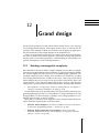
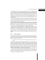
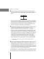
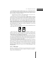
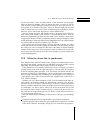
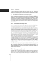
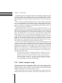
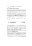
Woman in Guiyu, China, about to smash the cathode ray tube (CRT) from a computer
monitor in order to remove the copper-laden yoke. The immediate hazard is breathing
the phosphor screen coating, which is toxic. Monitor glass is later dumped in irrigation
canals and along the river where it leaches lead and phosphor into groundwater. The
groundwater is so contaminated that fresh water is being trucked in for drinking.
12
Grand design
Design is hard, and the real world, with its rush-to-market forces, won’t wait long
for a principle-driven designer. This chapter discusses how we can keep the advantages of the simplicity of finite state machines, but changing our approach so
that successful real world, complex designs can be undertaken too.
There is no escaping that real systems are complex. How do we keep the benefits of the of a finite state machine approach—and all the checking and automatic
features, such as user manual generation—while handling the unavoidable complexities and urgencies of real-world requirements?
12.1
Avoiding unmanageable complexity
If the demands of the real world are complex and finite state machines are simple,
then interaction programming has big problems! Complexity and design difficulties are unavoidable; the issue, then, is to avoid unmanageable complexity. Unmanaged complexity leads to design errors and flaws we should have avoided;
these design problems become a burden for the users—and a legacy from which
future designers may never escape. Users may become accustomed to flaws, and
“improvements” won’t help them. Indeed, design flaws can be so subtle that user
testing before a product is released will not detect them. We need better methods.
.
Part I (chapter 1, “Dodgy magic,” chapter 2, “Our perception,” and chapter 3,
“Reality”) reviewed the problems we are trying to avoid.
Even though we know the problems (this book’s part I) and the interaction programming principles (part II), we need guidance to design efficiently and avoid
design problems we cannot manage (or, perhaps worse, design problems we accidentally ignore because we don’t see them).
Here, then, is a summary of the suggestions, more design heuristics than principles, which this chapter fleshes out in more detail:
.
.
Make the device disappear If the device is invisible to the user, then there is
no interaction programming problem ! section 12.2 (p. 410).
Make the device behave like the real world If it does, the user will
intuitively understand the device, and the designer can copy the real world’s
solution ! section 12.3 (p. 415).
409
Chapter 12
.
.
.
.
.
.
.
Grand design
Change the world to fit the device Think about the big systems picture, not
the device in isolation ! section 12.4 (p. 426).
Make the device like its predecessor, only better Then we can avoid
designing everything from scratch ! section 12.5 (p. 427).
Make the design easy to change We will get it wrong, but at least we ought
to be in a position to improve it ! section 12.6.1 (p. 428).
Use simple techniques as long as possible Then we can manage with ease
as much complexity as possible ! section 12.6.2 (p. 429).
Use sophisticated design tools This book covers finite state machine
approaches, but there are more powerful—and harder to use—techniques
available. Build your own design tools if necessary ! section 12.6.3 (p. 432).
Make the device simple To try to make it more complex than we can handle
is to betray the user. If the device is a medical or other safety-critical device,
this is a wise decision ! section 12.7 (p. 434).
Know the user, and design accordingly Find out what users want and keep
them happy; this may be far easier than putting lots of design effort into issues
users don’t worry about ! section 12.8 (p. 435).
.
Why make devices like anything that has gone before? Be imaginative;
use computers properly. Think bigger—think outside of the box ! section 12.9
(p. 436).
.
If all else fails Take care to handle errors and get feedback from users, so at
least future designs can be improved ! section 12.10 (p. 438).
.
Finally . . . The next chapter, chapter 13, “Improving things,” discusses the
essential attitudes and awareness that go with successful use of these and all
other design principles.
12.2
Make design disappear
If the device is invisible to the user, then there is no interaction programming problem! Programmers building the system need only worry about technical issues,
such as sensors and mobile communications; they need not worry about user interface design.
Of course, this isn’t entirely true, since if the user is going to benefit from the
device or system, it must affect them in some way, and therefore there is or has
to be some interaction. Nevertheless the scope for hiding interaction is enormous
and rarely explored; perhaps manufacturers want to sell products rather than solutions, which may solve the user’s problems better—with less profit. (This somewhat cynical view of mine will resurface again toward the end of this section.)
410
12.2. Make design disappear
Box 12.1 Problem solving We need to solve problems all the time, but so often solving
the problem is so important that it focuses our energies—we need the solution!—and thus
we rarely step back to consider other approaches. Problem solving is a well-studied area
and provides many ways of making progress, often by going in different directions than our
natural focus would lead us in.
Design is a problem for designers, and use is a problem for users; so from both sides, it
is worth looking at problem solving, because it can help both designers and users.
Edward de Bono has collected and expressed many problem-solving principles. Often his
work has come under criticism because, perhaps, his ideas seem so obvious once they are
expressed clearly. His book Teach Your Child to Think has the advantage of collecting most
of his effective ideas into a single book. He argues that we should develop thinking tools, and
he gives some examples: just as a carpenter can cut wood and screw it together, we should
have thinking tools to split problems and join them together in new ways. His “six thinking
hats” is a tool that helps us compartmentalize our thinking styles; if we don’t clearly separate
our emotions, our judgments, our fact gathering, and so on, then we run the risk of being
driven down one route without considering important alternatives. Similar ideas are also
developed, with a much more direct relevance to user interface design, by Ben Shneiderman
in his Leonardo’s Laptop.
George Pólya was a mathematician who studied problem solving deeply, and his classic
How to Solve It should be read by everyone. Often when we try to solve a problem, we get
stuck. Pólya suggests that we should imagine the problem solved, and see if we can work
backward to where we are at the moment. Another deep idea is to generalize: sometimes a
specific problem has distracting details—can we work out what the general problem is and
see if we can solve that? Often it’s easier.
Terry Winograd and Fernando Flores’s ground-breaking Understanding Computers and
Cognition suggests (among many other ideas) that we should not always strive to solve
problems—sometimes we can dissolve them. That idea is developed in section 12.2 (p. 410),
where we suggest that design should be invisible.
Fridges switch their lights on when you open their doors; you don’t have to
switch the light on. Cars are another good example of this invisible or incidental
interaction. When you open a car door, the inside light comes on. On some cars,
if you get into reverse when you have the windscreen wipers on, the rear wipers
will come on automatically—the car switches them on automatically because it
can work out that if you need the front wipers on to go forward, need the rear
wipers on to go backward.
In some cars, the instrument panel is dimmed for night driving, but when you
reach your hand toward, say, the radio, it lights up brighter so you can see it better.
For car thieves, a quite different sort of user, the burglar alarm is another example of interaction that happens as a side effect of interacting. Something happens
automatically, without direct interaction from the user—though in this case, the
interaction is done on behalf of the owner, not the user. With alarms, unlike car
wipers, it’s essential that the interaction and control of the interaction is invisible;
otherwise, the burglar would override it.
411
Chapter 12
Grand design
Cars don’t just interact with their users, they are also part of the bigger transport
system. Road tolls can work automatically from sensors—the driver just drives
past the sensor and is billed automatically for using the road. In the past, this
interaction would have required either a human operator or a machine to take
cash. Now the interaction has disappeared.
Interaction also becomes invisible in less friendly ways. Traffic lights and speed
cameras interact with cars; the driver has to do nothing other than be there. Traffic
lights can stay on red indefinitely if they “think” nobody is waiting for them. As
usual, it’s wise to have timeouts in case there is an unusual situation beyond the
sensors’ awareness, such as a horse rider or cyclist might be—you shouldn’t keep
lo-tech users waiting forever!
Household energy-saving devices work in the same sort of way. If nobody
moves in a room, the lights go out to save energy—this is hopeless for a library,
where you would expect people to remain still as they read. Given that the lights
go out on a timeout, which can be frustrating as it will take people by surprise,
the timeout should be adjustable (perhaps up to infinity—that is, never—for people who really want to override the feature), and the lights should come on again
when there is movement. A person is plunged into darkness shouldn’t then have
to find the light switch; it should come on automatically! Even better would be for
the energy-saving system to slowly dim the lights; this at least would not plunge
anyone into complete darkness suddenly.
Timeouts seem a necessary evil for walk-up-and-use devices. Because users
may walk away from a device half way through an interaction, it is important
that the device reset itself to its standby “helpful” state so it is ready when a new
user walks up to it. Many walk-up-and-use devices work in many languages, and
the first interaction they require is to know what language the user wants—a new
user may not be able to read anything on the last screen left them by the previous
user. But timeouts are a crude way of doing this; much better is to use a proximity
sensor—a sensor that tells the device if there is a body or movement nearby. The
standard technology, such as passive infrared sensors (PIRs) or ultrasound motion
sensors, from burglar alarms can be used.
Sensors no doubt have a hard time telling the difference between people and
dogs or pigeons. A more reliable approach is to rely on the people carrying some
form of electronically readable identification, such as a key fob (which merely requires proximity), or a swipe card—either magnetic strip or optical bar code—that
requires some basic interaction. If the user wears the swipe card on a cord, the
card can be kept in the device while the user is interacting. When leaving the user
has to take the card with them, and the device realizes they’ve left. Of course, if
the card is merely swiped through the device at the start of interaction, the device
doesn’t know whether the user is still there or not, which is the original problem
we were trying to solve.
There are many other technologies. Car keys now often have simple radio transmitters in them, so a driver can unlock the car when nearby—the driver doesn’t
have to put the key directly into the lock. Most of these car keys are also passive
security devices: the car won’t start at all unless the key fob is close to the ignition
switch. The car “knows” the right user is present.
412
12.2. Make design disappear
Although many of these devices are proprietary, it has often surprised me that
there is so little reuse of the technologies. For example, my key fob lets me drive
my car, but if my house had a sensor that could learn the code my key fob uses,
then I could get into my house or set the burglar alarm with the key fob. Instead,
I need to have two different devices to do this. The same comment applies to my
workplace: I need more keys and cards to get around the building I work in. Yet
it could easily have learned my car key’s fob codes and been authorized to open
doors with that.
I guess manufacturers who make locks get a useful income from selling swipe
cards or their own key fobs, and they have little incentive to make things easier
to use in this way. This reluctance, if it is reluctance, will have to change as more
people use implants for the same purpose.
In prestige and high-security applications, people are willing to have little tags
injected into them. The tags are little cylinders, about 2mm (a tenth of an inch) in
diameter, and can easily be forced under your skin down a large diameter hypodermic needle. Once under your skin, you may have automatic access to secure
areas, or have your bar and hotel bills paid—or rather, billed—directly.
VeriChip is one such technology, made by Applied Digital Solutions—and its
commercial success suggests that this is a design area we must take seriously.
VeriChip uses a passive implant (so it uses the power of the external sensor, needing no power of its own) that responds with a unique number. The sensor then
uses this number to retrieve whatever information is relevant about the user. For
example, for access to a club, the scanner could bring up a photograph of the customer.
12.2.1
Ticket machines
Some walk-up-and-use devices are part of a bigger and more significant interaction with the user. Ticket machines, for example, enable users to use public transport. Users reall wants to interact with the bus or train—the ticket machine itself
hinders what they really want to do.
.
Some problems of walk-up-and-use ticket machines are discussed in section 3.9
(p. 77).
Rather than users having to first tell the ticket machine where they want to go
(and what sort of ticket they want, whether they want to return, and so on), then
having to pay (and maybe get some change, or maybe forget it), almost everything
the user should tell the ticket machine can be worked out afterward, provided the
train or bus can keep track of the user. Suppose the user has a wireless device
(perhaps their mobile phone), then the train could work out when they get on and
off the train. If the same person returns, they obviously wanted a round-trip ticket
and the system should behave as if that’s what they bought.
Now the interaction with the ticket machine has disappeared altogether. The
user cannot make mistakes like buying the wrong ticket or leaving change behind.
And the user isn’t under pressure to buy a ticket in a hurry just as a train arrives;
they just get on. Everything is automatic.
413
Chapter 12
Grand design
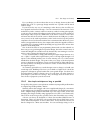
Figure 12.1: Manufacturers not understanding how unusable their products are was a
problem long before computers. In 1926, culminating the experience of building 59,999
steam locomotives, the Baldwin Locomotive Works designed the Baldwin 60000, which
out-performed locomotives of its day—except it was too complex for many to operate.
Nobody bought it, so it was donated to the Franklin Institute as a museum exhibit.
From the railway company’s point of view, the disappearing ticket machine also
gets rid of passengers who travel without tickets. Most railway cars have weight
sensors on them; if the weight and number of wireless-enabled passengers does
not tally, a conductor can be warned to do a manual check. Or perhaps the train
could wait while the angry delayed passengers sort the problem out for themselves: people might get off one at a time until the train leaves without them,
because they don’t have any means of paying automatically.
We’ve completely eliminated the conventional interaction programming problems, but we’ve replaced them with new problems—we’ve replaced conventional
interaction programming issues with ethical and business issues:
While we have made the device interaction very smooth, some people won’t
have the resources to be wirelessly connected. For these people, the user
interface has become much worse.
The old device could take cash and was essentially anonymous. The new
approach still needs a way of billing the user, but now it needs to do it with
something like a credit card account. The railway company therefore knows
who you are every time you travel—as well as where you live, and your credit
rating, and so on.
414
12.3. Design like the real world
The railway could invent its own credit card, which a traveler buys (they could
be wireless-enabled as well, so they do the complete job: providing passenger
location and paying). The credit on the card allows customers to travel, but
because they have paid up front, perhaps with cash, their anonymity need not
be compromised.
There are many possible “compromise” designs that make the interaction half
invisible. Why not, for instance, make the credit card idea low tech: it could be a
piece of paper. The piece of paper, once bought, allows 10 or 100 trips. The user
could punch it on the train . . . and we’ve just invented continental-style railway
ticketing.
When considering the tradeoffs between these alternatives, remember that most
walk-up-and-use devices are not meant to be perfect. Automatic ticket machines
are called “queue busters” because their purpose is to reduce queue lengths at
railway stations or at airports. If they only handle two-thirds of passengers, the
station or airport can employ fewer staff; for the (mostly regular) users, for whom
the ticket machines are successful, the experience will be good. For users with
complex requirements for their travel or tickets, they’d still need to talk to humans
anyway.
12.2.2
Don’t be perfect
Designing devices not to be perfect is a better design principle than trying to make
them wonderful for everybody. Provided you are designing a device for a wide
range of people, handling some of those people well and others not at all (provided
they have some sort of backup) is better than handling everybody in a mediocre
way. This principle applies directly to walk-up-and-use devices and to discretionary devices, such as mobile phones. If customers don’t like my wonderful mobile phone design, they can buy some other make. The principle does not apply in
areas such as cars (except their entertainment functions), medical equipment, and
aviation, where avoiding catastrophic errors is more important.
12.3
Design like the real world
Interactive devices are often hard to use because they are unfamiliar; they “don’t
work like they should.” Well, how should they work?
We live in a physical world, with lots of objects, from doors to balls, in it. We are
very familiar with the behavior of these physical objects, and after a little training in early childhood we are pretty good at things like shoelaces, buttonholes,
keys, to say nothing of our remarkable skills at walking, running, and jumping—
seemingly effortless, yet still beyond the best robots. Cars and bicycles are among
the very complex everyday devices we soon master.
All of these things, and many more, obey the laws of physics. Interactive devices, at least at the level of how they work, needn’t obey the laws of physics—or
415
Chapter 12
Grand design
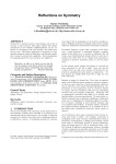
Figure 12.2: The letter X has four mirror symmetries and four rotational symmetries
(not counting turning it around in space, off the paper)—unless you look very closely
at the varying thickness of the strokes and at the details at their ends, the serifs. The
careful design of the symmetry-breaking details are what makes good typography—and
good interaction programming, once we have ways of seeing symmetry in programs.
indeed any laws at all. What is it, then, about the laws of physics that we have
become familiar with? Can we exploit any such principles in interaction programming?
12.3.1
Symmetry as a principle
A key organizing principle in the world is symmetry. In its many forms, symmetry
captures a basic aspect of reality that we can translate into the design of interactive
devices.
We are most familiar with visual symmetries. For instance, W is a symmetric
letter, but F isn’t. One way of seeing that W is symmetric is to put a mirror across
it vertically in the middle, so that it is split into two V shapes. The mirror reflects
one V to make another, and we see a W. We say that W has mirror symmetry.
The letters X and H have more mirror symmetries—can you see how X has more
mirror symmetries than H? More precisely, X has four mirror symmetries unless
you look very closely at the thicknesses of the strokes and the serifs at the ends
of the strokes: these details break the symmetries. As we shall see, things are
interesting when they are almost symmetrical—and the really interesting design
questions arise at these boundaries, just as good typography arises when letter
forms are almost symmetrical, but the symmetry is broken in an elegant way.
Symmetry can be defined formally, without any appeal to pictures at all. If
you can transform or change an object, and it appears to be unchanged, then the
object has a symmetry. For example, if you rotate a letter H upside down—that’s
how you intend to transform or change it—it will look the same; thus H has a 180
degree rotational symmetry.
The laws of physics have symmetries; and as we grow up we learn these symmetries. Later, we use our knowledge of the symmetries of nature to help us solve
problems. Mostly we find this practical problem solving so easy that we rarely
think about it.
One of the simplest and yet most profound symmetries is called translation,
otherwise known as moving. The laws of physics don’t change when something
is moved. You change something’s position—this is the change you intend—and
now you find everything seems the same. Movement is a sort of symmetry, just
416
12.3. Design like the real world
like reflecting in a mirror. In mundane terms, my mug of tea works like a mug of
tea—and if I move it to another room it still behaves like a mug of tea. As I said,
this is so obvious that we don’t think about it.
Imagine that you generously give me a coin, which I place in my left hand. I
now put the coin in my right hand and open my right hand for you to see. The
coin has gone! You gasp! I am a magician. I have surprised you because I broke
a fundamental law of physics: just by moving a coin from one hand to another
does not make it disappear. It should have been unchanged, for we know that
translation is a symmetry, a very basic fact about the way the universe works. If I
can break translation symmetry, I must be a very good magician indeed.
It’s even more fun doing magic with children, because they are still learning the
rules about how the world works. Even putting a hand over your face to make it
disappear briefly can get a young enough child excited about whether you’ll ever
reappear.
While breaking symmetry is fun when it is done for entertainment, it is devastating when it happens for other reasons. You put your coin in your pocket, and
next time you look, it has gone! You know the universe doesn’t behave like this, so
you blame a pickpocket. You would be lucky if it was only a coin that was stolen.
In short, breaking a symmetry can be upsetting.
We like symmetry; it is deeply tied up with out aesthetic sensibilities. A wiggly
line is just a wiggly line, but a line that has a repeated pattern is a frieze and can
be used for decoration. Poetry mixes translation (movement, as you move your
eye down the verse) and some rhythm and rhyme that is unchanged (or changes
at a different rate) as you read—a partial symmetry that is artistically balanced
between being overly repetitive, and dull, or being unstructured.
Computer graphics experiments done with peoples’ faces show that symmetric
faces are often perceived as more attractive than asymmetric ones. Symmetric
things have “balance” and seem more elegant; we like symmetry.
In contrast, broken things are often asymmetric. If you damage a ball, it will
have fewer symmetries and, for instance, will stop rolling freely (which requires
spherical symmetry). Damage, of course, often does random destructive things:
it would be hard to do damage symmetrically to something. When people or animals are diseased or damaged in any way, the marks of the disease are very unlikely to be symmetrical. When we go looking for mates, we tend to prefer people
who are symmetric, since this is a good heuristic that they are undamaged and are
more likely to be undamaged genetically. In evolutionary terms, the people who
mated with asymmetric partners probably had fewer healthy children. We who
are the survivors of generations of people making mating decisions, tend to like
symmetry, since it has served our ancestors well.
Symmetry is also intensely practical. I’ll mention four advantages of it, before
we move on to applying the idea in design.
When we try to solve a problem but get stuck, we need to find another way of
looking at the problem, so that if we can solve it from this other view, we’ve
solved the problem. This is exactly what symmetry is: we want to transform a
problem but leave the essential bits unchanged. We sometimes even say we
want to “turn it over” in our minds.
417
Chapter 12
Grand design
Symmetry compresses information. If something has a symmetry, we can
throw some of it away and yet be able to reconstruct it later just from knowing
the symmetry. Here is a very simple example: a table of numbers and their
squares:
Number
1
2
3
4
Square
1
4
9
16
Now if I tell you that squaring is symmetric—that is, the square of a number is
unchanged even if you change the number to be negative—I have doubled the
amount you know from reading the table, without making the table any bigger.
Because squaring is symmetric, I need only show you half the table—you
know, for instance, that 4 squared is 16. Symmetry has effectively allowed
the table to be compressed without loss of any information.
Symmetry makes things easier to use. More succinctly, we called this principle
permissiveness: if something can be used in more than one way, it is
permissive. Again, this is symmetry. The transformation is to use the device a
different way with the end result—what the device does—unchanged.
A physical example of symmetry and the principle of permissiveness is that a
plug that looks symmetric ought to be symmetric. A USB plug ends in a little
metal rectangle; it ought to go in its socket either way up, then. But it turns out
that the appearance of symmetry is deceptive. A USB plug is not symmetrical,
though it looks like it is unless you look closely. They are therefore much
harder to put in than they need be; either they should have been really
symmetrical (so it didn’t matter which way they go in), or they should not
have looked symmetrical (so we know which way is up). Another bit of bad
design is that they are easier to push—either way up—into network sockets!
.
See box 5.5, “Permissiveness” (p. 136), for further examples and more
cross-references.
Symmetry makes things easier to debug for programmers. From a user’s point
of view, symmetry makes things easier to learn. If we have good reason to
think something is symmetrical, then we can learn how it works (or check that
it works) by only trying it out partially. If we think the A and B parts of
something work the same way, that is, that they are symmetrical, then we need
only try A to know that B works the same way. It follows from this observation
that user manuals should explain when parts of a device behave the same way
as other parts; this will let users learn and understand faster.
To summarize what is a very big and wide-ranging topic: we learn rules about the
way the world works, and some very deep rules are called symmetries. Symmetries make things much easier to understand, they make problems easier to solve,
418
12.3. Design like the real world
Box 12.2 Design guidelines If we know we want to provide undo in a device, we can use
simple programming to check that the design allows all user actions to be undone, or we can
write programs to create undo actions for all user actions in the original device specification.
Either way, we have a device that has undo—which is what we wanted.
But what features should designers want in good devices? An idea like “provide undo” is
a typical design guideline, and there are books and manuals of guidelines that are a source
of inspiration—or even legal protection—for designers. Guidelines are particularly useful if
a group of designers are working together in a team, so that they have a coherent view of
the design work, or for a creating a range of devices that all work in ways the users see as
consistent. Often manufacturers will have proprietary guidelines that impose their distinctive
style, to ensure their devices have a suitable corporate feel about them.
Although there has been no systematic study of what makes for good guidelines, researchers have been filtering them for years, trying to identify core guidelines that are few in
number, easy to use and effective in design. Here’s a sample, which I’ve organized starting
with guidelines that a framework can readily help support or test, and the later ones being
more inspirational:
1 Match the user’s task sequence
2 Provide undo
or provide easy reversal of actions
3 Remove modes
4 Provide informative feedback,
and provide it immediately
5 Be consistent, utilize symmetry
6 Provide clearly marked exits
7 Provide shortcuts
8
9
10
11
Allow users to create short cuts
Design for errors
Provide help
Provide a sense of progress;
give users a sense of achievement
12 Information should appear
in a natural order
13 Minimize the user’s memory load
14 Speak the user’s language
This book has raised all these ideas—and more—in discussion, and indeed a proper list of
guidelines would expand and explain the ideas in careful detail, to suit the types of device
being designed and the types of users and activities for which they are being designed.
After the generalities of typical guidelines, it’s important to have more specific guidelines
for users with impaired vision, hearing, or movement—especially if you are designing for
older people, children, or users working in harsh environments—say, where they have to
wear gloves or eye protection. Remember that you can often design for both “normal” and
“impaired” users by suitable techniques: for instance, you should always use more than just
color to distinguish buttons and indicators on a device—use different high-contrast symbols
as well—otherwise some users may not be able to tell them apart reliably.
and they are aesthetically very satisfying, but occasionally they are broken. Under
the right circumstances, it may be an exciting game to break rules, but in more
prosaic circumstances it is awful. The world seems to have let you down.
Translating these ideas into interaction programming, a programmer should
identify the symmetries in the planned design, or in what the planned device is intended to do, and make them obvious to the user—and make them reliable, rather
than half-hearted. And avoid appearing to have symmetries that actually don’t
work, like the USB plug.
.
Half-hearted, beguiling, design rules are discussed in section 10.3.3 (p. 337).
419
Chapter 12
12.3.2
Grand design
Affordance as experience of symmetry
Interaction programmers should know about affordance, which is a principle very
like symmetry, but somewhat more specific. Affordance is the appearance an object has that it can be used in a particular way. Affordance, then, is very like symmetry. Symmetry, when it applies, says that we can change something (that is,
use it), and it will appear to be unchanged; in other words, we can still use it. A
round door knob has the affordance that it can be turned—a round door knob has
rotational symmetry, meaning that if you turn it, it will look unchanged.
A ball is such a good toy because you can do so many things to it, and it still
remains a ball (unlike my cup of tea, which isn’t so convenient to roll around). In
formal terms, a ball has spherical symmetry. In affordance terms, a ball has the
affordance of something you can pick up, roll, throw, and so on.
Affordance, like symmetry, compresses information. If you can see an object
that affords its being used in a particular way, you don’t need to know about that
object in particular. It looks like any other object of that sort, and you don’t need
to know so much about the world. Every chair you have ever seen behaves like
a chair, you have not had to learn how each chair works. Your mind would be
full if it had to have all that information in it; instead, you’ve learned very general
principles about how objects work.
More to the point, you’ve also learned how things like buttons work. If you
press a button, it goes in, and something happens. The affordance is that something that looks like a button is a pressable thing. If you are a designer, and you
want your user to press things, then make them look like buttons. Buttons have the
affordance of pressing. If you have to use a computer’s flat screen, using shading
and shadow effects to make the button look like it sticks out, so it can be pressed.
The design rule is to find out the affordances and then represent them in the
device you are designing. Then the user will “automatically” know what to do—
they don’t need to know specifically how your device works, because it works like
other things they are already familiar with.
12.3.3
420
Using symmetry in design
One of the deep and amazing facts about symmetry is that it is a very robust property. Again, we’ve learned this fact as we grew up, and simple examples to explain
it seem so obvious as to be quite banal. The letter W, we saw above, has mirror
symmetry. If we make it bigger or smaller, or change its color, it still has the same
symmetry. Even turing it over to make an M retains the symmetries.
A rather more radical change to W would be to change it into its ASCII code.
Now we’ve transformed a letter to a number, namely, 87. Provided we print 87 the
right way, we’ll get the letter W back, so this is a simple symmetry. But ASCII has
been designed in a clever way so that it preserves more properties of letters. The
next letter after W in the alphabet is X. The next number after 87 is 88. If we print
88, we’ll get an X. This designed-in symmetry of ASCII is very handy if you want
to know something more awkward, like the letter fifteen in the alphabet before W.
This robustness of symmetry helps us in interaction programming. Symmetries
that a state transition diagram have are symmetries the user may well be aware
12.3. Design like the real world
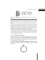
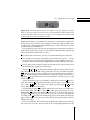
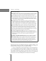
Flick down
Light
off
Light
on
Flick up
Figure 12.3: A wall light switch and its transition diagram. This is a UK switch; in
the US, it would be switched up for off.
of and will be able to exploit. The visual symmetries of a drawing of a device’s
diagram are symmetries that also surface, invisibly, in the way the user interface
works.
We’ll start with a simple example. Figure 12.3 (p. 421) is a transition diagram
for a simple on/off switch, next to a picture of a real wall switch. The diagram
has rotational and mirror symmetries; for instance, we can turn it over, and it will
look just the same (although maybe we need to keep the writing the right way up).
Similarly, the physical switch can be turned over, and it will work just the same
(although maybe we will need to swap over the on and off states).
Other sorts of on/off switches are knobs that you rotate; again, they work just
as well when they are turned over. You could of course design an on/off switch
not to be symmetric, but this would be unusual—and result in something harder to
use. A real physical switch is easier to use if it is designed to reflect the symmetries
of the state transitions it manipulates.
12.3.4
Statecharts and symmetry
Statecharts are a good ways of drawing transition diagrams because they remove
a lot of clutter and are much easier to read. Statecharts make interaction structure
like clusters and history very clear—things that would be very difficult to make
clear in a basic transition diagram. Equally, they make the designer aware of more
potential symmetries to exploit in a design.
Consider, as an example, designing the user interface for a digital clock. Typically a digital clock will have four digits, and each digit may have its own control
button. The statechart for the user interface for one digit of a digital clock could
look like this:
H
0
9
1
8
2
7
3
6
3
5
421
Chapter 12
Grand design
If we imagine that each of the four digits has a button underneath it, each would
make a sort of domino. Here is our basic physical building block: a basic dominoshaped unit that gives space for a single digit and the button that controls it is
immediately below it. Here’s how one of these dominos would look if it was
displaying the digit 3:
u
Pressing the button under a digit increases the digit by one, taking 0 to 1, 1 to 2
and so on, and 9 back to 0. This is what the statechart diagram says.
Now, take a domino and move it right three times to get a row of four dominos.
A row of buttons and digits showing 1215 would look something like this:
u
u
u
u
No doubt, if we were designing a real product, it wouldn’t have all those lines
on it, but would have a nice smooth surface. With or without lines, it has a simple
horizontal symmetry: a symmetry of translation—if you move left or right, each
domino looks and behaves the same.
The statechart of the four dominos combined has a corresponding symmetry as
well:
H
H
0
9
H
0
9
1
H
0
9
1
0
9
1
1
8
2
8
2
8
2
8
2
7
3
7
3
7
3
7
3
6
3
5
6
3
5
6
3
5
6
3
5
This is a really deep and fascinating outcome: the physical device and the statechart have corresponding symmetries. But before we get too excited, we must
acknowledge that there is an awful problem, brought about by the very symmetry
we’ve been claiming is a good thing. By convention, times go from 00:00 (midnight) to 23:59 (a minute before midnight) and then back to 00:00. But, thanks to
the consistent statechart, our clock’s display goes from 0000 to 9999; worse, strictly
it goes back to 0999, 9099, 9909, or 9990 with one user action—it takes four separate user actions to go from 9999 to 0000. The buttons in the dominos treat each
digit as the display of an independent state machine; the device—so far—has the
sense neither to handle multi-digit numbers nor times.
422
12.3. Design like the real world
The righthand pair of digits shouldn’t be able to get to a number higher than 59
minutes, and the left hand pair of digits shouldn’t be able to get higher than 23 (or
12 if we are using a 12-hour clock rather than a 24-hour clock). In short, it doesn’t
behave at all like we would want a clock to!
The opening story of chapter 11, “More complex devices,” exposes some of the
problems of clocks that can count from 0000 to 9999.
We can either try to change the world, and have 10, 000 “minutes” in a day to
make our lives easier, or we can spend a moment trying to reconcile our design
with convention, which requires clocks to go from 12:59 to 1:00 and from 23:59 to
0:00. Affordance may tell us the “best” way of doing it, but convention tells us
the way users will like! (If we were designing a digital display for some other
purpose than telling the time, say for an aircraft altimeter, we wouldn’t have this
conflict.) I blame the Babylonians for the mess, though the French tried a decimal
system during the Revolution and, more recently, Swatch introduced an “internet
time” dividing the day into 1, 000 “.beats” instead of 1, 440 minutes. A .beats clock
would be easier to make easy to use.
One way to satisfy social convention is to remove the first and third buttons and
combine digits into hours or minutes:
.
u
u
What we have done is to enlarge our dominos to display two digits, so one
domino goes from 0 to 12 (or 23), and the other from 0 to 59. Now the buttons
increase the units of the numbers, whether hours or minutes. Repeatedly pressing
a button cannot cause an invalid time to be displayed.
The disadvantage of combining digits into pairs is that it now takes much longer
to set a time. The righthand button might need pressing 59 times (say, to get it
from displaying 00 to displaying 59), whereas with two buttons for the same task
it would only need pressing 5 (for the left digit) plus 9 (for the right digit) times—a
total of only 14 presses, about four times faster.
The usual way of reducing the increased button-pressing effort is to make the
buttons automatically repeat, so the user can change the time from 0 to 59 with
only one press. To speed up this method, holding the button down for longer
makes the numbers change faster: when you want to slow down, stop pressing
the button, and start again. When we try to makes things simpler, we often make
them more complex in other ways. We have to use our skill and judgment to find
the right balance.
12.3.5
DVD players
Affordance and symmetry sound like such good principles that they should be
able to solve everything. Here, to make a contrast, we consider an everyday example, which is surprisingly tricky.
423
Chapter 12
Grand design
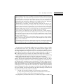
Select scene
17
18
Scene 17’s title
19
Scene 18’s title
20
Scene 19’s title
main menu
Scene 20’s title
| 1-4 | 5-8 | 9-12 | 13-16 | 17-20 | 21-22
Figure 12.4: A typical DVD menu design, schematically depicting a select scene menu
from a DVD. There are two distinct menus: the four scenes (as shown, scene 18 is
selected), and the main menu at the bottom, giving the user a total of 11 choices.
Similar issues arise in many DVD scene selection menus.
A typical DVD film menu, redrawn as a schematic TV “screen shot,” is shown in
figure 12.4 (p. 424). The schematic (of what would be a montage graphic of scenes
from the film) shows two menus, one for selecting a specific scene of the film (in
the upper part of screen), one (in the lower part of the screen) for either returning
back to the main DVD menu or for selecting a different choice from another four
⇤
scenes. In the figure, scene 18 is selected—if the user pressed ⇥Enter at this stage,
scene 18 would start playing.
A major design problem is that the remote control provides four orthogonal
arrow keys, pointing up, down, left, and right. These should “obviously” move
the choice of selected scene in the direction of the arrow, thanks to affordance.
Unfortunately, given this screen layout, a simple standard geometric interpretation of the arrow keys is in conflict with a consistent semantic interpretation of
the keys, namely, that there are two different menus on the screen and that they
have been designed so that movement within a menu takes priority over geometrical movement. Specifically, the arrow keys, which move the selection, appear to
move geometrically most of the time, but because they also try to move semantically within the scenes or within the main menu bottom line, they cannot always
move in a consistent way. For example, predicting what moving down will do
from some selection on the bottom menu is not easy.
Explaining the DVD design clearly is a problem. The next few paragraphs are,
while accurate, tedious to read. This in itself is an indication that the design should
be improved. When designs are not easy to explain, there is less motivation for
424
12.3. Design like the real world
Figure 12.5: The Sharp remote control, from figure 3.3 (p. 73), appears to be symmetrical, attractive visual feature, but it isn’t truly symmetrical, which creates a bad
interaction problem: when you pick it up and try to use it, about half the time it will
be the wrong way round—and therefore useless.
thinking about them; you probably take shortcuts to avoid tedious explanation!
Please persevere for the next few paragraphs with that thought in mind—how
would you have designed the DVD interaction to be easier to describe, and easier
to understand, use, and improve?
The geometric layout is obvious from the appearance of the menus, as drawn in
figure 12.4 (p. 424), but the menus are also structured hierarchically, although the
screen layout does not make this very clear:
The menu item “main menu” goes up a level in the hierarchy if it is selected.
The “group scene selection” menu items on the bottom row (1-4, 5-8, . . . 21-22)
move across levels in the hierarchy and bring up a screen similar to the one in
the figure, which could have been displayed by choosing 17-20 from this menu.
Once a group scene has been selected, the selection moves to the lowest level in
the hierarchy, to a specific one of four scenes.
⇤
⇤
The keys ⇥ and ⇥! go to numerically previous and next scenes, in the obvious
order they are seen in the film. Thus, given that scene 18 is selected in the figure,
⇤
⇥! would go to the next scene, selecting 19, then (if pressed again) it would go to
20, then 21 (redrawing the menu with scenes 21 and 22), then 22, then back to 1.
⇤
Similarly, ⇥ would select 17 then 16, and eventually it would go back to 1, and
recycle round to 22.
⇤
Vertical movement, however, is deceptive. With scene 18 selected, ⇥# moves to
⇤
scene 20, and then ⇥" will go back and select scene 18 again. So we think we my
⇤ ⇤
⇤ ⇤
have a rule: ⇥# ⇥" leaves you where you started, just as pressing ⇥ ⇥! would
always leave you where you started.
⇤
Inconsistently, though, ⇥# pressed in either lower scene (here, 19 or 20) moves
⇤
down to the main menu row, as does ⇥" in either upper scene (here, 17 or 18).
⇤
Furthermore, ⇥# from the left column (here, 19) moves to “main menu,” but from
the right column moves to 21-22 because this is the next set of scenes. My emphasis
⇤
is needed, since ⇥# from the left column always goes to main menu, but from the
right column it goes to the next set of scene choices in the bottom menu, which is
different every time.
Now let’s summarize the main features of this design. Mostly, but not always,
the arrow keys move the selection point in the corresponding direction on the
425
Chapter 12
Grand design
screen. Left and right arrows also cycle, whether on the bottom menu, or in the
scene region.
⇤
⇤
Inconsistencies are almost entirely due to the multiple uses of ⇥" and ⇥# , since
there is no great call for jumping forward and backward two scenes, their use in
the scene selection menu is questionable.
Whether this menu design causes real problems for users is an open question.
Whether improving the geometric affordances would reduce user problems is another question. Both questions are worth exploring experimentally, though of
course DVD menus as such are not a major issue for usability—they are for entertainment. Do the extra seconds a user takes, or the additional errors they make,
matter? Indeed, it is possible that the extra seconds enhance the user’s enjoyment,
for instance, by prolonging anticipation. Or is the graphic design (the static impression, rather than the interaction) more important for marketing?
Many DVD menu screen designs are much worse, suggesting that ease of use is
not a design priority. For example, as many DVDs organize menu items in circles
(or arcs), meaning that even within a menu there is no consistent direction for the
arrow keys to follow.
12.4
Fix the bigger system
We often think that we are designing a device, but in fact we are designing a system,
of which the device is but a small part. We are designing the device to fit into the
user’s world, and we are therefore making a contribution to designing the world,
the big system. We might do better if we started from the world and wondered
how to redesign the environment than the device that is supposed to be a part of it.
When we looked at statecharts and symmetry above, in section 12.3.4 (p. 421),
we uncovered a design conflict: if you want to make clocks easy to use, you have
to follow peculiar conventions. If the Babylonians had worried about ease-of-use,
they could have made the system a lot simpler, even allowing for their base-60
number system. If we were arrogant designers, we’d make a really easy-to-use
clock and expect people to change their ideas and live with it.
A ticket machine’s complex user interface comes about because it is poorly designed to do what it does. One of the things it does is to represent the railway
company’s ticket rules to the user. The user no longer has a ticket clerk interfacing
between them and the rules, the ticket machine’s complexity is, to a large part, due
to the rules it has to implement.
Many of the ticket machine’s rules evolved, in the UK at least, over centuries.
Many rules are still in the system have nothing to do with today’s technologies and
certainly nothing in the rules is based on making ticket machines easier to use. For
example, even a small a ticket machine in the UK will have tens of thousands of
ticket prices stored in it; the user interface necessarily has a baffling interface for
the user to get the right ticket price.
There are one-way tickets. There are tickets for before 9 a.m., which are more expensive because they are aimed at business travelers. There are round-trip tickets,
priced slightly less than twice a one-way ticket. There are weekly tickets. There
426
12.5. Make the device like its predecessor
are first-class tickets. There are family tickets. There are tickets for old people.
There are tickets for children. There are tickets that either cost more or can’t be
used on trains leaving Paddington station between 4 p.m. and 8 p.m. because too
many people leave London at that time. There are tickets bought with discount
cards, of which there are several. There are different prices to different stations.
There are “Saver” tickets and “Super Saver” tickets. Endless rules.
Why not change the rules, and simplify them so the design of the ticket machine can be made simpler? Why not have a one-price-fits-all ticket? Then the
interaction programming problem becomes much easier! Perhaps a more realistic approach to design is to find a compromise between trying to design for a mad
world and trying to make impossibly radical simplifications to the world. Perhaps
the ticket machine should have just three types of ticket?
This section seems to be proposing the opposite approach to the last one: rather
than design like the real world (copying its symmetries and affordances), change
the world to be easier to design for! But most of the things we think should be
changed for the better were social conventions, human constructs that were arbitrary to start with. Most of them won’t have been thought out, and it could be well
worth challenging them.
12.5
Make the device like its predecessor
Most design doesn’t start from scratch; rather, it progresses and develops an existing design, and usually a design that was sufficiently successful to make it worth
improving. Very bad designs are not improved; they are dropped.
If the predecessor is not actually an interactive device or a design you want to
develop directly from, then the right technique is to decide what the metaphor
is that the original gadget represents. Your new design will then be like the old
gadget in essential ways, as identified by your chosen metaphor. (A metaphor is a
way of saying something is like something else: an MP player is like a CD player;
a DVD player is like a video cassette recorder (the original PVR); a camel is like a
horse with two humps.)
Whether you use explicit metaphors or not, users are familiar with older designs, and if you design by refining the older designs, you keep your old users,
and what they have to learn to take advantage of the new system is much less
than if you had developed from scratch. If designs are incremental improvements
on old designs, you will be able to collect a lot of data about their real use and
hence focus on improvements to better suit ways you know the devices are actually used—this is a huge advantage over new devices, which will be used in ways
you are never quite sure about.
The main disadvantage of building on old successes is that two very bad things
happen:
Gradually the design becomes impenetrable to the designers themselves.
Typically program code in the device gets extended here and there in ways that
make sense at the time. Eventually, though as layers accumulate, the program
427
Chapter 12
Grand design
for the device is impossible to maintain; or, more likely, it has a collection of
unfixable bugs. There are two solutions to this problem: either refactor the
design, or employ a sensible design framework that can cope with changes
without getting more and more arbitrarily complex.
The number of staff allocated to designing the device is reduced. After all, only
incremental work is called for. Over time, the resources for serious device
development drop—then suddenly the market changes, and the skills,
knowledge, and abilities are just not available to catch up with some
competitor’s new device.
Experience is defined as what you get just after you need it; but when you are
designing a series of products, each based on its predecessor, you can put the
experience of one design into experience for the next.
An alternative to making a design like its predecessor is to make it like part of
itself. Make it internally consistent, not just consistent with previous versions. In
fact, making a device internally consistent amounts to increasing its symmetries.
A typical home TV (or DVD player) has about six buttons against its remote
control’s of twenty or more buttons. That lack of consistency necessarily means that
the buttons on the TV cannot be used in the same way or that different features
are available from the TV and its remote control. Generally both are true.
There is no logical or technical reason for such inconsistencies. Indeed, if there
is any special argument for a feature to turn out one way on the TV, the same argument probably applies with equal force to the remote control. A notable benefit
of making the remote control and the TV consistent—both their buttons and the
displays—would be that the user manual would be approximately halved in size,
and the user’s learning burden would be correspondingly reduced.
.
On the importance of short, minimal manuals, see especially section 11.6.1
(p. 397).
12.6
Use design tools wisely
Many ways of approaching grand design problems require sensible thinking about
design tools—choosing tools sensibly and not being overly driven by restrictive
tools. Be willing to use simple tools as much as possible.
12.6.1
Make the design easy to change
In any design process, anticipate making mistakes. It is inevitable that you will
make mistakes, and if you set out using tools or techniques that make going back
difficult, then you will be stuck with palliating rather than fixing the mistakes. To
put the though more pointedly: if you design something so that it doesn’t need
fixing, it will, and then you won’t be able to fix it.
428
12.6. Use design tools wisely
If, as you design, you choose ideas that are easy to change, then new ideas and
insights that occur as a prototype design matures into a product will be much
easier to adopt.
If your device has any way of connecting to other devices, then it will be easier to upgrade and iterate its design. Can it be connected to the internet? Can it
read memory cards—cameras often have memory cards for storing photographs,
so why not also use them for loading revised software when you want to improve
their design? Why not put in a USB socket so the device is easier to revise—this
will mean that the device will be easier to build, because the USB port (or whatever you use) can be used in production, and it can be used to keep the product
competitive once it has been released into the consumer market. Moreover, if consumers can upgrade their devices, the company that makes the upgrades will have
an excellent way of getting feedback (including use logs) from users on how their
product is really being used.
One of the motivations of our programming framework was that technical authors can get very good insights into product design, but in the normal course of
events their insights are wasted because by the time they start writing, it is too late
and too costly to change the design in any useful way.
A very useful heuristic to help guide making the right design decisions is to
use a “spike.” A spike takes representative parts of a design right through to all
aspects of the finished product, but of course missing out a lot of the features
intended for the final design. The point is that every stage of the development
process is checked out well before you get to really needing it. If the spike uncovers some problem, start fixing it now before it creates an actual delay in the real
development process.
An extremely powerful way to make designs easier to change is to build your
own design tools. Building tools forces you to think at a higher level—about the
properties of designs in general rather than your specific design. You then solve
general problems, and the solutions serve you well when you make changes to
your design as your ideas for it change. The your design tools can ensure or enforce whatever properties your devices need.
12.6.2
Use simple techniques as long as possible
George Pólya has given us a nice aphorism: within every impossible problem there
is a simpler impossible problem—find it!
Similarly rather than struggle with some complicated design job, concentrate
on the simpler part of it that Pólya promises will be there. The designer now starts
with a simpler design problem and builds up to the larger issues, all the time
managing the design carefully using appropriate tools (such as our framework).
The tools are used as long as they possibly can be, then extended in ways to help.
A device can always be designed as a finite state machine (FSM) because of
abstraction. That is, we don’t have to be specific about what is inside states; states
can be abstract descriptions of what a device does. Every interactive device can
thus be designed as a finite state machine. You can start design using a tool or
429
Chapter 12
Grand design
Box 12.3 Defending finite state machines This box reviews some of the defenses of FSMs
against the popular criticisms.
FSMs are large FSMs for typical devices often have thousands or more states. The size
of a FSM is not a real concern once it is programmed, though obviously it would be
a serious problem if one wanted to draw the corresponding transition diagram.
FSMs are unstructured FSMs are indeed unstructured. However, they can be “nested”
so that large classes of states are treated as one big state—this makes what you are
thinking about simpler, even though the underlying FSM is just as big. If an FSM
has been designed to be like this, it can be drawn easily using statecharts, which are
a very good way of drawing large FSMs.
FSMs are finite FSMs are finite and therefore formally less powerful than infinite
computational models such as pushdown automata (PDAs) or Turing Machines. For
example, a handheld calculator using brackets is readily modeled as a PDA, and
therefore one might think it is not an FSM. However, all physically realizable digital
devices are FSMs, whether or not it is convenient to model them explicitly as such.
FSMs are not relevant to users FSMs are mathematical or program structures, and
they do not exist in any useful concrete form for users except in the very simplest of
cases—where they are hardly necessary to help the users! Users should not be
expected to reason about the behavior of devices by using FSMs: they are typically
far too big—but this argument does not mean that designers should not reason using
FSMs, particularly if they have programs to help them do so.
Few systems are implemented as FSMs Most systems are implemented in ad hoc
ways, and determining any model from them is hard, if not impossible. In this sense,
FSMs suffer from problems no different from any other formal approach. Better, one
would start with the formal model and derive (preferably automatically) the
implementation.
FSM models are impossible to determine On the contrary, if systems are developed
rigorously, it is not hard to determine finite models of user interfaces from them.
FSMs are bad for design The rigor of FSMs encourages interaction programmers to
make simpler devices that they understand, so they can analyze and build reliable
interactive systems. FSMs have a clear theory, and we can measure all sorts of
important design properties with simple programming. We can also generate help,
user manuals, and other important material from FSMs specifications.
framework such as the one suggested in this book to explore the FSM. A very
strong argument is that if you cannot see an abstract FSM in your design, you
don’t know what your design is and you shouldn’t be doing it.
.
Box 12.4, “Reductionism” (p. 431) expands further on ideas around abstraction.
For example, designing a television requires working with a lot of detail, possibly an overwhelming amount of detail. But we could start with an abstract finite
state machine: the television is either on or off. That’s only two states, but we can
start from there. Next, we might add channels to the on state. As we extend what
the states do, we are always starting from a more abstract level of design.
430
12.6. Use design tools wisely
Box 12.4 Reductionism Reductionism says that we can make progress by reducing things
to bare principles and then reason successfully about useful properties of systems from those
underlying principles. We can discuss the large-scale behavior of planets in the solar system,
for example, without worrying about their weather systems; we can just study their gravitational influences on one another. (The reason why science became so successful since
the Renaissance was reductionism.) Abstraction is the computer science term: abstraction
reduces the number of concepts that one needs to think about all at once.
Reductionism as a philosophy, ontological reductionism, asserts that not only is it convenient to think like this, but reality is really like this, that is, made out of simpler things.
In human-computer interaction it’s pretty hard to go along with this form of reductionism
because interaction has many deeply-interacting features: the user’s motivation, lighting
conditions, whether users are part of a social group, and so on. Many things that have to
do with user context influence the success of a design and cannot be reduced.
Yet if we fail to be reductionist at the right time, we miss out on useful insights. A
reductionist programmer would build really simple programs and get them to work—perhaps
using finite state machines—and then build on necessary embellishments. Ideally the result
of a reductionist approach would be a human-computer system that was understood and
was easy to modify, and so on.
Instead, there is a temptation to resist reducing design at any stage to make it simpler.
This is a recipe for despair and results in large ad hoc system designs that nobody—whether
designer or user—understands.
Thinking about states and actions and finite state machines is unashamedly reductionist.
They allow designers to think clearly about simple things. They don’t help designers think
about everything they need to or should! But where they help, they help enormously.
At some point we will probably decide that it is not the time or place to decide
the details inside some state. For example, TV channel selection requires an interesting mapping between UHF and numbers—transmitters send TV signals at
ultra-high frequencies in complicated ways so that nearby transmitters do not interfere with one another, yet, the user wants a simple scheme like 1 is BBC 1, 2 is
BBC 2. We may prefer not to do this sort of thing with a finite state machine!
The principle to remember is, that just because you can’t do all of a design using
a simple approach doesn’t mean you can’t do a large part of it simply.
Although finite state machines are simple in themselves, which might seem restrictive, this doesn’t stop their being generated by programs. If they are, then a
designer could express themselves in a way or in a language they are familiar with,
and this high-level specification can be translated by a tool into a finite state machine. The designer’s tool can then generate (if it wishes) enormous finite state machines that would have been way beyond comprehension but for being expressed
in the high level way. Thus the size of the finite state machine has been hidden
from the designer, but all the advantages of the basically simple FSM approach
have been retained; all of the measurements and other advantages our framework
provides now comes for free, with no extra effort.
.
The drill and the farmer’s problem—see sections 9.8 (p. 316) and 10.1
(p. 325)—were generated by program, which was much easier to write than
work out by hand the correct relations between all the states.
The program lex (and all its derivatives) is a well-known example: it reads a list 431
Chapter 12
Grand design
of regular expressions and builds a finite state machine from them. The regular
expressions are very much easier to read than the details of the finite state machine
that is generated by this process.
.
Lex is explained more fully below, in section 12.6.4 (p. 432).
Many concurrent programming notations, such as CSP, Spin, and SMV, can
compile into finite state machines; if these notations are easier for a designer to
use, then they can be exploited and all of the advantages we promoted in part II
can either be derived directly or indirectly by compiling into finite state machines.
(Unfortunately, you don’t always get finite machines for all cases, but that is a technical issue beyond the scope of this book; LTSA is a dialect of CSP that guarantees
finite machines.)
12.6.3
Use sophisticated design tools
Press On covers basic finite state machine approaches combined with simple programming in JavaScript, but there are more powerful techniques available.
We rather constrained our use of JavaScript because the entire rules of interaction were captured by our finite state machine specification. That is, we used no
serious power of JavaScript to decide what an interactive device would do; everything was determined by a finite state machine. In general, if we choose, we
could program any interactive behavior in JavaScript, but then our ability to analyze and understand what we had designed would be very severely curtailed. Indeed, as most interactive programs are written in general-purpose programming
languages, there is very little hope of ever generating user manuals or drawing
transition diagrams from interactive programs written conventionally—or of getting any of the other advantages we covered in part II of this book.
For many purposes, specifying systems as finite state machines will seem overly
restricted. Fortunately, there are several very well designed programming languages that are much more powerful and yet have all the advantages of being
tractable and easy to analyze. Foremost among these languages are SMV and Spin,
though there are several approaches that are less like programming and more like
specifying in algebra, such as Alloy and CSP. See the further reading at the end of
this chapter (p. 441).
In contrast, rapid application development (RAD) tools like Flash let you build
interactive systems very quickly, which is a benefit in itself, but few I would consider “sophisticated design tools” as they provide no analysis of what you are
building. Typically, they cannot even answer simple questions, like whether the
design is strongly connected.
12.6.4
Use proper compiler tools
Rather than think of the finite state machine as defining an interactive device, it is
sometimes easier to start with the language that the device is supposed to interpret. For many devices, like light switches, the language is so trivial that we don’t
432
12.6. Use design tools wisely
need to think about it as such. For many more complex devices, the language is a
good starting point.
An obvious example is a handheld calculator: it should interpret arithmetic,
and the language of arithmetic should be used to specify the design. The language
of arithmetic (numbers, expressions, bracketed expressions) is very easy to write
down using a grammar, and a tool called a compiler-compiler can check this and
translate it into an efficient program that understands the language.
Compiler-compilers typically take a language specification and they generate
programs in a high-level language, like Java. The most famous tools are lex,
which takes a language specification written in terms of regular expressions, and
yacc, which takes a language specification written in a grammar. With a name
like yacc, it has not surprisingly inspired a range of newer tools like Bison and
ANTLR—unfortunately, we can’t cover them in this book, but it’s worth knowing
their names and looking them up on the web.
Because a lot of effort has gone into the careful design of tools like lex and yacc,
you can be certain that the programs they generate are faithful to the language
specifications they were given—much as you could be certain that the device simulations we created in part II were faithful to our finite state machine specifications. In fact, lex and yacc have been around a very long time, since the late 1970s,
and there are now many more advanced and flexible systems.
Here is a very condensed overview of lex, in sufficient detail to inspire you to
either find similar tools (on the web) or to build your own! In giving this overview,
I have translated lex’s compiler-compiler terminology into our terminology of interaction programming.
A lex specification starts with some declarations: these declarations may include definitions of the buttons the user can press. After a %% is a list of regular
expressions and program code (written in C in the original lex) that is run when
the regular expressions match the user’s actions. The regular expressions are usually set up to recognize things like <=, comments, strings, numbers, and variable
names (the lexical tokens of the language—hence lex’s name). Here’s a very simple
example, written more in the style of lex than being a complete working example,
based on some of the main buttons of a simple handheld calculator:
// a simple calculator, with memory, display and error flag.
DIGIT [0-9] // define decimal digits
%%
{AC}
{ // clear display
if( !error ) d = 0;
}
{AC}{AC}+
{ // clear all registers and reset error flag
m = d = 0; error = false;
}
{MRC}
{ // recall memory to display
if( !error ) d = m;
}
433
Chapter 12
Grand design
{MRC}{MRC}+
{ // clear memory
if( !error ) m = 0;
}
{SQRT}
{ // square root number
if( !error )
{ if( d < 0 ) error = true;
else d = sqrt(d);
}
}
{DIGIT}*("."{DIGIT}*)? { // handle a number
if( !error ) ...
}
In this example, I’ve hardly begun to use the power of regular expressions. Note
the + sign means “one or more,” and it was used to handle the clear-all-registers
⇤ ⇤
and memory-clear actions. If the user presses ⇥AC ⇥AC , the action is to clear the
⇤ ⇤ ⇤ ⇤
calculators registers, and this also happens if the user does ⇥AC ⇥AC ⇥AC ⇥AC . . . any
number of times, because of the +.
One of the advantages of lex is that it makes a number of checks on the regular
expressions. For example, it will warn you if there are two regular expressions
that both match the same sequence of actions in an undefined way.
Yacc works in a similar way, but it uses a grammar rather than regular expressions. If you were implementing a calculator, the grammar would be used for
⇤ ⇤
handling expressions like 3 + 4 ⇥ 5/(2 + 2.3), and it could also do the ⇥AC ⇥AC sort
of things we used lex for above. Again, yacc can find many errors in grammars—
itself a good reason for using compiler-compilers, whether or not you want to use
the compilers they generate.
.
It’s hard to imagine many of the calculator problems discussed in section 3.1
(p. 61) arising if compiler-compilers had been used. Section 3.8 (p. 74)
discussed feature interaction on calculators, another problem that would be a
lot less likely if using compiler-compilers.
12.7
Make the device simple
It is very tempting to design devices in a casual way, because programming gets
impressive results so easily. As Tony Hoare put it,
One way is to make it so simple that there are obviously no deficiencies and the
other way is to make it so complicated that there are no obvious deficiencies.
Mock-up a prototype using your favorite user interface design tool. Get it approved because it looks so nice. Start programming it in a decent programming
language like Java, because you can then do anything, and fix any problems . . .
what could be easier?
434
12.8. Know the user, and design accordingly
Unfortunately, we might accidentally make the actual device a bit more complex
than we intended, without noticing. Programs are notorious for looking easy but
camouflaging mysterious bugs—many of which are not noticed immediately, if
ever. Programs for user interfaces have the added disadvantage that their clarity
and correctness have nothing to do with how clear or sensible the user interface
is. Programmers can easily write code that is hard to use—and for which it’s hard
to tell it’s hard to use.
Rather than use general-purpose techniques, it is better to keep the device simple because to try to make it more complex than we can handle (whether or not we
know what we can reliably handle) is to betray the user. If the device is a medical
or other safety-critical device or if the device is going to earn or handle money,
simplicity is a wise decision. Get it right first, by keeping it simple, then make it
better.
.
On environmental reasons for simple designs, see section 1.10 (p. 29).
Rather than see simple design tools as limiting hindrances, you can easily extend them. For example, if a design tool presents a device, say, as an overly simple
tree, this makes things easier for the designer (but harder for the user). The simplifying view of the device needs extra tool support to make the final device easier to
use, but it still lets the design benefit from the designer’s better grasp of the device
goals. For example, a tree does not have “undo” and “go-back” functions (because
these introduce cycles), yet both such useful functions would be easy for a design
tool to add systematically to a tree.
.
Section 8.7.2 (p. 253) raises Chris Alexander’s insight that a city is not a tree.
Section 8.7.3 (p. 254) discusses how to add undo and other functions to trees.
12.8
Know the user, and design accordingly
Most other books on interaction design (whether or not they cover programming)
emphasize studying the user. Of course this is crucial—we must know the user,
their skills, personality, motivation, how they work, and what sorts of errors they
make. But there are three dangers. First, if we haven’t built a prototype system, the
user studies will tend to tell us what users do, whereas we (also) want to change
their lives—to see what they do with the new device. Secondly if we have built a
prototype system, we are only going to find out how to make incremental changes
to the design. Thirdly many important design checks cannot be done by users at
all.
It is important to distinguish two sorts of design. On the one hand is conceptual
design, where users of all sorts can help designers enormously. On the other hand
is engineering design, where users can have very little effective input to the design
process—the engineering design is about how the device works in detail. Most
checks on whether a device is usable should be done automatically, using any of
the range of techniques this book introduced.
435
Chapter 12
Grand design
Unfortunately when we talk about design, our terminology is limited. We tend
to speak of “usable” and “usability.” The two sorts of design are both concerned
with usability, but conceptual design is more concerned with usefulness, and engineering design is more concerned with whether devices work. Each assumes the
other.
Once all the main engineering design issues have been settled automatically,
then it is worth getting real users involved to try to refine the design, because it
now works, whether or not it is as useful as it might be. Studying the user properly
requires a wide range of techniques (experimental methods, statistics, and so on)
that are beyond the scope of this book.
Although I think the role of user involvement in design itself, which is a very
technical activity, is often over-rated, the wider importance of user involvement
is immense, particularly when designing interactive systems for organizations. In
other words, “knowing the user” is not just us knowing them so we can design
better. We should know the user to know how they form their opinions about
design, and hence how we can help them think the design is better for them—see
section 2.10 (p. 54) about persuasion. This may be deliberate deception to increase
profits, but if users think something is better, they will enjoy it more or be more
productive. The process of getting to know users includes and involves them in
the design process, which helps ensure they will be more supportive of the systems
that, otherwise, they might have felt had been imposed on them.
If users are not involved in design processes, they become disenfranchised. And
“users” here can mean not just the people who end up using the systems being
designed, whether mobile or desktop, but also their managers and other people
throughout the organization and its supply chains. To give just one example the
British National Health Service is spending approximately £3 billion a year (in
2005) on a major IT project; one of the main causes for the spiraling costs has
been the way frontline staff have become disengaged from the design process.
Participative design is crucial.
.
Problems of using people for even simple systems were outlined in section 6.5
(p. 191), where we discussed a very simple alarm clock. The issues were also
discussed in section 11.1 (p. 369). The merits of human testers compared to
gnomes is discussed in section 11.7 (p. 401). The present discussion continues
in the next chapter, in section 13.2 (p. 450), where we compare and contrast
user -centered design and designer -centered design.
12.9
Exploit computer magic
Calculators must be the most boring but widely used interactive devices! Handheld pushbutton devices are ubiquitous, and they are so well accepted that even
desktop computers, tablet computers, and personal digital assistants (PDAs) mimic
pushbutton calculators as if that’s the best they can do.
Figure 12.6 (p. 437) shows a calculator being simulated on a PDA. Notice that
despite the PDA’s pen and other features, all it is doing is simulating as best it can
436
12.9. Exploit computer magic
Figure 12.6: A PDA simulating a calculator. Instead of pressing buttons with your finger, a stylus is used on the touch-sensitive screen. Compare this with figure 3.1 (p. 62).
a conventional calculator. And it must be worse: the buttons no longer have the
affordance of being pressed—they just look like buttons.
A completely different approach is to start again: what exactly do people do
when they use calculations? And how can we help them do it better?
One answer, a different one than building yet another pushbutton calculator, is
to say they do sums on paper, and we could use computers to make the paper
magic. Why not imagine the users writing on paper, just as they would normally
write, but with the computer solving their problems? Will Thimbleby built a calculator like this, and it surprised us how successful it was, and how much users
liked it.
Here’s an example of it in use. Imagine first that the user has already written
3 ⇥ = 18. (They don’t need to leave a space after the multiplication symbol.) The
computer will sort out the handwriting, and recognize that there is a missing 6 in
this equation. The 6 gets inserted into the equation in a different color than the
user is writing in, and it is animated so that the equation the user wrote spreads
apart to let the 6 nestle in nicely. Next, imagine that the user wants to divide the
left hand side by 5.
The first picture, 1, below shows the correct equation 3 ⇥ 6 = 18 with the user
just starting to write “divided by 5” by hand. What the user has written—if we
ignore the 6 correction the magic paper put in a moment ago—is 3⇥
5 = 18. Now,
the correction is 30, not 6, so the calculator changes the last correction, 6, to 30. All
the changes are done with nice morphing, fluid animation, and scaling. This is
shown in picture 2 below; the smooth change 6-to-30 happens as the handwritten
5 is converted to a nicely typeset 5.
Essentially, at this point, the user has solved the equation 3⇥5 x = 18 for x, and
found that x = 30, without having to use any variable names or to rearrange the
calculation, as they would have to do on an ordinary calculator.
437
Chapter 12
1
Grand design
2
3
4
Next, in picture 3, the user has drawn a ring around the 3 ⇥ , and they are in the
process of dragging it to the bottom of the fraction. Picture 4 shows what happens
when the user lets go—the 3 ⇥ has moved to the bottom, making 3 ⇥ 5, and the
magic paper slides it into the exact place from where the user dropped it, at the
same time showing the correction 270 that is needed on the top.
This very brief description hardly gives a full impression of how nice the calculator is to use. The examples above seem contrived, so that the features can be
explained—they give a rather stilted picture of how it works. It feels much more
fluid in practice. For example, you can write 23 and it will show 23 = 8 immediately; if you then drag the 3 down below the 2, it will show 32 = 9 immediately.
It is very satisfying to play with. Try working out a calculation like, “if I get 15%
discount, how much can I buy for $12?” and you’ll soon appreciate that the flexible moving around is very useful. Also, being able to edit a calculation helps give
confidence; if you don’t really believe the answer, you can change the 15 to 5, say,
and check the answer changes in the way you expect.
Will did a small experiment asking computer science students to come with
their own ordinary calculator and do high school math exam problems. Will then
repeated the questions, but asked them to use the new calculator. No user got the
wrong answer for any question with the new calculator, though they did when
they used their own calculators.
This is an extraordinary result, suggesting that there is a lot of potential for this
new design, especially for critical applications, like calculating drug dosages. That
people enjoy using it—they even laugh as they see equations solved!—is very exciting. The calculator works wonderfully in schools, with interactive whiteboards
where your writing can involve whole arm movement.
The moral is that we simply decided to think out of the box; we wanted to make
a magic calculator, not one like all of the others.
12.10
If all else fails
If all else fails in our attempts to avoid unmanageable design complexity . . . then
we’ve made a mistake!
Put as many of the design decisions into software or firmware, rather than hardware, as possible. Then the device can be upgraded later, either to fix bugs or to
modify the design in ways that only become known after you or your device’s
users have gained experience with it. If it is a device like part of a car, the device’s
firmware can be upgraded when the car goes for routine services. If it is a device
that runs on or connects to a PC (like a music player), then it can be upgraded from
the internet.
438
12.10. If all else fails
PHIL BOORMAN
Figure 12.7: Writing on the new calculator using an interactive whiteboard. The
whiteboard has a back-projection so the user does not cast a shadow on it, and it
detects where they are writing by using cameras.
If we design assuming that our device is going to work perfectly, we will be
sadly mistaken in all but the very simplest of cases. Users will make mistakes,
and the design will have infelicities in it that either encourage mistakes or don’t
do what the users want. We should therefore design anticipating errors, and with
a view to doing better than ignoring them. If we ignore errors, our users won’t.
It’s possible that we won’t get any feedback from users who suffer from errors,
because we weren’t expecting any real problems.
.
The lottery effect, described in section 2.2 (p. 40), says that we hear more
about success than failure, thus tending to (incorrectly) reinforce any tendency
we have to make “perfect” designs that ignore error.
In short, we should actively design for error. Here are some suggestions:
Provide ways to collect information from users who cannot get the device to
work or to work well. For example, if the device is a phone, also provide a
postal feedback form.
Provide automatic ways of getting bad information. If the device crashes or
whatever, can you save a log of the sequence of actions that caused the crash
that can be sent (by phone, internet, or by mail) or recovered next time the
439
Chapter 12
Grand design
device is used or taken to a shop? For example, if the device is a camera, it
could take a “photograph” of a list of all its settings when the user had
problems.
Provide ways to modify a device. Perhaps the design can be upgraded by
reprogramming the firmware? If so, you can fix many design problems even
after a device has been shipped.
Provide free servicing. When a user returns a device (or takes it to a shop) for
servicing—which might be as minor as needing a good cleaning—you can
either ask users to answer a few questions while they wait, or you can recover
some usage information from the device.
Use a design framework so that changes to a design are easy and don’t require
all the hard work of writing manuals and other stuff from scratch. It is
important that small changes to a design have a small cost; you are using the
wrong techniques if a small change requires a major rework or rewrite of any
part of the product.
Support an after-market in upgrades. For example, mobile phones have
become fashion accessories, and you can easily buy new fascias in different
styles. Why not make the fascias more sophisticated, so that recycling the old
ones (returned to the manufacturer) gives some data about wear and use. Or
include a chip to record important events in the device’s life. If not fascias, then
what about batteries—which are sometimes sophisticated and unique for the
device?
Provide removable storage (such as a flash card) so that users can separate their
stuff from the device itself. If the device turns out not to be what the user wants
(or if it fails for any reason), users should not lose whatever they want to keep.
Provide undo. If the design is wrong in any way, the user is likely to make
⇤
mistakes—so provide a straightforward method (such as an ⇥Undo button) that
reverses the last action the user did.
Don’t try to be perfect. Often a device designed to be only 80% successful will
be better than one that was designed to be perfect—see section 12.2.2 (p. 415).
This list of ways to anticipate errors—and to turn them to advantage—is not exhaustive!
12.11
Conclusions
Finite state machines provide a theory and practical framework for interaction
programming, but they get tricky to use for large design projects, particularly
when working under real-world pressures. This chapter provided a wide range
440
12.11. Conclusions
of heuristics for design that can either be used in conjunction with finite state machines, or independently. For a summary, revisit the list of principles at the start
of this chapter, on p. 409.
Good design is not just a matter of knowing (and putting into action) theories
and principles. It’s also about understanding people (whether users or designers)
and having the right attitudes. The next chapter examines these more personal
and ethical aspects of design.
12.11.1
Further reading
Baxter, M. R., Product Design, Nelson Thornes, 2002, covers the field extremely
well, and provides many fascinating case studies. Whereas I’ve concentrated
on engineering design solutions in this book, design in industry is much
broader. The entire product development process covers market analysis,
concept design, embodiment, through to launching the product.
Feynman, R. P., The Character of Physical Law, Penguin, 1992. Based on
Feynman’s BBC Lectures, this is an introduction to laws of nature, including
symmetry.
Lidwell, W., Holden, K., and Butler, J., Universal Principles of Design, Rockport
Publishers, 2003. Most books on HCI guidelines stick rigidly to interaction,
and often to interaction on graphical user interfaces on the computer desktop,
but design guidelines cover a wider range of issues. Universal Principles of
Design covers a vast range of guidelines for designers from all backgrounds
and areas, and gives a more balanced coverage.
Norman, D. A., The Invisible Computer, MIT Press, 1998. Most devices are
badly-disguised PCs, with too many features to handle. Instead, Don Norman
argues that we should make the computers inside devices invisible—design
devices to support the user’s tasks and activities, rather than to parade the
computer chip’s functionality. I reviewed his book in the New Scientist
(November 28, 1998) and said, “You need controversial ideas if you want to
work out how to make the world a better place.” See also p. 112.
Thimbleby, H. W., Blandford, A. E., Cairns, P., Curzon, P., and Jones, M., “User
Interface Design as Systems Design,” Proceedings People and Computers, XVI,
pp281–301, edited by Faulkner, X., Finlay, J. and Détienne, F., Springer, 2002.
The sections about the ticket machine in this chapter are based on this
conference paper I wrote with my colleagues. The paper makes a few
additional points—it also has a longer reference list if you want to follow up
ideas.
Thimbleby, H. W., “Reflections on Symmetry,” Proceedings of the Advanced Visual
Interfaces Conference, AVI2002, pp28–33, 2002.
441
Chapter 12
Grand design
Thimbleby, W. J., “A Novel Pen-based Calculator,” Proceedings of the Third
Nordic Conference on Human-Computer Interaction, ACM NordiCHI, pp445–448,
2004. The calculator has advanced considerably since that early paper; you can
get more information and download the current version from
www.cs.swan.ac.uk/calculators.
There are many books on problem solving; here are just a few, particularly wellrelated to interaction programming:
de Bono, E., Teach Your Child to Think, Penguin, 1993. de Bono is the inventor of
lateral thinking. Each chapter of this book succinctly covers a different creative
approach to thinking.
Michalewicz, Z., and Fogel, D. B., How to Solve It: Modern Heuristics Springer,
2000, is a wide-ranging discussion about problem-solving in programming. It
was mentioned in the chapter 8, “Graphs,” for its coverage of the traveling
salesman problem.
Pólya, G., How to Solve It, Princeton University Press, 1945, reprinted by
Penguin, 1990. This is a classic and easy-to-read book—and popular enough to
sell over a million copies. If you like George Pólya’s work, a more
mathematically detailed book is Pólya, G. Mathematical Discovery, Combined
edition, John Wiley & Sons, 1981.
Shneiderman, B., Leonardo’s Laptop, MIT Press, 2002. This is a very inspiring
book, both about thinking and about thinking about computer design.
Winograd, T., and Flores, F., Understanding Computers and Cognition, Ablex,
1986. “Winograd and Flores” has gone down as one of the classic turning
points in the field; their book lifted everyone’s ideas about philosophy
(specifically phenomenology) and showed how to think in new ways about
interacting with computers. The book ties finite state machines into speech
acts, and presents interesting ideas about email/CSCW systems.
Compiling technology has moved on considerably since the early days of lex and
yacc. Of course, you will be able to find up-to-date details using a search engine.
Aho, A. V., Lam, M. S., Sethi, R., and Ullman, J. D., Compilers: Principles,
Techniques and Tools, Addison-Wesley, second edition, 2007. This is the classic
“dragon book,” with a very good introduction to the use and principles of lex
and yacc.
Appel, A. W., with Palsberg, J., Modern Compiler Implementation in Java,
Cambridge University Press, second edition, 2002. This is a more modern
book, available in different editions for different programming languages such
as Java.
Parr, T. J., Quong, R. W., “ANTLR: A Predicated-LL(k) Parser Generator,” in
Software—Practice & Experience, 25(7), pp789–810, 1995. ANTLR is an
object-oriented compiler-compiler that is very versatile, and easier to use.
442
Notes . . .
www.mitpress.edu/presson