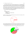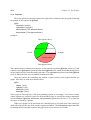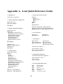
1
A User’s Guide to the Lout Document Formatting System Jeffrey H. Kingston Version 3.31 August, 2005 Copyright 1991, 2005 Jeffrey H. Kingston, School of Information Technologies, The University of Sydney 2006, Australia. ISBN 0 86758 9515. Preface This User’s Guide brings together in one document everything needed for the day-to-day use of Version 3 of the Lout document formatting system. There are three other documents describing Lout: the Expert’s Guide [5], which you need if you want to add new features to Lout; a journal paper on the design and implementation of Lout [3]; and a set of overhead transparencies [4] that cover much the same ground as this Guide. These documents are all distributed with the software. Lout is distributed free of charge under the GNU Public License. The primary source is directory ftp://ftp.it.usyd.edu.au/jeff/lout containing a gzipped tar file of the current version (currently lout-3.31.tar.gz), and various other things including a PostScript version of this guide. The distribution contains source code, libraries, documentation, license, and installation instructions. A mailing list has been set up for discussion of all topics related to Lout. To subscribe (or unsubscribe), visit http://lists.planix.com/mailman/options.cgi/lout-users/ After subscribing, to post an item send email to [email protected]; it will be forwarded to all subscribers via email. Lout began in 1984 as a research project into the design of a high-level language for document formatting. At that time my name for the subject was ‘document layout,’ and this terminology survives in the name ‘Lout’. The initial design was strongly influenced by Brian W. Kernighan and Lorinda L. Cherry’s eqn equation formatter [2], and also by Brian K. Reid’s Scribe system [9]. That research phase ended in October 1991 with the first public release of Lout. Since then the system has been steadily improved and extended. Optimal paragraph breaking and automatic hyphenation were copied from Donald E. Knuth’s TEX system [6], and the optimal paragraph breaking algorithm was applied to the problem of producing optimal page breaks. The first implementations of horizontal galleys and optimal page breaking were by my student Gabor Inokai. Vincent Tan contributed the PDF back end. Valeriy E. Ushakov smoothed the path for many people, by his contributions to improving Lout’s robustness, and his tireless management of and responses to the Lout mailing list. The current mailing list maintainer is Greg Woods. The number of other people who have offered comments and suggestions to me is so great that it is quite out of my power to acknowledge them individually. I hope that seeing their ideas adopted will be thanks enough. Jeffrey H. Kingston School of Information Technologies The University of Sydney 2006, Australia [email protected] Contents Preface .. .. .. .. .. .. .. .. .. .. .. .. .. .. .. .. .. .. .. .. .. .. .. .. .. .. .. .. .. .. Chapter 1. The Basics 1.1. Getting started .. .. .. .. .. .. .. 1.2. Objects, symbols, options, and lengths .. 1.3. Spaces and braces .. .. .. .. .. .. 1.4. Characters .. .. .. .. .. .. .. .. 1.5. The empty object .. .. .. .. .. .. 1.6. Fonts and font sizes .. .. .. .. .. .. 1.7. Headings .. .. .. .. .. .. .. .. .. 1.8. Starting a new line, paragraph, or page .. 1.9. Paragraph breaking .. .. .. .. .. .. 1.10. Line spacing .. .. .. .. .. .. .. 1.11. Hyphenation .. .. .. .. .. .. .. 1.12. Margin kerning .. .. .. .. .. .. .. 1.13. Underlining .. .. .. .. .. .. .. .. 1.14. Languages other than English .. .. .. 1.15. The current date and time .. .. .. .. 1.16. Superscripts and subscripts .. .. .. 1.17. Verbatim text .. .. .. .. .. .. .. 1.18. Drop capitals .. .. .. .. .. .. .. 1.19. Alternative conventions for white space .. .. .. .. .. .. .. .. .. .. .. .. .. .. .. .. .. .. .. .. 1 1 3 6 7 12 12 16 17 18 21 22 23 23 24 25 26 27 27 28 .. .. .. .. .. .. .. .. .. .. .. Adding Structure to Documents Displays .. .. .. .. .. .. .. .. .. .. .. .. .. .. .. .. .. .. Lists .. .. .. .. .. .. .. .. .. .. .. .. .. .. .. .. .. .. .. Footnotes and endnotes .. .. .. .. .. .. .. .. .. .. .. .. .. .. Margin notes and arbitrary placement .. .. .. .. .. .. .. .. .. .. Theorems, lemmas, corollaries, definitions, propositions, examples, and claims .. .. .. .. .. .. .. .. .. .. .. .. .. .. .. .. .. .. .. 2.6. Figures and tables .. .. .. .. .. .. .. .. .. .. .. .. .. .. .. 2.7. Large-scale structure: chapters, sections, etc. .. .. .. .. .. .. .. .. 2.8. Cross references and links .. .. .. .. .. .. .. .. .. .. .. .. .. 2.9. Tables of contents .. .. .. .. .. .. .. .. .. .. .. .. .. .. .. 2.10. Glossaries .. .. .. .. .. .. .. .. .. .. .. .. .. .. .. .. .. 30 30 31 36 39 Chapter 2. 2.1. 2.2. 2.3. 2.4. 2.5. .. .. .. .. .. .. .. .. .. .. .. .. .. .. .. .. .. .. .. .. .. .. .. .. .. .. .. .. .. .. .. .. .. .. .. .. .. .. .. .. .. .. .. .. .. .. .. .. .. .. .. .. .. .. .. .. .. .. .. .. .. .. .. .. .. .. .. .. .. .. .. .. .. .. .. .. .. .. .. .. .. .. .. .. .. .. .. .. .. .. .. .. .. .. .. .. .. .. .. .. .. .. .. .. .. .. .. .. .. .. .. .. .. .. .. .. .. .. .. .. .. .. .. .. .. .. .. .. .. .. .. .. .. .. .. .. .. .. .. .. .. .. .. .. .. .. .. .. .. .. .. .. .. .. .. .. .. .. .. .. ii 41 42 46 49 52 53 2.11. Indexes .. .. .. .. .. .. .. .. .. .. .. .. .. .. .. .. .. .. 2.12. Multiple columns .. .. .. .. .. .. .. .. .. .. .. .. .. .. .. 2.13. Defining new symbols .. .. .. .. .. .. .. .. .. .. .. .. .. .. 57 64 65 Chapter 3. 3.1. 3.2. 3.3. 3.4. 3.5. 3.6. 3.7. 3.8. .. .. .. .. .. .. .. .. Types of Documents Ordinary documents .. .. .. .. .. .. .. .. .. Technical reports .. .. .. .. .. .. .. .. .. .. Books .. .. .. .. .. .. .. .. .. .. .. .. .. Overhead transparencies .. .. .. .. .. .. .. .. Stand-alone illustrations .. .. .. .. .. .. .. .. Plain text documents .. .. .. .. .. .. .. .. .. PDF (Adobe Portable Document Format) documents Organizing large documents .. .. .. .. .. .. .. .. .. .. .. .. .. .. .. .. .. .. .. .. .. .. .. .. .. .. .. .. .. .. .. .. .. .. .. .. .. .. .. .. .. .. .. .. .. .. .. .. .. .. .. .. .. .. .. .. .. .. .. .. .. 68 68 72 78 85 90 91 93 93 Chapter 4. 4.1. 4.2. 4.3. 4.4. Changing the Overall Format .. .. .. .. .. Setup files .. .. .. .. .. .. .. .. .. .. Page size and page orientation .. .. .. .. .. Page margins, page boxes, and page backgrounds Page numbers and running headers .. .. .. .. .. .. .. .. .. .. .. .. .. .. .. .. .. .. .. .. .. .. .. .. .. .. .. .. .. .. .. .. .. .. 95 95 98 100 103 Chapter 5. 5.1. 5.2. 5.3. 5.4. 5.5. 5.6. .. .. .. .. .. .. .. .. .. .. .. .. References Setting up a bibliographic database .. .. .. .. .. .. Citation .. .. .. .. .. .. .. .. .. .. .. .. .. Labelled (as opposed to numbered) references .. .. .. Constructing database entries .. .. .. .. .. .. .. Changing the appearance of citations and the reference list Creating your own entry types and formats .. .. .. .. .. .. .. .. .. .. .. .. .. .. .. .. .. .. .. .. .. .. .. .. .. .. .. .. .. .. .. .. .. 108 108 109 111 112 116 119 .. .. .. .. .. .. .. .. .. .. .. .. .. .. .. .. .. .. .. .. .. .. .. .. .. .. .. .. .. .. .. .. .. .. .. .. .. .. .. .. .. .. .. .. 122 122 124 126 127 128 129 131 131 133 136 .. .. .. .. .. .. Chapter 6. Tables 6.1. Getting started .. .. .. .. 6.2. Changing the appearance of cells 6.3. Changing the appearance of rows 6.4. Rules .. .. .. .. .. .. .. 6.5. Margins .. .. .. .. .. .. 6.6. Cell width and height .. .. 6.7. Indenting and struts .. .. .. 6.8. Aligned columns .. .. .. .. 6.9. Spanning columns and rows .. 6.10. Vertical alignment of tables iv .. .. .. .. .. .. .. .. .. .. .. .. .. .. .. .. .. .. .. .. .. .. .. .. .. .. .. .. .. .. .. .. .. .. .. .. .. .. .. .. .. .. .. .. .. .. .. .. .. .. .. .. .. .. .. .. .. .. .. .. .. .. .. .. .. .. .. .. .. .. .. .. .. .. .. .. .. .. .. .. .. .. .. .. .. .. .. .. .. .. .. .. .. .. .. .. 6.11. 6.12. 6.13. 6.14. Multi-page tables .. .. .. .. .. .. Plain text tables .. .. .. .. .. .. .. Changing the overall format .. .. .. Summary of options .. .. .. .. .. .. .. .. .. .. .. .. .. .. .. .. .. .. .. .. .. .. .. .. .. .. .. .. .. .. .. .. .. .. .. .. .. .. .. .. .. 137 139 140 141 Chapter 7. 7.1. 7.2. 7.3. 7.4. 7.5. 7.6. 7.7. .. .. .. .. .. .. .. .. Equations Introduction .. .. .. .. .. .. .. .. Symbols .. .. .. .. .. .. .. .. .. Vertical positioning .. .. .. .. .. .. Spacing .. .. .. .. .. .. .. .. .. Displaying equations .. .. .. .. .. Defining new equation formatting symbols Summary .. .. .. .. .. .. .. .. .. .. .. .. .. .. .. .. .. .. .. .. .. .. .. .. .. .. .. .. .. .. .. .. .. .. .. .. .. .. .. .. .. .. .. .. .. .. .. .. .. .. .. .. .. .. .. .. .. .. .. .. .. .. .. .. .. .. .. .. .. .. .. .. .. .. .. .. .. .. .. .. 145 145 146 150 152 153 154 155 Chapter 8. 8.1. 8.2. 8.3. 8.4. 8.5. 8.6. 8.7. 8.8. 8.9. Basic Graphics .. .. Colour .. .. .. .. Textures .. .. .. .. Boxes and rules .. .. Outlined words .. .. Rotation .. .. .. .. Scaling .. .. .. .. Mirror reflections .. Including an illustration Precise object placement .. .. .. .. .. .. .. .. .. .. .. .. .. .. .. .. .. .. .. .. .. .. .. .. .. .. .. .. .. .. .. .. .. .. .. .. .. .. .. .. .. .. .. .. .. .. .. .. .. .. .. .. .. .. .. .. .. .. .. .. .. .. .. .. .. .. .. .. .. .. .. .. .. .. .. .. .. .. .. .. 162 162 163 165 169 169 170 172 172 174 .. .. .. .. .. .. .. .. .. .. .. Chapter 9. Diagrams 9.1. Introduction .. .. .. .. .. .. .. .. .. .. .. 9.2. Nodes .. .. .. .. .. .. .. .. .. .. .. .. .. 9.3. Links .. .. .. .. .. .. .. .. .. .. .. .. .. 9.4. Tags .. .. .. .. .. .. .. .. .. .. .. .. .. 9.5. Labels .. .. .. .. .. .. .. .. .. .. .. .. 9.6. Positioning .. .. .. .. .. .. .. .. .. .. .. 9.7. Trees .. .. .. .. .. .. .. .. .. .. .. .. .. 9.8. Syntax diagrams .. .. .. .. .. .. .. .. .. .. 9.9. Errors .. .. .. .. .. .. .. .. .. .. .. .. .. 9.10. Expert usage: defining new shapes .. .. .. .. 9.11. Expert usage: numbers, lengths, angles, and points 9.12. Summary .. .. .. .. .. .. .. .. .. .. .. .. .. .. .. .. .. .. .. .. .. .. .. .. .. .. .. .. .. .. .. .. .. .. .. .. .. .. .. .. .. .. .. .. .. .. .. .. .. .. .. .. .. .. .. .. .. .. .. .. .. .. .. .. .. .. .. .. .. .. .. .. .. .. .. .. .. .. .. .. .. .. .. .. .. .. .. .. .. 178 178 180 185 188 191 195 198 203 209 210 214 217 .. .. .. .. .. .. .. .. .. .. .. .. .. .. .. .. .. .. .. .. .. .. .. .. .. .. .. .. .. .. .. .. .. .. .. .. .. .. .. .. .. .. .. .. .. .. .. .. .. .. .. .. .. .. .. .. .. .. .. v Chapter 10. Graphs .. .. .. .. .. .. .. .. .. .. 10.1. Introduction .. .. .. .. .. .. .. .. .. 10.2. Changing the overall appearance of the graph 10.3. Captions .. .. .. .. .. .. .. .. .. .. 10.4. Ticks and labels .. .. .. .. .. .. .. .. 10.5. Changing the appearance of the data .. .. 10.6. Placing arbitrary objects on the graph .. .. 10.7. Mathematical functions, loops, and tests .. 10.8. Adding a key to the graph .. .. .. .. .. 10.9. Errors .. .. .. .. .. .. .. .. .. .. 10.10. Summary .. .. .. .. .. .. .. .. .. .. .. .. .. .. .. .. .. .. .. .. .. .. .. .. .. .. .. .. .. .. .. .. .. .. .. .. .. .. .. .. .. .. .. .. .. .. .. .. .. .. .. .. .. 233 233 234 237 239 242 247 248 251 252 253 .. .. .. .. .. .. .. .. .. .. .. .. .. .. .. .. .. .. .. .. .. .. .. .. .. .. .. .. .. .. .. .. .. .. .. .. .. .. .. .. .. .. .. .. .. .. .. .. .. .. .. .. .. .. .. 258 258 259 262 264 265 270 271 .. .. .. .. .. .. .. .. .. .. .. .. .. .. .. .. .. .. .. .. .. .. .. .. .. .. .. .. .. .. .. .. .. .. .. 272 272 273 275 277 279 280 281 282 283 283 284 Chapter 13. Pascal and Modula-2 Programs .. .. .. .. .. .. .. .. .. .. .. 287 Appendix A. Lout Quick Reference Guide .. .. .. .. .. .. .. .. .. .. .. 290 Chapter 11. 11.1. 11.2. 11.3. 11.4. 11.5. 11.6. 11.7. .. .. .. .. .. .. .. .. .. .. .. .. .. .. .. .. .. .. .. .. .. .. .. .. .. .. .. .. .. .. .. .. Pie Graphs .. .. .. .. .. .. .. .. .. .. Introduction .. .. .. .. .. .. .. .. .. .. Changing the appearance of slices .. .. .. .. Changing the overall appearance of the pie graph Captions .. .. .. .. .. .. .. .. .. .. .. Labels .. .. .. .. .. .. .. .. .. .. .. Errors .. .. .. .. .. .. .. .. .. .. .. Summary .. .. .. .. .. .. .. .. .. .. .. .. .. .. .. .. .. .. .. .. .. Chapter 12. Computer Programs .. .. .. .. .. .. .. .. .. .. .. 12.1. Typesetting computer programs independently of any document 12.2. Typesetting computer programs as part of a larger document 12.3. Changing the appearance of a program .. .. .. .. .. .. 12.4. Changing the appearance of all programs simultaneously .. 12.5. Dealing with tab characters in programs .. .. .. .. .. .. 12.6. Dealing with formfeed characters in programs .. .. .. .. 12.7. Embedding Lout commands within program comments .. .. 12.8. Embedding program text within program comments .. .. .. 12.9. Reading and selecting program text from separate files .. .. 12.10. Error messages .. .. .. .. .. .. .. .. .. .. .. .. 12.11. Notes on Perl and Pod .. .. .. .. .. .. .. .. .. .. vi .. .. .. .. .. .. .. .. .. .. .. .. .. .. .. 292 .. .. .. .. .. .. .. .. .. .. .. .. .. .. 294 .. .. .. .. .. .. .. .. .. .. .. .. .. .. .. .. .. .. .. .. .. 298 .. .. .. .. .. .. .. .. .. .. .. .. .. .. .. .. .. .. .. .. .. .. 299 Appendix B. Bypass Symbols Appendix C. Lots more colours References Index vii Chapter 1. The Basics The Lout document formatting system has been designed with the needs of the ordinary user very much in mind. Although the features of Lout are virtually endless, and include mathematical equations, diagrams made from lines and shapes, bibliographic databases, and so on, the system is very simple to use. 1.1. Getting started Suppose you want to produce the following little document: Introduction by W. J. Harvey For Virginia Woolf, Middlemarch was ‘the magnificent book which for all its imperfections is one of the few English novels written for grown-up people.’ She was, no doubt, thinking of George Eliot’s unblinking but compassionate delineation of her characters, of the subtlety of psychological analysis and the maturity of moral comment which underlie this complex and varied novel of English provincial life in the early nineteenth century. Unlike word processing and desktop publishing systems, with Lout you cannot see and edit your document on the screen in this finished form. Instead, you edit an ordinary text file, in which your text is augmented with symbols that mark out the headings, paragraphs, and so on. Although it would be nice to be able to see and edit the finished form, working with a text file and symbols does have some compensating advantages. The first step in producing your introduction to Middlemarch is to use the text editor of your choice to construct this text file: 1 Chapter 1. The Basics 2 @SysInclude { doc } @Doc @Text @Begin @Display @Heading { Introduction by W. J. Harvey } For Virginia Woolf, @I Middlemarch was ‘the magnificent book which for all its imperfections is one of the few English novels written for grown-up people.’ @PP She was, no doubt, thinking of George Eliot’s unblinking but compassionate delineation of her characters, of the subtlety of psychological analysis and the maturity of moral comment which underlie this complex and varied novel of English provincial life in the early nineteenth century. @End @Text Comparing this with the finished form, it’s easy to guess that @I is a symbol that causes the following thing to be printed in italics, and that @PP starts a new paragraph. The other symbols are not much harder. @SysInclude { doc } instructs Lout to read a setup file called doc, in which the symbols are defined. Setup files are the subject of Chapter 4, but you can go a long way without worrying about them. @Doc @Text @Begin and @End @Text have no visible effect, but they must bracket the document as a whole. Again, you don’t have to know what they are for. That explains everything except the part that produces the heading. It’s an interesting glimpse of the way that Lout’s symbols cooperate with each other: @Display @Heading { Introduction by W. J. Harvey } The @Display symbol does the centring and leaves space above and below, while @Heading switches to a bold font. The braces group the words of the heading together so that these symbols apply to all of it; without them they would apply to just the first word. All this is explained in detail in Sections 1.2 and 1.3. Once the file is ready, the next step is to get it processed by the Basser Lout interpreter. If the file’s name is intro, the command for this on the Unix1 operating system is lout intro > intro.ps The output is the PostScript2 file intro.ps, which is suitable for printing on many laser printers and other devices. There are programs that show you the result on your screen as well, although you won’t be able to edit it there. You can also get plain text output (Section 3.6) and PDF output. There are a few points that often confuse people as they begin, so we’ll treat them briefly now with pointers to later sections where they are done properly. Some characters are symbols that produce special effects – for example, { and } produce grouping – and to turn off these effects the characters must be enclosed in double quotes: "{" produces {. The complete set of these special characters is / 1 | & { } # @ ^ ~ \ " Unix is a trademark. PostScript is a trademark of Adobe Systems, Inc. 2 1.1. Getting started 3 Section 1.4 treats unusual characters in full detail. Symbols like @Doc and @Text must be separated from each other by one or more spaces, otherwise Lout will think they are part of one symbol. See Section 1.3 for the details. People familiar with other systems might expect that leaving a blank line would cause Lout to start a new paragraph; but this is not so, you must use a paragraph symbol. Lout will ordinarily take notice of how many spaces you type between words (Section 1.3), but it will mimic the spacing rules of two other systems, troff and TEX, if you prefer (Section 1.19). When Lout runs, you might see some error messages containing the words ‘unresolved cross reference’and ‘no destination point’– not on file intro above, but on more complicated ones (anything with a footnote, for example). These just mean that you have to run the lout command again to finish off the complicated things (Section 2.8), and they will gradually go away. Of course, if you see error messages about missing braces, unknown symbols, and so on, you need to revise your file. Lout will tell you the line number of the problem, and how far along the line it is. WARNING: Lout allows documents to cause arbitrary system commands to be executed. These typically do useful things such as format computer programs and uncompress graphics files, but it is possible for a malicious person to send you a document which includes a command to delete all your files, send abusive mail to the President of the United States in your name, etc. You can protect yourself against this possibility by using the ‘safe execution’ flag: lout -S suspect.document > out.ps Then no system commands will be executed; instead, Lout will print them so that you can confirm for yourself that they are safe before running again without the flag. These system commands are Lout’s only potentially unsafe features, but you also need to worry about whether the resulting PostScript file contains malicious code, since the document may direct Lout to include arbitrary PostScript code in the output. The safe execution of PostScript programs is a matter for PostScript interpreters, not for Lout. For example, the popular Ghostview program has a -safer command line option, which is rumoured to disable unsafe PostScript features. 1.2. Objects, symbols, options, and lengths Lout is not concerned with the exact shapes of individual characters, only with the rectangular areas they occupy: Biology When letters join together into a word, the result is a larger rectangle enclosing them all: Biology When words join into lines we get even larger rectangles: Biology is the study of living things. and so on up through paragraphs and columns to the largest rectangles, which are pages. We call any such rectangle, whether made up of one character, one word, one line, one paragraph, one Chapter 1. The Basics 4 page, or anything else, an object. We also often say, for example, ‘the object @I { Hello world },’ referring to a piece of Lout’s input as an object. This makes sense because we are anticipating the result produced, in this case the object Hello world. It’s true that if a line break happens to fall between Hello and world, the result of @I { Hello world } is not a single rectangle. We answer this by thinking of objects as existing before paragraph breaking rearranges them. Not everything is an object, however. @I alone is not an object, merely a symbol with the potential of producing an object when given an object to work on. To understand this, ask yourself what rectangle @I alone could possibly represent: there is no such rectangle. It helps to imagine the assembly of objects taking place before your eyes. Look at Hello and imagine the objects H, e, l, l, o being assembled into the larger object Hello; look at Hello world and imagine Hello and world being assembled into Hello world. When looking at @I { Hello world } you need to imagine the @I symbol consuming the following object, Hello world, and replacing it with the object Hello world. Here is another example: @CurveBox { Hello world } The @CurveBox symbol (Section 8.3) consumes Hello world and replaces it with the object Hello world This brings us to a basic principle of Lout: Where you can put one object,you can put any object. A few examples will show the vast range of possibilities opened up by this: @CurveBox { @I Hello world } produces Hello world It doesn’t bother @CurveBox if one of the words inside it is in italics. Next: @I @CurveBox { Hello world } produces Hello world The object following @I cannot be just @CurveBox, since that is not an object by itself (it needs to be applied to some object first). So the object following @I is @CurveBox { Hello world }, and it is this that is consumed by @I and modified. The @I symbol is happy to hunt through the object looking for words to italicize. We could go on indefinitely in this way, producing Hello world 1.2. Objects, symbols, options, and lengths 5 for example by @CurveBox { @CurveBox Hello @CurveBox world }. Symbols like @CurveBox often have options, which are subsidiary symbols that modify the result. For example, @CurveBox has margin and paint options: @CurveBox margin { 0.5c } paint { lightgrey } { Hello world } Options come immediately after the main symbol, before any following object. Each consists of the option name followed by the value we want the option to have, always enclosed in braces. Setting out options on separate lines as we have done above makes them easy to see but is not compulsory (end of line and space are the same to Lout). The result, naturally enough, is a curved box with a 0.5 centimetre margin around its contents, painted light grey: Hello world Options are optional: if you leave out an option, Lout supplies a sensible default value for it. Options may be given in any order. They are a very useful way of adding flexibility to symbols without cluttering things up when they aren’t needed. They also help with learning: you can learn the basic symbol first and worry about the options later. Whenever a length is required, as in the margin option above, it may be given using any one of the following seven units of measurement: c i p m f s v Centimetres Inches (1i = 2.54c) Points (72p = 1i) Ems (12m = 1i) 1f is the current font size 1s is the current width of a space character 1v is the current inter-line spacing The first four all define absolute distances and are strictly interchangeable. It is traditional to measure font sizes in points; typical sizes are 12p and 10p, but fractional sizes are allowed. If you use the f unit, the length will depend on the current font size. This can be very useful. For example, the default value of the margin option of @CurveBox is 0.3f (0.3 times the current font size). If you use a large font, for example in an overhead transparency, you get a correspondingly large margin without having to ask for it. The s and v units are less useful. The v unit is used within paragraph symbols (Section 1.8) to ensure that the space between paragraphs widens with the inter-line spacing. Chapter 1. The Basics 6 1.3. Spaces and braces Every symbol in Lout either consists entirely of letters (@ is considered to be a letter) or entirely of punctuation characters. Here are some examples of each type: From letters From punctuation @PP margin { } Now if two symbols made from letters are run together like this: @CurveBox@I Hello (wrong!) Lout will take this to mean one word or symbol called @CurveBox@I, which is wrong. In the same way, a letter-type symbol cannot be run together with a word. However, punctuation-type symbols can be run together with anything. For example, in @CurveBox{ Hello @I { world }}. Lout understands that @CurveBox and { are separate, and it also sorts out }}. into two right brace symbols and a full stop. It might seem strange to treat punctuation and letters so differently, but computer programming languages have done it like this for many years, and it works well. This is the first use for spaces: to separate letter-type symbols from each other and from words. To see the second use for spaces, consider two words side by side: Hello world We want this to produce Hello world, so a space between two words in the input must mean a space between them in the result. Apply the golden rule (where you can put one object, you can put any object) and you get this: a space between two objects in the input produces a space between them in the result. For example, @CurveBox Hello @CurveBox world produces Hello world The space between the two objects @CurveBox Hello and @CurveBox world appears between them in the result; the other two spaces do not separate objects so do not appear in the result. Two objects may be separated by a number of spaces other than one. If they are separated by no spaces, they will appear immediately adjacent in the result; if separated by two spaces, they will appear two spaces apart; and so on. In English it is correct to leave two spaces between the end of one sentence and the beginning of the next, for example. See Section 1.19 for two alternative ways to interpret white space in Lout. Occasionally the two uses for spaces conflict. For example, to produce Hello world 1.3. Spaces and braces 7 we need to have no spaces between the two objects, but then Hello and the following @CurveBox would be run together, which will not work. The solution is to use braces: { @CurveBox Hello }{ @CurveBox world } None of the six spaces in this example lie between two objects. However, the main use of braces is to inform Lout that the object within them is to be kept together, so that any nearby symbols are to apply to all of it. For example, leaving the braces out of @I { Hello world } would mean that @I applies only to Hello. When an object-consuming symbol like @I is followed by an object enclosed in braces, that is the object consumed. For example, This is @I { absolutely necessary }, since otherwise ... produces This is absolutely necessary, since otherwise … with the object absolutely necessary italicized, but not the following comma. If there are no braces, the object consumed is everything up to the next object-separating space: This is @I necessary, since otherwise ... produces This is necessary, since otherwise … with an undesirable italic comma. In practice, this means you can avoid braces only when italicizing a single word with no punctuation attached. One common pitfall is to use unnecessary braces, like this: @I { @CurveBox { Hello world } } (bad!) Another is to think that all spaces produce space in the result, and so write @I{@CurveBox{Hello world}} (worse!) Use braces only when necessary, and add extra spaces where they do not separate objects, and your documents will be far easier to read while you are working on them. Don’t be fooled by the argument that says it doesn’t matter because it doesn’t affect the final printed result. 1.4. Characters The usual way to get characters into a document is simply to type them as we have been doing all along. However, for some characters this is not possible, either because they have some special meaning, as { and } do, or because the keyboard has no button for them. This section explains how to get every possible character: every printable character in the ISO-LATIN-1 character set, every character in the Adobe Systems Symbol font, plus the characters ‚, „, …, Œ, œ, “, ”, fi, fl, –, —, •, †, ‡, ƒ, ⁄, and . If it exists at all, you will find it here. ISO-LATIN-2 Chapter 1. The Basics 8 and Russian characters are available separately. In principle, there is no limit to the characters available, but to go beyond those given in this section requires expertise in defining encoding vectors and fonts [5]. First up we have the characters that you get simply by typing them. The characters themselves are shown at the left, and what you type to get them at the right: ! * 2 8 > E K Q W _ e k q w ! * 2 8 > E K Q W _ e k q w $ + 3 9 ? F L R X ‘ f l r x % , 4 : A G M S Y a g m s y $ + 3 9 ? F L R X ‘ f l r x % , 4 : A G M S Y a g m s y ’ 5 ; B H N T Z b h n t z ( 0 6 < C I O U [ c i o u ’ 5 ; B H N T Z b h n t z ( 0 6 < C I O U [ c i o u ) 1 7 = D J P V ] d j p v ) 1 7 = D J P V ] d j p v Next come characters that have buttons but have a special meaning if they are typed directly, and consequently have to be enclosed in double quotes to turn off this meaning: " @ | "\"" "@" "|" # \ } & ^ ~ "#" "\\" "}" "&" "^" "~" / { "/" "{" "" (space character) If you think you want ", you probably really want “ and ”, for which see below. You can place whole sequences of characters, special or not, inside one pair of double quotes: jeff/includes/su_crest.eps "@PP" "jeff/includes/su_crest.eps" "\"@PP\"" The following characters have been deemed important enough to deserve their own symbols: “ ” • § · ƒ ″ ÷ ‘‘ ’’ @Bullet @SectSym @CDot @Florin @Second @Divide @TradeMark „ … ∗ † £ ° ◊ ,, ... @Star @Dagger @Sterling @Degree @Lozenge @CopyRight @Euro – — ¶ ‡ ¥ ′ × ---@ParSym @DaggerDbl @Yen @Minute @Multiply @Register Next we have the complete ISO-LATIN-1character set, whose members you get with the @Char 1.4. Characters 9 symbol followed by the name of the character you want: $ ( , 0 4 8 < @ D H L P T X \ ‘ d h l p t x | ` ¯ ˚ ˇ £ § « ¯ ³ · » ¿ Ã Ç Ë Ï Ó × Û ß ã ç ë ï ó ÷ û ÿ @Char space @Char dollar @Char parenleft @Char comma @Char zero @Char four @Char eight @Char less @Char at @Char D @Char H @Char L @Char P @Char T @Char X @Char backslash @Char quoteleft @Char d @Char h @Char l @Char p @Char t @Char x @Char bar @Char grave @Char macron @Char ring @Char caron @Char sterling @Char section @Char guillemotleft @Char macron @Char threesuperior @Char periodcentered @Char guillemotright @Char questiondown @Char Atilde @Char Ccedilla @Char Edieresis @Char Idieresis @Char Oacute @Char multiply @Char Ucircumflex @Char germandbls @Char atilde @Char ccedilla @Char edieresis @Char idieresis @Char oacute @Char divide @Char ucircumflex @Char ydieresis ! % ) 1 5 9 = A E I M Q U Y ] a e i m q u y } ´ ˘ ¸ ¤ ¨ ¬ ° ´ ¸ ¼ À Ä È Ì Ð Ô Ø Ü à ä è ì ð ô ø ü @Char exclam @Char percent @Char parenright @Char hyphen @Char one @Char five @Char nine @Char equal @Char A @Char E @Char I @Char M @Char Q @Char U @Char Y @Char bracketright @Char a @Char e @Char i @Char m @Char q @Char u @Char y @Char braceright @Char acute @Char breve @Char cedilla @Char space @Char currency @Char dieresis @Char logicalnot @Char degree @Char acute @Char cedilla @Char onequarter @Char Agrave @Char Adieresis @Char Egrave @Char Igrave @Char Eth @Char Ocircumflex @Char Oslash @Char Udieresis @Char agrave @Char adieresis @Char egrave @Char igrave @Char eth @Char ocircumflex @Char oslash @Char udieresis " & * . 2 6 : > B F J N R V Z ^ b f j n r v z ~ ˆ ˙ ˝ ¡ ¥ © ± µ ¹ ½ Á Å É Í Ñ Õ Ù Ý á å é í ñ õ ù ý @Char quotedbl @Char ampersand @Char asterisk @Char period @Char two @Char six @Char colon @Char greater @Char B @Char F @Char J @Char N @Char R @Char V @Char Z @Char asciicircum @Char b @Char f @Char j @Char n @Char r @Char v @Char z @Char asciitilde @Char circumflex @Char dotaccent @Char hungarumlaut @Char exclamdown @Char yen @Char copyright @Char hyphen @Char plusminus @Char mu @Char onesuperior @Char onehalf @Char Aacute @Char Aring @Char Eacute @Char Iacute @Char Ntilde @Char Otilde @Char Ugrave @Char Yacute @Char aacute @Char aring @Char eacute @Char iacute @Char ntilde @Char otilde @Char ugrave @Char yacute # ’ + / 3 7 ; ? C G K O S W [ _ c g k o s w { ı ˜ ¨ ˛ ¢ ¦ ª ® ² ¶ º ¾ Â Æ Ê Î Ò Ö Ú Þ â æ ê î ò ö ú þ @Char numbersign @Char quoteright @Char plus @Char slash @Char three @Char seven @Char semicolon @Char question @Char C @Char G @Char K @Char O @Char S @Char W @Char bracketleft @Char underscore @Char c @Char g @Char k @Char o @Char s @Char w @Char braceleft @Char dotlessi @Char tilde @Char dieresis @Char ogonek @Char cent @Char brokenbar @Char ordfeminine @Char registered @Char twosuperior @Char paragraph @Char ordmasculine @Char threequarters @Char Acircumflex @Char AE @Char Ecircumflex @Char Icircumflex @Char Ograve @Char Odieresis @Char Uacute @Char Thorn @Char acircumflex @Char ae @Char ecircumflex @Char icircumflex @Char ograve @Char odieresis @Char uacute @Char thorn Of course, many of these characters can also be typed directly, or with the aid of double quotes, as we have seen. If your keyboard has accented characters on it, you can type them directly too; Chapter 1. The Basics 10 if not, you need to use the @Char symbol, in which case you will probably need braces as well: gar{@Char ccedilla}on to distinguish the @Char symbol and the character name from adjacent letters. Next we have the Adobe Systems Symbol font, a treasure trove of exotic characters obtained with the @Sym symbol: ∃ ( , 0 4 8 < ≅ ∆ Η Λ Π Τ Ξ ∴ δ η λ π τ ξ | ′ ƒ ♠ → ″ ∂ ≡ ℜ ∅ ⊇ ∈ √ ∨ ⇒ @Sym space @Sym existential @Sym parenleft @Sym comma @Sym zero @Sym four @Sym eight @Sym less @Sym congruent @Sym Delta @Sym Eta @Sym Lambda @Sym Pi @Sym Tau @Sym Xi @Sym therefore @Sym radicalex @Sym delta @Sym eta @Sym lambda @Sym pi @Sym tau @Sym xi @Sym bar @Sym minute @Sym florin @Sym spade @Sym arrowright @Sym second @Sym partialdiff @Sym equivalence @Sym arrowhorizex @Sym Rfraktur @Sym emptyset @Sym reflexsuperset @Sym element @Sym registerserif @Sym radical @Sym logicalor @Sym arrowdblright @Sym registersans @Sym parenlefttp @Sym bracketleftex ! % ) − 1 5 9 = Α Ε Ι Μ Θ Υ Ψ ] α ε ι µ θ υ ψ } ≤ ♣ ↔ ↓ ≥ • ≈ ↵ ℘ ∩ ⊄ ∉ ⋅ ⇔ ⇓ @Sym exclam @Sym percent @Sym parenright @Sym minus @Sym one @Sym five @Sym nine @Sym equal @Sym Alpha @Sym Epsilon @Sym Iota @Sym Mu @Sym Theta @Sym Upsilon @Sym Psi @Sym bracketright @Sym alpha @Sym epsilon @Sym iota @Sym mu @Sym theta @Sym upsilon @Sym psi @Sym braceright @Sym lessequal @Sym club @Sym arrowboth @Sym arrowdown @Sym greaterequal @Sym bullet @Sym approxequal @Sym carriagereturn @Sym weierstrass @Sym intersection @Sym notsubset @Sym notelement @Sym copyrightserif @Sym dotmath @Sym arrowdblboth @Sym arrowdbldown @Sym copyrightsans @Sym parenleftex @Sym bracketleftbt ∀ & ∗ . 2 6 : > Β Φ ϑ Ν Ρ ς Ζ ⊥ β φ ϕ ν ρ ϖ ζ ∼ ⁄ ♦ ← ° × ÷ … ℵ ⊗ ∪ ⊂ ∠ ¬ ⇐ ◊ @Sym universal @Sym ampersand @Sym asteriskmath @Sym period @Sym two @Sym six @Sym colon @Sym greater @Sym Beta @Sym Phi @Sym theta1 @Sym Nu @Sym Rho @Sym sigma1 @Sym Zeta @Sym perpendicular @Sym beta @Sym phi @Sym phi1 @Sym nu @Sym rho @Sym omega1 @Sym zeta @Sym similar @Sym fraction @Sym diamond @Sym arrowleft @Sym degree @Sym multiply @Sym divide @Sym ellipsis @Sym aleph @Sym circlemultiply @Sym union @Sym propersubset @Sym angle @Sym trademarkserif @Sym logicalnot @Sym arrowdblleft @Sym lozenge @Sym trademarksans @Sym parenleftbt @Sym bracelefttp # ∋ + / 3 7 ; ? Χ Γ Κ Ο Σ Ω [ _ χ γ κ ο σ ω { ϒ ∞ ♥ ↑ ± ∝ ≠ ℑ ⊕ ⊃ ⊆ ∇ ∏ ∧ ⇑ 〈 ∑ @Sym numbersign @Sym suchthat @Sym plus @Sym slash @Sym three @Sym seven @Sym semicolon @Sym question @Sym Chi @Sym Gamma @Sym Kappa @Sym Omicron @Sym Sigma @Sym Omega @Sym bracketleft @Sym underscore @Sym chi @Sym gamma @Sym kappa @Sym omicron @Sym sigma @Sym omega @Sym braceleft @Sym Upsilon1 @Sym infinity @Sym heart @Sym arrowup @Sym plusminus @Sym proportional @Sym notequal @Sym arrowvertex @Sym Ifraktur @Sym circleplus @Sym propersuperset @Sym reflexsubset @Sym gradient @Sym product @Sym logicaland @Sym arrowdblup @Sym angleleft @Sym summation @Sym bracketlefttp @Sym braceleftmid @Sym braceleftbt @Sym braceex 〉 @Sym angleright ∫ @Sym integral ⌠ @Sym integraltp @Sym integralex ⌡ @Sym integralbt @Sym parenrighttp @Sym parenrightbt @Sym bracketrighttp @Sym bracketrightex @Sym bracerighttp @Sym bracerightmid @Sym bracerightbt @Sym parenrightex @Sym bracketrightbt 1.4. Characters 11 There is only one Symbol font; it does not come in bold or italic faces like the other fonts. Typing @B @Sym alpha is therefore useless, and anyway there is no bold α character in any font distributed with Lout. Next there are the dingbats. Here they are with their (regrettably meaningless) names:1 @Ding Dingbat @Ding Dingbat @Ding Dingbat @Ding Dingbat @Ding Dingbat @Ding Dingbat 1 a1 a119 a14 a19 a25 a8 a32 a38 a44 a50 a57 a63 a69 a203 a79 a98 a104 a110 a124 a130 a136 a142 a148 a154 a160 a192 a171 a176 a199 a184 a195 ✁ ✇ ✍ ✓ ✙ ✟ ✥ ✫ ✱ ✷ ✾ ❄ ❊ ❐ ❖ ❜ ❤ ♥ ⑤ ❶ ❼ ➂ ➈ ➎ ➔ ➚ ➠ ➦ ➬ ➳ ➹ a2 a118 a15 a20 a26 a9 a33 a39 a45 a51 a58 a64 a70 a75 a81 a99 a106 a109 a125 a131 a137 a143 a149 a155 a161 a166 a172 a177 a181 a197 a187 ✂ ✈ ✎ ✔ ✚ ✠ ✦ ✬ ✲ ✸ ✿ ❅ ❋ ❑ ◗ ❝ ❥ ♠ ⑥ ❷ ❽ ➃ ➉ ➏ → ➛ ➡ ➧ ➭ ➴ ➺ a202 a117 a16 a21 a27 a10 a34 a40 a46 a52 a59 a65 a71 a204 a82 a100 a107 a120 a126 a132 a138 a144 a150 a156 a163 a167 a173 a178 a200 a185 a188 ✃ ✉ ✏ ✕ ✛ ✡ ✧ ✭ ✳ ✹ ❀ ❆ ● ❒ ❘ ❞ ❦ ① ⑦ ❸ ❾ ➄ ➊ ➐ ↔ ➜ ➢ ➨ ➮ ➵ ➻ a3 a11 a105 a22 a28 a29 a35 a41 a47 a54 a60 a66 a72 a76 a83 a101 a108 a121 a127 a133 a139 a145 a151 a157 a164 a168 a162 a179 a182 a194 a189 ✄ ☛ ✐ ✖ ✜ ✢ ★ ✮ ✴ ✻ ❁ ❇ ❍ ▲ ❙ ❡ ❧ ② ⑧ ❹ ❿ ➅ ➋ ➑ a4 a12 a17 a23 a6 a30 a36 a42 a48 a55 a61 a67 a73 a77 a84 a102 a112 a122 a128 a134 a140 a146 a152 a158 a196 a169 a174 a193 a201 a198 a190 ☎ ☞ ✑ ✗ ✝ ✣ ✩ ✯ ✵ ✼ ❂ ❈ ■ ▼ ❚ ❢ ♣ ③ ⑨ ❺ ➀ ➆ ➌ ➒ ➘ ➞ ➤ ➪ ➱ ➷ ➽ a5 a13 a18 a24 a7 a31 a37 a43 a49 a56 a62 a68 a74 a78 a97 a103 a111 a123 a129 a135 a141 a147 a153 a159 a165 a170 a175 a180 a183 a186 a191 ✆ ✌ ✒ ✘ ✞ ✤ ✪ ✰ ✶ ✽ ❃ ❉ ❏ ◆ ❛ ❣ ♦ ④ ⑩ ❻ ➁ ➇ ➍ ➓ ➙ ➟ ➥ ➫ ➲ ➸ ➾ ↕ ➝ ➣ ➩ ➯ ➶ ➼ If you see only conventional characters in this table, the problem is that your viewer does not have access to the Dingbats font. The author’s viewer has this problem, for example, but his printer doesn’t. Chapter 1. The Basics 12 The easiest way to get a dingbat is to write, for example, @Ding a123 which produces the dingbat with the given name from the table above. This is just a shorthand for { Dingbats Base } @Font { @Char a123 } In other words, dingbats are just another font. Finally we have a few more characters that you get with the @Char symbol, although they aren’t ISO-LATIN-1 characters. ‚ œ fl † @Char quotesinglbase @Char oe @Char fl @Char dagger „ “ – ‡ @Char quotedblbase @Char quotedblleft @Char endash @Char daggerdbl … ” — ƒ @Char ellipsis @Char quotedblright @Char emdash @Char florin Œ fi • ⁄ @Char OE @Char fi @Char bullet @Char fraction Most of these characters are also in the list of ‘characters important enough to deserve their own symbols’ given above. 1.5. The empty object It is possible to produce examples in which an object is clearly missing: { @I } The @I symbol is supposed to italicize the following object, but in this example there isn’t one. A more plausible example is @PP @PP There are supposed to be paragraph objects between paragraph symbols, but here there aren’t. Wherever an object is clearly missing, Lout inserts an empty object, which is a rectangle of size zero by zero that prints as nothing. Here are two other ways to get an empty object: {} "" Braces always enclose an object, so Lout is obliged to insert an empty object between them; the two double quotes make a word with no characters in it, which is taken to be an empty object. 1.6. Fonts and font sizes A font is a collection of characters that may be printed. For example, here is the Times Roman font: 1.6. Fonts and font sizes 13 !"# $%&’()*+,-./ 0123456789:;<=>?@[\ ]^_ ‘ A BCDE F G HIJK L MN OP QR STUVW XYZ a bcd ef gh ijk lm n opq r st uvwxyz {|}~ı`´ ˆ ˜ ¯ ˘˙¨˚¸˝ ˛ˇ ¡¢£ ¤ ¥ ¦§¨©ª «¬-®¯ °±² ³ ´ µ ¶ ·¸¹º »¼½ ¾¿ À Á Â Ã Ä Å ÆÇÈ É Ê Ë ÌÍ Î ÏÐÑ ÒÓÔÕÖ×ØÙÚÛÜÝÞ ßà á â ã ä å æçèéêëìí î ï ðñ òóôõö÷øùúûüýþÿ and here is the Times Italic font: !" # $ %&’()* +,-./ 0 12345 6 7 8 9 :;<=>?@[ \ ] ^ _ ‘ ABC DE F G H I J K L M N OP QRS T U V W X Y Z abcd ef ghi j k l mnopqr st uvwx yz { |}~ı`´ ˆ ˜ ¯ ˘ ˙¨ ˚ ¸˝ ˛ˇ ¡¢£ ¤ ¥ ¦§¨ ©ª «¬-®¯ ° ±² ³ ´ µ ¶ ·¸¹ º »¼ ½ ¾ ¿ ÀÁÂÃÄÅÆ Ç È É Ê Ë Ì Í Î Ï ÐÑ ÒÓÔÕÖ×ØÙ Ú Û Ü Ý Þ ß àá âã ä åæçèé ê ë ì í î ï ðñòó ôõ ö ÷øùúûüý þÿ As their names imply, these two fonts belong to the Times family, a collection of fonts designed to go well together. Every font has a family name, such as Times, Helvetica, or Courier, and a face name, such as Roman or Italic. To find out how to get the unusual characters, see Section 1.4. Documents look best when they use just one font family, so the most common need is to change to a different face within the current family. We have already seen @I, which changes to the Italic face of the current family; there are six such symbols: @B { Hello World } @I { Hello World } @BI { Hello World } @II { Hello World } @S { Hello World } @R { Hello World } Hello World Hello World Hello World Hello World HELLO WORLD Hello World The symbols’ names stand for Bold, Italic, Bold-Italic, Italic-Italic (see below), Small capitals, and Roman. It is conventional to use Bold for headings; Italic for emphasis, terms being defined, and subsidiary headings; and Roman for the rest. Small capitals are not really a different font; they are made on demand from the current font. So you can write, for example, @I @S { Hello World } and get H ELLO W ORLD. You can change the size of small capitals using the @Font or @InitialFont symbols, as described below. The @R symbol is almost unnecessary, since the document as a whole is set in a Roman face; but it is occasionally useful: @I { An Italic sentence with one @R Roman word } produces An Italic sentence with one Roman word Chapter 1. The Basics 14 This illustrates the general principle that the effect of a font symbol on the following object is subject to font symbols within that object. When part of a title is to be set in italic font, neither @I nor @BI is suitable because the part should appear in bold italics in the title itself, but in ordinary italics in running headers and the table of contents. The @II symbol is the one for this situation: it produces bold italics when the current font is bold, and ordinary italics otherwise. Changing families is a little more complicated. Here is the complete list of font families and their faces available with Basser Lout Version 3: AvantGarde Bookman Chancery Courier Helvetica Schoolbook Palatino Symbol Times Dingbats Base Slope Bold BoldSlope BoldObl Book BookOblique CondBold CondBook CondDemi CondMedium Demi DemiOblique ExtraLight ExtraLightObl Medium MediumObl Base Slope Bold BoldSlope BoldItalic Demi DemiItalic Light LightItalic Medium MediumItalic Base Slope Bold BoldSlope Roman Bold Italic Light Demi LightItalic MediumItalic Base Slope Bold BoldSlope BoldOblique Oblique Base Slope Bold BoldSlope Black BlackOblique BoldOblique Compressed Cond CondBlack CondBlackObl CondBold CondBoldObl CondLight CondLightObl CondOblique ExtraCompressed Light LightOblique Narrow NarrowBold NarrowBoldObl NarrowObl Oblique UltraCompressed Base Slope Bold BoldSlope BoldItalic Italic Roman Base Slope Bold BoldSlope BoldItalic BoldItalicOsF BoldOsF Italic ItalicOsF Roman SC Base Slope Bold BoldSlope Base Slope Bold BoldSlope BoldItalic BoldItalicOsF BoldSC ExtraBold Italic ItalicOsF Roman RomanSC Semibold SemiboldItalic Base Slope Bold BoldSlope Lout understands all these fonts, but your printing device may not. Times, Helvetica, Courier, and Symbol at least seem to be ubiquitous, although not in every face. These fonts work only with languages that use the Latin1character set; consult Section 1.14 for more information about this. It is not difficult for a Lout expert to extend this list [5]. It is a convention in Lout that every font family should at least contain faces called Base, Slope, Bold, and BoldSlope, and these faces are what the @R, @I, @B, and @BI symbols give you. But this convention is something of a fiction for two reasons. First, some font families don’t have faces that could reasonably be described as bold or whatever. In particular, the Symbol family contains just one face, and all four conventional face names produce that face. Second, the four conventional face names are not names that typographers actually use, Bold excepted. Slope produces an italic face in some families and an oblique one in others. As the table shows, the true names are available if you want to use them, but it is very convenient to have a Slope face that is guaranteed to exist no matter which family is used. 1.6. Fonts and font sizes 15 The @Font symbol changes the font of the following object. For example, { Helvetica Slope } @Font { Hello World } produces Hello World When changing to a different family, a face name must follow the family name; but when changing face within a family, just the face name is sufficient. To make the characters larger or smaller, you need to change the font size, which can also be done with the @Font symbol. Font sizes are traditionally measured in points: there are 72 points to one inch, and the most common font sizes are 12 point and 10 point. However, as Section 1.2 explains in detail, any length including fractional lengths is acceptable: 24p @Font { Hello World } changes to 24 point size, producing Hello World It is also possible to specify a font size relative to the current size: +2p means two points larger, -2p means two points smaller, and 1.5f means 1.5 times the current font size. If you switch font sizes in the middle of a line, as in Here’s a 20p @Font big word you will discover one of Lout’s obscure secrets: Here’s a big word Adjacent letters are aligned vertically through their middles, not through the baseline, causing this awkward alignment. This was done because it makes equation formatting easy, and examples like the above look poor anyway. However, if you want to do this and so require alignment through the baseline, you can get it, with the baselinemark option to the @Font symbol: baselinemark @Font { Here’s a 20p @Font big word } which produces Here’s a big word If you want it this way throughout your document, you can put baselinemark in your initial font (see below). Lout’s equation formatter contains the opposite option, which is xheight2mark @Font { ... } (which aligns through a point half the height of an x character) so you won’t disrupt equation formatting if you do this, although if you put an equation inside a paragraph, its axis will be aligned with the baseline of the adjacent words. There is an @F symbol which switches to a fixed width font family: Chapter 1. The Basics 16 @F { Hello world } produces the equivalent of { Courier Base -1p } @Font ..., like this: Hello world The -1p is included to compensate for the relatively large appearance of the Courier font. The document as a whole will be set in Times Base 12p. To change this you need to change the @InitialFont option, for example to @InitialFont { Helvetica Base 10p } to get Helvetica 10 point. You must give all three parts in @InitialFont: family, face, size. If you are using your own setup file, as explained in Section 4.1, you can find the @InitialFont option there. If not, you can set it at the beginning of your document as explained in Section 3.1. The @InitialFont option is also a good place to set the size of small capitals if you don’t like the default size that Lout gives you: @InitialFont { Helvetica Base 10p setsmallcaps 0.9 } In this example we’re asking for small capitals to have size 0.9 times the height of ordinary capitals. The number following setsmallcaps is a ratio, not a length, so it carries no unit of measurement. You can put setsmallcaps in an ordinary @Font symbol too, if you like. For example, { setsmallcaps 0.9 } @Font @S { Hello, world } has result HELLO, WORLD However for consistency most people would use setsmallcaps only in @InitialFont, if at all. There are two features that make fonts look better on the page. Ligatures are pairs of letters run together; the most common ligatures are ‘fi’and ‘fl.’ Kerning is moving adjacent letters closer together, for example in ‘VA.’ Lout considers ligatures and kerning to be integral parts of each font; you can prevent them from happening only by enclosing one of the letters in a @OneCol symbol, as in @OneCol { V }A. Alternatively, to turn off ligatures you can write nolig @Font { ... } and then ligatures will not be used within the object following @Font. Should you ever need to turn ligatures on within a region where they are turned off, use lig @Font. 1.7. Headings The @Heading symbol makes the following object into a heading. Actually, all it does is change the font, so if you want a centred heading you have to display it as well: @Display @Heading { A Centred Heading } Following text 1.7. Headings 17 If you want a left-justified heading, use @LeftDisplay instead of @Display. Alternatively, you can use no display symbol at all, but then you will need paragraph symbols before and after: @DP @Heading { A Left-Justified Heading } @PP Following text The font used is Bold in the current family, although you can change this by changing the @HeadingFont option in the setup file (Section 4.1). In complex documents, large-scale structure symbols (Section 2.7) are usually more appropriate than the @Heading symbol. 1.8. Starting a new line, paragraph, or page The usual way to start a new paragraph is with the @PP ‘plain paragraph’ symbol. It produces a small vertical space and indents the first line of the new paragraph. Some document formatting systems interpret a blank line as a request to start a new paragraph. This is not the case with Lout: a blank line is two line-endings, equivalent to two spaces. The @LP ‘left paragraph’ symbol produces the same vertical space as @PP, but omits the indent. The @LLP ‘left line paragraph’ symbol starts a new paragraph using the usual inter-line spacing and no indent, or in other words it starts a new line. If you are using it to create single lines, you need the lines paragraph breaking style instead (Section 1.9). The @DP ‘display paragraph’ symbol produces a somewhat larger vertical space, equal to the amount used before and after displays (Section 2.1), with no indent. To get even more space, use @DP repeatedly. Another symbol, @LOP, leaves a paragraph break the size of the gap left outside (that is, before and after) lists (Section 2.2). This is usually equal to @DP. The @NP ‘new page’ symbol causes the following paragraph to begin on a new page or column. Of course, Lout starts a new page or column automatically when the old one is full, so @NP is needed only rarely. To make each section begin on a new page you must set the @SectionGap setup file option (Section 2.7). To make one particular section start on a new page or column, place @NP within the previous section, at the end. Placing @NP between sections will not work. Occasionally Lout will start a new page or column directly after a heading, which looks very poor. The obvious answer is to place an @NP just before the heading, but when the document is later revised and the heading no longer falls near the page or column ending, this @NP will have to be taken away again. A better answer is to precede the heading with a @CNP ‘conditional new page’ symbol, which checks whether enough space remains in the page or column for a heading and at least two lines of text. If so, @CNP does nothing; if not, @CNP causes a new page or column to be begun, like @NP. The recommended arrangement is Chapter 1. The Basics 18 @DP @CNP @Heading { A Heading } @PP First paragraph of next part ... The @CNP symbol should be preceded by either @DP or @LP, preferably @DP, and this determines the amount of space when the @NP action does not occur. The ultimate answer to the conditional new page problem is to recognise that the heading is the beginning of a new section of the document, and to use a large-scale structure symbol like @Section (Section 2.7). Conditional new page is just one of many services provided automatically by these symbols. Some people do not like to see the first line of a paragraph alone at the bottom of a page, or the last line of a paragraph alone at the top (these blemishes are sometimes called widows and orphans). You can instruct Lout not to allow these; see the next section for details. You can modify the effect of the paragraph symbols by changing options in the setup file. For general information about setup files and their options, consult Section 4.1; here we just explain how the relevant options work. The options and their default values are @ParaGap { 1.30vx } @ParaIndent { 2.00f } @DisplayGap { 1.00v } The values are lengths (Section 1.2), except that for reasons beyond our scope @ParaGap must be a length with an x appended, as shown. The @ParaGap option determines how much vertical space will be inserted by @PP and @LP. The default value, 1.30vx, is 30% more than the normal inter-line spacing; to get no extra spacing, change it to 1.00vx. The @ParaIndent option determines the width of the indent produced by @PP, and its default value is twice the current font size. The @DisplayGap option determines the amount of vertical space inserted by @DP, as well as the vertical space before and after displays. 1.9. Paragraph breaking Paragraph breaking is the process of inserting line breaks into paragraphs at places appropriate to the column width. Lout works out suitable column widths and performs paragraph breaking automatically, finding an ‘optimal’ break with the method used by the TEX system. It offers nine styles of paragraph breaking, which we will explore with the aid of this example: It is a truth universally acknowledged, that a single man in possession of a good fortune, must be in want of a wife. Changing the paragraph breaking style is similar to changing the font, colour, or language, and is done using the @Break symbol: ragged @Break ... 1.9. Paragraph breaking 19 This example causes every paragraph in the following object to be broken using the ragged style, of which more below. The first two of the nine styles perform line adjustment, which means that they enlarge the spaces between the objects making up each line so as to fill the lines completely: adjust @Break ... It is a truth universally acknowledged, that a single man in possession of a good fortune, must be in want of a wife. outdent @Break ... It is a truth universally acknowledged, that a single man in possession of a good fortune, must be in want of a wife. The adjust style is frequently used, so it has been chosen as the default style. Outdenting adds a small space at the start of each line except the first, and is much less common. The next four styles do not adjust lines, leaving the paragraph ragged: ragged @Break ... It is a truth universally acknowledged, that a single man in possession of a good fortune, must be in want of a wife. cragged @Break ... It is a truth universally acknowledged, that a single man in possession of a good fortune, must be in want of a wife. rragged @Break ... It is a truth universally acknowledged, that a single man in possession of a good fortune, must be in want of a wife. oragged @Break ... It is a truth universally acknowledged, that a single man in possession of a good fortune, must be in want of a wife. The paragraph is broken in the same places as adjust breaks it, but the resulting lines are left-justified, centred, or right-justified with respect to each other, rather than adjusted; oragged is like outdent except the resulting lines are not adjusted. If you have a few words that must be kept together on one line, the recommended way is to separate them by an ~ symbol: According to Prof.~Jones, the effect of ... It’s best not to bother about this until you actually get a bad line break, since chances are good that the words will fall on one line anyway. The last three styles differ from the first five in breaking the paragraph at the points where it is broken in the original input: Chapter 1. The Basics 20 lines @Break ... clines @Break ... rlines @Break ... It is a truth universally acknowledged, that a single man in possession of a good fortune, must be in want of a wife. It is a truth universally acknowledged, that a single man in possession of a good fortune, must be in want of a wife. It is a truth universally acknowledged, that a single man in possession of a good fortune, must be in want of a wife. The lines are left-justified, centred, or right-justified with respect to each other in the same way as for the ragged styles. When using the lines style, there are some fine points concerning the proper use of white space. Consider this example: @IndentedDisplay lines @Break @I { Teach me to hear Mermaides singing, Or to keep off envies stinging, And finde What winde Serves to’advance an honest minde. } The result is the indented display Teach me to hear Mermaides singing, Or to keep off envies stinging, And finde What winde Serves to’advance an honest minde. This style is the only one for which it is useful to indent individual lines in the input; as the result shows, such indents will be respected, as will blank lines. However, Lout’s rule that only white space separating objects affects the result (Section 1.3) still holds, which means that indenting the first line is not effective: @IndentedDisplay lines @Break @I { And finde What winde Serves to’advance an honest minde. } produces 1.9. Paragraph breaking 21 And finde What winde Serves to’advance an honest minde. This may seem awkward at first, but actually it is extremely convenient because you don’t have to worry about whether the first line of the paragraph should appear on a new line as above, or immediately after the opening brace: space at that point does not separate two objects, so it has no effect. The indent can be obtained by starting the first line with an empty object (Section 1.5): @IndentedDisplay lines @Break @I { {} And finde What winde Serves to’advance an honest minde. } The result is And finde What winde Serves to’advance an honest minde. as desired. To set the entire document in a paragraph breaking style other than adjust, you need to change the @InitialBreak option, as explained at the end of Section 1.10. Some people don’t like to see the first line of a paragraph alone at the foot of a page or column (the rest appearing on the next page). You can instruct Lout not to allow this with unbreakablefirst @Break ... meaning that the first line cannot be broken off from the rest of the paragraph. Similarly, unbreakablelast @Break ... instructs Lout to prevent the last line of a paragraph from appearing alone at the top of a page or column. These features would probably be invoked in the @InitialBreak option, like this: @InitialBreak { unbreakablefirst unbreakablelast hyphen adjust 1.2fx } You can turn them off with breakablefirst @Break and breakablelast @Break. In both cases Lout makes it happen by breaking at the previous place, either between paragraphs or two lines from the end of a paragraph. Both features are compatible with Lout’s @OptimizePages option, which optimizes the overall page layout subject to these requirements. 1.10. Line spacing The @Break symbol also controls the amount of space placed between the lines of paragraphs. This distance is best given using the v unit of measurement: 1v is the current line separation (see Section 1.2 for a description of lengths in general). For example, 2vx @Break ... Chapter 1. The Basics 22 produces double spacing in the paragraphs of the following object, and 0.9vx @Break ... produces cramped spacing, which can be useful in large tables that don’t quite fit on one page. The x following the v is required, but its meaning is beyond our scope [5]. To set the entire document in a different line spacing from the default, you need to change the @InitialBreak option. If you are using your own setup file (Section 4.1), change it there. If not, you can change it at the beginning of your document, as described in Section 3.1. The default value of the @InitialBreak option produces the adjust paragraph breaking style with a line spacing of 1.20 times the current (that is, the initial) font size, and hyphenation on: @InitialBreak { adjust 1.20fx hyphen } To get double spacing, change it to @InitialBreak { adjust 2.40fx hyphen } To get ragged paragraphs with hyphenation off, change it to @InitialBreak { ragged 1.20fx nohyphen } and so on. It is a good idea to define the initial line spacing using the f unit, since then if you change the initial font size the line spacing will change with it. However, any length (Section 1.2) with an x appended will do: 14px for 14 point, 0.5cx for 0.5 centimetres, etc. Don’t use the v unit though, because it refers to some previous line spacing, whereas here we are defining the line spacing for the first time. 1.11. Hyphenation The @Break symbol also controls hyphenation: hyphen @Break turns it on, nohyphen @Break turns it off. For example, ragged breaking is often done without hyphenation: @IndentedDisplay { ragged nohyphen } @Break { This little paragraph will appear with ragged ends to its lines. } Lout’s method of choosing hyphenation points is copied from the TEX system, except that Lout will never place a hyphen within a sequence of characters that form a ligature (fl and fi are the most common ligatures). Hyphenation usually works well by itself; you should never need to interfere with its ideas of what to do. However, if you do want to tell Lout where you think a hyphen could be inserted, you can use the &- symbol: after&-math If &- occurs directly after a hyphen character, hyphenation will be permitted but no extra hyphen 1.11. Hyphenation 23 will be inserted. To prevent hyphenation of a word, enclose the word in a @OneCol symbol. To turn hyphenation off throughout the document, you need to set the @InitialBreak option to nohyphen, as described at the end of Section 1.10. 1.12. Margin kerning The @Break symbol offers a variant of ordinary paragraph breaking called margin kerning, in which small characters that happen to end up at the start or end of a line protrude slightly into the margin. This is said to make documents look better, particularly in narrow columns. For example, 2i @Wide marginkerning @Break { This is a test, just a little test, of margin kerning. It should kern small characters at the margins. } produces This is a test, just a little test, of margin kerning. It should kern small characters at the margins. in which the comma at the end of the first line protrudes. (For the @Wide symbol, which produces a two-inch column here, see Section 8.9.) As with most @Break options, you probably want this in your @InitialBreak option, described in Section 1.9, if you use it at all. By default there is no margin kerning. To turn it off in a context where it is on, use nomarginkerning @Break. 1.13. Underlining The @Underline symbol underlines the following object: This little paragraph of text will have @Underline { three underlined words } in it. produces This little paragraph of text will have three underlined words in it. The underlining is continuous unless a line break intervenes. You can’t use this symbol to underline an arbitrary object: it is carefully designed to produce high-quality underlining of single words and parts of paragraphs, and it works only for those objects. Each font contains information about how words in that font should be underlined: how far Chapter 1. The Basics 24 below the baseline the line should be drawn, and how thick. The @Underline symbol uses this information; the font it bases its underlining on is the font of the first object underlined if it is a word, or else the font of the enclosing paragraph. 1.14. Languages other than English When part of a document is written in a language other than English, Lout should be informed of this using the @Language symbol: ... the garter, he said: French @Language { ‘Honi soit qui mal y pense’ }, and this saying ... Changing language is quite analogous to changing font using the @Font symbol. At the time of writing, the following languages were available: Croatian Hrvatski Czech Cesky Cestina cs Danish Dansk da Dutch Nederlands nl English en EnglishUK en-GB Esperanto eo Finnish Suomi fi French Francais Français fr German Deutsch de Hungarian Magyar hu Italian Italiano it Norwegian Norsk no Polish Polski pl Portuguese Português pt Russian ru Slovak Slovensky Slovencina Slovenian Slovenia Slovenija sl Spanish Español es Swedish Svenska sv UpperSorbian hornjoserbsce serbsce File include/langdefs in the distribution always has the exact list of known languages. As shown, most languages have alternative names, all equally acceptable to the @Language symbol. EnglishUK differs from English only by applying hyphenation rules said to be more appropriate for British English. Since accented characters (Section 1.4) are always available irrespective of the language, at first sight it might seem that there is no need to bother informing Lout what language you are writing in. However, words are hyphenated differently depending on the language, and some symbols have different results in different languages. For example, Danish @Language @Date produces 26. august, 2005 and the alphabetic list symbols of Section 2.2 also vary with the current language. So it’s worth doing for the sake of knowing that non-English parts will appear as they should. If your entire document is in a language other than English, you need to change the @InitialLanguage option: 1.14. Languages other than English 25 @InitialLanguage { Deutsch } If you are using your own setup file (Section 4.1), you can change it there. If not, you can change it at the start of your document, as explained in Section 3.1. Czech, Polish, and Slovenian (at least) use the Latin2 character set, and users of these languages have to place @SysInclude { latin2 } at the start of their documents in order to get access to the Latin2 versions of the fonts.1 These have family names such as TimesCE, CourierCE, HelveticaCE, and so on (CE standing for Central European), to distinguish them from the same fonts encoded in Latin1. The face names are unchanged. A typical Latin2 document would therefore start off like this: @SysInclude { latin2 } @SysInclude { doc } @Document @InitialLanguage { Polish } @InitialFont { TimesCE Base 12p } // Depending on the document type there may be a few other font-setting options in the setup file that need to be changed; in fact, it might be best to produce your own setup file in this case, replacing doc, with the changed options in it. See Section 4.1 for how to do this. You could even start your setup file off with @SysInclude { latin2 } to avoid the trouble of typing it at the top of every document. Consult database file latin2.ld in the standard database directory for a complete list of Latin2 fonts. Russian uses Cyrillic characters. In principle, users of Russian have to place @SysInclude { russian } at the very start of their documents in order to get access to Cyrillic fonts. However no such fonts are distributed with the current version of Lout, so this line does nothing at present. Other left-to-right languages are easily added, so consult the author if your language is not listed. 1.15. The current date and time The @Date and @Time symbols produce the current date and time: It is now @Time on @Date. produces something like It is now 7.23 p.m. on 26 August, 2005. 1 Prior to Version 3.21 of Lout, some accented characters were missing from these Latin2 fonts, but this deficiency has now been corrected by getting Lout to generate output for these characters which prints their base letter and accent separately. Chapter 1. The Basics 26 The result depends on the current language. Both symbols have a @Format option that changes the format of the result: @Date @Format { @DayNum"/"@MonthNum"/"@ShortYear } The result is the @Format option with the symbols replaced by the appropriate values: 26/8/05 The / characters have been enclosed in double quotes for the usual reason (Section 1.4). Here is the full list of symbols that you can use within both @Format options: @Year @ShortYear @Month @ShortMonth @MonthNum @Day @ShortDay @DayNum @MeriDiem @ShortMeriDiem @Hour @ShortHour @TwelveHour @Minute @Second The year, e.g. 1994 The last two digits of the year, e.g. 94 The month, e.g. December The month abbreviated, e.g. Dec The number of the month, between 1 and 12 The day of the week, e.g. Saturday The day abbreviated, e.g. Sat The day of the month, between 1 and 31 a.m. or p.m. am or pm The hour, between 00 and 23 The hour, between 0 and 23 The hour, between 1 and 12 The minute, between 00 and 59 The second, almost always between 00 and 59 The default format for @Date in English is @Date @Format { @DayNum @Month, @Year } and the default format for @Time in English is @Time @Format { @TwelveHour.@Minute @MeriDiem } Both default formats depend on the current language, and so do @Month, @ShortMonth, @Day, and @ShortDay,@MeriDiem and @ShortMeriDiem. 1.16. Superscripts and subscripts There are @Sup and @Sub symbols for producing superscripts and subscripts: 2 @Sup nd produces nd 2 1.16. Superscripts and subscripts 27 and the @Sub symbol works in a similar way. These symbols are probably never required in English language text, since the only uses for them are in footnotes, which produce the superscript automatically, and equations, which have their own versions of these symbols. Both symbols have a gap option which determines the vertical spacing. 1.17. Verbatim text The @Verbatim symbol1 prints the following object exactly as it appears in the input file. All special meanings for characters, symbols, etc. are turned off; there is one result line for each input line. For example, @IndentedDisplay @Verbatim { A line of "verbatim" text Another line, with a \ character } has result A line of "verbatim" text Another line, with a \ character Use @F @Verbatim { ... } to get the result in a fixed-width font. If the verbatim text contains { or } characters, then they should either be balanced or else you need to use the alternative form @Verbatim @Begin ... @End @Verbatim so that there is no doubt about where the verbatim text ends. Although we have said that there are no special meanings, there is one exception to this rule: @Include and @SysInclude commands are recognized, allowing all or part of the verbatim text to come from some other file. Braces do not have to be balanced in that file. Occasionally the first line of some verbatim text begins with some spaces that have to be preserved. This is a problem for @Verbatim because it ignores all white spaces following the opening brace and all white spaces preceding the closing brace. However, the alternative @RawVerbatim symbol stops ignoring white spaces at the opening as soon as a newline character is reached; in other words, it will preserve all white spaces following the first newline. 1.18. Drop capitals There are two symbols for producing drop capitals, @DropCapTwo and @DropCapThree. Place the capital to be dropped just before the symbol, and the rest of the paragraph after it: 1 Prior to Version 3.13 the @Verbatim symbol was implemented in a way that restricted its availability to Unix systems only. This restriction no longer applies. Chapter 1. The Basics 28 I @DropCapTwo { t is a truth universally acknowledged, that a single man in possession of a good fortune, must be in want of a wife. } produces the object t is a truth universally acknowledged, that a single man in possession of a good fortune, must be in want of a wife. I @DropCapThree is the same except that the capital is larger and spreads over three lines. Because Lout occasionally gets the height of the enlarged capital slightly wrong, there is a height option which allows you to change the height if you need to: H @DropCapTwo height { 1.5v } { ... } This shows the default value for the height of the capital in @DropCapTwo: 1.5 times the current inter-line spacing. The default height in @DropCapThree is 2.5v. These symbols produce an object which may appear anywhere in the usual way. A paragraph symbol will be needed after the paragraph. The paragraph breaking style of the body of the paragraph will be adjust nohyphen; this cannot be changed at present. 1.19. Alternative conventions for white space As Section 1.3 explains, when two objects are separated by one or more white space characters (spaces, tabs, and newlines), this same amount of white space will separate the two objects in the output. Two other conventions for interpreting these white spaces have been used in other document formatting systems. Roughly, they are: troff TEX Like Lout, except that at every point where a sentence ends at the end of an input line, add one extra space in the output. Replace all sequences of two or more white spaces by one. Then, at every point where a sentence ends, whether or not it is at the end of a line, add one extra space in the output. Lout offers these two alternative conventions by means of the @InitialSpace option. This is similar to the @InitialFont option described at the end of Section 1.6, in that you can set it at the beginning of your document, like this: @SysInclude { doc } @Document @InitialSpace { lout } 1.19. Alternative conventions for white space 29 // @Text @Begin ... @End @Text or you can set it in the setup file. The above example shows the default value, lout, which produces Lout’s usual spacing; the alternative values are troff and tex. How to tell whether a sentence has ended is a vexed question. For the troff method, Lout looks for a word at the end of a line ending in one of ‘.’, ‘:’, ‘?’, or ‘!’optionally followed by either a right quote character or a right parenthesis. Actually, this depends on the current language (Section 1.14); the rule just given is for English, and other languages may differ. The tex rule for where a sentence ends is slightly more complicated. Lout looks for a word, not necessarily at the end of an input line, which ends as described for troff but in addition has a lower-case letter preceding that. In all cases you must use a paragraph symbol, such as @PP or @LP, to separate your paragraphs. The common convention of other systems, that a blank line marks a paragraph, is never true of Lout. Whatever rule is adopted, there are occasional exceptions where you will have to indicate explicitly whether you want an ordinary space or a between-sentences space. For this there are two symbols, ~ (ordinary space) and ~~ (between-sentences space). For example, Dr.~Kingston will produce an ordinary space between the two words, even with tex which would otherwise consider that spot to be the end of a sentence. Spaces adjacent to these two symbols have no effect on the result. Please note however that ~ produces an unbreakable space (that is, one that will never be replaced by the end of a line) in contrast to just leaving a space, which is breakable. Chapter 2. Adding Structure to Documents 2.1. Displays The @Display symbol displays the following object in the centre of the page or column: @Display @I { Invitation to Afternoon Tea } has result Invitation to Afternoon Tea Space is inserted automatically above and below the display; no paragraph symbols are needed. To make the display appear at the left margin instead of centred, use @LeftDisplay instead of @Display. To make an indented display, use @IndentedDisplay or @QuotedDisplay; the latter indents at the right margin as well as at the left. There are also @CentredDisplay and @CenteredDisplay symbols which centre the display just like @Display does, and @RightDisplay which right-justifies the display. If you use displays frequently you might prefer abbreviated forms of their names. These are made from @ and the capital letters of the full name: @D, @LD, @ID, @QD, and @CD. Owing to a clash with the name of another symbol, @RightDisplay has no abbreviation. Displays often need to be set using a different font, paragraph breaking style, and so on to the surrounding text. It’s best to set out such displays like this: @CentredDisplay @I clines @Break { Invitation to Afternoon Tea with Mr. and Mrs. Gilbert Newington-Smith } You can have as many of these symbols as you like, including specialized ones like @CurveBox and @Tbl. The only rule is that the display symbol must come first: @I @Display ... is wrong. It’s not a good idea to have one display immediately followed by another one, because there will be too much vertical space between them. Use a list instead (Section 2.2). Displays at the ends of paragraphs look awkward and are best avoided. A display may come out partly on one page or column and partly on the next, if it has places where it obviously can be broken in two. For example, a display which is an ordinary paragraph of text might be broken in two between any two lines. To force a display to keep together on one page or column, use the @OneRow symbol like this: @Display @OneRow { ... }. Other display symbols produce aligned and numbered displays, and raw displays (i.e. without vertical space). Although these can display any object as usual, in practice they are used 30 2.1. Displays 31 for mathematics, so they are described in Section 7.5. Three setup file options control the appearance of displays. (For a general introduction to setup files and their options, consult Section 4.1.) Here they are with their default values: @DisplayGap { 1.00v } @DefaultIndent { 0.5rt } @DisplayIndent { 2.00f } @DisplayGap is the amount of vertical space inserted before and after displays, and may be any length (Section 1.2). The default value, 1.00v, is equal to the current inter-line spacing. @DefaultIndent is the indent produced by @Display; 0.5rt produces centring, although why it does so is beyond our scope [5]. @DisplayIndent is the indent for @IndentedDisplay, and used at both margins by @QuotedDisplay. Its default value, 2.00f, is twice the current font size. 2.2. Lists The @List symbol introduces a sequence of items to be made into a displayed list: preceding text @List @ListItem @I Emma @ListItem @I { Mansfield Park } @EndList following text After the initial @List symbol, each item is introduced by @ListItem, and the list ends with @EndList. The result here is preceding text 1 Emma 2 Mansfield Park following text with space inserted automatically before, between, and after the items. As the example shows, the @List symbol causes the items to be indented. Also available are @LeftList, @IndentedList, @QuotedList, @CentredList, and @CenteredList, which format the items like the corresponding display symbols do. Other list symbols generate a label for each item. For example, @NumberedList causes the items to be numbered: @Heading { Quiz } @NumberedList @ListItem { Which American statesman owned a two-storey clock? } @ListItem { Which Yankee commander from the Civil War cut a swathe of destruction through the State of Georgia? } @EndList Chapter 2. Adding Structure to Documents 32 has result Quiz 1. Which American statesman owned a two-storey clock? 2. Which Yankee commander from the Civil War cut a swathe of destruction through the State of Georgia? The generated labels are added at the left margin. Here is the full set of label-generating list symbols, showing the first label produced by each: 1. i. I. a. A. • ∗ – @NumberedList @RomanList @UCRomanList @AlphaList @UCAlphaList @BulletList @StarList @DashList (1) (i) (I) (a) (A) @ParenNumberedList @ParenRomanList @ParenUCRomanList @ParenAlphaList @ParenUCAlphaList The Roman numerals end at cc (200), but ordinary decimal numbers have no limit. The labels produced by the four alphabetical list symbols are determined by the current language; in English they start at a and end at z. You may also supply your own labels using the @TaggedList symbol. Each item is introduced by @TagItem instead of @ListItem. Since such labels tend to be quite wide, there are @WideTaggedList and @VeryWideTaggedList symbols which leave extra space for them: @WideTaggedList @TagItem { 9 a.m. } { Breakfast in the Ipamena Lounge, served with Irish coffee and fresh croissants. } @TagItem { 10 a.m. } { Prof. A. Smith speaks on ‘The Wealth of Nations.’ } @EndList Each @TagItem symbol is followed by the desired label between braces, and then the item proper. The label may be empty, but still its enclosing braces must be there. The result here is 9 a.m. Breakfast in the Ipamena Lounge, served with Irish coffee and fresh croissants. 10 a.m. Prof. A. Smith speaks on ‘The Wealth of Nations.’ An alternative way to accommodate wide labels is the ‘drop item,’ which looks like this: 10 a.m. Prof. A. Smith speaks on ‘The Wealth of Nations.’ Individual items are dropped in this way by using @DropTagItem instead of @TagItem. There is also a @DropListItem symbol corresponding to @ListItem, but it is very rarely needed. Lout 2.2. Lists 33 is not able to decide for itself whether a label is wide enough to require a drop item. Lout will refuse to skip to the next column or page between a drop tag and its item, preferring instead to move the drop tag to the next column or page. Each list has a ‘raw’ version which omits the preceding space, and @EndList has a raw version which omits the following space. These are mainly used when an item is itself a list: @ParenNumberedList @ListItem { @RawParenRomanList @ListItem { MV Nominees, hereinafter called the vendor, ... } @RawEndList } @EndList produces (1) (i) MV Nominees, hereinafter called the vendor, … If @ParenRomanList had been used instead of @RawParenRomanList, (1) and (i) would have appeared on different lines; or if @EndList had been used instead of @RawEndList, there would have been too much space following the list. A list item may come out partly on one page or column and partly on the next, if it has places where it obviously can be broken in two. For example, a list item which is an ordinary paragraph of text might be broken in two between any two lines. To force a list item to keep together on one page or column, use the @OneRow symbol like this: @ListItem @OneRow { ... }. Occasionally it is desirable to start a new page or column between two list items. This cannot be done by inserting @NP between them, because the space between two list items is a kind of no-man’s land where nothing is allowed to be. Instead, the @ListNewPage symbol is used: it is permitted only between two list items, and its effect is to make the following list item appear at the top of the next page or column. It may be used within any kind of list. Another special list item is @ListInterruptItem. This prints its content without any numbering or formatting: @NumberedList @ListItem { This is the first list item. } @ListInterruptItem { This is an interruption to the list. } @ListItem { This is the second list item. } @EndList produces 1. This is the first list item. This is an interruption to the list. 2. This is the second list item. Chapter 2. Adding Structure to Documents 34 Although @ListInterruptItem is written like a list item, the result appears to be an interruption to the list. It may be used in any kind of list. Yet another kind of list item symbol is @ParagraphItem, which introduces a list item whose labels are integrated into a paragraph: @Heading { Extract from GNU General Public License } @LeftList @ParagraphItem { You may copy and distribute verbatim copies of the Program’s source code as you receive it, in any medium, provided that you conspicuously and appropriately publish on each copy an appropriate copyright notice and disclaimer of warranty ... } @ParagraphItem { You may modify your copy or copies of the Program or any portion of it, thus forming a work based on the Program, and copy and distribute such modifications or work under the terms of Section 1 above, provided that you ... } @EndList has result Extract from GNU General Public License 1. You may copy and distribute verbatim copies of the Program’s source code as you receive it, in any medium, provided that you conspicuously and appropriately publish on each copy an appropriate copyright notice and disclaimer of warranty … 2. You may modify your copy or copies of the Program or any portion of it, thus forming a work based on the Program, and copy and distribute such modifications or work under the terms of Section 1 above, provided that you … Since the numbers are part of the item, the kind of list to use is just @LeftList rather than @NumberedList. It would be better if @ListItem could be used, but problems behind the scenes prevent this. @ParagraphItem has a style option that works much like the style option of @List described just below. Every symbol introduced in this section has an abbreviated form consisting of @ followed by its capital letters only. For example, @RawNumberedList abbreviates to @RNL, and @ListItem to @LI. The sole exception is @RawList, which has no abbreviation because @RL is the abbreviation for @RomanList. Expert users will be interested to learn that all of the list symbols described in this section are derived from the two basic ones, @List and @RawList, merely by setting options. Here are all the options, together with their default values: 2.2. Lists 35 @List type { num } style { num } labelwidth { 2f } indent { 0c } rightindent { 0c } gap { 1v } start { 1 } These options may be used with all of the list and raw list symbols, except that some combinations don’t make sense, for example indent with @CentredList or style with @BulletList, since the list symbol has clearly already set the option. The type option determines the type of numbering (Arabic, Roman, etc.) and is not intended for ordinary use, since there are distinct symbols for each type, as we have seen. The style option determines the format of the label, any num symbol within it being replaced by the number (in Arabic, Roman, etc. as determined by the type option) of the item. For example, @ParenNumberedList is just @List style { (num) } and @BulletList is just @List style { @Bullet } with num not mentioned since no number is wanted. The @TaggedList symbol and its variants also have the style option; in their case, the num symbol within it must be mentioned exactly once, and its value is set to produce the label supplied by the author. The labelwidth option determines the width set aside for the labels; this is where @WideTaggedList and @VeryWideTaggedList differ from @TaggedList. The indent and rightindent options determine the space left blank at the left and right margins. The value given to these three options may be any length, for example 0.5i (half an inch), or 0.5f (half the current font size). Section 1.2 describes lengths in general. There are also three useful symbols denoting lengths: @DisplayIndent is the amount by which indented and quoted displays are indented; @WideIndent and @VeryWideIndent are the indents used by @WideTaggedList and @VeryWideTaggedList. Using these symbols helps to keep documents consistent. The gap option determines the vertical space inserted between items. Once again this must be a length, although since it is vertical rather than horizontal, somewhat different kinds of lengths are appropriate: 1.5v for 1.5 times the current vertical space between lines, or the default value, @DisplayGap, which produces the amount of vertical space used before and after displays. Owing to problems behind the scenes, there is no list option for the space before or after the list as a whole. To change this space in one list, use a raw list and insert your own paragraph symbols; to change it in every list there is a setup file option, described below. The start option is the number assigned to the first item. It must be decimal: Chapter 2. Adding Structure to Documents 36 @ParenRomanList start { 25 } looks strange, but it is the correct way to number the first item (xxv). Here is a larger example of these options in action. Setting both indent and rightindent to @DisplayIndent produces an effect similar to @QuotedDisplay: preceding text @List style { @I {Item num}: } indent { @DisplayIndent } rightindent { @DisplayIndent } labelwidth { @WideIndent } start { 10 } @ListItem { The vendor ... in the case of accident. } @ListItem { The vendor ... adjacent to the facility. } @EndList following text The result is preceding text Item 10: The vendor will not be liable for any injury caused by the escape of radiation or radioactive materials from the facility, nor for the costs of repair of any property damaged by nuclear blast or fallout in the case of accident. Item 11: The vendor will not be liable for any injury caused by radioactive materials being transported to or from the facility, nor for injury caused by radioactive materials stored adjacent to the facility. following text You can change the default values of the labelwidth, indent, rightindent, and gap options, by setting options called @ListTagWidth, @ListIndent, @ListRightIndent, and @ListGap in the setup file (Section 4.1). These default values will then apply to every list in the document unless overridden by an option, just like the usual default values. The setup file also has a @ListOuterGap option which determines the gap before the first and after the last list item in non-raw lists. 2.3. Footnotes and endnotes A footnote is created by typing @FootNote { Like this. } after the word that the footnote refers to. It will be numbered automatically and placed at the foot of the page or column;1 or, if space there is insufficient, it may start on or run onto the following page or column. The footnote must be enclosed in braces. 2.3. Footnotes and endnotes 37 The @FootNote symbol has a @Location option which determines where it goes: @FootNote @Location { ColFoot } { ... } places the footnote at the bottom of the column, and @FootNote @Location { PageFoot } { ... } places it at the bottom of the current page, occupying the full page width even in a multi-column document (this is occasionally useful for footnotes to headings). Of course, in a single-column document there is no difference anyway. The default value of the @Location option is ColFoot. Endnotes work in exactly the same way as footnotes, except that the symbol to use is @EndNote and they appear either at the end of the document or at the end of some major part of it, depending on the type of document (Chapter 3). Endnotes are always column width and so have no @Location option. Footnotes are usually labelled with consecutive Arabic numberals, but you can tell Lout to label a footnote (not an endnote) with something else, like this: @FootNote @Label { @Dagger } { This footnote will be labelled with a dagger, not a number. } whose result should appear at the bottom of this page.† Symbols commonly used for footnote labels include @Dagger (†), @DaggerDbl (‡), @Star (∗), @SectSym (§), and @ParSym (¶), but you can use any object. If you want no label at all, use an empty object like this: @FootNote @Label {} Footnotes with a @Label option are excluded from the automatic numbering that applies to other footnotes. The language of a footnote or endnote will be the language of the document as a whole. This is not necessarily the same as the current language at the point where the footnote or endnote occurs, or even the language of the enclosing large-scale structure symbol. It may be necessary to enclose the body of the footnote in a language symbol, like this: @FootNote { French @Language { ... } } Doing it the other way (French @Language @FootNote ...) is not effective. A footnote attached to the very last line of a chapter or appendix of a book occasionally runs onto the first page of the following chapter or appendix, and this looks very poor. If this happens, 1 Like this. This footnote will be labelled with a dagger, not a number. † Chapter 2. Adding Structure to Documents 38 the solution is to place an @LP after the last line (including the footnote). In the rare case where more than one footnote is attached to one word, use @AnotherFootNote for the second and subsequent footnotes: something or other. @FootNote { The first footnote. } @AnotherFootNote { The second footnote. } This ensures that the superscripts will be separated by commas, as convention demands. The setup file contains a number of options for controlling the appearance of footnotes. (See Section 4.1 for a general introduction to setup files and their options.) Here are all the options, with their default values: @FootNoteThrough { No } @FootNoteLocation { ColFoot } @FootNoteNumbers { Arabic } @FootNoteFont { 0.80f } @FootNoteBreak { 1.20fx } @FootNoteFormat { { number &0.05f } @Insert body } @FootLen { 2.00c } @FootAboveGap { 1.00v } @FootGap { 0.20c } There are also setup file options for controlling endnotes. Since they are quite similar to the ones for footnotes, we won’t say any more about them here. @FootNoteThrough may be Yes or No; Yes means that the footnotes are numbered continuously through the document (or through each chapter in the case of books); No means that the numbering begins afresh on each page. @FootNoteLocation determines the default value of the @Location option mentioned above; it may be either ColFoot or PageFoot. @FootNoteNumbers determines how the footnotes are numbered; it may be Arabic, Roman, UCRoman, Alpha, or UCAlpha, which give the obvious results. It may also be Bullets, which uses sequences of bullets to mark the footnotes, following a style proposed by typographer Jan Tschichold, and it may be Symbols, which produces the traditional sequence of daggers and similar symbols. @FootNoteFont and @FootNoteBreak determine the font and paragraph breaking style of footnotes. The default value of @FootNoteFont produces the same font family and face as the bulk of the document, but reduced to 0.8 times the original size. @FootNoteFormat determines the format of the footnote. The number symbol within it must appear exactly once, and is replaced by the number of the footnote (if numbered). The body symbol is replaced by the body (that is, the content) of the footnote. The default value shown uses symbols from raw Lout to add a small space at the right of the number, then insert it at the beginning of the first paragraph of the body. Another suitable value might be @FootNoteFormat { number |1fx body } which places the body in a separate column to the number, one font width to the right of the left 2.3. Footnotes and endnotes 39 edge of the number. @FootLen determines the length of the small horizontal line drawn above the footnotes; @FootAboveGap determines the minimum space to be left clear above this line; and @FootGap determines the vertical separation between footnotes. All three may be any length. 2.4. Margin notes and arbitrary placement A note can be placed in the left margin by typing A left note. @LeftNote { A left note. } after the word that the note refers to. The note will appear in the margin at the same height on the page as that word, unless that would cause it to overlap a previous margin note, in which case it will be shifted downwards (but never onto the next page). The note may be an arbitrary Lout object; for example, you might type A left note. @LeftNote @I { A left note. } to make your note come out in italics. An inner note. You can get a note in the right margin by using @RightNote instead of @LeftNote. To get a note in the outer margin (left on even pages, right on odd pages), use @OuterNote; and for the opposite, use @InnerNote. By default, Lout produces margins that are 2.5 centimetres wide, which is not really enough to accommodate reasonable margin notes. To change these margins, you need to change options in the setup file, as explained in Section 4.3. The appearance of the margin notes themselves is also determined by options in the setup file (for a general introduction to setup files and their options, consult Section 4.1). Here are the options and their default values: @MarginNoteFont { 0.80f } @MarginNoteBreak { ragged 1.10fx } @MarginNoteHGap { 0.5c } @MarginNoteVGap { 1.00v } @MarginNoteWidth { 1.50c } @MarginNoteFont determines the font; the default value produces the current font scaled to 0.8 times the current size. Slope 0.80f would yield italic notes, and so on. @MarginNoteBreak is the paragraph breaking style, similar to the @InitialBreak setup file option. @MarginNoteHGap determines how far away from the adjacent text column the margin note will appear; the default value is 0.5 centimetres. Notice that, by this definition, margin notes will appear in the page body margin (Section 4.3) if there is one. @MarginNoteVGap is the minimum vertical separation between margin notes (i.e. it determines how far downwards a note will be shifted to avoid the previous one). @MarginNoteWidth determines the width of the column in which margin notes (both left and right) are set; the default value of 1.5 centimetres is suited to the 2.5 centimetre page margins that are the default, but if you widen the page or page body margins you will be able to increase @MarginNoteWidth too. A right note. An outer note. Chapter 2. Adding Structure to Documents 40 Left notes extend into the left margin (including the left page body margin) a total distance of @MarginNoteHGap plus @MarginNoteWidth, and it is up to you to make sure that this does not put them off the page. Similar remarks apply to right notes. And since notes are never shifted to the next page, only downwards, there is also a risk that a note will be shifted off the bottom of the page, if it is very long or if preceding notes obstruct it. Again, it is up to you to avoid this problem by keeping your notes small and not too close together. Margin notes inside footnotes, figures and tables work well. Margin notes in multi-column documents are disastrous unless used very sparingly. Margin notes do not appear in plain text output (Section 3.6). A more radical way to place objects at arbitrary points on the current page is provided by the @Place symbol: @Place x { right - 1c - xsize } y { { foot + top } / 2 } { @Box { Hello } } The placed object may be any object. This particular example produces a box whose x (horizontal) position is such that its right edge is one centimetre from the right edge of the page, and whose y (vertical) position is halfway up the page. Hello In addition to numbers, with or without units of measurement (Section 1.2), the following symbols may be used inside the x and y options: left right foot top + * / xsize xmark ysize ymark The left edge of the page The right edge of the page The foot edge of the page The top edge of the page Addition (positive is to the right and up) Subtraction (negative is to the left and down) Multiplication Division The width of the object being placed The column mark of the object being placed (for expert users) The height of the object being placed The row mark of the object being placed (for expert users) Negative numbers have to be enclosed in double quotes to avoid the initial - being mistaken for subtraction. The usual precedences and associativities apply to the mathematical operators; braces (not parentheses) may be used for grouping. It is best to give values to x and y that do not depend on any assumptions about where the coordinate system’s origin is; this is true of the examples above. At the point where @Place occurs, the result is an empty object. As with margin notes, Lout does not know what is happening and will not lay out the rest of the page around the placed object. 2.5. Theorems, lemmas, etc. 41 2.5. Theorems, lemmas, corollaries, definitions, propositions, examples, and claims A theorem is created like this: @LD @Theorem @Title { Fermat’s Last Theorem } { @Eq { a sup n + b sup n != c sup n } for all positive integers @Eq { a }, @Eq { b }, @Eq { c } and @Eq { n } when @Eq { n > 2 }. @LP @Proof I have a proof of this theorem, but the margin is too small to contain it. @EndProof } where we have used the @LD ‘left display’symbol from Section 2.1 to get a left-justified display, and the @Eq symbol from Chapter 7 for the equations. The result is n Theorem 2.1 (Fermat’s Last Theorem): an + b ≠ cn for all positive integers a, b, c and n when n > 2. Proof: I have a proof of this theorem, but the margin is too small to contain it. The @Theorem symbol produces an object with no adjacent vertical space, hence it needs to be used in conjuction with display or paragraph symbols. The theorem is numbered automatically, with the title and number inserted at the start of the first paragraph. @Title may be omitted. @Proof produces Proof: with the appropriate following space, and @EndProof produces a box at the end of the line. They may be used anywhere, not just within theorems.1 There are seven symbols that produce independently numbered sequences in this way. They are @Theorem, @Definition, @Claim, @Proposition, @Lemma, @Corollary, and @Example. The setup file contains options which determine whether the theorem numbers include a chapter number (@ChapterNumInTheorems), or a section number (@SectionNumInTheorems), and so on. A section number automatically includes a chapter number, etc. There are also options to change the word printed. For example, if you need a sequence of conjectures, change the @ClaimWord setup file option to @ClaimWord { Conjecture } and use the @Claim symbol for your conjectures. You can even put import @DocumentSetup macro @Conjecture { @Claim } into your mydefs file (Section 2.13) if you wish, so that you can write @Conjecture in your documents instead of @Claim. The setup file also contains two options which control the format of the theorem (claims and 1 Occasionally @EndProof does not appear as far to the right as it should. This problem can be fixed by using @LD @HExpand @Theorem, which instructs Lout to make sure that as much horizontal space as possible is allocated to the theorem. Chapter 2. Adding Structure to Documents 42 so on have corresponding options). Here they are with their default values: @TheoremTitleFormat { (title) } @TheoremFormat { { @B { word @NumSep number title: } &2s } @Insert body } The first option is used only when a @Title is given to the theorem, and it determines how the title is formatted: the title symbol within the option stands for the @Title option. The default value shown places parentheses around the title. The second option determines the format of the entire theorem. Within it, word stands for the value of @TheoremWord; number is the number of the theorem; title is the title of the theorem after formatting by @TheoremFormat (if there is a title; otherwise title is @Null, which prints as nothing and even deletes the preceding space as required); and body is the body of the theorem. The default value prints the word, number and title with a colon in bold, and inserts them and two spaces into the first paragraph of the body; another value might be @TheoremFormat { @B { word @NumSep number title } @LP body } which places the header in bold on a line by itself, separated from the body by a paragraph break. For @NumSep see page 107. Owing to problems behind the scenes, the @Theorem symbol and its companions have a potential efficiency problem: although all numbers are finalized on the second run, it takes Lout time proportional to the square of the highest theorem number to do this. So large numbers of theorems numbered together might be slow. 2.6. Figures and tables Figures are created in a similar way to footnotes: @Figure @Caption { Basser Lout } @Diag vstrut { yes } treehsep { 1c } { @HTree { @Box Lout @FirstSub arrow { yes } @Box PostScript } } The @Figure symbol places the following object (which in this example is created using the advanced graphics features of Chapter 9) at the top of the following column or page, labelled by the @Caption option and automatically numbered. You can see this example at the top of page 43. Tables are obtained in the same way using @Table instead of @Figure. @Figure and @Table each have an @InitialLanguage option which determines the language of the figure or table. If this is omitted, the language of the document as a whole will be used, not the language where the figure or table occurs. The two symbols also have a @CaptionPos option, which determines whether the caption appears above or below the figure or table. The default is Below, the alternative is Above. The question of what is a suitable running header to print on pages containing figures and tables (possibly from different sections) is a rather awkward one. On any page with a figure or table at the top, Lout uses whatever running header was appropriate for the text on the previous 2.6. Figures and tables 43 Lout PostScript Figure 2.1. Basser Lout page. In practice it seems to work quite well. If your document contains many figures, large figures, or multi-page figures, you are likely to encounter cases where Lout’s assignment of figures to pages is not pleasing. In that case, you can improve things by moving the figures around within the body text, and by using the @Location option of the @Figure symbol, which determines where the figure will appear. Its possible values are PageTop EvenPageTop FullPage EvenFullPage PageFoot ColTop ColFoot ColEnd AfterLine TryAfterLine Display 1 The figure will appear at the top of the following page, occupying the full page width; or, if there is insufficient space there (owing to other figures already present), at the top of the first subsequent page with sufficient space. Like PageTop except that the first page of the figure or table will be an even-numbered (left-hand or verso) page – useful for double-page spreads. Like PageTop except that nothing else will appear on the same page as the figure except the usual running headers and footers, and possibly other FullPage figures and tables.1 Like FullPage except that the first page of the figure or table will be an even-numbered (left-hand or verso) page, like EvenPageTop. The figure will appear at the foot of the current page, occupying the full page width; or, if there is insufficient space there, at the top of the following page and so on as for PageTop. The figure will appear at the top of the following column, occupying the column width; or, if there is insufficient space there, at the top of the first subsequent column with sufficient space. This is different from PageTop only in multi-column documents. The figure will appear at the foot of the current column, occupying the column width; or, if there is insufficient space there, at the top of the following column as for ColTop. This differs from PageFoot only in multi-column documents. The figure will appear in a column at the end of the document (or chapter, appendix etc. in the case of books). There is no PageEnd value corresponding to ColEnd. The figure will appear as a column-width display immediately after the line in the final printed document in which it occurs. The same as AfterLine unless there is insufficient space in the current column to hold the displayed figure, in which case it switches to ColTop instead. The figure will appear as a display at the point it occurs. There is no TryDisplay value corresponding to Display. This location replaces the @FullPage option of earlier versions of Lout, which has been withdrawn. Chapter 2. Adding Structure to Documents 44 The figure will appear as an object, with no extra spacing, at the point it occurs. This is useful, for example, for getting two figures side by side in one display: use a displayed table containing two raw figures. Raw The @Table symbol also has this option. The default location is PageTop, but this can be changed by changing the @FigureLocation and @TableLocation setup file options. The numbers assigned to figures and tables, and their ordering in any list of figures or tables, is based on where they appear in the final printed document, not on where they appear in the source files. This is better for the reader in the unusual case of a fixed figure being overtaken by a floating one. If a section number is printed as part of a figure number, and the figure floats forward from one section into another, the figure number will reflect the later section, not the earlier one as it should. You can fix this problem by moving the figure to an earlier point in the section, or by not having section numbers in figures (see below). @Figure and @Table each have a @OnePage option, whose value may be Yes or No. Setting @OnePage to Yes causes the figure or table and its caption to be kept together on one page or column (enclosing the body of the figure or table in @OneRow would have the same effect except that it would not incorporate the caption, hence the need for this option). You need to be certain that the whole assembly will fit on one page when setting @OnePage to Yes. If it doesn’t, Lout should warn you with a message such as 25.3c object too high for 23.4c space; will try elsewhere giving the size of the oversize object and the size of the space it failed to fit into; but (unfortunately) it does not given a clear indication of whether trying elsewhere succeeded or not. When you see this message you need to check for yourself whether the figure was actually printed or not; it may mean merely that the figure was put back to a later page than the first possible one. The default value of the @OnePage option for each figure or table depends on the value of its @Location option as follows: No Yes PageTop ColTop ColEnd Raw PageFoot ColFoot Display AfterLine TryAfterLine These choices represent a guess that figures that the user is happy to see at the page foot or in a display are probably going to be small enough to keep on one page, but that other figures may not be. In any case, these are only default values and you may set @OnePage as you wish. By default, the body of the figure will be centred, and this usually looks best, at least for small figures. @Figure and @Table each have a @Format option which controls this format: @Figure @Format { @CurveBox @HExpand @CC @Body } Within the @Format option, the @Body symbol stands for the body of the figure or table; it must appear exactly once. Display symbols such as @CentredDisplay may not be applied to the @Body symbol; instead, there are @II, @QQ, @CC, and @RR, which indent, quote, centre, or right-justify the following object. The example just given centres the figure inside a @CurveBox which is horizontally expanded (by the @HExpand symbol, which is not specific to figures) to 2.6. Figures and tables 45 occupy the full width of the page or column, rather than fitting snugly around the figure. Although @CC will always centre the figure or table, occasionally it underestimates the amount of space available to centre in, and hence the figure or table appears only partly centred, or even left justified. This occurs when nothing on the page extends the full width of the page. If this problem occurs, use @Format { @HExpand @CC @Body } The @HExpand symbol expands the space available to the following object to the maximum possible amount, so that the centring is with respect to the full available width as desired. The @Format option applies to just the body of the figure, not to its caption. It applies to each page or column of a multi-page or multi-column figure; for example, the above format will draw a box around each page of a multi-page figure, and each page will be separately centred. ColEnd and Raw figures are exceptions to this rule: they always apply the format to the figure as a whole. This means that you cannot box multi-page figures of these two types, since the result would be an unbreakable object too large to fit on one page. There are setup file options for controlling the appearance of figures and tables. Only those for figures will be given here, since the ones for tables are identical except that Table replaces Figure in their names. Here they all are:1 @FigureLocation { PageTop } @FigureFormat { @CC @Body } @FigureWord { figure } @FigureNumbers { Arabic } @FigureCaptionPos { Below } @FigureCaptionFont { } @FigureCaptionBreak { } @FigureCaptionFormat { @B { word @NumSep number. &2s } @Insert caption } @MakeFigureContents { No } @FigureListWord { figurelist } @FigureLocation is the default value of the @Location option of figures. Changing it, for example to FullPage, changes the location of all figures at once. You may still override this location for any individual figure, however, by giving that figure a @Location option. In a similar way, @FigureFormat is the default value of the @Format option (this shows why figures are centred by default) and @FigureCaptionPos is the default value of @CaptionPos. @FigureWord determines the word that is part of the figure number. The default value, figure, produces ‘Figure’ or its equivalent in the current language; any other value produces itself. @FigureNumbers determines whether figures are numbered automatically or not; the choices are None, Arabic, Roman, UCRoman, Alpha, and UCAlpha. Depending on the document type and where the figure or table occurs, the number might include a chapter number as well. This is determined by options in the setup file for your document type; for example, 1 These are as of Version 3.15 and above. Prior to that there were @CaptionFont, @CaptionBreak, and @CaptionFormat options, and @CaptionFormat took values that did not include the caption symbol. Chapter 2. Adding Structure to Documents 46 @SectionNumInFigures { No } appears in the report setup file, and means that a section number will not appear in the figure number (unless you change the option to Yes). @FigureCaptionFont and @FigureCaptionBreak determine the font and paragraph breaking style used in the captions of figures. Their default values are empty, meaning to use the initial font and break styles; but, for example, you could have @FigureCaptionFont { -2p } in your setup file to get a smaller font size in your captions. The @FigureCaptionFormat option determines the format of the caption. Within it, the symbol word stands for the ‘Figure’word as defined by @FigureWord; the number symbol stands for the number of the figure; and caption stands for the body of the caption. The default value shown above prints the word and number and a period in bold, inserted together with a gap of two spaces into the first paragraph of the caption. If you don’t use the @Insert symbol you’ll run into problems with multi-paragraph captions. You can get a list of figures at the start of your document by setting the @MakeFigureContents setup file option to Yes. The format of these lists will follow the format of tables of contents. These lists are only available in books (Section 3.3). The title printed above the list of figures is determined by the @FigureListWord option; the default value, figurelist, produces ‘List of Figures’ or its equivalent in the current language; any other value produces itself. 2.7. Large-scale structure: chapters, sections, etc. Lout’s large-scale structure symbols vary with the type of document (@Chapter for books, @Overhead for overhead transparencies, etc.), but they all work in the same way. Here is a typical example, @Section, as it would actually be used: @Section @Title { Allocation of teachers } @Begin @PP Apart from the usual need to avoid clashes, the allocation of teachers must ensure that no teacher teaches more than seven periods per day, or ... @End @Section First comes the symbol itself, then any options in the usual way, and then the following object, enclosed in @Begin and @End @Section. The following object, also called the body of the section, may contain paragraphs, displays, and all the other features as usual. The body should begin with a paragraph symbol, which may be @PP or @LP as you prefer. The result is a section like the present one, automatically numbered, with the @Title option for its heading, preceded by a conditional new page symbol (Section 1.8). When @Section symbols are used within an ordinary document, they must be bracketed by @BeginSections and @EndSections symbols, like this: 2.7. Large-scale structure 47 @SysInclude { doc } @Doc @Text @Begin preceding text @BeginSections @Section ... @End @Section @Section ... @End @Section ... @Section ... @End @Section @EndSections @End @Text This arrangement is reminiscent of the one for lists, and, as for lists, there may be no paragraph or new page symbols before, between, or after the sections. To change the gap between sections, you need to change the @SectionGap option in the setup file, as explained in Chapter 3. If you just want a new page before one section, not all sections, place @NP at the very end of the previous section, just before its @End @Section. The @Begin ... @End @Section that brackets the body of each section may be abbreviated to { ... }. However, the long form is recommended because it helps Lout to detect missing or extra braces within the body of the section. All large-scale structure symbols have a @Tag option, whose use is explained in Section 2.8, and a @RunningTitle option. If running page headers have been requested, @RunningTitle will be used if it is given, otherwise @Title will be used for the running header. For example, the present section begins like this: @Section @Title { Large-scale structure: chapters, sections, etc. } @RunningTitle { Large-scale structure } @Tag { largescale } @Begin ... The point is that the section title is rather long for a running title, and so we use @RunningTitle to get an abbreviated version of it. Section titles typically appear in Bold face in the section heading, but in Roman face in tables of contents and running page headers. So if part of your title is in italics, enclose it in @II rather than just @I to ensure that you get the right kind of italics in both contexts. All large-scale structure symbols also have an @InitialLanguage option which sets the current language for the duration of that symbol. However, footnotes, endnotes, figures, tables, references, and index entries are set in the initial language of the document as a whole, unless you change their language explicitly using the @Language symbol. The remainder of this section describes the setup file options for controlling the appearance of large-scale structure symbols. (For an introduction to setup files, consult Section 4.1.) These options mainly appear in the third @Use clause, since exactly which large-scale structure symbols exist depends on the type of document. For example, here are the setup file options from the doc setup file relating to appendices: Chapter 2. Adding Structure to Documents 48 @AppendixWord { appendix } @AppendixNumbers { UCAlpha } @FirstAppendixNumber { 1 } @AppendixHeadingFont { Bold } @AppendixHeadingBreak { ragged 1.2fx nohyphen } @AppendixHeadingFormat { number @DotSep title } @AppendixGap { 2.0v @OrIfPlain 2f } @AppendixInContents { Yes } @AppendixNumInTheorems { No } @AppendixNumInDisplays { Yes } @AppendixNumInFigures { No } @AppendixNumInTables { No } @AppendixPrefix { } There are similar options for each large-scale structure symbol. Here is a brief explanation. @AppendixWord contains the word that is to be prefixed to the appendix number in full headings. The special value appendix produces Appendix or its equivalent translated into the current language. Any other value produces itself. @AppendixNumbers determines the style of numbering of appendices, and may be Arabic, Roman, UCRoman, Alpha, UCAlpha, or None meaning unnumbered. Most common is Arabic, but appendices traditionally use upper-case letters, hence the value UCAlpha given above. @FirstAppendixNumber { 1 } is the number (always in Arabic) to assign to the first appendix. It is almost always 1, but a few people like to start their numbering from 0; this is only possible if the style of numbering specified by @AppendixNumbers is Arabic. @AppendixHeadingFont and @AppendixHeadingBreak specify the font and paragraph breaking style to be applied to the appendix heading (relative to @InitialFont and @InitialBreak); the default values shown above produce Bold in the current font family and size, and ragged breaking without hyphenation. @AppendixHeadingFormat defines the format of the appendix heading. Within it, the symbols number and title stand for the appendix number (including the appendix word) and title respectively. The @DotSep symbol produces a dot and two spaces, except when there is no number, when it produces nothing. For example, to draw a full-width rule under the heading, change this option to @AppendixHeadingFormat { number @DotSep title @LP @FullWidthRule } Arbitrary formats are acceptable. @AppendixGap determines the vertical space to leave between appendices; the default above leaves 2v, except that when plain text output is in effect it leaves 2f instead. To get a new page between appendices, use the magic value 2b, which is raw Lout for new page. In books, the major components (preface, introduction, tables of contents, parts, chapters, appendices, and indexes) always start on a new page and there is nothing you can do to change that. @AppendixInContents determines whether the appendix will be listed in the table of contents, and may be Yes or No. The next few options determine whether an appendix number will be included in the numbers assigned to theorems etc., numbered displays, figures, and tables. 2.7. Large-scale structure 49 There is a @StructPageNums setup file option which determines whether page numbers will include the numbers of large-scale structure symbols. If it is Yes, @AppendixPrefix is prefixed to all page numbers of pages containing appendices. For example, setting @AppendixPrefix to APP- produces page numbers APP-A-1, APP-A-2, and so on. The object separating each element of such compound numbers is determined by the @NumberSeparator setup file option, which has default value . but which can easily be set to - or -- if desired. Running page headers above appendices always include the title of the appendix, so there is no option for specifying whether to do so or not. But for subappendices and other such smaller units, the choice of whether to mention them in running headers is left to the user: @SubAppendixNumInRunners { Yes } Despite the misleading name, this option determines whether the entire subappendix title as well as number will be used as a running header. 2.8. Cross references and links Cross references are a useful feature of documents, but they are a problem for authors. Suppose that at one point of your document you have We hold these truths to be self-evident, that all men are created equal, that they are endowed by their Creator with certain inalienable Rights, that among these are Life, Liberty, and the pursuit of Happiness... and that at some other point, earlier or later, you have The anti-slavery cause, founded as it was on the Declaration of Independence (page 181), could appeal to patriotic as well as moral sentiments... This is a cross reference, and the problem is that as the document is revised, the Declaration of Independence might move to page 185, and the cross reference must be found and changed. Lout has a simple solution to this problem. Instead of writing the page number, write The anti-slavery cause, founded as it was on the Declaration of Independence (page @PageOf { decl.of.ind }), could appeal to patriotic as well as moral sentiments... instead, and at the point referred to, write We @PageMark decl.of.ind hold these truths to be self-evident, that... Inserting @PageMark decl.of.ind will not affect the result, but Lout makes a note of the number of the page on which the word preceding it appears, and inserts that number in place of @PageOf decl.of.ind. The tag, decl.of.ind, may be any simple word (actually Lout will accept a multi-word tag, but they are very inconvenient and better avoided). The braces are there, as usual, to control grouping: we don’t want the following punctuation characters in the tag. One tag called last.page is created automatically for you. @PageOf last.page gives the Chapter 2. Adding Structure to Documents 50 number of the last page of the document. For example, the result for this document is 315. Cross referencing also applies to large-scale structure symbols such as @Chapter and @Section (any symbol with a @Title option), as well as @FootNote, @EndNote, @Figure, @Table, the numbered display symbols, and @ListItem and @DropListItem (but not @TagItem and @DropTagItem). Each of these symbols has a @Tag option: @Section @Title { Cross references } @Tag { cross } @Begin @PP Cross references are a useful ... Now you can use the @PageOf symbol to find the number of the page on which the symbol’s result begins, and the @NumberOf symbol to find its number: For further information on this point, please consult Section @NumberOf cross (page @PageOf { cross }). produces For further information on this point, please consult Section 2.8 (page 49). For symbols with a @Title option (chapters, sections, etc.) there is also the @TitleOf symbol: For further information on this point, please consult the @TitleOf { cross } section. produces For further information on this point, please consult the Cross references and links section. But this symbol won’t work for footnotes, list items, and other things without a title. Like all tags, the value of the @Tag option should be a simple word (although Lout does accept multi-word tags). Cross referencing of list items yields just the number of the item, in Arabic, Roman, or whatever; it does not include the surrounding parentheses or other decorations introducted by the list’s style option. To work cross references out, Lout has to process your document more than once, storing information between runs in special files it creates whose names end in .li and .ld. A complex document like this Guide requires five runs, but since every run produces a perfectly good PostScript file suitable for proof reading, in fact you need two runs to start with and one run per cycle of revision thereafter, only one more than would have been necessary in any case. The cross referencing system assumes that each Unix directory contains only one Lout document (possibly spread over many files). If you keep several documents in one directory you can turn off the cross referencing with the -s flag: lout -s simple > simple.ps 2.8. Cross references and links 51 Since this will cause question marks to replace footnote and section numbers, and other products of cross referencing, it is only feasible for simple documents. Alternatively, you can reset cross referencing when switching from one document to another, by removing file lout.li. You should also remove this file if your document changes radically – from a report to a book, say.1 PDF viewers and recent versions of PostScript viewers offer a high-tech version of cross references called links, which allow the user to click on, say, the entry for a section in a table of contents and be immediately transported to the page on which that section begins. In principle, anything could happen when a link is clicked on, but Lout only offers two kinds of links: internal links that transport the user to some page in the current document, and external links that transports the user to a URL location on the World Wide Web. Lout automatically makes an internal link out of every page number it prints in the table of contents and in the index, and every reference citation. You can also insert your own links, using the @CrossLink symbol like this: See cross @CrossLink { Section @NumberOf cross } The @CrossLink symbol consumes two objects, one to its left and the other to its right, and we’ll explain each of these now. The object on the right (Section @NumberOf cross in our example) can be an arbitrary Lout object: you don’t have to have @NumberOf or @PageOf inside it, although in practice you often will, since it makes sense to put a low-tech link wherever you have a high-tech one, for the benefit of readers of paper versions. This object on the right is what is printed, so the overall result in this example is See Section 2.8 But, beyond this, clicking anywhere on this object on the screen will invoke the link, transporting the user to some other page. The object on the left (cross in our example) must be a tag that is acceptable to the @PageOf symbol described earlier in this section. The link will transport the user who clicks on it to the page that @PageOf would point to if given that tag. You can ensure that your tag is acceptable in the usual ways: by using @PageMark, or by giving the tag as the @Tag option of a chapter, section, etc. as described earlier in this section. A moment ago we said that the object to the right of @CrossLink is what is printed by the @CrossLink symbol. This is true by default, but there is a @CrossLinkFormat option in the setup files which allows you to change the appearance of this printed object. (See Section 4.1 for a 1 An unfortunate and long-standing bug causes Lout to crash occasionally when reading from a cross-reference database file that it wrote on the preceding run. The problem has to do with mistakenly taking a literal word, or part of such a word, as an invocation of a symbol. The crash will occur on the second run (because the database file is written, not read, on the first run), and might be accompanied by an error message mentioning routine AttachEnv or SetTarget. You can make it happen, for example, by including pnformat @Index { watch me crash! } in your document – the pnformat tag, a literal word, will be mistaken for the pnformat option of @Index by the database reader. If this problem appears, try enclosing tags that you entered recently in double quotes. Enclosing pnformat above in double quotes fixes the example problem. Chapter 2. Adding Structure to Documents 52 general description of setup files and their options.) The default value of @CrossLinkFormat is @CrossLinkFormat { @Body } Within the @CrossLinkFormat option, the @Body symbol stands for the object to the right of @CrossLink. It is actually the value of @CrossLinkFormat that is printed, so, for example, changing it to @CrossLinkFormat { blue @Colour @Underline @Body } causes all link objects to be printed in blue and underlined. If you want a special format just for one link, there is a @Format option to @CrossLink that overrides @CrossLinkFormat: cross @CrossLink @Format { @CurveBox @Body } { Section @NumberOf cross } You can also give the formatting you want directly, since the object to the right of @CrossLink can be an arbitrary Lout object: cross @CrossLink @CurveBox { Section @NumberOf cross } However, in this form the @CrossLinkFormat setup file option is still applied. External links are obtained in much the same way as internal ones, except that the symbol to use is @ExternalLink and instead of supplying a tag, you need to supply a URL: "http://snark.ptc.spbu.ru/~uwe/lout/lout.html" @ExternalLink { Lout Home Page } Once again the result is the object to the right, modified by any @Format option; and there is an @ExternalLinkFormat setup file option that works in the same way as @CrossLinkFormat. This time, though, the effect is to jump right out of your document to the given place on the World Wide Web, assuming that the software you are using to display your document is capable of such a thing. At present, the @CrossLink and @ExternalLink symbols behave as though a @OneCol symbol encloses the object to their right. This means that that object is kept together on one line of any enclosing paragraph, and inter-word spaces within it are not adjusted along with the inter-word spaces of any enclosing paragraph. This deficiency might be corrected in the future, but meanwhile it means that it is best to keep your objects on the right short. 2.9. Tables of contents Lout takes note of the titles of all your large-scale structure symbols (Section 2.7) and what pages they begin on, and it uses this information to produce a table of contents like the one at the start of the present document. It is totally automatic; you do nothing. Some details of the appearance of the table of contents, including whether to make one or not, are controlled by options in the setup file. The default setting is to make one in books but not to in other types of documents, but by changing the setup file you can have a table of contents in any type of document. Section 4.1 describes setup files in general and how to change the options within them. The 2.9. Tables of contents 53 options relevant to tables of contents and their default values are: @MakeContents { No } @ContentsGap { 0.20v } @ContentsGapAbove { 0.80v } @ContentsGapBelow { 0.00v } @ContentsLeader { .. } @ContentsLeaderGap { 4s } @ContentsRightWidth { 3f } The @MakeContents option may be Yes or No, and determines whether a table of contents is made or not. Its default value is No but it is set to Yes in the book setup file. @ContentsGap determines how much vertical space to leave above each line of the table of contents, in addition to the usual single line spacing; its value may be any length (Section 1.2). The default value, 0.20v, is twenty percent of the current inter-line spacing. Some entries, such as those for chapters and appendices in books, are more important than others. @ContentsGap does not apply to these entries; instead, @ContentsGapAbove and @ContentsGapBelow are used above and below each of them, again in addition to the usual single line spacing. @ContentsLeader is the object which is repeated across the page to connect each entry with its page number; popular values are .. and . and the empty object. @ContentsLeaderGap determines how far apart these objects are; the default value, 4s, is four times the width of a space character. @ContentsLeaderGap may be 0s, but only if @ContentsLeader is non-empty. @ContentsRightWidth reserves some space at the far right for page numbers. Any entry wide enough to intrude into this space is broken into two or more lines to keep it clear. In addition to these options, each document type has options that determine which largescale structure symbols will be listed in the table of contents. For example, among the options to the @BookSetup symbol in the book setup file are these: @ChapterInContents { Yes } @SectionInContents { Yes } @SubSectionInContents { Yes } @SubSubSectionInContents { No } @AppendixInContents { Yes } @SubAppendixInContents { Yes } @SubSubAppendixInContents { No } Each may be either Yes or No; these default values produce entries for everything except sub-subsections and sub-subappendices. 2.10. Glossaries A glossary1 is a section at the end of a document containing terms and their definitions, 1 The features described in this section are closely based on a design by Thorsten Seitz. Chapter 2. Adding Structure to Documents 54 with a reference back to the page of the document where each term is first used. It’s similar to an index, except that there are fewer entries and they are longer and more spaced out – for reading rather than just reference. In order to get a glossary, you have to be using either the book or report setup file, and you have to make your own copy of the setup file (as described in Section 4.1) and change the @MakeGlossary option within it to Yes. Lout does not insert a glossary automatically. The glossary will appear at the end of the document, immediately before any index. To make an entry in the glossary, place something like this in your main text at the point you are defining the term: Object @Glossary { Part of a document occupying a rectangular area; may be a simple word, or a collection of smaller objects composed in arbitrary ways. } The object to the left of @Glossary is the term being defined, and the object to the right is its definition. Nothing will appear in the main text where you put this, but the term will appear in the glossary, accompanied by its definition and the page number of this spot. The term should be just a word or a short sequence of words. The definition may be as long and complex as you wish, containing paragraphs, displays, and so on. The glossary items will appear sorted alphabetically. You can use the sortkey option of @Glossary to provide a separate sorting key: {@Char florin} @Glossary sortkey { florin } { The florin character. } This entry will appear in the list where things beginning with f do, not where the florin character code would place it. If you do this, since the term being defined is no longer used as a sort key it is free to be an arbitrary object, not restricted to be a word or a short sequence of words. Creating a glossary entry does not automatically create an index entry (Section 2.11). If you want an index entry for your glossary term as well (as you probably will) you need to make that separately, and you will need to use a different tag from the tag used by the glossary entry (which is either the term being defined, or sortkey if given). To make an index entry that points into the actual glossary, which you also probably need, just place your index entry somewhere inside the definition. In your main text you may want to indicate to the reader that some word or phrase appears in the glossary. For that there is the @InGlossary symbol: ... where you can put one @InGlossary { object } ... The thing between braces does not actually have to be in the glossary; @InGlossary usually just changes the font, by default to small capitals, and it does not change anything unless @MakeGlossary is Yes. The remainder of this section explains how to change the appearance of the printed glossary, 2.10. Glossaries 55 by setting options in the setup file. For a general introduction to setup files and their options, see Section 4.1; here we just explain how the particular options relating to glossaries work. Most of the glossary options appear within the @DocumentSetup @Use clause. Here they are (except @GlossaryFormat which we’ll discuss in a moment) with their default values: @MakeGlossary { No } @GlossaryText { @Null } @GlossaryFont {} @GlossaryBreak {} @GlossaryGap { @DisplayGap } @GlossaryColumnNumber{ 2 } @GlossaryColumnGap { 1.00c @OrIfPlain 6s } @InGlossaryFont { smallcaps } @InGlossaryFormat { @Body } First comes @MakeGlossary, which determines whether to make a glossary, as we know. @GlossaryText is some arbitrary text that will be placed before the first entry of the glossary. You can also give this option to the @Book and @Report symbols, and that would probably be the best place since such text is usually part of the document content, not the setup. @GlossaryFont and @GlossaryBreak are font and break style options which are applied to each glossary entry. The default values don’t change the font or break style at all. @GlossaryGap determines the vertical separation between one glossary entry and the next. You can give any length (Section 1.2) here; the default is the gap used around displays. @GlossaryColumnNumber and @GlossaryColumnGap determine the number of columns on glossary pages, and the width of the gap between them. By default you get two columns per page and a one centimetre gap (or six spaces in plain text output), as for indexes (Section 2.11). @InGlossaryFont and @InGlossaryFormat determine the appearance of the result of the @InGlossary symbol. The first changes the font; the second allows for more radical formatting. Within it, @Body stands for the object following the @InGlossary object, and you can do anything you like with it here. For example, @InGlossaryFormat { @CurveBox @Body } would cause @InGlossary to enclose the following object in a curvebox (which would look horrible, of course). The default values change to small capitals but nothing more. @GlossaryFormat, which we omitted earlier because it is more complex, determines the format of each glossary entry. Here it is with its default value: @GlossaryFormat { +3p @Font @S @Name @Right @I { @Word&&page @PageNum } @DP @RawIndentedDisplay @Body } We’ll go through this bit by bit. First, the value of the option is longer than usual so we have spread it over three lines. There Chapter 2. Adding Structure to Documents 56 is nothing significant in this; end of line is the same as a space to Lout, and we’ve used three lines just to show the value clearly. Within @GlossaryFormat three symbols are made available specially: @Name Will be replaced by the term being defined @PageNum Will be replaced by the number of the page of the spot where the @Glossary symbol is placed @Body Will be replaced by the definition Now let’s look at what the default format does. The first bit, +3p @Font @S @Name produces the term being defined, three points larger than would have been the case otherwise, and in small capitals. The @Right symbol causes what follows it to appear at the far right, so @I { @Word&&page @PageNum } will appear at the right of the column on the same line as the term. The value of @Word&&page is just page in the current language, and @PageNum is a page number as we know, so this produces something like page 143 at the right. After that we have @DP which leaves a display-sized vertical gap, then the body appears in an indented display, made Raw so that there is no trailing vertical space. You can change this option to anything you like. For example, suppose you prefer bold to small capitals, you want the page number in parentheses after the term, and you want each entry to be kept together in one column: @GlossaryFormat { @OneRow { @B @Name (@I { @Word&&page @PageNum }) @DP @RawIndentedDisplay @Body } } And so on. There are a few more setup file options for glossaries, to be found in the @BookSetup or @ReportSetup @Use clause of the setup file. Here they are with their default values: @GlossaryWord { glossary } @GlossaryInContents { Yes } @GlossaryPrefix {} The first determines the word that will be used as the title of the glossary. The default value 2.10. Glossaries 57 shown produces Glossary in English and its equivalent in other languages. You could change it, for example, to @GlossaryWord { List of Definitions } @GlossaryInContents determines whether the glossary will be listed in the table of contents if there is one; and @GlossaryPrefix is used by structure page numbers. 2.11. Indexes Although Lout is not clever enough to guess what entries should go in your index, it will do almost everything else for you: sort the entries and attach the correct page numbers automatically. As for tables of contents, the default setting is to have an index in books but not in other types of documents. This and a few aspects of the appearance of the index can be changed by changing the setup file, as explained at the end of this section. Now, suppose you are discussing Galileo and you want his name in your index. Let’s be ambitious and say that you want the index to contain something like this: Galileo Galilei life of, 201 telescope, his use of, 201–203 trial of, 205–211, 242, 395 Each line shows off one of Lout’s four tricks: the first is a raw entry (no page number attached); the second is a sub-entry (indented); the third has a page number range instead of a single page number; and the fourth is a merged entry (several page numbers or ranges within one entry) with a special element (the page number in italics). We’ll take each of them in turn in a moment, but first, let’s see how to get a basic entry, like this one: Galileo Galilei, 201 To get this into your index, type galileo @Index { Galileo Galilei } at the point where you mention Galileo. Nothing will be printed there, but the object following the @Index symbol will be placed in the index, with a comma and the correct page number appended automatically. The object preceding the @Index symbol is a compulsory key which is used for sorting the index entries,1 but which is not itself printed anywhere. It is best to construct these sorting keys 1 The collating sequence used to decide what comes after what is either the collating sequence used by the memcmp() library routine (just the underlying binary character codes), or else the one used by the strcoll() collating sequence, which understands accented characters and whose effect depends on your locale. To find out whether strcoll() is in use or not, type lout -V which prints out several lines of this and similar information, including information about command line flags to switch between the two kinds of collation. If the sorting you get turns out to be not what you expected, the first thing to try is the replacement of all accented Chapter 2. Adding Structure to Documents 58 from lower-case letters and the . character only, beginning with a letter, although multi-word keys are allowed. These sorting keys do not have to be distinct from the tags used in cross referencing; however, they do have to be distinct from each other, unless you want merged entries (see below). Our first trick, raw entries (no page number attached), is very easy: just use @RawIndex instead of @Index. So the first line of our ambitious example is obtained by galileo @RawIndex { Galileo Galilei } This could go anywhere, since no page numbers are involved. Our second trick, sub-entries, is also very easy, since a sub-entry differs from an ordinary entry only by having an indent. The symbol is @SubIndex, so the second line of our ambitious example is produced by galileo.life @SubIndex { life of } You should always give sub-entries the same sorting key as their corresponding main entries, plus a . and another word, because then you can be certain that the sorting will place sub-entries directly after their main entries. There is a @SubSubIndex symbol that produces a double indent, and there are @RawSubIndex and @RawSubSubIndex symbols. For our third trick, page number ranges, we use the to option of the @Index, @SubIndex, and @SubSubIndex symbols. For example, to produce the sub-entry telescope, his use of, 201–203 put galileo.telescope @SubIndex to { gt.end } { telescope, his use of } at the beginning of the range, and @PageMark { gt.end } at the end. You can use any tag you like inside the to option, as long as it differs from every other tag (notice that sorting keys do not have to differ from tags, but to options do: this is because to options go into @PageMark like other tags do, and if two tags are the same we would have an ambiguous result of @PageOf). If both ends of the range fall on the same page, the to option is ignored: you will never get 201–201. Our fourth and final trick is the merged entry: trial of, 205–211, 242, 395 The main thing to grasp is that this merged entry was originally three separate entries (sub-entries in this case): letters in index keys by unaccented ones. Sorting is quite an intractable problem: even if strcoll() gets the sorting right for one language, there still remains the problem of sorting multilingual indexes. 2.11. Indexes 59 trial of, 205–211 trial of, 242 trial of, 395 We already know how to produce these three entries, using three @SubIndex symbols, one with a to option. Now we have discovered that Lout is able to merge several entries into one entry. This raises two questions: how does Lout know which entries to merge? and given those entries, what does the merging produce? The answer to the first question is that Lout merges entries whose sorting keys are equal. The merged entry above is produced by these three entries, placed in the appropriate places: galileo.trial @SubIndex to { gtrial.end } { trial of } galileo.trial @SubIndex { trial of } galileo.trial @SubIndex { trial of } The entries are merged because they have the same sorting key (galileo.trial), not because they happen to have the same content (trial of). In fact, once the page numbers are added the content is not the same at all. Now, having decided that the three entries trial of, 205–211 trial of, 242 trial of, 395 must be merged, what does Lout do? Without being too formal, it finds the shortest larger entry that contains everything in the given entries, more or less, preserving the order in which the entries’ points of origin appear in the final printed document. If the entries are not different at all, then the result will be the same as each of them. With this in mind, let us return to our initial, ambitious example: Galileo Galilei life of, 201 telescope, his use of, 201–203 trial of, 205–211, 242, 395 We now know how to produce all four of these entries, but one problem of some practical importance remains. Suppose we delete the section on the life of Galileo. If we had put the entry that produces ‘Galileo Galilei’ in that section, we might inadvertently delete it, and the other two sub-entries will lose their main entry. Before deleting anything, we must hunt through it for index entries and ponder their significance, an error-prone and time-wasting thing to do. The solution is as follows. When an index entry has sub-entries, make it raw, and repeat it just before each of its sub-entries: galileo @RawIndex { Galileo Galilei } galileo.life @SubIndex { life of } at the first place, Chapter 2. Adding Structure to Documents 60 galileo @RawIndex { Galileo Galilei } galileo.telescope @SubIndex { telescope, his use of } at the second, and so on. Now it is easy to verify that every sub-entry has a main entry; and when deleting a sub-entry we can and should delete the adjacent main entry. After sorting, our index entries will be galileo galileo galileo galileo galileo galileo.life galileo.telescope galileo.trial galileo.trial galileo.trial Galileo Galilei Galileo Galilei Galileo Galilei Galileo Galilei Galileo Galilei life of, 201 telescope, his use of, 201–203 trial of, 205–211 trial of, 242 trial of, 395 The first five entries have the same sorting key, and will be merged as required. Each index entry symbol has a pnformat option, which affects the way the page number of the entry is printed in the index. For example, galileo.trial @SubIndex pnformat { Main } { trial of } indicates that this is an entry of format Main. By default the format is Ordinary; it may be Main, producing a bold page number in the index, or Special, producing an italic page number. As the name suggests, the pnformat option is actually a format option, within which the @PageNum symbol stands for the index page number, so you could even write galileo.trial @SubIndex pnformat { @Underline @PageNum } { trial of } to get an underlined page number. However, it is rarely a good idea to use the pnformat option in this way. Better to decide once and for all what variants on the basic format you are going to have, call one variant Main and the other Special, use the setup file options described later in this section to redefine the appearance of page numbers for these two index entry formats, and explain in the @IndexText what the formats mean. When index entries with different formats are merged, naturally each page number preserves its own format. If there are two merged entries with the same page number but different formats, the result is plausible but indeterminate. A page number range is formatted according to the format of the index entry which is its starting point. To change the format of the stem of the index entry, just do the usual thing. For example, galileo @Index @I { Galileo Galilei } will cause the stem of the entry to appear in an italic font. The language of the index entry will be the initial language of the document as a whole, 2.11. Indexes 61 which is not necessarily the language at the point where the index entry occurs. To get the correct language you will need a @Language symbol following the @Index symbol: galileo. @Index Italian @Language { Galileo Galilei } or whatever. If you don’t do this your index entry might be hyphenated incorrectly. Although the page numbers in index entries will be kept up to date automatically as the document changes, as all cross references are, it is best to refrain from inserting index entries until the document is complete and an overall plan of the structure of the index can be made. Large indexes may benefit from spacers – empty spaces or even headings between the parts for each letter of the alphabet. One simple way to get blank line spacers is with @RawIndex, like this: b @RawIndex {} c @RawIndex {} d @RawIndex {} ... z @RawIndex {} These phantom entries will insert blank lines before the region of each English letter except ‘a’. In fact there is a symbol called @IndexBlanks that makes exactly these 25 entries. Unfortunately, these blanks will occasionally appear at the top of a column, and if there are no tags beginning with x, for example, there will be two blank lines between the w and y entries. You can start off with @IndexBlanks and replace it later by the appropriate subset, if necessary.1 A more elaborate kind of spacer can be placed into the index with the @IndexSpacer symbol, like this: a @IndexSpacer A This is roughly equivalent to a @RawIndex A in that it puts the entry A at sort position a; but it also places extra space above and below it, and it includes a font change, so that the A stands out like a heading (you can see the effect in the index of this document). @IndexSpacer also includes a conditional new page effect, so that the spacer never appears alone at the bottom of a column. You need to change things slightly for the first spacer: a @InitialIndexSpacer A to tell Lout to omit the unwanted space above it. There is an @IndexLetters symbol which places the 26 spacers a @InitialIndexSpacer A b @IndexSpacer B ... z @IndexSpacer Z 1 For Lout to solve this problem automatically, it would need to be told which letter each index entry belongs under, perhaps by symbols @AIndex, @BIndex, etc. The author felt that this would have been too tedious. Chapter 2. Adding Structure to Documents 62 into your document for you in one go. Users of other alphabets are recommended to define a similar symbol of their own. The remainder of this section describes how to change the appearance of the index by setting options in the setup file. For setup files and their options in general, consult Section 4.1. There are several setup file options for the index. Here they are with their default values: @MakeIndex { No } @IndexText { @Null } @IndexFont { } @IndexBreak { oragged 1.2fx } @IndexFormat { @Body } @SubIndexFormat { {1f @Wide}@Body } @SubSubIndexFormat { {2f @Wide}@Body } @IndexTypeOrdinary { @PageNum } @IndexTypeMain { @B @PageNum } @IndexTypeSpecial { @I @PageNum } @IndexRangeFormat { @From--@To } @IndexColumnNumber { 2 } @IndexColumnGap { 1.00c } @IndexCtd { Yes } @IndexCtdWord { continued } @IndexCtdFormat { @Body @I (@CtdWord) } @IndexSpacerAbove { 2v } @IndexSpacerBelow { 1v } @IndexSpacerFont { +3p } @IndexSpacerFormat { @Body } The @MakeIndex option, which may be Yes or No, determines whether to produce an index or not. Although the default value is No, any type of document may be given an index just by changing it to Yes. This has already been done in the book setup file, but not in the others. @IndexText is some text to put at the start of the index, after the heading but before any index entries. It will appear full width on the page. This option is also available as an option of the @Document, @Report, and @Book symbols. @IndexFont determines the font and font size of index entries (e.g. Times Base 12p). Leaving it empty as above produces the same font as the rest of the document. @IndexBreak is the paragraph breaking style applied to index entries; oragged is the traditional and best way. @IndexFormat allows a more radical control of the appearance of the index entry than just its font and break style. Within it, the @Body symbol stands for the entry, not including any page numbers. The default value just leaves the index entry as is, but the corresponding options for formatting subindexes (@SubIndexFormat and @SubSubIndexFormat) are more interesting: @SubIndexFormat { {1f @Wide}@Body } causes subindexes to begin with an indent of width 1f, immediately followed by the entry. For more information about lengths like 1f, see Section 1.2. Another possible format is 2.11. Indexes 63 @SubIndexFormat { -- @Body } which causes the subindex to begin with an en-dash and two spaces instead of an indent. @IndexTypeOrdinary, @IndexTypeMain, and @IndexTypeSpecial give the page number format to use when the index entry type is Ordinary, Main, and Special respectively. Within them the @PageNum symbol stands for the page number or page number range being printed. The value of these options can be an arbitrary object. If the value of a pnformat option is not Ordinary, Main, or Special, then the pnformat option itself is printed; it too may contain a @PageNum symbol, as explained earlier. @IndexRangeFormat gives the format to use when a page number range, such as 5–8, is to be included in an index entry. Within it the symbols @From and To stand for the first and last page numbers respectively. These will always be different when @IndexRangeFormat is used; Lout knows never to insert a range when the two end points are equal. The default value just separates the two numbers by an en-dash with no space. @IndexColumnNumber and @IndexColumnGap determine the number of index columns per page, and the gap between them, and are exactly analogous to the @ColumnNumber and @ColumnGap options described in Section 2.12. The next three options work together to control the appearance of running headers1 in the index: @IndexCtd { Yes } @IndexCtdWord { continued } @IndexCtdFormat { @Body @I (@CtdWord) } If an @Index entry has @SubIndex entries that run over to the next column, Lout will print an unobtrusive running header at the top of that column, something like this in English: procrastination (ctd.) It will print two running headers if a @SubIndex entry has @SubSubIndex entries that run over, one for the main entry and an indented one for the sub-entry. You can turn off these running headers by setting @IndexCtd to No. A particular word is associated with index running headers; by default it is ctd. in English and its equivalent in other languages. This is what the default value, continued, of the @IndexCtdWord option gives you; if you want some other word, change that option to the word you want. Finally, you can control the format of the running headers using @IndexCtdFormat. Within this option, the symbol @Body stands for the value of the index entry that is running over (as formatted by @IndexFormat, @SubIndexFormat, or @SubSubIndexFormat but without any page numbers), and @CtdWord stands for the word produced by the @IndexCtdWord option. The default value of @IndexCtdFormat, shown above, yields the index entry followed by @IndexCtdWord in italics and parentheses. Finally, we have four options to control the appearance of index spacers: 1 Owing to problems behind the scenes, if more than three copies of the same running header appear on the same page, their horizontal positions will become confused, probably resulting in the apparent disappearance of all but the last three. Of course, this is highly unlikely to happen, since it means there must be a four-column index with a page on which all four columns have the same running header. Chapter 2. Adding Structure to Documents 64 @IndexSpacerAbove { 2v } @IndexSpacerBelow { 1v } @IndexSpacerFont { +3p } @IndexSpacerFormat { @Body } @IndexSpacerAbove and @IndexSpacerBelow determine the amount of extra space to insert above and below index spacers (except that @InitialIndexSpacer uses 0v for its above space). Any lengths from Section 1.2 are acceptable here; the default lengths shown are two times and one times the current inter-line spacing. @IndexSpacerFont may contain any font change acceptable to the @Font symbol; the default increases the size by 3 points. For more radical changes to the spacer format, @IndexSpacerFormat allows any symbols to be applied to the spacer object, which is represented by the symbol @Body within this option. For example, @IndexSpacerFormat { @Underline @Body } will cause the spacer to be underlined. The @IndexSpacer symbol has above, below, font, and format options which override the four setup file options. For example, @InitialIndexSpacer is equivalent to @IndexSpacer above { 0v } Whether you will ever need to vary the appearance of index spacers individually in this way is very doubtful, but the capacity is there. Lout offers the possibility of having up to three independent indexes (useful for author indexes, etc.). The other two are called index A and index B, and they precede the main index in the output. Just replace Index by IndexA to refer to index A, and by IndexB to refer to index B. For example, smith.j @IndexA { Smith, John } will insert an index entry to index A, and @IndexBBlanks will insert the usual 25 blank entries into index B. There are setup file options to change the titles of indexes. In large projects it might help to rename the @IndexA symbol to something else, such as @AuthorIndex. This can be done by placing import @DocumentSetup macro @AuthorIndex { @IndexA } in the mydefs file. See Section 2.13 for an introduction to the mydefs file; the word macro is needed here instead of def because we are introducing a new name for an existing symbol, not defining a new symbol. 2.12. Multiple columns You can change the number of columns of text per page, and the width of the gap between the columns, by changing these two setup file options: 2.12. Multiple columns 65 @ColumnNumber { 1 } @ColumnGap { 1.00c } If you are using your own setup file (Section 4.1), you can find and change them there. If not, @ColumnNumber may be changed at the beginning of your document (Section 3.1). @ColumnNumber may be any number between 1and 10, with default value 1as shown, and @ColumnGap may be any length (Section 1.2). The column width is derived from these options using the obvious formula columnwidth = pagewidth − margins − (@ColumnNumber − 1) × @ColumnGap @ColumnNumber You must ensure that this comes to something reasonable. These two options do not apply to pages containing an index. For them there are similar setup file options called @IndexColumnNumber and @IndexColumnGap (Section 2.11). Most document types permit you to have multiple columns, but certain things will be kept full width regardless of the @ColumnNumber option: figures and tables, chapter headings, and so on. The details vary with the document type, so are deferred to Chapter 3. 2.13. Defining new symbols Whenever you find yourself typing the same thing repeatedly, you can save a lot of time by defining your own personal symbol to stand for that thing. For example, suppose you type your company’s name, Batlow Food Distributors Pty. Ltd., frequently. You can define your own symbol, @Batlow say, so that Concerning your crate supply contract with @Batlow, @Batlow wishes to ... produces Concerning your crate supply contract with Batlow Food Distributors Pty. Ltd., Batlow Food Distributors Pty. Ltd. wishes to … You will never have to type Batlow Food Distributors Pty. Ltd. again. The method is to create a file called mydefs in your current directory, containing definitions like this: import @BasicSetup def @Batlow { Batlow Food Distributors Pty. Ltd. } The meaning of the first line, import @BasicSetup, will be explained shortly. After that comes def for ‘define,’then the name of the symbol being defined, then its value between braces. So this example defines a symbol called @Batlow to stand for the object following it between braces. Lout will read this file during its setup phase (Section 4.1). Your symbols may have any names you wish made from letters and @. However, it is good practice to have exactly one @, at the start, and to choose distinctive names that have no chance of being the same as the name of any existing symbol. @Batlow is a good choice, for example. Chapter 2. Adding Structure to Documents 66 The object between braces is quite arbitrary; in particular, it may contain symbols. For example, suppose you frequently need a small grey box: import @BasicSetup def @GreyBox { @Box paint { lightgrey } {} } This defines a @GreyBox symbol that produces . Most of the symbols in this guide are from the BasicSetup package, which is why import @BasicSetup is required: it makes these symbols available to the definition, and can actually be omitted before definitions like the one for @Batlow which do not use any symbols. However it does no harm, so we place it in front of every definition as a matter of course.1 Now suppose you frequently need a grey box, but enclosing different things: ENTRY one moment, EXIT the next. You could try omitting the {} from the definition above, but that does not work, because Lout notices the missing object while reading the definition, and inserts an empty object in the usual way (Section 1.5). However, there is a way to define a @GreyBox symbol so that @GreyBox ENTRY produces ENTRY , @GreyBox EXIT produces EXIT , and so on: import @BasicSetup def @GreyBox right x { @Box paint { lightgrey } x } The addition of right x immediately after the symbol’s name places @GreyBox into that class of symbols, like @I and @Box, which consume and transform the object to their right. The x in right x means that the object to the right will be referred to as x within the definition. So in @GreyBox { Hello world } @GreyBox consumes the following object, which becomes x, so that the value is @Box paint { lightgrey } { Hello world } which produces Hello world . It is a good principle to choose symbol names that refer to what the symbol is for, rather than how it does what it does. Here is a good example: import @BasicSetup def @Poetry right x { lines @Break @I x } This kind of name is very pleasant to use, since it allows you to forget about what is going on behind the scenes: 1 Later chapters of this guide introduce specialized symbols for producing tables, equations, diagrams, graphs, and computer programs. You need a different import clause when using those symbols within a definition, because they are not from the BasicSetup package. Examples may be found in the chapters concerned. 2.13. Defining new symbols 67 @IndentedDisplay @Poetry { Teach me to hear Mermaides singing, Or to keep off envies stinging, And finde What winde Serves to’advance an honest minde. } Most of Lout’s symbols follow this principle. You can define symbols that consume the object to their left as well as the object to their right, as the @Font, @Break, and @Colour symbols do: import @BasicSetup def @HeadingBox left x right y { @Box { @CentredDisplay @Heading x y } } This definition occupies several lines only because it is long; as usual, end of line is the same as one space. Now Cheating @HeadingBox { The Department uses assignments ... of that student alone. } is much easier to type than the equivalent example in Section 8.3. The result is the same: Cheating The Department uses assignments both as a teaching device and as a major component of its assessment of each student. It therefore requires that all programs, exercises etc. handed in bearing an individual student’s name be the work of that student alone. Do not use a paragraph, display, or list symbol at the beginning or end of a definition, since the result is not what people who do it are hoping for. Chapter 3. Types of Documents Particular types of documents have specialized formatting requirements: title pages in books, abstracts in technical reports, and so on. Lout provides a range of document types with the appropriate specialized features for each type. There are five types: ordinary documents, technical reports, books, overhead transparencies, and stand-alone illustrations. The features of all other chapters are available within each document type, but the features of one type are not available within other types. 3.1. Ordinary documents Ordinary documents are the simplest kind, consisting of a plain sequence of numbered pages. To produce an ordinary document, use the doc setup file and the @Doc symbol: @SysInclude { doc } @Doc @Text @Begin ... @End @Text where … stands for the body of your document. This is the arrangement from Section 1.1 for getting started. Alternatively, you can begin with @Document instead of @Doc: @SysInclude { doc } @Document @InitialFont { Times Base 12p } @InitialBreak { adjust 1.2fx hyphen } @InitialSpace { lout } @InitialLanguage { English } @PageOrientation { Portrait } @PageHeaders { Simple } @FirstPageNumber { 1 } @ColumnNumber { 1 } @OptimizePages { No } @Unpaginated { No } // @Text @Begin ... @End @Text This shows all the options of @Document, with their default values. As usual with options, the options of @Document may be given in any order, and only the ones that need to be changed need be given at all. Notice the // after the last option. Its meaning is beyond our scope, but total disaster will ensue if it is forgotten. The @Doc symbol is an abbreviation for @Document //, 68 3.1. Ordinary documents 69 which is why you don’t need // with @Doc. The eight options are a selection of setup file options (Section 4.1) that frequently need to be changed. If your changes to the overall formatting are confined to these options, you can change them here and avoid having your own setup file. If you already have your own setup file, change them in either place and omit them in the other. @InitialFont is the font of the bulk of the document, and should contain a family, a face, and a size. The default value selects the Times family, the Base face, and the 12 point size. @InitialBreak controls the behaviour of paragraph breaking in the bulk of the document. It should have three parts: a paragraph breaking style (adjust, ragged, etc.), an inter-line spacing (1.2fx for single spacing, 2.4fx for double spacing, and so on), and either hyphen or nohyphen for turning hyphenation on or off. It may also have nobreakfirst or nobreaklast (or both), meaning to disallow a page break after the first line of a paragraph, or before the last, respectively. @InitialSpace determines how Lout treats white space between two objects, as described in Section 1.19. @InitialLanguage determines the language of the bulk of the document. @PageOrientation determines the orientation of the page. Its value may be Portrait (the default), Landscape, ReversePortrait, or ReverseLandscape. See Section 4.2 for further details. @PageHeaders determines the appearance of page headers and footers throughout the document, and may be None, Simple, Titles, or NoTitles. Section 4.4 has the details, but just briefly, None means no page headers at all, Simple means a page number between hyphens at the top of each page except the first, Titles produces full running titles as in this guide, and NoTitles is like Titles with the running titles omitted, leaving just the page numbers. @FirstPageNumber is the page number given to the first page. @ColumnNumber is the number of columns per page in the bulk of the document, and may be anything from 1 (the default value) to 10. It is possible to produce full-width ordinary text in a multi-column document, using the @FullWidth symbol: @SysInclude { doc } @Document @ColumnNumber { 2 } // @Text @Begin @FullWidth { @CentredDisplay @Heading { NOTICE TO TRESPASSERS } }Trespassers are hereby notified that, ... @End @Text This produces a full-width heading above a two-column body. The word Trespassers has been placed immediately after the closing brace of @FullWidth because (regrettably) any space here will appear before Trespassers in the output. Alternatively you could use a paragraph symbol: @FullWidth { @CentredDisplay @Heading { NOTICE TO TRESPASSERS } } @PP Trespassers are hereby notified that, ... Chapter 3. Types of Documents 70 You can have several @FullWidth symbols, producing full-width text wherever you want. Just be aware that @FullWidth always causes a fresh page to be begun, it will never appear on the same page as a figure or table, and it is not able to hold a table of contents, a section, or an appendix. Lout ordinarily places lines onto a page until space runs out, then moves to the next page and so on. This often produces ugly empty spaces at the bottoms of pages preceding large unbreakable displays. Setting the @OptimizePages option to Yes causes Lout to examine the overall situation and try to minimize the ugliness, using the TEX optimal paragraph breaking algorithm. It takes two runs to do this, with intermediate results stored in Lout’s cross reference database (Section 2.8); so deleting file lout.li will reset it, which might be wise after major changes. It is possible for the optimizer to cycle, never settling on a single final best version; this is usually caused by footnotes or floating figures inserted at points that end up near page boundaries. The @Unpaginated option, whose value is ignored unless plain text output is in effect, produces unpaginated output when changed to Yes (see Section 3.6). Within the @Text symbol, it is possible to have a sequence of sections: preceding text @BeginSections @Section ... @End @Section @Section ... @End @Section ... @Section ... @End @Section @EndSections as described in Section 2.7. Within any section, a similar arrangement produces subsections: preceding text @BeginSubSections @SubSection ... @End @SubSection @SubSection ... @End @SubSection ... @SubSection ... @End @SubSection @EndSubSections Within any subsection, there may be sub-subsections, obtained using @BeginSubSubSections, @SubSubSection, and @EndSubSubSections. There are no sub-sub-subsections. Also within the @Text symbol only, there may be a sequence of appendices: preceding text @BeginAppendices @Appendix ... @End @Appendix @Appendix ... @End @Appendix ... @Appendix ... @End @Appendix @EndAppendices These will be ‘numbered’ A, B, C etc. as is conventional. Within any appendix there may be a sequence of subappendices, obtained in the usual way using @BeginSubAppendices, 3.1. Ordinary documents 71 @SubAppendix, and @EndSubAppendices. There are sub-subappendices as well, following the same pattern, but no sub-sub-subappendices. In addition to the @Title option, each large-scale structure symbol (@Section, @SubSection, @SubSubSection, @Appendix, @SubAppendix, and @SubSubAppendix) has a @Tag option for cross referencing (Section 2.8), an @InitialLanguage option for changing the language of that part of the document, and a @RunningTitle option which will be used in place of @Title in running headers if given. @RunningTitle is useful when the full title is rather long. The features described in other chapters are all available within ordinary documents. Endnotes and references appear automatically at the end of the document. Figures are labelled Figure 1, Figure 2, etc., and tables are labelled Table 1, Table 2, etc. To get a table of contents, set the @MakeContents option in the setup file to Yes, and insert the symbol @ContentsGoesHere at the point where you would like the table of contents to appear, anywhere before the first section: @SysInclude { doc } @Text @Begin @CentredDisplay @Heading { Safety Procedures } @Heading { Contents } @DP @ContentsGoesHere @DP ... @End @Text You must supply your own heading, as well as paragraph symbols before and after. Regrettably, @ContentsGoesHere may not be placed inside a display, nor inside @FullWidth. To get an index, set the @MakeIndex option in the setup file to Yes, and follow the instructions in Section 2.11. The index will appear automatically at the end of your document. Within the doc setup file there is an @OrdinarySetup symbol whose options control the appearance of features specific to ordinary documents (in other words, the features described in this section). Here is a representative sample of these options, showing their default values: @Use { @OrdinarySetup # @IndexWord { index } # @AppendixWord { appendix } # @SectionNumbers { Arabic } # @SectionHeadingFont { Bold } # @SectionGap { 2.00v } # @SectionInContents { Yes } # @SectionContentsIndent { 0f } } Section 4.1 explains how to make your own setup file and change its options. The @IndexWord option determines what the index is called, if there is one. The default value, index, produces the word ‘Index’in the current language. Any other value produces itself. The @AppendixWord option is similar; its default value is ‘Appendix’ in the current language. Chapter 3. Types of Documents 72 @SectionNumbers determines how sections will be numbered, and may be None, Arabic, Roman, UCRoman, Alpha, or UCAlpha. The default value is Arabic for sections and also all other large-scale structure symbols except appendices, for which it is UCAlpha. This produces the appendices numbered in upper-case letters (A, B, C, etc.) that were mentioned earlier. @SectionHeadingFont is the font used for section headings. The default value produces the bold face from the family of the initial font. A family name or size is also acceptable: @SectionHeadingFont { Helvetica Base +2p } makes the section heading appear in the Helvetica font, two points larger than the initial size. @SectionGap determines how much space is left blank before each section title; the default value shown above is twice the current inter-line spacing. The special value 2b may be used to get a page break rather than a space. There are similar options for other large-scale structure symbols, which determine how much space is left before each one. @SectionInContents determines whether or not an entry is made in the table of contents for each section; it may be Yes or No, but would always be Yes. The default value of the corresponding options for sub-subsections and sub-subappendices,however, is No. @SectionContentsIndent determines the indent of the contents entry if printed at all; the default value shown above, 0f, asks for zero indenting, so the entry will appear at the left margin. 3.2. Technical reports To make a technical report, start off with the report setup file and the @Report symbol: 3.2. Technical reports 73 @SysInclude { report } @Report @Title {} @Author {} @Institution {} @DateLine { No } @AtEnd {} @CoverSheet { Yes } @ContentsSeparate { No } @InitialFont { Times Base 12p } @InitialBreak { hyphen adjust 1.2fx } @InitialSpace { lout } @InitialLanguage { English } @PageOrientation { Portrait } @PageHeaders { Simple } @ColumnNumber { 1 } @FirstPageNumber { 1 } @OptimizePages { No } @AbstractDisplay { Yes } @AbstractTitle { Abstract } @Abstract {} @GlossaryText { @Null } @IndexText { @Null } @IndexAText { @Null } @IndexBText { @Null } // This shows all the options of @Report1 with their default values. As usual with options, they may be given in any order, and only the ones whose values need to be changed need be given at all. The meaning of the // symbol is beyond our scope, but disaster will ensue if it is forgotten. The @Title option holds the title of the report. It will be printed using the clines paragraph breaking style (Section 1.9), which centres each line, so it makes sense to have multi-line titles: @Report @Title { The solution of real instances of the timetabling problem } ... With a multi-line title, each line after the first should begin at the left margin, not indented. It doesn’t matter where the first line begins, because space following an open brace is ignored. The @Author and @Institution options hold the author’s name and institution or address, and will also be printed using the clines style. If there are several authors but only one institution, list all the authors in the @Author option: 1 Before Version 3.13, @Abstract followed // rather than preceded it, and had some options that are now withdrawn. Old documents may therefore need some superficial rearrangement. Chapter 3. Types of Documents 74 @Author { Tim B. Cooper and Jeffrey H. Kingston } With more authors, or with more than one institution, it is best to ignore the @Institution option and place all the information within the @Author option, enclosing institution information in @I symbols. In extreme cases, a table with columns of authors might be necessary (Chapter 6). @DateLine may be set to No, meaning no dateline, Yes, meaning print the current date, or anything else, which is taken to be a date and printed: @DateLine { 4 July, 1776 } A good plan is to use @DateLine { Yes } until the report is finalized. The @AtEnd option will come out on a single unnumbered page with no page headers or footers, and using the same margins as for even pages, after the very last page of the report; even after the index if there is one. It is intended to make it possible to include a back cover, so @PageOf last.page does not take account of any @AtEnd page. The remaining options (except @Abstract) are setup file options (Section 4.1) that frequently need to be changed. If your changes to the overall formatting are confined to these options, you can change them here and avoid having your own setup file. If you already have your own setup file, change them in either place and omit them in the other. If @CoverSheet is Yes, an unnumbered cover sheet will be produced containing the title, author, institution, abstract, and dateline. Otherwise they will appear on the first page. The ‘cover sheet’ is in reality a sequence of Intro pages (Section 4.4), numbered by default with Roman numerals on pages after the first. In order to get a table of contents, it is necessary to use your own setup file (Section 4.1 explains how to do this) and to set the @MakeContents option within it to Yes. The table of contents will ordinarily appear beginning on the first page, but if the @ContentsSeparate option of @Report is set to Yes it will appear on separate pages. @InitialFont is the font of the bulk of the report, and should contain a family, a face, and a size. The default value selects the Times family, the Base face, and the 12 point size. @InitialBreak controls the behaviour of paragraph breaking in the bulk of the report. It should have three parts: a paragraph breaking style (adjust, ragged, etc.), an inter-line spacing (1.2fx for single spacing, 2.4fx for double spacing, and so on), and either hyphen or nohyphen for turning hyphenation on or off. It may also have nobreakfirst or nobreaklast (or both), meaning to disallow a page break after the first line of a paragraph, or before the last, respectively. @InitialSpace determines how Lout treats white space between two objects, as described in Section 1.19. @InitialLanguage determines the language of the bulk of the report. @PageOrientation determines the orientation of the page. Its value may be Portrait (the default), Landscape, ReversePortrait, or ReverseLandscape. See Section 4.2 for further details. @PageHeaders determines the appearance of page headers and footers. Its value may be None, Simple, Titles, or NoTitles. Section 4.4 has the details, but just briefly, None produces no page headers, Simple produces a centred page number between hyphens on every page except the cover sheet and the first page, Titles produces full running titles as in the present document, and NoTitles is like Titles with the running titles omitted, leaving just the page numbers. @ColumnNumber is the number of columns per page in the bulk of the report, and 3.2. Technical reports 75 may be anything from 1 (the default value) to 10. However, there is nothing analogous to the @FullWidth symbol of ordinary documents. Instead, the cover sheet, title material, and all figures and tables will be printed full width, and the rest will be set in columns. There is a separate @IndexColumnNumber option in the setup file which determines the number of columns in the index (Section 2.11). @FirstPageNumber is the page number given to the first page. Lout ordinarily places lines onto a page until space runs out, then moves to the next page and so on. This often produces ugly empty spaces at the bottoms of pages preceding large unbreakable displays. Setting the @OptimizePages option to Yes causes Lout to examine the overall situation and try to minimize the ugliness, using the TEX optimal paragraph breaking algorithm. It takes two runs to do this, with intermediate results stored in Lout’s cross reference database (Section 2.8); so deleting file lout.li will reset it, which might be wise after major changes. It is possible for the optimizer to cycle, never settling on a single final best version; this is usually caused by footnotes or floating figures inserted at points which end up near page boundaries. Finally we have three options that control the abstract. @AbstractDisplay may be Yes or No; it determines whether the abstract is displayed (occupying the full page width except for an indent at each side like a quoted display) or inline (occupying the column width). There is a more general option, @AbstractFormat, in the setup file that offers more formatting choices. @AbstractTitle is the title of the abstract; its default value is Abstract or its equivalent in the current language. Finally, @Abstract contains the abstract itself; it may be empty or absent, in which case there will be no abstract. The abstract may contain footnotes in the usual way. The @GlossaryText, @IndexText, @IndexAText, and @IndexBText symbols allow you to insert some arbitrary text after the title of the glossary, index, etc., and before the entries. After the compulsory // comes the report body in the form of a sequence of sections: @Section @Title { Introduction } @Begin @PP ... @End @Section No @BeginSections or @EndSections symbols are needed. The general rule is that you need these bracketing symbols only when you are inside something else. Sections lie inside @Text in ordinary documents, but they don’t lie inside anything else in technical reports. A section may have subsections, between @BeginSubSections and @EndSubSections: preceding text @BeginSubSections @SubSection ... @End @SubSection @SubSection ... @End @SubSection ... @SubSection ... @End @SubSection @EndSubSections Within each subsection there may be sub-subsections, each introduced by @SubSubSection, Chapter 3. Types of Documents 76 with the whole sequence bracketed by @BeginSubSubSections and @EndSubSubSections: preceding text @BeginSubSubSections @SubSubSection ... @End @SubSubSection @SubSubSection ... @End @SubSubSection ... @SubSubSection ... @End @SubSubSection @EndSubSubSections There are no sub-sub-subsections. After the sections comes an optional sequence of appendices: @Appendix @Title { Derivation of the renewal formula } @Begin @PP ... @End @Appendix No @BeginAppendices or @EndAppendices symbols are needed, because (like the sections above) these appendices do not lie inside any other large-scale structure symbol. The appendices are numbered A, B, C, etc., as is conventional for them. Within each appendix there may be a sequence of subappendices, obtained with the @SubAppendix symbol and bracketed by @BeginSubAppendices and @EndSubAppendices: preceding text @BeginSubAppendices @SubAppendix ... @End @SubAppendix @SubAppendix ... @End @SubAppendix ... @SubAppendix ... @End @SubAppendix @EndSubAppendices There are sub-subappendices following the same pattern, but no sub-sub-subappendices. The report ends with the last section or appendix; any reference list or index will be appended automatically. Although we have described how to create reports as though everything was in one large file, in practice it is much better to divide the report into multiple files, following the method given in Section 3.8. In addition to the @Title option, each large-scale structure symbol (@Section, @SubSection, @SubSubSection, @Appendix, @SubAppendix, and @SubSubAppendix) has a @Tag option for cross referencing (Section 2.8), an @InitialLanguage option for changing the language of that part of the document, and a @RunningTitle option which will be used in place of @Title in running headers if given. @RunningTitle is useful when the full title is rather long. The features described in other chapters are all available within technical reports. To get a table of contents, change the @MakeContents option in the setup file to Yes; the rest is automatic, and you don’t need the @ContentsGoesHere symbol from ordinary documents. To get an index, 3.2. Technical reports 77 again you need only change the @MakeIndex setup file option to Yes. Endnotes and references appear at the end of the report. Figures and tables are numbered 1, 2, 3, etc. Within the report setup file there is a @ReportSetup symbol whose options control the appearance of features specific to reports (in other words, the features described in this section). Section 4.1 explains setup files and their options in general; here is a representative sample of these options, showing their default values: @Use { @ReportSetup # @CoverSheet { Yes } # @DateLine { No } # @ReferencesBeforeAppendices { No } # @AbstractWord { abstract } # @ContentsWord { contents } # @SectionNumbers { Arabic } # @SectionHeadingFont { Bold } # @SectionGap { 2.00v } # @SectionInContents { Yes } # @SectionContentsIndent { 0f } } @CoverSheet and @DateLine are as for @Report; you can set them in either place as you prefer. @ReferencesBeforeAppendices determines whether the reference list is printed out before or after any appendices. @AbstractWord determines the value of the title of the abstract if none is given there; its default value, abstract, produces ‘Abstract’ in the current language. @ContentsWord is similar; its default value produces ‘Contents’ in the current language. The other four options control the appearance of sections, and there are similar options for controlling the other large-scale structure symbols. @SectionNumbers determines how sections will be numbered, and may be None, Arabic, Roman, UCRoman, Alpha, or UCAlpha. The default value is Arabic for sections, and also for all large-scale structure symbols except appendices, for which it is UCAlpha. This produces the appendices numbered in upper-case letters (A, B, C, etc.) that were mentioned earlier. @SectionHeadingFont is the font used for section headings. The default value shown above produces the bold face from the family of the initial font. A family name and size is acceptable here as well: @SectionHeadingFont { Helvetica Base +2p } produces section headings in the Helvetica font, two points larger than the initial font size. @SectionGap determines how much space is left blank before each section title; the default value shown above is twice the current inter-line spacing. The special value 2b may be used to get a page break rather than a space. @SectionInContents determines whether or not an entry is made in the table of contents for each section; it may be Yes or No. @SectionContentsIndent determines how far the contents entry is indented from the left margin if printed at all. There are similar options for other large-scale structure symbols. Chapter 3. Types of Documents 78 3.3. Books To produce a book, start off with the book setup file and the @Book symbol: @SysInclude { book } @Book @Title {} @Author {} @Edition {} @Publisher {} @BeforeTitlePage {} @OnTitlePage {} @AfterTitlePage {} @AtEnd {} @InitialFont { Times Base 12p } @InitialBreak { adjust 1.2fx hyphen } @InitialSpace { lout } @InitialLanguage { English } @PageOrientation { Portrait } @PageHeaders { Titles } @ColumnNumber { 1 } @FirstPageNumber { 1 } @IntroFirstPageNumber { 1 } @OptimizePages { No } @GlossaryText { @Null } @IndexText { @Null } @IndexAText { @Null } @IndexBText { @Null } // This shows all the options of @Book with their default values. As usual, these options may be given in any order, and only those to be changed need be given at all. The meaning of the // symbol after the last option is beyond our scope, but total disaster will ensue if it is forgotten. The @Title, @Author, and @Edition options will appear on the title page, in the clines paragraph breaking style which centres each line (Section 1.9). The @Publisher option will appear at the foot of the title page. The @BeforeTitlePage option will come out on the page (or pages) preceding the title page. This is where publishers advertise other books of a similar kind, perhaps from a series. If @OnTitlePage is given it will replace the title page that usually appears, superseding the @Title, @Author, @Edition, and @Publisher options in the process. The @AfterTitlePage option will come out on the page (or pages) following the title page. This is where publishers traditionally put copyright notices, information about production, and cataloguing-in-publication data. If this option is empty or omitted, there will be no such pages. The @AtEnd option will come out on a single unnumbered page with no page headers or footers, and using the same margins as for even pages, after the very last page of the book; even after the index if there is one. It is intended to make it possible to include a back cover, so @PageOf last.page (Section 2.8) does not take account of any @AtEnd page. (To make a colophon, which occupies any number of numbered pages after the index, consult the 3.3. Books 79 @Colophon symbol below.) The remaining options are a selection of setup file options (Section 4.1) that frequently need to be changed. If your changes to the overall formatting are confined to these options, you can change them here and avoid having your own setup file. If you already have your own setup file, change them in either place and omit them in the other. @InitialFont is the font of the bulk of the book, and should contain a family, a face, and a size. The default value selects the Times family, the Base face, and the 12 point size. @InitialBreak controls the behaviour of paragraph breaking in the bulk of the book. It should have three parts: a paragraph breaking style (adjust, ragged, etc.), an inter-line spacing (1.2fx for single spacing, 2.4fx for double spacing, and so on), and either hyphen or nohyphen for turning hyphenation on or off. It may also have nobreakfirst or nobreaklast (or both), meaning to disallow a page break after the first line of a paragraph, or before the last, respectively. @InitialSpace determines how Lout treats white space between two objects, as described in Section 1.19. @InitialLanguage determines the language of the bulk of the book. @PageOrientation determines the orientation of the page. Its value may be Portrait (the default), Landscape, ReversePortrait, or ReverseLandscape. See Section 4.2 for further details. @PageHeaders determines the appearance of page headers and footers. Its value may be None, Simple, Titles, or NoTitles. Section 4.4 has the details, but just briefly, None and Simple are not really suitable for books, Titles produces full running titles as in the present document, and NoTitles is like Titles with the running titles omitted, leaving just the page numbers. @ColumnNumber is the number of columns per page in the bulk of the book, and may be anything from 1 (the default value) to 10. Irrespective of its value, all prefatory material, all chapter and appendix headings, and all figures and tables will be printed full width. There is a separate @IndexColumnNumber option in the setup file which determines the number of columns in the index (Section 2.11). @FirstPageNumber is the page number to be given to the first non-introductory page. @IntroFirstPageNumber is the page number of the first introductory page; it will usually appear in Roman but must be given in Arabic. Lout ordinarily places lines onto a page until space runs out, then moves to the next page and so on. This often produces ugly empty spaces at the bottoms of pages preceding large unbreakable displays. Setting the @OptimizePages option to Yes causes Lout to examine the overall situation and try to minimize the ugliness, using the TEX optimal paragraph breaking algorithm. It takes two runs to do this, with intermediate results stored in Lout’s cross reference database (Section 2.8); so deleting file lout.li will reset it, which might be wise after major changes. It is possible for the optimizer to cycle, never settling on a single final best version; this is usually caused by footnotes or floating figures inserted at points which end up near page boundaries. The @GlossaryText, @IndexText, @IndexAText, and @IndexBText symbols allow you to insert some arbitrary text after the title of the glossary, index, etc., and before the entries. After the compulsory // comes an optional preface: Chapter 3. Types of Documents 80 @Preface @Title { About this book } @Begin @PP ... @End @Preface Since the title of most prefaces is simply Preface, that is the default value in English of the @Title option. Within the preface, just before @End @Preface, there may optionally be a sequence of sub-prefaces enclosed in @BeginSubPrefaces and @EndSubPrefaces, like this: @BeginSubPrefaces @SubPreface ... @End @SubPreface @SubPreface ... @End @SubPreface @EndSubPrefaces After the preface there will automatically appear a table of contents listing the introduction, chapters, sections, subsections, appendices, sub-appendices, bibliography, and index as appropriate. The pages up to this point will be numbered in lower case Roman numerals; subsequent pages will be numbered in Arabic starting from the @FirstPageNumber option of @Book. There is a setup file option for changing this to a single numbering sequence (see below). Next comes an optional abbreviations sections, exactly like the preface except that its name is @Abbreviations and the default title in English is Abbreviation. There are no sub-abbreviations, and no support for what goes inside; you need to use a list or table to lay out the abbreviations, in the usual way. Next comes an optional introduction, exactly like the preface except that its name is @Introduction and the default title in English is Introduction: @Introduction @Begin @PP ... @End @Introduction It may have sub-introductions, exactly like sub-prefaces: @BeginSubIntroductions @SubIntroduction ... @End @SubIntroduction @SubIntroduction ... @End @SubIntroduction @EndSubIntroductions After the introduction comes a sequence of chapters in the usual style: 3.3. Books 81 @Chapter @Title { Australian Native Plants } @Begin @PP ... @End @Chapter No @BeginChapters or @EndChapters symbols are needed, because these chapters are not inside any other large-scale structure symbol. Within a chapter, there may be a sequence of sections, each introduced by @Section, all bracketed by @BeginSections and @EndSections: preceding text @BeginSections @Section ... @End @Section @Section ... @End @Section ... @Section ... @End @Section @EndSections Within each section there may be subsections, each introduced by @SubSection, and the sequence as a whole bracketed by @BeginSubSections and @EndSubSections: preceding text @BeginSubSections @SubSection ... @End @SubSection @SubSection ... @End @SubSection ... @SubSection ... @End @SubSection @EndSubSections The subsections may contain sub-subsections, but there are no sub-sub-subsections. After the chapters comes an optional sequence of appendices. Each is introduced by @Appendix in the usual way: @Appendix @Title { Climatic Regions of Australia } @Begin @PP ... @End @Appendix No @BeginAppendices or @EndAppendices symbols are needed, because (like chapters) these appendices do not lie inside any other large-scale structure symbol. The appendices are numbered A, B, C, etc., as is conventional for them. Within each appendix there may be a sequence of subappendices, obtained with the @SubAppendix symbol and bracketed by @BeginSubAppendices and @EndSubAppendices: Chapter 3. Types of Documents 82 preceding text @BeginSubAppendices @SubAppendix ... @End @SubAppendix @SubAppendix ... @End @SubAppendix ... @SubAppendix ... @End @SubAppendix @EndSubAppendices There are sub-subappendices following the same pattern, but no sub-sub-subappendices. Apart from any colophon, described below, the book ends with the last chapter or appendix; any reference list or index will be appended automatically. Although we have described how to create books as though everything was in one large file, in practice it is much better to divide the book into multiple files, following the method given in Section 3.8. In addition to the @Title option, each large-scale structure symbol (i.e. @Preface, @Introduction, @Chapter, @Section, @SubSection, @SubSubSection, @Appendix, @SubAppendix, and @SubSubAppendix) has a @Tag option for cross referencing (Section 2.8), an @InitialLanguage option for changing the language of that part of the document, and a @RunningTitle option which will be used in place of @Title in running headers if given. This last is useful when the full title is rather long. The @Chapter symbol has three additional options for dividing the book into parts: @Chapter @PartNumber { Part A } @PartTitle { The Ancient World } @PartText { ... } Any chapter with a non-empty @PartNumber or @PartTitle option will become the first chapter of a part. It will be preceded by two pages containing the part number, title, and text, and there will also be an entry made in the table of contents. Parts are not numbered automatically: you have to supply your own numbers or letters as shown above. After the last chapter or appendix, an optional colophon may be given: @Colophon @Begin This document was typeset using the Lout document formatting system. The resulting PostScript file was converted to PDF using GNU @I { ps2pdf }. @End @Colophon For this to work, however, the @MakeColophon option of the setup file must be changed to Yes (see next paragraph). A colophon appears at the very end of the book, after the index. It may occupy several pages, and these will be numbered as usual. See also the @AtEnd option above, which is intended to hold a one-page unnumbered back cover. As the example suggests, colophons these days are generally used for notes concerning how a book was produced. They are an old form that has been revived; previously, according to my dictionary, they contained information now printed on the title page. A colophon is like a preface except that it appears at the end, and should logically be im- 3.3. Books 83 plemented like the @Preface symbol. Unfortunately, owing to problems behind the scenes it has instead been implemented like glossaries and indexes: you have to set a @MakeColophon option in the setup file to Yes. There are setup file options for setting the font and break style, column number and column gap, and heading (@ColophonFont, @ColophonBreak, @ColophonColumnNumber, @ColophonColumnGap,and @ColophonWord). There are also @ColophonInContents and @ColophonPrefix options for determining whether the colophon appears in the table of contents, and its prefix when structured page numbers are used. The features described in other chapters are all available within books. A table of contents and index will appear automatically, and you will need to change the setup file to avoid them. Endnotes will appear at the end of the enclosing preface, introduction, chapter, or appendix. The numbering of figures and tables includes a chapter or appendix number: the first figure of Appendix C will be Figure C.1, and so on. Figures and tables within the preface or introduction are numbered 1, 2, 3, etc. A figure or table will never appear on the same page as the beginning of a chapter or appendix. References work as described in Chapter 5. As explained there, it is possible to have a list of references at the end of each chapter as well as at the end of the book. Within the book setup file there is a @BookSetup symbol whose options control the appearance of features specific to books (in other words, the features described in this section): @Use { @BookSetup # @TitlePageFont { Helvetica Base } # @SeparateIntroNumbering { Yes } # @PrefaceAfterContents { No } # @ReferencesBeforeAppendices { No } # @ChapterStartPages { Any } # @ChapterWord { chapter } # @ChapterNumbers { Arabic } # @ChapterHeadingFont { Bold 2.00f } # @ChapterHeadingBreak { ragged 1.2fx nohyphen } # @ChapterHeadingFormat { number @DotSep title } # @AboveChapterGap { 3.00f } # @ChapterInContents { Yes } # @ChapterContentsIndent { 0f } } This is just a representative sample of these options. Section 4.1 explains how to make your own setup file and change its options; here we just explain what the options do. @TitlePageFont is the font used on the title page of the book, not including a size. @ChapterStartPages determines what kinds of pages chapters and other major components of the book may begin on, and may be Any, Odd, or Even, meaning any page, odd-numbered pages only, or even-numbered pages only. It may also be SamePage, which means that chapters and appendices will continue directly after the previous chapter or appendix, on the same page (other major components such as the table of contents and index will start on a fresh page as usual). If you switch to SamePage, you will probably need to adjust @ChapterHeadingFont and @AboveChapterGap, described below, since their default values are intended for use with chapters and appendices that start on a fresh page; and you will also need to begin the body of your chapter with a paragraph symbol such as @LP or @PP, since otherwise there will be no vertical Chapter 3. Types of Documents 84 space between the chapter heading and body. @SeparateIntroNumbering determines whether the introductory part of the book is to have a separate numbering sequence or not. @ReferencesBeforeAppendices determines whether any final list of references appears before or after any appendices. @ChapterWord determines the word used in chapter titles; its default value, chapter, produces ‘Chapter’ in the current language. The other six options control the appearance of chapters, and there are similar options for controlling the other large-scale structure symbols. @ChapterNumbers determines how chapters will be numbered, and may be None, Arabic, Roman, UCRoman, Alpha, or UCAlpha. The default value is Arabic for chapters and also for all large-scale structure symbols except appendices, for which it is UCAlpha. This produces the appendices numbered in upper-case letters (A, B, C, etc.) that were mentioned earlier. @ChapterHeadingFont is the font used for chapter headings. The default value shown above produces the bold face of the initial font family, at twice the initial size. A family name is acceptable here as well. @ChapterHeadingBreak is the break style for chapter headings. @ChapterHeadingFormat allows you to change the format of the heading. The symbol number within it will be replaced by the number of the chapter (actually including the word Chapter as well in the current language, e.g. Chapter 12); the symbol title within it will be replaced by the title. So you could write, say, @ChapterHeadingFormat { @Box paint { lightgrey } { number @DP title } } to get the title below the number, both enclosed in a box. The default value uses the @DotSep symbol from Section 4.4 to show the number and title separated by a dot and two spaces, like @ChapterHeadingFormat { number. title } except when there is no number. This option is applied to other major headings, in the preface, introduction, table of contents, appendices, reference list, and index. In all these other cases, number is an empty object, except for appendices, when it contains Appendix A or whatever. There is a @PartHeadingFormat option for determining the format of part headings. It works in the same way as @ChapterHeadingFormat, with number and title symbols standing for the relevant @PartNumber and @PartTitle options. The default value is @PartHeadingFormat { @CD number @DP @CD title } which centres the number and title. The default paragraph breaking style is clines, but you may place a @Break symbol within @PartHeadingFormat to change this. The example of boxed titles for chapters given above suffers from two practical deficiencies. First, the box won’t extend right across the page, and second, when there is no number we don’t want @DP either. Here is a value for @ChapterHeadingFormat that solves both problems: 3.3. Books 85 @ChapterHeadingFormat { number @Case { {} @Yield @Box paint { lightgrey } @HExpand { title } else @Yield @Box paint { lightgrey } @HExpand { number @DP title } } } The @Case symbol (Expert’s Guide [5]) distinguishes between the cases where number is empty and non-empty; the @HExpand symbol expands the horizontal space occupied by the heading to the maximum possible, so that when the box is drawn around it it will occupy the full page width. The format can be as complicated as you like, and there is no need to squeeze it all onto one line; as always, the end of a line is the same as one space. Every chapter and appendix begins on a new page. @AboveChapterGap determines how much space is left blank above the chapter title; the default value is three times the initial font size. There are similar options for other large-scale structure symbols, which determine how much space is left before each one. @ChapterInContents determines whether or not an entry is made in the table of contents for each chapter; it may be Yes or No, but would always be Yes. The default value of the corresponding options for sub-subsections and sub-subappendices, however, is No. @ChapterContentsIndent determines how far from the left margin the contents entry is indented if it is printed at all. The default value shown above causes no indenting; but the default values for the corresponding @SectionrContentsIndent and @SubSectionrContentsIndent symbols are 3f and 6f respectively, producing the familiar indenting structure. 3.4. Overhead transparencies To produce overhead transparencies1 (hereafter called overheads), start off with the slides setup file and the @OverheadTransparencies symbol: 1 In Version 3.15 overhead transparencies were updated and brought into line with the other document types. Although existing source files do not need to be modified, their printed appearance may change (spacing, running headers). There are some new setup file options, and some changes to existing setup file options. Chapter 3. Types of Documents 86 @SysInclude { slides } @OverheadTransparencies @Title {} @RunningTitle {} @Author {} @Institution {} @DateLine { No } @InitialFont { Times Base 20p } @InitialBreak { ragged 1.2fx nohyphen } @InitialSpace { lout } @InitialLanguage { English } @PageOrientation { Portrait } @PageHeaders { Titles } @FirstPageNumber { 1 } @FirstOverheadNumber { 1 } @FirstLectureNumber { 1 } @OptimizePages { No } // This shows all the options of @OverheadTransparencies with their default values. As usual with options, they may be given in any order, and only the ones whose values need to be changed need be given at all. The meaning of the // symbol after the last option is beyond our scope, but disaster will ensue if it is forgotten. If @Title is not empty, an initial overhead will be produced containing the @Title, @Author, @Institution, and @DateLine options. @DateLine may be set to No, meaning no dateline, Yes, meaning print the current date, or anything else, which is taken to be a date and printed. Each overhead has a running header printed in small type at the top left. The @RunningTitle option goes into this header, or, if there is no @RunningTitle option, @Title is used instead. The remaining options are a selection of setup file options (Section 4.1) that frequently need to be changed. If your changes to the overall formatting are confined to these options, you can change them here and avoid having your own setup file. If you already have your own setup file, change them in either place and omit them in the other. @InitialFont is the font in which the overheads will be set, and should contain a family, a face, and a size. A good font size for overheads is 20 points, so that is the default size. @InitialBreak controls the behaviour of paragraph breaking in the overheads. It should have three parts: a paragraph breaking style (adjust, ragged, etc.), an inter-line spacing (1.2fx for single spacing, 2.4fx for double spacing, and so on), and either hyphen or nohyphen for turning hyphenation on or off. Adjusted lines and hyphenated words are difficult to read from overheads, so the default is not to have them. @InitialSpace determines how Lout treats white space between objects (Section 1.19). @InitialLanguage determines the language of the overheads. @PageOrientation determines the orientation of the page. Its value may be Portrait (the default), Landscape, ReversePortrait, or ReverseLandscape. See Section 4.2 for further details. @PageHeaders determines the appearance of page headers and footers. Its value may be None, Simple, Titles, or NoTitles. Section 4.4 has the details, but just briefly, None produces no page headers, Simple produces page numbers only, Titles produces full running titles, and 3.4. Overhead transparencies 87 NoTitles is similar to Simple in this context. @FirstPageNumber is the number given to the first page, @FirstOverheadNumber is the number given to the first overhead, and @FirstLectureNumber is the number given to the first lecture, of which more below. See preceding sections for @OptimizePages. After the compulsory // come the overheads themselves. There are two alternatives: a series of overheads, corresponding to a single lecture, or a series of series of overheads, corresponding to a series of lectures. If the first is wanted, use this arrangement: @SysInclude { slides } @OverheadTransparencies @Title { ... } @Author { ... } @DateLine { ... } ... // @Overhead ... @End @Overhead @Overhead ... @End @Overhead ... @Overhead ... @End @Overhead @Overhead is a large-scale structure symbol, similar to @Section, with the usual options: @Overhead @Title { Trends in investment since 1980 } @RunningTitle { Investment } @Tag { investment } @InitialLanguage { English } @Begin ... @End @Overhead If @Title is given it will appear as a centred, bold display at the beginning of the overhead. As usual, these options may be given in any order or omitted altogether. The body of the overhead is quite arbitrary. Typically one tends to use lists and displays more than paragraphs, but all the usual features are available. Each overhead begins on a fresh page, but it may occupy more than one page. @Overhead also has a @Format option which allows you to specify an arbitrary format for the body of the overhead (that is, everything except its title). For example, @Format { @CurveBox @HExpand @VExpand @Body } encloses the body in a curvebox, with the box expanded to the full available width and height. Unlike the similar option for figures and tables, however, this @Format option unfortunately has not been set up to work with multi-page overheads, so if you use the format just given you have to make sure your overheads all fit on one page. To draw boxes around the entire page, use the @PageBox setup file options. Lout does not provide any special support for overlays. A good way to make them is to Chapter 3. Types of Documents 88 first produce one overhead containing all the layers simultaneously. Once this is correct, enclose the entire body of the overhead in white @Colour, make one copy of the text of the overhead for each layer, separating the copies with @NP (new page) symbols, and, in each copy, enclose the parts that are to appear in that layer in black @Colour (or any other colour). This works because white @Colour makes an object invisible without altering its size. We turn now to the second major alternative, which is a series of lectures, like this: @SysInclude { slides } @OverheadTransparencies @Title { ... } @Author { ... } @DateLine { ... } ... // @Lecture ... @End @Lecture @Lecture ... @End @Lecture ... @Lecture ... @End @Lecture @Lecture is a large-scale structure symbol, again with the usual options: @Lecture @Title { Macro-Economic Policies for the Nineties } @RunningTitle { Macro-economic policies } @Tag { macro-economics } @InitialLanguage { English } @Begin ... @End @Lecture If @Title is non-empty the series of overheads will begin with an overhead containing the title alone, centred on the page using the clines paragraph breaking style. This means that it makes sense to have a multi-line title. Any text following the @Begin will appear under the lecture title as you would expect. Within the body of @Lecture, place a series of overheads bracketed by @BeginOverheads and @EndOverheads: @BeginOverheads @Overhead ... @End @Overhead ... @EndOverheads The @Overhead symbol is exactly as described earlier. The features described in other chapters are available with overheads. Endnotes and references appear automatically at the end of the overheads. You can have a table of contents, by setting the @MakeContents option of the setup file to Yes. It will appear automatically after any title overhead. The setup file options have been set on the assumption that you want your lectures to appear in the table of contents, but not individual overheads. It is not possible to have an index, and it is not possible to have multiple columns. 3.4. Overhead transparencies 89 Within the slides setup file there is an @OverheadSetup symbol whose options control the appearance of features specific to overheads (in other words, the features described in this section). Here are some of these options and their default values: @Use { @OverheadSetup # @DateLine { No } # @FirstOverheadNumber { 1 } # @FirstLectureNumber { 1 } # @ContentsWord { contents } # @LectureNumbers { Arabic } # @OverheadNumbers { Arabic } # @TitlePageFont { Helvetica Base } # @LectureHeadingFont { Bold 1.20f } # @LectureHeadingFormat { @Centre number @DP @Centre title @DP } # @OverheadHeadingFormat { @Centre title @DP } # @OverheadHeadingFont { Bold } # @LectureInContents { Yes } # @OverheadInContents { No } # @ReferencesInContents { Yes } } For an introduction to setup files and their options, consult Section 4.1. The first four options are as for @OverheadTransparencies as described above. @ContentsWord determines the table of contents heading; its default value, contents, produces ‘Contents’ in the current language. @LectureNumbers and @OverheadNumbers determine the style of numbering of lectures and overheads, and may be None, Arabic, Roman, UCRoman, Alpha, or UCAlpha as usual. Next come options for setting the font of the overall title page, the title page of each lecture, and so on, and finally options which determine which entries are made in any table of contents. The @LectureHeadingFormat option determines the format of the heading of each lecture. Within it, the symbol number stands for the number of the lecture, including the ‘Lecture’ word if there is one, and title stands for the title of the lecture. The default value centres the number and title, with display gaps below each one. @OverheadHeadingFormat is similar; it has the same symbols but the default value chooses not to use number. Other setup file options exist which permit you to have a box drawn around each overhead, and to change the page size, margins, and orientation. These are described in Chapter 4. Section 4.4 describes the setup file options that control the appearance of page headers and footers. With overheads, the values given to the @MajorTitle, @MinorTitle, @MajorNum, and @MinorNum symbols within those options are as follows. If @Lecture is being used: Chapter 3. Types of Documents 90 @MajorTitle @MinorTitle @MajorNum @MinorNum The @RunningTitle option of @OverheadTransparencies, or its @Title option if @RunningTitle is absent; The @RunningTitle option of the current @Lecture, or else its @Title option if @RunningTitle is absent; The number of the current @Lecture; A two-part number, for example 5.2, containing the number of the current @Lecture and the number within that lecture of the current overhead. If @Lecture is not being used: @MajorTitle @MinorTitle @MajorNum @MinorNum The @RunningTitle option of @OverheadTransparencies, or its @Title option if @RunningTitle is absent; Empty; Empty; The number of the current overhead. The first page occupied by any overhead is a Start page; subsequent pages are NonStart pages. There are no Intro pages. 3.5. Stand-alone illustrations This section describes how to use Lout to produce an illustration for inclusion in some other document, which may itself be a Lout document but need not be. The opposite process, the inclusion of an illustration in a Lout document, is the subject of Section 8.8. A A RM Y RM Y Suppose you want to produce the following logo for inclusion in some other document: This is just an object, and it is not hard to make it using Lout’s graphics features: 45d @Rotate @CurveBox { ARMY @LP 180d @Rotate ARMY } The problem is that objects ordinarily come out on pages with margins, page numbers, and so forth, which we don’t want here. The solution is to use the illustration document type, whose setup file, curiously enough, is called picture: @SysInclude { picture } @Illustration { 45d @Rotate @CurveBox { ARMY @LP 180d @Rotate ARMY } } After the usual @SysInclude line comes one @Illustration symbol. Following it is an arbitrary object which becomes the entire result, with no pages and no margins, ready for inclusion in some other document as an illustration. 3.5. Stand-alone illustrations 91 The @Illustration symbol has options for setting the initial font, paragraph breaking style, colour, and language. Here they are with their default values: @Illustration @InitialFont { Times Base 12p } @InitialBreak { adjust 1.2fx hyphen } @InitialSpace { lout } @InitialLanguage { English } @InitialColour { black } { ... } You can specify any colour from the list in Section 8.1, for example blue, and then your illustration will have that colour wherever it is included. Because there are no pages, the width and height of the result are indeterminate, depending on how large the object turns out to be. This makes things very awkward for filled paragraphs and centring, which depend on knowing how much space is available to be occupied. So you should either avoid filled paragraphs and all displays and lists altogether in illustrations, or else enclose your object in a @Wide symbol: @Illustration 5c @Wide { ... } to make clear how wide you want your illustration to be. The technical name for a file containing a stand-alone illustration is ‘encapsulated PostScript file’ or ‘EPS file’ for short. To get Lout to produce an encapsulated PostScript file instead of an ordinary PostScript file, you have to use the -EPS Unix command line flag. For example, suppose the Lout file containing our example illustration is called army; then the appropriate Unix command for formatting it is lout -EPS army > army.eps An EPS file is supposed to contain only one ‘page’, so Lout will refuse to generate any second or subsequent pages when the -EPS flag is given. There is also a minor difference in format between ordinary and encapsulated PostScript files, which is why the -EPS flag is needed at all. 3.6. Plain text documents Occasionally you may need to produce an output file containing plain text rather than PostScript, for example for an online manual entry or to send as electronic mail. Any document that can be produced by Lout in PostScript can be produced in plain text as well, by adding a -p flag to the Unix command line: lout -p simple No other changes are required. Here we are sending the output directly to the screen, but it can Chapter 3. Types of Documents 92 be redirected to a file, or piped through the more command for viewing one page at a time, etc. Of course, plain text is an extremely limited medium of communication compared with PostScript, and this forces Lout to make some rather drastic compromises: • Symbols like @Bullet, which stand for unusual characters, produce printable characters which approximate the PostScript ones. For example, @Bullet produces o. However, the @Char and @Sym symbols often produce unprintable characters, and are best avoided; • All font and size changes are ignored, since plain text has only one font and size. Every character is taken to be 1⁄10 inch wide and 1⁄6 inch high; • No underlines are printed; • No margin notes are printed; • Scaled objects are not printed unless the scale factor happens to be 1; • Rotated objects are not printed unless the angle happens to be zero degrees. This means that page orientations (Section 4.2) other than Portrait do not work; • Ruled lines are not printed, and paint and colour options are ignored. This spoils the graphics and graphs of Chapters 8, 9, and 10. Despite the problems, many things work surprisingly well. Tables, for example, look very good. It does no harm to try things and see if they work out. The worst problem with plain text is that characters cannot be placed at arbitrary points on the page. A superscript, for example, is impossible to place correctly, so Lout uses a different layout for footnote labels (and makes a mess of equations, which are best avoided). Because of this problem it’s best to make all horizontal lengths multiples of 1⁄10 inch (conveniently expressed as 1s), and all vertical lengths multiples of 1⁄6 inch (conveniently expressed as 1f). To help you do this, the setup files contain many entries that look like this example: # @InitialBreak { {adjust 1.2fx hyphen} @OrIfPlain {ragged 1fx nohyphen} } The meaning is that the value of @InitialBreak will be adjust 1.2fx hyphen usually, but will switch to ragged 1fx nohyphen, which is better suited to plain text, if the -p command line flag is used. These setup file values allow you to switch from PostScript to plain text and back again without changing anything at all except the -p command line flag. If you use lout -P instead of lout -p, the plain text output will contain a form-feed character (control-L) after each page except the last. This character causes most printing devices to start a new page, which is very useful when your page height is not exactly right. The @Document symbol (Section 3.1) has an @Unpaginated option which, when set to Yes, causes the plain text output to appear unpaginated, that is, in one long continous stream with no page breaks. Its value is ignored if plain text output is not in effect, so it can be safely set to Yes in documents intended for formatting both ways. The usual margins apply; footnotes appear at the end; floating figures and tables do not work. Lout stupidly reads the entire document before producing any output when this option is used, so if the document is long you might run out of memory. 3.7. PDF (Adobe Portable Document Format) documents 93 3.7. PDF (Adobe Portable Document Format) documents You can get Lout to produce PDF (Adobe Portable Document Format) output as an alternative to PostScript, by adding -PDF to the command line like this: lout -PDF simple > simple.pdf No other changes are required. When viewed with a PDF viewer, entries in tables of contents and indexes can be clicked on and this transports the viewer to the part of the document referenced by the link, as described in Section 2.8. Recent versions of PostScript support this feature too, via the pdfmark feature, and Lout’s PostScript contains links expressed in this way. Unfortunately, few PostScript viewers know how to handle these links; those that don’t just ignore them. Regrettably, the PDF output produced by Lout is inferior at graphics: the advanced features of the @Diag and @Graph packages do not produce any output. One can still format documents that contain them, but the results are disappointing. The only way to get the best of everything is to produce PostScript, and then either pass it through a ‘distillation’ program to produce PDF, or else view it with a PostScript viewer that understands links. 3.8. Organizing large documents It is not a good plan to store a large document in a single large file. It takes too long to find things in it, and if some catastrophe occurs, you lose the lot. Lout encourages you to break documents into pieces by its willingness to read a sequence of files (lout file1 file2 ...). For large documents, the following plan is recommended. Suppose you are making a book whose third chapter contains sections on banksias, grevilleas, acacias, and eucalypts. Place each section, from @Section to @End @Section, in a separate file, making four files called, say, banksias, grevilleas, acacias, and eucalypts. Then make a single file for the chapter as a whole whose contents are as follows: @Chapter @Title { Australian Native Plants } @Tag { natives } @Begin Australian native plants provide a distinctive identity to the garden. Although less colourful than their European alternatives, some banksias and grevilleas do flower strongly, and of course the acacias (wattles) are unsurpassable in late winter. @BeginSections @Include { banksias } @Include { grevilleas } @Include { acacias } @Include { eucalypts } @EndSections @End @Chapter The @Include symbol causes Lout to read the file whose name follows it between braces, just as Chapter 3. Types of Documents 94 though the contents of that file had been included at that point. With this arrangement you can easily rearrange the order of the sections: just swap their @Include lines. You should be using Lout’s automatic cross referencing features (Section 2.8), so you don’t have to worry about keeping cross references up to date. You can also temporarily delete a section by placing a # character at the start of its line: # @Include { acacias } This works because # is the comment character: Lout will ignore this character (unless enclosed in double quotes) and everything following it up to the end of the line. You can even temporarily delete every section except the one you are working on at the moment, using these comments. Suppose now that this chapter file is called natives, and you have others called preface, flowers, etc. Then you can make one file (call it garden) for the whole book like this: @SysInclude { book } @Book @Title { The Australian Garden } @Author { Martha S. Vineyard } // @Include { preface } @Include { flowers } @Include { shrubs } @Include { natives } @Include { trees } You can play the same tricks here: swap chapters around, or temporarily delete one or more with a #. When a chapter is finished you can temporarily delete it to save formatting time and paper, and bring it back at the end. To format the book, use lout garden > out.ps in Unix. Lout will read each @Include file as it comes to it, and if it finds an @Include of a section while reading a chapter file, it will read the section too. If the order of your chapters is fairly stable, it might be advantageous to use the @BypassNumber option of @Chapter (described in Appendix B) to fix the numbers of all your chapters, so that you get correct chapter numbers even when formatting one chapter at a time. If you decide to store chapters in separate Unix directories, make sure that any / characters in the file names are enclosed in double quotes: @Include { "natives.dir/acacias" } Be careful not to give the directory the same name as your chapter file. You might also find it useful to construct your book top-down, as computer scientists call it, laying out all the chapters and sections as empty skeletons and filling their contents in later. Chapter 4. Changing the Overall Format The symbols of Lout make many decisions behind the scenes. Even the humble @PP symbol has to decide how much vertical space to leave, and how far to indent the first line of the paragraph. How to change these decisions is the subject of this chapter. 4.1. Setup files As mentioned briefly in Section 1.1, each Lout document begins with an instruction to include (i.e. to read) a setup file: @SysInclude { doc } The setup file’s name in this example is doc, and the Sys in @SysInclude means that doc is stored in the Lout system include directory, which is where all the standard setup files are kept. Each document type (Chapter 3) has its own setup file, and each specialized package (for equations, tables, and so on) has a setup file too. To change the overall format of a document, you need to create your own setup file by copying and modifying one of the standard ones. We will assume that you are making an ordinary document, with the doc setup file, but a similar procedure works for any setup file. You first need to find out the name of the Lout system include directory, by typing lout -V in Unix. This causes Lout to print out various facts about itself. Then, supposing that this tells you that the Lout system include directory is /usr/lout/include, type the Unix command cp /usr/lout/include/doc mydoc to place a copy of the doc setup file in your directory, renaming it mydoc. Since doc is read-only, you may also need to change the mode of mydoc to be writable (by chmod +w mydoc in Unix). Now replace @SysInclude { doc } at the beginning of your document by @Include { mydoc } and Lout will read mydoc as the setup file instead of doc. Since the two files are at present identical, this has changed nothing so far; but now any changes you make to mydoc will affect your document. Notice the use of @Include rather than @SysInclude; @Include will search your current directory for mydoc, whereas @SysInclude searches only the system directory. The remainder of this section is a tour through doc, explaining the various parts and how to 95 Chapter 4. Changing the Overall Format 96 modify them. The first lines that actually do anything are these: @SysInclude { langdefs } @SysInclude { bsf } @SysInclude { dsf } @SysInclude { docf } We already know that @SysInclude causes Lout to read a file from the Lout system include directory. File langdefs tells Lout what languages there are, and files bsf and dsf contain the definitions of the BasicSetup and DocumentSetup packages, in which all the symbols of the first two chapters of this guide are defined. File docf contains extra definitions specific to ordinary documents (as distinct from technical reports, books, or the other document types of Chapter 3). So this line will be different in the setup files for those other types. The next line is @Include { mydefs } This searches your current directory for a file called mydefs, which (as Section 2.13 explains) is intended to hold your own personal set of definitions of new symbols. It does no harm if there is no mydefs file in your current directory, because @Include then searches the Lout system include directory for it, and there is an empty mydefs file there. When using your own setup file, you might prefer to delete @Include { mydefs } and put your definitions in its place, so that you have one file of setup material rather than two. Next we come to the BasicSetup @Use clause. It looks like this: @Use { @BasicSetup # @InitialFont { Times Base 12p } # @InitialBreak { {adjust 1.20fx hyphen} @OrIfPlain {ragged 1fx nohyphen} } # @InitialSpace { lout } # @InitialLanguage { English } # @InitialColour { black } # @OptimizePages { No } # @HeadingFont { Bold } # @ParaGap { 1.3vx @OrIfPlain 1f } # @ParaIndent { 2.00f @OrIfPlain 5s } } @BasicSetup is a symbol, and @InitialFont, @InitialBreak, etc. are its options. There are more options than we’ve shown; the display above just shows the first few. You change the overall format of your document by changing these options. A # causes Lout to ignore that character and the rest of the line (such ignored parts are called comments and # is the comment character). As it stands, then, the options are all hidden within comments, so their default values (shown within braces in the comments) are in force. To change an option, delete the # and change the value between braces. For example, to set the document in Helvetica 10 point font, change the @InitialFont line to @InitialFont { Helvetica Base 10p } 4.1. Setup files 97 We won’t go through all the options now, since they are the subject of following sections. The @OrIfPlain symbol that appears within some setup file options is used to set the value of the option differently when plain text output (Section 3.6) is being produced. For example, the default value of @InitialBreak is usually adjust 1.20fx hyphen, but when plain text is being produced it switches to ragged 1fx nohyphen. When changing such options you can leave the @OrIfPlain symbol there and change one or both of the alternative values as you wish. Next comes a similar @Use clause, for the DocumentSetup package: @Use { @DocumentSetup # @PageType { A4 @OrIfPlain Other } # @PageWidth { 80s } # @PageHeight { 66f } # @PageOrientation { Portrait } # @PageBackground {} # @TopMargin { 2.5c @OrIfPlain 6f } } This one has many options, starting with options for page layout as shown, then going on to figures and tables, tables of contents, etc. The standard setup files are all much the same up to this point; the main variation is that in some files, some options are already set. The slides setup file, for example, contains @InitialFont { Times Base 20p } so that overhead transparencies will have a large font size. However, now comes a third @Use clause whose symbol and options depend on the document type. For ordinary documents (i.e. in the doc setup file) this clause is (once again we show just some of the options): @Use { @OrdinarySetup # @IndexWord { index } # @AppendixWord { appendix } # @SectionNumbers { Arabic } # @AppendixNumbers { UCAlpha } # @SectionHeadingFont { Bold } } In the slides setup file for overhead transparencies, we find this: @Use { @OverheadSetup # @DateLine { No } # @ContentsWord { contents } # @FirstOverheadNumber { 1 } # @OverheadNumbers { Arabic } # @TitlePageFont { Helvetica Base 1.5f } # @OverheadHeadingFont { Bold } # @OverheadInContents { No } } Chapter 4. Changing the Overall Format 98 In general this third @Use clause assigns values to options specific to the document type we are using, whereas the first and second @Use clauses assign values to options that are relevant to many or all document types. The setup file ends with a comment identifying a spot where database declarations may be put, and two such declarations, one for fonts and the other for reference printing styles. The setup files used with other packages, such as C and C++ program printing, diagrams, and graphs, are similar to the doc setup file we have just gone through. They contain a @SysInclude line analogous to @SysInclude { dsf } for reading the package’s definition, followed by a @Use clause for setting the package’s options. The same procedure is followed for changing these options. For example, to change the options of the diag package, copy file diag from the Lout system include directory to your directory, replace the @SysInclude { diag } line at the top of your document by @Include { mydiag }, then edit mydiag and change the options as you wish. If you are using several packages and you would like a single setup file, that is quite easy to arrange. For example, suppose you have @Include { mydoc } @Include { mydiag } @Include { mycprint } To create a single setup file, just concatenate these three files into one file (call it mysetup, say), and replace the three lines by @Include { mysetup } As explained earlier, you can even replace the @Include { mydefs } line within the setup file by the actual definitions, giving just one file of setup material for the entire document. 4.2. Page size and page orientation This section explains how to use the setup file options that determine page size and page orientation. Here they are with their default values: @PageType { A4 } @PageWidth {} @PageHeight {} @PageOrientation { Portrait } The usual way to determine the page size is to set the @PageType option to the name of the paper you use: 4.2. Page size and page orientation 99 width in points height in points 612p 792p 1224p 612p 396p 540p 1190p 842p 595p 420p 729p 516p 612p 610p 720p 792p 1224p 792p 1008p 612p 720p 1884p 1190p 842p 595p 1032p 729p 936p 780p 1008p @PageType { Letter } @PageType { Tabloid } @PageType { Ledger } @PageType { Legal } @PageType { Statement } @PageType { Executive } @PageType { A2 } @PageType { A3 } @PageType { A4 } @PageType { A5 } @PageType { B4 } @PageType { B5 } @PageType { Folio } @PageType { Quarto } @PageType { 10x14 } This will automatically assign the widths and heights shown above to the @PageWidth and @PageHeight options, so you don’t have to worry about those options. If your paper size is not on this list, set @PageType to Other and supply your own width and height: @PageType { Other } @PageWidth { 12.0c } @PageHeight { 18.0c } The width and height may each be any length (Section 1.2), and do not have to be in points. The basic page orientations are portrait and landscape: @PageOrientation { Portrait } Hello @PageOrientation { Landscape } Hello When changing to Landscape, do not change the page type, page width, or page height, and do not change the way you feed your paper into the printer. Lout knows what to do. Two other orientations are provided which are 180° rotations of the basic ones: Chapter 4. Changing the Overall Format 100 @PageOrientation { ReversePortrait } Hello @PageOrientation { ReverseLandscape } Hello ReverseLandscape might be useful when post-processing the PostScript output to print two landscape pages per sheet. The @PageOrientation symbol is available at the start of a document, as well as in the setup file, like @InitialFont and @PageHeaders. 4.3. Page margins, page boxes, and page backgrounds There are six options for setting the top and bottom margins on each page, and the left and right margins on odd and even pages. Here they are with their default values: @TopMargin { 2.50c } @FootMargin { 2.50c } @OddLeftMargin { 2.50c } @OddRightMargin { 2.50c } @EvenLeftMargin { 2.50c } @EvenRightMargin { 2.50c } When setting these options you must ensure that @OddLeftMargin + @OddRightMargin = @EvenLeftMargin + @EvenRightMargin In other words, the total margin on odd pages must be the same as on even pages. In addition, four options are provided which add extra left and right margins to the page body (that is, everything but the running headers and footers): @OddLeftBodyMargin { 0c } @OddRightBodyMargin { 0c } @EvenLeftBodyMargin { 0c } @EvenRightBodyMargin { 0c } The default is to add no page body margins, as shown. Most people who use page body margins would change only @OddRightBodyMargin and @EvenLeftBodyMargin, since those are the outside margins. As for ordinary margins, the total (left plus right) page body margin must be the same on odd and even pages. Margin notes (Section 2.4) occupy body margin space. You can have a box drawn around each page if you wish. Here are the relevant options and their default values: 4.3. Page margins, page boxes, and page backgrounds 101 @PageBoxType { None } @PageBoxMargin { 1.00c } @PageBoxLineWidth {} @PageBoxPaint { None } @PageBoxShadow { 0.06c } You get boxes by changing the @PageBoxType option: @PageBoxType { None } (no box) @PageBoxType { Box } @PageBoxType { CurveBox } @PageBoxType { ShadowBox } Page boxes reduce the amount of space available to the page contents, so your columns will become somewhat narrower and shorter when you introduce them. The @PageBoxMargin, @PageBoxLineWidth, @PageBoxPaint, and @PageBoxShadow options affect the page box exactly as the margin, linewidth, paint, and shadow options described for other boxes in Section 8.3 do. For example, @PageBoxType { CurveBox } @PageBoxMargin { 1.0c } @PageBoxPaint { grey } draws a curved box, painted grey, around each page, with a one centimetre margin between its boundary and the page contents. If the left margin is 2.5 centimetres, say, this gives a total left margin from the page edge to the page contents of 3.5 centimetres. More generally, you can enclose each page in any object at all, by means of the @PageEnclose option: @PageEnclose { @Body } Within this option, @Body stands for the page, and it must occur exactly once. You could place a curved box around each page, for example, by writing @PageEnclose { @CurveBox @Body } This is of course also available from the @PageBox symbols, but with @PageEnclose there are infinitely many other possibilities. Chapter 4. Changing the Overall Format 102 Finally, it is possible to have something other than the usual white background on the page, using the @PageBackground option: @PageBackground { @Scale 60d @Rotate lightgrey @Colour DRAFT } FT The value of the option is an object which is drawn on each page, within the margins, before the page contents are drawn. This example draws a large word DRAFT in light grey diagonally across each page: A Test Example Jeffrey H. Kingston Basser Department of Computer Science The University of Sydney 2006 Australia 9 September, 1994 Abstract is the first section. It too is very short, just a test section, nothing more. This is the first section. It too is very short, just a test section, nothing more. This is the first section. It too is very short, just a test section, nothing more. This is the first section. It too is very short, just a test section, nothing more.ii This is the first section. It too is very short, just a test section, nothing more. This is the first section. It too is very short, just a test section, nothing more.a This is the first section. It too is very short, just a test section, nothing more. This is the first section. It too is very short, just a test section, nothing more. This is the first section. It too is very short, just a test section, nothing more. This is the first section. It too is very short, just a test section, nothing more. This is the first section. It too is very short, just a test section, nothing more. DR A This is the abstract. It’s very short, as befits a tiny test document. However it is long enough to check that things are working as expected. 1. The first section This is the first section. It too is very short, just a test section, nothing more [1]. This is the first section. It too is very short, just a test section, nothing more. This is the first section. It too is very short, just a test section, nothing more. This is the first section. It too is very short, just a test section, nothing more.i This is the first section. It too is very short, just a test section, nothing more. This is the first section. It too is very short, just a test section, nothing more. This is the first section. It too is very short, just a test section, nothing more. This is the first section. It too is very short, just a test section, nothing more. This is the first section. It too is very short, just a test section, nothing more. This is the first section. It too is very short, just a test section, nothing more. This is the first section. It too is very short, just a test section, nothing more. This is the first section. It too is very short, just a test section, nothing more. This is the first section. It too is very short, just a test section, nothing more. This is the first section. It too is very short, just a test section, nothing more. This 1.1. The first subsection This is the first subsection, and what is more it has sub-subsections which are starting now. The first sub-subsection This is the first sub-subsection. There will be a second one in a minute. a This is the first footnote, anchored towards the end of the first section. It should appear at the bottom of the page. Let’s hope it comes out right. You have to find a suitable angle by experiment. As Section 8.6 explains, @Scale with no scale factor only takes account of the available horizontal space, not the available vertical space, so if your angle is too steep the result will be too tall for the page and you will get a regrettably obscure warning message about a ‘broken size constraint.’ The solution is to try a smaller angle. Another useful page background draws marks to show where the margins lie: @PageBackground { @BoundaryMarks } produces something like this around each page: The @BoundaryMarks symbol has options for controlling the line width (thickness), the line length, and the gap between the ends of the lines and the corner of the text area: 4.3. Page margins, page boxes, and page backgrounds 103 @PageBackground { @BoundaryMarks linewidth { 0.2p } length { 0.5c } gap { 0.5c } } This shows the default values: 0.2 points for line width, 0.5 centimetres for the others. 4.4. Page numbers and running headers A page header is a line at the top of a page containing a page number or running title. A page footer is a similar line at the bottom of a page. This section describes the setup file options that control the appearance of page headers and footers. There are four basic styles, selected by the @PageHeaders option: @PageHeaders { None } @PageHeaders { Simple } @PageHeaders { Titles } @PageHeaders { NoTitles } No page headers, no page footers. No footers, and a centred page number between hyphens for header on every page whose number is not 0 or 1. Full running titles as in the present document. Page numbers placed as for Titles, but with the titles themselves blanked out. Titles and NoTitles use Lout’s cross-referencing machinery, so will require a few runs to settle down. None and Simple do not, so they work first time and may be used with the -s command line flag. Section 2.8 has a fuller discussion of these ramifications of cross referencing. The next step is to set the page numbers, using the @PageNumbers and @FirstPageNumber options. There are two useful values for @PageNumbers: @PageNumbers { Arabic } @PageNumbers { Roman } Arabic page numbers Lower-case Roman page numbers although the full range of choices is None, Arabic, Roman, UCRoman, Alpha, and UCAlpha. @FirstPageNumber is the number of the first page. Its default value is of course 1, although @FirstPageNumber { 0 } might be useful if the first page is really an unnumbered cover sheet. @FirstPageNumber must be an Arabic number even if @PageNumbers is set to something other than Arabic. Some document types, such as books and technical reports with cover sheets, have a separate introductory sequence of pages preceding the main sequence. For the page numbers on introductory pages there are two options, @IntroPageNumbers and @IntroFirstPageNumber, which are exactly analogous to @PageNumbers and @FirstPageNumber. It is traditional to number introductory pages using Roman numerals, so Roman is the default value of @IntroPageNumbers. Let’s summarize the five options so far by looking at their values in the book setup file, Chapter 4. Changing the Overall Format 104 which was used to produce the present document: @PageHeaders { Titles } @PageNumbers { Arabic } @FirstPageNumber { 1 } @IntroPageNumbers { Roman } @IntroFirstPageNumber { 1 } The remainder of this section goes beyond these basic choices to explain how to change the detailed appearance of page headers and footers. Inevitably it gets quite a lot harder. Pages are classified by the page header options in three ways: 1. Odd vs. even. The first page is odd, the second is even, the third is odd, and so on. If @FirstPageNumber is set to an even number, the first page will have that number, but it will still be classified as odd. 2. Start vs. non-start. A start page is the first page of some major part of the document (a chapter, say); other pages are non-start. The Simple header type uses a simpler definition: a page whose number is 0 or 1 is a start page, all others are non-start. 3. Intro vs. non-intro. Intro pages form a separate sequence of pages that precede the main (non-intro) sequence. They typically contain prefatory material such as a title page, preface, and table of contents. In a book there will always be an even number of Intro pages, even if it means that the last one is empty. These classifications are quite independent of each other: a page could be a non-intro start odd page, or an intro non-start even page, and so on. This makes eight (2 × 2 × 2) possibilities altogether. Depending on the type of document there may also be pages that Lout will never place a page header or footer on (e.g. pages containing part titles in books). If you choose @PageHeaders { None }, there are no page headers or footers, so there is nothing more to say. If you choose @PageHeaders { Simple }, then eight options become relevant for controlling the page headers on each of the eight kinds of pages. Here they are with their default values: @OddTop { @Centre { - @PageNum - } } @EvenTop { @Centre { - @PageNum - } } @StartOddTop { @Null } @StartEvenTop { @Null } @IntroOddTop { @Null } @IntroEvenTop { @Null } @IntroStartOddTop { @Null } @IntroStartEvenTop { @Null } If the word Start is missing from an option name, the option applies to non-start pages; if Intro is missing, it applies to non-intro pages. Another eight options control footers in the same way: 4.4. Page numbers and running headers 105 @OddFoot { @Null } @EvenFoot { @Null } @StartOddFoot { @Null } @StartEvenFoot { @Null } @IntroOddFoot { @Centre @PageNum } @IntroEvenFoot { @Null } @IntroStartOddFoot { @Centre @PageNum } @IntroStartEvenFoot { @Null } The value of the option is an object which becomes the header or footer. It may be any object, but there are some peculiarities that will be explained now. The full set of symbols of the BasicSetup package can be used when setting page header options (and indeed any of the options of the @BasicSetup @Use clause package), as well as symbols from special-purpose packages that have been included before this setup file. This means you can use any symbol you might reasonably expect to. But footnotes and floating figures and tables, for example, are not from BasicSetup so cannot be used. There are five symbols of special relevance to page headers and footers: @Null, @Centre, @Center, @Right, and @PageNum. The @Null symbol is similar to the empty object in printing as nothing, but in addition it removes the vertical space that ordinarily separates the header line from the page body. If there is no header there should be no vertical space either, so always use @Null rather than the empty object in header and footer options. @Centre and @Center centre the following object, and @Right right-justifies it: at left @Centre { - 27 - } @Right { at right } produces at left - 27 - at right The objects should be enclosed in braces if they contain spaces. The @PageNum symbol produces the number of the current page, in Arabic, Roman, etc. as specified by the @PageNumbers or @IntroPageNumbers option. @PageNum is available only within page header and footer options. To get the last page into a header, so that you can have page headers like ‘Page 5 of 8’, you need @NumberOf last.page as described in Section 2.8. You might have @Centre { Page @PageNum of @NumberOf last.page } as the value of @EvenTop and the rest. At this point you might like to pause and verify that the default values of the sixteen options given above produce what we said they would: no footers, and a centred page number between hyphens on every page whose number is not 0 or 1. It should be clear now what to do if you want to remove the hyphens, move the numbers to the page footer, make them bold, have them at the left on even pages and at the right on odd pages, and so on. A different set of sixteen options applies when @PageHeaders is set to Titles or NoTitles. Chapter 4. Changing the Overall Format 106 Here are the eight options for headers, with their default values: @RunningOddTop { @I { @MinorNum @DotSep @MinorTitle } @Right @B @PageNum } @RunningEvenTop { @B @PageNum @Right @I { @MajorNum @DotSep @MajorTitle } } @RunningStartOddTop { @Null } @RunningStartEvenTop { @Null } @RunningIntroOddTop { @Null } @RunningIntroEvenTop { @Null } @RunningIntroStartOddTop { @Null } @RunningIntroStartEvenTop { @Null } Some options occupy two lines, but only because they are long: as usual, the end of a line is the same as one space. Here are the options for footers: @RunningOddFoot { @Null } @RunningEvenFoot { @Null } @RunningStartOddFoot { @Centre { Bold 0.8f } @Font @PageNum } @RunningStartEvenFoot { @Centre { Bold 0.8f } @Font @PageNum } @RunningIntroOddFoot { @Right @PageNum } @RunningIntroEvenFoot { @PageNum } @RunningIntroStartOddFoot { @Null } @RunningIntroStartEvenFoot { @Null } All these options are similar to the earlier ones, in providing one option for each of the eight kinds of pages. The names are the same except that Running is added to each. Remember that a start page is now one that begins a major part of the document. In addition to the symbols described earlier for simple page headers and footers, these running header options may contain the symbols @MajorNum, @MajorTitle, @MinorNum, @MinorTitle, @DotSep, @NoDotSep, @DotJoin, @NoDotJoin, @DashJoin, and @NumSep described below. The exact values of @MajorNum, @MajorTitle, @MinorNum, and @MinorTitle depend on the document type, but they are intended to describe what is on the current page. Here are some values typical of books: @MajorNum @MajorTitle @MinorNum @MinorTitle Chapter 2 Adding Structure to Documents 2.7 Tables of contents It is not possible to change the values assigned to these symbols, but the sixteen options allow you to choose whether to use them and how to arrange them, in the usual way. The @DotSep symbol consumes the objects to its left and right and produces them separated by a dot and two spaces: @MinorNum @DotSep @MinorTitle 4.4. Page numbers and running headers 107 is the same as @MinorNum. @MinorTitle However, if either object is empty, the dot and two spaces are omitted. It’s a fine point, needed mainly for unnumbered chapters and sections. @DotJoin is the same as @DotSep but without the two spaces. @NoDotSep is the same as @DotSep but leaving out the dot, @NoDotJoin is the same as @DotJoin but again leaving out the dot, and @DashJoin is the same as @DotJoin except that ‘–’ replaces the dot. Lout uses @DotSep between numbers and titles by default. To get rid of all dots between numbers and titles it is necessary to change all occurrences of @DotSep in the setup file to @NoDotSep. There are about ten occurrences, depending on the setup file. @NumSep is similar to @NoDotSep except that one space is used, not two, and also the order of the two parts is reversed and a dot is added if the current language is Hungarian (apparently Hungarians write ‘3. Table’ where other people write ‘Table 3’). @NumSep is used behind the scenes in a variety of places. The present document was produced using @PageHeaders { Titles } with the default values of the sixteen options unchanged, as you might like to verify. @PageHeaders { NoTitles } is identical to @PageHeaders { Titles } except that @MajorNum, @MajorTitle, @MinorNum, and @MinorTitle are always replaced by empty objects. The description given at the beginning of this section, ‘like Titles but with the titles blanked out,’ is therefore accurate. There is a @StructPageNums setup file option that produces structured page numbers when it is changed to Yes; that is, page numbers that include a section number, subsection number, and so on. Precisely which structure numbers are included is determined by the @SectionNumInRunners option and its relatives. @PageHeaders must be Titles when structured page numbers are used, and it is probably best to set @SectionGap and some similar options to 2b (meaning new page) as well. The @NumberSeparator setup file option (Section 2.7) affects the format of the structured page numbers. Chapter 5. References The simple way to make a list of references is to put them in a numbered or tagged list at the end of your document. If you use references only rarely, that is probably the best way, but if you use them frequently this chapter will save you hours of work in the long run. Some good general principles and many examples have been given by van Leunen [11]. Broadly speaking Lout follows her recommendations, with some unification and scaling back as is inevitable with software. Scribe [9] and LATEX [7] followed the first edition of the same source, so translation from Scribe and LATEX references is fairly straightforward. 5.1. Setting up a bibliographic database The basic idea is to store your references in a separate database file, in a form which does not include formatting details such as font changes. This makes it easy to use the same references in many documents, and it leaves the formatting to Lout. Here is an example of a reference as it would appear in a database file: { @Reference @Tag { vanleunen1992 } @Type { Book } @Author { Mary-Claire van Leunen } @Title { A Handbook for Scholars } @Publisher { Oxford } @Edition { Revised Edition } @Year { 1992 } } @Reference is a symbol, and @Tag, @Type, @Author, and so on are its options. The database file as a whole consists of a sequence of references, each enclosed in braces as shown. The @Tag option is compulsory: since you cite a reference by giving its tag, there must be one. The @Type option is also compulsory, since it says whether the reference is to a book, a journal article, or whatever, and this determines what other options are required. Section 5.4 describes all the types provided by Lout, and Section 5.6 explains how to add your own. Lout database file names must end in .ld, so now suppose that you have made one called refs.ld and put it in the same directory as your document. Next, place @Database @Reference { refs } at the start of your document, just before @Doc, @Document, @Report, or whatever. Alternatively, you may place it at the end of your setup file. It informs Lout that you might be referring to @Reference symbols in database refs (that is, in file refs.ld). If you want to maintain a central database, used by many documents, you won’t want it in 108 5.1. Setting up a bibliographic database 109 the same directory as any one of them. A Unix pathname will be more appropriate: @Database @Reference { "/usr/jeff/lib/refs" } or whatever. Quotes are needed because of the / characters. A separate directory is probably safest anyway, since Lout creates files ending in .ld in the document directory when sorting out cross references (Section 2.8), and clearing these out using the Unix command rm lout.li *.ld will destroy your valuable database file if it is kept in the same directory. With the database file created and the @Database line in place, you are ready to start citing references. The first time that the database is used, Lout will create an index file whose purpose is to speed up the retrieval of your references. Thanks to this file you can have hundreds or even thousands of references in your database, without slowing Lout down very much. However, whenever you change your database file you must remove its corresponding index file, so that Lout knows to create it afresh.1 The index file is stored in the same directory as the database file, and it has the same name except that it ends in .li rather than .ld (e.g. refs.li). If a separate database file is not convenient for some reason, perhaps because you need a self-contained document in a single file, the @Reference symbols may be incorporated into the document itself, anywhere that ordinary text may appear. Nothing will appear where they are typed in, but Lout will notice them and treat them as if they had come from a database file. In this case no @Database symbol is needed unless you are referring to a database as well. You may have multiple databases, like this: @Database @Reference { myrefs } @Database @Reference { "/usr/pub/refs/theoryrefs" } Lout will search the databases in the order you list them. 5.2. Citation To cite one or more references, use the @Cite symbol like this: This feature is beyond our scope @Cite { $kingston1995lout.expert, page 97 }. The following object must be enclosed in braces. It may be an arbitrary object as usual. Within it the $ character is a symbol with a special meaning: it causes a citation to be made of the reference whose @Tag option is the word following the $ symbol: This feature is beyond our scope [5, page 97]. The reference itself will appear automatically in a reference list at the end of the document, and the citation(s) will be enclosed in brackets as shown. There is no need to write 1 Depending on how it was installed on your system, Lout may be able to use the time of last modification of the database file and its index file to determine automatically whether the index file needs to be created afresh, thus saving you the trouble of removing it. You can find out whether this is true of your system by typing the command lout -V. Chapter 5. References 110 ${kingston1995lout.expert}, as would normally be the case, because within @Cite special ar- rangements are made to prevent commas and semicolons from being a nuisance. A reference may be cited many times, but it will appear in the reference list only once. The references will ordinarily be sorted by tag and labelled with Arabic numbers, although this can be changed by setting options in the setup file (Section 5.5). If you are making a book, there is a @ChapCite symbol which is the same as @Cite except that its references come out at the end of the current preface, introduction, chapter, or appendix, rather than at the end of the document. It is quite all right to cite a reference from within a footnote, figure, table, or index entry. The reference will appear in the closest reference list following the citation point in the final printed document, or if there is no such list, the closest preceding reference list. This is fine in documents with just one reference list; but when using @ChapCite in books, if the citation point appears after the intended reference list (because the footnote or figure has floated past the reference list at the end of the chapter), the reference will come out in the wrong list. Although it is frowned upon by the authorities, some people include references which are not cited anywhere in the body of their document. For this there is @NoCite: ... our scope @NoCite { $kingston1995lout.expert $kingston1993lout.design }. produces … our scope. with the @NoCite symbol and any preceding space removed. The references will nevertheless appear in the reference list as usual. Note that if you put commas between the references inside @NoCite you will get commas in the output (so don’t). There is a @NoChapCite symbol that combines @NoCite and @ChapCite. For compatibility with previous versions of Lout, there is a @Ref symbol: @Ref kingston1995lout.expert is the same as @Cite { $kingston1995lout.expert } without the brackets. There are analogous @ChapRef, @NoRef, and @NoChapRef symbols, which are not recommended. The @RefPrint symbol will print a reference on the spot: @RefPrint kingston1995lout.expert has result Jeffrey H. Kingston. An Expert’s Guide to the Lout Document Formatting System (Version 3). Basser Department of Computer Science, University of Sydney, 1995. unrelated to any reference list. For example, 5.2. Citation 111 @Heading { Journal Articles } @NumberedList @LI @RefPrint kingston1985tree ... @LI @RefPrint kingston1993lout.design @EndList might appear in someone’s resume. 5.3. Labelled (as opposed to numbered) references Lout ordinarily assigns a number to each reference, and prints this number beside the reference in the reference list and at the point(s) of citation. There is a way to make Lout use a label of your choice instead of a number for each reference. First change the following setup file options to the values shown (these options are explained in Section 5.5): @RefCiteLabels { @Label } @RefListLabels { @Label. } @RefListLabelWidth { 4.00f } @RefListSortKey { @Label } Then make sure that every reference you cite has a @Label option: { @Reference @Tag { kingston1995lout.expert } @Type { TechReport } @Label { Kin94 } ... } @Label may contain several words, and even font changes, but not an arbitrary object. The effect of these changes is that your references will now be labelled with their @Label options instead of with numbers, and they will be sorted by label instead of by tag. However, tags are still used when citing. The big problem with labels is that they vary from document to document, either because of a change of style or because the usual first few letters of the authors’ names plus year has to be augmented with a, b, c etc. to distinguish publications by the same authors in the same year. To help you overcome these problems, the $ symbol has a label option: @Cite { $ label { Kin94a } kingston1995lout.expert, ... } The @Ref and @ChapRef symbols also have a label option. If you use this option, it will be used to label the reference instead of the @Label option from the @Reference symbol (indeed, the @Reference symbol need have no @Label option in this case). But note that using label does not itself give you labelled references; you get them with the setup file options as explained above. If your labels turn out to be too wide for the space allowed for them in the reference list, you have two alternatives. One is to increase the @RefListLabelWidth setup file option shown above, Chapter 5. References 112 since it determines this space. The other is to change the @RefListFormat setup file option to DropLabels, which produces drop items: Kin94a. Jeffrey H. Kingston. An Expert’s Guide to the Lout Document Formatting System (Version 3). Basser Department of Computer Science, University of Sydney, 1995. Then it won’t matter how wide your labels are. 5.4. Constructing database entries Here is the complete, fixed list of options that you may give to the @Reference symbol: { @Reference @Tag {} @Type {} @Abstract {} @Address {} @Annote {} @Author {} @Day {} @Edition {} @HowPublished {} @InAuthor {} @InTitle {} @Institution {} @Journal {} @Keywords {} @Label {} @Month {} @Note {} @Number {} @Organization {} @Page {} @Pages {} @Pinpoint {} @Publisher {} @Title {} @TitleNote {} @TRType {} @URL {} @Volume {} @Year {} } Used to cite this reference The type of reference, for example Book, Article Not used, intended to hold an abstract The address of a publisher, organization, or institution Not used, intended for annotations The author(s) or editor(s) The day of the month, for newspaper articles The edition, for example Second Edition How something strange has been published The author of the work that the cited work appears within The title of the work that the cited work appears within The institution or school The journal name Not used, intended to hold keywords The label of a labelled reference The month of publication or writing Any additional helpful information The number of a technical report The organization sponsoring the work Page number if only one, for example 23 Page numbers if more than one, for example 23--47 A point or part of the work, for example Chapter VI The publisher of the work The title of the work Additional title information (series, editor, etc.) The type of a technical report, for example Research Note The URL of the reference The volume of a journal The year of publication or writing Every reference may contain any of these options, although, depending on the @Type option, only some will be printed. You can’t give an option twice; in particular, multiple authors must 5.4. Constructing database entries 113 be placed within one @Author option, arranged as you want them to appear. Here is the complete set of values that you may give to the @Type option: Book Proceedings PhDThesis TechReport MastersThesis Misc Article InBook InProceedings Each column represents one broad category of reference type: the first contains large works; the second contains small works not appearing within anything else (although possibly part of a series); the third contains small works appearing within an ongoing forum for such works; and the fourth contains small works appearing within large works. In each case, the reference may be to the work as a whole, or to one point or part of it (known as pinpointing). Some care is needed when choosing the @Tag option, since references are both cited and sorted by tag. It is best to choose a three-part tag consisting of the first author’s surname and possibly initial, the year of publication, and a brief reminder of the contents: @Tag { kingston1995lout.expert } Keep to lower-case letters, since mixed cases confuse the sorting, and give the full four digits of the year to avoid trouble in the year 2000. Multi-word tags are possible but not recommended. Unusually for Lout, you can have unquoted / and ~ characters inside the @URL option: @URL { ftp://ftp.cs.su.oz.au/jeff/lout } In fact it is better not to use quotes because then Lout will be able to break lines at / characters, which is very useful since URLs tend to be long and prone to causing bad line breaks. Since the types within each broad category are similar, our plan is to give one example of each and briefly note how the others differ. Here is a Book entry showing all its options: { @Reference @Tag { homer.odyssey } @Type { Book } @Author { Homer } @Title { The Odyssey } @TitleNote { Translated by E. V. Rieu } @Pinpoint { Chapter VI } @Pages { 102--111 } @Page { 102 } @Publisher { Penguin Books } @Address { Harmondsworth, Middlesex } @Edition { Penguin Classics Edition } @Month { August } @Year { 1942 } @Note { The date of composition is unknown, but is thought to be about the tenth century BC. } } Chapter 5. References 114 And here is what it produces: Homer. The Odyssey, Chapter VI, pages 102–111, page 102. Translated by E. V. Rieu. Penguin Books, Harmondsworth, Middlesex. Penguin Classics Edition, August 1942. The date of composition is unknown, but is thought to be about the tenth century BC. The only compulsory options are @Tag, @Type, and @Title, and Lout will carefully adjust the formatting to the right thing when you omit others. A basic book would have just @Tag, @Type, @Author, @Title, @Publisher, and @Year options. Proceedings is similar, except you may have an @Organization or @Institution option for the sponsoring organization if you wish, and the author will either be absent or an editor: @Author { P. W. Lamb, editor } There is no option specifically for editors, translators, and so forth. PhDThesis is very similar again, with @Institution instead of @Publisher, and the phrase ‘Ph.D. thesis’ appearing by magic in the right spot. Like all words and phrases introduced automatically by Lout, it will be translated into the current language if this is not English. Moving now to the second broad category, here is a typical TechReport: { @Reference @Tag { christofides1976tsp } @Type { TechReport } @Author { Christofides, N. } @Title { Worst-case analysis of a new heuristic for the travelling salesman problem } @Number { 388 } @Institution { Graduate School of Industrial Administration, Carnegie-Mellon University } @Address { Pittsburgh, PA } @Year { 1976 } } Here is the result: N. Christofides. Worst-case analysis of a new heuristic for the travelling salesman problem. Tech. Rep. 388 (1976), Graduate School of Industrial Administration, Carnegie-Mellon University, Pittsburgh, PA. The two novelties here are the @Number option, which is the number of the report, and the ‘Tech. Rep.’ phrase. If you need some other phrase instead, use the @TRType option: @TRType { Programmer’s Manual } or whatever. The phrase will be ‘Master’s Thesis’in the current language for type MastersThesis, and absent in type Misc. You may use the pinpointing options (@Pinpoint, @Page, and @Pages) and @TitleNote, @Month, and @Note in the same way as for books. Journal articles are referenced by journal name, volume, number, and page(s): 5.4. Constructing database entries 115 { @Reference @Tag { kingston1993lout.design } @Type { Article } @Author { Jeffrey H. Kingston } @Title { The design and implementation of the Lout document formatting language } @Journal { Software---Practice and Experience } @Volume { 23 } @Pages { 1001--1041 } @Year { 1993 } } The result of this is Jeffrey H. Kingston. The design and implementation of the Lout document formatting language. Software—Practice and Experience 23, 1001–1041 (1993). All are optional, as usual. Notice that @Pages and @Page refer to the whole article so are not available for pinpointing here, but you may still use @Pinpoint. Finally, small works that appear within large works have @Author and @Title options for the work itself, and @InAuthor and @InTitle for the work that it appears within: { @Reference @Tag { rieu1942intro } @Type { InBook } @Author { E. V. Rieu } @Title { Introduction to @I { The Odyssey } } @InAuthor { Homer } @InTitle { The Odyssey } @Publisher { Penguin } @Year { 1942 } } @InAuthor would often be absent or an editor. The result is E. V. Rieu. Introduction to The Odyssey. In Homer, The Odyssey. Penguin, 1942. The other options are as for large works. Type InProceedings is similar to InBook. A database usually has a long life, and some day it might find itself used in a document whose language is not the one its original compiler had in mind. For this reason, a truly meticulous compiler of database entries would enclose all language-specific options in @Language symbols: Chapter 5. References 116 { @Reference @Tag { zimand1986size.sets.strings } @Type { Article } @Author { French @Language { M. Zimand } } @Title { English @Language { On the topological size of sets of random strings } } @Journal { German @Language { Zeitschr. f. math. Logik und Grundlagen d. Math. } } @Volume { 32 } @Pages { 81--88 } @Year { 1986 } } (My apologies to M. Zimand if he or she is not French.) This ensures correct hyphenation whatever the language of the document in which the reference appears. 5.5. Changing the appearance of citations and the reference list By default, citations appear like this [5], and the reference list appears like the one at the end of this document, with the entries numbered, and sorted by their @Tag options. This section explains how to change all this, by setting options in the setup file. For a general introduction to setup files and their options, see Section 4.1. Here we just describe the setup file options that relate to references. Here they are, with their default values: @MakeReferences { Yes } @RefCiteStyle { [cite] } @RefCiteLabels { @RefNum } @RefNumbers { Arabic } @RefListFormat { Labels } @RefListLabels { [@RefNum] } @RefListTitle { references } @ChapRefListTitle { references } @RefListIndent { 0c } @RefListRightIndent { 0c } @RefListGap { 1.00v } @RefListFont { } @RefListBreak { } @RefListLabelWidth { 2.00f } @RefListSortKey { @Tag } Setting @MakeReferences to No will cause Lout to ignore all citation symbols and omit all reference lists. @RefCiteStyle and @RefCiteLabels combine to determine the appearance of citations. The result of each @Cite symbol is the value of @RefCiteStyle with the cite symbol replaced by the object following the @Cite symbol. For example, the default value shown above encloses each citation in brackets. The cite symbol must appear exactly once within @RefCiteStyle. @RefCiteLabels determines the appearance of each label within the citation. Within it, the @RefNum symbol will produce the number of the reference, and you may also use any of the 5.5. Changing the appearance of citations and the reference list 117 options of the @Reference symbol listed at the beginning of Section 5.4: @RefCiteLabels { @RefNum } @RefCiteLabels { @Label } @RefCiteLabels { @Author, @Year } [3] [Kin93] [Jeffrey H. Kingston, 1993] The value of @RefCiteLabels may be any object. The @Label symbol will produce the label option of $ or @Ref if there is one, rather than the @Label option of the reference; this label option is explained in Section 5.3. @RefNumbers determines the kind of numbering produced by the @RefNum symbol used within @RefCiteLabels above and @RefListLabels below. Its value may be Arabic, Roman, UCRoman, Alpha, or UCAlpha, as usual for numbering in Lout. If you don’t use @RefNum, @RefNumbers has no effect. The remaining eleven setup file options are all concerned with the appearance of the reference list. The first, @RefListFormat, determines the overall format of the list. Here is what its four possible values do: @RefListFormat { NoLabels } William Strunk and E. B. White. The Elements of Style. Macmillan. Third Edition, 1979. @RefListFormat { Labels } 10. William Strunk and E. B. White. The Elements of Style. Macmillan. Third Edition, 1979. @RefListFormat { DropLabels } 10. William Strunk and E. B. White. The Elements of Style. Macmillan. Third Edition, 1979. @RefListFormat { InLabels } 10. William Strunk and E. B. White. The Elements of Style. Macmillan. Third Edition, 1979. @RefListFormat is not concerned with the appearance of the labels and references, only with where they appear. @RefListLabels determines the appearance of the labels in the reference list (and so has no effect if @RefListFormat is NoLabels). It is a combination of @RefCiteStyle and @RefCiteLabels; you can use @RefNum and all the options of @Reference within it. The default value, @RefListLabels { @RefNum. } produces a numbered reference list in the style of @NumberedList. Another useful value is @RefListLabels { [@Label] } which produces the @Label option of the reference, or the label option of the citation if there is one, enclosed in brackets. If you do switch to non-numeric labels you will need to either use DropLabels or else increase the @RefListLabelWidth option described below. @RefListTitle determines the heading placed just before the reference list at the end of Chapter 5. References 118 the document: @RefListTitle { Further Reading } Two special values, references and bibliography, produce References and Bibliography in English and their equivalents in other languages. @ChapRefListTitle is the same as @RefListTitle, but applied to the reference list at the end of each chapter of a book when @ChapCite is used. @RefListIndent, @RefListRightIndent, and @RefListGap determine the left indent, right indent, and gap between reference list items, analogously to the indent, rightindent, and gap options of the @List symbol (Section 2.2). @RefListFont and @RefListBreak determine the font and paragraph breaking style of the reference list. For example, @RefListFont { -2p } @RefListBreak { 1.2fx outdent } switches to a smaller size with outdented paragraphs (these work well with NoLabels). The empty default values produce the same font and break style as in the document as a whole. @RefListLabelWidth determines the distance from the left edge of the labels to the left edge of the references, when @RefListFormat is Labels or DropLabels (it has no effect when @RefListFormat is NoLabels or InLabels). This is different to @RefListIndent, which determines the distance from the edge of the column to the left edge of the item. Particular care is needed when @RefListFormat is Labels and the labels are non-numeric, for then if the labels are too wide they will overstrike the references. The default value, 2.00f, is twice the current font size. It may be changed to any length (Section 1.2). Regrettably, Lout is not clever enough to choose a good value by itself. Finally, @RefListSortKey determines the sorting key used when ordering the reference list. The default value, @RefListSortKey { @Tag } sorts by tag. Another possibility is to sort by the @Label option: @RefListSortKey { @Label } As usual @Label will use the value of a label option to the citation if there is one. To sort by order of first citation, use @RefListSortKey { @CiteOrder } @CiteOrder is implemented in a quick and dirty way, and there are a couple of problems to watch out for if you use it. First, when you cite references more than once you get some strange intermediate error messages and results. All such problems will be gone by the end of the fifth run. Second, if you insert more citations later on, you will need to restart the whole process, by deleting the cross reference index file lout.li, since any late insertions get erroneously stuck on the end instead of inserted in the correct order. If things go haywire, delete lout.li then do five runs and they should be right again. @RefListSortKey may be any sequence of words and options from the @Reference symbol, but not @RefNum for obvious reasons. A possible more elaborate sorting key is 5.5. Changing the appearance of citations and the reference list 119 @RefListSortKey { @Author:@Year:@Tag } sorting first by author, then by year within each author, and finally by tag. However you are supposed to choose tags which have this effect, and that is more reliable since the modern practice is to put the authors’surnames after their given names. There seems to be little practical use for sorting keys other than @Tag, @Label, and @CiteOrder. A colon within the @RefListSortKey option is converted by Lout into a character smaller than any printable character, which ensures that the sorting is carried out separately on the three fields. It is essential that the sort key uniquely identify the reference, because if two sort keys are equal only one of the references will be printed. The easiest way to ensure this is to always include @Tag in the sort key. 5.6. Creating your own entry types and formats Although the set of options to the @Reference symbol (@Tag, @Type, @Author, etc.) is fixed, you can add your own reference types and change the formatting of existing types. To do this you must be using your own setup file, as explained in Section 4.1. At the end of the setup file you will find this line: @SysDatabase @RefStyle { refstyle } This tells Lout to consult a database file of reference styles called refstyle.ld. These are not references, they are formatting styles, one for each reference type. The Sys in @SysDatabase means that this file is stored in the Lout system database directory, which is where all the standard databases are kept. To change the formatting of a reference type, or to add your own types, you need to create your own reference styles database file by copying and modifying refstyle.ld. To find out the name of the Lout system database directory, type the Unix command lout -V Then, supposing that the Lout system database directory is /usr/lout/data, type cp /usr/lout/data/refstyle.ld mystyle.ld to place a copy of the refstyle.ld database file in your directory, renaming it mystyle.ld. Since refstyle.ld is read-only, you may also need to change the mode of mystyle.ld to be writable (by chmod +w mystyle.ld in Unix). Now replace @SysDatabase @RefStyle { refstyle } at the end of your setup file by @Database @RefStyle { mystyle } and Lout will read its reference styles from mystyle.ld instead of refstyle.ld. Since the two are at present identical, this has changed nothing so far; but now any changes you make to mystyle.ld will affect your document. Changing @SysDatabase to @Database makes Lout search your current directory for mystyle.ld, whereas @SysDatabase searches only the system directory. Chapter 5. References 120 In practice you will probably want to store your database of reference styles in some library directory, so that it can be used by many documents. A Unix pathname is appropriate for this: @Database @RefStyle { "/usr/jeff/lib/mystyle" } Quotes are needed because of the / characters. The database entries within refstyle.ld and mystyle.ld might look something like this: { Book @RefStyle @Style { @Reference&&reftag @Open { @Author. @I @Title. @Publisher, @Year. } } } The meaning of the first two lines is beyond our scope, except that Book on the first line means that this is the entry which defines how references of type Book will be printed. Fortunately, apart from this one word these two lines are the same in every reference style entry so you don’t need to understand them. The important part is in the middle: @Author. @I @Title. @Publisher, @Year. The meaning should be clear: first print the author option and a full stop, then the title option and another full stop in italics, and so on. To change the formatting of books, change this object. To create a new reference type, copy the entire database entry, change Book to a new name of your choice, and change the middle part. Don’t forget to delete the index file mystyle.li afterwards, if there is one, so that Lout knows to generate it afresh. Although the entry shown above is perfectly viable, the real entry for Book is much more complicated, in part because there are more options than those basic four, but mainly because the real entry goes to great lengths to do the right thing when options are omitted: 5.6. Creating your own entry types and formats { Book @RefStyle @Style { @Reference&&reftag @Open { { @Author. {} { @I @Title { @Word&¬itle { , @Pinpoint { , @Word&&pages @NumSep @Pages { , @Word&&page @NumSep @Page { . @TitleNote { . @HowPublished { . @Publisher { . @Organization { . @Institution { , @Address { . @Edition { , @Month @Year { , @Year { . { {} URL @URL. { {} @Note } } } 121 } } } } } } } } } } } } } } } } } } @If @If @If @If @If @If @If @If @If @If @If @If @If @If @If @If @If @If @Author @Title @Not @Title @Pinpoint @Pages @Page @TitleNote @HowPublished @Publisher @Organization @Institution @Address @Edition @Year @And @Month @Year @And @Not @Month @True @URL @Note The meaning is that each object to the left of an @If will be printed only if the condition to the right of the @If is true. The condition may contain options, which are considered to be true if they are not omitted (non-empty), and it may contain @And, @Or, @Not, and @True with the usual precedence and meaning. Sub-conditions may be enclosed in braces if desired, although it is best to keep the conditions as simple as possible given the complexity of the whole setup. The objects subject to @If are printed with no space preceding them; any space in the final print will be the result of space within them, not between them. This is why @If @True is not redundant. The object @Word&¬itle produces No title in the current language; @Word&&pages produces pages in the current language, and so on. Consult database standard.ld for other standard words and phrases, and page 107 for @NumSep. Chapter 6. Tables This chapter explains how to produce tables like this one: Value of mathematical formulae (millions of dollars) Quadratic formula Binomial theorem −b ± √ b2 − 4ac 2a ∞ n n ak bn − k (a + b) = ∑ k=0 k x= () 3.5 12 As the example shows, the tables may contain spanning columns, aligned columns, and rules, and the cells may contain arbitrary objects.1 6.1. Getting started The Lout definitions for table formatting2 are kept in a file called tbl, which you must include at the start of your document if you want tables, like this: @SysInclude { tbl } @SysInclude { doc } @Doc @Text @Begin ... @End @Text Specialized setup files, like tbl, are included before the main setup file (doc in this case). Alternatively, if you are using your own setup file, you may place the include commands within it, near the start. To begin with a very simple example, the table Austen Chaucer Donne Balzac Darwin Goethe Byron Dickens Homer is produced by the following input: 1 There has been a slight change to @Tbl, starting with Version 3.18: if you want columns whose entries are aligned (on decimal points, equals signs, etc.), or the analogous thing with rows, you have to ask for it now, whereas before it happened automatically. See Section 6.8 for the details. 2 The tbl package described here replaces the tab package of Version 3.12 and earlier. For backward compatibility the tab package is still available and still works as described in older versions of this documentation. Users of tab will find simple uses of tbl to be very similar, replacing @Tab by @Tbl, @Fmta by aformat, @Col by @Cell, and ! by |. 122 6.1. Getting started 123 @Tbl aformat { @Cell A | @Cell B | @Cell C } { @Rowa A { Austen } B { Chaucer } C { Donne } @Rowa A { Balzac } B { Darwin } C { Goethe } @Rowa A { Byron } B { Dickens } C { Homer } } Immediately after the @Tbl symbol, which introduces the table, comes a format option, aformat, describing the format of each row. It says that each row contains three cells: @Cell A, @Cell B, and @Cell C. The format option may have up to 26 cells, with names chosen freely from the upper-case letters from A to Z. The symbol | separates each cell from the next. After the format option comes the body of the table, enclosed in braces. It consists entirely of a sequence of rows, each introduced by a @Rowa symbol and containing one entry for each cell of the format option, as shown (the row may occupy any number of lines of the input file). The entries may be arbitrary Lout objects, such as words, paragraphs, equations, figures, and so on without restriction. An entry may be omitted altogether if it is empty. Lout will choose suitable widths for the cells, and break paragraphs in the entries to the right widths. The result of the @Tbl symbol is an object. As usual with Lout, this object may appear at any point in the document,1 even within a paragraph or another table. Most commonly, though, tables are displayed using the @IndentedDisplay and @CentredDisplay symbols (Section 2.1): @CentredDisplay @Tbl ... or else they go into the @Table symbol (Section 2.6): @Table @Caption { ... } @Tbl ... which centres them at the top of the following page and adds a caption. Note the difference between @Tbl, which builds a table, and @Table, which places an arbitrary object in an appropriate place. It’s important to remember that the result is an object like any other, because from time to time one wants such things as rotated tables whose entire contents are to be italicised: 1 In rare cases, when the table occupies an entire paragraph but is not displayed, a bug in Basser Lout causes the second column to appear much too far to the right. If this occurs, replace the very first row symbol (@Row, @Rowa, @Rowb, etc.) by @FirstRow, @FirstRowa, @FirstRowb, etc. There are also @HeaderFirstRow, @HeaderFirstRowa, @HeaderFirstRowb etc. symbols for replacing @HeaderRow, @HeaderRowa, @HeaderRowb, etc., if required. Chapter 6. Tables 124 90d @Rotate @I @Tbl ... and it helps to remember that the full power of Lout can be brought to bear on the entire table. 6.2. Changing the appearance of cells The @Cell symbol offers a few options for changing the appearance of entries placed in it. Like all options, these appear immediately after the @Cell symbol, with their values in braces: @Tbl aformat { @Cell paint { lightgrey } font { Italic } break { clines } A } { @Rowa A { IMPORTANT Do not throw stones at this notice } } The result here is IMPORTANT Do not throw stones at this notice with a light grey background, Italic font, and clines paragraph breaking style. The paint colour may be any colour from Section 8.1. Wherever there is a paint option in the standard packages, there is a neighbouring texture option, which causes the paint to be applied according to a given texture. For a list of available textures, consult Section 8.2; for how the texture option works, consult the description of the texture option to the @Box symbol in Section 8.3 (all texture options work in the same way). Here’s an example: @Tbl width { 2f } height { 2f } aformat { @Cell paint { black } texture { brickwork } A | @Cell B | @Cell paint { black } texture { brickwork } C | @Cell D } bformat { @Cell A | @Cell paint { black } texture { brickwork } B | @Cell C | @Cell paint { black } texture { brickwork } D } { @Rowa @Rowb @Rowa @Rowb } 6.2. Changing the appearance of cells 125 produces1 Another option, background, allows an arbitrary object to be placed in the background of the cell, in front of any paint but behind the entry. Later sections introduce other @Cell options, for fixed-width columns, indented entries, margins, and rules. It is also possible to combine other symbols from Lout with cell formatting, by placing them between the @Cell symbol and its following letter, like this: @Tbl aformat { @Cell 90d @Rotate @S A | @Cell @B grey @Colour B } { @Rowa A { Col A } B { Col B } } COL A Think of the A as standing for the value of the A option of the @Rowa symbol (which it does), and you’ll see that this is just Lout’s usual rule of symbols applying to the object that follows them. The result here is Col B In simple cases @B is easier than font { Bold }; the latter is useful as a default value, as we will see in a moment. Note the difference between a coloured background, obtained with paint, and a coloured entry, obtained using the @Colour symbol. @Tbl offers many places where you can set cell options. The meaning of the option is the same wherever you set it; what changes is the extent of its application. Taking the paint option as a representative example, the most specific place to set it is at a @Cell symbol as above; then it affects only that cell in rows formatted using that format. Alternatively, @Tbl apaint { lightgrey } aformat { @Cell A | @Cell B } will paint every cell in the aformat. And 1 If you can’t see any textures here, the fault is probably with your PostScript viewer. See Section 8.2. Chapter 6. Tables 126 @Rowa paint { lightgrey } A { ... } will paint every cell in a particular row. To paint the entire table, use @Tbl paint { lightgrey } And finally, there is a paint option in the setup file (Section 6.13), which if set will paint every table in the document. When a more general setting of an option is contradicted by a more specific setting (e.g. when @Tbl has paint { lightgrey } but some cell or row has paint { none }), the more specific setting applies. For a precise description, see Section 6.14. 6.3. Changing the appearance of rows We’ve seen that the aformat option of @Tbl determines the format of the rows introduced by the @Rowa symbol. There are eight row format options: aformat, bformat, and so on up to hformat, and for each there is a corresponding @Row symbol: @Rowa, @Rowb, and so on: @Tbl aformat { @Cell @I A | @Cell @I B } bformat { @Cell A | @Cell B } { @Rowa A { Name } B { Nationality } @Rowb A { Austen } B { English } @Rowb A { Balzac } B { French } } The result of this is Name Nationality Austen English Balzac French The first row, being a @Rowa, is formatted using aformat; the others, being @Rowb symbols, are formatted using bformat. In addition to the eight format options of @Tbl, it is possible to specify the format of a row at the row itself, using the @Row symbol like this: 6.3. Changing the appearance of rows 127 @Row format { @Cell @B A | @Cell paint { lightgrey } B } A { ... } B { ... } All formats must contain the same number of cells, otherwise the table will not be rectangular. 6.4. Rules There is a rule option for drawing a rule around a cell: @Cell rule { yes } Other values are no (the default), single (the same as yes), and double (for a double rule). There are rulehorizontal and rulevertical options which draw only horizontal or vertical rules, and also ruleabove, rulebelow, ruleleft, and ruleright options: @Tbl aformat { @Cell A | @Cell B } { @Rowa ruleabove { yes } A { Commercial property } B { 10% } @Rowa A { Stock market } B { 15% } rulebelow { yes } } produces Commercial property 10% Stock market 15% These options take the same values as rule, but draw along only one or two of the four edges. Other options control the appearance of rules. Here they are with their default values: @Tbl rulewidth { 0.05f } rulegap { 0.15f } rulecolour { black } These say that rules are to be 0.05f wide (thick), double rules are to appear 0.15f apart, and the colour of rules is to be black. Once again, more specific versions of these symbols exist for controlling above, below, left, and right rules: Chapter 6. Tables 128 rulehorizontalwidth ruleabovewidth rulebelowwidth ruleverticalwidth ruleleftwidth rulerightwidth rulehorizontalgap ruleabovegap rulebelowgap ruleverticalgap ruleleftgap rulerightgap rulehorizontalcolour ruleabovecolour rulebelowcolour ruleverticalcolour ruleleftcolour rulerightcolour All these options have alternative, abbreviated names; and colour may be spelt color wherever it appears. Section 6.14 has a complete summary of all spellings of all options. To clarify exactly where the rules are drawn, let’s start with a cell with no rules at all: Above rules and left rules are drawn within the cell boundary, just touching it, with any above rule overstriking any left rule: Below and right rules are drawn just outside the boundary of the cell, also touching it: When a right rule is present, any above and below rules are extended by the width of the right rule, and they overstrike it: (These diagrams were produced by @Tbl itself, using horizontal rules of width 0.8v drawn in black, and vertical rules of width 0.5v drawn in grey.) These arrangements ensure that even thick rules produce clean corners, and also that a right rule and a neighbouring left rule exactly overstrike each other, as do a below rule and its neighbouring above rule. 6.5. Margins The @Cell symbol offers a margin option for changing the amount of margin left between the entry and the boundary of the cell: @Cell margin { 0.3f } 6.5. Margins 129 The default values are different for horizontal and vertical margins, which brings us to the marginhorizontal and marginvertical options: @Cell marginhorizontal { 0.6f } marginvertical { 0.3f } These are the default values, 0.6 and 0.3 times the current font size respectively. Another useful value is marginvertical { 0.5vx }, which asks for a vertical margin of half the current line separation, but measured from baseline to baseline (this is what the x means). This produces a separation equal to the separation of the surrounding lines: Austen Balzac Byron Chaucer Darwin Dickens Donne Goethe Homer This margin does not work so well when the cells contain paragraphs, diagrams or other things that could not be described as single lines. There are marginabove, marginbelow, marginleft, and marginright options for setting margins individually. For example, sometimes you don’t want the extreme left and right margins in a table, and they can be got rid of like this: @Tbl paint { lightgrey } aformat { @Cell ml { 0i } A | @Cell B | @Cell mr { 0i } C } { @Rowa A { Column A } B { Column B } C { Column C } } We’ve used abbreviated versions of the options’names: ml for marginleft, and mr for marginright. Every option has such an abbreviated name, made from the first letters of the parts of its full name (Section 6.14 lists all these names). The result is Column A Column B Column C 6.6. Cell width and height Lout is quite good a choosing suitable widths for cells. It leaves narrow cells at their natural width, then uses paragraph breaking to reduce the wider cells to a common width which is as large as the available space allows: Chapter 6. Tables 130 Acacia Shrub or small tree with greygreen foliage and brilliant yellow blossom in late winter. Distributed widely throughout Australia except in the most arid parts; many varieties. This usually looks good, but if you need something else, there is the width option: @Cell width { 3c } Here we have asked for a cell width of three centimetres; this includes the cell margins. When using width to fine-tune the appearance of a table wide enough to require paragraph breaking, it is best to use width to make cells narrower, not wider. Regrettably, there is no way to request that several cells in a row be given a common width equal to the width of the widest. One simple way to approximate this is to give these cells the same width value. The width option also has a special value, expand. All cells with width { expand } are assigned a common width equal to the maximum amount permitted by the available space. For example, @QuotedDisplay @Tbl width { expand } paint { lightgrey } aformat { @Cell A | @Cell B | @Cell C } { @Rowa A { 23.56 } B { 98.76 } C { 65.00 } } has result 23.56 98.76 65.00 We have used our usual trick of making the option apply to several cells by moving it to a more general level, in this case to @Tbl. The available space can be reduced using the @Wide symbol; if we replace @QuotedDisplay @Tbl in the example above with @CentredDisplay 4i @Wide @Tbl the result will be 23.56 98.76 65.00 with the total table width reduced to four inches. There is an analogous height option which makes a cell take on a particular fixed height, again including margins. Make sure there is enough height in the cell to hold its entry when you use this option. The expand value is not available for height. 6.7. Indenting and struts 131 6.7. Indenting and struts By default, entries appear at the left within cells, not counting the cell margin. The indent option causes entries to be indented horizontally. For example, @Cell indent { ctr } horizontally centres the entry within the cell. Other possible values are left (the default value), right, align (Section 6.8), or any length (for example, 2f) meaning that much indent. There is a corresponding indentvertical option for vertical indenting within the cell. It takes the same values except that left is renamed top (the default), and right is renamed foot. A common problem with vertical placement is that words that lack ascenders (parts of letters that rise up) or descenders (parts that sink down) can easily become misaligned. Looking at resume poppy title which is the result of @Tbl aformat { @Cell A | @Cell B | @Cell C } { @Rowa A { resume } B { poppy } C { title } } we see that the words are aligned correctly despite these worries. This is because by default @Tbl adds a vertical strut to each entry: an invisible object of zero width and height 1f, which covers for any absent ascenders and descenders. The option @Cell strut { no } can be used to remove the strut; other acceptable values for this option are yes (the default value), and any length, which will add a strut of that length. For completeness there is a corresponding struthorizontal option; it takes the same values, its default value is no, and it unlikely ever to be used. 6.8. Aligned columns Columns of numbers are often presented with decimal points aligned: 5.46 3.4159 5772 To produce this you need two steps. First, indicate that you want an aligned column, using indent { align } on the relevant cell; and second, place a ^ symbol, which is used generally Chapter 6. Tables 132 throughout Lout for alignment, just before the alignment point in each entry: @Tbl marginvertical { 0.5vx } aformat { @Cell indent { align } A } { @Rowa A { 5^.46 } @Rowa A { 3^.4159 } @Rowa A { 5772^ } } The equals signs of equations can be aligned in the same way. Owing to problems behind the scenes, in a column in which one cell is labelled indent { align }, all the other cells have to be so labelled, otherwise Lout make a mess of things. This is a problem when we want to get a heading over the top of an aligned column: if we follow the rule, the heading gets aligned, which is wrong. There is no ideal solution to this problem. What most people want is for the heading to be centred in the column, and the aligned entries to be centred in the column as a block, but Lout cannot do this. One approximation is to make the heading cell a spanning cell (Section 6.9) with centring, like this:1 @Tbl marginvertical { 0.5vx } aformat { @StartHSpan @Cell indent { ctr } @B A | } bformat { @Cell indent { align } A | } { @Rowa A { Head } @Rowb A { 5^.46 } @Rowb A { 3^.4159 } @Rowb A { 5772^ } } The spanning quarantines the centred cell, permitting indent { ctr } to work: Head 5.46 3.4159 5772 But if the heading cell is wider than the aligned cells, you get this: A Wider Heading 5.46 3.4159 5772 1 Lout does not currently accept single-column tables with @StartHSpan, so we’ve had to add an empty second column. 6.8. Aligned columns 133 In other words, this will centre a heading with respect to aligned entries, but it will not centre aligned entries with respect to a heading. In these cases you could forget about @StartHSpan and treat the heading as an aligned entry, either by placing a ^ within it or by using @Cell 0.5w @HShift A which places the alignment point in the centre of the entry: A Wider Heading 5.46 3.4159 5772 You can move the alignment point about by changing the 0.5 to something smaller or larger. Of course, all this is a poor substitute for the real thing. 6.9. Spanning columns and rows To make a cell span across several columns, precede the @Cell symbol with @StartHSpan and replace each spanned cell’s @Cell symbol with @HSpan, like this: @Tbl rule { yes } aformat { @StartHSpan @Cell indent { ctr } @B A | @HSpan | @HSpan } bformat { @Cell A | @Cell B | @Cell C } { @Rowa A { Some famous authors } @Rowb A { Austen } B { Chaucer } C { Donne } @Rowb A { Balzac } B { Darwin } C { Goethe } } The result of this is Some famous authors Austen Chaucer Donne Balzac Darwin Goethe We’ve used a sample of options to show how naturally these go with spanning cells: they apply to the whole cell as usual, whatever its extent. It is quite acceptable to span just some of the columns, not all of them; indeed, there may be no @HSpan symbols at all, and then the cell just spans its own column, which sounds redundant but actually has a use (Section 6.8). Chapter 6. Tables 134 Spanning rows work in the same way; the spanning cell is preceded by @StartVSpan, and the spanned cells are replaced by @VSpan: @Tbl rule { yes } aformat { @StartVSpan @Cell @I A | @Cell B | @Cell C } bformat { @VSpan | @Cell B | @Cell C } { @Rowa A { Mathematics } B { MATH 1001 } C { Differential Calculus } @Rowb B { MATH 1002 } C { Linear Algebra } @Rowa A { Computer Science } B { COMP 1001 } C { Introductory Programming } @Rowb B { COMP 1002 } C { Introductory Computer Science } } The result of this is Mathematics Computer Science MATH 1001 Differential Calculus MATH 1002 Linear Algebra COMP 1001 Introductory Programming COMP 1002 Introductory Computer Science Here is a notorious larger example, the ‘spiral’: @QuotedDisplay @Tbl rule { yes } { @Row format { @StartVSpan @Cell A | @StartHSpan @Cell B | @HSpan } A { @SomeText } B { @SomeText } @Row format { @VSpan | @Cell B | @StartVSpan @Cell C } B { @SomeText } C { @SomeText } @Row format { @StartHSpan @Cell A | @HSpan | @VSpan } A { @SomeText } } 6.9. Spanning columns and rows 135 The @SomeText symbol produces a short paragraph of text. The result is Johnson suddenly uttered, in a strong determined tone, an apophegm, at which many will start: ‘Patriotism is the last refuge of a scoundrel.’ Johnson suddenly uttered, in a strong determined tone, an apophegm, at which many will start: ‘Patriotism is the last refuge of a scoundrel.’ Johnson suddenly uttered, in a strong determined tone, an apophegm, at which many will start: ‘Patriotism is the last refuge of a scoundrel.’ Johnson suddenly uttered, in a strong determined tone, an apophegm, at which many will start: ‘Patriotism is the last refuge of a scoundrel.’ Johnson suddenly uttered, in a strong determined tone, an apophegm, at which many will start: ‘Patriotism is the last refuge of a scoundrel.’ It is important when constructing mind-boggling tables like this one to ensure that every format has exactly the same number of | symbols. Otherwise the number of columns will differ from row to row. The names given to the entries (A, B, C, etc.) are quite irrelevant: having a @Cell D in one row and a @Cell D in another does not mean that the cells will appear in the same column. There is a @StartHVSpan symbol which combines the effects of @StartHSpan and @StartVSpan. You need to use it in this arrangement: @StartHVSpan @VSpan @VSpan @HSpan @HSpan The blank positions should be left empty. For example: @Tbl rule { yes } aformat { @Cell A | @Cell B | @Cell C | @Cell D } bformat { @Cell A | @StartHVSpan @Cell i { ctr } iv { ctr } B | @HSpan | @Cell D } cformat { @Cell A | @VSpan | | @Cell D } { @Rowa @Rowb B { CPU } @Rowc @Rowa } produces CPU Chapter 6. Tables 136 This example illustrates how Lout apportions space in the presence of spanning columns. If the spanning cell is naturally narrower than the cells it spans, it is widened to their size. If it is wider (as in the example above), then the last spanned cell is widened to take up the slack. This is why the third cell is wider than the second in the first row of this example. 6.10. Vertical alignment of tables Occasionally the vertical alignment of a table with objects to its left and right becomes an issue. Examples are hard to find, but let’s say that we need to construct a symbol and include it in running text. The obvious first attempt at a table with three rows is @Tbl aformat { @Cell A } margin { 0i } strut { no } { @Rowa A { @OpenCircle } @Rowa A { @ClosedCircle } @Rowa A { @OpenCircle } } where @OpenCircle and @ClosedCircle produce open and closed circles (they may be defined using the @Diag package); but this produces in running text, because vertical alignment is by default through the top boundary of the table. To make the alignment pass through one of the rows, replace its @Row symbol by a corresponding @MarkRow symbol. Here is the revised table, enclosed in a definition for ease of use: import @TblSetup def @AmberLight { @OneRow @Tbl aformat { @Cell indentvertical { align } A } margin { 0i } strut { no } paint { no } rule { no } { @Rowa A { @OpenCircle } @MarkRowa A { @ClosedCircle } @Rowa A { @OpenCircle } } } Now when we write produces @AmberLight in running text 6.10. Vertical alignment of tables 137 we find that this definition produces in running text, as desired. We have enclosed the table in @OneRow to ensure that its rows will never become separated, and added some options just in case the definition is ever used with a setup file (Section 6.13) that has default painting or rules. 6.11. Multi-page tables The tables produced by @Tbl permit page breaks (including breaking to a new column) between every two rows, except rows that have a vertically spanning cell in common. Page breaks cannot occur within rows. The choice of page breaks can either be left to Lout, or it can be forced by placing the new page symbol @NP between two rows. To prevent page breaks within a table, precede the @Tbl symbol by @OneRow: @CD @OneRow @Tbl ... @OneRow is a general Lout symbol which binds the following object into a single, unbreakable row. Make sure your table is small enough to fit on one page when you do this, otherwise an error message will be printed and it will be scaled to fit. Display symbols like @CD often have this effect anyway. To prevent a page break between two particular rows, but not in general, replace the @Row symbol of the second row with the corresponding @NoBreakRow symbol (@NoBreakRowa instead of @Rowa, @NoBreakRowb instead of @Rowb, and so on). Some care is needed over where to put multi-page tables. They can’t go within any of the display symbols, because display symbols are not clever enough to break tables between rows, even though they are sometimes able to break simpler displays. (A display symbol will scale a very high table to fit on one page, and it will go wrong on a table containing @NP.) Multi-page tables can go inside @Figure or @Table symbols, because these symbols have been set up to accept multi-page objects. Or they can go into the body text of the document at full width with a paragraph symbol before and after, like this: @DP @Tbl ... @DP An example of this kind of multi-page table appears in Section 6.14. You can simulate an indent by means of an empty cell at the left of each row format, although in the author’s opinion a multi-page table looks better at full width anyway. Lout will expand the rightmost column to the full page width; one way to prevent this is to add a | after the last cell within each format option, creating an empty extra column. One practical problem in multi-page tables is getting the rules right. The simplest way to do this is to set rulehorizontal to yes. This places a rule above every row including the first on each page, and a rule below every row including the last on each page. There is nothing equivalent to running headers (described below) at the bottom of the page – nothing that would allow you to insert a rule after the last line of each page, but not elsewhere. (However, if you are using the @Table symbol, its @Format option can be used to do this.) Another practical problem with multi-page tables is that of getting a heading over every page after the first. This is easy if you know where the page breaks are going to fall (if you are Chapter 6. Tables 138 using @NP, for example), but you usually don’t. To solve this problem, @Tbl offers the @HeaderRowa … @HeaderRowh and @EndHeaderRow symbols. For example, the multi-page table in Section 6.14 is arranged like this: @Tbl ... { @Rowd A { Option names } B { Default in PS, PDF } C { Default in plain text } D { Allowed values } rulebelow { yes } @HeaderRowd A { Option names (ctd.) } B { Default in PS, PDF } C { Default in plain text } D { Allowed values } rulebelow { yes } @Rowa A { paint p } B { none } D { any colour from Section {@NumberOf colour} } ... @Rowa A { ruleplainchar rpc } C{.} D { any simple word e.g. @Code + } rulebelow { yes } @EndHeaderRow } @HeaderRowd is exactly like @Rowd, except that the row is not printed at all where it occurs; instead, it is saved up and used as a running header on subsequent pages. The @EndHeaderRow symbol goes where a @Row symbol might go. Notice that it does not end with a letter between a and h, and that it has no options. Its effect is to cancel the closest preceding @HeaderRowa … @HeaderRowh symbol. If you forget it, the result is bizarre: the header row will remain in effect, and then every page from this point on will have the running header, even though the table ended long before. There may be any number of header rows saved up at any moment, all to be printed at the top of subsequent pages. Having @EndHeaderRow allows them to be ‘nested.’ For example, @HeaderRowa ... @HeaderRowb ... @EndHeaderRow @HeaderRowb ... @EndHeaderRow @EndHeaderRow 6.11. Multi-page tables 139 could be used in a table to say that the entire table has the first header row; and that the first part also has the second header row, but that subsequent parts of the table have their own, different second header row, but still the same first header row. Certain kinds of objects are not allowed in header rows, and Lout will complain and quit if you try to put them there. Galleys (e.g. @FootNote and @Index) are not allowed, nor are cross references (e.g. @NumberOf and @PageOf), nor are @HExpand, @VExpand, or @Scale in the form that works out its own scale factor. Spanning symbols (@StartHSpan, @StartVSpan etc.) work well in header row formats, however. Header rows have some other peculiarities, not likely to trouble the ordinary user but worth pointing out. Header rows are taken account of by Lout when deciding column widths, whether they are actually printed or not. Basser Lout copies running header rows into the table after each page break, with no check on whether the next page has enough space to accommodate them, so if your running headers are so high that there is no room for ordinary rows on the page after they are inserted, then the document will never end. 6.12. Plain text tables Tables work well with plain text output (Section 3.6): ................................................... . . . . Johnson . Johnson suddenly uttered, in . . suddenly . a strong determined tone, an . . uttered, . apophegm, at which many will . . in a strong . start: ‘Patriotism is the . . determined . last refuge of a scoundrel.’ . . tone, an . . . apophegm, at . . . which many .................................. . will start: . . . . ‘Patriotism . Johnson . Johnson . . is the last . suddenly . suddenly . . refuge of a . uttered, . uttered, . . scoundrel.’ . in a strong . in a strong . . . determined . determined . . . tone, an . tone, an . . . apophegm, at . apophegm, at . . . which many . which many . . . will start: . will start: . . . ‘Patriotism . ‘Patriotism . . . is the last . is the last . . . refuge of a . refuge of a . . . scoundrel.’ . scoundrel.’ . . . . . . . . . .................................. . . . . . Johnson suddenly uttered, in . . . a strong determined tone, an . . . apophegm, at which many will . . . start: ‘Patriotism is the . . . last refuge of a scoundrel.’ . . . . . . . . ................................................... Chapter 6. Tables 140 This table was produced by a separate run of Lout and pasted into this document. @Tbl changes the default values of several options when used in a plain text document: @Tbl marginvertical { 2f } marginhorizontal { 2s } rulehorizontalwidth { 1f } ruleverticalwidth { 1s } rulehorizontalgap { 0f } ruleverticalgap { 0s } When using plain text it is advisable to make vertical distances whole multiples of 1f, and horizontal distances whole multiples of 1s, since this avoids fractional spacing which cannot be successful in plain text files and produces quite messy results. There is also a ruleplainchar option for changing the character used to draw rules. For example, @Tbl ruleplainchar { - } would be a good choice if you plan to draw only horizontal rules. This option can be set anywhere as usual. If you do use rules it is worth pondering the implications of the last part of Section 6.4. Right and below rules are drawn outside the boundary of the cell, which is unimportant in ordinary output, but means that they will appear one space to the right and one line below the cell in plain text output. This explains the slight asymmetry in the example above; you can correct it with @Tbl marginright { 1s } marginbelow { 1f } but you still have to worry about rules at the extreme right of the page going off the edge, and rules below the last line bumping into whatever follows the table. The first can be fixed by not using full width tables with right rules; the second by inserting an extra @DP after a table that ends with a below rule. 6.13. Changing the overall format All of the options apart from the format options can be changed in the tbl setup file, in which case the new values become the default values for every table in the document. This section explains how to do it. Changing options in the setup file can save a lot of time, but its more important purposes are to promote consistency and to allow document-wide formatting changes to be carried out easily. The first step is to obtain your own copy of the setup file, tbl, from the Lout system include directory. You can find out where that is by typing lout -V 6.13. Changing the overall format 141 This prints out various things about Lout. Supposing that it says that the Lout system include directory is /usr/lout/include, for example, you can copy the setup file into your current directory, renaming it mytbl, with the Unix command cp /usr/lout/include/tbl mytbl or its equivalent on your system. You will also need to make mytbl writable. The next step is to replace the @SysInclude { tbl } line at the start of your document with @Include { mytbl }. This causes Lout to read your copy of the setup file, not the one in the system include directory. Since the two files are currently identical, this has changed nothing so far, but now you can change the options within mytbl and the changes will affect your document. Your copy of the setup file has some lines beginning with # that are ignored by Lout, and then it has @SysInclude { tblf }. This line tells Lout to read file tblf which contains the definition of the tbl package, so it should not be changed. After it comes the @TblSetup @Use clause, which looks like this: @Use { @TblSetup # paint { none } # font { } # break { } } Only a few of the options are shown here. To change a setup file option, delete the # in front of it and change the value. For example, suppose you want all table entries two points smaller than the surrounding text: @Use { @TblSetup # paint { none } font { -2p } # break { } } This relative specification of font size is available anywhere, not just in setup files (Section 1.6). Some setup file options contain values which use the @OrIfPlain symbol: marginvertical { 0.3f @OrIfPlain 1f } This means that the value of marginvertical is to be 0.3f usually, but 1f in plain text documents. Feel free to leave these symbols there when you change a value, or delete them if you prefer. 6.14. Summary of options This summary applies to all @Tbl options except the format options described in Section 6.3. Here is the complete list of these options, one option per line, showing its alternative spellings, default values (PostScript and PDF, and plain text) from the setup file, and allowed range of values. Where one option is indented below another, it means that the indented option is a specialized version of the other, which affects its default value. For more on this see below. Chapter 6. Tables 142 Option names Default in PS, PDF paint p texture t background bg font f break b width w height h indent i indentvertical iv strut s struthorizontal sh none solid margin m marginhorizontal mh marginleft ml marginright mr marginvertical mv marginabove ma marginbelow mb Default in plain text left top yes no yes no 0.6f 2s 0.3f 2f rule r rulehorizontal rh ruleabove ra rulebelow rb rulevertical rv ruleleft rl ruleright rr no no rulewidth rw rulehorizontalwidth rhw ruleabovewidth raw rulebelowwidth rbw ruleverticalwidth rvw ruleleftwidth rlw rulerightwidth rrw 0.05f rulegap rg rulehorizontalgap rhg ruleabovegap rag rulebelowgap rbg ruleverticalgap rvg ruleleftgap rlg rulerightgap rrg 0.15f 1f 1s 0f 0s Allowed values any colour from Section 8.1 any texture from Section 8.2 any object any font e.g. Helvetica Slope -2p any break e.g. ragged nohyphen expand or any length e.g. 5c any length e.g. 3c left, ctr, align, mctr, right, or any length top, ctr, align, mctr, foot, or any length no, yes, or any length no, yes, or any length any length any length any length any length any length any length any length no, yes, single, or double no, yes, single, or double no, yes, single, or double no, yes, single, or double no, yes, single, or double no, yes, single, or double no, yes, single, or double any length any length any length any length any length any length any length any length any length any length any length any length any length any length 6.14. Summary of options Option names (ctd.) 143 Default in PS, PDF Default in plain text Allowed values rulecolour rulecolor rc black rulehorizontalcolour rulehorizontalcolor rhc ruleabovecolour ruleabovecolor rac rulebelowcolour rulebelowcolor rbc ruleverticalcolour ruleverticalcolor rvc ruleleftcolour ruleleftcolor rlc rulerightcolour rulerightcolor rrc any colour from Section 8.1 any colour from Section 8.1 any colour from Section 8.1 any colour from Section 8.1 any colour from Section 8.1 any colour from Section 8.1 any colour from Section 8.1 ruleplainchar rpc any simple word e.g. + . There are seven places where these options may be given, counting the setup file (Section 6.13). To make it clear that this summary applies to any of these options, we illustrate the seven places with a fictitious option called option: @Use { @TblSetup option { 1 } } @Tbl option { 2 } aoption { 3 } aformat { @Cell option { 4 } A } { @Rowa option { 5 } @Row option { 6 } format { @Cell option { 7 } A } } Each occurrence of option is of course optional. If there are none, the default value given in the table above applies. For any other combination of absent and present options, the value that applies is the present and relevant one with the largest number in the illustration just above. But before applying this rule, any general options must be thought of as being replaced by their more specialized versions: rulehorizontal { yes } is equivalent to ruleabove { yes } rulebelow { yes } for example. Conflicts are resolved in the logical way: Chapter 6. Tables 144 margin { 0.5f } marginleft { 0.0f } is equivalent to the four specialized options marginabove { 0.5f } marginbelow { 0.5f } marginleft { 0.0f } marginright { 0.5f } General options are really just abbreviations for sets of specialized options. Chapter 7. Equations This chapter explains how to produce mathematical formulas in Lout, using the @Eq symbol like this: @Eq { big int supp 1 on 0 ‘ dx over sqrt {1 - x sup 2} = pi over 2 } This example produces 1 π ∫0 √ 1 − x2 = 2 dx The @Eq symbol looks after all the details of spacing for you, and it provides several hundred mathematical symbols. 7.1. Introduction The Lout definitions for the @Eq symbol are accessed via a setup file called eq, which you must include at the start of your document if you want equations, like this: @SysInclude { tbl } @SysInclude { eq } @SysInclude { doc } @Doc @Text @Begin ... @End @Text This shows what to do if you want both tables and equations, but you may leave out the line for tables if you don’t want them. Setup files for specialized packages, such as tab and eq, are best included before the main setup file, but may be included in any order. With the eq file included, you may write @Eq { ... } at any point in your document, and the symbols of @Eq will be available between the braces. Any symbols available outside continue to be available inside, which means that equations may be freely mixed with other symbols, without restriction. Equations may appear within a paragraph of text, or they may be displayed. @Eq’s job is to produce an object containing the equation; it neither knows nor cares where this equation goes. To display an equation, use a display symbol like @IndentedDisplay or @CentredDisplay (Section 2.1). For example, @CentredDisplay @Eq { int supp pi on 0 sin ‘ x = 0 } 145 Chapter 7. Equations 146 produces π ∫0 sin x = 0 There are also symbols for aligned and numbered displays, which are very commonly used with equations. These symbols are the subject of Section 7.5. To get an equation within a paragraph, it is best to use a variant of @Eq called @E. An equation within @E { ... } will be prevented from breaking across two lines, and its superscripts will appear slightly lower, which is desirable within paragraphs. In this chapter we show the Lout input at the left, and its result at the right: @Eq { {x sup 2 + y sup 2} over 2 } x2 + y2 2 Subsequent examples will omit the enclosing @Eq { ... }. 7.2. Symbols @Eq prints characters in the fonts appropriate for mathematics: x-2 x−2 Here x is in Italic, 2 is in Roman, and − is from the Symbol font. The character - is a symbol which stands for −, and 2 is also a symbol, standing for 2. @Eq includes a vast number of symbols: Omega delta int partial club Ωδ ∫ ∂♣ The summary at the end of this chapter has the complete list. Symbols whose names are made from letters should be separated from each other by at least one space or end of line, as was done above, or else @Eq will become confused: Omegadelta Omegadelta Symbols whose names are made from digits and punctuation characters can, however, be run together with each other and with symbols made from letters: Omega-delta<=2 Ω−δ≤2 This rule applies throughout Lout (Section 1.3). Some symbols join objects together in mathematical ways: x sub 2 x2 Here the sub symbol has taken the object just to its left, and the object just to its right, and joined them into one object in the form of a subscript. The two objects are called the left and right parameters of sub, and they may be arbitrary Lout objects. Other symbols of a similar kind include sup for superscripting, over for built-up fractions, 7.2. Symbols 147 and from and to for the lower and upper limits of sums, products, etc. These symbols may be used together to produce complicated equations very easily: big sum from i=0 to n r sup i = {r sup n+1 - 1} over r-1 n ∑ ri = r r −−1 1 n+1 i=0 Here sum is just the ∑ symbol; from and to do all the work of placing the limits. They are quite independent, so either or both may be omitted. To get a superscript directly over a subscript, use the supp and on symbols: A supp b on a b Aa These two symbols should always be used together as shown. Sometimes a subscript appears to be too far to the right, owing to the slope of italic letters: in Wn, for example. You can fix this by using ‘tucked’ subscripts, like this: W tsub n Wn W supp b ton a Wab The tsub and ton symbols are exactly like sub and on except for this tucking-in effect. However, the sub symbol itself does a certain amount of tucking in; the amount is determined by kerning information in the font files and so is sensitive to the shape of the letters. As usual in Lout, braces are used to group something into an indivisible object. Leaving them out creates ambiguities: a sup b over c There are two possible interpretations for this: {a sup b} over c ab c a sup {b over c} ac b @Eq chooses between them in the following way. Every symbol that takes a parameter also has a precedence, which is a number. For example, sup has precedence 60 and over has precedence 54. The symbol with the highest precedence wins the object lying between them, so in the above case the first interpretation is chosen. If two symbols of equal precedence compete for an object, the association is towards the left: a sup b sub 2 ab2 In this case it is more probable that the following right association was actually wanted: a sup { b sub 2 } ab2 Chapter 7. Equations 148 When in doubt, use braces to make the grouping clear. White space between two objects is considered to be a symbol with precedence 7, which is lower than the precedence of any @Eq symbol; but if the two objects are immediately adjacent and neither is enclosed in braces the precedence is 102, which is higher than the precedence of any @Eq symbol. Compare these three examples: n big sum from i=0 to n ∑ i=0 n big sum from {i = 0} to n ∑ i=0 n big sum from i = 0 to n ∑=0 i and you will see that some care is needed on this point. Braces can always be used to override precedence and associativity, and when in doubt the easiest course is to insert them. Although Lout allows symbols to associate towards the left or right, @Eq chooses to have only left associative symbols. The summary at the end of this chapter gives the precedence of every symbol. The matrix symbol builds an array of objects: matrix atleft { blpar } atright { brpar } { row col x sup 2 col y sup 2 col z sup 2 row col x col y col z row col 1 col 1 col 1 } x2 y2 z2 x y z 1 1 1 The atleft and atright options place vertically scaled versions of their values at each side; if either is omitted the value is taken to be an empty object of zero width by default. Although we have used blpar and brpar here, since the options are vertically scaled to the correct size some people prefer simply matrix atleft { ( } atright { ) } The right parameter of matrix is the array itself. It must be enclosed in braces, and it is a sequence of rows introduced by row symbols; each row is a sequence of objects introduced by col symbols.1 The row and col symbols have low precedence, but not as low as white space between two objects. Therefore, unless the entries in the array are very simple, it is safest to enclose each of them in braces. 1 Older versions of Lout use different symbols, above and nextcol, at this point. For backward compatibility these symbols are still available, but they are obsolete and no longer documented. 7.2. Symbols 149 Entries built with the col symbol have their objects centred in the column. Also available are lcol for left-justified entries, ccol meaning the same as col, rcol for right-justified entries, and mcol for alignment along column marks. Each column may contain entries of different kinds, except that mcol does not work well with any other sort. When several matrices appear side by side, slight differences in height can cause an unsightly appearance: ( )( )( ) a11 a12 b11 b12 c11 c12 = a21 a22 b b c21 c22 21 22 To assist in resolving this problem, the matrix symbol has a strut option, which causes a strut to be inserted into every row, guaranteeing that every row has height at least equal to the height of the strut. By using matrix strut { Yes } ... in each of the three matrices above, the result is improved to ( )( ) ( ) a11 a12 b11 b12 a21 a22 b21 b22 = c11 c12 c21 c22 By default, the strut has height 0.5f (half the current font size) both above and below the axis of the row. This can be changed by giving any length as the value of the strut option: strut { 2.0c } for two centimetres above and below the axis, and so on. Some symbols have been added which produce ‘matrices’with commonly needed atleft and atright options already set for you. Here are these symbols, on the left, with the equivalent matrix symbol and, on the right, the result produced: pmatrix matrix atleft { ( } atright { ) } { M } (M ) bmatrix matrix atleft { blbrack } atright { brbrack } { M } brmatrix matrix atleft { blbrace } atright { brbrace } { M } fmatrix matrix atleft { blfloor } atright { brfloor } { M } cmatrix matrix atleft { blceil } atright { brceil } { M } amatrix matrix atleft { blangle } atright { brangle } { M } M M M M M For example: fmatrix { (n+1) over 2 } (n + 1) 2 As this example shows, these symbols are very useful for getting large scaled delimiters around things that aren’t necessarily matrices at all. Chapter 7. Equations 150 Each of the @Eq symbols that takes parameters also has a gap option, which controls the amount of space inserted by the symbol: x over y x y x over gap { 3p } y x y @Eq usually gets the spacing right without help. 7.3. Vertical positioning Every equation and every object within every equation has an axis running through it which is used to position it vertically with respect to nearby objects. In the Expert’s Guide to Lout [5] this is called a row mark, but we’ll stick with axis. Here are some examples with the axis shown as a dashed line: + x2 1 √ 1 − 4x2 When these objects are placed adjacent to one another, their axes are merged, giving the correct vertical positioning: x2 + 1 √ 1 − 4x2 Most of the time you do not need to think about vertical positioning, because for most objects there is just one sensible place for the axis to go, and Lout puts it there. Matrices and the delimiters that enclose them are the two exceptions. Lout makes the axis of a matrix pass through its exact centre, and it shifts the axes of delimiters so that they exactly enclose the thing delimited. These choices are never disastrous, but there are other possibilities that might be better sometimes. The axis of a matrix could reasonably be set to the axis of any of its rows: x3 y3 z3 x3 y3 z3 x3 y3 z3 x2 y2 z2 x y z x2 y2 z2 x y z x2 y2 z2 x y z Alternatively, it could be set to where Lout usually places it, through the exact centre: x3 y3 z3 x2 y2 z2 x y z Delimiters could reasonably keep the axes that they naturally have (approximately through their centres, but not exactly): 7.3. Vertical positioning ( 1 √ 1 − 4x2 151 ) or they could have their axes moved in the way that Lout usually does, to the point which allows them to evenly cover the thing delimited: ( 1 √ 1 − 4x2 ) Altogether then there are four possibilities when these two alternatives interact: Matrix axis uses row axis Delimiter keeps its axis Delimiter axis shifted ( ( 1 √ 1 − 4x2 1 √ 1 − 4x2 ) ) Matrix axis passes through centre ( ( 1 1 − √ 4x2 1 √ 1 − 4x2 ) ) To supply these possibilities, the matrix symbol and all its variants (pmatrix etc.) have two options whose values may be yes or no: matrix userow { no } shiftdelim { yes } { ... } The userow option determines whether the axis of the matrix will use a row axis; the default is not to, i.e. to centre the axis instead. The shiftdelim option determines whether the axis of the delimiter will be shifted so that the delimiter evenly covers the thing delimited; the default is to do this. If userow is yes, the next question is which row’s axis to use to make the overall axis. If you do nothing, the first (or only) row’s axis becomes the overall axis. To select some other row instead, replace the row symbol that precedes the row by axisrow: matrix userow { yes } { row col { x sup 3 } col { y sup 3 } col { z sup 3 } axisrow col { x sup 2 } col { y sup 2 } col { z sup 2 } row col { x } col { y } col { z } } The result of this is Chapter 7. Equations 152 x3 y3 z3 x2 y2 z2 x y z with the axis through the second row as desired. 7.4. Spacing There is a basic rule governing the use of white space characters (space, tab, and newline) in the input to Lout: white space between two objects affects the result; white space between a symbol and its parameter does not. This is explained at length in Section 1.3. Although this rule is just right most of the time, it is not adequate for equation formatting. Getting the horizontal spacing right in equations is a very fiddly business, involving four different sizes of space (zero, thin, medium, and thick), and different rules for spacing within superscripts and subscripts to those applying outside, according to a leading authority [6]. @Eq therefore takes the spacing decisions upon itself, and consequently chooses to ignore all white space in its input, even between two objects. (The simplest way to restore the effect of white space to part of an equation is to enclose that part in a @Font symbol.) Every symbol provided by @Eq has a full name, which denotes the symbol without any space attached. Many symbols also have a short name, which denotes the same symbol with what @Eq considers to be an appropriate amount of space for that symbol attached to it. For example, ≤ has full name lessequal and short name <=: a lessequal b a≤b a <= b a≤b @Eq puts a thick space around relation symbols like <=, a medium space around binary operator symbols like +, and a thin space after punctuation symbols (; and ,); except that in places where the symbols appear in a smaller size (superscripts, subscripts, etc.), these spaces are omitted. No other horizontal space is ever inserted. The short names have been carefully designed to produce good-looking mathematics most of the time. It is best to rely on them in the first instance and only think about spacing when the result is not pleasing. In that case, @Eq’s space can be removed by using the full names, and thin, medium and thick space can be added using the following symbols: ‘ ‘‘ ‘‘‘ 0.18f 0.24f 0.30f (0.018f in subscripts, etc.) (0.024f in subscripts, etc.) (0.030f in subscripts, etc.) where 1f is the current font size. These symbols have low precedence. The & symbol from raw Lout is also available; the s unit has value 0 and so is not very useful, but one can write &2m for example for a two em space. The full names are tedious to remember, so @Eq provides a non symbol which removes spaces from its right parameter; thus non <= is equivalent to lessequal. There are also rel, bin, and punct symbols for telling @Eq to add space to the following symbol as though it was a relation symbol, binary operator, or punctuation symbol. 7.5. Displaying equations 153 7.5. Displaying equations The result of the @Eq symbol is an object which, according to the golden rule (Section 1.2), may appear anywhere: inside a paragraph, inside a table, and so on. In particular, equations are often displayed using the @CentredDisplay or @IndentedDisplay symbols from Section 2.1: @IndentedDisplay @Eq { ... } Now displayed equations are often numbered, and often aligned with one another on their equals signs. For this there are special display symbols which are the the subject of this section. These symbols can align and number any display at all, but since in practice they seem to be used only with equations, we discuss them here rather than in Section 2.1 where they really belong. Let’s begin by looking at a first example of a numbered display: Fn = Fn − 1 + Fn − 2 (7.5.1) After the display we might have some more text for a while, and then we might want a second display, aligned on its equals sign with the first, and also numbered in sequence with it: Fn − Fn − 1 = Fn − 2 (7.5.2) Notice that the two displays are centred as a block as well as aligned. Altogether there are four ways in which displays vary: • A display can be raw or not raw (see below); • It can be a @Display, @LeftDisplay, @IndentedDisplay, @QuotedDisplay, @CentredDisplay, @CenteredDisplay, or @RightDisplay; • It can be aligned or not aligned; • It can be numbered or not numbered. All possible combinations are allowed. The display that has everything is called @RawCentredAlignedNumberedDisplay By leaving out some or all of Raw, Aligned, and Numbered, and by changing or leaving out Centred, we get all these combinations. The two displays given earlier were made like this: ... a first example of a numbered display: @BeginAlignedDisplays @CentredAlignedNumberedDisplay @Tag { fibeq } @Eq { F sub n ^= F sub { n-1 } + F sub { n-2 } } After the display we might ... numbered in sequence with it: @CentredAlignedNumberedDisplay @Eq { F sub n - F sub { n-1 } ^= F sub { n-2 } } @EndAlignedDisplays Notice that the two displays are centred ... Chapter 7. Equations 154 All numbered displays have an optional @Tag option which is used for cross referencing (see Section 2.8). Alignment and numbering work quite independently; they don’t have to start or end together, and there can be non-aligned and non-numbered displays among the others. When aligned displays are used, it is necessary to indicate where the aligned group begins and ends, by placing @BeginAlignedDisplays just before the first, and @EndAlignedDisplays just after the last. The alignment points are indicated by preceding them by the symbol ^, so you aren’t restricted to aligning at equals signs. @BeginAlignedDisplays and @EndAlignedDisplays cannot span across several sections or subsections: the equations aligned by them must lie within a single large-scale structure symbol. In our example of aligned and numbered displays, the two displays were separated by some ordinary text. Very often, though, aligned displays follow directly after each other. This is a problem, because if you have one display directly following another there will be too much vertical space between them. This problem was mentioned in Section 2.1, and the recommended solution was to use a list. However, there are no aligned or numbered (in this sense) lists. Fortunately, each display symbol has a ‘raw’ version, which means that no space is inserted above or below the display. Instead, you must insert it yourself using paragraph symbols: preceding text @DP @RawAlignedDisplay @Eq { ... } @DP @RawAlignedNumberedDisplay @Eq { ... } @DP following text You get the right spacing by placing @DP symbols before, between, and after each display; and you get to use the specialized displays that you need. Raw and non-raw displays may be numbered and aligned together. Numbered displays are numbered automatically. Depending on where in the document they appear, the number might include a chapter number or section number, etc. This is controlled by options in the setup file; for example, setting @ChapterNumInDisplays to Yes ensures that numbered displays will be numbered afresh at the beginning of each chapter, and that the number will include a chapter number. There is also a @DisplayNumStyle option which controls the style of displays; the default value, (num), encloses the number in parentheses as is conventional when numbering equations. Every display symbol has an abbreviated form consisting of @ followed by its capital letters only. For example, @BeginAlignedDisplays may be abbreviated to @BAD, and the display that has everything to @RCAND. Owing to an unfortunate clash between the initial letters of ‘raw’ and ‘right’, @RightDisplay and the other right displays have no abbreviations. 7.6. Defining new equation formatting symbols Whenever you type particular equations or parts of equations repeatedly, you can save time by using definitions. Definitions are the subject of Section 2.13, so here we will just give a few examples of their use in equation formatting. 7.6. Defining new equation formatting symbols 155 Suppose for example that pi log2 pi occurs frequently in your document. Then def epi { p sub i ‘ log sub 2 ‘ p sub i } makes the symbol epi stand for the object between the braces: n big sum from i=1 to n ‘ epi ∑ pi log2 pi i=1 Parameters are very useful when parts of the symbol vary: def ep right x { p sub x ‘ log sub 2 ‘ p sub x } The parameter x will be replaced by the object just to the right of ep: big sum from i=1 to k ‘ ep i + big sum from j=k+1 to n ep j k n i=1 j=k+1 ∑ pi log2 pi + ∑ pj log2 pj The precedence of the symbols you define will be 100 by default. To make the symbols of @Eq available within such definitions, each must be preceded by import @Eq. As explained in Section 2.13, the definitions go into a file called mydefs, which might then look like this: import @Eq def epi { p sub i ‘ log sub 2 ‘ p sub i } import @Eq def ep right x { p sub x ‘ log sub 2 ‘ p sub x } Use of epi and ep outside @Eq will cause an error. 7.7. Summary This section is a complete list of the symbols provided by @Eq. We divide them into auxiliary, parameterized, short names (further divided into relations, binary operators, and punctuation), and full names. The auxiliary symbols are: Chapter 7. Equations 156 ‘ ‘‘ ‘‘‘ bin x rel x punct x non x vctr x big x small x Thin space Medium space Thick space Treat x as a binary operator Treat x as a relation Treat x as a punctuation symbol Remove spaces normally put into x Centre x vertically Make x larger Make x smaller Here are all the parameterized symbols, shown in groups of equal precedence, with the precedence itself at right: matrix pmatrix bmatrix brmatrix fmatrix cmatrix amatrix not (100) dot dotdot hat tilde vec dyad overbar underbar (62) sup sub tsub supp (60) on ton (61) from to widefrom wideto (58) sqrt root (56) over frac (54) col lcol ccol rcol mcol (52) row axisrow (50) See Section 7.2 for examples of matrices. Here are some examples of the other symbols: . x dot x x dotdot x x hat x^ x tilde x~ x vec x dyad .. → x ↔ x x+y overbar − x+y x+y underbar x+y − These marks are centred over the preceding object, except the last two which are extended to the width of the object. a sup b ab a sub b ab W tsub b Wb 7.7. Summary 157 a supp b on c abc W supp b ton c Wcb Note that supp and on (or ton) must be used together as shown; tsub and ton are exactly like sub and on except that the subscript is tucked in. ∑ big sum from i i j ∏ a, …, z {a, ... , z} widefrom {90d @Rotate blbrace} big prod to j {a, ... , z} wideto minus − a, …, z widefrom and wideto are like from and to except that they horizontally scale the right parameter to the width of the left. sqrt {x over y} √ x y 3 root {x over y} √ x y 3 The left parameter of root may be any object. Here are four ways to denote division: 2 over 3 2 3 2 frac 3 2⁄ 3 2 div 3 2÷3 2 slash 3 2/3 The div symbol is a binary operator (see below), and slash is the full name for the / character from the Adobe Symbol font. You can’t use / itself, because it is one of Lout’s special symbols. The following short names define relations (that is, they have a thick space on each side): ) ⊂ ∈ − ⊇ ⊥ ( ⊃ > = preceq subseteq vdash >= >> sqsupseteq mid = − ⊆ ⊥ − > prec subset in frown succeq supseteq dashv < ≤ << ∈ < <= << sqsubseteq smile succ supset ni ≥ >> − | Chapter 7. Equations 158 == asymp bowtie doteq notsub <-> up <== dbldown := ≡ )( || ∼ − ≅ |= ⊥ ≠ → ⇔ ⇑ :: parallel -~ =~ models perp != --> <=> dblup :: =⋅ ⊄ ↔ ↑ ⇐ ⇓ := ∼ ≈ ∝ = ∉ ← ↓ ⇒ : ~ ~~ propto trieq notin <-down ==> : These can be negated by preceding them with not, as in not ==, for example, which yields ≡/ . The following short names define binary operators (medium space on each side): ∨ − ⋅ − \ ∗ ∩ ∧ ⊗ † +cdot circ cup sqcup wr bigtriangledown oplus oslash daggerdbl ± ⋅ ∪ ∼ × ÷ + ∪ setminus * cap sqcap triangleright bigtriangleup wedge otimes dagger ⊕ − + ± ‡ ∏ + -+ times div uplus triangleleft bigcirc vee ominus odot amalg The following names define arrow symbols (no extra space): nearrow nwarrow ← → ⇒ ⇔ → ∼→ ← ↑ ⇓ → longleftarrow rightarrow dbllongrightarrow dblleftrightarrow longmapsto leadsto leftharpoondown uparrow dbldownarrow dblleftarrow longrightarrow leftrightarrow dbllongleftrightarrow hookleftarrow leftharpoonup rightharpoondown dbluparrow updownarrow searrow ⇐ → ↔ ⇔ ← ← → ⇑ ↓ ↑ → → dblupdownarrow swarrow ← ⇐ ⇒ ↔ → → → → ← ↓ ⇑ ⇓ → leftarrow dbllongleftarrow dblrightarrow longleftrightarrow mapsto hookrightarrow rightharpoonup rightleftharpoons downarrow The following names define punctuation symbols (thin space on the right-hand side): ; ; , , col : The following symbols are used in ways typified by the large sum and product symbols. In display equations they should be preceded by the big symbol: ∑ prod ∏ coprod ∏ sum 7.7. Summary 159 int bcup bodot buplus ∫ ∪ ⋅ + ∪ oint bvee botimes °∫ ∨ ⊗ bcap bwedge boplus ∩ ∧ ⊕ The following symbols are defined so that they will appear in Roman, as is conventional for them in equations: arccos arg cot deg exp inf lim ln min sin tan arccos arg cot deg exp inf lim ln min sin tan arcsin cos coth det gcd ker liminf log Pr sinh tanh arcsin cos coth det gcd ker lim inf log Pr sinh tanh arctan cosh csc dim hom lg limsup max sec supr mod arctan cosh csc dim hom lg lim sup max sec sup mod The following symbols are also defined to ensure that they will appear in Roman: 0 3 6 9 % [ 0 3 6 9 % [ 1 4 7 ! ( ] 1 4 7 ! ( ] 2 5 8 ? ) 2 5 8 ? ) The following symbols make good atleft and atright parameters of the matrix symbol: lpar ( blpar brpar lbrack [ blbrack rbrack ] brbrack lbrace { blbrace rbrace } brbrace lfloor blfloor rfloor rpar ) Chapter 7. Equations 160 brfloor lceil blceil rceil brceil langle 〈 rangle 〉 brangle blangle Here are some miscellaneous symbols: h∂ ∇ ⊥ \ ¬ ⋅⋅ ⋅ ∇ … 1⁄ 3 Re infty surd dbar forall circle ldots ddots triangleup ,..., ’ ℜ ∞ √ || ∀ ... ⋅⋅ ⋅ ,…, ′ Im prime top triangle exists filledcircle cdots del triangledown half empty ℑ ′ ⊥ hbar partial nabla bot backslash neg square vdots grad ... third ∃ ⋅⋅⋅ ∇ 1⁄ 2 ∅ Finally, here is the long list of full names from the Adobe Symbol font; these are as for the @Sym symbol of Section 1.4, but within equations you don’t type @Sym: space numbersign ampersand parenright comma slash two five eight semicolon greater Alpha Delta Gamma thetaone Mu Pi Sigma sigmaone Psi # & ) , / 2 5 8 ; > Α ∆ Γ ϑ Μ Π Σ ς Ψ exclam existential suchthat asteriskmath minus zero three six nine less question Beta Epsilon Eta Kappa Nu Theta Tau Omega Zeta ! ∃ ∋ ∗ − 0 3 6 9 < ? Β Ε Η Κ Ν Θ Τ Ω Ζ universal percent parenleft plus period one four seven colon equal congruent Chi Phi Iota Lambda Omicron Rho Upsilon Xi bracketleft ∀ % ( + . 1 4 7 : = ≅ Χ Φ Ι Λ Ο Ρ Υ Ξ [ 7.7. Summary therefore underscore beta epsilon eta kappa nu theta tau omega zeta braceright minute infinity diamond arrowboth arrowright plusminus multiply bullet equivalence arrowvertex aleph weierstrass emptyset propersuperset propersubset notelement registerserif product logicalnot arrowdblboth arrowdblright angleleft trademarksans parenleftex bracketleftex braceleftmid angleright integralex parenrightex bracketrightex bracerightmid 161 ∴ _ β ε η κ ν θ τ ω ζ } ′ ∞ ♦ ↔ → ± × • ≡ ℵ ℘ ∅ ⊃ ⊂ ∉ ∏ ¬ ⇔ ⇒ 〈 〉 bracketright radicalex chi phi iota lambda omicron rho upsilon xi braceleft similar lessequal florin heart arrowleft arrowdown second proportional divide approxequal arrowhorizex Ifraktur circlemultiply intersection reflexsuperset reflexsubset angle copyrightserif radical logicaland arrowdblleft arrowdbldown registersans summation parenleftbt bracketleftbt braceleftbt integral integralbt parenrightbt bracketrightbt bracerightbt ] χ φ ι λ ο ρ υ ξ { ∼ ≤ ƒ ♥ ← ↓ ″ ∝ ÷ ≈ ℑ ⊗ ∩ ⊇ ⊆ ∠ √ ∧ ⇐ ⇓ ∑ ∫ ⌡ perpendicular alpha delta gamma phione mu pi sigma omegaone psi bar Upsilonone fraction club spade arrowup degree greaterequal partialdiff notequal ellipsis carriagereturn Rfraktur circleplus union notsubset element gradient trademarkserif dotmath logicalor arrowdblup lozenge copyrightsans parenlefttp bracketlefttp bracelefttp braceex integraltp parenrighttp bracketrighttp bracerighttp ⊥ α δ γ ϕ µ π σ ϖ ψ | ϒ ⁄ ♣ ♠ ↑ ° ≥ ∂ ≠ … ↵ ℜ ⊕ ∪ ⊄ ∈ ∇ ⋅ ∨ ⇑ ◊ ⌠ The names given are the same as Adobe’s, as used by the @Sym symbol, except in a few places where the Adobe name contains a digit, which is not possible for a symbol name in Lout. Chapter 8. Basic Graphics This chapter introduces some basic graphics symbols for colour, texture, rotation, scaling, and included illustrations. These are all from the standard BasicLayout package, so no @SysInclude line is needed to get them beyond the usual @SysInclude { doc } or whatever. 8.1. Colour Colour is obtained in much the same way that fonts and language changes are, using the @Colour (or equivalently @Color) symbol: grey @Colour { Hello, world } produces Hello, world The @Colour symbol will accept any of the following colours: darkred darkgreen darkblue darkcyan darkmagenta darkyellow darkgrey darkgray black red green blue cyan magenta yellow grey gray white lightred lightgreen lightblue lightcyan lightmagenta lightyellow lightgrey lightgray Monochrome output devices will render them as shades of grey. Colouring something white makes it invisible (unless printed on a coloured background), which is sometimes useful. See Appendix C to get many more colour names, using the xrgb include file and its @Xrgb symbol. In addition to the list of colours given above, there is a special nochange colour which produces whatever colour you already happen to be using; you can also use an empty object to ask for this. And you can get lots more colours by specifying them using numbers, like this: { rgb 0.5 0.5 1.0 } @Colour { Hello, world } which means use red at intensity 0.5, green at intensity 0.5, and blue at intensity 1.0, producing Hello, world In the strange world of colour coordinates, in which 0 is dark and 1 is light, this is a light blue. You can also use the CMYK system: 162 8.1. Colour 163 { cmyk 0.5 0.5 1.0 1.0 } @Colour { Hello, world } produces Hello, world Wherever in this document it says that that you can use any colour from this section, it means any of the names above, or nochange, or an object beginning with rgb or cmyk as shown. Whether the colours produced by @Colour actually correspond with the names depends on the output device; the same nominal colour can look quite different on screen and on paper. 8.2. Textures The @Texture symbol works in the same kind of way as @Font and @Colour do. It causes the object to its right to be printed in a texture specified by the object to its left: striped @Texture 40p @Font ABC produces1 ABC The object to the right of @Texture may be arbitrary as usual. Only a handful of textures are offered by the @Texture symbol; but, as some compensation, there are options which allow any texture to be scaled, printed at any angle, and shifted: striped @Texture scale { 2 } angle { 45d } hshift { 1p } vshift { 3p } 40p @Font ABC produces ABC with the texture scaled by a factor of 2, printed at an angle of 45 degrees, and shifted one point horizontally and three points vertically. The scale option causes equal scaling in the horizontal and vertical directions; there is also hscale which scales horizontally only, and vscale which scales vertically only. As you would expect, the default values of these options are 1 for the 1 If you can’t see the result here, or if you can see it but without texture, then the fault is probably in your PostScript viewer. The PostScript viewer used by the author (a 1997 version of gv) shows a blank space here and throughout this section wherever a texture is supposed to appear, but when printed on his printer the textures appear correctly. Some viewers may fail altogether when given a PostScript file with textures. In that case, run your document again using lout -t instead of lout. This will cause Lout to ignore all textures and print everything in solid colour. Chapter 8. Basic Graphics 164 scaling options, 0d for angle, and 0p for hshift and vshift. Here is the list of all textures offered by the @Texture symbol, with the options specific to each kind of texture, their default values, and sample default output. Remember, all textures take the angle, scale, hscale, vscale, hshift, and vshift options as well. solid @Texture striped @Texture width { 1p } gap { 1p } The width of each stripe The width of each gap between stripes grid @Texture width { 1p } gap { 1p } The width of each stripe The width of each gap between stripes dotted @Texture radius { 0.5p } gap { 2p } The radius of each dot (filled circle) The gap between the centres of adjacent dots chessboard @Texture width { 2p } The width of each square brickwork @Texture width { 6p } height { 2p } linewidth { 0.5p } The width of each brick The height of each brick The width of the brickwork lines honeycomb @Texture radius { 2p } linewidth { 0.5p } The radius of each hexagon The width of the lines triangular @Texture radius { 4p } linewidth { 0.5p } The side length of each triangle The width of the lines string @Texture width { 12p } height { 12p } font { Times-Roman } size { 10p } value { "*" } The width at which the string repeats The height at which the string repeats The font used to display the string (see below) The font size used to display the string The characters to be displayed 8.2. Textures 165 This last example seems like a good one for experimenting with the hshift and vshift options, so here goes: string @Texture hshift { 4p } vshift { 4p } You have to find the right amount of shift by experiment, especially when combined with rotation and scaling. We recommend sticking to the p (points), m (ems), c (centimetres), and i (inches) units of measurement when giving length options to @Texture symbols. Care is needed when using the font and value options of string @Texture, since these options are passed straight through to the PostScript output without checking. The font option takes a PostScript name for a font, not a Lout name. Typical PostScript font names, virtually certain to work, are Times-Roman and Helvetica. Since Lout takes no special steps to make sure that the font you ask for is available, you should restrict your font choices to fonts known to be in use elsewhere on the same page, or known to be always loaded in your viewing device. The value option must be a sequence of characters from the nominated font. Although the value does not have to be quoted as shown, we recommend it as a reminder of how limited the choices are here. Also, spaces in your value will work better between quotes, and to make parentheses – ( and ) – come out correctly they must be enclosed in quotes and preceded by a backslash character, which you get as usual by writing two backslash characters. For example, "\\(" will produce one left parenthesis. Notice that solid @Texture produces solid colour, or in other words no texture: striped @Texture angle { 45d } @Box linewidth { 2p } solid @Texture 50p @Font WARNING! produces WARNING! As shown, solid @Texture is useful for switching back to normal printing within a textured region. In this example, without it the letters would have been striped as well. Expert users can also make the object to the left of @Texture be anything that is acceptable to the left of the expert’s symbol @SetTexture, allowing people who want to do some serious work in PostScript to get arbitrary textures. Consult the Expert’s Guide for more about this. 8.3. Boxes and rules The @Box symbol causes the following object to be enclosed in a box: Chapter 8. Basic Graphics 166 @QuotedDisplay @Box { @CentredDisplay @Heading Cheating The Department uses assignments ... of that student alone. } The result of this is Cheating The Department uses assignments both as a teaching device and as a major component of its assessment of each student. It therefore requires that all programs, exercises etc. handed in bearing an individual student’s name be the work of that student alone. showing that a box may enclose an arbitrarily complicated object. The @Box symbol has a margin option which determines the margin between the box and what it encloses. For example, @Box margin { 0.1c } {} requests a box with a 0.1 centimetre margin enclosing an empty object, so the result is a square whose width and height are 0.2 centimetres: If the margin option is omitted, it is assigned the default value 0.3f, which means 0.3 times the current font size. It is very useful to tie the margin to the font size in this way, because large headings (in overhead transparencies, say) need large margins. There is a linewidth option which determines the width (thickness) of the line drawn around the boundary of the box: @Box linewidth { 0.1c } { Hello world } produces Hello world Lout does not take the line width into account when working out how large everything is: as far as Lout is concerned, the line always has width zero. If you draw really thick lines you might need a larger margin and more space near the box. The default value of linewidth is empty, which means to use whatever width the PostScript interpreter in your output device thinks is a good default value. The special value none for linewidth ensures that no line is drawn around the box at all. 8.3. Boxes and rules 167 There is also a paint option which paints a background of the nominated colour: @Box paint { grey } WARNING! has result WARNING! This is quite different from grey @Colour @Box WARNING!, which produces WARNING! The paint option may be given any colour from the list in Section 8.1; its default value is none, which is a special value (not a colour) which means no painting. White paint comes into its own inside painted boxes: @Box paint { nochange } white @Colour { Hello world } produces a box painted in whatever colour we happen to be using at the moment, with white text inside: Hello world This works because the box is painted before the object it encloses is drawn on the page. Wherever there is a paint option in Lout for painting the background of something, there is always an accompanying texture option for applying that paint with the textures described in Section 8.2. For example, @Box paint { black } texture { brickwork } 50p @Font WARNING! produces1 WARNING! If paint is absent or none then texture will have no effect. Since textures are naturally lighter than solid colour, you will usually need darker paint when using textures than when not. To set options on a texture within a texture option, you can write texture { striped @Texture angle { 45d } scale { 2 } } mimicking the @Texture symbol from Section 8.2, but without any following object. However, it’s clunky to have to type both texture and @Texture, so by special arrangement you can omit the @Texture symbol within the texture option: texture { striped angle { 45d } scale { 2 } } 1 As explained in Section 8.2, if you can’t see any textures the problem is probably with your PostScript viewer. Chapter 8. Basic Graphics 168 The value of the texture option may also be an expert’s texture as required by @SetTexture. Incidentally, there is no significance in our laying out all the options along one line. As always in Lout, the end of a line and a space mean the same. We’ve done it this way because we think it’s the clearest way to lay out the texture option. Let’s just summarize the painting and texturing possibilities for boxes. A box has three components: its outline, its background, and its content (what appears inside). You can actually set the colour and texture of all three components independently of each other, with a little trouble: black @Colour striped @Texture angle { 45d } @Box paint { lightgrey } linewidth { 2p } texture { striped angle { 90d } } darkgrey @Colour striped @Texture scale { 2 } 50p @Font ABC produces ABC The outline colour and texture are the colour and texture from outside the box; the background colour and texture are always determined by the paint and texture options; and the colour and texture of the contents are inherited from outside the box, but can be changed as shown if desired. Notice what happens when two textures overstrike: the lower one shows through the unpainted parts of the upper one. There are @CurveBox and @ShadowBox symbols that produce other kinds of boxes: A curve box A shadow box These also have margin, linewidth, paint, and texture options, and @ShadowBox has a shadow option which determines the thickness of the shadow (its default value is 0.2f). Boxes are quite at home inside paragraphs, as a box , a curve box , and a shadow box show. Simply proceed as usual: ... paragraphs, as @Box { a box }, @CurveBox { a curve box }, ... Boxes within paragraphs are never broken across two lines. There are two symbols for producing horizontal rules. @FullWidthRule produces a rule which occupies the full page (or column) width: More precisely, the rule occupies as much horizontal space as it legally can. @FullWidthRule produces an object in the usual way, so you will need paragraph or display symbols to separate it from preceding and following things. A variant called @LocalWidthRule is more timid about zooming across the whole page: 8.3. Boxes and rules 169 @OddPageTop { { My lovely document @LP @LocalWidthRule } @Right @PageNum } will draw a rule under just the three words. Of course, underlining using the @Underline symbol might be a better way to do this. These two rule symbols are handled behind the scenes like the outlines of boxes. Both symbols have a linewidth option which works like the one for boxes described above. In particular, Lout leaves zero space for the line, no matter how wide you make it. And to change the colour or texture of a rule, it must be enclosed in @Colour and @Texture symbols: chessboard @Texture scale { 2 } @FullWidthRule linewidth { 8p } produces Notice how we have made sure that the rule is wide enough to accommodate two rows of the chessboard texture. The author’s printer places a thin row of solid colour along the top of this pattern. Logically it should not be there; it can be got rid of by reducing the line width: chessboard @Texture scale { 2 } @FullWidthRule linewidth { 7.5p } produces We can only guess that the problem might be roundoff error. 8.4. Outlined words The @Outline symbol causes all the words in the following object (which may be arbitrary as usual) to be printed in outline. For example, @Outline @Box 24p @Font HELP produces HELP There is no way to control the thickness of the outline, and @Outline has no effect in PDF output. On the other hand, it works with any font likely to be used in practice. 8.5. Rotation The @Rotate symbol rotates the following object by any positive or negative angle, measured in degrees: 45d @Rotate @Box WARNING! has result Chapter 8. Basic Graphics W A RN IN G ! 170 As usual, the object to be rotated may be arbitrary. However, it is difficult for Lout to choose appropriate column widths for paragraphs inside rotated objects, so if a rotated object contains paragraphs that should be broken it is best to define the object’s width explicitly, using the @Wide symbol from Section 8.9: -90d @Rotate 4.5c @Wide { Papal initiatives and influence from the crowning of Charlemagne to the First Crusade } The result here is Papal initiatives and influence from the crowning of Charlemagne to the First Crusade The @Wide symbol fixes the width of the following object, in this example to the length 4.5 centimetres, which is all Lout needs to decide the column widths of any paragraphs within it. 8.6. Scaling The @Scale symbol performs a geometrical scaling of the following object: 0.5 @Scale @Box WARNING! produces WARNING! A scale factor of 0.5 means half the original size, 2.0 means double size, and so on. No unit of measurement appears in the scale factor, because it makes no sense to have one. As usual, the object to be scaled may be arbitrary. It is also possible to supply two scale factors, in which case the first is applied horizontally and the second vertically: {0.5 2.0} @Scale @Box WARNING! has result 8.6. Scaling 171 WARNING! Practical uses for this kind of scaling are rare. If an empty object is given instead of a scale factor, like this: {} @Scale @Box WARNING! the @Scale symbol will choose the largest scale factor that does not overrun the available horizontal space. It is often possible to omit the {}, since Lout inserts an empty object automatically whenever an object is clearly missing (see Section 1.2). For example, @QuotedDisplay @Scale @Box WARNING! produces WARNING! @QuotedDisplay and @LeftDisplay go well with this form of @Scale. However, some care is needed because Lout foolishly takes no account of the available vertical space when choosing the scale factor. The chosen scale factor could enlarge the vertical size so much that the object no longer fits on the page, with disastrous results. By using the @Wide symbol from Section 8.9 to restrict the available horizontal space, this form of scaling can also be used to scale to a nominated width. For example, 5c @Wide @Scale @Box WARNING! produces WARNING! which is 5 centimetres wide. The @Scale symbol will scale either up or down, whichever is required to fit the available space. There is also a way to make it scale down if necessary but never scale up, by giving the downifneeded keyword instead of an empty object: 5c @Wide downifneeded @Scale @Box WARNING! produces no scaling: WARNING! Chapter 8. Basic Graphics 172 but 1c @Wide downifneeded @Scale @Box WARNING! does produce scaling: WARNING! This is a good option if scaling is being used when a display is around the same width as the page; it scales only if this is needed to fit the display into the column, not otherwise. 8.7. Mirror reflections The @HMirror symbol produces a horizontal mirror reflection of the following object: @HMirror AMBULANCE produces ECNALUBMA The @VMirror symbol produces a vertical mirror reflection of the following object: @VMirror 5c @Wide @Box { @B { Pond life. } Pond life includes frogs, tadpoles, newts, salamanders, eels, and mosquito larvae. } produces and mosquito larvae. newts, salamanders, eels, includes frogs, tadpoles, Pond life. Pond life As this example shows, the object to be mirror reflected may be arbitrary. We have used a @Wide symbol in this example to restrict the width of the result to be five centimetres wide. See the description of the @VShift symbol in Section 8.8 for what to do if your reflected object is not aligned properly with adjacent objects. 8.8. Including an illustration The @IncludeGraphic symbol incorporates into a Lout document an illustration (that is, an encapsulated PostScript or EPS file) produced by other means. For the opposite process, using Lout to produce an illustration for inclusion in some other document, see Section 3.5. For example, suppose the encapsulated PostScript file su_crest.eps contains the University of Sydney crest. Then 8.8. Including an illustration 173 @IncludeGraphic su_crest.eps SI O produces D E R E· M E N S· EAD E M ·MUTA T In general, the result produced by @IncludeGraphic is an object that may be scaled, rotated, made into a display or placed within a paragraph, just like any other object. Accolades for this remarkable flexibility should go to the PostScript page description language, whose extraordinary power makes the provision of this feature in Lout almost trivial. The @IncludeGraphic command understands that files ending with any of the suffixes .gz, -gz, .z, -z, _z, and .Z are compressed files, and it will uncompress such files using the gunzip command before including them. The uncompressed version is stored in a file called lout.eps in the current directory, and removed after being copied into the output file. If you place an included illustration in a line of text, or anywhere where you care about its alignment with things on each side, it will be positioned with its centre at the same height as the centre of the letter x. If this is not what you want, use the @VShift symbol from Section 8.9: ... +0.5f @VShift @IncludeGraphic ... prints the illustration half of the current font size higher on the page than would otherwise have been the case, and ... -0.5f @VShift @IncludeGraphic ... prints it half the current font size lower. Sometimes you need to include the same EPS file many times, for example once per page. If it is a large file it can make the output file very large to include it over and over again. Lout offers a solution to this problem, in the form of the @IncludeGraphicRepeated symbol. You place this at the start of your document, like this for example: @Include { doc } @IncludeGraphicRepeated { su_crest.eps } (note the braces around the following EPS file name). Adding @IncludeGraphicRepeated like this does not actually print the graphic anywhere on any page; on the contrary, it is guaranteed to not change the appearance of your document at all. What it does do is give Lout a hint that the EPS file between the braces is likely to be included many times over in this document. Lout then handles this EPS file in a different way that involves copying it into the PostScript output file just once, no matter how many times it is included by subsequent @IncludeGraphic symbols. When your EPS file would otherwise be included many times over, using @IncludeGraphicRepeated definitely makes your PostScript output file a lot shorter, and it usually makes it print faster as well. On the other hand, @IncludeGraphicRepeated uses Level 2 PostScript features which some older printers may not have, and it consumes a lot of memory in the printer. If memory runs out your job will not print properly, so use @IncludeGraphicRepeated with caution. Chapter 8. Basic Graphics 174 8.9. Precise object placement This section offers some tips on placing objects precisely where you want them. This isn’t a subject with any clear boundaries, so the section is mainly a list of examples, covering the use of the @OneCol, @OneRow, @Wide, @High, @HExpand, @VExpand, @HShift, @VShift, @VStrut, @OverStrike, @ZeroHeight, and @ZeroWidth symbols. The @OneCol symbol causes the following object to be kept on one line. (The name stands for ‘one column’, which is a bit confusing unless you are an expert.) For example, you could use it to prevent hyphenation in a particular word, or to keep someone’s name together on one line: @OneCol { Mr. Jones } although there is also the ~ symbol for that. Similarly, @OneRow causes the following object to be kept in one column. It is commonly used to keep displays and list items together: @IndentedDisplay @OneRow ... and @ListItem @OneRow ... are the usual uses. Loosely speaking, the @Wide symbol causes the object following it to have a particular width. It also has a @OneCol effect. Paragraphs within the object will be broken if necessary in order to satisfy the width restriction. More precisely, the result of the @Wide symbol is an object with the given width, with the following object fitting inside it, so having at most that width. Compare 5c @Wide @Box { A box } which produces A box with @Box 5c @Wide { A box } which produces A box In the first example, the only obligation on the box is to be at most five centimetres wide, so that it fits into the space allowed it. In the second example, the box is drawn around an object guaranteed to be exactly five centimetres wide. The width of the box itself will be five centimetres plus twice the box margin width. Any length (Section 1.2) is allowed, and the object following @Wide may be arbitrary as usual. The @High symbol is like @Wide, only vertical. The two may be used together: 8.9. Precise object placement 175 @Box 5c @Wide 5c @High { A box } produces A box Be careful when using @High to allow enough space for whatever is inside. An error message will be printed if you don’t, and the @High symbol will be ignored. Instead of a particular width, it is quite common to want something to be as wide as possible. For this there is the @HExpand symbol: @IndentedDisplay @Box @HExpand { A box } produces A box Notice how @HExpand is placed after the @Box symbol, to ensure that the box is drawn around something as wide as possible, analogously to the second @Wide example above. Lout has carefully worked out that ‘as wide as possible’ means the column width minus the indent width and box margins. Here is an example of @Wide and @HExpand working together: Name: Address: The problem is to get the underlines to be as wide as possible. The solution is @Box margin { 0.3c } 8c @Wide { Name: @Underline @HExpand @LP Address: @Underline @HExpand } Each @HExpand symbol produces for its result an object which is as wide as possible, in this example containing nothing. When that object is underlined, the underline is as wide as possible. Although there is a corresponding @VExpand symbol, it is not very useful alone because Chapter 8. Basic Graphics 176 ‘as high as possible’ does not mean ‘down to the foot of the page’ as you would expect. It is mainly useful within @High. The @HShift and @VShift symbols control the alignment of objects with neighbouring objects. There are not many places in document formatting where alignment actually matters. Ordinary lines of text are one of them: faults such as {-0.3f @VShift s}lipped letters produces faults such as slipped letters with the object following @VShift aligned with neighbouring objects such that it appears 0.3 times the current font size lower than it normally would. The object following @VShift may be arbitrary as usual. Examples requiring @HShift are very rare; one appears below. The @VStrut symbol is used to compensate for missing letter ascenders and descenders. For example, the three boxes e , f , and g look ragged because their contents differ in their ascenders and descenders. The solution is to insert a strut into each box: an invisible object of zero width whose height is that of a letter with both an ascender and a descender. This is done with the @VStrut symbol, which attaches such a strut to the following object: @Box { @VStrut e }, @Box { @VStrut f }, and @Box { @VStrut g } produces e , f , and g The @VStrut symbol has above and below options which determine how high and low (relative to the middle of the letter ‘x’) the strut is to go. Their default values are both 0.5f. Missing descenders can cause list items to appear unequally spaced, because the space between list items is ordinarily measured from the bottom edge of the higher list item to the top edge of the lower one, rather than from baseline to baseline. Enclosing the last word of the troublesome items in @VStrut will fix this problem. The @OverStrike symbol causes the objects on each side of it to be overstruck: = @OverStrike "/" produces / = The objects to be overstruck may be arbitrary as usual. For example, Section 10.2 recommends this symbol for overstriking two graphs, to get what appears to be one graph with two coordinate systems superimposed. The second object is printed after the first and will paint over it. Sometimes the best way to get Lout to do what you want is to make it pretend that some object has zero width or height, using the @ZeroWidth and @ZeroHeight symbols. Lout will format the overall document as though the object in question had zero width or height, but it will still print the entire object. 8.9. Precise object placement 177 For example, you might have an inline equation that causes the line spacing to increase to N accommodate it – 22 say – but you would rather it didn’t. Writing @ZeroHeight @E { 2 sup 2 sup N } causes Lout to pretend that the object has zero height, and so it will not increase the line spacing N around this version of 22 , as you can see. The @HShift and @VShift symbols provide a way to move the printed object with respect to the zero-width one: {@ZeroWidth 1w @HShift ‘‘}My dear Sir Thomas!’’ cried Mrs. Norris, red with anger, ‘‘Fanny can walk.’’ This example produces ‘hanging punctuation’: “My dear Sir Thomas!” cried Mrs. Norris, red with anger, “Fanny can walk.” The double quotes are printed at zero width, and 1w @HShift ensures that they appear just to the left of the empty object that Lout thinks it is placing, so that they protrude into the margin rather than overstriking the next word (the Expert’s Guide [5] explains the w unit of measurement). Some of the symbols described in this section are Lout primitives, described in full detail in the Expert’s Guide [5]; and that is also the place to look for more information about precise object placement. Chapter 9. Diagrams This chapter describes how to use the @Diag symbol1 to make diagrams like this one: 25, 39 43 40, 41 Problem node 44, 45, 46 @Diag offers nodes and links, arrows, labels, coordinates, tree diagrams, and syntax diagrams. 9.1. Introduction To use the @Diag symbol you first need to include its setup file. For example, suppose you have an ordinary document with tables: @SysInclude { tbl } @SysInclude { doc } @Doc @Text @Begin ... @End @Text Change this to @SysInclude { tbl } @SysInclude { diag } @SysInclude { doc } @Doc @Text @Begin ... @End @Text This provides everything you need for making diagrams. The result of the @Diag symbol is an object in the usual way. A diagram is commonly made into a centred display, like this: @CentredDisplay @Diag { ... } 1 Starting with Version 3.18 of Lout, the @Diag symbol was enhanced with the @ANode, @BNode, and @CNode symbols described in Section 9.2, and with the symbols for syntax diagrams described in Section 9.8. Prior to Version 3.09 of Lout, this chapter described a symbol called @Fig which was similar to but more primitive than @Diag. For backward compatibility the @Fig symbol is still available and still works exactly as described in the old documentation, but there is no reason to use it in new documents. 178 9.1. Introduction 179 or into a floating figure, like this: @Figure @Caption { ... } @Diag { ... } but it could be an entry in a table, a word in a paragraph, or anything else. Most uses of @Diag contain a nodes part and a links part: @Diag { nodes part // links part } This reflects @Diag’s view of the world as consisting of nodes (circles, squares, and so on), which have to be put in their right places and then joined with links (lines, arrows). The technical meaning of the // symbol does not concern us here; it simply serves to divide the two parts. For example, here is a nodes part containing two nodes separated by a @DP symbol that (as usual) leaves some vertical space between them: @Ellipse { Hello, world } @DP @Square @I x Hello, world x Node symbols like @Ellipse and @Square follow a familiar pattern: they consume the following object, which may be arbitrary, draw a shape around it, and give back the resulting object. To insert links, the nodes must first be given names, called tags, using the :: symbol: A:: @Ellipse { Hello, world } @DP B:: @Square @I x Then a link from A to B may be added to the links part: @Diag { A:: @Ellipse { Hello, world } @DP B:: @Square @I x // @Link from { A } to { B } } Hello, world x Subsequent examples will often omit the enclosing @Diag { }. Chapter 9. Diagrams 180 9.2. Nodes @Diag has one basic symbol for creating nodes. It is called @Node, and it takes the following object and encloses it in an outline whose shape is determined by the outline option: @Node outline { curvebox } { Hello, world } Hello, world As Section 9.10 explains, the outline option may be used to produce an outline of any shape. There are also nine values that produce standard shapes: box, curvebox, shadowbox, square, diamond, polygon, isosceles, ellipse, and circle. The shape of the outline is determined by the outline option, but its size and position depend on the size and position of its base: the following object with a small margin around it. For example, this is how a circle is positioned over its base (shown in grey): @Node outline { circle } { Hello, world } Hello, world Lout works only with the base, having no idea where the outline is, which explains why this circle is too high for the space allowed it. Section 9.12 shows how each of the standard outlines is positioned over its base. The @Node symbol has many options, but all of them without exception share the following very useful property: they may be given to the @Diag symbol as well, where they apply to every node in the diagram: @Diag outline { circle } { @Node @I a @DP @Node @I b } a b These options also appear in the setup file (diag); if set there, they apply to every node in every diagram of the document. As the number of nodes increases, it becomes very tedious and error-prone to duplicate options at all the nodes. Giving each option just once, at the @Diag symbol or in the setup file, saves time and makes it easy to change all the nodes into squares or any other shape later on. Any setup file option may be overridden in a diagram by giving the option to its @Diag symbol; any @Diag option or setup file option may be overridden at any node by giving the option again there. Sometimes a diagram contains several different node types, each with its own combination of options (for example, the syntax diagrams of Section 9.8 have three node types). To handle these cases there are three alternative versions of the @Node symbol, called @ANode, @BNode, and @CNode. These have exactly the same options as @Node, but the default values of these options are different, in that they come from @Diag options, or else setup file options, that have 9.2. Nodes 181 an extra letter in front of their name: a, b, or c. Here is a small example (see later in this section for the font option): @Diag aoutline { box } afont { Italic } boutline { curvebox } bfont { Bold } { @ANode identifier @DP @BNode keyword } identifier keyword Note that when giving an option directly to @ANode, @BNode, and @CNode, the initial a, b, or c used with @Diag and in the setup file is omitted. To save time in simple cases, @Diag provides nine other node symbols called @Box, @CurveBox, @ShadowBox, @Square, @Diamond, @Polygon, @Isosceles, @Ellipse, and @Circle. These are just abbreviations for @Node with the appropriate value of outline, nothing more. They take the same options as @Node (except that outline is already fixed), and everything works in the same way. There is a shadow option which determines the depth of the shadow in shadow boxes: @Node outline { shadowbox } shadow { 0.4f } { WARNING } WARNING This example shows the default value, 0.4 times the current font size. For polygons there is a sides option for specifying the number of sides, and an angle option for rotating the outline: @Polygon sides { 5 } @Polygon sides { 5 } angle { 0d } Setting angle to 0d causes the first vertex to be placed directly underneath the centre, and as the angle increases, the position of the first vertex rotates anticlockwise. The defaults are 3 sides and the angle that gives the polygon a horizontal base (i.e. 180 degrees divided by the number of sides). Thus the two cases with symmetry about a vertical axis are obtained by the default angle and 0d respectively, which is convenient. The shadow, sides, and angle options may be given to any node, and also to @Diag and in the setup file, where they apply to every node as usual. However, they only affect the appearance of shadow boxes and polygons, respectively. The outlinestyle, outlinedashlength, and outlinewidth options apply to any node and affect Chapter 9. Diagrams 182 the appearance of the outline: @CurveBox outlinestyle { solid } outlinedashlength { 0.2f } outlinewidth { thin } { Hello, world } Hello, world This example shows the default values of these options. The outlinestyle option’s allowed values include solid, dashed, cdashed, dotted, and noline. There are also six values for mixing dots and dashes (Section 9.12). The dashed option makes all dashes the same length, whereas cdashed halves the length of the first and last dash on each segment, which usually looks better: @CurveBox outlinestyle { cdashed } { Hello, world } Hello, world The length of dashes is outlinedashlength, and the distance between dashes or dots is at most outlinedashlength, reduced to make the dashes or dots fit evenly. The outlinewidth option determines the width of the line, dashes, or dots, and may be thin, medium, thick, or any length. The values used for thin, medium, and thick are 0.04f, 0.08f, and 0.12f. The outlinestyle option may contain a sequence of the values mentioned above, meaning that they are to be applied in turn to each segment of the outline: @CurveBox outlinestyle { solid cdashed } { Hello, world } Hello, world If there are more segments than values, outlinestyle cycles back to the first value again; this is why a single value is applied to all segments. Section 9.12 shows how each of the standard shapes is divided into segments. The node symbols of @Diag are quite separate symbols from the three basic box symbols of Section 8.3. Although much is the same, one obvious difference between the two is that to get no outline in those boxes you use linewidth { none }, whereas to get no outline here you use outlinestyle { noline }. The basic boxes can only draw the outline solid or not at all, and their options have been kept simple to reflect that. Nodes may be painted any of the colours listed in Section 8.1, using the paint option: @Box paint { grey } @Diamond outlinestyle { noline } paint { white } { Hello, world } Hello, world In this example the object following @Box is a diamond containing Hello, world. The default 9.2. Nodes 183 value of paint is none, a special value (not a colour) meaning don’t use any paint. There is also a texture option which causes this paint to be applied with a given texture. This works exacly like the texture option described in Section 8.3, so we’ll say no more about it here. When painting it is important to know what order things are done in, because anything put down earlier will disappear under the paint. This is why none and white are different. Painting is done first, then boundaries, and finally the following object. Each node symbol has font and break options which may be used to set the font and paragraph breaking style of the following object: @Box font { Helvetica Base } break { clines } { WARNING DANGEROUS PENGUINS } WARNING DANGEROUS PENGUINS Both options have empty default values, which leave the font and break style unchanged. There is also a format option for making more radical changes to the appearance of the following object: @Box format { {0.8 1.5} @Scale @S @Body } { Dangerous Penguins } DANGEROUS PENGUINS The result is the format option with any @Body symbol within it replaced by the following object. These are very useful when attached to the @Diag symbol: @Diag font { Helvetica Base } break { clines } format { { 0.8 1.5 } @Scale @S @Body } { ... } since then they apply to every node, as usual, thereby eliminating a lot of tedious, error-prone duplication of formatting information at each node. The margin option determines the size of the margin added to the following object: @Box margin { 0c } { Hello, world } Hello, world Chapter 9. Diagrams 184 These margins are included in the node’s base (described above), so a larger margin enlarges the base and hence the outline as well. The default value of margin is 0.6f (six-tenths of the current font size), and so the margin will automatically increase when the font size does, for example in overhead transparencies. The margin option adds the same margin to all four sides. For finer control, the hmargin option determines the horizontal (left and right) margins only, overriding margin. Similarly, the vmargin option determines the vertical (top and foot) margins. There are also leftmargin, rightmargin, topmargin, and footmargin options which override margin, hmargin, and vmargin. When nodes appear side by side, the valign option is useful for controlling their vertical position with respect to each other. For example, @Diag valign { foot } { @Box font { 24p } Big @Box font { 8p } Small } Big Small causes the feet of the boxes to be aligned. In this example it is applied to all nodes at once, but of course it can be applied to individual nodes as well. The value of valign can be a length, which means that the point of alignment is to be that far down from the top of the base (including margins); or it may be top, ctr, or foot, meaning alignment through the top, centre (the default value), or foot. The vsize option specifies a particular height for a node (not including margins): @Diag vsize { 2f } { @Box font { 24p } Big @Box font { 8p } Small } Big Small The font size used when calculating vsize is not affected by the value of any font option. If the following object is too tall for the chosen height, Lout will print a warning message (‘forced to enlarge @High’, probably) and enlarge the base. There is a vindent option which is effective only when vsize is used. It controls where in the vertical space the following object is to appear: @Diag vsize { 3f } { @Box vindent { top } Top @Box Centre @Box vindent { foot } Foot } Top Centre Foot The value may be top for at the top, ctr (the default value) for in the centre, foot for at the foot, 9.2. Nodes 185 or a length, meaning that distance down from the top. These values are the same as for the valign option. Small discrepancies in the size of nodes can be very annoying, particularly when the nodes appear side by side: @Diag { @Box Hole @Box in @Box my @Box pocket } Hole in my pocket These are caused by the slightly different heights of the objects within the nodes. Selecting a fixed vertical size for all nodes goes some way towards solving this problem: @Diag vsize { 1f } { @Box Hole @Box in @Box my @Box pocket } Hole in my pocket The size 1f is a good choice because most fonts are designed to be 1f high from the top of the tallest character to the foot of the deepest. However, there is still a problem with the baselines of the words being misaligned. A better solution is to insert a vertical strut into each node: an invisible object with zero width and height equal to 1f. This is done using the vstrut option: @Diag vstrut { yes } { @Box Hole @Box in @Box my @Box pocket } Hole in my pocket The vstrut option may be yes, no (the default value), or a length, meaning to insert a strut of this height. So vstrut { yes } is equivalent to vstrut { 1.0f }. There are halign, hsize, hindent, and hstrut options which work horizontally exactly as valign, vsize, vindent, and vstrut work vertically, except that they use left and right where the vertical ones use top and foot. The best way to fix horizontal size discrepancies is with hsize, not hstrut. 9.3. Links @Diag has one basic symbol for creating links, called @Link. It draws a link between two points or nodes given by from and to options, along a path given by a path option: @Link path { ... } from { ... } Chapter 9. Diagrams 186 to { ... } Unlike @Node, @Link has no following object. The path option may be used to produce a link of any shape, as Section 9.10 explains. There are also values that produce standard paths. These are listed in full in the summary (Section 9.12); here is a sample: path { line } path { acurve } path { ccurve } path { rvlcurve } The name of the last one is a reminder that it goes right, then vertically, then left, with curved corners. The acurve and ccurve values produce circular arcs, anticlockwise and clockwise respectively, lying on the circle passing through the endpoints, or through the centres of the endpoints when they are tags denoting nodes. There is also curve which is an abbreviation for acurve. All these standard paths are defined in a way that makes sense no matter where the two nodes are relative to each other, except that no promise of a sensible result is made for two nodes very close together. @Link has two options, bias and radius, that may be used to fine-tune the path. The bias option determines the maximum distance that a curve is permitted to stray: bias bias bias bias The radius option does not apply to acurve and ccurve; rather, it determines the radius of the arcs at the corners of rvlcurve and its kin. A very large radius will be reduced to the largest reasonable value, which provides a way to get a semicircle at the right in an rvlcurve. 9.3. Links 187 Lout has no idea where the path is wandering, and cannot take it into account when placing a diagram on the page: @Link path { ccurve } bias { 2c } In such cases you have to arrange for the extra space yourself, by adding an extra paragraph symbol, blank row or column in a table, or whatever. As with the options of @Node, the options of @Link may all be given to @Diag as well, where they apply to every link in the diagram, unless overridden in the usual way. They also appear in the setup file, where they apply to every link in every diagram of the document, unless overridden. There are pathstyle, pathdashlength and pathwidth options which affect the appearance of the path in the same way as the outlinestyle, outlinedashlength and outlinewidth options of @Node affect the outline. When pathstyle contains just one value (as opposed to a sequence of values) @Diag tries to divide the path into fewer segments than it would otherwise, to make dashed and dotted paths look as good as possible. There is also a pathgap option which affects only doubleline paths; it determines the gap between the centres of the two lines. The @Link symbol has an arrow option, which adds an arrowhead to the end of the link: @Link arrow { yes } Its value may be no (the default), yes, forward (which is the same as yes), back, or both: @Link arrow { both } @Link has three options for controlling the appearance of arrowheads: arrowstyle, arrowwidth, and arrowlength. Although every link symbol has these options, for consistency it is almost always better to set the corresponding options to the @Diag symbol, which applies them to every arrow in the diagram: @Diag arrowstyle { solid } arrowwidth { 0.3f } arrowlength { 0.5f } { ... } This shows the default values: a solid arrowhead like the ones above, 0.3f wide (across) and 0.5f long. The arrowwidth and arrowlength options may be any length; it may be necessary to decrease arrowwidth when many arrows enter one node. The full list of possible values for arrowstyle is Chapter 9. Diagrams 188 arrowstyle { solid } arrowstyle { halfopen } arrowstyle { open } arrowstyle { curvedsolid } arrowstyle { curvedhalfopen } arrowstyle { curvedopen } arrowstyle { circle } arrowstyle { box } The reader is invited to admire the beautifully sharp points on these arrowheads.1 Corresponding with arrowstyle, arrowwidth, and arrowlength, there are backarrowstyle, backarrowwidth, and backarrowlength options which determine the style and size of the back arrow; it doesn’t have to be the same style or size as the forward arrow: @Link arrow { both } backarrowstyle { circle } It is also possible to place an arbitrary object at the beginning or end of a link, using the fromlabel and tolabel options of Section 9.5. To save time in common cases, @Diag provides link symbols, each of which is just @Link with one of the standard paths already set: @Line, @Curve, @CCurve, @RVLCurve, and so on. There are also symbols in which the arrow option is set to yes in addition: @Arrow, @CurveArrow, @CCurveArrow, @RVLCurveArrow, and so on. See the summary (Section 9.12) for the full list of these symbols. You will still need the arrow option to get backward arrows and double-ended arrows. 9.4. Tags In addition to drawing the outline, each of the standard node types also attaches names, called tags, to certain points. For example, the @Ellipse symbol creates nine tags: 1 The outlines of all nodes and arrowheads are drawn on the inside of the geometrical curve defining them, not centred over the curve as is common in PostScript documents. Hence, the arrowheads and node outlines intersect at a true geometrical point; they do not overlap by one line width. Furthermore, the standard link paths terminate at the base of the arrowhead, not at the point; the arrowhead itself is responsible for continuing the link path, at the appropriate width (although never dashed or dotted), from its base to its point, and hence can and does ensure that the link path does not overstrike and thicken the point of the arrow. 9.4. Tags 189 @Ellipse N NW NE R CT W E SW SE S The standard link symbols also create tags: @Link OM M FR FRO L LM ID O LT O T The names and positions of all standard tags may be found in the summary (Section 9.12) at the end of this chapter. Each tag stands for a point, and may be used wherever a point is required: @Ellipse { Hello, world } // @Link from { SW } to { SE } Hello, world A tag may only be used later in the text of the diagram than the place where it is defined. Standard tags like N and S are not much use as they are, since in general there will be many nodes and hence many N and S tags. The retagging symbol, ::, solves this problem: A:: @Ellipse NW @ A W A@ SW A@ N A@ NE R A@ CT A@ S A@ E A@ SE A@ Within the following object, the points have their original tags, but afterwards the names are changed by prefixing the word preceding ::, plus a @ character, to each one. These longer tags may be used exactly like the others: A:: @Ellipse { Hello, world } // @Link from { A@SW } to { A@SE } Hello, world The retagging symbol may be applied to links, and indeed to arbitrary objects; it will retag every tag within the following object, even tags that have already been retagged: Chapter 9. Diagrams 190 NW A:: { 1:: @Ellipse vsize { 1.0c } hsize { 2.5c } @DP @DP 2:: @Ellipse vsize { 1.0c } hsize { 2.5c } } N NE 1@ R CT A@ E 1@ 1@ @ @ @ W E S A A AS S 1@ 1@ @ @ @ 1 A A A@ 1@ A@W @ 1 NW 1@ A@ N NE 2@ R CT A@ E 2@ 2@ @ @ @ W E S A A AS S 2@ 2@ @ @ @ 2 A A A@ 2@ A@W 2@ 2@ A@ In practice one usually only retags individual nodes. It is best to use only upper-case letters in tags, because Lout and PostScript have tags of their own containing lower-case letters, and any mixup causes total disaster. Although the above example uses digits, these can cause problems since a tag like A@1@S will be interpreted by Lout as A@1 followed by the @S small capitals symbol. (This problem can itself be avoided by enclosing the entire tag in quotes, as in "A@1@S"; this works because tags are just words to Lout, although they are symbols to PostScript. But better to avoid the whole problem by not using digits.) When a tag lies within the object following some node, it is automatically retagged in this way with tag IN. For example, in @Square @Circle Hello the circle lies within the square, and what you get in effect is @Square IN:: @Circle Hello This prevents confusion between the tags of the inner and outer nodes. This retagging cannot be left to the user’s discretion, owing to unexpected effects on the positioning of labels of the outer node if inner tags are not retagged. Although from and to are just two of several options within @Diag where a point is expected, and hence where a tag may be given, they have a special virtue not shared by any other options. It is possible to give the name of an entire node, not just a tag denoting one point, to them: A:: @Circle @DP B:: @Ellipse { Hello, world } // @Link from { A } to { B } Hello, world This will select a point on the outline of the named node, appropriate to the type of link being drawn. It is extremely useful, of course, but potentially confusing: A and B do not denote points and are not tags, strictly speaking, at all. The :: symbol has a restrict option which can be used to save printer memory in deeply nested structures (such as the syntax diagrams of Section 9.8) by restricting the tags promoted 9.4. Tags 191 by :: to a limited set and discarding the rest: A:: restrict { (E) (W) } @Ellipse W E A@ A@ The tags to be preserved appear within the restrict option, each enclosed in parentheses. Care is needed with this option: all of the listed tags must actually exist in the following object. If not, the result will be a PostScript error mentioning the get command. 9.5. Labels Diagrams often contain small labels adjacent to their nodes and links: b a a 10 b 20 15 cc 10 15 20 Each node may have up to four labels, called alabel, blabel, clabel, and dlabel: b @Ellipse alabel { a } blabel { b } clabel { c } dlabel { d } { Hello, world } a Hello, world c a cb d d Links also have labels, five in fact: y f @Link fromlabel { f } xlabel { x } ylabel { y } zlabel { z } tolabel { t } z t x zt x y The fromlabel and tolabel options are positioned directly over the endpoints of the link, and fromlabel is by default printed at a funny angle, because these labels are the means of attaching arrowheads to links: @Link tolabel { @SolidArrowHead } @SolidArrowHead is a symbol available for use anywhere whose value is an object in the shape of a small solid arrowhead. The arrowhead options of Section 9.3 work by setting fromlabel and tolabel in exactly this way. Usually it is best to forget about fromlabel and tolabel, and think of Chapter 9. Diagrams 192 links as having three labels: xlabel near the start, ylabel in the middle, and zlabel near the end. Adding a label will not change the size of the diagram or the position of any node, link, or other label. Although a label may be an arbitrary object, it is treated as having zero size and will overstrike anything that happens to be where it wants to go. There are options for controlling the appearance and position of labels. These are described below mainly for alabel, but there are corresponding options for all nine labels. The alabelfont and alabelbreak options determine the font and paragraph breaking style of the label: a @Ellipse alabel { a } alabelfont { -2p } alabelbreak { ragged nohyphen } { Hello, world } Hello, world a This example shows the default values of these two options; -2p explains why the labels in earlier examples were printed in a smaller font size. There is also an alabelformat option which allows for more radical changes in appearance: @Ellipse alabel { a } alabelformat { @Box @I @Body } { Hello, world } a Hello, world a The value attached to the ellipse will be the value of alabelformat, with any @Body symbol within it replaced by the value of the alabel option. This example produces boxed italic labels. Nodes also have nodelabelfont, nodelabelbreak, and nodelabelformat options which work in the same way but affect all of the node labels, not just one: @Ellipse nodelabelformat { @Box @I @Body } alabel { a } blabel { b } { Hello, world } b a Hello, world ab Links similarly have linklabelfont, linklabelbreak, and linklabelformat options which affect all the link labels (except fromlabel and tolabel, since that would produce results that people do not expect.) The @Diag symbol also has these options, in the usual way, and they are extremely useful there: 9.5. Labels 193 a @Diag OK nodelabelfont { Slope -2p } a /sig/ linklabelformat { \/\@Body\/\ } hsize { 1.8c } b { FAULT b /sig/ A:: @Ellipse alabel { a } { OK } @DP @DP B:: @Ellipse alabel { b } { FAULT } // @Arrow from { A } to { B } ylabel { sig } } These settings specify that every node label will be set in italics, two points smaller than the surrounding text, and that every link label will appear between two / characters, also two points smaller because the default value of linklabelfont still applies. Of course, it remains open to any node or link to override these settings by supplying its own label options. The remaining five label options, alabelpos, alabelangle, alabelprox, alabelmargin, alabelctr, and alabeladjust, affect the position of the label. Don’t be daunted by the number of options. As previous examples have shown, they all have sensible default values and thus need to be set only rarely. Each label inhabits its own characteristic region of the node or link: alabel in the north-east corner of the node, ylabel halfway along the link, and so on. This general location of the label is defined by the alabelpos option. Here are the default values for all nine labels: @Node alabelpos { NE } blabelpos { NW } clabelpos { SW } dlabelpos { SE } @Link fromlabelpos { FROM } xlabelpos { LFROM } ylabelpos { LMID } zlabelpos { LTO } tolabelpos { TO } N NW NE R CT W SW E SE S OM M FR FRO L ID LM O LT O T Thus, by changing clabelpos to S you can move the position of the clabel label to beneath the node. You can do this for every node by setting this option in the @Diag symbol, as was done for the formatting options above. In a similar vein, there is an xindent option which controls how far from the start of the link the LFROM tag, and hence the xlabel, will appear. A similar option, zindent, determines how far from the end of the link the LTO tag and hence the zlabel will appear: Chapter 9. Diagrams 194 OM M FR FRO L ID LM TO L @Link xindent { 1f } zindent { 2f } TO Both options have default value 0.8f. The alabelangle option determines the angle at which the label is printed: alabelangle { horizontal } alabelangle { aligned } alabelangle { perpendicular } Horizontal (the default) Aligned with the node outline or link path Perpendicular to the outline or link path The alabelprox option determines where in the proximity of alabelpos the label is printed: alabelprox { above } alabelprox { below } alabelprox { left } alabelprox { right } alabelprox { inside } alabelprox { outside } Above the node outline or link path (the default for link labels) Below the node outline or link path To the left of the node outline or link path To the right of the node outline or link path Inside the node outline or on the left of the link path going from from to to Outside the node outline or on the right of the link path going from from to to (the default for node labels) The alabelmargin option adds a margin around all four sides of the label, thereby moving it away from alabelpos irrespective of which direction it happens to lie in: @Ellipse alabel { a } alabelmargin { 0f } { Hello, world } a Hello, world a The default value is 0.2f, and so there is scope for some reduction as well as increase. @Diag takes careful account of the alabelangle option, the alabelprox option, the direction that the node outline or link path is heading, and which label it is, and places the label in a way that looks good nearly always. When it doesn’t, the remainder of this section should help. The alabelangle option may be given an arbitrary angle, and then the label will be printed at that angle. There are also the special values parallel and antiparallel, which give the direction that the node outline or link path is going at that point and its opposite. These are the default values for tolabelangle and fromlabelangle respectively, which explains why arrowheads point the right way. The aligned value above is one of these two angles, the one closest to 0d. The alabelprox option may be N, S, E, W, NE, SE, NW, SW, NNW, NNE, SSW, SSE, or CTR: 9.5. Labels 195 NW W SW W NN N E NN NE R CT label SS W S SS E E SE meaning that the indicated point of the label will coincide with alabelpos. These points lie on the outside of the margins added by alabelmargin. The six values of alabelprox given earlier (above, below, etc.) all produce one of N, S etc. for their ultimate result; which one they produce depends on the direction the outline or link is going at that point. For example, above produces SE when the outline or link is going from northeast to southwest or vice versa, SW when the outline or link is going from northwest to southeast and vice versa, and S when it happens to be exactly horizontal. There is also a dependence on which label it is: for example, if it is xlabel and the direction happens to be vertical, the result is NW. The preceding discussion is all under the assumption that the alabelctr option is no. When it is yes, a small adjustment is made to the position of the label. The selected corner or side midpoint of the label will no longer coincide with alabelpos, although it will still lie on the straight line passing through alabelpos at the angle of alabelpos. The corner or side midpoint slides up or down this line to the point which minimises the distance from alabelpos to the centre of the label. Only ylabelctr has yes for its default value; the y label often looks better centred when this adjustment is made, particularly on lines with shallow but non-zero slope: ylabelctr { no } ylabel ylabel ylabelctr { yes } ylabel ylabel since it is then the centre of the label which is centred on the link, rather than one of its corners. Finally, when all else fails there is an alabeladjust option which translates the label by an arbitrary amount: alabeladjust { -0.5c 1.5c } causes the label to appear 0.5 centimetres to the left of and 1.5 centimetres above the point where it otherwise would have done. 9.6. Positioning Once the nodes of the diagram are in place, @Diag can be trusted to look after the rest: links to standard outlines will terminate neatly on their boundaries, labels will not overstrike links no matter what direction they are heading, and so on. The great weakness of @Diag is in positioning the nodes. This is partly because ‘what pleases the eye’is the positioning rule in many diagrams, and an interactive system is really needed in such cases; and partly because, even when the rule is more formal (for example, when the nodes are to be laid out in a grid), @Diag does not have symbols to produce it anyway. Chapter 9. Diagrams 196 Previous examples have used @DP for getting nodes one under another, and white space between nodes for getting them side by side, but this is very primitive. This section suggests three better ways: using @Tbl, using @Graph, and using coordinates; and the following section adds a fourth, using @Diag’s tree-drawing symbols. It’s a bit of a jumble. The @Tbl symbol (Chapter 6) is a good choice when the nodes have any kind of grid-like arrangement: @Diag { @Tbl aformat { @Cell A | @Cell B | @Cell C } marginhorizontal { 0.5c } marginvertical { 0.25c } { @Rowa B { A:: @Square } @Rowa A { B:: @Square } C { C:: @Square } @Rowa B { D:: @Square } } // @Arrow from { A } to { B } @Arrow from { A } to { C } @Arrow from { B } to { D } @Arrow from { C } to { D } @Arrow from { A } to { D } } The table occupies the nodes part. Tags may have the same name as columns; the two can never conflict. Similarly, the @Graph symbol from Chapter 10 has an objects option which can place arbitrary objects, including labelled nodes, anywhere on a graph: 9.6. Positioning @Diag { @Graph xmin { 0 } xmax { 100 } ymin { 0 } ymax { 100 } objects { @CTR at { 20 30 } { A:: @Square } @CTR at { 60 70 } { B:: @Square } } {} // @Link from { A } to { B } } 197 100 80 60 40 20 0 0 20 40 60 80 100 Once again the @Graph symbol occupies the nodes part. You can get rid of the axes by setting the style option of @Graph to none, and then it won’t look like a graph at all. @Diag has a system of node positioning based on coordinates which is somewhat similar to the @Graph one. It is often the easiest way to scatter nodes about a diagram at random. The first step is to create a nodes part that is just an empty space of whatever size you want the final diagram to be: @Diag { 4c @High 6c @Wide // ... } As shown, this is done with the @Wide and @High symbols from basic Lout; the above diagram will be four centimetres high by six centimetres wide. @Diag has a , symbol that allows you to specify a point by its coordinates in the diagram’s base. For example, 0,0 denotes the bottom left-hand corner of the base, 1,0 denotes the bottom right-hand corner, and 0.5,0.5 denotes the centre of the base. Coordinates should usually be between 0 and 1, since otherwise they denote points outside the base (which is allowed but seldom useful). Every node symbol has a translate option which allows you to move the node about on the diagram’s base (or off it if you use coordinates less than 0 or greater than 1). If you use this option, the node effectively has zero size and overstrikes anything else in the area you put it (like labels do). It is best to put these nodes in the links part: Chapter 9. Diagrams 198 @Diag { @Box margin { 0c } 4c @Wide 5c @High // A:: @Square translate { CTR to 0.5, 0.67 } { @I A } B:: @Circle translate { CTR to 0.8, 0.25 } { @I B } } A B AB A box with margin zero has been drawn around the empty space to show its extent. The value of translate should always be point to point; the first point lies within the node, the second lies within the nodes part, and the translation makes these two points coincide. You are free to have nodes in the nodes part as well, or any object at all. Here is an example which shows what a little ingenuity can accomplish: @Diag { @Polygon sides { 5 } outlinestyle { noline } hsize { 4c } vsize { 4c } // A:: @Circle translate { N to P1 } {} B:: @Circle translate { N to P2 } {} C:: @Circle translate { N to P3 } {} D:: @Circle translate { N to P4 } {} E:: @Circle translate { N to P5 } {} @Link arrow { both } from { A } to { B } @Link arrow { both } from { B } to { C } @Link arrow { both } from { C } to { D } @Link arrow { both } from { D } to { E } @Link arrow { both } from { E } to { A } } This uses the tags of a phantom polygon to position the real nodes. It would be a rare interactive system that could position nodes with this precision; @Diag shines whenever there is a formal positioning rule to follow. 9.7. Trees @Diag offers some symbols for producing tree diagrams, using the @Tree symbol, which may appear anywhere within the nodes part: 9.7. Trees 199 @Diag { ... @Tree { ... } ... } Within this symbol, new symbols @LeftSub, @RightSub, @FirstSub, @NextSub, and @StubSub become available. The first two are used to get a (non-empty) binary tree: @Tree { @Circle A @LeftSub { @Circle B @LeftSub @Square C @RightSub @Square D } @RightSub @Circle E } A B E D C The root of the tree, which must be a single node but may have any outline, comes first. After that comes the @LeftSub symbol followed by the left subtree, which must be enclosed in braces unless it consists of a single node. After that comes the @RightSub symbol followed by the right subtree, again enclosed in braces unless it consists of a single node. These rules apply recursively and will produce a binary tree of arbitrary size and depth. If a node has no left or right subtree, leave out the corresponding @LeftSub or @RightSub symbol. A similar system using @FirstSub and @NextSub produces trees in which each node may have arbitrarily many children: @Tree { @Circle A @FirstSub { @Circle B @FirstSub @Square C @NextSub @Square D } @NextSub @Circle E @NextSub @Circle F } A B C E F D The first subtree is preceded by @FirstSub, and subsequent trees are preceded by @NextSub. The subtrees are spaced at equal separations from each other, with the root centred over them, in contrast to the binary tree arrangement in which the two subtrees are positioned to the left and right of the root, never intruding into the space beneath it. Although each subtree must contain a node for its root, it is not hard to get around this: Chapter 9. Diagrams 200 @Tree { @Circle @FirstSub @Circle @NextSub pathstyle { noline } @Circle outlinestyle { noline } ... @NextSub @Circle } … Clumsy as this is, it often assists in placing the unenclosed object in a way consistent with the surrounding nodes, and offers margins and so forth which help with fine-tuning its position. The fifth subtree symbol, @StubSub, produces a stub subtree: @Tree { @Circle @Eq { a } @StubSub @Eq { T tsub a } } a Ta Unlike the other subtree symbols, @StubSub is not followed by a subtree with a node for its root; rather, it is followed by an arbitrary object, and the path is drawn around this stub object, which is placed directly underneath the parent node with zero vertical separation. In practice, it is usually necessary to attach margins to the following object; the easiest way to do that is to enclose it in @Box outlinestyle { noline }. An example appears below. It is possible to mix the three subtree types, by having binary tree symbols following some nodes, non-binary tree symbols following others, and a single @StubSub following others. However, at any one node the subtrees must be all either binary, non-binary, or stub. The subtree symbols have all of the options of @Link, and these apply to the link drawn from the parent of the root of the subtree to the root of the subtree (or anticlockwise around the stub object): @Tree { @Circle A @LeftSub arrow { yes } xlabel { 1 } @Circle B @RightSub arrow { yes } xlabel { 2 } @Circle C } 1 B A 12 2 C To get reverse arrows use arrow { back } as usual. The subtree symbols do not need from and to options, because they already know which nodes they are linking together. However, you may use from or to to give a tag specifying a 9.7. Trees 201 particular point within the node: @Tree { @Circle @LeftSub from { S } to { N } @Isosceles vsize { 2f } @RightSub from { S } to { N } @Isosceles vsize { 2f } } In this example both links go from the S tag of the parent node to the N tag of the child node (at the apex of the iscosceles triangle). These options also work for @StubSub, where they refer to the start and end of the stub path: @Tree { @Circle @Eq { a } @StubSub from { SW } to { SE } @Box outlinestyle { noline } @Eq { T tsub a } } a Ta and so the tags both refer to points in the parent node in this case. The @LeftSub and @RightSub symbols have variants called @ZeroWidthLeftSub and @ZeroWidthRightSub which are the same except that the resulting subtrees consume no width: @Tree { @Circle @LeftSub { @Circle @LeftSub @Square @RightSub @Square } @RightSub { @Circle @LeftSub { @Circle @ZeroWidthLeftSub @Square @ZeroWidthRightSub @Square } @RightSub @Square }} There is nothing analogous for the other subtree symbols. The @Diag symbol has a few options for adjusting the appearance of the tree. The treehsep option determines the horizontal space left between a root and its left subtree, between a root and its right subtree, and between one subtree and the next when @NextSub is used. The treevsep option determines the vertical space left between a root and its subtrees: Chapter 9. Diagrams 202 @Diag treehsep { 0c } treevsep { 0c } { @Tree { @Circle A @LeftSub @Square B @RightSub @Square C } } A B C These options may also be given to individual subtree symbols, although treevsep works as expected only with @LeftSub and @FirstSub, since these determine the vertical separation of all children of their parent. The treehindent option determines where the root of a non-binary tree is positioned over its subtrees; the value may be left for at left, ctr for centred over them (the default), right for at the right, or any length, meaning that far from the left. Owing to problems behind the scenes, this option may not be given to individual subtree symbols; so as a consolation, it is permitted as an option to the @Tree symbol. It is not possible to attach tags to nodes within a tree, because tags are attached automatically by the tree symbols and any extra tags would disrupt the linking. However, you can use @ShowTags to find out what these automatic tags are, and use them in a subsequent links part. For example, the tag attached to the right child of the left child of the root of a binary tree is L@R@T, and in general the tag records the path from the root to the node, with T added to the end. The root always has tag T. The tree as a whole may be retagged in the usual way. There is an @HTree symbol which is the same as @Tree except that the tree grows horizontally (from left to right) instead of vertically. The same symbols are available within @HTree as within @Tree; @LeftSub and @FirstSub produce what might be called the top subtree, and @RightSub and @NextSub produce lower trees. @HTree has no treehindent option; instead, it has an exactly analogous treevindent option. @HTree may be used to get horizontal lists: @I @Diag arrow { yes } treehsep { 1c } { @HTree { @Node A @FirstSub { @Node B @FirstSub @Node C } } } A B C The braces are clumsy but necessary. The first node has tag T, the second has tag S@T, the third has tag S@S@T, and so on. 9.8. Syntax diagrams 203 9.8. Syntax diagrams A variant of the @Diag symbol, called @SyntaxDiag, produces syntax diagrams (sometimes called railroad diagrams): call-chain identifier super ! expression ( ) , . These are used to define the syntax of computer programming languages, although they could be put to other uses. We’ll explain how to get syntax diagrams first. At the end of this section is an explanation of how to change the formats of things, which people who use these diagrams for other purposes will probably need to do. A syntax diagram can be right-moving, which means it starts at the left and heads right (like the example above), or it can be down-moving, starting at the top and heading downwards. The @StartRight and @StartDown symbols are used at the start of the diagram to say which of these directions is wanted: @SyntaxDiag title { call-chain } { @StartRight ... } where … stands for the rest of the diagram, as we are about to describe. For completeness there are also @StartLeft and @StartUp symbols, but diagrams never start off in these directions. The title option is optional; if given, the effect is as shown (this option is also available with @Diag). Subsequent examples will omit the enclosing @SyntaxDiag { ... }. The basic components of syntax diagrams are category cells, shown as boxes in the example above and obtained with the @ACell symbol; keyword cells, shown as curved boxes and obtained with @BCell; and punctuation cells, containing punctuation symbols small enough to be enclosed in circles, and obtained with @CCell. After each symbol, place whatever has to go inside the cell: @StartRight @BCell loop loop Lout will insert the appropriate arrows, taking account of which direction (right, up, left, or down) the diagram is currently moving. This is true for all the syntax diagram symbols; we won’t mention it again.1 Occasionally, instead of a cell one wants the horizontal or vertical line to continue uninterrupted. For this there is the @Skip symbol: 1 This wonderfully useful effect is achieved by a dirty trick, one of whose consequences is that if you see an error message similar to ‘replacing unknown @Case option 0p by 1p’ it means you’ve forgotten the initial @StartRight or whatever. Chapter 9. Diagrams 204 @StartDown @Skip Some examples of its use in practice appear below. There are three main ways to build up larger syntax diagrams out of smaller ones: sequencing, selection, and looping. For sequencing there is the @Sequence symbol: @StartRight @Sequence A { @BCell loop } B { @ACell statements } C { @BCell end } loop statements end This is what the sequence looks like in the other three directions: end end statements loop loop statements statements loop end Whatever the direction, the arrows go from option A to option B to option C and so on. You can have up to twelve items in the sequence, in options A to L; if more than twelve are needed, just place another sequence inside any one of these options: where one syntax diagram is allowed, any syntax diagram is allowed, provided there is enough space on the page (Lout makes a total mess of any diagram that is too wide to fit on the page). After sequencing comes selection, which is obtained with the @Select symbol: @StartRight @Select A { @ACell asst } B { @ACell call-chain } C { @Sequence A { @BCell assert } B { @ACell condition } } asst call-chain assert condition This example shows right-moving selection of three alternatives, the third being a sequence of things. Here is the same example in the other three directions: asst condition asst call-chain assert call-chain condition asst call-chain assert assert condition When building up complex diagrams like this, it pays to keep the indenting perfect in the source document. As with sequences, there can be up to twelve alternatives, in options from A to L. To say that something is optional is to select either that thing or nothing: 9.8. Syntax diagrams 205 @StartRight @Select A { @Skip } B { @ACell parameters } parameters Since this case is so common, there is an @Optional symbol for it: @StartRight @Optional @ACell parameters parameters @Optional is exactly like @Select with option A set to @Skip and option B set to the syntax diagram following the @Optional symbol. Here is the same example in the other three directions: parameters parameters parameters There is another kind of ‘optional’ layout, @OptionalDiverted: @StartDown @OptionalDiverted @Sequence A { @BCell creation } B { @ACell parameters } creation parameters Here is the same example in the other three directions: creation creation parameters parameters creation parameters The optional material goes in a direction perpendicular to what it would have otherwise: right-moving if previously up or down, and down-moving if previously left or right. Another, related symbol is @Diverted; it is similar to @OptionalDiverted but without the path which produces nothing: @StartDown @Diverted @Sequence A { @BCell creation } B { @ACell parameters } creation parameters Here is the same example in the other three directions: creation parameters creation parameters creation parameters Chapter 9. Diagrams 206 This symbol is a great aid to packing a big syntax diagram into a compact shape. A variant of the basic selection idea is when you want one thing or another, or alternatively both in a particular order. You can get this with the @OneOrBoth symbol, which takes exactly two options, A and B: @StartRight @OneOrBoth A { @ACell type } B { @ACell body } type body Although the concept extends to more than two options, the symbol doesn’t. The summary at the end of this chapter shows the other three directions. That covers sequencing and selection; now for looping. The @Loop symbol produces a loop, with option A going forwards and option B centred and going backwards: @StartRight @Loop A { @Sequence A { @ACell identifier } B { @CCell : } C { @ACell type } } B { @CCell , } identifier : type , Here is the same example in the other three directions: type type identifier : identifier , : , : identifier , type One common case of looping is to have nothing on the way back. We could get this by placing @Skip in option B of @Loop, but there is an even easier way, the @Repeat symbol: @StartRight @Repeat @ACell statement statement Here is the same example in the other three directions: statement statement statement Occasionally it looks better to have the empty returning arrow go on the opposite side of the forward part; for that, there are @LoopOpposite and @RepeatOpposite symbols: 9.8. Syntax diagrams 207 @StartRight @LoopOpposite A { @Sequence A { @ACell identifier } B { @CCell : } C { @ACell type } } B { @CCell , } , identifier : type Here is the same example in the other three directions: , type , type : identifier identifier : , identifier : type @RepeatOpposite is particularly useful around a large @Select: @StartRight @RepeatOpposite @Select A { @ACell asst } B { @ACell call-chain } C { @BCell return } D { @Sequence A { @BCell assert } B { @ACell condition } } E { @ACell conditional } F { @ACell selection } G { @ACell loop } asst call-chain return assert condition conditional selection loop since it clearly distinguishes the loop from the selection. Finally, the @RepeatDiverted symbol combines the two ideas of repetition and diversion: @StartDown @RepeatDiverted @ACell statement statement Here is the same example in the other three directions: statement statement There is no @LoopDiverted symbol, for good reason. statement Chapter 9. Diagrams 208 Every syntax diagram, from the simplest to the most complex, has one arrow going into it, and one coming out. There are no exceptions to this rule. In most syntax diagrams, these two arrows lie on the same (invisible) line and point in the same direction, and this is the direction that we say the diagram is moving. There are two symbols that produce syntax diagrams that lack this second property. Because of this lack, these symbols cannot be used at arbitrary places in a complex diagram; they can only be used instead of the @StartRight or @StartDown symbols at the beginning of a diagram. The first symbol, @StartRightDown, prints its option A right-moving and its option B down-moving like this: @StartRightDown A { @ACell A } B { @ACell B } A B The second symbol, @StartRightRight, prints both options right-moving like this: @StartRightRight A { @ACell A } B { @ACell B } A B As usual, the options to these symbols may contain arbitrarily complex syntax diagrams. Finally, a few words about changing things. The @SyntaxDiag symbol used the @ANode, @BNode, and @CNode symbols of @Diag to construct its three types of cells. In fact, the @SyntaxDiag symbol is nothing more than this: @Diag avalign { mark } avstrut { yes } amargin { 0.2f } aoutline { box } afont { Italic } bvalign { mark } bvstrut { yes } bmargin { 0.2f } boutline { curvebox } bfont { Bold } cvalign { mark } cvstrut { yes } cmargin { 0.2f } coutline { circle } chsize { 1f } arrowlength { 0.4f } So any of the other @Diag options can be used freely with @SyntaxDiag; and the format of the three cell types can be changed by using @Diag instead of @SyntaxDiag, and choosing new values for these (and other) options. 9.8. Syntax diagrams 209 If there are more than three cell types, it is necessary to fall back on the @XCell symbol, which produces a cell without nominating any particular cell type. After @XCell there must be a regular @Diag node, like this: @StartRight @XCell @Ellipse INIT INIT This way there is no limit to the number of different kinds of cells. Also, since (for example) @ACell is merely an abbreviation for @XCell @ANode any node options may follow @ACell, @BCell, and @CCell. The appearance of the arrows can be changed in the usual way, by setting options as has been done above for arrowlength. There are three options specifically related to syntax diagrams: @SyntaxDiag syntaxgap { 0.35f } syntaxbias { 1.0f } syntaxradius { 0.3f } The syntaxgap option determines the spacing between the various elements; changing it causes the syntax diagrams to be set tighter or looser in a consistent way. The default value shown is 0.35 times the current font size. The syntaxbias and syntaxradius options affect the appearance of curved lines, as in @RVLCurve and its relatives. These options are also available with @Diag, and in the setup file. Note however that these options cannot be given to individual elements in a syntax diagram, only to the diagram as a whole. 9.9. Errors Lout normally produces an output file that will print without mishap on any PostScript device. However, some of the options of @Diag’s symbols are passed through Lout to the output file without checking, including anything containing @Diag lengths, angles, points, and tags. Any errors in these options will not be detected until the file is printed. The most likely errors are syntax errors, as in outline { 0 0 [ 0 xsize } for example, in which a ] is missing; type errors, as in SE:: 45d where the following object should have been a point; and undefined errors, arising from labels misspelt or used before being defined. Less commonly, the options may all be correct but the figure is too large in some way: too many labels, too deeply nested, and so on. When an error is detected, @Diag arranges for the offending page to be printed up to the point where the error occurred, with a message nearby describing the error. Printing of the document is then aborted. It is often quite easy to find the problem, because it lies in whatever should have been printed next. If you see VMerror in an error message, it means that the printer is running out of memory. In that case, one thing you can try is @Diag Chapter 9. Diagrams 210 save { yes } ... This causes the memory used by @Diag to be reclaimed as soon as the diagram is printed, rather than at the end of the current page as is usual. However, if the diagram is nested inside some other major Lout package, such as @Graph, use of this option may cause other PostScript errors. If you see dictfull in an error message, it means that you are using an old version of PostScript. Increasing the maxlabels option of @Diag (Section 9.12) might fix the problem. On other occasions your document might print without problems but you see things that should not be there. Here is a typical example, reported by a user: QEvent QIMEvent QKeyEvent The problem here is the two short lengths of straight line protruding backwards beyond the point where the arrow starts to curve. This has occurred because the TO labels are to the right of the point where the curving begins; it can be corrected either by reducing the radius option, or else by decreasing zindent. Ideally @Diag would adjust options for you so as to ensure that the diagram always look good; but this is quite difficult to do, especially when space to turn in is tight or there is a choice of which option to adjust, as in the example above. So @Diag just does a few basic things and leaves the rest to you. 9.10. Expert usage: defining new shapes @Diag permits you to create your own node outlines and link paths, by giving non-standard values to the outline and path options. This section shows how to do this for very simple shapes only; the following section introduces the large repertoire of geometrical symbols that @Diag offers for helping you create complex shapes. As explained earlier, a node outline is drawn over its base, which is a rectangle containing the following object plus margins. The base defines a coordinate system with the point (0, 0) at the bottom left corner, and (xsize, ysize) at the top right: ysize 0 0 ysize xsize 0 xsize The value of the outline option is a sequence of points defined in this coordinate system: 9.10. Expert usage: defining new shapes 211 @Node outline { 00 xsize 0 0 ysize 00 } As shown, the resulting outline is created by joining each point to the next with a straight line. It is conventional to proceed anticlockwise around the outline, but you may start anywhere. The paint, texture, outlinestyle, outlinedashlength, and outlinewidth options of @Node work for user-defined outlines exactly as they do for the standard ones: @Node outline { 00 xsize 0 0 ysize 00 } paint { lightgrey } outlinestyle { solid dashed } Each line in the outline is one segment for outlinestyle. If two points in an outline are separated by [], no line is drawn between them, and the outline is treated as two separate, disconnected regions when painting. Two points may also be separated by [point], where point stands for any point. This causes the two points to be joined by an arc whose centre is at the given point: @Node outline { 00 ysize 0 [00] 0 ysize 00 } The arc will be circular if possible, otherwise it will be part of an ellipse whose axes are oriented horizontally and vertically. The arc goes anticlockwise; to get a clockwise arc, use [point clockwise]. Two points may be separated by [x1 y1 x2 y2], which requests that a Bezier curve be drawn between them with control points (x1, y1) and (x2, y2): Chapter 9. Diagrams 212 (x1, y1) (x0, y0) (x2 , y2 ) (x3, y3) ( The curve is attracted toward the control points, without reaching them; it is tangent to the straight line from the start point to the first control point, and from the second control point to the finishing point, and it lies wholly inside the quadrilateral formed by the four points. Owing to the author’s laziness, dashes and dots do not fit as neatly onto Bezier curves as they do onto lines and arcs. Tags (Section 9.4) may be assigned to points within the outline option, like this: @Node outline { LR:: { xsize 0 } UL:: { 0 ysize } 0 0 LR UL 0 0 } UL LR The tagged point does not have to lie on the outline, and it is not automatically added to the outline. Once defined, a tag stands for a point in the usual way; it may be used later in the outline, as was done above, relabelled, and so on, exactly like the tags of the standard nodes. Once a point has been tagged, a direction may be associated with it, to inform @Diag which way the outline or link path is going at that point. The standard outlines have directions: NW @ @Ellipse { 3c @Wide 1c @High } W N @ TR NE @ C @ E @ @ SW @ S @ SE @ CTR has no direction. If available, direction information is used when placing labels, in the proximity step (by above, for example) and in the angle step if the label is aligned, perpendicular, parallel, or antiparallel. A direction is given using the :< symbol within an outline: UL @Node outline { LR:: { xsize 0 } LR:< 0d UL:: { 0 ysize } UL:< 270d 0 0 LR UL 0 0 } @ LR @ It is often helpful when creating outlines to check where the tagged points and directions really are, by printing them out as is done above. For this there is a @ShowTags symbol whose result is the following (arbitrary) object with its tagged points visible, and a @ShowDirections symbol which works similarly and shows the directions. The diagram above was printed using 9.10. Expert usage: defining new shapes 213 @ShowTags @ShowDirections @Node .... There is also a @ShowPoints symbol which is like @ShowTags except that it omits the tags, just placing circles on the points. Link paths are similar to node outlines, created using the path option of @Link instead of the outline option of @Node. The major difference is that links have no base, so xsize and ysize cannot be used. Indeed, even 0 0 does not have any useful meaning inside a link path. Within a link path, the symbols from and to denote the values of the link’s from and to options, and these form the basis of constructing the link path: @Link path { FROM:: from TO:: to FROM TO } OM FR TO This simple example creates two tagged points and joins them with a straight line. If you want a link that can carry arrowheads, it is best to ensure that it creates FROM and TO tags, with directions pointing along the link from FROM to TO at both points, since then the default values of the various arrow options will do the rest. Similarly, if you want labels you need to define LFROM, LMID, and LTO labels, ideally also with directions. Once the outline or path is complete, unless it is really a one-off production the best thing to do with it is to add it to your mydefs file in the following form: extend @DiagSetup @Diag macro @MyNode { @Node outline { LR:: { xsize 0 } LR:< 0d UL:: { 0 ysize } UL:< 270d 0 0 LR UL 0 0 } } This says that we are ‘extending’the @Diag symbol by adding a new symbol, @MyNode, which stands for what follows it between braces. @MyNode will then behave exactly like @Circle and the other standard node symbols. The same pattern works for links: Chapter 9. Diagrams 214 extend @DiagSetup @Diag macro @MyLink { @Link path { FROM:: from TO:: to FROM TO } } If it is worth the effort to construct a new outline or link path, it is worth packaging it like this and thinking up a good name for it, for then it will be available, easily, forever. This same approach is also useful to define common combinations of options, even when there is no new outline or path: extend @DiagSetup @Diag macro @BigOctagon { @Polygon sides { 8 } hsize { 5c } vsize { 5c } font { Bold } } Such definitions are very useful if the combinations occur frequently. Any options not mentioned have their usual default values, and may be set in the usual way: @BigOctagon outlinestyle { dashed } ... Attempts to reset an already set option will elicit a warning message. 9.11. Expert usage: numbers, lengths, angles, and points @Diag has many options whose values contain lengths, angles, and points. Options such as margin and vsize, which affect the size or appearance of the base of a node, may contain only the kinds of lengths described in Section 1.2; but in all other cases arbitrarily complex algebraic expressions may be used to specify the values. The usual mathematical operations may be applied to numbers, angles, and lengths: 2.0f + 3.0f * sin { 30d } is a valid length. Since this is just ordinary algebra on real numbers, the unsurprising details are deferred to the summary (Section 9.12). Grouping is always done with braces, never parentheses. More interesting are the geometrical symbols that @Diag provides. The most fundamental is not a symbol at all: two lengths side by side define a point. For example, 9.11. Expert usage: numbers, lengths, angles, and points 215 xsize ysize * 0.5 within an outline is the point at the far right of the base, halfway up. There are ++ and -- symbols for vector addition and subtraction of two points, and ** for multiplication by a scalar. For example, A@CTR ++ { 1.0f 0 } is the point 1f to the right of A@CTR. It is a good idea to distinguish between absolute points, like A@CTR and 0.5,1, which denote fixed positions on the page, and relative points, like 1.0f 0, which serve as offsets from absolute points. The difference of two absolute points is a relative point; adding two absolute points gives an unpredictable result because it depends on the origin of the coordinate system. However, the expression P1 ** x ++ P2 ** {1 - x} is safe for any two absolute points P1 and P2 and any number x; it produces a point on the line through the two points. These remarks on safety do not apply within the outline option of @Node, because there the coordinate system is clearly specified. Vector operations, with the aid of a few well-chosen tags, can greatly simplify the production of outlines: @Node outline { SB:: {0 ysize} ** 0.4 ST:: {0 ysize} ** 0.6 HB:: {xsize 0} ** 0.7 SB SB ++ HB HB xsize ysize * 0.5 HB ++ {0 ysize} HB ++ ST ST SB } paint { grey } { 6c @Wide 2c @High } ST SB HB But absolute sums like SB ++ HB are not safe in link paths and stray options like alabelpos. Sometimes it is useful to define tags which are not wanted afterwards and are better forgotten. For this there is the := symbol, which works in much the same way as :: except that the tag is forgotten after the outline or path option ends. The value assigned does not have to be a point, it can be a length or angle, or even a sequence of values. It is permissible to change the value assigned to a tag by reassigning. Two very useful symbols, angleto and atangle, bring angles into the algebra. The angleto symbol finds the angle from one point to another. For example, Chapter 9. Diagrams 216 SB angleto ST in the outline above would produce 90d. The atangle symbol finds the point at a given length and angle from the origin. For example, 1.4142f atangle 45d is the point 1f 1f, and B@NE ++ 2f atangle 115d is the point 2f from B@NE to its northwest. There is a prev symbol, used only within outline and path, which returns the previous point on the outline or path, ignoring points within []. It makes relative movements very easy: outline { 00 { 2c atangle 30d } prev ++ { 2c atangle 90d } prev ++ { 2c atangle 150d } prev ++ { 2c atangle 210d } prev ++ { 2c atangle 270d } 00 } This example is rather naughty because the outline does not grow and shrink with the base as it should. Such outlines, while tempting, are always regretted later. There are xcoord and ycoord symbols for finding the x and y coordinates of a point: {xcoord P1} min {xcoord P2} {ycoord P1} max {ycoord P2} is the point at the top left-hand corner of the smallest rectangle containing points P1and P2. And there is a distance symbol which produces the (non-negative) distance between two points: CTR ++ { CTR distance NW } atangle { CTR angleto NW } equals NW. The rest of this section is concerned with how the ‘special virtue’of the from and to options, their ability to accept a node tag as well as a point, is implemented behind the scenes. A good user-defined link should also have this virtue, because it is extremely useful. The solution is based on a symbol called boundaryatangle, whose preceding object should be either a point or else the tag of a node with one of the standard shapes, and whose following object is an angle: { xsize ysize*0.5 } boundaryatangle 45d A boundaryatangle 45d In the first case the result is the point, regardless of the angle. In the second case, the result is the 9.11. Expert usage: numbers, lengths, angles, and points 217 point on the boundary of the node whose tag is given, at the given angle from the centre. There is a second symbol with a similar adaptive ability, called ??, which is defined to be @ whenever that would make sense, and otherwise to produce the preceding object for its result. For example, A??CTR will equal A@CTR if there is such a thing; but { xsize ysize*0.5 }??CTR will have result { xsize ysize*0.5 } since replacing ?? by @ does not produce anything sensible. Now suppose we want a link path that connects from and to by a straight line, where from and to may be either node tags or points. In either case a suitable direction for the line to take is from??CTR angleto to??CTR and so the desired path is path { FROM:: from boundaryatangle { from??CTR angleto to??CTR } TO:: to boundaryatangle { to??CTR angleto from??CTR } FROM TO } The first line defines point FROM to be on the boundary of from at the appropriate angle, if from is a node tag; otherwise FROM is just the point from. The second line defines point TO similarly, and then the last two lines join these two points. The line standard link type is exactly this plus a few additional tags and directions. 9.12. Summary Here is the complete list of standard node outlines that may be given to the @Node symbol. Each shows the outline name, any extra options relevant to this outline, base (shown as a grey box), segments (shown using outlinestyle { solid dashed }), tags, and directions (shown as a thick arrowhead wherever defined): W E @Node outline { box } NW NN N NN NE @ @ @ @ R W CT E @ @ @ W E SW SS S SS SE @ @ @ @ @ @ NW N @ W CT @ @ S @ @ @ @Node outline { curvebox } @ SW @ NE @ R E SE 218 @Node outline { shadowbox } shadow { 0.4f } NW N @ W CT @ @ SW S @ @ @ @Node outline { square } NE @ R @ @ @Node outline { diamond } Chapter 9. Diagrams W E NW NN N NN NE @ @ @ @ @ R T W C E @ @ @ W E SW SS S SS SE @ @ @ @ @ NW @ E SE N @ NE R@ CT E @ @ SW SE @ @ S @ W @ P2 @ @Node outline { polygon } sides { 3 } angle { 180d / sides } P6 P7 @ R CT @ P3 P1 @ … @ R NW CT NE @ @ @ SW SE S @ @ NW @ W SW NW @ N @ C @ @ @ NE @ TR @ S @ N @ NE @ R CT @ W @ SW @ Here are the abbreviations for the standard shapes: E @ SE @ @Node outline { circle } CT @ @ P9 @ S @ E @ SE @ P4 R P3 @ P2 0 P1 @ @Node outline { isosceles } P5 @ @ P8 N @ @Node outline { ellipse } @ P1 @ @ … 9.12. Summary 219 outline { box } outline { curvebox } outline { shadowbox } outline { square } outline { diamond } outline { polygon } outline { isosceles } outline { ellipse } outline { circle } @Box @CurveBox @ShadowBox @Square @Diamond @Polygon @Isosceles @Ellipse @Circle Here are all the options to the @Node symbol, their default values, and their ranges of allowed values. Definitions of number, length, angle, and point appear later in this summary. The options related to alabel, blabel, clabel, and dlabel have mostly been omitted since they are the same as the nodelabel options except for nodelabelpos. @Node outline { box } box, curvebox, shadowbox, square, diamond, polygon, ellipse, circle, or any outline margin shadow sides { 0.6f { 0.4f { 3 } } } angle translate outlinestyle { 180d / sides { { solid } } } outlinedashlength outlinewidth paint texture font break format valign vsize vindent { { { { { { { { { { 0.2f thin none solid } } } } } } } } } } vstrut vmargin topmargin footmargin halign hsize { { { { { { no margin vmargin vmargin ctr any length from Section 1.2 any length any number (it will be rounded to the nearest integer) any angle empty, or point to point solid, dashed, cdashed, dotted, dotdashed, dotcdashed, dotdotdashed, dotdotcdashed, dotdotdotdashed, dotdotdotcdashed, noline, or any sequence of one or more of these values any length thin, medium, thick, or any length none or any colour from Section 8.1 Any texture from Section 8.2 any value suitable for the @Font symbol any value suitable for the @Break symbol any object, usually containing @Body top, ctr, foot, or any length from Section 1.2 empty, or any length from Section 1.2 top, ctr, mctr, foot, or any length from Section 1.2 no, yes, or any length from Section 1.2 any length from Section 1.2 any length from Section 1.2 any length from Section 1.2 left, ctr, right, or any length from Section 1.2 empty, or any length from Section 1.2 @Body ctr ctr } } } } } } Chapter 9. Diagrams 220 hindent { ctr hstrut hmargin leftmargin rightmargin nodelabel nodelabelmargin nodelabelfont nodelabelbreak nodelabelformat nodelabelpos nodelabelangle { { { { { { { { { { { nodelabelprox { outside } nodelabelctr nodelabeladjust alabelpos blabelpos clabelpos dlabelpos { { { { { { } } } } } } left, ctr, mctr, right, or any length from Sec- } tion 1.2 no, yes, or any length from Section 1.2 no margin hmargin hmargin } } } } } 0.2f } -2p } ragged nohyphen } @Body } } horizontal } no 00 NE NW SW SE any length from Section 1.2 any length from Section 1.2 any length from Section 1.2 any object any length from Section 1.2 any value suitable for the @Font symbol any value suitable for the @Break symbol any object, usually containing @Body any point horizontal, aligned, or perpendicular; parallel, antiparallel, or any angle above, below, left, right, inside, or outside; CTR, N, S, E, W, NE, NW, SW, SE, NNW, NNE, SSW, or SSE yes or no any point any point any point any point any point Here is the complete list of standard link paths that may be given to the @Link symbol. Each entry shows the link path name, any extra options relevant to this path, segments (shown using outlinestyle { solid dashed }, and tags. All tags have directions pointing along the link from FROM to TO; these have been omitted for clarity. The frompt and topt options of bezier are compulsory and denote the two control points (Section 9.10). @Link path { line } @Link path { doubleline } @Link path { curve } bias { 2.0f } OM OM FR FR L ID LM O LT O T OM OM FR FR L ID LM O LT O T OMM FR RO LF LM TOO LT ID OO LT T D OM OM MI L FR LFR 9.12. Summary 221 OM OM FR FR L @Link path { ccurve } bias { 2.0f } ID LM OM LM O LT TO @Link path { bezier } frompt { A@CTR ++ { 3f 0 } } topt { B@CTR ++ { 3f 0 } } M OM RO F R F L O LM TO LT ID ID M OMRO FR LF O TO LT LM ID M OM RO F R F L @Link path { hvline } O LT TO R LFOM FR LM OM FRROM LF @Link path { vhline } ID ID OM LM O LT TO R LF OM R F O LT TO LM ID O LT O T M OMRO FR LF TOO LT ID LM In the following links, the radius option determines the radius of the curved corners of the link. OM FRROM LF ID LM @Link path { vhcurve } radius { 1.0f } M OM RO F R F L @Link path { hvcurve } radius { 1.0f } ID LM M RO LF OM FR O LT TO O LT TO ID LM O LT O T M OMRO FR LF TOO LT ID LM In the following links, the bias option determines how far the link extends to the left of the leftmost node, or to the right of the rightmost node. @Link path { lvrline } bias { 2.0f } MM RORO F 1 P L F ID LM P2 O LT TO P2 LM O LT TO ID MM RO O P1 LF FR Chapter 9. Diagrams 222 M OMRO FR LF @Link path { rvlline } bias { 2.0f } @Link path { lvrcurve } bias { 2.0f } radius { 1.0f } O TO LT P2 P1 LM ID ID M OMRO FR LF O TO LT P2 MM RORO F P1 L F ID LM OM M P1 LFRFRO O LT TO M OMRO FR LF @Link path { rvlcurve } bias { 2.0f } radius { 1.0f } P1 O LT TO P2 ID LM P2 LM P1 LM O TO LT P2 ID M OMRO FR LF O2 TO LT P ID LM P1 In the following links, the hfrac and hbias options determine how far across from FROM to TO the path turns vertical: a fraction hfrac of the way across, plus a distance hbias. The default settings shown make this point halfway; by changing hfrac to 0 and giving a length to hbias, one can select a particular distance, rather than a fraction of the total distance. M OMRO FR LF P1 ID LM @Link path { hvhline } hfrac { 0.5 } hbias { 0f } radius { 1.0f } O P2 LT TO M OM RO F R F L P1 ID LM @Link path { hvhcurve } hfrac { 0.5 } hbias { 0f } radius { 1.0f } @Link path { vhvline } hfrac { 0.5 } hbias { 0f } radius { 1.0f } O P2 LT TO ID LM M OMRO FR LF P1 TO O P2 L T ID LM M 1 OMRO FR LF P P2 LTOTO OM FRROM LF P1 LM ID P2 TO L TO P1 LM OM R LF OM FR ID TOO LT P2 9.12. Summary 223 OM FRROM LF P1 @Link path { vhvcurve } hfrac { 0.5 } hbias { 0f } radius { 1.0f } LM ID M P1 OM L R LF OM R F P2 O LT O T ID TOO LT P2 In the following links, the fbias option determines how far the curve extends away from the FROM node; the tbias option determines how far it extends away from the TO node; and the bias option determines how far it extends above the higher or below the lower node. MM RORO F 1 P L F @Link path { dwrapline } tbias { 2.0f } bias { 2.0f } fbias { 2.0f } O TO LT P4 O TO LT P4 @Link path { uwrapline } tbias { 2.0f } bias { 2.0f } fbias { 2.0f } P2 LM P2 LM ID ID MM RO O P1 LF FR P3 P2 LM P3 P2 LM ID ID MM RO O P1 LF FR MM RORO F 1 P L F OM M FRFRO L 1 P O TO LT P4 O TO LT P4 @Link path { uwrapcurve } tbias { 2.0f } bias { 2.0f } fbias { 2.0f } radius { 1.0f } P3 O TO LT P4 O TO LT P4 @Link path { dwrapcurve } tbias { 2.0f } bias { 2.0f } fbias { 2.0f } radius { 1.0f } P3 P2 LM P2 LM ID OM M FRFRO L 1 P P3 P2 LM P3 P2 LM ID OM M P1 LFRFRO ID P3 ID P3 O4 TO LT P O4 TO LT P OM M P1 LFRFRO Here is the list of abbreviations for the standard paths (note that curve and acurve are the same). Each path also has an abbreviation which adds a forward arrow: path { line } @Line @Arrow Chapter 9. Diagrams 224 path { doubleline } path { curve } path { acurve } path { ccurve } path { bezier } path { hvline } path { vhline } path { hvcurve } path { vhcurve } path { lvrline } path { rvlline } path { lvrcurve } path { rvlcurve } path { hvhline } path { vhvline } path { hvhcurve } path { vhvcurve } path { dwrapline } path { uwrapline } path { dwrapcurve } path { uwrapcurve } @DoubleLine @Curve @ACurve @CCurve @Bezier @HVLine @VHLine @HVCurve @VHCurve @LVRLine @RVLLine @LVRCurve @RVLCurve @HVHLine @VHVLine @HVHCurve @VHVCurve @DWrapLine @UWrapLine @DWrapCurve @UWrapCurve @DoubleArrow @CurveArrow @ACurveArrow @CCurveArrow @BezierArrow @HVArrow @VHArrow @HVCurveArrow @VHCurveArrow @LVRArrow @RVLArrow @LVRCurveArrow @RVLCurveArrow @HVHArrow @VHVArrow @HVHCurveArrow @VHVCurveArrow @DWrapArrow @UWrapArrow @DWrapCurveArrow @UWrapCurveArrow Here is the complete list of options to the @Link symbol. The options related to xlabel, ylabel, and zlabel have been omitted where they are the same as the linklabel options. @Link path from to bias fbias tbias hfrac hbias radius xindent zindent frompt topt { line } line, doubleline, curve, acurve, ccurve, bezier, vhline, hvline, vhcurve, hvcurve, lvrline, rvlline, lvrcurve, rvlcurve, hvhline, vhvline, hvhcurve, vhvcurve, dwrapline, uwrapline, dwrapcurve, uwrapcurve, or any path { { { { { { { { { { { { } } } } } } } } } } } } any point or node label any point or node label any length any length any length any fractional number any length any length any length any length any point any point 0,0 1,1 2.0f 2.0f 2.0f 0.5 0.0f 1.0f 0.8f 0.8f 00 00 9.12. Summary pathstyle 225 { solid } pathdashlength pathwidth pathgap arrow arrowstyle { { { { { 0.2f thin thin no solid } } } } } arrowwidth arrowlength backarrowstyle { 0.3f { 0.5f { solid } } } backarrowwidth backarrowlength linklabel linklabelmargin linklabelfont linklabelbreak linklabelformat linklabelpos linklabelangle { { { { { { { { { linklabelprox { above linklabelctr linklabeladjust xlabelpos ylabelpos ylabelctr zlabelpos fromlabel fromlabelmargin fromlabelfont fromlabelbreak fromlabelformat fromlabelpos fromlabelangle { { { { { { { { { { { { { fromlabelprox { W } fromlabelctr { no } 0.3f 0.5f } } } 0.2f } -2p } ragged nohyphen } @Body } } horizontal } } no 00 LFROM LMID yes LTO } } } } } } } 0f } -2p } ragged nohyphen } @Body } FROM } antiparallel } solid, dashed, cdashed, dotted, dotdashed, dotcdashed, dotdotdashed, dotdotcdashed, dotdotdotdashed, dotdotdotcdashed, noline, or any sequence of one or more of these values any length thin, medium, thick, or any length thin, medium, thick, or any length no, yes, forward, back, or both solid, halfopen, open, curvedsolid, curvedhalfopen, or curvedopen any length any length solid, halfopen, open, curvedsolid, curvedhalfopen, or curvedopen any length any length any object any length from Section 1.2 any value suitable for the @Font symbol any value suitable for the @Break symbol any object, usually containing @Body any point horizontal, aligned, or perpendicular; parallel, antiparallel, or any angle above, below, left, right, inside, or outside; CTR, N, S, E, W, NE, NW, SW, SE, NNW, NNE, SSW, or SSE yes or no any point any point any point yes or no any point any object any length from Section 1.2 Any value suitable for the @Font symbol Any value suitable for the @Break symbol any object, usually containing @Body any point horizontal, aligned, or perpendicular; parallel, antiparallel, or any angle above, below, left, right, inside, or outside; CTR, N, S, E, W, NE, NW, SW, SE, NNW, NNE, SSW, or SSE yes or no Chapter 9. Diagrams 226 fromlabeladjust tolabel tolabelmargin tolabelfont tolabelbreak tolabelformat tolabelpos tolabelangle { { { { { { { { tolabelprox { W } tolabelctr tolabeladjust { no { 00 } } any point any object any length from Section 1.2 Any value suitable for the @Font symbol Any value suitable for the @Break symbol any object, usually containing @Body any point horizontal, aligned, or perpendicular; parallel, antiparallel, or any angle above, below, left, right, inside, or outside; CTR, N, S, E, W, NE, NW, SW, SE, NNW, NNE, SSW, or SSE yes or no any point 00 } } 0f } -2p } ragged nohyphen } @Body } TO } parallel } Here is the complete list of options to the @Tree symbol: @Tree treehindent { ctr } left, ctr, right, or any length from Section 1.2 The @HTree option has a similar treevindent option, which may be top, ctr, foot, or any length from Section 1.2. Here are all the syntax diagrams symbols, used within @SyntaxDiag usually but also available within @Diag. To begin with we have the six starter symbols: @StartRight ... @StartLeft ... @StartUp ... ... ... @StartDown ... ... ... @StartRightRight A { ... } B { ... } @StartRightDown A { ... } B { ... } A B A B And here are all the syntax diagram types, shown in all four directions (right, up, left, and down). @Sequence and @Select may have up to twelve options, A to L. @ACell ... @BCell ... @CCell ... ... ... ... ... ... ... ... ... ... ... ... ... 9.12. Summary 227 @Skip @Sequence A { ... } B { ... } C { ... } @Select A { ... } B { ... } C { ... } @Optional ... A B C C C B A A B B A C A A A B C B A B C B C C ... ... ... ... @OptionalDiverted ... ... ... ... ... @Diverted ... ... @OneOrBoth A { ... } B { ... } ... ... ... A A B B B A A @Loop A { ... } B { ... } B @Repeat ... ... A B A A B B ... ... @LoopOpposite A { ... } B { ... } B A A B ... B B A A B A Chapter 9. Diagrams 228 @RepeatOpposite ... ... ... ... ... @RepeatDiverted ... ... ... ... ... The @Diag symbol and to the @DiagSetup setup file symbol have all of the options of @Node, @Link, @Tree, and @HTree. They also have the following options: @Diag maxlabels save treehsep syntaxgap syntaxbias syntaxradius { { { { { { 200 no 0.5f 0.35f 1.0f 0.3f } } } } } } any whole number no or yes any length from Section 1.2 any length from Section 1.2 any length from Section 1.2 any length from Section 1.2 The following lists define all the ways to specify numbers, lengths, angles, points, and booleans. Brief explanations appear to the right, with the symbols’ precedences in parentheses. number −27.56 sqrt number abs number ceiling number floor number truncate number round number sin angle cos angle number atan number number exp number number log number number rand number number max number number min number number * number number / number length / length angle / angle number idiv number number mod number or any literal number square root (99) absolute value (99) least integer greater than or equal to (99) greatest integer less than or equal to (99) delete fractional part (99) round to nearest integer (99) sine of angle measured in degrees (99) cosine of angle measured in degrees (99) arc tangent of first over second (98) first number raised to second number (98) logarithm of second number to base first (98) random real number in this range inclusive (98) the larger of two numbers (98) the smaller of two numbers (98) the product of two numbers (97) real-valued division (96, left associative) the ratio of two lengths (96, left associative) the ratio of two angles (96, left associative) integer division of two numbers (96, left associative) integer remainder when first divided by second (96) 9.12. Summary number + number + number number − number − number sides length 0 xsize ysize xmark ymark margin shadow number i number c number p number m number s number v number f xcoord point ycoord point abs length length rand length length max length length min length point distance point length * number number * length length / number length + length + length length − length − length 229 sum of two numbers (96, left associative) identity operation (96) difference of two numbers (96, left associative) negation (96) (outline only) value of the node’s sides option zero (outline only) distance to right boundary (outline only) distance to top boundary (outline only) distance to column mark (outline only) distance to row mark (outline only) value of the node’s margin option (outline only) value of the node’s shadow option number inches (100) number centimetres (100) number points (100) number ems (100) 1s is the current width of a space (100) 1v is the current inter-line space (100) 1f is the size of the current font (100) the x coordinate of the point (99) the y coordinate of the point (99) absolute value (99) random real length in this range inclusive (98) the larger of two lengths (98) the smaller of two lengths (98) (non-negative) distance between two points (98) length multiplied by number (97) length multiplied by number (97) length divided by number (96, left associative) sum of two lengths (96, left associative) identity operation (96) difference of two lengths (96, left associative) negation (96) angle number d number parallel antiparallel number degrees (100) number degrees (d is optional) (100) (labelangle options only) angle parallel to curve at label point (labelangle options only) angle antiparallel to curve at label point Chapter 9. Diagrams 230 perpendicular antiperpendicular label??ANGLE anglefix angle abs angle length atan length point angleto point angle rand angle angle max angle angle min angle angle * number number * angle angle / number angle + angle + angle angle − angle − angle angle (labelangle options only) angle perpendicular to curve at label point (labelangle options only) angle antiperpendicular to curve at label point angle parallel to curve at label if known, else 0d (99) angle normalized to between 0d inclusive and 360d exclusive (99) absolute value (99) arc tangent of first over second (98) angle from first point to second (98) random angle in this range inclusive (98) the larger of two angles (98) the smaller of two angles (98) angle multiplied by number (97) angle multiplied by number (97) division of angle by number (96, left associative) sum of two angles (96, left associative) identity operation (96) difference of two angles (96, left associative) negation (96) (outline only) value of the node’s angle option point label any??label prev length atangle angle point/tag boundaryatangle angle point ** number point ++ point point −− point number, number length length from to boolean number = number number != number number == number number !== number number <= number a previously defined label any@label if sensible, else any (99) the previous point in a shape point at distance and angle from origin (89) point, or point on boundary of tag at angle (89) multiplication of point by number (88) vector sum of two points (87) vector difference of two points (87) x and y coordinates with respect to base (70) x and y distance from origin (5) (path only) the value of the link’s from option (path only) the value of the link’s to option =; also between lengths (79) ≠; also between lengths (79) = between angles (79) ≠ between angles (79) ≤; also between lengths (79) 9.12. Summary number < number number >= number number > number not boolean boolean and boolean boolean or boolean boolean xor boolean 231 <; also between lengths (79) ≥; also between lengths (79) >; also between lengths (79) Logical not (78) Logical and (77) Logical or (76) Logical exclusive or (76) A length is represented in PostScript by a single number on the operand stack; so is an angle. Therefore all number operations can be applied to lengths and angles as well, but the results will not always be useful. For example, rounding a length to the nearest integer is not a useful thing to do because the result depends on the basic unit (what does 1 equal as a length?) which is implementation-dependent and genuinely subject to change. Rounding the ratio of two lengths does make sense. The above is an attempt to list only the useful operations; but if you really need the logarithm of an angle, you can have it. Angles are a little more amenable to this kind of thing because they are always measured in degrees. However, angles suffer from the problem that 0d is really the same angle as 360d. For this reason, separate equality and inequality operators for angles are provided which ignore multiples of 360d, and less than and similar relations are not defined for angles, because they inherently are not well defined. See also the anglefix symbol above. A point is represented by two lengths (which are numbers) on the stack. Those familiar with PostScript and willing to sacrifice portability and increase their risk of error can therefore write, for example, point exch to obtain the reflection of a point about the main diagonal, and so on. The following may have a result of any type, depending on their options. The options and result may be a sequence of things as required in shapes, including [] and so forth. if cond { boolean } then { anything } else { anything } angle quadcase 0 { anything } 0-90 { anything } 90 { anything } 90-180 { anything } 180 { anything } 180-270 { anything } 270 { anything } 270-360 { anything } number signcase neg { anything } zero { anything } pos { anything } Chapter 9. Diagrams 232 xloop from { number } to { number } by { number } do { anything } yloop from { number } to { number } by { number } do { anything } zloop from { number } to { number } by { number } do { anything } The if symbol returns then or else depending on the value of cond, and signcase returns neg, zero, or pos depending on whether number (which may also be an angle or a length) is negative, zero, or positive. The quadcase symbol decides whether the given angle points in one of the four horizontal or vertical directions, or into the quadrants between them, and returns the appropriate option. Don’t be misled by the unorthodox option names; it is not possible to give your own ranges, only these ones. The loops return a sequence of repetitions of anything; any occurrences of x in xloop will be replaced by the current value of the loop counter, and similarly for the other loops. Symbols not covered in this summary are the retagging symbol :: (Section 9.4); the symbols available within the @Tree symbol (Section 9.6); and :<, :=, @ShowPoints, @ShowTags, and @ShowDirections from Section 9.10. Chapter 10. Graphs This chapter describes how to draw graphs, using the @Graph symbol. For example, @Graph abovecaption { New South Wales road deaths, 1960--1990 (fatalities per 100 million vehicle km) } { @Data points { plus } pairs { dashed } { 1963 5.6 1971 4.3 1976 3.7 1979 3.4 1982 2.9 1985 2.3 1988 2.0 } } produces the graph New South Wales road deaths, 1960–1990 (fatalities per 100 million vehicle km) 6 5 4 3 2 1960 1970 1980 1990 The features of @Graph include captions, automatic and manual ticks and labels, logarithmic axes, histograms, and plotting of mathematical functions. 10.1. Introduction The Lout definitions for graph formatting are kept in a file called graph, which you must include at the start of your document if you want graphs, like this: @SysInclude { graph } @SysInclude { doc } @Doc @Text @Begin ... @End @Text Setup files for specialized packages, such as graph, should be included before the main setup file. Once this is done, the @Graph symbol used below will then be available for use anywhere within 233 Chapter 10. Graphs 234 your document. @Graph distinguishes between the overall graph, produced by the @Graph symbol itself, and the data sets to be placed within it, each of which is enclosed by a @Data symbol: @CentredDisplay @Graph { @Data points { plus } { 1 1.10 2 1.21 3 1.33 4 1.46 5 1.61 6 1.77 7 1.95 8 2.14 } @Data points { circle } { 1 1.20 2 1.44 3 1.73 4 2.07 5 2.45 6 2.99 7 3.58 8 4.30 } } Although it is good practice to lay the input data out neatly, layout has no effect on the result. It is not necessary to have one data point per line, for example. The result of this example is 5 4 3 2 1 0 0 2 4 6 8 We have used the @CentredDisplay symbol from Section 2.1 to produce a centred display, but the @Graph symbol produces an object which may appear anywhere at all – in a figure, for example, or as an entry in a table. 10.2. Changing the overall appearance of the graph The overall appearance of the graph is controlled by options to the @Graph symbol. As usual, these options follow the @Graph symbol, with their values enclosed in braces; they may appear in any order, and if omitted are assigned some sensible default value. There is a style option for controlling the overall style of the graph, whose value may be either frame, grid, none, or axes. The default value is frame, and it produces a frame around the graph with ticks and labels along its left and bottom edges, as in previous examples. Value grid is similar except that the ticks are converted into grid lines crossing the entire frame. The none style prints nothing (no frame, no ticks, no labels), which is useful for producing graphs that don’t look like graphs, as it were. If axes is chosen, two other options called xorigin and yorigin become compulsory: 10.2. Changing the overall appearance of the graph 235 -2p @Font @Graph style { axes } xorigin { 0 } yorigin { 0 } width { 12c } height { 7c } leftcaption { 90d @Rotate { counts (%) } } leftgap { 1.0c } belowcaption { time (min) } belowgap { 0c } { @Data points { filledsquare } pairs { solid } { 0 0.0 1 4.8 2 7.0 3 15.2 4 19.8 5 20.0 6 21.0 7 25.0 10 29.5 15 31.2 20 35.0 30 40.0 60 50.8 } @Data points { square } pairs { solid } { 0 0.0 1 3.7 1.5 43.1 2 99.1 3 85.6 4 69.1 5 47.0 6 44.1 7 40.8 10 35.0 15 29.4 20 25.0 30 21.1 60 15.5 } } We have requested a smaller font size for this graph as a whole by preceding it with -2p @Font, meaning two points smaller, and we have used some other options which will be explained shortly. The resulting graph has an x axis and a y axis instead of a frame, like this: 100 counts (%) 80 60 40 20 0 0 20 40 time (min) 60 Chapter 10. Graphs 236 The point where the axes cross is (xorigin, yorigin). Although @Graph does not provide explicit support for multiple axes, you can simulate them by overstriking two separate graphs of equal size. There is an @OverStrike symbol which overstrikes two objects, so @Graph { ... } @OverStrike @Graph { ... } will do the job. Typically one of the graphs would have y ticks, and the other would have r ticks (adjacent to the right-hand side of the frame). There are xlog and ylog options which produce logarithmic x and y axes: @Graph xlog { 10 } ylog { 10 } { ... } The value is the base of the logarithm, usually 10 or 2, or none (the default) meaning not logarithmic. Logarithms to different bases differ only by a constant factor, so the main effect of different bases is on the choice of ticks and labels. An xlog option will be ignored if there are any negative or zero x data points, x ticks, or xorigin or xmin options; and similarly for ylog. There are width and height options for setting the size of the total area enclosed: @Graph width { 6.0c } height { 4.0c } { ... } This shows the default width and height, six centimetres and four centimetres. These lengths and others discussed below can be specified using a variety of units of measurement (see Section 10.10 for the details). Within the frame or axes, a small margin is kept free of data points. The size of this margin is controlled by xextra and yextra options: @Graph xextra { 0.5c } yextra { 0.5c } { ... } Setting xextra to 0.5c (the default value if the style option is frame) means that the smallest x value will be placed 0.5 centimetres to the right of the left boundary, and the largest will be placed 0.5 centimetres to the left of the right boundary. It is quite safe to set xextra to 0c if desired, and 10.2. Changing the overall appearance of the graph 237 indeed this is the default value when style is axes or none. The yextra option works in exactly the same way for y values. The xdecreasing option plots the x values in decreasing order instead of increasing: @Graph xdecreasing { yes } abovecaption { New South Wales road deaths, 1960--1990 (fatalities per 100 million vehicle km) } { @Data points { plus } pairs { dashed } { 1963 5.6 1971 4.3 1976 3.7 1979 3.4 1982 2.9 1985 2.3 1988 2.0 } } produces New South Wales road deaths, 1960–1990 (fatalities per 100 million vehicle km) 6 5 4 3 2 1990 1980 1970 1960 The value of xdecreasing should be either no (the default value) or yes. A similar ydecreasing option does the same thing to the y axis. 10.3. Captions There are options for placing captions above, below, left, and right of the frame: @Graph abovecaption { This appears above } belowcaption { This appears below } leftcaption { At left } rightcaption { At right } { } Chapter 10. Graphs 238 produces This appears above 1.0 0.5 At left At right 0.0 -0.5 -1.0 -1.0 -0.5 0.0 0.5 1.0 This appears below The captions may be arbitrary Lout objects, so may include equations, @Rotate, and so on. Each caption except rightcaption is printed in the clines @Break style, which means that multiple lines in one caption will be centred beneath each other. The rightcaption option uses the lines @Break style, in which the lines are left justified beneath each other. Incidentally, this example shows what happens if there is no data. There are options for controlling the amount of space between each caption (when non-empty) and the frame. Here they are with their default values: @Graph abovegap { 0.5c } belowgap { 0.5c } leftgap { 1.5c } rightgap { 0.5c } { ... } This is particularly important in the case of leftgap (and rightgap if rticks is used), because Lout has no idea how wide the ticks and labels attached to the y axis are; 1.5c is just a wild guess and often needs adjustment. On the other hand, Lout does know how high the ticks and labels on the x axis are; it allows 1.7 times the current font size for them, and belowgap is additional to this. When a graph is to be presented as a centred display, it is generally best if the centring is done with respect to the frame alone, not the captions, ticks, and labels. The hidecaptions option does this by making the left and right captions and gaps seem to Lout to have zero width: @Graph hidecaptions { yes } { ... } 10.3. Captions 239 Actually yes has been made the default value, since the vast majority of graphs are centred displays. In the rare cases where this feature is not wanted (for example, if a graph appears as an entry in a table), use hidecaptions { no }. The y and r ticks and labels seem to Lout to have zero width already, so do not need to be hidden. 10.4. Ticks and labels Ticks are the short lines that mark off intervals along the axes, and labels are the numbers appearing near the ticks (not to be confused with captions). @Graph produces ticks and labels automatically with some care, so it is probably best not to worry about them unless the result is not pleasing, in which case there are options for controlling them. One simple way to control the production of x ticks is with the xmin, xmax, and xticksep options to @Graph. For example, @Graph xmin { 0 } xmax { 5 } xticksep { 0.5 } specifies that x values in the range 0 to 5 are to be expected, and that a tick and label is to appear every 0.5 units along the x axis. One or both of xmin and xmax may be omitted, in which case suitable values will be inferred from the data as usual. Alternatively, complete control over the appearance of x ticks and labels is provided by the xticks option. For example, @Graph xticks { 0@ 5 10@ 15 20@ } specifies that x ticks are to be drawn at 0, 5, 10, 15, and 20. An @ following a number indicates that a label is to be printed as well, so the above example will produce labels at 0, 10, and 20. For even finer control, @ may be replaced by a label enclosed in parentheses: @Graph xticks { 1 (Democrat) 2 (Republican) 3 (Other) } As this example shows, a label does not have to be a number; it can be any string of characters, including spaces and balanced parentheses; but it may not be an arbitrary Lout object. The character ^ in a label indicates that the remainder is to be treated as an exponent: @Graph xlog { 10 } xticks { 1 (1) 10 (10) 100 (10^2) 1000 (10^3) 10000 (10^4) 100000 (10^5) } { @Data points { plus } { 1 2.1 10 3.4 100 4.9 1000 6.1 10000 7.2 100000 7.6 } } Chapter 10. Graphs 240 In fact, the labels inserted automatically when xticks is omitted have exponents when the axis is logarithmic, so xticks is hardly necessary in this example. Anyway the result is 8 6 4 2 0 1 10 102 103 104 105 Setting xticks to empty produces no x ticks (this is not the same as omitting xticks). Similar options control ticks and labels on the y axis: ymin, ymax, yticksep, and yticks. There are also xticklength and yticklength options which set the length of ticks: @Graph xticklength { 0.5f } yticklength { 0.5f } shows the default values, half the current font size in both cases. There is also an rticks option which is similar to yticks except that the ticks it controls appear on the right-hand side of the frame (this option is relevant only when the style option is frame). Unlike xticks and yticks, rticks has empty default value, which is why you don’t usually see r ticks. They are most useful when overstriking two graphs using @OverStrike as explained earlier; one graph will have y ticks in the usual way, the other will have r ticks and empty y ticks: 40 400 30 350 300 20 250 10 200 0 150 -10 100 -20 50 -30 J F MAM J J A S O N D Precipitation mm Temperature °C 450 0 Here the first graph has rticks { 0@ 50@ 100@ 150@ 200@ 250@ 300@ 350@ 400@ 450@ } yticks {} for its ticks. This graph uses other features that we have not come to yet, but anyway its source is: 10.4. Ticks and labels @Graph style { frame } width { 6c } height { 6c } xextra { 0c } yextra { 0c } rightcaption { -90d @Rotate { Precipitation mm } } rightgap { 3.0f } hidecaptions { no } xmin { 0 } xmax { 12 } ymin { 0 } ymax { 450 } xticks { } xticklength { 0c } rticks { 0@ 50@ 100@ 150@ 200@ 250@ 300@ 350@ 400@ 450@ } yticks {} { @Data pairs { filledyhisto } colour { blue } linewidth { 1 pt } { 0 340 1 410 2 430 3 340 4 290 5 175 6 140 7 125 8 110 9 100 10 85 11 175 12 0 } } @OverStrike @Graph style { frame } width { 6c } height { 6c } xextra { 0c } yextra { 0c } leftcaption { 90d @Rotate { Temperature {@Degree}C } } leftgap { 2.5f } hidecaptions { no } xmin { 0 } xmax { 12 } ymin { -30 } ymax { 50 } xticks { 0.5 (J) 1.5 (F) 2.5 (M) 3.5 (A) 4.5 (M) 5.5 (J) 6.5 (J) 7.5 (A) 8.5 (S) 9.5 (O) 10.5 (N) 11.5 (D) } xticklength { 0c } yticks { -30@ -20@ -10@ 0@ 10@ 20@ 30@ 40@ } { @Data pairs { solid } colour { red } linewidth { 1 pt } { 0.0 24 1.0 24 2.0 25 3.0 26 4.0 26 5.0 26 6.0 26 7.0 27 8.0 26 9.0 27 10.0 28 11.0 28 12.0 26 } } 241 Chapter 10. Graphs 242 Lout has only a hazy idea of how much space is occupied by ticks and labels. Unless xticks is empty, Lout allows 1.7 times the current font size below the graph for x ticks and labels, which is usually about right; but it does not allow any space for y and r ticks and labels since it has no idea how wide the labels will be. The discussion of captions in Section 10.3 explains how to use the leftgap and rightgap options to work around this deficiency. 10.5. Changing the appearance of the data The @Data symbol has options for controlling the appearance of its data. We have already seen the points option, which controls what is printed at each data point: cross square diamond circle triangle plus filledsquare filleddiamond filledcircle filledtriangle If the points option is omitted or empty, nothing is printed. The symbols are centred over the data point. There is a symbolsize option which controls the size (radius) of all these symbols: @Data symbolsize { 0.15f } shows the default, 0.15 times the current font size. More precisely, the default value is taken from an option to the @Graph symbol, also called symbolsize. By setting that option you can therefore set the symbol size of all data points in the graph at once; its default value is 0.15f. The @Data symbol also has a pairs option which determines how each pair of points is connected. The choices are none (not connected, the default), solid (a solid line), dashed (a dashed line), dotted (a dotted line), or dotdashed, dotdotdashed, and dotdotdotdashed for mixing dots and dashes. For example, @Graph abovecaption { Estimated population of Boston, New York, and Philadelphia } { @Data points { plus } pairs { solid } { 1720 12000 1730 13000 1740 15601 1760 15631 1770 15877 } @Data points { plus } pairs { dashed } { 1720 7000 1730 8622 1740 10451 1750 14255 1760 18000 1770 22667 } @Data points { plus } pairs { dotdashed } { 1720 10000 1730 11500 1740 12654 1750 18202 1760 23750 1770 34583 } } produces 10.5. Changing the appearance of the data 243 Estimated population of Boston, New York, and Philadelphia 40000 30000 20000 10000 0 1720 1730 1740 1750 1760 1770 (R. C. Simmons, The American Colonies, W. W. Norton, New York, 1981.) We will see in Section 10.8 how to add an explanatory key to this graph. If the points have symbols, these connecting lines will stop 1.5 symbolsizes away from the data points, so as not to overstrike them. If the points have no symbols and pairs is dashed, the first and last dash in each segment will have half the length of the others. A dashlength option controls the length of dashes and also the separation between dots, and a linewidth option controls the width (thickness) of the lines and dots: @Data dashlength { 0.2f } linewidth { 0.5p } { ... } This shows the default values, 0.2f for dashlength and 0.5p (half a point) for linewidth. Actually the default value for linewidth is whatever happens to be already in use, but Lout sets line widths to half a point initially. This option also controls the separation between bars in histograms. The pairs option is also used for producing histograms, like this: @Graph hidecaptions { yes } abovecaption { Computer Science 3 Results (1993) } leftcaption { Number of students } belowcaption { Final mark (%) } yextra { 0c } ymax { 80 } { @Data pairs { yhisto } { 0 1 10 3 20 2 30 4 40 15 50 60 60 58 70 28 80 15 90 7 100 0 } } which has result Chapter 10. Graphs 244 Computer Science 3 Results (1993) 80 60 Number of students 40 20 0 0 20 40 60 80 100 Final mark (%) Note carefully that one y histogram rectangle occupies the space from one x value to the next, with height equal to the y value lying between these two x values. This means that the very last y value has no effect on the result (however, there must be a last y value anyway). There is an alternative to yhisto called surfaceyhisto: Computer Science 3 Results (1993) 80 60 Number of students 40 20 0 0 20 40 60 80 100 Final mark (%) As you can see, surfaceyhisto draws just the surface of the histogram, not the descending lines. There are xhisto and surfacexhisto values of pairs which produce a histogram whose bars are parallel to the x axis. There are also filledyhisto and filledxhisto values which produce filled rectangles rather than outlined ones: 10.5. Changing the appearance of the data 245 @Graph abovecaption { Fertility rates in some developing countries } xextra { 0c } yextra { 0c } xmax { 8 } yticks { 1.5 (Turkey) 2.5 (Thailand) 3.5 (Indonesia) 4.5 (Costa Rica) 5.5 (Colombia) 6.5 (Cameroon) 7.5 (Botswana) 8.5 (Bangladesh) } yticklength { 0c } { @Data pairs { filledxhisto } { 0 1 3.2 2 2.2 3 3.0 4 3.5 5 2.8 6 5.9 7 4.8 8 5.3 9 } } produces Fertility rates in some developing countries Bangladesh Botswana Cameroon Colombia Costa Rica Indonesia Thailand Turkey 0 2 4 6 8 (Bryant Robey, Shea O. Rutstein, and Leo Morros: The fertility decline in developing countries, Scientific American, December 1993.) Once again each bar goes from one y value to the next, with its x value equal to the x value lying between the two y values; this time the very first x value has no effect on the result. The colour of one set of data can be changed with a colour option: @Data colour { blue } For the complete list of acceptable colours, see Section 8.1. The colour option’s name may also be spelt color. It is also possible to paint the area between the data points and the x axis (or frame if style is not axes), using Chapter 10. Graphs 246 @Data paint { yes } The paint colour is determined by the colour option just introduced; it will be black if no colour is specified. Paint (including white paint) hides paint, points, and lines drawn by previous data sets. However the points and lines of each data set are drawn after painting that set, so they cannot be hidden under their own paint; and axes and frames are drawn last so that they too are never hidden. Wherever there is a paint option in Lout’s standard packages, there is a neighbouring texture option. For historical reasons the paint option of @Graph is not quite the same as other paint options, but the texture option is available as usual: @Graph yextra { 0c } { @Data paint { yes } texture { chessboard angle { 45d } } { 0 0.00 1 1.00 2 1.50 3 1.83 4 2.08 5 2.28 6 2.45 } } produces1 3 2 1 0 0 2 4 6 Any value acceptable to the texture option of @Box (Section 8.3) is acceptable here. The texture option will also give a texture to the filled areas of a filledxhisto or filledyhisto: @Graph yextra { 0c } { @Data pairs { filledyhisto } texture { striped angle { 45d } } { 0 0.00 1 1.00 2 1.50 3 1.83 4 2.08 5 2.28 6 2.45 7 0 } } 1 If you can’t see any textures here, the fault is probably with your PostScript viewer. See Section 8.2. 10.5. Changing the appearance of the data 247 produces 3 2 1 0 0 2 4 6 8 If you want the bars to vary in colour or texture, you have to give multiple @Data sets, one for each combination of colour and texture. A dataformat option is provided for changing the interpretation of the data. Ordinarily, as we know, the numbers are taken to be pairs of x and y coordinates, like this: @Data { x y x y ... x y } However, by setting dataformat to yonly, the interpretation is changed to a sequence of y coordinates only: @Data dataformat { yonly } { y y ... y } and x values 1, 2, and so on are inserted automatically, as though the original input was @Data { 1 y 2 y ... } Similarly, xonly inserts y values 1, 2, and so on. The default value, xandy, gives the usual interpretation, and swapxandy exchanges adjacent pairs of numbers: the data is interpreted as (y, x) pairs rather than (x, y) pairs. The layout of data on lines has no effect on the interpretation. 10.6. Placing arbitrary objects on the graph As we have just seen, the repertoire of symbols that @Data is able to place on the graph is quite limited. However, there is a way to place any number of arbitrary Lout objects anywhere on the graph, using the objects option to the @Graph symbol: Chapter 10. Graphs 248 @Graph objects { @CTR at {2.5 6.0} @Eq { y = x sup 2 } @CTR at {4.5 7.0} @Eq { y = x sup 3 } } where we have used the @Eq symbol from Chapter 7 to place two equations onto the graph at the points 2.5 6.0 and 4.5 7.0 respectively. An example result appears in the next section. In addition to @CTR, there are eight other symbols which may be used within the objects option in the same way: @NW, @SW, @SE, @NE, @N, @W, @S, and @E. These place the object just to the northwest of the point, to the southwest, and so on instead of centring it over the point. By ‘to the northwest’we mean that the object’s bottom right corner coincides with the point, and similarly for the other symbols. Each of these symbols has a margin option which enlarges the object by adding a margin: @NW at {2.5 6.0} margin { 0.3f } @Eq { y = x sup 2 } shows the default value, 0.3 times the current font size. As the margin is increased, the object moves further away from the point. The major advantage of the objects option over the @Data symbol is that arbitrary Lout objects may be used. The @Data symbol however is able to place many copies of its symbols onto the graph, and also allow for them when connecting points together with lines. Also, the points within the objects option are not taken into account when deciding on the permissible range of x and y values, whereas the points within the @Data symbol are. Altogether it seems best to use the @Data symbol for the bulk of the data points, and to use the objects option for adding a small number of labels or other decorations. The objects option may contain @Graph symbols, but in that case, owing to a deficiency in the implementation, those symbols will need to have their save options (Section 10.9) set to yes. 10.7. Mathematical functions, loops, and tests @Graph offers quite a large selection of mathematical functions, available everywhere that x and y coordinates are required: within the xticks and yticks options, within the points within the objects option, and within the right parameter of the @Data symbol. For example, @Data pairs { solid } { 0 0 pi sin { pi/2 } } draws a solid line from (0, 0) to (π, sin(π/ 2)). Section 10.10 lists all the functions; they include the four arithmetical operators +, −, ∗, and / , as well as sin, cos, sqrt, and many others. Braces are used for grouping, never parentheses. For plotting functions there are three looping symbols, xloop, yloop, and zloop. For 10.7. Mathematical functions, loops, and tests 249 example, the following plots the two functions y = 2 and y = √ πx/ 4 + 1 for x from 10 to 500: -2p @Font @Graph style { axes } xorigin { 0 } yorigin { 0 } width { 8c } xticks { 10@ 50@ 100@ 200@ 500@ } objects { @NE at { 300 2 } @I { Exponential } @SE at { 300 sqrt { pi*300/4 } + 1 } @I { Uniform } } belowcaption { @I n } belowgap { 0c } leftcaption { Right shell nodes } { @Data points { filledcircle } { 10 1.97 50 2.01 100 2.00 200 2.0 500 2.00 } @Data points { filledcircle } { 10 3.53 50 7.45 100 9.32 200 13.41 500 21.63 } @Data pairs { dashed } { 10 2 500 2 } @Data pairs { dashed } { xloop from { 10 } to { 500 } by { 20 } do { x sqrt { pi*x / 4 } + 1 } } } The do option of xloop is replicated repeatedly with each occurrence of x replaced by 10, 30, 50, … up to 490. The result is1 30 20 Right shell nodes Uniform 10 Exponential 0 10 50 100 200 500 n 1 Source: Jeffrey H. Kingston, Analysis of tree algorithms for the simulation event list. Acta Informatica 22, pp. 15–33 (1985). Chapter 10. Graphs 250 The points are connected by straight line segments as usual, but a smallish by option of about one-twentieth of the range creates the illusion of a smooth curve quite well. There is also an if symbol which produces alternative results, depending on whether a condition evaluates to true or false: xloop from { -5 } to { +5 } by { 0.2 } do { if cond { abs { x } > 0.1 } then { x 1/x } else {} } This plots the function y = 1/ x, skipping points near zero. Actually the else part could be omitted since its default value is empty. Adventurous users might enjoy nesting a yloop or zloop within an xloop, or using loops to generate ticks, like this: xticks { xloop from { 0 } to { 20 } do { x if cond { x mod 5 = 0 } then { @ } } } The missing by option defaults to 1, so this produces x ticks at 0, 1, 2, …, 20, with labels at 0, 5, 10, 15, and 20. It is quite all right to mix @ and even labels in with numbers, as long as the final result obeys the rules of Section 10.4. You can define your own functions using Lout definitions, placed in your mydefs file as explained in Section 2.13. Here is an example of a function definition: import @Graph @Data def @Tan precedence 40 right x { sin x / cos x } This defines a function called @Tan which implements the trigonometric tangent function. It may then be used in expressions just like any other function: @Data { yloop from { 0 } to { 0.95 } by { 0.05 } do { y @Tan { y / pi } } } Following is a detailed explanation. 10.7. Mathematical functions, loops, and tests 251 The first line, import @Graph @Data, is the import clause. Its function is to grant the definition access to the three previously defined functions (symbols) that it uses, namely sin, cos, and /. These are found within the @Data symbol within @Graph. After the import clause comes the def keyword, meaning ‘define,’ and then the name of the symbol being defined, in this case @Tan. We have chosen @Tan rather than tan because symbols defined by the user in this way are visible throughout the document, and we do not want the literal word tan to be taken as a symbol. Next comes the symbol’s precedence, in this case the same as sin and cos (see Section 9.12 for the precedence of each symbol). Next is a list of the formal parameters, in this case just one, called x, that is to be passed on the right. Finally comes the body of the definition enclosed in braces. When @Tan is invoked, its value will be this body with each occurrence of the formal parameter x replaced by the object following the @Tan symbol. For example, the do option of the yloop above becomes y sin { y / pi } / cos { y / pi } as you would expect. 10.8. Adding a key to the graph A key to a graph is an explanation of what each data set represents. To assist you in constructing a key, some extra symbols are provided in addition to @Graph: @GraphCross @GraphSquare @GraphDiamond @GraphCircle @GraphTriangle @GraphPlus @GraphFilledSquare @GraphFilledDiamond @GraphFilledCircle @GraphFilledTriangle @GraphNoLine @GraphSolid @GraphDashed @GraphDotted @GraphDotDashed @GraphDotDotDashed @GraphDotDotDotDashed These extra symbols may be used anywhere in your document except within the right parameter of @Graph; they are commonly used within the caption options of @Graph: Chapter 10. Graphs 252 @Graph rightcaption { @GraphPlus @GraphSolid @GraphPlus Boston @GraphPlus @GraphDashed @GraphPlus New York @GraphPlus @GraphDotDashed @GraphPlus Philadelphia } (You can also use them within the objects option, which is the way to place your key within the graph itself.) Recall that unlike the other captions, rightcaption is set using the lines @Break style rather than clines @Break (Section 10.3). Adding this caption to the graph from Section 10.5, the complete result is 40000 30000 Boston New York Philadelphia 20000 10000 0 1720 1730 1740 1750 1760 1770 The first eight symbols have a symbolsize option with the usual meaning and the usual default value (0.15f). The last four symbols have dashlength and linewidth options with the usual default values, 0.2f and 0.5p respectively, and a length option, which determines the length of the line drawn by each symbol; its default value is 1.0f. 10.9. Errors Lout normally produces output that will print without mishap on any PostScript device. However, some of the options of @Graph and all of the data and labels are passed through Lout without checking. Any errors in this material will not be detected until the file is printed. The most likely errors are rangecheck errors, for example if an attempt is made to divide by zero or take the square root of a negative number, and undefined errors, arising from symbols misspelt, use of x outside an xloop, etc. Less commonly, everything may be correct but the graph is too large in some way: too much data, expression too deeply nested, and so on. When an error is detected, @Graph arranges for the offending page to be printed up to the point where the error occurred, with a message nearby describing the error. Printing of the document is then aborted. The problem is usually easy to locate since it lies in whatever should have been printed next. If you see VMerror in an error message, it means that the printer has run out of memory. All the data is stored in the printer while the graph is being printed, and it remains there until the end of the current page, when it is discarded and all memory consumed by the graph is reclaimed. If you do run out of memory, one option is to try @Graph 10.9. Errors 253 save { yes } ... This causes the memory used by the graph to be reclaimed as soon as the graph is printed, which might well solve your problem if you have several graphs on one page. However, if the graph is nested inside some other major Lout package, notably @Diag, this option could cause PostScript errors in that package. 10.10. Summary The options to the @Graph symbol, their default values, and their possible values are: Chapter 10. Graphs 254 @Graph style width height xextra yextra xdecreasing ydecreasing leftcaption rightcaption abovecaption belowcaption leftgap rightgap abovegap belowgap hidecaptions xorigin yorigin xlog ylog xmin xmax ymin ymax xticksep yticksep rticksep xticks yticks rticks xticklength yticklength rticklength objects { { { { { { { { { { { { { { { { { { { { { { { { { { { { { { { { { { frame 6.0c 4.0c 0.5c 0.5c no no 1.5c 0.5c 0.5c 0.5c yes none none none none none none none none none none none auto auto 0.5f 0.5f 0.5f } } } } } } } } } } } } } } } } } } } } } } } } } } } } } } } } } } points { none } pairs { none } colour/color paint texture dataformat dashlength linewidth symbolsize { { { { { { { } } } } } } } none no solid xandy 0.2f 0.5p 0.15f frame, grid, axes, or none any distance any distance any distance (axes and none default is 0c) any distance (axes and none default is 0c) yes or no yes or no any Lout object any Lout object any Lout object any Lout object any distance any distance any distance any distance yes or no none or any number none or any number none or any number greater than 1 none or any number greater than 1 none or any number none or any number none or any number none or any number none or any number greater than 0 none or any number greater than 0 none or any number greater than 0 sequence (of numbers and strings), or auto meaning automatic sequence (of numbers and strings), or auto meaning automatic sequence (of numbers and strings), or auto meaning automatic any distance any distance any distance sequence of @CTR, @NW, @SW, @SE, @NE, @N, @W, @S, @E symbols none, plus, cross, square, filledsquare, diamond, filleddiamond, circle, filledcircle, triangle, filledtriangle none, solid, dashed, dotted, dotdashed, dotdotdashed, dotdotdotdashed, yhisto, xhisto, filledyhisto, filledxhisto, surfaceyhisto, surfacexhisto none or any colour from Section 8.1 no or yes any texture from Section 8.2 xandy, yonly, xonly, swapxandy any distance any distance any distance 10.10. Summary 255 Number means an ordinary decimal number; distance means a number with a unit of measurement (Section 1.2), such as 5c or 0.5f. In general, numbers denote x or y values while distances denote lengths on the printed result. The minimum plottable x value is the minimum of all the x data, xticks, xorigin, xmin, and xmax whenever these are not none. If xticks is none, this minimum may be reduced further to a ‘round’number. The maximum plottable x value is the maximum of the same values, and it may be increased further if xticks is none. Similar remarks apply to y values. The value of the objects option is a sequence of zero or more of the following: @CTR @NW @SW @SE @NE @N @W @S @E at { expression expression } at { expression expression } at { expression expression } at { expression expression } at { expression expression } at { expression expression } at { expression expression } at { expression expression } at { expression expression } object object object object object object object object object where object is an arbitrary Lout object. Each of these nine symbols also has a margin option whose value may be any non-negative distance, with default value 0.3f. The options to the @Data symbol, their default values, and their possible values are: @Data points pairs colour/color paint texture dataformat dashlength linewidth symbolsize sequence { } { inherited } { inherited } { { { { { { { inherited inherited inherited inherited inherited inherited inherited } } } } } } } none, plus, cross, square, filledsquare, diamond, filleddiamond, circle, filledcircle, triangle, filledtriangle none, solid, dashed, dotted, dotdashed, dotdotdashed, dotdotdotdashed, yhisto, xhisto, filledyhisto, filledxhisto, surfaceyhisto, surfacexhisto none, or any colour name from Section 8.1 no or yes Any texture from Section 8.2 xandy, yonly, xonly any distance any distance any distance Inherited means that the default value is taken from the @Graph option with the same name. The right parameter of @Data contains a sequence of zero or more expressions. The xticks, yticks, and rticks options also are sequences, which may contain @ and labels as well as expressions. An expression is any of the following (operators are shown in decreasing precedence order, with the precedence, if relevant, at right): Chapter 10. Graphs 256 number x (within xloop only) y (within yloop only) z (within zloop only) pi e { expression } sqrt expression abs expression ceiling expression floor expression truncate expression round expression cos expression sin expression expression atan expression expression exp expression expression log expression expression rand expression expression ∗ expression expression / expression expression idiv expression expression mod expression expression − expression − expression expression + expression + expression if cond { boolean } then { expression } else { expression } 40 40 40 40 40 40 40 40 39 38 37 36 35 34 34 34 33 33 32 32 A − immediately followed by a digit or decimal point is always taken to be a minus sign, never a subtraction. The left parameter of exp and log is the base of the exponentiation and logarithm respectively; idiv is integer division; and rand returns a uniform random integer lying between its two parameters (inclusive). Now a sequence is zero or more of the following: @ (within xticks, yticks, and rticks only) (label) (within xticks, yticks, and rticks only) expression xloop from { expression } to { expression } by { expression } do { sequence } yloop from { expression } to { expression } by { expression } do { sequence } zloop from { expression } to { expression } by { expression } do { sequence } if cond { boolean } then { sequence } else { sequence } The by part of the loop symbols is optional with default value 1; the else part of if is optional with default value equal to the empty sequence. A boolean is any one of the following things, again shown in decreasing precedence order, with the precedence at right: 10.10. Summary 257 true false { boolean } expression = expression expression != expression expression < expression expression <= expression expression > expression expression >= expression not boolean boolean and boolean boolean xor boolean boolean or boolean if cond { boolean } then { boolean } else { boolean } 30 30 30 30 30 30 25 24 23 22 Chapter 11. Pie Graphs This chapter describes how to draw pie graphs, using the @Pie symbol. For example, @Pie { @Slice weight { 20 } label { Admin (20%) } @Slice weight { 40 } paint { green } label { Research (40%) } @Slice weight { 40 } paint { lightred } label { Teaching (40%) } } produces the pie graph Research (40%) Admin (20%) Teaching (40%) This example shows off most of what @Pie can do. 11.1. Introduction The Lout definitions for pie graph formatting are kept in a file called pie, which you must include at the start of your document if you want pie graphs, like this: @SysInclude { pie } @SysInclude { doc } @Doc @Text @Begin ... @End @Text 258 11.1. Introduction 259 Setup files for specialized packages, such as pie, should be included before the main setup file. Once this is done, the @Pie symbol used below will then be available for use anywhere within your document. As usual in Lout, the @Pie symbol produces an object which may appear anywhere at all – in a centred display, for example, or in a figure, or as an entry in a table. A pie graph is made by a @Pie symbol enclosing a sequence of @Slice symbols. These @Slice symbols and their options are the only things that may appear inside the @Pie symbol. Every option of @Slice is also an option of @Pie. Giving a value to such an option at @Pie will make that the default value for very @Slice. For example, you can write @Pie weight { 20 } { ... } to give every slice a weight (angular extent) of 20. If all but a few slices have the same weight, you can still do this, just giving a weight option to the exceptional slices. Furthermore, every option of @Pie appears in the setup file, and giving a value to an option there makes that value the default value for every @Pie in your document. For example, if you want every slice of every pie to be light red, you can set the paint option in the setup file to lightred, and all your slices will be painted this colour unless you override the setup file value by giving paint options to some pies or slices. See Section 4.1 to find out how to make your own copy of the setup file, perhaps calling it mypie, and change some options within it. Your document would then typically start like this: @Include { mypie } @SysInclude { doc } @Doc @Text @Begin ... @End @Text and by changing options within file mypie you can affect every pie graph in your document. 11.2. Changing the appearance of slices The @Slice symbol has options for controlling the appearance of the slice it makes: @Slice weight { 10 } paint { none } texture { solid } outlinestyle { solid } outlinedashlength { 0.2f } outlinewidth { thin } detach { no } This example shows the default values of the options. Chapter 11. Pie Graphs 260 The weight option is the weight (angular extent) of the slice. By default, the total weight of the complete pie graph is 100, so a slice of weight 10, say, would occupy 10% of the pie area, or in other words an angular extent of (10/100) × 360 degrees. You can change the total weight by setting an option to the @Pie symbol: @Pie totalweight { 360 } The value 360 would be useful if you wanted your weights to correspond with degrees. It would be good to get @Pie to add up all the weights of its constituent slices and use that for the total weight, but problems behind the scenes prevent this. As it is, if the total weight of all slices is less than totalweight, the leftover angular extent will be blank; and if it exceeds totalweight, later slices will overstrike earlier ones. The paint option defines the colour of the interior of the slice. Any colour acceptable to the @Colour symbol (Section 8.1) is allowed, plus the default value none, meaning no paint. As always, alongside the paint option there is a texture option: @Pie paint { grey } { @Slice weight { 20 } texture { striped } label { Admin (20%) } @Slice weight { 40 } texture { striped angle { 45d } } label { Research (40%) } @Slice weight { 40 } texture { striped angle { 90d } } label { Teaching (40%) } } produces Research (40%) Admin (20%) Teaching (40%) Textures might work better in black and white prints. 11.2. Changing the appearance of slices 261 The next three options affect the outline drawn around each slice. The outlinestyle option may be solid (the default) which draws a solid line, dashed which draws a dashed line, cdashed which draws a dashed line with half-size dashes at the ends (this often looks better than dashed), dotted which draws a dotted line, and noline which draws no outline at all. The outlinedashlength option determines the dash length if outlinestyle is dashed or cdashed, and the distance between dots if outlinestyle is dotted. The length will be varied a little to ensure that the dashes or dots fit evenly on each segment of the outline. The outlinewidth option determines the width of the outline, or the diameter of the dots if outlinestyle is dotted. You can give three values to outlinestyle, like this: @Pie { red @Colour @Slice weight { 75 } outlinestyle { dashed cdashed dotted } label { Bad debts } } and the first will apply to the first straight segment, the second to the curved segment, and the third to the second straight segment: Bad debts There is no option to change the colour of the outline, but you can change the colour of the whole slice using the @Colour symbol from Section 8.1 as shown. It colours the label as well, but you can fix that by enclosing the contents of your label in another @Colour symbol if you need to. The detach option pulls its slice radially out of the pie, without affecting any other slice: Admin (20%) Research (40%) Teaching (40%) Chapter 11. Pie Graphs 262 is produced by @Pie aboveextra { 0.7c } { @Slice detach { yes } weight { 20 } label { Admin (20%) } @Slice weight { 40 } paint { green } label { Research (40%) } @Slice weight { 40 } paint { lightred } label { Teaching (40%) } } We’ve used the aboveextra option (Section 11.3) to compensate for Lout’s ignorance of where the slice actually ended up. The value of detach may be no (the default), yes, or any number, which defines the fraction of the pie radius that the slice is pulled out by. For example, yes is just another name for 0.5. 11.3. Changing the overall appearance of the pie graph We’ve already seen that all @Slice options may be given to @Pie as well. In addition to those, @Pie has its own options that affect the overall appearance of the pie graph: @Pie radius { 2.5c } initialangle { 0d } leftextra { 0c } rightextra { 0c } aboveextra { 0c } belowextra { 0c } This example shows these options with their default values. The radius option determines the radius of the pie graph. As shown, the default radius is 2.5 centimetres, giving a diameter of 5 centimetres. The initialangle option determines the angle that the first slice begins at. Following mathematical convention, the default angle 0d is directly to the right of the centre of the pie graph, and as the value of initialangle is increased the initial angle moves anticlockwise. The slices are placed in anticlockwise order immediately adjacent to each other. If you need a gap between two slices, use a slice with no outline, no paint, and no label. Lout thinks that the whole pie graph occupies a square space tightly fitting around the given radius, as we can verify by drawing a box with zero margin around an example pie graph: 11.3. Changing the overall appearance of the pie graph 263 Research (40%) Admin (20%) Teaching (40%) Detached slices (Section 11.2) and external labels (Section 11.5) can be printed outside this square region without Lout’s knowledge, and this is likely to spoil the layout: Admin (20%) Research (40%) Teaching (40%) The leftextra, rightextra, aboveextra, and belowextra options are used to tell Lout to leave extra space to the left, right, above, and below, so as to correct these problems: @Pie aboveextra { 0.7c } We have not added extra space at the right as well, since we prefer to centre the pie graph horizontally without regard to detached slices. The result occupies 0.7 cm extra at the top: Admin (20%) Research (40%) Teaching (40%) We’ll see these options again when we come to external labels in Section 11.5. Chapter 11. Pie Graphs 264 11.4. Captions There are options for placing captions left, right, above, and below the pie graph, following the pattern of the captions in @Graph: @Pie leftcaption { At left } rightcaption { At right } abovecaption { This appears above } belowcaption { This appears below } produces This appears above Research (40%) Admin (20%) At right At left Teaching (40%) This appears below The captions may be arbitrary Lout objects, so may include equations, @Rotate, and so on. Each caption except rightcaption is printed in the clines @Break style, which means that multiple lines in one caption will be centred beneath each other. The rightcaption option uses the lines @Break style, in which the lines are left justified beneath each other. There are options for controlling the amount of space between each caption and the pie graph. Here they are with their default values: @Pie leftgap { 0.5c } rightgap { 0.5c } abovegap { 0.5c } belowgap { 0.5c } These gaps are inserted only if the corresponding caption is non-empty. Lout knows exactly where captions are, and leaves space for them and their gaps, so it would be wrong to attempt to use the leftextra, rightextra, aboveextra, and belowextra options from Section 11.3 to allow for the space occupied by captions. When a pie graph is to be presented as a centred display, it is usually best if the centring is done with respect to the pie alone, not the captions and labels. The hidecaptions option does this by making the left and right captions and gaps seem to Lout to have zero width: 11.4. Captions 265 @Pie hidecaptions { yes } Actually yes has been made the default value, since the vast majority of pie graphs are centred displays. In the rare cases where this feature is not wanted (for example, if a pie graph appears as an entry in a table), use hidecaptions { no }. 11.5. Labels Labels are short messages printed inside the slices, identifying them. We’ve already seen the label option, in which we place the label, which can be an arbitrary Lout object. In this section we’ll show how to change the format and position of these labels. For changing the format of a label there are four options: @Slice labelfont { -2p } labelbreak { clines } labelmargin { 0.2f } labelformat { @Body } This shows the default values of these options. The labelfont option determines the font in which the label will be printed. The default value shown above calls for the current font to be used, two points smaller than it otherwise would have been. Any value acceptable to the @Font symbol from Section 1.6 is acceptable here, including changing the family and face. The labelbreak option determines how paragraph breaking within the label will be carried out. Any value acceptable to the @Break symbol from Section 1.9 is acceptable here. The default value shown above causes each line of the label to be one line of the result, with each line centred with respect to the longest line. The labelmargin option places a margin around the label. The default value shown makes a margin of width 0.2 times the current font size. This margin has no effect on the appearance or position of the label (in particular, it is drawn outside labelformat below, not inside). It is only needed for adjusting the appearance of fingers, as described as the end of this section. The labelformat option allows more radical changes to the label format. Its value may be an arbitrary object. Within it, the symbol @Body stands for the value of the label option: @Slice labelformat { @ShadowBox @Body } will cause the text of the label to appear within a shadow box. Of course, we could get this effect by placing these symbols in the label itself, like this: @Slice label { @ShadowBox { Admin (20%) } } However, like all @Slice options, labelformat may be given to @Pie as well, like this: Chapter 11. Pie Graphs 266 @Pie labelformat { @ShadowBox @Body } and there it affects every label in the pie graph: Research (40%) Admin (20%) Teaching (40%) When the labels all have the same format, this is much faster and less error-prone than formatting each label independently, especially when experimenting with different formats. Two options are available for changing the positions of labels: @Slice labelradius { internal } labeladjust { 0c 0c } Each label occupies a rectangular area, and these options determine the position of the centre of the rectangle. The labelradius option determines how far the centre of the label is from the point of the slice (usually the same as the centre of the pie graph, but not when the slice is detached). The default value of labelradius shown above, internal, is a synonym for 0.6, so it causes the centre of the label to appear 60% of the way from the point of the slice to its outside boundary. The angular position of the label centre will be halfway around the arc of the slice. No attempt is made to fit the label into the interior of the slice; it lands where these rules say irrespective of what might be overstruck when it does. It is printed after its slice’s outline and paint, so it can’t be hidden by them; but if it strays into the next slice it will be buried under any paint in that slice. For fine adjustments, the labeladjust option may be used to move the label centre any distance in the x and y directions. For example, @Slice labeladjust { 0.2c -0.1c } will move the label centre 0.2 centimetres further to the right and 0.1 centimetres down from where it would otherwise have appeared. The recommended procedure for getting internal labels to look good is to first try them without any adjustment. Next, consider rearranging the label layout. Our running example has poorly positioned labels, but they can be improved just by breaking each label over two lines: 11.5. Labels 267 Admin (20%) Research (40%) Teaching (40%) Finally, the labeladjust option is there as a last resort. To get a label outside its slice, use @Slice labelradius { external } Again, external is just a synonym for the number 1.4, meaning that the label centre is to be placed 140% of the pie chart’s radius away from the point of the slice. It can be replaced by any number. Two issues arise when labels are placed externally. The first issue is that Lout does not know where these labels are being printed and so cannot leave space for them. Section 11.3 has already explained how to handle this problem using the leftextra, rightextra, aboveextra, and belowextra options of @Pie. Our running example, converted to external labels, might be entered like this: @Pie abovecaption { Ideal breakdown of academic workload } labelradius { external } aboveextra { 0.7c } belowextra { 1.3c } { @Slice detach { yes } weight { 20 } label { Admin @LLP (20%) } @Slice weight { 40 } paint { green } label { Research @LLP (40%) } @Slice weight { 40 } paint { lightred } label { Teaching @LLP (40%) } } which produces this: Chapter 11. Pie Graphs 268 Ideal breakdown of academic workload Admin (20%) Research (40%) Teaching (40%) The amount of extra space to add has to be worked out by experiment. It can help to temporarily remove all captions and enclose the @Pie symbol in a box with zero margin: @Box margin { 0i } @Pie ... to show clearly how much space the extra options are covering. The second issue raised by external labels is how to visually connect each label with its slice, when this seems necessary. @Pie can do this with short line segments that we will call fingers: Ideal breakdown of academic workload Admin (20%) Research (40%) Teaching (40%) These were made by adding finger { yes } as another option to the @Pie symbol. Each slice has several options which control the appearance of its own finger. Here is the full set, showing their default values: 11.5. Labels 269 @Slice finger { no } fingerstyle { solid } fingerdashlength { 0.2f } fingerwidth { thin } fingerradius { 0.7 } fingeradjust { 0c 0c } The finger option may be no or yes and determines whether a finger will be drawn or not. The fingerstyle, fingerdashlength, and fingerwidth options are exactly analogous to the outlinestyle, outlinedashlength, and outlinewidth options. They take the same range of values, and determine the style of the line segment drawn to make the finger (solid, dashed, etc.). The fingerradius and fingeradjust options are exactly analogous to the labelradius and labeladjust options, except that instead of determining the position of the centre of the label they determine the position of the inner endpoint of the finger. The default values place it 70% of the way from the point of the slice to its outer edge. The outer endpoint of the finger always terminates on the bounding box of the label, with the line pointing through the centre of the label, and this cannot be changed, although the labelmargin option (see the start of this section) may be used to decrease or increase the margin around the label, thus causing the finger to terminate closer to the label or further away. Fingers may have arrowheads on their inner ends: @Pie labelradius { 1.6 } aboveextra { 2f } belowextra { 4f } finger { yes } fingerarrow { yes } fingerradius { 1 } { @Slice detach { yes } weight { 20 } label { Admin @LLP (20%) } @Slice weight { 40 } paint { green } label { Research @LLP (40%) } @Slice weight { 40 } paint { lightred } label { Teaching @LLP (40%) } } produces Chapter 11. Pie Graphs 270 Admin (20%) Research (40%) Teaching (40%) The point of the arrowhead coincides with the inner endpoint of the finger, so fingerradius would usually be set to 1 when arrowheads are used. Although @Pie does not offer the elegant selection of arrowhead styles of @Diag, it is possible to change the length and width of the arrowheads with these options: @Slice fingerarrowlength { 0.6f } fingerarrowwidth { 0.45f } This example shows the default values of these options. These options may of course be given to @Pie and also in the setup file as usual. 11.6. Errors Lout normally produces output that will print without mishap on any PostScript device. However, some of the options of @Pie and @Slice are passed through Lout without checking. Any errors in this material will not be detected until the file is printed. When an error is detected, the offending page is printed up to the point where the error occurred, with a message nearby describing the error. Printing of the document is then aborted. The problem is usually easy to locate since it lies in whatever should have been printed next. Like @Diag and @Graph, @Pie has a save option which causes the memory used by the pie graph to be reclaimed as soon as it is printed: @Pie save { yes } ... However @Pie uses very little memory and so this option is probably not going to be needed. 11.7. Summary 271 11.7. Summary Here are the options of the @Pie symbol, with their default values and allowed values: @Pie save totalweight radius initialangle leftextra rightextra aboveextra belowextra leftcaption rightcaption abovecaption belowcaption leftgap rightgap abovegap belowgap hidecaptions weight paint texture outlinestyle outlinedashlength outlinewidth detach label labelfont labelbreak labelmargin labelformat labelradius labeladjust finger fingerstyle fingerdashlength fingerwidth fingerradius fingeradjust fingerarrow fingerarrowlength fingerarrowwidth { { { { { { { { { { { { { { { { { { { { { { { { { { { { { { { { { { { { { { { { no 100 2.5c 0d 0c 0c 0c 0c } } } } } } } } } } } } 0.5c } 0.5c } 0.5c } 0.5c } yes } 10 } none } solid } solid } 0.2f } thin } no } } -2p } clines } 0.2f } @Body } internal } 0c 0c } no } solid } 0.2f } thin } 0.7 } 0c 0c } no } 0.6f } 0.45f } no or yes any positive number any length any angle (90d etc.) any length any length any length any length any Lout object any Lout object any Lout object any Lout object any length any length any length any length no or yes Any positive number none or any colour (Section 8.1) Any texture (Section 8.2) solid, dashed, cdashed, dotted, or noline any length thin, medium, thick, or any length no, yes, or any non-negative number any Lout object any font as given to @Font any break style as given to @Break any length any Lout object, usually including @Body internal, external, or any positive number any point (pair of lengths) no or yes solid, dashed, cdashed, dotted, or noline any length thin, medium, thick, or any length any positive number a point (pair of lengths) no or yes any length any length The options from weight downwards are also the complete set of options of the @Slice symbol. The value of an option is the value given at the @Slice symbol, if any; otherwise, the value at the enclosing @Pie is used if any; if it is not given there, the setup file value is used. Chapter 12. Computer Programs This chapter describes how to typeset computer program text using Lout in conjunction with the prg2lout filter program, which is always installed wherever Lout is. It is possible to simply print out one or more program files independently of any document. Alternatively, the program text may be printed as part of a larger Lout document. Either way, Lout does not lay out the programs in the sense of choosing line breaks and indenting; it uses whatever line breaks and indenting you give to the program. What Lout does do is cope with characters in the program text that it would ordinarily either reject or interpret in some way (braces and so on), ensuring that you can include program texts with absolutely no modifications; plus, if you wish, Lout will print keywords in bold, identifiers in italics, add line numbers, etc. At the time of writing, the available programming languages are: Language name Blue C, C++ Eiffel Haskell Java Nonpareil Perl Pod Python RSL Ruby Setup file name Lout symbol Default style blue cprint eiffel haskell java np perl pod python rsl ruby @Blue @CP @Eiffel @Haskell @Java @Nonpareil @Perl @Pod @Python @RSL @Ruby varying fixed varying symbol fixed symbol fixed varying varying symbol fixed ‘ ’ escapes Yes No Yes Yes No Yes No No No Yes No C and C++ are handled together since, for formatting purposes, they differ only in that C++ has some additional keywords plus an extra way to make comments. Whenever we mention C from now on, we mean both C and C++. See Section 12.11 for more on Perl and its handmaiden Pod. The second to fifth columns of this table will be explained at various points later in this chapter. The list of languages is likely to expand, because the prg2lout program has been designed to make it relatively easy to add new languages (you don’t have to write executable code, just declare a lot of records describing your language). Consult the instructions at the top of the source file of that program (prg2lout.c) if you want to try it yourself. 12.1. Typesetting computer programs independently of any document Printing of program files independently of any document is accomplished by the following Unix pipeline: prg2lout -l language options files | lout -s > out.ps 272 12.1. Typesetting computer programs independently of any document 273 where language stands for any one of the programming language names in the first column of the table above. As usual with Lout, the output will be a PostScript file. Each input file will begin on a new page of the output, starting with its name in bold type. The options provide control over the final appearance, as follows: -pstyle Select a printing style. Your choices are -pfixed, -pvarying, and -psymbol, with the default value varying with the language as given in the fourth column of the table above. Consult Section 12.2 for examples of these styles. -n Do not print file names. -ffont Select a Lout font family. The default is -fCourier for -pfixed, and -fTimes for -pvarying and -psymbol. -vvsize Select an inter-line spacing size in Lout units. The default is -v1.1fx meaning 1.1 times the font size measured from baseline to baseline. -Lnumber Add line numbers to the program print, starting with number, or 1 if number is omitted. -Sfile Use file as the setup file for printing your language. This allows you to change all the options mentioned in subsequent sections, rather than just the few given here. There are also -t and -T options for dealing with tab characters (Section 12.5). 12.2. Typesetting computer programs as part of a larger document When the program texts are to be part of a larger Lout document, the procedure is somewhat different. You need to include the setup file appropriate to your language, like this: @SysInclude { cprint } @SysInclude { doc } @Doc @Text @Begin ... @End @Text The cprint setup file includes everything needed to set up for C program formatting; for the other languages, consult the second column of the table at the start of this chapter. The program texts within the Lout document are enclosed in braces preceded by the Lout symbol from the third column of the table, like this for the C language: Chapter 12. Computer Programs 274 @IndentedDisplay @CP { #include <stdio.h> treeprint(p) /* print tree p recursively */ struct tnode *p; { if (p != NULL) { treeprint(p->left); printf(\%4d %s\\n\, p->count, p->word); treeprint(p->right); } } } Although computer programs violate the rules of legal Lout input in many ways, these rules are suspended by the @CP, @Eiffel etc. symbols, allowing the program text to be incorporated with absolutely no modifications. The result is #include <stdio.h> treeprint(p) /* print tree p recursively */ struct tnode *p; { if (p != NULL) { treeprint(p->left); printf("%4d %s\n", p->count, p->word); treeprint(p->right); } } We have chosen to use the @IndentedDisplay symbol from Section 2.1 to obtain an indented display, but in fact @CP, @Eiffel and the rest may appear anywhere at all: the result is an object in the usual way, which may go anywhere. When including a program text within a paragraph, use @OneCol @CP { ... } (or @OneCol @Eiffel { ... } etc. for other languages) to prevent it being broken across two lines, if desired. In cases where the program text has unbalanced braces, it is necessary to use the alternative form @CP @Begin ... @End @CP (or the equivalent for other languages), so that Lout does not confuse program braces with Lout braces. In that case the program text must not contain @End; and in either case the program text must not include @Include or @SysInclude unless you are really including a file at that point (Section 12.9). If your Lout document contains program texts in several languages, simply add one @SysInclude line for each of them and proceed as before. If your programming language is not currently supported, a viable alternative is @F @Verbatim { ... } These symbols cause the text between braces to be set verbatim in a fixed-width font, as explained 12.2. Typesetting computer programs as part of a larger document 275 elsewhere in this guide. This fallback method will not handle tab and formfeed characters very well. Again, use @Verbatim @Begin ... @End @Verbatim if your program text contains unbalanced braces. 12.3. Changing the appearance of a program The @CP, @Eiffel etc. symbols have a number of options for changing the appearance of the printed program. These options are the same for all symbols, although their default values may vary. The style option changes the printing style; its value may be fixed (fixed-width font), varying (varying-width font), or symbol (varying-width font with mathematical symbols used for some operators). Its default value depends on the language, and may be found in the fourth column of the table at the start of this chapter. The example in the previous section was in fixed style; we can switch styles like this: @CP style { varying } { #include <stdio.h> treeprint(p) /* print tree p recursively */ struct tnode *p; { if (p != NULL) { treeprint(p->left); printf(\%4d %s\\n\, p->count, p->word); treeprint(p->right); } } } The result in this case will be #include <stdio.h> treeprint(p) /* print tree p recursively */ struct tnode *p; { if (p != NULL) { treeprint(p->left); printf ("%4d %s\n", p->count, p->word); treeprint(p->right); } } If we use style { symbol } we get this: Chapter 12. Computer Programs 276 #include <stdio.h> treeprint(p) /* print tree p recursively */ struct tnode *p; { if (p ≠ NULL) { treeprint(p→left); printf ("%4d %s\n", p→count, p→word); treeprint(p→right); } } with mathematical symbols replacing some of the operators. The @CP, @Eiffel etc. symbols have additional options which allow a finer control over the style. Here they all are, with their default values: @CP [ or @Eiffel, @Blue, etc. ] style { fixed } numbered { No } font { Courier } size { -1.0p } line { 1.0vx } space { lout } tabin { 8 } tabout { 8s } identifiers { Base } keywords { Base } operators { Base } numbers { Base } strings { Base } comments { Base } { ... } We are already familiar with style. After that comes numbered, whose value may be No (the default), Yes, or a number, and which determines whether or not line numbers are to be added and if so the value of the first one. Next we have font, which determines the font family to use, size, the font size to use, line, the inter-line spacing, and space, the spacing mode (as for the @Space symbol of Section 1.19). The default value for size asks for one point smaller than in the surrounding document; this was done to compensate for Courier’s relatively large appearance compared to other fonts of the same nominal size. The tabin and tabout options are the subject of Section 12.5. After them come six options giving the particular font faces in which to print identifiers, keywords, operators, numbers, strings, and comments. Base means the basic face; other commonly available choices are Slope and Bold. These options may all be set to different faces if desired. The default values shown 12.3. Changing the appearance of a program 277 are correct for style { fixed } only; the other styles have other defaults (Section 12.4). 12.4. Changing the appearance of all programs simultaneously We have just seen that the @CP, @Eiffel etc. symbols have many options for changing the appearance of the program text. However, most people would not want to have a different style for every program text in their document; they want to define the style once at the start, and have all their program texts come out in that style without laboriously setting options on every symbol. You do this by copying the setup file and changing it. For general information about how to make your own setup file, consult Section 4.1. The options that determine the default values are in the @Use clause which occupies most of the setup file. Here is part of the @Use clause from cprint: @Use { @CPSetup # pipe # numbered # style { { No { fixed } } } # fixedfont # fixedsize # fixedline # fixedspace # fixedtabin # fixedtabout { Courier { -1.0p { 1.0vx { lout {8 { 8s } } } } } } # fixedidentifiers # fixedkeywords # fixedoperators # fixednumbers # fixedstrings # fixedcomments # fixedlinenumbers { Base { Base { Base { Base { Base { Base { Base } } } } } } } # fixedidentifiersformat # fixedkeywordsformat # fixedoperatorsformat # fixednumbersformat # fixedstringsformat # fixedcommentsformat # fixedlinenumbersformat { @Body { @Body { @Body { @Body { @Body { @Body { @Body } } } } } } } ... } The pipe option will be explained in Section 12.9. The options whose name begins with fixed Chapter 12. Computer Programs 278 apply only when style is fixed; there are corresponding options, not shown, which apply when style is varying and symbol. We can see in this extract that the default value of style is fixed, and of numbers is No. We can also see the default font family, font face, font size, line spacing, spacing mode, and tab settings when the style is fixed. The font family name for fixed style is Courier, but for the other styles (not shown) it is empty. This causes the fixed style to always switch to Courier, and the other styles to use the same font family as in the surrounding document. The options from fixedidentifiers to fixedlinenumbers allow you to set the font face to use for each of these parts of your program. People who want fixed-width fonts do not usually want very exciting font faces either, so the default values above are all Base, but for the varying and symbol styles, the default identifier face is Slope, the default keyword face is Bold, and so on. You can actually give a family name before the face name in these options, allowing you to switch font families for different parts of the program if you wish. The fixedidentifiersformat option allows you to make a more radical change to the format of identifiers than just the font. Within this option, @Body stands for the identifier being formatted, and by applying Lout symbols to it, you apply them to every identifier. For example, fixedidentifiersformat { red @Colour @Body } will cause identifiers to be printed red.1 If you do use exotic formats, remember that in some programming languages, comments and even strings may occupy more than one line: @Box, for example, will give a logical but probably unwanted result when formatting a multi-line string. As always with setup files, to change a default value, delete the preceding # and change the part between braces. For example, suppose you are happy with fixed except that you want bold keywords. Then one line needs to be changed, to fixedkeywords { Bold } Or suppose you like varying as it stands, but would like it to be the default style rather than fixed. Again, only one line needs to be changed, to style { varying }. It is probably not a good idea to change the default value of numbered to Yes, because small fragments of code within paragraphs will then get line numbers as well as large displayed programs. If you do have many large numbered programs as well as small fragments, a better approach would be to place import @CPSetup macro @NCP { @CP numbered { Yes } } (or the equivalent for your language) in your mydefs file, so that you can type @NCP instead of @CP numbered { Yes }. The setup files for the other languages are identical to this one, except that the symbol after 1 @Colour is not a Lout primitive like, say, @Font; it is defined when you write @SysInclude { doc } or the equivalent for the other document types. This is true of quite a few generally useful symbols, including @Box and @I. If you want to use these symbols here, you must include your setup file after @SysInclude { doc } or whatever, the reverse of the usual arrangement, so that they are defined before Lout reads your setup file. This is always done when formatting programs independently of any document, so you can use these symbols in a setup file given by a -S command line flag. 12.4. Changing the appearance of all programs simultaneously 279 @Use is different, and some of the default values may be different. Changing an option affects only the language of that setup file; if you have multiple languages you can have multiple setup files and change their options quite independently of each other. 12.5. Dealing with tab characters in programs Tab characters provide a convenient way to indent and align parts of computer programs. With care, this alignment can be preserved in the final print even with varying-width fonts. The distance between two tab stops in the program text is by default taken to be 8 characters, which is standard for Unix. This can be changed with the tabin option. For example, @CP tabin { 4 } informs Lout that tab stops occur every 4 characters in the program text. All the symbols (@CP, @Eiffel, etc.) and their setup files have this option and the next; but to save repetition we will stick with C for the rest of this section. The distance between two tab stops on the printed page is quite a different thing, and it is determined by the value of the tabout option, which must be a Lout length. For example, @CP tabout { 0.5i } requests that tab stops be placed at half-inch intervals. In other words, a distance of one tab stop in the program text will be equivalent to a distance of half an inch on the printed page. For example, @CP style { varying } tabout { 3f } numbered { Yes } might produce the following, where tab characters in the program text have been used for indenting and also to align the comments: 1 2 3 4 5 6 struct tnode { char *word; int count; struct tnode *left; struct tnode *right; }; /* the basic node */ /* points to the text */ /* number of occurrences */ /* left child */ /* right child */ We’ve used numbered { Yes } to demonstrate that the features for dealing with tabs work even with line numbers. The value 3f means three times the current font size, and it is the default value of tabout for the varying and symbol styles (Section 12.4). In a 12 point font this is 36 points, or half an inch. If tabout is too small, there is a danger that the alignment might fail. For example, @CP style { varying } tabout { 0.2i } produces Chapter 12. Computer Programs 280 struct tnode {/* the basic node */ char *word;/* points to the text */ int count;/* number of occurrences */ struct tnode *left;/* left child */ struct tnode *right;/* right child */ }; given the same C text as the previous example. The problem here is that we are asking for /* to appear four tab stops or 0.8 inches from the left edge, and yet the material to its left on the line is wider than this. This causes /* to be shifted further to the right than expected, and the alignment is lost. The only solution is to increase tabout. When typesetting computer program texts independently of any document, there are -t and -T options to the prg2lout program equivalent to tabin and tabout respectively. For example, -T0.5i produces a half-inch tab width. 12.6. Dealing with formfeed characters in programs The formfeed (Control-L) character is traditionally taken to be a request to start a new page. This is explicitly recognized by the formal definition of the C language and many others, which treat this character as white space from a language point of view, with the understanding that it will cause a page break when printed. There are no prg2lout options for dealing with formfeed characters. They will be converted into @NP (new page) symbols, causing a new page or column to be begun in the printing. Whether formfeed characters end their line or not is a problem. Consider this example, where ^L stands for one formfeed character: abc def^Lghi jhk How many lines does this example contain? Your text editor would probably say ‘three’, but when you print it you will see four. It is not desirable to have printed programs (especially those with line numbers attached) disagreeing with text editors about line numbers. The solution adopted by prg2lout to this problem is to treat the formfeed character as including a newline, but to assign the same line number to both parts of the original line (the parts before and after the formfeed). If the part after the formfeed is empty (that is, if the formfeed character is immediately followed by a newline or another formfeed), and if the formfeed is not inside any lexical unit, then the empty line after the formfeed will not be printed at all. The most common case is that of a formfeed character, outside any lexical unit, on a line by itself. Let’s see what this rule produces in the following example of this case: abc def ^L ghi 12.6. Dealing with formfeed characters in programs 281 There will be one blank line numbered 3 at the end of the first page, and a line numbered 4 and containing ghi at the start of the next page. The blank line is a necessity, at least when lines are being numbered, because we want the last line in the example to be numbered 4 to agree with text editors, but we don’t want the line numbers on our print to skip from 2 on the first page to 4 on the second, because that would make readers anxious about the apparently missing line 3. If you don’t want that empty line, move the formfeed character to the end of the preceding line. 12.7. Embedding Lout commands within program comments It is possible to embed Lout text inside program comments. How this is done could in principle vary from language to language, but in every language supported so far it is done by starting off the comment with an @ character. If the language has several ways to get a comment, this will work every way. The entire comment after the @ character should then be Lout text. For example, to force Lout to start a new page at some point within a C program, place /*@ @NP */ at that point. (In this case you can also simply include a formfeed character without any comment; see Section 12.6 for more on this.) Or, to make a heading in an Eiffel program, do this: --@ @Display @Heading { treeprint } (Eiffel comments begin with -- and end at the end of the line.) Other possible uses for this feature include index entries and margin notes. Incredible as it may seem, you can even write /*@ @CD @Heading { Function @CP { treeprint() } } */ with @CP and C code inside the Lout code inside the C code. You probably can’t go further, however, at least not in C, since that would require a C comment inside a C comment. It’s possible to get quite long Lout insertions, with a bit of care. For example, here’s how to get a filled paragraph of text into a computer program: @Eiffel { --@@ID ragged @Break { --@This program is free software; you can redistribute --@it and"/"or modify it under the terms of the --@@B { GNU General Public License } as published by --@the Free Software Foundation; either Version 2, or --@(at your option) any later version. --@} launch(x: APPLICATION) is -- launch the application deferred } produces Chapter 12. Computer Programs 282 This program is free software; you can redistribute it and/or modify it under the terms of the GNU General Public License as published by the Free Software Foundation; either Version 2, or (at your option) any later version. launch(x: APPLICATION) is -- launch the application deferred This example relies on the fact that prg2lout passes escape comments like these through to Lout absolutely untouched. Notice the use of both a display symbol (@ID) and a change to the break style (ragged @Break). If the change of break style had been omitted, the break style of the surrounding program, lines @Break, would have been applied to the displayed paragraph. The display symbol is needed because without it the paragraph would be an integral part of the surrounding program (which is actually considered by Lout to be one paragraph), making the ragged @Break ineffective since you can’t change the paragraph style in the middle of a paragraph. Clearly, use of such escape comments in conjunction with line numbers is going to be problematic. No promise is made that the result of doing that will make sense. 12.8. Embedding program text within program comments The standard reference for the Eiffel language [8] specifies that identifiers within comments may or should be enclosed in ‘ and ’ so that they may be noticed and printed in an italic font: @ID @Eiffel { deposit(amount: REAL) is -- deposit ‘amount’ dollars } produces deposit(amount: REAL) is -- deposit amount dollars This has been generalized in Lout: arbitrary text within an Eiffel comment between ‘ and ’will be treated as Eiffel text and printed accordingly. Some other languages may also offer this feature: see the fifth column of the table at the start of this chapter. In principle the precise means of getting it could vary from language to language, but the languages available at the moment either do not have it at all, or else they use ‘ and ’ like Eiffel. On the subject of Eiffel, the Eiffel reference [8] has some quite detailed style guidelines, and these have been closely followed in the implementation of the @Eiffel symbol. In particular, @Eiffel prints dots larger than usual when they denote feature calls, as the example account.deposit(20) shows. 12.9. Reading and selecting program text from separate files 283 12.9. Reading and selecting program text from separate files We have said that program text within @CP { ... } and the other symbols is passed directly to prg2lout for analysis. However, there is an exception. The program text may contain an @Include or @SysInclude command, which, as for the @Verbatim symbol (Section 1.17), causes Lout to take the program text from a file: @Eiffel { @Include { "/usr/staff/jeff/Eiffel/hash.e" } } The included file is not examined for balanced braces or @End or @Include; it is treated entirely verbatim and passed straight on to prg2lout. There may be several @Include commands, and any amount of program text as well, within @CP { ... } and the rest. When including files in this way it often happens that only part of an actual program file is wanted for display. Rather than placing the wanted part in a separate file, which is error-prone and tedious when the program is changing, Unix users can use the pipe option to pipe the entire file through an arbitrary sequence of Unix commands, which may be used to make the wanted selection before the program text is passed to prg2lout. For example, suppose that all your Eiffel routines begin with the routine name one tab stop from the left margin and end at the first following end indented two tab stops. Then @Eiffel pipe { "sed -n /^.insert/,/^..end/p" } { @Include { "/usr/staff/jeff/Eiffel/hash.e" } } will select just the insert routine from the hash.e file. Assuming that your program text has been laid out in a disciplined manner, every line of the selection will begin with a tab character that is not wanted in this display, so an even better pipe is @Eiffel pipe { "sed -n /^.insert/,/^..end/p | cut -c2-" } { @Include { "/usr/staff/jeff/Eiffel/hash.e" } } since it cuts away the unwanted tab characters. Unfortunately, we can’t show the result of this on an actual example, since that would prevent this manual from being formatted on a non-Unix system. 12.10. Error messages In order to understand the error messages produced by program printing, it is necessary to understand that Lout’s first step when given a program text is to pass it to the separate prg2lout Chapter 12. Computer Programs 284 program for analysis. This separate program is the source of most of the error messages associated with program printing. The prg2lout program is quite happy to format a fragment of a computer program: there is no need to supply a complete routine, or a complete statement, or any such thing. However, it will complain if you supply only a fragment of one lexical unit, such as a comment or string without its terminating delimiter. It will also complain if there is a character that cannot be classified as part of an identifier, number, etc. according to the rules of the language as they have been given to prg2lout by the implementer. Irrespective of the language rules, prg2lout always interprets spaces, tabs, newlines, and formfeed characters in the usual way. If an error message is generated by prg2lout, it will contain a line and column number counting from the start of the program text involved. Lout will precede this error message with a file name, line number, and column number pointing to the Lout symbol (@CP, @Eiffel etc.) whose program text caused the error message, like this: lout file "prg_tabs" (from "prg" line 96, from "all" line 46): 56,23: prg2lout 2,1: program text ended within comment This is an actual message produced when formatting this chapter. The program text in question has only one line, containing an incomplete comment, so when prg2lout tried to start the second line and found nothing, it complained as shown. In general, then, you have to add prg2lout’s line number to Lout’s line number, and use some initiative, to find the precise point of the problem. 12.11. Notes on Perl and Pod The Perl programming language1 is quite a difficult one for the prg2lout program to deal with, and our boast that programs can be included with ‘absolutely no modifications’is not quite true for Perl. Here is the complete list of problem areas. In most cases their effect is to get the formatting wrong over a short region, which is not perhaps so disastrous; and it should be easy to modify your Perl program without changing its meaning, to work around these problems. After all, in Perl there is always more than one way to do it. 1. Here-documents such as <<"EOF" These lines will be read as though enclosed in double quotes EOF will be handled correctly only if the string appearing immediately after the << operator (that is, the string used to terminate the here-document) is one of EOF, EOT, END, and the empty string, all optionally enclosed in quotes of any of the three kinds. If this condition is not met, then the here-document will be treated as Perl program text. If the condition is met, there is still another problem: the << symbol and everything after it on the same line will be treated (incorrectly) as a string. The worst consequence of this is that stacked here-documents will 1 My thanks to Mark Summerfield for help with Perl and Pod. 12.11. Notes on Perl and Pod 285 not be printed properly. 2. When prg2lout is scanning the program text looking for the beginning of a lexical unit, it may come upon a / character, and this initial / (not subsequent ones in the same lexical unit) it finds difficult to interpret, since it may be the beginning of a regular expression, to be formatted like a string, or it may be a complete lexical unit denoting division. The program chooses the regular expression (or equivalently, string) interpretation if the / character is immediately preceded by q, qq, qx, qw, qr, m, s, y, or tr. It also chooses the regular expression interpretation if the / character appears at the start of a line, or if it is immediately preceded by zero, one, or two space or tab characters, which are themselves immediately preceded by a complete lexical unit which is one of (, =, =~, !~, split, if, and, &&, or, ||, not, !, unless, for, foreach, and while. Otherwise it chooses the division interpretation. In the rare cases where this rule fails, you can force prg2lout to choose the regular expression interpretation by placing an m in front of the initial / (this does not change the meaning of the program), and you can force the division interpretation by placing at least three spaces before the / character. 3. Substitution expressions, even such lexically complex ones as s{{@D}}[{@I}], are handled correctly. However, prg2lout does not understand that the letters gimosx in any combination appearing immediately after a substitution expression are part of it; it treats them as the start of a new lexical unit. This new unit will usually be taken to be an identifier, which is harmless enough, but occasionally it is taken to be something else. For example, in s///s; the trailing s will be mistaken for the start of a new substitution expression, with ; delimiting the first pattern. This particular example can be fixed by inserting a space before the semicolon. Further work may eliminate some of these problems. The Pod language is used by Perl programmers for creating documentation, and may be found within Perl programs or standing alone. Lout supports both arrangements without any special action by the user. At the beginning of the perl setup line, the following line has been placed: @SysInclude { pod } Thus, asking for Perl always gives you Pod as well. If you are using your own setup files for both languages, it is probably better to break this connection by deleting this line from your copy of the perl setup file and placing @Include { mypod } @Include { myperl } at the start of your document in the usual way. Because Pod is a documentation language rather than a programming language, the setup file options listed in Section 12.4 do not really apply. So for Pod only these have been discarded and replaced by a completely different set of options, controlling such things as the size of 286 Chapter 12. Computer Programs headings and the gaps between list items, which you can find documented in the pod setup file. If you ask for line numbers on a Pod program, or on a Perl program that contains Pod, any text blocks in the Pod that would otherwise have appeared as filled paragraphs will come out with the line breaks in the source respected, and lines numbered accordingly. Because prg2lout attaches line numbers before Lout breaks paragraphs, it is not possible to number the lines after paragraph breaking. Owing to problems behind the scenes, if a Pod inclusion in a Perl program has unbalanced braces, prg2lout is forced to insert braces into the Pod text to make them balance. It will insert a left brace directly before any unbalanced right brace, and it will insert right braces at the end of the Pod inclusion to balance any preceding unbalanced left braces. It will tell you if it has to do this. This problem does not afflict Pod when used as a separate language. Chapter 13. Pascal and Modula-2 Programs There is a @Pas symbol for printing Pascal programs [1]. No attempt is made to follow any particular printing standard; the design simply reflects this author’s taste. To use @Pas, place @SysInclude { pas } at the start of your document in the usual way. A Pascal program or program fragment is entered like this: @ID @Pas { procedure PriDelete(x: PriEntry; var Q: PriorityQueue); var i: integer; begin with Q^ do begin size := size - 1; if x^.back <= size then begin i := x^.back; A[i] := A[size + 1]; A[i]^.back := i; PriAddRoot(i, Q); PriAddLeaf(i, Q) end end end; } This produces procedure PriDelete(x: PriEntry; var Q: PriorityQueue); var i: integer; begin with Q↑ do begin size := size − 1; if x↑.back ≤ size then begin i := x↑.back; A[i] := A[size + 1]; A[i]↑.back := i; PriAddRoot(i, Q); PriAddLeaf (i, Q) end end end; 287 Chapter 13. Pascal and Modula-2 Programs 288 Blank lines, line breaks, indents and spaces in the input are respected, with a tab being considered equal to eight spaces. @Pas can also be used within a paragraph to produce a fragment like A[i..j]. Use @OneCol @Pas { ... } to prevent the result from breaking over two lines. @Pas does not attempt to rearrange the program in any way. Each item is simply printed according to the following plan: and array begin case const div do downto else end file for forward function goto if in label mod nil not of or otherwise packed procedure program record repeat set then to type until var while with and array begin case const div do downto else end file for forward function goto if in label mod nil not of or otherwise packed procedure program record repeat set then to type until var while with 0 1 2 3 4 5 6 7 8 9 . , : ; ’ ‘ + * / ( ) [ ] ^ .. = < > <> <= >= := 0 1 2 3 4 5 6 7 8 9 . , : ; ’ ‘ + − ∗ ⁄ ( ) [ ] ↑ .. = < > ≠ ≤ ≥ := Anything not mentioned here will appear in italic font. Unlike the @CP symbol from the previous chapter, the @Pas symbol is a quick-and-dirty 289 production which does not offer you any options, or indeed attempt to solve every problem of Pascal formatting. In particular, Pascal strings need attention before formatting by @Pas. Their interiors are best enclosed in double quotes to prevent the above transformations from occurring inside them. Any \ or " characters inside strings will need to be replaced by \\ and \" respectively, and the opening quote should be replaced by ‘. Similar remarks apply to Pascal comments; don’t forget that { and } must be enclosed in double quotes. Alternatively, a @Com symbol can be placed in front of a comment enclosed in braces. It will add literal braces: @Com { A Pascal comment } has result { A Pascal comment } It may still be necessary to enclose the interior in double quotes. There is a @Modula symbol which allows you to format Modula-2 programs in the same way as @Pas does for Pascal. You get it via @SysInclude { modula }, and once again it is a quick-and-dirty production. Appendix A. Lout Quick Reference Guide 1. Running Lout 5. Large-scale structure symbols lout filename > postscript.ps @Section @Title { ... } @RunningTitle { ... } @Tag { ... } @Begin @PP ... @End @Section 2. Ordinary documents (simple form) @SysInclude { doc } @Doc @Text @Begin ... @End @Text @Section / @SubSection / @SubSubSection @Appendix / @SubAppendix / @SubSubAppendix @BeginSubSections … @EndSubSections if inner. 3. Ordinary documents (full form) @SysInclude { doc } @Document @InitialFont { Times Base 12p } @InitialBreak { adjust 1.2fx hyphen } @InitialLanguage { English } @PageHeaders { Simple } @FirstPageNumber { 1 } @ColumnNumber { 1 } @PageOrientation { Portrait } // @Text @Begin ... @BeginSections @Section ... @End @Section @EndSections @End @Text 6. Cross references @Tag { foo } @PageMark foo @PageOf foo @NumberOf foo 7. Font changes @B { bold font } @BI { bold-italic font } @S { small-caps font} @I { italic font } @R { Roman font } @F { fixed-width font } @II { italic bold or Roman } { family face size } @Font { ... } Times Helvetica Courier ... Base Slope Bold BoldSlope ... 10p 12p +2p -2p 2.0f ... 4. Technical reports @SysInclude { report } @Report @Title { ... } @Author { ... } @Institution { ... } @DateLine { No } @CoverSheet { Yes } @InitialFont { Times Base 12p } @InitialBreak { adjust 1.2fx hyphen } @InitialLanguage { English } @PageHeaders { Simple } @FirstPageNumber { 1 } @ColumnNumber { 1 } @Abstract { ... } // @Section ... @End @Section @Appendix ... @End @Appendix 8. Paragraph breaking styles { breakstyle linesep hyphen } @Break { ... } adjust ragged lines clines ... 1.2fx 2vx 0.9vx ... hyphen nohyphen 9. New paragraph and new page @PP @LP @LLP @DP @NP @CNP 290 Plain paragraph Left paragraph New line Display paragraph New page Conditional new page 291 10. Displays and headings 13. Floating figures and tables @CD @Heading { A centred heading } @ID { An indented display } @Figure @Caption { ... } @Tag { ... } @Begin ... @End @Figure @D @LD @ID @QD @CD @Display @LeftDisplay @IndentedDisplay @QuotedDisplay @CentredDisplay @CenteredDisplay @RightDisplay 11. Lists @List @ListItem { A list item } @ListItem { Another list item } @EndList @L @LL @IL @QL @CL @NL @RL @UCRL @AL @UCAL @PNL @PRL @PUCRL @PAL @PUCAL @BL @SL @DL @List @LeftList @IndentedList @QuotedList @CentredList @CenteredList @NumberedList @RomanList @UCRomanList @AlphaList @UCAlphaList @ParenNumberedList @ParenRomanList @ParenUCRomanList @ParenAlphaList @ParenUCAlphaList @BulletList @StarList @DashList @TaggedList @TagItem { label } { A list item } @TagItem { label } { Another list item } @EndList @TL @WTL @VWTL @TaggedList @WideTaggedList @VeryWideTaggedList 12. Footnotes, endnotes, margin notes @FootNote { ... } @LeftNote { ... } @OuterNote { ... } @EndNote { ... } @RightNote { ... } @InnerNote { ... } @Table @Caption { ... } @Tag { ... } @Begin ... @End @Table 14. Tables @SysInclude { tbl } @SysInclude { doc } ... @Tbl aformat { @Cell A | @Cell B } marginvertical { 0.5vx } { @Rowa A { ... } B { ... } @Rowa ... } 15. Equations @SysInclude { eq } @SysInclude { doc } ... @Eq { sum from i=0 to n { r sup i over sqrt pi } } 16. Basic graphics grey @Colour { ... } gray @Color { ... } @Box { ... } @CurveBox { ... } @ShadowBox { ... } 60d @Rotate { ... } 0.71 @Scale { ... } @QuotedDisplay @Scale { ... } @IncludeGraphic filename.eps 17. Miscellaneous @Underline { will be underlined } @Date @Time German @Language { ... } # comment to end of line "#&/@^{}|~" (enclose these characters in quotes) Appendix B. Bypass Symbols The ‘bypass’symbols described in this appendix are intended to be used only in Lout which is generated by computer programs. Their purpose is to bypass the Lout cross reference database, and so reduce the number of passes needed to finalise a document. These symbols should not be used by people, because that would only lead back to the consistency problems that prompted the introduction of cross references in the first place. To produce a bypass table of contents, set the @MakeContents setup file option to Bypass and use @BypassContentsEntry symbols at the outermost level just before the introduction or first chapter: @BypassContentsEntry indent { 0f } number {} title {} pagenum {} the indent, e.g. 0f, 2f, 4f … the section (etc.) number e.g. 5.2 the section (etc.) title e.g. Azaleas the page number e.g. @PageOf azaleas For major entries such as chapters, use @BypassMajorContentsEntry with the same options. This increases the vertical spacing and uses bold font. When @MakeContents is Bypass, no contents entries will be produced automatically. To bypass Lout’s automatic numbering of large-scale structure symbols, use the @BypassNumber option: @Section @Title { Azaleas } @Tag { azaleas } @BypassNumber { 5.2 } ... Give the full ‘path number’ (5.2, B.3 or whatever) of the symbol. There is a @BypassNumber option for every symbol that has a @Title option and is usually assigned a number automatically by Lout, plus @Figure and @Table. No changes to the setup file are required in order to use @BypassNumber, and it is permitted for some large-scale structure symbols to have this option and others not. To produce a bypass reference list, set the @MakeReferences setup file option to Bypass and place reference entries at the end of the document, after the last chapter or other large-scale structure symbol but before any bypass index entries (see below), like this: @BypassReference label { [Kin94a] } value { @RefPrint kingston1995lout.expert } The two options are objects which become the label and value of the reference entry. The value 292 293 option can be any object, including an explicit reference; but @RefPrint does not introduce any cross-referencing delay if the @Reference symbols lie in a separate database file. No sorting or removal of duplicate entries will be done by Lout. When @MakeReferences is Bypass, @Cite and related symbols are ignored. There is also @BypassChapReference with the same options for producing bypass chapter reference lists; these symbols should be placed at the outer level immediately after the preface, introduction, chapter or appendix that they refer to. To produce bypass indexes, set the @MakeIndex setup file option to Bypass and use the @BypassRawIndex symbol repeatedly at the very end of the document, enclosed in @BypassBeginIndex and @BypassEndIndex symbols: @BypassBeginIndex @BypassRawIndex indent { 0f } { Azaleas, @PageOf azaleas } ... @BypassEndIndex The indent option gives the indent (0f, 1f, 2f, etc.), and the right parameter is as for @RawIndex. No @PageMark operations, sorting, merging, or attachment of page numbers will be done by Lout. When @MakeIndex is Bypass, @Index and related symbols are ignored. At present, bypass index symbols work only in books, not with ordinary documents or technical reports. There are corresponding symbols for creating bypass indexes A and B. Appendix C. Lots more colours Here is the long list of extra colours, said to be from the X windows system, that you can get by placing @SysInclude { xrgb } at the start of your document and using the @Xrgb symbol. For example, you might write {@Xrgb oldlace} @Colour ... or @Box paint { @Xrgb oldlace } ... You can’t get these colours just by giving their names; you have to use the @Xrgb symbol. Wherever grey appears it may also be spelt gray. There are 541colours here. I’ve removed capitalized alternative spellings and hyphens from the information provided to me. Thanks to Mark Summerfield for providing this information. black gainsboro antiquewhite peachpuff ivory mintcream lavenderblush dimgrey lightgrey cornflowerblue lightslateblue dodgerblue steelblue paleturquoise cyan aquamarine seagreen springgreen mediumspringgreen forestgreen palegoldenrod gold rosybrown peru sandybrown brown orange snow floralwhite papayawhip navajowhite lemonchiffon azure mistyrose slategrey midnightblue darkslateblue mediumblue deepskyblue lightsteelblue darkturquoise lightcyan darkgreen ghostwhite oldlace blanchedalmond moccasin seashell aliceblue white lightslategrey navy slateblue royalblue skyblue lightblue mediumturquoise mediumseagreen lawngreen greenyellow olivedrab lightgoldenrodyellow lightgoldenrod indianred burlywood tan darksalmon darkorange 294 cadetblue darkolivegreen lightseagreen green limegreen darkkhaki lightyellow goldenrod saddlebrown beige chocolate salmon coral whitesmoke linen bisque cornsilk honeydew lavender darkslategrey grey navyblue mediumslateblue blue lightskyblue powderblue turquoise mediumaquamarine darkseagreen palegreen chartreuse yellowgreen khaki yellow darkgoldenrod sienna wheat firebrick lightsalmon lightcoral 295 tomato deeppink maroon violet darkorchid mediumpurple orangered pink mediumvioletred plum darkviolet thistle red lightpink violetred orchid blueviolet hotpink palevioletred magenta mediumorchid purple snow1 seashell1 antiquewhite1 bisque1 peachpuff1 navajowhite1 lemonchiffon1 cornsilk1 ivory1 honeydew1 lavenderblush1 mistyrose1 azure1 slateblue1 royalblue1 blue1 dodgerblue1 steelblue1 deepskyblue1 skyblue1 lightskyblue1 lightsteelblue1 lightblue1 lightcyan1 paleturquoise1 cadetblue1 turquoise1 cyan1 aquamarine1 darkseagreen1 seagreen1 palegreen1 springgreen1 green1 chartreuse1 olivedrab1 darkolivegreen1 khaki1 lightgoldenrod1 snow2 seashell2 antiquewhite2 bisque2 peachpuff2 navajowhite2 lemonchiffon2 cornsilk2 ivory2 honeydew2 lavenderblush2 mistyrose2 azure2 slateblue2 royalblue2 blue2 dodgerblue2 steelblue2 deepskyblue2 skyblue2 lightskyblue2 lightsteelblue2 lightblue2 lightcyan2 paleturquoise2 cadetblue2 turquoise2 cyan2 aquamarine2 darkseagreen2 seagreen2 palegreen2 springgreen2 green2 chartreuse2 olivedrab2 darkolivegreen2 khaki2 lightgoldenrod2 snow3 seashell3 antiquewhite3 bisque3 peachpuff3 navajowhite3 lemonchiffon3 cornsilk3 ivory3 honeydew3 lavenderblush3 mistyrose3 azure3 slateblue3 royalblue3 blue3 dodgerblue3 steelblue3 deepskyblue3 skyblue3 lightskyblue3 lightsteelblue3 lightblue3 lightcyan3 paleturquoise3 cadetblue3 turquoise3 cyan3 aquamarine3 darkseagreen3 seagreen3 palegreen3 springgreen3 green3 chartreuse3 olivedrab3 darkolivegreen3 khaki3 lightgoldenrod3 snow4 seashell4 antiquewhite4 bisque4 peachpuff4 navajowhite4 lemonchiffon4 cornsilk4 ivory4 honeydew4 lavenderblush4 mistyrose4 azure4 slateblue4 royalblue4 blue4 dodgerblue4 steelblue4 deepskyblue4 skyblue4 lightskyblue4 lightsteelblue4 lightblue4 lightcyan4 paleturquoise4 cadetblue4 turquoise4 cyan4 aquamarine4 darkseagreen4 seagreen4 palegreen4 springgreen4 green4 chartreuse4 olivedrab4 darkolivegreen4 khaki4 lightgoldenrod4 Appendix C. Lots more colours 296 lightyellow1 yellow1 gold1 goldenrod1 darkgoldenrod1 rosybrown1 indianred1 sienna1 burlywood1 wheat1 tan1 chocolate1 firebrick1 brown1 salmon1 lightsalmon1 orange1 darkorange1 coral1 tomato1 orangered1 red1 deeppink1 hotpink1 pink1 lightpink1 palevioletred1 maroon1 violetred1 magenta1 orchid1 plum1 mediumorchid1 darkorchid1 purple1 mediumpurple1 thistle1 lightyellow2 yellow2 gold2 goldenrod2 darkgoldenrod2 rosybrown2 indianred2 sienna2 burlywood2 wheat2 tan2 chocolate2 firebrick2 brown2 salmon2 lightsalmon2 orange2 darkorange2 coral2 tomato2 orangered2 red2 deeppink2 hotpink2 pink2 lightpink2 palevioletred2 maroon2 violetred2 magenta2 orchid2 plum2 mediumorchid2 darkorchid2 purple2 mediumpurple2 thistle2 lightyellow3 yellow3 gold3 goldenrod3 darkgoldenrod3 rosybrown3 indianred3 sienna3 burlywood3 wheat3 tan3 chocolate3 firebrick3 brown3 salmon3 lightsalmon3 orange3 darkorange3 coral3 tomato3 orangered3 red3 deeppink3 hotpink3 pink3 lightpink3 palevioletred3 maroon3 violetred3 magenta3 orchid3 plum3 mediumorchid3 darkorchid3 purple3 mediumpurple3 thistle3 lightyellow4 yellow4 gold4 goldenrod4 darkgoldenrod4 rosybrown4 indianred4 sienna4 burlywood4 wheat4 tan4 chocolate4 firebrick4 brown4 salmon4 lightsalmon4 orange4 darkorange4 coral4 tomato4 orangered4 red4 deeppink4 hotpink4 pink4 lightpink4 palevioletred4 maroon4 violetred4 magenta4 orchid4 plum4 mediumorchid4 darkorchid4 purple4 mediumpurple4 thistle4 grey0 grey4 grey8 grey12 grey16 grey20 grey24 grey28 grey1 grey5 grey9 grey13 grey17 grey21 grey25 grey29 grey2 grey6 grey10 grey14 grey18 grey22 grey26 grey30 grey3 grey7 grey11 grey15 grey19 grey23 grey27 grey31 297 grey32 grey36 grey40 grey44 grey48 grey52 grey56 grey60 grey64 grey68 grey72 grey76 grey80 grey84 grey88 grey92 grey96 grey100 grey33 grey37 grey41 grey45 grey49 grey53 grey57 grey61 grey65 grey69 grey73 grey77 grey81 grey85 grey89 grey93 grey97 grey34 grey38 grey42 grey46 grey50 grey54 grey58 grey62 grey66 grey70 grey74 grey78 grey82 grey86 grey90 grey94 grey98 grey35 grey39 grey43 grey47 grey51 grey55 grey59 grey63 grey67 grey71 grey75 grey79 grey83 grey87 grey91 grey95 grey99 darkgrey darkred darkblue lightgreen darkcyan darkmagenta References [1] K. Jensen and N. Wirth. Pascal User Manual and Report. Springer-Verlag, 1975. [2] Brian W. Kernighan and Lorinda L. Cherry. A system for typesetting mathematics. Communications of the ACM 18, 182–193 (1975). [3] Jeffrey H. Kingston. The design and implementation of the Lout document formatting language. Software—Practice and Experience 23, 1001–1041 (1993). [4] Jeffrey H. Kingston. A Practical Introduction to the Lout Document Formatting System. Overhead transparencies (1994), Basser Department of Computer Science, University of Sydney. [5] Jeffrey H. Kingston. An Expert’s Guide to the Lout Document Formatting System (Version 3). Basser Department of Computer Science, University of Sydney, 1995. [6] Donald E. Knuth. The TEXBook. Addison-Wesley, 1984. [7] Leslie Lamport. LATEX User’s Guide and Reference Manual. Addison-Wesley, 1986. [8] Bertrand Meyer. Eiffel: The Language. Prentice-Hall, 1992. [9] Brian K.Reid. A High-Level Approach to Computer Document Production. In Proceedings of the 7th Symposium on the Principles of Programming Languages (POPL),Las Vegas NV, pages 24–31, 1980. [10] William Strunk and E. B. White. The Elements of Style. Macmillan. Third Edition, 1979. [11] Mary-Claire van Leunen. A Handbook for Scholars. Oxford. Revised Edition, 1992. 298 Index A B @Abbreviations, 80 abovecaption option @B, 13 backarrowlength option (diagrams), 188 backarrowstyle option (diagrams), 188 backarrowwidth option (diagrams), 188 background option (tables), 125 Base font, 14 in graphs, 237 in pie graphs, 264 aboveextra option (pie graphs), 263 abovegap option in graphs, 238 in pie graphs, 264 @Abstract, 75 accented characters, 9 aformat option (tables), 123 @AL, 32 alabel option (diagrams), 191 aligned columns in tables, 131 aligned displays, 153 aligned equations, 153 @AlignedDisplay, 153 @AlphaList, 32 amatrix symbol (equations), 149 @AmberLight symbol, 136 angle option (diagrams), 181 @ANode symbol (diagrams), 180 @AnotherFootNote, 38 base of a node in diagrams, 180 @BasicSetup, 96 @BeginAlignedDisplays, 154 @BeginAppendices in books, 81 in ordinary documents, 70 in reports, 76 @BeginChapters, 81 @BeginOverheads, 88 @BeginSections in books, 81 in ordinary documents, 70 in reports, 75 @BeginSubAppendices in books, 81 in ordinary documents, 71 in reports, 76 @BeginSubSections @Appendix in books, 81 in ordinary documents, 70 in reports, 75 in books, 81 in ordinary documents, 70 in technical reports, 76 arrow option (diagrams), 187 @Arrow symbol (diagrams), 188 arrowlength option (diagrams), 187 arrowstyle option (diagrams), 187 arrowwidth option (diagrams), 187 Article reference type, 114 atleft option (equations), 148 atright option (equations), 148 axes in graphs, 234 axis of equation, 150 axisrow symbol (equations), 151 @BeginSubSubAppendices in books, 82 in ordinary documents, 71 in reports, 76 @BeginSubSubSections in books, 81 in ordinary documents, 70 in reports, 76 belowcaption option in graphs, 237 in pie graphs, 264 belowextra option (pie graphs), 263 belowgap option 299 Index 300 belowgap option (ctd.) in graphs, 238 in pie graphs, 264 Bezier curve, 211 @BI, 13 bias option (diagrams), 186 bin symbol (equations), 152 binary operator symbols in equations, 152 @BL, 32 blabel option (diagrams), 191 Blue program printing, 272 bmatrix symbol (equations), 149 @BNode symbol (diagrams), 180 Bold font, 14 BoldSlope font, 14 @Book, 78 Book reference type, 113 books, 78 @BookSetup, 83 @BoundaryMarks, 102 @Box, 165 linewidth option, 166 margin option, 166 paint option, 167 texture option, 167 @Box symbol (diagrams), 181 braces in Lout text, 7 in program formatting, 274 break option in diagrams, 183 in tables, 124 @Break symbol, 18 brickwork texture, 164 brmatrix symbol (equations), 149 bsf file, 96 @Bullet, 8 @BulletList, 32 bypass symbols, 292 C C and C++ program printing, 272 captions in @Figure and @Table, 42 captions (ctd.) in graphs, 237 in pie graphs, 264 ccol symbol (equations), 149 @CD, 30 cdashed outlines (diagrams), 182 @CDot, 8 @Cell (tables), 123 @Center, 105 @CenteredDisplay, 30 @CenteredList, 31 centimetres, 5 @Centre, 105 centred entries in tables, 131 @CentredDisplay, 30 @CentredList, 31 @ChapCite (references), 110 @ChapRef (references), 110 @ChapRefListTitle (references), 118 @Chapter, 80 @ChapterStartPages, 83 @Char symbol, 8 characters, 7 Cherry, Lorinda L., ii chessboard texture, 164 @Circle symbol (diagrams), 181 @Cite (references), 109 @CL, 31 clabel option (diagrams), 191 @Claim, 41 clines paragraph breaking style, 19 cmatrix symbol (equations), 149 @CNode symbol (diagrams), 180 @CNP, 17 col symbol (equations), 148 collation order, 58 @Color, 162 @Colour, 162 colour option (graphs), 245 column width in pages, 65 in tables, 129 @ColumnGap, 64 @ColumnNumber, 64 columns, 64 comments, 94 Index comments option (programs), 276 computer programs see programs contents, tables of, 52 @ContentsGoesHere, 71 @ContentsSeparate, 74 @ContentsGap, 53 @ContentsGapAbove, 53 @ContentsGapBelow, 53 @ContentsLeader, 53 @ContentsLeaderGap, 53 @ContentsRightWidth, 53 coordinates in diagrams, 197 @CopyRight, 8 @Corollary, 41 @CoverSheet, 74 cragged paragraph breaking style, 19 cross references, 49 curriculum vitae, 110 @Curve symbol (diagrams), 188 @CurveBox, 168 @CurveBox symbol (diagrams), 181 cut marks, 102 D @D, 30 @Dagger, 8 @DaggerDbl, 8 @DashJoin, 107 dashed outlines (diagrams), 182 dashlength option (graphs), 243 @DashList, 32 @Data symbol (graphs), 242 database declarations, where to put, 98 database files of references, 108 database index file, 109 @Database (references), 108 dataformat option (graphs), 247 @Date, 25 in languages other than English, 24 @DefaultIndent, 31 @Definition, 41 definitions, 65 use with diagrams, 210 use with equations, 154 301 @Degree, 8 detach option (pie graphs), 261 @Diag, 178 @Diag (diagrams), 178 diagrams alabel option, 191 angle option, 181 @ANode symbol, 180 arrow option, 187 @Arrow symbol, 188 arrowlength option, 187 arrowstyle option, 187 arrowwidth option, 187 backarrowlength option, 188 backarrowstyle option, 188 backarrowwidth option, 188 base of a node, 180 bias option, 186 blabel option, 191 @BNode symbol, 180 @Box symbol, 181 break option, 183 cdashed outlines, 182 @Circle symbol, 181 clabel option, 191 @CNode symbol, 180 coordinates, 197 @Curve symbol, 188 @CurveBox symbol, 181 dashed outlines, 182 definitions, 210 @Diamond symbol, 181 dlabel option, 191 dotted outlines, 182 @Ellipse symbol, 181 @FirstSub symbol, 199 font option, 183 format option, 183 from option, 185, 201 fromlabel option, 191 geometry, 214 halign option, 185 hindent option, 185 hsize option, 185 hstrut option, 185 @HTree symbol, 202 Index 302 diagrams (ctd.) @Isosceles symbol, 181 labeladjust options, 195 labelangle options, 194 labelbreak options, 192 labelctr options, 195 labelfont options, 192 labelformat options, 192 labelmargin options, 194 labelpos options, 193 labelprox options, 194 labels, 191 @LeftSub symbol, 199 @Line symbol, 188 @Link symbol, 185 links part, 179 margin option, 183 @NextSub symbol, 199 @Node symbol, 180 nodes part, 179 noline outlines, 182 outline option, 180 outlinedashlength option, 181 outlinestyle option, 181 outlinewidth option, 181 paint option, 182 path option, 185 pathdashlength option, 187 pathgap option, 187 pathstyle option, 187 pathwidth option, 187 @Polygon symbol, 181 positioning nodes, 195 radius option, 186 restrict option, 190 @RightSub symbol, 199 save option, 209 shadow option, 181 @ShadowBox symbol, 181 sides option, 181 solid outlines, 182 @Square symbol, 181 @StubSub symbol, 200 summary of all options, 217 syntax diagrams, 203 tags (::), 179, 188 diagrams (ctd.) texture option, 183 to option, 185, 201 tolabel option, 191 translate option, 197 @Tree symbol, 198 treehindent option, 202 treehsep option, 201 treevindent option, 202 treevsep option, 201 valign option, 184 vindent option, 184 vsize option, 184 vstrut option, 185 xindent option, 193 xlabel option, 191 ylabel option, 191 @ZeroWidthLeftSub symbol, 201 @ZeroWidthRightSub symbol, 201 zindent option, 193 zlabel option, 191 @Diamond symbol (diagrams), 181 dictfull PostScript error, 210 dingbats characters, 11 directories, Lout files and, 50 @Display, 30 @DisplayGap, 31 @DisplayIndent, 31 displayed equations, 153 displays, 30 div symbol (equations), 157 @Divide, 8 @DL, 32 dlabel option (diagrams), 191 @DLI, 32 @Doc, 68 doc file, 95 docf file, 96 @Document, 68 document types, 68 dot symbol (equations), 156 @DotJoin, 107 @DotSep, 106 dotdot symbol (equations), 156 dotted outlines (diagrams), 182 dotted texture, 164 Index double spacing, 22 @DP, 17 @DropCapThree, 27 @DropCapTwo, 27 drop items, 32 @DropListItem, 32 @DropTagItem, 32 dsf file, 96 @DTI, 32 dyad symbol (equations), 156 E @E (equations), 146 Eiffel program printing, 272 @EL, 31 Eliot, George, 1 @Ellipse symbol (diagrams), 181 elliptical arcs, 211 em (unit of measurement), 5 empty object, 12 encapsulated PostScript file, 91 @EndList, 31 @EndAlignedDisplays, 154 @EndAppendices in books, 81 in ordinary documents, 70 in reports, 76 @EndChapters, 81 @EndNote, 37 @EndOverheads, 88 @EndProof, 41 @EndSections in books, 81 in ordinary documents, 70 in reports, 75 @EndSubAppendices in books, 81 in ordinary documents, 71 in reports, 76 @EndSubSections in books, 81 in ordinary documents, 70 in reports, 75 @EndSubSubAppendices 303 @EndSubSubAppendices (ctd.) in books, 82 in ordinary documents, 71 in reports, 76 @EndSubSubSections in books, 81 in ordinary documents, 70 in reports, 76 EPS file, 91 @Eq (equations), 145 eq file, 145 eqn equation formatter, ii equations, 145 amatrix symbol, 149 atleft option, 148 atright option, 148 axis of, 150 axisrow symbol, 151 bin symbol, 152 binary operator symbols, 152 bmatrix symbol, 149 brmatrix symbol, 149 ccol symbol, 149 cmatrix symbol, 149 col symbol, 148 definitions, use with, 154 div symbol, 157 dot symbol, 156 dotdot symbol, 156 dyad symbol, 156 @E, 146 @Eq, 145 fmatrix symbol, 149 frac symbol, 157 from symbol, 147 full name of symbol, 152 gap option, 150 hat symbol, 156 lcol symbol, 149 matrix symbol, 148 mcol symbol, 149 non symbol, 152 not symbol, 158 on symbol, 147 over symbol, 147, 157 overbar symbol, 156 Index 304 equations (ctd.) pmatrix symbol, 149 precedence of symbols, 147 punct symbol, 152 punctuation symbols, 152 rcol symbol, 149 rel symbol, 152 relation symbols, 152 root symbol, 157 row symbol, 148 shiftdelim option, 151 short name of symbol, 152 slash symbol, 157 spacing symbols, 152 sqrt symbol, 157 strut option, 149 sub symbol, 146 sup symbol, 146 supp symbol, 147 tilde symbol, 156 to symbol, 147 ton symbol, 147 tsub symbol, 147 underbar symbol, 156 userow option, 151 vctr symbol, 156 vec symbol, 156 widefrom symbol, 157 wideto symbol, 157 errors, 3 in diagrams, 209 in graphs, 252 in program formatting, 283 in pie graphs, 270 @Euro, 8 @EvenLeftMargin, 100 @EvenRightMargin, 100 @Example, 41 expand cell width in tables, 130 extend keyword, 213 external labels in pie graphs, 267 F f unit of measurement, 5 face name of font, 13 family name of font, 13 @Fig, 178 @Figure, 42 @FigureCaptionPos, 45 @FigureFormat, 45 @FigureLocation, 44 @FigureNumbers, 45 figures, 42 filledxhisto option (graphs), 244 filledyhisto option (graphs), 244 finger option (pie graphs), 269 fingerdashlength option (pie graphs), 269 fingers in pie graphs, 268 fingerstyle option (pie graphs), 269 fingerwidth option (pie graphs), 269 @FirstPageNumber, 103 @FirstSub symbol (diagrams), 199 fixed style (programs), 275 @Florin, 8 fmatrix symbol (equations), 149 font option in diagrams, 183 in program formatting, 276 in tables, 124 font size, 15 @Font symbol, 15 @FootMargin, 100 @FootAboveGap, 39 @FootGap, 39 @FootLen, 39 @FootNote, 36 @FootNoteBreak, 38 @FootNoteFont, 38 @FootNoteLocation, 38 @FootNoteNumbers, 38 @FootNoteThrough, 38 form-feed in plain text, 92 format option (diagrams), 183 format of tables option (tables), 123, 126 formfeed characters in programs, 280 frac symbol (equations), 157 from option (diagrams), 185, 201 from symbol (equations), 147 Index fromlabel option (diagrams), 191 full name of equation symbol, 152 @FullWidth, 69 @FullWidthRule, 168 G gap option (equations), 150 geometry in diagrams, 214 GNU Public License, ii @Graph, 233 graph file, 233 @GraphCircle symbol (graphs), 251 @GraphCross symbol (graphs), 251 @GraphDashed symbol (graphs), 251 @GraphDiamond symbol (graphs), 251 @GraphDotDashed symbol (graphs), 251 @GraphDotDotDashed symbol (graphs), 251 @GraphDotDotDotDashed symbol (graphs), 251 @GraphDotted symbol (graphs), 251 @GraphFilledCircle symbol (graphs), 251 @GraphFilledDiamond symbol (graphs), 251 @GraphFilledSquare symbol (graphs), 251 @GraphFilledTriangle symbol (graphs), 251 @GraphNoLine symbol (graphs), 251 @GraphPlus symbol (graphs), 251 @GraphSolid symbol (graphs), 251 @GraphSquare symbol (graphs), 251 @GraphTriangle symbol (graphs), 251 graphics (basic), 162 see also diagrams, graphs, pie graphs graphs (statistical), 233 abovecaption option, 237 abovegap option, 238 belowcaption option, 237 belowgap option, 238 captions, 237 colour option, 245 dashlength option, 243 @Data symbol, 242 dataformat option, 247 errors, 252 305 graphs (statistical) (ctd.) filledxhisto option, 244 filledyhisto option, 244 @GraphCircle symbol, 251 @GraphCross symbol, 251 @GraphDashed symbol, 251 @GraphDiamond symbol, 251 @GraphDotDashed symbol, 251 @GraphDotDotDashed symbol, 251 @GraphDotDotDotDashed symbol, 251 @GraphDotted symbol, 251 @GraphFilledCircle symbol, 251 @GraphFilledDiamond symbol, 251 @GraphFilledSquare symbol, 251 @GraphFilledTriangle symbol, 251 @GraphNoLine symbol, 251 @GraphPlus symbol, 251 @GraphSolid symbol, 251 @GraphSquare symbol, 251 @GraphTriangle symbol, 251 height option, 236 hidecaptions option, 238 histograms, 243 keys, 251 labels, 239 leftcaption option, 237 leftgap option, 238 linewidth option, 243 mathematical functions, 248 objects option, 247 paint option, 245 pairs option, 242 points option, 242 rightcaption option, 237 rightgap option, 238 rticks option, 240 save option, 252 style option, 234 summary of all options, 253 surfacexhisto option, 244 surfaceyhisto option, 244 symbolsize option, 242 texture option, 246 ticks, 239 width option, 236 xdecreasing option, 237 Index 306 graphs (statistical) (ctd.) xextra option, 236 xhisto option, 244 xlog option, 236 xmax option, 239 xmin option, 239 xorigin option, 234 xticklength option, 240 xticks option, 239 xticksep option, 239 ydecreasing option, 237 yextra option, 236 yhisto option, 243 ylog option, 236 ymax option, 240 ymin option, 240 yorigin option, 234 yticklength option, 240 yticks option, 240 yticksep option, 240 grid texture, 164 H halign option (diagrams), 185 Harvey, W. J., 1 Haskell program printing, 272 hat symbol (equations), 156 @HeaderRow symbols (tables), 138 @Heading, 16 @HeadingFont, 17 height option in graphs, 236 in tables, 130 @HExpand, 175 hidecaptions option in graphs, 238 in pie graphs, 264 @High, 174 hindent option (diagrams), 185 histograms, 243 @HMirror, 172 honeycomb texture, 164 @HShift, 176 hsize option (diagrams), 185 @HSpan option (tables), 133 hstrut option (diagrams), 185 @HTree symbol (diagrams), 202 Hungarian and @NumSep, 107 hyphenation, 22 in languages other than English, 24 I @I, 13 @ID, 30 identifiers option (programs), 276 @II, 13 @IL, 31 @Illustration, 90 illustrations, 90 import, 66 InBook reference type, 115 inches, 5 @Include, 93 @IncludeGraphic, 172 including an illustration, 172 @Include within programs, 283 @IncludeGraphicRepeated, 173 indent option (tables), 131 @IndentedDisplay, 30 @IndentedList, 31 indentvertical option (tables), 131 index file, 109 @Index symbol, 57 @IndexBlanks, 61 @IndexBreak, 62 @IndexColumnGap, 63 @IndexColumnNumber, 63 @IndexCtd, 63 @IndexCtdFormat, 63 @IndexCtdWord, 63 indexes, 57 @IndexFont, 62 @IndexFormat, 62 @IndexLetters, 61 @IndexSpacer, 61 @IndexSpacerAbove, 63 @IndexSpacerBelow, 63 @IndexSpacerFont, 63 Index @IndexSpacerFormat, 63 initialangle option (pie graphs), 262 @InitialBreak, 22 @InitialFont, 16 @InitialIndexSpacer, 61 @InitialLanguage, 24 @InitialSpace option, 28 InProceedings reference type, 115 @IntroFirstPageNumber, 103 @IntroPageNumbers, 103 intro and non-intro pages, 104 @Introduction, 80 ISO-LATIN-1 character set, 8 @Isosceles symbol (diagrams), 181 J Java program printing, 272 K keeping things on one line, 19 Kernighan, Brian W., ii kerning, 16 keys in graphs, 251 keywords option (programs), 276 Knuth, D. E., ii L @L, 31 @Label (references), 111 labeladjust options in diagrams, 195 in pie graphs, 266 labelangle options (diagrams), 194 labelbreak options in diagrams, 192 in pie graphs, 265 labelctr options (diagrams), 195 labelfont options in diagrams, 192 in pie graphs, 265 307 labelformat options in diagrams, 192 in pie graphs, 265 labelled references, 111 labelmargin options in diagrams, 194 in pie graphs, 265 labelpos options (diagrams), 193 labelprox options (diagrams), 194 labelradius option (pie graphs), 266 labels in diagrams, 191 in graphs, 239 in pie graphs, 265 langdefs file, 96 @Language, 24 languages other than English, 24 large-scale structure, 46 last.page tag, 49 LATEX, 108 lcol symbol (equations), 149 @LD, 30 .ld file, 108 @Lecture, 88 leftcaption option in graphs, 237 in pie graphs, 264 @LeftDisplay, 30 leftextra option (pie graphs), 263 leftgap option in graphs, 238 in pie graphs, 264 @LeftList, 31 @LeftNote, 39 @LeftSub symbol (diagrams), 199 @Lemma, 41 length, 5 @LI, 31 .li file, 109 ligatures, 16 and hyphenation, 22 line adjustment, 19 @Line symbol (diagrams), 188 line option (programs), 276 line spacing, 21 lines paragraph breaking style, 19 Index 308 linewidth option (graphs), 243 @Link symbol (diagrams), 185 links part in diagrams, 179 @List, 31 @ListItem, 31 list symbol options, 34 lists, 31 in languages other than English, 24 @LL, 31 @LLP, 17 @LocalWidthRule, 168 @Location, 43 logarithmic axes in graphs, 236 @LOP, 17 lout.li file, 51 lout spacing, 29 Lout code embedded in programs, 281 @Lozenge, 8 @LP, 17 M @MajorNum, 106 @MajorTitle, 106 @MakeContents, 53 @MakeIndex, 62 @MakeReferences (references), 116 margin kerning, 23 margin options in diagrams, 183 in pages, 100 in tables, 128 margin notes, 39 MastersThesis reference type, 114 mathematical functions in graphs, 248 mathematics, 145 matrix symbol (equations), 148 mcol symbol (equations), 149 @MinorNum, 106 @MinorTitle, 106 @Minute, 8 Mirror images, 172 Misc reference type, 114 multi-page tables, 137 multiple columns, 64 multiple runs, why needed, 50 @Multiply, 8 mydefs file, 65 mydoc file, 95 mystyle.ld file, 119 N negation of equation symbols, 158 new page, 17 @NextSub symbol (diagrams), 199 @NL, 31 @NoChapCite (references), 110 @NoChapRef (references), 110 @NoCite (references), 110 @NoRef (references), 110 @NoBreakRow symbols (tables), 137 @Node symbol (diagrams), 180 nodes part in diagrams, 179 @NoDotJoin, 107 @NoDotSep, 107 noline outlines (diagrams), 182 non symbol (equations), 152 Nonpareil program printing, 272 not symbol (equations), 158 @NP (new page), 17 in tables, 137 @Null, 105 @NumSep, 107 numbered displays, 153 numbered equations, 153 numbered option (programs), 276 @NumberedDisplay, 153 @NumberedList, 31 @NumberOf, 50 numbers option (programs), 276 @NumberSeparator, 49 O object, 4 objects option (graphs), 247 @OddLeftMargin, 100 odd and even pages, 104 Index @OddRightMargin, 100 on symbol (equations), 147 @OneCol, 174 @OneRow, 174 operators option (programs), 276 option, 5 oragged paragraph breaking style, 19 ordinary documents, 68 @OrdinarySetup, 71 organizing large documents, 93 orphan lines, 21 outdented paragraphs, 19 @OuterNote, 39 outline option (diagrams), 180 @Outline symbol, 169 outlinedashlength option in diagrams, 181 in pie graphs, 261 outlinestyle option in diagrams, 181 in pie graphs, 261 outlinewidth option in diagrams, 181 in pie graphs, 261 over symbol (equations), 147, 157 overbar symbol (equations), 156 @Overhead, 87 @OverheadSetup, 89 @OverheadTransparencies, 85 overhead transparencies, 85 @OverStrike, 176, 236 P page, skipping to next, 17 @PageBackground, 102 @PageBoxType, 101 page footer, 103 page header, 103 @PageHeaders, 103 @PageHeight, 99 @PageNum, 105 @PageNumbers, 103 @PageOrientation, 99 @PageType, 98 309 @PageWidth, 99 @PageMark, 49 @PageOf, 49 paint option in diagrams, 182 in graphs, 245 in pie graphs, 260 in tables, 124 pairs option (graphs), 242 @PAL, 32 @ParaGap, 18 paragraph breaking, 18 @ParagraphItem, 34 paragraph symbols, 17 @ParaIndent, 18 @ParenAlphaList, 32 @ParenNumberedList, 32 @ParenRomanList, 32 @ParenUCAlphaList, 32 @ParenUCRomanList, 32 @ParSym, 8 @PartNumber, 82 @PartText, 82 @PartTitle, 82 parts of books, 82 @Pas, 287 Pascal programs, 287 path option (diagrams), 185 pathdashlength option (diagrams), 187 pathgap option (diagrams), 187 pathstyle option (diagrams), 187 pathwidth option (diagrams), 187 PDF documents, 93 Perl program printing, 272 Perl problems (programs), 284 PhDThesis reference type, 114 @PI, 34 @Pie symbol, 258 pie setup file, 258 pie graphs, 258 abovecaption option, 264 aboveextra option, 263 abovegap option, 264 belowcaption option, 264 belowextra option, 263 belowgap option, 264 Index 310 pie graphs (ctd.) captions, 264 detach option, 261 errors, 270 external labels, 267 finger option, 269 fingerdashlength option, 269 fingers, 268 fingerstyle option, 269 fingerwidth option, 269 hidecaptions option, 264 initialangle option, 262 labeladjust option, 266 labelbreak option, 265 labelfont option, 265 labelformat option, 265 labelmargin option, 265 labelradius option, 266 labels, 265 leftcaption option, 264 leftextra option, 263 leftgap option, 264 outlinedashlength option, 261 outlinestyle option, 261 outlinewidth option, 261 overall appearance, 262 paint option, 260 radius option, 262 rightcaption option, 264 rightextra option, 263 rightgap option, 264 save option, 270 @Slice symbol, 259 summary, 271 texture option, 260 totalweight option, 260 weight option, 260 pipe option (programs), 283 @Place, 40 plain text documents, 91 plain text tables, 139 pmatrix symbol (equations), 149 @PNL, 32 Pod (for Perl) printing, 272 Pod problems (programs), 285 point (unit of measurement), 5 points option (graphs), 242 @Polygon (diagrams), 181 positioning nodes in diagrams, 195 @PP, 17 precedence of symbols in equations, 147 @Preface, 79 preventing line breaks, 19 prg2lout filter program, 272 @PRL, 32 Proceedings reference type, 114 programs, 272 braces in, 274 comments option, 276 errors, 283 fixed style, 275 font option, 276 formfeed characters in, 280 identifiers option, 276 @Include within, 283 keywords option, 276 line option, 276 Lout code embedded in, 281 numbered option, 276 numbers option, 276 operators option, 276 Perl problems, 284 pipe option, 283 Pod problems, 285 program text in comments, 282 setup files for, 277 size option, 276 space option, 276 stand-alone, 272 strings option, 276 style option, 275 symbol style, 275 tab characters, 279 tabin option, 279 tabout option, 279 varying style, 275 program text in program comments, 282 @Proof, 41 @Proposition, 41 @PUCAL, 32 @PUCRL, 32 punct symbol (equations), 152 Index punctuation symbols in equations, 152 Python program printing, 272 Q @QD, 30 @QL, 31 quote characters, 8 @QuotedDisplay, 30 @QuotedList, 31 R @R, 13 radius option in diagrams, 186 in pie graphs, 262 ragged paragraph breaking style, 19 railroad diagrams, 203 raw displays, 154 @RawEndList, 33 @RawList, 33 raw lists, 33 @RawVerbatim, 27 @RawIndex symbol, 58 rcol symbol (equations), 149 @Ref (references), 110 @RefCiteLabels (references), 116 @RefCiteStyle (references), 116 @Reference (references), 108 references, 108 Article reference type, 114 Book reference type, 113 @ChapCite, 110 @ChapRefListTitle, 118 @Cite, 109 @Database, 108 database.files, 108 database index file, 109 InBook reference type, 115 InProceedings reference type, 115 @Label, 111 labelled, 111 @MakeReferences, 116 311 references (ctd.) MastersThesis reference type, 114 Misc reference type, 114 @NoChapCite, 110 @NoCite, 110 PhDThesis reference type, 114 Proceedings reference type, 114 @RefCiteLabels, 116 @RefCiteStyle, 116 @Reference, 108 @ReferencesBeforeAppendices, 84 @RefListBreak, 118 @RefListFont, 118 @RefListFormat, 117 @RefListGap, 118 @RefListIndent, 118 @RefListLabels, 117 @RefListLabelWidth, 118 @RefListRightIndent, 118 @RefListSortKey, 118 @RefListTitle, 117 @RefNumbers, 117 @RefPrint, 110 @RefStyle, 119 @SysDatabase, 119 @Tag, 108 TechReport reference type, 114 @Type option, 108 @URL, 113 Reflected objects, 172 @RefListBreak (references), 118 @RefListFont (references), 118 @RefListFormat (references), 117 @RefListGap (references), 118 @RefListIndent (references), 118 @RefListLabels (references), 117 @RefListLabelWidth (references), 118 @RefListRightIndent (references), 118 @RefListSortKey (references), 118 @RefListTitle (references), 117 @RefNumbers (references), 117 @RefPrint (references), 110 refs.ld file, 108 refstyle.ld file, 119 @RefStyle (references), 119 @Register, 8 Index 312 Reid, Brian K., ii rel symbol (equations), 152 relation symbols in equations, 152 @Report, 72 @ReportSetup, 77 reports, 72 restrict option (diagrams), 190 resumes, 110 @Right, 105 right justified entries in tables, 131 rightcaption option in graphs, 237 in pie graphs, 264 @RightDisplay, 30 rightextra option (pie graphs), 263 rightgap option in graphs, 238 in pie graphs, 264 @RightNote, 39 @RightSub symbol (diagrams), 199 @RL, 32 rlines paragraph breaking style, 19 Roman numerals, 32 @RomanList, 32 root symbol (equations), 157 @Rotate, 169 rotated entries in tables, 125 row symbol (equations), 148 row formats in tables, 126 @Rowa (tables), 123 rragged paragraph breaking style, 19 RSL program printing, 272 rticks option (graphs), 240 Ruby program printing, 272 rule options (tables), 127 ruleplainchar option (tables), 140 rules, 168 running header, 103 @RunningTitle, 47 S @S, 13 s unit of measurement, 5 save option save option (ctd.) in diagrams, 209 in graphs, 252 in pie graphs, 270 @Scale, 170 Scribe influence on Lout, ii reference formatting, 108 @Second, 8 @Section in books, 81 in ordinary documents, 70 in reports, 75 @SectionGap, 17 @SectSym, 8 @SeparateIntroNumbering, 84 setup files, 95 for programs, 277 for tables, 140 shadow option (diagrams), 181 @ShadowBox, 168 @ShadowBox symbol (diagrams), 181 shiftdelim option (equations), 151 short name of equation symbol, 152 sides option (diagrams), 181 size option (programs), 276 @SL, 32 slash symbol (equations), 157 @Slice symbol (pie graphs), 259 slides see overhead transparencies Slope font, 14 small capitals, 13 solid outlines (diagrams), 182 solid texture, 164 sorting of reference lists, 118 sorting order, 58 space option (programs), 276 spacers in indexes, 61 spaces, significance of, 6 spacing symbols in equations, 152 spanning columns and rows in tables, 133 sqrt symbol (equations), 157 @Square symbol (diagrams), 181 stand-alone illustrations, 90 stand-alone programs, 272 standard.ld file, 121 Index @Star, 8 @StarList, 32 start and non-start pages, 104 @StartHSpan option (tables), 133 @StartHVSpan option (tables), 135 @StartVSpan option (tables), 134 @Sterling, 8 string texture, 164 strings option (programs), 276 striped texture, 164 @StructPageNums, 107 strut option in equations, 149 in tables, 131 struthorizontal option (tables), 131 @StubSub symbol (diagrams), 200 style option in graphs, 234 in programs, 275 sub symbol (equations), 146 @SubAppendix in books, 81 in ordinary documents, 71 in reports, 76 @SubIndex symbol, 58 @SubSection in books, 81 in ordinary documents, 70 in reports, 75 @SubSubAppendix in books, 82 in ordinary documents, 71 in reports, 76 @SubSubSection in books, 81 in ordinary documents, 70 in reports, 76 summary of all options for diagrams, 217 sup symbol (equations), 146 supp symbol (equations), 147 surfacexhisto option (graphs), 244 surfaceyhisto option (graphs), 244 @Sym symbol, 10 Symbol font, 10 symbol style (programs), 275 symbols, makeup of, 6 313 symbolsize option (graphs), 242 syntax diagrams, 203 @SysDatabase, 119 @SysInclude, 95 system database directory, 119 system include directory, 95 T tab characters in programs, 279 tabin option (programs), 279 @Table, 42 @TableCaptionPos, 45 @TableFormat, 45 @TableLocation, 44 @TableNumbers, 45 tables, 122 aformat option, 123 aligned columns, 131 background option, 125 break option, 124 @Cell, 123 expand cell width, 130 font option, 124 format of, 123 format option, 126 @HeaderRow symbols, 138 height option, 130 @HSpan option, 133 indent option, 131 indentvertical option, 131 margin options, 128 @MarkRow symbols, 136 multi-page, 137 @NoBreakRow symbols, 137 @NP (new page) in, 137 paint option, 124 plain text output, 139 row formats, 126 @Rowa, 123 rule options, 127 ruleplainchar option, 140 setup file, 140 spanning columns and rows, 133 @StartHSpan option, 133 Index 314 tables (ctd.) @StartHVSpan option, 135 @StartVSpan option, 134 strut option, 131 struthorizontal option, 131 summary of all options, 141 @Tbl, 122 texture option, 124 vertical alignment of, 136 @VSpan option, 134 width option, 130 tables of contents, 52 tabout option (programs), 279 @Tag option, 50 in references, 108 @TaggedList, 32 @TagItem, 32 tags (::) in diagrams, 179, 188 tbl file, 122 @Tbl (tables), 122 technical reports, 72 TechReport reference type, 114 TEX, ii hyphenation, 22 page optimization, 70 paragraph breaking, 18 tex (LATEX) spacing, 29 texture option in diagrams, 183 in graphs, 246 in pie graphs, 260 in tables, 124 @Texture symbol, 163 angle option, 163 hshift option, 163, 165 scale option, 163 vshift option, 163, 165 @Theorem, 41 @MarkRow symbols (tables), 136 @TI, 32 ticks in graphs, 239 tilde symbol (equations), 156 @Time, 25 in languages other than English, 24 @Title, 46 @TitlePageFont, 83 @TL, 32 to option (diagrams), 185, 201 to symbol (equations), 147 tolabel option (diagrams), 191 ton symbol (equations), 147 @TopMargin, 100 totalweight option (pie graphs), 260 @TradeMark, 8 translate option (diagrams), 197 @Tree symbol (diagrams), 198 treehindent option (diagrams), 202 treehsep option (diagrams), 201 treevindent option (diagrams), 202 treevsep option (diagrams), 201 triangular texture, 164 troff spacing, 29 tsub symbol (equations), 147 @Type (references), 108 U @UCAL, 32 @UCAlphaList, 32 @UCRL, 32 @UCRomanList, 32 unbreakablefirst, 21 unbreakablelast, 21 underbar symbol (equations), 156 @Underline, 23 units of measurement, 5 @Unpaginated, 92 @URL (references), 113 @Use, 96 userow option (equations), 151 V v unit of measurement, 5 valign option (diagrams), 184 van Leunen, Mary-Claire, 108 varying style (programs), 275 vctr symbol (equations), 156 vec symbol (equations), 156 @Verbatim, 27 Index vertical alignment of tables, 136 @VeryWideTaggedList, 32 @VExpand, 175 vindent option (diagrams), 184 VMerror PostScript error, 209 @VMirror, 172 @VShift, 173, 176 vsize option (diagrams), 184 @VSpan option (tables), 134 @VStrut, 176 vstrut option (diagrams), 185 @VWTL, 32 W 315 Y ydecreasing option (graphs), 237 @Yen, 8 yextra option (graphs), 236 yhisto option (graphs), 243 ylabel option (diagrams), 191 ylog option (graphs), 236 ymax option (graphs), 240 ymin option (graphs), 240 yorigin option (graphs), 234 yticklength option (graphs), 240 yticks option (graphs), 240 yticksep option (graphs), 240 weight option (pie graphs), 260 @Wide, 174 with illustrations, 91 with @Rotate, 170 with @Scale, 171 widefrom symbol (equations), 157 @WideTaggedList, 32 wideto symbol (equations), 157 widow lines, 21 width option in graphs, 236 in tables, 130 @WTL, 32 X xdecreasing option (graphs), 237 xextra option (graphs), 236 xhisto option (graphs), 244 xindent option (diagrams), 193 xlabel option (diagrams), 191 xlog option (graphs), 236 xmax option (graphs), 239 xmin option (graphs), 239 xorigin option (graphs), 234 @Xrgb symbol, 294 xticklength option (graphs), 240 xticks option (graphs), 239 xticksep option (graphs), 239 Z @ZeroHeight, 176 @ZeroWidth, 176 @ZeroWidthLeftSub (diagrams), 201 @ZeroWidthRightSub (diagrams), 201 zindent option (diagrams), 193 zlabel option (diagrams), 191