1
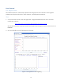
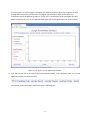
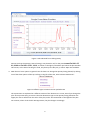
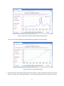
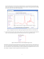
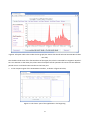
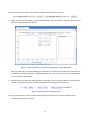
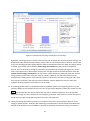
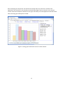
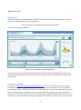
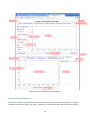
A Kod I Ferien Project
Google PowerMeter
Emulator Documentation
(includes user manual)
Surendra B Kunwar
Acknowledgement
I am deeply thankful to Morten, who masterminded the open-source programming project ‘Kod I Ferien’,
opening the door to an interesting and fruitful summer for many students studying in Danish universities. It
wouldn’t have been possible for me apply to this program in the first place, if Morten had not connected
me to Søren Peter, who conceived the main idea behind my project. I am very grateful to Søren Peter for
his ideas about the Google PowerMeter Emulator for my project. After I was selected to participate in the
program late in June, I met Carsten, my Project Manager. He has been absolutely helpful in giving me right
directions in every step of the project. His idea of familiarizing me with Per’s work was a brilliant idea.
Moreover, he continued to guide and observe my progress even during vacation, for which I am indeed
very thankful. Without Per’s code, I would have been easily confused and lost while writing code. However,
Per showed me the important aspects of his code, and even gave me a tutorial on Javascript. My first
meeting with Per and Søren Peter, that Carsten had arranged, was indeed the stepping stone for my entire
project. I would like to thank Brian for sparing some of his time on the GUI aspects of my application, and
giving me the idea for using datepickers. Throughout the summer, Morten has endeavored to run the
entire program smoothly. Interestingly, he has also managed to give attention to individual projects of the
students. I sincerely appreciate Morten’s help in clearing some of the most difficult problems facing my
code. Finally, I would like to express my gratitude to everyone at ITST for being kind and helpful and flexible
during the project.
Surendra Kunwar
September 2, 2011
1
Table of Contents
Acknowledgement ............................................................................................................................................. 1
User Manual ...................................................................................................................................................... 3
About the Code................................................................................................................................................ 12
Inspiration:................................................................................................................................................... 12
Google PowerMeter: ................................................................................................................................... 12
HTML, CSS, Javascript files........................................................................................................................... 13
Issues with the Emulator ............................................................................................................................. 14
Contact with the KIF student: ...................................................................................................................... 15
2
User Manual
User Requirements
The code was checked on a Windows Xp platform with Google Chrome as the browser. There might be
problems with the plot and the links in other browsers, especially Windows Explorer.
Steps
1. To access the latest version of the web application ‘Google PowerMeter Emulator’ that I wrote the
code for, go to the link
http://dl.dropbox.com/u/15970748/work%20end/powerboard.htm
This will take somewhere around 30 seconds to load (due to data being accessed from another site at a
slow rate).
2. You should be able to see the following on the browser:
Figure 1: The application at the beginning
3
It is my intention to use the upper rectangular plot window (in black outline) for navigation of data
through different periods, and the lower rectangular plot window (in black outline again) for
comparison of data of different periods. For a new user, it would make sense to navigate data first,
before comparing. So, let’s try to understand the upper part of the application first (shown below):
Figure 2: The ‘upper’ part of application window.
3. First, the user can click on the links (named ‘Last 24 hours/Today’, ‘Last 7 days/This week’, etc.) on the
lightly colored bar just below the title:
For instance, when the Today is clicked, we get the following plot:
4
Figure 3: Plot obtained from clicking Today
We can see that the quantity ‘interval energy’ was plotted in red, for the period FROM FRI 2011-0701, 00:00 TO FRI 2011-07-01, 16:10, as shown on the lightly colored bar just below the plot window.
This means, at the time of writing the code, only data up to Friday July 1, 2011 4:10pm was available.
4. Now the user has 3 options in general. One of them is to change the quantity being plotted, by clicking
one of the three options of the top red box on the left of the plot, titled ‘Choose Datastream’:
Figure 4: Different types of data stored on pachube.com
The 3 quantities are explained in a different section of this document. For now, we will just change the
plot. One important thing to notice is that the datastream type or the quantity being plotted on the
upper plot area is reflected on the color of the plot, and is also mentioned on the legend of the plot.
For instance, when I click the link Average Power, the plot changes accordingly:
5
Figure 5: Blue plot represents the Average Power datastream.
Or you can also view the data of Accumulated Energy datastream on the browser:
Figure 6: Green for Accumulated energy
5. The second of the three options mentioned in step 4 above is to go to the previous period, or the next
period, if it exists. Since I had clicked Today, I can now click Previous period to see yesterday’s data for
6
the three datastreams. If I click Previous period three times, I can view the plot from three days ago,
which is also reflected in the Viewing: bar just below the plot. Below is the page obtained by clicking
the Previous button four times (after clicking today):
Figure 7: Going back to data from 4 days ago using Previous period button on the bottom left.
6. The last of the three options after clicking Today or any other period is changing the Chart Properties,
which is the red outline just below the Choose Datastream box on the right of the screen:
Figure 8: Some plot features can be changed through this box.
The options or the links of the Chart Properties box are intuitive, and two of them are used to either turn
on or turn off the Legend, and Grid features. Point Graph feature converts the line plot into point scatterplot. The Fill feature is used to decide whether to fill the area below the line graph with color or not. The
plot in figure 7 changes to the plot in Figure 8 when the Fill link is clicked:
7
Figure 9: Fill option adds colors under the line graph (also notice that the Fill link now becomes No Fill after
one click).
This should include most of the functionalities of the upper plot, which is intended for navigation. Now let’s
turn our attention to the lower plot, where we will compare several quantities of interest for two different
periods. So we scroll the browser window to the lower part.
7. In the compare region of the PowerMeter emulator, as shown in figure 10 below,
Figure 10: The ‘lower’ part of the application in the beginning.
8
we have to pick the two dates (in the small rectangular date field on the first line):
8. When you click one of the dates, say the base period date, then you will see a calendar, where you can
click the starting date for base period:
Figure 11: Selecting dates for comparison using a JQuery plugin datepicker.
Once you click a day of a month belonging to a particular year, then the calendar closes and shows the
clicked date on the date field area. To keep the default date, you can just click Close. The same applies
to the comparison period date.
9. Now that we have chosen the starting dates for comparison, we can choose whether to compare days
or weeks, by clicking one of the two links Days/Weeks on the second line of Figure 11:
Figure 11: Options for the comparison plot.
10. Say, you choose Days, then you will see a bar graph on the plot area, and some statistics on the
Comparison Stats box to the right:
9
Figure 12: Comparison of energy consumption for two days.
By default, the Energy button is chosen, so when Days link is clicked, the statistics related to energy are
displayed on both the plot window and the statistics box. It is important to know, however, that the bar
charts are showing quantities slightly different from the Comparison Stats box. When the Energy option
is clicked, then the bar charts show the total energy consumed during the base and comparison
periods. This can be seen on the lightly colored bar at the bottom of the page (see Figure 12). At that
point, the statistics box in blue outline will show the average, maximum and the minimum of the 10
minute interval energy consumption. The top section of the Comparison Stats box shows this interval
energy quantity and its unit, along with ‘Day’ (or ‘Week’). However, the Plot value quantity in the
second and the third sections of the stats box show the values of the two bars in the graph. This could
be a source of confusion, and with some time and effort, a better depiction of the bar values (for
example, showing values on top of the bar) can be made.
11. If the Energy/Power option is clicked before the Days/Weeks option in the beginning before any plot
has been shown on the comparison plot area, then no plot will be displayed. Hence the existence of the
sign between the two options means that the daily or weekly comparison has to be selected
before the energy or power comparison in the beginning. However, afterwards, any of the two options
can be chosen to get a bar graph comparison and stats of desired kind.
12. Finally, the Energy per head link, which is not related to the base or the comparison periods, or the
energy or power options, shows the per head energy consumption for all the months from November
2010 till June 2011 due to the availability of number of employee data and the energy consumption
10
date overlapping for that period. This data will not change when any other link is clicked in the
application. The statistics for the monthly per head energy usage at ITST can be seen in the second
section of the blue Comparison Stats box to the right. The lower part of the application looks like below
when the Energy per head option is clicked:
Figure 13: Energy per head data for ITST for several months.
11
About the Code
Inspiration:
Studying the code that Per de Place Bjørn wrote for his own ITST project is the first thing that I did for my
project. The web page (and the code) is available at
http://dl.dropbox.com/u/4591719/power/powerboard.htm#
A screenshot of the page is below:
Figure 14: ITST dashboard, programmed by Per.
The code was written in Javascript, besides the HTML and CSS files that any webpage has. The data was
accessed from Pachube.com, where the data can be stored for an account. The charts were drawn using
Google Charts.
Google PowerMeter:
If we log on to http://www.google.com/powermeter/about/, then it is not difficult to see that ‘Google
PowerMeter is a free energy monitoring tool that allows you to view your home’s energy consumption
from anywhere online’. Consumers can either use a meter at home, or contact the utility company to store
all their consumption data and display and analyze them. However, Google is retiring the PowerMeter
project on 16th September, 2011, and users are asked to export the data somewhere else. Fortunately, the
site Pachube.com has agreed to host Google PowerMeter data. However, consumers still need a tool that
12
does what Google PowerMeter did. Thus, we decided to work on Google PowerMeter Emulator. The aim is
not to copy everything Google PowerMeter did, but to write an open source code that can be easily
modified or extended to suit the needs of different types of users and analysts.
HTML, CSS, Javascript files:
The files with code that have been used for this application are all available at
https://svn.softwareborsen.dk/energymanagement/
The HTML file is powerboard.htm, while the corresponding CSS file is styles.css. The Javascript code is in
powerboard.js. The only two other files that are included with the application are calendar.css and
calendar.js, which are the CSS and Javascript files for the datepicker used in the application. These two files
are slightly modified versions of the files that are made available to users (for use or modification) by the
site http://teddevito.com/demos/calendar.php. There would have been more files, but many of the JQuery
plugins, including the JQuery Flot library itself, are accessible through a URL. These files are jquery.js,
jquery.flot.js, jquery.flot.symbol.js, and are available at people.iola.dk/olau/flot/[filename]. The code has
been commented, and hopefully, the explanation of each function , variable or statement is easy to grasp
from the comments.
Although it is possible to see what sections of the application the different elements of the HTML file
represent in a browser like Chrome, a simple diagram with labels has been drawn in figure 15:
13
Figure 15: Different Elements of the HTML file
Issues with the Emulator:
Some issues remain to be solved at the end of the summer of 2011. Towards the end, ‘holes’ in the plot
were discovered in the ‘upper’ plot. Hence, sometimes, a small gap was detected in the timeseries data
14
plotted for longer periods, like the weeks, months, years. Such missing data could be minimized when the
data was read at the rate of a day per loop step, as compared to the two-weekly rate of accessing data
from Pachube. Also, all data (once every ten minutes) could only be obtained if data was read in six hour (at
most) slots. Otherwise, there would data for every 20th, 30th, 40th and 60th minute of an hour. However,
reading data in 6 hour slots would make the program very slow in the beginning when data is being read.
Also, there are many tools that can be added for analysis. At least one technical statistical tool was planned
to be included in the app, but due to some unforeseen issues with the datepicker and the plot data, this
could not be accomplished.
Contact with the KIF student:
Any questions regarding Google PowerMeter Emulator code can be directed to [email protected].
15