1
Parallel Coordinates
Exploratory Data Analysis with Parallel Coordinates
and the Multi-Dimensional Explorer
Master’s Thesis
at
Graz University of Technology
submitted by
Christian Hackl
Institute for Information Systems and Computer Media (IICM),
Graz University of Technology
A-8010 Graz, Austria
15th March 2011
© Copyright 2011 by Christian Hackl
Advisor:
Ao.Univ.-Prof. Dr. Keith Andrews
Parallelkoordinaten
Empirische Datenanalyse mit Parallelkoordinaten
und dem Multi-Dimensional Explorer
Masterarbeit
an der
Technischen Universität Graz
vorgelegt von
Christian Hackl
Institut für Informationssysteme und Computer Medien (IICM),
Technische Universität Graz
A-8010 Graz
15. März 2011
© Copyright 2011, Christian Hackl
Diese Arbeit ist in englischer Sprache verfasst.
Begutachter:
Ao.Univ.-Prof. Dr. Keith Andrews
Abstract
Parallel coordinates are an analysis technique in which multi-dimensional data is visualised by arranging axes in parallel to each other on a plane. Each dimension is represented by one axis. Each data
record is represented by a polyline connecting to one point on every axis.
The corresponding research field of information visualisation is first presented and numerous techniques are discussed. Parallel coordinates are then discussed in detail, including issues of scalability
and performance. Previously developed software tools featuring parallel coordinates are reviewed and
their strengths and weaknesses analysed. The interactive features necessary to perform exploratory data
analysis with parallel coordinates are illustrated.
A new, general-purpose information visualisation tool, the Multi-Dimensional Explorer (MDE), was
developed in C++ and OpenGL. It facilitates exploratory data analysis with high performance and a
variety of user interaction features. The thesis documents the modular software architecture of MDE.
User and developer guides for MDE are included as appendices.
Kurzfassung
Parallelkoordinaten sind ein Analyseverfahren, bei dem mehrdimensionale Daten visualisiert werden, indem Achsen parallel zueinander auf einer Ebene angeordnet werden. Jede Achse steht für eine
Dimension, und jeder Datensatz wird mit einer Polylinie dargestellt, die durch je einen Punkt auf jeder
Achse läuft.
Erst werden der dazugehörige Forschungsbereich der Informationsvisualisierung vorgestellt und verschiedene andere Techniken besprochen, dann werden Parallelkoordinaten im Detail erörtert, samt Betrachtungen zu Skalierbarkeit und Performance. Bisher entwickelte Parallelkoordinaten-Software wird
besprochen und deren Stärken und Schwächen werden untersucht. Ebenfalls erläutert werden die für die
empirische Datenanalyse mit Parallelkoordinaten nötigen Interaktionsmöglichkeiten.
Eine neue, universell verwendbare Informationsvisualisierungs-Software namens Multi-Dimensional
Explorer (MDE) wurde mit C++ und OpenGL entwickelt. Sie erleichtert die empirische Datenanalyse
durch hohe Performance und eine Reihe von Interaktionsmöglichkeiten. Die Arbeit dokumentiert die
modulare Softwarearchitektur von MDE. Der Anhang enthält Anleitungen zum Gebrauch von MDE und
zu seiner künftigen Weiterentwicklung.
Statutory Declaration
I declare that I have authored this thesis independently, that I have not used other than the declared
sources / resources, and that I have explicitly marked all material which has been quoted either literally
or by content from the used sources.
Place
Date
Signature
Eidesstattliche Erklärung
Ich erkläre an Eides statt, dass ich die vorliegende Arbeit selbständig verfasst, andere als die angegebenen Quellen/Hilfsmittel nicht benutzt und die den benutzten Quellen wörtlich und inhaltlich entnommenen Stellen als solche kenntlich gemacht habe.
Ort
Datum
Unterschrift
Contents
Contents
ii
List of Figures
iv
List of Tables
v
List of Listings
vii
Acknowledgements
ix
Credits
xi
1
Introduction
1
2
Information Visualisation
3
2.1
History . . . . . . . . . . . . . . . . . . . . . . . . . . . . . . . . . . . . . . . . . . .
3
2.2
Interaction . . . . . . . . . . . . . . . . . . . . . . . . . . . . . . . . . . . . . . . . . .
6
2.3
Multi-Dimensional Data Visualisation . . . . . . . . . . . . . . . . . . . . . . . . . . .
6
3
4
5
6
Parallel Coordinates
13
3.1
Background . . . . . . . . . . . . . . . . . . . . . . . . . . . . . . . . . . . . . . . . .
13
3.2
Handling Large Data Sets . . . . . . . . . . . . . . . . . . . . . . . . . . . . . . . . . .
17
3.3
Variations . . . . . . . . . . . . . . . . . . . . . . . . . . . . . . . . . . . . . . . . . .
19
3.4
Using Parallel Coordinates . . . . . . . . . . . . . . . . . . . . . . . . . . . . . . . . .
22
3.5
Software Applications . . . . . . . . . . . . . . . . . . . . . . . . . . . . . . . . . . .
31
Multi-Dimensional Explorer
53
4.1
Software Architecture . . . . . . . . . . . . . . . . . . . . . . . . . . . . . . . . . . . .
53
4.2
Modules . . . . . . . . . . . . . . . . . . . . . . . . . . . . . . . . . . . . . . . . . . .
57
4.3
Comparison With Other Tools . . . . . . . . . . . . . . . . . . . . . . . . . . . . . . .
76
Selected Details of the Implementation
83
5.1
Multi-Phase Caching . . . . . . . . . . . . . . . . . . . . . . . . . . . . . . . . . . . .
83
5.2
Rendering TrueType Fonts in OpenGL . . . . . . . . . . . . . . . . . . . . . . . . . . .
86
Conclusion and Future Work
91
i
A MDE User Guide
95
A.1 Loading Data . . . . . . . . . . . . . . . . . . . . . . . . . . . . . . . . . . . . . . . .
95
A.2 Parallel Coordinates View . . . . . . . . . . . . . . . . . . . . . . . . . . . . . . . . .
97
A.3 Scatter Plot View . . . . . . . . . . . . . . . . . . . . . . . . . . . . . . . . . . . . . . 101
A.4 Records View . . . . . . . . . . . . . . . . . . . . . . . . . . . . . . . . . . . . . . . . 102
A.5 Dimensions View . . . . . . . . . . . . . . . . . . . . . . . . . . . . . . . . . . . . . . 104
A.6 Options . . . . . . . . . . . . . . . . . . . . . . . . . . . . . . . . . . . . . . . . . . . 104
B MDE Developer Guide
109
B.1 Development Environment Setup . . . . . . . . . . . . . . . . . . . . . . . . . . . . . . 109
B.2 Preparing a New Visualisation . . . . . . . . . . . . . . . . . . . . . . . . . . . . . . . 111
B.3 Implementing Visualisations . . . . . . . . . . . . . . . . . . . . . . . . . . . . . . . . 113
Bibliography
129
ii
List of Figures
2.1
2.2
2.3
2.4
2.5
2.6
2.7
2.8
2.9
Florence Nightingale’s Wedge Diagram . .
John Snow’s Cholera Map . . . . . . . . .
Abstract Matrix of Multi-Dimensional Data
Concrete Matrix of Multi-Dimensional Data
Scatter Plot . . . . . . . . . . . . . . . . .
FilmFinder . . . . . . . . . . . . . . . . .
Histogram . . . . . . . . . . . . . . . . . .
Star Plot . . . . . . . . . . . . . . . . . . .
VisIslands . . . . . . . . . . . . . . . . . .
.
.
.
.
.
.
.
.
.
.
.
.
.
.
.
.
.
.
.
.
.
.
.
.
.
.
.
.
.
.
.
.
.
.
.
.
.
.
.
.
.
.
.
.
.
.
.
.
.
.
.
.
.
.
.
.
.
.
.
.
.
.
.
.
.
.
.
.
.
.
.
.
.
.
.
.
.
.
.
.
.
.
.
.
.
.
.
.
.
.
.
.
.
.
.
.
.
.
.
.
.
.
.
.
.
.
.
.
.
.
.
.
.
.
.
.
.
.
.
.
.
.
.
.
.
.
.
.
.
.
.
.
.
.
.
.
.
.
.
.
.
.
.
.
.
.
.
.
.
.
.
.
.
.
.
.
.
.
.
.
.
.
.
.
.
.
.
.
.
.
.
.
.
.
.
.
.
.
.
.
4
5
7
7
9
10
11
12
12
3.1
3.2
3.3
3.4
3.5
3.6
3.7
3.8
3.9
3.10
3.11
3.12
3.13
3.14
3.15
3.16
3.17
3.18
3.19
3.20
3.21
3.22
3.23
3.24
2D Points on Orthogonal and Parallel Axes . . . . .
4D Points on Parallel Axes . . . . . . . . . . . . . .
Parallel Coordinates in MDE . . . . . . . . . . . . .
Cluttered Parallel Coordinates . . . . . . . . . . . .
Cluttered Parallel Coordinates With Reduced Opacity
Hierarchical Parallel Coordinates . . . . . . . . . . .
Parallel Sets . . . . . . . . . . . . . . . . . . . . . .
3D Parallel Coordinates . . . . . . . . . . . . . . . .
Curves for Parallel Coordinates . . . . . . . . . . . .
Cities Data Set with Parallel Coordinates . . . . . . .
Removing Axes in Parallel Coordinates . . . . . . .
Moving Axes in Parallel Coordinates . . . . . . . . .
Flipping Axes in Parallel Coordinates . . . . . . . .
Parallel Coordinates Record Details . . . . . . . . .
Angular Brushing . . . . . . . . . . . . . . . . . . .
Colour Shading . . . . . . . . . . . . . . . . . . . .
Parallel Coordinates Zooming . . . . . . . . . . . .
Parallel Coordinates Focussing . . . . . . . . . . . .
MDVS . . . . . . . . . . . . . . . . . . . . . . . . .
InfoScope . . . . . . . . . . . . . . . . . . . . . . .
parvis . . . . . . . . . . . . . . . . . . . . . . . . .
Parallax . . . . . . . . . . . . . . . . . . . . . . . .
Situvis . . . . . . . . . . . . . . . . . . . . . . . . .
Picviz . . . . . . . . . . . . . . . . . . . . . . . . .
.
.
.
.
.
.
.
.
.
.
.
.
.
.
.
.
.
.
.
.
.
.
.
.
.
.
.
.
.
.
.
.
.
.
.
.
.
.
.
.
.
.
.
.
.
.
.
.
.
.
.
.
.
.
.
.
.
.
.
.
.
.
.
.
.
.
.
.
.
.
.
.
.
.
.
.
.
.
.
.
.
.
.
.
.
.
.
.
.
.
.
.
.
.
.
.
.
.
.
.
.
.
.
.
.
.
.
.
.
.
.
.
.
.
.
.
.
.
.
.
.
.
.
.
.
.
.
.
.
.
.
.
.
.
.
.
.
.
.
.
.
.
.
.
.
.
.
.
.
.
.
.
.
.
.
.
.
.
.
.
.
.
.
.
.
.
.
.
.
.
.
.
.
.
.
.
.
.
.
.
.
.
.
.
.
.
.
.
.
.
.
.
.
.
.
.
.
.
.
.
.
.
.
.
.
.
.
.
.
.
.
.
.
.
.
.
.
.
.
.
.
.
.
.
.
.
.
.
.
.
.
.
.
.
.
.
.
.
.
.
.
.
.
.
.
.
.
.
.
.
.
.
.
.
.
.
.
.
.
.
.
.
.
.
.
.
.
.
.
.
.
.
.
.
.
.
.
.
.
.
.
.
.
.
.
.
.
.
.
.
.
.
.
.
.
.
.
.
.
.
.
.
.
.
.
.
.
.
.
.
.
.
.
.
.
.
.
.
.
.
.
.
.
.
.
.
.
.
.
.
.
.
.
.
.
.
.
.
.
.
.
.
.
.
.
.
.
.
.
.
.
.
.
.
.
.
.
.
.
.
.
.
.
.
.
.
.
.
.
.
.
.
.
.
.
.
.
.
.
.
.
.
.
.
.
.
.
.
.
.
.
.
.
.
.
.
.
.
.
.
.
.
.
.
.
.
.
.
.
.
.
.
.
.
.
.
.
.
.
.
.
.
.
.
.
.
.
.
.
.
.
.
.
.
.
.
.
.
.
.
.
.
.
.
.
.
.
.
.
.
.
.
.
.
.
.
14
15
15
16
16
18
20
21
23
25
25
27
28
28
29
30
31
32
34
35
37
38
41
42
iii
.
.
.
.
.
.
.
.
.
.
.
.
.
.
.
.
.
.
.
.
.
.
.
.
.
.
.
.
.
.
.
.
.
.
.
.
3.25
3.26
3.27
3.28
3.29
3.30
3.31
3.32
GGobi . . . . . .
XmdvTool . . . .
VisDB . . . . . .
Caleydo . . . . .
OECD eXplorer .
Protovis . . . . .
VizCraft . . . . .
Liquid Diagrams
.
.
.
.
.
.
.
.
.
.
.
.
.
.
.
.
.
.
.
.
.
.
.
.
.
.
.
.
.
.
.
.
.
.
.
.
.
.
.
.
.
.
.
.
.
.
.
.
.
.
.
.
.
.
.
.
.
.
.
.
.
.
.
.
.
.
.
.
.
.
.
.
.
.
.
.
.
.
.
.
.
.
.
.
.
.
.
.
.
.
.
.
.
.
.
.
.
.
.
.
.
.
.
.
.
.
.
.
.
.
.
.
.
.
.
.
.
.
.
.
.
.
.
.
.
.
.
.
.
.
.
.
.
.
.
.
.
.
.
.
.
.
.
.
.
.
.
.
.
.
.
.
.
.
.
.
.
.
.
.
.
.
.
.
.
.
.
.
.
.
.
.
.
.
.
.
.
.
.
.
.
.
.
.
.
.
.
.
.
.
.
.
.
.
.
.
.
.
.
.
.
.
.
.
.
.
.
.
.
.
.
.
.
.
.
.
.
.
.
.
.
.
.
.
.
.
.
.
.
.
.
.
.
.
.
.
.
.
.
.
43
44
45
46
47
48
49
50
4.1
4.2
4.3
4.4
4.5
4.6
4.7
4.8
4.9
4.10
MDE Module Dependencies . . . . . . . . . . . . . . . .
MDE Storing and Synchronising Multi-Dimensional Data .
Structure of an MDE Matrix . . . . . . . . . . . . . . . .
MDE’s CSV Support Architecture . . . . . . . . . . . . .
Options Example in MDE . . . . . . . . . . . . . . . . .
MDE’s Concrete DataView Subclasses . . . . . . . . . . .
MDE’s Visualisation Class Hierarchy . . . . . . . . . . .
MDE’s Visualisation Frontend and Backend . . . . . . . .
MDE’s Visualisation Structuring . . . . . . . . . . . . . .
MDE Application Window . . . . . . . . . . . . . . . . .
.
.
.
.
.
.
.
.
.
.
.
.
.
.
.
.
.
.
.
.
.
.
.
.
.
.
.
.
.
.
.
.
.
.
.
.
.
.
.
.
.
.
.
.
.
.
.
.
.
.
.
.
.
.
.
.
.
.
.
.
.
.
.
.
.
.
.
.
.
.
.
.
.
.
.
.
.
.
.
.
.
.
.
.
.
.
.
.
.
.
.
.
.
.
.
.
.
.
.
.
.
.
.
.
.
.
.
.
.
.
.
.
.
.
.
.
.
.
.
.
.
.
.
.
.
.
.
.
.
.
.
.
.
.
.
.
.
.
.
.
.
.
.
.
.
.
.
.
.
.
.
.
.
.
.
.
.
.
.
.
56
60
61
63
65
68
69
70
74
76
5.1
5.2
5.3
Multiple Visualisation Steps in MDE . . . . . . . . . . . . . . . . . . . . . . . . . . . .
Font Names and Files . . . . . . . . . . . . . . . . . . . . . . . . . . . . . . . . . . . .
Text Rotation . . . . . . . . . . . . . . . . . . . . . . . . . . . . . . . . . . . . . . . .
85
87
89
A.1
A.2
A.3
A.4
A.5
A.6
A.7
A.8
A.9
A.10
A.11
A.12
A.13
A.14
A.15
A.16
MDE Opening a CSV File . . . . . . . . . . . . . . . . .
Parallel Coordinates Concept . . . . . . . . . . . . . . . .
MDE’s Parallel Coordinates GUI Controls . . . . . . . . .
Selecting Parallel Coordinates Axes in MDE . . . . . . . .
Interactive Elements on Parallel Coordinates Axis in MDE
Flipping a Parallel Coordinates Axis in MDE . . . . . . .
Set Filters in MDE . . . . . . . . . . . . . . . . . . . . .
MDE Axis Histograms . . . . . . . . . . . . . . . . . . .
Selecting Records in MDE . . . . . . . . . . . . . . . . .
Focussing Records in MDE . . . . . . . . . . . . . . . . .
MDE Scatter Plot . . . . . . . . . . . . . . . . . . . . . .
Record Synchronisation in MDE . . . . . . . . . . . . . .
Records Table in MDE . . . . . . . . . . . . . . . . . . .
MDE’s Records Table Showing Only Used Records . . . .
MDE’s Dimensions View . . . . . . . . . . . . . . . . . .
MDE Options Dialogue . . . . . . . . . . . . . . . . . . .
.
.
.
.
.
.
.
.
.
.
.
.
.
.
.
.
.
.
.
.
.
.
.
.
.
.
.
.
.
.
.
.
.
.
.
.
.
.
.
.
.
.
.
.
.
.
.
.
.
.
.
.
.
.
.
.
.
.
.
.
.
.
.
.
.
.
.
.
.
.
.
.
.
.
.
.
.
.
.
.
.
.
.
.
.
.
.
.
.
.
.
.
.
.
.
.
.
.
.
.
.
.
.
.
.
.
.
.
.
.
.
.
.
.
.
.
.
.
.
.
.
.
.
.
.
.
.
.
.
.
.
.
.
.
.
.
.
.
.
.
.
.
.
.
.
.
.
.
.
.
.
.
.
.
.
.
.
.
.
.
.
.
.
.
.
.
.
.
.
.
.
.
.
.
.
.
.
.
.
.
.
.
.
.
.
.
.
.
.
.
.
.
.
.
.
.
.
.
.
.
.
.
.
.
.
.
.
.
.
.
.
.
.
.
.
.
.
.
.
.
.
.
.
.
.
.
.
.
.
.
.
.
.
.
.
.
.
.
.
.
.
.
.
.
.
.
.
.
.
.
.
.
.
.
.
.
96
98
98
99
99
100
100
100
101
101
102
103
103
104
105
107
B.1
B.2
B.3
B.4
B.5
MDE Test Visualisation . . . . . . . . . . . .
MDE’s Development Environment . . . . . .
Adding New MDE Visualisation Header File
New Visualisation Appearing in GUI . . . . .
New Empty Visualisation Window in MDE .
.
.
.
.
.
.
.
.
.
.
.
.
.
.
.
.
.
.
.
.
.
.
.
.
.
.
.
.
.
.
.
.
.
.
.
.
.
.
.
.
.
.
.
.
.
.
.
.
.
.
.
.
.
.
.
.
.
.
.
.
.
.
.
.
.
.
.
.
.
.
.
.
.
.
.
.
.
.
.
.
110
111
112
114
116
iv
.
.
.
.
.
.
.
.
.
.
.
.
.
.
.
.
.
.
.
.
.
.
.
.
.
.
.
.
.
.
.
.
.
.
.
.
.
.
.
.
.
.
.
.
.
.
.
.
.
.
.
.
.
.
.
.
.
.
.
.
.
.
.
.
.
.
.
.
.
.
.
.
.
.
.
.
.
.
.
.
.
.
.
.
.
.
.
.
.
.
.
.
.
.
.
.
.
.
.
List of Tables
3.1
Cities Data Set . . . . . . . . . . . . . . . . . . . . . . . . . . . . . . . . . . . . . . .
24
3.2
Parallel Coordinates Software Summary . . . . . . . . . . . . . . . . . . . . . . . . . .
33
4.1
MDE Modules . . . . . . . . . . . . . . . . . . . . . . . . . . . . . . . . . . . . . . .
55
4.2
MDE “Application” Components . . . . . . . . . . . . . . . . . . . . . . . . . . . . . .
58
4.3
MDE “Data” Components . . . . . . . . . . . . . . . . . . . . . . . . . . . . . . . . .
62
4.4
MDE “Data Input” Components . . . . . . . . . . . . . . . . . . . . . . . . . . . . . .
64
4.5
MDE’s “Options” Components . . . . . . . . . . . . . . . . . . . . . . . . . . . . . . .
66
4.6
General Components in MDE’s Presentation Module . . . . . . . . . . . . . . . . . . .
72
4.7
Specific Components in MDE’s “Presentation” Module . . . . . . . . . . . . . . . . . .
73
4.8
MDE’s “Presentation Structure” Components . . . . . . . . . . . . . . . . . . . . . . .
75
4.9
Unit Tests for MDE’s “Data” Module . . . . . . . . . . . . . . . . . . . . . . . . . . .
77
4.10 Unit Tests for MDE’s “Data Input” Module . . . . . . . . . . . . . . . . . . . . . . . .
78
4.11 Other MDE Unit Tests . . . . . . . . . . . . . . . . . . . . . . . . . . . . . . . . . . .
79
v
vi
List of Listings
B.1 New MDE Visualisation Header File . . . . . . . . . . . . . . . . . . . . . . . . . . . . 112
B.2 New MDE Visualisation Source File . . . . . . . . . . . . . . . . . . . . . . . . . . . . 113
B.3 New MDE Visualisation Factory Header File . . . . . . . . . . . . . . . . . . . . . . . 114
B.4 New MDE Visualisation Factory Source File . . . . . . . . . . . . . . . . . . . . . . . . 115
B.5 DataViewFactoryGroup’s Constructor in MDE . . . . . . . . . . . . . . . . . . . . . . 115
B.6 MDE TestVisualisation Implementation . . . . . . . . . . . . . . . . . . . . . . . . . . 117
vii
viii
Acknowledgements
First and foremost, thanks go to my parents for their support throughout the years of my studies. Thanks
also go to my older brother Bernhard, who once got me into software engineering by encouraging me to
learn BASIC V2 on our Commodore 64 at the age of 12. Some years later, he would allow me to write
Visual Basic code on his old 386 machine, and eventually, when I had enrolled at university, he would
share with me important books like “Effective C++”, the teachings contained therein ever present in the
writing of the software for this thesis.
As far as programming skills are concerned, I also owe a lot to the regulars of the Usenet newsgroup
comp.lang.c++. I gained many insights by just silently following their often heated discussions about
the C++ programming language. I’m very grateful also for Alfred Inselberg allowing me to evaluate his
Parallax software for free, Ross Shannon and Tom Holland for providing me with a copy of their Paired
PCV tool, Daniel Keim for the source code of VisDB, the folks in de.comp.text.tex for help on LATEX
issues, and Anita for her moral support.
Further help came from my esteemed colleague and good old friend Stefan. His help comprised
useful LATEX techniques for generating class diagrams – and very many relaxing coffee breaks, every one
of them sorely needed!
My supervisor Keith Andrews provided the LATEX skeleton for my thesis, he gave me many valuable
hints which really improved my work, and he sacrificed a lot of time for our weekly meetings. He even
gave me one of his own notebooks to develop my software! He used to be my teacher, my boss and my
Bachelor’s thesis supervisor – He guided me through my studies at Graz University of Technology, and
I think it is very fitting that their conclusion involves him as well.
Finally, I wish to thank the people from all over Europe whom I met during my unforgettable times
in Milan and as a result of my studies abroad, because it was ultimately their friendship which gave me
the strength to believe in my ability to accomplish this project and to complete my studies in Graz the
way I had always hoped I would. The encouragement they gave me might have come from distant places,
but I felt it all the more close to me.
Thank you, Chiara and Jennifer, for the conversations and e-mail correspondence we had when I was
unsure about whether to start this project or not. You helped me make the right decision. I wonder if this
thesis would exist if it was not for you. Thank you, Mathilde, Alessandro and Fabio, for believing in me
right from the beginning! Thanks to each and every one of you who helped me in the project’s intense
final phase by expressing emotional support in one way or the other! Giuseppe, Mattia, Andrea, Katrin,
Ismael, Paula, Pietro, Despina, Wojtek, Marina, Rafal, Ottavio, Anneke, Abel, Leticia, Alice – I think
the list of names could go on forever. A person sometimes just needs to hear or read a few encouraging
words to carry on the struggle, and this is exactly what you’ve given me.
“Ce la farai!” – “You’ll make it!” I heard that sentence very often, and my ultimate determination to
finally complete my thesis and to really give my best came also from the wish not to disappoint you.
Christian Hackl
Graz, Austria, March 2011
ix
x
Credits
I would like to thank the following individuals and organisations for permission to use their material:
• The thesis was written using Keith Andrews’ skeleton thesis [Andrews, 2008b].
• Alfred Inselberg provided a copy of his commercial Parallax software for free [Inselberg, 2010a].
• Ross Shannon and Tom Holland sent me a copy of their Paired Parallel Coordinates View (PPCV)
tool [Shannon et al., 2008].
• Daniel Keim gave me access to the source code of VisDB so that I could compile, run and review
the program [Keim et al., 2002].
• The screenshot of the FilmFinder in Figure 2.6 was used with the kind permission of the University
of Maryland, see copyright notice below.
University of Maryland Copyright Notice
All works herein are Copyright © University of Maryland 1984-1994, all rights reserved. We allow fair
use of our information provided any and all copyright marks, trade marks, and author attribution are
retained.
xi
xii
Chapter 1
Introduction
“From the fiery mirror of truth
She smiles upon the researcher,
Towards virtue’s steep hill
She guides the endurer’s path.”
[Friedrich Schiller, Ode to Joy, 17861 ]
This Master’s thesis is about exploratory data analysis using the parallel coordinates technique for
information visualisation. The history and general definition of “information visualisation” are discussed
in Chapter 2. Information visualisation might sound like a very general term but has a precise scientific
meaning which must be established before discussing any material in detail. In particular, geographical
maps do not usually belong to that area. The chapter then discusses the importance of user interaction in
today’s visualisation software and aspects of multi-dimensional information visualisation; scatter plots,
star plots, histograms and VisIslands are introduced.
Chapter 3 explains the mathematical background of parallel coordinates. The basic idea is to arrange
axes parallel to each other on a plane, rather than aligning them in an orthogonal way. The individual
data points are then connected by polylines across all axes. This way, more than three dimensions can be
displayed at the same time. However, this visualisation scheme can also be problematic when large data
sets must be visualised, because the display soon becomes cluttered by many lines. The thesis discusses
the many techniques proposed to handle this problem by means of clustering. It explains also a select
number of experimental approaches to extend the original parallel coordinates idea, such as 3D visualisations or replacing polylines with curves. The chapter is concluded with an explanation of how a user
interacts with parallel coordinates to analyse data. A large number of software applications implementing
parallel coordinates are reviewed, and their individual strengths and weaknesses are outlined.
In most cases, low performance and limited user interaction are problems in parallel coordinates software. Based on this finding, a new software application called “Multi-Dimensional Explorer” (MDE)
was developed for this thesis. Chapter 4 discusses it in detail. MDE is a general-purpose information
visualisation software application, although special attention has been given to its parallel coordinates
component. It was designed and implemented from ground up with high performance and high usability
in mind. The software architecture of MDE is discussed and its highly modular architecture is explained.
This allows developers to extend the tool in many different aspects, for example by adding new visualisation techniques or by adding new ways of reading data for input.
1
German Original: “Aus der Wahrheit Feuerspiegel lächelt sie den Forscher an. Zu der Tugend steilem Hügel leitet sie des
Dulders Bahn.” (English translation by Wikisource [2011].)
1
2
1. Introduction
Chapter 5 of the thesis discusses selected details of MDE’s implementation which are particularly
complex. The first of these selected details is MDE’s caching mechanism, which divides the process
of building a visualisation into different steps and maintains caches of the OpenGL pixel output. The
second is the solution MDE employs for embedding text in OpenGL visualisations. This is non-trivial,
as OpenGL itself does not support text; additional libraries have to be used for it. Mapping from a font
name to a font file’s path is a very complex task as well. The thesis explains how these problems were
solved.
The conclusion of the thesis in Chapter 6 is about the future of parallel coordinates and how the
development of MDE might continue. Parallel coordinates are evolving in many different directions,
and the problem of too many lines cluttering the display has not been completely solved yet. Both the
theory of parallel coordinates and their practical implementation are still works in progress. More work
by software engineers and usability engineers are needed to support their use in actual data analysis.
Appendix A is MDE’s user manual and explains the features of MDE with practical examples and
many supporting screenshots. Appendix B, on the other hand, is a detailed guide for developers adding
new visualisations to MDE.
Chapter 2
Information Visualisation
“When I tell you: ‘Observe, please!’, then you should, according to your typical language
use, ask me: ‘Fine, but what? What is it that you want me to observe?’ In other words: you
will ask me to specify a problem which can be solved by your observation.”
[Sir Karl Popper, Alles Leben ist Problemlösen, 1996, pp.19-201 ]
Information visualisation is defined by Andrews [2010] as “the visual presentation of abstract information spaces and structures to facilitate their rapid assimilation and understanding”. In other words,
the goal of information visualisation is to provide insights into data sets using graphical representations
of the data which would be difficult to extract otherwise. Lex [2008] notes that a distinction must be
made between information visualisation, which deals with abstract information, and scientific visualisation, which deals with information bearing intrinsic visual properties. Google Body [Google, 2010] is an
example of a visualisation tool not meeting the criteria of information visualisation, because the threedimensional graphics it produces do not visualise abstract information but are instead just a rendering of
the real structure of the human body. A better example of information visualisation would be tag clouds
as discussed by Halvey and Keane [2007], because the graphical attributes of that visualisation scheme,
such as position, colour and size of words, are derived from non-visual abstract information about the
relationship between elements of the cloud.
Modern computer applications excel in the field of information visualisation due to their sheer calculation power in creation of graphics. Nevertheless, information visualisation existed long before computers were invented, as is explained in Section 2.1. Section 2.2 talks about interactivity playing a
major role in modern-age information visualisation. Section 2.3 discusses some popular techniques for
multi-dimensional data visualisation. Chapter 3 then discusses parallel coordinates, the information
visualisation technique this thesis focuses on.
2.1
History
Information visualisation might appear a field originating in computer science, but in truth dates back to
earlier centuries and is a concept much older than computer science itself. In the second half of the 18th
and the first half of the 19th century, British statistician William Playfair published diagrams based on
statistical data about England’s trade relations [Playfair, 2005]. According to FitzPatrick [1960], he is
considered one of the pioneers of information visualisation.
1
German Original: “Wenn ich Sie auffordere: ‘Bitte, beobachten Sie!’, so sollten Sie mich, dem Sprachgebrauch gemäß,
fragen: ‘Ja, aber was? Was soll ich beobachten?’ Mit anderen Worten, Sie bitten mich, Ihnen ein Problem anzugeben, das
durch Ihre Beobachtung gelöst werden kann.” (English translation by the author of this thesis.)
3
4
2. Information Visualisation
Figure 2.1: Florence Nightingale’s wedge diagram from 1857 is a historical example of information visualisation long before computers came into existence. The visualisation shows the
majority of soldiers in the Crimean Wars died because of poor sanitary conditions, rather than
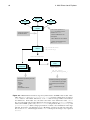
being killed by the enemy in combat. Image copyright of the Wellcome Library [2011a]
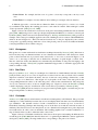
The wedge diagram by famous British nurse Florence Nightingale, shown in Figure 2.1, can be cited
as another historical example of creating abstract graphical representations of information long before
computers came into existence. In 1857, Nightingale created a chart representation of statistical numbers
of deaths during the Crimean Wars, proving that more soldiers fell victim to poor sanitary conditions in
the armies rather than being killed by the enemy [Wielemaker, 2010]. Today, Nightingale’s chart is often
referred to as a “Coxcomb Chart”, although according to Small [1998], she never used that name herself.
Ancient maps are often cited as historical examples for information visualisation. Applying the
definition from this chapter’s introductory paragraph, however, they usually cannot be considered as
such, because the data visualised by them is not abstract; they are just visualisations of the real physical
positions of cities, countries or other places. Therefore, in such cases it is more correct to talk about
geographical visualisation.
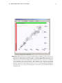
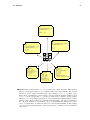
Andrews [2010] names John Snow’s historical cholera map from 1854, shown in Figure 2.2, as a
famous example of geographical visualisation not to be considered information visualisation, because
it is primarily based on topographical data. The map visualised deaths caused by cholera in different
parts of London, illustrating Snow’s theory of the outbreak of the epidemic in the city to be caused by
a specific water pump. However, contrary to popular belief, it is not true that Snow came up with his
theory as a result of analysing the map; he drew the map as an illustration afterwards [Brody et al., 2000].
Friendly and Denis [2001] cite many other historical examples of maps, diagrams, and information
visualisation, dating the beginning of the modern age of information visualisation to the beginning of the
second half of the 20th century.
2.1. History
Figure 2.2: John Snow’s cholera map from 1854 is sometimes misunderstood as an important contribution to the field of information visualisation when it is actually an example of geographical
visualisation. The map visualised deaths caused by cholera in different parts of London, illustrating the theory that a particular water pump in the city had caused the outbreak of the epidemic.
Popular belief has it that Snow came up with his theory through analysis of the map, but in truth
the map only illustrated his previously established theory. Image copyright of the [Wellcome
Library, 2011b]
5
2. Information Visualisation
6
2.2
Interaction
Rather than just being capable of quickly generating visual output, computers also have the ability to accept input from their users. This makes visualisations interactive, because parameters of the visualisation
can be immediately updated. Shneiderman [1996] famously describes the principle of good interactive
visualisation as “overview first, zoom and filter, then details-on-demand”. A user looking at the visualisation of a large data set should first obtain an idea of the entirety of the data available (overview), then a
closer view of the data points in a particular area of interest (zoom), then be able to remove from the view
those data points which are not relevant to the task at hand (filter), and finally be shown all information
available for particular data points by explicit request (details-on-demand).
With information visualisation becoming ever more complex and more interactive, usability becomes
a greater concern, too. Andrews [2006, 2008a] discusses how traditional usability evaluation methods are
inappropriate for testing new visualisation techniques. Cawthon and Moere [2007] describe a case study
exploring the relationship between visually pleasing data representation and the perceived usability of a
visualisation.
Keeping a software application responsive during user interaction contributes greatly to usability
as well. Piringer et al. [2009] discuss the use of multi-threading to improve information visualisation
software in this regard. They observe the problem of reduced responsiveness when software performance
suffers from the amount of data to be visualised. The crux of the matter is that the time needed to perform
a particular rendering step may exceed the time span between two consecutive user decisions, meaning
that the software will not respond in time before the second action (a mouse click, for example). To
mitigate these problems, a generic software architecture for implementation of information visualisation
techniques is proposed. In that architecture, the main thread delegates each instance of a visualisation to
a dedicated visualisation thread.
Wide-spread use of multi-threading in visualisation applications is hindered by the fact that concurrency itself is always very complex to handle in software engineering. Thread-safety is particularly hard
to achieve when underlying software modules do not provide sufficient thread-safety guarantees. For example, the popular OpenGL graphics rendering library [Shreiner, 2009; Khronos Group, 2011a], which
is often used to implement high-performance information visualisation software, requires developers to
take a number of precautions to ensure the robustness of software when multi-threading is present [Apple,
2010].
2.3
Multi-Dimensional Data Visualisation
Input data to be visualised comes in different forms and variations. One of them is multi-dimensional
data, as explained by Andrews [2010]. Such data consists of n records and m dimensions. Therefore,
the data can be seen as a matrix, an item d of the matrix indexed by n and m, as shown in Figure 2.3. A
concrete example would be a matrix for cities, each city record having the dimensions “Name”, “Area”,
“Elevation” and “Population”, as shown in Figure 2.4.
Multi-dimensional data is not just a synonym for vector space data. The most important difference is
defined by Mader [2007] as the number of dimensions, which is typically significantly higher in vector
space data. For example, Widdows et al. [2006] describe a linguistic vector space data set with 1000
dimensions. In contrast, multi-dimensional data visualisation is more limited with regards to the number of dimensions, as explained by Yang et al. [2007]: “However, most traditional multidimensional
visualization techniques suffer from visual clutter and only scale up to tens of dimensions. Up to now,
few multidimensional visualization systems have claimed to be scalable to data sets with hundreds of
dimensions.”
2.3. Multi-Dimensional Data Visualisation
d(0, 0) · · · d(i, 0) · · · d(m, 0)
..
..
..
..
..
.
.
.
.
.
d(0, i) · · · d(i, i) · · · d(m, i)
..
..
..
..
..
.
.
.
.
.
d(0, n) · · · d(i, n) · · · d(m, n)
7
Figure 2.3: A matrix of multi-dimensional data with n records and m dimensions. This is an
abstraction of input for information visualisation software tools capable of dealing with multidimensional data.
Name Area (km2 ) Elevation (m) Population
Graz
127.56
353
255354
M ilan
183.77
120
1306637
London
1706.8
24
7556900
Figure 2.4: An example of concrete multi-dimensional data for a list of cities with three records
and four dimensions: “Name”, “Area”, “Elevation” and “Population”. This could be actual input
for an information visualisation software tool.
There is also a subtle semantic difference, in that in multi-dimensional data the meaning of the dimensions themselves is equally important. Mader [2007] explains that, for example, with multi-dimensional
data it makes sense to filter rows of a matrix by some condition defined on one of the columns, whereas
in vector space one works with reference vectors.
Many techniques exist for visualising multi-dimensional data. One of them is parallel coordinates.
They are the major topic of this thesis and are discussed in detail in Chapter 3. Parallel coordinates do
not have any theoretical limit in the number of dimensions they can display at the same time; they are
only limited by very practical boundaries like screen space. Other visualisation techniques discussed in
the following subsections are also conceptually more limited with regards to the possibility of displaying
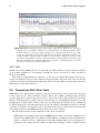
an arbitrary number of dimensions all at once.
Note that the usefulness of visualisation techniques can be increased by viewing the same data set
with different but synchronised methods on the same screen, combining their distinct advantages [Bertini
et al., 2005; Shannon et al., 2008]. This consideration has become an important aspect of information visualisation, and in 2003, a dedicated annual conference has been launched, the “International Conference
on Coordinated & Multiple Views in Exploratory Visualization” (CMV) [Roberts, 2007]. Nevertheless,
as far as usability is concerned, multiple views have also certain costs associated with them, because
there is less screen space available for individual visualisations and because the multitude of visualisation techniques results in increased complexity for the end user. Baldonado et al. [2000] give guidelines
a software designer should take into account when deciding on whether or not to show different visualisations of the same data set on the same screen.
2.3.1
Scatter Plots
A scatter plot is a two-dimensional visualisation of multi-dimensional information, each axis of the
display corresponding to one of the dimensions in the data set. Data points are entered on the twodimensional area according to their values in both dimensions. The points themselves can be made to
convey information about additional dimensions, as shown by Cleveland and McGill [1984]. Examples
of such additional information channels include:
• Point Size. For example, in a data set of cities, larger points may indicate cities with greater
population.
2. Information Visualisation
8
• Point Colour. For example, the blue tone of a point’s colour may correspond to the city’s total
area.
• Point Form. For example, dots may indicate cities in Europe, rectangles cities in America.
A different approach to overcome the two-dimension limit of scatter plots is to create a set of each
x/y combination and display the resulting plots next to each other in a matrix. This technique is called
“scatter plot matrix” [Elmqvist et al., 2008].
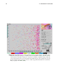
Figure 2.5 shows the visualisation of a data set about prices and earnings in different cities around the
globe [UBS, 2009] using a basic scatter plot display implemented in MD2 VS, a software tool developed
by Mader [2007], which is discussed in detail in Chapter 3. Ahlberg and Shneiderman [1994] provide an
example of the scatter plot technique applied to the task of finding movies in software called FilmFinder,
which is shown in Figure 2.6. The horizontal and vertical axes of the plot displayed by the software
correspond to popularity and age, while the colour of the plotted points is used as an additional channel
conveying information about a film’s category.
2.3.2
Histograms
Histograms are a common information visualisation technique invented by Pearson [1895]. In their most
basic form, they map one-dimensional data on a two-dimensional visualisation. The distribution of data
points on the horizontal axis is projected on the vertical axis, or vice versa, as shown in Figure 2.7. In
order to do so, the range of the first axis is divided into subranges of equal length, so-called “bins”.
The size of the bins in the other dimension is determined by the number of data points belonging to the
corresponding subrange. Wand [1997] explains mathematical approaches to determine appropriate bin
width, or number of bins.
2.3.3
Star Plots
Star plots [Chambers et al., 1983] are a technique for visualisation of multi-dimensional data. Friendly
[1991] describes star plots as a series of depictions for each record in a data set. Each of those smaller
depictions resembles a star (hence the name), the rays of each star corresponding to dimensions, so that
there are n rays for n dimensions. The length of a ray depends on the value of the data point in the
corresponding dimension relative to all other data points’ values in the same dimension. The end points
of a ray are connected to those of the two neighbouring rays. Figure 2.8 shows the XmdvTool [2010]
software displaying a star plot visualisation of the cereals data set provided by Velleman [1996].
Fanea et al. [2005] discuss an extension of star plots named “parallel glyphs”, in which star plots are
merged with parallel coordinates (see Chapter 3).
2.3.4
VisIslands
Andrews et al. [2001] discuss an information visualisation technique they call VisIslands. The goal of this
technique is to reflect similarity between data vectors and display them such that a user can immediately
spot similarities. The dynamic creation of such a visualisation is an iterative process. It involves a
hierarchical clustering technique and clustering vectors in the data set around the centroids in terms of
similarity. The clustered vectors are then placed on a two-dimensional rectangular area, peaks displayed
in red with circles in other colours around them. The resulting graphics bear a certain resemblance to a
map of islands in the sea; this is where the name comes from.
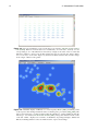
Figure 2.9 shows a VisIslands visualisation of the data set about prices and earnings in different cities
around the globe [UBS, 2009] introduced in Section 2.3.1, again using the MD2 VS software application
developed by Mader [2007], showing similar cities corresponding to the peak of an “island”.
2.3. Multi-Dimensional Data Visualisation
Figure 2.5: MD2 VS scatter plot developed by Mader [2007], visualising a data set about prices
and earnings in different cities around the globe, provided by UBS [2009]. The data set was
turned into a comma-separated value file suitable for opening in MD2 VS with the InfoScope tool
made by Brodbeck and Girardin [2003]. The horizontal axis of the plot corresponds to dimension
“Gross purchasing power”, the vertical axis to “Net purchasing power”. The dots represent data
points; in this case, individual cities. Their position on the plot therefore depend on their values
in the two dimensions corresponding to the axes. Dot size is a third information channel; the
greater the radius of a dot, the greater the data point’s value, in this case in the dimension “Prices
(excluding rent)”.
9
10
2. Information Visualisation
Figure 2.6: The FilmFinder is a software application developed in the nineties of the 20th century
using the scatter plot technique to visualise a data set about films [Ahlberg and Shneiderman,
1994]. The horizontal and vertical axes correspond to the films’ popularity and age, while the
colour of the plotted points conveys information about film categories. For example, the red point
in the bottom left corner shown here denotes a rather unpopular drama film from around 1925.
Image copyright of the HCIL [2006]
2.3. Multi-Dimensional Data Visualisation
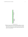
Figure 2.7: Vertical histogram feature of Multi-Dimensional Explorer (MDE), the tool developed
for this thesis, applied to the data set of prices and earnings in different cities around the globe
provided by UBS [2009] and turned into a comma-separated value file suitable for opening in
MDE with InfoScope [Brodbeck and Girardin, 2003]. The 6-bin histogram shows distribution
of records in the “Gross purchasing power” dimension. Each bin represents a subrange of the
dimension’s entire range, which spans from 12.0 to 115.8. The wider a bin, the more records
belong to the corresponding subrange.
11
12
2. Information Visualisation
Figure 2.8: Star plot visualisation of the cereals data set provided by Velleman [1996] in XmdvTool [2010]. Each record in the data set is visualised by one of the stars, each ray of a star
corresponding to one of the dimensions and each ray’s length to the value of the record in that
dimension, relative to other records. In this example, the stars are sorted by the “Sugar” dimension, so it is easy to see how the “Sugar” ray, the 8th in clockwise direction here, becomes longer
as the “Sugar” value becomes greater.
Figure 2.9: VisIslands display of MD2 VS, a tool developed by Mader [2007], visualising a data
set about prices and earnings in different cities around the globe, provided by UBS [2009]. The
data set was turned into a comma-separated value file suitable for opening in MD2 VS with the
“InfoScope” tool made by Brodbeck and Girardin [2003]. Data points clustered in the centre
of the left “island”, displayed as red circles, are Bratislava, Copenhagen, Prague, Vilnius and
Warsaw, indicating that these cities are similar in terms of prices and earnings.
Chapter 3
Parallel Coordinates
“Take that, you lousy dimension!”
[Chief Wiggum in “The Simpsons”, Episode 3F04, 1995]
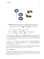
Parallel coordinates are a way to visualise multi-dimensional data by displaying axes in parallel,
rather than orthogonal, to each other. Parallel coordinates belong to the computer science field of multidimensional data visualisation, which was introduced and discussed in Chapter 2.
Section 3.1 explains the theory of parallel coordinates and their roots in mathematics. Section 3.2
discusses problems of parallel coordinates handling large data sets and possible solutions thereof. Section 3.3 introduces some variations on the general idea of parallel coordinates proposed by the scientific
community. Section 3.4 explains the operations provided by interactive parallel coordinates visualisation
for data analysis in high-dimensional space. Finally, Section 3.5 gives an overview of existing software
solutions in the field.
Chapter 4 discusses the original software developed for this thesis, based on the experience gained
from using the other software tools.
3.1
Background
Parallel coordinates did not originate in the field of information visualisation. They were invented as
a purely mathematical concept, the transformation of orthogonal axes into parallel ones, and can be
traced back to 1885, when Maurice d’Ocagne, a French mathematician, published his book Coordonnées
parallèles et axiales. Méthode de transformation géométrique et procédé nouveau de calcul graphique
déduits de la considération des coordonnées parallèlles (“Parallel and axial coordinates. A geometric
transformation method and a new graphical calculation procedure derived from the consideration of
parallel coordinates”) [d’Ocagne, 1885].
d’Ocagne applied parallel coordinates to numerical problems. It was not until 1959 that Alfred
Inselberg rediscovered them independently and applied them to information visualisation [Inselberg,
2010b]. Quoting Inselberg himself in [Inselberg, 2007, p.645]:
“I wondered why geometry was being tackled without using (the fun and benefits of)
pictures? (...) What is ‘sacred’ about orthogonal axes, which quickly ‘use up’ the plane
associated with them?”
Inselberg’s publications [Inselberg, 1985; Inselberg and Dimsdale, 1990] would later help spread the
concept of parallel coordinates in the field of information visualisation. Inselberg [2009] explains exactly
13
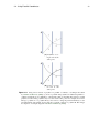
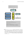
3. Parallel Coordinates
14
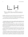
B
A
b
B
p
p
b
a
a
(a) Orthogonal axes
A
(b) Parallel axes
Figure 3.1: In (a), point p lies at coordinates a and b, corresponding to axes A and B. The axes are
orthogonal to each other. In (b), p is still at coordinates a and b on axes A and B, but the axes are
now parallel to each other. Consequently, p is no longer represented by a point, but by the line
drawn from a to b.
how parallel coordinates can be used to extract information from data sets. He also discusses some of
the difficulties in applying parallel coordinates to very large data sets, where the visualisation technique
may not scale very well. Those problems are discussed in detail in Section 3.2 of this thesis.
As far as usability issues are concerned, Siirtola et al. [2009] performed eye-tracking studies on parallel coordinates visualisations, finding that even inexperienced users quickly learn to use the technique
effectively, despite initial scepticism or uneasiness with the visualisation.
Following the teachings of d’Ocagne, the theory of parallel coordinates begins with the basic idea
of duality between lines and points. Any two-dimensional point defined by orthogonal axes can also
be visualised as a two-dimensional line. Expanding on this concept, any n-dimensional point can be
visualised as a polyline consisting of n-1 elements.
Imagine a two-dimensional point p on a plane. It has two coordinates, one for each axis. Let the axes
be denoted A and B; the coordinates shall be denoted a and b. The axes are orthogonal but may also be
viewed in parallel to each other, as shown in Figure 3.1. The coordinates a and b of p remain the same;
their positions on the corresponding axes are connected by a line. A parallel coordinates visualisation
has been created. The line connecting the axes represents p in the same way as a two-dimensional point
represents p using orthogonal axes.
Once the duality between lines and points has been established, the concept can be extended. p can
have many more dimensions and still be displayed by parallel coordinates, as long as there is enough
horizontal space. There is no geometrical limit to how many axes one can display in parallel to each
other. This is not true for orthogonal axes, which can display only up to three dimensions, because of
human perception.
Figure 3.2 shows an example of a 4D point p visualised with parallel coordinates, p being represented
now by the polyline connecting the axes. This way, any number of points (or records) can be visualised
at the same time. As one can see, there are no theoretical limitations on the number of dimensions or
records displayed at the same time. Limits arise in the practical use of parallel coordinates due to limited
screen space and because of overlapping lines, as discussed in Section 3.2. Figure 3.3 shows what the
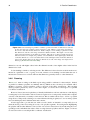
visualisation of a data set consisting of 73 records and 24 dimensions looks like with parallel coordinates.
3.2. Handling Large Data Sets
A
B
15
C
D
A
B
C
D
d
b
c
a
(a) One 4D point on
parallel axes
(b) Two 4D points on
parallel axes
Figure 3.2: (a) shows a 4-dimensional point p represented by a vector of three connected lines at
coordinates a, b, c and d on axes A, B, C and D, respectively. This example demonstrates how
parallel coordinates can be used to display records with any number of dimensions as long as
there is enough horizontal space, while orthogonal axes are restricted to 3D because of human
visual perception. In (b), two 4D points are displayed using parallel coordinates. Each of them
is represented by a vector of three connected lines.
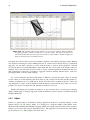
Figure 3.3: Parallel coordinates visualisation with Multi-Dimensional Explorer (MDE), the software developed for this thesis. In this example, the application visualises the data set about prices
and earnings in different cities around the globe [UBS, 2009] (turned into a comma-separated
value file suitable for opening in MDE with the InfoScope tool made by Brodbeck and Girardin
[2003]). 73 records and 24 dimensions are shown at the same time. Every polyline corresponds
to one record. The record for the city of Milan and all its data points have been highlighted in
red.
16
3. Parallel Coordinates
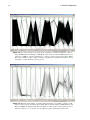
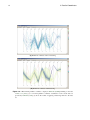
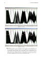
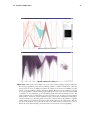
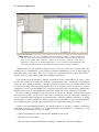
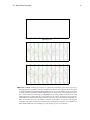
Figure 3.4: Too many polylines can easily clutter a parallel coordinates visualisation. This example in Multi-Dimensional Explorer (MDE) shows the result of rendering 3000 polylines from
a data set of 3000 records and 14 dimensions, a subset of a data set about stars [Nash, 2006].
The massive number of lines clutter the display and make the visualisation unusable; various
techniques to reduce clutter have been proposed.
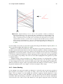
Figure 3.5: When the sheer number of polylines clutter the display of a parallel coordinates visualisation, reduced opacity can mitigate the problem. This is another example of Multi-Dimensional
Explorer (MDE), showing the same data set as Figure 3.4. The opacity of each polyline, however,
has been reduced to 1%, so the user can once again recognise certain patterns in the data.
3.2. Handling Large Data Sets
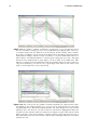
3.2
17
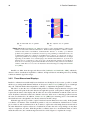
Handling Large Data Sets
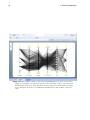
Figure 3.4 shows what happens when the data set to be visualised by parallel coordinates is very large: the
display becomes cluttered with polylines up to a point where the entire visualisation becomes unusable,
because lines overlap and no more patterns can be seen [Artero et al., 2004; Wegman and Luo, 1996].
The problem can be mitigated somewhat by reducing the polylines’ opacity, as shown in Figure 3.5.
When each polyline is rendered with reduced transparency, patterns previously hidden to the eye can
once again be recognised, because areas of many overlapping lines will appear darker than areas with
fewer lines [Holten and van Wijk, 2010].
Reducing polyline opacity is a simple way to mitigate the problem of cluttered parallel coordinates
displays, but may not always be sufficient. Fua et al. [1999] argue that the root of all such problems is the
idea of mapping every record of the data set to one particular graphical element, and that visualisation
techniques based on such direct mapping will always scale badly in face of large input data. Novotný
[2004] refers also to performance problems with software applications having to render overly complex
graphics. Therefore, clustering may be needed for many large data sets. Novotný and Hauser [2006]
name “a few thousand” as the number of records visually comprehensible with parallel coordinates,
whereas “hundreds of thousands” of records are an indication that problems will arise. An exact measure
obviously cannot be given, as the critical number of records will always depend to a certain degree
on the data set. The following techniques are specifically tailored towards reducing clutter in parallel
coordinates:
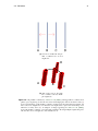
• Fua et al. [1999] discuss clustering of records under the name of “hierarchical parallel coordinates”. The clustered display is achieved by creating an internal tree structure from the data set.
Each node in the tree corresponds to a certain number of data points and their mean value. The
level of clustering, that is, how many lines are displayed in the parallel coordinates view, depend
on a parameter which can be imagined to horizontally split the tree structure (the word “cut” is
used for this in the paper). By changing that parameter, the user of a visualisation can dynamically change the degree by which records are joined to clustered polylines. Figure 3.6 shows the
technique implemented in XmdvTool [2010].
• Zhou et al. [2008] take a different approach. Instead of basing any clustering on calculation in the
data set itself, they base their technique directly on the geometry of polylines which would result
otherwise from a normal parallel coordinates visualisation. Lines are denoted as belonging to the
same cluster according to their parallelism and their position. Actual visual clustering is achieved
by turning straight lines into curves, leaving the colour aspect of the visualisation free to carry
other information.
The use of curves instead of lines for parallel coordinates is addressed in a different context by Graham and Kennedy [2003], see Section 3.3.3.
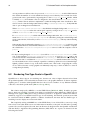
• Randomness can be exploited for reducing clutter, too. Dix and Ellis [2002] introduce the idea
of visualising random samples of the input data set and apply the idea to parallel coordinates
in [Ellis and Dix, 2006]. Ease of use is stated as a distinct advantage of such techniques. Doubts
about the validity of random sampling in data analysis are met with references to other areas in
computer science where randomness plays an important role, such as keys in cryptography or
neuronal networks.
• Johansson et al. [2004] approach the problem with neural networks and propose a solution involving the classification of records using the Self-Organising Map (SOM) algorithm [Kohonen,
1997]. The clusters displayed are then based on that classification.
• “Splatting” of parallel coordinates polylines is discussed by Zhou et al. [2009]. The idea here is to
exploit time to visualise the process of clustering step by step as each line is added separately to
3. Parallel Coordinates
18
(a) Parallel Coordinates with no Clustering
(b) Parallel Coordinates with Clustering
Figure 3.6: “Hierarchical parallel coordinates” display in XmdvTool [2010], building on the idea
of Fua et al. [1999]. (a) is a normal parallel coordinates visualisation of the cereals data set
provided by Velleman [1996]. (b) shows the results of applying a clustering method to the data
set.
3.3. Variations
19
the display. Whenever one line is added, opacity of neighbouring lines is increased while opacity
of all lines is reduced. Allowing users to pause the resulting animation allows them to select their
desired level of detail.
Animation is noted as an important visualisation technique also by Ellis and Dix [2007], who give
an overview of different approaches to mitigate the problem of cluttered displays in information
visualisation and conclude that better results are achieved by a combination of different methods,
such as animating the clustering process. Johansson et al. [2005b] use animation as an information channel of its own, using motion in a clustered parallel coordinates visualisation to express
additional information about a cluster of records.
A high number of dimensions, rather than just records, may cause similar problems, but can be
approached in different ways. Jing et al. [2003] discuss ways of clustering dimensions to reduce visual
overload. They apply their technique not only to parallel coordinates, but also to other visualisation
methods.
3.3
Variations
The basic idea of parallel coordinates is to draw polylines corresponding to records in a data set on a
2D display. Building on this basic idea, other, similar visualisation techniques have been devised. The
following subsections give an overview of variations on the original parallel coordinates theme.
3.3.1
Parallel Sets
Parallel sets [Bendix et al., 2005] adapt parallel coordinates for enumerated dimensions. Parallel coordinates usually deal with continuous numeric data types, having an obvious order defined for them and
no fixed number of allowed values. In contrast, enumerated dimensions such as “Gender” or “Country”
usually have no natural ordering relationship (is “Austria” less than “Italy”?) and define a fixed number
of values a record in the data set may have. Although enumerated dimensions can be normalised in
order to be treated like dimensions of numeric type [Mader, 2007], parallel sets take a different approach
altogether.
Just like parallel coordinates, parallel sets display axes arranged parallel to each other. However,
parallel sets do not plot points on the axes which are then connected by polylines; instead rectangles
of equal width and different height are drawn on an axis. Each rectangle represents an element of
an enumeration set such as all countries on earth for a dimension “Country”. Users are also free to
group subsets: for example, in a “Country” dimension, elements might be grouped by continent, so that
the visualisation effectively has to deal with only six graphical elements. Dimensions of a continuous
numerical type may be adapted for use in parallel sets by defining a set of exclusive ranges (for example
“less than 50”, “greater or equal than 50”, “greater than 100”).
The height of a rectangle depends on the number of records belonging to the corresponding enumeration value in that dimension. When axes are displayed next to each other, the parallel sets equivalent of
parallel coordinates polylines comes into play. From each of an axis’ rectangles a number of polygons
extend to the adjacent right axis (always assuming that all axes in a parallel sets display are of an enumerated type). The right edge of each polygon is connected to a rectangle on the right axis such that every
polygon between two axes N and M represents one of the possible combination of the axes’ respective
dimensions.
With M different enumeration elements in the left axis and N in the right axis, N x M combinations
are possible, resulting also in a maximum of N x M polygons. In other words, each of the polygons
represents the existence of at least one record belonging to one particular enumeration element in both
dimensions. See Figure 3.7 for an exemplary depiction of parallel sets.
3. Parallel Coordinates
20
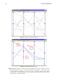
Austria
Italy
UK
(a) An individual axis in parallel
sets.
(b) Two adjacent axes in parallel
sets.
Figure 3.7: Parallel sets [Bendix et al., 2005] are a variation of the original parallel coordinates idea
suitable for data with enumerated dimensions. While traditional parallel coordinates visualise
continuous data such as real numbers, enumerated like “Gender” or “Country” pose different
problems. In a parallel sets visualisation, instead of points pertaining to individual records, sets
of enumeration values are connected on parallel axes by polygons. (a) shows how an axis is
organised in parallel sets by drawing a rectangle for each element in the enumeration, its height
depending on the number of records belonging to the element in that dimension. (b) shows how
adjacent axes are connected by polygons (in red). In this fictional example, the visualisation
shows more records with people from the UK than from Austria or Italy; men are from all three
countries, while there is no record for an Austrian woman. The image was adapted from Bendix
et al. [2005].
Parallel sets differ from the approach discussed in [Andrienko and Andrienko, 2004], which also
discusses subset visualisation in parallel coordinates, though still based on defining subsets by dividing
continuous numeric types into ranges.
3.3.2
Three-Dimensional Displays
Parallel coordinates have traditionally been visualised on a 2D display. It is, however, possible to extend
the idea to projecting multi-dimensional data on 3D space. Johansson et al. [2005a] propose a technique
they call “clustered multi-relational parallel coordinates” to implement 3D parallel coordinates.
The idea is to take the axes of traditional 2D parallel coordinates and put them into 3D space such
that all of them still point in the same direction, though their position on the plane is changed. One axis
is placed in the centre of the display and all other axes are evenly distributed around the centre axis in a
circle. Polylines connect the centre axis with the outer axes; there are no connecting polylines between
the outer axes themselves. In addition, Johansson et al. [2005a] use clustering just as some traditional
2D visualisations do, though this is not directly related to the 3D concept.
With this approach it is possible to explore relations between dimensions more easily. In 2D parallel
coordinates, one instance of the visualisation pertains to only one combination of dimensions; for example, in a data set with four dimensions A, B, C and D, to explore the relationship between A and each of
the other dimensions requires at least two visualisations, because the axis corresponding to A may have
only two neighbours, not three. With 3D parallel coordinates, there is no such inherent limit; A can be
made the centre axis, B, C and D arranged around it in a circle. Figure 3.8 explains the concept.
3.3. Variations
21
(a) An axis in traditional 2D parallel coordinates has at most
neighbours.
D
A
B
C
(b) The centre axis in 3D parallel coordinates can have multiple neighbours.
Figure 3.8: 3D parallel coordinates by Johansson et al. [2005a], turning parallel coordinates from
plane to space by placing one axis into the centre and arranging the others around it in a circle. (a)
shows a disadvantage of 2D parallel coordinates, in that an axis, B in this fictional example, can
have at most two neighbours, even when the user might want to explore the relationship of one
dimension to many others. (b), an adaption of images appearing in Johansson et al. [2005a],
shows 3D parallel coordinates overcoming this problem by allowing multiple neighbouring axes.
All other axes are now neighbours of the central axis, B.
3. Parallel Coordinates
22
Moving axes along the Z dimension is not the only way of turning parallel coordinates into 3D. Wegenkittl et al. [1997] propose instead to turn the two-dimensional axis lines of traditional parallel coordinates into planes arranged in 3D space. Parallel axes transformed to parallel planes move quite far away
from the original idea of parallel coordinates, whereas the previously discussed approach feels more like
a natural evolution of the concept.
3.3.3
Curves
Parallel coordinates traditionally use straight lines to connect axes. This leads to the problem of polylines
crossing the same point, making it impossible to tell which lines belong to which polylines. Graham and
Kennedy [2003] call this the “cross-over” problem and suggest the use of curves as a solution to overcome
it. Using curves, as shown in Figure 3.9, allows users to immediately keep apart entire polylines using
natural visual perception even when all polylines cross at the same point on the same axis. The paper
argues that except for their end points, the lines in traditional parallel coordinates visualisations carry
no information of their own, so other means of connecting points on the axes can be employed without
any loss of information. This is in line with Theisel [2000], who notes that the horizontal space between
parallel coordinates axes can be leveraged to convey more information.
3.3.4
Continuous Parallel Coordinates
Continuous parallel coordinates were introduced by Heinrich and Weiskopf [2009]. They argue that traditional parallel coordinates techniques miss an important aspect of the input data: the continuous nature
of data gathered from scientific observations. Discretisation of such data in visualisations inevitably
leads to a loss of information conveyed. Therefore, mathematical techniques to express the continuity of
input values in an adapted form of parallel coordinates have been devised.
3.4
Using Parallel Coordinates
This section discusses commonly used procedures in exploratory analysis with interactive parallel coordinates. The discussion is based on the tutorial of Bauer et al. [2010], created for Keith Andrews’
course on information visualisation at Graz University of Technology [Andrews, 2010]. However, the
tutorial contained in this thesis uses screenshots from the Multi-Dimensional Explorer (MDE), discussed
in Chapter 4, and InfoScope [Brodbeck and Girardin, 2003], discussed in Section 3.5.2. Furthermore, it
uses a different data set for its examples. Bauer et al. use data about the correlation between smoking
and cancer [Fraumeni, 1968], whereas this thesis uses data about prices and earnings in different cities
provided by UBS [2009]. The data set was turned into a comma-separated value file suitable for opening
in MDE (and many other software applications) with InfoScope. Table 3.1 shows part of the cities data
set.
3.4.1
Removing Axes
Often, not all the dimensions of a multi-dimensional data set are of interest to the task at hand. Therefore,
it makes sense to view only the axes for important dimensions and remove the others. Figure 3.10 shows
the entire data set with all 52 dimension axes. Figure 3.11 shows the parallel coordinates visualisation
after removal of those axes which the user is not interested in. All but 5 of the 52 dimensions in the cities
data set have been hidden by the user, leaving: city names, paid vacation days per year, time required for
1 kg of bread, time required for 1 kg of rice and normal local rent medium.
3.4. Using Parallel Coordinates
23
(a) Polylines crossing an axis at the
same point.
(b) Curves crossing
an axis at the
same point.
Figure 3.9: Using curves instead of polylines for parallel coordinates, a technique introduced
by Graham and Kennedy [2003]. (a) shows a problem with polylines in traditional parallel coordinates visualisations: it is difficult or outright impossible to tell which lines belong to which
polylines, because many polylines may cross axes at the same point. For example, does line 2
belong to polyline A or to polyline B? (b) show curves solving the problem intuitively; a user
can immediately and visually observe that curve segment 2 belongs to polyline B. The images
are adaptions of example diagrams in Graham and Kennedy [2003].
3. Parallel Coordinates
24
Cities
Amsterdam
Athens
Auckland
Bangkok
Barcelona
Beijing
Berlin
Bogotá
Bratislava
Brussels
Budapest
Buenos Aires
Bucharest
Caracas
Chicago
Delhi
Doha
Dubai
Dublin
Frankfurt
Geneva
Helsinki
Hong Kong
Istanbul
Jakarta
Johannesburg
Cairo
Kiev
Copenhagen
Kuala Lumpur
Lima
Lisbon
Ljubljana
London
...
Gross purchasing power
95.3
61.8
64.8
18.4
65.7
21.7
93.5
32.3
35.7
97.2
34.2
30.5
33.5
22.0
97.9
18.2
30.3
45.1
90.7
92.9
104.4
86.1
41.6
29.9
12.0
52.8
22.4
21.1
115.8
33.1
29.6
60.6
68.0
81.5
...
Net purchasing power
85.5
63.3
70.8
24.1
73.6
24.1
89.4
37.9
39.5
88.5
29.6
34.9
33.7
27.7
96.3
21.8
41.8
62.3
106.4
84.6
100.6
88.1
52.3
31.0
14.5
54.8
24.1
23.7
86.2
38.4
32.5
66.0
56.4
86.7
...
Prices (excl. rent)
83.0
72.7
62.3
58.7
83.5
57.4
81.0
47.1
59.4
84.7
54.4
50.4
46.0
91.0
82.0
37.6
67.6
84.9
92.7
90.8
106.8
94.5
80.9
74.2
47.8
48.6
45.3
52.1
108.4
43.2
50.5
74.0
64.3
84.6
...
...
...
...
...
...
...
...
...
...
...
...
...
...
...
...
...
...
...
...
...
...
...
...
...
...
...
...
...
...
...
...
...
...
...
...
...
Table 3.1: Part of the cities data set by UBS [2009], containing information about prices and
earnings of various cities in different countries. This data set is a popular benchmark for testing
information visualisation software. There are 73 records (one for each city) and 52 dimensions,
including the name of the city.
3.4. Using Parallel Coordinates
Figure 3.10: Initially, a parallel coordinates visualisation usually shows all axes. The cities data
Set used here [UBS, 2009] contains 52 dimensions. The user will want to remove some, if not
most of them, from the view.
Figure 3.11: In contrast to Figure 3.10, all but 5 of the 52 dimensions in the Cities Data Set have
been hidden by the user, leaving: City Names, Paid Vacation Days Per Year, Time Required for
1 kg of Bread, Time Required for 1 kg of Rice, and Normal Local Rent Medium.
25
3. Parallel Coordinates
26
3.4.2
Moving Axes
Once the set of dimensions has been reduced to a suitable subset, ordering becomes an issue. Axes in parallel coordinates are restricted to two neighbours (at least in their traditional 2D form, see Section 3.3.2
for a variation of parallel coordinates overcoming this limitation), and correlations between dimensions
can be explored, only if the corresponding axes are placed next to each other. This calls for a means to
move axes to obtain a desired ordering.
Figure 3.12 shows how axes are moved in parallel coordinates visualisations. Following up on the
previous example, users might want to know more about how Medium Rents and Paid Vacation Days
Per Year are related, so the axis about rents is moved next to that about paid vacation days.
3.4.3
Looking for Patterns
With dimensions reduced to a suitable subset and arranged in a suitable order, the pattern of lines between
the axes can be analysed. Siirtola and Räihä [2006] explain that the crossings of lines should be observed:
if many lines cross, and if they become more parallel to each other after having flipped one of the axes
upside down, a correlation between the two dimensions can be deduced. Figure 3.13 shows how flipping
one of the axes immediately reveals that:
1. Rents and paid vacation days are not much related to each other.
2. People living in cities with low rents tend to work longer to earn enough money to buy 1 kg of
bread.
3.4.4
Selecting Records (Brushing)
Selection means choosing a subset of records of particular interest: a selection is usually highlighted
by colouring the records differently. Figure 3.14 continues the previous example. It shows how one of
the lines stands out between two apparently correlated dimensions. This record has been selected and is
highlighted in blue. Its details are shown and reveal the city of Caracas to be an example of a place where
rents are much higher compared to other cities in relation to the time required to earn enough money for
1 kg of bread. The selected record is shown in blue so that the user can distinguish between selected and
unselected records.
The terminology is sometimes inconsistent in the literature. Inselberg [2009] calls the operation
“querying” and gives it a more general meaning. He defines a query as any command the user can
issue to parallel coordinates software to change the display such that desired information can be gained
visually, which may or may not involve a change in the appearance of individual records. Note that the
word is not to be understood in the classical computer science sense; it has nothing to do with query
languages such as Structured Query Language (SQL) or even with retrieving records from a database.
Instead, the word denotes visual interaction mechanisms provided by the user interface.
Other sources call the operation “brushing” [Ward, 1994]. For reasons of consistency, the term
“selection” will be used throughout this thesis.
Selection or brushing is preferably achieved by dragging the mouse to enclose desired line segments
within a box. The enclosed records are highlighted as selected. For the aggregation of different selections, it makes sense to use additional keyboard actions as well; for example, when the shift key is pressed
while a selection rectangle is being drawn with the mouse, the enclosed records might be added to the
previous set of selected records, rather than replacing it. This is an established user interface paradigm;
3.4. Using Parallel Coordinates
(a) A parallel coordinates axis is being moved (shown in red here during
movement).
(b) After moving, dimensions about vacation and rent are located next
to each other.
Figure 3.12: In parallel coordinates, users sometimes want to move axes, so that dimensions whose
correlations they wish to explore are placed next to each other. For example, the user might want
to study the correlation between Medium Rents and Paid Vacation Days Per Year. (a) shows the
axis about medium rents being moved by dragging it with the mouse; (b) shows the result of the
operation, the two axes are located next to each other.
27
28
3. Parallel Coordinates
Figure 3.13: In parallel coordinates visualisations, if many lines cross in the interval between
two axes, and if the crossings give way to more parallel lines upon flipping either of the axes,
a correlation between the two dimensions can be deduced. In this example, which continues
the scenario from Figure 3.12, the axis about medium rents has been flipped. The left interval,
marked with a red ellipse, still shows many crossed lines, so it can be assumed that rents are not
much related to the left-hand dimension (“vacation [paid working days per year]”). The right
interval, however, marked with an orange ellipse, now shows many, more parallel, lines. This
indicates a correlation between medium rents and the right-hand dimension (“time required for
1 kg of bread [minutes]”). In other words: people living in cities with low rents tend to work
longer to earn enough money to buy 1 kg of bread.
Figure 3.14: One of the records in a parallel coordinates visualisation is selected. In this example, building on the example in Figure 3.13. one record stood out between the two apparently
correlating dimensions “Normal Local Rent Medium” and “Time Required for 1 kg of bread
[minutes]” due to the direction of its line. It has been selected here (highlighted in blue) and
revealed to be that of Caracas. Therefore, Caracas is an example of a place where rents are much
higher compared to other cities in relation to the time required to earn enough money for 1 kg of
bread. The selected record is shown in blue so that the user can distinguish between selected and
unselected records.
3.4. Using Parallel Coordinates
29
Figure 3.15: Angular brushing is used to select records in parallel coordinates by defining an
angle interval between two axes. On the right, there is an illustration of interval definition; the
upper red line has an angle of 45 degrees from the axis lines, the bottom red line an angle of 90
degrees. Applied between axes A and B, shown on the left side, the angle between every polyline
segment and the axis lines is considered; the red segments match the filter because for them the
angle is between 45 and 90 degrees, so they are considered selected. The other, black ones, are
not selected. The idea for this concept and the source of this adapted image are from Hauser et
al. [2002].
it works similar to how items are selected in everyday file managers like Windows Explorer [Microsoft,
2011] or the Finder in Mac OS X [Shadovitz, 2007].
Furthermore, if additional visualisations of the same data set are present (see Section 2.3), selections
should be synchronised in both directions. Records selected in a parallel coordinates visualisation should
be highlighted as selected in any other views, while records selected in the other views should likewise be
highlighted as selected in the parallel coordinates view. For example, if a user selects dots corresponding
to records in a synchronised scatter plot window (which may also be achieved by enclosing them with a
box), the polylines corresponding to the same records should be highlighted in the application’s parallel
coordinates window.
“Angular brushing”, discussed by Hauser et al. [2002], is the name of a special parallel coordinates
record-selection technique which considers the angle of lines between two axes. The degree of the angle
of a line reaching from one axis to the next is in the range (0,180). The brushing angle can likewise be
defined as an interval of degrees. This is especially useful for discerning records whose values go against
the general trend between two axes. Figure 3.15 shows an example of the concept.
3.4.5
Colour Shading
Colour shading is an operation in which one dimension is selected by the user and every polyline is
then assigned a colour within a colour range according to the record’s data value in that dimension.
Figure 3.16 is an example of colour shading; the operation is applied to the first dimension, colours
ranging from black over red to white. The higher a record’s data value in the first dimension, the darker
its polyline. This aids in detecting correlations to other dimensions. One can, for instance, immediately
observe that the order of the records in the dimensions on the right is largely the same as in the first
3. Parallel Coordinates
30
Figure 3.16: Colour shading is a parallel coordinates operation in which one dimension is selected
by the user and every polyline is then assigned a colour within a colour range according to
the record’s data value in that dimension. In this example, colour shading is performed on the
first dimension, and the colour range is defined as black-red-white. The higher a record’s data
value in the first dimension, the darker its polyline. This aids in spotting correlations between
dimensions. Here, for example, the polylines’ colour distribution on the right largely match that
of the first dimension, so a user can deduce that records with higher values in the first dimension
tend to have higher values in the last few dimensions as well. The image was adapted from
InfoScope [Brodbeck and Girardin, 2003].
dimension; records with higher values in the first dimension tend to have higher values in the last few
dimensions as well.
Colour shading is similar to selecting records. The difference is that selections result from the user’s
interest in a particular record, or group of records, whereas colour shading is useful when the user is
interested in a dimension as a whole and how that dimension generally relates to other dimensions.
3.4.6
Zooming
Bauer et al. name zooming as the final step in using parallel coordinates for data analysis. Indeed,
as parallel coordinates polylines are infinitely thin by definition, they can always be rendered with a
thickness of exactly 1 pixel, regardless of the zoom level of the entire visualisation. This can help
discern polylines placed very close to each other. Figure 3.17 shows the zoomed region of a parallel
coordinates visualisation.
However, if users just need a quick way to identify individual records in crowded areas of the display,
zooming may not be a desirable solution, because it requires users to temporarily sacrifice their complete
overview of the data and to constantly zoom in and out. This is a rather tedious way to “follow” a polyline
along all axes. Temporarily selecting a record and then deselecting it again just to see its entire polyline
in a crowded display mixes different tasks and concerns.
A better approach to provide the user with a record’s details on demand is to temporarily focus it
when the mouse pointer is hovering above any of its polyline segments. Focussing means highlighting
the polyline with another different colour (not the one used for selected records) and showing the corresponding record’s individual data values on the crossings between polylines and axes. Figure 3.18 shows
a focussed record in a crowded parallel coordinates visualisation.
3.5. Software Applications
31
Figure 3.17: A parallel coordinates display at a zoom level of 400%. With zooming, users can
more easily discern polylines drawn close to each other. Lines are infinitely thin by definition,
that is, they can always be drawn with a thickness of 1 pixel, irrespective of the zoom level.
This helps in detecting patterns in otherwise overly crowded areas of the parallel coordinates
visualisation.
See also Section 3.2 for discussion of techniques to solve problems caused by overlapping polylines.
3.5
Software Applications
This section gives an overview of existing software solutions for parallel coordinates visualisations. Each
application is introduced separately, and particular features, strengths and weaknesses are highlighted.
Parallel coordinates are simple enough to implement, but still each software application reviewed in this
section turns out to be different:
• Features: Applications may offer certain features not found in competitors. For instance, Parallax
features automatic visual classification, XmdvTool can animate data along a time dimension, and
GGobi has extensive statistical tools.
• Purpose: Some of the applications also differ in their general scope and purpose. InfoScope is
particularly aimed at exploring data with a geographical aspect, whereas Picviz was developed for
use in the field of network security. Situvis was developed in the context of conflict analysis.
• Interaction: Finally, applications differ in the way users can interact with the display. For example, parvis features two-phase rendering to keep the software responsive while the user manipulates
the visualisation. Caleydo has angular brushing.
Table 3.2 lists the reviewed software applications. Software which turned out to be more featurerich with regards to parallel coordinates was given more space than the other tools. When software is
available for download (or direct online use) on the Internet, a web address is given in its bibliography
entry.
3.5.1
MDVS
The Multi-Dimensional Visualisation System (MDVS) was made by Hackl [2010] as an extension of the
Java [Oracle, 2011] desktop application MultiDimensional MetaData Visualization System (MD2 VS)
3. Parallel Coordinates
32
(a) Before focussing
(b) After focussing
Figure 3.18: Focussing is a more user-friendly way than zooming to discern individual records
in a crowded parallel coordinates visualisation. (a) shows 3000 records and 14 dimensions from
the stellar data set by [Nash, 2006]. On the top area between the second and third axis, one
of the polyline segments stands out, but it is impossible to follow its path in the rest of the
display, because it is overlapped by thousands of other polylines. On (b), the mouse pointer is
hovering above the line segment between the second and third axis, which temporarily focusses
the polyline, highlighting it in red and showing its individual data values.
3.5. Software Applications
Name
MDVS
InfoScope
parvis
Parallax
Situvis
Picviz
GGobi
XmdvTool
VisDB
Caleydo
OECD eXplorer
Protovis
VizCraft
Liquid Diagrams
33
Characteristics
Intuitive usage
Support for geographical dimensions
Performance gains by two-phase rendering
Visual classification, selection mechanisms
Conflict analysis, pairing with graphs
Aimed at network security
Extensive statistical tools
Time animation, hierarchical clustering
Offers other visualisations
Aimed at medical science
OECD-specific analyses, direct online use
Implemented entirely in JavaScript and SVG
Aimed at Aircraft Design
Integration into Google Docs, SVG export
Table 3.2: A summary of parallel coordinates software reviewed in this thesis. For each of the
tools, main characteristics are named.
previously developed by Mader [2007]. The original MD2 VS application lacked a parallel coordinates
visualisation. It had, however, been designed with potential extensions for further visualisation schemes
in mind. MDVS therefore integrated a parallel coordinates component. Figure 3.19 is an example of
a test data set visualised with parallel coordinates in MDVS. The component offers the following user
interaction features:
• Filtering. In order to render a record “unused”, the user has to restrict the dimension by dragging
the blue triangles located on the top and bottom of the corresponding axes. All records whose lines
do not pass through the now restricted vertical area will be considered unused and appear greyed
out.
• Record Selection. Records which are not unused can be selected and deselected, either by clicking the corresponding lines, or by drawing a selection rectangle with the mouse. Selected records
appear in blue, unselected ones in black. Figure 3.19 shows the difference between unused, unselected, and selected records.
• Dragging Axes. The horizontal position of each axis can be changed by dragging and dropping
the header text with the mouse.
• Tooltip Information. When the user moves the mouse pointer over a record and leaves it there for
a few seconds, the record’s actual data values are displayed on each axis.
3.5.2
InfoScope
InfoScope is a commercial, closed-source Java desktop application, made by Brodbeck and Girardin
[2003] and distributed by the Macrofocus company. A free test version can be obtained from the company’s web site. The test version, however, can only be used with demo data sets provided by Macrofocus. Figure 3.20 shows the tool.
For data input, the software uses proprietary .mis files. It is a binary format, but the professional
version of InfoScope provides InfoScope Distiller, a tool for conversion of simple text files into .mis
files [Macrofocus, 2010]. Data sets can be read by opening files from the local file system or by downloading them from Macrofocus servers directly from within the application.
3. Parallel Coordinates
34
(a) All records are used, none are selected.
(b) Some records are unused or selected.
Figure 3.19: The parallel coordinates component in MDVS [Hackl, 2010] visualising a test data
set with dimensions “Category”, “Created”, “Importance” and “Quality”. (a) shows all records
are used and unselected. However, as (b) shows, records can also be in different states. When
unused because of a restricted dimension axis, they appear grey. When in use, they can be either
selected (blue) or unselected (black).
3.5. Software Applications
Figure 3.20: Macrofocus InfoScope, a commercial visualisation application written in Java, aimed
at data with a geographical dimension. Depending on the nature of the data set, the parallel
coordinates display is synchronised with a geographical map. In this example, the data is about
cities spread across the globe; the lines highlighted in the parallel coordinates display correspond
to the cities shown on the world map. The city of Milan corresponds to the red dot in the centre of
Europe and to the red (selected) polyline in the parallel coordinates display. Likewise, Vienna and
Munich correspond to the light blue dots and to the light blue (active but not selected) polylines.
Additionally, a thematic similarity map of the data is shown in the right top corner.
35
3. Parallel Coordinates
36
InfoScope is aimed at data with a geographical dimension, such as data for a set of cities, because
the geographical location of records is shown on a map in an extra window. The nature of the map and
whether it is shown at all depends on the data. Examples of demo data sets provided by Macrofocus
include “Prices and Earnings around the Globe” [UBS, 2009], which uses a map of the whole world,
and “Swiss Cities Ranking” [l’Agefi, 2003], which uses a map just of Switzerland. The other additional
visualisation provided is a thematic similarity map, which is calculated so as to place cities with similar
characteristics near to one another using techniques such as force-directed placement [Fruchterman and
Reingold, 1991].
The central parallel coordinates visualisation component fixes the order of dimensions. Axes cannot
be reordered, nor can single axes be removed from the view. Nevertheless, dimensions are grouped into
categories; this categorisation is reflected in the visualisation, since the user can visually “broaden” a
category. The dimension axes belonging to the category are then separated by wider spacing, while the
other categories are narrower.
InfoScope distinguishes between active and selected records. Arrows controlling filtering are placed
at the top and bottom of each axis. These arrows can then be moved up and down, restricting active (that
is, selectable) records to those whose lines run through the vertical area, the interval, between the arrows.
These active records are selected by clicking on their lines in the parallel coordinates visualisation.
Multiple records can be selected by pressing the Ctrl key while clicking. Upon selection, records appear
in a different colour, and the geographical and thematic similarity visualisations are updated accordingly.
Similarly, the selection is synchronised with a standard tabular view of the data.
The other selection type found in InfoScope introduces an additional visual information channel in
the graphical display by means of colour shading. One dimension axis can be selected for this feature
via the “Color by” dropdown menu, upon which each record polyline is coloured according to its value
in the selected dimension. The colour shading scheme itself can be chosen, too. For example, one can
choose shading from black to red, such that lower values tend more towards black while higher values
tend more towards red.
There is no zooming available for the parallel coordinates visualisation; its size always depends on
the window size. On the positive side, anti-aliasing can optionally be turned on. Records are optionally
focussed when hovering over their lines with the mouse pointer and, simultaneously, tooltips showing
the record’s data values appear.
3.5.3
parvis
parvis is an open-source Java desktop application developed by Ledermann [2003]. It is a generalpurpose parallel coordinates visualisation tool without any particular application area. The text-based
.STF file format is used for data input. At the time of writing, the project is discontinued. Although the
latest release version number is only 0.3.1, parvis is a mature and usable piece of software. Figure 3.21
shows the tool.
Dimensions in the display can be reordered freely by horizontally dragging the axes, but an axis
cannot be repeated or removed from the display. Individual axes can be translated and scaled vertically.
There is, however, no way to zoom the entire display.
When the “tooltips” option is activated, records are focussed when moving over them with the mouse
pointer, and the record’s data values appear as tooltips over the data points on the axes. Selecting the
records, however, is a rather complex operation, because the only selection type supported by parvis is
angular brushing. Records cannot be selected by a simple single click, by creating an axis interval, or
by drawing a rectangle.
3.5. Software Applications
Figure 3.21: parvis is an open-source Java desktop application for general-purpose parallel coordinates visualisation; displaying here the well-known cars data set [Ramos and Donoh, 1983].
This figure illustrates progressive rendering, one of parvis’ special features to enhance speed
and usability. While an axis is being moved by dragging it horizontally with the mouse, the
visualisation is updated immediately without anti-aliasing. It is then progressively replaced by
anti-aliased lines while the application stays responsive, allowing the user to continue work without interruption. The bar at the bottom left of the window shows the current rendering progress.
37
3. Parallel Coordinates
38
Figure 3.22: Parallax, a commercial, closed-source desktop application featuring parallel coordinates. This figure shows a combination of two different query types on a financial data set.
Records appearing in green have been selected by an angle query on the “Year” axis; blue ones
have been selected by an interval query on the “Yen” axis. Basic queries can be combined into
more complex ones by logical AND, OR and NOT operators. Parallax also features automatic
visual classification.
The most distinguishing feature of parvis is progressive rendering. To enhance usability of the application even for large data sets, rendering is performed in two steps. While the user modifies the
display, such as by dragging an axis or by selecting records with the mouse, a fast and low-quality (no
anti-aliasing) version of the visualisation is displayed immediately. It is then replaced progressively by
anti-aliased lines which are generated in the background. This way, the system remains responsive while
the user still performs operations with the mouse. Work can be continued without interruption. The
other performance advantage gained from this, is that most of the time, the expensive generation of the
high-quality display can be terminated immediately, as long as the user keeps moving the mouse pointer.
A further distinguishing feature of parvis are axis histograms, which visualise the density of records
on an axis’ interval. parvis also allows the free choice of all colours in the parallel coordinates visualisation. On the negative side, there is no synchronised table view of the data set.
3.5.4
Parallax
Parallax is a parallel coordinates visualisation desktop application developed by Inselberg [2010a]. It is
a commercial, closed-source software package. Inselberg [2009, pp. 382-416] gives a walkthrough of
the application, explaining its various features. Figure 3.22 shows Parallax.
For file input, Parallax uses simple text files with the default file name ending .DAT. In these files,
records are separated by line breaks, while elements within a record are separated by spaces. There are
only numerical values, no enumerations or strings. One can, however, denote undefined (null) values in
the input data set. In the visualisation, these values appear below the bottom of their corresponding axes.
Parallax allows users also to create new .DAT files. In order to do so, the current selection is “isolated”,
which is to say that all records currently not selected by any query are removed from the data set. The
remaining records may then be saved as a new file.
3.5. Software Applications
39
Axes can be reordered and removed freely, but any axis may appear only once. The application,
however, automatically generates a list of all meaningful axis permutations to choose from, based on
the observation in Inselberg [2009, pp. 389-390] that few permutations are needed to obtain all possible
adjacent pairs of axes. In addition to this convenience feature, Parallax also features vertical flipping of
axes. Parallax has scatter plot and histogram visualisations. In the scatter plot display, record selections
are synchronised with the parallel coordinates display. It is also possible to select records from within
the scatter plot display by drawing a multi-sided polygon encompassing the desired points.
Parallax features a comprehensive structured querying mechanism, which can be viewed as a twolayered system:
• On the first layer, queries can be named and be associated with a particular colour. Any number
of such queries can be created. The results of each query, that is, the colouring of records, can be
shown separately or in combination with those of other queries.
• On the second layer, a query is itself composed of “queries”. Thus, the word “query” actually has
a double meaning in Parallax. Queries on this second layer comprise interval, pinch, angle and
relative complement queries:
– A pinch query is defined by an upper and lower arrow placed anywhere between two axes. As
the horizontal position of the arrows may be moved as well, this must actually be considered
an invisible selection line. Those records whose polylines intersect with the invisible line are
selected.
– The interval query can likewise be considered a special case of the pinch query in which
upper and lower bound arrows have to be placed exactly on an axis.
– Angle queries, defined between two axes, constitute a range of angles. An angle is measured
from the left axis line. For example, the minimum allowed angle might be 30 degrees, the
maximum allowed angle 45 degrees. Now, if a polyline segment between the two axes has
an angle of 35 degrees from the left line, then it is included in that range, and the record
is selected. Figure 3.15 illustrates the concept, which Hauser et al. [2002] call “angular
brushing”. In order to define such a query in Parallax, the user has to click the “A” button
in the tool bar, then click on an axis line in the parallel coordinates visualisation; two purple
arrow handles appear on the axis line. They can be dragged up and down to define the angle
range.
– A relative complement query is defined by the complement of two first-layer queries. If, for
instance, the user chooses the relative complement between (first-layer) queries A and B,
then the result of this (second-layer) query are all records selected in A but not in B.
Second-layer queries are combined logically with AND, OR and NOT operators to form a firstlayer query.
Parallax offers an undo feature for some of its operations, which represents an important plus in terms
of usability. On the downside, the application’s display quality suffers from the lack of anti-aliasing. The
colour scheme can only be partially changed. Furthermore, a number of bugs detract from a flawless
user experience. Most importantly, zooming results in seemingly random display errors to the point of
rendering the application unstable, and dialogue windows for choosing a query’s associated colours will
not always open. The former error is acknowledged in the manual and may disappear in future versions
of the application (1.0 at the time of writing).
3. Parallel Coordinates
40
3.5.5
Situvis
Situvis is an open-source parallel coordinates visualisation software package developed by Clear et al.
[2009] within the Processing programming environment [Fry and Reas, 2010]. The tool is meant to
be used for modelling behaviour patterns and for conflict analysis, although it could also be used more
generally for all kinds of input data. It operates on text-based .tsv files.
Originally, before the software was labelled “Situvis”, its most particular feature was to pair parallel
coordinates with a node-like graph visualisation of the same data set. Figure 3.23 shows a comparison
of the current software with its predecessor, which was given the name “paired parallel coordinates”. It
was based on the observation by Shannon et al. [2008] that parallel coordinates are not particularly good
at visualising relationships between records. The graph visualisation component, however, has been
removed and is no longer present in the current Situvis software.
User interaction in Situvis is relatively limited. Axes can be reordered, but an axis cannot be removed
or repeated. When the user moves the mouse pointer over an axis, a tooltip shows the value corresponding
to the mouse pointer location. Records can be selected by intersecting their polylines with a line the
user draws by dragging the mouse over the visualisation. The records’ actual values, however, are not
displayed. There is no table view of the data, either.
Apart from the line intersection feature, selecting records is based on the concept of “situations.” A
situation is a named selection, composed of constraints defined on each dimension. The way a constraint
is defined depends on the nature of the dimension, the type of which can either be numerical or an
enumeration of strings. Constraints for numerical dimensions are defined in terms of lower and upper
bounds, while constraints for enumerations are defined as a subset of allowed values. The graphical user
interface, however, provides no way of defining situations; they have to be defined manually in the tool’s
input text files.
Besides the parallel coordinates visualisation, there is a list of all currently defined situations. Each
entry in the list can be activated separately, which results in the situation and all the records it encompasses being visualised, using the colour defined for that situation. The user may then expand or narrow
the situation for axes with real values, and toggle allowed values for axes with enumerations. Where
situations cross, colours are mixed automatically, the tool’s main purpose being conflict analysis.
3.5.6
Picviz
Picviz is an open-source C library originally made by Tricaud et al. [2011] and implemented itself with
the Cairo [2010] graphics library. The developers also provide ready-to-use command-line interface
(CLI) and graphical user interface (GUI) frontends. At the time of writing, the project is still in its beta
phase. Figure 3.24 shows the GUI frontend of Picviz.
Although Picviz can be used as a general-purpose parallel coordinates visualisation tool, its actual
purpose, as explained by Tricaud and Saadè, is network security. A tool to convert server logs into the
tool’s own Picviz Graph Description Language (PGDL) file format is provided. PGDL is a text-based
graph description language [Picviz, 2010].
The introductory example given by the Picviz developers is to analyse Hypertext Transfer Protocol
(HTTP) server logs. Records represent different requests, dimensions include information such as a
request’s Uniform Resource Locator (URL), Internet Protocol (IP) address, HTTP level, request method,
and the user agent string. The authors then go on to show how one can immediately spot particularities in
the correlations between request methods and URLs, or between IP addresses and user agents [Tricaud
and Amaducci, 2009].
The Picviz GUI gives users complete control over the order of dimension axes. Axes may also appear
3.5. Software Applications
41
(a) Current Version of Situvis
(b) Paired Parallel Coordinates
Figure 3.23: Situvis [Clear et al., 2009] is an open-source software package developed within the
Processing programming environment, featuring parallel coordinates visualisation. Although
envisioned as a tool for modelling user behaviour patterns, it can be used for all kinds of applications. (a) shows what the software currently looks like. Previous versions of Situvis, as shown
in (b), pair parallel coordinates with a graph visualisation, based on the observation that parallel
coordinates are not particularly good at visualising relations between individual records. The
graph visualisation does exactly that; its nodes represent records, its edges represent relations
between them. Selections in both visualisations are synchronised, with turquoise indicating a
selection. Turquoise nodes in the graph correspond to turquoise lines in the parallel coordinates
display. Purple nodes and lines represent records directly related to the selected ones. This image shows an example of a social network data set in which each record represents a user on
Facebook. (Note that both images shown here have been inverted to increase legibility.)
3. Parallel Coordinates
42
Figure 3.24: The standard GUI frontend of Picviz, an open-source C library aimed specifically
at applying parallel coordinates visualisation to network security. The data set shown here is
scanned network traffic. Grey lines represent selected records. In addition, dashed rectangles are
drawn around selected records dimension-wise.
more than once; an axis cannot, however, be hidden completely other than by replacing it with a different
axis. Instead of selecting records by defining intervals on or between axes, Picviz employs a generalised
approach; one can draw a selection rectangle with the mouse to enclose desired polylines. Selected
records can then be coloured individually. Other than that, the colours used in the display cannot be
changed. Sets of records can however be saved as “layers” and subsequently be hidden from the view.
This compensates for the lack of a feature to aggregate selections directly with the mouse, such as by
pressing the Shift or Ctrl key while clicking.
As a severe limitation, the Picviz GUI makes it difficult to analyse the actual values of selected
records. There is a table displaying the whole data set, but selections in the table and the parallel coordinates visualisation are not synchronised. In fact, the table itself is completely inactive. Values are
only displayed as tooltips on the visualisation itself when the user places the mouse pointer on a record’s
polyline. For any more complicated task, the CLI frontend has to be used.
Finally, anti-aliasing can optionally be turned on to give users the choice to trade speed for display
quality. Additionally, zooming is supported, and the visualisation can be exported as a Portable Network
Graphics (PNG) file.
3.5.7
GGobi
GGobi is a general-purpose visualisation desktop application suitable for statistical analysis of multivariate data [Cook and Swayne, 2007]. It is written in C, using the GTK+ toolkit [GTK+ Team,
2010], and can read Extensible Markup Language (XML) and comma-separated values (CSV) text files.
GGobi is open-source and can be downloaded for free. The application evolved from the older XGobi
project [Swayne et al., 2007]. Figure 3.25 shows the tool.
3.5. Software Applications
43
Figure 3.25: GGobi, an open-source GTK+ application featuring parallel coordinates visualisation.
The tool offers various other visualisation types and synchronises selections and data manipulations in each of them. Here, parallel coordinates are shown with a scatter plot of the first two
dimensions. GGobi’s most distinguishing feature is a set of extensive data manipulation and
statistical tools. (Note that parts of this image have been inverted to increase legibility.)
GGobi features not only parallel coordinates, but also scatter plots, time series, and bar charts. The
visualisations are synchronised: record selections and data manipulations in one of them trigger an
immediate update of the others. There is also a table view of the input data set (called “data viewer”),
which is, however, only partially synchronised with the visualisations.
User interaction in the parallel coordinates visualisation itself is rather limited. In order to select
records, the user must move a fixed-size rectangle over the the data points – not the lines connecting the
points! In order to aggregate selections, a checkbox labelled “consistent” has to be checked while records
are selected. On the positive side, the application gives users complete control over the way a selection
is displayed. Colour, style and thickness of a selected record’s lines can be chosen freely. Additionally,
dimension axes can be reordered and removed from the display. They cannot, however, be repeated.
In order to identify individual records, the user has to activate the “Identify” interaction mode and
move the mouse pointer over the record’s lines. The record will be focussed, and tooltips showing the
record’s actual data values will appear. A particular feature of GGobi’s parallel coordinates is to change
the visualisation’s entire orientation, so that axes appear as horizontal lines, as opposed to the traditional
way of displaying them vertically. The application does not feature anti-aliasing or zooming.
GGobi’s most distinguishing feature is not directly related to its parallel coordinates visualisation
component. It is the tool’s extensive set of data manipulation and statistical tools. Examples of such
tools include the following [Swayne et al., 2006]:
• Data in each dimension can be transformed, standardised, and sorted.
• Random noise can be added.
• Records can be selected automatically according to defined rules (“automatic brushing”).
3. Parallel Coordinates
44
Figure 3.26: XmdvTool’s parallel coordinates component. XmdvTool is an open-source C++ application suitable for general-purpose visualisation of multivariate data. The interior of the grey
polygon behind the lines defines an interval on each axis and thus the current record selection.
XmdvTool also features clustering (“hierarchical parallel coordinates”) for large data sets and
animation for data sets in which one dimension represents time.
• The data set can be sampled (“subsetting”).
All of these manipulations immediately update the parallel coordinates display and all other visualisations.
3.5.8
XmdvTool
XmdvTool is an open-source application for general-purpose data visualisation, implemented in C++,
using OpenGL [Shreiner, 2009; Khronos Group, 2011a] and Tcl/Tk [2010]. It features scatter plots, star
glyphs, dimensional stacking, and parallel coordinates. For each of its visualisation schemes, XmdvTool
also features a hierarchical view, that is, clustering [Rundensteiner et al., 2007; XmdvTool, 2010]. XmdvTool uses text-based .okc files for data input. It also provides an output facility: selected records can
be saved as a subset into a new .okc file, which can then be reopened later for further processing.
Dimension axes can be freely reordered and removed from the display, but cannot be repeated. Aside
from manual reordering, the tool also features a number of algorithms to order axes computationally.
Furthermore, the space between axes can be stretched with the “distortion” feature.
Selecting records in the tool’s parallel coordinates component is performed via combined interval
definitions on each axis. When the user moves the mouse over the visualisation, the application’s status
bar displays the dimension closest to the mouse pointer, along with the value corresponding to the mouse
pointer’s current vertical position. Clicking then sets the upper or lower bound of the interval to be
defined on that axis. The intervals are represented by a grey polygon whose vertices lie on the axes.
Consequently, the interior of the polygon contains the polylines of all selected records. Figure 3.26
shows an example of this record selection method. Up to four different selection polygons can be created
3.5. Software Applications
45
Figure 3.27: VisDB’s parallel coordinates component. A data set with three dimensions is visualised on the left side. The right side of the screen contains user interaction elements controlling
the number of records displayed as well as the vertical stretching of each axis.
at the same time and combined with logical operators AND, OR and NOT, in order to create complex
selections.
Time series animation is a special feature of XmdvTool. If one of the data set’s dimensions can be
considered to represent time, then the data set can be animated as a series of visualisations changing over
time.
XmdvTool allows zooming both horizontally and vertically. Despite the application using OpenGL,
the multiple visualisations it produces are not anti-aliased. Another downside of the software is that,
although record selections are maintained across different visualisation schemes, the multiple visualisations cannot be shown together at the same time.
3.5.9
VisDB
VisDB is a general-purpose visualisation tool, written in C++ using Motif [2000]. It was developed
at the Institute for Computer Science at the University of Munich to support “the exploration of large
databases” [Keim and Kriegel, 1994; Keim et al., 2002]. The software features various visualisation
techniques in addition to parallel coordinates. Figure 3.27 shows the application running on Linux and
displaying three-dimensional data. The input format is a plain text file in which dimensions are separated
by spaces and records by line breaks. This is the format of the example data file which comes with the
software; no further documentation is given on file input formats.
3. Parallel Coordinates
46
Figure 3.28: Caleydo [Lex et al., 2010], an OpenGL-based Java tool aiding in the analysis of multidimensional data in a medical domain (gene expression data). Its parallel coordinates component
offers various interaction features, including angular brushing. The record currently under the
mouse is focussed (yellow in this image), and tooltips with the record’s values appear.
VisDB offers only limited user interaction for its parallel coordinates component. Records cannot be
selected or brushed. Axes cannot be moved or hidden. The visualisation’s size is fixed. The application
does support reducing the number of records displayed and vertically stretching any of the axes.
3.5.10
Caleydo
Caleydo is an information visualisation framework by Lex et al. [2010], implemented in Java [Oracle,
2011] and OpenGL [Shreiner, 2009; Khronos Group, 2011a], rooted in medical and genetic science,
although it can be used for any kind of multi-dimensional data. Other than parallel coordinates, it features
a number of additional visualisation methods suitable for its scientific problem domain: heat maps and a
radial hierarchy. Different visualisations can be shown arranged next to each other in a special 3D view
called a bucket. Figure 3.28 shows Caleydo’s parallel coordinates component.
Axes in the parallel coordinates view can be rearranged, hidden, and repeated freely. Records can be
selected individually or grouped via angular brushing.
3.5.11
OECD eXplorer
OECD eXplorer is a free online tool provided by the Organisation for Economic Co-operation and Development (OECD) for visual analysis of regional statistics [Organisation for Economic Co-operation
and Development, 2011; Jern, 2009]. It is implemented in Flash [Adobe, 2011]. The software is made
for OECD-specific data, but custom data can be loaded by users in the form of plain text files. This
feature is not really made for data completely unrelated to OECD statistics, but in practise one can adapt
any data set to be read correctly by OECD eXplorer.
Other than parallel coordinates, the software features scatter plot and table lens visualisations. There
is a data grid which displays records and dimensions in tabular form, and (very suitable for this domain)
3.5. Software Applications
47
Figure 3.29: OECD eXplorer, an online tool provided by the Organisation for Economic Cooperation and Development [2011], features parallel coordinates visualisation for regional statistical data. Every record in the data set belongs to a region, and there is a geographical map to
aid data analysis. This example screenshot was made from a visualisation of a European subset
of data, with the parallel coordinates view showing four of the dimensions: total population, unemployment rate, labour productivity, and patent applications. Histograms are displayed on each
axis and can be used to select groups of records. Records with low unemployment rates have
been selected, which shows how they are generally related to regions with low population and
high labour productivity.
a geographical map of the data. Figure 3.29 shows the OECD eXplorer visualising statistics about unemployment rates with parallel coordinates and a linked geographical map of Central European regions.
Standard parallel coordinates features include changing polyline opacity, flipping axes, free reordering, hiding axes, and setting interval filters on any axis. Colours can be freely customised. The minimum
and maximum value can be specified for every axis. As for special features, there are histograms on
the axes, their width depending on the number of records in the corresponding axis interval. Groups
of records are selected by clicking on histograms. There is also a mean line, that is, a special polyline
representing the average value of every dimension.
On the negative side, axes cannot be repeated, and there are no tooltips for polylines, regardless of
whether they are selected or not.
3.5.12
Protovis
Protovis [Bostock and Heer, 2009] is a toolkit implemented entirely in JavaScript and SVG [Mozilla
Developer Network, 2011; Ramani et al., 2008]. Its creators maintain that its high level of abstraction
compared to many other low-level graphics libraries is a distinct advantage for the development of information visualisation software. Protovis also includes parallel coordinates, as shown in Figure 3.30.
Given that Protovis is meant to run in a web browser and makes extensive use of scripting, performance is an issue. User interaction is very limited compared to other parallel coordinates software as
well. Records are coloured from red to blue relative to their value in one of the dimensions, which the
user selects by clicking on the respective axis. Dragging on an axis with the mouse creates an interval in
which records are selected. The data values of selected records are not shown anywhere.
3. Parallel Coordinates
48
Figure 3.30: Parallel coordinates in Protovis [Bostock and Heer, 2009], a toolkit implemented in
JavaScript and SVG. This example shows Protovis running in a web browser and visualising the
commonly used cars data set by Ramos and Donoh [1983]. Performance is an issue with webbased implementations of parallel coordinates, and interaction methods are more limited than in
other software.
3.5.13
VizCraft
VizCraft is an information visualisation tool written by Goel [1999], applying parallel coordinates to the
domain of aircraft design but made such that any kind of multi-dimensional data can be used with it.
It is implemented as a Java [Oracle, 2011] applet and can be used online from the official web page.
Figure 3.31 shows VizCraft visualising a small fictional test data set created by the tool’s author.
Interaction is very limited in VizCraft. Axes can be moved by dragging them with the mouse, and
they can be vertically zoomed. In addition to that, an axis can be chosen as the “active” one by clicking
on it, leading to records being coloured from black to red relative to their value in the corresponding
dimension. Selecting records, or obtaining detailed information about the records in general, is entirely
absent from the software’s interface.
3.5.14
Liquid Diagrams
Liquid Diagrams provide parallel coordinates and a number of other visualisation techniques as a Google
Docs Gadget [Google, 2011]. They were implemented by Andrews and Lessacher [2010]. The idea is
that a user enters data into a Google Docs spreadsheet and then inserts the gadget to visualise it, as shown
in Figure 3.32. All of this happens online, with no installation of additional software required.
The parallel coordinates component of Liquid Diagrams features extensive support for user interaction. Axes can be dragged horizontally with the mouse to reorder dimensions. An axis can also be
flipped by clicking on a small arrow above it. Polylines are selected by simply clicking on them.
Furthermore, there are triangular handles on the top and bottom of each axis, which can be dragged
vertically by the user to define a range on the corresponding dimension; all polylines not going through
that range are greyed out and cannot be selected (as a minor problem, the tool does not make sure that
greyed-out lines are drawn below the others).
3.5. Software Applications
Figure 3.31: Parallel coordinates in VizCraft [Goel, 1999], a visualisation tool written in the context of aircraft design, implemented as a Java applet. Interaction in this tool is restricted to
moving axes, vertically zooming axes, and designating one axis as the reference for colouring of
records.
49
50
3. Parallel Coordinates
Figure 3.32: The parallel coordinates component of Liquid Diagrams by Andrews and Lessacher
[2010], a set of gadgets to be used in Google Docs. Given the nature of the tool, it can be used
anywhere where web access exists. It features extensive support for user interaction and SVG
export. This figure shows the tool visualising the well-known cars data set [Ramos and Donoh,
1983].
3.5. Software Applications
51
There are also some options for customisation of the visualisation, such as colours and fonts for
various labels. The most powerful of those options is to choose the colour scheme of the polylines such
that every record is given an individual colour. This works well for small data sets with few records,
because the colours are more easily distinguishable.
Performance is an issue with Liquid Diagrams. Since the gadget is implemented in Flash and runs
inside a web browser, it cannot always deliver the speed and responsiveness required for fluent interactive
analysis of data. On the other hand, there is also the unique feature of exporting the visualisation as an
SVG file. This makes it particularly easy to embed a parallel coordinates visualisation inside other
documents or presentations or to edit it outside of Google Docs.
52
3. Parallel Coordinates
Chapter 4
Multi-Dimensional Explorer
“We are the champions, O Bjarne!
And we’ll keep compiling till the end!”
[Herb Sutter at SD Best Practices, 2008]
This chapter is about the software application Multi-Dimensional Explorer (MDE), which was written for this thesis. It implements parallel coordinates, a visualisation technique discussed in Chapter 3;
that chapter also discusses previously developed tools. MDE learned from them by building upon their
strengths and useful ideas, while at the same time avoiding some of their pitfalls.
Although MDE is a general-purpose visualisation tool, designed to be extensible with additional
visualisation schemes and not dependent on any concrete visualisation scheme, its focus is on parallel
coordinates. It is a desktop application with a graphical user interface supporting interaction (that is, not
only displaying static images). MDE is designed to be as cross-platform as possible. Performance is a
major requirement, which is why OpenGL [Shreiner, 2009; Khronos Group, 2011a] was chosen as the
main rendering engine.
Section 4.1 outlines the software design principles of MDE and documents the environment in which
it was developed. Section 4.2 discusses the individual modules of the MDE source code. Section 4.3
compares MDE to other parallel coordinates software discussed previously.
Chapter 5 then discusses two selected areas in MDE’s software design, which are particularly complex in the overall architecture. Appendix A is a manual for MDE end users and explains all of its
features in detail. Appendix B gives future developers detailed information on how to extend MDE with
new visualisations.
4.1
Software Architecture
MDE is written in C++, conforming to the 2003 ISO standard of the language [International Organization
for Standardization, 2003]. No C++0x features [International Organization for Standardization, 2010]
are used. Such features are already available in many C++ compilers and might keep some parts of the
source code more concise and could in fact be employed in future versions of MDE, but the new language
standard is still too much of a work in progress, and its implementations are still too experimental to meet
MDE’s goal of being a robust and reliable piece of software.
The C++ code of MDE follows generally accepted principles of good software engineering in C++
as defined by Meyers [1996, 1997], using standard design patterns by Gamma et al. [1994]. The major
principles in MDE’s software design and implementation are:
53
4. Multi-Dimensional Explorer
54
1. Use of the C++ standard library whenever possible [Josuttis, 1999]. For example, no use of a
custom string class instead of std::string.
2. Compliance with the C++ language standard to ease porting MDE to other platforms; no use of
proprietary compiler extensions.
3. Heavy use of the Non-Virtual Interface (NVI) idiom [Sutter, 2001]. Public member functions are
preferably non-virtual, delegating to virtual or pure virtual private member functions. Protected
member functions are preferably non-virtual as well.
4. Liberal use of the assert macro for safe termination of the application in face of programing
errors, rather than throwing exceptions. Exceptions are reserved for exceptional problems not
caused by errors in MDE’s source code, and in certain cases for a simple means of reporting errors
from recursive functions. In other cases, function return values are deemed appropriate. Assertions
are not turned off in release builds of MDE – this is on purpose!
5. Restriction of object-oriented features (virtual functions) to cases where run-time polymorphism
is actually needed. Specifically, mde::presentation::structure::VisualisationElement and
mde::data::Point are examples of two classes whose instances can semantically belong to different types, but this typing is not expressed in terms of derivation and overriding virtual functions.
C++ was chosen for this project for a number of reasons. Its expressiveness and abstraction features
ease the creation of complex software applications. Unlike other high-level languages, however, C++
does not impose any cost in performance gains in trade for these advantages. Performance is one of
the major goals in the development of MDE, and the fact that C++ compiles code to native executables
accessing the underlying operating system without any intermediate layers, providing for closer vicinity
to hardware, makes the language more than apt for a desktop visualisation application. Other than that,
C++ is one of the most used programming languages in computer science and software engineering,
which means that extensive documentation and support from a large community are available.
MDE was developed with Microsoft Visual C++ 2010 Express Edition [Microsoft, 2010b], which is
available for free on Microsoft’s official website. The source code package of MDE contains a solution
file which developers can use to build MDE with all necessary compiler switches and automatically
execute unit tests. Doxygen [van Heesch, 2011] is used for documentation at source code level; all
necessary means to build documentation in various formats at class and function level are provided.
Note that MDE was tested only with Microsoft Visual C++ 2010 Express Edition on Windows XP
and Windows 7. Porting MDE to different platforms or different compilers such as GCC [Free Software
Foundation, 2011] is an example of future work. However, MDE’s design principles mentioned above,
paired with the cross-platform compatibility of all 3rd party libraries involved, inevitably ease any such
undertaking significantly.
MDE’s source code is divided into seven modules. Each module resides in a distinct namespace or
sub-namespace. mde is the parent namespace; it contains no direct members of its own. All names of
classes, functions or other C++ entities are contained in one of the sub-namespaces. Table 4.1 gives an
overview of the modules. Modules Data, Data Input, Presentation, Presentation Structure and Options are
meant to be built as libraries which are then linked to by Application and Test, the two executables.
MDE depends also on a number of 3rd party libraries:
• MDE’s graphical user interface (GUI) is implemented with the cross-platform wxWidgets library,
version 2.8.11 [wxWidgets, 2010].
4.1. Software Architecture
Module Name
Application
Data
Data Input
(submodule of
Data)
Presentation
Presentation Structure
(submodule of Presentation)
Options
Test
55
Purpose
Application-specific components,
such as the help menu or status
bar.
Data matrix storage, normalisation
and access synchronisation.
Reading data from external
sources, such as files.
Data presentation, such as visualisation windows and rendering
backends.
Logical structure of visualisations,
such as geometrical line and circle
definitions; SVG creation.
Program options management,
such as storing an internal options
tree.
Unit tests.
C++ Namespace
mde::application
mde::data
mde::data::input
mde::presentation
mde::presentation::structure
mde::options
mde::test
Table 4.1: Modules of MDE’s source code. Each of them resides in a distinct namespace or subnamespace of its own. mde is the parent namespace; it contains no direct members of its own. All
names of classes, functions or other C++ entities are contained in one of the sub-namespaces.
With the exception of Application and Test, all modules are meant to be compiled to libraries.
Application and Test are meant to be compiled to executables, statically linking the libraries created
from the other modules.
• Visualisation windows use OpenGL, version 1.1, for rendering [Shreiner, 2009; Khronos Group,
2011a]. Note that wxWidgets features integrated OpenGL support.
• OpenGL font support is enabled by FTGL, version 2.1.3 [Maddock, 2008]. FTGL depends itself
on the FreeType 2 library [FreeType, 2010]. Mapping between font names and font file paths is
handled in a platform-dependent way. Therefore, text in OpenGL visualisations is currently only
enabled in Windows, where the Win32 API is used directly to retrieve a list of available fonts and
their corresponding file paths. On other platforms, no text appears. See also Chapter 5.
• TinyXML++, version 2.5.4 [Thomason et al., 2010], is used to read MDE’s options file in Extensible Markup Language (XML) format [Bray et al., 2008].
• The Boost libraries, version 1.43.0, are used by MDE for a variety of features throughout the entire
source code [Boost, 2010].
• UnitTest++, version 1.4, is used for unit tests [Llopis and Nicholson, 2011].
Apart from the fact that Application has to link to all libraries, there are a number of conceptual
dependencies, visualised in Figure 4.1.
4. Multi-Dimensional Explorer
56
Application
Application
Data
Data Input
Input
Data
Data
Presentation
Presentation
Options
Options
TinyXML++
TinyXML++
Presentation
Presentation Structure
Structure
wxWidgets
wxWidgets
OpenGL
OpenGL
FTGL
FTGL
General dependencies
Boost
Boost
FreeType
FreeType 22
Test
Test
MDE's own module
UnitTest++
UnitTest++
3rd party library
Figure 4.1: Visualisation of the dependencies between MDE’s modules and 3rd party libraries. An
arrow indicates that a module needs to know about another module or 3rd party library. The Boost
libraries are used throughout the entire application, more as an extension of the C++ standard
library than a separate module, so dependencies on them are not documented explicitly. Module
Test contains tests of all other modules (or is designated to contain tests of all other modules
in future versions of MDE), so conceptually it needs to know about all of the other modules
and libraries. Apart from the fact that these conceptional dependencies exist, modules Application
and Test are statically linked to the library files created from all other modules, because they are
compiled into executable files.
4.2. Modules
4.2
57
Modules
This section discusses each of the modules in MDE’s software architecture in detail. The order in which
modules appear in this section is not related to their importance or “level” in the general design, but is
simply alphabetical. For reasons of readability (and in accordance with C++ rules), names of classes and
free-standing functions in this section are not written with the full namespace prefix. For example, mde::
presentation::DataView is written as DataView in the Data subsection and as presentation::Data
View in the other subsections.
4.2.1
Application
This module contains components which are not of general use, but belong to the concrete MDE GUI
application: specific windows, menus, bars, and dialogues. Its central class is MainWindow, which represents the main window of MDE; the parent of any other windows which might be opened. The module
depends on all of the Data, Data Input, Presentation and Options modules, in the following way:
• The data storage and synchronisation mechanisms of Data are used to provide a central point of
reference to the data set which is accessed by visualisation subwindows.
• Data Input is used to link file-open dialogues to actual file-parsing mechanisms.
• Presentation provides the contents of visualisation subwindows in the GUI.
• General program options are defined and maintained via the Options module.
wxWidgets [2010] is the GUI framework used by MDE. It provides an abstract interface equal across
different platforms, internally implementing it by direct access to the operating system’s Application
Programming Interface (API). This aids in achieving platform-specific look and feel, increasing usability
of a software application.
Much startup initialisation code is found in the constructor of MainWindow, a class derived from
wxWidget’s wxMDIParentFrame to enable the Multiple Document Interface paradigm [Microsoft, 2010a].
The class allocates and stores one instance for each of the data::Holder, options::Tree and options::
Synchroniser classes. Those are never deleted, nor should they, in order to avoid order of destruction
issues at program termination. Note that this does not constitute a memory leak, as memory usage is
constant.
Note how the module uses abstract, application-independent components from Options and integrates
them into the GUI using OptionsDialog and related Application classes. This way of interaction between
the modules can be described such that OptionsDialog acts as visual frontend of the Options module.
Which subwindows can be opened by MainWindow and consequently, the contents of the toolbar and
Views menu, are determined by querying presentation::DataFactoryGroup. It returns information
about visualisations offered by the application and provides MainWindow with pointers to presentation::
DataViewFactory. When a user wishes to open a visualisation window, the factory is used to instantiate
concrete presentation::DataView subclasses, using the Factory Method design pattern by Gamma et
al. [1994]. The subclass instance is then put into a new instance of DataViewMDIChildFrame, the base
class for MDE subwindows, and equipped with references to the centralised instances of data::Holder
(to allow it to access the data set) and options::Synchroniser (to grant it access to program options).
How visualisation takes place and what the user can do in a subwindow is the concern of module
Table 4.2 gives an overview of all classes, functions, and enumerations used by module
Application.
Presentation.
4. Multi-Dimensional Explorer
58
Name
Application
CsvCharacterControl
CsvFileReaderDialogue
CsvFileReaderWithDialogue
DataViewMdiChildFrame
MainMenuBar
MainStatusBar
MainToolBar
MainWindow
MainWindowItemInformation
MainWindowItems
OptionColourControl
OptionColourTextControl
OptionControl
OptionEnumerationControl
OptionFontControl
OptionsDialogue
OptionsDialoguePanel
RecentFiles
RecentFilesIterator
MainWindowIdentifier
createDefaultFileReaderGroup()
createOptionsFileError()
handleException()
itemIdentifierDataViewHighest()
itemIdentifierDataViewLowest()
openFile()
serialiseMdiChildFrames()
Purpose
Main application class for wxWidgets.
Character option control for
CsvFileReaderDialogue.
Dialogue window for CSV file import.
Creates a data::Matrix from a CSV file with user
interaction.
wxMDIChildFrame used as parent window of
presentation::DataView.
Menu bar for MainWindow.
Status bar for MainWindow.
Tool bar for MainWindow.
Top-level window of MDE.
Appearance information for MainWindow menus and
toolbar.
Group of MainWindowItemInformation instances.
wxColourPickerCtrl replacement
Specialised text control for colour codes.
Control on an OptionsPanel.
Control for choosing enumeration value.
Control for choosing font option.
Options dialogue.
Page in an OptionsDialogue.
Container storing paths of recently opened files.
Iterator for RecentFiles.
Identifiers for tool bar and menu items in
MainWindow.
Creates default data::input::FileReaderGroup.
Creates options file error message.
Displays current exception’s error message.
Highest of all “add data view” menu item identifiers.
Lowest of all “add data view” menu item identifiers.
Opens file with data for a data::Matrix.
Generates string from DataViewMdiChildFrame
instances’ position and size.
Table 4.2: The classes, enums and free-standing functions of MDE’s Application module.
4.2. Modules
4.2.2
59
Data
This module contains data structure components and means to manipulate them, independent of their
visual or textual representation. It also features mechanisms to intercept modifications of the data and
notify other parts of the software of any such changes. Data is entirely self-contained and does not know
about or depend on any of the other modules.
The way MDE internally represents multi-dimensional data and how it is stored and synchronised
is explained in Figure 4.2. Class Matrix stores std::vector of Point for representing matrix fields.
A union member variable is used in Point to store for each field either a double value for real number
dimensions, or an int value for integer number and enumeration dimensions. In the latter case, the value
is the index of the enumeration value. Information pertaining to entire dimensions is stored by Matrix
in a separate collection of Dimension instances.
Holder is, for most of MDE’s other source code sections, the only way to communicate with Matrix.
It permits only non-modifying operations on it, providing a const reference to Matrix. Among those are
and pointNormalised, used to obtain a string representation of a field or its normalisation in the range [0.0,1.0], irrespective of the corresponding dimension’s type. Figure 4.3 explains the
difference between obtaining string representations and normalised values and how those operations are
related to the way Matrix stores and structures data.
pointString()
Modifying operations of Matrix are mirrored in the interface of Holder, which intercepts the calls
and notifies any registered Observer instances. This is a classical application of the Observer design
pattern by Gamma et al. [1994]. After sending the notification, Holder delegates the operation to Matrix.
This is similar to the Proxy design pattern by Gamma et al. [1994], but in the case of MDE, the approach
is not object-oriented because there is no run-time polymorphism involved.
Data is stored in class Matrix after it has been loaded (see the Data Input module discussed in Section 4.2.3. The constructor of Matrix is templatised in order to achieve complete flexibility with any data
sources.
Filters on dimensions are maintained by Holder, which stores a collection of DimensionFilter
instances separately for each dimension in its encapsulated matrix. A filter restricts a dimension to a
subrange or subset of values. This way, filters determine which records are considered “used” and which
ones are considered “unused”. There are two different ways of defining a filter:
• Using a percentage range. Since the normalised complete range of data in a dimensions is always
(0.0, 1.0), a filter of this type is defined as a pair of double values. For example, a filter might be
(0.1, 0.9), which means that any record whose normalised point in that dimension is less than 0.1
or greater than 0.9 will be considered unused.
• Using a set of allowed values. This mode can only be applied to dimensions of type enumeration.
A DimensionFilter defined as such contains a set of “used” enumeration indices. A record’s
enumeration index in the corresponding dimension must be an element of that set; otherwise, it is
considered unused.
The design of this module generally assumes that there will be many records and few dimensions,
which is why no effort is made to optimise dimension-specific data or algorithms, whereas such considerations have been taken into account for efficient mass-storage of records. This is the reason class
Point uses a union. To mitigate security problems related to the use of unions in C++, access to the data
inside of Point is restricted exclusively to Matrix.
Table 4.3 gives an overview of all classes, free-standing functions, enums and typedefs found in the
module.
Data
4. Multi-Dimensional Explorer
60
Observer
Observer
Observer
Observer
Observer
Observer
Holder
Holder
- Non-const operations of
Matrix are mirrored in the
interface of Holder.
- Stores an instance.
- Maintains filters.
- Matrix modifications are
intercepted.
- Other Observers are notified.
- Holder provides Observers
with Matrix const&.
pointNormalised()
Matrix
Matrix
pointString()
std::vector<Point>
...
Point
Point
Dimension
Dimension
Dimension
Dimension
Dimension
Dimension
Information pertaining to whole
dimension:
-
Name.
Visibility.
Type.
Bounds.
Enumeration Values.
union Value
{
int int_value_;
double double_value_;
};
Information pertaining to single field:
- int for dimensions of type Integer
or Enumeration (as enumeration
index).
- double for dimensions of type
Real.
Figure 4.2: Multi-dimensional data storage and synchronisation in MDE’s Data module. Internally, class Matrix stores a std::vector<Point>. Point represents a field and stores either a
double value for real number dimensions, or an int value for integer number and enumeration dimensions. In the latter case, the value is the index of the enumeration value. Matrix
also stores information about entire dimensions in a separate collection of Dimension instances.
Almost all of MDE operates only on Matrix const&, using methods like pointString() and
pointNormalised() to obtain a string representation of a field or its normalisation in the range
(0.0,1.0), irrespective of its dimension’s type. Modifying operations are mirrored in the interface of class Holder, which delegates them to Matrix and reports the change to any registered
Observer.
4.2. Modules
61
Field:
String Representation = "4.0"
Normalised Value = 1.0
int_
double_ = 4.0
Field:
String Representation = "unknown"
Normalised Value = 0.5
Field:
String Representation = "30"
Normalised Value = 0.3
int_ = 1
double_
int_ = 30
double_
20 4.0
2
30 0.0
2
40 -1.0 1
A B C
Dimension:
Name = "A"
Type = Integer
Max Integer = 100
Min Integer = 0
Max Real
Min Real
Enumeration Values
Dimension:
Name = "B"
Type = Real
Max Integer
Min Integer
Max Real = 4.0
Min Real = -5.0
Enumeration Values
Dimension:
Name = "C"
Type = Enumeration
Max Integer
Min Integer
Max Real
Min Real
Enumeration Values =
"good", "unknown", "bad"
Figure 4.3: Every field stored in a Matrix is presented to the outside world in a unified manner;
either as a string representation or as a normalised value in the range (0.0,1.0). This is a safe
interface to a more complex internal structure. Every instance of Dimension is either of type
Integer, Real or Enumeration, and according to that type different member variables both in
Dimension and in corresponding Field objects are either active or inactive. In this example,
dimension “A” is of type Integer and therefore stores maximum and minimum integer values to
define its range. Those are used for normalising individual values. “30” here is normalised to
0.3. “B” works similarly for real numbers. “C” is of type Enumeration and therefore stores a
vector of possible values, an index into that vector stored in individual fields. In this example,
“1” is stored in the last field, leading to a string representation of “unknown” and a normalisation
value of 0.5.
4. Multi-Dimensional Explorer
62
Name
Change
Dimension
DimensionFilter
DimensionIndex
DimensionPosition
Exception
Holder
HolderBatchCommit
IllegalInputRowLengthException
Observer
Point
PointConversionException
PointStringConverter
RecordState
addDefaultFiltersToHolder()
dimensionFilterDescription()
getUsedRecordIndices()
prettyReal()
typeDescription()
Purpose
Records data manipulations made via Holder.
Represents a data dimension.
Restriction of records to a subset in one of the dimensions.
Index of a dimension in Matrix.
Position of a dimension in Matrix when dimensions are
rearranged.
Base exception for data-related errors.
Filters and synchronisation for Matrix.
Commits multiple data changes in one batch.
Exception when an input row has too few or too many
fields
Observes Holder.
Field of Matrix.
Exception when Matrix construction fails due to conversion error
Converts strings to Point instances.
State of a record in Matrix.
Adds default, limitless filters to Holder.
Textual representation of DimensionFilter.
Applies DimensionFilter range to a dimension, obtaining
records not excluded through the filters.
Pretty representation of real number.
Text description of a Type.
Table 4.3: The classes, enums, typedefs and free-standing functions of MDE’s Data module.
4.2. Modules
63
FileReader
+readMatrix(path, Matrix&) : bool
-doReadMatrix(path, Matrix&) : bool
CsvFileReaderWithDialog
-doReadMatrix(path, Matrix&) : bool
CsvFileReader
-doReadMatrix(path, Matrix&) : bool
CsvFileReaderDialog
wxDialog
+CsvFileReaderDialog(path)
+getMatrix() const : Matrix
...
Figure 4.4: This class diagram shows how the part of MDE responsible for importing CSV files
is implemented. data::input::FileReader is an abstract base class to read any kind of files
into data::Matrix instances. data::input::CsvFileReader is derived from it, implementing
its pure virtual doReadMatrix() member function. application::CsvFileReaderWithDialog
adapts data::input::CsvFileReader for GUI-specific use, implemented in terms of
application::CsvFileReaderDialog – the “Import Wizard” from the user’s point of view. This
designs completely separates parsing and interpreting CSV files (a concern of module Data Input)
from the provision of related GUI elements to the user (the concern of module Application).
4.2.3
Data Input
This module is a sub-module of Data. It contains tools to read data from external sources and use it in the
creation of new mde::data::Matrix instances. The templatised non-default constructor of class data::
Matrix can be seen as the link between the parent and child module.
The central component of the module is the abstract base class FileReader. Inside the Data Inmodule, the only concrete derived class is CsvFileReader, an implementation for reading commaseparated value (CSV) files. This is because the current version of MDE only supports CSV for input.
The implementation relies on boost::escaped list separator from Boost [2010] to break up input
lines into tokens.
put
Outside of module Data Input, in module Application, application::CsvFileReaderWithDialog is
another derivee of FileReader. It is implemented in terms of CsvFileReader and adds a GUI dialogue
(the “Import Wizard” from the end user’s point of view). This is an application of the Adaptor design
pattern by Gamma et al. [1994]. Figure 4.4 is a class diagram of this part of MDE’s architecture, crossing
module boundaries. Table 4.4 lists all classes and functions of the Data Input module.
4.2.4
Options
This module contains the means to load, save and query both options chosen by the user, such as colours
for selected, used, or unused records, and options saved automatically without the user noticing, such
as the paths of recently opened files. Options is self-contained and does not depend on any other MDE
4. Multi-Dimensional Explorer
64
Name
CannotOpenFileException
CsvFileReader
CsvParsingOptions
FileReader
FileReaderGroup
IsDefaultValidLine
TextStreamInput
TextStreamInputIterator
TextStreamInputLine
TooFewColumnsInCsvLineException
TooManyColumnsInCsvLineException
guessCsvParsingOptions()
makeDimension()
makeDimensionImplementation()
Purpose
Exception when a file cannot be opened for reading.
Creates a Matrix from a CSV file.
Options for CSV parsing.
Creates a Matrix from a file.
FileReader instances with associated file name
endings.
TextStreamInput’s default functor to determine
whether to skip lines.
Provides TextStreamInputIterator pair for
Matrix creation from a std::istream.
Iterates over a std::istream and turns each line
into a TextStreamInputLine.
Tokenises a line of text for Matrix input.
Exception when a CSV line contains too few
columns.
Exception when a CSV line contains too many
columns.
Guesses CsvParsingOptions suitable for a specific
CSV file.
Creates a Dimension by analysing text input.
Implementation of makeDimension().
Table 4.4: The classes and free-standing functions of MDE’s Data Input module.
modules. Options are persistently stored in an Extensible Markup Language (XML) file [Bray et al.,
2008], and the TinyXML++ library by Thomason et al. [2010] is used for parsing it. No library is used
for writing XML, because the process of writing XML is too simple to justify adding yet another 3rd
party library to MDE.
The module is built around a tree for cascading option values, similar to the logic of Cascading Style
Sheets [Çelik et al., 2010]. Its central component is class Tree, which stores an internal tree of Node
objects. For every option available in the application, a Definition object exists, including information
about an option’s name, description, type and default value. A collection of Definition objects is
contained within each Node. All definitions are automatically inherited.
In addition to that, each Node also contains values for definitions. Values are simply strings; whether
their contents are valid or not depends on the Definition they are assigned to. Every Node must contain
a value for each of its own definitions and may contain a value for each of its inherited definitions. This
is how values are overridden. Node’s own and inherited values can be read and modified uniformly. The
class will recognise if the definition of a particular value is inherited or not.
In order to prevent inheritance of unused options, or inheritance of options which would be meaningless for a subnode (imagine a “Rendering Engine” option in a base node which is not used by a
subnode representing a plain text panel), inherited options have to be made visible explicitly by calling
setVisibleInheritedOptions().
Figure 4.5 gives a fictional example of an options tree whose root element contains the two general
options background colour and label font. Furthermore, it contains two subnodes My View and Your
View. Your View contains no new definitions or overridden values, while My View contains a special
option dot size and overrides background colour. This leads to the following options being available and
values being set for them:
4.2. Modules
65
Root
Root
background_colour = "#FFFFFF"
label_font = "Verdana"
overridden
My
My View
View
background_colour = "#000000"
dot_size = "15"
new definition
Your
Your View
View
Figure 4.5: MDE’s tree-based options mechanism supports inheritance and overriding. In this
example, Root, My View and Your View are Node objects, Root being the parent of the other
two. Root contains two options background colour and label font, which the others inherit. My
View overrides the parent value of background colour and adds dot size, an option definition of
its own.
• Root: background colour = “#FFFFFF”, label font = “Verdana”
• My View: background colour = “#000000”, label font = “Verdana”, dot size = “15”
• Your View: background colour = “#FFFFFF”, label font = “Verdana”
As this example shows, which definitions are available and which values they are currently set to
depends on which node is being queried! In common Design Patterns terminology [Gamma et al., 1994],
Tree acts as a Facade for the more complex Node class. Clients of Tree are not completely oblivious of
Node, but they only have to deal with const references, not with pointers or non-const references if they
do not explicitly request them.
Class Synchroniser encapsulates Tree, giving access only to its const interface. Modifying operations such as changeValue() are intercepted so that registered Observer objects can be notified before
the call is delegated to Tree. This is the same design as in data::Holder, implementing the Observer
design pattern by Gamma et al. [1994].
As for the technical structure of the tree, a Node knows its children and its parent, both via pointers.
A leaf node has an empty children collection, while a root node stores the null pointer as its parent.
Table 4.5 lists all classes, free-standing functions, and enums of module Options.
4.2.5
Presentation
This module contains components responsible for visual and textual presentation of the data structures
in module Data. Additionally, it depends on the Presentation Structure module, which it uses to create
and maintain the geometrical structure of its visualisations, and on the Options module to maintain user
settings such as the colour of selected records.
4. Multi-Dimensional Explorer
66
Name
BatchChange
Change
ChildrenCountsDifferException
Definition
DefinitionCountsDifferException
DefinitionNamesOrTypesDifferException
DuplicateNodeKeyException
EnumerationValues
Exception
InvalidDefaultValueException
InvalidIntegerException
InvalidValueException
Node
NodeKeysDifferException
NoRootException
Observer
OptionsFileCannotBeOpenedException
OptionsFileNotFoundException
ParsingException
Synchroniser
Tree
TreeStructuresNotEqualException
UnknownTypeException
ValueForUnknownDefinitionException
Type
checkEqual()
getAvailableFonts()
getDefaultFontName()
getFontDirectory()
getFontPath()
readOptionsFile()
readXml()
writeXml()
Purpose
Commits many option changes in one batch.
Changes made via Synchroniser.
Exception for differing children counts in
checkEqual()’s node comparison
Defines an option.
Exception for differing definition counts in
checkEqual()’s node comparison
Exception for differing definition names or types in
checkEqual()’s node comparison
Exception for duplicate node keys in options file
Values for enumerated options.
Base exception for option-related errors.
Exception for a Definition’s invalid default value
Exception for when an integer string in the options
file is invalid
Exception for when a value in the options file is
invalid for its definition
Node in Tree.
Exception for differing node keys in
checkEqual()’s node comparison
Exception for when the options file has no root.
Observes Synchroniser.
Exception for when the options file cannot be
opened.
Exception for when the options file cannot be found.
Exception for XML code that cannot be parsed.
Synchronises options across different Observers.
Manages cascading options.
General, abstract exception for checkEqual().
Exception for unknown types in the options file.
Exception for values of unknown options in options
file.
Type of an option.
Checks two Node objects and their descendents for
an equal structure.
Retrieves fonts available on the system.
Retrieves default font name.
Retrieves the system directory for font files.
Retrieves the complete path of a font file.
Reads the options file.
Reads options XML code.
Writes options XML code.
Table 4.5: The classes, free-standing functions, and enums of MDE’s Options module.
4.2. Modules
67
MDE can be extended with additional visualisations by subclassing the abstract Visualisation
base class, which is itself a specialisation of the more general abstract DataView. The abstract class Data
View is implemented for non-visual ways of data presentation in the sense of no graphical rendering.
InteractiveVisualisation is a predefined derivee of Visualisation providing interaction with the
mouse and keyboard for the user of a visualisation window.
is derived from the wxPanel class of the wxWidgets framework, but multiply inherits also
and options::Observer, so that all views will always be notified when data changes
occur in one of them, and when program options have been modified by the user. Multiple inheritance
is used in a safe manner here due to data::Observer and options::Observer being defined as pure
interface classes. It is necessary that they never directly or indirectly derive from wxPanel (or wxPanel’s
parent classes) to avoid a diamond class hierarchy [Meyers, 1997].
DataView
data::Observer
The way MDE separates data from presentation concerns is similar to the widely recognised ModelView-Controller (MVC) software architecture pattern; however, using the definition of Buschmann et al.
[1996, pp. 140-141], MDE lacks a separate controller component and is thus more an application of the
“Document-View” pattern. As Buschmann et al. explain, “In several GUI platforms, window display
and event handling are closely interwoven. (...) You can combine the responsibilities of the view and
the controller from MVC in a single component by sacrificing the exchangeability of controllers. (...)
The view component of Document-View combines the responsibilities of controller and view in MVC,
and implements the user interface of the system. As in MVC, loose coupling of the document and view
components enables multiple simultaneous synchronized but different views of the same document.” This
description fits MDE’s architecture. wxWidgets not only draws windows, but also provides input event
handling (the responsibility of the controller in MVC). Module Data corresponds to the “document”
component and module Presentation corresponds to the “view” component.
Module Presentation contains four concrete presentation subclasses, which are made known to the
rest of MDE via DataViewFactoryGroup:
• ParallelCoordinatesVisualisation, derived from InteractiveVisualisation, visualises data
with parallel coordinates (see Chapter 3).
• ScatterPlotVisualisation, derived from InteractiveVisualisation, visualises data with a
Scatter Plot (see Chapter 2).
• RecordsTableDataView, derived from DataView, shows individual records in a tabular form.
• DimensionTableDataView, derived from DataView, gives an overview of the dimensions in the
data set.
Figure 4.6 shows how these concrete subclasses are presented to the user in MDE’s GUI. Figure 4.7
is a class diagram showing the inheritance relationships.
Visualisation works with normalised window coordinates in the range [0.0,1.0]. The point of origin, (0.0,0.0) is the lower left corner of a visualisation window. This means subclasses do not have to
cope with window size and that their visualisations are automatically scalable. In some cases, however,
it is still desirable to translate relative to absolute coordinates and vice versa; for example when determining whether the mouse pointer is close enough to some element of the visualisation, or to implement
minimum pixel sizes for otherwise freely stretchable elements. To fulfil those needs, Visualisation
offers the methods toPixelsX(), toPixelsY(), toRelativeX() and toRelativeY().
Subclasses of Visualisation (directly or indirectly via InteractiveVisualisation), such as Parallel
CoordinatesVisualisation, override private virtual methods and are implemented in terms of the pro-
tected non-virtual methods of Visualisation. Furthermore, Visualisation automatically creates and
4. Multi-Dimensional Explorer
68
(a) ParallelCoordinatesVisualisation
(b) ScatterPlotVisualisation
(c) RecordTableDataView
(d) DimensionTableDataView
Figure 4.6: The concrete subclasses of MDE’s abstract base class DataView. (a) parallel coordinates drawn by ParallelCoordinatesVisualisation, (b) a scatter plot drawn by
ScatterPlotVisualisation. Those two classes are indirectly derived from DataView via
Visualisation and InteractiveVisualisation. On the other hand, RecordTableDataView
shown in (c), and DimensionTableDataView, shown in (d), are direct implementations of textual
representations of the data set.
maintains an instance of structure::VisualisationStructure, a structured collection of geometrical
definitions explained in Subsection 4.2.6.
MDE can likewise be configured to use different implementations for the visualisations it renders to
the screen, by subclassing the abstract VisualisationImplementation base class and providing a factory to instantiate it by subclassing VisualisationImplementationFactory; this is in accordance with
the Factory Method design pattern described by Gamma et al. [1994]. VisualisationImplementation
itself is an extension of wxWindow.
The module contains two implementations of VisualisationImplementation:
• VisualisationImplementationOpenGL is MDE’s main rendering engine. It is implemented in
terms of OpenGL [Shreiner, 2009; Khronos Group, 2011a].
• VisualisationImplementationGraphicsRenderer is an alternative engine which uses the operating system’s standard Application Programming Interface (API) for graphics drawing. This class
should be considered more as a proof-of-concept for MDE’s software architecture supporting different rendering backends. It is much slower than the OpenGL backend.
The relationship between Visualisation and VisualisationImplementation is such that the former instantiates an instance of the latter; Visualisation is the graphical frontend, Visualisation
Implementation is the backend. This is a classical application of the Bridge design pattern by Gamma
et al. [1994]. System-specific and low-level graphics operations are the concern of Visualisation
Implementation, while Visualisation is concerned with providing a protected interface with which
derived classes can build concrete visualisation schemes.
4.2. Modules
69
application::
MainStatusBar
+onNewData
data::
options::
Observer
Observer
+onNewData
wxPanel
+onNewOption
presentation::
presentation::
presentation::
DataView
Visualisation
DimensionTableDataView
+onNewData
-doOnNewData
+onNewOption
-doOnNewData
-doOnNewOption
-doOnNewData
-doOnNewOption
-doOnNewOption
presentation::
presentation::
InteractiveVisualisation
RecordTableDataView
-doOnNewData
-doOnNewOption
presentation::
ParallelCoordinates
Visualisation
presentation::
ScatterPlotVisualisation
Figure 4.7: The class hierarchy in MDE pertaining to visualisation. The central component
is the abstract class DataView in the Presentation module. It is a wxPanel specialisation, derived also from observers in both the Data and the Options module, so that all DataView instances are kept up to date with changes in data or program options. RecordTableDataView and
DimensionTableDataView implement DataView directly. Visualisation extends DataView for
data presentation involving the rendering of graphics. InteractiveVisualisation, still abstract,
adds mouse and keyboard interaction mechanisms. ParallelCoordinatesVisualisation and
ScatterPlotVisualisation are concrete subclasses of it. In module Application, MainStatusBar
is yet another implementor of data::Observer, keeping MDE’s status bar up to date. See Figure 4.8 for the further separation of Visualisation into frontend and backend.
4. Multi-Dimensional Explorer
70
VisualisationImplementation
Visualisation
+drawLine
+drawCircle
#drawLine
+drawRectangle
#drawCircle
...
#drawRectangle
-doDrawLine
...
-doDrawCircle
-doDrawRectangle
...
ParallelCoordinatesVisualisation
VisualisationImplementationOpenGL
-doDrawLine
-doDrawCircle
-doDrawRectangle
...
Figure 4.8: This class diagram shows the bridging between visualisation frontend and backend in MDE. Visualisation, the frontend, stores a pointer to VisualisationImplementation,
the backend. Both classes are abstract; derivees of Visualisation are concerned with the
logic of creating structured graphics, VisualisationImplementation is concerned with translating that logic into actual on-screen rendering. ParallelCoordinatesVisualisation and
VisualisationImplementationOpenGL are given as examples of concrete subclasses here. If,
for example, ParallelCoordinatesVisualisation needs to draw a line, then it calls the
protected method Visualisation::drawLine(). The base class will delegate the call to
VisualisationImplementation::drawLine(), from where it will be dispatched to the concrete
rendering backend’s VisualisationImplementationOpenGL::doDrawLine() function, which finally draws a line on the screen.
It follows that Visualisation-derived classes do not need to know how the visualisations they produce are implemented. Figure 4.8 is a class diagram of the bridge. In summary:
• Visualisation is implemented in terms of VisualisationImplementation.
• Visualisation’s only public method is its constructor, and is used by outside code to place visualisations into the application’s general user interface.
• Visualisation’s protected methods are all non-virtual and are used by derived classes to build
concrete visualisation schemes.
• Visualisation’s virtual private methods are to be implemented by derived classes (which constitutes an application of the Template Method design pattern by Gamma et al. [1994]). Those
implementations are implemented in terms of the protected base class methods mentioned in the
previous item.
• Visualisation’s non-virtual private methods are helper functions and wxWidgets event handlers.
Visualisation contains a breach of object-oriented pureness. It knows of the existence of its special base class InteractiveVisualisation and internally downcasts the this pointer to Interactive
Visualisation in order to be able to call certain interaction-related functions. Those functions should
4.2. Modules
71
not be used by anyone other than Visualisation, which is why they are private and Interactive
Visualisation declares Visualisation a friend in order to grant access to them. Visualisation
declares InteractiveVisualisation a friend, too, so that InteractiveVisualisation may access private
functions of Visualisation not meant to be used further down in the inheritance hierarchy.
This breach of object-oriented pureness is justified by the fact that the separation into Visualisation
and InteractiveVisualisation stems mainly from the desire to avoid a central class from becoming
too huge. Their purposes are not entirely separated from each other, the result being mutual friendship.
Presentation is clearly the most complex of MDE’s modules. Two particularly complex areas are
pixel caching and rendering of fonts in OpenGL. These are discussed in detail in Chapter 5. See also
Appendix A for more detailed information on how to add new Visualisation subclasses to MDE.
Table 4.6 is a list of the classes, structs, and free-standing functions of the Presentation module which
are not related to any of the concrete DataView classes. Table 4.7, on the other hand, lists all components
of the module related specifically to the parallel coordinates visualisation, the scatter plot visualisation,
and the textual record and dimension views.
4.2.6
Presentation Structure
Presentation Structure,
a sub-module of Presentation, contains the components responsible for the logical
structuring of data presentations. This includes Scalable Vector Graphics (SVG) support [Eisenberg,
2002; Ramani et al., 2008]. Presentation Structure is entirely self-contained and does not depend on any
other MDE module.
The structure of a presentation is different from the structure of data. A presentation’s structure is
defined in geometrical terms, such as the end points of lines or the centre and radius of circles, and
related geometrical operations. The central class of the Presentation Structure module is Visualisation
Structure, a collection of VisualisationElement instances with related operations for iteration and
specific querying.
VisualisationElement has a memory-efficient internal implementation in the form of a discriminated union. Just as in the case of data::Point, the use of a union here is justified by the sheer number
of objects which can be instantiated from this class. There may literally be millions of Visualisation
Element objects, all created while the visualisation is also being rendered to the screen. For reasons
of safety in face of union usage, however, VisualisationStructure alone is allowed to create new
instances of VisualisationElement. Other parts of MDE can instantiate the class only indirectly via
public methods of VisualisationStructure, such as addLine() or addCircle().
The contents of VisualisationStructure are inspected for:
1. Geometrical operations with the current mouse pointer position in InteractiveVisualisation,
such as finding out whether a particular VisualisationElement is under the mouse pointer.
2. Exporting a visualisation as an SVG file.
Figure 4.9 shows an example of what could be contained in a VisualisationStructure and how
buildSvg() would transform the contents into SVG code. Table 4.8 lists all classes and functions of the
Presentation Structure module. Functions rgbToHsl() and hslToRgb(), used for making an RGB colour
lighter, are based on JavaScript code by Jackson [2008].
4. Multi-Dimensional Explorer
72
Name
DataView
DataViewConstructionParameters
DataViewFactory
DataViewFactoryGroup
DimensionFilterDialogue
Exception
FontException
InteractiveVisualisation
NormalisedMousePosition
NormalisedSelectionRectangle
OpenGLFontException
RecordIterationStrategy
RecordIterationUnusedFirst
RecordIterationUnusedFirstSelected
Last
TimedSpinControl
TimedTextControl
Visualisation
VisualisationImplementation
VisualisationImplementationFactory
VisualisationImplementationGraphics
Purpose
Base class for the display of data in a window.
Tuple of parameters for DataView’s constructor.
Creates DataView instances.
Group of DataViewFactory instances.
Dialogue for adding or editing a
data::DimensionFilter.
Base exception for presentation-related errors.
Exception for font-related errors.
Visualisation with mouse and keyboard interaction.
Mouse coordinates in range (0.0, 1.0).
Rectangle with coordinates in range (0.0, 1.0) used for
group selections in InteractiveVisualisation.
Exception for OpenGL font errors.
Defines order by which Visualisation iterates
records to be rendered.
Defines record iteration order such that unused records
go first.
Defines record iteration order such that unused records
go first, selected last.
wxSpinCtrl emitting events also a few seconds after
direct text modification
wxTextCtrl emitting timed modification events
Central visualisation component.
Class with which Visualisation is implemented.
Singleton factory class for producing
VisualisationImplementation objects.
Standard operating system graphics drawing backend.
Renderer
VisualisationImplementationOpenGL
VisualisationMustBeRebuiltEvent
Widget
WidgetGroup
changeDimensionType()
iterationIndicesAreUnique()
showDataViewError()
OpenGL rendering backend.
Event for when a visualisation must be rebuilt.
Interactive entity in an InteractiveVisualisation
window.
Group of Widget instances in the same
InteractiveVisualisation window.
Changes dimension type with message boxes.
Checks record iteration indices for uniqueness.
Displays DataView error message.
Table 4.6: The general classes, structs, and free-standing functions of MDE’s Presentation module.
4.2. Modules
73
Name
Purpose
DimensionInformationWindow
DimensionTableDataViewSubwindow
DimensionTableDataView
DataView
DimensionTableDataViewFactory
DimensionTableDataViewSubwindow
EnumerationDimensionInformationWindow
IntegerDimensionInformationWindow
NoDimensionInformationWindow
ParallelCoordinatesAxis
ParallelCoordinatesAxisMenu
ParallelCoordinatesFilterCircle
ParallelCoordinatesFilterTriangle
ParallelCoordinatesVisualisation
ParallelCoordinatesVisualisationFactory
RealDimensionInformationWindow
RecordTableDataView
RecordTableDataViewFactory
RecordTableDataViewListControl
ScatterPlotVisualisation
ScatterPlotVisualisationFactory
TableDataViewListControl
for when
a dimension is selected.
in which dimension-specific information is shown and manipulated.
Creates DimensionTableDataView instances.
Panel on bottom of DimensionTableDataView.
DimensionTableDataViewSubwindow for when
an enumeration dimension is selected.
DimensionTableDataViewSubwindow for when
an integer number dimension is selected.
DimensionTableDataViewSubwindow for when
no dimension is selected.
Means to interact with an axis in
ParallelCoordinatesVisualisation.
Menu for axes in
ParallelCoordinatesVisualisation.
Means to interact with set filters in
ParallelCoordinatesVisualisation.
Means to interact with ranged filters in
ParallelCoordinatesVisualisation.
InteractiveVisualisation with parallel
coordinates.
Creates ParallelCoordinatesVisualisation
instances.
DimensionTableDataViewSubwindow for when
a real number dimension is selected.
DataView with a text table of records.
Creates RecordTableDataView instances.
List view control for RecordTableDataView.
InteractiveVisualisation with a scatter plot.
Creates ScatterPlotVisualisation instances.
wxListView with sorting by column, used in
RecordTableDataView.
Table 4.7: Classes in MDE’s Presentation module used for concrete data views, rather than the
general mechanisms of the module.
4. Multi-Dimensional Explorer
74
setFillColour(structure::Colour(0, 255, 0));
drawRectangle(0.0, 0.0, 0.3, 1.0);
setFillColour(structure::Colour(255, 0, 0));
drawRectangle(0.6, 0.0, 1.0, 1.0);
VisualisationStructure
VisualisationStructure
std::vector<VisualisationElement>
type_ = FillColourChange
colour_ =
{0, 255, 0, 1.0 }
type_ = Rectangle
array_double_4_ =
{ 0.0, 0.0, 0.3, 1.0 }
type_ = FillColourChange
colour_ =
{255, 0, 0, 1.0 }
type_ = Rectangle
array_double_4_ =
{ 0.6, 0.0, 1.0, 1.0 }
VisualisationElement
VisualisationElement
union
{
[...]
};
Different members for different types
of visualisation elements.
<?xml version="1.0" standalone="no"?>
<!DOCTYPE svg PUBLIC "-//W3C//DTD SVG 1.1//EN"
"http://www.w3.org/Graphics/SVG/1.1/DTD/svg11.dtd">
<svg version="1.1"
width="600" height="400"
xmlns="http://www.w3.org/2000/svg">
<rect x="0" y="0" width="200" height="400" fill="#00FF00" />
<rect x="400" y="0" width="200" height="400" fill="#FF0000" />
</svg>
Figure 4.9: Class VisualisationStructure maintains the logical structure of visualisations.
Visualisation contains an instance of it and fills it in operations called by subclasses. In this
example, a subclass draws two rectangles of different colour. VisualisationElement instances
are created, which are queried later by buildSvg() to create SVG code. All elements are defined in normalised coordinates. Only when the SVG is created, are the absolute width and
height of the image specified. The resulting code shows that there is no direct mapping between
VisualisationElement objects and SVG elements; the fill colour is changed twice, which results
in individual VisualisationElement objects, whereas in the SVG, colours become attributes of
corresponding rect tags.
4.2. Modules
Name
Colour
Exception
InvalidColourException
Rectangle
Text
VisualisationElement
VisualisationStructure
VisualisationStructure
GeometricalIterator
VisualisationStructure
75
Purpose
RGB colour code.
Base exception for all errors related to presentation structure.
Exception when an invalid Colour is to be created.
Geometrical rectangle definition.
Geometrical text definition.
Element of a VisualisationStructure.
Collects VisualisationElement instances.
Iterates over the geometrical elements of
VisualisationStructure.
Iterates over the elements of VisualisationStructure.
Iterator
boundsOutsideOfRectangle()
buildSvg()
enclosedByRectangle()
equal()
greaterOrEqual()
hslToRgb()
intersectsRectangle()
lessOrEqual()
lineSegmentsIntersect()
rgbToHsl()
svgCircle()
svgClipPath()
svgColour()
svgEllipse()
svgLine()
svgPolygon()
svgRectangle()
svgText()
svgTriangle()
Whether an element is entirely outside of a rectangle.
SVG code from a VisualisationElement range.
Whether an element is entirely within a rectangle.
Floating-point-aware equality comparison.
Floating-point-ware greater-than-or-equal-to comparison.
Converts from HSL to RGB.
Checks whether a VisualisationElement intersects a rectangle.
Floating-point-aware less-than-or-equal-to comparison.
Checks intersection of two line segments.
Converts from RGB to HSL.
SVG code for a circle.
SVG code for clipping.
SVG code for an RGB colour.
SVG code for an ellipse.
SVG code for a line.
SVG code for a polygon.
SVG code for a rectangle.
SVG code for text.
SVG code for a triangle.
Table 4.8: The classes and free-standing functions of MDE’s Presentation Structure module.
4. Multi-Dimensional Explorer
76
Figure 4.10: MDE visualising the Cities data set [UBS, 2009] in three different ways. The upper
subwindow shows a parallel coordinates view of the data with some dimensions hidden. There
are filters defined on some axes, turning a number of records unused (and shown in grey). Blue
records are selected. Record states are synchronised across different visualisation windows, as is
evident in both the scatter plot and the tabular records subwindow, which use the same colours
for the states. The parallel coordinates subwindow features axis histograms and a mean line. The
first axis is highlighted in red, meaning that the mouse pointer is currently hovering over it. The
green arrows on top can be clicked to flip the axes.
4.2.7
Test
Module Test contains MDE’s unit tests. Conceptually, all other modules are tested; it therefore depends
on all of them. Furthermore, Test depends on UnitTest++ [Llopis and Nicholson, 2011], the unit test
library used by MDE.
Every unit test’s implementation resides in a .cpp file of its own. Header files in this module serve to
reduce code duplication in cases where different unit tests need the same basic setup. The vast majority
of unit tests are for the modules Data and Data Input. They are listed in Tables 4.9 and 4.10, respectively.
Other unit tests are listed in Table 4.11.
4.3
Comparison With Other Tools
MDE differs from other parallel coordinates software both from the user and from the developer point
of view. There are also many similarities, though. This is due to MDE combining features found in
separate applications, which in turn allows users to analyse data with a single application rather than
having to switch between tools while working on the same data set. Combining those features is not only
an aggregation of functionality, it leads to new ways of working with data, because the set of features in
a software application is more than the sum of its parts. In summary, what MDE contributes to the field
of parallel coordinates is an integration of best user interaction practises found in previously developed
tools. Figure 4.10 shows the MDE application window and some its features.
The following list discusses major differences with other tools in detail:
• MDE takes its user interface approach from MDVS [Hackl, 2010]. It provides a Multiple Document Interface (MDI) [Microsoft, 2010a] in which different visualisations reside in different subwindows. Textual overviews of individual records and individual dimensions are integrated consistently into this scheme. Record selection is achieved by drawing a selection rectangle with the
4.3. Comparison With Other Tools
Name
TestChange
TestChangeDimensionType
TestChangeMatrixReplacement
TestChangeMinMax
TestChangeRecordState
TestCorrectPointStringConverter
TestDefaultDimensionFilters
TestDimension
TestDimensionFilter
TestDimensionIndexAndPosition
TestDimensionReordering
TestDimensionReorderingAllAtOnce
TestDimensionVisibility
TestDimensionWrongType
TestFocusRecord
TestGetSmallestGreatestValues
TestHolderAddRemoveFilters
TestHolderApplyFilters
TestHolderMatrixAssignment
TestMatrixOutOfBounds
TestMatrixPointsAsStrings
TestMatrixPointsNormalised
TestWrongPointStringConverter
77
Purpose
Tests isolated data::Change.
Tests changing dimension types in data::Matrix.
Tests data::Change for replacement of matrix in a
data::Holder.
Tests changing min/max values in data::Matrix.
Tests changing record state in data::Matrix.
Tests data::PointStringConverter with correct
decimal point characters.
Tests default instances of data::DimensionFilter
for data::Holder.
Tests isolated data::Dimension.
Tests isolated data::DimensionFilter.
Tests data::DimensionIndex and
data::DimensionPosition.
Tests changing the dimension order in
data::Matrix.
Tests changing the order of all dimension in
data::Matrix at once.
Tests hiding and showing dimensions.
Tests wrong types for data::Dimension.
Tests focussing of records.
Tests retrieving smallest and greatest values from
data::Matrix dimensions.
Tests adding and removing
data::DimensionFilter to data::Holder.
Tests applying data::DimensionFilter in
data::Holder.
Tests basic assignment of data::Matrix to
data::Holder.
Tests assertions for illegal indices in a
data::Matrix.
Tests string representation of data::Matrix fields.
Tests normalisation of data::Matrix fields.
Tests data::PointStringConverter with wrong
decimal point character.
Table 4.9: The unit tests in MDE’s Test module testing components of module Data.
4. Multi-Dimensional Explorer
78
Name
TestCsvFileReaderFirstLineCaptions
TestCsvFileReaderSimple
TestCsvFileReaderWrongFilename
TestCsvFileReaderWrongParameters
TestFileReaderGroup
TestIsDefaultValidLine
TestMakeDimensionSimpleColumns
TestMatrixCreationFromStream
TestMatrixCreationRowTooLong
TestMatrixCreationRowTooShort
TestTextStreamInput
TestTextStreamInputComplex
TestTextStreamInputEmpty
TestTextStreamInputOnlyInvalidLines
Purpose
Tests data::input::CsvFileReader with first line
as captions.
Tests data::input::CsvFileReader with simple
file.
Tests data::input::CsvFileReader with wrong
filename.
Tests data::input::CsvFileReader with wrong
parameters.
Tests data::input::FileReaderGroup.
Basic tests for data::input::IsDefaultValidLine.
Tests data::input::makeDimension() with simple
input.
Tests creation of data::Matrix from stream.
Tests creation of data::Matrix with input row
being too long.
Tests creation of data::Matrix with input row
being too short.
Basic tests for data::input::TextStreamInput.
Complex tests for data::input::TextStreamInput.
Tests empty string input for
data::input::TextStreamInput.
Tests invalid lines input for
data::input::TextStreamInput.
Table 4.10: The unit tests in MDE’s Test module testing components of module Data Input.
4.3. Comparison With Other Tools
Name
79
TestVisualisationElement
Purpose
Basic tests for presentation::structure::Colour.
Basic tests for options::Definition.
Tests for isolated options::Node.
Tests isolated options::Change.
Tests options::readXml().
Tests application::RecentFiles.
Tests presentation:: RecordIterationStrategy.
Basic tests for options::Tree.
Tests C++ standard algorithms on
Algorithms
presentation::structure::VisualisationStructure.
TestColour
TestOptionDefinition
TestOptionNode
TestOptionsChange
TestReadXml
TestRecentFiles
TestRecordIteration
TestTestOptionsTree
Tests presentation::structure::
intersectsRectangle().
TestVisualisationElementOrdering
Tests order of presentation::structure::
VisualisationElement elements.
TestVisualisationElementType
Tests type equality of presentation::structure::
Equality
VisualisationElement.
TestVisualisationElementValues
Tests return values of presentation::structure::
VisualisationElement methods.
TestVisualisationStructure
Tests iterators of presentation::structure::
Iterator
VisualisationStructure.
TestVisualisationStructureRecords Tests record handling of presentation::structure::
VisualisationStructure.
TestVisualisationElementLine
Intersection
Table 4.11: The unit tests in MDE’s Test module testing components of modules Application, Presentation, Presentation Structure and Options.
80
4. Multi-Dimensional Explorer
mouse, filters are set on dimensions by vertically dragging triangles on an axis. However, MDVS
uses standard operating system functions to draw its graphics and is thus much slower than MDE,
which uses an OpenGL backend.
• InfoScope [Brodbeck and Girardin, 2003], too, has a similar user interface. Dimension filters are
set by dragging triangles on axes; however, group selection of records is not as easy to achieve as
in MDE with its simple selection rectangle approach. However, MDE lacks InfoScope’s special
support for geographical dimensions.
• parvis [Ledermann, 2003] features axis histograms very much like those found in MDE. Its multiphase rendering of the parallel coordinates visualisation, however, takes a different approach.
parvis draws a non-anti-aliased preview for visualisation areas about to be modified by current user
actions and does not redraw areas which will not be touched. MDE acknowledges that redrawing
of same graphics on the same area is a performance bottleneck, but defines multiple rendering
phases which are cached internally as arrays of pixel data. Anti-aliasing can be globally turned off
as an option, though this has turned out to be of little use in terms of higher performance. MDE’s
approach is more abstract and can thus be used to optimise other visualisation methods as well.
• Parallax [Inselberg, 2010a] offers more sophisticated record selection techniques than MDE, such
as angular brushing. It has also a unique approach to the handling of empty fields in the input data,
which MDE simply transforms to 0. Setting filters on dimensions (called “interval queries” in
Parallax) works in a similar manner. MDE, however, uses more interaction-oriented means of dynamically adapting its visualisations. For example, in MDE dimensions can be moved and flipped
with simple mouse operations instead of requiring the user to open separate dialogue windows and
menus. Parallax’ lack of anti-aliasing support means that there is no way to change the opacity of
polylines, whereas polyline opacity can be freely modified in MDE.
• Situvis by Clear et al. [2009] does not feature much user interaction, and it is generally more difficult for the user to maintain an overview of the relationship between the parallel coordinates view
and the details of the data it visualises. The graph visualisation featured in previous versions of
Situvis is absent from MDE. However, MDE uses the same approach to define filters on enumeration dimensions by having the user click dots on an axis corresponding to individual elements of
the enumeration. In addition to that, MDE also provides range filters for enumerated dimensions.
• Picviz [Tricaud et al., 2011] is meant to be used in the context of network security, while MDE is
a general-purpose visualisation tool for multi-dimensional data. Picviz generally offers few user
interaction features compared to MDE. It is not possible to set filters on dimensions or to move or
flip axes. The rendering backend does not use anti-aliasing. However, the mechanism of selecting
records by drawing a rectangle with the mouse is the same as in MDE.
• GGobi [Cook and Swayne, 2007] offers statistics tools absent from MDE. Its way of synchronising data in different visualisation views is similar, though. MDE, on the other hand, provides
feature-rich user interaction not found in GGobi, such as simple record selection and aggregation of
selections or zooming of the display. Another major difference is MDE’s support for anti-aliasing.
• XmdvTool [XmdvTool, 2010] features clustering and time series animation; two features not
found in MDE. It uses OpenGL as its rendering backend, but in contrast to MDE disables antialiasing. MDE makes it easier to select and identify individual records, as visualisations can be
viewed next to each other and are also synchronised with textual record and dimension tables
absent from XmdvTool.
• VisDB by Keim et al. [2002] offers a set of different synchronised visualisations, just like MDE,
but it provides little support for user interaction. MDE features many ways of selecting records,
defining filters, moving and flipping dimensions, and zooming; all of this is absent from VisDB.
4.3. Comparison With Other Tools
81
• Caleydo by Lex et al. [2010] is rooted in medical science, whereas MDE is general-purpose software, which makes it simpler to use for data analysis in other domains without distraction by
features useful only for Caleydo’s original purpose. Caleydo, in contrast to MDE, features angular
brushing, but does not have a simple mouse selection rectangle mechanism like MDE.
• OECD eXplorer [Organisation for Economic Co-operation and Development, 2011], too, is rooted
in a particular domain, namely statistics of regions around the world. MDE is general-purpose and
thus accepts anything as input data, while special measures have to be taken to load custom data
into OECD eXplorer (which will still try to interpret it as OECD statistics data). The other major
difference is that OECD eXplorer is implemented as an online Flash application, whereas MDE is
a native desktop application. OECD eXplorer’s mean line and histogram features have been integrated into MDE. However, in OECD eXplorer, groups of records cannot be selected by a drawing
a rectangle, but are selected by clicking on the axis histograms.
• Protovis [Bostock and Heer, 2009] offers almost none of the interaction features of MDE. From
an implementation point of view, its use of JavaScript and SVG is radically different from MDE,
which is a desktop application written in C++ and using OpenGL. However, MDE allows users to
export visualisations as SVG files.
• VizCraft by Goel [1999] offers almost none of MDE’s features, either. It is targeted at aircraft
design and implemented as a Java applet, in contrast to MDE’s general-purpose approach and C++
implementation.
• Liquid Diagrams [Andrews and Lessacher, 2010] is an online tool integrated into Google Docs,
which is yet another example of an approach radically different from MDE. This difference in
implementation also means that while Liquid Diagrams have the advantage of being available
everywhere, they do not have any way to access graphics hardware directly like MDE with its
OpenGL backend; consequently the software performs more slowly than MDE.
82
4. Multi-Dimensional Explorer
Chapter 5
Selected Details of the Implementation
“Hic sunt dracones!”
[“Here be dragons!” – Latin phrase labelling dangerous unknown territories on medieval maps]
Chapter 4 discusses the Multi-Dimensional Explorer (MDE) software application from a software
engineer’s point of view. This chapter describes two areas of the software architecture which deserve
special attention due to their complexity. Section 5.1 discusses the multi-layered caching mechanism of
MDE, Section 5.2 explains how MDE manages to embed text in graphics.
The context of this chapter is the Presentation module. In order to increase legibility, class names are
not prefixed by presentation::. For example, Visualisation refers to presentation::Visualisation.
5.1
Multi-Phase Caching
The Visualisation and VisualisationImplementation classes of MDE’s Presentation module are responsible for drawing graphics in visualisation windows. As visualisations in MDE are dynamic, they
change often, whenever the user modifies some parameters of the visualisation or uses its interaction features. Recreating the entire visualisation from scratch every time a minimal change occurs is not feasible.
This is particularly true in the case of ParallelCoordinatesVisualisation, the parallel coordinates
component of MDE, with its large variety of interaction mechanisms. The scatter plot visualisation,
implemented in ScatterPlotVisualisation, is much simpler.
The parallel coordinates visualisation is also more complex than the scatter plot visualisation for the
sheer number of graphics primitives which are drawn. Visualising N records and M dimensions requires
N x (M - 1) lines to be drawn in parallel coordinates, whereas a scatter plot only draws N glyphs (dots,
or other icons) for any given number of dimensions.
For these two reasons, ParallelCoordinatesVisualisation shall serve as the motivating example
for this section. However, MDE is also designed to be independent of any particular visualisation scheme.
Therefore, any optimisation mechanism in its software architecture has to be defined in abstract, general
terms. VisualisationImplementationOpenGL, the main rendering engine of MDE implements those
mechanisms in OpenGL [Shreiner, 2009; Khronos Group, 2011a] and is used as an example throughout
the rest of this section. VisualisationImplementationGraphicsRenderer is not considered.
Optimisation of MDE’s rendering performance is built on the idea of caching the pixels of a visualisation after pre-defined steps. Concrete subclasses of Visualisation know about those steps and can
structure the creation of their visualisations accordingly. Three such steps are identified:
83
5. Selected Details of the Implementation
84
1. Rendering the background of a visualisation. The background includes elements which are likely
to be unaffected by the most common forms of user interaction. In the case of parallel coordinates,
axis labels, minimum and maximum value labels as well as flipping arrows on top of each axis are
considered the visualisation’s background. These elements do not change often.
2. Drawing the main contents of a visualisation on top of its background. This is when graphical
elements for individual records are drawn. In the case of parallel coordinates, polylines for unused,
used and selected records, as well as the mean line, histograms and filter handles. These elements
change more often than the background, as record states are modified by the user selecting records
and adjusting filters on dimensions.
3. Drawing the overlay of a visualisation on top of its background and main contents. This is for
temporary changes of a visualisation as the user moves the mouse pointer over it. In the case
of parallel coordinates, focussing of records and displaying tooltips for them, as well as drawing
highlighted axes elements and filter handles, and displaying a semi-transparent copy of an axis
while it is being dragged with the mouse.
Figure 5.1 gives a better idea of how these steps translate to visualisation phases. Unused records
are part of the main contents, rather than the background, due to the observation that the manipulation
of filters is a frequent user action in parallel coordinates; if the change of a record’s state triggered a
rebuild of the entire visualisation, then the filter handles would not be responsive enough. The drawback
of this approach is the (less likely but still possible) use case when filters are not used much, while record
selections change often, because in this case continuously redrawing the same polylines for unused
records is wasteful. Accounting to both cases through a more flexible design involving a dynamic number
of visualisation phases is an example of future work on MDE, see also Chapter 6.
As for the implementation of this design, VisualisationImplementationOpenGL contains two std::
member variables in which the pixel output of the first and second step is
cached. background stores the background of the visualisation, pixels stores its main contents. What
follows is a documentation of how and in which parts of the source code the caching takes place.
vector<unsigned char>
When a visualisation window is first created or when any changes in data or options occur,
calls prepareForNewData() and prepareForNewOption(), two of its
non-pure virtual private member functions. The default implementations do nothing, but derived classes
may override them to take custom preparations for rebuilding a visualisation or parts of it. For example,
ParallelCoordinatesVisualisation updates its custom GUI controls, such as the polyline opacity
slider or the check boxes for mean line and histograms.
presentation::Visualisation
Visualisation then starts the process of rebuilding its visualisation (or parts of it) by sending the
custom wxEVT VISUALISATION MUST BE REBUILT AFTER DATA CHANGE event to itself and handling it in
function onVisualisationMustBeRebuiltAfterDataChange().
The nature of the change dictates how Visualisation proceeds. The data::Change and options::
objects are inspected to decide on further action.
Change
• If the change is more comprehensive than just a change of the record currently being focussed, then
rebuildVisualisation() is called. Subsequently, in VisualisationImplementationOpenGL::
doClear(), the pixels cache is cleared. The background cache remains, for now, untouched.
commences wxEVT IDLE event handling, which means onIdle() is called repeatedly until all records of the input data set have been processed. This design keeps the window
responsive while extremely comprehensive data sets are being visualised.
Visualisation
5.1. Multi-Phase Caching
85
(a) Background
(b) Main Contents
(c) Overlay
Figure 5.1: In MDE, rendering performance is optimised by breaking it up into three steps. In (a),
the background of a parallel coordinates visualisation is drawn; this comprises dimension names
as well as minimum and maximum labels and flipping arrows on each dimension. In (b), the main
contents (polylines, mean line and filter handles here), are drawn on top of the background. In (c),
the overlay is drawn by rendering a red highlighted copy of the polyline under the mouse and
adding temporary tooltips with the corresponding record’s values. Unused records are put into
the middle layer, rather than the background layer, due to the observation that the manipulation of
filters is a frequent user action in parallel coordinates; if the change of a record’s state triggered
a rebuild of the entire visualisation, then the entire visualisation would have to be rebuilt every
time a filter handle was used, resulting in a slow and unresponsive user interface.
5. Selected Details of the Implementation
86
As long as there are still records to be processed, createVisualisation() is called. This function
first checks the number of records which have been processed already; if it is 0 and if no background cache exists (performed by inspecting the boolean background cached variable, which
is initially false), then further control is delegated to the virtual function visualisationFirst
Step(), which concrete subclasses implement to render the background of the visualisation. Subclasses can also clear the background cache by calling clearBackgroundCache(), if they find that
data or option changes have invalidated it.
When ParallelCoordinatesVisualisation has finished creating the background, Visualisation
ImplementationOpenGL caches the current pixel output by saving it in its background member
variable. Visualisation sets background cached to true.
If createVisualisation() is called with an active background cache, the renderBackground()
method of VisualisationImplementationOpenGL is called first, pasting the cached background
pixels on the window, followed by a call to visualisationFirstStep() with any actual rendering
disabled.
Subsequently, the virtual member function partiallyCreateVisualisation() is called for each
record, and the likewise virtual member function visualisationLastStep() is called to complete
the visualisation. VisualisationImplementationOpenGL can now cache the complete scene in
pixels .
• If only focussing changed, Visualisation just calls its renderVisualisationToScreen() function. It first instructs VisualisationImplementationOpenGL to paste its pixels cache to the
screen and calls the virtual member function createOverlay(). That function does nothing in
the base class but is overridden in InteractiveVisualisation to handle features like focussing
records under the mouse. If, for example, a parallel coordinates polyline is focussed, then the highlighted polyline is drawn on top of the entire cached scene. The results of applying the overlay
are not cached, because overlay graphics are inherently temporary, so there would be no sense in
storing them persistently.
5.2
Rendering TrueType Fonts in OpenGL
OpenGL has no direct support for rendering text, because text exists a higher abstraction level than
the problems OpenGL solves and which are much closer to the graphics hardware. Software engineers
requiring text to be drawn with OpenGL therefore choose from a number of very different available
solutions to meet their specific needs [Khronos Group, 2011b].
The solution employed by MDE is to use the FTGL library [Maddock, 2008]. It enables programmers to draw text specifying a font file from which to read character shape definitions. FTGL supports
TrueType fonts [Apple, 2002], allows any geometrical operations to be applied to rendered text and, alternatively, supports a less flexible but faster type of text rendering. Geometrical operations are needed
for rotated axis labels in MDE’s parallel coordinates visualisation; the faster but less flexible type of
rendering is used to display non-rotated axis labels.
The complexity arising with MDE’s use of the FTGL library is two-folded. First, some way to map
from a font’s name (that which a user sees in the end user interface) to the path of its file in the operating
system’s file system is required. Second, the font file must be integrated into the OpenGL visualisation
with the library’s Application Programming Interface (API). These two aspects are discussed in the
following subsections.
5.2. Rendering TrueType Fonts in OpenGL
(a) Font Names
87
(b) Font Files
Figure 5.2: No obvious mapping exists between font names and font file paths. (a) shows an
option control in MDE displaying all available font names to the user. (b) demonstrates that the
corresponding files have very different names which follow no logical scheme. For this reason,
programmers must employ platform-specific means of determining the paths of font files.
5.2.1
Mapping from Name to File Path
Font names, as they are displayed to the end user of an application, do not correspond at all to file names
in the file system. For example, “Arial” may correspond to the file path C:\Windows\Fonts\arial.ttf
on a Windows installation, but for obvious reasons this cannot generally be assumed. Unavailability of
any such logical mapping between name and path poses a problem to MDE, because the full path of a
font file is needed to draw text with the FTGL library. Figure 5.2 shows the difference between font
names and font paths.
wxWidgets is no help in this regard, either, because although it features many font-related components, it does not contain functionality for retrieving the path of a font. Therefore, this is an area
where MDE has to resort to platform-specific implementations. Any such platform-specific dependencies are encapsulated in the implementations of the two functions getAvailableFonts() and getFont
Directory(). They are not exposed to other components of MDE. The following part of this documentation assumes a Microsoft Windows platform and availability of the Windows API [Microsoft, 2010c].
A font path consists of two parts: the directory path and the file name. For example, in C:\Windows\
the directory path is C:\Windows\Fonts. In order to retrieve it, MDE’s getFont
Directory() function uses the Windows API function SHGetSpecialFolderLocation(), passing the
predefined value CSIDL FONTS as an argument.
Fonts\arial.ttf,
getAvailableFonts(),
on the other hand, creates, statically stores, and returns a const reference
to a std::map in which keys are font names and values are corresponding file names. The directory is
not contained in the map’s values! For example, key “Arial” might refer to value “arial.ttf”, rather than
C:\Windows\Fonts\arial.ttf.
The Windows registry has to be used to identify all the available font names and their corresponding file names, because the relationships are stored there at key HKEY_LOCAL_MACHINE\\SOFTWARE\
\Microsoft\\WindowsNT\\CurrentVersion\\Fonts. The key is opened with RegOpenKeyEx(), followed by a series of calls to RegEnumValue() and RegQueryValueEx() to retrieve font names and filenames. Any entry whose name does not end with “ (TrueType)” or whose filename does not end with
“.ttf” is excluded from the results, because this is the easiest way to retrieve only TrueType fonts.
Clients of getAvailableFonts() and getFontDirectory() are oblivious to these system-specific
low-level intricacies. They operate instead on safe C++ constructs like std::map, std::string and
5. Selected Details of the Implementation
88
boost::filesystem::path.
Consequently, porting the mechanism to other platforms requires no mod-
ification of client code.
5.2.2
Drawing Text
Having obtained a map of all available fonts with corresponding file paths, FTGL can be used to draw
text respecting the user’s font choice. All use of FTGL in MDE (just as any OpenGL-specific MDE
functionality in general) is encapsulated in class VisualisationImplementationOpenGL. Two different
classes for FTGL font rendering are used in the two overloaded versions of doDrawText():
• FTGLTextureFont is used in the overload taking a rotation parameter for drawing potentially
rotated text.
• FTGLPixmapFont is used in the overload taking no such parameter for the drawing of non-rotated
text because its implementation is faster.
In both cases, an instance of the corresponding FTGL class is dynamically allocated via a boost::
This is a costly operation which should not be repeated every time text is drawn. Therefore,
performance is optimised by caching the instances, inserting them into a std::map which maps font
filenames to either boost::shared ptr<FTGLTextureFont> or boost::shared ptr<FTGLPixmapFont>.
Having now at its disposal an instance of the proper FTGL font class, doDrawText() just uses its Face
Size() and Render() high-level methods to draw text on the current OpenGL visualisation.
shared ptr.
For FTGLTextureFont, the class used for rotated text, the implementation is slightly more complex
because OpenGL matrix transformations are involved. First, the identity matrix is loaded by calling
the OpenGL function glLoadIdentity(). It is then modified by glOrtho() such that the desired text
coordinates become the point of origin. Afterwards, the projection matrix is rotated using glRotatef().
At this point, the rotated piece of text is drawn. When the operation has finished, it restores the previous
projection matrix. Figure 5.3 shows the geometry of text rotation.
5.2. Rendering TrueType Fonts in OpenGL
Text coordinates
become transformation
matrix's point of origin.
With transformation
matrix applied, text is
drawn at (0,0).
TE
XT
Figure 5.3: MDE uses OpenGL’s transformation matrix mechanism to rotate text drawn with the
FTGLTextureFont class. An identity matrix is first positioned such that the desired text coordinates correspond to its point of origin. It is then rotated. Finally, text is drawn at position (0,0) of
the transformation matrix, visualised here as the rotated rectangle around the text. The operation
is completed by restoring the previous transformation matrix.
89
90
5. Selected Details of the Implementation
Chapter 6
Conclusion and Future Work
“To them and their posterity will we commit our future. They will continue the voyages we
have begun, and journey to all the undiscovered countries, boldly going where no man...
where no one has gone before.”
[James T. Kirk in Star Trek VI – “The Undiscovered Country”, 1991]
This thesis began with an introduction to information visualisation in Chapter 2. It placed information
visualisation in a historical context and demonstrated that the concept existed long before computers were
invented. Furthermore, it defined the term “information visualisation” to distinguish it from general data
visualisation. Geographical visualisation was given as a prime example of visualisation often falsely
attributed to the field of information visualisation.
Having defined the precise scientific meaning of multi-dimensional information visualisation, a number of popular techniques were introduced: scatter plots, histograms, star plots and similarity maps. The
growing importance of user interaction was outlined; usability is becoming an ever greater concern in
this area.
With all this context established, Chapter 3 explained parallel coordinates. Ever since Alfred Inselberg reintroduced the technique in the second half of the 20th century, it has become ever more popular
and more widely-used. Parallel coordinates are a unique information visualisation technique, because
they impose no theoretical limit on the number of dimensions which can be displayed at the same time.
The thesis explained why parallel coordinates work like this and why they differ from any orthogonal
approach.
However, the thesis also outlined problems with parallel coordinates. The most important problem is
that large amounts of data result in the visualisation being cluttered with lines. As the thesis demonstrates,
many techniques to mitigate this problem have been invented by the scientific community; the solution
proposed is usually to combine records or lines into clusters. Random sampling, using neural networks,
or using time animation have all been suggested as extensions to the basic parallel coordinates technique.
This thesis explained also how to use parallel coordinates. It first discussed basic interaction features
and then reviewed a large number of software applications featuring parallel coordinates to demonstrate
that the basic concept of the technique has been implemented in many different ways. The thesis reviewed
each of the software applications’ strengths and weaknesses, making it an ideal starting point for anyone
willing to try exploratory data analysis with parallel coordinates and looking for the proper tool to solve
the task at hand.
At the same time, there is a great variety of applications of parallel coordinates. This is demonstrated
by this thesis as well, because the software reviewed covers many different domain areas, ranging from
91
92
6. Conclusion and Future Work
conflict analysis, network security, and regional statistics to medical science. Other than that, technical
aspects of the implementations differ, too. Some of the tools are classical desktop applications, others
are embedded into web pages for online access. In short, this thesis shows parallel coordinates’ versatility both from the end user’s and the software engineer’s point of view. Performance turned out to be
a common problem in the parallel coordinates software reviewed. However, as previously discussed,
user interaction is becoming ever more important in information visualisation. The “best” clustering
technique has yet to be found. As a result, existing software tools do not handle large data sets in a
satisfactory manner for the end user of an application.
The Multi-Dimensional Explorer (MDE) software was developed for this thesis and was discussed in
Chapter 4. MDE is faster than traditional parallel coordinates software by its choice of implementation
tools (C++ and OpenGL) and by applying a variety of optimisation techniques coming from software
engineering. Furthermore, MDE combines interaction features found in other parallel coordinates visualisation software, creating new usage scenarios. Unlike a number of other, more academic or experimental toolkits, MDE is meant to be used for real data analysis and has been designed and developed
with usability in mind.
Chapter 5 discussed some particularly complex aspects of MDE’s design, including the multi-level
caching mechanism and the difficulties in embedding text into OpenGL visualisations. Both are important for a usable parallel coordinates visualisation, of course. The structure of parallel coordinates makes
them apt for caching, and text is needed to display axis names or informative tooltips.
The future of parallel coordinates is hard to predict. On the one hand, the basic approach of arranging
axes next to each other on a plane is going into ever new directions: 3D parallel coordinates and curves
instead of polylines have been proposed and tested in prototypes. On the other hand, parallel coordinates
are already a useful technique as they are. They should be embraced much more by software engineers as
well as usability engineers to create robust, fast, reliable and usable implementations. MDE is a starting
point for this. Although the software performs very fast already, many additional techniques are not used
and might be tested in future.
Most importantly, MDE does not employ OpenGL display lists and uses basic pixel operations for its
caching mechanism, rather than relying on texture operations. Both of those techniques promise further
performance gains. Additionally, MDE’s caching mechanism currently supports only a fixed number of
cache levels – the mechanism could instead be generalised to support n cache levels, which would certainly prove interesting for interactive parallel coordinates visualisations where operations often update
only a horizontal subrange of the screen when axes are being moved.
Another use for a dynamic number of cache levels is to put polylines for unused records into an
intermediate layer between the background and the main contents. The current design always considers
unused records part of the main contents. This keeps the user interface responsive when filter handles
are being dragged with the mouse (because the background does not have to be recreated), but sacrifices
performance gains which would be obtained otherwise for the case when a user has finished setting his
or her filters and continues modifying only selections (because in this case the current implementation
of MDE redraws the same unused record lines over and over). An intermediate layer would combine
responsiveness with additional performance gains at the cost of slightly increased memory consumption.
MDE does not currently feature clustering, either. This is partly due to the fact that little research
has gone so far into the translation of parallel coordinates’ typical user interaction features to a clustered
display. For example, how should MDE’s record selection rectangle work with clusters? What does
it mean to drag filter handles on a dimension when records are clustered? What should be highlighted
and which tooltip values should appear when the user moves the mouse pointer over a cluster? In fact,
the entire user interaction scheme has to be redefined when clustering is present; extensive usability tests
93
should be performed to gain more insights in this area, rather than implementing one’s own ideas without
taking the end user into account.
Similar considerations hold for colour shading, which MDE does not yet implement. Colour shading
conflicts with record selection, because both operations modify the colour of the polylines. What exactly
do users expect when they select records in a parallel coordinates visualisation with activated colour
shading? Should the selected polylines just become blue, ignoring the colour range? Or should the
colour of selected records follow a different shading range? And how intuitive is an application with
such heavy overloading of the colour information channel? Again, it seems advisable to perform user
testing, possibly with a prototype, to see how this feature should be implemented to aid in exploratory
data analysis.
Parallel coordinates have stood the test of time in the fast moving world of computer science. They
are certainly here to stay. Let us apply our knowledge in other areas of software engineering to make
them faster, better and more usable.
94
6. Conclusion and Future Work
Appendix A
MDE User Guide
“Just TU it.”
[Motto of Graz University of Technology alias TU Graz]
This is the user manual of the Multi-Dimensional Explorer (MDE) software, an interactive information visualisation desktop application for the exploratory analysis of multi-dimensional data. MDE was
developed in 2011 by Christian Hackl for his Master’s thesis (“Exploratory Data Analysis with Parallel Coordinates and the Multi-Dimensional Explorer”) at Graz University of Technology. It documents
MDE from the end user’s point of view. Future developers of MDE who might want to extend the tool
should instead use the MDE Developer Guide.
No setup is needed for MDE. All it takes to use the software are its .exe file (on Windows) and
a CSV file to be opened. There is no “installer” for MDE. A file in which program options are stored
persistently, options.xml, is created automatically in the same directory as the executable. MDE does
not modify the Windows registry.
All examples given in this manual use the well-known cities data set by UBS, a collection of information about prices and earnings around the globe, turned into a CSV file using the conversion mechanism
of Macrofocus InfoScope.
A.1
Loading Data
Data is loaded into MDE by pressing the Open File button on the tool bar or by selecting the appropriate
item from the File menu. There is also a tool bar button and a menu item for generating random data,
although this feature might be more useful for developers testing visualisations rather than actual end
users. Upon selecting a CSV file to be opened, MDE opens a dialogue window like the one shown in
Figure A.1, in which CSV parsing parameters can be overruled in case the application did not succeed
in automatically detecting the correct separators, comment characters, quoting characters, decimal point
characters, and escape characters.
Upon clicking OK, the data is loaded and will automatically be visualised as parallel coordinates.
Every view of the data resides in its own MDE subwindow. A new view can be opened by clicking one
of the Parallel Coordinates, Scatter Plot, Records and Dimensions buttons on the tool bar, or by selecting the
corresponding items in the Views menu. Almost all of MDE’s user interaction takes place in the view
subwindows. They are discussed in subsequent sections.
95
96
A. MDE User Guide
Figure A.1: The “Import Wizard”, which MDE shows to the user upon selection of a CSV file to
be opened for visualisation. If MDE did not succeed in detecting the correct separators, comment characters, quoting characters, decimal point characters or escape characters, the user can
override these parameters. The left part of the window shows the plain text contents of the input
file, the table on the right part is a preview of how it will be interpreted.
A.2. Parallel Coordinates View
A.2
97
Parallel Coordinates View
The parallel coordinates view visualises multi-dimensional input data with the parallel coordinates visualisation technique, which involves arranging axes in parallel to each other on a plane, each axis representing one of the dimensions. Records are represented by polylines connecting the axes. Figure A.2
shows MDE implementing the concept.
A number of general display options for parallel coordinates can be changed in MDE using the
controls in the view’s subwindow. From left to right:
• An SVG Export button with which the visualisation is saved as an SVG file.
• A Zoom spin control for selecting the visualisation’s zoom level.
• Controls to change the opacity of the polylines (50% by default).
• Controls to change the angle by which axis names are rotated, or to turn rotation off completely
and instead truncate names so that they do not overlap.
• Controls to individually turn on and off polylines, the mean polyline, and axis histograms.
• An Options button to fine-tune further options, such as the colours of individual visualisation elements.
Figure A.3 shows these controls. Controls for SVG export, zooming and the Options button make
sense for all graphical views and therefore appear also in the scatter plot visualisation.
The first thing a user will want to do with a parallel coordinates visualisation displaying many dimensions is to hide some of the axes. This can be done in MDE by drawing a selection rectangle with
the mouse in the display area above or below the polylines. Axes under the rectangle are selected and
are displayed in a different colour, as shown in Figure A.4. It is now possible to right click on any of the
selected dimensions to open a context menu with a Hide item. This is how a group of axes can be hidden
from the view at once.
Figure A.5 shows what the user can do with each axis of the parallel coordinates visualisation. An
axis can be flipped by clicking on the arrow symbol on top of each axis, as shown in Figure A.6. Filters
can be defined on dimensions by dragging the triangles on the axis line; this results in polylines outside
of the range becoming “unused” and thus displayed in grey. Furthermore, the entire axis can be moved
horizontally by grabbing one of its top or bottom elements with the mouse and dragging it around. This is
so that the user can change the order in which dimensions appear in the parallel coordinates visualisation.
It is also possible to define more than one filter for an axis. Filters can be fine-tuned by right-clicking
on one of their handles and choosing “Edit Filter...”. An additional filter type exists for Enumeration
dimensions, such as the “Cities” dimension of the Cities data set, which contains the names of cities.
Filters for such dimensions can define a set of allowed values. A circle is drawn for each value of the
enumeration. Allowed values are represented by filled circles. Circles can be clicked to toggle whether
that value is allowed or disallowed. Figure A.7 shows what a Set filter for the “Cities” dimension looks
like.
MDE’s parallel coordinates view features histograms, as shown in Figure A.8. Histograms can be
turned on and off individually for both sides of an axis by clicking on the respective check box at the
bottom of the visualisation window. They represent the number of records in individual subranges of an
axis; the number of bins to be displayed on an axis is changed via the “Histogram Bins” spin control.
Presumably, the most common user interaction feature of MDE’s parallel coordinates3 is the selection of records. When a polyline is clicked, the record it belongs to is selected. A group of polylines
A. MDE User Guide
98
A
B
C
D
A
B
C
D
d
b
c
a
(a)
One
fourdimensional
record in parallel
coordinates
(b)
Two
fourdimensional
records in parallel coordinates
(c) Parallel coordinates in MDE
Figure A.2: The concept of parallel coordinates is to arrange axes in parallel to each other on a
plane. (a) shows a four-dimensional record p visualised with a vector of three connected lines
at coordinates a, b, c and d on axes A, B, C and D, respectively. This demonstrates how the
technique can be used to display records with any number of dimensions as long as there is
enough horizontal space. In (b), two four-dimensional records are visualised with parallel coordinates. (c) shows MDE’s parallel coordinates component implementing the concept, visualising
73 records and 4 dimensions.
Figure A.3: The controls shown by MDE on the bottom of a parallel coordinates visualisation
window allow users to modify certain aspects of the visualisation. SVG Export saves the visualisation as an SVG file, the Zoom spin control serves to zoom the visualisation; polyline opacity
can be controlled by both a spin control and the slider next to it; the rotation of axis name labels
can be chosen or turned off completely; mean line, polylines and histograms can be individually
turned on and off. Finally, there is an Options button to fine-tune further aspects of the parallel
coordinates visualisation.
A.2. Parallel Coordinates View
99
Figure A.4: In MDE’s parallel coordinates visualisation, a group of axes can be selected by dragging a rectangle with the mouse in the display area above or below the polylines. The user can
then right-click on any of the axes to open context menu with which all selected axes can be
hidden at once.
(a) Clickable
Parts
of
an
Axis.
(b) Moving an
Axis.
Figure A.5: A parallel coordinates axis in MDE presents a number of interaction features to the
user. Clickable parts of an axis are shown in (a). The arrow on top (1) can be clicked to toggle
flipping. The triangles on top and bottom can be dragged to define filtered ranges on the polylines. (2) displays the original triangle position; (3) is the filter handle currently being dragged
(the upper limit of the range is shown above it, too). (4) is the bottom handle of the range filter.
(b) shows an axis being dragged horizontally with the mouse. The minimum and maximum value
of the dimension are shown at the top and bottom of each axis as well.
A. MDE User Guide
100
Figure A.6: A parallel coordinates axis in MDE can be flipped upside down by clicking on the
arrow symbol above each axis. The arrow direction changes as well.
(a) Editing a Filter
(b) Circles of a Set
Filter
Figure A.7: MDE supports not only range filters on dimensions, but also set filters for enumerations. In (a), a range filter is turned into a set filter. (b) shows the graphical representation of a
set filter: filled circles are drawn for allowed values of the enumeration, empty circles are drawn
for disallowed ones. The circles can be clicked to toggle the state.
Figure A.8: Histograms can be turned on and off in MDE’s parallel coordinates visualisation. They
can be shown either left of each axis, right of each axis, or on both sides. The colours and opacity
of histogram bins as well as the number of bins to be displayed on each axis can be changed by
the user.
A.3. Scatter Plot View
101
Figure A.9: In MDE’s parallel coordinates visualisation, polylines are selected by dragging a
rectangle with the mouse. All records belonging to one of the polyline segments under that
rectangle change their state and become selected, which is visualised by drawing them in blue.
This example also shows how unused records are not included in the selection, regardless of
whether they are under the selection rectangle or not.
Figure A.10: When the user moves the mouse pointer over a polyline in MDE’s parallel coordinates
visualisation, that line is displayed in red. With some delay (the default being 1 second), tooltips
showing the corresponding record’s individual values appear on each axis.
(and thus, a group of records) can be selected by drawing a rectangle with the mouse, as shown in Figure A.9. When the user moves the mouse pointer over a polyline, it is focussed by drawing it in red.
After some delay (1 second by default), tooltips showing the corresponding record’s actual values on
each axis appear as well, as shown in Figure A.10.
A.3
Scatter Plot View
A scatter plot is a two-dimensional visualisation technique for multi-dimensional input data. Any two of
the input data dimensions are chosen by the user to represent the horizontal and vertical axes of the plot.
Data points are then plotted according to their values in the two selected dimensions. Figure A.11 shows
MDE’s scatter plot component.
MDE synchronises the states of records across all of its views. Records selected or turned unused
in the parallel coordinates visualisation are selected or unused in the scatter plot view as well – and
vice versa. The same applies to focussing records and to hiding entire dimensions. However, there
A. MDE User Guide
102
Figure A.11: A scatter plot is a standard 2D visualisation technique in which two dimensions
of a multi-dimensional data set are selected to represent the horizontal and vertical axes of the
window. Data points are then plotted on the window according to their values in the selected
dimensions.
are also properties specific to individual visualisations. For example, the scatter plot has no notion of
polyline opacity, so there is also no setting for it. Figure A.12 shows an example of record states being
synchronised across different views.
The two dimensions to be visualised in the scatter plot are chosen with the controls at the bottom of
the window. This is also the location of the SVG Export button, the zoom control, and the Options button
to fine-tune some display options.
A.4
Records View
The records view is a textual tabular representation of the input data. It therefore does not feature zooming or SVG export. However, record states and its colour scheme are synchronised with other visualisations. Figure A.13 shows a Records window displaying unused records in grey, selected ones in blue,
and the focussed one in red; just like in the parallel coordinates and scatter plot visualisations.
Furthermore, the order of columns in the records table is synchronised with that in the parallel coordinates display. The table can be sorted by clicking on one of its headers. Note that the order of records
is an attribute specific to the records view. Other views have no notion of an order relationship between
records.
The records view also features incremental search. Users can type text in the text field at the top
right of the window. As they type, the records shown in the table are restricted to those with at least
one field containing the typed text. Another useful feature of the records view is the ability to show
only used, or only used and selected, records. This feature is enabled by clicking on the radio buttons
on top of the window. An example of using it is to click on “Show only used” and then set filters on
A.4. Records View
Figure A.12: MDE synchronises the states of records across different visualisation windows. This
example shows a parallel coordinates view and a scatter plot view opened at the same time.
Records which have become “unused” by setting a filter in the parallel coordinates window are
displayed using grey polyline in the parallel coordinates window and using grey dots in the scatter
plot window (as can be seen in the right part of the window). The user draws draws a rectangle
in the latter, selecting all records whose dots are under it; this turns the dots blue. Corresponding
polylines in the parallel coordinates are now displayed in blue as well.
Figure A.13: MDE’s records view is a table in which records are presented in textual form. The
states of records are synchronised with all other views. This example shows selected records in
blue, unused ones in grey, and the focussed one (Barcelona) in red. This matches exactly the
colours in the parallel coordinates window above.
103
A. MDE User Guide
104
Figure A.14: MDE’s records view allows users to display only relevant records in the table. For
example, if users are interested only in seeing entries of used records, they can click on “Show
only used”. This image shows the user setting a ranged filter on the “Gross purchasing power”
dimension in the parallel coordinates window, leading to only Copenhagen and Zurich being
included. The records view now only shows these two records.
dimensions using the handles in the parallel coordinates window. This gives an immediate overview of
which records are included in the range and which are not. Figure A.14 shows what this looks like in
MDE. Visual properties of the records view can be customised by clicking on the Options button.
A.5
Dimensions View
MDE’s dimensions view is used to fine-tune information about dimensions, rather than individual records.
It is synchronised with the other views in terms of data pertaining to entire dimensions: name, type, visibility, order, minimum and maximum values, and filters. All these attributes of a dimension can be
changed in this window, and the effect of any change becomes immediately visible in all other windows. Figure A.15 shows the modification of a dimension’s minimum and maximum values causing the
corresponding axis in the parallel coordinates visualisation to be updated.
The bottom part of the window consists of controls with which the user can update, remove, or add
filters. Although the parallel coordinates visualisation features the same mechanisms, the dimensions
window is more appropriate for setting precise filters. For example, setting a filter’s upper limit to 13.14
is difficult in the parallel coordinates window, whereas in the dimensions window, the exact value can be
typed in. Unlike other views, the dimensions window has no special options associated with it.
A.6
Options
All visual attributes of MDE can be customised in options dialogues. The options dialogue window is
opened via the Options... item in the Views menu. It presents a hierarchy of option pages with general
options at the top; the parallel coordinates, scatter plot and records views have their own pages (the
dimensions view does not, because there are no visual options associated with it).
A.6. Options
105
(a) Dimensions Window
(b) Axis Before Change
(c) Axis After Change
Figure A.15: MDE’s dimensions view, shown in (a), is used to fine-tune information about entire
dimensions. In this example, the user modified the minimum and maximum value of the “Vacation” dimension. This is all synchronised with the parallel coordinates visualisation. Before the
modification, the dimension ranged from 6 to 30, as shown in (b). After the change, as shown
in (c), it ranges from 0 to 100.
106
A. MDE User Guide
Many options are inherited in this hierarchy and can optionally be overridden. For example, the
general colour to use for selected records can either be set globally on the General page or individually for
each category of views. All option definitions and the currently chosen values are stored in options.xml.
In addition, every instance of a view (that is, every single subwindow) has its own set of inherited options
for temporary modification of options.
If, for example, a user opens a parallel coordinates visualisation and wants selected records to be
displayed in green, then there are three ways to perform this task:
1. Open the options dialogue and change the Colour Of Selected Records option on the General page.
This will lead not only to all parallel coordinates windows displaying green polylines but also all
scatter plot windows displaying green dots and all records windows displaying green table rows
for selected records.
2. Open the options dialogue, select the Parallel Coordinates entry and override the Colour Of Selected
Records option only for parallel coordinates windows. Figure A.16 shows how to do this. By
default, all inherited general options use the original value; in order to override an option and
specify a custom colour, the check box to the left has to be clicked first. This will lead to all
parallel coordinates windows displaying green polylines for selected records but not cause any
change in the other windows.
3. Click the Options... button in the current parallel coordinates window and override the option there.
This will lead to only the current window being affected. Other parallel coordinates windows,
and parallel coordinates windows opened later, are not affected. The modification is not stored in
options.xml, either. However, a user can always choose to make the change persistent and apply
it to all parallel coordinates windows by clicking the Set As Default button.
In MDE, colours can be specified either by typing their hexadecimal RGB code or by clicking the
coloured button on the right, which brings up a standard colour dialogue window. Fonts are specified by
choosing a font name from a list.
For the parallel coordinates and scatter plot visualisation, the rendering backend can be chosen, too.
However, the default OpenGL backend will usually suffice. The alternative, called “Standard Renderer”,
does not require OpenGL but will perform much slower. “OpenGL with anti-aliasing disabled” will
usually not bring performance gains justifying the requisite loss of alpha transparency. The Reset All
Options button is used to reset all options in MDE to the factory defaults.
A.6. Options
Figure A.16: General options can be overridden in MDE’s options dialogue window. This example shows the user overriding the colour of selected records specifically for parallel coordinates
views. By default, values inherited from the General page are used; in order to override them, the
check box to the left has to be clicked first. Colours can be specified either by typing their hexadecimal RGB code or by clicking the coloured button on the right, which brings up a standard
colour dialogue window.
107
108
A. MDE User Guide
Appendix B
MDE Developer Guide
“What you write, and how you write it, can change your life.”
[Beppe Severgnini, L’italiano – Lezioni semiserie, 2008, p.101 ]
This guide is meant for future developers of Multi-Dimensional Explorer (MDE), a software application developed in 2011 by Christian Hackl for his Master’s thesis (“Exploratory Data Analysis with
Parallel Coordinates and the Multi-Dimensional Explorer”) at Graz University of Technology. It explains how to add new visualisations to MDE using a concrete but simple example. The audience of this
developer guide are not end users of MDE. End users should instead refer to the User Guide.
The example of a new (imaginary) visualisation discussed in this guide is as follows: for each record,
a horizontal line across the full window width is displayed, its vertical position depending on the first dimension’s data value, its colour depending on whether the corresponding record is used (black), unused
(grey) or selected (blue). Figure B.1 shows the desired result. Note that this is not a real information
visualisation technique (or at least not a very useful one); the example was chosen for its simplicity so
that the developer guide can concentrate on programming aspects.
B.1
Development Environment Setup
MDE’s source code is managed by the Subversion (SVN) version control software [Apache Software
Foundation, 2011]. After a fresh checkout of the repository, the following subdirectories appear:
• application/
• data/
• data/input
• options/
• presentation/
• presentation/structure/
• test/
1
Italian Original: “Quello che scrivete, e come lo scrivete, può cambiare la vostra vita.” (English translation by the author
of this thesis.)
109
B. MDE Developer Guide
110
Figure B.1: An example of a new visualisation added to MDE. For each record of the data set,
a horizontal line across the full window width is displayed, its vertical position depending on
the first dimension’s data value, its colour depending on whether the corresponding record is
used (black), unused (grey) or selected (blue). This visualisation does not serve any practical
purpose, but its simplicity makes it ideal for explaining the programming aspects of adding a
new visualisation to MDE.
These contain the C++ source files of MDE (.cpp and .h), Microsoft Visual Studio project files
(.vcprojx) as well as the Windows icon files (.ico) and Windows bitmap files (.bmp) needed by MDE’s
GUI frontend. Subdirectory test also contains simple.csv and a number of other plain-text files used
by MDE’s unit tests.
The root directory contains the Visual Studio solution file mde.sln, which can be used to quickly
create MDE from scratch by opening it in Visual C++ 2010 [Microsoft, 2010b] and build the solution
with one of the Release or Debug configurations. Before building MDE with the solution file provided,
a developer must make sure that the following libraries are installed on his or her system:
• wxWidgets, version 2.8.11 [wxWidgets, 2010].
• Boost, version 1.43.0 [Boost, 2010].
• UnitTest++, version 1.4 [Llopis and Nicholson, 2011].
• FTGL, version 2.1.3 [Maddock, 2008].
• FreeType 2 [FreeType, 2010].
• TinyXML++, version 2.5.4 [Thomason et al., 2010].
The version numbers indicate those with which MDE was developed and tested. More recent versions
may be used and should work if they are guaranteed to be backwards compatible.
It is necessary that all libraries mentioned above are built from source code. The reason for this requirement is that MDE itself is built with the non-default compiler switch /MT (Multi-Threaded Runtime
Library). Therefore, any libraries used must have been built with the same compiler switch. Failure to
do so will result in linker errors upon any attempt to build MDE.
SVN ignore lists have been set for all files and directories the build process might generate (such as
various Release and Debug subdirectories, binaries or .user files). No attempts to commit any of those
should be made.
B.2. Preparing a New Visualisation
111
Figure B.2: The Visual C++ development environment for MDE, after having opened the main
solution file and performed a build with the Release configuration.
This guide assumes Microsoft Visual C++ Express Edition as the development environment. No full
version of Microsoft Visual C++ is needed! Express Editions are provided free of charge by Microsoft
and contain no technical restrictions in the compiler and debugger. Figure B.2 shows mde.sln opened in
Visual C++ Express Edition 2010 and built with the Release configuration.
B.2
Preparing a New Visualisation
The new visualisation shall be named TestVisualisation, residing in namespace presentation, and
it will be a subclass of Visualisation. Before implementing it, however, header and source files for it
must be added to the solution. To do so, a developer first has to undertake these steps:
1. Create a header file called test_visualisation.h for the new visualisation in the presentation
subdirectory. The easiest way to achieve this is to use the Solution Explorer, as shown in Figure B.3, by right-clicking on “Header Files” item of “mde-presentation” and selecting “Add” /
“New Item”. In the dialogue window which appears, “Header File (.h)” must be chosen.
2. Create the associated source file test_visualisation.cpp, repeating the step from above but
choosing instead the “Source Files” item of “mde-presentation” and choosing the “C++ File (.cpp)”
entry in the dialogue window which appears. Due to wxWidgets’ reliance on platform-specific
components in its implementation, it is imperative for this new source file to enable Microsoft’s
language extensions, which are disabled by default in all files. This can be done on the file’s
Language property page. Failure to do so will result in many seemingly unrelated compiler errors.
Listing B.1 is the header file for TestVisualisation. Listing B.2 is its source file. Note how
the only requirement for the class is its constructor taking a DataViewConstructionParameters argument (because this is passed to the base constructor) and to implement the pure virtual private function
partiallyCreateVisualisation().
B. MDE Developer Guide
112
Figure B.3: The first step in adding a new visualisation to MDE is to create its header file in the
Solution Explorer of Visual C++.
1
2
3
4
5
6
7
8
9
10
11
12
13
14
15
16
17
18
19
20
# i f n d e f MDE PRESENTATION TEST VISUALISATION H
# d e f i n e MDE PRESENTATION TEST VISUALISATION H
# include ” v i s u a l i s a t i o n . h”
namespace mde
{
namespace presentation
{
c l a s s TestVisualisation : p u b l i c Visualisation
{
public :
TestVisualisation ( DataViewConstructionParameters c o n s t ¶meters )
;
private :
v i r t u a l v o i d partiallyCreateVisualisation ( i n t record_index ) ;
};
}
}
# endif
Listing B.1:
The header file for TestVisualisation.
The class is derived from
and implements its pure virtual function partiallyCreateVisualisation().
The DataViewConstructionParameters parameter is just passed to the base constructor;
TestVisualisation itself does not use it.
Visualisation
B.3. Implementing Visualisations
1
2
# include ” t e s t v i s u a l i s a t i o n . h”
3
4
5
6
7
namespace mde
{
namespace presentation
{
TestVisualisation : : TestVisualisation ( DataViewConstructionParameters
c o n s t ¶meters ) :
Visualisation ( parameters )
{
}
8
9
10
11
12
13
14
15
16
113
v o i d TestVisualisation : : partiallyCreateVisualisation ( i n t record_index
)
{
}
}
}
Listing B.2: The source file for TestVisualisation. The constructor passes parameters to
the base constructor, while partiallyCreateVisualisation() currently does nothing. This is
skeleton code for future Visualisation-derived MDE classes.
Now that the class exists, its existence must be made known to other components of MDE. DataView
contains a list of all DataView-derived concrete classes. Including TestVisualisation
there will automatically make it appear in MDE’s main window tool bar and menu bar. In order to do so,
a factory class producing TestVisualisation instances, derived from DataViewFactory, is required.
The factory class will be called TestVisualisationFactory. Again, header files and source files as
described above must be added to the Presentation project of the MDE solution.
FactoryGroup
The resulting factory code is shown in Listings B.3 and B.4. withInstanceIndex() is used so that
MDE can keep track of the number of instances of a particular product. The list of option names created
in the constructor and passed to the base factory class indicates which options TestVisualisation
instances are going to use. It is important to include “rendering backend” in the list, because every
visualisation needs that option.
At this point, the factory class can be added to DataViewFactoryGroup by including its header file in
data_view_factory_group.cpp and inserting a line in its constructor, pushing back a dynamically allo-
cated instance of TestVisualisationFactory to factories . The factory instance is never destroyed.
This is on purpose! Developers should not falsely assume a memory leak here and attempt to needlessly
delete the factories, because this can lead to dangerous order-of-destruction issues. Listing B.5 shows
what the constructor of DataViewFactoryGroup looks like after the modification.
MDE now recognises the existence of the new visualisation in its user interface and displays appropriate buttons and items in its main window tool bar and menu, as shown in Figure B.4. Clicking on the
tool bar and menu opens an empty window, as seen in Figure B.5. This is because TestVisualisation
contains an empty implementation of partiallyCreateVisualisation(). The next section explains
how to actually display something.
B.3
Implementing Visualisations
At this point, TestVisualisation has been created and embedded into MDE’s graphical user interface.
However, the visualisation does not yet display anything. To make graphics appear, its partiallyCreate
B. MDE Developer Guide
114
1
2
3
4
5
6
7
8
9
10
11
12
13
14
15
16
17
18
19
20
21
# i f n d e f MDE PRESENTATION TEST VISUALISATION FACTORY H
# d e f i n e MDE PRESENTATION TEST VISUALISATION FACTORY H
# include ” d a t a v i e w f a c t o r y . h”
namespace mde
{
namespace presentation
{
c l a s s TestVisualisationFactory : p u b l i c DataViewFactory
{
public :
TestVisualisationFactory ( ) ;
private :
v i r t u a l DataView * doCreateDataView ( DataViewConstructionParameters
c o n s t ¶meters ) ;
v i r t u a l std : : string getName ( ) c o n s t ;
};
}
}
# endif
Listing B.3: The header file for TestVisualisationFactory.
The class is derived
from DataViewFactory and implements its pure virtual functions doCreateDataView() and
getName().
Figure B.4: The new visualisation in TestVisualisation automatically appears in MDE’s tool
bar and menu.
B.3. Implementing Visualisations
1
2
3
4
5
6
7
8
9
10
11
12
13
14
15
16
17
18
19
20
21
# include
# include
# include
# include
namespace mde
{
namespace presentation
{
TestVisualisationFactory : : TestVisualisationFactory ( ) :
DataViewFactory ( boost : : assign : : list_of
(” records colour ”)
(” selected records colour ”)
( ” unused records colour ” )
( ” rendering backend ” )
( ” background colour ” )
)
{
}
DataView * TestVisualisationFactory : : doCreateDataView (
DataViewConstructionParameters c o n s t ¶meters )
{
r e t u r n new TestVisualisation ( withInstanceIndex ( parameters ,
productCounter ( ) ) ) ;
}
22
23
24
25
26
27
28
29
30
31
” t e s t v i s u a l i s a t i o n f a c t o r y . h”
” t e s t v i s u a l i s a t i o n . h”
” d a t a v i e w c o n s t r u c t i o n p a r a m e t e r s . h”
<b o o s t / a s s i g n / l i s t o f . hpp>
std : : string TestVisualisationFactory : : getName ( ) c o n s t
{
return ” Test ” ;
}
}
}
Listing B.4: The source file for TestVisualisationFactory. The list of option names in the
constructor of the factory indicates which options TestVisualisation instances are going to
use.
1
2
3
4
5
6
7
8
9
DataViewFactoryGroup : : DataViewFactoryGroup ( ) :
factories_ ( )
{
factories_ . push_back ( new ParallelCoordinatesVisualisationFactory ) ;
factories_ . push_back ( new ScatterPlotVisualisationFactory ) ;
factories_ . push_back ( new RecordTableDataViewFactory ) ;
factories_ . push_back ( new DimensionTableDataViewFactory ) ;
factories_ . push_back ( new TestVisualisationFactory ) ;
}
Listing B.5: The existence of TestVisualisationFactory is made known to the rest of MDE
by allocating an instance of it in the constructor of DataViewFactoryGroup and adding it to its
internal collection of factories. MDE will then automatically put appropriate items on its main
window tool and menu bars.
115
B. MDE Developer Guide
116
Figure B.5: With partiallyCreateVisualisation() doing nothing, TestVisualisation appears
to the user as an empty window.
Visualisation()
function must be implemented for real.
partiallyCreateVisualisation() is called by the Visualisation base class every time a record
has to be rendered. The derived class, TestVisualisation in this example, uses the protected methods
of Visualisation to implement the function, such as drawLine() or drawRectangle(). The input data
to be visualised is accessed and can be modified via dataHolder().
The goal of this guide is to create a visualisation displaying a horizontal line for every record. This
requires four of Visualisation’s protected functions:
• dataHolder() to access the data.
• drawLine() to draw a line.
• setStrokeColour() to set a line’s colour.
• getOption() to choose appropriate colours for different records.
Listing B.6 shows the source code for TestVisualisation to draw the corresponding lines.
This completes the developer guide. Other features of MDE graphics drawing are found in Christian
Hackl’s thesis and in the source code documentation. The implementations of ParallelCoordinates
Visualisation and ScatterPlotVisualisation serve as further reference.
B.3. Implementing Visualisations
1
2
3
4
5
6
7
8
9
10
11
12
# include ” t e s t v i s u a l i s a t i o n . h”
# include ” . . / data / holder . h”
namespace mde
{
namespace presentation
{
TestVisualisation : : TestVisualisation ( DataViewConstructionParameters
c o n s t ¶meters ) :
Visualisation ( parameters )
{
}
v o i d TestVisualisation : : partiallyCreateVisualisation ( i n t record_index
)
{
i f ( dataHolder ( ) . matrix ( ) . dimensionCount ( ) > 0 )
{
i f ( ! dataHolder ( ) . isRecordUsed ( record_index ) )
{
setStrokeColour ( getOption ( ” u n u s e d r e c o r d s c o l o u r ” ) ) ;
}
e l s e i f ( dataHolder ( ) . matrix ( ) . recordState ( record_index ) == data
: : Selected )
{
setStrokeColour ( getOption ( ” s e l e c t e d r e c o r d s c o l o u r ” ) ) ;
}
else
{
setStrokeColour ( getOption ( ” r e c o r d s c o l o u r ” ) ) ;
}
13
14
15
16
17
18
19
20
21
22
23
24
25
26
27
28
29
30
31
drawLine (
0 . 0 , dataHolder ( ) . matrix ( ) . pointNormalised ( data : : DimensionIndex
( 0 ) , record_index ) ,
1 . 0 , dataHolder ( ) . matrix ( ) . pointNormalised ( data : : DimensionIndex
( 0 ) , record_index )
);
32
33
34
35
36
37
117
}
}
}
}
Listing B.6: A complete example implementation for class TestVisualisation. Protected
member functions of the base class are used to implement partiallyCreateVisualisation(),
which is called individually for each record. dataHolder() accesses the input data,
setStrokeColour() sets the line colour, getOption() determines appropriate colours for various
record states, and drawLine() finally draws the line.
118
B. MDE Developer Guide
Bibliography
Adobe [2011]. Adobe Flash Player. http://www.adobe.com/de/products/flashplayer/.
(Cited on page 46.)
Ahlberg, Christopher and Ben Shneiderman [1994]. Visual Information Seeking Using the FilmFinder.
In Companion 12th Conference on Human Factors in Computing Systems (CHI’94), pages 433–434.
ACM. ISBN 0897916514. doi:10.1145/259963.260431. (Cited on pages 8 and 10.)
Andrews, Keith [2006]. Evaluating Information Visualisations. In Proc. Advanced Visual Interfaces (AVI
2006), pages 1–5. BEyond time and errors: novel evaLuation methods for Information Visualization
(BELIV ’06), ACM. doi:10.1145/1168149.1168151. (Cited on page 6.)
Andrews, Keith [2008a]. Evaluation Comes in Many Guises. Position Paper at BEyond time and errors: novel evaLuation methods for Information Visualization (BELIV ’08). http://www.dis.
uniroma1.it/beliv08/pospap/andrews.pdf. (Cited on page 6.)
Andrews, Keith [2008b]. Writing a Thesis: Guidelines for Writing a Master’s Thesis in Computer
Science. Graz University of Technology, Austria. http://ftp.iicm.edu/pub/keith/thesis/.
(Cited on page xi.)
Andrews, Keith [2010]. Information Visualisation Course Notes. http://courses.iicm.tugraz.
at/ivis/ivis.pdf. (Cited on pages 3, 4, 6 and 22.)
Andrews, Keith, Christian Gütl, Josef Moser, Vedran Sabol, and Wilfried Lackner [2001]. Search Result
Visualisation With xFIND. In Proc. 2nd International Workshop on User Interfaces to Data Intensive
Systems (UIDIS 2001), pages 50–58. doi:10.1109/UIDIS.2001.929925. (Cited on page 8.)
Andrews, Keith and Martin Lessacher [2010]. Liquid Diagrams: Information Visualisation Gadgets. In
14th International Conference on Information Visualisation (IV10), pages 104–109. ISSN 1550-6037.
doi:10.1109/IV.2010.100. (Cited on pages 48, 50 and 81.)
Andrienko, Gennady and Natalia Andrienko [2004]. Parallel Coordinates for Exploring Properties of
Subsets. In Proc. 2nd International Conference on Coordinated & Multiple Views in Exploratory
Visualization (CMV 2004), pages 93–104. IEEE Computer Society. ISBN 0769521797. doi:10.1109/
CMV.2004.13. (Cited on page 20.)
Apache Software Foundation [2011]. Apache Subversion. http://subversion.apache.org/.
(Cited on page 109.)
Apple [2002]. TrueType Reference Manual. http://developer.apple.com/fonts/TTRefMan/
index.html. (Cited on page 86.)
Apple [2010].
OpenGL Programming Guide for Mac OS X – Concurrency and OpenGL.
http://developer.apple.com/library/mac/#documentation/GraphicsImaging/
Conceptual/OpenGL-MacProgGuide/opengl_threading/opengl_threading.html.
(Cited on page 6.)
119
120
Bibliography
Artero, Almir Olivette, Maria Cristina Ferreira de Oliveira, and Haim Levkowitz [2004]. Uncovering
Clusters in Crowded Parallel Coordinates Visualizations. In Proc. 10th IEEE Symposium on Information Visualization (InfoVis 2004), pages 81–88. IEEE Computer Society. doi:10.1109/INFVIS.2004.
68. (Cited on page 17.)
Baldonado, Michelle Q. Wang, Allison Woodruff, and Allan Kuchinsky [2000]. Guidelines for Using
Multiple Views in Information Visualization. In Proc. 4th Working Conference on Advanced Visual
Interfaces (AVI 2000). doi:10.1145/345513.345271. (Cited on page 7.)
Bauer, Alois, Sophie Steinparz, Richard Aßmair, and John Feiner [2010]. Parallel Coordinates - A
Tutorial. http://courses.iicm.tugraz.at/ivis/. (Cited on pages 22 and 30.)
Bendix, Fabian, Robert Kosara, and Helwig Hauser [2005]. Parallel Sets: Visual Analysis of Categorical
Data. In Proc. 11th IEEE Symposium on Information Visualization (InfoVis 2005), pages 133–140.
IEEE Computer Society. ISBN 078039464x. doi:10.1109/INFVIS.2005.1532139. http://www.
bendix.at/parallel-sets-infovis-2005-bendix.pdf. (Cited on pages 19 and 20.)
Bertini, Enrico, Luigi Dell’ Aquila, and Giuseppe Santucci [2005]. SpringView: Cooperation of Radviz
and Parallel Coordinates for View Optimization and Clutter Reduction. In Proc. 3rd International
Conference on Coordinated & Multiple Views in Exploratory Visualization (CMV 2005), pages 22–
29. IEEE Computer Society. ISBN 078039464x. doi:10.1109/CMV.2005.17. http://www.dis.
uniroma1.it/˜santucci/VisDis/Papers/CMV05.pdf. (Cited on page 7.)
Boost [2010]. Boost C++ Libraries. http://www.boost.org/. (Cited on pages 55, 63 and 110.)
Bostock, Michael and Jeffrey Heer [2009]. Protovis: A Graphical Toolkit for Visualization. IEEE
Transactions on Visualization and Computer Graphics, 15, pages 1121–1128. ISSN 1077-2626.
doi:10.1109/TVCG.2009.174. http://vis.stanford.edu/protovis/. (Cited on pages 47, 48
and 81.)
Bray, Tim, Jean Paoli, Eve Maler, François Yergeau, and C. M. Sperberg-McQueen [2008]. Extensible
Markup Language (XML) 1.0 (Fifth Edition). W3C recommendation, W3C. http://www.w3.org/
TR/2008/REC-xml-20081126/. (Cited on pages 55 and 64.)
Brodbeck, Dominique and Luc Girardin [2003]. Design Study: Using Multiple Coordinated Views to
Analyze Geo-referenced High-dimensional Datasets. In Proc. 1st International Conference on Coordinated and Multiple Views in Exploratory Visualization (CMV 2003). doi:10.1109/CMV.2003.
1215008. http://www.macrofocus.com/public/products/infoscope/. (Cited on pages 9,
11, 12, 15, 22, 30, 33 and 80.)
Brody, Howard, Michael Russell Rip, Peter Vinten-Johansen, Nigel Paneth, and Stephen Rachman
[2000]. Map-making and myth-making in Broad Street: the London cholera epidemic, 1854. The
Lancet, 356(9223), pages 64–68. doi:10.1016/S0140-6736(00)02442-9. http://www.ph.ucla.
edu/epi/snow/mapmyth/mapmyth.html. (Cited on page 4.)
Buschmann, Frank, Regine Meunier, Hans Rohnert, Peter Sommerlad, and Michael Stal [1996]. PatternOriented Software Architecture Volume 1 - A System of Patterns. Wiley. ISBN 0471958697. (Cited on
page 67.)
Cairo [2010]. Cairo. http://cairographics.org/. (Cited on page 40.)
Cawthon, Nick and Andrew Vande Moere [2007]. The Effect of Aesthetic on the Usability of Data
Visualization. In Proc. 11th IEEE International Conference on Information Visualisation (IV 2007),
pages 637–648. ISSN 1550-6037. doi:10.1109/IV.2007.147. http://web.arch.usyd.edu.au/
˜andrew/publications/iv07b.pdf. (Cited on page 6.)
Bibliography
121
Çelik, Tantek, Bert Bos, Ian Hickson, and Håkon Wium Lie [2010]. Cascading Style Sheets Level
2 Revision 1 (CSS 2.1) Specification. Candidate recommendation, World Wide Web Consortium.
http://www.w3.org/TR/CSS21/. (Cited on page 64.)
Chambers, John M., William S. Cleveland, Paul A. Tukey, and Beat Kleiner [1983]. Graphical Methods
for Data Analysis. Duxbury Press. ISBN 053498052X. (Cited on page 8.)
Clear, Adrian K., Ross Shannon, Thomas Holland, Aaron J. Quigley, Simon A. Dobson, and Paddy
Nixon [2009]. Situvis: A Visual Tool for Modeling a User’s Behaviour Patterns in a Pervasive Environment. In Proc. 7th International Conference on Pervasive Computing (Pervasive 2009), pages
327–341. doi:10.1007/978-3-642-01516-8 22. http://situvis.com/. (Cited on pages 40, 41
and 80.)
Cleveland, William S. and Robert McGill [1984]. The Many Faces of a Scatterplot. Journal of the
American Statistical Association, 79(388), pages 807–822. ISSN 0162-1459. http://www.jstor.
org/stable/2288711. (Cited on page 7.)
Cook, Dianne and Deborah F. Swayne [2007]. Interactive and Dynamic Graphics for Data Analysis:
With R and GGobi. Use R, Springer. ISBN 0387717617. http://www.ggobi.org/. (Cited on
pages 42 and 80.)
Dix, Alan and Geoffrey Ellis [2002]. By Chance – Enhancing Interaction with Large Data Sets through
Statistical Sampling. In Proc. 6th Working Conference on Advanced Visual Interfaces (AVI 2002),
pages 167–176. ACM. doi:10.1145/1556262.1556289. (Cited on page 17.)
d’Ocagne, Maurice [1885]. Coordonnées parallèles et axiales. Méthode de transformation géométrique
et procédé nouveau de calcul graphique déduits de la considération des coordonnées parallèlles.
Gauthier-Villars. http://dlxs2.library.cornell.edu/cgi/t/text/text-idx?c=math;
cc=math;idno=00620001;view=toc. (Cited on pages 13 and 14.)
Eisenberg, J. David [2002]. SVG Essentials. O’Reilly. ISBN 0596002238. (Cited on page 71.)
Ellis, Geoffrey and Alan Dix [2006]. Enabling Automatic Clutter Reduction in Parallel Coordinate Plots.
IEEE Transactions on Visualization and Computer Graphics, 12(5), pages 717–724. ISSN 1077-2626.
doi:10.1109/TVCG.2006.138. (Cited on page 17.)
Ellis, Geoffrey and Alan Dix [2007]. A Taxonomy of Clutter Reduction for Information Visualisation.
IEEE Transactions on Visualization and Computer Graphics, 13(6), pages 1216–1223. ISSN 10772626. doi:10.1109/TVCG.2007.70535. (Cited on page 19.)
Elmqvist, Niklas, Pierre Dragicevic, and Jean-Daniel Fekete [2008]. Rolling the Dice: Multidimensional Visual Exploration using Scatterplot Matrix Navigation. IEEE Transactions on Visualization
and Computer Graphics, 14(6), pages 1539–1148. ISSN 1077-2626. doi:10.1109/TVCG.2008.
153. https://engineering.purdue.edu/˜elm/projects/scatterdice.html. (Cited on
page 8.)
Fanea, Elena, Sheelagh Carpendale, and Tobias Isenberg [2005]. An Interactive 3D Integration of Parallel Coordinates and Star Glyphs. In Proc. 11th IEEE Symposium on Information Visualization (InfoVis 2005), pages 149–156. IEEE Computer Society. ISBN 078039464x. doi:10.1109/INFVIS.
2005.1532141. http://innovis.cpsc.ucalgary.ca/Research/3DParallelCoordinates.
(Cited on page 8.)
FitzPatrick, Paul J. [1960]. Leading British Statisticians of the Nineteenth Century. Journal of the
American Statistical Association, 55(289), pages 38–70. ISSN 0162-1459. (Cited on page 3.)
122
Bibliography
Fraumeni, JF Jr [1968]. Cigarette Smoking and Cancers of the Urinary Tract: Geographic Variations
in the United States. Journal of the National Cancer Institute, 41(5), pages 1205–1211. http:
//lib.stat.cmu.edu/DASL/Datafiles/cigcancerdat.html. (Cited on page 22.)
Free Software Foundation [2011]. GCC, the GNU Compiler Collection. http://gcc.gnu.org/.
(Cited on page 54.)
FreeType [2010]. FreeType 2 Overview. http://www.freetype.org/freetype2/index.html.
(Cited on pages 55 and 110.)
Friendly, Michael [1991]. Statistical Graphics for Multivariate Data. In Proc. 16th SAS Users Group International Conference (SUGI 16). http://www.math.yorku.ca/SCS/sugi/sugi16-paper.
html. (Cited on page 8.)
Friendly, Michael and Daniel D. Denis [2001]. Milestones in the History of Thematic Cartography, Statistical Graphics, and Data Visualization. http://datavis.ca/milestones/. (Cited on page 4.)
Fruchterman, Thomas M. J. and Edward M. Reingold [1991]. Graph Drawing by Force-directed
Placement. Software: Practice and Experience, 21(11), pages 1129–1164.
doi:10.1002/
spe.4380211102. http://www.cs.ubc.ca/local/reading/proceedings/spe91-95/spe/
vol21/issue11/spe060tf.pdf. (Cited on page 36.)
Fry, Ben and Casey Reas [2010]. Processing.org. http://processing.org/. (Cited on page 40.)
Fua, Ying-Huey, Matthew O. Ward, and Elke A. Rundensteiner [1999]. Hierarchical Parallel Coordinates for Exploration of Large Datasets. In Proc. 10th International IEEE Visualization Conference
(Vis ’99), pages 43–50. doi:10.1109/VISUAL.1999.809866. (Cited on pages 17 and 18.)
Gamma, Erich, Richard Helm, Ralph Johnson, and John Vlissides [1994]. Design Patterns: Elements
of Reusable Object-Oriented Software. Addison-Wesley Professional. ISBN 0201633612. (Cited on
pages 53, 57, 59, 63, 65, 68 and 70.)
Goel, Amit [1999]. VizCraft - A Multi-Dimensional Visualization Tool for Aircraft Design. Master’s Thesis, Department of Computer Science at Virginia Polytechnic Institute and State University (Virginia
Tech). http://www.amitgoel.com/projects/vizcraft/. (Cited on pages 48, 49 and 81.)
Google [2010]. Google Body. http://bodybrowser.googlelabs.com/. (Cited on page 3.)
Google [2011]. Gadgets - Google Docs Help. http://docs.google.com/support/bin/topic.
py?topic=15165. (Cited on page 48.)
Graham, Martin and Jessie Kennedy [2003]. Using Curves to Enhance Parallel Coordinate Visualisations. In Proc. 9th IEEE Symposium on Information Visualization (InfoVis 2003), pages 10–
16. ISBN 0769519881. doi:10.1109/IV.2003.1217950. http://www.iidi.napier.ac.uk/c/
publications/publicationid/2760350. (Cited on pages 17, 22 and 23.)
GTK+ Team [2010]. The GTK+ Project. http://www.gtk.org/. (Cited on page 42.)
Hackl, Christian [2010]. Parallel Coordinates Visualisation. Term Paper at Graz University of Technology. (Cited on pages 31, 34 and 76.)
Halvey, Martin J. and Mark T. Keane [2007]. An Assessment of Tag Presentation Techniques. In Proc.
16th International World Wide Web Conference (WWW2007), pages 1313–1314. ACM. doi:10.1145/
1242572.1242826. http://www2007.org/posters/poster988.pdf. (Cited on page 3.)
Bibliography
123
Hauser, Helwig, Florian Ledermann, and Helmut Doleisch [2002]. Angular Brushing of Extended Parallel Coordinates. In Proc. 8th IEEE Symposium on Information Visualization (InfoVis 2002), pages
127–130. IEEE Computer Society. ISBN 076951751X. ISSN 1522-404X. doi:10.1109/INFVIS.2002.
1173157. http://www.vrvis.at/publications/pdfs/PB-VRVis-2002-035.pdf. (Cited
on pages 29 and 39.)
HCIL [2006]. University of Maryland, Human-Computer Interaction Laboratory. http://www.cs.
umd.edu/projects/hcil/. (Cited on page 10.)
Heinrich, Julian and Daniel Weiskopf [2009]. Continuous Parallel Coordinates. IEEE Transactions
on Visualization and Computer Graphics, 15(6), pages 1531–1538. ISSN 1077-2626. doi:10.1109/
TVCG.2009.131. (Cited on page 22.)
Holten, Danny and Jarke J. van Wijk [2010]. Evaluation of Cluster Identification Performance for Different PCP Variants. Computer Graphics Forum, 29(3), pages 793–802. doi:10.1111/j.1467-8659.
2009.01666.x. http://www.win.tue.nl/˜dholten/papers/pcps_eurovis.pdf. (Cited on
page 17.)
Inselberg, Alfred [1985]. The Plane with Parallel Coordinates. The Visual Computer, 1(2), pages 69–91.
doi:10.1007/BF01898350. (Cited on page 13.)
Inselberg, Alfred [2007]. Parallel Coordinates: Visualization, Exploration and Classification of HighDimensional Data, chapter 14, pages 643–680. Number III in Springer Handbooks of Computational
Statistics, Springer. ISBN 3540330364. doi:10.1007/978-3-540-33037-0 25. http://gap.stat.
sinica.edu.tw/HBCSC/. (Cited on page 13.)
Inselberg, Alfred [2009]. Parallel Coordinates - Visual Multidimensional Geometry and Its Applications.
Springer. ISBN 0387215077. (Cited on pages 13, 26, 38 and 39.)
Inselberg, Alfred [2010a]. Parallax: Software for Multidimensional Visualization and Automatic Classification. http://www.kdnuggets.com/software/parallax.html. (Cited on pages xi, 38
and 80.)
Inselberg, Alfred [2010b]. Parallel Coordinates - How it happened. http://www.cs.tau.ac.il/
˜aiisreal/. (Cited on page 13.)
Inselberg, Alfred and Bernard Dimsdale [1990]. Parallel Coordinates: A Tool for Visualizing MultiDimensional Geometry. In Proc. 1st IEEE Conference on Visualization (Vis90), pages 361–378. IEEE
Computer Society. ISBN 0818620838. doi:10.1109/VISUAL.1990.146402. (Cited on page 13.)
International Organization for Standardization [2003]. The C++ Standard: Incorporating Technical
Corrigendum No.1. Second Edition. Wiley. ISBN 0470846747. (Cited on page 53.)
International Organization for Standardization [2010]. Working Draft, Standard for Programming Language C++. http://www.open-std.org/jtc1/sc22/wg21/docs/papers/2010/n3225.
pdf. (Cited on page 53.)
Jackson, Michael [2008].
version
Algorithms
in
RGB to HSL
JavaScript.
and
RGB
to
HSV
Color
Model
Con-
http://mjijackson.com/2008/02/
rgb-to-hsl-and-rgb-to-hsv-color-model-conversion-algorithms-in-javascript.
(Cited on page 71.)
Jern, Mikael [2009]. Collaborative Web-Enabled GeoAnalytics Applied to OECD Regional Data.
In Proc. 6th International Conference on Cooperative Design, Visualization, and Engineering
(CDVE’09), Lecture Notes in Computer Science, volume 5738, pages 32–43. Springer. doi:10.1007/
978-3-642-04265-2 5. (Cited on page 46.)
124
Bibliography
Jing, Wang, Peng Wei, Matthew O. Ward, and Elke A. Rundensteiner [2003]. Interactive Hierarchical
Dimension Ordering, Spacing and Filtering for Exploration of High Dimensional Datasets. In Proc.
9th IEEE Symposium on Information Visualization (InfoVis 2003), pages 105–112. ISBN 0769519881.
doi:10.1109/INFVIS.2003.1249015. http://davis.wpi.edu/˜xmdv/docs/infovis03_osf.
pdf. (Cited on page 19.)
Johansson, Jimmy, Matthew Cooper, and Mikael Jern [2005a]. 3-Dimensional Display for Clustered
Multi-relational Parallel Coordinates. In Proc. 9th IEEE International Conference on Information
Visualisation (IV 2005), pages 188–193. IEEE Computer Society. ISBN 078039464x. doi:10.1109/
IV.2005.1. http://webstaff.itn.liu.se/˜jimjo/papers/IV05/paperIV05.pdf. (Cited
on pages 20 and 21.)
Johansson, Jimmy, Patric Ljung, Mikael Jern, and Matthew Cooper [2005b]. Revealing Structure within
Clustered Parallel Coordinates Displays. In Proc. 11th IEEE Symposium on Information Visualization
(InfoVis 2005), pages 125–132. IEEE Computer Society. ISBN 078039464x. doi:10.1109/INFVIS.
2005.1532138. http://webstaff.itn.liu.se/˜jimjo/papers/Infovis2005/johansso.
pdf. (Cited on page 19.)
Johansson, Jimmy, Robert Treloar, and Mikael Jern [2004]. Integration of Unsupervised Clustering,
Interaction and Parallel Coordinates for the Exploration of Large Multivariate Data. In Proc. 8th
IEEE International Conference on Information Visualisation (IV 2004), pages 52–57. IEEE Computer
Society. ISBN 0769521770. doi:10.1109/IV.2004.80. (Cited on page 17.)
Josuttis, Nicolai [1999]. The C++ Standard Library: A Tutorial and Reference. Addison-Wesley Professional. ISBN 0201379260. http://www.josuttis.com/libbook/index.html. (Cited on
page 54.)
Keim, Daniel A. and Hans-Peter Kriegel [1994]. VisDB: Database Exploration using Multidimensional
Visualization. IEEE Computer Graphics & Application Journal, 14(5), pages 40–49. doi:10.1109/38.
310723. (Cited on page 45.)
Keim, Daniel A., Hans-Peter Kriegel, Ankerst, and Juraj Porada [2002]. VisDB: A Visual Data
Mining and Database Exploration System. http://infovis.uni-konstanz.de/research/
projects/VisDB/visdb.html. (Cited on pages xi, 45 and 80.)
Khronos Group [2011a]. OpenGL - The Industry Standard for High Performance Graphics. http:
//www.opengl.org/. (Cited on pages 6, 44, 46, 53, 55, 68 and 83.)
Khronos Group [2011b].
Survey Of OpenGL Font Technology.
resources/features/fontsurvey/. (Cited on page 86.)
http://www.opengl.org/
Kohonen, Teuvo [1997]. Self-Organizing Maps. Second Edition. Springer. ISBN 3540620176. (Cited
on page 17.)
l’Agefi [2003]. Classement des villes. http://www.stadtzug.ch/dl.php/de/20031007081610/
Classement_Villes2003.pdf. (Cited on page 36.)
Ledermann, Florian [2003]. parvis parallel coordinates visualisation. http://www.mediavirus.
org/parvis/. (Cited on pages 36 and 80.)
Lex, Alexander [2008]. Exploration of Gene Expression Data in a Visually Linked Environment. Master’s
Thesis, Graz University of Technology, Austria. http://www.icg.tugraz.at/Members/alex/
lex_masters_thesis/. (Cited on page 3.)
Bibliography
125
Lex, Alexander, Marc Streit, Ernst Kruijff, and Dieter Schmalstieg [2010]. Caleydo: Design and Evaluation of a Visual Analysis Framework for Gene Expression Data in its Biological Context. 57–64 pages.
doi:10.1109/PACIFICVIS.2010.5429609. http://caleydo.icg.tugraz.at/publications.
html. (Cited on pages 46 and 81.)
Llopis, Noel and Charles Nicholson [2011]. UnitTest++. http://unittest-cpp.sourceforge.
net/. (Cited on pages 55, 76 and 110.)
Macrofocus [2010].
InfoScope Distiller. http://www.macrofocus.com/public/products/
infoscope/tutorial/distiller/. (Cited on page 33.)
Maddock, Henry [2008]. FTGL User Guide. http://ftgl.sourceforge.net/docs/html/. (Cited
on pages 55, 86 and 110.)
Mader, Helmut [2007]. Visualizing Multidimensional Metadata - Development of the Visualization
Framework MD2 VS. Master’s Thesis, Graz University of Technology, Austria. http://www.iicm.
tu-graz.ac.at/iicm_thesis/hmader.pdf. (Cited on pages 6, 7, 8, 9, 12, 19 and 33.)
Meyers, Scott [1996]. More Effective C++: 35 New Ways to Improve Your Programs and Designs.
Addison-Wesley Professional. ISBN 020163371X. http://www.aristeia.com/books.html.
(Cited on page 53.)
Meyers, Scott [1997]. Effective C++: 50 Specific Ways to Improve Your Programs and Design. Second
Edition. Addison-Wesley Professional. ISBN 0201924889. http://www.aristeia.com/books.
html. (Cited on pages 53 and 67.)
Microsoft [2010a]. About the Multiple Document Interface. http://msdn.microsoft.com/en-us/
library/ms644908. (Cited on pages 57 and 76.)
Microsoft [2010b]. Microsoft Visual Studio Express - Build Cutting Edge Windows Applications. http:
//www.microsoft.com/express/Windows/. (Cited on pages 54 and 110.)
Microsoft [2010c].
Registry Functions (Windows).
http://msdn.microsoft.com/en-us/
library/ms724875%28v=vs.85%29.aspx. (Cited on page 87.)
Microsoft [2011].
Select multiple files or folders. http://windows.microsoft.com/en-US/
windows-vista/Select-multiple-files-or-folders. (Cited on page 29.)
Motif [2000]. Motif. http://www.opengroup.org/motif/. (Cited on page 45.)
Mozilla Developer Network [2011]. About JavaScript. https://developer.mozilla.org/en/
JavaScript/About_JavaScript. (Cited on page 47.)
Nash, David [2006]. The HYG Database. http://www.astronexus.com/node/34. (Cited on
pages 16 and 32.)
Nimoy, Leonard, Lawrence Konner, Mark Rosenthal, Nicholas Meyer, and Denny Martin Flinn [1991].
Star Trek VI: The Undiscovered Country (1991) - Memorable quotes. http://www.imdb.com/
title/tt0102975/quotes. (Cited on page 91.)
Novotný, Matej [2004]. Visually Effective Information Visualization of Large Data. In Proc. 8th Central
European Seminar on Computer Graphics (CESCG 2004), pages 41–48. http://www.cescg.org/
CESCG-2004/papers/21_NovotnyMatej.pdf. (Cited on page 17.)
Novotný, Matej and Helwig Hauser [2006]. Outlier-Preserving Focus+Context Visualization in Parallel
Coordinates. IEEE Transactions on Visualization and Computer Graphics, 12(5), pages 893–900.
ISSN 1077-2626. doi:10.1109/TVCG.2006.170. (Cited on page 17.)
Bibliography
126
Oracle [2011]. Java. http://www.java.com/en/. (Cited on pages 31, 46 and 48.)
Organisation for Economic Co-operation and Development [2011]. OECD eXplorer: interactive
maps for regional statistics. http://stats.oecd.org/OECDregionalstatistics/. (Cited
on pages 46, 47 and 81.)
Pearson, Karl [1895]. Contributions to the Mathematical Theory of Evolution. II. Skew Variation in
Homogeneous Material. Philosophical Transactions of the Royal Society of London. (A.), 186, pages
343–414. doi:10.1098/rsta.1895.0010. (Cited on page 8.)
Picviz [2010].
The Picviz Language.
PcvLanguage. (Cited on page 40.)
http://trac.wallinfire.net/picviz/wiki/
Piringer, Harald, Christian Tominski, Philipp Muigg, and Wolfgang Berger [2009]. A Multi-Threading
Architecture to Support Interactive Visual Exploration. IEEE Transactions on Visualization and Computer Graphics, 15(6), pages 1113–1120. ISSN 1077-2626. doi:10.1109/TVCG.2009.110. (Cited on
page 6.)
Playfair, William [2005]. Playfair’s Commercial and Political Atlas and Statistical Breviary. Cambridge
University Press. ISBN 0521855543. doi:10.2277/0521855543. (Cited on page 3.)
Popper, Karl [1996]. Alles Leben ist Problemlösen. Piper. ISBN 3492037267. (Cited on page 3.)
Ramani, Nandini, Andrew Shellshear, Craig Northway, Vincent Hardy, Erik Dahlström, Ola Andersson, Jon Ferraiolo, Doug Schepers, Dean Jackson, Chris Lilley, Andrew Emmons, Anthony Grasso,
Cameron McCormack, Andreas Neumann, Scott Hayman, Antoine Quint, and Robin Berjon [2008].
Scalable Vector Graphics (SVG) Tiny 1.2 Specification. W3C recommendation, World Wide Web
Consortium. http://www.w3.org/TR/2008/REC-SVGTiny12-20081222/. (Cited on pages 47
and 71.)
Ramos, Ernesto and David Donoh [1983]. 1983 Data Exposition Dataset. http://stat-computing.
org/dataexpo/1983.html. (Cited on pages 37, 48 and 50.)
Roberts, Jonathan C. [2007]. State of the Art: Coordinated & Multiple Views in Exploratory Visualization. In Proc. 5th International Conference on Coordinated & Multiple Views in Exploratory
Visualization (CMV 2007). IEEE Computer Society. doi:10.1109/CMV.2007.20. http://www.cs.
kent.ac.uk/pubs/2007/2559/content.pdf. (Cited on page 7.)
Rundensteiner, Elke A., Matthew O. Ward, Zaixian Xie, Qingguang Cui, Charudatta V. Wad, Di Yang,
and Shiping Huang [2007]. Xmdvtool: Quality-Aware Interactive Data Exploration. In Proc. 27th
ACM SIGMOD International Conference on Management of Data (SIGMOD 2007), pages 1109–
1112. doi:10.1145/1247480.1247623. (Cited on page 44.)
Schiller, Friedrich [1786]. An die Freude. Thalia, 1(2), pages 1–5. http://www.ub.uni-bielefeld.
de/diglib/aufkl/thalia/thalia.htm. (Cited on page 1.)
Severgnini, Beppe [2008]. L’italiano – Lezioni semiserie. Rizzoli. ISBN 8817027448. (Cited on
page 109.)
Shadovitz, Deborah S. [2007].
Mac Efficiency #2: How to select items in the Finder.
//macefficiency.com/selection/finderselection.html. (Cited on page 29.)
http:
Shannon,
Ross,
Thomas Holland,
and Aaron Quigley [2008].
Multivariate Graph Drawing using Parallel Coordinate Visualisations.
Technical Report,
University
College
Dublin.
http://www.csi.ucd.ie/content/
multivariate-graph-drawing-using-parallel-coordinate-visualisations. (Cited
on pages xi, 7 and 40.)
Bibliography
127
Shneiderman, Ben [1996]. The Eyes Have It: A Task by Data Type Taxonomy for Information Visualizations. In Proc. 12th IEEE Symposium on Visual Languages (VL ’96), pages 336–343. IEEE Computer
Society. ISBN 081867508X. doi:10.1109/VL.1996.545307. http://www.cs.uta.fi/˜jt68641/
infoviz/The_Eyes_Have_It.pdf. (Cited on page 6.)
Shreiner, Dave [2009]. OpenGL Programming Guide: The Official Guide to Learning OpenGL, Versions
3.0 and 3.1. Seventh Edition. Addison-Wesley Professional. ISBN 0321552628. (Cited on pages 6,
44, 46, 53, 55, 68 and 83.)
Siirtola, Harri, Tuuli Laivo, Tomi Heimonen, and Kari-Jouko Raiha [2009]. Visual Perception of Parallel
Coordinate Visualizations. In Proc. 13th IEEE International Conference on Information Visualisation
(IV09), pages 3–9. IEEE Computer Society. ISSN 1550-6037. doi:10.1109/IV.2009.25. (Cited on
page 14.)
Siirtola, Harri and Kari-Jouko Räihä [2006]. Interacting with Parallel Coordinates. Interacting with
Computers, 18(6), pages 1278–1309. doi:10.1016/j.intcom.2006.03.006. (Cited on page 26.)
Small, Hugh [1998]. Florence Nightingale’s Statistical Diagrams. In Florence Nightingale Museum
Research Conference 1998. http://www.florence-nightingale-avenging-angel.co.uk/
GraphicsPaper/Graphics.htm. (Cited on page 4.)
Sutter, Herb [2001]. Sutter’s Mill: Virtuality. C/C++ Users Journal, 19(9), pages 53–58. ISSN 10752838. http://www.gotw.ca/publications/mill18.htm. (Cited on page 54.)
Sutter, Herb [2008]. No Time for JAVA. http://www.youtube.com/watch?v=xF0-LGoXtaw.
(Cited on page 53.)
Swartzwelder, John, David Samuel Cohen, Steve Tompkins, and Bob Anderson [1995]. [3F04] Treehouse of Horror VI. http://www.snpp.com/episodes/3F04.html. (Cited on page 13.)
Swayne, Deborah F., Dianne Cook, Andreas Buja, Duncan Temple Lang, Hadley Wickham, and Michael
Lawrence [2006]. GGobi Manual. http://www.ggobi.org/docs/manual.pdf. (Cited on
page 43.)
Swayne, Deborah F., Dianne Cook, Duncan Temple Lang, Andreas Buja, Nicholas Lewin-Koh, Heike
Hofmann, Michael Lawrence, and Hadley Wickham [2007]. The History of GGobi. http://www.
ggobi.org/history.html. (Cited on page 42.)
Tcl/Tk [2010]. Tcl Developer Xchange. http://www.tcl.tk/. (Cited on page 44.)
Theisel, Holger [2000]. Higher Order Parallel Coordinates. In Proc. 5th International Fall Workshop for Vision, Modeling, and Visualization (VMV2000), pages 415–420. IOS Press. ISBN
158603104X.
http://isgwww.cs.uni-magdeburg.de/visual/files/publications/
Archive/Theisel_2000_VMAV.pdf. (Cited on page 22.)
Thomason, Lee, Yves Berquin, and Andrew Ellerton [2010].
TinyXML.
http://www.
grinninglizard.com/tinyxmldocs/index.html. (Cited on pages 55, 64 and 110.)
Tricaud, Sébastien and Victor Amaducci [2009]. Know Your Tools: use Picviz to find attacks. https:
//www.honeynet.org/files/KYT-Picviz_v1_0.pdf. (Cited on page 40.)
Tricaud, Sébastien, Philippe Saadé, and Kara Nance [2011]. Visualizing Network Activity using Parallel
Coordinates. In Proc. 44th Hawaii International Conference on System Sciences (HICSS-44), pages 1–
8. IEEE Computer Society. ISSN 1530-1605. doi:10.1109/HICSS.2011.488. http://wallinfire.
net/picviz/. (Cited on pages 40 and 80.)
128
Bibliography
Tricaud, Sèbastien and Philippe Saadè [2010]. Applied Parallel Coordinates for Logs and Network
Traffic Attack Analysis. Journal in Computer Virology, 6, pages 1–29. ISSN 1772-9890. doi:10.1007/
s11416-009-0127-3. (Cited on page 40.)
UBS [2009]. Prices and Earnings. http://www.ubs.com/1/ShowMedia/wealthmanagement/
wealth_management_research/prices_earnings?contentId=170298&name=
PreiseLoehne_2009_e.pdf. (Cited on pages 8, 9, 11, 12, 15, 22, 24, 25, 36 and 76.)
van Heesch, Dimitri [2011]. Doxygen. http://www.stack.nl/˜dimitri/doxygen/index.html.
(Cited on page 54.)
Velleman, Paul [1996].
Cereals Datafile.
http://lib.stat.cmu.edu/DASL/Datafiles/
Cereals.html. (Cited on pages 8, 12 and 18.)
Wand, M.P. [1997]. Data-Based Choice of Histogram Bin Width. The American Statistician, 51(1), pages
59–64. ISSN 0003-1305. http://www.jstor.org/stable/2684697. (Cited on page 8.)
Ward, Matthew O. [1994]. XmdvTool: Integrating Multiple Methods for Visualizing Multivariate Data.
In Proc. 5th IEEE Conference on Visualization (Vis ’94), pages 326–333. doi:10.1109/VISUAL.1994.
346302. http://davis.wpi.edu/xmdv/docs/vis94.pdf. (Cited on page 26.)
Wegenkittl, Rainer, Helwig Löffelmann, and Eduard Gröller [1997]. Visualizing the Behavior of Higher
Dimensional Dynamical Systems. In Proc. 7th IEEE Conference on Visualization (Vis97), pages 119–
126. IEEE Computer Society. ISBN 0818682620. doi:10.1109/VISUAL.1997.663867. http://
www.cg.tuwien.ac.at/research/vis/dynsys/ndim/ndim_crc.pdf. (Cited on page 22.)
Wegman, Edward J. and Qiang Luo [1996].
High Dimensional Clustering Using Parallel Coordinates and the Grand Tour.
Computing Science and Statistics, 28, pages 361–
368. http://courses.cit.cornell.edu/eceprojectsland/STUDENTPROJ/2007to2008/
ak364/491_ak364/tecrep_pdf.pdf. (Cited on page 17.)
Wellcome Library [2011a]. Diagram of the Causes of Mortality in the Army in the East, by Florence
Nightingale. http://images.wellcome.ac.uk/indexplus/image/L0041105.html. (Cited
on page 4.)
Wellcome Library [2011b]. Map showing deaths from Cholera in Broad Street, Golden Square and
the neighbourhood, by John Snow. http://images.wellcome.ac.uk/indexplus/image/
L0063431.html. (Cited on page 5.)
Widdows, Dominic, Scott Cederberg, and Beate Dorow [2006]. Visualisation Techniques for Analysing
Meaning. In Sojka, Petr, Ivan Kopecek, and Karel Pala (Editors), Text, Speech and Dialogue, Lecture
Notes in Computer Science, volume 2448, pages 107–114. Springer. doi:10.1007/3-540-46154-X 14.
(Cited on page 6.)
Wielemaker, Thomas [2010]. Information Visualization and Conflict. http://mastersofmedia.
hum.uva.nl/2010/05/25/information-visualization-and-conflict/.
(Cited on
page 4.)
Wikisource [2011]. Ode to Joy. http://en.wikisource.org/wiki/Ode_to_Joy. (Cited on
page 1.)
wxWidgets [2010]. wxWidgets. http://www.wxwidgets.org/. (Cited on pages 54, 57 and 110.)
XmdvTool [2010]. XmdvTool. http://davis.wpi.edu/xmdv/. (Cited on pages 8, 12, 17, 18, 44
and 80.)
Bibliography
129
Yang, Jing, Daniel Hubball, Matthew O. Ward, Elke A. Rundensteiner, and William Ribarsky [2007].
Value and Relation Display: Interactive Visual Exploration of Large Data Sets with Hundreds of
Dimensions. IEEE Transactions on Visualization and Computer Graphics, 13(3), pages 494–507.
doi:10.1109/TVCG.2007.1010. (Cited on page 6.)
Zhou, Hong, Weiwei Cui, Huamin Qu, Yingcai Wu, Xiaoru Yuan, and Zhuo Zhuo [2009]. Splatting the
Lines in Parallel Coordinates. Computer Graphics Forum, 28(3), pages 759–766. ISSN 1467-8659.
doi:10.1111/j.1467-8659.2009.01476.x. (Cited on page 17.)
Zhou, Hong, Xiaoru Yuan, Huamin Qu, Weiwei Cui, and Baoquan Chen [2008]. Visual Clustering
in Parallel Coordinates. Computer Graphics Forum, 27(3), pages 1047–1054. ISSN 0167-7055.
doi:10.1111/j.1467-8659.2008.01241.x. (Cited on page 17.)