1
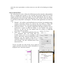
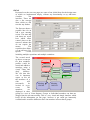
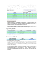
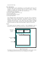
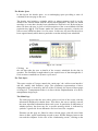
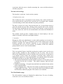
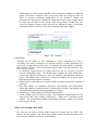
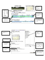
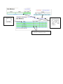
Human Computer Interaction
Design Report
By
James Thatcher
Joseph Tricklebank
Sapna Nunloll
Andy Bennett
Nisa Chitakasem
Alex Whitton
Design Report
THE TASK
We have been asked to design a regular meeting scheduler which might be used by
a club or society to inform it’s members of up and coming events and allow them
to specify whether they will be attending that event or not. The system is then
required to log this information and use it to decide whether the meeting is quorate
and will go ahead or not. We have also been asked to consider additional functions
such as reminders.
Design Framework
As a starting point for our design specification we came up with a set of constraints
which would form the design framework focusing in the four key areas of user,
system, task, environment (although environment has only a small impact on this
problem). Following our first meeting we had developed the following design
space.
User
2 Users
1. Co-ordinator
1.1. Trained
1.2. Flexible
1.3. Computer literate
1.4. Long-term organisation
2. Club Member
2.1. Untrained
2.2. Unknown computer literacy
2.3. Short term organisation
Task
Co-ordinator
1. Select club member to send to
1.1. Add/Remove member
1.2. Change member e- mail
1.3. Multiple e- mails for single user
2. Setup meetings
2.1. Change details
2.2. View replies so far
3. Archive of past meetings
4. Cancel meeting
Club Members
1. Select Yes/No
2. Change selection
3. View replies so far?
System
Environment
1. Send confirmation
Co-ordinator
2. Send reminders
Always same PC (probably)
3. Cancel Meetings if not quorum
Club Member
4. - Error Checking (Dates match and Anywhere
are in future etc.)
Design Specification
From our design framework it was quickly apparent that the vast majority of the
work was at the co-ordinators end, since we do not know how computer literate the
club member is. We decided that all the club member would want to do is select
whether or not they could attend the specified event, however we also thought that
the possibility of more complex member functions could be included through a
linked web interface, this will be covered in more detail later.
We outlined the co-ordinator’s main stages of user activity as defined below:
Goal
Co-ordinate and manage his club in a fast and efficient manner.
Sub-Goal
Send out information about events.
Edit database of members.
View replies to previously sent e- mails.
Tasks
Setup a meeting.
Send out e-mails.
Add new members.
Edit old member profiles.
This is the very basic user model that we will be working with. Our system should
allow the co-ordinator to perform these basic tasks intuitively and provide extra
functionality to facilitate his job without creating annoyance should he want to
perform the simple tasks quickly.
At this stage we felt that we had a good enough outline to try and decide which
design environment to use as different programming languages will provide a
different set of constraints on the design. Our options were fairly limited and it fell
to a choice between:
• A highly graphical interface such as Delphi which would require some
additional coding to create interaction between the system and the user
using e- mail and would be a fixed location hard drive based application.
• A more restrictive language such as HTML, PHP and MySQL which limit
your design in terms of the interfaces which can be produced, creating
custom I/O methods would be complex, but which is ideally suited to the
task with specific database and internet based data transfer functions built
in. This method also has the advantage of allowing the co-ordinator to use
the system from any work station, so long as a secure login was provided.
We felt that the second option was the best choice as the MySQL functions seemed
ideal suited to the task. Also using HTML it would be extremely easy to implement
a member’s website displaying information past and future meetings and who will
be attending the next meeting (special care would have to be taken not to breach
the data protection act).
Hierarchical Task Analysis
The very last stage of defining our design specification was to create a task
analysis for the user model defined on the previous page. This is represented on the
next page for the tasks of adding a meeting and adding a member. This is an
outline of the exact tasks our system must perform to
meet the users expectations, we then went on to use this in developing our design
ideas.
IDEA GENERATION
We all developed a series of ideas for different parts of the interface independently
then we brought them together in one meeting and decided which bits of what
design we liked from each persons ideas. We also found that the idea of a diary/email application crops up in many different places and we had a look at all of these
to gain ideas, both positive and negative. The three main applications we looked at
were:
• Hotmail – this online e-mail application has provisions for managing many
contacts, interesting features we noticed were the ability to easily add
multiple contacts to an e- mail and assigning nicknames as memory aides.
• Microsoft outlook – an organiser application although primarily used to
send/receive e- mails we liked the ability to sort contacts into groups.
However we did not like the method used for sorting or displaying
previously entered contacts.
• Apple iCal – a Macintosh application that acts
as a traditional diary. We found that iCal
actually allows you to do everything in this
project with all the required information clearly
displayed, the only negative being that it is
extremely difficult to add custom text to your email message. We have included some screen
shots from iCal.
Left we see how an event can be set to repeat at
regular and below shows how all the information is
displayed once it has been entered.
IDEAS
Presented over the next two pages are some of our initial ideas for the design some
of which we implemented simply, without any functionality to try and better
visualise
the
interface. There are
also a few concept
ideas which we did
not take any further.
The first one shows a
possible idea for an
add a new meeting
screen. The start and
end times use scroll
bars which allow
control down to the
nearest 5 minutes but
do not require the
mouse.
The
repetition box allows
you to add up to five
special
events
including multiple repetitions and multiple reminders.
The second mock
up shows a concept
for how members
Name
profiles could be
Exec
Name
sorted and added to
Name
meetings using a
Name
Name
visual “Drag and
drop”
interface.
Name
Name
Tab
We felt that this
Name
was in important
Old
aspect as not all
Drag & Drop
the members of a
club
will
Meeting
Meeting
necessarily
be
invited to every
12/03/04
19/03/04
event.
The
members
are
displayed in their
groups in a sort of Venn diagram. Groups or Individual members can then me
dragged into the relevant meeting. This is a very visual and simple interface which
keeps all the information on one page, however it get could get immensely
crowded and it would be difficult to have one member in more than 4 groups.
An alternative way of arranging club members in a clear and easily editable way is
displayed below. This uses a common everyday model of a logic grid to sort
members into groups. You would be able to sort by member name and by each
group. Again the number of groups would be limited but we felt that 5 or 6 groups
would be sufficient to accommodate all the members of the club. When the user
clicks on ‘Add member’ or ‘Edit groups’ blank text boxes appear in a new row or
column allowing the required information to be entered.
Using a similar template we created a sample main page which would be used to
display all the basic information about any scheduled meetings.
A page similar to this could be displayed on the web for general access by all the
members to give them information about all the up and coming meetings and who
will be attending each one. It could also be used to display past events and view the
minutes of that meeting.
We liked the above template for layout and colour and decided to take it forward to
implementation with a few minor changes (i.e. change the green cell colour as
green has associated mental connections.) and influences from the other ideas
discussed.
DIALOGUE STYLES
Direct Manipulation
We have focused on direct manipulation as our main method of data entry and
navigation. This involves rapid, incremental and reversible actions. Typing is
replaced by pointing and selecting, and the results of actions are visible
immediately. The benefits of using this style of interaction are:
1. control and display compatibility
2. less syntax, resulting in reduced error rates
3. more preventable errors
4. faster learning and higher retention
5. encouraged exploration
This determines that the main input device is the mouse. This is expected to
improve fluidity in usage of the interface. The keyboard is necessary only in the
following 2 cases, both of which with a relatively low frequency of usage, as
compared to that of the mouse: on the ‘add-an-event’ page, a textbox is available
should the user wish to include a message in the email to the members of the club,
and the club members list where names and members’ details are to be entered.
Layout
The interface has been designed to provide a ‘direct manipulation’ style of
interaction, with features such as drop-down menus, calendars and check boxes.
PERMANET
HEADER
SPACE
Club name and
picture
T
a
CALENDAR
T
a
CHANGEABLE
SPACE:
SCREEN
Fig.1. Interface layout
The display area allocated to the interface is separated into 2 main sections, namely
a non-changing permanent header space and a changing task area. (fig.1)
The Header Space
In this layout, the header space, as an unchanging space providing a sense of
continuity from one page to the ne xt.
The header also includes a calendar which, to reduce memory recall is set by
default to the current month with the current date highlighted. The dates for which
meetings or events have already been scheduled are shown in red. By hovering on
these red dates, the user is given a brief description of the event scheduled for that
particular day (fig.2). This feature makes the interaction responsive, whereby an
effect occurs within less than 0.1s of its cause. In this case, the need for the user to
know approximately which dates a particular event has already been scheduled.
Fig 2. The calendar
Clicking on
the red date takes the user to details of the event(s) scheduled for the date in
question. The flexibility brought about by the rapid access of data through this 2level structure contributes to dynamic exploration.
The Task Space
This space consists of 3 pages, namely the ‘main page’, the ‘add an event interface’
and the ‘modify club members’ page. The continuous representation of these
changeable pages is ensured by the use of tabs. Evidently, the layout of these pages
as being in a 3-compartment folder is in line with the implementation of a directmanipulation design style.
The Main Page
The main page provides the user with a quick overview of the events, with the
information displayed in tabular form. This allows the user to quickly scan all
the most important information about each event. In particular an indication of
whether quoracy has been met for a specific meeting, which is indicated by
symbols: a green tick for an affirmative and a red cross for a negative.
Elements on this page are linked to other relevant pages, with all active links
shown in blue, again contributing towards a more flexible dialogue between the
user and the computer. In the case of the ‘forthcoming events’, clicking on the
event name takes the user to details concerning the event and allows them to
edit these properties.
The Add an Event Page
This interface is split into 3 main sections, namely:
1. Details for the event.
This includes the title or description of the meeting. Once all the details have
been entered and the event has been saved the user is presented with a template
e-mail including to all the data which he may then personalise.
The date is selected in 2 steps, first involving the use of a drop-down menu, to
select the month and year, then clicking on the required date in the calendar.
The drop-down month and year lists are ideal in this instance as drop-downs are
very fast, reduce the need for user memorisation and reduce the likelihood of
errors.
The calendar model provides a familiar means of visual display to the user
which is extremely well known and highly intuitive.
2. Attendees.
Designed to allow the administrator to select which members are invited to a
particular meeting. The list is a compacted version of the address book, with the
members grouped into different categories as per requirements deemed
convenient by the user (see next section). For instance, in this case, different
groups include ‘novices’ and ‘board members’.
3. Repetition
This is an optional feature, should the meeting be a regular event it can be set to
repeat weekly, monthly by date, monthly by day or yearly. Also we have
allowed the administrator to ask for reminders to be sent out on a certain date or
a set number of days before the meeting(s). Obviously these options have
different sub-options so we have implemented a tree structure where sub options
are hidden until they are needed. The advantages of this include:
1. The internal classification of fields and the sequences of execution provide
a structure for the user to follow. This reduces memory load and eases
navigation.
2. Familiar terminology - Grouped items and labels are marked clearly and are
easily comprehensible.
3. Non-overlapping items - The lower level items are naturally associated with
a single higher level item. There is an obvious link between different stages
and selections within the program. This reduces user confusion.
The Club Members page
The club members’ names are displayed in tabular form. For ease of reading,
consecutive rows are of different colours.
Check boxes are used for this specific case to assign the members to different
groups. This allows members to be part of more than one group at a time. In
order to prevent accidental manipulation of the members’ details, the
information is displayed, by default, in a read-only format. If any changes are to
be made, the user has to click on the ‘Edit Group Names’ button first. The
‘cancel all changes’ button, which provides the additional option of nullifying
any modifications, is clearly visible at the bottom of this page. (fig.3)
Fig.3 Club Members
page
Consistency
Through out the design we have attempted to create consistency by using a
cascading style sheet. Consistency in interface design is vitally important as it
speeds up learning and prevents error. Consistency in colour makes commands
more intuitive. Below is a list of the main aspects of the style sheet and why they
have been set as such.
1. A continuous representation of certain objects by the use of tabs is present
between changeable pages. The header space remains the same (club name,
picture and calendar), providing a sense of continuity and familiarity between
pages. The display area consists of 2 sections throughout the program which
keeps general layout aspects consistent.
2. Tables used on each page are of similar formats and appear onscreen in standard
positions.
3. Text fonts chosen are consistent with their representation and functionality.
Titles and headers are shown in bold. Explanations of feature functionality and
user instructions appear in italic hyperlinks are in blue.
4. Terminology is kept simplistic and familiar throughout.
5. Colour coding is used to clarify sections. Each calendar representation uses the
same layout and colour coding (yellow/grey). Tables use a consistent colour
scheme. The selected and currently viewed page will show a white tab, with the
unseen pages brown.
HELP AND ERROR CHECKING
We will provide both a printed (paper-copy) user manual and an online user
manual for our product. An online help facility, tutorial and demonstration will
also be made available to aid user understanding.
User Manual
This will be divided into 2 main sections. The first section will introduce users to
the basic workings of the system, acting as a good way for users to ‘get-started’. A
brief overview of the key features and the most commonly used functions will be
described. By providing this initial introduction, users should be more aware of
the system’s basic functionality. It enables more eager users to try things out
almost immediately, therefore reducing user learning time, which in turn hopefully
increases user satisfaction.
The second section will be a more detailed description of all the features in the
program. It is there to be used as a reference manual and will cover the entire
system functionality. This will include step-by-step instructions and examples for
common sequences of actions as well as ‘trouble-shooting’ explanations for
possible errors or mistakes encountered by users.
A ‘table of contents’, ‘index’ and ‘glossary’ will be provided. The information
will aim to be easy to understand, keeping to simple and common terminology.
Sentences will be kept concise, instructions concrete and only relevant and correct
information will be presented. A priority in designing the manual will be to make
information easy to find. Entry points will be included and information will be
arranged logically.
The reason for having the user manual in both printed and electronic form is that
there are advantages and disadvantages associated with both. The printed format is
more traditional. However, by offering the online manual the text may be more
readily available to users since the user will be online if currently using the
meeting scheduler and may not have the printed manual to hand. It is also easier
for some users to store and access an electronic version of the manual than the
printed copy.
On the other hand, reading from displays does have the potential to make
information harder to read and absorb. The emitted light from displays may cause
difficulty in reading as opposed to reflected light from paper since there may be a
greater glare. Displays are fixed which may limit certain aspects associated with
reading, for example the reading distance of the manual may be greater than for a
paper copy, and the placement of the screen could be too high/low for comfortable
reading. It is also often hard to display the information in help and the application
at the same time if the help is on screen, where as this is very easy when using a
paper manual. Reduced hand-body motion is linked to reading off displays. These
limitations on movement and the encouragement of rigid postures can lead to
fatigue.
Online Help
Here we have 2 options for online help that could be provided for the user. The
first would be a simple alphabetical list of keywords which the user can select from
a ‘help’ menu item. This would involve the clicking of the mouse cursor and a
user selection of displayed command names, which would result in a short
paragraph explanation of the selected command. However, this method may be
confusing for new users since there can be confusion between command names
leading to frustration and stress.
A second help method could be to have pop-up messages appearing onscreen once
the cursor moves across certain parts of the display. This may irritate the
knowledgeable user or those who do not need guidance. Therefore, an alternative
would be to provide a ‘help’ key or button within each section of the program that
could be pressed when needed. Each display page would have its respective ‘help’
button which would lead onto information relevant for that particular display page
and the available features onscreen. The online help system will be made easy to
access and easy to return from.
Online Tutorial/Demonstration
An online tutorial is used to teach the novice user the general functions of the
program by showing simulations of the working system. The user can see
sequences of actions take place but will also be able to direct the demonstration to
different features of the product. This method is a good hand s-on way to engage
the user in interactive sessions and to increase familiarity with the system rapidly.
Each section (add event, add member etc) will be shown in sequence with the
potential use of animations to help direct and explain certain steps and options
available. The user will have the option to interact with the tutorial or to simply
watch a chosen series of actions as a demonstration of system functionality.
Advantages of the tutorial/demonstration system are that the attention of the user
will not be constantly shifting between the terminal and the instructional material.
The user can focus on ‘learning-by-seeing’. Therefore, the skills needed to operate
the meeting scheduler will be acquired faster. The tutorial/demonstration can also
be viewed by the individual user alone without the possibility of embarrassment of
mistakes made before other club members.
Error Checking
The system performs error checking to ensure that the user has not entered and data
which contravenes the laws of the universe, such as, not scheduling meetings in the
past etc.
Walk Through
Clicking here will change the year
Clicking here will change the month
Clicking
here
confirms
date
Clicking
here
will
take you to
the
add
event
and
edit
members
sections
Clicking
these
will allow you to
amend the event
Allows description
of meeting to be
added
Clicking these
will allow you
to view the
attendees
Clicking here will
announce the event
to the attendees via
email
Highlighting
people selects
them to be
attendees
Can set the time
for the meeting
Can set whether
the meeting will
be repeated
Changing
this
will set the % of
attendees needed
to make the
meeting viable
Sets
miscellaneous
options
Affirms
choices
and sends out
email to attendees
Hovering over
names brings
up
their
associated
email address
Clicking
on
these will change
the appearance
of the page to
allow you to edit
groups
and
members
Clicking on check boxes assigns
members to different groups