1
http://docs.scala.com/display/D1100/
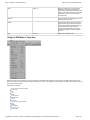
1. Designer 11.00 . . . . . . . . . . . . . . . . . . . . . . . . . . . . . . . . . . . . . . . . . . . . . . . . . . . . . . . . . . . . . . . . . . . . . . . . . . . . . . . . . . . . . . . . . . . . . .
1.1 Introducing Designer . . . . . . . . . . . . . . . . . . . . . . . . . . . . . . . . . . . . . . . . . . . . . . . . . . . . . . . . . . . . . . . . . . . . . . . . . . . . . . . . . . . . .
1.1.1 Primer . . . . . . . . . . . . . . . . . . . . . . . . . . . . . . . . . . . . . . . . . . . . . . . . . . . . . . . . . . . . . . . . . . . . . . . . . . . . . . . . . . . . . . . . . . .
1.1.1.1 UI Overview . . . . . . . . . . . . . . . . . . . . . . . . . . . . . . . . . . . . . . . . . . . . . . . . . . . . . . . . . . . . . . . . . . . . . . . . . . . . . . . . . .
1.1.1.2 Tips and Tricks . . . . . . . . . . . . . . . . . . . . . . . . . . . . . . . . . . . . . . . . . . . . . . . . . . . . . . . . . . . . . . . . . . . . . . . . . . . . . . .
1.1.1.2.1 Context Menus . . . . . . . . . . . . . . . . . . . . . . . . . . . . . . . . . . . . . . . . . . . . . . . . . . . . . . . . . . . . . . . . . . . . . . . . . . .
1.1.1.2.2 The F1 Key IS Your Friend . . . . . . . . . . . . . . . . . . . . . . . . . . . . . . . . . . . . . . . . . . . . . . . . . . . . . . . . . . . . . . . . .
1.1.2 Installing Designer . . . . . . . . . . . . . . . . . . . . . . . . . . . . . . . . . . . . . . . . . . . . . . . . . . . . . . . . . . . . . . . . . . . . . . . . . . . . . . . . . .
1.1.2.1 Advanced Configuration Options for Designer . . . . . . . . . . . . . . . . . . . . . . . . . . . . . . . . . . . . . . . . . . . . . . . . . . . . . . .
1.1.3 Getting Started . . . . . . . . . . . . . . . . . . . . . . . . . . . . . . . . . . . . . . . . . . . . . . . . . . . . . . . . . . . . . . . . . . . . . . . . . . . . . . . . . . . .
1.1.3.1 Starting Designer . . . . . . . . . . . . . . . . . . . . . . . . . . . . . . . . . . . . . . . . . . . . . . . . . . . . . . . . . . . . . . . . . . . . . . . . . . . . . .
1.1.3.2 Creating a Script . . . . . . . . . . . . . . . . . . . . . . . . . . . . . . . . . . . . . . . . . . . . . . . . . . . . . . . . . . . . . . . . . . . . . . . . . . . . . .
1.1.3.3 Publishing a Script . . . . . . . . . . . . . . . . . . . . . . . . . . . . . . . . . . . . . . . . . . . . . . . . . . . . . . . . . . . . . . . . . . . . . . . . . . . . .
1.1.3.4 Sharing and Archiving a Script . . . . . . . . . . . . . . . . . . . . . . . . . . . . . . . . . . . . . . . . . . . . . . . . . . . . . . . . . . . . . . . . . . .
1.1.3.5 Doing More with Designer . . . . . . . . . . . . . . . . . . . . . . . . . . . . . . . . . . . . . . . . . . . . . . . . . . . . . . . . . . . . . . . . . . . . . . .
1.1.3.6 Getting Updates . . . . . . . . . . . . . . . . . . . . . . . . . . . . . . . . . . . . . . . . . . . . . . . . . . . . . . . . . . . . . . . . . . . . . . . . . . . . . . .
1.2 Working in the Main View . . . . . . . . . . . . . . . . . . . . . . . . . . . . . . . . . . . . . . . . . . . . . . . . . . . . . . . . . . . . . . . . . . . . . . . . . . . . . . . . .
1.2.1 Main View Toolbar . . . . . . . . . . . . . . . . . . . . . . . . . . . . . . . . . . . . . . . . . . . . . . . . . . . . . . . . . . . . . . . . . . . . . . . . . . . . . . . . . .
1.2.1.1 Main View Toolbar: New . . . . . . . . . . . . . . . . . . . . . . . . . . . . . . . . . . . . . . . . . . . . . . . . . . . . . . . . . . . . . . . . . . . . . . . .
1.2.1.2 Main View Toolbar: Open . . . . . . . . . . . . . . . . . . . . . . . . . . . . . . . . . . . . . . . . . . . . . . . . . . . . . . . . . . . . . . . . . . . . . . .
1.2.1.3 Main View Toolbar: Save . . . . . . . . . . . . . . . . . . . . . . . . . . . . . . . . . . . . . . . . . . . . . . . . . . . . . . . . . . . . . . . . . . . . . . . .
1.2.1.4 Main View Toolbar: Add . . . . . . . . . . . . . . . . . . . . . . . . . . . . . . . . . . . . . . . . . . . . . . . . . . . . . . . . . . . . . . . . . . . . . . . .
1.2.1.4.1 Adding a Page from a Media File . . . . . . . . . . . . . . . . . . . . . . . . . . . . . . . . . . . . . . . . . . . . . . . . . . . . . . . . . . . .
1.2.1.4.2 Adding a Plain Background Page . . . . . . . . . . . . . . . . . . . . . . . . . . . . . . . . . . . . . . . . . . . . . . . . . . . . . . . . . . . .
1.2.1.4.3 Adding a Special Event Page . . . . . . . . . . . . . . . . . . . . . . . . . . . . . . . . . . . . . . . . . . . . . . . . . . . . . . . . . . . . . . .
1.2.1.4.4 Adding a Streaming Video Page . . . . . . . . . . . . . . . . . . . . . . . . . . . . . . . . . . . . . . . . . . . . . . . . . . . . . . . . . . . . .
1.2.1.4.5 Adding a Page using Drag and Drop . . . . . . . . . . . . . . . . . . . . . . . . . . . . . . . . . . . . . . . . . . . . . . . . . . . . . . . . . .
1.2.1.5 Main View Toolbar: Edit Page . . . . . . . . . . . . . . . . . . . . . . . . . . . . . . . . . . . . . . . . . . . . . . . . . . . . . . . . . . . . . . . . . . . .
1.2.1.6 Main View Toolbar: Cut, Copy and Paste . . . . . . . . . . . . . . . . . . . . . . . . . . . . . . . . . . . . . . . . . . . . . . . . . . . . . . . . . . .
1.2.1.7 Main View Toolbar: Undo and Redo . . . . . . . . . . . . . . . . . . . . . . . . . . . . . . . . . . . . . . . . . . . . . . . . . . . . . . . . . . . . . . .
1.2.1.8 Main View Toolbar: List . . . . . . . . . . . . . . . . . . . . . . . . . . . . . . . . . . . . . . . . . . . . . . . . . . . . . . . . . . . . . . . . . . . . . . . . .
1.2.1.9 Main View Toolbar: Publish . . . . . . . . . . . . . . . . . . . . . . . . . . . . . . . . . . . . . . . . . . . . . . . . . . . . . . . . . . . . . . . . . . . . . .
1.2.1.10 Main View Toolbar: Print . . . . . . . . . . . . . . . . . . . . . . . . . . . . . . . . . . . . . . . . . . . . . . . . . . . . . . . . . . . . . . . . . . . . . . .
1.2.1.10.1 ScalaPrint - General . . . . . . . . . . . . . . . . . . . . . . . . . . . . . . . . . . . . . . . . . . . . . . . . . . . . . . . . . . . . . . . . . . . . . .
1.2.1.10.2 ScalaPrint - Layout . . . . . . . . . . . . . . . . . . . . . . . . . . . . . . . . . . . . . . . . . . . . . . . . . . . . . . . . . . . . . . . . . . . . . . .
1.2.1.10.3 ScalaPrint - Labeling . . . . . . . . . . . . . . . . . . . . . . . . . . . . . . . . . . . . . . . . . . . . . . . . . . . . . . . . . . . . . . . . . . . . .
1.2.1.10.4 ScalaPrint - Margins . . . . . . . . . . . . . . . . . . . . . . . . . . . . . . . . . . . . . . . . . . . . . . . . . . . . . . . . . . . . . . . . . . . . . .
1.2.1.10.5 ScalaPrint - Printer . . . . . . . . . . . . . . . . . . . . . . . . . . . . . . . . . . . . . . . . . . . . . . . . . . . . . . . . . . . . . . . . . . . . . . .
1.2.1.11 Main View Toolbar: Preview and Play . . . . . . . . . . . . . . . . . . . . . . . . . . . . . . . . . . . . . . . . . . . . . . . . . . . . . . . . . . . . .
1.2.2 Main View Menus . . . . . . . . . . . . . . . . . . . . . . . . . . . . . . . . . . . . . . . . . . . . . . . . . . . . . . . . . . . . . . . . . . . . . . . . . . . . . . . . . .
1.2.2.1 Using the File Menu in Main View . . . . . . . . . . . . . . . . . . . . . . . . . . . . . . . . . . . . . . . . . . . . . . . . . . . . . . . . . . . . . . . . .
1.2.2.1.1 Collecting a Script . . . . . . . . . . . . . . . . . . . . . . . . . . . . . . . . . . . . . . . . . . . . . . . . . . . . . . . . . . . . . . . . . . . . . . . .
1.2.2.2 Using the Edit Menu in Main View . . . . . . . . . . . . . . . . . . . . . . . . . . . . . . . . . . . . . . . . . . . . . . . . . . . . . . . . . . . . . . . . .
1.2.2.3 Using the Add Menu in Main View . . . . . . . . . . . . . . . . . . . . . . . . . . . . . . . . . . . . . . . . . . . . . . . . . . . . . . . . . . . . . . . . .
1.2.2.4 Using the View Menu in Main View . . . . . . . . . . . . . . . . . . . . . . . . . . . . . . . . . . . . . . . . . . . . . . . . . . . . . . . . . . . . . . . .
1.2.2.5 Using the Tools Menu in Main View . . . . . . . . . . . . . . . . . . . . . . . . . . . . . . . . . . . . . . . . . . . . . . . . . . . . . . . . . . . . . . .
1.2.2.5.1 Using the Multi-Tile Editor . . . . . . . . . . . . . . . . . . . . . . . . . . . . . . . . . . . . . . . . . . . . . . . . . . . . . . . . . . . . . . . . . .
1.2.2.5.2 Using the Spell Checker . . . . . . . . . . . . . . . . . . . . . . . . . . . . . . . . . . . . . . . . . . . . . . . . . . . . . . . . . . . . . . . . . . .
1.2.2.5.3 Designer Tool Options . . . . . . . . . . . . . . . . . . . . . . . . . . . . . . . . . . . . . . . . . . . . . . . . . . . . . . . . . . . . . . . . . . . . .
1.2.2.6 Using the Help menu in Main View . . . . . . . . . . . . . . . . . . . . . . . . . . . . . . . . . . . . . . . . . . . . . . . . . . . . . . . . . . . . . . . .
1.2.3 Columns--EXtension Modules . . . . . . . . . . . . . . . . . . . . . . . . . . . . . . . . . . . . . . . . . . . . . . . . . . . . . . . . . . . . . . . . . . . . . . . . .
1.2.3.1 No.--Number . . . . . . . . . . . . . . . . . . . . . . . . . . . . . . . . . . . . . . . . . . . . . . . . . . . . . . . . . . . . . . . . . . . . . . . . . . . . . . . . .
1.2.3.2 Name . . . . . . . . . . . . . . . . . . . . . . . . . . . . . . . . . . . . . . . . . . . . . . . . . . . . . . . . . . . . . . . . . . . . . . . . . . . . . . . . . . . . . . .
1.2.3.3 Background . . . . . . . . . . . . . . . . . . . . . . . . . . . . . . . . . . . . . . . . . . . . . . . . . . . . . . . . . . . . . . . . . . . . . . . . . . . . . . . . . .
1.2.3.4 Transition . . . . . . . . . . . . . . . . . . . . . . . . . . . . . . . . . . . . . . . . . . . . . . . . . . . . . . . . . . . . . . . . . . . . . . . . . . . . . . . . . . . .
1.2.3.5 Timing . . . . . . . . . . . . . . . . . . . . . . . . . . . . . . . . . . . . . . . . . . . . . . . . . . . . . . . . . . . . . . . . . . . . . . . . . . . . . . . . . . . . . .
1.2.3.6 Variables . . . . . . . . . . . . . . . . . . . . . . . . . . . . . . . . . . . . . . . . . . . . . . . . . . . . . . . . . . . . . . . . . . . . . . . . . . . . . . . . . . . .
1.2.3.6.1 Tab: Condition . . . . . . . . . . . . . . . . . . . . . . . . . . . . . . . . . . . . . . . . . . . . . . . . . . . . . . . . . . . . . . . . . . . . . . . . . . .
1.2.3.6.2 Tab: Set Variable . . . . . . . . . . . . . . . . . . . . . . . . . . . . . . . . . . . . . . . . . . . . . . . . . . . . . . . . . . . . . . . . . . . . . . . . .
1.2.3.6.3 Tab: Repeat . . . . . . . . . . . . . . . . . . . . . . . . . . . . . . . . . . . . . . . . . . . . . . . . . . . . . . . . . . . . . . . . . . . . . . . . . . . . .
1.2.3.6.4 Tab: Go To . . . . . . . . . . . . . . . . . . . . . . . . . . . . . . . . . . . . . . . . . . . . . . . . . . . . . . . . . . . . . . . . . . . . . . . . . . . . . .
1.2.3.7 Data Source . . . . . . . . . . . . . . . . . . . . . . . . . . . . . . . . . . . . . . . . . . . . . . . . . . . . . . . . . . . . . . . . . . . . . . . . . . . . . . . . . .
1.2.3.7.1 Tab: Source . . . . . . . . . . . . . . . . . . . . . . . . . . . . . . . . . . . . . . . . . . . . . . . . . . . . . . . . . . . . . . . . . . . . . . . . . . . . .
1.2.3.7.2 Tab: Counters and Indexes . . . . . . . . . . . . . . . . . . . . . . . . . . . . . . . . . . . . . . . . . . . . . . . . . . . . . . . . . . . . . . . . .
1.2.3.8 Input . . . . . . . . . . . . . . . . . . . . . . . . . . . . . . . . . . . . . . . . . . . . . . . . . . . . . . . . . . . . . . . . . . . . . . . . . . . . . . . . . . . . . . . .
1.2.3.8.1 Tab: Button Controls . . . . . . . . . . . . . . . . . . . . . . . . . . . . . . . . . . . . . . . . . . . . . . . . . . . . . . . . . . . . . . . . . . . . . .
1.2.3.8.2 Tab: Mouse Pointer . . . . . . . . . . . . . . . . . . . . . . . . . . . . . . . . . . . . . . . . . . . . . . . . . . . . . . . . . . . . . . . . . . . . . . .
1.2.3.8.3 Tab: Slideshow Controls . . . . . . . . . . . . . . . . . . . . . . . . . . . . . . . . . . . . . . . . . . . . . . . . . . . . . . . . . . . . . . . . . . .
1.2.3.9 Sound . . . . . . . . . . . . . . . . . . . . . . . . . . . . . . . . . . . . . . . . . . . . . . . . . . . . . . . . . . . . . . . . . . . . . . . . . . . . . . . . . . . . . .
1.2.3.10 Launch . . . . . . . . . . . . . . . . . . . . . . . . . . . . . . . . . . . . . . . . . . . . . . . . . . . . . . . . . . . . . . . . . . . . . . . . . . . . . . . . . . . . .
1.2.3.11 Log . . . . . . . . . . . . . . . . . . . . . . . . . . . . . . . . . . . . . . . . . . . . . . . . . . . . . . . . . . . . . . . . . . . . . . . . . . . . . . . . . . . . . . . .
1.2.3.12 Schedule . . . . . . . . . . . . . . . . . . . . . . . . . . . . . . . . . . . . . . . . . . . . . . . . . . . . . . . . . . . . . . . . . . . . . . . . . . . . . . . . . . .
4
4
5
6
8
8
8
9
15
22
22
23
32
33
34
34
34
35
36
37
37
38
38
40
40
40
41
41
42
42
43
44
45
46
47
47
48
48
48
49
49
50
51
51
52
52
53
54
56
60
61
62
62
62
62
62
63
63
63
64
64
65
66
67
68
68
68
69
69
69
69
70
Page 1
http://docs.scala.com/display/D1100/
1.2.3.12.1 Schedule Panel . . . . . . . . . . . . . . . . . . . . . . . . . . . . . . . . . . . . . . . . . . . . . . . . . . . . . . . . . . . . . . . . . . . . . . . . .
1.2.3.13 Textfile . . . . . . . . . . . . . . . . . . . . . . . . . . . . . . . . . . . . . . . . . . . . . . . . . . . . . . . . . . . . . . . . . . . . . . . . . . . . . . . . . . . . .
1.2.3.14 WinScript . . . . . . . . . . . . . . . . . . . . . . . . . . . . . . . . . . . . . . . . . . . . . . . . . . . . . . . . . . . . . . . . . . . . . . . . . . . . . . . . . . .
1.2.3.15 Playback Audit . . . . . . . . . . . . . . . . . . . . . . . . . . . . . . . . . . . . . . . . . . . . . . . . . . . . . . . . . . . . . . . . . . . . . . . . . . . . . . .
1.2.3.16 Optional Modules . . . . . . . . . . . . . . . . . . . . . . . . . . . . . . . . . . . . . . . . . . . . . . . . . . . . . . . . . . . . . . . . . . . . . . . . . . . . .
1.2.3.17 Customizing Columns . . . . . . . . . . . . . . . . . . . . . . . . . . . . . . . . . . . . . . . . . . . . . . . . . . . . . . . . . . . . . . . . . . . . . . . . .
1.2.4 Working with Pages . . . . . . . . . . . . . . . . . . . . . . . . . . . . . . . . . . . . . . . . . . . . . . . . . . . . . . . . . . . . . . . . . . . . . . . . . . . . . . . . .
1.2.4.1 Administrating Pages . . . . . . . . . . . . . . . . . . . . . . . . . . . . . . . . . . . . . . . . . . . . . . . . . . . . . . . . . . . . . . . . . . . . . . . . . . .
1.2.4.1.1 Selecting a Page(s) . . . . . . . . . . . . . . . . . . . . . . . . . . . . . . . . . . . . . . . . . . . . . . . . . . . . . . . . . . . . . . . . . . . . . . .
1.2.4.1.2 Moving Pages . . . . . . . . . . . . . . . . . . . . . . . . . . . . . . . . . . . . . . . . . . . . . . . . . . . . . . . . . . . . . . . . . . . . . . . . . . .
1.2.4.1.3 Copying Pages . . . . . . . . . . . . . . . . . . . . . . . . . . . . . . . . . . . . . . . . . . . . . . . . . . . . . . . . . . . . . . . . . . . . . . . . . . .
1.2.4.1.4 Deleting Pages . . . . . . . . . . . . . . . . . . . . . . . . . . . . . . . . . . . . . . . . . . . . . . . . . . . . . . . . . . . . . . . . . . . . . . . . . . .
1.2.4.1.5 Disabling Pages . . . . . . . . . . . . . . . . . . . . . . . . . . . . . . . . . . . . . . . . . . . . . . . . . . . . . . . . . . . . . . . . . . . . . . . . . .
1.2.4.1.6 Grouping Pages . . . . . . . . . . . . . . . . . . . . . . . . . . . . . . . . . . . . . . . . . . . . . . . . . . . . . . . . . . . . . . . . . . . . . . . . . .
1.2.5 Adjusting Script Properties . . . . . . . . . . . . . . . . . . . . . . . . . . . . . . . . . . . . . . . . . . . . . . . . . . . . . . . . . . . . . . . . . . . . . . . . . . .
1.2.6 Closing a Script . . . . . . . . . . . . . . . . . . . . . . . . . . . . . . . . . . . . . . . . . . . . . . . . . . . . . . . . . . . . . . . . . . . . . . . . . . . . . . . . . . . .
1.2.7 Quitting Designer . . . . . . . . . . . . . . . . . . . . . . . . . . . . . . . . . . . . . . . . . . . . . . . . . . . . . . . . . . . . . . . . . . . . . . . . . . . . . . . . . . .
1.3 Working in the Page View . . . . . . . . . . . . . . . . . . . . . . . . . . . . . . . . . . . . . . . . . . . . . . . . . . . . . . . . . . . . . . . . . . . . . . . . . . . . . . . . .
1.3.1 Page View Toolbar . . . . . . . . . . . . . . . . . . . . . . . . . . . . . . . . . . . . . . . . . . . . . . . . . . . . . . . . . . . . . . . . . . . . . . . . . . . . . . . . .
1.3.1.1 Page View Toolbar: Add . . . . . . . . . . . . . . . . . . . . . . . . . . . . . . . . . . . . . . . . . . . . . . . . . . . . . . . . . . . . . . . . . . . . . . . .
1.3.1.1.1 Add a Clip Element . . . . . . . . . . . . . . . . . . . . . . . . . . . . . . . . . . . . . . . . . . . . . . . . . . . . . . . . . . . . . . . . . . . . . . .
1.3.1.1.2 Add a Movie Clip Element . . . . . . . . . . . . . . . . . . . . . . . . . . . . . . . . . . . . . . . . . . . . . . . . . . . . . . . . . . . . . . . . . .
1.3.1.1.3 Add a Special Event . . . . . . . . . . . . . . . . . . . . . . . . . . . . . . . . . . . . . . . . . . . . . . . . . . . . . . . . . . . . . . . . . . . . . . .
1.3.1.1.4 Add a Text Element . . . . . . . . . . . . . . . . . . . . . . . . . . . . . . . . . . . . . . . . . . . . . . . . . . . . . . . . . . . . . . . . . . . . . . .
1.3.1.1.5 Add a Text Box Element . . . . . . . . . . . . . . . . . . . . . . . . . . . . . . . . . . . . . . . . . . . . . . . . . . . . . . . . . . . . . . . . . . .
1.3.1.1.6 Add a Text Crawl Element . . . . . . . . . . . . . . . . . . . . . . . . . . . . . . . . . . . . . . . . . . . . . . . . . . . . . . . . . . . . . . . . . .
1.3.1.1.7 Add a Text Entry Field Element . . . . . . . . . . . . . . . . . . . . . . . . . . . . . . . . . . . . . . . . . . . . . . . . . . . . . . . . . . . . . .
1.3.1.1.8 Add a Table Element . . . . . . . . . . . . . . . . . . . . . . . . . . . . . . . . . . . . . . . . . . . . . . . . . . . . . . . . . . . . . . . . . . . . . .
1.3.1.1.9 Add a Box Element . . . . . . . . . . . . . . . . . . . . . . . . . . . . . . . . . . . . . . . . . . . . . . . . . . . . . . . . . . . . . . . . . . . . . . .
1.3.1.1.10 Add a Oval Element . . . . . . . . . . . . . . . . . . . . . . . . . . . . . . . . . . . . . . . . . . . . . . . . . . . . . . . . . . . . . . . . . . . . . .
1.3.1.1.11 Add a Line Element . . . . . . . . . . . . . . . . . . . . . . . . . . . . . . . . . . . . . . . . . . . . . . . . . . . . . . . . . . . . . . . . . . . . . .
1.3.1.1.12 Add a Streaming Video Clip Element . . . . . . . . . . . . . . . . . . . . . . . . . . . . . . . . . . . . . . . . . . . . . . . . . . . . . . . . .
1.3.1.1.13 Add Web Clip Element . . . . . . . . . . . . . . . . . . . . . . . . . . . . . . . . . . . . . . . . . . . . . . . . . . . . . . . . . . . . . . . . . . . .
1.3.1.1.14 Add TV Clip Element . . . . . . . . . . . . . . . . . . . . . . . . . . . . . . . . . . . . . . . . . . . . . . . . . . . . . . . . . . . . . . . . . . . . .
1.3.1.1.15 Add a Flash Clip Element . . . . . . . . . . . . . . . . . . . . . . . . . . . . . . . . . . . . . . . . . . . . . . . . . . . . . . . . . . . . . . . . .
1.3.1.2 Page View Toolbar: Cut, Copy and Paste . . . . . . . . . . . . . . . . . . . . . . . . . . . . . . . . . . . . . . . . . . . . . . . . . . . . . . . . . . .
1.3.1.3 Page View Toolbar: Zoom Level . . . . . . . . . . . . . . . . . . . . . . . . . . . . . . . . . . . . . . . . . . . . . . . . . . . . . . . . . . . . . . . . . .
1.3.1.4 Page View Toolbar: Undo and Redo . . . . . . . . . . . . . . . . . . . . . . . . . . . . . . . . . . . . . . . . . . . . . . . . . . . . . . . . . . . . . . .
1.3.1.5 Page View Toolbar: Element . . . . . . . . . . . . . . . . . . . . . . . . . . . . . . . . . . . . . . . . . . . . . . . . . . . . . . . . . . . . . . . . . . . . .
1.3.1.5.1 Working with Design Panels . . . . . . . . . . . . . . . . . . . . . . . . . . . . . . . . . . . . . . . . . . . . . . . . . . . . . . . . . . . . . . . .
1.3.1.6 Page View Toolbar: Background . . . . . . . . . . . . . . . . . . . . . . . . . . . . . . . . . . . . . . . . . . . . . . . . . . . . . . . . . . . . . . . . . .
1.3.1.7 Page View Toolbar: List . . . . . . . . . . . . . . . . . . . . . . . . . . . . . . . . . . . . . . . . . . . . . . . . . . . . . . . . . . . . . . . . . . . . . . . . .
1.3.1.7.1 Working with the List Panel . . . . . . . . . . . . . . . . . . . . . . . . . . . . . . . . . . . . . . . . . . . . . . . . . . . . . . . . . . . . . . . . .
1.3.1.8 Page View Toolbar: Buttons . . . . . . . . . . . . . . . . . . . . . . . . . . . . . . . . . . . . . . . . . . . . . . . . . . . . . . . . . . . . . . . . . . . . .
1.3.1.8.1 Design Buttons Panel . . . . . . . . . . . . . . . . . . . . . . . . . . . . . . . . . . . . . . . . . . . . . . . . . . . . . . . . . . . . . . . . . . . . .
1.3.1.9 Page View Toolbar: Palette . . . . . . . . . . . . . . . . . . . . . . . . . . . . . . . . . . . . . . . . . . . . . . . . . . . . . . . . . . . . . . . . . . . . . .
1.3.1.10 Page View Toolbar: Preview . . . . . . . . . . . . . . . . . . . . . . . . . . . . . . . . . . . . . . . . . . . . . . . . . . . . . . . . . . . . . . . . . . . .
1.3.1.11 Page View Toolbar: Main . . . . . . . . . . . . . . . . . . . . . . . . . . . . . . . . . . . . . . . . . . . . . . . . . . . . . . . . . . . . . . . . . . . . . . .
1.3.2 Page View Menus . . . . . . . . . . . . . . . . . . . . . . . . . . . . . . . . . . . . . . . . . . . . . . . . . . . . . . . . . . . . . . . . . . . . . . . . . . . . . . . . . .
1.3.2.1 Using the File Menu in Page View . . . . . . . . . . . . . . . . . . . . . . . . . . . . . . . . . . . . . . . . . . . . . . . . . . . . . . . . . . . . . . . . .
1.3.2.2 Using the Edit Menu in Page View . . . . . . . . . . . . . . . . . . . . . . . . . . . . . . . . . . . . . . . . . . . . . . . . . . . . . . . . . . . . . . . .
1.3.2.3 Using the Add Menu in Page View . . . . . . . . . . . . . . . . . . . . . . . . . . . . . . . . . . . . . . . . . . . . . . . . . . . . . . . . . . . . . . . .
1.3.2.4 Using the View Menu in Page View . . . . . . . . . . . . . . . . . . . . . . . . . . . . . . . . . . . . . . . . . . . . . . . . . . . . . . . . . . . . . . . .
1.3.2.5 Using the Tools Menu in Page View . . . . . . . . . . . . . . . . . . . . . . . . . . . . . . . . . . . . . . . . . . . . . . . . . . . . . . . . . . . . . . .
1.3.2.5.1 Using Grid Points . . . . . . . . . . . . . . . . . . . . . . . . . . . . . . . . . . . . . . . . . . . . . . . . . . . . . . . . . . . . . . . . . . . . . . . . .
1.3.2.5.2 Using Guide Lines . . . . . . . . . . . . . . . . . . . . . . . . . . . . . . . . . . . . . . . . . . . . . . . . . . . . . . . . . . . . . . . . . . . . . . . .
1.3.2.6 Using the Help Menu in Page View . . . . . . . . . . . . . . . . . . . . . . . . . . . . . . . . . . . . . . . . . . . . . . . . . . . . . . . . . . . . . . . .
1.3.3 Element Selection, Moving and Manipulation . . . . . . . . . . . . . . . . . . . . . . . . . . . . . . . . . . . . . . . . . . . . . . . . . . . . . . . . . . . . .
1.3.4 Working with Off-Page Elements . . . . . . . . . . . . . . . . . . . . . . . . . . . . . . . . . . . . . . . . . . . . . . . . . . . . . . . . . . . . . . . . . . . . . .
1.4 Working with Templates . . . . . . . . . . . . . . . . . . . . . . . . . . . . . . . . . . . . . . . . . . . . . . . . . . . . . . . . . . . . . . . . . . . . . . . . . . . . . . . . . .
1.4.1 Template Creation . . . . . . . . . . . . . . . . . . . . . . . . . . . . . . . . . . . . . . . . . . . . . . . . . . . . . . . . . . . . . . . . . . . . . . . . . . . . . . . . . .
1.5 Working with Add-ons . . . . . . . . . . . . . . . . . . . . . . . . . . . . . . . . . . . . . . . . . . . . . . . . . . . . . . . . . . . . . . . . . . . . . . . . . . . . . . . . . . . .
1.5.1 Using the Scala Photoshop Export Plug-In . . . . . . . . . . . . . . . . . . . . . . . . . . . . . . . . . . . . . . . . . . . . . . . . . . . . . . . . . . . . . . .
1.5.2 Using Scala Publish Automation EX Module . . . . . . . . . . . . . . . . . . . . . . . . . . . . . . . . . . . . . . . . . . . . . . . . . . . . . . . . . . . . . .
1.6 Integrating Data . . . . . . . . . . . . . . . . . . . . . . . . . . . . . . . . . . . . . . . . . . . . . . . . . . . . . . . . . . . . . . . . . . . . . . . . . . . . . . . . . . . . . . . . .
1.7 Scripting and Automation . . . . . . . . . . . . . . . . . . . . . . . . . . . . . . . . . . . . . . . . . . . . . . . . . . . . . . . . . . . . . . . . . . . . . . . . . . . . . . . . .
1.7.1 The ScalaScript Language . . . . . . . . . . . . . . . . . . . . . . . . . . . . . . . . . . . . . . . . . . . . . . . . . . . . . . . . . . . . . . . . . . . . . . . . . . .
1.7.1.1 ScalaScript Structure . . . . . . . . . . . . . . . . . . . . . . . . . . . . . . . . . . . . . . . . . . . . . . . . . . . . . . . . . . . . . . . . . . . . . . . . . . .
1.7.1.2 Lexical Rules . . . . . . . . . . . . . . . . . . . . . . . . . . . . . . . . . . . . . . . . . . . . . . . . . . . . . . . . . . . . . . . . . . . . . . . . . . . . . . . . .
1.7.1.3 ScalaScript Syntax . . . . . . . . . . . . . . . . . . . . . . . . . . . . . . . . . . . . . . . . . . . . . . . . . . . . . . . . . . . . . . . . . . . . . . . . . . . .
1.7.1.4 Event Names . . . . . . . . . . . . . . . . . . . . . . . . . . . . . . . . . . . . . . . . . . . . . . . . . . . . . . . . . . . . . . . . . . . . . . . . . . . . . . . . .
1.7.1.5 ScalaScript Variables . . . . . . . . . . . . . . . . . . . . . . . . . . . . . . . . . . . . . . . . . . . . . . . . . . . . . . . . . . . . . . . . . . . . . . . . . . .
71
73
73
74
75
75
75
75
76
76
76
76
77
77
78
78
78
78
79
80
80
82
83
83
84
85
86
87
88
89
89
90
91
92
93
94
94
95
96
96
122
123
123
125
126
131
133
133
133
133
134
136
137
139
140
141
142
143
144
144
145
147
147
148
148
149
150
150
156
163
170
173
Page 2
http://docs.scala.com/display/D1100/
1.7.1.6 Core ScalaScript Commands . . . . . . . . . . . . . . . . . . . . . . . . . . . . . . . . . . . . . . . . . . . . . . . . . . . . . . . . . . . . . . . . . . . .
1.7.1.7 Core ScalaScript Functions and Variables . . . . . . . . . . . . . . . . . . . . . . . . . . . . . . . . . . . . . . . . . . . . . . . . . . . . . . . . . .
1.7.1.8 Extension Functions and Variables . . . . . . . . . . . . . . . . . . . . . . . . . . . . . . . . . . . . . . . . . . . . . . . . . . . . . . . . . . . . . . . .
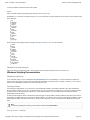
1.7.2 Windows Scripting Introduction . . . . . . . . . . . . . . . . . . . . . . . . . . . . . . . . . . . . . . . . . . . . . . . . . . . . . . . . . . . . . . . . . . . . . . . .
1.7.3 Windows Scripting Documentation . . . . . . . . . . . . . . . . . . . . . . . . . . . . . . . . . . . . . . . . . . . . . . . . . . . . . . . . . . . . . . . . . . . . .
1.7.4 Text Style Tags . . . . . . . . . . . . . . . . . . . . . . . . . . . . . . . . . . . . . . . . . . . . . . . . . . . . . . . . . . . . . . . . . . . . . . . . . . . . . . . . . . . .
1.7.5 Connecting HTML5 Web Clips and ScalaScript . . . . . . . . . . . . . . . . . . . . . . . . . . . . . . . . . . . . . . . . . . . . . . . . . . . . . . . . . . .
1.7.6 Connecting Flash and ScalaScript . . . . . . . . . . . . . . . . . . . . . . . . . . . . . . . . . . . . . . . . . . . . . . . . . . . . . . . . . . . . . . . . . . . . .
1.7.7 Data Driven Text Crawls . . . . . . . . . . . . . . . . . . . . . . . . . . . . . . . . . . . . . . . . . . . . . . . . . . . . . . . . . . . . . . . . . . . . . . . . . . . . .
1.7.8 Data Source Fetcher . . . . . . . . . . . . . . . . . . . . . . . . . . . . . . . . . . . . . . . . . . . . . . . . . . . . . . . . . . . . . . . . . . . . . . . . . . . . . . . .
1.7.9 Reporting Custom Warnings and Problems . . . . . . . . . . . . . . . . . . . . . . . . . . . . . . . . . . . . . . . . . . . . . . . . . . . . . . . . . . . . . .
1.7.10 Locally Integrated Content . . . . . . . . . . . . . . . . . . . . . . . . . . . . . . . . . . . . . . . . . . . . . . . . . . . . . . . . . . . . . . . . . . . . . . . . . .
1.7.11 Restart Playback . . . . . . . . . . . . . . . . . . . . . . . . . . . . . . . . . . . . . . . . . . . . . . . . . . . . . . . . . . . . . . . . . . . . . . . . . . . . . . . . . .
1.7.12 Check for New Plans . . . . . . . . . . . . . . . . . . . . . . . . . . . . . . . . . . . . . . . . . . . . . . . . . . . . . . . . . . . . . . . . . . . . . . . . . . . . . . .
1.7.13 Accessing Player Variables and Metadata . . . . . . . . . . . . . . . . . . . . . . . . . . . . . . . . . . . . . . . . . . . . . . . . . . . . . . . . . . . . . .
1.7.14 Scala Publish Automation EX Module . . . . . . . . . . . . . . . . . . . . . . . . . . . . . . . . . . . . . . . . . . . . . . . . . . . . . . . . . . . . . . . . . .
1.7.15 Scala Server Support Module . . . . . . . . . . . . . . . . . . . . . . . . . . . . . . . . . . . . . . . . . . . . . . . . . . . . . . . . . . . . . . . . . . . . . . . .
180
188
199
209
210
215
217
217
218
218
221
222
224
224
225
228
230
Page 3
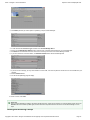
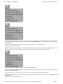
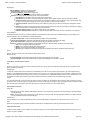
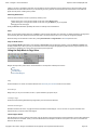
Scala -- Designer 11.00 Documentation
http://docs.scala.com/display/D1100/
Designer 11.00
Welcome to the Designer Documentation homepage for release
11.00. The below sections are grouped to help you find the areas
most likely to assist you:
Where to Begin points you at the system fundamentals, or
offers an overview of the system changes since the last
major release, depending on your history with the product.
User Manual takes you deeper into the online
documentation. The links allow you to jump into a specific
topic area.
Related Areas takes you to the other products of
Enterprise, the prior Designer version, or to other versions,
depending on your interests.
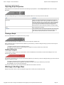
Where to Begin
New Users
Introducing Designer
Installing Designer
Primer
Glossary of Terms
Getting Started
Tips and Tricks
Experienced Users
What's New
Release and Update
Notes
Keeping your Scala Maintenance Subscription up to
date will give you access to the latest updates and
upgrades from Scala. These are the dates specific to
this release:
Scala Maintenance Start Date: June 1, 2015
End of Support Date: not yet defined.
For more information about maintenance and renewal,
click here.
User Manual
Working in the Main
View
Working in the Page
View
Working with
Templates
Working with
Add-Ons
Integrating Data
Scripting and
Automation
Related Areas
For online documentation
related to our other products
in this same release version:
Content Manager
11.00
Player 11.00
To access the prior version of
Designer:
Designer 10.5
Looking for something
different? Visit our
documentation portal
homepage:
Scala Enterprise
Homepage
Other Resources
In addition to this resource, the following are also available:
Updates show which updates are available for the product(s) you have currently licensed.
Extras is a resource of information and inspiration, from documentation to examples and more.
Support provides help through FAQs and a Discussion Forum.
Services and Training are available to help you get the most out of your digital signage network.
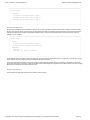
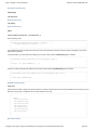
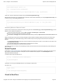
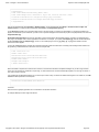
Introducing Designer
Whether you are a beginner or an expert, with Designer you can create polished, professional on-screen productions that combine text, sound,
graphics and animation for maximum impact. Designer, when used with its powerful companion application Content Manager, lets you easily
publish and distribute your productions across the internet to networks of Scala Players located around the globe.
Designer was created specifically for visual communication and has many publication and playback options that make the environment a powerful
creative composition tool to add to your existing toolbox.
Designer provides users with the ability to create and publish content to…
Content Manager for Scala Players in a Scala Enterprise network.
Content created with Designer ranges from dynamic presentations to interactive applications to data-driven information.
Although Scala supports a wide variety of media formats from images to streaming video, only Designer has these benefits:
Creates content in the native Scala format.
Can be used to create Scala Templates.
Can mix high quality motion with dynamic data.
Copyright © 2015 Scala - All logos and trademarks are the property of the respective trademark owners
Page 4
Scala -- Designer 11.00 Documentation
http://docs.scala.com/display/D1100/
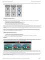
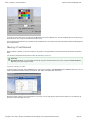
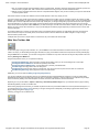
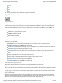
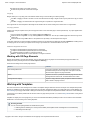
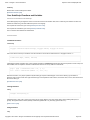
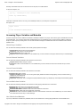
In a Scala Enterprise network, Designer is part of a workflow process, allowing users to create scripts and templates, manage them in Content
Manager and play them in Player. An illustration of this process is below.
Designer can work for you
Designer offers you a variety of presentation formats so you can use whatever fits your purpose. For example, you can use Designer to:
Design and publish content for digital signage networks.
Engage your customers with an interactive customer experience.
Make advertising more compelling, increase sales and grow your business.
Inform your patrons of the many services your business has available.
Distribute news and publicize products and events on your corporate information channel.
Because Designer productions can be transmitted and updated through the Internet, up-to-the-minute information can reach all your sites almost
instantly. The time and expense of sending people or bulky media to each site when the displays need to change is a thing of the past. And your
training and production costs for creating productions and managing a Designer installation are low, thanks to Scala’s easy-to-use graphical user
interface.
The key to a successful production is to think about your audience and how and where they will interact with the content you create. With
Designer, your can create productions that be displayed on a wide variety of display types of setups including, but not limited to: large format
screens, video walls, outdoor billboards, complex monitor arrangements.
Additional Introduction Topics
The Primer section covers the essentials for working with Designer.
Installing Designer will help you to set up your version of Designer.
Getting Started is a simple walk though of using Designer to create a simple script through to publishing the production.
Glossary of Terms defines the terminology used within Designer.
Primer
In Designer, your production is defined by a script, which is defined as a file that specifies a series of events and their timing. The events in a
script are the individual image files, sound files, text lines, and other items that appear in the final production. The events in a script contain all the
settings and options that describe how and when things happen in the final production.
However, you do not have to work with a Designer script the way a programmer works, which is through a series of text commands. You may
write and edit the script entirely through the Scala graphical user interface. It shows you the script as one or more pages of information, each of
which can be created or designed graphically and arranged in any order you choose.
As you work with a production and compose the script, each page is listed separately in the Main View. A page number is assigned based on its
position in the production sequence, including a short title for easy identification. Thus, the Designer Main View shows you an outline of your
script and an overview of its structure.
Copyright © 2015 Scala - All logos and trademarks are the property of the respective trademark owners
Page 5
Scala -- Designer 11.00 Documentation
http://docs.scala.com/display/D1100/
Laying out an individual page is accomplished in the Page View. Here you are able introduce Elements on the page which can be positioned,
scaled and layered as well as setting the order, timing and transitions for how the Elements appear on the page.
From here, you can navigate to other Designer views necessary to create the script. Additionally, it is possible to perform tasks directly from this
view to manipulate and refine the script.
Once your production is complete, you can either publish it directly to Scala Content Manager for inclusion in a Playlist or collect it for others to
use.
Scripts can be created in a text editor. Many advanced users modify their scripts to perform additional functionality that otherwise is not available
in the GUI (graphical user interface.)
Additional Topics:
A general overview of the User Interface(UI) is given in the section UI Overview.
Get more details on media that can be used in conjunction with Designer in Media Formats Supported.
Tips and Tricks provides you with helpful hints to be more productive when using Designer.
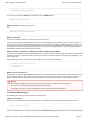
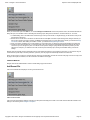
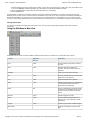
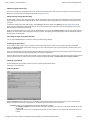
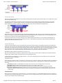
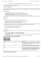
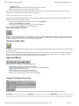
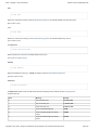
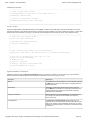
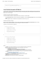
UI Overview
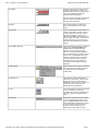
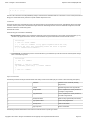
The options and commands available in any Designer panel depend on the purpose of the panel, but most Main View elements have common
features in Designer. For example, unlike other PC applications, some choices in the panel are buttons rather than text items in a list, while some
buttons lead to other panels and dialog boxes.
It is assumed that most people will use a mouse to interact with the UI although almost all operations can be accomplished using a keyboard
shortcut.
Common menu elements are briefly explained below:
Element
Graphical Representation
Function
Title Bar
Shows the name of the panel, script, or
dialog box in which you are working.
Occasionally, additional information is
provided.
Toolbar
Contain icon buttons for common functions in
that panel or dialog. Toolbar items can toggle
special options, present drop-down lists, or
navigate to another panel.
Tabbed Panels
Access different sets of related controls to
prevent panels from becoming too large or
crowded. Ctrl+Tab moves to the next tab. Sh
ift+Ctrl+Tab moves to the previous tab. Click
the tab header to display the panel of options
for that type of operation.
As a point of interest, the sequence of panels
are ordered so that common tools between
elements are found in the left-hand panels
and unique tools for that element in the
right-hand panels.
Copyright © 2015 Scala - All logos and trademarks are the property of the respective trademark owners
Page 6
Scala -- Designer 11.00 Documentation
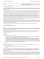
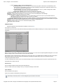
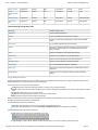
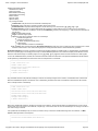
Close Button
http://docs.scala.com/display/D1100/
Closes the active panel or script with which
the button is associated. In the Main View,
the Close button is located in the upper right
corner of the application window and
choosing it quits the application.
The other, smaller Close button is associated
with the script you are working with and
choosing it closes the script.
Up Button
When grouping pages, this allows you to
move up one level out of an open page
group.
Value Control
Lets you cycle through a series of values, or
change a value directly. Click the arrows to
go to the previous or next value, or click in
the text box between the arrows, type a
value and press Enter. Some value controls
have more than one value, or more than one
text box between the arrows. Before using
the arrows, click in the text box you want to
change.
Pop-up Button (Selector)
Pop-up list allowing a choice from a series of
option values. The Selector Button will
facilitate access to other functions and
panels. If the pop-up list shows option
values, the current selection is highlighted
when you open the list. To choose a value or
function, click on the Selector button, then
click on your desired choice. Or, click and
hold the mouse button while moving the
pointer through the list, then release the
mouse button when the desired choice is
highlighted.
Pull-down Menu
Opens a pull-down list of options or functions
from a top menu item, allowing your choice
of a particular function or navigation to
another panel.
Combination Icon
Lets you either choose a default action or
select from a list of actions. A single click on
the main part of the icon will choose the
default action. By clicking on the down arrow
(d) part of the icon, a drop-down list of
related actions will be displayed.
List Icon
Lets you choose how you want to view pages
in a script. Normally you would see
thumbnails. When the icon is depressed, the
List mode is opened, with pages listed by
name.
On/Off Button
When clicked, this button will turn an option
on or off. If the label for this type of button
ends in a question mark (?), then a check
mark appears after the label when the option
is on. Some buttons of this type can be
pressed in to turn their option on and
released with another click to turn it off.
Copyright © 2015 Scala - All logos and trademarks are the property of the respective trademark owners
Page 7
Scala -- Designer 11.00 Documentation
http://docs.scala.com/display/D1100/
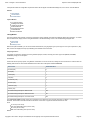
Close and OK Buttons
All panels and dialogs have a Close button.
When the button is pressed, any changes
made to the settings are saved rather than
undone. The OK button will accept any
changes you make in the dialog, then the
dialog will close. The close button is located
in the upper right corner of the screen, and is
essentially the same as the Cancel button.
Nudge with Arrow Keys
Ctrl+Arrow Key allows you to move/nudge
elements by one pixel in whatever direction
the arrow key is depressed. Shift+Ctrl+Arro
w Key allows you to jump 10 pixels at a
time.
Tips and Tricks
Page listed below can provide you with shortcuts to make usage of Designer easier.
Context Menus
The F1 Page IS Your Friend
Context Menus
Designer has right-click Context Menus, which increases the ability to quickly access certain features.
For example, right-clicking on a thumbnail or list item in the Main View.
This will reveal a context menu allowing you to Cut, Copy, Paste, Delete, Group, Ungroup, Bind to Data fields, Disable and Preview in one motion.
Combined with keyboard shortcuts, this will greatly increase your productivity.
The F1 Key IS Your Friend
If there is a button you are not familiar with, hover the mouse pointer over it to see the Tool Tip label.
For even more detailed information, select Help from the Menu Bar or press the F1 key.
Copyright © 2015 Scala - All logos and trademarks are the property of the respective trademark owners
Page 8
Scala -- Designer 11.00 Documentation
http://docs.scala.com/display/D1100/
Highlight what you are interested in,
then click to learn more.
The Help section on the Menu Bar also contains general information about Designer, including your license information, and for advanced users
links to Scala Script (for connecting HTML5 WebClips and Flash) and Text Style Tag documentation.
Keyboard shortcuts exist for many actions in Designer and are shown next to the Menu item. We have made an effort to list them as often as is
possible through the documentation.
Installing Designer
Technical Specification
Operating Systems
Recommended
Windows 8.1 (64-bit)
Windows 7 (64-bit)
Supported:
Windows 8.1 (32-bit)
Windows 7 (32-bit)
Windows XP SP3 (32-bit)
Third Party Components
Copyright © 2015 Scala - All logos and trademarks are the property of the respective trademark owners
Page 9
Scala -- Designer 11.00 Documentation
http://docs.scala.com/display/D1100/
Requirement
Purpose
Python 2.7.9
Special Scala version.
Adobe Flash
Processes Flash files.
Warning about Adobe Flash:
Scala Enterprise only supports Flash through version
10.3.x (e.g. 10.3.183.90) due to issues with significant
memory leaks seen in newer versions of Flash. You might
still choose to leverage your older Flash media assets, but
we advise shifting to a different media format moving
forward.
The Installation Process
Important Note about Software Dongles:
Scala Designer comes with a USB key (dongle).
To ensure the correct driver is installed and used, please do not insert the USB key (dongle) until requested by the Installer program.
Note:
Your actual steps may vary based on components that may be already installed on your system.
1. Insert the Designer Installation DVD.
If auto-run is disabled on your PC, open Explorer to access the DVD and run setup.exe.
2. Welcome to the Scala Designer Setup Wizard.
Notice the button to view the Getting Started Guide online. This has installation steps similar to these, which can help you in a live installation.
Click Next.
Copyright © 2015 Scala - All logos and trademarks are the property of the respective trademark owners
Page 10
Scala -- Designer 11.00 Documentation
http://docs.scala.com/display/D1100/
3. Third Party Components.
If any third party components are already installed, those steps will be skipped by the installer. Otherwise, answer Yes to install components if
requested.
4. License Agreement.
Accept and click Next.
5. Select Language.
Click Next.
6. Select Destination Location.
Click Next.
7. Select Components
Copyright © 2015 Scala - All logos and trademarks are the property of the respective trademark owners
Page 11
Scala -- Designer 11.00 Documentation
http://docs.scala.com/display/D1100/
8. Select Clipart Location.
This choice depends on personal preference where the Scala clipart should be installed. A shortcut to this location will be installed in you’re My
Documents folder so you can find it later. Make a selection and click Next.
What Do These Options Mean?
Program Files: Clipart will be installed in C:\Program Files\Scala\Clipart.
Shared Documents: Clipart will be installed in C:\Documents and Settings\All Users\Documents\Scala\Clipart. This choice is
recommended.
Custom Folder: You choose a folder.
9. Python Scripting
This can be skipped if it is already installed. Click Next.
Copyright © 2015 Scala - All logos and trademarks are the property of the respective trademark owners
Page 12
Scala -- Designer 11.00 Documentation
http://docs.scala.com/display/D1100/
10. ScalaScript Export Plug-in for Adobe Photoshop
Un-check the option and click Next.
11. Microsoft Internet Connection Firewall
Keep the option selected to allow network connections for Designer. Click Next.
12. Ready to Install.
Click Install.
Copyright © 2015 Scala - All logos and trademarks are the property of the respective trademark owners
Page 13
Scala -- Designer 11.00 Documentation
http://docs.scala.com/display/D1100/
13. Installing.
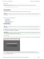
You will see a progress bar like the one below while the installation happens.
14. Finish Page
This screen will given the option to View Update Notes, and/or start Scala Designer now. Once you have (un)selected your choices, click Finish.
License Activation
You will need a license file in order to run Designer. This is an XML file generated by Scala that enables the software to run using a particular
USB dongle. It also contains information such as additional features or EX Modules that can be activated according to your license.
Copyright © 2015 Scala - All logos and trademarks are the property of the respective trademark owners
Page 14
Scala -- Designer 11.00 Documentation
http://docs.scala.com/display/D1100/
New dongles have a 30-day grace period before they stop working unless you provide the license file. The license can be downloaded directly
from Scala by Designer, or you can manually copy it.
If you select Get New License File Online, Designer will retrieve it from the Scala license server. You will have the option to save a copy of your
license file in the My Documents folder.
You can also select I Have It if you have a copy of your license file or defer by selecting Get it Later.
Software Update
Unless otherwise specified, all updates are cumulative so if you’ve missed one or more updates, you can just install the latest one. You can find
the latest updates on the Scala website at www.scala.com/updates.
Additional Topics
Advanced Configuration Options for Designer provides information on how to further customize your installation of Designer.
Advanced Configuration Options for Designer
Shortcuts to Sub-topics within this Page:
Installation Options
Silent Installation
Common Installation Options
Scala Designer Installation Options
Font Exclusion List
Advanced Customization Options
MMOS.INI Options Applying to All Scala Products
Scala Designer and Scala Player MMOS.INI Options
Scala Designer MMOS.INI Options
Installation Options
The Scala installers accept various command-line parameters that affect the installation, or the values used in installation. To use these, open a
command prompt and type:
setup.exe /OPTION1=value /OPTION2=value ...
If value contains spaces, enclose it in quotes, for example:
setup.exe /OPTION1="C:\Temp\My Folder"
Silent Installation
Silent installation can be accomplished by passing /SILENT or /VERYSILENT as command-line arguments. /SILENT installs ask no questions,
but show installation progress./VERYSILENT installs ask no questions and do not show progress during installation.
To assist with silent installs, the installers accept various additional command line parameters given below.
Common Installation Options
All the Scala installers accept:
/LOG=filename: Log the results to filename, which can be used to trouble-shoot a silent install.
/DIR=folderpath: Specify the full path where the product should be installed.
/LANGUAGE=language: Select language during installation.
These are the accepted values for Designer installs (NOT case sensitive):
Arabic
English
French
Japanese
Korean
Russian
SimplifiedChinese
Spanish
TraditionalChinese
Copyright © 2015 Scala - All logos and trademarks are the property of the respective trademark owners
Page 15
Scala -- Designer 11.00 Documentation
http://docs.scala.com/display/D1100/
/ROOTDATAFOLDER=path: Specify the path to be used for storing various configuration and data items. This corresponds to the WIN3
2_RootDataFolder keyword in MMOS.INI (see here), but the command-line option is also supported for Content Manager.
Scala Designer Installation Options
The Scala Designer installer also supports these options:
/COMPONENTS="comma-separated list": Specify which components to install. Supported values are:
usersguide: User's Guide
clipart: Clipart library
clipart\4x3: 4x3 (Landscape) Clipart
clipart\4x3\demoscripts: 4x3 Demo scripts
clipart\4x3\templates: 4x3 Template scripts
clipart\4x3\images: 4x3 Image files
clipart\4x3\videos: 4x3 Video files
clipart\16x9: 16x9 (Wide-screen landscape) Clipart
clipart\16x9\demoscripts: 16x9 Demo scripts
clipart\16x9\templates: 16x9 Template scripts
clipart\16x9\images: 4x3 Image files
clipart\16x9\videos: 4x3 Video files
clipart\9x16: 9x16 (Wide-screen portrait) Clipart
clipart\9x16\images: 4x3 Image files
clipart\9x16\videos: 4x3 Video files
clipart\clips: Clip files
clipart\sounds: Sound files
clipart\misc: Other files (tiles, palettes, pointers, ...)
extrafonts: Additional typefaces
Example: /COMPONENTS="clipart\clips,clipart\sounds,extrafonts"
Font Exclusion List
Scala Players use intelligent file transfer to avoid uploading or downloading files that are already present. However, font licensing rules generally
require that fonts be transmitted with their documents (Scala scripts), which defeats the benefit of intelligent file transfer. This is not a big issue
with Western fonts because of their comparatively small size, but with Asian fonts this can be a significant issue.
Scala Designer supports a font exclusion list. In a Scala network, if a set of fonts is known to be pre-installed on all players, then naming these
fonts in the font exclusion list will cause them to be not included by default when publishing to Scala networks. (By default, fonts not on the
exclusion list are published as normal.)
In the Advanced Publish Options menu, the Include Fonts? option still allows you to exclude all fonts. If you choose to include fonts, the new E
xclude Standard Fonts? option lets you control whether the fonts on the exclusion list are excluded or transmitted.
The list of excluded fonts itself is an XML file that can be found at:
Program Files\Scala\Designer 5\System\FontEmbeddingExclusionList.xml
Modifying this file is straightforward, but care must be taken to only list fonts that are indeed present on all players. Otherwise, a player may
receive a script without all the necessary fonts, which can produce an incorrect display and run-time errors.
Advanced Customization Options
Most Scala products have a variety of advanced configuration options available through the use of the MMOS.INI file. Content Manager uses a
file called features.xml for some of its advanced customization.
MMOS.INI is a file that lives in the program's installation folder, e.g. D:\Scala\Player or C:\Program Files\Scala\Designer, or wherever your
Scala product(s) are installed. Normally, each installation folder can have its own MMOS.INI file with its own settings. It can be UTF-8, in which
case it should begin with the UTF-8 byte-order mark, which consists of the hexadecimal values EF BB BF. It begins with the optional byte-order
mark, followed by the word [Scala] as shown inside square brackets, followed by one or more lines of the form
OptionName = value
Anything after a semi-colon is treated as a comment and is ignored by the Scala applications.
Here is a simple example:
Copyright © 2015 Scala - All logos and trademarks are the property of the respective trademark owners
Page 16
Scala -- Designer 11.00 Documentation
http://docs.scala.com/display/D1100/
[Scala]
; Open on the desktop in a borderless window
DESKTOP_Borderless = 1
; Force the window to be topmost always
DESKTOP_TopMost = 1
and so on.
You may find you already have an MMOS.INI file. If you do, you may wish to review which settings are already in force. But remember, anything
after a semi-colon is a comment and does not have any effect. If you do not have an MMOS.INI file, it is a simple matter to make one in any
text-editor such as Notepad.
Windows 7 (and Newer) Note:
Under Windows 7 and up, if you try to create files inside the Program Files folder, Windows will create a per-user shadow-copy inside
the Windows "Virtual Store". Depending on your system configuration and user rights, you may need to create the MMOS.INI file in a
regular folder, then use Windows Explorer to drag it over to the correct destination inside Program Files.
MMOS.INI Options Applying to All Scala Products
WIN32_RootDataFolder
Control the location of all Scala config files, logs, settings, temporary files, etc.
WIN32_RootDataFolder = path
When set, Scala data that is normally stored under the Windows-standard configuration areas is stored instead under the specified path. Also the
Scala temporary folder appears under the specified path. Most of the locations where Scala reads and writes files can be controlled.
This is the simplest way to move the locations where such files are stored. There are additional MMOS.INI keywords to move specific folders such
as the Content andLocallyIntegratedContent folder, but it is often better to move them all with this one keyword.
You can install the products specifying /RootDataFolder=path on its command-line, and Setup will set WIN32_RootDataFolder correctly
(creating anMMOS.INI file if necessary, otherwise modifying the existing one.)
Content Manager installer supports /RootDataFolder=path on its command-line. This sets WIN32_RootDataFolder for Content Manager itself,
as well as for the Transmission Server and Server Support components. (In those components, the installer also sets WIN32_CommonProductR
ootDataFolder, so those components can locate Content Manager's location where needed.
Note:
For Content Manager, changes to WIN32_RootDataFolder must be done using the installer, rather than by hand-editing the MMOS.INI
files.
Note:
This option is not yet supported for the Playback Audit Reporting Module.
WININET_EnableServUDirectoryCacheKludge
The directory caching of the Serv-U FTP server can return incorrect results. Scala recommends that directory caching be disabled when using the
Serv-U FTP server. However, if this is not possible you can enable a workaround by adding this to your MMOS.INI:
WININET_EnableServUDirectoryCacheKludge = 1
(The workaround will hurt media transfer performance.)
TCPIPTOOLS_FTPClientKeepAliveCommandChannel
Setting this instructs the FTP client to set the socket "keep-alive" option on the FTP command channel. This can resolve certain
Copyright © 2015 Scala - All logos and trademarks are the property of the respective trademark owners
Page 17
Scala -- Designer 11.00 Documentation
http://docs.scala.com/display/D1100/
command-channel timeouts that can sometimes be caused by intervening firewalls or routers. To enable this, add the following to your MMOS.INI:
TCPIPTOOLS_FTPClientKeepAliveCommandChannel=1
Scala Designer and Scala Player MMOS.INI Options
These MMOS.INI Options apply to both Scala Designer and Scala Player:
Path Options
MEDIA_Content:
You can override the location of the Content folder by setting:
MEDIA_Content=path
MEDIA_LocalIntegratedContent
Normally, when a Scala script references some media, that media is sent along with the script when the script is published to a Scala network.
However, any media that isLinked Content is not sent with the script that references it. Such content either needs to be added separately within
Scala Enterprise Content Manager, or needs to be installed, delivered, or generated on the player.
Note:
When installing, delivering, or generating content on the Player, you should read and understand the Locally Integrated Content supp
ort features.
When resolving references to Linked Content, the Scala software first looks in the Content folder, and if the file is not found there, it looks in
the LocallyIntegratedContent folder. The reason for two folders and the essential difference is that:
The Content folder is managed by the Player network engine, i.e., things sent as content from Scala Enterprise Content Manager are
placed there.
The LocallyIntegratedContent folder is for content managed outside of Scala Players, e.g., placed here by any custom integration
application.
One big difference is that cleanup of old/unused content will not touch files in the LocallyIntegratedContent folder.
By default, the Content and LocallyIntegratedContent folders are placed side-by-side as:
Documents and Settings\All Users\Documents\Scala\Content
Documents and Settings\All Users\Documents\Scala\LocallyIntegratedContent
but the WIN32_RootDataFolder keyword overrides this to:
WIN32_RootDataFolder\Documents\Content
WIN32_RootDataFolder\Documents\LocallyIntegratedContent
Display Options
DESKTOP_Borderless/TopMost/CustomPosition
Scala Player can now run on the desktop as a top-most borderless window of arbitrary or full size. You can specify the left, top, width and height.
As an example, add this to your MMOS.INI:
Copyright © 2015 Scala - All logos and trademarks are the property of the respective trademark owners
Page 18
Scala -- Designer 11.00 Documentation
http://docs.scala.com/display/D1100/
DESKTOP_Borderless = 1
DESKTOP_TopMost = 1
DESKTOP_CustomPosition = 100 50 800 600
Omitting DESKTOP_CustomPosition will make the window fill the primary display.
These options are also supported by Scala Designer.
MM3D_EnsureVBlankDuringPresentKludge
This enables a workaround for certain Direct3D device driver issues. Some device drivers do not properly maintain frame-synchronization during
display updates. Ordinarily, a Direct3D device driver waits for the display device to enter vertical blank before performing the display update.
Playback relies on this for smooth, shear-free animation. Some drivers do not handle this properly, resulting in jerky animation and/or horizontal
shearing. When this workaround is enabled, playback waits for the display device's vertical blank period instead of relying on the device driver to
wait for vertical blank. This workaround was initially added to address an issue with the Intel 945 graphics chipset, and playback will automatically
recognize the Intel 945 chipset and enable this workaround.
In some preliminary tests, this workaround has also shown a performance improvement to movie playback on multiple display players. If you
enable this workaround, you should probably also disable MM3D_UseBackBufferLockKludge as it will likely interfere with the MM3D_EnsureV
BlankDuringPresentKludge workaround.
To enable this workaround, use:
MM3D_EnsureVBlankDuringPresentKludge=1
MM3D_UseBackBufferLockKludge
This enables a workaround for device drivers that consume a large amount of CPU waiting for vertical blank. Most Direct3D devices apart from
those from nVidia and ATi require this workaround. Playback detects those devices and will enable this workaround as necessary. You can
override that behavior with this setting. Note that the Intel 945 *does not* require this workaround, other Intel devices (845, 865, 915, 946, 965)
currently require this workaround.
To enable this workaround, use:
MM3D_UseBackBufferLockKludge=1
To disable this workaround, use:
MM3D_UseBackBufferLockKludge=0
Due to a driver bug on certain ATI-based systems, some wide text elements or crawl-segments could end up displayed as a white rectangle.
There is now a workaround that can be enabled by setting
MM3D_UseATIOddTextureSizeKludge=1
in your MMOS.INI file.
Video playback of H.264, MPEG-2, MPEG-1, and WMV/VC-1, as well as most audio playback, is now based on the FFMPEG video decoder
library, for improved performance and compatibility. Updated for the video decoders are now included in the Player and Designer installers —
there is no longer a separate video codecs updater. If for some reason you need the older behavior on a system that already has the
MainConcept codecs installed, use the MMOS.INI setting
DSHOWRENDER_EnableFFMPEG=0
When playing back H.264 or WMV/VC-1 video on most systems with AMD or NVIDIA graphics, hardware-accelerated video is now used. This
results in better image quality and performance, combined with lower power consumption. This new capability requires Windows 7 or newer. To
Copyright © 2015 Scala - All logos and trademarks are the property of the respective trademark owners
Page 19
Scala -- Designer 11.00 Documentation
http://docs.scala.com/display/D1100/
force software-based video decode, use the MMOS.INI setting
AllowDXVA=0
Most graphics hardware has a resolution limit for hardware-accelerated video, beyond which things may not work, or may even crash. By default,
we limit hardware-accelerated video to 1920x1088 or smaller. If you know your graphics card can go higher, use the MMOS.INI setting
MM3D_MaxWidthForDXVA2=width
MM3D_MaxHeightForDXVA2=height
When Video files are not recognized by the new playback subsystem, the system will attempt to play it using other Windows codecs. This may be
useful in rare or obscure cases. In normal systems where you have good control over the media formats used, it can be a good idea to set the M
MOS.INI setting
DSHOWRENDER_FFMPEGFallbackToDirectShow=0
Media-Handling Options
If a video stream has multiple audio tracks, we select the one whose language matches the system's language. This can be overridden with the M
MOS.INI key
DSHOWRENDER_IPTVISO639LanguageID=0xnnnnnn
where nnnnnn is the hex representation of ISO-639 language code, e.g. (0x737061, corresponding to 'spa', for Spanish.)
DSHOWRENDER_UseSafestRecognition
When Scala tries to identify files as video, it sometimes needs to invoke third-party CODECs installed on the system. Rare combinations of these
CODECs with certain media files can crash. By setting,
DSHOWRENDER_UseSafestRecognition = 1
Scala will only use more conservative ways to identify video files.
FLASHLOADER_MaxTextureSize:
Limits the maximum texture-size (resolution) used for Flash clips, that effectively gives better performance for slightly fuzzier visual quality, for
large Flash clips. Set
FLASHLOADER_MaxTextureSize=n
Where n is at least 400. If the Flash clip is larger than n in either dimension, playback will cut its size in half repeatedly until both dimensions are
less than or equal to n. The Flash clip will be drawn at its correct size, but with reduced detail, enabling higher performance.
A small number of WMV videos are encoded interlaced, and interlacing artifacts could be visible when played in Scala. Playback of WMV files can
now be forced to progressive mode by setting the following MMOS.INI flag:
DSHOWRENDER_ForceWMVProgressive=1
In the future, this will become the default behavior.
Most WMV or WMA files use 16-bit audio. Fixed a problem where WMV or WMA files that used other-than 16-bit audio played back as noise. To
enable this change, you must set the following in your MMOS.INI:
Copyright © 2015 Scala - All logos and trademarks are the property of the respective trademark owners
Page 20
Scala -- Designer 11.00 Documentation
http://docs.scala.com/display/D1100/
DSHOWRENDER_FixWMVAudioRemap=1
The "User-Agent" string used for WebClip can be customized using the MMOS.INI setting:
WEBCLIP_UserAgent=string
MEDIA_CachePath=This path is defined by the user:
AND
WEBCLIP_DeleteCacheOnShutdown=0
WEBCLIP_ShareInput=0
This behavior is enabled by default. You can disable it with this mmos.ini setting.
The input system for the webclip is separate from the input system used by ScalaScript buttons and hotkeys. When an interactive webclip is on
screen, it gets the opportunity to handle input before ScalaScript buttons and hotkeys, even if there are ScalaScript buttons are visibly in front of
the webclip. In the past, the webclip would consume all input, so any ScalaScript button that overlapped with a webclip would never get any input.
The webclip will now provide the ScalaScript input system with its own copy of mouse and keyboard input, so the same input goes to both the
webclip andany ScalaScript buttons that overlap with the webclip
WEBCLIP_DisableAccelerated2DCanvas, WEBCLIP_DisableGPU and WEBCLIP_Disable3DAPIs
These three boolean variables are used to disable different aspects of hardware acceleration used by webclip. They assist the user with potential
compatibility, driver bugs, or performance issues introduced by the introduction of hardware acceleration for 2D and 3D in Scala Release 11. The
mmos.ini options are:
These all default to off. These control the corresponding "disable" chrome command line flag, respectively:
--disable-accelerated-2d-canvas
--disable-3d-apis
--disable-gpu
WEBCLIP_IgnoreCertificateErrors=1
This passes the command flag --ignore-certificate-errors to Chromium. It disables the security features related to certificate verification. If a web
page fails certificate verification, it tells the browser to show the page anyway. During testing, there are times where this flag is helpful to either
diagnose certificate problems or lift restrictions during development when the web server is not available or may not be production ready.
Warning:
Because leaving this flag in place has significant security risks, if you use it, we provide a strong warning against it.
"You are using an unsupported webclip flag: Stability and security will suffer."
This will appear as an error in logs and is intended to be obvious so the end user won't forget to disable it.
Scala Designer MMOS.INI Options
(See additional options that apply to both Scala Designer and Scala Player.)
HTREQ_PreserveScalaArt:
Normally, if you add media from the Scala clipart library location, the ScalaScript uses the normal Windows path to that file. But if you set:
HTREQ_PreserveScalaArt=1
then such media will be listed in the script using a path of the form ScalaArt:\folder\file.jpg. This matches IC3 behavior, but only in certain limited
Copyright © 2015 Scala - All logos and trademarks are the property of the respective trademark owners
Page 21
Scala -- Designer 11.00 Documentation
http://docs.scala.com/display/D1100/
cases is it useful.
SCRIPTXFER_EnableUTF8ContentFiles: When set, forces the publish operation write the top-level Content XML files in UTF8.
SCRIPTXFER_EnableUTF8ContentFiles=1
Getting Started
This space will serve as a brief starter guide for using Designer, and will provide you the basics to get going.
Note:
If you have not already done so, please see Installing Designer for steps on how the requirements and steps for setting up Designer on
your PC.
Shortcuts to Sub-topics within this Section:
Starting Designer
Creating a Script
Publishing a Script
Sharing and Archiving a Script
Doing More with Designer
Getting Updates
Starting Designer
Note:
If you have not already done so, please see Installing Designer for steps on how the requirements and steps for setting up Designer on
your PC.
The installer will run Designer for you the first time you use it, but when you later want to open the program, select the Windows Start Menu and
choose All Programs > Scala Designer > Scala Designer.
Useful Tip:
While you are in the Start menu, notice that in addition to the program, there are shortcuts to the Linked Content folder, the Logs folder,
and several links to Scala’s Web site for your convenience.
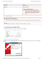
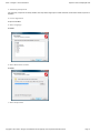
Activating Designer
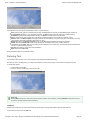
In addition to the USB key, Designer must be activated in order to operate. If you have not activated Designer, the following message will appear:
You must activate Designer with a license file. You can install the license file now or choose to defer installing the file for up to 30 days.
If you select Get New License File Online, Designer will retrieve it from the Scala license server. You will have the option to save a copy of your
license file in the My Documents folder.
Copyright © 2015 Scala - All logos and trademarks are the property of the respective trademark owners
Page 22
Scala -- Designer 11.00 Documentation
http://docs.scala.com/display/D1100/
You can also select I Have It if you have a copy of your license file or defer by selecting Get it Later.
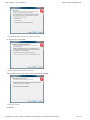
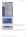
Welcome to Scala Designer
When the program opens, and before you begin to create a new production you will see this message:
You can view the Getting Started Guide or to start using Designer, click OK.
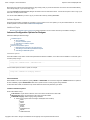
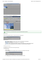
The Designer Interface
When you open Designer, you will see the Main View, which is initially empty. Once you start creating with Designer, more items on the screen
will become available.
The key parts of the Main view are:
1.
2.
3.
4.
5.
Menu Bar: Contains pull-down menus for opening, saving and closing files as well as editing and viewing options.
Tool Bar: Contains buttons for common functions.
Script Bar: Just below the toolbar, when scripts are loaded, this area shows their names.
Page Area: The larger area of the window is where your content, organized into pages will appear as thumbnails.
Status Bar: The bottom of the window displays messages related to the actions you have done in the program.
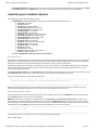
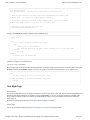
Creating a Script
In Designer, your productions are called scripts, a file that specifies a sequence of pages containing audio and visual elements.
Each page is represented by a thumbnail image. However, you can toggle the display between thumbnails and text-only columns by clicking the L
ist button in the toolbar.
Defining the Script
To begin work, you need to either create a script or load an existing script.
To create a new script:
1. Click New from the Toolbar.
2. Choose or enter a Page Size. The size to be used depends on the use of the content, such as landscape or portrait screens, crawls,
sidebars or other smaller portions of the display, or a video wall. For example, 1368 x768 for a typical landscape LCD screen. You can
also enter custom values for the size by clicking on the numbers at the top of the window. This is particularly useful when designing
Copyright © 2015 Scala - All logos and trademarks are the property of the respective trademark owners
Page 23
Scala -- Designer 11.00 Documentation
http://docs.scala.com/display/D1100/
content that will appear in a frame/zone in Content Manager. Click OK when done.
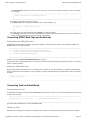
Adding A Page
A page consists of a background and any foreground elements.
Under the Add pull-down menu you will see options for creating different types of page backgrounds:
Page from Media File: Image or video as the background.
Plain: Solid color, gradient or transparent background.
Special Event: Non-displayed page to the script (for audio or other non-visual actions).
Streaming Video Page: Background is a Streaming Media source.
There is also an Add button in the toolbar, which does the same action as Add Page from Media File.
To add a new page:
1. Click on the Add button or select Add Page From Media File from the Add pull down menu.
2. This will bring up the Add Page From Media File dialog box. The background image you choose will be the base upon which you place
text, animation, photos and other items.
3. Select a background by navigating to the desired folder and double-clicking the file. A background format can include any of these file
types: JPG, PNG, GIF, TIFF, BMP, H.264, MPG, WMV, SWF or AVI.
The Page View
After choosing a background, you will see the Page View, where you can add elements from the Add pull-down menu, then edit their attributes
using the Design panel at the bottom of the window.
Copyright © 2015 Scala - All logos and trademarks are the property of the respective trademark owners
Page 24
Scala -- Designer 11.00 Documentation
http://docs.scala.com/display/D1100/
The toolbar at the top of the window provides easy access to common functions:
Add: Imports a photo, graphic or animation onto the page. The Add pull-down menu lets you add additional types of elements.
Cut/Copy/Paste: Standard cut, copy and paste commands. The Edit pull-down menu has more tools for editing elements.
Undo/Redo: Undoes the last change made to the page. Use Redo to cancel the effect of the last Undo.
Zoom : Allows the user to change the sizing of the panel to preset percentages or to Fit Screen or Full Screen options.
Element: Goes to the Element panel for the type of element you have selected, giving control over color, scale, opacity, etc. for text,
clips, animclips, text crawls and drawing objects (line, box, oval).
Background: Goes to the Background panel, where you set attributes for the background image and resolution.
Palette: Goes to the Palette panel, where you set the selection of available colors for text, shadow, outline, etc.
List: Goes to the List panel, where you see a listing of all the elements on the current page. The List panel is used to determine the
sequence of events and object layering.
Preview: Plays back the current page of the presentation.
Main: Returns to the Main view.
There are additional options in the pull-down menus.
Entering Text
The most basic element is text. You can click anywhere in the page and immediately start typing.
Each time you click on the background, you create a new text element, which you can drag to a new location on the page at any time.
To create a text element:
1. Click anywhere on the page.
2. Type your name or something like “Welcome to Scala.”
Useful Tip:
Pressing Enter will move the cursor to the next line and also create a new text element. Pressing Shift-Enter will move the cursor to
the next line, but keep within the same text element.
Text Boxes
Text boxes are useful when you want to confine text to a specific area on the page and be able to align text within that area.
To add a Text box select it from the Add menu.
Copyright © 2015 Scala - All logos and trademarks are the property of the respective trademark owners
Page 25
Scala -- Designer 11.00 Documentation
http://docs.scala.com/display/D1100/
An empty text box appears on the screen and this can be resized to fit your needs.
Text Box has a definable minimum size of the font. This will cause the font size to automatically adapt to fit within the Text Box (providing all the
text can fit based on the minimum size). This is useful when the text is dynamically created, either as a template field or program variable.
In text cursor mode, you can now type in your text. When the text box is "full" the onscreen font size reduces as you continue to type. On reaching
the minimum size the Text Box will overflow. When you select another element or hit ESC, the text will be trimmed to the box.
Copyright © 2015 Scala - All logos and trademarks are the property of the respective trademark owners
Page 26
Scala -- Designer 11.00 Documentation
http://docs.scala.com/display/D1100/
Note the Text font size will also adjust when you resize the Text Box itself.
No Doc Needed
Changing Font Color and Style
You can change the font, color and style of the text, depending on what is selected.
If the cursor is visible, the changes will affect the next text typed.
You can also click and drag a selection of letters.
If the text has a selection border around it, the entire element is selected. Any style changes will affect all the letters in the element. To select the
entire text element, press Esc or double-click the element.
To change the font, click on the Font button with the name of the font in it. You see a list in which you can choose from any TrueType fonts
installed on your system. Select a font when you are done.
Copyright © 2015 Scala - All logos and trademarks are the property of the respective trademark owners
Page 27
Scala -- Designer 11.00 Documentation
http://docs.scala.com/display/D1100/
To change the color of text, click on the color within the Face button and choose a different color. There are additional options in the Style pop-up
button next to the color. Colors can be modified in the Palette panel.
Common text styles like bold, italics, and underline are also available (the B, I and U buttons) and options like Outline, Shadow and Backdrop also
have separate buttons.
Moving a Text Element
When an element is selected, you can click and drag it to any position on the page. Make sure the entire text element is selected, not individual
letters.
You can set the pixel position directly from the Position tab of the Design Text Panel.
Useful Tip:
Ctrl+Arrow Key allows you to move/nudge elements by one pixel in whatever direction the arrow key is depressed. Shift+Ctrl+Arrow
Key allows you to jump 10 pixels at a time.
Importing a Graphic or Video
To import a graphic to the page, click the Add button (the + sign icon) in the toolbar or select Add File(s) from the Add drop down menu. You can
import most standard file formats including JPG, PNG, GIF, TIFF, BMP, H.264, MPG, WMV, SWF or AVI.
Navigate to a folder containing clips and double-click on one of them. You can apply styles to clips the same as text and you can resize the clip
and try other options that apply only to clips.
Copyright © 2015 Scala - All logos and trademarks are the property of the respective trademark owners
Page 28
Scala -- Designer 11.00 Documentation
http://docs.scala.com/display/D1100/
Notice that the bottom panel has changed to Design Clip. The Design panel adjusts to whatever type of element you have selected.
Useful Tip:
To resize proportionally, hold down the shift while resizing. To crop an image, hold down the Alt key and drag the handles on border of
the clip.
Transitions
Adding transitions to elements on the page gives them motion and visual excitement with zooms, and fly-ons that you can sequence any way you
want.
By default, elements start with no transition, so they appear when the page itself appears and remain static until a new page appears.
1. Select the desired element by clicking on it. If it is text, make sure the entire element is selected, not the letters within it.
2. Click on the In button on the lower left side of the Design panel.
3. You will see the Transition panel.
4. When you select a transition, you will be able to adjust the duration, acceleration, direction and other options.
5. A small preview shows the Transition’s effect. You can see how it works on your actual content by clicking Preview.
6. When finished, click Close. Or, to remove a transition from an element, click Delete.
The Out button brings up the same panel to let you choose a transition to make the element disappear or fly away.
Returning to Main View
You are currently in the Page View, where you can edit elements on a page. To return to the Main View, click the Main button in the Toolbar.
Copyright © 2015 Scala - All logos and trademarks are the property of the respective trademark owners
Page 29
Scala -- Designer 11.00 Documentation
http://docs.scala.com/display/D1100/
You should see your new page as a thumbnail image.
In the Main view, you can adjust the size of the preview thumbnails with the slider bar.
EX Columns
There are several attributes shown as a row of boxes next to the page name.
Some of them are:
No.: Clicking on it lets you change the page’s name and enable/disable it from playback.
Name: Name of the page.
Background: Changes background settings for one or multiple pages.
Transition: Apply a page wipe. Like elements, a page can have a wipe, which controls how it first appears.
Timing: Sets how the page advances, which can be after any of several things have happened.
Changing the Timing
The Timing button allows the user to set timing for the page.
To change the timing:
1. Select a page.
2. Click the Timing button for the page to open the Timing panel at the bottom of the window.
3. The Timing pop-up you see here lets you choose several different choices:
Copyright © 2015 Scala - All logos and trademarks are the property of the respective trademark owners
Page 30
Scala -- Designer 11.00 Documentation
http://docs.scala.com/display/D1100/
3.
a. Duration: Page will display for a fixed period of time. Any elements still in motion at that moment will disappear when the page
transitions to the next.
b. Wait Forever: Page will not advance on its own. Some other method, such as clicking the mouse or using the keyboard is
needed to advance.
c. Record Time with Mouse: Sets the page’s timing interactively the next time you play the script.
d. Wait For Elements: Page will wait for all the elements on the page to complete.
Note:
If none of the elements have transitions or durations of their own (e.g. a video), the page will effectively have zero
duration and will only appear briefly. Use the Duration option to specify a value.
4. A common choice is to select Duration and enter a value such as 10 seconds (the units are HH:MM:SS.hh). When you have completed
setting the timing, click Close.
Adding Sound
Sounds can be added within a page, such a sound effect, or to a page itself such as background music.
To add sound to a page:
1. Select a page.
2. Click on the Sound button for the page.
3. You will see the Sound panel.
4. Click on the File button to choose the sound file.
5. Navigate to a folder containing WAV or MP3 file and double-click on one.
Notice the Sound button for the page reflects that a sound has been added.
If the sound is longer than the duration of the page, it will continue to play over other pages. The Sound panel has additional commands to stop
and wait for playing sounds.
Sounds can also be added to elements within a page.
Copyright © 2015 Scala - All logos and trademarks are the property of the respective trademark owners
Page 31
Scala -- Designer 11.00 Documentation
http://docs.scala.com/display/D1100/
Playing a Script
To view all of the pages you have added to your script, click the Play icon in the toolbar.
The first page should appear, then the next page, and so on, until the end of the list of pages you have added. When the final page has appeared,
the script will loop back to the first page.
To exit playback at any time, press the Esc key.
There is also a Preview button, which only plays the page(s) you have selected.
Saving a Script
Remember to save your work by clicking the Save button on the toolbar or selecting Save from the File pull-down menu.
Enter a file name (the .SCA extension will be automatically added) and click Save.
Publishing a Script
In order for a script to be used in Content Manager, it must be published.
Before publishing you need to know the following information:
Content Manager URL: this typically looks like:
http://hostname:8080/ContentManager
or
http://1.2.3.4:8080/ContentManager (where 1.2.3.4 is the Content Manager IP address).
Username and password: created on Content Manager. The account must have a Role that allows “Publish from Designer”. As of
Release 11.00, the password must contain at least eight (8) characters.
Note:
If your computer is behind a proxy server, you will need to know its URL and, if required, user name and password for the proxy. These
are entered in Designer under Tools/Options/Network.
To publish a script:
1. Click the Publish icon from the toolbar. Publish settings are saved as “Targets.” Select <New Target> and click OK.
Copyright © 2015 Scala - All logos and trademarks are the property of the respective trademark owners
Page 32
Scala -- Designer 11.00 Documentation
http://docs.scala.com/display/D1100/
2. The Publish panel lets you select options for publishing a script to Content Manager.
3.
4.
5.
6.
In most networks the Connection Type should be set to Content Manager Direct.
Click on the Content Manager Address button. Enter the URL, User Name and Password for your Content Manager.
Click Refresh. This will test the connection to the server and tell you the name of the Content Manager network.
If you have entered the correct information, the Available Networks button will be automatically filled.
7. If you see an error message, you may have entered an incorrect URL, user name or password. Or the server is not accessible from your
computer.
8. Click the Publish! Button.
9. You will see the publishing progress display.
10. When it is done, click Close.
Useful Tip:
Once you have published successfully, the settings will be saved as a “Target” for the next time you need to publish. Simply click on the
Publish button in the toolbar to publish again, or select it from the drop-down list next to the icon to use the same settings on a new
script.
Sharing and Archiving a Script
Copyright © 2015 Scala - All logos and trademarks are the property of the respective trademark owners
Page 33
Scala -- Designer 11.00 Documentation
http://docs.scala.com/display/D1100/
When you import media files into your script, Designer references them from their respective locations. It does not embed them.
If you want to share or archive a script, you will need to gather all the necessary media files together. The Collect Files feature does this for you.
This function works similar to other production software. It will save a copy of your script and create a folder with the same name as the script
containing all of the media files. This script plus folder is a separate copy from what you are editing, and can be archived for later use.
1. Select File from the drop-down menu and choose Collect Files.
2. Set the Collect For button to Authoring. This ensures the script will be editable by other users. They must have the same fonts used by
the script.
3. Click on the Folder button to select where the files will be collected (try the Desktop).
4. Click the Collect button.
Doing More with Designer
Congratulations, you have made your first script. But you have just scratched the surface of what can be done.
For example:
Making a Template Script: Designer allows you to turn scripts into templates where you can give users in Content Manager the ability to
fill in text or replace specific visual elements.
Interactivity: You can turn any element on a page into an interactive button that can control script flow, play a sound or other features.
Device and Data Integration: Designer has powerful scripting capabilities as well as the ability to run VBScript, JavaScript or Python.
These features enable advanced programming to integrate with data sources, devices or external files.
Live or Streaming Video: Designer can display live video input as well as streaming video. Live video requires a video capture card and
the TV Tuner EX Module.
Scrolling Tickers: Designer allows you to add text crawl elements that can pull text from an external file or a template filled in by a user.
Getting Updates
A newer version of Designer may be available. To find out, visit http://www.scala.com/updates.
There you can enter your Designer serial number and click Submit.
Useful Tip:
You can find your Designer serial number by going to Help/About Scala Designer in the Designer menu bar.
Working in the Main View
Designer’s Main View is used to create and manipulate scripts and gives you access to all other views needed in the creation and execution of
your scripts.
The Main View is broken down into these basic areas:
Main View Menu (1)
Provide access to functions in the areas of File, Edit, Add, View, Tools and Help. More detailed discussions of these can be found by clicking on
Copyright © 2015 Scala - All logos and trademarks are the property of the respective trademark owners
Page 34
Scala -- Designer 11.00 Documentation
http://docs.scala.com/display/D1100/
the link of the section.
Main View Toolbar (2)
When you initially open Designer, the Toolbar only has the the icons that can be used at that moment. The Thumbnail/List Area is empty, because
it is waiting for you to either create a script (using the New icon) or load an existing script (using the Open icon).
Document Tab Bar (3)
This area contains all your currently opened or unsaved scripts. You can switch scripts by selecting the scripts name in the Document Tab bar. If
you have not saved the script, then an asterisk (*) will appear in front of the script name. On the right of the document bar you will see the scripts
dimensions, the scripts properties icon, the up icon (for moving up levels in grouping) and the close script icon.
Thumbnail/List Area (4)
The List icon toggles the view between thumbnails. List mode is a textual view that can be useful when over-viewing larger scripts, or when you
want to modify multiple pages simultaneously.
This area gives you an overview of everything your script will display or execute.
A thumbnail in the Main view may represent one of several things, each of which has a distinctive appearance:
Page (5) : Contains elements such as text, video clips, HTML web clips and sounds. Most thumbnails fall into this category. Examples
include a background upon which you may place elements such as text, graphics, and video. These pages may also include non-graphic
elements, such as sounds and timing events. Page View is used to create and manipulate a page.
Group (6): Collection of pages that can be treated as a unit.
Sub-Script (7): Another script run from within the current script.
Special Event (8): Non graphical event, such as a timing event, sound, or a command to control an external device.
Column - EXtension Modules (9)
Between the Document Tab Bar and the Thumbnail area is a row of columns which hold information or events associated with the currently
selected page as a whole. The number of columns displayed depends upon the number of modules installed, which can vary.
You can change the size of the thumbnail images by using the slider control above the thumbnails (10), or by adjusting the Size control in the
Thumbnails tab of the Options dialog.
In List mode, pages are displayed here as rows from top to bottom, identified by name, which lets you see and access many pages' column
buttons at once. This provides an overview of the script's settings for Transitions, timing, etc.
Status information Bar (11)
Additional information may appear in this bar from time to time.
Additional Topics
These areas will also be discussed as part of this section:
Working with Pages
Adjusting Script Properties
Closing a Script
Quitting Designer
Main View Toolbar
On opening a Designer session there are only two options available in the toolbar:
New: Icon for creating a new script.
Open: Allows you to open an existing script.
Once one of these activities have been done then the full toolbar is shown. The toolbar is context sensitive and only those icons that can be used
at that moment are available, while the remainder are ghosted.
Copyright © 2015 Scala - All logos and trademarks are the property of the respective trademark owners
Page 35
Scala -- Designer 11.00 Documentation
http://docs.scala.com/display/D1100/
The following is the full list of activities in the toolbar. Click on the link to find out more information.
Save: Saves the currently selected script. The drop down menu also allows you to select Save As, which enables you to save the script
with a new name.
Add: Opens the file dialog to select a file as the background for a new page. The drop down menu also enables you to add A Special
Event, A Plain Page or a Streaming Video Page.
Edit Page: Selecting this Icon will open the currently selected page for Editing.
Cut: Deletes the currently selected page(s) from the current Script and places them on the clipboard.
Copy: Copies the currently selected page(s) to the clipboard.
Paste: Pastes the most recently cut or copied item(s) from the clipboard into the sequence of pages, after the selected page.
Undo: Erases the last change(s) and reverts your script to an older state.
Redo: Restores the last change(s) and returns your script to a more current state.
List: Toggles between Thumbnail mode (images) and List mode (rows of pages).
Publish: Publishes a Designer Script to Scala Content Manger for inclusion Playlists and distribution to Players.
Print: Lets you print the script.
Preview: Previews the selected page(s).
Play: Plays the entire script from the beginning
Main View Toolbar: New
Setting the page dimensions of your production is the first part of creating a new script. The dimensions will depend on how the content will be
displayed, i.e., is the content going to be shown over the whole display or in a portion of the screen inside a frame (zone).
Two important concepts need to be explained at this point.
1. You are not limited to screen resolutions such as 1280 x 720 or 1920 x 1080, you can work in any native portrait and landscape
resolutions but more importantly you can work pixel for pixel when necessary; for instance, when creating content to displayed on super
wide stadium perimeter banners, video walls or frames within a channel.
2. Aspect ratio is also key. It enables you to re-purpose content created in one resolution and either scaled up or down to fit a different
resolution of the same aspect ratio.
There is no need to worry if you make an incorrect choice. You can change your mind afterwards using the script properties button and the size
you select or specify will be remembered for the next production. Remembering what you did last is one of the things Designer does and is
something you will come to appreciate as this enables you to accomplish your tasks quicker.
For scripts to be displayed across the whole screen, the following table contains some common resolutions and aspect ratios:
Resolution
Aspect Ratio
Typical Display
1024 x 768
4:3
Desktop LCD
1280 x 720
16:9
LCD or Plasma
1360 x 768
16:9
LCD or Plasma
16:9
LCD or Plasma
720 x 1280
9:16
LCD or Plasma in Portrait rotation
768 x 1360
9:16
LCD or Plasma in Portrait rotation
1080 x 1920
9:16
LCD or Plasma in Portrait rotation
1920 x 1080
Note:
Not all screens have the exact resolutions listed in the above chart. For example, some may be 1280 x 768 or 366 x 768. Check your
screen's user manual for a list of its correct resolutions.
As we described earlier, you may be creating content and scripts intended for playback within frames of a Scala channel. For example, the
frameset created in Content Manager for a 1920 x 1080 Channel might have the following frames:
Frame
Resolution
Aspect Ratio
Copyright © 2015 Scala - All logos and trademarks are the property of the respective trademark owners
Page 36
Scala -- Designer 11.00 Documentation
http://docs.scala.com/display/D1100/
Main
1600 x 900
16:9
Sidebar
320 x 900
16:45
Crawl
1920 x 180
32:3
Remember that content created in the same aspect ratio can easily be played in either a frame or the full screen using Scala scaling properties
without having to re-author the content.
Create a New Script
In this example, you will create a 1920 x 1080 script for a full-screen display.
1. Click on the New button or select New from the File pull-down menu.
2. You should now see the Script Properties dialog. Choose whether you want to author in landscape or portrait mode. Select one of the
preset resolutions such as 1920 x 1080, or type your own dimensions and then click OK.
3. You now have an empty script and you can start composing your production.
Main View Toolbar: Open
You can easily open an existing or saved script file while in the Main View.
1. In the Main View, click Open, which will open the Windows File dialog.
2. Navigate to the folder on your hard drive containing the desired script.
3. Scroll through the files in the list box that appears, then double-click on that name, or select the script and click OK. Thumbnails of the
script you have just opened will appear in the Main View.
You can also open scripts from the Files menu using:
Open
Open Recent
Open from Recent Folder
It is also possible to work with multiple scripts open at once. Each is shown in its own tab in the Main View and it is possible to copy pages
between open scripts. Be careful when copying between scripts of different dimensions, as the layout may change.
Main View Toolbar: Save
As you compose and manipulate the pages in a script, you should periodically save the script so that your work is not accidentally lost. Designer
allows you to save a script at any time from any level of the script structure in which you are working.
This can be done in a number of ways:
Use the Save icon in the toolbar to save the current script, if it has previously been saved, using its current name and location without
opening the File dialog. If the script has not been previously saved the File dialog opens for you to choose a location and script name.
Use the Save drop down menu icon to access Save and Save As options.
Alternatively, use the File pull-down menu and click Save or Save As to open the File dialog.
Ensure that the File dialog shows that you are on the drive and in the folder where you want to save the script. Designer remembers the last one
used, or if this is the first time using Designer, you will see the My Documents folder. If necessary, navigate to the folder where you want to save
the script.
File Name: May/may not be an existing name. You can either edit the existing name of the script, or type any name you choose. If the
script is new, the File name: text box is empty; otherwise File name: indicates the name you gave the script the last time it was saved.
In Designer, file names, unlike page names, must follow Windows standards and:
Can have up to 256 alphanumeric characters which can be upper or lowercase,
Must start with a letter or a number, and it cannot contain any backslashes (\), colons (:), semicolons (;), asterisks (*) or
question marks (?). Designer adds the proper file-type extension (.SCA for scripts) unless you choose to include it in the
name.
Auto Recover
Under Designers Options there is a Auto Recover tab. The option, which can be turned on or off, can be set to periodically save Auto Recover
Information. When the feature is:
1.
Copyright © 2015 Scala - All logos and trademarks are the property of the respective trademark owners
Page 37
Scala -- Designer 11.00 Documentation
http://docs.scala.com/display/D1100/
1. On: Any unsaved changes will be automatically saved to a specific folder. If Designer should be unexpectedly closed due to power loss,
machine crash or program crash, offer to recover to the last saved recovery point, upon the next start after the issue.
2. Off: No recovery information will be saved, and if an unexpected situation happens, and you had not saved your script, then there will be
no recovery files to restore.
This feature works for all scripts when enabled, but how it works depends on how many scripts you have.
If you have 3 scripts open and all of them have been modified, and auto-saved, and either your PC or Designer crashes, the next time you start
Designer, you will be asked if you want to recover the auto-saved scripts. If you choose to defer the recovery process, you can do something else,
and then open one of the scripts that have a auto-saved script. At that point, you will get a dialog asking if you want to: Recover, Open Original or
Cancel the operation. If you chose to open original, then the auto-saved version will be deleted. Auto-recover also works if you have a single
script, but the unsaved script will be called <untitled>. If you defer recovering it, then later in the same session create a new script, you will not be
asked if you want to recover the unsaved script. Only if you exit Designer and start the program again will you have the chance to recover that
unsaved script again.
For unsaved scripts there is a limit of one auto-saved version. For all already saved scripts they can potentionally have their own auto-saved
version. Whenever a script is successfully saved, its auto-saved version is removed. When the user makes changes to a script, it will get
auto-saved after a period of time.
If multiple users have access to scripts located on a share drive, they cannot share auto-saved scripts.
Main View Toolbar: Add
To add a new page of any type (script, animation, etc.), use the Add icon in the Main View toolbar. If the Main View is empty, as it is when you
create a new script, you will be adding the first page. Otherwise, the page you add will be inserted in the script after the currently selected page.
Using the Add button in the toolbar, you can add a new page from a media file or script. This is the same as using the Add pull-down menu and
selecting Add Page From Media File.
Using the Add pull-down menu, you can perform the following:
Add Page From Media File: Add a new page by opening the File dialog, where you can choose backgrounds or sub-scripts.
Add Page From Recent Media File: Choose from previously used media
Add Page From Recent Media Folder: Choose media from a previously used media folder
Add Plain Page: Add a page with a solid color background
Add Special Event: Add an event other than a background, such as a sound event or pause or some other non-visual event
Add Streaming Video Page: Add a page whose source is a video stream.
Additionally, you have the option of Adding a Page using Drag and Drop.
You can drag media files into into the Main View from your Desktop and pages will automatically be created for you, with the media getting
embedded into the the script. Be careful when using this option, as the action of dragging or copying media from your clipboard into your script,
causes unnecessary bloating of the Scala Script file. As a result, this action, while convenient ,is not recommended
Depending on how you have Tools > Options > Authoring > Automatically Edit New Page set up, you will either enter the page for editing
automatically (default) or remain on the Main View.
When entering the page for the first time, you will either be placed into text entry mode with the Text cursor at the top left of the background, or
you will see the Background Design Panel, depending on the type of background. Subsequently, when editing a page the first element on the
page is selected along with its Design Panel.
Adding a Page from a Media File
Copyright © 2015 Scala - All logos and trademarks are the property of the respective trademark owners
Page 38
Scala -- Designer 11.00 Documentation
http://docs.scala.com/display/D1100/
When you click the main part of the Add icon, or choose Add Page From Media File from the Add pull-down menu, the standard Windows File
dialog will open, which enables access to all existing files including scripts, backgrounds, animations, and sound effects, etc. To do this:
1. In the File dialog, click on the folder which contains the type of file you want to add, or navigate through your file structure until you see
the file name in the list box.
2. Double-click on the file name in the list box or select the file and click Open. If the file is a picture background, Designer assumes you
want to start composing the page. Therefore, the Page view will appear with your chosen background. Usually you will see the Design
Text Panel, however, when adding an animation or movie, you will see the Design Background Panel.
3. When your page is completed, and you click the Main icon in the Page View, you will see the page thumbnail listed in the Main View.
4. If the file is not a picture background, you will see the Main View. The new page is automatically selected and Designer will assign a
name which you can change at any time. You will also see the panel for the type of page element represented by the file you have
selected. For example, if you selected a sound file, the Sound panel is already open, allowing for immediate refining of the sound
settings.
Designer also has the ability to select several files from the same folder and add them to the script at the same time. You can select a range of
consecutive files, (Shift-click) or randomly select files, (Ctrl-click). The new pages are automatically selected in the Main View.
When you add a page to a script, the contents of the file chosen from the File dialog, become the contents of the page. If the file is a script, all of
its pages, sub-scripts, sound effects, etc. will be included in the definition of the page.
Additional Methods
Designer also has two additional Menu choices to assist adding a page from the Menu.
Add Recent File
A list of recent loaded files is displayed. Choosing one will load the file.
Add From Recent Folder
A list of recently used folders is displayed. Choosing one will open the file dialog for this folder. The number of items listed will be based on the
settings in the Authoring Tab of Designer Tool Options.
Copyright © 2015 Scala - All logos and trademarks are the property of the respective trademark owners
Page 39
Scala -- Designer 11.00 Documentation
http://docs.scala.com/display/D1100/
Adding a Plain Background Page
The Add Plain Page option enables you to quickly create a page with a single color background. As with other backgrounds, Designer assumes
you want to begin designing the page immediately. so when you choose Add > Add Plain Page, you will see the Design Text Panel in addition to
a plain background.
You also have the option of changing the color of the background or subsequently change the background type.
Adding a Special Event Page
A Special Event page is unique because it enables you to add elements to a script which may not be associated with a file or background. Some
examples of Special Events include setting the value of a variable or changing the flow of the script based on variable values.
To add a special event, go the Add drop-down menu and choose Add Special Event.
The Special Event page is automatically assigned <untitled> as the name of the page. As with any page, you can click on the No. button and edit
the name in the Page Control Panel.
You can then click the Timing, Input, Variable, Sound, or other Module columns to specify the action of the special event.
Special Events are often used to notate or comment your script by naming the page with your comment and then un-checking Enabled? in the Pa
ge Control Panel.
Adding a Streaming Video Page
Copyright © 2015 Scala - All logos and trademarks are the property of the respective trademark owners
Page 40
Scala -- Designer 11.00 Documentation
http://docs.scala.com/display/D1100/
You can only add a streaming video page from the Add pull-down menu, by selecting Add > Add Streaming Video Page and entering the URL
of the active media. For a discussion of media supported by Designer, please go here.
The page may also be edited in Page View with additional elements and text after which the media will stream to the page as a background
movie.
Adding a Page using Drag and Drop
You can also add pages to the script using ordinary drag and drop methods. To do this, drag a file icon for a background image, sound,
sub-script, or other file from its window into the Designer window showing the Main View. The file is added as a new page, and it will follow
whichever page you originally selected.
There are certain types of pages that cannot be created using drag and drop. Plain Pages, for example, and Special Event pages which are not
file-based (such as a branch event) must be created as described in Adding a Special Event Page.
Main View Toolbar: Edit Page
The quickest way to begin editing the contents or design of a page listed in the Main View is to double-click on the corresponding thumbnail, or its
Name button.
In addition to the Page Toolbar, the revealed Page View is dependent upon two things:
An Empty Page
The Page Already Has Elements on It
An Empty Page
You will see the Design Text Panel with a text cursor at the top left of the page canvas (the visible design area
of the page), ready for text entry. Clicking anywhere in the page canvas will place the text cursor in this
position, assuming you wish to type text in that position. To add other elements at this position, you can use
the drop-down menu to add the following elements:
Using this Element
Allows You To
Add Files
Add a new element by opening the File dialog from which you can
choose from Clips (Images) , AnimClips, Movie Clips, Multi-tile Clips,
Buttons.
Add Recent File
Choose from previously used media.
Add From Recent Folder
Choose media from a previously used media folder.
Add Special Event
Add an event such as a sound event or pause or some other non
visual or programming event.
Add Text
Enter free-form text at the cursor position.
Add Text Box
Define an area on the screen for text to be entered into.
Copyright © 2015 Scala - All logos and trademarks are the property of the respective trademark owners
Page 41
Scala -- Designer 11.00 Documentation
http://docs.scala.com/display/D1100/
Add Text Crawl
Add a Text Crawl element whose contents continuously move, or
"crawl," in a specified direction during playback.
Add Text Entry Field
Add an interactive text element that can accept typed input from
someone running the script and store the text in a variable.
Add Table
Add a grid of Text Box elements for the easy display of tabular data.
Add Box
Draw open or filled boxes. After choosing this option, the pointer
changes to a cross and you can draw the box on the page.
Add Oval
Draw open or filled ovals. After choosing this option, the pointer
changes to a cross and you can draw the box on the page.
Add Line
Draw a line. After choosing this option, the pointer changes to a cross
and you can draw the box on the page.
Add TV Clip (if EX Module enabled)
Add a Clip that shows the display of an attached webcam or TV
Tuner type video source, as controlled by the TV Tuner Module.
Add Streaming Video Clip
Add a video clip whose source is a video stream.
Add Webclip
Add a clip whose source is a web based URL (HTML or HTML5).
The Page Already Has Elements on it
If this is the case, you should be presented with the corresponding Design Panel for the first element on the page, (i.e., if the first item is a clip,
then you will see the Design Clip Panel.) If the page is an animation or movie page, then the Design Background Panel is shown irrespective of
whether there are any elements on the page.
Main View Toolbar: Cut, Copy and Paste
Function
What It Does
Where Does my Info Go?
Cut
Deletes the selected page(s).
Information is placed on the clipboard and
can be pasted into any script. Any
information located on the clipboard is
available until the next time you choose Cut
or Copy.
Copy
Puts information to the clipboard, which can
be pasted into any script.
Any information on the clipboard is available
until the next time you choose Cut or Copy.
Paste
Inserts pages from the clipboard that have
been cut or copied.
Pages are inserted after the currently
selected page.
Main View Toolbar: Undo and Redo
Mistakes happen, which is why Designer has a multi-leveled Undo and Redo function. Undo (shortcut Ctrl+Z) and Redo (shortcut Ctrl+Y) are
options which are available on the Edit pull-down menu and the toolbar panel in both the Main and Page Views.
While the majority of actions can be undone, changes to settings that impact only the application’s working environment and not the script itself
are not tracked by the undo system.
Examples of changes that cannot be undone include:
Changes made in the Tools Options dialog.
Opening or closing a panel or dialog (apart from changes made within it).
Actions that cause some form of output, such as printing or publishing.
Changing the Designer window size or position.
Undo (Ctrl+Z)
Copyright © 2015 Scala - All logos and trademarks are the property of the respective trademark owners
Page 42
Scala -- Designer 11.00 Documentation
http://docs.scala.com/display/D1100/
Undo reverses the last change that you made to the script. You can continue choosing Undo to move as far back as necessary through your
editing history. (The Undo entry in in the pull-down menu identifies the change to be reversed, such as Undo Delete.)
You see the results immediately, and a message in the Status Bar at the bottom of the screen indicates the specific change.
Use Redo to cancel the effect of the last Undo.
Redo (Ctrl+Y)
Redo reverses the effect of the last Undo operation, restoring an editing change you had made. You can continue choosing Redo to move as far
forward as necessary through the actions that you have taken back using Undo. (The Redo entry in in the pull-down menu identifies the change to
be reversed, such as Redo Delete.)
You see the results immediately, and a message in the Status Bar at the bottom of the screen indicates the specific change.
Use Undo to cancel the effect of the last Redo.
Main View Toolbar: List
This button toggles the view between Thumbnail Mode and List Mode.
Thumbnail Mode
In this mode, you will see thumbnails of each page, group, sub-script or special event in the script.
Page Thumbnails have the page name shown underneath them to help distinguish the different types of thumbnails in the Main View. A page,
group of pages, sub-script, or a special event, reveal different thumbnails. In the Main View, every item listed, regardless of type—page, group,
sub-script, or special event—is represented by a row, consisting of a separate columns.
When you select the thumbnail of a page, the column buttons for that page are shown above the rows of thumbnails. The size of the thumbnails
can be adjusted using the slider.
List Mode
The script in the Main View is presented as a list of page names.
The List icon in the Main View toolbar enables you to choose how the pages of the script appear.
Copyright © 2015 Scala - All logos and trademarks are the property of the respective trademark owners
Page 43
Scala -- Designer 11.00 Documentation
http://docs.scala.com/display/D1100/
Details and columns are the same as in thumbnail mode. However, the column buttons of all the visible pages are readily available for each page
making it easy to apply adjustments to your script rapidly.
Note:
Rows are the same for either List Mode or Thumbnail Mode. Columns represent previously selected thumbnails. To view the column
information of more than one selected item in the Main View, switch to the List Mode.
Main View Toolbar: Publish
Use the Publish icon button on the toolbar to publish your script. This publishes the script to a location that Content Manager can distribute for
playback on Player systems. The Publish button launches a dialog that asks for your target location. Once you have your network set up, it
becomes a nearly instantaneous process to update your scripts.
The publishing process collects every file used by the script (including graphics, video, sound, and other files) and puts them together in a
portable form. Whichever publishing medium you choose, the procedure is basically the same. Different available options will depend on the final
destination of your published script.
Designer uses Intelligent file transfer methods to ensure that only the changed script and associated assets are transferred, minimizing the data
that is actually altered on subsequent publishing of a new version of the script.
There are three publishing methods, and the one you use will depend on your Scala Enterprise network topology.
Publishing To
Lets You Specify
Content Manager Direct
URL, logon name, and password for connecting directly to Scala
Enterprise Content Manager
Web or FTP Folder
URL, logon name, and password to a web-based Publish Location
Local or Shared Folder
Path to a Publish Location folder on your network
In the last two cases, the destination should be a Publish Location defined in Content Manager.
Designer stores publish settings in what is called a target. When you click the Publish icon from the Main View toolbar, the script is published
using the previously configured options. If you have not published the script before or if you click on the small down arrow to the right of the icon in
the toolbar, a popup list will appear. This allows you publish to a selected target location or create a new target. You can also publish through the
File menu.
Publishing a Script
To publish a script:
1. Create or open a script.
2. Click the Publish icon, select <New Target> and click OK.
3. Notice the Script Information box. This box on the right provides information about the script which you have chosen to publish, such as
the approximate size in megabytes. Designer will automatically scan your script and display its information in this box. It will also display
information regarding data which is currently being processed.
4. Notice the Target Options. Located under Target Options is the Connection Type button. Selecting it lets you choose the type of
connection you will publish to:
a. Content Manager Direct: Published to Content Manager's Media or Template library where it can be used in playlists or as a
template, depending on how it was authored. This is the most commonly used option.
b. Web or FTP Folder: Uploaded to a folder on a server. It is assumed that this folder is set up in Content Manager as a Remote
Publish Location. Content Manager polls the folder periodically for updates and retrieves the script.
c. Local or Shared Folder: Copied to a local or shared folder. It is assumed that this folder is set up in Content Manager as a
Remote Publish Location (similar to Web or FTP Folder).
5. Choose Content Manager Direct.
6. Click on the Content Manager Address button. A dialog will appear to allow you to select the connection protocol and enter a URL
and/or folder of your connection, as well as a User Name and Password. When publishing to Content Manager, the URL is case
sensitive. Depending on how Content Manager was configured, you may need to specify a port in the URL (e.g. http://localhost:8080/Con
tentManager)
7. The User Name and Password will be an account created in Content Manager (e.g. Designer). Click OK.
8. Click Refresh, and Designer will query Content Manager for the name of its network. If this step is successful, you know you have
entered the correct settings in order to publish to Content Manager. If not, you will see an error message.
Other options in this window include:
a. Media Item Folder: Specifies a sub-folder to publish the script in the Content Manager media or template library. A folder will be
created if it does not yet exist.
b.
Copyright © 2015 Scala - All logos and trademarks are the property of the respective trademark owners
Page 44
8.
Scala -- Designer 11.00 Documentation
http://docs.scala.com/display/D1100/
b. Media Item Name: Name of the script currently being published.
c. Skip Cleanup?: Skips a step at the end of publishing which cleans up old files.
d. Protect Media from Editing: Adds a password to prevent the published version of the script from being edited by someone else
with a copy of Designer.
e. Advanced Options: Extra settings controlling whether fonts and transitions are included with the published script. It is generally
recommended that you do not change these options.
f. Remember Media Item Folder in Target: Chooses whether or not to save the Media Item Folder in the target definition so it is
already entered the next time you publish. All other settings are remembered, but this one is optional.
g. Remember Target As: Lets you choose a name for the target that is easy to remember (e.g. Main Office Content Manager).
9. To complete Publishing, click the Publish! button.
If you are publishing to a local or shared folder and there is another script of the same name in the publish folder, a dialog will appear asking
whether you want to delete the contents and continue publishing or abort. If you see dialog, click OK.
You must be sure to check the licensing requirements for any fonts you use . The TrueType fonts included with Scala Designer are freely
re-distributable for any production you create, but only for non-commercial purposes. TrueType fonts which you acquire from other sources may
have licensing restrictions which vary from manufacturer to manufacturer. It is your responsibility to comply with their requirements.
Publishing Through a Proxy Server
If your network has a proxy server, you will need to configure Designer so it can publish through it.
To change the proxy settings:
1.
2.
3.
4.
From the main view, go to Tools/Options.
Click on the Network tab.
Enable the Connect Via Proxy Server option.
Click on the Proxy Server URL button and enter the appropriate address, port, and authentication.
Publishing a ScalaScript Package
Normally you would publish Scripts directly to Content Manager. In cases where this is not possible, you can publish to a SCZ file and manually
upload it to the Media library.
When publishing to a local or shared folder, select Publish to ScalaScript Package? which will create a single file containing the ScalaScript and
its related media. This single file has a .SCZ file extension and may then be shared with others or uploaded to Content Manager via
drag-and-drop.
After uploading the SCZ file, it will become a new revision (i.e. replace) an SCB file of the same base name.
Main View Toolbar: Print
Designer gives you the ability to print your scripts. Using ScalaPrint, you can produce color or black and white hard copies on paper or
transparencies to enhance or accompany your Designer production, or simply to aid in your design process. You may want to summarize your
script, print certain pages of your script, or print a permanent record of the entire script. You may also find a need for a cue card-type list of notes
for a presenter to follow during the presentation of your script.
Using ScalaPrint, you can choose how much of your script to print, whether it be the entire script or only selected pages. You can also lay out
your pages in different formats. Whatever you choose, ScalaPrint provides you the ability to customize your script printouts in order to
accommodate your needs. ScalaPrint produces printed output in a graphical format similar to the way the Thumbnail View in the Main View
displays your scripts. You can print all script pages on one sheet of paper, or each on its own page, and every option in between. The ScalaPrint
view will allow you to arrange the size, numbering, and arrangement of all the script’s pages on the printed page, and direct that output to a
specific printer device.
To open ScalaPrint, click the Print icon on the Main View toolbar or select the File drop down menu and click Print.
The ScalaPrint view will appear on the screen, divided into two main areas: the page preview section and the five ScalaPrint tabbed panels:
General
Layout
Labeling
Margins
Printer
Copyright © 2015 Scala - All logos and trademarks are the property of the respective trademark owners
Page 45
Scala -- Designer 11.00 Documentation
http://docs.scala.com/display/D1100/
The page preview section, located across the top of the screen, will provide a graphical representation of how your script’s slides will be
positioned on a sample printed page. You will not see your actual script page's images or content on the screen. Instead, you will see boxes
which represent the size and position of each slide. The tabbed options panels will allow you to select the options which control the layout of your
slides on each page, and choose the destination printer to generate the hard copy. As you change most layout options, the page preview update
will automatically reflect your changes.
Remember, the slides are only a representation of the physical position of your script pages. They are not a preview of what will actually print.
Reset Settings
Clicking this option changes all of ScalaPrint’s settings back to their defaults. Any selections which have been made, will be discarded.
Print!
When you have made your choices for your print job’s content, layout, and destination, you are ready to print. Click the Print! button to send the
currently configured print job to the printer you have selected.
Close
Selecting Close exits ScalaPrint and will return you to the Main View. All settings in the tabbed panels will automatically be saved when you close
the ScalaPrint view.
ScalaPrint - General
The General panel options deal with the overall arrangement of the script pages you want to print.
Slides
This selector allows you to choose whether to print slides for all script pages, or only the slides corresponding to the script pages which you have
selected in the Main View. Use the selector to switch between All and Selected. If you have more than one script page selected in the Main View
before you start ScalaPrint, this selector will default to Selected.
Pages
This selector allows you to print pages from the current job, either every page, or only pages from a selected range in the print job. Use the
selector to switch between All and Range. Choosing Range will enable the Print Range control below.
This control refers to pages of the print job, not script pages. For example, if your script has twelve pages and your slide layout places six slides
on each printed page, the print job has three physical pages, controlled by this option. Choosing Pages: All does not print all script pages unless
the Slides: All option has been selected.
Print Range
When you select Range from the Pages: selector, the Print Range value control becomes active, allowing you to specify the beginning and
ending pages of a range you wish to print from the current print job. Select the page number range using the value control. You can use the
arrows or enter the page range numbers manually. Possible values for this control are from 1 to 999. The Print Range value control is not limited
to the actual number of pages in the current print job. It is possible to set page numbers which are higher than the maximum number of pages. If
the starting page number is too high, pages will not be printed. Entering an ending page number greater than the maximum number of pages will
have the same effect as entering the maximum number.
Copies
Use the Copies value control to set the number of copies of the current print job you wish to print.
Include Background?
Copyright © 2015 Scala - All logos and trademarks are the property of the respective trademark owners
Page 46
Scala -- Designer 11.00 Documentation
http://docs.scala.com/display/D1100/
You have the option to exclude the background images from your slides so they will not be printed as part of the slide. Turning off Include
Background? excludes background images from all slides in the current print job. For example, if your slides contain text overlying busy
background graphic images, and you are using ScalaPrint to generate transparencies, then you may want to emphasize only the text, and might
choose to exclude the background images from the slides. This option is on by default.
ScalaPrint - Layout
The Layout panel contains options which adjust how slides are laid out on the pages of your print job.
Orientation
Choose the direction in which the slide’s contents are positioned on the page with this selector. You can choose either:
Portrait: Page height is longer than its width, and columns are positioned across the narrower dimension of the page
Landscape: Page width is longer than its height, and columns are positioned across the widest dimension of the page.
Matrix
You can specify the number of slides which will appear on a page and how they are arranged in columns and rows by using the Matrix value
control. The first value represents the number of columns of slides, and the second is the number of rows of slides.
You can have as few as 1 slide per page (a matrix value of 1×1) to as many as 100 slides per page (a matrix value of 10×10). Obviously, as
matrix values increase, the number of slides on a page will increase. Subsequently there will be less room to display each slide. ScalaPrint will
reduce the size of every slide equally, maintaining their original aspect ratios. As you adjust the matrix values, the page preview slides will change
correspondingly.
To change the Matrix value, use the value control. You can use the arrows or enter the numbers manually.
Slide Order
Placing multiple rows and/or columns of slides on a page requires you decide their order. Using this selector, you can specify whether the slides’
order is:
Across (Default): Filling each row to progress to the bottom of the page.
Down: Filling each column to progress to the right side of the page.
Scale
Sometimes when printing a script you may need more white space around your slides, whether for notes, framing, titles or labels, or just aesthetic
reasons. Using the Scale option, you can reduce slides to a percentage of their maximum size. Keep in mind the maximum slide image sizes are
initially determined by the number of slides you choose to place upon each page with the Matrix control. Scaling does not increase the number of
slides on a page, but merely reduces each slide’s image size. You cannot scale up, or enlarge a slide to greater than 100% of its maximum size.
Row Alignment
Just like you justify or align text, you can align slides. However, with ScalaPrint, you are actually aligning the slides within the boundaries of their
individual matrix areas. This option allows you to align the rows of slides vertically on the page, by choosing from Center, Top, and Bottom
alignments. Aligning slides will create a visual effect only if the slides have room to move vertically within their matrix areas. If your slides do not
move when you change their alignment, use the Scale option to reduce their size.
Column Alignment
This option allows you to align the column(s) of slides horizontally on the page. Choose from among Center, Left, and Right alignments to align
columns along their matrix areas. Further adjustments may need to be applied to the page’s margins using the Margins option tab. Aligning slides
will create a visual effect only if the slides have room to move horizontally within their matrix areas. If your slides do not move when they have
been justified, use the Scale option to reduce their size.
ScalaPrint - Labeling
This panel offers a variety of options to control the labeling of your slides on the printed pages.
Title?
This option is on by default, will place the name of your script, without its file extension, at the top of each page of your print job. When this option
is turned on, you will see a representation of the title displayed at the top of the page preview. When off, the printed pages will not contain a
heading.
Page Number?
This option enables or disables printing the print job’s page number at the bottom of each page. The page number represents the order of the
pages as they are generated by the printer for the current print job, and does not necessarily correspond to the numbering of pages in the script. If
this option is turned on, you will see a Greek numbered representation (1, 2, 3, etc.) of the page number displayed at the bottom of the page
Copyright © 2015 Scala - All logos and trademarks are the property of the respective trademark owners
Page 47
Scala -- Designer 11.00 Documentation
http://docs.scala.com/display/D1100/
preview.
For example, suppose you select pages 1, 3, and 5 from the Main View, and set the matrix to 1 × 1 in ScalaPrint, so each slide prints on one
page. You have defined a print job of 3 pages. These pages, if you turn on Page Number?, will be pages 1, 2, and 3 of the print job. The print
job’s page numbers do not correspond to the script’s page numbers.
Frames?
You can choose to have a beveled frame, similar to a picture frame, placed around your slides. If you turn this option on, a predefined frame is
placed around each slide. But if you leave it off, (the default setting), the slide will be displayed and printed without a border. With this option on,
thin lines representing the frames outlining each slide will appear in the page preview. ScalaPrint frames are the same thickness regardless of
slide size.
Slide Name?
Turn this on to enable the name of a slide to print directly underneath the slide image. The slide name corresponds to the script’s assigned page
name, including the extension if a file name is used. With this option on, you will see a representation of the slide name displayed underneath and
to the left of each slide in the page preview. This option is off by default.
Slide Number?
This option enables or disables printing the slide’s script page number, which is the same as the script’s page number, directly underneath the
slide image. If a slide is part of a group of pages in the Main View, the slide number will be printed as the Group number, followed by a dash (-),
and the page number within the group. With this option on, you will see a representation of the slide number displayed underneath and to the right
of each slide in the page preview.
ScalaPrint - Margins
You can adjust the margins of the printed page by using the Top, Left, Bottom, and Right value controls on the Margins panel.
The units of measure indicated on the value controls are controlled by the Margin Units: selector. Adjusting the margins is useful when you need
to leave room for binding your printout.
Printer devices have different minimum margin settings, and you may find a minimal margin which you have selected is not supported by your
printer. If your images, text, or labels seem to be cut off near the page edge, consult the printer manual to determine the printer’s minimum
supported margin.
Margin Units
Margins can be specified as either 1/16 ths of an inch (English units) or millimeters (metric units). Use this selector to switch between English and
metric. When you change between millimeters and 1/16 ths of an inch, the individual margin values will accurately convert from metric to English
and vice versa.
ScalaPrint - Printer
The panel will allow you to adjust physical printing options, including allowing you to choose the print device itself.
Printer
Use this selector to choose from the list of available printers your computer is set up to use. You can select only from those printers configured in
the Windows Printers folder. If the desired printer name is not available from the selector, check your system’s printer settings. The default printer
displayed in ScalaPrint will match your default Windows printer.
Paper
Use this selector to choose a paper size for your print job. The sizes listed are those which the currently selected printer accommodates.
Printer Properties
Clicking this button will open the Windows Printer Properties dialog. You can then select from among the other features which is offered by the
selected printer driver. Other than to select printer device, paper size, number of copies and paper orientation, you must use the external
Windows Printer Properties dialog to change the current printer’s features.
For these printer settings which you can also make directly in ScalaPrint, the corresponding settings in the Printer Properties sheet will reflect
whatever choices have already been made. Similarly, changes which are made in Printer Properties are immediately reflected in ScalaPrint, when
you click OK and return.
Main View Toolbar: Preview and Play
Copyright © 2015 Scala - All logos and trademarks are the property of the respective trademark owners
Page 48
Scala -- Designer 11.00 Documentation
http://docs.scala.com/display/D1100/
Preview a Page(s)
The Preview icon helps you test and preview one or more pages of the script. However, what you see and hear is not necessarily everything that
will appear on the selected pages. While using preview, events continuing from earlier pages will not be included in the playback.
Play
To see how everything flows and functions together, it is necessary to use Play. It will always show the entire script, regardless of the selected
pages.
Options during Playback
You can stop script playback at any time by pressing Esc.
Advancing
You can override any timing settings by pressing the main mouse button to reveal the next page in the sequence, or by using the secondary
mouse button to return to the previous page. If you use the mouse buttons during the presentation of a page which represents another script, you
will advance (or move back) through each page of the sub-script. Using the mouse to advance when the script has reached the last event, by
default will loop back to the beginning of the script.
Main View Menus
The drop down menus in Main View cover the following activities:
File
Edit
Add
View
Tools
Help
Using the File Menu in Main View
The File Menu has a number of functions available to assist you during the creative process, and it enables quick access to:
Function
Explanation
New (Ctrl +N)
Creates a new blank script.
Copyright © 2015 Scala - All logos and trademarks are the property of the respective trademark owners
Page 49
Scala -- Designer 11.00 Documentation
http://docs.scala.com/display/D1100/
Open
Brings up the Open Script File dialog with the Scripts folder displayed
by default.
Open Recent
Lists recently used scripts to open without using the Open Script File
dialog. The number of scripts listed can be set in Tools Options.
Open From Recent Folder
Lists recently used folders. Opens the Open Script File dialog for the
Scripts folder selected. The number of folders listed can be set in Too
ls Options.
Close (Ctrl +W)
Closes the current script. Clicking on this button brings up a dialog
asking if you want to save changes. Choose Yes to save and close
the script or No to close without saving. Choose Cancel to leave the
script open.
Close All Scripts
Closes all currently open scripts. For each script with unsaved
modifications, indicated by the * next to the script name, you will be
asked if you want to save changes. Choose Yes to save and close
the script or No to close without saving. Choose Cancel to leave the
script open.
Save (CTRL+S)
Saves the current script, if it has previously been saved, using its
current name and location without opening the File dialog. If the
script has not been previously saved the File dialog opens for you to
choose a location and script name.
Save As
The File dialog opens for you to choose a location and script name
even if it has previously been saved.
Save All
Saves all open scripts. Those scripts that have previously been saved
will be updated under their current name and location without opening
the File dialog, which will open for you to choose a location and script
name for those scripts that have not been previously saved.
Revert
Opens the on-disk version (usually the last version saved to the disk).
Discards all unsaved changes and cannot be undone. A warning
dialog will be shown before this action is taken.
Publish To
Selects a publish location and opens the Publish to Scala Enterprise
Content Manager option.
Publish All Scripts To
Selects a publish location and opens the Publish to Scala Enterprise
Content Manager option.
Export to HTML Slides
Opens the Export Script as an HTML Slides dialog, which exports the
script to a Web server as a set of HTML pages that displays the script
as a series of static images. Viewing the script in this format requires
only a web browser.
Collect Files
Collects the script and all its media.
Print
Print the current script.
Script Properties
Opens a dialog allowing you to view and edit specific properties
related to the current script.
Exit
Exits this session of Designer. If there are any open scripts that are
unsaved, you will be prompted to do save them.
Additional Topics
A more detailed discussion of script collection can be found at Collecting a Script.
Collecting a Script
It is useful to be able to collect the final version of your script either for archival purposes or to send the script and the assets to another Designer.
Collecting a Scala Script will save a copy of your script and create a folder with the same name as the script containing all of its media files. This
script and the folder are separate copies of the script you are editing.
To collect a script:
1. Load or Create a script.
2. Select File from the drop-down menu and choose Collect Files.
3. Set the Collect For button to Authoring. The Collecting For option affects which fonts can be embedded in the script. Choosing Playba
Copyright © 2015 Scala - All logos and trademarks are the property of the respective trademark owners
Page 50
Scala -- Designer 11.00 Documentation
http://docs.scala.com/display/D1100/
3.
ck, allows embedding of fonts for playback but not editing. If a user does not have those fonts on their system, they cannot edit the script.
If you choose Authoring, this limits embedding only to fonts that can be included with editable documents.
4. Click on the Folder button to select where the files will be collected (e.g. the Desktop).
5. Click the Collect button.
The ideal situation is that the other user already has the necessary fonts installed and embedding is not needed. Some fonts may not allow
embedding at all. You must be sure to check the licensing requirements for any fonts you use. The TrueType fonts included with Scala Designer
are freely re-distributable for any production you create, but only for non-commercial purposes. TrueType fonts which you acquire from other
sources may have licensing restrictions which vary from manufacturer to manufacturer. It is your responsibility to comply with their requirements.
Sharing Scala Scripts
You can copy and distribute the script and its folder to other users. As long as they are kept together, Designer will be able to read them
successfully.
Using the Edit Menu in Main View
The Edit Menu has a number of functions available to assist the designer during the creative process, and enables quick access to:
Function
Keyboard
Shortcut
Explanation
Undo
Ctrl+Z
Reverses the last change that you made to
the script.
Redo
Ctrl+Y
Reverses the effect of the last Undo
operation, restoring an editing change you
had made.
Edit Page
Allows you to make edits to the script.
Cut
Ctrl+X
Removes selected items from the screen and
places them on the clipboard.
Copy
Ctrl+C
Adds selected items to the clipboard.
Paste
Ctrl+V
Takes the most recently cut or copied item(s)
from the clipboard into the sequence of
pages, after the selected page.
Delete
Del
Removes selected items permanently. Deleti
ng items from a script affects only the script,
and has no effect on the files an item may
refer to.
Select All
Ctrl+A
Selects all pages in the script.
Group
Ctrl+G
Groups all selected pages together into a
single group. It can be nested (can contain
sub-groups).
Ungroup
Ctrl+H
Dissolves a group into its constituent pages.
Bind to Data
Binds the current page or group to a Data
field.
Copyright © 2015 Scala - All logos and trademarks are the property of the respective trademark owners
Page 51
Scala -- Designer 11.00 Documentation
http://docs.scala.com/display/D1100/
Using the Add Menu in Main View
The Add Menu has a number of functions available to assist you during the creative process, and enables quick access to:
Function
Explanation
Add Page From Media File
Add a new page by opening the File dialog, where you can choose
backgrounds or sub-scripts.
Add Page From Recent Media File
Choose from previously used media.
Add Page From Recent Media Folder
Choose media from a previously used media folder.
Add Plain Page
Add a page with a solid color background.
Add Special Event
Add an event other than a background, such as a sound event or
pause or some other not visual event.
Add Streaming Video Page
Add a page whose source is a video stream.
Using Drag and Drop
Alternatively, you can drag media files into the Main View from your desktop and pages will automatically be created for you, and the media will
be embedded into the script.
Using the View Menu in Main View
The View Menu has a number of functions available to assist you during the creative process, and enables quick access to:
Function
Explanation
List?
Toggles between Thumbnail and List Views.
Preview
Previews the currently selected page(s).
Play
Shows the entire script from the beginning.
Using the Tools Menu in Main View
The Tools Menu has a number of functions available to assist you during the creative process, and enables quick access to:
Function
Explanation
Multi-Tile Editor
Allows you to create and edit multi-tiles, graphic objects that are
similar to clips. They may be resized without distorting their contents,
and are ideal for use as text backdrops, which must change size to fit
their contents.
Spelling
Begins checking the spelling of the text on the current page.
Copyright © 2015 Scala - All logos and trademarks are the property of the respective trademark owners
Page 52
Scala -- Designer 11.00 Documentation
Options
http://docs.scala.com/display/D1100/
Presents the Options dialog, which you can use to customize Scala
Designer and control script performance.
Using the Multi-Tile Editor
The Multi-Tile Editor splits bitmapped elements into sections that can be stretched and scaled, while keeping their four corner integrity in shape
and resolution. It will work with any imported JPG, BMP or PNG image file, and is a highly effective tool to quickly and seamlessly create scalable
screen graphic elements.
Making a multi-tile image from an ordinary one is accomplished by using the Designer Multi-Tile Editor to slice the source image into nine tiling
regions. There are three slices in each direction. The four corner regions will not change size, and are not duplicated when the multi-tile is sized.
The basic strategy to make a multi-tile is to make the framing slices (Left, Right, Top, and Bottom) just wide enough to contain the parts of the
source image that form the borders of the image. The Center and Middle slices contain the areas of the image which can be duplicated.
The middle regions of the four outer slices are duplicated in the appropriate direction when the multi-tile is sized. The Top Middle and Bottom
Middle regions are duplicated horizontally, and the Left Middle and Right Middle regions are duplicated vertically. This will ensure that the sides of
the image, where you would typically have features such as beveled edges, shadows, etc., will continue to fit with the corner regions. The
Center-Middle region is tiled, or duplicated, both horizontally and vertically as necessary to fill the internal area of the multi-tile for the desired size.
The key is to adjust the slice edges so they will precisely match the edges of the pattern which is to be repeated. The Center slice should be
exactly as wide as the pattern, while the Middle slice should be exactly as tall.
Although you can use any image to make a multi-tile, to achieve optimal results, you should use a source image specifically created for this use.
Typically this will be a rectangular graphic which contains shading or other special treatment of its edges and corners, along with a central pattern
designed to fit seamlessly together when tiled. By using this image, the tiling will not be apparent, but the multi-tile interior will look like a single,
unbroken surface and the edges will be continuous.
Clip-art libraries, particularly those intended for Web authoring, often contain graphics specifically designed with this purpose in mind.
Understanding the Multi-Tile Toolbar
Open
Clicking on the icon in the Multi-Tile Editor toolbar will open the File dialog. Choose a source image in any format, or an existing multi-tile (PNG
format). When you have chosen an image, click OK. The Multi-Tile Editor containing your chosen image will appear, ready for editing. The name
of the image will appear in the bar below the toolbar.
When you first open a plain image (one which is not already a multi-tile) into the Multi-Tile Editor, the Center and Middle slices are set to occupy
the entire image. If your image is a uniform pattern, the other slices will be superfluous allowing you to simply adjust the granularity and
immediately save the image.
Image Areas
The Multi-Tile Editor screen has two display areas.
1. The large area to the left is the Graphic Editor, which shows an enlarged version of the source image, and it is where you actually define
the slices. The name of the currently open file will be shown in the bar above this area.
2. In the lower right of the editor is a tabbed display section which contains the Preview tab. It shows a stretched version of the source
image, using the settings you have defined, and the Original tab, which shows the image at its natural, un-expanded dimensions. The
Preview image will change in real time as you makes changes using the Slice Controls and Granularity settings. The example will then
expand to fill the preview box, given the current settings. If the source image is too large, it may not be possible to fit a stretched image in
the Preview panel. With a very large source image, the sample may extend beyond the edges of the box. If this occurs, simply drag the
sample around in the Preview panel so you can easily see the outer areas.
Slice Controls
Above the Preview/Original tabs are the buttons of the Numeric Editor, which control the vertical and horizontal slices. Each of the six slice
buttons displays two pixel values:
1. An offset (the number of pixels from the top edge or left edge of the source image)
2. Width.
When you select one of the buttons, the corresponding slice will be highlighted on the Graphic Editor’s enlarged image. Changing the Numeric
Editor values will change the dimensions of the slice in the editor. Similarly, clicking in the enlarged image will select a slice. By dragging the
graphic handles on the sides of the slice, the pixel values on the corresponding button will automatically update. You can use either or both
methods to define your slices.
By default, the edges of neighboring slices are stuck together. For example, when you move the right edge of the Middle slice, the left edge of the
Right slice will move in tandem. This will ensure that the source image’s pattern will match from slice to slice. The edges of the slices may also be
adjusted independently. To independently control the edge of a slice, hold down Ctrl while dragging its handle. As you position the selected slice
edge, the edge of the neighboring slice will not move. Once separated, the two edges will remain independent of one another, until they are
Copyright © 2015 Scala - All logos and trademarks are the property of the respective trademark owners
Page 53
Scala -- Designer 11.00 Documentation
http://docs.scala.com/display/D1100/
moved again. The capability to separate slices may occasionally be useful, for example if there is one part of the source image which you want to
constitute the repeated multi-tile pattern.
Granularity
In Designer, you can resize a clip arbitrarily to any pixel size. However, multi-tiles are resized in discrete increments which may be larger than a
single pixel. The Granularity value control specifies the increments by the size which the multi-tile can be changed. A large granularity limits the
number of possible sizes you can make; a small granularity allows you to resize more freely.
The control will allow you to adjust the horizontal and vertical granularity independently, in pixels. Click the Granularity control to activate it. This
will also highlight the granularity setting graphically on the enlarged image. You can adjust the setting using the handles, similar to working with
slices.
Generally, granularity should be small, such as 3 × 3. This will allow greater precision in sizing the multi-tile. The limiting factor in specifying the
granularity is the source image, and the desired look when it is adjusted to its final size. With some source images, the exact granularity setting is
not critical. However, others may call for a particular granularity value.
There are two main reasons for specifying a particular granularity value:
1. Prevent discontinuities between the center-middle slices and the Bottom and Right slices.
If the granularity is smaller than the size of the center-middle slice, segments of the Center and Middle slices (in granularity-sized
increments) are used to complete any odd-sized area on the right and bottom of the fill area. These segments might not match with
portions of the central pattern that could be present in the Bottom/Right slices.
2. Ensure the pattern contained in the center-middle region will always reproduced in its entirety, not cut off from the bottom or
right sides.
When the granularity is made equal to the size of the tile defined by the Center and Middle slices, only whole center-middle tiles will be
displayed, and the pattern will not be cut off.
The granularity of a multi-tile is not necessarily the same as the size of the center-middle region. Aside from the fact that granularity
cannot be larger than the size of the center-middle region, the settings of Granularity, Center, and Middle are independent.
This will allow you to optimize both the precision with which you can resize the multi-tile and the quality of the resulting image. The
center-middle region is used as the basic tile unit to fill the multi-tile; Designer will always reproduce the full tile, or as much of it as
possible within the space available. When the final size of the multi-tile cannot be filled by complete tiles, partial tiles will be used. The
size of the partial tiles can vary in granularity-sized increments. Some multi-tile images have a large-scale pattern or shape, and will
simply look better with a large center-middle tile. However, the nature of some large-scale patterns may allow a small granularity.
Save
To save a multi-tile which you have created or edited, simply click the Save icon in the Multi-Tile Editor toolbar to open the File dialog. You can
also save the multi-tile to any location. Regardless of the format of the source image, multi-tiles will be saved as PNG files.
Close
Click Close to exit the Multi-Tile Editor and return to the Main View. You will be prompted to save any unsaved changes.
Using the Spell Checker
Designer includes a full-featured multilingual spell-checking tool that can quickly and automatically examine every text element in a script, and
allow you to correct misspellings manually, or by choosing from a list of suggested alternatives.
Configuring the Spell Checker
The Designer Options dialog has a panel dedicated to the spell checker. Click Tools and choose Options to open the dialog, then click the Spelli
ng tab to see the spell checker options panel.
Starting the Spell Checker
You can access the spell checker from the Main View or Page View. Starting the spell checker from the Page View will only apply to the current
page until you advance to the next page. From the Main View, you can initiate spell check on any page.
When you initiate the spell checker, it will search the full text in a script, and sequentially highlight any words which appear to be misspelled.
Unrecognized words, such as proper names, can be added to a user dictionary, to keep spell checker from stopping on them in the future.
Spell-Checking from the Main View
To start spell-checking from the Main view, click the Tools icon and choose Spelling from the drop-down list. The spell checker will begin
checking the spelling starting with the highlighted when you chose Spelling. You can begin the spell check on any particular page by selecting it in
the Main View before running the spell checker.
Copyright © 2015 Scala - All logos and trademarks are the property of the respective trademark owners
Page 54
Scala -- Designer 11.00 Documentation
http://docs.scala.com/display/D1100/
Spell-Checking from the Page Views
To start spell-checking from any Page View, click the Tools pull-down menu and choose Spelling. The spell checker will begin checking the
spelling starting with the page currently in the Page View.
When There are No Misspellings
When you run the spell checker on a script without misspelled words, you will not see the Spelling panel. Instead, the following dialog will appear:
"The spell check of this script is complete."
Using the Spelling Panel
What you will see when the spell checker runs and finds a word which is not in either the main or the user dictionaries for that language is a panel
that resembles a regular Design panel. The page currently being checked is displayed, with the Spelling panel at the bottom of the screen.
The unrecognized word will be highlighted in the text element on the page. If you do not see a highlighted word, the word is hidden beneath the
Spelling panel. As with a Design panel, you can temporarily hide the dialog to see the word in context by clicking the secondary (Right) mouse
button and select Hide Design Panel or by pressing F11.
The highlighted word will also appear in the Not in Dictionary: text box. If the word is similar to a word in one of the dictionaries, the spell checker
will offer a suggested replacement in the Change To: text box. Additional possibilities for the intended word may be offered in the Suggestions: s
crolling list.
You have several options:
Accept the suggested correction: Can be done either for this occurrence or all occurrences.
Make a different correction: You can either use one of the suggested alternatives, or type the correct spelling yourself.
Tell the spell checker to ignore the word:Can be done either for this occurrence only, for all occurrences in the current session, or
always, by adding the word to the user dictionary.
Delete the word from the page.
Go to the Design Text Panel to edit the page.
Preview the page.
Move on to check the following page.
Close the spell checker.
Changing the Highlighted Word
Clicking Change will replace the highlighted word on the page with the word in the Change To: text box. The corrected word will retain the same
text styles as the original word. The spell checker will resume searching for any other unrecognized words on the page.
If the suggested correction in the text box is not the intended word, but the intended word is in the Suggestions: list, select the word in the list to
make it appear in the Change To: box, and then click Change.
If the highlighted word or any suggestions are not correct, select the word in the Change To: box and type the intended word, and then click Cha
nge to make the correction.
Ignoring a Word
To ignore the highlighted word, and allow the spell checker to continue checking the page, click Ignore.
To ignore the word and continue ignoring it for the remainder of your authoring session, click Ignore All. The word will be added to a temporary
list in memory of words to ignore. Until you shut down and restart Designer, or use the Reset Ignore All option in the Options dialog from the To
ols pull-down menu, the spell checker will not stop on that particular word.
Adding a Word to the User Dictionary
The dictionary which Designer checks spellings is extensive, but it cannot contain every word that might be used in a script.
Proper names, trademarks, technical terms, foreign words, and less common forms of existing words are likely to be unrecognized by the spell
checker. To prevent the need to continually use Add for such words, the spell checker allows you to add them to a special user dictionary. This is
similar to the Ignore All list, but because the user dictionary is a file stored on your hard drive, once entered, a saved word is ignored in future
Designer sessions as well as the current session.
To add the highlighted word to the user dictionary, click Add in the Spelling panel. The word is then considered to be spelled correctly in this and
any other script. Any variant forms of the word, such as plurals or those with different verb endings, will have to be added separately.
You can see the contents of the user dictionary, and delete any words on the Spelling panel of the Designer Options dialog.
Copyright © 2015 Scala - All logos and trademarks are the property of the respective trademark owners
Page 55
Scala -- Designer 11.00 Documentation
http://docs.scala.com/display/D1100/
Multiple Language Dictionaries
The custom user dictionary is language-specific. There can be several user dictionaries, each of which may contain only the words which were
added when a particular spell check language was selected in Designer Options.
Editing the Page during Spell Checking
At times spelling corrections may change the lengths of words, and the layout of text on the page may be disrupted as a result. If this happens,
simply navigate to the Page Views to adjust the layout, while in the middle of a spell checking session, then resume spell checking from where
you left off.
To switch to the Design panel while spell-checking, click the Design button at the bottom of the Spelling panel. The Design Text Panel will
appear, and the misspelled word will be highlighted. You can revise the positioning of text elements so everything will properly fit, and/or go to
other Page Views to rearrange other elements.
When you have finished making your change, click the Tools pull-down menu and choose Continue Spelling. This choice will appear in place of
Spelling in the Tools pull-down menu while spell checking is in progress. The Spelling panel will appear again, and spell checking will restart at
the point where you left the dialog.
Previewing the Page during Spell Checking
You can click the Preview button to see how the current page will look during playback.
Continuing the Spell Check
As you continue to click Change, Ignore, or Ignore All, the spell checker will move on to other text on the page. When all the text has been
checked, the Next Page button will be enabled, requiring you to move to the next page and give you the opportunity to review the page, and if
necessary, adjust the layout.
When you are satisfied with the page, click Next Page, which allows the spell checker to check the text of the following page in the script. Spell
check will continue to check each subsequent page until it finds another misspelled word.
When the spell checker reaches the end of the script that you did not start checking on the first page, it goes back to the beginning and continues
checking. Once the text in the script has been checked, the following message will appear: "The spell check of this script is complete."
Finishing a Spell Check
Click the Close button on the Spelling panel at any time to complete a spell checking session.
Designer Tool Options
Authoring Options
Select Tools/Options from the pull-down menu. This displays system information panel contains options that you can use to customize how
Designer is presented and controls script performance. The following is a brief overview for each of the Tabs:
Playback: Allows you to modify the options that control playback within Designer.
The Display Configuration button determines how Designer will display your script when you press Play. Normally this is set to
Window mode.
In Full-screen mode, you can use the Quick Preview option to choose whether or not to swap to that resolution when you click
Preview.
Copyright © 2015 Scala - All logos and trademarks are the property of the respective trademark owners
Page 56
Scala -- Designer 11.00 Documentation
http://docs.scala.com/display/D1100/
Scaling provides you with 3 choices for default playback.
Fill Display Exactly: Fills the entire display or window when playing back a Scala script. The default setting of Fill
Display Exactly is recommended. You may choose Fit Inside Display if the script has an aspect ratio other than 16:9
(e.g.: portrait or designed for a sidebar frame).
Fit Inside Display: Choose if the script has an aspect ratio other than 16:9 (e.g.: portrait or designed for a sidebar
frame), as this setting will preserve the media item(s) aspect ratio.
Fill and Trim to Display: Will also preserve the media item(s) aspect ratio.
Playback (Advanced): Modify advanced options to conserve video memory for playback in Designer.
Network: Contains options for Designer to connect via a Proxy server to Scala Enterprise Content Manager.
Authoring: Modify the options that control the UI, including:
Toolbar: By, Defaulting to Text and Icons, you can minimize this to icons or text only once you are familiar with the UI.
Skin: Determines the icon sets and color scheme used for your interface.
Show Off-Page Elements: Extends your work surface by allowing you to work with elements outside of the page boundaries.
Auto Recover: Allows you to modify the options that controls the Auto Recover feature including the time interval between check points.
Modules: Shows the Scala modules installed and allows you to modify the configurable options.
Spelling: Contains options you can use to customize the Spelling checker.
Info: Shows system information.
Additional Topics
Detailed explanations of the Scala Extension Modules can be found here.
Scala Extension Modules
The Modules tab in the shows the Scala Extension Modules (EX Modules) that are installed and allows you to modify the options of those that are
configurable.
When you click a column button in a Main View, for the page you are working on, a menu for the corresponding Module will appear. You can then
adjust the settings just as you would for similar columns in the Page List view.
Some Modules contain configuration settings. Modules such as Timing and Launch in the default Designer installation are shown in the Options
dialog Module Settings list. The settings which are available with these dialogs are global settings. Any event or script which uses the
corresponding Module will be affected.
In contrast, the Module menus which you see on the Main and Design List views control settings which are specific to a particular script event.
The Module Panel consists of two lists:
Module Settings
Lists the activated modules that have settings associated with them.
Click on a module name to open a dialog in which you can adjust the settings for that module.
Optional Modules
Lists the modules that are optional.
These can be activated or deactivated by clicking on them.
Deactivating a module may result in a column disappearing from the Main and List views.
Copyright © 2015 Scala - All logos and trademarks are the property of the respective trademark owners
Page 57
Scala -- Designer 11.00 Documentation
http://docs.scala.com/display/D1100/
If the optional module has configuration requirements then it will also appear in the Modules Settings list, such as the TV Tuner EX Module
Modules
Timing Module
Launch Module
Schedule Module
Optional Modules
TV Tuner EX Module
CORIOgen EX Module
Leighttronix EX Module
Queue EX Module
Serial (RS-232) Module
VCR EX Module
Weather EX Module
Timing Module
The Timing Options dialog primarily controls how the Designer system variables, Time, Date and Weekday display their information. To choose
time and date formats, simply click the Timing Module button in the Module Settings column. The variables dialog will appear with
Time Format
Date Format
Weekday Format
With several options available, you can use the formats best suited for your geographic region (or the region in which your scripts will run). Day,
date, and time are displayed in scripts by embedding those variables in the normal text.
Always Upper-Case?
If you prefer your text which appears in the timing variables (am/pm, October, Thursday) to be all in upper-case (AM/PM, OCTOBER,
THURSDAY) simply turn on this option.
Time Format
Time Format has ten primary options, using different combinations of 12-hour and 24-hour, leading zero and seconds and a custom format. The
following Table shows the Time formats available and the value of the Scala System Variable timeformat.
Time Format
Timeformat Value
07:30:58 (24h)
0
07:30 (24h)
1
7:30:58 (24h)
2
7:30 (24h)
3
07:30:58 am (12h)
4
07:30 am (12h)
5
7:30:58 am (12h)
6
7:30 am (12h)
7
Use Windows Regional Options: With Seconds
100
Use Windows Regional Options: Without Seconds
101
Use Windows Regional Options: In Custom format
102
The custom time format template consists of a combination of one pattern from each of these categories. The letters m, s, and t must be
lowercase, and the letter h must be lowercase to denote the 12-hour clock or uppercase to denote the 24-hour clock.:
Hours
h: Hours (12-hour clock).
hh: Hours with leading zeros (12-hour clock).
H: Hours (24-hour clock).
HH: Hours with leading zeros (24-hour clock).
Minutes
Copyright © 2015 Scala - All logos and trademarks are the property of the respective trademark owners
Page 58
Scala -- Designer 11.00 Documentation
http://docs.scala.com/display/D1100/
m: Minutes.
mm: Minutes with leading zeros.
Seconds
s: Seconds.
ss: Seconds with leading zeros.
Time Marker (am/pm)
t: Single-character time marker.
tt: Multi-character time marker.
Date Format
Date Format has sixteen primary options, using different combinations of separators, leading zero, and day/month/year order and a custom
format. The following Table shows the Date formats available and the value of the Scala System Variable dateformat.
Date Format
Datefoemat vaule
"5 October 1999"
0
"5. October 1999"
1
"October 5, 1999"
2
"10/5/99"
3
"10/05/99"
4
"05/10/99"
5
"05-Oct-99"
6
"5-Oct-99"
7
"991005"
8
"99/10/05"
9
"05.10.99"
10
"5.10.99"
11
"5.10.1999"
12
"1999-10-05"
13
"Use Windows Regional Options" In Long Form
100
"Use Windows Regional Options" In Short Form
101
"Use Windows Regional Options" In Custom Format
102
The custom date format template consists of a combination of patterns from this list. The letters d, g, and y must be lowercase and the letter M
must be uppercase:
Day
d: Day of the month as digits.
dd: Day of the month as digits with leading zeros.
ddd: Day of the week, abbreviated.
dddd: Day of the week.
Month
M: Month as digits.
MM: Month as digits with leading zeros.
MMM: Month name, abbreviated.
MMMM: Month name.
Year
y: Single-digit Year.
yy: Two-digit Year.
yyyy: Four-digit Year.
Period/Era
gg: Period/era name (ignored if the current calendar has no associated era name).
Copyright © 2015 Scala - All logos and trademarks are the property of the respective trademark owners
Page 59
Scala -- Designer 11.00 Documentation
http://docs.scala.com/display/D1100/
Weekday Format
Weekday Format has 15 primary options, using different combinations of separators, leading zero, and day/month/year order and a custom
format. The following Table shows the Weekday formats available and the value of the Scala System Variable weekdayformat.
Weekday Format
Weekdayformat value
"Use Installed language" Full
0
"Use Installed language" Abbreviated
1
"Use English" Full
2
"Use English" Abbreviated
3
"Use Windows Regional Options" Full
100
"Use Windows Regional Options" Abbreviated
101
Save
To save these settings as your defaults, and exit the Timing dialog, click OK. Click Cancel or the dialog close button to discard any unwanted
changes.
Launch Module
The Launch Module allows a Scala Designer script to launch other applications and commands under script control. This capability may open
security issues and possibly make the playback machine vulnerable to possibly damaging software and therefore care should be taken when
changing this setting.
Security
This drop list contains the three options:
Option
Explanation
Warn When Opening
Default choice which causes a cautionary dialog to be displayed
whenever you open a script that contains Launch events. Use this
choice if you may be opening scripts from sources that cannot be
trusted.
Disallow Opening
Prevents the opening or authoring of scripts that contain Launch
events. If the scripts that you will be creating or using do not contain
Launch events, select this choice.
No Warning When Opening
Disables Launch event warnings. This can be convenient for those
who often work with scripts that contain Launch events and prefer to
avoid the dialogs. If you select this choice, you should be careful
when opening scripts from sources you do not trust.
Schedule Module
This provides options that specify the configuration of the Schedule Module and how the UI displays scheduling.
First Day of the Week
The two choices for this option are for the First Day of the Week: select Sunday or Monday.
Changes in these settings take effect when Scala Designer is restarted. It is important to note the the players schedule matches this setting.
Week Numbers are used for scheduling as the the Start of the week can vary by a day.
Using the Help menu in Main View
Copyright © 2015 Scala - All logos and trademarks are the property of the respective trademark owners
Page 60
Scala -- Designer 11.00 Documentation
http://docs.scala.com/display/D1100/
Designer has help both in-product and on-line documentation. The Help Menu enables quick access to:
Function
Explanation
Help
Assistance for various user-interface elements.
Scala Designer Getting Started Guide
Opens the online Getting Started guide.
Scala Designer User Guide
Opens this online user documentation
Scala Script
Brings up a dialog where you can pick a Scala Script command,
function or system variable to get syntax help on.
Text Style Tags
Brings up a syntax document describing Embedded Tags supported
by Text and Text Crawl elements.
Scala on the Web
Opens www.scala.com .
About Scala Designer
Brings up the About Box that shows Version and Licensing
Information. This list in the About box shows version, copyright and
license information about Scala Designer.
The About Scala Designer Box
Note
You can use Ctrl + C to copy this information to the clipboard should you need to contact Scala Support.
Check Support Online: Attempts to connect to Scala's License Server to verify the subscription coverage information, and either
download a new license file if one is available, or take you to the Scala Maintenance Subscription web site for more options. You must be
connected to the internet for this to succeed.
Get License File Online: Attempts to connect to Scala's License Server over the Internet and download the latest license file associated
with your Scala Designer USB Key and install it. You must be connected to the internet for this to succeed.
Import License File...: Use this button to install a license file you already have. In the file dialog that opens, locate your license file,
select it and press Open to install it. The file must be for your Scala Designer USB Key.
Columns--EXtension Modules
The first two columns in the row are identified by number and name, and the remaining columns to the right are Module columns. The column
buttons open different panels at the bottom of the Main View, allowing you to create settings associated with the entire script. Settings made in the
Module panels are reflected in text or graphic form on the Column buttons. This will allow a quick overview of the various settings, such as
transitions and sound effects, or to examine the settings in greater detail and make changes to refine the script, which can be done by clicking the
Column button to open the associated panel.
Some columns only appear if the EXtension module has been enabled in Options. For example, the Series EX column has to be enabled in order
for you to enter Serial commands and depending on the resolution of your screen you may have to scroll to see the additional columns using the
scroll bar. (1)
Apart from column 1 (Number) and column 2 (Name), the column order may be adjusted by selecting the column header, and clicking and
holding down the left mouse button, then dragging the heading either to the left or right. Similarly the column width can be adjusted by selecting
the column spacer, found at top right of the column header. This allows you to move and size the columns you use the most into an order that
works for you. This setting is remembered between Designer sessions.
The integrated Modules are always available. Optional Modules may be enabled in the Options dialog. Each Module extends the capabilities of
your script and some may be purchased separately.
Follow the link for a more detailed discussion of each of the Optional Modules:
No.–Number
Name
Copyright © 2015 Scala - All logos and trademarks are the property of the respective trademark owners
Page 61
Scala -- Designer 11.00 Documentation
http://docs.scala.com/display/D1100/
Background
Transition
Timing
Variables
Data Source
Input
Sound
Launch
Log
Schedule
TextFile
WinScript
Playback Audit
Optional Modules
Customizing Columns
No.--Number
A number on a button in the No. (number) column indicates the position of the page in the sequence of the script, and also that the page is on an
d enabled as part of the script. When Off is visible on the button, it means that the page is not shown when the script is run. This is used when
you need to prevent the execution of a page, but do not want to lose or change the contents of the page, so it is easily available in the future. To
change the setting so that a page is included or excluded accordingly, click on the page’s No. button, opening the Page Control panel.
The Enabled? button is marked with a checkmark when the page is included in the script. Otherwise it is excluded and off. Click on the button to
either include or exclude the page. Unless you specifically choose to exclude the page, it is numbered in the Main View, according to its position
in the script. You can set the status of other pages without closing the panel by clicking in either the No. or Name columns of the pages. To close
the panel, click on the Close button or the X box in the upper right corner of the panel to confirm the setting or Cancel to leave it unchanged.
Clicking outside the panel after making a change will confirm the action. If you choose to make changes to other pages, it is not necessary to
close the panel.
Name
The buttons in the Name column display a unique name for each page. If the name is referring to a page, then the original name of the page will
be displayed. Initially, the page is given a default name based upon the file name of the background, or the first element placed on the page.
Designer handles each page as a distinct entity separate from the file contained within it. The name used to identify a page is not dependent upon
a specific file name. Page names can be as long as the space in a button permits. It may also contain spaces and dots ( .). The only restriction is
that the name must be unique within the script.
To change the name of a page, click on the page’s No. (number) button and, in the Page Control panel, edit the name as desired. The name
should be short but descriptive enough so it conveys the contents or purpose of the page.
The specific name of a page and script will not affect any other pages or page names, nor any file name. This means that although the name
Designer provides may be based upon the name of a file, you can change the name to something more descriptive in the Main View without
affecting the name of the original file.
Background
Clicking a button in the Background column opens the Background panel, allowing for sizing, opacity, masking and other adjustments to
background images from the Main View. It is essentially identical to the Design Background Panel. It also offers the advantage of being able to
work with more than one page at a time.
Transition
The icon on the button in the Transition column represents the page transition, or the way the page moves onto the screen and replaces the
previous page in the script, is currently being applied to each page. In most cases, there is also a number on the button which represents the
duration of the transition.
By default, Designer applies the Cut transition (the next page simply appears all at once).
You may edit the page transition by clicking on the Transition button, opening the Page Transition panel. When you select a transition, the
Transition button will immediately reflect the icon, transition duration or speed, and direction (if any). You may also change the transition for
additional pages in the script before clicking on Close, to exit the panel. When adjusting each page, simply click on the page to select it, choose a
transition and/or set a duration or speed.
Buttons in the Transition column are blank and disabled for pages in the Main View which represent a group, a special event or a sub-script, as
transitions cannot be applied to those items.
Designer allows you to adjust the speed of the transitions. You can start or end the transition either slower or faster. The transition tool will allow
you to select the direction, variable speed, transition speed and direction (in many cases) of the transition.
Set the length of the transition in the Duration button. To remove a transition from an element, click Delete.
Timing
The Timing button indicates how pages automatically advance. Pages can have one of the following durations:
Copyright © 2015 Scala - All logos and trademarks are the property of the respective trademark owners
Page 62
Scala -- Designer 11.00 Documentation
http://docs.scala.com/display/D1100/
Duration: Fixed time duration. It is defined in hours, minutes, seconds and hundredths of a second. Depending on the current width of
the column, the value can be displayed as either seconds only (up to 999), or in hh:mm:ss.hh format
Wait for Elements: Wait for the elements in the page, however long this may take.
Wait Forever: Page wait indefinitely, and can only be interrupted by mouse click, or by scheduling or programming.
Designer uses the default setting Wait For Elements for a new page, and also assumes that a new page should have the same timing setting as
the previously selected one. Look at the Timing button to verify the setting. To change the timing setting, click on the Timing button for the
desired page, and open the Timing Panel.
When a thumbnail in the Main View represents a group of pages, a script, or a special event, Designer automatically uses Wait For Elements as
the timing setting, indicating no delay between the current page and the following page. If the thumbnail represents a group, the timing setting for
the last page in the group determines when the next page in the script is displayed.
Regardless of the timing setting, the viewer of the script can always override the timing of a page by pressing the secondary mouse button to see
the previous page, or by pressing the main mouse button to see the following page.
Further details on Working with Script Timings are discussed here.
Variables
The Variable column button allows access to the panel that defines variables and controls the flow of a script. This panel makes it possible for you
to produce sophisticated, flexible scripts which can respond to a variety of inputs.
Clicking a button in the Variables column opens the Variable and Branching panel, which consists of 4 tabs:
Condition: Determines whether page will be played based on the Show If expression.
Set Variable: Sets either the initial value for a new variable or the value of a variable for an existing variable.
Repeat: Conditions under which the page or group of pages will be repeated.
Go To: Allows the script flow control to be adjusted from playing the next page in the sequence of the script.
Tab: Condition
The Show If Expression literally translates into words and action: “If this condition is true, then show this event.” If the condition is not true, the
event will be skipped, and the script will continue with the following event.
The condition can be any logical expression allowed in Designer. Because expressions in Designer can use logical operators, you can also use
the condition to make more complex comparisons.
Show If may also be combined with the Go To and Repeat branches, to make those operations.
Show If Expression
Enter a valid Expression for testing either by:
Typing the expression in the prompt.
Selecting Variables, Functions and Operators from the list to build an expression.
For example, the condition might be the expression Quantity < 5, that is, an event having this condition would execute if the value in the variable
QUANTITY was less than 5.
Tab: Set Variable
A variable is a container for a quantity which can change within a script. Because you can name variables, you can refer to what they hold by their
names, regardless of the actual value. For example, you can create a variable which keeps track of how many times a page has been played with
a name, such as "iterations." You can also increase it for each time the page has played, and display its current value on a page at any time by
referring to its name.
There are four variable types in Designer, which also contains various system variables:
Text: Text of any length. Any literal text must be enclosed in double quotes (e.g.: “Oscar”.) Designer will preserve any capitalization, or
spaces.
Logical: ON or OFF. You also can use TRUE or FALSE, which are synonyms for ON and OFF respectively.
Integer: Any whole number between -2,147,483,648 and 2,147,483,647, or any expression which evaluates to a number within that
range.
Real: Any number between approximately -3.40238 and 3.40238, or any expression which evaluates to a number within that range.
Designer also contains various system variables.
Set Variable
In the Set Variable prompt box enter the variable name followed by an equals sign (=) and an initial value for the variable.
Examples:
Copyright © 2015 Scala - All logos and trademarks are the property of the respective trademark owners
Page 63
Scala -- Designer 11.00 Documentation
http://docs.scala.com/display/D1100/
Name = "Fred Flint"
Quantity = 5.67
If the variable does not exist then a dialog will appear asking you to confirm the variable type. If you do not know what the initial value will be, you
can enter:
0 for a numeric variable (interger,
" " two double quote marks for a text variable (also known as a Null String)
FALSE for a logical variable.
Tab: Repeat
Use Repeat While and Repeat Until when an action must be repeated several times. You can use these events to repeat a single event several
times, or repeat a series of events.
This is easily visualized: Script execution runs through the series of events, then at the end of the series, jumps or “loops” back to the top of the
series to repeat the loop.
The difference between the two types of loops is the point in the loop where they evaluate whether the “while” or “until” condition is true. Repeat
While evaluates the condition before executing the contents of the loop; Repeat Until evaluates the condition after each time through the loop. R
epeat Until will always execute the events in the loop at least once. Repeat While, will look at the condition before starting the loop. If the
condition is not true when the script first reaches the loop, it will be skipped.
Another way to think of the difference is that Repeat While loops will continue while the condition is TRUE, but Repeat Until loops will continue
while the condition is FALSE (until it becomes TRUE).
Repeat While / Repeat Until
This drop menu allows you to choose the type of looping to apply:
Repeat While
Repeat Until
Expression
Enter in the prompt the expression to test whether to continue looping.
Generally, if the value of the variable used in the condition is set somewhere earlier in the script, it is easier to use Repeat Until. If the loop is
self-contained, or its condition variable is created and set within the loop, Repeat While may be easier to use. The two types are mutually
exclusive; a loop cannot be both a While and an Until loop.
Tab: Go To
Go To actions are the most powerful of the branching instructions, because they can remove all linear, sequential limitations to the order in which
events are executed. This will allow much more flexibility in your script. Designer also has the powerful capability to set a bookmark when you
use a Go To action, allowing you to return at a later time, and continue running the script from the point after the action. Go To branches should
be used sparingly. Overuse of such actions, especially Go to event, can make a script difficult to understand and edit. Before you use a Go To
branch, see if there might be another way to accomplish your objective by rearranging events to make the branch unnecessary.
The Action: pop-up on this tab has the following options:
None
Go to Event
Return to Bookmark
Exit from Script
Show WWW Page
The three “Go to” actions allow you to make script execution move to some other location in the script, from which execution continues. You can
return to the original location after a Go to by setting a bookmark.
None
This removes the Go To Event.
Go to Event
This is the most flexible branching action. Consequently it requires you to specify both the destination itself and the level of the script where the
Copyright © 2015 Scala - All logos and trademarks are the property of the respective trademark owners
Page 64
Scala -- Designer 11.00 Documentation
http://docs.scala.com/display/D1100/
destination exists. You see the controls for these on the tab when you choose Action: Go to Event.
Go To
Choose the page you want the script to advance to. In most cases, the Go To will be set to a page. A thumbnail of the destination page is shown
in the box to the right of the button.
Level
Select the level of the script where the destination is. Use the selector to cycle through the levels. If the destination is in the same group you are
in, you can leave the selector as is. If your script has no groups, the only choices are: <this script> . Only levels at or above the current level are
accessible.
Leave Bookmark?
Return from a series of events after branching with a Go to Event. Click on Leave Bookmark? to turn it on. Then, at the end of the series of Go to
events, insert a special event, open the Variables column and select the Go To tab. Choose Action: Return to Bookmark. When executed, this
returns the script to the bookmark location, which is immediately after the original Go to Event. Using Go to Event with a bookmark lets you define
sections of a script as independent units that you can go to and return from whenever you call it.
Return to a Bookmark
When using a Go to Event in the Variables and Branching Panel you can choose to use the Leave Bookmark? option. This allows you to set a
marker to which a later event can return. In this way, you can define sections of a script as independent units that you can go to and return from at
any point in the script.
Exit from a Script
Although most productions are designed to run continuously, some need to be able to exit from playback. This ends the script, returning the
viewer either to Windows, or to the Main menu if the script was run from within Designer.
Show WWW Page
This Option has been superceeded
Show WW Page has been superseded by using a Adding a Web Clip Page. and is the preferred method for displaying a web page. The
option remains for legacy purposes only.
Show WWW Page , allows the viewer to jump out of the playback environment. You see the URL: text box when Show WWW Page is selected.
Enter the address of the desired Web page there (for example, enter http://www.scala.com to jump to Scala’s Web page), and Designer attempts
to launch or activate the preferred Web browser. If successful, it then tries to connect to the Web page specified. If playback is setup to run
full-screen, playback is minimized so that the Web browser window is visible on the desktop.
Data Source
The Data Source Module allows a simply-formatted Local XML File to be opened. You are also able to view the various XML elements and decide
which of these can be connected to data fields, such as ScalaScript variables and arrays. These can then be bound to Scala Elements within the
ScalaScript.
Using it will repeat (if required) the page(s) according to where the data source is applied and the parameters set within the Data Source Module.
It is possible to use ScalaScript programming techniques, in conjunction with Data Source for more advance looping, iterations and processing of
the Local XML file.
XML File Structures Supported
This module supports only simply-formatted XML File structures. It does not fetch the XML file, which is done instead by a Data Source Fetcher,
that converts your original file to something simpler if it is in a different or more complex XML format.
Here is an example for your reference. It contains comments, but please note that your XML file should not.
Copyright © 2015 Scala - All logos and trademarks are the property of the respective trademark owners
Page 65
Scala -- Designer 11.00 Documentation
http://docs.scala.com/display/D1100/
<?xml version="1.0"?>
<!-- main node element, can have any name -->
<main>
<!-- main contains zero or more top-level elements.These top-level elements can
have any unique names,and simple values (sub-elements ignored) -->
<top-element-1>top-value-1</top-element-1>
<top-element-2>top-value-2</top-element-2>
...
<!-- main contains zero or more repeating items, where the item node can have any
name -->
<item>
<!-- item node contains one or more elements with simple values. -->
<item-element-1>item-value-A1</item-element-1>
<item-element-2>item-value-A2</item-element-2>
...
</item>
<item>
<!-- Successive item nodes would typically have the same elements, with new
values. -->
<item-element-1>item-value-B1</item-element-1>
<item-element-2>item-value-B2</item-element-2>
...
</item>
...
</main>
XML Features Not Supported
These XML features are not currently supported by the Data Source module:
XML attributes
Additional sub-elements
Other more complex structures (e.g.: deeper trees)
More than one group of repeating item nodes
XML comments (e.g.: <!-- My Comment -->
Using Data Source
To use Data Source, follow this process:
1. Create an XML file like the example found above.
2. Create the layout using placeholder Scala elements on the page(s) that will be replaced by XML elements from the XML file. If using
multiple page layouts, be sure to group the pages
3. Select the Data Source column for the page(s).
4. Select the source XML File on the Data Source tab of the Data Source Panel
5. Select the XML element(s) to be read using Data Source Mapper dialog and define the number of records to read at a time.
6. Setting the rules for stepping through the XML File.
7. (Optional) Set the variables associated for Counters and Indexes.
8. Bind the data fields to existing placeholder elements on the page(s).
Additional Topics
Overviews of the Tabs used with the Data Source module can be found at:
Tab: Source
Tab: Counters and Indexes
Tab: Source
The Source tab of the Data Source Panel allows you to:
Specify the XML data source file.
Map which entries in the XML are read and how many are read at a time.
Copyright © 2015 Scala - All logos and trademarks are the property of the respective trademark owners
Page 66
Scala -- Designer 11.00 Documentation
http://docs.scala.com/display/D1100/
Set the required looping behavior.
You need to have a sample of the data source file in order to be able to set up the event.
Data Source Mapping
Initially the only button available on this tab and on selection opens the Data Source Mapping Dialog, which contains the following:
Filename
Opens the file dialog to select the file name of an XML data source.
Recent Feeds
Lists the recently used files for quick access. For a discussion on how to make the XML file dynamic load the XML file from the Linked Content
folder, see the section on Locally Integrated Content under Scripting and Automation.
Number of Records
Specifies how many records you want to read from the data source at one time, the Default is 1. It also determines the array-size for any variables
created to handle repeated data records. Once the XML file is specified the XML source file is read and the dialog populates with details of the
XML element structure, preview data and enables you choose which elements you want to map to ScalaScript variables, with the default being All
. Check the panel to ensure that the definitions are what you need. Should you need to change these details, select the XML Element, then you
can modify:
Mapped
Select whether this entry should be mapped to a ScalaScript variable (the default value is yes).
Type
Specify the type of the variable to which you are mapping. The available types will depend on the data in your source file, and one will be
suggested. If the variable is already used elsewhere in the script, then this button is disabled since you cannot change the type.
Variable
Lets you select the name of a new or existing variable or array to map the XML element to, based on the XML element name and its position in
the structure.
Loop Through Records?
Disabled: (default): Performs one read from the XML file and will attempt to read the number of records specified in the Mapping Dialog.
Enabled: Enabling Loop Through Records adds an additional option Max Loops which defaults to infinite (in this case infinite is defined
as all records in the XML file). Alternatively specify the number of Loops to perform by adjusting the numeric value.
Resume At:
If Loop Through Records is off, or the number of loops specified by Max Loops is reached, then the next time this page is played you can choose:
Next Record: Data should pick up where you left off.
First Record: Re-starts from the beginning of the XML file.
Custom Step Size?
Disabled: (Default): Advances the position in the XML file by the specified value in Number of Records read after each iteration of the
loop.
Enabled: Enabling Custom Step Size adds an additional numeric field which advances the position in the XML file by the count
specified.
Tab: Counters and Indexes
The Counters and Indexes tab of the Data Source Panel allows you to set these Data Source control variables to Scala Script variables, which
can be used as on-screen variables or used for more complex ScalaScript programming technique. For each of these variables, you must first de
fine an integer variable.
Type
Explanation of Value
Current Count Variable
Number of repeating records retrieved for the current iteration.
Total Count Variable
Total number of repeating records in the data source.
Copyright © 2015 Scala - All logos and trademarks are the property of the respective trademark owners
Page 67
Scala -- Designer 11.00 Documentation
http://docs.scala.com/display/D1100/
Current Loop Variable
Current loop count. The Loop starts at zero.
Current Index Variable
Current index position into the data source for the current iteration.
The index starts at zero.
Input
Clicking a button in the Input column opens the Input panel, which contains options related to interactive input for how mouse, touch and keyboard
input are handled on any given page.
Unlike other panels, the settings you make on this panel are not options specific to the page on which they are set. Instead, they are commands
to change the interactive settings for the script starting at that point in script execution.
The settings are effective for the current page and all subsequent pages, until another Input panel event is encountered.
The Input menu has three tabs:
Button Controls: Types of user input accepted by interactive buttons within a script.
Mouse Pointer: Options for determining when a mouse pointer appears, and what it looks like.
Slideshow Controls: Options for page advance that do not require the use of interactive buttons, as in slideshow presentations.
Tab: Button Controls
On the Button Controls tab, you can choose the type of input recognized in a production using one of these options:
Mouse?
Touch Screen?
Keyboard (arrows + Enter)?
At least one of these options is always on, so you cannot turn off all three.
Mouse?
Enabling Mouse? allows the viewer to use the mouse to highlight and select buttons when the production plays. The mouse pointer appears and
the script can respond to mouse clicks if the page uses buttons. This option is on by default.
Touch Screen?
Turn this on when the system playing the production uses a touch screen. Doing so turns off the Mouse? option so that the mouse pointer does
not appear. Because mouse and touch screen input are mutually exclusive, the appearance of the pointer would be both unnecessary and
misleading to the viewer. Pointer Image options are not necessary with touch screens, so they are also disabled.
Keyboard (Arrows + Enter)?
When enabled, this option lets you use the keyboard rather than the mouse and main mouse button to highlight and select buttons on the screen
with the arrow keys, and select the highlighted button by pressing Enter. This option is available whether the touch screen or mouse options are
on, and can also be used by itself.
Tab: Mouse Pointer
To change the default pointer images for entire pages and scripts, or to choose when the pointer is visible in your script, you can use the options
in the Mouse Pointer tab. However, if you want to change the pointer image for buttons in the Highlight and Select states, use the Buttons panel.
Pointer
The Pointer: pop-up lets you choose when you want the pointer visible in your production. Even on a page that has no buttons, for example, you
might want to use the pointer for illustrative purposes, to point to items on the page as you discuss them. Alternatively, you may want the pointer
visible only when buttons are available for selection.
The Pointer pop-up menu has two options:
For Selection Only: Pointer is be visible only if there are buttons on screen.
Always: Pointer visible regardless of whether there are buttons on screen or not.
Pointer Image
Controls the design of the normal mouse pointer used on screen, if for example, you want the image to be a pointing finger instead of the
standard arrow. When you click on Pointer Image: you see the File dialog open and you can and choose any clip to use as a pointer image.
Copyright © 2015 Scala - All logos and trademarks are the property of the respective trademark owners
Page 68
Scala -- Designer 11.00 Documentation
http://docs.scala.com/display/D1100/
Busy Pointer Image
Change the image of the busy pointer, which appears on the screen when the script is busy and temporarily cannot accept input. By default, there
is no busy pointer. Click this button, and in the File dialog, choose a new image.
Tab: Slideshow Controls
The Slideshow Controls tab lets you choose how you want your script to advance when you are working with a slideshow-style production. Slides
how Controls ONLY work when playing back your script in Designer. They do not work if you publish your script to the Network and schedule that
script to play on a player.
Mouse Buttons?
This controls whether the mouse buttons by themselves control the advance to another page. Pressing the main mouse button moves forward in
the script, and the secondary mouse button moves back. It is on by default.
On any page with buttons, the button-selection function of the mouse buttons takes precedence over the page-advance function, regardless of the
setting of the Mouse Buttons option.
Keyboard (Page Up/Down)?
This controls whether the keyboard can advance the script. The Page Down key moves to the next page, and the Page Up (default) key moves to
the previous page.
Slideshow Controls ONLY work when playing back your script in Designer. They do not work if you publish your script to the Network and
schedule that script to play on a player.
Sound
Clicking a button in the Sound column opens the Sound panel. When a sound is added to a page, the corresponding button in the Sound column
is labeled with text, such as Play or Stop to the sound event, which may be music, sound effect or voice. If there is no sound event on the page,
the button will be blank.
As with the Page Transition and Timing panels, you can change the sound setting for other pages in the script without closing the Sound panel by
clicking on the following page.
When the thumbnail or row in the Main View represents a group of pages or a script, the Sound button is blank, even when sound is an element
of one or more individual page(s). You may click on the button to define sound elements that affect the entire group or script. For example, if you
want music to begin with the first page in the series and end with the last page, before the next page in the script in the Main view is presented,
this option would be very useful.
For more information about the Sound panel and its controls please click here (page is under construction).
Launch
Prior to using Launch, which allows you to run external programs, documents, or URLs from within your script, the security settings for Launch
should be set. More details on how to do this are available in the Launch Module section of this documentation. Once selected, the Launch
Program or Document panel appears, with the following options:
Command Line
Type the location and file name of the program, document, or URL you want to launch, as well as any command line arguments.
File...
Opens the file dialog, enabling you to locate the program or document you need and add additional arguments in the command line.
Wait?
When On, this suspends the execution of the script until you exit the launched application or document.
Minimized
Runs the launched application in a minimized window, without showing the Windows desktop.
Log
Opens the Log panel, where you can add, edit, or delete text and/or variables to be included in the playback log as this script event is executed.
When the page is played, the text is evaluated (if it contains variables) and written into the log.
The Log panel has:
Log Text:
Copyright © 2015 Scala - All logos and trademarks are the property of the respective trademark owners
Page 69
Scala -- Designer 11.00 Documentation
http://docs.scala.com/display/D1100/
Enter the text written into the log when this page is executed. The text may contain variables, which must be preceded by the evaluation character
(!), to be evaluated prior to writing the string.
Schedule
Most of your scheduling tasks and calendar events will be managed through Content Manager. However, you can still use the creative scheduling
features built into Designer.
Scheduling works the same with pages, special events, elements, sub-scripts, and groups. Some types of scheduling will not apply to elements
and will only be able to be applied to pages.
You can schedule events to be run according to various criteria:
At regular intervals—hourly, daily, or weekly.
Continuously between two given times or dates.
Once, at a specific date and time.
By default, all events are available to play with no scheduling restrictions.
What Can Be Scheduled?
The Schedule panel can be used for all of the following (although some have limited scheduling options, as explained later in this document):
A page, consisting of a background and all its elements.
Individual elements on a page such as text, clips and sounds.
A group or collection of pages which you can treat as a unit.
Sub-script, another script which is run from within the current script.
There are essentially three types of scheduling in Designer:
Periodic
Interrupt
Timeslot
Each contains its particular uses, depending on your production needs.
Periodic Scheduling
Periodic scheduling can be applied to any script event. It creates “windows” of time, which are defined as valid time periods. It uses four
successively more specific levels which you may use to define a valid time period:
Valid Range: Overall schedule time period.
Valid Weeks: Whole weeks by week number.
Valid Days: Days of the week.
Valid Time of Day: Single-day level.
Given a time period which you have defined as valid, you can specify one of two possible results for a periodic schedule entry either enable or
disable the event for that particular period.
As Designer runs a script and reaches an event which has a periodic schedule setting, it will check to see whether the current date and time is
within the valid period defined by the schedule. If it is, then:
if the event is Enabled within the Valid Period, the event will run (it cannot run outside the valid period).
if the event is Disabled within the Valid Period, the event will be skipped (it can run at any time outside the valid period).
In short, the periodic/disabled type of schedule will invert the sense of the valid period (i.e. don't play during this periodic schedule.)
It is important to emphasize that periodic scheduling will not cause events to run at a certain time, or guarantee which event will run during any
given scheduled period. It simply allows the event to run if, in the normal pace and sequence of the script’s execution, the event is reached during
a period for which it is enabled.
The following diagram graphically illustrates how three levels of periodic scheduling (for simplicity, omitting consideration of the Valid Weeks level)
work together to filter the possible execution times of a script event.
The example schedule has an overall Valid Range setting of one week, with Monday, Wednesday, and Friday selected in Valid Days, and
periodic/enabled daily in and out times of noon and Midnight.
Copyright © 2015 Scala - All logos and trademarks are the property of the respective trademark owners
Page 70
Scala -- Designer 11.00 Documentation
http://docs.scala.com/display/D1100/
Interrupt Scheduling
This type of scheduling can be applied to any kind of page (including special event pages, groups and sub-scripts), but not to elements on a page,
and not to pages within groups.
The Valid Range, Valid Weeks, and Valid Days levels of scheduling are active and work for interrupt scheduling just as they do for periodic
scheduling. However, in contrast to periodic scheduling, at the daily level, interrupt scheduling is definite. When the scheduled time arrives,
playback will interrupt whatever is happening in order to run the page which is interrupt-scheduled for that particular time.
During normal running of a script, Playback will skip over interrupt-scheduled page(s). After running an interrupt-scheduled page, Playback will
continue by running the next page in the script after the interrupt-scheduled page. It will not automatically return to the interrupted page. There is
an option to set a bookmark to allow resuming playback from the point of interrupt.
For periodic-scheduled events, the location of the event in the script will dictate when the event may run. For interrupt-scheduled pages, the
location of the page in the script is irrelevant to when the event will run. It does dictate which page will run after the interrupt-scheduled page,
especially if the bookmarking feature is not used.
Timeslot Scheduling
Is similar to interrupt scheduling, however, timeslots are more structured than exact interrupts, since playback respects them when determining
what to play. This is true even if the exact start time was missed due to a down-time, if the segment is temporarily interrupted by other content. Ti
meslots are more structured than exact interrupts. Playback respects them when determining what to play, even if the exact start time was missed
due to a down-time or if the segment is temporarily interrupted by other content. This means a script with a Timeslot schedule applied, will
interrupt the current running script at the beginning of the Timeslot period, and will continue until the end of that period.
More details on setting schedules is discussed in the Schedule Panel.
Many of the important issues in scheduling are related to issues in timing. Timing of events is relative and neither type of scheduling will adjust
duration lengths, transition speeds, or other factors which control a production’s pacing.
To make the best use of scheduling in a complex production, you may need to utilize grouping and/or sub-scripts as the use of groups and/or
sub-scripts have special considerations.
Schedule Panel
The Schedule panel specifies entries in the schedule for an event. Each entry consists of a collection of time-related information which determines
when the scheduled event can or will play. These controls are grouped into four sections, corresponding to successively more specific levels of
scheduling:
Valid Range: Establish the overall date/time range within which an event can play, and outside of which it cannot play.
Valid Weeks: Make it possible to schedule events through the year on the basis of week numbers.
Valid Days: Operates on the level of individual days, and allows you to permit the event to play on certain days of the week.
Valid Time of Day/Exact Time of Day: Operates on the level of the individual days which are valid as defined by other controls, and
establishes whether the schedule entry is of the periodic or interrupt type. Other buttons in the Schedule panel let you add, view, and
remove entries.
Schedule Entries
When you open the Schedule panel, you will start at entry 1. Once it has been edited, you can add additional entries for the event as necessary.
For example, you may want the same page to run only during an hour in the morning and another hour in the afternoon. Each hour would then be
one entry in the schedule for that corresponding page.
Copyright © 2015 Scala - All logos and trademarks are the property of the respective trademark owners
Page 71
Scala -- Designer 11.00 Documentation
http://docs.scala.com/display/D1100/
Nothing will prevent you from creating multiple-entry schedules which can cause an event to always or never run, or which can make
interrupt-scheduled events interrupt each other. You must keep track of the cumulative effect of the entries. It is often easier to create your
schedules within the Schedule interface in Content Manager.
The following choices are available from the drop-down menu:
Option
Explanation
Entry Number
Selects the scheduled entry to display and/or edit.
Add Entry
Creates additional schedule entries for this event. For example, to
schedule an event to run from 1-2 pm on Wednesdays and 2-4 pm on
Thursdays requires two schedule entries.
Remove Entry
Removes an entry from the schedule.
Remove All
Removes all scheduled entries from this event, so that it is
unscheduled.
View Schedules...
Switches the Schedule panel to an entry view mode, in which you can
look at a summary of all the scheduled entries for the selected
events, or for the whole script. Use multiple entries to create complex
schedules for an event. You can combine entries which use different
types of scheduling—periodic/enabled, periodic/disabled,
interrupt—freely, and timeslot. When the periodic/enabled and
periodic/disabled types are combined, the valid period(s) created by
the cumulative effect of all enabled entries will be determined first,
then the disabled entries are will be used to “cut holes” in the valid
period.
Event
Sets the type of scheduling for this event using the drop menu:
Dates are in mm/dd/yy format
Time is in 24hr (or military time) Format HH:mm:ss
Option
Explanation
Is Enabled within Period:
Creates periodic schedules with Valid Time of Day ranges within
which the event may run.
Daily in Time:
Set a time of day after which the event can run using the value
controls for hours, minutes and/or seconds.
Daily Out Time:
Set a time of day after which the event cannot run using the value
controls for hours, minutes and/or seconds.
Is Disabled within Period:
Creates periodic schedules with Valid Time of Day ranges within
which the event may run.
Daily in Time:
Set a time of day after which the event cannot run using the value
controls for hours, minutes and/or seconds.
Daily Out Time:
Set a time of day after which the event can run using the value
controls for hours, minutes and/or seconds.
Interrupts Exactly
Creates an Exact Time of Day event, interrupting whatever else
happens to be running at that time.
Leave Bookmark?
This option appears, and is enabled by default, when Event:
Interrupts Exactly is chosen. An interrupt-scheduled page will
disrupt the normal script flow, effectively acting as a branch to that
page, and script execution will normally continue with any pages
which follow the interrupt-scheduled page in the script.
If you want to resume the script from the point of interruption, so the
interrupt-scheduled page works as a temporary detour rather than a
branch, two actions need to be taken:
Enable this option.
At the end of the interrupted-scheduled page, or sequence of
pages use and set a Return to Bookmark in the Go To Tab.
Copyright © 2015 Scala - All logos and trademarks are the property of the respective trademark owners
Page 72
Scala -- Designer 11.00 Documentation
http://docs.scala.com/display/D1100/
At Time:
Sets a precise time at which the event will run.
Repeat?
When enabled, this allows the setting of a regular interval for the
interrupted event (Repeat Every and Repeat Until become enabled).
Repeat Every
Set the time between repetitions of an Interrupt-scheduled
event using the value controls for hours, minutes and/or seconds.
Repeat Until
Set a time of day after which no more repeats will take place using
the value controls for hours, minutes and/or seconds.
Timeslot
More structured than exact interrupts, since playback respects them
when determining what to play even if the Exact Time of Day start
time was missed due to down-time or the segment in turn is
temporarily interrupted by other content.
Daily In Time
Set the in-time of a timeslot interruption using the value controls for
hours, minutes and/or seconds.
Daily Out Time
Set the out-time of a timeslot interruption using the value controls for
hours, minutes and/or seconds.
Recurrence
This can be set to on of 4 (four) options for the scheduled event:
Once: Set to a specific date.
Weekly (Default option): Set for days of the week, week numbers, and a date range for recurrence.
Monthly: Set for day of the month(s) and a date range for recurrence.
Yearly: Set for a specific month, day of the month and a date range for recurrence.
Textfile
The Textfile EX Module allows you to link a ASCII text file, containing data, to a page or group of pages. The data from the Text file is displayed
on the page(s) using the series of reserved Scala System variables line1 though to line99. As the script runs, a specified number of lines are read
from the text file, the lineXX variables are updated and the page(s) is displayed. This is repeated until the end of the text file is reached.
Basic Steps
To use the Textfile EX Module:
1.
2.
3.
4.
5.
Create a text file making sure that if you have repeated data, it is in the same sequence and position in the sequence.
Create a script with one or more page(s) using the Scala reserved variables line1, line2...line99 to display the contents of the text file.
Assign the text file to the template pages in the Textfile EX menu.
Set the number of lines to read from the text file (max 99).
Run the script.
Textfile EX will not display the page or pages if it cannot find the Textfile, and the same is true if the file is missing or contains all blanks. Ensure
you set the Update setting as mentioned on Tab: Misc for the element to ensure they do not update prematurely.
Text File Panel
File
Opens the File dialog which is used to select the name of a text (data) file. If you are going to replace the Text file by local version on the playback
device, then you can load the text file from the Linked Content folder.
Maximum Lines on Page
This can sometimes be a little confusing as this specifies the number of lines read from the text file at a time (default 1) as normally the value
specified here should equal the number of unique !LINE variables to be displayed on the page or group of pages. Because your text file could
contain lines that are not used for either display or programmatic usage, it sets the block of lines to read on each pass.
Rules for Use
1.
2.
3.
4.
You do not have to use line variables in order (i.e. display line5 before line2).
You do not have to display or use all of the lines that are read.
The maximum number of lines that can be read in one go is 99
While you can Nest Textfile operations, great care should be taken and remember that the values or Line1..99 will depend on the last file
read.
Copyright © 2015 Scala - All logos and trademarks are the property of the respective trademark owners
Page 73
Scala -- Designer 11.00 Documentation
http://docs.scala.com/display/D1100/
WinScript
Note:
More details on this topic can be found in the Scripting and Automation section.
The Windows Scripting column displays the name of a Windows script launched by this event through the Windows Scripting Module.
You can develop Windows scripts using any scripting language supported through the Windows Scripting Engines installed on your system.
Common scripting engines include VBScript, Python and JScript.
The Windows Scripting panel enables you to select the external windows script and share variables between it and ScalaScript. An example of
this might be a windows script that gathers weather information from an external source and populates ScalaScript variables with today's weather.
It consists of:
Windows Script
Opens the File dialog to let you select a Windows script file to run. It is launched when the Scala script executes this Windows Scripting event.
Engine
It is enabled after the file is chosen and defaults to the engine Designer believes should be the source. The drop down list shows Windows
Scripting engines currently available on your system. You should ensure that it matches the Windows Scripting language used by the selected
Windows script. It is important to make sure that the chosen scripting engine is is also available on your playback device.
Variables List
The left hand list shows the user variables created within the current Scala script, along with their variable type (integer, real, text, or boolean).
The Variables are not enabled for selection until a Windows script file has been selected. Double-click on a variable in the list to share it with the
Windows script. Scala variables shared with the Windows script will be available to the Windows script for reading and writing.
Shared Variables
The right hand list shows the Scala variables that are shared with the Windows script. These variables will be available for the Windows script to
read and modify within the Windows Scripting environment. Double-click on a variable in the list to stop it from being shared.
Delete
Deletes a Windows Scripting event.
Playback Audit
This opens the Playback Audit panel, which allows you to enable or disable the logging of playback audit information for the page, and has:
Audit Event?
When On, playback audit information is written to the playback audit log file when this page is played.
When Off, no playback audit information is written for this page.
The playback audit information consists of the:
Player name (derived from the COMPUTERNAME environment variable)
Page name
Script name
Timestamps showing exactly when playback for the page began and ended.
It is written to the file 'Logs:\BillYYYYMMDD.log', where YYYY is the year, MM is the month, and DD is the day, and is appended to the end of the
log file each time a tracked page finishes. The Playback Audit Module creates a new playback audit log file at midnight every day.
Include Custom Text?
The Custom Text field may be used to control grouping in Playback Audit Reports, and to provide additional detail.
When on, the Custom Text string is written to the playback audit log. Entries that would otherwise match will be tallied separately if the
Custom Text values differ.
Include Note?
The Note Text field provides additional detail in Playback Audit Reports.
When on, the Note Text string is written to the playback audit log. Entries that would otherwise match will be tallied together even if the
Copyright © 2015 Scala - All logos and trademarks are the property of the respective trademark owners
Page 74
Scala -- Designer 11.00 Documentation
http://docs.scala.com/display/D1100/
Note Text values differ.
Optional Modules
Optional Modules may be enabled in the Designer Tool Options dialog. Each Module extends your script's capabilities.
Optional modules include:
TV Tuner
This EX Module gives you the capability of incorporate video inputs within your production using integrated Webcams, Video Capture devices and
TV Tuner hardware that accepts and displays a video input.
This module requires configuration prior to use. Information on doing this can be found at Designer Tool Options.
To use the TV Tuner EX see the following topics:
Add TV Clip Element
Design TV Clip Panel
Serial
This allows the bi-directional communication between ScalaScript and external RS-232 devices. This could be for sending control signals to
change the mood lighting or receiving a trigger from a proximity sensor when a customer is near to the screen.
An additional column is added in the Page and Main Views and it is normal for the Serial commands to be applied to a special event although can
be tied to specific elements.
This module requires configuration prior to use. Information on doing this can be found at Designer Tool Options.
Customizing Columns
Designer enables you to adjust the width of the columns in the Main View and change the sequence of the columns that represent page elements,
(Transition, Timing, etc.)
Adjusting Column Width
Changing the width of a column affects the number of columns that can be seen at one time in the Main View. For example, if you make the Nam
ecolumn narrower, you can see additional Module columns without using the scroll bar.
Adjusting the width will also determine the amount of visible information on one or more buttons. For example, if the Timing column is wide
enough, a full time value such as 00:03:45.50 can be shown.
To make an adjustment to column width:
1. Point to the vertical space between the column you want to adjust, and the column to its right.
2. Press and hold the main (left) mouse button. The space between the columns will be highlighted.
3. Drag the right edge of the column to your desired width, then release the mouse button.
Adjusting Column Order
Although you cannot adjust the position of the No. and Name columns, you can rearrange the order of any of the other columns. For example, if
you need to work more frequently than usual within a column adjusting the column order would be desirable.
To rearrange the columns of page elements:
1. Point to the column heading and
2. Drag the name to the left or right until it is in the new position.
3. Do this as necessary until the columns are in the desired order.
You can also choose not to display the columns of optional Modules. This may be accomplished in the Options dialog.
Working with Pages
In addition to using the Main View to define page elements such as transitions, pauses and sounds, there are many other ways to work with
pages in the Main view to refine the script. Generally, the basic techniques for handling pages are the same, whether you are working in the List
or Thumbnail mode.
The topics discussed in this section include:
Administrating Pages
Administrating Pages
This section covers techniques for manipulating your production (script).
Copyright © 2015 Scala - All logos and trademarks are the property of the respective trademark owners
Page 75
Scala -- Designer 11.00 Documentation
http://docs.scala.com/display/D1100/
Topics covered in this section include:
Selecting a Page(s)
Moving Pages
Copying Pages
Deleting Pages
Disabling Pages
Grouping Pages
Selecting a Page(s)
To select a single page, click on its thumbnail. In List Mode you will click on the corresponding Name button. The page may also be selected by
clicking on one of its other module buttons. When selected,, the corresponding panel of each button’s function will appear.
To select multiple pages in either List Mode or Thumbnail Mode, Designer uses the same controls for multi-section as many Windows based
programs. You may select pages listed consecutively in the panel, or randomly positioned in the list.
The following are several reasons for selecting multiple pages:
Copy and paste them into another script
Move them to another location in the script
Group them
Delete them
Collectively apply settings, such as a transition or timing
This enables you to save time and effort because it allows you to modify the settings for several pages by selecting the module button for the
setting you wish to change for all selected pages.
Module panels do not need to be closed before opening another. Select a different column to open its module panel.
Note that the order in which you select the pages is maintained when they are copied, moved, or grouped.
Moving Pages
You can quickly revise a production by changing the order of the script’s pages, whether or not a page in the Main View represents a page, a
group of pages, or a script.
Thumbnail View: Point to its thumbnail and drag it to a different position. With the exception of the page number (in the No. column), all
of the information defined for the page will also be moved. All other pages will be moved accordingly, and their corresponding page
numbers will be adjusted.
List View: You may move a page by dragging the Name button up or down the list.
Designer also allows several pages to be moved simultaneously. Multi-select the pages you wish to move and then drag them to their new
position in the script. Whether or not your selected pages are in a consecutive series, they will be handled collectively, and inserted together in
their new position.
Copying Pages
You can create a new page in Designer by copying an existing page and pasting it elsewhere in the current script, or in another script of your
choice. You may also copy one page or a series of selected pages, regardless if they are consecutive.
To make a copy of a Page:
1. Select the page(s) you want to copy.
2. In the Main View, click on Edit and choose Copy (Ctrl+C). A copy of each selected page will be placed on the clipboard.
3. If necessary, use the tabs to navigate to the script where you want to place the duplicate(s) or, if the script is not available, click on Open
and select it from the File dialog.
4. In the script, select the page where you want to place the duplicate(s).
5. Click on Edit and choose Paste (Ctrl+V). Each copied page will be listed in the panel in the order in which it was originally selected.
6. Designer applies the same name as the original to the copy. Additionally, a number which uniquely identifies the duplicate, will be added.
For example, if the original name of a page is “Info”, the name of the first copy is “Info.1”. If the page is copied again, the second copy will
be titled “Info.2”, and so on.
A copy of the original selection(s) will remain on the clipboard and may be pasted as many times as necessary until the next time you choose Cut
or Copy from the list of Edit options.
Deleting Pages
Copyright © 2015 Scala - All logos and trademarks are the property of the respective trademark owners
Page 76
Scala -- Designer 11.00 Documentation
http://docs.scala.com/display/D1100/
To remove a page(s) from a script:
1. Select the page or pages you want to delete.
2. In the Main View, click on Edit and choose Delete (Del/Delete) or Cut (Ctrl+X). If you choose Cut, the pages will be placed on the
clipboard. If you choose Delete, the pages will not be placed on the clipboard.
The only way a deleted page can be recovered is by using Undo.
If you used Cut, then the page can be moved to another position in the same script, or moved to a different script by using Edit from the menu and
choose Paste. If you selected and cut several pages, they will be inserted in the order in which they were selected.
Information which is cut or copied to the clipboard, will remain there until you choose Cut or Copy again. When you quit Designer, the clipboard is
automatically cleared, but any text that exists will remain.
Disabling Pages
A page can be disabled and will not be payed or acted upon when running the script. There are several uses for disabling a page including:
It is a page that holds elements you want to reuse.
It is a page that needs to be suspended for some reason, but you do not want to lose the original information.
To add a comment to your script to aid clarity.
To disable a page:
1.
2.
3.
4.
Click on the page's No. (Number) button, opening the Page Control Panel.
Uncheck the Enabled? button
Close the panel.
The disable page now appear grayed out or blank.
To re-enable a disabled page, use the same technique above but make sure the Enabled? button is checked.
The first graphical page is used to generate the thumbnail for the script when published to Content Manager even if that page is disabled.
Knowing this allows you to create a disabled page whose thumbnail more accurately reflects the script.
Grouping Pages
To help you structure and organize a script, Designer makes it possible to organize pages into groups. This can be especially useful in large
scripts, where grouping pages will enable you to get a better overview and be easier to manage.
A group may include any number or combination of pages, scripts or other groups of pages. Whether the selected pages are (are not) listed
consecutively in the Main View, the group's position in the script will be that of the first page you select. Similarly, within the group, pages are
sequenced according to the order in which they were selected.
Thumbnail View:
A thumbnail/Name button representing the group appears in the position of the first page you selected. The page(s) you selected are now
in the group. Designer assigns a generic name to the group, which will also appear on the group’s Name button. You can change the
name of the group as follows:
Click on the group’s No. (Number) button, opening the Page Control Panel.
In the Name text box, type a short descriptive name for the group and click on Close. You will return to the Main View and, on
the group’s Name button, you will see the name you have assigned. Buttons for a group are generally darker in color than
buttons for a page. The thumbnail for a group looks like a stack of pages with the first page in the group located on top.
List View:
To group pages: Select the pages you want to include in the group in the Main View.
Click on the Edit pull down menu and choose Group or you can right-click on one of the selected thumbnails or listed page
names, and select Group from the context menu,
Editing a Group
When you double-click on a group’s Name button, you will see the Main View with the individual pages, scripts or groups of pages that are
included in the group. The page number for each represents the sequence of pages within the group based upon their selected order.
The path in the script title bar reflects the position of the group in the structure of the script. You can refine the elements of the group and work in
the panel as usual.
When you are done, click on the Script Up button in the script title bar, as necessary, until you see the top level of the script structure.
Ungrouping
To dissolve the group and leave its contents as individual items in the script, select the page representing the group, then click on the Edit pull-do
wn menu in the Main View and choose Ungroup. The items in the group are listed individually and consecutively, beginning at the position in the
Copyright © 2015 Scala - All logos and trademarks are the property of the respective trademark owners
Page 77
Scala -- Designer 11.00 Documentation
http://docs.scala.com/display/D1100/
script previously occupied by the group.
Adjusting Script Properties
Script properties can be accessed from the File Menu and selecting Script Properties or via the Script Properties button next to the script's
dimensions.
This opens a dialog allowing you to view and edit specific properties related to the current script. There are three tabs:
Tab
Function
Dimensions
Allows you to change the dimension of the pages in the script. All
background images, videos or other types will be sized relative to the
dimensions specified, using user specific rules. If different dimensions
are used for full screen playback in the Options dialog, the elements
on the script pages are rendered normally, but the page will be
stretched/shrunk to fit the dimensions specified in the Options dialog.
Fonts
Lists all fonts used in the script.
Variables
Lists all variables used in the script, along with their Type, Scope and
Initial Value. Scope and Initial value are allowed to be edited. If an
array variable is selected, the Max Index can also be edited.
Closing a Script
Click on the Close button in the script title bar to close your script.
If a script has unsaved changes, an asterisk ( * ) is shown in that script's tab in the Main View.
When you attempt to close a script that has been edited since you last saved it, you will see a dialog box asking if you want to save changes to
the script you have made.
Click Yes in the dialog to save the script before closing it.
Click No if you want to close the script, discarding any changes to the script you made since you last saved.
Click Cancel to leave the script open.
Quitting Designer
To stop working in Designer and quit your current session, click on the Close button in the Title Bar, or double-click the Designer icon on the
left-hand side of the Title Bar.
If you attempt to close Designer when an open script has been edited since your last save, you will see a dialog box asking if you want to save the
changes you made to your script.
Click Yes in the dialog to save the script before closing the application.
Click No if you want to close the application, discarding any changes to the script you made since you last saved.
Click Cancel if you do not want to close Designer.
You will see this dialog for each open script that has been edited since the last time it was saved.
Working in the Page View
Designer’s Page View is used to create and manipulate a page, and it is broken down into these basic areas:
Copyright © 2015 Scala - All logos and trademarks are the property of the respective trademark owners
Page 78
Scala -- Designer 11.00 Documentation
http://docs.scala.com/display/D1100/
Page View Menu (1)
These menus provide access to functions in the areas of File, Edit, Add, View, Tools and Help.
Page View Toolbar (2)
The Page View Toolbar has a few buttons which are similar to the Main View Toolbar. Certain icons, including Add, Cut, Copy, Paste, Undo and
Redo and Preview are also present on both Toolbars. To the right of the tool bar you will see the page's name and duration and the Page
Switcher.
Page View Canvas (3)
The canvas has two distinct parts:
Visible Page Area (4): seen during playback and is normally the main area to work within.
The Off-page Area (5): area outside the visible page
Design Panel (6)
These panels house the functions and settings you will need to compose individual pages in your script. There is a specific Design Panel
associated with every major type of design task. The name of a panel reflects its purpose or the type of element with which it is associated.
Additional Topics
Information on the following topics can also be found in this section:
Element Selection, Moving and Manipulation
Working with Off-Page Elements
Page View Toolbar
The Page View Toolbar has a few buttons which are similar to the Main View Toolbar. However, it has other icons that let you quickly access
different aspects of the page in which to compose, and it consists of:
Add
Cut
Copy
Paste
Zoom Level
Undo
Redo
Copyright © 2015 Scala - All logos and trademarks are the property of the respective trademark owners
Page 79
Scala -- Designer 11.00 Documentation
http://docs.scala.com/display/D1100/
Element
Background
List
Buttons
Palette
Preview
Main
Add, Cut, Copy, Paste, Undo & Redo and Preview are also present on both Toolbars.
Page View Toolbar: Add
Using the Add Icon
Most types of elements are added to the page through the Add icon in the toolbar, with the general exception being Text. Clicking in an open area
on the background will insert a Text Cursor allowing you to enter text. Other elements are added at the current cursor position (Text Cursor).
Select the File type in the bottom panel and navigate to the location of the file you wish to add (either on your hard drive or server), in a manner
similar to the Windows file dialog. You can select more than one file at a time by either holding down the Shift key or using the Alt key and
selecting one file at a time. To add elements such as Special Events, Text Crawl and Streaming Videos, use the Add pull-down menu.
Using the Add icon in the Toolbar, the following elements may be utilized:
Custom: Select any type of file which is supported.
Images: Narrows the choice of selection of items in the dialog to just image files.
Animations: Available animation files
Video: Available video files
Sounds: Available sound files
All Files: Select any type of file, whether or not it is supported.
Using the Add Pull-Down Menu
The following choices are available:
Add File(s): Allows you to select any type of importable file, such as a Clip Element, Flash Clip or Movie Clip Element.
Add a Clip Element: Use the Add File option to select a clip.
Add a Movie Clip Element: Use the Add File option to select a clip.
Add Special Event: Opens the Design List panel and adds a line to select Timing, Branch, Sound, Launch, Log, Schedule or WinScript.
Add Text: Adds an empty text element to your page, which can be useful when you can not select an open spot on the canvas area,
especially if you have full-screen elements on your page. The text cursor will also appear.
Add Text Box: Empty text box element will be placed on your page.
Add Text Crawl: Element which can be positioned and edited will be placed on your page.
Add Text Entry Field: Interactive text element that can accept typed input from someone running the script and store the text in a
variable.
Add Table: Adds a Table of text boxes.
Add Box: Creates a Box element that can be drawn out with the mouse.
Add Oval: Creates an Oval inside a boundary box that can be drawn out with the mouse.
Add Line: Creates a diagonal Line inside a boundary box that can be drawn out with the mouse.
Add Streaming Video clip: Requests input of the Streaming Video URL.
Add Web clip: Opens a dialog that requests input of the Web URL.
Add TV Clip: Adds a Clip that shows the display of an attached TV Tuner type video source, as controlled by the TV Tuner Module.
Add a Flash Clip Element: Use the Add File option to select a clip.
Adding Elements using Drag and Drop
When working in Page View, Designer can add elements to a page by using Windows drag and drop feature.
Dragging the icon for a graphics file into the Page View canvas will add that file as a clip, animclip, or movieclip. You can also add sound and text
files in the same way. They are added to the page as sound events or text elements after any existing elements, and will appear at the bottom of
the Page view List panel.
If you drag an icon for a type of file which is unrecognized or cannot be added to an Designer page into the Page view canvas, you will see a
message stating that it cannot be added.
Add a Clip Element
Designer can import and separately position almost any image available as a graphic file, even animations. In Designer, any graphic image
placed on a page is referred to as a clip, which is an independent element that can be moved, resized, and styled on top of the current page
background. To be more specific, in the case of animations, as an animclip, movieclip, webclip or Flashclip.
Copyright © 2015 Scala - All logos and trademarks are the property of the respective trademark owners
Page 80
Scala -- Designer 11.00 Documentation
http://docs.scala.com/display/D1100/
For a more detailed discussion of the Clip formats supported by Designer, click here.
All clips are added to the page using these methods:
Position the cursor at the point on the page you want to insert the clip.
Then either:
In the toolbar, click on the Add icon, which reveals the File dialog.
Use the Add pull-down menu and select the Add File(s) option to select a clip.
The image is imported at full resolution at the cursor position. After the import is complete, the Design Clip Panel appears which contain
numerous options when working with clips, which are discussed further in the section associated with a specific type.
General Visual Manipulation
When the clip is displayed on the page, you will see a dashed frame with eight graphic handles positioned around the edge of the clip, which
indicate that it is has been selected. You can continue to work with the clip, or click anywhere on the page outside of the clip image to deselect it.
Moving the Clip
With the clip selected simply drag the clip to a new position.
Using SHIFT and dragging will lock the drag either in the horizontal or vertical direction
Using CTRL + Arrow Key will move the element(s) by one (1) pixel in the direction of the arrow
Using SHIFT + CTRL + Arrow Key will move the element(s) by ten (10) pixels in the direction of the arrow.
Elements can be dragged off of the page into the off-page area. If multiple elements are selected, they will move as a group and maintain their
relative positions.
Changing Size
You can quickly adjust the size by clicking and dragging on the clip’s bounding box.
Dragging a handle at a corner will allow you to simultaneously adjust the width and height.
Dragging a handle on a side will allow you to adjust only that side.
SHIFT + dragging a corner handle maintains the original aspect ratio of the clip.
You can cancel a dragging operation by pressing the secondary (Right) mouse button while holding down the main (Left) mouse button.
The size can also be adjusted in the Design Clip Panel's Position Tab as well as resetting the clip to its original size.
A couple of notable single-key keyboard shortcuts associated with sizing are:
h: make the clip half its current width and height.
d: make the clip double its current width and height
Cropping
Designer allows you to crop away parts of the clip without having to resort to editing in a external paint package:
Use ALT + to drag a handle on the side or corner of the clip until the edge(s) enclose only the portion of the clip you want to keep.
Use ALT + to drag the clip itself to re-position the cropped area seen.
The cropped area can also be adjusted in the Design Clip Panel's Position Tab as well as reverting to the clip to its un-cropped state.
Cut, Copy & Paste
A clip can easily be copied from one part of the page to another or even to another page in another opened script. Any styles applied will be
remembered.
Cut the element using CRTL + x or by selecting Cut from the Edit menu.
Copy the element using CTRL + c or by selecting Copy from the Edit menu.
Paste the element using CTRL + v or by selecting Paste from the Edit menu. The new clip is added slightly below and to the right of the
existing clip.
Paste the element using CTRL + ALT + v will paste the new clip exactly in the same place as the original.
If a clip was copied from an external package and added by pasting from the clipboard, the Clip button will read <embedded>, indicating there is
no underlying file. This can bloat your script file and on saving as you will also see a .dat file associated to the .sca file
Additional Keyboard Shortcuts
x: Flips the selected Clip horizontally (around a vertical axis).
y: Flips the selected Clip upside down (around a horizontal axis).
r: Rotates the clip clockwise in 15-degree increments.
SHIFT+ r: Rotates the clip counter-clockwise in 15-degree increments.
Copyright © 2015 Scala - All logos and trademarks are the property of the respective trademark owners
Page 81
Scala -- Designer 11.00 Documentation
http://docs.scala.com/display/D1100/
Exporting Clips
You can save clips with your size, crop and style changes simply by choosing Export from the Edit drop-down menu. In the File dialog, choose a
location and enter a name for the processed clip. If several clips are selected, they will be exported as one, with any additional transparent areas,
and the resulting file is saved as a PNG file.
Add a Movie Clip Element
A Movie Clip is an independent element which can be moved, resized, and styled on top of the current page background. For a more detailed
discussion of the Movie Clip formats supported by Designer, click here.
It can added to the page using these methods:
Position the cursor at the point on the page you want to insert the Movie Clip
Then either
In the toolbar, click on the Add icon, which reveals the File dialog.
Use the Add pull-down menu and select the Add File(s) option to select a Movie Clip.
The Movie Clip imported at full resolution at the cursor position.
After importing the Design Movie Clip Panel appears. It contains numerous options to use when working with Movie Clips, which are discussed
further in the section associated with a specific type.
General Visual Manipulation
When the Movie Clip is displayed on the page, you will see a dashed frame with eight graphic handles positioned around the edge. The handles
are an indication that a Movie Clip has been selected. You can continue to work with the Movie Clip, or click anywhere on the page outside of the
Movie Clip to deselect it.
Moving the Movie Clip
With the Movie Clip selected simply drag the clip to a new position.
Using SHIFT and dragging will lock the drag either in the horizontal or vertical direction
Using CTRL + Arrow Key will move the element(s) by one (1) pixel in the direction of the arrow
Using SHIFT + CTRL + Arrow Key will move the element(s) by ten (10) pixels in the direction of the arrow.
Elements can be dragged off of the page into the off-page area. If multiple elements are selected, they will move as a group and maintain their
relative positions.
Changing Size
You can quickly adjust the size by clicking and dragging on the clip’s bounding box.
Dragging a handle at a corner will allow you to simultaneously adjust the width and height.
Dragging a handle on a side will allow you to adjust only that side.
SHIFT + dragging a corner handle maintains the original aspect ratio of the clip.
You can cancel a dragging operation by pressing the secondary (Right) mouse button while holding down the main (Left) mouse button.
The size can also be adjusted in the Design Clip Panel's Position Tab as well as resetting the clip to its original size.
A couple of notable single-key keyboard shortcuts associated with sizing are:
h: make the Movie Clip half its current width and height.
d: make the Movie Clip double its current width and height.
Cropping
Designer allows you to crop away parts of the Movie Clip without having to resort to editing in a external 'video editing package',
Use ALT + to drag a handle on the side or corner of the clip until the edge(s) enclose only the portion of the Movie Clip you want to keep.
Use ALT + to drag the clip itself to re-position the cropped area seen.
The cropped area can also be adjusted in the Design Movie Clip Panel's Position Tabas well as reverting to the Movie Clip to its un-cropped
state..
Cut, Copy & Paste
A Movie Clip can easily be copied from one part of the page to another or even to another page in another opened script. Any styles applied will
be remembered.
Cut the element using CRTL + x or by selecting Cut from the Edit menu
Copy the element using CTRL + c or by selecting Copy from the Edit menu.
Paste the element using CTRL + v or by selecting Paste from the Edit menu. The new clip is added slightly below and to the right of the
Copyright © 2015 Scala - All logos and trademarks are the property of the respective trademark owners
Page 82
Scala -- Designer 11.00 Documentation
http://docs.scala.com/display/D1100/
existing clip.
Paste the element using CTRL + ALT + v will paste the new clip exactly in the same place as the original.
If a clip was copied from an external package and added by pasting from the clipboard, the Clip button will read <embedded>, indicating there is
no underlying file. This can bloat your script file and on saving as you will also see a .dat file associated to the .sca file
Additional Keyboard Shortcuts
x: Flips the selected Clip horizontally (around a vertical axis).
y: Flips the selected Clip upside down (around a horizontal axis).
r: Rotates the clip clockwise in 15-degree increments.
SHIFT+ r: Rotates the clip counter-clockwise in 15-degree increments.
Exporting Clip
You can save a still image of a movie clip based on its current start position. with your size, crop and style changes simply by choosing Export fro
m the Edit drop-down menu. In the File dialog, choose a location and enter a name for the processed clip. If several clips are selected, they will be
exported as one, with any additional transparent areas, and the resulting file is saved as a PNG file.
Add a Special Event
A Special Event within a Page enables you to add events to a script which may not be associated with an element, such as setting the value of a
variable, or changing the flow of the script within the page based on variable values.
To create a Special Event, go to the Add drop-down, and choose Add Special Event. This opens the Design List Panel and adds a line that
contains the Special Event. It is automatically assigned <untitled> as the name of the event. As with any element, you can click on the No.
button and edit the name in the Element Control panel.
You can then click the Timing, Input, Variable, Sound, or other Module columns to specify the action of the special event.
Special Events are often used to notate or comment your script by naming the page with your comment and then un-checking Enabled? in the
Page Control panel.
Add a Text Element
A text element is created by typing text on a page. If you click on any free area of the page, the Text Cursor will appear and you can start typing
text. It can be a single word, a line, or several lines. Each text element is independent of one another and can exhibit entirely different settings
which govern its appearance, position, and movement on the page.
If you wish to add Text over another element then chose Add Text from the Add pull-down menu.
The Design Text Panel at the bottom of the work area allows you change many attributes of the Text Element.
Designer allows tremendous freedom to individually move, manipulate and design each element. You can move any text element by dragging it to
a new position. You can also start a new element or break the current text element into two when the cursor is visible by pressing Enter.
Selection and Editing Text
You can select text using the keyboard, the mouse, or a combination of both. The method you use will depend upon the amount of text you want
to select, and if you want to move the text. For example, using the mouse is the quickest way to select and group several text elements so they
can be moved as a unit.
Depending on the selection method chosen, the text will either be highlighted in a different color, or enclosed in a dashed rectangular
selection frame.
When the whole Text Element is selected you will see a dashed rectangular selection frame, any changes made in the Text Design Panel
will affect the whole element. Typing Text when the element is selected will replace all of the existing text.
When highlighted in a different color, any changes made using the Design Text Panel will only affect that Text Segment. Typing Text
when a segment is highlighted replaces that section of text.
In either case, the selected text is now available to edit. You can change the color, apply a style, delete it, and so on. The selection frame also
indicates the availability of options which are only available to text elements, such as applying a transition, specifying a pause setting, changing
the alignment or dragging the text to move it.
Editing text is similar to using most word processors, including cut, copy, paste and delete. To add more text to the element, position the text
cursor as desired and start typing. Unless you have turned off Word Wrap in the Design Text panel as you type, the text will automatically wrap
onto the next line, but ALL the text typed will be considered as a single text Element.
Breaking/Joining Text Elements
If you want to create a New Text Element while typing, press Enter, which will move the Text Cursor to the next line and a new text element can
then be created.
To break an Text Element into two, position the Text Cursor and hit Enter. Text after the Enter will start on the next line and will retain any styles
associated to the text. To start a new line without creating a new Text element use Shift + Enter.
Copyright © 2015 Scala - All logos and trademarks are the property of the respective trademark owners
Page 83
Scala -- Designer 11.00 Documentation
http://docs.scala.com/display/D1100/
To Join text elements together either position the cursor at the:
End of the first text element and press Delete.
Beginning of the second text element and press Backspace.
Another method of breaking up text Elements is to use Ctrl + Enter. This leaves the starting point for the new text Element where the Ctrl + Enter
was pressed. This method is often used to transition on individual characters of a word.
Inserting In-line Images into the Text Element
To insert an image into a text element:
1. Position the text cursor where you want to insert an image.
2. Right Click to open the Context Menu and choose Insert Image.
3. The image will be scaled according to its original size and image settings on the appearance tab of the Design Text Panel.
General Visual Manipulation
When the Text element is displayed on the page, you will see a dashed frame around the edge. The highlighted frame is an indication that it has
been selected. You can continue to work with the Text element , or click anywhere on the page outside of the Text element to deselect it.
Moving the Text Element
With the Text element selected simply drag it to a new position.
Using SHIFT and dragging will lock the drag either in the horizontal or vertical direction.
Using CTRL + Arrow Key will move the element(s) by one (1) pixel in the direction of the arrow.
Using SHIFT + CTRL + Arrow Key will move the element(s) by ten (10) pixels in the direction of the arrow.
You can cancel a dragging operation by pressing the secondary (Right) mouse button while holding down the main (Left) mouse button. Elements
can be dragged off of the page into the off-page area. If multiple elements are selected then they move as a group and maintain their relative
positions
Cut, Copy & Paste
A Text Element can easily be copied from one part of the page to another or even to another page in another opened script. Any styles applied
will be remembered.
Cut the element using CRTL + x or by selecting Cut from the Edit menu.
Copy the element using CTRL + c or by selecting Copy from the Edit menu.
Paste the element using CTRL + v or by selecting Paste from the Edit menu. The new text element is added slightly below and to the
right of the existing clip.
Paste the element using CTRL + ALT + v will paste the new text element exactly in the same place as the original.
Additional Keyboard Shortcuts
'r: Rotates the text clockwise in 15-degree increments.
SHIFT+ r: Rotates the text counter-clockwise in 15-degree increments.
Importing Text
Text can be imported from a ASCII text file by using the Add File dialog. Only the first 1000 characters are imported.
Exporting Text
Text can be exported either as text or as a clip which contains an image of the text.
To export text:
1. Select the text you want to save. If you select several elements to save as text, Designer will save them in the order selected. You can
also save a selected segment of a text element.
2. Click the File pull-down menu and choose Export Selection as Text. If you want to save the selected text element as a graphic clip,
then select Save Selected as Clip from the File pull-down menu.
Any selected elements other than text will be ignored if you have chosen to export as Text. The result is either a plain ASCII text file containing
your selected text with carriage return/line feeds at the ends of text elements, or a PNG image file.
Add a Text Box Element
To add a Text box and enter text into it:
1. Position the text cursor where you want to insert the Text Box.
2. Either use the Add Menu or Drop Menu option and select Add Text Box.
3.
Copyright © 2015 Scala - All logos and trademarks are the property of the respective trademark owners
Page 84
Scala -- Designer 11.00 Documentation
http://docs.scala.com/display/D1100/
3. A semi opaque rectangle appears with the text cursor ready to enter text.
4. To exit cursor mode press the Esc key, which will remove the text cursor. Your element can now be resized or other styles applied
though the Design Text Box Panel.
The Text Box is a useful alternative to the Text element due to these specific properties:
1. It defines an area on the page into which text is entered.
2. Text typed into it will automatically reduce in size when the cursor reaches the bottom right corner, allowing more text to be entered into
the area until the minimum font size is reached.
3. Text that overflows it will be truncated.
This makes using a Text Box almost the primary element for Text when using them for Binding to Data in Templates.
General Visual Manipulation
When the Text Box element is displayed on the page, you will see a dashed frame with eight graphic handles positioned around the edge. The
highlighted frame is an indication that it has been selected. You can continue to work with the Text element, or click anywhere on the page
outside of the Text element to deselect it.
Moving the Text Element
With the Text Element selected simply drag the clip to a new position.
Using SHIFT and dragging will lock the drag either in the horizontal or vertical direction
Using CTRL + Arrow Key will move the element(s) by one (1) pixel in the direction of the arrow
Using SHIFT + CTRL + Arrow Key will move the element(s) by ten (10) pixels in the direction of the arrow.
You can cancel a dragging operation by pressing the secondary (Right) mouse button while holding down the main (Left) mouse button. Elements
can be dragged off of the page into the off-page area. If multiple elements are selected, they will move as a group and maintain their relative
positions.
Cut, Copy & Paste
A Text Box can easily be copied from one part of the page to another or even to another page in another opened script. Any styles applied will be
remembered.
Cut the element using CRTL + x or by selecting Cut from the Edit menu
Copy the element using CTRL + c or by selecting Copy from the Edit menu.
Paste the element using CTRL + v or by selecting Paste from the Edit menu. The new clip is added slightly below and to the right of the
existing clip.
Paste the element using CTRL + ALT + v will paste the new clip exactly in the same place as the original.
Changing Size
You can quickly adjust the size by clicking and dragging one of the handles on the bounding box.
Dragging a handle at a corner will allow you to simultaneously adjust the width and height.
Dragging a handle on a side will allow you to adjust only that side.
SHIFT + dragging a corner handle maintains the original aspect ratio of the clip.
The size can also be adjusted in the Design Text Box Panel's Position Tab.
When re-sizing the Text Box, the font size of the text displayed may change according to the Text Box's normal and minimum font size. If it
contains Text segments with different normal font sizes they will reduce or enlarge proportionately until the minimum size is reached.
Add a Text Crawl Element
A Text Crawl is a special kind of text element, allowing you to move text across the page continuously in the crawl as is typically seen for news
feeds but can also be used to create credit scrolls, like those used at the end of television programs.
In addition to having the attention-grabbing element of motion, a Text Crawl is more powerful than a simple Text Element. It will allow you to
specify different types of source for the text, process the text for display, and define a window where the text can freely move.
The source for a Text Crawl can be contained in:
File: Text file.
Expression: Expression, entered into the Text Expression field below the Text Source: selector.
Cued Expression: Expression which can be updated via a cue signal.
You can design Text Crawl elements to become global, allowing them to run over every page within the current script.
Creating a Text Crawl
A text element consisting of the word “Crawl” will appear by default, and will inherit the current set of text styles. However, unlike a normal text
element, it contains graphic handles on its dotted frame, indicating that it can be resized.
Copyright © 2015 Scala - All logos and trademarks are the property of the respective trademark owners
Page 85
Scala -- Designer 11.00 Documentation
http://docs.scala.com/display/D1100/
A graphical separator can be inserted between text crawl segments, which are defined as an expression of a single line from a file.
For more information, please see the Design Text Crawl Panel, specifically the Crawl Control tab.
General Visual Manipulation
When the a Text Crawl is displayed on the page, you will see a dashed frame with eight graphic handles positioned around the edge of the crawl.
The handles are an indication that a element has been selected. You can continue to work with the Text Crawl or click anywhere on the page
outside of the Text Crawl to deselect it.
Moving the Text Crawl Element
With the clip selected simply drag the clip to a new position.
Using SHIFT and dragging will lock the drag either in the horizontal or vertical direction
Using CTRL + Arrow Key will move the element(s) by one (1) pixel in the direction of the arrow
Using SHIFT + CTRL + Arrow Key will move the element(s) by ten (10) pixels in the direction of the arrow.
Elements can be dragged off of the page into the off-page area. If multiple elements are selected, they will move as a group and maintain their
relative positions.
Changing Size
You can quickly adjust the size by clicking and dragging one of the Text Crawl's handles on the bounding box.
Dragging a handle at a corner will allow you to simultaneously adjust the width and the height of the Text Crawl. (Font Size does not
change)
Dragging a handle on a side will allow you to adjust only that side.
SHIFT + dragging a corner handle maintains the original aspect ratio of the clip.
You can cancel a dragging operation by pressing the secondary (Right) mouse button while holding down the main (Left) mouse button.
The size can also be adjusted in the Design Text Crawl Panel's Position Tab
Cut, Copy & Paste
A Text Crawl can easily be copied from one part of the page to another or even to another page in another opened script - any styles applied will
be remembered
Cut the element using CRTL + x or by selecting Cut from the Edit menu
Copy the element using CTRL + c or by selecting Copy from the Edit menu.
Paste the element using CTRL + v or by selecting Paste from the Edit menu. The new clip is added slightly below and to the right of the
existing clip.
Paste the element using CTRL + ALT + v will paste the new clip exactly in the same place as the original.
Add a Text Entry Field Element
Text Entry Fields are used in interactive scripts and allow a viewer to enter data with an input devices such as a keyboard
They require a variable, which must be a Text variable, to be associated with it. Whatever the viewer enters in the field is stored in this variable,
which can be displayed and manipulated the same as any other variable in Designer. For example, the viewer could be asked to enter their name,
and the script could then refer to the viewer by name. More sophisticated applications of Text Entry Fields can gather, store, and process
information entered, then use it as a basis for changing script flow (branching), and display choices based on that variable.
It is an independent element which can be moved, resized, and styled on top of the current page background. They are are added to the page
using the Add pull-down menu and select the Add Text Entry Field option.
If there are any user-defined Text variables already defined, they are listed and you can select one. Otherwise, enter a name in the Name: box to
create a variable by that name.
Set the Scope of the variable as appropriate for this case (i.e. set the Scope to External), if you want a new variable to be common to the script
and any sub-scripts it has.
Once the variable has been defined (or selected), you see the variable name within a dashed box with graphic handles, representing the size of
the field. The Design Text Entry Field Panel will appear, containing options when working with Text Entry Fields.
General Visual Manipulation
When a Text Entry Field is displayed on the page, you will see a dashed frame with eight graphic handles positioned around the edge, which
indicate that it is has been selected. You can continue to work with the clip, or click anywhere on the page outside of the clip image to deselect it.
Moving the Text Entry Field Element
With the clip selected simply drag the clip to a new position.
Using SHIFT and dragging will lock the drag either in the horizontal or vertical direction
Copyright © 2015 Scala - All logos and trademarks are the property of the respective trademark owners
Page 86
Scala -- Designer 11.00 Documentation
http://docs.scala.com/display/D1100/
Using CTRL + Arrow Key will move the element(s) by one (1) pixel in the direction of the arrow
Using SHIFT + CTRL + Arrow Key will move the element(s) by ten (10) pixels in the direction of the arrow.
Elements can be dragged off of the page into the off-page area. If multiple elements are selected, they will move as a group and maintain their
relative positions.
Changing Size
You can quickly adjust the size by clicking and dragging one of the Text Entry Field's handles on the bounding box.
Dragging a handle at a corner will allow you to simultaneously adjust the width and height.
Dragging a handle on a side will allow you to adjust only that side.
SHIFT + dragging a corner handle maintains the original aspect ratio of the clip.
You can cancel a dragging operation by pressing the secondary (Right) mouse button while holding down the main (Left) mouse button.
The size can also be adjusted in the Design Clip Panel's Position Tab as well as resetting the clip to its original size. It can also be adjusted in the
Design Text Entry Field Panel's Position Tab
Cut, Copy & Paste
A Text Entry Field Element can easily be copied from one part of the page to another or even to another page in another opened script. Any styles
applied will be remembered.
Cut the element using CRTL + x or by selecting Cut from the Edit menu.
Copy the element using CTRL + c or by selecting Copy from the Edit menu.
Paste the element using CTRL + v or by selecting Paste from the Edit menu. The new clip is added slightly below and to the right of the
existing clip.
Paste the element using CTRL + ALT + v will paste the new clip exactly in the same place as the original.
Add a Table Element
A Table Element is essentially a grid which can be either empty or contain a Text Cell, which is an adaption of the Text Box Element.
To add a Table:
1. Position the text cursor where you want to insert the Table.
2. Either use the Add Menu or Drop Menu and select Add Table. A grid of 2 columns x 2 rows will appear.
The Table Element can now be resized, have additional rows and columns added, or styles applied though the Design Table Panel. It is possible
to add additional rows and columns to the table at any time but it is recommended that you get the table into its most general shape before you
populate it.
General Visual Manipulation
When the Table element is displayed on the page, you will see a dashed frame with eight graphic handles positioned around the edge of the clip,
which indicate that it is has been selected. You can continue to work with the Table, or click anywhere on the page outside of the Table to
deselect it.
To exit cursor mode in a Text Cell press the Esc key, which will select the Text Cell to Design Text Cell Panel. Pressing ESC again will change to
the Design Table Panel.
Moving the Table Element
With the Table element selected simply drag it to a new position.
Using SHIFT and dragging will lock the drag either in the horizontal or vertical direction
Using CTRL + Arrow Key will move the element(s) by one (1) pixel in the direction of the arrow
Using SHIFT + CTRL + Arrow Key will move the element(s) by ten (10) pixels in the direction of the arrow.
You can cancel a dragging operation by pressing the secondary (Right) mouse button while holding down the main (Left) mouse button.
Elements can be dragged off of the page into the off-page area. If multiple elements are selected then they move as a group and maintain their
relative positions
Cut, Copy & Paste
A Table can easily be copied from one part of the page to another or even to another page in another opened script. Any styles applied will be
remembered.
Cut the element using CRTL + x or by selecting Cut from the Edit menu.
Copy the element using CTRL + c or by selecting Copy from the Edit menu.
Paste the element using CTRL + v or by selecting Paste from the Edit menu. The new clip is added slightly below and to the right of the
existing clip.
Paste the element using CTRL + ALT + v will paste the new clip exactly in the same place as the original.
Copyright © 2015 Scala - All logos and trademarks are the property of the respective trademark owners
Page 87
Scala -- Designer 11.00 Documentation
http://docs.scala.com/display/D1100/
Changing Table Size
You can quickly adjust the size of the Table by clicking and dragging one of the handles on the bounding box.
Dragging a handle at a corner will allow you to simultaneously adjust the width and height.
Dragging a handle on a side will allow you to adjust only that side.
SHIFT + dragging a corner handle maintains the original aspect ratio of the clip.
Cell sizes are adjusted by selecting and dragging one of the grid lines or intersection points of the grid. This can also be done in the Design Text
Cell Panel's Position Tab.
Column Size
When re-sizing the Table the minimum size for any column or row is 3 pixels.
The height of a row is common to the whole row in the Table.
The width of a column is common to the whole column in the Table.
Context Menu
The context menu for Table allows you to:
Insert a Row Above the selected row.
Insert a Row Below the selected row.
Insert a Column Before the selected column.
Insert a Column After the selected column.
Delete Row
Delete Column
Text Cell
A Text Cell has the same basic functionality as a Text Box, and is added by clicking inside the empty grid cell.
To exit cursor mode press the Esc key, which will remove the text cursor, the Text Cell Element and other styles applied though the Design Text
Cell Panel.
Add a Box Element
Rectangles and Square can be created using the Box Element, an independent element which can be moved, resized, and styled on top of the
current page background.
By applying Corner Styles to boxes, you are able to create a variety of shapes, (e.g. simple boxes with rounded corners, crosses, triangles,
crescents, etc.) and these can have the area filled or outline line-art.
To create a Box:
1. Use the Add pull-down menu and select the Add Box option.
2. The Design Box Panel appears and the mouse pointed turns into a cross-hair (+).
3. Move the pointer to where you want one corner of the box, then press and hold the left (main) mouse button, then move the pointer to the
position of the diagonally opposite corner and release the mouse button to complete the box.
While drawing, you can hold down the the following keys to draw:
SHIFT: perfect square from the first corner in any direction.
CTRL: from the center of the Box (the center being the original position).
SHIFT + CTRL: perfect square from the center of the Box (the center being the original position).
Graphic handles will appear around the resulting box, indicating it is selected, allowing you to change its shape.
General Visual Manipulation
Moving the Box
With the Box Element selected simply drag the Box to a new position.
Using SHIFT and dragging will lock the drag either in the horizontal or vertical direction.
Using CTRL + Arrow Key will move the element(s) by one (1) pixel in the direction of the arrow.
Using SHIFT + CTRL + Arrow Key will move the element(s) by ten (10) pixels in the direction of the arrow.
Elements can be dragged off of the page into the off-page area. If multiple elements are selected, they will move as a group and maintain their
relative positions.
Changing Size
Copyright © 2015 Scala - All logos and trademarks are the property of the respective trademark owners
Page 88
Scala -- Designer 11.00 Documentation
http://docs.scala.com/display/D1100/
You can quickly adjust the size by clicking and drag one of the Box’s bounding box handles. Size can also be adjusted in the Design Box Panel's
Position Tab.
Dragging a handle at a corner will allow you to simultaneously adjust the width and the height using the diagonally opposite corner as the
anchor point.
Dragging a handle on a side will allow you to adjust the width or height and using the opposite side as the anchor point.
SHIFT + dragging a corner handle will allow you to simultaneously adjust the width and the height, and maintain the original aspect ratio
of the Box using the diagonally opposite corner as the anchor point.
SHIFT + dragging a side handle maintains the original aspect ratio of the Box using the opposite side as the anchor point.
CTRL + dragging a corner handle resizes the width and height of the Box from the Center.
CTRL + dragging a side handle resizes the Box, from the Center in both directions, of the side selected.
SHIFT + CTRL + dragging a corner or side handle maintains the original aspect ratio of the Box, while simultaneously adjusting the width
and height.
A couple of notable single-key keyboard shortcuts associated with sizing are:
h: make the Box half its current width and height.
d: make the Box double its current width and height
Add a Oval Element
Ovals and Circles can be created using the Oval Element which is an independent element which can be moved, resized, and styled on top of the
current page background.
To create an Oval:
1. Use the Add pull-down menu and select the Add Oval option.
2. The Design Oval Panel appears, and the mouse pointer will turn into a cross-hair +.
3. Move the pointer to where you want one corner of the bounding box in which the oval will be drawn, then press and hold the left (main)
mouse button.
4. Move the pointer to the position of the diagonally opposite corner and release the mouse button to complete the oval.
While drawing, you can hold down the the following keys to draw:
SHIFT: a perfect circle from the first corner in any direction.
CTRL: from the center of the Oval, with the center being the original position.
SHIFT + CTRL: a perfect circle from the center of the Oval, with the center being the original position.
Graphic handles will appear around the resulting bounding box of the oval, indicating it is selected, allowing you to change its shape.
General Visual Manipulation
Moving the Oval
With the Box Element selected simply drag the Box to a new position.
Using SHIFT and dragging will lock the drag either in the horizontal or vertical direction
Using CTRL + Arrow Key will move the element(s) by one (1) pixel in the direction of the arrow
Using SHIFT + CTRL + Arrow Key will move the element(s) by ten (10) pixels in the direction of the arrow.
Elements can be dragged off of the page into the off-page area. If multiple elements are selected, they will move as a group and maintain their
relative positions.
Changing Size
You can quickly adjust the size by clicking and dragging one of the Oval's bounding box handles. Size can also be adjusted in the Design Oval
Panel's Position Tab.
Dragging a handle at a corner will allow you to simultaneously adjust the Oval's width and height radii using the diagonally opposite
corner as the anchor point.
Dragging a handle on a side will allow you to adjust the width or height radii and using the opposite side as the anchor point.
SHIFT + dragging a corner handle will allow you to simultaneously adjust the width and the height radii and maintain the original aspect
ratio of the Oval, using the diagonally opposite corner as the anchor point.
SHIFT + dragging a side handle maintains the original aspect ratio of the Oval using the opposite side as the anchor point.
CTRL + dragging a corner handle resizes the width and height radii of the Oval from the Center.
CTRL + dragging a side handle resizes the Oval, from the Center in both directions, of the side selected.
SHIFT + CTRL + dragging a corner or side handle maintains the original aspect ratio of the Oval simultaneously adjusting the width and
height.
You can cancel a dragging operation by pressing the secondary (Right) mouse button while holding down the main (Left) mouse button.
A couple of notable single-key keyboard shortcuts associated with sizing are:
h: make the Oval half its current width and height.
d: make the Oval double its current width and height
Copyright © 2015 Scala - All logos and trademarks are the property of the respective trademark owners
Page 89
Scala -- Designer 11.00 Documentation
http://docs.scala.com/display/D1100/
Add a Line Element
Lines and Arrows can be created using the Line Element which is an independent element which can be moved, resized, and styled on top of the
current page background.
To create a Line:
1. Use the Add pull-down menu and select the Add Line option.
2. The Design Line Panel appears and the mouse pointed turns into a cross-hair (+).
3. Move the pointer to where you want the starting point of the line (corner of the bounding box in which the line will be drawn), then press
and hold the left (main) mouse button.
4. Move the pointer to the position of the end of the line and release the mouse button to complete the line.
While drawing, you can hold down the the following keys to draw:
SHIFT: a line at 15 degree angle intervals.
CTRL: from the center of the Line, with the center being the original position.
SHIFT + CTRL: from the center of the Line at 15 degree angle intervals.
Two graphic handles will appear on the bounding box the start and end points of the line, indicating it is selected, and allowing you to change its
shape.
General Visual Manipulation
Moving the Line
With the Line Element selected simply drag the Line to a new position.
Using SHIFT and dragging will lock the drag either in the horizontal or vertical direction.
Using CTRL + Arrow Key will move the element(s) by one (1) pixel in the direction of the arrow.
Using SHIFT + CTRL + Arrow Key will move the element(s) by ten (10) pixels in the direction of the arrow.
Elements can be dragged off of the page into the off-page area. If multiple elements are selected, they will move as a group and maintain their
relative positions.
Changing Size
You can quickly adjust the size by clicking and dragging either the Start or End point of the Line. Size can also be adjusted in the Design Oval
Panel's Position Tab.
Dragging a handle at a corner will allow you to simultaneously adjust the Line's width and height radii using the diagonally opposite
corner as the anchor point.
SHIFT + dragging a corner handle will allow you to simultaneously adjust the width and the height radii and maintain the original aspect
ratio of the Oval,using the diagonally opposite corner as the anchor point.
CTRL + dragging a corner handle resizes the Oval's width and height radii from the Center.
SHIFT + CTRL + dragging a corner or side handle maintains the original aspect ratio of the Oval, simultaneously adjusting the width and
height.
You can cancel a dragging operation by pressing the secondary (Right) mouse button while holding down the main (Left) mouse button.
A couple of notable single-key keyboard shortcuts associated with sizing are:
h: make the bounding box of the Line half its current width and height.
d: make the bounding box of the Line double its current width and height
Add a Streaming Video Clip Element
A Streaming Video Clip is an independent element which can be moved, resized, and styled on top of the current page background. They are
added to the page using the Add pull-down menu and select the Add Streaming Video Clip option. For a more detailed discussion of the
Streaming Video Clip formats supported by Designer, click here.
The Streaming Video Clip is created at a resolution of the Streaming Video and a frame from that stream is used at the cursor position. If the URL
of the clip cannot be reached, Designer has no reference to draw the Streaming Video Clip. You will not see anything on the screen, but Element
will be listed in the Page List View. When you return to the Main View, a warning triangle can be observed on the page's thumbnail indicating a
problem. Previewing the page and pressing ESC may provide additional information as to exact nature of your issue. After successful creation,
the Design Streaming Video Clip Panel appears which contain numerous options when working with Streaming Video Clips.
General Visual Manipulation
When the Streaming Video Clip is displayed on the page, you will see a dashed frame with eight graphic handles positioned around the edge,
which indicate that a Streaming Video Clip has been selected. You can continue to work with the Streaming Video Clip, or click anywhere on the
page outside of the Streaming Video Clip to deselect it.
Moving the Streaming Video Clip
Copyright © 2015 Scala - All logos and trademarks are the property of the respective trademark owners
Page 90
Scala -- Designer 11.00 Documentation
http://docs.scala.com/display/D1100/
With the Streaming Video Clip selected, simply drag the Streaming Video Clip to a new position.
Using SHIFT and dragging will lock the drag either in the horizontal or vertical direction
Using CTRL + Arrow Key will move the element(s) by one (1) pixel in the direction of the arrow
Using SHIFT + CTRL + Arrow Key will move the element(s) by ten (10) pixels in the direction of the arrow.
Elements can be dragged off of the page into the off-page area. If multiple elements are selected, they will move as a group and maintain their
relative positions.
Changing Size
You can quickly adjust the size by clicking and dragging one of the clip’s bounding boxes. The size can also be adjusted in the Design Streaming
Video Clip Panel's Position Tab as well as resetting the Streaming Video Clip to its original size.
Dragging a handle at a corner will allow you to simultaneously adjust the width and height.
Dragging a handle on a side will allow you to adjust only that side.
SHIFT + dragging a corner handle maintains the original aspect ratio of the clip.
You can cancel a dragging operation by pressing the secondary (Right) mouse button while holding down the main (Left) mouse button.
A couple of notable single-key keyboard shortcuts associated with sizing are:
h: make the Streaming Video Clip half its current width and height.
d: make the Streaming Video Clip double its current width and height.
Cropping
Designer allows you to crop away parts of the Streaming Video Clip without having to resort to editing in a external video editing package:
Use ALT + to Drag a handle on the side or corner of the clip until the edge(s) enclose only the portion of the Streaming Video Clip you
want to keep.
Use ALT + to Drag the clip itself to re-position the cropped area seen .
The cropped area can also be adjusted in the Design Streaming Video Clip Panel's Position Tab as well as reverting the Streaming Video Clip to
its un-cropped state..
Cut, Copy & Paste
A Streaming Video Clip can easily be copied from one part of the page to another or even to another page in another opened script. Any styles
applied will be remembered.
Cut the element using CRTL + x or by selecting Cut from the Edit menu.
Copy the element using CTRL + c or by selecting Copy from the Edit menu.
Paste the element using CTRL + v or by selecting Paste from the Edit menu. The new Streaming Video Clip is added slightly below and
to the right of the existing clip.
Paste the element using CTRL + ALT + v will paste the new Streaming Video Clip exactly in the same place as the original.
Addition Keyboard Shortcuts
x: Flips the selected Clip horizontally (around a vertical axis).
y: Flips the selected Clip upside down (around a horizontal axis).
r: Rotates the clip clockwise in 15-degree increments.
SHIFT+ r: Rotates the clip counter-clockwise in 15-degree increments..
Exporting Clips
You can save a still image of a movie clip based on its current start position along with any changes to its size, crop and style applied by choosing
Export from the Edit drop-down. In the File dialog, choose a location and enter a name for the processed clip. If several clips are selected, they
will be exported as one, with any additional transparent areas. The file is saved as a PNG file.
Add Web Clip Element
A Web Clip is an independent element which can be moved, resized, and styled on top of the current page background, and has two forms:
A URL pointing at a specific web content.
A HTML Widget, which is a ZIP compressed file, ending with the extension “.wgt”, containing a top level file named “index.html” plus any
other HTML, JavaScript, and media files used by your content.
They are are added to the page using the Add pull-down menu and select the Add Web Clip option to create a Web Clip, which occurs at a
resolution of 512 x 384 and a frame from that stream is used at the cursor position. If the URL of the Web Clip cannot be reached, Designer has
no reference to draw the Streaming Video Clip. You will not see anything on the screen but the Element will be listed in the Page List View. After
returning to the Main View, a warning triangle can be observed on the page's thumbnail indicating a problem. Previewing the page and pressing E
SC may provide additional information as to exact nature of your issue. After successful creation, the Design Streaming Video Clip Panel appears,
and contains numerous options when working with Streaming Video Clips.
Copyright © 2015 Scala - All logos and trademarks are the property of the respective trademark owners
Page 91
Scala -- Designer 11.00 Documentation
http://docs.scala.com/display/D1100/
For a more detailed discussion of the Web Clip formats supported by Designer, click here.
General Visual Manipulation
When the Web Clip is displayed on the page, you will see a dashed frame with eight graphic handles positioned around the edge. The handles
are an indication that a Web Clip has been selected. You can continue to work with the Web Clip, or click anywhere on the page outside of the
Web Clip to deselect it.
Moving the Web Clip
With the Web Clip selected simply drag it to a new position.
Using SHIFT and dragging will lock the drag either in the horizontal or vertical direction
Using CTRL + Arrow Key will move the element(s) by one (1) pixel in the direction of the arrow
Using SHIFT + CTRL + Arrow Key will move the element(s) by ten (10) pixels in the direction of the arrow.
Elements can be dragged off of the page into the off-page area. If multiple elements are selected, they will move as a group and maintain their
relative positions.
Changing Size
You can quickly adjust the size by clicking and dragging one of the clip’s bounding boxes. The size can also be adjusted in the Design Streaming
Video Clip Panel's Position Tabas well as resetting the Streaming Video Clip to its original size.
Dragging a handle at a corner will allow you to simultaneously adjust the width and height.
Dragging a handle on a side will allow you to adjust only that side.
SHIFT + dragging a corner handle maintains the original aspect ratio of the clip.
You can cancel a dragging operation by pressing the secondary (Right) mouse button while holding down the main (Left) mouse button.
A couple of notable single-key keyboard shortcuts associated with sizing are:
h: make the Streaming Video Clip half its current width and height.
d: make the Streaming Video Clip double its current width and height
Cropping
Designer allows you to crop away parts of the Web Clip without having to resort to editing in a external 'video editing package',
Use ALT + to drag a handle on the side or corner of the clip until the edge(s) enclose only the portion of the clip you want to keep.
Use ALT + to drag the clip itself to re-position the cropped area seen.
The cropped area can also be adjusted in the Design Streaming Video Clip Panel's Position Tab as well as reverting to the Streaming
Video Clip to its un-cropped state..
Cut, Copy & Paste
A Web Clip can easily be copied from one part of the page to another or even to another page in another opened script. Any styles applied will be
remembered.
Cut the element using CRTL + x or by selecting Cut from the Edit menu.
Copy the element using CTRL + c or by selecting Copy from the Edit menu.
Paste the element using CTRL + v or by selecting Paste from the Edit menu. The new clip is added slightly below and to the right of the
existing clip.
Paste the element using CTRL + ALT + v will paste the new clip exactly in the same place as the original.
Addition Keyboard Shortcuts
x: Flips the selected Clip horizontally (around a vertical axis).
y: Flips the selected Clip upside down (around a horizontal axis).
r: Rotates the clip clockwise in 15-degree increments.
SHIFT+ r: Rotates the clip counter-clockwise in 15-degree increments.
Exporting Clips
You can save a still image of a movie clip based on its current start position along with any changes to its size size, crop and style applied by
choosing Export from the Edit drop-down. In the File dialog, choose a location and enter a name for the processed clip. If several clips are
selected, they will be exported as one, with any additional transparent areas. The file is saved as a PNG file.
Add TV Clip Element
TV Clips are only available if they have been configured and enabled in the Tools Options Settings. They are used to show content from TV
capture cards and internal webcams, and are independent elements, which can be moved, resized, and styled on top of the current page
background.
Copyright © 2015 Scala - All logos and trademarks are the property of the respective trademark owners
Page 92
Scala -- Designer 11.00 Documentation
http://docs.scala.com/display/D1100/
They are added to the page using the Add pull-down menu and select the Add TV Clip option to create a TV Clip, and are represented by a Colo
r Bars graphic at a Capture Size resolution, defined as the Capture Size at the cursor position. After creating TV Clip, the Design TV Clip Panel a
ppears, and contains numerous options for working with TV Clips.
General Visual Manipulation
When the TV Clip is displayed on the page, you will see a dashed frame with eight graphic handles positioned around the edge. The handles are
an indication that a TV Clip has been selected. You can continue to work with the TV Clip, or click anywhere on the page outside of the TV Clip to
deselect it.
Moving the TV Clip
With the TV Clip selected simply drag the TV Clip to a new position.n.
Using SHIFT and dragging will lock the drag either in the horizontal or vertical direction
Using CTRL + Arrow Key will move the element(s) by one (1) pixel in the direction of the arrow
Using SHIFT + CTRL + Arrow Key will move the element(s) by ten (10) pixels in the direction of the arrow.
Elements can be dragged off of the page into the off-page area. If multiple elements are selected, they will move as a group and maintain their
relative positions.
Changing Size
You can quickly adjust the size by clicking and dragging one of the clip’s bounding boxes. The size can also be adjusted in the Design TV
Clip Panel's Position Tab as well as resetting the TV Clip to its original size.
Dragging a handle at a corner will allow you to simultaneously adjust the width and height.
Dragging a handle on a side will allow you to adjust only that side.
SHIFT + dragging a corner handle maintains the original aspect ratio of the clip.
You can cancel a dragging operation by pressing the secondary (Right) mouse button while holding down the main (Left) mouse button.
A couple of notable single-key keyboard shortcuts associated with sizing are:
h: make the TV Clip half its current width and height.
d: make the TV Clip double its current width and height
Cropping
Designer allows you to crop away parts of the TV Clip without having to resort to editing in a external video editing package:
Use ALT + to Drag a handle on the side or corner of the clip until the edge(s) enclose only the portion of the TV Clip you want to keep.
Use ALT + to Drag the clip itself to re-position the cropped area seen.
The cropped area can also be adjusted in the Design TV Clip Panel's Position Tab as well as reverting to the TV Clip to its un-cropped state..
Cut, Copy & Paste
A TV Clip can easily be copied from one part of the page to another or even to another page in another opened script. Any styles applied will be
remembered.
Cut the element using CRTL + x or by selecting Cut from the Edit menu.
Copy the element using CTRL + c or by selecting Copy from the Edit menu.
Paste the element using CTRL + v or by selecting Paste from the Edit menu. The new TV Clip is added slightly below and to the right of
the existing clip.
Paste the element using CTRL + ALT + v will paste the new TV Clip exactly in the same place as the original.
Addition Keyboard Shortcuts
x: Flips the selected Clip horizontally (around a vertical axis).
y: Flips the selected Clip upside down (around a horizontal axis).
r: Rotates the clip clockwise in 15-degree increments.
SHIFT+ r: Rotates the clip counter-clockwise in 15-degree increments.
Add a Flash Clip Element
A Flash Clip is an independent element which can be moved, resized, and styled on top of the current page background. For a more detailed
discussion of the Flash Clip formats supported by Designer, click here.
All Flash Clips are added to the page one of these methods:
Position the cursor at the point on the page you want to insert the Flash Clip.
Then either
In the toolbar, click on the Add icon, which reveals the File dialog.
Copyright © 2015 Scala - All logos and trademarks are the property of the respective trademark owners
Page 93
Scala -- Designer 11.00 Documentation
http://docs.scala.com/display/D1100/
Use the Add pull-down menu and select the Add File(s) option to select a Flash Clip (.swf file)
The Flash Clip imported at a resolution of 1280x720 at the cursor position. After importing the clip, the Design Flash Clip Panel appears, and
contain numerous options when working with Flash Clips.
General Visual Manipulation
When the Flash Clip is displayed on the page, you will see a dashed frame with eight graphic handles positioned around the edge. The handles
are an indication that a Flash Clip has been selected. You can continue to work with the Flash Clip, or click anywhere on the page outside of the
Flash Clip to deselect it.
Moving the Flash Clip
With the Flash Clip selected, simply drag the Flash Clip to a new position.
Using SHIFT and dragging will lock the drag either in the horizontal or vertical direction.
Using CTRL + Arrow Key will move the (s) by one (1) pixel in the direction of the arrow.
Using SHIFT + CTRL + Arrow Key will move the element(s) by ten (10) pixels in the direction of the arrow.
Elements can be dragged off of the page into the off-page area. If multiple elements are selected, they will move as a group and maintain their
relative positions.
Changing Size
You can quickly adjust the size by clicking and drag one of the of a clip’s bounding box.
Dragging a handle at a corner will allow you to simultaneously adjust the width and height.
Dragging a handle on a side will allow you to adjust only that side.
SHIFT + dragging a corner handle maintains the original aspect ratio of the clip.
You can cancel a dragging operation by pressing the secondary (Right) mouse button while holding down the main (Left) mouse button. The size
can also be adjusted in the Design Flash Clip Panel's Position Tab as well as resetting the Movie Clip to its original size.
A couple of notable single-key keyboard shortcuts associated with sizing are:
h: make the Flash Clip half its current width and height.
d: make the Flash Clip double its current width and height
Cut, Copy & Paste
A Flash Clip can easily be copied from one part of the page to another or even to another page in another opened script. Any styles applied will
be remembered.
Cut the element using CRTL + x or by selecting Cut from the Edit menu.
Copy the element using CTRL + c or by selecting Copy from the Edit menu.
Paste the element using CTRL + v or by selecting Paste from the Edit menu. The new Flash Clip is added slightly below and to the right
of the existing clip.
Paste the element using CTRL + ALT + v will paste the new clip exactly in the same place as the original.
Page View Toolbar: Cut, Copy and Paste
Function
Description
Cut
Deletes the selected element or elements. The information is placed
on the clipboard and can be pasted into any script. It is available until
the next time you choose Cut or Copy.
Copy
Copies information to the clipboard which can then be pasted into any
script. It is available until the next time you choose Cut or Copy.
Paste
Inserts elements from the clipboard that have been cut or copied,
which are inserted after the currently selected element. If you click on
the screen and see the text cursor, the information will be inserted at
the cursor position, but if one or more elements are selected, the
information will be placed after the first selected page.
Page View Toolbar: Zoom Level
Copyright © 2015 Scala - All logos and trademarks are the property of the respective trademark owners
Page 94
Scala -- Designer 11.00 Documentation
http://docs.scala.com/display/D1100/
Zoom In/Out
The current zoom level is indicated on the Zoom icon, which allows you to pick a predefined zoom level from the popup when you click on it.
You can also use these hotkeys to choose zoom level:
ALT + CTRL + 0: Return to 100% zoom.
CTRL + 0: Fit the space in the menu.
SHIFT + CTRL+ 0: Fill the space in the menu.
SHIFT + ALT + CTRL + 0: Shows the pages off-page elements in the menu.
CTRL + PLUS (+): Attempt to keep the selected items visible.
CTRL + MINUS (-): Zoom out of the page.
ALT + WHEEL: Zoom in / out around the position of the mouse pointer.
Scrolling
Using the Scroll Bars
A Design panel can cover the lower portion of a Page View canvas. If any portion of the canvas is covered by a Design panel, or if the window is
not large enough to display the entire page, you will see vertical and/or horizontal scroll bars in the Page View window, that will disappear when
not needed.
Designer can automatically scroll through the page display. For example, if you drag an element below the top of a Design panel, Designer will
scroll the page to reveal the entire element.
Mouse-Wheel / Middle-Mouse-Button Support
if your mouse has a middle wheel and/or button, you can use it to scroll or zoom on the page.
Wheel: Scrolls the page vertically as you turn the wheel
Shift + Wheel: Scrolls the page vertically by screenfuls as you turn the wheel.
Ctrl + Wheel: Scrolls the page horizontally as you turn the wheel.
Shift + Ctrl + Wheel: Scrolls the page horizontally by screenfuls as you turn the wheel.
Alt + Wheel: Zooms the page in or out as you turn the wheel.
Middle Mouse Button: Scrolls the page as you drag with the middle mouse button (wheel-button) pressed.
Page View Toolbar: Undo and Redo
Designer has a multi-leveled Undo and Redo function. Undo and Redo are options which are available on the Edit pull-down menu and the
toolbar panel in both the Main and Page Views. You can also use keyboard shortcuts for these functions: Ctrl+Z for Undo and Ctrl+Y for Redo.
While the majority of actions can be undone changes to settings that impact only the application’s working environment and not the script itself,
are not tracked by the undo system.
Examples of changes that cannot be undone include:
Changes made in the Tools Options dialog.
Opening or closing a panel or dialog, apart from changes made within it.
Actions that cause some form of output, such as printing or publishing.
Changing the Designer window size or position.
Undo Ctrl+Z
This function undoes the last change made to the script.
You can continue choosing it to move as far back as necessary through your editing history. The Undo entry in in the pull-down menu identifies
the change to be reversed, such as Undo Delete. You will see the results immediately, and a message in the Status Bar at the bottom of the
screen indicates the specific change.
Use Redo to cancel the effect of the last Undo.
Redo Ctrl+Y
Copyright © 2015 Scala - All logos and trademarks are the property of the respective trademark owners
Page 95
Scala -- Designer 11.00 Documentation
http://docs.scala.com/display/D1100/
This function reverses the effect of the last Undo operation, restoring an editing change you had made.
You can continue choosing it to move as far forward as necessary through the actions that you have taken back using Undo. The Redo entry in in
the pull-down menu identifies the change to be reversed, such as Redo Delete. You will see the results immediately, and a message in the Status
Bar at the bottom of the screen indicates the specific change.
Use Undo to cancel the effect of the last Redo.
Page View Toolbar: Element
The Element button jumps to the Element Design panel for the selected element(s), and is particularly useful when alternating between the List
and Element Views. You can also use the keyboard shortcut F3 to access the Element button.
A more detailed discussion of each of these elements can found in Working with Design Panels.
Working with Design Panels
Design panels are the tabbed panels at the bottom of your Designer window when you are editing a page.
You can easily move from one Design panel to another by clicking its icon in the toolbar, or by pressing its F-key shortcut.
In order to see the Design panel for a particular element, first, select the element, and depending on the type of element selected, the appropriate
Design panel will automatically appear. The Element icon in the toolbar will also be highlighted. There is a corresponding Design panel for every
type of created screen element.
To edit other aspects of the page such as Background, Palette or List, click on the desired icon.
After using a Design panel, click the Element icon to continue working with an element’s styles. If an element is not selected when you click the El
ement icon, or you have selected multiple elements of different types, you will see a Design Multiple Elements tab in which most options have
been disabled.
Look in the View pull-down menu to see the associated F-keys for the different Design panels. Some keyboards may be set up with alternate
global commands for F-key functions, which may be disabled or overridden while working in Designer. These panels house the functions and
settings you will need to compose individual pages in your script. There is a specific Design panel associated with every major type of design
task. The name of a panel reflects its purpose or the type of element with which it is associated. The tabs containing common functions between
elements are on the left most tab and the unique functions for the element are on the right.
This arrangement is optimal for getting the job done as you are kept on the same tab panel as you switch between elements. The Elements
Design Panel can also be accessed from the View pull-down menu.
Since many of the panels contain similar controls under the tab of the same name the tabs are discussed in general. The table below shows each
of the Panels and their associated tabs with a brief description to follow in Understanding the Panel Tabs, found after the chart.
Panel Name
Panel Tabs
Design
Background
Image Type
Image Settings
Process
Design Text
Appearance
Position
Misc
Design Clip
Appearance
Position
Misc
Chroma Key
Process
Design Movie
Clip
Appearance
Position
Misc
Chroma Key
Process
Design Text Box
Appearance
Position
Misc
Design Text
Crawl
Appearance
Position
Misc
Design Table
Appearance
Position
Misc
Design Text
Entry Field
Appearance
Position
Misc
Design Box
Appearance
Position
Misc
Design Oval
Appearance
Position
Misc
Design Line
Appearance
Position
Misc
Video
Crawl Control
Field
Copyright © 2015 Scala - All logos and trademarks are the property of the respective trademark owners
Page 96
Scala -- Designer 11.00 Documentation
http://docs.scala.com/display/D1100/
Design TV Clip
Appearance
Position
Misc
Chroma Key
Process
Video
Design
Streaming Video
Clip
Appearance
Position
Misc
Chroma Key
Process
Video
Design Web Clip
Appearance
Position
Misc
Chroma Key
Process
Web Clip Control
Design Flash
Clip
Appearance
Position
Misc
Chroma Key
Process
Flash Control
Understanding the Design Panel Tabs
Panel Tab
Contains Options That
Appearance
Can be applied to the element.
Position
Control how elements are positioned on the page.
Misc
Do not fit on other tabs, including options to save and reset default
values.
Chroma Key
Let you make a particular Clip color transparent.
Process
Allow you to change the appearance of Clips. These changes affect
the rendering of the images only, not the underlying files, and can
easily be undone.
Video
Assist in the playback of Anim Clips and Movie Clips.
Crawl Control
Allow the control of aspects of a Text Crawl element.
Field
Define text entry characteristics of the Text Field element
Web Clip Control
Allow the control of aspects of a Web Clip element.
Flash Control
Set controls related to the playback of flash files.
Image Type
Choose a type of background image and set certain options for that
image type.
Image Settings
Control the size of the background image and other background
settings.
Design Background Panel
The Design Background Panel gives you the the ability to make special adjustments to the background of a page. The adjustments and options
available will depend on the type of background you are working with.
Some of the actions you can perform with this panel are:
Change: Background type without affecting elements on the page. Color or image processing.
Adjust: How the image or video used for the background is scaled to fit the page and background size to ensure that it matches the page
size.
Crop/Trim: Graphic areas you do not want to include.
Apply: Color and opacity gradients, as well as corner styles and alpha masks
Make: Full page background from a smaller image by tiling.
Because the Background consists of two layers, the Background Face (upper) and the Backdrop (Lower), the tabs and options available
accessible are dependent the background type selected.
The Design Background panel is accessed from:
Main View: Select the page you want to change and click on the Background column
Page View: Click Background icon or use the View Menu > Background Panel or use the keyboard shortcut F4.
The Design Background Panel consists of these tabs:
Image Type: Set or change the type of background to be used.
Image Settings: Contains options related to the dimensions of picture, movie, anim or streaming video backgrounds.
Copyright © 2015 Scala - All logos and trademarks are the property of the respective trademark owners
Page 97
Scala -- Designer 11.00 Documentation
http://docs.scala.com/display/D1100/
Process: Enables real-time color processing of the background during playback.
Design Text Panel
The Design Text Panel is shown when a Text Element is added or selected in Page View. It allows you to:
Change: Font size and face color or fill type.
Set: Typographical controls and In and Out transitions for the element
Apply: Color and opacity gradients, corner styles and alpha masks. Element backdrops can be applied and changed.
Add: Line images.
The Design Text Panel can be accessed by:
Adding a new Text element.
Selecting a Text element on the page you want to change.
Selecting the name of the element in List View.
Using the Tools > Element Panel (F3) when in List View and working in another Module column, such as Variables.
Remember whenever you click on an unoccupied area on the background the Text Cursor will appear, allowing immediate entry of Text at that
position.
The Design Text Panel consists of following tabs:
Appearance: Adjust basic style options that can be applied to the element and how it is transitioned In and Out of the page.
Position: Controls where elements are positioned on the page.
Misc: Set page margins, Variable update rules and other miscellaneous settings.
Design Clip Panel
The Design Clip Panel is shown when a Clip Element is added or selected in Page View. It allows you to:
Adjust: Size and cropping areas for the Clip.
Apply: Color gradients, opacity gradients, corner styles and alpha masks. You can also apply and change the backdrop of the element.
Set: In and Out transitions for the element.
The Design Clip Panel is accessed by:
Adding a new Clip element.
Selecting a Clip element on the page you want to change.
Selecting the name of the element in List View.
Using the Tools > Element Panel (F3) when in List View and working in another Module column, such as Variables.
The Design Clip Panel consists of following tabs:
Appearance: adjust basic style options that can be applied to the element and how it is transitioned In and Out of the page.
Position: controls where elements are positioned on the page.
Misc: set page margins, Variable update rules and other miscellaneous settings.
Chroma Key: controls that let you select a particular Clip color and make it transparent.
Copyright © 2015 Scala - All logos and trademarks are the property of the respective trademark owners
Page 98
Scala -- Designer 11.00 Documentation
http://docs.scala.com/display/D1100/
Process: Enables real-time color processing of the clip during playback.
Design Movie Clip Panel
The Design Movie Clip Panel is shown when a Movie Clip Element is added or selected in Page View. It allows you to:
Adjust: Size and cropping areas or the Movie Clip.
Apply: Color gradients, opacity gradients, corner styles and alpha masks. You can also apply and change the backdrop of the element.
Set: In and Out transitions for the element, volume for the elements sound, Start and End Times.
The Design Movie Clip Panel is accessed by:
Adding a new Movie Clip element.
Selecting a Movie Clip element on the page you want to change.
Selecting the name of the element in List View.
Using the Tools > Element Panel (F3) when in List View and working in another Module column, such as Variables.
The Design Movie Clip Panel consists of following tabs:
Appearance: Adjust basic style options that can be applied to the element and how it is transitioned In and Out of the page.
Position: Controls where elements are positioned on the page.
Misc: Set page margins, Variable update rules and other miscellaneous settings.
Chroma Key: Controls that let you select a particular Movie Clip color and make it transparent.
Process: Enables real-time color processing of the Clip during playback.
Video: Enables the clip to be trimmed in duration and loop control.
Design Text Box Panel
The Design Text Box Panel is shown when a Text Box Element is added or selected in Page View. It allows you to:
Adjust: Normal and minimum font sizes, face color or fill type.
Set: Typographical controls, the In and Out transitions for the element.
Apply: Color gradients, opacity gradients, corner styles and alpha masks. You can also apply and change the backdrop of the element.
Add: Inline images.
The Design Text Box Panel is accessed by:
Adding a new Text Box element.
Selecting a text element on the page you want to change.
Selecting the name of the element in List View.
Using the Tools> Element Panel (F3) when in List View and working in another Module column, such as Variables.
The Design Text Box Panel consists of following tabs:
Appearance: Adjust basic style options that can be applied to the element and how it is transitioned In and Out of the page.
Copyright © 2015 Scala - All logos and trademarks are the property of the respective trademark owners
Page 99
Scala -- Designer 11.00 Documentation
http://docs.scala.com/display/D1100/
Position: Controls where elements are positioned on the page.
Misc: Set page margins, Variable update rules and other miscellaneous settings.
Design Text Crawl Panel
The Design Text Crawl Panel is shown when a Text Crawl Element is added or selected in Page View. It allows you to:
Change: Font size and face color or fill type.
Set: Typographical controls, In and Out transitions for the element.
Add: Separator image between Crawl segments.
Apply: Color gradients, opacity gradients, corner styles and alpha masks. You can also apply and change the backdrop of the element.
The Design Text Crawl Panel is accessed by:
Adding a new Text Crawl element.
Selecting a Text Crawl element on the page you want to change.
Selecting the name of the element in List View.
Using the Tools > Element Panel (F3) when in List View and working in another Module column, such as Variables.
The Design Text Crawl Panel consists of following tabs:
Appearance: Adjust basic style options that can be applied to the element and how it is transitioned In and Out of the page.
Position: Controls where elements are positioned on the page.
Misc: Set page margins, Variable update rules and other miscellaneous settings.
Crawl Control: Controls how the Crawl is fed, the direction and the speed of the crawl.
Design Table Panel
The Design Table Panel is shown when a Table Element is added or selected in Page View. It allows you to:
Add: Text Cells to the Table.
Apply: color gradients, opacity gradients, corner styles and alpha masks. You can also apply and change the backdrop of the element.
Set: In and Out transitions for the element.
The Design Table Panel is accessed by:
Selecting a Table element on the page you want to change.
Selecting the name of the element in List View.
Using the Tools > Element Panel (F3) when in List View and working in another Module column, such as Variables.
The Design Table Panel consists of following tabs:
Appearance: Adjust basic style options that can be applied to the element and how it is transitioned In and Out of the page.
Position: Controls where elements are positioned on the page.
Misc: Set page margins, Variable update rules and other miscellaneous settings.
Copyright © 2015 Scala - All logos and trademarks are the property of the respective trademark owners
Page 100
Scala -- Designer 11.00 Documentation
http://docs.scala.com/display/D1100/
Design Text Cell Panel
The Design Text Cell Panel is shown when a Text Cell is selected within a Table Element. It allows you to:
Change: Normal and minimum font sizes, and the face color or fill type.
Set: Typographical controls.
Add: Inline images.
Apply: Color gradients, opacity gradients, corner styles and alpha masks, backdrops and internal padding for a Text Cell.
The Design Text Cell Panel is accessed by selecting a cell within a Table Element, and it consists of following tabs:
Appearance: Adjust basic style options that can be applied to the Text Cell.
Position: Controls the Text Cell's width and height.
Misc: Set page margins, Variable update rules and other miscellaneous settings.
Design Text Entry Field Panel
The Design Text Entry Field Panel is shown when a Text Entry Field Element is added or selected in Page View. It allows you to:
Change: Font size and face color or fill type.
Set: Typographical controls, the variable associated with this text entry field, and the In and Out transitions for the element.
Apply: Color gradients, opacity gradients and corner styles and alpha masks. You can also apply and change the backdrop of the
element.
The Design Text Entry Field Panel is accessed by:
Adding a new Text Entry Field.
Selecting a Text Entry Field element on the page you want to change.
Selecting the name of the element in List View.
Using the Tools > Element Panel (F3) when in List View and working in another Module column, such as Variables.
The Design Text Entry Field Element Field Panel consists of following tabs:
Appearance: Adjust basic style options that can be applied to the element and how it is transitioned In and Out of the page.
Position: Controls where elements are positioned on the page.
Misc: Set page margins, Variable update rules and other miscellaneous settings.
Field: Defines Text Entry Field attributes.
Design Box Panel
The Design Box Panel is shown when a Box Element is added or selected in Page View. It allows you to:
Change: Box size, and the area color or fill type.
Add: An outline.
Apply: Color gradients, opacity gradients and corner styles and alpha masks. You can also apply and change the backdrop of the
element.
Set: In and Out transitions for the element.
The Design Box Panel is accessed by:
Adding a new Box Element.
Copyright © 2015 Scala - All logos and trademarks are the property of the respective trademark owners
Page 101
Scala -- Designer 11.00 Documentation
http://docs.scala.com/display/D1100/
Selecting a Box element on the page you want to change.
Selecting the name of the element in List View.
Using the Tools > Element Panel (F3) when in List View and working in another Module column, such as Variables.
The Design Box Panel consists of following tabs:
Appearance: Adjust basic style options that can be applied to the element and how it is transitioned In and Out of the page.
Position: Controls where elements are positioned on the page.
Misc: Set page margins, Variable update rules and other miscellaneous settings.
Design Oval Panel
The Design Oval Panel is shown when a Oval Element is added or selected in Page View. It allows you to:
Change: Oval size, and the area color or fill type.
Add: An outline.
Apply: Color gradients, opacity gradients and alpha masks. You can also apply and change the backdrop of the element.
Set: In and Out transitions for the element.
The Design Oval Panel is accessed by:
Adding a new Oval element.
Selecting a Oval element on the page you want to change.
Selecting the name of the element in List View.
Using the Tools > Element Panel (F3) when in List View and working in another Module column, such as Variables.
The Design Oval Panel consists of following tabs:
Appearance: adjust basic style options that can be applied to the element and how it is transitioned In and Out of the page.
Position: controls where elements are positioned on the page.
Misc: Set page margins, Variable update rules and other miscellaneous settings.
Design Line Panel
The Design Line Panel is shown when a Line Element is added or selected in Page View. It allows you to:
Change: Line size and thickness, line color or fill type.
Add: Arrow heads to either end of the Line.
Set: Typographical controls and In and Out transitions for the element.
Apply: Color gradients, opacity gradients and corner styles and alpha masks. You can also apply and change the backdrop of the
element.
The Design Line Panel is accessed by:
Adding a new Line element.
Selecting a Line element on the page you want to change.
Selecting the name of the element in List View.
Using the Tools > Element Panel (F3) when in List View and working in another Module column, such as Variables.
The Design Line Panel consists of following tabs:
Appearance: Adjust basic style options that can be applied to the element and how it is transitioned In and Out of the page.
Position: Controls where elements are positioned on the page.
Copyright © 2015 Scala - All logos and trademarks are the property of the respective trademark owners
Page 102
Scala -- Designer 11.00 Documentation
http://docs.scala.com/display/D1100/
Misc: Set page margins, Variable update rules and other miscellaneous settings.
Design TV Clip Panel
The Design TV Clip Panel, which is only present if the TV Module has been configured in the Designer Options, is shown when a TV Clip Element
is selected in Page View. It allows you to:
Adjust: Size and cropping areas.
Apply: Opacity gradients, corner styles and alpha masks. You can also apply and change the backdrop of the element.
Set: In and Out transitions for the element, volume for the elements sound and the device and channel.
The Design TV Clip Panel is accessed by:
Adding a new TV Clip element.
selecting a TV Clip element on the page you want to change.
selecting the name of the element in List View.
Using the Tools>Element Panel (F3) when in List View when in list view and working in another Module column, such as Variables.
The Design TV Clip Panel consists of following tabs:
Appearance: Adjust basic style options that can be applied to the element and how it is transitioned In and Out of the page.
Position: Controls where elements are positioned on the page.
Misc: Set page margins, Variable update rules and other miscellaneous settings.
Chroma Key: Controls that let you select a particular Clip color and make it transparent.
Process: Enables real-time color processing of the clip during playback.
Video: Sets the Device Source for the TV Clip.
Design Streaming Video Clip Panel
The Design Streaming Video Clip Panel is shown when a Streaming Video Clip Element is selected in Page View. It allows you to:
Set: URL of the Video Stream, In and Out transitions for the element, volume for the elements sound, and the Start and End Times.
Adjust: Size and Cropping areas.
Apply: Opacity gradients and corner styles and alpha masks. You can also apply and change the backdrop of the element.
The Design Streaming Video Clip Panel is accessed by:
Adding a new Streaming Video Clip.
Selecting a Streaming Video Clip element on the page you want to change.
Selecting the name of the element in List View.
Using the Tools > Element Panel (F3) when in List View and working in another Module column, such as Variables.
The Design Streaming Video Clip Panel consists of following tabs:
Appearance: Adjust basic style options that can be applied to the element and how it is transitioned In and Out of the page.
Position: Controls where elements are positioned on the page.
Copyright © 2015 Scala - All logos and trademarks are the property of the respective trademark owners
Page 103
Scala -- Designer 11.00 Documentation
http://docs.scala.com/display/D1100/
Misc: Set page margins, Variable update rules and other miscellaneous settings.
Chroma Key: Controls that let you select a particular Clip color and make it transparent.
Process: Enables real-time color processing of the clip during playback.
Video: Enables the clip to be trimmed in duration and loop control.
Design Web Clip Panel
The Design Web Clip Panel is shown when a Web Clip Element is selected in Page View. It allows you to:
Adjust: Size and Cropping areas.
Apply: Color gradients, opacity gradients and corner styles and alpha masks. You can also apply and change the backdrop of the
element.
Set: In and Out transitions for the element, volume for the elements sound and the Start and End Times.
The Design Web Clip Panel is accessed by:
Adding a new Web Clip Element (URL) or adding a pre-packaged HTML Widget (.wgt file).
Selecting a Web Clip element on the page you want to change.
Selecting the name of the element in List View.
Using the Tools > Element Panel (F3) when in List View and working in another Module column, such as Variables.
The Design Web Clip Panel consists of following tabs:
Appearance: Adjust basic style options that can be applied to the element and how the it is transitioned In and Out of the page.
Position: Controls where elements are positioned on the page.
Misc: Set page margins, Variable update rules and other miscellaneous settings.
Chroma Key: Controls that let you select a particular Clip color and make it transparent.
Process: Enables real-time color processing of the clip during playback.
Web Clip Control: Controls parameters associated with a Web Clip.
Design Flash Clip Panel
The Design Flash Clip Panel is shown when a Flash Clip Element is added or selected in Page View. It allows you to:
Adjust: Size and Cropping areas.
Apply: Opacity gradients, corner styles and alpha masks. You can also apply and change the backdrop of the element.
Set: In and Out transitions for the element and the Start and End Times.
The Design Flash Clip Panel is accessed by:
Copyright © 2015 Scala - All logos and trademarks are the property of the respective trademark owners
Page 104
Scala -- Designer 11.00 Documentation
http://docs.scala.com/display/D1100/
Adding a new Flash Clip File (.swf).
Selecting a Flash Clip element on the page you want to change.
selecting the name of the element in List View.
Using the Tools > Element Panel (F3) when in List View and working in another Module column, such as Variables.
The Design Flash Clip Panel consists of following tabs:
Appearance: Adjust basic style options that can be applied to the element and how it is transitioned In and Out of the page.
Position: Controls where elements are positioned on the page.
Misc: Set page margins, Variable update rules and other miscellaneous settings.
Chroma Key: Controls that let you select a particular Clip color and make it transparent.
Process: Enables real-time color processing of the clip during playback.
Flash Control : Sets Flash clip variables and other parameters.
Design Panel Tabs
These panels house the functions and settings you will need to compose individual pages in your script. There is a specific Design panel
associated with every major type of design task. The name of a panel reflects its purpose or the type of element with which it is associated. The
tabs containing common functions between elements are on the left most tab and the unique functions for the element are on the right.
Each Panel Tab is described in general and some options may not be available depending on the Element.
Panel Tab
Function
Appearance
Basic style options that can be applied to the element.
Position
Control how elements are positioned on the page.
Misc
Various options that do not fit on other tabs, including options to save
and reset default values.
Chroma Key
Make a particular Clip color transparent.
Process
Image-processing options to change the appearance of Clips, which
affect the rendering of the images only, not the underlying files, and
can easily be undone if desired.
Video
Related to the playback of Anim Clips and Movie Clips.
Crawl Control
Control aspects of a Text Crawl element.
Field
Controls input options for Text Entry Fields
Web Clip Control
Control aspects of a Web Clip element.
Flash Control
Related to the playback of flash files.
Image Type
Choose a type of background image and set certain options for that
image type.
Image Settings
Control the size of the background image and other background
settings.
Tab: Appearance
Copyright © 2015 Scala - All logos and trademarks are the property of the respective trademark owners
Page 105
Scala -- Designer 11.00 Documentation
http://docs.scala.com/display/D1100/
The Appearance tab is the primary tab of all Design Panels. It allows the application of a variety of styles to the element, and how it should
transition on and off of the page.
Note:
This image is for illustrative purposes only. The actual Panel's layout may vary based on the element selected and some of the features
described below may not be available.
General Element Controls
Face
Specify a colored or textured effect for the face of the selected element.
Enable/Disable the Face
The face is enabled by default and will show a color chip for text or monochrome clip elements and the Options popup button, while all other
elements will show the Options popup. To prevent elements from becoming invisible, you cannot disable the Face unless either the Outline or
Shadow is enabled.
Fill Chip
To change the face color or texture, click on the color chip to open the Fill Options popup. Select the desired Fill type (Solid Color, Color
Gradient, Image, or Tile), then adjust colors and various other parameters.
Options
To adjust attributes click on the triangle to open the options popup, all of which are element dependent:
Opacity: Set the overall opacity of the face.
Opacity Gradient: Apply an opacity gradient to the face, the level and the direction of the gradient
Smooth?: Turn on or off smoothing of text elements or shape elements.
Note:
Off: can be useful when working with low resolution outdoor LED displays
Corners: Corner Styles can be applied to this part of the element.
Mask: Choose an image file to use as a mask to determine the opacity for this part of the element.
Outline
Specify a colored or textured effect for the outline around the selected element.
Enable/Disable the Outline
The Outline is disabled by default, but will show a color chip and the options popup button when enabled. To prevent elements from becoming
invisible, you cannot disable the Outline unless either the Face or Shadow is enabled.
Fill Chip
To change the outline color or texture, click on the color chip to open the Fill Options popup. Select the desired Fill type (Solid Color, Color
Gradient, Image, or Tile), then adjust colors and various other parameters.
Options
To adjust attributes click on the triangle to open the Options popup.
Opacity: Set the overall opacity of the outline.
Opacity Gradient: Apply an opacity gradient to the outline, the level as well as the direction of the gradient.
Thickness: Set the thickness, in pixels, of the outline.
Softness: Adjust the softness of the outline.
Presets: Glow, Edged and Solid are preset combinations of softness and thickness.
Shadow
Lets you specify a colored or textured drop shadow behind the selected element.
Enable/Disable the Shadow
The Shadow is disabled by default, but will show a color chip and the options popup button when enabled. To prevent elements from becoming
invisible, you cannot disable the Shadow unless either the Face or Outline is enabled.
Fill Chip
To change the shadow color or texture, click on the color chip to open the Fill Options popup. Select the desired Fill type (Solid Color, Color
Gradient, Image, or Tile), then adjust colors and various other parameters.
Options
To adjust attributes click on the triangle to open the Options popup.
Copyright © 2015 Scala - All logos and trademarks are the property of the respective trademark owners
Page 106
Scala -- Designer 11.00 Documentation
http://docs.scala.com/display/D1100/
Opacity: Set the overall opacity of the outline
Opacity Gradient: Apply an opacity gradient to the outline, the level as well as the direction of the gradient.
Allow Show Through?: Control whether the Shadow is visible through the non-opaque and/or transparent portions of the Face, Outline,
Underline, Area or Line.
Offset: Control the direction and depth of the drop shadow.
Softness: Adjusts the softness of the outline.
Presets: Glass, Softer and Normal are preset combinations of softness and offset.
Backdrop
Specify a colored or textured backdrop box behind the selected element.
Enable/Disable the Backdrop
The Backdrop is disabled by default, but will show a color chip and the options popup button when enabled.
Fill Chip
To change the backdrop color or texture, click on the color chip to open the Fill Options popup. Select the desired Fill type (Solid Color, Color
Gradient, Image, or Tile), then adjust colors and various other parameters.
Options
To adjust attributes click on the triangle to open the Options popup.
Opacity: Set the overall opacity of the outline.
Opacity Gradient:Apply an opacity gradient to the outline, the level as well as the direction of the gradient.
Corners: Corner Styles can be applied to this part of the element.
Mask: Choose an image file to use as a mask to determine the opacity for this part of the element.
Padding: Adjust the height and width of the background box by adding padding to the Top, Left, Right and Bottom.
Linked Padding?: When enabled, allows all the padding sliders to be adjusted simultaneously.
Bevel
Specify a colored or textured effect for the bevel around the selected elements bounding box
Enable/Disable the Bevel
The Bevel is disabled by default, but will show five (5) color chips and the options popup button when enabled.
Fill Chips
The five (5) color chips are:
Bevel All Edge Fill: Automatically populate all the bevel fill chips with an appropriate color or image (Colors are added to the User
Palette).
Bevel Top Fill: Adjust the fill type settings for the Top bevel.
Bevel Left Fill: Adjust the fill type settings for the Left bevel.
Bevel Right Fill: Adjust the fill type settings for the Right bevel.
Bevel Bottom Fill: Adjust the fill type settings for the Bottom bevel.
It is recommended to change the Bevel All Edge Fill color or texture first by clicking on the color chip to open the Fill Options popup. After this has
been set, change the individual Bevel edges if required. Select the desired Fill type (Solid Color, Color Gradient, Image, or Tile), then adjust colors
and various other parameters.
Options
To adjust attributes click on the triangle to open the options popup.
Opacity: Set the overall opacity of the Bevel.
Opacity Gradient: Apply an opacity gradient to the Bevel, the level as well as the direction of the gradient.
Thickness: Sets the thickness, in pixels, of the Bevel.
Transitions
In... : Shows the current In transition for the element.
Out... : Shows the current Out transition for the element.
These can be changed by clicking the button to open the Element Transition Panel.
Opacity
Sets the overall Opacity of the Element. The overall opacity effects any opacity level already set in the Face, Outline, Shadow, Backdrop and/or
Bevel Options.
Page Alignment
The six (6) page alignment buttons adjusts the position of the element in relation to the page margins.
The upper group align the element to Top, Middle or Bottom of the page, while the lower group align the element to the Left, Center or Right of the
Page Margins.
Text Based Element Controls
Text, Text Box, Text Crawl, Table Cell and Text Entry Field Elements.
Font
Copyright © 2015 Scala - All logos and trademarks are the property of the respective trademark owners
Page 107
Scala -- Designer 11.00 Documentation
http://docs.scala.com/display/D1100/
The Font button has the currently selected font shown and lets you change the typeface of the selected text based element. Click on the name of
the current typeface to change it and the shown is in two parts, the top section has the recently used fonts and the bottom section is an
alphabetical list of fonts available on this system. Scroll the list using the scroll bar or the up/down arrows or even type the first letter of the font
you are looking for, and select the font highlighted. The changes you make are applied to any selected text, or to the next text you type.
Fonts listed with a lock symbol next to the name is an indication that the font has restricted distribution rights and cannot be embedded within a
ScalaScript. If you wish to publish or distribute a script that uses non-embeddable fonts, you must ensure that the machines on which the script
will play already have the necessary font(s) installed. A warning at the the time of selection is shown as well as at the time of collection and
publication of the script.
Font Size
The Font Size popup has several options:
Font Size: Specify the font size or select the numeric value and enter the size you want. It can be bound by right mouse selection of the
numeric value.
Font Browser...: Shows an alternative and more detailed font selection panel, with a preview area to type some text into.
Font Sizing: Sets the method to use to calculate the drawn text.
Cell Height: Text, including accents and descenders, fits exactly within the number of pixels specified in the Font Size.
Character Height: Upper-case letters are approximately the number of pixels specified in the Font Size, which more closely
matches various other applications.
Text Engine: Choose which engine will be used to draw text.
Standard: Supports a full range of text effects
Complex: The Standard text engine and styles and the Complex Writing Systems engine supports Arabic, Thai, Hebrew, Hindi,
and other complex writing systems, but does not support certain text style settings.
Automatic: Uses the Standard text engine when possible, but uses the Complex Writing Systems engine when the text element
requires its features.
Complex Writing Systems: Always uses the Complex Writing Systems text engine.
Asian Vertical Text?:Specify that the text shall be rendered using the Asian vertical writing style.
Spacing
Opens the Spacing options popup which enables you to make the following changes:
Line Spacing: Slider tightens or opens the spacing between text lines for multi-line text based elements. The value is in pixels and can
also be adjusted by the value control.
Character Spacing: Slider tightens or opens the spacing between selected characters of text based elements. The value is in pixels and
can also be adjusted by the value control.
Kerning: Adjusts spacing between certain character pairs based on typographical rues. There are three (3) options:
Normal and Digits: The default setting is applied to all Character pairs including digits.
Normal: Character pairs are kerned but digits have equal spacing for vertical alignment.
Off: No Kerning is applied and all characters use their standard spacing.
Image
The Image button popup menu enables images to be embedded into text based elements with controls for scaling and positioning of the
embedded image based on the typographical size ranges of the current font.
Insert Image: Brings up the file dialog to select an image
image Range: Can be set to one of the following ranges:
Cap Height: Scaled and positioned between the Baseline and the Cap Height of the current font.
Ascender Height: Scaled and positioned between the Baseline and the Ascender of the current font.
Cell Height: Scaled and positioned within the cell height of the current font.
image Alignment: The image can be aligned at the Top, Middle, or Bottom of the range set in the Image Range. An embedded image
that is larger than the specified range will be scaled smaller to fit the range. If the image is smaller than the specified range will not be
scaled but will be positioned within the range based on the current image alignment.
Caps
The Caps button opens a popup with controls for the capitalization style to be applied to the text, which is shown:
Normal: As typed (default option).
Small Caps: Any lower-case letters replaced with reduced-size upper-case letters.
All Caps: All upper-case.
Word Wrap?
Word Wrap, enabled by default, is the distance in pixels between the left and right text margins of the element. Text will dynamically wrap to the
next line when the right text margin of the element is reached. To disable Word Wrap simply toggle the button off and any text typed, regardless of
the length, will not wrap at the right text margin of the element.
The left and right text margins are indicated in the Tab/Margin bar by a pair of black triangles, one on the left and one on the right. These triangles
will appear hollow if they are outside of the visible page area. The word wrap length can be adjusted either by dragging them in the Tab/Margin
bar to a new position or by changing the value in the options popup menu.
Word Wrap Width: Use the numerical controls buttons or select the value and enter a new value. The right margin triangle will move to
reflect this change.
Keep Ideographs Together?: When On, word wrapping will try to keep ideographic phrases together, as is the case in Chinese
characters.
Copyright © 2015 Scala - All logos and trademarks are the property of the respective trademark owners
Page 108
Scala -- Designer 11.00 Documentation
http://docs.scala.com/display/D1100/
Style Buttons
Bold (B) Button: Makes the selected text bold.
Italics (I) Button: Italicizes the selected text.
Underline (U) Button: Underlines the selected text.
Underline Fill Chip: Adjust the fill type settings of the Underline.
Options: This popup will vary depending on the current styles selected.
Bold Weight: Use the slider or select and change the numeric value.
Italic Slant: Using the slider or select and change the numeric value (negative numbers slant the characters to the left).
Underline Position: Adjusts the number of pixels of the underline in relation to the fonts baseline. This is done by either using
the slider or selecting and changing the numeric value. (Negative numbers raise the underline).
Underline Thickness: Adjusts the thickness of the underline by either using the slider or selecting and changing the numeric
value.
Underline Air: Adjusts the pixel space (air) surrounding the text characters by either using the slider or selecting and changing
the numeric value when an underline goes though the characters.
Underline Opacity: Enables you to set the overall opacity of the Underline.
Underline Opacity Gradient: Enables you to apply an opacity gradient to the Bevel, the level and direction of the gradient.
Text Justification
Text Based elements have three (3) Justification Buttons and Text Boxes and Table Cells have an additional Option popup for adjusting the
Vertical Justification. They are disabled for horizontal Text Crawls.
Left Text Justify button: Justify text inside elements bounding box along the left edge.
Center Text Justify button: Justify text inside elements bounding box between the left and right edges.
Right Text Justify button: Justify text inside elements bounding box along the right edge.
Options: Contains the Vertical Justification for Horizontal Text Crawls, Text Entry Fields, Text Boxes and Table Cells:
Top: Text is top-aligned within its bounding box.
Middle: Text is centered vertically within its bounding box.
Bottom: Text is bottom-aligned within its bounding box.
Baseline: Text is justified to the baseline specified with the baseline button below. (Horizontal Text Crawls Only)
Cursor
Use the color chip to set the color of the Text Entry Field's blinking cursor.
Direction of Text
Left-to-Right (>¶): Sets the default text-direction for left-to-right languages such as English.
Right-to-Left (¶<): Sets the default text-direction for right-to-left languages such as Arabic or Hebrew.
Image, Movie and Flash Element Controls
Clip
Shows the name of the current clip or blank if nothing is selected. The current clip can be replaced by clicking the name, which opens the file
dialog, and selecting a new file.
Transparency?
If a Clip has an alpha channel then Transparency is automatically turned On. For other clips turning transparency On makes transparent any
portions of a Clip defined as transparent using the controls in the Chroma Key tab. Adding Transparency and Chroma Key to Movies and other
animations require additional CPU usage and can result in poor performance on low specification playback devices. When Transparency? is On,
the Shadow and Outline styles follow the edges of the visible areas of the Clip, rather than the rectangular shape of the Clip..
Volume
For a clip where the audio volume is set to to the maximum value. This setting can be adjusted by either using the slider or select and changing
the numeric value. The actual volume is in relationship to the master volume setting of the device. (e.g. If the Master volume of the device is set to
60% then setting the volume of the clip to 25% will result in the actual volume being 15% of the master volume.)
Web Clip Element Controls
File or URL
File: Shows the currently selected HTML Widget (.wgt file). It can be replaced by clicking the name and selecting a new HTML Widget
from the file dialog.
URL: Shows the URL of the Web Page and can be replaced by clicking the URL. The Web Clip dialog enables you to specify the URL
and any credentials needed to view the web page.
Transparency?
Turning transparency On makes transparent any portions of a Web Clip defined as transparent using the controls in the Chroma Key tab.
Wait?
When set, the playback sequence will wait until after the Web Clip has completed before continuing with subsequent commands.
Shape Element Controls
For Box and Oval shapes, the Face is broken into two parts, Area and Line, which enables shapes to have filled areas and/or line art. For Line
Shapes, only Line is available.
Copyright © 2015 Scala - All logos and trademarks are the property of the respective trademark owners
Page 109
Scala -- Designer 11.00 Documentation
http://docs.scala.com/display/D1100/
Area
Lets you specify a colored or textured effect for the Area of the selected shape element.
Enable/Disable the Area
For Boxes and Ovals, the Area is enabled by default and will show a fill chip and an Options popup button. To prevent Shape elements from
becoming invisible, you cannot disable the Area unless the Line is enabled.
Fill Chip
To change the Area color or texture, click on the fill chip to open the Fill Options popup. Select the desired Fill type (Solid Color, Color Gradient,
Image, or Tile), then adjust colors and various other parameters.
Options
To adjust attributes click on the triangle to open the Options popup, and choose from one of the available options:
Opacity: Set the overall opacity of the Area.
Opacity Gradient: Apply an opacity gradient to the Area, the level and direction of the gradient.
Mask: Choose an image file to use as a mask to determine the opacity for this part of the element.
Line
Lets you specify a colored or textured effect for the Line of the selected shape element.
Enable/Disable the Line
For Line Shapes, Line is Enabled by default and will show a fill chip and an options popup button. For Boxes and Ovals the Line is disabled by
default. To prevent Shape elements from becoming invisible, you cannot disable the Line unless the Area is enabled.
Fill Chip
To change the Line color or texture, click on the fill chip to open the Fill Options popup. Select the desired Fill type (Solid Color, Color Gradient,
Image, or Tile), then adjust colors and various other parameters.
Options
To adjust attributes click on the triangle to open the options popup, and choose from one of the available options:
Opacity: Set the overall opacity of the Area
Opacity Gradient: Apply an opacity gradient to the Area, the level and direction of the gradient.
Line Thickness: Adjusts the thickness of the line by either using the slider or select and change the numeric value.
Streaming Video Element Controls
URL
Shows the URL of the Stream Video and can be replaced by clicking the URL. The Steaming Video dialog enables you to specify the URL and
any credentials needed to view the Streaming Video.
Transparency?
Turning transparency On makes transparent any portions of the Streaming Video defined as transparent, using the controls in the Chroma Key
tab.
Wait?
When set the playback sequence will wait until after the Video Stream has completed before continuing with subsequent commands
TV Clip Element Controls
This Element is only available if the TV Tuner Module is enabled in the Designer Tool Options panel. Here, you are able to setup the default
settings for Channel, Capture size, etc.
Channel
Enables the selection of the channel for the TV Tuner device. The default Channel is initially shown, but you can choose other channels from the
list on the device. The List contains channels defined for the current capture device and also:
<use player default>: uses the channel defined in the settings of the player. This is useful when players are located in different
locations.
Composite: Captures from the Composite port of the device (device dependent).
S-Video: Captures from the S-Video port of the device (device dependent).
Custom: Selecting this option enables the Custom Button below.
Custom Channel
This is only available if Custom is first selected as the Channel lis, and lets you manually enter the name of the Channel.
Transparency?
Turning transparency On makes transparent any portions of the Streaming Video defined as transparent using the controls in the Chroma Key
tab.
Volume
The TV Clip volume is set to to the maximum value. This can be adjusted by either using the slider or by selecting and changing the numeric
value. The actual volume is in relationship to the master volume setting of the device. (e.g.if the Master volume of the device is set to 60% then
Copyright © 2015 Scala - All logos and trademarks are the property of the respective trademark owners
Page 110
Scala -- Designer 11.00 Documentation
http://docs.scala.com/display/D1100/
setting the volume of the clip to 25% will result in the actual volume being 15% of the master volume.)
Tab: Position
The Position tab contains options related to the position and dimensions of the element(s) selected.
This image is for illustrative purposes only as the actual Panel's layout may vary based on the element selected and some of the
features described below may not be available.
Element Position
This is normally defined by the number of pixels in the x and y direction, relative to the origin, which is the top left of the page (0,0). It can can be
modified by entering in the exact coordinates or by using the numeric controls. Also, it may be bound to variables by clicking the right mouse
button on a numeric control, then choosing Bind to Data.
Element Size?
When this button is On, it enables the Element Size value control, and when Off, the element is reverted to its original size. The perimeter of the
area defined by the size of the element is often referred to as the bounding box.
Size
Sets the width and height of an element in pixels. The element will be stretched or squeezed to fit the new dimensions. It can be modified by
entering the width and height or you can use the numeric controls. It may be bound to variables by clicking the right mouse button on a numeric
control, then choosing Bind to Data. This button is automatically enabled if you have re-sized the element using graphical controls
Cell Size
Sets the width and height of the cell in pixels. The cell will be stretched or squeezed to fit the new dimensions, and it can be modified by entering
the width and height or using the numeric controls. Changing the width of a cell will adjust all cells in that column to the new width. Changing the
height of a cell will adjust all cells in that row to the new height. The size of the cell may be bound to variables by clicking the right mouse button
on a numeric control, then choosing Bind to Data.
Scaling
The Scaling of an element can be adjusted according to its bounding box size.
Free: Image will exactly match the bounding box, which the element may be stretched or squeezed to fill.
Fill and Trim (Preserve Aspect Ratio): Scales the image to fill the bounding box, trimming either the width or height as required.
Fit Inside (Preserve Aspect Ratio): Scales the image, as large as possible while still fitting entirely within the bounding box,
letterboxing the element as necessary.
Scaling an element is especially useful when the Clip's filename is bound to a data field, because it controls how the replacement Clip is scaled to
fit the area of the placeholder. It is particularly important to check when you bind the graphical element to a variable for use in a template.
Crop?
Selecting Crop? it enables the crop position and crop size fields.
Position: Sets the upper left corner of the crop area (initially 0,0). The first value is the distance from the left side of the original media
asset, and the second value is the distance from the top of the original media asset.
Size: Define the size of the area visible after cropping (initially <full width> x <full height>). The first value is the crop area width, and the
second is its height.
You can revert to the uncropped state by turning this button Off.
Flip X?
When enabled the media asset is flipped horizontally around the vertical axis. The keyboard shortcut for this option is x.
Flip Y?
When enabled the media asset is flipped vertically around the horizontal axis. The keyboard shortcut for this option is y.
Copyright © 2015 Scala - All logos and trademarks are the property of the respective trademark owners
Page 111
Scala -- Designer 11.00 Documentation
http://docs.scala.com/display/D1100/
Locked?
When enabled, this locks the element in position and prevents any editing of the element. A small lock indicates the element is currently locked.
Element Level
The visual order (stacking) of elements is controlled by the Element Level. Normally the elements are placed on the page in the order they appear
in the list view of the page. This means elements that appear later will be on top of other elements that appeared earlier. The level number
enables the visual ordering of the elements to be adjusted independently from the order the elements appear on the screen. Elements with a
higher level number always appear on top of those with a lower numbered level, regardless of when they appear on the page.
By default all elements are created on level zero (0) and in Page View. You will see a small overlay indicating the level for any selected element
that is not on level zero (0). The Element Level can also be set in the List View of a Page, and may be bound to a variable by clicking the right
mouse button on the numeric control, then choosing Bind to Data.
Rotate
Displays the rotation angle of the element. You can adjust the angle using the numeric field or the up/down controls in either single (1) or ninety
(90) degree increments, depending on the element type.
Tab: Misc
The Misc (miscellaneous) Tab enables you to:
Set the Global status of the element.
Set Page Margins.
Control how on-screen variables are updated.
Control the advanced scripting behavior for replaying an element.
This image is for illustrative purposes only as the actual Panel's layout may vary based on the element selected and some of the
features described below may not be available.
Global?
When Global? is Off (default), the element appears only on that page. When it is On, the element shows on all pages of the script, without being
affected by page transitions. Global Elements cannot have an In or Out transition, nor can they be aligned relative to the page. If transitions were
applied prior to making the element Global?, these transitions will be removed when Global? is turned on.
Page Margins
The left, right, top and bottom page margins are predefined to 10 pixels from the edges of the page. These settings are used to determine the
position of the element when an alignment option is applied, and to provide the default position of the left and right margins for new elements.
Left Page Margin: Pixels from the left edge of the page.
Right Page Margin: Pixels from the right edge of the page.
Together, they determine the effects of the left, center, and right alignment buttons in Tab: Appearance.
Top Page Margin: Pixels from the top edge of the page.
Bottom Page Margin: Pixels from the bottom edge of the page.
Together, they determine the effects of the top, middle, and bottom alignment buttons in Tab: Appearance.
Update
By default, embedded variables displayed on the page are automatically updated, so as the variable's value changes during playback so to does
its representation on the screen. The simplest example of this is !(time), which displays a clock on the page.
You are able to control how long the variable will update for while playing the page.
Extended: (default) Continues to update until the beginning of the next visual page. This includes the transition period between the
pages and also any special events that follow the current page.
Normal: Continues updating until the end of the current page.
None: Does not update at all. When using Textfile, it is recommended that Update be set to Normal for the text variables !(Line1),
Copyright © 2015 Scala - All logos and trademarks are the property of the respective trademark owners
Page 112
Scala -- Designer 11.00 Documentation
http://docs.scala.com/display/D1100/
!(Line2),..,!(LineN).. to avoid premature updating of the display.
On Replay
Note:
This is intended for advanced scripting only.
This feature allows you to control what should happen if the element is run again as part of some scripting in your page.
Add: Makes a new element, leaving the existing element present. It can be used in a scripted loop to create several copies of an
element.
Replace: Makes a new element, replacing the existing element. It can be used to update the image file used by a clip.
Ignore: Will not make a new element after the first time.
Tab: Chroma Key
Transparency is generally handled for clip formats containing a pre-set alpha channel. For those that do not support alpha channel, the
transparent area can be associated with a selected color called the Chroma Key.
Any particular color in the clip’s palette which has been defined as transparent will determine which areas of the clip will disappear when Transpa
rency? in the Appearance tab is turned On. You can also specify which color in a clip is transparent using the Chroma Key tab in the Design
panel. By turning the Transparency? option Off, you can see this color by turning the Chroma Key option Off.
If the Chroma Key tab is disabled then it is usually because the clip has a pre-set alpha channel.
This image is for illustrative purposes only as the actual Panel's layout may vary based on the element selected and some of the
features described below may not be available.
The Chroma Key tab has a set of sliders and associated value displays which reveal the chosen transparency, or Chroma Key color. You can
select a Chroma Key Color by using either:
Pick: Click Pick, then use the pointer to click on your desired color in the clip.
RGB/HSV Color Selection: sliders or Numeric values.
The large color block will display your chosen color. If the Transparency? button in the Appearance tab is On, your chosen color will become
transparent in the clip. You can switch between the RGB and HSV color models by clicking in the RGB/HSV display box.
Range
The Chroma Key Range control will allow you to specify a color tolerance, so similar colors may also become transparent. When the range slider
is all the way to the left, only the exact color on the color block will be affected.
Feathering
The Chroma Key Feathering control allows you to adjust smoothness of the transition between transparent and non-transparent areas. You may
need to experiment with the range value and the exact color to achieve your desired effect.
Tab: Process
Designer allows you to make real-time changes in the overall color balance and tonal qualities of a clip or background, since it is not uncommon
that they may need some touching up. Some examples may include tinting an image a particular color for an artistic effect, or reducing its contrast
to make it work better by allowing it to blend more effectively into a background. Adjustments made in the Process panel will not alter the source
image. You can always return to the original, unprocessed image with a single click.
This image is for illustrative purposes only as the actual Panel's layout may vary based on the element selected and some of the
features described below may not be available.
Copyright © 2015 Scala - All logos and trademarks are the property of the respective trademark owners
Page 113
Scala -- Designer 11.00 Documentation
http://docs.scala.com/display/D1100/
Types of Image Processing
The image processing tasks which you can accomplish in the Process panel can be distinguished within two general types:
Color Processing: Deals with adjusting hues which make up an image. You can apply minor alterations in the strength of a particular
color component in order to correct a picture’s color balance, or make a radical adjustment which will completely alter the natural colors in
the image.
Luminance Processing: Affects the relative and overall brightness levels of the pixels in the image, apart from their color.
As you will see when you begin to work in this panel, the effects of the controls are not independent. There are many ways to achieve similar
effects. Not only will every control affect the entire image, they will also interact with one another.
Process Controls
The initial value for each control is zero (0) and can be adjusted using either the slider, or by selecting and entering the value of the control
located at the top right of the control.
The range of values for most sliders is -100 to +100, except the Hue control, whose value can range from -179 to 180.
Please be aware that processing Video and other animations require additional CPU usage and can result in poor performance on low
specification playback devices.
Color Processing:
Hue: Shifts the hue of all colors by a constant amount, retaining color relationships.
Saturation: Adjusts the intensity or purity of the colors in the image.
Red: Controls the amount of red in the image.
Green: Controls the amount of green in the image.
Blue: Controls the amount of blue in the image.
Luminance Processing:
Brightness: Adjusts the brightness of the image.
Contrast: Adjusts the relationship of light and dark areas, increasing or decreasing contrast.
Gamma Correction: Similar to Brightness, this setting adjusts the overall luminance of the image, but does not alter the lightest
and darkest tones from their original values.
Reset: Returns the image to its original, unprocessed state, resetting all controls to zero.
Tab: Video
This image is for illustrative purposes only as the actual Panel's layout may vary based on the element selected and some of the
features described below may not be available.
The Video tab is primarily used to set the Start and End times of the movie clip allowing you to play a specific part of the movie clip. To have the
movie clip start playing at some point after the beginning, use the Start Time control to set the position in hours, minutes, seconds, and
hundredths (HH:MM:SS.hh). To have the movie clip stop playing at some point before the end, use the End Time control to set the length of time
from the beginning to the desired stop point (HH:MM:SS.hh).
Start Time in HH:MM:SS.hh?
Enables the Start Time value control, allowing you to adjust the start time for the movie.
Start Time Control: The default is 00:00:00:00, the beginning of the movie. Select a value and adjust it.
End Time in HH:MM:SS.hh?
Enables the End Time value control, allowing you to adjust the end time for the movie.
End Time Control: The default is the movie length, indicating that the movie plays to the end. Select a value and adjust it.
Wait?
Controls the progress of the script.
When On, Wait? prevents the script from advancing to the next event in the page's sequence until the current animation finishes.
When Off, Wait? allows the next event to begin as soon as the animation has started.
Loops
Copyright © 2015 Scala - All logos and trademarks are the property of the respective trademark owners
Page 114
Scala -- Designer 11.00 Documentation
http://docs.scala.com/display/D1100/
Sets the number of times the Movie Clip should play.
The default value is one (1) and is the recommended setting.
Page Advancement for Wait? and Loops
Regardless of the Wait? setting, the page itself will advance when the page duration is reached. If Wait? is off, and if the page is set to Wait for
Elements, then the page will wait for the specified number of Loops to complete. If Loops is set to infinite then the page will advance.
Tab: Crawl Control
The Crawl Control tab has a number of options for defining the source of the text crawl as well as options for how the crawl is displayed.
Initially, a text Crawl will source the text as an Expression with the word "Crawl" as its Expression Text.
Text Source
There four sources that can be used with a Text Crawl, once the Source is selected other fields appear for further definition.
File: Contained in a text file
Text File: Use the file dialog to specify the Text File
Expression: Contained in an expression
Text: Enter an expression, which can be a literal text string (enclosed in double quotes) or can involve variables, functions, and
operators.
CuedExpression: Contained in an expression which can be that can be signaled/cued by another program to display updated text
content.
Text: Enter an expression, which can be a literal text string (enclosed in double quotes) or can involve variables, functions, and
operator.
Cue Variable: (possibly from an external source) during playback. A cue variable is used to signal when updated text is
available.
Endless?: You also must specify whether the source is an endless stream (such as a stock price ticker) or is terminated.
Variable: Contained in a text variable or a text variable array.
Text: Enter an expression, which can be a literal text string (enclosed in double quotes) or can involve variables, functions, and
operators. When a text array is selected, then all entries in the array will be used.
Style Control Codes
It is possible to change various aspects of the text style within the text of a Text Crawl or Global Text Crawl by using special control codes.
Inserting the appropriate control codes at the beginning of the crawl text will change the style in the segment of text which follows.
Direction
The Direction of the Crawl can be set using the arrow control or by typing a numeric value
Right to Left (Default): Traditional for horizontal text Crawls.
Left to Right
Bottom to Top: Traditional for credit scrolls
Top to Bottom
Rate Control
The crawl movement can be adjusted by either Duration (time code) or a preset series of steps called Speed,
Duration: Specify the time that the first edge of the crawl will take to travel the crawl area. This is specified in HH:MM:SS:hh.
Speed: Determine the number of pixels the crawl will move per step (refresh rate of the screen).
Pixels per Step: Enter the number of pixels. Increasing Pixels per Step will make the crawl move faster.
Gap
When a crawl element loops, is cued, or the text source contains carriage returns, there will be a space between the crawl texts. You can adjust
the size of this space using the Gap value control.
The Gap is specified as a number of pixels between each crawl text repetition or update. To allow visual adjustments, the space you set will be
reflected in the distance between the repetitions of the Crawl place-holder text which is displayed in the Page View.
Separator
In addition to using Gap, an image separator can be inserted between crawls. The Image will have the Gap either side of it
Copyright © 2015 Scala - All logos and trademarks are the property of the respective trademark owners
Page 115
Scala -- Designer 11.00 Documentation
http://docs.scala.com/display/D1100/
Click the Separator button and select a image file using the file dialog.
Clear: Clears the Image Separator.
Bind: Specify a variable that contains the Separator Image.
Image
Controls the scaling and positioning of separator images in text crawl elements, based on the metrics of the current font.
Range can be set to Cap Height, Ascender Height, or Cell Height.
Can be aligned with the Top, Middle, or Bottom of that range.
A separator image that is larger than the specified range will be scaled smaller to fit the range, while one that is smaller than the specified range
will not be scaled but will be positioned within that range based on the current image alignment.
Loops
Lets you specify the number of times that the entire crawl text moves through the crawl element box. The default infinity setting causes the crawl
text to continue to repeat without stopping.
Wait?
Controls the progress of the script.
When on, it prevents the script from advancing to the next event in the page's sequence until the current text crawl finishes.
When off, it allows the next event to begin as soon as the text crawl has started.
Tab: Field
The Field tab enables you to modify the following:
Setting
Explanation
Pointer
Shows the current mouse pointer and when selected opens the file
dialog. This will allow you to change how you want the mouse pointer
to appear when the Text Entry Field is accepting keystrokes.
Clear
Resets the pointer to the default.
Field Length?
Defines the number of characters the text entry field accepts, which
can be adjusted using the numeric controls. If the user attempts to
add more characters than this limit, those characters will be ignored.
Password?
Conceals its contents by displaying an asterisk for any character
typed into it.
Decimal Only?
Restricts the user to type only the decimal characters 0 through 9 into
the Text Entry Field and will ignore all other keystrokes.
Variable:
Shows the current variable and enables you to select another
variable or create one to store the text typed into the field during
playback.
Tab: Web Clip Control
This image is for illustrative purposes only as the actual Panel's layout may vary based on the element selected and some of the
features described below may not be available.
The Web Clip Control tab enables you to modify the following:
Mode
Copyright © 2015 Scala - All logos and trademarks are the property of the respective trademark owners
Page 116
Scala -- Designer 11.00 Documentation
http://docs.scala.com/display/D1100/
Controls the Composition Layers of the Web Clip:
Opaque Mode: Hides everything underneath the Web Clip.
Transparent Mode: Allows elements underneath to show through any transparent portions of the Web Clip.
Show Scroll Bars?
Sets whether the Web clip will be displayed with Scroll Bars, which sometimes will appear because the underlying HTML page is causing them to
be displayed.
Interactive?
Enables the Web Clip to receive input controls from an input device such as a touch screen.
Tab: Flash Control
This image is for illustrative purposes only as the actual Panel's layout may vary based on the element selected and some of the
features described below may not be available.
The Flash Control tab enables you to modify the following:
Flash Variables
Lets you specify a list of variables and their initial values that will passed to the Flash file through the FlashVars method.
Each entry in the list is of the form <variable name> = <value>.
When supplying multiple values, separate them with the ampersand (&) character. For example, var1=Hello World&var2=300
Quality
Specifies the quality of the flash playback. Each of the levels of quality has its advantages.
Low: Favors playback speed over appearance and never uses anti-aliasing.
Auto Low: Favors speed and begins with anti-aliasing turned off, but if the CPU is powerful enough, it will dynamically switch to a higher
quality and turn on anti-aliasing.
Auto High: Starts with higher quality with anti-aliasing turned on, but will dynamically turn off anti-aliasing and cut back the quality to
maintain reasonable playback performance.
Medium: Applies some anti-aliasing and does not smooth bitmaps.
High: Favors appearance over playback speed and always applies anti-aliasing. It uses bitmap smoothing when there is no animation.
Best: Provides the best display quality without regard for playback performance. All output is anti-aliased and all bitmaps are smoothed.
Wait?
Controls the progress of the script.
When On, it prevents the script from advancing to the next event in the page's sequence until the current animation finishes.
When Off, it allows the next event to begin as soon as the animation has started.
Loops
Sets the number of times the Flash Clip should play. The default value (and also the recommended setting) is infinite.
Simpler Flash Clips do work well when you specify the number of loops. More complex Flash Clips can interfere with the end-of-loop detection,
and may end up finishing prematurely, or loop due to behaviors designed into the clip itself.
Page Advancement for Wait? and Loops
Regardless of the Wait? setting, the page itself will advance when the page duration is reached. If Wait? is off, and if the page is set to Wait for
Elements, then the page will wait for the specified number of Loops to complete. If Loops is set to infinite then the page will advance.
Mode
Controls the Window Mode property of the Flash Clip.
Copyright © 2015 Scala - All logos and trademarks are the property of the respective trademark owners
Page 117
Scala -- Designer 11.00 Documentation
http://docs.scala.com/display/D1100/
Opaque Mode: Hides everything underneath the Clip.
Transparent Mode: Allows elements underneath to show through any transparent portions of the Clip, including any alpha-channel
transparency.
Interactive?
This enables the Flash Clip to receive input controls from an input device, such as a touch screen.
Tab: Image Type
This image is for illustrative purposes only as the actual Panel's layout may vary based on the element selected and some of the
features described below may not be available.
There are six Background Types which can be selected from the pop-up:
Type: Plain
Type: Picture
Type: Animation
Type: Movie
Type: Streaming Video
Type: Flash
Type: Plain
Plain Backgrounds consists of only a Backdrop layer (lower).
The Fill type is defined by selecting the color clip.
A Plain Background can have options applied to the backdrop such as Opacity.
Changing the Fill Type of the Backdrop
Plain pages start with a Solid Color as can be seen in the Color Chip. To change the type of fill being used, click the Color Chip to access the Fill
pop-up panel.
The Fill Type selector has four style options:
Solid Color
Fills the backdrop with one single color selected from the palette.
Color Gradient
Fills the backdrop with a linear color gradient from one color to another. To change the From and To colors, select either or the color chips and
then click one of the colors from the palette.
The direction of the gradient can be adjusted by changing the direction of the arrow or by typing the numeric value of degrees
Image
Fills the backdrop with a image file which will be stretched to fill the area it will cover.
Tile
Tiles the specified image to fill the backdrop. Tiled images have additional controls that allow for the adjustment of:
Primary row of tiles to be aligned to the Top, Middle or Bottom of the page or the primary column of tiles to be aligned to the Left, Center
or Right of the page, using the alignment buttons.
Vertical?: When this button is off, Offset specifies a horizontal offset for successive tile rows. When this button is on, Offset specifies a
vertical offset for successive columns.
Offset lets you specify the number of pixels that each successive row or column of tiles is offset from the preceding row or column.
Changing the Backdrop options
Selecting the up arrow next to the Color Chip opens up the Backdrop options panel where you can apply the following:
Corner Styles.
Select an Alpha Mask Image file that will be use as a stencil.
Set the overall Opacity level of the background.
Opacity gradient.
Type: Picture
Copyright © 2015 Scala - All logos and trademarks are the property of the respective trademark owners
Page 118
Scala -- Designer 11.00 Documentation
http://docs.scala.com/display/D1100/
Picture Backgrounds have both a Face layer (upper) and Backdrop layer (lower).
File: Shows the current media asset being used and can be changed by clicking the name to bring up the file dialog.
Face: Can have options applied to the face by selecting the Face button.
Backdrop: Can have a Backdrop Fill Type options applied to the backdrop such as Opacity
Changing the Face options
Selecting the Face button opens up the Face options panel where you can apply the following:
Corner Styles.
Select an Alpha Mask Image file that will be use as a stencil.
Set the overall Opacity level.
Opacity gradient
Changing the Backdrop options
Selecting the up arrow next to the Color Chip opens up the Backdrop options panel where you can apply the following:
Corner Styles.
Select an Alpha Mask Image file that will be use as a stencil.
Set the overall Opacity level.
Opacity gradient
Type: Animation
Animation Backgrounds have both a Face layer (upper) and Backdrop layer (lower).
File: Shows the current media asset being used and can be changed by clicking the name to bring up the file dialog.
Face: An Animation Background can have options applied to the face by selecting the Face button.
Backdrop: An Animation Background can have a Backdrop Fill Type options applied to the backdrop such as Opacity.
Loops: Specifies the number of times the Animation Background should loop during playback.
Speed: Specifies the speed of playback.
Stop on First?: Specifies whether the Animation finishes on the last or first fame.
Changing the Face options
Selecting the Face button opens up the Face options panel where you can apply the following:
Corner Styles.
Select an Alpha Mask Image file that will be use as a stencil.
Set the overall Opacity level.
Opacity gradient
Changing the Backdrop options
Selecting the up arrow next to the Color Chip opens up the Backdrop options panel where you can apply the following:
Corner Styles.
Select an Alpha Mask Image file that will be use as a stencil.
Set the overall Opacity level.
Opacity gradient.
Loops
Sets the number of times the Animation Background should play. The default value is one (1).
Speed
Adjusts the update rate of the animated GIF file. Lower numbers make the animation update less frequently. A value of 50 tells the animation to
play at its normal speed. Values less than 50 are treated as a fraction of the normal speed, so a value of 25 will make the animation play at half
speed. 25, or half speed, is the default.
Stop on First?
After completion of the number of loops this setting specifies whether the Animation stops on the last frame of the animation (default) or shows
the first frame again
Type: Movie
Movie Backgrounds have both a Face layer (upper) and Backdrop layer (lower):
File: Shows the current media asset being used and can be change by clicking the name to bring up the file dialog.
Face: A Movie Background can have options applied to the face by selecting the Face button.
Backdrop: A Movie Background can have a Backdrop Fill Type options applied to the backdrop such as Opacity.
Loops: Specifies the number of times the Movie Background should play.
Start Time in HH:MM:SS.hh? To have the Movie Background start playing at some point after the beginning, use the Start Time control
to set the position in hours, minutes, seconds, and hundredths (HH:MM:SS.hh).
End Time in HH:MM:SS.hh? To have the Movie Background stop playing at some point before the end, use the End Time control to set
the length of time from the beginning to the desired stop point (HH:MM:SS.hh).
Volume: Specifies the volume level using a range of 0-255 with the default set to 255.
Copyright © 2015 Scala - All logos and trademarks are the property of the respective trademark owners
Page 119
Scala -- Designer 11.00 Documentation
http://docs.scala.com/display/D1100/
The Backdrop layer will only be seen if the Face layer's settings allow it to do so (i.e. by applying Corners Styles or a Mask to the Face will expose
the Backdrop Fill behind it).
Changing the Face Options
Selecting the Face button opens up the Face options panel where you can apply the following:
Corner Styles.
Select an Alpha Mask Image file that will be use as a stencil.
Set the overall Opacity level.
Opacity gradient.
Changing the Backdrop Options
Selecting the up arrow next to the Color Chip opens up the Backdrop options panel where you can apply the following:
Corner Styles.
Select an Alpha Mask Image file that will be use as a stencil.
Set the overall Opacity level.
Opacity gradient.
Start Time in HH:MM:SS.hh?
Enables the Start Time value control, allowing you to adjust the start time for the movie. The default is 00:00:00:00, the beginning of the movie.
Select a value and adjust it.
End Time in HH:MM:SS.hh?
Enables the End Time value control, allowing you to adjust the end time for the movie. The default is the movie length, indicating that the movie
plays to the end. Select a value and adjust it.
Loops
Sets the number of times the Movie Background should play. The default value is one (1).
Type: Streaming Video
Streaming Video Backgrounds have both a Face layer (upper) and Backdrop layer (lower).
File: Shows the current media asset being used and can be change by clicking the name to bring up the file dialog.
Face: A Streaming Video Background can have options applied to the face by selecting the Face button.
Backdrop: A Streaming Video Background can have a Backdrop Fill Type options applied to the backdrop such as Opacity.
Loops: Specifies the number of times the Streaming Video Background should play.
Start Time in HH:MM:SS.hh? To have the Streaming Video Background start playing at some point after the beginning, use the Start
Time control to set the position in hours, minutes, seconds, and hundredths (HH:MM:SS.hh).
End Time in HH:MM:SS.hh? To have the Streaming Video Background stop playing at some point before the end, use the End Time
control to set the length of time from the beginning to the desired stop point (HH:MM:SS.hh).
Volume: Specifies the volume level using a range of 0-255 with the default set to 255.
Changing the Face Options
Selecting the Face button opens up the Face options panel where you can apply the following:
Corner Styles.
Select an Alpha Mask Image file that will be use as a stencil.
Set the overall Opacity level.
Opacity gradient.
Changing the Backdrop Options
Selecting the up arrow next to the Color Chip opens up the Backdrop options panel where you can apply the following:
Corner Styles.
Select an Alpha Mask Image file that will be use as a stencil.
Set the overall Opacity level.
Opacity gradient.
Start Time in HH:MM:SS.hh?
Enables the Start Time value control, allowing you to adjust the start time for the Streaming Video.
Start Time control
The default is 00:00:00:00, the beginning of the Streaming Video. Select a value and adjust it.
End Time in HH:MM:SS.hh?
Enables the End Time value control, allowing you to adjust the end time for the Streaming Video.
End Time control
The default is the Streaming Video length, indicating that the movie plays to the end. Select a value and adjust it.
Loops
Sets the number of times the Streaming Video Background should play. The default value is one (1).
Type: Flash
Copyright © 2015 Scala - All logos and trademarks are the property of the respective trademark owners
Page 120
Scala -- Designer 11.00 Documentation
http://docs.scala.com/display/D1100/
Flash Backgrounds have both a Face layer (upper) and Backdrop layer (lower).
File: Shows the current media asset being used and can be change by clicking the name to bring up the file dialog
Face: A Flash Background can have options applied to the face by selecting the Face button.
Backdrop: A Flash Background can have a Backdrop Fill Type options applied to the backdrop such as Opacity.
Loops: Specifies the number of times the Flash Background should play.
Flash Variables: Lets you specify a list of variables and their initial values that will passed to the Flash background file through the
FlashVars method.
Interactive: Enables the Flash Background to receive input controls from an input device such as a touch screen.
Mode: Sets the "Window Mode" property of the Flash Background to either Opaque or Transparent.
Quality: Sets the quality of playback for the Flash Background.
Changing the Face options
Selecting the Face button opens up the Face options panel where you can apply the following:
Corner Styles.
Select an Alpha Mask Image file that will be use as a stencil.
Set the overall Opacity level.
Opacity gradient.
Changing the Backdrop options
Selecting the up arrow next to the Color Chip opens up the Backdrop options panel where you can apply the following:
Corner Styles.
Select an Alpha Mask Image file that will be use as a stencil.
Set the overall Opacity level.
Opacity gradient.
Loops
Sets the number of times the Flash Background should play. The default value (and the recommended setting is infinite.
Simpler Flash Clips do work well when you specify the number of loops. More complex Flash Clips can interfere with the end-of-loop detection,
and may end up finishing prematurely, or loop due to behaviors designed into the Flash Clip itself.
Flash Variables:
Lets you specify a list of variables and their initial values that will passed to the Flash Background through the FlashVars method.
Each entry in the list is of the form <variable name> = <value>.
When supplying multiple values, separate them with the ampersand (&) character. For example, var1=Hello World&var2=300
Interactive?
Enables the Flash Background to receive input controls from an input device such as a touch screen.
Mode:
Controls the Window Mode property of the Flash Background.
Opaque mode hides everything underneath the Flash Background.
Transparent mode allows elements underneath to show through any transparent portions of the Flash Clip, including any alpha-channel
transparency.
Quality:
Specifies the quality of the flash playback.
Low: Favors playback speed over appearance and never uses anti-aliasing.
Auto Low: Favors speed and begins with anti-aliasing turned off, but if the CPU is powerful enough it will dynamically switch to a higher
quality and turn on anti-aliasing.
Auto High: Starts with higher quality with anti-aliasing turned on, but will dynamically turn off anti-aliasing and cut back the quality to
maintain reasonable playback performance.
Medium: Applies some anti-aliasing and does not smooth bitmaps.
High: Favors appearance over playback speed and always applies anti-aliasing. It uses bitmap smoothing when there is no animation.
Best: Provides the best display quality without regard for playback performance. All output is anti-aliased and all bitmaps are smoothed.
Tab: Image Settings
This image is for illustrative purposes only as the actual Panel's layout may vary based on the element selected and some of the
features described below may not be available.
Copyright © 2015 Scala - All logos and trademarks are the property of the respective trademark owners
Page 121
Scala -- Designer 11.00 Documentation
http://docs.scala.com/display/D1100/
The Image Settings tab of the Design Background panel contains options related to the dimensions of picture, movie, anim or streaming video
backgrounds. When a background of one of these types is added, both the face and backdrop layers are present. This tab relates to the media
asset in the face layer.
The media asset used for the background will be scaled automatically from the center using the default scaling setting of Fill and Trim to Page.
This allows the media asset to cover the entire page without being distorted. If the media asset is smaller than the defined page size, it will
automatically be scaled upward until it covers the dimensions of the page. If the media asset is larger than the page, it will be scaled down.
Regardless, if the proportions of the media asset and the page do not match, some of the media asset will run-off the edge of the page.
The Custom Image Size button, although normally disabled, reveals the size of media asset being used in the face layer of the background.
Additionally, the Image Size: selector provides several automatic scaling options.
Scaling
Lets you choose one of several options for scaling the background media asset to the size of the page.
Original: No scaling is performed. The media asset appears at its original dimensions and positioned centrally within the page.
Fit Inside Page (Preserve Aspect Ratio): Scales the media asset as large as possible while still fitting entirely within the page,
letter-boxing if necessary.
Fill and Trim to Page (Preserve Aspect Ratio): Scales the media asset to just completely fill the entire page, trimming in the larger
dimension if necessary.
Fill Page Exactly: Scales the media asset so that it exactly matches the page size, without regard to aspect ratio.
Custom: Enables the Custom Image Size control, so that you can specify any arbitrary size.
When the proportions of the media asset do not match the proportions of the page, the Backdrop layer's Fill Type is used to fill the page areas not
covered by the media asset.
If the dimensions or proportions of the media asset match those of the page, there will be no apparent difference in the effects of some of these
options.
Custom Image Size
Normally disabled, this option displays the pixel dimensions of the picture, movie, anim or streaming video background. To choose a custom size,
set the Scaling option to Custom, which allows you to specify any size you want for the media asset, and it will be scaled according to its new
dimensions.
Crop?
Selecting Crop? enables the crop position and crop size fields. The position fields (initially 0,0) set the upper left corner of the crop area. The first
value is the distance from the left side of the original media asset, the second value is the distance from the top of the original media asset. The
size fields (initially <full width> x <full height>) define the size of the area visible after cropping. The first value is the crop area width, and the
second is its height. You can revert to the background's uncropped media asset by turning this button off.
Flip Horizontal?
When enabled, the media asset is flipped horizontally.
Flip Vertical?
When enabled, the media asset is flipped vertically.
Rotate
Displays the rotation angle of the picture, movie, streaming video or anim background. Adjust the angle using the numeric field or the up/down
controls in 90 degree increments.
Page View Toolbar: Background
Once a new page is added, the background becomes a backdrop for elements such as text, clip art, special photographs, pre-designed graphics,
and video clips, all of which will enhance the creative design of your page.
In Designer, still images are referred to as Picture backgrounds, while AnimGIF animations and SWF files are Animation backgrounds. Digital
video (AVI, WMV, MPG H.264) are referred to as Movie backgrounds. Animation and Movie backgrounds are generally referred to as
animations. There are also Multi-tile backgrounds, which are similar to picture backgrounds, and Plain backgrounds, which consist simply of a
solid color. Any type of background, other than a Plain background, is referred to as an image background.
Selecting the Background Button in the Toolbar takes you to the Design Background Panel, where you can make changes to the settings of the
background or change the background Image type
Copyright © 2015 Scala - All logos and trademarks are the property of the respective trademark owners
Page 122
Scala -- Designer 11.00 Documentation
http://docs.scala.com/display/D1100/
If you are looking for information on adding elements, please go to Page View Toolbar: Add.
Page View Toolbar: List
The Page View: List Panel will give you an overview of the relationships between elements and events that take place on a page, similar to the
way the Main View presents an overview of how every page fits into the complete architecture of your script.
The List Panel arranges the events on a page in their specific order, allowing you to change their sequence without affecting the position of the
elements on the page. It primarily allows you to apply and remove transitions, and individually control the timing of events.
From here, you can access the Sound panel to create a sound event specifically associated with an element. You can also access the Timing pan
el to allow you to define the pause setting of an element. The Element Transition panel determines how elements enter and leave the page.
The List Panel can adjust the order of existing events on a Page. It can also create a special event which may not be associated with a visual
element. If you are currently working in a Design Panel, click on the List icon on the toolbar. If you are in the Main View, select the page you want
to edit before you choose List from the toolbar.
You will see the Page View List Panel, complete with text and clip elements.
If the page has more than a few elements, you can use the scroll bars to access different parts of the list, or you can click on the Normal/Full Size
button in the panel title bar to enlarge the panel to full screen size. This allows you to see multiple events in the list, thereby realizing their
relationships to one another.
Clicking the Normal/Full Size button a second time will reduce the List Panel to its standard size. You will also be able to view both the Page View
canvas and the panel simultaneously. When the panel is normal size, you can press the secondary mouse button to temporarily hide the List
panel. If the panel is hidden, press the button again and it will appear.
You can easily move between the List Panel and the current page while you are working. Any selections or changes which are applied in one
area, will immediately be reflected in the other.
Unlike settings defined in most Design Panels, you will not be able to see or hear the results until you preview the page or run the script. Any
changes made in the List Panel are timing-related and they are not apparent on a static page.
You can move from one page to another using the Page Switcher arrows in the panel title bar. You can also access a different Design panel by
using the toolbar icons, or a shortcut key.
Additional Topics
The List Panel is discussed in greater detail in Working with the List Panel.
Working with the List Panel
The List Panel offers several similarities in function as that of the Main View.
An event here is analogous to a page in the Main View. It can be a single line of text, a clip, or it may be a special event which defines a sound
event, a pause, or a variable. An event is anything which can be introduced on a page and controlled from the List Panel. Events representing
something seen on a page, such as text and clips, are more frequently referred to as Elements, but they may also be known as events.
The No. (Number) column indicates the position of an event in the sequence of events as they occur on the page. It also indicates
whether or not the event is enabled (On) on the page. To change the status of an element, click on the No. button and use the Element
Control panel, which is the same as the Page Control Panel on the Main View. When an event is disabled, the No. button will read Off. Its
row in the List panel will also change color. If the event is an element, the element will disappear from the screen.
In the Element column, the name of an element is based on the element itself. For example, if the element is a line of text, the name will
be the same as the contents of the line, (i.e. the actual text.) A clip is identified by its file name.
If the same text or the same type of element is used more than once on a page, Designer automatically adjusts the name by adding a
numerical suffix such as “.1”.
Copyright © 2015 Scala - All logos and trademarks are the property of the respective trademark owners
Page 123
Scala -- Designer 11.00 Documentation
http://docs.scala.com/display/D1100/
You can change the name which identifies an element without affecting the element itself. To edit the on-screen text in a text element,
you must work directly in the Page View. Do not edit the text by editing the name of the element in the List panel.
You can change the order in which events take place by dragging the Element button to a different position.
You can adjust the width of the columns and change their order.
To work with several elements simultaneously, select the elements on the page by using the Shift-click and Ctrl-click commands.
All the standard functions of the Edit Pull-Down Menu and the context menu (Cut, Copy, Delete, etc.) are available.
There are some additional columns that are specific to the Page View List Panel:
Transition In: How an element should appear onto the page (unset means it will appear immediately).
Transition Out: Allows you move elements off of the page while it is being displayed.
Level: Controls the elements depth arrangement.
Working with Elements in List Panel View
In the Page View List panel, page elements and events are listed in order according to time. Later events are further down in the list. Depending
on how you arrange them, this sequence can be quite different from the top-to-bottom arrangement of the elements as they are positioned on the
page itself.
Changing the Order of Events
You can change the position of an element in the List panel by pointing to its Element button and dragging the row to a new position, but will not
change the position of the element on the page.
The freedom of movement of an element within the list depends on whether it is either a passive or independent element.
Passive and Independent Elements
Passive Elements
When the script is running, elements which do not contain an In transition will simultaneously come into view with the background. They are also
collectively affected by any settings that apply to the entire page. If they are global elements, they will be displayed over every background. These
are called passive elements, meaning they are not separate events in time. They cannot have special module column events, such as a sound or
pause, and are always listed first in the List panel. When you assign an In transition to an element, it becomes an independent element and is no
longer passive.
Independent Elements
Elements with transitions and events created as special events will produce effects which occur independently of the page transition. These are
known as independent elements. They will appear in the List Panel following the passive elements. In playback, they will either appear during, or
after the page transition, depending upon the status of the Wait option of the page transition.
Independent elements and events are listed in the order in which they take place. Initially, this is the order in which they were created, or placed
on the page. To make an independent element passive, remove the In transition.
You cannot move a passive element into the section of the panel which lists the independent elements. Similarly, you cannot move an
independent element into the area of passive elements.
Changing the order of passive elements will not change the order in which they are displayed. However, you may want to change their order in
the List panel, especially if they overlap. You may also change their order to place a particular element on top, or to make the panel more closely
resemble the Page View.
Changing the order of independent elements will also change the sequence of events, and it will determine which element will be displayed first,
next or last.
Adding Elements on the List Panel
Designer allows you to add elements to the current page directly from the List Panel. Similar to the Design Text Panel, click on the page and type
to add text. You can add an element that exists as a file in your system, such as a clip, or script, or you can add a special event which will insert a
blank element into the List Panel. For example, you can define a pause setting to ensure there is a brief delay before the first element transitions
onto the page.
To add an element to the page from the Page View Toolbar: List, click on Add. The File dialog will appear. Similar to clicking Add in the Main
View, you have access to the same folders and files. To add a special event choose Add Special Event from the Add icon pull-down menu list.
An event named “<untitled>” will appear in the List panel.
When you double-click on a file name, click OK, or choose Add Special Event, you will see the List Panel again. The new event will be inserted
below the previously selected event in the list or at the end of the list if a selection is not made. Added elements are automatically selected on the
page (if the element is visible) and in the List Panel. If the new element overlaps any existing elements on the Page View canvas, you may need
to adjust its position.
Using Element Levels
Copyright © 2015 Scala - All logos and trademarks are the property of the respective trademark owners
Page 124
Scala -- Designer 11.00 Documentation
http://docs.scala.com/display/D1100/
The List Panel contains the Level column. The column button contains the current level number of each element. Clicking in the Level column will
open the Level panel, which contains the Element Level control.
By default, elements are created in Level 0. Changing an element’s level number from 0 to a higher number will ensures it will appear on top of
any elements with a lower level number. Levels are only a designation of the depth relationship of overlapping elements. Levels do not exist as
entities that you work with directly. You can directly select and manipulate any element on any level. For any elements with level numbers other
than 0, a legend will appear in the upper left corner of their selection frame, indicating the element’s level number.
There is no limit to the number of elements or element levels that can be at a given level. Levels are adjusted by changing a selected element’s
level number. This can be done by changing the:
Value in the Element Level control on the Position panel of the Element Design panels.
Level number in the List panel’s Level column.
As with other element attributes, newly created elements will take on whatever value is specified in the Element Level. New elements are created
in the level with the last level specified, or the level of the last element which was selected, or until you change the level number.
Applying Transitions from the List Panel
In and Out transitions may be applied to any element that is not a sub-script or non-graphic special event, such as a sound or a pause. When a
page element is added, it does not contain an In or Out transition.
If you click on a transition button the Element Transition Panel will appear. Additionally, depending upon the size of the List panel, either the Page
View canvas and the Transition panel, or the full-screen List Panel and the Transition Panel will appear. Applying transitions using the List Panel
allows an effective overview of the sequence of page elements and events, and also reveals transition settings. As a result, it is often more
practical to work with the full-screen List Panel and the Transition panel. Click Preview to test the on-screen effects of your adjustments.
You can select a transition, adjust its duration and preview the results, or work in the panel and apply In and Out transitions to multiple elements
in the List Panel before closing the Transition Panel.
Transitions and Passive Elements
If you apply an In transition to a passive element, Designer will automatically move the element to the bottom of the list in the List Panel. If you
remove an In transition from an independent element, the element will automatically be repositioned and listed last in the series of passive
elements. Elements that are special events are interpreted by Designer as independent elements. If there is a long list of elements, Designer will
scroll to the element in its new position, selecting it so you can continue working.
Passive elements may contain an Out transition. When an Out transition is applied, Designer will create a new event in the list of independent
elements. The name will be the same as the original element, but will include the prefix Out. This will allow you to distinguish between every type
of transition and related event. If you change the name of one of the related events, Designer will automatically update the other. If you do not
apply an Out transition to an element, it will remain on the page until the next page transitions.
Adjusting the Sequence of In and Out Transitions
When you apply both an In and an Out transitions to an element, Designer will schedule the element to transition out immediately after it
transitions in. In the list of independent elements, the Out transition event is placed directly below the event with the related In transition.
You can change the timing by moving one or both of the elements in the list, or by changing the Timing setting for the element with the In
transition.
Since an element cannot transition out of view before it is displayed, you cannot move an Out transition event to a position which precedes its
related In event.
Adding Pauses
The setting on the Timing button of an element indicates how long Designer waits before it proceeds to the next event in the sequence. Initially,
this setting is one (1) second, after which the next event will occur immediately. This duration is independent of the transition duration. If it is less
than the duration of the transition, the next event will start before the current transition has been completed. If it is longer, playback will appear to
wait for the difference between the two durations.
To vary the timing, simply click on the Timing button of an element which will open the Timing panel. This panel will also appear when you click on
a Timing button in the Main View. The timing options for elements are the same as for pages.
Special Event Pauses
It is often useful to create a special event that is used to define a pause. For example, create a brief delay between the information presented by
the passive elements which come into view with the page, and the appearance of the first independent event, which may be additional text. You
cannot apply a pause directly to a passive element.
Page View Toolbar: Buttons
Copyright © 2015 Scala - All logos and trademarks are the property of the respective trademark owners
Page 125
Scala -- Designer 11.00 Documentation
http://docs.scala.com/display/D1100/
A script that is interactive accepts input from the user. Buttons and Text Entry Fields are the key to the world of interactivity.
A button is an element in your script that provides interactivity. Most standard elements can be converted into a button. These Button elements
give the viewer control over the direction of the production. By using the mouse (or another type of input device, like a touch screen) to select
buttons, the viewer can make choices about how the script should proceed. A button can trigger almost any kind of event: jumping to a new page,
playing a sound, wiping in an element, even making calculations with variables. This makes it possible for you to create flexible, powerful scripts
that can adapt themselves to respond to a wide variety of audiences. Your interactive button, then, could be anything from a cat illustration that
meows when clicked, to a catalog of product photos and text that a potential customer can browse for information.
Buttons are created and edited in the Design Buttons Panel, where you work with unique button features. They can be used to:
Go to other locations in the script.
Link sounds to buttons.
Specify hotkeys for buttons.
Set variables based on button activity.
Use custom mouse pointers.
Independently set options for various button states.
Although buttons have special features, they are elements that can be manipulated just like other elements, using wipes, cut and paste, and the
other Design Panels. You have all the Element Design Options open to you to make the element look the way you want.
Designer gives you great freedom to design your own buttons, but you do not have to do so. The Buttons Panel also gives you the option of
choosing from a selection of predefined buttons and button backdrops supplied with the Scala Clipart Library, which have matched images for the
various states.
There are three types of buttons you can create:
Push Buttons
Toggle Buttons
Radio Buttons
The Design Buttons Panel and the Design Text Entry Field Panel pages discuss these buttons in greater detail.
Plan
Before making your Script interactive, it is recommended you lay out the basic production first and save this as a base, so you can always revert
to the non-interactive version should you need to do so. Additionally, is recommended you create an interactive map that you can use to help do
your work.
Design Buttons Panel
In Designer almost all elements can be transformed into interactive buttons. The Design Buttons Panel is shown when selecting Buttons from the
Page View Toolbar or selecting Buttons (F5) from the View Menu.
It consists of the following tabs, which allow you to specify the:
Type: Use of the selected element. You can change it into one of three types of button, change one type of button to another, or change
a button back into a plain element.
Select Action: Action to take when the button is selected.
Other Actions: Additional controls for setting variables or playing sounds associated with the button.
Appearance: Visual appearance of push, toggle, and radio buttons.
Tab: Type
Initially this Panel only contains a single list button which specifies the type of button
None: The default setting and also the method for removing the button and making it a 'normal' element again. Swapping between Push
Buttons,Toggle Buttons and Radio Buttons requires the selection of None before swapping can be completed successfully.
Push Buttons
Toggle Buttons
Radio Buttons
Push Buttons
These are the most common and most versatile type of button, and are typically used for branching to another page of the script or accepting
some kind of response from the viewer. A Push button can have one, two, or three visual states.
1-State: Normal
A Push button with one state has a single appearance. It can respond to being selected, but cannot give any visible response to the mouse
Copyright © 2015 Scala - All logos and trademarks are the property of the respective trademark owners
Page 126
Scala -- Designer 11.00 Documentation
http://docs.scala.com/display/D1100/
passing over it or clicking on it the way a button with multiple states can.
2-State: Normal or Select
A two-state Push button can have a different appearance for its Normal (idle) state and its Select state (when it is clicked by the mouse). During
playback, a button displays the Select state when:
It is chosen by clicking on the mouse.
The viewer presses Enter.
The viewer touches the button, if using a touch screen device.
Using different imagery for the Select state helps confirm for the viewer that his or her choice has been noticed and accepted.
3-State: Normal, Highlight or Select
A Push button with three states can have separate appearances for Normal, Highlight (mouse pointer touching it but not clicked, or highlighted
by using arrow keys) and Select (clicked-on) states.
If you do not make changes to the button for its Highlight state, the button keeps its normal imagery when the mouse pointer is over it. Using the
Highlight state is valuable in most interactive productions as a way of letting viewers know where buttons are, so they know when they can click or
press Enter to choose a button.
During playback, a button displays the Select state when:
It is chosen by clicking on the mouse.
The viewer presses Enter while the button is highlighted.
The viewer touches the button if using a touch screen device.
Using different imagery for the Select state helps confirm for the viewer that his or her choice has been noticed and accepted.
Panel Buttons
Selecting a Push buttons adds 3 button icons to the Design Buttons Panel Title Bar. These are also visible on the Elements Design Panel, indicati
ng it is a Button and enables the setting of different visual appearances for each state.
At least one of these button icons is always selected, indicating the current state of the selected button. If you have defined a Push button with
fewer than three states, the title bar icon(s) for the unused state(s) are disabled.
More than one state of the selected button(s) may be current at a given time, so that you can apply the same styles and attributes to several
states at once. Select multiple button states to affect them all with the same attributes by Ctrl-clicking as many title bar state indicators as desired.
To cycle through the states of the currently selected button, use the F12 shortcut, or click the button icons to switch directly to a particular state.
Hold the mouse pointer over the button icons to get tool tip information about which state each icon represents. Both F12 and the button icons are
available in any Design menu.
Most of the options in the Button Appearance and Action tabs can be applied independently to each of a button’s states.
Toggle Buttons
The states possible for Toggle buttons are somewhat different from those of Push buttons. They are always in either an Off or On state.
Additionally, for a four-state button, both the Off and On states can have a Highlight state as well as a Normal state.
A Toggle button is used to switch a logical variable between its two possible values, on and off. This makes it easy for a script to accept and
respond to Yes/No kinds of input from the viewer. Unlike a Push button, a Toggle button remains in its selected state after being clicked so that its
value is obvious. They can have either two or four visual states, and require a Logical (Boolean) variable to be assigned to it. The Variable List
panel appears when first creating the Toggle button. You can either choose an existing variable or create a new one as required .
2-State: Normal On and Off
A two-state Toggle button can be either Off (appearing like a Push button in the Normal state) or On (appearing like a Push button in the Select
state). It does not respond to the mouse pointer until clicked on. Selecting it triggers a change in the variable's value.
4-State: Normal On and Off, Highlighted On and Off
A four-state Toggle button works the same way, but both the Off and the On positions also have a Highlight state to indicate when the pointer is
over the button. This button can change visually when the mouse moves over it, and also when the button's variable changes value. Selecting it
triggers a change in the variable's value.
Panel Buttons
Selecting a Toggle button adds 4 button icons to the Design Buttons Panel Title Bar. These are also visible on the Element Design Panel indicatin
g it is a Button and enables the setting of different visual appearances for each state.
At least one of these button icons is always selected, indicating the current state of the selected button. If you have defined a Toggle button with
fewer than four states the title bar icon(s) for the unused state(s) are disabled.
Copyright © 2015 Scala - All logos and trademarks are the property of the respective trademark owners
Page 127
Scala -- Designer 11.00 Documentation
http://docs.scala.com/display/D1100/
More than one state of the selected button(s) may be current at a given time, so that you can apply the same styles and attributes to several
states at once. Select multiple button states to affect them all with the same attributes by Ctrl-clicking as many title bar state indicators as desired.
To cycle through the states of the currently selected button, use the F12 shortcut, or click the button icons to switch directly to a particular state.
Hold the mouse pointer over the button icons to get tool tip information about which state each icon represents. Both F12 and the button icons are
available in any Design menu.
Most of the options in the Button Appearance and Action tabs can be applied independently to each of a button’s states.
Radio Buttons
Radio buttons are closely related to Toggle buttons, but are different because they allow you to use any type of variable, not just logical ones. This
implies that, when using text and numeric variables, you are not limited in your choice of values to assign to the button states. You can choose
any valid value you like for the button variable in a given state. This makes Radio buttons more versatile than Toggle buttons.
Like a Toggle button, a Radio button it has either two or four visual states, and remains in its selected state after being clicked. It requires a
variable to be assigned to it. The Variable List panel appears on first creating the Toggle button where you can either choose an existing variable
or create a new variable as required.
2-State: Normal On and Off
A two-state Radio button can be either Off (appearing like a Push button in the Normal state) or On (appearing like a Push button in the Select
state). It does not respond to the mouse pointer until clicked on. Selecting it triggers a change in the variable's value.
4-State: Normal On and Off, Highlighted On and Off
A four-state Radio button works the same way, but both the Off and the On positions also have a Highlight state to indicate when the pointer is
over the button. This button can change visually when the mouse moves over it, and also when the button's variable changes value. Selecting it
triggers a change in the variable's value.
Panel Buttons
Selecting a Radio buttons adds 4 button icons to the Design Buttons Panel Title Bar, These are also visible on the Element Design Panel, indicati
ng it is a Button and enables the setting of different visual appearances for each state.
At least one of these button icons is always selected, indicating the current state of the selected button. If you have defined a Radio button with
fewer than four states the title bar icon(s) for the unused state(s) are disabled.
More than one state of the selected button(s) may be current at a given time, so that you can apply the same styles and attributes to several
states at once. Select multiple button states to affect them all with the same attributes by Ctrl-clicking as many title bar state indicators as desired.
To cycle through the states of the currently selected button, use the F12 shortcut or click the button icons to switch directly to a particular state.
Hold the mouse pointer over the button icons to get tool tip information about which state each icon represents. Both F12 and the button icons are
available in any Design menu.
Most of the options in the Button Appearance and Action tabs can be applied independently to each of a button’s states.
Tab: Select Action
There are two tabs in the Buttons menu for controlling the actions that can happen when using the action-oriented button types (Push and Toggle
buttons): the Select Action tab and the Other Action tab.
The Select Action Tab is for specifying the primary purpose for an action-oriented button. In particular, it lets you choose what happens when the
button is put into the Select or On state. This occurs when the button is clicked on, or the viewer presses Enter or a defined hotkey while the
button is highlighted. Most often, the action is a branching type of operation, such as moving to another event or page within the script, but other
action types are possible.
The Action: pop-up on the Select Action tab has the following options:
None
Go To Event
Going to the Next Page
Going to the Previous Page
Returning to a Bookmark
Exiting from a Script
Show WWW Page
Using Go To Actions
The three Go To actions allow you to make script execution move to another location in the script where that execution continues, either on
another page or another event on a page. This lets the response to a button be almost any series of scriptable events. You can return to the
original button location after a button Go To by setting a bookmark.
Copyright © 2015 Scala - All logos and trademarks are the property of the respective trademark owners
Page 128
Scala -- Designer 11.00 Documentation
http://docs.scala.com/display/D1100/
Go To Event
Go To Event is the most flexible button branching action. Consequently it requires you to specify both the destination itself and the level of the
script where the destination exists. You see the controls for these on the tab when you choose Action: Go to Event.
Action
Description
Go To
Selector to choose the page or event that you want the script to
advance to when a button is selected. In most cases, Go To will be
set to a page. Use the selector to choose a page number. A
thumbnail of the destination page is shown in the box to the right of
the button. If you just want to advance to the immediately following or
preceding page in the script, it is simpler to use the Go to Next Page
or Go to Previous Page actions.
Use Level:
Choose the level of the script where the destination is. Use the
selector to cycle through the levels. If the destination is in the same
group you are in, you can leave the selector as is. If your script has
no groups, the only choices are: <this script> and <this page>. Only
levels at or above the current level are accessible. Setting a Go To an
event on the current page is also possible: set the Level: selector to
<this page>, then use the Go To: selector to cycle through events on
the page.
Leave Bookmark?
Allows you to return from a series of events after branching with a Go
to Event. Click on Leave Bookmark? to turn it on. Then, at the end of
the button’s series of Go to events, insert a special event. On this
special event, open the Variables column and select the Go To tab.
Choose Action: Return to Bookmark. When executed, this returns
the script to the bookmark location, which is immediately after the
original Go to Event. Using Go to Event with a bookmark lets you
define sections of a script as independent units that you can go to
and return from whenever a button is clicked.
Going to the Next Page
A very common type of button-activated branch is advancing to the next page in the presentation. It does what its names implies, advancing to the
page that follows the current page on the Main Menu.
Going to the Previous Page
A very common type of button-activated branch is returning to the preceding page in the presentation. It does what its names implies, returning to
the page that immediately precedes the current page on the Main Menu.
Returning to a Bookmark
When using a Go to Event branch on a button or in the Branch menu, you can choose to use the Leave Bookmark? option. This allows you to
set a marker to which a later event can return. This way, you can define sections of a script as independent units that you can go to and return
from at any point in the script.
As with bookmarks and GoTo’s on the Branch menu, bookmarks left with a button Go to Event action are used in conjunction with an action that
restores the current execution location in the script to the bookmark location. This is Action: Return to Bookmark. The typical usage of this
action would be as the Select Action of a Return or Back interactive button you would place on a page that was the last in a series branched to
by a Go to Event button.
Exiting from a Script
Although most productions are designed to run continuously, some need to allow the viewer to exit from the script. Creating a button to do this is
simple. Give a button the Exit from Script action as a Select Action, ending the script and returning the viewer either to Windows, or to the Main
menu if the script was run from within Designer.
Show WWW Page
Copyright © 2015 Scala - All logos and trademarks are the property of the respective trademark owners
Page 129
Scala -- Designer 11.00 Documentation
http://docs.scala.com/display/D1100/
Option Superceded
The Show WWW Page option has been superseded by using Add Web Clip Element, and is the preferred method for displaying a web
page. The option remains for legacy purposes only.
It allows the viewer to jump out of the playback environment. You see the URL: text box when Show WWW Page is selected. Enter the address of
the desired Web page there (for example, enter http://www.scala.com to jump to Scala’s Web page). When someone clicks a button that has this
as its Select Action, Designer attempts to launch or activate the preferred Web browser. If successful, it then tries to connect to the Web page
specified. If playback is setup to run full-screen, playback is minimized so that the Web browser window is visible on the desktop.
Tab: Other Action
The Other Actions tab provide actions that take place when a button transitions between selection status.
Transition
From the Transition: pop-up, choose the selection status transition for which the additional action(s) should apply. The action, which changes the
button from it's Normal state (unless noted) to will take place when:
Status
Function
Makes Changes To:
Button Selected
Button is selected.
Select/On state from the Normal or Highlight
states.
Mouse Off Button
Moves off a button or otherwise becomes
idle.
Normal state from the Select/On state.
Mouse Over Button
Passed over by the mouse pointer or
otherwise is highlighted.
Highlight state from the Normal state.
Selection status is closely related to a button’s visual state, with the distinction being that any of the selection status transitions can occur
regardless of how many visual states you have defined for a button. For example, a 1-state Push button can have secondary actions defined for a
transition to the Highlight state, regardless of the fact that the button itself does not have a visual Highlight state.
Sound
Each selection status transition can have a different sound. When the selection status transition for which you have set a sound occurs, the sound
event plays. It plays to completion, even if the button does not remain in the state that triggered the sound. Clicking the Sound: button opens the
Sound panel, where you can choose the sound file and adjust sound properties.
Variable
A variable value can be set when a button changes state. Clicking on the Variable: button opens the Variables panel, where you can define and
set variables.
Pointer
The pointer is ordinarily the default arrow, or the pointer image specified by the most recent Input menu event. When you move the pointer over a
Push or Toggle button, its appearance changes by default to a hand with the finger extended.
You can change how you want the mouse pointer to appear depending on the button state. Clicking the Pointer: button opens the File dialog,
where you can select and load a clip to use as a mouse pointer.
Tab: Appearance -- Button
The buttons general appearance is created using the elements Design Panel. You can apply different styles to each button state by selecting the
state button icon on the Design Panel Title Bar.
The appearance options apply to whichever button state is currently selected, as indicated by the highlighted button icon in the title bar.
Shift
Use the value control to specify an offset, in pixels horizontally and vertically, to move the button face (text or clip) from its normal position in
relation to its bounding box. The most typical use of Shift is to use a small offset down and to the right for the selected face of a button that has a
beveled style. This gives the illusion that the button is being pressed down when it is clicked.
Boxed Hit Area?
The option lets you adjust the button’s hit area, which is the space in and around the button that responds when the mouse pointer moves over it
or clicks on it. This area can be rectangular (default) or an irregular shape, that is, one defined by the pixels of the button image, as opposed to
the background.
Copyright © 2015 Scala - All logos and trademarks are the property of the respective trademark owners
Page 130
Scala -- Designer 11.00 Documentation
http://docs.scala.com/display/D1100/
The primary use of this option is with clip images that have transparent areas. The hit area of a round button (which has transparent corners) can
be round. If you have selected three elements with different sizes for the three different buttons states, Designer uses the size and position of the
Normal state image for the hit area determination.
Link Sizes?
Because you can adjust the different button states independently, it is possible to have different sized buttons for each state.
On: Forces any size changes made in one button state to be reflected in the other state(s) so that their sizes match. This is the default
setting.
Off: Enables independent control of the sizes of a button’s states.
Link Positions?
Most Button are designed so that the states overlap each other and thus must be in the same position. but it is possible to position them
independently. When moving one state button:
Setting On: All other states move to retain their relative position. This is the default setting.
Setting Off: All other states remain in their specified position.
If you do need to position button states independently:
1. Turn off Link Positions?
2. Move the individual button states to the correct places.
3. Turn the option back on again. You can then move the entire button (all states) as necessary without losing the relative positioning.
Apply Preset
Button presets load a set of backdrop images that are aligned, and contain appropriate Shift and Border settings so that an element fits neatly into
the backdrop with no additional effort. Button presets are much like an elaborate kind of style that you can apply to buttons. Clicking Apply Preset
: when a button is selected opens the File dialog open to the Clipart Folder. Select the ButtonsPresets folder and then you can choose a preset
.BTN file.
Page View Toolbar: Palette
Several Design panels will also allow you to assign colors to elements from the color popup. These colors are controlled from the Design Palette
panel, where you can individually apply color options to images and edit individual colors.
Designer uses three kinds of palettes:
User Palette: Selection of default colors, which are fully customizable. Most of your time working with individual colors in Designer will
involve the User palette.
Background Palette: Colors in the background image if the image is 256-color format (8-bit).
Clip Palette: Colors for the currently selected clip if it is a 256-color format (8-bit).
Palettes will not be available under the following conditions:
A Background Palette Option: Background is Plain, a High Color or True Color image, or a movie.
The Clip Palette Option: If a clip has not been selected, or if the clip is a High Color, or True Color image, or a movieclip.
No clip is currently selected.
Color Bar
The contents of the current palette are displayed in the color bar at the top of the panel, in color sets of 16 colors at a time. Use the Color Set
Switcher at the end of the color bar to cycle through the color sets in the palette.
The color bar for the User palette contains the system default of 19 colors. One of these colors is always selected, as indicated by a box within
one of the colors on the color bar, and it will also be displayed in a larger color block to the right of the sliders.
Palette
Lets you select:
User:
Background: Available if the current background is a 256-color (8-bit) picture or animation
Clip: Available only if a 256-color (8-bit) clip is selected.
Add
Copyright © 2015 Scala - All logos and trademarks are the property of the respective trademark owners
Page 131
Scala -- Designer 11.00 Documentation
http://docs.scala.com/display/D1100/
You can create and add any color you choose to the User palette.
Click the Add button beneath the Palette: pop-up to create a new chip.
It is located to the left of the currently selected color chip, and will be the selected color. Colors which are located to the right on the color
bar, and those which are located in higher numbered color sets, will be moved over one space.
Initially, the new chip is the same color as the previously selected color chip, but it can be edited to reflect your choice of colors.
New colors should be added to the end of the current palette by first using the Color Set Switcher and then selecting the last color.
Copying Colors from the Background or Clip palettes
You can transfer some of the clip, or background colors in the User palette to color text blocks, allowing them to match the background, by:
Switching to the Background or Clip palette by using the Palette: pop-up.
Selecting the color on the Background or Clip palette color bar.
Clicking the Add to User Palette button. When you switch from the User palette to the Background or Clip palettes, this button will replace
the Add and Delete buttons.
Every time you click on the Add to User Palette button, the selected color will be copied to the User palette. The color will immediately be
selected in the User palette display.
Delete
Deleting unneeded User colors will facilitate locating the colors you want to use in your production. This can be done by:
Selecting the color in the User palette
Click the Delete button.
You cannot delete colors from the Background or Clip palettes. If you delete a color which is already in use, (applied to some element), the
element’s color will be remapped to the closest matching color in the User palette.
Pick
Usually used after adding a new color chip, Pick enables you to change a selected color to match a specific color from the page. Clicking this
button changes the pointer to the Pick pointer, and you can then position it on the pixel whose color you want and click to pick it. The color that
was selected in the color bar changes to the picked color and all pixels in the image that were the selected color become the picked color.
Spread
One special feature of the Palette panel is automatic color spreads which allow you to easily create a series of any number of colors which will
smoothly shade between two given colors. To create a spread in the User palette:
1.
2.
3.
4.
5.
6.
Select a color chip on the User palette color bar.
Click the Add button as many times as the number of steps you want in the spread.
Use the color controls to adjust the last color added, or Pick a color from the page. This color will be representing the end of the spread.
Select the first color added, and adjust it (or Pick a color) to represent the other end of the spread.
Click the Spread Button.
Select the ending color chip on the User palette color bar.
The color chips between the first and last colors which were created will smoothly shade between the two colors.
Sliders
You can adjust the color of the selected chip to any desired shade, simply by using the three color sliders. The sliders are available for two color
modes, RGB or HSV. For both modes, the large color block in the middle of the panel will display the color, and the corresponding numerical
display. You can also click the value and enter a number.
RGB/HSV selector
Lets you choose either RGB or HSV color modes for editing colors. Click this button to toggle between RGB and HSV mode.
RGB Mode
The three sliders control the amounts of Red, Green, and Blue that combine to make the color in the color chip. The R, G and B values range
from 0 to 255. Red, Green and Blue channels are combined in the color light spectrum to produce the color chip. Pure white light is a full
combination of RGB at 100%, whereas black, is the absence of all RGB, or 0%
HSV mode
The HSV color mode is slightly more complicated. Once you understand it, you can frequently make color adjustments more easily than with
RGB. The three sliders in HSV control are
Hue (H): Basic color, accessible on the slider in a spectral order: red-orange–yellow–green–blue–violet–red. Because of this, the value
Copyright © 2015 Scala - All logos and trademarks are the property of the respective trademark owners
Page 132
Scala -- Designer 11.00 Documentation
http://docs.scala.com/display/D1100/
ranges from 0 to 359.
Saturation (S): Intensity or purity of the hue. It can have values from 0 to 255.
Value (V): Overall brightness. It can have values from 0 to 255.
If the V slider is at 0 before starting, the color will remain black. To achieve gray tones, set S to 0 and adjust V. H will not have an effect. For
bright, pure colors, set S and V to their maximum setting, and adjust H.
Copy Color Palette from One Page to Another
Each page has a separate color palette. If you want to use the palette of one page on another (or another script) you need to export it from the
first page, then add it on the other page. To do this:
1.
2.
3.
4.
Open the first page, select the File pull-down menu and choose Export/Palette.
Name the file mypalette.pal and click Save.
Return to the Main View and open the page you want to add the palette to.
In the Page View, click Add and open the mypalette.pal file.
Page View Toolbar: Preview
Preview runs the current page, allowing you to see and hear any element on the page, including their transitions. In a Design panel, Preview will
not show you how the page transitions in, or let you hear a sound which started on, an earlier page. For a complete overview of the interaction of
the page and the rest of the script, you must run the script from the Main View.
Page View Toolbar: Main
The Main icon closes the Page view and returns to the Main View, where the page will also be listed. When you save the script, the page will also
be permanently saved.
Choosing Undo from the Edit drop-down immediately after exiting to the Main View will return you to the Page View. This will also undo the last
change you made to the page, and it does not revert the page to its previous state, prior to any editing in Page View. To globally revert to an
earlier version of your script, you must close it without saving changes, and then reopen it.
Page View Menus
The drop down menus in Page View cover the following activities:
File: File based activities that assist in the creative process.
Edit: Various editing functions that will allow you to manage the contents of the page.
Add: Ability to add elements to the page.
View: Viewing options that assist in the creative process.
Tools: Various tool options that assist in the creative process.
Help: Access to the Help system and various online documentation.
Using the File Menu in Page View
The File menu has a number of functions available to assist the designer during the creative process that enable quick access to:
Function
Shortcut
Explanation
Copyright © 2015 Scala - All logos and trademarks are the property of the respective trademark owners
Page 133
Scala -- Designer 11.00 Documentation
Save
http://docs.scala.com/display/D1100/
CTRL + S
Save the current script, if it has previously
been saved, using its current name and
location without opening the File dialog. If the
script has not been previously saved, the File
dialog opens for you to choose a location
and script name.
Save As
Choose a location and script name, even if it
has previously been saved.
Export
Sub-menu has several options for exporting
selected element(s), the background or the
entire Page as a PNG image file. Options for
saving the selected text into a text file,
exporting the page's palette and saving a
newly created button as a button preset for
later use.
Main
ALT + M
Returns you to the Main View.
Using the Edit Menu in Page View
Edit contains options for managing the contents of the page. The available options depend on the tab which may differ slightly from one tab to
another. They can be accessed primarily through the Edit pull-down menu. A few options are also available in the Page view Toolbar such as Cut,
Copy, Paste, Undo and Redo.
The Edit menu consists of:
Undo (last named action)/ Redo
Undo Page
Cut
Copy
Paste
Paste Special
Reset Format
Delete
Select All
Appear Later, Appear Earlier
Align
Spread
Bind to Data
Set Array Index
Insert Image
Copyright © 2015 Scala - All logos and trademarks are the property of the respective trademark owners
Page 134
Scala -- Designer 11.00 Documentation
http://docs.scala.com/display/D1100/
Undo (last named action)/ Redo
You can Undo and Redo your actions as necessary. The Undo/Redo support in the Design panels is the same as described in Main View
Toolbar: Undo and Redo. The Undo command undoes the last action you performed while Redo restores that action. Undo and Redo are
multi-leveled, meaning you can repeatedly step backward through the sequence of your changes by continually choosing Undo, or step forward in
your sequence by choosing Redo.
Undo Page
This is whole-page undo. Choosing this option will revert the current page to the state it was in when you last entered it from the Main View, or
from another page, in any Design Panel. For example, if you’ve just made several changes to a page and realize that it has all gone wrong, Undo
Page lets you start over more easily than using Undo repeatedly.
Cut
Deletes information from a page, which is then placed on the clipboard and can be pasted into any script. Any information located on the clipboard
is available until the next time you choose Cut or Copy.
Copy
Copies information to the clipboard, which can then be pasted into any script. Any information located on the clipboard is available until the next
time you choose Cut or Copy.
Paste
Paste inserts information from the clipboard which has been cut or copied. The position of the information after it has been pasted, depends on
the current status of the page:
If you click on the screen and see the text cursor, the information will be inserted at the cursor position.
If one or more elements are selected, the information will be placed down and slightly to the right of the currently selected items’ upper
left corner.
If nothing is selected and there is no cursor visible, Designer will remember the last position the text cursor occupied, and will insert the
information into that position.
Having copied an element it is possible to paste it exactly on top of the original using the keyboard CTRL+ALT+V.
You may continue working with any pasted information.
Paste Special
For special options when pasting material placed on the clipboard from an external program. It is available only when there is material on the
clipboard, apart from plain text, which Designer will interpret as graphics.
When you choose Paste Special, you will see a dialog offering two options:
Paste as Clip: Embed the pasted image into your script.
Store as a Separate File: Use when you do not want the pasted object to be embedded into the Designer script file. Instead, it will
remain a separately referenced file, which will will keep the script file from becoming too large, especially when you are using several
copies of the same item. When you choose this option, you will see the File dialog. Enter a location and filename, and Designer will
create a file containing the clipboard object with the name and location you assigned, and will display the object on the page. The script
will reference the file in a manner similar to Adding a file. For example, copying columns out of a spreadsheet program to be included in a
page. If pasted normally, the spreadsheet data would appear on the page as a single text element, and the data would most likely not be
arranged in columns. Using this option, you can paste an image of the copied columns into the spreadsheet. For it to work properly, the
application from which you cut or copy must be able to create the bitmap image when it places the data on the clipboard, something that
not all applications can do.
Reset Format
Resets the selected elements to the defaults, which are controlled by the Save Element and Page Defaults in the Tools Menu.
Delete
Removes any selected elements, and may be recovered by choosing Undo.
Copyright © 2015 Scala - All logos and trademarks are the property of the respective trademark owners
Page 135
Scala -- Designer 11.00 Documentation
http://docs.scala.com/display/D1100/
Select All
Automatically selects every element on the page. For example, if you wanted to apply the same pause setting to every element, you would use
this option. In some situations it is faster to select all elements on the page and then Ctrl-click on the elements you want to exclude, rather than
individually clicking on every element.
Appear Later, Appear Earlier
Appear Later causes the selected element to appear on the page later than other elements, while Appear Earlier causes the selected element to
appear on the page earlier than other elements. This will effectively move the element to the top of the Page View Toolbar: List mode.
These options also have the effect of causing the selected element to move in front of, or behind overlapping elements. Using Element Layering
will control how elements cover each other, independent of their temporal order. When using these options, the rules applied are based of
whether the element has a transition. Essentially there are two groups as is seen in the List View. The first section of elements are those without
transitions and are already on the page when the page appears during playback, while the second section of elements are those with transitions
and appear in the order in List View. Adding or removing a transition will cause the element to move between the sections.
Align
Opens the Align popup, which provides the different ways to align the selected elements both vertically and horizontally.
Spread
Opens the Spread popup, which provides the different ways to spread the selected elements both vertically and horizontally.
Bind to Data
This will bring up a popup menu that lets you pick a variable, or choose New... to create or select a variable to bind the property to. If the property
already is bound to data, you will find an Unbind option at the bottom of the popup menu so that you can unbind it from the data. When an
element is bound to a variable the Selection box of the element will show the name of the variable it is bound to.
Set Array Index
Opens the Set Array Index popup, which provides the different ways to alter the index used when binding parameters in the selected elements.
Insert Image
Inserts the given image into the text or text box element at the current location as an embedded image.
Using the Add Menu in Page View
Copyright © 2015 Scala - All logos and trademarks are the property of the respective trademark owners
Page 136
Scala -- Designer 11.00 Documentation
http://docs.scala.com/display/D1100/
The Add menu enables you to add to the page any of the available designer elements at the current selected position, indicated by either the Text
cursor or the first selected Element. After adding the element the appropriate Design Panel opens allowing you set various attributes for the
element. It enables quick access to:
Menu Item
Explanation
Add File(s) (CTRL + D)
Add a new element by opening the File dialog where you can choose
from among Clips, Anim Clips, Movie Clips, HTML Widgets, Multi-tile
Clips, Buttons or other files.
Add Recent File
Choose from previously used media files.
Add From Recent Folder
Choose media from a previously used media folder.
Add Special Event
Opens the Design List Panel and adds a line to select Timing,
Branch, Sound, Launch, Log, Schedule or WinScript.
Add Text
Inserts an Text Element on your page. This can be useful when you
can not select an open spot on the canvas area, especially if you
have full-screen elements on your page. The text cursor will also
appear.
Add Text Box
Places an empty Text Box Element on your page.
Add Text Crawl
Adds a Text Crawl Element which can be positioned and edited.
Add Text Entry Filed
Inserts a Text Entry Field, an interactive text element that can accept
typed input from someone running the script and store the text in a
variable.
Add Table
Table of Text Boxes.
Add Box
Opens the Design List panel. Creates a Box Element that can be
drawn-out with the mouse.
Add Oval
Opens the Design List panel. Creates an Oval Element inside a
boundary box that can be drawn-out with the mouse.
Add Line
Opens the Design List panel. Creates a diagonal Line inside a
boundary box that can be drawn-out with the mouse.
Add TV Clip
Adds a TV Clip that shows the display of an attached TV Tuner type
video source, as controlled by the TV Tuner Module.
Add Streaming Video Clip
Dialog that requests input of the Streaming Video Clip URL.
Add Web Clip
Dialog that requests input of the Web Clip URL.
Using the View Menu in Page View
Copyright © 2015 Scala - All logos and trademarks are the property of the respective trademark owners
Page 137
Scala -- Designer 11.00 Documentation
http://docs.scala.com/display/D1100/
The View menu has a number of functions available to assist the designer during the creative process., and it enables quick access to:
The primary Design panels of Element (F3), Background (F4), Buttons (F5), Palette (F6) and List (F7)
Hiding the Design Panels
Hiding Elements
Hide/Show Global Elements
Hide/Show Off-page Elements
Extras (Grids and Guide Lines)
Show Extras?
Snap to
Snap?
Zoom Control
Preview Page
Play Script
Hiding the Design Panels
To see the covered portion of a page obscured by a panel without scrolling, press the secondary (Right) mouse button and select Hide Design
Panel. When the tab is hidden, press the secondary (Right) mouse button to make it visible. If your keyboard is not globally programmed with
another feature, or you have reprogrammed it for accessibility in Designer, you can also use the F11 key to Hide/Show the Design panel.
If you are running in a window, and your desktop is large enough, you can enlarge the window so that the Design panels do not obscure the Page
View canvas.
Hiding Elements
It is useful to be able to hide elements while working on a page since typically, when designing, several elements are arranged one on top of
another.
Hide Selected Elements
Select the element either by clicking it in the design canvas or from the List Panel, then choose Hide Selected Elements from the View pull-down
menu.
Hide All Other Elements
Copyright © 2015 Scala - All logos and trademarks are the property of the respective trademark owners
Page 138
Scala -- Designer 11.00 Documentation
http://docs.scala.com/display/D1100/
Quick way to isolate only the selected element(s) on the screen.
Unhide All Elements
Make all hidden elements visible regardless if they were selected. You can also access the Hide/Unhide All features from the context menu, using
the secondary (Right) mouse button on a selected element or by using the hotkey Ctrl+N.
Elements will remain hidden until you complete editing them and exit from the page. To permanently hide elements from playback, use the
Enable/Disable feature from the Element Control Panel.
Hide/Show Global Elements
This toggle option hides/shows any elements that are globally viable on all pages of this script. Elements that are hidden are still in the script, and
can be drag-selected or selected in the List panel, but cannot be selected by clicking on them. When the page is crowded, this option makes it
easier to work with elements that are only on this page.
Hide/Show Off-page Elements
This toggle option Hides/Shows elements not within the page boundary. Elements that break the boundary are cropped to the part visible within
the page boundary. When off-page elements are hidden, the Page View scroll bars are limited to the page itself.
Extras (Grids and Guide Lines)
Used in conjunction with Show Extras?, this menu allows to to specify which of the Extras are shown.
Show Extras?
This toggle option allows you to show/hide grids and guidelines that are for editing purposes only. Grids and Guidelines are useful both to ensure
alignment or defining safe areas of the screen.
Snap to
Used in conjunction with Snap?, this menu allows you to specify which of the Extras elements are snapped to, when moved.
Snap?
This toggle option enables you limit the movement of elements to the nearest grid or guide line depending on the selected Snap To options.
Zoom Control
Six of the commonly used zoom levels are provided from this menu section.
Preview Page
This is the same option as the Preview Icon in the Page View Toolbar and enables you to preview the page, including transitions.
Play script
This is the same option as the Play Icon in the Main View Toolbar and enables you to play the script from the beginning.
Using the Tools Menu in Page View
Copyright © 2015 Scala - All logos and trademarks are the property of the respective trademark owners
Page 139
Scala -- Designer 11.00 Documentation
http://docs.scala.com/display/D1100/
The Tools menu has a number of functions available to assist the designer during the creative process, and enables you quick access to:
Spelling
Edit Grid
Edit Guide Lines...
Save Element and Page Defaults
Restore Defaults
Options...
Spelling
Begins checking the spelling of the text on the current page.
Edit Grid
Opens the Grid Editor, where you can adjust the size, origin, and Snap setting of the layout grid. This option is explained in greater detail in the Us
ing Grid Points section.
Edit Guide Lines...
Opens the Guide Lines Editor, where you can add, adjust, and delete layout guide lines. This option is explained in greater detail in the Using
Guide Lines section.
Save Element and Page Defaults
Lets you save the current settings on the Design Panels as the default for new pages.
Restore Defaults
Restores the default settings for new pages.
Options...
Opens the Options dialog, which can be used to customize Scala Designer and control script performance. This option is explained in greater
detail in the Designer Tool Options section.
Using Grid Points
Turning on the Show Extras? option in the View pull-down menu will reveal a grid of points, representing the current grid settings. ( Show Extras?
also shows any guides if set).
The default is a 10 x 10 pixel grid with the origin point at position 0,0, that is, the top left corner of the page. Turning on the grid will not cause
elements to move or change size.
Grid Options
You can adjust the size and origin of the grid in the Grid Editor panel. Click Edit Grid from the Tools pull-down menu to open the Grid Editor panel.
The Show Grid? option is automatically turned on. Within this dialog, you can adjust the grid, either graphically or numerically.
Re-sizing the Grid
The smaller the grid size values, the more freedom you have to position and resize elements. Both the width and height contain a range from a
minimum of 4 to any desired maximum size.
Copyright © 2015 Scala - All logos and trademarks are the property of the respective trademark owners
Page 140
Scala -- Designer 11.00 Documentation
http://docs.scala.com/display/D1100/
To graphically edit the size of the grid, drag the solid graphic handle, which is located below and to the right of the origin (initially the upper left
corner of the page). To numerically edit the size of the grid, simply highlight the value in the Grid Size control which you want to change, (width or
height), and use the value control to increase or decrease the number.
As the values are edited, you will see the grid change. With coarser settings, the grid lines become farther apart and the “boxes” in the grid will
become larger.
Moving the Grid on the Page
You can re-position the entire grid relative to the page, so that even with coarse grid settings you will still have considerable freedom in positioning
items. The grid origin is represented by a hollow graphic handle crossed by two solid lines. By default, it is set to 0,0, which is located in the upper
left corner of the page. You can drag this handle, or you can adjust the values in the Grid Origin control. Any pixel position (regardless of the grid
size) can also be set as the origin.
When you are finished in the Grid Settings dialog, click Done. The grid settings apply to every page in every open script, however, they will only
have an effect while you are editing a page. They can be retained for future use by clicking Save Element and Page Defaults from the Tools
pull-down menu, and are not saved with scripts.
Using the Grid
The grid can be used purely as a visual aid or can assist alignment if the Snap? option is set you can easily position elements to consistently line
up on the page.
Snap To
When Snap? is enabled, it will use grid and guides depending on the setting of Snap To in the View Menu.
When turned on, this option will allow elements to be specifically positioned at grid points. When you drag with the grid on, the horizontal and
vertical leading edges of the elements will show a visible yellow line where they can “snap” into the possible positions defined by the horizontal
and vertical grid size values. However, if you quit dragging in-between two grid points, the element will not automatically jump to the snap
position.
Using Guide Lines
Guide Lines are another useful layout and alignment aid for the Designer. But unlike grid points, they are not defined by default. Guides are
horizontal and vertical lines which extend across the entire page canvas. They are visible only in the Page View when the Show Extras? option is
turned on. They need to be checked in the Extras Option.
They are not viewable when you preview or play a script, and can be created or positioned anywhere. This can be done by selecting Edit Guide
Lines from the Tools pull-down menu and opening the Guide Lines Editor panel. They will automatically be turned on when you open the panel.
You can create and move lines by clicking and dragging directly on the page, or by using controls in the dialog to make more precise adjustments.
Creating Guide Lines
There are two ways to create a guide line:
1. Click anywhere on the canvas while in the Guide Lines Editor. The new guide line will be vertical or horizontal depending on whether you
clicked closer to the sides of the canvas area or the top/bottom.
2. Click Add Line. Your line will be positioned relative to the side of the page specified by the Edge: pop-up. The line is vertical if Edge: is
set to Left or Right, or horizontal if it is set to Top or Bottom.The new line will appear solid, indicating that it is the current selected line.
Any other guide lines will be dashed. A small arrowhead in the middle of the current line will point to the left side, right side, the top or the
bottom, depending upon which edge represents 0 for that line’s position value.
You can create any number of guide lines.
Selecting Guide Lines
Guide lines are individually numbered. Each Edge: setting (Left, Right, Top or Bottom) can have a series of lines associated with it, regarding its
numbering and position. The numbering starts with 0, and represents the order of the lines in terms of how far they are from the page edge, with
line 0 is closest to its edge, line 1 is the next closest, and so on. The number of the current line is shown in the Line Number value control arrows.
You can use this value control to select a line, or alternatively, click on the line. The selected line will become solid, and its Edge, Line Number,
and Line Position settings will be displayed in those controls.
Positioning Guide Lines
If you used Add Line, the new line will be positioned relative to the last guide line which you created for the current edge. Newer lines are
positioned farther from the edge. The Line Position value control will show the distance of the current guide line from its edge, in pixels. You can
adjust the line’s position using this control. Once created, you can move guide lines by dragging them. You must click directly on the line to avoid
Copyright © 2015 Scala - All logos and trademarks are the property of the respective trademark owners
Page 141
Scala -- Designer 11.00 Documentation
http://docs.scala.com/display/D1100/
creating a new line. In repositioning guide lines, it can be easier to use the Line Number control to select the lines, rather than making precise
adjustments with the Line Position control. If you click and drag to move a guide line, the line will follow the mouse pointer, and a number will
appear near the pointer, indicating its line position.
Removing Guide Lines
There are several methods to remove a guide line by selecting it and :
Either clicking on it or using the Line Number control, then clicking Remove Line.
Either clicking on it or using the Line Number control, then using the Delete key on your keyboard.
Dragging the line off the page.
Clicking the Remove Line button repeatedly will remove successively lower-numbered lines.
Done
When you have finished creating guide lines, click Done to close the Guide Lines Editor. The guide lines you defined will appear in the Page View
canvas as solid yellow lines, whenever the Show Extras option in the View pull-down menu is on. The lines do not appear in playback.
Guide line settings can be retained for future use by clicking Save Element and Page Defaults in the Tools pull-down menu.
Snap-To Guide Lines?
Using the Snap-to Guide Lines? Option works similarly to Snap-to Grid?. With the element(s) selected, choose the Snap to > Guides? from
the View pull-down menu. When you move your elements on the canvas, the edges will highlight the guide lines when you get near them. Once
the guide line is highlighted, let go of the mouse and it will snap to that guide line.
Using the Help Menu in Page View
Designer has help both in-product and on-line documentation. The Help Menu enables quick access to:
Help
Scala Script
Text Style Tags
About Scala Designer
Help
Provides assistance on various user interface elements. See The F1 Key IS Your Friend section for more details.
Scala Script
Dialog where you can pick a command, function, or system variable to get syntax help on.
Text Style Tags
Syntax document describing Embedded Tags supported by Text and Text Crawl elements.
About Scala Designer
About Box that shows the version, copyright and license information for Scala Designer. You can use Ctrl+c to copy this information to the
clipboard should you need to contact Scala Support.
Check Support Online
This will attempt to connect to Scala's License Server over the Internet to verify the subscription coverage information, and then either download a
new license file if one is available, or take you to the Scala Maintenance Subscription web site for more options. You must be connected to the
internet for this to succeed.
Copyright © 2015 Scala - All logos and trademarks are the property of the respective trademark owners
Page 142
Scala -- Designer 11.00 Documentation
http://docs.scala.com/display/D1100/
Get License File Online
This will attempt to connect to Scala's License Server over the Internet and download the latest license file associated with your Scala Designer
USB Key and install it. You must be connected to the internet for this to succeed.
Import License File...
You can use this button to install a license file you already have. In the file dialog that opens, locate your license file, select it and press Open to
install it. The file must be for your Scala Designer USB Key.
Element Selection, Moving and Manipulation
Element Selection
Elements can be selected by:
Using a mouse click to select the element (moving the mouse over the element only shows the 'bounding rectangle' of the element).
Using the Up/Down arrow keys to select the next / previous element on the page based on the order in the List View.
Clicking the elements name in Page List view.
Drag-selecting elements using the mouse. Click and hold down the mouse on an empty area Then, drag the mouse and a lasso-frame
appears and any element that is enclosed fully or partially by the lasso is selected.
When you click on a element, you will see a dashed rectangular frame. This indicates that it is selected. For those Elements that can be re-sized,
the eight (8) graphic handles placed around its edges.
You have to click on a non-transparent part of a clip which has Transparency set or the Chroma Key? option on in order to select it (Or use the
drag select method). If several clips overlap, you can click through the transparent part of one to select another underneath.
Selecting Multiple Elements
This can be done using one or more of the following methods:
1. Choose the first element(s) using one of the methods above.
2. Hold down the Ctrl Key.
3. Using the mouse to select another element, or the Up/Down arrow keys to select the previous or next elements on the page based on
the order in the List View.
4. Click another elements name in Page List view
5. Drag-select elements using the mouse.
Regardless of your selection method, the Design Panel will appear for the last type of element you have selected. If it is a clip, you will see the De
sign Clip Panel; if it is text, you will see the Design Text Panel and so on.
Moving Elements
Select the element and drag it to its new position (you can cancel the drag by right clicking while dragging)
Use the Position tab in the Design Panel and type in the X, Y co-ordinates.
Using SHIFT and dragging will lock the drag either in the horizontal or vertical direction.
Using CTRL + Arrow Key will move the element(s) by one (1) pixel in the direction of the arrow.
Using 'SHIFT + CTRL + Arrow Key will move the element(s) by ten (10) pixels in the direction of the arrow.
When moving Multiple items, they are normally moved in relation to each other, except when Snap? is turned on.
Manipulation using Element Handles
Apart from the Text Element, which does not have any handles on the bounding frame, all other elements can be re-sized using these handles.
Image and Animation elements may also be cropped using the handles.
Changing Size
You can quickly adjust the size by clicking and drag one of the of a element's bounding box.
Dragging a handle at a corner will allow you to simultaneously adjust the width and the height.
Dragging a handle on a side will allow you to adjust only that side.
SHIFT + dragging a corner handle maintains the original aspect ratio of the image.
You can cancel a dragging operation by pressing the secondary (Right) mouse button while holding down the main (Left) mouse button.
The size can also be adjusted in the Design Panel's Position Tab as well as resetting the element to its original size.
A couple of notable single-key keyboard shortcuts associated with sizing for images and animations:
Copyright © 2015 Scala - All logos and trademarks are the property of the respective trademark owners
Page 143
Scala -- Designer 11.00 Documentation
http://docs.scala.com/display/D1100/
h: Make the clip half its current width and height.
d: Make the clip double its current width and height
Cropping
Designer allows you to crop away parts of the element without having to resort to editing in a external package:
Use ALT + Dragging a handle on the side or corner of the element until the edge or edges enclose only the portion of the clip you want to
keep.
Use ALT + Dragging the element within the cropped rectangle to re-position the cropped area seen
The cropped area can also be adjusted in the Design Panel's Position Tab as well as reverting to the element to its un-cropped state..
Cut, Copy & Paste
A element can easily be copied from one part of the page to another or even to another page in another opened script - any styles applied will be
remembered
Copy the element using CRTL + c or by selecting Copy from the Edit menu.
Paste the element using CTRL + v or by selecting Paste from the Edit menu. The new clip is added slightly below and to the right of the
existing clip.
Paste the element using CTRL + ALT + v will paste the new clip exactly in the same place as the original.
If a clip was copied from an external package and added by pasting from the clipboard, the Clip: button will read <embedded>, indicating there is
no underlying file. This can bloat your script file and on saving as you will also see a .dat file associated to the .sca file.
Additional Keyboard Shortcuts
x: Flips the selected Element horizontally (around a vertical axis).
y: Flips the selected Element upside down (around a horizontal axis).
r: Rotates the Element clockwise in 15-degree increments.
SHIFT+ r: Rotates the Element counter-clockwise in 15-degree increments.
Working with Off-Page Elements
Designer has the ability to show off page elements, which is useful when laying out graphics or text that overlap the page boundaries. The
settings are found by selecting from the menu Tools> Options> Authoring.
There are three settings that control off-page elements:
Element
Function
Show Off-Page Elements?
If this option is selected, the elements extending outside the page
boundaries will fully show in the Page View. If this option is off, then
elements will be clipped to the page boundaries.
Border
Adjust the color of the 1 pixel border around the page when the Show
Off-Page Elements mode is On. The default border color is black.
Off-Page Elements Opacity
Adjust the off-page elements opacity to adjust the difference between
what is visible on the page and off it.
Working with Templates
One of the most common uses of Designer is the creation of Templates. Designer defines the structure and layout of the Template and specifies
elements or variables that can be changed by binding them to a data field. Templates are filled in via a simple web form in Content Manager to cr
eate a Message by changing media assets or adding text as defined by the template and template administration restrictions in Content Manager.
It is presumed you are already familiar with the the basic creation of pages and layout tools. If not, see the Getting Started Section of this guide for
quick overview.
Templates can display one or more pages and you can use the same Data Field Name (variable) more than once to show the same information.
Please bear in mind this warning when creating templates:
Renaming Variables
You can correct a spelling mistake of a variable name by either:
1. Unbinding and then rebinding to a correctly named variable (the misspelled version will disappear if not used elsewhere)
2. Hand editing the Scala Script.
Copyright © 2015 Scala - All logos and trademarks are the property of the respective trademark owners
Page 144
Scala -- Designer 11.00 Documentation
http://docs.scala.com/display/D1100/
What can be ‘Bound’?
Text Elements
Text Crawls (Text Expression or Text File)
Background (Image /Videos)
Clips (Images//Videos)
Pages (Playlists in Content Manager)
Table Cells
Masks
Font Size
Many Numeric values of an Items properties for example the elements position
Content Manager only allows you to replace the placeholders with data of the same type (i.e. Text with Text, Video with Video and Images with
images.)
Binding is easy – just right mouse click!
Whether you are binding a text element, a clip or even some panel options for instance Font size – Bind to Data is just a right-click away (or you
can use the Edit menu for Elements). To bind something, right click on what you want to bind, then select and right-click the element or panel
option:
Bind Text To Data Field…: Text elements
Bind Text Crawl Text To Data Field…: Text Crawl Text Expressions
Bind Text Crawl Filename To Data Field…: Text Crawl Text Files
Bind Clip Filename To Data Field…: Clip Files
Bind Background Picture Filename To Data Field…: Background Files
See Template Creation for further details on each of these options.
You are defining Text variables and as such you should remember the rules for naming Variables.
Content Manager Template Properties
When Scala Designer publishes the scripts, Content Manager is able to distinguish between a normal script and a template script. Normal scripts
are put directly in the media list, while template scripts are added to the Template list where they can be used to make Messages. A single
Template can be used to generate any number of Messages.
It is useful to be able to present the fields in an order that is more friendly and also adjust some of the parameters of the fields. To do this:
1.
2.
3.
4.
5.
Login to Content Manger with an appropriate role.
Open the Content tab.
Click on Templates.
Select the Template you just created and Click Properties.
Change the field labels and order (if desired) and click Save.
Template Creation
A template script can have one or more page(s) and must have at least one element/variable bound as a template field. It is this the act of binding
a data field for use as a Template that changes a normal Scala Script into a Template. Similarly, the un-binding of all the template data fields in a
script will return it to a normal script.
The bound element/variable will be used as the placeholder while working in Designer and may be replaced later during the creation of a
message in Content Manager.
The same bound variable may be used in more than one location, that is, an image that appears on multiple pages of your template.
When publishing a template script it it will not appear in the media list in Content Manager, but it will be in Template repository. An explanation of
the methods for publishing template scripts into Content Manager can be found in the Uploading Templates section.
The basic steps to creating a template are:
Create a Script
Bind Elements
Save
Publish to Content Manager
Scala recommends that you first create a non-templated version of the script before commencing the binding process, as doing this will make
reverting to the original version easier, should you need to do so.
Subjects to Consider When Creating Templates
Before you start the creation process there are a few choices to consider in regards to what to use in the Template.
Copyright © 2015 Scala - All logos and trademarks are the property of the respective trademark owners
Page 145
Scala -- Designer 11.00 Documentation
http://docs.scala.com/display/D1100/
Text Box Element vs Text Element
For templates the Text Box Element can be more versatile than using a Text Element. This is because the:
Font size of the text will reduce in size to accommodate more text into the area (if set).
Visible area for the copy is limited to the bounding area of the element to avoid overflow.
Conversely, should you need fixed font sizes then you might want to consider using the Text Element.
Text Word Wrap
When using a Text Element as a template file, it is important to ensure that the Word Wrap option in the text panel is set correctly for the behavior
you need. Remember the Text Element is of a fixed font size. Typically the following are the suggested settings for Word Wrap:
Headings: Word Wrap Off
Body copy: Word Wrap On
Clips
When using a Clip as a template file, select the Scaling option as follows:
Free: Exactly to the size regardless of aspect ratio.
Fill and Trim: Match the width or height (whichever is closer) and crops off the image in the other direction.
Fit Inside: Fit completely within the size area, leaving space above or below if the aspect ratio is different.
Binding Elements
Binding a Text Element to a Data Field
1. Right-click on the title and select Bind Data and then New.
2. Enter the name of the variable and click OK.
The text you have typed in Designer is considered a placeholder. When creating a message in Content Manager, a user will enter
different text to replace the placeholder. The font, attributes, size, and transitions will be preserved.
Binding Text Segments
It is also possible to bind a segment of a text element to a data field. Highlight a word within a text element, then right-click on the selection and ch
oose Bind to Data from the context menu
Binding a Clip Filename to a Data Field
When binding a clip to a data field you are actually binding the file name of the clip that is being assigned the data field.
1. Right-click on a clip and select Bind to Data, then select New.
2. Enter the name of the variable and click OK.
The image you use in Designer is considered a placeholder. This clip is published with the script but is replaced when the user creates a
message. The new clip will adopt the attributes, scale, transitions, and effects that were applied to the placeholder.
You cannot use a still image clip as a template placeholder and later select a video clip to replace it in Content Manager. You must keep the same
type of clip used in your template as you will use from your media folder items. If you need the option of still and video, you will have to make two
separate template scripts or use Scala script programming to handle the choice of file format.
Binding a Text Crawl a Data Field
The Text Crawl element has two options for templates depending on the Text Source:
Text Source: Expression
When binding a Text Crawl Expression to a data field you can only bind the complete text
1. Right-click on a Text Crawl and select Bind to Data, then select New.
2. Enter the name of the variable and click OK.
Text Source: File
When binding a Text Crawl File to a data field you are actually binding the file name of the Text File that is being assigned the data field.
1. With the Text Crawl selected use the Edit menu and select Bind to Data, then select New.
2. Enter the name of the variable and click OK.
Copyright © 2015 Scala - All logos and trademarks are the property of the respective trademark owners
Page 146
Scala -- Designer 11.00 Documentation
http://docs.scala.com/display/D1100/
Binding a Sound file to a Data Field
Binding a Sound file to a data field can be done from the Sound panel. Click on the Sound Column in the row of the element or page you are
setting. When binding a Sound File to a data field you are binding the file name of the Sound File being assigned to the data field.
With the Sound panel open:
1. Select the Bind button in the panel and then select New.
2. Enter the name of the variable and click OK.
Binding a Page to a Data Field
Binding a Page of a Designer script allows the substitution of this page with a Playlist when creating a Message in Content Manger. As this page
is not played back it is recommended that you bind a simple Plain Page.
From the Main View:
1. Select the Page to be bound.
2. Right-click on a Page and select Bind to Data, then select New.
3. Enter the name of the variable and click OK.
Binding the Position (X, Y) of an Element to a Data Field
The X and Y positions of an Element can be bound so that you can re-position the Element during Message Creation
With the Design Panel open for the Element select the position tab:
1. Right-click on a Element Position (X or Y numeric) and select Bind to Data, then select New.
2. Enter the name of the variable and click OK.
Binding the Size (X, Y) of an Element to a Data Field
The X and Y size of an Element can be bound so you can re-size the Element during Message Creation.
With the Design Panel open for the Element select the Position tab:
1. Right-click on a Size (X or Y numeric) and select Bind to Data, then select New.
2. Enter the name of the variable and click OK.
Binding the Rotation Angle of an Element to a Data Field
Where available the Rotation Angle of an Element can be bound so that you can adjust the angle of the Element during Message Creation
With the Design Panel open for the Element, select the Position tab:
1. Right-click on a Rotation Angle numeric and select Bind to Data, then select New.
2. Enter the name of the variable and click OK.
Unbinding Elements
Removing a Data Field
To remove the data field binding from an element, right-click on it and select Bind to Data, then Unbind. This removes the connection between
the element and the data field. Once any element has been assigned to a data field, the script is will be considered template script. You would
need to remove all data fields to convert it back to a normal script.
Working with Add-ons
The Scala Photoshop Export Plug-In allows you to examine individual layers within a Photoshop document and use it to generate a ScalaScript.
The Scala Publish Automation EX Module is an additional software component that supports external applications that want to represent and
publish content to a Scala network. It is a Windows service that allows an external program to perform the equivalent of the Publish to Scala
Network function of Designer.
Using the Scala Photoshop Export Plug-In
The ScalaScript Export plug-in works by examining the individual layers within an Adobe Photoshop document and generating an equivalent
ScalaScript. The installer is located on the Designer DVD.
Note:
Copyright © 2015 Scala - All logos and trademarks are the property of the respective trademark owners
Page 147
Scala -- Designer 11.00 Documentation
http://docs.scala.com/display/D1100/
The plugin is compatible with Photoshop CS4 and newer. Tested with the current version of Photoshop CC (CC 2015--16.0 or
20150529.r.88).
In Photoshop CS5, there are some inconsistencies / problems (due to Photoshop bugs), that can be fixed by upgrading to CS6 or
newer.
Background and Elements
If you name the bottom most layer "Background" or "background" it will become the background of the page. Otherwise, the plug-in will
automatically generate a plain background.
Any visible text or image layers become elements on the page. Each clip is saved out as a separate file.
The plug-in can export grouped elements as a single image file as well.
Text
Text layers can be preserved as editable text in Designer. To accomplish this, the layer name must be prefixed with TXT_ .
If you use any effects that are not supported by Designer, those effects will not be exported. You will need to allow the text to be rasterized to a
clip by removing the TXT_ prefix.
Layer Effects
Layers can have virtually any of Photoshop's effects applied to them , such as drop shadows, bevels, and gradient fills. Those effects will be
rasterized (converting of an image from a vector graphics format to a raster image) at export time.
Adobe Photoshop has many layer blending modes, such as multiply, overlay, hard, light, etc. Currently Designer only supports Normal Blending
mode. This does not mean that the other blending modes cannot be used when designing an image. It just means that you will have to convert
layers with the other blending modes to Normal Blending mode to ensure that your clips maintain the same appearance in Designer as they do
in Adobe Photoshop. If a particular effect is applied to a clip layer that changes only inner pixels of that layer, any blending mode can be used for
these effects.
To troubleshoot problems, the plug-in generates an "Error.log" file within the directory.
Using Scala Publish Automation EX Module
This subject is covered under Scripting and Automation. Click here to go to that page.
Integrating Data
There are many ways in which Designer can integrate with data, as it is essential a scripting language and therefore data handling is an intrinsic
part of this scripting language. There are many ways to integrate with ScalaScript, and while many require programming skills, there are a few
that can be done with limited to no programming skills whatsoever.
Variables
All integration needs the basic understanding of Variables., This section goes through the methods of defining, using and displaying Scala
Variables. There are a number of predefined system variables that can be used by the script as well as the ability to define your own.
Textfile EX
The simplest form of data integration and one that needs little to no previous experience of programming. It provides easy to repeat pages of
information based on the content of the text file.
Data Source Module
Lets you map data from XML files into Scala variables, with flexible control over data mapping and iteration.
Data Driven Text Crawl
Drive the contents of a text-ticker from a Python or Windows script that connects to a data source, and prepares data for display.
Text Style Tags
Copyright © 2015 Scala - All logos and trademarks are the property of the respective trademark owners
Page 148
Scala -- Designer 11.00 Documentation
http://docs.scala.com/display/D1100/
Scala supports inline text-style tags to format text in Text elements and TextCrawls. For example, "Hello <facecolor="#ff0000">world" changes the
color of "world" to red. You can reach this by using the Help pull-down menu.
Connecting Flash and ScalaScript
When including a Flash object in a ScalaScript, you can pass data to the Flash clip, and have the ScalaScript wait for the Flash object to decide
when to advance.
Connecting HTML5 Web Clips and ScalaScript
When including an HTML5 object in a ScalaScript, you can pass data to the HTML object, and have the ScalaScript wait for the HTML object to
decide when to advance. Scala supplies a JavaScript file called scala.js that lets you access certain features independent of whether your
HTML/JavaScript is running on a classic Scala PC Player or Scala Android Player.
Integrating with Windows Host Scripting (WHS) Languages
A ScalaScript can invoke other scripts (usually Python or VBScript). Various topics are documented at Windows Scripting Introduction, including:
Sharing ScalaScript variables or arrays with Python (or VBScript) variables or arrays.
Methods to let the script sleep.
Methods to write messages to the Scala log.
Methods to report custom errors back to Content Manager.
Functions to manage access to Scala media files that take care of file-revision and locking issuesMethods that let a Python or VBScript
(or other external process) download or create media files, and integrate them locally to the player, in a way that takes care of
file-revision and locking issues.
Additional Windows Scripting integration notes can be found here. (A username and password is required to access this page.)
Accessing Player Variables and Metadata
This page contains information on various ways to access player variables and metadata.
Scripting and Automation
Scala Developer Wiki
Scala now offers an online information resource for partners and customers who wish to develop solutions around Scala products, at the Scala
Developer Wiki. (Registration is required.)
Web Services for Content Manager
Scala Enterprise Content Manager now supports a rich set of web services so that other applications can interface with it. Documentation is
provided on the Scala Developer Wiki. (Registration required.)
ScalaScript Documentation
Scala's rich media playback is governed by a flexible scripting language called ScalaScript, which describes pages, elements, actions, and
events in Scala. Documentation on individual commands, functions, and variables is accessible from Designer's Help > Scala Script pull-down
menu.
ScalaScript language topics:
The ScalaScript Language
ScalaScript Syntax documentation
Other Scripting and Integration Documentation
Other Scripting and Automation topics:
Windows Scripting Introduction
Windows Scripting Documentation
Text Style Tags
Connecting HTML5 Web Clips and ScalaScript
Connecting Flash and ScalaScript
Data-Driven Text Crawls
Copyright © 2015 Scala - All logos and trademarks are the property of the respective trademark owners
Page 149
Scala -- Designer 11.00 Documentation
http://docs.scala.com/display/D1100/
Data Source Fetcher
Reporting Custom Warnings and Problems
Locally Integrated Content
Restart Playback
Check For New Plans
Accessing Player Variables and Metadata
Scala Publish Automation EX Module
Scala Server Support Module
The ScalaScript Language
Foreword
This document provides an overview of the ScalaScript language and its capabilities.
When you create a project in Scala Designer, you use Designer's user-interface to compose and sequence media. If you were to open your
project in a text editor, you would see a ScalaScript, which is the document format that represents your project. Most users never need to
concern themselves with the details of ScalaScript, because Designer takes care of all that for them. That said, various advanced results can be
achieved by hand-editing ScalaScripts. Often this is done by creating the basic project in Designer, then embellishing it using a text editor.
If you need to use a feature or capability that is not supported by Designer, manual updating of a script may be required. It is possible to create
new scripts outside of Designer, as well as hand-edit scripts that were created by Designer. Loading a hand-edited or hand-authored script into
Designer can occasionally produce unexpected results.
The ScalaScript Language
ScalaScript is a language used for storing Scala Player scripts. The Scala Player internally stores scripts as an object tree, where playing the
script consists of traversing the tree and passing methods to the objects. When a script is saved, it is converted into a text file containing
commands and directives that allow the object hierarchy to be reconstructed at a later time.
It is important to understand that the ScalaScript language is not a traditional procedural (imperative) programming language. Commands in a
ScalaScript script are not executed (played back) one after another, like a Basic or C program. Rather, a ScalaScript script is a description of an
application and its components, much like a description in English. The Player and the EX modules use this description to build an object model of
the script. When the script is played, the objects are activated and deactivated according to the structure of the script. However, they may also
react to external stimuli (such as input events or hardware interrupts) to asynchronously cause changes in the playback of the script. That is,
these script objects may perform operations even if they are not being directed by the Player to do so.
Also, keep in mind that the ScalaScript language was designed primarily to be authored in a graphical user interface. It would certainly look
different if it was intended to be programmed directly.
Table of Contents
ScalaScript Structure
Lexical Rules
ScalaScript Syntax
Event Names
ScalaScript Variables
Core ScalaScript Commands
Core ScalaScript Functions and Variables
Extension Functions and Variables
ScalaScript Structure
To introduce the ScalaScript language, a number of simple scripts will be presented. These scripts will highlight certain features of the language
and give an overview of how scripts are constructed and how they execute. The details of the language will be presented on other pages of this
wiki.
Note:
The examples presented in this section are simplified for illustrative purposes. That is, they are strictly examples and may not be
complete enough to actually play in Designer or Player.
Simple Picture Sequence
The first example script consists of three commands that execute sequentially:
Copyright © 2015 Scala - All logos and trademarks are the property of the respective trademark owners
Page 150
Scala -- Designer 11.00 Documentation
http://docs.scala.com/display/D1100/
!ScalaScript
{
Picture("C:\Pictures\Photo1.jpg");
Picture("C:\Pictures\Photo2.jpg");
Picture("C:\Pictures\Photo3.jpg");
}
What is important to recognize here? The first point is the general construction of the script. The first line of the script must contain
the !ScalaScript file identifier. This token must be the first thing on the line. It identifies the contents of the file to the Player.
Next, notice that the commands in the script are enclosed between EVENT and END brackets, { and } respectively. Commands enclosed
between { and } are known as a block, and the block containing the entire script is known as the main block of the script. All scripts must have a
main block, and all commands must appear inside of at least one block (blocks may be nested). ScalaScript does not support blocks outside of
the main block, however, it does support calling external scripts.
Blocks are used extensively in scripts for grouping and execution control.
Comments and white space may appear anywhere in the script, even outside of the main block (but not before the !ScalaScript identifier).
Comments follow the comment style of the C language, with both line comments and block comments being supported:
!ScalaScript
/* this is a block comment, it may appear anywhere
within the script
*/
{
// This is a line comment.
}
There are a number of places where either a single command or a block may be used. To this end, it is convenient to define an event as either a
single command or a block. That is, if an event may be used in some context, then either a single command or a block may be used in that
context. The definition of a block should then be modified to read: events enclosed between { and }. That is, blocks may contain both commands
and other blocks.
The containing block of an event is often referred to as the parent of that event.
There are three commands in the example script. Each command must be terminated by a semicolon. Commands may take arguments, and the
arguments are enclosed in parentheses.
Command arguments may be of several data types, including Boolean, Integer, or String. String arguments are enclosed in double quotes (").
The Picture command used here requires one argument: the name of the picture file to display. In this case, the name is a string parameter so it
is enclosed in quotes. This is a command that displays a picture as the backdrop of a page (full-screen).
The default behavior of a block is to play its events sequentially. Thus, this script will display one picture after another until they have all been
displayed.
Parallel Execution
Sequential execution is fine for many tasks, but there are times when two commands must execute simultaneously. For instance, a script may
wish to play a sound at the same time a picture is being displayed:
!ScalaScript
{
Group:
Picture("C:\Pictures\Photo1.jpg");
Sample.Play("C:\Sounds\Sound1.mp3");
}
Copyright © 2015 Scala - All logos and trademarks are the property of the respective trademark owners
Page 151
Scala -- Designer 11.00 Documentation
http://docs.scala.com/display/D1100/
This example is similar to the previous example, except it contains a Group: directive. Events that follow the Group: directive are said to be in the
group list of the block. Each block may have its own group list.
It introduces the Sample.Play command, which plays a sound file.
Events within the group list of a block are executed in parallel. They are also executed before any events in the block that are outside of the group
list. In the above example, the sound will start playback when the picture is displayed.
Combining Parallel and Sequential Execution
The next step is to allow both sequential and parallel execution of events within the same script. This may be accomplished in a number of ways
given the simple constructs that have been presented so far. The first, and most obvious way is to separate the parallel events from the sequential
events using blocks:
!ScalaScript
{
{
Group:
Picture("C:\Pictures\Photo1.jpg");
Sample.Play("C:\Sounds\Sound1.mp3");
}
Picture("C:\Pictures\Photo2.jpg");
Picture("C:\Pictures\Photo3.jpg");
}
In this case, Photo1 will play in parallel with Sound1. Once these have completed, Photo2 and Photo3 will display sequentially. Alternatively, the
sequential pictures may be placed into the same block as the parallel events as long as they appear before the Group: directive.
!ScalaScript
{
Picture("C:\Pictures\Photo2.jpg");
Picture("C:\Pictures\Photo3.jpg");
Group:
Picture("C:\Pictures\Photo1.jpg");
Sample.Play("C:\Sounds\Sound1.mp3");
}
This script will have the same behavior as the preceding example, that is, the pictures will be shown in the same order. This is because the group
list of a block executes first, before sequential events in that block.
To better highlight which events are sequential and which are parallel, the Sequence: directive is available. This directive is placed before events
that are to be executed sequentially:
!ScalaScript
{
Group:
Picture("C:\Pictures\Photo1.jpg");
Sample.Play("C:\Sounds\Sound1.mp3");
Sequence:
Picture("C:\Pictures\Photo2.jpg");
Picture("C:\Pictures\Photo3.jpg");
}
Events following the Sequence: directive are known as the sequence list of the block. This list is played immediately following the execution of
the group list, and the contents are played sequentially. By default an event is placed into its parent's sequence list. The first example relied on
this fact, placing the three Picture commands into the sequence list. The example could just as well have read:
Copyright © 2015 Scala - All logos and trademarks are the property of the respective trademark owners
Page 152
Scala -- Designer 11.00 Documentation
http://docs.scala.com/display/D1100/
!ScalaScript
{
Sequence:
Picture("C:\Pictures\Photo1.jpg");
Picture("C:\Pictures\Photo2.jpg");
Picture("C:\Pictures\Photo3.jpg");
}
Simultaneous Execution
The preceding examples have been simplified to introduce the concepts of the group list and the sequence list. In reality, the behavior of these
two list is more complex. Events in the group list are played before the events in the sequence list, but the events in the group list remain active
until after the sequence list completes. This makes it possible to have a command execute while another command is in process. Take the
following script, for example:
!ScalaScript
{
Group:
Picture("C:\Pictures\Photo1.jpg");
Sample.Play("C:\Sounds\Sound1.mp3");
Sequence:
Pause(2);
Text(10, 10, "Hello, World!");
}
In this example, Picture1 and Sound1 start at the same time. The sequence list is played while the picture is displaying and the sound is playing,.
That is, after two seconds of playback a line of text will be displayed on the picture.
The group and sequence list behavior is even more complex than this example suggests, however, this should give the reader a good feel for
page construction within a script. When scripts are built that contain multiple pages, each page will look much like the above block. All of the page
blocks will be contained within the main block of the script.
Simple Page Sequence
This example shows how blocks might be used to define a number of pages:
Copyright © 2015 Scala - All logos and trademarks are the property of the respective trademark owners
Page 153
Scala -- Designer 11.00 Documentation
http://docs.scala.com/display/D1100/
!ScalaScript
{
Sequence:
:"Page1"
{
Group:
Picture("C:\Pictures\Photo1.jpg");
Sequence:
Text(120, 40, "This is a");
Text(120, 60, "page with text");
}
:"Page2"
{
Group:
Movie("C:\Movies\Anim1.mpg");
Sample.Play("C:\Music\Song1.mp3");
Sequence:
Text(120, 350, "Hello, World!");
}
}
This example also shows that blocks may be named by preceding them with a label, which is a string that is prefixed by a colon. If the string is an
identifier (defined in the section on Lexical Rules), then the quotes around the string may be omitted.
Both commands and blocks may have labels. The label attaches to the first event following the label. Therefore, a label must precede some
event.
There are certain places where labels may not be placed in a script. They may not be added to events in the group list of a block, and they may
not be used on commands that define internal labels, such as style commands.
The above example contains two named pages: Page1 and Page2.
Labels are used to give names to events, thus creating named events. A named event may be used as a target for the Goto() command, or as a
subroutine calls via the Use() command.
Simple Chapter Sequence
Blocks can be nested any number of levels:
Copyright © 2015 Scala - All logos and trademarks are the property of the respective trademark owners
Page 154
Scala -- Designer 11.00 Documentation
http://docs.scala.com/display/D1100/
!ScalaScript
{
:"Chapter1"
{
Sequence:
:"Page1"
{
Group:
Picture("C:\Pictures\Photo1.jpg");
Sequence:
Text(120, 40, "Some text");
}
:"Page2"
Picture("C:\Pictures\Photo2.jpg");
:"Page3"
Picture("C:\Pictures\Photo3.jpg");
}
:"Chapter2"
{
:"Page1"
{
Group:
Picture("C:\Pictures\Photo4.jpg");
Sequence:
Text(120, 40, "Some text");
}
}
}
Note:
It may not be desirable to nest the script a great deal, even though it is possible. Nested blocks restrict the scope of the label names
defined within the block. It is often useful to be able to jump directly to any page from any point in the script. This is not possible if the
script uses chapter nesting as shown above.
How Things Happen in Parallel
Here we describe how the script engine interacts with the modules that actually handle most ScalaScript commands, to enable the desired
parallelism.
Player Threads
The script engine progresses through a ScalaScript by using a single thread that invokes each command, following the rules for events, scoping,
group lists, sequence lists, etc.
In a configuration with multiple frames, each frame has its own script, and each script has its own script engine thread. (Internally, the AsyncScri
pt() command is used to achieve that.) Such a configuration has multiple ScalaScripts running at the same time, each with its own script engine
thread and execution context.
Command Handling
Most ScalaScript commands, such as those that display pictures, draw text, play videos, play sound, handle serial input and output, etc., do their
heavy lifting using their own threads. That means the script engine thread does not have to wait for a picture to be displayed before it can process
the next command. This is how many things can happen in parallel, and how a ScalaScript can react rapidly to asynchronous signals while other
things are occurring.
Asynchronous Signals
Copyright © 2015 Scala - All logos and trademarks are the property of the respective trademark owners
Page 155
Scala -- Designer 11.00 Documentation
http://docs.scala.com/display/D1100/
It is also possible to cause script events to execute in response to asynchronous signals. That is, an event can execute out of sequence, and then
playback will resume with the original sequence.
Warning:
Information below relies on concepts covered later in ScalaScript Language. The reader may wish to skip this section on first reading.
Alternatively, try to grasp the concepts of the examples without worrying about the specifics of the implementation.
The simplest example of responding to asynchronous signals uses the OnNotification() command and a system-provided variable that changes
value every second, called Timing.Seconds.
The OnNotification() command executes a branch whenever the value of a variable changes. Using this command, it is possible to execute a
subroutine whenever our example variable, Timing.Seconds, changes value:
{
Group:
OnNotification(Timing.Seconds, Use(UpdateDisplay));
Sequence:
...
Resources:
:UpdateDisplay Text(10, 10, "!Timing.Seconds");
}
Whenever the variable Timing.Seconds changes value, the UpdateDisplay text command is executed. It is important to recognize here that the
execution of the command does not change the current execution sequence of the script. The script continues running as though nothing had
happened, and there is no break in the playback of the sequence list of the block. However, at the same time the sequence list is executing, the
update.display subroutine will also run. This playback of the subroutine is asynchronous to the normal flow of the program. That is, the normal
playback of the sequence list is not paused or notified in any way. The subroutine just executes.
The UpdateDisplay action in the example executes out of sequence without disturbing the original sequence because of the way the Use() branc
h operates. If the branch had been aGoto(), then the script would behave differently. Using the Goto() branch will change the main execution flow
to the target location. Thus, in the script:
{
Group:
OnNotification(Timing.Seconds, Goto(UpdateDisplay)); // NOTE: Goto().
Sequence:
...
Resources:
:UpdateDisplay Text(10, 10, "!Timing.Seconds");
}
The main execution will transfer to the resource when Timing.Seconds changes. That is, the sequence list will be stopped and the execution will
jump to UpdateDisplay.
OnNotification() can be used to react to environment variables that change asynchronously, including device notification variables. Other
examples of asynchronous signals include button presses and hotkeys.
Lexical Rules
When parsing tokens from a ScalaScript file, the parser will gather the maximum possible number of characters to form the token., which mean
the next token will not begin until the end of the previous token has been found. The only exception to this rule involves expressions that contain a
minus sign immediately followed by a number:
x = x - 3;
If the longest possible tokens are taken, then 'x' and '-3' are found on the right-hand side of the assignment. However, this will actually parse to:
Copyright © 2015 Scala - All logos and trademarks are the property of the respective trademark owners
Page 156
Scala -- Designer 11.00 Documentation
http://docs.scala.com/display/D1100/
x = ( x ) - ( 3 );
The end of the current token is usually identified by finding a character that is not allowed within the current token. In some cases (comments and
strings), the current token will only end when a specific character sequence is found.
Comments
Comments are used when hand-authoring scripts. They allow the author to document their work. However, Scala Designer does not recognize
comments, and they will be lost if a hand-authored script is saved from within Designer. Each comment is treated as a single token, where all
characters inside of the comment are ignored.
Comments do not nest.
There are two types of comments in ScalaScript:
1. Block comments. Delimit a range of characters defined by a block comment introducer (/*) and a block comment terminator (*/). Any
characters may appear inside of the comment, and all characters are ignored until the block comment terminator is found:
!ScalaScript
/* this is a block comment
*/ { /* this is a comment. It may appear anywhere within the file,
except on the first line. Everything within the block is ignored.
*/ } /* another block comment */
2. Line Comments. Are introduced by the line comment introducer (//). All characters up to the first end of line character (either carriage
return or line-feed) are ignored:
!ScalaScript
// this is a comment
{
Sequence: // this is a comment.
my.command(1,2,Test(on)); // another comment.
}
// this is a comment.
Special Characters
The following characters are single-character tokens which always end the current token (they do not have to have intervening white space):
;
semicolon
Marks the end of commands (including
assignments).
,
comma
Separates arguments in an argument list.
(
left parenthesis
Used in expressions to control precedence,
and begins an argument list.
)
right parenthesis
Used in expressions to control precedence,
and ends an argument list.
[
left square bracket
Starts an array argument list (index values).
]
right square bracket
Ends an array argument list.
{
left curly brace
Starts an event-block.
}
right curly brace
Ends an event-block.
The following characters terminate the current token and mark the start of a specific type of token:
Copyright © 2015 Scala - All logos and trademarks are the property of the respective trademark owners
Page 157
Scala -- Designer 11.00 Documentation
http://docs.scala.com/display/D1100/
:
colon
Label introducer. These may also appear as
part of the Group:, Sequence:, and Resour
ces: primitives.
$
dollar sign
Hex number introducer.
%
percent sign
Binary number introducer.
"
double-quote
String introducer.
See also special characters within strings.
Numbers
Numbers can be integers or real numbers.
Integers
Integer numeric literals can be in decimal (base 10), hexadecimal (base 16) or binary (base 2) form.
Integer numbers are internally represented as 32-bit signed values. The decimal form supports a minus sign which is used to denote negative
numbers. The hexadecimal and binary forms are in twos-complement form. Hexadecimal numbers are not case sensitive.
Decimal Numbers
Introduced by either a number (0-9) or a minus sign. The number will continue as long as characters in the range 0-9 are found.
4711
-123
09090911122344321
Hexadecimal Numbers
Introduced with the dollar sign ($) and continue as long as characters in the ranges 0-9, a-f and A-F are found. Given that the value is
represented as a 32-bit data type, a maximum of eight hex digits should be presented in any number. If the number contains less than eight digits,
it is padded on the left with zeroes.
$7f
$Ac39dF
$0000FFFF
Binary Numbers
Introduced with the percent sign (%) and continue as long as characters in the range 0-1 are found. Given that the value is represented as a
32-bit data type, a maximum of 32 binary digits should be presented in any number. If the number contains less than 32 digits, it is padded on the
left with zeroes.
%11010111
%10101010101010101010101010101010
Real Numbers
Real number literals are written in decimal form.
Introduced by either a numeric digit (0-9) or a minus sign. The number will continue as long as characters in the range 0-9 are found, and may
contain a single decimal-point (.) character. If the portion ahead of the decimal is zero, and the number is not negative, the zero may be omitted.
Copyright © 2015 Scala - All logos and trademarks are the property of the respective trademark owners
Page 158
Scala -- Designer 11.00 Documentation
http://docs.scala.com/display/D1100/
1.23
0.5
.5
-0.7
1234.567
Strings
String literals are always enclosed with double quotes ("). The string continues until the next un-escaped double quote is reached. ScalaScript
imposes no limit to the length of a string. The string token generated will contain everything between the double quotes.
ScalaScripts are typically in Unicode UTF-8 format (and have a Byte Order Mark at the beginning), in which case string literals may contain any
Unicode character. Legacy ScalaScripts that lack a byte-order-mark are treated as ANSI, in which case string literals may contain any ANSI
character. The ^uNNNN escape sequence works even in ANSI scripts.
The ScalaScript language uses the caret (^) as an "escape" character, to prefix control codes within a string:
^n
new line
^r
carriage return
^t
tab
^"
literal quote
^^
literal caret
^ at end of line
Continue string on next line
^xNN
Embed any ANSI Latin-1 character code NN (hexadecimal 00-FF)
^uNNNN
Embed any Unicode character code-point NNNN (hexadecimal
0000-FFFF)
By using the exclamation-mark (!), which is sometimes referred to as the bang character, a literal string may also contain embedded variables or
expressions that are expanded, through bang expansion.
Labels
Consists of a colon followed by a string. If the string is a simple identifier (see below) then the quotes around the string are optional. However, if
the quotes are omitted, then the label must be immediately followed by either white space, an opening brace ({) or a comment.
:"this is a long label with spaces!"
:page1
:page1.paragraph2
Identifiers
Used to denote command names, variable names and function names. Identifiers must start with one of the following characters:
A-Z, a-z, _ (underscore)
The remaining characters of the identifier can include any of the following:
A-Z, a-z, _ (underscore), 0-9, . (period)
Identifiers are not case-sensitive.
Copyright © 2015 Scala - All logos and trademarks are the property of the respective trademark owners
Page 159
Scala -- Designer 11.00 Documentation
http://docs.scala.com/display/D1100/
Valid identifiers include:
_foo09
test.identifier
FourScoreAndSevenYearsAgo
The_Date_is_1997.02.03
White Space
Used to separate tokens that could not be distinguished without the intervening white space. That is, the tokens EVENT and Group: must have
white space between them for the parser to recognize them as separate tokens:
!ScalaScript
EVENTGroup: // the parser would NOT recognize these as independent tokens.
...
END
The white space is used to identify the tokens and then discarded. All strings of white space are treated as a single token break during parsing.
That is, any amount of white space may be inserted between tokens without changing the behavior of the script. White space is defined as the
following characters:
Hex Value Character Description
0x20
space
0x09
tab
0x13
carriage return
0x10
line feed
The script:
!ScalaScript
{
Group:
integer ( x ) ;
Sequence:
x
=
x
+
1
;
}
is equivalent to:
!ScalaScript
{ Group:Integer(x);Sequence:x=x+1;}
Comments are treated as white space.
Primitives
Copyright © 2015 Scala - All logos and trademarks are the property of the respective trademark owners
Page 160
Scala -- Designer 11.00 Documentation
http://docs.scala.com/display/D1100/
Control Primitives
These primitives are used to structure the script and control certain behaviors of events:
Disabled
Mark the following event as disabled.
End
Block terminator, equivalent to }.
Event
Block introducer, equivalent to {.
NoAuthor
Mark the following event as non-authorable.
Optional
Suppresses error messages if the EX module that processes the
following optional command is unavailable.
External
Denotes that a variable is an external variable.
These tokens are also control primitives, however, note that they contain a trailing colon. This colon does not indicate the start of a label.
Group:
Place events that follow into the group list of the current block.
Sequence:
Place events that follow into the sequence list of the current block.
Resources:
Place events that follow into the resources list of the current block.
Parentheses, Separators and Terminators
These characters are used to break statements into their component parts:
()
parentheses
Enclose argument lists for commands and
functions. They are also used in expression
grouping.
[]
square brackets
Enclose indices of array variables.
,
comma
Separate arguments in command, function
and array argument lists. Array arguments
are also known as indices.
;
semi-colon
Terminate commands (including
assignments).
=
equals-sign
Separate the left and right-hand sides of an
assignment statement. It is also used as the
equality comparator.
:
colon
Part of certain primitives (such as Sequence
:), or are used to introduce labels.
{}
curly braces
Enclose event blocks. The keyword EVENT i
s equivalent to open-brace, and the keyword
END is equivalent to the close-brace.
Other Control Characters
These control characters are also used:
Boolean Literals
These values are valid Boolean literals:
True
Boolean true value.
False
Boolean false value.
On
Boolean true value.
Off
Boolean false value.
Copyright © 2015 Scala - All logos and trademarks are the property of the respective trademark owners
Page 161
Scala -- Designer 11.00 Documentation
http://docs.scala.com/display/D1100/
True is equivalent to On and False is equivalent to Off. The two forms may be used interchangeably.
Operators
Assignment Operator
To assign a value to a variable, use the equals-sign to write:
variable = expression;
If x is an integer, r is a real, s is a string, and b is a boolean, then:
x = 3;
// Sets x to 3
x = 3/2;
// Sets x to 1 (truncates to fit in an integer)
x = 3.9;
// Sets x to 3 (truncates to fit in an integer)
r = 3.9;
// Sets r to 3.9
r = 3/2;
// Sets r to 1.5
r = 3.5/2; // Sets r to 1.75
b = True;
// Sets b to true
Note that the equals-sign (=) is used both for assignment and as the equal-to comparator.
There is no facility for multiple assignment (You cannot say a = b = 5 to set both a and b to 5).
Integer Operators
Can be performed on integer expressions, constants, or variables:
Operator
Meaning
Example
Result
-
unary negation
-3
-3
+
addition
2+3
5
-
subtraction
5-3
2
*
multiplication
2*3
6
/
division
12 / 3
4
MOD
modulus (remainder)
9 mod 4
-1
**
power
6 ** 2
36
Real Operators
Can be performed on real expressions, constants, or variables:
Operator
Meaning
Example
Result
-
unary negation
-3.5
-3.5
+
addition
2.1 + 3.2
5.3
Copyright © 2015 Scala - All logos and trademarks are the property of the respective trademark owners
Page 162
Scala -- Designer 11.00 Documentation
http://docs.scala.com/display/D1100/
-
subtraction or negation
5.3 - 3.2
2.1
*
multiplication
2.1 * 3.2
6.72
/
division
9.0 / 4
2.25
String Operators
Can be performed on string expressions, constants, or variables:
Operator
Meaning
Example
Result
+
Concatenation
"Hello" + "World"
"HelloWorld"
Strings also support embedding of expressions within the string through bang-expansion. This is discussed later in the section on Strings.
Boolean Operators
These operators can be performed on boolean expressions, constants, or variables:
Operator
Meaning
Example
Result
NOT
logical not
NOT False
True
AND
logical and
False AND True
False
OR
logical or
False OR True
True
Comparators
Comparators can be used to compare two values. The result of the comparison will either be True or False.
The two values being compared must be of compatible types. That is, you can compare a boolean to a boolean, a string to a string, an integer to
an integer, or a real to a real. If you compare an integer to a real, the integer is treated as a real for purposes of the comparison.
Comparator
Meaning
Example
Result
<
less-than
2<7
True
<=
less-than or equal-to
2 <= 7
True
>
greater-than
2>7
False
>=
greater-than or equal-to
2 >= 7
False
=
equal-to
2=7
False
<>
not equal-to
2 <> 7
True
Remember that the equals-sign (=) is used both for assignment and as the equal-to comparator.
ScalaScript Syntax
The various commands and functions follow certain general syntactical style. However, certain commands, especially legacy ones, may have
some minor variations.
Case
Scripts are case insensitive. That is, WHILE() is equivalent to while().
/* these three lines are equivalent */
DISPLAY(STYLE(DISPLAY1));
Display(Style(Display1));
display(style(display1));
Copyright © 2015 Scala - All logos and trademarks are the property of the respective trademark owners
Page 163
Scala -- Designer 11.00 Documentation
http://docs.scala.com/display/D1100/
Naturally, case generally matters in string constants. What you use is what will be displayed or used.
Byte Order Mark
Most ScalaScripts are saved in the Unicode UTF-8 format. The first character of the script is the Byte Order Mark, represented by the three-byte
UTF-8 sequence EF BB BF, which looks like  in most editors.If a ScalaScript does not have a Byte Order Mark, then it is interpreted as ANSI
(8-bit text).
File Identifier
After any Byte Order Mark, the next 12 characters of a ScalaScript file must be !ScalaScript. This identifies the file to the Player as a valid
ScalaScript file. This keyword must be before any comments, commands, white space or any other characters. It must be on the first line of the
file.
Following !ScalaScript is an optional version number. For example, ScalaScripts saved by Scala 10.5 begin with:
!ScalaScript1050
...
Blocks
A number of events bracketed by the { and } (or EVENT and END) directives is known as a block. Blocks are used for grouping and execution
control, and its contents are treated as a single event by the Player.
Execution of events within a block is controlled by dividing the block into three sections:
Group List: Early execution, parallel playback and scoping.
Sequence List: Sequential playback.
Resources List: Sequential events that are normally not executed, but may be called when needed.
By default, events go into the sequence list. To place something into another section, that section must be explicitly named. The sections are
named as follows:
{
Group:
/* Group stuff here */
Sequence:
/* Sequence stuff here */
Resources:
/* Resources stuff here */
}
The sections may appear in any order, but are executed in a very well-defined order. The group list is executed first, and all commands in the
group list are executed in parallel. Once the commands in the group list are all active, the events in the sequence list are played back
sequentially. Events in the resources list are only accessed if specifically referenced by another command. Once the sequence list has completed,
commands in the group list are given a chance to clean up.
This order of execution is always maintained regardless of how the block is called. The block always starts with the group list, then executes the
sequence list in order. This may lead to unexpected results if an attempt is made to jump from outside of a block into the middle of the block's
sequence list. If an attempt is made to jump into the middle of a block's sequence list, the block will still execute from the beginning. The actual
target command will be ignored.
The commands in the group list are actually playing the entire time the rest of the block is executing. That is, while execution is continuing in the
sequence or resources list of the block, the group list commands are still active. They are activated when the block is entered and deactivated just
before the block is left. This fact means that the group list also gives scope to commands. Specifically, commands in the group list have scope
over the entire block. They remain active until the block is exited. Objects created in the group list will exist throughout the execution of the block's
sequence list. Certain commands take advantage of this fact. For instance, the Player supplied variable commands are placed into the group list
of a block. The variables declared will then be available anywhere within that block.
Blocks should not be placed within the group list of another block. If a block is placed into the group list of another block, then only the group list of
the contained will be played (the sequence list and resources lists are ignored).
Commands in the group list may not be named by labelling them. Labels may only be used in the sequence list or the resources list of a block.
Copyright © 2015 Scala - All logos and trademarks are the property of the respective trademark owners
Page 164
Scala -- Designer 11.00 Documentation
http://docs.scala.com/display/D1100/
This is because commands in the group list execute in parallel, and there is no meaning to jumping into the group list or only executing part of the
group list.
The sequence list of a block contains commands that conceptually execute in order. The commands in the sequence list may be designed such
that they continue to perform actions after their turn in the list. For example, a command that displays an animated icon may simply display the
icon and start it moving. This action may continue while other commands played. That is, the command may be interpreted as a command to start
the icon moving. Once the icon is running, the command is complete and execution can continue with the next command. The icon may depend
on a second command executing or a change in the display to terminate its action.
The resources list of a block is identical to the sequence list, however, commands in the resources list are not executed by default. These
commands may only be accessed by a jump or call to the resources list. Once control is passed into the resources list, execution continues until
the end of the list (which terminates the block) or control is passed back to the sequence list. The execution of the block ends when either the end
of the sequence or resources list is reached, or when a jump is made out of the block.
Block Execution Control
Execution of a block may be controlled through the following commands:
If()
Execute block if condition is True.
ElseIf()
Execute block if previous if-condition was False, but this condition is
True.
Else()
Execute block if previous if-condition was False.
While()
Repeat block while condition is True.
Until()
Repeat block until condition becomes True.
These commands are used in the group list of the block and they control the execution of the entire block. For instance, the If() statement allows a
block to execute only if the condition is True:
{
Group:
If (condition);
Sequence:
/* stuff to execute if condition is TRUE */
}
Blocks that use If(), ElseIf() and Else() must be contiguous to operate as expected. White space and comments between the blocks does not
matter. For instance:
{
Group:
If (if-condition);
Sequence:
// execute if condition is TRUE.
}
{
Group:
ElseIf (elseif-condition);
Sequence:
// execute if if-condition was FALSE, but elseif-condition is TRUE.
}
{
Group:
Else ();
Sequence:
// execute if if-condition and elseif-condition are FALSE.
}
Copyright © 2015 Scala - All logos and trademarks are the property of the respective trademark owners
Page 165
Scala -- Designer 11.00 Documentation
http://docs.scala.com/display/D1100/
The While() statement repeats the execution of the block while the condition is True.
{
Group:
While (while-condition);
Sequence:
/* stuff to execute while condition is TRUE */
}
The Until() statement repeats the execution of the block until the condition is True.
{
Group:
Until (condition);
Sequence:
/* stuff to execute until condition is TRUE */
}
The While() statement tests the condition before the block is executed, so the block may not even execute once. The Until() statement tests the
condition after the block is executed, so the block is always executed at least once.
Execution order in a script may be controlled using the Goto(), Use(), Jump(), Exit(), Quit(), Return(), Script(), and OnNotification() commands
. See the reference later in this document for more information on these commands.
Statements
A statement is either a command or an assignment:
Display(Style(display1));
Text( 10, 10, "Hello, world!");
While(x = 1);
greeting = "Hello world";
Integer(temptime, timeofday, timeoffset[20]);
temptime = timeofday + timeoffset[12];
Else();
Where a semicolon terminates each statement.
Assignments
Simple statement that assigns the result of an expression to a variable:
x=10;
Foo.ControlValue = LookupValue[123] / 32;
y = ( ( x + 1 ) ** 2 ) + ( 3 * sin ( angle ) );
The left-hand side of the assignment may be either a simple variable or an array. The right hand side consists of an expression, which may
contain constants, variables, array references and functions.
Commands and Functions
Commands and functions are very similar, differing only in two respects:
Functions return a value.
Commands are complete statements, terminated by a semicolon. Functions are used in expressions.
Copyright © 2015 Scala - All logos and trademarks are the property of the respective trademark owners
Page 166
Scala -- Designer 11.00 Documentation
http://docs.scala.com/display/D1100/
Commands have two parts: the command and the arguments. The command itself is a simple identifier. Prior to parsing the script, the various
modules within the Scala system register to parse the arguments for those commands they are responsible for. When the Player encounters the
command it passes control to the appropriate module, which reads the argument list and builds an object in memory. If no module has registered
to parse a command, then an error will be displayed when the script is loaded.
Arguments to commands are enclosed in parentheses and multiple arguments are separated by commas. Arguments may include named options
such as this Text() command which has a Style() and an Outline() option:
Text(0, 0, "Outline", Style(t2), Outline(on, Thickness(2), Pen(1)));
Options may be embedded within options as in Outline(). This may go arbitrarily deep. For instance, the Text() command shown has an Outline()
option which has a Pen() option.
Commands with no arguments have an empty set of parentheses following the command identifier.
Expressions
May appear in two places:
Right-hand side of an assignment statement
Argument list of a command, function or array.
That is, the following are all valid:
x = x + 1;
test.command(y-3, x**2);
val = Sin(2 * theta);
next_channel_name = channels_array[channel + 1];
Variables and functions are often used in expressions:
foo = x - temp[100] + Random(1,10);
Expressions may also be used inside quoted strings using a special notation called bang-expansion. This uses the exclamation point character,
which is also known as a "bang" character, to introduce an expression embedded within a string:
// substitute the variables x and y in the string, plus use an expression.
string_var = "X value is !x, Y value is !y, product is !(x * y)";
The expression is evaluated when the string is resolved, which is usually when it is displayed on the screen. Bang-expansion will be covered in
detail in a later section on strings.
In ScalaScript, each expression has a data type. The data type of the expression must match its use. When assigning an expression to a variable,
the result of the expression must match the data type of the variable. This also applies to command and function arguments and to array index
values. If an expression of a different data type is to be used, then a conversion function must be called to convert it to the proper type. There are
no automatic conversions in ScalaScript.
Expressions consist of constants, variables, array references and function calls separated by operators. Constants and variables should be
self-explanatory. Array references take the form:
array-name[...]
Where the array arguments (index values) are inside of the square brackets. Function calls take the form:
function-name(...)
Copyright © 2015 Scala - All logos and trademarks are the property of the respective trademark owners
Page 167
Scala -- Designer 11.00 Documentation
http://docs.scala.com/display/D1100/
Where the function arguments are inside of the parentheses. The arguments passed to functions and arrays may be quite complex, and may
include expressions or optional parameters:
my.function(2*x+1, "string data", my.other.variable, option1(1,TestOff), option2(ON));
another.fn()
simple_fn( int_var )
my.array[ x, y ]
string_array[ hash_value, Extended(on) ]
The arguments passed to arrays usually do not include optional parameters, but they are supported by the ScalaScript language specification.
Parentheses are used to override default operator precedence.
int_1 = 1 + (3 ** 2);
bool_1 = (1 = 1) and not (3 > 7);
Named Parameters
ScalaScript uses the concept of named, or optional parameters to create self-identifying data in argument lists. A named parameter is an
argument or set of arguments that are enclosed in parentheses and given a name, much like a function name:
Test.Command(X, Y, Color(10, 100, 17));
Here, the command Test.Command()' has three parameters. It has two required parameters X and Y, and a named parameter Color(), which
itself contains three parameters.
The advantages of using named parameters include:
Command arguments can be optional. The caller specifies only the arguments they are interested in and lets the command use
default values for the rest.
The script becomes more readable, as values are preceded by a explanatory name.
Using named parameters ensures script compatibility between different software versions. New optional arguments can be added
without changing the existing syntax.
To see how named parameters work, consider a command to play back a sound. In its simplest form, this command will have a single argument:
the name of the file to play.
Sample.Play("C:\Sounds\Toccata.mp3");
Additionally, one might add arguments to set the sound's volume, panning, pitch, fade-in time, fade-out time and so on.
Sample.Play("C:\Sounds\Toccata.mp3", Volume(24), Pan(-5), FadeOut(10));
In these examples, the first argument (the file name) is fixed. After all the fixed position arguments comes a list of optional (named) arguments,
which may be empty (as in the first example, above). New options may be added to the command at any time without changing existing usage.
For instance, a Reverb() parameter could be added in a future version of the Sample.Play() command:
Sample.Play("C:\Sounds\Toccata.mp3", Reverb(10));
The new version of the Sound module will still play the old scripts, they simply will not use the new features.
It is possible to have more than one value per named parameter, for example:
Copyright © 2015 Scala - All logos and trademarks are the property of the respective trademark owners
Page 168
Scala -- Designer 11.00 Documentation
http://docs.scala.com/display/D1100/
Clip(120, 400, "C:\Graphics\Logo.png", Resize(48, 54));
It is even possible to have parameters that contain other named parameters:
Clip(120, 400, "C:\Graphics\Logo.png", Bevel(on,Size(4)));
Directives
There are a number of directives that apply to commands and events.
Disabled
Events may be disabled by placing the directive Disabled in front of them. A disabled event does not play when the script is executed. This
directive follows any label, but precedes the command or block.
Disabled my_command(1, Foo(on)); // disabled command.
:my_label Disabled cmd(); // disabled command with label.
:my_event Disabled { ... } // disabled block with label.
Optional
Commands may be marked as optional by putting the directive Optional in front of them. This directive follows any label, but precedes the
command.
optional my_command(1, Foo(on)); // this command not required.
An optional command is one that is not required for the execution of the script. If the module that handles the command is available, then the
command should be normally processed. If the module is unavailable, then any errors will be quietly suppressed and the script playback will
proceed without the command.
If a command is not marked as optional and the module is unavailable, then Designer will present an error message to the user, and Player will
log an error into its log file.
The Optional directive also comes after any label.
NoAuthor
The NoAuthor directive prevents Scala Designer from attempting to interpret the event. This is usually used on hand-authored scripts that
Designer wouldn't understand, allowing such hand-authored scripts to be loaded into Designer for editing.
NoAuthor my_command(1, Foo(on));
Events marked NoAuthor will be unchanged by the authoring process. The NoAuthor directive also comes after any label.
Scripts
A script consists of a single block contained in a file. A script might be:
Copyright © 2015 Scala - All logos and trademarks are the property of the respective trademark owners
Page 169
Scala -- Designer 11.00 Documentation
http://docs.scala.com/display/D1100/
{
/* commands and stuff here. */
}
The outside block of a script is known as the main block of the script. All scripts must have a main block, and all statements in the script must
appear inside of the main block.
All scripts must begin with the text !ScalaScript file identifier. The minimal script is:
!ScalaScript
// This is the minimal ScalaScript script. Note that nothing is allowed
// to appear before the !ScalaScript file identifier (no comments, blank lines,
// etc. This script doesn't do anything.
{
}
Only comments, white space and the file identifier may appear outside of the main block of a script.
The If() Parameter
Can be added to many commands to make the command conditional on an expression. For example, a text element might be:
Text(20, 20, "Always shown");
By adding an If() parameter, you can make the element's presence conditional.
Text(20, 20, "Shown sometimes", If(mycondition));
See also the If() command.
Event Names
Labels are used to name events:
:cmd_label command(); // command with label.
:my_event event...end // block with label.
Named events allow references to be made to specific commands or blocks. They are primarily used for execution control, but can also be used
for element transitions. That is, the script may Goto() an event with a name rather than calculating the offset of the target event. This makes the
target event position independent.
Labels attach to the first block or command after the label. They that do not have a following block or command are ignored (for instance, labels
immediately before an end-block }, or where there are two sequential label(s).
Here are some examples of labels:
:"test event name" { // a block with the name "test event name"
Sequence:
:bar Text(10, 20, "hello"); // a command with the name "bar"
}
Labels cannot be used to jump into the group list of a block, as it is meaningless to do that. However, labels on dumped elements in a group list
can be used by out transitions to refer to specific elements.
Copyright © 2015 Scala - All logos and trademarks are the property of the respective trademark owners
Page 170
Scala -- Designer 11.00 Documentation
http://docs.scala.com/display/D1100/
Name Collisions
Labels, variable names and style names all occupy the same name space, even though they are defined using different formats. Labels, as
previously mentioned, use a leading colon:
:TestLabel
{ // this event (a block) will take the name "TestLabel"
...
}
Variables contain the event name inside the command:
Integer(my_var);
This creates an object (an integer variable) named my_var. A single command may be used to declare multiple variables:
Integer(x, y, z);
This creates objects (integer variables) named x, y and z.
Styles, such as those implemented by the Text() command, are similar to variable definitions in that they contain the event name within the
command. However, they may only contain a single event name. They also contain additional information that defines the behavior of the style:
TextStyle(my_style, Font("helvetica 20"), Face(on, Pen(7)));
Here, a text style object named my_style is defined with a specific set of attributes (font and color).
Typically, the event name will be a fixed parameter if the name is required by the command. That is, variables and styles must be named. If they
are not named, then they cannot be accessed later. The script writer should understand that all of these names occupy the same name space;
and that care should be exercised to avoid reusing names, even in seemingly unrelated areas.
Scope
The scope of a name is the part of the script where the name is visible. An event name is visible to all events that are inside of the block in which
that name is defined. If a reference to a name is made outside of its scope, the name will not be found.
The event's scope includes all events within the immediate parent block of the named event, and, if any of these events are blocks, then all
events inside of these blocks. It continues recursively to include all events that are contained within any block that is contained within the
immediate parent block of the named event. This includes the group, sequence and resources list of all of these blocks.
When the Player must search for an event name to resolve a reference, it searches the parent block of the event that has the reference. The
block is searched from the beginning to the end, and the first name that matches is the one that is used. If a match is not found in the block, then
the Player searches the parent of that block from beginning to end. This continues until the Player has searched all containing blocks, including
the main block of the script. If the event name is still not resolved, then the environment will be searched.
Different types of name references will search in different areas of the script. For instance, it does not make sense to jump into the group list of a
block, so commands like Use() orGoto() will not look in the group list. Variables, on the other hand, must be defined in the group list of a block as
they rely on the group scoping. Thus, variables will be resolved by searching the group lists of the containing blocks.
When the Player is searching blocks to resolve names, it always searches the group list first, followed by the sequence list and, finally, the
resources list. Again, certain commands do not search the entire block. For instance, the Goto() command does not search the group list.
ScalaScript allows names to be reused in the same scope. That is, a name may be used even though it has already been defined within that
scope:
Copyright © 2015 Scala - All logos and trademarks are the property of the respective trademark owners
Page 171
Scala -- Designer 11.00 Documentation
http://docs.scala.com/display/D1100/
{
Group:
Integer(SourceID); // definition #1
Sequence:
SourceID = 321; // set SourceID #1 to 321
{
Group:
Integer(SourceID); // definition #2, hides SourceID #1
Sequence:
SourceID = 10; // set SourceID #2 to 10
}
SourceID = 999; // #2 is out of scope, set SourceID #1 to 999
}
Here, the local variable hides the more global variable until the local variable goes out of scope. Once the local variable is no longer in scope, the
more global variable is again visible. Even environment variables may be hidden in this manner.
Binding
There are two possible methods of binding to a name in a script given a reference to that name:
1. Static binding: Name is found when the script is loaded. The connection does not change during the playback of the script. It is fast
compared to dynamic binding. There is no searching for the target name at run time. However, the referenced position will always remain
the same regardless of the execution of the script.
2. Dynamic binding: Name is found each time the command is executed. Every time the name is needed, the Player must search the
script for the name. It is more flexible, but is slower and often not necessary. IT only matters where the same name is defined in multiple
places within a script.
Currently, only bang-expansion within strings supports dynamic binding of names. Suppose a string is created that references a variable:
{
Group:
Integer(x); x = 3;
String(str); str = "x is !x";
...
And then, within that script there are two different uses of that string:
...
{
Group:
Integer(x);
x = 9123;
Sequence:
Text(10, 20, str);
}
...
{
Text(10, 20, str);
}
...
If strings used static binding, then the string would bind the value of x to 3 when the script is parsed. If this were true, then when if the script were
run, it would print "x is 3" twice. However, strings use dynamic binding to resolve internal variable references, so each use of the string (once in
each of the Text() commands) will bind when it is encountered. Thus, the script will print "x is 9123" and "x is 3".
The location of the 'Use() command in the script does not change the binding of names in that the called subroutine. This is best shown through
Copyright © 2015 Scala - All logos and trademarks are the property of the respective trademark owners
Page 172
Scala -- Designer 11.00 Documentation
http://docs.scala.com/display/D1100/
examples:
{
Group:
Integer(x);
x = 100;
Sequence:
Use(foo);
{
Group:
Integer(x);
x = 123;
Sequence:
Use(foo);
}
Resources:
:foo Text("x is !x");
}
This script will print "x is 100" twice. The resolution of the name "x" does not happen from where the subroutine is used, it happens from where
the subroutine is defined in the script. Therefore, the name "x" referenced in the resources list will be found at the outer level regardless of
whether static or dynamic binding is used. This script shows the same effect:
{
Sequence:
{
Sequence:
Use(foo);
Resources:
:bar Text("inner level");
}
Resources:
:foo Goto(bar);
:bar Text("outer level");
}
This script will print "outer level". Again, this is because the Goto() is resolved from its actual location in the script and not where it is used. This
has nothing to do with static vs. dynamic binding, but is determined solely by the way events in the resources list are handled.
ScalaScript Variables
A variable is a named object that can store a value that can be changed or used elsewhere within a script. There are several types of variables,
which are discussed in grater details later on in this discussion. Using the variable-typeInteger as an example, here is how you can declare a
variable called age:
Integer(age);
Most variables and arrays must be declared, although there are built-in variables (often added by EX modules) that are available without
declaration. Variables that do not need to be declared are always global in scope. They are known as built-in, global or environment variables.
Global variables do not have to be declared or created by the script. However, variables that are created within the script must be declared before
use. Variables that must be declared in the script are known as local variables.
There are several types of variables.
Variable Declaration Forms
Copyright © 2015 Scala - All logos and trademarks are the property of the respective trademark owners
Page 173
Scala -- Designer 11.00 Documentation
http://docs.scala.com/display/D1100/
Declaring One Variable
To declare a single variable, you would write:
{
Group:
Integer(myvariable);
Declaring Several Variables
To declare several variables of the same type, you would write:
{
Group:
Integer(myvariable, another_variable);
Declaring Array Variables
You can make a single-dimensional array using square brackets:
{
Group:
Integer(myarray[10]);
External Variable Declarations
If a variable foo is created by script A, which calls script B as a subscript, script B can see and use the variable foo too. But if you load script B
into Designer, it won't know that foo is a variable, nor what type it is. To handle this, use the External keyword:
{
Group:
External Integer(foo);
This lets Designer recognize foo when it is isolated in script B. At runtime, if foo already exists because of script A, then script B will attach to the
same foo. (If you omit External, then script B gets its own private variable foo, and script A's copy remains untouchable by B.)
Initializers in Variable Declarations
A variable can be given an initial value, called an initializer, by enclosing that value in parentheses:
{
Group:
Integer(myvariable(7)); // An initializer, not an array-size!
An initializer is similar to an assignment such as myvariable=7, and is evaluated at run-time. An initializer that is a constant can supply its value
even when the script is not being run. For example, such initializers establish the value of variables for purposes of generating or displaying
thumbnails, for the purposes of enumerating files during publish, etc. They have specific value for publishing files, for templates, and certain other
scenarios.
Copyright © 2015 Scala - All logos and trademarks are the property of the respective trademark owners
Page 174
Scala -- Designer 11.00 Documentation
http://docs.scala.com/display/D1100/
Template Variables
A ScalaScript template has data fields. Within the ScalaScript, these are represented by variables that are both External and that have an
initializer, for example:
{
Group:
External Integer(DaytimeTemperature(72));
Variable Types
Boolean
Boolean variables are used to represent logical values. They may be assigned the result of a logical expression, or may be set to any of the
Boolean constants (True, False, On orOff).
The Boolean() command is used to declare one or more Boolean variables (true/false values), or to declare single-dimensional arrays of
booleans. This command must be used in the group list of a block. The scope of the variables is over the block in which they were declared.
{
Group:
Boolean(var_1, arr[3]);
Sequence:
...
The boolean constants are True and False. (You may also use On and Off)
Integer
Integer variables are 32-bit, signed whole numbers.
The Integer() command is used to declare one or more integer variables (whole numbers), or to declare single-dimensional arrays of integers.
This command must be used in the group list of a block. The scope of the variables is over the block in which they were declared.
{
Group:
Integer(x, y, z);
Integer(test[100]);
...
Real
Real variables are numbers that can include decimal points.
The Real() command is used to declare one or more real variables (non-integers, such as 1.23) or single-dimensional arrays. This command must
be used in the group list of a block. The scope of the variables is over the block in which they were declared.
{
Group:
Real(x, y, z);
Real(test[100]);
...
String
Copyright © 2015 Scala - All logos and trademarks are the property of the respective trademark owners
Page 175
Scala -- Designer 11.00 Documentation
http://docs.scala.com/display/D1100/
String variables contain arbitrary Unicode text.
The String() command is used to declare one or more text variables or single-dimensional arrays. String variables adjust dynamically to the
length of the string it contains. There is no need to declare the length of the string. This command must be used in the group list of a block. The
scope of the variables is over the block in which they were declared.
{
Group:
String(x);
String(my_array[100], normal.var.string);
...
FileNameString
The FileNameString type behaves like a regular String.
However, if you use an initializer, then when publishing a ScalaScript, the file that is referenced will be published too, and can be referenced by
that variable.
{
Group:
FileNameString(mypicture("C:\Photos\MyFace.png"));
...
Clip(10, 20, mypicture, ...);
ScriptNameString
The ScriptNameString type is like FileNameString, but if you use an initializer, then when you publish a ScalaScript the file that is referenced
will be published too, as a subscript.
ResourceNameString
The ResourceNameString behaves like a regular String, but for a ScalaScript template it denotes a page within this script that would be
replaced by a playlist within Content Manager.
Object
Object variables contain references to certain script objects.
When you create an element such as Text(), Clip(), etc., you can remember a reference to that element, which you can later use in a WipeOut()
command.
OBJECT myhandle;
Text(20, 20, "Remember me", Handle(myhandle)); // Stores a reference to this text
element in myhandle
...
WipeOut(myhandle, Wipe("Cut"));
Scope of Variables
Environment Variables
Added to the playback environment when EX modules are opened. They are available to the script through the entire execution of the script.
Copyright © 2015 Scala - All logos and trademarks are the property of the respective trademark owners
Page 176
Scala -- Designer 11.00 Documentation
http://docs.scala.com/display/D1100/
There is a minor exception to this rule, that EX supplied environment variables are not available in the configuration scripts of other EX modules.
They are available in their own configuration script, allowing the EX to be controlled by setting values in the configuration script.
Local Variables
Declaration
They must be declared before they are used, and must always be declared in the group list of a block. The scope of the variable is everything
inside the block in which the variable is declared. This is the same as the named event scope, and includes every command in the block and
every command contained within every block within the block.
{
Group:
Boolean(bool_1, bool_2, bool_3);
Integer(int_1, int_2, int_3);
String(str_1, str_2, str_3);
Sequence:
/* use the variables here, or in the resources list. */
}
Local variables may be initialized in the group list:
{
Group:
String(str_1); // declare str1
str_1 = "initial value"; // initialize str1
Sequence:
/* str1 will have the value "initial value" when the sequence executes. */
}
Scope
Local variable objects use group scoping. This means that the variable becomes active when the group list is played, and are deactivated when
the block is exited (after the sequence list completes).
Variable Notification
Variables declared in the script, as well as most of the variables supplied by the script engine and other modules support the concept of
notification. This is a procedure where a variable can tell another object that its value has changed. The object may then update its display or
internal state based on the new value of the variable.
For instance, the Text() command supports notification on variables that are referenced within strings using bang-expansion. This means that a
string may displayed with variable references that will update as the values in the variables change:
Copyright © 2015 Scala - All logos and trademarks are the property of the respective trademark owners
Page 177
Scala -- Designer 11.00 Documentation
http://docs.scala.com/display/D1100/
{
Group:
Integer(X);
Sequence:
X = 0;
Text(10, 10, "x is !X");
{
Group:
While (X < 100);
Sequence:
Pause(1);
X = X + 1;
}
}
Here, the variable X follows the block scope rules, while the text object does not. Text objects are a part of the Element class of the Screen book
and these object follow a different set of scope rules. The Text object will remain active until the next Display() command is executed (this script
assumes that a Display() command has already been executed.) See the Element Selection, Moving and Manipulation for more information.
So, what does this script do? It displays "x is 0". Then after one second the value of X on screen changes to 1, then to 2, and so on. This is
because the variable is notifying the text object that its value has changed. The text object then updates its display to show the new value.
Other types of objects can implement notification in their own way, notification doesn't have to involve the updating of the screen. For instance, a
Television tuner might change the channel when the value of the channel variable changes.
If a script must execute an action when the value of a variable changes, it may choose to use the OnNotification() command to call the action,
and that commandwill take the specified branch when the value of the variable changes:
{
Group:
OnNotification(my_var, Use(foo));
...
OnNotification() follows group scope rules, that is, the command is placed into the group list of a block. It is then active throughout the execution
of that block. It is capable of taking any branch action, including Use() and Goto().
The use of OnNotification() in this example cause the resource foo to be executed asynchronously every time the variable changes. If the
asynchronous behavior is not desired, then a Goto() may be used in place of the Use() branch. It should be remembered that the OnNotification
() will remain active if the Goto() does not exit the block.
String Features
Bang Expansion
Strings may also contain variables or expressions that are expanded when the string is used. The variables or expressions are introduced with the
bang (!) operator:
Text(10, 10, "X is !x, Y is !y, array index 10 is !(array[10])");
The bang operator actually introduces a full expression. Parentheses must enclose the expression if it is anything other than a simple variable:
Copyright © 2015 Scala - All logos and trademarks are the property of the respective trademark owners
Page 178
Scala -- Designer 11.00 Documentation
http://docs.scala.com/display/D1100/
!my_var
!(my_var)
!(a + 1)
!(my_array[10])
!(my_function(a, b, 10))
Variable references in bang-expansion expressions are always determined dynamically, at the point where the string is used.
Live Expressions in Text
If an expression or bang-expansion is used in a string displayed by the Text() command, then notification is set up for all the variables within that
expression or bang-expansion. Changes to the variables while the Text element is displayed will cause the on-screen text to update, subject to
the Update() option of the Text() command.
Consider the following example:
String(a, b);
Sequence:
a = "Hello";
b = " World!";
Text(20, 20, "!a!b");
HardDuration(1000); // Waits for one second
a = "Goodbye";
The text will show "Hello World!", and one second later it would automatically update to read "Goodbye World!". The text will also update if an
expression is used:
String(a, b);
Sequence:
a = "Hello";
b = " World!";
Text(20, 20, a + b);
HardDuration(1000); // Waits for one second
a = "Goodbye";
If it is desired that the text not update, you can use an intermediate variable:
String(a, b);
Sequence:
a = "Hello";
b = " World!";
c= a + b;
Text(20, 20, c);
HardDuration(1000); // Waits for one second
a = "Goodbye";
In the above example, the text would remain as "Hello World!" even after a was changed, because the value of c was already established, and it
Copyright © 2015 Scala - All logos and trademarks are the property of the respective trademark owners
Page 179
Scala -- Designer 11.00 Documentation
http://docs.scala.com/display/D1100/
does not update when a changes.
The Update(None) tells the text element not to update, so it would also leave the text as "Hello World!" after the value of a had changed:
String(a, b);
Sequence:
a = "Hello";
b = " World!";
Text(20, 20, "!a!b", Update(None));
HardDuration(1000); // Waits for one second
a = "Goodbye";
Format Strings
To control how numbers are formatted, see the Format() function.
Core ScalaScript Commands
The ScalaScript player engine supplies a range of core commands to handle script flow, conditions, and other "programming language" level
tasks. Also, there is a wide range of extension commands for media, timing, and other additions beyond the core language.
The complete set of commands is given in the [ScalaScript commands index].
The core commands are outlined below.
Core Commands
Conditionals
If(Boolean-expr)
The If() command causes the block to execute conditionally if Boolean-expr evaluates to True. This command must be used in the group list of a
block.
{
Group:
If (condition);
...
}
[If Command syntax]
See also the If() parameter.
Else()
The Else() command causes the block to execute conditionally if the preceding If()/ElseIf() returned False.
This command must be used in the group list of a block.
Copyright © 2015 Scala - All logos and trademarks are the property of the respective trademark owners
Page 180
Scala -- Designer 11.00 Documentation
http://docs.scala.com/display/D1100/
{
Group:
If (condition);
...
}
{
Group:
Else();
...
}
[Else Command syntax]
ElseIf(Boolean-expr)
Causes the block to execute conditionally if the preceding If()/ElseIf() returned False and if Boolean-expr evaluates to True.
This command must be used in the group list of a block.
{
Group:
if (condition);
...
}
{
Group:
ElseIf(other_condition);
...
}
[ElseIf Command syntax]
Looping
While(Boolean-expr)
Used to cause repetitive execution of the current block while Boolean-expr evaluates to True. The condition is evaluated and tested before the
block runs, so the block may not execute at all.
This command must be used in the group list of a block.
{
Group:
If (condition);
...
}
{
Group:
Else();
Sequence:
...
}
[While Command syntax]
Until(Boolean-expr)
Copyright © 2015 Scala - All logos and trademarks are the property of the respective trademark owners
Page 181
Scala -- Designer 11.00 Documentation
http://docs.scala.com/display/D1100/
Used to cause repetitive execution of the current block until Boolean-expr evaluates to True. The condition is evaluated and tested after the block
runs, so the block will always execute at least once.
This command must be used in the group list of a block.
{
Group:
Until (condition);
...
}
[Until Command syntax]
Branching
Goto(eventname, Bookmark(Boolean-expr))
Used to transfer control to a named event.
Goto(name);
...
:name echo("this is a test^n");
/* execution continues here */
The named event must be in the sequence or resources list of a block, and the name must be in scope.
The Goto() command by default does not push a return address for the Return() command. However, a return address may be set by using the B
ookmark(True) option. This allows for scripts like this:
Goto(foo, Bookmark(True));
...
:foo
// do stuff here.
Return;
If the goto action causes the execution to leave the current block, then the current block will clean up before execution resumes. This means that
the commands in the group list will be deactivated and the block will exit. This will continue for each block exited until the block containing the
named event is reached. At that point, execution will continue at the named event.
If the Goto() pushes a bookmark and then exits a block (or a number of blocks), then control will not be able to return to the exact position of the
Goto() when the Return() command is executed. This is because exited blocks always execute from the start when they entered. So, the return
action will jump to the start of the outermost block that was exited between the execution of the Goto() and the Return().
[Goto Command syntax]
GotoExpr()
Is like a Goto(), but its argument is treated as a string-expression, the result of which is used to find the destination event. For example:
Integer(n);
...
n = 5;
...
// Will go to a page called "Page5"
GotoExpr("Page" + Format("#", n));
[GotoExpr Command syntax]
Copyright © 2015 Scala - All logos and trademarks are the property of the respective trademark owners
Page 182
Scala -- Designer 11.00 Documentation
http://docs.scala.com/display/D1100/
Jump(integer-expr)
Used to jump a number of events. The direction may be either forward or backward, with positive numbers indicating a forward jump.
Jump(2);
Jump(-5);
Jump(1) does not skip any events, it just jumps to the next event. Jump(2) skips one event. Blocks encountered are considered a single event.
Jump(3);
sample_command(); // first event skipped
{ // second event skipped, events within the block are ignored.
...
}
another_command(); // jump to here (third event).
[Jump Command syntax]
JumpPage()
[JumpPage Command syntax]
Use(eventname)
Executes the named event, then returns when the event completes.
The named event may be a block, in which case the entire block will be executed. If the named event is not a block, then only the single event will
be executed as a subroutine. Often, events referenced by a Use() command are kept in the resources list, but this is not required. They may also
be in the sequence list.
Use(name);
/* execution continues here */
...
:name echo("this is a test^n");
Sequence:
Use(res);
/* execution continues here */
...
Resources:
:res
{
/* do everything in this event, then return */
echo("this is a test^n");
}
[Use Command syntax]
UseExpr()
Is like a Use(), but its argument is treated as a string-expression, the result of which is used to find the destination event. For example:
Copyright © 2015 Scala - All logos and trademarks are the property of the respective trademark owners
Page 183
Scala -- Designer 11.00 Documentation
http://docs.scala.com/display/D1100/
Integer(n);
...
n = 5;
...
// Will Use a page called "Resource5"
UseExpr("Resource" + Format("#", n));
[UseExpr Command syntax]
Return()
Will cause the execution of the current script to return to the position following the last executed Goto() that pushed a bookmark. This command
only returns to gotos that include the option Bookmark(True).
Return();
If the return attempts at any point to enter a block that has previously been exited, then execution will resume at the start of that block. This
means that the Return() command can never cause execution to be transferred to the middle of an exited block.
[Return Command syntax]
Quit(integer-expr)
Will exit one or more scripts and return to the caller. If a script calls another script with the Script() command, and that script calls a third, then the
third script may return to the first by executing the command Quit(2).
Quit(1);
Quit(5);
[Quit Command syntax]
Exit(integer-expr)
Used to exit from the current block. If the block exited is the main block of the script then the script will exit, returning control to the calling script. If
the current script is the top-level script, then the Player terminates.
The Exit() command takes an argument that indicates the number of blocks (levels of nesting) to exit:
Exit(1);
Exit(5);
The Exit() command may be used to return from a subroutine called by the Use() command:
Copyright © 2015 Scala - All logos and trademarks are the property of the respective trademark owners
Page 184
Scala -- Designer 11.00 Documentation
http://docs.scala.com/display/D1100/
Use("myresource")
...
Resources:
:"myresource"
{
/* return from the resource before the end. */
Exit(1);
}
...
echo("this is a test^n");
}
The subroutine will return when it reaches the end of the event, so thse Exit() command is only needed when control must return before reaching
the end of a block. The parameter to the Exit() command indicates the number of blocks that are to be exited. For instance, if the Exit() command
is embedded within a conditional block, then Exit(2) must be called to fully exit the subroutine:
:res event
...
{
Group:
If (exit.condition);
Sequence:
// return from the resource before the end.
Exit(2);
}
...
[Exit Command syntax]
Notification
OnNotification(variable, branch)
Used to set-up notification on a specific variable. When the variable changes value, a specified action is taken. The notification remains in effect
until the variable or the OnNotification() command go out of scope.
OnNotification(variable, Goto(foo));
OnNotification(my_var, Use(foo));
It follows group scoping. That is, it is placed into the group list of a block and remains active until that block is exited.
{
Group:
OnNotification(x, Goto(foo))
Sequence:
// the OnNotification command is active throughout this entire block
// (both the sequence and the resources list).
}
It accepts Use(), Goto(), UseExpr(), GotoExpr(), JumpPage(), Return() and Quit() for the branch action. These take the following actions when
the variable changes:
Copyright © 2015 Scala - All logos and trademarks are the property of the respective trademark owners
Page 185
Scala -- Designer 11.00 Documentation
http://docs.scala.com/display/D1100/
If the branch specified is a Goto(), then the action will interrupt the player thread, and it will exit its current context so that it can jump
to the specified destination location in the script. Bookmarks may not be set in a Goto() within an OnNotification() command.
If the branch specified is a Use() command, then the action will interrupt the player thread, and it will detour to the specified
destination location in the script, returning to the original context when the destination work is complete.
If the branch specified is a Return(), then the action will break the current playback thread and return to the last pushed bookmark.
If the branch specified is a Quit(), then the action will break the current playback thread and exit the current script.
[OnNotification Command syntax]
Notification()
Used to turn variable-notification on and off. To disable notification for a specific variable myvar, use:
Notification(Disable, Specific(myvar));
To re-enable notification, use:
Notification(Enable, Specific(myvar));
If the value of myvar changed while notification was disabled, no notification will occur. To defer notification until a subsequent Enable, use this
instead of Disable:
Notification(Defer, Specific(myvar));
If you omit a specific variable, notification for all variables is affected, for example:
Notification(Defer);
[Notification Command syntax]
Subscripts
Script(scriptname, KeepPlaying(Boolean-expr))
Used to load another file and then return when it is done.
Script("C:\scala\scripts\test.scr");
/* execution continues here when test.scr is done. */
The KeepPlaying() option allows the called script to loop (if the argument is True).
Script(filename, KeepPlaying(Boolean));
/* execution continues here when test.scr is done. This will only happen
* if the script exits (such as through a Quit() command.)
*/
[Script Command syntax]
AsyncScript()
Launches an asynchronous Player thread to play another script independent of the calling script. The calling script will continue as soon as the
async script is launched. Unless it ends on its own, the async script will continue running until either the player is reset, or the calling script ends.
The async script will not have access to the calling script's variables. Any variables to be passed must be explicitly specified on the command.
Copyright © 2015 Scala - All logos and trademarks are the property of the respective trademark owners
Page 186
Scala -- Designer 11.00 Documentation
http://docs.scala.com/display/D1100/
[AsyncScript Command syntax]
Sequencing
Pick.Sequential()
[Pick Command syntax]
Pick.Shuffle()
[Pick Command syntax]
Other
UsesFiles(ViaExpression(filename,...), Scripts(filename,...))
Has the following syntax.
UsesFiles(ViaExpression(filename, filename, ...)
Scripts(filename, filename, ...));
This specifies files and other scripts that are used by this script. This information is used by the authoring system to package the script and its
support files for publishing.
It is mostly obsolete. To include a file when publishing, and to refer to it later, declare a FileNameString with an initializer:
FileNameString(myincludedfile("C:\Files\MyClip.jpg"));
...
Clip(20, 40, myincludedfile, ...);
Likewise, to include a subscript when publishing, and to refer to it later, declare a ScriptNameString with an initializer:
ScriptNameString(myincludedscript("C:\Files\MySubscript.sca"));
...
Script(myincludedscript);
[UsesFiles Command syntax]
EX(ex-name)
Used to load EX modules. Loading an EX module makes the commands, variables and functions of that EX available to the executing script. This
statement is usually used in configuration files to load EX modules for the script.
{
Group:
EX("button.ex");
EX("example.ex");
EX("console.ex");
EX("debug.ex");
EX("screen.ex");
EX("timing.ex");
EX("touch.ex");
}
[EX Command syntax]
Copyright © 2015 Scala - All logos and trademarks are the property of the respective trademark owners
Page 187
Scala -- Designer 11.00 Documentation
http://docs.scala.com/display/D1100/
EX.Reset()
Restores each module's settings to the default.
[EX.Reset Command syntax]
Core ScalaScript Functions and Variables
Functions and Variables in ScalaScript
The ScalaScript player engine supplies a number of useful core functions and variables. Also, there is a wide range of extension functions and
variables for media, timing, and other additions beyond the core language.
The complete set of functions is given in the [ScalaScript functions index].
The complete set of variables is given in the [ScalaScript variables index].
The core functions and variables are outlined below.
Core Functions
Conditional Functions
Conditional()
anytype Conditional(Boolean Expr, anytype OnTrue, anytype On False)
This function does not show up in the Branch menu list of functions. The function is similar to the C/C++ language construct "?:":
Conditional(Expr, OnTrue, OnFalse)
It evaluates the boolean expression Expr. If Expr evaluates to True, then Conditional() evaluates and returns the expression OnTrue. If Expr eval
uates to False, then the expression OnFalse is evaluated and returned. This is very useful for constructs like:
page = page + Conditional(line > 20, 1, 0);
str = word + Conditional(number > 1, "'s", "");
Without thhis function, many simple operations requires setting up complex conditional pages. It is unusual in that any type of variable or
expression may be used, and the return type matches the type of the expressions used. However, the function return, OnTrue, and OnFalse must
all be of the same type.
[Conditional Function syntax]
Casting Functions
Value()
Integer Value(String S)
Interprets the text in string S as a number and converts it to an integer. Returns 0 if S does not start with a number (leading white space is
ignored). Recognizes decimal numbers (default), hexadecimal (prefixed with a '$'), and binary (prefixed with a '%').
[Value Function syntax]
String Functions
Left()
Copyright © 2015 Scala - All logos and trademarks are the property of the respective trademark owners
Page 188
Scala -- Designer 11.00 Documentation
http://docs.scala.com/display/D1100/
String Left(String S, Integer N)
Return the N first characters of S. If Length(S) <= N, return S.
[Left Function syntax]
Right()
String Right(String S, Integer N)
Return the N last characters of S. If Length(S) <= N, return S.
[Right Function syntax]
Substring()
String Substring(String S, Integer P, Integer N)
Return substring of S, starting at position P, containing N characters. P should be in the range [1...Length(S)]. If N > 1+Length(S)-P, return as
many characters as possible. If P > Length(S), return an empty string.
[Substring Function syntax]
Length()
Integer Length(String S)
Return the number of characters in S.
[Length Function syntax]
Search()
Integer Search(String S, Integer P, String T)
If T is a substring of S (starting at a position >= P) return the position of the first occurrence of T within S, else return 0.
[Search Function syntax]
Code()
Integer Code(String S)
Return the ANSI Latin-1 code of the first character in the string S. If S is empty, return 0.
[Code Function syntax]
Char()
String Char(Integer C)
Return a one-character string consisting of the ANSI Latin-1 character defined by the code C.
Copyright © 2015 Scala - All logos and trademarks are the property of the respective trademark owners
Page 189
Scala -- Designer 11.00 Documentation
http://docs.scala.com/display/D1100/
[Char Function syntax]
Unicode()
Integer Unicode(String S)
Return the Unicode code of the first character in the string S. If S is empty, return 0.
[Unicode Function syntax]
Unichar()
String Unichar(Integer C)
Return a one-character string consisting of the Unicode character defined by the code C.
[Unichar Function syntax]
Formatting Functions
Format()
String Format(String FormatStr, Integer Value)
Apply the specified format string to the given integer value and return the result as a string. For example:
my_str = Format("-0####.##0", 123400);
Will return the string -00123.400.
[Format Function syntax]
FormatReal()
String FormatReal(String FormatStr, Real Value)
Apply the specified format string to the given real value and return the result as a string.
[FormatReal Function syntax]
Format String Syntax
The bang expansion syntax in strings allows for formatting information to be presented for integer expressions. The formatting information is
presented as a format string within the parentheses along with the expression to be expanded. The formatting allows for fixed width fields, leading
plus or minus signs, and leading or trailing zeroes. For example:
"This is a test !(my_var, ^"###.##^") of a format string"
This will build a string representation of an integer variable based on information in the format string.
The Format() function may also be used to format integer values:
Copyright © 2015 Scala - All logos and trademarks are the property of the respective trademark owners
Page 190
Scala -- Designer 11.00 Documentation
http://docs.scala.com/display/D1100/
str_var = Format("###.##", int_var);
Format strings may be constructed as follows:
"####" will print an integer, 4 digits wide:
12345
1234
234
34
4
-4
-34
(too wide, grows freely)
(fits fine)
(shorter number is padded with spaces)
(negative numbers just pick up a minus sign)
"0###" will print an integer with leading zeroes:
1234
0234
0034
(fits fine)
(padded with zeroes)
"#0##" will fill with leading zeros all but the first digit:
1234
234
034
(fits fine)
(leftmost place isn't supposed to be zero-filled)
(now we get zeroes)
"##.##" will print an integer as a fixed-point number based on the fractional digits given:
12.34
2.34
2.3
.3
0
(integer 1234 prints like this)
(leading zeroes trick would work here if you wanted)
(trailing zeroes dropped, but see below!)
(not even one leading zero)
(special case)
"#0.#0" is like the above example, but will always display two full decimal places listed plus the integral zero:
12.34
2.34
2.30
0.30
0.00
(note the 0 in the hundredth's place)
(never lose that upper zero)
(as zero as we get)
"-####" will print a leading minus sign:
1234
-1234
- 34
(no sign printed if positive)
(compare to first example, where the minus sign touches the 3)
"+####" will print a leading sign (plus or minus):
Copyright © 2015 Scala - All logos and trademarks are the property of the respective trademark owners
Page 191
Scala -- Designer 11.00 Documentation
+1234
+ 234
-1234
http://docs.scala.com/display/D1100/
(even the plus is printed)
"####<" will print a left-align number in the field:
1234
234
34
4
Math Functions
Min()
Integer Min(Integer N1, Integer N2)
Returns the smaller of N1 and N2. In other words, if N1 > N2 it returns N2 else it returns N1.
[Min Function syntax]
Max()
Integer Max(Integer N1, Integer N1)
Returns the larger of N1 and N2. In other words, if N1 > N2 it returns N1 else it returns N2.
[Max Function syntax]
Abs()
Integer Abs(Integer N)
Returns the absolute value of N. In other words, if N < 0 it returns -N else it returns N.
[Abs Function syntax]
Sign()
Integer Sign(Integer N)
If N < 0 return -1 else if N > 0 return 1 else return 0.
[Sign Function syntax]
Random()
Copyright © 2015 Scala - All logos and trademarks are the property of the respective trademark owners
Page 192
Scala -- Designer 11.00 Documentation
http://docs.scala.com/display/D1100/
Integer Random(Integer Min, Integer Max)
Returns a random number in the range [Min...Max].
[Random Function syntax]
Seed()
Boolean Seed(Integer N)
Seed the random number generator; N can be any number. The function returns True always.
[Seed Function syntax]
Sqrt()
Real Sqrt(Real X)
Returns the square root of X.
[Sqrt Function syntax]
Bezier()
Real Bezier(Real P0, Real P1, Real P2, Real P3, Real Time))
[Bezier Function syntax]
Cos()
Real Cos(Real X)
Returns the cosine of X, where X is in radians.
[Cos Function syntax]
Sin()
Real Sin(Real X)
Returns the sine of X, where X is in radians.
[Sin Function syntax]
Tan()
Real Tan(Real X)
Returns the tangent of X, where X is in radians.
[Tan Function syntax]
Copyright © 2015 Scala - All logos and trademarks are the property of the respective trademark owners
Page 193
Scala -- Designer 11.00 Documentation
http://docs.scala.com/display/D1100/
RadiansToDegrees()
Real RadiansToDegrees(Real X)
Convert the angle X (in radians) to degrees.
[RadiansToDegrees Function syntax]
DegreesToRadians()
Real DegreesToRadians(Real X)
Convert the angle X (in degrees) to radians.
[DegreesToRadians Function syntax]
Expression Evaluation
EvalString()
String EvalString(String S)
Evaluate the string expression contained in the string S and return the result.
[EvalString Function syntax]
EvalInt()
Integer EvalInt(String S)
Evaluate the integer expression contained in the string S and return the result.
[EvalInt Function syntax]
EvalBool()
Boolean EvalBool(String S)
Evaluate the Boolean expression contained in the string S and return the result.
[EvalBool Function syntax]
EvalReal()
Real EvalReal(String S)
Evaluate the Real expression contained in the string S and return the result.
[EvalReal Function syntax]
System Functions
Getenv()
Copyright © 2015 Scala - All logos and trademarks are the property of the respective trademark owners
Page 194
Scala -- Designer 11.00 Documentation
http://docs.scala.com/display/D1100/
String Getenv(String Var)
Return the contents of the OS (not Player) Environment variable Var. If the variable is not defined, return an empty string.
[Getenv Function syntax]
Exists()
Boolean Exists(String FileName)
Return True if and only if a file named FileName exists.
[Exists Function syntax]
Version() / Revision()
Integer Version(String ModuleName)
Integer Revision(String ModuleName)
Return the version or revision number of a module (e.g. "Player.book" or "mpeg.ex").
[Version Function syntax]
[Revision Function syntax]
SysTime()
Integer SysTime(Enum TimeType)
Returns the system time as a number. TimeType can be any of:
Year: Returns the current year, e.g. 2015
Month: Returns the current month, e.g. 1 for January.
Day: Returns the current day of the month
Hour: Returns the current hour (0-23)
Minute: Returns the current minute (0-59)
Second: Returns the current second (0-59)
Weekday: Returns the current weekday, e.g. 1 for Sunday, 2 for Monday, up to 7 for Saturday.
[SysTime Function syntax]
Core Variables
Date and Time Variables
Clock
Integer Clock
Returns time in milliseconds. This variable updates twice per second.
[Clock Variable syntax]
Copyright © 2015 Scala - All logos and trademarks are the property of the respective trademark owners
Page 195
Scala -- Designer 11.00 Documentation
http://docs.scala.com/display/D1100/
Date
String Date
Returns the current date, according to DateFormat and Timing.Uppercase. This variable updates when the date changes.
[Date Variable syntax]
Time
String Time
Returns the current time, according to TimeFormat and Timing.Uppercase. This variable updates every second.
[Time Variable syntax]
Timing.Seconds
Integer Timing.Seconds
Returns system time, in seconds. This variable updates every second.
[Timing.Seconds Variable syntax]
Weekday
String Weekday
Returns the weekday as a string, e.g. Tuesday, according to WeekdayFormat and Timing.Uppercase.
[Weekday Variable syntax]
DateFormat
Integer DateFormat
The DateFormat variable controls the date format used when evaluating the Date variable. See also Timing.Uppercase.
Accepted values are:
Value
Meaning
Example
0
day month-name year
5 October 1995
1
day. month-name year
5. October 1995
2
month-name day, year
October 5, 1995
3
month-number/day/2-digit year
10/5/95
4
month-number/day/2-digit year, leading
zeroes
10/05/95
5
day/month-number/2-digit year, leading
zeroes
05/10/95
Copyright © 2015 Scala - All logos and trademarks are the property of the respective trademark owners
Page 196
Scala -- Designer 11.00 Documentation
http://docs.scala.com/display/D1100/
6
day-month-shortname-2-digit year, leading
zeroes
05-Oct-95
7
day-month-name-shortname-2-digit year
5-Oct-95
8
Packed 2-digit year, month-number, day
951005
9
2-digit year/month-number/day, leading
zeroes
95/10/05
10
day.month-number.2-digit year, leading
zeroes
05.10.95
11
day.month-number,2-digit year
5.10.95
12
day.month-number,4-digit year
5.10.1995
13
4-digit year.month-number.day, leading
zeroes
1995.10.05
100
Windows "Long date" format, from Windows
Regional and Language Options control
panel
101
Windows "Short date" format, from Windows
Regional and Language Options control
panel
102
Windows date format, customized using Timi
ng.CustomDateFormatString
Windows date formats are localized based on the Windows language. The built-in formats are localized based on the installation language of
Designer or Player.
[DateFormat Variable syntax]
Timing.CustomDateFormatString
String Timing.CustomDateFormatString
Used to format the date when DateFormat is set to 102. See Windows KB 307938 for Windows date format notation.
[Timing.CustomDateFormatString Variable syntax]
TimeFormat
Integer TimeFormat
The TimeFormat variable controls the time format used when evaluating the Time variable. See also Timing.Uppercase
Accepted values are:
Value
Meaning
Example
0
hh:mm:ss, 24-hour, with leading zeroes, with
seconds
09:23:04 or 21:23:04
1
hh:mm, 24-hour, with leading zeroes, no
seconds
09:23 or 21:23
2
hh:mm:ss, 24-hour, no leading zeroes, with
seconds
9:23:04 or 21:23:04
3
hh:mm, 24-hour, no leading zeroes, no
seconds
9:23 or 21:23
Copyright © 2015 Scala - All logos and trademarks are the property of the respective trademark owners
Page 197
Scala -- Designer 11.00 Documentation
http://docs.scala.com/display/D1100/
4
hh:mm:ss, 12-hour am/pm, with leading
zeroes, with seconds
09:23:04 am or09:23:04 pm
5
hh:mm, 12-hour am/pm, with leading zeroes,
no seconds
09:23 am or09:23 pm
6
hh:mm:ss, 12-hour am/pm, no leading
zeroes, with seconds
9:23:04 am or9:23:04 pm
7
hh:mm, 12-hour am/pm, no leading zeroes,
no seconds
9:23 am or 9:23 pm
100
Windows time format, with seconds, from
WindowsRegional and Language Options
control panel
101
Windows time format, no seconds, from
WindowsRegional and Language Options
control panel
102
Windows time format, customized using Timi
ng.CustomTimeFormatString
[TimeFormat Variable syntax]
Timing.CustomTimeFormatString
String Timing.CustomTimeFormatString
Used to format the time when TimeFormat is set to 102. See Windows KB 307938 for Windows date format notation.
[Timing.CustomTimeFormatString Variable syntax]
WeekdayFormat
Integer WeekdayFormat
The WeekdayFormat variable controls the time format used when evaluating the Weekday variable. See also Timing.Uppercase
Accepted values are:
Value
Meaning
Example
0
Localized long-form weekday
Monday or Lundi
1
Localized short-form weekday
Mon or Lun
2
English long-form weekday
Monday
3
English short-form weekday
Mon
100
Windows "Long weekday" form, from
Windows Regional and Language Options
Control Panel
Monday or Lundi
101
Windows "Short weekday" form, from
WindowsRegional and Language Options
Control Panel
Mon or Lun
[WeekdayFormat Variable syntax]
Timing.Uppercase
When Timing.Uppercase is set to true, then text in the Date, Time, and Weekday variables will be converted to upper-case.
[Timing.Uppercase Variable syntax]
Copyright © 2015 Scala - All logos and trademarks are the property of the respective trademark owners
Page 198
Scala -- Designer 11.00 Documentation
http://docs.scala.com/display/D1100/
System Information Variables
Player.Language
String Player.Language
Returns the installed language of the player, e.g. English.
[Player.Language Variable syntax]
Scala.ProductInfo / Scala.ReleaseInfo / Scala.BuildInfo
String Scala.ProductInfo
String Scala.ReleaseInfo
String Scala.BuildInfo
Returns information on the product and version. Scala.ProductInfo describes the product, build-date, and language. Scala.ReleaseInfo the
release-number information.Scala.BuildInfo is normally blank but could contain some information if using a beta-test version, for example.
Examples:
Scala.ProductInfo = Scala Player 5/2010-05-04 English
Scala.ReleaseInfo = Release 4.1.7
Scala.BuildInfo = blank
[Scala.ProductInfo Variable syntax]
[Scala.ReleaseInfo Variable syntax]
[Scala.BuildInfo Variable syntax]
Scala.Version / Scala.Revision / Scala.Build
Integer Scala.Version
Integer Scala.Revision
Integer Scala.Build
Returns the version, revision, and build of Player. Scala.Version includes 500 for the generation (Scala 5), plus the major release number. Scala.
Revision is the minor release number. Scala.Build is the hotfix number. So Scala 5 Release 4.1.7 would be:
Scala.Version = 504
Scala.Revision = 1
Scala.Build = 7
[Scala.Version Variable syntax]
[Scala.Revision Variable syntax]
[Scala.Build Variable syntax]
Memory
Integer Memory
Environment variable containing the total amount (not necessarily free) of RAM in bytes.
Extension Functions and Variables
The ScalaScript player engine supplies a number of useful core functions and variables. There is a wide range of extension functions and
variables for media, timing, and other additions beyond the core language.
The complete set of functions is given in the [ScalaScript functions index].
Copyright © 2015 Scala - All logos and trademarks are the property of the respective trademark owners
Page 199
Scala -- Designer 11.00 Documentation
http://docs.scala.com/display/D1100/
The complete set of variables is given in the [ScalaScript variables index].
Many extension functions and variables are outlined below.
Extension Functions
FileIO Module Functions
Close()
Integer Close(Integer filehandle)
Closes a file.
Note that Close() is a function, and must be used that way. For example, x=Close(n) rather than Close(n)
[Close Function syntax]
Copy()
Boolean Copy(String from, String to)
Copies a file.
[Copy Function syntax]
DirExists()
Boolean DirExists(String dirname)
Returns a Boolean value indicating whether the specified directory exists. If no drive letter is included, the Path is assumed to be relative to the
folder containing the script using this function; if a drive letter is included, then that absolute path is searched.
[DirExists Function syntax]
Eof()
Boolean Eof(Integer filehandle)
Returns a boolean value indicating whether an open file is positioned at the end-of-file.
[Eof Function syntax]
Erase()
Boolean Erase(String filename)
Erases a file.
[Erase Function syntax]
FileSize()
Copyright © 2015 Scala - All logos and trademarks are the property of the respective trademark owners
Page 200
Scala -- Designer 11.00 Documentation
http://docs.scala.com/display/D1100/
Integer FileSize(String filename)
Returns the size of a file.
[FileSize Function syntax]
MkDir()
Boolean MkDir(String dirname)
Creates a directory.
[MkDir Function syntax]
Open()
Integer Open(String filename, enum mode, Encoding(enum encodingType))
Opens a file.
[Open Function syntax]
Position()
Integer Position(Integer filehandle, Integer position, enum relativeType)
Sets the read/write position of a file.
[Position Function syntax]
ReadBool()
Boolean ReadBool(Integer filehandle)
Reads a line from an open file, converts it to a boolean and returns the boolean.
[ReadBool Function syntax]
ReadChars()
String ReadChars(Integer filehandle, Integer numchars)
Reads a number of characters from an open file and returns them as a string.
[ReadChars Function syntax]
ReadInt()
Integer ReadInt(Integer filehandle)
Reads a line from an open file, converts it to an integer and returns the integer.
Copyright © 2015 Scala - All logos and trademarks are the property of the respective trademark owners
Page 201
Scala -- Designer 11.00 Documentation
http://docs.scala.com/display/D1100/
[ReadInt Function syntax]
ReadStr()
String ReadStr(Integer filehandle)
Reads a line from an open file and returns it as a string.
[ReadStr Function syntax]
Rename()
Boolean Rename(String from, String to)
Renames a file.
[Rename Function syntax]
RmDir()
Boolean RmDir(String dirname)
Removes a directory.
[RmDir Function syntax]
WriteBool()
Boolean WriteBool(Integer filehandle, Boolean value)
Writes a boolean value to an open file. The boolean value is written as a complete line, with CR/LF appended.
[WriteBool Function syntax]
WriteChars()
Integer WriteChars(Integer filehandle, Boolean value)
Writes a number of characters to an open file. Only the characters are written, with no trailing CR/LF.
[WriteChars Function syntax]
WriteInt()
Boolean WriteInt(Integer filehandle, Integer value)
Writes an integer value to an open file. The integer value is written as a complete line, with CR/LF appended.
[WriteInt Function syntax]
WriteStr()
Boolean WriteStr(Integer filehandle, String value)
Copyright © 2015 Scala - All logos and trademarks are the property of the respective trademark owners
Page 202
Scala -- Designer 11.00 Documentation
http://docs.scala.com/display/D1100/
Writes a string to an open file. The string is written as a complete line, with CR/LF appended.
[WriteStr Function syntax]
Media Functions
Movie.Duration()
Integer Movie.Duration(String filename)
Returns the duration of a specified movie in milliseconds, or zero if the duration cannot be determined.
[Movie.Duration Function syntax]
TargetAspectRatio()
Real TargetAspectRatio(String targetname)
Gets the aspect ratio of a target, such as a page, Frame, VirtualMonitor, or Monitor.
[TargetAspectRatio Function syntax]
TargetWidth()
Real TargetWidth(String targetname)
Gets the width of a target, such as a page, Frame, VirtualMonitor, or Monitor.
[TargetWidth Function syntax]
TargetHeight()
Real TargetHeight(String targetname)
Gets the height of a target, such as a page, Frame, VirtualMonitor, or Monitor.
[TargetHeight Function syntax]
Serial Module Functions
Serial.Open()
Opens the specified serial port, with optional serial data parameters such as baud rate, parity, etc.
[Serial.Open Function syntax]
Serial.Close()
Closes the specified serial port.
[Serial.Close Function syntax]
Serial.Send()
Sends the specified data string to the specified serial port that you previously opened with Serial.Open().
[Serial.Send Function syntax]
Copyright © 2015 Scala - All logos and trademarks are the property of the respective trademark owners
Page 203
Scala -- Designer 11.00 Documentation
http://docs.scala.com/display/D1100/
Serial.Receive()
Lets you receive data from a previously opened serial port. You can specify an optional string to wait for before receiving data, and an optional
end string that denotes the end of the sequence to wait for, or the maximum number of characters to read.
[Serial.Receive Function syntax]
TV Tuner EX Module Functions
TVTuner.CurrentChannelName()
String TVTuner.CurrentChannelName(String deviceName)
Returns a string containing the current channel name for the specified capture device, or an empty string if it cannot be determined.
[TVTuner.CurrentChannelName Function syntax]
TVTuner.GetVolume()
Integer TVTuner.GetVolume(String deviceName)
Returns an integer containing the current volume for the specified capture device, or zero if it cannot be determined.
[TVTuner.GetVolume Function syntax]
Extension Variables
Billing Module Variabes
Billing.PlayerName
String Billing.PlayerName
[Billing.PlayerName Variable syntax]
FileIO Module Variables
FileIO.Status
Boolean FileIO.Status
[FileIO.Status variable syntax]
Queue EX Module Variables
Q.Call
Integer Q.Call
[Q.Call variable syntax]
Copyright © 2015 Scala - All logos and trademarks are the property of the respective trademark owners
Page 204
Scala -- Designer 11.00 Documentation
http://docs.scala.com/display/D1100/
Q.Counter
Integer Q.Counter
[Q.Counter variable syntax]
Q.CounterN
Integer Q.CounterN
Q.Counter1 through Q.Counter9 are supported.
[Q.CounterN variable syntax]
Q.Letter
String Q.Letter
[Q.Letter variable syntax]
Q.NewQueueType
Integer Q.NewQueueType
[Q.NewQueueType variable syntax]
Q.NewServiceType
Integer Q.NewServiceType
[Q.NewServiceType variable syntax]
Q.NewTicket
Integer Q.NewTicket
[Q.NewTicket variable syntax]
Q.NewTicketLabel
String Q.NewTicketLabel
[Q.NewTicketLabel variable syntax]
Q.NewWaitTime
Integer Q.NewWaitTime
[Q.NewWaitTime variable syntax]
Copyright © 2015 Scala - All logos and trademarks are the property of the respective trademark owners
Page 205
Scala -- Designer 11.00 Documentation
http://docs.scala.com/display/D1100/
Q.NumDigits
Integer Q.NumDigits
[Q.NumDigits variable syntax]
Q.NumWaiting
Integer Q.NumWaiting
[Q.NumWaiting variable syntax]
Q.Print
Integer Q.Print
[Q.Print variable syntax]
Q.QueueType
Integer Q.QueueType
[Q.QueueType variable syntax]
Q.ServiceType
Integer Q.ServiceType
[Q.ServiceType variable syntax]
Q.ShowLetter
Boolean Q.ShowLetter
[Q.ShowLetter variable syntax]
Q.Ticket
Integer Q.Ticket
[Q.Ticket variable syntax]
Q.TicketN
Integer Q.TicketN
Q.Ticket1 through Q.Ticket9 are supported.
Copyright © 2015 Scala - All logos and trademarks are the property of the respective trademark owners
Page 206
Scala -- Designer 11.00 Documentation
http://docs.scala.com/display/D1100/
[Q.TicketN variable syntax]
Q.TicketLabel
String Q.TicketLabel
[Q.TicketLabel variable syntax]
Q.Unit
Integer Q.Unit
[Q.Unit variable syntax]
Q.WaitTime
Integer Q.WaitTime
[Q.WaitTime variable syntax]
Serial Module Variables
ComN.Input
String ComN.Input
Up to 16 serial ports are supported, i.e. COM1.Input through COM16.Input.
[COMN.Input variable syntax]
ComN.LastChar
String ComN.LastChar
Up to 16 serial ports are supported, i.e. COM1.LastChar through COM16.LastChar.
[COMN.LastChar variable syntax]
Video EXes Module Variables
CORIOGEN.VideoSource
String CORIOGEN.VideoSource
[CORIOGEN.VideoSource variable syntax]
Switcher.Success
Boolean Switcher.Success
Copyright © 2015 Scala - All logos and trademarks are the property of the respective trademark owners
Page 207
Scala -- Designer 11.00 Documentation
http://docs.scala.com/display/D1100/
[Switcher.Success variable syntax]
Weather EX Module Variables
WEATHER.Barometer
String WEATHER.Barometer
[WEATHER.Barometer variable syntax]
WEATHER.DailyET
String WEATHER.DailyET
[WEATHER.DailyET variable syntax]
WEATHER.DewPt
String WEATHER.DewPt
[WEATHER.DewPt variable syntax]
WEATHER.HeatIndex
String WEATHER.HeatIndex
[WEATHER.HeatIndex variable syntax]
WEATHER.InsideHumidity
String WEATHER.InsideHumidity
[WEATHER.InsideHumidity variable syntax]
WEATHER.InsideTemp
String WEATHER.InsideTemp
[WEATHER.InsideTemp variable syntax]
WEATHER.OutsideHumidity
String WEATHER.OutsideHumidity
[WEATHER.OutsideHumidity variable syntax]
WEATHER.OutsideTemp
Copyright © 2015 Scala - All logos and trademarks are the property of the respective trademark owners
Page 208
Scala -- Designer 11.00 Documentation
http://docs.scala.com/display/D1100/
String WEATHER.OutsideTemp
[WEATHER.OutsideTemp variable syntax]
WEATHER.Rain
String WEATHER.Rain
[WEATHER.Rain variable syntax]
WEATHER.UV
String WEATHER.UV
[WEATHER.UV variable syntax]
WEATHER.WindChill
String WEATHER.WindChill
[WEATHER.WindChill variable syntax]
WEATHER.WindDirection
String WEATHER.WindDirection
[WEATHER.WindDirection variable syntax]
WEATHER.WindSpeed
String WEATHER.WindSpeed
[WEATHER.WindSpeed variable syntax]
Windows Scripting Introduction
The Windows Scripting Module lets you extend playback behavior by connecting a ScalaScript to additional code you create in your favorite
scripting language. This can be used for advanced control and customization, data integration, etc.
Windows Scripting Supported Languages
You can use any Windows Script Host compatible language, including VBScript, JScript, and Python. There are also Windows Script Host
compatible versions of other languages, including Perl, Ruby, TCL, and REXX.
VBScript
VBScript is a light scripting language that resembles Visual Basic. See VBScript information on microsoft.com.
It comes pre-installed on Windows XP and newer systems.
JScript
JScript is a light scripting language that resembles JavaScript. See JScript information on Microsoft.com.
Copyright © 2015 Scala - All logos and trademarks are the property of the respective trademark owners
Page 209
Scala -- Designer 11.00 Documentation
http://docs.scala.com/display/D1100/
It comes pre-installed on Windows XP and newer systems.
Python
Python is a flexible scripting language with many extensions. See www.python.org.
Scala Release 11.0 comes with an installer for Python 2.7.9, which includes the core Python distribution for that version, and the following useful
Python packages:
pip
setuptools
requests
pyserial
Pygments
colorama
httpie
humanize
bottle
waitress
virtualenv
xlrd
Pillow
psycopg2
Plus the following Scala-supplied scripts and packages. See https://developer.scala.com for full information:
scala5
ezxml
scalalib
scalalink
scalaprov
scalatools
scws
scws2
soaplib
cm_upload
packager
player_report
sca_publisher
screencap
Windows Scripting Examples
Various examples of using Windows Script in Scala, and other advanced scripting features of Scala, can be found here.
Windows Scripting Documentation
Windows Script Event
To run a Windows script is run from a ScalaScript, add a WindowsScript event to the ScalaScript. You choose the Windows script file, the
scripting engine (language) to use, and whether the ScalaScript should wait for the Windows script to complete. In addition, you can choose to
share one or more ScalaScript variables for access from the Windows script.
Sharing Variables
In the Windows Scripting Module, you can select one or more ScalaScript variables to share with the Windows Script. These variables then
become available as objects you can use in the Windows script, where you can read them or change them. If you change a variable from within
the Windows script, it value automatically changes, live, in Scala. Shared variables can be used to pass data in either direction between
ScalaScript and a Windows script.
Accessing shared variables is similar in all Windows Scripting languages. A shared variable is actually a Windows script object, whose value is
represented by the .Value method. This is the default method in VBScript, so in VBScript you do not need to explicitly write out .Value. In Python,
Scala supplies bindings to make direct access easy. In JScript and other languages, you have to explicitly use the .Value method to get at its
value.
Note:
The following examples given assume you have shared a variable called sharedvariable.
Sharing Variables in VBScript
Copyright © 2015 Scala - All logos and trademarks are the property of the respective trademark owners
Page 210
Scala -- Designer 11.00 Documentation
http://docs.scala.com/display/D1100/
Reading and writing shared variables is very straightforward in VBScript:
' Read a shared variable
myVBScriptString = "The value of the shared variable is " & sharedvariable
' Write to a shared variable
sharedvariable = new_value
Sharing Variables in JScript
Reading and writing shared variables is very straightforward in JScript. Remember to explicitly write out the .Value method:
// Read a shared variable
var myJScriptString = "The value of the shared variable is " + sharedvariable.Value;
// Write to a shared variable
sharedvariable.Value = new_value;
Sharing Variables in Python
In Python, first import the Python support bindings. From there, reading and writing shared variables is very easy:
Note:
In Python, do not use the same name for a Python variable as for a shared Scala variable, as access to the shared variable will be lost,
and an exception thrown.
scalavars = sharedvars()
...
# Don't do this!
x = scalavars.x
Sharing Boolean Variables
If you share a boolean variable in VBScript, the resulting variables appear in VBScript with the possible string-values of True and False.
Sharing Arrays
ScalaScript supports array variables, as do Windows Script languages. When you share a ScalaScript array variable, the variable on the Windows
Script side is a Collection object of variable objects. How you access this depends on the language you are using.
Arrays in VBScript
In VBScript you must explicitly the .Value method when writing to a shared array variable. When reading, you do not need to explicitly use .Value,
but in this example it is shown for consistency and clarity:
' Read a shared array variable
myVBScriptString = "The value of the shared value is " & sharedarray(4).Value
' Write to a shared array variable (here we *must* explicitly use .Value)
sharedarray(4).Value = new_value
Arrays in JScript
For languages other than VBScript and Python, you have to explicitly use the .Item(n) method to access the nth entry of the array, then the .Valu
Copyright © 2015 Scala - All logos and trademarks are the property of the respective trademark owners
Page 211
Scala -- Designer 11.00 Documentation
http://docs.scala.com/display/D1100/
e method to get at its value.
// Read a shared array variable
var myJScriptString = "The value of the shared value is " +
sharedarray.Item(4).Value;
// Write to a shared array variable
sharedvariable.Item(4).Value = new_value;
Arrays in Python
The Python COM interfaces map ScalaScript arrays to Python tuples, a sequence of immutable Python objects. This will allow you to directly
read from a shared array using natural syntax. However, a Python tuple cannot be modified; it can only be replaced in its entirety. In order to write
individual values to a shared array, first copy it to a Python list, then manipulate the list, and finally copy it back. This example shows how:
# Import the Scala support module
from scala5 import sharedvars
# Retrieve Scala shared variables
scalavars = sharedvars()
...
# Read a shared array variable (can be done directly)
mypystring = "The value of the shared value is " + scalavars.sharedarray[4]
# To write to a shared array, first copy to a list
mylist = scalavars.sharedarray
# Modify the list
mylist[4] = new_value
# Finally, copy back to the shared array
scalavars.sharedarray = mylist
Synchronization Techniques
A Windows script starts when the Window Scripting Module event is encountered in playback. There are various ways to synchronize the
Windows script to the ScalaScript. Many of these techniques are illustrated in the advanced scripting examples.
Technique
Explanation
Wait On
The simplest form of synchronization is to run the Windows script with
the Wait option set to on. The script will run to completion before the
ScalaScript resumes.
Free-Running
Alternatively, the Windows script can be free-running, launched
with the Waitoption set to off, and no particular synchronization. Any
shared variables that are changed by the Windows script will be
reflected live in the ScalaScript.
Polling Synchronization
Both the Windows script and the ScalaScript can periodically check
for a change in the value of a shared variable, then sleep for a
fraction of a second.
Cued Expression
The TextCrawl and GlobalTextCrawl elements support a cued
expression with a cue control variable. The Windows script side uses
polling synchronization, but the ScalaScript side uses the cue control
variable to coordinate the feeding of new text from the Windows script
into the crawl.
Copyright © 2015 Scala - All logos and trademarks are the property of the respective trademark owners
Page 212
Scala -- Designer 11.00 Documentation
Notification Triggering
http://docs.scala.com/display/D1100/
In ScalaScript, the OnNotification command lets you monitor a
shared variable, and trigger a Goto or Use when that variable
changes.
The ScalaPlayer Interface
The ScalaPlayer interface is available during any Scala playback, which includes ScalaScript playback from within the Scala Player product and
the Scala Designer product. Its interface is the basic support interface exposed to a Windows script when run from the Windows Scripting
Module. To create a handle to this interface, do as follows:
Dim oScala
Set oScala = CreateObject("ScalaPlayer.ScalaPlayer.1")
The ScalaPlayer interface supports the following methods:
Sleep Method
The Sleep method causes the script to sleep for the specified number of milliseconds. It internally knows how to abort when playback of the script
needs to be aborted by Scala.
A VBScript example to sleep for a 3 seconds would be:
oScala.Sleep(3000)
In Python, you would write:
import scala5
...
scala5.ScalaPlayer.Sleep(3000)
Log Method
To log a message to IC.log, say:
oScala.Log("the message to write")
In Python, you would write:
import scala5
...
scala5.ScalaPlayer.Log("the message to write")
LogExternalError Method
Your script can report a custom warning or problem into the log, which can also appear on the Content Manager Player Health screens, and
trigger an email-alert to the network administrators. To do this, use the LogExternalError method.
To report a problem, say:
oScala.LogExternalError(1000, "my module name", "the detailed problem to report")
In Python, you would write:
Copyright © 2015 Scala - All logos and trademarks are the property of the respective trademark owners
Page 213
Scala -- Designer 11.00 Documentation
http://docs.scala.com/display/D1100/
import scala5
...
scala5.ScalaPlayer.LogExternalError(1000, "my module name", "the detailed problem to
report")
ScriptDir Property
The ScriptDir property returns the name of the folder containing the Windows Script.
The ScalaFileLock Interface
Note:
The ScalaFileLock interface is available when the Player Network Client is running. That means it is available under the Scala Player
product, but it is not generally available during playback from the Scala Designer product.
Scala uses normal Windows paths to access files. However, Scala extends in the following ways the file path syntax in order to manage the
storage and seamless updating of content (media files):
Special Locations: The most important one is called Content:, which is the Linked Content location. For example, if you use Scala
Enterprise Content Manager's Non-Scheduled Content feature to send data.xml to a player, that file will end up in the Linked Content
location. Scala can refer to this file using the path Content:\data.xml, and the true location will be found.
File Revisions: Every time you update a file called data.xml, it is given a unique, always-increasing revision number. The actual file on
disk might thus be called data[12345].xml. Scala automatically locates the newest revision of a file, and cleans up older revisions when
they are no longer in use, thus Scala can refer to this file using the path Content:\data.xml, and the correct revision will be found.
Locking: Scala locks media files while they are in use, to ensure that such files are never cleaned up while they are still in use, and to
allow new revisions to be installed under a new, higher revision number.
In order for your Windows script to access files that are inside the Content: location, and/or to automatically deal with file revisions and locking,
Scala provides the LockScalaFile and UnlockScalaFile methods of the ScalaFileLock interface. These let you obtain the normal Windows-style
path to a file, and to hold a lock on it. For example, given a simple path of Content:\data.xml, LockScalaFile might return.
C:\Documents and Settings\All Users\Documents\Scala\Content\data[12345].xml
You would then use this result within your Windows script, and when you were done with that file, you would call UnlockScalaFile.
The ScalaFileLock interface supports the following methods:
LockScalaFile Method
The LockScalaFile method returns a normal Windows path you can use anywhere in your Windows script. This method will resolve any special
locations such as Content:, will locate the newest revision of the file, and will ensure that the file will not change out from underneath you.
UnlockScalaFile Method
The UnlockScalaFile method indicates you are done with the file. After you call UnlockScalaFile, it is no longer safe to use the filename you
previously obtained from LockScalaFile (unless you call LockScalaFile again.)
Note that if a new revision of a file arrives while you have one revision already locked, the new revision is still installed, and will be given to you
the next time you inquire, all without disturbing the current revision.
VBScript Example:
Copyright © 2015 Scala - All logos and trademarks are the property of the respective trademark owners
Page 214
Scala -- Designer 11.00 Documentation
http://docs.scala.com/display/D1100/
Dim oScalaFileLock
Set oScalaFileLock = CreateObject("ScalaFileLock.ScalaFileLock.1")
' Resolve and lock the file name, and return the Windows file name to use
windows_file = oScalaFileLock.LockScalaFile(filename)
' Do whatever operation you need, using 'windows_file' as your file name
MsgBox "The Windows path to the file is " & windows_file
' Indicate we are now done with this file
oScalaFileLock.UnlockScalaFile()
In Python, the ScalaFileLock interface is exposed through the FileLock object:
import scala5
...
try:
lock = scala5.FileLock(r"Content:\foo.jpg")
try:
windows_file = lock.realpath
# Do whatever operation you need, using 'windows_file' as your file name
finally:
del lock
except:
# Handle file not found here
Additional Python Considerations
Use of sys.exit() / SystemExit
When running Python scripts using the Windows Scripting interfaces, the Windows Scripting environment does not handle Python scripts that call
sys.exit() or that raise the SystemExit exception. If you are invoking Python code that uses those exit features, you can wrap it this way:
try:
my_main_script() # Call your core Python stuff
except SystemExit,e: # Handle SystemExit exception
return
Text Style Tags
Introduction
You can use text style tags to change the appearance and style of the text in a text element or text crawl. Simply include the appropriate tag in the
text itself. If a text element is displaying a a variable (e.g. the text is !myvariable), you can even control style changes from a variable. When
using a crawl, the style tags can be in the crawl text, or in the file feeding the crawl, or in the cued expression that you set from a VBScript /
Python script, etc.
Style tags are supported for text elements, and can also be placed anywhere in a text crawl.
Style Tags
You can use the following embedded style tags in Text Elements or a Text Crawl to change the text style:
Copyright © 2015 Scala - All logos and trademarks are the property of the respective trademark owners
Page 215
Scala -- Designer 11.00 Documentation
http://docs.scala.com/display/D1100/
<typeface = "typefacename">
<typesize = "pointsize">
<latintypeface = "typefacename">
<latintypesize = "pointsize">
<asiantypeface = "typefacename">
<asiantypesize = "pointsize">
<caps = "Normal|Small|All|None">
<bold = "On|Off">
<bolddelta = "numpixels">
<italic = "On|Off">
<italicdelta = "numpixels">
<under = "On|Off">
<undercolor = "#rrggbb">
<underposition = "numpixels">
<underthickness = "numpixels">
<underair = "numpixels">
<underopacity = "percent">
<face = "On|Off"> or <front = "On|Off">
<facecolor = "#rrggbb"> or <frontcolor = "#rrggbb">
<faceopacity = "percent"> or <frontopacity = "percent">
<outline = "On|Off">
<outlinecolor = "#rrggbb">
<outlinethickness = "numpixels">
<outlinesoftness = "value">
<outlineopacity = "percent">
<shadow = "On|Off">
<shadowcolor = "#rrggbb">
<shadowoffset = "numpixels_horizontal, numpixels_vertical">
<shadowsoftness = "value">
<shadowopacity = "percent">
<kerning = "None|Alpha|AlphaNum">
<leading = "numpixels">
<spacing = "value">
<imagevar = "variable or array-entry">
<imagepath = "path to image file">
<imagerange = "CapHeight|AscenderHeight|CellHeight">
<imagealign = "Top|Middle|Bottom">
<opacity = "percent">
<extragap = "numpixels">
Most of the above are self-explanatory. Documentation is available from within Designer, via the Help > Text Style Tags pull-down menu. Here
are a few additional notes:
In ScalaScript expressions, the quotation mark always needs to be escaped with a caret. Although you can directly type the following as
a text element in Designer,hello <bold="On">world<bold="Off">if using a ScalaScript variable, the equivalent would be:
var = "hello <bold=^"On^">world<bold=^"Off^">";
Copyright © 2015 Scala - All logos and trademarks are the property of the respective trademark owners
Page 216
Scala -- Designer 11.00 Documentation
http://docs.scala.com/display/D1100/
The Text Expression: button on the Crawl Control Tab of the Design Text Crawl Panel expects an expression, as its name suggests.
You would type:
"hello <bold=^"On^">world<bold=^"Off^">"
The <face...> and <front...> tags are synonymous.
For typefacename, specify the typeface as generally seen in saved ScalaScripts, e.g.:
<typeface = "Arial (Western [])">
To specify a color, use either a hexadecimal value #rrggbb, or its decimal equivalent.
The <extragap> option specifies the number of extra pixel rows of gap that should be added before the next segment is crawled. This
option is useful to increase spacing when using scrolls (i.e. vertical crawls).
Connecting HTML5 Web Clips and ScalaScript
Passing Data Into HTML5 Web Clips
The WebClip() command creates an HTML5 environment that supports a JavaScript accessor function to read Scala Player variables and
Metadata. Here is some sample JavaScript:
a = window.ScalaGetVariable("Player.PlayerName");
b = window.ScalaGetVariable("MediaItem.Description");
c = window.ScalaGetVariable("Foo");
Alternately, you may use window.ScalaGetMetadataValue() as a synonym.
The values from window.ScalaGetVariable() are not live; they are the values at the time the Web Clip was started. Also, there is not currently a
function to set Player variables.
Waiting for HTML5 Web Clips
Normally, Scala playback advances at the end of a media item such as the end of a video. Since HTML5 can encapsulate complex behaviors,
there is as JavaScript function the HTML5 can use to signal that it is complete, and that Scala playback should advance. Here is some sample
JavaScript:
window.ScalaDone();
Connecting Flash and ScalaScript
Passing Data Into Flash
The FlashClip() and Flash() commands support a FlashVars() parameter that lets you pass one or more named variables and their values into
the Flash clip. For example:
FlashClip(100, 50 "test.swf", ..., FlashVars("foo=1&bar=Hello"),...);
would set the Flash variable foo to 1, and the variable bar to Hello.
Waiting for Flash
Many Flash clips are designed to loop forever. Scala playback does not wait for any infinitely-looping media to finish (because such media is
Copyright © 2015 Scala - All logos and trademarks are the property of the respective trademark owners
Page 217
Scala -- Designer 11.00 Documentation
http://docs.scala.com/display/D1100/
designed to never finish).
For linear, movie-like SWF files, Scala playback can detect when the Flash has finished playing, which lets you add such clips to a Content
Manager playlist, and playback will advance at the end of such a Flash clip. Likewise, such linear SWF files can be added in Designer, and you
can set the number of loops, and the wait option, and things work as expected, i.e. the same as if using a video file.
More complex SWF files, especially those that are driven by ActionScript rather than a timeline, can make it hard for Scala playback to detect the
true end of playback. This is why Designer defaults newly added Flash clips to infinite looping, which effectively lets the Flash clip play for as long
as it wants (same as in a browser), and doesn't hold up playback waiting for the Flash clip to complete.
It is possible to make your ScalaScript wait for an explicit signal from your Flash clip's ActionScript. To use this new capability, you need to:
Edit your ScalaScript to add the new WaitForExit(On) into your FlashClip() or Flash() command, which tells Scala playback to wait for
your Flash clip's ActionScript to explicitly signal its completion, before Scala script playback advances.
Make your Flash clip's ActionScript use Flash's External API. Using the ExternalInterface.call method, call the special scalaexit function
at the point that it wishes Scala playback to advance:
ExternalInterface.call("scalaexit");
Data Driven Text Crawls
Introduction
You can use a Windows Script to drive a text crawl element, using the Cued Expression feature. Use one Scala variable for the Text
Expression, and another as the Cue Variable. Using the Windows Script module, share both of these variables with your VBScript / JScript /
Python script.
When the text crawl engine is ready for more text, it will set the cue variable to 1. Your script should notice this, and place the next text string into
the text expression variable, then set the cue variable to 0 signaling that the text is now ready. Then, your script should wait for the cue variable to
become 1 again. Your script can set the cue variable to -1 to indicate that there are no further updates, which will end the crawl.
Showing / Hiding an "Emergency Crawl" Element
To implement an emergency crawl, you want to have a text crawl element appear only during whatever emergency condition you define and
implement. Using the Text Style Tags for opacity, you can turn on and off the crawl.
The crawl can be hidden by setting the opacity to zero, by using this text style tag:
<opacity="0">
and the crawl can be restored by setting its opacity to 100% or whatever value desired, by using this text style tag:
<opacity="100">
Data Source Fetcher
Introduction
The Data Source feature primarily focuses on the design-time problem of binding data values to visual elements, and lets the user set up the
basic mapping between the feed source and Scala variables. The Data Source module is how the Player reads data from local files. It initially has
limited goals, and does not handle how data is fetched from the actual source (e.g. internet feeds, database, serial, etc.) This part of the overall
task is left to a separate Data Fetcher application running alongside. We are going to discuss the responsibilities of a Fetcher, and what it needs
to do in order to be well behaved.
Overview
In the initial version of the Data Source module, the feed supported by Player is a simple XML file available locally (the "Local XML File"). It will be
the responsibility of the Fetcher to provide this file, which means the Fetcher must:
Retrieve the data from the real source, local or web (or multiple sources).
Scrub the data (sort, filter, reformat content, restructure as simple XML).
Copyright © 2015 Scala - All logos and trademarks are the property of the respective trademark owners
Page 218
Scala -- Designer 11.00 Documentation
http://docs.scala.com/display/D1100/
Fetch and stage any files associated with the data (e.g. images).
Manage updates to the feed.
Present a simplified Local XML File to Player.
Manage cleanup of any files associated with the data.
Data Source Module Behavior
The Data Source module allows the user to:
Select a simply-formatted Local XML File, and see the various XML elements, so that these can be connected to data fields (ScalaScript
variables and arrays-of-variables), which can then be bound to text, images, etc., or otherwise used within the ScalaScript.
Select looping rules to automatically iterate through the records of a feed.
Use ScalaScript for more advanced looping, iterating, and processing.
Supported Local XML File format
The Data Source module currently supports only a fairly limited format for the Local XML File. Here is an annotated example:
<?xml>
<!-- main node element, can have any name -->
<main>
<!-- main contains zero or more top-level elements
These top-level elements can have any unique names,
and simple values (sub-elements ignored) -->
<top-element-1>top-value-1</top-element-1>
<top-element-2>top-value-2</top-element-2>
...
<!-- main contains zero or more repeating items,
where the item node can have any name -->
<item>
<!-- item node contains one or more elements with
simple values. -->
<item-element-1>item-value-A1</item-element-1>
<item-element-2>item-value-A2</item-element-2>
...
</item>
<item>
<!-- Successive item nodes would typically have
the same elements, with new values. -->
<item-element-1>item-value-B1</item-element-1>
<item-element-2>item-value-B2</item-element-2>
...
</item>
...
</main>
An additional supported variant is that the main node can itself be inside a root node. (This is how RSS is structured, for example.)
Non-supported XML Features
Among the XML features not currently supported by the Data Source module include:
XML attributes (this is supported in hand-scripted ScalaScript).
Additional sub-elements.
Other more complex structures (e.g. deeper trees).
More than one group of repeating item nodes.
It will be the job of the Fetcher to present a Local XML File where any additional complexity in the Original Feed has been mapped down to a valid
Local XML File.
Fetcher Requirements
Copyright © 2015 Scala - All logos and trademarks are the property of the respective trademark owners
Page 219
Scala -- Designer 11.00 Documentation
http://docs.scala.com/display/D1100/
Currently, when using the Data Source module, the actual data retrieval and preparation needs to be done by an external program or script, the
Fetcher. For this document, Python is assumed, but any suitable language could be used.
The following is what the Fetcher must do.
Feed Source Connection Management
The Fetcher is responsible for the connection to the Original Feed source, and to connect in a suitable way, handle errors, etc. It needs to handle
all the aspects needed for correct behavior, including:
Frequency of checking.
Use of HTTP conditional-get, notification APIs, or other optimized ways of detecting changes in the Original Feed.
Use of proxies where required.
Local caching of feed data
Error detection.
Error handling (e.g. how to inform playback that a feed is unavailable or stale).
Feed Retrieval
The Fetcher must retrieve the data from the Original Feed. This could involve reading data from a local file, from the web, from a database, from a
spreadsheet, from hardware interfaces such as the serial port, etc. It will have to deal with whatever format is being offered, e.g. RSS, XML,
JSON, Database, CSV, proprietary, etc.
In some cases, the Fetcher will have to read data from multiple places, and combine that into a single Local XML File for Player.
Filtering, Sorting, Scrubbing, and Formatting
Although some filtering, sorting, and formatting is possible within the ScalaScript, the Fetcher normally would do things like:
Filtering out unneeded records or fields.
Sorting records into the desired-for-playback order.
Scrubbing any unusual formatting from the Original Feed (e.g. there are various common errors or junk in RSS feeds that would need to
be scrubbed).
Formatting field values so they are ready for display or use by ScalaScript.
Fetching of related files
Many feeds link to related files. For example, an RSS feed, or a media-RSS feed, can have a picture associated with each story. The Fetcher
needs to:
Fetch any related files, and place them in a local folder chosen by the Fetcher. This may be via locally integrated content, but that is often
not necessary.
Clean up old related files.
After placing the related files locally, the Fetcher needs to include the local path to those related files as the element's content, e.g.:
<?xml>
<!-- main node element, can have any name -->
<main>
<item>
<item-name>Apple</item-name>
<item-picture>C:\temp\Apple1.png</item-picture>
...
</item>
<item>
<item-name>Banana</item-name>
<item-picture>C:\temp\Banana.jpg</item-picture>
...
</item>
...
</main>
All related files must be placed locally before the Local XML File referencing them is presented to Player.
If processing a Media-RSS feed, the item images appear as URLs in the element's url attribute, but the local files need to be presented in an
element's content.
Copyright © 2015 Scala - All logos and trademarks are the property of the respective trademark owners
Page 220
Scala -- Designer 11.00 Documentation
http://docs.scala.com/display/D1100/
Presenting the Local XML File
Once the Original Feed has been read, filtered, sorted, and scrubbed, and any related files fetched and placed locally, the Fetcher needs to:
Create an XML file that follows the form supported by the Data Source module.
Use local-file paths for any related files it fetched, in place of the original URLs.
Place that XML file as the Local XML File, via locally integrated content.
Local XML File Revision Handling
The Locally Integrated Content feature automatically handles revisioning, meaning the ability to provide a new revision of the same file. By using
the Locally Integrated Content feature, the Fetcher can update the Local XML File without worrying that Player is currently using this file. Once
Player is finished with the older revision of the Local XML File, it will automatically switch to the newer revision, and the older revision will be
cleaned up.
Cleanup of Related Files
For most data sources, related files are similar to those in a news feed. In the case of a news feed, the associated pictures would typically be
supplanted by a new set of pictures, rather than by new revisions of the same old picture file names, so using Locally Integrated Content would
not take care of cleaning up no-longer-needed related files. The Fetcher must take care of this cleanup.
Simple Cleanup
In some cases, the overall behavior and schedule means that the Fetcher can implement cleanup following some simple rules. For example, if the
Fetcher is checking often for an updated news feed, and suppresses any feed that is more than one hour out of date, the Fetcher may be able to
simply clean up any related files that are more than a couple of hours old.
Locking-Aware Cleanup
In other cases, it may not be possible to have an overarching rule for identifying obsolete files. With a bit of care, it is possible to clean up related
files in a way that avoids deleting any file that Player may still need.
When Player accesses the Local XML File, it locks that file and holds the lock until it is done using that revision of the file. In addition, Player will
lock all related files from all records of the Local XML File. This protects these files from deletion. If the Fetcher tries to clean them up, it will
fail to delete them.
When Player needs to check for a new revision of the Local XML File (e.g. once it has iterated through all the records), it will unlock all the related
files, obtain the new revision, and then lock all the related files. If the Local XML File is unchanged, that does mean it will re-lock the same set of
related files it just had locked.
Once the Fetcher has placed all the related media files, and presented a new revision of the Local XML File, the following may be true:
Player has not yet grabbed this new revision of the Local XML File, in which case the related media files are not yet locked
Player has grabbed this new revision, and locked the related media files
The player may be still in the middle of using one older revision of the Local XML File. (This may be the current revision, one back, or several
back, depending on update frequency, loop length, etc.) Whichever revision is being used, its related files will still be locked.
Therefore, the following cleanup rules are complete and safe:
Any related files used by the current revision presented by the Fetcher must not be deleted
Any other related files are safe to attempt to delete. Those that are still used will fail the attempt, while those that are truly obsolete will
be successfully deleted.
The above rules leave a potential gap if the Fetcher supplies a new revision while the Data Source module is starting to process the previous
revision, but the Data Source module has special handling to care for that. (Here are the details: say the Data Source module is just starting to
process revision x of a feed, and the Fetcher supplies a new revision y of the feed. By the above rules, the Fetcher may clean up related files from
revision x that are no longer used by revision y. The Data Source module might then fail to find the related files for its revision x. It has a special
behavior in that case, which is to loop back to pick up the newest revision.)
Future Plans for the Data Source Module
Extended Format Support
The Data Source module may grow the capability to handle additional things, such as more complex XML structures, XML attributes, etc. The
Data Source module may grow the capability to handle JSON-formatted data.When this support arrives, the Fetcher will have more flexibility in
how it presents the Local XML File.
Extended Script Playback Support
The Data Source module may grow additional looping policies. This would not tend to affect the Fetcher.
Copyright © 2015 Scala - All logos and trademarks are the property of the respective trademark owners
Page 221
Scala -- Designer 11.00 Documentation
http://docs.scala.com/display/D1100/
Reporting Custom Warnings and Problems
Scala Player makes it easy for custom applications running alongside Player, and for Windows Scripts run from a ScalaScript, to report custom
warnings or problems into the log, which can also appear on the Content Manager Player Health screens, and trigger an email-alert to the
network administrators. This is done using the LogExternalError method, which is available in two forms:
Windows Scripts run from within the Windows Scripting Module should use the LogExternalError method of the Scala.Player interface,
which is always available from playback.
Custom applications running alongside Player should use the LogExternalError method of the Scala.InfoNetwork interface, which is
always available when the Player Network Client is running.
Either form of the LogExternalError method takes three parameters:
problemNumber: The problem-number to report. This determines whether the report is a problem (logged, reported to Content
Manager's Player Health subsystem, where it can trigger an email alert), or a warning (logged only). The current supported values are:
Value
Explanation
1000
Problem - general. (Use when none of the other Problem
numbers are suitable.)
1001
Warning - general. (Use when none of the other Warning
numbers are suitable.)
1002
Problem with Player hardware, e.g. "CPU temperature critical".
1003
Warning with Player hardware, e.g. CPU temperature higher than
expected".
1004
Problem with the display, e.g. "Projector lamp has failed".
1005
Warning with the display, e.g. "Projector lamp life less than 10%
remaining".
1006
Problem with a device, e.g., "Printer is out of paper".
1007
Warning with a device, e.g., "Printer is low on paper".
1008
Problem with communication, e.g. "Server could not be reached,
invalid password".
1009
Warning with communication, e.g. "Server could not be reached.
retrying".
1010
Problem with software, e.g. "Unhandled error, subsystem cannot
continue".
1011
Warning with software, e.g. "Unexpected result".
1012
Problem with data, e.g., "Invalid data format".
1013
Warning with data, e.g., "Data is corrupt".
moduleName: A short string identifying your script module as the source of this report. This information is included in the log and
problem report. Examples:
"XYZ Screen Monitor"
"ABC Data Fetcher"
problemString: A string describing the problem, with as much useful detail on the impact of the problem and/or how to resolve it. This
information is included in the log and problem report. Examples:
"The lamp in projector #2 has failed",
"Unable to get data from newsfeed at http://example.com/SignageNewsFeed.rss"
Locally Integrated Content
Scala Player makes it easy for custom applications running alongside to create, deliver, or install media files or other content in a way which
allows them to be seamlessly introduced into a Scala script. This is done through the IntegrateContentLocally COM interface provided by the
Scala Player Transmission Client.
In Scala Designer, if you add a piece of media from the Linked Content folder, that creates a linked content reference. This means that the file
specified is not included when the script is published, but is expected to be found on the player at run-time. One way to get that content to the
player is to send it using Scala Enterprise Content Manager's Non-Scheduled Content feature.
If you want to use a custom application residing on the player to fetch or create the linked content, then use IntegrateContentLocally to locally
integrate content, which means that the file is placed correctly into a specific folder, such as ...\All Users\Documents\Scala\LocallyIntegratedC
Copyright © 2015 Scala - All logos and trademarks are the property of the respective trademark owners
Page 222
Scala -- Designer 11.00 Documentation
http://docs.scala.com/display/D1100/
ontent.
IntegrateContentLocally places the file there in a manner that prevents access-collisions with the Scala script which may simultaneously be
using the file.
Some examples where IntegrateContentLocally may be useful include:
Load an XML file used by Data Source Module to be replaced at the local player (e.g. prices for a menu board).
Read XML over the web, convert it to text, and place it where TextFile Module can access it.
Fetch the current weather map as a JPEG file from a web server every five minutes.
Generate a BMP image that is a graph of current production rates.
The IntegrateContentLocally method cooperates with Player so that even if Player is currently reading a file, you can install a new version of
that file that will be used the next time player needs that file. If you are part-way done installing a file when Player needs it, Player gets the most
recent fully-installed copy.
This COM interface is installed as part of the Scala Player installation and is available when the Transmission Client is running. To use this
method, you first must instantiate the Scala.InfoNetwork interface:
Set obj = CreateObject("Scala.InfoNetwork")
Install External Content Files
In a typical example, your external code would generate the file in question, or download it, and place it into some folder you manage. Then, by
using the correct technique below, you can install that file into the LocallyIntegratedContent folder, which automatically cleans up any earlier
revisions of the same file name that are no longer needed.
For example, if the file is "C:\MyStuff\MyFolder\foo.jpg"), and you wanted to make it available in the root of the LocallyIntegratedContent folde
r, you would say in VBScript:
Set obj = CreateObject("Scala.InfoNetwork")
...
result = obj.IntegrateContentLocally("C:\MyStuff\MyFolder\foo.jpg", "")
or equivalently in Python:
from win32com import client as ax
...
obj = ax.Dispatch("Scala.InfoNetwork")
...
obj.IntegrateContentLocally(r"C:\MyStuff\MyFolder\foo.jpg", "")
A script can reference this media by using the path Content:\foo.jpg.
If instead you wanted to install foo.jpg to a subfolder, then you would say in VBScript:
Set obj = CreateObject("Scala.InfoNetwork")
...
result = obj.IntegrateContentLocally("C:\MyStuff\MyFolder\foo.jpg", "mysubfolder")
or equivalently in Python:
Copyright © 2015 Scala - All logos and trademarks are the property of the respective trademark owners
Page 223
Scala -- Designer 11.00 Documentation
http://docs.scala.com/display/D1100/
from win32com import client as ax
...
obj = ax.Dispatch("Scala.InfoNetwork")
...
obj.IntegrateContentLocally(r"C:\MyStuff\MyFolder\foo.jpg", "mysubfolder")
In that case, a script can reference this media by using the path Content:\mysubfolder\foo.jpg.
Note that when using Python, you can request that the Transmission Client be started automatically upon calling IntegrateContentLocally, if it is
not already running. Just add start_netic=True, as in:
...
obj.IntegrateContentLocally(r"C:\MyStuff\MyFolder\foo.jpg", "", start_netic=True)
...
Seamlessly Reference External Content
As shown above, a Scala Script can reference this media by using paths such as Content:\foo.jpg or Content:\mysubfolder\foo.jpg. In Scala
Designer, you can create such a reference by:
Opening the Linked Content folder, by going to Start > Programs > Scala Designer > Linked Content
Putting a placeholder file (foo.jpg in this example) in that folder.
From Designer, add foo.jpg. You can locate the Linked Content folder by following the My Documents > Scala Linked Content shortcut
.
Player has special logic for linked content and locally integrated content that allows for seamless updates. That means if your external code
installs a new JPEG (e.g. the current weather image), it does not matter if Player is currently using an older revision of the same JPEG. In
particular:
The IntegrateContentLocally method will not fail or be blocked because the previous revision is in use. Rather, the new revision of the
file will be placed in the folder.
Player will automatically grab the newest revision of your file the next time it needs it.
Player will automatically clean up any older revisions of that file.
If you locally integrate a file, and also use Content Manager to deliver a file of the exact same name, the file delivered by Content Manager will
take precedence.
Restart Playback
As discussed in Locally Integrated Content, newly integrated content is used the next time it is referenced. In some cases, this could mean the
new content is not used until a script loops, for example. To force an immediate restart of playback, use the RestartPlayback method
implemented inside the Scala Player.
To restart the player engine from VBScript, use:
Set obj = CreateObject("Scala.InfoPlayer5")
...
obj.RestartPlayback
If the Player is not running, the CreateObject will fail, so you should plan to trap that error.
From Python, use:
import scala5
...
scala5.InfoPlayer5.RestartPlayback()
Check for New Plans
Copyright © 2015 Scala - All logos and trademarks are the property of the respective trademark owners
Page 224
Scala -- Designer 11.00 Documentation
http://docs.scala.com/display/D1100/
The Player Transmission Client can be asked to check for new plans, via a COM interface.
To check for new plans, use:
Set obj = CreateObject("Scala.InfoNetwork")
...
result obj.CheckPlanNow()
If the Player Transmission Client is not running, the CreateObject will fail, so you should plan to trap that error.
From Python, use:
import scala5
...
scala5.InfoNetwork.CheckPlanNow()
Accessing Player Variables and Metadata
A number of Player and Channel variables are available as ScalaScript variables on the player, as are various types of metadata that can be set
in Content Manager. You can read or display these variables directly from your ScalaScripts, which can also pass this variable to a VBScript,
JScript, or Python script for processing there. You can make solutions that display the metadata information or that different actions based on
metadata values.
Global Player Variables
You can read these ScalaScript variables to learn certain global properties of the Player:
Playback.Name: Name of Player in Content Manager.
Playback.Id: UUID of Player in Content Manager.
Playback.MainScript: Player's main script.
Player.Foo: Value of Player metadata Foo. The metadata entry Foo and its values on each player would be set up in Content Manager.
Current Channel Variables
You can read these ScalaScript variables to learn about the current channel:
Playback.Channel: Name of Player's channel.
Channel.Foo: Value of channel variable Foo. The metadata entry Foo and its values for each channel would be set up in Content
Manager.
Current Frame Variables
You can read these ScalaScript variables to learn about the current frame:
Playback.Frame: Name of frame.
Playback.FramePath: Frame path. This is a string that uniquely identifies the frame including display, channel, and frame-name, e.g.
"Display1.My channel.My frame"
Playback.Fullscreen: On or off.
Playlist.Path: Playlist path. This is a string that uniquely identifies the playlist, e.g. "Display1.My channel.My frame.TimeSlot.My playlist"
Current Media Item Variables
You can read these ScalaScript variables to learn about the currently-playing media item in the current frame:
MediaItem.Title: Name of the current media item in this frame.
MediaItem.Type: Type of the current media item in this frame.
MediaItem.ModifiedDate: Modification date of the current media item in this frame.
MediaItem.Folder: Folder of the current media item in this frame.
MediaItem.Foo: Value of media item metadata Foofor the current media item in this frame. The metadata entry Foo and its values for
each media item would be set up in Content Manager.
Use of Media Item Metadata
If you set up a Media Item metadata entry called Foo, then the value of Foo for the currently-playing Media Item is made available as the
Copyright © 2015 Scala - All logos and trademarks are the property of the respective trademark owners
Page 225
Scala -- Designer 11.00 Documentation
http://docs.scala.com/display/D1100/
ScalaScript variable MediaItem.Foo, and you can read this variable directly from your ScalaScripts. Your ScalaScript can also pass this variable
to a VBScript, JScript, or Python script for processing there. You can make a script that displays the metadata information or takes different
actions based on metadata values. That lets a ScalaScript read the values of the Media Item metadata that were applied to that script itself.
Cross-Frame Media Item Variables
If you have a ScalaScript running in one frame, you can read these ScalaScript variables to learn about the currently-playing media item in
another frame (example given for a frame called framename:
framename.MediaItem.Title: Name of the media item currently playing in frame framename.
framename.MediaItem.Type: Type of the media item currently playing in frame framename.
framename.MediaItem.ModifiedDate: Modification-date of the media item currently playing in frame framename.
framename.MediaItem.Folder: Folder of the media item currently playing in frame framename.
framename.MediaItem.Foo: Value of media item metadata Foo for the media item currently playing in frame framename. The metadata
entry Foo and its values for each media item would be set up in Content Manager.
Use of Cross-Frame Media Item Metadata
You can also access the Media Item metadata for the media items playing in a different frame. You could create a ScalaScript to play in a
bottom-frame that displays the song title of a video playing in the main frame, by accessing the ScalaScript variable <framename>.MediaItem.<
metadataname>, for example Main.MediaItem.SongTitle. You can display this in a text element by typing in Designer Song: !Main.MediaItem.
SongTitle.
Additionally, Playback.xyz variables can also be used the same way the MediaItem variables are shown. e.g.: framename.Playback.Fullscreen (
which can be used to tell when a given frame is playing fullscreen).
Player Metadata
There are a couple of ways to learn the value of Player Metadata.
Player Metadata from Variables
Player metadata appears as Player variables. For example, Player.Foo contains the value of the Player metadata Foo for the current player. This
can be used as a variable in ScalaScript. (In your ScalaScript, you should declare the variable as External.)
To share this value to a VBScript, JScript, Python script, etc., pass it as as a shared variable in the Windows Scripting command. In scripting
languages where the period character is not legal in variable names, use the shared name feature to share it under an adapted name.
Player Metadata XML
Alternately, to access Player Metadata from VBScript, JScript, Python, or another scripting language, the player can discover the settings of its
player metadata. Player metadata is written to a file...\Network\metadata[revision].xml. Using the ScalaFileLock interface, this file can be
located and then loaded. Here is a sample VBScript to read the player metadata file:
Example to read local metadata file. In this example, there are two metadata values, "Player.Location" and "Player.Color".
Use .SelectSingleNode("entry[@name='X']") to read metadata named X.
In ScalaScript, make variables by those names and share them with the VBScript. Running the VBScript will look up and fill in these values.
Copyright © 2015 Scala - All logos and trademarks are the property of the respective trademark owners
Page 226
Scala -- Designer 11.00 Documentation
http://docs.scala.com/display/D1100/
' ---------------------------------------------------------------------' Set default values for all metadata here:
location = "?"
color = "?"
' ---------------------------------------------------------------------Dim oScalaFileLock
Dim myXML
' Get an instance of the ScalaFileLock, to do our resolving and locking: Set
oScalaFileLock = CreateObject("ScalaFileLock.ScalaFileLock.1")
' Prepare to survive the case where the file is not found
On Error Resume Next
' Resolve and lock the file name, and return the Windows file name to use windows_file
= oScalaFileLock.LockScalaFile("ScalaNet:\metadata.xml")
If windows_file <> "" Then
' Load the metadata XML:
Set myXML = CreateObject("Microsoft.XMLDOM")
myXML.async = False
If (myXML.Load(windows_file) <> 0) Then
' Find the root metadata node:
Set metadatanode = myXML.selectSingleNode("scala-metadata")
IF Not metadatanode Is nothing Then
' Find the entry for location:
Set entrynode = metadatanode.SelectSingleNode("entry[@name='Player.Location']")
If Not entrynode Is nothing Then
' Set the value
location = entrynode.Attributes.getNamedItem("value").text
End If
' Find the entry for color:
Set entrynode = metadatanode.SelectSingleNode("entry[@name='Player.Color']")
If Not entrynode Is nothing Then
' Set the value
color = entrynode.Attributes.getNamedItem("value").text
End If
End If
End If
' Indicate we are done with this file for now
oScalaFileLock.UnlockScalaFile()
End If
Access Metadata from Python
Using this method to access metadata is a simpler way than using a VBScript:
Copyright © 2015 Scala - All logos and trademarks are the property of the respective trademark owners
Page 227
Scala -- Designer 11.00 Documentation
http://docs.scala.com/display/D1100/
from scalatools import get_metaval
location = get_metaval('Player.location')
Scala Publish Automation EX Module
The Scala Publish Automation EX Module is an additional software component that supports external applications that wish to represent and
publish content to a Scala network. It is a Windows service that allows an external program to perform the equivalent of the Publish to Scala
Network function of Scala Designer.
Publish Automation Module Installation
The Publish Automation EX Module is a separate product with its own installer. To use that Installer:
1. In the Administrative Tools control panel, double-click the Services icon. Select the Scala Publish Server service, and open its Prope
rties.
2. On the Log On tab, specify a suitable account and password for this service to log on as.
Publish Automation Usage
When the Publish Automation EX Module is running, it offers a COM interface to access its Publish to Scala Network feature. This COM
interface can be accessed from VBScript or many other languages. It contains these methods:
GoPublish and GoPublishFolder Methods
Publisher.GoPublish
scriptlist As String,
targeturl As String,
logfilename As String,
editpassword As String,
options As String,
out_handle As Variant
or
Publisher.GoPublishFolder
scriptlist As String,
targeturl As String,
targetfolder As String,
logfilename As String,
editpassword As String,
options As String,
out_handle As Variant
Where:
scriptlist: String containing the filenames of one or more script files to publish (one script per line).
targeturl: Publish location path or URL with username and password. Can be one of:
A UNC path: \\server\share\folder
An FTP URL: ftp://user:password@hostname[:portnumber]/folder/
An HTTP URL: http://user:password@hostname[:portnumber]/virtual folder?networkname
An HTTPS URL: https://user:password@hostname[:portnumber]/virtual folder?networkname
Examples:
ftp://administrator:test@myftpserver/foo
http://administrator:test@myserver:8080/ContentManager?Scala
targetfolder: (Only for GoPublishFolder method) Sub-folder into which to publish.
logfilename: Path to log file to write information to.
editpassword: Optional edit-password to apply to published script(s).
Copyright © 2015 Scala - All logos and trademarks are the property of the respective trademark owners
Page 228
Scala -- Designer 11.00 Documentation
http://docs.scala.com/display/D1100/
options: String containing zero or more of the following option flags:
d: Show progress dialog (not supported when Publish Automation module is running as a service).
i: Ignore errors (scripts get published with errors).
f: Do NOT include fonts.
w: Do NOT include wipes.
x: Skip cleanup.
p: Use passive FTP.
z: Publish to a ScalaScript Package (a single-file format).
out_handle: Returns a unique handle for each request (for use with the CheckPublish method).
GoPublish asynchronously initiates a publish operation. Multiple operations can be queued. Once initiated, you can check the progress of a
publish operation by passing the handle returned from GoPublish to the CheckPublish method. See the CheckPublish method for more
information and a full VBScript example on how to invoke both methods.
CheckPublish Method
Publisher.CheckPublish
handle As Variant,
out_numberofscripts As Variant,
out_currentscriptnum As Variant,
out_currentscriptname As Variant,
out_scriptpercentdone As Variant,
out_overallpercentdone As Variant,
out_completedscripts As Variant,
out_failedscripts As Variant,
out_allerrors As Variant
Where:
handle: Supply the handle returned by GoPublish.
out_numberofscripts: Total number of scripts in this publish operation.
out_currentscriptnum: Number in sequence of script currently being published (starting with 1).
out_currentscriptname: Name of script currently being published (no path or extension).
out_scriptpercentdone: Current script progress 0-100 (%), for display only.
out_overallpercentdone: Overall progress 0-100 (%), for display only.
out_completedscripts: String listing successfully publish scripts (one name per line).
out_failedscripts: String listing all scripts that failed to publish (one name per line).
out_allerrors: String listing all errors encountered in this publish operation.
CheckPublish synchronously requests progress information on a publish operation in progress. It may be called repeatedly to request
information on a handle returned from GoPublish. A publish operation has ended whenout_currentscriptnum > out_numberofscripts.
An example VBScript might look like this:
Copyright © 2015 Scala - All logos and trademarks are the property of the respective trademark owners
Page 229
Scala -- Designer 11.00 Documentation
http://docs.scala.com/display/D1100/
Dim obj, handle
Set obj = CreateObject("Scala.Publisher")
obj.GoPublish "c:\My1stScript.sca" & vbLf & "c:\My2ndScript.sca", _
"http://username:password@servername:8080/ContentManager?network", _
"c:\log.txt", "", "", handle
' This example shows progress ten times using MsgBox. User must hit OK each time.
Dim i, numscripts, curscriptnum, curscriptname, percentdone, _
totpercentdone, completedscripts, failedscripts, allerrors
i = 0
Do While (i < 10)
i = i+1
obj.CheckPublish handle, numscripts, curscriptnum, curscriptname, _
percentdone, totpercentdone, completedscripts, failedscripts, allerrors
Dim s
If (curscriptnum > numscripts) Then
If (failedscripts <> "") Then
s = "Publishing finished with errors."
Else
s = "Publishing finished successfully."
End if
ElseIf (curscriptnum = 0) Then
s = "Queued and awaiting publishing."
Else
s = "Publishing script " & curscriptnum & " of " & numscripts & ": '" & _
curscriptname & "' is " & percentdone & "% done." & vbLf & _
vbLf & _
"Overall progress: " & totpercentdone & "% done."
End If
s = s & vbLf & vbLf
If (completedscripts <> "") Then
s = s & "Completed scripts:" & vbLf & completedscripts & vbLf & vbLf
End if
If (failedscripts <> "") Then
s = s & "Failed scripts:" & vbLf & failedscripts & vbLf & vbLf
End If
MsgBox s & allerrors
Loop
Set obj = Nothing
Scala Server Support Module
The Scala Server Support Module is a component that supports various tasks that Scala Enterprise Content Manager needs. Using those same
features, an external program can generate preview thumbnails of scripts and other content.
Installation
The Server Support Module is installed as part of the Scala Enterprise Content Manager installation.
Module Usage
The Server Support Module offers a COM interface to access its Thumbnail Generation feature. This COM interface can be accessed from
VBScript or many other languages. It contains these methods:
GenerateThumbnail2 Method
The GenerateThumbnail2 method can be used to create a thumbnail image from a media file or ScalaScript. At the same time it can retrieve
related information (such as dimensions and duration) about that media file or ScalaScript.
Copyright © 2015 Scala - All logos and trademarks are the property of the respective trademark owners
Page 230
Scala -- Designer 11.00 Documentation
http://docs.scala.com/display/D1100/
Publisher.GenerateThumbnail2
mediafilename As String,
pagename As String,
thumbnailfilename As String,
mediainfofilename As String,
width As Variant,
height As Variant,
options As String,
out_errormsg As Variant
mediafilename: Full path to the source media file or ScalaScript file.
pagename: Name of the page to generate (if omitted, the first page is used).
thumbnailfilename: Full path to desired image file. The file name may end in the extension .jpg, .jpeg, .png, or .gif.
mediainfofilename: Full path to desired XML file that will be written to contain media info. Use a null string if you do not wish this
information to be written out. (In VBScript, use the special vbNullString constant.) The empty string "" may be used as an alternative to
the null string.
width: Thumbnail width in pixels.
height: Thumbnail height in pixels.
options: A string that can optionally contain one of these flags:
rl: Rotate 90 degrees left.
rr: Rotate 90 degrees right.
ru": Rotate 180 degrees (upside down).
k: Keep aspect.
s: Skip calculation of duration for ScalaScripts.
out_errormsg: Error message returned by GenerateThumbnail2. Note that errors such as missing files may be reported even in cases
where the call succeeds. In such cases, the imagery for the missing files will be absent in the thumbnail that is generated.
GenerateThumbnail2 synchronously generates a thumbnail of the supplied media file or ScalaScript file. For ScalaScript files, the thumbnail is
either of the specified page or the first page of the script. The thumbnailfilenameparameter must contain the full path plus the filename and the
extension of the desired image. The resulting image can be in .jpg, .bmp, .gif, or .png format, based on the file extension the caller supplies.
If a non-null mediainfofilename is provided, then information about the duration and dimensions of the specified mediafilename will be written to
the file specified by mediainfofilename in XML format. Here is a sample result for a media-file:
<?xml version="1.0"?>
<media-items-info>
<duration>00:03:59.699</duration>
<width>1024</width>
<height>768</height>
</media-items-info>
Only information relevant to the particular media type is returned. For example, images have no duration, and audio-files have no dimensions.
Note that if mediafilename points to an audio file, then no thumbnail is generated in that case, but media-info is returned if the call succeeds.
Here is a sample result for a ScalaScript:
<?xml version="1.0"?>
<media-items-info>
<min-duration>00:03:59.699</min-duration>
<max-duration>00:03:59.699</max-duration>
<width>1024</width>
<height>768</height>
</media-items-info>
Note how for ScalaScripts duration is reported as a minimum and a maximum. That is because duration for ScalaScripts may not be a single
constant value, due to the presence of conditionals, complex logic, or other factors that can cause the ScalaScript to run for longer or shorter. In
such cases a range is returned.
If it is possible that the ScalaScript may run forever (if it contains a loop, an element of undetermined length such as a Flash file, or a Wait
Forever ScalaScript duration-command) then
<max-duration>unbounded</max-duration>
Copyright © 2015 Scala - All logos and trademarks are the property of the respective trademark owners
Page 231
Scala -- Designer 11.00 Documentation
http://docs.scala.com/display/D1100/
is returned.
An example VBScript invocation might look like this:
Dim obj, errormsg
Set obj = CreateObject("Scala.Thumbnailer")
obj.GenerateThumbnail2 "c:\test.sca", "", "c:\thumbnail.jpg", "c:\mediainfo.xml", 512,
384, "", errormsg
If errormsg <> "" Then
MsgBox errormsg
End if
Set obj = Nothing
GeneratePreviewThumbnails3 Method
The GeneratePreviewThumbnails3 can be used to create thumbnail images from a template-ScalaScript, where the template will use the text
and media-files that you supply. At the same time it can retrieve related information (such as dimensions and duration) about the resulting
message.
Typical Use of GeneratePreviewThumbnails3
The typical use of GeneratePreviewThumbnails3 is:
Publisher.GeneratePreviewThumbnails3
scriptpath As String,
xmltext As String,
thumbnailfilename As String,
mediainfofilename As String,
width As Variant,
height As Variant,
options As String,
out_numthumbs As Variant
out_errormsg As Variant
scriptpath: Full path to the template-ScalaScript
xmltext: An string of XML that defines the template data-field values to use.
thumbnailfilename: Full path to desired image file. The file name may end in the extension .jpg, .jpeg, .png, or .gif. Since templates
may have multiple pages, the actual file names will have a number appended. For example, if you specify C:\Temp\Foo.jpg, then the
thumbnail filenames will be C:\Temp\Foo1.jpg, C:\Temp\Foo2.jpg, and so on.
mediainfofilename: Full path to desired XML file that will be written to contain media info. Use a null string if you do not wish this
information to be written out. (In VBScript, use the special vbNullString constant.) (The empty string "" may be used as an alternative to
the null string.)
width: Thumbnail width in pixels.
height: Thumbnail height in pixels.
options: String that can optionally contain one of these flags:
rl: Rotate 90 degrees left.
rr: Rotate 90 degrees right.
ru: Rotate 180 degrees (upside down)
k: Keep aspect.
s: Skip calculation of duration for ScalaScripts.
out_numthumbs: Returns number of thumbnails that were generated from this template. (A multi-page template will return a number
higher than one.)
out_errormsg: Error message returned by GeneratePreviewThumbnails3. Note that errors such as missing files may be reported even
in cases where the call succeeds. In such cases, the imagery for the missing files will be absent in the thumbnail that is generated.
The xmltext string must specify the "ingredients" for your template. That is, it must list the data-fields the template provides and the values you
wish to use for each of them. This input string should consist of an <ingredients>XML-element containing one or more data-field elements, from
the following supported types:
<text name="fieldname">Text to use</text>: A text data-field and its value.
<boolean name="fieldname">On|Off</boolean>: A boolean data-field and its value.
<integer name="fieldname">number</integer>: An integer (numeric) data-field and its value.
<real name="fieldname">floating-point number</real>: A real (floating point) data-field and its value.
<filename name="fieldname">path-to-filename</filename>: A filename data-field and its value, which is the full path to the file.
<resource name="fieldname">name-of-playlist</filename>: A resource data-field and its value, which is typically the name of a playlist
in Content Manager.
Here is an example xmltext string:
Copyright © 2015 Scala - All logos and trademarks are the property of the respective trademark owners
Page 232
Scala -- Designer 11.00 Documentation
http://docs.scala.com/display/D1100/
<ingredients>
<text name="Headline">Breaking News</text>
<text name="Body">Scala announces a major new software release!</text>
<filename name="Photo">C:\images\ScalaLogo.png</filename>
<resource name="Showcase">C:\images\FeatureA.mpg</resource>
</ingredients>
This sets the text data-field named Headline to "Breaking News", and the text data-field named Body to "Scala announces a major new
software release!", and sets the filename data-field named Photo to C:\images\ScalaLogo.png.
For the Showcase ingredient, since it would be hard to pass in an entire playlist, a convention is used instead: You provide the full path to the
playlist's first media-item (or the media-item you wish to use to represent this playlist in the thumbnail) in place of the playlist itself, in this case C:\i
mages\FeatureA.mpg.
GeneratePreviewThumbnails3 synchronously generates a series of thumbnails for the templated message, generating one thumbnail file for
each page in the template, with a number appended to the filename. For example, if you specify C:\Temp\Foo.jpg, then the thumbnail filenames
will be C:\Temp\Foo1.jpg, C:\Temp\Foo2.jpg, and so on. The resulting image can be in .jpg, .bmp, .gif, or .png format, based on the file
extension the caller supplies.
If a non-null mediainfofilename is provided, then information about the duration and dimensions of resulting entire message will be written to the
file specified by mediainfofilename in XML format. Here is a sample result:
<?xml version="1.0"?>
<media-items-info>
<min-duration>00:03:59.699</min-duration>
<max-duration>00:03:59.699</max-duration>
<width>1024</width>
<height>768</height>
</media-items-info>
Note how duration is reported as a minimum and a maximum. That is because duration for templated messages may not be a single constant
value, due to the presence of conditionals, complex logic, or other factors that can cause the ScalaScript template to run for longer or shorter. In
such cases a range is returned.
If it is possible that the templated message may run forever (if it contains a loop, an element of undetermined length such as a Flash file, or a Wai
t Forever ScalaScript duration-command) then
<max-duration>unbounded</max-duration>
is returned.
Note that resource (playlist) ingredients are not considered in the duration calculation.
An example VBScript invocation might look like this:
Copyright © 2015 Scala - All logos and trademarks are the property of the respective trademark owners
Page 233
Scala -- Designer 11.00 Documentation
http://docs.scala.com/display/D1100/
Dim obj, errormsg, numthumbs
Set obj = CreateObject("Scala.Thumbnailer")
obj.GeneratePreviewThumbnails3 "C:\rootfolder\NewsTemplate.sca", _
"<ingredients><text name=""Headline"">Breaking News</text><text name=""Body"">Scala
announces a major new software release!</text><filename
name=""Photo"">C:\images\ScalaLogo.png</filename></ingredients>", _
"C:\thumbnail.png", "C:\mediainfo.xml", 512, 384, "", numthumbs, errormsg
If errormsg <> "" Then
MsgBox errormsg
Else
MsgBox "Generated " & numthumbs & " thumbnail(s)."
End If
Set obj = Nothing
Alternate Use of GeneratePreviewThumbnails3
Sometimes, an alternate way of calling GeneratePreviewThumbnails3 can be useful. Here, you pass a root-folder as the first argument, and the
xmltext additionally provides the path to the template-ScalaScript, and any media files in the ingredients can be specified with paths relative to
the rootfolder.
Publisher.GeneratePreviewThumbnails3
rootfolder As String,
xmltext As String,
thumbnailfilename As String,
mediainfofilename As String,
width As Variant,
height As Variant,
options As String,
out_numthumbs As Variant
out_errormsg As Variant
rootfolder: Full path to the template-ScalaScript.
xmltext: String of XML that defines the template script and the data-field values to use. The syntax is slightly different than above.
All other parameters are the same as above.
The xmltext string defines the script and its "ingredients". This string consists of a <content> XML-element whose name attribute is the path to
the script (relative to rootfolder). The <content> XML-element contains an<ingredients> XML-element containing one or more data-field
elements, as above. With this form, the path in any <filename> XML-element can be relative to rootfolder.
Here is an example xmltext string:
<content name="NewsTemplate.sca">
<ingredients><text name="Headline">Breaking News</text>
<text name="Body">Scala announces a major new software release</text>
<filename name="Photo">images\ScalaLogo.png</filename>
<resource name="Showcase">C:\images\FeatureA.mpg</resource>
</ingredients>
</content>
An example VBScript invocation might look like this:
Copyright © 2015 Scala - All logos and trademarks are the property of the respective trademark owners
Page 234
Scala -- Designer 11.00 Documentation
http://docs.scala.com/display/D1100/
Dim obj, errormsg, numthumbs
Set obj = CreateObject("Scala.Thumbnailer")
obj.GeneratePreviewThumbnails3 "C:\rootfolder", _
"<content name=""NewsTemplate.scb""><ingredients><text name=""Headline"">Breaking
News</text><text name=""Body"">Scala announces a major new software
release</text><filename
name=""Photo"">images\ScalaLogo.png</filename></ingredients></content>", _
"C:\thumbnail.png", "C:\mediainfo.xml", 512, 384, "", numthumbs, errormsg
If errormsg <> "" Then
MsgBox errormsg
Else
MsgBox "Generated " & numthumbs & " thumbnail(s)."
End If
Set obj = Nothing
Older Methods
The newer, more general methods GenerateThumbnail2 and GeneratePreviewThumbnails3 have replaced the older GenerateThumbnail and
GeneratePreviewThumbnails methods, but the older methods are still available, and continue to work.
GenerateThumbnail Method
The GenerateThumbnail method can be used to create a thumbnail image from a ScalaScript.
Publisher.GenerateThumbnail
scriptfilename As String,
pagename As String,
thumbnailfilename As String,
width As Variant,
height As Variant,
options As String,
out_errormsg As Variant
scriptfilename: Full path to the source script file.
pagename: Name of the page to generate (if omitted, the first page is used).
thumbnailfilename: Full path to desired image file. The file name may end in the extension .jpg, .jpeg, .png, or .gif.
width: Thumbnail width in pixels.
height: Thumbnail height in pixels.
options: String that can optionally contain one of these flags:
rl: Rotate 90 degrees left.
rr: Rotate 90 degrees right.
ru: Rotate 180 degrees (upside down).
k: Keep aspect.
out_errormsg: Error message returned by GenerateThumbnail. Note that errors such as missing files may be reported even in cases
where the call succeeds. In such cases, the imagery for the missing files will be absent in the thumbnail that is generated.
GenerateThumbnail synchronously generates a thumbnail of either the specified page or the first page of the provided script file. The thumbnailfil
ename parameter must contain the full path plus the filename and the extension of the desired image. The resulting image can be in .jpg, .bmp, .
gif, or .png format, based on the file extension the caller supplies.
An example VBScript invocation might look like this:
Dim obj, errormsg
Set obj = CreateObject("Scala.Thumbnailer")
obj.GenerateThumbnail "c:\test.sca", "", "c:\thumbnail.jpg", 512, 384, "", errormsg
If errormsg <> "" Then
MsgBox errormsg
End if
Set obj = Nothing
GeneratePreviewThumbnails Method
Copyright © 2015 Scala - All logos and trademarks are the property of the respective trademark owners
Page 235
Scala -- Designer 11.00 Documentation
http://docs.scala.com/display/D1100/
The GeneratePreviewThumbnails can be used to create thumbnail images from a template-ScalaScript, where the template will use the text and
media-files that you supply.
Typical Use of GeneratePreviewThumbnails
The typical use of GeneratePreviewThumbnails is:
Publisher.GeneratePreviewThumbnails
scriptpath As String,
xmltext As String,
thumbnailfilename As String,
width As Variant,
height As Variant,
options As String,
out_numthumbs As Variant
out_errormsg As Variant
scriptpath: Full path to the template-ScalaScript.
xmltext: String of XML that defines the template data-field values to use.
thumbnailfilename: Full path to desired image file. The file name may end in the extension .jpg, .jpeg, .png, or .gif. Since templates
may have multiple pages, the actual file names will have a number appended. For example, if you specify C:\Temp\Foo.jpg, then the
thumbnail filenames will be C:\Temp\Foo1.jpg, C:\Temp\Foo2.jpg, and so on.
width: Thumbnail width in pixels.
height: Thumbnail height in pixels.
options: String that can optionally contain one of these flags:
rl: Rotate 90 degrees left.
rr: Rotate 90 degrees right.
ru: Rotate 180 degrees (upside down).
k: Keep aspect.
out_numthumbs: Returns number of thumbnails that were generated from this template. (A multi-page template will return a number
higher than one.)
out_errormsg: Error message returned by GeneratePreviewThumbnails. Note that errors such as missing files may be reported even
in cases where the call succeeds. In such cases, the imagery for the missing files will be absent in the thumbnail that is generated.
The xmltext string defines the "ingredients", meaning the template data-fields and their values. This string consists of an <ingredients> XML-ele
ment containing one or more data-field elements, from the following supported types:
<text name="fieldname">Text to use</text>: A text data-field and its value
<boolean name="fieldname">On|Off</boolean>: A boolean data-field and its value
<integer name="fieldname">number</integer>: An integer (numeric) data-field and its value
<real name="fieldname">floating-point number</real>: A real (floating point) data-field and its value
<filename name="fieldname">path-to-filename</filename>: A filename data-field and its value, which is the full path to the file.
Here is an example xmltext string:
<ingredients>
<text name="Headline">Breaking News</text>
<text name="Body">Scala announces a major new software release!</text>
<filename name="Photo">C:\images\ScalaLogo.png</filename>
</ingredients>
This sets the text data-field named Headline to "Breaking News", and the text data-field named Body to "Scala announces a major new
software release!", and sets the filename data-field named Photo toC:\images\ScalaLogo.png.
An example VBScript invocation might look like this:
Copyright © 2015 Scala - All logos and trademarks are the property of the respective trademark owners
Page 236
Scala -- Designer 11.00 Documentation
http://docs.scala.com/display/D1100/
Dim obj, errormsg, numthumbs
Set obj = CreateObject("Scala.Thumbnailer")
obj.GeneratePreviewThumbnails "C:\rootfolder\NewsTemplate.sca", _
"<ingredients><text name=""Headline"">Breaking News</text><text name=""Body"">Scala
announces a major new software release!</text><filename
name=""Photo"">C:\images\ScalaLogo.png</filename></ingredients>", _
"C:\thumbnail.png", 512, 384, "", numthumbs, errormsg
If errormsg <> "" Then
MsgBox errormsg
Else
MsgBox "Generated " & numthumbs & " thumbnail(s)."
End If
Set obj = Nothing
Alternate Use of GeneratePreviewThumbnails
Sometimes, an alternate way of calling GeneratePreviewThumbnails can be useful. Here, you pass a root-folder as the first argument, and the x
mltext additionally provides the path to the template-ScalaScript, and any media files in the ingredients can be specified with paths relative to the r
ootfolder.
Publisher.GeneratePreviewThumbnails
rootfolder As String,
xmltext As String,
thumbnailfilename As String,
width As Variant,
height As Variant,
options As String,
out_numthumbs As Variant
out_errormsg As Variant
rootfolder: Full path to the template-ScalaScript.
xmltext: An string of XML that defines the template script and the data-field values to use. The syntax is slightly different than above. See
below.
All other parameters are the same as above.
The xmltext string defines the script and its "ingredients". This string consists of a <content> XML-element whose name attribute is the path to
the script (relative to rootfolder). The <content> XML-element contains an<ingredients> XML-element containing one or more data-field
elements, as above. With this form, the path in any <filename> XML-element can be relative to rootfolder.
Here is an example xmltext string:
<content name="NewsTemplate.sca">
<ingredients><text name="Headline">Breaking News</text>
<text name="Body">Scala announces a major new software release</text>
<filename name="Photo">images\ScalaLogo.png</filename>
</ingredients>
</content>
An example VBScript invocation might look like this:
Copyright © 2015 Scala - All logos and trademarks are the property of the respective trademark owners
Page 237
Scala -- Designer 11.00 Documentation
http://docs.scala.com/display/D1100/
Dim obj, errormsg, numthumbs
Set obj = CreateObject("Scala.Thumbnailer")
obj.GeneratePreviewThumbnails "C:\rootfolder", _
"<content name=""NewsTemplate.scb""><ingredients><text name=""Headline"">Breaking
News</text><text name=""Body"">Scala announces a major new software
release</text><filename
name=""Photo"">images\ScalaLogo.png</filename></ingredients></content>", _
"C:\thumbnail.png", 512, 384, "", numthumbs, errormsg
If errormsg <> "" Then
MsgBox errormsg
Else
MsgBox "Generated " & numthumbs & " thumbnail(s)."
End If
Set obj = Nothing
Copyright © 2015 Scala - All logos and trademarks are the property of the respective trademark owners
Page 238