1
Backbase 4 RIA Development
Ghica van Emde Boas
Sergey Ilinsky
Chapter No. 2
"User Interface Development"
In this package, you will find:
A Biography of the authors of the book
A preview chapter from the book, Chapter NO.2 "User Interface Development"
A synopsis of the book’s content
Information on where to buy this book
About the Authors
Ghica van Emde Boas is an independent IT Consultant. She was employed by IBM in
the Netherlands for 30 years as a relational database developer, as an IT Architect, and as
a Java developer involved with the largest Java framework ever written—the IBM
SanFrancisco Framework. She has been taking part in the development of object-oriented
methodologies within IBM. She has been teaching these at IBM's Object Technology
University in Belgium and the USA.
Ghica has co-organized several workshops on Generative Model Transformations at
OOPSLA (Object-oriented Programming, Systems, Languages, and Applications)
conferences, the place where it all happened: objects, design patterns, modeling wars
(UML), eXtreme programming, and Agile development. She now specializes in PHP,
MySQL, and web application development. She helped write the client framework
documentation for Backbase.
Ghica has written two books in Dutch about PHP and MySQL for Pearson Education,
and has contributed considerably to the Dutch translation of "Foundations of Ajax", by
Ryan Asleson and Nathaniel T. Schutta, Apress. While at IBM, Ghica participated in
writing two Redbooks and published two articles, one in the IBM Journal of Research
and Development and the other in the IBM Systems Journal.
Ghica lives and works in the Netherlands. She is married and has three children. She likes
rowing on the Spaarne River.
For More Information:
www.packtpub.com/backbase-4-4-x-rich-internet-applications-riadevelopment/book
First of all, I would like to thank Dimitra Retsina, Jouk Pleiter, and
Gerbert Kaandorp from Backbase for their enthusiasm about this
book-writing project and for supporting me by allowing access to all
information about the Backbase framework that I needed.
Sergey Ilinsky deserves my gratitude for his spontaneous offer to
be a co-author and for the fierce discussions we had, which were
always interesting.
Without the help of the R&D crew at Backbase, this book would
contain a lot more errors and fewer examples. Thanks!
The Planning & Scores group at the ROC Eindhoven (a very large
school in the Netherlands) helped me by developing widgets that I
could use in the sample application, while Geert Broekmans wrote the
PHP database framework used in the sample application of the book.
I am truly grateful for the help and useful comments from the
reviewers and the staff at Packt Publishing.
Of course writing this book would not have been possible without the
ongoing support for my information technology related adventures,
from my husband, Peter.
Sergey Ilinsky is a senior UI engineer at Nedstat BV and a Tech Lead for an open
source project at Clientside OY. He has worked for Backbase for three years,
evangelizing open-standards based software development, while engineering and
developing core parts of the Backbase Client Framework.
Having been heavily involved with client-side development since 2003, he became an
expert in many standard and proprietary web technologies. He is also a contributor to
some of the modern web-related specifications. Sergey can frequently be found on AJAX
or client-side technology related forums, or he can be met at international developers'
conferences where he occasionally gives talks.
For More Information:
www.packtpub.com/backbase-4-4-x-rich-internet-applications-riadevelopment/book
I would like to thank Backbase for the opportunity they gave me to
work and improve on this beautiful piece of software—the Backbase
Ajax Client Framework—and later for letting me join the project of
writing this book.
Thanks to Ghica van Emde Boas, the main writer of the book, who I
had the pleasure to work with and who never sent me a third email
reminder whenever I delayed my part.
Thanks to the staff of Packt Publishing involved in this book project.
I would like to express special gratitude to my girlfriend, Elena O., for
her tolerance and ongoing support.
For More Information:
www.packtpub.com/backbase-4-4-x-rich-internet-applications-riadevelopment/book
Backbase 4 RIA Development
This book is about squaring the circles of web applications. It deals with the Backbase
Client Framework.
Before you put this book away because you think that squaring circles is rather vague and
mathematically impossible, let's hasten to say that this book will give you a solid
foundation in web application programming using the Backbase Client Framework.
Now, before you again think of putting this book away because you are not sure why you
should use the Backbase framework instead of one of the many other JavaScript
frameworks or libraries out there, give us a chance to briefly explain what squaring the
circles of web applications means and what the Backbase framework has to do with this.
Here is a set of rhetorical questions: Would it not be nice if you have an extensive library
of UI widgets that could be used in the same way as HTML? If you could extend HTML
with new widgets and components in any way you like? If you could use AJAX almost
transparently? If you could bind data retrieved dynamically from a server in flexible ways
to any widget, in particular to complex data grids?
Of course, that would be nice for a number of reasons. First of all, XML-based UI
definition languages such as HTML have been proven to be a very effective and natural
way to lay out web pages. UI designers are familiar with them and have good tools to
help them make good designs.
Therefore, the UI designer or the developer who plays this role should be able to define
the UI using an XML-based UI definition language directly. It should not be necessary to
generate the HTML or UI definition in complex ways using a server scripting language
such as PHP or JSP; even worse is constructing the DOM tree to define the UI using
JavaScript. This is because it is very hard to predict what the final result on the web page
will be from the perspective of the UI designer. Yet, this is a common practice today.
Rich UI widgets will have rich interaction with each other and with a server. For
example, to retrieve new data dynamically from a database to be displayed in a
table, a drop-down list, or a report, and so on. Common interaction patters
involve also submitting form data that can be used for updates on a server.
For More Information:
www.packtpub.com/backbase-4-4-x-rich-internet-applications-riadevelopment/book
Creating rich interaction is a programmer's job. On the client side, you will want
to use JavaScript and on the server side, you have a choice of options according
to your preference or that of your developers. The question is how do you
prevent polluting your nice, clean, square-bracketed XML-based UI definition
language with the round JavaScript objects that you need to implement the
desired behavior?
The answer is the Backbase Client Framework. For details of how this happens
and how you really square the circles, we refer to the rest of this book. But let's
briefly introduce the framework here: the Backbase Client Framework is a
standards-based, server independent, cross-browser framework to create Rich
Internet Applications (RIAs).
RIA development is usually associated with either Adobe Flex or Microsoft
Silverlight. Although both have similar XML-based UI definition languages, the
main difference with the Backbase framework is that they need a plugin to run,
whereas the Backbase framework does not because it is developed in JavaScript.
Backbase allows the development of web applications that run within all major browsers,
whereas developers are able to use established standards for XHTML, DOM, CSS,
XPath, and XSLT, even if the browser used does not support them. The transparent use of
AJAX technologies, for example to submit forms or to retrieve updates for data grids, can
be taken for granted with the Backbase framework.
This book teaches you how to use the Backbase framework effectively from Hello
Backbase to complex custom-defined UI components. The book contains a complete
overview of all UI libraries available within the Backbase framework and shows
examples for each element described. It teaches you how to develop your own widgets,
providing a comprehensive overview of the Backbase Tag Definition Language (TDL)
and by showing interesting, non-trivial examples.
Significant attention is given to the architectural aspects of designing a web application,
showing sample applications using a Model-View-Controller approach.
What This Book Covers
Here is a summary of the chapter contents:
Chapter 1: Hello Backbase!, walks you through the steps to set up your development
environment.
For More Information:
www.packtpub.com/backbase-4-4-x-rich-internet-applications-riadevelopment/book
The famous Hello World is shown in many variations: with only basic JavaScript, a
Backbase UI widget together with basic JavaScript, a Backbase Tag Library widget
together with the Backbase XML Execution Language, and finally using AJAX
communication with a server script.
This chapter teaches you something about XML namespaces.
Chapter 2: User Interface Development, provides a closer look at the Backbase UI
markup languages and their XML namespaces. We give an overview of the Backbase
Tag Library (BTL) and details about the UI layout widgets in BTL.
The proper layout of an application user interface involves styling with CSS. We describe
how CSS can interact with the BTL widgets and how you can go about styling in your
web application.
Chapter 3: Writing the Application Logic, provides more details about the execution logic
of a web application. We look at the Backbase programming model and the various APIs
it provides. In particular, we look at the Backbase XML Execution Language and at the
Command Functions.
We add a few new BTL widgets to our repertoire: the Info and Notify widgets.
Chapter 4: Client-server Communication and Forms, covers subjects that range from low
level details about asynchronous communication between client and server, to high level
web application architecture.
We show you the details of forms support, including validation options, in the Backbase
framework and list the widgets available in this category.
We will start applying the knowledge acquired in these four chapters to design and
develop a sample application for a travel blog site, the C3D sample application.
Chapter 5: Data-bound Widgets, deals with data binding which is an interaction between
a data source, usually residing on a server (for example, a database), and a data observer
is usually an object on the client that can map this data to a UI widget.
In this chapter we discuss data binding, the data-bound widgets in the Backbase
framework, and how you can make your own widget.
The most powerful data-bound widget in the Backbase framework is the dataGrid.
With 11 examples, we explore many details of using this grid.
For More Information:
www.packtpub.com/backbase-4-4-x-rich-internet-applications-riadevelopment/book
Chapter 6: More Dynamic Behavior, talks about:
Behaviors: Generic functionality that you can attach to any Backbase element.
The built-in behaviors, in particular the drag-and-drop behavior: how you can influence
the dragging of elements and the things you can do when the element is dropped. We also
discuss the resize behavior with its options.
Command functions to add, remove, or set behaviors dynamically.
The broadcaster/observer elements and functions.
Animation with the Synchronized Multimedia Integration Language (SMIL).
Chapter 7: Creating UI Components, gives a lot of detail about the Tag Definition
Language (TDL), the most interesting and unique feature of the Backbase framework.
We show that you can build powerful UI components using TDL, which promises new
ways of doing web application development.
Chapter 8: Widget Wrap-Up, covers almost all the remaining BTL widgets and command
functions. We will look in detail at actions, menus, and windows.
Chapter 9: Debugging, Optimization, and Deployment, shows that the Backbase tool set,
especially the debugger, has an advantage over other tools because it works with all
browsers. In addition, the Backbase debugger allows you to inspect your Backbase
application structure and all custom built widgets easily.
Using the guidelines set forth by the YSlow tool, we describe what you can do to
optimize a Backbase web application.
We look at deploying the Backbase framework libraries, optimizing the TDL bindings,
and using the optimized versions of the bindings delivered with the Backbase package.
Chapter 10: Framework Comparison, is a rather theoretical chapter that will show you a
way to look at the various JavaScript frameworks available and how to categorize them.
We illustrate with an example the difference in coding style for a pure JavaScript
framework as opposed to the Backbase framework using XML for UI layout. We also
illustrate how easy it is to integrate other frameworks into the Backbase framework.
Chapter 11: The Square Web Application, formulates what a square web application is
and how to develop one.
This last chapter provides a last look at the C3D travel blog sample application. It shows
changes and updates according to the make it work, make it right, make it fast principle.
The details of uploading an image and of including a Google map are included.
We end the chapter by developing a square puzzle.
For More Information:
www.packtpub.com/backbase-4-4-x-rich-internet-applications-riadevelopment/book
User Interface Development
The Backbase Tag Library (BTL) contains about fifty UI widgets—UI components
that can be embedded in an HTML page—that help you to build a web page quickly.
In this chapter, we will give an overview of BTL and a list of all elements available.
We will briefly describe the structure of BTL, showing the base elements from which
BTL widgets inherit, depending on their function.
Widget, element, control, and UI component are terms that are almost
synonymous and that can cause confusion. The Backbase documentation
is sometimes vague about their meaning. We try to use widget for visible
things on a page and element in a more generic way for things that can
also be abstract or behavioral. We will avoid control, but the word is used
sometimes in the Backbase documentation.
There are six BTL widgets intended to do the major work when laying out a web
page. We will describe those in more detail, with examples. To make this work, we
need some utility tasks, for which a special set of elements is available and we will
describe those too.
With the layout widgets that we'll describe, we'll have enough knowledge to build a
sample application specific for this chapter. This sample application, a BTL Exerciser,
will show and execute all BTL examples that we'll show in this, and the following,
chapters. The BTL Exerciser is built upon the basic layout that we showed at the end
of the previous chapter.
Another topic will be styling of the web page and what you can do to make the
Backbase widgets fit your style.
For More Information:
www.packtpub.com/backbase-4-4-x-rich-internet-applications-riadevelopment/book
User Interface Development
You are not expected to read this chapter as if it were a novel. Depending on your
skill and interest, you can glance through the pages to see what widgets are available
and find out how to code them, or you can read about the object-oriented structure of
the widgets and their relationships.
Here is a complete list of subjects that we will discuss in this chapter:
•
Squaring the circles: why an XML-based framework
•
The Backbase Reference
•
An overview of the Backbase markup languages
•
XHTML within Backbase
•
Overview of the Backbase Tag Library (BTL)
•
The BTL abstract elements
•
The BTL layout widgets
•
The BTL utility elements
•
Styling techniques
•
A sample application that can show all BTL examples
As we cannot describe all the BTL widgets in this chapter, here is a table that lists
where each category can be found:
Category
Chapter
Layout
2
Info & Notify
3
Actions & Menu
8
Grids & Trees
5
Forms
4
Multimedia
8
Windows & Dialogs
8
Utilities & Tools
2
[ 42 ]
For More Information:
www.packtpub.com/backbase-4-4-x-rich-internet-applications-riadevelopment/book
Chapter 2
Squaring the circles of web applications
There is an old saying that expresses the difficulty of trying to match things that
inherently do not match: "Try to fit round pegs into square holes". In IT circles, the
saying became popular to describe the difficulty of storing programming objects
created, for example in Java, in a relational database table. If you think about it, this
is exactly what many AJAX developers try to do: fit round JavaScript objects in
square HTML tags.
The Backbase framework solves this problem by allowing you to write JavaScript
code that is encapsulated as data within XML tags. This causes the pieces of
JavaScript that you need in your application to become smaller and easier to write.
The problem of unwanted global objects interfering in unexpected ways with other
parts of your application, or with other frameworks that you may want to use, is
solved in this way. We will discuss the background for these ideas in Chapter 7,
which is about the Backbase Tag Definition Language.
Now, our task is to explain what the squares or the XML tags look like in
the Backbase framework. We'll start with the tags that allow you to build a
UI: XHTML and the built-in UI widgets, the Backbase Tag Library.
The Backbase Reference
The best source of information for all details concerning the Backbase framework is
the API Reference. The content of the Reference is generated from the source code
of the Backbase framework. This means that the API Reference is up-to-date, but
also that its format may not be clear at first. We suggest that you take your time to
become familiar with the API Reference, because the amount of detail it contains can
be intimidating. There are two versions of the API Reference, one in the Windows
Help format and one in HTML format.
From experience, we know that you will have the API Reference open on your
desktop most of the time while developing, to look up widgets or functions you
are using. Although, by having this book available, the need to search the Reference
will be much less.
After opening the reference, click on the Markup Languages book, then on BTL (b:),
and next on Elements. You will see an alphabetical list of the widgets that
are available in the BTL. Click on one and you will see its attributes, properties,
methods, and events. You can click on almost anything to get more details, and
to see inheritance, derived elements, attributes, and events.
[ 43 ]
For More Information:
www.packtpub.com/backbase-4-4-x-rich-internet-applications-riadevelopment/book
User Interface Development
Here is a typical API Reference page:
UI markup languages
As we have explained in Chapter 1, the Backbase framework implements a set of
XML markup languages for the purpose of developing web applications. In this
section, we will give an overview of those markup languages that are used to
develop the visual part of your web application.
Believe it or not, after reading just the first chapter you will have a sound background
to start developing Backbase web applications. So far, you have seen how to:
•
Set up an application UI skeleton
•
Specify the namespace definitions needed
[ 44 ]
For More Information:
www.packtpub.com/backbase-4-4-x-rich-internet-applications-riadevelopment/book
Chapter 2
•
Put Backbase Tag Library widgets on the page
•
Interact with a widget through an event handler
The key insight into understanding how to develop web applications with the
Backbase framework is that you will develop XHTML documents as before, using
familiar XHTML syntax and technology. In addition to what you could use before,
you have a set of XML markup languages available that use their own XML
namespaces. Not only can you use the languages that Backbase has developed, you
can also develop your own markup language using the Tag Definition Language, as
we will see in a later chapter.
For UI development, we need XHTML, forms, and BTL markup languages.
Here is an overview of these:
Language
Standard
Description
Backbase
Tag
Library
No
The BTL (Backbase Tag Library) is a set of extensible UI
widgets that shield you to a large extent from cross-browser
problems and that you can use out of the box. These widgets
use a declarative model familiar to anyone who knows
standard HTML.
Namespace:
xmlns:b = "http://www.backbase.com/2006/btl"
Forms
No
The forms namespace contains a number of interfaces and
base implementations for submission of forms and validation
functionality that is shared between XHTML, BTL, and custom
client controls.
Namespace:
xmlns:bf = "http://www.backbase.com/2007/forms"
XHTML
Yes
XHTML, as provided by Backbase, has methods,
properties, and attributes that correspond almost exactly
to XHTML 1.1 standards. For more information, refer to
the W3C http://www.w3.org/1999/xhtml, the
XHTML specification.
Namespace:
xmlns = "http://www.w3.org/1999/xhtml"
[ 45 ]
For More Information:
www.packtpub.com/backbase-4-4-x-rich-internet-applications-riadevelopment/book
User Interface Development
Language
Standard
Description
XInclude
Yes
XInclude is a mechanism to include other files, which facilitates
the modularity of applications. For more information, refer to
the W3C http://www.w3.org/TR/XInclude, the XInclude
specification.
Namespace:
xmlns:xi = "http://www.w3.org/2001/XInclude
There are other markup languages as well, as you may have guessed from the list
in Chapter 1. We will see details about these in later chapters.
Where is the source code?
The source code of the Backbase framework is available for you to view. In the
package, you will find two versions of the code—a development version and an
optimized version. The difference between the two is that the optimized version
has all white space filtered out to minimize file size. For the same reason, the
development version source code has no comments, but most of these comments
can be found in the Reference.
If you open the package and then the web folder, you will see a structure as in
the picture below (the release number may differ):
You may have guessed that the BTL definitions are in:
web/backbase/4_4_1/bindings/www.backbase.com.2006.btl
[ 46 ]
For More Information:
www.packtpub.com/backbase-4-4-x-rich-internet-applications-riadevelopment/book
Chapter 2
When you open this folder, you will see (we are showing only a part of the list):
There is a folder for every element in BTL. Many folders have subfolders: chameleon
and system, to accommodate the two skins that the Backbase framework provides
for BTL, the chameleon, and the system skin.
Widgets' definitions are loaded in a lazy manner, which means only those definitions
are loaded that are actually used.
XHTML
The overview in the previous section shows XHTML as one of the markup languages
that you will need for UI development. Are we kicking in an open door here? Maybe,
maybe not.
[ 47 ]
For More Information:
www.packtpub.com/backbase-4-4-x-rich-internet-applications-riadevelopment/book
User Interface Development
We hope you remember that all the Backbase code is contained within script tags
with type="application/backbase+xml"; we called this a Backbase area. This
means that a browser will not process any tags placed within this area directly.
Instead, the Backbase Client Runtime will process them before being presented to
the browser. This is the reason why XHTML is a markup language for the Client
Runtime just like the other markup languages that it processes.
If you place a tag in a Backbase area that looks like an XHTML tag, in reality, it is a
tag from the XHTML markup language implemented by Backbase. This offers some
interesting possibilities: an XHTML language that complies fully with the W3C
standards on all browsers, for example. There is some sugar on top of this, which
adds a very important feature: AJAX support for form submission, form validation,
and more.
The processing of the XHTML tags Backbase Client Runtime also has a drawback
because it takes extra time. If you are not using any specific Backbase framework
facility, this would just be a performance penalty. Therefore, if you have pieces of
code where no Backbase markup language is involved, you should place it outside
the Backbase area. You can have as many Backbase areas as you like.
As XHTML is just another markup language, you must declare its namespace while
using it, which will almost always be the case. Therefore, the XHTML namespace is
usually the default namespace that does not require a prefix.
We don't have to tell you what XHTML looks like because we assume that you
already know it. We spend some time on it here anyway. The reason is that the
Backbase Client Runtime is much less forgiving for sloppy code than most browsers
are. If you see errors in your application, it is usually a good idea to check first for
unclosed tags. In many cases, the Backbase debugger will give you a good indication
of what is wrong.
XHTML 1.1 is in fact a refined version of HTML 4 with proper XML syntax enforced.
We briefly hinted at what you should keep in mind when discussing the page
skeleton. Here it is again, as a short checklist:
•
Tags should be closed
•
Element names as well as attribute names should be lowercase
•
Attribute values should be enclosed in quotes, preferably double quotes
by convention
An example of valid XHTML markup, where these things are used is:
<form action="action.php" method="post">
Your email:
<input name="email" type="text" />
[ 48 ]
For More Information:
www.packtpub.com/backbase-4-4-x-rich-internet-applications-riadevelopment/book
Chapter 2
<br />
<input id="flag" name="subscribe"
type="checkbox" checked="checked" />
<label for="flag"> Send me updates</label>
<input type="submit" value="Subscribe" />
</form>
Developing true client-side applications with pure XHTML is not an easy task,
because the technology was designed to markup hypertext, not to develop
Application User Interfaces. XHTML lacks sophisticated components for user input,
interaction, and layout. The Backbase Tag Library is adding these building blocks.
Let us take a closer look.
The Backbase Tag Library
The focus of this chapter is the Backbase Tag Library (BTL). BTL concerns itself
with the visible aspect of a web application user interface. For its dynamic behavior,
we need JavaScript, or the XML Execution Language and Command Functions tag
libraries that we will cover in the next chapter.
When you are developing a user interface, you will find that you are solving the
same problems over and over again:
•
Create a layout
•
Show a menu of options
•
Have tabs to structure the space on a page
•
Provide pop ups and tool tips
•
Do form validation
These are just a few examples from a long list. The BTL is a set of UI widgets that
can be used out of the box, which are extensible, and should appear the same in all
browsers. By using these, you should be able to develop your website faster with a
more robust result.
[ 49 ]
For More Information:
www.packtpub.com/backbase-4-4-x-rich-internet-applications-riadevelopment/book
User Interface Development
Backbase Tag Library widget overview
There are eight categories of BTL widgets for every aspect of layout and user
interaction. If that is not enough, you can extend the BTL widgets to add new
behavior or new looks. You can also develop your own widgets as we'll see in
detail in the chapter about the Tag Definition Language.
The following schema shows an overview of the widgets that are available:
There is also a ninth category of BTL elements. They are special because they can
appear as attributes on other tags to specify extra behaviors that can be applied to
any UI element. An example of such a behavior is drag-and-drop. We will cover
drag-and-drop in Chapter 6.
If you are using the Backbase Explorer that we encountered in the previous chapter
to find examples for the BTL widgets (http://demo.backbase.com/explorer/), the
schema shown above may be a handy reference to find widgets you are looking for.
[ 50 ]
For More Information:
www.packtpub.com/backbase-4-4-x-rich-internet-applications-riadevelopment/book
Chapter 2
We always use the b prefix when referring to BTL widgets, although you can use
whatever (nonconflicting) prefix you want.
The BTL abstract elements
If you are interested mainly in learning what BTL widgets look like, then the subject
of this section about abstract elements maybe a little too abstract. Feel free to skip it,
but before you do, take a look at the picture of the inheritance relationships between
abstract elements. The picture shows the attributes that are available on many
BTL elements.
Most of these attributes will be familiar to you and remind you of a
not so distant past when you were still coding HTML instead of XHTML.
While coding XHTML instead of HTML, you should use class and
style instead of more specific attributes like width or margin.
However, while using BTL, you must partly unlearn this for the BTL
elements because using class or style could upset the styling that is
done for the BTL elements, to make them look as they do.
Abstract element inheritance structure
The BTL markup language was developed using the Backbase Tag Definition
Language. This means that BTL widgets are objects that can inherit properties
from other TDL objects. It also means that you are able to extend the BTL objects
into customized objects suitable for your application.
The BTL objects that we are looking at in this chapter, the layout objects, inherit from
more basic, abstract objects. It is useful to look at some of these abstract elements
because their attributes can be used by inheritance on the layout objects. The BTL
elements we will be looking at are element, containerElement, dimensionElement,
postionElement, and visualElement. All layout BTL elements inherit from these.
[ 51 ]
For More Information:
www.packtpub.com/backbase-4-4-x-rich-internet-applications-riadevelopment/book
User Interface Development
Here is a diagram of the inheritance structure:
visualElement
element
class
display
opacity
style
title
visibility
id
xml:base
positionElement
containerElement
dimensionElement
height
width
backgroundColor
overflow
padding
card
selected
bottom
left
margin
position
right
top
zIndex
cardStack
0..*
loop
For those of you who are not so familiar with object-oriented models: the picture
says that element is the object from which all others inherit. Therefore, for all BTL
widgets, you can use the id and xml:base attributes, because these are defined on
the element element.
The Backbase Tag Definition Language supports multiple inheritance. Therefore,
a cardStack element can use the attributes of both dimensionElement and
positionElement, and by looking further up in the tree, also of visualElement
and element.
The relationship between card and cardStack says that a cardStack can contain
zero or more card elements.
The picture does not describe the methods available. The only public methods that
are interesting, belong to cardStack, which has the next and previous methods.
Now, let's look at some of the BTL elements in detail:
[ 52 ]
For More Information:
www.packtpub.com/backbase-4-4-x-rich-internet-applications-riadevelopment/book
Chapter 2
element
Base element from which all the elements in the BTL namespace are derived.
Attribute
id
Description
Unique ID of the element.
xml:base Specifies a base URI other than the base URI of the document or external
entity. The value of this attribute is interpreted as a URI reference.
Although element has no parent within the BTL namespace, it derives from
the element JavaScript object in the DOM Core of the Backbase framework. The
element JavaScript object implements the node interface, which means that all
familiar DOM-related attributes and methods to append and remove children, and
to navigate the DOM tree, are available. See the Backbase Reference for more details.
visualElement
An element from which all the visual elements in the BTL namespace are derived.
This element takes care of some of the visual and interaction aspects.
visualElement inherits from element.
Attribute
class
Description
Used to set CSS classes to BTL elements. It is not recommended that this
attribute be used, as it might break the styling of controls. More specific
attributes are implemented to take care of certain styling properties. Fontrelated styling can be used safely.
display
Sets how the element is displayed. It works like the CSS display property.
Because setting display can be tricky in some cases, the true and false
values have been added. False does exactly the same as none, and true will
reset the display property of the viewNode. The result is that the element is
displayed according to the default rules or according to settings specified in
the CSS classes.
opacity
Sets the opacity of the element, allowing you to see through it. It works like
the CSS3 opacity property. It (decimal) ranges between 0.0 (not visible) to
1.0 (100% visible).
[ 53 ]
For More Information:
www.packtpub.com/backbase-4-4-x-rich-internet-applications-riadevelopment/book
User Interface Development
Attribute
style
Description
Used to set styles to BTL elements. It is not recommended that this attribute
be used because it might break the styling of controls. More specific attributes
are implemented to take care of certain styling properties. Font-related
styling can be used safely.
Sets the title of the element.
visibility Sets the visibility of the element. It works like the CSS visibility property.
As opposed to setting the display, setting the visibility of the element does
not change its dimensions. It will not disappear from the layout.
title
positionElement
This element implements attributes that can position the elements that inherit
from it.
positionElement inherits from visualElement.
Attribute
bottom
Description
Sets the distance from the bottom of the element to the bottom of the offset
parent. It works like the CSS bottom property. You must add the proper CSS
unit type.
left
Sets the distance from the left side of the element to the left side of the offset
parent. It works like the CSS left property. You must add the proper unit
type.
margin
Sets the margin around the element. It works like the CSS margin property.
You must add the proper unit type.
position
Sets the position of the element. It works like the CSS position property.
right
Sets the distance from the right side of the element to the right side of the offset
parent. It works like the CSS right property. You must add the proper CSS
unit type (for example, px).
top
Sets the distance from the top of the element to the top of the offset parent. It
works like the CSS top property. You must add the proper CSS unit type (for
example, px).
zIndex
Sets the z-index of the element. It works like the CSS z-index property.
[ 54 ]
For More Information:
www.packtpub.com/backbase-4-4-x-rich-internet-applications-riadevelopment/book
Chapter 2
dimensionElement
This element implements attributes that set the dimensions of the elements that
inherit from it.
dimensionElement inherits from visualElement.
Attribute
Description
height
Sets the height of the widget. The widget height is relative to the height
of its container.
width
Sets the width of the widget. The widget width is relative to the width
of its container.
cardStack and card
There is a set of layout widgets that have a container—containment relationship.
They use cardStack and card to inherit from. The widgets involved are:
•
accordion and accordionItem
•
deck and deckItem
•
tabBox and tab
cardStack is the parent element for all widgets that represent a stack of cards.
It allows users to navigate through items (cards). The content of the card on top
will be visible.
cardStack has one attribute and a set of methods that can be called to navigate
through the stack.
cardStack inherits from disableElement, dimensionElement,
and positionElement.
[ 55 ]
For More Information:
www.packtpub.com/backbase-4-4-x-rich-internet-applications-riadevelopment/book
User Interface Development
Attribute
loop
Method
next
Description
When set to true, the previous or next methods will, when called,
continue to select either the last or first item. If set to false, these methods
will not continue to select an item when reaching the beginning or end of
the list.
Description
Selects the next item in the cardStack (that is not disabled). If the loop
attribute is set to false, it will not select an item when the end of the list is
reached. If set to true, it will continue with the first item in the list.
previous Selects the previous item in the cardStack (that is not disabled). If the loop
attribute is set to false, it will not select an item when the beginning of the
list is reached. If set to true, it will continue with the last item in the list.
A card is an abstract element that provides the ability to enable and disable a
widget. When the selected attribute is set to true, this card is the one that is
shown when the cardStack is loaded into the page.
card inherits from disableElement, dimensionElement,
and containerElement.
Attribute
Description
selected The selected state of the item (true/false).
This section does not sum up all the basic abstract elements implemented in BTL.
For example, disableElement or focusableElement may interest you, for which
you can find the details, as always, in the Reference.
There is another set of abstract elements that you will find mentioned in the
Reference—the base element for each widget. Many widgets have a generic
implementation that is common to both the system and the chameleon skin,
and then specific implementations for each skin. The file structure for the
tabBox widget, for example, is as follows:
[ 56 ]
For More Information:
www.packtpub.com/backbase-4-4-x-rich-internet-applications-riadevelopment/book
Chapter 2
For both the chameleon and the system skin, there is a tabBox BTL object, which
inherits from the tabBoxBase BTL object. In fact, it is the tabBoxBase object that
inherits from all basic elements as described before. The tabBox itself conveniently
inherits everything from its base object.
Just for fun, we created the previous picture from the following code snippet:
<b:tree xmlns="http://www.w3.org/1999/xhtml"
xmlns:b="http://www.backbase.com/2006/btl">
<b:treeBranch open="true">
<b:label>../www.backbase.com.2006.btl/tabBox</b:label>
<b:treeBranch label="chameleon">
<b:treeBranch label="media" open="true">
<b:treeLeaf label="tabHead.png" />
</b:treeBranch>
<b:treeLeaf label="tabBox.xml" />
</b:treeBranch>
<b:treeBranch label="system" open="true">
<b:treeLeaf label="tabBox.xml" />
</b:treeBranch>
<b:treeLeaf label="tabBoxBase.xml" />
</b:treeBranch>
</b:tree>
This code hardly needs explanation by now.
From now on, we will usually take the existence of the base element for granted
and ignore it in our description of inheritance relationships.
[ 57 ]
For More Information:
www.packtpub.com/backbase-4-4-x-rich-internet-applications-riadevelopment/book
User Interface Development
Now, we have all the background we need to know how the layout widgets are
constructed. With this in mind, you can use the information in the next section
without needing to look into the Backbase API Reference because we will mention
the specific attributes for each widget. By looking at the inheritance information that
we showed earlier, you will know what inherited attributes you can use.
The layout widgets
BTL has a number of widgets that are intended to perform the most common
layout tasks while developing an application user interface.
We will describe these widgets in this section and give you examples of their use.
You can see the widgets in action by using the BTL Exerciser described at the end
of this chapter.
We will look at the layout widgets in an alphabetical order. Therefore, the first one
is accordion.
Accordion
An accordion efficiently groups together content, only showing the selected
accordionItem.
accordion and accordionItem inherit from cardStack and
card. They do not have local attributes or methods.
[ 58 ]
For More Information:
www.packtpub.com/backbase-4-4-x-rich-internet-applications-riadevelopment/book
Chapter 2
When a user clicks on one of the header panes in an accordion, the body pane of
the accordion is revealed. All header elements are always visible. The sequence of
panes is determined by the order of the child accordionItem elements. By setting
the selected attribute to true, you can determine which accordionItem is selected
when the widget is put on the page.
An accordion always has one and only one item open. If you open another item, the
item that was open before will be automatically closed. The navBox is very similar to
an accordion in appearance, but it can have as many items open as you like.
The accordion has previous and next methods (inherited from cardStack),
to navigate between accordionItems. Note the loop attribute (inherited from
cardStack) set on the accordion. When the loop attribute is set to a value of
true, the previous and next methods will loop after reaching the first/last
accordionItem.
The example that follows shows an accordion. The first snippet shows the
accordion itself, the second snippet shows two buttons with click event handlers.
These buttons can be used as an alternative way to navigate the accordion.
Note the use of the b:label element instead of the label attribute in the third
accordionItem. This element allows for inserting more than just text into the label,
for example, icons. Here's the code snippet that shows the accordion:
<b:accordion loop="true" width="250px">
<b:accordionItem label="Beloved">
<p>Author - Toni Morrison</p>
<p> ... </p>
</b:accordionItem>
<b:accordionItem label="Their Eyes Were Watching God"
selected="true">
<p>Author - Zora Neale Hurston</p>
<p> ... </p>
</b:accordionItem>
<b:accordionItem>
<b:label>The Color Purple</b:label>
<p>Author - Alice Walker</p>
<p> ... </p>
</b:accordionItem>
</b:accordion>
In the next snippet, each of the two buttons contains an XEL event handler (using
the handler tag). When the button is clicked, the event is handled, and previous
and next methods are called. These methods belong to the accordion. They allow
navigation back and forward through the accordion items.
[ 59 ]
For More Information:
www.packtpub.com/backbase-4-4-x-rich-internet-applications-riadevelopment/book
User Interface Development
<b:button>
Previous accordionItem
<e:handler event="click">
<e:call with="preceding::b:accordion[last()]"
method="previous" />
</e:handler>
</b:button>
<b:button>
Next accordionItem
<e:handler event="click">
<e:call with="preceding::b:accordion[last()]"
method="next" />
</e:handler>
</b:button>
Look at the e:call statements in the event handlers for the buttons. The with
attribute has the value preceding::b:accordion[last()] in both cases. This is
an XPath expression that says "Find the set of elements in the DOM tree before this
button element. Of these, select all accordions in the b namespace. Of these, find the
last element".
The support for XPath expressions is an important and powerful
feature of the Backbase framework. Many attributes in the Backbase
markup languages can have an XPath expression as their value. You
can find details about XPath in the API Reference and the Application
Development Guide. We will see more of it in the next chapter when we
talk about XEL and commands.
Why is this complicated XPath expression preferable over the more simple XPath
expression: id('my-accordion')? Well, in that case, I need to give the accordion an
ID. Imagine that you have more than one accordion in your application UI, or more
applications with accordion elements. You could then extend the accordion into
a new widget that always has the previous and next buttons, and you would not
have the problem of coping with id attributes in multiple accordion elements that
cannot have the same value.
There is also a disadvantage. If you were not sure about the relative position of the
buttons and the accordion, it would be difficult to use an XPath expression, while if
you were using an ID, it would not matter.
A last remark before we look at the next widget. If you have many elements, such as
a number of input fields in your accordionItems, then you may experience timing
problems when the accordion is loaded. Look at the tips section later in this chapter
for a solution to this problem.
[ 60 ]
For More Information:
www.packtpub.com/backbase-4-4-x-rich-internet-applications-riadevelopment/book
Chapter 2
Box
The box widget allows you to create a styled container for generic content. Use
this to group components and define layout.
box inherits from containerElement, dimensionElement, and
positionElement. box does not have local attributes or methods.
The box widget accepts text, images, and other BTL widgets.
The box is very similar to a div element. It has a default styling of a darker
background. Here's the code snippet that shows the box widget:
<b:box width="300px" height="75px">
The last book I read was:
<div>
<input type="text"
size="25" value="The Sound and the Fury"
name="lastBook"/>
<button>Confirm</button>
</div>
</b:box>
deck
The deck widget presents multiple panes, one at a time of which is visible, just
like a deck of playing cards.
deck and deckItem inherit from cardStack and card
respectively. They do not have local attributes or methods.
[ 61 ]
For More Information:
www.packtpub.com/backbase-4-4-x-rich-internet-applications-riadevelopment/book
User Interface Development
Each pane in the deck is called a deckItem (it is really a card). The content of each
deckItem element determines the content of the deck. The order of deckItems in
the deck represents the sequence in which they will be displayed.
While the deck has built-in previous and next methods (inherited from cardStack),
you must create the buttons and handlers that trigger navigation between card
elements in the deck. You will also be responsible for any other functionality that
must occur while navigating between cards.
Here is a simple example of a deck with two buttons that navigate to the next and
previous deckItem in the deck. One of the buttons is written in XEL, while the
other is written in JavaScript.
The JavaScript version uses an XPath expression to find the deck. The JavaScript
that you could use to find the element by ID is commented out.
<h1>Booker Prize Winners:</h1>
<b:deck id="mydeck" loop="true">
<b:deckItem>2002 - Yann Martel</b:deckItem>
<b:deckItem>2003 - DBC Pierre</b:deckItem>
<b:deckItem>2004 - Alan Hollinghurst</b:deckItem>
<b:deckItem>2005 - John Banville</b:deckItem>
<b:deckItem selected="true">2006 - Kiran Desai</b:deckItem>
</b:deck>
<button>Previous Card
<e:handler event="click">
<e:call with="id('mydeck')" method="previous"/>
</e:handler>
</button>
<button>Next Card
<e:handler event="click" type="text/javascript">
//var oDeck = bb.document.getElementById('mydeck');
var oDeck = this.selectSingleNode('preceding::b:deck[1]');
oDeck.next();
</e:handler>
</button>
[ 62 ]
For More Information:
www.packtpub.com/backbase-4-4-x-rich-internet-applications-riadevelopment/book
Chapter 2
navBox
The navBox widget shows and hides levels of sub-navigation and further detail.
Its appearance is the same as an accordionItem.
navBox inherits from containerElement, dimensionElement,
and positionElement.
navBox also inherits from focusableElement, iconElement,
and labelImplementor.
Attribute
open
Description
If true, the widget will be open initially.
Method
open
Opens the widget.
close
Closes the widget.
Description
Each navBox has a header widget (defined by the value of the label attribute) and
related content, which can be static or dynamic text, links, images, or other widgets.
Clicking on the head widget expands or collapses the body widget with the related
content as shown in the following screenshot:
[ 63 ]
For More Information:
www.packtpub.com/backbase-4-4-x-rich-internet-applications-riadevelopment/book
User Interface Development
The navBox widget can expand multiple topics simultaneously. If you want to have
only one topic visible at a time, you can use an accordion or a tabBox. Unlike the
accordion, each navBox operates completely independent of the other, therefore, a
set of navBox elements do not need a container like the accordionItem elements do.
Here is an example:
<b:navBox width="200px"
label="W, or, the Memory of childhood" open="false">
W ou le souvenir d'enfance, (W, or, the Memory of Childhood, 1975)
is a semi-autobiographical work, hard to classify. Two alternating
narratives make up the volume, one a fictional outline of a
totalitarian island country called "W", patterned partly on life in
a concentration camp, and the second, descriptions of childhood,
that merge towards the end when the common theme of the Holocaust is
explained.
</b:navBox>
<b:navBox width="200px" label="A Void" open="false">
Perec is also noted for his constrained writing: his 300 page novel A
Void (La disparition, 1969) is a lipogram, written without ever using
the letter "e". It has been translated into English by Gilbert Adair
under the title A Void (1994).
</b:navBox>
<b:navBox width="200px" label="Life: A User's Manual">
In 1978, Perec won the prix Médicis for Life: A User's Manual (French
title, La Vie mode d'emploi), possibly his best-known work. The
99 chapters of this 600 page piece move like a knight's tour of a
chessboard around the room plan of a Paris apartment, describing the
rooms and stairwell and telling the stories of the inhabitants.
</b:navBox>
panelSet
The panelSet widget partitions the screen layout into rows and columns.
panelSet inherits from dimensionElement and positionElement.
See the table below for the attributes that are specific for panelSet.
panel inherits from containerElement and does not have local
attributes or methods.
[ 64 ]
For More Information:
www.packtpub.com/backbase-4-4-x-rich-internet-applications-riadevelopment/book
Chapter 2
The panelSet has a number of specific attributes:
Attribute
columns
Description
Specifies the column dimensions, defining values, or a
space-separated set of values in %, px, pc, pt, em, ex, in, cm, or mm.
You can also use the wildcard asterisk "*" sign to fill the remaining
space. You can use rows and columns attributes simultaneously to
create a panel matrix.
fullScreen
Tells the panelSet to expand its area to the browser view port.
rows
Specifies the row dimensions, defining values, or a space-separated
set of values in %, px, pc, pt, em, ex, in, cm, or mm. You can also use
the wildcard asterisk "*" sign to fill the remaining space. You can use
rows and columns attributes simultaneously to create a panel matrix.
splitter
The panelSet can be resized using a splitter when this attribute is
set to true.
splitterSize
Size of the splitter between panels in the panelSet.
When subdividing a panelSet, you use the panel element, or you can use another
panelSet widget to further subdivide that row/column. You can specify a panelSet
to have rows, columns, or both. By using the splitter="true" attribute/value pair,
you can add a resizable border to your panelSet.
first row
second row, first column
second row, second column
third row
third row
third row
third row
The orientation of the panelSet can be set using either the rows or columns attribute.
The number of rows or columns is defined by the number of space-separated unit
values in the attribute. For instance, we create two columns by setting the columns
attribute to "200px 600px". To create three columns, we should have set the attribute
value to "200px 200px 600px". For five columns, you can use "50px 100px 100px
100px 50px". If not specified differently, the width of the panelSet widget will
automatically adjust to the sum of the column widths.
[ 65 ]
For More Information:
www.packtpub.com/backbase-4-4-x-rich-internet-applications-riadevelopment/book
User Interface Development
Note that a panelSet with a width of 800px will have an empty space on the right
for users with a screen resolution of 1024x768 or higher. This can be solved by using
the "*" wildcard. This way, the row or column will fill up its container in the browser
window. The asterisk wildcard can only be used once within the panelSet. For
example, the five columns panelSet can also use "50px 100px * 100px 50px", where
the third column will automatically adjust its width to ensure that the panelSet
occupies the entire container area.
The panel and panelSet widgets behave like a div tag. By themselves, they do not
have width or height. Therefore, you must add some styling to make a panelSet
visible. A simple way to achieve visibility is to add the fullScreen="true" to the
panelSet tag. Another option is to surround the panelSet with a div. For example:
<div style="width:600px; height:400px;">
Warning: Microsoft Internet Explorer performs slower if ancestor
elements of a panelSet have the style attribute set to height: 100%.
To resolve this, for the parent elements that have style="height:
100%", add the style attribute overflow: auto or overflow: hidden.
The panel tag represents the column or row as specified by the columns or rows
attributes of panelSet. Therefore, it is important that there are as many panel tags
nested in the panelSet as there are defined rows or columns. Child elements of the
panel tag constitute the content of the panel.
It is also possible to use a nested panelSet tag instead of the panel tag. Be aware
that there should eventually be as many panel tags as there are columns or rows
defined in (nested) panelSets.
Here is a panelSet with panels example:
In the following example, there are three rows, where the second row is divided
into two columns:
<div style="width:600px; height:200px;">
<b:panelSet rows="50px * 60px" splitter="true">
<b:panel backgroundColor="#A9E9E2">first row</b:panel>
<b:panelSet columns="30% *">
<b:panel backgroundColor="#99FF99">
second row, first column
</b:panel>
<b:panel backgroundColor="#FFCCFF">
second row, second column
</b:panel>
[ 66 ]
For More Information:
www.packtpub.com/backbase-4-4-x-rich-internet-applications-riadevelopment/book
Chapter 2
</b:panelSet>
<b:panel backgroundColor="#DF8E8E">
third row
<br />
third row
<br />
third row
<br />
third row
</b:panel>
</b:panelSet>
</div>
tabBox
A tabBox is a container for multiple items that can be selected through tabs.
tabBox and tab inherit from cardStack and card.
tabBox is focusable by inheriting from focusableElement.
tab can have a label by inheriting from labelImplementor.
tabBox and tab do not have local attributes or methods.
This is how a tabBox widget looks:
When a user clicks on one of the header panes in a tabBox widget, the body pane of
the tabBox is revealed. All the header elements are always visible. The sequence of
panes is determined by the order of the child tab elements. The value of the label
attribute determines the text header of each tab.
The tabBox is functionally similar to an accordion. The difference between the two
widgets is their visual presentation. While the tabBox has a horizontal orientation that
looks like a Rolodex or tabbed address book, the accordion has a vertical orientation.
[ 67 ]
For More Information:
www.packtpub.com/backbase-4-4-x-rich-internet-applications-riadevelopment/book
User Interface Development
You can navigate between tabs by using the left and right arrow keys.
Here is a BTL tabBox example. Note how you can put other XHTML or BTL
widgets inside a tab:
<b:tabBox>
<b:tab label="Person">
<div class="container">
<table class="form-table">
<tbody>
<tr>
<!-- omitted code: input form fields,
we just leave the birth date to show
the b:calendar -->
<tr>
<td class="form-left">
<label
for="input_person_birth_date">
Birth Date:</label>
</td>
<td class="form-right">
<b:calendar
name="person_birth_date"
id="input_person_birth_date"/>
</td>
</tr>
</tr>
</tbody>
</table>
</div>
</b:tab>
<b:tab label="Address"/> <!-- this tab is empty -->
</b:tabBox>
tabBox is the last of the layout widgets. So far, we have concentrated on the visual
and static aspects of a web application page. What happens and how to code it when
a user interacts with your application, will be shown in detail in the next chapter. We
conclude the description of widgets in this chapter by showing a few utility elements.
[ 68 ]
For More Information:
www.packtpub.com/backbase-4-4-x-rich-internet-applications-riadevelopment/book
Chapter 2
The BTL utility elements
There are a number of elements in the BTL library that only have a utilitarian
purpose. Here is a short overview of these. In particular, you will see populator
used in our BTL Exerciser sample application to lazily load tab panel contents.
codeHighlighter
This is an internal element that you can use to show code in a nice way. All examples
in the API Reference are shown using the highlighter. For example, see the following
section about the label widget for how the picture of the label example is followed
by the highlighted source code. The highlighter can be used as follows:
<b:codeHighlighter>
<!-- your valid piece of XML here -->
</b:codeHighlighter>
label
Many BTL widgets support a label attribute, where, for example, you can specify a
simple text to be shown in a title bar. If you need more than simple text, you can use
the label element, which allows markup and icon images within your label.
[ 69 ]
For More Information:
www.packtpub.com/backbase-4-4-x-rich-internet-applications-riadevelopment/book
User Interface Development
populator
populator is a utility widget that implements lazy loading, allowing content to be
loaded upon request.
Attribute Description
events
Default: "select".
Space-separated list of events that will trigger loading.
type
Default: "once".
Specifies the behavior of lazy loading.
If set to once, it will load the content only once. This is useful when
working with static content that will not change. Setting this attribute
to always will make the lazy loader connect to the server every time
one of the events occur to which the populator element is listening.
url
Specifies the URL that will be loaded.
Method
Description
populate Loads the resource specified in the url attribute.
A custom loading message can be placed inside the populator element.
This element is often used in conjunction with a tabBox, to load contents of a tab
panel on request.
The loaded contents will be appended after the populator element. Any previously
loaded contents will be removed.
skinSettings
This element can be used to set a number of styling attributes of the chameleon
skin. We will give more detail about these settings in the section about styling
later in this chapter.
xhtml and xml
xhtml is a tag that can be used within a Backbase area to signal the Backbase runtime
engine that the contents between the start and end tag do not need to be processed.
This is useful to optimize performance if you have a block of plain XHTML code.
The following code snippet shows the use of xhtml tag:
<p style="border:1px solid blue">
This XHTML code is processed by the Backbase Engine.
</p>
[ 70 ]
For More Information:
www.packtpub.com/backbase-4-4-x-rich-internet-applications-riadevelopment/book
Chapter 2
<b:xhtml>
<p style="border:1px solid green">
This XHTML code is processed by the client browser.
</p>
</b:xhtml>
xml is a tag that does the opposite. It can be used for escaping back into an area that
is processed by the Backbase Client Runtime, when used within the BTL xhtml tag.
You can place xml elements within an xhtml element to force processing by the
Client Runtime.
Several attributes that affect the style of the xml element are available. In the
example, backgroundColor is used. To make the background color visible,
style="display: block;" must be specified.
<b:xhtml>
<p>This is outside the Backbase space</p>
<b:xml backgroundColor="yellow" style="display: block;">
<p>This is inside the Backbase space</p>
<b:calendar mode="inline" />
</b:xml>
<p>This is outside the Backbase space</p>
</b:xhtml>
Styling techniques for GUI widgets
This section talks about CSS and about the two skins available in the Backbase
framework—the chameleon skin and the system skin.
We assume that you have experience working with CSS (Cascading Style Sheets).
You probably did style your web pages by coloring texts and by filling areas with
background images, or by drawing borders. Another aspect of using CSS is to specify
layout for HTML, which you probably are familiar with too.
In this section, we will cover both aspects, that is, using CSS in Backbase applications
as well as other facilities that are available.
[ 71 ]
For More Information:
www.packtpub.com/backbase-4-4-x-rich-internet-applications-riadevelopment/book
User Interface Development
Using CSS
CSS helps you to separate visual aspects of the application from its content markup.
Generally speaking, you can use CSS to style many properties of your application
markup, such as colors, fonts, sizes, positioning, and so on. The following example
shows how an ID selector was used to give the calendar component a width:
<style type="text/css">
#myCalendar { width: 200px; }
</style>
<b:calendar id="myCalendar" />
Keep in mind that Internet Explorer doesn't support multiple class
selectors. So, creating a rule .myclass1 .myclass2 will be applied
only to elements that have either myclass1 and/or myclass2
classes specified.
Styling BTL components can also be done with CSS. However, here you need to
follow certain conventions. Let's take a look at an example:
<style type="text/css">
.btl-calendar-input { color: red; }
</style>
<b:calendar value="10/03/2009" />
Here, we gave a red color to the text that displays the calendar value. The class
selector we used was constructed by concatenating the following parts with a character: btl, indicating the BTL component namespace, calendar for the name
of the component, and input, indicating that this style is to be applied to the
component's input field.
You can style other BTL components in a similar way.
Skinning
When a set of widgets share a common skin, a consistent look and feel is propagated
throughout the web application.
The Backbase Client Framework provides two skins for all renderable BTL
elements: a system skin, which has the same look and feel as the Windows XP
classic skin, and a modern, configurable chameleon skin. This is how a slider
widget looks in system skin:
[ 72 ]
For More Information:
www.packtpub.com/backbase-4-4-x-rich-internet-applications-riadevelopment/book
Chapter 2
Here's how the same slider widget looks in chameleon skin:
You can change the skin used by altering the backbase/4_4_1/bindings/config.
xml file. In this file, alter the value of the href attribute in the include statement to
reflect the system skin file (config.xhtml_btl.system.xml) or the chameleon skin
file (config.xhtml_btl.chameleon.xml).
For example, to change the skin to a chameleon skin, you can use this code:
<include xmlns="http://www.w3.org/2001/XInclude"
href="config.xhtml_btl.chameleon.xml" />
The Backbase Client Framework provides a few different options to alter the look
and feel of Backbase widgets. The application developer can alter the chameleon
skin simply by updating attribute values in the skin settings.
The BTL skinSettings widget
When using the chameleon skin, a tag called skinSettings is available. This
tag has attributes that allow you to alter the background and text colors of the
chameleon skin.
The slider, in this example, will be yellow; the button will have a purple
border when pressed, and the calendar will show a variety of colors when
dates are clicked:
<b:skinSettings activeText="cyan" highlightText="green"
activeBackground="yellow" activeBorder="purple" />
<p>
<b:slider id="mySlider"
max="30" min="0" step="2" value="15" />
</p>
<p>
<b:button> This is a button </b:button>
</p>
[ 73 ]
For More Information:
www.packtpub.com/backbase-4-4-x-rich-internet-applications-riadevelopment/book
User Interface Development
<p>
<b:calendar mode="inline" />
</p>
Default colors are represented by the default values of attributes of the
skinSettings.xml widget. By changing these attributes, you alter the
stylesheet settings.
Refer to the API Reference for the default values of the chameleon skin.
Many features of the Backbase chameleon skin cannot be customized as easily as it
may seem from this story. One reason is the use of background images and the other
reason is that the intricate interplay of the various CSS settings can easily be upset if
you change things.
If you don't want to use the chameleon skin, or you only want to alter a subset
of the chameleon skin widgets, or want to create your own skin, you will
have to extend widget(s) using TDL. Refer to the Widget Development Guide
for more information.
Height problems
When putting GUI widgets on a page, it may happen that they look different than
what you expected in the browser. Especially, the panelSet has a tendency to not
appear at all, causing frustration to developers. Let's look at the cause and its solutions.
It can happen that the container element of the widget does not have a height set.
In that case, the container will be sized according to the contents of the container.
By default many BTL widgets do have a height of 100%, but if the height of the
container is not set, this may be 100% of zero. The widget will collapse and will not
be visible.
Solutions to these problems are as follows:
•
Don't use height: 100% but use a fixed height.
•
Set a height to the container. While using 100%, please understand that
you're setting a size relative to the (offset) parent. You are actively setting a
relative size. If you are not aware of the size of the (offset) parent, you may
have to start with setting the height of the html element to 100%.
[ 74 ]
For More Information:
www.packtpub.com/backbase-4-4-x-rich-internet-applications-riadevelopment/book
Chapter 2
Part of the issue is the browser behavior. Take the following test case:
<!-- -->
<!DOCTYPE html PUBLIC "-//W3C//DTD XHTML 1.1//EN"
"http://www.w3.org/TR/xhtml11/DTD/xhtml11.dtd">
<html xmlns="http://www.w3.org/1999/xhtml">
<head>
<style type="text/css">
html { background-color: blue; }
body { background-color: red; }
</style>
</head>
<body> </body>
</html>
You will find that in Firefox, the color you see will be blue. In Internet Explorer, in
quirks mode, it is red. In IE, in standards mode, it will be blue, but with a red bar
(even if there is no content in the body). The conclusion is that the body does not
have a height initially (the content would determine the height). A height of 100% of
something that has no height will result in no height.
The next step is to give the body a height. If we want "full screen" behavior, we will
use 100%. However, the screen will still only show a blue background. Setting a
height to the html element quickly solves this.
There is much more to tell about skinning and ways to change the looks of BTL
elements. When appropriate, we will add some more information about this subject
in our examples.
[ 75 ]
For More Information:
www.packtpub.com/backbase-4-4-x-rich-internet-applications-riadevelopment/book
User Interface Development
A BTL Exerciser
In this section, we introduce an example application, a BTL Exerciser, which you
can use to execute the BTL examples shown in this chapter and later chapters. This
application uses functionality learned in this chapter and it gives a simple way to see
what the examples that are described in this chapter look like when executed. Each
of the examples is stored in a separate file. This makes it easy to look at the code or
to add your own examples. The picture below shows the application showing the
tabBox example:
The BTL Exerciser application builds upon the Basic Layout application that we
made in the previous chapter. If you want to follow along building this application,
then make a copy of the myApp1 folder in the same examples folder, and name it
btlSamples, or some other name that you like better.
The application structure
The structure of the application is similar to what we had in the first chapter, while
showing the basic application layout.
In the btlSamples folder, you will see the index.html file that contains the include
statements for the Backbase framework libraries and also, there is the app.xml file,
which contains the basic application layout.
[ 76 ]
For More Information:
www.packtpub.com/backbase-4-4-x-rich-internet-applications-riadevelopment/book
Chapter 2
We have some subfolders in the examples folder:
•
resources: contains application-specific widgets, CSS files, and images.
•
panels: contains the definitions for the tab panels, as we will see.
•
The BTL examples are contained in two folders: descriptions and
examples. Their name says it all. You will find files in these with names
such as btl_accordion.xml, btl_balloon.xml, and so on.
See the picture below for an overview of this structure. The Backbase framework
does not enforce a directory structure such as, for example, the Ruby on Rails
framework does. However, we recommend setting a structure for yourself that
allows you and your co-workers to find all application-related items quickly.
The starting point to find out how an application works is of course index.html.
Therefore, we will look at its content now.
index.html
Make sure that the code for the Backbase area in index.html looks like this:
<script type="text/backbase+xml" style="height:100%">
<xi:include
href="../../backbase/4_4_1/bindings/config.xml" />
<xi:include href="resources/bindings/squared.xml" />
<xi:include href="app.xml" />
</script>
[ 77 ]
For More Information:
www.packtpub.com/backbase-4-4-x-rich-internet-applications-riadevelopment/book
User Interface Development
In addition to the config.xml file that is there to include the Backbase widgets and
tag libraries, we also include resources/bindings/squared.xml and app.xml. The
squared.xml file is there to include our own custom built widgets. As you will see
shortly, we used a widget that we built for this application. We will explain how
to build custom widgets and how this works in Chapter 7, which is about the Tag
Definition Language. For now, just copy the resources folder from the sample code
provided with this book.
app.xml
The app.xml file contains the main user interface layout for the application. We
have chosen to make a more complex layout than in the "Basic Layout" application
because we needed space for some fifty examples. We gave each category of BTL
widgets its own tab, and on each tab panel there is a layout like the one in the "Basic
Layout". The code looks as follows:
<div xmlns="http://www.w3.org/1999/xhtml"
xmlns:b="http://www.backbase.com/2006/btl" style="height: 100%;">
<div id="appHeader">
<div class="appHeaderText">
Squared Circles - BTL Examples</div>
</div>
<b:tabBox height="100%">
<b:tab class="mainTab" label="Layout">
<b:populator
events="DOMNodeInsertedIntoDocument select"
url="panels/layout.xml" />
</b:tab>
<b:tab class="mainTab" label="Info & Notify">
<b:populator url="panels/infoNotify.xml" />
</b:tab>
<b:tab class="mainTab" label="Actions & Menus">
<b:populator url="panels/actionMenu.xml" />
</b:tab>
<b:tab class="mainTab" label="Forms">
<b:populator url="panels/forms.xml" />
</b:tab>
<b:tab class="mainTab" label="Multimedia">
<b:populator url="panels/multimedia.xml" />
</b:tab>
<b:tab class="mainTab" label="Windows & Dialogs">
<b:populator url="panels/windowsDialogs.xml" />
</b:tab>
</b:tabBox>
</div>
[ 78 ]
For More Information:
www.packtpub.com/backbase-4-4-x-rich-internet-applications-riadevelopment/book
Chapter 2
For the tabBox used in our application, the tab panel contents are not coded directly,
but they are loaded from another file with a populator element. The populator
element differs from XInclude because the file is loaded in a lazy manner—only
when you click on a tab to select it, are the contents loaded. In our case, the contents
will be loaded once because we did not specify a type attribute and therefore, its
default value is assumed to be once.
Note that for the first tab we also specified an events attribute, which shows a
DOMNodeInsertedIntoDocument value, in addition to the select value, which is
the default. This is because the select event is not fired when the tabBox is loaded
for the tab that is the selected tab, by default the first one.
Tab panel content
Let's look at the content of one of the tab panels. The content of all of them is very
similar. We chose the panel for the multimedia category of widgets. Here's the
content of the tab panel:
<div xmlns="http://www.w3.org/1999/xhtml"
xmlns:b="http://www.backbase.com/2006/btl" style="height: 100%;">
<b:panelSet columns="200px *" splitter="true">
<b:panel>
<xi:include href="menus/multimediaMenu.xml" />
</b:panel>
<b:panel class="btl-border-left">
<div class="examplePanel">
<p> Flash and Applets. </p>
</div>
</b:panel>
</b:panelSet>
</div>
Each tab panel contains its own panelSet to create its layout. Each panelSet uses
a layout that is very similar to the basic layout that we described in Chapter 1.
We have chosen here to load the real content of the left part of the panel with an
XInclude. This means that the code is loaded statically when the tabBox is loaded
into the web application user interface. If the user interface of the application would
have many tabs of which you expect only a few will be used, then you should use a
populator element instead to load the contents more dynamically. You should also
use it if the contents of each tab are very large or if the contents should be refreshed
whenever the tab is selected.
[ 79 ]
For More Information:
www.packtpub.com/backbase-4-4-x-rich-internet-applications-riadevelopment/book
User Interface Development
You could argue that the use of XInclude here is modularization taken too far,
which results in too many small files. This is a matter of choice. Try to experiment
whatever size of files and modules works for you to make the code more clear to
read and therefore, easier to maintain. Recognize though, that you indeed have a
choice without resorting to server-side inclusion of code fragments, for example,
by PHP or JSP processing.
The menu in each tab panel
In the example above, you saw a reference to the menu file to be included. What does
it look like? Let us take as example the menus/infoNotifyMenu.xml file. It contains
the code that shows a menu with a set of navBox widgets, one for each BTL widget in
the category that the tab panel represents:
<div xmlns="http://www.w3.org/1999/xhtml"
xmlns:b="http://www.backbase.com/2006/btl">
<b:navBox label="balloon" open="false">
<sq:navLink example="btl_balloon" />
</b:navBox>
<b:navBox label="infoBox" open="false">
<sq:navLink example="btl_infoBox" />
</b:navBox>
<b:navBox label="toolTip" open="false">
<sq:navLink example="btl_toolTip" />
</b:navBox>
</div>
We have chosen a set of navBox elements over an accordion because we wanted
all navBox elements to be closed, whereas for an accordion there will always be
one accordionItem open.
The code looks simple enough, but what does <sq:navLink example="btl_infoBox"
/> mean? Or the other navLink elements? Well, think about what we would like to see
when you click on a navBox tab:
•
The navBox should open and we would like some descriptive text to appear
for each example that is available for the particular BTL widget that is in the
title of the navBox.
•
A standard text will be appended to each description: click here to see
the example...
•
When you click on the click here text, the example should be loaded
and shown in the panel to the right of the menu area.
[ 80 ]
For More Information:
www.packtpub.com/backbase-4-4-x-rich-internet-applications-riadevelopment/book
Chapter 2
The following code snippet implements this for the case when we want to look at the
infoBox test case:
<div>
<b:populator events="DOMNodeInsertedIntoDocument"
url="../../descriptions/btl_infoBox.xml" />
<a href="javascript:">
click here to see the example ...
<e:handler event="click">
<c:load url="../../examples/btl_infoBox.xml"
destination="following::b:panel[1]"
mode="replaceChildren" />
</e:handler>
</a>
</div>
Our sq:navLink is an encapsulation into a widget that we made ourselves for the
code in the snippet above. Instead of having to copy the code above fifty times,
each with slightly different content, we now only have to code one line for each of
the widgets. We will explain more about it in Chapter 7, which describes the Tag
Definition Language.
The code in the snippet does the following:
•
Load the description for the infoBox example underneath the navBox header
using a populator widget.
•
Load the code for the example itself in the panel on the right. The
populator does not allow us to specify a target for the contents of the file
to be loaded, therefore, we are using the more powerful c:load command
to accomplish this. We will explain the Backbase commands including
c:load in the next chapter.
You have already seen some of the code for the examples and their descriptions.
Therefore, we assume that you already know what the files to be loaded, which
are in the descriptions and the examples folders, will look like.
We can conclude that we have built with very simple means a rather extensive and
dynamic application that shows the power of Backbase Tag Library.
[ 81 ]
For More Information:
www.packtpub.com/backbase-4-4-x-rich-internet-applications-riadevelopment/book
User Interface Development
Summary
In this chapter, we took a closer look at the Backbase Tag Library and in particular
the layout widgets.
The proper layout of an application user interface involves styling with CSS.
We described how CSS can interact with the BTL widgets and how you can go
about styling in your web application. We created a web application that can show
all BTL examples, basically just using the BTL layout widgets.
In the next chapter, we will give more detail about the execution logic of a web
application—commands and XEL.
[ 82 ]
For More Information:
www.packtpub.com/backbase-4-4-x-rich-internet-applications-riadevelopment/book
Where to buy this book
You can buy Backbase 4 RIA Development from the Packt Publishing website:
http://www.packtpub.com/backbase-4-4-x-rich-internetapplications-ria-development/book
Free shipping to the US, UK, Europe and selected Asian countries. For more information, please
read our shipping policy.
Alternatively, you can buy the book from Amazon, BN.com, Computer Manuals and
most internet book retailers.
www.PacktPub.com
For More Information:
www.packtpub.com/backbase-4-4-x-rich-internet-applications-riadevelopment/book


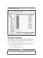
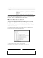
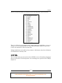

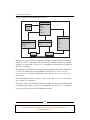

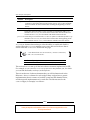
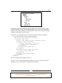

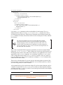
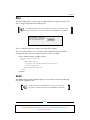

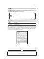


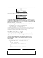
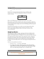
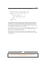

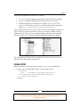
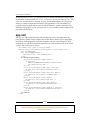


![Defining Event Handlers [Backbase Manual]](http://vs1.manualzilla.com/store/data/005692904_1-d6f01c41c66ce6049d8fb6a78592ae1b-150x150.png)