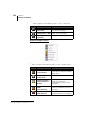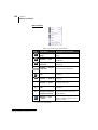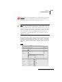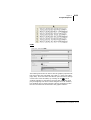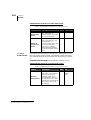
1
Manuale
User Manual
Utente
Rev. 2.1
1.0
INDEX
Introduction........................................................................................ 1
What is SmartClick? ...................................................................1
What does SmartClick do? .........................................................1
The Manual .................................................................................1
ESA Elettronica’s Customer Care service ..................................1
Layout of menus ................................................................................. 3
Main menu ..................................................................................4
The Toolbar ..............................................................................45
Managing the project...................................................................... 47
SmartClick Startup ...................................................................47
Creating a project in Wizard mode ...........................................49
Changing elements within a project .........................................51
Changing a project’s data .........................................................56
Saving a project ........................................................................58
Opening a project .....................................................................58
Project Explorer.............................................................................. 61
Operations on elements of the Project Explorer window .........62
Setting the panel .......................................................................64
Software Configuration ............................................................70
Variables ...................................................................................75
Languages and Fonts ..............................................................104
Pages .......................................................................................107
Popup pages ............................................................................114
Alarms ....................................................................................116
Recipes Types .........................................................................128
Users and Passwords ..............................................................136
ExportUserLog .......................................................................139
Data Archive ...........................................................................143
TrendBuffersXY .....................................................................147
DataLog ..................................................................................149
Polymath SmartClick - User Manual - rev. 1.0
Scripts .....................................................................................150
GlobalScripts ..........................................................................152
Text list ...................................................................................152
Image list ................................................................................153
Images .....................................................................................154
Advanced ................................................................................160
Pipelines .................................................................................160
Reports ....................................................................................162
Keyboards ...............................................................................171
Configuring the device ...........................................................174
Properties and Events that can be associated to the objects ...... 177
Editing object properties .........................................................177
Events that can be associated to objects .................................182
Managing a page .....................................................................190
Predefined graphic elements ...................................................194
Simple Figures ........................................................................194
Value fields .............................................................................216
Invert Function Option ...........................................................216
Invert Function option operation ............................................217
Thresholds option functioning ................................................218
Objects to which the Thresholds functionality can be applied 223
Simple Controls ......................................................................260
Complex Controls ...................................................................283
Active Alarm View .................................................................304
Operations on graphic elements .............................................327
Library Explorer............................................................................ 345
SmartClick Libraries ..............................................................345
Errors Viewer .........................................................................359
Warning Viewer .....................................................................360
Compiler Output .....................................................................360
Compiling, Downloading and Runtime........................................ 361
Project simulation ...................................................................363
Download the OPERATING SYSTEM image ......................371
Establishing an Ethernet connection ......................................372
Polymath SmartClick - User Manual - rev. 1.0
Scripts.............................................................................................. 377
The object ESAUSERMGR ...................................................387
The object ESAALARMMGR ...............................................387
The object ESARECIPEMGR ................................................390
The object ESARECIPETYP .................................................391
The object ESARECIPEARC .................................................392
The object ESARECIPETRF .................................................394
The object ESAPIPEMGR .....................................................396
The object ESATIMER ..........................................................398
The object ESATRENDMGR ................................................399
The object ESAPAGEMGR ...................................................404
The object ESAPAGE ............................................................408
The object ESACNTRL .........................................................409
object ESAPRN ......................................................................463
Examples of Script use ...........................................................466
Tutorial ........................................................................................... 477
Phase 1 - The Project and Hardware Configuration ...............477
Phase 2 - Software configuration ...........................................479
Phase 3 - Configuration of variables and Memory areas .......484
Phase 4 - General configuration of the terminal .....................491
Phase 5 - Defining the alarms .................................................494
Phase 6 - Defining recipe types ..............................................497
Phase 7 - Loading Images .......................................................498
Phase 8 - Defining text and image lists ..................................500
Phase 9 - Setting Pipelines .....................................................503
Phase 10 - Defining a Trend Buffer .......................................503
Phase 11 - Graphic setting ......................................................504
Phase 12 - Creating pop-up pages ..........................................517
Phase 13 - Drawing Full Screen pages ...................................523
Phase 14 - Using complex controls ........................................533
Phase 15 - Defining the Trend graph ......................................538
Phase 16 - Compilation and Download ..................................543
Appendix A - System Variables .................................................... 547
Appendix B - Predefined functions .............................................. 553
Polymath SmartClick - User Manual - rev. 1.0
Appendix C - Status area .............................................................. 565
VT Status area ........................................................................565
Keyboard status area ...............................................................567
Appendix D - Command area ....................................................... 569
Polymath SmartClick - User Manual - rev. 1.0
Chapter 1
1
Introduction
1.
Introduction
What is
SmartClick?
SmartClick is the software that ESA Elettronica offers its clients for the configuration of all operator panels in the SC family. The principal feature of the application is that it’s so easy
to use, thanks to its user-friendly, intuitive interface.
What does
SmartClick do?
The concept behind SmartClick is to be the switching-point between the customer and the terminal; in fact, it is the tool that
allows the user to transfer his or her own ideas onto the panel
creating projects at different levels of development.
The work performed by SmartClick produces a compiled
project containing all the operative details of the package created. Once the project has been compiled without errors, it
can be uploaded and installed on the panel, which is now
ready to use. SmartClick guides the user at every step of the
development of the project: from its creation to editing, from
compilation to its passage to the terminal.
Note: For a better knowledge of the functions offered by a particular
product, please consult the product’s technical characteristics on
www.esahmi.com
The Manual
This manual is designed to be a constant guide for ESA’s customers, describing and explaining the different features that
the software offers. It is aimed at the average user of ESA
products, guiding both first-time users of ESA products and
those already familiar with previous versions of the configurator.
The principal concepts and the method of use related to each
topic and operative feature will be illustrated using appropriate examples and screenshots.
The information contained in this document is subject to
change without prior notice and do not represent any obligation on the part of ESA elettronica S.P.A.
All products are trade names registered by their respective
owners.
ESA
Elettronica’s
Customer Care
service
In the event of any doubts about the use of SmartClick or other ESA products, contact ESA Elettronica’s Customer Care service.
Customer Care telephone number: +39/031/757400
Polymath SmartClick - User Manual - rev. 1.0
2
Chapter 1
Introduction
Fax: +39/031/751777
E-mail: [email protected]
Important: it is always a good idea to annotate the currently installed version of SmartClick and keep it to hand every time you contact ESA’s Customer Care service. The version of the software is
shown in the main menu by clicking on Help->Information
Polymath SmartClick - User Manual - rev. 1.0
Chapter 2
3
Layout of menus
2.
Layout of menus
Before we can confidently operate the numerous features
offered by SmartClick we need to familiarise ourselves with
the work environment and its various menus.
The layout of the application can be divided into the following
areas:
• main menu
• toolbars
• work area
• Project Explorer, Library Explorer
This chapter offers guidelines for making general software
settings and will pay particular attention to the main menu
and the toolbar which are the basic instruments for carrying
out any operations within SmartClick. We will also briefly
mention the "Project Explorer" and "Library Explorer" menu
windows that will be treated in detail in the following chapters.
Polymath SmartClick - User Manual - rev. 1.0
4
Chapter 2
Layout of menus
The functions offered by the toolbar can all be accessed via
the main menu.
Main menu
The main menu is the tool that permits SmartClick’s main
project and settings operations to be performed.
This is positioned at the top of the programme window. There
are also various scrollable submenus each offering different
functions as set out in the paragraphs that follow.
File menu
Table 1: Functions in the File menu
Icon
NA1
NA1
Polymath SmartClick - User Manual - rev. 1.0
Path Menu
Description of function
File -> New
Creates a new Wizard project
(see chap. 4, “Managing the
project” page 83)
File -> Open
Opens an existing project
File -> Close
Closes the project
File -> Save
Saves the project
File -> Save as...
Saves the project with a
different name/path
File -> Print
Prints the project
File -> Validate
project
Validates all the project (see
chap. 8, “Validation” page 461)
Chapter 2
5
Layout of menus
Table 1: Functions in the File menu
Icon
NA1
Path Menu
Description of function
File -> Validate
current
Validates the element currently
selected
File -> Compile
Compiles the project (see chap.
8, “Compiling, Downloading and
Runtime” page 461)
File -> Run project
Opens the project simulator
(see chap. 8, “Compiling,
Downloading and Runtime”
page 461)
File -> Download
Downloads the project onto the
panel (see chap. 8, “Compiling,
Downloading and Runtime”
page 461)
File -> Exit
Exits from SmartClick
1.Icon Not Available
Edit menu
Table 2: Functions of the Edit menu
Icon
Path Menu
Description of function
Modify -> Annul
Annuls the previous operation
Modify -> Repeat
Repeats the following operation
Edit -> Cut
Cuts the object selected
Edit -> Copy
Copies the object selected
Edit -> Paste
Pastes the object that has been
cut or copied
Polymath SmartClick - User Manual - rev. 1.0
6
Chapter 2
Layout of menus
Table 2: Functions of the Edit menu
Icon
Path Menu
Description of function
Edit -> Cancel
Deletes the object selected
Script Menu
Table 3: Script menu functions
Icon
Polymath SmartClick - User Manual - rev. 1.0
Path Menu
Description of function
Script -> Find
Finds a specific string in the
script
Script -> Go to line
Directs to a specific page in the
script
Script -> Comment
Allows to insert a comment in
the script
Script ->
Uncomment
Eliminates a comment from the
script
Script -> Increase
re-entry
Increases the re-entry of the
text in the script
Script -> Reduce
re-entry
Reduces the re-entry of the text
in the script
Chapter 2
7
Layout of menus
Fields menu
Table 4: Functions of the Fields menu
Icon
Path Menu
Description of function
Fields -> Select
Selects the object clicked on
after pressing
Fields -> Move
Editing area
Moves the Editing area selected
(e.g. Popup Page)
Fields -> Connect
Enables connection of devices
and terminals (see chap. 4,
“Managing the project”
page 83)
Fields -> Move
Port
Fields -> Create
Moves a connection port
Adds a device or a terminal to
the project
The Create submenu can be reached via the Fields menu and
this submenu can be used to add a large number of elements
to the page (Fields -> Create).
The elements that can be added are grouped under the
following headings:
• Simple figures
• Value fields
• Simple Controls
• Complex controls
The tables below give a description of the commands that can
be launched from this submenu. Refer to the appropriate
Polymath SmartClick - User Manual - rev. 1.0
8
Chapter 2
Layout of menus
chapter for the characteristics peculiar to the elements that
have been added.
Submenu: Simple figures
Table 5: Functions of the submenu: Fields -> Create -> Simple figures
Icon
Polymath SmartClick - User Manual - rev. 1.0
Path Menu
Description of function
Simple figures ->
Rectangle
Adds a rectangle to the page
(see chap. 6, “Simple Figures”
page 259)
Simple figures ->
Ellipse
Adds an ellipse to the page
Simple figures ->
Arc
Adds an arc to the page
Simple figures ->
Circular sector
Adds a circular sector to the
page
Simple figures ->
Line
Adds a line to the page
Simple figures ->
Polygon
Adds a polygon to the page
Simple figures ->
Broken line
Adds a broken line to the page
Simple figures ->
Regular polygon
Adds a regular polygon to the
page
Chapter 2
9
Layout of menus
Table 5: Functions of the submenu: Fields -> Create -> Simple figures
Icon
Path Menu
Description of function
Simple figures ->
Label
Adds a label to the page
Simple figures ->
Complex label
Adds a complex label to the
page
Simple figures ->
Trend pen
Adds a trend pen to the page
indicating the current value of
the buffer
Simple figures ->
image
Adds an image to the page
Submenu: Value fields
Table 6: Functions of the submenu: Fields -> Create -> Value fields
Icon
Path Menu
Description of function
Value fields ->
Numerical
Adds a numerical field to the
page (see chap. 6, “Value
fields” page 285)
Value fields ->
Dynamic
Adds a dynamic text to the page
Value fields ->
ASCII
Adds an ASCII field to the page
Value fields ->
Symbolic
Adds a symbolic field to the
page
Polymath SmartClick - User Manual - rev. 1.0
10
Chapter 2
Layout of menus
Table 6: Functions of the submenu: Fields -> Create -> Value fields
Icon
Path Menu
Description of function
Value fields ->
Date Time
Adds a field relating to the date
and time to the page
Value fields -> Bar
Adds a bar to the page
Value fields ->
Indicator
Adds an indicator to the page
Submenu: Simple Controls
Table 7: Functions of the submenu: Fields -> Create -> Simple Controls
Icon
Path Menu
Description of function
Simple Controls ->
Touch Button
Adds a touch button to the page
(see chap. 6, “Simple Controls”
page 333)
Simple Controls ->
Touch Area
Polymath SmartClick - User Manual - rev. 1.0
Adds a touch area to the page
Simple controls ->
Touch Keyboard
Button
Determines the keys and is
used only during the
configuration of the run time
keyboard
Simple Controls ->
Slide
Potentiometer
Adds a slide potentiometer
(with no predefined values) to
the page
Simple Controls ->
Slide Selector
Adds a slide selector (with
predefined values) to the page
Chapter 2
11
Layout of menus
Table 7: Functions of the submenu: Fields -> Create -> Simple Controls
Icon
Path Menu
Description of function
Simple Controls ->
Potentiometer
Knob
Adds a knob potentiometer
(without predefined values) to
the page
Simple Controls ->
Selector Knob
Adds a selector knob (with
predefined values) to the page
Submenu: Complex controls
Table 8: Functions of the submenu: Fields -> Create -> Complex controls
Icon
Path Menu
Description of function
Complex controls > One-touch
button
Adds a one-touch push-button
to the page (see chap. 6,
“Complex Controls” page 360)
Complex controls > Double-touch
button
Adds a double-touch button to
the page (see chap. 6,
“Complex Controls” page 360)
Complex controls > Trend
Adds a trend to the page (see
chap. 6, “Complex Controls”
page 360)
Complex controls > TrendXY
Inserts a trendXY in the page
(see chap. 6, “Complex
Controls” page 360)
Polymath SmartClick - User Manual - rev. 1.0
12
Chapter 2
Layout of menus
Table 8: Functions of the submenu: Fields -> Create -> Complex controls
Icon
Path Menu
Description of function
Complex controls > Logged on users
displayed
Displays the users logged on
and allows the password to be
changed (see chap. 6,
“Complex Controls” page 360)
Complex controls > Active alarm
table
Adds a table of active alarms to
the page (see chap. 6,
“Complex Controls” page 360)
Complex controls > Alarm history
table
Adds an alarm history table to
the page (see chap. 6,
“Complex Controls” page 360)
Complex controls > User list
Adds a table with a list of users
to the page (see chap. 6,
“Complex Controls” page 360)
Complex controls > Recipe list
Adds a table with a list of
recipes to the page (see chap.
6, “Complex Controls”
page 360)
Complex controls > Recipe editor
Adds a table with a recipe editor
to the page (see chap. 6,
“Complex Controls” page 360)
Menu: Layout
Polymath SmartClick - User Manual - rev. 1.0
Chapter 2
13
Layout of menus
Table 9: Functions of the menu: Layout
Icon
Path Menu
Description of function
Layout -> Show
grid
Shows the grid in a page or in a
Hardware configuration (see
chap. 6, “Page properties”
page 257)
Layout -> Align
grid
Aligns the selected element to
the grid
Layout -> Show/
Hide Touch Grid
Displays / hides the cells to b
selected by the Grill on the
Touch screen
Layout -> Show/
Hide touchsensitive areas
Displays / hides the pixels of
the Area on the Touch screen
Layout -> Enlarge
Enlarges the page display
Layout -> Reduce
Reduces the page display
Layout -> Zoom
Makes it possible to indicate the
display percentage for the page
Layout -> Group
Group two or more elements in
the current selection (see chap.
6, “Grouping of two or more
graphic elements” page 425)
Layout ->
Separate
Separates the elements of a
group
Layout -> Block
Blocks the objects / pages
Layout -> Un block
Un blocks the objects / pages
Layout -> Redimension with the
control
Re-dimensions the elements
collected, maintaining the aspect.
Using the Layout menu you can also access all the functions
for aligning and positioning the elements within the pages.
This is done using the submenus: Align, Arrange and Level
that are illustrated below.
Polymath SmartClick - User Manual - rev. 1.0
14
Chapter 2
Layout of menus
Submenu: Align
Table 10: Functions of the submenu: Layout -> Align
Icon
Polymath SmartClick - User Manual - rev. 1.0
Path Menu
Description of function
Align -> Top
Aligns the object in the
selection with the top (see
chap. 6, “Alignment of objects”
page 430)
Align -> Bottom
Aligns the object in the
selection with the bottom
Align -> Middle
Aligns the object in the
selection with the middle
Align -> Left
Aligns the object in the
selection with the left
Align -> Centre
Aligns the object in the
selection with the centre
Align -> Right
Aligns the object in the
selection with the right
Chapter 2
15
Layout of menus
Submenu: Arrange
Table 11: Functions of the submenu: Layout -> Arrange
Icon
Path Menu
Description of function
Arrange ->
Horizontally
Arranges the object in the
selection horizontally (see
chap. 6, “Arrangement of
objects” page 434)
Arrange -> Right
Arranges the object in the
selection to the right
Arrange -> Centre
Arranges the object in the
selection to the centre
Arrange -> Left
Arranges the object in the
selection to the left
Arrange ->
Vertically
Arranges the object in the
selection vertically
Arrange -> Top
Arranges the object in the
selection to the top
Arrange -> Middle
Arranges the object in the
selection to the middle
Arrange -> Bottom
Arranges the object in the
selection to the bottom
Polymath SmartClick - User Manual - rev. 1.0
16
Chapter 2
Layout of menus
Submenu: Level
Table 12: Functions of the submenu: Layout -> Level
Icon
Path Menu
Description of function
Level ->
Foreground
Places the object selected into
the foreground (see chap. 6,
“Depth order of objects”
page 428)
Level ->
Background
Places the object selected onto
the background
Level -> Up
Raises the object selected by a
level
Level -> Down
Lowers the object selected by a
level
Menu: Image
Polymath SmartClick - User Manual - rev. 1.0
Chapter 2
17
Layout of menus
Table 13: Functions of the menu: Image
Icon
Path Menu
Description of function
Image -> Load
Load the current image (see
chap. 5, “Operations
performable on an image”
page 214)
Image -> Edit
Allows the image to be edited
Image -> Remove
Remove the image loaded
Image -> Colour
Makes it possible to choose the
type of colouring between:
Automatic, Tones of grey, White
and Black
Image -> Increase
contrast
Increases the contrast of the
image selected
Image ->
Decrease contrast
Decreases the contrast of the
image selected
Image -> Increase
brightness
Increases the brightness of the
image selected
Image ->
Decrease
brightness
Decreases the brightness of the
image selected
Image -> Cut area
Cuts the area selected
Image -> Rotate
Rotates the image selected
Image -> Adapt to
screen
Adapts the selection to the
display
Image -> Maintain
proportions
Maintains the proportions while
the image size is changed
Polymath SmartClick - User Manual - rev. 1.0
18
Chapter 2
Layout of menus
Menu: Display
Table 14: Functions of the menu: Display
Icon
Path Menu
Description of function
Display -> First
page
Moves to SmartClick Home
Page
Display -> Last
Moves to last work page
displayed
Display ->
Forward
Moves to next work page
displayed
Display -> Project
language
NA1
NA1
NA1
Display -> Show
all
Shows all the anchorable
windows
Display -> Hide all
Hides all the anchorable
windows
Display -> Show
Allows to access the anchorable
windows sub-menu
Display -> Tools
bar
Allows to access the tools bar
submenu
Display ->
Restores windows
and bars position
Allows to restore the SmartClick
windows and bars with the default position
Display -> Full
screen
Allows to display the work window in "Schermo Intero" (Full
Screen) mode
1.Icona Non Disponibile.
Polymath SmartClick - User Manual - rev. 1.0
Makes it possible to change the
current project language
Chapter 2
19
Layout of menus
Submenu: Show
Table 15: Functions of the submenu: Display -> Show
Icon
Path Menu
Description of function
Show -> Explore
project
Shows the Explore Project
window
Show -> Explore
Library
Shows the Explore Library
window
Show -> Log List
Shows the Log List window
Submenu: Toolbar
This submenu lists the twelve groups of icons making up the
toolbar. Using this menu the user can proceed to reintroduce
into the application groups of icons that have been closed and
that no longer appear in the SmartClick screen. For further
information about the way the toolbar works, please consult
the next paragraph.
Menu: Tools
Options Sub-menu
Table 16: Functions of the menu: Tools
Icon
NA1
NA1
Path Menu
Description of function
Tools -> Options
Makes it possible to configure
the Options of SmartClick
Tools -> Utility
Accesses SmartClick utilities
Polymath SmartClick - User Manual - rev. 1.0
20
Chapter 2
Layout of menus
Table 16: Functions of the menu: Tools
Icon
Path Menu
Description of function
NA1
Tools ->
Translations
Manages the Translation of the
project
NA1
Tools -> Tags/
Variables
Manages the Tags/Variables of
the project
NA1
Tools -> Recipes
Manages the project recipes
NA1
Tools -> Alarms
Manages the project alarms
NA1
Tools ->
Downloader
Utilities
This allows you to load the image of the Windows® CE operating system on the terminal
1.Icon Not Available
Click on the option Tools -> Options to access the mask for
configuring the Options of SmartClick.
Language Menu
Use the Language menu to choose the language of the
SmartClick application. Once the language has been selected
the application will need to be restarted to apply the changes.
Polymath SmartClick - User Manual - rev. 1.0
Chapter 2
21
Layout of menus
Skin Menu
From the "Skin" menu, it is possible to select the skin to use
with the SmartClick interface.
Various menu
Use the Various menu to proceed to configure the general
Options of the application. The user may decide to view all the
objects during the move or only their outline, to automatically
provide a new name if using the cut/paste function , whether
to validate the project manually (File -> Validate project) or
in ‘real time’ automatically (see chap. 8, “Validation”
page 461), to visualise the edit password screen, view or hide
information on the various fields of the page, whether or not
to view the ESA terminal frame on the page editor, whether to
activate the "Invert" option or not, view or hide the images of
structures, graphically decide if wanting to inherit the
Hardware configuration, decide whether it should show the
Polymath SmartClick - User Manual - rev. 1.0
22
Chapter 2
Layout of menus
message regarding conversation for old programs or not,
display or not display the panel image in the simulator, enable
or disable pop-up window viewing for importing tags, to set
the maximum number of windows open at the same time in
the SmartClick Work area.
Note: The options Manual validation and viewing only the outline
while the objects are being dragged are advised for configuring
particularly slow performing machines.
Utility Sub-menu
Table 17: Utility functions menu
Icon
Menu path
Function description
NA1
Utility -> Updates
control
Allows to check the presence of
new software issues of the
SmartClick program
NA1
Utility -> Project
documents
Allows a document to be
created with the specifics of the
project
NA1
Utility -> Panel
converts
Allows the conversion of a panel
NA1
Utility -> Device
converts
Allows the conversion of a device
Utility -> Remove
Tags/Variables
not used
Checks if Tags/Variables not
used are present in the project
NA1
NA1
Utility -> Crossed
reference
1.Icon Not Available
Polymath SmartClick - User Manual - rev. 1.0
Finds all components used
inside the project.
Configured only components ,
are not included in the research
Chapter 2
23
Layout of menus
Update control
The “Update control” option allows verifying if online there are
more updated SmartClick versions compared to the one installed:
By clicking on “Next” a more recent version of SmartClick will
be searched online (on the ESA site) compared to the one installed on the PC, if a more updated version is not found, the
following image is displayed:
If there is a more recent version, the new version of SmartClick will be installed by clicking on "Next".
Polymath SmartClick - User Manual - rev. 1.0
24
Chapter 2
Layout of menus
Project documentation
The “Project documentation” option allows creating a simple
or complete print report, choosing from “.pdf” “.rtf” and “.html” formats.
In the first screen it is possible to choose the “Simple” or
“Complete” option, the first only contains default options:
while the second one contains all options:
Polymath SmartClick - User Manual - rev. 1.0
Chapter 2
25
Layout of menus
By pressing the Next key a window will open where you can
choose the contents of the project to be printed :
Pressing the next button opens a window from which it is possible to choose the desired page layout :
By enabling the "include title page" check-box, a preview is
automatically opened with all default parameters enabled:
Polymath SmartClick - User Manual - rev. 1.0
26
Chapter 2
Layout of menus
Pressing next will open a window from which, by clicking on
"Browse", it is possible to select the name and path where the
file is to be saved:
Polymath SmartClick - User Manual - rev. 1.0
Chapter 2
27
Layout of menus
By clicking on “Create” the project is saved with the desired
file path.
Convert panel
The “Panel Conversion” option allows you to convert the panel
used in the project into an HMI with different features. Open
the folders to select the type of panel :
Once the panel type clicking on “Next”
Polymath SmartClick - User Manual - rev. 1.0
28
Chapter 2
Layout of menus
The following image, summarising the operation to be carried
out, will appear :
At this point, click on "Next" and wait for the end of the conversion :
Polymath SmartClick - User Manual - rev. 1.0
Chapter 2
29
Layout of menus
Convert device
The “Convert device” option allows converting a Device into a
second, during this conversion, only variables with the same
structure are maintained:
The first screen allows choosing the Device group:
Open the folders to choose the Device type:
Once the Device type is chosen, click "Next":
Polymath SmartClick - User Manual - rev. 1.0
30
Chapter 2
Layout of menus
The following image, summarising the operation to be carried
out, will appear:
Polymath SmartClick - User Manual - rev. 1.0
Chapter 2
31
Layout of menus
At the end of the conversion a Report is displayed listing the
"non converted tags" and a message is present warring the
user that certain panel/device connections may have been removed, next it recommends recreating new connections:
Unused Tags Removal
The "unused Tags Removal" option allows verifying if unused
variables are present in the project, and to eliminate them.
The first screen allows selection, by clicking on the corresponding “Unused tags” to be removed.
Note: All variables are selected by default.
Polymath SmartClick - User Manual - rev. 1.0
32
Chapter 2
Layout of menus
Pressing the “Remove” will remove unused Tags:
At the end, click on “OK”:
Cross reference
The “Cross reference” option allows searching for unused
components within all projects, from the following window it
is possible to select search criteria:
Polymath SmartClick - User Manual - rev. 1.0
Chapter 2
33
Layout of menus
The search criteria are the following:
•
•
•
•
•
Free search
Find/Replace
Page Elements
Project Tags (with “Check” enabled by default)
Project Scripts/Functions
Free search
Within “Free search” it is possible to carry out a search by fields by editing the “Name Mask” and inserting, for example, the
letter “F”. In the initial page it is also possible to decide if the
search is to be completed for the entire project or only in a
part of it.
Using two keys, it is also possible to save/load filter conditions
in “.XML” format.
Then click “Search”:
Polymath SmartClick - User Manual - rev. 1.0
34
Chapter 2
Layout of menus
The following mask will display all objects whose name begins
with the letter “F”:
In the same page, by using the keys, it is also possible to:
•
•
Polymath SmartClick - User Manual - rev. 1.0
Export all: Export all objects in the list to an Excel or
CSV file.
Export selected: Export selected objects in the list to an
Excel or CSV file.
Chapter 2
35
Layout of menus
•
•
•
•
Modify: After selecting an element from the list, it allows modifying it within the project.
Tree view: Allows modifying how elements are viewed,
from "table" to "tree" type.
Find element: Allows a more detailed search among elements that have already been searched.
New search: Allows carrying out a new search from the
beginning.
Find/Replace
With the “Find/Replace” option it is possible to find, within the
project, certain elements (for example a Font type) and
replace it with another (for example a different Font type):
Polymath SmartClick - User Manual - rev. 1.0
36
Chapter 2
Layout of menus
Let us now select the font to be used:
Clicking “Forward”, the following screen is appears:
Click "End"
Page Elements
In the “Page Elements” option it is possible to complete a
search for elements within the project, with three different
Polymath SmartClick - User Manual - rev. 1.0
Chapter 2
37
Layout of menus
criteria that can be used both individually and at the same
time:
• “Search by Name” : allows carrying out an alphabetic
search among elements, the "Search by Name" option
is divided into three subgroups:
1) “Search from : to": the filter is set by the user who can define a search field starting form one letter and finishing with
another one, the following mask will display all objects whose
name is included between “M” and “N”, of the " Numerical
Field" category and belonging to the entire project
2) “Element name begins with”: The filter is set by the user
who defines a search field by selecting the letter at the beginning of the name for the element to be searched
3) “Mask” : The search filter is the same one of the option
“Element name begins with”
•
•
“Element category” : Allows searching within each individual category of elements present in the project
“Search in”: Allows deciding where, within the project,
the search is to be carried out, in the entire project or
only in a portion of it.
Once the filters for carrying out the search are selected, the
following mask is obtained:
Polymath SmartClick - User Manual - rev. 1.0
38
Chapter 2
Layout of menus
From the previously described mask, using the appropriate
keys, it is possible to complete the following operations:
•
•
•
•
•
•
Export all: Export all objects in the list to an Excel or
CSV file.
Export selected: Export selected objects in the list to an
Excel or CSV file.
Modify: After selecting an element from the list, it allows modifying it within the project.
Tree view: Allows modifying how elements are viewed,
from "table" to "tree" type.
Find element: Allows a more detailed search among elements that have already been searched.
New search: Allows carrying out a new search from the
beginning.
Projects Tags
In the “Projects Tags” option it is possible to complete a
search for elements within the project, with two different
criteria that can be used both individually and at the same
time:
“Search by Name” : allows carrying out an alphabetic search
among elements, the "Search by Name" option is divided into
three subgroups:
1) “Search from : to": the filter is set by the user who can
define a search field starting form one letter and finishing with
another one.
Polymath SmartClick - User Manual - rev. 1.0
Chapter 2
39
Layout of menus
“Search by type” : the filter is set by the user who can define
a search field by selecting the tag type needed.
2) “Element name begins with”: The filter is set by the user
who defines a search field by selecting the letter at the
beginning of the name for the element to be searched.
3) “Mask” : The search filter is the same one of the option
“Element name begins with”
Once the filters for carrying out the search are selected, the
following mask is obtained :
Polymath SmartClick - User Manual - rev. 1.0
40
Chapter 2
Layout of menus
From the previously described mask, using the appropriate
keys, it is possible to complete the following operations:
•
•
•
•
•
•
Export all: Export all objects in the list to an Excel or
CSV file.
Export selected: Export selected objects in the list to an
Excel or CSV file.
Modify: After selecting an element from the list, it allows modifying it within the project.
Tree view: Allows modifying how elements are viewed,
from "table" to "tree" type.
Find element: Allows a more detailed search among elements that have already been searched.
New search: Allows carrying out a new search from the
beginning.
Note: The “Project Tags” option exclusively searches Tags used in
the project. If a Tag is present within the “Project Explorer” but it
is not associated with any project element, it will NOT be included
in the search.
Project Scripts/Functions
In the “Projects Scripts/Functions” option it is possible to complete a search for elements within the project, with two different criteria that can only be used individually:
•
Search by Name” : allows carrying out an alphabetic search among elements, the "Search by Name" option is
divided into three subgroups:
1) “Search from : to": The filter is set by the user who can define a search field starting form one letter and finishing with
another one.
2) “Element name begins with”: The filter is set by the user
who defines a search field by selecting the letter at the beginning of the name for the element to be searched
3) “Mask” : The search filter is the same one of the option
“Element name begins with”
•
“Search by Type”: allows searching within each individual category of the "Function" or "Script" present in
the panel project.
By selecting the "Function" option and choosing an item from
the list (e.g. Exit Runtime) the SW will search all “Exit Runtime” functions in the project:
Polymath SmartClick - User Manual - rev. 1.0
Chapter 2
41
Layout of menus
Once the filters for carrying out the search are selected, the
following mask is obtained:
By selecting the "Script" option and choosing an item from the
list (e.g. ESAStartup) the SW will search all “ESAStartup”
Script in the project:
Polymath SmartClick - User Manual - rev. 1.0
42
Chapter 2
Layout of menus
Once the filters for carrying out the search are selected, the
following mask is obtained:
From the previously described mask, using the appropriate
keys, it is possible to complete the following operations:
•
•
Polymath SmartClick - User Manual - rev. 1.0
Export all: Export all objects in the list to an Excel or
CSV file.
Export selected: Export selected objects in the list to an
Excel or CSV file.
Chapter 2
43
Layout of menus
•
Modify: After selecting an element from the list, it allows modifying it within the project.
Tree view: Allows modifying how elements are viewed,
from "table" to "tree" type.
Find element: Allows a more detailed search among elements that have already been searched.
New search: Allows carrying out a new search from the
beginning.
•
•
•
Translations Sub-menu
Table 18: Translations menu functions
Icon
Menu path
Function description
NA1
Translations ->
Export
Exports Translations
NA1
Translations ->
Import
Imports Translations
1.Icon Not Available
Translations are converted in CSV. format easily transferable
and convertible from each software.
Tags Sub-menu
Table 19: Tags/Variables menu functions
Icon
Menu path
Function description
NA1
Tags/Variables ->
Export
Exports Tags/Variables
NA1
Tags/Variables ->
Import
Imports Tags/Variables
1.Icon Not Available
Polymath SmartClick - User Manual - rev. 1.0
44
Chapter 2
Layout of menus
Recipes Sub-menu
Table 20: Recipe menu functions
Icon
Menu path
Function description
Recipes -> Export
Exports Recipes
NA1
Recipes -> Import
Imports Recipes
NA1
Recipes ->
Recipe Editor
Allows to manage the recipes
NA
1
1.Icon Not Available
Alarms Sub-menu
Table 21: Alarms menu functions
Icon
Menu path
Function description
NA1
Alarms -> Export
Exports Alarms
NA1
Alarms -> Import
Imports Alarms
1.Icon Not Available
? Menu
Table 22: ? menu functions
Icon
NA1
Polymath SmartClick - User Manual - rev. 1.0
Menu path
Function description
? -> Information
Allows the information
regarding the version of the
program to be seen
Chapter 2
45
Layout of menus
Table 22: ? menu functions
Icon
NA1
Menu path
Function description
? -> Help
Allows to access the SmartClick guide
1. Icon Not Available
The Toolbar
The Toolbar consists of buttons allowing the user to access all
SmartClick operations.
When the mouse is placed on one of the icons, its meaning is
displayed, see below:
Note: The Toolbar offers a shortcut to the same Functions that you
can access from the main menu. To find out what a given icon
means, consult the Table of Functions in the main menu (see chap.
2, “Main menu” page 4).
Editing the Toolbar
The Toolbar is organized into groups of icons, each of which
can be managed individually.
To move or delete a group of objects, just drag up from the
bar towards any area of the application. To start the drag,
click on the left edge of the group.
Once you have clicked, the mouse pointer will change into the
dragging cursor typical of Windows. It is now possible to
insert the group wherever you want.
Polymath SmartClick - User Manual - rev. 1.0
46
Chapter 2
Layout of menus
Release the mouse key to apply the move. The group can be
left in any position on the screen or, once you have double
clicked on the group itself, it can be closed by clicking on the
‘X’ :
Closed groups can be reinserted into the toolbar by clicking on
the corresponding name in the main menu (Display>toolbar). The changes to the layout of the toolbar are saved
for the next time SmartClick is used.
In addition to the menu and the icons, SmartClick's other fundamental component is represented by the following menu
windows :
•
•
•
•
•
•
•
Project explorer (see chap. 5, “Project Explorer”
page 107)
Properties editor (see chap. 6, “Properties Editor”
page 241)
Events editor (see chap. 6, “Properties Editor”
page 241)
Library explorer (see chap. 6, “SmartClick Libraries”
page 345)
“Errors Viewer” (see chap. 7, “Errors Viewer” page 458)
“Warning Viewer” (see chap. 6, “Warning Viewer”
page 360)
“Compiler Output” (see chap. 7, “Compiler Output”
page 459)
The menu windows are described in detail in the following
chapters together with their respective function.
Polymath SmartClick - User Manual - rev. 1.0
Chapter 3
47
Managing the project
3.
Managing the project
The user can completely program the behavior of the terminal
by using SmartClick which will produce at the end a project
file.
The user can create a project file, edit it as he or she pleases
(using the functions we will describe later on), save it and later reopen it for any further editing.
The aim of this chapter is precisely to furnish the information
needed to create and manage the SmartClick project files correctly.
SmartClick
Startup
When you start up SmartClick the following image will appear:
With SmartClick, in a few simple steps it is possible to edit the
properties of any object using the graphic libraries on the right
side of the working area :
Polymath SmartClick - User Manual - rev. 1.0
48
Chapter 3
Managing the project
To use an object from the library simply select one and drag
it onto the page so that you can edit and configure it to your
liking.
The use of the libraries is recommended for all users who are
familiar with the use of Popup pages for configuring or editing
objects :
Once you have inserted an object you can immediately edit its
properties by double clicking on it :
Polymath SmartClick - User Manual - rev. 1.0
Chapter 3
49
Managing the project
Creating a
project in
Wizard mode
The first step using SmartClick is to create a brand-new
project. The user is offered two ways of creating a new
project: one guided (the Wizard) and one completely manual.
Opening the Wizard
Wizard mode will guide you in creating your projects and in organizing the various hardware components.
There are three ways of activating the Wizard :
•
•
•
Click on
File->New from the main menu
Click on ‘Open Wizard to create a project’ to start up the
guided project creation.
Using the Wizard
To begin creating the project, simply click on the "Next" button.
Polymath SmartClick - User Manual - rev. 1.0
50
Chapter 3
Managing the project
The first choice you must make concerns the type of project,
click on "Next" to choose the panel you wish to insert; once
you have made your choice, click on "Next" to continue :
You will then need to select the device you wish to connect.
When you have made your choice, click on "Next" to continue:
Polymath SmartClick - User Manual - rev. 1.0
Chapter 3
51
Managing the project
Note: The categories that appear in the window will differ based on
the type of panel you have chosen.
Note: When a user chooses a device that allows variables form the
proprietary database to be imported, the mask described below will
appear where he/she can decide whether to import the variables at
this point in the project or postpone the operation to a later time:
Changing
elements
within a project
At any time it is possible to add, edit or delete elements and
connections contained in the hardware configuration of a
project. Simply double click
on the “HWConfiguration” entry in the "Project Explorer" window :
Polymath SmartClick - User Manual - rev. 1.0
52
Chapter 3
Managing the project
There are three options for adding new devices to the project :
• Use the right mouse key to click inside the white configuration page and select "Aggiungi Nuovo Oggetto"
(Add New Object) from the menu
• Click on the
key present in the tools bar
• Select Fields ->
Create...from the main menu
A dialogue window will open from where it is possible to select
ESA devices and panels :
Polymath SmartClick - User Manual - rev. 1.0
Chapter 3
53
Managing the project
Now the introduction procedure of the object selected, results
identical to that described previously in the "Wizard".
Modification and connection of the project components
Once all of the useful elements for the realisation of the
project have been introduced, they must be connected and
the connection modes must be specified.
The "ConfigurazioneHW" (HW Configuration) window displays
terminals and previously-inserted devices. The ports available
are indicated for every element.
Moving a terminal or device
To move a terminal or a device to the inside of the Configuration Window just click on
and then on the element to be
moved. At this point the element has been selected and you
need only drag it (keeping the left mouse key pressed down)
till it reaches the desired position; when the left mouse key is
released the element will remain in the new position unless it
is again moved. If elements containing connections are
moved, SmartClick will automatically update the position and
the connections showing in the window.
Moving a port
To move a port, click on
; at this point the icons representing the ports can be selected, as in the following example.
After clicking on the port to be moved just drag it (keeping the
left mouse key pressed down) till it reaches the desired position; when the left mouse key is released the port will remain
in the new position unless it is again moved.
Polymath SmartClick - User Manual - rev. 1.0
54
Chapter 3
Managing the project
If ports that are references to existing connections are moved,
SmartClick will automatically update the position and the connections showing in the window without altering their nature.
Connecting two elements
If the page contains at least one ESA panel and one device you
will be able to specify the mode of the connection between
them. If you want to add a connection you have first to click
on
and then go on to click inside a free port (one that is
not already a reference to another connection). When the
pointer nears an available port, a small rectangle will appear
next to the pointer containing a connection thread as shown
in the figure.
Without releasing the left mouse key, you can proceed to
specify the connection path (a horizontal line appears).
Polymath SmartClick - User Manual - rev. 1.0
Chapter 3
55
Managing the project
To establish the second terminal of the connection release the
mouse as soon as the black line reaches the port you wish to
include in the connection. When the pointer nears an available
port, a small rectangle will appear next to the pointer containing a connection thread.
The connection will appear as a broken blue line between the
two reference ports.
Operations on terminals and devices
To change a terminal or a device in the Hardware Configuration window you need first to select it: click on
and then on
the element itself.
Once the object has been selected, just click with the righthand key on the same to be able to access the following editing menu :
Polymath SmartClick - User Manual - rev. 1.0
56
Chapter 3
Managing the project
Using the ‘Edit’ option you can make changes to the properties
of the object; ‘Duplicate’ creates within the Configuration Window an identical copy of the object that has been selected (all
the properties of the first are copied into the second). The
‘Cancel’ option eliminates the element from the project, while
the ‘Cut’, ‘Copy’ and ‘Paste’ keys have their usual functions,
typical when operating in Windows. Besides these there are
the Zoom options which allow you to edit the dimensions of
the display of the objects.
Eliminating a terminal or device
To eliminate a terminal or a device from the Hardware Configuration window just click on
and then on the element to be
eliminated. To eliminate it, once the object has been selected,
press the ‘Canc’ key of the keyboard or alternatively click with
the right-hand key of the mouse on the element, then, using
the drop-down menu that appears click on ‘Cancel’.
Eliminating a connection
To eliminate a connection from the Hardware Configuration
window just click on
and then on the connection (line) to
be eliminated. To eliminate it, once the connection has been
selected, press the ‘Canc’ key of the keyboard or alternatively
click with the right-hand key of the mouse on the element,
then, using the drop-down menu that appears click on ‘Cancel’.
Changing a
project’s data
Changes to the general data of a project can be made at any
moment throughout the project editing process (over and
above changes to its components as seen in the last paragraph).
To access the editing menu of a project, double-click the
‘Project’ option within the ‘Explore project’ menu (see chap. 5,
“Project Explorer” page 107). There are three editing masks:
User Information, File Information and Components.
Polymath SmartClick - User Manual - rev. 1.0
Chapter 3
57
Managing the project
User Information
Using the User Information mask you can edit general data relating to the project, such as Name, Comment (optional), Author, Company and Version. The data relating to the creation
and editing of the project are not editable.
File Information
The File Information mask contains the data relating to the
current file in which the project is saved; such data contains
information regarding the name of the file, the remote path in
which the file is saved and the creation and editing dates of
the file.
Note: The name of the project and the name of the file are two quite
distinct things: the name of the project is a project identifier used
only within SmartClick software while the name of the file serves to
distinguish the file within the File System of the user’s PC.
Polymath SmartClick - User Manual - rev. 1.0
58
Chapter 3
Managing the project
Components
The Components mask lists all the devices and ESA panels involved in the current project and added in the course of the
creation of the project. By clicking on each element in the list
you can access the corresponding editing mask.
Saving a
project
At any point throughout the process of editing the project the
user can save his or her work onto hard disk or a removable
support.
There are three options for saving the project into a file:
- File -> Save from the main menu
- Press CTRL+S on the keyboard together
- Click on
When the project file is overwritten, SmartClick automatically
creates a backup file with the extension *.scprj.bak saving it
into the folder the user is working in. In this way there is always a reserve copy of the original project; to use and edit the
backup copy just rename the extension, changing it from
*.scprj.bak to *.scprj and reopen the project in SmartClick.
Warning: When the Save command described above is used the currently open file is overwritten (or written onto a new file in the case
of a new project); to maintain the original file you must choose File>’Save as...’ from the main menu and supply a name or a different
path.
Opening a
project
When the application is launched or in the course of the work
on SmartClick you can proceed to work on a project previously
saved onto Hard Disk or onto a removable support.
There are three options for opening a new file:
- click on
- File -> Open from the main menu
- click on
to go to the Home Page of the program. Then
click on ‘Open existing project’
In all these cases an exploration window opens that allows you
to select project files (*.scprj) from within your resources.
Polymath SmartClick - User Manual - rev. 1.0
Chapter 3
59
Managing the project
Note: When you enter the Home page of the program by means of a
click on
a list of recently opened files ordered chronologically
according to their last editing date. This procedure is simplest and
quickest if you often work with the same files.
Polymath SmartClick - User Manual - rev. 1.0
60
Chapter 3
Managing the project
Polymath SmartClick - User Manual - rev. 1.0
Chapter 4
61
Project Explorer
4.
Project Explorer
The principal anchorable window in SmartClick is the Project
Explorer window from which the structure and operations of
the project can be controlled. In this chapter we describe in
detail all the characteristics that can be configured using
Project Explorer.
The Project Explorer window contains all the editable objects
arranged as a tree diagram in which the parent element is
always the project to which the Hardware configuration is
anchored, the ESA terminals (with their attributable
properties) and the connected devices (with their related
settings).
Note: A single click on an element in the tree selected it, while a
double click allows you to edit.
There are six buttons present in the upper part of the window :
•
The
button is used to add one element to the
category selected in the tree chart. If the entire project
Polymath SmartClick - User Manual - rev. 1.0
62
Chapter 4
Project Explorer
•
•
•
•
•
is selected, this key can be used to insert new terminals
or devices.
The
button is used to enter editing mode for the
element selected in the tree chart.
The
button is used to shift an element upwards.
The
button is used to shift an element downwards.
The
button is used to put the objects in order.
The
button is used to put the page numbers in order.
There is also a drop-down menu from which any of the
categories making up the menu can be selected.
Information relating to the element selected is displayed in
the lower section of the window. Here you will find the name,
the comment and the path of those objects chosen when
creating the project.
Operations on
elements of the
Project
Explorer
window
There is a series of cumulative functions applicable to all the
categories or elements of the Project Explorer window
irrespective of their nature. These functions are contained in
a menu called up by clicking with the right-hand key on the
object in question as illustrated in the figure
Polymath SmartClick - User Manual - rev. 1.0
Chapter 4
63
Project Explorer
The functions that can be selected are:
• Edit, to enter editing mode
• Add new, to add an element to a category
• Add new and Edit, to add an element to a category and
directly access the editing page (in the Work area)
• Rename, to change the name of the object selected
• Duplicate, to create an exact copy of the element
selected; the properties that must remain unique within
the project (e.g. Name, Identifying Number,
Description) are not copied but are automatically
assigned a valid value
• Delete, to delete the element selected
• Create folder, for organization reasons, it is possible to
split all the components of a project in different folders;
You can :
- Create new folders.
- Rename the folders.
- Cut/Copy/Paste the objects in the folder
- Delete the objects and the folders.
- Move the objects among the folders
•
Cut, to eliminate the element selected and copy it into
the clipboard
Polymath SmartClick - User Manual - rev. 1.0
64
Chapter 4
Project Explorer
•
•
•
•
•
•
Copy, to copy the element selected into the clipboard
Paste, to paste in the element contained in the clipboard
Paste as Child, to paste in the element contained in the
clipboard as Child of the element selected
Import : to import texts inside of the project in the ".xls"
or ".csv" format
"Export": exports project elements (texts, alarms,
pages etc.) onto the Hard Disk or the USB storage
device
"Configuration columns", allows you to configure the
columns of the properties for the function in question,
to your liking
Elements of Project Explorer
The tree-type structure of Project Explorer allows the user to
access the configurator of all the components of a SmartClick
project (with the exception of the graphic elements that are
configured by the Editor property); the Project (see chap. 4,
“Changing a project’s data” page 96) and Hardware
configuration editor (see chap. 4, “Managing the project”
page 83) have already been described in the previous chapter
while the other objects will be described in this chapter.
To access the editor of an element just double-click on it in
Project Explorer; the corresponding editing window will
appear in the work area.
We will start by describing the elements that can be
associated with ESA terminals and then we will illustrate the
settings of devices connected to these terminals.
Setting the
panel
When the Project Explorer icon corresponding to the panel
added to the project is double-clicked, the user is able to edit
its characteristics.
Editing the panel is organized via 6 work windows: General,
Communication ports, Main window, Configuration Boot,
Exchange areas and Components. The user can move from
one window to another at any time without losing any of the
changes made.
Polymath SmartClick - User Manual - rev. 1.0
Chapter 4
65
Project Explorer
General
The work window ‘General’ is used to change the name of the
panel in question and add comments within it to make it
distinguishable in the programming phase with SmartClick.
The bottom of the window shows information on the date of
creation, editing and compilation of the project.
Communication ports
In this window it is possible to configure the communication
method between the panel and the device; the parameters
can be configured in function of the connected panel and
device.
The bottom of the window shows the range allowed by the
protocol for each value inserted :
Polymath SmartClick - User Manual - rev. 1.0
66
Chapter 4
Project Explorer
PORT1
PORT2
ETH1
To edit each parameter, simply click on the desired item and
then click the drop down menu :
Polymath SmartClick - User Manual - rev. 1.0
Chapter 4
67
Project Explorer
Main window
The Work window of the main window shows the dimensions
in pixels of the page displayed on the panel; in general these
dimensions are unchangeable and depend on the features of the
panel hardware. Nevertheless, it is possible to change the grid
for arranging objects in the page (see chap. 6, “Managing a
page” page 254); the default values for these dimensions are
set at 10 pixels for the width and 10 pixels for the length. By
reducing these values you have more freedom to add and
reposition elements within the page (the grids in the work
area will be denser); similarly, by increasing these values, the
lines will become less dense and there will be less freedom to
introduce objects.
There are also a number of configurable options regarding the
display of pages on the terminal; the "Show focus" option can
be selected (100% zoom), the user can decider whether to
display the title bar, the ‘Reduce to icon’ button, the window
focus (practically speaking, the focus highlights the currently
selected object or button), the on-screen keyboard for
entering data and whether to hide the applications bar,
whether the confirmation message is to be shown, whether to
show the confirmation message, whether to use the default
size of the dialogues.
The last three options allow the user to set the time-out in the
edit phase, the font for the Help pages and the password level
for accessing the system pages (see chap. 4, “Password
configuration” page 136).
Polymath SmartClick - User Manual - rev. 1.0
68
Chapter 4
Project Explorer
Dialog Box
From the main window (previous image) it is possible to change
the "Dialog Boxes" size disabling the check-box “Use default dialogs size”. Once disabling such option, the user will be able to configure the new sizes. This value is unique for all the dialog-boxes
and can not be changed at Runtime level. The events which use
the new "Dialog Box" are the "User login" and all the related to
"Recipes" functions (see chap. 6, “Events related to Recipes”
page 251).
Configuring the Boot
This mask allows the user to set the page to be displayed
when the project is opened. By clicking on the
icon a new
page can be added, while the
icon opens the editor of the
page selected.
In addition, the Runtime refresh frequency of the
DateAndTime system Tag (see “Appendix A - System
Variables” page 693) can be defined; a refresh of once a
second or once a minute can be set.
Polymath SmartClick - User Manual - rev. 1.0
Chapter 4
69
Project Explorer
Exchange areas
ESA panels communicate with the field devices to which they
are connected; to make this information exchange possible
the panel and the device in question share memory areas from
which data can be taken and into which it can be written. In
reality, an exchange area is a tag-area (of one or more words)
located in the field device.
The two main categories of exchange areas are the status
areas and the command areas. The former are for the panel
to write information regarding the working of the device
connected while the second are read by the terminal which
then answers by running particular operations in relation the
value read (in practice the device uses the command areas to
send automatic commands to the terminal). From this mask it
is possible to proceed to add (using the ‘Add’ key), delete
(using the ‘Delete’ key) or duplicate (using the ‘Duplicate’
key) both exchange areas and command areas. Once an
exchange area is added, an area-type variable must be
assigned to it (see chap. 4, “Value” page 79) for reference. In
the case of command areas it is also necessary to introduce a
response tag (variable) to which the data relating to the
outcome of the operation indicated is written.
This variable can also be newly created and edited by clicking
on the adjacent icon; this can then naturally also be used
inside the project or accessed using Scripts.
To be able to see in detail the list of activities that can be run
using the status area and the command area, the reader is
advised to consult the appropriate appendices (see “Appendix
C - Status area” page 715 e see “Appendix D - Command
area” page 719).
Polymath SmartClick - User Manual - rev. 1.0
70
Chapter 4
Project Explorer
Components
This page offers only a summary of the components that can
be assigned to ESA panels; by clicking on each of these the
appropriate main editing page can be accessed.
Software
Configuration
To access the general editor of each entry simply click on the
corresponding entry. To this area there belong the setting
windows for the following elements:
• SystemAlarms
• SystemMessages
• Timers
• Timers Events
• F Keys
To access the general editor of each option just double-click
on the appropriate name in Project Explorer. The following
paragraphs will carry detailed information on the features that
can be configured for each element.
SystemAlarms
The system alarms are alarms that are displayed to the
operator whenever certain conditions of anomaly occur.
In this section it is possible to access a table containing all the
system alarms that are displayed by the panel in particular
situations. Alarm messages are displayed for each project
language entered. Some messages are unchangeable by the
programmer while others are contained in editable fields. In
any event, it is always possible to delete the changes made to
the translation by clicking on the appropriate button (‘Clear
Translation’). Use the Project language button to access the
editable list of languages already described in this paragraph
(see chap. 4, “Languages” page 104).
Polymath SmartClick - User Manual - rev. 1.0
Chapter 4
71
Project Explorer
Warning: when editing the texts of the systemalarms (and
messages), be careful not to introduce special characters reserved
for the system (e.g. ‘%’).
SystemMessages
System messages are messages displayed to the operator at
various points when the panel is in use.
In this section it is possible to access a table containing all the
system messages that are displayed. Messages are displayed
for each project language entered. Some messages are
unchangeable by the programmer while others are contained
in editable fields. When editing these strings, be careful not to
introduce special characters reserved for the system
(e.g.‘%’). In any event, it is always possible to delete the
changes made to the translation by clicking on the appropriate
button (‘Clear Translation’).
Use the Project language button to access the editable list of
languages already described in this paragraph (see chap. 4,
“Languages” page 104).
Note: In ESA terminology, system messages differ from alarms in as
much as the former are simple messages set into Dialog Boxes or
masks for entering information, while the latter are connected to
events correlated to system variables (e.g. flat battery, insufficient
space on disk, etc...).
Timers
Timers are tools put at the operator’s disposal for
programming the execution of certain activities in line with
temporal variables calculated directly by the terminal.
Polymath SmartClick - User Manual - rev. 1.0
72
Chapter 4
Project Explorer
The Timers can be used in accordance with the needs of the
project, simply by entrusting functions or Scripts to their
start, suspend or end count events (see chap. 6, “Events
related to Timers” page 253).
Using the general table relating to the Timers you can
introduce, delete and duplicate Timers. In relation to each
element you can specify the operational mode, the duration
and the direction of the count.
There are different modes of operation:
•
•
•
•
One-run: the timer starts, allows a certain period of
time to elapse, then goes off and stops (one run)
Normal: the timer works periodically, that is, when it
goes off it resets itself and then another cycle starts,
indefinitely (continuous run)
Single alarm: the timer goes off at the date and time
specified and then stops
Alarm time: the timer goes off at the specified time then
resets and another cycle starts (continuous run)
Warning: Irrespective of the type of Timer used, it is always
necessary for the Timer to be activated in runtime by the related
Start function called up by the button or Script (see “Appendix B Predefined functions” page 701 and see chap. 9, “The object
ESATIMER” page 530), otherwise the related count or control will
not be initialised.
The duration attribute also takes on various meanings
depending on the operational mode specified:
If the Mode is One-run or Normal: it represents the trigger
time in tenths of a second (0 disables the Timer)
If the Mode is Single alarm: it represents the date-trigger time
in ANSI-C format: number of seconds from time 0:0:0 of the
1-January-1970 (the data can be selected in SmartClick using
an convenient calendar window).
If the Mode is alarm time: it represents the trigger time in
seconds after midnight; assigning a inadmissible value
disables the Timer and is flagged to the operator by means of
an error dialog box.
The value of direction, indicates the counting mode of the
Timer; this may be arrived at by increasing the count variable
or decreasing it (this choice has no operative consequences on
the working of the Timer but merely on the internal count
value).
Polymath SmartClick - User Manual - rev. 1.0
Chapter 4
73
Project Explorer
Warning: These types of Timer are software timers, so it is
preferable to avoid using them as clocks.
Timer Events
You can associate an event (function or script) to a particular
condition of any timer you have created. These conditions can
be :
•
•
•
•
OnSuspend: the event is activated when the timer is
temporarily suspended
OnTimerFired: the event is activated when the timer naturally stops counting
OnTimerStart: the event is activated when the timer
starts counting
OnTimerStop: the event is activated when the timer isstopped
F Keys (Global)
This mask allows the user to define a global mode of
behaviour for all F keys (of a virtual or physical keyboard) :
Polymath SmartClick - User Manual - rev. 1.0
74
Chapter 4
Project Explorer
Note: By global mode of behaviour we mean that the key will make
it possible to effect the configured function independently of the
page being displayed on the panel, while by local mode of behaviour
we mean the execution of the function only in the context of the
current page (see chap. 4, “F keys (Local)” page 111).
A predefined function or a user Script can be associated with
any key simply by double-clicking on the table in the
corresponding row or by selecting and clicking on ‘Put’; should
you wish to delete an already existing association, click on
‘Remove’ after having made the selection. If you choose to
introduce an association with a key, the following dialog
window opens :
Polymath SmartClick - User Manual - rev. 1.0
Chapter 4
75
Project Explorer
To add a function just click on ‘Add Function’ and choose the
function required from the list which appears, by clicking on
the line just created three times or on the
key, similarly by
clicking on ‘Add Script’ the Script to be associated can be
chosen. Up to 2 functions/Scripts can be introduced for each
key and these will be executed in the order indicated; to
change the order of the functions just move them with the
‘Move Up‘ and ‘Move Down’ keys. To delete a function just
select it and click on the ‘Delete’ button
Should a predefined function be chosen to associate with the
global key, the lower part of the window can be used to
indicate the data related to a correct execution of this (e.g. file
name, name of objects, etc..).
Should a Script be chosen to associate with the global key, it
will be possible to choose to save the value returned by this
Script (if the Script is set to return a value) in a variable.
For details regarding the functions that can be associated and
regarding Scripts the reader is advised to consult the sections
of the manual devoted to these topics (see “Appendix B Predefined functions” page 701 e see chap. 9, “Scripts”
page 509).
Variables
Variables are fundamental elements for creating a SmartClick
project ; they allow the programmer to store and arrange data
to permit dialog between panel and device. Up to 500
variables can be created in a SmartClick project.
Polymath SmartClick - User Manual - rev. 1.0
76
Chapter 4
Project Explorer
List
After double-clicking on Project Explorer, you access a table
of variables, whose list and classes of update (described in the
next subsection) can be managed. Using the list, you can not
only introduce new variables, delete them and duplicate them
but also edit certain properties (name, memory and Type; the
meaning of these properties will be described in the next
section). The "Tools" key allows modifying at will the columns
structure, importing or exporting Tags (see chap. 4,
“Variables Export /Import” page 94).
One alternative method of creating a variable is to click Add in
the menu arising from right clicking on Tags in Project
Explorer or clicking on
in all those properties to which a
variable can be associated. Once a variable is created, it (with
its valid name assigned by SmartClick) will appear under the
Tags option of the tree-form diagram; to enter edit mode for
this just double-click on it.
If you wish to get to know the list and the meaning of the
events that can be associated to a variable, you are advised
to consult the next chapter (see chap. 6, “Events related to
variables” page 249).
Note: By dragging a variable from Project Explorer onto a page in
the work area, SmartClick automatically creates a data field
(numerical or ASCII) associated to the variable within that page.
Note: The duplication of a variable provokes the creation of a new
variable with a new Memory Address with the same value (address)
as the Memory Address of the original variable.
Polymath SmartClick - User Manual - rev. 1.0
Chapter 4
77
Project Explorer
RefreshGroups
The second window in the "Tags" menu allows to specify the
"Gruppi di Rinfresco" (Refresh Groups) present in the project.
These classes allow to distinguish the updating frequency of
the values of the relative tags. This function is useful when
different degrees of mutability are envisioned for field tags.
It is possible to introduce, eliminate and duplicate update
classes. An identification name and a refresh value indicated
in seconds can be inserted for each of these. The "Tools" key
allows to modify the structure of the columns at will.
Tags in the groups
This window shows the list of project tags and it is possible to
modify the relative class associated. It is possible to filter the
display of the elements, limiting it just to the tags of the class
selected. The distinctive features are supplied for every tag in
the list.
Polymath SmartClick - User Manual - rev. 1.0
78
Chapter 4
Project Explorer
Under "Tags" in the tree chart, find the tags just created.
Double click on these to enter the editing window of the
individual tag.
General
The editable elements in the General mask are the identifying
properties of the variable like name and comment; the name
of a variable must be unique, that is other variables cannot
exist bearing the same name.
The comment is a string that is displayed only within
SmartClick and it identifies the variable.
It is necessary to specify the type of variable you are editing;
the variables are divided into: device, internal system
variables.
The device variables are shared with the connected equipment
and constitute the two-way data exchange medium; the
internal variables, by contrast, are used as a deposit for local
data or results of operations or Scripts and their value is not
read by the device; in this case, it is possible to specify
whether the value should be retentive by activating the option
appearing in the page when the variable is internal (‘Save the
value in a persistent memory. Tags are retentive’). If the
variable is retentive, the value is conserved when the terminal
is switched off.
The system variables (whose names begin obligatorily with
the prefix ‘SYS_’) are variables predefined by SmartClick that
contain special information relating to the working of the
Polymath SmartClick - User Manual - rev. 1.0
Chapter 4
79
Project Explorer
project and of the system. They are not editable by the
operator but can be displayed and used by the panel. The type
of system variable can be selected from the options on a dropdown menu; the characteristics of each variable appear in the
lower part of the mask and are also illustrated in the related
appendix of this manual (see “Appendix A - System Variables”
page 693).
Value
The mask relating to value can be used to configure the type
of data that the variable is supposed to contain. The types of
data possible are those represented in the following table:
Tabella 1: Types of variable
Type
Description
Range
Char
8-bit signed integer
-127 to 128
Byte
8-bit unsigned integer
0 to 255
Boolean
Single bit
True (1) or False(0)
Integer
16-bit signed integer
-32.768 to 32.767
Unsigned
Integer
16-bit unsigned integer
0 to 0xFFFF
32-bit signed integer
-2,147,483,648 to
2,147,483,647
32-bit unsigned integer
0 to 0xFFFFFFFF
Long
Unsigned
Long
Polymath SmartClick - User Manual - rev. 1.0
80
Chapter 4
Project Explorer
Tabella 1: Types of variable
Type
Description
Range
Floating point IEEE 32bit single precision
-3.402823E38 to 1.401298E-45 for
negative values;
1.401298E-45 to
3.402823E38 for
positive values
Floating point IEEE 64bit double precision
-1.7976931348623E308
to -4.9406564584124E324 for negative values;
4.9406564584124E-324
to
1.7976931348623E308
for positive values
ASCII string
ASCII String (maximum
length 0x7FFF
characters)
Array of
Unsigned
Integer
(WORD)
Whole value string
without sign
1 to 1024
Array of
Integer
(WORD)
Whole value string with
sign
1 to 1024
Array of
Real
Floating point 32 bit value string
1 to 1024
Real
Double
String
For each variable you can introduce an initialization value that
is assumed at the start of the project. In the case of a Stringtype of data, its maximum length can also be indicated.
If the tag is an "operational" or "internal" type, there will also
be Array data; this in substance is a data area whose
dimensions can be set by SmartClick; as indicated in the
figure, a table will also appear which enables you to introduce
the initialization values of each portion of the area :
Polymath SmartClick - User Manual - rev. 1.0
Chapter 4
81
Project Explorer
Device
In the case of device variables it is necessary to proceed to
specify the destination memory areas for the values.
SmartClick guides the user by furnishing indications regarding
the valid memory ranges calculating them automatically in
relation to the device chosen in the project.
First of all it is necessary to introduce the destination device,
the related memory addresses and the update class (see
chap. 4, “RefreshGroups” page 77). If these last two
components are lacking or incorrect, they can be introduced
again by clicking on the
icon or they can be edited by
clicking on
.
In addition, you can decide whether to enable the updated or
not.
Polymath SmartClick - User Manual - rev. 1.0
82
Chapter 4
Project Explorer
Even when a tag is not being used by any field, the option
‘Keep updating’, indicates, if it is activated, that the variable
will be updated even when its value is not shown in the page
currently being displayed on the panel; this option is
indispensable whenever, you want, for example, to access the
value of this variable via Script. In the event that the variable
is part of Alarms, Pipelines, Trends or Recipes this setting is
ignored and the variable is monitored all the same.
In conclusion, a one-shot read can be requested when the
variable is used in a data field.
It is also necessary to indicate the type of memory to reserve,
whether Bit, Byte, Word, DWord or String; if it is not String,
you can indicate whether the memory is to be considered as
Signed (for relative values) or BCD.
Note: Binary-coded decimal (BCD) is a commonly used format for
representing the decimal digits in binary code. In this format each
digit of a number is represented by a 4-bit binary code, whose value
is between 0 (0000) and 9 (1001). For example the number 127 is
represented in BCD as 0001, 0010, 0111.
If the type of area is String, you can define the length, the
type and the gap characters. The types of gap characters
available are left, right or none. It is also possible to define the
gap character by entering the appropriate ASCII code or
choosing an option from the drop-down menu. In both cases,
the right-hand side of the mask will display a preview of the
gaps.
You can use the lower part of the mask to introduce the
destination memory addresses; the values entered must be
coherent with the range displayed at the foot of the mask :
Polymath SmartClick - User Manual - rev. 1.0
Chapter 4
83
Project Explorer
Limits
Validity ranges can be defined for the tag just created (if this
restriction has sense in relation to the type of data). It is
possible to assign these limits to the values of the tag and/or
to the device. If limits are assigned to the Tag (i.e. on the tags
of the terminal) the limit will have effect in the editing phase:
if, for example, a maximum limit is at 100 and the operator
inserts a higher value in an editing field, the field will
automatically be taken to 100 (maximum limit). However, this
limit does not prevent a greater value being written in the
device memory by a device side process.
If this is not the case, by assigning device limits a value will
be read on the terminal within the range set also when the tag
on the device assumes values outside of the interval.
Once the relative box has been enabled, it is possible to
manually insert the limit values or assign them dynamically by
combining them with those of tags. This last option can be
performed by clicking on
and selecting the tag from the
drop-down menu that will occur as a consequence. It will
always be possible to access the creation-modification of the
tags directly from this mask :
Another option that can be found in the "Limits” option is the
possibility that the user is warned when an incorrect value is
attributed to the Tag. This option is activated
by selecting the “Warn if the value introduced is incorrect”
box. When the option is activated, a warning will appear under
the form of a "Popup" page every time that the value attributed to the Tag is greater or smaller than the previously-set limits.
Polymath SmartClick - User Manual - rev. 1.0
84
Chapter 4
Project Explorer
After having enabled and set the minimum and maximum limit
and having selected the "Warn if the value introduced is incorrect” option (see following image):
from (Project Explore) click twice on the main page and then
use the mouse to drag the Tag inside the page :
At this point click on the "Esegui Progetto" (Perform Project)
icon
; the following image will appear :
Polymath SmartClick - User Manual - rev. 1.0
Chapter 4
85
Project Explorer
By clicking on the Tag the editing keyboard will appear, from
where a value can be assigned to the tag itself :
For example, by entering "150" on the editing keyboard and
confirming using "Enter" also on the editing keyboard, a warning will automatically appear under the form of a "Popup"
page, where the user is warned of the fact that the value being
introduced is a higher value that the maximum limit set
(which remember is 100) :
Polymath SmartClick - User Manual - rev. 1.0
86
Chapter 4
Project Explorer
At this point the user can decide whether to continue (by clicking on the "OK" key, or to annul the introduction of the data,
which must be re-set.
If the user decides to continue by clicking "OK" as just seen,
SmartClick will automatically attribute the maximum limit value (100).
The same will occur when trying to insert a value below the
minimum set, e.g. if a value equal to "5" is set when the minimum limit is "10", a warning message will appear under the
form of a "Popup" page, as shown below :
Also in this case, the user can decide whether to continue (by
clicking on the "OK" key, or to annul the introduction of the
data, which must be re-set).
If the user decides to continue by clicking "OK" as just seen,
SmartClick will automatically attribute the minimum limit value (10).
Polymath SmartClick - User Manual - rev. 1.0
Chapter 4
87
Project Explorer
Conversion
The value of the numerical external variable is always
calculated by the system based on the rough value.
Often, apart from the standard conversions, it is necessary to
carry out a calculation, because the units of measurement in
which the rough value is expressed are different from those
required for the value of the variable.
For example, it occurs very frequently that the rough value is
expressed as an integer value within the range of a digitalanalog converter, while the value of the variable is expressed
in engineering units.
Using this mask you can determine the type of conversion to
be adopted for the variable; the conversions that can be
selected are: none, linear, quadratic or defined by the user.
Linear conversion implies the definition of two pairs of values,
each formed of the value of the variable and the
corresponding rough value:
P1 (x1, y1)
P2 (x2, y2)
where xn are rough values and yn the corresponding
‘engineering’.
The rough value x and the corresponding value y of the
variable in the conversion are related by the following
equation :
Polymath SmartClick - User Manual - rev. 1.0
88
Chapter 4
Project Explorer
The quadratic conversion needs the same values with the
exception of Y1; in the quadratic transformation the equation
that connects the rough value x and the y value of the variable
is as follows :
In both cases the window situated in the left part of the mask
furnishes a graphic representation of how the conversion of
the values will take place.
In addition you can carry out an immediate test of the
conversion after entering the necessary values; a value can be
entered in the appropriate fields and SmartClick displays its
conversion instantly.
The conversion defined by the user envisages the association
of a Script with the events that can be associated to the
variable (see chap. 6, “Events related to variables” page 249).
Polymath SmartClick - User Manual - rev. 1.0
Chapter 4
89
Project Explorer
Thresholds
The developer can enable the generation of various types of
event associated to a numerical variable. The events are
generated when the variable assumes particular values (or
when there is a rapid change in the value itself), called
threshold values or simply thresholds. The user can make use
of the defined thresholds by assigning a function or a Script to
the threshold events that can then be associated to a variable
(see chap. 6, “Events related to variables” page 249).
There are three types of thresholds: level thresholds,
deviation thresholds and variation speed thresholds.
In this mask, select the type of threshold required and decide
whether to value activating the event should be dynamic or
not (Boolean).
The type of threshold is represented graphically to the right of
the mask.
Polymath SmartClick - User Manual - rev. 1.0
90
Chapter 4
Project Explorer
The first type of threshold is the Level type. Up to eight Level
thresholds can be defined, each of which can be enabled
independently of the others.
For each of the above mentioned thresholds the developer
wants to enable, he/she must specify whether the threshold is
a maximum or minimum, independently of which event is
generated: thus, if all eight of the possible Level events are
generated, eight different thresholds need to be specified. It
is also necessary to specify a dead zone value (indicated as a
percentage of the reference value), to be used exclusively to
check the re-entry of the event (hysteresis). The dead zone
indicates a time interval within which the event must not be
raised so as to be able to make the slight value oscillations
negligible.
Alternatively, the Dead zone and Value attributes can be
assigned to another tag simply by clicking on
inside the
field in question.
The functioning of the Level thresholds can be summed up as
follows:
• minimum thresholds: if the value of the variable is
falling, the event is activated the moment the variable
falls below the reference value; if the value of the
variable is rising, the event is activated the moment the
variable rises above the reference value increased by
the value of the dead zone.
• maximum thresholds: if the value of the variable is
falling, the event is activated the moment the variable
falls below the reference value diminished by the value
Polymath SmartClick - User Manual - rev. 1.0
Chapter 4
91
Project Explorer
of the dead zone; if the value of the variable is rising,
the event is activated the moment the variable rises
above the reference value.
Let us consider the example in which we put a reference value
of 30 without a dead zone. In this case, if the threshold is
defined as a minimum threshold, the events will be activated
as soon as the value arrives at the value 30 (when the value
is rising) and as soon as it goes below (when the value is
falling). If the threshold is defined as a maximum threshold,
the events will be activated as soon as the value exceeds the
value 30 (when the value is rising) and as soon as it returns
to a value equal to or less than 30 (when falling).
If we add to our example a dead zone equal to 10% of the
reference value (10% of 30 = 3) the behaviour will be:
if the threshold is defined as a minimum threshold, the events
will be activated as soon as the value arrives at the value 30
(when the value is rising) and as soon as it goes below the
value 33 (when the value is falling). If the threshold is defined
as a maximum threshold, the events will be activated as soon
as the value exceeds the value 30 (when the value is rising)
and as soon as it returns to a value equal to or less than 27
(when falling).
The second type of threshold the Deviation threshold; there
are two types of this threshold and these can be enabled
separately:
• DLO= lower deviation
• DHI= higher deviation
Deviation thresholds are relative to a reference value and
indicate how much can be deviated from this value.
Polymath SmartClick - User Manual - rev. 1.0
92
Chapter 4
Project Explorer
For each of the above mentioned thresholds the developer
wants to enable, he/she must specify the deviation value
(expressed as a percentage of the reference value),
independently of which event is generated: thus, if both
possible events are enabled, two thresholds different from one
another must be defined. The values can be fixed or can refer
to other tags. There must be a dead zone value for each
threshold, expressed as a percentage value of the level
referred to; the attributes dead zone and value can be
associated to another tag.
Let us now seek to clarify how deviation thresholds work by
using an example. To make it easier to understand we will
avoid using the dead zone the concept of which has already
been expressed in the course of the explanation of the Level
threshold concept.
Let us set 30 as a reference value. We shall activate (by
clicking on the appropriate box) the low Level threshold,
assigning 10% as the value. This means that the event
onThdDevLo (see chap. 6, “Events related to variables”
page 249) is launched each time there is a breach (whether
rising or falling) of the value given by:
• reference value - % low threshold value
In our case, 30 - (10% of 30)= 30 - 3 = 27 thus the event will
be activated when the value 27 is crossed.
We operate in the same way to define a high deviation
threshold; by clicking on the appropriate box we activate the
high-level threshold, assigning 50% as the value. This means
that the event onThdDevHi (see chap. 6, “Events related to
variables” page 249) is launched each time there is a breach
(whether going up or down) of the value given by:
• reference value + % high threshold value
In our case, 30 + (50% of 30)= 30 + 15 = 45 thus the event
will be activated when the value 45 is crossed.
Polymath SmartClick - User Manual - rev. 1.0
Chapter 4
93
Project Explorer
The third group of thresholds is the Variation speed group; the
idea is to be able to carry out checks on variation times used
by a variable. It may, for example, be useful to manage a
situation in which a temperature plunges or soars too rapidly.
We can define two Variation speed thresholds that can be
enabled independently of each other:
• RLO= low variation (decrease in the value)
• RHI= high variation (increase in the value)
The Variation speed thresholds are relative to a reference
value. It is necessary to specify the time in seconds below
which the variation in value should take place such that the
event is launched relative to the threshold. Return from the
threshold occurs when there is an increase/decrease lower
than the value specified within the threshold period.
There must also be a dead zone value for each threshold,
expressed as a percentage value of the level referred to; the
attributes dead zone and value can be associated to another
variable.
Let us now seek to clarify how Variation speed thresholds work
by using an example. To make it easier to understand we will
avoid using the dead zone, the concept of which has already
been expressed in the course of the explanation of the Level
threshold concept.
Let us set 30 as a reference value and 5 seconds as the
checking time. Clicking on the appropriate box we shall
activate the low Level threshold, assigning 10% as the value.
This means that the event onThdDevLo (see chap. 6, “Events
related to variables” page 249) is launched each time there is
a decrease of at least 3 (10% of 30) in an interval of less than
Polymath SmartClick - User Manual - rev. 1.0
94
Chapter 4
Project Explorer
5 seconds. In the same way, the event returns to rest when
there is a decrease of less than 3 seconds in a time interval of
less than 5 seconds.
Similarly if we set a high threshold: we will leave the reference
values unchanged (30) and the checking time remains 5
seconds.
Clicking on the appropriate box we shall activate the high
Level threshold, assigning 50% as the value. This means that
the event onThdDevHi (see chap. 6, “Events related to
variables” page 249) is launched each time the value of the
variable increases by at least 15 (50% of 30) in an interval of
less than 5 seconds. In the same way, the event returns to
rest when there is an increase of less than 15 seconds in an
interval of 5 seconds.
Events
You can associate each Variable with an event (function or
script) by clicking the "Browse" button on the right :
The event is activated according to the condition of the
Variable. The conditions are listed in the table "Events
associated with variables" (see chap. 6, “Events related to
variables” page 249).
Variables Export /Import
It is possible to export or import a series of previously created
variables by clicking "Tools" then "Tags" from the main menu.
Polymath SmartClick - User Manual - rev. 1.0
Chapter 4
95
Project Explorer
Export Tags
By clicking on the sub-menu “Export” the following screen is
obtained:
By clicking on the pull-down menu the "filter" options that can
be selected by the user are shown, select, for example "All Tags" option :
Polymath SmartClick - User Manual - rev. 1.0
96
Chapter 4
Project Explorer
all Tags types present in the project will be shown and subsequently exported :
Clicking the "Next" key will open the following page from which the user can choose where the file to be exported is saved
by clicking the "Browse" key.
Polymath SmartClick - User Manual - rev. 1.0
Chapter 4
97
Project Explorer
Note: The file to be exported can be saved with extension ".xls" or
".csv”
By clicking on the "Separate addresses" check box, the variables list is shown, in the table created, in separate fields :
Polymath SmartClick - User Manual - rev. 1.0
98
Chapter 4
Project Explorer
By clicking on the “Export” key the following screen is obtained:
Polymath SmartClick - User Manual - rev. 1.0
Chapter 4
99
Project Explorer
Import Tags
By clicking on the sub-menu "Import” the following screen is
obtained:
It is possible to select the format type with which to import variables :
•
•
Excel Format : standard Excel format
PLC Format : previously exported variables are imported automatically by using the PLC application in use.
Polymath SmartClick - User Manual - rev. 1.0
100
Chapter 4
Project Explorer
Excel Format :
After clicking "Next" and selecting the file to be imported, the
following screen is obtained:
Polymath SmartClick - User Manual - rev. 1.0
Chapter 4
101
Project Explorer
From the previous screen, it is possible to choose between the
following options by acting on the keys and by selecting the
various present check-boxes :
•
•
•
•
•
•
From what row of the list the variables import should be
started
Select the individual variables to be imported
Select all variables to be imported by clicking the "Select all" key
Uncheck all variables to be imported by clicking the "Uncheck all" key
Overwrite the already present variables inside the
project or not
After how many errors the variables import is stopped
After having made the selection, the following screen is obtained by clicking on the "Import" key :
If everything is done correctly there are no error reports.
Polymath SmartClick - User Manual - rev. 1.0
102
Chapter 4
Project Explorer
PLC Format :
After clicking "Next" and selecting the file to be imported, the
following screen is obtained:
Polymath SmartClick - User Manual - rev. 1.0
Chapter 4
103
Project Explorer
From the previous screen, it is possible to choose between the
following options by acting on the keys and by selecting the
various present check-boxes :
•
•
•
•
•
Select the individual variables to be imported
Select all variables to be imported by clicking the "Select all" key
Uncheck all variables to be imported by clicking the "Uncheck all" key
Add as prefix to the individual variables name, the CPU
name from which they were previously exported
Overwrite the already present variables inside the
project or not
After having made the selection, the following screen is obtained by clicking on the "Import" key :
If everything is done correctly there are no error reports
Polymath SmartClick - User Manual - rev. 1.0
104
Chapter 4
Project Explorer
Languages and
Fonts
Languages
The configuration window for Languages allows the user to
manage the project languages that can be displayed on the
panel. Up to eight languages can be introduced at the
programming level and at least one language always needs to
be present. To introduce a new language to the project just
click on ‘Add’.
For each language added a decimal and group needs to be
indicated as well as a system language and a Font for the
related system messages. Naturally you can delete languages
present in the project (by pressing ‘Delete’), duplicate (by
clicking on ‘Duplicate’) or change the settings of the existing
ones (by clicking on the corresponding fields in the list table);
in this window you can also indicate the language to be used
when the project starts up on the terminal.
The "Tools" key allows to access two windows :
• Translations; if a multilanguage project is created, every time a text is introduced, the possibility of translating it into all languages is given. In this way a Wizard
will start that will guide the user through the translation
process.
• Columns configuration for modifying the structures of
the columns at will.
Polymath SmartClick - User Manual - rev. 1.0
Chapter 4
105
Project Explorer
Select the desired languages and select “Next”.
Select the elements to be exported and click on the Create table.
Polymath SmartClick - User Manual - rev. 1.0
106
Chapter 4
Project Explorer
Once the texts have been added just click on OK to save the
changes made or on Delete to delete them. There is no default
translation but SmartClick furnishes the same text (the one
introduced for the main language) for all the languages.
Note: There is no particular limit for the translation of secondary
languages; their length may exceed that of the reference language.
Note: While programming with SmartClick, the display language for
the project elements (e.g. labels and buttons) can be changed simply
by selecting the required language from the Display>project
language menu or the option from the tools menu (if the field has
been set to be present); in both cases the changes will be immediate
and all the objects will be displayed in the required language.
Polymath SmartClick - User Manual - rev. 1.0
Chapter 4
107
Project Explorer
Character fonts
The window related to the fonts allows the user to manage
(introduce, delete and edit the name or property) of all the
character fonts used in the project. There is a series of default
fonts present in the project (that cannot be cancelled), but
new ones can be added by choosing from those installed on
your PC. It is also possible to associate a comment to each
font added to be displayed only within SmartClick; for each
font there is also the indication of the memory that to be
occupied by installing the font in question.
It is possible to use up to 32 "Fonts" during the programming
phase (6 are by default and the user can choose between the
other 26).
Pages
Pages are fundamental for the creation of a project; they are
the real interface between operator and terminal. The editing
of pages must be based on information accessible to the user
and the access policy (restrictions on users) and navigation
procedures (links between the pages).
An enormous quantity of objects that can be selected from a
list furnished by SmartClick - which will be described in detail
in the next chapter - can be introduced into these pages.
Note: Up to 50 different project pages can be entered using
SmartClick.
After double-clicking the Pages icon of Project Explorer, the
work area will display a list of the pages introduced into the
project. Using this list you can introduce new pages and
Polymath SmartClick - User Manual - rev. 1.0
108
Chapter 4
Project Explorer
duplicate or delete existing ones. In addition, certain
attributes like Page number, Description and Comment can be
edited simply by clicking inside the appropriate fields of the
table and new texts can be introduced.
Once a page has been created (using Project Explorer or the
list), double-clicking on it in the tree-diagram makes it
possible to edit it in the work area. The page editor is
organized in the following sections: Fields, General, Help page
and F keys. The subsections below offer a description for each
mask.
The properties and the events that can be assigned to the
Page will be dealt with in the next chapter; we advise readers
to consult the relevant section for a list of them and their
meanings (see chap. 6, “Page properties” page 257 and see
chap. 6, “Events related to Pages” page 257).
Fields
The Fields mask shows graphically how the page will appear
once the project has been installed in the terminal. To
introduce an object simply click on the relevant icon and
immediately afterwards draw the outline of the area that will
contain it in the page in the desired position.
The next chapter will illustrate all the procedures for
introducing graphic objects and the relevant meanings and
tools (see chap. 6, “Managing a page” page 254).
Polymath SmartClick - User Manual - rev. 1.0
Chapter 4
109
Project Explorer
General
Using this mask you can introduce the identifying attributes of
the Page like Name, Comment, Number and Description. The
Name, the Number and the Description of the page are unique
properties within the project that is there cannot be other
different pages that have one of these attributes in common.
For this reason, whenever a page is pasted in or duplicated
SmartClick sees to it that these properties are edited so that
they satisfy the requirement of uniqueness.
The page number can be a whole number greater than 0, its
maximum value depending on the capacity of the terminal’s
memory; the Comment is a Unicode string and it is visible only
within SmartClick.
Warning: when entering the Description string, be very careful not
to introduce control or punctuation characters. Control characters
are those between 0x0000 and 0x001F (inclusive) that can be
introduced using a keyboard by pressing the sequences ALT+000 up
to ALT+031. This rule applies in general for all the objects
containing the property Description.
Polymath SmartClick - User Manual - rev. 1.0
110
Chapter 4
Project Explorer
This mask can also be used to furnish operational settings for
the page; you can decide have the cursor jump automatically
to the next input field in runtime. If this option is activated,
each time the operator enters a value into a numeric field and
presses the Enter key, the focus of the application (that is, the
selection) moves to the next field (the order of the selection
passage between fields is defined by the TabIndex attribute to
be assigned to the page objects, (see chap. 6, “Properties of
the Numerical Field” page 302, for example).
It is also possible to overwrite the default grid dimensions for
the current page by specifying the desired dimensions. This
option is useful when a different degree of precision is
required during the editing phase of the page. When low
values are entered the grid becomes denser and there is
greater freedom in positioning objects within the page; by
entering a high value, the grid becomes less dense and the
freedom in positioning objects in the page becomes more
limited.
Help pages
Polymath SmartClick - User Manual - rev. 1.0
Chapter 4
111
Project Explorer
A each project page can have a Help page assigned to it,
giving information relating to the working of the mother page.
The Help page is essentially a window into which a text to
guide the operator can be introduced. Apart from the text
displayed, other properties like the position and the
dimensions of the page can be defined. At the bottom of the
mask you are offered a preview of how and where the Help
page will appear in runtime. It is also possible to define the
font and the dimension of the text of the Help pages during
the phase of defining the general properties of the panel (see
chap. 4, “Main window” page 67). This page only becomes
visible to the operator when it is expressly called (using the
button assigned to this function introduced into a mother
page, via the command area and function keys).
F keys (Local)
It is possible to edit the behaviour of a particular function
button within the page. Unlike the global keys, the functions
set in this page are only effective when they are in the current
page.
Polymath SmartClick - User Manual - rev. 1.0
112
Chapter 4
Project Explorer
Warning: The table present in this mask already indicates the global
functions (see chap. 4, “Keyboards” page 171), so as to make any
overwriting evident. In fact, if they were assigned to the same global
and local key functions, only the local ones would carried out in
runtime in the context of the page in question.
The functions or Scripts that can be associated to the local
buttons are introduced in exactly the same way as already
seen for the global keys, thus the same procedure should be
followed (see chap. 4, “Keyboards” page 171).
Events
You can associate an event (function or script) to each Page
you have created.
The event is activated in the two different conditions of the Page :
•
•
OnPageClose : the event is activated when the page closes (for instance when moving from one page to the
next)
OnPageOpen : the event is activated when the page
opens (for instance when moving from one page to the
next)
To attribute an event to the page, simply select a condition by
clicking the browse button and, in the window that appears,
using the necessary buttons to associate a function or script
to the page :
Polymath SmartClick - User Manual - rev. 1.0
Chapter 4
113
Project Explorer
Page Properties
The "Page Properties" window is in two parts: "Appearance"
and "Advanced" :
The “Appearance” section allows you to edit the following options :
Polymath SmartClick - User Manual - rev. 1.0
114
Chapter 4
Project Explorer
•
•
•
•
•
•
Background colour
Border visibility
Border size
Border colour
Border style
3D border
The “Advanced” section allows you to edit the following options :
•
•
•
•
•
Popup pages
Use background image
Background image
Image Representation
Horizontal Position of Image
Vertical Position of Image
Popup pages are pages that are only displayed following the
occurrence of particular situations (these can be called using
the command area and the button with an assigned function).
After double-clicking the Popup pages icon in Project Explorer,
a list of the pages introduced into the project will appear in the
work area. This list can be used to add new Popup pages,
duplicate them or delete existing ones. In addition, some
attributes like the Page number, Description and Comment
can be edited simply by clicking inside the fields relating to the
table and new texts can be introduced.
Once the Popup page has been created (using Project Explorer
or the list), you can double-click on it in the tree diagram to
begin editing it in the work area. The page editor is organized
in the following sections: Fields, General, Help page and F
keys as described in the paragraphs below.
Note: Up to 10 different Popup pages can be entered in a SmartClick
project.
For information regarding the properties and events that can
be assigned to the Popup pages the reader is advised to read
the relevant section in the next chapter (see chap. 6,
“Properties of Popup pages” page 257 and see chap. 6,
“Events related to Popup pages” page 258).
Polymath SmartClick - User Manual - rev. 1.0
Chapter 4
115
Project Explorer
Fields
The Fields mask for the Popup pages is similar to that relating
to the traditional pages (see chap. 4, “Fields” page 108).
The sole difference between the two masks consists in the
dimensions of the Popup page. Naturally the Popup page is
meant to be smaller than a standard page; it may be
positioned in any part of the screen.
To change the dimensions of a Popup page, select it after
pressing the
key; at this point just take the cursor onto
the edges of the page (red outline) to enlarge or reduce its
dimensions.
To move a Popup page, select it after pressing the
key;
then simply drag it to the position you want it to appear in
runtime.
The next chapter illustrates all the procedures for introducing
graphic objects and their related meanings and tools (see
chap. 6, “Managing a page” page 254).
General
The General mask for the Popup pages is identical to that
relating to the traditional pages; thus, readers are advised to
consult the paragraph dealing with these (see chap. 4,
“General” page 109) for details of the properties.
The sole difference consists in the possibility of expressing a
preference in runtime: you can choose whether to display the
page title bar or whether the Popup page should always
appear in the foreground.
Polymath SmartClick - User Manual - rev. 1.0
116
Chapter 4
Project Explorer
Help page
The Help page mask for the Popup pages is identical to that
relating to the traditional pages; thus, readers are advised to
consult the paragraph dealing with these (see chap. 4, “Help
pages” page 110) for details of the properties.
F keys
The F keys mask for the Popup pages is identical to that
relating to the traditional pages; thus, readers are advised to
consult the paragraph dealing with these (see chap. 4, “F keys
(Local)” page 111) for details of the properties.
Events
The "Events" window on popup pages is the same as the one
for traditional pages, so refer to the same section (see chap.
4, “Events” page 112).
Popup Page Properties
The “Popup Page Properties” window is the same as the one
for traditional pages, so refer to the same section (see chap.
4, “Page Properties” page 113).
Alarms
Alarms are events that need immediate attention on the part
of the operator; they are connected to signal anomalous
conditions with respect to the plant or the terminal. The
alarms usually have associated to them particular events of
the following type :
•
•
•
Polymath SmartClick - User Manual - rev. 1.0
raised: the alarm condition is signalled on the device
return to rest: refers to the end of the alarm state on
the device
acquisition: (often also identified as ‘ack’ acknowledgement) an operator has recognized the
alarm condition.
Chapter 4
117
Project Explorer
Using Project Explorer, double-click on Alarms to access the
general setting windows of all the alarms. The masks available
in this area are :
•
•
•
•
•
•
•
•
List
Memory resources
Behaviour
Fields
Priority
Alarm groups
User signals
Events
The next subsections will give a detailed account of the
features accessible via each mask.
For a more thorough knowledge of the list and the meaning of
the events that can be associated to an alarm the reader is
advised to consult the next chapter (see chap. 6, “Events
related to alarms” page 250) where there are also illustrations
of the complex fields for displaying and managing alarms (see
chap. 6, “Complex Controls” page 360).
List
The Alarm list allows you to manage the table of alarms and
their related properties; a summary of all the standard
properties in editable fields is supplied. This mask is useful for
giving an overall vision of all the alarms present in the project.
New alarms can be added, or cancelled and those existing
edited by means of the relevant buttons at the bottom of the
mask.
Polymath SmartClick - User Manual - rev. 1.0
118
Chapter 4
Project Explorer
Memory resources
Use the Memory resources mask to define how much memory
to reserve in the terminal for the management of the alarms;
it is necessary to specify how many alarms can be managed
by the history and how many active alarms to consider.
The "Dimension" field indicates the file dimension expressed
in bytes.
Behaviour
Use the Behaviour mask to indicate the filling and emptying
policy of the buffer when it has reached its maximum value.
You can choose to substitute the least recent element (FIFO
buffer) or ignore the new elements when the buffer is full.
(The buffer can be emptied in runtime using a Script, a button
or a command area.) You can also decide on the limit of
alarms present in the history above which the system variable
‘SYS_HistoryWarning‘ will be activated (see “Appendix A System Variables” page 693).
The name of the file in which the Alarm History is to be saved
must be entered into the text field in the mask; the log file is
saved in the folder \log (see chap. 8, “Transferring data”
page 474).
Polymath SmartClick - User Manual - rev. 1.0
Chapter 4
119
Project Explorer
Warning: When entering file names, care must be taken that they are
admissible names for a Windows environment. A file name, to be
admissible, cannot contain the following characters \ / : * ? “ < > |
Note: The log file is a file used by the system to permanently save the
data to be represented in the Alarm History. Being able to choose its
name using SmartClick is useful in that it allows the user to manage
this file (e.g. copy or delete in the event that it is too big). Should you
want to re-arrange the data in an Alarm History, however, it will
have to be exported using a predefined function or Script (see
“Appendix B - Predefined functions” page 701 and see chap. 9,
“Scripts” page 509).
If you decide that a Page should change automatically when
an alarm is raised that is of higher priority than a threshold
(specified using a drop-down menu) (see chap. 4, “Priorities”
page 120), indicate which Page to display when the alarm is
raised.
Fields
Polymath SmartClick - User Manual - rev. 1.0
120
Chapter 4
Project Explorer
Use the Fields mask to define the character and the colours of
the display tables of the alarms (see chap. 6, “Active Alarm
View” page 389 and see chap. 6, “Alarm History View”
page 394). You can specify the character of the rows, the
colours of the cells selected, the characters and colours of the
column headers. The way the editing fields relating to the
fonts and colours work is identical to what has already been
set out for the user table.
The programmer can also make a choice in relation to labels
to be assigned to the table headings. Each column can have
associated to it a multilingual label; to access mutilingual
editing just click on the
icon adjacent to the editable text
field (see chap. 4, “Languages” page 104).
There is also the option of selecting the images to be
associated to the state of the alarm; already at the project
creation stage SmartClick furnishes a set of default images
that can be confirmed or substituted with an image added to
the project (see chap. 4, “Add an image” page 155).
The alarm states to which an image should be attributed are:
Active, Recognised, Returned, Simple and Diagnostic.
Priorities
Polymath SmartClick - User Manual - rev. 1.0
Chapter 4
121
Project Explorer
The Priorities mask gives you the possibility of managing the
set of properties that can be assigned to an alarm. As default
SmartClick offers three priority levels to each of which there
is a corresponding value: Advice (200), Error (100) and Fatal
Error (0). The ‘Add’ and ‘Delete’ keys respectively allow you
to add priority levels to and remove them from the list; the
three initial levels predefined by SmartClick cannot be
removed. When a new priority is added, it has to be assigned
a priority value that permits it to be classified relative to the
other already existing levels. For example, if you wish to
introduce a priority of a level lower than the three predefined
ones, we will need to assign a value of 201 or above; if you
wish to introduce a high priority, give a value between 1 and
99 (the predefined Fatal Error level is always the one with the
highest priority).
You can distinguish the priority of the alarms in runtime by
assigning them different colours in the Table of active alarms
or in the history (see chap. 6, “Active Alarm View” page 389
and see chap. 6, “Alarm History View” page 394). Use this
mask to indicate the background colour (with the RGB code or
a palette) and text of the non-selected options in the table
(otherwise the colours are those in the Fields mask).
Alarmgroups
SmartClick offers the possibility of organizing the alarms of a
given project into Alarm groups; this could be useful where a
considerable quantity of alarms is envisaged and the
programmer wants to have at his/her disposal a cataloguing
tool (for example, to speed up the acquisition of many a
alarms at the same time). Using this mask new groups can be
created by clicking on ‘Add’ or existing ones deleted by
clicking on ‘Delete’); in addition, for each group a comment
with a purely identificatory purpose for the programmer can
be introduced that will be visible only within SmartClick.
Polymath SmartClick - User Manual - rev. 1.0
122
Chapter 4
Project Explorer
Usersignals
Use this mask to set the alarm signals that appear to the
operator. The types of alarm messages displayed are :
•
•
•
Raised alarms
Simple messages
Diagnostic alarms
Once the type of alarm message has been selected (by
clicking on the appropriate box), it is displayed in the preview
page in the right-hand section of the mask. After clicking on
the element introduced, it can be moved to the position you
want the message to appear in.
For the three types of messages a minimum level of priority
must be defined for the appropriate icon to be displayed; a
destination page when the icon itself is pressed; and the
image to be presented on screen (which can be selected from
among those in the project).
The reproduction of a warning sound ("Enable buzzer /audio")
can be enabled at the back of the mask :
When this function is enabled, it is also necessary to indicate
a minimum priority alarm level so as to cause the sound reproduction: (see chap. 4, “Priorities” page 120) :
Polymath SmartClick - User Manual - rev. 1.0
Chapter 4
123
Project Explorer
Events
It is possible to associate an event (script) to each alarm you
have created.
The event is activated in the two different conditions of the
Alarm :
•
•
OnHistoryFull : lthe event is activated when the alarm
log memory reaches 100% capacity (memory full)
OnHistoryWarning : the event is activated when the
alarm log memory reaches the set value; by default, the
warning is issued after 75 records (out of the 512 that
can be stored on the memory)
To attribute an event to the alarm, simply select a condition
by clicking the browse button and, in the window that appears, using the necessary buttons to associate a script to the
alarm :
Polymath SmartClick - User Manual - rev. 1.0
124
Chapter 4
Project Explorer
Creating and changing an alarm
Once the general characteristics of the alarms have been
defined within the project, you can begin to define the way the
individual alarms should work. An alarm can be created
directly from the alarm list (see chap. 4, “List” page 117) or
using Project Explorer (click with the right-hand key on Alarms
and then on Add).
In the editing phase, three masks, General, Property and
Events - that we shall go on to describe in detail below - are
presented for each alarm in the project.
Polymath SmartClick - User Manual - rev. 1.0
Chapter 4
125
Project Explorer
General
The General mask can be used to set the identifying properties
of the alarm like Name and Comment. The name is a unique
attribute within any given project that is other different alarms
with the same name cannot exist.
The Comment is a Unicode string and is visible only within
SmartClick.
A variable must be assigned on which the checks relating to
the alarm will be carried out; depending on the type of
variable (see chap. 4, “Value” page 79) there will be different
modes of checking which may be orientated to the bit or value
of the variable. The text box asks you to enter the reference
value which when reached will generate the alarm (absolute
value or bit number).
Properties
Polymath SmartClick - User Manual - rev. 1.0
126
Chapter 4
Project Explorer
The specific characteristics of the individual alarm are defined
in the Property mask.
First of all the programmer is asked to enter a membership
group for the alarm (see chap. 4, “Alarmgroups” page 121)
and a description representing the actual text that the
operator will read on the panel when the alarm is triggered.
The description is a multilingual Unicode string (see chap. 4,
“Languages” page 104) that cannot contain punctuation or
control characters (da Alt+000 a Alt+031).
The attributes Datiuser 1 and Datiuser 2 are optional
attributes indicating identifying multilingual strings of the
alarm. The user can choose whether to employ them for
personal purposes or to leave them unused. When they are
used they appear in runtime within the alarm views if the
appropriate column is present in the attribute Columns (see
chap. 6, “Properties of the Active Alarm Grid” page 392 and
see chap. 6, “Properties of the Alarm History Grid” page 396).
Note: For the current value of a variable (for example one assigned
to an alarm) to appear in the Description, Datiuser1 or Datiuser2
strings just put into the string the name of the variable in a sequence
having the form %{<name of the TAG>#<format>}%. the format
follows ANSI-C specifications. For example, a Description
containing the string “excessive temperature:
%{TFORNO#%03d}%°C”; if the variable TFORNO has a value of
150, it will be displayed as: “excessive temperature: 150°C” .
The Property mask also asks you to specify the type of alarm;
the following table explains the types of alarm available.
Tabella 2: Types of alarm
Event type
Description
Simple event
simple event; this is not an
alarm but an information
message
ISA alarm
alarm event (requires
acknowledgement on the part
of an operator – triggers an ISA
sequence)
Polymath SmartClick - User Manual - rev. 1.0
Chapter 4
127
Project Explorer
The lower part of the mask is used to set a series of
parameters relating to the behaviour of the alarm.
It is possible to decide:
• to permit acknowledgement via global
(cumulative)acquisition
• to include the alarm in the Alarm History
• to attribute a lag (the entered value is expressed in
tenths of seconds) before the alarm is signalled to the
user (in the tables or by means of messages). If the
alarm is terminated within this interval it is not
signalled.
• that acknowledgement of an alarm instance should
provoke the acquisition of all the instances of this type
of alarm
• to enable external acquisition via a project variable If
so, it will be necessary to define a reference variable
and the bit value to be checked. You can choose to have
the bit reset automatically after its remote acquisition
• to assign to a page; if this preference is enabled, it will
be necessary to define a reference page be assigned. To
be able to exploit this function you will need to introduce
the ‘Shows page’ button in the Alarm display tables (see
chap. 6, “Active Alarm View” page 389 and see chap. 6,
“Alarm History View” page 394).
Events
It is possible to associate an event (script) to each alarm you
have created.
The event is activated in the different conditions of the Alarm :
Polymath SmartClick - User Manual - rev. 1.0
128
Chapter 4
Project Explorer
•
•
•
OnAlarmAck : the event is activated when the alarm is
stopped
OnAlarmOff : the event is activated when the alarm ends
OnAlarmOn : the event is activated when the alarm enters "Activated" mode
To attribute an event to the alarm, simply select a condition
by clicking the browse button and, in the window that appears, using the necessary buttons to associate a script to the
alarm :
Recipes Types
Recipes are a means of creating the setup of the plant or part
of it) to carry out a given process.
This result can be obtained by writing appropriate values into
a certain number of variables, typically set-points or
regulating parameters and PLC memory cells.
Polymath SmartClick - User Manual - rev. 1.0
Chapter 4
129
Project Explorer
SmartClick allows you to define a number of types of recipes,
that is, general data structures whose instances the operator
will proceed to furnish in line with his needs; there are no
limits to the number of types of recipes that the programmer
can define using SmartClick. The only limits my depend on the
Hardware characteristics of the terminal.
Warning: SmartClick makes it possible to define types of recipes,
that is, different structures identified by name and by the related
variables; the recipes are created and managed in runtime and
saved into the retentive memory of the panel. The types of recipes
describe only the structure which all the recipes belonging to that
type have.
For further information regarding the list and the meanings of
the events that can be associated to a Recipe type, the reader
is advised to consult the next chapter (see chap. 6, “Events
related to Recipes” page 251) where there is also a
description of the display modes of the recipes using complex
controls (see chap. 6, “Complex Controls” page 360) as well
as the meanings of the transfer operations between the
terminals and devices (see chap. 6, “Operations for
transferring Recipes” page 403).
Recipe list
After double-clicking on the Recipe element of Project
Explorer, you access the list of types of recipes present in the
project :
Polymath SmartClick - User Manual - rev. 1.0
130
Chapter 4
Project Explorer
Use this list to add new types (by clicking on the ‘Add’ key),
duplicate (with the ‘Duplicate’ key) or delete (with ‘Delete’)
existing ones.
For each recipe type the summary of the related
characteristics is shown in editable fields. This mask is useful
for gaining a complete view of all the recipes present in the
project.
Polymath SmartClick - User Manual - rev. 1.0
Chapter 4
131
Project Explorer
Fields
The Fields mask is used to define the character and colours of
the Recipe display tables see chap. 6, “Recipe Editing Table”
page 401). Here you can specify the character of the rows, the
colours of the selected cells, the characters and the colours of
the column headings. The way the editing fields relating to the
font and the colours is identical to what has already been
indicated for the User table.
It is up to the programmer to choose which labels to assign to
the Table headings. Each column can have a multilingual label
assigned to it. To access Multilanguage editing just click on
the
icon adjacent to the editable text field (active only if
more than one language coexists in the project).
Creating and changing a Recipe type
Once the general characteristics of the recipes in the project
have been established, you can start defining the actual
characteristics of each Recipe type. A Recipe type can be
created directly from the list of Recipe types (see chap. 4,
“Recipe list” page 129) or using Project Explorer (click with
right key on Recipes types and then on Add).
For each Recipe in the project, there are two editing masks,
"General", "Fields", "Recipes" and "Events".
Polymath SmartClick - User Manual - rev. 1.0
132
Chapter 4
Project Explorer
Note: Up to 5 different "Recipe Types" can be entered in a SmartClick project.
General
The General mask is used to define the identifying properties
of a Recipe Type. The Recipe Type ID is an identifying number
within the data structure of the project; it is a whole number
greater than zero.
The Recipe type name and ID are unique attributes within the
project that is other different Recipe types with the same
name cannot exist.
The Comment is a Unicode string and is visible only within
SmartClick.
You can use the bottom of the mask to choose whether to
enable the dedicated exchange areas for the recipe in
question. If this option is activated it will also be necessary to
indicate the command and status areas linked to the recipe
(see chap. 4, “Exchange areas” page 69).
Recipes Status area
The recipes status area is composed of 3 Words, each of which
having a specific meaning:
Polymath SmartClick - User Manual - rev. 1.0
Chapter 4
133
Project Explorer
Word 0: status word containing the bits indicating the status
of the transfer
Word 1: contains the ID of the recipe to be transferred
Word 2: contains the “checksum” of the recipe (optional, used
when the “UseAreaChecksum” flag is enabled)
The meanings of the bits of Word 0 are listed in the following
table:
Recipe status word values
Tabella 3: Meaning of recipe status word values
Bit
Description
0
high bit (1) if transfer is underway
1
high bit (1) if transfer from panel to device
has been requested
3
high bit (1) if transfer from panel to device
has been completed
4
high bit (1) if transfer from device to panel
has been requested
6
high bit (1) if transfer from device to panel
has been completed
14
high bit (1) if there is an error in the transfer
from panel to device
15
high bit (1) if there is an error in the transfer
from device to panel
Recipes Command area
The command area of recipes consists of 2 Words in which the
first Word indicates the command that the terminal must
execute while the second Word indicates the ID of the recipe
that has to be transferred.
The meanings of the commands of Word 0 are listed in the
table below:
Tabella 4: Meanings of Word 0 bits of the Command area for non-compatible
recipes
Bit
Description
0
If the bit is high (1) it indicates confirmation
for transfer from panel to device
Polymath SmartClick - User Manual - rev. 1.0
134
Chapter 4
Project Explorer
Tabella 4: Meanings of Word 0 bits of the Command area for non-compatible
recipes
Bit
Description
1
If the bit is high (1) it indicates confirmation
for transfer from device to panel
3
If the bit is high (1) indicates request for nonsynchronized transfer from panel to device
4
If the bit is high (1) indicates request for synchronized transfer from panel to device
Recipe type fields
The real structure of the Recipe type must be indicated in the
Fields mask. Each recipe in the terminal must have the fields
Name, ID and Comment while other fields can be introduced
by the programmer. It is precisely the fields introduced by the
operator that are the distinctive elements of each Recipe type.
By clicking on the ‘Add’ key it is possible to introduce a new
field to the Recipe type. After having clicked on the
key,
variables already present in the project or new variables can
be assigned to the new field using the column relating to the
variable by clicking on the field introduced. It is also possible
to access the editor of the variable selected after clicking on
.
To remove a field in the Recipe type, simply select it and click
on ‘Delete’.
Polymath SmartClick - User Manual - rev. 1.0
Chapter 4
135
Project Explorer
Recipes
The "Recipes" option allows you to view all the recipes in a
project. There are also buttons for adding new recipes and
cancelling and duplicating existing ones.
Events
It is possible to associate an event (script) to each Recipe you
have created by clicking the "Browse" button on the right :
Polymath SmartClick - User Manual - rev. 1.0
136
Chapter 4
Project Explorer
The event is activated according to the condition of the recipe.
The conditions are listed in the table "Events associated with
recipes" (see chap. 6, “Events related to Recipes” page 251).
Users and
Passwords
Password configuration
Within a project you can define authentication levels to
maintain control of access to specific areas. The purpose of
this feature is to distinguish and control the level of
operational freedom for each user in the course of their work
session. Using SmartClick the programmer can proceed to
establish access policies for particular features (e.g. access to
buttons, pages, recipe management, etc.) thereby stopping
operators without the proper credentials from accessing or
editing data in an improper manner. Each operator, when
using the panel, must be recognised by the system by
entering an identifying name and a password for the
appropriate level of access (logon operation). It is envisaged
that only one operator can be logged on and use the panel at
any given moment; each operator can logout at any time.
Up to ten access levels can be defined and the lowest level
(typically level 1) is the one with the highest degree of
operational freedom. Each user who has not gone through the
login procedure will be treated by the system as a level 10
user (the lowest degree of freedom) and can access only the
features available to that level. To run an operation of a level
lower than ten, you will be asked to login again using a special
Popup page predefined by the system.
Use SmartClick to define the initial users’ levels, that is the
levels of those present at the start-up of the project. You can
also add or edit users directly in runtime. To do this you can
introduce into their pages a predefined check called User List
(see chap. 6, “User List Table” page 396).
For security reasons each operator with access to the pages
for changing User Passwords (using the User List check) can
display and change the access credentials (name-password)
only of users with the same or higher-numbered levels than
his/her own (e.g. an operator on level 5 can see and change
the password of levels 5,6,7,8,9 and 10).
The password configuration of the access levels is made up of
four edit masks: General, Users Users Events and Fields.
By means of the "Mask Password edit" it is possible to determine
if the password is to be displayed or hidden with asterixes during
configuration (see chap. 2, “Various menu” page 21).
Polymath SmartClick - User Manual - rev. 1.0
Chapter 4
137
Project Explorer
General
The General mask is used to configure the panel such that it
executes the logout automatically after a certain period of
inactivity; you can also define which page to go to see once a
user has completed the logout.
This window can also be used to set the procedures for
recording the user login/logout operations; this function is
particularly useful where it is important to be able to maintain
a history file of accesses. The files in which the data is saved
(a valid file name must be given when working in a Windows)
are editable, as is the format of the date-time and whether to
program the logs after a certain period of time. The log file is
saved in text format in the folder \log (see chap. 8,
“Transferring data” page 474).
Polymath SmartClick - User Manual - rev. 1.0
138
Chapter 4
Project Explorer
Users
The Users window is the one used to show the participating
users and the corresponding passwords. Up to 256
participating users can be introduced. To create a new
participant, just click the appropriate level and then Create
new; for each participant created it is essential to indicate a
user name and a password (minimum 1 maximum 14
alphanumeric characters).
In addition, each level can be supplied with a comment visible
only within SmartClick in the programming phase. To
introduce a comment just click on the level (not the user) and
enter the text in the corresponding field.
Once a participation has been registered and selected using
the
and
icons it can be transferred to a lower or higher
level as required. If, however, ‘Delete’ is pressed, the selected
participation is cancelled.
Users Events
It is possible to associate events (functions or scripts) to the
actions executed by each use (for instance, log-in) by clicking
the "Browse" button on the right :
Polymath SmartClick - User Manual - rev. 1.0
Chapter 4
139
Project Explorer
The event is activated in the various conditions listed in the
table "Password Events" (see chap. 5, “Events related to Passwords” page 188).
ExportUserLog
Among the functions that can be associated to password
Events we have the “ExportUserLog ” function, which can be
used to control access to Password-protected objects.
With this function the user can export the user log in a CSV
format.
The “Export User Log” function is associated to the event in
the various conditions described in the "Password Events"
table (see chap. 5, “Events related to Passwords” page 188):
Polymath SmartClick - User Manual - rev. 1.0
140
Chapter 4
Project Explorer
The "FileName" field in the window below allows you to select
the directory and the name of the file in which to save the Log:
Opening the xxxxx.csv file with Excel displays the following
records and allows you to check who has accessed passwordprotected objects :
Polymath SmartClick - User Manual - rev. 1.0
Chapter 4
141
Project Explorer
Fields
The Fields grid window is used to set the graphic properties of
the cells of the user list table (see chap. 6, “User List Table”
page 396). The Font choice box allows you to decide to assign
a font to the user list table; by clicking on the
icon a
window appears for specifying the font and using this each
project language can have a font assigned to it. In addition,
this window can be used to define various properties of the
font for the table like dimensions and graphic effects :
Polymath SmartClick - User Manual - rev. 1.0
142
Chapter 4
Project Explorer
In addition you can specify a background and text colour for
the cell selected currently. The colour can be selected using
RGB values or the colour palette obtainable by clicking on the
rectangle of the colour :
or on the selection arrow :
Polymath SmartClick - User Manual - rev. 1.0
Chapter 4
143
Project Explorer
In both cases the standard Windows color selection window
opens, where it is also possible to define custom colors.
Data Archive
The "Data Archive" object comprises all the SmartClick functions able to store data :
•
•
•
Time trend
XY trend
Data log
Trend Buffer
In runtime the system supplies the support for the acquisition
and accumulation of numerical values and for their graphic
presentation in the form of a “trend curve”.
The accumulated data can be presented in real time or saved
into the permanent memory and recalled to the screen at a
later point.
By double-clicking on the “Trend” element in Project Explorer,
the list of Trends held in the project can be accessed. This list
also offers a summary of the principal characteristics of the
Trends in editable fields :
Polymath SmartClick - User Manual - rev. 1.0
144
Chapter 4
Project Explorer
Using this list you can create new Trend buffers and duplicate
or delete existing ones.
For more information on the table and the meaning of the
events that can be associated to a Trend buffer, readers are
advised to consult the next chapter (see chap. 6, “”
page 253).
Once a new Trend has been created double-click on it in
Project Explorer to be able to edit it. For this there are two
pages General, Buffer and Events as indicated in the following
sections. Project Explorer is used only to define the operation
of each Trend Buffer, while the way it is drawn is dealt with in
the next chapter (see chap. 6, “Trend View” page 367).
General
Using the General mask you can set the identifying properties
of the Trends. The ID of the Trend is an identifying number of
the data structure within the project; it is a whole number
greater than zero.
The name and ID of a Trend are unique attributes within the
project that is other different Trends with the same name and
number cannot exist.
The Comment is a Unicode string and is visible only within
SmartClick.
Polymath SmartClick - User Manual - rev. 1.0
Chapter 4
145
Project Explorer
Buffer
In this mask enter the operating characteristics of the Trend
and of the related memory buffer.
First of all, a source variable to the object of the monitoring of
the Trend must be specified.
You also need to indicate a sampling mode for the values. The
types of sampling available are summed up in the following
table:
Tabella 5: Types of Trend sampling
Sampling mode
Description
Time based
the sampling is done at regular intervals
On Strobe Raise
the sampling is done when the reference
variable changes the value from FALSE to
TRUE
On Strobe Fall
the sampling is done when the reference
variable changes the value from TRUE to
FALSE
On Command
the sampling is done on receipt of a command
from a Script, function or command area
If the type of sampling is Time-based it will be necessary to
enter a reference to a Timer specially configured so as to
acquire sampling of the TrendBuffer (see chap. 4,
“RefreshGroups” page 77), while if the type of sampling is On
Polymath SmartClick - User Manual - rev. 1.0
146
Chapter 4
Project Explorer
Strobe Raise or On Strobe Fall it will be necessary to specify a
Boolean variable (see chap. 4, “Value” page 79).
Setting the TrendBuffer also requires its dimension be
indicated: the maximum number of samples to be saved can
be defined, or, if the sampling frequency refers to a timer, the
maximum duration of the buffer (in tenths of a second).
The system can manage the buffer either on a FIFO (first in
first out: the least recent element is eliminated) or an ARRAY
basis (when the buffer is full the new values are disregarded).
You can also set a Warning value, expressed as a percentage,
beyond which the user must be advised that the Buffer is
nearly full (this triggers an OnWarningLevel event).
The option ‘Save to File’ at the bottom of the mask indicates
whether the elements of the TrendBuffer must be saved to file
so as to be kept after the terminal is switched off (otherwise
they are retained in the volatile memory). If this option is
activated, a storage file name (containing characters
supported by a Windows environment) will also have to be
specified. The log file is memorized in the \log folder (see
chap. 8, “Transferring data” page 474).
The last option relates to the possibility of enabling the Trend
at the start-up of the project; if the Buffer is associated to a
Timer, it will still be necessary to start the Timer (see chap. 6,
“Properties of the Password Grid” page 398) to begin the
acquisition.
Note: The log file is a file the system uses to permanently save the
data to be represented in the TrendView. The fact that its name can
be chosen using SmartClick is useful in that this allows the user to
manage the file (e.g. copy or delete if dimensions are too great). If,
however, you want to manipulate the data of a TrendBuffer it will
have to be exported using either a predefined function or Script (see
“Appendix B - Predefined functions” page 701 and see chap. 9,
“Scripts” page 509).
Events
It is possible to associate events (script) to different statuses
that the trendbuffer is subject to (for example when the trendbuffer is full) by clicking with the mouse on the "Browse" key
to the right :
Polymath SmartClick - User Manual - rev. 1.0
Chapter 4
147
Project Explorer
The event will launch in the various trendbuffer conditions, the
single conditions are described in the "Trendbuffer Events" table (see chap. 5, “Events related to Trend Buffers” page 190).
TrendBuffersXY
The display graphic of the "TrendBufferXY" property is the representation of two distinct variables, and not like in the
"TrendBuffer" of a variable depending on time. Therefore, as
shown in the following image, in the assignment phase, the
variables must both be determined (Source X and Source Y).
Clicking "Modify" the "General", "Buffer" and "Events" masks
can be accessed.
Polymath SmartClick - User Manual - rev. 1.0
148
Chapter 4
Project Explorer
General
The identification properties of "TrendXY" can be set on the
"General" mask. The'"ID" of "TrendXY" is an identification
number of the data structure inside of the project; it is a whole
number greater than zero.
The "Name" and"ID" of a "TrendXY" are alone attributes inside
of the project. Distinct "TrendXY"'s having the same name or
ID number cannot exist.
The comment is a Unicode string visible only inside of SmartClick.
Buffer
The functional features of the TrendXY and the relative memory buffer are indicated on this mask.
First of all, as can be seen, two distinct tag sources must be
indicated (and not only one, as in "Trend", since the second
Polymath SmartClick - User Manual - rev. 1.0
Chapter 4
149
Project Explorer
variable was the time) which will be the object of "TrendXY"
monitoring.
As in the "Trend" function, a value sampling mode must be indicated. The available sampling types and their properties are
identical to those on "Table 4" and in the successive descriptions previously shown.
Events
You can associate events (scripts) to the various conditions of
the trendbufferXY (for example when the trendbufferXY is full)
by clicking the "Browse" button on the right :
The event is activated in the various conditions of the trendbufferXY. The conditions are listed in the table "Trendbuffer
Events" (see chap. 5, “Events related to Trend Buffers”
page 190).
DataLog
The "DataLog" is a property similar to the "TrendBuffer". The
biggest difference is that while the "TrendBuffer" is data
displayed on a graphic, the "DataLog" is data displayed on a
table :
Polymath SmartClick - User Manual - rev. 1.0
150
Chapter 4
Project Explorer
Scripts
Scripts are an element enabling writing of functions to be
customized, which is useful in that the predefined functions
are not always sufficient for the user’s needs. They can be
written with true programming languages and be executed
directly in runtime. For more information on writing Script
codes readers are advised to consult the chapter dealing with
these (see chap. 9, “Scripts” page 509).
In this section we shall limit ourselves to describing the how
the Scripts are managed at the project level .
By double-clicking on the Script option in Project Explorer, the
list of Scripts in the project (with their related comments) can
be accessed. Using this list mask you can add new Scripts to
the project (using the ‘Add’ key) or duplicate them (using
‘Duplicate’) and delete existing ones (using ‘Delete’) :
To be able to enter the actual edit mode for a Script, doubleclick on it in Project Explorer; there are two masks for editing
Scripts: General and Scripts. These are described in the next
subsections.
For more information on the table and the meaning of the
events that can be associated to a Script, readers are advised
to consult the next chapter (see chap. 6, “Events related to
Pipelines” page 252).
Polymath SmartClick - User Manual - rev. 1.0
Chapter 4
151
Project Explorer
General
Using the General mask you can set the identifying properties
of the Script. The Name is a unique attribute within the project
that is, other different Scripts with the same name cannot
exist. The Comment is a Unicode string and is visible only
within SmartClick. It is also necessary to define whether the
Script must return a value to the application and what type of
value this must be (Number, String or Variant). Use the table
at the bottom of the mask to specify the input parameters to
the function with their related Names, Types (Number, String
or Variant) and Comments (visible only in SmartClick).
Scripts
The Script mask contains only one text input window, inside
of which you enter the code relating to the functions the Script
will have. For more information regarding the uses of Scripts
Polymath SmartClick - User Manual - rev. 1.0
152
Chapter 4
Project Explorer
we advise the reader to consult the relevant part of the
manual (see chap. 9, “Scripts” page 509).
GlobalScripts
GlobalScripts function in the same way as the Scripts
described in the preceding paragraph; the real difference is
that these types of Script cannot be associated to an event or
a key but are activated with the start up of the Runtime.
They work and are edited in the same way as standard Scripts,
the only difference consists in the non configurability of the
input parameters and the return values for these functions (as
they cannot be called up inside the project).
Text list
In SmartClick there are objects whose purpose it is to be text
containers useful for creating value fields (see chap. 6, “Value
fields” page 285). Each text list can contain an indefinite
number of texts; the sole limits are those deriving from the
Hardware configuration of the panel.
When you double-click on the Text list icon in Project Explorer
the causes the table of text lists to appear in the work area;
this list can be used to introduce, duplicate and delete the text
lists or simply introduce or edit a related comment.
Once a Text list has been created, it can be double-clicked in
Project Explorer to access the corresponding editing mask :
The upper part of the mask can be used to change the
identifying properties of the list. The Name of a list is a unique
attribute within any given project that is other different lists
with the same name cannot exist.
The Comment is a Unicode string and is visible only within
SmartClick.
The lower part of the mask can be used to edit the text list
itself; new texts can be added or existing ones deleted. To
Polymath SmartClick - User Manual - rev. 1.0
Chapter 4
153
Project Explorer
move a text just select it and click on the Up or Down keys
according to the operation to be performed.
If there is more than one language in a project (see chap. 4,
“Languages” page 104), you can go on to define the
translation for each text in the list as shown in the following
figure :
The
Image list
key allows to insert symbols into the description.
In SmartClick there are objects whose purpose it is to be text
containers useful for creating value fields (see chap. 6, “Value
fields” page 285). Each Image list can contain an indefinite
number of texts; the sole limits are those deriving from the
Hardware configuration of the panel.
When you double-click on the Image list icon in Project
Explorer the causes the table of Image lists to appear in the
work area; this list can be used to introduce, duplicate and
delete the text lists or simply introduce or edit a related
comment.
Once an Image list has been created, it can be double-clicked
in Project Explorer to access the corresponding editing mask.
Polymath SmartClick - User Manual - rev. 1.0
154
Chapter 4
Project Explorer
The upper part of the mask can be used to change the
identifying properties of the list. The Name is a unique
attribute within any given project that is other different lists
with the same name cannot exist.
The Comment is a Unicode string and is visible only within
SmartClick.
The lower part of the mask can be used to edit the Image list
itself; new images can be added or existing ones deleted. Add
an image already in the project (see chap. 4, “Add an image”
page 155) by using the relevant drop-down menu Image
column. A preview and a comment can be displayed for each
image belonging to the list.
To move an image just select it and click on the Up or Down
keys according to the operation to be performed.
Images
SmartClick offers the possibility of importing into the project
images that are in the programmer’s PC; images in all the
more common graphic formats can be introduced.
By double-clicking on the Images icon in Project Explorer, the
list of images uploaded into the project can be accessed. Using
this list you can see a preview of the figures, add them,
duplicate and delete them. In addition this window makes
information available regarding the dimensions (in pixels) of
the image, its format and quality; it is also possible to edit the
Comment relating to each figure :
Polymath SmartClick - User Manual - rev. 1.0
Chapter 4
155
Project Explorer
When a new project is created SmartClick introduces some
images intended for specific uses as a default (display of
alarms, Trend Pen, etc.). These can also be used inside for
other purposes.
For the description of how to introduce and change images
within a page you are advised to read the following chapter
(see chap. 6, “Image Field” page 282). Below we describe the
procedure for adding an image to a project.
Add an image
To add an image in SmartClick you can use Project Explorer
(by right-clicking on Images, then Add new and edit) :
Polymath SmartClick - User Manual - rev. 1.0
156
Chapter 4
Project Explorer
You access the "Image" mask (described in the next subparagraph); to browse the contents of your PC just click low
down on the mask (‘press here to upload a file’) :
At this point a window will open where you can decide whether
to add a personal image or load a library image :
Polymath SmartClick - User Manual - rev. 1.0
Chapter 4
157
Project Explorer
The inserted image can be edited using the normal controls
contained in the "Image" and "General" masks that we will describe in detail below.
Image mask
This mask is used to edit the parameters of the image. Each
time one of the properties of the image is changed, the
changes made are immediately visible in the preview box at
the foot of the mask.
Firstly, you can set the dimensions in pixels (width and height)
of the image contained in the project. Should the original
dimensions of the imported image be varied it will also be
necessary to define how SmartClick will have to effect the
change in size (calculating the addition or removal of pixels).
The options available are :
•
Normal
Polymath SmartClick - User Manual - rev. 1.0
158
Chapter 4
Project Explorer
•
•
Resample (also called Bilinear), a faster and less precise
algorithm recommended for reducing images
Bicubic, a more precise algorithm recommended for
enlarging images
in addition you can define the type of filter for the images that
contain colours not supported by the panel thanks to the
dithering technique (substitution of pixels with colours not
available with the interpolation method); you can choose from
a list of the more common types of dithering algorithm the one
you wish to use :
•
•
•
•
•
•
•
•
•
None
FloydStenberg
Stucki
Burkes
Sierra
StevensonArce
Jarvis
Ordered
Clustered
Note: For more details regarding the special characteristics of each
dithering algorithm, the reader is advised to consult manuals
specializing in digital graphics.
Finally you have to specify the format in which the image is to
be saved within the project (Bitmap or Jpeg); if the Jpeg
format is chosen, the level of quality-compression desired will
also have to be defined by choosing between the levels
offered:
•
•
•
•
•
Excellent quality
Good quality
Normal
String compression
High compression
Operations performable on an image
When you are inside Image mask of an image, SmartClick
activates a series of icons for graphic purposes that are
applicable to the image in question. These features are
accessible via the toolbar or the image submenu of the main
menu. To edit it is possible to use the image editor of the
Polymath SmartClick - User Manual - rev. 1.0
Chapter 4
159
Project Explorer
window. Below we set out a list of SmartClick utilities related
to images :
•
•
•
•
•
•
•
•
•
•
•
•
Load image: reached via icon
or main menu (Image>Load image). Allows a new image present in your PC
to be loaded (you can introduce images in the more
common formats)
“Modify”: can be reached via the icon or by main menu
(Image->Modify). Allows the image to be modified.
Restore image: reached via icon
or main menu
(Image->Restore image). Undoes all changes made to
the base image.
Colour: reached via icon
or main menu (Image>Colour). Allows the type of image colour to be selected
from the following 3 types, namely Automatic, Grey
tones or Black and white.
Increase contrast: reached via icon
or main menu
(Image->Increase contrast). Increases the contrast of
the image being edited.
Decrease contrast: reached via icon
or main menu
(Image->Decrease contrast). Reduces the contrast of
the image being edited.
Increase brightness: reached via icon
or main menu
(Image->Increase brightness). Increases the
brightness of the image being edited.
Decrease brightness: reached via icon
or main
menu (Image->Decrease brightness). Reduces the
brightness of the image being edited.
Cut Area: reached via icon
or main menu (Image>Cut Area). If this icon is pressed it will be possible to
cut (and make visible) a portion of the imported image.
Rotate: reached via icon
or main menu (Image>Rotate). This function makes it possible to rotate the
image anticlockwise; with each rotation SmartClick
automatically updates the Height and Width dimensions
inverting them.
Adapt to screen: reached via icon
or main menu
(Image->Adapt to screen). If this icon is pressed the
image is adapted so that it occupies the work screen
completely (in practice its dimensions coincide with the
maximum screen dimensions of the terminal).
Maintain proportions: reached via icon
or main menu
(Image->Maintain proportions). If this icon is pressed
the proportions of the original image are maintained,
that is, to change the Height of the image, SmartClick
updates the Width and vice versa.
Polymath SmartClick - User Manual - rev. 1.0
160
Chapter 4
Project Explorer
General
The General mask can be used to set the identifying properties
of the image. The Name of an image is a unique attribute
within any given project that is other different images with the
same name cannot exist.
The Comment is a Unicode string and is visible only within
SmartClick.
Advanced
The following objects come under the heading of "Advanced" :
•
•
•
Pipelines
Pipelines
Print
Keyboards
Pipelines are the active objects that update the value of one
variable on the basis of the value of another variable. The
most common application of Pipelines is for copying the value
of one variable into another; this function is convenient for
having the panel work as a bridge between two devices. The
Pipelines created with SmartClick are already activated at the
start of the Runtime together with their particular functioning.
By double-clicking on the object Pipelines in Project Explorer,
the list of Pipelines in the project can be accessed. The
principal characteristics of each Pipeline are entered in
editable fields. Using this mask you can add new Pipelines,
edit or delete existing ones. A new Pipeline can be edited after
double-clicking on its Name in Project Explorer, thereby
accessing the General mask described in the next section.
For more information on the table and the meaning of the
events that can be associated to a Pipeline, readers are
advised to consult the next chapter (see chap. 6, “Events
related to Pipelines” page 252).
Polymath SmartClick - User Manual - rev. 1.0
Chapter 4
161
Project Explorer
General
Using the General mask you can set the identifying properties
of the Pipeline. The ID of the Pipeline is an identifying number
of the data structure within the project; it is a whole number
greater than zero.
The Pipeline name and ID are unique attributes within the
project that is other different Pipelines with the same name
and the same ID cannot exist.
The Comment is a Unicode string and is visible only within
SmartClick.
At the bottom of the mask you can enter the working
characteristics that describe the Pipeline. First of all, it is
necessary to indicate a source and destination variable.
The related sliding menu is used to select the Pipeline
operating mode and this is chosen from those listed in the
following table :
Tabella 6: Pipeline modes
Mode
Description
Polling
Each time a new value is read from the source
variable, this value is assigned to the
destination variable. The acquisition rhythm
is governed by the refresh parameters of the
source variable
Polymath SmartClick - User Manual - rev. 1.0
162
Chapter 4
Project Explorer
Tabella 6: Pipeline modes
Mode
Description
Copy by Change
Similar to ‘polling’, only that the values
acquired from the source variable are
assigned to the destination variable only
when the value of the source variable is
changed
Copy by
Command
The value is copied by command, that is, in
line with the transition from FALSE to TRUE of
the value of the auxiliary variable that can be
entered into the next field (activation, must
be Boolean)
In the boxes for choosing variables you will also find the icons
for adding variables
and editing
them.
Events
You can associate an event (function or script) to each condition of the Pipeline by clicking the "Browse" button on the right:
The event is activated by associating it to one of the conditions
listed in the table "Events associated to the Pipeline" (see
chap. 6, “Events related to Pipelines” page 252).
Reports
Print reports are objects that make it possible to set out on
paper information relating to the Runtime procedures. In
SmartClick different types of Report can be defined, each
having an undefined number of pages. Each Report page can
in turn contain all the objects found in a Page. The
arrangement of these objects is independent and fixed.
in runtime, printing can be launched by pressing buttons to
which predefined functions are associated or via User Script
(see “Functions relating to printing” page 713 and see chap.
9, “ESAPAGEMGR methods accessible with Scripts”
Polymath SmartClick - User Manual - rev. 1.0
Chapter 4
163
Project Explorer
page 537). Naturally a compatible printer needs to be
connected to the panel.
Using the Report element of Project Explorer you can define
any number of Report types, Headers and Footers. Different
pages, even ones belonging to the same Report, can have
Different and customized Headers and Footers.
Report List
Double-clicking the Report element of Project Explorer
accesses the List of Reports in the project. Using this list you
can introduce Report Types by clicking on ‘Add’, duplicate
existing ones by clicking on ‘Duplicate’ or delete them by
clicking on ‘Delete’. In addition, existing ones can be edited by
clicking on ‘Edit’.
For each type of Report the summary of its characteristics is
shown in editable fields (Name, ID and Comment). This mask
is useful for gaining a complete view of all the recipes present
in the project.
Definition of a Print Report
There are two ways of creating a Print Report :
•
•
click on ‘Add’ in the Report list
click on ‘Add’ or ‘Add and change’ on the menu
appearing after clicking with the right key of the Reports
element in the Project Editor
In both cases, the Report is edited by means of three tabs:
General, Pages and Headers/Footers page.
Polymath SmartClick - User Manual - rev. 1.0
164
Chapter 4
Project Explorer
General
The upper part of the General mask can be used to introduce
the general properties of the Report.
The Report ID is an identifying number of the Report within
the project; it is a whole number greater than zero.
The name and ID are unique attributes within the project that
is other different Reports with the same name or the same ID
number cannot exist.
The Comment is a Unicode string and is visible only within
SmartClick.
The lower part of the General mask can be used to define the
common layout of each page belonging to the Report currently
being edited. All the pages belonging to the same Report thus
have the same layout.
Using the left side of the mask you can define the page
settings while the right side shows you an updated preview of
how the printed page will look.
You can define a format for the page (options are A4, A3, B5,
Legal or Letter), an orientation (Portrait or Landscape) and a
default Colour for the pages belonging to the Report.
Polymath SmartClick - User Manual - rev. 1.0
Chapter 4
165
Project Explorer
Finally, after specifying a unit of measurement as a reference
(options are: centimetres, pixel, inches or millimetres), you
can proceed to define the margins between which to print the
Report pages. You can define the left, right, top and bottom
page margins. You can also define default values for the
editing grid of all the pages belonging to the Report (then, if
required, the grid can be edited for each individual page in the
related General table).
Report page list
The Report pages mask displays the list of the pages
belonging to the Report. Use this list to add new types (by
clicking on the ‘Add’ key), or duplicate (use the ‘Duplicate’
key) or delete (by using the ‘Delete’ key) the existent ones. In
addition, existing ones can be edited by clicking on ‘Edit’.
For each type of Report the summary of its characteristics is
shown in editable fields (Name and Comment). This mask is
useful for gaining a complete view of all the Report pages.
Headers and Footers page
This Headers and Footers mask allows you to associate a
Header or a Footer page (or both) to each Report page.
Polymath SmartClick - User Manual - rev. 1.0
166
Chapter 4
Project Explorer
Just assign a Header/Footer object to the Report page ID and
specify whether this is to be placed in the upper part
(Headers) or the lower part (Footer).
In the following sections we will illustrate how personalized
Headers and Footers can be defined.
Definition of a Report page
There are two ways of creating a Report page:
• click on ‘Add’ in the Report list of pages related to
reports
• click on ‘Add’ or ‘Add and change’ on the menu
appearing after clicking with the right key of the Reports
element in the Project Editor
In both cases, the Report pages are edited by means of three
tabs: Fields, General and Properties.
Fields
Using this mask you can define the way a Report page in
question will actually appear; it is edited just like that for
normal pages with various objects being introduced and
properties being set.
The properties of the Report pages are the same as those of
the Project pages.
To introduce an object simply click on the respective icon and,
immediately after, draw the outline of the area to contain it
wherever you wish in the page .
The next chapter describes all the procedures for introducing
the graphic objects together with their related meanings and
tools.
General
Polymath SmartClick - User Manual - rev. 1.0
Chapter 4
167
Project Explorer
The General mask can be used to set the identifying properties
of the Report page. The name is a unique attribute within the
project that is other different Report pages with the same
name cannot exist.
The Comment is a Unicode string and is visible only within
SmartClick.
In the "Parameters" sub mask it is possible to determine the
number of pages to be printed.
Programmers can use the bottom of the mask to define their
preferences regarding the editing of the page; by ticking the
option required you can define whether to overwrite the
default dimensions (established in the General mask of the
Report) of the grid.
Properties
The "Properties" mask is identical to the pages one (see chap.
4, “Page Properties” page 113).
Definition of Header and Footer
In SmartClick you can use, the default Headers and Footers
after editing them or create an unlimited quantity of new
ones. Editing for Headers/Footers is the same both for the
default elements and for those introduced by the user.
After clicking on the ‘Edit’ option of the Headers/Footers list or
on a Header or Footer in Project Explorer, you can proceed to
the actual editing the object which is subdivided into three
masks: Fields, General and Properties.
Polymath SmartClick - User Manual - rev. 1.0
168
Chapter 4
Project Explorer
Note: In this phase the objects are defined without distinguishing
between Headers and Footers; thus these are created and edited in
the same way and only at the moment of their being used within a
Report is it specified whether they are to be placed at the top or the
bottom of the page.
Header/Footer list
By clicking twice on the object Headers/Footers you can
access the Headers/Footers list defined in the project for the
Reports. As a default SmartClick already contains two objects:
Default Header and DefaultFooter; to edit these objects just
click on the ‘Edit’ button. It is also possible to add new objects
by clicking on ‘Add’, duplicate by clicking on ‘Duplicate’, or
delete ones already present by clicking on ‘Delete’.
Fields
Using this mask you can edit the way the Header/Footer will
actually appear in the pages into which it is called; it is edited
just like in the case of normal pages with various objects being
introduced and properties being set (see chap. 6, “Managing
a page” page 254).
To introduce an object simply click on the respective icon and
immediately after draw where in the page you wish the outline
of the area to contain it to be placed.
The next chapter describes all the procedures for introducing
the graphic objects together with their related meanings and
tools.
Using this mask you can, however, set the dimensions of the
Frame. Click on the
icon to select it and then move the
cursor to one of the red corners by dragging it in line with the
desired dimensions (this operation can also be performed by
the General mask as set out in the next section).
Polymath SmartClick - User Manual - rev. 1.0
Chapter 4
169
Project Explorer
You cannot use this mask to move the object, in that its
position could be at the top of the page (if used as a Header)
or at the bottom (if used as a Footer).
General
The General is used to set identifying properties of the
Header/Footer page. The name is a unique attribute within the
project, that is, other different Headers/Footers with the same
name cannot exist.
The Comment is a Unicode string and is visible only within
SmartClick.
At the bottom of the mask, you can define your preferences
regarding editing the Headers/Footers. You can also specify a
unit of measurement as a reference (options are: centimetres,
pixel, inches or millimetres) and the height and breadth
values of the part of the page occupied and the depth value of
the grid for the edging phase.
Polymath SmartClick - User Manual - rev. 1.0
170
Chapter 4
Project Explorer
Properties
The "Properties" mask is identical to the pages one (see chap.
4, “Page Properties” page 113).
Points relating to print formats: XML and Hardcopy
When the Print function is called using a predefined command
or a Script you can decide to print the Report onto paper or
onto file (or both). In the case of printing onto file, the Report
specified by SmartClick is saved onto a physical support of the
panel in XML format so as to be able to be displayed on a
browser and be in any case kept in a reconstructable digital
format.
For more information on how to carry out this operation, the
reader is advised to read the chapters illustrating this function
(see “Functions relating to printing” page 713 and see chap.
9, “ESAPAGEMGR methods accessible with Scripts”
page 537).
Hardcopy printout is an alternative mode for printing the
Reports created in SmartClick. With this you can print the
entire content of the page displayed by the panel at the
moment of the print command (adapting it to sheet format).
There are two types of Hardcopy printout:
• Hardcopy page : print the current page excluding any
popup
• Fullscreen hardcopy : print exactly what appears on the
screen
Polymath SmartClick - User Manual - rev. 1.0
Chapter 4
171
Project Explorer
Note: There is also the possibility of managing the text print and
values on rows in runtime exploiting the Scripting functions
contained SmartClick. Readers are advised to consult the section in
this manual dealing with the Scripts to discover the potential of
these functions (see chap. 9, “object ESAPRN” page 595).
Keyboards
Keyboards can be customized to enter data having the desired
form, colour and content, so that they can be used for projects
in any language (using Cyrillic, Greek, German, American and
Asian characters). Keyboards can be created and saved in the
library to be used in further projects.
You can associate a customized default keyboard to any
language.
List
Double-click on keyboard to access the list of keyboards
entered by default :
The "List" menu allows you, by pressing the respective buttons, to :
• Add one or more keyboards
• Edit one or more keyboards in the list
• Cancel one or more keyboards in the list
• Duplicate one or more keyboards in the list
Fields
Double-click one of the keyboards in "Explore Resources":
Polymath SmartClick - User Manual - rev. 1.0
172
Chapter 4
Project Explorer
The "Fields" window opens :
In the "Fields" window you can double-click each button of the
keyboard and customize its settings and properties :
Polymath SmartClick - User Manual - rev. 1.0
Chapter 4
173
Project Explorer
General
The "General" window allows you to do the following :
•
•
•
Attribute a name and insert any comments on the keyboard
Define the size of the keyboard
Edit the default size of the grid
Polymath SmartClick - User Manual - rev. 1.0
174
Chapter 4
Project Explorer
Properties
The "Properties" window allows you to do the following :
•
•
•
•
Configuring the
device
Assign a position in the page to the keyboard
Define the appearance of the keyboard by selecting a
background and foreground picture
Choose whether to show or hide the content in the keyboard display
Choose whether to show the keyboard in "foreground"
mode.
It is possible to define a set of properties and working characteristics for each device in the project;
Double-click "HW Configuration" in "Explore Project" to open
the editing page :
Polymath SmartClick - User Manual - rev. 1.0
Chapter 4
175
Project Explorer
Select the device you wish to edit. Double-click it to edit its
settings in the "General" and "Communication Ports" windows:
General
This window allows you to insert the identification attributes
of the devices such as the "Name" and "Comment". Each name in the project must be different - no two devices should
have the same name, even if they are of the same type, brand
and model. The comment is a unicode string that can only be
viewed in the SmartClick.
"Parameters" subwindow :
Polymath SmartClick - User Manual - rev. 1.0
176
Chapter 4
Project Explorer
From the "Parameters" sub mask you can set the "Type of addressing" to establish the address format of the device register. The "Default" option associates the selected driver
format to the register.
Communication Ports
In this window you can configure communication between the
panel and device. You can configure all the ports on the device. In general, it is possible to configure on the terminal the
communication speed (baudrate) and general settings of the
communication protocol (including parity of the bits, data bits
and stop bits), while the address of the device is configured
on the device itself. At the bottom of the window are the ranges permitted by the protocol for each value inserted.
Polymath SmartClick - User Manual - rev. 1.0
Chapter 5
177
Properties and Events that can be
associated to the objects
5.
Properties and Events that can
be associated to the objects
The purpose of this chapter is to describe all those functions
offered by SmartClick for editing the graphics and the accessibility of the project applications. Our starting point is the
concept that each executable operation, each visible data
(modifiable or not), each link between the pages, each function button must appear to the operator inside a page displayed on the terminal.
We shall start out giving some indications of the general organization of the pages and go on to give more detailed information on all the elements that can be introduced together with
their characteristics. For each graphic element that can be introduced in a page (and for the pages themselves) a series of
properties can be defined that determine the aspect that the
object will assume in Runtime.
Furthermore, in the case of many objects, functions or scripts
are applicable when particular events are triggered.
Editing object
properties
The properties of all the objects that can be added to a project
page are contained in and can be edited in the pop-up window
that appears once you "double click" on each single object.
Below is an example using a "Touch Button" key in the project.
We will add a touch button to the project page (see chap. 5,
“Touch Button” page 260), then we “double click” on it to edit
its properties and the following image will appear :
Polymath SmartClick - User Manual - rev. 1.0
178
Chapter 5
Properties and Events that can be
associated to the objects
From the previous window, by clicking on the “Aspect” option
we get into the following window, from which it's possible to
edit the following properties :
Polymath SmartClick - User Manual - rev. 1.0
Chapter 5
179
Properties and Events that can be
associated to the objects
By clicking on the “Text Property” option we can get into the
following window, from which it's possible to edit the following
properties :
By clicking on the “Fuctioning” option we can get into the following window, from which it's possible to edit the following
properties :
Polymath SmartClick - User Manual - rev. 1.0
180
Chapter 5
Properties and Events that can be
associated to the objects
By clicking on the option “Text List” we can get into the following window, from which it's possible to edit the following
properties :
By clicking on the “Label” option we can get into the following
window, from which it's possible to edit the following properties :
Polymath SmartClick - User Manual - rev. 1.0
Chapter 5
181
Properties and Events that can be
associated to the objects
By clicking on the “Image” option we can get into the following window, from which it's possible to edit the following
properties :
By clicking on the “Events” option we can get into the following window, from which it's possible to associate an event
(function or script) to the object (see chap. 5, “Properties of
the Touch button” page 261) :
Polymath SmartClick - User Manual - rev. 1.0
182
Chapter 5
Properties and Events that can be
associated to the objects
Changes in the graphic properties of an object cause an immediate redrawing of the object on the page which is noticeable to the programmer.
Over the next paragraphs we will show the editable properties
of each object and the meanings of these properties.
Dynamic assigning of values to the properties
Some properties can have a variable assigned to them rather
than having a constant value;it is also possible to manage a
number of properties with the "Thresholds" mode (see chap.
5, “Thresholds Management Function” page 217). The value
of the properties can change in Runtime in line with the changes of the variables assigned to them.
To pass from the mode used to assign a constant value to the
one used to assign a variable, to the one used to manage the
"Thresholds", simply click on the icon located to the left of the
editing field. If in assigning-a-constant mode, the icon will be
and pressing on it will take you to assigning-a-variable
mode. If in assigning-a-variable mode, the icon will be
and
pressing on it will take you to assigning-a-constant mode; the
following icon is used for thresholds management
.
The type of variable assigned must, naturally, be compatible
with the values requested by the properties; for example:
• for the properties True/False, the variable must assume
Boolean values
• for the properties DateAndTime, the variable must assume Long values
• for properties defining colors (e.g. BorderColor, AreaColor, etc.), the variable must assume admissible RGB
(Long) values as indicated in the following table:
Table 1:
Events that can
be associated
to objects
Color
RGB
Hexadecimal value
Red
255,0,0
00 00 00 FF
Green
0,255,0
00 00 FF 00
Blue
0,0,255
00 FF 00 00
It is possible to associate events (scripts or functions) to
objects contained in each project page. Once you have added
an object to a page, by double clicking on it :
Polymath SmartClick - User Manual - rev. 1.0
Chapter 5
183
Properties and Events that can be
associated to the objects
the following window will appear:
Once you have clicked on the "Events" option, the following
image will appear :
Polymath SmartClick - User Manual - rev. 1.0
184
Chapter 5
Properties and Events that can be
associated to the objects
From this window it is possible to associate a predefined function or user script to each event by simply clicking on the table in the corresponding line and then on
.
The resulting mask will allow you to make all the settings necessary; to add a function just click on ‘Add Function’ and
choose the function you want from the list that appears. Similarly, by clicking on ‘Add Script’ you can choose the Script to
be assigned. For objects like touch buttons, Function keys and
Switchbuttons up to 2 functions/scripts per corresponding
event can be introduced; for the events of other objects generally only one function or script can be assigned. To change
the order in which the functions must be executed just move
Polymath SmartClick - User Manual - rev. 1.0
Chapter 5
185
Properties and Events that can be
associated to the objects
them using the ‘Move up’ and ‘Move down’ keys. To eliminate
a function you just need to select it and click on the ‘Delete’
button.
Over the next paragraphs we will show, in relation to each object, the events to which functions and scripts can be assigned.
For further details relating to the functions and scripts, the
reader is advised to consult the appropriate sections of this
manual (see chap.‘‘Appendix B - Predefined functions”
page 701 and see chap. 9, “Scripts” page 509).
Warning: Where two functions can be assigned to the same event
the user must take care to furnish an order which is logical for consecutive functions: there would be no sense, for example, in having
a function referring to an old page follow a function of Change page.
If you choose to assign a predefined function to an event, the
lower part of the window can be used to enter its parameters
(e.g. file name, name of objects, etc.).
If you choose to assign a script to an event, you can choose
to save the value returned by that script (if the script is set to
return a value) in a variable.
For further details relating to the assignable functions and the
scripts, the reader is advised to consult the appropriate chapters of this manual (see chap.‘‘Appendix B - Predefined functions” page 701 e see chap. 9, “Scripts” page 509).
Note: If you wish to assign more than one function to a key, it is better to use a user script containing those functions.
Below we will provide a description of the events that can be
associated to a number of elements contained in "Project
Explorer"; for the graphic elements, on the other hand, the list
of events will be treated depending on the case.
Polymath SmartClick - User Manual - rev. 1.0
186
Chapter 5
Properties and Events that can be
associated to the objects
Events related to variables
Table 2: Events assignable to variables
Event
Description
OnInizialization
Activated immediately after initialization of the variable, that is, at the startup of Runtime
OnOffLine
Activated when the variable goes Off
Line, that is, when it becomes unavailable following a break in communication
OnOffScan
Activated when the update of the variable field is disabled; this happens via
a script setting the attribute OffScan at
True (see chap. 5, “Device” page 128)
OnOnLine
Activated when the variable goes On
Line, that is, when it becomes available again after a break in communication
OnOnScan
Activated when the update of the variable field is enabled; this happens via
a script setting the attribute OffScan at
False (see chap. 5, “Device” page 128)
OnRawValueChange
Activated when the peripheral device
assigns a new rough value to the variable (therefore also at the startup of
the project and when the connection
with the device is re-established). The
event is always generated before the
value itself is transferred
OnValSent
Activated when the rough value has
been correctly sent to the field device
OnValueChange
Activated when a new value is assigned to the variable (thus also at the
startup of the project and when the
connection with the device is re-established). The event is always generated
before the value itself is transferred
Polymath SmartClick - User Manual - rev. 1.0
Chapter 5
187
Properties and Events that can be
associated to the objects
Events related to alarms
Table 3: Events associated with the Alarms Log
Event
Description
OnHistoryFull
Activated when the alarm log is full
OnHistoryWarning
Activated when the alarm log memory
reaches the set value; by default, the
warning is issued after 75 records (out
of the 512 that can be stored on the
memory).
Table 4: Events assignable to Alarms
Event
Description
OnAlarmAck
Activated when the alarm has been acknowledged
OnAlarmOff
Activated when the alarm ends
OnAlarmOn
Launched when the alarm enters the
active stat; the script or the function
are run after the instance of the alarm
event in the table of active alarms
Events related to Recipes
Table 5: Events assignable to Recipes
Event
Description
OnDownload
Complete
Activated when the download from the
terminal to the device is completed
OnDownloadError
Activated when errors occur in the
download from the terminal to the device
OnRecipeCreate
Activated when the Recipe is created
OnRecipeDelete
Activated when the Recipe is about to
be deleted from the archive. The event
is generated immediately before the
effective deletion of the Recipe
OnRecipeLoad
Activated when the recipe is about to
be loaded in the archive. The event is
generated just before the recipe is effectively loaded.
Polymath SmartClick - User Manual - rev. 1.0
188
Chapter 5
Properties and Events that can be
associated to the objects
Table 5: Events assignable to Recipes
Event
Description
OnUploadComplete
Activated when the upload from the
terminal to the device is completed
OnUploadError
Activated when errors occur in the upload from the terminal to the device
Script Events key
Table 6: Events that can be associated to the Scripts
Evento
Descrizione
OnScriptError
Activated when errors appear during
execution of the Script
Events related to Pipelines
Table 7: Events assignable to Pipelines
Event
Description
OnDestDown
When anomalies in the destination
variable stop the Pipeline working correctly
OnSourceDown
When anomalies in the source variable
stop the Pipeline working correctly
(break in the connection with the device, invalid value assignment etc.)
OnStart
The event is activated following the
startup of the Pipeline; that is, it occurs at the start of Runtime, or after a
break in the connection between the
variables is restored
OnStop
When a Pipeline stop is requested
Events related to Passwords
The events relating to the Passwords can be edited by the
Events editor by keeping the User table for Password configu-
Polymath SmartClick - User Manual - rev. 1.0
Chapter 5
189
Properties and Events that can be
associated to the objects
ration selected (see chap. 5, “Users and Passwords”
page 194).
Table 8: Events assignable to Passwords
Event
Description
OnLogin
Activated following a successful Login
operation
OnLogout
Activated following a successful Logout
operation
OnLoginError
Activated when wrong Login data is
emitted
OnPasswordChanged
Activated following a change in password for a user via the user grid (see
chap. 5, “By double clicking on the
Alarms View Fields mask, we enter the
Alarms Grid editing area, whose properties are contained in the following table :” page 317)
Events related to Timers
The events relating to the Timers can be edited by the Events
editor by keeping the reference Timer in the related list selected.
Table 9: Events assignable to Timers
Event
Description
OnSuspend
Activated when the Timer is suspended
by means of a stop command
OnTimerFired
Activated following the completion of
the Timer count
OnTimerStart
Activated when the Timer count is
started
OnTimerStop
Activated following a stop command to
the Timer
Polymath SmartClick - User Manual - rev. 1.0
190
Chapter 5
Properties and Events that can be
associated to the objects
Events related to Trend Buffers
Table 10: Events assignable to Trend buffers
Managing a
page
Event
Description
OnBufferClear
Activated when the buffer has been
emptied
OnBufferFull
Activated following the admission of a
new sample if, after the reading, the
buffer becomes full
OnBufferOverflow
Activated when the buffer is full and a
new sample has arrived
OnSample
A new sample has been admitted. Not
generated for the trend buffers assigned to a tag array
OnWarningLevel
Activated following the admission of a
new sample and the filling of the buffer
has reached the warning level (see
chap. 5, “Buffer” page 201)
To set graphic and visual characteristics of a project special
attention must be paid its the base element, the Page. Each
graphic element, navigation or function button, command and
Data viewing/editing field must be positioned in a Page for it
to be visible to the operator in Runtime.
To create and manage the pages in a project the reader is advised to consult the preceding chapter (see chap. 5, “Pages”
page 156).
When you enter a page’s Fields mask, the work area will show
a preview of how the page will be displayed on the terminal.
Polymath SmartClick - User Manual - rev. 1.0
Chapter 5
191
Properties and Events that can be
associated to the objects
During the editing of a page a series of programming commands are made available. Use buttons
,
and
of the toolbar (accessible also via Layout menu ->Zoom) to
change the display dimensions of a page, defining these with
the Zoom (the same operation can be performed by clicking
the right-hand mouse key when the pointer is on the page and
choosing the required function from the menu that appears).
By clicking on the
icon of the toolbar (Layout -> Show
Grid) you can decide whether to show or hide the editing grid
in the page preview. The grid is very useful for bringing objects in alignment very quickly when they are being arranged
on the page. The grid dimensions can also be edited using
Project Explorer in the terminal options (see chap. 5, “Main
window” page 113).
By clicking on the
icon of the toolbar (Layout -> Align Grid)
you can decide whether to align the objects to the grid once
they have been introduced or whether to have them introduced freely.
With alignment to the grid is activated, the element can only
be introduced within the limits delineated by the grid.
While if the alignment function is deactivated the elements
can be freely introduced into the page as shown in the figure
below
Polymath SmartClick - User Manual - rev. 1.0
192
Chapter 5
Properties and Events that can be
associated to the objects
Note: You are recommended to activate the alignment to the grid
function to be sure to have a well-ordered and coherent arrangement of objects on the page.
Should you be creating a multilanguage project (see chap. 5,
“Languages” page 153), the elements in the page and the related texts can be displayed in a particular project language.
To do this just select the required language from the dropdown menu
containing all the languages added to
the project (this command can be accessed also via the Main
menu using the sequence Display->Project language). Each
time a language is chosen the display of the page changes instantly.
To introduce an object into the page click on the related icon
in the toolbar (or use the Main menu) and draw the outline in
the position desired on the page preview. Once an element is
added it will appear in the page and can be selected simply by
clicking on it. For each object selected there will appear in the
Properties and Events Editor all the options the user can set,
while by clicking with the right key on an object selected you
can access a menu with standard functions like Edit, Duplicate, Delete, Cut, Copy and Zoom.
Page properties
Table 11: Page properties
Properties
Description
PageBColor
Background page color; editable using
RGB code or a palette of colors
Polymath SmartClick - User Manual - rev. 1.0
Chapter 5
193
Properties and Events that can be
associated to the objects
Table 11: Page properties
Properties
Description
PageBorder3DEffect
Defines the effects of the Border: Flat,
Relief or Sunken
PageBorderColor
Color of the Border
PageBorderEnabled
Defining whether to display the Border
of the Page
PageBorderSize
Dimensions of the Border
PageBorderStyle
Style of the Border, Solid or Broken
BackgroundImage
Enabled
Defines whether the page must have a
background image
BackgroundImageId
Chooses the background image (from
the list of images introduced)
ImageHPosition
Horizontal positioning of the image
(Centered, Right or Left)
ImageReprMode
Mode of representation of the image:
can be Cut, Stretched, Stretched
maintaining the proportions and Position
ImageVPosition
Vertical positioning of the image (Centered, Top or Bottom)
Events related to Pages
Table 12: Events related to Page
Event
Description
OnPageOpen
Activated after a Page is shown
OnPageClose
Activated when a Page is about to be
closed
Properties of Popup pages
The properties of the Popup page editor are exactly the same
as those of the standard pages (see chap. 5, “Page properties”
page 192).
Events related to Popup pages
Polymath SmartClick - User Manual - rev. 1.0
194
Chapter 5
Properties and Events that can be
associated to the objects
The Editor events that can be assigned to the Popup pages are
exactly the same as those of the standard pages (see chap. 5,
“Events related to Pages” page 193).
Predefined
graphic
elements
SmartClick has a set of predefined graphic elements that can
be added to a page. These elements can have simple graphic
functions, navigation functions and display and edit data functions. The icons relating to these objects can be found in the
toolbar and the Main menu using Fields->Create.
All the graphic elements have been grouped, depending on
their function, in four groups:
• Simple Figures
• Value Fields
• Simple Controls
• Complex Controls
The next paragraphs contain a list of all the graphic elements
predefined by SmartClick which can be introduced into a page.
For each property we shall indicate in a schematic way the related editable properties and the events that can be assigned
to them.
Warning: When planning your project you need to bear in mind that
when two buttons on the Touch Screen panel are pressed at the same
time this is interpreted as having pressed halfway between these buttons. So you are advised to avoid settings that involve this situation.
Simple Figures
The first group of graphic elements to be considered is that of
the Simple Figures; these can be useful for creating more or
less complex drawings or for assigning special effects to the
pages.
Rectangle
A rectangle can be introduced into a page by clicking on the
icon
or using the Main Menu (Fields->Create->Simple figures->Rectangle) and drawing its dimensions directly in the
page. This procedure enables you also to introduce rectangles
with rounded outlines (see TypeOfBox properties).
Polymath SmartClick - User Manual - rev. 1.0
Chapter 5
195
Properties and Events that can be
associated to the objects
The characteristics of the Rectangle must be set in the Properties Editor as indicated in the following section.
Properties of the Rectangle
Table 13: Properties of the Rectangle
Properties
Description
Name
Identifying name of the Rectangle.
Must be unique among the graphic elements
Comment
Identifying comment within SmartClick
AreaColor
Determines the color of the Area that
can be selected using the RGB code or
color palettes. The value can be assigned to a whole variable or it can be
managed with thresholds
AreaVisibility
Determines whether the Rectangle
should have a background or if it must
be transparent; a Boolean variable can
be assigned to this value or it can be
managed with thresholds
Border3D
Determines a 3D effect for the Border,
which can be Flat, Relief, Recessed,
Bump or Etched. The value can be assigned to a whole variable or it can be
managed with thresholds
BorderBlink
Determines the flashing of the Border,
which can be No blinking, Slow blinking
or Rapid blinking. The value can be assigned to a whole variable or it can be
managed with thresholds
Polymath SmartClick - User Manual - rev. 1.0
196
Chapter 5
Properties and Events that can be
associated to the objects
Table 13: Properties of the Rectangle
Properties
Description
BorderColor
Determines the color of the Border,
which can be selected using the RGB
code or color palette. The value can be
assigned to a whole variable or it can
be managed with thresholds
BorderVisibility
Determines whether there will be a
Border to the Rectangle or not; a Boolean variable can be assigned to this
value
BorderSize
Determines the size of the Border,
which must be a number to which a
whole variable could be assigned if desired or it can be managed with thresholds
BorderStyle
Determines the style of the Border,
which can be Solid or Broken. The value can be assigned to a whole variable
or it can be managed with thresholds
TypeOfBox
Determines whether the Rectangle
must be normal or rounded
RoundX
Editable if the Rectangle is rounded;
corresponds to the horizontal distance
between the position of the corner and
the point at which the curve joins the
horizontal side of the Rectangle
RoundY
Editable if the Rectangle is rounded;
corresponds to the vertical distance
between the position of the corner and
the point at which the curve joins the
vertical side of the Rectangle
Hide
Determines whether the object is initially visible. It is also possible to assign a Boolean variable (for changes in
Runtime) or it can be managed with
thresholds
Lock
Determines if the object can move or
not
PartialFill
Determines whether to make a partial
color infill. The value can be assigned
to a whole variable
Polymath SmartClick - User Manual - rev. 1.0
Chapter 5
197
Properties and Events that can be
associated to the objects
Table 13: Properties of the Rectangle
Properties
Description
FillColor
Determines the color of the Border infill that can be selected using the RGB
code or color palette. The value can be
assigned to a whole variable
FillDir
Determines the direction of the Border
infill. The infill can happen From Low to
High, From High to Low, From Right to
Left or From Left to Right. The value
can be assigned to a whole variable
FillPercent
Indicates the percentage of the infill.
The value can be assigned to a whole
variable
Ellipse
An ellipse can be introduced into a page by clicking on the icon
or using the Main Menu (Fields->Create->Simple figures>Ellipse) and drawing its dimensions directly in the page.
To define the characteristics of the Ellipse, they must be set in
the Properties Editor as indicated in the following section.
Properties of the Ellipse
Table 14: Properties of the Ellipse
Properties
Description
Name
Identifying name of the Ellipse. Must
be unique among the graphic elements
Comment
Identifying comment within SmartClick
Polymath SmartClick - User Manual - rev. 1.0
198
Chapter 5
Properties and Events that can be
associated to the objects
Table 14: Properties of the Ellipse
Properties
Description
AreaColor
Determines the color of the Area that
can be selected using the RGB code or
color palette. The value can be assigned to a whole variable or it can be
managed with thresholds
AreaVisibility
Determines whether the Sector has a
background area or should be transparent; a Boolean variable can be assigned to this value or it can be
managed with thresholds
LineColor
Determines the color of the Ellipse outline that can be selected using the RGB
code or color palette. The value can be
assigned to a whole variable or it can
be managed with thresholds
Hide
Determines whether the object is initially visible; it is also possible to assign a Boolean variable (dynamic in
Runtime) or it can be managed with
thresholds
Lock
Determines if the object can move or
not
Ellipse3D
Determines the 3D effect of the Ellipse,
which can be Flat, Bump or Etched.
The value can be associated with Tag
or it can be managed with thresholds
PartialFill
Determines whether to make a partial
color infill. The value can be assigned
to a whole variable
FillColor
Determines the color of the Ellipse infill
which can be selected using the RGB
code or color palette. The value can be
assigned to a whole variable
FillDir
Determines the direction of the Ellipse
infill. The infill can happen From Low to
High, From High to Low, From Right to
Left or From Left to Right. The value
can be assigned to a whole variable
FillPercent
Indicates the percentage of the infill.
The value can be assigned to a whole
variable
Polymath SmartClick - User Manual - rev. 1.0
Chapter 5
199
Properties and Events that can be
associated to the objects
Arc
An Arc can be introduced into a page by clicking on the icon
or using the Main Menu (Fields->Create->Simple figures>Arc) and drawing its dimensions directly in the page.
To define the characteristics of the Arc they must be set in the
Properties Editor as indicated in the following section.
Properties of the Arc
Table 15: Properties of the Arc
Properties
Description
Name
Identifying name of the Arc. Must be
unique among the graphic elements
Comment
Identifying comment within SmartClick
LineColor
Determines the color of the Arc outline
which can be selected using the RGB
code or color palette. The value can be
assigned to a whole variable or it can
be managed with thresholds
Hide
Determines whether the object is initial visible; it is also possible to assign
a Boolean variable (dynamic in Runtime) or it can be managed with thresholds
Lock
Determines if the object can move or
not
StartAngle
Determines the Arc starting position
(given as an angle)
SweepAngle
Determines the angle (in degrees) of
the opening of the Arc
Polymath SmartClick - User Manual - rev. 1.0
200
Chapter 5
Properties and Events that can be
associated to the objects
Sector
A Sector can be introduced into a page by clicking on the icon
or using the Main Menu (Fields->Create->Simple figures>Sector) and drawing its dimensions directly in the page.
To define the characteristics of the Sector they must be set in
the Properties Editor as indicated in the following section.
Properties of the Sector
Table 16: Properties of the Sector
Properties
Description
Name
Identifying name of the Sector. Must
be unique among the graphic elements
Comment
Identifying comment within SmartClick
AreaColor
Determines the color of the Area,
which can be selected using the RGB
code or color palette. The value can be
assigned to a whole variable or it can
be managed with thresholds
AreaVisibility
Determines whether the Sector has a
background area or should be transparent; a Boolean variable can be assigned to this value or it can be
managed with thresholds
LineColor
Determines the color of the Sector outline, which can be selected using the
RGB code or color palette. The value
can be assigned to a whole variable or
it can be managed with thresholds
Polymath SmartClick - User Manual - rev. 1.0
Chapter 5
201
Properties and Events that can be
associated to the objects
Table 16: Properties of the Sector
Properties
Description
Hide
Determines whether the object is initially visible; it is also possible to assign a Boolean variable (dynamic in
Runtime) or it can be managed with
thresholds
Lock
Determines if the object can move or
not
StartAngle
Determines the Sector starting position (given as an angle)
SweepAngle
Determines the angle (in degrees) internal to the Sector
CircularSectorType
Determines the type of Sector. If True,
the line closing the sector does not
pass through the center (forming a
convex figure); otherwise, if False, the
line passes through the center (concave figure)
PartialFill
Determines whether to make a partial
color infill. The value can be assigned
to a whole variable
FillColor
Determines the color of the Sector infill, which can be selected using the
RGB code or color palette. The value
can be assigned to a whole variable
FillDir
Determines the direction of the Sector
infill. The infill can happen From Low to
High, From High to Low, From Right to
Left or From Left to Right. The value
can be assigned to a whole variable
FillPercent
Indicates the percentage of the infill.
The value can be assigned to a whole
variable
Line
A Line can be introduced into a page by clicking on the icon
or using the Main Menu (Fields->Create->Simple figures>Line) and drawing its dimensions directly in the page.
To define the characteristics of the Line they must be set in
the Properties Editor as indicated in the following section.
Polymath SmartClick - User Manual - rev. 1.0
202
Chapter 5
Properties and Events that can be
associated to the objects
Properties of the Line
Table 17: Properties of the Line
Properties
Description
Name
Identifying name of the Line. Must be
unique among the graphic elements
Comment
Identifying comment within SmartClick
X1
Horizontal coordinate of starting point
X2
Horizontal coordinate of destination
point
Y1
Vertical coordinate of starting point
Y2
Vertical coordinate of destination point
Effect3D
Determines the 3D effect to be applied
to the image: Flat, Relief, Recessed,
Tube in Relief or Recessed Tube. Can
be assigned to a whole variable or it
can be managed with thresholds
LineColor
Determines the color of the infill, which
can be selected using the RGB code or
color palette. The value can be assigned to a whole variable or it can be
managed with thresholds
LineSize
Determines the thickness of the line.
The value can be assigned to a whole
variable or it can be managed with
thresholds
Polymath SmartClick - User Manual - rev. 1.0
Chapter 5
203
Properties and Events that can be
associated to the objects
Table 17: Properties of the Line
Properties
Description
Hide
Determines whether the object is initial visible; it is also possible to assign
a Boolean variable (dynamic in Runtime) or it can be managed with thresholds
Lock
Determines if the object can move or
not
Polygon
A Polygon can be introduced into a page by clicking on the icon
or using the Main Menu (Fields->Create->Simple figures>Polygon). After clicking on the icon, click on the page at the
points that you want the vertices of the Polygon to appear in.
SmartClick will show the preview of the Polygon as soon as the
mouse is moved. Every click made will produce a new vertex.
The introduction of the Polygon is confirmed by just doubleclicking it (thereby ending its edit).
Once a Polygon has been introduced, its structure (that is, its
vertices) can be edited: after selecting the Polygon and then
moving one of its vertices the lines (sides) adjacent to this
vertex are automatically removed by SmartClick.
Using this function, an irregular Polygon can be created, that
is one having angles and sides with dimensions chosen at will.
Regular polygons can also be introduced using the appropriate
SmartClick tool (see chap. 5, “Regular polygon” page 207).
To define the characteristics of the Polygon they must be set
in the Properties Editor as indicated in the following section.
Polymath SmartClick - User Manual - rev. 1.0
204
Chapter 5
Properties and Events that can be
associated to the objects
Properties of the Polygon
Table 18:
Properties
Description
Name
Identifying name of the Polygon. Must
be unique among the graphic elements
Comment
Identifying comment within SmartClick
AreaColor
Determines the color of the Polygon,
which that can be selected using the
RGB code or color palette. The value
can be assigned to a whole variable or
it can be managed with thresholds
AreaVisibility
Determines whether the Sector has a
background area or should be transparent; a Boolean variable can be assigned to this value or it can be
managed with thresholds
LineColor
Determines the color of the Polygon
outline, which can be selected using
the RGB code or color palette. The value can be assigned to a whole variable
or it can be managed with thresholds
LineSize
Determines the thickness of the outline of the Polygon. The value can be
assigned to a whole variable or it can
be managed with thresholds
Hide
Determines whether the object is initially visible; it is also possible to assign a Boolean variable (dynamic in
Runtime) or it can be managed with
thresholds
Lock
Determines if the object can move or
not
PartialFill
Determines whether to make a partial
color infill. The value can be assigned
to a whole variable
FillColor
Determines the color of the Polygon infill using the RGB code or the color palette. The value can be assigned to a
whole variable
Polymath SmartClick - User Manual - rev. 1.0
Chapter 5
205
Properties and Events that can be
associated to the objects
Table 18:
Properties
Description
FillDir
Determines the direction of the Polygon infill. The infill can happen From
Low to High, From High to Low, From
Right to Left or From Left to Right. The
value can be assigned to a whole variable
FillPercent
Indicates the percentage of the infill.
The value can be assigned to a whole
variable
Irregular line
A Irregular line can be introduced into a page by clicking on
the icon
or using the Main Menu (Fields->Create->Simple
figures->Irregular line). After clicking on the icon, click on the
page at the points that you want the vertices of the figure to
appear (in practice, the beginning and the end of the various
line sections). SmartClick will show the preview of the line as
soon as the mouse is moved. Every click made will produce a
new line sections. The introduction of the Irregular line is confirmed by just double-clicking it (thereby ending its edit).
Once an Irregular line has been introduced, its structure (that
is, its vertices) can be edited: after selecting the Line and then
moving one of its lines, those adjacent to this vertex are automatically removed by SmartClick.
Using this function, an open line can be created, that differs
from an irregular Polygon in that it is not necessarily closed to
form a closed geometric figure.
To define the characteristics of the Irregular line they must be
set in the Properties Editor as indicated in the following section.
Polymath SmartClick - User Manual - rev. 1.0
206
Chapter 5
Properties and Events that can be
associated to the objects
Properties of the Irregular line
Table 19: Properties of the Irregular line
properties
Description
Name
Identifying name of the Irregular line.
Must be unique among the graphic elements
Comment
Identifying comment within SmartClick
LineColor
Determines the color of the Line, which
can be selected using the RGB code or
color palette. The value can be assigned to a whole variable or it can be
managed with thresholds
LineSize
Determines the thickness of the outline of the Line. The value can be assigned to a whole variable or it can be
managed with thresholds
NPoints
Indicates the number of sides assigned
to the Irregular Line in the drawing
phase
Hide
Determines whether the object is initially visible; it is also possible to assign a Boolean variable (dynamic in
Runtime) or it can be managed with
thresholds
Lock
Determines if the object can move or
not
Polymath SmartClick - User Manual - rev. 1.0
Chapter 5
207
Properties and Events that can be
associated to the objects
Regular polygon
A Regular polygon can be introduced into a page by clicking
on the icon
or using the Main Menu (Fields->Create->Simple figures->Regular polygon). After clicking on the icon, use
the mouse to indicate the area in the page where SmartClick
should draw the Polygon.
The default setting is that a pentagon (5 sides) is drawn; to
change the number of sides (vertices) just edit the properties
Number of Points using the Properties Editor (see the following section).
This function allows the creation only of regular polygons, that
is, one with all the angles and sides equal. Irregular Polygons
can also be introduced by using the appropriate SmartClick
tool (see chap. 5, “Polygon” page 203).
To define the characteristics of the Regular Polygon they must
be set in the Properties Editor as indicated in the following
section.
Properties of the Regular Polygon
The properties of the Regular polygon are identical to those of
the Irregular polygon(see chap. 5, “Properties of the Polygon”
page 204).
Label
A Label can be introduced into a page by clicking on the icon
or using the Main Menu (Fields->Create->Simple figures>Label). After clicking on the icon, use the mouse to indicate
the area in the page where SmartClick should draw the Poly-
Polymath SmartClick - User Manual - rev. 1.0
208
Chapter 5
Properties and Events that can be
associated to the objects
gon. A Label is a text field (may be multilanguage) into which
you can introduce text strings that will not change in Runtime.
To define the characteristics of the Label they must be set in
the Properties Editor as indicated in the following section.
Properties of the Label
Table 20: Properties of the Label
Properties
Description
Name
Identifying name of the Label. Must be
unique among the graphic elements
Comment
Identifying comment within SmartClick
AreaColor
Determines the color of the Label,
which can be selected using the RGB
code or color palette. The value can be
assigned to a whole variable or it can
be managed with thresholds
AreaVisibility
Determines whether the Sector has a
background area or should be transparent; a Boolean variable can be assigned to this value or it can be
managed with thresholds
Border3D
Determines a 3D effect for the Border,
which can be Flat, Relief, Recessed,
Bump or Etched. The value can be assigned to a whole variable or it can be
managed with thresholds
BorderBlink
Determines the flashing of the Border,
which can be No blinking, Slow blinking
or Rapid blinking. The value can be assigned to a whole variable or it can be
managed with thresholds
BorderColor
Determines the color of the Border using the RGB code or color palette. The
value can be assigned to a whole variable or it can be managed with thresholds
Polymath SmartClick - User Manual - rev. 1.0
Chapter 5
209
Properties and Events that can be
associated to the objects
Table 20: Properties of the Label
Properties
Description
BorderVisibility
Determines whether there will be a
Border to the Label or not; a Boolean
variable can be assigned to this value
BorderSize
Determines the size of the Border
which must be a number to which a
whole variable can be assigned, if
wished, or it can be managed with
thresholds
BorderStyle
Determines the style of the Border,
which can be Solid or Broken. The value can be assigned to a whole variable
or it can be managed with thresholds
FontField
Font related to the text shown in the
field; by clicking on
you can edit
multilanguage Fonts (see chap. 5,
“Languages” page 153)
Text
Text shown in the Label; by clicking on
you can edit multilanguage texts
and their related Fonts (see chap. 5,
“Languages” page 153)
TextBlink
Determines the flashing of the text;
the possibilities are No Blinking, Slow
blinking or Rapid Blinking. The value
can be assigned to a whole variable or
it can be managed with thresholds
TextColor
Determines the color of the Label text,
which can be selected using the RGB
code or color palette. The value can be
assigned to a whole variable or it can
be managed with thresholds
TextHAlign
Allows you to specify the horizontal
centering of the text within the Label.
The value can be assigned to a whole
variable or it can be managed with
thresholds
TextVAlign
Allows you to specify the vertical centering of the text within the Label. The
value can be assigned to a whole variable or it can be managed with thresholds
Polymath SmartClick - User Manual - rev. 1.0
210
Chapter 5
Properties and Events that can be
associated to the objects
Table 20: Properties of the Label
Properties
Description
Hide
Determines whether the object is initially visible. It is also possible to assign a Boolean variable (for changes in
Runtime) or it can be managed with
thresholds
Lock
Determines if the object can move or
not
TextMaxLen
Determines the maximum value in relation to the length of the text string
TextMultiLine
Determines whether the Label text can
start a new line
TextTranslateDisable
Determines whether the translation of
the Label text must be disabled
TextAutoAdjust
Determines whether automatically to
distribute the text uniformly within the
Label; this causes a resizing of the Label in relation to the text contained in
Runtime
Complex label
A Complex label can be introduced into a page by clicking on
the icon
or using the Main Menu (Fields->Create->Simple
figures->Complex label). This icon (or Menu option) is active
only if it is within a Complex Control editor (see chap. 5,
“Complex Controls” page 283).
After clicking on the icon, use the mouse to indicate the area
in the page where SmartClick should draw the Label. A Label
is a text field (may be multilanguage) into which you can introduce text strings that will not change in Runtime.
To define the other characteristics of the Label they must be
set in the Properties Editor as indicated in the following section.
Polymath SmartClick - User Manual - rev. 1.0
Chapter 5
211
Properties and Events that can be
associated to the objects
Properties of the Complex Label
The properties of the Complex label are identical to those of
the Label. The reader is, therefore, advised to consult the appropriate part of the previous section (see chap. 5, “Properties
of the Label” page 208).
Trend Pen
A Trend Pen can be introduced into a page by clicking on the
icon
or using the Main Menu (Fields->Create->Simple figures->Trend pen). This icon (or Menu option) is active only if
it is within a Trend editor (see chap. 5, “Editing a TrendView”
page 289). In practice, the Trend Pen makes it possible to
view the current value next to the Pen selected, in such a way
as to couple a numeric indication with the graphic display of
the Trend.
After clicking on the icon, use the mouse to indicate the area
in the page where SmartClick should draw the Trend Pen.
For the characteristics of the Trend Pen to be defined, they
must be set in the Properties Editor as indicated in the following section.
Properties of the Trend Pen
Table 21: Properties of the Trend Pen
Properties
Description
Name
Identifying name of the Trend Pen.
Must be unique among the graphic elements
Comment
Identifying comment within SmartClick
AreaColor
Determines the color of the Trend Pen,
which can be selected using the RGB
code or color palette. The value can be
assigned to a whole variable
Polymath SmartClick - User Manual - rev. 1.0
212
Chapter 5
Properties and Events that can be
associated to the objects
Table 21: Properties of the Trend Pen
Properties
Description
AreaVisibility
Determines whether the Sector has a
background area or should be transparent; a Boolean variable can be assigned to this value
Border3D
Determines a 3D effect for the Border,
which can be Flat, Relief, Recessed,
Bump or Etched. The value can be assigned to a whole variable
BorderBlink
Determines the flashing of the Border,
which can be No blinking, Slow blinking
or Rapid blinking. The value can be assigned to a whole variable
BorderColor
Determines the color of the Border using the RGB code or color palette. The
value can be assigned to a whole variable
BorderVisibility
Determines whether there will be a
Border to the Field or not; a Boolean
variable can be assigned to this value
BorderSize
Determines the size of the Border
which must be a number to which a
whole variable can be assigned, if
wished
BorderStyle
Determines the style of the Border,
which can be Solid or Broken. The value can be assigned to a whole variable
FontField
Font related to the text shown in the
field; by clicking on
you can edit
multilanguage Fonts (see chap. 5,
“Languages” page 153)
TextBlink
Determines the flashing of the text;
the possibilities are No Blinking, Slow
blinking or Rapid Blinking. The value
can be associated with Tag or it can be
managed with thresholds
TextColor
Determines the color of the Field text,
which can be selected using the RGB
code or color palette. The value can be
assigned to a whole variable
Polymath SmartClick - User Manual - rev. 1.0
Chapter 5
213
Properties and Events that can be
associated to the objects
Table 21: Properties of the Trend Pen
Properties
Description
TextHAlign
Determines the type of horizontal text
alignment, which can be Centered, Left
or Right
TextVAlign
Determines the type of vertical text
alignment, which can be Centered, Top
or Bottom
Lock
Determines if the object can move or
not
PasswordLevel
Determines the authorization level required to access the field (see chap. 5,
“Password configuration” page 194)
TabIndex
Makes it possible to control the focus
movement when using movement keys
of the cursor within a page. It also controls the order in which data is introduced in several fields when the
automatic setting of the next field of
the page is enabled (see chap. 5,
“General” page 124)
AsciiLen
Determines the maximum length of
the string represented in the Field
PenValue
Allows you to select the type of Pen to
which to assign the field
Image Field
An Image field can be introduced into a page by clicking on the
icon
or using the Main Menu (Fields->Create->Simple figures->Image). After clicking on the icon, use the mouse to indicate the area in the page where SmartClick should draw the
Image. The area created in this way will contain one of the images added to the project (see chap. 5, “Frames” page 166).
To define the characteristics of the Image they must be set in
the Properties Editor as indicated in the following section.
Note: An image can also be added to a page by simply dragging it
from Project Explorer into the work area to the page position required. With this procedure SmartClick automatically creates an
Image field relating to the dragged image.
Polymath SmartClick - User Manual - rev. 1.0
214
Chapter 5
Properties and Events that can be
associated to the objects
Properties of the Image field
Table 22: Properties of the Image Field
Properties
Description
Name
Identifying name of the Image field.
Must be unique among the graphic elements
Comment
Identifying comment within SmartClick
AreaColor
Determines the color of the Image
field, which can be selected using the
RGB code or color palette. The value
can be assigned to a whole variable or
it can be managed with thresholds
AreaVisibility
Determines whether the Sector has a
background area or should be transparent; a Boolean variable can be assigned to this value or it can be
managed with thresholds
Border3D
Determines a 3D effect for the Border,
which can be Flat, Relief, Recessed,
Bump or Etched. The value can be assigned to a whole variable or it can be
managed with thresholds
BorderBlink
Determines the flashing of the Border,
which can be No blinking, Slow blinking
or Rapid blinking. The value can be assigned to a whole variable or it can be
managed with thresholds
BorderColor
Determines the color of the Border using the RGB code or color palette. The
value can be assigned to a whole variable or it can be managed with thresholds
Polymath SmartClick - User Manual - rev. 1.0
Chapter 5
215
Properties and Events that can be
associated to the objects
Table 22: Properties of the Image Field
Properties
Description
BorderVisibility
Determines whether there will be a
Border to the Image Field or not; a
Boolean variable can be assigned to
this value
BorderSize
Determines the size of the Border
which must be a number to which a
whole variable can be assigned, if
wished, or it can be managed with
thresholds
BorderStyle
Determines the style of the Border,
which can be Solid or Broken. The value can be assigned to a whole variable
or it can be managed with thresholds
Image
Reference to the image that must be
contained within the Field
Hide
Determines whether the object is initially visible. It is also possible to assign a Boolean variable (for changes in
Runtime) or it can be managed with
thresholds
Lock
Determines if the object can move or
not
ImageAutoSize
Indicates whether the image should
automatically sized to fit the dimensions of the Field
ImageHAlign
Indicates the type of horizontal alignment of the image within the Field,
which can be Central, Leftward or
Rightward
ImageKeepAspect
Ratio
Indicates whether the image should
maintain the proportions of the source
image
ImageTransColor
Indicates the color, selectable using
the RGB code or the color palette, for
which the transparency filter should be
applied
ImageTransparent
Indicates whether a transparency filter
should be applied to the image
Polymath SmartClick - User Manual - rev. 1.0
216
Chapter 5
Properties and Events that can be
associated to the objects
Table 22: Properties of the Image Field
Properties
Description
ImageVAlign
Indicates the type of vertical alignment
of the image within the Field, which
can be Central, Top or Bottom
Value fields
Value fields are objects (graphic) that can be inserted into a
page in order to show the operator the value of an item of data
(variable) or a representation of it. Some of these fields can
also have their value edited by the operator. In this section we
will analyze each Value field indicating its functional characteristics, its particular properties (that can be configured by
the Properties Editor) and its Events (Events Editor).
Invert Function
Option
A general property of all graphic objects (buttons, value fields,
numerical fields etc.) that can be inserted in a project page is
called the "Invert Function" option.
The "Invert Function" option can be associated to variables
that have a Boolean behaviour (true/false) and can be used
only if activated as shown hereafter.
Select the "Tools" menu and then the "Options" sub-menu :
clicking on "Various" the following image will appear :
Polymath SmartClick - User Manual - rev. 1.0
Chapter 5
217
Properties and Events that can be
associated to the objects
Selecting the "Show the invert function" box, the option will
be activated.
Invert Function
option
operation
Select the "Invert" option in "Editor Properties", using it as an
example with a numerical field associated to a "Tag" :
The behaviour associated to the "Tag" is inverted. For example, if a "Tag" enables the display of the background colour of
the numerical field when its value is "1", selecting the "Invert"
option, the numerical field background will be visible even
when the value of the "Tag" is "0" and not "1".
Thresholds Management Function
A new functionality is present inside SmartClick (starting from
version 1.7).
The new SmartClick function that we will call "Thresholds" can
be selected in the object property editing phase. The "Thresholds" function was created as an additional option to manage "change color", "textblink", "hide" and "disable" and other
properties of the various objects.
Polymath SmartClick - User Manual - rev. 1.0
218
Chapter 5
Properties and Events that can be
associated to the objects
Thresholds
option
functioning
To explain functioning of the Thresholds option, the AreaColourPressed property of a Touch-sensitive Button will be taken
as an example :
On the first click, access the immediate colour selection :
Polymath SmartClick - User Manual - rev. 1.0
Chapter 5
219
Properties and Events that can be
associated to the objects
With the second click, access the direct assignment to Tag :
Polymath SmartClick - User Manual - rev. 1.0
220
Chapter 5
Properties and Events that can be
associated to the objects
With the third click, access the new "Soglie" (Thresholds)
item:
The following editing mask will appear by clicking on the
icon :
From the previous mask, select the type of thresholds management to be performed, whether with "Valore" (Values) or
Polymath SmartClick - User Manual - rev. 1.0
Chapter 5
221
Properties and Events that can be
associated to the objects
"Bits". Moreover, the "ColoreAreaPremuta" (AreaColourPressed) property of the "PulsanteSfioramento" (Touch-sensitive
Button) must be associated to a "Tag". In our example we have selected the "Valore" type of management. In this case the
user can add all of the values he wants without any limits :
The first threshold is assigned with the value "10", associating
it to green :
A second threshold is now added by clicking on the "Aggiungi"
(Add) button :
Polymath SmartClick - User Manual - rev. 1.0
222
Chapter 5
Properties and Events that can be
associated to the objects
The second threshold is assigned with the value "20", associating it to blue :
Clicking on the
button to end editing.
If the user should select the "Bits" type management, the same amount of values must be introduced as there are Bits defined to which the desired settings are to be associated.
Practically, the user can assign a different colour to every Bit,
for example when the second Bit is at 1, the object will be yel-
Polymath SmartClick - User Manual - rev. 1.0
Chapter 5
223
Properties and Events that can be
associated to the objects
low. When the third Bit is at 1, the object will be blue, when
the fourth Bit is at 1, the object will be red and so on.
If there are more Bits at 1, the lowest one will be considered.
The Bits that the user addresses may not be adjoining.
The most insignificant Bit must be Bit "1" while the most significant Bit will depend on the length of the type of Tag associated, e.g. if the Tag is at 16 Bit, the user can insert the
Bits from 1 to 16.
Objects to
which the
Thresholds
functionality
can be applied
The new Thresholds Management functionality is supported by
the following objects, with properties described below :
Rectangle
Area Colour
Area Visibility
3D Border
Border Flashing
Border Colour
Border Thickness
Border Style
Hidden
Ellipse
Area Colour
Area Visibility
Line Colour
Polymath SmartClick - User Manual - rev. 1.0
224
Chapter 5
Properties and Events that can be
associated to the objects
Hidden
3D Ellipse
Arc
Line Colour
Hidden
Circular Sector
Area Colour
Area Visibility
Line Colour
Hidden
Line
3D effect
Line Colour
Line Size
Hidden
Polygon
Area Colour
Area Visibility
Line Colour
Line Size
Hidden
Polyline
Line Colour
Line Size
Hidden
Regular Polygon
Area Colour
Area Visibility
Line Colour
Polymath SmartClick - User Manual - rev. 1.0
Chapter 5
225
Properties and Events that can be
associated to the objects
Line Size
Hidden
Label
Area Colour
Area Visibility
3D Border
Border Flashing
Border Colour
Border Thickness
Border Style
Text Flashing
Text Colour
Text Horizontal Alignment
Text Vertical Alignment
Hidden
Image
Area Colour
Area Visibility
3D Border
Border Flashing
Border Colour
Border Thickness
Border Style
Hidden
Numerical Field
Area Colour
Area Visibility
3D Border
Border Flashing
Border Colour
Border Thickness
Border Style
Text Flashing
Text Colour
Text Horizontal Alignment
Text Vertical Alignment
Polymath SmartClick - User Manual - rev. 1.0
226
Chapter 5
Properties and Events that can be
associated to the objects
Rejected Characters
Disabled
Hidden
Mile Separator
Dynamic Text
Area Colour
Area Visibility
3D Border
Border Flashing
Border Colour
Border Thickness
Border Style
Text Flashing
Text Colour
Text Horizontal Alignment
Text Vertical Alignment
Disabled
Hidden
Ascii Field
Area Colour
Area Visibility
3D Border
Border Flashing
Border Colour
Border Thickness
Border Style
Text Flashing
Text Colour
Text Horizontal Alignment
Text Vertical Alignment
Disabled
Hidden
Symbol Field
Area Colour
Area Visibility
3D Border
Border Flashing
Border Colour
Border Thickness
Polymath SmartClick - User Manual - rev. 1.0
Chapter 5
227
Properties and Events that can be
associated to the objects
Border Style
Disabled
Hidden
Date Time Field
Area Colour
Area Visibility
3D Border
Border Flashing
Border Colour
Border Thickness
Border Style
Text Flashing
Text Colour
Text Horizontal Alignment
Text Vertical Alignment
Disabled
Hidden
Bar Field
Area Colour
Area Visibility
3D Border
Border Flashing
Border Colour
Border Thickness
Bar Background Colour
Disabled
Hidden
Indicator
Area Visibility
Border Style
Hidden
Touch-sensitive Button
Area Colour Pressed
Area Colour Released
Area Visibility
Polymath SmartClick - User Manual - rev. 1.0
228
Chapter 5
Properties and Events that can be
associated to the objects
Border Flashing
Border Colour Pressed
Border Colour Released
Border Thickness
3D Button
Text Flashing
Text Colour
Text Horizontal Alignment
Text Vertical Alignment
Image Horizontal Alignment
Image Vertical Alignment
Disabled
Hidden
Tactile Area
Disabled
Slide Potentiometer
Area Colour
Area Visibility
3D Border
Border Flashing
Border Colour
Border Thickness
Disabled
Hidden
Slide Selector
Area Colour
Area Visibility
3D Border
Border Flashing
Border Colour
Border Thickness
Disabled
Knob potentiometer
Polymath SmartClick - User Manual - rev. 1.0
Chapter 5
229
Properties and Events that can be
associated to the objects
Area Visibility
Border Style
Disabled
Hidden
Knob Selector
Area Visibility
Border Style
Disabled
Hidden
Monostable Button
Area Colour Pressed
Area Visibility Pressed
Area Colour Released
Area Visibility Released
Disabled
Hidden
Bistable Button
Area Colour Key Off
State Area Off Present
Area Colour State On
State Area On Present
Disabled
Hidden
Trend Buffer View
Area Colour
Area Visibility
3D Border
Border Flashing
Border Colour
Border Thickness
Border Style
Hidden
Trend Buffer Graphics
Area Colour
Polymath SmartClick - User Manual - rev. 1.0
230
Chapter 5
Properties and Events that can be
associated to the objects
Area Visibility
3D Border
Border Flashing
Border Colour
Border Thickness
Border Style
Trend Buffer X-Y View
Area Colour
Area Visibility
3D Border
Border Flashing
Border Colour
Border Thickness
Border Style
Hidden
Trend X-Y Graphics
Area Colour
Area Visibility
3D Border
Border Flashing
Border Colour
Border Thickness
Border Style
Data Log View
Area Colour
Area Visibility
3D Border
Border Flashing
Border Colour
Border Thickness
Border Style
Hidden
Active Alarms View
Area Colour
Area Visibility
3D Border
Border Flashing
Polymath SmartClick - User Manual - rev. 1.0
Chapter 5
231
Properties and Events that can be
associated to the objects
Border Colour
Border Thickness
Border Style
Historic Alarms View
Area Colour
Area Visibility
3D Border
Border Flashing
Border Colour
Border Thickness
Border Style
Hidden
User List
Area Colour
Area Visibility
3D Border
Border Flashing
Border Colour
Border Thickness
Border Style
Hidden
Recipes List
Area Colour
Area Visibility
3D Border
Border Flashing
Border Colour
Border Thickness
Border Style
Hidden
Recipe Editing
Area Colour
Area Visibility
3D Border
Border Flashing
Polymath SmartClick - User Manual - rev. 1.0
232
Chapter 5
Properties and Events that can be
associated to the objects
Border Colour
Border Thickness
Border Style
Hidden
Recipe Type Name Text
Area Colour
Area Visibility
3D Border
Border Flashing
Border Colour
Border Thickness
Border Style
Text Flashing
Text Colour
Text Horizontal Alignment
Text Vertical Alignment
Disabled
Hidden
Recipe Comment
Area Colour
Area Visibility
3D Border
Border Flashing
Border Colour
Border Thickness
Border Style
Text Flashing
Text Colour
Text Horizontal Alignment
Text Vertical Alignment
Disabled
Hidden
Keyboard Display
Area Colour
Border Colour
Text Colour
Numerical Field
Polymath SmartClick - User Manual - rev. 1.0
Chapter 5
233
Properties and Events that can be
associated to the objects
A Numerical Field can be introduced into a page by clicking on
the icon
or using the Main Menu (Fields->Create->Value
Fields->Numerical field). After clicking on the icon, use the
mouse to indicate the area in the page where SmartClick
should draw the Field.
The purpose of the Numerical Field is to show the operator the
updated value of a particular variable. These fields can be also
be edited to become Edit value fields.
The reader is advised to consult the following subsections to
learn about the details of the properties and events that can
be assigned to a Numerical Field. In SmartClick, the value of
the Numerical Field is represented by a series of hash characters which in Runtime are substituted by the effective value.
Note: an alternative method of creating a Numerical Field is to drag
a numerical variable from the Project Explorer directly onto the
destination page in the work area.
Properties of the Numerical Field
Properties
Description
Name
Identifying name of the Numerical
field. Must be unique among the
graphic elements
Comment
Identifying comment within SmartClick
AreaColor
Determines the color of the Numeric
Field, which can be selected using the
RGB code or color palette. The value
can be assigned to a whole variable or
it can be managed with thresholds
AreaVisibility
Determines whether the numerical
field must have the background area
or if it must be transparent. A Boolean
variable can be associated to this value
or it can be managed with thresholds
Polymath SmartClick - User Manual - rev. 1.0
234
Chapter 5
Properties and Events that can be
associated to the objects
Properties
Description
Border3D
Determines a 3D effect for the Border,
which can be Flat, Relief, Recessed,
Bump or Etched. The value can be assigned to a whole variable or it can be
managed with thresholds
BorderBlink
Determines the flashing of the Border,
which can be No blinking, Slow blinking
or Rapid blinking. The value can be assigned to a whole variable or it can be
managed with thresholds
BorderColor
Determines the color of the Border using the RGB code or color palette. The
value can be assigned to a whole variable or it can be managed with thresholds
BorderVisibility
Determines whether the Border of the
Numeric Field is present or not; a Boolean variable can be assigned to this
value
BorderSize
Determines the size of the Border
which must be a number to which a
whole variable can be assigned, if
wished, or it can be managed with
thresholds
BorderStyle
Determines the style of the Border,
which can be Solid or Broken. The value can be assigned to a whole variable
or it can be managed with thresholds
Digits
Defines the maximum number of characters visible in the field representing
the value
FontField
Font related to the text shown in the
field; by clicking on
you can edit
multilanguage Fonts (see chap. 5,
“Languages” page 153)
KeyboardId
Enabling this option allows you to select the keyboard to use for editing
Representation
Indicates the value representation format, which will be either Decimal with
or without a Sign, Hexadecimal, Binary, Floating or Fixed Point
Polymath SmartClick - User Manual - rev. 1.0
Chapter 5
235
Properties and Events that can be
associated to the objects
Properties
Description
TagId
Reference variable for the value to be
displayed. This is a numerical variable.
Using the appropriate keys you can
create a new variable or edit an existing one
TextBlink
Determines the flashing of the text;
the possibilities are No Blinking, Slow
blinking or Rapid Blinking. The value
can be associated with Tag or it can be
managed with thresholds
TextColor
Determines the color of the Field text
which can be selected using the RGB
code or color palette. The value can be
assigned to a whole variable or it can
be managed with thresholds
TextHAlign
Determines the type of horizontal
alignment of the text; this can be Center, Left or Right
TextVAlign
Determines the type of horizontal
alignment of the text; this can be Center, Top or Bottom
TruncationDigits
Indicates the number of digits to be
truncated when finally representing
the field; the digits are truncated starting from the right (e.g. 1456 when
truncation = 2 is 14). The value can be
associated with Tag or it can be managed with thresholds
Disable
Indicates whether the field should be
disabled
Hide
Determines whether the object is initially visible. You can also assign a
Boolean variable (for Runtime changes) or it can be managed with thresholds
LeadingZeroes
Indicates if zeroes should be set before
the significant digits; e.g. if True
000541 will be displayed, otherwise it
will simply be 541
Lock
Determines if the object can move or
not
Polymath SmartClick - User Manual - rev. 1.0
236
Chapter 5
Properties and Events that can be
associated to the objects
Properties
Description
PasswordLevel
Determines the authorization level required to be able to edit the field (see
chap. 5, “Password configuration”
page 194). This property is ignored if
the field is Read Only
TabIndex
Makes it possible to control the focus
movement when using movement keys
of the cursor within a page. It also controls the order in which data is introduced in several fields when the
automatic setting of the next field of
the page is enabled (see chap. 5,
“General” page 124)
Thousep
Indicates whether to show “thousand
separators” or not. The value can be
associated with Tag or it can be managed with thresholds
PasswordChar
Allows you to use a general numerical
field and view, during insertion of its
data, the character attributed to the
"Password Character" property. For
example, if you attribute the "*" character to the "Password Character"
property, a line of asterisks "*****"
will appear when inserting the data
(e.g. "12345").
Picture
Indicates the layout of the representation of the numerical value; for example, if the value is 35403 and if the
picture is ##!#:## the field displayed
will be 35!4:03
DecimalDigits
Indicates the number of decimal digits
to display if the representation format
is Fixed Point
NegativeLeftText
Indicates the string that will appear to
the left when the value is negative
PositiveLeftText
Indicates the string that will appear to
the left when the value is positive
NegativeRightText
Indicates the string that will appear to
the right when the value is negative
PositiveRightText
Indicates the string that will appear to
the right when the value is positive
Polymath SmartClick - User Manual - rev. 1.0
Chapter 5
237
Properties and Events that can be
associated to the objects
Numerical Field events
Table 23: Numerical Field events
Event
Description
OnAbortInput
Activated when data input operation is
ended
OnBeginInput
Activated when data input using the
keyboard starts
OnValueChange
Activated when the value of the Field is
changed using the keyboard
Dynamic Text
A Dynamic text can be introduced into a page by clicking on
the icon
or using the Main Menu (Fields->Create->Value
Fields->Dynamic text). After clicking on the icon, use the
mouse to indicate the area in the page where SmartClick
should draw the Field.
The purpose of a Dynamic text is to show the operator a given
string as the function of the value of a variable. Which string
contained in a Text List is displayed depends on the value of
the variable, (see chap. 5, “Text list” page 209). For example
the words “On” or “Off” can be shown as a function of a Boolean variable.
The reader is advised to consult the following subsections to
learn about the details of the properties and events that can
be assigned to a Dynamic text. In SmartClick, the value of a
Dynamic text is represented by the first value of the text list
which in Runtime is substituted by the correct value.
Properties of the Dynamic Text
Table 24: Properties of the Dynamic Text
Properties
Description
Name
Identifying name of the Dynamic text.
Must be unique among the graphic elements
Polymath SmartClick - User Manual - rev. 1.0
238
Chapter 5
Properties and Events that can be
associated to the objects
Table 24: Properties of the Dynamic Text
Properties
Description
Comment
Identifying comment within SmartClick
AreaColor
Determines the color of the Dynamic
text, which can be selected using the
RGB code or color palette. The value
can be assigned to a whole variable .
The value can be associated with Tag
or it can be managed with thresholds
AreaVisibility
Determines whether the Sector has a
background area or should be transparent; a Boolean variable can be assigned to this value . The value can be
associated with Tag or it can be managed with thresholds
Border3D
Determines a 3D effect for the Border,
which can be Flat, Relief, Recessed,
Bump or Etched. The value can be assigned to a whole variable or it can be
managed with thresholds
BorderBlink
Determines the flashing of the Border,
which can be No blinking, Slow blinking
or Rapid blinking. The value can be assigned to a whole variable or it can be
managed with thresholds
BorderColor
Determines the color of the Border using the RGB code or color palette. The
value can be assigned to a whole variable or it can be managed with thresholds
BorderVisibility
Determines whether there will be a
Border to the Dynamic text or not; a
Boolean variable can be assigned to
this value
BorderSize
Determines the size of the Border
which must be a number to which a
whole variable can be assigned, if
wished, or it can be managed with
thresholds
BorderStyle
Determines the style of the Border,
which can be Solid or Broken. The value can be assigned to a whole variable
or it can be managed with thresholds
Polymath SmartClick - User Manual - rev. 1.0
Chapter 5
239
Properties and Events that can be
associated to the objects
Table 24: Properties of the Dynamic Text
Properties
Description
FontField
Font related to the text shown in the
field; by clicking on
you can edit
multilanguage Fonts (see chap. 5,
“Password configuration” page 194)
TagId
Reference variable for the value to be
displayed. This is a numerical variable.
Using the appropriate keys you can
create a new variable or edit an existing one
TextBlink
Indicates the blinking mode of the text
displayed; can be No Blinking, Slow
Blinking or Rapid Blinking
TextColor
Determines the color of the Field text,
which can be selected using the RGB
code or color palette. The value can be
assigned to a whole variable or it can
be managed with thresholds
TextHAlign
Determines the type of horizontal
alignment of the text; this can be Center, Left or Right. The value can be associated with Tag or it can be managed
with thresholds
TextVAlign
Determines the type of horizontal
alignment of the text; this can be Center, Top or Bottom. The value can be
associated with Tag or it can be managed with thresholds
Value
Active if the type of control is valueorientated; the values on which to apply the list strings must be indicated.
By clicking on
you can access the
mask associating values and elements
of the text list
ControlType
Indicates the type of control to exercise over the control variable; this can
be value-oriented, single-bit orientated or bit-group-oriented.
Disable
Indicates whether the field should be
disabled. The value can be associated
with Tag or it can be managed with
thresholds
Polymath SmartClick - User Manual - rev. 1.0
240
Chapter 5
Properties and Events that can be
associated to the objects
Table 24: Properties of the Dynamic Text
Properties
Description
FirstBit
Active if the type of control is single-bit
orientated or bit-group-oriented. It indicates the bit reference to apply the
control to (or the group initial reference if the control relates to a group)
Hide
Determines whether the object is initially visible. You can also assign a
Boolean variable (for Runtime changes) or it can be managed with thresholds
LastBit
Active if the type of control is single-bit
orientated. Indicates the last bit of the
group to apply the control to
Lock
Determines if the object can move or
not
PasswordLevel
Determines the authorization level required to be able to edit the field (see
chap. 5, “Password configuration”
page 194). This property is ignored if
the field is Read Only
TabIndex
Makes it possible to control the focus
movement when using movement keys
of the cursor within a page. It also controls the order in which data is introduced in several fields when the
automatic setting of the next field of
the page is enabled (see chap. 5,
“General” page 124)
TextListId
Defines the text list from which the
string to be displayed will be selected
in Runtime. Using the appropriate keys
you can create a new list or edit an existing one (see chap. 5, “Text list”
page 209)
TextMaxLen
Indicates the maximum length of the
text
TextTranslateDisable
Determines whether the translation of
the Label text must be disabled
Polymath SmartClick - User Manual - rev. 1.0
Chapter 5
241
Properties and Events that can be
associated to the objects
Dynamic Text Events
Table 25: Dynamic Text Events
Event
Description
OnAbortInput
Activated when data input operation is
ended
OnBeginInput
Activated when data input using the
keyboard starts
OnValueChange
Activated when the value of the Field is
changed using the keyboard
ASCII Field
An ASCII field can be introduced into a page by clicking on the
icon
or using the Main Menu (Fields->Create->Value
Fields->ASCII field). After clicking on the icon, use the mouse
to indicate the area in the page where SmartClick should draw
the Field.
ASCII fields tell the operator the updated value of a particular
String variable. These fields can also be edited thereby becoming value changing fields.
The reader is advised to consult the following subsections to
learn about the details of the properties and events that can
be assigned to an ASCII Field. In SmartClick, the value of an
ASCII field is represented by a series of dollar symbols ($)
that can be substituted by the effective value in Runtime.
Note: An alternative method of creating an ASCII Field is to drag a
string variable from the Project Explorer directly onto the destination page in the work area.
Polymath SmartClick - User Manual - rev. 1.0
242
Chapter 5
Properties and Events that can be
associated to the objects
Properties of the ASCII Field
Table 26: Properties of the ASCII Field
Properties
Description
Name
Identifying name of the ASCII field.
Must be unique among the graphic elements
Comment
Identifying comment within SmartClick
AreaColor
Determines the color of the ASCII
field, which can be selected using the
RGB code or color palette. The value
can be associated with Tag or it can be
managed with thresholds
AreaVisibility
Determines whether the Sector has a
background area or should be transparent; a Boolean variable can be assigned to this value or it can be
managed with thresholds
Border3D
Determines a 3D effect for the Border,
which can be Flat, Relief, Recessed,
Bump or Etched. The value can be assigned to a whole variable or it can be
managed with thresholds
BorderBlink
Determines the flashing of the Border,
which can be No blinking, Slow blinking
or Rapid blinking. The value can be assigned to a whole variable or it can be
managed with thresholds
BorderColor
Determines the color of the Border using the RGB code or color palette. The
value can be assigned to a whole variable or it can be managed with thresholds
BorderVisibility
Determines whether there will be a
Border to the ASCII field or not; a
Boolean variable can be assigned to
this value
BorderSize
Determines the size of the Border
which must be a number to which a
whole variable can be assigned, if
wished, or it can be managed with
thresholds
Polymath SmartClick - User Manual - rev. 1.0
Chapter 5
243
Properties and Events that can be
associated to the objects
Table 26: Properties of the ASCII Field
Properties
Description
BorderStyle
Determines the style of the Border,
which can be Solid or Broken. The value can be assigned to a whole variable
or it can be managed with thresholds
FontField
Font related to the text shown in the
field; by clicking on
you can edit
multilanguage Fonts (see chap. 5,
“Languages” page 153)
KeyboardId
Enabling this option allows you to select the keyboard to use for editing
TagId
Reference variable for the value to be
displayed. This is a numerical variable.
Using the appropriate keys you can
create a new variable or edit an existing one
TextBlink
Determines the flashing of the text;
the possibilities are No Blinking, Slow
blinking or Rapid Blinking. The value
can be associated with Tag or it can be
managed with thresholds
TextColor
Determines the color of the Field text,
which can be selected using the RGB
code or color palette. The value can be
assigned to a whole variable or it can
be managed with thresholds
TextHAlign
Determines the type of horizontal
alignment of the text; this can be Center, Left or Right. The value can be associated with Tag or it can be managed
with thresholds
TextVAlign
Determines the type of horizontal
alignment of the text; this can be Center, Top or Bottom. The value can be
associated with Tag or it can be managed with thresholds
Disable
Indicates whether the field should be
disabled. The value can be associated
with Tag or it can be managed with
thresholds
Polymath SmartClick - User Manual - rev. 1.0
244
Chapter 5
Properties and Events that can be
associated to the objects
Table 26: Properties of the ASCII Field
Properties
Description
Hide
Determines whether the object is initially visible. You can also assign a
Boolean variable (for Runtime changes) or it can be managed with thresholds
Lock
Determines if the object can move or
not
PasswordLevel
Determines the authorization level required to be able to edit the field (see
chap. 5, “Password configuration”
page 194). This property is ignored if
the field is Read Only
TabIndex
Makes it possible to control the focus
movement when using movement keys
of the cursor within a page. It also controls the order in which data is introduced in several fields when the
automatic setting of the next field of
the page is enabled (see chap. 5,
“General” page 124)
AsciiLen
Determines the maximum length of
the string represented in the Field
PasswordChar
Allows you to use a general numerical
field and view, during insertion of its
data, the character attributed to the
"Password Character" property. For
example, if you attribute the "*" character to the "Password Character"
property, a line of asterisks "*****"
will appear when inserting the data
(e.g. "12345").
ASCII Field events
Table 27: ASCII Field events
Events
Properties
OnAbortInput
Activated when data input operation is
ended
OnBeginInput
Activated when data input using the
keyboard starts
Polymath SmartClick - User Manual - rev. 1.0
Chapter 5
245
Properties and Events that can be
associated to the objects
Table 27: ASCII Field events
Events
Properties
OnValueChange
Activated when the value of the Field is
changed using the keyboard
Symbol Field
A Symbol field can be introduced into a page by clicking on the
icon
or using the Main Menu (Fields->Create->Value
fields->Symbol field). After clicking on the icon, use the
mouse to indicate the area in the page where SmartClick
should draw the Field.
The Symbol field serves to indicate to the operator a given image according to the value of a related variable; depending on
the value of the variable, an image contained in a list of images is displayed (see chap. 5, “Image list” page 210). For example, the image of a led that may be ON or OFF can be
shown, according to the Boolean variable.
The reader is advised to consult the following subsections to
learn about the details of the properties and events that can
be assigned to a Symbol field. In SmartClick, the Symbol field
value is represented by the first image in the image list will be
replaced by the correct image in Runtime.
Properties of the Symbol Field
Table 28: Properties of the Symbol Field
Properties
Description
Name
Identifying name of the Symbol field.
Must be unique among the graphic elements
Comment
Identifying comment within SmartClick
Polymath SmartClick - User Manual - rev. 1.0
246
Chapter 5
Properties and Events that can be
associated to the objects
Table 28: Properties of the Symbol Field
Properties
Description
AreaColor
Determines the color of the Symbol
Field, which can be selected using the
RGB code or color palette. The value
can be assigned to a whole variable or
it can be managed with thresholds
AreaVisibility
Determines whether the Sector has a
background area or should be transparent; a Boolean variable can be assigned to this value or it can be
managed with thresholds
Border3D
Determines a 3D effect for the Border,
which can be Flat, Relief, Recessed,
Bump or Etched. The value can be assigned to a whole variable or it can be
managed with thresholds
BorderBlink
Determines the flashing of the Border,
which can be No blinking, Slow blinking
or Rapid blinking. The value can be assigned to a whole variable or it can be
managed with thresholds
BorderColor
Determines the color of the Border using the RGB code or color palette. The
value can be assigned to a whole variable or it can be managed with thresholds
BorderVisibility
Determines whether there will be a
Border to the Symbol Field or not; a
Boolean variable can be assigned to
this value
BorderSize
Determines the size of the Border
which must be a number to which a
whole variable can be assigned, if
wished, or it can be managed with
thresholds
BorderStyle
Determines the style of the Border,
which can be Solid or Broken. The value can be assigned to a whole variable
or it can be managed with thresholds
Polymath SmartClick - User Manual - rev. 1.0
Chapter 5
247
Properties and Events that can be
associated to the objects
Table 28: Properties of the Symbol Field
Properties
Description
TagId
Reference variable for the value to be
displayed. This is a numerical variable.
Using the appropriate keys you can
create a new variable or edit an existing one
Value
Active if the type of control is valueoriented; it is necessary to indicate the
values on which to apply the strings in
the list. By clicking on
you access
the mask for associating values with
elements in the list of images
ControlType
Indicates the type of control to exercise over the control variable; this can
be value-oriented, single-bit orientated or bit-group-oriented.
Disable
Indicates whether the field should be
disabled. The value can be associated
with Tag or it can be managed with
thresholds
FirstBit
Active if the type of control is single-bit
orientated or bit-group-oriented. It indicates the bit reference to apply the
control to (or the group initial reference if the control relates to a group)
Hide
Determines whether the object is initially visible. You can also assign a
Boolean variable (for Runtime changes) or it can be managed with thresholds
LastBit
Active if the control is bit-group oriented. Indicates the last bit of the group
to which the control is applied
Lock
Determines if the object can move or
not
PasswordLevel
Determines the authorization level required to be able to edit the field (see
chap. 5, “Password configuration”
page 194). This property is ignored if
the field is Read Only
Polymath SmartClick - User Manual - rev. 1.0
248
Chapter 5
Properties and Events that can be
associated to the objects
Table 28: Properties of the Symbol Field
Properties
Description
TabIndex
Makes it possible to control the focus
movement when using movement keys
of the cursor within a page. It also controls the order in which data is introduced in several fields when the
automatic setting of the next field of
the page is enabled (see chap. 5,
“General” page 124)
ImageAutoSize
Indicates whether the image should
automatically sized to fit the dimensions of the Field
ImageHAlign
Indicates the type of horizontal alignment of the image within the Field,
which can be Center, Left or Right
ImageKeepAspect
Ratio
Indicates whether the image should
maintain the proportions of the source
image
ImageListId
Indicates the list of images from which
a Runtime selection of the image to be
displayed is made. Using the appropriate keys a new list can be created or an
existing one edited (see chap. 5, “Image list” page 210)
ImageTransColor
Indicates the color, selectable using
the RGB code or the color palette, for
which the transparency filter should be
applied
ImageTransparent
Indicates whether a transparency filter
should be applied to the image
ImageVAlign
Indicates the type of vertical alignment
of the image within the Field, which
can be Center, Top or Bottom
Symbol Field events
Table 29: Symbol Field events
Event
Description
OnAbortInput
Activated when data input operation is
ended
Polymath SmartClick - User Manual - rev. 1.0
Chapter 5
249
Properties and Events that can be
associated to the objects
Table 29: Symbol Field events
Event
Description
OnBeginInput
Activated when data input using the
keyboard starts
OnValueChange
Activated when the value of the field is
changed using the keyboard
DateTime field
A DateTime field can be introduced into a page by clicking on
the icon
or using the Main Menu (Fields->Create->Value
fields->DateTime field). After clicking on the icon, use the
mouse to indicate the area in the page where SmartClick
should draw the Field.
The DateTime field serves to indicate to the operator the current date and/or time while a project is running. A variable can
be associated to the field, like Long or UnsignedLong (e.g. to
use the data set in the device) or the system variable
SYS_DateAndTime that shows the time of the operating system of the panel (see chap.‘‘Appendix A - System Variables”
page 693). To express the day or the month in letters rather
than in numbers, the corresponding translations must be given in appropriate text lists (see chap. 5, “Text list” page 209).
The reader is advised to consult the following subsections to
learn about the details of the properties and events that can
be assigned to a DateTime field. In SmartClick, the value of
the DateTime field is represented by the DateTime of the operating system of the machine the programmer is using.
Polymath SmartClick - User Manual - rev. 1.0
250
Chapter 5
Properties and Events that can be
associated to the objects
Properties of the DateTime field
Table 30: Properties of the DateTime field
Properties
Description
Name
Identifying name of the Date-Time
field. Must be unique among the
graphic elements
Comment
Identifying comment within SmartClick
AreaColor
Determines the color of the Date/Time
field, which can be selected using the
RGB code or color palette. The value
can be assigned to a whole variable or
it can be managed with thresholds
AreaVisibility
Determines whether the Field has a
background area or should be transparent; a Boolean variable can be assigned to this value or it can be
managed with thresholds
Border3D
Determines a 3D effect for the Border,
which can be Flat, Relief, Recessed,
Bump or Etched. The value can be assigned to a whole variable or it can be
managed with thresholds
BorderBlink
Determines the flashing of the Border,
which can be No blinking, Slow blinking
or Rapid blinking. The value can be assigned to a whole variable or it can be
managed with thresholds
BorderColor
Determines the color of the Border using the RGB code or color palette. The
value can be assigned to a whole variable or it can be managed with thresholds
BorderVisibility
Determines whether there will be a
Border to the Date/Time field or not; a
Boolean variable can be assigned to
this value
BorderSize
Determines the size of the Border
which must be a number to which a
whole variable can be assigned, if
wished, or it can be managed with
thresholds
Polymath SmartClick - User Manual - rev. 1.0
Chapter 5
251
Properties and Events that can be
associated to the objects
Table 30: Properties of the DateTime field
Properties
Description
BorderStyle
Determines the style of the Border,
which can be Solid or Broken. The value can be assigned to a whole variable
or it can be managed with thresholds
FontField
Font related to the text shown in the
field; by clicking on
you can edit
multilanguage Fonts (see chap. 5,
“Languages” page 153)
KeyboardId
Enabling this option allows you to select the keyboard to use for editing
TagId
Reference variable for the data value
to be displayed. The variable selected
can be Long or Unsigned Long. Using
the appropriate keys you can create a
new variable or edit an existing one
TextBlink
Determines the flashing of the text;
the possibilities are No Blinking, Slow
blinking or Rapid Blinking. The value
can be associated with Tag or it can be
managed with thresholds
TextColor
Determines the color of the Text field,
which can be selected using the RGB
code or color palette. The value can be
assigned to a whole variable or it can
be managed with thresholds
TextHAlign
Determines the type of horizontal
alignment of the text; this can be Center, Left or Right. The value can be associated with Tag or it can be managed
with thresholds
TextVAlign
Determines the type of horizontal
alignment of the text; this can be Center, Top or Bottom. The value can be
associated with Tag or it can be managed with thresholds
Disable
Indicates whether the field should be
disabled. The value can be associated
with Tag or it can be managed with
thresholds
Polymath SmartClick - User Manual - rev. 1.0
252
Chapter 5
Properties and Events that can be
associated to the objects
Table 30: Properties of the DateTime field
Properties
Description
Hide
Determines whether the object is initially visible. You can also assign a
Boolean variable (for Runtime changes) or it can be managed with thresholds
Lock
Determines if the object can move or
not
PasswordLevel
Determines the authorization level required to be able to edit the field (see
chap. 5, “Password configuration”
page 194). This property is ignored if
the field is Read Only
TabIndex
Makes it possible to control the active
focus using cursor keys within a page.
It also controls the order in which data
is introduced in several fields when the
automatic setting of the next field of
the page is enabled (see chap. 5,
“General” page 124)
DatePosition
Indicates the position of the Date within the field: this may be centered, leftward or rightward
DateRepresentation
Indicates the format of the date to be
shown; the order and the layout of the
day, month and year can be selected.
You can choose whether or not to assign a text list to the value of the
month so as to display the string related to the current month (see chap. 5,
“Text list” page 209)
TimePosition
Indicates the position of the Time within the field: this may be centered, leftward or rightward
TimeRepresentation
Indicates the format of the date to be
shown; you can indicate whether or
not to insert the seconds and whether
to create an AM/PM type of display
Polymath SmartClick - User Manual - rev. 1.0
Chapter 5
253
Properties and Events that can be
associated to the objects
Table 30: Properties of the DateTime field
Properties
Description
TypeOfDayOfWeek
Indicates the display related to the day
of the week; it is possible not to display anything, to show an ordinal number (Sunday being 0, etc.) or to assign
a text list to the number so as to view
(also in multilanguage) the current day
(see chap. 5, “Text list” page 209)
DayOfWeek
Active if the TypeOfDayOfWeek is set
as a text list. This property indicates
the text list assigned to the day of the
week; a text list of 7 values must be
created (see chap. 5, “Text list”
page 209)
DayOfWeekPosition
Indicates the position of the text related to the Day (if desired) within the
field: this may be centered, leftward or
rightward
Month
Active if the DateRepresentation display is to be the full name of the
month. This property indicates the text
list assigned to the month; a text list of
12 values must be created (see chap.
5, “Text list” page 209)
DateTime field events
Table 31: DateTime field events
Event
Description
OnAbortInput
Activated when data input operation is
ended
OnBeginInput
Activated when data input using the
keyboard starts
OnValueChange
Activated when the value of the field is
changed using the keyboard
Bar Field
A Bar field can be introduced into a page by clicking on the
icon
or using the Main Menu (Fields->Create->Value
Fields->Bar field). After clicking on the icon, use the mouse to
Polymath SmartClick - User Manual - rev. 1.0
254
Chapter 5
Properties and Events that can be
associated to the objects
indicate the area in the page where SmartClick should draw
the Field.
The Bar field serves to give a graphic indication of the value
of a variable within a Scroll bar guided by a scale of values. If
the field is editable, the operator can change the value simply
by moving the pointer onto desired the Scale value.
The reader is advised to consult the following subsections to
learn about the details of the properties and events that can
be assigned to a Bar field.
Properties of the Bar field
Table 32: Properties of Bar field
Properties
Description
Name
Identifying name of the Bar field. Must
be unique among the graphic elements
Comment
Identifying comment within SmartClick
AreaColor
Determines the color of the Bar field,
which that can be selected using the
RGB code or color palette. The value
can be assigned to a whole variable or
it can be managed with thresholds
AreaVisibility
Determines whether the Sector has a
background area or should be transparent; a Boolean variable can be assigned to this value or it can be
managed with thresholds
Border3D
Determines a 3D effect for the Border,
which can be Flat, Relief, Recessed,
Bump or Etched. The value can be assigned to a whole variable or it can be
managed with thresholds
BorderBlink
Determines the flashing of the Border,
which can be No blinking, Slow blinking
or Rapid blinking. The value can be assigned to a whole variable or it can be
managed with thresholds
Polymath SmartClick - User Manual - rev. 1.0
Chapter 5
255
Properties and Events that can be
associated to the objects
Table 32: Properties of Bar field
Properties
Description
BorderColor
Determines the color of the Border using the RGB code or color palette. The
value can be assigned to a whole variable or it can be managed with thresholds
BorderVisibility
Determines whether there will be a
Border to the Bar Field or not; a Boolean variable can be assigned to this
value
BorderSize
Determines the size of the Border
which must be a number to which a
whole variable can be assigned, if
wished, or it can be managed with
thresholds
FontSize
Indicates the size of the character of
the values written above the numerical
division lines
ScaleNotches
Indicates the number of subdivision
marks appearing between two numerical divisions. These are shorter division lines than the numerical ones,
giving greater precision to the representation
ScaleColorRanges
Indicates the color ranges to be assigned to given value intervals within
the scale. By clicking on
you enter
an editing window in which the value
intervals and their respective colors
can be defined; the window also allows
you only to specify the limits in relation
to the scale to be displayed
ScaleSectors
Indicates the number of notches on the
scale of values. You will also see the figure for the value above the notch
(calculated based on the number of
notches)
TagId
Reference variable corresponding to
the position of the indicator. Using the
appropriate keys you can create a new
variable or editor an existing one
Polymath SmartClick - User Manual - rev. 1.0
256
Chapter 5
Properties and Events that can be
associated to the objects
Table 32: Properties of Bar field
Properties
Description
AlignBarColorToScale
Color
Allows to align, or not, the color of the
bar to the color of the scale
BarBackgroundColor
Allows you to assign a color to the bar
background. The value can be associated with Tag or it can be managed
with thresholds
Direction
Indicates the direction of the Bar:
whether vertical or horizontal
Disable
Indicates whether the field should be
disabled. The value can be associated
with Tag or it can be managed with
thresholds
FillBarColorRanges
Determines the color of the filling of
the bar through code or RGB color palette. The value can be associated with
integer variable.
Hide
Determines whether the object is initially visible. You can also assign a
Boolean variable (for Runtime changes) or it can be managed with thresholds
PasswordLevel
Determines the authorization level required to be able to edit the field (see
chap. 5, “Password configuration”
page 194). This property is ignored if
the field is Read Only
TabIndex
Makes it possible to control the focus
movement when using movement keys
of the cursor within a page. It also controls the order in which data is introduced in several fields when the
automatic setting of the next field of
the page is enabled (see chap. 5,
“General” page 124)
BarOrigin
Indicates from which value the Bar value count should start
ScaleValueColor
Color of the values (figures) related to
the numerical subdivisions of the
scale. This can be selected using the
RGB code or the color palette
Polymath SmartClick - User Manual - rev. 1.0
Chapter 5
257
Properties and Events that can be
associated to the objects
Table 32: Properties of Bar field
Properties
Description
ScalePosition
Indicates where the scale of values
should be positioned in relation to the
Bar. If the Bar is vertical, the scale can
be positioned to the left or the right; if
it is horizontal, the scale can be above
or below
FinalY
Vertical co-ordinate
Bar field events
Table 33: Bar field events
Event
Description
OnValueChange
Activated when the value of the Field is
changed using the touch screen
Indicator
An Indicator can be introduced into a page by clicking on the
icon
or using the Main Menu (Fields->Create->Value
fields->Pointer). After clicking on the icon, use the mouse to
define the area in the page where SmartClick should draw the
Indicator.
The Indicator gives a graphic representation of the value of a
variable within a given scale of values. Unlike the Bar, the Indicator cannot be edited and has a different graphic form.
The reader is advised to consult the following subsections to
learn about the details of the properties and events that can
be assigned to an Indicator.
Polymath SmartClick - User Manual - rev. 1.0
258
Chapter 5
Properties and Events that can be
associated to the objects
Properties of the Indicator
Table 34: Properties of the Indicator
Properties
Description
Name
Identifying name of the Indicator. Must
be unique among the graphic elements
Comment
Identifying comment within SmartClick
AreaColor
Determines the color of the Indicator
area, which can be selected using the
RGB code or color palette. The value
can be assigned to a whole variable
AreaVisibility
Determines whether the Sector has a
background area or should be transparent; a Boolean variable can be assigned to this value or it can be
managed with thresholds
Border3D
Determines a 3D effect for the Border,
which can be Flat, Relief, Recessed,
Bump or Etched. The value can be assigned to a whole variable
BorderBlink
Determines the flashing of the Border,
which can be No blinking, Slow blinking
or Rapid blinking. The value can be assigned to a whole variable
BorderColor
Determines the color of the Border using the RGB code or color palette. The
value can be assigned to a whole variable
BorderVisibility
Determines whether there will be a
Border to the Indicator or not; a Boolean variable can be assigned to this
value
BorderSize
Determines the size of the Border
which must be a number to which a
whole variable can be assigned, if
wished
BorderStyle
Determines the style of the Border,
which can be Solid or Broken. The value can be assigned to a whole variable
or it can be managed with thresholds
Polymath SmartClick - User Manual - rev. 1.0
Chapter 5
259
Properties and Events that can be
associated to the objects
Table 34: Properties of the Indicator
Properties
Description
FontSize
Indicates the size of the character of
the values written above the numerical
division lines
IndicatorColor
Determines the color of the Indicator
(hand) using the RGB code or the color
palette
ScaleNotches
Indicates the number of subdivision
marks appearing between two numerical divisions. These are shorter division lines than the numerical ones,
giving greater precision to the representation
ScaleColorRanges
Indicates the color ranges to be assigned to given value intervals within
the scale. By clicking on
you enter
an editing window in which the value
intervals and their respective colors
can be defined; the window also allows
you only to specify the limits in relation
to the scale to be displayed
ScaleSectors
Indicates the number of divisions on
the scale of values. The number relating to the value above the division is
also displayed (calculated according to
the number of divisions)
TagId
Reference variable corresponding to
the position of the indicator. Using the
appropriate keys you can create a new
variable or edit an existing one
Hide
Determines whether the object is initially visible. You can also assign a
Boolean variable (for Runtime changes) or it can be managed with thresholds
Lock
Determines if the object can move or
not
StartAngle
Determines the Indicator start position
(given as an angle)
SweepAngle
Determines the angle (in degrees) of
the aperture of the Indicator
Polymath SmartClick - User Manual - rev. 1.0
260
Chapter 5
Properties and Events that can be
associated to the objects
Table 34: Properties of the Indicator
Simple Controls
Properties
Description
ScaleValueColor
Color of the values (figures) related to
the numerical subdivisions of the
scale. This can be selected using the
RGB code or the color palette
TipColor
Determines the color of the Indicator
(hand) using the RGB code or color
palette. The value can be assigned to a
whole variable
Simple Controls are objects that can be inserted into a page
to show the operator the value of an item of data (variable)
and/or edit it. In this section we will analyze each Simple Control, identifying their functional characteristics, their properties (configurable using the Properties Editor) and their
associated events (Events Editor).
Touch Button
A Touch Button can be introduced into a page by clicking on
the icon
or using the Main Menu (Fields->Create->Simple
controls->TouchButton). After clicking on the icon, use the
mouse to indicate the area in the page where SmartClick
should draw the button.
Touch Buttons are useful as they allow the operator to assign
a given function or script user with a single click. For further
details regarding scripts and predefined functions, the reader
is advised to consult the relevant section of this manual (see
chap.‘‘Appendix B - Predefined functions” page 701 and see
chap. 9, “Scripts” page 509).
The reader is advised to consult the following subsections to
learn about the details of the properties and events that can
be assigned to a button.
Polymath SmartClick - User Manual - rev. 1.0
Chapter 5
261
Properties and Events that can be
associated to the objects
Properties of the Touch button
Table 35: Properties of the Touch button
Properties
Description
Name
Identifying name of the Touch button.
Must be unique among the graphic elements
Comment
Identifying comment within SmartClick
AreaColorPressed
Determines the color of the Area of the
button (when depressed), which can
be selected using the RGB code or color palette. The value can be assigned
to a whole variable or it can be managed with thresholds
AreaColorReleased
Determines the color of the Area of the
button (when released), which can be
selected using the RGB code or color
palette. The value can be assigned to a
whole variable or it can be managed
with thresholds
AreaVisibility
Determines whether the Button has a
background area or should be transparent; a Boolean variable can be assigned to this value or it can be
managed with thresholds
BorderBlink
Determines the flashing of the Border,
which can be No blinking, Slow blinking
or Rapid blinking. The value can be assigned to a whole variable or it can be
managed with thresholds
BorderColorPressed
Determines the color of the Border
(when the button is depressed) using
the RGB code or color palette. The value can be assigned to a whole variable
or it can be managed with thresholds
BorderColorReleased
Determines the color of the Border
(when the button is released) using
the RGB code or color palette. The value can be assigned to a whole variable
or it can be managed with thresholds
BorderVisibility
Determines whether there will be a
Border to the button or not; a Boolean
variable can be assigned to this value
Polymath SmartClick - User Manual - rev. 1.0
262
Chapter 5
Properties and Events that can be
associated to the objects
Table 35: Properties of the Touch button
Properties
Description
BorderSize
Determines the size of the Border
which must be a number to which a
whole variable can be assigned, if
wished, or it can be managed with
thresholds
Button3D
Determines whether the button is in
3D. The value can be associated with
Tag or it can be managed with thresholds
Bitmap
Indicates the choice of image to apply
to the button: No image, a single image or list of images
Image
Active only if Bitmap set on Image;
with this you can indicate which of the
images in the project to apply to the
button
Caption
Indicates the type of inscription to display on the button: None, Label or Text
list
Text
Active only if Caption is set for Label;
makes it possible to indicate the text to
be applied to the button. Inside a multilanguage project, click on
to edit
texts in any language (see chap. 5,
“Languages” page 153)
FontField
Font related to the text shown in the
field; by clicking on
you can edit
multilanguage Fonts (see chap. 5,
“Languages” page 153)
TextBlink
Determines the flashing of the text;
the possibilities are No Blinking, Slow
blinking or Rapid Blinking. The value
can be assigned to a whole variable or
it can be managed with thresholds
TextColor
Determines the color of the text of the
button, which can be selected using
the RGB code or color palette. The value can be assigned to a whole variable
or it can be managed with thresholds
Polymath SmartClick - User Manual - rev. 1.0
Chapter 5
263
Properties and Events that can be
associated to the objects
Table 35: Properties of the Touch button
Properties
Description
TextHAlign
Allows you to specify the horizontal
centering of the text within the Label.
The value can be assigned to a whole
variable or it can be managed with
thresholds
TextVAlign
Allows you to specify the vertical centering of the text within the Label. The
value can be assigned to a whole variable or it can be managed with thresholds
Disable
Indicates whether the field should be
disabled. The value can be associated
with Tag or it can be managed with
thresholds
Hide
Determines whether the object is initially visible. You can also assign a
Boolean variable (for Runtime changes) or it can be managed with thresholds
Lock
Determines if the object can move or
not
PasswordLevel
Determines the authorization level required to access the button functions
(see chap. 5, “Password configuration”
page 194)
TabIndex
Makes it possible to control the focus
movement when using cursor keys
within a page. It also controls the order in which data is introduced in several fields when the automatic setting
of the next field of the page is enabled
(see chap. 5, “General” page 124)
TextMaxLen
Determines the maximum value in relation to the length of the text string
TextMultiLine
Determines whether the Label text can
start a new line
TextTranslateDisable
Determines whether the translation of
the Button text must be disabled
Polymath SmartClick - User Manual - rev. 1.0
264
Chapter 5
Properties and Events that can be
associated to the objects
Table 35: Properties of the Touch button
Properties
Description
TextListValue
Active if TextListType is value-oriented; it is necessary to indicate the values on which to apply the list strings.
By clicking on
you can access the
mask for associating values and text
list elements
TextListType
Indicates which type of check to perform on the control variable: can be
value-oriented, single-bit or bit-grouporiented
TextListId
Active only if Caption is a Text List
type. Determines the reference text
list (see chap. 5, “Text list” page 209)
TextTagId
Active only if Caption is a Text List
type. Determines the variable to
choose from the text list (see chap. 5,
“Text list” page 209)
TextListFirstBit
Active if TextListType is single-bit or
bit-group-oriented. Indicates the reference bit to be checked (or the group
initial reference if the control relates to
a group)
TextListLastBit
Active if TextListType is bit-group-oriented, indicates the last bit of the
group to which the control is applied.
ImageAutoSize
Indicates whether the image should
automatically sized to fit the dimensions of the Field
ImageKeepAspect
Ratio
Indicates whether the image should
maintain the proportions of the source
image
ImageListValue
Active if ImageListType is value-oriented. Indicate the values corresponding to the Strings in the list. By clicking
on
you access the mask for associating values and text list elements
ImageListType
Indicates which type of check to perform on the variable: value-oriented,
single-bit or bit-group-oriented
Polymath SmartClick - User Manual - rev. 1.0
Chapter 5
265
Properties and Events that can be
associated to the objects
Table 35: Properties of the Touch button
Properties
Description
ImageListId
Active only if the Bitmap is an Image
List. Determines the reference text list
(see chap. 5, “Image list” page 210)
ImageTagId
Active only if the Bitmap is an Image
List. Determines which text list variable to choose (see chap. 5, “Image
list” page 210)
ImageTransparent
Indicates whether a transparency filter
should be applied to the image
ImageHAlign
Allows you to specify the horizontal
centering of the image within the button. The value can be assigned to a
whole variable or it can be managed
with thresholds
ImageVAlign
Allows you to specify the vertical centering of the image within the button.
The value can be assigned to a whole
variable or it can be managed with
thresholds
ImageListFirstBit
Active if the ImageListType is singlebit orientated or bit-group-oriented. It
indicates the bit reference to apply the
control to (or the group initial reference if the control relates to a group)
ImageListLastBit
Active if ImageListType is bit-grouporiented. Indicates the last bit of the
group to which the check is applied
Touch button events
Table 36: Touch button events
Event
Description
OnPressed
Activated whenever the button is
pressed
OnReleased
Activated whenever the button is released after being pressed
Polymath SmartClick - User Manual - rev. 1.0
266
Chapter 5
Properties and Events that can be
associated to the objects
Touch Area
A touch-sensitive area can be introduced into a page by clicking on the icon
or using the Main Menu (Fields->Create>Simple controls->Touch area). After clicking on the icon, use
the mouse to indicate the area in the page where SmartClick
should draw the item.
The Touch Area is useful when you want to assign an entire
screen area to a given function or user script (for example a
part of an image to create a ‘map’). The area in question can
contain other graphic objects or elements.
Note: If a Touch area is superimposed on other objects, only the
function relating to the Touch area is performed in Runtime. In general, the operation relating to the object positioned on the surface is
performed while those relating to the objects underneath are ignored.
For further details regarding the script and predefined functions, the reader is advised to consult the relevant section of
this manual (see chap.‘‘Appendix B - Predefined functions”
page 701 and see chap. 9, “Scripts” page 509).
The reader is advised to consult the following subsections to
learn about the details of the properties and events that can
be assigned to a Touch area.
Properties of the Touch Area
Table 37: Properties of the Touch Area
Properties
Description
Name
Identifying name of the Touch area.
Must be unique among the graphic elements
Polymath SmartClick - User Manual - rev. 1.0
Chapter 5
267
Properties and Events that can be
associated to the objects
Table 37: Properties of the Touch Area
Properties
Description
Comment
Identifying comment within SmartClick
Disable
Indicates whether the field should be
disabled. The value can be associated
with Tag or it can be managed with
thresholds
Lock
Determines if the object can move or
not
PasswordLevel
Determines the authorization level required to access the Area functions
(see chap. 5, “Password configuration”
page 194)
TabIndex
Makes it possible to control the focus
movement when using movement keys
of the cursor within a page. It also controls the order in which data is introduced in several fields when the
automatic setting of the next field of
the page is enabled (see chap. 5,
“General” page 124)
Touch Area events
Table 38: Touch Area events
Event
Description
OnPressed
Activated whenever the button is
pressed
OnReleased
Activated whenever the button is released after being pressed
Touch Keyboard Button
A "Touch Keyboard Button" can be inserted inside the keyboard.
Double-click one of the keyboard types on SmartClick default
in the "Keyboards" sub-menu of the "Explore Project" :
Polymath SmartClick - User Manual - rev. 1.0
268
Chapter 5
Properties and Events that can be
associated to the objects
The following image will appear :
Click on the icon
or the "Main Menu" (Fields->Create>Simple controls->Touch Keyboard Button.
The "Touch Keyboard Button" allows to insert a touch key for
the creation and configuration of a new keyboard.
After having clicked the icon, indicate the area in which
SmartClick must designate the button using the mouse inside
of a key.
Polymath SmartClick - User Manual - rev. 1.0
Chapter 5
269
Properties and Events that can be
associated to the objects
The main property of the "Touch Keyboard Button" consists in
the possibility of associating the ASCII code of the symbol to
which the button is placed during the creation of the keyboard.
Slide potentiometer
A Slide Potentiometer can be introduced into a page by clicking on the icon
or using the Main Menu (Fields->Create>Simple controls->SlidePotentiometer). After clicking on the
icon, use the mouse to indicate the area in the page where
SmartClick should draw the Potentiometer.
A Slide Potentiometer is useful for introducing a direct check
on a variable. There is a continuous representation of the value of the reference variable and the operator can attribute any
value by just clicking on the indicator (slide control).
The reader is advised to consult the following subsections to
learn about the details of the properties and events that can
be assigned to a Potentiometer.
Properties of the SlidePotentiometer
Table 39: Properties of the Slide Potentiometer
Properties
Description
Name
Identifying name of the Potentiometer.
Must be unique among the graphic elements
Comment
Identifying comment within SmartClick
AreaColor
Determines the color of the Potentiometer, selectable using the RGB code or
color palette. The value can be assigned to a whole variable or it can be
managed with thresholds
Polymath SmartClick - User Manual - rev. 1.0
270
Chapter 5
Properties and Events that can be
associated to the objects
Table 39: Properties of the Slide Potentiometer
Properties
Description
AreaVisibility
Determines whether the Potentiometer
has a background area or should be
transparent; a Boolean variable can be
assigned to this value or it can be managed with thresholds
Border3D
Determines a 3D effect for the Border,
which can be Flat, Relief, Recessed,
Bump or Etched. The value can be assigned to a whole variable or it can be
managed with thresholds
BorderBlink
Determines the flashing of the Border,
which can be No Blinking, Slow blinking or Rapid blinking. The value can be
assigned to a whole variable or it can
be managed with thresholds
BorderColor
Determines the color of the Border using the RGB code or color palette. The
value can be assigned to a whole variable or it can be managed with thresholds
BorderVisibility
Determines whether there will be a
Border to the Potentiometer or not; a
Boolean variable can be assigned to
this value
BorderSize
Determines the size of the Border
which must be a number to which a
whole variable can be assigned, if
wished, or it can be managed with
thresholds
FontSize
Indicates the size of the character of
the values written above the numerical
division lines
IndicatorColor
Indicates the color of the precision indicator of the Potentiometer; this is selected using the RGB code or the color
palette
Polymath SmartClick - User Manual - rev. 1.0
Chapter 5
271
Properties and Events that can be
associated to the objects
Table 39: Properties of the Slide Potentiometer
Properties
Description
ScaleNotches
Indicates the number of subdivision
marks appearing between two numerical divisions. These are shorter division lines than the numerical ones,
giving greater precision to the representation
ScaleColorRanges
Indicates the color ranges to be assigned to given value intervals within
the scale. By clicking on
you enter
an editing window in which the value
intervals and their respective colors
can be defined; the window also allows
you only to specify the limits in relation
to the scale to be displayed
ScaleSectors
Indicates the number of divisions on
the scale of values. The number relating to the value above the division is
also displayed (calculated according to
the number of divisions)
TagId
Reference variable whose value is
checked. Using the appropriate keys
you can create a new variable or edit
an existing one
CursorColor
Indicates the color of the whole cursor
of the Potentiometer: this is selected
using the RGB code or the color palette
Direction
Indicates the direction of the scale:
whether vertical or horizontal
Disable
Indicates whether the field should be
disabled. The value can be associated
with Tag or it can be managed with
thresholds
Hide
Determines whether the object is initially visible. You can also assign a
Boolean variable (for Runtime changes) or it can be managed with thresholds
Lock
Determines if the object can move or
not
Polymath SmartClick - User Manual - rev. 1.0
272
Chapter 5
Properties and Events that can be
associated to the objects
Table 39: Properties of the Slide Potentiometer
Properties
Description
PasswordLevel
Determines the authorization level required to be able to edit the potentiometer value (see chap. 5, “Password
configuration” page 194). This property is ignored if the field is Read Only
TabIndex
Makes it possible to control the focus
movement when using cursor keys
within a page. It also controls the order in which data is introduced in various fields when the automatic setting
of the next field of the page is enabled
(see chap. 5, “General” page 124)
ScaleValueColor
Color of the values (figures) related to
the numerical subdivisions of the
scale. This can be selected using the
RGB code or the color palette
ScalePosition
Indicates where the scale of values
should be positioned in relation to the
Potentiometer. If the Potentiometer is
vertical, the scale can be positioned to
the left or the right; if it is horizontal,
the scale can be above or below
Slide Potentiometer events
Table 40: Slide Potentiometer events
Event
Description
OnValueChange
Activated when the value of the Potentiometer is changed using the touch
screen
Slide Selector
A Slide Selector can be introduced into a page by clicking on
the icon
or using the Main Menu (Fields->Create->Simple
controls->SlideSelector. After clicking on the icon, use the
mouse to indicate the area in the page where SmartClick
should draw the Selector.
Slide Selectors are useful is useful for introducing a direct
check on a variable. There is a discrete representation of the
value of the reference variable and the operator can attribute
Polymath SmartClick - User Manual - rev. 1.0
Chapter 5
273
Properties and Events that can be
associated to the objects
one of the available values by just clicking on the indicator
(slide control).
The reader is advised to consult the following subsections to
learn about the details of the properties and events that can
be assigned to a Slide Selector.
Note: It is advisable to use the SlideSelector (rather than a Potentiometer) if the number of choices that can be executed by the operator is restricted, giving a limited range of options.
Properties of the SlideSelector
Table 41: Properties of the SlideSelector
Properties
Description
Name
Identifying name of the Selector. Must
be unique among the graphic elements
Comment
Identifying comment within SmartClick
AreaColor
Determines the color of the Potentiometer, which can be selected using the
RGB code or color palette. The value
can be assigned to a whole variable or
it can be managed with thresholds
AreaVisibility
Determines whether the Potentiometer
has a background area or should be
transparent; a Boolean variable can be
assigned to this value or it can be managed with thresholds
Border3D
Determines a 3D effect for the Border,
which can be Flat, Relief, Recessed,
Bump or Etched. The value can be assigned to a whole variable or it can be
managed with thresholds
Polymath SmartClick - User Manual - rev. 1.0
274
Chapter 5
Properties and Events that can be
associated to the objects
Table 41: Properties of the SlideSelector
Properties
Description
BorderBlink
Determines the flashing of the Border,
which can be No blinking, Slow blinking
or Rapid blinking. The value can be assigned to a whole variable or it can be
managed with thresholds
BorderColor
Determines the color of the Border using the RGB code or color palette. The
value can be assigned to a whole variable or it can be managed with thresholds
BorderVisibility
Determines whether there will be a
Border to the Selector or not; a Boolean variable can be assigned to this
value
BorderSize
Determines the size of the Border
which must be a number to which a
whole variable can be assigned, if
wished, or it can be managed with
thresholds
FontField
Active if the value type is Text List.
Font related to the text shown in the
field; by clicking on
you can edit
multilanguage Fonts (see chap. 5,
“Languages” page 153)
FontSize
Establishes the Font size
IndicatorColor
Indicates the color of the precision Indicator of the Potentiometer. This can
be selected using the RGB code or the
color palette
TagId
Reference variable whose value is
checked. Using the appropriate keys
you can create a new variable or edit
an existing one
CursorColor
Indicates the color of the entire cursor
of the Potentiometer. This can be selected using the RGB code or the color
palette
Direction
Indicates the direction of the scale:
whether vertical or horizontal
Polymath SmartClick - User Manual - rev. 1.0
Chapter 5
275
Properties and Events that can be
associated to the objects
Table 41: Properties of the SlideSelector
Properties
Description
Disable
Indicates whether the field should be
disabled. The value can be associated
with Tag or it can be managed with
thresholds
Hide
Determines whether the object is initially visible. You can also assign a
Boolean variable (for Runtime changes)
Lock
Determines if the object can move or
not
NumValues
Defines the values to be inserted into
the scale. By clicking on
you enter
an editing window in which the value
intervals and their respective colors
can be defined; the window also allows
you only to specify the limits in relation
to the scale to be displayed
PasswordLevel
Determines the authorization level required to edit the potentiometer value
(see chap. 5, “Password configuration”
page 194). This property is ignored if
the field is Read Only
TabIndex
Makes it possible to control the focus
movement when using cursor keys
within a page. It also controls the order in which data is introduced in several fields when the automatic setting
of the next field of the page is enabled
(see chap. 5, “General” page 124)
ValueType
Defines the type of display setting for
the scale: the display of values can be
maintained or a text list can be used
corresponding to the values
TextListId
Active if the value type is Text List. Allows you to choose the text list associated with the values in question (see
chap. 5“Text list” page 209)
ScaleValueColor
Determines the color Color relating to
the scale of values. This can be selected using the RGB code or the color palette
Polymath SmartClick - User Manual - rev. 1.0
276
Chapter 5
Properties and Events that can be
associated to the objects
Table 41: Properties of the SlideSelector
Properties
Description
ScalePosition
Indicates where the scale of values
should be positioned in relation to the
Bar. If the Bar is vertical, the scale can
be positioned to the left or the right; if
it is horizontal, the scale can be above
or below
Slide Selector events
Table 42: Slide Selector events
Event
Description
OnValueChange
Activated when the value of the Selector is changed using the touch screen
Knob Potentiometer
A Knob Potentiometer can be introduced into a page by clicking on the icon
or using the Main Menu (Fields->Create>Simple controls->KnobPotentiometer). After clicking on the
icon, use the mouse to indicate the area in the page where
SmartClick should draw the potentiometer.
Knob potentiometers are useful for introducing a direct control
on a variable. A continuous representation of the value of the
reference variable is given and the operator can attribute any
value simply by clicking on the knob indicator.
The reader is advised to consult the following subsections to
learn about the details of the properties and events that can
be assigned to a potentiometer.
Polymath SmartClick - User Manual - rev. 1.0
Chapter 5
277
Properties and Events that can be
associated to the objects
Properties of the Knob Potentiometer
Table 43: Properties of the Knob Potentiometer
Properties
Description
Name
Identifying name of the Potentiometer.
Must be unique among the graphic elements
Comment
Identifying comment within SmartClick
AreaColor
Determines the color of the Potentiometer, selectable using the RGB code or
color palette. The value can be assigned to a whole variable
AreaVisibility
Determines whether the Potentiometer
has a background area or should be
transparent; a Boolean variable can be
assigned to this value or it can be managed with thresholds
Border3D
Determines a 3D effect for the Border,
which can be Flat, Relief, Recessed,
Bump or Etched. The value can be assigned to a whole variable
BorderBlink
Determines the flashing of the Border,
which can be No blinking, Slow blinking
or Rapid blinking. The value can be assigned to a whole variable
BorderColor
Determines the color of the Border using the RGB code or color palette. The
value can be assigned to a whole variable
BorderVisibility
Determines whether there will be a
Border to the Potentiometer or not; a
Boolean variable can be assigned to
this value
BorderSize
Determines the size of the Border
which must be a number to which a
whole variable can be assigned, if
wished
BorderStyle
Determines the style of the Border,
which can be Solid or Broken. The value can be assigned to a whole variable
or it can be managed with thresholds
Polymath SmartClick - User Manual - rev. 1.0
278
Chapter 5
Properties and Events that can be
associated to the objects
Table 43: Properties of the Knob Potentiometer
Properties
Description
FontSize
Establishes the Font size for representing the text of the scale
IndicatorColor
Indicates the color of the precision indicator of the Potentiometer. This is
selected using the RGB code or the color palette
KnobColor
Determines the color of the Potentiometer knob, selectable using the RGB
code or color palette
ScaleNotches
Indicates the number of subdivision
marks appearing between two numerical divisions. These are shorter division lines than the numerical ones,
giving greater precision to the representation
ScaleColorRanges
Indicates the color ranges to be assigned to given value intervals within
the scale. By clicking on
you enter
an editing window in which the value
intervals and their respective colors
can be defined; the window also allows
you simply to specify the limits in relation to the scale to be displayed
ScaleSectors
Indicates the number of divisions on
the scale of values. The number relating to the value above the division is
also displayed (calculated according to
the number of divisions)
TagId
Reference variable whose value is
checked. Using the appropriate keys
you can create a new variable or editing an existing one
Disable
Indicates whether the field should be
disabled. The value can be associated
with Tag or it can be managed with
thresholds
Hide
Determines whether the object is initially visible. You can also assign a
Boolean variable (for Runtime changes) or it can be managed with thresholds
Polymath SmartClick - User Manual - rev. 1.0
Chapter 5
279
Properties and Events that can be
associated to the objects
Table 43: Properties of the Knob Potentiometer
Properties
Description
Lock
Determines if the object can move or
not
PasswordLevel
Determines the authorization level required to edit the potentiometer value
(see chap. 5, “Password configuration”
page 194). This property is ignored if
the field is Read Only
StartAngle
Determines the Knob starting position
(given as an angle)
SweepAngle
Determines the angle (in degrees) of
the aperture of the Knob
TabIndex
Makes it possible to control the focus
movement when using the cursor keys
within a page. It also controls the order in which data is introduced in several fields when the automatic setting
of the next field of the page is enabled
(see chap. 5, “General” page 124)
ScaleValueColor
Determines the color relating to the
scale of values. This can be selected
using the RGB code or the color palette
ScaleEnabled
Determines whether the scale of values is to be present or not
Knob Potentiometer events
Table 44: Knob Potentiometer events
Event
Description
OnValueChange
Activated when the Potentiometer value is changed using the touch screen
Knob Selector
A Knob Selector can be introduced into a page by clicking on
the icon
or using the Main Menu (Fields->Create->Simple
controls->KnobSelector). After clicking on the icon, use the
mouse to indicate the area in the page where SmartClick
should draw the selector.
Knob selectors are useful for introducing a direct control on a
given variable. A discrete representation of the value of the
Polymath SmartClick - User Manual - rev. 1.0
280
Chapter 5
Properties and Events that can be
associated to the objects
reference variable is given and the operator can attribute one
of the values present simply by clicking on the knob.
The reader is advised to consult the following subsections to
learn about the details of the properties and events that can
be assigned to a Slide selector.
Note: It is advisable to use the Knob selector (rather than a potentiometer) if the number of choices the operator can make is to be restricted, giving a limited range of options.
Properties of the Knob Selector
Table 45: Properties of the Knob Selector
Properties
Description
Name
Identifying name of the Selector. Must
be unique among the graphic elements
Comment
Identifying comment within SmartClick
AreaColor
Determines the color of the Selector,
which can be selected using the RGB
code or color palette. The value can be
assigned to a whole variable
AreaVisibility
Determines whether the Selector has a
background area or should be transparent; a Boolean variable can be assigned to this value or it can be
managed with thresholds
Border3D
Determines a 3D effect for the Border,
which can be Flat, Relief, Recessed,
Bump or Etched. The value can be assigned to a whole variable
Polymath SmartClick - User Manual - rev. 1.0
Chapter 5
281
Properties and Events that can be
associated to the objects
Table 45: Properties of the Knob Selector
Properties
Description
BorderBlink
Determines the flashing of the Border,
which can be No blinking, Slow blinking
or Rapid blinking. The value can be assigned to a whole variable
BorderColor
Determines the color of the Border using the RGB code or color palette. The
value can be assigned to a whole variable
BorderVisibility
Determines whether the Border of the
Selector should be present or not; a
Boolean variable can be assigned to
this value
BorderSize
Determines the size of the Border
which must be a number to which a
whole variable can be assigned, if so
desired
BorderStyle
Determines the style of the Border,
which can be Solid or Broken. The value can be assigned to a whole variable
or it can be managed with thresholds
FontField
Active if the value is a Text List value.
Font for the text shown in the field; by
clicking on
you can edit multilanguage Fonts (see chap. 5, “Languages”
page 153)
FontSize
Establishes the Font size
IndicatorColor
Defines the color of the indicator hand.
This is selected using the RGB code or
the color palette
KnobColor
Determines the color of the Selector
knob, which can be selected using the
RGB code or color palette.
TagId
Reference variable whose value is
checked. Using the appropriate keys
you can create a new variable or edit
an existing one
Disable
Indicates whether the field should be
disabled. The value can be associated
with Tag or it can be managed with
thresholds
Polymath SmartClick - User Manual - rev. 1.0
282
Chapter 5
Properties and Events that can be
associated to the objects
Table 45: Properties of the Knob Selector
Properties
Description
Hide
Determines whether the object is initially visible. You can also assign a
Boolean variable (for Runtime changes) or it can be managed with thresholds
Lock
Determines if the object can move or
not
NumValues
Indicates the values to insert into the
scale. By clicking on
you enter an
editing window in which the value intervals and their respective colors can
be defined; the window also allows you
only to specify the limits in relation to
the scale to be displayed
PasswordLevel
Determines the authorization level required to be able to edit the selector
value (see chap. 5, “Password configuration” page 194). This property is ignored if the field is Read Only
StartAngle
Determines the Knob starting position
(given as an angle)
SweepAngle
Determines the angle (in degrees) of
the aperture of the Knob
TabIndex
Makes it possible to control the focus
movement when using the cursor keys
within a page. It also controls the order in which data is introduced in several fields when the automatic setting
of the next field of the page is enabled
(see chap. 5, “General” page 124)
ValueType
Indicates the display type for setting
the scale: the display of values can be
maintained or a text list corresponding
to the values can be used
TextListId
Active if the value is a Text List value.
Allows you to choose the text list associated with the values in question
(see chap. 5“Text list” page 209)
ScaleValueColor
Determines the color of the scale of
values. This can be selected using the
RGB code or the color palette
Polymath SmartClick - User Manual - rev. 1.0
Chapter 5
283
Properties and Events that can be
associated to the objects
Knob Selector events
Table 46: Knob Selector events
Complex
Controls
Event
Description
OnValueChange
Activated when the Selector value is
changed using the touch screen
Complex Controls are objects that can be inserted into a page
in order to show the operator the value of one or more data
items (or groups of data, like recipes, alarms, trends etc.)
and, if required, edit them. In this section we will analyze each
Complex Control, setting out its functional characteristics,
their respective properties (to be configured by the Properties
Editor) and associated events (Events Editor).
Monostable Button
A Monostable Button can be introduced into a page by clicking
on the icon
or using the Main Menu (Fields->Create>Complex controls->Monostable button). After clicking on the
icon, use the mouse to indicate the area in the page where
SmartClick should draw the button. The Monostable Button
serves basically to trigger OnPressed and OnReleased events
to which the desired functions (or scripts) can be assigned.
For further details regarding predefined functions and user
scripts that can be assigned to the button, the reader is advised to consult the appropriate section in this manual (see
chap.‘‘Appendix B - Predefined functions” page 701 and see
chap. 9, “Scripts” page 509). The reader is advised to consult
the following subsections to learn about the details of the
meaning of the properties that can be assigned to a
Monostable Button and how to edit them.
Note: No variable has to be assigned to a monostable button. When
you want the pressing of the monostable button to have an effect on
a variable, just assign the appropriate functions to the button’s
events.
Polymath SmartClick - User Manual - rev. 1.0
284
Chapter 5
Properties and Events that can be
associated to the objects
Properties of the Monostable button
Table 47: Properties of the Monostable button
Properties
Description
Name
Identifying name of the Monostable
button. Must be unique among the
graphic elements
Comment
Identifying comment within SmartClick
AreaColorPressed
Determines the color of the area of the
button (when pressed), selectable using the RGB code or color palette. The
value can be assigned to a whole variable or it can be managed with thresholds
PressedAreaVisibility
Determines whether the Button has a
background or if it must be transparent
when pressed; a Boolean variable can
be assigned to this value or it can be
managed with thresholds
AreaColorReleased
Determines the color of the area of the
button (when released), which can be
selected using the RGB code or color
palette. The value can be assigned to a
whole variable or it can be managed
with thresholds
ReleasedArea
Visibility
Determines whether the button has a
background or if it must be transparent
when released; a Boolean variable can
be assigned to this value or it can be
managed with thresholds
Disable
Indicates whether the field should be
disabled. The value can be associated
with Tag or it can be managed with
thresholds
Polymath SmartClick - User Manual - rev. 1.0
Chapter 5
285
Properties and Events that can be
associated to the objects
Table 47: Properties of the Monostable button
Properties
Description
Hide
Determines whether the object is initially visible. You can also assign a
Boolean variable (for Runtime changes) or it can be managed with thresholds
Lock
Determines if the object can move or
not
PasswordLevel
Determines the authorization level required to access the button utilities
(see chap. 5, “Password configuration”
page 194)
TabIndex
Makes it possible to control the focus
movement when using the cursor keys
within a page. It also controls the order in which data is introduced in several fields when the automatic setting
of the next field of the page is enabled
(see chap. 5, “General” page 124)
Monostable button events
Table 48: Monostable button events
Event
Description
OnPressed
Activated whenever the button is
pressed
OnReleased
Activated whenever the button is released after being pressed
Monostable button events
Once a monostable button is added to a page its form can be
edited but in OnPressed state and in OnReleased state. To edit
the button just double-click on it within the page; editing the
monostable button comprises three windows: Pressed, Released and General.
In the Pressed and Released masks the graphic appearance of
the button in its two states can be defined. Editing these windows works like normal editing for project pages (see chap. 5,
“Managing a page” page 190).
Polymath SmartClick - User Manual - rev. 1.0
286
Chapter 5
Properties and Events that can be
associated to the objects
Note: A monostable button differs from a touch button in its graphic
form which is completely editable. As described in this chapter, images or geometric forms can be applied to them. The library supplied with SmartClick contains a set of buttons ready for use in a
project (see chap. 6, “SmartClick Libraries” page 345).
The General window can be used to set identifying properties
related to the button; the Name is a unique string within a set
of graphic objects, while the comment is a recognition text to
be used only within SmartClick. You can also choose to overwrite the global grid dimensions to make positioning on the
surface of the button more (or less) precise.
Bistable button
A Bistable button can be introduced into a page by clicking on
the icon
or using the Main Menu (Fields->Create->Complex controls->Bistable button). After clicking on the icon, use
the mouse to indicate the area in the page where SmartClick
should draw the button.
A bistable button is useful when you need to change and
memorize the value of a variable by pressing it. Unlike a
monostable button, the bistable button must have two values
of a variable assigned to it (one for the ON-state and one for
the OFF-state) and pressing it changes the value variable.
The library supplied with SmartClick contains a set of buttons
ready for use within the project (see chap. 6, “SmartClick Libraries” page 345).
The reader is advised to consult the following subsections to
learn about the details of the properties and events that can
be assigned to a bistable button and how to edit it.
Properties of a Bistable button
Table 49: Properties of a Bistable button
Properties
Description
Name
Identifying name of the Bistable button. Must be unique among the graphic
elements
Comment
Identifying comment within SmartClick
Polymath SmartClick - User Manual - rev. 1.0
Chapter 5
287
Properties and Events that can be
associated to the objects
Table 49: Properties of a Bistable button
Properties
Description
OffStateAreaColor
Determines the color of the area of the
Button (in OFF state), which can be selected using the RGB code or color palette. The value can be assigned to a
whole variable or it can be managed
with thresholds
OffStateAreaVisibility
Determines whether the Button has a
background or should be transparent
when it is OFF; a Boolean variable can
be assigned to this value or it can be
managed with thresholds
OnStateAreaColor
Determines the color of the area of the
button (in ON state), which can be selected using the RGB code or color palette. The value can be assigned to a
whole variable or it can be managed
with thresholds
OnStateAreaVisibility
Determines whether the Button has a
background or should be transparent
when it is ON; a Boolean variable can
be assigned to this value or it can be
managed with thresholds
TagId
Reference variable whose value is
checked. Using the appropriate keys
you can create a new variable or edit
an existing one
ValueStateOff
Indicates the value that the reference
variable must assume for the button to
be OFF; if the button goes to OFF by
being pressed, the value of the variable is updated to that value
ValueStateOn
Indicates the value that the reference
variable must assume for the button to
be ON; if the button goes to ON by being pressed, the value of the variable is
updated to that value
Disable
Indicates whether the button should
be disabled. The value can be associated with Tag or it can be managed with
thresholds
Polymath SmartClick - User Manual - rev. 1.0
288
Chapter 5
Properties and Events that can be
associated to the objects
Table 49: Properties of a Bistable button
Properties
Description
Hide
Determines whether the object is initially visible. You can also assign a
Boolean variable (for Runtime changes) or it can be managed with thresholds
Lock
Determines if the object can move or
not
PasswordLevel
Determines the authorization level required to access the button utilities
(see chap. 5, “Password configuration”
page 194)
TabIndex
Makes it possible to control the focus
movement when using the cursor keys
within a page. It also controls the order in which data is introduced in several fields when the automatic setting
of the next field of the page is enabled
(see chap. 5, “General” page 124)
Bistable button events
Table 50: Bistable button events
Event
Properties
OnSwitchButtonOff
Activated when the Button is pressed
in position OFF
OnSwitchButtonOn
Activated when the Button is pressed
in position ON
Editing the Bistable button
Once a Bistable button has been added to a page, its form can
be edited both for the ON state and the OFF state. To edit the
button just double-click on it within the page; editing a
Bistable button comprises three windows: OFF, ON and General.
The OFF and ON masks can be used to define the graphic appearance of the button in its two states. Editing these windows
works like normal editing for project pages (see chap. 5,
“Managing a page” page 190).
The General window is used to set identifying properties relating to the Button: the Name is a unique string within the set
Polymath SmartClick - User Manual - rev. 1.0
Chapter 5
289
Properties and Events that can be
associated to the objects
of graphic objects while the comment is a recognition text to
be used only within SmartClick. You can also choose to overwrite the global grid dimensions to make positioning within
the surface of the button more (or less) precise.
Trend View
A Trend View can be introduced into a page by clicking on the
icon
or using the Main Menu (Fields->Create->Complex
controls->TrendView).
Note: With SmartClick you can insert up to 10 different Trends.
After clicking on the icon, use the mouse to indicate the area
in the page where SmartClick should draw the TrendView.
A Trend View is the field inside which you can see the contents
of the Trend Buffer, whose working was described in the preceding section (see chap. 5, “Trend Buffer” page 200).
The reader is advised to consult the following subsections to
learn about the details of the properties and events that can
be assigned to a TrendView and how it is edit.
Editing a TrendView
After inserting a TrendView into a page, just double-click on it
to edit. The default object is a Trend Graph (see chap. 5,
“Properties of a Trend Graph” page 294) that can be accompanied, if the programmer wishes, by a series of control buttons for displaying the Trend. Editing is organized through
three masks, Fields, General and Properties.
Polymath SmartClick - User Manual - rev. 1.0
290
Chapter 5
Properties and Events that can be
associated to the objects
The Fields mask allows you to indicate which buttons have to
be present together with the table and position them in the area. Each button has properties which can be edited in the
Properties Editor as happens with normal touch buttons (see
chap. 5, “Touch Button” page 260). To add or eliminate a button just click on the list of buttons present to the left of the
table. If an object is already present in the page it will appear
highlighted within the list (it will be visible in the Table Edit Area). To move an element (button or table) just drag it to the
desired position. Insertable buttons are different and a noneditable predefined function can be assigned to each of these:
• Move Left: The button has two functions depending on
whether the cursor is displayed or not: if the cursor is
invisible, pressing the key makes the graph move from
right to left. If, however, the cursor is visible, the button
moves it to the left and when it reaches the furthest
point, the graph moves from right to left by a unit defined by the principal horizontal division of the grid.
• Move Right: The button has two functions depending on
whether the cursor is displayed or not: if the cursor is
invisible, pressing the key makes the graph move from
left to right. If, however, the cursor is visible the button
moves it to the right and when it reaches the furthest
point, the graph moves from left to right by a unit defined by the principle horizontal division of the grid.
Polymath SmartClick - User Manual - rev. 1.0
Chapter 5
291
Properties and Events that can be
associated to the objects
•
Move Up: the button makes the graph move upwards by
a unit defined by the major vertical division of the grid.
• Move Down: the button makes the graph move downwards by a unit defined by the major vertical division of
the grid.
• Principal: the button makes the graph move from right
to left until the oldest sample readings are positioned on
the left side of the graph.
• End: the button makes the graph move from right to left
until the most recent sample readings are positioned on
the right side of the graph.
• GoTo: the button makes a dialog window appear to ask
the user at what date and time the right side of the
graph should be put.
• IncreaseVerticalEnlargement: increases the vertical
scale factor
• ReduceVerticalEnlargement: decreases the vertical
scale factor
• IncreaseHorizontalEnlargement: increases the horizontal scale factor
• ReduceHorizontalEnlargement: decreases the horizontal scale factor
• "Zoom": Increases the total graphic display
• "Reduction": Decreases the total graphic display
• Reset Enlargement: restores the original scale factors
(no zoom)
• "User Button": Button to which the user can assign a
function/script.
• "HorizontalCursorPosition": it represents the sample acquisition time (when it identifies at least one sample on
the graphics)
• "Selected Pendrive Value": field that indicates the pendrive currently selected
• ShowScalePen: Determines the scale pen to be shown
via a pull-down menu
There are also two bistable buttons, a Date-Time Field and a
Numerical Field that can be edited as already described in this
chapter (see chap. 5, “Bistable button” page 286, see chap. 5,
“DateTime field” page 249 and see chap. 5, “Numerical Field”
page 232) each having its own function:
• CursorEnabled: allows the graphic cursor to be displayed or not
• Pause: shows whether or not the update of the graph is
enabled (does not disable the acquisition of samples).
• HorizontalCursorPosition: represents the time of the acquisition of the sample (when it identifies at least one
sample on the graph)
Polymath SmartClick - User Manual - rev. 1.0
292
Chapter 5
Properties and Events that can be
associated to the objects
•
Pen Selected: field indicating that the Pen is currently
selected.
As already described in this chapter, another customized label
can be added to the complex field (see chap. 5, “Complex label” page 210) or a dynamic field showing the value of the
Trend on the pen (see chap. 5, “Trend Pen” page 211).
The General mask can be used to insert a name and an identifying comment for the TrendView being edited. In addition,
you can overwrite the default dimensions of the editing grid of
the page (see chap. 5, “Main window” page 113) introducing
new measures in pixels valid only for editing the current field.
Polymath SmartClick - User Manual - rev. 1.0
Chapter 5
293
Properties and Events that can be
associated to the objects
In the "Properties" mask it is possible to edit the "Trend View"
properties described in the following table :
Properties of a TrendView
Table 51: Properties of a TrendView
Properties
Description
Lock
Determines if the object can move or
not
Top
Vertical position coordinate
Left
Horizontal position coordinate
Width
Width dimension
Height
Height dimension
AreaVisibility
Determines whether the sector has a
background area or should be transparent; a Boolean variable can be assigned to this value or it can be
managed with thresholds
AreaColor
Determines the color of the display,
which can be selected using the RGB
code or color palette. The value can be
assigned to a whole variable or it can
be managed with thresholds
BorderVisibility
Determines whether there will be a
Border to the display or not; a Boolean
variable can be assigned to this value
BorderSize
Determines the size of the Border
which must be a number to which a
whole variable can be assigned, if
wished, or it can be managed with
thresholds
BorderColor
Determines the color of the Border using the RGB code or color palette. The
value can be assigned to a whole variable or it can be managed with thresholds
BorderStyle
Determines the style of the Border,
which can be Solid or Broken. The value can be assigned to a whole variable
or it can be managed with thresholds
Polymath SmartClick - User Manual - rev. 1.0
294
Chapter 5
Properties and Events that can be
associated to the objects
Table 51: Properties of a TrendView
Properties
Description
Border3D
Determines a 3D effect for the Border,
which can be Flat, Relief, Recessed,
Bump or Etched. The value can be assigned to a whole variable or it can be
managed with thresholds
Hide
Determines whether the object is initially visible. You can also assign a
Boolean variable (for Runtime changes) or it can be managed with thresholds
Properties of a Trend Graph
By double clicking on the Trend View Fields mask, we enter
the graphic editing area, whose properties are contained in
three different masks :
• Appearance
• Behaviour
• Advanced
Appearance
Polymath SmartClick - User Manual - rev. 1.0
Chapter 5
295
Properties and Events that can be
associated to the objects
The following properties can be edited from the "Appearance
" mask :
Properties
Description
AreaColor
Determines the color of the Area,
which can be selected using the RGB
code or color palette. The value can be
assigned to a whole variable or it can
be managed with thresholds
Border3D
Determines a 3D effect for the Border,
which can be Flat, Relief, Recessed,
Bump or Etched. The value can be assigned to a whole variable or it can be
managed with thresholds
BorderBlink
Determines the flashing of the Border,
which can be No blinking, Slow blinking
or Rapid blinking. The value can be assigned to a whole variable or it can be
managed with thresholds
BorderColor
Determines the color of the Border using the RGB code or color palette. The
value can be assigned to a whole variable or it can be managed with thresholds
BorderVisibility
Determines whether there will be a
Border to the Table or not; a Boolean
variable can be assigned to this value
BorderSize
Determines the size of the Border
which must be a number to which a
whole variable can be assigned or it
can be managed with thresholds
BorderStyle
Determines the style of the Border,
which can be Solid or Broken. The value can be assigned to a whole variable
or it can be managed with thresholds
Polymath SmartClick - User Manual - rev. 1.0
296
Chapter 5
Properties and Events that can be
associated to the objects
Behaviour
The following properties can be edited from the "Behaviour "
mask :
Properties
Description
Pens
Indicates the pens to use in representing the trend. By clicking on the
key you can edit the types of pen (see
chap. 5, “EditingTrend Pens”
page 298)
RefreshTime
Indicates the refresh period of the
trend expressed in milliseconds
ScrollType
Indicates how the scroll movement of
the table should operate: may be continuous, half screen or full screen
TimeSpan
Length of time periods expressed in
thousandths of a second. If the value
10000 is entered, for example, at any
point the trend table will display the
values gathered in 10 seconds
Polymath SmartClick - User Manual - rev. 1.0
Chapter 5
297
Properties and Events that can be
associated to the objects
Properties
Description
UpdateMode
Indicates the way the Trend display is
updated: automatically, with a change
of value or on command
TabIndex
Determines the index that the object
will occupy in the table order
Advanced
The following properties can be edited from the "Advanced "
mask :
Properties
Description
ChartAreaColor
Indicates the color of the chart area,
which can be selected using the RGB
code or color palette
ChartAreaTop
Vertical coordinate position of the
chart
ChartAreaLeft
Horizontal coordinate position of the
chart
Polymath SmartClick - User Manual - rev. 1.0
298
Chapter 5
Properties and Events that can be
associated to the objects
Properties
Description
GridHorDivisionColor
Indicates the color of the divisions of
the horizontal grid, can be done using
the RGB code or the color palette
GridHorDivision
Number
Indicates the number of horizontal divisions in the grid
GridHorMinDivision
Number
Indicates the number of horizontal
subdivisions in the grid, that is, the
number of horizontal lines between
any two divisions
GridVerDivisionColor
Determines the color of the vertical
grid divisions, which can be selected
using the RGB code or color palette.
GridVerDivision
Number
Indicates the number of vertical divisions in the grid
GridVerVisible
Indicates whether there needs to be a
vertical grid
HorScaleMode
Indicates the way the scale should be
displayed. The Date alone, the Time
alone, both or tenths of seconds can be
represented
HorScaleTimeFormat
Active if the type of scale envisages
the Time and permits its format to be
specified
HorScaleVisible
Indicates whether there needs to be a
horizontal scale
VerScaleVisible
Indicates whether there should be a
vertical scale
VerScaleVisible
Number
Number of digits to show on the vertical scale
EditingTrend Pens
From the "Behaviour" mask, by clicking on the
icon contained in the "Pens" entry we enter the following editing mask :
Polymath SmartClick - User Manual - rev. 1.0
Chapter 5
299
Properties and Events that can be
associated to the objects
The Pen edit window that is displayed is composed of three
sections. The left part has a list of pens created by the user
from which it is possible to create and eliminate elements
(max. 2 pens for each trend). The bottom part contains a preview of the pen currently being edited, while the middle part
of the window contains the real editing area for the pen selected. This window is organized into property masks, Intervals
and Interval Colors that are dealt with in the next subsections.
Properties
Polymath SmartClick - User Manual - rev. 1.0
300
Chapter 5
Properties and Events that can be
associated to the objects
First of all, it is possible to assign a Name to the Trend Pen and
assign a Trend Buffer, for which the Pen must be used.
A type must be indicated for the scale of values: this may be:
• Programmed - it is necessary to indicate the maximum
and minimum values which can also be assigned to variables
• Automatic - calculated in Runtime on the basis of the
values contained in the Buffer (but limits can also be inserted)
• Tag Limit related - the Buffer has to refer to a limited
variable (see chap. 5, “Limits” page 129)
• Client - maximum and minimum values must be defined
You can also choose the appearance of the penline, which can
be of the following: samples only, analog (continuous, with
oblique connections between the values) or digital (scaled,
with digital steps). Also the dimensions of the line, its color
and style (solid, broken or dotted) can be edited to suit the
user’s taste.
The pen marker can assume various different geometric forms
(pixel, circle, cross etc.) and you can choose not to show the
icon relating to the pen.
Each variation updates the preview at the bottom of the mask.
Intervals
This mask is used to insert the values relating to the intervals
to which different representation colors can be attributed. The
scale of intervals must present values in increasing order.
Polymath SmartClick - User Manual - rev. 1.0
Chapter 5
301
Properties and Events that can be
associated to the objects
Interval colors
This mask lets you assign a color to each of the value intervals
set out in the Interval mask. A color is applied when its value
read by the Buffer memory is within the corresponding interval.
TrendXY
A "TrendXY" can be inserted inside of the page clicking on the
icon
or from the "Main Menu" (Fields->Create->Controls
Complexes->TrendXY).
Note: With SmartClick you can insert up to 10 different TrendXY
After having clicked the icon, indicate the area in which SmartClick must designate the "TrendXY" using the mouse inside of
the page.
The "TrendXY" is the field inside of which the content of the
TrendBufferXY is displayed, the functioning of which was described in the previous paragraph (see chap. 4, “TrendBuffersXY” page 147).
Editing the TrendXY
You edit TrendXY in the same way as seen previously for
Trend (see chap. 5, “Editing a TrendView” page 289)
Properties of TrendXY View
The properties that can be associated to a TrendXY View are
the same as those described previously for Trend (see chap.
5, “Properties of a TrendView” page 293)
Polymath SmartClick - User Manual - rev. 1.0
302
Chapter 5
Properties and Events that can be
associated to the objects
Properties of the TrendXY Graph
The properties that can be associated to a TrendXY View are
the same as those described previously for Trend (see chap.
5, “Properties of a Trend Graph” page 294).
Editing of the Trend Pens
To access the "TrendXY" writing pens editing, enter the TrendXY" complex field editing (double-click it on the page). After
having selected the "TrendXY Graphic", click on the icon
in
the "Pens" voice in the relative "Editor Properties".
The displayed pens editing window is made up of three sections. On the left, there is a list of pens created by the user
from which to create and eliminate elements (max. 2 pens for
each TrendXY). At the bottom there is a preview of the pen
currently being edited. At the centre of the window there is the
actual editing area for the selected pen. This window is divided
in "Properties", "Intervals" and "Interval Colours" masks.
They will be described in the following sub-paragraphs.
Polymath SmartClick - User Manual - rev. 1.0
Chapter 5
303
Properties and Events that can be
associated to the objects
Properties
First of all, a "Name" and a "Trend bufferXY", for which the
"Pen" must be used, can be associated to the Trend Pen.
It is necessary to indicate a "Scale Type" for the X axis and Y
axis values; the scale type can be :
•
•
•
•
"Programmed": the Max and Min values that can also be
associated to variables must be indicated
"Automatic": calculated by Runtime, based on the values contained in the Buffer (but the limits can also be
inserted)
"By the tag limits": the Buffer must refer to a limited variable (see chap. 4, “Limits” page 83)
"Client": the Max and Min values must be indicated
From a graphical point of view, the aspect of the "Pen" can be
established. It can be "Signal only", have an "Analogue" dash
(continuous, with oblique connections between the values) or
"Digital" (scaled, with digital steps). Even the dimensions of
the line, the colour and the style ("Solid", "Dash", "Dot",
"Dash Dot", "Dash Dot Dot") can be edited at will.
The pen marker can assume different geometrical shapes
("Pixel", "Cross", "Plus, "Cross and plus" and "circle") and one
can choose to not show the icon relative to the pen.
Every variation will update the preview at the back of the
mask.
Polymath SmartClick - User Manual - rev. 1.0
304
Chapter 5
Properties and Events that can be
associated to the objects
Intervals
From this mask, insert the values relative to the intervals to
which different representation colours can be attributed. The
interval scale must present values in increasing order.
Interval Colours
In this mask, a colour can be associated to each of the value
intervals described in the Interval mask. The colour is applied
when the value read by Buffer is contained in the relative interval.
Active Alarm
View
Active Alarm View is a predefined element in SmartClick, one
that can be inserted into the project pages. It allows the operator to access the alarm list and perform the principal operations with a simple click. To insert an Active Alarm table into
a page, click on the icon
or, alternatively, use the main
menu: Fields->Create->Complex Controls->ActiveAlarmView. After clicking draw just its outline in the page and the
table appears automatically.
Polymath SmartClick - User Manual - rev. 1.0
Chapter 5
305
Properties and Events that can be
associated to the objects
Once the table has been inserted into the page and been selected, a series of properties contained in the Properties Editor
can be attributed to it; the meanings of these properties are
identical to those of TrendView properties (see chap. 5, “Properties of a TrendView” page 293).
By double-clicking on the table, you access its editing page
which comprises three masks: Fields, General and Properties.
The default contents of the Fields mask include the Alarm Grid
table, whose properties will be dealt with in the next subsections (see chap. 5, “Properties of the Active Alarm Grid”
page 309). Using this mask you can proceed to indicate which
buttons should be present with the table and position them
within the area. To insert or remove a button just click on the
Polymath SmartClick - User Manual - rev. 1.0
306
Chapter 5
Properties and Events that can be
associated to the objects
list of buttons to the left of the table; if an object is already
present in the page, it will appear highlighted within the list
(and will be visible in the Table Edit Area). To move an element (button or table) just drag it to the desired position. The
buttons that can be inserted are different and each has a predefined (non editable) function assigned to it:
• Page Up: allows the operator to go up the pages of the
table
• Page Down: allows the operator to go down the pages
of the table
• Page Left: allows the operator to move left within the
page
• Page Right: allows the operator to move right within the
page
• Line Up: select the line above the current one
• Line Down: select the line below the current one
• Cursor Left: move the table cursor leftwards
• Cursor Right: move the table cursor rightwards
• User button: this button can have a user-chosen function or a script assigned to it (see chap.‘‘Appendix B Predefined functions” page 701 and see chap. 9,
“Scripts” page 509)
• Show Page: displays the page assigned to the alarm
(see chap. 5, “Properties” page 185)
• Acknowledgement: acquires the selected alarm
• Global Acknowledgement: allows the operator to perform a global (cumulative) acquisition of all the alarms
present in the table, if this option has been enabled for
the alarm in question (see chap. 5, “Properties”
page 185)
• Group Acknowledgement: allows the operator to perform a global (cumulative) acquisition of all the alarms
in the table that belong to the same group as the one
selected, if this option has been enabled for the alarm
in question (see chap. 5, “Properties” page 185)
• Show History: shows the page containing the Alarm History. Enter the appropriate Events Editor and indicate
the name of the page to go to after pressing this key
In addition, Dynamic fields can be assigned to the system
variables related to the alarms, each of which has properties
that can be edited using the Properties Editor (see chap. 5,
“Label” page 207). These fields are:
• Total of active alarms: shows the total number of active
alarms (not yet acknowledged or not yet terminated)
• Total of active alarms not acknowledged: shows the total number of alarms not acknowledged
Polymath SmartClick - User Manual - rev. 1.0
Chapter 5
307
Properties and Events that can be
associated to the objects
•
Total of alarms not returned: shows the total number of
alarms not terminated (still present in the device)
The General mask can be used to insert a name and an identifying comment for the Alarm table being edited. In addition,
you can overwrite the default dimensions of the editing grid of
the page (see chap. 5, “Main window” page 113) introducing
new measures in pixels valid only for editing the current field
The graphic properties (fonts and colors) of the Active Alarm
View grid can be configured by using together the Fields and
the Priorities mask of the Alarms (see chap. 5, “Fields”
page 159 and see chap. 5, “Priorities” page 175).
Properties
Polymath SmartClick - User Manual - rev. 1.0
308
Chapter 5
Properties and Events that can be
associated to the objects
In the "Properties" mask it is possible to edit the "Active Alarms View" properties described in the following table :
Properties of the Active Alarm View
Table 52: Properties of the Active Alarm View
Properties
Description
Lock
Determines if the object can move or
not
Top
Vertical position coordinate
Left
Horizontal position coordinate
Width
Width dimension
Height
Height dimension
AreaVisibility
Determines whether the sector has a
background area or should be transparent; a Boolean variable can be assigned to this value or it can be
managed with thresholds
AreaColor
Determines the color of the display,
which can be selected using the RGB
code or color palette. The value can be
assigned to a whole variable or it can
be managed with thresholds
BorderVisibility
Determines whether there will be a
Border to the display or not; a Boolean
variable can be assigned to this value
BorderSize
Determines the size of the Border
which must be a number to which a
whole variable can be assigned, if
wished, or it can be managed with
thresholds
BorderColor
Determines the color of the Border using the RGB code or color palette. The
value can be assigned to a whole variable or it can be managed with thresholds
BorderStyle
Determines the style of the Border,
which can be Solid or Broken. The value can be assigned to a whole variable
or it can be managed with thresholds
Polymath SmartClick - User Manual - rev. 1.0
Chapter 5
309
Properties and Events that can be
associated to the objects
Table 52: Properties of the Active Alarm View
Properties
Description
Border3D
Determines a 3D effect for the Border,
which can be Flat, Relief, Recessed,
Bump or Etched. The value can be assigned to a whole variable or it can be
managed with thresholds
Hide
Determines whether the object is initially visible. You can also assign a
Boolean variable (for Runtime changes) or it can be managed with thresholds
Properties of the Active Alarm Grid
By double clicking on the Alarms View Fields mask, we enter
the Alarms Grid editing area, whose properties are contained
in the following table :
Polymath SmartClick - User Manual - rev. 1.0
310
Chapter 5
Properties and Events that can be
associated to the objects
Table 53: Properties of the Active Alarm Grid
Properties
Description
Name
Identifying name of the Alarm Grid.
Must be unique among the graphic elements
Comment
Identifying comment within SmartClick
Lock
Determines whether the object can
move or not
Columns
This field allows the operator to determine which columns to put in the table
and define their respective properties.
To edit the columns click on the icon
. In the window which appears enter
the details relating to their width, to
the font and to the dimension and format of the titles of each column in the
table.
RowHeight
Determines height in pixels of each
row
TabIndex
Determines the index that the object
will occupy in the table order
AutoScrollEnabled
Indicates whether table scrolling
should be enabled automatically.
AutoScrollInterval
Active if autoscroll is enabled. Sets the
number of lines for the autoscroll interval.
Filters
This field allows the operator to insert
filtering parameters for the alarms to
be displayed within the table. To apply
these filters click on the icon
. In
Runtime only the alarm instances respecting the conditions indicated in the
Filters window will be shown. If more
than one filter is set, only the alarm instances respecting the limits (AND
conditions) will be shown in runtime.
HScrollBarVisible
Indicates whether the horizontal scroll
bar should be visible in Runtime.
VScrollBarVisible
Indicates whether the vertical scroll
bar should be visible in Runtime.
Polymath SmartClick - User Manual - rev. 1.0
Chapter 5
311
Properties and Events that can be
associated to the objects
Table 53: Properties of the Active Alarm Grid
Properties
Description
LetterHeadVisibility
Indicates whether the tables should
have titles.
RibbonVisibility
Allows the operator to decide whether
or not to display the index numbers of
the alarm (in the columns to the left of
the table)
TimeStampOrder
Indicates the chronological order in
which to arrange the alarms in the
grid; may choose to show the most recent ones first, or the oldest ones
Alarm History View
The Alarm History table is a predefined element in SmartClick,
one that can be inserted into the project pages. It allows the
operator to access the active alarm list and perform the principal operations with a simple click. To insert an Alarm History
View table into a page, click on the icon
or, alternatively,
use the main menu: Fields->Create->Complex Controls>Alarm History. This table contains only those alarms whose
configuration explicitly says that they are to be saved in the
terminal’s Alarm History (see chap. 5, “Properties” page 185).
After clicking on the table draw just its outline in the page and
the table will appear automatically.
Once the table has been inserted into the page and been selected, a series of properties can be attributed using the Properties Editor; the meanings of these properties are identical to
Polymath SmartClick - User Manual - rev. 1.0
312
Chapter 5
Properties and Events that can be
associated to the objects
those of the properties in TrendView (see chap. 5, “Properties
of a TrendView” page 293).
By double-clicking on the table itself you access its editing
page which comprises two masks: Fields and General.
The default contents of the Fields mask include the Alarm Grid
table, whose properties will be dealt with in the next subsections (see chap. 5, “Properties of the Active Alarm Grid”
page 309). Using this mask you can proceed to indicate which
buttons should be present with the table and position them
within the area. To insert or remove a button just click on the
list of buttons to the left of the table; if an object is already
present in the page, it will appear highlighted within the list
(and will be visible in the Table Edit Area). To move an element (button or table) just drag it to the desired position. The
buttons that can be inserted are different and each has a predefined (non editable) function assigned to it:
• Page Up: allows the operator to go up the pages of the
table
• Page Down: allows the operator to go down the pages
of the table
• Page Left: allows the operator to move left within the
page
• Page Right: allows the operator to move right within the
page
• Line Up: select the line above the current one
• Line Down: select the line below the current one
• Cursor Left: move the table cursor leftwards
• Cursor Right: move the table cursor rightwards
• User button: this button can have a user-chosen function or a script assigned to it (see chap.‘‘Appendix B Predefined functions” page 701 and see chap. 9,
“Scripts” page 509)
Polymath SmartClick - User Manual - rev. 1.0
Chapter 5
313
Properties and Events that can be
associated to the objects
•
Show Page: displays the page assigned to the alarm
(see chap. 5, “Properties” page 185)
The General mask can be used to insert a name and an identifying comment for the Alarm History table being edited. In
addition, you can overwrite the default dimensions of the editing grid of the page (see chap. 5, “Main window” page 113)
introducing new measures in pixels valid only for editing the
current field.
The graphic properties (fonts and colors) of the Active Alarm
View grid can be configured using together the Fields and Priorities masks of the Alarm (see chap. 5, “Fields” page 159 and
see chap. 5, “Priorities” page 175).
Properties of the Alarm History Grid
The properties of the Alarm History Grid coincide with those of
the Active Alarm Grid (see chap. 5, “Properties of the Active
Alarm Grid” page 309).
User List Table
The User List table (see chap. 5, “Password configuration”
page 194) is a predefined element in SmartClick, one that can
be inserted into the project pages. It allows the operator to
access the user list (respecting the limits of its level of protection) and perform the principal operations with a simple click.
To insert a User List table into a page, click on the icon
or,
alternatively, use the main menu: Fields->Create->Complex
Controls->User list.
After clicking draw just the outline of the table and it will appear automatically.
Polymath SmartClick - User Manual - rev. 1.0
314
Chapter 5
Properties and Events that can be
associated to the objects
Once the table has been inserted into the page and been selected, a series of properties contained in the Properties Editor
can be attributed to it; the meanings of these properties are
identical to those of the properties in TrendView (see chap. 5,
“Properties of a TrendView” page 293).
By double-clicking on the table itself you access its editing
page which comprises four masks: Fields, General, Properties
and Events.
The default contents of the Fields mask include the Alarm Grid
table, whose properties will be dealt with in the next subsections (see chap. 5, “Properties” page 316). Using this mask
you can proceed to indicate which buttons should be present
with the table and position them within the area. To insert or
remove a button just click on the list of buttons to the left of
the table; if an object is already present in the page, it will appear highlighted within the list (and will be visible in the Table
Polymath SmartClick - User Manual - rev. 1.0
Chapter 5
315
Properties and Events that can be
associated to the objects
Edit Area). To move an element (button or table) just drag it
to the desired position. The buttons that can be inserted are
different and each has a predefined (non editable) function assigned to it:
• Add User: allows the operator to add a new user
• Delete User: allows the operator to remove the user selected
• Change Password: allows the operator to change the
password relating to the user selected
The General mask can be used to insert a name and an identifying comment for the User table being edited. In addition,
you can overwrite the default dimensions of the editing grid of
the page (see chap. 5, “Main window” page 113) introducing
new measures in pixels valid only for editing the current field
The graphic properties (fonts and colors) of the User List can
be configured using together the Fields mask and Password element (see chap. 5, “Fields grid” page 199).
Note: After inserting a new user in Runtime, you will have to change
his/her password by selecting the corresponding row in the table
and then by clicking on ‘Change Password’. Just insert the new
password in the ensuing mask, leaving blank the field relating to the
old password (since the new user does not possess any assigned
password).
Polymath SmartClick - User Manual - rev. 1.0
316
Chapter 5
Properties and Events that can be
associated to the objects
Properties
The "Users Table View" properties are the same as those in
the "Active Alarms View" (see chap. 5, “Properties of the Active Alarm View” page 308).
Properties of the Password Grid
Polymath SmartClick - User Manual - rev. 1.0
Chapter 5
317
Properties and Events that can be
associated to the objects
By double clicking on the Alarms View Fields mask, we enter
the Alarms Grid editing area, whose properties are contained
in the following table :
Properties
Description
Name
Identifying name of the Password Grid.
Must be unique among the graphic elements
Comment
Identifying comment within SmartClick
Lock
Determines whether the object can
move or not
Columns
This field allows the operator to determine which columns to put in the table
and define their respective properties.
To edit the columns click on the icon
. In the window which appears enter
the details relating to their width, to
the font and to the dimension and format of the titles of each column in the
table.
RowHeight
Determines height in pixels of each
row
TabIndex
Determines the index that the object
will occupy in the table order
HScrollBarVisible
Indicates whether the horizontal scroll
bar should be visible in Runtime.
VScrollBarVisible
Indicates whether the vertical scroll
bar should be visible in Runtime.
Recipe List Table
The Recipe List table is a predefined element in SmartClick,
one that can be inserted into the project pages. It allows the
operator to access the Recipe list in the terminal (see chap. 5,
“Recipes Types” page 188). To insert a Recipe List table into
a page, click on the icon
or, alternatively, use the main
menu: Fields->Create->Complex Controls->Recipe list.
After clicking draw just the outline of the table and it will appear automatically.
Polymath SmartClick - User Manual - rev. 1.0
318
Chapter 5
Properties and Events that can be
associated to the objects
By double-clicking on the table, you access its editing page
which comprises three masks, Fields, General and Properties.
The default contents of the Fields mask include the RecipeGrid
table, whose properties will be dealt with in the next subsections (see chap. 5, “Properties of the Active Alarm Grid”
page 309). Using this mask you can proceed to indicate which
buttons should be present with the table and position them
within the area. To insert or remove a button just click on the
list of buttons to the left of the table; if an object is already
present in the page, it will appear highlighted within the list
(and will be visible in the Table Edit Area). To move an element (button or table) just drag it to the desired position. The
buttons that can be inserted are different and each has a predefined (non editable) function assigned to it:
• Delete: deletes the Recipe selected
• Export: exports the Recipe selected into a .csv file
Polymath SmartClick - User Manual - rev. 1.0
Chapter 5
319
Properties and Events that can be
associated to the objects
•
Export all Recipes: exports all the Recipes in the table
into a .csv or .xml file
• Transfer (download): downloads the Recipe selected
onto a device
• Import Recipes: imports the Recipes from a .csv file
In addition, a Dynamic field can be inserted, which contains
the Recipe type list in a pull-down menu which allows the operator to filter the display for a specific type of Recipe. The
properties relating to position and dimension can be inserted
into the Properties Editor of this field, and it is also possible to
indicate which type of Recipe to display as default when the
page opens.
The General mask can be used to insert a name and an identifying comment for the Recipe table being edited. In addition,
you can overwrite the default dimensions of the editing grid of
the page (see chap. 5, “Main window” page 113) introducing
new measures in pixels valid only for editing the current field.
The graphic properties (fonts and colors) of the Recipe list can
be configured using the Fields mask of the Recipes element
(see chap. 5, “Fields” page 159).
Polymath SmartClick - User Manual - rev. 1.0
320
Chapter 5
Properties and Events that can be
associated to the objects
Properties
The "Users Table View" properties are the same as those in
the "Active Alarms View" (see chap. 5, “Properties of the Active Alarm View” page 308).
Properties of the RecipeGrid
Polymath SmartClick - User Manual - rev. 1.0
Chapter 5
321
Properties and Events that can be
associated to the objects
By double clicking on the users Table View Fields mask, we enter the Password Grid editing area, whose properties are contained in the following table :
Properties
Description
Name
Identifying name of the Grid. Must be
unique among the graphic elements
Comment
Identifying comment within SmartClick
Lock
Determines whether the object can
move or not
Columns
This field allows the operator to determine which columns to put in the table
and define their respective properties.
To edit the columns click on the icon
. In the window which appears enter
the details relating to their width, to
the font and to the dimension and format of the titles of each column in the
table.
RowHeight
Determines height in pixels of each
row
TabIndex
Determines the index that the object
will occupy in the table order
HScrollBarVisible
Indicates whether the horizontal scroll
bar should be visible in Runtime.
VScrollBarVisible
Indicates whether the vertical scroll
bar should be visible in Runtime.
LetterHeadVisibility
Indicates whether the tables should
have titles.
OrderMode
Indicates the way the instances should
be ordered within the table; the order
can be alphabetical, chronological order of editing and Recipe ID order
Recipe Editing Table
The Recipe Editing table is a predefined element in SmartClick, one that can be inserted into the project pages. It allows
the operator to access the Recipe editor in the terminal (see
chap. 5, “Recipes Types” page 188). To insert a Recipe Editing
table into a page, click on the icon
or, alternatively, use
Polymath SmartClick - User Manual - rev. 1.0
322
Chapter 5
Properties and Events that can be
associated to the objects
the main menu: Fields->Create->Complex Controls->RecipeEditing.
After clicking draw just the outline of the table in the page and
it will appear automatically.
By double-clicking on the table, you access its editing page
which comprises three masks, Fields, General and Properties.
The default contents of the Fields mask include the table,
whose properties will be dealt with in the next subsections
(see chap. 5, “Operations for transferring Recipes” page 326).
Using this mask you can proceed to indicate which buttons
should be present with the table and position them within the
area. To insert or remove a button just click on the list of buttons to the left of the table; if an object is already present in
the page, it will appear highlighted within the list (and will be
visible in the Table Edit Area). To move an element (button or
Polymath SmartClick - User Manual - rev. 1.0
Chapter 5
323
Properties and Events that can be
associated to the objects
table) just drag it to the desired position. The buttons that can
be inserted are different and each has a predefined (non editable) function assigned to it:
• Save: saves the Recipe in the terminal memory (if necessary, overwriting the one being edited)
• Save as: saves the Recipe open in any case the insertion window of the name
• Load: loads the Recipe selected into the video buffer
• Delete Buffer: empty the buffer
• Transfer to Buffer (upload): transfers the Recipe from
the device to the video buffer
• Transfer from Buffer (download): transfers the data of
the Recipe present from the video buffer to the device
In addition, dynamic fields can be inserted which contain a
Recipe list and the name of the uploaded Recipe which has
same properties as the Label objects (see chap. 5, “Label”
page 207) that can be edited using the Properties Editor.
The General mask can be used to insert a name and an identifying comment for the Recipe table being edited. In addition,
you can overwrite the default dimensions of the editing grid of
the page (see chap. 5, “Main window” page 113) introducing
new measures in pixels valid only for editing the current field.
The graphic properties (fonts and colors) of the Recipe list can
be configured using the Fields mask of the Recipes element
(see chap. 5, “Fields” page 159).
Polymath SmartClick - User Manual - rev. 1.0
324
Chapter 5
Properties and Events that can be
associated to the objects
Properties
The "Recipe Editing View" properties are the same as those in
the "Active Alarms View" (see chap. 5, “Properties of the Active Alarm View” page 308).
Polymath SmartClick - User Manual - rev. 1.0
Chapter 5
325
Properties and Events that can be
associated to the objects
Properties of the RecipeEditingGrid
By double clicking on the Recipe Editing Grid Fields mask, we
enter the editing area, whose properties are contained in the
following table :
Properties
Description
Name
Identifying name of the Grid. Must be
unique among the graphic elements
Comment
Identifying comment within SmartClick
Lock
Determines whether the object can
move or not
Columns
This field allows the operator to determine which columns to put in the table
and define their respective properties.
To edit the columns click on the icon
. In the window which appears enter
the details relating to their width, to
the font and to the dimension and format of the titles of each column in the
table.
RowHeight
Determines height in pixels of each
row
Polymath SmartClick - User Manual - rev. 1.0
326
Chapter 5
Properties and Events that can be
associated to the objects
Properties
Description
ShowRecipeType
This allows you to choose the "Recipe
Type" to show in the table
TabIndex
Determines the index that the object
will occupy in the table order
HScrollBarVisible
Indicates whether the horizontal scroll
bar should be visible in Runtime.
VScrollBarVisible
Indicates whether the vertical scroll
bar should be visible in Runtime.
LetterHeadVisibility
Indicates whether the tables should
have titles.
OrderMode
Indicates the way the instances should
be ordered within the table; the order
can be alphabetical, chronological order of editing and Recipe ID order
Operations for transferring Recipes
The following summary gives an overview of all the operations
that can be performed on transfers of Recipes using terminals
and devices. It is important to note that transfer operations
see the interaction of 3 elements: the physical memory of the
terminal (where the Recipes are saved), the terminal video
buffer (containing the data of just one Recipe, the one being
displayed on the panel) and the device (in whose memory the
Recipe data really resides).
When you decide to manage the transfer of Recipes in synchronized mode constitutes a special case.
Polymath SmartClick - User Manual - rev. 1.0
Chapter 5
327
Properties and Events that can be
associated to the objects
In this case, before transferring the data the terminal asks for
the status of the device, waiting for an authorization. The synchronization procedure happens by means of the write/read of
certain exchange areas (see chap.‘‘Appendix C - Status area”
page 715 and see chap.‘‘Appendix D - Command area”
page 719).
A synchronized transfer is defined at the moment the function
is attributed (or the script instruction, see chap. 9, “Scripts”
page 509).
Let us give a practical example. Supposing we are performing
a synchronized download, then, at the request for a transfer
of data, the devices will behave as follows:
• the terminal will send the data transfer request to the
PLC (WORD0.BIT1 of the Status Area)
• the PLC responds, enabling the transfer using bit 4 of
WORD0 of the Command Area
• At this point, the data transfer will begin (WORD0.BIT0
of the Status Area)
• At the end of the transfer, the terminal will signal to the
PLC (WORD0.BIT3 of the Status Area) that the download has terminated
• the PLC will respond confirming the reception
(WORD0.BIT0 of the Command Area)
If during the data transfer the handshake times are not respected, the terminal puts at 1 in the Status Area the Error In
Transferring bit (bit 14 = download, bit 15 = upload).
Operations on
graphic
elements
For all the graphic elements described in this chapter it is possible to perform a series of useful operations aimed at further
improving the graphic presentation of the project.
In this section we will give a complete description of practical
examples relating to standard operations, like grouping, alignment and distribution.
Grouping of two or more graphic elements
The grouping function is useful whenever you want to deal
with a group of graphic elements as a single block so as to be
able to perform cumulative operations on all the elements. To
group two or more elements select them simultaneously using
the mouse to construct an area to enclose them :
Polymath SmartClick - User Manual - rev. 1.0
328
Chapter 5
Properties and Events that can be
associated to the objects
and click on the icon
ing the Main menu) :
of the toolbar (or Layout->Group us-
The type of object created is Group Field and, when selected,
the Properties Editor can be used to attribute the properties
relating to dimensions and position besides the name and
identifying comment in the context of SmartClick. Once a
Group Field is created it is possible to edit the position of the
objects within it (or delete and add objects) after double-clicking on the group itself. In this way you access the Group editor in which it is also possible to set the Group’s general
properties and dimensions.
This operation can of course be performed on all the types of
graphic element described in this chapter. Moreover, the elements of a group can be disaggregated later by clicking on the
key (Layout->Separate), active only when a group of ob-
Polymath SmartClick - User Manual - rev. 1.0
Chapter 5
329
Properties and Events that can be
associated to the objects
jects is selected. After their division the elements return to being separately editable.
Depth order of objects
When there is an overlapping of more than one object in a
page, the operator can establish display priority policy for the
overlapping objects. By selecting one of the objects it is possible to determine at what depth level to position it by pressing one of the four keys also to be found in the Main menu
Layout->Level.
To understand the way the four options work let us take the
example given in the previous section; we select the red button :
now by clicking on
(Layout->Level->Move to First Level)
the button is brought to the top level above all the other objects :
Polymath SmartClick - User Manual - rev. 1.0
330
Chapter 5
Properties and Events that can be
associated to the objects
Alignment of objects
When there are two or more objects in a page the operator
can use the tools supplied by SmartClick to obtain their automatic alignment; these tools can be accessed directly via the
Main menu (Layout->Align) or via the respective icons of the
toolbar, as described below.
To describe the various behaviors of the Alignment function,
we will use the same example we utilized in the last subsection; using the mouse we select all of the objects :
By clicking on
(Layout->Align->Top), the top edges of all
the figures selected are aligned with one another at the level
of the top edge of the highest positioned object (in our example, the red button) :
Polymath SmartClick - User Manual - rev. 1.0
Chapter 5
331
Properties and Events that can be
associated to the objects
By clicking on
(Layout->Align->Bottom) the lowest edges
of all the figures selected are aligned with one another at the
level of the bottom edge of the lowest positioned object (in our
example, the red button) :
By clicking on
(Layout->Align->Mid-point) the (vertical)
mid-points of all the figures selected are aligned with one another at the level of the (vertical) mid-point of the lowest positioned object (in our example, the red button) :
By clicking on
(Layout->Align->Left) the left edges all the
figures selected are aligned with one another at the level of
Polymath SmartClick - User Manual - rev. 1.0
332
Chapter 5
Properties and Events that can be
associated to the objects
the left edge of the leftmost object (in our example, the red
button) :
By clicking on
(Layout->Align->Center) the (horizontal)
mid-points of all the figures selected are aligned with one another at the level of the (horizontal) mid-point of the lowest
positioned object (in our example, the red button) :
By clicking on
(Layout->Align->Right) the right edges all
the figures selected are aligned with one another at the level
of the right edge of the rightmost object (in our example, the
button). See figure:
Polymath SmartClick - User Manual - rev. 1.0
Chapter 5
333
Properties and Events that can be
associated to the objects
Arrangement of objects
When there are at least three objects in a page the operator
can use the tools supplied by SmartClick to obtain their automatic arrangement; these tools can be accessed directly via
the Main menu (Layout->Arrange) or via the respective icons
of the toolbar, as described below.
Objects are arranged within a page by taking as a point of reference the distance between the first two objects in the page.
(For vertical arrangements, the reference is the distance between the first two objects encountered scrolling the page
from top to bottom; for horizontal arrangements, the reference is the distance between the first two objects encountered
scrolling the page from left to right).
The following subsections offer simple examples which take
into consideration only three touch buttons of different dimensions but more complex configurations are dealt with in the
same way.
Horizontal arrangement
Using our example, let us add three different colored buttons
to the page. See below:
In the examples in this subsection, our starting point to illustrate how the arrangement operation works will always be this
same initial situation. For horizontal arrangements, SmartClick takes as its reference the distance between buttons 1
and 2 (being the first two from the left).
We select the buttons using the mouse:
Polymath SmartClick - User Manual - rev. 1.0
334
Chapter 5
Properties and Events that can be
associated to the objects
To operate a simple horizontal arrangement, just click on the
icon
of the toolbar or Main menu (Layout->Arrange->Horizontally).
SmartClick will arrange all the objects selected such that the
distance between the left side of one object and the right side
of the object preceding it is always equal to the distance between the left side of the second object and the right side of
the first object (reference objects calculated according to their
order when scrolling the page from the left). If the reference
distance is less than zero, SmartClick takes it automatically to
0.
In our example, the result obtained will be the one represented in the next figure:
To operate a rightward arrangement, just click on icon
the toolbar or Main menu (Layout->Arrange->Right).
Polymath SmartClick - User Manual - rev. 1.0
of
Chapter 5
335
Properties and Events that can be
associated to the objects
SmartClick will arrange all the objects selected such that the
distance between the right sides of consecutive objects is always equal to the distance between the right sides of the first
two objects (reference objects calculated according to their
order when scrolling the page from the left). If the reference
distance is less than zero, SmartClick takes it automatically to
0, thereby aligning to the right :
In our example, the result obtained will be the one represented in the next figure:
To arrange to the center, just click on icon
of the toolbar
or the Main menu (Layout->Arrange->Center).
SmartClick will arrange all the objects selected such that the
distance between the central vertical axes of consecutive objects is always equal to the distance between the central vertical axes of the first two objects (reference objects calculated
according to the order when scrolling the page from the left).
If the reference distance is less than zero, SmartClick takes it
automatically to 0, thereby aligning to the center :
Polymath SmartClick - User Manual - rev. 1.0
336
Chapter 5
Properties and Events that can be
associated to the objects
In our example, the result obtained will be the one represented in the next figure:
To operate a leftward arrangement, just click on the icon
of the toolbar or Main menu (Layout->Arrange->Left).
SmartClick will arrange all the objects selected such that the
distance between the left sides of consecutive objects is always equal to the distance between the left sides of the first
two objects (reference objects calculated according to their
order when scrolling the page from the left). If the reference
distance is less than zero, SmartClick takes it automatically to
0, thereby aligning to the right :
Polymath SmartClick - User Manual - rev. 1.0
Chapter 5
337
Properties and Events that can be
associated to the objects
In our example, the result obtained will be the one represented in the next figure :
Vertical arrangement
Using our example, let us add three different colored buttons
to the page as indicated in the next figure :
Polymath SmartClick - User Manual - rev. 1.0
338
Chapter 5
Properties and Events that can be
associated to the objects
After drawing the three buttons, let us click on icon
of the
toolbar and draw a selection area that includes all the objects.
This activates the arrangement options of the toolbar or Main
menu: Layout->Arrange.
In the examples in this subsection, our starting point to illustrate how the arrangement operation works will always be this
same initial situation. For vertical arrangements, SmartClick
takes as its reference the distance between buttons 1 and 2
(being the first two from the top).
We select the buttons using the mouse :
Polymath SmartClick - User Manual - rev. 1.0
Chapter 5
339
Properties and Events that can be
associated to the objects
To operate a simple vertical arrangement, just click on the
icon
of the toolbar or Main menu (Layout->Arrange->Vertically).
SmartClick will arrange all the objects selected such that the
distance between the top side of one object and the bottom
side of the object preceding it is always equal to the distance
between the bottom side of the first object and the top side of
the second object (reference objects calculated according to
their order when scrolling the page from the top). If the reference distance is less than zero, SmartClick takes it automatically to 0.
In our example, the result obtained will be the one represented in the next figure :
Polymath SmartClick - User Manual - rev. 1.0
340
Chapter 5
Properties and Events that can be
associated to the objects
For a top-line arrangement, just click on icon
of the toolbar
or the Main menu (Layout->Arrange->Top).
SmartClick will arrange all the objects selected such that the
distance between the top sides of consecutive objects is always equal to the distance between the top sides of the first
two objects (reference objects calculated according to their
order when scrolling the page from the top).
In our example, the result obtained will be the one represented in the next figure:
Polymath SmartClick - User Manual - rev. 1.0
Chapter 5
341
Properties and Events that can be
associated to the objects
For a mid-point arrangement, just click on the icon
of the
toolbar or the Main menu (Layout->Arrange->Mid-point).
SmartClick will arrange all the objects selected such that the
distance between the central horizontal axes of consecutive
objects is always equal to the distance between the central
horizontal axes of consecutive objects (reference objects calculated according to their order when scrolling the page from
the top). If the reference distance is less than zero, SmartClick takes it automatically to 0 (thus making the alignment in
the center).
Polymath SmartClick - User Manual - rev. 1.0
342
Chapter 5
Properties and Events that can be
associated to the objects
In our example, the result obtained will be the one represented in the next figure:
For a bottom-line arrangement, just click on the icon
of the
toolbar or the Main menu (Layout->Arrange->Bottom).
SmartClick will arrange all the objects selected such that the
distance between the lowest sides of consecutive objects is always equal to the distance between the lowest sides of the
first two objects (reference objects calculated according to
their order when scrolling the page from the top). If the reference distance is less than zero, SmartClick takes it automatically to 0 (thus making the alignment at the bottom).
Polymath SmartClick - User Manual - rev. 1.0
Chapter 5
343
Properties and Events that can be
associated to the objects
In our example, the result obtained will be the one represented in the next figure :
Polymath SmartClick - User Manual - rev. 1.0
344
Chapter 5
Properties and Events that can be
associated to the objects
Polymath SmartClick - User Manual - rev. 1.0
Chapter 6
345
Library Explorer
6.
Library Explorer
In the last chapters we dealt with the workings of the three
main anchorable windows: Project Explorer, Properties Editor
and Events Editor.
But SmartClick contains other anchorable windows, each of
which has its particular purposes and functions as we shall
now see: Library Explorer, Error Viewer and Complirer Output.
SmartClick
Libraries
SmartClick has a structure saving tool that also functions outside the context of the project being edited: the Library.
This too is useful as it makes it possible to store, save and reuse portions of a project; each individual element or set of elements can be put in a library to be easily re-usable in new
projects. A classic example of the use of the Library is when
you want to maintain a uniform style in different projects
without having to redefine them each time.
With SmartClick an unlimited number of libraries can be managed; the libraries are managed using the Explorer Library
window.
This chapter describes SmartClick's standard libraries and
how to insert objects of the various categories of library in a
page of the project.
Library Explorer
Library Explorer is the window that shows the contents of the
libraries being worked on and allows them to be managed.
Polymath SmartClick - User Manual - rev. 1.0
346
Chapter 6
Library Explorer
Image of the Explore Libraries :
The “Library” comprises the following categories of objects :
• “Buttons”
• “Swicthes”
• “Images
• “Keyboards”
• “Lights””
• “Dynamic objects
• “Filled polygons”
• “TEMP”
Polymath SmartClick - User Manual - rev. 1.0
Chapter 6
347
Library Explorer
The library allows you to use objects immediately by dragging
them with the mouse onto the page :
This window appears after you have dragged an object onto
the page. You can now edit the various properties of the object
as you like :
Polymath SmartClick - User Manual - rev. 1.0
348
Chapter 6
Library Explorer
“Double click” an object :
This window appears. You can define all the parameters of the
variables associated with the object :
Polymath SmartClick - User Manual - rev. 1.0
Chapter 6
349
Library Explorer
Selecting "User Interface" and then clicking "Edit" :
Takes you back to the previous page where you can edit the
properties of the object.
In the same way, it's possible to import a button on the page,
choosing among the several ones available in the library, editing its properties from the popup windows after double-clicking on the object. For example, let's import the button
“Access 2” :
Polymath SmartClick - User Manual - rev. 1.0
350
Chapter 6
Library Explorer
After double-clicking on it, the following window appears allowing to configure all the parameters of the "Released" button :
By twice clicking on the Preview key it is possible to :
•
•
•
•
•
Change the Background colour
Change the “Symbol” internal colour
Edit the Background colour
Change the rotation (default=0)
Change the Mirror
In the “released” page it is possible to change both the features of the released button: :
•
•
Polymath SmartClick - User Manual - rev. 1.0
Area Colour
Area Visibility
Chapter 6
351
Library Explorer
by selecting the corresponding entries, the user can edit all of
the parameters in the "Pressed" mask :
Polymath SmartClick - User Manual - rev. 1.0
352
Chapter 6
Library Explorer
by selecting the corresponding entries, the user can edit all of
the parameters in the "General" mask :
by selecting the corresponding entries, the user can edit all of
the parameters in the "Behaviour" mask :
Polymath SmartClick - User Manual - rev. 1.0
Chapter 6
353
Library Explorer
In the "Events" mask it is possible to associate a function or a
script to the object :
Libraries management
To manage libraries click on the appropriate "Libraries management" icon in "Libraries explorer" :
Polymath SmartClick - User Manual - rev. 1.0
354
Chapter 6
Library Explorer
This screen opens :
Selecting the "Visible" column boxes makes it possible to determine which libraries need to be visible in "Libraries Explorer".
Note: To choose a library click twice on "check-box", the first time
is to select a library and the second time is to make the selection effective.
Clicking on the "Create" key adds a library named "My Library"
by default :
Polymath SmartClick - User Manual - rev. 1.0
Chapter 6
355
Library Explorer
If you want to delete a library, click on the corresponding
"check box" to select it, then click on the "Delete" key :
To confirm click on "Yes" :
Clicking on the "Import" key makes it possible to import predetermined libraries from the hard disk, while clicking "Export", after having select it, makes it possible to export the
"User" library and save it onto the hard disk.
Creating a subfolder
The user can add subfolders to the "My Library" folder by clicking on the "Create Folder" icon :
The new folder appears under library :
Polymath SmartClick - User Manual - rev. 1.0
356
Chapter 6
Library Explorer
Right clicking makes it possible to perform the following operations on the just created folder :
•
•
Rename
Delete
Select the "Rename" option to open this window :
Type the desired name then click OK to confirm.
Selecting the "Delete Folder" option makes it possible to eliminate selected folder :
Polymath SmartClick - User Manual - rev. 1.0
Chapter 6
357
Library Explorer
Saving objects
It is possible to save the edited objects in the "TEMP" folder
located in the Library.
The saved objects will only be available in the current project.
Open the “TEMP” folder :
Select the object you wish to save, press CTRL+Shift and drag
it into the "TEMP" library
This operation can take a few seconds.
Polymath SmartClick - User Manual - rev. 1.0
358
Chapter 6
Library Explorer
It is possible to save an entire page of a project in the library
by simply selecting it in Explore Project and dragging it into
the "TEMP" library. The operation can take a few seconds
Polymath SmartClick - User Manual - rev. 1.0
Chapter 6
359
Library Explorer
Warning: If an element is dragged from the project to a library and
this object refers to a variable (e.g. Numeric field), SmartClick does
not automatically import the variable into the Library, this operation must be done manually. When a variable is imported into a Library, its reference to the memory address is lost.
Dragging is also the way an object moves from the library to
a project: just take an element from the Library Explorer to
the Project Explorer so that it is included in the project.
Warning: When inserting an element from the Library to the Project
pay special attention to the nomenclature of the objects. When the
object inserted has the same name as an element already present in
the project, SmartClick will replace the element with the one present
in the library
Errors Viewer
The "Error Viewer" mask supplies information regarding the
errors present in the project.
The "Error Viewer" window lists, in real time, any errors associated with the project you are editing and validating; errors
are highlighted in red color.
Double-clicking the description of a problem focuses the application on the source of the error, opening a window ("Properties Editor", window in the work area, etc.) where you can
make the necessary corrections. Errors disappear as soon as
they are corrected in the associated area.
Polymath SmartClick - User Manual - rev. 1.0
360
Chapter 6
Library Explorer
Warning
Viewer
The "Warning Viewer" window list shows in real time, any warnings associated with the project you are editing and validating; warnings are highlighted in yellow.
Double-clicking the description of a problem focuses the application on the source of the error, opening a window ("Properties Editor", window in the work area, etc.) where you can
make the necessary corrections. Errors disappear as soon as
they are corrected in the associated area.
Compiler
Output
In "Compiler Output" mask the log information relative to the
last compilation (if already carried out during the actual session) of the project currently being edited is reported. During
the compilation phase, the log in this window is updated in real time, showing the object and the compiled file on which it
is working.
Polymath SmartClick - User Manual - rev. 1.0
Chapter 7
361
Compiling, Downloading and
Runtime
7.
Compiling, Downloading and
Runtime
The preceding sections have provided all the necessary
concepts for creating and editing a project by describing all
the utilities offered by SmartClick. Once the editing phase is
over, the work done needs to be downloaded onto the ESA
panel.
First of all it is necessary to check that there are no problems
in the project that might prevent it behaving properly in
runtime. To detect any errors there needs to be a validation
operation which analyzes all the objects created and checks
that the properties are complete and coherent without,
however, creating any transfer files.
Transfer files are created, though, when compiling, which,
therefore, is the more complex operation. Once the compiled
files have been created, they can be downloaded onto the
panel using the appropriate SmartClick function.
This chapter will supply the details of the operations of
validation, compilation and download.
Validation
Validation is the operation that checks the coherence of the
objects added to the project. Any errors or warnings are
shown in the Errors Viewer window (see chap. 6, “Errors
Viewer” page 359).
SmartClick offers wither a global validation of the project or
the validation of only the object currently being edited: a
project can be globally validated by clicking on the
icon of
the Toolbar (or main menu, using File->Validates Project)
while partial validation requires a click on
(File->Validates
Current).
There is also a choice as to whether to let SmartClick perform
a validation in real-time (signals problems as they are edited)
or whether validation should be carried out only when
requested by the appropriate commands. This function can be
configured using the main menu by clicking on Tools>Options.
The Errors mask contains a report in real time of the errors
and warnings relating to the project being validated. The
errors appear in red while the warnings appear in yellow color.
If we double-click on the description of the problem,
SmartClick will focus the application on the origin of the error,
Polymath SmartClick - User Manual - rev. 1.0
362
Chapter 7
Compiling, Downloading and
Runtime
that is, on the mask (Properties Editor, work area mask, etc.)
where a correction can be made. As soon as they are
corrected in the appropriate area, the errors disappear.
Compilation
Compilation is the operation whereby a project created with
SmartClick is transformed into files ready to be sent to the
panel to be then interpreted by the VT’s firmware.
To start off the compilation of a project click on the
icon in
the Toolbar (or use the main menu File->Compile). Any errors
or warnings detected in the process of compilation are
signalled in the Errors Viewer window (see chap. 7, “Errors
Viewer” page 458). Errors appear in red while Warnings
appear in yellow color.
Warning: It is always advisable to correct errors (in red) signalled
by the compiler before downloading the project onto the panel, as
failure to do so could cause runtime malfunctioning. By contrast, the
warnings relate to incomplete parts of the project that it would be
advisable to correct although their runtime impact is less grave.
When the compilation has finished the project is ready to be
downloaded onto the panel. When there is an attempt to
download a project that has not been compiled (or that
contains changes compared with the last compilation),
Polymath SmartClick - User Manual - rev. 1.0
Chapter 7
363
Compiling, Downloading and
Runtime
SmartClick will advise the user and ask whether to go ahead
with the compilation again before beginning to transfer.
Project
simulation
Run time simulator
The project can be simulated directly on the PC without being
transferred to the terminal; all device variables and the
project's accurate execution can be verified without the device
actually being connected.
List of entries contained in the “ESARunTime Simulation” menu :
•
•
•
•
File
Tags
Simulation
Help
File
Menu Path
Function
File -> Import
Imports .csv files of following
elements:
•
Watch list : list of variables
selected by check mark
•
Tag values : value of variables
•
Simulations : type of simulation
associated with single variables
File -> Export
Exports .csv files of following
elements:
•
Watch list : list of variables
selected by check mark
•
Tag values : value of variables
•
Simulations : type of simulation
associated with single
File -> Print
Prints
Tags
Menu path
Function description
Tags -> Edit value
Edits the value of the selected variable
Tags -> Reset all
values
Resets the values of all variables
Polymath SmartClick - User Manual - rev. 1.0
364
Chapter 7
Compiling, Downloading and
Runtime
Menu path
Function description
Tags -> Add to
watch list
Adds the selected variable to the
"Watch List"
Tags -> Remove
from watch list
Removes the selected variable from
the "Watch List"
Tags -> Reset
watch list
Removes all variables from the "Watch
List"
Tags ->Show
watch list
Shows list of variables included in the
"Watch list"
Tags -> Show
complete list
Shows list of all variables included in
the project
Simulation
Menu path
Function description
Simulation -> Play
Carries out all simulations
Simulation ->
Pause
Pauses the simulations
Simulation -> Stop
Stops the simulations
Simulation -> Add
new simulation
Adds a new simulation
Simulation -> Edit
simulation
Edits the selected simulation
Simulation ->
Remove
simulation
Removes the selected simulation
Simulation ->
Enable simulation
Enables the selected simulation
Simulation ->
Disable simulation
Disables the selected simulation
Simulation ->
Remove all
simulation
Removes all simulations
Simulation ->
Enable all
simulation
Enables all simulations
Polymath SmartClick - User Manual - rev. 1.0
Chapter 7
365
Compiling, Downloading and
Runtime
Menu path
Function description
Simulation ->
Disable all
simulation
Disables all simulations
Help
Menu path
Function description
Help -> About
Allows the information regarding the
version of the program to be seen
List of buttons in the tags
"Device simulation" tag
List of configured simulations
•
•
•
Add: adds a simulation to a selected variable
Edit: edits the selected simulation
Remove: removes the selected simulation
"Project Tags" Tag
List of all the variables in the project
•
•
•
Edit Value: Edits the value of the selected variable.
Watch List: shows only the variables in the Watch List,
selected by check mark.
Reset List: Reset List: unchecks all variables, removing
them from the watch list.
!!! WARNING !!! When quitting the simulator, all the values of the
variables, the watch list and the simulations are lost. To save them
for further use, use the file menu to export Watch lists, Tag values
and Simulations.
Preparation of Terminals before download
The Terminals do not require any particular preparation if
choosing a USB connection. If an ethernet connection is
chosen, the panel must be connected to the network and the
network parameters must be configured as indicated in the
hardware manual (Video terminal SCxxx/Control Panel/
Network). Finally, configure the connection gate on the
"Service page/configuration download" page of the terminal
Polymath SmartClick - User Manual - rev. 1.0
366
Chapter 7
Compiling, Downloading and
Runtime
(See hardware manual (Video terminal SCxxx/Dowloader
Configuration).
Perform the project Download on the Terminal
When a project is compiled it can be transferred on to the
terminal by means of the Download function; to start transfer,
click on the icon
of the instruments bar (or on the main
menu File->Download). If there are compiled files for the
current project version edited, SmartClick will display a
window relating to the configuration of the hardware
connection machine-terminal. If however, no files are
compiled with respect the project, SmartClick will ask the
programmer to perform compilation.
In the window relating to download, it is possible to select the
terminal to send the project files and the relative parameters
to the type of connection to use; types foreseen for the
terminal are:
• “Ethernet - TCP/IP”
• “USB”
• “http”
If an Ethernet TCP/IP connection is chosen, specify the parameters in order to carry out the connection as IP address
and communication gate that must be configured before the
terminal, it is also necessary to specify the type of required
protocol (TCP/IP or UDP) :
Polymath SmartClick - User Manual - rev. 1.0
Chapter 7
367
Compiling, Downloading and
Runtime
Cable to transfer the project directly (from PC to terminal,
therefore without the use of a "HUB") via ETHERNET :
CONN.8P.RJ45 (PC)
CONN.8P.RJ45 (SCxxx)
8
1
1
8
SCHIELD
SCHIELD
The USB connection is carried out by connecting, using a
suitable cable, the gates of the machine with SmartClick
installed and those of the terminal (see chap. 5,
“Communication ports” page 112).
Cable to transfer the project via USB :
Polymath SmartClick - User Manual - rev. 1.0
368
Chapter 7
Compiling, Downloading and
Runtime
If you choose an Http type of connection you will need to specify parameters to set up the connection, such as address,
communication port and “Proxy Mode” :
Once the connection has been selected, click on 'Connect' to
start the connection whilst clicking on 'Cancel', cancels the
operation.
Transferring data
After setting all the connection variables and activated the
connection, SmartClick checks the status of the terminal. In
particular, there is a check of the space available in the
terminal’s memory (relative to the needs of the current
project) and status of the project’s components.
The upper part of the download mask is used to indicate
whether the project being sent is consistent with the type of
terminal being used to receive the transfer. If it is not, the
mask shows an error message.
Polymath SmartClick - User Manual - rev. 1.0
Chapter 7
369
Compiling, Downloading and
Runtime
Following this the details regarding the memory required for
the project and that available on the terminal’s supports is
shown: the operator can see if there is enough space on the
panel to hold the project files and, if there are problems, an
error message is shown.
Finally, in the lower part there is a list of project components,
the more recent of which (compared with those residing in the
terminal) are highlighted in pink. The support and the path
used for saving the files of the related section can be shown
or the operator can decide to let SmartClick automatically
allocate the component on the physical supports available on
the panel.
At this point, all the elements on the panel (firmware, project
and all the other components) can be updated or, to save
time, only those elements requiring updating because the
currently used version is more recent than that of the
elements in the terminal.
Polymath SmartClick - User Manual - rev. 1.0
370
Chapter 7
Compiling, Downloading and
Runtime
•
•
•
•
•
•
•
•
•
•
•
•
Runtime: transfer of firmware files in the currently used
version of SmartClick.
Pages: files containing information about the pages
created in the project
Help: files containing information about the help pages
created in the project
Images: the project images are simply copied into this
folder
Configuration: files containing information useful for
running the project properly (.xml component files).
The Scripts added by the user and the password files
can be found here, too.
Recipes: files (.rec) containing information on the
recipes saved in the memory of the VT
Translation: files containing translations of multilingual
project texts and system messages
Log: log files used by the application; this folder, for
example, contains the log files of the login/logout
operations, the alarm history and trend buffer logs.
Font: files containing relative information to fonts used
in the project
Report: files containing the relative information to the
project reports
Documents: empty directory ready to accommodate the
reports in pdf
“Client” : this contains general project information (file
.xml)
After the file download is launched (whether it is partial or total
update) a log window for transfer operations being performed
by SmartClick is opened :
By enabling the "Show details" check box, the file names currently being transferred are displayed :
Polymath SmartClick - User Manual - rev. 1.0
Chapter 7
371
Compiling, Downloading and
Runtime
Next to the download bar the remaining process completion time is displayed.
During panel transfer a message indicating download status is
displayed; after its completion the project execution is launched.
Download the
OPERATING
SYSTEM image
In SmartClick, it is possible to transfer the whole image of the
Windows Operating System® CE on the terminal. This
operation is reachable from the main menu clicking on
Instruments->Utility downloader :
It is necessary to set the connection mode as in the case of
project download (see chap. 7, “Transferring data” page 368).
Polymath SmartClick - User Manual - rev. 1.0
372
Chapter 7
Compiling, Downloading and
Runtime
The loaded images on the panel will overwrite the existing one
for which backup should be carried out before performing this
operation.
Establishing an
Ethernet
connection
ESA panels with Windows® CE operating system allow a
connection to be made to an Ethernet network by means of
just a few simple steps. After connecting the terminal to the
network using the appropriate network cable, just define the
connection as set out below .
•
From the initial page of the terminal, click on "Control
Panel" :
•
From the "Control Panel, click on the "Network" icon :
•
Use the next window to insert the details by which the
panel is to be recognised within the network.
Select the "Specify an IP address" option and insert an
IP address and a Subnet Mask address. These
•
Polymath SmartClick - User Manual - rev. 1.0
Chapter 7
373
Compiling, Downloading and
Runtime
parameters must be used in order to interact with the
terminal inside of the network (for example,
Downloading a project via Ethernet (see chap. 7,
“Perform the project Download on the Terminal”
page 366) :
Note: To check that the panel has been correctly set in the Ethernet
network, the operator is advised to perform a “Ping” operation
using a different terminal in the network. For example, using a
Windows PC, click on Start->Run->and write ‘ping
***.***.***.***’ replacing the asterisks with the IP address
assigned to the panel. A command window for checking the actual
connection and its speed will appear.
Note: Naturally, to have a PC interact with the panel via Ethernet
the PC also needs to be configured to access the network with its
own IP address (the configuration is identical to that seen for the
terminal).
Sharing folders between panel and PC
It can sometimes prove useful to share folders in a network to
make them accessible to a Windows® CE panel in the same
network (after having first carried out the configuration
indicated in the preceding section).
In this section we shall give an example of how to access a PC
folder with Windows® XP using a SmartClick project.
• First of all create a new folder on your PC’s hard disk
(e.g. C:\); we will rename this folder
Polymath SmartClick - User Manual - rev. 1.0
374
Chapter 7
Compiling, Downloading and
Runtime
“Shared_SmartClick” and then select it by clicking with
the right-hand mouse key as indicated below :
•
•
Polymath SmartClick - User Manual - rev. 1.0
Now select the option „Sharing and Protection” from the
resulting menu. This takes you to the window for the
sharing settings.
Now move to the “Sharing” tab as shown in the figure
below:
Chapter 7
375
Compiling, Downloading and
Runtime
•
•
•
•
We select the option “Share this folder”; we then leave
the sharing name unchanged (leaving the default one
corresponding to the name we chose for the folder, in
our case “Shared_SmartClick”).
Finally we click on the “Authorization” button to define
which users can have access to the folder (for details
regarding network users, consult your network
administrator) and which actions can be performed :
Using the lower part of the window, we select all 3
options available. In this way outside users can read
and write the files contained in this folder.
At this point we click on ‘Apply’ and ‘Ok’ in this window
and then on ‘Apply’ and ‘Ok’ in the window for assigning
the properties of the folder.
After making these settings, the folder C:\Shared_SmartClick
will be accessible from any Windows® CE panel connected to
the same network. In particular, the folder can be reached by
the panel by digit ting the following path :
\\NOMEPC\c$\Shared_SmartClick
where NOMEPC indicates the ID name of one’s personal
computer within the network (this name is given in the
System Properties of the PC under the option “Name of
Computer” or it must be requested from the network
administrator). The code c$ indicates the drive on which the
shared folder can be found.
A typical example of this function is when exporting recipes,
alarms or trend buffers directly to a PC so that they can be
dealt with more easily. To do this just carry out the export by
Polymath SmartClick - User Manual - rev. 1.0
376
Chapter 7
Compiling, Downloading and
Runtime
indicating the path \\NOMEPC\c$\Shared_SmartClick\file.xml
in the Scripts or when configuring the function predefined in
SmartClick.
Exporting files to various supports
After configuring the panel for Ethernet access or for sharing
folders, this connection can be used for exporting data from
SmartClick projects. And therefore it is possible to use the
function for exporting and importing recipes, alarms or trend
buffers to various devices.
For example, to export data to a physical support other than
the main disk (like a mass storage card or USB key), just
specify the name of the file including the complete path (e.g.
‘Hard Disk2\fileexportato.xml’) in the destination file path.
Polymath SmartClick - User Manual - rev. 1.0
Chapter 8
377
Scripts
8.
Scripts
SmartClick allows the programmer to add to the project whole
programmes or functions for managing and editing all the
application’s components (graphic objects, variables, recipes
etc.) in runtime. Thanks to this, users can complement the set
of predefined functions supplied by SmartClick with those they
have created according to their needs. User scripts can be
called up in a project when a button is pressed, when an event
is triggered or in response to being called by other scripts.
Scripts can be inserted into a project using Project Explorer
(see chap. 5, “Scripts” page 207) and their code can be
written using simple programming/scripting languages like
VBScript.
For details concerning programming techniques (variable
declarations, operators, conditional structures and predefined
functions) the user is advised to consult specialist manuals
relating to the language to be used.
In this chapter we will give information relating to the
properties and methods that can be used in SmartClick scripts
with relevant examples.
Editing codes
In SmartClick once a script has been inserted using Project
Explorer (see chap. 5, “Scripts” page 207) the editor page for
writing the code can be used.
Polymath SmartClick - User Manual - rev. 1.0
378
Chapter 8
Scripts
The editor runs a real-time check of the syntax of the code,
immediately posting an on-screen warning should it detect
any imprecision in the formulation of the instructions.
As indicated in the figure above, a red circle is shown to
indicate the existence of an error. When the mouse cursor is
placed on it, a complete description of the problem is put on
screen. The errors and their related descriptions are also listed
the moment the project is validated and compiled.
The editor facilities the drafting of the code, showing too the
list of objects and properties available for the object that has
been inserted (Intellisense mechanism). This list appears
whenever the user presses the separation point between the
objects or between an object and the method (or property) to
be called. When the code is edited, the objects are, in fact,
separated from their respective children or methods by the
insertion of a point ‘.’ (dot). There follows a chart showing the
hierarchy of objects accessible by script.
Polymath SmartClick - User Manual - rev. 1.0
Chapter 8
379
Scripts
Therefore, to indicate an element of the page, we use an
instruction of the type:
ESAHMI.ESAPAGE("Page").ESACNTRL("Label").ControlWid
th=67
In the case of those objects that require a passage of the
name of the reference object (for example, ESAPAGE,
ESACNTRL, etc.), after the opening of the brackets just press
the ‘?’ key of the keyboard to obtain the list of objects that can
be inserted.
The following sections of this chapter will deal with the various
objects accessible by Script and set out their properties and
functions, giving where necessary practical examples of their
use.
Polymath SmartClick - User Manual - rev. 1.0
380
Chapter 8
Scripts
Note: Some properties mentioned in the following paragraphs are
described as being in read-only mode when using Scripts; for many
of these properties, however, there is no physical protection, so
there is the possibility that the script will overwrite their value. This
overwrite operation is, in any case, not advised. It is thus the
programmer’s responsibility to avoid the properties indicated as
being read-only (R) being edited by the scripts.
Key to types of variable and syntactical premises
The following sections will refer to properties and methods
characteristic of objects. The table below gives a rapid key to
the abbreviations that will be used.
Table 1: Key to Abbreviations
Variable
Abbreviatio
n
Whole
Int
String
Str
Boolean
Bool
Long
Long
Double
Dbl
RGB (color,
returned by the
RGB function)
RGB
Variant
Var
R
Read, readonly
RW
Read&Write,
read and write
If a subroutine (method returning no value) requires an input
parameter, the passage can be achieved by using brackets or
by leaving them out:
ESAHMI.ESAMSGBOX “Text”
ESAHMI.ESAMSGBOX(“Text”)
When a subroutine requires more than one input parameter,
these parameters must be written consecutively and
Polymath SmartClick - User Manual - rev. 1.0
Chapter 8
381
Scripts
separated by a comma (without brackets) as shown in the
following example:
ESAHMI.ESAPAGEMGR.ShowPageByNumber 32,0
If a function (a method returning a value) requires one of
more input parameters, a passage must be made using
brackets, as follows:
a=ESAHMI.ESATAG("Tag_Array").GetTagBitValue(1)
a=ESAHMI.ESAPAGEMGR.GetTAGBuffer
(“RecipeType“,”RecipeName”)
Use of functions and subroutines
It is possible to insert into one’s projects functions and
subroutines (the former return a value while the latter do not)
that can be called by a script at any moment. The definition of
these functions happens as with normal scripts, only that it is
necessary to specify the type of input and output parameters.
After creating the script using Project Explorer, enter in the
General mask the type of output value (‘None’ if it is a
subroutine) and enter the type in question in the list of input
parameters.
Polymath SmartClick - User Manual - rev. 1.0
382
Chapter 8
Scripts
ESAMSGBOX Method
The ESAMSGBOX method serves to make a message window
appear on the terminal with the value provided.
This method is useful for debugging the script as it allows the
user to view, for example, the value of a variable at a given
moment of its execution.
According to the simplest syntax for invoking that method, the
passage of a value (whether constant or variable) is as set out
in the following example:
ESAHMI.ESAMSGBOX(“Message Text“)
which in Runtime makes the window containing the message
“Message Text” appear. If, on the other hand, we use the
following syntax:
ESAHMI.ESAMSGBOX(VariableName)
in Runtime a window containing the current value of the
variable ‘VariableName’) appears.
Alternatively the method can be invoked with the passage of
two values; in this case the first parameter indicates the string
to be displayed while the second parameter must be a string
that then appears in the title bar of the window. See example
below:
ESAHMI.ESAMSGBOX “Message Text“,”Message Title”
will make a window containing the message ‘Message Text’
appear, while the title appearing in the bar above this window
will be ‘Message Title’.
Warning: The ESAMSGBOX method is advised only for debugging
the script, or rather during its testing. For the final project, when
messages are to be presented on screen for the operator, we strongly
advise the use of pop-up pages (whose appearance can be controlled
using Scripts).
Polymath SmartClick - User Manual - rev. 1.0
Chapter 8
383
Scripts
Warning: To execute scripts relating to a variable the continuous
update option must be enabled during the setting of the variable in
SmartClick (see chap. 5, “Device” page 128). In addition, tags can
only use the methods and properties relating to thresholds if these
have already been assigned.
Methods of the ESATAG objects accessible from
ScriptESAUSERMGR
Table 2: Methods of the ESATAG objects accessible from Script
Method
Description
OUT
Returns the IC variable
code inserted under string
form
Long
String
GetId
Gets the code type of the
value corresponding to the
type of tag
Integ
er
String
GetDataType
Gets the code type of the
"rough" value (value inside
the device) from the
variable
Integ
er
String
GetRawDataT
ype
IsInvalid
Checks if the tag value is
not valid
Bool
ean
String
IsOffline
Checks if the tag is
correctly Off Line
Bool
ena
String
IsOffscan
Checks if the tag is
correctly Off Scan
Bool
ean
String
Checks if the tag value had
been forced whilst in Off
Scan
Bool
ean
String
IsForced
Checks if the threshold of
the tag is forbidden
Bool
ean
String
Set the tag to the Off Scan
status
-
String(tag
name)
Boolean(O
ffscan)
IsInhibit
SetOffscan
IN
Polymath SmartClick - User Manual - rev. 1.0
384
Chapter 8
Scripts
Table 2: Methods of the ESATAG objects accessible from Script
Method
Description
OUT
Set the threshold of the
tag to the forbidden status
-
String(Tag
name)
Boolean(I
nhibit)
GetStringLen
Gets the length configured
of the tag's string
Long
String
GetFillingType
Gets the filling assigned to
the code of the tag's string
Integ
er
String
GetFillingChar
Gets the fillings character
of the tag's string
Integ
er
String
Changes the fillings
character of the tag's
string
-
String(Tag
name)
Integer(Fil
lchar)
Gets the lower limit of the
operations in entry of a
numerical tag
Doub
le
String
GetInputValue
UpperLimit
Gets the upper limit of the
operations in entry of a
numerical tag
Dbl
String
GetInputRaw
ValueLowerLi
mit
Gets the lower limit of the
operations in exit of a
numerical tag
Dbl
String
GetInputRaw
ValueUpperLi
mit
Gets the upper limit of the
operations in exit of a
numerical tag
Dbl
String
GetConversion
Type
Gets the conversion type
code of a numerical tag
Integ
er
String
Gets the parameter of the
mathematical conversion
of the value of a numerical
tag
Dbl
String
GetConversion
X1Par
Gets the parameter of the
mathematical conversion
of the value of a numerical
tag
Dbl
String
GetConversion
Y1Par
SetInhibit
SetFillingChar
GetInputValue
LowerLimitGe
tTagThrsDevR
eference
Polymath SmartClick - User Manual - rev. 1.0
IN
Chapter 8
385
Scripts
Table 2: Methods of the ESATAG objects accessible from Script
Method
Description
OUT
Gets the parameter of the
mathematical conversion
of the value of a numerical
tag
Dbl
String
GetConversion
X2Par
Gets the parameter of the
mathematical conversion
of the value of a numerical
tag
Dbl
String
GetConversion
Y2Par
SetInputValue
LowerLimit
Changes the lower limit of
the operations in entry of a
numerical tag
-
String(Tag
name)
Dbl(Limit)
Changes the upper limit of
the operations in entry of a
numerical tag
-
String(Tag
name)
Double(Li
mit)
Changes the lower limit of
the operations in exit of a
numerical tag
-
String(Tag
name)
Double(Li
mit)
Changes the upper limit of
the operations in exit of a
numerical tag
-
String(tag
name)
Double(Li
mit)
Changes the parameter of
the mathematical
conversion of the value of
a numerical tag
-
String(Tag
name)
Double(Co
nvPatamet
er)
Changes the parameter of
the mathematical
conversion of the value of
a numerical tag
-
String(Tag
name)
Double(Co
nvPatamet
er)
Changes the parameter of
the mathematical
conversion of the value of
a numerical tag
-
String(Tag
name)
Double(Co
nvPatamet
er)
SetInputValue
UpperLimit
SetInputRaw
ValueLower
Limit
SetInputRaw
ValueUpper
Limit
SetConversion
X1Par
SetConversion
Y1Par
SetConversion
X2Par
IN
Polymath SmartClick - User Manual - rev. 1.0
386
Chapter 8
Scripts
Table 2: Methods of the ESATAG objects accessible from Script
Method
Description
OUT
-
SetConversion
X2Par
Changes the parameter of
the mathematical
conversion of the value of
a numerical tag
String(Tag
name)
Double(Co
nvPatamet
er)
GetCurrent
Value
Reads the current value
saved in the tag
Varia
nt
String
GetCurrent
RawValue
Read the current "rough"
value (value inside the
device) saved in the tag
Varia
nt
String
ReadValue
Read the value of the tag
from the device
Varia
nt
String
Writes a new value of the
tag in the device
-
String(Tag
name)
Variant(Va
lue)
Reads from the device the
single element value of the
tag's array
Varia
nt
String(Tag
name)
Integer(In
dex)
Writes from the device the
single element value of the
tag's array
-
String(tag
Name)
Integer(In
dex)
Variant(Va
lue)
Reads from the device the
single bit value from an
array or the numerical
variable
Bool
ean
String(Tag
name)
Long(Inde
x)
Writes on the device the
single bit value from an
array or the numerical
variable
-
String(Tag
name)
Long(Inde
x)
Boolean(V
alue)
Gets the code type of the
configured threshold
Integ
er
String
WriteValue
ReadElement
WriteElement
ReadBit
WriteBit
GetThreshold
Type
Polymath SmartClick - User Manual - rev. 1.0
IN
Chapter 8
387
Scripts
Table 2: Methods of the ESATAG objects accessible from Script
Method
Description
OUT
GetThreshold
State
Gets the current state of
the tag's threshold
Integ
er
String
Gets the current specific
level state of the threshold
Integ
er
String(Tag
name)
Integer(Le
vel)
GetThreshold
LevelState
The object
ESAUSERMGR
IN
This object offers functions relating to the user currently
logged onto the terminal. The following table describes the
methods that can be used with this object using a syntax of
ESAHMI.ESAUSERMGR.GetCurrentUser()
ESAUSERMGR methods accessible with Scripts
Table 3: ESAUSERMGR methods accessible with Scripts
The object
ESAALARMMGR
Method
Description
OUT
IN
GetCurrentU
serName
Returns the name of the
user currently logged in
Str
-
GetCurrentU
serLevel
Returns the level of the
user currently logged in
Int
-
This object offers functions relating to the management of the
alarms in the project. The following table describes the
methods that can be used with this object using a syntax of
ESAHMI.ESAALARMMGR.ClearAlarm(“Alarm_1“)
Polymath SmartClick - User Manual - rev. 1.0
388
Chapter 8
Scripts
ESAALARMMGR methods accessible with Scripts
Table 4: ESAALARMMGR methods accessible with Scripts
Method
Description
OUT
IN
-
Alarm
Name
(Str)
AlarmOn
Raises named alarm with
lag set using SmartClick.
Needs as an input
parameter the name of the
alarm to be acquired. Bear
in mind that you cannot
activate in Runtime the
event ON for an alarm
whose status is already ON
(the status must first be
changed to OFF)
-
Alarm
Name
(Str)
RaiseAlarm
Raises named alarm
without lag set using
SmartClick. Needs as an
input parameter the name
of the alarm to be
acquired. Bear in mind
that you cannot activate in
Runtime the event ON for
an alarm whose status is
already ON (the status
must first be changed to
OFF)
-
ClearAlarm
Forces the named alarm
setting its status as
‘terminated’ (OFF). Needs
as an input parameter the
name of the alarm to be
terminated
Alarm
Name
(Str)
Polymath SmartClick - User Manual - rev. 1.0
Chapter 8
389
Scripts
Table 4: ESAALARMMGR methods accessible with Scripts
Method
Description
OUT
IN
-
Ack
Instances
Acknowledges all the
instances of the named
alarm (whether of
AlarmISA or OnlyAck
type), that is, if allowed by
the settings of the alarm
relating to the
acknowledgement of
multiple instances. Needs
as an input parameter the
name of the alarm, of the
operator and of the station
from which the request is
made (valid parameter in
the case of a network)
Alarm
Name
(Str)
Operator
(Str)
Station
(Str)
-
AckGroup
Acknowledges all the
instances of the alarm
(whether of AlarmISA or
OnlyAck type) of the
named group, that is, if
allowed by the settings of
the alarm relating to global
acknowledgement . Needs
as an input parameter the
name of the alarm, of the
operator and of the station
from which the request is
made (valid parameter in
the case of a network)
Group
Name
(Str)
Operator
(Str)
Station
(Str)
-
Operator
(Str)
Station
(Str)
AckGlobal
Acknowledges all the
alarms (whether of
AlarmISA or OnlyAck
type), that is, if allowed by
the settings of the alarm
relating to global
acknowledgement. Needs
as an input parameter the
name of the alarm, of the
operator and of the station
from which the request is
made (valid parameter in
the case of a network)
Polymath SmartClick - User Manual - rev. 1.0
390
Chapter 8
Scripts
Table 4: ESAALARMMGR methods accessible with Scripts
The object
ESARECIPEMGR
Method
Description
OUT
IN
-
Registratio
nID (Long)
Operator
(Str)
Station
(Str)
AckAlarm
Acknowledges the alarm
specified by the first input
parameter (whether it is
AlarmISA type or
OnlyAck). Needs as an
input parameter the
number with which the
alarm has been registered
(ID), the operator’s name
and that of the station
from which the request is
made (valid parameter in
the case of a network)
-
FileName
(Str)
FileType
(Int)
Alarms
Export
Exports active alarms to
the file in main directory of
the terminal. Needs two
input parameters, one
relating to the name to
give to the file and one
(whole) relating to its
type; the possible file
extensions are:
(FileType=1) XML
(FileType=2) CSV
-
FileName
(Str)
FileType
(Int)
History
Export
Exports history alarms to
the file in main directory of
the terminal. Needs two
input parameters, one
relating to the name to
give to the file and one
(whole) relating to its
type; the possible file
extensions are:
(FileType=1) XML
(FileType=2) CSV
History
Delete
Cancels the buffer of alarm
history and needs no input
parameter
-
-
This object offers functions relating to the management of the
recipes in the project. The following table describes the
methods that can be used with this object using a syntax of
ESAHMI.ESARECIPEMGR.GetTAGBuffer
“RecipeType”,”variable1”
Polymath SmartClick - User Manual - rev. 1.0
Chapter 8
391
Scripts
ESARECIPEMGR methods accessible with Scripts
Table 5: ESARECIPEMGR methods accessible with Scripts
The object
ESARECIPETYP
Method
Description
OUT
IN
Str
GetTAG
Buffer
Returns the name of the
tag buffer related to a field
of the recipe; needs as
input parameters the
name of the type of recipe
and the field buffer
Structure
Name
(Str)
FieldName
(Str)
-
Structure
Name
(Str)
ClearTAG
Buffer
Clears the buffer of all
recipe variables (including
ID, name and comment):
the numerical variables are
set at 0, the strings at ““;
it needs as an input
parameter the type of
recipe
Bool
Recipe
Compare
Returns a Boolean value
indicating whether the two
recipes indicated are the
similar (1) or different (0);
the test is carried out on
the versions that have
been saved. Requires as
an input parameter the
name of the recipe type
and of two recipes to
compare
Structure
Name
(Str)
Recipe
Name1
(Str)
Recipe
Name2
(Str)
IsActive
Indicates if it is in course
and therefore a transfer is
active
Integ
er
Structure
Name
(Str)
This object offers functions relating to the management of the
recipe types in the project. The following table describes the
methods that can be used with this object using a syntax of
ESAHMI.ESARECIPETYP.GetFirstRecipeTypeName()
Polymath SmartClick - User Manual - rev. 1.0
392
Chapter 8
Scripts
ESARECIPETYP methods accessible with Scripts
Table 6: ESARECIPETYP methods accessible with Scripts
The object
ESARECIPEARC
Method
Description
OUT
IN
GetFirst
RecipeType
Name
Returns the name of the
first recipe type (in
ascending order of the IDs
set using SmartClick)
Str
-
Str
-
GetNextt
RecipeType
Name
Returns the name of the
recipe type after the one
just displayed (in
ascending order of the IDs
set using SmartClick).
Requires the method
GetFirstRecipeTypeName
to have been called at least
once
This object offers functions relating to the management of the
filing of recipes in the project. The following table describes
the methods that can be used with this object using a syntax
of
ESAHMI.ESARECIPEARC.RecipeImport(“filename.xml“)
ESARECIPEARC methods accessible with Scripts
Table 7: ESARECIPEARC methods accessible with Scripts
Method
Description
OUT
IN
Str
Structur
Name
(Str)
GetFirst
RecipeName
Returns the name of the
first recipe in the terminal
belonging to the type
specified. Needs as an
input parameter the type
of recipe whose list is to be
examined (in chronological
order of the insertion of
the recipes).
Polymath SmartClick - User Manual - rev. 1.0
Chapter 8
393
Scripts
Table 7: ESARECIPEARC methods accessible with Scripts
Method
Description
OUT
IN
Str
Structur
Name
(Str)
GetNext
RecipeName
Returns the name of the
next recipe in the terminal
belonging to the type
specified. Needs as an
input parameter the type
of recipe whose list is to be
examined (in chronological
order of the insertion of
the recipes). The method
GetFirstRecipeName has to
have been called at least
once
-
Delete
Recipe
Deletes the recipe
specified by the
parameters as an input
parameter. Requires: the
recipe type name, the
recipe name and a Boolean
variable indicating whether
the user must confirm the
operation (1) or whether
deletion is automatic (0)
Structur
Name
(Str)
Recipe
Name
(Str)
UserFlag
(Bool)
Bool
RecipeExists
Returns a Boolean value
indicating whether the
recipe referred to exists
(1) or not (0). The test is
carried out on thee recipes
saved. Requires as an
input parameter the type
of recipe and the name of
the recipe to be checked
Structur
Name
(Str)
Recipe
Name
(Str)
Polymath SmartClick - User Manual - rev. 1.0
394
Chapter 8
Scripts
Table 7: ESARECIPEARC methods accessible with Scripts
The object
ESARECIPETRF
Method
Description
OUT
IN
Int
Filename
(Str)
Structur
Name
(Str)
RecipeList
(Str)
Recipe
Export
Exports the recipes
referred to in the input
parameters. Necessary
specifications: the name of
the destination file (.xml or
.csv. If an empty string is
provided, the name can be
assigned in Runtime), the
recipe type name and the
list of recipes to be
inserted (names separated
by the TAB character on
the keyboard). If one of
the two parameters (or
both) is an empty string,
all recipes are exported
without consideration to
their type or name
Int
Filename
(Str)
Recipe
Import
Imports the recipes
contained in the file (.xml
or .csv) indicated by the
input string. If the input
string is empty, when this
method is called in
Runtime the window for
exporting files is shown to
allow a search for the file
from which to import the
recipe
This object offers functions relating to the transfer of recipes
the project. The following table describes the methods that
can be used with this object using a syntax of
ESAHMI.ESARECIPETRF.RecipeBufferUpload
“RecipeType“,”1”
Polymath SmartClick - User Manual - rev. 1.0
Chapter 8
395
Scripts
ESARECIPETRF methods accessible with Scripts
Table 8: ESARECIPETRF methods accessible with Scripts
Method
Description
OUT
IN
-
LoadRecipe
Loads the recipe specified
by the input parameter
into the video buffer. It is
necessary to provide: the
type of recipe, the name of
the recipe and a Boolean
variable indicating whether
the user must confirm the
operation (1) or whether
the loading is automatic
(0)
Structure
Name
(Str)
Recipe
Name
(Str)
UserFlag
(Bool)
-
SaveRecipe
Saves the data in the video
buffer into the recipe
specified by the input
parameter. It is necessary
to provide: the type of
recipe, the name of the
recipe and a Boolean
variable indicating whether
the user must confirm the
operation (1) or whether
the loading is automatic
(0)
Structure
Name
(Str)
Recipe
Name
(Str)
UserFlag
(Bool)
-
Recipe
Download
Downloads onto a device
the recipe specified by the
input parameter. It is
necessary to provide: the
type of recipe, the name of
the recipe and a Boolean
variable indicating whether
the download must follow
synchronization (1) or not
(0)
StructureN
ame (Str)
RecipeNa
me (Str)
SyncFlag
(Bool)
Polymath SmartClick - User Manual - rev. 1.0
396
Chapter 8
Scripts
Table 8: ESARECIPETRF methods accessible with Scripts
The object
ESAPIPEMGR
Method
Description
OUT
IN
-
Recipe
Buffer
Download
Downloads the video
buffer onto the device
corresponding to the
recipe specified by the
input parameter. It is
necessary to provide: the
type of recipe and a
Boolean variable indicating
whether the download
must follow
synchronization (1) or not
(0)
Structure
Name
(Str)
SyncFlag
(Bool)
-
Recipe
Buffer
Upload
Uploads the video buffer
from the device
corresponding to the
recipe indicated by the
input parameters. It is
necessary to provide: the
type of recipe and a
Boolean variable indicating
whether the download
must follow
synchronization (1) or not
(0)
Structure
Name
(Str)
SyncFlag
(Bool)
This object offers functions relating to the Pipelines in the
project. The following table describes the methods that can be
used with this object using a syntax of
ESAHMI.ESAPIPEMGR.StartPipelineByNumber(2)
ESAPIPEMGR methods accessible with Scripts
Table 9: ESAPIPEMGR methods accessible with Scripts
Method
Description
OUT
IN
Starts the Pipeline
indicated by the input
parameter; needs the
string containing the name
of the Pipeline to be
provided
-
Start
PipelineBy
Name
Pipeline
Name
(Str)
Polymath SmartClick - User Manual - rev. 1.0
Chapter 8
397
Scripts
Table 9: ESAPIPEMGR methods accessible with Scripts
Method
Description
OUT
IN
Starts the Pipeline
indicated by the input
parameter; needs the
number relating to the
Pipeline ID
-
Start
PipelineBy
Number
PipelineID
(Int)
-
PipelineNa
me (Str)
StopPipeline
ByName
Stops the Pipeline
indicated by the input
parameter; needs the
string containing the name
of the Pipeline to be
provided
-
StopPipeline
ByNumber
Stops the Pipeline
indicated by the input
parameter; needs the
number relating to the
Pipeline ID
PipelineID
(Int)
-
Write
PipelineBy
Name
Forces the writing of the
Pipeline indicated by the
input parameter (also if
the Pipeline has been
stopped); the string
containing the name of the
Pipeline must be provided
Pipeline
Name
(Str)
-
PipelineID
(Int)
Write
PipelineBy
Number
Forces the writing of the
Pipeline indicated by the
input parameter (also if
the Pipeline has been
stopped); needs the
number relating to the
Pipeline ID to be provided
Int
Pipeline
Name
(Str)
GetPipeline
StatusBy
Name
Returns an indication of
the status of the pipeline
referred to in the input
parameter; the string
containing the name of the
Pipeline must be provided.
The complete returned
data will have one of the
following values and
meanings§:
1 - Inactive Pipeline
2 - Active Pipeline
3 - Disconnected Pipeline
(no communication)
Polymath SmartClick - User Manual - rev. 1.0
398
Chapter 8
Scripts
Table 9: ESAPIPEMGR methods accessible with Scripts
The object
ESATIMER
Method
Description
OUT
IN
Int
PipelineID
(Int)
GetPipeline
StatusBy
Number
Returns an indication of
the status of the pipeline
referred to in the input
parameter; the number
relating to the ID of the
Pipeline must be
transferred. The complete
returned data will have
one of the following values
and meanings§:
1 - Inactive Pipeline
2 - Active Pipeline
3 - Disconnected Pipeline
(no communication)
This object offers functions relating to the timers in the
project. The following table describes the methods that can be
used with this object using a syntax of the type
var=ESAHMI.ESATIMER(“nomeTimer“).State
ESAHMI.ESATIMER(“nomeTimer“).Stop()
ESATIMER properties accessible with Scripts
Table 10: ESATIMER properties accessible with Scripts
Properties
Description
Typ
e
RW
Defines Timer counting mode;
possible values of this property
are:
1 - Ascending (0 to Duration)
2 - Descending (Duration to 0)
Long
R
Direction
Count
Long
R
Duration
Defines the duration of the Timer.
The meaning of this value
depends on the type of Timer:
- if it is Once Only or Normal, the
unit of duration is 1/10 second
- if it is Single alarm, the duration
is a Date and Time expressed as
the number of seconds from 1/1/
1970
- if it is AlarmTime mode, the
duration is the current time of day
expressed a number of seconds
past midnight
Polymath SmartClick - User Manual - rev. 1.0
Chapter 8
399
Scripts
Table 10: ESATIMER properties accessible with Scripts
Properties
Description
Typ
e
RW
Long
R
Mode
Defines the Timer mode; possible
values of this property are:
1 - Once onlt
2 - Normal
3 - Single alarm
4 - AlarmTime
Long
R
State
Defines the current state of the
Timer; possible values of this
property are:
0 - Not Active
1 - Counting
2 - Terminated
3 - Suspended
Count
Indicates the current position of
the counter
Long
R
ESATIMER methods accessible with Scripts
Table 11: ESATIMER methods accessible with Scripts
The object
ESATRENDMGR
Method
Description
OUT
IN
Sets the duration value to
correspond with the input
value. Returns duration set
for timer
Long
SetTimer
Value
Duration
(Long)
Starts the timer; returns
the value of the start-timer
activity
Long
-
Start
Stops the timer; returns
the value of the stop-timer
activity
Long
-
Stop
Suspends the timer;
returns the value of the
suspend-timer activity
Long
-
Suspend
ESATRENDMGR gives access to certain properties and
methods that are useful for managing Trend Buffers.
Polymath SmartClick - User Manual - rev. 1.0
400
Chapter 8
Scripts
ESATRENDMGR properties accessible with Scripts
It is important to emphasize that the properties offered by
ESATRENDMGR are only available as Read-only and the Trend
buffer ID that the following code lines refer to must be defined
at the beginning of the Script (or at least before using the
properties).
To exemplify this, we will analyze the following code lines:
ESAHMI.ESATRENDMGR.TrendId=5
a=ESAHMI.ESATRENDMGR.Name
ESAHMI.ESATRENDMGR.TrendId=1
b=ESAHMI.ESATRENDMGR.Name
After performing the 4 instructions listed above, variable ‘a’
will contain the name of the Trend buffer with ID=5, while
variable ‘b’ will contain the name of the Trend buffer with
ID=1. (SmartClick assigns the IDs during the editing of the
Trend buffer).
Table 12: ESATRENDMGR properties accessible with Scripts
Properties
Description
Typ
e
RW
TrendId
This is a unique code identifying
the trend selected
Long
R
Str
R
Name
This is the name of the Trend
buffer selected. It is unique in
that two Trend buffers with the
same name cannot exist
Long
R
Type
Defines the type of variable
assigned to the Trend buffer
selected. The possible values of
this property are: 0 - Single
value; 1 - Array
This is the name of the variable
assigned to the Trend buffer
selected
Str
R
SourceTag
Long
R
StrobeType
This is a code identifying the
event to start the acquisition of
new sample readings for the
Buffer selected. Possible codes
are:
0 ONTIMER
1 ONSTROBERISE
2 ONSTROBEFALL
3 ONCOMMAND
4 ONTAG
Polymath SmartClick - User Manual - rev. 1.0
Chapter 8
401
Scripts
Table 12: ESATRENDMGR properties accessible with Scripts
Properties
Description
Typ
e
RW
Used only if StrobeType has a
value of 1 or 2; indicates the
name of the variable that triggers
the acquisition
Str
R
StrobeTag
Used only if StrobeType has a
value of 0. This is the Timer
identity code used by the Trend
Long
R
StrobeTimer
Long
R
BufferSize
Represents the maximum number
of sample readings that can be
saved in the Buffer selected
(value set in SmartClick). With
Array-type trends, this value is an
exact multiple of the array
dimension
Samples
Num
Represents the number of sample
readings currently in the Buffer
selected
Long
R
Long
R
Warning
Level
Defines the percentage threshold
of the number of samples for
which the OnWarningLevel event
is generated for the buffer
selected (value set in
SmartClick).
Bool
R
Enabled
This is a Boolean flag indicating
the active state of the buffer
selected. If at 0 the trend
activities are ignored, while if at
1, the trend functions regularly
Long
R
StatusBit
The number of trend status area
bits assigned to the trend. If the
buffer is full, the bit assumes a
value of 1; if it is not full, 0; if the
buffer is not assigned to external
bits, -1
Polymath SmartClick - User Manual - rev. 1.0
402
Chapter 8
Scripts
ESATRENDMGR methods accessible with Scripts
Table 13: ESATRENDMGR methods accessible with Scripts
Method
Description
OUT
IN
Bool
TrendId
(Long)
Value
(Var)
Time (Str)
Quality
(Bool)
GetFirst
Sample
Returns attributes of the
first (least recent) sample
of the trend buffer
specified by the input
parameter. Apart from the
Trend ID, requires as input
parameters pointers linked
to Variant, String and
Boolean type variables to
which the values are
returned. Returns TRUE if
the operation is successful,
while Quality indicates
whether the value of
‘Value’ exists or not (if
Quality=FALSE, the buffer
is empty)
Bool
TrendId
(Long)
Value
(Var)
Time (Str)
Quality
(Bool)
GetNext
Sample
Returns attributes of the
next sample of the trend
buffer specified by the
input parameter (next in
chronological order
relative to the last sample
read by the
GetFirstSample methods
or by GetNextSamples
itself). Apart from the
Trend ID, requires as input
parameters pointers linked
to Variant, String and
Boolean type variables to
which the values are
returned. Returns TRUE if
the operation is successful,
while Quality indicates
whether the value of
‘Value’ exists or not (if
Quality=FALSE, the buffer
has no successive
elements)
Checks whether the Trend
specified by the input ID is
empty (returns 1) or not
(returns 0)
Bool
IsEmpty
TrendId
(Long)
Polymath SmartClick - User Manual - rev. 1.0
Chapter 8
403
Scripts
Table 13: ESATRENDMGR methods accessible with Scripts
Method
Description
OUT
IN
-
PutValue
Adds to the trend indicated
by the input ID a new
sample with the attributes
provided as input
parameters. The sample
time is the current one.
TrendId
(Long)
Value
(Var)
Quality
(Bool)
-
PutValueAt
Adds to the trend indicated
by the input ID a new
sample with the attributes
passed as input
parameters. Time must be
expressed as “DD/MM/
YYYY hh:mm:ss,mmm”
TrendId
(Long)
Value
(Var)
Time (Str)
Quality
(Bool)
Removes all samples from
the specified trend and
triggers the event
OnBufferClear
-
Reset
Samples
TrendId
(Long)
-
TrendId
(Long)
Acquire
Sample
Acquires a new sample for
the trend indicated by the
input parameter. This
method functions
independently of the type
of trend acquisition and of
the value of its attribute
Enabled
-
ExportPart
TrendBuffer
Exports part of the buffer
of the trend indicated by
the input parameter.
Requires in addition the
passage of the destination
file name, the type of file
(1 - xml, 2 - csv) and the
times of the first and last
samples to be exported
TrendId
(Long)
FileName
(Str)
Type (Int)
TimeStart
(Str)
TimeEnd
(Str)
-
ExportFull
TrendBuffer
Exports all the samples in
the buffer of the trend
indicated by the input
parameter. Requires in
addition the passage of the
destination file name, the
type of file (1 - xml, 2 csv)
TrendId
(Long)
FileName
(Str)
Type (Int)
Polymath SmartClick - User Manual - rev. 1.0
404
Chapter 8
Scripts
Table 13: ESATRENDMGR methods accessible with Scripts
The object
ESAPAGEMGR
Method
Description
OUT
IN
-
Change
ScaleLimit
Changes the limits of the
vertical scale assigned to
the penline. All tracks of
the trend specified are
updated. In addition needs
as input parameter the
new upper and lower
coordinates of the track
scale
TrendId
(Long)
MinLimit
(Dbl)
MaxLimit
(Dbl)
Long
GetTrendId
Returns the identifying
number (ID) of a trend
whose name is known
(provided as input
parameter for the method)
Trend
Name
(Str)
-
Enable
Used to enable or disable
the trend (in practice
operates on attribute
Enabled). Requires as
input parameter the trend
to edit and the value to be
attributed (1 enabled; 0
disabled)
TrendId
(Long)
Enabled
(Boolean)
The object ESAPAGEMGR offers functions and methods for the
global management of pages within the project. The following
table describes the methods that can be used with this object
using a syntax similar to:
ESAHMI.ESAPAGEMGR.ShowNextPage()
Properties of the object ESAPAGEMGR accessible from the
script
Table 14: Properties of the object ESAPAGEMGR accessible from the script
Properties
Description
OUT
IN
Current
Language
Indicates the identity code of the
current language in use
Integ
er
RW
Polymath SmartClick - User Manual - rev. 1.0
Chapter 8
405
Scripts
ESAPAGEMGR methods accessible with Scripts
Table 15: ESAPAGEMGR methods accessible with Scripts
Method
Description
OUT
IN
ShowNext
Page
Shows the next page
(following order of page ID
number)
-
-
-
ShowPage
ByName
Shows the page identifying
it by the input parameter;
needs a string containing
the name of the page to be
passed
PageName
(Str)
Shows the page identifying
it by the input parameter;
needs an integer
containing the page ID to
be passed
-
ShowPage
ByNumber
PageID
(Int)
Show
Previous
Page
Shows the preceding page
(following order of page ID
number)
-
-
-
-
ShowHelp
Page
Makes it possible to show
the Help defined in
SmartClick relating to the
page (full or popup)
currently being displayed
(see chap. 5, “Help pages”
page 161 )
ClosePopUp
PageBy
Name
Closes the popup page
indicated in the input
parameter; needs the
passage of a string relating
to the name of the popup
page
PageName
(Str)
ClosePopUp
PageBy
Number
Closes the popup page
indicated in the input
parameter; needs the
passage of an integer
relating to the identifying
number of the popup page
PageID
(Int)
Polymath SmartClick - User Manual - rev. 1.0
406
Chapter 8
Scripts
Table 15: ESAPAGEMGR methods accessible with Scripts
Method
Description
OUT
IN
-
-
CloseActive
PopUp
Closes the currently active
popup page (the one in
focus); does not work if no
popup is in focus at the
moment the method is
invoked
CloseAll
PopUp
Closes all currently open
popup pages
-
-
GetNum
PopupOpen
Returns the number
(counter) of the currently
open popup pages
Int
-
Int
Index
(Int)
GetPopup
Open
Returns the identifying
number of the popup page
corresponding to the index
number provided as an
input parameter. The
index number provided as
an input parameter marks
the order of the opening of
the pages; for example, if
2 pages are opened, index
0 identifies the first page
opened while index 1
identifies the second page
opened. It is advisable to
use this command when in
the programming phase
the number of popup
opened at the moment the
method is invoked can be
foreseen
Str
PageID
(Int)
GetPage
Name
Returns a string of the
page name corresponding
to the input parameter;
needs the identifying
number of the page whose
name is required to be
passed
Int
PageName
(Str)
GetPage
Number
Returns the identifying
number of the page
corresponding to the input
parameter; needs the
name of the page whose
ID is required to be passed
Polymath SmartClick - User Manual - rev. 1.0
Chapter 8
407
Scripts
Table 15: ESAPAGEMGR methods accessible with Scripts
Method
Description
OUT
IN
Bool
PageName
(Str)
IsPageName
Open
Returns a Boolean value (0
if False, 1 if True)
indicating whether the
page relating to the input
parameter is open or not;
needs the passage of the
name of the page that is to
be checked
Bool
PageID
(Int)
IsPageNum
Open
Returns a Boolean value (0
if False, 1 if True)
indicating whether the
page relating to the input
parameter is open or not;
needs the passage of the
ID number of the page that
is to be checked
Activates a specific window
-
PageID
(Int)
Show
Sequence
PageBy
Name
Displays the page where
the name of the page and
the name of the sequence
are specified
-
Sequence
Name(Str)
PageName
(Str)
Show
Sequence
PageBy
Number
Displays the page where
the Id of the page and the
name of the sequence are
specified
-
SequenceI
d(Int)
PageId
(Int)
Show
Previous
Sequence
Page
Displays the previous page
inside the current
sequence
-
-
ShowNext
Sequence
Page
Displays the following
page inside the current
sequence
-
-
Get
Sequence
Name
Gets the name of the page
sequence
Strin
g
SequenceI
d(Int)
Get
Sequence
Page
Gets the name of the page
sequence
Integ
er
Sequence
Name(Str)
Varies the light on the
display by increasing it
-
-
ActivePage
LightUp
Polymath SmartClick - User Manual - rev. 1.0
408
Chapter 8
Scripts
Table 15: ESAPAGEMGR methods accessible with Scripts
The object
ESAPAGE
Method
Description
OUT
IN
LightDown
Varies the light on the
display by decreasing it
-
-
Varies the light on the
display by setting the
specific value
-
LightSet
LightLevel
(Int)
The object ESAPAGE allows some properties of an individual
page to be managed as set out in the following table. The
string relating to the name of the references pages must be
passed to it. This object does not have usable methods but in
the following section we will analyze the object ESACNTRL
(child of the object ESAPAGE) which enables the user to act
on the individual objects contained in a page.
The correct syntax for using the object ESAPAGE is as follows:
ESAHMI.ESAPAGE(“NamePage“).AreaColor=RGB(23,24,23)
Warning: The methods and Properties of ESAPAGE (and thus of its
children’s objects) are only applicable to the currently open page. If
a Script tries to edit elements in a page not currently open in
runtime, an error signal will appear.
ESAPAGE properties accessible with Scripts
Table 16: ESAPAGE properties accessible with Scripts
Properties
Description
Typ
e
RW
The name attributed to the page
by SmartClick in the project
editing phase
Str
R
Name
The number attributed to the
page by SmartClick in the project
editing phase
Int
R
Number
Width
The value of the width of the page
Int
R
Height
The value of the height of the
page
Int
R
Polymath SmartClick - User Manual - rev. 1.0
Chapter 8
409
Scripts
Table 16: ESAPAGE properties accessible with Scripts
The object
ESACNTRL
Properties
Description
Typ
e
RW
RGB
RW
AreaColor
The background color of the page.
This can also be changed by
inserting in the input phase an
RGB value (Long) returned, for
example, by the RGB function
(e.g. AreaColor=RGB(24,255,0).
ESACNTRL (contained within ESAPAGE) puts at the operator’s
disposal a series of methods and properties relating to the
individual objects present in a page. The following sections will
analyze the properties and methods accessible using Scripts
in relation to each graphic object that can be added to a page
(maintaining the order followed in the chapter on the
Properties Editor). All the graphic elements use the same
Draw () method for redrawing the element in question.
The correct syntax to access the properties of the object
ESACNTRL is:
ESAHMI.ESAPAGE(“PageName”).ESACNTRL(“ObjectName”
).BorderColor=RGB(32,255,0)
Warning: When a Script modifies the graphic properties of an
object, these are displayed only when the object is redrawn using the
appropriate Draw () method. This method redraws the object
simultaneously applying all the changes made to the attributes up to
the moment the display is invoked. Dynamic fields that show a value
also have the RefreshControl () method capable of updating only the
value of the field while ignoring the graphic properties that have
been changed.
Polymath SmartClick - User Manual - rev. 1.0
410
Chapter 8
Scripts
Properties of ESACNTRL - Rectangle
Table 17: Properties of ESACNTRL - Rectangle
Properties
Description
Typ
e
RW
Int
RW
ControlLeft
Defines the position (in pixels)
counting from the left where the
object has currently been drawn.
If this value is changed, the
object is moved horizontally
(when redrawn with the Draw
method).
Int
RW
ControlTop
Defines the position (in pixels)
counting from the top where the
object has currently been drawn.
If this value is changed, the
object is moved horizontally
(when redrawn with the Draw
method).
Control
Width
Defines the width of the object
Int
R
Control
Height
Defines the height of the object
Int
R
Bool
RW
ControlHide
Defines whether the object should
be visible (0) or invisible (1).
Modifying this command provokes
an immediate redrawing without
needing to invoke the Draw
method.
RGB
RW
BorderColor
Defines the color of the border of
the object currently being
redrawn. Can be changed by
attributing an RGB (Long) value
returned, for example, by the
RGB function (e.g.
BorderColor=RGB(24,255,0). The
change will appear in runtime
after invoking the Draw method.
Polymath SmartClick - User Manual - rev. 1.0
Chapter 8
411
Scripts
Table 17: Properties of ESACNTRL - Rectangle
Properties
Description
Typ
e
RW
Int
RW
BorderBlink
Defines whether the edge of the
object should blink or not.
Possible values of this property
are:
0 - No blinking
1 - Slow blinking
2 - Rapid blinking
If a different value from the
preceding ones is attributed, the
property is forced to 0. Modifying
this command provokes an
immediate redrawing without
needing to invoke the Draw
method.
RGB
RW
AreaColor
Defines the color of the internal
area of the object currently being
redrawn. Can be changed by
attributing an RGB (Long) value
returned, for example, by the
RGB function (e.g.
BorderColor=RGB(24,255,0). The
change will appear in runtime
after invoking the Draw method.
Int
RW
FillDir
Defines infill direction of the
object currently being redrawn;
the values may be as follows:
0 - From bottom to top
1 - From top to bottom
2 - From left to right
3 - From right to left
If a different value from the
preceding ones is attributed, the
property is forced to 0. The
change is shown in runtime after
the Draw method is invoked.
Int
RW
FillPercent
Defines the percentage infill of
the object currently being
redrawn. The change is shown in
runtime after the Draw method is
invoked.
Polymath SmartClick - User Manual - rev. 1.0
412
Chapter 8
Scripts
Table 17: Properties of ESACNTRL - Rectangle
Properties
Description
Typ
e
RW
RGB
RW
FillColor
Defines the infill color of the
object currently being redrawn.
Can be changed by attributing an
RGB (Long) value returned, for
example, by the RGB function
(e.g. BorderColor= RGB
(24,255,0). The change is shown
in runtime after the Draw method
is invoked.
Methods of ESACNTRL - Rectangle
Table 18: Methods of ESACNTRL - Rectangle
Method
Description
OUT
IN
-
-
Draw
Redraws the whole object
from the beginning,
updating all the graphic
properties that were
changed.
Properties of ESACNTRL - Ellipse
Table 19: Properties of ESACNTRL - Ellipse
Properties
Description
Type
RW
Int
RW
ControlLeft
Defines the position (in pixels)
counting from the left where the
object has currently been drawn.
If this value is changed, the
object is moved horizontally
(when redrawn with the Draw
method).
Int
RW
ControlTop
Defines the position (in pixels)
counting from the top where the
object has currently been drawn.
If this value is changed, the
object is moved horizontally
(when redrawn with the Draw
method).
ControlWidth
Defines the width of the object
Int
R
Polymath SmartClick - User Manual - rev. 1.0
Chapter 8
413
Scripts
Table 19: Properties of ESACNTRL - Ellipse
Properties
Description
Type
RW
Control
Height
Defines the height of the object
Int
R
Bool
RW
ControlHide
Defines whether the object should
be visible (0) or invisible (1).
Modifying this command provokes
an immediate redrawing without
needing to invoke the Draw
method.
RGB
RW
BorderColor
Defines the color of the border of
the object currently being
redrawn. Can be changed by
attributing an RGB (Long) value
returned, for example, by the
RGB function (e.g.
BorderColor=RGB(24,255,0). The
change will appear in runtime
after invoking the Draw method.
Int
RW
BorderBlink
Defines whether the border of the
object should blink or not.
Possible values of this property
are:
0 - No blinking
1 - Slow blinking
2 - Rapid blinking
If a different value from the
preceding ones is attributed, the
property is forced at 0. Modifying
this command provokes an
immediate redrawing without
needing to invoke the Draw
method.
RGB
RW
AreaColor
Defines the color of the internal
area of the object currently being
redrawn. Can be changed by
attributing an RGB (Long) value
returned, for example, by the
RGB function (e.g.
BorderColor=RGB(24,255,0). The
change will appear in runtime
after invoking the Draw method.
Polymath SmartClick - User Manual - rev. 1.0
414
Chapter 8
Scripts
Table 19: Properties of ESACNTRL - Ellipse
Properties
Description
Type
RW
Int
RW
FillDir
Defines infill direction of the
object currently being redrawn;
the values may be as follows:
0 - From bottom to top
1 - From top to bottom
2 - From left to right
3 - From right to left
If a different value from the
preceding ones is attributed, the
property is forced to 0. The
change is shown in runtime after
the Draw method is invoked.
Int
RW
FillPercent
Defines the percentage infill of
the object currently being
redrawn. The change is shown in
runtime after the Draw method is
invoked.
RGB
RW
FillColor
Defines the infill color of the
object currently being redrawn.
Can be changed by attributing an
RGB (Long) value returned, for
example, by the RGB function
(e.g. BorderColor= RGB
(24,255,0). The change is shown
in runtime after the Draw method
is invoked.
Methods of ESACNTRL - Ellipse
Table 20: Methods of ESACNTRL - Ellipse
Method
Description
OUT
IN
-
-
Draw
Redraws the whole object
from the beginning,
updating all the graphic
properties that were
changed.
Polymath SmartClick - User Manual - rev. 1.0
Chapter 8
415
Scripts
Properties of ESACNTRL - Arc
Table 21: Properties of ESACNTRL - Arc
Properties
Description
Typ
e
RW
Int
RW
ControlLeft
Defines the position (in pixels)
counting from the left where the
object has currently been drawn.
If this value is changed, the
object is moved horizontally
(when redrawn with the Draw
method).
Int
RW
ControlTop
Defines the position (in pixels)
counting from the top where the
object has currently been drawn.
If this value is changed, the
object is moved vertically (when
redrawn with the Draw method).
ControlWidth
Defines the width of the object
Int
R
ControlHeight
Defines the height of the object
Int
R
Bool
RW
ControlHide
Defines whether the object should
be visible (0) or invisible (1).
Modifying this command provokes
an immediate redrawing without
needing to invoke the Draw
method.
RGB
RW
ArcColor
Defines the color of the border of
the arc currently being redrawn.
Can be changed by attributing an
RGB (Long) value returned, for
example, by the RGB function
(e.g. BorderColor= RGB
(24,255,0). The change will
appear in runtime after invoking
the Draw method.
Polymath SmartClick - User Manual - rev. 1.0
416
Chapter 8
Scripts
Table 21: Properties of ESACNTRL - Arc
Properties
Description
Typ
e
RW
Int
RW
ArcBlink
Defines whether the arc should
blink or not. Possible values of
this property are:
0 - No blinking
1 - Slow blinking
2 - Rapid blinking
If a different value from the
preceding ones is attributed, the
property is forced to 0. Modifying
this command provokes an
immediate redrawing without
needing to invoke the Draw
method.
Methods of ESACNTRL - Arc
Table 22: Methods of ESACNTRL - Arc
method
Description
OUT
IN
-
-
Draw
Redraws the whole object
from the beginning,
updating all the graphic
properties that were
changed.
Properties of ESACNTRL - Circular sector
Table 23: Properties of ESACNTRL - Circular sector
Properties
Description
Typ
e
RW
Int
RW
ControlLeft
Defines the position (in pixels)
counting from the left where the
object has currently been drawn.
If this value is changed, the
object is moved horizontally
(when redrawn with the Draw
method).
Polymath SmartClick - User Manual - rev. 1.0
Chapter 8
417
Scripts
Table 23: Properties of ESACNTRL - Circular sector
Properties
Description
Typ
e
RW
Int
RW
ControlTop
Defines the position (in pixels)
counting from the top where the
object has currently been drawn.
If this value is changed, the
object is moved horizontally
(when redrawn with the Draw
method).
Control
Width
Defines the width of the object
Int
R
Control
Height
Defines the height of the object
Int
R
Bool
RW
ControlHide
Defines whether the object should
be visible (0) or invisible (1).
Modifying this command provokes
an immediate redrawing without
needing to invoke the Draw
method.
RGB
RW
ArcColor
Defines the color of the arc of the
circular section currently being
redrawn. Can be changed by
attributing an RGB (Long) value
returned, for example, by the
RGB function (e.g. BorderColor=
RGB (24,255,0). The change will
appear in runtime after invoking
the Draw method.
Int
RW
ArcBlink
Defines whether the arc of the
circular section should blink or
not. Possible values of this
property are:
0 - No blinking
1 - Slow blinking
2 - Rapid blinking
If a different value from the
preceding ones is attributed, the
property is forced to 0. Modifying
this command provokes an
immediate redrawing without
needing to invoke the Draw
method.
Polymath SmartClick - User Manual - rev. 1.0
418
Chapter 8
Scripts
Table 23: Properties of ESACNTRL - Circular sector
Properties
Description
Typ
e
RW
RGB
RW
AreaColor
Defines the color of the internal
area of the object currently being
redrawn. Can be changed by
attributing an RGB (Long) value
returned, for example, by the
RGB function (e.g.
BorderColor=RGB(24,255,0). The
change will appear in runtime
after invoking the Draw method.
Int
RW
FillDir
Defines infill direction of the
object currently being redrawn;
the values may be as follows:
0 - From bottom to top
1 - From top to bottom
2 - From left to right
3 - From right to left
If a different value from the
preceding ones is attributed, the
property is forced to 0. The
change is shown in runtime after
the Draw method is invoked.
Int
RW
FillPercent
Defines the percentage infill of
the object currently being
redrawn. The change is shown in
runtime after the Draw method is
invoked.
RGB
RW
FillColor
Defines the infill color of the
object currently being redrawn.
Can be changed by attributing an
RGB (Long) value returned, for
example, by the RGB function
(e.g. FillColor= RGB (24,255,0).
The change is shown in runtime
after the Draw method is invoked.
Polymath SmartClick - User Manual - rev. 1.0
Chapter 8
419
Scripts
Methods of ESACNTRL - Circular sector
Table 24: Methods of ESACNTRL - Circular sector
Method
Description
OUT
IN
-
-
Draw
Redraws the whole object
from the beginning,
updating all the graphic
properties that were
changed.
Properties of ESACNTRL - Line
Table 25: Properties of ESACNTRL - Line
Properties
Description
Typ
e
RW
Int
RW
ControlLeft
Defines the position (in pixels)
counting from the left where the
object has currently been drawn.
If this value is changed, the
object is moved horizontally
(when redrawn with the Draw
method).
Int
RW
ControlTop
Defines the position (in pixels)
counting from the top where the
object has currently been drawn.
If this value is changed, the
object is moved vertically (when
redrawn with the Draw method).
Int
R
X1
Horizontal coordinate of the
starting point. Changing this
value means moving the starting
point horizontally (when
redrawing using the Draw
method).
This value, if read with a Script,
assumes a value of X1-Left
(values set with SmartClick).
Similarly, the point is drawn on
the pixel with the value X1+Left
(Script values).
Polymath SmartClick - User Manual - rev. 1.0
420
Chapter 8
Scripts
Table 25: Properties of ESACNTRL - Line
Properties
Description
Typ
e
RW
Int
R
X2
Horizontal coordinate of the
arrival point. Changing this value
means moving the arrival point
horizontally (when redrawing
using the Draw method).
This value, if read with a Script,
assumes a value of X2-Left
(values set with SmartClick).
Similarly, the point is drawn on
the pixel with the value X2+Left
(Script values).
Int
R
Y1
Vertical coordinate of the starting
point. Changing this value means
moving the starting point
vertically (when redrawing using
the Draw method).
This value, if read with a Script,
assumes a value of Y1-Top
(values set with SmartClick).
Similarly, the point is drawn on
the pixel with the value Y1+Top
(Script values).
Int
R
Y2
Vertical coordinate of the arrival
point. Changing this value means
moving the arrival point vertically
(when redrawing using the Draw
method).
This value, if read with a Script,
assumes a value of Y2-Top
(values set with SmartClick).
Similarly, the point is drawn on
the pixel with the value Y2+Top
(Script values).
Bool
RW
ControlHide
Defines whether the object should
be visible (0) or invisible (1).
Modifying this command provokes
an immediate redrawing without
needing to invoke the Draw
method.
Polymath SmartClick - User Manual - rev. 1.0
Chapter 8
421
Scripts
Table 25: Properties of ESACNTRL - Line
Properties
Description
Typ
e
RW
RGB
RW
LineColor
Defines the color of the line
currently being redrawn. Can be
changed by attributing an RGB
(Long) value returned, for
example, by the RGB function
(e.g. BorderColor= RGB
(24,255,0). The change will
appear in runtime after invoking
the Draw method.
Int
RW
LineBlink
Defines whether the line should
blink or not. Possible values of
this property are:
0 - No blinking
1 - Slow blinking
2 - Rapid blinking
If a different value from the
preceding ones is attributed, the
property is forced to 0. Modifying
this command provokes an
immediate redrawing without
needing to invoke the Draw
method.
Methods of ESACNTRL - Line
Table 26: Methods of ESACNTRL - Line
Method
Description
OUT
IN
-
-
Draw
Redraws the whole object
from the beginning,
updating all the graphic
properties that were
changed.
Polymath SmartClick - User Manual - rev. 1.0
422
Chapter 8
Scripts
Properties of ESACNTRL - Polygon
Table 27: Properties of ESACNTRL - Polygon
Properties
Description
Typ
e
RW
Int
RW
ControlLeft
Defines the position (in pixels)
counting from the left where the
object has currently been drawn
(that is, the rectangle containing
it). If this value is changed, the
object is moved horizontally
(when redrawn with the Draw
method).
Int
RW
ControlTop
Defines the position (in pixels)
counting from the top where the
object (or the rectangle
containing it) has currently been
drawn. If this value is changed,
the object is moved vertically
(when redrawn with the Draw
method).
Bool
RW
ControlHide
Defines whether the object should
be visible (0) or invisible (1).
Modifying this command provokes
an immediate redrawing without
needing to invoke the Draw
method.
RGB
RW
LineColor
Defines the color of the outline of
the polygon currently being
redrawn. Can be changed by
attributing an RGB (Long) value
returned, for example, by the
RGB function (e.g. BorderColor=
RGB (24,255,0). The change will
appear in runtime after invoking
the Draw method.
RGB
RW
AreaColor
Defines the color of the internal
area of the object currently being
redrawn. Can be changed by
attributing an RGB (Long) value
returned, for example, by the
RGB function (e.g.
BorderColor=RGB(24,255,0). The
change will appear in runtime
after invoking the Draw method.
Polymath SmartClick - User Manual - rev. 1.0
Chapter 8
423
Scripts
Table 27: Properties of ESACNTRL - Polygon
Properties
Description
Typ
e
RW
Int
RW
FillDir
Defines infill direction of the
object currently being redrawn;
the values may be as follows:
0 - From bottom to top
1 - From top to bottom
2 - From left to right
3 - From right to left
If a different value from the
preceding ones is attributed, the
property is forced to 0. The
change is shown in runtime after
the Draw method is invoked.
Int
RW
FillPercent
Defines the percentage infill of
the object currently being
redrawn. The change is shown in
runtime after the Draw method is
invoked.
RGB
RW
FillColor
Defines the infill color of the
object currently being redrawn.
Can be changed by attributing an
RGB (Long) value returned, for
example, by the RGB function
(e.g. FillColor= RGB (24,255,0).
The change is shown in runtime
after the Draw method is invoked.
Methods of ESACNTRL - Polygon
Table 28: Methods of ESACNTRL - Polygon
Method
Description
OUT
IN
-
-
Draw
Redraws the whole object
from the beginning,
updating all the graphic
properties that were
changed.
Polymath SmartClick - User Manual - rev. 1.0
424
Chapter 8
Scripts
Properties of ESACNTRL - Irregular line
Table 29: Properties of ESACNTRL - Irregular line
Properties
Description
Typ
e
RW
Int
RW
ControlLeft
Defines the position (in pixels)
counting from the left where the
object has currently been drawn
(or the rectangle containing it). If
this value is changed, the object
is moved horizontally (when
redrawn with the Draw method).
Int
RW
ControlTop
Defines the position (in pixels)
counting from the top where the
object (or the rectangle
containing it) has currently been
drawn. If this value is changed,
the object is moved vertically
(when redrawn with the Draw
method).
Bool
RW
ControlHide
Defines whether the object should
be visible (0) or invisible (1).
Modifying this command provokes
an immediate redrawing without
needing to invoke the Draw
method.
RGB
RW
LineColor
Defines the color of the outline of
the polygon currently being
redrawn. Can be changed by
attributing an RGB (Long) value
returned, for example, by the
RGB function (e.g. BorderColor=
RGB (24,255,00). The change will
appear in runtime after invoking
the Draw method.
Methods of ESACNTRL - Broken line
Table 30: Methods of ESACNTRL - Broken line
Method
Description
OUT
IN
-
-
Draw
Redraws the whole object
from the beginning,
updating all the graphic
properties that were
changed.
Polymath SmartClick - User Manual - rev. 1.0
Chapter 8
425
Scripts
Properties of ESACNTRL - Regular polygon
The properties and methods of the regular polygon coincide
with those of the polygon drawn by the user as already
described (see chap. 8, “Properties of ESACNTRL - Polygon”
page 422 and see chap. 8, “Methods of ESACNTRL - Polygon”
page 423).
Properties of ESACNTRL - Label
Table 31: Properties of ESACNTRL - Label
Properties
Description
Typ
e
RW
Int
RW
ControlLeft
Defines the position (in pixels)
counting from the left where the
rectangle of the label has
currently been drawn. If this
value is changed, the object is
moved horizontally (when
redrawn with the Draw method).
Int
RW
ControlTop
Defines the position (in pixels)
counting from the top where the
object (or the rectangle of the
label) has currently been drawn.
If this value is changed, the
object is moved vertically (when
redrawn with the Draw method).
Control
Width
Defines the width of the object
Int
R
Control
Height
Defines the height of the object
Int
R
Defines whether the object should
be visible (0) or invisible (1).
Modifying this command provokes
an immediate redrawing without
needing to invoke the Draw
method.
Bool
RW
ControlHide
Polymath SmartClick - User Manual - rev. 1.0
426
Chapter 8
Scripts
Table 31: Properties of ESACNTRL - Label
Properties
Description
Typ
e
RW
RGB
RW
BorderColor
Defines the color of the border of
the rectangle of the label
currently being redrawn. Can be
changed by attributing an RGB
(Long) value returned, for
example, by the RGB function
(e.g.
BorderColor=RGB(24,255,0). The
change will appear in runtime
after invoking the Draw method.
Int
RW
BorderBlink
Defines whether the border of the
rectangle of the label should blink
or not. Possible values of this
property are:
0 - No blinking
1 - Slow blinking
2 - Rapid blinking
If a different value from the
preceding ones is attributed, the
property is forced to 0. Modifying
this command provokes an
immediate redrawing without
needing to invoke the Draw
method.
RGB
RW
AreaColor
Defines the color of the internal
area of the label currently being
redrawn. Can be changed by
attributing an RGB (Long) value
returned, for example, by the
RGB function (e.g.
BorderColor=RGB(24,255,0). The
change will appear in runtime
after invoking the Draw method.
Str
RW
TextValue
Defines the value of the text
currently written on the label. Can
be varied by providing a new
string and the on screen update
happens after the Draw method
has been invoked.
Polymath SmartClick - User Manual - rev. 1.0
Chapter 8
427
Scripts
Table 31: Properties of ESACNTRL - Label
Properties
Description
Typ
e
RW
RGB
RW
TextColor
Defines the color of the text
currently being written on the
label. Can be changed by
attributing an RGB (Long) value
returned, for example, by the
RGB function (e.g.
BorderColor=RGB(24,255,0). The
change will appear in runtime
after invoking the Draw method.
Int
RW
TextBlink
Defines whether the text of the
label should blink or not. Possible
values of this property are:
0 - No blinking
1 - Slow blinking
2 - Rapid blinking
If a different value from the
preceding ones is attributed, the
property is forced to 0. Modifying
this command provokes an
immediate redrawing without
needing to invoke the Draw
method.
Str
RW
FontFace
Name
Defines the font to use for writing
the text. Can be edited by
inserting the string relating to the
name of the Font (one of those
included in the project). The
change will appear in runtime
after Draw method is invoked.
Int
RW
FontSize
Defines the size of the label text.
Can be changed by attributing the
required value. The change will
appear in runtime after Draw
method is invoked.
Bool
RW
FontItalic
Defines whether the label text is
shown in Italics (1) or in Roman
(0). If modified using a Script,
the variation will appear in
runtime after Draw method is
invoked.
Polymath SmartClick - User Manual - rev. 1.0
428
Chapter 8
Scripts
Table 31: Properties of ESACNTRL - Label
Properties
Description
Typ
e
RW
Bool
RW
FontBold
Defines whether the label text is
shown in Bold (1) or in Roman
(0). If modified using a Script,
the variation will appear in
runtime after Draw method is
invoked.
Bool
RW
Font
Underline
Defines whether the label text is
shown underlined (1) or normal
(0). If modified using a Script,
the variation will appear in
runtime after Draw method is
invoked.
Defines whether the label text is
shown barred (1) or normal (0). If
modified using a Script, the
variation will appear in runtime
after Draw method is invoked.
Bool
RW
FontStrike
Out
Methods of ESACNTRL - Label
Table 32: Methods of ESACNTRL - Label
Method
Description
OUT
IN
-
-
Draw
Redraws the whole object
from the beginning,
updating all the graphic
properties that were
changed.
Returns the length of the
string currently written in
the label.
Int
-
GetTextLen
Polymath SmartClick - User Manual - rev. 1.0
Chapter 8
429
Scripts
Properties of ESACNTRL - Image field
Table 33: Properties of ESACNTRL - Image field
Properties
Description
Typ
e
RW
Int
RW
ControlLeft
Defines the position (in pixels)
counting from the left where the
rectangle of the field has currently
been drawn. If this value is
changed, the object is moved
horizontally (when redrawn with
the Draw method).
Int
RW
ControlTop
Defines the position (in pixels)
counting from the top where the
object (or the rectangle of the
field) has currently been drawn. If
this value is changed, the object
is moved vertically (when
redrawn with the Draw method).
ControlWidth
Defines the width of the object
Int
R
ControlHeight
Defines the height of the object
Int
R
Bool
RW
ControlHide
Defines whether the object should
be visible (0) or invisible (1).
Modifying this command provokes
an immediate redrawing without
needing to invoke the Draw
method.
RGB
RW
BorderColor
Defines the color of the border of
the rectangle of the field currently
being redrawn. Can be changed
by attributing an RGB (Long)
value returned, for example, by
the RGB function (e.g.
BorderColor=RGB(24,255,0). The
change will appear in runtime
after invoking the Draw method.
Polymath SmartClick - User Manual - rev. 1.0
430
Chapter 8
Scripts
Table 33: Properties of ESACNTRL - Image field
Properties
Description
Typ
e
RW
Int
RW
BorderBlink
Defines whether the border of the
rectangle of the field should blink
or not. Possible values of this
property are:
0 - No blinking
1 - Slow blinking
2 - Rapid blinking
If a different value from the
preceding ones is attributed, the
property is forced to 0. Modifying
this command provokes an
immediate redrawing without
needing to invoke the Draw
method.
RGB
RW
AreaColor
Defines the color of the internal
area of the field being drawn. Can
be changed by attributing an RGB
(Long) value returned, for
example, by the RGB function
(e.g.
BorderColor=RGB(24,255,0). The
change will appear in runtime
after invoking the Draw method.
Methods of ESACNTRL - Image field
Table 34: Methods of ESACNTRL - Image field
Method
Description
OUT
IN
-
-
Draw
Redraws the whole object
from the beginning,
updating all the graphic
properties that were
changed.
Int
-
GetHorDim
Returns the original value
of the horizontal
dimension of the image
currently displayed within
the symbol field.
Polymath SmartClick - User Manual - rev. 1.0
Chapter 8
431
Scripts
Table 34: Methods of ESACNTRL - Image field
Method
Description
OUT
IN
Int
-
GetVertDIm
Returns the original value
of the vertical dimension of
the image currently
displayed within the
symbol field.
Properties of ESACNTRL - Numerical field
Table 35: Properties of ESACNTRL - Numerical field
Properties
Description
Typ
e
RW
Int
RW
ControlLeft
Defines the position (in pixels)
counting from the left where the
rectangle of the field has currently
been drawn. If this value is
changed, the object is moved
horizontally (when redrawn with
the Draw method).
Int
RW
ControlTop
Defines the position (in pixels)
counting from the top where the
object (or the rectangle of the
field) has currently been drawn. If
this value is changed, the object
is moved vertically (when
redrawn with the Draw method).
Control
Width
Defines the width of the object
Int
R
Control
Height
Defines the height of the object
Int
R
Defines whether the object should
be visible (0) or invisible (1).
Modifying this command provokes
an immediate redrawing without
needing to invoke the Draw
method.
Bool
RW
ControlHide
Polymath SmartClick - User Manual - rev. 1.0
432
Chapter 8
Scripts
Table 35: Properties of ESACNTRL - Numerical field
Properties
Description
Typ
e
RW
RGB
RW
BorderColor
Defines the color of the border of
the rectangle of the field currently
being redrawn. Can be changed
by attributing an RGB (Long)
value returned, for example, by
the RGB function (e.g.
BorderColor=RGB(24,255,0). The
change will appear in runtime
after invoking the Draw method.
Int
RW
BorderBlink
Defines whether the border of the
rectangle of the field should blink
or not. Possible values of this
property are:
0 - No blinking
1 - Slow blinking
2 - Rapid blinking
If a different value from the
preceding ones is attributed, the
property is forced to 0. Modifying
this command provokes an
immediate redrawing without
needing to invoke the Draw
method.
RGB
RW
AreaColor
Defines the color of the internal
area of the field currently being
drawn. Can be changed by
attributing an RGB (Long) value
returned, for example, by the
RGB function (e.g.
BorderColor=RGB(24,255,0). The
change will appear in runtime
after invoking the Draw method.
Str
RW
FontFace
Name
Defines the font to use for writing
the text. Can be edited by
inserting the string relating to the
name of the Font (one of those
included in the project). The
change will appear in runtime
after Draw method is invoked.
Int
RW
FontSize
Defines the size of the field text.
Can be changed by attributing the
required value. The change will
appear in runtime after Draw
method is invoked.
Polymath SmartClick - User Manual - rev. 1.0
Chapter 8
433
Scripts
Table 35: Properties of ESACNTRL - Numerical field
Properties
Description
Typ
e
RW
Bool
RW
FontItalic
Defines whether the field text is
shown in Italics (1) or in Roman
(0). If modified using a Script,
the variation will appear in
runtime after Draw method is
invoked.
Bool
RW
FontBold
Defines whether the field text is
shown in Bold (1) or in Roman
(0). If modified using a Script,
the variation will appear in
runtime after Draw method is
invoked.
Bool
RW
Font
Underline
Defines whether the field text is
shown underlined (1) or in normal
(0). If modified using a Script,
the variation will appear in
runtime after Draw method is
invoked.
Bool
RW
FontStrike
Out
Defines whether the field text is
shown barred (1) or in normal
(0). If modified using a Script,
the variation will appear in
runtime after Draw method is
invoked.
Bool
RW
Disable
Defines whether the field is
enabled (0) or disabled (1), that
is, whether the user can edit it.
Editing this property provokes
immediate redrawing without
needing to invoke the Draw
method.
RGB
RW
ValueColor
Defines the color of the current
text contained in the field. Can be
changed by attributing an RGB
(Long) value returned, for
example, by the RGB function
(e.g.
BorderColor=RGB(24,255,0). The
change will appear in runtime
after invoking the Draw method.
Polymath SmartClick - User Manual - rev. 1.0
434
Chapter 8
Scripts
Table 35: Properties of ESACNTRL - Numerical field
Properties
Description
Typ
e
RW
Int
RW
ValueBlink
Defines whether the current field
text should blink or not. Possible
values of this property are:
0 - No blinking
1 - Slow blinking
2 - Rapid blinking
If a different value from the
preceding ones is attributed, the
property is forced to 0. Modifying
this command provokes an
immediate redrawing without
needing to invoke the Draw
method.
Var
RW
Value
Defines the value of the text
currently written onto the field.
Can be varied by providing a new
string and the on screen update
happens after the Draw method
or Refresh Control is invoked.
Methods of ESACNTRL - Numerical field
Table 36: Methods of ESACNTRL - Numerical field
Method
Description
OUT
IN
-
-
Draw
Redraws the whole object
from the beginning,
updating all the graphic
properties that were
changed.
-
-
Refresh
Control
Redraws only the part of
the field relating to the
value shown, leaving out
the graphic aspects of the
field. This function is
preferable to Draw when
all that is needed is a
refresh of the value (it is
quicker).
Polymath SmartClick - User Manual - rev. 1.0
Chapter 8
435
Scripts
Properties of ESACNTRL - Dynamic text
Table 37: Properties of ESACNTRL - Dynamic text
Properties
Description
Typ
e
RW
Int
RW
ControlLeft
Defines the position (in pixels)
counting from the left where the
rectangle of the field has currently
been drawn. If this value is
changed, the object is moved
horizontally (when redrawn with
the Draw method).
Int
RW
ControlTop
Defines the position (in pixels)
counting from the top where the
object (or the rectangle of the
field) has currently been drawn. If
this value is changed, the object
is moved vertically (when
redrawn with the Draw method).
Control
Width
Defines the width of the object
Int
R
Control
Height
Defines the height of the object
Int
R
Bool
RW
ControlHide
Defines whether the object should
be visible (0) or invisible (1).
Modifying this command provokes
an immediate redrawing without
needing to invoke the Draw
method.
RGB
RW
BorderColor
Defines the color of the border of
the rectangle of the field currently
being redrawn. Can be changed
by attributing an RGB (Long)
value returned, for example, by
the RGB function (e.g.
BorderColor=RGB(24,255,0). The
change will appear in runtime
after invoking the Draw method.
Polymath SmartClick - User Manual - rev. 1.0
436
Chapter 8
Scripts
Table 37: Properties of ESACNTRL - Dynamic text
Properties
Description
Typ
e
RW
Int
RW
BorderBlink
Defines whether the border of the
rectangle of the field should blink
or not. Possible values of this
property are:
0 - No blinking
1 - Slow blinking
2 - Rapid blinking
If a different value from the
preceding ones is attributed, the
property is forced to 0. Modifying
this command provokes an
immediate redrawing without
needing to invoke the Draw
method.
RGB
RW
AreaColor
Defines the color of the internal
area of the field currently being
drawn. Can be changed by
attributing an RGB (Long) value
returned, for example, by the
RGB function (e.g.
BorderColor=RGB(24,255,0). The
change will appear in runtime
after invoking the Draw method.
RGB
RW
TextColor
Defines the color of the text
currently contained in the field.
Can be changed by attributing an
RGB (Long) value returned, for
example, by the RGB function
(e.g. BorderColor= RGB
(24,255,0). The change will
appear in runtime after invoking
the Draw method.
Polymath SmartClick - User Manual - rev. 1.0
Chapter 8
437
Scripts
Table 37: Properties of ESACNTRL - Dynamic text
Properties
Description
Typ
e
RW
Int
RW
TextBlink
Defines whether the current field
text should blink or not. Possible
values of this property are:
0 - No blinking
1 - Slow blinking
2 - Rapid blinking
If a different value from the
preceding ones is attributed, the
property is forced to 0. Modifying
this command provokes an
immediate redrawing without
needing to invoke the Draw
method.
Str
RW
FontFace
Name
Defines the font to use for writing
the text. Can be edited by
inserting the string relating to the
name of the Font (one of those
included in the project). The
change will appear in runtime
after Draw method is invoked.
Int
RW
FontSize
Defines the size of the field text.
Can be changed by attributing the
required value. The change will
appear in runtime after Draw
method is invoked.
Bool
RW
FontItalic
Defines whether the field text is
shown in Italics (1) or in Roman
(0). If modified using a Script,
the variation will appear in
runtime after Draw method is
invoked.
Bool
RW
FontBold
Defines whether the field text is
shown in Bold (1) or in Roman
(0). If modified using a Script,
the variation will appear in
runtime after Draw method is
invoked.
Bool
RW
Font
Underline
Defines whether the field text is
shown underlined (1) or in normal
(0). If modified using a Script,
the variation will appear in
runtime after Draw method is
invoked.
Polymath SmartClick - User Manual - rev. 1.0
438
Chapter 8
Scripts
Table 37: Properties of ESACNTRL - Dynamic text
Properties
Description
Typ
e
RW
Bool
RW
FontStrike
Out
Defines whether the field text is
shown barred (1) or in normal
(0). If modified using a Script,
the variation will appear in
runtime after Draw method is
invoked.
Bool
RW
Disable
Defines whether the field is
enabled (0) or disabled (1), that
is, whether the user can edit it.
Editing this property provokes
immediate redrawing without
needing to invoke the Draw
method.
Var
RW
Value
Defines the value of the text
currently written onto the field.
Can be varied by providing a new
string and the on screen update
happens after the Draw method
or Refresh Control is invoked.
Methods of ESACNTRL - Dynamic text
Table 38: Methods of ESACNTRL - Dynamic text
Method
Description
OUT
IN
-
-
Draw
Redraws the whole object
from the beginning,
updating all the graphic
properties that were
changed.
-
-
Refresh
Control
Redraws only the part of
the field relating to the
value shown, leaving out
the graphic aspects of the
field. This function is
preferable to Draw when
all that is needed is a
refresh of the value (it is
quicker).
Returns the length of the
string currently written
into the field
Int
-
GetTextLen
Polymath SmartClick - User Manual - rev. 1.0
Chapter 8
439
Scripts
Properties of ESACNTRL - ASCII field
The properties of the ASCII field accessible using Scripts
coincide with those of the Numerical field (see chap. 8,
“Properties of ESACNTRL - Numerical field” page 431).
Methods of ESACNTRL - ASCII field
Table 39: Methods of ESACNTRL - ASCII field
Method
Description
OUT
IN
-
-
Draw
Redraws the whole object
from the beginning,
updating all the graphic
properties that were
changed.
-
-
Refresh
Control
Redraws only the part of
the field relating to the
value shown, leaving out
the graphic aspects of the
field. This function is
preferable to Draw when
all that is needed is a
refresh of the value (it is
quicker).
Returns the length of the
string currently written
into the field
Int
-
GetTextLen
Properties of ESACNTRL - Symbol field
Table 40: Properties of ESACNTRL - Symbol field
Properties
Description
Typ
e
RW
Int
RW
ControlLeft
Defines the position (in pixels)
counting from the left where the
rectangle of the field has currently
been drawn. If this value is
changed, the object is moved
horizontally (when redrawn with
the Draw method).
Polymath SmartClick - User Manual - rev. 1.0
440
Chapter 8
Scripts
Table 40: Properties of ESACNTRL - Symbol field
Properties
Description
Typ
e
RW
Int
RW
ControlTop
Defines the position (in pixels)
counting from the top where the
object (or the rectangle of the
field) has currently been drawn. If
this value is changed, the object
is moved vertically (when
redrawn with the Draw method).
Control
Width
Defines the width of the rectangle
containing the object
Int
R
Control
Height
Defines the height of the
rectangle containing the object
Int
R
Bool
RW
ControlHide
Defines whether the object should
be visible (0) or invisible (1).
Modifying this command provokes
an immediate redrawing without
needing to invoke the Draw
method.
RGB
RW
BorderColor
Defines the color of the border of
the rectangle of the field currently
being redrawn. Can be changed
by attributing an RGB (Long)
value returned, for example, by
the RGB function (e.g.
BorderColor=RGB(24,255,0). The
change will appear in runtime
after invoking the Draw method.
Int
RW
BorderBlink
Defines whether the border of the
rectangle of the field should blink
or not. Possible values of this
property are:
0 - No blinking
1 - Slow blinking
2 - Rapid blinking
If a different value from the
preceding ones is attributed, the
property is forced to 0. Modifying
this command provokes an
immediate redrawing without
needing to invoke the Draw
method.
Polymath SmartClick - User Manual - rev. 1.0
Chapter 8
441
Scripts
Table 40: Properties of ESACNTRL - Symbol field
Properties
Description
Typ
e
RW
RGB
RW
AreaColor
Defines the color of the internal
area of the field currently being
drawn. Can be changed by
attributing an RGB (Long) value
returned, for example, by the
RGB function (e.g.
BorderColor=RGB(24,255,0). The
change will appear in runtime
after invoking the Draw method.
Bool
RW
Disable
Defines whether the field is
enabled (0) or disabled (1), that
is, whether the user can edit it.
Editing this property provokes
immediate redrawing without
needing to invoke the Draw
method.
Var
RW
Value
Defines the value the symbol field
refers to. Can be varied by
providing a new string and the on
screen update happens after the
Draw method or Refresh Control
is invoked.
Methods of ESACNTRL - Symbol field
Table 41: Methods of ESACNTRL - Symbol field
Method
Description
OUT
IN
-
-
Draw
Redraws the whole object
from the beginning,
updating all the graphic
properties that were
changed.
-
-
Refresh
Control
Redraws only the part of
the field relating to the
value shown, leaving out
the graphic aspects of the
field. This function is
preferable to Draw when
all that is needed is a
refresh of the value (it is
quicker).
Polymath SmartClick - User Manual - rev. 1.0
442
Chapter 8
Scripts
Table 41: Methods of ESACNTRL - Symbol field
Method
Description
OUT
IN
Int
-
GetHorDim
Returns the original value
of the horizontal
dimension of the image
currently displayed inside
the Symbol field.
Int
-
GetVertDIm
Returns the original value
of the vertical dimension of
the image currently
displayed inside the
Symbol field.
Properties of ESACNTRL - DateTime field
The properties of the DateTime field accessible using Scripts
coincide with those of the Numerical field (see chap. 8,
“Properties of ESACNTRL - Numerical field” page 431).
Methods of ESACNTRL - DateTime field
Table 42: Methods of ESACNTRL - DateTime
Method
Description
OUT
IN
-
-
Draw
Redraws the whole object
from the beginning,
updating all the graphic
properties that were
changed.
-
-
Refresh
Control
Redraws only the part of
the field relating to the
value shown, leaving out
the graphic aspects of the
field. This function is
preferable to Draw when
all that is needed is a
refresh of the value (it is
quicker).
Returns the length of the
string currently written
into the field.
Int
-
GetTextLen
Polymath SmartClick - User Manual - rev. 1.0
Chapter 8
443
Scripts
Properties of ESACNTRL - Bar
Table 43: Properties of ESACNTRL - Bar
Properties
Description
Typ
e
RW
Int
RW
ControlLeft
Defines the position (in pixels)
counting from the left where the
rectangle containing the bar has
currently been drawn. If this
value is changed, the object is
moved horizontally (when
redrawn with the Draw method).
Int
RW
ControlTop
Defines the position (in pixels)
counting from the top where the
object (or the rectangle
containing the bar) has currently
been drawn. If this value is
changed, the object is moved
vertically (when redrawn with the
Draw method).
Control
Width
Defines the width of the rectangle
containing the object
Int
R
Control
Height
Defines the height of the
rectangle containing the object
Int
R
Bool
RW
ControlHide
Defines whether the object should
be visible (0) or invisible (1).
Modifying this command provokes
an immediate redrawing without
needing to invoke the Draw
method.
RGB
RW
BorderColor
Defines the color of the border of
the rectangle containing the bar
currently being redrawn. Can be
changed by attributing an RGB
(Long) value returned, for
example, by the RGB function
(e.g.
BorderColor=RGB(24,255,0). The
change will appear in runtime
after invoking the Draw method.
Polymath SmartClick - User Manual - rev. 1.0
444
Chapter 8
Scripts
Table 43: Properties of ESACNTRL - Bar
Properties
Description
Typ
e
RW
Int
RW
BorderBlink
Defines whether the border of the
rectangle containing the bar
should blink or not. Possible
values of this property are:
0 - No blinking
1 - Slow blinking
2 - Rapid blinking
If a different value from the
preceding ones is attributed, the
property is forced to 0. Modifying
this command provokes an
immediate redrawing without
needing to invoke the Draw
method.
RGB
RW
AreaColor
Defines the color of the internal
area of the bar currently being
drawn. Can be changed by
attributing an RGB (Long) value
returned, for example, by the
RGB function (e.g.
BorderColor=RGB(24,255,0). The
change will appear in runtime
after invoking the Draw method.
RGB
RW
Indicator
Color
Defines the color of the indicator
used in the bar currently being
redrawn. Can be changed by
attributing an RGB (Long) value
returned, for example, by the
RGB function (e.g. AreaColor=
RGB (24,255,0). The change will
appear in runtime after invoking
the Draw method.
Var
RW
Value
Defines the value the bar refers
to. Editing this property provokes
immediate redrawing without
needing to invoke the Draw
method.
Bool
RW
Disable
Defines whether the field is
enabled (0) or disabled (1), that
is, whether the user can edit it.
Editing this property provokes
immediate redrawing without
needing to invoke the Draw
method.
Polymath SmartClick - User Manual - rev. 1.0
Chapter 8
445
Scripts
Methods of ESACNTRL - Bar
Table 44: Methods of ESACNTRL - Bar
Method
Description
OUT
IN
-
-
Draw
Redraws the whole object
from the beginning,
updating all the graphic
properties that were
changed.
-
-
Refresh
Control
Redraws only the part of
the field relating to the
value shown, leaving out
the graphic aspects of the
field. This function is
preferable to Draw when
all that is needed is a
refresh of the value (it is
quicker).
Properties of ESACNTRL - Indicator
Table 45: Properties of ESACNTRL - Indicator
Properties
Description
Typ
e
RW
Int
RW
ControlLeft
Defines the position (in pixels)
counting from the left where the
rectangle containing the indicator
has currently been drawn. If this
value is changed, the object is
moved horizontally (when
redrawn with the Draw method).
Int
RW
ControlTop
Defines the position (in pixels)
counting from the top where the
object (or the rectangle
containing the indicator) has
currently been drawn. If this
value is changed, the object is
moved vertically (when redrawn
with the Draw method).
Control
Width
Defines the width of the rectangle
containing the object
Int
R
Control
Height
Defines height of the rectangle
containing the object
Int
R
Polymath SmartClick - User Manual - rev. 1.0
446
Chapter 8
Scripts
Table 45: Properties of ESACNTRL - Indicator
Properties
Description
Typ
e
RW
Bool
RW
ControlHide
Defines whether the object should
be visible (0) or invisible (1).
Modifying this command provokes
an immediate redrawing without
needing to invoke the Draw
method.
RGB
RW
BorderColor
Defines the color of the border of
the rectangle containing the
indicator currently being redrawn.
Can be changed by attributing an
RGB (Long) value returned, for
example, by the RGB function
(e.g. BorderColor= RGB
(24,255,0). The change will
appear in runtime after invoking
the Draw method.
Int
RW
BorderBlink
Defines whether the border of the
rectangle containing the indicator
should blink or not. Possible
values of this property are:
0 - No blinking
1 - Slow blinking
2 - Rapid blinking
If a different value from the
preceding ones is attributed, the
property is forced to 0. Modifying
this command provokes an
immediate redrawing without
needing to invoke the Draw
method.
RGB
RW
AreaColor
Defines the color of the internal
area of the bar currently being
drawn. Can be changed by
attributing an RGB (Long) value
returned, for example, by the
RGB function (e.g.
BorderColor=RGB(24,255,0). The
change will appear in runtime
after invoking the Draw method.
Var
RW
Value
Defines the value the indicator
refers to. Editing this property
provokes immediate redrawing
without needing to invoke the
Draw method.
Polymath SmartClick - User Manual - rev. 1.0
Chapter 8
447
Scripts
Methods of ESACNTRL - Indicator
Table 46: Methods of ESACNTRL - Indicator
Method
Description
OUT
IN
-
-
Draw
Redraws the whole object
from the beginning,
updating all the graphic
properties that were
changed.
-
-
Refresh
Control
Redraws only the part of
the field relating to the
value shown, leaving out
the graphic aspects of the
field. This function is
preferable to Draw when
all that is needed is a
refresh of the value (it is
quicker).
Properties of ESACNTRL - Touch button
Table 47: Properties of ESACNTRL - Touch button
Properties
Description
Typ
e
RW
Int
RW
ControlLeft
Defines the position (in pixels)
counting from the left where the
button has currently been drawn.
If this value is changed, the
object is moved horizontally
(when redrawn with the Draw
method).
Int
RW
ControlTop
Defines the position (in pixels)
counting from the left where the
button has currently been drawn.
If this value is changed, the
object is moved vertically (when
redrawn with the Draw method).
Control
Width
Defines the width of the button.
Int
R
Control
Height
Defines the height of the button.
Int
R
Polymath SmartClick - User Manual - rev. 1.0
448
Chapter 8
Scripts
Table 47: Properties of ESACNTRL - Touch button
Properties
Description
Typ
e
RW
Bool
RW
ControlHide
Defines whether the object should
be visible (0) or invisible (1).
Modifying this command provokes
an immediate redrawing without
needing to invoke the Draw
method.
RGB
RW
BorderColor
Defines the color of the border of
the button currently being
redrawn. Can be changed by
attributing an RGB (Long) value
returned, for example, by the
RGB function (e.g.
BorderColor=RGB(24,255,0). The
change will appear in runtime
after invoking the Draw method.
Int
RW
BorderBlink
Defines whether the border of the
button should blink or not.
Possible values of this property
are:
0 - No blinking
1 - Slow blinking
2 - Rapid blinking
If a different value from the
preceding ones is attributed, the
property is forced to 0. Modifying
this command provokes an
immediate redrawing without
needing to invoke the Draw
method.
RGB
RW
AreaColor
Defines the color of the internal
area of the button currently being
drawn. Can be changed by
attributing an RGB (Long) value
returned, for example, by the
RGB function (e.g.
BorderColor=RGB(24,255,0). The
change will appear in runtime
after invoking the Draw method.
Polymath SmartClick - User Manual - rev. 1.0
Chapter 8
449
Scripts
Table 47: Properties of ESACNTRL - Touch button
Properties
Description
Typ
e
RW
Bool
RW
Disable
Defines whether the button is
enabled (0) or disabled (1), that
is, whether the pressing it has an
effect or not (for example, the
function is executed or the Script
corresponding to it). Editing this
property provokes immediate
redrawing without needing to
invoke the Draw method.
Provides the text of the label
Strin
g
RW
Provides the colour of the label
displayed
Strin
g
RW
TextLabel
TextColor
Methods of ESACNTRL - Touch button
Table 48: Methods of ESACNTRL - Touch button
Method
Description
OUT
IN
-
-
Draw
Redraws the whole object
from the beginning,
updating all the graphic
properties that were
changed.
Properties of ESACNTRL - Touch Area
Table 49: Properties of ESACNTRL - Touch area
Properties
Description
Typ
e
RW
Int
RW
ControlLeft
Defines the position (in pixels)
counting from the left where the
area has currently been drawn. If
this value is changed, the object
is moved horizontally (when
redrawn with the Draw method).
Polymath SmartClick - User Manual - rev. 1.0
450
Chapter 8
Scripts
Table 49: Properties of ESACNTRL - Touch area
Properties
Description
Typ
e
RW
Int
RW
ControlTop
Defines the position (in pixels)
counting from the top where the
object (that is, the rectangle
containing the bar) has currently
been drawn. If this value is
changed, the object is moved
vertically (when redrawn with the
Draw method).
Control
Width
Defines the width of the currently
drawn area
Int
R
Control
Height
Defines the height of the currently
drawn area.
Int
R
Methods of ESACNTRL - Touch area
Table 50: Methods of ESACNTRL - Touch area
Method
Description
OUT
IN
-
-
Draw
Redraws the whole object
from the beginning,
updating all the graphic
properties that were
changed.
Properties of ESACNTRL - Slide-Potentiometer
Table 51: Properties of ESACNTRL - Slide-potentiometer
Properties
Description
Typ
e
RW
Int
RW
ControlLeft
Defines the position (in pixels)
counting from the left where the
button has currently been drawn.
If this value is changed, the
object is moved horizontally
(when redrawn with the Draw
method).
Polymath SmartClick - User Manual - rev. 1.0
Chapter 8
451
Scripts
Table 51: Properties of ESACNTRL - Slide-potentiometer
Properties
Description
Typ
e
RW
Int
RW
ControlTop
Defines the position (in pixels)
counting from the top where the
potentiometer has currently been
drawn. If this value is changed,
the object is moved vertically
(when redrawn with the Draw
method).
Control
Width
Defines the width of the object
Int
R
Control
Height
Defines the height of the object
Int
R
Bool
RW
ControlHide
Defines whether the object should
be visible (0) or invisible (1).
Modifying this command provokes
an immediate redrawing without
needing to invoke the Draw
method.
RGB
RW
BorderColor
Defines the color of the border of
the rectangle containing the
potentiometer currently being
redrawn. Can be changed by
attributing an RGB (Long) value
returned, for example, by the
RGB function (e.g.
BorderColor=RGB(24,255,0). The
change will appear in runtime
after invoking the Draw method.
Int
RW
BorderBlink
Defines whether the border of the
rectangle containing the
potentiometer should blink or not.
Possible values of this property
are:
0 - No blinking
1 - Slow blinking
2 - Rapid blinking
If a different value from the
preceding ones is attributed, the
property is forced to 0. Modifying
this command provokes an
immediate redrawing without
needing to invoke the Draw
method.
Polymath SmartClick - User Manual - rev. 1.0
452
Chapter 8
Scripts
Table 51: Properties of ESACNTRL - Slide-potentiometer
Properties
Description
Typ
e
RW
RGB
RW
AreaColor
Defines the color of the internal
area of the potentiometer
currently being drawn. Can be
changed by attributing an RGB
(Long) value returned, for
example, by the RGB function
(e.g.
BorderColor=RGB(24,255,0). The
change will appear in runtime
after invoking the Draw method.
Var
RW
Value
Defines the value represented by
the potentiometer. Can be varied
by providing a new string and the
on screen update happens after
the Draw method is invoked.
Bool
RW
Disable
Defines whether the field is
enabled (0) or disabled (1), that
is, whether the user can edit its
value. Editing this property
provokes immediate redrawing
without needing to invoke the
Draw method.
Methods of ESACNTRL - Slide-Potentiometer
Table 52: Methods of ESACNTRL - Slide-potentiometer
Method
Description
OUT
IN
-
-
Draw
Redraws the whole object
from the beginning,
updating all the graphic
properties that were
changed.
-
-
Refresh
Control
Redraws only the part of
the field relating to the
value shown, leaving out
the graphic aspects of the
field. This function is
preferable to Draw when
all that is needed is a
refresh of the value (it is
quicker).
Polymath SmartClick - User Manual - rev. 1.0
Chapter 8
453
Scripts
Properties and Methods of ESACNTRL - Slide-Selector
The properties and methods of the Slide-Selector that can be
accessed using Scripts coincide with those of the SlidePotentiometer (already described, see chap. 8, “Properties of
ESACNTRL - Slide-Potentiometer” page 450 and see chap. 8,
“Methods of ESACNTRL - Slide-Potentiometer” page 452).
Properties and Methods of ESACNTRL - Knob-Potentiometer
The properties and methods of the Knob-Potentiometer that
can be accessed using Scripts coincide with those of the SlidePotentiometer (already described, see chap. 8, “Properties of
ESACNTRL - Slide-Potentiometer” page 450 e see chap. 8,
“Methods of ESACNTRL - Slide-Potentiometer” page 452).
Properties and Methods of ESACNTRL - Knob-selector
The properties and methods of the Knob-Selector that can be
accessed using Scripts coincide with those of the SlidePotentiometer (already described, see chap. 8, “Properties of
ESACNTRL - Slide-Potentiometer” page 450 e see chap. 8,
“Methods of ESACNTRL - Slide-Potentiometer” page 452).
Properties of ESACNTRL - Complex Control Grid
Table 53: Properties of ESACNTRL - Complex Control Grid
Properties
Description
Typ
e
RW
Int
RW
ControlLeft
Defines the position (in pixels)
counting from the left where the
Grid has currently been drawn. If
this value is changed, the object
is moved horizontally (when
redrawn with the Draw method).
Int
RW
ControlTop
Defines the position (in pixels)
counting from the top where the
Grid has currently been drawn. If
this value is changed, the object
is moved vertically (when
redrawn with the Draw method).
Control
Width
Defines the width of the object
Int
R
Control
Height
Defines the height of the object
Int
R
Polymath SmartClick - User Manual - rev. 1.0
454
Chapter 8
Scripts
Table 53: Properties of ESACNTRL - Complex Control Grid
Properties
Description
Typ
e
RW
Bool
RW
ControlHide
Defines whether the object should
be visible (0) or invisible (1).
Modifying this command provokes
an immediate redrawing without
needing to invoke the Draw
method.
RGB
RW
BorderColor
Defines the color of the border of
the rectangle containing the Grid
currently being redrawn. Can be
changed by attributing an RGB
(Long) value returned, for
example, by the RGB function
(e.g.
BorderColor=RGB(24,255,0). The
change will appear in runtime
after invoking the Draw method.
RGB
RW
AreaColor
Defines the color of the internal
area of the rectangle containing
the Grid. Can be changed by
attributing an RGB (Long) value
returned, for example, by the
RGB function (e.g.
BorderColor=RGB(24,255,0). The
change will appear in runtime
after invoking the Draw method.
Bool
RW
Disable
Defines whether the field is
enabled (0) or disabled (1), that
is, whether the user can edit its
values. Editing this property
provokes immediate redrawing
without needing to invoke the
Draw method.
RGB
RW
GridColor
Defines the color of the Grid. Can
be changed by attributing an RGB
(Long) value returned, for
example, by the RGB function
(e.g. BorderColor= RGB
(24,255,0). The change will
appear in runtime after invoking
the Draw method.
Polymath SmartClick - User Manual - rev. 1.0
Chapter 8
455
Scripts
Table 53: Properties of ESACNTRL - Complex Control Grid
Properties
Description
Typ
e
RW
RGB
RW
RibbonBack
Color
Defines the color of the Grid
ribbon. Can be changed by
attributing an RGB (Long) value
returned, for example, by the
RGB function (e.g. BorderColor=
RGB (24,255,0). The change will
appear in runtime after invoking
the Draw method.
RGB
RW
RibbonFore
Color
Defines the color of the text of the
Grid ribbon. Can be changed by
attributing an RGB (Long) value
returned, for example, by the
RGB function (e.g. AreaColor=
RGB (24,255,0). The change will
appear in runtime after invoking
the Draw method.
RGB
RW
SelBack
Color
Defines the color of the cell/row
selected in the Grid. Can be
changed by attributing an RGB
(Long) value returned, for
example, by the RGB function
(e.g. AreaColor= RGB (24,255,0).
The change will appear in runtime
after invoking the Draw method.
RGB
RW
SelFore
Color
Defines the color of the text of the
cell/row selected in the Grid. Can
be changed by attributing an RGB
(Long) value returned, for
example, by the RGB function
(e.g. BorderColor= RGB
(24,255,0). The change will
appear in runtime after invoking
the Draw method.
SortCol
Defines the number of columns
used to create the order.
Long
RW
Long
RW
SortMode
Defines how to create the order;
admissable values are:
0 - ascending
1 - descending
Polymath SmartClick - User Manual - rev. 1.0
456
Chapter 8
Scripts
Methods of ESACNTRL - Complex Control Grid
Table 54: Methods of ESACNTRL - Complex Control Grid
Method
Description
OUT
IN
Count
Column
Returns the number of
columns in the Grid
Long
-
CountRow
Returns the number of
rows in the Grid
Long
-
Properties of ESACNTRL - Trend Graph
Table 55: Properties of ESACNTRL - Trend Graph
Properties
Description
Typ
e
RW
Long
RW
ControlLeft
Defines the position (in pixels)
counting from the left where the
Grid has currently been drawn. If
this value is changed, the object
is moved horizontally (when
redrawn with the Draw method).
Long
RW
ControlTop
Defines the position (in pixels)
counting from the top where the
Grid has currently been drawn. If
this value is changed, the object
is moved vertically (when
redrawn with the Draw method).
Control
Width
Defines the width of the object
Long
R
Control
Height
Defines the height of the object
Long
R
Defines whether the object should
be visible (0) or invisible (1).
Modifying this command provokes
an immediate redrawing without
needing to invoke the Draw
method.
Bool
RW
ControlHide
Polymath SmartClick - User Manual - rev. 1.0
Chapter 8
457
Scripts
Table 55: Properties of ESACNTRL - Trend Graph
Properties
Description
Typ
e
RW
RGB
RW
BorderColor
Defines the color of the border of
the rectangle containing the Grid.
Can be changed by attributing an
RGB (Long) value returned, for
example, by the RGB function
(e.g. BorderColor= RGB
(24,255,0). The change will
appear in runtime after invoking
the Draw method.
RGB
RW
AreaColor
Defines the color of the internal
area of the rectangle containing
the Grid. Can be changed by
attributing an RGB (Long) value
returned, for example, by the
RGB function (e.g.
BorderColor=RGB(24,255,0). The
change will appear in runtime
after invoking the Draw method.
RGB
RW
ChartArea
Color
Defines the color of the area of
the internal table. Can be
changed by attributing an RGB
(Long) value returned, for
example, by the RGB function
(e.g. AreaColor= RGB (24,255,0).
The change will appear in runtime
after invoking the Draw method.
RGB
RW
ChartBorder
Color
Defines the color of the border of
the internal table. Can be
changed by attributing an RGB
(Long) value returned, for
example, by the RGB function
(e.g. BorderColor= RGB
(24,255,0). The change will
appear in runtime after invoking
the Draw method.
Str
RW
ChartTime
Left
Specifies the exact position of the
left margin of the table, that is,
the start time of the table
displayed in the format “DD/MM/
YYYY HH:MM:SS,mmm”
Polymath SmartClick - User Manual - rev. 1.0
458
Chapter 8
Scripts
Table 55: Properties of ESACNTRL - Trend Graph
Properties
Description
Typ
e
RW
RGB
RW
GridHorLine
Color
Defines the color of the horizontal
Grid. Can be changed by
attributing an RGB (Long) value
returned, for example, by the
RGB function (e.g. AreaColor=
RGB (24,255,0). The change will
appear in runtime after invoking
the Draw method.
RGB
RW
GridHorMin
LineColor
Defines the color of the minimum
horizontal Grid. Can be changed
by attributing an RGB (Long)
value returned, for example, by
the RGB function (e.g.
AreaColor= RGB (24,255,0). The
change will appear in runtime
after invoking the Draw method.
RGB
RW
GridVertLine
Color
Defines the color of the vertical
Grid. Can be changed by
attributing an RGB (Long) value
returned, for example, by the
RGB function (e.g. AreaColor=
RGB (24,255,0). The change will
appear in runtime after invoking
the Draw method.
RGB
RW
GridVertMin
LineColor
Defines the color of the minimum
vertical Grid. Can be changed by
attributing an RGB (Long) value
returned, for example, by the
RGB function (e.g. AreaColor=
RGB (24,255,0). The change will
appear in runtime after invoking
the Draw method.
RGB
RW
ScaleHor
LabelColor
Defines the color of the horizontal
scale label. Can be changed by
attributing an RGB (Long) value
returned, for example, by the
RGB function (e.g. AreaColor=
RGB (24,255,0). The change will
appear in runtime after invoking
the Draw method.
CursorFlag
Defines whether the cursor is
visible (1) in the table or not (0).
Bool
RW
Polymath SmartClick - User Manual - rev. 1.0
Chapter 8
459
Scripts
Table 55: Properties of ESACNTRL - Trend Graph
Properties
Description
Typ
e
RW
RGB
RW
CursorColor
Defines the color of the cursor.
Can be changed by attributing an
RGB (Long) value returned, for
example, by the RGB function
(e.g. AreaColor= RGB (24,255,0).
The change will appear in runtime
after invoking the Draw method.
Defines the number of tracks
currently in the table. Available as
read-only.
Long
R
NumTracks
ActiveTrack
Specifies the identifying code of
the track that is currently active
Long
RW
Specifies the identifier of a track.
Gives access to the attributes of a
specific track.
Long
RW
TrackId
TrackNum
Ranges
The number of intervals into
which the track values are
divided.
Long
RW
Dbl
RW
TrackRange
1
Defines the limits of the values of
interval 1 into which the domain
of the track values has been
divided. Used only if the attribute
TraclNumRanges specifies a
sufficient number of intervals.
Dbl
RW
TrackRange
2
Defines the limits of the values of
interval 2 into which the domain
of the track values has been
divided. Used only if the attribute
TraclNumRanges specifies a
sufficient number of intervals.
Dbl
RW
TrackRange
3
Defines the limits of the values of
interval 3 into which the domain
of the track values has been
divided. Used only if the attribute
TraclNumRanges specifies a
sufficient number of intervals.
Polymath SmartClick - User Manual - rev. 1.0
460
Chapter 8
Scripts
Table 55: Properties of ESACNTRL - Trend Graph
Properties
Description
Typ
e
RW
Dbl
RW
TrackRange
4
Defines the limits of the values of
interval 4 into which the domain
of the track values has been
divided. Used only if the attribute
TraclNumRanges specifies a
sufficient number of intervals.
Dbl
RW
TrackRange
5
Defines the limits of the values of
interval 5 into which the domain
of the track values has been
divided. Used only if the attribute
TraclNumRanges specifies a
sufficient number of intervals.
RGB
RW
TrackColor1
Defines the color of the sample
readings and the track lines in
relation to the intervals they
belong to. This is the standard
color used for the track icons and
the labels on the vertical scale.
Defines the color of the sample
readings and the track lines
relating to the interval of track
number 2.
RGB
RW
TrackColor2
Defines the color of the sample
readings and the track lines
relating to the interval of track
number 3.
RGB
RW
TrackColor3
Defines the color of the sample
readings and the track lines
relating to the interval of track
number 4.
RGB
RW
TrackColor4
Defines the color of the sample
readings and the track lines
relating to the interval of track
number 5.
RGB
RW
TrackColor5
Defines the color of the sample
readings and the track lines
relating to the interval of track
number 6.
RGB
RW
TrackColor6
TrackValue
Low
Specifies the exact coordinate of
the bottom margin of the table.
Long
RW
Polymath SmartClick - User Manual - rev. 1.0
Chapter 8
461
Scripts
Table 55: Properties of ESACNTRL - Trend Graph
Properties
Description
Typ
e
RW
TrackMax
Samples
The maximum number of tracks
that can be inserted in a table
buffer. This is a read-only value.
Long
R
TrackNum
Samples
Indicates the number of samples
currently in the table buffer. This
is a read-only value.
Long
R
Methods of ESACNTRL - Trend Graph
Table 56: Methods of ESACNTRL - Trend Graph
Method
Description
OUT
IN
Long
AddTrack
Adds a new track to the
table. Requires the
passage of the track
identifier and the
maximum number of
samples the buffer will
hold.
TrackId
(Long)
NumSampl
es (Int)
Long
AddSample
Adds a new sample to the
track indicated by the
input parameter. Also
needs the passage of the
value of the sample, the
acquisition time and a flag
indicating whether the
value is valid (1) or not
(0). Invalid values
(flag=0) are used to
specify acquisition errors.
TrackId
(Long)
Value
(Var)
Time (Str)
Quality
(Bool)
Removes the track
indicated by the identifier
passed as an input
parameter from the table.
Long
Remove
Track
TrackId
(Long)
Long
Remove
Samples
Removes all the samples
related to the track
indicated by the identifier
passed as an input
parameter.
TrackId
(Long)
Polymath SmartClick - User Manual - rev. 1.0
462
Chapter 8
Scripts
Table 56: Methods of ESACNTRL - Trend Graph
Method
Description
OUT
IN
Long
TrackId
(Long)
Value
(Var)
Result
(Long)
GetCursor
TrackValue
Returns the value of the
track at the position
indicated by the cursor.
Needs as an input
parameter the ID of the
track and the value and
value-type pointers. The
value type is numerical,
with the following
meanings:
0 - intersection value; 1sample value; 2 - valid
value, but cursor is in cutoff area; -1 non-valid
value, the cursor is out of
range; -2 non-valid value,
the cursor is in a track
gap; -3 non-valid value,
the cursor is hidden.
Returns the time
coordinates of the cursor;
functions only if the cursor
is active
Long
Time (Str)
GetCursor
Position
SetCursor
Position
Changes cursor time
coordinates; functions only
if the cursor is active
Long
Time (Str)
MoveUp
Moves display of the table
up.
Long
Step
(Long)
MoveDown
Moves display of the table
down.
Long
Step
(Long)
MoveLeft
Moves display of the table
leftwards.
Long
Step
(Long)
MoveRight
Moves display of the table
rightwards.
Long
Step
(Long)
Long
Time (Str)
Goto
Moves the coordinates of
the table to the position
indicated by the input
parameter.
Draw
Redraws the table
completely.
Long
-
Polymath SmartClick - User Manual - rev. 1.0
Chapter 8
463
Scripts
Table 56: Methods of ESACNTRL - Trend Graph
object ESAPRN
Method
Description
OUT
IN
Chart
Alignment
Aligns the contents of the
table to the right.
Long
-
Changes the display times
from Relative to Absolute.
Needs as an input
parameter the times at
which to run the display.
Long
RelativeTo
Absolute
Time
RelTime
(Str)
AbsTime
(Str)
Changes the display times
from Absolute to Relative.
Needs as an input
parameter the times at
which to run the display.
Long
AbsoluteTo
Relative
Time
RelTime
(Str)
AbsTime
(Str)
ESAPRN puts at the user’s disposal simple functions for
printing strings on printers connected to the panel. A print
session can be managed by inserting and positioning a variety
of texts in the page. The page is printed and released only
after the method End has been invoked. This type of printing
is, therefore, useful when you need to print data destined to
change over time on the same page. In fact, the method Start
opens a buffer of elements to be printed that closes only when
the method End is invoked.
For a concrete example of the use of the print functions, the
reader is advised to consult Example 6 of this chapter (see
chap. 8, “Example 6: Creates printout of list of recipes”
page 474).
ESAPRN properties accessible with Scripts
Table 57: ESAPRN properties accessible with Scripts
Properties
Description
Typ
e
RW
LastError
Indicates the code of the last
error
Int
RW
Polymath SmartClick - User Manual - rev. 1.0
464
Chapter 8
Scripts
Table 57: ESAPRN properties accessible with Scripts
Properties
Description
Typ
e
RW
Int
RW
FontSize
Defines (in points) the size of the
font in which the strings inserted
during the print session will be
written. Can be called more than
once within the same print
session.
Moreover, when a value is
assigned to this property, the
properties PageRows and
PageColumns are updated.
PageWidth
Defines the page width in pixels.
Int
R
PageHeight
Defines page height in pixels.
Int
R
MarginHor
Indicates the horizontal margin of
the page in pixel
Int
RW
MarginVert
Indicates the vertical margin of
the page in pixel
Int
RW
Defines the number of printable
rows in the page. This property is
updated whenever the value of
the property FontSize changes.
Int
R
PageRows
Defines the number of columns
that can be printed in the page.
This property is updated
whenever the value of the
property FontSize changes.
Int
R
Page
Columns
Polymath SmartClick - User Manual - rev. 1.0
Chapter 8
465
Scripts
ESAPRN methods accessible with Scripts
Table 58: ESAPRN methods accessible with Scripts
Method
Description
OUT
IN
Int
DialogBox
(Bool)
Start
Starts the print procedure
and leaves the panel
waiting for other print
inputs. This function needs
as an input parameter a
value indicating whether
the print setup window
should be shown. If the
value True is passed, the
Options window is shown
as soon as this instruction
is executed. If the value
False is passed, the print
command is sent to the
last printer used in the
current session or to the
default printer, if no
printing has been
performed in the current
session.
The actual printing starts
when the method PRNEnd
is invoked. The method
returns 1 if the user has
clicked on Ok (or if simply
it has been decided not to
show the DialogBox), 0 if
the user has cancelled the
operation or there is a
negative integer indicating
an error code. It is
important to deal with
cases in which a value
other than 1 is returned so
that no further print
operations are run.
Concludes the print setup
phase and sends the data
to the printer.
-
-
End
Abort
Interrupts and aborts the
print procedure being run.
-
-
Polymath SmartClick - User Manual - rev. 1.0
466
Chapter 8
Scripts
Table 58: ESAPRN methods accessible with Scripts
Examples of
Script use
Method
Description
OUT
IN
-
-
NewPage
With this a new print page
can be created. After this
function has been invoked,
the next texts are printed
on a new page.
-
Text (Str)
WriteLN
Writes the text contained
in the input string in a
single row (going to the
next line when the row has
been printed).
-
WriteXY
Writes the text contained
in the input string into the
position indicated, in
pixels, by the two
parameters PosX and PosY
PosX(Int)
PosY(Int)
Text (Str)
-
WriteRC
Writes the text contained
in the input string into the
position indicated, in terms
of row and column
positions, by the two
parameters Col and Row.
Row(Int)
Col(Int)
Text (Str)
This paragraph deals practically with writing the scripting
code. We offer examples relating the use of all the accessible
objects described so far.
Example 1 - Analysis of variables and launching events
In this example we will suppose we have a project in which we
configure a page, a variable, an alarm and the controls
assigned to the page.
Using SmartClick we set the objects we need while running the
Script. We set a variable, calling it ‘Tag’ (the names of the
objects assigned using SmartClick are important as this is the
key to accessing them using Scripts) of the Integer type
assigning an initial value of 0. In addition, we set a generic
alarm (‘Alarm’) that will be set off when the variable ‘Tag’
assumes the value 10. We remember to set in Alarms, in the
User Signals mask (see chap. 5, “Usersignals” page 176), the
display of one of the user signals present.
We set a page called ‘Page’ in which we insert a label (called
‘Label’) and a touch button (‘Touch Button’) to which we
assign the Script (‘Script) corresponding to the event
‘onReleased’. Using Project Explorer, we drag the variable to
Polymath SmartClick - User Manual - rev. 1.0
Chapter 8
467
Scripts
the work area to create a dynamic field showing its value in
runtime (useful for constantly monitoring its value). We add
two buttons to which we assign the predefined functions of
increase-decrease value acting on the variable ‘Tag’ so as to
be able to change the value in runtime. The page created will
look like this:
Our Script must be able to get the value of the variable ‘Tag’,
check that the value is less than 5 and, should this not be the
case, launch an alarm, edit the layout of the label and the
page and take the variable to a low value.
To get the value of the variable, we use ESATAG and save it
into variable ‘a’ with the following instruction:
a=ESAHMI.ESATAG.ReadValue (‘‘Tag’’)
Now let us analyze the received value: if the value is greater
than or equal to 5, an alarm is raised. Using SmartClick we set
an alarm to be activated when the value 10 was reached, so
we are certain that it is the Script activating it now. The
control and activation code uses the object ESAALARMMGR as
indicated by the following rows:
If a>4 Then
ESAHMI.ESAALARMMGR.RaiseAlarm("Alarm")
End If
We can also run other instructions within the same condition
such that when we change the value of the variable and
launch the Script other changes will be applied, too. For
example, we change the text, the color and the blinking of the
label (object ESACNTRL, remembering to invoke the Draw
method related to the label) and the background of the page
(object ESAPAGE) as set out below:
If a>4 Then
ESAHMI.ESAALARMMGR.RaiseAlarm("Alarm")
ESAHMI.ESAPAGE("Page").ESACNTRL("Label").TextValue
="ValueError"
ESAHMI.ESAPAGE("Page").ESACNTRL("Label").AreaColor
=RGB (23,123,43)
Polymath SmartClick - User Manual - rev. 1.0
468
Chapter 8
Scripts
ESAHMI.ESAPAGE("Page").ESACNTRL("Label").BorderColo
r=RGB (54,245,13)
ESAHMI.ESAPAGE("Page").ESACNTRL("Label").BorderBlin
k=2
ESAHMI.ESAPAGE("Page").ESACNTRL("Label").Draw()
ESAHMI.ESAPAGE("Page").AreaColor=RGB(25,25,25)
End If
Finally, we re-establish an admissible value for the variable
with the following instruction:
ESAHMI.ESATAG.WriteValue ‘‘Tag’’,2
The final code inserted in the SmartClick editor is the
following:
Example 2 - Page access according to user level
Another example of using Scripts is the way access to project
pages is managed according to the level of the user currently
logged onto the terminal.
Using SmartClick we can set the objects we need while the
Script is run. We set two levels of use (see chap. 5, “Password
configuration” page 194), assigning a password for levels 3
and 8, for example. Remember that when the project starts
the predefined level is 10, that is, the lowest.
We add 3 buttons to the default page (‘Page’): one recalling
the Script, the other two the log-in and log-out functions
respectively. Finally we set two new pages (‘Page_1’ and
‘Page_2’) that will be recalled by the Script depending on the
user level.
Let us look now at the implementation of the code: first of all
we must use the object USERMGR to get the level of the user
currently logged in:
a=ESAHMI.ESAUSERMGR.GetCurrentUserLevel()
Polymath SmartClick - User Manual - rev. 1.0
Chapter 8
469
Scripts
Now we need merely create a check condition for this level
(the function returns an integer). The credentials of the user
will determine which page is displayed.
If a>3 Then
ESAHMI.ESAPAGEMGR.ShowPageByName("Page_1")
Else ESAHMI.ESAPAGEMGR.ShowPageByName("Page_2")
End If
The complete Script code is ass follows:
Example 3 - Exporting alarms to a file chosen by the user
Another example of how SmartClick Scripts can be used is
provided by the use of value fields to receive data to be used
to invoke dynamic functions. We insert a complex field into a
page and this displays the Alarm history, an ASCII field
(‘ASCII’, assigned to a string-variable) and a button to which
we assign a Script (event onReleased).
The Script reads the value of the ASCII field and saves it in
variable ‘a’ using the following instruction:
a=ESAHMI.ESAPAGE("Page").ESACNTRL("ASCII").Value
Then we invoke the Export alarms function to which we pass
the string that has just been read:
ESAHMI.ESAALARMMGR.HistoryExport a,1
Naturally this is only a simple example useful for illustrating
the ease of programming via scripting that makes creating the
project extremely dynamic.
Polymath SmartClick - User Manual - rev. 1.0
470
Chapter 8
Scripts
Example 4 - Saving a Recipe into a memory
In this subsection we will show how it is possible, for example,
using a Script to force the loading, the saving and exporting
of certain recipes when a bit in the device is raised. To do this,
we assign this Script to the event OnRawValueChange of the
control bit (in our case, the variable ‘Control’). The PLC raises
the status of the bit every X minutes allowing the Script to
operate.
The Script operates the saving of the export file using a format
of the type ric_DATA_ORA.xml.
In the project we create a type of recipe called ‘Proportions’
and define it as we wish; this will be used in the Script.
In this example we also introduce the use of a function that
checks a variable and returns a value; namely, the values
relating to the days, months, hours, minutes and seconds
returned by the functions VBSCRIPT can be values of 1 digit.
So that all files saved have the same format and the same
length, we write a function of a few rows that adds a 0 in front
of a digit if it is less than 10.
Using SmartClick we create a Script in the usual way, but in
the general page we assign a name (‘addzero’), a type of
returned value (Variant) and an input value (‘value’,
numeric). We have created the structure of our function: now
we write its code:
If value<10 Then
Polymath SmartClick - User Manual - rev. 1.0
Chapter 8
471
Scripts
value="0" & value
End If
addzero=value
If the input value (‘value’) is less than ten (that is, consists of
only one digit), add the string “0” to the variable and finally it
returns the value of ‘Value’ (if the cycle is not accessed the
function simply returns the value received as an input
parameter). The following is an example of applying this
function: addzero(5) is invoked by giving the value 5, and
returns the value ‘05’.
Now let us analyze the code of our main Script:
a=ESAHMI.ESATAG("Check").GetRawValue()
First of all we read the raw value of the Check variable and if
its value is 1 we run our operations (this way we avoid
executing them when the bit passes from 1 to 0). The If cycle
is as follows:
If (a=1) Then
ESAHMI.ESARECIPETRF.RecipeBufferUpload
"Proportions",0
ESAHMI.ESARECIPETRF.SaveRecipe
"Proportions","Recipe",0
End If
We execute the upload of the recipe loaded onto the PLC (type
is ‘Proportions’) in the first rows of the cycle, while in the
second row we save that recipe (using the name ‘Recipe’) onto
the terminal. Now all we need is the save phase that is run
using the following instruction:
ESAHMI.ESARECIPEARC.RecipeExport
dest,"Proportions",""
ESAHMI.ESATAG.WriteValue ‘‘Check’’,0
All the recipes are exported (the third parameter is an empty
string) and they are saved in the file indicated in the string
variable ‘dest’ which we shall now go on to construct. After the
save operation the check bit returns to 0.
The string ‘dest’ is constructed by adding the details relating
to the date and time of the execution of the operation. This
information can be obtained using the functions put at the
user’s disposal by the programming language, VBScript:
time=Now()
date=Date()
day=addzero(Day(date)
month=addzero(Month(date)
year=Year(dat)
hour=addzero(Hour(time)
minute=addzero(Minute(time)
second=addzero(Second(time)
Polymath SmartClick - User Manual - rev. 1.0
472
Chapter 8
Scripts
dest="Hard Disk2\ric_" & day & "-" & month & "-" & year &
"_h" & hour & "." & minute & "." & second & ".xml"
As we can see, the variables day, month, hour, minute and
second are passed to the addzero function defined by us in
which the zeroes for one-digit values are added.
The final instruction leads to constructing the string ‘dest’
indicating the path and name of the file to which the recipes
are exported. In our case, we will save onto the support called
‘Hard Disk2’ (which, for example, could be a USB key) with a
name of the type ‘ric_02-12-2005_h12.13.08.xml’. In this
way we will be certain to have a series of distinct exportations
in a file with unique names in terms of the support.
What follows is an overall view of the Script that has just been
configured
Example 5 - Canceling all the recipes in the terminal
Putting together the methods described in this section you can
construct customized functions according to your own project
needs. In this example we shall see how to create a function
of just a few rows that will cancel all the recipes saved in the
terminal. This is useful for avoiding cancelling each individual
recipe manually and substituting it with a cumulative
cancellation.
We also introduce a few rows of code allowing us to ‘time’ the
execution of the entire script (giving us an identifying value of
the time taken for it).
Polymath SmartClick - User Manual - rev. 1.0
Chapter 8
473
Scripts
Let us now analyze the code:
t=Timer()
R_Type="Dieci_Var"
In the first line we ask for the instant the Script starts (the
Timer function returns the number of seconds elapsed since
12:00 AM) and we save this in variable (t). In the second line
we define the recipe type whose instances we want to cancel
completely (alternatively we could pass this string value as a
parameter for the function, as seen in example 4 for the
‘addzero’ function).
Next we go and get the name of the first recipe and save it in
a variable (a):
a=ESAHMI.ESARECIPEARC.GetFirstRecipeName(R_Type)
if there are no recipes for the type indicated (R_Type), the
function returns an empty string (““). Thus cancellation should
only occur if the string returned is different from ““. We,
therefore, use a ‘Do While’ cycle to make operation:
Do While a<>""
ESAHMI.ESARECIPEARC.DeleteRecipe R_Type,a,0
a=ESAHMI.ESARECIPEARC.GetFirstRecipeName(R_Type)
Loop
As we can see, the ‘While’ cycle remains open until such time
as the value of ‘a’ is different from the empty string (that is,
until recipes have been saved).
Cancellation occurs in accordance with the type indicated at
the beginning of the Script and the current value of a (recipe
name). In addition the value 0 is passed to avoid confirmation
being asked of the operator. Within the cycle we also update
the value of a by getting the new first recipe (we again use
GetFirst rather than GetNext because the delete operation has
changed the order of the recipes).
Exiting from the While cycle, all the recipes have been
eliminated, so all we can do is get the time taken by the
Script:
t=Timer()-t
return t
Using this instruction, the value of t is updated by removing
from the current value of Timer() the value obtained at the
beginning of the Script (saved in t). Thus, at the end of this
instruction t will contain the number of seconds elapsed
between the beginning and the end of the cancel operation.
Below is the complete code of our Script:
Polymath SmartClick - User Manual - rev. 1.0
474
Chapter 8
Scripts
Example 6: Creates printout of list of recipes
What follows is an example illustrating the use of the print
functions. Supposing we want a paper printout of the list of
recipes present in the memory of the terminal. The logic
behind searching for recipes is similar to that used in the
previous example.
Let us first of all initialize the print session using the Start
method: by providing parameter 1 the Print options window is
shown in runtime before the print session starts. To abort the
print operation the user can click on the X of the window. This
control is carried out with an If that checks and, where
appropriate, stops the running of all the other code rows:
if (ESAHMI.ESAPRN.Start(1)=1) Then
Now we create a page heading of a title and two blank rows to
separate the title from the contents. To leave blank rows we
use the method WriteLN, passing an empty string. Before
writing the title, we set the font at a higher value which we
then reduce to a smaller font for the rest of the page.
ESAHMI.ESAPRN.FontSize=16
ESAHMI.ESAPRN.WriteLN(“Recipe Lists in the terminal“)
ESAHMI.ESAPRN.WriteLN(““)
ESAHMI.ESAPRN.WriteLN(““)
ESAHMI.ESAPRN.FontSize=12
At this point we instance the read-cycle of the recipes saved
in the terminal using the methods GetFirstRecipeName and
GetNextRecipeName. Within the cycle we use the method
PrintLN to have the name of a recipe in each line.
R_Type= “Tipo_Recipes_1”
a=ESAHMI.ESARECIPEARC.GetFirstRecipeName(R_Type)
Polymath SmartClick - User Manual - rev. 1.0
Chapter 8
475
Scripts
Do While a<>""
ESAHMI.ESAPRN.WriteLN(a)
a=ESAHMI.ESARECIPEARC.GetNextRecipeName(R_Type)
Loop
Up to this point we have prepared the contents of the page,
now we launch the command that actually starts the printing:
ESAHMI.ESAPRN.End()
End If
With the execution of this method the print process begins.
Below we show the complete text of the Script:
Polymath SmartClick - User Manual - rev. 1.0
476
Chapter 8
Scripts
Polymath SmartClick - User Manual - rev. 1.0
Chapter 9
477
Tutorial
9.
Tutorial
The purpose of this chapter is to give practical examples of
how SmartClick can be used to create complete projects. We
shall try to include all the functions offered by the application
together with simple but exhaustive descriptions. For our
project we will be using an terminal ESA SC207A and a Modbus RTU Master PLC.
The following sections deal with the editing for every aspect of
the programming phase beginning from Hardware and Software configuration to navigation procedures, access and management of alarms and recipes in the project. In this Tutorial
project we do not intend to explain how Scripts are composed
or how to use the Library, as these topics are already fully
dealt with elsewhere in this manual (see chap. 9, “Scripts”
page 509 and see chap. 6, “SmartClick Libraries” page 345).
Phase 1 - The
Project and
Hardware
Configuration
The first operation that must be performed with SmartClick is
the creation of a new project, defining its operating procedures. The quickest and most natural way to do this is to create a project using a Wizard. To do this go to the main menu
and select File->New. In the work area there will be a series
of windows for determining general preferences and those relating to the Hardware aspect of the project.
Polymath SmartClick - User Manual - rev. 1.0
478
Chapter 9
Tutorial
First of all we are asked to identify the model of ESA terminal
that we are using and that we intend to use for our project. In
our case, we will select ESA SC207A from among the SC panels in the list and then click on ‘Continue’.
In the next page we select the device the ESA panel should
interface with (in our example we will use a Modbus PLC. Using the list of devices (in the form of a tree-diagram), we
search the category of PLC to find the makers of our chosen
device. We select the model we are using, one which uses a
compatible protocol (in our case, RTU Master slow peripherals) and then click on ‘Continue’ to proceed with the configuration.
Polymath SmartClick - User Manual - rev. 1.0
Chapter 9
479
Tutorial
The last operation is to give a name to our project and a description allowing us to identify it. The names and the descriptions given in this phase have no functional value in the
project but serve only to make identifying it easier. At this
point we click on ‘Continue’ and then ‘End’ to conclude the
project set-up operations.
SmartClick now creates all the connections we need to interact with the panel-device (communication ports, addresses
etc.). The project’s Hardware settings can, of course, be
changed at any time simply by clicking on Hardware Configuration in Project Explorer.
Phase 2 Software
configuration
When configuring the Software we can define the global preferences relating to our project. In our example we customize
the project by stipulating two languages, three user levels, a
personalized font (not one of the default ones) and a Timer.
We shall, however, leave the options relating to the translations of messages and systems alarms unchanged. (The programmer can, of course, decide to customize every single
message.)
Setting project languages
We wish to produce a multi-language project, in which it will
be up to the end-user (operator) to decide the language with
which to interact with the panel in runtime (in practice, this
means choosing the language in which the messages, the errors and the texts that appear in the pages will appear). In our
example we shall set two languages: Italian and English. To
Polymath SmartClick - User Manual - rev. 1.0
480
Chapter 9
Tutorial
carry out this operation, we go to the appropriate page by
clicking on the Project Explorer option Languages.
By default SmartClick inserts English in the project, while by
clicking on ‘Add’ a new language can be introduced. In our
case Italian is introduced as a second default language (we
can always change the project languages by selecting them
from the pull-down menu).
Using the same page, we set Italian as the display language
at the opening the project in runtime. In any case, the operator can change the current display language by using the
commands that give us access to it.
Polymath SmartClick - User Manual - rev. 1.0
Chapter 9
481
Tutorial
Inserting a new font
Now let us add two more fonts to display the project texts
with.
For example, we select the fonts Trebuchet MS and Verdana
from the list containing the fonts in the PC where SmartClick
has been installed.
We must also assign IDs to the fonts we have just added so
that they can easily be identified when we want to use them
in the project: Font_Trebuchet and Font_Verdana.
Settings identifying users
The next step is to define the users of our project. It is necessary to know from the outset who will be interfacing with our
project and what their respective rights will be.
Polymath SmartClick - User Manual - rev. 1.0
482
Chapter 9
Tutorial
ln our project we will stipulate 2 users: one at level 1 (maximum access rights) and one at level 5 (lower credentials). As
for user names and passwords, we will call them ‘user1’ and
‘user5’ respectively (same value for user name and password,
in general it is advisable to insert different strings).
The same window now allows us to access the General mask
to set general values relating to managing users in runtime.
For example, we set the automatic logout after a period of inactivity at 5 minutes (300 seconds) and force the view of the
first page (‘Page’) when the logout is executed. In conclusion
we set a name (e.g. ‘log’) for the file to register the users’ activity.
Setting global keys
We now set the global keys of the application. Their functions
come into effect whenever the button corresponding to them
is pressed (using either the physical or the virtual keyboard)
irrespective of the context.
Polymath SmartClick - User Manual - rev. 1.0
Chapter 9
483
Tutorial
In our project F1 will be assigned the function displaying the
page-linked Help; in this way, whenever the operator presses
button F1 the Help relating to the page being displayed will
appear.
Setting timers
The last operation of the software configuration is setting timer to be used to manage a trend (see below).
We set a One-shot Timer called ‘Timer’ to last 1.7 seconds
with an ascending direction.
Polymath SmartClick - User Manual - rev. 1.0
484
Chapter 9
Tutorial
Phase 3 Configuration
of variables and
Memory areas
Without doubt, data management is the most important aspect in creating a project for the work of the terminal. It is essential to have a clear idea of the structure the data needs to
respect in runtime and how the operator can access them.
With SmartClick internal variables as well as device and system variables can be managed (see chap. 5, “RefreshGroups”
page 123). It is also possible to manage memory areas dedicated, for example, to status indication commands.
Naturally, the list of variables can be accessed at any point
during the editing of the project. In our example, we do this
to define some examples of each type of variable.
Defining device variables
If we click twice on the ‘Tags’ option of the Project Explorer,
we access the list of variables defined in the project.
Now click on ‘Add’ to insert the new variables.
For the moment we will introduce 4 variables which we will
then edit individually.
We shall now describe in detail how the first variable is edited,
the procedure being identical for the following ones.
We start with the General mask where we digit the name and
the comment of the variable :
Polymath SmartClick - User Manual - rev. 1.0
Chapter 9
485
Tutorial
Let us call the variable ‘num_pezzi’ (and add a brief description which may be useful for identifying what the variable is
for in the future), defining its location as ‘Device’.
In the ‘Value’ mask we specify the type of value as ‘Integer’.
We will leave the default settings in the Device mask (memory
address = Memory Address) and proceed to enable the option
‘Update continually, even when no tag is used by a field’ so
that this variable can be controlled by a Script. The value of
the word containing the variable must also be assigned, specifying memory addresses different for all tags so that there
will not be wrong references in runtime (unless there is a definite intention for them to coincide): we give the first variable
the memory address 0.
Polymath SmartClick - User Manual - rev. 1.0
486
Chapter 9
Tutorial
Note: The address of the variables can be edited directly through
this mask when individual variable areas being edited or, alternatively, using the mask for managing addresses in the device memory.
In either case, the changes made to a ‘MemoryAddress’ will influence all the variables referring to it.
The next step is to set the limits (on both the panel and the
device values) for this variable. Let us suppose that this is
always a value between 0 and 1000, then if you try to go outside these limits in runtime, the value will automatically be put
at the nearest limit to the value requested. Our example will
not use conversions and thresholds: we leave the possibility
of assigning these in the way described in the related part of
this manual (see chap. 5, “Conversion” page 133 and see
chap. 5, “Thresholds” page 135) to the user.
Thus we have finished configuring the first variable,
‘num_pezzi’; the other 3 variables are configured in exactly
the same way and thus we can edit them to give:
- an integer variable called ‘int_var’ with an address of word 1
- a real variable called ‘real_var’ with an address of word 2
- a string variable called ‘str_var’ with an address starting at
word 3 and having a length of 8 characters (so it also occupies
word 4, 5 and 6) as shown in the figure below :
Polymath SmartClick - User Manual - rev. 1.0
Chapter 9
487
Tutorial
Defining system variables
We will now define a further two project variables indicating
the current status of the process in runtime; the variables that
allow us to do this are system variables (see “Appendix A System Variables” page 693).
For example we will define one variable indicating the ID number of the language currently in use in the project
(SYS_CurrentLanguageID) and one indicating the date and
time of the panel (SYS_DateAndTime).
Defining internal variables
We will now also use an internal variable that does not relate
to the device in any way. It is a variable that works on the terminal irrespective of the status of the PLC. This type of variable is defined differently from a device variable, in that it is
not possible to define memory, conversion and threshold values.
Polymath SmartClick - User Manual - rev. 1.0
488
Chapter 9
Tutorial
We use the General mask to specify the name (like
‘internal_var’) and, of course, we set the type of address as
Internal. In addition, we enable the option allowing the variable to be made retentive, that is, to maintain its value even
after the terminal has been switched off. In the Value mask
we set the type of variable as Integer.
Defining memory areas
Besides individual variables, with SmartClick it is possible to
define consecutive memory areas (value arrays or indexed
variables) that can be used, for example, to define Exchange
Areas (see chap. 5, “Exchange areas” page 116).
To insert these memory areas in a project use the same procedure as for normal variables :
After assigning a name to the variable, ‘array_var_4’, we use
the Value mask to specify the type (like ArrayOfUnsignedInteger) and the dimensions of the area (equivalent of 4 elements).
We now use the Device mask to set as starting memory address word 7 (namely the first to remain free - as a result,
Polymath SmartClick - User Manual - rev. 1.0
Chapter 9
489
Tutorial
words 8-9 and 10 will also be occupied) and enable the continuous update option as illustrated below :
In conclusion, we use the same procedure to define another
two memory areas, calling them ‘array_var_6’ and
‘array_var_2’ respectively and defining their dimensions as
equal to 6 and 2. We give the variable ‘array_var_6’ the addresses from word 11 to 16 inclusive and give the variable
‘array_var_2’ the addresses word 17 and 18.
Setting refresh times
Now that we have defined the list of variables, we can go on
to attribute particular refresh policies to some of them by accessing the list of variables (double-clicking on ‘Variables’ in
Project Explorer) and opening the Refresh Groups mask.
We add a customized group to the list of groups by clicking on
‘Add’. We will call the new type NewRefresh and set the update time as 2 seconds.
Finally we attribute the group we have just defined to the variable ‘int_var’ by acting on the tag "Device" window :
Polymath SmartClick - User Manual - rev. 1.0
490
Chapter 9
Tutorial
For the other variables we will leave the refresh group as predefined "Class_0 : as fast as possible".
Summary of variables and memory area
We have thus defined 9 variables of different types that we
can use as we wish within our project. The next table offers a
summary also of the use of the memory addresses as specified in our work up to this point.
Tabella 1: Organization of Memory area
Address
Memory name
Variable
W0
MemoryAddress
num_pezzi
Polymath SmartClick - User Manual - rev. 1.0
Chapter 9
491
Tutorial
Tabella 1: Organization of Memory area
Phase 4 General
configuration
of the terminal
Address
Memory name
Variable
W1
MemoryAddress_1
int_var
W2
MemoryAddress_2
real_var
W 3-4-5-6
MemoryAddress_3
str_var
W 7-8-9-10
MemoryAddress_4
array_var_4
W 11-12-13-1415-16
MemoryAddress_5
array_var_6
W 17-18
MemoryAddress_6
array_var_2
Having defined the Hardware and Software structure as well
as the data areas of the job (variables), we now also provide
the general work settings for the terminal.
For this we double-click on the name of the terminal in Project
Explorer (in our case this is SC207A).
Setting the main window
Here, in the terminal section, the window is again arranged in
masks. We go to the ‘Main Window’ mask, where we can set
our general preferences regarding the appearance of the
project in runtime.
Polymath SmartClick - User Manual - rev. 1.0
492
Chapter 9
Tutorial
In our example we have decided to specify the dimensions of
the grid as 5-5 (to make the editing more precise) and to
leave the default settings for the page display (focus, reduce
button, etc.).
Using the lower part of the mask, we set at 5 the consent level
allowing a user to display system pages (then access is given
when you log on). We then edit the Help-pages font by clicking
on
Polymath SmartClick - User Manual - rev. 1.0
Chapter 9
493
Tutorial
A different font can be specified for each of the project languages. In our example we set Font_Trebuchet which we previously inserted for both languages and set the font size at 25.
These changes will be valid for all the Help-pages we set.
Configuring the Boot
In this mask we set the start-up options of the project. We indicate the language of the Operating System (English) and
leave the page displayed on start-up as the default option
(“Page”).
Setting Exchange areas
The last terminal configuration operation for our project is the
definition of the exchange areas. After moving to the appropriate mask, we specify which of the variables (areas) created
are to be dedicate to these checks.
We add a status area (see “Appendix C - Status area”
page 715) by clicking on ‘Add’ and in the variables menu we
assign the variable with the dimension of 6 (‘array_var_6’).
The are type we will leave as the type of terminal. The size of
the status areas is always 6 words.
Polymath SmartClick - User Manual - rev. 1.0
494
Chapter 9
Tutorial
Using the same procedure, we now also add a command area
to which we assign the variable ‘array_var_4’ for the invoke
command and the variable ‘array_var_2’ for the command to
see the results of the operation. Thus in runtime word 7 will
be checked for commands as indicated in the appropriate appendix (see “Appendix D - Command area” page 719).
Phase 5 Defining the
alarms
At this point in the programming we proceed to define the
alarms to be taken into consideration using runtime. In our
project we will define an alarm assigned to the variable
num_pezzi: first of all, using Project Explorer, we click on
Alarms and then on ‘Add’ to create a new alarm. By clicking
twice on the alarm we have just created, we can start editing
it :
We set the name ‘Allarme_1’ and include a brief description.
The lower part of the mask is used to define the more important properties of the alarm, namely the reference variable
and the type of activation. Our alarm refers to the variable
Polymath SmartClick - User Manual - rev. 1.0
Chapter 9
495
Tutorial
‘int_var’ and is activated (by value) when it assumes the value
200.
We go to the properties mask simply to define the priority,
here maximum (‘FatalError’), the group of alarms (managing
the groups is only useful for cataloguing alarms in the project
when many of them are configured) and a description of the
alarm (the description is displayed on the panel when there is
an error in runtime). As alarm type we will leave the default
setting (ISA).
We now use the lower part to enable the log in the history
buffer (in practical terms, with this option the instances of this
alarm are listed in the history table we will set in due course).
We also enable the association with a page to be displayed
when requested by the user after the alarm has been raised
(for now we will assign the first page).
Polymath SmartClick - User Manual - rev. 1.0
496
Chapter 9
Tutorial
General alarm settings
A series of general options relating to managing the alarms
can be accessed by clicking twice on Alarms in Project Explorer. While we will leave the masks relating to the resources and
the behavior of the alarm buffer memory unchanged, we will
make changes to the Priorities mask.
In this mask we will indicate the colors to be used to represent
(in the pages showing the alarms with complex controls) the
instances of the alarms that have ‘FatalError’ priority, like the
one defined in the project.
in the last mask we select the option ‘Message’ and set the
same priority FatalError that we set for the alarm we defined).
In this section we can establish how the operator is to be advised of the alarm being set off; we have chosen message, hat
is, a little icon will appear on the screen (irrespective of the
page the project is in when the alarm is raised). By clicking on
this alarm icon in runtime the operator is taken to the page
identified in the second field of this mask. Furthermore, we
will leave the default image as the image associated with the
alarm icon and at the bottom we will keep the enablement for
the warning noise.
Polymath SmartClick - User Manual - rev. 1.0
Chapter 9
497
Tutorial
Phase 6 Defining recipe
types
We will now insert the definition of a type of recipe in our
project: in SmartClick we define only the structure of the recipe, the instances themselves of recipes must be defined (and
appropriately saved or exported to a file) in runtime by the operator.
We use the General mask to set only the name ‘RecipeType’
and a short comment, leaving the default ID set by SmartClick.
Now we use the Fields mask to insert the variables that really
make up the recipe. In our example we click on ‘Add’ and add
two fields as shown above. We introduce two fields containing
the variables ‘int_var’ and ‘str_var” obtaining the following
list:
Polymath SmartClick - User Manual - rev. 1.0
498
Chapter 9
Tutorial
Phase 7 Loading
Images
At this point we can try to load some images in the project that
we can go on to use in our pages to make the functions more
comprehensible or simply to give the project a more pleasing
appearance.
Let us insert, for example, the image of the Italian flag; from
"Project Explorer" we double click on the "Images" entry.
Polymath SmartClick - User Manual - rev. 1.0
Chapter 9
499
Tutorial
The following window will appear :
From the previous image, by clicking on the words it is possible to select the image you wish to load by choosing from the
"File" and "Library" options :
We then select the Italian flag :
Polymath SmartClick - User Manual - rev. 1.0
500
Chapter 9
Tutorial
You will be sent back to the image editing mask where you can
set size and features and image color variations (see chap. 5,
“Operations performable on an image” page 214) :
Phase 8 Defining text
and image lists
When defining a project it may be useful to display images or
dynamic texts to the operator in relation to the value of a variable. For this reason, SmartClick allows you to define object
lists that can then be invoked in the project in association with
a variable (depending on the value of the variable assigned,
one or another item in the list will be shown).
Polymath SmartClick - User Manual - rev. 1.0
Chapter 9
501
Tutorial
Let us now create a simple list of images using the two images
of the flags introduced in the previous section. The procedure
for creating the list is the usual one: double-click in Project Explorer on the option ‘ImageList’; click on ‘Add’ and then in
Project Explorer click twice on the list to be able to edit.
In the edit mask we leave the name of the list as per default,
‘ImageList’, and click on ‘Add’ to introduce images to the list :
In the Images column of the table we select the image to be
introduced from the pull-down menu (choosing it from those
included in the project). We add both the images related to
the languages (‘ita’ and ‘eng’).
The procedure for creating text lists is exactly the same as for
image lists: after creating one (with the default name of ‘TextList’) the following situation obtains :
Polymath SmartClick - User Manual - rev. 1.0
502
Chapter 9
Tutorial
We now add 4 texts relating to the value of a variable; for example, we insert the following strings “The level of pieces is
low”, “The level of pieces is normal”, “The level of pieces is
high” and “The level of pieces is very high”.
Each string inserted needs a translation in all the languages of
the project, thus in our case we have to provide a translation
in English. To insert the translation we click on the icon
adjacent to each string, thereby opening the corresponding
translation window :
Having provided the translation for all 4 strings, we have finished editing our list and can use it for constructing our pages.
Polymath SmartClick - User Manual - rev. 1.0
Chapter 9
503
Tutorial
Phase 9 Setting
Pipelines
Suppose we want to link the values of two variables by defining a mechanism whereby the value of one tag is continuously
copied onto the other. In SmartClick this can be done by defining a Pipeline.
After double-clicking on the ‘Pipeline’ option (double-click in
Project Explorer), we click on ’Add’ to edit the pipeline created. We shall leave the name (‘Pipeline’) and the default ID (1)
created by the application.
We use the lower part of the mask now to set the specific behavior of the Pipeline: the source variable for the value is
‘num_pezzi’, while that value is to be copied onto
‘internal_val’ (destination variable). In the third field we select
the copy mode (CopyonChange, that is, the value is copied every time the value of the source variable changes).
Phase 10 Defining a
Trend Buffer
If we want to constantly monitor the progress of a variable,
we can do this using Trend. This is a graphic object displaying
the data relating to the sampling of the values assumed by a
particular variable. The sample readings are saved in a memory called TrendBuffer.
Polymath SmartClick - User Manual - rev. 1.0
504
Chapter 9
Tutorial
After double-clicking on the item ‘TrendBuffers’ (double-click
in Project Explorer), we click on ‘Add’ to be able to edit the
buffer created. We will leave the name (‘TrendBuffer’) and the
default ID (1) created by the application in the General mask.
In the Buffer mask, however, we set the options for how the
buffer in question will operate. First of all we set as the source
the variable to be monitored (‘num_pezzi’), while we select
the acquisition mode OnTimer and assign to it the Timer
(‘Timer’) we created in Phase 2. We must remember to change
the Timer so that its event, OnTimerFired, has assigned to it
the function AcquireSample for this TrendBuffer (the timer
must also be made to start in runtime to enable the count. A
good solution here is to assign a function or a Script to the
opening of the initial page).
We will leave the general settings in the lower part unchanged
but activate the log onto file option identifying the file
‘LogTrend.xml’ as the export file. In addition, we disable the
automatic start up of the Trend at the beginning of the runtime (it must be enabled when necessary using a function or
Script).
We have now defined the buffer of the trend we shall now insert into a page (by introducing a display field referring to this
buffer).
Phase 11 Graphic setting
At this point of the work the functional structure of the project
has been almost completely set. We now need only define the
Polymath SmartClick - User Manual - rev. 1.0
Chapter 9
505
Tutorial
graphic presentation of the project in runtime. SmartClick
puts at our disposal essentially two presentation elements:
classic full-screen pages and pop-up pages (pages that open
on request overlapping full-screen pages).
The interrelated use of these elements allows complex and
flexible configurations to be used that can meet every operational requirement.
Adding buttons to a page
In our tutorial example let us begin adding a number of buttons to a page of our project.
We shall begin by introducing a button for navigating between
pages, to be more precise, for displaying the previous page.
To introduce a touch button, we click on
in the applications
bar and draw the outline inside the page :
We will now add in the text that will be displayed on the button, after having double clicked on it, we enter the "General"
mask, and we select "Label" mode :
Polymath SmartClick - User Manual - rev. 1.0
506
Chapter 9
Tutorial
We then click on
Polymath SmartClick - User Manual - rev. 1.0
to edit the translations of the text :
Chapter 9
507
Tutorial
For English we put in "Back", for Italian “Indietro” :
Once the texts have been defined, we edit their size and color;
From the "Text Properties" mask, we select the color yellow
from the "Text Color" property :
Polymath SmartClick - User Manual - rev. 1.0
508
Chapter 9
Tutorial
From the "Appearance" mask, we click on
entry to edit character size :
the "Font Field"
Using the editing window that now opens we choose the size
of 13 and choose Bold from among the properties :
Polymath SmartClick - User Manual - rev. 1.0
Chapter 9
509
Tutorial
At this point the only thing left to do is to set the colors of the
button. From the "Appearance" mask we select green as the
area and border color (when released) :
and blue with a white border when it is pressed. We also set
the border width as 3 pixels.
Polymath SmartClick - User Manual - rev. 1.0
510
Chapter 9
Tutorial
The last operation to be performed on the button is to define
its function; from the "Events" mask we associate a function
to the “OnReleased” event by clicking on
;
After having clicked on "Add Function" :
The list of predefined functions will open up (see “Appendix B
- Predefined functions” page 553) where we will select the
"Show previous page" function :
Polymath SmartClick - User Manual - rev. 1.0
Chapter 9
511
Tutorial
Once we have clicked on "Close" in the function assigning window, we have finished editing our button :
Following the same procedure explained in this example we
can edit all the buttons in our pages. We shall now see how to
create other buttons using the work just done.
Duplicating buttons
Up to this point we have added only one button to our page,
that has the function of returning to the previous page (the order followed is that of the IDs set for the pages). Now we can
create a similar button but one with the opposite function, that
is, show the next page. We need just duplicate the button al-
Polymath SmartClick - User Manual - rev. 1.0
512
Chapter 9
Tutorial
ready created to avoid edit again from square one; to do this
we select the button with the right-hand key and Duplicate in
the menu that appears :
we now have two completely identical buttons :
The new button is to differ from the first only in three aspects:
the text of the label (“Next” instead of “Back”), the horizontal
position (which can also be set by dragging the button to the
right) and the reference function “ShowNextPage” rather than
“ShowPreviousPage”. In just a few steps we have inserted a
second button :
Using the same procedure, that is, duplicating and changing
the function and the translations of the label, we insert another 3 buttons: one for the login (“UserLogin” function), one for
the logout (“UserLogout” function) and a last one for quitting
runtime and set as indicated below.
Polymath SmartClick - User Manual - rev. 1.0
Chapter 9
513
Tutorial
After duplicating one of the already defined buttons, we
change the label text (we insert “Quit” and “Uscita” respectively for the two languages) and the color of the area when
the button is released (we insert orange) as indicated below :
We will now go to the "Events" mask and change the function
associated to the button, as we have seen above, we choose
the function ShowPageByName as shown in the figure below :
The lower part of the mask contains a request to specify the
page to be seen. In this phase we can also indicate a page that
does not yet exist in the project but that we will edit later on.
So we now select the option pop-up pages in the first pulldown menu, the second remains empty as no Pop-up pages
Polymath SmartClick - User Manual - rev. 1.0
514
Chapter 9
Tutorial
exist in our job so far. At this point we click on
to create
one.
The “PopUp” page that was created with this operation will be
edited in the next section when we deal with the pop-up pages.
Finally, we insert a DateTime field so as to let the operator see
the date and time at any point (assuming the field will be added to every page of the project). We click on the
button of
the toolbar and draw the outline of the field in the page :
Once we have entered the field, with a double click we enter
its editing masks :
First of all we assign the system variable SYS_DateAndTime
(set in phase 3) to the attribute ID Variable by selecting it
from the pull-down menu :
Polymath SmartClick - User Manual - rev. 1.0
Chapter 9
515
Tutorial
We can now edit the graphic aspect of the field, from the "Text
Properties" mask we select yellow as the color for the text :
and from the "Appearance" mask we change the Font to 15
pixels, in bold, using the same procedure we used for the touch buttons :
Polymath SmartClick - User Manual - rev. 1.0
516
Chapter 9
Tutorial
Finally we choose the color blue for the AreaColor and for the
BorderColor; for the border we choose as a width dimension 3
pixels and as a style 3D “bump”.
Polymath SmartClick - User Manual - rev. 1.0
Chapter 9
517
Tutorial
The complete page will be the following :
If for our project we wish to have "n" number of pages containing the buttons described above, it will not be necessary to
edit each single page, but simply duplicate "n" times the page
we have just created :
Phase 12 Creating popup pages
Pop-up pages are pages overlapping with already opened (not
yet closed) full screen pages. They are generally smaller than
the complete page and are invoked by particular events
(Scripts, pressing buttons, events assigned to variables, etc.).
It is a good idea for the pop-up page to include the function
relating to its closure (to avoid leaving Pop-ups open that
might create confusion inside the project).
In our example we have created a Pop-up page (‘PopUpPage’)
in the foregoing section; we associated its appearance with
pressing the Quit button (the one identified by the color orange). Let us suppose that when this key is pressed, a mask
for confirming the Quit operation appears (that is, a Pop-up).
In effect, two items will appear: a label asking in the two languages of the project whether you wish to quit or not as well
as two buttons, one for negating (associated with the function
of closing the current pop-up) and one for confirming the Quit
operation (associated with the predefined function QuitRuntime).
To be able to edit the pop-up created in the previous section,
we scroll the Project Explorer list and find it under the option
Pop-up pages.
Polymath SmartClick - User Manual - rev. 1.0
518
Chapter 9
Tutorial
Before beginning to edit the graphics of the pop-up, we access
its general settings present in the General mask. The only
change to be made in this mask is to disable the option ‘Show
the title bar’ thus there will be no blue bar over the pop-up in
runtime. The other options will be left unchanged.
If we return to the Fields mask, we will find a preview of what
the pop-up will look like :
Pop-ups can be freely moved around the screen as well as resized. To move a pop-up select it by clicking on
in the toolbar and drag it to the required area. In our example we will
move the pop-up to the bottom right-hand corner of the page
as shown below :
Polymath SmartClick - User Manual - rev. 1.0
Chapter 9
519
Tutorial
To make the editing of the graphics easier, we enlarge the
pop-up preview by clicking on the zoom icons in the toolbar :
We will now move on to graphically editing the appearance of
the popup; just as we did for the button in the previous paragraph, we will open the “Popup Page Properties” window and
edit some of the entries located there. We enable the outline
of the pop-up and set a size of 5 pixels; for the 3D effect we
select Recessed and for the background color and the frame
of the pop-up we select green :
Polymath SmartClick - User Manual - rev. 1.0
520
Chapter 9
Tutorial
Our pop-up is now ready to accept objects placed in it. As already mentioned, we will start by inserting a label by clicking
on
in the toolbar and drawing its outline inside the pop-up.
By double clicking on the object we have just added, it will be
possible to enter the sub-masks and decide which properties
to assign to it :
Let’s assign the multilanguage text of the label (“Are you sure
you want to quit?” and “Confirm exit from project?”), the font
(30, yellow) and a color for the background and border of the
label (both blue) as well as the border dimension of 5 pixels
and the Bump 3D effect). Now the label looks like this :
Polymath SmartClick - User Manual - rev. 1.0
Chapter 9
521
Tutorial
The only things missing now are the buttons confirming or
canceling the Quit command. We create these as set out in detail for the last parameter, remembering to assign the close
current pop-up function to the Cancel key and the exit from
runtime function to the Confirm key. In our example we create
a blue key for cancelling (with a label saying “Cancel” and “Annulla”) and a red one for the confirmation. The resulting popup will be as follows (with the label saying “OK” and “Conferma”) :
Defining a Help-page for the Pop-up
In phase 2 we configured the project to manage the global
keys, specifically, we stipulated that when the F1 key was
pressed in any context of the project the Help relating to the
page being displayed at that point would be shown.
We will therefore define a text to be displayed when the operator presses F1 with the current pop-up open. The Help-pages
are edited while the page they refer to is being created: just
move to the Help-pages mask to start editing.
Polymath SmartClick - User Manual - rev. 1.0
522
Chapter 9
Tutorial
In this phase the dimensions and position of the Help-page
can be defined: we shall leave the default values but change
the text the operator will see. We click on
to start editing
the text :
Polymath SmartClick - User Manual - rev. 1.0
Chapter 9
523
Tutorial
We insert the texts of advisory messages to be displayed in
the page, providing, of course, translations in both the
project’s languages. After clicking on OK, our Help-page is
complete and with that our page pop-up, too.
Phase 13 Drawing Full
Screen pages
At this point in the project, the only thing left to do is define
the number of pages and the way data can be accessed from
them. In our example we first define the default page created
in SmartClick that we defined as the Start page of the project
(see chap. 9, “Configuring the Boot” page 493) and then we
go on to create pages that use complex controls.
Editing the Start page
When a new project is created, SmartClick defines a default
page in it. This is initially empty but can, naturally, be edited
by the programmer who can also add an unlimited number of
pages to the project. The ways of navigating within these pages are defined by the programmer using the many made available by the application (buttons with predefined functions,
Scripts, user checks etc.).
To edit the default page, we double-click on it in the Project
Explorer :
At this point the editing masks for the page appear in the work
area. We move to the Fields mask that shows a preview of how
the page will appear in runtime. Now just drag the object into
the page required (the positions can be modified with greater
precision by operating the Properties Editor for each individual
object). Naturally, the first time the page preview is accessed
it will appear completely empty :
Polymath SmartClick - User Manual - rev. 1.0
524
Chapter 9
Tutorial
You can now decide whether to display or remove the grid inside the page by clicking on the
icon in the toolbar.
Introducing an image
Now we can introduce a second element into of our first page:
for example, let us add the image of the ESA logo, we can do
this by dragging :
We have now defined where the image is to be placed, so we
can define which image to introduce. While keeping the area
just defined selected, we move to the Properties Editor. Next
to the Images option there is a pull-down menu containing all
the images introduced into the project: we choose the image
‘logo’ :
Polymath SmartClick - User Manual - rev. 1.0
Chapter 9
525
Tutorial
We can also change other properties of the image area: for
example, we will set the border color as white so as not to see
the edges of the image and have a more pleasing effect.
Inserting a symbol field
Now let us imagine we want to insert a symbol field (relating
to a list of images) which will indicate in this page the language currently selected by the operator. We click on the
icon in the toolbar and draw the area that will take the field :
Polymath SmartClick - User Manual - rev. 1.0
526
Chapter 9
Tutorial
By double clicking on the object we have just added, it will be
possible to enter the sub-masks and decide which properties
to assign to it; first of all we must indicate the variable the
field refers to (that is, the one whose value will be checked
and in relation to which the image to be displayed will be chosen). We select the system variable relating to the ID of the
current language (SYS_CurrentLanguageID, defined in Phase
3) as illustrated below :
Polymath SmartClick - User Manual - rev. 1.0
Chapter 9
527
Tutorial
We also assign as an image list the one created in the course
of Phase 8 (‘ImageList’) and attribute the values relating to
the images: we click on the
key next to the Value option.
In the window that opens we assign the value 1 for the image
‘eng’ and 2 for the image ‘ita’. The IDs of the project languages are shown as these latter are created (Phase 2); take care
that they correspond when assigned to items in an image list
(or text list when necessary).
Finally we also change some graphic details like the color of
the area (blue) and the border (white).
At the side of this symbol field we also put a button permitting
us to change the display language of the project (by assigning
the function ChangeNextLanguage). We dealt with how to edit
Polymath SmartClick - User Manual - rev. 1.0
528
Chapter 9
Tutorial
a button in Phase 11, so now we follow the same steps to create the button for changing languages.
Introducing value indicators
We now give the page an object for indicating value for our
variable ‘num_pezzi’. As illustrated elsewhere in this manual,
there is a set different objects for displaying/editing values. In
our project we will insert a knob-potentiometer that allows us
also to set the value of the variable to suit our requirements.
We click on the
icon relating to the knob-potentiometer in
the toolbar and draw the destination area in the page. SmartClick will draw the object in the page as can be seen from the
following figure :
Polymath SmartClick - User Manual - rev. 1.0
Chapter 9
529
Tutorial
By double clicking on the potentiometer we enter the editing
sub masks where it is possible to edit a number of attributes.
First of all, we assign the variable ‘num_pezzi’ as reference
variable (the one whose value will be displayed/edited); then
we assign the number of values to be displayed on the bar (5)
and the number of notches to display between the values (5).
In addition we define the intervals of the scale and the related
values by clicking on the
icon adjacent to the Color Intervals option. In the window that now appears, we click on ’Add’
to add new intervals and create 6 intervals with gaps of 200
per interval as in the figure below.
We then move to the Colors mask and set the color green for
the low level, orange for the middle level and red for the highest level. Finally we click on ‘Close’ to confirm the changes
made.
Polymath SmartClick - User Manual - rev. 1.0
530
Chapter 9
Tutorial
We must now perform an important operation, namely the
setting of restrictions on the use of this potentiometer. Still
positioned in the Properties Editor, we go to the Password Level option and enter the value 5 (for the user set in Phase 2).
This setting means that the value can be edited by means of
the potentiometer only by users who have logged in and
whose user level has a value lower than or equal to 5 (thus,
level 1 users can also edit). When the project starts, for example, the system gives the user level 10 until the log-in has
been performed. This means that if a user who has not logged
in (or with level greater than 5) tries to access the potentiometer (that is, tries to change the value of ‘num_pezzi’) the login window will automatically be displayed to make it possible
to perform the operation.
We need now only define the graphic details (as we have just
seen in the case of other objects) relating to the color of the
Polymath SmartClick - User Manual - rev. 1.0
Chapter 9
531
Tutorial
area, of the border and of the indicator (needle) of the value.
For example, in our project we set the color blue for the border
and the internal area, 5 for the border size with 3D Etched as
the style. The last step is to edit the indicator so that it will be
displayed in yellow. The preview of how the potentiometer will
appear is as below :
Setting a dynamic text
Suppose we want to relate a text to the value of the variable
monitored by the potentiometer. To help us do this, SmartClick allows us to insert dynamic texts in the project pages:
the text displayed is chosen from a text list in runtime and it
depends on the current value of reference variable.
To add a dynamic text to the page, we click on the
icon in
the toolbar and draw the outline of the field in the page :
By double clicking on the field that has just been created, from
the "General" mask we indicate the control variable
(‘num_pezzi’, the same one that the potentiometer is monitoring) and the appropriate text list (‘TextList’) :
Polymath SmartClick - User Manual - rev. 1.0
532
Chapter 9
Tutorial
We now move to the Value option and click on
to start editing the values: we must specify a reference value for each
option in the text list. The corresponding string will be displayed whenever the value of ‘num_pezzi’ reaches the exact
value specified in this window :
Polymath SmartClick - User Manual - rev. 1.0
Chapter 9
533
Tutorial
We also have to specify the graphic properties of the label relating to the dynamic text using the same methods as already
seen for all the other objects we have added up to now.
Phase 14 Using complex
controls
SmartClick allows you to insert complex controls for managing
elements like alarms, recipes, users and trends.
All these elements are edited in the same way, thus in this illustrative project we shall insert only one complex control: a
recipe editor.
First of all we create a new page (click with right key on ‘Pages’ in Project Explorer).
Starting from this empty page we can begin to insert our
check window: to insert a recipe editor, we click on
and
draw the outline of the check window on the page :
Polymath SmartClick - User Manual - rev. 1.0
534
Chapter 9
Tutorial
SmartClick will draw the recipe editor viewer with a standard
layout. We select the control and (after double clicking) we set
a number of general graphic attributes in the field that contains the control : for example, we select a color, blue, for the
area and border, the width of the latter being set at 5 and the
type as Bump :
Internal editing of complex controls
After introducing the recipe editor and defining its general
graphic properties, we can start editing the internal components of the check window.
Polymath SmartClick - User Manual - rev. 1.0
Chapter 9
535
Tutorial
To perform this operation, we just double-click on the check
window that has just been added to the page. The work area
will show the Fields mask that is used to change the buttons
and the fields and their characteristics (see below) :
As we can see, the elements making up this control area are:
touch buttons, labels indicating the recipe type and a grid in
which the instances of recipes are inserted in runtime. In the
left section of the mask there is a list of buttons and labels that
can be inserted into the viewer: all those already present are
default elements so no change is made.
By double clicking on each internal object (button or label) we
can change their respective properties, such as graphic attributes or access procedures. For example, we could enable
the download button only for level 5 users or those with a lower level (higher priority) :
Polymath SmartClick - User Manual - rev. 1.0
536
Chapter 9
Tutorial
While the check buttons are being edited, the only difference
from standard buttons is that the events cannot be changed.
With SmartClick each already has assigned to it a predefined
function).
The next section will describe how to edit the basic checking
element, the table grid.
Editing the grid
Remaining in the edit mask contained within the control area,
select the grid and open the Properties Editor :
We can now change properties like the height of the columns
(we will set this at 25), the display of the vertical and horizontal scroll bars (we will leave both at TRUE) and the columns to
be displayed in the table. We click on the
icon and a new
editing window opens :
Polymath SmartClick - User Manual - rev. 1.0
Chapter 9
537
Tutorial
The left-hand menu contains the list of columns to be seen in
the table in runtime. In the case of the recipe editor, this list
contains only two non-removable items (in general, the lists
for other controls can be customized). Furthermore, if we select each column in this list, we can use the right-hand section
of the mask to edit the values of column width and font properties for the table headings (titles). In our example, we set
for both columns a width of 104 pixels and heading font size
of 16 points. Finally we click on ‘Close’ to confirm the changes
made.
Remember that the colors of the fields selected in the table in
runtime can be changed in carrying out the general editing of
the recipes (see chap. 5, “Fields” page 159).
In conclusion, using the last option in the Properties Editor
(ShowRecipeType), we select the type of recipe the check refers to (‘RecipeType’).
Introducing other complex controls
Using the same procedure employed in introducing the recipe
editor, we can introduce other complex controls in new pages
(or even more than one in the same page). For example, in
our project, we create a new page in which we insert an active
alarms display table. Applying the same procedures as in the
previous subsections we obtain the following result :
Polymath SmartClick - User Manual - rev. 1.0
538
Chapter 9
Tutorial
This we obtained by inserting the complex control, resizing it
and eliminating certain default buttons. Furthermore, we have
configured the control graphically so as to have a uniform setting within the project as a whole. The user can now practice
inserting also instances of other complex controls (recipe list,
alarm buffer and user table) all of which are edited in exactly
the same way as we have just seen.
Phase 15 Defining the
Trend graph
After inserting the complex controls we need into our project,
we can add a page containing a trend, a chart displaying the
behavior of a variable. Suppose that in our project we want to
constantly monitor the situation of the variable ‘num_pezzi’
graphically. In Phase 10 we defined a Trend buffer for acquiring and memorizing value samples acquired by the variable.
First of all we create a new page as in the previous phases and
drag the navigation frame inside it.
Now we can really start inserting the graph: in the toolbar we
click on
and draw the space where our trend should appear
in the page; when the mouse-key is released SmartClick will
draw the basic structure for us :
Polymath SmartClick - User Manual - rev. 1.0
Chapter 9
539
Tutorial
We select the graph that has just been added and (after double clicking) we set the graphic properties for the area that
contains the trend (as per standard practice). To maintain a
graphic unity with the rest of the project so far edited, we set
blue as the color for the area and the border.
Internal editing takes place as with the other complex controls: just double-click on the area of the trend to be able to
edit :
Polymath SmartClick - User Manual - rev. 1.0
540
Chapter 9
Tutorial
In this case, too, it will be possible to choose from the lefthand list the buttons and fields to be displayed on the Trend
simply by clicking on them (if the button chosen has already
been inserted, it will be removed).
For example, we insert the Zoom and GoTo buttons that allow
us to select the position of the graph. For each of the buttons
inserted we can edit their respective graphic properties, trying
always to maintain a homogeneous style within the project.
Editing the Trend chart
We can now go on to edit the basic element of the trend viewer, the chart containing the graph. We select the table and (after double clicking) we set the graphical features of
representation such as colors and scale values and subdividing lines. As area color we choose gray and select a white, 3
pixel wide Bump border :
Polymath SmartClick - User Manual - rev. 1.0
Chapter 9
541
Tutorial
We now change the representational properties of the horizontal value scale; for the representation we will choose thousandths of a second and light blue as the area color. We leave
all the other values unchanged except for the colors of the dividing lines that we set as white :
The final option requires great care. In the Pens field we click
on the
button :
Polymath SmartClick - User Manual - rev. 1.0
542
Chapter 9
Tutorial
a new configuration window appears :
This new window contains the operating methods of the Trend
pens, that is, the different ways the graphs and trend buffers
can be drawn. On the left side of the mask, 2 pens can be defined for each trend contained in the project.
We can freely modify some of these properties: as type of
scale we assign the limits of the variable (already defined in
Phase 3 for the variable of the buffer, ‘num_pezzi’). We also
set the line-style as dash-dot, the marker as a little circle and
its color to be dark blue :
Polymath SmartClick - User Manual - rev. 1.0
Chapter 9
543
Tutorial
At the bottom of the page we see an example of a preview of
how the graph will appear. Finally we click on ‘Close’ to confirm our changes and thereby conclude the editing of the trend
viewer.
Phase 16 Compilation
and Download
We have now finished editing a simple project that uses all the
basic functions offered by SmartClick. At the end of this tutorial, the reader will be able to be more familiar with the application and ready to create projects with the sure knowledge
of how to take full advantage of the numerous functions available.
Once the edit phase is over, before seeing the results of our
work, we must compile the relevant files and download them
onto the panel.
To start the compilation, in the toolbar click on the
icon.
The compilation starts straight away and the messages relating to its status will appear in the Log View under the Compilation mask :
Polymath SmartClick - User Manual - rev. 1.0
544
Chapter 9
Tutorial
As the instructions supplied in each phase have been correctly
followed, no error nor warning message will appear (provided
that we have also remembered to assign a Help-page for each
page created).
With no error signaled in the compilation phase, we are ready
to download onto the panel: we click on
and SmartClick
proceeds by asking us for information regarding the connection between the PC and the terminal :
Polymath SmartClick - User Manual - rev. 1.0
Chapter 9
545
Tutorial
In our example we have connected the terminal using the
standard “USB” port, so we do not need to edit what is in the
mask: terminal model and connection mode. We click on ‘Connect’ after checking that the connection cable has been properly attached to the terminal and PC.
In this phase SmartClick compares the versions of the project
element on the panel and those to be downloaded. The next
window shows us a summary of this comparison :
The parts needing updating are highlighted in red color. In addition, the support and the destination path of the files in the
terminal can be changed. In our case we will leave everything
unchanged and click on ‘Update only oldest’ to only update the
project. If you also want to download the firmware for the first
time, you are advised to click on ‘Update all’.
Polymath SmartClick - User Manual - rev. 1.0
546
Chapter 9
Tutorial
A window reporting the download will then appear, which
shows the status of the file transfer. Once this phase is over,
the download is ended and the project we have just finished
editing will start on the panel automatically.
Polymath SmartClick - User Manual - rev. 1.0
Appendix A - System Variables
A.
547
Appendix A - System Variables
In this section we analyse the meaning of one particular type
of variable, the system variable inside the terminal, which in
RUNTIME is a read-only variable.
In general, these represent the operating status of the
terminal and the project currently being executed.
System variables can be created in the project the same way
as other variables and be managed and used in the same way
(see chap. 5, “General”, pag. 124). The name of the default
system variables begins with the prefix SYS_ followed by a
string identifying its function.
To represent the system variables in the project, SmartClick
makes a system library available containing predefined pages
for displaying this type of variable (see chap. 6, “SmartClick
Libraries”, pag. 345).
Table 1: Meaning of System Variables
Variable
Description
Type
SYS_AlarmNot
Ack
Number of active alarms not
acquired in the system
Int
SYS_AlarmNot
Off
Number of active alarms not
terminated in the system
Int
SYS_AlarmNum
Total number of non-acknowledged
active alarms in the system
Int
SYS_AlarmPath
File path for alarm history
String
SYS_Author
Name of project author (see chap.
4, “User Information”, pag. 97)
String
Name of organization to which the
project author belongs (see chap.
4, “User Information”, pag. 97)
String
SYS_Author_Org
SYS_BufferFull
TRUE if active alarm buffer has
reached the maximum limit set in
SmartClick (see chap. 5, “Memory
resources”, pag. 172)
Boolea
n
Terminal address on the first gate
String
SYS_COM1_
DriverAddress
Polymath SmartClick - User Manual - rev. 1.0
548
Appendix A - System Variables
Table 1: Meaning of System Variables
Variable
Description
Type
SYS_COM1_
DriverName
Driver name on the first gate
String
SYS_COM1_
DriverPresent
TRUE if communication with the
field on the first gate is active
Boolea
na
SYS_COM1_
DriverStatus
Driver status on the first gate
String
SYS_COM1_
DriverVersion
Driver version on the first gate
String
SYS_Current
Language
Name of current language
String
SYS_Current
LanguageID
ID of current language
Int
SYS_Current
Level
Current level of protection
(password)
Int
SYS_Current
Page
Name of current non pop-up page
String
SYS_Current
User
Name of present user
String
Date and time of system (format
t_time Windows); terminal settings
using SmartClick also make it
possible to define the refresh
frequency for this variable (see
chap. 5, “Configuring the Boot”,
pag. 115)
Long
Int
True if DM is active
Boolea
na
SYS_DM_DB
Name
Name of the DM configuration file
(DEF/EXT)
String
SYS_DM_Error
Last error verified by the Device
Manager
String
SYS_DM_Groups
Num
Number of groups determined in
the project
Long
SYS_DM_Items
Num
Number of items determined in the
project
Long
SYS_DateAnd
Time
SYS_DM_Active
Polymath SmartClick - User Manual - rev. 1.0
Appendix A - System Variables
549
Table 1: Meaning of System Variables
Variable
Description
Type
SYS_DM_Name
Name of the Device Manager to
which the TAGs are connected
String
SYS_ETH_Driver
Address
Terminal address on the ethernet
gate (gate1 / logic1)
String
SYS_ETH_Driver
Name
Driver name on the ethernet gate
(gate1 / logic1)
String
SYS_ETH_Driver
Present
True if communication with the
field on the ethernet gate is active
(gate1 / Logic1)
Boolea
na
SYS_ETH_Driver
Status
Driver status on the ethernet gate
(gate1 / logic1)
String
SYS_ETH_Driver
Version
Driver version on the ethernet gate
(gate1 / logic1)
String
SYS_HistoryFull
TRUE if alarm history has reached
the maximum limit set in
SmartClick (see chap. 5, “Memory
resources”, pag. 172)
Boolea
n
SYS_History
Warning
TRUE if alarm history has reached
the limit set in SmartClick (see
chap. 5, “Behaviour”, pag. 173)
Boolea
n
SYS_IPAddress
IP address of terminal
String
With X being a value between 1 and
8 (inclusive); name of the Xth
language configured
Int
SYS_LanguageX
SYS_Language
Num
Number of languages configured
Int
SYS_LastError
Message
Numerical ID of last error message
Int
SYS_LastError
Module
Software module that generated
last error (1..35>)
Int
SYS_LastError
Severity
Level of gravity of last error (0..2)
Int
SYS_LastError
Text
Multilanguage string identifying
last error message
String
Polymath SmartClick - User Manual - rev. 1.0
550
Appendix A - System Variables
Table 1: Meaning of System Variables
Variable
Description
Type
Name of terminal; for TCP/IP
network terminals this always
coincides with the network name of
the terminal (e.g.: \\TermCE)
String
SYS_Machine
Name
SYS_OSName
Operating system (e.g.: “CE4.2.”)
String
SYS_Page
Name of focus page (including
popup)
String
SYS_PageNum
Number of non POP UP project
pages
Int
SYS_Pipelines
Num
Number of pipelines in project
Int
SYS_Project
Name
Name of the project (see chap. 4,
“User Information”, pag. 97)
String
String
SYS_Project
Version
Version of project; the string
(never an empty string) has the
following structure: “Vvv.rr ddmm-yyyy” where: vv: version
(from ‘01’) rr: release (from ‘00’)
dd-mm-yyyy: release date (see
chap. 4, “User Information”,
pag. 97
SYS_PWD
Default
Default protection level (that is,
with no user logged on)
Int
SYS_RCS_BT
Version
Version BT of the first
communication card
String
SYS_RCS_DB
Name
Name of the configuration system's
configuration file
String
SYS_RCS_FW
Name
Name of the first card's firmware
file
String
SYS_RCS_FW
Version
Version FW of the first
communication card
String
SYS_RCS_Hw
Version
Version HW of the first
communication card
String
SYS_RCS_Status
Operating status of the first
communication card
Int
SYS_RCS2_BT
Version
Version BT of the second
communication card
String
Polymath SmartClick - User Manual - rev. 1.0
Appendix A - System Variables
551
Table 1: Meaning of System Variables
Variable
Description
Type
SYS_RCS2_Fw
Name
Name of the second card's
firmware file
String
SYS_RCS2_FW
Version
Version FW of the second
communication card
String
SYS_RCS2_HW
Version
Version HW of the second
communication card
String
SYS_RCS2_
Status
Operating status of the second
communication card
Int
Total number of recipes currently
saved in the terminal memory
irrespective of their type
Int
SYS_RecipeNum
SYS_RecipePath
File path for the recipes
String
SYS_Report
Name
Name of last current report
String
SYS_ReportPage
Report page number
Int
SYS_Report
Pages
Total number of report pages
Int
SYS_ReportPath
Directory of report destination
String
SYS_Screen
Hor_Dim
Horizontal dimension of screen
(pixels)
Int
SYS_Screen
Vert_Dim
Vertical dimension of screen
(pixels)
Int
SYS_Script
Name of Script currently being
executed (empty if none)
String
SYS_ShowFocus
TRUE if focus display is enabled,
otherwise FALSE
Boolea
n
SYS_TimerNum
Number of timers.
Int
SYS_TrendPath
File path for trends
String
SYS_UserNum
Number of users configured
Int
SYS_UsrLog
Log file path and name for user
access
String
Polymath SmartClick - User Manual - rev. 1.0
552
Appendix A - System Variables
Polymath SmartClick - User Manual - rev. 1.0
Appendix B - Predefined functions
B.
553
Appendix B - Predefined functions
This section is dedicated to the meanings of the predefined
functions in SmartClick that will prove useful during the development of a project. In general, they can be assigned to the
events of the various SmartClick objects (see chap. 5, “Events
that can be associated to objects” page 182) and can be selected from the relevant pull-down menu. For certain types of
function it is also necessary to specify the variables or the objects that that function should effect and indicate the values
with which it should operate.
A typical example of the use of predefined functions in SmartClick is when they are assigned to touch buttons and touch areas when changing values of value fields or when opening and
closing pages and pop-ups.
Functions relating to alarms
Table 1: Functions relating to alarms
Function
Description
ClearAlarmHistory
Cancels the buffer containing the
alarm history; may be useful to insert
a button with this function near an
alarm history table (see chap. 6,
“Alarm History View” page 394)
ExportAlarmHistory
Exports all alarms in the history to a
file. The name of the destination file
and its format (XML or CSV) need to be
specified.
ExportActiveAlarms
Exports all active alarms in RUNTIME
to a file. The name of the destination
file and its format (XML or CSV) need
to be specified.
Polymath SmartClick - User Manual - rev. 1.0
554
Appendix B - Predefined functions
Functions relating to users and password
Table 2: Functions relating to users and password
Function
Description
UserLogin
Makes it possible to invoke the user
log-in operation (see chap. 5, “Password configuration” page 194). Makes
the window for inserting the user name
and password appear in RUNTIME.
UserLogout
Makes it possible to invoke the log-out
operation. Makes a message of confirmation appear in RUNTIME. If confirmed, this operation takes the
session-user to default status (can also
be sent to a certain page each time the
log-out operation is executed, see
chap. 5, “Password configuration”
page 194).
ChangeUserPassword
Changes the password of the user currently logged-in; has no effect if no user is logged on when pressed.
ExportUserLog
Allows controlling Password protected
objects accesses (see chap. 5, “User
log Export” page 197)
Functions relating to recipes
To have an overview of the way the operations performed by
the following functions work, the reader is advised to consult
the section of the manual dealing with the transfer of recipes
between the terminal and the device (see chap. 6, “Operations
for transferring Recipes” page 403).
Table 3: Functions relating to recipes
Function
Description
LoadRecipe
Loads a recipe of a particular type.
SmartClick requires that the type of
recipe (see chap. 5, “Creating and
changing a Recipe type” page 191) to
which this command refers be specified. The user is offered a choice between the list of available recipes in
runtime.
Polymath SmartClick - User Manual - rev. 1.0
Appendix B - Predefined functions
555
Table 3: Functions relating to recipes
Function
Description
DownloadRecipe
Buffer
Allows downloading recipes buffer
from terminal to PLC (or device);
SmartClick requires the type of recipe
(see chap. 5, “Creating and changing a
Recipe type” page 191) to which this
command refers to be specified and
whether the transfer should occur after
synchronization or not. By pressing
this key in runtime the buffer is downloaded to the terminal.
DownloadRecipe
Downloads one or more recipes to the
terminal. SmartClick requires the type
of recipe (see chap. 5, “Creating and
changing a Recipe type” page 191) to
which this command refers to be specified and whether the transfer should
occur after synchronization or not. By
pressing in runtime the key associated
with this function, the list of the recipes of the type defined is provided and
the operator can choose which recipe
to download.
SaveRecipeBuffer
Saves the recipe buffer; SmartClick requires the type of recipe (see chap. 5,
“Creating and changing a Recipe type”
page 191) to which this command refers to be specified.
ClearRecipeBuffer
Cancels the buffer containing the recipes; may be useful to insert a button
with this function near an alarm history table (see chap. 5, “Creating and
changing a Recipe type” page 191).
DeleteRecipe
Cancels one or more recipes; SmartClick requires the type of recipe (see
chap. 5, “Creating and changing a Recipe type” page 191) to which this command refers to be specified. By
pressing in runtime the key associated
with this function, the list of the recipes of the type defined is provided and
the operator can choose which recipe
to download.
UploadBufferRecipe
Allows loading recipes buffer from PLC
(or device) to terminal.
Polymath SmartClick - User Manual - rev. 1.0
556
Appendix B - Predefined functions
Table 3: Functions relating to recipes
Function
Description
ExportRecipe
Exports a recipe to a CSV or XML file on
the terminal; SmartClick requires the
type of recipe (see chap. 5, “Creating
and changing a Recipe type”
page 191) to which this command refers to be specified. By pressing in
runtime the key associated with this
function, the list of the recipes of the
type defined is provided and the operator can choose which recipe to export
and (once this is selected) the name
and path of the destination file.
ImportRecipes
Imports the recipes contained in a CSV
or XML file on the terminal
ExportRecipeType
Makes it possible to export to a CSV or
XML file all the recipes of a certain
type; SmartClick requires the type of
recipe (see chap. 5, “Creating and
changing a Recipe type” page 191) to
which this command refers to be specified. The operator can indicate the
name and path of the destination file in
runtime.
ExportRecipeAllTypes
Makes it possible to export to a CSV or
XML file all the recipes whatever their
type. The operator can indicate the
name and path of the destination file in
runtime.
StopRecipeTransfer
Ends recipe transfer; SmartClick requires the type of recipe (see chap. 5,
“Creating and changing a Recipe type”
page 191) to which this command refers to be specified
StopAllRecipe
Transfers
Polymath SmartClick - User Manual - rev. 1.0
Interrupts all current recipe transfers.
Appendix B - Predefined functions
557
Functions relating to pages
Table 4: Functions relating to pages
Function
Description
ShowNextPage
Shows next page (follows order of
page ID numbers). If this command is
on a Pop-up page, the next Pop-up
page is shown
ShowPreviousPage
Shows previous page (follows order of
page ID numbers). If this command is
on a Pop-up page, the previous Pop-up
page is shown.
ShowPageName
Displays page defined. the name of the
page to be shown needs to be specified
in SmartClick.
ShowPageNumber
Displays page defined. the number of
the page to be shown needs to be
specified in SmartClick.
ShowPreviousOpened
Page
Shows the previously viewed page (it
goes back to the previously opened page based on opening order and not
number).
CloseCurrentPopup
Page
Closes only the current pop-up page
(with the command); must be assigned to an element or event of a popup page.
ClosePopupPage
Name
Closes the pop-up page defined; the
name of the page to be closed must be
defined.
ClosePopupPage
Number
Closes the pop-up page defined; the
number of the page to be closed must
be defined.
CloseAllPopupPage
Closes all the pop-up pages currently
open in RUNTIME.
ShowHelp
Shows SmartClick-defined Help relating to the page (full or pop-up) currently being displayed (see chap. 5,
“Help pages” page 161 and see chap.
5, “Help pages” page 161)
Polymath SmartClick - User Manual - rev. 1.0
558
Appendix B - Predefined functions
Table 4: Functions relating to pages
Function
Description
ShowFocus
Shows the focus of the application
(this function makes it possible to
change the general settings relating to
the focus in RUNTIME, see chap. 5,
“Main window” page 113)
HideFocus
Hides the focus of the application (this
function makes it possible to change
the general settings relating to the focus in RUNTIME, see chap. 5, “Main
window” page 113)
Functions relating to the project
Table 5: Functions relating to the project
Function
Description
ChangeNextLanguage
Changes the project language currently being used to the next one in the list
defined in SmartClick (see chap. 5,
“Languages” page 153); all the elements subject to translation are displayed in the new language.
ChangeLanguage
Changes the project language currently being used to the defined one; all
the elements subject to translation are
displayed in the new language.
ExitRuntime
In RUNTIME this function exits from
the project completely, returning the
operator to the environment of the
panel’s operating system.
Minimize
Reduces the project to an icon; the
corresponding icon can be found in the
applications bar.
LightUp
It increases brightness of led display
terminals (IT104, IT105T, IT107W)
LightDown
It decreases brightness of led display
terminals (IT104, IT105T, IT107W)
LightSet
It sets brightness of led display terminals (IT104, IT105T, IT107W)
Polymath SmartClick - User Manual - rev. 1.0
Appendix B - Predefined functions
559
Table 5: Functions relating to the project
Function
Description
Flush Persistent Data
Used to force the writing of the actual
persistent-type internal Tag values
ShowCalculator
It shows calculator
DownloadPanasonic
PlcProgram
Allows transferring a "Panasonic"
project to PLC using the terminal
ChangeModbusSlave
Address
Used to change the address of a “SLAVE” Modbus
Functions relating to trends
Table 6: Functions relating to Trends
Function
Description
TrendAcquireSample
Performs a trend sample reading; the
trend buffer the command works on
must be given as an input parameter
(see chap. 5, “In runtime the system
supplies the support for the acquisition
and accumulation of numerical values
and for their graphic presentation in
the form of a “trend curve”.” page 200
TrendExport
Exports the trend indicated to a file;
the relevant Trend Buffer and the
name and type of destination file need
to be defined,
TrendEnable
Enables acquisition of the trend indicator; the trend buffer the command relates to must be defined as an input
parameter (see chap. 5, “In runtime
the system supplies the support for the
acquisition and accumulation of numerical values and for their graphic
presentation in the form of a “trend
curve”.” page 200)
Polymath SmartClick - User Manual - rev. 1.0
560
Appendix B - Predefined functions
Table 6: Functions relating to Trends
Function
Description
TrendDisable
Disables acquisition of the trend indicated; the trend buffer that the command relates to must be defined as an
input parameter (see chap. 5, “In runtime the system supplies the support
for the acquisition and accumulation of
numerical values and for their graphic
presentation in the form of a “trend
curve”.” page 200)
TrendReset
Clears the buffer of the trend indicated; the trend buffer that the command
relates to must be defined as an input
parameter (see chap. 5, “In runtime
the system supplies the support for the
acquisition and accumulation of numerical values and for their graphic
presentation in the form of a “trend
curve”.” page 200)
Functions relating to direct commands
Table 7: Functions relating to direct commands
Function
Description
SetBit
Forces the value of a bit of a variable
to a defined value; in SmartClick the
variable and the position of the bit to
be forced need to be specified.
ResetBit
Allows the value of a bit to be reset;
the variable to be reset and the position of the bit to be reset need to be
defined.
ToggleBit
Inverts the value of a bit of a variable
to a defined value; in SmartClick the
variable and the position of the bit to
be inverted need to be specified.
Set
Forces the value of a variable to a defined value; in SmartClick the variable
and to be forced and the corresponding
value need to be specified.
Polymath SmartClick - User Manual - rev. 1.0
Appendix B - Predefined functions
561
Table 7: Functions relating to direct commands
Function
Description
Add
Used to increase a variable by one value; must indicate the variable to which
the command and the increase value
should be applied.
Subtract
Used to decrease a variable by one value; must indicate the variable to which
the command and the decrease value
should be applied.
And
This executes a logical AND-operation
on the binary representation of the
values; must specify the variable on
which to perform the operation and the
value with which to execute the AND.
The result of the operation will substitute the original value of the variable.
Or
This executes a logical OR-operation
on the binary representation of the
values; must specify the variable on
which to perform the operation and the
value with which to execute the OR.
The result of the operation will substitute the original value of the variable.
Xor
This executes a logical XOR-operation
on the binary representation of the
values; must specify the variable on
which to perform the operation and the
value with which to execute the XOR.
The result of the operation will substitute the original value of the variable.
Functions relating to pipelines
Table 8: Functions relating to pipelines
Function
Description
StartPipeline
Starts the pipeline defined according
to the settings set out in the editor; in
SmartClick the name of the Pipeline to
be started must be specified.
Polymath SmartClick - User Manual - rev. 1.0
562
Appendix B - Predefined functions
Table 8: Functions relating to pipelines
Function
Description
StopPipeline
Stops the pipeline defined from working; in SmartClick the name of the
Pipeline to be stopped must be specified.
WritePipeline
When this function is invoked the writing of a pipeline defined independently
of its settings (the writing occurs even
if the pipeline has been stopped) takes
place.
Functions relating to timers
Table 9: Functions relating to timers
Function
Description
StartTimer
Starts the count of the selected Timers; need to specify the name of the
timer to which the command refers
(see chap. 5, “Timers” page 118).
StopTimer
Starts the count of the selected Timers; need to specify the name of the
timer to which the command refers
(see chap. 5, “Timers” page 118).
SuspendTimer
Momentarily suspends the count of the
selected Timers; the count of the selected Timers; need to specify the
name of the timer to which the command refers (see chap. 5, “Timers”
page 118).
SetTimerValue
Set the value of the selected Timers;
the count of the selected Timers; need
to specify the name of the timer to
which the command refers (see chap.
5, “Timers” page 118).
Polymath SmartClick - User Manual - rev. 1.0
Appendix B - Predefined functions
563
Functions relating to printing
Table 10: Functions relating to printing
Function
Description
PrinterSetup
This command brings up the print preferences window: to choose printer,
format, etc.) in runtime.
HardCopy
This function makes it possible to print
the contents of the current page (see
chap. 5, “Points relating to print formats: XML and Hardcopy” page 224);
need to specify if the print preference
window, the print mode (1=page hardcopy, 2=full screen hardcopy) and the
page orientation (horizontal or vertical) should be shown.
ReportPrint
Prints one of the Reports defined in the
project; need to specify if the print
preference window and the name of
the Report to be printed should be
shown.
ReportPrintSave
This function, apart from executing the
print, saves the contents in an PDF file;
need to specify whether to show the
print preference window, the name of
the Report to be printed and the name
of the PDF file in which the contents of
the Report will be saved (if the file already exists, the contents will be overwritten).
ReportSave
This function saves the Report contents into an PDF file; specify the name
of the Report to be printed and the
name of the PDF file in which the contents of the Report will be saved (if the
file already exists, the contents will be
overwritten).
Polymath SmartClick - User Manual - rev. 1.0
564
Appendix B - Predefined functions
Functions relating to Data Log
Table 11: Functions relating to Data Log
Function
Description
DataLogAcquire
Sample
Reads Data Log sample; the LogBuffer
that the control must act upon is required upon input (see chap. 5, “DataLog”
page 207
DataLogExport
Exports the indicated Data Log to file;
requires that relative LogBuffer, name
and destination file be specified.
DataLogEnable
Enables acquisition of indicated Data
Log; the Log Buffer that the control
must act upon is required upon
input(see chap. 5, “DataLog”
page 207)
DataLogDisable
Disables acquisition of indicated Data
Log; the LogBuffer that the control
must act upon is required upon input
(see chap. 5, “DataLog” page 207)
DataLogReset
Resets indicated Data Log buffer; the
Log Buffer that the control must act
upon is required upon input (see chap.
5, “DataLog” page 207)
Functions relating to Remote Notification
Table 12: Functions relating to Remote Notification
Function
Description
SendMsg
Sends notification messages to a previously created user list via email, SMS
or Proxy (see chap. 5, “Remote Notifications” page 225)
Polymath SmartClick - User Manual - rev. 1.0
Appendix C - Status area
C.
565
Appendix C - Status area
The terminal can be set to write information regarding its status and functioning onto defined memory areas. This information can be used by the device while it is carrying out its work.
Unlike in the case of command areas, here the panel supplies
information to the device. There are four types of status information that the terminal can write to these memory areas :
•
•
•
•
•
status of VT : informs the device of the display and operating status of the terminal
status of keyboard ((only for terminals with a keyboard)
stato pulsante funzione
printer status
trend buffer status
The memory area reserved for the status area will depend on
the type of information to be supplied by the terminal: the terminal status requires 6 Words, the Keyboard status 2 Words
and the Recipes status areas are 2 Words and 1 Word respectively.
In SmartClick, the status areas can be defined in the course
of the general configuration of the panel (see chap. 5, “Exchange areas” a pag. 116).
VT Status area
The status area relating to the panel is composed of 6 words,
each of which assumes a meaning in line with what is set out
in the table below.
Tabella 1: Structure of VT status area
Word
Description
0
VT_STATUS: contains bit-coded status
information (see chap. C, “VT_STATUS
values” a pag. 566)
1
SEQUENCE_ID: contains the numeric
ID of the active sequence (including
pop-ups) in focus. If no sequence is
active the value is 0
Polymath SmartClick - User Manual - rev. 1.0
566
Appendix C - Status area
Tabella 1: Structure of VT status area
Word
Description
2
PAGE_ID: contains the numeric ID of
the page (including pop-ups) in focus
(can never be 0 when the Runtime is
active)
3
CONTEXT_VALUE: the value depends
on the page/control in focus (see chap.
C, “CONTEXT_VALUE values” a
pag. 567)
4
MAIN_SEQUENCE_ID: contains the
numeric ID of the active non pop-up
(or ‘base’) sequence. If no sequence is
active the value is 0
5
MAIN_PAGE_ID: contains the numeric
ID of the ‘base’ page currently being
displayed (can never be 0 when the
Runtime is active).
VT_STATUS values
Tabella 2: Meaning of VT_STATUS bit values
Bit
Description
0
WATCHDOG: in the course of normal
working the terminal sets the bit at 1.
If from time to time the device sets it
at 0, you can check the Runtime is active (in which case the terminal will set
it at 1 with a refresh period corresponding to the TAG-AREA)
1
EDITING_MODE: set at 1 when any active ‘base’ page field is in editing mode
2
ALARM_PRESENT: set at 1 when at
least one alarm is active (whether recognised or not)
3
ALARM_PENDING: set at 1 when at
least one alarm has not been acknowledged
4
COMMAND_NACK: set at 1 when a
command from the device has not
been accepted by the terminal
Polymath SmartClick - User Manual - rev. 1.0
Appendix C - Status area
567
Tabella 2: Meaning of VT_STATUS bit values
Bit
Description
5
ALARM_BUFFER_WLEVEL: set at 1 if
the alarm history has reached its
threshold (percentage determined by
the maximum capacity available)
6
ALARM_BUFFER_FULL: set at 1 if the
alarm buffer is full
7
N.U.: not used
CONTEXT_VALUE values
Tabella 3: Meaning of CONTEXT_VALUE bit values
Keyboard
status area
Bit
Description
0
Default value
1
Focus is checking sequence directory
or project pages
2
Displayed (and is focus) service/driver
status page
3
Focus is a HELP page message
4
Focus is an alarm check
6
Focus is a recipe list check
8
Focus is a check of alarm history list
The status area relating to the keyboard is composed of 2
Words, making a total of 32 bits. Each bit corresponds to an F
key on the keyboard where bit 0 is assigned to F1, bit 1 to F2
and so on for all the successive keys. The bits are set at 1
when the key is held down, 0 when released. The value of the
bit simply reflects the status held-released (irrespective of
any script or function assigned to the key) and if the keyboard
is disconnected the value is at 0.
Polymath SmartClick - User Manual - rev. 1.0
568
Appendix C - Status area
Polymath SmartClick - User Manual - rev. 1.0
Appendix D - Command area
D.
569
Appendix D - Command area
It is often necessary for the terminals in a plant to interact not
only with the operators (by means of the appropriate peripheral devices like touch-screens and keyboards) but also with
field devices, so that commands can be received and status information transmitted. This information exchange is carried
out using special memory areas in the devices called Exchange areas.
These Exchange areas are, therefore, structures containing
various types of information (whose meaning and format is
set by the terminal) which are regularly exchanged with the
device.
An exchange area is a tag-area (see chap. 5, “Value” a
pag. 126) of one or more words residing in a field device.
Command response areas (variables) can also be used by the
terminal to respond to a command sent by the device using
the Command area.
To help set command areas SmartClick has a dedicated section that can be reached using Project Explorer (see chap. 5,
“Exchange areas” a pag. 116).
In this appendix we list the Command Areas that can be used
by the device to change the operating status of the terminal
(that is, send commands).
The Command tag function and the Response tag have the
same layout and are generally made up of four words:
Tabella 1: Command Tag Structure and Response Tag
Word
Description
0
COMMAND_ID: contains the code of
the command requested/executed
1
PARAMETER_1: first parameter
2
PARAMETER_2: second parameter
3
PARAMETER_3: third parameter
The panel will execute the requested operation relative to the
value of the Word corresponding to the COMMAND_ID and
where necessary use the parameters indicated in the remaining 3 Words. The COMMAND_ID of the function, command ar-
Polymath SmartClick - User Manual - rev. 1.0
570
Appendix D - Command area
ea, is set at 0 by the terminal when it is able to process a
command (free area).
To send a command the device must:
• check that the COMMAND_ID is at 0
• compile the parameters
• set COMMAND_ID of the response tag at 0
• set the command in the COMMAND_ID.
The terminal executes the command and when it has finished
puts any parameters into the response area and then puts the
command code executed into the COMMAND_ID of the response tag. In addition, it frees the command tag by putting
0 into its COMMAND_ID.
If the command cannot be executed or there are errors in any
parameters, in the response tag the terminal will put the value
0xFFFF (all 16 bits at 1) into the COMMAND_ID and puts the
non executed command code into PARAMETER_1. It frees,
however, the command tag by putting 0 into the
COMMAND_ID.
A command response tag should be assigned to each device
equipped with a command area.
The terminal polls the command tags residing in the different
devices, but always runs one command at a time, interrupting
the polling while the command itself is run.
The table below shows the codes relating to the various commands that can be used (COMMAND_ID) and the respective
parameters required for the execution.
Tabella 2: Command codes and parameters
ID
Description
Parameters
1
Forces sequence (non POPUP); if page ID is 0 it starts
from the first page. Not on
Touch Screen panels
PARAMETER_1:sequence ID
PARAMETER_2:page ID
PARAMETER_3:
2
Forces page (non POP-UP),
if a sequence is active, it is
disabled
PARAMETER_1:page ID
PARAMETER_2:
PARAMETER_3:
3
Forces the cursor onto the
current (non POP-UP) page
in the field whose index tab
is specified
PARAMETER_1:index tab
PARAMETER_2:
PARAMETER_3:
Sets the language indicated
in PARAMETER_1
PARAMETER_1:language ID
PARAMETER_2:
PARAMETER_3:
7
Polymath SmartClick - User Manual - rev. 1.0
Appendix D - Command area
571
Tabella 2: Command codes and parameters
ID
Description
Parameters
14
Asks for the current time
(writes parameters onto the
response tag, see next table)
PARAMETER_1:
PARAMETER_2:
PARAMETER_3:
15
Asks for the current date
(writes parameters onto the
response tag, see next table)
PARAMETER_1:
PARAMETER_2:
PARAMETER_3:
16
Sets time specified in parameters; parameters contain time in BCD with the
format HHmmss00
PARAMETER_1: HHmm
PARAMETER_2: ss00
PARAMETER_3:
17
Sets date specified in parameters; parameters contain date in BCD with the
format DDMMYYYY
PARAMETER_1: DDMM
PARAMETER_2: YYYY
PARAMETER_3:
18
Reads sample (block) of
trend buffer specified by the
parameter
PARAMETER_1: trend ID
PARAMETER_2:
PARAMETER_3:
Clears (empties) alarm history
PARAMETER_1:
PARAMETER_2:
PARAMETER_3:
Recipe synchronization:
syncro_cmd is bit-structured:
bit 15: confirms transfer
from terminal to PLC
bit 14: confirms end of
transfer from terminal to
PLC
bit 13: transfer time-out
elapsed
PARAMETER_1: syncro_cmd
PARAMETER_2:
PARAMETER_3:
19
20
Polymath SmartClick - User Manual - rev. 1.0
572
Appendix D - Command area
Tabella 2: Command codes and parameters
ID
Description
Parameters
PARAMETER_1: name (2
char)
PARAMETER_2: name (2
char)
PARAMETER_3: type_id
21
Recipe transfer request
from terminal to PLC. The
first two parameters contain
the name of the recipe (4 alphanumeric ASCII characters), parameter 3 is the
identifier of the type of recipe. The command can only
be used for compatible recipes (see chap. 5, “Modes of
compatibility” a pag. 190)
PARAMETER_1: name (2
char)
PARAMETER_2: name (2
char)
PARAMETER_3: type_id
22
Recipe sent from PLC to terminal without overwriting.
The first two parameters
contain the name of the recipe (4 alphanumeric ASCII
characters), parameter 3 is
the identifier of the type of
recipe. The command can
only be used for compatible
recipes (see chap. 5, “Modes
of compatibility” a pag. 190)
PARAMETER_1: name (2
char)
PARAMETER_2: name (2
char)
PARAMETER_3: type_id
23
Recipe sent from PLC to terminal with overwriting. The
first two parameters contain
the name of the recipe (4 alphanumeric ASCII characters), parameter 3 is the
identifier of the type of recipe. The command can only
be used for compatible recipes (see chap. 5, “Modes of
compatibility” a pag. 190)
26
Reads and writes the pipeline specified
PARAMETER_1: pipeline_id
PARAMETER_2:
PARAMETER_3:
27
Empties the trend buffer
specified
PARAMETER_1: trend_id
PARAMETER_2:
PARAMETER_3:
28
Commands single sample of
trend buffer specified
PARAMETER_1: trend ID
PARAMETER_2:
PARAMETER_3:
Polymath SmartClick - User Manual - rev. 1.0
Appendix D - Command area
573
Tabella 2: Command codes and parameters
ID
Description
Parameters
29
Stops sampling trend buffer
specified
PARAMETER_1: trend ID
PARAMETER_2:
PARAMETER_3:
Starts trend buffer specified
PARAMETER_1: trend ID
PARAMETER_2:
PARAMETER_3:
35
Commands printing of report specified
PARAMETER_1: report ID
PARAMETER_2:
PARAMETER_3:
36
Requests printing of alarm
history
PARAMETER_1:
PARAMETER_2:
PARAMETER_3:
Requests (HARDCOPY)
printing of the screen; if text
mode flag is at 1 printing
will be in text mode, otherwise in graphic mode
PARAMETER_1: text mode
flag
PARAMETER_2:
PARAMETER_3:
Forces printer Form Feed
PARAMETER_1:
PARAMETER_2:
PARAMETER_3:
39
Resets numbering of print
pages
PARAMETER_1:
PARAMETER_2:
PARAMETER_3:
43
Global alarm acknowledgement
PARAMETER_1:
PARAMETER_2:
PARAMETER_3:
46
Requests disabling (if flag is
at zero) or enabling (if flag
is at 1) of the touch screen:
if disabled, il terminal does
not respond to the ‘touch’
PARAMETER_1: flag
PARAMETER_2:
PARAMETER_3:
50
Requests transfer of recipe
from terminal to PLC. Parameter 1 contains the ID of
the recipe to be transferred
while parameter 2 has the
identifier of the recipe type
PARAMETER_1: recipe_id
PARAMETER_2: type_id
PARAMETER_3:
30
37
38
Polymath SmartClick - User Manual - rev. 1.0
574
Appendix D - Command area
Tabella 2: Command codes and parameters
ID
Description
Parameters
PARAMETER_1: recipe_id
PARAMETER_2: type_id
PARAMETER_3:
51
Sending recipe from PLC to
terminal with overwriting.
Parameter 1 contains the ID
of the recipe to be transferred while parameter 2
has the identifier of the recipe type
52
Start the automatic execution of a pipeline
PARAMETER_1 : pipeline id
PARAMETER_2 :
PARAMETER_3 :
53
Stopt the automatic execution of a pipeline
PARAMETER_1 : pipeline id
PARAMETER_2 :
PARAMETER_3 :
54
Increase display light (one
discrete step)
PARAMETER_1 :
PARAMETER_2 :
PARAMETER_3 :
55
Decrease display light (one
discrete step)
PARAMETER_1 :
PARAMETER_2 :
PARAMETER_3 :
Set the display light to a
specific level
PARAMETER_1 : (percentage of maximum light
0..100%)
PARAMETER_2 :
PARAMETER_3 :
Read a single samples set
PARAMETER_1 : buffer id
PARAMETER_2 :
PARAMETER_3 :
58
Clear the specified datalog
buffer content
PARAMETER_1 : buffer id
PARAMETER_2 :
PARAMETER_3 :
59
Start the automatic acquisition of a datalog buffer
PARAMETER_1 : buffer id
PARAMETER_2 :
PARAMETER_3 :
60
Stop the automatic acquisition of a datalog buffer
PARAMETER_1 : buffer id
PARAMETER_2 :
PARAMETER_3 :
56
57
Polymath SmartClick - User Manual - rev. 1.0
Appendix D - Command area
575
Note: Commands number 54, 55 and 56 are used only for terminals
with backlight LED.
Commands number 14 and 15 require data being written onto
the response tag as indicated in the next table:
Tabella 3: Response Tag codes and parameters
ID
Description
Parameters
14
Current time: the parameters contain time in BCD
with the format HHmmss00
PARAMETER_1: HHmm
PARAMETER_2: ss00
PARAMETER_3:
15
Current date: the parameters contain date in BCD
with the format DDMMYYYY
PARAMETER_1: DDMM
PARAMETER_2: YYYY
PARAMETER_3:
Polymath SmartClick - User Manual - rev. 1.0
576
Appendix D - Command area
Polymath SmartClick - User Manual - rev. 1.0