1
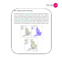
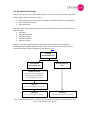
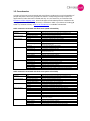
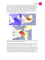
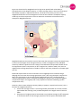
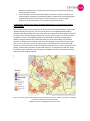
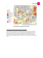
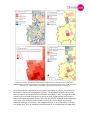
User Guide: Understanding social vulnerability and climate disadvantage in your area This user guide illustrates how the Climate Just map tool can be used to understand socio-spatial vulnerability and climate disadvantage in your area. It provides an introduction to the key concepts and examples of the maps and what they mean to help users of the map tool to understand and interpret information about their own localities. 1. Introduction Climate disadvantage occurs when vulnerable people and places are exposed to climate hazards (Box 1). More about what these terms mean can be found here. A more detailed guide is also available for data analysts, along with the actual datasets. The map tool explores how climate change and extreme weather events may differentially impact people’s health and wellbeing across England, due to differing levels of vulnerability and exposure to heat and flood related events. Maps are available illustrating: • River and coastal flood disadvantage • Surface water flood disadvantage • Heat disadvantage. Box 1: Mapping climate disadvantage The map tool contains social vulnerability maps which show places where the current characteristics of people and communities could result in negative impacts on their wellbeing from flooding or high temperatures. These maps are combined with others showing the potential to be exposed to flooding (in the present day) and high temperatures (in the 2050s). Combined maps of flood disadvantage or heat disadvantage show how the likelihood of being affected compares with the potential for severe impacts on wellbeing in an area. The example below shows disadvantage to surface water flooding in England in 2011. 1.1 Structure of the maps The structure of the maps is illustrated in Figure 1. For each theme (e.g. surface water flood disadvantage) there are three main maps: Disadvantage (how socio-spatial vulnerability and hazard exposure come together) Socio-spatial vulnerability Hazard-exposure. The socio-spatial vulnerability maps are structured into five dimensions, each of which has a separate map: Sensitivity Enhanced exposure Ability to prepare Ability to respond Ability to recover. Finally, each of the separate indicators used to generate each dimension map have themselves been mapped. Additional information on the calculations behind the map is summarised in Box 2 and in the guide for data analysts here. Climate disadvantage map Socio-spatial vulnerability map Hazard-exposure map Dimension maps Sensitivity; Enhanced exposure; Ability to prepare; Ability to respond; Ability to recover Domains (e.g. income, mobility, social networks) Indicators Indicators (e.g. % unemployed, % lone pensioners) (e.g. % area prone to surface water flooding) Figure 1: Climate disadvantage as a measure of socio-spatial vulnerability and hazard-exposure. Bold denotes data available in the map tool 1.2 Core domains A variety of personal, environmental and social factors underpin the social vulnerability of people and places. These are grouped into domains. Interpreting the maps requires an appreciation of what has been included and why. It is also necessary to understand the limitations of the mapping work. A list of the types of vulnerability factors included in the work (grouped into vulnerability domains) is available in Table 1 (in relation to flooding) & Table 2 (in relation to heat). A full list of all indicators is available to download. Table 1: Domains associated with flood socio-spatial vulnerability Dimension Sensitivity Enhanced exposure Ability to Prepare Ability to Respond Ability to Recover Domain Age Health Physical environment Housing characteristics Income Tenure Information use Local knowledge Insurance Income Information use Local knowledge Insurance Social networks Mobility Crime General accessibility Income Information use Insurance Social networks Mobility Housing mobility Explanation The old and young are more physically susceptible to harm Those with pre-existing illnesses are more susceptible to harm Amount of built up/non-built up areas Types of buildings (e.g. basement dwellings) e.g. ability to obtain property-level solutions e.g. ability to modify living environment e.g. ability to access and use information Extent of personal or community experience as a result of past events in the local area e.g. potential availability/affordability e.g. ability to use property level (and other) solutions e.g. ability to respond to warnings Extent of personal or community experience as a result of past events in the local area e.g. potential availability/affordability Personal and community networks e.g. general personal and household mobility e.g. ability to deploy property level solutions Extent of relative physical isolation e.g. ability to obtain property level solutions e.g. ability to access and use information e.g. ability to claim and re-insure Personal and community networks e.g. general personal and household mobility Neighbourhood level mobility, potential for recovery/decline Table 2: Domains associated with heat socio-spatial vulnerability Dimension Sensitivity Enhanced exposure Ability to Prepare Ability to Respond Ability to Recover Domain Age Health Physical environment Physical geography Housing characteristics Income Tenure Information use Income Information use Social networks Mobility Crime General accessibility General infrastructure Information use Social networks Mobility Service access Explanation The old and young are more physically susceptible to harm Those with pre-existing illnesses are more susceptible to harm Amount of built up/non-built up areas Physical location, e.g. cooler temperatures at higher elevations Types of buildings (e.g. high rise dwellings) e.g. ability to obtain property-level solutions e.g. ability to modify living environment e.g. ability to access and use information e.g. ability to use property level (and other) solutions e.g. ability to respond to warnings. Personal and community networks e.g. general personal and household mobility e.g. ability to deploy property level solutions Extent of relative physical isolation e.g. availability of potential cool spaces, e.g. local shops and general community cohesion e.g. ability to access and use information Personal and community networks e.g. general personal and household mobility e.g. availability and accessibility of GPs and hospitals 2. Examples of the maps To demonstrate how to interpret the maps in a local authority context, selected examples are provided below of the various maps that can be produced from the downloaded data, along with explanations. The maps can be used to provide an overview of social vulnerability and climate disadvantage across a local authority area (and to compare this to the national average – Box 2). The maps can also be used to provide more detail about the characteristics of particular areas, in terms of indicators of the individual, social and environmental factors which explain vulnerability. In turn, this helps to understand the ways in which particular people and communities might be negatively affected by events like floods and heatwaves, and therefore what measures might be most appropriate to help build local resilience. Examples are taken from the 2011 and 2001 versions of the maps and this is reflected in the data reported. Box 2: Understanding how the maps are presented All data used to generate the maps in the map portal have been standardised before being combined. The standardisation process produced a set of scores which placed data for each local area in the wider geographical context, in this case the average English neighbourhood (English mean). As a result local characteristics can be compared to the national average, to determine how far they are similar to, higher or lower than average. The scores relate to the classification scheme shown in the Table below. Scores ≥ 2.5 1.5 – 2.5 0.5 – 1.5 -0.5 – 0.5 -1.5 - -0.5 -2.5 - - 1.5 ≤ - 2.5 Label Acute Extremely high Relatively high Average Relatively low Extremely low Slight This standardisation was also important to allow the combination of data into composite maps. Since there are different numbers of indicators and domains, they have undergone a weighting process. This has given an equal weighting to all indicators, domains and dimensions. More information can be found in the technical guide here. This can be used to produce examples similar to those given in this document. If required, local data analysts should also be able to reconstruct the index at a finer scale or recalculate scores in response to specific needs, e.g. To show scores relative to other geographical contexts, e.g. at county level To consider differences in the local importance of particular themes, e.g. to make sensitivity have a bigger influence on the final composite social vulnerability scores. To add or remove indicators, e.g. to account for local data or priorities 2.1 Example 1: Exploring the drivers of flood disadvantage in an area affected by river and coastal flooding Figure 2.1 provides an overview of the three main maps for flood disadvantage in 2001 for Example 1. This area has one extremely flood disadvantaged neighbourhood (dark red in Figure 2.1c). Other neighbourhoods are shown as being relatively disadvantaged (light red in Figure 2.1c), around average (yellow in Figure 2.1c) or relatively advantaged (light blue in Figure 2.1c) compared to the rest of England. For the neighbourhood identified as being extremely flood disadvantaged, the other maps show that there is a relatively high proportion of the land area potentially exposed to flooding (Figure 2.1a) and extremely high socio-spatial flood vulnerability (dark red in Figure 2.1b). Figure 2.1 Neighbourhood-scale flood disadvantage from river and coastal related flooding in England based on 2001 data: (a) socio-spatial vulnerability (b) river and coastal flood hazard-exposure and (c) the combination of (a) and (b) to identify flood disadvantage The scores for each socio-spatial vulnerability dimension are shown relative to one another in the bar charts in Figure 2.2. Investigating these data, and the indicators from which they are comprised, helps to build up a picture about neighbourhoods of interest. In the bar charts, the coloured blocks represent the scores for that neighbourhood relative to the average English neighbourhood (represented by the horizontal axis). Bars above the horizontal axis show positive scores which are greater than the English average socio-spatial vulnerability. Bars below the horizontal axis show negative scores which are lower than the English average. This data can be constructed for any of the map data. In Figure 2.2, for example, data for each of the five dimensions of socio-spatial flood vulnerability are shown. Figure 2.2 shows that for Neighbourhood A, high socio-spatial flood vulnerability is principally due to low adaptive capacity, i.e. above average values in the scores associated with ability to prepare, respond and recover. The levels of sensitivity are low in this neighbourhood and so more investigation of some of the indicators of adaptive capacity could help to inform responses in this area. How this can be done is illustrated in the example for Neighbourhood B. B A Figure 2.2 Dimensions of socio-spatial flood vulnerability Neighbourhood B to the north has some of the same characteristics except that people living in that area have higher than average sensitivity. Further investigation of the individual sensitivity indicators shows that this is mainly associated with self reported ill-health in the local population (24.4% compared to 17.9% in England as a whole in 2001). The area has slightly below average proportions of children under 5 and lower proportions of people aged over 75. Enhanced exposure due to the environment in the neighbourhood is around average. Although there is lower than average greenspace cover (76% not greenspace compared to 48.3% not greenspace in the average English neighbourhood), this is compensated by relatively large gardens (0.26 m2 domestic buildings per square metre of domestic garden compared to 0.36 m2 for England) and a low proportion of basement dwellings (0.41% compared to 2.6%). However, there is lower adaptive capacity (ability to prepare, respond and recover). This is because the neighbourhood has: Lower than average incomes: the average weekly household net income estimate (equivalised after housing costs) is £300 compared to the English mean of around £390 Proportions of single pensioner households are just below average (13.9% compared to 14.2%) but there are much larger proportions of lone parent households with dependent children (9.4% compared to 6.4%) who may have particular problems coping with flood events Lower mobility in terms of personal mobility and access to private transport: the area has higher proportions of disabled residents compared to the average English neighbourhood (10.1% compared to 5.3%). Furthermore, there is a higher proportion of households with no car (38.5% compared to 26.3%). 2.2 Example 2: Exploring the drivers of flood disadvantage in an area prone to surface water flooding This example explores what contributes to surface water flood disadvantage in a particular neighbourhood (see Figure 3.1). This case study area has no neighbourhoods showing extreme flood disadvantage but many areas which are relatively disadvantaged with respect to surface water flooding (shown in light red). The bar charts in Figure 3.1 show that there are different reasons for neighbourhoods to be identified as relatively disadvantaged. Different neighbourhoods have a different balance of social vulnerability and potential exposure to surface water flooding. Some are relatively high on both measures and some only on one or the other. Data at this level helps to show whether the potential for high impacts is particularly influenced by the likelihood of flood events to occur, the nature of the people, communities and places to withstand impacts or a combination of the two. Flood zone data can be visualised in the map portal to establish the extent of potential exposure within particular neighbourhoods. Figure 3.1 Surface water disadvantage (1 in 30 year) with bar charts to show socio-spatial vulnerability (red) and the potential for exposure (blue). Neighbourhood A is highlighted with the red circle. Neighbourhood A has a higher than average likelihood of being exposed to surface water flooding (measured by the proportion of its area potentially affected by a 1 in 30 year event). It also has above average socio-spatial flood vulnerability. This would suggest a need for actions both to help reduce flood exposure (such as physical changes in the environment and housing) and also wider activities to help build community resilience. The types of measures which may be appropriate can be explored further by considering the dimensions of vulnerability and the separate indicators behind them. Figure 3.2 explores the drivers of social vulnerability in the same area. It shows that overall the area has below average sensitivity in terms of age and health. This is due to a considerably lower proportion of children under 5 in the local population (5.1% compared to 6.2% in England). This is also below the average for the rest of the local authority and the wider region. The proportion of the population aged over 75 is above the national average (8.9% compared to 7.9%) but only slightly higher than the average for the local authority. Although the area has a higher than average proportion of over 75s, the proportion of people whose day-to-day activities are limited a little or a lot is below average (15.7% compared to 17.8% as the English and local authority average). However, the proportion of people with disabilities is considerably above average. The data also suggest that the neighbourhood has been affected by previous flood events, which may mean that awareness is relatively high, if this area is also associated with a relatively stable population. Response to and recovery from flood events, as well as some aspects of preparation, are likely to be impeded in this area due to relatively high scores for: People on low incomes: an average weekly household income of £290 compared to around £360 in the rest of the local authority and around £375 in England as a whole Higher than average proportions of single parents with dependent children: 15.6% compared to 7.1% in England and 8% in the rest of the local authority Higher than average proportions of disabled people: 14.5% compared to 6.4% in England and 11% in the rest of the local authority Higher than average proportions of people with no car: 49.1% compared to 25.2% in England and 24.5% in the rest of the local authority. Figure 3.2 Dimensions of socio-spatial flood vulnerability. Neighbourhood A is highlighted with the red circle 2.3 Example 3: Exploring heat disadvantage and vulnerability This example looks at working with heat disadvantage and socio-spatial heat vulnerability data. It uses the data to identify an area of extremely high heat disadvantage in relation to the distribution of mean summer maximum temperatures in the 2050s (Figure 4.1 (d)). Figure 4.1(b) shows population weighted socio-spatial heat vulnerability data with Figure 4.1(a) showing the neighbourhood level socio-spatial heat vulnerability data behind it (Figure 4.1(a)). Figure 4.1 (a) Socio-spatial heat vulnerability by neighbourhood, (b) expressed as a populationweighted total, (c) heat hazard-exposure measured as the medium emissions scenario 50% percentile mean summer temperatures in the 2050s and (d) heat disadvantage relative to (c) Figure 4.2 shows the components of socio-spatial vulnerability in 2011 for part of the area identified as relatively disadvantaged in Figure 4.1. The highlighted neighbourhood scores above average for all components of socio-spatial vulnerability in 2011, although this is less marked in terms of enhanced exposure (how far the local neighbourhood environment is likely to exacerbate the effects of heat). This contrasts with the neighbourhood immediately to the north, where there is below average sensitivity but a much higher than average enhanced exposure. For example in that neighbourhood, 9.7% of households live in homes at or above the 5th floor of a building compared with 0.7% on average (based on 2001 data). Figure 4.2 (top) Socio-spatial heat vulnerability by neighbourhood (2011), (bottom) components of socio-spatial heat vulnerability: sensitivity (ZSENS_IND); enhanced exposure (ZH_EXP_IND); (in)ability to prepare (ZH_PREP_IN); (in)ability to respond (ZH_RESP_IN); and (in)ability to recover (ZH_REC_IND). The white circle indicates a neighbourhood which is explored in further detail. The people in the neighbourhood highlighted with the white circle tend to have: Higher sensitivity. This is particularly affected by a disproportionately laqrge proportion of children under 5 (8.5% compared to 6.2%). There is also a higher than average proportion of people (27.3% compared to 17.8%) who have a long-term illness or disability which affects their day-to-day activities a little or a lot. The proportion of older people (aged 75 years or older) is just below average (6.8% compared to 7.9%). Lower adaptive capacity. The neighbourhood is associated with low average incomes (estimated average household weekly income of £210 compared to £424 in the average English neighbourhood, after accounting for differences in housing costs). There are very high proportions of people who are unemployed, long term unemployed or who have never worked. A very high proportion of people live in homes rented from social landlords (around 68% compared to 17.5%). Low incomes and renting rather than owning homes restricts people’s ability to modify homes. However, although being very built up, the area does benefit from having a lower than average proportion of people living in high-rise accommodation (0.3% compared to 0.7%). There is also an opportunity for social landlords to assist with adaptation. A high proportion of people were born outside the UK and Ireland here may indicate the need for information to be provided in other languages. Depending on the composition of the population, it may also mean that there is some community knowledge about coping with high temperatures. However, effective action depends on there being no other barriers to applying knowledge, such as the nature of the building stock. This summary has extracted a subset of some the indicators with particularly high values from the socio-spatial vulnerability index. The final example develops a pen picture with a wider selection of indicators and connects this to some potential adaptation measures. Further suggestions on possible measures can be found in other parts of the website. 2.4 Example 4 : Exploring the drivers of socio-spatial heat vulnerability in an area with high social vulnerability to heat without mapping Example 4 shows how a more detailed pen picture can be developed for particular areas of interest and connected to potential actions. It is developed simply from consulting the underlying indicators behind the socio-spatial vulnerability data. The case study is taken for a neighbourhood which was ranked within the top 1% of the most socially heat vulnerable neighbourhoods in England in 2001. The case-study neighbourhood had above average scores in all of the dimensions of sociospatial heat vulnerability considered in the 2001 version of the index. It had a particularly high enhanced exposure score which contributed to the high overall score. This is because the neighbourhood had a disproportionate amount of high-rise accommodation compared to other neighbourhoods in England. Some 28% of households had a lowest floor level at fifth floor or above, compared to just 1% for England as a whole. Many of the most heat vulnerable neighbourhoods may similarly be associated with highrise living. This is an extremely important driver of differential impacts between communities. Another notable concern is the low proportion of garden space available. In the case-study there was 56% less private garden space than in an average English neighbourhood. There were proportionally fewer young children than the national mean, and also fewer older people, so the area did not have a highly sensitive population in terms of age. However, local residents were more likely to report a limiting long-term illness - around 30% compared to 18% in the average English neighbourhood. This tendency to report poor health, coupled with a lack of private outdoor space and high-rise living all contribute to potential negative effects from extreme heat on people in this neighbourhood. To understand further the extent of socio-spatial vulnerability, it is important to consider what adaptation resources, both tangible and more intangible, may be found in the neighbourhood. The area had an above-average proportion of social tenants (11% compared to 6%) but just below average private renters. So although many residents may have some restrictions in adapting their personal environments, social landlords could have a role to assist if appropriate resources were available. Indeed, this could be a very effective and efficient way of reaching the most highly sensitive communities. Otherwise, another factor which might restrict autonomous adaptation would also come into play – that of low income. In this particular community, people were unlikely to have a large amount of disposable income once the basic necessities of their day-to-day lives had been covered. They lived on very low average incomes; just £240 per week, compared to £390 for the average English neighbourhood (accounting for different housing costs). These factors all suggested the potential for a lack of preparedness in this particular area. The people in this neighbourhood were also challenged in terms of their ability to respond both due to the physical environment and social factors. To avoid heat stress it is important that people within a community with these characteristics know how to keep cool, that they are able to act on this knowledge and that they support neighbours, particularly people who are old or in ill-health, as these groups are susceptible to harm from high temperatures. However, a number of indicators suggest that social networks were not likely to be as strong as elsewhere in the country. For example, there was a higher proportion of single-pensioner households (20% compared to 14%). Other potentially isolated groups were also larger than in the average English neighbourhood. The percentage of lone parents with dependent children was 9% (compared to 6% across the country as a whole). The area was also associated with general population loss on the one hand but a relatively high rate of overseas arrivals on the other. While the latter may have come from areas where they are personally used to high temperatures, their recent arrival may mean that they are less well integrated. The two factors together therefore suggest a level of community transience which could be an indicator of rather weak social networks which may inhibit responses. While the area had a higher than average loss of business units, it had a retail density which was around the English norm. It is therefore possible that agreements could be made with local businesses, which may offer a cool environment for the community to use during a heatwave. Indeed, this could be achieved through using other public spaces for this purpose, such as libraries. This sort of strategy is used in cities across Europe where heatwave planning is particularly advanced, such as in Greece. Here there are agreements with hotels and other places with air conditioning to provide cool refuges for people within the community. However, to make use of this sort of strategy, people need to feel secure in their communities in the first place. For this particular neighbourhood, the much higher crime rates compared to the rest of the country may make some feel more inclined to stay at home. Given that many heatwave deaths are associated with temperatures at night, this may also impact on people’s capacity to act on advice to leave their windows open. High-rise living may actually be a benefit in this context, although it would depend on the specific characteristics of individual flats how practical and effective cooling would be, or in fact whether this is as secure as would be expected. For those living in houses at street level, the crime context of this particular neighbourhood may very well be a restriction on the use of passive ventilation solutions during hot weather. Although this section has used only one example neighbourhood, it is important to note that similar stories could be told for other UK neighbourhoods based on the results of this study. 3. Applying the approach in your area The above examples illustrate how you can analyse the maps and underlying indicators to understand their relevance in different contexts. You can apply a similar approach to explore climate disadvantage in your own area. Please refer to the map tool. You can begin by: 1. Identifying the issue of concern – whether river flooding, heat or surface water flooding. 2. Reviewing the related map of flood or heat disadvantage. 3. Selecting an area of interest. This can be informed by the maps or by local knowledge, e.g. established through partnership workshops. 4. Looking at the drivers of disadvantage by examining: a. Exposure maps for heat/river or surface water flooding b. Social vulnerability maps for the same topic 5. Understanding the related drivers of social vulnerability by building up a picture of the drivers of concern. This can be supporting by looking at the individual maps under the headings of: a. Sensitivity for personal factors b. Enhanced exposure for built environment factors c. Ability to prepare/ respond or recover for factors linked to people’s adaptive capacity. 6. Using the maps to build up a local profile of the issues as a basis for identifying and discussing potential local responses with relevant stakeholders.