1
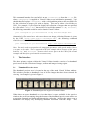
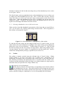
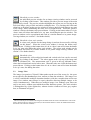
Virtual Vellum: User Guide
1
Background
Virtual Vellum (VV) provides a means of delivering and exploring at close quarters highresolution images delivered to the user in real-time. The images to be viewed can be
stored either locally or at a remote location across a network. JPEG and JPEG 2000
image formats are supported, the former files being tiled and sampled at multiple
resolution bands (see technical reference section for further details). Virtual Vellum
comprises the following main features:
• Supports arbitrarily-sized JPEG tiled and JPEG2000 images
• Real-time image panning and zooming from 1% magnification upwards
• Horizontal and vertical ruler bars which re-size to scale according to the size of
the display, and which can be switched on or off
• Preview window (can also be switched on or off)
• Colour scale window (can also be switched on or off)
• Fully configurable multiple document interface for viewing multiple images (of
the same or of different images aligned for comparison or simultaneous side-byside or cascaded viewing)
2
Running Virtual Vellum from the Desktop
Virtual Vellum is written in Java to achieve a cross-platform software solution. Java
Virtual Machine (JVM) version 1.2 or above needs to be installed on the user’s machine
before Virtual Vellum can be run. There are two alternatives for launching Virtual
Vellum:
2.1
Running Virtual Vellum from a web page
If Virtual Vellum is embedded in a project or other kind of web page, eg a gallery of
images or a VLE, navigate to the address of that web page and the software will
automatically launch1.
2.2
Running Virtual Vellum from the desktop
Virtual Vellum is supplied as a JAR file, vv.jar (i.e. a generic, self-contained file
containing a resource or program). To run the application you will need to open a
command prompt/terminal window in Windows/Unix. At the prompt, ensure that you are
in the same folder as the vv.jar file and type the following command2:
java -classpath vv.jar VirtualVellum <imagepath>
1
This assumes that the security permissions on your web browser do not prohibit Java applets from
running.
2
It is assumed that the path for the Java Virtual Machine is configured correctly within the system
environment variables.
This command launches Java and tells it to run VirtualVellum from the vv.jar file,
where <imagepath> is supplied to Virtual Vellum as an initialisation parameter. You
should therefore replace <imagepath> with a valid path that points to the root XML file
for the collection of images you wish to display. This can be either a local folder or
URL. For example, if you wished to display the collection of images that are specified
by a file called “images.xml” that resides in a local folder named “C:\My Pictures”,
the following command would be used to launch Virtual Vellum:
java –classpath vv.jar VirtualVellum “C:\My Pictures\images.xml”
Alternatively, files stored on a web server those root image collection filename is given
by the URL “http://www.vvpics.com/images.xml”, the following command
would be used to launch Virtual Vellum:
java –classpath vv.jar VirtualVellum http://www.vvpics.com/images.xml
Note: You only need to encapsulate the imagepath parameter with speech marks if there
is a space in its value. This is required in the first example above because of the space
between “My” and “Pictures”, however there are no spaces in the URL of the second
example and therefore speech marks are unnecessary.
3
The Interface
The three primary regions within the Virtual Vellum interface consist of a thumbnail
preview area for the collection of images, toolbar and image-viewing region.
3.1
Thumbnail Preview Area
The thumbnail preview area is located at the top of the main Virtual Vellum window.
This window provides a thumbnail view of all the images that have been selected for
viewing. An example is given in Figure 1.
Figure 1: Thumbnail preview region of Virtual Vellum
When there are more thumbnails to view than there is space available in the preview
window, the scroll bar running along the bottom of the thumbnail preview area can be use
to navigate forwards and backwards through the collection. Moving the mouse over a
thumbnail will display any identifying metadata associated with the image. This
metadata is displayed in the bar that runs along the top of the thumbnail preview section
(as in Figure 1 above).
The Shrink button, at the top right-hand corner of the thumbnail preview area allows you
to collapse the whole thumbnail preview area. This is useful when viewing a full-size
image and when you wish to give the main image-viewing portion of the screen more
screen space. When the thumbnail preview area is collapsed, the Shrink button text
changes to Expand. Clicking on this button restores the thumbnail preview area to its
regular size and changes the button text back to Shrink.
3.1.1 Selecting a thumbnail to view its full-sized version
When you have found the thumbnail representation of the image that you would like to
view, you can select it by clicking on the image with the mouse. This will generate a
blue outline, as illustrated in Figure 2.
Figure 2: A selected thumbnail is highlighted by a blue outline
To load the full-sized image into the image-viewing area of Virtual Vellum, you can
either double-click on the thumbnail or highlight it (by single clicking on the thumbnail)
and use the “Open selected thumbnail…” toolbar option (see section 3.2). This will load
the full-sized image into the active image-viewing window. When using multiple imageviewing windows, the active window is recognisable by the blue caption bar. Inactive
windows are distinguished by their grey caption bar (see section 3.3).
3.2
Toolbar
The toolbar is situated vertically down the left-hand side of Virtual Vellum. Within
Virtual Vellum, if you move your mouse over a toolbar icon, a description of its
functionality will appear at the very bottom of the screen in the 3 rd part of the status bar.
The following list outlines the functionality that is accessible from the toolbar icons.
Toolbar icons that immediately affect the image view without further user input (such as
show/hide rulers) act upon the active image window only.
Open the selected thumbnail
This function loads the full-sized image corresponding to the selection made in
the thumbnail preview area. This action loads the selected image into the active
image- viewing window (the window with the blue caption bar), providing an alternative
means to double-clicking on a thumbnail to view its corresponding full-sized image.
Image-panning tool
When a full-sized image is loaded into an image-viewing window, the panning
tool is used to move the image around. This allows you to view parts of the
image that might be off-screen, by dragging them into view. When the panning tool
button is selected it remains ‘pressed’ and the mouse cursor changes to a hand icon when
over an image. The image is panned by clicking and holding the mouse button down on
the image, and then dragging the mouse; you then release the button when finished.
Image zoom tool
When a full-sized image is loaded into an image-viewing window, the zoom
tool allows you to magnify in or out of the picture. This allows you to zoom
into and focus on those parts of the image that are of most interest to you. When the
zoom tool is selected it remains ‘pressed’, and the mouse cursor changes to a magnifying
glass icon while over an image. You can zoom in and out of an image by clicking and
holding the mouse button down on the image, and then dragging the mouse up and down
for zoom out and in respectively. Please note that when the zoom tool is selected, the
image-panning tool becomes deselected and vice versa. A global zoom factor percentage
is given in the status bar at the bottom of the Virtual Vellum screen; it turns red above
100% (i.e. when the display image is being scaled larger than its source). The zoom
functionality can also be accessed using a mouse scroll wheel (if present) even when the
image-panning tool is selected. However this feature is only present when running
Virtual Vellum on a version of Java Virtual Machine that is at least v. 1.4.
Annotation tool
This feature is yet to be developed under the current release of Virtual Vellum;
its status will therefore always appear greyed out and unavailable. It is
anticipated that a later release will incorporate this tool.
Reset magnification to default
You can use this button to reset the magnification of the image being viewed to
its default setting. The default magnification level is chosen such that the
whole image can be viewed without it going off-screen, whilst occupying as much space
as the window allows.
Zoom in
By clicking and releasing the zoom in button, you can zoom in on the image in
the active window by 1%, about the window’s centre point. Pressing and
holding the button down allows you to zoom into the image continuously until the button
is released.
Zoom out
By clicking and releasing the zoom out button, you can zoom out of the image
in the active window by 1%, about the window’s centre point. Pressing and
holding the button down allows you to zoom out of the image continuously until the
button is released.
Show/hide preview window
An individual preview window for an image-viewing window can be accessed
by clicking on this button. This window provides a preview image of the main
picture being viewed. The preview window highlights the region you are viewing on the
full-sized image, using a black and white rectangular box. You can drag this black and
white box to anywhere on the preview window to refocus the full-sized image to any part
of the image, while maintaining the same level of magnification. When the preview
window is shown, the button stays pressed down. Clicking on the button when it is in its
‘down’ state will release the button to its ‘up’ state, also hiding the preview window. The
preview window can be repositioned and sized in a similar manner to its parent imageviewing window (see section 3.3 for further details).
Show/hide colour scale window
A colour scale window for the image being viewed can be accessed by clicking
on this button3. When the colour scale window is shown, the button stays
pressed down. Clicking on the button when it is in its ‘down’ state will release the button
to its ‘up’ state, also hiding the colour scale window. The colour scale window can be
repositioned and sized in a similar manner to its parent image-viewing window (see
section 3.3 for further details).
Show/hide rulers
Automatically self-rescaling horizontal and vertical ruler bars can be accessed
by clicking on this button3. The rulers appear at the very top of the image and
down its left-hand side. The measurement scale is given in the top left-hand corner,
where the horizontal and vertical rulers meet. When the rulers are visible the button stays
pressed down. Clicking on the button when it is in its ‘down’ state will release the button
to its ‘up’ state, also hiding the rulers.
3.3
Image View
The image view portion of Virtual Vellum makes up the rest of the screen (i.e. the space
not occupied by the thumbnail preview, toolbar or status bar windows). The image view
is a fully customisable multiple document interface (with the exception that at least one
image view window must always be open), therefore allowing multiple images to be
viewed simultaneously. When there are multiple image view windows open, there can
only be one active window upon which the toolbar functions operate. The active window
is distinguished by a blue caption bar, whereas inactive windows all have grey caption
bars, as illustrated in Figure 3.
3
The icon will only be accessible if the image has metadata about the colour scale/dimension scale of the
image, otherwise the icon will be greyed out (see the technical reference section for further details about
the colour scale and ruler metadata)
Figure 3: Difference between an active image view, which has a blue caption bar (top
left), and inactive image views, which have grey caption bars.
The Window menu provides functions for manipulating the image view windows as
outlined below:
Single Window: Default preset for a single image view window. This window fills the
image view region.
Double Window: Default preset for two image view windows. The two image view
windows are positioned beside each other, tiled vertically.
New Window: Creates a new image view window
Close Window: Closes the active image view window (you will not be able to close the
last open image view window)
Close All Windows: Closes all image view windows except one (there must always be
one of several image view windows open)
Prevent Mouse-Driven Dimension Changes: By default, changes are not permitted to the
position and size of the image view windows. However if you wish to re-position a
window manually or change its size, you must first uncheck this menu option.
When this option is unchecked you can move an image view window by clicking on
the caption bar, and with the mouse pressed you can drag it to a new location. To
resize the window, move the mouse to either the left, right or bottom borders of the
image view window; when the mouse cursor changes to the appropriate resize icon,
you can click and hold the mouse button while dragging the window to the desired
size.
Cascade: To help organise multiple windows, a cascade function is provided. This aligns
the windows along a diagonal line, staggering each at regular intervals.
Tile Horizontally: This function tiles the image view windows horizontally, making each
window fill the width of the image view area, with the height being equally divided
between the image view windows.
Tile Vertically: This function tiles the image windows vertically. Each window therefore
fills the height of the image view area and the width is divided equally between the
image view windows.
Grid Windows: This option allows the image view windows to be organised in a grid-like
fashion. When this option is selected, a dialogue box appears, requesting the
number of rows and columns that you wish to grid the windows into.
Windows: This option will take you to a dialogue box that lists all image view windows,
so allowing you to move quickly to any image view window. Just before this
option in the Window menu there is a list of the first 9 image view windows
created. This numerical list facilitates quick and easy transitioning between
windows without using the full Windows dialogue box.