1
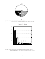
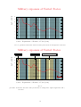
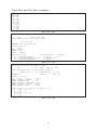
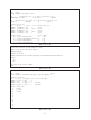
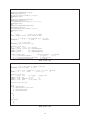
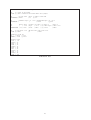
PstChart
Business charts in (La)TEX + PostScript with PSTricks
User’s Guide and Reference Manual
Denis Girou∗
August 5, 1998 — Version 0.22 Beta
Documentation revised August 5, 1998
Abstract: PstChart is a program to generate business charts (bar, line and pie) in (La)TEX +
PostScript with PSTricks. It creates the PSTricks code for direct insertion in a (La)TEX document
of the charts generated. It use small data files which describe the aspects, labels and values for
the charts to realize, but you can have only a raw data file and use all the default options. And
you can always modify the generated PSTricks code for more personal and sophisticated result.
You can use this script without knowledge of PostScript (nor of PSTricks if you don’t want specific
results).
The main goals of PstChart are power, flexibility, quality, ease of use and ability to
generate results automatically from data files generated themselves automatically by other scripts
from databases, accounting reports, etc.
For examples of more sophisticated usage of PstChart and of it integration into other pieces
of document, see the PstChartDemos associated file1 .
The PstChart Web page is on http://www.tug.org/applications/PSTricks/PstChart
1
Presentation
PstChart is a script (SHELL and AWK program) to generate business charts in (La)TEX + PostScript
with the splendid PSTricks package of Timothy van Zandt <[email protected]> ([van Zandt 94] — see
also [Girou 94] and [LGC 97]. The PSTricks Web page is on http://www.tug.org/applications/PSTricks).
It realize hight quality, greatly customizable, grayscaled or colored2 bar, line and pie charts in
PostScript. The bars may be horizontal or vertical, in 2D or 3D. The lines may be filled or not, in
2D or 3D. The bar and lines may be stacked or not. The bar and lines (in fill mode) can be filled by set
of lines, colors or arbitrary patterns. Several kinds of charts may be mixed inside the same graphics (for
instance vbar and hlines, or vlinesfill and vlines, etc.) The axis of the values may be in log mode.
The pie slices may be detached or not.
It creates the PSTricks code for direct insertion in a (La)TEX document of the charts generated. It use
small data files which describe the aspects, labels and values for the charts to realize, but you can have
only a raw data file and use all the default options. And you can always modify the generated PSTricks
code for more personal and sophisticated result. You can use this script without knowledge of PostScript
(nor of PSTricks if you don’t want specific results).
It exist few other tentatives to offer these kind of charts in the (La)TEX world, but all that I know offer
only few possibilities apart MetaGraph and are limited by the intrinsic limitations of (La)TEX, because
none use PostScript. Nevertheless, you can also consider the [bar], [fastpictex], [histogr], (Al)DraTEX
[Gurari 94] or MetaGraph [Hobby 94, LGC 97] packages.
∗ CNRS/IDRIS – Centre National de la Recherche Scientifique / Institut du D´
eveloppement et des Ressources en Informatique Scientifique – Orsay – France – <[email protected]>.
1 Available on the PstChart Web page. But you are encouraged to contribute with your own real examples to illustrate
other aspects not already emphasized in my documents.
2 This documentation is clearly color oriented. It’ll be less beautiful if you can’t see or print it in color...
1
It’s clear that we can’t have all the possibilities of huge products as the graphics modules included
in some well-known commercial packages in the Mac or PC world, but, nevertheless, PstChart offer a
lot of possibilities (including 3D pie, line and unidimentional bar charts) and generate very high quality
results (see the examples below!)
Portability:
Portability is expected great, at least on Unix systems. But you must have the so-called new version
of the awk program. Sometimes it’s simply renamed to awk, other times it’s called nawk. If you don’t
have it, you must install for instance gawk from GNU3 . The script automatically search for nawk and
gawk and try awk if it doesn’t found one of them. But you can force the version used by exporting the
environment variable AWK (for instance: export AWK=awk).
I test it on an RS 6000 under AIX 4.1.5, both with IBM awk and gawk 3.0.3.
I receive reports of installation on OS/2, MS/DOS (in this case with both Shell and AWK versions
from GNU) and Windows NT systems (with the Bash shell).
For tests:
You can use the file pstc-tol.tex to perform a test in LATEX mode, and the file pstc-tot.tex to
perform a test in plain TEX mode, by using a command like:
pstchart.sh vbar 3d <file1.dat >chart.tmp ; latex pstc-tol
Remarks:
• It require the PSTricks 97 distribution.
• The unit used is centimeter. But it’s easy to change. For example, add the line \psset{unit=2.54}
before to insert PstChart graphics if you want to have the unit in inch.
• Default dimensions are 5 units (with 1cm for default unit), in both directions. But don’t forget that
you can always scale a graphic with one of the scaling macro of PSTricks or graphics / graphicx
packages.
• By default, minimum and maximum values are computed automatically.
• Default mode is LATEX (use the PLAIN option if you want to generate a plain TEX code).
• For huge graphics, take care to the rather small memory of TEX (even with some so-called BigTEX).
If you run out of memory and if you have several consecutive graphics, try first to specify explicitely
the break pages (by \clearpage or \newpage commands). Otherwise TEX will analyse in the same
event all the consecutive graphics to see if they will fit on the same page.
• Today, you are strongly encourage to use the standard ‘color’ package of the graphics tool (available both for LATEX and plain TEX) rather than the PSTricks color mechanism.
• The appearance of title, graduations, labels and legend will be better if you use some PostScript
resident fonts, because by default all the text characters are scaled (you can avoid it).
• To draw pie charts of ellipse form, you must use the ‘pst-addc’ extension package included in
the PstChart distribution, which define some additional PSTricks macros required for this kind of
charts.
• Yes! Today, it appear that it would be better to have a Perl script that this mixture of Shell and
AWK. But I wrote the first version, with the major functionnalities, in spring/summer 1993, and
Perl had not at this time the same status as today... Nevertheless, I plan to rewrite PstChart at
the end of 1998...
• To report bugs, don’t forget to put the word “PstChart” and the version number (you get it by
the command: pstchart.sh -V) in the subject of the message).
Known problems: See the PROBLEMS file.
Changes: See the CHANGES file.
Copyright: See the COPYRIGHT file.
3 The
main server is prep.ai.mit.edu in the /pub/gnu directory.
2
Send comments, suggestions and bug reports (with version number and the keyword “PstChart” in
the subject of the message) to <[email protected]>
3
2
Examples
Here are a lot of examples to demonstrate the various possibilities...
4000
3200
2400
1600
800
0
LUU
SOL
LMD
LEG
PPM
MEF
ASF
DRT
AMB
TPR
RRS
Ex. 1: pstchart.sh vbar <users.dat
Users’ files
4000
3200
2400
1600
800
0
LUU
SOL
LMD
LEG
Others
Ex. 2: pstchart.sh vbar nb-values=5 title="Users’ files" <users.dat
4
LUU
52.6%
16.8%
24.4%
6.2%
Others
SOL
LMD
Ex. 3:
pstchart.sh pie dim=6 nb-values=4 print-percentages \
grayscale=white-black data-change-colors center <users.dat
Users’ files
4000
3094
52.6%
3200
2400
1438
24.4%
1600
365
800
0
267
248
236
4.5%
4.2%
4%
6.2%
LUU
SOL
LMD
LEG
PPM
MEF
122
117
2.1%
2%
ASF
Others
Ex. 4:
pstchart.sh vbar dim=9 3d nb-values=8 print-percentages print-values \
grayscale=white-black data-change-colors title="Users’ files" \
center <users.dat
5
3200
2960
+++++
+++++
2720
480
240
0
LUU
SOL
LMD
LEG
PPM
Others
Ex. 5:
pstchart.sh vbar dim=8 3d coef-3d-x=2.5 nb-values=6 \
max=3200 cut-min=500 cut-max=2500 <users.dat
4000
+++++
+++++
3500
1500
1000
500
0
LUU
SOL
LMD
LEG
PPM
Others
Ex. 6:
pstchart.sh vbar dim=8 3d coef-3d-x=-1 coef-3d-y=4 \
nb-values=6 cut-min=1500 cut-max=3000 <users.dat
6
In millions of $
Example of chart
40
$35.3M
32
$26.7M
1992
24
16
$11.6M
8
0
Paris
France
London
Great Britain
Berlin
Germany
Ex. 7: pstchart.sh vbar <file1.dat
Example of chart
Paris
$11.6M
France
London
$26.7M
Great Britain
1992
Berlin
$35.3M
Germany
0
10
20
30
40
50
In millions of $
Ex. 8: pstchart.sh hbar dim-x=6 dim-y=9 max=50 center <file1.dat
7
Example of chart
Paris
France
London
Great Britain
Berlin
Germany
0
20
40
60
80
100
In millions of $
Ex. 9:
pstchart.sh hbar dim-x=4 dim-y=3 max=100 coef-bar-size=1.7 \
data-gap=-0.5 no-print-top-labels <file1.dat
Example of chart
Paris
$11.6M
France
London
$26.7M
Great Britain
1992
Berlin
$35.3M
Germany
0
10
20
30
40
50
In millions of $
Ex. 10: pstchart.sh hbar dim=7 max=50 3d center <file1bis.dat
8
Example of chart
In millions of $
100
$26.7M
1992
$35.3M
London
Great Britain
Berlin
Germany
$11.6M
10
1
Paris
France
Ex. 11: pstchart.sh vbar max=100 log nb-major-ticks=2 center <file1.dat
London
Great Britain
Paris
France
$26.7M
1992
$11.6M
$35.3M
Berlin
Germany
Figure 1: An example of chart
Ex. 12:
pstchart.sh pie 3d dim-x=10 dim-y=6 coef-vspace-bottom=5 center figure \
<file1.dat
9
With gradient style
50
43.4
40
30
26.7
21.9
19.3
20
12.6
10
0
1988
1989
1990
1991
1992
Ex. 13: pstchart.sh vbar dim-y=8 print-values center boxit
<file2.dat
With gradient style
50
35%
40
30
21.5%
17.7%
15.6%
20
10.2%
10
0
1988
1989
1990
1991
1992
Figure 2: Another example
Ex. 14: pstchart.sh vbar dim=6 3d print-percentages boxit center figure <file2.dat
10
1989
1988
15.6%
21.5%
35%
17.7%
1990
10.2%
1992
1991
Figure 3: Another example
Ex. 15:
pstchart.sh pie dim=7 print-percentages coef-hspace-right=1.7 \
boxit center figure <file2.dat
1989
1988
15.6%
21.5%
35%
17.7%
1990
10.2%
1992
1991
Ex. 16:
pstchart.sh pie dim-x=12 dim-y=4 no-gradient no-detached-slices \
print-percentages center <file2.dat
11
1992
1988
1991
1989
1990
Ex. 17:
pstchart.sh pie 3d dim-x=8 dim-y=3 no-gradient no-detached-slices \
pie-chart-start-position=90 coef-bottom-labels=1.5 center <file2.dat
1990
1991
35%
10.2%
15.6%
17.7%
21.5%
1992
1989
1988
Ex. 18:
pstchart.sh pie 3d dim-x=11 dim-y=5 print-percentages \
pie-chart-start-position=230 coef-height-pie-chart=3 center <file2.dat
12
Example with negative values
50
40
30
20
10
0
t
er
R
ob
Pa
ul
l
ar
K
Se
ni
or
H
en
ry
Jo
hn
-10
Ex. 19: pstchart.sh vbar dim=6 <file3.dat
Example with negative values
100
80
60
40
20
0
t
er
R
ob
Pa
ul
l
ar
K
hn
Jo
H
en
ry
Se
ni
or
-20
Ex. 20: pstchart.sh vbar dim=4 min=-20 max=100 3d data-change-colors <file3.dat
13
l
ar
R
ob
er
t
Pa
ul
K
H
en
ry
Se
ni
or
Jo
hn
Example with negative values
-10
0
10
20
30
40
50
11
7.
3
93
.5
18
4.
1
Ex. 21: pstchart.sh hbar data-change-colors <file3.dat
Ex. 22:
pstchart.sh hbar dim-x=10 coef-bar-size=1.7 frame=false no-ticks print-values \
<file4.dat
14
Example of different chart types on the same graphic
40
One
Two
30
20
b bThree
b bFour
b
b
b
b
b
b
10
0
First
Second
Third
Ex. 23: pstchart.sh vbar interval-major-ticks=10 <file5.dat
Example of different chart types on the same graphic
40
30
b
b
20
b
b
One
Two
bThree
bFour
b
b
b
b
10
0
First
Second
Third
Ex. 24:
pstchart.sh hlinesfill dim=7 frame=first interval-major-ticks=10 center \
<file5.dat
15
In millions of $
Example of chart
40
$35.3M
32
$26.7M
1992
24
16
$11.6M
8
0
Paris
France
London
Great Britain
Berlin
Germany
Ex. 25: pstchart.sh vbar dim=8 <file6.dat
In millions of $
Example of chart
40
$35.3M
32
$26.7M
1992
24
16
$11.6M
8
0
Paris
France
London
Great Britain
Berlin
Germany
Ex. 26:
pstchart.sh vbar dim-x=11 dim-y=7 coef-linewidth=0 data-change-colors \
coef-top-labels=0.6 <file6.dat
16
In millions of $
Example of chart
40
$35.3M
32
$26.7M
1992
24
16
$11.6M
8
0
Paris
France
Berlin
Germany
London
Great Britain
Ex. 27:
pstchart.sh hlinesfill dim=8 coef-linewidth=0 data-change-colors \
coef-top-labels=0.8 <file6.dat
17
43.9%
Supercomputer’s user today?
8.2% 55.2%
37.6%
Interested by MPP?
22.4%
18.5%
Already MPP user?
0
44.8%
69.4%
20
40
60
Yes
80
No
100
Percentage
No answer
Ex. 28:
pstchart.sh hbar dim-x=10 print-percentages data-gap=-0.25 \
stack coef-bottom-labels=0.5 center <quest.dat
3.42
3.41
3.4
3.39 9h
10
11
12
13
14
15
16
17
18
19h
Hours
Figure 4: Rate of mark for one french franc the 07/12/93
Ex. 29:
pstchart.sh hlinesfill dim-x=8 min=3.39 max=3.42 interval-major-ticks=0.01 \
coef-bottom-labels=2 center figure <mark.dat
18
2000
Paul
Willian Junior
Robert
1600
John
1200
800
400
0
JAN
FEB
MAR
APR
MAY
JUN
Figure 5: Multi sets example
Ex. 30: pstchart.sh vbar boxit center figure <multsets.dat
10000
Paul
Willian Junior
Robert
John
1000
100
10
1
JAN
FEB
MAR
APR
MAY
JUN
Figure 6: Multi sets example
Ex. 31:
pstchart.sh vbar max=10000 log legend-nb-horiz=4 nb-major-ticks=4 \
boxit figure <multsets.dat
19
Paul
JAN
11.8%
12.6%
12.8%
12.5%
Willian Junior
Robert
John
13.9%
10.3%
14.7%
15.8%
FEB
MAR
12.6%
18.4%
12.5%
17.1%
20.5%
APR
28.9%
MAY
JUN
13.2%
0
400
16.7%
18.8%
16.8%
11.8%
25%
29.5%
20.5%
13.7%
800
19.4%
1200
1600
2000
Ex. 32:
pstchart.sh hbar dim=7 coef-linewidth=0 print-percentages \
coef-bar-overlay=0.25 <multsets.dat
2000
Paul
Willian Junior
Robert
John
1600
1200
800
400
0
JAN
FEB
MAR
APR
MAY
JUN
Figure 7: Multi sets example
Ex. 33: pstchart.sh vbar dim=9 3d legend-nb-horiz=2 boxit center figure <multsets.dat
20
6000
Paul
Willian Junior
Robert
4800
John
3600
2400
1200
0
JAN
FEB
MAR
APR
MAY
JUN
Ex. 34: pstchart.sh vbar dim=8 coef-linewidth=3 stack <multsets.dat
10000
1000
JAN
FEB
MAR
APR
MAY
JUN
Ex. 35:
pstchart.sh vbar dim=8 max=10000 min=1000 log no-legend nb-major-ticks=1 stack \
<multsets.dat
21
Paul
Willian Junior
JAN
Robert
John
FEB
MAR
APR
MAY
JUN
0
1200
2400
3600
4800
6000
Ex. 36: pstchart.sh hbar dim-x=12.5 dim-y=7 stack <multsets.dat
6000
Paul
Willian Junior
Robert
4800
John
3600
2400
1200
0
JAN
FEB
MAR
APR
MAY
JUN
Ex. 37: pstchart.sh vbar 3d stack coef-3d-x=-1 coef-3d-y=1.5 center <multsets.dat
22
Paul
Willian Junior
JAN
Robert
John
FEB
MAR
APR
MAY
JUN
0
1200
2400
3600
4800
6000
Ex. 38: pstchart.sh hbar dim-x=10 dim-y=6 3d stack coef-3d-x=-1 <multsets.dat
2000
Paul
b
Wil ian Junior
Robert
1600
John
t
u
1200
b
800
rs
t
u
400
0
b
u
t
rs
u
sr
b
sr
u
b
rs
u
t
u
t
u
u
FEB
MAR
rs
t
u
u
JAN
b
APR
MAY
u
JUN
Ex. 39: pstchart.sh hlines dim-x=6 dim-y=12 data-gap=0 <multsets.dat
23
2000
Paul
Willian Junior
Robert
1600
John
1200
800
400
0
JAN
FEB
MAR
APR
MAY
JUN
Ex. 40: pstchart.sh hlines dim=8 3d <multsets.dat
2000
Paul
Willian Junior
Robert
1600
John
1200
800
400
0
JAN
FEB
MAR
APR
MAY
JUN
Ex. 41: pstchart.sh hlines dim-x=9 dim-y=7 3d coef-3d-x=-1.5 <multsets.dat
24
2000
b
Paul
Willian Junior
Robert
1600
John
u
t
rs
u
1200
b
b
rs
t
u
u
800
400
0
rs
b
u
t
u
u
t
rsu
JAN
FEB
b
rs
b
sr
t
u
u
t
u
u
MAR
APR
MAY
JUN
Ex. 42: pstchart.sh hlines dim=8 coef-linewidth=0 data-gap=0 <multsets.dat
uu
t rs b
JAN
Paul
u
rs u
t
FEB
Robert
John
uu b rs
t
MAR
urs u
t
APR
u
MAY
JUN
Willian Junior
b
0
400
t
u
uu
t800
b
rs b
rs b
1200
1600
2000
Ex. 43: pstchart.sh vlines <multsets.dat
25
b
JAN
rs u
tu
Paul
b rs
FEB
b
MAR
t u
u
b
0
John
rs
rs
b
JUN
Robert
rs u
t u
APR
MAY
Willian Junior
b
1200
t
u
u
tu
u
rs u
tu
2400
3600
4800
6000
Ex. 44: pstchart.sh vlines dim=7 stack <multsets.dat
2000
Paul
Willian Junior
1600
Robert
John
1200
800
400
0JAN
FEB
MAR
APR
MAY
JUN
Ex. 45: pstchart.sh hlinesfill dim-x=10 dim-y=4 coef-graduations=2 <multsets.dat
26
6000
Paul
Willian Junior
Robert
4800
John
3600
2400
1200
0JAN
FEB
MAR
APR
MAY
JUN
Ex. 46: pstchart.sh hlinesfill dim-x=10 dim-y=4 stack coef-graduations=2 <multsets.dat
JAN
Paul
Willian Junior
Robert
FEB
John
MAR
APR
MAY
JUN
0
400
800
1200
1600
2000
Ex. 47: pstchart.sh vlinesfill dim-x=5 dim-y=8 <multsets.dat
27
Megaflops/s
125
HP 9000/755
IBM RS6k/370
100
DEC 3000/500
75
50
25
0
1
2
3
4
5
6
7
8
9
10
11
12
13
14
15
16
17
18
19
20
21
22
23
24
Loops
Figure 8: Livermore loops (long vectors)
Ex. 48:
Loops
pstchart.sh vbar dim-x=12.5 dim-y=8 max=125 coef-bar-size=1.3 \
coef-bottom-labels=3 center figure <livermor.dat
1
HP 9000/755
2
3
IBM RS6k/370
4
5
DEC 3000/500
6
7
8
9
10
11
12
13
14
15
16
17
18
19
20
21
22
23
24
0
25
50
75
100
125
Megaflops/s
Ex. 49:
pstchart.sh hbar dim=9 max=125 coef-bar-size=1.3 coef-linewidth=0 \
coef-bottom-labels=3 <livermor.dat
28
Megaflops/s
125
HP 9000/755
IBM RS6k/370
100
DEC 3000/500
75
50
25
0
1
2
3
4
5
6
7
8
9
10
11
12
13
14
15
16
17
18
19
20
21
22
23
24
Loops
Ex. 50:
pstchart.sh hlines dim-x=6 dim-y=9 max=125 no-showpoints center \
coef-bottom-labels=3 <livermor.dat
Megaflops/s
125
HP 9000/755
IBM RS6k/370
100
DEC 3000/500
75
50
25
0
1
2
3
4
5
6
7
8
9
10
11
12
13
14
15
16
17
18
19
20
21
22
23
24
Loops
Ex. 51:
pstchart.sh hlinesfill dim-x=6 dim-y=9 max=125 center coef-bottom-labels=3 \
<livermor.dat
29
In % of PNB
Military expanses of United States
14
12
10
8
6
4
2
0
1950
1960
1970
1980
1990
1997
Source: Department of Defense of USA (1992)
Ex. 51: pstchart.sh hlines dim-x=12 dim-y=6 max=14 no-showpoints <dod.dat
Military expanses of United States
In % of PNB
Koree war
Vietnam war
Reagan administration
14
12
10
8
6
4
2
projections
0
1950
1960
1970
1980
1990
1997
Source: Department of Defense of USA (1992)
Ex. 52:
pstchart.sh hlines dim-x=12 dim-y=6 max=14 no-showpoints input-begin=dod.add \
<dod.dat
30
3
Usage
3.1
Description
pstchart.sh use a data file which contains both some optional parameters for the representation (title,
background, aspects, etc.) and the data themselves.
If you want to use all the default options, you may defined a raw file with only the data values (and
possibly the associated labels, separated from the data by the special | character4).
Here is an example (file users.dat):
3094
1438
365
267
248
236
122
57
33
18
9
|
|
|
|
|
|
|
|
|
|
|
LUU
SOL
LMD
LEG
PPM
MEF
ASF
DRT
AMB
TPR
RRS
If you use:
pstchart.sh vbar <users.dat
you’ll obtain the vertical bar chart of the example 1.
You can used a lot of options to have specific results (see example 4):
pstchart.sh vbar dim=9 3d nb-values=8 print-percentages print-values \
grayscale=white-black data-change-colors \
title="Users’ files" center <users.dat
4 This
kind of file can be created by another program to automatically generate a chart from these data – see below.
31
Another possibility is to generate automatically a chart from external data. Here is an example of
how to obtain a graphical representation of the CPU usage for a multi users system5 :
#! /bin/sh
# cpu.sh --- Simple example to obtain a vertical 3d bar chart
#
of the CPU usage for running processes
#
#
#
#
Author
Created the
Last mod. by
Last mod. the
:
:
:
:
Denis GIROU (CNRS/IDRIS - France) <[email protected]>
Fri Jul 30 18:14:12 1993
Denis GIROU (CNRS/IDRIS - France) <[email protected]>
Thu Mar 6 19:48:36 1997
# Note: The output depend of the flags accepted my your ps command
#
and of the format returned. So, you may have to adapt this script.
#
It has been tested on an RS 6000 under AIX
#
#
#
#
#
#
#
1 - We require the list of all the processes
(we print only the names and the CPU time, in format hh:mm:ss)
2 - We sort them by users
3 - We sum by users the CPU used by all the processes
and we print all these sums and names
4 - We sort the result by reverse sums
5 - We use pstchart.sh on it, to have the 3d bar chart...
ps -edf -F runame,time | \
sort +0 -1 | \
awk ’$1 != "RUSER" \
{CPU[$1]+=substr($2,1,2)*1440 + substr($2,4,2)*60 + substr($2,7,2)}
END{for (NAME in CPU) print CPU[NAME] " | " NAME}’ | \
sort -nr +0 -1 | \
pstchart.sh vbar dim=8 3d center nb-values=5 print-percentages \
grayscale=black-white data-change-colors \
title="CPU usage the ‘date‘"
But if you want a full control of the different aspects of the chart, you can define yourself all his
characteristics.
3.2
Syntax of the data files
There are two parts in the data files: parameters part, and data part. The parameters lines begin with
a keyword.
The comment lines (beginning with the special # character) are ignored. Nevertheless the lines
beginning with two consecutive # are not comments: these special lines are attempted to be (La)TEX
or PSTricks commands and are written in the result file like that (of course, without the ##), at the
beginning of it if they are in the parameters part and at the end if they are in the data part. You can
use this possibility for special effects, like rotations or projections in the 3D space (see the file file4.dat
and example 22 and the examples 25, 26 and 27).
The blank lines are ignored in the parameters part.
There are eight types of parameters (typed indifferently in upper or lower case)6 : VERSION, TITLE,
AXISLABELS, BACKGROUND, GRADUATIONS, TICKS, LEGEND and ASPECT, with only zero or one occurrence of
the seven first, and possibly several of ASPECT type.
3.2.1
General remarks
• The order of appearance of the parameters has no importance, except the VERSION one, which must
appear first.
• The keyword is always the first field of the line.
• The separator of fields is everywhere the | character, so you can’t use it in the labels.
• All the fields are optional, except the keyword itself.
• The leading and trailing blanks are removed.
5 The script is possibly to adapt according to the ps command, which can required other flags than those used here, and
to have an output formatted differently...
6 All are optional if you want to use the default options.
32
• You can use all the (La)TEX and PSTricks commands to change the aspect of the labels (colors,
fonts, sizes, etc.).
• You can have the labels (for title, axis, bottom or top – but not for the legend box) on two lines,
separated by the relevant separator (’\\’ in LATEX and ’\cr ’7 in plain TEX). But if there are
special commands (colors, fonts, etc.), you must repeat them on the two parts of the labels. You
must also take care to quote the special characters: \$, \%, etc.
In the parameters, the colors are attributes and must be defined without the \ character (red, etc.),
but in labels they are commands and must be preceded by \ (\red, etc.) if you use the PSTricks
color commands (use the \textcolor command with the standard color package).
• The valid line styles are: none, solid, dashed and dotted (look at the PSTricks manual for the
description of them).
• The valid dot styles (for LINES charts) are8 : * (default ), o, +, x, asterisk, oplus, otimes, square,
square*,
diamond,
diamond*,
triangle, triangle*, pentagon and pentagon* (look at the PSTricks manual for the description of them).
• The valid fill styles are: none, solid, gradient, vlines, vlines*, hlines, hlines*, crosshatch,
crosshatch* and pattern9 (look at the PSTricks documentation for the description of them).
• You can use other PSTricks parameters to specify different characteristics for the various styles.
For instance hatchangle=0,hatchwidth=0.5mm, hatchsep=2mm for a fill style (see example 22).
Another example is for line style, where you can say something like solid,linewidth=0.5mm or
dashed,dash=5mm 2mm. Look at the PSTricks manual for details about all the accessible parameters.
• When you use a gradient style, the first color is the beginning one and the second the ending one.
When you use one of the three * fill style forms, the first color is use for filling and the second one
for the lines (defined as hatchcolor in PSTricks).
• If the scale factor for the title, labels or graduations is equal to the special keyword UNSCALED, we
use the ”natural” character size of the font, without any scaling.
• If the scale factor for the title or labels is equal to the special keyword FIXED, we use the \scaleboxto
macro to draw them, so all the characters of the labels will have the same size. Otherwise, we use
the \scalebox macro. See the effect of this coefficient for instance in examples 8 and 10.
• You can also use other PSTricks macros to change globaly the presentation of the graphics generated
(as the \pstilt or \ThreeDput macros).
3.2.2
Description of the parameter lines
• VERSION (for future use – there is no reason to use it today):
1. the keyword VERSION,
2. the version number, defined to possibly support later different syntax of data files. I hope to
have never to do that! – (Default: 1 ).
• TITLE:
1. the keyword TITLE,
2. the title of the chart, which can also been specified (or redefined) in the command line,
3. the scale factor for it – (Default: 1 ),
4. the vertical shift factor for it, if you want to put it upper or lower (see example 52) – (Default: 1 ),
5. the title for the figure environment (used only in LATEX mode),
7 Don’t
forget the blank!
it’s already used as field separator, the | character is not autorized, although it’s defined in PSTricks.
9 With pattern, you can use arbitrary patterns to fill the background and bar and filled line data, and if a color is defined,
the patterns will be drawn above this background color – see examples 25, 26 and 27 and the PstChartDemos file.
8 As
33
6. the title for the table of figures (used only in LATEX mode),
7. the label of the figure (used only in LATEX mode),
8. the position of the figure, mainly useful to specify the H option when using the float package
of Anselm Lingnau (used only in LATEX mode) – (Default: !htbp),
• AXISLABELS:
1. the keyword AXISLABELS,
2. the label for the X axis. You can also use it for another type of indication (see example 52).
3. the scale factor for it (see an example in the file livermor.dat) – (Default: 1 ),
4. the rotation factor for it (in degrees) – (Default: 0 ),
5. the position of it (in vertical mode 0 means at left, 1 at right, and in horizontal mode respectively at bottom and top). If it’s 0 or 1, the label is push on left or right, otherwise it’s
centered – (Default: 1 ),
6. the vertical shift factor for it (if you want to put it upper or lower) (see an example in the file
livermor.dat) – (Default: 1 ),
7. the label for the Y axis,
8. the scale factor for it – (Default: 1 ),
9. the rotation factor for it (in degrees) – (Default: 90 ),
10. the position of it (in vertical mode 0 means at bottom, 1 at top, and in horizontal mode
respectively at left and right). If it’s 0 or 1, the label is push on bottom or top, otherwise it’s
centered (see an example in the file livermor.dat) – (Default: 1 ),
11. the horizontal shift factor for it, if you want to put it upper or lower – (Default: 1 ).
• BACKGROUND:
1. the keyword BACKGROUND,
2. the line style for the framebox – (Default: solid ),
3. the line color for the framebox – (Default: black ),
4. the style for the background – (Default: none),
5. the first color for the background – (Default: white),
6. the second color for the background (if the gradient style is used, this second color is used
for the gradend color ; if a * style is defined, it is used for the hatchcolor) (see an example in
the file file2.dat) – (Default: not defined: we use the default gradend or hatchcolor color ),
7. the pattern to used to fill the background, if the defined style chosen is pattern.
• GRADUATIONS:
1. the keyword GRADUATIONS,
2. the scale factor for graduation numbers (see example 29) – (Default: 1 ),
3. the color of them – (Default: black ),
4. the style for the major graduations lines from X axis (they are defined by a bottom (or left)
label associated to them – see examples 29 and 51) – (Default: none),
5. the color of them – (Default: black ),
6. the coefficient applied to the default width of the lines for them – (Default: 1 ),
7. the style for the minor graduations lines from X axis (they are defined by a bottom (or left)
label non associated to them – see example 51) – (Default: none),
8. the color of them – (Default: black ),
9. the coefficient applied to the default width of the lines for them – (Default: 1 ),
10. the style for the major graduations lines from Y axis (those which have a graduation number
– also called lines from major ticks) – (Default: dotted ),
11. the color of them – (Default: black ),
34
12. the coefficient applied to the default width of the lines for them – (Default: 1 ),
13. the style for the minor graduations lines from Y axis (also called lines from minor ticks) –
(Default: none),
14. the color of them – (Default: black ),
15. the coefficient applied to the default width of the lines for them – (Default: 1 ).
• TICKS:
1. the keyword TICKS,
2. the number of major ticks, which can also been specified (or redefined) in the command line
– in fact, it’s the number of intervals used... (see an example in the file file2.dat) (if equal
to 0 there are no axis and graduations printed) – (Default: 5 ),
3. the value of the interval between major ticks – obviously, you can’t specify both this value and
the number of major ticks marks (see an example in the file dod.dat) – (Default: computed
according the minimum and maximum of data values, and the number of major ticks marks),
4. the color of major ticks – (Default: black ),
5. the number of minor ticks – in fact, it’s the number of intervals used... – (Default: 5 ),
6. the style for the ticks of the X axis – (Default: none).
7. the color of minor ticks – (Default: black ).
8. the coefficient applied to the lenght of these ticks – (Default: 1 ).
• LEGEND10 :
1. the keyword LEGEND,
2. the X left coefficient for position coordinate, where left is 0 and right 1 (can be less than 0 or
greater than 1 if you want to put the legend box outside the chart) – (Default: 0.04 in vertical
mode and 0.76 in horizontal mode),
3. the Y top coefficient for position coordinate, where bottom is 0 and top 1 (can be less than 0
or greater than 1 if you want to put the legend box outside the chart – see the file quest.dat
and example 28) – (Default: 0.96 ),
4. the style of the background – (Default: solid ),
5. the first color of it – (Default: white),
6. the second color of it (if the gradient style is used, this second color is used for the gradend
color ; if a * style is defined, it is used for the hatchcolor) – (Default: not defined: we use
the default gradend or hatchcolor color ),
7. the coefficient applied to the horizontal length – (Default: 1 ),
8. the coefficient applied to the vertical length (see example 28) – (Default: 1 ),
9. the number of labels to put by lines, which can also been specified (or redefined) in the
command line – (Default: 1 ).
• ASPECT:
1. the keyword ASPECT,
2. the style for the representation of the data – (Default: solid ),
3. the first color of it – (Default: white),
4. the second color of it (if the gradient style is used, this second color is used for the gradend
color ; if a * style is defined, it is used for the hatchcolor). For 3D pie charts, it’s the color for
the cylinder parts and, if there are some detached slices, for the visible parts of the polygons,
unless a gradient style is used (see examples in the files file2.dat and file3.dat) – (Default:
not defined: we use the default gradend or hatchcolor color ),
5. the color of the border lines used for PIE and BAR charts – also related to the data-change-colors
command option (see an example in the file file3.dat) – (Default: black ),
10 Used
only for multi sets of data – no meaning for PIE charts.
35
6. the style of the dots (used only for HLINES and VLINES charts) – (Default: * ),
7. the label to put in the legend box (if it’s the special false value, this entry will not be printed
in the legend box),
8. the scale factor applied to this label. If it is equal to the special keyword FIXED, we use the
\scaleboxto macro to draw them, so all the characters of the labels will have the same size.
Otherwise, we use the \scalebox macro (see examples 28 and 30) – (Default: 1 ),
9. the pattern to used to fill the background, if the defined style chosen is pattern,
10. the chart type for the corresponding data values, if we want to have it drawn using another
chart type than the default one (as vbar with hlines, vlines with hbar, hlinesfill with
hlines, etc.).
3.2.3
Description of the data lines
The data lines always begin by a value. Otherwise, you can only use in this part comment lines or blank
lines. But blank lines have a meaning here and separate the sets of data in case of several sets (see
an example in the file multsets.dat).
But if you want to analyse only a part of all the data sets, you can use the END keyword to stop
reading of data values.
1. the value (a number or the special value UNDEFINED – in lower or upper case – with a possible
repetition factor, as 3*12.5 or 8*undefined, without blanks after the * character: see an example
in the file dod.dat. The UNDEFINED value permit to have values which are missing or not used, as
to define one curve with several aspects: see the file dod.dat and the example 51),
2. the first label11 , outside for pie charts, at bottom for vertical charts and at left for horizontal charts,
3. the scale factor for it – (Default: 1 ),
4. the rotation for it (in degrees, between -90 and 90) – (Default: 0 ),
5. the position of it, as a coefficient to apply to his “natural” position just above the value (so a
number greater than 1 will increase the gap between the graphic representation for the value and
the label, and a number less than 1 will put the label nearer or below the graphic representation
for the value) – (Default: 1 ),
6. the second label, inside for pie charts, at top for vertical charts and at right for horizontal charts,
7. the scale factor for it – (Default: 1 ),
8. the rotation for it, in degrees, between -90 and 90 (see an example in the file file3.dat) – (Default: 0 ),
9. the position of it, as a coefficient to apply to his “natural” position just above the value (so a
number greater than 1 will increase the gap between the graphic representation for the value and
the label, and a number less than 1 will put the label nearer or below the graphic representation
for the value) – (Default: 1 ),
10. the detached coefficient to used (which will be multiply by the size of the chart) for detached slices
of pie charts (used only for PIE charts – see an example in the file file1.dat and example 12),
11. the number of consecutive detached slices to define, beginning with this one – (Default: 1 if the
detached coefficient is defined ).
11 These values and the scales and rotations associated to these labels are only read for the first set, in case of a multi
sets data file.
36
3.3
Syntax of the command
The general syntax of the command is:
pstchart.sh -V
pstchart.sh -help
pstchart.sh pie | vbar | hbar | hlines | vlines \
| hlinesfill | vlinesfill \
[3d] [boxit] [center] \
[coef-3d-x=number] [coef-3d-y=number] \
[coef-bar-overlay=number] [coef-bar-size=number] \
[coef-bottom-labels=number] \
[coef-dotsize=number] \
[coef-graduations=number] \
[coef-height-pie-chart=number] \
[coef-hspace-left=number] \
[coef-hspace-right=number] \
[coef-linewidth=number] \
[coef-top-labels=number] \
[coef-top-labels-shift=number] \
[coef-vspace-bottom=number] \
[coef-vspace-top=number] \
[cut-extremes] \
[cut-max=value-cut-max] [cut-min=value-cut-min] \
[data-change-colors] [data-gap=number] \
[debug] \
[dim=value-dim-x-and-y] \
[dim-x=value-dim-x] [dim-y=value-dim-y] \
[figure] [frame=false | first] \
[grayscale=black-white | white-black] \
[input-begin=file] [input-end=file] \
[interval-major-ticks=number] \
[label-others=string] [latex-color-package] \
[legend-nb-horiz=number] [log] \
[max=value-max] [min=value-min] \
[nb-major-ticks=number] [nb-values=number] \
[no-detached-slices] [no-gradient] \
[no-legend] [no-multido-graduations] \
[no-print-top-labels] [no-showpoints] [no-ticks] \
[pie-chart-start-position=number] [plain] \
[print-percentages] \
[print-values] [print-values-decimal-digits] \
[reverse-overlay-order] [stack] [title=sentence] \
[top-labels-colored] \
<data-file >output-file
Only the type of the chart and the data file are required.
The parameters of the command line have the following meaning:
-V
: to print the version number of pstchart.sh.
-help
: to print the syntax of the command.
3d
: to generate a 3d effect – only for BAR and LINE charts (see examples 4, 33,
etc.) – (Default: false).
boxit
: to draw a frame box around the chart (multiple examples) – (Default: false).
center
: to center the chart (multiple examples) – (Default: false).
coef-3d-x=number
: the coefficient to applied to increase horizontally the 3D effect for bar charts,
which can be negative (see examples 5 and 37) – (Default: 1 ).
37
coef-3d-y=number
: the coefficient to applied to increase vertically the 3D effect for bar charts (see
example 6) – (Default: 1 ).
coef-bar-overlay=number : the default coefficient applied to compute the position of the bars for multisets – only for BAR charts (see example 32) – (Default: 1 ).
coef-bar-size=number : the default coefficient applied to compute the size of the bars, greater than 0 –
only for BAR charts (see examples 9 and 48) – (Default: 1 ).
coef-bottom-labels=number : the coefficient applied to the bottom (outside for pie charts) labels (see
example 48) – (Default: 1 ).
coef-dotsize=number
: the coefficient applied to the size of the dots – only for LINES charts – (Default: 1 ).
coef-graduations=number : the coefficient applied to the graduation numbers (see example 45) – (Default: 1 ).
coef-height-pie-chart=number : the coefficient applied to the height of 3D pie charts (see example 18)
– (Default: false).
coef-hspace-left=number : the coefficient to applied to increase the space at the left of the graphic,
typically for pie charts labels (Default: 1 ).
coef-hspace-right=number : the coefficient to applied to increase the space at the right of the graphic,
typically for pie charts labels (see example 15) – (Default: 1 ).
coef-linewidth=number : the coefficient applied to the width of the lines (the lines themselves for LINES
charts and the border lines for PIE and BAR charts) – this value can be equal
to 0 (see the examples 32, 34, 40) – (Default: 1 ).
coef-top-labels=number : the coefficient applied to the top (inside for pie charts) labels – (Default: 1 ).
coef-top-labels-shift=number : the coefficient applied to the position of the top labels (mainly useful
for multi-sets data with the print-values or print-percentages option).
Increase it to have highter spacing – (Default: 1 ).
coef-vspace-bottom=number : the coefficient to applied to increase the space after the graphic, typically
before the caption if a figure environment is defined (some space is already reserved for the bottom labels, considering a standard size for them) (see example
12) – (Default: 1 ).
coef-vspace-top=number : the coefficient to applied to increase the space above the graphic (some space
is already reserved if a title is defined, considering a standard size for it) –
(Default: 1 ).
cut-extremes
: this allow to ”cut” some extra range values. It work in conjunction with the
min, cut-min and cut-max parameters. If cut-max is use too, a special cross
hached zone is shown to show that the value was cutted. The interest to use
cut-min, which is to replace a value by a higher one, is to use it with the min
parameter, to don’t see some lower values. For instance min=0 cut-extremes
cut-min=0 will don’t see negative values. For the moment work only for positive values and non stacked charts – (Default: false).
cut-max=value-cut-max : the maximum value to use to “cut” the values. For the moment work only for
positive values and non stacked charts (see examples 5 and 6) – (Default: not
used ).
cut-min=value-cut-min : the minimum value to use to “cut” the values (specially useful when you have
few very high values, which made the other one disappear – for instance for
storms in series of raining measurements!). For the moment work only for
positive values and non stacked charts (see examples 5 and 6) – (Default: not
used ).
data-change-colors
: for HBAR, VBAR and PIE charts, to change the colors for each part (see
examples 3, 4 and 20) – (Default: false).
38
data-gap=number
: the coefficient for the space before the first value and after the last – without
meaning for PIE charts (see examples 9 and 39) – (Default: 0 for BAR charts
and 1 for LINES charts).
debug
: to allow debugging and tracing of program – (Default: false).
dim=value-dim-x-and-y : the dimension of the chart, in centimeters, both for horizontal and vertical
sizes, without the title, graduations and external labels – (Default: 5 ).
dim-x=value-dim-x
: the horizontal dimension of the chart, in centimeters, without the graduations and external labels – (Default: 5 ).
dim-y=value-dim-y
: the vertical dimension of the chart, in centimeters, without the title and
external labels – (Default: 5 ).
figure
: to generate a figure environment for the chart, only in LATEX mode (multiple
examples) – (Default: false).
frame=false|first
: to suppress the frame normally generated (see example 22) or to draw it before
the graphs, which allow the dots for extremum values for line charts to override
it... – (Default: true).
grayscale=black-white|white-black : if the option data-change-colors is used, it generate one gray
color by value used in the chart, equally spaced between black and white, or
white and black (see examples 3 and 4) – (Default: false).
input-begin=file
: to include a file after the definition of the pspicture environment and the
drawing of the background. This file must contains (La)TEX and PSTricks
commands (see example 52) – (Default: no file).
input-end=file
: to include a file just before the end of definition of the pspicture environment
– (Default: no file).
interval-major-ticks=number : the value of the interval between major ticks, which override the one
possibly defined in the data file – often easier to specify than the number of
major ticks marks, and specially useful if you fix the MIN and MAX values (see
example 29) – (Default: computed according the minimum and maximum of
data values and the number of major ticks marks).
label-others=string
: in case of use of the nb-values option, to specified the label associated with
the part which sum the last values (you must put it between " if there are
several words) – (Default: Others).
latex-color-package
: to be able to generate color commands compatible with the standard color
package of LATEX – (Default: false).
legend-nb-horiz=number : the number of horizontal labels to put by lines on the legend, which override
the one possibly defined in the data file (see examples 31 and 33) – (Default: 1 ).
log
: to have the axis of the values in LOG mode (see examples 11, 35, etc.) –
(Default: false).
max=value-max
: the maximum value to use to calculate the chart – (Default: maximum of the
data, top rounded ).
min=value-min
: the minimum value to use to calculate the chart (no meaning for PIE charts)
– (Default: 0 ).
nb-major-ticks=number : the number of major ticks, which override the one possibly defined in the data
file (see examples 11 and 31) – (Default: 5 ).
nb-values=number
: the number of values to really draw. There must be at least nb-values values
in the file. But if there are not exactly nb-values, the first nb-values - 1
are used, and the last one correspond to the sum of the rest, affected which the
label defined by the label-others parameter – (Default: draw all the values
of the data file).
39
no-detached-slices
: to inhibit the possible detached coefficients for the slices – only for pie charts
(see examples 16 and 17) – (Default: false).
no-gradient
: to replace the gradient fill styles by solid ones (see example 17) – (Default:
false).
no-legend
: to
suppress
the
legend
normally
generated
for
multi sets data – no meaning for PIE charts (see example 35) – (Default: true
for PIE charts, false otherwise).
no-multido-graduations : to calculate the values of the graduations by awk and not by the \multido
PSTricks macro (it’s generate an overhead but it’s sometimes necessary when
the numerical precision isn’t good with \multido) – not often useful – (Default:
false).
no-print-top-labels
: to suppress the printing of the top labels (see example 9) – (Default: false).
no-showpoints
: to suppress the dots printed for each coordinate for LINES charts (see example
50) – (Default: true for HLINES and VLINES charts, false otherwise).
no-ticks
: to suppress the ticks marks and the graduations normally generated (see example 22) – (Default: true).
pie-chart-start-position=number : the position where the first slice of the pie must start. It is a
number between 0 and 360 (see example 17) – (Default: 0, which is on left side
and equal to 180 with PSTricks convention).
plain
: to generate plain TEX code – (Default: false).
print-percentages
: to print the percentages, as top labels in vertical mode, right labels in horizontal
mode, and inside labels for PIE charts (to use this option, it mustn’t exist two
lines top labels) – (Default: false).
print-values
: to print the values, as top labels in vertical mode, right labels in horizontal
mode, and inside labels for PIE charts (to use this option, it mustn’t exist two
lines top labels) – (Default: false).
print-values-decimal-digits : to specify the number of decimal digits to print, when using the print-values
parameter – (Default: undefined ).
reverse-overlay-order : to reverse the order of printing of bars for multisets when coef-bar-overlay
is greater than 1 – (Default: false).
stack
: to stacked the bar or lines charts (see examples 34, 36, 44, 46, etc.) – (Default:
false).
title=sentence
: the title and the title for the table of figures (this last one used only in LATEX
mode), which override the one possibly defined in the data file (you must put it
between " if there are several words) (see for instance example 2) – – (Default:
no title).
top-labels-colored
: to have top labels in the same color than data – (Default: false).
References
[bar] by Joachim Bleser, TH Darmstadt Hochschulrechenzentrum,
CTAN/macros/latex209/contrib/misc/bar.sty
Germany,
available on
[fastpictex] by Harald Martin Strauss, Humboldt University, Berlin, Germany, available on
CTAN/systems/unix/linux
[Girou 94] Denis Girou, “Pr´esentation de PSTricks”, Cahiers GUTenberg, No. 16, pp. 21–70, F´evrier
1994,
available
on
http://www.univ-rennes1.fr/pub/GUTenberg/publications/publis.html
40
[Gurari 94] Eitan M. Gurari, <[email protected]>, TEX and LATEX:
Drawing and Literate Programming,
McGraw-Hill,
New-York,
USA, 1994 (see also
http://www.cis.ohio-state.edu/∼gurari/systems.html).
¨ pf,
[histogr] by
Rainer
Scho
Mainz
University,
CTAN/macros/latex/contrib/supported/histogr
Germany,
available
on
[Hobby 94] John D. Hobby, Drawing Graphs with MetaPost, documentation available in
PostScript format for instance on http://www.loria.fr/tex/prod-graph.html (see also
http://cm.bell-labs.com/who/hobby/MetaPost.html).
[LGC 97] Michel Goossens, Sebastian Rahtz and Frank Mittelbach, The LATEX Graphics Companion, Addison-Wesley, Reading, Massachusetts, 1997.
[van Zandt 94] Timothy van Zandt, PSTricks: PostScript Macros for Generic TEX — User’s
Guide., electronic distribution, 1994, documentation available in PostScript format for instance on
http://www.loria.fr/tex/packages.html
41
Data files used for the examples:
3094
1438
365
267
248
236
122
57
33
18
9
|
|
|
|
|
|
|
|
|
|
|
LUU
SOL
LMD
LEG
PPM
MEF
ASF
DRT
AMB
TPR
RRS
File users.dat
# file1.dat: data file for the examples of charts
#
| Title
||| Title of the figure
TITLE | Example of chart ||| An example of chart
#
|||||| Y axis label
AXISLABELS |||||| In millions of \$
# Aspects of the sets
#
| Style
ASPECT | hlines
ASPECT | vlines
ASPECT | crosshatch
# Value
11.6
26.7
35.3
|
|
|
|
First label
\textit{Paris}\\France
\textit{London}\\Great Britain
\textit{Berlin}\\Germany
|Sca|||Second label
|
||| \$11.6M
|
||| \$26.7M\\1992
|
||| \$35.3M
||||Detached
||||0.3
|
|
File file1.dat
# file2.dat: data file for the examples of charts
#
| Title
||| Title of figure | Table fig | Label
TITLE | With gradient style ||| Another example | Example 1 |
#
| Framebox style | F. color | Background style | B. colors
BACKGROUND |
|
| gradient
| Pink | red
# Aspects of the sets
#
| Style
| Color 1
ASPECT | gradient | LightBlue
ASPECT | gradient | Pink
ASPECT | gradient | LemonChiffon
ASPECT | gradient | PaleGreen
ASPECT | gradient | white
# Value
26.7
19.3
43.4
12.6
21.9
|
|
|
|
|
|
|
|
|
|
|
|
Color 2
blue
red
yellow
green
black
Label |||||||| Detached coef. | Nb of slices
1988 |||||||| 0.2
| 2
1989
1990 |||||||| 0.2
1991
1992
File file2.dat
42
# file3.dat: data file for the examples of charts
#
| Title
TITLE | Example with negative values
#
|| Graduations color ||||||| Major Y lines style | Color
GRADUATIONS || magenta
||||||| solid
| magenta
#
| Nb maj ticks || Maj ticks color | Nb min ticks | Min ticks color
TICKS | 6
|| magenta
| 3
| green
# Aspects of the sets
#
| Style
|
ASPECT | crosshatch* |
ASPECT | crosshatch* |
ASPECT | crosshatch* |
ASPECT | crosshatch* |
ASPECT | crosshatch* |
# Value
44.4
-9.2
35.3
-7.8
13.1
|
|
|
|
|
|
Color 1 | Color 2 | Border line color
red
|
| green
blue
| white
| yellow
red
|
| green
blue
| white
| yellow
red
|
| green
Label
\textcolor{blue}{John}
\textcolor{blue}{Henry Senior}
\textcolor{blue}{Karl}
\textcolor{blue}{Paul}
\textcolor{blue}{Robert}
|
|
|
|
|
|
Scale
2
2
2
2
2
|
|
|
|
|
|
Angle
45
45
45
45
45
File file3.dat
# file4.dat: data file for the examples of charts
##% To rotate all the chart by 45 degrees !
##\rput[l]{45}{%
# Aspect of the sets
ASPECT|crosshatch,hatchcolor=white,hatchangle=0,hatchwidth=1mm,hatchsep=2mm|black
# Value
93.5
184.1
117.3
# Closing of the rotation command
##}
File file4.dat
# file5.dat: data file for the examples of charts
#
| Title
| Scale
TITLE | Example of different chart types on the same graphic | 2
# Aspects
#
||
ASPECT ||
ASPECT ||
ASPECT ||
ASPECT ||
of the
Color
yellow
red
blue
green
# Value
11
16
21
First label
First
Second
Third
|
|
|
|
sets
||||
||||
||||
||||
||||
Legend
One
Two
Three
Four
|
|
|
|
|
Scale || Local chart type
2
2
2
|| hlines
2
|| hlines
20
12
18
25
17
33
21
29
23
File file5.dat
43
# file6.dat: data file for the examples of charts
##\providecommand{\MyCircle}[1]{%
##\begin{pspicture}(1,1)
## \pscircle*[linecolor=#1](0.5,0.5){0.5}
##\end{pspicture}}
##
##\providecommand{\MyDiamond}[1]{%
##\begin{pspicture}(1,1)
## \psdiamond*[linecolor=#1](0.5,0.5)(0.5,0.5)
##\end{pspicture}}
##
##\providecommand{\MyTriangle}[1]{%
##\begin{pspicture}(1,1)
## \pstriangle*[linecolor=#1](0.5,0)(1,1)
##\end{pspicture}}
##
#
| Title
||| Title of the figure
TITLE | Example of chart ||| An example of chart
#
|F. style|F. color| Background style | B. color
BACKGROUND |
|
| solid
| PaleGreen
#
|||||| Y axis label
AXISLABELS |||||| In millions of \$
# Aspects of the
#
| Style
ASPECT | pattern
ASPECT | pattern
ASPECT | pattern
# Value
11.6
26.7
35.3
|
|
|
|
sets
| Color
| yellow
|
|
||||||
||||||
||||||
||||||
Pattern
\MyDiamond{red}
\MyCircle{green}
\MyTriangle{blue}
First label
\textit{Paris}\\France
\textit{London}\\Great Britain
\textit{Berlin}\\Germany
|Sca|||Second label
|
||| \$11.6M
|
||| \$26.7M\\1992
|
||| \$35.3M
||||Detached
||||0.3
|
|
File file6.dat
# quest.dat: data file for the examples of charts
#
|||||| Y axis label |||| Shift coefficient
AXISLABELS |||||| Percentage
|||| 1.5
#
| X pos | Y pos | Legend style | Color ||| Y scale | Nb horiz
LEGEND | 0.2
| -0.3 | solid
| yellow ||| 2
| 3
# Aspects of the
#
| Style |
ASPECT | solid |
ASPECT | solid |
ASPECT | solid |
sets
Color
red
LightBlue
green
||||
||||
||||
||||
Legend
Yes
No
No answer
|
|
|
|
Legend scale
2
2
1.1
# Values for all the sets
# Yes
# Val.|
76 |
65 |
32 |
Outside label
Supercomputer’s user today?
Interested by MPP?
Already MPP user?
# No
8
22
68
# No answer
16
13
0
File quest.dat
44
# mark.dat: data file for the examples of charts
#
|||| Title of the figure
TITLE |||| Rate of mark for one french franc the 07/12/93
#
| X axis label | Scale ||| Shift coefficient
AXISLABELS | Hours
| 1.3
||| 2.2
#
| Framebox style | F. color | Background style | B. color
BACKGROUND |
|
| solid
| green
#
|Scale| Grad. | X lines | X lines ||||| Major Y
| Major Y
#
|
| color | style
| color
||||| lines style | lines color
GRADUATIONS | 1.5 | blue | solid
| white
||||| solid
| white
#
||| Maj ticks color | Nb min ticks | Min ticks color
TICKS ||| white
| 2
| white
# Aspects of the set
#
| Style | Color
ASPECT | solid | yellow
# Value|
3.399 |
3.4035 |
3.407 |
3.414 |
3.4085 |
3.407 |
3.41
|
3.4095 |
3.411 |
3.4185 |
3.414 |
Label
9h
10
11
12
13
14
15
16
17
18
19h
File mark.dat
45
# multsets.dat: data file for the examples of charts
#
|||| Title of the figure
TITLE |||| Multi sets example
#
| Framebox style | F. color | Background style | B. color
BACKGROUND |
|
| solid
| PaleGreen
#
| X pos | Y pos | Legend style | Color
LEGEND |
|
| solid
| Pink
# Aspects of the
#
| Style
ASPECT | solid
ASPECT | solid
ASPECT | solid
ASPECT | solid
sets
| Color
| red
| black
| yellow
| cyan
|||
|||
|||
|||
|||
Dot style |
|
square
|
triangle |
triangle* |
Legend
Paul
Willian Junior
\textcolor{red}{Robert}
John
# Values for all the sets
# Set 1
# Value
900
1000
900
1800
1200
1400
|
|
|
|
|
|
|
Bottom label
JAN
FEB
MAR
\textcolor{red}{APR}
MAY
JUN
# Set 2
750
600
1000
1200
1100
1200
# Set 3
600
700
600
1400
800
650
# Set 4
450
600
700
1100
450
500
File multsets.dat
46
|
|
|
|
|
Scale
FIXED
FIXED
FIXED
FIXED
# livermor.dat: data file for the examples of charts
#
||||
TITLE ||||
#
AXISLABELS
#
BACKGROUND
#
| X
LEGEND |
Title of the figure
Livermore loops (long vectors)
| X label | Scale ||| Shift coef | Y axis label ||| Position
| Loops
| 0.8
||| 1.5
| Megaflops/s ||| 0.9
| Framebox style | F. color | Background style | B. color
|
|
| solid
| LemonChiffon
pos | Y pos | Legend style
|
| false
# Aspects of the
#
| Style
ASPECT | solid
ASPECT | solid
ASPECT | solid
sets
| Color
| green
| LightBlue
| Pink
||||
||||
||||
||||
Legend
HP 9000/755
IBM RS6k/370
DEC 3000/500
# Values for all the sets
# Value | Label
# Set 1 : HP 9000/755
60.4798 | 1
23.3277 | 2
59.2402 | 3
56.0158 | 4
27.4948 | 5
40.6982 | 6
67.8191 | 7
79.1646 | 8
60.3950 | 9
23.1046 | 10
17.1111 | 11
19.5405 | 12
9.7179 | 13
12.8727 | 14
24.9059 | 15
15.8215 | 16
23.5049 | 17
54.3715 | 18
33.8956 | 19
28.6335 | 20
91.6996 | 21
15.8750 | 22
50.1488 | 23
15.6887 | 24
# Set 2 : IBM 370
51.4064
34.8516
61.1549
57.6013
32.1230
29.8952
106.5600
71.7077
57.3077
13.2251
26.0656
24.3483
3.5670
5.9538
10.3165
11.5997
22.8314
31.7907
32.2007
14.6826
30.7973
10.4479
34.3899
6.7580
# Set 3 : DEC 3000/500
48.2873
18.7194
28.9793
15.9842
15.9788
14.9191
89.3702
60.8094
38.9593
10.5085
15.3047
37.3772
7.8533
6.3675
7.0411
16.8087
20.9314
26.1331
20.3918
12.5091
71.3701
9.7279
30.4753
9.1757
File livermor.dat
47
# dod.dat: data file for the examples of charts
#
| Title
| Scale | Shift
TITLE | \textcolor{red}{Military expanses of United States} | 1.3
| 1.2
#
|X axis label
|||Pos|Shift|Y axis label
AXISLABELS |Source: Department of Defense of USA (1992)|||0 |3
|In \% of PNB
#
| Framebox style | F. color | Background style | B. color
BACKGROUND |
|
| solid
| LightBlue
#
|| Grad. | X "major"
|| X "major" | X "minor"
#
|| color | lines style || lines coef | lines style
GRADUATIONS ||
| solid
|| 2
| solid
#
|| Interval between major ticks marks || Number of minor ticks marks
TICKS || 2
|| 0
# Aspects of the sets
#
| Style | Color |||| Legend label
ASPECT | solid | red
ASPECT | dotted | red
|||| false
# Val| Label
| Scale factor for labels
# Set 1: known values
4.3 | \textcolor{blue}{1950} | 6
4.6
7
12.7
13.8
13.4
12.8
10.6
9.7
9.5
9.6 | \textcolor{blue}{1960} | 6
9.3
9.1
8.9
8.5
7.5
7.9
9.1
9.5
9.1
8.5 | \textcolor{blue}{1970} | 6
7.6
6
5.3
5.4
5.3
5.1
4.9
4.6
5
5.2 | \textcolor{blue}{1980} | 6
5.8
6.3
6.2
6.5
6.5
6.4
6.1
6.1
5.8
5.6 | \textcolor{blue}{1990} | 6
5.0
5.2
4*undefined
undefined | \textcolor{blue}{1997} | 6
# Set 2: previsions
42*undefined
5.2
4.7
4.3
3.8
3.3
2.9
File dod.dat
% dod.add: adjunct to the chart generated with dod.data
\def\Period#1#2#3#4{%
\psframe[linestyle=none,fillstyle=solid,fillcolor=LemonChiffon](#1,0)(#2,14)
\rput[t](#3,17){\psshadowbox{#4}}
\psline[arrows=->,linewidth=2pt](#3,15)(#3,12.5)}
% Periods
\Period{1.5}{4.5}{3}{Koree war}
\Period{13.5}{26.5}{20}{Vietnam war}
\Period{31}{39}{35}{Reagan administration}
% Others precisions
\psline[arrows=<->,linecolor=red](43,2.5)(43,1.5)(48,1.5)(48,2.5)
\rput[b](45.5,0.5){\scaleboxto(1,0.2){\textcolor{red}{projections}}}
File dod.add
48