1
Chapter 1: Random Intercept and Random Slope Models
This chapter is a tutorial which will take you through the basic procedures for
specifying a multilevel model in MLwiN, estimating parameters, making inferences,
and plotting results. It provides both an introduction to the software and a practical
introduction to multilevel modelling.
As we have seen, multilevel models are useful in a very wide range of applications.
For illustration here, we use an educational data set for which an MLwiN worksheet has
already been prepared. Usually, at the beginning of an analysis, you will have to create
such a worksheet yourself either by entering the data directly or by reading a file or
files prepared elsewhere. Facilities for doing this are described at the end of this
chapter. The data in the worksheet we use have been selected from a very much larger
data set, of examination results from six inner London Education Authorities (school
boards). A key aim of the original analysis was to establish whether some schools were
more ‘effective’ than others in promoting students’ learning and development, taking
account of variations in the characteristics of students when they started Secondary
school. The analysis then looked for factors associated with any school differences
found. Thus the focus was on an analysis of factors associated with examination
performance after adjusting for student intake achievements. As you explore MLwiN
using the simplified data set you will also be imitating, in a simplified way, the
procedures of the original analysis. For a full account of that analysis see Goldstein et
al. (1993).
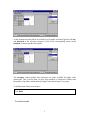
Opening the worksheet and looking at the data
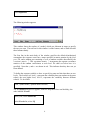
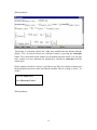
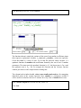
When you start MLwiN the main window appears. Immediately below the MLwiN title
bar are the menu bar and below it the tool bar as shown:
These menus are fully described in the online Help system.This may be accessed either
by clicking the Help button on the menu bar shown above or (for context-sensitive
1
Help) by clicking the Help button displayed in the window you are currently working
with. You should use this system freely.
The buttons on the tool bar relate to model estimation and control, and we shall
describe these in detail later. Below the tool bar is a blank workspace into which you
will open windows using the Window menu These windows form the rest of the
‘graphical user interface’ which you use to specify tasks to MLwiN. Below the
workspace is the status bar, which monitors the progress of the iterative estimation
procedure. Open the tutorial worksheet as follows:
Select File menu
Select Open worksheet
Select tutorial.ws
Click Open
When this operation is complete the filename will appear in the title bar of the main
window and the status bar will be initialised.
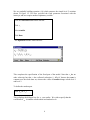
The MLwiN worksheet holds the data and other information in a series of columns.
These are initially named c1, c2, …,but the columns can (and should) be given
meaningful names to show what their contents relate to. This has already been done in
the Tutorial worksheet that you have loaded. When a worksheetis loaded a summary
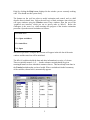
of the variables, shown below, automatically appears.
2
Each line in the body of the window summarises a column of data. In the present case
only the first 10 of the 400 columns of the worksheet contain data. Each column
contains 4059 items, one item for each student represented in the data set. There are no
missing values, and the minimum and maximum value in each column are shown.
Note the Help button on the tool bar. The remaining items on the tool bar of this
window are for attaching a name to a column. We shall use these later.
You can view individual items in the data using the Data window as follows:
Select Data manipulation menu
Select View or edit data
When this window is first opened it always shows the first three columns in the
worksheet. The exact number of items shown depends on the space available on your
screen.
You can view any selection of columns, spreadsheet fashion, as follows:
Click the View button
Select columns to view
Click OK
3
You can select a block of adjacent columns either by pointing and dragging or by
selecting the column at one end of the block and holding down ‘Shift’ while you select
the column at the other end. You can add to an existing selection by holding down
‘Ctrl’ while you select new columns or blocks.
The Font button, which is present in several of the MLwiN windows, can be used to
make the characters in that window larger or smaller. This can be useful when the
space available for the windows is not too large.
The school and student columns contain identifiers; normexam is the exam score
obtained by each student at age 16, Normalised to have approximately a standard
Normal distribution, cons is a column of 1’s, and standlrt is the score for each student
at age 11 on the London Reading Test, standardised using z-scores. Normexam is
going to be the y-variable and cons and standlrt the x-variables in our initial analysis.
The other data columns will be used in later sections of the manual. Use the scroll bars
of the Data window to move horizontally and vertically through the data, and move or
resize the window if you wish. You can go straight to line 1035, for example, by
typing 1035 in the goto line box, and you can highlight a particular cell by pointing and
clicking. This provides a means to edit data: see the Help system for more details.
Having viewed your data you will typically wish to tabulate and plot selected variables,
and derive other summary statistics, before proceeding to multilevel modelling.
Tabulation and other basic statistical operations are available on the basic statistics
menu. These operations are described in the help system. In our first model we shall be
looking at the relationship between the outcome attainment measure normexam and
the intake ability measure standlrt and at how this relationship varies across schools.
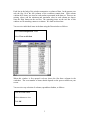
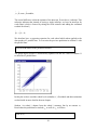
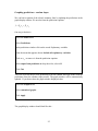
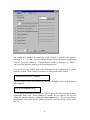
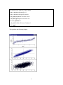
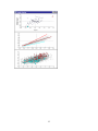
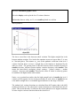
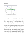
The scatter plot of normexam against standlrt for the whole of the data looks like this:
4
The plot shows, as might be expected, a positive correlation with pupils with higher
intake scores tending to have higher outcome scores. Our modelling will attempt to
partition the overall variability shown here into a part which is attributable to schools
and a part which is attributable to students. We will demonstrate later in the chapter
how to produce such graphs in MLwiN but first we focus on setting up a basic model.
You can now proceed straight away to the next section of this chapter, or stop at this
point and close MLwiN. No data have been changed and you can continue with the
next section after re-opening the worksheet Tutorial.ws. Each of the remaining
sections in this chapter is self-contained [but they must be read in the right order!], and
you are invited to save the current worksheet (using a different name) where necessary
to preserve continuity.
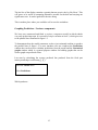
Setting up a variance components multilevel model
We now go through the process of specifying a two-level variance components model
for the examination data. First, close any open windows in the workspace. Then:
Select Model menu
5
Select Equations
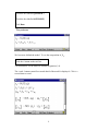
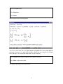
The following window appears:
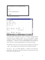
This window shows the nucleus of a model, which you elaborate in stages to specify
the one you want. The tool bar for this window is at the bottom, and we shall describe
these buttons shortly.
The first line in the main body of the window specifies the default distributional
assumption: the response vector has a mean specified in matrix notation by the fixed
part XB , and a random part consisting of a set of random variables described by the
covariance matrix Ω . This covariance matrix Ω incorporates the separate covariance
matrices of the random coefficientss at each level. We shall see below how it is
specified. Note that y and x0 are shown in red. This indicates that they have not yet
been defined.
To define the response variable we have to specify its name and also that there are two
levels. The lowest level, level 1, represents the variability between students at the same
school; the next higher level, level 2, represents the variability between different
schools. To do all this
Click y (either of the y symbols shown will do)
The Y variable dialogue box appears, with two drop-down lists: one labelled y, the
other labelled N levels.
In the y list, select normexam
In the N levels list, select 2-ij
6
By convention, the suffix i is used by MLwiN for level 1 and j for level 2, but suffixes
can be changed as we will show later.
This reveals two further drop-down lists, level 2 (j) and level 1 (i).
In the level 2 (j) list, select school
In the level 1 (i) list, select student
Click done
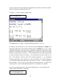
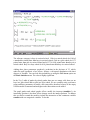
In the Equations window the red y has changed to yij in black indicating that the
response and the number of levels have been defined.
Now we must define the explanatory variables.
Click x0
In the drop-down list, select cons
Note that the fixed parameter box is checked: by default, each explanatory variable is
assumed to have a fixed parameter. We have just identified the explanatory variable
x0 with a column of 1’s. This vector of 1’s explicitly models the intercept. Other
software packages may do this for you automatically, however, in the interests of
greater flexibility, MLwiN does not.
Click Done
The Equations window now looks like this:
7
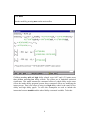
We are gradually building equation (1.8) which assumes the simple level 2 variation
shown in figure 1.2. We have specified the fixed parameter associated with the
intercept, and now require another explanatory variable.
Click the AddTerm button on the tool bar
Click x1
Select standlrt
Click Done
The Equations window looks like this –
This completes the specification of the fixed part of the model. Note that x 0 has no
other subscript but that x1 has collected subscripts ij. MLwiN detects that cons is
constant over the whole data set, whereas the values of standlrt change at both level 1
and level 2.
To define the random part.
Click β 0 (or x0 )
This redisplays the dialogue box for x0 , seen earlier. We wish to specify that the
coefficient of x0 is random at both school and student levels.
8
Check the box labelled j(SCHOOL)
Check the box labelled i(STUDENT)
Click Done
This produces
We have now defined the model. To see the composition of β 0ij ,
Click the + button on the tool bar
You should now see the model as defined in equation (1.8).
The + and – buttons control how much detail of the model is displayed. Click + a
second time to reveal:
9
You may need to resize the window by dragging the lower border in order to see all the
details, or alternatively change the font size.
To replace y, x0 and x1 by their variable names,
Click the Name button
The Name button is a ‘toggle’: clicking again brings back the x’s and y’s.
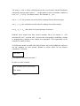
In summary, the model that we have specified relates normexam to standlrt. The
regression coefficients for the intercept and the slope of standlrt are ( β 0 , β 1 ). These
coefficients define the average line across all students in all schools. The model is made
multilevel by allowing each school’s summary line to depart (be raised or lowered)
from the average line by an amount u0 j . The i’th student in the j’th school departs from
its school’s summary line by an amount e0ij . The information conveyed on the last two
lines of the display is that the school level random departures u0 j are distributed
Normally with mean 0 and variance σ²u0 and the student level random departures
e0ij are distributed Normally with mean 0 and variance σ²e0 (the Ω’s can be ignored for
the time being). The u0j (one for each school) are called the level 2 or school level
residuals; the e0ij (one for each student) are the level 1 or student level residuals.
Just as we can toggle between x’s and actual variable names, so we can show actual
variable names as subscripts. To do this
Click the Subscripts button
10
Which produces :
This display is somewhat verbose but a little more readable than the default subscript
display. You can switch between the subscript formats by pressing the subscripts
button. The screen shots in this chapter use the default subscript format. You can gain
more control over how subscripts are displayed by clicking on subscripts from the
model menu.
Before running a model it is always a good idea to get MLwiN to display a summary of
the hierarchical structure to make sure that the structure MLwiN is using is correct. To
do this
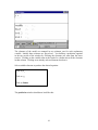
Select the Model menu
Select Hierarchy Viewer
Which produces :
11
The top summary grid shows, in the total column, that there are 4059 pupils in 65
schools. The range column shows that there are maximum of 198 pupils in any school.
The details grid shows information on each school. ‘L2 ID’ means ‘level 2 identifier
value’, so that the first cell under details relates to school no 1. If when you come to
analyse your own data the hierarchy that is reported does not conform to what you
expect, then the most likely reason is that your data are not sorted in the manner
required by MLwiN. In an n level model MLwiN requires your data to be sorted by
level 1, within level 2, within level 3...level n. There is a sort function available from
the Data Manipulation menu.
We have now completed the specification phase for this simple model. It is a good idea
to save the worksheet which contains the specification of the model so far, giving it a
different name so that you can return to this point in the manual at a later time.
Estimation
We shall now get MLwiN to estimate the parameters of the model specified in the
previous section.
We going to estimate the two parameters β 0 and β 1 which in a single level model are
the regression coefficients. In multilevel modelling regression coefficients are referred
12
to as constituting the fixed part of the model. We also estimate the variance of the
school level random effects σ 2u 0 and the variance of the pupil level random effects σ 2e 0 .
The random effects and their variances are referred to as the random part of the
model.
Click the Estimates button on the Equations
window tool bar
You should see highlighted in blue the parameters that are to be estimated. Initially, we
will not estimate the 4059 individual pupil level random effects and 65 school level
random effects, we will return to these later.
The estimation process is iterative. To begin the estimation we use the tool bar of the
main MLwiN window. The Start button starts estimation, the Stop button stops it, and
the More button resumes estimation after a stop. The default method of estimation is
iterative generalised least squares (IGLS). This is noted on the right of the Stop button,
and it is the method we shall use. The Estimation control button is used to vary the
method, to specify convergence criteria, and so on. See the Help system for further
details.
Click Start
You will now see the progress gauges at the bottom of the screen (R for random
parameters and F for fixed parameters) fill up with green as the estimation proceeds
alternately for the random and fixed parts of the model. In the present case this is
completed at iteration 3 at which point the blue highlighted parameters in the
Equations window change to green to indicate convergence. Convergence is judged to
have occurred when all the parameters between two iterations have changed by less
than a given tolerance, which is 10−2 by default but can be changed from the Options
menu.
Click Estimates
once more and you will see the parameter estimates displayed together with their
standard errors as in the following screen (the last line of the screen can be ignored for
the time being).
13
The first two lines of this display reproduce equations 1.8, with the actual names of the
different variables filled in. Recall that our model amounts to fitting a set of parallel
straight lines to the results from the different schools. The slopes of the lines are all the
same, and the fitted value of the common slope is 0.563 with a standard error of 0.012
(clearly, this is highly significant). However, the intercepts of the lines vary. Their
mean is 0.002 and this has a standard error (in brackets) of 0.040. Not surprisingly
with Normalized data, this is close to zero. The intercepts for the different schools are
the level 2 residuals u0j and these are distributed around their mean with a variance
shown on line 4 of the display as 0.092 (standard error 0.018). The variance appears to
be significantly different from zero. Judging significance for variances however, (and
assignng confidence intervals) is not as straightforward as for the fixed part parameters.
The simple comparison with the standard error and also the use of the interval and
tests procedures (see help system) provides approximations that can act as rough
guides. We shall deal with this further when discussing the likelihood ratio statistic and
also in the part of this guide which deals with simulation based techniques. Of course,
the actual data points do not lie exactly on the straight lines; they vary about them with
amounts given by the level 1 residuals e0ij and these have a variance estimated as 0.566,
standard error 0.013. We shall see in the next chapter how MLwiN enables us to
estimate and plot the residuals in order to obtain a better understanding of the model.
If we were to take children at random from the whole population, their variance would
be the sum of the level 2 and level 1 variances, 0.092 + 0.566 = 0.658. The betweenschool variance makes up a proportion 0.140 of this total variance. This quantity is
known as the intra-school correlation. It measures the extent to which the scores of
children in the same school resemble each other as compared with those from children
at different schools.
14
The last line of the display contains a quantity known as twice the log likelihood. This
will prove to be useful in comparing alternative models for the data and carrying out
significance tests. It can be ignored for the time being.
This is another place where you would do well to save the worksheet.
Graphing Predictions : Variance components
We have now constructed and fitted a variance components model in which schools
vary only in their intercepts. It is a model of simple variation at level 2, which gives rise
to the parallel lines illustrated in figure 1.2.
To demonstrate how the model parameters we have just estimated combine to produce
the parallel lines of figure 1.2 we now introduce two new windows the Predictions
window that can be used to calculate predictions from the model and the Customised
graphs window which is a general purpose window for building graphs that can be
used to graph our predicted values.
Lets start by calculating the average predicted line produced from the fixed part
intercept and slope coefficients( β 0 , β 1 ).
Select the Model menu
Select Predictions
Which produces :
15
The elements of the model are arranged in two columns, one for each explanatory
variable. Initially these columns are ‘greyed out’. You build up a prediction equation
in the top section of the window by selecting the elements you want from the lower
section. Clicking on the variable name at the head of a column selects all the elements
in that column. Clicking on an already-selected element deselects it.
Select suitable elements to produce the desired equation :
Click on β 0
Click on β 1
Click on Names
The prediction window should now look like this :
16
The only estimates used in this equation are β 0 and β 1 , the fixed parameters – no
random quantities have been included.
We need to specify where the output from the prediction is to go and then execute the
prediction
In the output from prediction to drop-down list, select C11
Click Calc
We now want to graph the predictions in column 11 against our predictor variable
standlrt. We can do this using the customised graph window.
Select the Graphs menu
Select customised graph(s)
This produces the following window :
17
This general purpose graphing window has a great deal of functionality, which is
described in more detail both in the help system and in the next chapter of this guide.
For the moment we will confine ourselves to its more basic functions. To plot out the
data set of predicted values :
In the drop down list labeled y in the plot what ? tab select c11
In the neighbouring drop down list labeled x select standlrt
In the drop down list labeled plot type select line
In the drop down list labeled group select school
This last action specifies that the plot will produce one line for each school. For the
present graph all the lines will coincide, but we shall need this facility when we update
our predictions to produce the school level summary lines. To see the graph :
Click the Apply button
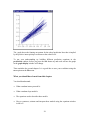
The following graph will appear :
18
We are now going to focus on the predictions window and the graph
window.
display
Close the Equations
Close the Customised graph window
Arrange the predictions and graph display windows so that they are both visible. If
by mistake you click on the interior area of the graph display window, a window
offering advanced options will appear; if this happens just close the advanced options
window; we will be dealing with this feature in the next chapter.
The line for the j’th school departs from the above average prediction line by an
amount u0 j . The school level residual u0 j modifies the intercept term, but the slope
coefficient β 1 is fixed. Thus all the predicted lines for all 65 schools must be parallel.
To include the estimated school level intercept residuals in the prediction function :
Select the predictions window
click on the term u0 j
The prediction equation in the top part of the predictions window changes from
y = β 0cons + β 1 standlrt ij
to
19
y = β 0 j cons + β 1 standlrt ij
The crucial difference is that the estimate of the intercept β 0 now has a j subscript. This
subscript indicates that instead of having a single intercept, we have an intercept for
each school, which is formed by taking the fixed estimate and adding the estimated
residual for school j
β 0 j = β 0 + u0 j
We therefore have a regression equation for each school which when applied to the
data produce 65 parallel lines. To overwrite the previous prediction in column 11 with
the parallel lines
Press the Calc button in the prediction window
The graph display window is automatically updated with the new values in column 11
to show the 65 parallel lines.
In this plot we have used the school level residuals( u0 j ). Residuals and their estimation
are dealt with in more detail in the next chapter.
Student i in school j departs from the school j summary line by an amount e0 ij .
Recalculate the predictions to include e0 ij as well as u0 j as follows
Click on e0 ij
20
Press the Calc button
Which is a line plot through the original values of yij , i.e. we have predicted back onto
the original data. Experiment including different combinations of ( β 0 , β 1 , u0 j , e0ij ) in
the prediction equation. Before pressing the calc button try and work out what pattern
you expect to see in the graph window.
A Random slopes model
The variance components model which we have just specified and estimated assumes
that the only variation between schools is in their intercepts. We should allow for the
possibility that the school lines have different slopes as in Figure 1.3. This implies
that the coefficient of standlrt will vary from school to school.
Still regarding the sample schools as a random sample from a population of schools, we
wish to specify a coefficient of standlrt which is random at level 2. To do this we need
to inform MLwiN that the coefficient of x1ij , or standlrtij , should have the subscript j
attached.
To do this
Select the model menu
Select the Equations window
21
Click Estimates until β 0 etc. are displayed in black
Click β 1
Check the box labelled j(school)
Click Done
This produces the following result:
Now that the model is becoming more complex we can begin to explain the general
notation. We have two explanatory variables x 0 and x1ij (cons and standlrt). Anything
containing a 0 subscript is associated with x 0 and anything containing a 1 subscript is
associated with x1ij . The letter u is used for random departures at level 2(in this case
school). The letter e is used for random departures at level 1(in this case student).
The parameters β 0 and β 1 are the fixed part (regression coefficients) associated with
x 0 and x1ij . They combine to give the average line across all students in all schools.
The terms u0 j and u1 j are random departures or ‘residuals’ at the school level
from β 0 and β 1 . They allow the j’th school's summary line to differ from the average
line in both its slope and its intercept.
22
The terms u0 j and u1 j follow a multivariate (in this case bivariate) Normal distribution
with mean 0 and covariance matrix Ω u . In this model we have two random variables at
level 2 so Ω u is a 2 by 2 covariance matrix. The elements of Ω u are :
var( u0 j ) = σ u2 0 (the variation across the schools' summary lines in their intercepts)
var( u1 j ) = σ u21 (the variation across the schools' summary lines in their slopes)
cov( u0 j , u1 j ) = σ u 01 (the school level intercept/slope covariance).
Students' scores depart from their school's summary line by an amount e0ij . (We
associate the level 1 variation with x 0 because this corresponds to modelling constant
or homogeneous variation of the student level departures. This requirement can be
relaxed as we shall see later).
To fit this new model we could click Start as before, but it will probably be quicker to
use the estimates we have already obtained as initial values for the iterative
calculations. Therefore
Click More
Convergence is achieved at iteration 7.
In order to see the estimates,
Click Estimates (twice if necessary)
Click Names
To give
23
You should compare this display with that for the model where we did not fit a random
slope. In line 2 of the display the coefficient of standlrt has acquired a suffix j
indicating that it varies from school to school. In fact, its mean from line 4 is 0.557
(standard error 0.020), not far different from the model with a single slope. However,
the individual school slopes vary about this mean with a variance estimated as 0.015
(standard error 0.004). The intercepts of the individual school lines also differ. Their
mean is –0.012 (standard error 0.040) and their variance is 0.090 (standard error 0.018).
In addition there is a positive covariance between intercepts and slopes estimated as
+0.018 (standard error 0.007), suggesting that schools with higher intercepts tend to
some extent to have steeper slopes and this corresponds to a correlation between the
intercept and slope (across schools) of 0.018 / 0.015 * 0.090 = 0.49 . This will lead to a
fanning out pattern when we plot the schools predicted lines.
As in the previous model the pupils' individual scores vary around their schools’ lines
by quantities e0ij, the level 1 residuals, whose variance is estimated as 0.554 (standard
error 0.012).
The quantity on the last line of the display, -2*log-likelihood can be used to make an
overall comparison of this more complicated model with the previous one. You will
see that it has decreased from 9357.2 to 9316.9, a difference of 40.3. The new model
involves two extra parameters, the variance of the slope residuals u1j and their
covariance with the intercept residuals u0j and the change (which is also the change in
deviance, where the deviance for Normal models differs by a constant term for a fixed
sample size) can be regarded as a χ² value with 2 degrees of freedom under the null
hypothesis that the extra parameters have population values of zero. As such it is very
highly significant, confirming the better fit of the more elaborate model to the data.
24
Graphing predictions : random slopes
We can look at pattern of the schools summary lines by updating the predictions in the
graph display window. We need to form the prediction equation
y = β 0 j x 0 + β 1 j x1ij
One way to do this is
Select the Model menu
Select Predictions
In the predictions window click on the words Explanatory variables
From the menu that appears choose Include all explanatory variables
Click on eoij to remove it from the prediction equation
In the output from prediction to drop-down list, select c11
Click Calc
This will overwrite the previous predictions from the random intercepts model with the
predictions from the random slopes model. The graph window will be automatically
updated. If you do not have the graph window displayed, then
Select the Graphs menu
Select customised graphs
Click Apply
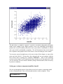
The graph display window should look like this :
25
The graph shows the fanning out pattern for the school prediction lines that is implied
by the positive intercept/slope covariance at the school level.
To test your understanding try building different prediction equations in the
predictions window; before you press the calc button try and work out how the graph
in the graph display window will change.
That concludes the second chapter. It is a good idea to save your worksheet using the
save option on the File menu.
What you should have learnt from this chapter
You should understand :
•= What a random intercept model is
•= What a random slope model is
•= The equations used to describe these models
•= How to construct, estimate and interpret these models using the equations window
in MLwiN
26
•= How to carry out simple tests of significance
•= How to use the predictions window to calculate predictions from the model
estimates
27
Chapter 2: Residuals
In this chapter we will work through the random slope model again. This time we shall
explore the school and student random departures known as residuals.
Before we begin let’s close any open windows :
Select the Window menu
Select close all windows
What are multilevel residuals?
In order to answer that question let’s return to the random intercepts model. You can
retrieve one of the earlier saved worksheets, or you can modify the random slopes
model Select the model menu
Select Equations
Click on β 1
Uncheck the box labeled j(school)
Click Done
The slope coefficient is now fixed with no random component. Now run the model and
view the estimates:
Press Start on the main toolbar
Press Name then Estimates twice in the Equations window
Which produces :
1
This should be familiar from the previous chapter. The current model is a 2-level linear
regression relationship of normexam on standlrt, with an average line defined by the
two fixed coefficients β0 and β1. The model is made two-level by allowing the line for
the jth school to be raised or lowered from the average line by an amount u0j. These
departures from the average line are known as the level 2 residuals. Their mean is zero
and their estimated variance of 0.092 is shown in the Equations window. With
educational data of the kind we are analyzing, they might be called the school effects.
In other datasets, the level 2 residuals might be hospital, household or area effects.
The true values of the level 2 residuals are unknown, but we will often require to obtain
estimates of them. We might reasonably ask for the effect on student attainment of one
particular school. We can in fact predict the values of the residuals given the observed
data and the estimated parameters of the model (see Goldstein, 1995, Appendix 2.2).
In ordinary multiple regression, we can estimate the residuals simply by subtracting the
predictions for each individual from the observed values. In multilevel models with
residuals at each of several levels, a more complex procedure is needed.
Suppose that yij is the observed value for the ith student in the jth school and that y ij is
the predicted value from the average regression line. Then the raw residual for this
subject is rij = yij − y ij . The raw residual for the jth school is the mean of these over
the students in the school. Write this as r+j. Then the predicted level 2 residual for this
school is obtained by multiplying r+j. by a factor as follows –
2
u 0 j =
σ 2 uo
σ 2 u0
r+ j
+ σ 2 e0 / n j
where nj is the number of students in this school.
The multiplier in the above formula is always less than or equal to 1 so that the
estimated residual is usually less in magnitude than the raw residual. We say that the
raw residual has been multiplied by a shrinkage factor and the estimated residual is
sometimes called a shrunken residual. The shrinkage factor will be noticeably less than
1 when σ²e0 is large compared to σ²u0 or when nj is small (or both). In either case we
have relatively little information about the school (its students are very variable or few
in number) and the raw residual is pulled in towards zero. In future ‘residual’ will
mean shrunken residual. Note that we can now estimate the level 1 residuals simply by
the formula
e0ij = rij − u0 j
MLwiN is capable of calculating residuals at any level and of providing standard errors
for them. These can be used for comparing higher level units (such as schools) and for
model checking and diagnosis.
Calculating residuals in MLwiN
We can use the Residuals window in MLwiN to calculate residuals. Let’s take a look at
the level 2 residuals in our model.
Select Model menu
Select Residuals
Select Settings tab
3
The comparative standard deviation (SD) of the residual is defined as the standard
deviation of u0 j − u0 j and is used for making inferences about the unknown underlying
value u0 j , given the estimate u0 j . The standardised residual is defined as u0 j / SD(u0 j )
and is used for diagnostic plotting to ascertain Normality etc.
As you will see, this window permits the calculation of the residuals and of several
functions of them. We need level 2 residuals, so at the bottom of the window
From the level: list select 2:school
You also need to specify the columns into which the computed values of the functions
will be placed.
Click the Set columns button
The nine boxes beneath this button are now filled in grey with column numbers running
sequentially from C300. These columns are suitable for our purposes, but you can
change the starting column by editing the start output at box. You can also change
the multiplier to be applied to the standard deviations, which by default will be stored
in C301.
4
Edit the SD multiplier to 1.96
Click Calc(to calculate columns C300 to C308.
Having calculated the school residuals, we need to inspect them and MLwiN provides a
variety of graphical displays for this purpose. The most useful of these are available
from the Residuals window by clicking on the Plots tab. This brings up the following
window –
One useful display plots the residuals in ascending order with their 95% confidence
limit. To obtain this, click on the third option in the single frame (residual +/- 1.96 SD
x rank) then click Apply. The following graph appears
5
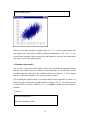
This is sometimes known (for obvious reasons) as a caterpillar plot. We have 65 level 2
residuals plotted, one for each school in the data set. Looking at the confidence
intervals around them, we can see a group of 10 or 15 schools at each end of the plot
where the confidence intervals for their residuals do not overlap zero. Remembering
that these residuals represent school departures from the overall average line predicted
by the fixed parameters, this means that the majority of the schools do not differ
significantly from the average line at the 5% level.
See Goldstein and Healy (1995) for further discussion on how to interpret and modify
such plots when multiple comparisons among level 2 units are to be made.
Comparisons such as these, especially of schools or hospitals, raise difficult issues: in
many applications, such as here, there are large standard errors attached to the
estimates. Goldstein and Spiegelhalter (1996) discuss this and related issues in detail.
Note: You may find that you sometimes need to resize graphs in MLwiN to obtain a
clear labeling of axes.
What you should have learnt from this chapter
•= Multilevel residuals are shrunken towards zero and shrinkage increases as nj
decreases
•= How to calculate residuals in MLwiN
6
Chapter 3. Graphical procedures for exploring the model
Displaying graphs
We have already produced a graphical display of the school level residuals in our
random intercept model, using the Residuals window to specify what we wanted.
MLwiN has very powerful graphical facilities, and in this chapter we shall see how to
obtain more sophisticated graphs using the Customised graphs window. We will also
use some of these graphical features to explore the random intercepts and random
slopes models.
Graphical output in MLwiN can be described (very appropriately) at three levels. At
the highest level, a display is essentially what can be displayed on the computer screen
at one time. You can specify up to 10 different displays and switch between them as
you require. A display can consist of several graphs. A graph is a frame with x and y
axes showing lines, points or bars, and each display can show an array of up to 5x5
graphs. A single graph can plot one or more datasets, each one consisting of a set of x
and y coordinates held in worksheet columns.
To see how this works,
Select the graphs menu
Select customised graphs
The following window appears :
1
This screen is currently showing the construction details for display D10 – you may
have noticed that the plot tab of the Residuals window in the previous chapter
specified this in its bottom right hand corner. The display so far contains a single
graph, and this in turn contains a single dataset, ds1 for which the y and x coordinates
are in columns c300 and c305 respectively. As you can check from the Residuals
window, these contain the level 2 residuals and their ranks.
Let us add a second graph to this display containing a scatterplot of normexam against
standlrt for the whole of the data. First we need to specify this as a second dataset.
Select data set number 2(ds #2) by clicking on the row labeled 2 in the
grid on the left hand side of the window
Now use the y and x dropdown lists on the plot what? tab to specify normexam and
standlrt as the y and x variables in ds2.
Next we need to specify that this graph is to separate from that containing the
caterpillar plot. To do this,
Click the position tab on the right hand side of the customised graph
window
The display can contain a 5x5 grid or trellis of different graphs. The cross in the
position grid indicates where the current data set, in this case (normexam, standlrt),
will be plotted. The default position is row 1, column 1. We want the scatterplot to
appear vertically below the caterpillar plot in row 2, column 1 of the trellis, so
Click the row 2 column 1 cell in the above grid
Now to see what we have got,
Press the Apply button at the top of the Cutomised graph window
and the following display will appear on the screen:
2
As a further illustration of the graphical facilities of MLwiN, let us create a third graph
to show the 65 individual regression lines of the different schools and the average line
from which they depart in a random manner. We can insert this between the two
graphs that we already have. First we need to calculate the points for plotting in the
new graph. For the individual lines
Select the Model window
Select Predictions
Click on Variable
Select Include all explanatory variables
Click on e0ij to remove it
In the output from prediction list select c11
Press calc
3
This will form the predictions using the level 2 (school)residuals but not the level 1
(student) residuals. For the overall average line we need to eliminate the level 2
residuals, leaving only the fixed part of the model:
In the Predictions window click on u0j to remove it
In the output from prediction list select c12
Press calc
Close the Predictions window
The Customised graph window is currently showing the details of dataset ds2, the
scatterplot. With this dataset selected
4
Click on the position tab
In the grid click the cell in row 3, column 1
Press Apply
The display now appears as follows:
We have not yet specified any datasets for the middle graph so it is blank for the time
being. Here and elsewhere you may need to resize and re-position the graph display
window by pulling on its borders in the usual way.
Now let us plot the lines that we have calculated. We need to plot c11 and c12 against
standlrt. For the individual school lines we shall need to specify the group, meaning
that the 65 lines should be plotted separately. In the Customised graphs window
5
Select data set ds3 at the left of the window
In the y dropdown list specify c11
In the x dropdown list specify standlrt
In the group dropdown list select school
In the plot type dropdown list select line
Select the position tab
In the grid click the cell in row 2 column 1
Click Apply
This produces the following display:
6
Now we can superimpose the overall average line by specifying a second dataset for the
middle graph. So that it will show up, we can plot it in red and make it thicker than the
other lines:
Select dataset ds4 at the left hand side of the Customised graphs window
In the y dropdown list select c12
In the x dropdown list select standlrt
In the plot type dropdown list select line
Select the plot styles tab
In the colour dropdown list select red
In the line thickness dropdown list select 2
Select the position tab
In the grid click the cell in row 2, column 1
[I think the position should be OK following the previous manoeuvre]
Click Apply
There is a lot more that MLwiN makes it possible to do with the graphs that we have
produced. To investigate some of this, click in the top graph on the point corresponding
to the largest of the level 2 residuals, the one with rank 65. This brings up the following
Graph options screen:
7
The box in the centre shows that we have selected the 53rd school out of the 65, whose
identifier happens to be 53. We can highlight all the points in the display that belong to
this school by selecting highlight (style 1) and clicking Apply. If you do this you will
see that the appropriate point in the top graph, two lines in the middle graph and a set of
points in the scatterplot have all become coloured red.
The individual school line is the the thinner of the two highlighted lines in the middle
graph. As would be expected from the fact that it has the highest intercept residual, the
school’s line is at the top of the collection of school lines.
It is not necessary to highlight all references to school 53. To de-highlight the school’s
contribution to the overall average line which is contained in dataset ds4, in the
Customised graphs window:
Select dataset 3
Click on the other tab
Click the Exclude from highlight box
Click Apply
In the caterpillar plot there is a residual around rank 30 which has very wide error bars.
Let us try to see why. If you click on the point representing this school in the caterpillar
plot, the graph options window will identify it as school 48. Highlight the points
belonging to this school in a different colour:
Using the graph options window, in the in graphs box select highlight (style 2)
Click Apply
The points in the scatterplot belonging to this school will be highlighted in cyan, and
inspection of the plot shows that there are only two of them. This means that there is
very little information regarding this school. As a result, the confidence limits for its
residual are very wide, and the residual itself will have been shrunk towards zero by an
appreciable amount.
Next let us remove all the highlights from school 48. In the graph options window
In the in graphs box select normal
Click Apply
Now let us look at the school at the other end of the caterpillar, that with the lowest
school level residual. Click on its point in the caterpillar (it turns out to be school 59)
and in the Graph options window select highlight (style 3) and click Apply. The
8
highlighting will remain and the graphical display will look something like this, having
regard to the limitations of monochrome reproduction:
9
The caterpillar tells us simply that school 49 and 53 have different intercepts – one is
significantly below the average line, the other significantly above it. But the bottom
graph suggests a more complicated situation. At higher levels of standlrt, the points for
school 53 certainly appear to be consistently above those for school 49. But at the other
end of the scale, at the left of the graph, there does not seem to be much difference
between the schools. The graph indeed suggests that the two schools have different
slopes, with school 53 the steeper.
To follow up this suggestion, let us keep the graphical display while we extend our
model to contain random slopes. To do this:
From the Model menu select Equation
Click on β1 and check the box labelled j (school) to make it random at level 2
Click Done
Click More on the main toolbar and watch for convergence
Close the Equations window
Now we need to update the predictions in column c11 to take account of the new model:
From the Model menu select Predictions
Click on u0j and u1j to include them in the predictions
In the Output from predictions dropdown list select c11
Click Calc
Notice that the graphical display is automatically updated with the new contents of
column c11.
The caterpillar plot at the top of the display however is now out of date, having been
calculated from the previous model. (Recall we used the residuals window to create the
caterpillar plot). We now have two sets of level 2 residuals, one giving the intercepts for
the different schools and one the slopes. To calculate and store these:
Select Residuals from the Model menu
Select 2:School from the level dropdown list
Edit the Start output at box to 310
Click Calc
The intercept and slope residuals will be put into columns c310 and c311. To plot them
10
against each other:
In the Customised graphs window select dataset ds#1 and click Delete dataset
From the y dropdown list select c310
From the x dropdown list select c311
Click Apply
The axis titles in the top graph also need changing. Note that if you use the customised
graph window to create graphs no titles are automatically put on the graphs. This is
because a graph may contain many data sets so in general there is no obvious text for
the titles. The existing titles appear because the graph was originally constructed by
using the plots tab on the residuals window. You can specify or alter titles by clicking
on a graph. In our case:
Click somewhere in the top graph to bring up the Graph options window
Select the titles tab
Edit the y title to be Intercept
Edit the x title to be Slope
Click Apply
You can add titles to the other graphs in the same way if you wish. Now the graphical
display will look like this:
11
12
The two schools at the opposite ends of the scale are still highlighted, and the middle
graph confirms that there is very little difference between them at the lower levels of
standlrt. School 53 stands out as exceptional in the top graph, with a high intercept and
much higher slope than the other schools.
For a more detailed comparison between schools 53 and 49, we can put 95% confidence
bands around their regression lines. To calculate the widths of the bands:
Select Predictions from the Model menu
Edit the multiplier of S.E. to 1.96
From the S.E. of dropdown list select level 2 resid function
From the output to dropdown list select column c13
Click Apply
Now plot the bands
In the Customised graphs window select dataset ds#2
Select the errors tab
From the y error + list se;ect c13
From the y error – list select c13
From the y error type list select lines
Click Apply
This draws 65 confidence bands around 65 school lines, which is not a particularly
readable graph. However, we can focus in on the two highlighted schools by drawing
the rest in white.
Select the customised graphs window
Select data set number 2 (ds # 2)
From the colour list select white
Click Apply
13
The confidence bands confirm that what appeared to be the top and bottom schools
cannot be reliably separated at the lower end of the intake scale.
Looking at the intercepts and slopes may be able to shed light on interesting educational
questions. For example, schools with high intercepts and low slopes, plotting in the top
left quadrant of the top graph, are ‘levelling up’ – they are doing well by their students
at all levels of initial ability. Schools with high slopes are differentiating between levels
of intake ability. The highlighting and othere graphical features of MLwiN can be
useful for exploring such features of complicated data. See Yang et al., (1999) for a
further discussion of this educational issue.
What you should have learnt from this chapter
•= How to make different graphical representations of complex data.
•= How to explore aspects of multilevel data using graphical facilities such as
highlighting.
•= With random slopes models differences between higher level units(e.g. schools) can
not be expressed by a single number.
14
Chapter 4: Contextual effects
Many interesting questions in social science are of the form how are individuals
effected by their social contexts? For example,
•= Do girls learn more effectively in a girls' school or a mixed sex school?
•= Do low ability pupils fare better when they are educated alongside higher ability
pupils or worse?
In this section we will develop models to investigate these two questions.
Before we go on let's close all open windows by
Select the Window menu
Select close all windows
Pupil gender and school gender effects
We are now going use a new window which is useful for building models with
categorical explanatory variables.
Select the Model menu
Select Main Effects and Interactions
The following window appears
1
This screen automates the process of creating sets of dummy variables (and interactions
between sets of dummy variables) that are required for modelling categorical
predictors. To enter main effects for individual gender and school gender
In the panel marked categorical click on [none]
From the list that appears select gender
Click on [none] again and select schgend
Note that now that we have defined two cataegorical variables the possiblility for a 1st
order interaction exists and the view panel (on the right of the window) has been
updated to include the option order 1. We just want to include main effects so
In the View panel click on Main Effects
The main effects and interactions window now displays a list of potential main effects:
2
At the moment no main effects are included, to fit gender and school gender with boy
and mixedsch as the reference categories, click on the corresponding entries in the
included column to produce the pattern :
The in higher column defines what categories are made available for higher order
interactions. This is useful when you have large numbers of categorical variables and
the number of possible combinations for higher order interactions is very large.
To add the main effects to the model :
Click Build
To view the model
3
Select the Model menu
Select Equations
Click Names
Which produces the following model
You can see that main effects for girl, boysch and girlsch have been added.Girl has
subscript ij because it is a pupil level variable, whereas the two school level variables
have subscript j. We can run the model and view the results by
Click estimates until numbers appear in the equations window
Press More on the main toolbar
The model converges to the results below:
4
The reference category is boys in a mixed school. Girls in a mixed school do 0.168 of
a standard deviation better than boys in a mixed school. Girls in a girls school do 0.175
points better than girls in a mixed school and (0.175+0.168) points better than boys in a
mixed school. Boys in a boys school do 0.18 points better than boys in a mixed school.
Adding these three parameters produced a reduction in the deviance of 35, which,
under the null hypothesis of no effects, follows a chi-squred distribution with three
degrees of freedom. You can look this probability up using the Tail Areas option on
the Basic Statistics menu. The value is highly significant.
In the 2 by 3 table of gender by school gender there are two empty cells, there are no
boys in a girls school and no girls in a boys school. We are currently using a reference
group and three parameters to model a four entry table, therefore because of the empty
cells the model is saturated and no higher order intercations can be added.
The pupil gender and school gender effects modify the intercept (standlrt=0). An
interesting question is do these effects change across the intake spectrum. To address
this we need to extend the model to include the interaction of the continuous variable
standlrt with our categorical variables. To do this
5
Select the Main Effects and Interactions window
In the View panel select setup
In the continous panel click on none
From the list that appears select standlrt
In the View panel select main effects
The main effects screen now has a column for standlrt added. Click on entries in the
column to produce the following pattern
Click on Build
The equations window will be automatically modified to include the thre new
interaction terms. Run the model :
press More on the main toolbar
The deviance reduces by less than one unit. From this we conclude there is no evidence
of an interaction between the gender variables and intake score. We can remove from
the model by
Select the main effects and interactions window
Ensure main effects are selected in the view panel
Deselect all entries marked with a X in the standlrt column by clicking
Press Build
6
Note that we could have clicked on individual terms in Equations window and selected
the delete term option. However, this would not have removed the terms from the
main effects and interactions tables and every subsequent build would put them back
into the model.
Contextual effects
The variable schav is contructed by taking the average intake ability(standlrt) for each
school, based on these averages the bottom 25% of schools are coded 1(low), the
middle 50 % coded 2(mid) and the top 25% coded 3(high). Let's include this
categorical school level contextual variable in the model.
Select the Main Effects and Interactions window
Select Setup from the View panel
In the Categorical panel click on [none]
Select schav from the list that appears
Select Main Effects from the View panel
Click the included column for the mid and high entries
The main effects and interactions window should now look like this :
7
Click Build
Run the model by pressing more on the main toolbar
Children attending mid and high ability schools score 0.067 and 0.174 points more
than children attending low ability schools. The effects are of borderline statistical
significance. This model assumes the contextual effects of school ability are the same
across the intake ability spectrum because these contextual effects are modifying the
intercept term. That is the effect of being in a high ability school is the same for low
ability and high ability pupils. To relax this assumption we need to include the
interaction between standlrt and the school ability contextual variables. To do this :
8
Select the Main Effects and Interactions window
Select Main Effects from the View panel
Click the standlrt column for the mid and high entries
Click Build
The Main Effects and Interactions window should look like this:
The model converges to :
9
The slope coefficient for standlrt for pupils from low intake ability schools is 0.455.
For pupils from mid ability schools the slope is steeper 0.455+0.092 and for pupils
from high ability schools the slope is steeper still 0.455+0.18. These two interaction
terms have explained variabilty in the slope of standlrt in terms of a school level
variable therefore the between school variability of the standlrt slope has been
substantially reduced (from 0.015 to 0.011). Note that the previous contextual effects
boysch, girlsch, mid and high all modified the intercept and therefore fitting these
school level variables reduced the between school variabilty of the intercept.
We now have three different linear relationships between the output score(normexam)
and the intake score(standlrt) for pupils from low, mid and high ability schools. The
prediction line for low ability schools is
β 0 cons + β 1standlrt ij
The prediction line for the high ability schools is
β 0 cons + β 1standlrt ij + β 6 high j + β 8 high.standlrt ij
The difference between these two lines, that is the effect of being in a high ability
school is
10
β 6 high j + β 8 high.standlrt ij
We can create this prediction function by
select the Model window
Select Predictions
Clear any existing prediction by clicking on variable
Select Remove all explanatory variables from the menu that appears
Click in turn on β 6 , β 8
In the output from prediction to list select c30
Press Ctl-N and rename C30 to predab
Click Calc
We can plot this function as follows :
Select the Customised Graph window
Select display number 5 D5
In the y list select predtab
In the x list select standlrt
In the plot type list select line
In the filter list select high
Click Apply
Which produces
11
This graph shows how the effect of pupils being in a high ability school changes across
the intake spectrum. On average very able pupils being educated in a high ability
school score 0.9 of a standard deviation higher in their outcome score than they would
if they were educated in a low ability school. Once a pupils’ intake score drops below –
1.7 then they fare progressively better in a low ability school. This finding has some
educational interest but we do not pursue that here. We can put a 95% confidence band
around this line by
Select the Predictions window
Edit the multiplier S.E. of to 1.96
In the S.E. of list select Fixed
In the corresponding output to list select c31
Click Calc
Select the customised graph window
Select error bars tab
In the y errors + list select c31
In the y errors – list select c31
12
In the y error type list select lines
Click Apply
Which produces
Save your worksheet. We will be using it in the next chapter.
What you should have learnt from this chapter
•= What is meant by contextual effects
•= How to set up multilevel models with interaction terms
13
Chapter 5: Modelling the variance as a function of explanatory
variables
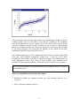
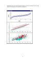
From the fanning out pattern of the school summary lines seen in chapters 3 and 4 we
know that schools are more variable for students with higher levels of standlrt.
Another way of saying this is that the between school variance is a function of
standlrt.
In MLwiN we always specify the random variation in terms of coefficients of
explanatory variables, the total variance at each level is thus a function of these
explanatory variables. These functions are displayed in the Variance function window.
Retreive the worksheet from the end of chapter 5
Select the Model menu
Select Variance Function
Click Name button in the Variance function window
The initial display in this window is of the level 1 variance. In the present model we
have simple (constant) variation at level 1, as the above equation shows. Now
1
In the level drop-down list, select 2:school
The function shown is simply the variance of the sum of two random coefficients times
their respective explanatory variables, u0 j cons and u0 j standlrt ij , written out explicitly.
Given that cons is a vector of ones we see that the between school variance is a
quadratic function of standlrt with coefficients formed by the set of level 2 random
parameters. The intercept in the quadratic function is σ 2u0 , the linear term is 2σ u01 and
the quadratic term is σ 2u1 . We can compute this function and the Variance function
window provides us with a simple means of doing this.
The column in the window headed select, cons, standlrt and result are for computing
individual values of the variance function. Since standlrt is a continuous variable it
will be useful to calculate the level 2 variance for every value of standlrt that occurs.
In the variance output to list on the tool bar, select c30
Click Calc
2
Now you can use the customised graph window to plot c30 against standlrt:
The above graph has had the y-axis rescaled to run between 0 and 0.3. The apparent
pattern of greater variation between schools for students with extreme standlrt scores,
especially high ones, is consistent with the plot of prediction lines for the schools we
viewed earlier.
We need to be careful about over the interpretation of such plots. Polynomial functions
are often unreliable at extremes of the data to which they are fitted. Another difficulty
with using polynomals to model variances is that they may, for some values of the
explanatory variables, predict a negative overall variance. To overcome this we can use
nonlinear(negative exponential) functions to model variance. This is an advanced topic
and for details see the Advanced Modelling Guide (Yang et al., 1999).
We can construct a similar level 2 variance plot for the basic random slope model,
before extending the model by adding gender, schgend and schav explanatory
variables. This can be illuminating because it shows us to what extent these variables
are explaining between-school differences across the range of standlrt. This is left as
an exercise for the reader but the graph comparing the between school variance for the
two models is shown below.
3
We see in both models schools are more variable for students with high standlrt
scores. The explanatory variables we added in the extended model explain about 25%
of the between school variation across the spectrum of standlrt.
Complex variation at level 1
Until now we have assumed a constant variance at level 1. It may be that the student
level departures around their school summary lines are not constant. They may change
in magnitude at different levels of standlrt or be larger for boys than girls. In other
words the student level variance may also be a function of explanatory variables.
Let’s look and see if the pupil level variance changes as a function of standlrt. To do
this we need to make the coefficient of standlrt random at the student level. To do this
In the equations window click on β 1
Check the box labeled i(student)
Which produces
4
Now β 1 the coefficient of standlrt has a school level random term u1 j and a student
level random term e1ij attached to it. As we have seen, at the school level we can think
of the variance of the u1 j terms, that is σ 2u1 in two ways. Firstly, we can think of it as
the between school variation in the slopes. Secondly we can think of it as a coefficient
in a quadratic function that describes how the between school variation changes with
respect to standlrt. Both conceptualisations are useful.
The situation at the student level is different. It does not make sense to think of the
variance of the e1ij ’s, that is σ 2e1 as the between student variation in the slopes. This is
because a student corresponds to only one data point and it is not possible to have a
slope through one data point. However, the second conceptualisation where σ 2e1 is a
coefficient in a function that describes how between student variation changes with
respect to standlrt is both valid and useful. This means that in models with complex
level 1 variation we do not think of the estimated random parameters as separate
variances and covariances but rather as elements in a function that describes how the
level 1 variation changes with respect to explanatory variables. The variance function
window can be used to display the form of the function.
5
Run the model
Select the variance function menu
From the level drop down list select 1:student
Which produces
As with level 2, we have a quadratic form for the level 1 variation. Let us evaluate the
function for plotting
In the output to drop down list select c31
Click calc
Now let’s add the level 1 variance function to the graph containing the level 2 variance
function.
6
Select the customised graphs window
Select the display used to plot the level 2 variance function
Add another data set with y as c31, x as standlrt, plotted as a red line
Which produces
The lower curved line is the between school variation. The higher straight line is the
between student variation. If we look at the equations screen we can see that σ 2e1 is zero
to 3 decimal places. The variance σ 2e1 acts as the quadratic coefficient in the level 1
variance function hence we have a straight line as the function is dominated by the
other two terms. The general picture is that the between school variation increases as
standlrt increases, whereas between student variation decreases with standlrt. This
means the intra-school correlation( school variance / [school variance + student
variance] ) increases with standlrt. Therefore the effect of school is relatively greater
for students with higher intake achievements.
Notice, as we pointed out earlier, that for high enough levels of standlrt the level 1
variance will be negative. In fact in the present data set such values of standlrt do not
exist and the straight line is a reasonable approximation over the range of the data.
The student level variance functions are calculated from 4059 points, that is the 4059
students in the data set. The school level variance functions are calculated from only 65
points. This means that there is sufficient data at the student level to support estimation
of more complex variance functions than at the school level.
7
Lets experiment by allowing the student level variance to be a function of gender as
well as standlrt. We can also remove the σ 2e1 term which we have seen is negligible.
In the equations window click on β 2
Check the box labeled i(student)
The level 1 matrix Ω e is now a 3 by 3 matrix.
Click on the σ 2e1 term.
You will be asked if you want to remove the term from the model. Click yes
Do the same for σ e21 and σ e20
When you remove terms from a covariance matrix in the equations window they are
replaced with zeros. You can put back removed terms by clicking on the zeros.
Notice that the new level 1 parameter σ 2e2 is estimated as –0.054. You might be
surprised at seeing a negative variance. However, remember at level 1 that the random
parameters cannot be interpreted separately; instead they are elements in a function for
the variance. What is important is that the function does not go negative within the
range of the data.
[Note – MLwiN by default will allow negative values for individual variance
parameters at level 1. However, at higher levels the default behaviour is to reset any
negative variances and all associated covariances to zero. These defaults can be overridden in the Estmation Control window available by pressing the Estimation
Control button on the main toolbar.]
Now use the variance function window to display what function is being fitted to the
student level variance.
8
From the equations window we can see that { σ 2e 0 , σ e 01 , σ 2e 2 }={0.583, -0.012, -.054}.
Substituting these values into the function shown in the variance function window we
get the student level variance for the boys is :
0.583 - 0.024 * standlrt
and for the girls is:
0.583 - 0.054 - 0.024*standlrt
Note that we can get the mathematically equivilent result fitting the model with the
following terms at level 1 : σ 2e 0 , σ e 01 , σ e 02 . This is left as an exercise for the reader.
The line describing the between student variation for girls is lower than the boys line
by 0.054. It could be that the lines have different slopes. We can see if this is the case
by fitting a more complex model to the level 1 variance. In the equations window:
In the level 1 covariance matrix click on the right hand 0 on the bottom line.
You will be asked if you want to add term girl/standlrt. Click Yes.
Run the model
We obtain estimates for the level 1 parameters { σ 2e 0 , σ e 01 , σ e12 , σ 2e 2 }={0.584, -0.032,
0.031,-0.058}
9
The updated variance function window now looks like this :
The level 1 variance for boys is now :
0.584 + 2 *(-0.032)*standlrt=0.584 –0.064* standlrt
and for girls is:
0.584 +(2*(-0.032) +2*(0.031))* standlrt-0.058=0.526-0.02* standlrt
We can see the level 1 variance for girls is fairly constant across standlrt. For boys the
level 1 variance function has a negative slope, indicating the boys who have high levels
of standlrt are much less variable in their attainment. We can graph these functions :
In the variance function window set output to: list to c31
Press calc
Select the customised graphs window
Select the display used to plot the level 2 variance function
Select the data set y=c31, x=standlrt
In the group list select gender
Click Apply
10
Which produces :
We see that the student level variance for boys drops from 0.8 to 0.4 across the
spectrum of standlrt, whereas the student level variance for girls remains fairly
constant at around 0.53.
We are now forming a general picture of the nature of the variability in our model at
both the student and school levels of the hierarchy. The variability in schools’
contributions to students progress is greater at extreme values of standlrt, particularly
positive values. The variability in girls progress is fairly constant. However, the
progress of low intake ability boys is very variable but this variability drops markedly
as we move across the intake achievement range.
These complex patterns of variation give rise to intra-school correlations that change as
a function of standlrt and gender. Modelling such intra-unit correlations that change
as a function of explanatory variables provides a useful framework when addressing
interesting substantive questions.
Fitting models which allow complex patterns of variation at level 1 can produce
interesting substantive insights. Another advantage is that where there is very strong
heterogeneity at level 1 failing to model it can lead to a serious model specification. In
some cases the mis-specification can be so severe that the simpler model fails to
converge but when the model is extended to allow for a complex level 1 variance
structure convergence occurs. Usually the effects of the mis-specification are more
subtle, you can find that failure to model complex level 1 variation can lead to inflated
11
estimates of higher level variances (that is between-student heterogeneity becomes
incorporated in between-school variance parameters).
What you should have learnt from this chapter
That variance functions are a useful interpretation for viewing variability at the
different levels in our model.
How to construct and graph variance functions in MLwiN
A more complex interpretation of intra unit correlation
12