1
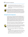
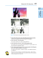
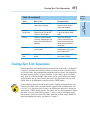
In This Chapter
AL
Chapter 1: Prepping Graphics
for Print
✓ Picking the right resolution, mode, and format
✓ Managing color when printing
MA
✓ Creating color separations
TE
✓ Printing vector images
RI
✓ Prepress and working with a service bureau
P
PY
RI
GH
TE
D
reparing images for the screen is a snap compared to what you
have to go through to get images ripe for the printing process. If all you ever want to do is print your images to a desktop laser or inkjet printer, the task is a little easier, but
you still must take some guidelines into account. And
prepping your images for offset printing? Well, throw
in an additional set of guidelines. It’s not rocket
science, mind you. If you stick to the basic rules and,
more importantly, spend some time developing a
good working relationship with your service bureau
and offset printer, you’re good to go.
CO
Getting the Right Resolution,
Mode, and Format
If you’re not familiar with the concept of resolution, I suggest taking a look at Book II, Chapter 1. That’s where I cover
all the basics on resolution, pixel dimension, resampling, and
other related topics. For full descriptions on color modes and file formats,
see Book II, Chapter 2. That said, the following sections give you the lowdown on the proper settings for an image that will ultimately go to print.
642
Getting the Right Resolution, Mode, and Format
Resolution and modes
Table 1-1 provides some guidelines about what resolution settings to use
for the most common types of output. Remember, these are just guidelines.
They aren’t chiseled in stone to withstand the sands of time or anything lofty
like that. You need to communicate with your service bureau, offset printer,
or client and get specifications and/or recommendations. (See the section
“Working with a Service Bureau,” later in this chapter.)
Table 1-1
Recommended Resolutions and Image Modes
Device
Notes
Recommended
Resolution
Mode
Fuji Frontier
Photo Printer
Wallets to 10 x 15
inches. Great for
printing digital photos.
300 dpi
RGB
Online Photo
Printers, such
as Shutterfly
Check recommended
size and resolution
settings on the vendor’s Web site.
1024 x 768 for 4-x-6
print; minimum
of 1600 x 1200 for
8-x-10 print
RGB
Digital
presses
Brands include
Xeikon, Xerox, IBM,
Indigo*, Scitex,
Heidelberg, and so on.
255 dpi
CMYK
Epson color
inkjets
Resolutions depend
on the print setting.
Epson recommends
1
/3 of the horizontal
resolution, but do test
prints; settings may be
higher than you need.
720 dpi × 1/3 =
240 dpi;
1440 dpi × 1/3 =
480 dpi;
2880 dpi × 1/3 =
960 dpi
RGB or
CMYK
Color
separations
Film separations or
direct to plate for
offset printing.
2 × lines per inch
(lpi); 2 × 133 lpi =
266 dpi; 2 × 150 lpi =
300 dpi; 2 × 175 lpi =
350 dpi**
CMYK
and spot
colors
Laser printers
Color or B&W
printouts.
2 x lpi = 170 dpi
Grayscale
or RGB
*Indigo presses can handle a fifth spot color, if necessary.
**See the section “Screen frequencies,” in this chapter.
Getting the Right Resolution, Mode, and Format
643
Screen frequencies
File formats
As far as file formats go, what you choose depends on a couple of issues:
✓ What you intend to do with the image — print it to a laser printer, order
prints from an online photo printer?
✓ What does your service bureau, offset printer, client, director, or
another interested party prefer?
Table 1-2 lists some of the more popular recommended formats for specific
jobs, but again, communicate with the parties involved to see what’s ultimately the best format to use.
Table 1-2
Recommended File Formats
Job
Formats
Color inkjet printouts
EPS, TIFF, PDF, PSD
Color separations
PSD, PDF, EPS, TIFF, DCS 2.0
Spot color separations
PSD, PDF, DCS 2.0 if importing into another
application
Magazines/brochures
EPS, TIFF, PDF
Newspapers
TIFF, PDF
Importing to page layout programs
TIFF, EPS, PSD, PDF
Importing to illustration programs
EPS, TIFF, DCS, PSD, PDF
Slides
TIFF, PowerPoint, PICT, PCX, EPS
(some bureaus can’t do EPS)
Photo prints
JPEG, TIFF
Word documents
TIFF, EPS
E-mailing for workflow review
PDF
Prepping Graphics
for Print
For the recommended resolution for color separations in Table 1-1, I list 2
multiplied by the number of lines per inch. The lines per inch, or lpi, pertains to the screen frequency of the output device. Screen frequencies are
measured in lines per inch in a halftone screen. You may also hear the terms
screen ruling or line screen. When images are printed, they’re converted into
a series of dots called halftones. When you print your halftone, you print it
by using a halftone screen of a certain value. The average screen frequency
for printing four-color images is 133 to 175 lpi. Therefore, when you multiply
that number by 2, you need to create your images by using a resolution setting of 266 to 350 dots per inch (dpi).
Book IX
Chapter 1
644
Working with a Service Bureau
Working with a Service Bureau
Service bureaus handle photo processing and various photographic output
options, such as prints (of varying sizes) and slides. Mounting and lamination services may also be provided. Many service bureaus provide scanning
services, including high-end drum scanning. A common service is taking
scans or digital photos and burning them onto CDs or DVDs. Many service
bureaus provide output to color separations to film and RC paper. Larger
bureaus may even have a digital press to handle a short-run (500 or less),
on-demand printing need.
Getting the ball rolling
Developing a good working relationship with your service bureau and/or
offset printer can save you a lot of time, money, and frustration. These folks
are the experts and know their equipment and processes. And believe me,
they’re only too willing to help. The fewer problems they have with your
files, the better they like it. You can do some things to keep the relationship
on solid footing:
✓ Get a dialogue going about the specs: If your file is going directly to a
newspaper, magazine, or other publication, talk with the art director,
graphics production coordinator, or other knowledgeable person about
the graphic specifications required.
✓ Build a lasting relationship: Consistency is also key. When you find a
good bureau or offset printer, stick with it for all your jobs. Jumping from
one company to another because a quote came in a little cheaper doesn’t
always pay off in the long run. If you’re a faithful customer, often your service bureau or offset printer will match that lower quote if it can.
✓ Get on the Web: Many service bureaus have Web sites where you can
find a listing of services they offer, price lists, file specs, and even downloadable order forms. Larger offset printers also have general information, online requests for quote applications, and more.
Using a prepress checklist
To prepare your file for print, use the following list to ensure your file is
ready and rarin’ for problem-free output. Note that this list isn’t all-inclusive
when it comes to prepress; I include tips that pertain to Photoshop only.
Working with a Service Bureau
645
✓ Always transform your images in their native application. Size, crop,
rotate, shear, and reflect art in Photoshop. Transforming images in an
illustration or page layout program is complex and time-consuming.
importing the images into an illustration or page layout program.
✓ If you’re placing Photoshop EPS images into a page layout or illustra-
tion program, set the halftone screen frequency in the destination
program instead of embedding it in each image in Photoshop. Or better
yet, don’t set any halftone screen frequencies in your images and let your
service bureau or offset printer handle setting them in the other program.
✓ When saving Photoshop images for print purposes, stick to TIFF, EPS,
native PSD, or PDF file formats. If you’re unsure of the proper format
to use for a specific job, ask your offset printer or service bureau.
✓ Make sure that you use the proper color mode. For example, use CMYK
for color separations and RGB for slide output.
✓ Create vector shapes and paths efficiently. Use the fewest number of
anchor points possible to create the path and delete any unnecessary or
stray points. Leave your flatness setting blank. Photoshop uses the default
setting for the output device, which is usually a safe bet.
✓ Limit the number of typefaces. Downloading takes time. Limiting the
number of typefaces also makes your document look more sophisticated
and polished.
✓ Make sure that all scanning is at the appropriate dpi. For more on reso-
lution, see Book II, Chapter 1.
✓ If your image is to bleed (extend to the edge of the printed page), take
that into account when creating your image. Note that you need to
allow for 1/8 to 1/4 of an inch on any side that will bleed to allow for slippages when the paper is cut.
✓ Always specify colors from a Pantone color swatch chart and then
select the color, whether process or spot, in Photoshop. Never trust the
way colors look on-screen because of calibration deficiencies and differences between RGB and CMYK color models.
✓ Make spot color names consistent. Make sure that the Photoshop spot
color names exactly match those of any programs to which you are
importing your image, such as an illustration or page layout program.
Otherwise, you may get an additional color separation.
✓ Print and provide laser or inkjet prints of your file, both separations
(if warranted), and a composite print. Print all prints with printer
marks — crop marks, registration marks, labels, and so on.
Prepping Graphics
for Print
✓ Ensure that images can first print from Photoshop. Do this before
Book IX
Chapter 1
646
Saving and Printing Vector Data in a Raster File
✓ Provide all fonts used in your file. Provide both screen and PostScript
printer fonts, if applicable.
✓ Choose File➪Save As for your final save to squeeze down to the small-
est file size.
✓ Organize your files into folders. For example, put the image files
together in one folder, all the fonts in another, and so on.
✓ Communicate any trapping needs to your service bureau or offset
printer. For color separations, indicate whether you created the trapping yourself or if you want the service bureau/offset printer to do it.
Saving and Printing Vector Data in a Raster File
Photoshop allows you to create vector shapes and vector type with the Pen
tools, shape tools, and type tools (I explain how in Book III). Technically, the
vector shapes are clipping paths applied to a bitmap, or raster, layer. But the
clipping path is still a vector path, thereby retaining vector qualities. This
vector data is resolution independent, which means that it prints at the resolution of the PostScript output device. Photoshop sends the printer separate
images for each type and shape layer, which are printed on top of the raster
image and clipped by using their vector paths. The edges of the vector path
print at the full resolution of the PostScript printer, but the contents, such
as the colored pixels or the image pixels within the vector path, print at the
resolution of the Photoshop file (all portions of the type are resolution independent). Therefore, type and shapes always have crisp, hard edges, with
curves appearing smooth and never jagged.
Some file format warnings
If you save your file as an EPS or DCS and
reopen the file in Photoshop, Photoshop rasterizes the vector data to pixels. Save the original
in the native PSD format.
If you save your layered file as an EPS,
Photoshop converts your vector type to clipping paths. Extensive and small type creates
complex clipping paths, which can be time
consuming and sometimes difficult to print.
You can either flatten your file or deselect the
Include Vector Data option in the Save as EPS
Options dialog box. Either choice rasterizes the
type into pixels at the resolution of your image.
You may want to consider eliminating the type
in your image file and applying it either in a
drawing or page layout program that can retain
vector type.
Choosing Color Management Print Options
647
Choosing Color Management Print Options
I highly recommend checking out the color management section in Book II,
Chapter 3. In that chapter, I go into great detail about the concept of color
spaces, ICC profiles, and so on. In this section, I cover the color management
options you can find in the Print with Preview dialog box.
Different output devices operate in different color spaces. Monitors, desktop
printers, large format printers, film recorders, offset printers, and so on all
have their own unique color space. The color management options enable
you to convert the color space of your image while printing. So, for example,
if the ICC (color) profile of your image is sRGB, you can choose to have your
image’s color space converted to the color space of your Epson printer
when you print.
Unfortunately, I can’t tell you what specific settings to choose. This choice
is a widely debated topic, and different printers have their strengths, shortcomings, and quirks. My advice is to take an hour and a pack of paper, run
test prints to see which settings give you the most accurate result, and stick
with those. You may even get different results from different types of paper.
When you have some free time, follow these steps to experiment with the
Color Management settings and discover what print settings work best:
1. Choose File➪Print to open the Print dialog box, shown in Figure 1-1.
2. Select Color Management from the pop-up menu in the top-right of the
Print dialog box.
3. Select either Document or Proof.
Remember you’re experimenting. So select one, and then try the other:
• Document: Uses the color profile of your image.
• Proof: By default, uses the color profile of your Working CMYK
color space, which you defined in your Color Settings dialog box.
You can change this profile, however, by choosing View➪Proof
Setup➪Current Custom Setup. For details on proofs, see Book II,
Chapter 3.
Book IX
Chapter 1
Prepping Graphics
for Print
Remember that the only file formats that allow you to retain vector data
are PSD, PDF, DCS, and EPS. When saving to DCS or EPS, be sure to select
the Include Vector Data option in their respective Options dialog boxes. All
other file formats rasterize the vector data.
8
Choosing Color Management Print Options
Purestock
Figure 1-1: Specify the settings in the Color Management portion of the Print dialog box.
4. Select a method from the Color Handling drop-down list.
The options differ, depending on whether you chose Document or Proof
in Step 3.
If you chose Document in the Print area, here are your options:
Choosing Color Management Print Options
649
If you chose Proof in the Print area, you see the same options, but a
couple of them produce different results:
• Photoshop Manages Colors: Tells Photoshop to handle the color conversion of the proof to the print, using the printer profile specified in
the pop-up menu and your choice of simulation. Unless you have a lot
of dark colors, I recommend leaving it on Simulate Paper Color.
5. If you chose Photoshop Manages Colors in Step 4, select your printer
and paper type from the Printer Profile pop-up menu.
Note that profiles associated with the current printer you select in the
Printer submenu are sorted and placed at the top of the profile list.
Although you may be able to change the Rendering Intent setting, I
recommend leaving this at the default setting of Relative Colorimetric,
especially when printing photos or multi-colored artwork. If, by chance,
your image has a lot of areas of solid saturated color, you can try
Saturation. Also, leave the Black Point Compensation check box at the
default setting of checked or unchecked (depending on your Color
Handling choice) — unless, of course, you’re a color guru and have a
better reason not to. Setting this option enables your printer to more
accurately print the blacks in your image.
When you select Photoshop Manages Color, you have three new options
located directly below the image preview. These options are strictly
preview options and affect only how you see your image on the computer screen. The Match Print Colors option displays a soft proof of
your print based on the profiles, color management options, and printer
you select. See Book II, Chapter 3, for more on soft proofs. The Gamut
Warning option displays colors that will be out of gamut, or out the
range of printable colors. These colors appear as gray pixels by default.
And, finally, the Show Paper White option simulates the white point of
the paper you select in the Printer Profile submenu. My paper of choice
is Premium Matte, as shown in Figure 1-1.
6. When you finish making your selections, click Print.
The final dialog box appears. Depending on your printer, options will
vary. In Vista, click the Preferences button and search for paper/media
and quality options. On the Mac, click the Options pop-up menu and
look for the same. Depending on whether your printer is an Epson,
Canon, HP, or other, the names of these settings vary.
Prepping Graphics
for Print
• Printer Manages Colors: Works only with a PostScript (PS level 2 or
higher) printer, which manages the color conversion of the proof to
the print based on your selection of Simulate Paper Color or Simulate
Black Ink.
Book IX
Chapter 1
650
Getting Four-Color Separations
If you selected the Photoshop Manages Colors option, you should turn
off color management in your particular printer’s dialog box.
That’s all there is to it. If you want more information on printing, check
out Book I, Chapter 3. For more explanation on color management, see
Book II, Chapter 3.
If all you want to do is print color prints on your desktop printer, I recommend starting off by selecting Document in the Print area and selecting
Photoshop Manages Colors for Color Handling, which gives you the most
control over printing. If you have a little time and paper to burn, then print
another copy by using the Printer Manages Colors option. Do a side-by-side
comparison to see which one looks superior. You can also crack the seal on
the documentation that came with your printer for any recommendations.
Getting Four-Color Separations
It’s necessary to color separate your image whenever you plan to print your
image to an offset press. Your image must first be in CMYK color mode
(choose Image➪Mode➪CMYK Color). Then, the composite color image gets
digitally separated into the four-color channels — cyan, magenta, yellow,
and black — and is output. (These colors are also known as process colors.)
Sometimes, the separation output is onto film, and sometimes, it’s output
directly to aluminum printing plates. The plates are put on an offset press,
paper runs through each of the four inked rollers (cyan first, then magenta,
yellow, and finally black), and out comes your composite image.
Before you take your image to a service bureau or offset printer to get color
separations, it’s wise to get what are called laser separations. Basically,
you’re color separating your image, not to film or plates, but to paper.
If your image doesn’t separate to paper, most likely it won’t to film or plates,
either. You can go back and correct the problem, rather than pay upward of
$80 to $150 an hour to have the service bureau or offset printer correct it for
you. Consider laser separations a cheap insurance policy.
Follow these steps to get laser separations from your desktop printer:
1. Be sure your image mode is CMYK. If it isn’t, choose Image➪Mode➪
CMYK Color.
I’m assuming your image is a four-color image. But it may also be a grayscale, duotone, tritone, or quadtone image, in which case, no conversion
to CMYK is necessary. (See Book II, Chapter 2, for more on modes.)
After the conversion, you have an image with four channels — Cyan,
Magenta, Yellow, and Black, like the one shown in Figure 1-2.
Getting Four-Color Separations
651
Book IX
Chapter 1
Prepping Graphics
for Print
Cyan
Magenta
Yellow
Black
Corbis Digital Stock
Figure 1-2: Color images are separated into four process colors.
2. Choose File➪Print, then select Color Management from the pop-up
menu in the top-right of the Print dialog box that appears.
3. In the Print area, select Document.
The setting should say U.S. Web Coated (SWOP) v2.
4. Select Separations from the Color Handling pop-up menu.
This option prints each channel from the image to a separate plate, or in
the case of laser separations, paper.
5. Select Output from the pop-up menu in the top-right of the dialog box,
then select additional options as you desire.
For general print options, see Book I, Chapter 3. For additional options,
see Table 1-3.
Note that if you’re printing to a non-PostScript printer, some of these
options may not be available. You see a preview of most of these options
when you apply them to your file.
652
Getting Four-Color Separations
6. Click the Print button.
If all goes well, four pieces of paper, one for each of the four CMYK channels, print. If you’re printing a grayscale, duotone, tritone, or quadtone
image, you get one to four pieces of paper, one for each color used. If
that doesn’t happen, something’s amiss, and it’s time for troubleshooting. Be sure to take these laser separations with you when you hand
over your file to the service bureau or offset printer.
Table 1-3
Output Options
Option
What It Does
Recommendation
Calibration
Bars
Prints an 11-step grayscale
bar outside the image area
to gauge how accurately the
shades are being printed.
When printing separations, this
option prints a gradient tint bar
and color bar.
Select this option.
Registration
Marks
Prints crosshair and target
marks outside the image area,
allowing you to line up the four
plates or pages.
Select this option.
Corner Crop
Marks
Adds crops marks at the corners of the image to indicate
where to trim the image.
Select this option.
Center Crop
Marks
Adds crop marks at the center
of each side of the image to
indicate where to trim the
image.
Select this option.
Emulsion
Down
Emulsion is the side of the film
that’s light sensitive. Allows the
film to be printed with the emulsion side down.
Leave this option deselected for laser separations.
When the service bureau
or offset printer prints the
separations to film or plates,
it may select this option.
Negative
Prints black as white and white
as black, and every other color
inverts accordingly.
Leave this option deselected for laser separations.
When the service bureau
or offset printer prints the
separations to film or plates,
it may select this option.
continued
Creating Spot Color Separations
653
Book IX
Chapter 1
Table 1-3 (continued)
What It Does
Recommendation
Interpolation
Anti-aliases low-resolution
images by resampling.
Available only for PostScript
Level 2 or laser printers.
Leave it deselected.
Include
Vector Data
See the “Saving and Printing
Vector Data in a Raster File”
section, in this chapter.
Leave this option selected
if you have type or vector
paths.
Screen
Creates a custom halftone
screen by changing the size,
angle, and shape of the halftone dots.
Leave this set to Use
Printer’s Default Screen.
Let the service bureau or
offset printer change it, if
necessary.
Transfer
Redistributes brightness levels
in your image.
I wouldn’t mess with this
setting unless you’re a prepress professional.
Send 16-Bit
Data
Sends 16-bit information to the
printer.
Select this option only if
your image is 16-bit.
Creating Spot Color Separations
Photoshop allows you to add separate channels for spot colors (see Book VI,
Chapter 1, for more on channels), which can then be color separated. Spot,
or custom, colors are premixed inks manufactured by various ink companies,
the most popular in the U.S. being Pantone. A spot color is often used for a
logo, type, or small illustration. Spot colors are also used when you need to
apply metallic inks or varnishes to your print job. Spot colors can be used
rather than, or in addition to, the four process CMYK colors.
If you’re delving into the world of spot colors, I highly recommend that you
choose your color from a printed Pantone swatch book, available from www.
pantone.com. Because your screen is an RGB device and you’re setting up
your file for a CMYK output device, the colors you see on-screen don’t match
the colors that are ultimately on paper — at best, they’re a ballpark match.
For accuracy, you must select the colors from the printed swatch book. For
more on working with color, see Book II, Chapter 3.
Prepping Graphics
for Print
Option
654
Creating Spot Color Separations
Creating a spot channel
Follow these steps to create a spot channel:
1. On a separate layer, create the graphic or type to which you want to
apply the spot color.
2. Ctrl-click (Ô-click on the Mac) the thumbnail of the layer to select the
graphic and then choose Edit➪Fill to fill it with any solid color at an
opacity of 100 percent.
3. With your selection active,
choose Window➪Channels and
then select New Spot Channel
from the Channels panel
pop-up menu.
You can apply a spot color to
Figure 1-3: Adding an additional color
only an active selection. It can’t be
separation in Photoshop requires creating a
applied to just a layer.
spot color channel first.
The New Spot Channel dialog box
appears, as shown in Figure 1-3.
4. In the Name text box, enter a name for your spot color. In the Ink
Characteristics area, click
the color swatch.
I recommend naming your spot
color according to the spot color
you want to use, such as Pantone
7417C.
When you click the color swatch,
the Color Picker appears.
5. Click the Color Libraries button
in the Color Picker and select
your Pantone color from the Color
Libraries dialog box that appears
(see Figure1-4), then click OK.
Figure 1-4: Select an appropriate color
from the Color Libraries dialog box.
6. In the New Spot Channel dialog box, select a Solidity value between 0
percent and 100
percent.
A value of 100 percent represents an ink that’s completely opaque, such
as a metallic ink, which completely covers the inks beneath it. A value
of 0 percent represents a transparent ink, such as a clear varnish. But
the solidity value affects only the screen view and composite prints; it
doesn’t affect the separations. It can help you see where a “clear” varnish will print.
Creating Spot Color Separations
655
7. Click OK to close the dialog box.
In the printing process, spot colors are overprinted on top of the four-color image, as
shown in Figure 1-6. That means that the spot
color is applied at the end of the printing
process and is printed over the other inks.
This can sometimes cause lighter spot colors Figure 1-5: The Channels panel
displays the spot channel.
to darken somewhat.
If you need your spot color graphic to knock
out the underlying image, create it in an illustration or page layout program. A knockout is a hole left in the four-color image, which is filled
with the spot ink. The spot ink
doesn’t print over the other inks.
8. Save the image in the native
Photoshop, Photoshop PDF, or
Photoshop DCS 2.0 (Desktop Color
Separations) format.
If the image is being separated
directly out of Photoshop, leave it
as a PSD or PDF file. If you want to
import it into a different program,
such as InDesign, or QuarkXPress,
you must save it as a DCS file. If
your image is a duotone, tritone, or
quadtone image, you also have to
go through a few more hoops. You
must first convert it to multichannel
mode by choosing Image➪Mode.
In the DCS 2.0 Format dialog box,
make sure that the Include Halftone
Screen and Include Transfer options
aren’t selected.
Corbis Digital Stock
Import the image into your destina- Figure 1-6: Spot colors are often used for
tion application and set your screen color critical logos that print on top of your
angles.
image.
Prepping Graphics
for Print
Your spot channel appears in the Channels
panel and is filled in the image, as well. I created a spot channel for my crest graphic and
for the type (Pantone 7417C), as shown in
Figure 1-5.
Book IX
Chapter 1
656
Creating Spot Color Separations
Converting an alpha channel to a spot channel
If you want to convert an alpha channel to a
spot channel, select the alpha channel in the
Channels panel and select Channel Options from
the panel’s pop-up menu. Rename the channel
and select Spot Color. Click the color swatch
and select a color from the Color Libraries section of the Color Picker. Click OK, then click OK
again. Note that Photoshop converts all areas
containing nonwhite pixels (unselected to partially selected areas) to the spot color. With the
channel still selected in the Channels panel,
choose Image➪Adjustments➪Invert to apply
the spot color to the white pixels or selected
areas of the alpha channel. For details on alpha
channels, see Book VI, Chapters 1 and 3.
Editing a spot channel
After you create a spot channel, you can edit it. Select the channel in the
Channels panel and use a painting or editing tool to paint with black, white,
or any shade of gray, just as you would with an alpha channel. To change
any of the options of the spot channel, double-click the spot channel thumbnail, or select it and then select Channel Options from the panel pop-up
menu. Select a different color or solidity.