1
1
TE
RI
AL
Tabs
MA
Tabs have become fairly ubiquitous in web design — you can find them nearly anywhere you look
these days. (Apple.com is a great example of a mainstream site that implements tabs.) Earlier web
design relied more heavily on image maps or on simple linked images and tables to create tabs. This
chapter discusses several techniques that employ CSS for tab implementations, which naturally
lead to more meaningful, accessible markup.
RI
GH
TE
D
Each of the major browsers is capable of stable, simple, friendly tab designs. Some caveats still
remain, however. As with most things CSS, not every approach will be cross-browser friendly, but
this chapter covers all the necessary workarounds and outright hacks required to make a tab
implementation shine in as many browsers as possible. Later in this chapter you see how an open
source JavaScript named “IE7” helps bring compatibility to Internet Explorer 5.5 and 6 for some of
the more advanced approaches, and how sometimes a little JavaScript goes a long way to bridge
compatibility gaps between browsers, not only with the open source IE7 JavaScript, but also using
other JavaScript-centered tools, such as Internet Explorer’s proprietary CSS feature, expression(),
which also plays a large role in many of the projects presented in this book.
PY
Before presenting the tabs project, some planning is required. You should ask, “What do I expect
of the tab implementation?” The following list outlines the design goals of the tabs project:
The tabs must be contained in simple, meaningful markup.
❑
The text of each tab must not be images.
❑
A mouseover effect must be supplied for each tab so that the tab changes color when the
user’s mouse is hovering over it.
❑
The tab of the currently loaded page must be highlighted.
CO
❑
The next section discusses the CSS, XHTML, and JavaScript components that play a role in meeting
these goals.
Chapter 1
Design
The design presented in this chapter isn’t particularly aesthetically appealing — it is a simple, down-tothe-wires presentation of how to create CSS tabs without images or tables. Later in this chapter you learn
how to alter this design, both for liquid, stretchable tabs, and for custom borders and backgrounds. But
the initial design is very simple and basic. The following list expands on the goals of the CSS tabs project
covered in the preceding section and discusses the CSS and markup that will play a role in meeting
those goals:
❑
The tabs must be contained in simple, meaningful markup. The first design goal is relatively
trivial to meet. In simple terms, it means the right markup must be used for the data it encloses.
In the tabs project, that means that the tabs are going to be structured in the document as an
unordered HTML list. Because what is being presented is really a sequence of hyperlinks (not
necessarily appearing in a particular order), the <ul> and <li> elements make the most sense.
CSS provides the ability to transform the presentation of an unordered list to that of tabs. This is
done by removing the default list styling provided via the margin, padding, and list-style
properties. Then each list item (<li>) is styled with borders, some margin, and in order to place
the <li> elements next to each other — as you expect to see with tabs — either the float property or absolute positioning via the position: absolute; declaration. For this project, you
use the float property, because it is just a smidge simpler than positioning.
❑
The text of each tab must not be images. The second design goal involves accessibility and
search engine visibility. If the text of the tab is contained in an image, it cannot be read to a blind
user who is accessing the site with a voice browser like JAWS. Placing the text in images also
impedes search visibility, because the text in the image is likely valuable keywords that you’d
want the search engines to pick up on. Later in this chapter you see a method of using background images for each tab while preserving the text and maintaining search visibility and
accessibility.
❑
A mouseover effect must be supplied for each tab so that the tab changes colors when the
user’s mouse is hovering over it. The next design goal is trivial to implement. You merely want
there to be some visual cue to the user that the tab is for navigation. Changing the background
colors or other aspects of it is one way to provide this visual cue. You achieve this in the project
by applying the CSS :hover pseudo-class to some rules in the style sheet.
❑
The tab of the currently loaded page must be highlighted. The fourth design goal is a common
one. Put simply, there must be some visual cue that the currently loaded page is the same page
that is linked via a tab. To achieve this, a slightly more verbose approach is available, and this
is demonstrated in the tabs project by marking up five separate XHTML documents. Each
document’s <body> element is provided with a different unique ID name, and then each <li>
element that contains a single tab is also given a unique name. This approach provides some
hooks that allow you to provide a different style for the tab of the currently loaded page.
Without further ado, the code and code explanation for the tabs project are presented in the next section.
Keep in mind that this project’s source code is provided on the CD-ROM accompanying this book, or
you can download it from www.wrox.com.
2
Tabs
Code and Code Explanation
To create tabs using CSS and XHTML, follow these steps:
1.
Create the following markup documents; the differences between each document are
highlighted:
<!DOCTYPE html PUBLIC “-//W3C//DTD XHTML 1.0 Transitional//EN”
“http://www.w3.org/TR/xhtml1/DTD/xhtml1-transitional.dtd”>
<html xmlns=’http://www.w3.org/1999/xhtml’ xml:lang=’en’>
<head>
<meta http-equiv=’Content-Type’ content=’text/html; charset=UTF-8’ />
<title></title>
<link rel=’stylesheet’ type=’text/css’ href=’tabs.css’ />
<!-- compliance patch for microsoft browsers -->
<!--[if lt IE 7]>
<script src=’/ie7/ie7-standard-p.js’ type=’text/javascript’></script>
<![endif]-->
</head>
<body id=’wrox’>
<ul id=’tabs’>
<li id=’tab1’><a href=’wrox.html’><span>Wrox P2P</span></a></li>
<li id=’tab2’><a href=’amazon.html’><span>Amazon</span></a></li>
<li id=’tab3’><a href=’google.html’><span>Google</span></a></li>
<li id=’tab4’><a href=’slashdot.html’><span>Slashdot</span></a></li>
<li id=’tab5’>
<a href=’twit.html’><span>This Week in Tech</span></a>
</li>
</ul>
<div id=’iframe’>
<iframe src=’http://p2p.wrox.com’
frameborder=’0’ marginheight=’0’ marginwidth=’0’></iframe>
</div>
</body>
</html>
2.
Save the first document as wrox.html.
<!DOCTYPE html PUBLIC “-//W3C//DTD XHTML 1.0 Transitional//EN”
“http://www.w3.org/TR/xhtml1/DTD/xhtml1-transitional.dtd”>
<html xmlns=’http://www.w3.org/1999/xhtml’ xml:lang=’en’>
<head>
<meta http-equiv=”Content-Type” content=”text/html; charset=UTF-8” />
<title></title>
<link rel=’stylesheet’ type=’text/css’ href=’tabs.css’ />
<!-- compliance patch for microsoft browsers -->
<!--[if lt IE 7]>
<script src=”/ie7/ie7-standard-p.js” type=”text/javascript”></script>
<![endif]-->
</head>
<body id=’amazon’>
<ul id=’tabs’>
3
Chapter 1
<li
<li
<li
<li
<li
id=’tab1’><a href=’wrox.html’><span>Wrox P2P</span></a></li>
id=’tab2’><a href=’amazon.html’><span>Amazon</span></a></li>
id=’tab3’><a href=’google.html’><span>Google</span></a></li>
id=’tab4’><a href=’slashdot.html’><span>Slashdot</span></a></li>
id=’tab5’>
<a href=’twit.html’><span>This Week in Tech</span></a>
</li>
</ul>
<div id=’iframe’>
<iframe src=’http://www.amazon.com’
frameborder=’0’ marginheight=’0’ marginwidth=’0’></iframe>
</div>
</body>
</html>
3.
Save the second document as amazon.html.
<!DOCTYPE html PUBLIC “-//W3C//DTD XHTML 1.0 Transitional//EN”
“http://www.w3.org/TR/xhtml1/DTD/xhtml1-transitional.dtd”>
<html xmlns=’http://www.w3.org/1999/xhtml’ xml:lang=’en’>
<head>
<meta http-equiv=’Content-Type’ content=’text/html; charset=UTF-8’ />
<title></title>
<link rel=’stylesheet’ type=’text/css’ href=’tabs.css’ />
<!-- compliance patch for microsoft browsers -->
<!--[if lt IE 7]>
<script src=’/ie7/ie7-standard-p.js’ type=’text/javascript’></script>
<![endif]-->
</head>
<body id=’google’>
<ul id=’tabs’>
<li id=’tab1’><a href=’wrox.html’><span>Wrox P2P</span></a></li>
<li id=’tab2’><a href=’amazon.html’><span>Amazon</span></a></li>
<li id=’tab3’><a href=’google.html’><span>Google</span></a></li>
<li id=’tab4’><a href=’slashdot.html’><span>Slashdot</span></a></li>
<li id=’tab5’>
<a href=’twit.html’><span>This Week in Tech</span></a>
</li>
</ul>
<div id=’iframe’>
<iframe src=’http://www.google.com’
frameborder=’0’ marginheight=’0’ marginwidth=’0’></iframe>
</div>
</body>
</html>
4.
Save the third document as google.html.
<!DOCTYPE html PUBLIC “-//W3C//DTD XHTML 1.0 Transitional//EN”
“http://www.w3.org/TR/xhtml1/DTD/xhtml1-transitional.dtd”>
<html xmlns=’http://www.w3.org/1999/xhtml’ xml:lang=’en’>
<head>
<meta http-equiv=’Content-Type’ content=’text/html; charset=UTF-8’ />
<title></title>
<link rel=’stylesheet’ type=’text/css’ href=’tabs.css’ />
4
Tabs
<!-- compliance patch for microsoft browsers -->
<!--[if lt IE 7]>
<script src=’/ie7/ie7-standard-p.js’ type=’text/javascript’></script>
<![endif]-->
</head>
<body id=’slashdot’>
<ul id=’tabs’>
<li id=’tab1’><a href=’wrox.html’><span>Wrox P2P</span></a></li>
<li id=’tab2’><a href=’amazon.html’><span>Amazon</span></a></li>
<li id=’tab3’><a href=’google.html’><span>Google</span></a></li>
<li id=’tab4’><a href=’slashdot.html’><span>Slashdot</span></a></li>
<li id=’tab5’>
<a href=’twit.html’><span>This Week in Tech</span></a>
</li>
</ul>
<div id=’iframe’>
<iframe src=’http://www.slashdot.org’
frameborder=’0’ marginheight=’0’ marginwidth=’0’></iframe>
</div>
</body>
</html>
5.
Save the fourth document as slashdot.html.
<!DOCTYPE html PUBLIC “-//W3C//DTD XHTML 1.0 Transitional//EN”
“http://www.w3.org/TR/xhtml1/DTD/xhtml1-transitional.dtd”>
<html xmlns=’http://www.w3.org/1999/xhtml’ xml:lang=’en’>
<head>
<meta http-equiv=’Content-Type’ content=’text/html; charset=UTF-8’ />
<title></title>
<link rel=’stylesheet’ type=’text/css’ href=’tabs.css’ />
<!-- compliance patch for microsoft browsers -->
<!--[if lt IE 7]>
<script src=’/ie7/ie7-standard-p.js’ type=’text/javascript’></script>
<![endif]-->
</head>
<body id=’twit’>
<ul id=’tabs’>
<li id=’tab1’><a href=’wrox.html’><span>Wrox P2P</span></a></li>
<li id=’tab2’><a href=’amazon.html’><span>Amazon</span></a></li>
<li id=’tab3’><a href=’google.html’><span>Google</span></a></li>
<li id=’tab4’><a href=’slashdot.html’><span>Slashdot</span></a></li>
<li id=’tab5’>
<a href=’twit.html’><span>This Week in Tech</span></a>
</li>
</ul>
<div id=’iframe’>
<iframe src=’http://www.twit.tv’
frameborder=’0’ marginheight=’0’ marginwidth=’0’></iframe>
</div>
</body>
</html>
6.
Save the fifth document as twit.html.
5
Chapter 1
7.
Next, key in the following style sheet:
body, html {
margin: 0;
padding: 0;
}
ul#tabs {
list-style: none;
margin: 0;
padding: 10px 0 0 0;
height: 25px;
border-bottom: 1px solid black;
background: rgb(222, 222, 222);
}
ul#tabs li {
float: left;
margin: 0 5px;
height: 23px;
text-align: center;
position: relative;
width: 150px;
border: 1px solid black;
top: 1px;
background: rgb(128, 128, 128);
}
ul#tabs li:hover {
border-bottom: 1px solid white;
background: white;
}
ul#tabs a {
display: block;
height: 100%;
text-decoration: none;
color: white;
font: 14px Arial, sans-serif;
}
body#wrox li#tab1,
body#amazon li#tab2,
body#google li#tab3,
body#slashdot li#tab4,
body#twit li#tab5 {
background: white;
border-bottom: 1px solid white;
}
ul#tabs a:hover,
body#wrox li#tab1 a,
body#amazon li#tab2 a,
body#google li#tab3 a,
body#slashdot li#tab4 a,
body#twit li#tab5 a {
color: black;
}
ul#tabs span {
display: block;
padding: 4px 10px 0 10px;
}
6
Tabs
div#iframe {
position: absolute;
top: 0;
bottom: 0;
right: 0;
left: 0;
margin-top: 50px;
border-top: 1px solid black;
}
iframe {
position: absolute;
top: 0;
bottom: 0;
right: 0;
left: 0;
width: 100%;
height: 100%;
}
8.
Save the style sheet as tabs.css.
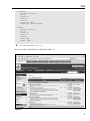
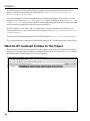
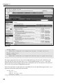
The result of this in Mozilla Firefox is depicted in Figure 1-1.
Figure 1-1
7
Chapter 1
In Figure 1-1, you see that the tab for Wrox P2P is highlighted when the wrox.html page is loaded. If
another tab is clicked, the tab for that page is highlighted, as is depicted in Figure 1-2.
Figure 1-2
Figure 1-2 shows that the tab for Google is highlighted when the google.html page is loaded.
Before getting into the explanation, take a look at this markup, which may seem a little curious:
<!-- compliance patch for microsoft browsers -->
<!--[if lt IE 7]>
<script src=”/ie7/ie7-standard-p.js” type=”text/javascript”></script>
<![endif]-->
This markup is used to bring compatibility to Internet Explorer 5.5 and 6 for a few CSS features appearing in the style sheet that Internet Explorer doesn’t natively support. Set this (and testing in Internet
Explorer) aside for now — this is discussed in detail in the next section, “Testing and Caveats.”
The following is a rule-by-rule explanation of each declaration appearing in the tabs.css style sheet,
which is provided as an aid to customizing the tabs project for your own use.
8
Tabs
The first rule appearing in the tabs.css style sheet removes default margin and padding from the
<body> element:
body, html {
margin: 0;
padding: 0;
}
This rule isn’t necessary for a tabs implementation, but was added merely for the sake of presenting the
example here. Some browsers (IE and Firefox) apply some margin by default to the <body> element and
others (Opera) apply default padding to the <body> element; this rule covers both.
The next rule styles the <ul> element that contains the list items that eventually become tabs:
ul#tabs {
list-style: none;
margin: 0;
padding: 10px 0 0 0;
height: 25px;
border-bottom: 1px solid black;
background: rgb(222, 222, 222);
}
The first declaration in this rule, list-style: none;, removes the default bullet styling of each <li>
item. Subsequently, margin: 0; removes the default spacing each browser applies to the <ul> element,
though as was the case with the <body> element, some browsers apply padding instead of margin to the
<ul> element; padding: 10px 0 0 0; takes care of this, and you add 10 pixels of space to the top
padding, which appears between the top border of the browser’s viewport and the top border of each
tab. Like the modification for the <body> element, this space isn’t really necessary to create a tab implementation and can be customized to suit your own needs.
The next declaration sets a fixed height for the <ul> element. Without a fixed height, the background and
bottom border specified for the <ul> element would appear above the tabs instead of flush with the
bottom border of each <li> element. This happens because each <li> element is floated, and because
they are floated, they no longer affect the height of the <ul> element since floated elements leave the normal
flow and affect only content, but not box model–related properties such as height, padding, margin, and
so on. The last two declarations are also not necessary for a tab implementation and can be customized.
border-bottom: 1px solid black; and background: rgb(222, 222, 222); are applied — the
former goes along the bottom of all of the tabs, and the latter provides some color contrast from the <li>
elements and the <ul> containing them. The bottom border is only necessary to create the tab effect where
the tab of the current page has no bottom border. As shown in Figure 1-1, the Wrox P2P tab is highlighted
with no bottom border, and in Figure 1-2 the tab for the Google page is highlighted with no bottom border.
If this effect is desired, the bottom border for the <ul> element plays a role in creating it.
To make the tab design truly portable, it can also be positioned absolutely and set to any place in a document
desired via the offset properties of CSS (top, right, bottom, or left).
The next rule sets styles for each <li> element:
ul#tabs li {
float: left;
margin: 0 5px;
9
Chapter 1
height: 23px;
text-align: center;
position: relative;
width: 150px;
border: 1px solid black;
top: 1px;
background: rgb(128, 128, 128);
}
This project uses the CSS float model for laying out the tabs. This places each <li> element side by side
instead of how they would appear in a normal list (each on a new line). This is done with the float:
left; declaration. To overlap the bottom border of each tab with the bottom border of the containing
<ul> element, you apply a position: relative; declaration, and then subsequently a top: 1px;
declaration, which moves the position of each tab down a single pixel to overlap with the bottom border
of the <ul> element. Next, to put some space between each tab, you apply margin. margin: 0 5px;
sets the top and bottom margins to zero and the left and right margins to 5 pixels. This puts 10 pixels of
space between each tab, and 5 pixels of space between the left border of the containing <ul> element
and the left border of the first tab. The next declaration sets a fixed height for each tab. This provides
consistency between <li> height and <ul> height, though it isn’t absolutely necessary. The height could
be removed and the top: 1px; declaration could be changed to top: 4px; to maintain synchronicity
between the bottom border of each <li> element and the bottom border of the <ul> element. The height
is applied to vertically center the text, though this can also be achieved by applying a vertical-align
property to each <li> element. To center the text, naturally, a text-align: center; declaration is
applied. Next, a fixed width is added with the width: 150px; declaration. This property is also
optional; it is applied here so that each tab is of the same width.
If the <ul> element containing each tab is absolutely positioned, a fixed width larger than the <li>
elements’ cumulative widths will need to be applied to maintain compatibility with Opera. This is
required because each <li> element is floated and the containing <ul> is not expanded horizontally to
accommodate the nested <li> elements in Opera. This behavior is the result of an ambiguity in the CSS
2 specification, the wording of which actually leads to both Firefox and Opera being correct through a
mutually exclusive interpretation of the specification. The conflict revolves around absolutely positioned
elements using the shrink-to-fit width sizing algorithm, and at which point that width is determined.
Opera calculates the absolutely positioned element’s width before taking its floating descendants into
account; Firefox floats those elements first and then gives the absolutely positioned element its width.
Finally, a background and borders are applied to each <li> element to set them apart from the containing
<ul> element.
In the next rule, a hovering effect is added to each <li> element:
ul#tabs li:hover {
border-bottom: 1px solid white;
background: white;
}
This rule is very straightforward: if the user’s mouse hovers over one of the <li> elements, the <li>
element’s background becomes white instead of the gray color applied in the previous rule with
background: rgb(128, 128, 128);. The bottom border also changes color to white, instead of black
as it was specified in the previous rule. This provides the effect of the tab appearing “on top,” as you
10
Tabs
saw in Figures 1-1 and 1-2; although those figures show that the current page’s tab is highlighted, this
hover effect does the same thing for the tabs of the other pages, but only when the user’s mouse is
hovering over a tab.
The next rule styles the links within each <li> element:
ul#tabs a {
display: block;
height: 100%;
text-decoration: none;
color: white;
font: 14px Arial, sans-serif;
}
The first declaration switches the display of the <a> element from inline, its default display state, to block,
which is the default for elements like <div> and <p>. This makes the <a> element take up all the horizontal space available to it (up to the left and right borders of the <li> element that contains it). Next, a
height: 100%; declaration is applied; this makes the whole inner space of each <li> element (within
the borders) a hyperlink. Then the default underline of links is removed with the text-decoration:
none; declaration. The color: white; declaration sets the color of the link to white (usually blue, by
default, and purple if visited). Like other stylistic aspects of this project, color: white; is unnecessary,
but provided here for the sake of presenting a CSS tabs implementation. Finally, font: 14px Arial,
sans-serif; is applied to change the font.
In the five documents that you created, you applied a different id name to the <body> element of each
document. The next rule takes advantage of that naming convention to style the tab for the currently
loaded page differently than the other tabs:
body#wrox li#tab1,
body#amazon li#tab2,
body#google li#tab3,
body#slashdot li#tab4,
body#twit li#tab5 {
background: white;
border-bottom: 1px solid white;
}
The concept is simple enough. By taking advantage of the cascade and uniquely naming each page, you
are able to style the tab for the currently loaded page differently than the other tabs. This also requires
each tab to be uniquely named as well. Combined with the <body> element’s id name, the rule can override the previous rule, ul#tabs li, because the body#wrox li#tab1 selector’s cascading specificity is
greater than that of the former rule. In the latter selector, when the <body> has a “wrox” id name, and a
<li> element has an id name of tab1, it overrides the ul#tabs li selector, and applies a white background and a solid white bottom border giving the current page’s tab a different style than the tabs for
the other pages.
The previous rule can, in fact, be grouped with the ul#tabs li:hover rule that you saw previously —
they are presented separately here for the sake of segregating the two different concepts, but in fact they
specify the same declarations, which makes it an ideal situation for selector grouping. This can be
observed in the next rule:
11
Chapter 1
ul#tabs a:hover,
body#wrox li#tab1 a,
body#amazon li#tab2 a,
body#google li#tab3 a,
body#slashdot li#tab4 a,
body#twit li#tab5 a {
color: black;
}
This rule begins with six separate selectors, which have been grouped together to avoid repetition in the
style sheet. The first selector selects <a> elements that are descendants of <ul> elements with a tabs id
name, but only when the user’s mouse is hovering over the <a> element. The subsequent selectors, as
you saw in the last rule, select the link of the current page that is loaded based on the id name of the
<body> element and the id name of the <li> element. Because the links within each <li> element are
white, and the background of each <li> element is made white when either the user’s mouse is hovering
over a tab or the tab is the tab of the currently loaded page. The link color must be changed in those
circumstances to contrast with the white background, so a declaration of color: black; is applied
when that criteria is met.
The next rule applies styling to the <span> element nested inside of each <a> element:
ul#tabs span {
display: block;
padding: 4px 10px 0 10px;
}
The first declaration in this rule changes the display state of the <span> element from its default, inline,
to block. This enables you to apply padding via the block box model instead of the inline box model.
This is done to control the spacing around the text of each tab, which may or may not be desired,
depending on the stylistic requirements of your particular project.
You might be wondering, why not use a <div> instead of a <span> element? Semantically speaking,
enclosing block elements like <div> with inline elements like <a> is technically illegal (even though you
change its display state to block), and could foster mixed results with browsers. From the standpoint of
standards, it is both technically correct and more appropriate to use <span>, because it can legally be
nested inside another inline element, like <a>. This approach takes care of validation errors using the
W3C validator, at http://validator.w3.org, which is used by markup authors to find markup errors
and to ensure that their markup adheres to the standards.
Again, the extra <span> may or may not be desired, as mentioned previously, you may or may not desire
fixed height tabs, and may or may not want to use a <span> element to control the vertical spacing of text
(as opposed to the vertical-align property).
The final two rules have nothing to do with implementing a tabs design and are included merely to fill
the void of the rest of the document with supplemental content, via the inclusion of external documents
from popular web sites by inline frame.
12
Tabs
Testing and Caveats
This section describes some of the challenges that come as a result of expanding the test bed of browsers.
Typically when I begin a project, I ignore all browsers but Firefox until the project matures to something
resembling the final product. When that point in development comes, I begin testing in other browsers
such as Internet Explorer, Opera, Safari, and so on. In a typical project only minor adjustments may need
to be made for more standards-aware browsers such as Opera and Safari, which is why you see in this
section that the focus is only on Internet Explorer and the challenges you face when introducing standards
to Internet Explorer that it may not already understand, or understands only poorly or incorrectly.
The previous section mentioned a snippet of markup that helps bring compatibility to Internet Explorer
5.5 and 6 for a few CSS features that Internet Explorer 5.5 and 6 do not natively support. To refresh your
memory, this was the markup in question:
<!-- compliance patch for microsoft browsers -->
<!--[if lt IE 7]>
<script src=’/ie7/ie7-standard-p.js’ type=’text/javascript’></script>
<![endif]-->
If you’ve read my book, Beginning CSS: Cascading Style Sheets for Web Design (also published by Wiley
Publishing, Inc.), you might remember that I introduced the IE7 JavaScript in Chapter 18 and described
how to download and install it in that chapter. Because this book is intended for readers with more
advanced knowledge of web site design, I won’t reiterate every step involved here but will provide a
general overview of the installation process and the background of the IE7 JavaScript.
The IE7 JavaScript was written by London, UK native Dean Edwards to help designers cope with the fact
that Microsoft’s Internet Explorer browser hasn’t received significant CSS updates in five years. Edwards
uses JavaScript to implement CSS features in Internet Explorer that it previously did not support to bring
IE 5.5 and IE 6 onto a more level playing field with other browsers, such as Safari and Mozilla Firefox,
which both have (at the time of this writing) far better CSS support. The IE7 library is written in a transparent way, so that it appears that Explorer supports these CSS features natively, and the person making
use of IE7 need not have any more JavaScript knowledge than that required to link to the IE7 library.
Some of the top CSS features that IE7 provides are as follows:
❑
min-width, max-width, and min-height properties
❑
:hover, :active, and :focus pseudo-classes (on any element, not just the <a> element)
❑
Various advanced selectors such as the direct child selector (>), attribute selectors
(input[type]), adjacent sibling selector (+), and indirect adjacent sibling selector (~)
❑
Structural pseudo-classes, such as :root, :first-child, and :last-child
❑
::before and ::after pseudo-elements and the content property
Of course, Edwards doesn’t stop there; those are only some of the top features. The truly amazing part is
IE7’s size and speed. The IE7 JavaScript library is modularized; this helps keep down the download size
and lets designers include only the features that they need. The main library is only about 24KB in size.
It provides all of the preceding functionality and then some (with the exception of :last-child, which
he includes in a special CSS3 selector library).
13
Chapter 1
The IE7 JavaScript is hosted on SourceForge, an organization that hosts thousands of open source
projects, and can be downloaded at the following URL: https://sourceforge.net/project/
showfiles.php?group_id=109983.
After downloading IE7, it must be unzipped and placed in the root directory of your web server. For
example, if your web site is http://www.example.com/, the IE7 JavaScript must appear at http://www
.example.com/ie7/. You can also install IE7 to a different directory, but the source examples provided
in this book must be updated to reflect the path you install IE7 to.
The IE7 JavaScript is open source and is available under a Creative Commons LGPL license (Lesser
General Public License). You can obtain the full text (legalese-free) at http://creativecommons.org/
licenses/LGPL/2.1.
You can find more information about IE7 from the IE7 homepage at http://dean.edwards.name/ie7.
The next section discusses what specific functionality Edwards’ IE 7 JavaScript provides for this project.
What the IE7 JavaScript Provides for This Project
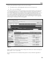
The functionality the IE7 JavaScript provides for this project is best observed by simply opening up the
tabs project in Internet Explorer without installing the IE7 JavaScript. The output of wrox.html without
IE7 functionality in Internet Explorer 6 is shown in Figure 1-3.
Figure 1-3
14
Tabs
It doesn’t look much different in Explorer, with a few minor exceptions:
❑
The tabs do not have a white background when the mouse is hovering over one.
❑
The <iframe> isn’t visible at all.
The situation described in the first bullet point happens because Internet Explorer 6 only supports the
:hover dynamic pseudo-class on <a> elements instead of all elements, as does Firefox, Opera, and
Safari. The latter bullet point is because Explorer 6 does not support the combination of the top, right,
bottom, and left properties to imply dimensions on absolutely positioned or fixed positioned ele-
ments. Edwards’ IE7 JavaScript provides both of those features and brings Internet Explorer 6 to the
same level of functionality as is provided by Firefox, Opera, and Safari. Figure 1-4 shows output from
Internet Explorer 6 with Edwards’ IE7 JavaScript applied.
Figure 1-4
Figure 1-4 demonstrates that the other tabs now change colors when the user’s mouse is hovering over
them, and the <iframe> is now visible.
The next section discusses how to modify the tabs project for a variety of alternative approaches in
design.
15
Chapter 1
Using and Modifying the Project
This section presents a few alternative approaches to the tabs project design because not everyone will
want the tabs project as it has been presented. The alternative approaches discussed in this section are as
follows:
❑
Using background images instead of solid colors and square borders
❑
Using background images that include text without compromising accessibility
❑
Using background images in such a way that the tabs are liquid and can be fluid between a minimum and maximum constraint
Naturally, these alternative approaches increase the complexity and difficulty of the project, but they are
included to provide maximum flexibility and to cover as many scenarios of tab implementation as possible.
The first alternative approach shows you how to use background images instead of the default solid colors and square borders.
Tabs with Background Images
To create tabs with background images, follow these steps. The source code of the following approach,
as well as the accompanying images, is available on the book’s web site and on the source CD-ROM
accompanying this book in the folder “with-background” in the “Project 1” folder.
1.
Enter the following style sheet. Changes from tabs.css in the original project are highlighted:
body, html {
margin: 0;
padding: 0;
}
ul#tabs {
list-style: none;
margin: 0;
padding: 10px 0 0 0;
height: 23px;
border-bottom: 1px solid black;
background: rgb(218, 218, 218);
}
ul#tabs li {
float: left;
margin: 0;
height: 23px;
text-align: center;
width: 160px;
background: transparent url(‘images/tab.png’) no-repeat scroll top;
}
ul#tabs a {
display: block;
16
Tabs
height: 100%;
text-decoration: none;
color: white;
font: 14px Arial, sans-serif;
}
ul#tabs li:hover,
body#wrox li#tab1,
body#amazon li#tab2,
body#google li#tab3,
body#slashdot li#tab4,
body#twit li#tab5 {
background: transparent url(‘images/tab_hover.png’) no-repeat scroll top;
}
ul#tabs a:hover,
body#wrox li#tab1 a,
body#amazon li#tab2 a,
body#google li#tab3 a,
body#slashdot li#tab4 a,
body#twit li#tab5 a {
color: black;
}
ul#tabs span {
display: block;
padding: 4px 10px 0 10px;
}
div#iframe {
position: absolute;
top: 0;
bottom: 0;
right: 0;
left: 0;
margin-top: 50px;
border-top: 1px solid black;
}
iframe {
position: absolute;
top: 0;
bottom: 0;
right: 0;
left: 0;
width: 100%;
height: 100%;
}
2.
Save the resulting style sheet as tabs.css.
You can see the result of these modifications in Figure 1-5.
17
Chapter 1
Figure 1-5
The required modifications to use background images instead of borders and solid colors are surprisingly few. The following explains in detail each modification made.
The first modification is to the height of the <ul> element, which corresponds directly to the height of
the background image to be used for each <li> element:
ul#tabs {
list-style: none;
margin: 0;
padding: 10px 0 0 0;
height: 23px;
border-bottom: 1px solid black;
background: rgb(218, 218, 218);
}
The second modification is to the solid background of the <ul> element containing the five tabs. The
background is made slightly lighter to match the background of the Adobe Photoshop–generated
tab background images. Although an RGB value of 222, 222, 222 was used originally, and an identical
RGB value was used in Adobe Photoshop for the background of the tab, the two did not match in any of
the browsers. To bring these closer, you simply darken the gray background of the <ul> element slightly.
18
Tabs
The next modification is to the rule for the <li> elements:
ul#tabs li {
float: left;
margin: 0;
height: 23px;
text-align: center;
width: 160px;
background: transparent url(‘images/tab.png’) no-repeat scroll top;
}
First, you remove the margin from between each <li> element, and delete the declarations position:
relative; and top: 1px; because they are no longer needed. Previously there were 5 pixels of margin
specified for the left and right margins of each <li> element. This was done because a background image is
being used in this example; the margin can exist in the background image itself. After the margin, the width
is modified to 160 pixels. This is set to include the margin that was removed from the left and right sides of
each <li> element. Finally, in the last declaration of the previous rule, a background image is applied. The
background image is generated at 160 × 23 pixels, which matches exactly the width and height specified for
the <li> element. To modify the example for tabs of different dimensions, keep in mind the width and
height properties appearing in the previous rule, and the height property of the ul#tabs rule, which will
be the starting point for modifying the dimensions of each tab to accommodate a larger or smaller background tab. Other things to consider when modifying the dimensions are the padding values of the <span>
element that wraps the text of each tab, which is used to control vertical alignment.
The last modifications modify the tab of the page that is loaded, or the background image that appears
when a user hovers over a tab:
ul#tabs li:hover,
body#wrox li#tab1,
body#amazon li#tab2,
body#google li#tab3,
body#slashdot li#tab4,
body#twit li#tab5 {
background: transparent url(‘images/tab_hover.png’) no-repeat scroll top;
}
In the original tabs example you defined ul#tabs li:hover as a separate rule. Here you have simply
grouped them with the rule that defines the tab of the currently loaded document and modified the
background declaration to reference tab_hover.png.
That’s it. The next section discusses how to use background images that include text without compromising accessibility.
Background Images That Include Text
To create tabs with background images that include text, follow these steps. The source code and accompanying images of the following approach are available on the book’s web site and on the source
CD-ROM in the folder “with-text” in the “Project 1” folder.
19
Chapter 1
1.
Enter the following modifications to tabs.css. Changes from the previous background image
approach are highlighted, though some declarations have also been removed:
body, html {
margin: 0;
padding: 0;
}
ul#tabs {
list-style: none;
margin: 0;
padding: 10px 0 0 0;
height: 23px;
border-bottom: 1px solid black;
background: rgb(218, 218, 218);
}
ul#tabs li {
float: left;
margin: 0;
height: 23px;
text-align: center;
width: 160px;
}
ul#tabs a {
display: block;
height: 100%;
text-decoration: none;
color: white;
font: 14px Arial, sans-serif;
}
ul#tabs li#tab1 {
background: transparent url(‘images/wrox-tab.png’) no-repeat scroll top;
}
ul#tabs li#tab1:hover,
body#wrox li#tab1 {
background: transparent url(‘images/wrox-tab-hover.png’) no-repeat scroll top;
}
ul#tabs li#tab2 {
background: transparent url(‘images/amazon-tab.png’) no-repeat scroll top;
}
ul#tabs li#tab2:hover,
body#amazon li#tab2 {
background: transparent url(‘images/amazon-tab-hover.png’) no-repeat scroll
top;
}
ul#tabs li#tab3 {
background: transparent url(‘images/google-tab.png’) no-repeat scroll top;
}
ul#tabs li#tab3:hover,
body#google li#tab3 {
background: transparent url(‘images/google-tab-hover.png’) no-repeat scroll
top;
}
ul#tabs li#tab4 {
background: transparent url(‘images/slashdot-tab.png’) no-repeat scroll top;
}
ul#tabs li#tab4:hover,
20
Tabs
body#slashdot li#tab4 {
background: transparent url(‘images/slashdot-tab-hover.png’) no-repeat scroll
top;
}
ul#tabs li#tab5 {
background: transparent url(‘images/twit-tab.png’) no-repeat scroll top;
}
ul#tabs li#tab5:hover,
body#twit li#tab5 {
background: transparent url(‘images/twit-tab-hover.png’) no-repeat scroll top;
}
ul#tabs a:hover,
body#wrox li#tab1 a,
body#amazon li#tab2 a,
body#google li#tab3 a,
body#slashdot li#tab4 a,
body#twit li#tab5 a {
color: black;
}
ul#tabs span {
display: block;
padding: 4px 10px 0 10px;
visibility: hidden;
}
div#iframe {
position: absolute;
top: 0;
bottom: 0;
right: 0;
left: 0;
margin-top: 50px;
border-top: 1px solid black;
}
iframe {
position: absolute;
top: 0;
bottom: 0;
right: 0;
left: 0;
width: 100%;
height: 100%;
}
2.
Save as tabs.css.
These modifications result in the output depicted in Figure 1-6.
Although the modifications to this approach are more extensive than the last approach that used only
background images with no text, much of the revision is redundant because a different background
image must be used for each tab.
21
Chapter 1
Figure 1-6
ul#tabs li#tab1 {
background: transparent url(‘images/wrox-tab.png’) no-repeat scroll top;
}
ul#tabs li#tab1:hover,
body#wrox li#tab1 {
background: transparent url(‘images/wrox-tab-hover.png’) no-repeat scroll top;
}
The former snippet from the style sheet is the background images of the first tab, which links to the
Wrox P2P web site. First you remove the background declaration from the ul#tabs li rule, then
beginning with the former snippet separate rules are defined for all five tabs, because all five tabs now
have the text of the tab in the background image itself.
Later in the style sheet, in order to preserve accessibility, the text of each tab that appears in the <span>
elements nested within each tab is made invisible:
ul#tabs span {
display: block;
padding: 4px 10px 0 10px;
visibility: hidden;
}
22
Tabs
Making the text invisible hides it from the end user, but because search robots like Googlebot and screen
readers like JAWS do not yet support CSS, the text is still “visible” to search engines and screen readers,
which preserves accessibility.
The final approach demonstrates how to make the tabs liquid, so that they stretch and contract in
response to minimum and maximum constraints.
Liquid Tabs
To create liquid tabs that can stretch to fill up all the space available to them, follow these steps:
1.
Modify tabs.css as follows; the changes from the last approach are highlighted:
body, html {
margin: 0;
padding: 0;
}
ul#tabs {
list-style: none;
margin: 0;
padding: 10px 0 0 0;
height: 23px;
border-bottom: 1px solid black;
background: rgb(218, 218, 218);
position: relative;
}
ul#tabs li {
position: absolute;
bottom: 0;
margin: 0;
height: 23px;
text-align: center;
width: 20%;
background: transparent url(‘images/tab/tab_01.png’) no-repeat scroll left;
}
ul#tabs li > div {
height: 23px;
background: transparent url(‘images/tab/tab_03.png’) no-repeat scroll right;
}
ul#tabs li > div > div {
height: 23px;
background: transparent url(‘images/tab/tab_02.png’) repeat-x scroll center;
margin: 0 8px 0 7px;
}
ul#tabs a {
display: block;
height: 100%;
text-decoration: none;
color: white;
font: 14px Arial, sans-serif;
}
ul#tabs li#tab1 {
left: 0;
23
Chapter 1
}
ul#tabs li#tab2 {
left: 20%;
}
ul#tabs li#tab3 {
left: 40%;
}
ul#tabs li#tab4 {
left: 60%;
}
ul#tabs li#tab5 {
left: 80%;
}
ul#tabs li:hover,
body#wrox li#tab1,
body#amazon li#tab2,
body#google li#tab3,
body#slashdot li#tab4,
body#twit li#tab5 {
background: transparent url(‘images/tab-hover/tab-hover_01.png’) no-repeat
scroll left;
}
ul#tabs li:hover > div,
body#wrox li#tab1 > div,
body#amazon li#tab2 > div,
body#google li#tab3 > div,
body#slashdot li#tab4 > div,
body#twit li#tab5 > div {
background: transparent url(‘images/tab-hover/tab-hover_03.png’) no-repeat
scroll right;
}
ul#tabs li:hover > div > div,
body#wrox li#tab1 > div > div,
body#amazon li#tab2 > div > div,
body#google li#tab3 > div > div,
body#slashdot li#tab4 > div > div,
body#twit li#tab5 > div > div {
background: transparent url(‘images/tab-hover/tab-hover_02.png’) repeat-x
scroll center;
}
ul#tabs a:hover,
body#wrox li#tab1 a,
body#amazon li#tab2 a,
body#google li#tab3 a,
body#slashdot li#tab4 a,
body#twit li#tab5 a {
color: black;
}
ul#tabs span {
display: block;
padding: 4px 10px 0 10px;
}
div#iframe {
24
Tabs
position: absolute;
top: 0;
bottom: 0;
right: 0;
left: 0;
margin-top: 50px;
border-top: 1px solid black;
}
iframe {
position: absolute;
top: 0;
bottom: 0;
right: 0;
left: 0;
width: 100%;
height: 100%;
}
2.
3.
Save tabs.css.
Modify wrox.html, amazon.html, google.html, slashdot.html, and twit.html with the
following changes:
<!DOCTYPE html PUBLIC “-//W3C//DTD XHTML 1.0 Transitional//EN”
“http://www.w3.org/TR/xhtml1/DTD/xhtml1-transitional.dtd”>
<html xmlns=’http://www.w3.org/1999/xhtml’ xml:lang=’en’>
<head>
<meta http-equiv=’Content-Type’ content=’text/html; charset=UTF-8’ />
<title></title>
<link rel=’stylesheet’ type=’text/css’ href=’tabs.css’ />
<!-- compliance patch for microsoft browsers -->
<!--[if lt IE 7]>
<link rel=’stylesheet’ type=’text/css’ href=’tabs-ie.css’ />
<script src=”/ie7/ie7-standard-p.js” type=”text/javascript”></script>
<![endif]-->
</head>
<body id=’wrox’>
<ul id=’tabs’>
<li id=’tab1’>
<div><div>
<a href=’wrox.html’><span>Wrox P2P</span></a>
</div></div>
</li>
<li id=’tab2’>
<div><div>
<a href=’amazon.html’><span>Amazon</span></a>
</div></div>
</li>
<li id=’tab3’>
<div><div>
<a href=’google.html’><span>Google</span></a>
</div></div>
</li>
25
Chapter 1
<li id=’tab4’>
<div><div>
<a href=’slashdot.html’><span>Slashdot</span></a>
</div></div>
</li>
<li id=’tab5’>
<div><div>
<a href=’twit.html’><span>This Week in Tech</span></a>
</div></div>
</li>
</ul>
<div id=’iframe’>
<iframe src=’http://p2p.wrox.com’
frameborder=’0’ marginheight=’0’ marginwidth=’0’></iframe>
</div>
</body>
</html>
4.
5.
Save wrox.html, amazon.html, google.html, slashdot.html, and twit.html.
Create a new style sheet and enter the following CSS:
ul#tabs {
height: 22px
}
6.
Save the new style sheet as tabs-ie.css.
This approach results in the output depicted in Figure 1-7.
The last variation of the tabs project is the most complex, but it creates some flexibility because this
design can easily be adapted into a project that requires minimum or maximum constraints on the element in which the tabs reside. In this example there are no minimum or maximum constraints as there
would be if you had used the min-width or max-width property on the ul#tabs element.
The first modification made to tabs.css is to add a position: relative; declaration to the tabs
<ul> element:
ul#tabs {
list-style: none;
margin: 0;
padding: 10px 0 0 0;
height: 23px;
border-bottom: 1px solid black;
background: rgb(218, 218, 218);
position: relative;
}
26
Tabs
Figure 1-7
The addition of position: relative; causes the <li> elements that it contains, which are absolutely
positioned, to be positioned relative to the tabs <ul> element. I use positioning in this approach because
Explorer has some bugs with percentage width measurements. Simply applying a 20% width to each
<li> element results in the last <li> element appearing on a new line in Explorer, even though 20% * 5
= 100%!
ul#tabs li {
position: absolute;
bottom: 0;
margin: 0;
height: 23px;
text-align: center;
width: 20%;
background: transparent url(‘images/tab/tab_01.png’) no-repeat scroll left;
}
27
Chapter 1
The first declaration, naturally, causes the <li> elements to be positioned absolutely, relative to the <ul>
element that contains them. The bottom: 0; declaration positions each <li> element relative to the
bottom of the <ul> element that contains them. The next declaration, width: 20%;, makes each <li>
element take up 20% of the width of the <ul> element that contains them. The bug in Explorer is
defeated because each <li> element is absolutely positioned, and it is impossible for the fifth <li> element to appear on the next line.
The last declaration applies the first background image. I used the slice tool of Photoshop to cut the
image into three parts. The first part is the left corner and side. The second part is the middle of the tab,
and the third part is the right corner and side. The first image is applied and positioned non-repeating
on the left side of each <li> element. Then, in order to make stretching tabs, you added some extra
<div> elements into each of the XHTML documents, which provide hooks to place the sliced up tab:
ul#tabs li > div {
height: 23px;
background: transparent url(‘images/tab/tab_03.png’) no-repeat scroll right;
}
In the next rule, you applied the right side of the tab. This is applied in the first <div>, which is given a
height of 23 pixels to mirror the <li> element that contains it. The right side of the tab is then applied
and positioned on the right side of the first <div> element. The next <div> element is nested inside of
the last one; this one contains the middle of the tab:
ul#tabs li > div > div {
height: 23px;
background: transparent url(‘images/tab/tab_02.png’) repeat-x scroll center;
margin: 0 8px 0 7px;
}
It is also given a height of 23 pixels, to mirror the dimensions of the <div> and <li> elements that contain it. The background is applied to the center of the <div> element and set to repeat on the x axis, or
horizontally. Finally, in the last declaration, to control overlapping, you apply left and right margins to
the <div> equal to the width of the left and right tab slices, respectively.
The next five rules set the horizontal position of each <li> element:
ul#tabs li#tab1
left: 0;
}
ul#tabs li#tab2
left: 20%;
}
ul#tabs li#tab3
left: 40%;
}
ul#tabs li#tab4
left: 60%;
}
ul#tabs li#tab5
left: 80%;
}
28
{
{
{
{
{
Tabs
Each tab is positioned to the left relative to the containing <ul> element in increasing increments of 20%
(20% being relative to the width of the containing <ul> element).
Finally, the layering technique for each tab slice is repeated for the tab of the currently loaded page and
when the user hovers over a tab:
ul#tabs li:hover,
body#wrox li#tab1,
body#amazon li#tab2,
body#google li#tab3,
body#slashdot li#tab4,
body#twit li#tab5 {
background: transparent url(‘images/tab-hover/tab-hover_01.png’) no-repeat
scroll left;
}
ul#tabs li:hover > div,
body#wrox li#tab1 > div,
body#amazon li#tab2 > div,
body#google li#tab3 > div,
body#slashdot li#tab4 > div,
body#twit li#tab5 > div {
background: transparent url(‘images/tab-hover/tab-hover_03.png’) no-repeat
scroll right;
}
ul#tabs li:hover > div > div,
body#wrox li#tab1 > div > div,
body#amazon li#tab2 > div > div,
body#google li#tab3 > div > div,
body#slashdot li#tab4 > div > div,
body#twit li#tab5 > div > div {
background: transparent url(‘images/tab-hover/tab-hover_02.png’) repeat-x
scroll center;
}
This time only the background image needs to be changed, of course, because this technique takes
advantage of the cascade to replace the background of the tab for the currently loaded page, and when
the user hovers over a tab.
You also modified the markup of each document to reference a conditional comment style sheet that
only Internet Explorer can see:
<!--[if lt IE 7]>
<link rel=’stylesheet’ type=’text/css’ href=’tabs-ie.css’ />
<script src=’/ie7/ie7-standard-p.js’ type=’text/javascript’></script>
<![endif]-->
The style sheet is referenced within Internet Explorer–proprietary conditional comments, which provides a way to serve up style sheet fixes for Internet Explorer exclusively.
Within this style sheet you entered a single rule:
29
Chapter 1
ul#tabs {
height: 22px
}
The preceding rule corrects a space 1 pixel in height that appears below the tabs.
Having discussed four different approaches to designing tabs with XHTML and CSS, the next chapter
shows you how to create multi-column designs with XHTML and CSS.
30