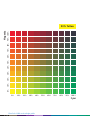
1
Table of Contents
Introduction
A new way to look at documents
An overview of the DocuColor 2000 Series Design Guide
1. Digital print
What is digital print?
Digital print workflow
Document creation
Prepress
Press
Postpress
Correction required?
What does digital print mean to you?
Benefits of digital print
Short runs
Just-in-time printing
Distribute and print
Variable information printing
Use of colour
Wrap-up
2. Image reproduction process
DocuColor 2000 Series technology
Printing stations
Digital Blanket
BeltNip fuser
TRACS
Precise Registration System
Decurling devices
Print speeds/productivity
Image size/paper size
Screens
Gamut
Process colours
1-1
1-1
1-3
1-3
1-3
1-5
1-5
1-5
1-6
1-6
1-6
1-7
1-8
1-9
1-10
1-10
2-1
2-1
2-1
2-2
2-2
2-3
2-3
2-3
2-3
2-5
2-5
2-7
2-8
1-1
3. Designing documents
Design elements to discuss with your printer
Paper stock
Image considerations
Image area, bleeds and folds
Specifying colours
Choice of screens
Vignettes
Text
Solid blacks
Image mottle
Knockout, overprint and trapping
File formats
Resource collection
Creating PDFs
Dot gain
Design elements to avoid
Straight design elements close to the edge of the page
Large areas of solid colour
Coated stock and large white text on heavy background
4. Submitting jobs
Print submission
Compatible software
Printing overview
Print from Microsoft Windows and Apple Macintosh workstations
Print direct from a Digital Front End
Submit jobs via a PostScript Downloader Application
Submit jobs using an Internet browser
Submission of PDF Files for print
In summary
5. Selecting paper stock
Stock considerations
Digital printing process
Paper influences on print quality
Formation
Grain direction
Weight
Finish
DocuColor 2000 series design guide
1–2
3-1
3-1
3-1
3-2
3-4
3-7
3-7
3-16
3-17
3-19
3-19
3-20
3-21
3-21
3-22
3-23
3-23
3-23
3-25
3-26
4-1
4-1
4-1
4-2
4-4
4-10
4-13
4-15
4-17
4-19
5-1
5-1
5-1
5-2
5-2
5-2
5-3
5-3
table of contents
Why paper doesn’t always work the way it should
Coated paper and offset
Coated paper and digital printing
Moisture and offset
Moisture and digital printing
Textured stock and offset
Textured stock and digital printing
Thick paper stocks
Coated papers
Paper stretch
Optical paper qualities that influence image quality
Shade
Opacity
Brightness
Reflectivity
Paper grades
Bond
Uncoated offset
Text and covers
Coated offset
Uncoated digital
Cover
Index or Bristol
Paper handling and storage
Wrap-up
6. Binding and finishing
Collating
Folding and scoring
Scoring
Types of folds
Binding
Saddle stitching
Side stitching
Edition binding
Perfect binding
Mechanical binding
Looseleaf binding
Finishing touches
Trimming
Die cutting
5-3
5-3
5-3
5-4
5-4
5-4
5-4
5-5
5-5
5-5
5-6
5-6
5-6
5-6
5-7
5-8
5-8
5-9
5-11
5-12
5-13
5-13
5-15
5-16
5-17
6-1
6-1
6-1
6-2
6-2
6-4
6-4
6-4
6-5
6-5
6-6
6-6
6-7
6-7
6-7
1-3
Lamination
Varnish
Embossing
Shrink wrapping
Double-sided printing
6-7
6-8
6-8
6-8
6-9
7. Applications by industry
7-1
Financial services
Consumer products
Hospitality
Professional services
Education
Health care
Public sector
Appendix 1. Microsoft Office colour charts
1
Appendix 2. RGB colour charts
1
Appendix 3. CMYK colour charts
1
Appendix 4. Pantone colour charts
1
Reference
1
Glossary
2
DocuColor 2000 series design guide
1-4
7-1
7-6
7-10
7-13
7-15
7-18
7-21
Introduction
A new way to look at documents
One of the greatest advantages of digital colour applications and systems is that they
allow high-quality colour process printing to be produced in smaller quantities at a
higher frequency, as well as personally tailored printing to optimise customer interaction.
Digital printing technology changes the way we think about and create documents.
Limitless possibilities are now accessible for full-colour, near-offset quality printing
at a reasonable price.
Until recently, highly trained imaging experts working on expensive proprietary systems
typically performed most imaging tasks such as colour enhancement and image
manipulation. New technologies and desktop publishing applications have changed all
that, enabling designers to complete many of these tasks from their desktop computers.
The more knowledgeable you are about the imaging process from document creation to
output, the easier it will be to maximise your results. This guide offers suggestions that
will help you get the most out of your imaging applications when preparing files to
print on a Xerox DocuColor 2045 or 2060 digital colour press.
An overview of the DocuColor 2000 Series Design Guide
The DocuColor 2000 Series Design Guide has been written to provide you with all the
information you need to ensure you get the highest quality printed documents from the
DocuColor 2045 and 2060 with the minimum of fuss – every time. It is divided into
sections for easy reference.
•
Section 1 covers the topic of digital print, describing what it is, the workflow, and
the key benefits digital print offers designers and customers. Use this section to
learn more about digital print and what it offers.
•
Section 2 details the key attributes of the DocuColor 2000 Series. It examines some
of the technology used and details performance and printing characteristics. Use
this section to learn more about the capabilities of the DocuColor 2045 and 2060.
•
Section 3 provides guidance on how to design your documents to get the best
possible results from the DocuColor 2045 and 2060 and avoid design elements that
may cause problems. Use this section as a guide to ensure you design documents
that will result in perfectly printed documents every time.
0-1
•
Section 4 includes information on how to submit jobs to a DocuColor solution,
directly from software applications on Windows or Macintosh personal computers,
over the web, using removable media, or other means. Use this section to make sure
you get the job to the printer trouble-free every time.
•
Section 5 describes how to select the right paper to get optimum results from the
DocuColor 2045 and 2060. It includes a guide to all paper grades available in the
market today. Use this section to learn more about paper and to choose the best
paper for the job.
•
Section 6 provides information on binding and finishing – the final steps to ensure
a perfect, finished piece. Use this section as a guide to various binding and
finishing options available from your printer.
•
Section 7 examines different industry segments and identifies key applications, the
department or person responsible for that application, and the key benefits of using
digital colour print for that application. Use this section as a guide to finding
digital colour applications in different market segments.
•
Appendix 1 includes charts of Microsoft Office colours. Use this section as a guide
to how Microsoft Office colours are reproduced on the DocuColor 2045 and 2060.
•
Appendix 2 includes charts of RGB colours. Use this section as a guide to see how
RGB colours are reproduced on the DocuColor 2045 and 2060.
•
Appendix 3 includes charts of CMYK colours. Use this section as a guide to select
CMYK colours as they are reproduced on the DocuColor 2045 and 2060.
•
Appendix 4 includes charts of Pantone colours. Use this section as a guide to see
how Pantone colours are reproduced on the DocuColor 2045 and 2060.
•
The Reference section includes references to other documents and material. Use this
section as a reference to find more information on particular topics and issues.
•
The Glossary section includes definitions of digital printing terms. Use this section
to check words or abbreviations that may be unfamiliar to you.
If you have any suggestions on how this Design Guide can be improved, please send
your comments to [email protected].
DocuColor 2060 design guide
0-2
1
Digital print
Digital technology has changed many facets of business and industry today.
Computing and communications technology has allowed companies to revolutionise the
manufacturing process – from producing goods and then hoping to sell them, to just-intime production, where products are sold first and then manufactured to order, reducing
waste, inventory and cost. It has also allowed them to produce products more in tune
with individual customer’s needs, moving from mass production to mass customisation.
Computing and communications technology has also allowed companies to gain access
to new markets. No longer are they tied to local markets, but instead can compete in
a global market.
Countless examples exist of how digital technology has changed the face of business
across all industries, from agriculture to information technology. Banks, for instance,
still provide banking and lending services, but have closed branches in favour of ATMs,
and internet and phone banking. The music and entertainment industry has seen the
appearance of CDs, DVDs and game boxes, and the disappearance of LPs and cassettes.
Still photography, video and television broadcasting is transitioning to digital. The way
people communicate now is by mobile phone, facsimile and e-mail – instant
communications to anyone anywhere on the planet.
Digital technology has also dramatically changed the nature of the document – a document
today can still be a sheet of paper or book, but is more likely to be an electronic file,
a spreadsheet, presentation, scanned image, or a clip with video and music. Computers,
desktop publishing applications, digital imaging and printers have allowed millions of
people to create documents on their desktop that used to take a team of people weeks
to develop.
Consumers today are more demanding. They know what they want and they’re not prepared
to wait. It’s no different in their demands for print: high quality, cost effective, and now!
What is digital print?
In simple terms, digital print is where information to be printed is submitted electronically
(ie, in digital form) to the printer, where it is imaged and the printed material produced.
There are numerous digital printing technologies available, including inkjet, electrophotography with dry or liquid toner, thermal transfer, ionography and magnetography.
Even traditional offset presses with direct imaging (or DI) are promoted as “digital presses”.
1-1
What truly distinguishes digital printing from traditional printing is the ability to print
every page differently. This is something that offset presses – including DI presses – cannot do. Offset presses can only print exact replicas of the same sheet, again and again.
The digital colour presses that dominate the market now – and for the foreseeable
future – are all toner based. They utilise electrophotography, either with liquid toners
(Indigo), or dry toners (IBM, Kodak-Heidelberg, MAN Roland, Xeikon and Xerox).
The market for colour print can be split into segments defined by run length and
specific applications. The suitability of different printing technologies to these
segments is as follows:
Segment/application
One-off and one-at-a-time publications
Customised/personalised documents
Vert short runs (<500)
Short runs (501-2,000)
Moderate runs (2,001-5,000)
Long runs (5,001-50,000)
Very long runs (50,001+)
Digital
colour
printing
Direct
imaging (or DI)
offset presses
Conventional
offset
printing
Yes
Yes
Yes
Yes
No
No
No
No
No
No
Yes
Yes
No
No
No
No
No
No
Yes
Yes
Yes
With the many benefits of digital colour printing (described later in this section), we
are seeing a strong swing toward shorter runs. The table below shows that in 1998, 28%
of all print volume in the US was short run, but in less than 20 years it is expected to
account for almost half of all print volume.
Ultra Short Run (1)
Very Short Run (2-500)
Short Run (501-2,000)
Moderate Short Run (2,001-5,000)
Moderate Run (5,001-10,000)
Average Run (10,001-50,000)
Moderate Long Run (50,001-250,000)
Long Run (250,001-750,000)
Very Long Run (750,000+)
1998
2000
2010
2020
8%
10%
10%
17%
14%
12%
11%
9%
9%
10%
13%
13%
15%
13%
9%
11%
7%
9%
13%
15%
15%
16%
11%
8%
9%
6%
7%
14%
16%
17%
16%
11%
7%
8%
5%
6%
100%
100%
100%
100%
Source: Professor Frank Romano, Graphic Media Briefing, 29 March 2001.
DocuColor 2000 series design guide
1–2
digital print
Digital print workflow
The entire process for the production of a printed document can be broken-down into
three phases: prepress (which includes all steps after the design is completed up to the
point where the job is printing), press or printing (the printing phase), and postpress or
finishing (all the steps required to finish the job after printing and before distribution).
Digital printing has greatly simplified two of these phases: prepress and press.
For an understanding of how digital printing has streamlined the production of printed
documents, it’s useful to compare it with the workflow associated with traditional offset
printing. The following discussion greatly simplifies the entire production process, but is
sufficient to highlight the major steps involved in each workflow. (See diagram page 1-4)
Document creation
The first step in the production of a printed document requires the creation of a design.
A concept is developed into a layout, followed by the preparation of text (writing,
editing, font selection and typesetting) and artwork and images (which can include
electronic illustrations, scanned photographs, digital camera shots or stock library
images). The document is then ready to be created, generally using a page assembly
program to combine the text and image elements.
Computers, software and digital technologies have already revolutionised the creation of
documents. Typesetting (the assembly of type into words and lines) used to be done by
hand. Illustrations were created by hand and photographs were always film-based. The
assembly of these text and image elements was a manual process, called pasteup, with
the end result being a camera-ready copy. Today, almost all documents are created
electronically, totally eliminating the need for these time-consuming and error-prone
manual processes.
Prepress
Once a document is created, it can be proofed (proofing is a simulation of how the job
will look when it is printed).
If you are having your job printed on a DocuColor 2045 or 2060, you can also run a
proof on the press which will show you how the job will look when it is run. This is
called a “press proof” (because it is proofed on the actual press) and will show you
exactly how the job will look when it’s printed.
If you are printing on a traditional offset press, a proof at this stage will only
approximate what the final result will look like. Fonts may look different (because
1-3
DIGITAL PRINT WORKFLOW
C
M
YK
CAPTIONS TO BE SUPPLIED
different RIPs are used) and colours will not match exactly. A proof can be produced on
a digital device (like a DocuColor printer or inkjet or dye sublimation system) or using a
photomechanical system (like Cromalin). The advantage of digital systems is that they
have a lower cost and quicker turnaround, and they better fit the digital workflow most
use today. However, photomechanical systems are still used where film is an important
part of the workflow.
If everything is acceptable with the proof, you can then approve the job and have it
printed. If, on the other hand, changes are required, the design needs to be edited and
the steps above repeated.
If the job is ready and is to be printed on a DocuColor 2045 or 2060, there’s no more to
do – the job can be RIPped and printed.
If the job is to be printed on an offset press, plates need to be produced for the
printing process. Traditionally, this involves the production of film from which the plates
are made. Prior to the introduction of digital solutions, this involved producing
photographic negatives or positives (film) of the camera-ready copy. Today, imagesetters
are used to produce film directly from electronic files. The film is then assembled and
light-sensitive plates (or image carriers) are exposed to visible light, UV radiation or
lasers in a photomechanical process to make the plates.
Newer technologies today allow printers to produce plates or image carriers directly from
electronic files. Called CTP (short for Computer-to-Plate) or DI (short for Direct Imaging
on a press), these technologies are designed to streamline the prepress requirements of
offset presses.
DocuColor 2000 series design guide
1-4
digital print
Press
The job is now at the stage where it’s ready to be printed.
If the job is being printed on a DocuColor 2045 or 2060, the operator will have
calibrated the press earlier in the day and loaded the right paper. The job is then
RIPped (using the appropriate settings) and printed. It doesn’t matter whether you want
1 copy or a thousand, the process is the same.
On an offset press, the operator needs to set the press to make it ready for printing
(called makeready). This process can take anywhere from 10 minutes to an hour and
requires the use of a skilled operator. It can involve steps such as inking, dampening,
cleaning and loading plates. Once the press starts printing, it will take several prints
(sometimes hundreds of prints) for the press to settle and be adjusted correctly so that
it is matches the proof as closely as possible. These prints are called waste and are
thrown-away or recylced. Once the press is set and printing correctly, it will print exact
copies of the same image again and again.
Postpress
Once printing is completed, the job is ready to be finished. This can include tasks such
as trimming, folding, binding, packing and delivery to the customer.
Correction required?
If you’ve received your job and noticed that something’s not right (for example, the
address is wrong), you’ll need to reprint the job.
1-5
With the DocuColor 2045 and 2060, you’ll make the change to the file and re-submit the
job. The printer will re-RIP the job and print it. Done.
With the traditional offset process, you would also change the file and re-submit the job.
Now the printer will have to create a new set of film, new plates, set the press up again,
and then start printing. More steps for something to go wrong and more waste produced.
What does digital print mean to you?
New opportunities: added document value combining technology with your creativity.
New solutions: improved customer satisfaction and loyalty.
Cost reductions: elimination of print storage and distribution costs.
Speed: getting mission-critical information where it needs to be faster.
Focus: documents customised to your audience one-to-one.
Management: creative revisions and/ or reprints whenever and wherever needed.
Digital print is about you, the designer, combining your creativity with new print
technology to deliver more effective communication between business and customers.
Digital print is about getting improved response rates on direct mail, faster turnaround
for brochures, and minimising outdated material. It’s about time to market, reacting
quickly to changing market dynamics and capturing market opportunities – without
blowing the budget.
Benefits of digital print
There are four main areas where digital colour print can deliver real benefits: cost
effective short run printing, printing on demand, just-in-time, distributing documents
electronically and printing them locally, and targeting customers with personalised
content utilising variable information printing.
Short runs
The key strength of traditional offset printing is that once the press is set, it prints
long runs cost effectively. Recent developments with offset presses have been aimed at
reducing the set-up (or make-ready) time in order to make the presses more cost
effective at shorter runs. However, anybody wanting short runs of high quality colour
work has until recently had few choices – either pay a very high unit price, print many
more copies than required (most of which would be wasted), or accept that the work
can’t be done economically.
DocuColor 2000 series design guide
1-6
digital print
The DocuColor 2045 and 2060 now allow consumers of print to have high quality colour
work printed cost effectively on short runs – anywhere from a one-off up to 2,000
copies. You no longer have to buy long print runs to drive unit costs down.
Because a digital press prints each page differently, you can even print one book at-atime in a single print run.
Examples of applications now possible with digital printing include:
•
•
•
•
•
•
•
•
•
•
•
Short run books
Limited run video covers and CD labels and jewel case inserts
Business cards
Conference, trade show or seminar publications
Test marketing material
Brochures
Newsletters
Annual reports for small companies or review copies for the board
Proposals
Market research reports, survey reports, environmental impact reports
Menus, invitations and greeting cards
With digital colour printing you can now print exactly the quantity you require, not the
quantity your printer wants you to buy.
Just-in-time printing
The just-in-time manufacturing process has revolutionised many industries, such as the
personal computer, whitegoods, brown goods and car industries. It reduces inventory and
eliminates wastage, leading to cost savings and improvements in productivity. Print buyers
want to share the same advantages, and digital printing delivers on these benefits.
The DocuColor 2045 and 2060 have markedly reduced prepress requirements, especially
in comparison with both DI and traditional offset presses (which require lengthy makeready work) as well as most other digital colour presses. This means that work can be
turned around very quickly – within the day, hours or even minutes. No other printing
technology can match the turnaround time of a digital press.
Combine the quick turnaround time with the short run economics of digital print means
that you can print on demand only what you require. Files can be stored electronically,
eliminating the need to store and retrieve paper documents. This significantly reduces
non-print costs associated with the storage, wastage and distribution of out-of-date
documents. Studies show that 30-50% of all printed material is thrown out unused.
1-7
As the life cycle of products gets shorter and shorter, it means that with digital print
you will always have the latest, most up-to-date, accurate and relevant support material
and publications. It allows you to frequently update the content of your printed
material and print small batches of the latest version, avoiding the distribution of
incorrect or out-of-date material.
Examples of applications suited to the just-in-time advantages of digital printing include:
•
•
•
•
Manuals
Catalogues
Presentations
Conference and trade show material
• Brochures
• Financial reports
• Books
With digital colour print you will no longer print material just in case you need it, you’ll
print it when you need it, on demand, just in time.
Distribute and print
Traditionally, print buyers would order ample quantities of print to meet all foreseeable
needs, print it in one run, and then ship it to all those locations that required copies of
the publication. This process is time consuming, costly, and prone to delay, as
documents are shipped around the country or around the world.
With digital printing and the power of the internet, documents can be sent
electronically anywhere around the world and printed locally on a digital press at the
point of delivery. An editor can sign-off on a document in Sydney and have it printing
in minutes in Melbourne, London, Paris and New York. This eliminates delays in the
production process, reduces shipping costs, and ensures that up-to-date publications are
in the hands on consumers in a timely manner.
You can even version your documents to tailor them for regional readers
Examples of documents ideally suited to the distribute and print model include:
• Newspapers
• New product brochures
• Newsletters
• Financial reports
• Limited edition books
No longer do you need to print first and wait for it to be distributed, you can now
distribute your document instantly world-wide and have it printed locally without delay.
DocuColor 2000 series design guide
1-8
digital print
Variable information printing
A unique characteristic of digital print is the ability to print every page differently. Not
only does this mean you can print a multi-page document (like a book) in a single print
run, but you can also personalise each sheet or page to an individual. It is achieved by
changing certain text (like name and address) and/or images on the page. This new
capability is called variable information printing (or variable data printing), which
people may also call personalisation, customisation or versioning.
Although this capability is not new (it’s been used for many years to produce bills and
statements), what’s exciting is that this capability is now available in full colour,
including graphics and images.
Personalised refers to a document that has been tailored to a specific individual.
Although it could be a simple mail merge, a personalised document may often have
unique combinations of paragraphs, pictures, and other information directly targeting
the individual.
Customised is used to describe any document that has been altered, in a sense
customised, to its audience. It is derived from a common document template with
different messages and content based on stated customer preferences.
Versioned or targeted lots is used to describe documents based on data-mining
techniques. Several versions of a document are created based on selection of target
criteria, such as broad demographics, psychographics or purchase history data. The
document appears personalised but is identical to that produced for other recipients
with the same profile. Catalogues, newspapers and manuals are good candidates for
versioning.
Variable information printing has allowed marketeers to target customers with specific
products and services, tailored to their individual needs. Companies can today leverage
the vast amount of information they possess about their customers with this capability.
It also allows companies to protect their most valuable strategic asset – their
customers. Communicating with each customer individually allows organisations to
solidify a direct, one-to-one relationship with their clients.
Marketeers can improve the investment value of mailings by utilising variable
information printing. Even by adding the simplest personalisation to a direct mail piece
– name and address – response rates can increase by 36% (1997 CAP Ventures report).
This is especially important in these days where marketeers are wanting to get closer to
their customers, have fewer dollars to spend, and are demanding measurable results.
Variable information printing is perfectly placed to meet these goals.
1-9
Use of colour
Colour attracts attention, increases impact, stimulates emotions, and touches us where
pure reason and intellect do not. Use of colour in documents improves understanding
and comprehension, helps organise data, and aids the reader in decision-making,
learning, retention and recall.
Numerous studies back the power of colour. Ronald E Green (The Persuasive Properties of
Color, October 1984) showed that colour sells products and services better by up to 85%
and provides savings in time taken to read of 70%. D Hoadley et al (Investigating the
effects of Colour, Fonts and Bold in Text Documents, January 1996) demonstrated that
colour increases understanding by up to 74% and recollection rates by up to 77%, and
reduces error counts by up to 55%. And Case and Company (Grasp Facts Fast with Color
Copying, July 1974) showed that colour increase reader motivation by up to 80%.
The benefits of colour apply to all documents. Add impact to presentations and
proposals, improve response times and response rates with direct mail and bills, increase
readability of statements and reports, and improve learning and recollection of training
material and manuals. Colour improves your company’s professional image and enhances
all types of documents.
Until recently, colour was too expensive to use in everyday applications. With the
introduction of Xerox solutions like the DocuColor 1250, 2045 and 2060, everyone
now has the ability to produce high quality full colour documents at an affordable
price – no matter whether you need one copy or a thousand.
Wrap-up
Economical short runs
Quick turnaround
Rapid response to market changes
Cost effective publications
High quality print for professional image
Reduced print inventory
Eliminate print wastage
Reduce print costs
Distribute and print
Print what you need, when you need
Documents always up-to-date
Personalised documents
Reprints on demand
One book at a time
Communicate with each customer individually
Affordable colour
DocuColor 2000 series design guide
1 - 10
2
Image reproduction process
The DocuColor 2045 and 2060 are digital colour presses with the ability to produce
superb print quality on a broad range of paper stocks. This section includes a
description of the technology that’s built into the presses that allows them to deliver
on their promise as well as providing information on some of the capabilities of the
DocuColor 2000 Series that will help you in designing documents for the press. This
includes topics such as size considerations, print speeds, available colours, print
resolution and screens available.
DocuColor 2000 Series technology
The DocuColor 2045 and 2060 were developed to meet the demands of customers for
extremely high quality print, production-oriented feeding and finishing, paper versatility,
and cost-efficiency.
Never before has a digital colour press come so close to offset quality so easily. The 600 x
600 x 8 dpi print resolution consistently provides users with sharp, clear text and vibrant,
true-to-life images. The untrained eye will find it difficult to tell the difference between
jobs output from the DocuColor 2045 or 2060 and those produced on offset presses.
The print engine houses the brains, heart and muscle that drive the DocuColor 2045 and
2060. It uses state-of-the-art, patented technology that ensures high image quality and
productive, reliable output.
Printing stations
Inside the DocuColor 2045 and 2060 there are four printing stations – one for each
process colour, cyan (C), magenta (M), yellow (Y), and black (K). Each station houses
extra-large cartridges that hold a mixture of dry ink and developer. A Xerox process
called Trickle Charge Development (the mixture of dry ink and developer) constantly
replenishes the print stations with fresh dry ink and developer, which ensures a more
consistent image quality over longer periods of time and through longer runs.
Xerox engineers found that with xerography, full-colour images come out looking truer
when the dry ink/developer is laid down on the blanket in an atypical order: yellow,
magenta, cyan, black. Placing the process colours on the blanket in this order, rather
than in the standard cyan, magenta, yellow, black used with offset presses, improves
the integrity and vibrancy of greens whilst maintaining that of the other colours,
including yellows, reds and blues.
2-1
Digital Blanket
Significant improvements in image quality can be attributed to the Digital Blanket used
in the DocuColor 2000 Series. The Digital Blanket passes under the four printing stations
where the image is transferred to the blanket. The four colours of the image are
assembled on the blanket – one on top of another in perfect register – and then
transferred to the paper in a single pass when the blanket passes under a pressure
roller. The uniform, flat surface of the Digital Blanket reduces image quality defects and
extends the range of stock that can be reliably supported.
BeltNip fuser
The imaged paper then travels toward the BeltNip fuser, crossing two vacuum transports
which keep stocks moving along smoothly. The BeltNip fuser is another technological
innovation that ensures each image is fused properly to the stock. It consists of a roller
and a belt that ensures stocks stay against the heated roller for the longest possible
time for a complete fix of the image. A long dwell time is especially important for heavy
stocks and jobs with heavy area coverage to fuse well, and to compensate for the
increased speed of printing of the press.
The BeltNip fuser also uses LOFT (Low Oil Fusing Technology), which reduces oil usage
to a fraction of previous generation printers. This enhances the appearance of final
output and reduces operating costs.
DocuColor 2000 series design guide
2–2
image reproduction process
TRACS
To ensure consistency from first print to last, the DocuColor 2000 Series utilises a
technology called TRACS (Toner Reproduction Auto Correction System). TRACS
automatically measures 16 levels of density and colour, and makes adjustments on the
fly. TRACS works by placing CMYK density patches directly on the Digital Blanket
between pages as they circulate through the machine. These patches are then read by
built-in auto density control sensors, and any quality adjustments are made on the fly.
The result is consistent and reliable colour from start to finish.
Precise Registration System
Important to total high quality output is image to page registration. On the DocuColor
2045 and 2060, stock is passed over three aligner transport rolls which de-skew the
stock by applying the appropriate amount of pressure based on the substrate’s weight
and size. A registration roll then centres the stock to the image on the Digital Blanket.
Centring the stock cuts down on sheet-to-sheet and front-to-back registration errors by
half. Two timing registration sensors also regulate the speed of the Digital Blanket
(which regulates the speed of the stock) for more accurate, more consistent image-toblanket registration and image-to-page registration.
Decurling devices
When dry ink is fused to paper, especially with heavy coverage, there is a natural
tendency for the paper to curl.
To eliminate curling, the stock passes through two of three decurling devices. The devices
look at the weight of the stock, the print coverage, and whether the job is simplex or duplex
(when the stock is duplexed, it passes through all three decurling devices). The devices
remove curl and produce flat, uniform output that runs smoothly through the press.
Print speeds/productivity
With very heavy or very light substrates, print speed must decrease to ensure quality.
With the DocuColor 2045 and 2060, the machine will always print at optimum speed in
accordance with the stock being used. The most popular stock weights are printed at
the maximum speed available.
2–3
Print speeds of the DocuColor 2060 are as follows (in images per minute):
A4
64 – 80 gsm:
81 – 135 gsm:
136 – 220 gsm:
221 – 280 gsm:
45 ipm
60 ipm
30 ipm
22.5 ipm
A3
30
30
15
15
ipm
ipm
ipm
ipm
SRA3
22.5 ipm
30 ipm
15 ipm
7.5 ipm
The DocuColor 2045 prints slower than the 2060. Print speeds are as follows
(in images per minute):
A4
64 – 80 gsm:
81 – 105 gsm:
106 – 150 gsm:
151 – 280 gsm:
45 ipm
45 ipm
30 ipm
22.5 ipm
A3
30
30
15
15
ipm
ipm
ipm
ipm
SRA3
22.5 ipm
30 ipm
15 ipm
7.5 ipm
The production speed of the DocuColor 2060, in single-sided sheets per hour, is follows:
64 – 80 gsm:
81 – 135 gsm:
136 – 220 gsm:
221 – 280 gsm:
A4
A3
SRA3
2,700
3,600
1,800
1,350
1,800
1,800
900
900
1,350
1,800
900
450
The production speed of the DocuColor 2045, in single-sided sheets per hour, is follows:
64 – 80 gsm:
81 – 105 gsm:
106 – 150 gsm:
151 – 280 gsm:
DocuColor 2000 series design guide
2–4
A4
A3
SRA3
2,700
2,700
1,800
1,350
1,800
1,800
900
900
1,350
1,800
900
450
image reproduction process
Image size/paper size
The DocuColor 2045 and 2060 accept standard paper sizes of A4, A3 and SRA3. They will
also accept non-standard paper sizes, from 182 mm to 320 mm in height, and 182 mm
to 488 mm in width.
The DocuColor 2045 and 2060 will print to within 4 mm of each paper edge. The following
table provides the imageable area for different paper sizes.
Paper size name
Minimum paper size
A4
A3
SRA3
Maximum paper size
Paper size
182
210
297
320
320
x
x
x
x
x
182
297
420
450
488
mm
mm
mm
mm
mm
Image area
174
202
289
312
312
x
x
x
x
x
174
289
412
442
480
mm
mm
mm
mm
mm
Screens
Screen ruling is a measurement of lines per inch (lpi) or number of lines (or rows) of
halftone dots printed per inch on the page. When an image has a high screen ruling,
the dots are printed close together, resulting in sharp colours and images. Low screen
rulings print dots farther apart, resulting in a coarser effect. High screen rulings are
typically used for higher quality output on less porous surfaces (eg, gloss coated stock),
while low screen rulings are used for more porous surfaces that are prone to dot gain
(eg, newsprint).
When you print in colour, the rows of CMYK dots are printed in individual screens. One
layer is used for each base colour (ie, one cyan, one magenta, one yellow, and one
black). These screens are then overlapped and printed to create the illusion of multiple
colours. Screens are angled, forming a symmetrical pattern called a rosette so that the
dots don’t print on top of each other. Your eye easily merges these patterns into smooth
colour gradations.
2–5
The DocuColor 2045 and 2060 use a calibrated 200 cluster dot screen, as default, to
achieve their crisp image quality. Four other screens are available (600 fixed line, 300
fixed line, 200 rotated line and 150 cluster dot) for specific customer effects. For
example, the 600 screen could be used for pages containing only text, the 150 cluster
dot could be used to ‘soften’ a greyscale image.
A highly magnified picture of the 200 cluster dot screen is shown below for three input
density levels.
PLEASE SUPPLY ORIGINAL PIC
The next section, Designing documents, provides examples of the different screens
available on the DocuColor 2045 and 2060, and recommendations for their use.
DocuColor 2000 series design guide
2–6
image reproduction process
Gamut
The gamut (or range of colours) that the human eye can see is much larger than the range
of colours that can be reproduced in a photograph, on a television or computer display, or
in print. Also, every device capable of reproducing colour has a different gamut. The
gamut of an RGB computer display is larger than the CMYK gamut of a DocuColor 2000
Series system, which in turn is larger than the CMYK gamut of an offset press.
The primary reason the gamut of a DocuColor 2045 or 2060 is broader than the CMYK
gamut of an offset press is due to the purity and vibrancy of the dry ink used in the
DocuColor.
2–7
Process colours
Process colours are produced by printing overlapping screens of cyan, magenta, yellow
and black. Since the DocuColor 2045 and 2060 do not print “spot” colour like an offset
press, you have the ability to mix and blend variations of CMYK to create virtually
limitless colour palettes. Refer to Appendix 3 for examples of some of the CMYK colours
the DocuColor 2045 and 2060 can produce.
C
C, M
C, M, Y
C, M, Y, K
Even though the DocuColor 2045 and 2060 cannot run spot colours, they can convert
Pantone colours into CMYK process colours on the fly during the RIP stage. Both the
Fiery and Creo RIPs will convert Pantone colours into process colours, but their
conversion techniques are slightly different. Please refer to Appendix 4 for examples of
how the Pantone colours are reproduced on the DocuColor 2045 and 2060.
The DocuColor 2045 and 2060 can match about 75% of all Pantone colours to within a
Delta-E (DE) of 5. DE is a scientific measurement of colour difference with a DE of 0
being a perfect match. For colour matching, a DE of 5 is acceptable, but anything
greater than 5 is usually rejected as being an unsatisfactory match. Offset presses using
process colours can generally match no more than 50% of Pantone colours.
DocuColor 2000 series design guide
2–8
3
Designing documents
Graphic designers today have a broad choice of mediums they can use to communicate
ideas and designs, including traditional print technologies – like litho, gravure or flexo
– or newer technologies, like the web, multi-media CD, or digital colour presses.
Every medium presents its own set of challenges for the design community. For example,
with offset presses you need to consider issues like sheet size, screening used, ink
density and dot gain. With the web, you’ll need to conform to recognised standards,
ensure links and anchors work, and that your fonts and images work. The more you
know about your medium, the better you are able to design for it.
This section will help you design smarter, sexier-looking documents without having to
endure the steep learning curve normally associated with new technologies and mediums.
Knowing what design elements work best on a DocuColor 2045 or 2060 will make it
easier for you to set up your files for optimum printing, streamlining the print process
and avoiding any last minute corrections. You should consider the issues discussed
below to ensure a smooth, trouble-free print run of the highest quality available from
digital printing today.
Design elements to discuss with your printer
Elements that need forward consideration with your printer
Paper stock
With printing, paper quality has a direct relationship to print quality. Therefore it’s
important you review Section 5, Selecting paper stock, before committing to a job.
The DocuColor 2045 and 2060 will print on a broad range of stocks: coated and uncoated
stocks, specialty stocks and transparencies. Paper weight can range from 64 gsm to
280 gsm and size can vary from 182 x 182 mm to 320 x 488 mm.
The most versatile stock for the DocuColor 2000 Series is the Xerox Colotech+ uncoated
range of stocks. They offer more forgiveness than coated stocks, which more readily
display any print artifacts such as oil streaking. Coated stocks are also more prone
to paper stretch when passing through the heated fuser roll, so bleed and design will
need to be carefully considered when using coated stocks. Due to paper stretch, it is
recommended to include at least 3 mm of bleed on all documents.
3-1
Image considerations
Whether your original image is a transparency, photographic print or digital file, the
image characteristics you start with will have a major impact on the end results. As with
any other high quality print medium, the lower the quality of your source image, the
poorer the quality of your reproduction. There is simply no substitute for quality images.
Most common layout programs (QuarkXPress, InDesign, PageMaker) can be used to
supply artwork for the DocuColor 2045 and 2060. They will work with all popular,
standard image file formats, such as EPS, TIFF, JPEG, BMP, etc. You can use CMYK or
RGB files – the colour management software in the Creo and Fiery RIPs will convert RGB
images into the CMYK mix required for the press.
In terms of image resolution, the same 300 dpi images used for offset are equally suitable
for printing on the DocuColor 2045 and 2060. As with any offset print run, images of
lower resolution can be used, with a compromise in ultimate image quality. On the other
hand, images with resolution greater than 600 dpi (the print resolution of the DocuColor
2000 series) will only waste processing time and will not give you better results.
The images on the opposite page will allow you to make your own judgement on image
quality, with images ranging from 300 dpi down to 72 dpi. If high image quality is not
your prime requirement, then using lower image resolutions will result in faster
processing time.
DocuColor 2000 series design guide
1–2
designing documents
300dpi
225dpi
150dpi
72dpi
3-3
Where offset has a total ink limit of around 350%, digital printing has a lower limit of
around 280%. This requires images to have UCR or GCR applied either at the time of
scanning, or when they are RIPped. If you scan images with UCR, do so with a maximum
ink limit of 280%. The Creo and Fiery RIPs used with the DocuColor 2000 Series will
automatically apply ink reductions to jobs when RIPping and limit ink to 280% (or any
other amount with the Creo). This ink reduction does not affect image quality.
Note that the total ink limit refers to the maximum amount of ink or toner in any given
area on the paper, such as in a black area. To calculate, add together the CMYK dot
percentage values in the darkest area in the image, eg, C96, M88, Y88 and K75 =
96+88+88+75 = 347%. The theoretical maximum is 400% (100% each of C, M, Y and K).
Image area, bleeds and folds
The maximum sheet size the DocuColor 2045 and 2060 will accept is 320 x 488 mm,
however this is a non-standard sheet size and not readily available (it must be cut to
order). SRA3 – 320 x 450 mm – is the most commonly used sheet with a maximum
image area of 312 x 442 mm.
A3 size
297 x 420 mm
Maximum image size
312 x 442 mm
SRA3 paper size
320 x 450 mm
The DocuColor 2000 Series presses will accept standard paper sizes of A4, A3 and SRA3,
as well as non-standard paper sizes from 182 mm to 320 mm in height and 182 mm to
488 mm in width. They will print to within 4 mm of each paper edge. The following
illustrations highlight the image area for different paper sizes.
DocuColor 2000 series design guide
3-4
designing documents
Minimum paper size
182 x 182mm
Image area
174 x 174mm
A4 paper size
210 x 297mm
Image area
202 x 289mm
A3 paper size
297 x 210mm
Image area
289 x 412mm
3-5
SRA3 paper size
320 x 450mm
Image area
312 x 442mm
Maximum paper size
320 x 488mm
Image area
312 x 480mm
Bleed is recommended to be at least 3 mm all around to allow for any front to back
image skew on the DocuColor 2045 and 2060 (which has tolerance of 1 to 1.5 mm).
Folding any stock can result in paper cracking on the spine, therefore it is recommended
that for best results, all sheets that are to be folded be run through a scoring unit. This
is especially important when printing areas of dark colour across folds (if the stock is
not scored, the paper cracks will show as white lines through the colour). See Section
6, Binding and finishing, for more information.
DocuColor 2000 series design guide
3-6
designing documents
Specifying colours
The DocuColor 2045 and 2060 print using process colours, ie, a mix of cyan, magenta,
yellow and black. You have the ability to mix and blend variations of CMYK to create
virtually limitless colour palettes. Refer to Appendix 3, CMYK colour charts, for examples
of some of the combinations you can choose.
Even though the DocuColor 2045 and 2060 cannot run spot colours, they can convert
Pantone colours into CMYK process colours on the fly during the RIP stage. Both the
Creo and Fiery RIPs will convert Pantone colours into process colours, but their
conversion techniques are slightly different. Please refer to Appendix 4, Pantone colour
charts, for examples of how Pantone colours are reproduced on the DocuColor 2045 and
2060. The DocuColor 2045 and 2060 can closely match about 75% of the Pantone range
of colours. Offset can generally only simulate around 50%.
It is always recommended to proof your jobs before printing and this would be a great
check of the colour reproduction. Because you are proofing on the same device as the
final output will be printed on, then you can be assured that the colours on the proof
will be accurate.
If total colour consistency is required from monitors to final output, it is recommended
that a colour management system like ICC profiles are used. The Creo and Fiery RIPs on
the DocuColor 2045 and 2060 support the ICC colour management workflow.
Choice of screens
The DocuColor 2045 and 2060 can use a variety of printing methods to screen your job
when printing. The main choice is between a 150 and 200 clustered dot screen, which is
like the rosette dot used in offset printing. Also available is a 200 rotated line screen,
and 300 and 600 line screen.
It has been shown that use of a clustered dot screen, either 150 or 200, can help
reduce any banding in solid areas. However this screen is then applied to the entire job
and may cause some cause some loss of fine detail in graphic or text areas.
When using graphics with fine detail, a 600 line screen can be used to great effect but
it will cause the appearance of pictures and flat tints to degenerate, making them look
unsmooth with possible banding.
3-7
600 SCREEN
300 SCREEN
200 SCREEN
150 SCREEN
600 SCREEN
300 SCREEN
200 SCREEN
150 SCREEN
Vignettes
Vignettes, blends, and gradients (all essentially the same – basically one colour
blending into another) are often seen in documents these days. That’s because it’s so
easy to create them – simply click on the appropriate dialog box in your application,
specify your colours, and go. Blends may print poorly on some digital presses which are
prone to banding. (Banding can occur because electronic charges or toner particles may
not always be evenly distributed.)
By taking the following items into consideration, you can be assured that the blend you
want comes out smoothly when it prints on the DocuColor 2045 or 2060.
Blends will print much more easily if they are made from process (CMYK), not Pantone
colours. If you want to use a Pantone colour, select it and convert it to process.
When you create a blend, make sure that the lightest area is no lighter than 5% of the
colour. If you try to blend down to 0%, the blend won’t be as smooth and may show
banding.
By increasing the percentage change in the blend (for example, blending from 5% to
80% of a colour rather than 30% to 50%), you will increase the number of available
shades that can be used to print the blend. A narrow range forces the use of larger
bands of tints, while a broader range enhances the blend’s smoothness.
Poor example of vignette (created in a Microsoft Office application)
Good example of vignette (created in Adobe Photoshop)
DocuColor 2000 series design guide
3 - 16
designing documents
Try restricting vignettes to smaller areas (less than 180 mm) rather than full page
vignettes.
Try adding “noise” to a raster vignette (eg, use the “Add Noise” filter in Photoshop).
Create vignettes in Photoshop rather than Quark Xpress for better quality blends.
Text
With the DocuColor 2045 and 2060, you can use both PostScript and True Type fonts.
You’ll notice that all text will appear sharp, even when using small point sizes.
Sans serif fonts will reproduce better than fonts with delicate serifs, especially when
reverse out white text is used. Below are some examples of composition size text using
a sans serif and a serif typeface.
11 point text on white background, 4 point line
11 point text on black background, 4 point line
10 point text on white background, 3 point line
10 point text on black background, 3 point line
9 point text on white background, 2 point line
9 point text on black background, 2 point line
8 point text on white background, 1 point line
8 point text on black background, 1 point line
7 point text on white background, 0.75 point line
7 point text on black background, 0.75 point line
6 point text on white background, 0.5 point line
6 point text on black background, 0.5 point line
5 point text on white background, 0.25 point line
5 point text on black background, 0.25 point line
4 point text on white background, 0.125 point line
4 point text on black background, 0.125 point line
3 - 17
11 point text on white background, 4 point line
11 point text on black background, 4 point line
10 point text on white background, 3 point line
10 point text on black background, 3 point line
9 point text on white background, 2 point line
9 point text on black background, 2 point line
8 point text on white background, 1 point line
8 point text on black background, 1 point line
7 point text on white background, 0.75 point line
7 point text on black background, 0.75 point line
6 point text on white background, 0.5 point line
6 point text on black background, 0.5 point line
5 point text on white background, 0.25 point line
5 point text on black background, 0.25 point line
4 point text on white background, 0.125 point line
4 point text on black background, 0.125 point line
Remember to always include full font families with your artwork as missing fonts will be
substituted.
DocuColor 2000 series design guide
3 - 18
designing documents
Solid blacks
Large areas of solid black can often appear washed out, whether printed on an offset or
digital press. Also, when overprinting text, underlying colours and patterns can show
through. To avoid these issues, use a black that has been mixed with other colours for
added punch. When designing your document, use a ‘super black’ (or ‘rich black’) such
as K100, C50, M40, Y40. Below are some ‘super black’ examples.
C:0% M:0% Y:0% K:100%
C:50% M:0% Y:0% K:100%
C:0% M:50% Y:0% K:100%
C:0% M:0% Y:50% K:100%
C:50% M:50% Y:50% K:100%
3 - 19
Image mottle
Uneven spotty ink or toner coverage, called mottling, can occur when printing large
solid areas of flat mid tone colours, especially one colour black. Paper choice can be
critical in avoiding this problem. For the DocuColor press, a good, smooth paper stock
should be used. See Section 5, Selecting paper stock, for more information. Avoiding
mid brown and green colours can help reduce this artifact along with the use of
different screens available with the DocuColor 2045 and 2060. If in doubt, please see
your print provider for further information.
Knockout, overprint and trapping
When printing shapes or type in colour, it is necessary to specify how the ink or toner
will be applied to the paper. When knockout is specified, the shape is printed by
eliminating all background colours, resulting in a pure colour against the paper. When
overprint is specified, the shape prints over whatever colours have already been printed.
This can result in a shift of colour due to overlapping ink or toner.
DocuColor 2000 series design guide
3 - 20
designing documents
Trapping is a technique in which adjacent colours slightly overprint each other to help
minimise the effects of possible misregistration.
The DocuColor 2000 Series presses have excellent plate to plate registration. For many
layouts, it is unnecessary to design for separations. However, if ‘separations’ are
specified, the Creo and Fiery RIPs will process individual plates, together with all
‘knockout’, ‘overprint’ and ‘trapping’ selections in your original file, and combine them
for the printing process.
If no ‘trapping’ has been selected, the Creo has a trapping function that takes place
during RIPping of a file. Please check with your print provider.
File formats
The Creo and Fiery RIPs of the DocuColor 2045 and 2060 accept PostScript, EPS and PDF
file formats for output. PostScript files should be created using a print driver supplied
by your print provider (a print driver specifically created for the DocuColor 2000 Series
with Creo or Fiery RIP). PDF files should be created at print or press quality. If you try
to use a screen quality PDF file, it will not contain enough resolution to print out at
high quality on the DocuColor 2045 or 2060 and images will appear pixilated.
Resource collection
Before submitting your artwork to print, make sure you have included all of the
necessary files, fonts and associated images (including fonts and placed images used
within an EPS file).
Creating PDF files can be a way of assuring all elements are included in a ready to
print file.
3 - 21
Creating PDFs
Acrobat PDF can be a very convenient format for delivering files to print – you simply
hand off the file without having to worry about including fonts, linked images, etc.
However, you have to make sure the PDF is made with the correct settings in ‘Distiller’
and that it is set up to run correctly from ‘Reader’ to the DocuColor 2045 or 2060.
Make sure to:
• Embed all fonts
• Leave colours unchanged
• Save the PDF as high resolution (minimum downsampling of 300dpi)
• Leave the file uncompressed
• Embed the profile for your output provider’s DocuColor 2045 or 2060, if available.
INCLUDE SCREEN GRAB OF ACROBAT WITH APPROPRIATE SELECTIONS
(PLEASE SUPPLY)
DocuColor 2000 series design guide
3 - 22
designing documents
Dot gain
Dot gain is the tendency for halftone dots to become larger and appear darker because of
wet ink spreading when it comes into contact with paper. It is a real issue with offset
presses and inkjet printers, but is not a problem with the DocuColor 2045 and 2060.
Design elements to avoid
The following are elements you should avoid in your designs for the DocuColor 2045 and
2060.
Straight design elements close to the edge of the page
Skew can be experienced of up to 1 mm in 420 mm (A3) on the DocuColor 2045 and
2060. When printing on the second side, this skew can grow to up to 2 mm in 420 mm
(A3) front to back. This is not the amount of skew you would normally expect, just the
maximum that can be expected. Keep this in mind when designing elements with straight
lines close to, and parallel to, the edge of a page – they could appear slightly off line.
3 - 23
DocuColor 2000 series design guide
3 - 24
designing documents
Large areas of solid colour
Large solid areas of colour will always present a challenge for a press, whether it is
offset or digital. The DocuColor 2045 and 2060 are capable of producing great results
when it comes to flat tints, however, particular colours – like C100, M70 – can show up
with banding in the solid area. Rather than avoid solid areas, a designer can add other
elements to the design, like text or graphics or even pictures, to ‘break the colour up’,
thereby minimising the amount of flat, solid area. Alternatively, you could introduce
noise, a background pattern or texture to the solid area, or use lighter colours. These
techniques will help disguise any banding that can occur on some colours.
The DocuColor 2045 and 2060 have proven to be very capable of handling large solid
areas of solid black, however faint oil streaking from the fusing process is more readily
visible in these areas. As with solids of other colours, designing to avoid large areas of
solid black on its own is a priority to achieve the best result possible. Use ‘super black’
for added punch (refer to the earlier topic Solid blacks for examples).
Long runs (say 1,000 sheets) of large solid only areas should be avoided as this can be
draining on the engine. Instead, break up the run with other work.
3 - 25
Coated stock and large white text on heavy background
When printing white text on a heavy background on gloss or coated stock, faint
ghosting may occur. What causes this is the BeltNip fuser maintaining an oil coating
when white non image areas are put through the fuser. On second side printing, this
non image area can be coated with extra oil causing a ghost image to become evident.
To avoid this, care should be taken when designing solid colour or black areas not to
use reversed (white) text. By putting in a coloured text, even of a light shade, can help
the fuser avoid the ghost image occurring.
Avoid large text on dark background. Instead, lightly tint or colour the text.
DocuColor 2000 series design guide
3 - 26
5
Selecting paper stock
With any print job, it’s important to understand that paper quality has a direct
relationship to print quality. No matter whether you’re printing offset, on a digital
press, or at home on an inkjet, this is, and always will be, the case.
Also, paper represents a significant proportion of the cost of a job, and can account for
between one-third and one-half of the final cost of the printed work.
You should therefore carefully select the paper that will give you the best results in
terms of quality, runnability and cost-effectiveness.
Stock considerations
When deciding on the type of stock to use for a job, the first, most obvious rule to
remember is that the better the stock, the better the results. Both productivity and print
quality suffer when flimsy, inexpensive paper is used. Using smooth papers with good
formation (uniform fibre distribution) will help you attain the best image quality. Well
cut papers with no ragged edges are recommended to maintain a dust-free DocuColor
2060 system. Contamination in the system over time can cause imaging problems.
It is also important to consider the application and how it will be used. Many internal
communications in the general office have fairly light ink coverage, so a lighter weight
paper will suffice. The graphic arts industry, on the other hand, produces a wide variety
of documents, including two-sided jobs with heavy ink coverage, which means a heavier,
more opaque media is needed to prevent show-through. Fortunately, the DocuColor 2060
handles a full range of stock types reliably and consistently.
Digital printing process
Every printing technology has its own set of issues when it comes to paper. With digital
printing, paper manufacturers must take into account issues like the interaction of toner
with paper, the need for paper to hold a charge as part of the electrostatic process, and
the heat and pressure the paper is subjected to during the fusing stage.
All digital printers today utilise an electrostatic process, where dry or liquid toner is
transferred using an electric charge. In printers that use dry toner, the toner used in the
xerographic process is heat-fused onto paper fibres. Fusing permanently adheres the
toner so that it won’t flake, scratch or peel. Rough paper stocks may be less desirable for
xerographic use as their texture may prevent toner from adhering to the paper’s surface.
5-1
Paper influences on print quality
Variables in the papermaking process can influence the quality and performance of the
finished paper. While some variables are controlled to create specific stocks, other may
result in imperfections.
Formation
Formation is how fibres are distributed on a sheet. Poor fibre formation can cause
mottle or uneven, spotty ink/toner distribution in images with high solid area coverage.
To gain insight into the formation of paper, hold a sample sheet up to a light. If the
paper has good formation, it looks even and consistent. If it has poor formation, it will
appear splotchy and uneven.
Well-formed, premium papers also feel better to the hand, and help create professional
quality results. Good fibre formation is especially important when documents include
photographs or have high ink coverage.
Grain direction
Grain direction is the orientation of fibres with respect to the long edge of the paper
and is a product of the papermaking process. For example, in an A4 sheet, the fibres of
a long grain sheet are parallel to the 297 mm dimension of the paper. The fibres of a
short grain sheet are parallel to the 210 mm dimension.
Heavy stocks fold most smoothly parallel to the grain. Folds against the grain may
cause paper to crack and appear lumpy and ragged. This is why printers prefer to fold
jobs with the grain.
DocuColor 2000 series design guide
5-2
selecting paper stock
Weight
This is a measure of the weight of paper or stock, in grams per square metre (gsm), and
is another important consideration in paper selection. Most office papers are around 80
or 90 gsm, and are normally used for correspondence.
Heavier sheets, used for covers and business cards, are often thicker because they
contain more fibres. These papers may sometimes be too thick or rigid to pass through
the paper path of the DocuColor 2060. They may also crack or blister when folded (even
when scored).
The DocuColor 2060 accepts paper between 64 and 280 gsm. This covers the vast majority
of requirements, from office applications to covers, postcards and business cards.
Finish
Finish is the smoothness or roughness of a paper’s surface. Finish may be controlled by
the surface pattern used as part of the basic papermaking process, by adding coatings,
and through the calendaring process which smooths and polishes the paper surface.
Paper is available in a variety of uncoated and coated finishes. Uncoated finishes range
from rough to smooth, where rough textures add dimension, while smooth finishes
enhance print quality. Coated finishes range from premium highly polished, high gloss
cast coated to a gloss, matte, and dull coated.
Why paper doesn’t always work the way it should
Although many papers are now designed for digital printing, most fine printing papers
were originally designed for offset presses. The following sections take a look at the
influence coating, moisture content and texture have on results.
Coated paper and offset
The high gloss papers used in magazines, brochures, and direct mail have long been the
choice of graphic designers and offset presses because the smooth, glossy finish has
reflective qualities which provide an optimum surface for photographs, colour
illustrations and text.
Coated paper and digital printing
Because many of today’s applications have moved from offset to digital, users are
beginning to demand fine papers for their digital prints. Although many offset papers
5-3
may be used in digital printing equipment, there are some limitations to the
performance of coated stocks with this technology. Coating materials used in the
manufacture of these papers can impact performance and reliability (ie, smearing,
blurring, stretching and flaking).
Moisture and offset
Offset printing is essentially a wet process where papers run at approximately 6%
moisture content. Although too little or too much moisture may affect image quality,
offset printing tends to be less sensitive to moisture.
Moisture and digital printing
Xerography used in digital printers is a dry process where papers run at about 4.5%
moisture content. If too much moisture is present, the heat of the fuser will draw out
the moisture, causing curl. If there is not enough moisture, static electricity becomes a
problem.
Textured stock and offset
With offset printing on textured stock, photographic images may appear dark or muddy.
Textured stock and digital printing
In order to duplicate or print fine lines and detailed images on digital printers, the
paper surface must come in close contact with the imaging drum for the toner particles
to adhere. If the paper texture is too rough, some particles may never come in contact
with the paper, and parts of your image won’t print. The result will be uneven printing
and loss of detail.
Imaging drum on rough surface
Imaging drum on smooth surface
DocuColor 2000 series design guide
5-4
selecting paper stock
Thick paper stocks
Image quality on recommended heavy weight stocks is often excellent, but cannot
always be expected to match the image quality on 100 gsm Colotech+ paper.
Degradation in image quality is more likely to occur as paper weight increases. The
rough formation of heavy weight papers increases the possibility of mottle with some
images, particularly those with uniform halftone areas (ie, flat tints). As humidity and
the moisture content of paper rises, the likelihood of mottle will also increase.
Coated papers
Coated papers have binders, adhesives, and pigments applied to their surfaces on one or
both sides. As compared to the benchmark 100 gsm Colotech+ paper, coated papers
provide improved image gloss, but will generally cause an increased likelihood of issues
like paper stretch, offsetting and mottle.
Coated papers are very susceptible to humidity. Image mottle is more likely to occur
when coated stocks are used, especially on side two of a two-sided job.
Ink coverage on electronic originals should be limited to a total of 280% (70% for each
colour). Higher toner coverage can result in poorly fused prints on coated stocks, and is
more likely on side two of a two-sided job.
Coated stocks – especially when duplexed – are best suited to shorter run lengths.
If using a coated paper that has not been recommended, first try a small quantity to
test its performance before committing to the job.
Paper stretch
When running two-sided printing applications, side to side registration may be affected
by the inherent paper stretch that occurs as the paper is heated through the fusing
stage of the printing process. Typical paper stretch for light, uncoated paper is between
0.2% and 0.6% of the paper size in the print feed direction. For coated materials, the
affect is as high as 0.9% of the paper size in the print feed direction. The higher the
weight of the paper the lower the resulting stretch. Cover materials, therefore, show low
stretch tendencies.
The DocuColor 2060 operator can make some minor compensation for paper stretch, but
thinner coated stocks are best avoided if image size or front to back alignment are
critical factors in a particular job.
5-5
Optical paper qualities that influence image quality
The performance of toner and ink are affected by the following paper characteristics:
shade, opacity, brightness, and reflectivity.
Shade
Paper shades may change the appearance of colour images because toner and ink are
applied in dot patterns (or screens) which allow a certain amount of the paper colour to
show through. Paper shade can also vary significantly among brands.
For example, while some white papers may be a true white, others may be more blue- or
yellow-white in appearance. Switching from a true white to a blue- or yellow-white
affects the colours and overall hues in the finished piece.
Select a true white paper for truer colours and more natural looking skin tones.
Opacity
Two-sided (or duplex) printing requires paper that is more opaque so that show-through
of images and text from one side of the sheet to the other isn’t a problem. A paper with
low opacity allows show through of images and text from one side of the sheet to the
other (eg newsprint). Opacity affects legibility, attractiveness, and quality.
For better results on documents with large amounts of toner or ink coverage, use papers
with higher opacity.
Brightness
When toner or ink is applied to brighter papers, images have higher contrast which
improves printability and quality.
Use brighter papers for best results with documents that contain complex graphics or
photos.
DocuColor 2000 series design guide
5-6
selecting paper stock
Reflectivity
When toner or ink is applied to a smooth surface, the resulting image is sharper because
the image is reflected back in a straightforward direction. Images resulting from toner
or ink applied to a rough surface are not as sharp because the image reflection is
scattered in several directions.
Select smoother, more reflective surfaces for sharper images.
Light/Image
How an image reflects on
a smooth paper surface
Light/Image
How an image reflects on
a rough paper surface
5-7
Paper grades
When you order paper, it’s important to know the differences between papers so that
you’ll know what to ask for. Professionals divide papers into large categories or grades
according to their end use, method of printing, and pulp content. The following tables
summarise the major grades available, as well as providing a digital comparison.
BOND
Type
Forms or register bond
Definition
• Business forms and computer paper. Designed for a forms press or
continuous feed pin hole fed printing system.
• Typically used by forms converters.
Weights
60 – 90 gsm
Standard sizes
Usually web rolls
Finish
Smooth, often with high bulk
Application
Pre-printed forms, invoices, statements.
Xerox equivalent
Blue Wrap 80 gsm
Comment
Surface best suited to simple forms work. Not suitable for halftone
reproduction.
Type
Xerographic, multi-purpose, laser, inkjet
Definition
•
•
•
•
•
Weights
70 – 90 gsm
Standard sizes
Folio sheets
Cut sizes
Finish
Smooth writing type surface. Sometimes treated for inkjet printing.
Tinted.
Application
General office communications, letterheads, forms, statements,
newsletters, reports, manuals, flyers, directories and leaflets.
Blue Wrap 90 gsm
Engineered for use in xerographic equipment.
Marketed for xerography, laser, inkjet, plain paper fax and press.
Smoother, brighter, sometimes heavier weights for laser printing.
Surface treated for xerography or inkjet printing.
Well balanced moisture content.
DocuColor 2000 series design guide
5-8
635 x 880 mm S/G
650 x 910 mm L/G
A4, A3
650 x 910 mm L/G
430 x 610, 450 x 650, 635 x 880, 650 x 910 mm
A4, A3
selecting paper stock
BOND (continued)
Xerox equivalent
Comment
Blue Wrap 80 gsm
635 x 880 mm S/G
650 x 910 mm L/G
A4, A3
Blue Wrap 90 gsm
650 x 910 mm L/G
Purple Wrap 80 gsm
A4
Business 80 gsm
A4
Performer 80 gsm
A4, A3
Symphony Tints 80 gsm
A4, A3
Surface not suited to high resolution image reproduction.
Ideal for spot colours.
UNCOATED OFFSET
Type
Book publishing
Definition
• Manufactured to a thickness (caliper) and selected when finished
document thickness must be controlled. Typically available in a
wide range of weights, finishes and shades. Engineered for offset
printing.
Weights
60 – 135 gsm
Standard sizes
Web rolls
Folio sheets
650 x 910, 640 x 900 mm
Some special sizes
Finish
Extra bulky, antique rough, smooth, machine, eggshell
Application
Books, manuals, some annual reports and look-alike newspapers.
Xerox equivalent
None available
Type
Offset opaque
Definition
• High grade papers with an opacity level that minimises showthrough, usually with smooth surface for halftone reproduction.
Traditionaly designed for offset printing.
• Re-engineered for xerography and digital printing.
Weights
80 – 135 gsm
Standard sizes
Web rolls
Folio sheets
635 x 880, 650 x 910, 640 x 900, 700 x 1000 mm
Cut sizes
A4, A3
5-9
UNCOATED OFFSET (continued)
Finish
Regular printing, smooth, vellum
Application
Books, brochures, calendars, catalogues, flyers, direct mail pieces,
manuals, newsletters, programs, annual reports, posters, technical
drawings, self-mailers, reply paid, speaker sheets, inserts, packing
slips, notices.
Xerox equivalent
XPrint 80, 90, 100 and 120 gsm A4, A3
Comment
Xerox grades developed for finer resolution image output. Well
suited to drawings and spot colour. 90 gsm and up recommended
for double sided printing to maximise opacity. Offset grades will
often suffer image deletions due to higher moisture contents.
Type
Commodity offset
Definition
• An economical paper typically with a lower brightness and opacity
designed for offset printing presses. Sometimes called budget offset.
Weights
80 – 135 gsm
Standard sizes
Web rolls
Folio sheets
430 x 610, 450 x 640, 635 x 880, 640 x 900, 650 x 910 mm
Cut sizes
A4, A3
Finish
Wove, smooth, bond style, linen embossed, laid, felt
Application
Annual reports, announcements, books, brochures, calendars,
catalogues, flyers, invitations.
Xerox equivalent
Quick Pack 80 gsm
Performer 80 gsm
Purple Wrap 80 gsm
Comment
Offset grades likely to suffer from high moisture content causing
deletions and post image curl. Not suited to finer resolution
graphics, but meets a price need for longer runs with simple text
applications. Papers with controlled moisture content and quality
finishing are recommended.
Type
Recycled paper
Definition
• Designed to meet environmental standards. Usually lower
brightness. Sometimes surface treated for inkjet printing.
Weights
80 – 90 gsm
Standard sizes
Folio sheets
Cut sizes
DocuColor 2000 series design guide
5 - 10
A4, A4 4 hole
A4, A3
A4
615 x 870, 650 x 910 mm
A4, A3
selecting paper stock
UNCOATED OFFSET (continued)
Finish
Wove, smooth, antique rough
Application
Annual reports, announcements, brochures, books, flyers, leaflets,
mailers, general office communications, letterheads
Xerox equivalent
Green Wrap 80 gsm 615 x 870 mm S/G, A4, A3
Green Wrap 90 gsm 615 x 870 mm S/G
Revive 80 gsm
A4
Comment
Xerox stocks developed to overcome traditional roughness and
dusting problems. Some grades could contaminate printing
equipment and increase wear that would degrade image quality.
Type
Cardstocks (boards)
Definition
• Heavier weight versions of the uncoated offset grades of papers.
Weights
140 – 350 gsm
Standard sizes
Folio sheets
Cut sizes
Finish
Smooth, machine, ivory, wove type, white and tinted
Application
Covers, menus, tabs, dividers, business cards, calendar headers,
showcards, point of sale cards, post cards, reply paid cards, folders.
Xerox equivalent
Green Wrap Cardstock 150, 200 gsm
Symphony Cardstock Tints 120, 160 gsm
Pastel Cardstock 150, 200 gsm A4
Comment
Grain direction should always be considered before selecting any
cardstock. Scoring is recommended for all work over 150 gsm. Low
moisture content of stock can affect finished scoring ability.
450 x 640, 640 x 900, 650 x 910, 760 x 1020 mm
A4, A3
A4
A4
TEXT AND COVERS
Definition
• Premium priced paper and covers typically with characteristics of
higher brightness, excellent formation, cotton content or textured
surfaces. Wide range of colours are often available and are a
favourite with designers looking for unique end results.
Weights
100 – 350 gsm
Standard sizes
Web rolls
Folio sheets
450 x 640, 640 x 900, 430 x 610, 635 x 880, 650 x 910, 635 x 965,
660 x 1016 mm
Finish
Linen embossed, laid, felt, wove, vellum, parchment, antique rough
5 - 11
TEXT AND COVERS (continued)
Application
Annual reports, announcements, art reproductions, books,
brochures, calendars, posters, labels, invitations, greeting cards,
quality apparel enclosures, menus, high quality advertising.
Xerox equivalent
None available
Comment
Often have textured surfaces that are difficult for toner to adhere
to evenly, resulting in a breakup of digital images. Offset grades
nearly always hold too much moisture, causing deletions, post
image curl and difficulty in double-siding with even print quality.
COATED OFFSET
Definition
• Surface is coated with a formulation of pigments and binders to
enhance surface quality and printing. They are chosen when high
quality printing and fine detail resolution are required.
• Typically specified for brightness and gloss level.
• Re-engineered for xerographic and digital printing.
Weights
90 – 160 gsm
Standard sizes
Web rolls
Folio sheets
Cut sizes
Finish
Gloss, matt, dull, satin, silk, cast, embossed
Application
Annual reports, art reproductions, brochures, calendars, catalogues,
directories, advertisements, direct mail pieces, manuals, financial
prospectuses, magazines, posters, display sheets, newspaper inserts,
labels.
Xerox equivalent
Colotech Imaging Matt 135,160 gsm
Colotech Imaging Gloss 135,160 gsm
Colotech Imaging Super Gloss 135,160 gsm
Comment
Prone to highlighting oil streaks. Lighter weights – 135 gsm and
below – may suffer either stretching or creasing. Offset papers,
with their higher moisture content, are more prone to these issues.
Feeding and paper transport may be difficult if papers are too
smooth. Poor base formation will induce image mottle in some
images.
DocuColor 2000 series design guide
5 - 12
430 x 610, 450 x 640, 635 x 880, 640 x 900,
650 x 910, 700 x 1000 mm
A4, A3, SRA3
A4, A3, SRA3
A4, A3, SRA3
A4, A3, SRA3
selecting paper stock
UNCOATED DIGITAL
Type
Xerographic, digital, laser, colour copy
Definition
• Especially enhanced uncoated surfaces for digital and laser
reproduction. Particularly suited to jobs with high colour image
quality needs.
• Very even, smooth surfaces to lift image gloss on the page.
• Strictly controlled moisture content and surface conductivity.
• Usually very high sheet formation characteristics.
Weights
90 – 280 gsm
Standard sizes
Cut sizes
Finish
Smooth, gloss, matt
Application
Books, manuals, annual reports, leaflets, mailers, annual reports,
posters, labels, calendars, menus, greeting cards, quality apparel
enclosures, presentations, advertising, covers, post cards,
directories, catalogues.
Xerox equivalent
Colotech+ 90, 100, 120, 160, 200, 220, 250, 280 gsm
A4, A3, SRA3
Colotech+ Gloss 140 gsm A4, A3
Comment
Specifically designed to ensure the smooth matt type surface will
lift toner gloss. Very high resolution output possible. Score stock
160 gsm or above before folding. Gloss version is an adapted
surface to offer similar output qualities.
A4, A3, SRA3
COVER
Type
Uncoated
Definition
• Uncoated cover to match bond papers, uncoated offset and text
grades.
Weights
150 – 350 gsm
Standard sizes
Web rolls
Folio sheets
430 x 610, 450 x 640, 510 x 635, 640 x 900, 650 x 910,
700 x 1000 mm
Cut sizes
A4, A3, SRA3
Finish
Smooth, machine, regular printing
Application
Folders, covers, menus, tabs, post cards, point of sale cards, tags,
tickets, labels.
5 - 13
COVER (continued)
Xerox equivalent
Green Wrap Cardstock 150, 200 gsm
Symphony Cardstock Tints 120, 160 gsm
Pastel Cardstock 150, 200 gsm
Colotech+ 160, 200, 220, 250, 280 gsm
Comment
Surface type and grain direction must be considered before selecting.
Moisture content in offset grades may cause deletions to second side.
Type
Coated 2 sided
Definition
• Designed to match coated offset papers.
Weights
150 – 350 gsm
Standard sizes
Web rolls
Folio sheets
430 x 610, 450 x 640, 510 x 635, 640 x 900, 650 x 910,
700 x 1000 mm
Cut sizes
A4, A3, SRA3
Finish
Gloss, matt, dull, satin, silk
Application
Folders, covers, menus, tabs, post cards, point of sale cards, tags,
tickets, labels
Xerox equivalent
Colotech
Colotech
Colotech
Colotech
Comment
Oil streaks can be highlighted with these stocks. Edge quality is
important in order to avoid contamination within machine and
cross contamination to high coverage image areas. Scoring required
for stock 160 gsm and above.
Type
Cast coated 1 sided
Definition
• Super premium gloss cover. Mirror finish is made by pressing
paper against a polished, hot metal drum.
• Surface tends to be hard and non absorbent.
Weights
150 – 350 gsm
Standard sizes
Web rolls
Folio sheets
430 x 610, 450 x 640, 510 x 635, 640 x 900, 650 x 910,
700 x 1000 mm
Cut sizes
A4, A3, SRA3
Finish
Very smooth, high gloss, mirror-like
Imaging
Imaging
Imaging
Imaging
DocuColor 2000 series design guide
5 - 14
Matt 135, 160, 210 gsm
Matt 250, 275 gsm
Gloss 135, 160, 210 gsm
Gloss 250, 275 gsm
A4
A4
A4
A4, A3, SRA3
A4, A3, SRA3
SRA3
A4, A3, SRA3
SRA3
selecting paper stock
COVER (continued)
Application
High quality covers, greeting cards, point of sale, posters,
postcards, business cards, menus, high quality advertising
Xerox equivalent
Colotech Imaging Supergloss 135, 160 gsm
Colotech Imaging Supergloss 210 gsm
Colotech Imaging Supergloss 250, 275 gsm
Comment
Oil streaks can be highlighted with these stocks. Edge quality is
important in order to avoid contamination within machine and
cross contamination to high coverage image areas. Scoring required
for stock 160 gsm and above.
A4, A3
A4, A3, SRA3
SRA3
INDEX OR BRISTOL
Definition
• Lower priced uncoated heavyweight stock.
Weights
150 – 350 gsm
Standard sizes
Folio sheets
Cut sizes
Finish
Smooth, matt, ivory
Application
Reply paid cards, business cards, postcards, folders, covers, menus,
tabs, tags, tickets.
Xerox equivalent
Green Wrap Cardstock 150, 200 gsm
Symphony Cardstock Tints 120, 160 gsm
Pastel Cardstock 150, 200 gsm
Comment
Offset index grades not ideal for digital printing because they’re
usually too thick for the equipment to handle. Always consider
scoring. Poor formation likely to cause mottle and poor lightweight
tones. Toner adhesion on offset grades can be an issue.
450 x 640, 640 x 900, 510 x 635, 650 x 910 mm
A4, A3
A4
A4
A4
5 - 15
Paper handling and storage
Papers for digital printing are manufactured with a lower moisture content than offset
papers. For optimum printing, this controlled moisture content of paper needs to be
maintained.
Because paper absorbs or sheds moisture rapidly, it’s important to keep paper wrapped
in its moisture-proof packaging for as long as possible before use. Avoid opening a new
ream of paper until you are ready to use it.
Paper should be stored in a room that enjoys constant a temperature and humidity as
variations will induce changes in the paper. Ideally, paper should be kept in an airconditioned room maintained between 20°C and 23°C, and between 45% and 55%
relative humidity.
Always allow paper to acclimatise to the print room conditions at least 24 hours prior to
use for best results.
Paper should not have any paper dust that can contaminate the DocuColor 2060 and
cause artifacts in print work. Specify ream-sealed, mill-cut papers for optimum results.
If cutting paper before printing, ensure the paper is cut clean and free of paper dust.
Paper should always be handled carefully, with clean hands and only enough fanning of
reams to avoid sticking edges. Reseal open reams with tape and keep in a moistureproof container.
Always run paper in accordance with directions on the wrapper that state "Print side
first". This is important to minimise curl in the printing process.
DocuColor 2000 series design guide
5 - 16
selecting paper stock
Wrap-up
Paper has a direct relationship to print quality – the better the paper, the better the
results.
Specify paper that has been designed for digital printing.
Select paper that has good formation.
Use smooth or coated finishes for documents that have fine detail, shaded areas or
halftone images.
Select a true white paper for truer colours and more natural looking skin tones.
For documents with large amounts of toner or ink coverage, use papers with higher
opacity.
Select paper between 64 and 280 gsm.
Design jobs to fold with the grain.
Limit ink coverage to 280%.
Specify ream-sealed, mill-cut paper.
Keep paper sealed in wrapper until required.
Store paper in temperature and humidity controlled room.
Put paper is the same room as the DocuColor 2060 at least 24 hours prior to use.
Reseal open reams and keep in moisture-proof container.
Always handle paper carefully.
5 - 17
DocuColor 2000 series design guide
5 - 18
6
Binding and finishing
Outside of the commercial print world, a vital part of a document’s lifecycle is often
overlooked. Many people believe a document is completed once the pages leave the
printer, disregarding the finishing process altogether.
Yet advancements in binding and finishing processes are just as revolutionary as those
found in the rest of the printing marketplace. Documents are put together faster and
with more precision than ever before, keeping pace with the rate at which they are
produced by new digital technology.
Postpress operations generally follow a basic sequential order for finishing. Documents
are first collated, then folded, then bound and finally trimmed. After trimming, there
are other finishing options that can be performed for document protection or aesthetics.
Collating
Just after printing, postpress operators must ensure that all final pieces, including text
pages, tabs, inserts, etc. are placed in the appropriate position within the final document.
Collating a job refers to gathering signatures together in the correct sequence. Put
simply, it means ensuring that page 1 is followed by page 2, page 3, and so on.
Folding and scoring
There are many contributing factors to successful folding. Sheet size, for example, has
a bearing on the type of folding to be performed. Paper thickness or weight is another
important consideration. Some papers may be too thick or rigid to pass through the
paper path of the DocuColor 2060. They may also crack or blister when folded or scored.
The grain of the paper is another factor that affects the folding process. A paper’s grain
refers to the direction of the fibres with respect to the long edge of the paper. Paper
can be long grain (the grain runs
parallel to the 297 mm dimension of an
A4 sheet) or short grain (the grain runs
parallel to the 210 mm dimension of an
A4 sheet). Paper folds most smoothly
parallel to the grain, while folds against
the grain may cause paper to crack and
appear lumpy and ragged.
6–1
Scoring
Scoring is generally used when a fold needs to be made
against the paper grain, or when jobs are printed on middle
to heavy weight stocks that require folding. Scoring
involves a long blunt edged rule that presses firmly down
on a document, causing a crease in the paper. The paper is
folded over the crease, reducing the chances of cracking.
If possible, avoid placing an image where a fold is to take place, and try to design the
document so that the fold occurs in the direction of the paper grain.
Types of folds
A parallel fold means that the paper is folded parallel to the paper’s edge, no matter if
the fold is made parallel to the long edge or the short edge of the paper.
A right angle fold takes the parallel fold one step further. It simply means that a fold
falls at a right angle to the previous fold.
DocuColor 2000 series design guide
6–2
binding and finishing
An accordion fold is when two or more parallel folds are made in reversing directions.
Gate folds are useful for brochures and book covers because they create a pair of foldouts.
6–3
Binding
Saddle stitching
Saddle stitching is the most common and least expensive binding and is best suited to
low page count publications. In a saddle stitched publication, the signatures are opened
and straddled across a metal right angle plate called a saddle. In small quantities,
saddle stitching can be performed with a stapler, however it is most commonly
accomplished on high speed automated binding equipment. In this automated process,
wire is inserted into the paper, then bent and cut to length, leaving the document
looking like it has been stapled.
Side stitching
Side stitching is used when the bulk is too great for saddle stitching. The sections are
collated, placed flat under a stitching head, and the stitches (or staples) inserted about
8 mm from the edge. Side stitched books cannot be opened completely flat.
DocuColor 2000 series design guide
6-4
binding and finishing
Edition binding
The conventional method of bookbinding, producing "hardback" books. Signatures are
collated in sequence, endleaves pasted on the first and last signature, and then sewn
together. The book is then trimmed on three edges, the spine (or backbone) roughed up
and rounded (to lay flat when opened), and glue applied. At the same time, the covers
(or cases) are prepared separately. The book is then put into its case and pasted
together. After drying, a dust jacket may be added.
Perfect binding
Perfect binding is used to produce books without the expense of sewing and casebinding. The process begins with placing signatures in sequence. The spine is then
lightly ground to rough up the edges for better adhesion. An adhesive is applied to the
spine, the cover attached and the publication is three-edge trimmed. Examples of
perfect bound books include paperbacks, manuals and thicker magazines.
6-5
Mechanical binding
Mechanical binding includes an array of devices that can be used to hold a final
document together, including spiral binding, plastic binding, and coil binding. Holes or
slots are drilled or cut along one gutter edge and wire or plastic binding is inserted.
When opened, these bindings allow pages to lie flat. Some even allow for a full 360
degree rotation of the pages. Mechanical binding is often used for training manuals,
notebooks, calendars, and technical manuals.
Looseleaf binding
Looseleaf bindings include screw and post bindings and ring binders. They allow for
unlimited use of inserts and are ideal for manuals that undergo frequent updates. Pages
can be inserted and removed easily.
DocuColor 2000 series design guide
6-6
binding and finishing
Finishing touches
Trimming
Trimming is generally performed on a guillotine cutter after binding. Documents are
placed in the gutter, with the bound side away from the knife. The knife is lined up to
the desired edge of the document in position, and the knife cuts off the unnecessary
margin between the edge of the document and the edge of the paper. Three-knife
trimming machines trim the remaining non-bound edges of a publication. Trimming
brings the document to its exact pre-specified dimensions – the trim size.
Die cutting
The process of cutting specific shapes onto a page with sharp steel knives is called die
cutting. It can produce drama on the printed page and lure the reader onto the next
page to see the complete picture. It is also used for packaging applications where the
edges of the box contain specific angles for folding and gluing.
Lamination
Lamination is the process of covering a sheet with a thin layer of polyester (laminate)
to yield a strong and washable surface. Restaurant menus, for example, are laminated
for protection and washability. It is important, however, to make sure the document’s
paper and toner are compatible with the laminator. In some cases, the lamination
attracts the toner, so it looks like the text and images adhere to the laminate rather
than the paper.
6-7
Varnish
Another tool that can be used to protect documents from abrasion is varnishing. It can
also be used as a design tool to enhance a document’s appearance. Depending on the
desired effect, gloss or matte (dull) varnish can be applied to an entire document (flood
coverage) to give it a smooth overall finish, or specific portions of a page (spot
coverage) to highlight some parts of the document while de-emphasising others.
Whichever method is chosen, varnished documents are characterised by their depth of
colour, clarity of graphics, and crispness of text.
Embossing
Embossing creates a three dimensional image on the printed page. In this process, the
paper is pressed between two dies to raise a portion of the printed image. Embossing is
frequently found on greeting cards.
Shrink wrapping
The very final finishing option before documents are delivered is shrink-wrapping. This
process involves wrapping small quantities of the finished documents in a thin plastic
material using a heated shrink-wrapping machine. This is a simple way of keeping items
together and protecting them for shipping or storage.
DocuColor 2000 series design guide
6-8
binding and finishing
Double-sided printing
The DocuColor 2060 is capable of automatically duplex printing on up to 220 gsm
media. During automatic duplex printing mode the machine will make printing process
control changes during the side 2 pass, in an attempt to closely match the image on
side 1. These make printing process control changes are necessary because the paper
will be drier and hotter than it was during the first pass and therefore have different
electrostatic properties. Some gloss differential may still be visible, especially when
using heavy weight coated stocks
Use standard sizes: Design your printed pieces to take maximum advantage of common
sheet sizes. For example, think A4 or A3.
Use paper specifically designed for the equipment you’re using: For example, paper
designed specifically to optimise the performance of digital printing equipment may
significantly reduce waste due to jamming and offer a better surface for dry ink
adhesion.
Reduce basis weight: Heavier basis weight sheets cost more per sheet than lighter ones.
Lighter weight stocks will also reduce mailing costs.
Select the right paper for the job: Choosing the right paper is key. Consider factors such
as image quality, brightness, equipment choice, and end use (is folding required?). Then
select a paper that will ensure the best results.
6-9
DocuColor 2000 series design guide
6 - 10
7
Applications by Industry
Financial services
Banking, finance, securities, funds management, insurance, brokers, credit unions
Business graphics
Typical vertical application name
• “Red herring” draft prospectus
• Pitch book
• Deal book
Decision making role
•
•
•
•
•
•
Key benefits of digital colour printing
• Speed up turnaround time
• Improve quality
• Retain control
Investment banking
Global finance
Capital markets
Private placements
Corporate finance
Public finance
Presentations/proposals/reports
Typical vertical application name
•
•
•
•
•
•
•
•
•
•
•
•
•
•
•
•
Proposals
Customised proposals
Board packages
Outcome reports
Institutional daily equity reports
Private daily equity reports
Research reports
Market reports
Fund fact sheets
Fund reallocation projections
Claims analysis
Budgets
Overheads
Handouts
Inserts
Cover/spine
7-1
Decision making role
•
•
•
•
•
•
•
•
•
•
•
Marketing
Retail sales
CEO
Managing director
Research
Annuities marketing
Underwriting
Commercial lines marketing
Managed care
Finance
Treasury
Key benefits of digital colour printing
• Improve sales conversion rate
• Tailor document to an individual using
personalisation
• Ensure impact
• Enhance professional image
• Improve comprehension and action
• Build brand identity/recognition
• Increase security
• Speed up turnaround time
• Develop rapid response to regulations
• Reduce costs/contain costs
• Improve quality
Manuals
Typical vertical application name
•
•
•
•
Training
Agent training
Operations and procedure
Product and services marketing
Decision making role
•
•
•
•
•
Marketing
Retail sales
Training
IT
Managing director
DocuColor 2000 series design guide
1–2
applications by industry
Key benefits of digital colour printing
•
•
•
•
Speed up turnaround time
Target based on needs/features/services
Ensure consistency
Provide multi-lingual documentation to
improve understanding
• Reduce inventory/obsolescence
• Enable JIT delivery of print
Promotional materials
Typical vertical application name
•
•
•
•
•
•
•
•
•
•
•
•
•
•
•
•
•
•
•
•
Flyers
Danglers
Brochures
CD jewel case inserts
Video case inserts
Direct mail campaign
Counter cards/tent cards
Notices
Customer enrolment kits
Directories
Benefit booklets
Signage, posters, banners
Event notices
Tickets and passes to events
Invitation to fund raisers and events
Seminar/trade show material
Covers/spine
Postcards
Business cards
Customised internet response
Decision making role
•
•
•
•
•
•
•
•
Marketing
Relationship manager
Graphic arts
Public relations
Managed care
Underwriting
Corporate communications
Consumer relations
7-3
Key benefits of digital colour printing
•
•
•
•
•
•
Increase sales
Grow business, revenue and profits
Gain competitive advantage
Build brand identity/recognition
Improve response with targeted marketing
based on season, ethnic, demographic,
economic, geographic areas
Improve subscriber compliance and wellness
Improve response with targeted marketing
based on buying preferences
Facilitate micro-marketing
Build customer loyalty
Accelerate competitive response
Reduce inventory/obsolescence
Enable JIT delivery of print
Reduce costs/contain costs
Lower short run costs
Provide multi-lingual material to improve
response
Ease registration requirements
Typical vertical application name
•
•
•
•
Departmental
Human resource
Board of directors
Subscriber
Decision making role
•
•
•
•
•
Marketing communications
Corporate communications
Human resources
Consumer relations
Graphic arts
Key benefits of digital colour printing
•
•
•
•
•
•
Organise and classify information
Accelerate competitive response
Foster consumer education and awareness
Develop rapid response to regulations
Reduce costs/contain costs
Improve quality
•
•
•
•
•
•
•
•
•
•
Newsletters
DocuColor 2000 series design guide
7-4
applications by industry
Compensation and benefit booklets/directories
Typical vertical application name
• Cover/spine
• Booklet
• Entitlements and benefits booklets
Decision making role
•
•
•
•
Human resources
Employee services
Member services
Marketing
Key benefits of digital colour printing
•
•
•
•
Improve comprehension and recall
Improve customer satisfaction
Improve employee satisfaction
Speed up turnaround time
Notifications
Typical vertical application name
• Regulatory
• Treasury/interest/rate change
Decision making role
• Managing director
Key benefits of digital colour printing
• Speed up turnaround time
• Improve comprehension and action
• Reduce fines
Statements
Typical vertical application name
• Asset
• Portfolio
• Confirmation
Decision making role
• Asset management
• Investment banking
Key benefits of digital colour printing
• Tailor document to high net worth individuals
using personalisation
• Improve customer satisfaction
• Build customer loyalty
• Improve comprehension and retention
7-5
Consumer products
Manufacturing, industrial, retail, wholesale, consumer electronics
Catalogues
Typical vertical application name
• Product
• Parts
• Channel
Decision making role
• Marketing
• Catalogue sales
• Advertising
Key benefits of digital colour printing
• Speed up turnaround time
• Reduce inventory/obsolescence
• Improve response with targeted marketing
based on buying preferences
Promotional materials
Typical vertical application name
DocuColor 2000 series design guide
7-6
•
•
•
•
•
•
•
•
•
•
•
•
•
•
•
•
•
•
•
•
Point of sale
Flyers
Sell sheets
Danglers
Specifications
Brochures
Plan-o-grams
Price sheets
CD jewel case inserts
Video case inserts
Sale campaigns
Coupons
Notices
Counter cards
Event notices
Mock up packaging
Test marketing
Labels
Postcards
Exhibition brochures
applications by industry
Decision making role
•
•
•
•
Marketing
Advertising
Graphic arts/creative services
Public relations
Key benefits of digital colour printing
•
•
•
•
•
•
Increase sales
Grow profits
Build brand identity/recognition
Provide ability to change to demographic and
economic markets
Improve response with targeted marketing
based on buying preferences
Facilitate micro-marketing
Build customer loyalty
Accelerate competitive response
Reduce inventory/obsolescence
Lower short run costs
Provide multi-lingual material to improve
response
Provide stock flexibility
Ease registration requirements
Typical vertical application name
•
•
•
•
•
Direct sales channel
Human resource
Distributor/OEM
Shareholder
Technical bulletins
Decision making role
•
•
•
•
•
Marketing
Human resources
Employee services
CEO
Engineering
Key benefits of digital colour printing
•
•
•
•
Organise and classify information
Accelerate competitive response
Reduce costs/contain costs
Improve quality
•
•
•
•
•
•
•
Newsletters
7-7
Manuals
Typical vertical application name
•
•
•
•
•
•
Training
Operations and procedure
Product marketing
Service/repair
Distribution
Consumer (i.e. phone/internet banking)
Decision making role
•
•
•
•
•
•
•
Marketing
Training
Sales
IT
Service
Improve quality
Distribution/traffic
Key benefits of digital colour printing
• Improve print turnaround time
• Target based on needs/features/services
• Provide multi-lingual documentation to
improve understanding
• Ensure consistency
• Reduce inventory/obsolescence
• Enable JIT delivery of print
• Provide no-tear paper for service engineers
Notifications
Typical vertical application name
•
•
•
•
•
Decision making role
• Engineering
• Distribution/traffic
• Customer service
Key benefits of digital colour printing
• Speed up turnaround time
• Improve comprehension and action
• Provide colour-coding of diagrams
DocuColor 2000 series design guide
7-8
Change notice
Schematics
Technical bulletins
Tariffs
Consumer bulletins
applications by industry
Presentations/proposals/reports
Typical vertical application name
•
•
•
•
•
Proposals
Overheads
Handouts
Inserts
Cover/spine
Decision making role
• CEO/executives
• Marketing/sales
• Training
Key benefits of digital colour printing
•
•
•
•
Ensure impact
Enhance professional image
Improve comprehension and action
Build brand identity/recognition
Compensation and benefit booklets
Typical vertical application name
• Cover/spine
• Booklet
Decision making role
• Human resources
• Employee services
Key benefits of digital colour printing
• Improve comprehension and recall
• Improve employee satisfaction+
7-9
Hospitality
Restaurants, hotels, convention centres, travel agencies, advertising agencies, cruise
lines, tour operators
Promotional materials
Typical vertical application name
•
•
•
•
•
•
•
•
•
•
•
•
•
•
•
•
•
•
•
•
•
Conference materials
Flyers
Danglers
Brochures
Price sheets
CD jewel case inserts
Video case inserts
Sale campaigns
Coupons
Notices
Counter cards
Event notices
Labels
Postcards
Menus, placemats
Signage, posters, banners
Maps/directions
Business cards
Program of events
Customised internet response
Calendars
Decision making role
•
•
•
•
•
Marketing
Advertising
Promotions
Event planning
Graphic arts
Key benefits of digital colour printing
•
•
•
•
DocuColor 2000 series design guide
7 - 10
Increase sales
Grow profits
Build brand identity/recognition
Provide ability to change to demographic and
economic markets
• Improve response with targeted marketing
applications by industry
based on buying preferences
Facilitate micro-marketing
Build customer loyalty
Accelerate competitive response
Reduce inventory/obsolescence
Lower short run costs
Provide multi-lingual material to improve
response
• Provide stock flexibility
• Ease registration requirements
•
•
•
•
•
•
Compensation and benefit booklets
Typical vertical application name
• Cover/spine
• Booklet
Decision making role
• Human resources
• Employee services
Key benefits of digital colour printing
• Improve comprehension and recall
• Improve employee satisfaction
Presentations/proposals/reports
Typical vertical application name
•
•
•
•
•
•
•
Proposals
Research reports
Market reports
Overheads
Handouts
Inserts
Cover/spine
Decision making role
•
•
•
•
•
Marketing
Retail sales
CEO
Managing director
Research
Key benefits of digital colour printing
•
•
•
•
Ensure impact
Enhance professional image
Improve comprehension and action
Build brand identity/recognition
7 - 11
Manuals
Typical vertical application name
•
•
•
•
Training
Operations and procedures
Product and services marketing
Seminars
Decision making role
•
•
•
•
Marketing
Retail sales
Training
IT
Key benefits of digital colour printing
•
•
•
•
•
Improve print turnaround time
Target based on needs/features/services
Ensure consistency
Reduce inventory/obsolescence
Enable JIT delivery of print
Newsletters
Typical vertical application name
• Human resource
• Consumer
Decision making role
• Marketing communications
• Human resources
• Distribution
Key benefits of digital colour printing
•
•
•
•
DocuColor 2000 series design guide
7 - 12
Organise and classify information
Accelerate competitive response
Reduce costs/contain costs
Improve quality
applications by industry
Professional services
Legal firms, accountancy firms, real estate, travel, consulting firms, IT, peak bodies
Presentations/proposals/reports
Typical vertical application name
•
•
•
•
•
•
•
Proposals
Research reports
Market reports
Overheads
Handouts
Inserts
Cover/spine
Decision making role
•
•
•
•
•
Managing partner
Marketing
Sales
Research
Business operations manager
Key benefits of digital colour printing
•
•
•
•
•
Ensure impact
Enhance professional image
Improve comprehension and action
Build brand identity/recognition
Facilitate last minute changes
Newsletters
Typical vertical application name
• Human resource
• Client
• Contempories
Decision making role
• Marketing communications
• Human resources
Key benefits of digital colour printing
•
•
•
•
Organise and classify information
Accelerate competitive response
Reduce costs/contain costs
Improve quality
7 - 13
Manuals
Typical vertical application name
•
•
•
•
Training
Operations and procedures
Product and services marketing
Seminars
Decision making role
•
•
•
•
Marketing
Sales
Training
IT
Key benefits of digital colour printing
•
•
•
•
•
Improve print turnaround time
Target based on needs/features/services
Ensure consistency
Reduce inventory/obsolescence
Enable JIT delivery of print
Compensation and benefit booklets
Typical vertical application name
• Cover/spine
• Booklet
Decision making role
• Human resources
• Employee services
Key benefits of digital colour printing
• Improve comprehension and recall
• Improve employee satisfaction
Promotional materials
Typical vertical application name
DocuColor 2000 series design guide
7 - 14
•
•
•
•
•
•
•
•
•
•
•
•
Flyers
Brochures
Company profile
Professional profiles
Briefs
Client newsletters
Compliance updates
CD jewel case inserts
Video case inserts
Notices
Event notices
Postcards
applications by industry
•
•
•
•
•
Signage, posters, banners
Directories
Direct mail campaigns
Business cards
Trade show materials
Decision making role
• Managing partner
• Marketing
• Graphic arts
Key benefits of digital colour printing
•
•
•
•
•
•
•
Increase sales
Grow profits
Build brand identity/recognition
Disseminate information
Provide ability to change to demographic and
economic markets
Improve response with targeted marketing
based on buying preferences
Facilitate micro-marketing
Build customer loyalty
Accelerate competitive response
Reduce inventory/obsolescence
Lower short run costs
Provide multi-lingual material to improve
response
Provide stock flexibility
Ease registration requirements
•
•
•
•
•
Training
Operations and procedures
Services
Promotional
Certificate of achievement
•
•
•
•
•
•
•
Education
Primary, secondary, higher education
Course packs/manuals/booklets
Typical vertical application name
7 - 15
Decision making role
• Vice-chancellors
• School principals
• Department heads
Key benefits of digital colour printing
•
•
•
•
•
•
Reduce costs/contain costs
Reduce inventory/obsolescence
Enable JIT delivery of print
Accelerate learning, retention and recall
Improve print turnaround time
Target based on needs/features/services
Typical vertical application name
•
•
•
•
•
•
Council agendas
Research reports
Budgets
Handouts
Inserts
Cover/spine
Decision making role
• Vice-chancellors
• School principals
• Department heads
Key benefits of digital colour printing
• Ensure impact
• Improve comprehension and action
• Facilitate last minute changes
Presentations/proposals/reports
Newsletters/mailers
Typical vertical application name
•
•
•
•
School to home
Alumni
Employee
Community
Decision making role
•
•
•
•
•
Student administration
School principals
Vice-chancellors
Human resources
Alumni association
DocuColor 2000 series design guide
7 - 16
applications by industry
Key benefits of digital colour printing
•
•
•
•
•
Reduce costs/contain costs
Improve quality
Improve parent satisfaction
Improve student satisfaction
Improve employee satisfaction
Typical vertical application name
•
•
•
•
•
•
•
•
•
•
•
•
•
•
•
•
•
•
Flyers
Brochures
CD jewel case inserts
Video case inserts
Event/program notices
Postcards
Signage, posters, banners
Directories
Direct mail campaigns
Memory booklets
Yearbooks
Tickets and passes to events
Alumni solicitations
Invitations to fund raisers and events
Student catalogues
Athletic player cards
Covers
Calendars
Decision making role
•
•
•
•
•
Marketing department/corporate
School principals
Human resources
Vice-chancellors
Alumni association
Key benefits of digital colour printing
•
•
•
•
•
•
Attract new students
Lower short run costs
Reduce inventory/obsolescence
Provide stock flexibility
Ease registration requirements
Provide multi-lingual material to improve
response
Promotional materials
7 - 17
Other
Typical vertical application name
•
•
•
•
•
Student ID cards
Phone cards
Certificates
Diploma
Academic publications
Decision making role
•
•
•
•
Registrar
Vice-chancellors
School principals
Department heads
Key benefits of digital colour printing
• Lower short run costs
• Ease registration requirements
• Speed up turnaround time
Health care
Hospitals, medical practices, clinics, health funds
Course packs/manuals/booklets
Typical vertical application name
•
•
•
•
Training
Operations and procedures
Services
Promotional
Decision making role
• Administrator
• Public relations
• IT
Key benefits of digital colour printing
•
•
•
•
Improve print turnaround time
Accelerate learning retention and recall
Foster community education and awareness
Reduce costs/contain costs
•
•
•
•
•
Flyers
Brochures
Catalogues
CD jewel case inserts
Video case inserts
Promotional materials
Typical vertical application name
DocuColor 2000 series design guide
7 - 18
applications by industry
•
•
•
•
•
•
•
•
•
Event/program notices
Postcards
Signage, posters, banners
Directories
Direct mail campaigns
Tickets and passes to events
Invitations to fund raisers and events
Covers
Calendars
Decision making role
• Public relations
• Administrator
• Graphic arts
Key benefits of digital colour printing
•
•
•
•
•
•
Organise and classify information
Accelerate competitive response
Foster consumer education and awareness
Develop rapid response to regulations
Reduce costs/contain costs
Improve quality
Typical vertical application name
•
•
•
•
•
•
•
Board packets
Research reports
Budgets
Overheads
Handouts
Inserts
Cover/spine
Decision making role
• Administrator
• Department chief
Key benefits of digital colour printing
•
•
•
•
Presentations/proposals/reports
Ensure impact
Improve funding
Improve comprehension and action
Facilitate last minute changes
7 - 19
Compensation and benefit booklets
Typical vertical application name
• Cover/spine
• Booklet
Decision making role
• Human resources
• Employee services
Key benefits of digital colour printing
• Improve comprehension and recall
• Improve employee satisfaction
Newsletters/mailers
Typical vertical application name
• Employee
• Patient
• Community
Decision making role
• Human resources
• Administrator
• Department chief
Key benefits of digital colour printing
•
•
•
•
•
Organise and classify information
Improve employee satisfaction
Improve patient satisfaction
Reduce costs/contain costs
Improve quality
Typical vertical application name
•
•
•
•
•
•
ID cards
Business cards
Menus
Pre-op booklets
Home care booklets
Dietary booklets
Decision making role
• Human resources
• Print shop
Key benefits of digital colour printing
•
•
•
•
•
Other
DocuColor 2000 series design guide
7 - 20
Lower short run costs
Enable JIT delivery of print
Provide most accurate, up-to-date information
Ease registration requirements
Speed up turnaround time
applications by industry
Public sector
Federal Government – Armed forces
Key applications
• Pamphlets
• Versions of recruitment pamphlets/booklets
Key benefits of digital colour printing
• Reduce inventory/obsolescence
• Speed up turnaround time
• Foster community education and awareness
Local Council - General services
Key applications
•
•
•
•
•
•
Marketing flyers
Environmental brochures
Drug prevention brochures
Covers/spines
Polyester stock for repair manuals
Proofs/mock-ups
Key benefits of digital colour printing
•
•
•
•
•
Organise and classify information
Foster community education and awareness
Target based on needs/features/services
Reduce costs/contain costs
Improve quality
State Government - Department of Health
Key applications
•
•
•
•
•
•
•
•
•
Brochures
Child abuse pamphlets
Health in restaurant brochures
Aids brochures
Signage, posters, banners
Tent cards/counter cards
Public health notices
Pamphlets on disease control
Grants
Key benefits of digital colour printing
•
•
•
•
•
Organise and classify information
Foster community education and awareness
Develop rapid response to regulations
Reduce costs/contain costs
Improve quality
7 - 21
Federal/State/Local Government – Graphics reproduction print shops
Key applications
•
•
•
•
•
•
•
•
•
•
•
•
•
•
•
•
•
Colour covers for technical documentation
Colour covers for training materials
Signage, posters, banners
CD jewel case inserts
Video case inserts
Multi-lingual brochures
Newsletters
Public officials presentations
Business cards
Programs/events
Certificates
Constituent mailings
Postcards
City landmark books
Budget books
PC output applications
Covers and inserts for black and white jobs
Key benefits of digital colour printing
• Enable JIT delivery of print
• Organise and classify information
• Accelerate competitive response to
commercial offset
• Lower short run costs
• Reduce costs/contain costs
• Reduce inventory/obsolescence
• Provide multi-lingual material to improve
response
• Provide stock flexibility
• Ease registration requirements
• Improve quality
• Develop rapid response to regulations
State Government - Department of Labor
Key applications
DocuColor 2000 series design guide
7 - 22
• Newsletters
• Brochures
• Training materials (tests, overheads,
certificates, covers, video inserts, etc)
applications by industry
Key benefits of digital colour printing
• Enable JIT delivery of print
• Organise and classify information
• Reduce inventory/obsolescence
Federal/State/Local Government - Department of Roads
Key applications
•
•
•
•
•
•
•
Engineering change notification
Maps
Bid specs
Schematics
Litigation documentation
Expenditure reports
Project status reports
Key benefits of digital colour printing
• Organise and classify information
• Reduce inventory/obsolescence
• Increase retention/recall/action
• Enable JIT delivery of print
Federal/State Government - Department of Welfare
Key applications
•
•
•
•
•
•
•
•
Forms
Covers
Pamphlets
Multi-lingual materials
Workforce demographics reports
Job listings
Workbooks
Legislative and budget reports
Key benefits of digital colour printing
•
•
•
•
Organise and classify information
Reduce inventory/obsolescence
Increase retention/recall/action
Enable JIT delivery of print
7 - 23
Federal/State/Local Government - Department of Parks
Key applications
•
•
•
•
•
•
•
•
•
•
•
•
•
Brochures
Flyers
Postcards (including souvenir)
Maps
Events
Invitations/programs
Fund raising campaigns
Certificates
Newsletters
Signage, posters, banners
Tickets (security)
House rules and regulations
Seasonal information
Key benefits of digital colour printing
•
•
•
•
•
Increase sales
Foster community education and awareness
Build park identity/recognition
Provide ability to change to seasons
Improve response with targeted marketing
based on audience
Reduce inventory/obsolescence
Lower short run costs
Provide multi-lingual material to improve
response
Provide stock flexibility
Ease registration requirements
•
•
•
•
•
DocuColor 2000 series design guide
7 - 24
APPENDIX 1:
Microsoft Office colour charts
All Microsoft Office applications (Word, Excel, PowerPoint, Access, etc.) work in the RGB
colour space. The RGB gamut is much broader than the gamut of a process colour
printer or press. Consequently, many colours available in Microsoft Office applications
cannot be reproduced on a process colour device.
A common area of discontent with customers who use Microsoft Office applications is
the issue of colours looking different on their display and on the printed page, ie, the
conversion from RGB colours to CMYK colours. They usually do not understand colour
and how it is produced and/or reproduced.. A typical complaint is: "My PowerPoint
background is blue – why is it printing as purple?"
Microsoft Office applications utilise a common colour palette across all applications. It
consists of a basic standard palette of 40 colours and an extended standard palette of
143 colours (including a range of greys). Custom colours are also available (use the
charts in Appendix 2 – RGB colour charts – for examples of the custom colours
available).
These palettes are shown below and can be used as a guide to how the Microsoft Office
colours are reproduced on the DocuColor 2060. Due to differences between RIPs and
their colour conversion algorithms, individual DocuColor 2060 digital colour presses,
machine set-up (eg screening), RIP options, calibration used, environment, and papers
used and their condition, these charts should be used as a guide only. The following
charts may differ somewhat from the printed results you get on your DocuColor 2060.
Therefore it’s important that you make sure you print these charts on your DocuColor
2060, utilising your RIP, settings, calibration and paper to give to clients for colour
selection and matching.
Encourage your customers to have a copy of these charts near their computer so that
they can see how the colours they select in their application will be reproduced on the
DocuColor 2060.
1-1
The first chart below shows the basic standard palette of 40 colours available in
Microsoft Office applications. It also includes the additional standard colours used in
Microsoft Excel and Microsoft Chart for chart fills and chart lines.
Microsoft Excel standard "Chart fills" and "Chart lines" colours
Microsoft Chart standard "Chart fills" and "Chart lines" colours
DocuColor 2000 series design guide
1-2
microsoft office colour charts
The next chart shows the same colours with the name Microsoft uses for each colour.
Black
Brown
Olive
Green
Dark
Green
Dark
Teal
Dark
Blue
Indigo
Gray80%
Dark
Red
Orange
Dark
Yellow
Green
Teal
Blue
BlueGray
Gray50%
Red
Light
Orange
Lime
Sea
Green
Aqua
Light
Blue
Violet
Gray40%
Pink
Gold
Yellow
Bright
Green
Turquoise
Sky
Blue
Plum
Gray25%
Rose
Tan
Light
Yellow
Light
Green
Light
Turquoise
Pale
Blue
Lavender
White
Microsoft Excel standard "Chart fills" and "Chart lines" colours
Light
Turquoise
Plum
Dark
Blue
Pink
Yellow
Turquoise
Violet
Dark
Red
Teal
Blue
Microsoft Chart standard "Chart fills" and "Chart lines" colours
Red
Yellow
Bright
Green
Turquoise
Gray50%
Black
Blue
Pink
Teal
Blue
1-3
The next chart shows which of these standard Microsoft Office colours are out of gamut,
ie, those that cannot be reproduced on a DocuColor 2060. Because there are many
variables associated with colour reproduction, it is not possible to absolutely determine
whether a Microsoft Office colour will or will not reproduce accurately. Therefore the
following chart also highlights those colours where acceptable results may be achieved.
(Note that not all of these colours may be reproduced simultaneously.)
Black
Brown
Olive
Green
Dark
Green
Dark
Teal
Dark
Blue
Indigo
Gray80%
Dark
Red
Orange
Dark
Yellow
Green
Teal
Blue
BlueGray
Gray50%
Red
Light
Orange
Lime
Sea
Green
Aqua
Light
Blue
Violet
Gray40%
Pink
Gold
Yellow
Bright
Green
Turquoise
Sky
Blue
Plum
Gray25%
Rose
Tan
Light
Yellow
Light
Green
Light
Turquoise
Pale
Blue
Lavender
White
Microsoft Excel standard "Chart fills" and "Chart lines" colours
Light
Turquoise
Plum
Dark
Blue
Pink
Yellow
Turquoise
Violet
Dark
Red
Teal
Blue
Microsoft Chart standard "Chart fills" and "Chart lines" colours
Red
Yellow
Bright
Green
Turquoise
Gray50%
Black
Blue
Pink
Teal
Blue
Out of gamut colour - no close match possible
Close to out of gamut - acceptable colour match may be possible
Close colour match possible
DocuColor 2000 series design guide
1-4
microsoft office colour charts
The following chart shows the extended standard colour palette available in Microsoft
Office applications. It includes the names of the 40 basic standard colours where they
appear on the palette.
Dark
Teal
Blue
Teal
Aqua
Sea
Green
Sky
Blue
Indigo
Light
Blue
BlueGray
Turquoise
Pale
Blue
Bright
Green
Dark
Green
Light
Turquoise
Light
Green
Green
Lavender
White
Pink
Rose
Olive
Green
Light
Yellow
Violet
Tan
Lime
Dark
Yellow
Plum
Yellow
Gold
Orange
Light
Orange
Red
Dark
Red
Brown
Gray50%
White
Gray80%
Black
Gray25%
Gray40%
1-5
The last chart shows the same extended standard colour palette with out of gamut colours
highlighted, ie, those colours that cannot be reproduced on a DocuColor 2060. Because
there are many variables associated with colour reproduction, it is not possible to
absolutely determine whether a Microsoft Office colour will or will not reproduce accurately.
Therefore the following chart also highlights those colours where acceptable results may be
achieved. (Note that not all of these colours may be reproduced simultaneously.)
Remember that the DocuColor 2060 will reproduce more Microsoft Office colours than a
traditional offset press because of its broader gamut.
Dark
Teal
Blue
Teal
Aqua
Sea
Green
Sky
Blue
Indigo
Light
Blue
BlueGray
Turquoise
Pale
Blue
Light
Turquoise
Bright
Green
Dark
Green
Green
Light
Green
Olive
Green
Light
Yellow
Lavender
White
Pink
Rose
Violet
Tan
Lime
Dark
Yellow
Plum
Yellow
Gold
Orange
Light
Orange
Red
Dark
Red
Brown
Gray50%
Gray80%
White
Black
Gray25%
Gray40%
Out of gamut colour - no close match possible
Close to out of gamut - acceptable colour match may be possible
Close colour match possible
DocuColor 2000 series design guide
1-6
APPENDIX 2:
RGB colour charts
The RGB colour space (or gamut) is much broader than the gamut of a process colour
printer or press. Consequently, many colours available in the RGB colour space cannot
be reproduced on a process colour device.
A common area of discontent with customers is the issue of colour conversion from RGB
to CMYK, ie, the colours they see on their display and the same colours as they appear
on the printed page. Most customers who work in the office environment do not
understand colour and how it is produced and/or reproduced.. A typical complaint is:
"My PowerPoint background is blue – why is it printing as purple?"
The following charts can be used as a guide to how RGB colours are reproduced on the
DocuColor 2060. Each chart has a fixed percentage of red and a mixture of green and
blue in stepped increments.
Due to differences between individual DocuColor 2060 digital colour presses, machine
set-up (eg screening), RIPs, RIP options, calibration used, environment, and papers
used and their condition, these charts should be used as a guide only. The following
charts may differ somewhat from the printed results you get on your DocuColor 2060.
Therefore it’s important that you make sure you print these charts on your DocuColor
2060, utilising your RIP, settings, calibration and paper to give to clients for colour
selection and matching.
2-1
255
0
25
50
75
100
125
150
175
200
225
Green
Red = 0
0
25
50
75
100
125
150
175
200
225
255
Blue
DocuColor 2000 series design guide
2-2
RGB colour charts
255
225
200
175
150
125
100
75
50
25
0
Green
Red = 25
0
25
50
75
100
125
150
175
200
225
255
Blue
2-3
255
0
25
50
75
100
125
150
175
200
225
Green
Red = 50
0
25
50
75
100
125
150
175
200
225
255
Blue
DocuColor 2000 series design guide
2-4
RGB colour charts
255
225
200
175
150
125
100
75
50
25
0
Green
Red = 75
0
25
50
75
100
125
150
175
200
225
255
Blue
2-5
255
0
25
50
75
100
125
150
175
200
225
Green
Red = 100
0
25
50
75
100
125
150
175
200
225
255
Blue
DocuColor 2000 series design guide
2-6
RGB colour charts
255
225
200
175
150
125
100
75
50
25
0
Green
Red = 125
0
25
50
75
100
125
150
175
200
225
255
Blue
2-7
255
0
25
50
75
100
125
150
175
200
225
Green
Red = 150
0
25
50
75
100
125
150
175
200
225
255
Blue
DocuColor 2000 series design guide
2-8
RGB colour charts
255
225
200
175
150
125
100
75
50
25
0
Green
Red = 175
0
25
50
75
100
125
150
175
200
225
255
Blue
2-9
255
0
25
50
75
100
125
150
175
200
225
Green
Red = 200
0
25
50
75
100
125
150
175
200
225
255
Blue
DocuColor 2000 series design guide
2 - 10
RGB colour charts
255
225
200
175
150
125
100
75
50
25
0
Green
Red = 225
0
25
50
75
100
125
150
175
200
225
255
Blue
2 - 11
255
0
25
50
75
100
125
150
175
200
225
Green
Red = 255
0
25
50
75
100
125
150
175
200
225
255
Blue
DocuColor 2000 series design guide
2 - 12
APPENDIX 3:
CMYK colour charts
The DocuColor 2060 prints using process colours, viz. cyan (C), magenta (M), yellow (Y)
and black (K). You have the ability to mix and blend variations of CMYK to create
virtually limitless colour palettes. The following charts provide examples of mixtures
of CMYK that you can use to select colours.
Two types of sample charts are provided. On the left hand side is a chart with a fixed
percentage of yellow and a mixture of cyan and magenta in 10% increments (from 0%
to 100%). On the right hand side is the same chart with black added. For each
combination of cyan, magenta and yellow, 5%, 10%, 20% and 30% black has been
added.
Lighting conditions and surrounding colours will influence how you see colours. It is
therefore recommended that you view sample charts like these under standardised
lighting and use a white or neutral grey sheet of paper with a small square hole cut out
to view individual colours.
Due to differences between individual DocuColor 2060 digital colour presses, machine
set-up (eg screening), RIPs, RIP options, calibration used, environment, and papers
used and their condition, these charts should be used as a guide only. The following
charts may differ somewhat from the printed results you get on your DocuColor 2060.
Therefore it’s important that you make sure you print these charts on your DocuColor
2060, utilising your RIP, settings, calibration and paper to give to clients for colour
selection and matching.
3-1
90% 100%
0%
10%
20%
30%
40%
50%
60%
70%
80%
Magenta
0% Yellow
0%
10%
20%
30%
40%
50%
60%
70%
80%
90% 100%
Cyan
DocuColor 2000 series design guide
3-2
CMYK colour charts
30% Black
10% Black
10%
20%
30%
40%
50%
60%
70%
80%
90% 100%
0% Yellow
0%
Magenta
20% Black
5% Black
0%
10%
20%
30%
40%
50%
60%
70%
80%
90% 100%
Cyan
3-3
90% 100%
0%
10%
20%
30%
40%
50%
60%
70%
80%
Magenta
10% Yellow
0%
10%
20%
30%
40%
50%
60%
70%
80%
90% 100%
Cyan
DocuColor 2000 series design guide
3-4
CMYK colour charts
30% Black
10% Black
10%
20%
30%
40%
50%
60%
70%
80%
90% 100%
10% Yellow
0%
Magenta
20% Black
5% Black
0%
10%
20%
30%
40%
50%
60%
70%
80%
90% 100%
Cyan
3-5
90% 100%
0%
10%
20%
30%
40%
50%
60%
70%
80%
Magenta
20% Yellow
0%
10%
20%
30%
40%
50%
60%
70%
80%
90% 100%
Cyan
DocuColor 2000 series design guide
3-6
CMYK colour charts
30% Black
10% Black
10%
20%
30%
40%
50%
60%
70%
80%
90% 100%
20% Yellow
0%
Magenta
20% Black
5% Black
0%
10%
20%
30%
40%
50%
60%
70%
80%
90% 100%
Cyan
3-7
90% 100%
0%
10%
20%
30%
40%
50%
60%
70%
80%
Magenta
30% Yellow
0%
10%
20%
30%
40%
50%
60%
70%
80%
90% 100%
Cyan
DocuColor 2000 series design guide
3-8
CMYK colour charts
30% Black
10% Black
10%
20%
30%
40%
50%
60%
70%
80%
90% 100%
30% Yellow
0%
Magenta
20% Black
5% Black
0%
10%
20%
30%
40%
50%
60%
70%
80%
90% 100%
Cyan
3-9
90% 100%
0%
10%
20%
30%
40%
50%
60%
70%
80%
Magenta
40% Yellow
0%
10%
20%
30%
40%
50%
60%
70%
80%
90% 100%
Cyan
DocuColor 2000 series design guide
3 - 10
CMYK colour charts
30% Black
10% Black
10%
20%
30%
40%
50%
60%
70%
80%
90% 100%
40% Yellow
0%
Magenta
20% Black
5% Black
0%
10%
20%
30%
40%
50%
60%
70%
80%
90% 100%
Cyan
3 - 11
90% 100%
0%
10%
20%
30%
40%
50%
60%
70%
80%
Magenta
50% Yellow
0%
10%
20%
30%
40%
50%
60%
70%
80%
90% 100%
Cyan
DocuColor 2000 series design guide
3 - 12
CMYK colour charts
30% Black
10% Black
10%
20%
30%
40%
50%
60%
70%
80%
90% 100%
50% Yellow
0%
Magenta
20% Black
5% Black
0%
10%
20%
30%
40%
50%
60%
70%
80%
90% 100%
Cyan
3 - 13
90% 100%
0%
10%
20%
30%
40%
50%
60%
70%
80%
Magenta
60% Yellow
0%
10%
20%
30%
40%
50%
60%
70%
80%
90% 100%
Cyan
DocuColor 2000 series design guide
3 - 14
CMYK colour charts
30% Black
10% Black
10%
20%
30%
40%
50%
60%
70%
80%
90% 100%
60% Yellow
0%
Magenta
20% Black
5% Black
0%
10%
20%
30%
40%
50%
60%
70%
80%
90% 100%
Cyan
3 - 15
90% 100%
0%
10%
20%
30%
40%
50%
60%
70%
80%
Magenta
70% Yellow
0%
10%
20%
30%
40%
50%
60%
70%
80%
90% 100%
Cyan
DocuColor 2000 series design guide
3 - 16
CMYK colour charts
30% Black
10% Black
10%
20%
30%
40%
50%
60%
70%
80%
90% 100%
70% Yellow
0%
Magenta
20% Black
5% Black
0%
10%
20%
30%
40%
50%
60%
70%
80%
90% 100%
Cyan
3 - 17
90% 100%
0%
10%
20%
30%
40%
50%
60%
70%
80%
Magenta
80% Yellow
0%
10%
20%
30%
40%
50%
60%
70%
80%
90% 100%
Cyan
DocuColor 2000 series design guide
3 - 18
CMYK colour charts
30% Black
10% Black
10%
20%
30%
40%
50%
60%
70%
80%
90% 100%
80% Yellow
0%
Magenta
20% Black
5% Black
0%
10%
20%
30%
40%
50%
60%
70%
80%
90% 100%
Cyan
3 - 19
90% 100%
0%
10%
20%
30%
40%
50%
60%
70%
80%
Magenta
90% Yellow
0%
10%
20%
30%
40%
50%
60%
70%
80%
90% 100%
Cyan
DocuColor 2000 series design guide
3 - 20
CMYK colour charts
30% Black
10% Black
10%
20%
30%
40%
50%
60%
70%
80%
90% 100%
90% Yellow
0%
Magenta
20% Black
5% Black
0%
10%
20%
30%
40%
50%
60%
70%
80%
90% 100%
Cyan
3 - 21
90% 100%
0%
10%
20%
30%
40%
50%
60%
70%
80%
Magenta
100% Yellow
0%
10%
20%
30%
40%
50%
60%
70%
80%
90% 100%
Cyan
DocuColor 2000 series design guide
3 - 22
CMYK colour charts
30% Black
10% Black
10%
20%
30%
40%
50%
60%
70%
80%
90% 100%
100% Yellow
0%
Magenta
20% Black
5% Black
0%
10%
20%
30%
40%
50%
60%
70%
80%
90% 100%
Cyan
3 - 23
DocuColor 2000 series design guide
3 - 24
APPENDIX 4:
Pantone colour charts
The DocuColor 2060 is not capable of printing spot colours. However, it can convert
Pantone colours into CMYK process colours on the fly during the RIP stage. Both the
Fiery and CreoScitex RIPs will convert Pantone colours into process colours, but their
conversion algorithms are slightly different.
Because the gamut of the DocuColor 2060 is broader than offset presses using process
colours, it can match about 75% of all Pantone colours to an acceptable level compared
with around 50% of offset presses running process colours.
The following charts show how Pantone colours are reproduced on the DocuColor 2060.
Each Pantone colour is split into two halves. The left half shows the Pantone spot
colour converted by the RIP. The right half shows the same colour using the Pantone
Solid to Process values (ie, the CMYK simulation values specified by Pantone for that
colour).
Due to differences between individual DocuColor 2060 digital colour presses, machine
set-up (eg screening), RIPs (and their colour conversion algorithms), RIP options,
calibration used, environment, and papers used and their condition, these charts should
be used as a guide only. The following charts may differ somewhat from the printed
results you get on your DocuColor 2060.
Therefore it’s important that you make sure you print these charts on your DocuColor
2060, utilising your RIP, settings, calibration and paper to give to clients for colour
selection and matching.
4-1
PANTONE 100
PANTONE 106
PANTONE 113
PANTONE 120
PANTONE 1205
PANTONE 101
PANTONE 107
PANTONE 114
PANTONE 121
PANTONE 1215
PANTONE 102
PANTONE 108
PANTONE 115
PANTONE 122
PANTONE 1225
Yellow
PANTONE 109
PANTONE 116
PANTONE 123
PANTONE 1235
PANTONE 103
PANTONE 110
PANTONE 117
PANTONE 124
PANTONE 1245
PANTONE 104
PANTONE 111
PANTONE 118
PANTONE 125
PANTONE 1255
PANTONE 105
PANTONE 112
PANTONE 119
PANTONE 126
PANTONE 1265
PANTONE colour converted by RIP
DocuColor 2000 series design guide
4-2
PANTONE process colour simulation
Pantone colour charts
PANTONE 127
PANTONE 134
PANTONE 1345
PANTONE 141
PANTONE 148
PANTONE 128
PANTONE 135
PANTONE 1355
PANTONE 142
PANTONE 149
PANTONE 129
PANTONE 136
PANTONE 1365
PANTONE 143
PANTONE 150
PANTONE 130
PANTONE 137
PANTONE 1375
PANTONE 144
PANTONE 151
PANTONE 131
PANTONE 138
PANTONE 1385
PANTONE 145
PANTONE 152
PANTONE 132
PANTONE 139
PANTONE 1395
PANTONE 146
PANTONE 153
PANTONE 133
PANTONE 140
PANTONE 1405
PANTONE 147
PANTONE 154
PANTONE colour converted by RIP
PANTONE process colour simulation
4-3
PANTONE 1485
PANTONE 155
PANTONE 1555
PANTONE 162
PANTONE 1625
PANTONE 1495
PANTONE 156
PANTONE 1565
PANTONE 163
PANTONE 1635
PANTONE 1505
PANTONE 157
PANTONE 1575
PANTONE 164
PANTONE 1645
Orange 021
PANTONE 158
PANTONE 1585
PANTONE 165
PANTONE 1655
PANTONE 1525
PANTONE 159
PANTONE 1595
PANTONE 166
PANTONE 1665
PANTONE 1535
PANTONE 160
PANTONE 1605
PANTONE 167
PANTONE 1675
PANTONE 1545
PANTONE 161
PANTONE 1615
PANTONE 168
PANTONE 1685
PANTONE colour converted by RIP
DocuColor 2000 series design guide
4-4
PANTONE process colour simulation
Pantone colour charts
PANTONE 169
PANTONE 176
PANTONE 1765
PANTONE 1767
PANTONE 182
PANTONE 170
PANTONE 177
PANTONE 1775
PANTONE 1777
PANTONE 183
PANTONE 171
PANTONE 178
PANTONE 1785
PANTONE 1787
PANTONE 184
PANTONE 172
Warm Red
PANTONE 1788
Red 032
PANTONE 185
PANTONE 173
PANTONE 179
PANTONE 1795
PANTONE 1797
PANTONE 186
PANTONE 174
PANTONE 180
PANTONE 1805
PANTONE 1807
PANTONE 187
PANTONE 175
PANTONE 181
PANTONE 1815
PANTONE 1817
PANTONE 188
PANTONE colour converted by RIP
PANTONE process colour simulation
4-5
PANTONE 189
PANTONE 1895
PANTONE 196
PANTONE 203
PANTONE 210
PANTONE 190
PANTONE 1905
PANTONE 197
PANTONE 204
PANTONE 211
PANTONE 191
PANTONE 1915
PANTONE 198
PANTONE 205
PANTONE 212
PANTONE 192
PANTONE 1925
PANTONE 199
PANTONE 206
PANTONE 213
PANTONE 193
PANTONE 1935
PANTONE 200
PANTONE 207
PANTONE 214
PANTONE 194
PANTONE 1945
PANTONE 201
PANTONE 208
PANTONE 215
PANTONE 195
PANTONE 1955
PANTONE 202
PANTONE 209
PANTONE 216
PANTONE colour converted by RIP
DocuColor 2000 series design guide
4-6
PANTONE process colour simulation
Pantone colour charts
PANTONE 217
PANTONE 223
PANTONE 230
PANTONE 236
PANTONE 2365
PANTONE 218
PANTONE 224
PANTONE 231
PANTONE 237
PANTONE 2375
PANTONE 219
PANTONE 225
PANTONE 232
PANTONE 238
PANTONE 2385
Rubine Red
PANTONE 226
Rhod. Red
PANTONE 239
PANTONE 2395
PANTONE 220
PANTONE 227
PANTONE 233
PANTONE 240
PANTONE 2405
PANTONE 221
PANTONE 228
PANTONE 234
PANTONE 241
PANTONE 2415
PANTONE 222
PANTONE 229
PANTONE 235
PANTONE 242
PANTONE 2425
PANTONE colour converted by RIP
PANTONE process colour simulation
4-7
PANTONE 243
PANTONE 250
PANTONE 256
PANTONE 2562
PANTONE 2563
PANTONE 244
PANTONE 251
PANTONE 257
PANTONE 2572
PANTONE 2573
PANTONE 245
PANTONE 252
PANTONE 258
PANTONE 2582
PANTONE 2583
PANTONE 246
Purple
PANTONE 259
PANTONE 2592
PANTONE 2593
PANTONE 247
PANTONE 253
PANTONE 260
PANTONE 2602
PANTONE 2603
PANTONE 248
PANTONE 254
PANTONE 261
PANTONE 2612
PANTONE 2613
PANTONE 249
PANTONE 255
PANTONE 262
PANTONE 2622
PANTONE 2623
PANTONE colour converted by RIP
DocuColor 2000 series design guide
4-8
PANTONE process colour simulation
Pantone colour charts
PANTONE 2567
PANTONE 263
PANTONE 2635
PANTONE 270
PANTONE 2705
PANTONE 2577
PANTONE 264
PANTONE 2645
PANTONE 271
PANTONE 2715
PANTONE 2587
PANTONE 265
PANTONE 2655
PANTONE 272
PANTONE 2725
PANTONE 2597
PANTONE 266
PANTONE 2665
PANTONE 273
PANTONE 2735
PANTONE 2607
PANTONE 267
Violet
PANTONE 274
PANTONE 2745
PANTONE 2617
PANTONE 268
PANTONE 2685
PANTONE 275
PANTONE 2755
PANTONE 2627
PANTONE 269
PANTONE 2695
PANTONE 276
PANTONE 2765
PANTONE colour converted by RIP
PANTONE process colour simulation
4-9
PANTONE 2706
PANTONE 2707
PANTONE 2708
PANTONE 277
PANTONE 283
PANTONE 2716
PANTONE 2717
PANTONE 2718
PANTONE 278
PANTONE 284
PANTONE 2726
PANTONE 2727
PANTONE 2728
PANTONE 279
PANTONE 285
PANTONE 2736
Blue 072
PANTONE 2738
Reflex Blue
PANTONE 286
PANTONE 2746
PANTONE 2747
PANTONE 2748
PANTONE 280
PANTONE 287
PANTONE 2756
PANTONE 2757
PANTONE 2758
PANTONE 281
PANTONE 288
PANTONE 2766
PANTONE 2767
PANTONE 2768
PANTONE 282
PANTONE 289
PANTONE colour converted by RIP
DocuColor 2000 series design guide
4 - 10
PANTONE process colour simulation
Pantone colour charts
PANTONE 290
PANTONE 2905
PANTONE 297
PANTONE 2975
PANTONE 304
PANTONE 291
PANTONE 2915
PANTONE 298
PANTONE 2985
PANTONE 305
PANTONE 292
PANTONE 2925
PANTONE 299
PANTONE 2995
PANTONE 306
PANTONE 293
PANTONE 2935
PANTONE 300
PANTONE 3005
Process Blue
PANTONE 294
PANTONE 2945
PANTONE 301
PANTONE 3015
PANTONE 307
PANTONE 295
PANTONE 2955
PANTONE 302
PANTONE 3025
PANTONE 308
PANTONE 296
PANTONE 2965
PANTONE 303
PANTONE 3035
PANTONE 309
PANTONE colour converted by RIP
PANTONE process colour simulation
4 - 11
PANTONE 310
PANTONE 3105
PANTONE 317
PANTONE 324
PANTONE 3242
PANTONE 311
PANTONE 3115
PANTONE 318
PANTONE 325
PANTONE 3252
PANTONE 312
PANTONE 3125
PANTONE 319
PANTONE 326
PANTONE 3262
PANTONE 313
PANTONE 3135
PANTONE 320
PANTONE 327
PANTONE 3272
PANTONE 314
PANTONE 3145
PANTONE 321
PANTONE 328
PANTONE 3282
PANTONE 315
PANTONE 3155
PANTONE 322
PANTONE 329
PANTONE 3292
PANTONE 316
PANTONE 3165
PANTONE 323
PANTONE 330
PANTONE 3302
PANTONE colour converted by RIP
DocuColor 2000 series design guide
4 - 12
PANTONE process colour simulation
Pantone colour charts
PANTONE 3245
PANTONE 3248
PANTONE 331
PANTONE 337
PANTONE 3375
PANTONE 3255
PANTONE 3258
PANTONE 332
PANTONE 338
PANTONE 3385
PANTONE 3265
PANTONE 3268
PANTONE 333
PANTONE 339
PANTONE 3395
PANTONE 3275
PANTONE 3278
Green
PANTONE 340
PANTONE 3405
PANTONE 3285
PANTONE 3288
PANTONE 334
PANTONE 341
PANTONE 3415
PANTONE 3295
PANTONE 3298
PANTONE 335
PANTONE 342
PANTONE 3425
PANTONE 3305
PANTONE 3308
PANTONE 336
PANTONE 343
PANTONE 3435
PANTONE colour converted by RIP
PANTONE process colour simulation
4 - 13
PANTONE 344
PANTONE 351
PANTONE 358
PANTONE 365
PANTONE 372
PANTONE 345
PANTONE 352
PANTONE 359
PANTONE 366
PANTONE 373
PANTONE 346
PANTONE 353
PANTONE 360
PANTONE 367
PANTONE 374
PANTONE 347
PANTONE 354
PANTONE 361
PANTONE 368
PANTONE 375
PANTONE 348
PANTONE 355
PANTONE 362
PANTONE 369
PANTONE 376
PANTONE 349
PANTONE 356
PANTONE 363
PANTONE 370
PANTONE 377
PANTONE 350
PANTONE 357
PANTONE 364
PANTONE 371
PANTONE 378
PANTONE colour converted by RIP
DocuColor 2000 series design guide
4 - 14
PANTONE process colour simulation
Pantone colour charts
PANTONE 379
PANTONE 386
PANTONE 393
PANTONE 3935
PANTONE 400
PANTONE 380
PANTONE 387
PANTONE 394
PANTONE 3945
PANTONE 401
PANTONE 381
PANTONE 388
PANTONE 395
PANTONE 3955
PANTONE 402
PANTONE 382
PANTONE 389
PANTONE 396
PANTONE 3965
PANTONE 403
PANTONE 383
PANTONE 390
PANTONE 397
PANTONE 3975
PANTONE 404
PANTONE 384
PANTONE 391
PANTONE 398
PANTONE 3985
PANTONE 405
PANTONE 385
PANTONE 392
PANTONE 399
PANTONE 3995
Black
PANTONE colour converted by RIP
PANTONE process colour simulation
4 - 15
PANTONE 406
PANTONE 413
PANTONE 420
PANTONE 427
PANTONE 434
PANTONE 407
PANTONE 414
PANTONE 421
PANTONE 428
PANTONE 435
PANTONE 408
PANTONE 415
PANTONE 422
PANTONE 429
PANTONE 436
PANTONE 409
PANTONE 416
PANTONE 423
PANTONE 430
PANTONE 437
PANTONE 410
PANTONE 417
PANTONE 424
PANTONE 431
PANTONE 438
PANTONE 411
PANTONE 418
PANTONE 425
PANTONE 432
PANTONE 439
PANTONE 412
PANTONE 419
PANTONE 426
PANTONE 433
PANTONE 440
PANTONE colour converted by RIP
DocuColor 2000 series design guide
4 - 16
PANTONE process colour simulation
Pantone colour charts
PANTONE 441
Warm Grey 1
Warm Grey 6
Cool Grey 1
Cool Grey 6
PANTONE 442
Warm Grey 2
Warm Grey 7
Cool Grey 2
Cool Grey 7
PANTONE 443
Warm Grey 3
Warm Grey 8
Cool Grey 3
Cool Grey 8
PANTONE 444
Warm Grey 4
Warm Grey 9
Cool Grey 4
Cool Grey 9
PANTONE 445
Warm Grey 5
Warm Grey 10
Cool Grey 5
Cool Grey 10
PANTONE 446
Warm Grey 11
Cool Grey 11
PANTONE 447
PANTONE colour converted by RIP
PANTONE process colour simulation
4 - 17
Black 2
PANTONE 448
PANTONE 4485
PANTONE 455
PANTONE 462
Black 3
PANTONE 449
PANTONE 4495
PANTONE 456
PANTONE 463
Black 4
PANTONE 450
PANTONE 4505
PANTONE 457
PANTONE 464
Black 5
PANTONE 451
PANTONE 4515
PANTONE 458
PANTONE 465
Black 6
PANTONE 452
PANTONE 4525
PANTONE 459
PANTONE 466
Black 7
PANTONE 453
PANTONE 4535
PANTONE 460
PANTONE 467
PANTONE 454
PANTONE 4545
PANTONE 461
PANTONE 468
PANTONE colour converted by RIP
DocuColor 2000 series design guide
4 - 18
PANTONE process colour simulation
Pantone colour charts
PANTONE 4625
PANTONE 469
PANTONE 4695
PANTONE 476
PANTONE 483
PANTONE 4635
PANTONE 470
PANTONE 4705
PANTONE 477
PANTONE 484
PANTONE 4645
PANTONE 471
PANTONE 4715
PANTONE 478
PANTONE 485
PANTONE 4655
PANTONE 472
PANTONE 4725
PANTONE 479
PANTONE 486
PANTONE 4665
PANTONE 473
PANTONE 4735
PANTONE 480
PANTONE 487
PANTONE 4675
PANTONE 474
PANTONE 4745
PANTONE 481
PANTONE 488
PANTONE 4685
PANTONE 475
PANTONE 4755
PANTONE 482
PANTONE 489
PANTONE colour converted by RIP
PANTONE process colour simulation
4 - 19
PANTONE 490
PANTONE 497
PANTONE 4975
PANTONE 504
PANTONE 511
PANTONE 491
PANTONE 498
PANTONE 4985
PANTONE 505
PANTONE 512
PANTONE 492
PANTONE 499
PANTONE 4995
PANTONE 506
PANTONE 513
PANTONE 493
PANTONE 500
PANTONE 5005
PANTONE 507
PANTONE 514
PANTONE 494
PANTONE 501
PANTONE 5015
PANTONE 508
PANTONE 515
PANTONE 495
PANTONE 502
PANTONE 5025
PANTONE 509
PANTONE 516
PANTONE 496
PANTONE 503
PANTONE 5035
PANTONE 510
PANTONE 517
PANTONE colour converted by RIP
DocuColor 2000 series design guide
4 - 20
PANTONE process colour simulation
Pantone colour charts
PANTONE 5115
PANTONE 518
PANTONE 5185
PANTONE 525
PANTONE 5255
PANTONE 5125
PANTONE 519
PANTONE 5195
PANTONE 526
PANTONE 5265
PANTONE 5135
PANTONE 520
PANTONE 5205
PANTONE 527
PANTONE 5275
PANTONE 5145
PANTONE 521
PANTONE 5215
PANTONE 528
PANTONE 5285
PANTONE 5155
PANTONE 522
PANTONE 5225
PANTONE 529
PANTONE 5295
PANTONE 5165
PANTONE 523
PANTONE 5235
PANTONE 530
PANTONE 5305
PANTONE 5175
PANTONE 524
PANTONE 5245
PANTONE 531
PANTONE 5315
PANTONE colour converted by RIP
PANTONE process colour simulation
4 - 21
PANTONE 532
PANTONE 539
PANTONE 5395
PANTONE 546
PANTONE 5463
PANTONE 533
PANTONE 540
PANTONE 5405
PANTONE 547
PANTONE 5473
PANTONE 534
PANTONE 541
PANTONE 5415
PANTONE 548
PANTONE 5483
PANTONE 535
PANTONE 542
PANTONE 5425
PANTONE 549
PANTONE 5493
PANTONE 536
PANTONE 543
PANTONE 5435
PANTONE 550
PANTONE 5503
PANTONE 537
PANTONE 544
PANTONE 5445
PANTONE 551
PANTONE 5513
PANTONE 538
PANTONE 545
PANTONE 5455
PANTONE 552
PANTONE 5523
PANTONE colour converted by RIP
DocuColor 2000 series design guide
4 - 22
PANTONE process colour simulation
Pantone colour charts
PANTONE 5467
PANTONE 553
PANTONE 5535
PANTONE 560
PANTONE 5605
PANTONE 5477
PANTONE 554
PANTONE 5545
PANTONE 561
PANTONE 5615
PANTONE 5487
PANTONE 555
PANTONE 5555
PANTONE 562
PANTONE 5625
PANTONE 5497
PANTONE 556
PANTONE 5565
PANTONE 563
PANTONE 5635
PANTONE 5507
PANTONE 557
PANTONE 5575
PANTONE 564
PANTONE 5645
PANTONE 5517
PANTONE 558
PANTONE 5585
PANTONE 565
PANTONE 5655
PANTONE 5527
PANTONE 559
PANTONE 5595
PANTONE 566
PANTONE 5665
PANTONE colour converted by RIP
PANTONE process colour simulation
4 - 23
PANTONE 567
PANTONE 574
PANTONE 5743
PANTONE 5747
PANTONE 581
PANTONE 568
PANTONE 575
PANTONE 5753
PANTONE 5757
PANTONE 582
PANTONE 569
PANTONE 576
PANTONE 5763
PANTONE 5767
PANTONE 583
PANTONE 570
PANTONE 577
PANTONE 5773
PANTONE 5777
PANTONE 584
PANTONE 571
PANTONE 578
PANTONE 5783
PANTONE 5787
PANTONE 585
PANTONE 572
PANTONE 579
PANTONE 5793
PANTONE 5797
PANTONE 586
PANTONE 573
PANTONE 580
PANTONE 5803
PANTONE 5807
PANTONE 587
PANTONE colour converted by RIP
DocuColor 2000 series design guide
4 - 24
PANTONE process colour simulation
Pantone colour charts
PANTONE 5815
PANTONE 600
PANTONE 607
PANTONE 614
PANTONE 621
PANTONE 5825
PANTONE 601
PANTONE 608
PANTONE 615
PANTONE 622
PANTONE 5835
PANTONE 602
PANTONE 609
PANTONE 616
PANTONE 623
PANTONE 5845
PANTONE 603
PANTONE 610
PANTONE 617
PANTONE 624
PANTONE 5855
PANTONE 604
PANTONE 611
PANTONE 618
PANTONE 625
PANTONE 5865
PANTONE 605
PANTONE 612
PANTONE 619
PANTONE 626
PANTONE 5875
PANTONE 606
PANTONE 613
PANTONE 620
PANTONE 627
PANTONE colour converted by RIP
PANTONE process colour simulation
4 - 25
PANTONE 628
PANTONE 635
PANTONE 642
PANTONE 649
PANTONE 656
PANTONE 629
PANTONE 636
PANTONE 643
PANTONE 650
PANTONE 657
PANTONE 630
PANTONE 637
PANTONE 644
PANTONE 651
PANTONE 658
PANTONE 631
PANTONE 638
PANTONE 645
PANTONE 652
PANTONE 659
PANTONE 632
PANTONE 639
PANTONE 646
PANTONE 653
PANTONE 660
PANTONE 633
PANTONE 640
PANTONE 647
PANTONE 654
PANTONE 661
PANTONE 634
PANTONE 641
PANTONE 648
PANTONE 655
PANTONE 662
PANTONE colour converted by RIP
DocuColor 2000 series design guide
4 - 26
PANTONE process colour simulation
Pantone colour charts
PANTONE 663
PANTONE 670
PANTONE 677
PANTONE 684
PANTONE 691
PANTONE 664
PANTONE 671
PANTONE 678
PANTONE 685
PANTONE 692
PANTONE 665
PANTONE 672
PANTONE 679
PANTONE 686
PANTONE 693
PANTONE 666
PANTONE 673
PANTONE 680
PANTONE 687
PANTONE 694
PANTONE 667
PANTONE 674
PANTONE 681
PANTONE 688
PANTONE 695
PANTONE 668
PANTONE 675
PANTONE 682
PANTONE 689
PANTONE 696
PANTONE 669
PANTONE 676
PANTONE 683
PANTONE 690
PANTONE 697
PANTONE colour converted by RIP
PANTONE process colour simulation
4 - 27
PANTONE 698
PANTONE 705
PANTONE 712
PANTONE 719
PANTONE 726
PANTONE 699
PANTONE 706
PANTONE 713
PANTONE 720
PANTONE 727
PANTONE 700
PANTONE 707
PANTONE 714
PANTONE 721
PANTONE 728
PANTONE 701
PANTONE 708
PANTONE 715
PANTONE 722
PANTONE 729
PANTONE 702
PANTONE 709
PANTONE 716
PANTONE 723
PANTONE 730
PANTONE 703
PANTONE 710
PANTONE 717
PANTONE 724
PANTONE 731
PANTONE 704
PANTONE 711
PANTONE 718
PANTONE 725
PANTONE 732
PANTONE colour converted by RIP
DocuColor 2000 series design guide
4 - 28
PANTONE process colour simulation
Pantone colour charts
PANTONE 7401
PANTONE 7408
PANTONE 7415
PANTONE 7422
PANTONE 7429
PANTONE 7402
PANTONE 7409
PANTONE 7416
PANTONE 7423
PANTONE 7430
PANTONE 7403
PANTONE 7410
PANTONE 7417
PANTONE 7424
PANTONE 7431
PANTONE 7404
PANTONE 7411
PANTONE 7418
PANTONE 7425
PANTONE 7432
PANTONE 7405
PANTONE 7412
PANTONE 7419
PANTONE 7426
PANTONE 7433
PANTONE 7406
PANTONE 7413
PANTONE 7420
PANTONE 7427
PANTONE 7434
PANTONE 7407
PANTONE 7414
PANTONE 7421
PANTONE 7428
PANTONE 7435
PANTONE colour converted by RIP
PANTONE process colour simulation
4 - 29
PANTONE 7436
PANTONE 7443
PANTONE 7450
PANTONE 7457
PANTONE 7464
PANTONE 7437
PANTONE 7444
PANTONE 7451
PANTONE 7458
PANTONE 7465
PANTONE 7438
PANTONE 7445
PANTONE 7452
PANTONE 7459
PANTONE 7466
PANTONE 7439
PANTONE 7446
PANTONE 7453
PANTONE 7460
PANTONE 7467
PANTONE 7440
PANTONE 7447
PANTONE 7454
PANTONE 7461
PANTONE 7468
PANTONE 7441
PANTONE 7448
PANTONE 7455
PANTONE 7462
PANTONE 7469
PANTONE 7442
PANTONE 7449
PANTONE 7456
PANTONE 7463
PANTONE 7470
PANTONE colour converted by RIP
DocuColor 2000 series design guide
4 - 30
PANTONE process colour simulation
Pantone colour charts
PANTONE 7471
PANTONE 7478
PANTONE 7485
PANTONE 7492
PANTONE 7499
PANTONE 7472
PANTONE 7479
PANTONE 7486
PANTONE 7493
PANTONE 7500
PANTONE 7473
PANTONE 7480
PANTONE 7487
PANTONE 7494
PANTONE 7501
PANTONE 7474
PANTONE 7481
PANTONE 7488
PANTONE 7495
PANTONE 7502
PANTONE 7475
PANTONE 7482
PANTONE 7489
PANTONE 7496
PANTONE 7503
PANTONE 7476
PANTONE 7483
PANTONE 7490
PANTONE 7497
PANTONE 7504
PANTONE 7477
PANTONE 7484
PANTONE 7491
PANTONE 7498
PANTONE 7505
PANTONE colour converted by RIP
PANTONE process colour simulation
4 - 31
PANTONE 7506
PANTONE 7513
PANTONE 7520
PANTONE 7527
PANTONE 7534
PANTONE 7507
PANTONE 7514
PANTONE 7521
PANTONE 7528
PANTONE 7535
PANTONE 7508
PANTONE 7515
PANTONE 7522
PANTONE 7529
PANTONE 7536
PANTONE 7509
PANTONE 7516
PANTONE 7523
PANTONE 7530
PANTONE 7537
PANTONE 7510
PANTONE 7517
PANTONE 7524
PANTONE 7531
PANTONE 7538
PANTONE 7511
PANTONE 7518
PANTONE 7525
PANTONE 7532
PANTONE 7539
PANTONE 7512
PANTONE 7519
PANTONE 7526
PANTONE 7533
PANTONE 7540
PANTONE colour converted by RIP
DocuColor 2000 series design guide
4 - 32
PANTONE process colour simulation
Pantone colour charts
PANTONE 7541
PANTONE 801
PANTONE 808
PANTONE 871
PANTONE 7542
PANTONE 802
PANTONE 809
PANTONE 872
PANTONE 7543
PANTONE 803
PANTONE 810
PANTONE 873
PANTONE 7544
PANTONE 804
PANTONE 811
PANTONE 874
PANTONE 7545
PANTONE 805
PANTONE 812
PANTONE 875
PANTONE 7546
PANTONE 806
PANTONE 813
PANTONE 876
PANTONE 7547
PANTONE 807
PANTONE 814
PANTONE 877
PANTONE colour converted by RIP
PANTONE process colour simulation
4 - 33
DocuColor 2000 series design guide
4 - 34
Glossary
1/0
“One over zero” refers to printing with one colour on one side of a
sheet, leaving the other side blank.
2-up/4-up/8-up
The number of images printed on one side of a sheet.
4/0
“Four over zero” refers to printing with four colours on one side of a
sheet of paper, leaving the other side blank.
4/4
“Four over four” refers to four colour printing on both sides of a sheet.
6/2
“Six over two” refers to printing with six colours (four process colours +
2 spot colours) on one side and two colours on the other side. This is
common with specification sheets where full colour is required on the
front but only black and one accent colour is needed on the back.
A0
Standard ISO cut sheet size of 841 x 1189 mm.
A1
Standard ISO cut sheet size of 594 x 841 mm.
A2
Standard ISO cut sheet size of 420 x 594 mm.
A3
Standard ISO cut sheet size of 297 x 420 mm.
A4
Standard ISO cut sheet size of 210 x 297 mm.
AM screening
Conventional “lined” halftone screening that breaks up the image into
regularly spaced dots of varying size to simulate the original image.
Anti-aliasing
A process that removes jagged edges from curves and lines (including
characters), producing smooth lines and edges.
APR
Creo Automatic Picture Replacement. An extension to PostScript that
provides for automatic replacement of low-resolution placeholder images
with high-resolution images. Similar to OPI.
Aqueous coating
A water based coating applied after offset printing, which gives a gloss,
dull or matte finish and will accept ink jet printing to add variable data.
Artifact
A repeatable defect in a printed image caused by some discrete element
in the printing system.
Backing-up
Printing the reverse side of a sheet that is already printed on one side.
Banding
Undesirable horizontal or vertical bands on a printed image.
Binder’s creep
A term used to describe how the gutter margin varies from page to page
when large signatures are folded and trimmed (the printed area moves
slightly with respect to other pages). Adjustments are made at the DFE
to correct for creep.
Bitmap
An image file consisting of a two-dimensional array (or grid) of pixels.
Also called a raster image.
G-1
Bleed
An image that extends to all four edges of a page. The extra amount of
the image that is printed on a sheet beyond the crop marks (the sheet
is then trimmed to size).
Calendered
Paper that has been passed through a series of stainless steel rollers
that produce a very smooth finish to the paper.
Calibration
A procedure to set equipment (such as displays, printers, presses, and
scanners) to a standard level to ensure predictable results.
Caliper
The thickness of a sheet of paper, measured in microns.
Chalking
Pigment dusts off of prints because the ink was absorbed too rapidly
into the paper (when printing on an offset press).
Choke
A form of trapping. A choke traps a light background to a dark
foreground. The lighter colour is spread inward slightly into the darker
colour to maintain the visual edge. See also spread.
Chroma
The vividness or dullness of a hue. One of the three characteristics that
describe colour (along with hue and value). Also called saturation.
CIELAB
A device-independent colour space in which three variables (L*, a* and
b*) are used to describe a colour. L* represents lightness, and the
chromatic axes are a* (the red/green axis) and b* (the yellow/blue
axis). CIELab defines the largest gamut or colour space.
CMM
Short for Colour Matching Module. A part of the colour management
system that connects together profiles to produce colour transformations
for a group of devices.
CMS
Short for colour management system.
CMYK
Short for cyan, magenta, yellow and black – the four printing, or
process, colours. They are the three subtractive primaries (cyan,
magenta and yellow), as well as black, used to enhance colour and
improve contrast.
Coated
Paper that has additional pigments and binders added to enhance the
surface quality and printability of the stock.
Collate
The ability of the printing press to assemble sheets in the correct order.
Collating
The process of gathering signatures together so that page 1 is followed
by page 2, page 3, and so on.
ColorSync
The colour management framework that is used in the Macintosh
environment.
Colour management
system
A software system that controls the transformation of colour values of
different devices to ensure consistent results between different devices.
Profiles are generated for input devices (like scanners and digital
cameras), displays, and output devices (like printers and presses). These
profiles tell the conversion routines of the colour management system
how to convert the colour values of one device to another.
DocuColor 2000 series design guide
G–2
glossary
Colour rendering
dictionary
A lookup table in PostScript that describes how to map colour from one
device to another. Also called CRD.
Colour separations
A full colour image broken down into a series of single colour images of
the primary printing colours. This is most often the four process colour
images (CMYK), but may also include spot or specialty colours.
Colour space
The range of colours that can be seen, displayed or printed. Also called
gamut.
Compression
A technique to reduce the size of image files, reducing storage and
transmission requirements. There are two categories of compression:
lossy and loss-less. Lossy compression means that some data is
permanently removed during the compression, leading to a loss of
quality (the degradation of quality is linked to the amount of data
removed). Loss-less files are larger, but retain all original image data.
Consumable
Any material, such as paper, ink or toner, that is used up (or consumed)
during the printing process.
Continuous tone
An image that has an unbroken range of intensities, as found in black
and white photographs. Continuous tone images have not been
screened, and contain gradient tones from black to white.
Contone
Short for continuous tone, an image that has an unbroken range of
intensities, as found in black and white photographs. Continuous tone
images have not been screened, and contain gradient tones from black
to white.
Contract proof
A proof made as a true indicator of the final printed product. It is used
to secure final approval by the customer before a job is printed.
Conventional angle set
In the colour separation process using AM screening, there are four
screens made of dots (one for each process colour). To avoid Moiré
patterns when two or more screen grids are combined, a rosette pattern
is used. To create this pattern, the four halftone screens must be placed
at different angles. The conventional angles are: Black at 45º, Magenta
at 75º, Cyan at 15º or 105º, Yellow at 0º or 90º.
Conventional printing
A common term for offset printing.
Copies per minute
A term commonly used with xerographic printing for measuring print
speed.
cpm
Short for copies per minute.
CRD
Short for colour rendering dictionary.
Creep
A term used to describe how the gutter margin varies from page to page
when large signatures are folded and trimmed (the printed area moves
slightly with respect to other pages). Adjustments are made at the DFE
to correct for creep.
Crop marks
Lines printed in the margins of a sheet to indicate where the sheet
should be trimmed.
G–3
Crossover
Occurs when an image is printed on two adjacent pages in a publication
so readers perceive a single, unbroken image.
Customisation
A form of variable information printing. Used to describe a document
that has been customised to its audience. Generally a common
document template is used with different messages and content based
on customer preferences. See personalisation, versioning.
Delta-E
A scientific measurement for the difference between two colours. A
colour difference of 0 DE is a perfect match, 1 DE is defined as the
threshold of what is perceptible to the human eye, and 5 DE is
considered acceptable to print buyers.
Densitometer
A device used to measure light reflectance or transmission. Used for
calibration of a printer or press.
DFE
Short for digital front end. Also called RIP.
DI press
Offset press with direct imaging (DI) of plates digitally on the press.
Still a traditional offset press that offers reduced make-ready (or set-up)
times.
Die-cut
The process of cutting specific shapes onto a page with sharp steel
knives.
Digital front end
The platform that is responsible for job management, queue
management, raster image processing, and transfer of the image to the
print station. It encompasses the print service, the colour RIP, the
storage of Work In Process (WIP), RIPed files and fully automated
production services.
Digital printing
A printing system utilising electrostatic technology (where dry or liquid
toner is transferred using an electric charge). A characteristic of digital
printing is that every imaged page can be different.
Dot gain
The tendency for halftone dots to become larger and appear darker
because of wet ink spreading when it comes into contact with paper. It
is not a problem with digital or xerographic printing. Also called dot
spread.
Dot spread
The tendency for halftone dots to become larger and appear darker
because of wet ink spreading when it comes into contact with paper. It
is not a problem with digital or xerographic printing. Also called dot
gain.
Dots per inch
Used as a measure of addressability of a digital printer or sampling
resolution of a scanner. For example, the DocuColor 2045 and 2060 print
at 600 dots per inch.
dpi
Short for dots per inch.
Duotone
A two-colour halftone, usually printed with black and another colour.
Duplex
A form of double-sided printing. The printing press prints the first side,
flips the sheet, then prints the second side during a second pass.
DocuColor 2000 series design guide
G–4
glossary
Electrophotography
The image transfer system used in printers and copiers where images are
produced using electrostatic forces. Electrical charges are used to create
an image on a photoconductive surface to which toner is attracted. The
toner is then transferred and fused to paper.
Embossing
A process in which paper is pressed between two dies to raise a portion
of the printed image, creating a three dimensional image on the page.
EPS
Short for Encapsulated PostScript. A file format designed to transfer
PostScript information between compatible applications. It provides the
highest quality images available from a PostScript output device.
Includes a PICT component to allow it to be displayed on a screen and
to print on a non-PostScript printer.
Fan-out
Distortion of the paper on the press caused by wavy paper edges that
have absorbed excess moisture.
Finishing
A term used to describe the process a job goes through after printing is
finished and before the job is distributed. Examples include scoring,
folding, trimming and binding.
FM screening
A relatively new method for creating halftones. Stochastic screening
generates equal size dots that appear to be placed randomly. Advanced
algorithms are used to determine the optimum placement of dots so as
not to cause visual artifacts (such as moiré patterns). Registration on
press is slightly more difficult than with lined screens but the colours
can be very brilliant. The concepts of screen frequency and screen
angles do not apply with FM screening. Also called stochastic screening.
Folio sheet
A US size for sheets used in sheet-fed offset presses. Images are laid
out in printer spreads from which they can be later cut and folded into
booklets, brochures, and so on. Common sizes include 25” x 38", 20” x
26", 19” x 25” and 23” x 35”.
Form
A signature printed on one side only.
Formation
Describes how paper fibres are distributed on a sheet.
Four-colour
Printing with the four process colours – cyan, magenta, yellow and
black.
Full bleed
An image that extends beyond all four edges of a page. Because no
printers are able to print to the edge of a sheet, the edges must be
trimmed after printing.
Gamut
The range of colours that can be reproduce on a display or printer. Also
called colour space.
GCR
Short for Grey Component Replacement. A method for replacing equal
combinations of cyan, magenta and yellow with black.
Ghosting
The undesirable faint repetition of printed images. Can occur in offset
printing and digital printing.
GIF
Short for Graphics Interchange Format. A graphics file format widely
used on the internet because of its small file size.
G–5
Grain
Grain direction is the orientation of fibres with respect to the long edge
of the paper. For example, in an A4 sheet, the fibres of a long grain
sheet are parallel to the 297 mm dimension of the page (the pages of a
short grain sheet are parallel to the 210 mm dimension).
Graininess
Weak image (on an offset print) with a granular look caused by ink
becoming waterlogged and caked.
Grammage
The weight in grams of one square metre of paper (abbreviated to gsm).
Grey balance
The mix of cyan, magenta, yellow and black that produces a neutral grey
across the tonal range.
Gripper margin
The 10 mm lead edge of the sheet that is rendered unprintable by
grippers (the row of clips that holds a sheet of paper as it moves
through an offset press).
gsm
The weight in grams of one square metre of paper. Also called
grammage.
Gutter
The blank space, or inner margin, from the printing area to the binding.
Halftone
A continuous tone image that has been reproduced with groups of small
dots.
Halftone screen
To produce continuous tone images on a printing device, the image must
be broken down into a series of dots of various sizes and colours, called
a halftone screen.
Halo
The result when a dark coloured object knocks out a coloured
background that is composed of more than 30 to 70% of one toner
colour on a xerographic printer.
Hickey
A recurring, unplanned spot appearing on an offset printed image
caused by dust, lint, dried ink or paper stuck to the blanket.
Highlight
The lightest area in an image or photograph.
Hue
The name of colour, such as green, blue, purple or orange. One of the
three characteristics that describe colour (along with saturation and
value).
ICC
Short for International Colour Consortium. An industry body that has
been set up to create a common framework for colour management.
ICC profile
A file that describes how a particular device (eg, printer, display or
scanner) reproduces colour (ie, its gamut or colour space).
ICM
Short for Image Colour Matching. The colour management framework
that is used in the Windows environment. ICC profiles in the Windows
environment have a .icm extension.
Imposition
The positioning of individual pages on a signature (or press sheet) so
that after printing, folding and cutting, all pages will appear in the
proper sequence.
DocuColor 2000 series design guide
G–6
glossary
Impressions per hour
Impressions
per minute
The term most commonly used with offset printing for measuring print
speed. One impression can consist of multiple images on a large sheet
that will be cut into smaller sized sheets after being printed.
The term most commonly used with offset printing for measuring print
speed. One impression can consist of multiple images on a large sheet
that will be cut into smaller sized sheets after being printed.
In-line finisher
A finishing device, such as a folder or stitcher, that is directly
connected to a digital printer. Paper moves directly from the printer into
the finishing device.
iph
Short for impressions per hour.
ipm
Short for impressions per minute.
JPEG
Short for Joint Photographic Experts Group. An industry body that has
defined a standard for digital compression of image graphic files. The
file size is directly proportional to how much data is discarded.
Just-in-time printing
Documents stored digitally and then printed in the exact quantity
required at the precise time required.
Knockout
When printing a shape or type in colour, the shape is printed by
eliminating all background colours. This results in a pure colour against
the paper.
L/G
Short for long grain.
Lamination
A sheet covered with a thin layer of polyester (laminate) to yield a
strong and washable surface.
Lead edge
Feed edge of the paper.
Leaf
Consists of two pages (front and back of a sheet) in a comb bound or
wire bound book.
LEF
Short for long edge feed.
Lightfastness
The degree to which a printed page will resist colour changes when
exposed to light.
Lightness
The darkness or lightness of a hue. One of the three characteristics that
describe colour (along with hue and saturation). Also called value.
Lines per inch
A measure of resolution, especially with halftone screens. The number of
lines, or rows, of halftone dots per linear inch. See screen frequency.
Long edge feed
The longest edge of the paper is fed into the printer first.
Long grain
Paper in which the orientation of fibres is parallel to the long edge of
the sheet. For example, in an A4 sheet, the fibres of a long grain sheet
are parallel to the 297 mm dimension of the page.
Lookup table
A reference file used to convert images from one colour space to
another, such as converting RGB pixels into CMYK pixels for printing.
G–7
Looseleaf binding
A binding method that includes drilling holes into a paper’s edge to be
easily inserted into binders.
lpi
Short for lines per inch. See screen frequency.
LUT
Short for lookup table.
Makeready
All work required to set up a press for printing. This can include loading
plates, paper, ink or toner, as well as adjustments to the press. Very
little required in digital printing.
Mechanical binding
Wire or plastic binding inserted into holes that are drilled or cut along
one gutter edge of a paper.
Media
A digital printing or xerographic term used to refer to all types of paper,
transparencies, and other printable materials. Also called substrate or
stock.
Merge
Insertion of text or graphic elements into a printed document from a
database or other external file.
Metamerism
The tendency of colour to change with the light source in which it is
viewed.
Midtone
The range of tones in an image or photograph that are approximately
midway between the highlights and shadows.
Misregistration
Paper stretch, plate stretch, or misaligned plates can cause multi-colour
jobs to print out of register, resulting in slight gaps between
overlapping colours.
Moiré
An undesirable pattern caused by improperly aligned halftone screens in
process colour printing.
Mottle
A spotty or uneven appearance on prints, mostly in solid areas.
Off-line finisher
A finishing device, such as a folder or stitcher, that is located away
from a printer or press. Paper must be moved manually from the printer
into the finishing device.
Offset printing
A traditional printing process where ink is transferred from the plate to
a blanket to the paper.
Offsetting
In offset printing, the ink from one printed page does not dry properly
and rubs off onto the next page.
In digital printing, dry ink sticks to the photoreceptor belt or fuser roll
and is transferred to the next sheet.
On demand printing
Refers to printing where the printed documents can be printed and
delivered where and when required.
Opacity
The degree to which paper will allow images and text printed on side to
show-through to the other.
OPI
Short for Open Prepress Interface. An extension to PostScript which
DocuColor 2000 series design guide
G-8
glossary
provides for automatic replacement of low-resolution placeholder images
with high-resolution images.
Overprint
When printing a shape or type in colour, the shape prints over whatever
colours have already been printed. This can result in a shift of colour
due to overlapping ink or toner.
Page
One side of a sheet of paper. Both together are called a sheet or leaf.
Page description
language
A programming language used to describe how type and graphics should
be produced on a printer.
Pages per minute
The term most commonly used with digital printing for measuring print
speed.
Pantone
The common name for most widely used colour specification system for
special colours. It is a registered name of an ink colour.
PDF
Short for Portable Document Format.
PDL
Short for page description language.
Perfect
To print both sides of a piece of paper in one pass through a printing
press.
Perfect binding
Signatures bound together with an adhesive applied to the document’s
spine.
Personalisation
A form of variable information printing. A document that is tailored to a
specific individual. Variables could include text, images or other
information. See customisation, versioning.
PICT
A graphic file format used on Macintosh computers.
Pixel
Short for “picture element". The basic units of digital imaging, it is the
smallest point of a raster image.
PMS
Short for Pantone Matching System. A commercial system of spot colours
as distinct from CMYK or process colours.
Portable Document
Format
A file format modelled on PostScript that allows easy transfer between
computers and to printers.
Postpress
All operations in the print production process that take place after a job
is printed that are required to deliver a finished product to the
customer. This can include trimming, folding, binding, packing and
delivery.
PostScript
A page description language that is the industry standard for high
quality printing.
ppi
Short for pixels per inch. A measurement used when scanning images
and when images are displayed on a monitor.
ppm
Short for pages per minute.
G-9
Preflight
A step in the prepress process used to test every component of a job to
ensure it will print correctly. This can include fonts, image files and
links, colour gamut, etc.
Prepress
All operations in the print production process that take place up to the
point where the job is sent to the RIP of a digital printer (or where
plates are made for an offset press). It starts after the design of a job is
completed.
Press proof
A colour proof printed on the press used to check that the job is being
printed correctly.
Print engine
The part of the digital printing press that does the printing.
Printability
Describes how well a paper performs with ink on a press.
Process colours
The four printing colours – cyan, magenta, yellow and black (CMYK).
Profile
A part of the colour management system that contains the
characteristics of a particular device.
Proof
A proof is a good simulation of how the job will look when it is printed.
A proof can be made at any stage of the production process, from design
to final printing. A visual or rough proof allows the designer to confirm
the concept. A design proof allows confirmation of the layout, design
and text. A contract proof very closely simulates the final finished job.
PS
Short for PostScript.
Raster image
An image or image file consisting of a two-dimensional array (or grid) of
pixels. Also called a bitmap.
Raster Image Processor
Generally shortened to RIP. In digital imaging, software and/or hardware
that inputs high-level page descriptions and outputs low-level data
streams that can be fed directly to a digital print engine. A RIP
translates PostScript commands into a bitmap that can be printed. The
term RIP is used both as a noun to describe the software/hardware and
as a verb to describe the process of translating the data.
Register mark
A mark on the sheet used to check that a job is in register. When the
mark is overprinted by each colour perfectly, the colours are in register.
Registration
The perfect alignment of each colour layer on a page.
Resolution
The number of dots available to represent a graphics image. On a
display, resolution is measured in ppi (pixels per inch), while on a
printer it is measured in dpi (dots per inch).
RGB
Short for red, green and blue. These are the three primary additive
colours used in displays, scanners and digital cameras.
RIP
Short for Raster Image Processor.
RIP time
The amount of time it takes to RIP a file. Ineffective or improper page
layout work will cause extra RIP time.
DocuColor 2000 series design guide
G - 10
glossary
Rosette
The (acceptable) dot cluster formation that is created in four-colour
images.
RTP
Short for ready to print. A file that has been ripped
Runnability
Describes the ease with which paper moves through the printing press
or printer. A paper that performs well on the press (dust free, ideal
moisture content, no curves or waves, trimmed correctly, and troublefree feeding).
S/G
Short for short grain.
Saddle stitch
An automated method of binding where signatures are opened, straddled
across a metal right angle plate, and stapled using continuous wire.
Saturation
The vividness or dullness of a hue. One of the three characteristics that
describe colour (along with hue and value). Also called chroma.
Scoring
A way of folding paper using a long, blunt edged rule that presses firmly
down on a document, causing a crease in the paper. The paper is then
folded over the crease.
Screen
The lined screen through which images are photographed to create
halftones. Shooting through the mesh of a screen breaks an image into
tiny dots.
Screen angles
The angles at which the halftone screens are placed in relation to one
another to avoid undesirable Moiré patterns.
Screen frequency
How close the lines are in a screen measured in lines per inch. The
closer the lines of the screen, the smaller the dots, the more dots per
inch, and the crisper the image. In offset printing, the less the paper
absorbs and spreads ink, the finer the screen that can be used.
Newspapers use screen frequencies of 55 to 85 lines per inch. Most trade
publications use 85 to 110 lines per inch. Coated paper can hold dots
from a 200 line screen. With waterless printing, the paper can hold dots
with even finer screen frequencies, however, it is difficult for the human
eye to discern the difference in resolution above 200 lines per inch.
Screening
The breaking up of the contone image into a half-tone image for colour
printing. The finer the screen, the more dots per inch, the crisper the
image.
Scum
Areas on prints that should remain unprinted which take on ink in an
offset press.
SEF
Short for short edge feed.
Separations
A colour page split into its component colours (for example, cyan,
magenta, yellow, black and each spot colour). Each separation is used to
reproduce a particular colour for printing.
Shadow
The darkest areas in an image or photograph.
Sheet
A loose leaf of paper, printed or plain
G - 11
Sheet-fed press
A printing press, either digital or offset, that prints on cut sheets of
paper.
Sheets per hour
A term commonly used to describe the speed of binding and folding
operations.
Short edge feed
The shortest edge of the paper is fed into the printer first.
Short grain
Paper in which the orientation of fibres is parallel to the shortest edge
of the sheet. For example, in an A4 sheet, the fibres of a short grain
sheet are parallel to the 210 mm dimension of the page.
Short run
A run length on a printing press typically less than 1,000 copies.
Show-through
Printing on one side of a sheet that can be seen on the other side under
normal lighting conditions.
Signature
Both sides of a printed sheet that are folded to make up a section of a
printed piece. A greeting card is a good example – when opened fully,
the card is divided into quadrants.
Simplex
To print on one side of a sheet and leave the other side blank (digital or
xerographic printing term).
Spectrophotometer
An instrument for measuring colour in CIE colour spaces.
Spot colour
A colour printed with custom inks rather than process colours. The
colour is usually specified using the PMS or Pantone numbers.
Spread
A form of trapping. A spread traps a light foreground to a dark
background. The lighter colour is spread outward slightly into the darker
colour to maintain the visual edge. See also choke.
Spreads
Printer spreads are pages that appear next to each other so that after
folding and finishing, they are in the proper order. Reader spreads are
pages that appear across from one another in the final bound and
finished publication (ie, what the reader actually sees).
SRA0
Standard ISO cut sheet size of 900 x 1280 mm. The sheet size is slightly
larger than A0 allowing for bleed.
SRA1
Standard ISO cut sheet size of 640 x 900 mm. The sheet size is slightly
larger than A1 allowing for bleed.
SRA2
Standard ISO cut sheet size of 450 x 640 mm. The sheet size is slightly
larger than A2 allowing for bleed.
SRA3
Standard ISO cut sheet size of 320 x 450 mm. The sheet size is slightly
larger than A3 allowing for bleed.
Stochastic screening
A relatively new method for creating halftones. Stochastic screening
generates equal size dots that appear to be placed randomly. Advanced
algorithms are used to determine the optimum placement of dots so as
not to cause visual artifacts (such as moire patterns). Registration on
press is slightly more difficult than with lined screens but the colours
can be very brilliant. The concepts of screen frequency and screen
angles do not apply with stochastic screening. Also called FM screening.
DocuColor 2000 series design guide
G - 12
glossary
Stock
A term used to refer to all types of paper, transparencies, and other
printable materials. Also called media or substrate.
Streaking
Undesirable artifacts caused by linear irregularities in ink or toner
transfer.
Substrate
A term used to refer to all types of paper, transparencies, and other
printable materials. Also called media or stock.
Swatch
A sample book, usually of available printed colours (such as spot or
Pantone colours).
SWOP
Short for Specifications for Web Offset Publications. A set of standards
for offset printing that contains specifications for ink, paper, print
densities, etc.
Tail edge
The edge of the paper that is last fed into an offset press.
TIFF
Short for tagged image file format. A bitmapped graphic file format that
is widely used.
Tint
A tint is a lightened spot or process colour created by printing smaller
halftone dots of the base colour.
Toner
Particles used in the electrophotographic print process. They consist of a
resin binder, pigments (for colour), and a charge agent. Toners can be
dry or liquid.
Traditional printing
A common term for offset printing.
Trail edge
The edge of the paper that is last fed into a printer.
Trapping
The slight, intentional overlapping of the edges of print elements to
compensate for minor variations in registration. Used to eliminate white
lines between colours which may otherwise appear while printing.
Trim
The cutting of a printed job to the correct finished size.
Turnaround
The elapsed time between submission of a print job and receipt of the
final finished product.
UCR
Short for Under Colour Removal. A method for replacing equal
combinations of cyan, magenta and yellow with black.
Uncoated
Paper in which the printing surface is the paper stock itself.
Undertrapping
A condition that occurs on an offset press when less ink transfers to
previously printed ink than to unprinted paper.
Value
The darkness or lightness of a hue. One of the three characteristics that
describe colour (along with hue and saturation). Also called lightness.
Variable data
Data that changes from page to page in a digital printing operation
(also called variable information). See customisation, personalisation,
versioning.
Variable information
Data that changes from page to page in a digital printing operation
(also called variable data). See customisation, personalisation,
versioning.
G - 13
Varnish
A finishing process in which a coating, or varnish, is applied over the
printed area (or whole page) to protect it or enhance its visual appeal.
Vector
An image file that uses mathematical formulae to describe lines and
curves.
Versioning
A form of variable information printing. Several versions of a document
are created based on certain target criteria (such as demographics or
purchase history). Document appears personalised but is identical to
that produced for other recipients with the same profile. See
customisation, personalisation.
Vignette
An image in which colours blend smoothly and gradually from one to
another (usually from a lighter tone to a darker tone).
VIPP
Short for Variable-data Intelligent PostScript Printware. Xerox software
for printing variable data.
VPS
Short for Variable Print Specification. A variable print file format.
Web press
A printing press, either digital or offset, that prints on roll (or web) fed
paper.
Weight
The weight of paper or stock, measured in gsm (grams per square
metre).
Work-and-tumble
To print one side of a sheet of paper on an offset press, then turn it
over from gripper to back using the same side guide and plate to print
the second side.
Work-and-turn
To print one side of a sheet of paper on an offset press, then turn it
over from left to right and print the second side using the same gripper
and plate but opposite side guide.
Wrinkles
The uneven surface than can be caused by the drying of inks. Also,
paper creasing that occurs during printing.
Xerography
Another term for electrophotography. Derived from Greek for “dry
writing” and associated with Xerox.
DocuColor 2000 series design guide
G - 14