1
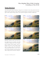
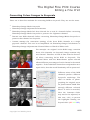
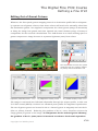
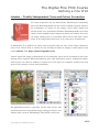
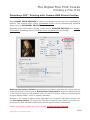
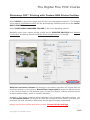
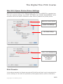
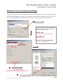
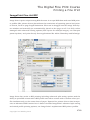
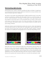
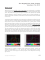
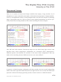
The Digital Fine Print
Course Notes
2012
Copyright Les Walkling 2012
Adobe Photoshop screen shots reprinted with permission
from Adobe Systems Incorporated.
Version 2012:01
The Digital Fine Print Course
CONTENTS
Part 1: Creating a Fine Print
• Printer Resolution
• Image Resolution
• Multi-Colour Printing
4
5
7
Part 2: Editing a Fine Print
•
•
•
•
•
•
•
Four Compositions: Image Editing Workflow
Colour Correction Tools
Converting Colour Images to Greyscale
Understanding Unsharp Masking
Advanced Unsharp Masking
Image Posterization
Reducing Noise and Artifacts
9
10
12
16
17
18
20
Part 3: Refining a Fine Print
•
•
•
•
•
•
Print Luminosity
Basic Layer Masks
Blending Adjustment Layers
Working in L*a*b*
Out-of-Gamut Colours
Lobster - Independent Tone and Colour Correction
22
23
24
25
26
28
Part 4: Printing a Fine Print
•
•
•
•
•
•
•
•
•
•
•
Photoshop Printing with Custom RGB Printer Profiles
Mac OS X: Epson Printer Driver Settings
Windows: Printer Properties Settings
Epson K1, K2 and K3 Ultrachrome Inksets
Understanding RIPs
ImagePrint Fine Art RIP
QuadTone B&W RIP
RIP Ink Limiting
RIP Linearization
RIP Profiling
Changing Epson Ultrachrome Black Ink Cartridges in OS X
30
33
34
35
36
37
38
39
40
41
42
Part 5: Viewing a Fine Print
• Photoshop Soft Proofing with Custom Printer Profiles
• Soft Proofing Light Sources
• Ink Inconstancy
44
45
49
• Bibliography
50
Copyright Les Walkling 2012
The Digital Fine Print Course
Part 1
Creating a Fine Print
Copyright Les Walkling 2012
3/50
The Digital Fine Print Course
Creating a Fine Print
Printer Resolution
The standard units expressing digital image resolution, ppi (pixels per inch) and dpi (dots
per inch), although often confused and interchanged, do not refer to the same attribute.
• PPI (pixels per inch) is a measure of the digital file’s linear pixel resolution. The higher
the ppi, the more pixels make up the image, and therefore the larger its overall file size.
• DPI (dots per inch) describes either the size of the ink drops an inkjet printer can produce, or the number of half tone dots per linear inch that a half tone printer uses to render each halftone dot. For example, inkjet printing at 1440 dpi produces drops of ink that
are only 1/1440th of an inch (0.176 mm) in diameter. On the other hand a bit mapped
image of 200 ppi resolution printed on an image setter at 2400 dpi, will have each of its
pixels rendered as a grid of one hundred and forty four 2400 dpi sized dots (ie. 2400/200
= 12 dots per linear pixel, hence 12 x 12 =144 dots per pixel). Dots per inch (dpi) therefore only applies to certain types of digital and halftone printing.
Higher ppi and dpi result in finer detail in the print. However printing at 1440 dpi does
not imply that the image’s pixel resolution should also be 1440 ppi. The optimum settings will depend on the pictorial and production requirements of the image. Too high a
ppi resolution will produce unnecessarily large file sizes without any visible increase in
detail in the print. Too high a dpi printer resolution will unnecessarily extend printing
times. Too low a ppi or dpi resolution will result in loss of original image detail.
The optimum resolution is easy to determine. Scan an image at various ppi resolutions at
a fixed output width and height, and print each file at the printer’s maximum dpi resolution. Observe the effect of increasing ppi on detail in the print. Then print the highest ppi
resolution file at the maximum (eg. 2880 dpi), half maximum (eg. 1440 dpi), and quarter
maximum printer resolution (eg. 720 dpi) while keeping the print width and height the
same. Critically examine each print to determine the optimum ppi and dpi resolutions.
For mural prints, a minimum resolution of a 100 ppi appears to be the visual threshold
at which most people begin to lose the ability to clearly distinguish individual image pixels (when viewing the print no closer than 60cm). The subjectivity in this judgement needs
to be taken into account, because in some cases higher or lower values will also be acceptable. This doesn’t mean that the image won’t appear sharper or more detailed at higher
pixel resolutions, just that it will be difficult to distinguish pixels in the mural print. Test
print small sections from the different ppi scans to determine the optimum mural ppi.
Copyright Les Walkling 2012
4/50
The Digital Fine Print Course
Creating a Fine Print
Image Resolution
The optimum pixel resolution of a print is dependent on the printing medium, the intended print viewing distance, and the required optical resolution.
Printing Medium: The printing medium is a combination of the printing process and the
paper used. A low resolution file printed on a glossy paper will look quite different when
printed on a rough surfaced paper. While the glossy surface will reveal all the detailed differences in the image, including its pixel resolution, the rough surface will tend to hide,
diffuse or obscure some of these differences.
Viewing Distance: Pixels clearly visible in a print at a close viewing distance become less
noticeable at increasing distances to the point that they disappear from view. Smaller
prints displayed in a book may therefore require a substantially higher pixel resolution
than a much larger print displayed on a billboard. Also printing very large prints at the
same high pixel resolution required for a book will result in extremely large file sizes
which will be more difficult to manipulate and manage in pixel editing programs like
Adobe Photoshop. Therefore as well as the aesthetic qualities of the print, there may also
be very practical reasons that influence a print’s pixel resolution.
Optical Resolution: Highly detailed images such as a large format sharply focussed landscape, or an image containing text, may require a higher pixel resolution than a small format or less carefully focussed or more abstracted image. On the other hand a very diffuse
image may actually require a high pixel resolution in order to preserve its inherently
smooth tonal transitions when significantly enlarged.
Optimum Pixel Resolution: Each printing process will also have a native or default pixel
resolution which is optimum for that process. This will be different for each printer, and
may influence which printing process is used. For example:
Lambda Digital Photographic Printer: 200 ppi (or 400 ppi for text)
Kodak Pegasus LED Digital Photographic Printer: 250 ppi
Epson Stylus Photo Inkjet Printer: 360 ppi
Hewlett Packard Deskjet Inkjet Printer: 300 ppi
An important experiment involves printing several (pictorially different) images at their
final size at different ppi resolutions, then examining them at various viewing distances.
This can help you decide on the required pixel resolution for different images.
Copyright Les Walkling 2012
5/50
The Digital Fine Print Course
Creating a Fine Print
Image Resolution
The following Bill Beath landscape image was re scanned at the same physical size but
different pixel resolutions. Each image was then printed at the same size on the same
paper with an Epson inkjet printer at the printer’s highest resolution of 2880 dpi.
Relatively smooth toned areas like the
sky might be quite acceptable at low PPI
resolutions (100ppi), but areas of higher
local contrast and texture such as
foliage retain more of the original image
detail at higher image PPI resolutions.
The greatest differences can be seen in
the text that identifies the PPI numbers
where image detail (contrast) is highest.
Copyright Les Walkling 2012
6/50
The Digital Fine Print Course
Creating a Fine Print
Multi-Colour Printing
Careful examination of CMYK and CcMmYK(k) prints reveal significant differences in the
highlight regions. Highlight resolution is markedly improved when printed with a light
cyan (c), light magenta (m) and light black (k), especially at the highest printer dpi,
because compared with a ‘traditional’ CMYK inkset, more drops of the light ink will be
deposited to produce the same highlight density which also preserves highlight detail.1
A light yellow ink is not required because yellow ink is already very transparent and tends
to only colour correct the image with little effect on the overall print density. Some manufacturers include two more additional pigments, mid magenta and mid cyan in eight
colour printers. This further improves the smoothness of the print's tonal transitions.
Other printer configurations print with eight colours, but substitute Orange and Green
or Red and Blue (Hexachrome printing) for the mid cyan and mid magenta. This produces
an expanded colour gamut with more saturated colours than can be reproduced in CMYK.
Print Dimensionality
Shifts in local contrast or variable edge definition are very effective in creating a sense of
spatial dimensionality in a print. For example, increasing the local contrast of an object
tends to bring it forward in pictorial space while decreasing local contrast moves it back.
Local contrast can be modified by local changes to the shape of an image curve that is
blended on Luminosity. Small differences between the gradients of each colour curve
blended on Color will introduce subtle local hue/saturation shifts that can also increase
the print's dimensionality. This is very effective in uniform but textured areas like foliage.
Local contrast or edge definition can be modified through the selective use of sharpened
or blurred duplicated image layers in Photoshop. However over-use of these techniques
can also create the opposite effect by degrading the print’s luminosity, disrupting smooth
tonal transitions, and producing or increasing colour fringing.
1. A CMYK inkjet printer resolution of 1440 dpi will actually only be achieved in the reproduction of maximum black, where there is at least 1440 (1/1440th inch) dots per linear inch in the print. A resulting maximum print density of Log 2.1 would produce an effective Zone V (Log 0.70) resolution of 1440/3 = 480 dpi,
while Zone IX (Log 0.10) would only be 1440/21 = 68.6 dpi. If the light cyan, light magenta and light black
ink density is a quarter the opacity of normal cyan, magenta and black ink, four times the resolution (275
dpi) will be required to create the same highlight print density, thereby also increasing highlight detail.
Copyright Les Walkling 2012
7/50
The Digital Fine Print Course
Part 2
Editing a Fine Print
Copyright Les Walkling 2012
8/50
The Digital Fine Print Course
Editing a Fine Print
Four Compositions: Image Editing Workflow
All images are composed of other images, both imagined and real. Identifying an
image according its individual compositions and then exploring and refining their contribution, honestly reveals the structure of the image. By rendering the individual compositions in the following order, the image can be most efficiently resolved.
Drawing Composition:
• Apply Dust & Scratches filter to a duplicate layer blended in Darken or Lighten Mode.
• Spot any remaining non-image artifacts with a Cloning Tool.
• Cropping experiments uncover the ‘psychological space’ within the image.
• Use Guides to outline the image window, thereby allowing precise cropping of the image.
• Carefully examine the image on screen and in a test print at the final scale.
• These strategies reveal the relationships between elements within the image
Tonal Composition:
• Convert the RGB image to Lab (16bit) and display only the L* (Lightness) channel.
• Use L* Levels to set highlight and shadow points, and adjust middle grey (gamma).
• Use L* Curves to adjust local contrast.
• Apply the Dodge & Burn tool to modify local tonal values, OR
• Paint with black and white on a 50% grey layer in Soft Light mode as a ‘printing pack’.
• These strategies reveal the drama of the image.
Colour Composition:
• Use R, G & B Levels to adjust global colour balance by setting highlight/shadow points.
• Use R, G & B Curves to locally adjust colour contrast (saturation) and brightness.
• Use the Sponge tool to locally saturate (& lighten) or desaturate (& darken) the image.
• Use HSL controls and Selective Color to precisely adjust individual colour values.
• Use Color Balance to ‘tweak’ the overall colour balance to enhance its ambience.
• These strategies reveal the mood or personality of the image.
Spatial Composition:
• Duplicate the image layer and apply the Unsharp Mask filter or Gaussian Blur filter.
• Blend sharpened layers on Lighten or Darken to modify ratio of light to dark halos.
• Use a Layer Mask to locally apply the sharpening or blurring at different opacities.
• Use Blending Options/Layer Styles to isolate the effect to specific tonal regions.
• Duplicate the image layer and apply a low pixel radius High Pass filter in Overlay mode.
• These strategies reveal and orchestrate our relationship to the image.
Copyright Les Walkling 2012
9/50
The Digital Fine Print Course
Editing a Fine Print
Colour Correction Tools
To fully colour correct an image control is needed over six variables:
1. Hue
2. Saturation
3. Brightness
4. Density Range
5. Global Colour Balance
6. Local Colour Balance
Photoshop’s Colour Picker displays a 2D
representation of 3D colour space.
Hue:
The hue of a colour is what is often thought of as the actual colour or ‘colour of the colour’
and is described by its (hue) angle on a 360º colour wheel. For example red has a hue
angle of 0º, green 120º, and blue 240º.
Saturation:
Saturation or Chroma is a second defining characteristic of colour. It defines the purity of
colour and is expressed as a percentage where 100% is the most saturated colour that
can be reproduced on a particular device (scanner, monitor or printer).
Brightness:
Brightness is a third defining characteristic of colour. It defines the lightness or darkness
of the colour. In a monitor adding more light makes the colour lighter, while in a print
subtracting ink makes the colour lighter.
Hue, saturation and brightness represent the three dimensions of a HSB model of colour.
Any colour will have a certain hue, level of saturation and brightness precisely describing
its position (and colorimetric qualities) within its 3D colour space. For example, pastel
colours exhibit low saturation and high brightness values for a given hue. The Photoshop
Colour Picker provides a 2D ‘unfolded’ representation of device dependent HSB, RGB,
CMYK, Hexadecimal, and device independent LAB (CIE L*a*b*) models of colour space.
Copyright Les Walkling 2012
10/50
The Digital Fine Print Course
Editing a Fine Print
Density Range:
Density range refers to the tonal or brightness range of the image and is not the same as
its colour range (or balance). Mode changing a colour image to a greyscale image changes
its colour values to density values. This represents the tonal darkness and lightness of
the print. An image's tonal composition may be different to its colour composition. For
example: A red rose may have the same tonality as the green leaves surrounding it, and
hence have a very low tonal contrast or density range, but a very high colour range or
colour contrast (red to green).
Colour Balance - Global:
Control over the global colour balance of an image is very important. In analogue colour
photography this was achieved either by a subtractive system (CMY filters), or by an additive system that mixed red, green and blue light. Photoshop (and colour monitors) also
use an additive system mixing red, green and blue colour channels.
Relative Colour Values - Curves:
Control of the RGB values for each pixel relative to any other pixel in the image is a very
important control in expressive colour print making. Curves allow every level of brightness, from 0 to 255 to be individually adjusted with precision.
Photoshop Colour Correction Tool Caveats:
Curves while facilitating specific areas of the image to be identified and adjusted, only
permit 256 levels of adjustment, even when working in 16-bit. Locked down control points
on an RGB curve unfortunately change their value whenever other points are moved. That
is they do not remain locked down. The RGB curve also causes saturation increases relative to brightness decreases, which is the opposite of human vision and expectation.
Hue and Saturation (HSL) is an wonderful tool that also works with Lab images
Colour Balance settings can not be saved but have a Preserve Luminosity feature which
attempts to alter the colour balance without distorting the overall luminosity.
Selective Color offers CMYK controls while still effectively adjusting RGB curves. Neutral
colour balance can be easily modified, and the K slider controls density in colour.
Brightness and Contrast in Legacy mode clips the image’s density range, and therefore
has to be used carefully to prevent significant damage to the image.
Copyright Les Walkling 2012
11/50
The Digital Fine Print Course
Editing a Fine Print
Converting Colour Images to Greyscale
There are at least five methods for converting RGB to Greyscale. They are not the same.
•
Photoshop>Image>Mode>Greyscale
•
Photoshop>Image>Adjustment>Desaturate
•
Photoshop>Image>Mode>Lab then discard the a* and b* channels before converting
Photoshop>Image>Mode>Greyscale to preserve the Lightness channel.
•
Discard two RGB channels before converting Photoshop>Image>Mode>Greyscale to
preserve that channel as Greyscale.
•
Custom manage the conversion (mixing) of the three RGB channels to a single
greyscale channel. This can be accomplished via Photoshop>Image>Calculations or
Photoshop>Image>Adjustments>Channel Mixer or Black & White tools.
For example: An original 24-bit RGB image contains
three 8 bit channels. An Greyscale image contains only
one channel. Therefore 16-bits of data must be discarded when converting 24-bit RGB to Greyscale. The
Channel Mixer with the Monochrome option selected
allows different percentages of each channel to be mixed
together. If the individual channels are adjusted so as to
equal 100%, then the overall luminosity will be preserved.
Different mixes of the RGB
channels produce different
Greyscale renderings. The
effect is similar to photographing the original scene
on panchromatic B&W film
through different coloured
filters. If 100% is exceeded,
then the Constant slider
may need to be adjusted, in
this case -10%, to prevent
255
255
255
Copyright Les Walkling 2012
the highlights blowing out
beyond 100% (255 255 255).
12/50
The Digital Fine Print Course
Editing a Fine Print
Altered Luminosity
The luminosity of an image is our perception of the relative lightness and darkness of its
colours. Photoshop’s luminosity formula mixes 30% of the Red channel + 59% of the
Green channel + 11% of the Blue channel to represent the luminosity of the image. In traditional BW photography contrast filters were used to alter this luminosity rendering. For
example a red filter was used to dramatically darken blue sky and intensify clouds.
Original Image
Original Luminosity
Altered Luminosity Rendering
Original Colour plus Altered Luminosity
Photoshop’s Channel Mixer in Monochrome mode can easily create altered luminosity
renderings. In this example, 110% Red + 80% Green + -100% Blue mimics the effect of a
medium red filter. This lightens green foliage while darkening the blue sky and increasing cloud contrast. Blending this Monochrome Channel Mixer adjustment layer on
Luminosity combines its altered luminosity with the original image colour (Hues). The
image’s Saturation is also adjusted by the Luminosity blending mode to maintain, with
varying succes, the overall appearance of the image despite its redistributed luminosity.
Copyright Les Walkling 2012
13/50
The Digital Fine Print Course
Editing a Fine Print
Advanced Greyscale Workflow
There are three typical stages or adjustment layers in an advanced greyscale workflow:
1. Extraction of a monochrome luminosity rendering from the original colour image.
2. Global redistribution of the image’s tone and contrast.
3. Local redistribution of the image’s tone and contrast.
The original image is converted to monochrome RGB
with Photoshop’s Channel Mixer. The three RGB
channels are individually mixed to produce the
desired greyscale luminosity. A curve is then applied
to enhance the global and/or local contrast if
required. This produces a foundation print that can
then be locally dodged and burned, locally intensified
and reduced, and globally and/or locally colorized.
Original RGB Image
Plus Channel Mixer
Layer Palette
Dodging & Burning
Add a 50% Grey filled
layer blended on Soft
Light. Paint on this layer
with black paint (darken)
and white paint (lighten)
to geographically
redis-
tribute the tonality.
Copyright Les Walkling 2012
Plus Curves
14/50
The Digital Fine Print Course
Editing a Fine Print
Colourizing Monochrome Images
A monochrome RGB image can be colorized (toned) by many methods such as RGB
Curves and/or Color Balance adjustments. A Color blended ‘toning layer’ modified via
Layer Style options is one of the more eloquent, accurate and adaptable methods.
Photoshop’s Color Picker can be used to accurately specify the required colour. This also facilitates small
changes being made to the toning colour (hue) without
disturbing other image qualities such as contrast or saturation. Note that LAB colour numbers (L*36 a*1 b*13)
provide an unambiguous description of the ‘toning’
colour independent of the working space/profile used.
Original Monochrome RGB Image
A new layer is filled with the ‘toning’ colour and blended
on Color above the original monochrome RGB image.
Adjusting its Layer Opacity (to 80%) and Layer Style to
remove the ‘colour’ from the shadows (0 to 35) and highToning Layer at 100% Opacity
lights (185 to 255) completes the toning process.
=
Colorize Layer Blending Options (Style)
Copyright Les Walkling 2012
Layer Palette
Finished image
15/50
The Digital Fine Print Course
Editing a Fine Print
Understanding Unsharp Masking
Sharpening (and blurring) effects are proportional to the degree of enlargement of the final
print. For example sharpening that appears perfectly balanced on a 100 ppi screen will
become excessive when enlarged in a 200 ppi Lambda print. Local effects are proportional to the distance (enlargement) over which they are projected. Therefore it is probably
wise to apply these sharpening and blurring effects only once the final image size has
been established and a test print (not the screen image) has been carefully evaluated.
Unsharp Mask: 500% 1.0 pixels 30 levels
The AMOUNT is the strength of the filter. In the
Unsharp Mask filter, 500% results in much
darker and lighter outlines (halos) than 100%.
The RADIUS is the width of the outline, in pixels
either side of the boundary being sharpened,
and THRESHOLD is the number of levels of
tonal difference that must first exist across a
boundary for that ‘amount and radius’ to be
applied. Begin adjusting the Adobe Photoshop
Unsharp Mask (USM) filter at a low Radius setting around 0.5 to 2.0 pixels and 0 Threshold
with a high Amount (100% to 500%.). Gradually
increase the Radius until the edges have been adequately ‘outlined’, then slowly increase
the Threshold setting until the effect just begins to wane. Finally reduce the Amount to
suit the image’s character. This will give you the basic sharpening setting for that image.
Always inspect the effects of the Unsharp Mask filter at 100% screen magnification. To
limit unwanted sharpening artifacts such as colour fringing, initially apply the filter to a
duplicate image layer then blend on Luminosity. The duplicate layer will also allow the
sharpening to be locally inserted via a layer mask. The Adobe Photoshop sharpen and
blur filters can also be applied in 16-bit colour depth which will further reduce unwanted image artifacts and promote smoother transitions in the final print.
Copyright Les Walkling 2012
16/50
The Digital Fine Print Course
Editing a Fine Print
Advanced Unsharp Masking
Photoshop’s Unsharp Mask filter increases edge contrast and therefore apparent sharpness, which appears as light and dark outlines around boundaries in the image. The exact
degree of sharpening (outlining) the image requires will need to be determined experimentally for each printer at the final print size according to these parameters:
.
Amount:
The darkness and lightness of the outlines.
Radius:
The width of the dark and light outlines
Threshold:
The number of levels of tonal difference across
a boundary before the outlines are applied.
Increasing the Threshold to 10 levels removes most
of the sharpening from the skin, but not the eyes.
Sharpening a duplicated
image layer and blending
on Lighten (or Darken)
only preserves the light
(or dark) outlines, thereby
also adding lightness (or
darkness) to the image.
Blended on Lighten
Variable Layer Opacity, Layer Masks and/or
Layer Styles can further enhance the effect.
Blended on Darken
Copyright Les Walkling 2012
17/50
The Digital Fine Print Course
Editing a Fine Print
Image Posterization
Practical experimentation alerts us to the fact that a minimum number of levels of tone
are required to create the illusion of a smooth tonal scale from black to white on the
screen and in the digital print. With less than 8-bits or 256 levels of tone per channel the
individual levels or steps may become increasingly noticeable as distinct jumps or bands
of tone. This effect is known as posterization, because the normal smooth tonal transitions of reality and the photographic image begin to break up into noticeable bands or layers of tone resembling a poster or screen print.
Adjusting the image in a pixel editing program (eg. Adobe Photoshop) results in a redistribution and/or elimination of levels of tone. Even a simple contrast adjustment can
result in a significant loss of levels of tone in an 8-bit per channel image. For example:
+
Normal Contrast Greyscale
The upper histogram shows the pixel distribution in the original image. Applying a moderate ‘two stop’ increase in contrast results in
the right hand histogram which reveals the
actual levels of tone that are now missing
from the image. As the gaps increase the
image becomes increasingly posterized. This
effect may eventually become visible in the
print as obvious bands of tone especially in
smooth tone areas like sky and skin. These
effects are often accumulated and multiplied
with repeated image adjustments.
Copyright Les Walkling 2012
Increased Contrast (N+2) Greyscale
18/50
The Digital Fine Print Course
Editing a Fine Print
Minimising Image Posterization
Posterization can be minimised (and therefore the illusion of smooth photographic tone
preserved) by working with files that contain more than 8-bits (2 8= 256 levels) of data per
channel. As many printer drivers and RIPs only accept 8-bits of data per channel it is also
logical to only convert the image down to 8-bits of data per channel just before printing.
This happens naturally in a program like Live Picture, but prior to version 8, Photoshop
only supported limited editing in more than 8-bits, therefore it was more difficult in
Photoshop to reduce the posterization that resulted from excessive image manipulation.
Whenever it is possible (or practical) digitize the image in greater than 8-bits, and complete all global colour corrections in the scanning/raw convertor software. Save the image
in 16-bits per channel, open in Photoshop and complete all image adjustments and profile conversions in 16-bits. Once the image is converted to 8-bits endeavour to achieve the
desired result with as few adjustments as possible.
Use an RGB working space with a Gamma of 2.2 (rather than 1.8) because it more equally distributes bit-depth between an image's shadows and highlights. At a Gamma of 1.8
much less of the image's bit depth is devoted to the shadows (approximately 102 levels)
compared with the highlights (153 levels), therefore posterization will appear more readily in the shadows than in the highlights when they are manipulated to the same extent.
Gamma 2.2
Zones
Screen Density
Levels
(Photoshop)
2.49
2.39
1.79
1.35
0.99
0.75
0.53
0.38
0.23
0.11
0.00
0
26
51
77
102
128
153
179
204
229
255
2.49
1.97
1.35
1.00
0.75
0.56
0.40
0.28
0.18
0.08
0.00
0
52
84
112
136
156
180
201
220
237
255
Gamma 1.8
Zones
Screen Density
Levels
(Photoshop)
When archiving JPEG camera files first optimize image quality in the capture software
(white balance, tone and contrast, and sharpening), with teh aim of limiting subsequent
image editing to minimse the risk of posterization in the 8-bit JPEG format. Also try to
avoid resaving an edited JPEG file back into the JPEG format because it will further compress the image data and therefore reduce image quality.
Copyright Les Walkling 2012
19/50
The Digital Fine Print Course
Editing a Fine Print
Reducing Noise and Artifacts in Scanned Images
A digital print from a scanned negative will often exhibit a more granular image structure
compared with an RA4 optical-chemical photographic print enlarged directly from the
same negative. These artifacts appear in proportion to the film’s density. It therefore tends
to not be as significant a problem with scanned transparencies whose reversed densities
effectively ‘hide’ these artifacts in the shadows. Excessive artifacts are also often only
present in the ‘unwanted colour’ in the affected area of the image. For example skin tone
artifacts are often only visible in the green and blue channels (G + B = Cyan). The following methods will variously help to reduce artifacts in digital files.
• Apply the Surface Blur filter to the affected channel(s). Selections can also be used to
further refine the correction through the local application of varying degrees of blur.
Use the smallest Surface Blur pixel radius that minimises the local artifacts. Then subtly sharpen any unaffected channels. This technique will help preserve the overall photographic appearance of the image while reducing some unwanted artifacts.
• Applying the Dust and Scratches filter at a very small pixel radius to a duplicated
image layer blended with Darken mode ensures only the minute areas of lighter tone
within the unwanted granularity are replaced by the blurred and darkened areas of the
filtered layer. A layer mask based on a Find Edges filtered copy of the image will help
preserve edge detail while minimising all over granularity.
• A more sophisticated method applies the Dust and Scratches filter to a copy of the
most artifacted channel(s), which is then blended with the original channel(s) using the
Darken mode via the Apply Image tool (File>Adjust>Apply Image).
• Fill a layer with paint whose colour has been sampled from the image areas that
require the most smoothing or reduction of granularity. This paint layer can be filtered
with the Noise filter at a small pixel radius that approximates the granularity of the
photographic image itself, and is then blended at a low opacity (typically 20% to 50%)
using the Darken blending mode to help smooth out excessive granularity.
• Sometimes small degrees of lossy JPEG compression can appear to reduce scanner
(and digital camera) artifacts by reducing the effective variance between different pixels, thereby smoothing out local values, especially in areas like skin.
• Nikon scanning software incorporates a GEM function and SilverFast uses a GANE filter that significantly reduce grain and artifacts in the scanned image. On close inspection individual colour channels can become locally posterized especially in smooth
toned areas, though these effects are usually only visible in giant enlargements.
• Software like NeatImage™ or Noise Ninja™ will significantly reduce digital noise, and
scanner specifc ‘grain profile’ can be created for repeated use or batch processing.
Copyright Les Walkling 2012
20/50
The Digital Fine Print Course
Part 3
Refining a Fine Print
Copyright Les Walkling 2012
21/50
The Digital Fine Print Course
Refining a Fine Print
Print Luminosity
A fine print is the fine transformation
of subject that matters.
Four thoughts on foundations.
A print is more than the sum of its
parts.
However each of its parts must be
treated as their own image.
Each image needs to be rendered
according to its own demands.
A foundation print harmoniously reintroduces these images to each other.
Four thoughts on subject that matters.
If we can not name our sources that is
not too bad a thing. That only means
we have not been paying enough
attention to the things we have come
to rely upon. It is an insensitive form
of indulgence. But if we can not name
our materials, we have no family left in
this world.
The photographic process looks after
itself when its natural inheritance is
honoured. It can not understand any
other way of working. But when what
is passed on represents a loss, the
process collapses.
We can learn more from our failures
than anything else. That is why
despite failure, we need to return to
the studio to renegotiate our options.
We have to investigate our materials
and befriend our processes otherwise
we will always be a stranger in their
presence.
Feelings which aren’t expressed aren’t
forgotten. They remain latent images
lost to the world.
Copyright Les Walkling 2012
Four thoughts on luminosity.
The inherent luminosity of the subject
is more richly photogenic than the
imposed luminosity of sun and shade.
If we expand inherent luminosity in
the negative we are multiplying an
already richly distributed resource. If
we expand imposed luminosity we are
only expanding an already reduced
range of options.
In a negative of expanded values, each
part of the image will have been tonally relocated some distance from where
it was found. The first task in printing
such a negative is to globally redistribute these values while preserving their
local inheritance.
It is a mistake to think that print
luminosity comes from extremes of
values. While differences in the subject
may attract us to the site in the first
place, in printing, the similarities are
more revealing of human difference.
Four thoughts on structure.
Structure is the backbone of our
desires. It is the bringing of things
together in a print that builds structure. Preventing collaboration between
friendly areas of a print destroys
structure. Without structure we have
nothing except spectacle or artifice to
carry the weight of our concerns.
The emotional logic of a print is hinged
to its structure. Balancing weights and
fulcrums compete for our attention. A
print becomes self sustaining through
the poetic resolution of its structure.
A self-sustaining print sustains us.
The heart of a print doesn’t escape our
attention when its structure doesn’t
22/50
The Digital Fine Print Course
Refining a Fine Print
Basic Layer Masks
Layer masks control the local distribution of the layer they mask. Layer masks can be
used in compositing different images together. They can also be used in the local control
of specific values within a single Layer. For example different areas of an image may
require different renderings in order for the image as a whole to be properly resolved.
These differences may include changes in density, contrast, colour (hue) and saturation.
One very powerful Photoshop technique that facilitates such adjustments involves the
variable blending of duplicated layers of the same image, via layer masks.
Working with Layer Masks:
•
Black in a Layer Mask hides that layer. • White in a Layer Mask reveals that Layer.
The layer will be locally hidden and/or revealed in proportion to the local mask density.
For example:
Black = invisible
White = visible
Grey = partially visible
Advantages of this method
•
It is easy to blend different renderings and the results can look very natural.
•
The 'feel' of this method is more intuitive for photographers, like dodging and
burning compared with having to work with Photoshop selections.
•
Changes can be deleted, undone or revised at any time.
•
The changes can also be saved as separate layers in a Photoshop (PSD) document.
•
Therefore specialised adjustments such as dodging and burning or Photoshop
filter effects can also be effectively archived as an ‘adjustment layer’.
•
With a pressure sensitive pen and tablet the layer can be variably and quickly
blended with accuracy.
Disadvantages of this method
•
Duplicate layers in Photoshop require large amounts of RAM.
•
Large image files take longer to render, thereby slowing the process down which
tends to destroy the intuitive feel of this method.
•
Sophisticated blending of image elements with a paint brush requires skill.
Copyright Les Walkling 2012
23/50
The Digital Fine Print Course
Refining a Fine Print
Blending Adjustment Layers
Many of ‘Photoshop > Image > Adjustments’ can be loaded as Adjustment Layers. This
allows incremental adjustments to be made with a reduced risk of incremental posterization. When the image is then flattened, archived or printed, only one adjustment per
adjustment layer is applied. Blending Adjustment Layers with different Blending Modes
further refines this technique by helping to constrain the adjustments to desired values.
Original Image by Glenn Guy
Adjustment Curve RGB
Adding an RGB Curve Adjustment Layer
Blended on Normal (default setting).
This results in the image Colour (Hue and Saturation) as well as Brightness all being affected. But when the Adjustment
Layer is blended on Luminosity the Hue remains unchanged and only the Brightness and Saturation are changed.
Adding a HSL Adjustment Layer blended on Color adjusts the Hue of the image
while attempting to maintain its relative luminosity (Brightness and Saturation).
Blending on Normal changes Hue but does not alter Brightness or Saturation.
This also encourages the independent
editing of Tone, Contrast and Colour.
Copyright Les Walkling 2012
24/50
The Digital Fine Print Course
Refining a Fine Print
Working in L*a*b*
One of the advantages of working in the CIE LAB colour space is that it separates the
image into a Lightness channel (L*) and two colour channels (a* and b*). This encourages
the editing of tone independently of colour.
L*a*b*
L*
L*a* (magenta to green)
L*b* (yellow to blue)
L*a*b* is also a device independent and very large colour space. But this can also be a
disadvantage if only subtle editing changes are required because of the relatively large
tonal jumps between adjacent levels in the a* and b* channels. It is also not possible to
judge colour balance and colour clipping by visually inspecting the a* and b* histograms.
‘RGB Luminosity’ can be enhanced by first duplicating the RGB image, mode changing to
LAB, discarding the two colour channels a* and b*, and then converting the L* channel
into greyscale, and then back into RGB, before moving it onto the original RGB image as
a separate layer blended on Luminosity. The RGB Luminosity is then replaced with that of
the Lightness channel, which results in expanded tonal separation through out the image.
+
RGB
+
L*
Copyright Les Walkling 2012
=
RGB + L*
25/50
The Digital Fine Print Course
Refining a Fine Print
Out of Gamut Colours
Saturated colours such as the green paint of this car can be accurately captured on film
or with a DSLR camera. Many of these colours can also be preserved in the Adobe RGB
(1998) working colour space. However once printed they becomes dull and lifeless.
Adobe RGB 1998 (Working Space Profile)
U.S. Web Coated (SWOP) v2 (Press profile)
Many of the colours in this image (35.4%
∆E2000 > 2.0) lie outside of the US Web
Coated (SWOP) v2. press profile. This
means that they can’t be accurately reproduced in this print space. The SWOP profile will render them as the closest but not
identical match to the original colours.
Green Duco
SWOP v2
SWOP v2
The Colormetric tables in the US Web Coated
(SWOP) v2 press profile will compress many of
the out-of-gamut colours into a very small
range of colours, even rendering different
shades as a single colour. For example in the
right hand diagram, many of the greens in the
car duco are being mapped into the same point
(the same colour) in the SWOP v2 colour space.
This is why the colours are rendered as a flat,
Many greens
are rendered
the same green
dull, undifferentiated composite green in print.
Copyright Les Walkling 2012
26/50
The Digital Fine Print Course
Refining a Fine Print
Editing Out of Gamut Colours
Whenever the Perceptual gamut mapping intent in a destination profile fails to adequately separate out-of-gamut colours, then these colours will need to be manually edited into
the destination gamut. One approach compresses the colour gamut (range of saturation)
to bring the image into gamut and then expands the tonal contrast (range of tones) to
compensate for the reduced colourfulness. The LAB format is an ideal working space to
gamut compress an image because it separates lightness (tone) from colour.
The Layer Mask removes the gamut
compress from the orange (magenta-yellow) barriers behind the car
Lab edited image softproofed in U.S. Web Coated (SWOP) v2
Lightness (Contrast) Curve
a* (Magenta to Green) Curve
b* (Yellow to Blue) Curve
The image is converted into LAB and softproofed through the output profile, in this case
U.S. Web Coated (SWOP) v2 which is a standard press profile for magazine reproduction.
The out-of-gamut greens are located in the a* channel (green to magenta) and not the b*
(blue to yellow) channel. Reducing the gradient of the a* curve therefore reduces the
range (gamut) of greens in the image. To compensate for the reduced green ‘vibrancy’,
the gradient of the L* (tone) curve is increased to enhance local tonal separation.
Copyright Les Walkling 2012
27/50
The Digital Fine Print Course
Refining a Fine Print
Lobster - Totally Independent Tone and Colour Correction
On closer inspection via the Info Palette, Photoshop’s Luminosity
and Color Blending Modes do not restrict editing changes solely to
the luminosity or colour of the image. Even when points are
‘locked down’ on a Luminosity blended Photoshop RGB curve their
colour is still modified when adjacent points are edited. For critical image editing this is a problem where local edits effect other
areas of an image that then have to be corrected, ad nauseam.
In Photoshop it is difficult to easily and accurately edit the tone of an image independently of its colour. That is unless you are working in LAB, or employ a third party script
called Lobster from http://www.freegamma.com.
Lobster opens an image in Photoshop as a Luminosity Layer and a Chromaticity Set comprising three separate RGB chromaticity (hue and saturation) layers. Individual adjustment layers can then be added as required to each layer for complete control over any
aspect of an image’s colour and luminosity.
All Adjustment Layers, especially Curves and Levels, will
now function with unequalled image editing precision, and
Lobster also corrects Photoshop’s Info Palette read outs.
Copyright Les Walkling 2012
28/50
The Digital Fine Print Course
Part 4
Printing a Fine Print
Copyright Les Walkling 2012
29/50
The Digital Fine Print Course
Printing a Fine Print
Photoshop CS™ Printing with Custom RGB Printer Profiles
Select PRINT WITH PREVIEW to layout the image and set the Color Management
options. The image’s colour space (Embedded Profile) will be automatically detected
and set as the SOURCE SPACE.
Manually select your custom printer profile as the PRINT SPACE with Relative
Colorimetric rendering intent and Black Point Compensation turned ON.
Relative Colorimetric Intent will attempt to accurately reproduce all colours that are
inside the printer’s colour gamut. Black Point Compensation maps the blackest point
of the Source Space to the blackest point of the Print Space, thereby preserving the
image’s shadow detail, which is usually desirable.
However if the image contains many important ‘out-of-gamut’ saturated colours, use
the Perceptual Intent. All colours will then be changed to some extent, but their proportional hue and saturation differences will be approximately maintained.
Always use printer profiles with their correct Printer Driver Settings
Copyright Les Walkling 2012
30/50
The Digital Fine Print Course
Printing a Fine Print
Photoshop CS2™ Printing with Custom RGB Printer Profiles
Select PRINT WITH PREVIEW to layout the image and set the Color Management
options. The image’s colour space (Embedded Profile) will be automatically detected
and set as the DOCUMENT PROFILE.
Manually select your custom printer profile as the PRINTER PROFILE with Relative
Colorimetric Rendering Intent and Black Point Compensation turned ON.
Relative Colorimetric Intent will attempt to accurately reproduce all colours that are
inside the printer’s colour gamut. Black Point Compensation maps the blackest point
of the Source Space to the blackest point of the Print Space, thereby preserving the
image’s shadow detail, which is usually desirable.
However if the image contains many important ‘out-of-gamut’ saturated colours, use
the Perceptual Intent. All colours will then be changed to some extent, but their proportional hue and saturation differences will be approximately maintained.
Always use printer profiles with their correct Printer Driver Settings
Copyright Les Walkling 2012
31/50
The Digital Fine Print Course
Photoshop CS3™ Printing with Custom RGB Printer Profiles:
Select PRINT to layout the image and set the Color Management options. The image’s
colour space (Embedded Profile) will be automatically detected and set as the DOCUMENT PROFILE.
Select PHOTOSHOP MANAGES COLORS in the Color Handling options.
Manually select your custom printer profile as the PRINTER PROFILE with Relative
Colorimetric Rendering Intent and Black Point Compensation turned ON.
E9800pkISP_PGP2880NCA_D50
Relative Colorimetric Intent will attempt to accurately reproduce all colours that are
inside the printer’s colour gamut. Black Point Compensation maps the blackest point
of the Source Space to the blackest point of the Print Space, thereby preserving the
image’s shadow detail, which is usually desirable.
However if the image contains many important ‘out-of-gamut’ saturated colours, use
the Perceptual Intent. All colours will then be changed to some extent, but their proportional hue and saturation differences will be approximately maintained.
Always use printer profiles with their correct Printer Driver Settings
Copyright Les Walkling 2012
32/50
The Digital Fine Print Course
Mac OS X: Epson Printer Driver Settings
Select the correct Printer Driver Settings and save them as a PRESET for repeated use.
The two required settings are PRINT SETTINGS and COLOR MANAGEMENT which
should be set to the same conditions as was used to produce the printer profile.
Select the correct printer
Select Print Settings
Premium Glossy Photo Paper
Use these settings
Select Color Management
Use these settings
and SAVE as
a PRESET
Print Presets:
In the above example the Preset was named ‘Ilford Smooth Pearl‘ and it represents the
correct settings to use with this particular printer/paper/custom profile combination.
Copyright Les Walkling 2012
33/50
The Digital Fine Print Course
Printing a Fine Print
Windows: Printer Properties Settings
Clicking on Windows’ Print dialogue box Preferences button opens the Advanced printer Settings dialogue that need to be correctly selected and saved for each printer profile. The saved Custom Preferences ensure error free printing with that profile.
1
Select Preferences
Set the correct printer settings as
required by your printer profile.
In this example it is:
Media Type:
Premium Glossy Photo Paper
Print Quality:
1440 dpi
Printer Color Management:
No Color Adjustment
Premium Glossy Photo Paper
2
Save Custom Settings
Select the saved setting that has the
same name as the Custom Printer profile.
3
Select Custom Settings
Copyright Les Walkling 2012
34/50
The Digital Fine Print Course
Printing a Fine Print
Epson K1, K2 and K3 Inksets
Epson’s Ultrachrome inksets are available in three generations, K1, K2 & K3. While they
all exhibit the same archival stability, their other attributes differ substantially.
Colour Gamut and Linearization:
These 2D gamut projections indicate some of the characteristics of each inkset relative to
the RA4 (Lambda/Kodak Endure E) photographic paper colour gamut. A 3D gamut comparison reveals even greater differences.
Epson’s K1/K2 printer drivers lack any facility to linearize the printer and therefore significantly compromise the resulting printer profiles. With the K1 2100, 4000, 7600, 9600
printers it was necessary to reduce the printer’s overall gamut by using the driver settings
that gave the most linear response. The alternative was expensive third party RIP software. But all of this has dramatically changed since the K3 2400, 4800, 7800, 9800 printers which include a third black ink and are ‘pre-linearized’ in the factory. For example:
Copyright Les Walkling 2012
35/50
The Digital Fine Print Course
Printing a Fine Print
Understanding RIPs
RIPS (Raster Image Processors), like printer drivers, are used to communicate with a
printer. However RIPs tend to do this with more sophistication and control than printer
drivers. For example RIPs can send CMYK and/or Hexachrome and/or vector/postscript
data to the printer, facilitate networked printing from multiple workstations, spool and
queue images for later printing or priority printing (for urgent jobs), support for spot
colours (Pantone libraries), and in general provide sophisticated control over many printer functions that aren’t usually available via a printer driver.
RIPs are distinguished by being either ‘Black Box’ RIPs where the printer controls are
preset by the RIP manufacturer and can’t be adjusted by the user, or Traditional RIPs
where the user is able to critically adjust all the printer functions.
RIPs are also distinguished as either Proofing RIPs designed to emulate on a local printer the output of a remote printer such as a printing press, and Fine Art RIPs and/or
Signage RIPs that produce the final output on the local printer they are controlling. For
example a large format Epson printer in an artist’s studio.
These distinguishing characteristics are not mutually exclusive, but in general indicate
the bias of the RIP. Most RIPs are Traditional Proofing RIPs running under Windows that
service the pre press, publishing, and design industries. Fewer RIPs are designated for
Fine Art, though some manufacturers like ErgoSoft (www.ergosoftus.com) produce different versions of their RIP adapted for different users. StudioPrint, for example, is their
famous Traditional Fine Art RIP, while PosterPrint is tailored to the needs of pre press and
graphic design, and TexPrint serves textile designers and producers. These RIPs require
CMYK printer profiles (which are complicated to build), and precise control of ink limits
(the amount of ink that the paper can absorb) that requires specialist knowledge, skills,
and additonal equipment such as a spectrophotometer for linearization (for msooth gradients and grey balance).
Black Box RIPs usually offer more sophisticated and higher quality output options than
printer drivers, but like printer drivers, do not allow the user to customise these functions. ImagePrint RIP (www.colorbytesoftware.com) is a famous fine art ‘Black Box’ RIP
that produces exceptional print quality without the user having to do any calibration or
profiling. In this sense Image Print is as simple to use as a printer driver but produces
higher quality output and greater efficiently, and requires no specialist knowledge.
Copyright Les Walkling 2012
36/50
The Digital Fine Print Course
Printing a Fine Print
ImagePrint Fine Art RIP
Image Print is quite unique among RIPs because it accepts RGB data and uses RGB printer profiles (like printer drivers) but without the restrictions of operating system level printer drivers, such as page length limitations. Files can be dragged into the image Print layout window and manually (or automatically) placed on the page or roll. It is fully colour
managed with advanced nesting options (auto layout for multiple images), can interpret
postscript data, and print directly from applications like Adobe Photoshop and InDesign.
Image Print also excels at BW printing including advanced split toning options and the
ability to print BW content with a BW profile and colour content with a custom colour profile simultaneously on the same sheet of paper. Epson’s Pro printer drivers also incorporate an Advanced BW function but it doesn’t include ImagePrint’s advanced split toning
and mixed profile printing options, nor Image Print’s sophisticated BW printer profiles.
Copyright Les Walkling 2012
37/50
The Digital Fine Print Course
Printing a Fine Print
QuadTone B&W RIP
The QuadTone RIP (www.quadtonerip.com) is also used with Epson K2/K3 Ultrachrome
printers to provide advanced ink controls for superior B&W printing. It is a software solution, rather than a colour managed (profile based) solution, or an inkset solution. As the
QuadTone RIP is not profile based, it doesn’t include a soft proofing function. This limits
its effective contribution to an efficient and productive B&W printing workflow.
A QuadTone Editing and SoftProofing Action can be
made that provides a simple solution to this problem.
A profile for each QuadTone RIP curve is required. See
separate notes on profiling B&W printers for instructions on producing custom B&W profiles.
Cold Tone Curve
The Action duplicates the original image and applies one
of the QuadTone RIP colour profiles before layering
these images with an adjustment curve.
Selenium Tone Curve
Warm Tone Curve
50% Cold Tone + 50% Warm Tone
Two layers are blended with the Opacity slider to
mimic the effect of blending the QuadTone RIP curves.
The adjusted curve is dragged onto the original image
Sepia Tone Curve
Copyright Les Walkling 2012
before printing with these QuadTone RIP settings.
38/50
The Digital Fine Print Course
Printing a Fine Print
RIP Ink Limiting
Traditional RIPs permit most printer functions to be customized and controlled by the
user. However the user then has to take responsibility for setting up and maintaining the
RIP. For example, setting up a Traditional RIP involves:
1. Creating a new 'setting' or 'environment' for the media being used because each media
will require different settings for optimum (and economical) output.
2. Establishing and setting the total ink limit (C+M+Y+K) and maximum black ink limit
(K only) for that media. This is usually determined experimentally by printing an 'ink limit
test chart' - which is usually included as part of the RIP software - and then visually
inspecting the printed test chart to determine when the media has become saturated.
It takes a bit of experience to visually determine this ink limit. Sometimes a densitometer
is used in this determination. UCR (Under Colour Replacement) or GCR (Grey Component
Replacement) settings also need to be taken into account, because high GCR will put
down less overall ink while achieving many of the same colours.
Determining the ink limits is the crucial first step in setting up a Traditional RIP. ‘Black
Box' RIPs do not allow user set ink limits, or they only provide 'preset' environments limited to a few types of media, which may not be the media you are printing on. In these
cases choose an 'environment/preset' for a media that you either know is similar to the
one you are using, or just 'sounds like' the media you are using - eg. Heavy Matte Canvas.
The better RIPs include helpful, well written and accurate on-line guides that walk you
through these steps. In some cases there will also be a 'Calibration' or 'Ink Limits' menu
item in the RIP software so these procedures can be carried out semi automatically.
Copyright Les Walkling 2012
39/50
The Digital Fine Print Course
Printing a Fine Print
RIP Linearization
3. Once the media’s ink limits have been determined the next step is linearization.
Linearization test charts are usually supplied with the RIP software, and should be available in different formats to suit different spectrophotometers. They usually comprise step
wedges in cyan, magenta, yellow and black, and sometimes also combinations of CMY and
CMYK. At least 21 steps per colour are considered necessary to accurately linearize a RIP,
though some linearization test charts can contain several hundred patches.
Once printed and dried, the linearization test chart is read, either directly into the RIP
software by connecting the Spectrophotometer directly to the RIP's computer, or by reading the linearization test chart with a remote spectrophotometer, and then transferring
those readings (in the appropriate format for the RIP) into the RIP's software for processing. Processing usually only involves selecting the new linearization data/file in the RIP
software as the current linearization for that printer and media 'environment/preset'.
Linearization is a critical step because it puts the printer into a balanced and known condition to which it can be returned through subsequent re linearization.
To maintain its accuracy the printer needs to be re linearized on a regular basis, and the
new linearization data saved into the current 'environment/preset'. The re linearization
frequency is often determined by experience as in "The prints are no longer looking correct so it must be time to re linearize the printer", or are included in a regular maintenance schedule. Sometimes re linearization needs to be performed several times a day in
the case of a printer whose output shifts or drifts during a normal working day.
Digital photographic printers are usually re linearized at the start of each day or shift or
even each roll of paper, or immediately before printing colour sensitive work, such as BW
images (printed on colour photographic paper).
Copyright Les Walkling 2012
40/50
The Digital Fine Print Course
Printing a Fine Print
RIP Profiling
4. Once the printer has been ink limited and linearized for the new media, and the new
linearization settings have been saved in the media specific 'environment or preset' in the
RIP software, the printer can then be 'profiled' by printing a CMYK profiling test chart.
The resulting CMYK profile therefore describes that 'current state of the printer'. It can
then be used within the print production workflow to ensure accurate and consistent
colour output, either selected in the RIP software and applied to the image data as it is
being rasterized and sent to the printer, or applied to the image files in the image creation
software (eg. Photoshop) before being sent to the RIP.
The above is how a traditional RIP is set up, with many subtle variations depending on
the RIP manufacturer's particular options.
Note that unless the RIP has a spectrophotometer built into it (such as a Fuji Frontier
mini lab) a supported measuring instrument such as a GretagMacbeth EyeOne Pro
Spectrophotometer will be required to linearize and profile the RIP. If the RIP does not
support linearization, then the CMYK profile not only has to describe the printer’s colour
gamut, but also grey balance (linearization) and sometimes also control total ink and
black ink limits. This is not an ideal solution, but can still result in acceptable images.
Copyright Les Walkling 2012
41/50
The Digital Fine Print Course
Printing a Fine Print
Changing Epson Black Ink Cartridges in Mac OS X
Th Epson Stylus Photo printer driver under the Mac OS X Printer Setup Utility is not
updated when a Black ink cartridge is changed from Matte Black to Photo Black (and vise
versa). The most obvious problem is that this does not reset the Epson driver, therefore
the additional Photo Black Media Types, such as Premium Semigloss Photo Paper, are not
available. Changing from Photo Black to Matte Black does not create the same problem
because all the Matte Black Media Types are also available with the Photo Black ink.
Fixes that don’t work:
• Deleting and reloading the Epson driver in the Printer Setup Utility does not reset
the driver Print Settings Media Types.
• Updating the Epson Status Monitor in the Epson Printer Utility recognises the
changed black ink cartridge and correctly indicates the amount of ink remaining, but
does not reset the driver Print Settings Media Types.
• Resetting the printer spooler by turning printer sharing on or off in the System
Preferences Sharing Pane resets the driver’s Presets but doesn’t reset the Print
Settings. Unfortunately it also doesn’t delete the name of the Presets it has reset so
you don’t know the Preset settings have changed unless you check or waste paper and
ink making a print.
• Deleting the printer from the User/Library/Printers folder does not force a reset of the
driver Print Settings Media Types.
The only way to force Mac OS X to load the correct driver Print Settings is to:
1. Delete the Epson driver from the Printer Setup Utility/Printer List.
2. Leave the Epson Stylus Photo printer connected to the computer and turned on.
3. Restart Mac OS X.
If there are no other printer drivers such as a GIMP driver or QUADTONE RIP already
loaded for this printer, a driver with the correct Print Settings will be automatically
loaded. However if another driver for this printer is already loaded you will have to manually load the new driver by pressing the ADD button in the Printer Setup Utility/Printer
List, then select the correct manufacturer and data connection (eg. Epson USB 2.0).
In a some studios it may be easiest to only ever use Photo Black ink for all media, or to
connect the printer twice, via USB for Photo Black and via FireWire for Matte Black.
Selecting the correct driver then loads the required Matte or Photo Black driver settings.
Copyright Les Walkling 2012
42/50
The Digital Fine Print Course
Part 5
Viewing a Fine Print
Copyright Les Walkling 2012
43/50
The Digital Fine Print Course
Viewing a Fine Print
Photoshop Soft Proofing with Custom Printer Profiles
Final image adjustments prior to printing should be made while viewing the screen image
‘through’ your custom printer profile for the paper you intend to print on.
1. Go to Photoshop’s ‘View > Proof Setup > Custom’ settings and select ‘Custom’:
NOTE:
Softproofing will only
be as accurate as
your monitor profile.
In all cases custom
monitor profiles are
highly recommended.
2. Choose your custom printer
profile (in this case for Epson
Semigloss Photo Paper) in the
following dialogue:
Gamut Warning:
3. Turning on Photoshop’s Gamut Warning will reveal any
areas of the image whose colours are outside of the gamut
of colours that the custom printer profile can accurately
reproduce. In some cases these colours are not critical to
the overall composition or meaning of the image, on other
occasions they are fundamental to its pictorial success,
and as such need to be carefully brought ‘into gamut’.
Use the Perceptual rendering intent to preserve the tonal differences within the image as
the ‘out-of-gamut colours’ are moved into the printer’s gamut.
Copyright Les Walkling 2012
44/50
The Digital Fine Print Course
Viewing a Fine Print
Soft Proofing Light Sources
Soft proofing involves viewing, assessing and editing an image according to its appearance
on a monitor that has been accurately calibrated to simulate the viewing conditions under
which the finished print will be displayed.
The practice of accurately soft proofing images is highly desirable because it can lead to
increases in productivity, reliability and image quality. However it is a flawed concept. Of
the four common dimensions of an image, its colour gamut, tonal range, physical scale
and resolution, only the first three can be soft proofed with any certainty, and only then
if the image is no larger than the screen. The colour and tonality of the image can also
only be accurately soft proofed relative to the correlation between the monitor and the
print viewing conditions.
Ideally the monitor’s spectral distribution, density scale, and the ‘colour’ and brightness
of its white point should very closely match the viewing light’s spectral distribution, and
the density scale and paper white of the print under those viewing conditions. Therefore
the selection of a suitable print viewing light source is critical for soft proofing success.
5000ºK Monitor vs. 5500ºK Fluorescent
5000ºK Monitor vs. 4700ºK Solux vs. 3200ºK
Some light sources such as fluorescent lamps emit a discontinuous spectrum which can
limit the accuracy of the soft proof. Standard halogen lamps (around 3200ºK) emit an
excessively red spectrum. Hardware calibrating a monitor to such a low (reddish) colour
temperature is virtually impossible, and the required video card LUT adjustments would
significantly reduce its bit depth particularly in the blue and green channels, resulting in
lowered screen quality and even greater difficulty in accurately soft proofing the image.
Copyright Les Walkling 2012
45/50
The Digital Fine Print Course
Viewing a Fine Print
Solux Lamps
Light sources such as SOLUX 12 volt 50 watt lamps are manufactured to the highest
colour rendering specifications and are excellent for critically viewing photographic/inkjet
prints. The SOLUX 4700ºK spectrum largely encompasses the spectrum of a standard
monitor calibrated to 5000ºK. Therefore the monitor can be accurately calibrated to a
SOLUX 4700ºK lamp, resulting in a larger gamut of colours being accurately soft proofed
on the screen.
A standardised print viewing light setup is important for confirming the validity of the soft
proof. This needs to be carefully designed and installed to simulate the viewing conditions
under which the print will be publicly viewed/exhibited. As a general guide, a 4700ºK
SOLUX 24 degree lamp at a distance of 6 feet above and slightly behind the monitor will
illuminate a print beside the monitor with approximately 400 LUX of visually white light.
This is within the luminance range of a standard monitor and the lighting geometry also
prevents the lamp from shining directly on the screen and lowering its dynamic range.
The soft proofing screen can then be calibrated and profiled to match the white point
(paper white), black point (DMax) and dynamic range (gamma curve) of the prints being
viewed under these conditions. Both CRT and LCD monitors can be calibrated to match
the white point, black point and colour gamut of prints viewed under a 4700º SOLUX lamp.
5000ºK CRT Monitor vs. 5000ºK LCD Monitor
5000ºK Fluor vs. 4700ºK Solux vs. 3200ºK
SOLUX lamps are available in different colour temperatures (3500ºK, 4100ºK, and
4700ºK) and beam angles (10˚, 17˚, 24˚, and 36˚). See < http://www.solux.net> for more
details, as well as research papers on visual perception, colour adaptation and viewing
light sources.
Copyright Les Walkling 2012
46/50
The Digital Fine Print Course
Viewing a Fine Print
Fluorescent Lamps
There are a number of fluorescent lamps available that employ a large number (7+) of
phosphers to create a smoother (less spiky or discontinuous) spectrum. Lamps manufactured by GretagMacbeth (http://www.gretagmacbeth.com) and GTI Graphic Technology
(http://www.gtilite.com) are used in general room lighting installations as well as specially constructed viewing booths for the critical matching of colour samples.
Macbeth 5000ºK and Graphiclite 5000ºK fluorescent lamps
Apple 23” LCD 5000ºK and Graphiclite 5000ºK viewing booth
Like CRT and LCD monitors, fluorescent lamps are not ‘black body light sources’ and
therefore their colour temperature calibrations are ‘correlated colour temperatures’.
Different spectra can therefore all correlate to the same colour temperature. This can
make colour matching between different devices even more difficult.
Sony 21” CRT 5000ºK
Solux 4700ºK
Apple 23” LCD 5000ºK
Graphiclite PDV 5000ºK
In practice a 5800ºK monitor calibration will often provide the best overall softproofing
match with these specialist 5000ºK fluorescent light sources due to their discontinuous
spectrum. Solux 4700 lamps generally provide a better match to a 5000ºK monitor.
Copyright Les Walkling 2012
47/50
The Digital Fine Print Course
Viewing a Fine Print
Soft Proofing Requirements
For softproofing to be a dependable and useful procedure six criteria need to be satisfied.
1. The conditions under which the print will be displayed need to be known and precisely
characterized. In terms of an exhibition venue, multiple measurements are averaged.
2. The monitor needs to be calibrated to a gamma curve that is very close to the gamma
curve of the printer that the image will be printed on.
3. The white point of the screen needs to very closely match the reflected luminance and
chromaticities of the Dmin of the printing paper under those viewing conditions.
4. The black point of the screen needs to match the colour temperature and luminance
of the Dmax of the printing paper under those viewing conditions.
5. The printer profile being used for softproofing (and printing the image) has to be white
balanced for the chromaticities of the viewing light as reflected by the printing paper.
This is particularly important when there is UV fluorescence or near infrared metameric
shifts relative to those viewing conditions and materials.
6. The B2A1 (Relative Colorimetric) printer tag must be called by the CMM in the soft
proofing direction (Printer to PCS) to correctly soft proof the paper colour and density.
When the monitor’s white point does not match the printing paper use Photoshop’s
‘View > Proof Setup’ with Absolute Colorimetric to reproduce this effect. However the
image will then ‘look incorrect’ relative to other screen elements (backgrounds, icons
and palettes) which are rendered relative to the monitor’s white point. Therefore
view these soft proofs in full screen mode with a 50% grey canvas surround.
When these conditions are met, a very accurate softproof will be possible.
Another critical element in any soft proofing system is the accuracy of monitor and printer profiles and device stability and repeatability. An on-screen soft proof simulation can
only be as accurate as the profiles, and unfortunately while it is possible to create very
accurate monitor and printer profiles, it also requires a great deal of experience and skill
along with the best instruments and profiling software available. For example, the following outstanding Delta E 2000 values can
usually be achieved for monitor and printer
profiles created with a GretagMacbeth
Spectrolino spectrophotometer, Spectroscan
X/Y table, and Profile Maker 5 software.
Copyright Les Walkling 2012
Delta E2000
Average
Maximum
Overall
< 1.00
< 2.00
Best 90%
< 0.50
< 1.00
Worst 10%
< 1.50
< 2.00
48/50
The Digital Fine Print Course
Viewing a Fine Print
Ink Inconstancy
Ink inconstancy is where the relationship between colours alters, sometimes drastically
when a CMYK print is viewed under different lighting conditions. This is different to the
overall colour shift that comes from moving the print from one light source to another.
For example, as the wavelength of light moves from red to infrared our ability to see colour
falls off gradually. But cyan dyes don’t absorb strongly in the near infrared region of the
spectrum, though we still see this radiation as reddish light. Under infrared rich light,
such as incandescent light, a CMYK print can be grey balanced so that greys appear neutral by using a large quantity of cyan ink to absorb the excess infrared radiation. However
if the same print is illuminated by light that contains little infrared radiation, such as daylight, the print’s neutral greys will no longer appear neutral. The excess cyan dye will now
colourize the print, most notably the neutral greys. and it will then take on a distinct cyan
green colour cast.
One way to minimise ink inconstancy is to use heavy GCR (Grey Component
Replacement) so that cyan is not significantly involved in the reproduction of neutral
greys. However this work around has other problems because brighter colours based on
a lot of cyan will still exhibit the effects of ink inconstancy. Also heavy GCR because it
substitutes black ink for equal CMY ink weights can produce a more noticeable inkjet dot
pattern in the print. Unfortunately many printer drivers do not provide printer CMYK separation settings, so we have little choice or control over this effect.
Some printers such as the Epson’s Ultrachrome pigment inkjet printers include additional Light Black ink(s) that facilitates increased GCR throughout the entire tonal scale,
which together with reformulated Matte and Photo Black inks significantly reduces ink
inconstancy. This is a very significant improvement in inkjet technology, especially for
fine art B&W printing where it is preferable to use 100% GCR.
A similar psychophysical effect is metamerism failure, which is not the same as ink inconstancy, but is often confused with it. Metamerisim failure is responsible for the excessive
green appearance of fluorescent lights (and extreme orange of incandescent lights) on
daylight film, and the ‘pink violet’ colouration when photographing certain flowers such
as Morning Glory. Silver absorbs all colours equally, including infrared, so silver gelatin
prints do not exhibit these effects. It is a problem most common to the reproduction of
grey tones and pastel colours in CMYK inkjet and offset printing processes.
Copyright Les Walkling 2012
49/50
The Digital Fine Print Course
References
Bibliography
DeWolfe, G. (2006), George DeWolfe's Digital Photography Fine Print Workshop, McGrawHill Osborne Media, USA
Johnson, H. (2004), Mastering Digital Printing: The Photographer's and Artist's Guide to
High-Quality Digital Output, 2nd edition, Muska & Lipman, USA
Kieran, M. (2003), Photoshop Color Correction: The Essential Guide to Color Quality for
Digital Images, Peachpit Press, USA
Pharos Editions - Awagami, Hahnemuehle, Crane papers, and Fine Art Printing
(0427 730 877) http://www.pharoseditions.com.au
Image Science - Hahnemuehle, Crane, Canson papers, Xrite, Eizo monitors
(03 9329 4522) http://www.imagescience.com.au
Giclee Media Supplies - Moab, Hawk Mountain, Eterna, Legion papers
(03 8682-9587) http://www.gicleemedia.com.au
Kayell Photographics - Canson, Hahnemuhle, Ilford papers, and Fine Art Metals
(03 9416 2848) http://www.kayellaustralia.com.au
Noise Ninja - Noise Reduction Software
http://www.picturecode.com/index.htm
Roy Harrington’s Quad Tone RIP - Advanced B&W RIP
http://www.quadtonerip.com
ImagePrint RIP - Fine Art ‘Black Box’ RIP
http://www.colorbytesoftware.com
MegaRIP - Fine Art Photography ‘RGB’ RIP
http://www.serendipity-software.com.au
Steven Livick - Print Coatings and Archival Research
http://www.livick.com/
Kodak White Paper on Inkjet Stability
http://www.kodak.com/US/en/digital/printers/claims/printStability.jhtml
Wilhelm Imaging Research - Archival Research
http://www.wilhelm-research.com
Les Walkling's courses, workshops and seminars are published at:
http://www.leswalkling.com/courses
Copyright Les Walkling 2012
50/50