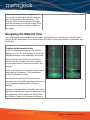
1
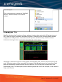
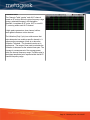
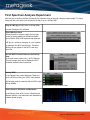
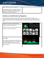
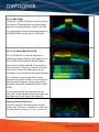
Welcome to the World of Wi-Spy.
This hands-on exercise reviews the fundamentals of spectrum analysis using MetaGeek's Wi-Spy DBx and
Chanalyzer Pro software.
Wi-Spy devices are designed to detect RF activity levels in the public ISM bands. These are the same RF
bands that Wi-Fi and many other wireless consumer electronics use. By measuring the wireless energy
created by all devices within the Wi-Fi bands, Wi-Spy can accurately measure where contention for frequency
space occurs. By “visualizing” RF activity, Wi-Spy users can more quickly isolate, identify and resolve wireless
issues that cause slow network performance and downtime.
Wi-Spy is a USB spectrum analyzer that takes very small steps across a frequency range to measure and
display the amplitude changes of wireless transmitters. Wi-Spy's accompanying software, Chanalyzer, creates
full-featured visuals of data received from one or more Wi-Spys.
This document is designed to help users understand the basic functionality of Chanalyzer Pro software. For
detailed questions, reference the help file after Chanalyzer Pro is installed.
Setting Up Chanalyzer
Download Chanalyzer Pro software:
http://www.metageek.net/products/chanalyzerpro/download
Open directory of downloaded file and doubleclick the installer.
Follow installer prompts.
Chanalyzer Pro requires:
• Wi-Spy 2.4x or Wi-Spy DBx hardware
• Wi-Fi card (for Wi-Fi features)
• Windows XP SP3, Vista or Windows 7
• .Net 3.5 framework
• USB
Page: 1 - Chanalyzer Pro 1.0.12.0407
Run Chanalyzer
Click on the start menu to access the “MetaGeek”
directory. Select Chanalyzer Pro to launch
software.
Chanalyzer Pro
MetaGeek developed the Chanalyzer software package to translate data captured by Wi-Spy hardware and
Wi-Fi cards into easy-to-understand, actionable information. Chanalyzer's user interface enables hardware
configuration of Wi-Spy devices, views and records RF spectrum and Wi-Fi activity, identifies wireless
interference-causing devices, and generates automated and custom reports.
Chanalyzer is divided into three main viewing panes. The Navigation pane, located on the left, represents the
entire Wi-Spy data capture. When users adjust the timespan in the Navigation pane, the Overview and Detail
panes are automatically updated to reflect the user's selection. The Overview pane contains Density and
Waterfall data views. The Details pane provides additional graphs and views of the timespan, like the Networks
Graph and Utilization.
Page: 2 - Chanalyzer Pro 1.0.12.0407
Navigation Pane
The Navigation pane provides controls for browsing Wi-Spy / Wi-Fi capture sessions or recordings. The
following table describes each component of the Navigation pane.
Device Selector
With two Wi-Spy devices, you can alternate between
the 2.4GHz band and 5GHz band without creating
additional files.
Chanalyzer Pro continuously logs data from multiple
sources. To toggle between Wi-Spy spectrumm
analyzers click the Sessions to the right of the
waterfall view.
Session Navigator
Each hardware configuration is saved as a session in
a Wi-Spy Recording.
When Chanalyzer is capturing the session will be
indicated with a red record icon. Any time the user
switches between frequency bands it will put the
previous capture into a new session into the session
manager.
Timespan Controls
The Timespan controls in the Navigation pane adjust
the length of time users see in the Overview and
Details panes.
Timespan adjustments allow users to narrow-in on
anomalies and moments in time when WLAN
performance suffered.
The playback buttons are used to Play, Pause,
Rewind, and Fast Forward through a data capture.
The auto check box anchors the time span so it is no
longer a rolling timespan but showing all data.
Page: 3 - Chanalyzer Pro 1.0.12.0407
Waterfall Navigation
Waterfall Navigation displays all data in the current
Wi-Spy session with visual indicators to show the
section of time detailed in the Overview and Details
displays.
To jump to a specific position within the session,
double-click the point within the waterfall.
User can then click-and-drag the head and tail of the
highlighted region to easily adjust the timespan in the
Waterfall Navigation. This functionality allows users
to quickly drill-down to specific points in time.
Overview Pane
Chanalyzer's Overview pane (top-right of Navigation pane) contains Waterfall and Density views and provides
a detailed overview of the selected Timespan.
Density View
The Density View displays how often a signal is
detected at a specific amplitude. The graph shows
signal amplitude over frequency. The main benefit of
the Density View is that after a short time of gathering
data, patterns begin to emerge. For example, in the
figure above the two curved patterns represent a
modulation type of 802.11 networks. This view
enables you to quickly identify signals that may be
interfering with your network. To see more specific
information about a point on the graph, use the
Inspector tool.
Color by Utilization
This emphasizes how constant noise is. At any given
point Chanalyzer assigns a color based on how much
of the energy is above that point. If 50% of all the
activity is above an amplitude point, Chanalyzer colors
it red. This is especially useful in understanding how
constant interference is in a given range of time.
Page: 4 - Chanalyzer Pro 1.0.12.0407
Color by Density
The more often a signal is detected at a specific
amplitude and frequency, the brighter the point on the
graph becomes. Low density signals are represented
by dark blue, and high density signals are represented
by red.
Color by Amplitude
Chanalyzer creates a density map of the most used
points in the user-selected timespan. The less
trafficked frequency points appear more transparent,
while high-use frequencies appear more bright or
intense.
Chanalyzer uses color to represent amplitude height.
Reds indicate higher amplitude and dark blues are
lower amplitudes levels.
Display Options
The Density View has several view options that can
be toggled on and off. Users can employ
combinations of these options to troubleshoot more
efficiently.
Waterfall View
The Waterfall View graphs amplitude over time for
each frequency in the selected ISM band. The
Waterfall View uses a color scale to represent
amplitude levels – low are dark blue while high
amplitudes are bright red. This emphasizes instances
where wireless devices like cordless phones or
microwaves may have changed the spectrum. For
example, when a microwave is started or a cordless
phone changes channels, it is very noticeable in the
Waterfall View.
Details Pane
The Details pane (bottom-right of Navigation pane) contains a number of tabs with more in-depth information
about Wi-Fi networks and recorded Wi-Spy data. You can quickly alternate between tabs by pressing CTRL +
TAB.
Page: 5 - Chanalyzer Pro 1.0.12.0407
Users can choose which tabs to display and which to
hide by selecting "Tabs" from Chanalyzer's top menu.
News
The News tab keeps users up-to-date by displaying
the latest Wi-Spy and MetaGeek news.
Showcase
The Showcase tab provides access to many example
recordings and is a great place to start for users who
have never before used Chanalyzer or Wi-Spy
devices.
Signatures
The Signatures tab is where users can find all of the
built-in Classifiers that Chanalyzer uses to identify RFtransmitting devices.
Any custom Classifiers users create are also
displayed in this tab. Any Classifiers outside the
currently used spectrum band are displayed with an
"Out of Band" notice.
Users can click any Classifier to select it and hover
the mouse over the Density view in the Overview
pane to overlay the Classifier on captured data to
compare patterns.
Page: 6 - Chanalyzer Pro 1.0.12.0407
Networks Graph
Click the Networks Graph to show signal strength
over time. This data comes from the wireless network
card. It draws the rows selected in the Networks
Table. Drops in signal strength indicate poor signal
coverage and can be referenced against the
Waterfall and Density views to determine if
interference is to blame.
Networks Table
The Networks Table is a list of Wi-Fi access points
that are within range of the computer’s Wi-Fi card.
The names (or SSIDs) of access points (APs) are
displayed, along with signal strength (RSSI), channel,
MAC address and other identifiers. This useful table
provides a snapshot of Wi-Fi networks in the area,
and helps correlate RF activity in spectrum views to
known Wi-Fi networks.
To see a network drawn in the Density View or
Networks Graph, click the check box next to its name.
Device Finder
Device Finder is a signal strength over time graph
similar to the Networks Graph, but shows the signal
strength of a selected frequency range. Specify a
selected frequency range by clicking-and-dragging in
the Density View, then select Device Finder.
Page: 7 - Chanalyzer Pro 1.0.12.0407
Channels Table
The Channels Table “grades” each Wi-Fi channel,
based on RF activity within the given frequency range
during a selected timespan in the Navigation
Waterfall. It considers all RF noise, Wi-Fi or non-WiFi, occurring within each Wi-Fi channel.
A high grade represents a clear channel, while a
lower grade indicates a noisier channel.
The Utilization (Duty Cycle) is a relative score that
helps determine how usable a specific channel is. It
measures the percentage of time at or above the
Utilization Threshold. This threshold can be set in
preferences. The range of time used to calculate the
Utilization is the same as the selected time span. The
Average is a measurement of the average power
within the channel frequency range. The Max value is
the highest amplitude point captured within that Wi-Fi
channel frequency range.
Page: 8 - Chanalyzer Pro 1.0.12.0407
First Spectrum Analysis Experiment
Now that you're familiar with the Chanalyzer Pro interface, let's go through a step-by-step example. To follow
along with this user guide, you will need a Wi-Spy 2.4x or a Wi-Spy DBx.
Plug in a Wi-Spy (Wi-Spy 2.4x or Wi-Spy DBx)
Launch Chanalyzer Pro software
Select Wireless Card
Select the built-in wireless card in the top right
corner to access additional WLAN information
about SSIDs, RSSI, MAC address and data rate.
*Wi-Spy is a spectrum analyzer. It is not capable
of reading at the Wi-Fi packet layer. Therefore
Wi-Spy will not appear in the Wi-Fi card dropdown list.
Use the Wi-Fi Channels label on the Density
View
In the main menu select View > Wi-Fi Channels.
This will change the x-axis to display the Wi-Fi
channels instead of the frequencies.
Sort by RSSI
In the Details Pane, select Networks Table and
sort by RSSI by clicking the “RSSI” table header.
Add a check mark to networks with an RSSI value
above -85dBm.
Sort by columns in the Networks Table
Select Current, Utilization and Networks.
In the Density View click Current, Utilization and
Network buttons. User selections are indicated by
a darker shade of gray.
Page: 9 - Chanalyzer Pro 1.0.12.0407
Use a Two Minute Time Segment
For this exercise we will be using a Timespan of
two minutes. Adjust the Timespan in the
Navigation pane by clicking the green or red
arrows to two minutes.
Wi-Spy capture playback options
The Overview and Details panes will update to
display data from the indicated timespan.
MetaGeek calls this a Unified Time Segment. All
graphs and tables display information for the
exact same time segment.
Chanalyzer uses a rolling Timespan, which
displays all of the data in the selected time
segment. It drops older data to keep information
displayed in the main panels relevant to the user's
location. This functionality improve the user’s
ability to track interfering device patterns.
Create a Baseline
Now that Chanalyzer has been running for a bit,
we will assume the displayed activity is
representative of your normal wireless spectrum.
An important part of spectrum analysis is
establishing a baseline to compare new RF
activity against a history. This helps us
understand RF activity that can negatively impact
wireless communications.
Examine Patterns in the Density View
Toggle off the Current and Networks tabs to see
just the Density View with the utilization
coloration.
Chanalyzer Pro Density View
Run a Microwave Oven
Fill a cup with water and microwave it on high for
two minutes with Chanalyzer running.
Page: 10 - Chanalyzer Pro 1.0.12.0407
Press the pause button in the Chanalyzer
Timespan controls when the microwave oven is
about to stop.
Since the Timespan is set to two minutes, and we
ran the microwave for two minutes, the time
segment selected in the Waterfall View will show
the microwave oven RF activity.
You have paused the Chanalyzer capture in much
the same way a DVR is paused. Chanalyzer
continues to collect data from the Wi-Spy even
while paused. Observe the data in the waterfall
navigation pane. The time span should tightly
snug the same range of time the microwave oven
was on.
Microwave ovens tend to create a mountain-like shape in the Density View. It is
never the same pattern, and can often change depending on the contents.
Build a Report
A powerful feature of Chanalyzer Pro is its report builder. This feature lets users highlight and visually explain
how bad interference was when it occurred. The current selection should match the period of time the
microwave was on. This will help generate a clearer snapshot of what the microwave RF interference looks
like.
Open Report Builder
Click View from the top menu and select Report
Builder (or Ctrl+R).
Start New Report Project
Chanalyzer can start with a previously built report
project (.wsrx file) or build a new one.
Select “Start New Report Project.”
Page: 11 - Chanalyzer Pro 1.0.12.0407
Add a Density View Block to the Report
At the top of the Report Builder interface, select
add graph (the first button) and choose Density.
Each of these menu items will add a graph block
from Chanalyzer to your report .
Update the Density Block
If you are not satisfied with the captured image,
you can easily refresh it. Move the Timespan and
turn off the network overlay at the top. Then click
the refresh button at the top of the block.
Edit the Density Block details
Change the title and description of the report
block by clicking the Pencil Icon.
Describe the type of interference and which
WLANs and channels are affected by the
interference.
Add a Channels Table
Chanalyzer Pro generates a table with
quantifiable results for Wi-Fi channels.
Add the Channels table to your report by clicking
the tables button at the top of the Report Builder
interface.
Change the Title of the Channels Table Block
Page: 12 - Chanalyzer Pro 1.0.12.0407
Edit the report block details to change the title.
Give the block a title to relate it to the microwave
oven like “Microwave Oven Interference.” The
Channels Table is used to compare a Timespan
when the microwave oven was not running. Point
out the channels with an increased Utilization or
lower grade.
Navigating the Waterfall View
Like a seismometer measures vibrations of the earth, the Waterfall View in Chanalyzer Pro does the same
thing for your RF environment. It uses colors to show when the RF environment changed, to what scale, and
for how long.
Compare the Microwave Activity
Be sure the Waterfall navigation pane is visible by
toggling it on (Ctrl + P). Click-and-drag our previously
highlighted timespan up the waterfall by two minutes.
When you do this, be sure there is no microwave
activity in the new Timespan (we want to compare
non-microwave activity to when the microwave was
running).
Notice as you drag to a new timespan that all views in
other panels are updated too. This is MetaGeek's
Unified Time Segment in action.
The mountain in the Density View created by the
microwave oven should fade to possibly reveal a curve
or two created by neighboring 802.11 wireless
networks.
Selecting a Timespan where the WLAN worked well is
important to determine the impacts of interference. We
will compare this new timespan to the Density View
and Channels Tables of our microwave interference.
Page: 13 - Chanalyzer Pro 1.0.12.0407
Add another Density View block and Channels
Table
By adding blocks from two different spans of time,
Chanalyzer Pro can help users explain to customers
and management the negative impacts of interference.
During site surveys, a wireless professional may
decide to add several blocks per location. They will
often turn on all wireless devices in the area to create
a worst-case scenario, which allows them to choose
the most interference-free channel for their WLAN.
To add our new data block, go to the top of Report
Builder and add another Density View block, as well
as another Channels Table block. Your report
builder should now have 4 blocks as shown on the
right.
Rearrange Report Builder Blocks
Click and drag a Density View block and place it below
another Density View for easy contrast.
Report Builder lets users customize the layout of
reports for simple comparisons.
Save the Report for Future Edits
Chanalyzer Pro lets users save a set of blocks for
future editing. Reports are saved in .wsxr files.
You can also add new block sets by opening
Page: 14 - Chanalyzer Pro 1.0.12.0407
another .wsxr file. To do so, click “Append.”
You might add a pre-built, vendor-specific block set
discussing the latest features available and how they
relate to the current spectrum data. You can also
include product images or digital photos.
Interference Identification by Signature
Most modern spectrum analyzer solutions offer some form of device classification, though many are
rudimentary. Chanalyzer Pro's device classification attempts to match RF signatures based on its pre-built
library of known transmitters. Wi-Fi transmission patterns, or modulation type, change with different types of
usage.
Chanalyzer Pro provides some quick reference
recordings in its Showcase tab. Click the Play button
to open the recording in Chanalyzer Pro.
Toggle the transmitter option above the density view
to experiment with device classification.
802.11b PSK
This is the most common shape you are likely to see
when troubleshooting Wi-Fi in the 2.4 GHz band. APs
tend to transmit beacons at the lowest common
denominator of all Wi-Fi devices, or the most basic
modulation, BPSK.
Page: 15 - Chanalyzer Pro 1.0.12.0407
802.11g ERP-OFDM
Identify 802.11g ERP-OFDM by looking for a flat top.
The flat top of OFDM signatures are under 20 MHz
wide.This is the same signature for 802.11a OFDM.
The second image is a more typical representation of
what ERP-OFDM looks like in the 2.4 GHz band.
802.11n 2.4 GHz 40-MHz ERP-OFDM
802.11n OFDM 802.11n APs with data rates of
300mbps use channel bonding, which appear as two
802.11g ERP-OFDM signatures bonded together.
Notice how the 40 MHz wide 802.11n access point
goes beyond Wi-Fi Channel 6? There is not enough
room in the 2.4 GHz public ISM band for two colocated 802.11n access points using channel bonding.
802.11n does not imply that the width of the AP
transmitter will always be 40 MHz. In most cases, 40
MHz transmissions appear in bursts when an APs
throughput exceeds the capabilities of 802.11g ERPOFDM.
You can see the bursts in the waterfall view very
easily. 802.11a/g/n typically shows abrupt edges, due
to the dBm drop on each side of the signatures.
Adjacent Channel Interference
Your Wi-Fi may be on the same channel as other
wireless APs. There are 11 channels in 2.4 GHz, but
only three that don’t overlap (1, 6 and 11 in the U.S.).
Page: 16 - Chanalyzer Pro 1.0.12.0407
Non-Wi-Fi Patterns
Microwave Ovens
Microwave Ovens operate in the 2.4 GHz range. Use
the Density View of Chanalyzer to identify microwave
oven leakage. Typically they create a sloping
mountain shape in the Density View. Since
microwaves are usually used from 1-5 minutes, it
helps to adjust the timespan to about two minutes.
Interference occurs when the microwave oven
transmits on the same frequencies as the Wi-Fi
channel. In this image, you can see how the
mountain-shaped microwave oven covers the
curvature of the Wi-Fi on channel 11.
The amplitude levels of the microwave vary
depending on the distance it is from the spectrum
analyzer. Experiment with a microwave oven and
varying locations.
Another great way to identify microwave oven
interference is using the Waterfall View. The waterfall
view shows how long something caused RF activity.
Page: 17 - Chanalyzer Pro 1.0.12.0407
Motion Sensors
Motion sensors tend to transmit in very narrow
frequency ranges. Sometimes a building will have
motion sensors in each room. If this is the case, verify
that they are not in the 2.4 GHz range by walking
close to each sensor and watching the corresponding
amplitude levels in the Waterfall View.
Audio Video Transmitter
Wireless security cameras generally create three
spikes. They constantly transmit and rarely change
channels. Look for three vertical lines in the Waterfall
View.
Cordless Phones
Not all cordless phones create the same pattern.
Some are very narrow and use the lower 2.4 GHz
band (2400-2420 MHz). Other cordless phones
attempt to scan for the clearest channel, and vary the
frequencies used.
One of the easiest way to identify cordless phone
interference is by examining patterns in the Waterfall
View, where they appear as vertical lines. When a
cordless phone changes channels, it will appear as a
break in the waterfall.
Some cordless phones may hop across the entire
spectrum similar to bluetooth..
Page: 18 - Chanalyzer Pro 1.0.12.0407
Bluetooth
Bluetooth hops across the 2.4 GHz 1,600 times a
second, which is a form of frequency-hopping spread
spectrum (FHSS) modulation.
Due to the nature of frequency-hopping transmitters,
they may cause WLAN degradation, though it is
unlikely that Bluetooth will cause severe Wi-Fi issues.
Customize the Utilization Threshold
Wireless engineers need to know how often noise levels cross a threshold. The Utilization or frequency
utilization is a calculation that determines how much activity on a certain frequency occurs above the threshold.
Utilization answers the question, “In the past five minutes, what percentage of time was noise above -90dBm?”
When planning, engineers must set a threshold that matches the SNR (Signal to Noise Ratio) requirements of
their WLAN.
Adjust the Utilization Threshold to -90dBm
In the Chanalyzer File menu, click File > Preferences.
The bottom of the preferences window contains an
adjustable Utilization threshold. Set this value to -90dBm.
Open 2.4 GHz 802.11g on Channel 6.
Select the Showcase Tab in the Details pane. Click the
right arrow until the “2.4 Ghz 802.11g on Channel 6”
recording appears.
Press the Play button.
Click on the Utilization tab in the bottom pane.
Change the Utilization Threshold to -80dBm
Page: 19 - Chanalyzer Pro 1.0.12.0407
Press Pause
The Utilization graph shows a wide curved shape due
to a lower Utilization threshold of -90dBm.
Build a Signature
Users can create Custom Classifier signatures in Chanalyzer Pro.
To follow this example, please download the 16MB
recording of a wireless audio projector made by
Yamaha.
http://files.metageek.net/recordings/yamaha.wsx
Open the recording and select a five minute Timespan
in the Navigation pane. Turn off the current, average
and max – we will only be using the Density and
Outline views to create a signature.
The outline may appear in varying colors of reds blues
and greens as it is seen in the image to the right.
When the line is red, it indicates that the shape is
more significant in a given Timespan.
Page: 20 - Chanalyzer Pro 1.0.12.0407
Use Playback Controls for Better Signature
Results.
Press Pause when the shape appears to match the
Density View modulation pattern. You may also want
to shorten or lengthen the Timespan to get data to
better fit the shape.
Narrowing-in on instances in the waterfall view offers
the best results for pattern matching. Press Pause
when you have found a good fit.
Highlight the Shape to Create a new Classifier
Signature
Click-and-drag the mouse cursor across the shape of
the transmitting device. After doing so, a contextual
menu appears. Select “Create New Classifier
Signature.”
Assign the Audio Category
Add a title “Yamaha YSP-4100.” After you click OK, a
new signature box appears in the Signatures Tab of
Chanalyzer.
In this new box, you can set the threshold by dragging
the slider left or right to avoid false positives.
Page: 21 - Chanalyzer Pro 1.0.12.0407
If a signature pops up for a few seconds then
disappears and never comes on again, it is quite likely
that this was a false positive.
Tracking Down Transmitters
Chanalyzer Pro’s waterfall view uses colors to map high amplitude points over time. This allows anyone with a
spectrum analyzer to track down devices by watching amplitude changes over time. While walking around, the
colors change to yellows and reds when a user is approaching the transmitting device.
To follow this exercise, please download the demo
recording at
http://files.metageek.net/recordings/waterfall.wsx
In the image to the right we can see that the person
performing this site survey walked right by a
transmitting device. The amplitude levels of a
transmitter increase and decrease. In the waterfall
view, it looks like a bluish vertical line turning red.
Page: 22 - Chanalyzer Pro 1.0.12.0407
Adjust the Timespan to select the range of time in
which the amplitude was the highest (most red). Since
the software continuously logs data from the Wi-Spy,
we can zoom-in to view just the minute when the
transmitter was within close range.
A shorter timespan helps users identify what type of a
device was transmitting. Once the Timespan is
shortened, we see three spikes of activity above Wi-Fi
Channels 8 and 9.
Using the signatures tool, we can match the recorded
pattern to an AV transmitter. Click on the signatures
box and then hover the mouse over the pattern in the
Density View. Click the box again to turn off the
silhouette.
Device Finder
The standard antenna in most spectrum analyzers and Wi-Fi receivers is omnidirectional. Omnidirectional
antennas receive almost indiscriminately on a horizontal plane, whereas a directional antenna is used in a
similar manner to a flashlight – point it to gain visibility in that specific direction.
Page: 23 - Chanalyzer Pro 1.0.12.0407
When performing site surveys, directional antennas minimize the guessing associated with determining where
interferers are transmitting from. Instead of going into each room to see if amplitude increases or decreases,
Wi-Spy users with a Device Finder directional antenna can rotate it to find higher amplitude levels and walk in
the direction until the transmitter is located.
Users can highlight frequency ranges of a
transmitter’s peak signal and track it using a
directional antenna.
This feature only works in live captures, and is very
useful because it gives exact amplitude levels over
time – freeing the user from interpreting color ranges.
Highlight a transmitter by clicking and dragging across
the Density View. Select Device Finder.
A new tab appears with an amplitude over time graph
to track down interfering transmitters.
With Device Finder, users can track down any device,
no matter if the software identifies the interfering
device or not.
This method is perfect for transmitters that emit a
constant signal, like cordless phones or AV
transmitters.
While using the Device Finder graph, continually
monitor the Density View to identify the pattern of the
device.
Learn More
As the 2.4 and 5 GHz public ISM bands are more heavily used by consumer electronics, accurate spectrum
analysis becomes increasingly important. You can learn more about wireless interference identification and
troubleshooting by joining the MetaGeek community at: http://www.metageek.net/forums
Use the forums to share your questions, recordings and technical expertise with your fellow MetaGeeks!
Page: 24 - Chanalyzer Pro 1.0.12.0407