1
SERENA
COLLAGE 5.1.3
®
®
Components User’s Guide
Serena Proprietary and Confidential Information
Copyright © 2001-2007 Serena Software, Inc. All rights reserved.
This document, as well as the software described in it, is furnished under license and may
be used or copied only in accordance with the terms of such license. Except as permitted
by such license, no part of this publication may be reproduced, photocopied, stored in a
retrieval system, or transmitted, in any form or by any means, electronic, mechanical,
recording, or otherwise, without the prior written permission of Serena. Any reproduction
of such software product user documentation, regardless of whether the documentation
is reproduced in whole or in part, must be accompanied by this copyright statement in its
entirety, without modification.
The content of this document is furnished for informational use only, is subject to change
without notice, and should not be construed as a commitment by Serena. Serena
assumes no responsibility or liability for any errors or inaccuracies that may appear in this
document.
Trademarks
Serena, TeamTrack, StarTool, PVCS, Collage, Comparex, and ChangeMan are registered
trademarks of Serena Software, Inc. The Serena logo, Dimensions, Professional, Version
Manager, Builder, Meritage, RTM, Change Governance, Profit From Change, Command
Center, Composer, Reviewer, and Mover are trademarks of Serena Software, Inc.
All other products or company names are used for identification purposes only, and may
be trademarks of their respective owners.
U.S. Government Rights
Any Software product acquired by Licensee under this Agreement for or on behalf of the
U.S. Government, its agencies and instrumentalities is "commercial software" as defined
by the FAR. Use, duplication, and disclosure by the U.S. Government is subject to the
restrictions set forth in the license under which the Software was acquired. The
manufacturer is Serena Software, Inc., 2755 Campus Drive, San Mateo, CA 94403.
Optional Oracle components embedded in Dimensions are also subject to the following
Copyright Notices:
Copyright © 2003-2006 Oracle Corporation. All rights reserved.
NOTICE OF RESTRICTED RIGHTS
Programs delivered subject to the DOD FAR supplement are 'commercial computer
software' and use, duplication, and disclosure of the programs, including documentation,
shall be subject to the licensing restrictions set forth in the applicable Oracle license
agreement. Otherwise, programs delivered subject to the Federal Acquisition Regulations
are 'restricted computer software' and use, duplication, and disclosure of the programs,
including documentation, shall be subject to the restrictions in FAR 52.227-19,
Commercial Computer Software-Restricted Rights (June 1987). Oracle Corporation, 500
Oracle Parkway, Redwood City, CA 94065.
Part number: MA-COLCOMP-006
Publication date: December 2007
Table of Contents
Chapter 1
Welcome to Serena Collage . . . . . . . . . . . . . . . . . . . . .
7
Typographical Conventions . . . . . . . . . . . . . . . . . . . . . . . . . . . . . . . . .
7
Introduction to Collage Components . . . . . . . . . . . . . . .
9
About the Components . . . . . . . . . . . . . . . . . . . . . . .
About Design-Time Components . . . . . . . . . . . . . . . .
What are the Design-Time Components? . . . . . . .
About the Layout Contribution Components . . . . . . . .
Components and Master Pages . . . . . . . . . . . . . . . . .
Learning by Doing: Using the Sample Website Projects
Using the Sample Sites in Your Projects . . . . . . . .
Studying the Source Code . . . . . . . . . . . . . . . . .
Chapter 2
.
.
.
.
.
.
.
.
.
.
.
.
.
.
.
.
.
.
.
.
.
.
.
.
.
.
.
.
.
.
.
.
.
.
.
.
.
.
.
.
.
.
.
.
.
.
.
.
.
.
.
.
.
.
.
.
.
.
.
.
.
.
.
.
.
.
.
.
.
.
.
.
.
.
.
.
.
.
.
.
.
.
.
.
.
.
.
.
.
.
.
.
.
.
.
.
Developing and Deploying
Assets that Use Components . . . . . . . . . . . . . . . . . . . .
Development Requirements . . . . . . . . . . . . . . . . . . .
Technical Requirements . . . . . . . . . . . . . . . . . . .
Knowledge Requirements . . . . . . . . . . . . . . . . . .
Setting Up Component Integration with Dreamweaver .
Setup Requirements . . . . . . . . . . . . . . . . . . . . .
How to Set Up Component Integration. . . . . . . . .
Inserting Components Using Dreamweaver . . . . . . . . .
About the Dreamweaver Object Palette . . . . . . . .
How to Insert a Component Using Dreamweaver .
How to Manually Insert Components . . . . . . . . . . . . .
How to Test Components . . . . . . . . . . . . . . . . . . . . .
About Component Deployment . . . . . . . . . . . . . . . . .
Deploying Design-Time Components . . . . . . . . . . . . .
Deploying Layout Contribution Components . . . . . . . .
Chapter 3
.
.
.
.
.
.
.
.
.
.
.
.
.
.
.
.
.
.
.
.
.
.
.
.
.
.
.
.
.
.
.
.
.
.
.
.
.
.
.
.
.
.
.
.
.
.
.
.
.
.
.
.
.
.
.
.
.
.
.
.
.
.
.
.
.
.
.
.
.
.
.
.
.
.
.
.
.
.
.
.
.
.
.
.
.
.
.
.
.
.
.
.
.
.
.
.
.
.
.
.
.
.
.
.
.
.
.
.
.
.
.
.
.
.
.
.
.
.
.
.
.
.
.
.
.
.
.
.
.
.
.
.
.
.
.
.
.
.
.
.
.
.
.
.
.
.
.
.
.
.
.
.
.
.
.
.
.
.
.
.
.
.
.
.
.
.
.
.
.
.
.
.
.
.
.
.
15
.
.
.
.
.
.
.
.
.
.
.
.
.
.
Design-Time Component Reference . . . . . . . . . . . . . . . .
About Design-Time Components . . . . . . . . . . . . . . . .
To Use a Design-Time Component: . . . . . . . . . . .
Example of Syntax . . . . . . . . . . . . . . . . . . . . . .
What are the Design-Time Components? . . . . . . .
Data Field Macro Reference . . . . . . . . . . . . . . . . . . . .
Why Macros are Useful. . . . . . . . . . . . . . . . . . . .
What Types of Assets Can You Define Macros For?
How the Data Field Macros Work . . . . . . . . . . . . .
Data Field Macro Reference . . . . . . . . . . . . . . . .
Formatting Date Fields . . . . . . . . . . . . . . . . . . . .
.
.
.
.
.
.
.
.
.
.
.
.
.
.
.
.
.
.
.
.
.
.
.
.
.
.
.
.
.
.
.
.
.
.
.
.
.
.
.
.
.
.
.
.
.
.
.
.
.
.
.
.
.
.
.
.
.
.
.
.
.
.
.
.
.
.
.
.
.
.
.
.
.
.
.
.
.
.
.
.
.
.
.
.
.
.
.
.
.
.
.
.
.
.
.
.
.
.
.
.
.
.
.
.
.
.
.
.
.
.
Components User's Guide
.
.
.
.
.
.
.
.
.
.
10
10
10
11
12
12
13
13
16
16
16
16
16
17
17
17
17
18
18
18
19
19
21
.
.
.
.
.
.
.
.
.
.
22
22
22
22
23
23
24
25
25
29
3
Table of Contents
AssetQuery . . . . . . . . . . . . . . . . . . . . . . . . . . . . . . . . . . . . . . . . . . . .
32
How AssetQuery Works . . . . . . . . . . . . . . . . . . . . . . . . . . . . . . . .
32
About Previewing AssetQuery Components. . . . . . . . . . . . . . . . . . .
32
About Nesting Multiple AssetQuery Components . . . . . . . . . . . . . . .
32
How to Insert an AssetQuery Component . . . . . . . . . . . . . . . . . . . .
33
AssetQuery Properties . . . . . . . . . . . . . . . . . . . . . . . . . . . . . . . . .
34
About the AssetQuery body . . . . . . . . . . . . . . . . . . . . . . . . . . . . .
45
AssetQuery Examples . . . . . . . . . . . . . . . . . . . . . . . . . . . . . . . . .
50
Banner . . . . . . . . . . . . . . . . . . . . . . . . . . . . . . . . . . . . . . . . . . . . . . .
54
How to Insert a Banner Component . . . . . . . . . . . . . . . . . . . . . . . .
55
Banner Properties . . . . . . . . . . . . . . . . . . . . . . . . . . . . . . . . . . . .
57
Conditional . . . . . . . . . . . . . . . . . . . . . . . . . . . . . . . . . . . . . . . . . . . .
57
Writing a Conditional Component . . . . . . . . . . . . . . . . . . . . . . . . .
57
Conditional Properties . . . . . . . . . . . . . . . . . . . . . . . . . . . . . . . . .
59
Conditional Example 1 . . . . . . . . . . . . . . . . . . . . . . . . . . . . . . . . .
59
Conditional Example 2 . . . . . . . . . . . . . . . . . . . . . . . . . . . . . . . . .
59
Database Query. . . . . . . . . . . . . . . . . . . . . . . . . . . . . . . . . . . . . . . . .
60
How the Database Query Component Works. . . . . . . . . . . . . . . . . .
60
How to Define Data Sources in Collage . . . . . . . . . . . . . . . . . . . . .
60
How to Create and Store Structured Queries in Collage . . . . . . . . . .
64
Writing the Database Query Component . . . . . . . . . . . . . . . . . . . .
65
Database Query Properties . . . . . . . . . . . . . . . . . . . . . . . . . . . . . .
66
Generating and Linking to Details Pages . . . . . . . . . . . . . . . . . . . .
70
Complete Database Query Example . . . . . . . . . . . . . . . . . . . . . . . .
73
ForceReference . . . . . . . . . . . . . . . . . . . . . . . . . . . . . . . . . . . . . . . . .
73
How to Insert a ForceReference Component . . . . . . . . . . . . . . . . . .
74
ForceReference Properties . . . . . . . . . . . . . . . . . . . . . . . . . . . . . .
74
ForceReference Example . . . . . . . . . . . . . . . . . . . . . . . . . . . . . . .
75
Include Asset . . . . . . . . . . . . . . . . . . . . . . . . . . . . . . . . . . . . . . . . . .
75
How the Include Asset Component Works . . . . . . . . . . . . . . . . . . .
76
How to Insert an Include Asset Component . . . . . . . . . . . . . . . . . .
76
Displaying Text on Images . . . . . . . . . . . . . . . . . . . . . . . . . . . . . .
78
Include Asset Properties. . . . . . . . . . . . . . . . . . . . . . . . . . . . . . . .
78
Example 1: Including an Entire Asset. . . . . . . . . . . . . . . . . . . . . . .
79
Example 2: Linking to an Included Asset . . . . . . . . . . . . . . . . . . . .
79
Example 3: Nesting the Include Asset Component in a Select Component80
Masterpage Body . . . . . . . . . . . . . . . . . . . . . . . . . . . . . . . . . . . . . . . .
80
How to Insert a Masterpage Body Component. . . . . . . . . . . . . . . . .
80
Masterpage Body Properties . . . . . . . . . . . . . . . . . . . . . . . . . . . . .
81
MetaTag . . . . . . . . . . . . . . . . . . . . . . . . . . . . . . . . . . . . . . . . . . . . . .
81
How to Insert a MetaTag Component . . . . . . . . . . . . . . . . . . . . . . .
81
MetaTag Properties . . . . . . . . . . . . . . . . . . . . . . . . . . . . . . . . . . .
82
MetaTag Example 1 . . . . . . . . . . . . . . . . . . . . . . . . . . . . . . . . . . .
83
MetaTag Example 2 . . . . . . . . . . . . . . . . . . . . . . . . . . . . . . . . . . .
83
Navigation Bar. . . . . . . . . . . . . . . . . . . . . . . . . . . . . . . . . . . . . . . . . .
84
About the Navigation Link Options. . . . . . . . . . . . . . . . . . . . . . . . .
84
Choosing Between the NavMap and Navigation Bar Components. . . .
85
How the Navigation Bar Works . . . . . . . . . . . . . . . . . . . . . . . . . . .
85
4
Serena® Collage® 5.1.3
Table of Contents
About Image Buttons. . . . . . . . . . . . . . . . . . . . . . . . . . . . . . .
How to Insert a Navbar Component. . . . . . . . . . . . . . . . . . . . .
Node Options for Links . . . . . . . . . . . . . . . . . . . . . . . . . . . . . .
Using Data Field Macros in Button Definitions . . . . . . . . . . . . . .
Navigation Bar Properties . . . . . . . . . . . . . . . . . . . . . . . . . . . .
Navigation Bar Examples . . . . . . . . . . . . . . . . . . . . . . . . . . . .
NavMap . . . . . . . . . . . . . . . . . . . . . . . . . . . . . . . . . . . . . . . . . . .
How the NavMap Component Works . . . . . . . . . . . . . . . . . . . .
Ways to Use the NavMap Component . . . . . . . . . . . . . . . . . . .
Choosing Between the NavMap and Navigation Bar Components.
Writing the NavMap Component . . . . . . . . . . . . . . . . . . . . . . .
NavMap Properties . . . . . . . . . . . . . . . . . . . . . . . . . . . . . . . .
NavMap Example: Passing Node Values
into JavaScripts. . . . . . . . . . . . . . . . . . . . . . . . . . . . . . . . . . .
Query Navigator . . . . . . . . . . . . . . . . . . . . . . . . . . . . . . . . . . . . .
How the Query Navigator Component Works . . . . . . . . . . . . . .
About the Query Navigator Buttons . . . . . . . . . . . . . . . . . . . . .
How to Insert a Query Navigator Component . . . . . . . . . . . . . .
Query Navigator Component Example . . . . . . . . . . . . . . . . . . .
Select. . . . . . . . . . . . . . . . . . . . . . . . . . . . . . . . . . . . . . . . . . . . .
How the Select Component Works. . . . . . . . . . . . . . . . . . . . . .
The Select Component Structure . . . . . . . . . . . . . . . . . . . . . . .
How to Insert a Select Component . . . . . . . . . . . . . . . . . . . . .
Select Properties . . . . . . . . . . . . . . . . . . . . . . . . . . . . . . . . . .
Select Example 1: Deploying Content in
Multiple Languages . . . . . . . . . . . . . . . . . . . . . . . . . . . . . . . .
Select Example 2: Displaying Unique
Content at Preview Time . . . . . . . . . . . . . . . . . . . . . . . . . . . .
WARFiler. . . . . . . . . . . . . . . . . . . . . . . . . . . . . . . . . . . . . . . . . . .
Before You Start . . . . . . . . . . . . . . . . . . . . . . . . . . . . . . . . . .
How to Set Up the WARFiler Component . . . . . . . . . . . . . . . . .
Chapter 4
.
.
.
.
.
.
.
.
.
.
.
.
.
.
.
.
.
.
.
.
.
.
.
.
.
.
.
.
.
.
.
.
.
.
.
.
86
86
89
90
91
93
95
95
96
96
97
97
.
.
.
.
.
.
.
.
.
.
.
.
.
.
.
.
.
.
.
.
.
.
.
.
.
.
.
.
.
.
.
.
.
100
101
102
102
103
106
107
107
108
110
111
...
112
.
.
.
.
113
114
114
114
.
.
.
.
.
.
.
.
Layout Contribution Component Reference . . . . . . . . . . .
About Layout Contribution Components . . . . . . . . . . . . .
How Collage Uses Layout Files . . . . . . . . . . . . . . . .
Use Standard HTML Files . . . . . . . . . . . . . . . . . . . .
Using Layout Pages with Master Pages. . . . . . . . . . .
About Deploying Layout Contribution Components . .
What are the Layout Contribution Components? . . . .
Layout Contribution Field . . . . . . . . . . . . . . . . . . . . . . .
How the Layout Contribution Field Component Works
How to Insert a Layout Contribution Field Component
Layout Contribution Field Example . . . . . . . . . . . . .
Layout Contribution Metadata . . . . . . . . . . . . . . . . . . . .
How the Layout Contribution Metadata
Component Works . . . . . . . . . . . . . . . . . . . . . . . . .
How to Insert a Layout Contribution
Metadata Component. . . . . . . . . . . . . . . . . . . . . . .
Layout Contribution Property. . . . . . . . . . . . . . . . . . . . .
.
.
.
.
.
.
.
.
.
.
.
.
.
.
.
.
.
.
.
.
.
.
.
.
.
.
.
.
.
.
.
.
.
.
.
.
.
.
.
.
.
.
.
.
.
.
.
.
.
.
.
.
.
.
.
.
.
.
.
.
.
.
.
.
.
.
.
.
.
.
.
.
.
.
.
.
.
.
.
.
.
.
.
.
.
.
.
.
.
.
.
.
.
.
.
.
.
.
.
.
.
.
.
.
.
.
.
.
.
.
122
122
122
122
123
124
124
124
125
127
127
...........
128
...........
...........
128
130
Components User's Guide
.
.
.
.
.
.
.
.
.
.
.
121
5
Table of Contents
How the Layout Contribution Property
Component Works . . . . . . . . . . . . . . . . . . . . . . . . . . . . . . . . . . . .
Property Values. . . . . . . . . . . . . . . . . . . . . . . . . . . . . . . . . . . . . .
How to Insert a Layout Contribution
Property Component . . . . . . . . . . . . . . . . . . . . . . . . . . . . . . . . . .
Chapter 5
6
130
130
131
Advanced Examples . . . . . . . . . . . . . . . . . . . . . . . . . .
135
About the Examples . . . . . . . . . . . . . . . . . . . . . . . . . . . . . . . . . . . . . .
Creating Printer-Friendly Contribution Documents . . . . . . . . . . . . . . . . .
Creating Printer-Friendly HTML Documents . . . . . . . . . . . . . . . . . . . . . .
136
136
137
Index. . . . . . . . . . . . . . . . . . . . . . . . . . . . . . . . . . . .
139
Serena® Collage® 5.1.3
Welcome to Serena Collage
Thank you for choosing Serena Collage, a complete web content management package.
Purpose of this
manual
This manual provides an introduction to the Collage components, explains how to use and
deploy them in your own websites, and provides complete reference information on each
of the components.
For more
information
Refer to the Introduction to Serena Collage for a description of the Collage documentation
set, a summary of the ways to work with Collage, and instructions for accessing the
Online Help.
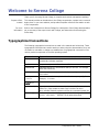
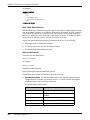
Typographical Conventions
The following typographical conventions are used in the manuals and online help. These
typographical conventions are used to assist you when using the documentation; they are
not meant to contradict or change any standard use of typographical conventions in the
various product components or the host operating system.
Convention
Explanation
italics
Introduces new terms that you may not be familiar with and
occasionally indicates emphasis.
bold
Emphasizes important information and field names.
UPPERCASE
Indicates keys or key combinations that you can use. For example,
press the ENTER key.
monospace
Indicates syntax examples, values that you specify, or results that
you receive.
monospaced
italics
Indicates names that are placeholders for values you specify; for
example, filename.
monospace
bold
Indicates the results of an executed command.
vertical rule |
Separates menus and their associated commands. For example,
select File | Copy means to select Copy from the File menu.
Also, indicates mutually exclusive choices in a command syntax line.
brackets []
Indicates optional items. For example, in the following statement:
SELECT [DISTINCT], DISTINCT is an optional keyword.
Components User's Guide
7
8
Serena® Collage® 5.1.3
Chapter 1
Introduction to Collage Components
About the Components
10
About Design-Time Components
10
About the Layout Contribution Components
11
Components and Master Pages
12
Learning by Doing: Using the Sample Website Projects
12
Components User's Guide
9
Chapter 1 Introduction to Collage Components
About the Components
The Serena Collage components are a set of pre-built extensions that you can easily plug
into your web-pages. With the push of a button in Macromedia Dreamweaver, or by
adding simple HTML tags to a page, you can automate the generation of navigation bars,
the personalization of web pages based on user preferences, and the retrieval of content
from the Collage database or other databases, either at deploy-time or run-time.
Collage components help you create the following different kinds of features:
Using design-time components, you can add advanced navigation, asset searching,
and placeholders for content in master pages.
Using layout contribution components, you can set up layout files for contribution
documents. Layout files are any HTML file or server page that defines look and feel for
contribution documents in Collage.
About Design-Time Components
Design-time components allow you to quickly build powerful website functionality that will
remain static after it is deployed. For example, you can use design time components to
build static navigation features, or merge multiple assets together. Design-time
components manage the ways that assets are presented to users.
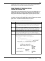
What are the Design-Time Components?
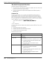
The following table describes the design-time components that are included with Collage.
Component
Description
For details, see...
AssetQuery
Queries for assets that fulfill certain criteria. Then, for each asset
found, you can generate some HTML that is specific to that asset.
The main tag describes what query to use. The body of the tag is
the HTML that will be repeated/generated for each found asset
"AssetQuery" on
page 32
Banner
Automatically inserts either standard text or a standard image
onto a master page, which you can then flatten text onto.
"Banner" on page 54
Conditional
Generates javascript that causes the browser to redirect the user
to a different page based on various possible conditions. This
might be used as a top-level page for a site, for example, that
redirects a browser to the appropriate start page for the user's
language.
"Conditional" on
page 57
Database Query
Displays data from records which Collage retrieves from an
external SQL database.
"Database Query" on
page 60
ForceReference
Creates a deployment dependency between an HTML page and a
file, ensuring that changes to the file result in the deployment of
the HTML page.
"ForceReference" on
page 73
Include Asset
Finds another asset in the project and inserts its content, or
generates information about or links to the asset
"Include Asset" on
page 75
10
Serena® Collage® 5.1.3
About the Layout Contribution Components
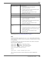
Component
Description
For details, see...
Masterpage
Body
Defines the location on a master page where you want Collage to
merge content. Wherever you insert the Masterpage Body
component, Collage will merge the content from assets that use
the master page when you preview or publish those assets
"Masterpage Body"
on page 80
MetaTag
Places a piece of metadata in the page.
"MetaTag" on page
81
Navigation Bar
Generates links to other pages in the site, relative to the current
page. A button can be an image which includes the name of the
page linked to, or it can be plain text naming the page linked to.
"Navigation Bar" on
page 84
NavMap
Retrieves information about each node in a site structure, which
you can then use to generate navigation menus to those nodes.
You can define any HTML or JavaScript in the NavMap component,
which will then be generated for every node in the structure when
you preview or deploy the asset that contains the component.
"NavMap" on page
95
Query Navigator
Automatically creates a navigation bar which allows site visitors
to navigate the results from an AssetQuery component. For each
page that is included in the AssetQuery result, the Query
Navigator component can generate links to the next page,
previous page, and the first and last pages in the query results.
"Query Navigator" on
page 101
Select
Display different content based on specific conditions such as
metadata values, or asset property values (such as filename and
asset name)
"Select" on page 107
WARFiler
Automates the creation of Web ARchive (WAR) files for
deployment.
"WARFiler" on page
114
About the Layout Contribution Components
Layout contribution components work together with the content contribution feature in
Collage. They enable you to set up layout files for contribution documents. Layout files are
any HTML file or server page that defines look and feel for contribution documents in
Collage. This includes:
Where on a page the contribution fields are placed
How text or other properties in the contribution field are formatted
Template elements, such as navigation bars or banners
Whether any metadata field or property values should be added to the deployed
version of contribution documents
For detailed information on setting up content contribution, see the Serena Collage
Project Manager's Guide.
Components User's Guide
11
Chapter 1 Introduction to Collage Components
The Layout Contribution components include:
Component
Description
For details, see...
Layout Contribution Field
Determines where on the page contribution
fields will be laid out
"Layout Contribution Field" on
page 124
Layout Contribution
Metadata
Displays the value of a specified metadata
field, making it editable from the contribution
documents editing view in Collage
"Layout Contribution
Metadata" on page 127
Layout Contribution
Property
Inserts the value of specific asset properties
into contribution documents
"Layout Contribution
Property" on page 130
Components and Master Pages
You can use any component on a master page in order to quickly apply standard elements
to multiple pages in a site. For more information on master pages, see the Introduction to
Serena Collage.
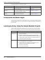
Learning by Doing: Using the Sample Website Projects
Collage includes several sample websites which you can import into your own projects.
When you create a project, you can choose from the following sample website projects:
This site...
Serena Realty
sample site
Includes...
Sample site
Serena® Collage® 5.1.3
Example contribution folder types and contribution folder
structure, including auto-generated sub-folders and documents
Example usage of master pages with contribution layout files
Example task states and templates
12
Example contribution document types, including layout files and
document definitions
An example of a departmental website, with different sections
for each department in an organization
Example usage of the AssetQuery Java Component, which
allows you to query and display lists of assets
Examples of master pages
A very simple site structure
Learning by Doing: Using the Sample Website Projects
This site...
Sample
Intranet site
Includes...
An example of a company intranet, with sections of different
internal services and projects
Example usage of the NavBar component, which automatically
generates navigation links based on site structure or deploy
folder structure
Examples of master pages
A site structure
Using the Sample Sites in Your Projects
If you have permission to create a project, you can add any of the sample sites to a new
project as part of the creation process. When you choose to create a project, you are
presented with an Options list that includes the sample sites.
To add sample sites to the project, simply press the CTRL key and click on the projects
you want to add.
Studying the Source Code
In addition to exploring the sites in Collage, and learning about the ways that Collage
supports functional websites that are ready for deployment to a web-server, you can also
study the source code for HTML and server pages to learn about some of the ways that
you can use the Collage components.
To study the source code for pages that contain components, you must check out or get
copies of those pages, then open your local copies. Collage does include a View Source
feature, but this displays the code that is actually generated by the components, not the
source component code itself.
Components User's Guide
13
Chapter 1 Introduction to Collage Components
14
Serena® Collage® 5.1.3
Chapter 2
Developing and Deploying
Assets that Use Components
Development Requirements
16
Setting Up Component Integration with Dreamweaver
16
Inserting Components Using Dreamweaver
17
How to Manually Insert Components
18
How to Test Components
18
About Component Deployment
18
Deploying Design-Time Components
19
Deploying Layout Contribution Components
19
Components User's Guide
15
Chapter 2 Developing and Deploying Assets that Use Components
Development Requirements
This chapter describes the technical and knowledge requirements for using components in
your web assets. It also explains how to set up integration with Macromedia
Dreamweaver, which allows you to insert and edit components graphically.
Technical Requirements
The following are required to develop assets which use the Serena Collage components:
An authoring environment which allows you to edit and save HTML files. Collage
integrates with Macromedia Dreamweaver, making the insertion and modification of
components as easy as the push of a button. You can use Dreamweaver or any editing
tool of your choice.
A running installation of Collage. You will use Collage to check out, check in, and test
assets that contain components.
If you will develop layout contribution components, you must set up the content
contribution feature in Collage. See the Serena Collage Project Manager's Guide for
more information.
Knowledge Requirements
The following are recommended to develop assets that use components:
An understanding of Collage concepts and usage. See the Introduction to Serena
Collage for more information.
Experience with HTML coding.
Setting Up Component Integration with Dreamweaver
Set up component integration to make adding components to pages and modifying their
properties as simple as clicking a button in Macromedia Dreamweaver 4.0. Once you have
set up the component integration to Dreamweaver, see the next section for information on
adding and modifying components in Dreamweaver.
Most of the components can be automatically inserted in Dreamweaver. If the component
you want to use is not available within Dreamweaver, use the syntax examples in the
online help topics to create your own component tags.
Setup Requirements
16
A running installation of Collage
Macromedia Dreamweaver 4.0 or later
You must have write access to the Dreamweaver install directory
Serena® Collage® 5.1.3
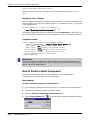
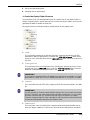
Inserting Components Using Dreamweaver
How to Set Up Component Integration
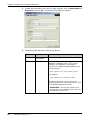
To set up component integration:
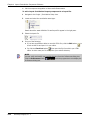
1
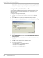
In your internet browser, open the following location to display the Collage login page:
http://Collage server name/servlet
2
Click the Show Options link.
3
Click the Install Authoring Components link.
4
Follow the instructions to copy the component extensions to your Dreamweaver
installation.
5
Once copying is complete, you may need to run the Dreamweaver Extensions
Manager to complete installation. If so, simply install the component extensions that
you copied.
Inserting Components Using Dreamweaver
Once you have set up the component integration, use Macromedia Dreamweaver to insert
a component on a web page.
About the Dreamweaver Object Palette
You can insert components from the Dreamweaver Object Palette, or from the Insert |
Serena Collage menu.
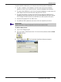
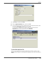
How to Insert a Component Using Dreamweaver
To insert a component using Dreamweaver:
1
Set up the component integration to Dreamweaver.
2
Open Dreamweaver.
3
Click F8 to view site files.
4
Right-click the Website folder.
5
Right-click the file to which you are adding the component and select Open.
Dreamweaver displays the document.
IMPORTANT!
If you are adding components to JSP files, do not include spaces in the JSP filenames.
This may cause errors when you preview the JSPs from Collage.
Components User's Guide
17
Chapter 2 Developing and Deploying Assets that Use Components
6
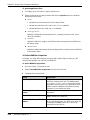
Select the Window pull-down list and click Objects and Properties if they aren't
selected.
7
In the Objects Palette, select the Serena Collage Design Components panel.
8
Click the button corresponding to the component you want to insert. See the section
on the particular component you want to use for specific rules and guidelines.
How to Manually Insert Components
Macromedia Dreamweaver is not a requirement to use components. You can insert a
component in the HTML editor of your choice simply by reproducing the component code,
as it is described in this manual. See the sections on the specific components you want to
use for specific information on and examples of how to use those components.
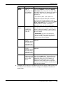
How to Test Components
Once you have finished creating components on your web pages, you should test them to
make sure they run correctly. Review the table below for testing guidelines.
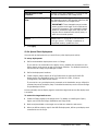
Component Type
Design-time
Contribution layout
Testing Procedure
1
Check the HTML, JSP, ASP, or PHP asset that contains the
design time component into Collage.
2
Preview the asset to verify that the component displays
correctly.
Preview either the layout file itself, or a contribution document
that uses the layout file to determine if the component displays
correctly.
About Component Deployment
To successfully deploy assets that contain components, you must follow the guidelines
described in this chapter. This includes the following information:
18
Guidelines for deploying assets that contain design-time components. See the next
section, "Deploying Design-Time Components" on page 19.
Guidelines for deploying assets that contain contribution layout components. See
"Deploying Layout Contribution Components" on page 19.
Serena® Collage® 5.1.3
Deploying Design-Time Components
Deploying Design-Time Components
No extra steps are required to set up deployment of design-time components, such as the
AssetQuery and Select components. The Collage server completes all design-time
component processing when you deploy assets that contain the components. The
deployment web servers host the generated results of the design-time components.
Because design-time components require no server-side processing, no server-side setup
is necessary.
Deploy assets that contain design-time components just as you would deploy any other
asset.
For more information on the design-time components, see Chapter 3, "Design-Time
Component Reference" on page 21.
Deploying Layout Contribution Components
The layout contribution components can only be used on layout files for the content
contribution feature. For this reason, these components will not function correctly when
used and deployed on pages that are not used as layout files.
For more information on:
Contribution layout components, see Chapter 4, "Layout Contribution Component
Reference" on page 121
Setting up and using the content contribution feature, see the Serena Collage Project
Manager's Guide
Components User's Guide
19
Chapter 2 Developing and Deploying Assets that Use Components
20
Serena® Collage® 5.1.3
Chapter 3
Design-Time Component Reference
About Design-Time Components
22
Data Field Macro Reference
23
AssetQuery
32
Banner
54
Conditional
57
Database Query
60
ForceReference
73
Include Asset
75
Masterpage Body
80
MetaTag
81
Navigation Bar
84
NavMap
95
Query Navigator
101
Select
107
WARFiler
114
Components User's Guide
21
Chapter 3 Design-Time Component Reference
About Design-Time Components
Design-time components are used to build information that depends upon other data in
the project; they manage the ways that assets are presented to users. For example, you
can use design-time components to create navigation bars or master pages, or merge
content from multiple assets together.
To Use a Design-Time Component:
Insert the component in Macromedia Dreamweaver, using the component integration
to Dreamweaver,
or
Manually enter the component tag directly into the HTML code (see tag syntax below).
This chapter contains complete syntax examples for each component which you can
use to create your own component tags.
Example of Syntax
Refer to the example below to help you write design-time components. All design-time
components require opening and closing tags, with specific properties, and many include
a body section with additional parameters. See the following sections for more
information.
Opening tag
Body
Closing tag
<nexus:component dwcomptype="Conditional" classid="nexus/
components/Conditional" code="$nexusComponents"
condition="OS">
<PARAM name="windows" value="windows.html">
<PARAM name="mac" value="mac.html">
<PARAM name="unix" value="unix.html">
<PARAM name="default" value="default.html">
</nexus:component>
What are the Design-Time Components?
The following table describes the design-time components that are included with Serena
Collage.
Component
Description
For details, see...
AssetQuery
Queries for assets that fulfill certain criteria. Then, for each asset
found, you can generate some HTML that is specific to that asset.
The main tag describes what query to use. The body of the tag is
the HTML that will be repeated/generated for each found asset.
"AssetQuery" on
page 32
Banner
Automatically inserts either standard text or a standard image onto
a master page, which you can then flatten text onto.
"Banner" on page 54
Conditional
Generates javascript that causes the browser to redirect the user to
a different page based on various possible conditions. This might
be used as a top-level page for a site, for example, that redirects a
browser to the appropriate start page for the user's language.
"Conditional" on
page 57
22
Serena® Collage® 5.1.3
Data Field Macro Reference
Component
Description
For details, see...
Database
Query
Retrieves and displays records from an external SQL database.
"Database Query" on
page 60
Force Reference
Creates a deployment dependency between an HTML, ASP, JSP, or
PHP page and another file, ensuring that changes to the file result
in the deployment of the HTML, ASP, JSP, or PHP page.
"ForceReference" on
page 73
Include Asset
Finds another asset in the project and inserts its content, or
generates information about or links to the asset.
"Include Asset" on
page 75
Masterpage
Body
Defines the location on a master page where you want Collage to
merge content. Wherever you insert the Masterpage Body
component, Collage will merge the content from assets that use
the master page when you preview or publish those assets.
"Masterpage Body"
on page 80
Metadata
Places a piece of metadata in the page.
"MetaTag" on page
81
Navigation Bar
Generates links to other pages in the site, relative to the current
page. A button can be an image which includes the name of the
page linked to, or it can be plain text naming the page linked to.
"Navigation Bar" on
page 84
NavMap
Retrieves information about each node in a site structure, which
you can then use to generate navigation menus to those nodes.
You can define any HTML or JavaScript in the NavMap component,
which will then be generated for every node in the structure when
you preview or deploy the asset that contains the component.
"NavMap" on page
95
Query
Navigator
Automatically creates a navigation bar which allows site visitors to
navigate the results from an AssetQuery component. For each page
that is included in the AssetQuery result, the Query Navigator
component can generate links to the next page, previous page, and
the first and last pages in the query results.
"Query Navigator"
on page 101
Select
Display different content based on specific conditions such as
metadata values, or asset property values (such as filename and
asset name).
"Select" on page 107
WARFiler
Automates the creation of Web ARchive (WAR) files for
deployment.
"WARFiler" on page
114
Data Field Macro Reference
Data field macros are placeholders that you can define for specific information about
Collage assets. When you deploy a page that contains a component with data field
macros, Collage replaces the macros with the correct asset information.
For example, you can use macros to automatically insert an asset's filename, creation
date, or MIME type. You can also use data field macros to automatically generate and
insert URLs.
Why Macros are Useful
Data field macros allow you to define generic placeholders in components which you can
reuse on multiple pages. For each page that includes a component that uses macros,
Collage will automatically generate and insert the correct information.
Components User's Guide
23
Chapter 3 Design-Time Component Reference
For example, with the Navigation Bar component, you could use macros in the following
way:
1
Add the Navigation Bar component to a master page
2
Define the Navigation Bar component so that it automatically generates links to all
assets in the current deploy folder
3
Use a macro to define the text for each navigation button as the name of the asset
that it links to
4
Apply the master page to multiple pages, in different deploy folders
When you deploy the pages, Collage will correctly label each button in each instance of
the Navigation Bar. In this way, you can automatically generate potentially thousands of
button names without having to manually enter any of the text.
For more information on the Navigation Bar component, see "Navigation Bar" on page 84.
What Types of Assets Can You Define Macros For?
You can use data field macros to insert information about any of the following types of
assets:
Any file asset, such as HTML or JSP files. To insert information about a file asset,
begin each macro with $node, for example:
$node.filename
Inserts the name of the asset file.
Deploy folders, including contribution folders. Folder macros return information
about the folder to which the current asset belongs. For example, you can use a folder
macro to return the name of the folder to which the asset that contains the
component belongs.
To insert information about a deploy folder, begin a macro with $parent, for example:
$parent.assettype
Inserts the asset type of the folder, such as Deploy Folder.
Deploy maps. Deploy map macros return information about the deploy map which
was used to deploy an asset. For example, if you use a deploy map called Staging
Publish to deploy assets, you can use deploy map data macros to display information
about the Staging Publish deploy map.
To insert information about a deploy map, begin a macro with $publishmap, for
example:
$publishmap.creator
Inserts the ID of the user who created the deploy map.
Contribution documents. In addition to standard file and asset information, you can
also insert the content from specific contribution fields from contribution document.
To insert the content from a contribution field, define a macro as follows:
$node.contribution("field_name")
Where field_name is the name of the contribution field.
24
Serena® Collage® 5.1.3
Data Field Macro Reference
How the Data Field Macros Work
Each data field macro identifies the specific type of information to display about the asset,
such as metadata, filename, or contribution field content.
The syntax for each data field is:
$type.Fieldname
Where type is the type of asset, and Fieldname is the data field. For example:
$node.FileName
Inserts the filename of any file asset.
Some fields support optional parameters, as well.
Data Field Macro Reference
There are several categories of data field macro:
Asset property field macros
URL macros
Metadata macros
Contribution field macros
Asset Property Fields
The asset property fields are the standard properties which Collage stores for all assets.
For example, $node.FileName retrieves and displays the actual name of the file, such as
home.html.
You can use the standard data field macros to insert information about file assets, deploy
folders, or deploy maps. See "What Types of Assets Can You Define Macros For?" on page
24 for more information.
The standard data fields also include an optional parameter for formatting date fields. For
example, $node.CreateDate("yyy.MMMM.dd GGG hh:mm aaa") would generate a date
value in the following format: 2001.May.10 AD 12:08 PM
Components User's Guide
25
Chapter 3 Design-Time Component Reference
The standard data fields are:
Field
Description
approvedby
If the asset has been approved, displays the name of the user who approved it. For
example:
$node.approvedby
approveddate
If the asset has been approved, displays the date when the asset was approved.For
example, to display the approval date for a file asset:
$node.approveddate
You can include an additional parameter to format the date. For example:
$node.approveddate("yyy.MMMM.dd GGG hh:mm aaa")
Will generate a date in the following format:
2001.May.10 AD 12:08 PM
See "Formatting Date Fields" on page 29 for more information.
approvedversion
If the asset is approved, displays the number of the version that is approved. For
example:
$node.approvedversion
assetid
Displays the asset's ID number. The syntax is:
$node.assetid
assettype
Displays the asset's assettype, such as Microsoft Word Document, or Contribution
Asset. For example:
$node.assettype
checkoutname
If the asset is checked out, displays the ID of the user who checked out the asset.
For example:
$node.checkoutname
checkouttime
If the asset is checked out, displays the time when the asset was checked out. For
example:
$node.checkouttime
You can include an additional parameter to format the date. For example:
$node.checkouttime("yyyy.MMMM.dd GGG hh:mm aaa")
Will generate a date in the following format:
2003.May.10 AD 12:08 PM
See "Formatting Date Fields" on page 29 for more information.
26
Serena® Collage® 5.1.3
Data Field Macro Reference
Field
Description
CreateDate
Displays the date that the asset was created. For example:
$node.CreateDate
You can include an additional parameter to format the date. For example:
$node.CreateDate("yyyy.MMMM.dd GGG hh:mm aaa")
Will generate a date in the following format:
2001.May.10 AD 12:08 PM
See "Formatting Date Fields" on page 29 for more information.
creator
Displays the ID of the user who created the asset, its deploy folder, or its deploy
map. For example, to display the ID of the user who created the asset's deploy map:
$publishmap.creator
Description
Displays the asset's description. For example:
$node.Description
expiredate
Displays the expiration date for the asset. For example:
$node.expiredate
You can include an additional parameter to format the date. For example:
$node.expiredate("yyyy.MMMM.dd GGG")
Will generate a date in the following format:
2004.May.10 AD
See "Formatting Date Fields" on page 29 for more information.
filedate
Displays the latest modification date of a file asset, distinct from the latest checkin
date. For example:
$node.filedate
FileName
Displays the actual name of the file. The syntax is:
$node.FileName
imgheight
If a thumbnail version of an image has been generated in Collage, displays the
height of the thumbnail. For example:
$node.imgheight
imgwidth
If a thumbnail version of an image has been generated in Collage, displays the width
of the thumbnail. For example:
$node.imgwidth
latestversion
Displays the number of the latest version of the asset. For example:
$node.latestversion
Components User's Guide
27
Chapter 3 Design-Time Component Reference
Field
Description
masterpageassetid
If a master page is assigned to the asset, displays the asset ID number for the
master page. For example, to display the master page ID for a file asset:
$node.masterpageassetid
MimeType
Displays the asset's MIME-type. For example:
$node.MimeType
Displays the asset name. The syntax is:
name
$node.name
Displays the deploy folder path to the asset. For example:
path
$node.path
recordnumber
If the asset is returned by a query, displays the record (or row) number of the asset,
in the query result. For example:
$node.recordnumber
Displays the asset's filesize. For example:
Size
$node.Size
startdate
Displays the start date for the asset. For example:
$node.startdate
You can include an additional parameter to format the date. For example:
$node.startdate("yyyy.MMMM.dd GGG")
Will generate a date in the following format:
2003.May.10 AD
See "Formatting Date Fields" on page 29 for more information.
Asset Metadata Field
To display the value of a metadata field, you must use the following syntax:
$node.meta('metadata_name')
For example, $node.meta('Reviewer')
The metadata fields also include an optional parameter for formatting date fields. For
example:
$node.meta('Review Date', yyyy.MM.dd).
See "Formatting Date Fields" on page 29 for more information.
URL Fields
You can use the following syntax to generate a relative URL to an asset, for example in a
query record returned by the AssetQuery component:
$node.url
28
Serena® Collage® 5.1.3
Data Field Macro Reference
You can use this value to generate a link to the asset, for example:
<a href="$node.url">
The $node.url macro generates the relative path to an asset. If you want to generate
the absolute path to an asset, use the following syntax instead:
$node.absurl
NOTE
The $node.absurl macro is not supported by the NavMap component.
You can also generate a URL to the HTML versions of contribution assets, or to alternate
versions of HTML files which are generated using different contribution layout files. Use
the following syntax to generate this URL as a relative path:
$node.detailsurl
Or the following syntax to generate this URL as an absolute path:
$node.absdetailsurl
To link to the HTML versions of contribution assets, or to any asset which is generated
using a layout file, the component must include a layout property, which determines
which contribution layout file will be used to generate the HTML. See page 52 for details.
Contribution Field
If the asset is a contribution asset, you can use the following syntax to display the content
from a contribution field in the asset:
$node.contribution("field_name")
For example, if the field name is Title, you can use this syntax to display the content from
the field:
$node.contribution("Title")
Formatting Date Fields
Data field macros which display time and date information can include an optional
parameter which formats the time and date. This option is appended to the macro as
follows:
$type.macroname("date format")
For example:
$node.createdate("yyyy.MM.dd G 'at' hh:mm:ss z")
Will display the date an asset was created in the following format:
2002.08.10 AD at 13:09:22 PDT
To define the date format, you can use any of the following symbols according to the
pattern rules in the following table:
Components User's Guide
29
Chapter 3 Design-Time Component Reference
Symbol
Description and pattern rules
'
Displays any text or characters which are
between the quotes
"
Displays a single quote, or apostrophe
Example
"'Today"s date is' EEEE, MMMM d,
yyyy" displays "Today's date is
Monday, March 3, 2002
"'Today"s date is' EEEE, MMMM d,
yyyy" displays "Today's date is
Monday, March 3, 2002
a
d
Displays "AM" or "PM"
Displays the day of the month as a number
D
Displays the day of the year as a number
E
Displays the day of the week as text:
EE displays the abbreviated day of the
week
EEEE displays the full text name of the day
"'The time is' h:mm a" displays
"The time is 10:42 AM"
"EE, MMMM d, "yy" displays "Wed,
July 10, '02
"h:mm a" displays "10:42 AM"
"h:mm:ss a" displays "7:21:53 PM"
"d" displays "22"
"MM.d.yy" displays "03.22.02"
"DDD" displays "195"
"EE" displays "Mon"
"EEEE" displays "Monday"
"EEEE, MMMM d, yyyy" displays
"Monday, March 3, 2002"
F
Displays the day of the week as a number
"FF" displays "2"
G
Displays the era in text
AD
h
Displays the hour of the day as 1-12
"h" displays "10"
H
Displays the hour of the day as 0-23
"H" displays "21"
k
Displays the hour of the day as 1-24
"kk" displays "22"
K
Displays the hour of the day as 0-11
"K" displays "4"
m
Displays minutes as a number
M
"mm" displays "42"
"h:mm" displays "10:42"
"MM" displays "03"
MM displays the month as a number
"MMM" displays "Mar"
MMM displays the abbreviated text name of
the month
"MMMM yyy" displays March "2002"
"ss" displays "15"
"h:mm:ss" displays "10:42:15"
Displays the month either as text or a number:
s
MMMM displays the full text name of the
month
Displays seconds as a number
S
Displays milliseconds as a number
"SSS" displays "978"
w
Displays the week in the year as a number
"ww" displays "42"
W
Displays the week in the month as a number
"W" displays "2"
30
Serena® Collage® 5.1.3
Data Field Macro Reference
Symbol
Description and pattern rules
y
Displays the year as a number:
z
yy displays the year in two digits
yyy displays the full year
Displays the timezone in text
Example
"yy" displays "02"
"yyy" displays "2002"
"z" displays "Pacific Standard Time"
Components User's Guide
31
Chapter 3 Design-Time Component Reference
AssetQuery
This component allows you to query for assets that fulfill certain criteria and then
generate HTML that can display the following:
Information about those assets. For example, you can display the asset's filename,
modification date, or metadata fields and values.
A list of links to the files in the query.
If the query returns contribution assets, you can also display the actual content that is
stored in the asset's fields. In this way, you can reuse and re-purpose content that is
stored in a contribution asset. This means that you only need to write key content
once, in a contribution field; to reuse it in other assets, you simply need to define an
AssetQuery component that retrieves and displays the content of the field. To make
changes to the content, simply edit the source contribution asset. The next time you
deploy your website, the revised content will be retrieved wherever the AssetQuery
component is defined. To learn more about content contribution, see the Serena
Collage Project Manager's Guide.
How AssetQuery Works
The opening tag of the AssetQuery component defines the query, which locates the
assets. The body of the tag, contained between the opening and closing component tags,
defines the HTML that will be repeated/generated for each found asset. You can repeat
the same HTML for each found asset, or define different HTML for different sets of assets.
For example, you can display information about the assets in a table, and define unique
formatting for each row or cell in the table.
The AssetQuery component can either search across the entire Collage project, or search
a specific folder, which you can define relative to the location of the deployed asset, or as
an absolute path in the project.
Inside the body of the tag, data field macros are used to access and display specific asset
properties or other information. For example, $node.filename will be replaced with the
asset's filename.
For each asset that is found, the body is repeated. For example, If the body contains a
$node.filename string, and two assets are found, the filename of each asset will be
displayed.
About Previewing AssetQuery Components
When you preview a page that contains an AssetQuery component, and the component
includes a layout parameter to format the linked assets, the component will list or
display information about a maximum of five assets, by default. If you want to override
this limitation, in order to list of display more than five assets, you must include the
Previewmax attribute in the component. See "Previewmax" on page 42 for details.
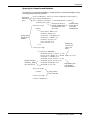
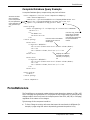
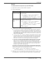
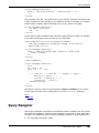
About Nesting Multiple AssetQuery Components
To further refine a query, and reduce the need to define redundant queries to return
related assets, you can nest one or more AssetQuery components inside another. This is
useful if, for example, you want to locate and list more than one type of asset, each of
32
Serena® Collage® 5.1.3
AssetQuery
which is from the same location in the project. You can use one AssetQuery component to
locate the folder that contains the assets, and additional, nested AssetQuery components
to list the different types of assets:
AssetQuery 1 locates
the folder in the project
that contains the assets
AssetQuery 1
AssetQuery 2
AssetQuery 3
AssetQuery 2 locates and lists one type of asset
in the folder specified by AssetQuery 1
AssetQuery 3 locates and lists another type of asset
in the folder specified by AssetQuery 1
How to Insert an AssetQuery Component
Follow the instructions below to insert an AssetQuery component, either in Dreamweaver,
or manually using your HTML editor.
IMPORTANT!
When you preview a page that contains an AssetQuery component, the component will
list or display information about a maximum of five assets, by default. If you want to
override this limitation, in order to list of display more than five assets, you must include
the Previewmax attribute in the component. See "Previewmax" on page 42 for details.
Dreamweaver
1
In Dreamweaver, place the insertion point where you want to insert the component.
2
Click Window | Objects to display the Objects palette.
3
Select the Serena Collage Design Components palette.
4
Click the Insert Asset Query button
5
Complete the options on the AssetQuery options dialog box. See "AssetQuery
Properties" on page 34 for detailed information.
6
Click OK.
.
Manually
1
Enter the following syntax in the appropriate location in your file:
<nexus:component classid="nexus/components/AssetQuery" code="value"
root="value" query="" filter="value" orderbycode="value"
metafilter="value">
AssetQuery body
</nexus:component>
2
Complete the attributes and body section according to the properties descriptions in
the following sections. For detailed information on the AssetQuery body, see "About
the AssetQuery body" on page 45.
Components User's Guide
33
Chapter 3 Design-Time Component Reference
AssetQuery Properties
Property
Value
Description
amongblessed
true or false
Whether to limit the query results to assets for which
the Deploy property has been set to Always. Set this
property to true to limit the query. Set this property to
false if you do not want to limit the query to assets
that are always deployed.
classid
Always set to nexus/
components/
AssetQuery
The component class file inside the component archive
file that is needed to implement the component.
code
Always set to the path in
Collage to the
nexusComponents.jar
file.
The archive where the component class file is stored. By
default, this is stored in: /root/System/Components/
nexusComponents.jar. You can also set this property
to: code="$nexusComponents" which will resolve to
the correct path.
docconvert
Any combination of the
following, separated by
commas:
Determines whether to deploy versions of Microsoft
Office files in any of the following formats:
pdf
ps
html
For example:
docconvert="pdf,ps"
34
Serena® Collage® 5.1.3
Adobe portable document format (PDF). To
generate and deploy PDF versions of files, the
Collage Server must be installed to a Windows
system to which Ghostscript GNU is also installed.
For information on installing and configuring
Ghostscript GNU, see the Serena Collage
Installation and Setup Guide.
Postscript (PS). To generate and deploy postscript
versions of files, the Collage Server must be
installed to a Windows system to which Ghostscript
GNU is also installed. For information on installing
and configuring Ghostscript GNU, see the Serena
Collage Installation and Setup Guide.
HTML. To generate and deploy HTML versions of
files, the Collage Server must be installed to a
Windows system to which Microsoft Office is also
installed.
AssetQuery
Property
Value
Description
To then generate links to the converted files, include
any of the following data field macros in the body of the
component:
docconvert
(continued)
$node.psurl
Links to the postscript version of the files. For
example:
<a href="$node.psurl">Postscript version
of $node.name</a>
Links to the postscript version of a file.
$node.pdfurl
Links to the PDF version of the files. For example:
<a href="$node.pdfurl">PDF version of
$node.name</a>
Links to the PDF version of a file.
$node.htmlurl
Links to the HTML version of the files. For
example:
<a href="$node.htmlurl">HTML version of
$node.name</a>
Links to the HTML version of a file.
filter
Filter value
The filter property narrows the search down to assets
with properties that meet specific criteria. For example:
filter="A.MimeType='text/html'"
Limits the returned assets to HTML files only. You can
also use data macro fields to define a filter, for example:
filter="A.FileName='$node.FileName'"
See "Data Field Macro Reference" on page 23 for more
information.
You can query multiple properties fields at one time, by
linking multiple filter statements with AND or OR. For
example:
filter="( A.FileName='index.html' ) AND
( A.MimeType='text/html' )"
Limits the results to HTML files named index.html, and:
Filter="( A.AssetType='HTML Document' ) OR
( A.AssetType='Welcome message' )"
Limits the results to assets of either the HTML
Document or Welcome message asset type.
Components User's Guide
35
Chapter 3 Design-Time Component Reference
Property
Value
filter (continued)
Description
For date properties, you can also use the following to
define more advanced filters:
is null: To limit query results to assets for which
a date property is undefined, for example:
A.StartDate is null
is not null: To limit results to assets for which
any date is defined, for example:
A.StartDate is not null
current timestamp: To limit results based on the
current (most recent) timestamp. For example, to
return assets that are scheduled to expire in the
future:
( A.ExpireDate > current timestamp )
Greater than/less than (< >) statements
Greater than/less than or equal to statements (<=
=>)
Not equal statements (<>)
All data fields must be preceded by A. Possible values
are:
A.FileName: Asset filename
A.assetid: Asset ID number
A.Description: Asset description
A.MimeType: Asset MIMEType
A.Size: Asset file size
A.CreateDate: Asset creation date
A.AssetType: Asset type name
A.Name: Asset name
36
Serena® Collage® 5.1.3
A.IsMasterPage: "1" indicates that the asset is a
master page, "0" indicates that it is not
AssetQuery
Property
Value
filter (continued)
Description
A.ApprovedDate: Asset approval date
A.ApprovedBy: User who approved the asset
A.CheckOutTime: Check out time
A.Path: Deploy folder path to the asset.
A.FileDate: Last modified date
A.Creator: User who created the asset
A.CheckOutName: User who checked out the asset
A.ApprovedVersion: Approved version
A.LatestVersion: Latest version
A.StartDate: Start date for the asset
A.ExpireDate: Expiration date for the asset
IMPORTANT! If no StartDate or ExpireDate filters
are defined, the AssetQuery component returns any
asset regardless of expiration or start date. This can
lead to errors if the component generates links to files
which are not deployed because they are expired or
haven't start yet.
layout
Layout file to use for
links to contribution
documents, or to
generate alternate
versions of other assets
using the formatting in
the layout file
The layout file that will be used to format HTML versions
of contribution documents.
If you link query results to an HTML version of a
contribution document, you must include this property
to determine which layout file will be used to generate
the HTML.
If you will link query results to pages that contain a
QueryNavigator component, you must include this
property. It must refer to the page that contains the
QueryNavigator component. For more information, see
"Query Navigator" on page 101.
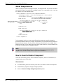
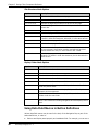
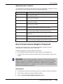
levelsdeep
Number
Allows you to do a recursive search on the specified
number of levels deep within your deploy folder tree.
For this property, you specify how many levels beneath
a particular folder (specified by the root or relative
property) to search.
For example:
<nexus:component classid="nexus/components/
AssetQuery" code="$nexusComponents"
root="/website/Offices/"
levelsdeep="3">
$node.Path$node.FileName<br>
</nexus:component>
Components User's Guide
37
Chapter 3 Design-Time Component Reference
Property
Value
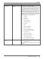
levelsdeep
(continued)
Description
NOTE The levelsdeep property is ignored if you
also set the query property.
For example, you might have a project that is set up as
shown below, with the root property set to
/website/Offices/.
If levelsdeep is set to 1, AssetQuery returns all
assets in the Offices folder, as well as assets in the
Issaquah folder and Seattle-Downtown folder.
If levelsdeep is set to 2, AssetQuery returns all
assets in the Offices, Issaquah and Seattle-Downtown
folders, and assets in both sets of Agents and Houses
folders.
If levelsdeep is set to -1, AssetQuery does a full
recursive search throughout the entire tree, starting at
the /website/Offices folder. It returns all assets in the
Offices folder and all assets in all folders beneath
Offices.
You can use the levelsdeep property in conjunction
with the skiplevels property. For example, you can
set levelsdeep to -1 and skiplevels to 1. This tells
AssetQuery to skip the root folder and return assets
starting one level down. In the example above, this
would return all assets in the Issaquah, SeattleDowntown, Agents, and Houses folders, and would skip
assets in the Offices folder.
max
38
Number
Serena® Collage® 5.1.3
Specifies the maximum number of records that will be
returned in the query result.
AssetQuery
Property
Value
Description
metafilter
Metadata field name and
value
Uses metadata fields and values to narrow the query.
For example:
metafilter="(M.name='Reviewer') AND
(M.value='Steven')"
Will limit the query to assets with a metadata field
called "Reviewer" with a value of "Steven." Notice that
all data fields must be preceded by M.
You can query multiple metadata fields at one time, by
separating multiple metafilter definitions with a
semicolon. You can also link multiple filter statements
with OR. For example:
metafilter="(M.name='Reviewer') AND
(M.value='Steven');(M.name='Product')
AND (M.value='Collage')"
Limits the results to files reviewed by Steven for
the Collage product.
Metafilter="(M.name='Reviewer') AND
(M.value='Steven' OR M.value='Nancy')"
Limits the results to assets that were reviewed
either by Steven or by Nancy.
metafilter="((M.name='Reviewer') AND
(M.value='Steven')) OR
((M.name='Author') AND
(M.value='Steven'))"
Limits the results to assets that were either
authored or reviewed by Steven.
For date properties, you can also use the
M.ValueDateTime statement with the following to
define more advanced filters:
is null: To limit results to assets for which no
date is defined, for example:
"(M.name='PurchaseDate') AND
(M.ValueDateTime is null)"
is not null: To limit results to assets for which
any date is defined, for example:
"(M.name='PurchaseDate') AND
(M.ValueDateTime is not null)"
current timestamp: To limit results based on the
current (most recent) timestamp. For example, to
return assets for which a metadata field is set to
an earlier date/time than the current date/time:
"(M.name='PurchaseDate') AND
(M.ValueDateTime <= current
timestamp)"
NOTE For SQL and Oracle, the syntax for current
timestamp is current_timestamp.
Components User's Guide
39
Chapter 3 Design-Time Component Reference
Property
Value
metafilter
(continued)
Description
Greater than/less than (< >) statements
Greater than/less than or equal to statements (<=
>=)
Not equal statements (<>)
For metadata fields of type asset, you can use the
M.ValueAssetId statement. For example:
metafilter="(M.name='MyLogo') AND
(M.ValueAssetId='1000')
Will limit the results to the files where the MyLogo field
is pointing to asset ID '1000.'
For metadata fields of type integer, you can use the
M.ValueInteger statement.
For example:
metafilter="(M.name='MyLogo') AND
(M.ValueInteger='2')
Will limit the results to the assets where the MyLogo
field is equal to 2.
40
Serena® Collage® 5.1.3
AssetQuery
Property
Value
Description
orderbycode
Letter code for a specific
sort order.
Sort order of listed data. For example,
orderbycode="F" Sorts the records by filename, in
ascending order. Use an upper case letter code, such as
"T," to sort the records in ascending order. Use a lower
case letter code, such as "t," to sort the records in
descending order. You can also combine multiple codes
to sort on as many as 16 columns. For example, "TN"
will first sort by asset type, then by asset name. Or,
"Tn" will first sort by asset type, then in reverse order
by asset name. You can also combine the orderbycode
property with the orderonmetadata property, to sort
by metadata values. Possible values are:
orderbycode
(continued)
I: Asset ID
T: Asset type
N: Asset name
E: Asset description
P: Deploy folder path
F: Filename
S: Size
D: Last file modified date
B: Asset create date
H: User who created the asset
C: User with the asset checked out
O: Check out time
L: Latest version number
A: Approved version number
K: Approved date number
M: User who approved the asset
U: URL (valid only for link assets)
Y: Start date
Z: Expiration date
The default value is "" (sort order will be as provided by
database).
Components User's Guide
41
Chapter 3 Design-Time Component Reference
Property
Value
Description
orderonmetadata
Names of metadata
fields which can be used
to sort results
Defines metadata fields which the orderbycode
property can use to order results.
For example, to enable the orderbycode property to
sort by metadata fields called Product and Reviewer,
define orderonmetadata as:
orderonmetadata="Product, Reviewer"
The orderbycode property can then sort using the
specified metadata fields by including a 2 digit code that
corresponds to each of the metadata fields. This code
identifies the index, or number, of the field in the
orderonmetadata property, and identifies ascending
(A) or descending (D) sort order. For example, if the
following orderbycode property is combined with the
orderonmetadata example above:
orderbycode="1A"
The AssetQuery results will be sorted based on the
values of the Product metadata field (1), in ascending
order (A).
In the following example, orderbycode will order
results first by the Reviewer metadata field (in
ascending order), then by the Product metadata field
(in descending order), and finally by asset name (in
descending order):
orderonmetadata="Product, Reviewer"
orderbycode="2A1Dn"
Previewmax
Number of preview rows
If the component includes a layout property to format
linked assets, the maximum number of rows that the
component can display when previewing the asset that
contains the component.
By default, this is set to 5.
query
Path to the query
cabinet
Refers to a predefined query cabinet. A query cabinet is
a saved query from the Asset view.
For example:
query="/Users/admin/MySearch/"
Will use the MySearch query cabinet.
The default value is "" (No QueryCabinet will be used).
relative
Relative path to the
deploy folder
Relative path to the deploy folder that will be searched.
This can be used in place of the root property. If
relative and root are both defined, AssetQuery will
use the relative path.
This path its relative to the asset that will be deployed.
For example, if the AssetQuery component is defined on
a master page, this property defines a path from any
assets to which the master page is applied.
To search the current folder, define this as:
relative="."
42
Serena® Collage® 5.1.3
AssetQuery
Property
Value
Description
root
Path to the deploy folder
The deploy folder that will be searched.
For example, if root is set to "/WebSite/documents/
", the deploy folder documents will be searched.
If a query cabinet is referenced from the query
property, or if a path is defined in the relative
property, this parameter is ignored.
skip
Number
Specifies the number of records that will be skipped in
the query result. The skipped records begin with the
first row in the query result.
This is useful if, for example, you wish to divide query
results into multiple pages. Each page can contain a
QueryAsset component, each of which returns a range
of specific records, such as 1-10, or 11-20. Use the max
property to define how many records to return, such as
10, and use the skiprows property to define the
starting row.
For example, to display records 11-20, set the following
values:
max="10"
skip="10"
These values skip the first 10 records to start at record
11, and limit the total records returned to 10.
Components User's Guide
43
Chapter 3 Design-Time Component Reference
Property
Value
Description
skiplevels
Number
Allows you to skip the specified number of folders
before beginning a recursive search within your deploy
folder tree. The starting point for this search is the
folder defined by the root property or the relative
property. For example:
<nexus:component classid="nexus/components/
AssetQuery" code="$nexusComponents"
root="/WebSite/PressRelease/"
skiplevels="1">
$node.Path$node.FileName<br>
</nexus:component>
NOTE The skiplevels property is ignored if you also
set the query property.
For example, you might have a project that is set up as
shown below, with the root property set to /website/
Offices/.
If skiplevels is set to 1, AssetQuery skips the assets
in the Offices folder, and returns all assets in the
Issaquah folder and Seattle-Downton folder.
To perform a full recursive search while skipping a level,
you can use the skiplevels property in conjunction
with the levelsdeep property. For details, see the
levelsdeep property on page 37.
44
Serena® Collage® 5.1.3
AssetQuery
Property
Value
Description
useoriginalassetid
true or false
If you will use the layout property to generate
contribution documents, or to format alternate versions
of HTML assets, you can set the useoriginalassetid
parameter to true to ensure that any components on
the pages which will be reformatted by the layout pages
will refer to the original assets when generating asset
information, rather than referring to the layout pages.
For example, if the layout property will generate
different layouts of assets that include the MetaTag
component, the useoriginalassetid property
ensures that each instance of the MetaTag component
displays the metadata for the correct asset. Otherwise,
the MetaTag component will display metadata for the
layout page itself, not the original asset which contains
the original MetaTag component.
For example, if the MetaTag component is defined on a
page called common.html, and you use the layout
property to display the contents of common.html on a
new page, you must include:
useoriginalassetid="true"
to make sure that the MetaTag component displays the
metadata for common.html, and not the layout pages.
About the AssetQuery body
The display of asset information is specified in the AssetQuery body. The AssetQuery body
can display any standard data fields and metadata fields for an asset, or it can query for
the content from contribution asset fields. If more than one record is found in the query,
the body will be repeated, thereby generating a list of data.
The AssetQuery body can consist of three sections, an optional prelog, the data fields, and
an optional prolog:
<nexus:prelog>
<--HTML-->
</nexus:prelog>
<--HTML to display information about the assets, or content from
contribution fields-->
<nexus:prolog>
<--HTML-->
</nexus:prolog>
Prelog Section
The prelog section can optionally be used to define a header for a table which will display
the records from the query.
Components User's Guide
45
Chapter 3 Design-Time Component Reference
For example:
<nexus:prelog>
<table>
<tr>
<td>Name</td>
<td>Created Date</td>
</tr>
</nexus:prelog>
Data Fields Macro Section
Each data field macro identifies the specific type of information to display about the asset,
such as metadata, filename, or contribution field content. By default, all HTML contained
in the body of an AssetQuery component (with the exception of the prelog and prolog
sections) is repeated for each asset that is returned by the query. If you want to define
unique HTML for different records, however, you can do so as well.
You use the data field macros to display information about any of the following:
A file asset which is returned by the query
The deploy map which was used to deploy the asset
The deploy folder that contains the asset
About the Data Fields
The syntax for each data field is:
$type.Fieldname
For example:
$node.filename
Displays an asset's filename.
Some fields support optional parameters, as well.
The different types of data you can return about an asset are:
Standard data fields. The standard data fields are the standard properties which
Collage stores for all assets. For example, $node.FileName retrieves and displays
the actual name of the file, such as home.html.
The standard data fields include:
46
Field
Description
$node.assetid
Displays the asset's ID number
$node.CreateDate
Displays the date that the asset was
created
$node.Description
Displays the asset's description
$node.FileName
Displays the actual name of the file
$node.MimeType
Displays the asset's MIME-type
Serena® Collage® 5.1.3
AssetQuery
Field
Description
$node.name
Displays the asset name
$node.Size
Displays the asset's filesize
Asset metadata. To display the value of a metadata field, you must use the following
syntax:
$node.meta('metadata_name')
For example, $node.meta('Reviewer')
URL fields. You can use the following syntax to generate the URL to the asset in the
current query record:
$node.url
You can use this value to generate a link to the asset, for example:
<a href="$node.url">
TIP
The $node.url macro generates a relative URL. You can also generate an absolute
URL to the asset by instead using the $node.absurl.
You can also automatically generate URLs to pages which are generated using
contribution layout files. This includes the HTML versions of contribution assets, or
any other type of web page. For example, you can merge all of the content from an
HTML file with different layout files. This allows you to automatically create alternate
versions of HTML files, each with unique formatting derived from different layout files.
The AssetQuery component can then locate and link to these generated files.
Use the following syntax to generate this URL:
$node.detailsurl
To link to the HTML versions of contribution assets, the component must include a
layout property, which determines which contribution layout file will be used to
generate the HTML. By including multiple AssetQuery components, each of which
defines unique layout files to generate the HTML version of contribution assets, you
can create links to alternate versions of the same page. For example, you can use one
layout file to generate and link to an online version of a page, and another to link to a
print version of a page.
See page 52 for details.
Contribution field. If the asset in the current query record is a contribution asset,
you can use the following syntax to display the content from a contribution field in the
asset:
$node.contribution("field_name")
For example, if the field name is Title, you can use this syntax to display the content
from the field:
$node.contribution("Title")
Components User's Guide
47
Chapter 3 Design-Time Component Reference
Record information. You can use the following syntax to display the record number
of the asset.
$node.recordnumber
The first asset in the list is record 1, the second asset in the list is record 2, and so on.
The last asset gives you the total number of records returned.
For detailed information on these and other data field macros that you can use with the
AssetQuery component, see "Data Field Macro Reference" on page 23.
Displaying Text on Images
When an image is used inside the AssetQuery body, the component can flatten text onto
the image. You can do this by adding a special text parameter to the <img> tag, as in the
example below:
<a href="$node.url"> <img src="button.gif"
text="$node.metadata('buttonname')"> </a>
This example flattens the value of a metadata field called buttonname on the image. You
can use this attribute in conjunction with any data field macros, or any other text value.
Formatting the AssetQuery Body
By default, all HTML that is defined in the body of the AssetQuery component (with the
exception of the prelog and prolog sections) is repeated for each asset that is returned
by the query. For example, if the body of the component consists simply of:
<li>$node.FileName
The filenames of each asset will be formatted as list items.
However, you can also define unique formatting for different records with the following
tags:
<nexus:next> Indicates the ending point for the formatting of a record or set of
records, and the starting point of formatting for the next record or set of records. This
allows you to define a pattern of unique HTML formats for sets of records. For
example,
<nexus:next>
<tr>
<td>$node.FileName</td>
<nexus:next>
<td bgcolor="green">$node.FileName</td>
</tr>
Will retrieve and display the filenames for two consecutive records, each with unique
formatting:
This formatting will repeat for each pair of records that is returned by the query. For
example, if six records are returned, the table might look like:
48
Serena® Collage® 5.1.3
AssetQuery
<nexus:exit> Indicates that no preceding record display will be repeated. For
example,
<nexus:next>
<tr>
<td>$node.FileName</td>
<nexus:next>
<td bgcolor="green">$node.FileName</td>
</tr>
<nexus:exit>
Limits the record display to two:
You can use <nexus:exit>, in combination with <nexus:next>, to define unique
formatting for different sets of records. For example,
<nexus:next>
<tr>
<td>$node.FileName</td>
<nexus:next>
<td bgcolor="green">$node.FileName</td>
</tr>
<nexus:exit>
<nexus:next>
<tr>
<td bgcolor="gray">$node.FileName</td>
<nexus:next>
<td>$node.Filename</td>
</tr>
<nexus:exit>
Formats each row, each of which displays the filenames for two assets, uniquely:
<nexus:norecords> Tags can optionally contain alternate text to use if the query
returns no assets.
For example, if the AssetQuery body includes the following:
<nexus:norecords><b><em>This query found no assets.
</em></b></nexus:norecords>
Then the text below would display if the query returned no assets:
This query found no assets.
Components User's Guide
49
Chapter 3 Design-Time Component Reference
Prolog Section
If a prelog section is used to open and define headers for a table which will display query
records, the prolog section can be used to close the table. By combining the Prelog and
Prolog sections, you can contain the entire table within the AssetQuery component tag.
For example:
<nexus:prolog>
</table>
</nexus:prolog>
AssetQuery Examples
The following examples illustrate some of the different ways that you can use the
AssetQuery component to retrieve and display information about assets, or content from
contribution assets.
50
Serena® Collage® 5.1.3
AssetQuery
Querying for Properties and Metadata
The following is an example AssetQuery component with a complete AssetQuery body,
including prelog and prolog sections.
Opening tag
defines the
query
<nexus:component classid="nexus/components/AssetQuery"
code="$nexusComponents"
root="/Website/Content" orderonmetadata="Product"
orderbycode="1AS">
<nexus:prelog>
Prelog section
defines table
headers
Sorts first by value of
Product metadata field, in
ascending order, then
by file size
<table>
<tr>
<td>Product Name</td>
<td>Asset Name</td>
<td>Actual Filename</td>
<td>Author's Name</td>
<td>Description</td>
<td>Filetype</td>
<td>Filesize</td>
</tr>
</nexus:prelog>
Displays the asset
description, MIME
type, and file size
Enables sorting
by the value of
the Product
metadata field
Displays the
name of and
links to the
asset
<tr bgcolor="#DDDDDD">
<td>$node.meta('Product')</td>
<td><a href="$node.url">$node.name</a></td>
<td>$node.FileName</td>
<td>$node.meta('Author')</td>
<td>$node.Description</td>
<td>$node.MimeType</td>
Displays the value
<td>$node.Size</td>
of a metadata
</tr>
field called Author
<nexus:prolog>
</table>
Prolog section
closes the table
</nexus:prolog>
</nexus:component>
Components User's Guide
51
Chapter 3 Design-Time Component Reference
Querying for Contribution Field Content
The following is an example AssetQuery component that retrieves and displays the
content from a field in a contribution asset.
<nexus:component classid="nexus/components/AssetQuery"
code="$nexusComponents"
Filter property limits
root="/Website/TechBriefs"
query to techbrief
Filter="A.AssetType='techbrief'" max=5 OrderbyCode="d">
asset type
<nexus:prelog>
<font size="2" color="darkblue" face="arial">
<strong>Most Recent Tech Briefs</strong>
</font>
Prelog defines and
formats a small
header, and creates
an unordered list
Retrieves 5
assets, and
sorts them
by date
<ul>
</nexus:prelog>
All HTML between the
<li>
prelog and prolog is
<font face="Times,Times New Roman" size="2"
repeated for each asset;
color="black">Title: $node.contribution("title")
each appears as a
</font>
bulleted list item
$node.contribution("title") retrieves and
<nexus:prolog>
displays the content of the "title" contribution
field for each asset that is queried
</ul>
Prolog closes the
unordered list
</nexus:prolog>
</nexus:component>
The results of this query may look something like:
You can also link to HTML versions of contribution assets by making the following changes
to the above example. The HTML version of the asset will always be generated in the
same location as the layout file for the asset.
Add a layout property to the <nexus:component> tag. This property identifies the
contribution layout file that you want to use to create the HTML version of the asset.
For example, layout="techbrief_layout.htm".For more information see Chapter
4, "Layout Contribution Component Reference" on page 121.
NOTE
You can use any layout file that you want, not just the layout file that is associated
with the contribution asset type in Collage. In this way, you can allow your site users
to display contribution assets in more than one format. You can cater look and feel to
different types of users without having to create duplicate contribution assets.
52
Serena® Collage® 5.1.3
AssetQuery
Modify the $node.contribution line to include a link to the $node.detailsurl
field:
<li>
<font face="Times,Times New Roman" size="2" color="black"><a
href="$node.detailsurl">Title: $node.contribution("title")
</a></font>
Querying by Date
Below are several examples of an AssetQuery component that retrieves assets by date.
These blocks of code work with the Sample Site that is installed with Collage, and can be
adapted to meet the needs of your projects.
The following is an example of an AssetQuery that displays a list of press releases for the
past year:
Filter property limits
query to Press Release
asset type
Limits query to assets
with no start date or a
start date that is less than
or equal to the current
timestamp, within the past
365 days
<nexus:component classid="nexus/components/AssetQuery"
code="$nexusComponents" dwcomptype="assetquery"
root="/WebSite/PressRoom/"
filter="(A.AssetType='Press Release') and
((A.StartDate is null) or ((A.StartDate <= current
timestamp) AND (A.StartDate >= current timestamp 365)))">
<nexus:prelog> </nexus:prelog>
Start Date: $node.startdate("MM/d/yy") -- $node.name <br>
<nexus:prolog> </nexus:prolog>
</nexus:component>
NOTE
The current timestamp value is the time of the last deploy, since the resulting HTML files
are static based on that time.
Components User's Guide
53
Chapter 3 Design-Time Component Reference
You can also display a list of press releases created between two dates. The following
example shows the filter property limiting the AssetQuery component to press releases
created between 7/1/03 and 7/31/03:
filter="(A.AssetType='Press Release') and (A.CreateDate between '7/1/
03' AND '7/31/03')"
The next example shows the filter property limiting the AssetQuery to press releases
created in July of any year:
filter="(A.AssetType='Press Release') and (DATEPART(mm, A.CreateDate) =
7)"
The next example displays a list of press releases that were deployed between the start
date and expiration date:
<nexus:component classid="nexus/components/AssetQuery"
code="$nexusComponents" dwcomptype="assetquery"
root="/WebSite/PressRoom/"
filter="(A.AssetType='Press Release') and
((A.StartDate <= current timestamp) or (A.StartDate
is null)) and ((A.ExpireDate > current timestamp) or
(A.ExpireDate is null))"
Start and
expire dates
<nexus:prelog> </nexus:prelog>
$node.name -- Dates: $node.startdate("MM/d/yy") to
$node.expiredate("MM/d/yy")
<nexus:prolog> </nexus:prolog>
</nexus:component>
Banner
The Banner component is an implementation of the Navigation Bar component which
allows you to insert either of the following onto a web page:
Standard text.
A standard image file, which you can automatically flatten text onto. Collage can layer
text onto a banner image, then generate a non-aliased bitmap of the banner with the
text flattened onto it. As a default it will use standard image effects to place and
format the text. But if you have defined specific effects for the images, these effects
will be used. This is useful when you want to control the font, color, and placement of
the text on the banners or navigation buttons.
NOTE
You can use the Image Effects feature in Collage to change the appearance of the
banner. See the Collage online help for more information.
You can use the Banner component on a master page, in order to easily reuse a banner on
any page to which the master page is applied.
For more information on the Navigation Bar component, from which the Banner
component is derived, see "Navigation Bar" on page 84.
54
Serena® Collage® 5.1.3
Banner
How to Insert a Banner Component
Follow the instructions below to insert a Banner component, either in Dreamweaver, or
manually using your HTML editor.
Dreamweaver
1
In Dreamweaver, place the insertion point where you want to insert the component.
2
Click Window | Objects to display the Objects palette.
3
Select the Serena Collage Design Components palette.
4
Click the Insert Banner button
5
Complete the options on the Insert Banner dialog box.
6
.
Choose Image or Text from the Banner Type list.
If you chose Image, enter the image name and location in the Banner Image
field, or browse to select it.
Click OK. The Banner component code is added to the file, and the image appears.
By default, when you insert a Banner component in Dreamweaver, the Banner will
display the name of the file to which you added the component. On an image Banner,
this text will be flattened onto the image, and is defined by the following attribute for
the <img> tag:
text="$node.name"
For example:
<img src="image.gif" border=0 text="$node.name">
On a text banner, this default text is defined by the following line:
<node:active>$node.name</node:active>
7
Do one of the following:
To replace the default text with your own text, find the $node.name string and
replace it with your own text. For example:
text="Banner Name"
or
<node:active>Banner Name</node:active>
Or, if you inserted an image banner and don't want any text to appear, simply
delete the text attribute from the <img> tag.
See the next section for diagrams of the banner component code.
Components User's Guide
55
Chapter 3 Design-Time Component Reference
Manually
The syntax varies depending on whether you want to insert an image banner or a text
banner. The component body (everything between the opening and closing tags) defines
the text and/or image that will comprise the banner. The text or image that will be used in
the banner is identified in an embedded <node:active> tag.
Image Banner
The example below illustrates the syntax for an image banner:
<nexus:component classid="nexus/components/Navbar"
code="$nexusComponents" nodes="current">
<node:active>
<node:active> tag
encloses the banner
body, which identifies
the image and text
Banner will use "Objects.gif" image
<img src="../images/Objects.gif" border=0 text="$node.name"
width="100" height="100">
</node:active>
</nexus:component>
text attribute in the image link defines the
text that will be flattened onto the image,
which in this case is the $node.name field,
which displays the name of the asset which
contains the component
To burn your own text onto the image, simply insert the text in place of $node.name in
the text attribute. To prevent any text from appearing on the image, delete the text
attribute.
Text Banner
If you choose to use a text banner, simply insert the text inside the <node:active> tag,
as in the example below:
<nexus:component classid="nexus/components/Navbar"
code="$nexusComponents"
nodes="current" type="text">
<node:active>Banner text</node:active>
</nexus:component>
<node:active> tag encloses
the banner body, which
contains the banner text
You can apply any HTML formatting that you want to this text, as well. For example, to
make the text bold, enclose it with a <strong> tag:
<node:active>
<h2>Banner text</h2>
</node:active>
56
Serena® Collage® 5.1.3
Conditional
Banner Properties
Property
Value
Description
classid
Always set to nexus/components/
Navbar
Points to the component class file inside the jar that is
needed to implement the component. This field is
required.
code
Always set to the path in Collage to the
nexusComponents.jar file, such as
"/System/Components/
nexusComponents.jar"
The archive where the component class file is stored.
By default, this is stored in: /root/System/
Components/nexusComponents.jar. You can also
set this property to: code="$nexusComponents"
which will resolve to the correct path.
nodes
Always set to current
Conditional
The Conditional component generates a javascript that redirects the user's browser to a
different page based on various possible conditions. This might be used as a top-level
page for a site, for example, that redirects a browser to the appropriate start page for the
user's language.
This component can redirect based on the following conditions:
OS: The operating system on which the browser is running.
Language: The localization of the browser.
Browser: The type of browser that is executing the javascript.
Writing a Conditional Component
Add the following code to the body of the web page:
<nexus:component dwcomptype="Conditional" classid="nexus/
components/Conditional" code="$nexusComponents"
condition="[OS | language | browser]">
Parameters
Define specific parameters
</nexus:component>
Choose whether the
component will redirect
a browser based on OS,
language, or browser
The following section describes how to define specific parameters, based on the condition
type.
Components User's Guide
57
Chapter 3 Design-Time Component Reference
Conditional Parameters
The Conditional component body uses <PARAM> tags which identify which page the
browser should be directed to if certain conditions are met. Each parameter tag must use
the following format:
<PARAM name="parameter" value="page.html">
For example, the Conditional component below will cause a browser to redirect to
different pages, depending on which operating system the browser is running on:
<nexus:component dwcomptype="Conditional" classid="nexus/components/
Conditional" code="$nexusComponents" condition="OS">
<PARAM
<PARAM
<PARAM
<PARAM
name="windows" value="windows.html">
name="mac" value="mac.html">
name="unix" value="unix.html">
name="default" value="default.html">
</nexus:component>
If the browser is running on Windows, the component will redirect the browser to the
windows.html page. If the browser is running on an Apple Macintosh, then it will cause
the browser to redirect to the mac.html page. The value properties specify the full paths
from the page that contains the component to the destination pages.
The Conditional component understands the following conditions and parameters. The
value of each parameter can be any URL or asset.
Condition
browser
language
OS
58
Serena® Collage® 5.1.3
Parameters
ie - any version of Internet Explorer.
ns - any version of Netscape Navigator
default - used if neither of the above can be determined
en - English
de - German
ja - Japanese
any ISO 639 language code
default - used if none of the above can be determined
Windows - any version of Microsoft Windows. Also accepted:
"winNT" for Windows NT/95/98/ME/2000, and "win31" for old
Windows 3.1
Mac - any version of the Apple Macintosh OS
UNIX - any version of Unix that supports X11
Default - used if none of the above can be determined
Conditional
Conditional Properties
Property
Value
Description
classid
Always set to "nexus/
components/Conditional"
Points to the component class file inside the jar that is
needed to implement the component. This property is
required.
code
Always set to the path in Collage
to the nexusComponents.jar file,
such as "/System/Components/
nexusComponents.jar" or set
to code="$nexusComponents"
Refers to the archive where the component class file is
stored. This property is required. By default, this file is
stored in: /root/System/Components/
nexusComponents.jar. You can also set this to
code="$nexusComponents."
condition
"OS", "language", or
"browser"
Specifies the condition to switch upon. This property is
required. Additional parameters in the body of the
component can then determine where the browser should
be redirected to, when certain conditions are met. See
the next section.
name
String
Use this property with the <PARAM> tags. If the condition
matches the value of this string, the browser is redirected
to the URL in the value attribute.
value
Path
Use this property with the <PARAM> tags. If the condition
matches the name, this specifies the path to the page to
which the user is redirected.
Conditional Example 1
The example below redirects different browser applications:
<nexus:component dwcomptype="Conditional" classid="nexus/components/
Conditional" code="$nexusComponents" condition="browser">
<PARAM name="ie" value="index_ie.html">
<PARAM name="ns" value="index_ns.html">
<PARAM name="default" value="index_allbrowsers.html">
</nexus:component>
If Internet Explorer is the browser application, the browser is re-directed to
index_ie.html. If Netscape is the browser application, the browser is redirected to
index_ns.html.
Conditional Example 2
The example below redirects browsers to either an English language or German language
home page:
<nexus:component dwcomptype="Conditional" classid="nexus/components/
Conditional" code="$nexusComponents"code="$nexusComponents"
condition="language">
<PARAM name="en" value="eng_site/home_english.html">
<PARAM name="de" value="german_site/home_german.html">
</nexus:component>
Components User's Guide
59
Chapter 3 Design-Time Component Reference
Database Query
The Database Query component displays data from records which Collage retrieves from
an external SQL database. You can define and store data source information in Collage.
Collage then uses these definitions to access external databases. You can also store SQL
query files, which Collage runs when it connects to the data sources. The Database
Component can then display the records that the queries return, with HTML formatting
applied to them. Optionally, you can also automatically link fields from each row to detail
pages, which can display all of the fields which are returned to the component.
How the Database Query Component Works
The following table describes the process which Collage follows to retrieve external data
and display it via the Database Query component.
Stage
Description
1
Deploy the asset the contains that Database Query component. The
component includes a property which identifies the data source definition
asset (.nds) that Collage should use to connect to an external database.
The component also includes a property which either:
Identifies the SQL query file (.sql) that Collage should pass to the
database, or
If the query is very simple, includes the entire text of the query.
2
Collage connects to the external database, as defined in the data source
asset which the component specifies.
3
If Collage successfully connects to the database, it passes the query to the
database server.
4
If the database server successfully processes the query, it returns the query
results to Collage.
5
Collage passes the query results (a set of database rows) to the
component.
6
The component displays fields from the returned rows, as defined in the
component HTML. Unique HTML can be defined for each returned row or
even each field, or the component can apply the same HTML to all records
in the result set.
7
Optionally, the data can be linked to detail pages, which can display any of
the fields that are returned for a particular row. Detail pages are generated
from pre-defined contribution layout files. The layout files determine which
fields from the linked row to display, and how each field is formatted.
How to Define Data Sources in Collage
Before you can use the Database Query component to retrieve and display database
records, you must define a data source, or external database, in Collage. The data
sources are stored in Collage as .nds files. Once you have defined the data source, you
can define structured queries to that data source, which retrieve the data that is displayed
by the Database Query component.
60
Serena® Collage® 5.1.3
Database Query
In order to define a data source, you must know the following about the database:
The URL, or address, of the database. The URL format varies across database
platforms; to learn how to specify the URL, consult the database documentation.
The name of the JDBC driver you will use to access the database. In most cases, you
must supply the precise Java class name and path for the driver.
The name and location in Collage of the JAR file that contains the JDBC driver. If
Collage does not provide the driver for you, you must upload this JAR file to Collage.
Then, Collage will load the driver from the JAR file in order to perform the query.
Username and password for the JDBC driver.
Any additional JDBC parameters and values which are required by the driver.
PRIVILEGES
Project Permissions: Project Configuration and Can work outside of task
To define a data source:
1
Log in to the Collage project.
2
Go to the Project | Data Sources view. If it's not currently selected, select the Data
Sources sub-view.
3
Click the New button
. The Create New Data Source dialog box appears.
Components User's Guide
61
Chapter 3 Design-Time Component Reference
4
All data source definitions are stored in Collage as assets. Enter an Asset Name and
Description, and click OK. The Edit data source dialog box appears.
5
Complete the Edit data source dialog box as follows:
Field
Description
Guidelines
Name
Data source
asset name
Optionally modify the asset name
URL
JDBC URL
Enter the URL, or connect-string, to the
database or database server, in the correct
format for the database. For example, to
connect to the default Collage database server,
you would enter:
jdbc:sybase:Tds:<host name>:<port>
For example:
jdbc:sybase:Tds:localhost:2638
The above URL allows you to connect to a
Collage Sybase server on the local system. 2638
is the default Sybase port number.
IMPORTANT! The host port number in the
connect-string is the database server port, not
the application server port.
62
Serena® Collage® 5.1.3
Database Query
Field
Description
Guidelines
JDBC
Driver
Name and class
path, if
necessary, of
the database
driver to use
Choose a database driver from the drop-down
list, such as Sybase, or choose the Specify
class name option, then enter the class name
and path to the driver. For example, the path to
the Sybase JDBC driver which Collage uses
internally is:
com.sybase.jdbc2.jdbc.SybDriver
Collage then uses the class path to load the
driver from the file that contains it, which is
either stored in Collage and defined in the Fetch
Driver from Asset field, or is external but in
the class path for Tomcat, or whichever
application server you use to host Collage.
Asset
driver
The asset in
Collage that
contains the
JDBC driver
class file
Choose this option if you want Collage to load
the JDBC driver from an asset in Collage. Then,
browse to select this asset. To use this option,
you must upload the JAR file that contains the
driver to Collage.
IMPORTANT! If you do not choose this
option, the JDBC driver must be in the class
path for Tomcat, or whichever application
server you use to host Collage.
6
Username
The username
for the
database, which
the JDBC driver
will pass to the
database server
Enter the administrator username for the
database.
Password
The password
for the
database, which
the JDBC driver
will pass to the
database server
Enter the administrator password for the
database.
Add
Any additional
parameters and
values required
by the JDBC
driver
Enter the Name and Value for each parameter,
then click the Add button. All parameters are
then listed below. You can delete any of the
parameters from the list. For example, on
Sybase, this might include a ServiceName
parameter, which Sybase uses to locate and
connect to a specific database, as defined by the
value of this parameter.
Click OK. The new data source is added to the list in the Project | Data Sources view.
The data source is stored as a .nds file in Collage, in the System \ Data Sources
deploy folder.
Components User's Guide
63
Chapter 3 Design-Time Component Reference
How to Create and Store Structured Queries in
Collage
You can create new, blank SQL (.sql) files in Collage, which you can then edit in an
external editing tool to define your database queries. If you already have SQL query files
that you want to use to retrieve data for the Database Component, you can also upload
them to Collage. Collage lists all SQL files in the Project | Data Sources view, under
Queries. This provides a short-cut to all of the queries that are currently stored in
Collage.
NOTE
If you will use the Database Query component to process a very simple query statement,
you can simply add the statement to the component itself, later on. You do not need to
store simple queries as .sql files in Collage.
To create and store a structured query in Collage:
1
Do one of the following:
If you want to...
Then...
Create a new, blank
.sql file
a
Go to the Project | Data Sources view.
b
Select the Queries sub-view.
c
Click the New button
dialog box appears.
d
Enter a query name and description, then click OK.
a
Go to the Content | Deploy Folders view.
b
Select the folder to which you want to upload the query.
By default, all structured queries are stored in the
System \ Data Sources view. To keep all query files
together, select this folder.
c
Click the Upload button
d
In the Upload dialog box, click the Upload File button
to browse to select the file to upload, then click OK.
Upload an existing
.sql query file to
Collage
2
. The New structured query
.
To see a list of all SQL queries stored in Collage, go to the Project | Data Sources
view, then select the Queries sub-view. From here, you can select and edit the SQL
files just as you would any other asset.
NOTE
To check out and automatically open a .sql file in the appropriate editing tool, you must
set the Content Editors preference for the Structured Queries asset type.
64
Serena® Collage® 5.1.3
Database Query
Writing the Database Query Component
A simple Database Query Component is structured as follows:
<nexus:component classid="nexus/components/DBQuery"
code="$nexusComponents"
datasource="path to data source asset"
query="SQL SELECT statement">
$node.column("Column name")
</nexus:component>
It includes two sections:
1
The opening tag, which specifies the data source and the query to submit to the data
source.
2
The body section, which specifies which columns to display from the result set, and
how to format the results.
The following sections describe in detail how to write each part of the component,
followed by complete examples.
Writing the Database Query Opening Tag
The opening tag specifies the following:
The path to the data source asset (.nds file) which Collage should use to access the
database.
Either the name of the SQL query file (.sql) which Collage should pass to the
database, or a simple inline SQL SELECT statement which Collage should use to query
the database.
Optionally, a maximum number of rows to return.
Optionally, the number of initial rows to skip.
Optionally, the path to a layout file which will be used to generate details pages for
linked fields.
A complete opening tag might look something like:
<nexus:component classid="nexus/components/DBQuery"
code="$nexusComponents"
datasource="/System/Data%20Sources/Company%20Database.nds"
query="SELECT Name, Position, FROM Employee WHERE Salary > 4000">
In this example, you can optionally replace the query property with a queryfile
property, which can then define a path to a SQL query file in Collage. For example:
<nexus:component classid="nexus/components/DBQuery"
code="$nexusComponents"
datasource="/System/Data%20Sources/Company%20Database.nds"
queryfile="/System/Data%20Sources/emp_name_positions.sql">
In this example, the linked query file, emp_name_positions.sql, may contain just the
same simple SELECT statement. You can also store much more complex queries in a
linked file.
Components User's Guide
65
Chapter 3 Design-Time Component Reference
See the following section for a complete description of all of the properties you can define
for the component tag.
Database Query Properties
Property
Value
Description
classid
Always set to "nexus/
components/DBQuery"
Points to the component class file inside the
nexusComponents.jar file that is needed to implement the
component. This property is required.
code
Always set to the path in
Collage to the
nexusComponents.jar file
The archive where the component class file is stored. By
default, this is stored in: /root/System/Components/
nexusComponents.jar. You can also set this property to:
code="$nexusComponents" which will resolve to the
correct path.
datasource
Path
Specifies the path to the data source asset (.nds file) in
Collage which Collage will use to connect to the database.
This path is absolute, from the root of the Collage project.
For example:
datasource="/System/Data%20Sources/
Company%20Database.nds"
layout
Path
Defines the path in Collage to a layout file which Collage will
use as a template for linked detail pages. For example, if this
property is set to:
layout="\System\WebSite\emp_details.htm"
And the following line is defined in the body of the
component:
<a href="$node.detailsurl">
$node.column("Name")</a>
Then the value of the Name column for each returned row will
be linked to a details page which uses the emp_details.htm
layout file, which then determines which additional fields
from the linked row are displayed, and how they are
formatted. See "Generating and Linking to Details Pages" on
page 70.
max
66
Number
Serena® Collage® 5.1.3
Specifies the maximum number of rows that will be returned
in the query result.
Database Query
Property
Value
Description
query or
queryfile
A SQL query (SELECT
statement), or the path to a
SQL query file (.sql) in
Collage
Specifies the query to pass to the database. Define this as
either of the following:
query
An inline SQL query statement (SELECT statement), for
example:
query="SELECT Name, Position, Age FROM
Employee WHERE Salary > 4000"
queryfile
The path to a SQL query file (.sql) in Collage.
IMPORTANT! The query must retrieve all of the fields that
you want to display, either from the component itself, or on
linked detail pages. Detail pages do not query for additional
fields; they can only display fields that are already in the
component's result set.
You can also pass a parameter to the query. The example
below shows a query that calls the "CustOrdersDetail" stored
procedure. It also passes the value of a metadata field called
"OrderId" as a parameter.
query="exec CustOrdersDetail
'$node.meta('OrderId')'"
skip
Number
Specifies the number of rows that the component will skip
when displaying the query results. The skipped rows begin
with the first row in the query result.
This is useful if, for example, you wish to divide query results
into multiple pages. Each page can contain a Database
Query component, each of which returns a range of specific
records, such as 1-10, or 11-20. Use the max property to
define how many records to return, such as 10, and use the
skip property to define the starting row. For example, to
display records 11-20, set the following values:
max="10"
skip="10"
These values skip the first 10 records to start at record 11,
and limit the total records returned to 10.
Writing the Database Query Body
The body section of the Database Query component formats the display of the query
results. The component can define unique formatting for each row and field in the result
set, or repeat the same formatting for a series of rows or fields.
Components User's Guide
67
Chapter 3 Design-Time Component Reference
The body section can consist of three sections, an optional prelog, the database records,
and an optional prolog:
<nexus:prelog>
<--HTML-->
</nexus:prelog>
<--HTML to display the records-->
<nexus:prolog>
<--HTML-->
</nexus:prolog>
The Prelog and Prolog Sections
The prelog section can optionally be used to define HTML which will precede the display of
the query results. For example, you can use it to define a header for a table which will
display the database fields:
<nexus:prelog>
<table cellpadding="6" cellspacing="0" bordercolor="#688AA6"
border="2">
<tr>
<td>Name</td>
<td>Position</td>
</tr>
</nexus:prelog>
The prolog section can then be used to close any HTML tags which were opened in the
prelog section. For example, to simply complete the table which the above example prelog
created:
<nexus:prolog>
</table>
</nexus:prelog>
The Database Records Section
The database records section outputs HTML for each row in the result set. This section
defines any HTML to apply to items in each of the columns in a row. For example, if the
query results include a set of rows with 4 columns, you can define unique HTML for the
value in each of the columns. By default, the component will generate the same HTML for
the column values in each of the rows.
68
Serena® Collage® 5.1.3
Database Query
The $node.column("column name") macro is a placeholder for the value of the column
identified by the column name attribute. For example, the following database records
section will place the values for 4 columns into separate table cells:
<tr><td>$node.column("Name")</td>
<td>$node.column("Position")</td>
<td>$node.column("Phone")</td>
<td>$node.column("Email")</td></tr>
Advanced Query Results Formatting
By default, all HTML that is defined in the body of the Database Query component (with
the exception of the prelog and prolog) is repeated for each row that is returned by the
query. For example, if the body of the component consists simply of:
<li>$node.column("Name")
The value of the Name column for each row in the result set will be formatted as a list item
(<li>).
However, you can also define unique formatting for different rows with the following tags:
<nexus:next> Indicates the ending point for the formatting of a row, and the starting
point of formatting for the next row. This allows you to define a pattern of unique
HTML formats for sets of rows, or for each row. For example,
<nexus:next>
<tr>
<td>$node.column("Name")</td>
<nexus:next>
<td bgcolor="#D3D3D3">$node.column("Name")</td>
</tr>
Will retrieve and display the value of the Name column for two consecutive rows, each
with unique formatting:
This formatting will repeat for each pair of rows that is returned by the query. For
example, if six rows are returned, the table might look like:
<nexus:exit> Indicates that no preceding row display will be repeated. For example,
<nexus:next>
<tr>
<td>$node.column("Name")</td>
<nexus:next>
<td bgcolor="#D3D3D3">$node.column("Name")</td>
</tr>
<nexus:exit>
Limits the display to two rows.
Components User's Guide
69
Chapter 3 Design-Time Component Reference
You can use <nexus:exit>, in combination with <nexus:next>, to define unique
formatting for different rows, or sets of rows. For example,
<nexus:next>
<tr>
<td>$node.column("Name")</td>
<td><i>$node.column("Position")</i></td>
</tr>
<nexus:exit>
<nexus:next>
<tr bgcolor="#E4E4E4">
<td>$node.column("Name")</td>
<td><i>$node.column("Position")</i></td>
</tr>
<nexus:exit>
<nexus:next>
<tr bgcolor="#D3D3D3">
<td>$node.column("Name")</td>
<td><i>$node.column("Position")</i></td>
</tr>
<nexus:exit>
Formats each table row, each of which displays the value of the Name and Position
columns for a database row, uniquely:
<nexus:norecords> Tags can optionally contain alternate text to use if the query
returns no records.
For example, if the Database Query body includes the following:
<nexus:norecords><b><em>This query returned no records.
</em></b></nexus:norecords>
Then the text below would display if the query returned no records:
This query found no assets.
Generating and Linking to Details Pages
You can optionally link the fields from any row in the result set to details pages. Details
pages can display any additional fields from the linked row, which were returned in the
query result set. Collage uses layout files to determine the placement and formatting of
the fields on details pages. For each Database Query component, you can specify one
layout file. Each linked field then uses this layout file to generate a details page.
You must complete the following steps, in order to generate and link to details pages.
1
70
Create and design the HTML page which you will use as the layout file, and add
placeholders for all of the database fields which the details pages will display.
Serena® Collage® 5.1.3
Database Query
2
Create the Database Query component, and include a layout property which
specifies the path to the layout file to use for details pages. Make sure that the query
returns all of the fields which you want to display, either from the component itself, or
on the details page.
3
Determine which fields you want to link to details pages, and add <a href> tags
which use the $node.detailsurl macro to automatically generate the links.
Review the detailed instructions in the following sections.
How to Set Up a Layout File
In order to generate and link to details pages, you must set up a layout file. The layout file
is a template for all details pages in a particular Database Query component; all content
on the layout file will appear on all details pages, including content that is generated by
other Collage components.
The layout file uses layout field components to display additional fields from the linked
row. Each field component is a placeholder for a particular field from the linked row. When
Collage generates the details page, it displays the actual value of the field, for the linked
row.
To set up a layout file for Database Query details pages:
1
Create a new HTML file or, if you already have a template for details pages, open it.
2
Add the following layout field component code wherever you want to display a field
value:
<nexus:field column="column name"/>
Where column name is the name of column for which you want to display the value.
For example, if you want to display the value of the Name column for the linked row,
define the component as:
<nexus:field column="Name"/>
3
Check in the layout file in Collage.
How to Generate Links to Details Pages
In order to link to a layout file, the Database Query component must include a layout
property which specifies the full path in Collage to the file. Then, for each field you want to
link, add <a href> tags that use the $node.detailsurl macro to automatically
generate the link.
To generate links to details pages:
1
When you create the Database Query opening tag, be sure to include the layout
property. For example:
layout="/System/WebSite/emp_details.htm"
See "Writing the Database Query Opening Tag" on page 65 for details on writing the
opening tag.
2
In the body of the Database Query tag, add the following tag to each field that you
want to link to a details page:
<a href="$node.detailsurl">$node.column("column name")</a>
Components User's Guide
71
Chapter 3 Design-Time Component Reference
When you deploy the asset that contains the Database Query component, Collage
generates the details page and replaces the $node.detailsurl macro with the
name of the details page.
Example Layout File Code
If the Database Query component retrieves a query that includes Name, Position,
Phone, and Email fields for each row in the result set, the following code on the layout
page will display the values of each field:
<p><b>Name:</b> <nexus:field column="Name"/></p>
<p><b>Position:</b> <nexus:field column="Position"/></p>
<p><b>Phone:</b> <nexus:field column="Phone"/></p>
<p><b>Email:</b> <nexus:field column="Email"/></p>
When Collage deploys the asset that contains the Database Query component that links to
details pages which use this layout page, Collage generates each of the details pages and
replaces the <nexus:field> components with the actual field values. The generated
details for the example above may appear something like the following:
72
Serena® Collage® 5.1.3
ForceReference
Complete Database Query Example
A complete Database Query component tag may look as follows:
<nexus:component classid="nexus/components/DBQuery"
code="$nexusComponents"
datasource="/System/Data%20Sources/Company%20Database.nds"
queryfile="/System/Data%20Sources/emp_positions.sql"
layout="/System/WebSite/emp_details.htm">
Accesses the data
source specified
in the comp db.nds
file, and passes the
query defined by the
emp_positions.sql
file
<nexus:prelog>
<table cellpadding="6" cellspacing="0" bordercolor="#688AA6"
border="2">
<tr>
Uses the emp_details.htm
<td>Name</td>
layout file to generate
details pages for any
<td>Position</td>
rows that are linked with
</tr>
Links the value of the Name
the $node.detailsurl
</nexus:prelog>
column for the row to a
details page
macros
<nexus:next>
<tr bgcolor="#E4E4E4">
<td><a href="$node.detailsurl">$node.column("Name")
</a></td>
<td><i>$node.column("Position")</i></td>
</tr>
Displays the values of
<nexus:exit>
the Name and Position
Columns, in the query
set
<nexus:next>
<tr bgcolor="#D3D3D3">
<td><a href="$node.detailsurl">$node.column("Name")
</a></td>
<td><i>$node.column("Position")</i></td>
</tr>
<nexus:exit>
<nexus:prolog>
</table>
</nexus:prolog>
</nexus:component>
ForceReference
The ForceReference component creates a deployment dependency between a HTML, ASP,
JSP, or PHP page and a particular file. The purpose of this component is to ensure that any
changes made to this file will result in the deployment of the HTML, ASP, JSP, or PHP page,
regardless of the nature of the changes.
Typical usage of this component would be:
To force Collage to monitor references that cannot be monitored via $CMAsset (for
example, a page using ASP code to dynamically generate the path to a file).
Components User's Guide
73
Chapter 3 Design-Time Component Reference
To force Collage to deploy assets whose dependencies are too complex to calculate in
an incremental deploy context.
How to Insert a ForceReference Component
Follow the instructions below to insert a ForceReference component by using your HTML
editor.
Enter the following syntax in the body of a web page:
<nexus:component classid="nexus/components/ForceReference"
code="$nexusComponents" dependency="path to the referenced file">
</nexus:component>
ForceReference Properties
Property
Value
Description
classid
Always set to nexus/components/
ForceReference
Points to the component class file inside the jar that is
needed to implement the component. This field is
required.
code
Always set to the path in Collage to
the nexusComponents.jar file, such
as "/System/Components
/nexusComponents.jar"
The archive where the component class file is stored.
By default, this is stored in: /root/System/
Components/nexusComponents.jar. You can also
set this property to: code="$nexusComponents"
which will resolve to the correct path.
dependency
Path
The path to the dependent file, which, if modified, will
cause this HTML, ASP, JSP, or PHP file to deploy.
74
Serena® Collage® 5.1.3
Include Asset
ForceReference Example
The Sample site project, which gets installed with Collage, includes a sample file that uses
this component. This file is /WebSite/Component_Demo/ForceReference.html and its
location in Collage is shown below:
The ForceReference.html file contains this code:
<nexus:component classid="nexus/components/ForceReference"
code="$nexusComponents" dependency="/WebSite/Component_Demo/
deploy.txt">
</nexus:component>
If any changes are made to deploy.txt, the ForceReference.html page will be deployed,
regardless of what changes were made. However, changes to ForceReference.html will not
force the deploy.txt file to be deployed.
Include Asset
Use the Include Asset component to do one of the following:
Find an asset in the current project and copy it into the asset that contains the
component. This allows you to reuse standard content snippets without having to
paste them into multiple files.
Display the content of specific contribution fields from contribution assets. In this way,
you can easily reuse the content of contribution fields without having to copy and
paste that content into multiple assets.
Components User's Guide
75
Chapter 3 Design-Time Component Reference
Display information about or generate links to other assets. You can use the
component to automatically find assets in a website that match a specified filename,
and generate links to them. This is useful if, for example, you want automatically
create links to stylesheets in different website sections without having to copy the
stylesheets into every folder in those sections.
How the Include Asset Component Works
The Include Asset component locates assets in one of the following ways:
From a relative path from the asset that contains the component, such as a master
page
If the component is on a master page, from a relative path from the asset to which
the master page is applied
Or by looking for any asset that matches a specified filename in the current deploy
folder, or any deploy folders above the current deploy folder
Once the component locates the asset to include, it either inserts the entire content of the
asset, or, if the component includes a body section, inserts whatever content is defined by
the body section. The body section might include property macros which display
information about the included asset, such as its filename or particular metadata value, or
it might define a reference to the included asset.
How to Insert an Include Asset Component
Follow the instructions below to insert an Include Asset component, either in Macromedia
Dreamweaver or manually using your own HTML editor.
Dreamweaver
To insert the Include Asset component in Dreamweaver:
76
1
In Dreamweaver, place the insertion point where you want to insert the component.
2
Click Window | Objects to display the Objects palette.
3
Select the Serena Collage Design Components palette.
4
Click the Include Asset button. The Insert Include Asset dialog box appears.
5
Do one of the following:
If you want to...
Then...
Insert the entire content of an
asset
Select the Long Form option.
Insert information about or link
to an asset
Select the Short Form option.
6
From Parameter, choose Findfile, File, or Relative to determine how the
component should find the file. See "Include Asset Properties" on page 78 for
information on these options.
7
Click OK.
Serena® Collage® 5.1.3
Include Asset
Manually
To manually insert the component in your own HTML editor:
1
Open the file to which you want to add the component.
2
Do one of the following:
If you want to...
Then...
Insert the entire
content of an asset
Add the following to the point in the file where you want to
include the asset:
<nexus:component classid="nexus/components/
IncludeAsset" code="path to the
nexusComponents.jar file" [file="filename
and path" | findfile="filename"]/>
Insert information
about or link to an
asset
Add the following to the point where you want to insert
information or link to the asset:
<nexus:component classid="nexus/components/
IncludeAsset" code="path to the
nexusComponents.jar file" [file="filename
and path" | findfile="filename"]>
body
</nexus:component>
3
To locate the file, include one of the following properties:
file="path and filename" to define the exact location of the file, relative to
the HTML asset that contains the component. For example, if the component is on
a master page, the file property defines a path to the file, relative to the location
of the master page. Choose this option to always use the same file, relative to the
location of the master page.
relative="path and filename" to define the exact location of the file, relative
to the HTML asset to which the master page that contains the component will be
applied. Choose this option to use locate the file relative to the actual deployed
asset itself, not relative to the master page that contains the component.
findfile="filename" to have the component search for the file in the current
deploy folder, and any deploy folders above it. If the component is on a master
page, the findfile property will search for the file in the deploy folder that
contains the asset to which the master page is applied, not the deploy folder that
contains the master page itself. Choose this option to search the deploy folder
structure for any file with a matching name.
For example, to find and insert the entire content of an asset called Copyright.html
which is located in a deploy folder called boilerplate, underneath the master page that
contains the component, the code might appear as follows:
<nexus:component classid="nexus/components/IncludeAsset"
code="$nexusComponents" file="boilerplate/Copyright.html"/>
4
Optionally, if you will use Include Asset to display information about or create a link to
the included asset, or insert the content from specific fields in a contribution asset,
Components User's Guide
77
Chapter 3 Design-Time Component Reference
complete the body section with a combination of standard HTML, and any combination
of the data field macros, including:
Field
Description
$node.assetid
Inserts the asset's ID number
$node.contribution("field_name")
Inserts content from a specified
contribution field
$node.CreateDate
Inserts the date that the asset was
created
$node.Description
Inserts the asset's description
$node.FileName
Inserts the actual name of the file
$node.meta('metadata name')
Inserts the value of the specified
metadata field
$node.MimeType
Inserts the asset's MIME-type
$node.name
Inserts the asset name
$node.Size
Inserts the asset's filesize
$node.url
Generates a link to the asset
NOTE The $node.url macro
generates a relative URL. You can also
generate an absolute URL to the asset
by instead using the $node.absurl.
For detailed information on these and other data field macros that you can use with
the Include Asset component, see "Data Field Macro Reference" on page 23.
Displaying Text on Images
When an image is used inside the Include Asset body, the component can flatten text onto
the image. You can do this by adding a special text parameter to the <img> tag, as in the
example below:
<a href="$node.url"> <img src="button.gif"
text="$node.metadata('buttonname')"> </a>
This example flattens the value of a metadata field called buttonname on the image. You
can use this attribute in conjunction with any data field macros, or any other text value.
Include Asset Properties
Property
Value
Description
classid
Always set to "nexus/
components/IncludeAsset"
Code must point to the component class file inside the JAR file
that is needed to implement the component. This property is
required.
code
Always set to the path in
Collage to the
nexusComponents.jar file, such
as "/System/Components/
nexusComponents.jar"
The archive where the component class file is stored. By
default, this is stored in: /root/System/Components/
nexusComponents.jar. You can also set this property to:
code="$nexusComponents" which will resolve to the correct
path.
78
Serena® Collage® 5.1.3
Include Asset
Property
Value
Description
file
File name and path
Specifies the location and filename of the file to include,
relative to the asset in Collage which contains the component.
For example, a master page.
findfile
File name
Searches for the file in the current deploy folder, and any
deploy folders above it. If the component is on a master page,
the findfile property will search for the file in the deploy
folder that contains the asset to which the master page is
applied, not the deploy folder that contains the master page
itself. Choose this option to search the deploy folder structure
for any file with a matching name.
relative
File name and path
Defines the exact location of the file, relative to the HTML
asset to which the master page that contains the component
will be applied. Choose this option to use locate the file
relative to the actual deployed asset itself, not relative to the
master page that contains the component.
Example 1: Including an Entire Asset
You can use the Include Asset component to automatically insert the content of one asset
into another asset. For example, you can create an asset which stores a text snippet that
can be reused by other assets, such as a copyright statement.
In the example below, the component inserts all of a asset called Copyright
Statement.html, which is comprised only of an HTML snippet:
<nexus:component classid="nexus/components/IncludeAsset"
code="$nexusComponents" file="Copyright Statement.html"/>
If Copyright Statement.html simply contains the following HTML snippet:
<p>
<font face="arial,helvetica,sans-serif" size="1">Copyright 2002
Serena</font>
</p>
Then the component will appear as follows:
This snippet could even include additional component tags, or javascript, or other, more
sophisticated syntax.
Example 2: Linking to an Included Asset
In this example, the component generates a link to a cascading stylesheet called
styles.css, and stores metadata information in an HTML comment. Because the Include
Asset component can search the current deploy folder and any deploy folders above the
folder for the file specified by the findfile property, you can use it to automatically
generate links to files in any section of a project. In this way, files that are standard for
each section of a site, such as stylesheets, don't need to be copied to each folder.
Components User's Guide
79
Chapter 3 Design-Time Component Reference
<nexus:component classid="nexus/components/IncludeAsset"
code="$nexusComponents" FindFile="styles.css">
<HEAD>
<!-- Include the stylesheet - authored by $node.metadata
("Author") -->
<LINK REL="stylesheets" TYPE="$node.mimetype"
HREF="$node.url">
</HEAD>
</nexus:component>
Example 3: Nesting the Include Asset Component in a
Select Component
You can nest an Include Asset component inside a Select component. To do so:
1
Close the IncludeAsset component with a complete </nexus:component> tag.
2
Include a form=longform attribute in the IncludeAsset tag. For example:
<nexus:component classid="nexus/components/Select" code="/System/
Components/nexusComponents.jar" select="$node.meta('Author')">
<nexus:select "Brian">
<nexus:component classid="nexus/components/IncludeAsset"
code="/System/Components/nexusComponents.jar"
relative="Page1.html" form="longform">
</nexus:component>
</nexus:select>
</nexus:component>
For more information on the Select component, see "Select" on page 107.
Masterpage Body
The Masterpage Body component allows you to define the location on a master page
where you want Collage to merge content. Wherever you insert the Masterpage Body
component, Collage will replace the component with the content from assets that use the
master page when you preview or publish those assets.
How to Insert a Masterpage Body Component
Follow the instructions below to insert a Masterpage Body component, either in
Dreamweaver, or manually using your HTML editor.
Dreamweaver
80
1
In Dreamweaver, place the insertion point where you want to insert the component.
2
Click Window | Objects to display the Objects palette.
Serena® Collage® 5.1.3
MetaTag
3
Select the Serena Collage Design Components palette.
4
Click the Insert Masterpage Body button
5
Accept the default options on the Insert Master Body dialog box.
.
See "Masterpage Body Properties" on page 81 for more information.
6
Click OK.
Manually
Enter the following syntax in the appropriate location in your file:
<nexus:masterpagebody width="460" height="445">
</nexus:masterpagebody>
Masterpage Body Properties
Property
Value
Description
height
Number, default is 445
Specifies the height, in pixels, a placeholder for the masterpage
body component will appear in Collage, when you preview the
master page
width
Number, default is 460
Specifies how wide, in pixels, a placeholder for the masterpage
body component will appear in Collage, when you preview the
master page
MetaTag
Use the MetaTag component to place specific asset metadata in the <head> section of a
page when it is previewed or deployed. This enables you to store information about an
asset in the asset itself. In this way, you can embed business specific data about a web
page in the web page itself, without having to update the asset content.
How to Insert a MetaTag Component
Follow the instructions below to insert a MetaTag component, either in Dreamweaver, or
manually using your HTML editor.
Dreamweaver
1
In Dreamweaver, place the insertion point in the <head> section of the page.
2
Click Window | Objects to display the Objects palette.
Components User's Guide
81
Chapter 3 Design-Time Component Reference
3
Select the Serena Collage Design Components palette.
4
Click the Insert MetaTag button
5
Manually complete the MetaTag component. See "The MetaTag Body" on page 82 for
more information.
.
Manually
Insert the following code in the <head> section of a web page:
<nexus:component classid="nexus/components/MetaTag" code="path
to nexuscomponents.jar file">
name attribute assigns a name to the metadata field
<meta> tags identify
the metadata fields
for which the values
will be retrieved
<meta name="name" content="$node.meta('parameter')">
<meta name="name"
content="$node.meta('parameter1','parameter2')">
</nexus:component>
$node.meta parameters identify the
metadata fields
The body of the tag, included in the <meta name> tags, identifies the specific metadata
fields to be included. See the next section.
The MetaTag Body
If no body is provided, all available metadata will be inserted.
For each metadata field you want to insert, include the following line in the body of the
component:
<meta name="name" content="$node.meta('parameter')">
The name attribute will insert a name for the metadata value. The content attribute will
insert the specific metadata value for the asset that contains the component.
For example, if you include the following line:
<meta NAME="Author" content="$node.meta('author_name')">
For an asset with a metadata field called author_name which has a value of "Ray," the
component will insert the following when the asset is deployed:
<meta NAME="Author" content="Ray">
You can also optionally include a second $node.meta parameter to define date
formatting, if you are retrieving a date type metadata field. For example:
$node.meta('Review Date', yyyy.MM.dd)
MetaTag Properties
Property
Value
Description
classid
Always set to:
"nexus/components/
MetaTag"
Code must point to the component class file inside
the JAR file that is needed to implement the
component. This property is required.
82
Serena® Collage® 5.1.3
MetaTag
Property
Value
Description
code
Always set to the path in
Collage to the
nexusComponents.jar file,
such as "/System/
Components/
nexusComponents.jar"
The archive where the component class file is stored.
By default, this is stored in: /root/System/
Components/nexusComponents.jar. You can also
set this property to: code="$nexusComponents"
which will resolve to the correct path.
useoriginalassetid
true or false
If you will use the Include Asset component on other
pages in your project to reuse your MetaTag
component on multiple pages, you must include
the useoriginalassetid property and set it to
true. This ensures that each instance of the MetaTag
component which is generated by the Include Asset
component displays the metadata for the correct
asset. Otherwise, the MetaTag component may
display metadata for the asset that contains the
Include Asset component, not the original asset
which contains the original MetaTag component.
For example, if the MetaTag component is defined on
a page called common.html, and you use the Include
Asset component to display the contents of
common.html on all pages, you must include:
useoriginalassetid="true"
to make sure that the Include Asset components
display the metadata for common.html, and not the
pages which contain the Include Asset component.
MetaTag Example 1
The following example retrieves the value of a metadata field called product, and names
it "Product Name":
<nexus:component classid="nexus/components/MetaTag"
code="$nexusComponents">
<meta NAME="Product Name" content="$node.meta('product')">
</nexus:component>
If the value of the product metadata field for the asset is Collage, Collage will generate
the following tag when the asset is deployed:
<meta NAME="Product Name" content="Collage">
MetaTag Example 2
The following example retrieves the value of a metadata field called release_date, names
it "Release Date," and applies a date format to it:
<nexus:component classid="nexus/components/MetaTag"
code="$nexusComponents">
<meta NAME="Release Date"
content="$node.meta('release_date',yyyy.MM.dd)">
Components User's Guide
83
Chapter 3 Design-Time Component Reference
</nexus:component>
If the value of the release_date metdata field is January 18, 2003, Collage will
generate the following tag when the asset is deployed:
<meta NAME="Release Date" content="2003.01.18">
Navigation Bar
The Navigation Bar, or Navbar, component generates buttons that link to other pages in
the site, making it easy to navigate around in the site. A button can be an image which
includes the name of the linked page, or it can be plain text naming the linked page.
The Navigation Bar generates a different set of buttons on each page it is used on, based
on the options specified for the Navbar and the site structure.
The Navigation Bar component stores information about how active and inactive buttons
will look and where the buttons should link to. When you deploy a page containing a
Navbar component, Collage generates the links based on:
The location of pages in a site structure definition, or
The location of pages in the project's deploy folder structure.
The Navbar component may be particularly useful when it appears in a master page that
is applied to all pages in the site.
About the Navigation Link Options
The Navigation Bar component dynamically generates links at deploy time based on an
asset's position in a site structure, or in a project's deploy folder structure. All links are
defined as relative to the asset that contains the component, or to the root node in the
site structure, or to a specific deploy folder.
For example, you can define a link to a Parent Node, which will automatically link to the
node or page immediately above the asset in a site structure:
Parent Node link
For detailed information on all of the types of link you can define, see "Node Options for
Links" on page 89.
84
Serena® Collage® 5.1.3
Navigation Bar
Choosing Between the NavMap and Navigation Bar
Components
The NavMap and Navigation Bar components provide similar navigation features for your
web pages; each can be used to automatically generate navigation menus based on site
hierarchy. To help you determine when to use each of these components, consider the
following important points:
The NavMap component returns information about all nodes in a site structure,
regardless of their relationship to the page that contains the component. This is ideal
for generating navigation features that will be identical across all pages. For example,
use the NavMap component to create top level navigation schemes, which site visitors
use to access different sections of a site. Then, within each section, use the
Navigation Bar component to generate navigation schemes for all of the pages in a
section. For more information on the NavMap component, see "NavMap" on page 95.
The Navigation Bar component always generates navigation information that is
relative to the page that contains the component. This is ideal for navigation features
which help users keep track of their location in a specific section of a site. For
example, you might use the Navigation Bar component to generate a sub-menu of all
pages in one area, for example product details pages that all pertain to products of a
common type, and which are grouped together in your site structure.
How the Navigation Bar Works
The Navigation Bar component contains three sections, the opening tag, the body, and
the closing tag.
The opening tag defines the destinations for the navigation buttons. The body defines the
following:
For image buttons, which images to use for the buttons' active and inactive states,
and whether any text should appear on top of the images
For text buttons, what text to use for the buttons' active and inactive states
Any HTML formatting for the buttons, such as spacing or line breaks
Optionally, whether to retrieve and display information about linked assets in the
navigation bar, such as metadata values
Optionally, how to format date values, if they are used in button text
When you deploy an asset that contains the Navigation Bar component, Collage generates
the buttons based on these settings.
Components User's Guide
85
Chapter 3 Design-Time Component Reference
About Image Buttons
When an image is used as a navigation button, the Navigation Bar component can flatten
text onto the image. You can do this by adding a special text parameter to the <img> tag
for a button, as in the example below:
<nexus:component classid="nexus/components/Navbar"
dwcomptype="navbar" code="$nexusComponents" nodes="parent
currentlevel children">
<node:active>
Button text will display
the asset name
Current page appears first, then other pages at
the current level, then any pages underneath
<a href="$node.url"><img src="p3.gif" border=0
text="$node.name"></a>
Image type
<br>
buttons
</node:active>
<node:inactive>
<a href="$node.url"><img src="p1.gif" border=0
text="$node.name"></a>
<br>
</node:inactive>
</nexus:component>
In this example, the $node.name macro flattens the asset name onto the image to
generate the Navbar button for the page. As a default it will use standard image effects to
place and format the text. But if you have defined specific effects for the images, these
effects will be used. This is useful when you want to control the font, color, and placement
of the text on the banners or navigation buttons.
NOTE
You can use the Image Effects feature in Collage to change the appearance of the
navigation bar. See the Collage online help for more information.
How to Insert a Navbar Component
Follow the instructions below to insert a Navbar component, either in Dreamweaver, or
manually using your HTML editor.
Dreamweaver
86
1
In Dreamweaver, place the insertion point where you want to insert the component.
2
Click Window | Objects to display the Objects palette.
3
Select the Serena Collage Design Components palette.
Serena® Collage® 5.1.3
Navigation Bar
4
Click the Insert Navigation Bar button
appears.
. The Insert Navigation Bar dialog box
5
Choose whether the Button Type will be Text or Image.
6
Choose whether the buttons will Display vertically or horizontally.
7
If you are creating image type buttons, enter or browse to select the Active Button
and Inactive Button images.
8
Choose whether the Navigation will be based on the Site Structure, or Deploy
Folders.
9
If the navigation will be based on deploy folders, specify a Root deploy folder. Any
links which are defined as relative to the root will be based on this setting.
10
If you want to limit the generation of navigation links to assets for which a specific
Yes/No (boolean) metadata field is defined, enter the name of the metadata field in
the Select field.
11
If you chose to based the navigation bar on a site structure, enter the location of and
name of the specific site structure file in the Site Structure field.
12
Choose the buttons which you want to include from the Buttons Include list. See
"Node Options for Links" on page 89 for details.
13
Click OK.
Manually
To insert a Navigation Bar component:
1
Enter the following opening tag where you want the navigation bar to appear:
<nexus:component classid="nexus/components/Navbar" code="path to the
nexusComponents.jar file" nodes="node1 node2 node3">
Complete the properties as follows:
For the code property, the path to the archive where the component class file is
stored. By default, this is stored in: /root/System/Components/
Components User's Guide
87
Chapter 3 Design-Time Component Reference
nexusComponents.jar. You can also set this property to:
code="$nexusComponents" which will resolve to the correct path.
By default, the Navigation Bar component uses the current site structure to which
the page belongs to define its links. If you want to use the deploy folder structure
instead, or choose a particular site structure in the project, add one of the
following properties to the opening tag:
• To use deploy folder structure:
navigation="pubfolders"
root="/root_folder" select="/WebSite"
For the root property, enter the deploy folder which will be defined as the root
folder for the navigation bar. Any link which is defined as relative to the root
will use this folder.
• To choose a particular site structure:
sitestructure="path to site structure"
2
For the nodes property, enter all of the links that you want to generate. See "Node
Options for Links" on page 89 for details. Each node value must be separated by a
space.
For the display property, enter either vertical or horizontal.
Do one of the following to define the active link button. The active button is used to
link to the current page.
If you are using image type buttons, enter:
<node:active>
<a href="$node.url">
<img name="Name" src="path" text="$node.name">
</a>
</node:active>
Specify an image name, the path to the image file, and any other img attributes.
Additionally, include any HTML formatting for the button, such as spacing or line
breaks.
Optionally, if you want Collage to flatten text on top of the image button, add a
text attribute, such as text="Home". If you want the button to display the
name of the current page, define the attribute as text="$node.name"
TIP
The $node.url macro generates a relative URL. You can also generate an
absolute URL to the asset by instead using the $node.absurl.
If you are using text type buttons, enter:
<node:active>
[<a href="$node.url">Text</a>]
</node:active>
Enter the text that you want to appear on the button in place of Text or, if you
want Collage to automatically generate text based on the names of the linked
asset, enter $node.name.
88
Serena® Collage® 5.1.3
Navigation Bar
3
Do one of the following to define the inactive link button. This definition will be reused
for all inactive buttons.
If you are using image type buttons, enter:
<node:inactive>
<a href="$node.url">
<img name="Name" src="path" text="$node.name">
</a>
</node:inactive>
Specify an image name, the path to the image file, and any other img attributes.
Optionally, if you want Collage to flatten text on top of the image button, add a
text attribute, such as text="Links". If you want the button to display the
name of the linked page, define the attribute as text="$node.name"
If you are using text type buttons, enter:
<node:inactive>
[<a href="$node.url">Text</a>]
</node:inactive>
Enter the text that you want to appear on the button in place of Text or, if you
want Collage to automatically generate text based on the names of the linked
asset, enter $node.name.
4
Enter the following to complete the component:
</nexus:component>
For examples of complete Navigation Bar components, see "Navigation Bar Examples" on
page 93.
Node Options for Links
The nodes property uses a string of node specifications (separated by spaces). The
specifications apply in the order they appear from left to right; each specification
describes which level of the site structure or deploy folders to link to. Links to duplicated
nodes are eliminated.
As a rule, any given page will be included just once even though the specifications might
refer to it several times. For example, if you specify: node="topsiteroot parentsiteroot
root" for a page in a structure that is not a child site structure, you will only get the root
page once.
The options differ, depending on whether the Navigation Bar uses a site structure, or the
deploy folder structure.
Components User's Guide
89
Chapter 3 Design-Time Component Reference
Site Structure Node Options
Option
Description
Children
Includes all children of the current page.
Current
Includes the current page.
CurrentLevel
Includes all pages at the same level as the current page.
FirstLevel
Includes all pages of the level immediately under the root of the
current site.
Parent
Includes the parent page of the current page.
ParentLevel
Includes all pages at the level above the current page.
ParentSiteRoot
Includes the root page of the immediate parent site structure, and
is useful in child site structures; otherwise, it is the same as Root.
Root
Includes the root page of the current site structure.
RootLevel
Includes all root pages of the current site structure.
SitePath
Includes the nodes from the root of the current site structure to
the current page. Useful when creating navigational bars that
should contain one entry for each level the user visited.
TopSiteRoot
Includes the page at the topmost root in the site structure
hierarchy. It's useful in child site structures; but is otherwise the
same as Root.
Deploy Folder Node Options
Option
Description
Children
Includes all assets from folders beneath the current asset's folder.
Current
Includes the current asset.
CurrentLevel
Includes all assets from the same folder as the current asset.
FirstLevel
Includes all assets from folders under the root.
Parent
Includes all assets from the parent folder.
ParentLevel
Includes all assets from the parent folder, and all assets from folders
under the parent folder.
Root
Includes all assets from the root deploy folder, as defined by the root
property in the component.
RootLevel
Includes all assets from the root deploy folder, and all assets from
folders under the root folder.
SitePath
Includes assets from each folder level that a user has navigated
down. This is useful for creating navigation bars that display a user's
path.
Using Data Field Macros in Button Definitions
Various data field macros may be used in the body of the Navigation Bar, as part of the
button definitions, in order to:
90
Retrieve and display asset property and metadata fields. For example, you can use a
Serena® Collage® 5.1.3
Navigation Bar
macro to generate text for buttons based on the name of the assets they are linking
to.
Format date fields.
All macros have the following format:
$Type.Fieldname
For example:
$node.FileName
Optional parameter(s) can be defined for date fields.
For detailed information on all of the data field macros, see "Data Field Macro Reference"
on page 23.
Navigation Bar Properties
Property
Value
Description
classid
Always set to "nexus/
components/Navbar"
Code must point to the component class file inside the JAR
file that is needed to implement the component.
code
Always set to the path in
Collage to the
nexusComponents.jar
file, such as
"/System/Components/
nexusComponents.jar"
The archive where the component class file is stored. By
default, this is stored in: /root/System/Components/
nexusComponents.jar. You can also set this property to:
code="$nexusComponents" which will resolve to the
correct path.
root
If you will base the links
on deploy folder
structure, a deploy folder
path, such as
"/WebSite/Content"
Specifies a root folder to use for creating links. For more
information, see "Deploy Folder Node Options" on page 90.
This property only affects Navigation Bar components that
use deploy folders.
navigation
Set to pubfolders to
use deploy folders
instead of site structure
Sets the Navigation Bar component to create links based
on deploy folder structure, rather than site structure. If
this property is empty or missing, the Navigation Bar will
be based on site structure.
nodes
For all possible values,
see "Node Options for
Links" on page 89.
Controls which elements from the site structure or deploy
folder structure that the Navigation Bar will link to.
The appearance of the buttons are defined in the
Navigation Bar body.
Components User's Guide
91
Chapter 3 Design-Time Component Reference
Property
Value
Description
orderbycode
Letter code for a specific
order in which to display
navigation buttons.
The order in which to locate and display navigation
buttons, for deploy folder based navigation bars. For
example, orderbycode="F" Sorts the buttons by
filename. Use an upper case letter code, such as "T," to
display the buttons in ascending order. Use a lower case
letter code, such as "t," to display the buttons in
descending order. You can also combine multiple codes to
order based on as many as 16 properties. For example,
"TN" will first sort by asset type, then by asset name. You
can also combine the orderbycode property with the
orderonmetadata property, to order by metadata values.
Possible values are:
I: Asset ID
T: Asset type
N: Asset name
E: Asset description
P: Deploy folder path
F: Filename
S: Size
D: Last file modified date
B: Asset create date
H: User who created the asset
C: User who has the asset checked out
O: Check out time
L: Latest version number
A: Approved version number
K: Approved date number
M: User who approved the asset
U: URL (valid only for link assets)
Y: Start date
X: Expiration date
The default value is "" (sort order will be as provided by
database).
92
Serena® Collage® 5.1.3
Navigation Bar
Property
Value
Description
orderonmetadata
Names of metadata fields
which can be used to
order the navigation
buttons
Defines metadata fields which the orderbycode property
can use to order the navigation buttons, for deploy folder
based navigation bars.
For example, to enable the orderbycode property to the
buttons based on metadata fields called Product and
Reviewer, define orderonmetadata as:
orderonmetadata="Product, Reviewer"
The orderbycode property can then order the buttons
using the specified metadata fields by including a 2 digit
code that corresponds to each of the metadata fields. This
code identifies the index, or number, of the field in the
orderonmetadata property, and identifies ascending (A)
or descending (D) sort order. For example, if the following
orderbycode property is combined with the
orderonmetadata example above:
orderbycode="1A"
The navigation buttons will be sorted based on the values
of the Product metadata field (1), in ascending order (A).
In the following example, orderbycode will order the
buttons first by the Reviewer metadata field (in ascending
order), then by the Product metadata field (in descending
order), and finally by asset name (in descending order):
orderonmetadata="Product, Reviewer"
orderbycode="2A1Dn"
select
Metadata fieldname
sitestructure
Path to the site structure
file to use.
IMPORTANT! You can only use this property with
navigation bars that are based on deploy folder
structure. The navigation property must be set to
pubfolders to use this property.
Limits the generation of navigation links to assets for
which a specific Yes/No (boolean) metadata field is
defined. For example, if select="navbar", then the
Navigation Bar will only generate links to those assets for
which a navbar metadata field is defined and set to Yes.
Specific a particular site structure definition to use. This
property must point to the actual site structure file, such
as:
sitestructure=/Website/Main.site
Navigation Bar Examples
The following examples diagram the syntax for Navigation Bar components, one based on
site structure, the other based on deploy folders.
Components User's Guide
93
Chapter 3 Design-Time Component Reference
Site Structure Based Navigation Bar
In this example, the Navigation Bar component will be added to Home.html, from the
simple section of a site structure pictured below.
The following component code is added to Home.Html:
<nexus:component classid="nexus/components/Navbar"
code="$nexusComponents"
nodes="Current Children">
<node:active>
<a href="$node.url">
<img src="active_button.gif" text="$node.name" border="0">
</a>
</node:active>
Button text will display
the asset name
<node:inactive>
<a href="$node.url">
<img src="inactive_button.gif" text="$node.name" border="0">
</a>
</node:inactive>
</nexus:component>
Once Home.html is checked in and previewed or deployed, the Navigation Bar may look
something like this:
Active page
Inactive page
Deploy Folder Based Navigation Bar
The following example creates links to all assets in the asset's current deploy folder, as
well as all assets in the parent deploy folder. To limit the number of links to only those
assets which are index files in their directories, the component includes the optional
94
Serena® Collage® 5.1.3
NavMap
select property, which limits the navigation buttons to only those assets to which the
indexfile metadata field is assigned and set to Yes.
<nexus:component classid="nexus/components/Navbar"
code="$nexusComponents" nodes="Current CurrentLevel
ParentLevel" display="vertical" navigation="pubfolders"
select="indexfile" root="/Website/Content"
orderbycode="1AN" orderonmetadata="Priority">
Navigation buttons will
be ordered first by the
Priority metadata field,
in ascending order, and
then by the asset name
<node:active>
[<a href="$node.url">$node.name</a>]
Priority metada field
can be used to order
navigation buttons
</node:active>
<node:inactive>
[<a href="$node.url">$node.name</a>]
</node:inactive>
</nexus:component>
NavMap
The NavMap component retrieves information about each node in a site structure, which
you can then use to generate navigation menus to those nodes. You can define any HTML
or JavaScript in the NavMap component, which will then be generated for every node in
the structure when you preview or deploy the asset that contains the component.
How the NavMap Component Works
The NavMap component can store any combination of HTML and JavaScript (or other
standard markup), which will be repeatedly generated for each node in a particular site
structure. The code that the component generates for each node can include any of the
following properties, which are defined in the component as data field macros:
The node name, which is also the asset name
You can use this to insert the name of the target asset on a navigation button. To
insert the asset name, the component must include the $node.name macro. When
you preview or deploy the component, Collage replaces $node.name with the actual
asset name.
The URL to the node, relative to the HTML file that contains the component
You can use the node URL to generate the link to the asset, from a navigation button.
To insert the url, the component must include the $node.url macro. When you
preview or deploy the component, Collage replaces $node.url with the actual path to
the asset.
The level in the site structure to which the node belongs
You can use the level value, in combination with custom JavaScripts or other logic, to
define unique behavior or formatting for navigation links to nodes at different levels in
Components User's Guide
95
Chapter 3 Design-Time Component Reference
the site structure. In this way, you can preserve the site's information hierarchy in
your navigation menus.
Site structure levels are defined as follows:
Level 1
Level 2
To insert the level number, the component must include the $node.level macro.
When you preview or deploy the component, Collage replaces $node.level with the
actual level number.
The number of children that the node has
Children refers to any nodes which are nested directly beneath another node. In the
illustration above, the top level node (Index) has two children.
You can use this value to define unique formatting or behavior for navigation links to
nodes which have different numbers of children. For example, a link to a node with no
children may use one style of button, while a link to a node with multiple children may
use another style of button.
To insert the number of children, the component must include the $node.children
macro. When you preview or deploy the component, Collage replaces
$node.children with the actual number of children nodes.
Ways to Use the NavMap Component
In its simplest form, you can use the NavMap component to add HTML links to all nodes in
a site structure. This is useful if you want to create a simple site map, with links to each
page in the map.
If your site uses more sophisticated, JavaScript navigation menus, you can also use the
NavMap component to populate and execute JavaScript functions with information about
all of the nodes in the site structure. This allows you to define navigation logic based on
the level of each node in the site hierarchy, and based on the relationship of each node to
its children. To learn about using the NavMap component with JavaScript , see "NavMap
Example: Passing Node Values into JavaScripts" on page 100.
Choosing Between the NavMap and Navigation Bar
Components
The NavMap and Navigation Bar components provide similar navigation features for your
web pages; each can be used to automatically generate navigation menus based on site
hierarchy. To help you determine when to use each of these components, consider the
following important points:
96
The Navigation Bar component always generates navigation information that is
relative to the page that contains the component. This is ideal for navigation features
which help users keep track of their location in a specific section of a site. For
Serena® Collage® 5.1.3
NavMap
example, you might use the Navigation Bar component to generate a sub-menu of all
pages in one area, for example product details pages that all pertain to products of a
common type, and which are grouped together in your site structure. For detailed
information on the Navigation Bar component, see "Navigation Bar" on page 84.
The NavMap component returns information about all nodes in a site structure,
regardless of their relationship to the page that contains the component. This is ideal
for generating navigation features that will be identical across all pages. For example,
use the NavMap component to create top level navigation schemes, which site visitors
use to access different sections of a site. Then, within each section, use the
Navigation Bar component to generate navigation schemes for all of the pages in a
section.
Writing the NavMap Component
The NavMap component includes two sections, the tag, and the body. The tag identifies
the site structure file which the component will use to generate node information, and the
body determines what node information will be generated, and how it will be formatted or
processed. The body may include HTML which will display the links or node information, or
it can contain JavaScript which will process the node data in some other way.
Writing the NavMap Component Tag
In addition to the common tag properties for Design-Time components, the opening tag
specifies the path to the site structure (.site file) which Collage should use to generate
node information. A complete opening tag might look something like:
<nexus:component classid="nexus/components/NavMap"
code="$nexusComponents" dwcomptype="navmap" sitestructure="/
WebSite/Website.site">
In this example, based on the sitestructure property, Collage will use the Website.site
file to generate node information (as defined in the component body), when you preview
or deploy the page that contains the component.
See the following section for a complete description of all of the properties you can define
for the component tag.
NavMap Properties
Property
Value
Description
classid
Always set to "nexus/
components/NavMap"
Points to the component class file inside the
nexusComponents.jar file that is needed to implement the
component. This property must always be set to "nexus/
components/NavMap"
Components User's Guide
97
Chapter 3 Design-Time Component Reference
Property
Value
Description
code
Path in Collage to the
nexusComponents.jar file,
such as "/System/
Components/
nexusComponents.jar"
The archive where the component class file is stored. By
default, this is stored in: /root/System/Components/
nexusComponents.jar. You can also set this property to:
code="$nexusComponents" which will resolve to the
correct path.
sitestructure
Path to the site structure file
Defines the absolute path, from the root of the project, to
the site structure file (.site) that Collage will use to
generate the node information when you preview or
deploy the file. For example:
sitestructure="/Website/Website.site"
Writing the NavMap Component Body
The NavMap body defines code which you will generate for each node in the site structure,
which can include the following data about each:
The node name
The URL to the node
The node's level in the site structure (1, 2, and so forth)
The number of children nodes that the node has (0, 1, and so forth)
You can then use this data to generate the navigation links to each node, either in the
body of the component itself, or by evaluating a JavaScript function which generates the
links.
The NavMap component repeats the body for every node in the site structure. For
example, if the body is simply set up to display the name of a node, the name of each
node in the structure will display.
The NavMap component body is very flexible. In its simplest form, you can define simple
HTML which Collage will generate for each node in a site structure. However, to take
better advantage of its benefits, you can also use the body of the component to generate
JavaScript methods which can automatically pass information about all nodes in a site
structure to a JavaScript navigation menu. See "NavMap Example: Passing Node Values
into JavaScripts" on page 100 for more information.
Generating Node Level Numbers
To generate the number of the site structure level to which the node belongs, include the
$node.level data macro field. The $node.level returns a number that corresponds to
the level in the structure hierarchy, starting with 0. You can use this value to define
statements, in your navigation script, which place lower level items further down in your
tree. For example, you may write a statement that places all links for which the
$node.level value is 1 at the top at the hierarchy, and cascade the remaining items in
the menu based on their level value (1, 2, and so forth).
98
Serena® Collage® 5.1.3
NavMap
The following component provides a basic example of how you might do this, using a very
simple JavaScript:
<nexus:component classid="nexus/components/NavMap"
code="$nexusComponents" dwcomptype="navmap"
sitestructure="/website/ccs_sample.site">
<script language="JavaScript">
var indent = 20; // children indent in pixels
document.write('<img src="' + 'clear.gif' + '" height="1"
width="' + $node.level * indent + '">
<a href="$node.url">$node.name</a><br>');
</script>
</nexus:component>
In this example, the script defines a variable called indent, which is set to 20. Then, the
script writes an image statement which defines the width of the image by multiplying the
indent value of each link by the node level ($node.level * indent). In this way, level 1
links are indented 20 pixels, level 2 links are indented 40 pixels, and so forth. The final
navigation menu, with indents, might look something like:
Generating Node Children Numbers
To generate the number of children that each node has in the site structure, include the
$node.children data macro field. If the node has no children, $node.children returns
0. Using the $node.children macro, you can define unique behavior or look and feel for
navigation links that do and do not have children, or for navigation links with different
numbers of children.
For example, you can define logic which states that if $node.children is equal to 0, then
the navigation link associated with that node will have no additional links embedded
beneath it. If, however, $node.children is greater than 0, you can define logic that will
display an arrow or other graphic that illustrates the node's relationship to other
navigation links, or build a menu that displays sub-links only when a site visitor hovers on
or clicks a node which has 1 or more children.
For example, the following site structure section has one top level node called Index, with
2 children nodes (in level 2 of the structure) called Local Offices and Find an Agent:
Components User's Guide
99
Chapter 3 Design-Time Component Reference
You can use JavaScript to define logic that will create navigation buttons for sub-topics (in
this case Employees and Policies) when you click or hover on the parent topic with 1 or
more children:
Generating Node Name
To add the name of the node to the navigation control which is generated by the NavMap
component, use the $node.name macro. You can use this to display the node name, in
order to name navigation links.
Generating a Node URL
To generate the link to the node, use the $node.url macro. The $node.url macro
returns the path to the node. For example, to link to and display the name of a node:
<a href="$node.url">$node.name</a>
NavMap Example: Passing Node Values
into JavaScripts
One of the key benefits of the NavMap component is that it enables you to define a set of
values which you can then pass into even the most sophisticated JavaScript navigation
menus. This section looks at a simple example of a way that you can use the NavMap
component to generate JavaScript arrays which are populated with data about all of your
site nodes, and which additional JavaScripts can access.
The example NavMap component below generates arrays for each node in a site structure,
each of which stores the navigation data that the NavMap component can return:
<nexus:component classid="nexus/components/NavMap"
code="$nexusComponents" dwcomptype="navmap" sitestructure="/
website/website.site">
<script language="JavaScript">
node[i] = new Array("$node.name","$node.url",
$node.level,$node.children);
i++;
</script>
</nexus:component>
For each node in the site structure, Collage will generate the script above, but with the
actual values in place of the macros. For example, if there are just two nodes, Collage will
generate something like the following:
<script language=JavaScript">
node[i] = new Array("Home", "index.html", 1, 1);
i++;
</script>
100
Serena® Collage® 5.1.3
Query Navigator
<script language=JavaScript">
node[i] = new Array("Contacts", "contacts.html", 2, 0);
i++;
</script>
If the variables node and i are defined in the <head> section of a page, the values stored
in these variables are then available to any JavaScript function on the page. For example,
to define these variables, add the following to the <head> section of the page:
<script language="JavaScript">
var node = new Array();
var i = 0;
</script>
You can then use these variables to store and write node values to the page. For example,
if you place the following code in the body of your HTML page:
<nexus:component classid="nexus/components/NavMap"
code="$nexusComponents" dwcomptype="navmap" sitestructure="/
website/website.site">
<script language="JavaScript">
node[i] = new Array("$node.name","$node.url",$node.level,
$node.children);
i++;
</script>
</nexus:component>
<script language="JavaScript">
var n;
var indent = 20;
for(x = 0; x < i; x++)
{
n = "<img src='" + "clear.gif" + "' height='1' width='" +
node[x][2] * indent + "'>
<a href='" + node[x][1] + "'>"
+ node[x][0] + "</a><br>";
document.write(n);
}
</script>
And there are just two nodes in the site structure (Home and Contact), then a simple
link will display for each node, as defined by the document.write(n) statement:
Home
Contact
Query Navigator
Use the Query Navigator component to automatically create a navigation bar which allows
site visitors to navigate the results from an AssetQuery component. For each page that is
included in the AssetQuery result, the Query Navigator component can generate links to:
The next page in the query results
Components User's Guide
101
Chapter 3 Design-Time Component Reference
The previous page in the query results
The first and last pages in the query results
The Query Navigator component allows you to assign unique images and text to each
button in the navigation bar. For example, you might create buttons with the text "Next,"
"Previous," and "Top."
How the Query Navigator Component Works
To generate the links, you must place the component on each of the details pages that the
AssetQuery links to. The AssetQuery component must include a layout property, which
defines the detail pages which contain the Query Navigator component.
The simplest way to place the component on each page may be to include it on a master
page, and apply the master page to each of the pages.
Based on the order in which pages are listed by the AssetQuery component, the Query
Navigator component generates the correct links on each page. For example, if the
AssetQuery component returns the following three files in alphabetical order:
productdetail_a.html
productdetail_b.html
productdetail_c.html
The Query Navigator component will generate the Next and Previous links based on this.
In this case, for example, the Previous link on productdetail_b.html would point to
productdetail_a.html, and the Next link would point to productdetail_c.html.
About the Query Navigator Buttons
Button Types
You can define either of the following button types for each Query Navigator component:
Button type
Description
Image
Image buttons use image files, such as .gif or .jpg files. You can also
define unique text for each button, which Collage will flatten onto the
image when the page containing the component is deployed or
previewed.
Text
Text buttons use standard HTML text formatting.
For each Query Navigator component, all of the buttons must be defined as either text or
image; you cannot mix text and image buttons in a component.
102
Serena® Collage® 5.1.3
Query Navigator
What Buttons Can You Define?
You can define the following unique buttons for the Query Navigator component, and you
can order them in any way that you like to build the navigation bar:
Button
Description
First active
Links to the first page in the AssetQuery result set; displays
when the link is active
First inactive
Links to the first page in the AssetQuery result set; displays
when the link is inactive
Last active
Links to the last page in the AssetQuery result set; displays
when the link is active
Last inactive
Links to the last page in the AssetQuery result set; displays
when the link is inactive
Next active
Links to the next page in the AssetQuery result set, relative to
the current page; displays when the link is active
Next inactive
Links to the next page in the AssetQuery result set, relative to
the current page; displays when the link is inactive
Parent
Links to the page that contains the original AssetQuery
component
Previous active
Links to the previous page in the AssetQuery result set, relative
to the current page; displays when the link is active
Previous inactive
Links to the previous page in the AssetQuery result set, relative
to the current page; displays when the link is inactive
How to Insert a Query Navigator Component
Follow the instructions below to insert a Query Navigator component, either in
Dreamweaver, or manually using your HTML editor.
The Query Navigator component contains two sections:
The component tag, which defines the button type for the navigation bar
The body section, which defines the specific button text and images for each of the
buttons
IMPORTANT!
You must define a query using the AssetQuery component in order to use the Query
Navigator component. The AssetQuery component is required to determine which files
the Query Navigator component will generate links to. Additionally, the AssetQuery
component must include a layout property, which must refer to the details page that
includes the QueryNavigator component.
Dreamweaver
1
In Dreamweaver, place the insertion point where you want to insert the component.
2
Click Window | Objects to display the Objects palette.
3
Select the Serena Collage Design Components palette.
Components User's Guide
103
Chapter 3 Design-Time Component Reference
4
Click the Insert Query Navigator button
component dialog box appears
. The Insert Query Navigator
5
From the Link list, choose whether the buttons will be Text or Image based.
6
Complete the Insert Query Navigator dialog box. See "About the Query Navigator
Buttons" on page 102.
Manually
Construct the component tag as follows:
<nexus:component classid="nexus/components/QueryNavigator" code="path
to the nexusComponents.jar file">
Button definitions
</nexus:component>
The code property specifies the location in Collage of the nexusComponents.jar file,
relative to the location of the asset that contains the component. By default, this is stored
in:
/System/Components/nexusComponents.jar.
You can also set this property to: code="$nexusComponents" which will resolve to the
correct path.
How to Write the Component Body
The body section defines the following for each button in the navigation bar:
The order in which it appears
If the navigation bar uses text buttons, what text should appear on it
If the navigation bar uses image buttons, what image should display and, optionally,
what text should be flattened onto the image
Each button is defined by a separate <node> tag, for example:
<node:next active>
<a href="$node.url">Next</a>
104
Serena® Collage® 5.1.3
Query Navigator
</node:next>
This example defines a button for an active link to the next page in the AssetQuery result
set. The <a href="$node.url"> tag generates the link to the correct page. The button
will be a simple text link ("Next").
TIP
The $node.url macro generates a relative URL. You can also generate an absolute URL
to the asset by instead using the $node.absurl.
Image buttons simply include an image reference in the <node> tag, for example:
<node:next active>
<a href="$node.url">
<img src="next_button.gif" text="Next">
</a>
</node:next>
This example points to a button image called "next_button.gif". The text property in the
<img> tag defines text that Collage will flatten onto the button image when the page that
contains the Query Navigator component is previewed or deployed.
Button Tag Reference
Define each of the buttons as described in the following table:
Button
Code
Parent
<node:parent><a href="$node.url">Image reference
or button text</a>
</node:parent>
First active
<node:first active>
<a href="$node.url">Image reference or button
text</a>
</node:first>
First inactive
<node:first inactive>
<a href="$node.url">Image reference or button
text</a>
</node:first>
Last active
<node:last active>
<a href="$node.url">Image reference or button
text</a>
</node:last>
Last inactive
<node:last inactive>
<a href="$node.url">Image reference or button
text</a>
</node:last>
Next active
<node:next active>
<a href="$node.url">Image reference or button
text</a>
</node:next>
Components User's Guide
105
Chapter 3 Design-Time Component Reference
Button
Code
Next inactive
<node:next inactive>
<a href="$node.url">Image reference or button
text</a>
</node:next>
Previous active
<node:prev active>
<a href="$node.url">Image reference or button
text</a>
</node:prev>
Previous inactive
<node:prev inactive>
<a href="$node.url">Image reference or button
text</a>
</node:prev>
Query Navigator Component Example
<nexus:component classid="nexus/components/QueryNavigator"
code="$nexusComponents">
<node:parent>
<a href="$node.url"><img src="nav_top.gif" text="Home"></a>
</node:parent>
<node:first active>
<a href="$node.url">
<img src="nav_first_active.gif" text="Start"></a>
</node:first>
<node:first inactive>
<a href="$node.url">
<img src="nav_first_inactive.gif" text="Start"></a>
</node:first>
<node:prev active>
<a href="$node.url">
<img src="nav_prev_active.gif" text="Previous"></a>
</node:prev>
<node:prev inactive>
<a href="$node.url">
<img src="nav_prev_inactive.gif" text="Previous"></a>
</node:prev>
<node:next active>
<a href="$node.url">
<img src="nav_next_active.gif" text="Next"></a>
</node:next>
<node:next inactive>
<a href="$node.url">
<img src="nav_next_inactive.gif" text="Next"></a>
</node:next>
<node:last active>
<a href="$node.url">
<img src="nav_last_active.gif" text="Last"></a>
106
Serena® Collage® 5.1.3
Select
</node:last>
<node:last inactive>
<a href="$node.url">
<img src="nav_last_inactive.gif" text="Last"></a>
</node:last>
</nexus:component>
Select
The Select component can display different content based on specific criteria. You can use
the Select component to define variable content based on conditions such as metadata
values, or asset property values (such as filename and asset name). You can even use the
select component to choose between variable versions of other components, such as the
Navigation Bar component.
For example, you can define a select component that will insert different text snippets
depending on the value of a metadata field for the page that contains the component, or
depending on the value of a metadata field for the folder that contains the page, or the
deploy map that was used to publish or preview it. By using such a component on a
master page, you can automatically generate and insert different content snippets on
pages with different metadata values, or which are published using different deploy maps.
In this way, you can even create different deploy maps for different language versions of
a website, and use the select component to determine which language content will be
published with each deploy map.
How the Select Component Works
When you create a Select component, you define alternative content snippets for each of
the potential conditions.
This is useful if, for example, a metadata field called Author is defined for a project, and
you want to automatically insert the author's name onto each page. If there are three
primary authors, you could set up the Select component to do the following:
If the Author metadata
field is set to...
Then the component...
Ken
Inserts "Author: Ken" on the page
Sara
Inserts "Author: Sara" on the page
Alice
Inserts "Author: Alice" on the page
Undefined
Inserts "Author: Unknown" on the page
You can also use the Select component to display alternate content for pages in different
languages.
Components User's Guide
107
Chapter 3 Design-Time Component Reference
The Select Component Structure
The Select component includes two sections:
The component tag, which defines the property or metadata value which will be used
to determine which content snippet to display
The body, which defines the unique content snippets for the different property or
metadata values
Component Tag
The opening tag includes a select property, which identifies the asset property or
metadata field the values of which will be used to determine which content snippet to
insert. The select property uses property macros to identify the property. For example,
the opening tag below uses a metadata field called Author to select the content snippets:
<nexus:component classid="nexus/components/Select"
code="$nexusComponents" select="$node.meta('Author')">
body
</nexus:component>
You use the select property to display content based on property definitions for any one of
the following:
The asset that contains the component
The deploy map which was used to deploy the asset
The deploy folder that contains the asset
The data field macros include:
Value
Description
$node.FileName
The actual file name of the asset that contains the
component
$type.name
The name of:
$type.assetid
Serena® Collage® 5.1.3
The deploy map that was used to publish the asset
($publishmap.name)
Or the deploy folder that contains the asset
($parent.name)
The asset ID number of:
108
The asset that contains the component ($node.name)
The asset that contains the component
($node.assetid)
The deploy map that was used to publish the asset
($publishmap.assetid)
Or the deploy folder that contains the asset
($parent.assetid)
Select
Value
Description
$type.Description
The description of:
The asset that contains the component
($node.Description)
The deploy map that was used to publish the asset
($publishmap.Description)
Or the deploy folder that contains the asset
($parent.Desription)
$node.MimeType
The MIME-type of the asset that contains the component
$node.Size
The filesize of the asset that contains the component
$type.CreateDate
The creation date of:
$type.meta('metadata
name')
The asset that contains the component
($node.CreateDate)
The deploy map that was used to publish the asset
($publishmap.CreateDate)
Or the deploy folder that contains the asset
($parent.CreateDate)
The value of the specified metadata field, which is assigned
to:
The asset that contains the component ($node.meta)
The deploy map that was used to publish the asset
($publishmap.meta)
Or the deploy folder that contains the asset
($parent.meta)
For additional information on these and other data field macros that you can use with the
Select component, see "Data Field Macro Reference" on page 23.
Body
The body of the Select component uses <nexus:select> tags to define the alternative
content snippets for the different values for the property of metadata field that is defined
in the opening tag.
For example, the body below inserts the correct author's name, based on the specific
value of the Author metadata field:
<nexus:select "Ken">Author: Ken</nexus:select>
<nexus:select "Sara">Author: Sara</nexus:select>
<nexus:select "Alice">Author: Alice</nexus:select>
<nexus:select "">Author: Unknown</nexus:select>
<nexus:select>Web Team</nexus:select>
The line:
<nexus:select "">Author: Unknown</nexus:select>
defines content to insert when no value is defined for the Author metadata field.
The line:
Components User's Guide
109
Chapter 3 Design-Time Component Reference
<nexus:select>Web Team</nexus:select>
defines content to insert when the value is set to anything other than Ken, Sara, or
Alice.
Displaying Text on Images
When an image is used inside the Select component body, the component can flatten text
onto the image. You can do this by adding a special text parameter to the <img> tag, as
in the example below:
<a href="$node.url"> <img src="button.gif"
text="$node.metadata('buttonname')"> </a>
This example flattens the value of a metadata field called buttonname on the image. You
can use this attribute in conjunction with any data field macros, or any other text value.
Complete Example
<nexus:component classid="nexus/components/Select"
code="$nexusComponents" select="$node.meta('Author')">
<nexus:select "Ken">Author: Ken</nexus:select>
<nexus:select "Sara">Author: Sara</nexus:select>
<nexus:select "Alice">Author: Alice</nexus:select>
<nexus:select "">Author: Unknown</nexus:select>
<nexus:select>No Author</nexus:select>
</nexus:component>
IMPORTANT!
The Select component is unique from other design time components that can use the
$node.meta macro, in that the name of the metadata field must be enclosed with single
quotes, rather than double quotes.
How to Insert a Select Component
Complete this procedure to insert a Select component, either in Macromedia
Dreamweaver, or manually using your own HTML editor.
Dreamweaver
To insert the Select component in Dreamweaver:
110
1
In Dreamweaver, place the insertion point where you want to insert the component.
2
Click Window | Objects to display the Objects palette.
3
Select the Serena Collage Design Components palette.
4
Click the Insert Select button
Serena® Collage® 5.1.3
. The Insert Select Component dialog box appears.
Select
5
Complete the Insert Select Component dialog box. See "Select Properties" on page
111 for more information.
6
Click OK.
Manually
To insert the Select component manually:
1
Open the file to which you want to add the component.
2
Add the following to the point in the file where you want the content snippets to
appear:
<nexus:component classid="nexus/components/Select" code="path to the
nexusComponents.jar file" select="property">
Where property is any of the values described in "The Select Component Structure"
on page 108, and the code property is set to the path in Collage to the
nexusComponents.jar file. By default, this file is stored in
/root/System/Components/nexusComponents.jar.You can also set this property
to: code="$nexusComponents" which will resolve to the correct path.
3
For each possible value of the property defined by the select attribute, define the
content as follows:
<nexus:select "value">Content</nexus:select>
4
Optionally, to define content that will display when no value is defined for the property
specified by the Select property, add the following line:
<nexus:select "">Content</nexus:select>
5
Add the following closing tag to complete the component:
</nexus:component>
Select Properties
Property
Value
Description
classid
Always set to "nexus/
components/Select"
Code must point to the component class file inside the JAR file
that is needed to implement the component. This property is
required.
code
Always set to the path in
Collage to the
nexusComponents.jar file,
such as "/System/
Components/
nexusComponents.jar"
The archive where the component class file is stored. By
default, this is stored in: /root/System/Components/
nexusComponents.jar. You can also set this property to:
code="$nexusComponents" which will resolve to the correct
path.
Components User's Guide
111
Chapter 3 Design-Time Component Reference
Property
Value
Description
select
Data field macro
Specifies an asset property or metadata field, the value of
which will determine which content snippet to select. Possible
values include:
$node.FileName
$node.name
$node.assetid
$node.description
$node.MimeType
$node.Size
$node.CreateDate
$node.meta('metadata field name')
For a complete list of data field macros which you can use to
select an asset, see "Data Field Macro Reference" on page 23.
Select Example 1: Deploying Content in
Multiple Languages
The example below displays unique text on a page, depending on whether a language
metadata field for the deploy map that is used to publish the page is set to english or
danish. If no value is defined for the language metadata field, then a third variable is
displayed ("No language is displayed").
<nexus:component classid="nexus/components/Select"
code="$nexusComponents"
Value of language field
select="$publishmap.meta('language')">
determines which text
displays
<nexus:select "english">
<h2>This page is written in english.</h2>
</nexus:select>
<nexus:select "danish">
<h2>Denne side er skrevet paa dansk.</h2>
</nexus:select>
If the value is set to
something other than
english or danish,
this text displays
<nexus:select>
<h2>This page is written in an unknown language.</h2>
</nexus:select>
If no value is defined for
the language field,
this message displays
<nexus:select "">
<h2>No language is selected.</h2>
</nexus:select>
</nexus:component>
By tying the output of the Select component to metadata or property values for a deploy
map, you can store variable versions of text in single web pages, and automate the
generation of language specific sites. If, for example, you create unique deploy maps for
english and spanish language versions of a site, you can then use the select component
wherever you need to store both an english and a spanish language version of text, as
112
Serena® Collage® 5.1.3
Select
illustrated above. When you deploy the site, your choice of deploy map automatically
determines which version will actually be output to the web server.
Select Example 2: Displaying Unique
Content at Preview Time
Collage includes a project setting which allows you to retrieve the metadata value for a
specified deploy map when you preview an asset. Because the Select component can
display unique content based on metadata values for the deploy map that is used to
deploy the asset that contains this component, this project setting allows you to take this
even further: you can also use the Select component to display unique content based on
the metadata values for the deploy map specified in this setting.
For example, you might use this to display status or author information when previewing
pages, such as: "This page was created by Stanley Mar on 2/6/03."
The table below describes an example implementation of this:
Step
Description
1
Create a deploy map called PreviewMap which will be used exclusively to
display content from the Select component on previewed pages. See the
Serena Collage Project Manager's Guide to learn how to set up deploy
maps.
2
Define a custom boolean metadata field for the project called Preview.
Associate the metadata with the Deploy Map asset type. See the Serena
Collage Project Manager's Guide to learn how to set up metadata fields.
3
For the PreviewMap deploy map, Set the Preview metadata field to Yes.
4
Set the Deploy Map to get metadata from during preview project
property to the PreviewMap deploy map. Then, whenever assets are
previewed, Collage will load the Yes value for the Preview metadata field.
5
Check out any asset that you want to display the unique content at preview
time and add the following Select component to it:
<nexus:component classid="nexus/components/
Select"
code="$nexusComponents"
Uses the Preview
select="$publishmap.meta('Preview')">
<nexus:select "1">
on the deploy
Text will display when
Preview is set to 1 ("Yes") map
<p>This page was created by $node.creator
on $node.createdate("MM.d.yy"). The
file was last modified on
$node.filedate("MM.d.yy").</p>
</nexus:select>
<nexus:select "0"> Nothing will
</nexus:select>
</nexus:component>
display when
Preview is
set to 0 ("No")
Text includes
macros to
display the
author's name,
the create
date, and the
last modified
date
Components User's Guide
113
Chapter 3 Design-Time Component Reference
When you preview the asset, it will display the following text:
This page was created by Alex Mar on 04.19.02. It was last modified on 05.22.02.
When the page is actually deployed using another deploy map, for which the Preview field
is set to "No," no content will display. This is because the <nexus:select "0"> tag is
empty.
WARFiler
The WARFiler component automates the creation of Web ARchive (WAR) files for
deployment. It automates the following deployment steps:
1
Pre-compiles JSP files into Java classes, and optionally into a JAR file.
2
Modifies the web.xml deployment descriptor file to include information about all of the
precompiled JSP files.
3
Creates and deploys a WAR file.
Before You Start
The WARFiler component creates and deploys WAR files based on standards defined by
Sun Microsystems for WAR file deployment. You must organize your web application
content according to Sun guidelines, as described in the following article:
http://access1.sun.com/techarticles/simple.WAR.html
This includes:
Storing all static HTML files and JSPs in the top-level directory. Collage looks for these
files in a root deploy folder called /Content. Collage then places any files it finds in
the /Content folder at the root of the WAR file.
Storing all servlet and related Java technology class files in a WEB-INF/classes
directory, and any auxiliary library JAR files in the WEB-INF/lib directory. Collage
looks for the WEB-INF/classes and WEB-INF/lib directories under a root deploy
folder called /Code.
Storing the deployment descriptor as a file named web.xml in the WEB-INF directory.
Collage looks for this file in a /Configuration/WEB-INF directory.
How to Set Up the WARFiler Component
Once you have organized your content correctly, you must do the following to set up the
WARFiler component in Collage:
114
1
Create the deploy folder structure.
2
Assign the Precompile metadata field to JSP files.
3
Upload web application files.
4
Define WARFiler properties.
Serena® Collage® 5.1.3
WARFiler
5
Set up and start deployment.
6
Schedule and run deployment.
1: Create the Deploy Folder Structure
You must store all of your web application files in a specific set of root deploy folders in
Collage. Collage looks for specific types of files in these root deploy folders, and correctly
generates the WAR file based on these files.
Set up the following root deploy folders, named exactly as they appear here:
/Code
This root folder contains all servlet and class files, organized according to the Sun
standard for WAR file deployment. It contains the /WEB-INF/classes folder, which
stores all of the Java class files, and the /WEB-INF/lib folder, which stores all of the
JAR files.
/Configuration
This root folder stores all configuration files, including the actual web.xml file. Place
the web.xml file in a /WEB-INF folder, under the /Configuration folder. Place any
additional configuration or properties files in the /WEB-INF folder as well.
IMPORTANT!
If you want any properties files to be added to the web server's classpath, you must
place them in a /WEB-INF/classes subfolder beneath the /Configuration folder.
/Content
This root folder stores all HTML files, images, and JSP files that are placed in the WAR
file.
IMPORTANT!
The JSP compiler for Tomcat requires that the web.xml file is in the same tree as the
JSP files. Therefore, you must create a WEB-INF folder beneath the /Content folder
and store a web.xml file in it. However, this web.xml file is used only to enable
Tomcat to recognize that this is the root folder for JSP files, and is not the file that will
be used as the application descriptor file at deploy time.
/WarContents
This root folder is the only folder that is actually deployed to the destination server
when you deploy a WAR file. It stores any files that will be deployed but not placed
Components User's Guide
115
Chapter 3 Design-Time Component Reference
into the WAR file. If you want to deploy any additional files, such as a script or batch
file that the Deploy Agent will run on the destination server, you must put the files in
this folder. For example, you might want to deploy a script or batch file to restart the
destination server.
2: Assign the Precompile Metadata Field to JSPs
You must create a metadata field called Precompile, and associate it with any JSP files
that will be precompiled into classes (and optionally into a JAR file) as part of the
deployment process.
To assign the Precompile metadata field:
116
1
In Collage, go to the Project | Asset Type Setup view, and select the Metadata
subview.
2
Click the New button. The New Project Metadata Field dialog box appears.
3
Enter Precompile in the Metadata Name field, and choose Boolean from the Type
list.
4
Click OK.
5
Select the Assets Types subview, and click the Show System Asset Types link to
display all asset types.
6
Select JSP File, and click the Metadata button. The Edit Metadata Definitions dialog
box appears.
7
Click Add. The New Metadata Definition dialog box appears.
8
Do the following and click OK:
Select Precompile from the Metadata name list.
Select Yes from the Edit by user list.
Select Yes from the Default value list.
Serena® Collage® 5.1.3
WARFiler
9
Click OK again, and then click Close.
10
Click the Update Metadata button, and then click OK.
11
For any JSP files that will be pre-compiled as part of the deployment process, make
sure that the Precompile metadata field is set to Yes.
To verify that the metadata field is assigned, select the JSP file and click the
Properties button. On the Properties tab, select Metadata.
3: Upload Web Application Files
Once you have assigned the Precompile metadata field to JSP files, upload your web
application files to Collage. You must upload your application files to the correct folders in
Collage.
Components User's Guide
117
Chapter 3 Design-Time Component Reference
To upload application files:
1
In Collage, go to the Content | Deploy Folders view.
2
Select the following root deploy folders and click the Upload button to upload the
appropriate files to each:
a /Code
• Upload all servlet and class files to this deploy folder.
• Upload Java class files to the /WEB-INF/classes subfolder.
• Upload JAR files to the /WEB-INF/lib subfolder.
b /Configuration
Upload all configuration and properties files, including the web.xml file, to the
/WEB-INF subfolder.
c /Content
Upload all HTML files, images, and JSP files that will be placed in the WAR file to
this deploy folder.
d /WarContents
Upload any additional files that should be deployed but not placed into the WAR file
to this deploy folder.
4: Define WARFiler Properties
In Collage, you must define several properties that enable Collage to start your JSP
compiler and package your JSP files into WAR files.
To define WARFiler properties:
118
1
Go to the Project | Components view.
2
Select TomcatWarFiler component from the list on the left.
3
Complete the following fields:
Field
Description
JSP compiler class name
The class name of the JSP compiler that the
WARFiler component will use. The default value,
org.apache.jasper.JspC, is correct for Tomcat
application servers, which is the application server
platform that the WARFiler component currently
supports. Do not modify this value.
Web Application's Context
name
The context name to be given to the deployed web
application.
Enable Tomcat WarFiler
Whether to enable the WARFiler component. Set to
Yes to enable the component.
Precompiled classes' Jar File
Name
Optionally, the name of the JAR file that will contain
all pre-compiled classes. Any JSP files for which the
Precompile metadata field is set to Yes will be
compiled into this JAR file.
Serena® Collage® 5.1.3
WARFiler
Field
Description
Absolute path of JDK
installed
Location of the JDK installation. This requires that
the JDK be installed on the Collage server.
Classpath for compiling JSP
files
Classpath for the JSP compiler. This requires that
the application server's JSP compiler class files/JAR
files are installed to the Collage Server.
IMPORTANT! These classpaths cannot contain
spaces, and the total length for this field cannot
exceed 254 characters. If the classpaths contain
spaces or exceed the length limit, copy the JSP
compiler files to locations with shorter paths, or
which do not contain spaces.
Absolute path of the web
server
4
Absolute path to the local Tomcat server. By
default, this is c:/Program Files/Serena/
Collage/Tomcat. If Collage is installed to a
nondefault location, update this field.
Click Apply.
5: Set Up and Start Deployment
You must set up deployment as you would for any other deployment activity.
To set up deployment:
1
Define the destination deployment server in Collage.
If you want to run commands on the deploy server, establish the connection to the
Deploy Agent on the server as part of the server definition. For detailed instructions,
see the Serena Collage Project Manager's Guide.
2
Define the deployment locations.
3
Create a deploy map to deploy all of the folders that are required for WAR file
deployment to the destination server. This includes the /Code, /Content,
/Configuration, and /WarContents folders.
If you want to run a post-deployment command on the destination server, define this
command as part of the deploy map. For detailed instructions, see the Serena Collage
Project Manager's Guide.
You can optionally use the Deploy Agent to restart the target web server after deployment
is complete.
To restart the target web server:
1
Install the Deploy Agent to the target server. For details on installing the Deploy
Agent, see the Serena Collage Installation and Setup Guide.
2
Make a script available on the target server that can restart the web server.
3
When you define a deploy map for the WAR file deployment, define a post-deployment
command to run the script.
Components User's Guide
119
Chapter 3 Design-Time Component Reference
6: Schedule and Run Deployment
Do either of the following to start a deployment activity that uses the deploy map you
created:
From the Deploy | Activities view, start a deployment activity immediately.
From the Deploy | Schedule view, schedule a deployment activity.
When the Enable Tomcat WARFiler property is set to True and you run a deployment
activity, Collage does the following:
120
Runs the JSPC and precompiles JSP files.
Compiles the WAR file and deploys it to the target deployment server.
Serena® Collage® 5.1.3
Chapter 4
Layout Contribution Component
Reference
About Layout Contribution Components
122
Layout Contribution Field
124
Layout Contribution Metadata
127
Layout Contribution Property
130
Components User's Guide
121
Chapter 4 Layout Contribution Component Reference
About Layout Contribution Components
Layout contribution components work together with the content contribution feature in
Serena Collage. They enable you to set up layout files for contribution documents, or to
define alternate layouts for other HTML assets.
Layout files are any HTML file or server page that defines look and feel for contribution
document in Collage, or that defines alternate formatting for other HTML assets. This can
include:
Where on a page contribution fields are placed
How text or other properties in the contribution field are formatted
Template elements, such as navigation bars or banners
Whether any metadata field or property values should be added to the deployed
version of contribution documents
For detailed information on setting up content contribution, see the Serena Collage
Project Manager's Guide.
How Collage Uses Layout Files
Collage uses layout files in the following ways:
To lay out the page in the contribution document editing view, so that contributors see
the page as it will actually appear when it is deployed.
To format and generate the final HTML page, which merges the content from the
contribution document with the layout file. You can use different layout files for the
editing view, and for the deployed versions of contribution documents.
Use Standard HTML Files
Layout pages can be any standard HTML or server page, such as a JSP, ASP, or PHP. To use
a page as a layout file, all you need to do is add special tags that tell Collage where to
insert the contribution fields for the asset type. To format those fields, simply wrap
standard HTML formatting tags around the special contribution field tags.
Using Layout Pages with Master Pages
To manage the reuse of formatting and Components on more than one layout page, you
can apply master pages to layout pages. In this way, you can continue to use the powerful
templating and navigation management features that master pages provide, and take
advantage of the structured content management and creation that the content
contribution feature provides.
If you choose to use master pages to manage template elements on your layout pages,
any HTML on the master pages is combined with the HTML on the layout pages.
In the example below, the master page contains all navigation and banner elements,
including a navigation bar in the top frame. The layout file then determines the look and
122
Serena® Collage® 5.1.3
About Layout Contribution Components
feel specifically for the contributed content, including placement on the page and font
definitions.
Heading Text
side
bar
Body text
Layout File
Master Page
Heading text
Body text
Side bar
Serena Unveils
Content
Contribution
Serena today
announced the
latest version of
Collage, which
includes new
Content
Contribution
features.
Serena Unveils
Content Contribution
Content
Management
Through the
Ages
Serena today
announced the
latest version of
Collage, which
includes new
Content
Contribution
features.
Web Page
Content Management
Through the Ages
Content
For more information
On the Masterpage Body component, see "Masterpage Body" on page 80
On the Navigation Bar component, see "Navigation Bar" on page 84
About Deploying Layout Contribution Components
The layout contribution components can only be used on layout files for the content
contribution feature. For this reason, these components will not function correctly when
used and deployed on pages that are not used as layout files.
For more information on setting up and using the content contribution feature, see the
Serena Collage Project Manager's Guide
Components User's Guide
123
Chapter 4 Layout Contribution Component Reference
What are the Layout Contribution Components?
Collage includes the following layout contribution components:
Component
Description
For details, see...
Layout Contribution Field
Determines where on the page
contribution fields will be laid out
"Layout Contribution Field" on page
124
Layout Contribution Metadata
Displays the value of a specified
metadata field, making it editable
from the contribution asset editing
view in Collage
"Layout Contribution Metadata" on
page 127
Layout Contribution Property
Inserts the value of specific asset
properties into contribution assets
"Layout Contribution Property" on
page 130
Layout Contribution Field
The Layout Contribution Field component tells Collage where on a contribution layout
page to insert the content from a contribution field.
IMPORTANT!
To ensure that any special characters in your contribution documents display correctly,
make sure that the layout or master pages for them include a META tag that sets the
character encoding for the content to UTF-8. To do this, you must place the following
META tag in the <head> section of a page:
<META http-equiv=Content-Type content="text/html; charset=UTF-8">
How the Layout Contribution Field Component Works
The Layout Contribution Field component uses the following syntax:
<nexus:field contribution="field_name"/>
For example, to insert the content of a field called Body on a layout page, use the
following syntax:
<nexus:field contribution="Body"/>
Example Layout File Usage
For example, the layout file pictured below defines the formatting for three contributed
content fields, Heading, Body, and Side bar. The layout file also includes additional
template elements, which you can create using the Collage components. The same result
124
Serena® Collage® 5.1.3
Layout Contribution Field
can also be achieved by applying a master page which contains the template elements to
the layout file, which contains the layout for the content fields.
Banner and
Navigation Bar
components
Heading
contribution field
Font: Arial
Size: 12pt
Heading
Authentication
components
Side bar
contribution field
Font: Arial
Color: 993366
Size: 10pt
Body
Body
contribution field
Font: Times
Size: 10pt
side
bar
How to Insert a Layout Contribution Field Component
You can add the Layout Contribution Field component to layout files in one of two ways:
Manually, using your own HTML editor
Via the component integration to Macromedia Dreamweaver
To add the Layout Contribution Field component to a layout file:
1
In Collage, locate and select the contribution layout file in the Project | Contribution
Setup view.
2
Do one of the following:
If you have specified an editor to use with HTML files, click the Edit button
check the file out and open it in your editor.
Components User's Guide
to
125
Chapter 4 Layout Contribution Component Reference
Or, click the Check Out button
then open the file from within your HTML
editor. In either case, the file is copied to your workfile directory.
NOTE
You can verify and modify your workfile directory from the Preferences dialog box.
Click the Preferences button
from the program bar to the display the
Preferences dialog box.
3
Do one of the following:
If you want to...
Then...
Insert the
component using
the Collage
component
integration to
Macromedia
Dreamweaver
a
Make sure you have installed the component integration
to Collage. See "Setting Up Component Integration with
Dreamweaver" on page 16.
b
Open the file in Dreamweaver.
c
Select Window | Objects to display the Objects window.
d
From the Objects window, display the Serena Collage
Design Components palette.
e
Place the cursor where you want to insert the tag.
f
Click the Insert Contribution Field button
Insert Contribution Field dialog box appears.
g
Enter the name of the contribution field in the
Contribution text box.
h
Click OK.
a
Open the file.
b
Enter the following at each point in the file where you
want Collage to insert contribution field text:
Insert the
component
manually using
your own HTML
editor
. The
<nexus:field contribution="field name"/>
For example:
<nexus:field contribution="Body"/>
4
Save the file.
5
From the Project | Contribution Setup view in Collage, select the file again.
6
Click the Check In button
7
Complete the Check in asset dialog box and click OK.
.
IMPORTANT!
To use an updated contribution layout file, you must approve the latest version and
make sure to associate the asset type with a contribution folder.
126
Serena® Collage® 5.1.3
Layout Contribution Metadata
Layout Contribution Field Example
The code example below includes a Layout Contribution Field component for a field called
Title. The text in the contribution field is simply formatted, with a font size, face, and
color:
<P><FONT face="Arial" color=blue size=2><STRONG>Breaking News:</
STRONG></FONT></P>
<H2><FONT face="Arial" color=darkblue>
<nexus:field contribution="Title"/></FONT></H2>
<P><FONT face="Arial" color=black>Serena today announced the release of
a new version of Collage.</FONT></P>
If a content contributor creates a contribution asset and enters the following text in the
Title field:
Serena Releases New Version of Collage
The text will appear as follows when it is deployed to a web server:
Layout Contribution Metadata
Use the Layout Contribution Metadata component to insert and display particular
metadata values in contribution document. When a contribution document that uses a
layout file that includes the Layout Contribution Metadata component is previewed,
edited, or deployed, Collage replaces the component with the metadata field's value.
Content contributors can then edit the values directly in the contribution editing view, and
the deployed version of the contribution assets will display the current value.
For example, if all content contributors are required to complete a metadata field called
"author" when they create Press Release contribution documents, you can set up the
Press Release layout file to allow contributors to enter their names directly on the page
when they edit press releases. When the press releases are deployed, the author's name
will be displayed as the contributor entered it.
Components User's Guide
127
Chapter 4 Layout Contribution Component Reference
How the Layout Contribution Metadata
Component Works
The Layout Contribution Metadata tag uses the following syntax:
<nexus:field metadata="field name"
format="format"/>
The metadata field defines the name of the metadata field to display. The format field
can be used to add any special formatting, for example for date fields.
For example, to insert the value of a metadata field called ReleaseDate, use the following
syntax:
<nexus:field metadata="ReleaseDate" format="yyyy.MMMM.dd GGG hh:mm
aaa"/>
This field will display a date in the following format:
2001.May.10 AD 12:08 PM
For more information on formatting date fields, see "Formatting Date Fields" on page 29.
How to Insert a Layout Contribution
Metadata Component
You can add the Layout Contribution Metadata component to layout files in Dreamweaver,
or manually in your own HTML editor.
To add the Layout Contribution Metadata component to layout files:
To add metadata field tags to a layout file:
1
In Collage, locate and select the contribution layout file in the Project | Contribution
Setup view.
2
Do one of the following:
If you have specified an editor to use with HTML files, click the Edit button
check the file out and open it in your editor.
Or, click the Check Out button
then open the file from within your HTML
editor. In either case, the file is copied to your workfile directory.
NOTE
You can verify and modify your workfile directory from the Preferences dialog box.
Click the Preferences button
to the display the Preferences dialog
box.
128
Serena® Collage® 5.1.3
to
Layout Contribution Metadata
3
Do one of the following:
If you want to...
Then...
Insert the
component using
the Collage
component
integration to
Macromedia
Dreamweaver
a
Open the file in Dreamweaver.
b
Select Window | Objects to display the Objects window.
c
From the Objects window, display the Serena Collage
Design Components palette.
d
Place the cursor where you want to insert the
component.
e
Click the Layout Metadata-field Component button
. The Insert Metadata Field Component dialog box
appears.
f
Enter the name of the metadata field in the Metadata
text box.
g
Optionally, if you are displaying a date field, enter a date
format in the Format field, such as:
yyyy.MMMM.dd GGG hh:mm aaa
See "Formatting Date Fields" on page 29 for more
information.
Insert the
component
manually using
your own HTML
editor
h
Click OK.
a
Open the file.
b
Enter the following at each point in the file where you
want Collage to insert metadata field values:
<nexus:field metadata="name"
format="format"/>
For example:
<nexus:field metadata="author"/>
c
Optionally, if you are displaying a date field, define a date
format for the format field, such as:
yyyy.MMMM.dd GGG hh:mm aaa
See "Formatting Date Fields" on page 29 for more
information.
4
Save the file.
5
From the Project | Contribution Setup view in Collage, select the file again.
6
Click the Check In button
7
Complete the Check in asset dialog box and click OK.
.
IMPORTANT!
To use an updated contribution layout file, you must approve the latest version and
make sure to associate the asset type with a contribution folder.
Components User's Guide
129
Chapter 4 Layout Contribution Component Reference
Layout Contribution Property
You can add the Layout Contribution Property component to layout files to insert the value
of specific asset properties into contribution documents, or to insert the entire content of
an HTML asset into a layout file. When a contribution document that uses a layout file that
includes the Layout Contribution Property component is previewed, edited, or deployed,
Collage replaces the component with the property value.
For example, if you add a Layout Contribution Property component to a layout file that will
display a contribution document's filename, the filename will appear in place of the
component when the file is previewed, edited, or deployed.
How the Layout Contribution Property
Component Works
The Layout Contribution Property Component uses the following syntax:
<nexus:field property="property name" format="format"/>
The property field defines the name of the field to display. The format field can be used
to add any special formatting, for example for date fields.
For example, to insert the value of the CreateDate property and apply a date format, use
the following syntax:
<nexus:field property="CreateDate" format="yyyy.MMMM.dd GGG hh:mm
aaa"/>
This field will display a date in the following format:
2001.May.10 AD 12:08 PM
For complete information on formatting date fields, see "Formatting Date Fields" on page
29.
Property Values
You can define the property field as any of the following values:
130
Property
Description
FileName
Displays the actual name of the file.
name
Displays the asset name.
assetid
Displays the asset's ID number.
Description
Displays the asset's description.
MimeType
Displays the asset's MIME-type.
Size
Displays the asset's filesize.
CreateDate
Displays the date that the asset was created.
assettype
Displays the asset's assettype.
Serena® Collage® 5.1.3
Layout Contribution Property
Property
Description
masterpageassetid
If a master page is assigned to the asset, displays the asset ID
number for the master page.
approveddate
If the asset has been approved, displays the date when the
asset was approved.
You can include an additional parameter to format the date.
For example:
<nexus:field property="approveddate"
format="yyyy.MMMM.dd GGG hh:mm aaa"/>
Will generate a date in the following format:
2001.May.10 AD 12:08 PM
See "Formatting Date Fields" on page 29 for more information.
approvedby
If the asset has been approved, displays the name of the user
who approved it.
checkouttime
If the asset is checked out, displays the time when the asset
was checked out.
You can include an additional parameter to format the date.
For example:
<nexus:field property="checkouttime"
format="yyy.MMMM.dd GGG hh:mm aaa"/>
Will generate a date in the following format:
2001.May.10 AD 12:08 PM
See "Formatting Date Fields" on page 29 for more information.
path
Displays the deploy folder path to the asset.
imgwidth
If a thumbnail version of an image has been generated in
Collage, displays the width of the thumbnail.
imgheight
If a thumbnail version of an image has been generated in
Collage, displays the height of the thumbnail.
filedate
Displays the latest modification date of a file asset, distinct
from the latest checkin date.
creator
Displays the ID of the user who created the asset.
checkoutname
If the asset is checked out, displays the ID of the user who
checked out the asset.
approvedversion
If the asset is approved, displays the number of the version
that is approved.
How to Insert a Layout Contribution
Property Component
You can add the Layout Contribution Property component to layout files in one of two
ways:
Manually, using your own HTML editor
Components User's Guide
131
Chapter 4 Layout Contribution Component Reference
Via the component integration to Macromedia Dreamweaver
To add a Layout Contribution Property component to a layout file:
1
Navigate to the Project | Contribution Setup view.
2
Locate and select the contribution asset type.
Details about the asset definition file and layout file appear in the right pane.
3
Select the layout file.
4
Do one of the following:
If you have specified an editor to use with HTML files, click the Edit button
check out the file and open it in your editor.
to
Or, click the Check Out button
then open the file from within your HTML
editor. In either case, the file is copied to your workfile directory.
NOTE
You can verify and modify your workfile directory from the Preferences dialog box.
Click the Preferences button
from the program bar to the display the
Preferences dialog box.
132
Serena® Collage® 5.1.3
Layout Contribution Property
5
Do one of the following:
If you want to...
Then...
Insert the
component using
the Collage
component
integration to
Macromedia
Dreamweaver
a
Install the component integration to Collage. See "Setting
Up Component Integration with Dreamweaver" on page
16.
b
Open the file in Dreamweaver.
c
Select Window | Objects to display the Objects window.
d
From the Objects window, display the Serena Collage
Design Components palette.
e
Place the cursor where you want to insert the tag.
f
Click the Insert Property Field Component button
g
Enter the name of the property in the Property field.
"Property Values" on page 130 for a complete list.
h
Optionally, if you entered CreateDate in the Property
field, enter a date format in the Format field. See
"Formatting Date Fields" on page 29.
i
Click OK.
a
Open the file.
b
Enter the following at each point where you want Collage
to insert properties:
Insert the
component
manually using
your own HTML
editor
.
<nexus:field property="name"
format="format"/>
For example:
<nexus:field property="FileName"/>
c
Specify the name of the property in the property field.
See "Property Values" on page 130 for a complete list.
d
Optionally, if you define the property field as
CreateDate, enter a date format in the Format field,
such as
"yyyy.MMMM.dd GGG hh:mm aaa"
See "Formatting Date Fields" on page 29 for more
information.
6
Save the file.
7
From the Project | Contribution Setup view in Collage, select the file again.
8
Click the Check In button
9
Complete the Check in asset dialog box and click OK.
.
IMPORTANT!
To use an updated contribution layout file, you must approve the latest version and
make sure to associate the asset type with a contribution folder.
Components User's Guide
133
Chapter 4 Layout Contribution Component Reference
134
Serena® Collage® 5.1.3
Chapter 5
Advanced Examples
About the Examples
136
Creating Printer-Friendly Contribution Documents
136
Creating Printer-Friendly HTML Documents
137
Components User's Guide
135
Chapter 5 Advanced Examples
About the Examples
This chapter provides examples of components that can be used together. You can adapt
these examples to your own projects.
Creating Printer-Friendly Contribution Documents
This example shows you how to create a printer-friendly version of a contribution
document that does not include things such as navigation buttons, ads, and so on from
the main web page.
The example is based on the Sample Site project template, and uses the following
components:
AssetQuery
Select
To create a printer-friendly contribution document:
1
Create a project based on the Sample Site by selecting New Project on the Login
Options window and choosing Sample site as the sample site to import.
2
Log in to the new project, and select Metadata from the Project | Asset Type Setup
view.
3
Click the New button. The New Project Metadata Definition dialog box appears.
4
Enter PrintVersion in the Metadata Name field and select Boolean from the Type
field.
5
Click OK.
6
Select Asset Types.
7
Locate the asset type called Press Release and click it to edit the metadata attached
to this asset type.
8
Click the Add button and select PrintVersion from the Metadata name list.
9
Click OK. The metadata definition is created. Click OK and then click Close.
10
136
Navigate to the Project | Contribution Setup view and navigate to the Document
Types | Press Release container.
Serena® Collage® 5.1.3
Creating Printer-Friendly HTML Documents
11
The select property
checks the PrintVersion
metadata
Edit the Press Release_layout.html file and add the following code:
<nexus:component classid="nexus/components/Select"
code="$nexusComponents"
select="$node.metadata('PrintVersion')">
<nexus:select "1">
<nexus:component classid="nexus/components/AssetQuery"
code="$nexusComponents"code="$nexusComponents"
layout="/WebSite/PressRoom/print_versions/
print_release.html"
filter="A.AssetId=$node.assetid">
<a href="$node.detailsurl" target="_blank">Print
version</a>
</nexus:component>
If metadata value
is Yes ("1"), the
AssetQuery runs
The AssetQuery
points to an
alternate layout file
</nexus:select>
</nexus:component>
12
Save the file and check it in.
In this example, the Select component checks the PrintVersion metadata on the asset. If
it is set to Yes ("1"), the AssetQuery runs, pointing at the alternate layout file specified by
the AssetQuery's layout property.
If you look at the properties of this alternate layout file, you can see that Applied
master-page has been set to none, which accomplishes the desired effect for the
printer-friendly version of this asset.
If there are certain files that do not need an alternate print version, simply change the
metadata value to No ("0") and the link will not get created.
You can use this example on a more global scale by inserting this code on a master page
in order to apply to more files on the website.
Creating Printer-Friendly HTML Documents
This example shows you how to create a printer-friendly version of an HTML document.
This procedure is similar to the procedure for creating printer-friendly contribution
documents, in that you point to an alternate layout file without an applied masterpage.
This procedure uses the following components:
AssetQuery
IncludeAsset
Components User's Guide
137
Chapter 5 Advanced Examples
To create a printer-friendly HTML document:
1
The layout
property points
to the alternate
layout file
Add the following AssetQuery code into the masterpage where you want the "Printer
Version" link to be placed:
<nexus:component classid="nexus/components/AssetQuery"
code="$nexusComponents" root="$node.path"
layout="/WebSite/PrinterFriendlyHTML.html"
filter="A.AssetId=$node.assetid">
<a href="$node.detailsurl">Printer Version</a>
</nexus:component>
NOTE
Do not add this AssetQuery in the asset itself or you will get an error when you click
the printer version link.
2
Add the following code to the layout file (in this example, the file is
PrinterFriendlyHTML.html):
<nexus:component classid="nexus/components/IncludeAsset"
code="$nexusComponents" file="$node.path$node.filename"/>
This code will include the entire body of the asset that is referred by the AssetQuery.
3
138
Set the Applied master-page property for this layout file to none.
Serena® Collage® 5.1.3
Index
Symbols
$node.approvedby 26
$node.approveddate 26
$node.approvedversion 26
$node.assetid 26
$node.assettype 26
$node.checkouttime 26
$node.children 99
$node.contribution 24, 29
$node.CreateDate 27
$node.creator 26
$node.Description 27
$node.detailsurl 29
$node.expiredate 27
$node.filedate 27
$node.FileName 27
$node.filename 24
$node.imgheight 27
$node.imgwidth 27
$node.latestversion 27
$node.level 98
$node.masterpageassetid 28
$node.meta 28
$node.MimeType 28
$node.name 28, 100
$node.path 28
$node.Size 28
$node.startdate 28
$node.url 28, 100
$parent.assettype 24
$parent.creator 27
$publishmap.creator 24
.nds file 60
A
absolute URLs to assets, generating 29
approval date
asset, displaying 26
contribution document 131
approved version number, displaying 26
approver
asset, displaying 26
contribution document 131
asset
metadata, placing on a page 82
queries
filtering 35
filtering metadata 39, 40
sorting 41
asset description, ordering AssetQuery results by
41, 92
asset ID, displaying 26
asset type, displaying 26
AssetQuery component
about 23
body 45
code example 45
AssetQuery results, ordering 41
authoring
environment requirements 16
in DreamWeaver 16
B
Banner component
about 54
properties 57
banner text, creating 54
browser redirection 57
C
cascading menus, populating with site nodes 99
checkout name
asset, displaying 26
contribution document 131
checkout time, displaying 26
classid 34
coding components
manually 18
requirements 16
Collage knowledge requirement 16
components
about 10
authoring in DreamWeaver 16
design-time
about 10
Conditional 57
masterpagebody 80
metatag 81
Navigation Bar 84
inserting in DreamWeaver 17
testing
Components User's Guide
139
Index
procedures 18
requirements 16
using with master pages 12
writing 17
Conditional component
about 57
properties 59
contribution documents
laying out 124
metadata 127
properties 130
creation date, asset 27
creation date, contribution document 130
creator name, asset 27
creator, contribution document 131
current timestamp 36
D
data field macros
$node.approvedate 26
$node.approvedby 26
$node.assetid 26
$node.assettype 26
$node.checkoutname 26
$node.checkouttime 26
$node.children 99
$node.contribution 29
$node.CreateDate 27
$node.creator 27
$node.Description 27
$node.detailsurl 29
$node.expiredate 27
$node.filedate 27
$node.FileName 27
$node.imgheight 27
$node.imgwidth 27
$node.latestversion 27
$node.level 98
$node.meta 28
$node.MimeType 28
$node.name 28, 100
$node.Path 28
$node.Size 28
$node.startdate 28
$node.url 28, 100
formatting date fields 29
reference 23
data sources, defining 60
database
external, querying 60
knowledge requirement 16
date queries, formatting 46
deploy folder path
asset 28
140
Serena® Collage® 5.1.3
contribution document 131
deploy folders, searching 42
deploy maps, using to trigger multiple language
output 112
deploying components 19
description
asset, displaying 27
contribution document, displaying 130
design-time components
about 10
deploying 19
details
AssetQuery 23
Banner 54
Conditional 57
masterpagebody 80
MetaTag 82
Navigation Bar 84
example code 22
testing 18
details pages
AssetQuery 32
Database Query 70
developing components, requirements 16
documents, contribution
laying out 124
metadata 127
properties 130
DreamWeaver, integrating with 16
drivers, specifying for data sources 63
E
expiration date
asset, displaying 27
ordering AssetQuery results by 41, 92
extensions 10
external databases, querying 60
F
Fetch Driver from Asset field 63
file date, asset 27
file size, contribution document 130
filename
asset, displayijng 27
ordering AssetQuery results by 41, 92
filtering asset queries 35
findfile 79
flattening text onto a banner 56
ForceReference component 73
formatting date queries 46
Index
H
horizontal navigation bar 91
HTML
authoring environment 16
knowledge requirement 16
layout files 122
I
image banner, generating 54
image height
asset thumbnail 27
contribution document 131
image width
asset thumbnail 27
contribution document 131
images, using in navigation bars 86
Include Asset component
about 75
examples 79
inserting components 17
is null 36
J
java components, see components
JDBC databases, querying 62
K
knowledge requirements 16
L
latest version, displaying 27
layout files, Database Query 72
layout files, filetypes 122
links, generating automatically 84
list of design-time components 22
localizing browser display 57
M
Macromedia DreamWeaver, integrating with 16
macros, data field
$node.approvedate 26
$node.approvedby 26
$node.assetid 26
$node.assettype 26
$node.checkoutname 26
$node.checkouttime 26
$node.children 99
$node.contribution 29
$node.CreateDate 27
$node.creator 27
$node.Description 27
$node.detailsurl 29
$node.expiredate 27
$node.filedate 27
$node.FileName 27
$node.imgheight 27
$node.imgwidth 27
$node.latestversion 27
$node.level 98
$node.meta 28
$node.name 28, 100
$node.path 28
$node.Size 28
$node.startdate 28
$node.url 28, 100
$nodeMimeType 28
formatting date fields 29
reference 23
manually writing components 18
master
borders 12
pages
creating 80
using with components 12
Masterpage Body component, about 80
metadata
contribution documents 127
filter, asset query 39, 40
placing on a page 82
metadata, ordering AssetQuery results by 42
MetaTag component
about 81
body 82
MIME type, asset 28
modification date, contribution document 131
N
name, asset 28
Navigation Bar component
about 84
properties 91
NavMap component
about 95
properties 97
writing 97
nds file 60
nexus 126
nodes
using for navigation 84
using in navigation bars 91
Components User's Guide
141
Index
O
SybDriver 63
Object Palette, Macromedia DreamWeaver 17
orderbycode 41
OrderOnMetadata property 42
OS redirection 57
OS-specific content 58
overview of components 10
P
parameters for Conditional 58
path
asset 28
contribution document 131
preferences 126, 128, 132
properties, contribution documents 130
T
technical requirements for developing
components 16
templates
creating 80
using with components 12
testing components 18
text banner, generating 54
type, MIME 28
U
user, ordering AssetQuery results by 41, 92
Q
V
Queries view 64
query cabinets, using in asset queries 42
querying
external databases 60
for assets 32
validating component functionality 18
variables, language 112
version number, ordering AssetQuery results by
41, 92
version, latest 27
vertical navigation bar 91
R
redirecting browsers 57
relative URL to assets, generating 28
requirements for developing components 16
S
searching for assets 32
Select component
about 107
structure 108
SELECT statements, SQL 65
setting up DreamWeaver integration 16
single source for multiple language output 112
site structure, using for navigation 84, 95
sitemaps, building 95
sitestructure property, NavMap 98
size, asset 28
sorting asset queries 41
SQL files, processing 60
SQL queries, creating and storing 64
start date
ordering AssetQuery results by 41, 92
structured queries, creating and storing 64
Sybase port number 62
142
Serena® Collage® 5.1.3
W
WARFiler component 114
what you need to know 16
workfile directory, setting 126, 128, 132
writing components
in DreamWeaver 16
manually 18
requirements 16