1
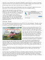
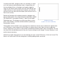
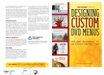
Designing Custom DVD Menus: Part I
By Craig Elliott Hanna
Manager, The Authoring House at Disc Makers
DVD authoring software makes it easy to create and design template-based DVD menus. But many of those
templates have limitations and drawbacks that may produce a less-than-acceptable DVD menu. At some
point you may need to abandon templates and create your own custom designed menu. This may seem
With the advent of desktop video editing, it’s quite common that a DVD producer does not come from a video
it’s essential that you understand the basic principles of designing graphics for TV.
Square Pixel vs. Non-Square Pixel
the way a computer displays an image. TV uses a non-square pixel (1.0 high x 0.9 wide) while a computer
uses a square pixel (1.0 x 1.0). If you were to create a DVD menu
on a computer and import it into your DVD authoring software,
the menu would be squeezed horizontally and appear elongated
vertically.
Your graphics must be designed with the non-square pixel
especially if you have Photoshop™ CS or CS2. These versions
of Photoshop come with a series of templates that allow you to
design a non-square pixel menu on the computer.
(Left) Square pixel image displayed
on a computer. (Right) Square pixel
image displayed on a TV.
and each has it’s own template. To keep things simple, we will
design in the NTSC DV format. (NTSC stands for National Television Systems Committee.)
[Ed. note: There are many formats and screen sizes associated with DVDs, including widescreen and PAL.
Consult our DVD Authoring FAQ for more information.]
In Photoshop, go to the File menu and choose “New.” In the “Preset Size” drop down box, select “NTSC DV
720 x 480 (with guides).” This template ensures you’re
working in a non-square pixel format and your graphics
will display correctly on a TV. In the “Color Mode” drop
down, choose 16bit. (If possible, modify your document
to 24 bit color by selecting “Mode” in the “Image” menu.)
Finally, in the “Advanced” drop down menu, select “NTSC
After clicking OK, a warning dialog box appears. This is
nothing to worry about. Click OK. The pixel aspect ratio
correction shows you the menu as it will appear on a TV.
Remember, you are designing with square pixels. Photoshop is compensating for this and has automatically
adjusted your design. If you turn the preview function off, the image will appear stretched horizontally. Leave
this pixel aspect ratio on. You’ll want to see your menu as it will appear on a TV.
If you are working in an older version of Photoshop or using software that doesn’t support the non-square
pixel format, you can still make adjustments that will ensure your menu displays correctly.
To do this, open your graphics program and create a
document 720 wide x 534 pixels high, 24bit, 72 DPI, and
RGB or YUV color space (not CMYK). It is possible to set
the DPI higher than 72, but NTSC televisions display at
72 DPI, so anything higher will not improve the
resolution of your graphics. When finished designing,
resize the image to 720 x 480. Your image will appear
elongated vertically, but when imported into a DVD
authoring application, the image will be resized and will
appear normal on a TV.
Action Safe – Title Safe
When you selected a preset in Photoshop, you chose NTSC DV 720 x 480 (with guides). The guides are there
for a reason. TVs with a picture tube have what’s known as an overscan area. Overscan is the area beyond
the bezel or frame of the TV screen that is not visible.
The overscan area was devised because not all TVs
(especially older models) display the image in exactly
the same way. Some TVs show more picture, some
show less, and others may shift the image to the left or
right. If you place important information outside the
Action Safe area, you run the risk of it not being seen
by the viewer. The Action Safe area was created to
ensure all important information is visible on all TVs.
These are the way the guides look in Photoshop.
As you can see from the example to the left, there are
two boundaries created by the guides. The outermost
guides are Action Safe, as explained above. The
innermost guides are called Title Safe. The Title Safe guides compensate for the bend in picture tubes,
especially on older TVs. Text outside this area may distort and be difficult to read. It’s important to keep title
information and especially navigation information within these boundaries. If text or navigation buttons are
placed outside this area your viewer may not be able see it. Keep in mind, function of the menu comes first,
then design.
[Ed. note: If using an earlier version of Photoshop or design software that doesn’t support designing for TV,
you can create your own Title Safe area by placing guides at Left 72pix, Right 648 pix, Top 54 pix, and
Bottom 480 pix.]
As you can see in the “No Retreat From Destiny” menu above, important information is within the Title Safe
area. The soldier on the left and part of the flag on the right fall outside this area and that’s perfectly fine. In
fact, placing elements outside the title and action safe guides is good design. Remember, all TVs display
differently, so what one person doesn’t see, another does. It’s important to design to the edge. Just keep the
important information inside the guides.
Broadcast Safe Colors
Televisions have a limited range of colors that can correctly be displayed on a picture tube. This color range is
referred to as Broadcast Safe Colors. Since NTSC is the standard for North American television, we will only
discuss NTSC Broadcast Safe Colors in this article. If you are designing a DVD that will be sent to a
non-NTSC country, click here for more information.
When setting up your DVD menu, choose at least 24bit (if possible) and limit your RGB colors to 233 or below.
Also limit your saturation to below 90% and keep luminance values below 80%. It’s much easier to limit your
colors now, rather than to try to correct them later (especially after your client has approved the menu).
Why limit colors? Colors outside of the broadcast safe range are considered “illegal” and can tend to bleed,
buzz, flicker, or crawl. Visually, this translates to images that seem to move or shake. Not only is this
unpleasant to look at, but it can make text illegible.
By limiting colors, you help ensure the viewer will be able to read your menu without straining their eyes. Bear
in mind that just because you have created Broadcast Safe Colors doesn’t mean your menu will look good on
a TV. In fact, there are many factors that can affect how your menu will appear on a TV. We’ll cover those in
the next issue (Part II of this article).
Safe Levels for Black and White
In addition to Broadcast Safe Colors, there are limitations on white and black levels (called luminance). White
levels that are too high (referred to as “hot”) can cause buzzing, bleeding, crawling, and flickering, just like
“illegal” colors. Be sure to set your white RGB levels no higher than 233 (luminance values below 80%) and
black no lower than 16. White set to 233 may look gray on your computer monitor, but rest assured it will look
white on a TV.
Button States, Normal – Selected – Activated
For a DVD menu to be truly interactive, there needs to be a way to indicate button states. Often these states
are referred to as rollovers, but this term as applied to DVDs is incorrect. Rollover applies to button states or
link states for web and computer applications. With DVD menus, we refer to the button states as Normal,
Selected, and Activated. On most DVD menus the normal state is not visible or is considered off. However
there will always be one button in the selected state by default.
The selected state indicates which button has been navigated to.
The activated state refers to a button that has been triggered by
pressing the enter button on the remote and causes something
to happen (most often to play a part of the DVD). Depending on
your DVD player, this state can last from up to a few seconds to
not visible at all.
There are two methods used to create button states:
1) subpicture overlay and 2) the use of Photoshop layers.
Subpicture overlay uses a black image on a white background
Selected State (Play Movie)
imported the same way as other menu assets. The black areas
are assigned a color in the authoring software to indicate the state and the white area is transparent (Alpha
channel).
There are some drawbacks when using this method. Only solid colors can be used to indicate a button state.
Also subpictures cannot be antialiased and can result in overlays with jagged edges. Because this may
appear unprofessional, most DVD designers do not use elements such as text or complex shapes as a state
indicator, and opt to use simple geometric shapes instead.
On professional DVDs, designers often use something as simple
as a small square to indicate button states. A square does not
have any diagonal lines so the edges won’t appear jagged or
rough. As you become more familiar with DVD menu design and
understand ways to work around these limitations, you may find
you can start to use more intricate shapes. (We will discuss this in
Part II of this article.)
Because of limitations with subpicture overlays, designers may
opt for another option. This second method, supported by Apple’s
DVD Studio Pro™ and Adobe’s Encore™, allows you to import
Photoshop layers. The designer can utilize layer effects such as
glows, drop shadows, and other antialiased effects producing a
more dynamic overlay.
Subpicture Overlay
(caption can center under both)
The drawback of this method is layers are larger than subpictures and can cause a decrease in performance
on a DVD player. It takes longer for the DVD player to swap out layers than it does to swap a subpicture
overlay. Using layers may result in a one to three-second delay between button states or navigation. This may
not seem like a considerable amount of time, but if you are trying to scroll through 10 scene selections, it can
quickly become annoying.
Follow these simple steps and you can start to design your own custom DVD menus. In the next issue of The
Source, we’ll offer more DVD menu design tips, including adding motion and sound.
Designing Custom DVD Menus: Part 2
By Craig Elliott Hanna
Manager, The Authoring House at Disc Makers
In Part I, we discussed some of the basics for designing DVD menus. In Part II, we’ll expand on these basics
and by discussing some of the rules and tips that will help you create professional DVD menus.
for video production. With the advances in video editing applications for the PC, you’re going to create all of
your graphics on a computer. This presents a problem because applications like Photoshop weren’t designed
to create graphics for video.
When designing menus on a computer, they’re going to look great, but put that menu on a TV, and you may
different way. To help avoid these problems, it’s necessary to understand how they differ and what you can do
help prevent these issues.
Terminology
Let’s take a minute to explain a few key terms. When talking about graphics not displaying correctly on TVs,
we refer to artifacts or artifacting. Artifacts, as they apply to DVD menus, are distortions or errors created
during compression, during the process of building the DVD (mixing), or created by the interlaced scanning
process. Essentially, artifacts are any visual distortions not desirous in the image.
The terms used to describe artifacts (distortions) are Twitter, Buzzing, Mosquitoing, and Crawl. These terms all
to a thin horizontal line. The line actually appears and then
originally referred to the audible buzzing noise created in a TV signal when white levels were above the NTSC
limits or “too hot.” It now refers to the edges of a graphic or font that appear to shimmer, glow, or move – also
referred to as Mosquitoing. Crawl is when part of an image appears to move or crawl across the screen.
menus, even professional ones, and you’ll see plenty of examples of artifacting. Look at what works and what
doesn’t. See if you can determine patterns. Are there particular fonts, colors, or designs that work or don’t
work? As you start to look closely at professional DVD menus, you’ll start to notice that artifacting many times
is unavoidable. Designing DVD menus is not about eliminating artifacts but learning how to minimize them.
All monitors are not created equal
When designing DVD menus, look at your graphics on a TV before you create your DVD. Preferably a
production monitor, but if you can only use a standard TV that will have to do. Remember, your graphics
look like. In addition to artifacts, color will differ from a computer to a TV, so you will not know how it really
looks until you see it on a monitor.
So how can I view my menus on a TV without making a DVD? There are applications designed to display
from the computer and converts it to composite (RCA connector) or S-Video, unless you already have a video
card with those outputs. Once converted, you can hook up your monitor as you would a VCR or DVD player.
When testing your menu, there are several factors that will effect how your menu will appear. The type of cable
used to connect to the monitor or TV can effect how well it displays. Your options (from worst to best) are:
1. Composite (RCA connector)
2. S-video
3. Component (professional analog)
4. SDI (Serial Digital Interface)
The lowest quality image will be created using a composite cable. This is the same type used in the majority of
home viewing situations. If you want to see what your menu will look like in the worst case scenario, use this
type. Another factor to keep in mind is all TVs are different. If possible, use a production monitor to review your
menus.
Newer TVs have comb filters and line doublers. These filters help improve the TV so you won’t be seeing the
raw video signal as you would with a production monitor. If you only have a consumer TV, it’s best to test your
menu on several different TVs to get a good understanding of how it will display. If you are using a production
monitor, make sure to turn off the comb filter to see the graphics in a raw (worst) state. After a little practice,
you may be able to judge what fonts, colors, and designs will work and what won’t.
Important tools of the trade
In addition a production monitor, it’s important to have the proper tools to create professional looking DVD
menus. Two important tools are the waveform and vector scope. Explaining how to use these is beyond the
scope of this article, but in short, these are engineering tools used in professional video production that
measure luminance (light and dark) and Chrominance (color) levels and phase. These tools will allow you to
measure video levels in graphics to determine if they are within NTSC guidelines (see Part I) and are available
in hardware and software forms.
When buying software-based Waveforms/Vector scopes, some only display one line of video per field instead
of the full field or frame. This does not give an accurate representation of your graphics. Professional video
editing applications such as Final Cut Pro come with their own versions of Waveforms and Vector scopes, and
FCP shows a full frame of video. Check your software as you may already have these tools. If you don’t know
how to use them, consult your user manual, or search the web (there are many good resources out there).
Mechanics of a monitor
Now that you have all the right equipment, let’s discuss why TVs and computer monitors display images
differently. A computer screen is made up of individual pixels each assigned it’s own discrete luminance (light
and dark) and chrominance (color) scanned progressively. That means each line is scanned, one after another,
in order from top to bottom.
A TV screen is made up fields. These fields are created by a single electron beam scanning across the
phosphorus coating on the back of a picture tube. The point of this beam changes chrominance and
luminance values as it scans comprising the TV picture. In a video image, each second contains 30 frames
and each frame consists of 2 fields (odd/even – 60 fields a second).
These fields are not drawn progressively as with a computer monitor or on some high definition TV sets. The
beam traces across the picture tube creating field one first (figure 1a) then retraces to the top of the screen
and creates field 2 (figure 1b). This process is known as interlacing. The end result, the two fields appear to be
seamlessly integrated into one solid picture (figure 1c).
This happens so quickly (approx 1/60th of a second) that the human eye cannot detect it is occurring because
of a phenomenon called persistence of vision. However, it is this process of interlacing that causes problems
with computer generated graphics on a TV.
Figure 1A – Odd.
Figure 1B – Even.
Figure 1C – Interlaced.
Designing a menu
Now that you better understand how images display on a TV, let’s present some guidelines for designing DVD
menus.
Horizontal Lines
Horizontal lines present one of the most common issues with DVD menus. During scanning, if a horizontal line
is too thin it can be visible in only 1 field of video. Since the cathode ray alternates scanning between odd and
even fields, the line will seem to appear and disappear causing it to twitter or flicker. By keeping horizontal
lines no thinner than 3 to 4 pixels thick you can help avoid this issue. You can also try shifting the line a pixel
or two up or down. Sometimes this will alleviate the problem.
Fonts
Fonts can be an issue if not used carefully. It’s recommended that Serif fonts be avoided. Serif fonts have
small design details that often consist of horizontal lines. These elements can cause twitter. It’s best to stick
with Sans Serif fonts, but there are no hard and fast rules when it comes to designing graphics for display on
a TV. Just because a font is Sans Serif, it doesn’t mean it will work as different fonts have different styles.
Font size can also be an issue. A font that’s too small can
buzz, crawl, or mosquito. It’s generally accepted that font
sizes smaller than 18-20 points should be avoided. Although
this is a good starting point, it’s not a rule. Different fonts can
be larger or smaller than one another even though they may
be the same point size. This is a good time to check things
on your monitor. No matter what the point size, if it doesn’t
look right, don’t use it.
Some experts recommend adding a very slight blur to text that doesn’t display well. Sometimes that effects
the readability of the menu. Another approach is putting a drop shadow or a glow on the fonts. This not only
can help reduce artifacts, but it can add to the readability of your menu. If you’re careful when choosing fonts
and test your menus on a monitor, you shouldn’t have any need to add a blur.
Chrominance (color)
As covered in Part I, staying within the NTSC color safe limits is important – but it is no guarantee. Colors,
especially red and yellow, if too hot (bright), can mosquito or crawl. A good place to start is adjust them to
within the NTSC limits. Review your menu on a TV and if those colors look bad, you will need to go back and
drop the saturation until it looks OK. Working within a single color palette is a great way to reduce artifacting.
Use a light blue font on top of a darker blue background. This makes it easier for the cathode ray to adjust
between the two areas of the image.
Luminance (brightness)
As with color, white levels that are too bright can cause issues. Again, adjusting to NTSC safe levels is a good
start, but you may need to do more. White on “TV White” is actually gray. If your white levels in your fonts or
images don’t look adequate, drop the brightness down until it’s slightly gray. When you view this on a TV, it
will look white.
Sharp Edges
As with horizontal lines, sharp edges, either in a font or in the design, can twitter or buzz. This can happen
for two reasons: the edge can fall within just one field of video or there can be too great a contrast between
the edge and the color next to it. When the contrast is too great, the cathode ray can’t change luminance and
chrominance values quickly enough to compensate for the difference. For this reason, we get artifacting.
You can handle this one of two ways. First, although I didn’t recommend it for fonts, you can blur the edge so
it creates a slight gradient between the two values. This gives the ray a series of steps to change values. The
same can be accomplished using a semi-transparent drop shadow or glow. Blurring the image will also work
on areas of your menu that may have a busy pattern like crosshatching or a herringbone.
Second, you can adjust the colors so the contrast isn’t as great. If you have a black element next to a white
element, try changing the white to gray or some other color. Sometimes even rotating the element slightly can
alleviate the artifacting.
Designing a DVD menu is a trial and error process. What may work in one instance, won’t in another. You may
need to experiment with fonts, colors, and designs before you get an acceptable combination. The important
thing is to recognize what works and doesn’t work and above all, test your menus on a TV.