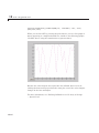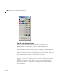
1
MATLAB® Creating Graphical User Interfaces R2012a How to Contact MathWorks Web Newsgroup www.mathworks.com/contact_TS.html Technical Support www.mathworks.com comp.soft-sys.matlab [email protected] [email protected] [email protected] [email protected] [email protected] Product enhancement suggestions Bug reports Documentation error reports Order status, license renewals, passcodes Sales, pricing, and general information 508-647-7000 (Phone) 508-647-7001 (Fax) The MathWorks, Inc. 3 Apple Hill Drive Natick, MA 01760-2098 For contact information about worldwide offices, see the MathWorks Web site. MATLAB® Creating Graphical User Interfaces © COPYRIGHT 2000–2012 by The MathWorks, Inc. The software described in this document is furnished under a license agreement. The software may be used or copied only under the terms of the license agreement. No part of this manual may be photocopied or reproduced in any form without prior written consent from The MathWorks, Inc. FEDERAL ACQUISITION: This provision applies to all acquisitions of the Program and Documentation by, for, or through the federal government of the United States. By accepting delivery of the Program or Documentation, the government hereby agrees that this software or documentation qualifies as commercial computer software or commercial computer software documentation as such terms are used or defined in FAR 12.212, DFARS Part 227.72, and DFARS 252.227-7014. Accordingly, the terms and conditions of this Agreement and only those rights specified in this Agreement, shall pertain to and govern the use, modification, reproduction, release, performance, display, and disclosure of the Program and Documentation by the federal government (or other entity acquiring for or through the federal government) and shall supersede any conflicting contractual terms or conditions. If this License fails to meet the government’s needs or is inconsistent in any respect with federal procurement law, the government agrees to return the Program and Documentation, unused, to The MathWorks, Inc. Trademarks MATLAB and Simulink are registered trademarks of The MathWorks, Inc. See www.mathworks.com/trademarks for a list of additional trademarks. Other product or brand names may be trademarks or registered trademarks of their respective holders. Patents MathWorks products are protected by one or more U.S. patents. Please see www.mathworks.com/patents for more information. Revision History November 2000 June 2001 July 2002 June 2004 October 2004 March 2005 September 2005 March 2006 May 2006 September 2006 March 2007 September 2007 March 2008 October 2008 March 2009 September 2009 March 2010 September 2010 April 2011 September 2011 March 2012 Online Online Online Online Online Online Online Online Online Online Online Online Online Online Online Online Online Online Online Online Online Only Only Only Only Only Only Only Only Only Only Only Only Only Only Only Only Only Only Only Only Only New for MATLAB 6.0 (Release 12) Revised for MATLAB 6.1 (Release 12.1) Revised for MATLAB 6.6 (Release 13) Revised for MATLAB 7.0 (Release 14) Revised for MATLAB 7.0.1 (Release 14SP1) Revised for MATLAB 7.0.4 (Release 14SP2) Revised for MATLAB 7.1 (Release 14SP3) Revised for MATLAB 7.2 (Release 2006a) Revised for MATLAB 7.2 Revised for MATLAB 7.3 (Release 2006b) Revised for MATLAB 7.4 (Release 2007a) Revised for MATLAB 7.5 (Release 2007b) Revised for MATLAB 7.6 (Release 2008a) Revised for MATLAB 7.7 (Release 2008b) Revised for MATLAB 7.8 (Release 2009a) Revised for MATLAB 7.9 (Release 2009b) Revised for MATLAB 7.10 (Release 2010a) Revised for MATLAB 7.11 (Release 2010b) Revised for MATLAB 7.12 (Release 2011a) Revised for MATLAB 7.13 (Release 2011b) Revised for MATLAB 7.14 (Release 2012a) Contents Introduction to Creating GUIs About GUIs in MATLAB Software 1 .................................... 1-2 How Does a GUI Work? . . . . . . . . . . . . . . . . . . . . . . . . . . . . . 1-4 Where Do I Start? . . . . . . . . . . . . . . . . . . . . . . . . . . . . . . . . . . 1-6 Ways to Build MATLAB GUIs . . . . . . . . . . . . . . . . . . . . . . . 1-8 What Is a GUI? How to Create a GUI with GUIDE 2 Introduction to GUIDE . . . . . . . . . . . . . . . . . . . . . . . . . . . . . What Is GUIDE? . . . . . . . . . . . . . . . . . . . . . . . . . . . . . . . . . . Opening GUIDE . . . . . . . . . . . . . . . . . . . . . . . . . . . . . . . . . . Getting Help in GUIDE . . . . . . . . . . . . . . . . . . . . . . . . . . . . Laying Out a GUIDE GUI . . . . . . . . . . . . . . . . . . . . . . . . . . Programming a GUIDE GUI . . . . . . . . . . . . . . . . . . . . . . . . 2-2 2-2 2-2 2-4 2-7 2-8 About the Simple GUIDE GUI Example . . . . . . . . . . . . . . Simple GUIDE GUI Components . . . . . . . . . . . . . . . . . . . . . View Simple GUIDE GUI Layout and Code File . . . . . . . . 2-9 2-9 2-10 Lay Out the Simple GUI in GUIDE . . . . . . . . . . . . . . . . . . Open a New GUI in the GUIDE Layout Editor . . . . . . . . . . Set the GUI Figure Size in GUIDE . . . . . . . . . . . . . . . . . . . Add Components to the Simple GUIDE GUI . . . . . . . . . . . 2-11 2-11 2-14 2-15 v Save the GUI Layout . . . . . . . . . . . . . . . . . . . . . . . . . . . . . . . 2-25 Program the Simple GUIDE GUI . . . . . . . . . . . . . . . . . . . . Add Code to the Simple GUIDE GUI . . . . . . . . . . . . . . . . . . Generate Data to Plot . . . . . . . . . . . . . . . . . . . . . . . . . . . . . . Program the Pop-Up Menu . . . . . . . . . . . . . . . . . . . . . . . . . . Program the Push Buttons . . . . . . . . . . . . . . . . . . . . . . . . . . 2-28 2-28 2-28 2-31 2-33 Use the Completed Simple GUIDE GUI . . . . . . . . . . . . . . Open and Run the GUI . . . . . . . . . . . . . . . . . . . . . . . . . . . . . 2-36 2-36 How to Create a Simple GUI Programmatically 3 vi Contents About the Simple Programmatic GUI Example . . . . . . . Simple Programmatic GUI Components . . . . . . . . . . . . . . . View Simple Programmatic GUI Code File . . . . . . . . . . . . . Functions for the Simple Programmatic GUI . . . . . . . . . . . 3-2 3-2 3-3 3-3 Create the Simple Programmatic GUI Code File . . . . . . 3-5 Lay Out the Simple Programmatic GUI . . . . . . . . . . . . . . Create a Figure for a Programmatic GUI . . . . . . . . . . . . . . Add Components to a Programmatic GUI . . . . . . . . . . . . . . 3-7 3-7 3-7 Code the Simple Programmatic GUI . . . . . . . . . . . . . . . . . Program the Pop-Up Menu . . . . . . . . . . . . . . . . . . . . . . . . . . Program the Push Buttons . . . . . . . . . . . . . . . . . . . . . . . . . . Program Callbacks for the Simple GUI Components . . . . . Initialize the Simple Programmatic GUI . . . . . . . . . . . . . . . The Completed Simple Programmatic GUI Code File . . . . 3-11 3-11 3-12 3-12 3-13 3-16 Use the Completed Simple Programmatic GUI . . . . . . . Open and Run the GUI . . . . . . . . . . . . . . . . . . . . . . . . . . . . . 3-20 3-20 Create GUIs with GUIDE What Is GUIDE? 4 GUIDE: Getting Started . . . . . . . . . . . . . . . . . . . . . . . . . . . . GUI Layout . . . . . . . . . . . . . . . . . . . . . . . . . . . . . . . . . . . . . . GUI Programming . . . . . . . . . . . . . . . . . . . . . . . . . . . . . . . . . 4-2 4-2 4-2 GUIDE Tools Summary . . . . . . . . . . . . . . . . . . . . . . . . . . . . . 4-3 GUIDE Preferences and Options 5 GUIDE Preferences . . . . . . . . . . . . . . . . . . . . . . . . . . . . . . . . Set Preferences . . . . . . . . . . . . . . . . . . . . . . . . . . . . . . . . . . . Confirmation Preferences . . . . . . . . . . . . . . . . . . . . . . . . . . . Backward Compatibility Preference . . . . . . . . . . . . . . . . . . All Other Preferences . . . . . . . . . . . . . . . . . . . . . . . . . . . . . . 5-2 5-2 5-2 5-4 5-6 GUI Options . . . . . . . . . . . . . . . . . . . . . . . . . . . . . . . . . . . . . . . The GUI Options Dialog Box . . . . . . . . . . . . . . . . . . . . . . . . Resize Behavior . . . . . . . . . . . . . . . . . . . . . . . . . . . . . . . . . . . Command-Line Accessibility . . . . . . . . . . . . . . . . . . . . . . . . Generate FIG-File and MATLAB File . . . . . . . . . . . . . . . . . Generate FIG-File Only . . . . . . . . . . . . . . . . . . . . . . . . . . . . 5-9 5-9 5-10 5-11 5-12 5-14 Lay Out a GUIDE GUI 6 Design a GUI . . . . . . . . . . . . . . . . . . . . . . . . . . . . . . . . . . . . . . 6-2 Start GUIDE . . . . . . . . . . . . . . . . . . . . . . . . . . . . . . . . . . . . . . 6-4 vii Select a GUI Template . . . . . . . . . . . . . . . . . . . . . . . . . . . . . Access the Templates . . . . . . . . . . . . . . . . . . . . . . . . . . . . . . Template Descriptions . . . . . . . . . . . . . . . . . . . . . . . . . . . . . 6-6 6-6 6-7 Set the GUI Size . . . . . . . . . . . . . . . . . . . . . . . . . . . . . . . . . . . Maximize the Layout Area . . . . . . . . . . . . . . . . . . . . . . . . . . 6-15 6-18 Add Components to the GUI . . . . . . . . . . . . . . . . . . . . . . . . Available Components . . . . . . . . . . . . . . . . . . . . . . . . . . . . . A Working GUI with Many Components . . . . . . . . . . . . . . . Add Components to the GUIDE Layout Area . . . . . . . . . . . Define User Interface Controls . . . . . . . . . . . . . . . . . . . . . . . Define Panels and Button Groups . . . . . . . . . . . . . . . . . . . . Define Axes . . . . . . . . . . . . . . . . . . . . . . . . . . . . . . . . . . . . . . Define Tables . . . . . . . . . . . . . . . . . . . . . . . . . . . . . . . . . . . . . Add ActiveX Controls . . . . . . . . . . . . . . . . . . . . . . . . . . . . . . Copy, Paste, and Arrange Components . . . . . . . . . . . . . . . . Locate and Move Components . . . . . . . . . . . . . . . . . . . . . . . Resize Components . . . . . . . . . . . . . . . . . . . . . . . . . . . . . . . . 6-19 6-20 6-23 6-31 6-38 6-56 6-62 6-66 6-77 6-79 6-83 6-86 Align Components . . . . . . . . . . . . . . . . . . . . . . . . . . . . . . . . . Align Objects Tool . . . . . . . . . . . . . . . . . . . . . . . . . . . . . . . . . Property Inspector . . . . . . . . . . . . . . . . . . . . . . . . . . . . . . . . . Grid and Rulers . . . . . . . . . . . . . . . . . . . . . . . . . . . . . . . . . . . Guide Lines . . . . . . . . . . . . . . . . . . . . . . . . . . . . . . . . . . . . . . 6-89 6-89 6-92 6-96 6-96 Set Tab Order . . . . . . . . . . . . . . . . . . . . . . . . . . . . . . . . . . . . . 6-98 Create Menus in a GUIDE GUI . . . . . . . . . . . . . . . . . . . . . . 6-101 Menus for the Menu Bar . . . . . . . . . . . . . . . . . . . . . . . . . . . . 6-102 Context Menus . . . . . . . . . . . . . . . . . . . . . . . . . . . . . . . . . . . 6-114 Create Toolbars . . . . . . . . . . . . . . . . . . . . . . . . . . . . . . . . . . . 6-122 Create Toolbars with GUIDE . . . . . . . . . . . . . . . . . . . . . . . . 6-122 Editing Tool Icons . . . . . . . . . . . . . . . . . . . . . . . . . . . . . . . . . 6-131 View the Object Hierarchy . . . . . . . . . . . . . . . . . . . . . . . . . 6-136 Designing for Cross-Platform Compatibility . . . . . . . . . 6-137 Default System Font . . . . . . . . . . . . . . . . . . . . . . . . . . . . . . . 6-137 viii Contents Standard Background Color . . . . . . . . . . . . . . . . . . . . . . . . . 6-138 Cross-Platform Compatible Units . . . . . . . . . . . . . . . . . . . . 6-139 Save and Run a GUIDE GUI 7 Name a GUI and Its Files . . . . . . . . . . . . . . . . . . . . . . . . . . . The GUI Files . . . . . . . . . . . . . . . . . . . . . . . . . . . . . . . . . . . . File and GUI Names . . . . . . . . . . . . . . . . . . . . . . . . . . . . . . . Rename GUIs and GUI Files . . . . . . . . . . . . . . . . . . . . . . . . 7-2 7-2 7-3 7-3 Save a GUIDE GUI . . . . . . . . . . . . . . . . . . . . . . . . . . . . . . . . . Ways to Save a GUI . . . . . . . . . . . . . . . . . . . . . . . . . . . . . . . Save a New GUI . . . . . . . . . . . . . . . . . . . . . . . . . . . . . . . . . . Save an Existing GUI . . . . . . . . . . . . . . . . . . . . . . . . . . . . . . Export a GUIDE GUI to a Code File . . . . . . . . . . . . . . . . . . 7-4 7-4 7-5 7-8 7-9 Run a GUIDE GUI . . . . . . . . . . . . . . . . . . . . . . . . . . . . . . . . . Execute GUI Code . . . . . . . . . . . . . . . . . . . . . . . . . . . . . . . . . From the GUIDE Layout Editor . . . . . . . . . . . . . . . . . . . . . From the Command Line . . . . . . . . . . . . . . . . . . . . . . . . . . . From Any MATLAB Code File . . . . . . . . . . . . . . . . . . . . . . . From a Test Script . . . . . . . . . . . . . . . . . . . . . . . . . . . . . . . . 7-10 7-10 7-10 7-11 7-11 7-12 Programming a GUIDE GUI 8 Working with Callbacks in GUIDE . . . . . . . . . . . . . . . . . . Programming GUIs Created Using GUIDE . . . . . . . . . . . . What Is a Callback? . . . . . . . . . . . . . . . . . . . . . . . . . . . . . . . Kinds of Callbacks . . . . . . . . . . . . . . . . . . . . . . . . . . . . . . . . . 8-2 8-2 8-2 8-2 Files Generated by GUIDE . . . . . . . . . . . . . . . . . . . . . . . . . Code Files and FIG-Files . . . . . . . . . . . . . . . . . . . . . . . . . . . GUI Code File Structure . . . . . . . . . . . . . . . . . . . . . . . . . . . . 8-7 8-7 8-8 ix Adding Callback Templates to an Existing GUI Code File . . . . . . . . . . . . . . . . . . . . . . . . . . . . . . . . . . . . . . . . . . . About GUIDE-Generated Callbacks . . . . . . . . . . . . . . . . . . 8-9 8-9 Default Callback Properties in GUIDE . . . . . . . . . . . . . . . Setting Callback Properties Automatically . . . . . . . . . . . . . Deleting Callbacks from a GUI Code File . . . . . . . . . . . . . . 8-11 8-11 8-14 Customizing Callbacks in GUIDE . . . . . . . . . . . . . . . . . . . GUIDE Callback Templates . . . . . . . . . . . . . . . . . . . . . . . . . Callback Names and Signatures in GUIDE . . . . . . . . . . . . GUIDE Callback Arguments . . . . . . . . . . . . . . . . . . . . . . . . Changing Callbacks Assigned by GUIDE . . . . . . . . . . . . . . 8-15 8-15 8-16 8-20 8-22 Initialize a GUIDE GUI . . . . . . . . . . . . . . . . . . . . . . . . . . . . . Opening Function . . . . . . . . . . . . . . . . . . . . . . . . . . . . . . . . . Output Function . . . . . . . . . . . . . . . . . . . . . . . . . . . . . . . . . . 8-25 8-25 8-28 Add Code for Components in Callbacks . . . . . . . . . . . . . . Push Button . . . . . . . . . . . . . . . . . . . . . . . . . . . . . . . . . . . . . . Toggle Button . . . . . . . . . . . . . . . . . . . . . . . . . . . . . . . . . . . . Radio Button . . . . . . . . . . . . . . . . . . . . . . . . . . . . . . . . . . . . . Check Box . . . . . . . . . . . . . . . . . . . . . . . . . . . . . . . . . . . . . . . Edit Text . . . . . . . . . . . . . . . . . . . . . . . . . . . . . . . . . . . . . . . . Table . . . . . . . . . . . . . . . . . . . . . . . . . . . . . . . . . . . . . . . . . . . Slider . . . . . . . . . . . . . . . . . . . . . . . . . . . . . . . . . . . . . . . . . . . List Box . . . . . . . . . . . . . . . . . . . . . . . . . . . . . . . . . . . . . . . . . Pop-Up Menu . . . . . . . . . . . . . . . . . . . . . . . . . . . . . . . . . . . . . Panel . . . . . . . . . . . . . . . . . . . . . . . . . . . . . . . . . . . . . . . . . . . Button Group . . . . . . . . . . . . . . . . . . . . . . . . . . . . . . . . . . . . . Axes . . . . . . . . . . . . . . . . . . . . . . . . . . . . . . . . . . . . . . . . . . . . ActiveX Control . . . . . . . . . . . . . . . . . . . . . . . . . . . . . . . . . . . Menu Item . . . . . . . . . . . . . . . . . . . . . . . . . . . . . . . . . . . . . . . 8-30 8-30 8-31 8-32 8-33 8-33 8-35 8-36 8-36 8-37 8-38 8-42 8-45 8-49 8-59 Managing and Sharing Application Data in GUIDE 9 Ways to Manage Data in a GUIDE GUI . . . . . . . . . . . . . . . x Contents 9-2 Data Management Mechanism Summary . . . . . . . . . . . . . . Nested Functions . . . . . . . . . . . . . . . . . . . . . . . . . . . . . . . . . UserData Property . . . . . . . . . . . . . . . . . . . . . . . . . . . . . . . . Application Data . . . . . . . . . . . . . . . . . . . . . . . . . . . . . . . . . . GUI Data . . . . . . . . . . . . . . . . . . . . . . . . . . . . . . . . . . . . . . . . Examples of Sharing Data Among a GUI’s Callbacks . . . . 9-2 9-4 9-5 9-5 9-7 9-10 Making Multiple GUIs Work Together . . . . . . . . . . . . . . . Data-Sharing Techniques . . . . . . . . . . . . . . . . . . . . . . . . . . . Example — Manipulating a Modal Dialog Box for User Input . . . . . . . . . . . . . . . . . . . . . . . . . . . . . . . . . . . . . . . . . Example — Individual GUIDE GUIs Cooperating as Icon Manipulation Tools . . . . . . . . . . . . . . . . . . . . . . . . . . . . . . 9-21 9-21 9-22 9-30 Examples of GUIDE GUIs 10 GUI with Multiple Axes (GUIDE) . . . . . . . . . . . . . . . . . . . . 10-2 About the Multiple Axes Example . . . . . . . . . . . . . . . . . . . . 10-2 View and Run the Multiple Axes GUI . . . . . . . . . . . . . . . . . 10-3 Design the Multiple Axes GUI . . . . . . . . . . . . . . . . . . . . . . . 10-4 Plot Push Button Callback . . . . . . . . . . . . . . . . . . . . . . . . . . 10-8 Validate User Input as Numbers . . . . . . . . . . . . . . . . . . . . . 10-11 GUI for Animating a 3-D View (GUIDE) . . . . . . . . . . . . . . About the 3-D Animation Example . . . . . . . . . . . . . . . . . . . View and Run the 3-D Globe GUI . . . . . . . . . . . . . . . . . . . . Design the 3-D Globe GUI . . . . . . . . . . . . . . . . . . . . . . . . . . Graphics Techniques Used in the 3-D Globe GUI . . . . . . . . Further Graphic Explorations . . . . . . . . . . . . . . . . . . . . . . . 10-15 10-15 10-16 10-17 10-24 10-29 GUI to Interactively Explore Data in a Table (GUIDE) . . . . . . . . . . . . . . . . . . . . . . . . . . . . . . . . . . . . . . . . About the tablestat Example . . . . . . . . . . . . . . . . . . . . . . . . View and Run the tablestat GUI . . . . . . . . . . . . . . . . . . . . . Design the tablestat GUI . . . . . . . . . . . . . . . . . . . . . . . . . . . Extend the tablestat GUI . . . . . . . . . . . . . . . . . . . . . . . . . . . 10-31 10-31 10-33 10-35 10-52 List Box Directory Reader (GUIDE) . . . . . . . . . . . . . . . . . 10-54 xi About the List Box Directory Example . . . . . . . . . . . . . . . . 10-54 View and Run the List Box Directory GUI . . . . . . . . . . . . . 10-55 Implement the List Box Directory GUI . . . . . . . . . . . . . . . . 10-56 xii Contents Access Workspace Variables from a List Box (GUIDE) . . . . . . . . . . . . . . . . . . . . . . . . . . . . . . . . . . . . . . . . About the Workspace Variable Example . . . . . . . . . . . . . . . View and Run the Workspace Variable GUI . . . . . . . . . . . . Read Workspace Variables . . . . . . . . . . . . . . . . . . . . . . . . . . Read Selections from List Box . . . . . . . . . . . . . . . . . . . . . . . 10-61 10-61 10-62 10-63 10-64 A GUI to Set Simulink Model Parameters (GUIDE) . . . About the Simulink Model Parameters Example . . . . . . . . View and Run the Simulink Parameters GUI . . . . . . . . . . . How to Use the Simulink Parameters GUI . . . . . . . . . . . . . Run the GUI . . . . . . . . . . . . . . . . . . . . . . . . . . . . . . . . . . . . . Program the Slider and Edit Text Components . . . . . . . . . Run the Simulation from the GUI . . . . . . . . . . . . . . . . . . . . Remove Results from List Box . . . . . . . . . . . . . . . . . . . . . . . Plot Results Data . . . . . . . . . . . . . . . . . . . . . . . . . . . . . . . . . The GUI Help Button . . . . . . . . . . . . . . . . . . . . . . . . . . . . . . Close the GUI . . . . . . . . . . . . . . . . . . . . . . . . . . . . . . . . . . . . The List Box Callback and Create Function . . . . . . . . . . . . 10-66 10-66 10-67 10-68 10-70 10-71 10-73 10-75 10-76 10-78 10-78 10-79 An Address Book Reader (GUIDE) . . . . . . . . . . . . . . . . . . About the Address Book Reader Example . . . . . . . . . . . . . . View and Run the Address Book Reader GUI . . . . . . . . . . . Run the Address Book Reader GUI . . . . . . . . . . . . . . . . . . . Load an Address Book Into the Reader . . . . . . . . . . . . . . . . The Contact Name Callback . . . . . . . . . . . . . . . . . . . . . . . . . The Contact Phone Number Callback . . . . . . . . . . . . . . . . . Page Through Address Book — Prev/Next . . . . . . . . . . . . . Save Address Book Changes from the Menu . . . . . . . . . . . . The Create New Menu . . . . . . . . . . . . . . . . . . . . . . . . . . . . . The Address Book Resize Function . . . . . . . . . . . . . . . . . . . 10-81 10-81 10-82 10-83 10-85 10-88 10-90 10-91 10-93 10-94 10-95 Use a Modal Dialog Box to Confirm an Operation (GUIDE) . . . . . . . . . . . . . . . . . . . . . . . . . . . . . . . . . . . . . . . . About the Modal Dialog Example . . . . . . . . . . . . . . . . . . . . View and Run the Modal Dialog Box GUIs . . . . . . . . . . . . . Set Up the Close Confirmation Dialog . . . . . . . . . . . . . . . . . Set Up the GUI with the Close Button . . . . . . . . . . . . . . . . 10-98 10-98 10-99 10-100 10-101 Run the Close-Confirmation GUI . . . . . . . . . . . . . . . . . . . . . 10-102 How the Close-Confirmation GUIs Work . . . . . . . . . . . . . . 10-103 Time Data Updates from a GUI (GUIDE) . . . . . . . . . . . . . About the Timer GUI Example . . . . . . . . . . . . . . . . . . . . . . View and Run the GUIDE Timer GUI . . . . . . . . . . . . . . . . . Components Used by the Timer GUI . . . . . . . . . . . . . . . . . . How the GUI Implements the Timer . . . . . . . . . . . . . . . . . . Other Uses for Timers in GUIs . . . . . . . . . . . . . . . . . . . . . . 10-105 10-105 10-106 10-107 10-109 10-112 Create GUIs Programmatically Lay Out a Programmatic GUI 11 Design a Programmatic GUI . . . . . . . . . . . . . . . . . . . . . . . . 11-2 Create and Run a Programmatic GUI . . . . . . . . . . . . . . . . File Organization . . . . . . . . . . . . . . . . . . . . . . . . . . . . . . . . . File Template . . . . . . . . . . . . . . . . . . . . . . . . . . . . . . . . . . . . Run the GUI . . . . . . . . . . . . . . . . . . . . . . . . . . . . . . . . . . . . . 11-4 11-4 11-4 11-5 Create Figures for Programmatic GUIs . . . . . . . . . . . . . . 11-6 Add Components to a Programmatic GUI . . . . . . . . . . . . Types of GUI Components . . . . . . . . . . . . . . . . . . . . . . . . . . Add User Interface Controls to a Programmatic GUI . . . . . Add Panels and Button Groups . . . . . . . . . . . . . . . . . . . . . . Add Axes . . . . . . . . . . . . . . . . . . . . . . . . . . . . . . . . . . . . . . . . Add ActiveX Controls . . . . . . . . . . . . . . . . . . . . . . . . . . . . . . 11-9 11-9 11-13 11-32 11-38 11-41 Compose and Code GUIs with Interactive Tools . . . . . . Set Positions of Components Interactively . . . . . . . . . . . . . Align Components . . . . . . . . . . . . . . . . . . . . . . . . . . . . . . . . . Set Colors Interactively . . . . . . . . . . . . . . . . . . . . . . . . . . . . Set Font Characteristics Interactively . . . . . . . . . . . . . . . . . Generate Code to Set Component Properties . . . . . . . . . . . 11-42 11-43 11-53 11-60 11-62 11-64 xiii Set Tab Order in a Programmatic GUI . . . . . . . . . . . . . . . How Tabbing Works . . . . . . . . . . . . . . . . . . . . . . . . . . . . . . . Default Tab Order . . . . . . . . . . . . . . . . . . . . . . . . . . . . . . . . . Change the Tab Order . . . . . . . . . . . . . . . . . . . . . . . . . . . . . 11-70 11-70 11-70 11-73 Create Menus for a Programmatic GUI . . . . . . . . . . . . . . 11-75 Add Menu Bar Menus . . . . . . . . . . . . . . . . . . . . . . . . . . . . . . 11-75 Add Context Menus to a Programmatic GUI . . . . . . . . . . . 11-81 Create Toolbars for Programmatic GUIs . . . . . . . . . . . . . Use the uitoolbar Function . . . . . . . . . . . . . . . . . . . . . . . . . . Commonly Used Properties . . . . . . . . . . . . . . . . . . . . . . . . . Toolbars . . . . . . . . . . . . . . . . . . . . . . . . . . . . . . . . . . . . . . . . . Display and Modify the Standard Toolbar . . . . . . . . . . . . . 11-88 11-88 11-88 11-89 11-92 Design Programmatic GUIs for Cross-Platform Compatibility . . . . . . . . . . . . . . . . . . . . . . . . . . . . . . . . . . . Default System Font . . . . . . . . . . . . . . . . . . . . . . . . . . . . . . . Standard Background Color . . . . . . . . . . . . . . . . . . . . . . . . . Cross-Platform Compatible Units . . . . . . . . . . . . . . . . . . . . 11-94 11-94 11-95 11-96 Code a Programmatic GUI 12 Organize a Programmatic GUI File . . . . . . . . . . . . . . . . . . 12-2 Initialize a Programmatic GUI . . . . . . . . . . . . . . . . . . . . . . Examples . . . . . . . . . . . . . . . . . . . . . . . . . . . . . . . . . . . . . . . . 12-3 12-4 Write Code for Callbacks . . . . . . . . . . . . . . . . . . . . . . . . . . . 12-7 What Is a Callback? . . . . . . . . . . . . . . . . . . . . . . . . . . . . . . . 12-7 Kinds of Callbacks . . . . . . . . . . . . . . . . . . . . . . . . . . . . . . . . . 12-8 Specify Callbacks in Function Calls . . . . . . . . . . . . . . . . . . . 12-11 Examples: Program GUI Components . . . . . . . . . . . . . . . Program User Interface Controls . . . . . . . . . . . . . . . . . . . . . Program Panels and Button Groups . . . . . . . . . . . . . . . . . . Program Axes . . . . . . . . . . . . . . . . . . . . . . . . . . . . . . . . . . . . xiv Contents 12-20 12-20 12-28 12-31 Program ActiveX Controls . . . . . . . . . . . . . . . . . . . . . . . . . . 12-34 Program Menu Items . . . . . . . . . . . . . . . . . . . . . . . . . . . . . . 12-34 Program Toolbar Tools . . . . . . . . . . . . . . . . . . . . . . . . . . . . . 12-37 Manage Application-Defined Data 13 Ways to Manage Data in a Programmatic GUI . . . . . . . . Data Management Mechanism Summary . . . . . . . . . . . . . . Nested Functions . . . . . . . . . . . . . . . . . . . . . . . . . . . . . . . . . UserData Property . . . . . . . . . . . . . . . . . . . . . . . . . . . . . . . . Application Data . . . . . . . . . . . . . . . . . . . . . . . . . . . . . . . . . . GUI Data . . . . . . . . . . . . . . . . . . . . . . . . . . . . . . . . . . . . . . . . 13-2 13-2 13-4 13-5 13-6 13-8 Share Data Among a GUI’s Callbacks . . . . . . . . . . . . . . . . Share Data with Nested Functions . . . . . . . . . . . . . . . . . . . Share Data with UserData . . . . . . . . . . . . . . . . . . . . . . . . . . Share Data with Application Data . . . . . . . . . . . . . . . . . . . . Share Data with GUI Data . . . . . . . . . . . . . . . . . . . . . . . . . . 13-11 13-11 13-15 13-18 13-21 Manage Callback Execution 14 Callback Sequencing and Interruption . . . . . . . . . . . . . . 14-2 Control Callback Execution and Interruption . . . . . . . . . . . 14-2 Control Program Execution Using Timer Objects . . . . . . . . 14-11 Examples of GUIs Created Programmatically 15 Techniques Explored by Programmatic GUI Examples . . . . . . . . . . . . . . . . . . . . . . . . . . . . . . . . . . . . . . . 15-2 xv GUI with Axes, Menu, and Toolbar . . . . . . . . . . . . . . . . . . 15-4 About the Axes, Menu, and Toolbar Example . . . . . . . . . . . 15-4 View and Run the AxesMenuToolbar Code . . . . . . . . . . . . . 15-6 Generate the Graphing Commands and Data . . . . . . . . . . . 15-7 Create the GUI and Its Components . . . . . . . . . . . . . . . . . . 15-8 Initialize the GUI . . . . . . . . . . . . . . . . . . . . . . . . . . . . . . . . . 15-13 Define the Callbacks . . . . . . . . . . . . . . . . . . . . . . . . . . . . . . . 15-14 Helper Function: Plot the Plot Types . . . . . . . . . . . . . . . . . 15-18 xvi Contents GUI that Displays and Graphs Tabular Data . . . . . . . . . About the tableplot Example . . . . . . . . . . . . . . . . . . . . . . . . View and Run the tableplot Code . . . . . . . . . . . . . . . . . . . . . Set Up and Interact with the uitable . . . . . . . . . . . . . . . . . . Subfunction Summary for tableplot . . . . . . . . . . . . . . . . . . . Further Explorations with tableplot . . . . . . . . . . . . . . . . . . 15-19 15-19 15-23 15-24 15-30 15-30 A GUI That Manages List Data . . . . . . . . . . . . . . . . . . . . . . About the List Master Example . . . . . . . . . . . . . . . . . . . . . . View and Run the List Master Code . . . . . . . . . . . . . . . . . . Use List Master . . . . . . . . . . . . . . . . . . . . . . . . . . . . . . . . . . . Program List Master . . . . . . . . . . . . . . . . . . . . . . . . . . . . . . . Add an “Import from File” Option to List Master . . . . . . . . Add a “Rename List” Option to List Master . . . . . . . . . . . . 15-33 15-33 15-36 15-37 15-42 15-50 15-50 Color Palette . . . . . . . . . . . . . . . . . . . . . . . . . . . . . . . . . . . . . . About the Color Palette Example . . . . . . . . . . . . . . . . . . . . . Techniques Used in the Color Palette Example . . . . . . . . . View and Run the Color Palette Code . . . . . . . . . . . . . . . . . Subfunction Summary for Color Palette . . . . . . . . . . . . . . . Code File Organization . . . . . . . . . . . . . . . . . . . . . . . . . . . . . GUI Programming Techniques . . . . . . . . . . . . . . . . . . . . . . . 15-51 15-51 15-55 15-55 15-56 15-57 15-58 Icon Editor . . . . . . . . . . . . . . . . . . . . . . . . . . . . . . . . . . . . . . . . About the Icon Editor Example . . . . . . . . . . . . . . . . . . . . . . View and Run the Icon Editor Code . . . . . . . . . . . . . . . . . . . Subfunction Summary . . . . . . . . . . . . . . . . . . . . . . . . . . . . . Code File Organization . . . . . . . . . . . . . . . . . . . . . . . . . . . . . GUI Programming Techniques . . . . . . . . . . . . . . . . . . . . . . . 15-63 15-63 15-65 15-68 15-70 15-70 Examples A Simple Examples (GUIDE) . . . . . . . . . . . . . . . . . . . . . . . . . . A-2 Simple Examples (Programmatic) . . . . . . . . . . . . . . . . . . . A-3 Application Examples (GUIDE) . . . . . . . . . . . . . . . . . . . . . A-4 Programming GUI Components (GUIDE) . . . . . . . . . . . . A-5 Application-Defined Data (GUIDE) . . . . . . . . . . . . . . . . . . A-6 GUI Layout (Programmatic) . . . . . . . . . . . . . . . . . . . . . . . . A-7 Programming GUI Components (Programmatic) . . . . . A-8 Application-Defined Data (Programmatic) . . . . . . . . . . . A-9 Application Examples (Programmatic) . . . . . . . . . . . . . . A-10 Index xvii xviii Contents Introduction to Creating GUIs Chapter 1, About GUIs in MATLAB Software (p. 1-1) Explains what a GUI is, how a GUI works, and how to get started creating a GUI. Chapter 2, How to Create a GUI with GUIDE (p. 2-1) Steps you through the process of creating a simple GUI using GUIDE. Chapter 3, How to Create a Simple GUI Programmatically (p. 3-1) Steps you through the process of creating a simple GUI programmatically. 1 About GUIs in MATLAB Software • “What Is a GUI?” on page 1-2 • “How Does a GUI Work?” on page 1-4 • “Where Do I Start?” on page 1-6 • “Ways to Build MATLAB GUIs” on page 1-8 1 About GUIs in MATLAB® Software What Is a GUI? A graphical user interface (GUI) is a graphical display in one or more windows containing controls, called components, that enable a user to perform interactive tasks. The user of the GUI does not have to create a script or type commands at the command line to accomplish the tasks. Unlike coding programs to accomplish tasks, the user of a GUI need not understand the details of how the tasks are performed. GUI components can include menus, toolbars, push buttons, radio buttons, list boxes, and sliders—just to name a few. GUIs created using MATLAB® tools can also perform any type of computation, read and write data files, communicate with other GUIs, and display data as tables or as plots. The following figure illustrates a simple GUI that you can easily build yourself. The GUI contains • An axes component • A pop-up menu listing three data sets that correspond to MATLAB functions: peaks, membrane, and sinc • A static text component to label the pop-up menu 1-2 What Is a GUI? • Three buttons that provide different kinds of plots: surface, mesh, and contour When you click a push button, the axes component displays the selected data set using the specified type of 3-D plot. 1-3 1 About GUIs in MATLAB® Software How Does a GUI Work? In the GUI described in “What Is a GUI?” on page 1-2, the user selects a data set from the pop-up menu, then clicks one of the plot type buttons. The mouse click invokes a function that plots the selected data in the axes. Most GUIs wait for their user to manipulate a control, and then respond to each action in turn. Each control, and the GUI itself, has one or more user-written routines (executable MATLAB code) known as callbacks, named for the fact that they “call back” to MATLAB to ask it to do things. The execution of each callback is triggered by a particular user action such as pressing a screen button, clicking a mouse button, selecting a menu item, typing a string or a numeric value, or passing the cursor over a component. The GUI then responds to these events. You, as the creator of the GUI, provide callbacks which define what the components do to handle events. This kind of programming is often referred to as event-driven programming. In the example, a button click is one such event. In event-driven programming, callback execution is asynchronous, that is, it is triggered by events external to the software. In the case of MATLAB GUIs, most events are user interactions with the GUI, but the GUI can respond to other kinds of events as well, for example, the creation of a file or connecting a device to the computer. You can code callbacks in two distinct ways: • As MATLAB language functions stored in files • As strings containing MATLAB expressions or commands (such as 'c = sqrt(a*a + b*b);'or 'print') Using functions stored in code files as callbacks is preferable to using strings, as functions have access to arguments and are more powerful and flexible. MATLAB scripts (sequences of statements stored in code files that do not define functions) cannot be used as callbacks. Although you can provide a callback with certain data and make it do anything you want, you cannot control when callbacks will execute. That is, when your GUI is being used, you have no control over the sequence of events that trigger particular callbacks or what other callbacks might still be 1-4 How Does a GUI Work? running at those times. This distinguishes event-driven programming from other types of control flow, for example, processing sequential data files. 1-5 1 About GUIs in MATLAB® Software Where Do I Start? Before starting to construct a GUI you have to design it. At a minimum, you have to decide: • Who the GUI users will be • What you want the GUI to do • How users will interact with the GUI • What components the GUI requires to function When designing any software, you need to understand the purposes a new GUI needs to satisfy. You or the GUI’s potential users should document user requirements as completely and precisely as possible before starting to build it. This includes specifying the inputs, outputs, displays, and behaviors of the GUI and the application it controls. After you design a GUI, you need to program each of its controls to operate correctly and consistently. Finally, you should test the completed or prototype GUI to make sure that it behaves as intended under realistic conditions. (Or better yet, have someone else test it.) If testing reveals design or programming flaws, iterate the design until the GUI works to your satisfaction. The following diagram illustrates the main aspects of this process. 1-6 Where Do I Start? Designing a Graphical User Interface Understand Requirements Purpose Use c a s e s Interactivity Functionality Specify GUI(s) Inputs Controls Displays Behavior Outputs Yes Add another window or dialog? No mock-up or prototype Design GUI(s) Sequencing Grouping Labeling Styling Iterate as needed Generate GUI(s) via GUIDE via programming Program GUI(s) Initialization Actions Coordination Data management Shutdown Test GUI(s) Unusual inputs Default actions Error handling Wrong results Ease of use “Design a GUI” on page 6-2 lists several references to help you design GUIs. You also must decide what technique you want to use to create your GUI. For more information, see the next section, “Ways to Build MATLAB GUIs” on page 1-8. 1-7 1 About GUIs in MATLAB® Software Ways to Build MATLAB GUIs A MATLAB GUI is a figure window to which you add user-operated controls. You can select, size, and position these components as you like. Using callbacks you can make the components do what you want when the user clicks or manipulates them with keystrokes. You can build MATLAB GUIs in two ways: • Use GUIDE (GUI Development Environment), an interactive GUI construction kit. • Create code files that generate GUIs as functions or scripts (programmatic GUI construction). The first approach starts with a figure that you populate with components from within a graphic layout editor. GUIDE creates an associated code file containing callbacks for the GUI and its components. GUIDE saves both the figure (as a FIG-file) and the code file. Opening either one also opens the other to run the GUI. In the second, programmatic, GUI-building approach, you create a code file that defines all component properties and behaviors; when a user executes the file, it creates a figure, populates it with components, and handles user interactions. The figure is not normally saved between sessions because the code in the file creates a new one each time it runs. As a result, the code files of the two approaches look different. Programmatic GUI files are generally longer, because they explicitly define every property of the figure and its controls, as well as the callbacks. GUIDE GUIs define most of the properties within the figure itself. They store the definitions in its FIG-file rather than in its code file. The code file contains callbacks and other functions that initialize the GUI when it opens. MATLAB software also provides functions that simplify the creation of standard dialog boxes, for example to issue warnings or to open and save files. The GUI-building technique you choose depends on your experience, your preferences, and the kind of application you need the GUI to operate. This table outlines some possibilities. 1-8 Ways to Build MATLAB® GUIs Type of GUI Technique Dialog box MATLAB software provides a selection of standard dialog boxes that you can create with a single function call. For an example, see the documentation for msgbox, which also provides links to functions that create specialized predefined dialog boxes. GUI containing just a few components It is often simpler to create GUIs that contain only a few components programmatically. You can fully define each component with a single function call. Moderately complex GUIs GUIDE simplifies the creation of moderately complex GUIs. Complex GUIs with many components, and GUIs that require interaction with other GUIs Creating complex GUIs programmatically lets you control exact placement of the components and provides reproducibility. You can combine the two approaches to some degree. You can create a GUI with GUIDE and then modify it programmatically. However, you cannot create a GUI programmatically and later modify it with GUIDE. 1-9 1 1-10 About GUIs in MATLAB® Software 2 How to Create a GUI with GUIDE • “Introduction to GUIDE” on page 2-2 • “About the Simple GUIDE GUI Example” on page 2-9 • “Lay Out the Simple GUI in GUIDE” on page 2-11 • “Save the GUI Layout” on page 2-25 • “Program the Simple GUIDE GUI” on page 2-28 • “Use the Completed Simple GUIDE GUI” on page 2-36 2 How to Create a GUI with GUIDE Introduction to GUIDE In this section... “What Is GUIDE?” on page 2-2 “Opening GUIDE” on page 2-2 “Getting Help in GUIDE” on page 2-4 “Laying Out a GUIDE GUI” on page 2-7 “Programming a GUIDE GUI” on page 2-8 What Is GUIDE? GUIDE, the MATLAB Graphical User Interface Development Environment, provides a set of tools for creating graphical user interfaces (GUIs). These tools greatly simplify the process of laying out and programming GUIs. Opening GUIDE There are several ways to open GUIDE from the MATLAB Command line. Command Result guide Opens GUIDE with a choice of GUI templates guide FIG-file name Opens FIG-file name in GUIDE You can also right-click a FIG-file in the Current Folder Browser and select Open in GUIDE from the context menu. 2-2 Introduction to GUIDE When you right-click a FIG-file in this way, the figure opens in the GUIDE Layout Editor, where you can work on it. 2-3 2 How to Create a GUI with GUIDE All tools in the tool palette have tool tips. Setting a GUIDE preference lets you display the palette in GUIDE with tool names or just their icons. See “GUIDE Preferences” on page 5-2 for more information. Getting Help in GUIDE When you open GUIDE to create a new GUI, a gridded layout area displays. It has a menu bar and toolbar above it, a tool palette to its left, and a status bar below it, as shown below. See “GUIDE Tools Summary” on page 4-3 for a full description. At any point, you can access help topics from the GUIDE Help menu, shown in the following illustration. 2-4 Introduction to GUIDE The first three options lead you to topics in the GUIDE documentation that can help you get started using GUIDE. The Example GUIs option opens a list of complete examples of GUIs built using GUIDE that you can browse, study, open in GUIDE, and run. The bottom option, Online Video Demos, opens a list of GUIDE- and related GUI-building video tutorials on MATLAB Central. You can access MATLAB video demos, as well as the page on MATLAB Central by clicking links in the following table. 2-5 2 How to Create a GUI with GUIDE Type of Video Video Content MATLAB New Feature Demos New Graphics and GUI Building Features in Version 7.6 (9 min, 31 s) New Graphics and GUI Building Features in Version 7.5 (2 min, 47 s) New Creating Graphical User Interfaces features in Version 7 (4 min, 24 s) MATLAB Central Video Tutorials Archive for the “GUI or GUIDE” Category from 2005 to present. Note You must be connected to the Internet to play the videos, which run in your system browser and require the Adobe® Flash® Player plug-in. Most of the MATLAB Central video tutorials are informal and brief, lasting 5 min. or less. Each covers a specific topic, such as “Accessing data from one widget to another in GUIDE.” See the following static screen shot of one such video. (The video does not play when you click this illustration.) 2-6 Introduction to GUIDE Authors add new tutorials to the set over time. Bookmark this page and revisit it occasionally to see them. Laying Out a GUIDE GUI The GUIDE Layout Editor enables you to populate a GUI by clicking and dragging GUI components into the layout area. There you can resize, group and align buttons, text fields, sliders, axes, and other components you add. Other tools accessible from the Layout Editor enable you to: 2-7 2 How to Create a GUI with GUIDE • Create menus and context menus • Create toolbars • Modify the appearance of components • Set tab order • View a hierarchical list of the component objects • Set GUI options The following topic, “Lay Out the Simple GUI in GUIDE” on page 2-11, uses some of these tools to show you the basics of laying out a GUI. “GUIDE Tools Summary” on page 4-3 describes the tools. Programming a GUIDE GUI When you save your GUI layout, GUIDE automatically generates a file of MATLAB code for controlling the way the GUI works. This file contains code to initialize the GUI and organizes the GUI callbacks. Callbacks are functions that execute in response to user-generated events, such as a mouse click. Using the MATLAB editor, you can add code to the callbacks to perform the functions you want. You can also add new functions for callbacks to use. “Program the Simple GUIDE GUI” on page 2-28 shows you what statements to add to the example code to make the GUI work. 2-8 About the Simple GUIDE GUI Example About the Simple GUIDE GUI Example In this section... “Simple GUIDE GUI Components” on page 2-9 “View Simple GUIDE GUI Layout and Code File” on page 2-10 Simple GUIDE GUI Components This section shows you how to use GUIDE to create the graphical user interface (GUI) shown in the following figure. The GUI contains • An axes component • A pop-up menu listing three different data sets that correspond to MATLAB functions: peaks, membrane, and sinc • A static text component to label the pop-up menu • Three push buttons, each of which displays a different type of plot: surface, mesh, and contour 2-9 2 How to Create a GUI with GUIDE To use the GUI, select a data set from the pop-up menu, then click one of the plot-type buttons. Clicking the button triggers the execution of a callback that plots the selected data in the axes. Subsequent topics, starting with “Lay Out the Simple GUI in GUIDE” on page 2-11, guide you through the steps to create this GUI. We recommend that you create the GUI for yourself as the best way to learn how to use GUIDE. View Simple GUIDE GUI Layout and Code File If you are reading this in the MATLAB Help browser, you can click the following links to display this example in the GUIDE Layout Editor and the MATLAB Editor. Note The following links execute MATLAB commands and are designed to work within the MATLAB Help browser. If you are reading this online or in PDF, go to the corresponding section in the MATLAB Help Browser to use the links. • Click here to display this GUI in the Layout Editor. • Click here to display the GUI code file in the MATLAB Editor. 2-10 Lay Out the Simple GUI in GUIDE Lay Out the Simple GUI in GUIDE In this section... “Open a New GUI in the GUIDE Layout Editor” on page 2-11 “Set the GUI Figure Size in GUIDE” on page 2-14 “Add Components to the Simple GUIDE GUI” on page 2-15 Open a New GUI in the GUIDE Layout Editor 1 Start GUIDE by typing guide at the MATLAB prompt. The GUIDE Quick Start dialog displays, as shown in the following figure. 2-11 2 How to Create a GUI with GUIDE 2 In the GUIDE Quick Start dialog box, select the Blank GUI (Default) template. Click OK to display the blank GUI in the Layout Editor, as shown in the following figure. 2-12 Lay Out the Simple GUI in GUIDE 3 Display the names of the GUI components in the component palette. Select File > Preferences. Then select GUIDE > Show names in component palette, and then click OK. The Layout Editor then appears as shown in the following figure. 2-13 2 How to Create a GUI with GUIDE Set the GUI Figure Size in GUIDE Set the size of the GUI by resizing the grid area in the Layout Editor. Click the lower-right corner and drag it until the GUI is approximately 3 in. high and 4 in. wide. If necessary, make the window larger. Click and drag corner to resize 2-14 Lay Out the Simple GUI in GUIDE Add Components to the Simple GUIDE GUI 1 Add the three push buttons to the GUI. Select the push button tool from the component palette at the left side of the Layout Editor and drag it into the layout area. Create three buttons this way, positioning them approximately as shown in the following figure. 2 Add the remaining components to the GUI. • A static text area • A pop-up menu • An axes 2-15 2 How to Create a GUI with GUIDE Arrange the components as shown in the following figure. Resize the axes component to approximately 2-by-2 inches. Align the Components If several components have the same parent, you can use the Alignment Tool to align them to one another. To align the three push buttons: 1 Select all three push buttons by pressing Ctrl and clicking them. 2 Select Tools > Align Objects. 2-16 Lay Out the Simple GUI in GUIDE 3 Make these settings in the Alignment Tool, as shown in the following figure: • Left-aligned in the horizontal direction. • 20 pixels spacing between push buttons in the vertical direction. 2-17 2 How to Create a GUI with GUIDE 4 Click OK. Your GUI now looks like this in the Layout Editor. Add Text to the Components The push buttons, pop-up menu, and static text have default labels when you create them. Their text is generic, for example Push Button 1. Change the text to be specific to your GUI, so that it explains what the component is for. This topic shows you how to modify the default text. • “Label the Push Buttons” on page 2-19 • “List Pop-Up Menu Items” on page 2-21 • “Modify the Static Text” on page 2-22 2-18 Lay Out the Simple GUI in GUIDE After you have added the appropriate text, the GUI will look like this in the Layout Editor. Label the Push Buttons. Each of the three push buttons lets the GUI user choose a plot type: surf, mesh, and contour. This topic shows you how to label the buttons with those choices. 1 Select Property Inspector from the View menu. 2-19 2 How to Create a GUI with GUIDE 2 In the layout area, select the top push button by clicking it. 3 In the Property Inspector, select the String property and then replace the existing value with the word Surf. 4 Click outside the String field. The push button label changes to Surf. 2-20 Lay Out the Simple GUI in GUIDE 5 Select each of the remaining push buttons in turn and repeat steps 3 and 4. Label the middle push button Mesh, and the bottom button Contour. List Pop-Up Menu Items. The pop-up menu provides a choice of three data sets: peaks, membrane, and sinc. These data sets correspond to MATLAB functions of the same name. This topic shows you how to list those data sets as choices in the pop-menu. 1 In the layout area, select the pop-up menu by clicking it. 2 In the Property Inspector, click the button next to String. The String dialog box displays. 2-21 2 How to Create a GUI with GUIDE 3 Replace the existing text with the names of the three data sets: Peaks, Membrane, and Sinc. Press Enter to move to the next line. 4 When you have finished editing the items, click OK. The first item in your list, Peaks, appears in the pop-up menu in the layout area. Modify the Static Text. In this GUI, the static text serves as a label for the pop-up menu. The user cannot change this text. This topic shows you how to change the static text to read Select Data. 1 In the layout area, select the static text by clicking it. 2 In the Property Inspector, click the button next to String. In the String dialog box that displays, replace the existing text with the phrase Select Data. 2-22 Lay Out the Simple GUI in GUIDE 3 Click OK. The phrase Select Data appears in the static text component above the pop-up menu. Completed Simple GUIDE GUI Layout In the Layout Editor, your GUI now looks like this and the next step is to save the layout. The next topic, “Save the GUI Layout” on page 2-25, tells you how to save it. 2-23 2 2-24 How to Create a GUI with GUIDE Save the GUI Layout Save the GUI Layout When you save a GUI, GUIDE creates two files, a FIG-file and a code file. The FIG-file, with extension .fig, is a binary file that contains a description of the layout. The code file, with extension .m, contains MATLAB functions that control the GUI. 1 Save and activate your GUI by selecting Run from the Tools menu. 2 GUIDE displays the following dialog box. Click Yes to continue. 3 GUIDE opens a Save As dialog box in your current folder and prompts you for a FIG-file name. 2-25 2 How to Create a GUI with GUIDE 4 Browse to any folder for which you have write privileges, and then enter the filename simple_gui for the FIG-file. GUIDE saves both the FIG-file and the code file using this name. 5 If the folder in which you save the GUI is not on the MATLAB path, GUIDE opens a dialog box, giving you the option of changing the current folder to the folder containing the GUI files, or adding that folder to the top or bottom of the MATLAB path. 6 GUIDE saves the files simple_gui.fig and simple_gui.m and activates the GUI. It also opens the GUI code file in your default editor. The GUI opens in a new window. Notice that the GUI lacks the standard menu bar and toolbar that MATLAB figure windows display. You can add your own menus and toolbar buttons with GUIDE, but by default a GUIDE GUI includes none of these components. When you operate simple_gui, you can select a data set in the pop-up menu and click the push buttons, but nothing happens. This is because the code file contains no statements to service the pop-up menu and the buttons. The next topic, “Program the Simple GUIDE GUI” on page 2-28, shows you how to program the GUI to make its controls operate. 2-26 Save the GUI Layout To run a GUI created with GUIDE without opening GUIDE, execute its code file by typing its name. simple_gui You can also use the run command with the code file, for example, run simple_gui Note Do not attempt to run a GUIDE GUI by opening its FIG-file outside of GUIDE. If you do so, the figure opens and appears ready to use, but the GUI does not initialize and its callbacks do not function. 2-27 2 How to Create a GUI with GUIDE Program the Simple GUIDE GUI In this section... “Add Code to the Simple GUIDE GUI” on page 2-28 “Generate Data to Plot” on page 2-28 “Program the Pop-Up Menu” on page 2-31 “Program the Push Buttons” on page 2-33 Add Code to the Simple GUIDE GUI When you saved your GUI in the previous topic, “Save the GUI Layout” on page 2-25, GUIDE created two files: a FIG-file simple_gui.fig that contains the GUI layout and a file, simple_gui.m, that contains the code that controls how the GUI behaves. The code consists of a set of MATLAB functions (that is, it is not a script). But the GUI did not respond because the functions contain no statements that perform actions yet. This topic shows you how to add code to the file to make the GUI do things. The following three sections describe the steps to take: Generate Data to Plot This topic shows you how to generate the data to be plotted when the GUI user clicks a button. The opening function generates this data by calling MATLAB functions. The opening function, which initializes a GUI when it opens, is the first callback in every GUIDE-generated GUI code file. In this example, you add code that creates three data sets to the opening function. The code uses the MATLAB functions peaks, membrane, and sinc. 1 Display the opening function in the MATLAB editor. If the file simple_gui.m is not already open in your editor, open it by selecting Editor from the GUIDE View menu. In the editor, click the function icon on the toolbar, then select simple_gui_OpeningFcn in the pop-up menu that displays. 2-28 Program the Simple GUIDE GUI The cursor moves to the opening function, which already contains this code: % --- Executes just before simple_gui is made visible. function simple_gui_OpeningFcn(hObject, eventdata, handles, varargin) % This function has no output args, see OutputFcn. % hObject handle to figure % eventdata reserved - to be defined in a future version of MATLAB % handles structure with handles and user data (see GUIDATA) % varargin command line arguments to simple_gui (see VARARGIN) % Choose default command line output for simple_gui handles.output = hObject; % Update handles structure guidata(hObject, handles); % UIWAIT makes simple_gui wait for user response (see UIRESUME) 2-29 2 How to Create a GUI with GUIDE % uiwait(handles.figure1); 2 Create data for the GUI to plot by adding the following code to the opening function immediately after the comment that begins % varargin... % Create the data to plot. handles.peaks=peaks(35); handles.membrane=membrane; [x,y] = meshgrid(-8:.5:8); r = sqrt(x.^2+y.^2) + eps; sinc = sin(r)./r; handles.sinc = sinc; % Set the current data value. handles.current_data = handles.peaks; surf(handles.current_data) The first six executable lines create the data using the MATLAB functions peaks, membrane, and sinc. They store the data in the handles structure, an argument provided to all callbacks. Callbacks for the push buttons can retrieve the data from the handles structure. The last two lines create a current data value and set it to peaks, and then display the surf plot for peaks. The following figure shows how the GUI now looks when it first displays. 2-30 Program the Simple GUIDE GUI Program the Pop-Up Menu The pop-up menu enables the user to select the data to plot. When the GUI user selects one of the three plots, MATLAB software sets the pop-up menu Value property to the index of the selected string. The pop-up menu callback reads the pop-up menu Value property to determine the item that the menu currently displays , and sets handles.current_data accordingly. 1 Display the pop-up menu callback in the MATLAB Editor. Right-click the pop-up menu component in the GUIDE Layout Editor to display a context menu. From that menu, select View Callbacks > Callback. 2-31 2 How to Create a GUI with GUIDE If the editor is not already open, GUIDE opens it to display the GUI code file, and the cursor moves to the pop-menu callback, which already contains this code: % --- Executes on selection change in popupmenu1. function popupmenu1_Callback(hObject, eventdata, handles) % hObject handle to popupmenu1 (see GCBO) % eventdata reserved - to be defined in a future version of MATLAB % handles structure with handles and user data (see GUIDATA) 2 Add the following code to the popupmenu1_Callback after the comment that begins % handles... This code first retrieves two pop-up menu properties: • String — a cell array that contains the menu contents • Value — the index into the menu contents of the selected data set 2-32 Program the Simple GUIDE GUI It then uses a switch statement to make the selected data set the current data. The last statement saves the changes to the handles structure. % Determine the selected data set. str = get(hObject, 'String'); val = get(hObject,'Value'); % Set current data to the selected data set. switch str{val}; case 'Peaks' % User selects peaks. handles.current_data = handles.peaks; case 'Membrane' % User selects membrane. handles.current_data = handles.membrane; case 'Sinc' % User selects sinc. handles.current_data = handles.sinc; end % Save the handles structure. guidata(hObject,handles) Program the Push Buttons Each of the push buttons creates a different type of plot using the data specified by the current selection in the pop-up menu. The push button callbacks get data from the handles structure and then plot it. 2-33 2 How to Create a GUI with GUIDE 1 Display the Surf push button callback in the MATLAB Editor. Right-click the Surf push button in the Layout Editor to display a context menu. From that menu, select View Callbacks > Callback. In the editor, the cursor moves to the Surf push button callback in the GUI code file, which already contains this code: % --- Executes on button press in pushbutton1. function pushbutton1_Callback(hObject, eventdata, handles) % hObject handle to pushbutton1 (see GCBO) % eventdata reserved - to be defined in a future version of MATLAB % handles structure with handles and user data (see GUIDATA) 2 Add the following code to the callback immediately after the comment that begins % handles... % Display surf plot of the currently selected data. surf(handles.current_data); 2-34 Program the Simple GUIDE GUI 3 Repeat steps 1 and 2 to add similar code to the Mesh and Contour push button callbacks. • Add this code to the Mesh push button callback, pushbutton2_Callback: % Display mesh plot of the currently selected data. mesh(handles.current_data); • Add this code to the Contour push button callback, pushbutton3_Callback: % Display contour plot of the currently selected data. contour(handles.current_data); 4 Save your code by selecting Save from the File menu. Your GUI is ready to run. The next topic, “Open and Run the GUI” on page 2-36, tells you how to do that. 2-35 2 How to Create a GUI with GUIDE Use the Completed Simple GUIDE GUI Open and Run the GUI In “Program the Simple GUIDE GUI” on page 2-28, you programmed the pop-up menu and the push buttons. You also created data for them to use and initialized the display. Now you can run your GUI and see how it works. 1 Run your GUI by selecting Run from the Layout Editor Tools menu. If the GUI is on your MATLAB path or in your current folder, you can also run it by typing its name, simple_gui, at the prompt. The GUI looks like this when it first displays: Notice that the GUI does not display a menu bar or toolbar, as figures normally do. By default, omits them because most GUIs do not support all the operations that the standard menu items and buttons provide. You can, however, turn on the standard figure toolbar and menu bar, or create custom ones using the GUIDE Menu Editor and Toolbar Editor, if you choose. In addition, by default, GUIs created by GUIDE lack controls to dock them in the MATLAB desktop that normal figures possess. You can 2-36 Use the Completed Simple GUIDE GUI give a GUI docking controls, but it must display a menu bar or a toolbar to enable them. For more information, see “How Menus Affect Figure Docking” on page 6-103. 2 In the pop-up menu, select Membrane, then click the Mesh button. The GUI displays a mesh plot of the MathWorks® L-shaped Membrane logo. 3 Try other combinations before closing the GUI. See “A Working GUI with Many Components” on page 6-23 for an example of a similar GUIDE GUI that features additional types of controls. 2-37 2 2-38 How to Create a GUI with GUIDE 3 How to Create a Simple GUI Programmatically • “About the Simple Programmatic GUI Example” on page 3-2 • “Create the Simple Programmatic GUI Code File” on page 3-5 • “Lay Out the Simple Programmatic GUI” on page 3-7 • “Code the Simple Programmatic GUI” on page 3-11 • “Use the Completed Simple Programmatic GUI” on page 3-20 3 How to Create a Simple GUI Programmatically About the Simple Programmatic GUI Example Simple Programmatic GUI Components This section shows you how to write MATLAB code that creates the example graphical user interface (GUI) shown in the following figure. The GUI contains • An axes • A pop-up menu listing three data sets that correspond to MATLAB functions: peaks, membrane, and sinc • A static text component to label the pop-up menu • Three push buttons, each of which provides a different kind of plot: surface, mesh, and contour To use the GUI, the user selects a data set from the pop-up menu, then clicks one of the plot-type push buttons. Clicking the button triggers the execution of a callback that plots the selected data in the axes. 3-2 About the Simple Programmatic GUI Example The next topic, “Functions for the Simple Programmatic GUI” on page 3-3, summarizes the functions used to create this example GUI. Subsequent topics guide you through the process of creating the GUI. This process begins with “Create the Simple Programmatic GUI Code File” on page 3-5. We recommend that you create the GUI for yourself. View Simple Programmatic GUI Code File If you are reading this in the MATLAB Help browser, you can click the following links to display the example GUI and its code file. Note The following links execute MATLAB commands and are designed to work within the MATLAB Help browser. If you are reading this online or in PDF, you should go to the corresponding section in the MATLAB Help Browser to use the links. • Click here to display the example GUI. • Click here to display the GUI code file in the MATLAB Editor. Functions for the Simple Programmatic GUI Almost all MATLAB functions work in GUIs. Many functions add components to GUIs or modify their behavior, others assist in laying out GUIs, and still others manage data within GUIs. This topic describes required and optional functions used to construct the example GUI and functions that it calls when it runs. Click any function name to read its documentation. MATLAB Functions Used to Create the Simple Programmatic GUI Function Description align Align GUI components such as user interface controls and axes. axes Create axes objects. figure Create figure objects. A GUI is a figure object. 3-3 3 How to Create a Simple GUI Programmatically MATLAB Functions Used to Create the Simple Programmatic GUI (Continued) Function Description movegui Move GUI figure to specified location on screen. uicontrol Create user interface control objects, such as push buttons, static text, and pop-up menus. Other MATLAB Functions Used to Program the GUI 3-4 Function Description contour Contour graph of a matrix eps Floating point relative accuracy get Query object properties membrane Generate data used in the MATLAB logo (a demo function) mesh Mesh plot meshgrid Generate X and Y arrays for 3-D plots peaks Example function of two variables. set Set object properties sin Sine; result in radians sqrt Square root surf 3-D shaded surface plot Create the Simple Programmatic GUI Code File Create the Simple Programmatic GUI Code File Start by creating a file for the example GUI. Because the file will contain functions, it is a function file as opposed to a script file, which contains a sequence of MATLAB commands but does not define functions. 1 At the MATLAB prompt, type edit. MATLAB opens a blank document in the Editor. 2 Type or copy the following statement into the editor. This function statement is the first line in the file. function simple_gui2 3 Type or paste these comments into the file following the function statement. They display at the command line in response to the help command. Follow them by a blank line, which MATLAB requires to terminate the help text. % SIMPLE_GUI2 Select a data set from the pop-up menu, then % click one of the plot-type push buttons. Clicking the button % plots the selected data in the axes. (Leave a blank line here) 4 Add an end statement at the end of the file. This end statement matches the function statement. Your file now looks like this. function simple_gui2 % SIMPLE_GUI2 Select a data set from the pop-up menu, then % click one of the plot-type push buttons. Clicking the button % plots the selected data in the axes. end Note You need the end statement because the example is written using nested functions. To learn more, see “Nested Functions”. 5 Save the file in your current folder or at a location that is on your MATLAB path. 3-5 3 How to Create a Simple GUI Programmatically The next section, “Lay Out the Simple Programmatic GUI” on page 3-7, shows you how to add components to your GUI. 3-6 Lay Out the Simple Programmatic GUI Lay Out the Simple Programmatic GUI In this section... “Create a Figure for a Programmatic GUI” on page 3-7 “Add Components to a Programmatic GUI” on page 3-7 Create a Figure for a Programmatic GUI In MATLAB software, a GUI is a figure. This first step creates the figure and positions it on the screen. It also makes the GUI invisible so that the GUI user cannot see the components being added or initialized. When the GUI has all its components and is initialized, the example makes it visible. % Initialize and hide the GUI as it is being constructed. f = figure('Visible','off','Position',[360,500,450,285]); The call to the figure function uses two property/value pairs. The Position property is a four-element vector that specifies the location of the GUI on the screen and its size: [distance from left, distance from bottom, width, height]. Default units are pixels. The next topic, “Add Components to a Programmatic GUI” on page 3-7, shows you how to add the push buttons, axes, and other components to the GUI. Add Components to a Programmatic GUI The example GUI has six components: three push buttons, one static text, one pop-up menu, and one axes. Start by writing statements that add these components to the GUI. Create the push buttons, static text, and pop-up menu with the uicontrol function. Use the axes function to create the axes. 1 Add the three push buttons to your GUI by adding these statements to your code file following the call to figure. % Construct the components. hsurf = uicontrol('Style','pushbutton',... 'String','Surf','Position',[315,220,70,25]); hmesh = uicontrol('Style','pushbutton',... 'String','Mesh','Position',[315,180,70,25]); 3-7 3 How to Create a Simple GUI Programmatically hcontour = uicontrol('Style','pushbutton',... 'String','Countour','Position',[315,135,70,25]); These statements use the uicontrol function to create the push buttons. Each statement uses a series of property/value pairs to define a push button. Property Description Style In the example, pushbutton specifies the component as a push button. String Specifies the label that appears on each push button. Here, there are three types of plots: Surf, Mesh, Contour. Position Uses a four-element vector to specify the location of each push button within the GUI and its size: [distance from left, distance from bottom, width, height]. Default units for push buttons are pixels. Each call returns the handle of the component that is created. 2 Add the pop-up menu and its label to your GUI by adding these statements to the code file following the push button definitions. hpopup = uicontrol('Style','popupmenu',... 'String',{'Peaks','Membrane','Sinc'},... 'Position',[300,50,100,25]); htext = uicontrol('Style','text','String','Select Data',... 'Position',[325,90,60,15]); For the pop-up menu, the String property uses a cell array to specify the three items in the pop-up menu: Peaks, Membrane, Sinc. The static text component serves as a label for the pop-up menu. Its String property tells the GUI user to Select Data. Default units for these components are pixels. 3 Add the axes to the GUI by adding this statement to the code file. Set the Units property to pixels so that it has the same units as the other components. ha = axes('Units','pixels','Position',[50,60,200,185]); 3-8 Lay Out the Simple Programmatic GUI 4 Align all components except the axes along their centers with the following statement. Add it to the code file following all the component definitions. align([hsurf,hmesh,hcontour,htext,hpopup],'Center','None'); 5 Make your GUI visible by adding this command following the align command. set(f,'Visible','on') 6 This is what your code file should now look like: function simple_gui2 % SIMPLE_GUI2 Select a data set from the pop-up menu, then % click one of the plot-type push buttons. Clicking the button % plots the selected data in the axes. % Create and hide the GUI as it is being constructed. f = figure('Visible','off','Position',[360,500,450,285]); % Construct the components. hsurf = uicontrol('Style','pushbutton','String','Surf',... 'Position',[315,220,70,25]); hmesh = uicontrol('Style','pushbutton','String','Mesh',... 'Position',[315,180,70,25]); hcontour = uicontrol('Style','pushbutton',... 'String','Countour',... 'Position',[315,135,70,25]); htext = uicontrol('Style','text','String','Select Data',... 'Position',[325,90,60,15]); hpopup = uicontrol('Style','popupmenu',... 'String',{'Peaks','Membrane','Sinc'},... 'Position',[300,50,100,25]); ha = axes('Units','Pixels','Position',[50,60,200,185]); align([hsurf,hmesh,hcontour,htext,hpopup],'Center','None'); %Make the GUI visible. set(f,'Visible','on') end 3-9 3 How to Create a Simple GUI Programmatically 7 Run your code by typing simple_gui2 at the command line. This is what your GUI now looks like. Note that you can select a data set in the pop-up menu and click the push buttons. But nothing happens. This is because there is no code in the file to service the pop-up menu or the buttons. 8 Type help simple_gui2 at the command line. MATLAB software displays this help text. help simple_gui2 SIMPLE_GUI2 Select a data set from the pop-up menu, then click one of the plot-type push buttons. Clicking the button plots the selected data in the axes. The next topic, “Code the Simple Programmatic GUI” on page 3-11, shows you how to initialize the GUI. 3-10 Code the Simple Programmatic GUI Code the Simple Programmatic GUI In this section... “Program the Pop-Up Menu” on page 3-11 “Program the Push Buttons” on page 3-12 “Program Callbacks for the Simple GUI Components” on page 3-12 “Initialize the Simple Programmatic GUI” on page 3-13 “The Completed Simple Programmatic GUI Code File” on page 3-16 Program the Pop-Up Menu The pop-up menu enables users to select the data to plot. When a GUI user selects one of the three data sets, MATLAB software sets the pop-up menu Value property to the index of the selected string. The pop-up menu callback reads the pop-up menu Value property to determine which item is currently displayed and sets current_data accordingly. Add the following callback to your file following the initialization code and before the final end statement. % Pop-up menu callback. Read the pop-up menu Value property to % determine which item is currently displayed and make it the % current data. This callback automatically has access to % current_data because this function is nested at a lower level. function popup_menu_Callback(source,eventdata) % Determine the selected data set. str = get(source, 'String'); val = get(source,'Value'); % Set current data to the selected data set. switch str{val}; case 'Peaks' % User selects Peaks. current_data = peaks_data; case 'Membrane' % User selects Membrane. current_data = membrane_data; case 'Sinc' % User selects Sinc. current_data = sinc_data; end 3-11 3 How to Create a Simple GUI Programmatically end The next topic, “Program the Push Buttons” on page 3-12, shows you how to write callbacks for the three push buttons. Program the Push Buttons Each of the three push buttons creates a different type of plot using the data specified by the current selection in the pop-up menu. The push button callbacks plot the data in current_data. They automatically have access to current_data because they are nested at a lower level. Add the following callbacks to your file following the pop-up menu callback and before the final end statement. % Push button callbacks. Each callback plots current_data in the % specified plot type. function surfbutton_Callback(source,eventdata) % Display surf plot of the currently selected data. surf(current_data); end function meshbutton_Callback(source,eventdata) % Display mesh plot of the currently selected data. mesh(current_data); end function contourbutton_Callback(source,eventdata) % Display contour plot of the currently selected data. contour(current_data); end The next topic shows you how to associate each callback with its specific component. Program Callbacks for the Simple GUI Components When the GUI user selects a data set from the pop-up menu or clicks one of the push buttons, MATLAB software executes the callback associated with 3-12 Code the Simple Programmatic GUI that particular event. But how does the software know which callback to execute? You must use each component’s Callback property to specify the name of the callback with which it is associated. 1 To the uicontrol statement that defines the Surf push button, add the property/value pair 'Callback',{@surfbutton_Callback} so that the statement looks like this: hsurf = uicontrol('Style','pushbutton','String','Surf',... 'Position',[315,220,70,25],... 'Callback',{@surfbutton_Callback}); Callback is the name of the property. surfbutton_Callback is the name of the callback that services the Surf push button. 2 Similarly, to the uicontrol statement that defines the Mesh push button, add the property/value pair 'Callback',{@meshbutton_Callback} 3 To the uicontrol statement that defines the Contour push button, add the property/value pair 'Callback',{@contourbutton_Callback} 4 To the uicontrol statement that defines the pop-up menu, add the property/value pair 'Callback',{@popup_menu_Callback} For more information, see “Write Code for Callbacks” on page 12-7. Initialize the Simple Programmatic GUI When you make the GUI visible, it should be initialized so that it is ready for the user. This topic shows you how to • Make the GUI behave properly when it is resized by changing the component and figure units to normalized. This causes the components to 3-13 3 How to Create a Simple GUI Programmatically resize when the GUI is resized. Normalized units map the lower-left corner of the figure window to (0,0) and the upper-right corner to (1.0, 1.0). • Generate the data to plot. The example needs three sets of data: peaks_data, membrane_data, and sinc_data. Each set corresponds to one of the items in the pop-up menu. • Create an initial plot in the axes • Assign the GUI a name that appears in the window title • Move the GUI to the center of the screen • Make the GUI visible 1 Replace this code in editor: % Make the GUI visible. set(f,'Visible','on') with this code: % Initialize the GUI. % Change units to normalized so components resize automatically. set([f,hsurf,hmesh,hcontour,htext,hpopup],'Units','normalized'); % Generate the data to plot. peaks_data = peaks(35); membrane_data = membrane; [x,y] = meshgrid(-8:.5:8); r = sqrt(x.^2+y.^2) + eps; sinc_data = sin(r)./r; % Create a plot in the axes. current_data = peaks_data; surf(current_data); % Assign the GUI a name to appear in the window title. set(f,'Name','Simple GUI') % Move the GUI to the center of the screen. movegui(f,'center') % Make the GUI visible. set(f,'Visible','on'); 2 Verify that your code file now looks like this: 3-14 Code the Simple Programmatic GUI function simple_gui2 % SIMPLE_GUI2 Select a data set from the pop-up menu, then % click one of the plot-type push buttons. Clicking the button % plots the selected data in the axes. % Create and hide the GUI figure as it is being constructed. f = figure('Visible','off','Position',[360,500,450,285]); % Construct the components hsurf = uicontrol('Style','pushbutton','String','Surf',... 'Position',[315,220,70,25]); hmesh = uicontrol('Style','pushbutton','String','Mesh',... 'Position',[315,180,70,25]); hcontour = uicontrol('Style','pushbutton',... 'String','Countour',... 'Position',[315,135,70,25]); htext = uicontrol('Style','text','String','Select Data',... 'Position',[325,90,60,15]); hpopup = uicontrol('Style','popupmenu',... 'String',{'Peaks','Membrane','Sinc'},... 'Position',[300,50,100,25]); ha = axes('Units','Pixels','Position',[50,60,200,185]); align([hsurf,hmesh,hcontour,htext,hpopup],'Center','None'); % Create the data to plot peaks_data = peaks(35); membrane_data = membrane; [x,y] = meshgrid(-8:.5:8); r = sqrt(x.^2+y.^2) + eps; sinc_data = sin(r)./r; % Initialize the GUI. % Change units to normalized so components resize % automatically. set([f,hsurf,hmesh,hcontour,htext,hpopup],... 'Units','normalized'); %Create a plot in the axes. current_data = peaks_data; surf(current_data); % Assign the GUI a name to appear in the window title. 3-15 3 How to Create a Simple GUI Programmatically set(f,'Name','Simple GUI') % Move the GUI to the center of the screen. movegui(f,'center') % Make the GUI visible. set(f,'Visible','on'); end 3 Run your code by typing simple_gui2 at the command line. The initialization above cause it to display the default peaks data with the surf function, making the GUI look like this. The next topic, “Code the Simple Programmatic GUI” on page 3-11, shows you how to program the push buttons and pop-up menu so you can interactively generate different plots in the axes. The Completed Simple Programmatic GUI Code File This is what your code file should now look like: function simple_gui2 % SIMPLE_GUI2 Select a data set from the pop-up menu, then % click one of the plot-type push buttons. Clicking the button % plots the selected data in the axes. 3-16 Code the Simple Programmatic GUI % Create and then hide the GUI as it is being constructed. f = figure('Visible','off','Position',[360,500,450,285]); % Construct the components. hsurf = uicontrol('Style','pushbutton','String','Surf',... 'Position',[315,220,70,25],... 'Callback',{@surfbutton_Callback}); hmesh = uicontrol('Style','pushbutton','String','Mesh',... 'Position',[315,180,70,25],... 'Callback',{@meshbutton_Callback}); hcontour = uicontrol('Style','pushbutton',... 'String','Countour',... 'Position',[315,135,70,25],... 'Callback',{@contourbutton_Callback}); htext = uicontrol('Style','text','String','Select Data',... 'Position',[325,90,60,15]); hpopup = uicontrol('Style','popupmenu',... 'String',{'Peaks','Membrane','Sinc'},... 'Position',[300,50,100,25],... 'Callback',{@popup_menu_Callback}); ha = axes('Units','Pixels','Position',[50,60,200,185]); align([hsurf,hmesh,hcontour,htext,hpopup],'Center','None'); % Create the data to plot. peaks_data = peaks(35); membrane_data = membrane; [x,y] = meshgrid(-8:.5:8); r = sqrt(x.^2+y.^2) + eps; sinc_data = sin(r)./r; % Initialize the GUI. % Change units to normalized so components resize % automatically. set([f,ha,hsurf,hmesh,hcontour,htext,hpopup],... 'Units','normalized'); %Create a plot in the axes. current_data = peaks_data; surf(current_data); % Assign the GUI a name to appear in the window title. 3-17 3 How to Create a Simple GUI Programmatically set(f,'Name','Simple GUI') % Move the GUI to the center of the screen. movegui(f,'center') % Make the GUI visible. set(f,'Visible','on'); % % % Callbacks for simple_gui2. These callbacks automatically have access to component handles and initialized data because they are nested at a lower level. % % % Pop-up menu callback. Read the pop-up menu Value property to determine which item is currently displayed and make it the current data. function popup_menu_Callback(source,eventdata) % Determine the selected data set. str = get(source, 'String'); val = get(source,'Value'); % Set current data to the selected data set. switch str{val}; case 'Peaks' % User selects Peaks. current_data = peaks_data; case 'Membrane' % User selects Membrane. current_data = membrane_data; case 'Sinc' % User selects Sinc. current_data = sinc_data; end end % Push button callbacks. Each callback plots current_data in % the specified plot type. function surfbutton_Callback(source,eventdata) % Display surf plot of the currently selected data. surf(current_data); end function meshbutton_Callback(source,eventdata) % Display mesh plot of the currently selected data. mesh(current_data); end 3-18 Code the Simple Programmatic GUI function contourbutton_Callback(source,eventdata) % Display contour plot of the currently selected data. contour(current_data); end end The next topic, “Use the Completed Simple Programmatic GUI” on page 3-20, shows the final code file and runs the GUI. 3-19 3 How to Create a Simple GUI Programmatically Use the Completed Simple Programmatic GUI Open and Run the GUI 1 Run the GUI by typing the name of the code file at the command line. simple_gui2 2 In the pop-up menu, select Membrane, and then click the Mesh button. The GUI displays a mesh plot of the MATLAB logo. 3-20 Use the Completed Simple Programmatic GUI 3 Try other combinations before closing the GUI. 3-21 3 3-22 How to Create a Simple GUI Programmatically Create GUIs with GUIDE Chapter 4, What Is GUIDE? (p. 4-1) Introduces GUIDE Chapter 5, GUIDE Preferences and Options (p. 5-1) Describes briefly the available MATLAB preferences and GUI options. Chapter 6, Lay Out a GUIDE GUI (p. 6-1) Shows you how to start GUIDE and from there how to populate the GUI and create menus. Provides guidance in designing a GUI for cross-platform compatibility. Chapter 7, Save and Run a GUIDE GUI (p. 7-1) Describes the files used to store the GUI. Steps you through the process for saving a GUI, and lists the different ways in which you can activate a GUI. Chapter 8, Programming a GUIDE GUI (p. 8-1) Explains how user-written callback routines control GUI behavior. Shows you how to associate callbacks with specific components and explains callback syntax and arguments. Provides simple programming examples for each kind of component. Chapter 9, Managing and Sharing Application Data in GUIDE (p. 9-1) Explains the mechanisms for managing application-defined data and explains how to share data among a GUIs callbacks. Chapter 10, Examples of GUIDE GUIs (p. 10-1) Illustrates techniques for programming various behaviors. 4 What Is GUIDE? • “GUIDE: Getting Started” on page 4-2 • “GUIDE Tools Summary” on page 4-3 4 What Is GUIDE? GUIDE: Getting Started In this section... “GUI Layout” on page 4-2 “GUI Programming” on page 4-2 GUI Layout GUIDE, the MATLAB graphical user interface development environment, provides a set of tools for creating graphical user interfaces (GUIs). These tools simplify the process of laying out and programming GUIs. Using the GUIDE Layout Editor, you can populate a GUI by clicking and dragging GUI components—such as axes, panels, buttons, text fields, sliders, and so on—into the layout area. You also can create menus and context menus for the GUI. From the Layout Editor, you can size the GUI, modify component look and feel, align components, set tab order, view a hierarchical list of the component objects, and set GUI options. GUI Programming GUIDE automatically generates a program file containing MATLAB functions that controls how the GUI operates. This code file provides code to initialize the GUI and contains a framework for the GUI callbacks—the routines that execute when a user interacts with a GUI component. Use the MATLAB Editor to add code to the callbacks to perform the actions you want the GUI to perform. Note MATLAB software provides a selection of standard dialog boxes that you can create with a single function call. For an example, see the documentation for msgbox, which also provides links to functions that create specialized predefined dialog boxes. 4-2 GUIDE Tools Summary GUIDE Tools Summary The GUIDE tools are available from the Layout Editor shown in the figure below. The tools are called out in the figure and described briefly below. Subsequent sections show you how to use them. Align Objects Tab Order Editor Menu Editor Selected Object Tag Property M-file Editor Toolbar Editor Mouse Pointer position Object Browser Property Inspector Run GUI Selected Object(s) position Resize Box 4-3 4 What Is GUIDE? Use This Tool... 4-4 To... Layout Editor Select components from the component palette, at the left side of the Layout Editor, and arrange them in the layout area. See “Add Components to the GUI” on page 6-19 for more information. Figure Resize Tab Set the size at which the GUI is initially displayed when you run it. See “Set the GUI Size” on page 6-15 for more information. Menu Editor Create menus and context, i.e., pop-up, menus. See “Create Menus in a GUIDE GUI” on page 6-101 for more information. Align Objects Align and distribute groups of components. Grids and rulers also enable you to align components on a grid with an optional snap-to-grid capability. See “Align Components” on page 6-89 for more information. Tab Order Editor Set the tab and stacking order of the components in your layout. See “Set Tab Order” on page 6-98 for more information. Toolbar Editor Create Toolbars containing predefined and custom push buttons and toggle buttons. See “Create Toolbars” on page 6-122 for more information. Icon Editor Create and modify icons for tools in a toolbar. See “Create Toolbars” on page 6-122 for more information. Property Inspector Set the properties of the components in your layout. It provides a list of all the properties you can set and displays their current values. Object Browser Display a hierarchical list of the objects in the GUI. See “View the Object Hierarchy” on page 6-136 for more information. Run Save and run the current GUI. See “Save a GUIDE GUI” on page 7-4 and “Run a GUIDE GUI” on page 7-10 for more information. GUIDE Tools Summary Use This Tool... To... Editor Display, in your default editor, the code file associated with the GUI. See “Files Generated by GUIDE” on page 8-7 for more information. Position Readouts Continuously display the mouse cursor position and the positions of selected objects 4-5 4 4-6 What Is GUIDE? 5 GUIDE Preferences and Options • “GUIDE Preferences” on page 5-2 • “GUI Options” on page 5-9 5 GUIDE Preferences and Options GUIDE Preferences In this section... “Set Preferences” on page 5-2 “Confirmation Preferences” on page 5-2 “Backward Compatibility Preference” on page 5-4 “All Other Preferences” on page 5-6 Set Preferences You can set preferences for GUIDE by selecting Preferences from the File menu. These preferences apply to GUIDE and to all GUIs you create. The preferences are in different locations within the Preferences dialog box: Confirmation Preferences GUIDE provides two confirmation preferences. You can choose whether you want to display a confirmation dialog box when you • Activate a GUI from GUIDE. • Export a GUI from GUIDE. • Change a callback signature generated by GUIDE. 5-2 GUIDE Preferences In the Preferences dialog box, click General > Confirmation Dialogs to access the GUIDE confirmation preferences. Look for the word GUIDE in the Tool column. Prompt to Save on Activate When you activate a GUI by clicking the Run button in the Layout Editor, a dialog box informs you of the impending save and lets you choose whether or not you want to continue. 5-3 5 GUIDE Preferences and Options Prompt to Save on Export When you select Export from the Layout Editor File menu, a dialog box informs you of the impending save and lets you choose whether or not you want to continue. For more information on exporting a GUI, see “Export a GUIDE GUI to a Code File” on page 7-9. Backward Compatibility Preference MATLAB Version 5 or Later Compatibility GUI FIG-files created or modified with MATLAB 7.0 or a later MATLAB version are not automatically compatible with Version 6.5 and earlier versions. GUIDE automatically generates FIG-files, which are a kind of MAT-file, to hold layout information for GUIs. 5-4 GUIDE Preferences To make a FIG-file backward compatible, select File > Preferences > General > MAT-Files, and then select MATLAB Version 5 or later (save -v6). Note The -v6 option discussed in this section is obsolete and will be removed in a future version of MATLAB. 5-5 5 GUIDE Preferences and Options All Other Preferences GUIDE provides other preferences, for the Layout Editor interface and for inserting code comments. In the Preferences dialog box, click GUIDE to access these preferences. The following topics describe the preferences in this dialog: • “Show Names in Component Palette” on page 5-7 • “Show File Extension in Window Title” on page 5-7 • “Show File Path in Window Title” on page 5-7 5-6 GUIDE Preferences • “Add Comments for Newly Generated Callback Functions” on page 5-8 Show Names in Component Palette Displays both icons and names in the component palette, as shown below. When unchecked, the icons alone are displayed in two columns, with tooltips. Show File Extension in Window Title Displays the GUI FIG-file filename with its file extension, .fig, in the Layout Editor window title. If unchecked, only the filename is displayed. Show File Path in Window Title Displays the full file path in the Layout Editor window title. If unchecked, the file path is not displayed. 5-7 5 GUIDE Preferences and Options Add Comments for Newly Generated Callback Functions Callbacks are blocks of code that execute in response to actions by the GUI’s user, such as clicking buttons or manipulating sliders. By default, GUIDE sets up templates that declare callbacks as functions and adds comments at the beginning of each one. Most of the comments are similar to the following. % --- Executes during object deletion, before destroying properties. function figure1_DeleteFcn(hObject, eventdata, handles) % hObject handle to figure1 (see GCBO) % eventdata reserved - to be defined in a future version of MATLAB % handles structure with handles and user data (see GUIDATA) Some callbacks are added automatically because their associated components are part of the original GUIDE template that you chose. Other commonly used callbacks are added automatically when you add components. You can also add callbacks explicitly by selecting them from View Callbacks on the View menu or on the component’s context menu. If you deselect this preference, GUIDE includes comments only for callbacks that are automatically included to support the original GUIDE template. GUIDE does not include comments for callbacks subsequently added to the code. See “Customizing Callbacks in GUIDE” on page 8-15 for more information about callbacks and about the arguments described in the comments above. 5-8 GUI Options GUI Options In this section... “The GUI Options Dialog Box” on page 5-9 “Resize Behavior” on page 5-10 “Command-Line Accessibility” on page 5-11 “Generate FIG-File and MATLAB File” on page 5-12 “Generate FIG-File Only” on page 5-14 The GUI Options Dialog Box You can use the GUI Options dialog box to configure various behaviors that are specific to the GUI you are creating. These options take effect when you next save the GUI. Access the dialog box by selecting GUI Options from the Layout Editor Tools menu. 5-9 5 GUIDE Preferences and Options The following sections describe the options in this dialog box: Resize Behavior You can control whether users can resize the figure window containing your GUI and how MATLAB software handles resizing. GUIDE provides three options: • Non-resizable — Users cannot change the window size (default). • Proportional — The software automatically rescales the components in the GUI in proportion to the new figure window size. • Other (Use ResizeFcn) — Program the GUI to behave in a certain way when users resize the figure window. The first two options set figure and component properties appropriately and require no other action. Other (Use ResizeFcn) requires you to write a callback routine that recalculates sizes and positions of the components based on the new figure size. For a discussion and examples of using a ResizeFcn, 5-10 GUI Options see the GUIDE examples “Panel” on page 8-38 and “An Address Book Reader (GUIDE)” on page 10-81. Also see the example “Using Panel Containers in Figures — Uipanels”, which does not use GUIDE. Command-Line Accessibility You can restrict access to a GUI figure from the command line or from a code file with the GUIDE Command-line accessibility options. Unless you explicitly specify a figure handle, many commands, such as plot, alter the current figure (the figure specified by the root CurrentFigure property and returned by the gcf command). The current figure is usually the figure that is most recently created, drawn into, or mouse-clicked. You can programmatically designate a figure h (where h is its handle) as the current figure in four ways: 1 set(0,'CurrentFigure',h) — Makes figure h current, but does not change its visibility or stacking with respect to other figures 2 figure(h) — Makes figure h current, visible, and displayed on top of other figures 3 axes(h) — Makes existing axes h the current axes and displays the figure containing it on top of other figures 4 plot(h,...), or any plotting function that takes an axes as its first argument, also makes existing axes h the current axes and displays the figure containing it on top of other figures The gcf function returns the handle of the current figure. h = gcf For a GUI created in GUIDE, set the Command-line accessibility option to prevent users from inadvertently changing the appearance or content of a GUI by executing commands at the command line or from a script or function, such as plot. The following table briefly describes the four options for Command-line accessibility. 5-11 5 GUIDE Preferences and Options Option Description Callback (GUI becomes Current Figure within Callbacks) The GUI can be accessed only from within a GUI callback. The GUI cannot be accessed from the command line or from a script. This is the default. Off (GUI never becomes Current Figure) The GUI can not be accessed from a callback, the command line, or a script, without the handle. On (GUI may become Current Figure from Command Line) The GUI can be accessed from a callback, from the command line, and from a script. Other (Use settings from Property Inspector) You control accessibility by setting the HandleVisibility and IntegerHandle properties from the Property Inspector. Generate FIG-File and MATLAB File Select Generate FIG-file and MATLAB file in the GUI Options dialog box if you want GUIDE to create both the FIG-file and the GUI code file (this is the default). Once you have selected this option, you can select any of the following items in the frame to configure GUI code: • “Generate Callback Function Prototypes” on page 5-12 • “GUI Allows Only One Instance to Run (Singleton)” on page 5-13 • “Use System Color Scheme for Background” on page 5-14 See “Files Generated by GUIDE” on page 8-7 for information about these files. Generate Callback Function Prototypes If you select Generate callback function prototypes in the GUI Options dialog, GUIDE adds templates for the most commonly used callbacks to the GUI code for most components you add to the GUI. You must then write the code for these callbacks. 5-12 GUI Options GUIDE also adds a callback whenever you edit a callback routine from the Layout Editor’s right-click context menu and when you add menus to the GUI using the Menu Editor. See “Customizing Callbacks in GUIDE” on page 8-15 for general information about callbacks. Note This option is available only if you first select the Generate FIG-file and MATLAB file option. GUI Allows Only One Instance to Run (Singleton) This option allows you to select between two behaviors for the GUI figure: • Allow MATLAB software to display only one instance of the GUI at a time. • Allow MATLAB software to display multiple instances of the GUI. If you allow only one instance, the software reuses the existing GUI figure whenever the command to run the GUI is issued. If a GUI already exists, the software brings it to the foreground rather than creating a new figure. If you clear this option, the software creates a new GUI figure whenever you issue the command to run the GUI. Even if you allow only one instance of a GUI to run at once, initialization can take place each time you invoke it from the command line. For example, the code in an OpeningFcn will run each time a GUIDE GUI runs unless you take steps to prevent it from doing so. Adding a flag to the handles structure is one way to control such behavior. You can do this in the OpeningFcn, which can run initialization code if this flag doesn’t yet exist and skip that code if it does. Note This option is available only if you first select the Generate FIG-file and MATLAB file option. 5-13 5 GUIDE Preferences and Options Use System Color Scheme for Background The default color used for GUI components is system dependent. This option enables you to make the figure background color the same as the default component background color. If you select Use system color scheme for background (the default), GUIDE changes the figure background color to match the color of the GUI components. The following figures illustrate the results with and without system color matching. Note This option is available only if you first select the Generate FIG-file and MATLAB file option. Generate FIG-File Only The Generate FIG-file only option enables you to open figures and GUIs to perform limited editing. These can be any figures and need not be GUIs. GUIs need not have been generated using GUIDE. This mode provides 5-14 GUI Options limited editing capability and may be useful for GUIs generated in MATLAB Versions 5.3 and earlier. See the guide function for more information. GUIDE selects Generate FIG-file only as the default if you do one of the following: • Start GUIDE from the command line by providing one or more figure handles as arguments. guide(fh) In this case, GUIDE selects Generate FIG-file only, even when a code file with a corresponding name exists in the same folder. • Start GUIDE from the command line and provide the name of a FIG-file for which no code file with the same name exists in the same folder. guide('myfig.fig') • Use the GUIDE Open Existing GUI tab to open a FIG-file for which no code file with the same name exists in the same folder. When you save the figure or GUI with Generate FIG-file only selected, GUIDE saves only the FIG-file. You must update any corresponding code files yourself, as appropriate. If you want GUIDE to manage the GUI code file for you, change the selection to Generate FIG-file and MATLAB file before saving the GUI. If there is no corresponding code file in the same location, GUIDE creates one. If a code file with the same name as the original figure or GUI exists in the same folder, GUIDE overwrites it. To prevent overwriting an existing file, save the GUI using Save As from the File menu. Select another filename for the two files. GUIDE updates variable names in the new code file as appropriate. Callbacks for GUIs without Code Even when there is no code file associated with a GUI FIG-file, you can still provide callbacks for GUI components to make them perform actions when used. In the Property Inspector, you can type callbacks in the form of strings, built-in functions, or MATLAB code file names; when the GUI runs, it will execute them if possible. If the callback is a file name, it can include 5-15 5 GUIDE Preferences and Options arguments to that function. For example, setting the Callback property of a push button to sqrt(2) causes the result of the expression to display in the Command Window: ans = 1.4142 Any file that a callback executes must be in the current folder or on the MATLAB path. For more information on how callbacks work, see “Working with Callbacks in GUIDE” on page 8-2 5-16 6 Lay Out a GUIDE GUI • “Design a GUI” on page 6-2 • “Start GUIDE” on page 6-4 • “Select a GUI Template” on page 6-6 • “Set the GUI Size” on page 6-15 • “Add Components to the GUI” on page 6-19 • “Align Components” on page 6-89 • “Set Tab Order” on page 6-98 • “Create Menus in a GUIDE GUI” on page 6-101 • “Create Toolbars” on page 6-122 • “View the Object Hierarchy” on page 6-136 • “Designing for Cross-Platform Compatibility” on page 6-137 6 Lay Out a GUIDE GUI Design a GUI Before creating the actual GUI, it is important to decide what it is you want your GUI to do and how you want it to work. It is helpful to draw your GUI on paper and envision what the user sees and what actions the user takes. Note MATLAB software provides a selection of standard dialog boxes that you can create with a single function call. For an example, see the documentation for msgbox, which also provides links to functions that create specialized predefined dialog boxes. The GUI used in this example contains an axes component that displays either a surface, mesh, or contour plot of data selected from the pop-up menu. The following picture shows a sketch that you might use as a starting point for the design. A panel contains three push buttons that enable you to choose the type of plot you want. The pop-up menu contains three strings — peaks, membrane, and sinc, which correspond to MATLAB functions. You can select the data to plot from this menu. Many Web sites and commercial publications such as the following provide guidelines for designing GUIs: 6-2 Design a GUI • AskTog — Essays on good design and a list of First Principles for good user interface design. The author, Bruce Tognazzini, is a well-respected user interface designer. http://www.asktog.com/basics/firstPrinciples.html. • Galitz, Wilbert, O., Essential Guide to User Interface Design. Wiley, New York, NY, 2002. • GUI Design Handbook — A detailed guide to the use of GUI controls. http://www.fast-consulting.com/desktop.htm. • Johnson, J., GUI Bloopers: Don’ts and Do’s for Software Developers and Web Designers. Morgan Kaufmann, San Francisco, CA, 2000. • Usability Glossary — An extensive glossary of terms related to GUI design, usability, and related topics. http://www.usabilityfirst.com/glossary/main.cgi. • UsabilityNet — Covers design principles, user-centered design, and other usability and design-related topics. http://www.usabilitynet.org/management/b_design.htm. 6-3 6 Lay Out a GUIDE GUI Start GUIDE There are many ways to start GUIDE. You can start GUIDE from the: • Command line by typing guide • Start menu by selecting MATLAB > GUIDE (GUI Builder) • MATLAB File menu by selecting New > GUI • MATLAB toolbar by clicking the GUIDE button However you start GUIDE, it displays the GUIDE Quick Start dialog box shown in the following figure. The GUIDE Quick Start dialog box contains two tabs: • Create New GUI — Asks you to start creating your new GUI by choosing a template for it. You can also specify the name by which the GUI is saved. See “Select a GUI Template” on page 6-6 for information about the templates. 6-4 Start GUIDE • Open Existing GUI — Enables you to open an existing GUI in GUIDE. You can choose a GUI from your current folder or browse other directories. 6-5 6 Lay Out a GUIDE GUI Select a GUI Template In this section... “Access the Templates” on page 6-6 “Template Descriptions” on page 6-7 Access the Templates GUIDE provides several templates that you can modify to create your own GUIs. The templates are fully functional GUIs; they are already programmed. You can access the templates in two ways: • Start GUIDE. See “Start GUIDE” on page 6-4 for information. • If GUIDE is already open, select New from the File menu in the Layout Editor. In either case, GUIDE displays the GUIDE Quick Start dialog box with the Create New GUI tab selected as shown in the following figure. This tab contains a list of the available templates. 6-6 Select a GUI Template To use a template: 1 Select a template in the left pane. A preview displays in the right pane. 2 Optionally, name your GUI now by selecting Save new figure as and typing the name in the field to the right. GUIDE saves the GUI before opening it in the Layout Editor. If you choose not to name the GUI at this point, GUIDE prompts you to save it and give it a name the first time you run the GUI. 3 Click OK to open the GUI template in the Layout Editor. Template Descriptions GUIDE provides four fully functional templates. They are described in the following sections: • “Blank GUI” on page 6-8 • “GUI with Uicontrols” on page 6-9 • “GUI with Axes and Menu” on page 6-10 • “Modal Question Dialog” on page 6-13 “Out of the box,” none of the GUI templates include a menu bar or a toolbar. Neither can they dock in the MATLAB desktop. You can, however, override these GUIDE defaults to provide and customize these controls. See the sections “Create Menus in a GUIDE GUI” on page 6-101 and “Create Toolbars” on page 6-122 for details. Note To see how the template GUIs work, you can view their code and look at their callbacks. You can also modify the callbacks for your own purposes. To view the code file for any of these templates, open the template in the Layout Editor and click the Editor button on the toolbar. 6-7 6 Lay Out a GUIDE GUI Blank GUI The blank GUI template displayed in the Layout Editor is shown in the following figure. Select the blank GUI if the other templates are not suitable starting points for the GUI you are creating, or if you prefer to start with an empty GUI. 6-8 Select a GUI Template GUI with Uicontrols The following figure shows the template for a GUI with user interface controls (uicontrols) displayed in the Layout Editor. User interface controls include push buttons, sliders, radio buttons, check boxes, editable and static text components, list boxes, and toggle buttons. 6-9 6 Lay Out a GUIDE GUI When you run the GUI by clicking the Run button , the GUI appears as shown in the following figure. When a user enters values for the density and volume of an object, and clicks the Calculate button, the GUI calculates the mass of the object and displays the result next to Mass(D*V). To view the code for these user interface controls, open the template in the Layout Editor and click the Editor button on the toolbar. GUI with Axes and Menu The template for a GUI with axes and menu is shown in the following figure. 6-10 Select a GUI Template When you run the GUI by clicking the Run button on the toolbar, the GUI displays a plot of five lines, each of which is generated from random numbers using the MATLAB rand(5) command. The following figure shows an example. 6-11 6 Lay Out a GUIDE GUI You can select other plots in the pop-up menu. Clicking the Update button displays the currently selected plot on the axes. The GUI also has a File menu with three items: • Open displays a dialog box from which you can open files on your computer. • Print opens the Print dialog box. Clicking OK in the Print dialog box prints the figure. • Close closes the GUI. To view the code for these menu choices, open the template in the Layout Editor and click the Editor button on the toolbar. 6-12 Select a GUI Template Modal Question Dialog The modal question dialog template displayed in the Layout Editor is shown in the following figure. Running the GUI displays the dialog box shown in the following figure: 6-13 6 Lay Out a GUIDE GUI The GUI returns the text string Yes or No, depending on which button you click. Select this template if you want your GUI to return a string or to be modall. Modal GUIs are blocking, which means that the current code file stops executing until the GUI restores execution; this means that the user cannot interact with other MATLAB windows until one of the buttons is clicked. Note Modal dialog boxes (figures with WindowStyle set to 'modal') cannot display menus or toolbars. To view the code for these capabilities, open the template in the Layout Editor and click the Editor button on the toolbar. See “Use a Modal Dialog Box to Confirm an Operation (GUIDE)” on page 10-98 for an example of using this template with another GUI. Also see the figure WindowStyle property for more information. 6-14 Set the GUI Size Set the GUI Size Set the size of the GUI by resizing the grid area in the Layout Editor. Click the lower-right corner and drag it until the GUI is the desired size. If necessary, make the window larger. Click and drag corner to resize As you drag the corner handle, the readout in the lower right corner shows the current position of the GUI in pixels. 6-15 6 Lay Out a GUIDE GUI Note Many of the following steps show you how to use the Property Inspector to set properties of a GUI and its components. If you are not familiar with using this tool and its context-sensitive help, see “Property Inspector” on page 6-92 If you want to set the position or size of the GUI to an exact value, do the following: 1 Select Property Inspector from the View menu or click the Property Inspector button . 2 Scroll to the Units property and note whether the current setting is characters or normalized. Click the button next to Units and then change the setting to inches from the pop-up menu. 3 In the Property Inspector, click the + sign next to Position. The elements of the component’s Position property are displayed. 6-16 Set the GUI Size 4 Type the x and y coordinates of the point where you want the lower-left corner of the GUI to appear, and its width and height. 5 Reset the Units property to its previous setting, either characters or normalized. Note Setting the Units property to characters (nonresizable GUIs) or normalized (resizable GUIs) gives the GUI a more consistent appearance across platforms. See “Cross-Platform Compatible Units” on page 6-139 for more information. 6-17 6 Lay Out a GUIDE GUI Maximize the Layout Area You can make maximum use of space within the Layout Editor by hiding the GUIDE toolbar, status bar, or both. To do this, deselect Show Toolbar and/or Show Status Bar from the View menu. Showing only tool icons on the component palette gives you more room as well. To show only tool icons on the component palette, select Preferences from the GUIDE File menu and deselect Show names in component palette. If you do all these things, the layout editor looks like this. 6-18 Add Components to the GUI Add Components to the GUI In this section... “Available Components” on page 6-20 “A Working GUI with Many Components” on page 6-23 “Add Components to the GUIDE Layout Area” on page 6-31 “Define User Interface Controls” on page 6-38 “Define Panels and Button Groups” on page 6-56 “Define Axes” on page 6-62 “Define Tables” on page 6-66 “Add ActiveX Controls” on page 6-77 “Copy, Paste, and Arrange Components” on page 6-79 “Locate and Move Components” on page 6-83 “Resize Components” on page 6-86 Other topics that may be of interest: • “Align Components” on page 6-89 • “Set Tab Order” on page 6-98 6-19 6 Lay Out a GUIDE GUI Available Components The component palette at the left side of the Layout Editor contains the components that you can add to your GUI. You can display it with or without names. When you first open the Layout Editor, the component palette contains only icons. To display the names of the GUI components, select Preferences from the File menu, check the box next to Show names in component palette, and click OK. See “Create Menus in a GUIDE GUI” on page 6-101 for information about adding menus to a GUI. 6-20 Add Components to the GUI Component Icon Description Push Button Push buttons generate an action when clicked. For example, an OK button might apply settings and close a dialog box. When you click a push button, it appears depressed; when you release the mouse button, the push button appears raised. Slider Sliders accept numeric input within a specified range by enabling the user to move a sliding bar, which is called a slider or thumb. Users move the slider by clicking the slider and dragging it, by clicking in the trough, or by clicking an arrow. The location of the slider indicates the relative location within the specified range. Radio Button Radio buttons are similar to check boxes, but radio buttons are typically mutually exclusive within a group of related radio buttons. That is, when you select one button the previously selected button is deselected. To activate a radio button, click the mouse button on the object. The display indicates the state of the button. Use a button group to manage mutually exclusive radio buttons. Check Box Check boxes can generate an action when checked and indicate their state as checked or not checked. Check boxes are useful when providing the user with a number of independent choices, for example, displaying a toolbar. Edit Text Edit text components are fields that enable users to enter or modify text strings. Use edit text when you want text as input. Users can enter numbers but you must convert them to their numeric equivalents. Static Text Static text controls display lines of text. Static text is typically used to label other controls, provide directions to the user, or indicate values associated with a slider. Users cannot change static text interactively. 6-21 6 Lay Out a GUIDE GUI Component Icon Description Pop-Up Menu Pop-up menus open to display a list of choices when users click the arrow. List Box List boxes display a list of items and enable users to select one or more items. Toggle Button Toggle buttons generate an action and indicate whether they are turned on or off. When you click a toggle button, it appears depressed, showing that it is on. When you release the mouse button, the toggle button remains depressed until you click it a second time. When you do so, the button returns to the raised state, showing that it is off. Use a button group to manage mutually exclusive toggle buttons. Table Use the table button to create a table component. Refer to the uitable function for more information on using this component. Axes Axes enable your GUI to display graphics such as graphs and images. Like all graphics objects, axes have properties that you can set to control many aspects of its behavior and appearance. See “Axes Objects — Defining Coordinate Systems for Graphs” and commands such as the following for more information on axes objects: plot, surf, line, bar, polar, pie, contour, and mesh. Panel Panels arrange GUI components into groups. By visually grouping related controls, panels can make the user interface easier to understand. A panel can have a title and various borders. Panel children can be user interface controls and axes as well as button groups and other panels. The position of each component within a panel is interpreted relative to the panel. If you move the panel, its children move with it and maintain their positions on the panel. 6-22 Add Components to the GUI Component Icon Description Button Group Button groups are like panels but are used to manage exclusive selection behavior for radio buttons and toggle buttons. Toolbar You can create toolbars containing push buttons and toggle buttons. Use the GUIDE Toolbar Editor to create toolbar buttons. Choose between predefined buttons, such as Save and Print, and buttons which you customize with your own icons and callbacks. ActiveX® Component ActiveX components enable you to display ActiveX controls in your GUI. They are available only on the Microsoft® Windows® platform. An ActiveX control can be the child only of a figure, i.e., of the GUI itself. It cannot be the child of a panel or button group. See “ActiveX Control” on page 8-49 in this document for an example. See “Creating COM Objects” to learn more about ActiveX controls. A Working GUI with Many Components To see what GUI components look like and how they work, you can open in GUIDE and run an example GUI that demonstrates more than a dozen of them. When you run the GUI, all its component callbacks tell your actions using the GUI and some also update the plot it displays. The GUI, called controlsuite, includes all the components listed in the table in the previous section, “Available Components” on page 6-20, except for ActiveX controls. It consists of a FIG-file (controlsuite.fig) that opens in GUIDE, and a code file (controlsuite.m) that opens in the MATLAB Editor. View the controlsuite Layout and GUI Code File If you are reading this in the MATLAB Help browser, click the following links to display the GUIDE Layout Editor and the MATLAB Editor with a completed version of the controlsuite example. 6-23 6 Lay Out a GUIDE GUI • Click here to display the controlsuite GUI in the GUIDE Layout Editor. • Click here to display the controlsuite GUI code file in the MATLAB Editor. • Click here to run the controlsuite GUI. Note If you want to experiment with the controlsuite GUI, first save a copy of the FIG-file and the code file in a writable folder on your MATLAB path and work with those copies. When you open controlsuite.fig in GUIDE, it looks like this in the Layout Editor. Click any control outlined in yellow in the following figure to read about how that type of component is programmed, as described in the section “Add Code for Components in Callbacks” on page 8-30. Several of the controls are also discussed later in this section. 6-24 Add Components to the GUI The GUI contains 15 controls organized within seven panels. The Action Panel contains a static text component that changes to describe the actions a user makes when manipulating the controls. For example, selecting Charlie in the Listbox panel places the word Charlie in the Action Panel. The Membrane data table and plot panel on the right side displays a 3-D surface plot (generated by the membrane function) in an axes at its bottom, and the data for that plot in the table above it. The user can control the view azimuth and the colormap using the two controls in the Plot Controls panel at the bottom center. 6-25 6 Lay Out a GUIDE GUI Run the controlsuite GUI When you click the Run Figure button in the Layout Editor, the GUI opens, initializes, and displays itself as shown in the following figure. The following sections describe several controls and the code they execute (their callbacks). Study the sections of code and click the links to the callbacks below to learn the how functions in the controlsuite code file control the GUI. The Push Button. When the user clicks the Push Button button, the result show up in the Action Panel as 6-26 Add Components to the GUI The code that generates the message is part of the pushbutton1_Callback, shown below: function pushbutton1_Callback(hObject, eventdata, handles) % hObject handle to pushbutton1 (see GCBO) % eventdata reserved - to be defined in a future version of MATLAB % handles structure with handles and user data (see GUIDATA) set(handles.textStatus, 'String', 'Push button pushed') This callback is activated when pushbutton1 is clicked. It places the string 'Push button pushed' in the static text field named textStatus using the set function. All the controls in controlsuite perform this action, but some of them do other things as well. The Toggle Button. When the user clicks the Toggle Button button, this is the result. The callback for this button, togglebutton1, contains this code: function togglebutton1_Callback(hObject, eventdata, handles) 6-27 6 Lay Out a GUIDE GUI % hObject % eventdata % handles handle to togglebutton1 (see GCBO) reserved - to be defined in a future version of MATLAB structure with handles and user data (see GUIDATA) % Hint: get(hObject,'Value') returns toggle state of togglebutton1 isDown = get(hObject,'Value'); if isDown set(handles.textStatus, 'string', 'Toggle down') else set(handles.textStatus, 'string', 'Toggle up') end The if block tests the variable isDown, which has been set to the Value property of the toggle button, and writes a different message depending on whether the value is true or false. The Plot Controls. The two components of the Plot Controls panel affect the plot of the peaks function as well as rewrite the text in the Action Panel. • A popup menu to select a built-in colormap by name • A slider to rotate the view around the z-axis The popup, named popupmenu1, contains a list of seven colormap names in its String property, which you can set in the Property Inspector by clicking its . Typing the strings into the edit dialog and clicking OK sets Edit icon all seven colormap names at once. 6-28 Add Components to the GUI The popup’s callback controls its behavior. GUIDE generates this much of the callback. function popupmenu1_Callback(hObject, eventdata, handles) % hObject handle to popupmenu1 (see GCBO) % eventdata reserved - to be defined in a future version of MATLAB % handles structure with handles and user data (see GUIDATA) % Hints: contents = get(hObject,'String') returns popupmenu1 % contents as cell array % contents{get(hObject,'Value')} returns selected item % from popupmenu1 The callbacks’s code adds these statements. contents = get(hObject,'String'); selectedText = contents{get(hObject,'Value')}; colormapStatus = [selectedText ' colormap']; set(handles.textStatus, 'string', colormapStatus); colormap(selectedText) The String data is retrieved as a cell array and assigned to contents. The Value property indexes the member of contents that the user just selected to 6-29 6 Lay Out a GUIDE GUI retrieve the name of the colormap That name, selectedText, is composed into a message and placed in the textStatus static text field, and used by the colormap function to reset the colormap. For example, if the user selects autumn from the popup, the surface changes to shades of yellow, orange, and red, as shown in the following cutout from the GUI. The slider control sets the viewing azimuth, causing the plot to rotate when the user moves its “thumb” or clicks its arrows. Its name is slider1 and its callback is slider1_Callback. The Data Table. The table in the upper right corner is a uitable component. When the GUI is created, the table’s CreateFcn loads the same membrane data into the table that the plot in the axes below it displays. The table is by default not editable, but by clicking the small Edit toggle button in its upper left corner the user can edit table values, one at a time. This button is placed on top of the table, but is not actually part of it. The table’s CellEditCallback responds to each table cell edit by updating the surface plot and displaying the result of the edit in the Action Panel. Clicking the Edit button again makes the table not editable. See togglebutton2_Callback in the controlsuite code file for details on how this works. 6-30 Add Components to the GUI For another example describing how to couple uitables with graphics, see “GUI to Interactively Explore Data in a Table (GUIDE)” on page 10-31. Find more about how to work with the GUI components used in controlsuite in “Add Code for Components in Callbacks” on page 8-30 and in the following sections: • “Define User Interface Controls” on page 6-38 • “Define Panels and Button Groups” on page 6-56 • “Define Axes” on page 6-62 • “Define Tables” on page 6-66 Add Components to the GUIDE Layout Area This topic tells you how to place components in the GUIDE layout area and give each component a unique identifier. Note See “Create Menus in a GUIDE GUI” on page 6-101 for information about adding menus to a GUI. See “Create Toolbars” on page 6-122 for information about working with the toolbar. 1 Place components in the layout area according to your design. • Drag a component from the palette and drop it in the layout area. • Click a component in the palette and move the cursor over the layout area. The cursor changes to a cross. Click again to add the component in its default size, or click and drag to size the component as you add it. Once you have defined a GUI component in the layout area, selecting it automatically shows it in the Property Inspector. If the Property Inspector is not open or is not visible, double-clicking a component raises the inspector and focuses it on that component. The components listed in the following table have additional considerations; read more about them in the sections described there. 6-31 6 Lay Out a GUIDE GUI If You Are Adding... Then... Panels or button groups See “Add a Component to a Panel or Button Group” on page 6-34. Menus See “Create Menus in a GUIDE GUI” on page 6-101 Toolbars See “Create Toolbars” on page 6-122 ActiveX controls See “Add ActiveX Controls” on page 6-77. See “Grid and Rulers” on page 6-96 for information about using the grid. 2 Assign a unique identifier to each component. Do this by setting the value of the component Tag properties. See“Assign an Identifier to Each Component” on page 6-37 for more information. 3 Specify the look and feel of each component by setting the appropriate properties. The following topics contain specific information. • “Define User Interface Controls” on page 6-38 • “Define Panels and Button Groups” on page 6-56 • “Define Axes” on page 6-62 • “Define Tables” on page 6-66 • “Add ActiveX Controls” on page 6-77 6-32 Add Components to the GUI This is an example of a GUI in the Layout Editor. Components in the Layout Editor are not active. Use Coordinates to Place Components The status bar at the bottom of the GUIDE Layout Editor displays: • Current Point — The current location of the mouse relative to the lower left corner of the grid area in the Layout Editor. • Position — The Position property of the selected component, a 4-element vector: [distance from left, distance from bottom, width, height], where 6-33 6 Lay Out a GUIDE GUI distances are relative to the parent figure, panel, or button group. All values are given in pixels. Rulers also display pixels. If you select a single component and move it, the first two elements of the position vector (distance from left, distance from bottom) are updated as you move the component. If you resize the component, the last two elements of the position vector (width, height) are updated as you change the size. The first two elements may also change if you resize the component such that the position of its lower left corner changes. If no components are selected, the position vector is that of the figure. For more information, see “Use Coordinate Readouts” on page 6-83. Add a Component to a Panel or Button Group To add a component to a panel or button group, select the component in the component palette then move the cursor over the desired panel or button group. The position of the cursor determines the component’s parent. 6-34 Add Components to the GUI GUIDE highlights the potential parent as shown in the following figure. The highlight indicates that if you drop the component or click the cursor, the component will be a child of the highlighted panel, button group, or figure. Highlight Cursor Note Assign a unique identifier to each component in your panel or button group by setting the value of its Tag property. See “Assign an Identifier to Each Component” on page 6-37 for more information. 6-35 6 Lay Out a GUIDE GUI Include Existing Components in Panels and Button Groups. When you add a new component or drag an existing component to a panel or button group, it will become a member, or child, of the panel or button group automatically, whether fully or partially enclosed by it. However, if the component is not entirely contained in the panel or button group, it appears to be clipped in the Layout Editor. When you run the GUI, the entire component is displayed and straddles the panel or button group border. The component is nevertheless a child of the panel and behaves accordingly. You can use the Object Browser to determine the child objects of a panel or button group. “View the Object Hierarchy” on page 6-136 tells you how. You can add a new panel or button group to a GUI in order to group any of its existing controls. In order to include such controls in a new panel or button group, do the following. The instructions refer to panels, but you do the same for components inside button groups. 1 Select the New Panel or New Button Group tool and drag out a rectangle to have the size and position you want. The panel will not obscure any controls within its boundary unless they are axes, tables, or other panels or button groups. Only overlap panels you want to nest, and then make sure the overlap is complete. 2 You can use Send Backward or Send to Back on the Layout menu to layer the new panel behind components you do not want it to obscure, if your layout has this problem. As you add components to it or drag components into it, the panel will automatically layer itself behind them. Now is a good time to set the panel’s Tag and String properties to whatever you want them to be, using the Property Inspector. 3 Open the Object Browser from the View menu and find the panel you just added. Use this tool to verify that it contains all the controls you intend it to group together. If any are missing, perform the following steps. 4 Drag controls that you want to include but don’t fit within the panel inside it to positions you want them to have. Also, slightly move controls that are already in their correct positions to group them with the panel. 6-36 Add Components to the GUI The panel highlights when you move a control, indicating it now contains the control. The Object Browser updates to confirm the relationship. If you now move the panel, its child controls move with it. Tip You need to move controls with the mouse to register them with the surrounding panel or button group, even if only by a pixel or two. Selecting them and using arrow keys to move them does not accomplish this. Use the Object Browser to verify that controls are properly nested. See “Define Panels and Button Groups” on page 6-56 for more information on how to incorporate panels and button groups into a GUI. Assign an Identifier to Each Component Use the Tag property to assign each component a unique meaningful string identifier. When you place a component in the layout area, GUIDE assigns a default value to the Tag property. Before saving the GUI, replace this value with a string that reflects the role of the component in the GUI. The string value you assign Tag is used by code to identify the component and must be unique in the GUI. To set Tag: 1 Select Property Inspector from the View menu or click the Property Inspector button . 2 In the layout area, select the component for which you want to set Tag. 6-37 6 Lay Out a GUIDE GUI 3 In the Property Inspector, select Tag and then replace the value with the string you want to use as the identifier. In the following figure, Tag is set to mybutton. Define User Interface Controls User interface controls include push buttons, toggle buttons, sliders, radio buttons, edit text controls, static text controls, pop-up menus, check boxes, and list boxes. To define user interface controls, you must set certain properties. To do this: 1 Use the Property Inspector to modify the appropriate properties. Open the Property Inspector by selecting Property Inspector from the View menu or by clicking the Property Inspector button . 2 In the layout area, select the component you are defining. Subsequent topics describe commonly used properties of user interface controls and offer a simple example for each kind of control: • “Commonly Used Properties” on page 6-39 • “Push Button” on page 6-40 • “Slider” on page 6-42 • “Radio Button” on page 6-43 • “Check Box” on page 6-45 • “Edit Text” on page 6-46 6-38 Add Components to the GUI • “Static Text” on page 6-48 • “Pop-Up Menu” on page 6-50 • “List Box” on page 6-52 • “Toggle Button” on page 6-54 Note See “Available Components” on page 6-20 for descriptions of these components. See “Add Code for Components in Callbacks” on page 8-30 for basic examples of programming these components. Commonly Used Properties The most commonly used properties needed to describe a user interface control are shown in the following table. Instructions for a particular control may also list properties that are specific to that control. Property Value Description Enable on, inactive, off. Default is on. Determines whether the control is available to the user Max Scalar. Default is 1. Maximum value. Interpretation depends on the type of component. Min Scalar. Default is 0. Minimum value. Interpretation depends on the type of component. Position 4-element vector: [distance from left, distance from bottom, width, height]. Size of the component and its location relative to its parent. 6-39 6 Lay Out a GUIDE GUI Property Value Description String String. Can also be a cell array or character array of strings. Component label. For list boxes and pop-up menus it is a list of the items. Units characters, centimeters, inches, normalized, pixels, points. Default is characters. Units of measurement used to interpret the Position property vector Value Scalar or vector Value of the component. Interpretation depends on the type of component. For a complete list of properties and for more information about the properties listed in the table, see Uicontrol Properties . Push Button To create a push button with label Button 1, as shown in this figure: • Specify the push button label by setting the String property to the desired label, in this case, Button 1. 6-40 Add Components to the GUI To display the & character in a label, use two & characters in the string. The words remove, default, and factory (case sensitive) are reserved. To use one of these as a label, prepend a backslash (\) to the string. For example, \remove yields remove. The push button accommodates only a single line of text. If you specify more than one line, only the first line is shown. If you create a push button that is too narrow to accommodate the specified String, MATLAB software truncates the string with an ellipsis. • If you want to set the position or size of the component to an exact value, then modify its Position property. See “Locate and Move Components” on page 6-83 and “Resize Components” on page 6-86 for details. • To add an image to a push button, assign the button’s CData property an m-by-n-by-3 array of RGB values that defines a truecolor image. You must do this programmatically in the opening function of the GUI code file. For example, the array img defines a 16-by-64-by-3 truecolor image using random values between 0 and 1 (generated by rand). img = rand(16,64,3); set(handles.pushbutton1,'CData',img); where pushbutton1 is the push button’s Tag property. 6-41 6 Lay Out a GUIDE GUI Note Create your own icon with the icon editor described in “Icon Editor” on page 15-63. See ind2rgb for information on converting a matrix X and corresponding colormap, i.e., an (X, MAP) image, to RGB (truecolor) format. Slider To create a slider as shown in this figure: • Specify the range of the slider by setting its Min property to the minimum value of the slider and its Max property to the maximum value. The Min property must be less than Max. • Specify the value indicated by the slider when it is created by setting the Value property to the appropriate number. This number must be less than or equal to Max and greater than or equal to Min. If you specify Value outside the specified range, the slider is not displayed. • The slider Value changes by a small amount when a user clicks the arrow button, and changes by a larger amount when the user clicks the trough (also called the channel). Control how the slider responds to these actions by setting the SliderStep property. Specify SliderStep as a two-element vector, [minor_step major_step], where minor_step is less than or equal to major_step. Because specifying very small values can cause unpredictable slider behavior, make both minor_step and major_step greater than 1e-6. Set major_step to the proportion of the range that 6-42 Add Components to the GUI clicking the trough moves the slider thumb. Setting it to 1 or higher causes the thumb to move to Max or Min when the trough is clicked. As major_step increases, the thumb grows longer. When major_step is 1, the thumb is half as long as the trough. When major_step is greater than 1, the thumb continues to grow, slowly approaching the full length of the trough. When a slider serves as a scroll bar, you can uses this behavior to indicate how much of the document is currently visible by changing the value of major_step. Arrow button (minor_step) Trough (major_step) • If you want to set the location or size of the component to an exact value, then modify its Position property. See “Locate and Move Components” on page 6-83 and “Resize Components” on page 6-86 for details. The slider component provides no text description or data entry capability. Use a “Static Text” on page 6-48 component to label the slider. Use an “Edit Text” on page 6-46 component to enable a user to input a value tp apply to the slider. Note On Mac® platforms, the height of a horizontal slider is constrained. If the height you set in the position vector exceeds this constraint, the displayed height of the slider is the maximum allowed. The height element of the position vector is not changed. Radio Button To create a radio button with label Indent nested functions, as shown in this figure: 6-43 6 Lay Out a GUIDE GUI • Specify the radio button label by setting the String property to the desired label, in this case, Indent nested functions. To display the & character in a label, use two & characters in the string. The words remove, default, and factory (case sensitive) are reserved. To use one of these as a label, prepend a backslash (\) to the string. For example, \remove yields remove. The radio button accommodates only a single line of text. If you specify more than one line, only the first line is shown. If you create a radio button that is too narrow to accommodate the specified String, MATLAB software truncates the string with an ellipsis. • Create the radio button with the button selected by setting its Value property to the value of its Max property (default is 1). Set Value to Min (default is 0) to leave the radio button unselected. Correspondingly, when the user selects the radio button, the software sets Value to Max, and to Min when the user deselects it. 6-44 Add Components to the GUI • If you want to set the position or size of the component to an exact value, then modify its Position property. See “Locate and Move Components” on page 6-83 and “Resize Components” on page 6-86 for details. • To add an image to a radio button, assign the button’s CData property an m-by-n-by-3 array of RGB values that defines a truecolor image. You must do this programmatically in the opening function of the GUI code file. For example, the array img defines a 16-by-24-by-3 truecolor image using random values between 0 and 1 (generated by rand). img = rand(16,24,3); set(handles.radiobutton1,'CData',img); Note To manage exclusive selection of radio buttons and toggle buttons, put them in a button group. See “Button Group” on page 6-60 for more information. Check Box To create a check box with label Display file extension that is initially checked, as shown in this figure: • Specify the check box label by setting the String property to the desired label, in this case, Display file extension. 6-45 6 Lay Out a GUIDE GUI To display the & character in a label, use two & characters in the string. The words remove, default, and factory (case sensitive) are reserved. To use one of these as a label, prepend a backslash (\) to the string. For example, \remove yields remove. The check box accommodates only a single line of text. If you specify a component width that is too small to accommodate the specified String, MATLAB software truncates the string with an ellipsis. • Create the check box with the box checked by setting the Value property to the value of the Max property (default is 1). Set Value to Min (default is 0) to leave the box unchecked. Correspondingly, when the user clicks the check box, the software sets Value to Max when the user checks the box and to Min when the user clears it. • If you want to set the position or size of the component to an exact value, then modify its Position property. See “Locate and Move Components” on page 6-83 and “Resize Components” on page 6-86 for details. Edit Text To create an edit text component that displays the initial text Enter your name here, as shown in this figure: 6-46 Add Components to the GUI • Specify the text to be displayed when the edit text component is created by setting the String property to the desired string, in this case, Enter your name here. To display the & character in a label, use two & characters in the string. The words remove, default, and factory (case sensitive) are reserved. To use one of these as a label, prepend a backslash (\) to the string. For example, \remove yields remove. • To enable multiple-line input, specify the Max and Min properties so that their difference is greater than 1. For example, Max = 2, Min = 0. Max default is 1, Min default is 0. MATLAB software wraps the string and adds a scroll bar if necessary. On all platforms, when the user enters a multiline text box via the Tab key, the editing cursor is placed at its previous location and no text highlights. 6-47 6 Lay Out a GUIDE GUI If Max-Min is less than or equal to 1, the edit text component admits only a single line of input. If you specify a component width that is too small to accommodate the specified string, MATLAB software displays only part of the string. The user can use the arrow keys to move the cursor through the entire string. On all platforms, when the user enters a single-line text box via the Tab key, the entire contents is highlighted and the editing cursor is at the end (right side) of the string. • If you want to set the position or size of the component to an exact value, then modify its Position property. See “Locate and Move Components” on page 6-83 and “Resize Components” on page 6-86 for details. • You specify the text font to display in the edit box by typing the name of a font residing on your system into the FontName entry in the Property Inspector. On Microsoft Windows platforms, the default is MS Sans Serif; on Macintosh® and UNIX® platforms, the default is Helvetica. Tip To find out what fonts are available, type uisetfont at the MATLAB prompt; a dialog displays containing a list box from which you can select and preview available fonts. When you select a font, its name and other characteristics are returned in a structure, from which you can copy the FontName string and paste it into the Property Inspector. Not all fonts listed may be available to users of your GUI on their systems. Static Text To create a static text component with text Select a data set, as shown in this figure: 6-48 Add Components to the GUI • Specify the text that appears in the component by setting the component String property to the desired text, in this case Select a data set. To display the & character in a list item, use two & characters in the string. The words remove, default, and factory (case sensitive) are reserved. To use one of these as a label, prepend a backslash (\) to the string. For example, \remove yields remove. If your component is not wide enough to accommodate the specified String, MATLAB software wraps the string. • If you want to set the position or size of the component to an exact value, then modify its Position property. See “Locate and Move Components” on page 6-83 and “Resize Components” on page 6-86 for details. • You can specify a text font, including its FontName, FontWeight, FontAngle, FontSize, and FontUnits properties. For details, see the previous topic, 6-49 6 Lay Out a GUIDE GUI “Edit Text” on page 6-46, and for a programmatic approach, the section “Setting Font Characteristics” on page 11-18. Pop-Up Menu To create a pop-up menu (also known as a drop-down menu or combo box) with items one, two, three, and four, as shown in this figure: • Specify the pop-up menu items to be displayed by setting the String property to the desired items. Click the button to the right of the property name to open the Property Inspector editor. 6-50 Add Components to the GUI To display the & character in a menu item, use two & characters in the string. The words remove, default, and factory (case sensitive) are reserved. To use one of these as a label, prepend a backslash (\) to the string. For example, \remove yields remove. If the width of the component is too small to accommodate one or more of the specified strings, MATLAB software truncates those strings with an ellipsis. • To select an item when the component is created, set Value to a scalar that indicates the index of the selected list item, where 1 corresponds to the first item in the list. If you set Value to 2, the menu looks like this when it is created: 6-51 6 Lay Out a GUIDE GUI • If you want to set the position and size of the component to exact values, then modify its Position property. See “Locate and Move Components” on page 6-83 and “Resize Components” on page 6-86 for details. The height of a pop-up menu is determined by the font size. The height you set in the position vector is ignored. Note The pop-up menu does not provide for a label. Use a “Static Text” on page 6-48 component to label the pop-up menu. List Box To create a list box with items one, two, three, and four, as shown in this figure: • Specify the list of items to be displayed by setting the String property to the desired list. Use the Property Inspector editor to enter the list. You can open the editor by clicking the 6-52 button to the right of the property name. Add Components to the GUI To display the & character in a label, use two & characters in the string. The words remove, default, and factory (case sensitive) are reserved. To use one of these as a label, prepend a backslash (\) to the string. For example, \remove yields remove. If the width of the component is too small to accommodate one or more of the specified strings, MATLAB software truncates those strings with an ellipsis. • Specify selection by using the Value property together with the Max and Min properties. - To select a single item when the component is created, set Value to a scalar that indicates the index of the selected list item, where 1 corresponds to the first item in the list. 6-53 6 Lay Out a GUIDE GUI - To select more than one item when the component is created, set Value to a vector of indices of the selected items. Value = [1,3] results in the following selection. To enable selection of more than one item, you must specify the Max and Min properties so that their difference is greater than 1. For example, Max = 2, Min = 0. Max default is 1, Min default is 0. - If you want no initial selection, set the Max and Min properties to enable multiple selection, i.e., Max - Min > 1, and then set the Value property to an empty matrix []. • If the list box is not large enough to display all list entries, you can set the ListBoxTop property to the index of the item you want to appear at the top when the component is created. • If you want to set the position or size of the component to an exact value, then modify its Position property. See “Locate and Move Components” on page 6-83 and “Resize Components” on page 6-86 for details. Note The list box does not provide for a label. Use a “Static Text” on page 6-48 component to label the list box. Toggle Button To create a toggle button with label Left/Right Tile, as shown in this figure: 6-54 Add Components to the GUI • Specify the toggle button label by setting its String property to the desired label, in this case, Left/Right Tile. To display the & character in a label, use two & characters in the string. The words remove, default, and factory (case sensitive) are reserved. To use one of these as a label, prepend a backslash (\) to the string. For example, \remove yields remove. The toggle button accommodates only a single line of text. If you specify more than one line, only the first line is shown. If you create a toggle button that is too narrow to accommodate the specified String, MATLAB software truncates the string with an ellipsis. • Create the toggle button with the button selected (depressed) by setting its Value property to the value of its Max property (default is 1). Set Value to Min (default is 0) to leave the toggle button unselected (raised). Correspondingly, when the user selects the toggle button, MATLAB 6-55 6 Lay Out a GUIDE GUI software sets Value to Max, and to Min when the user deselects it. The following figure shows the toggle button in the depressed position. • If you want to set the position or size of the component to an exact value, then modify its Position property. See “Locate and Move Components” on page 6-83 and “Resize Components” on page 6-86 for details. • To add an image to a toggle button, assign the button’s CData property an m-by-n-by-3 array of RGB values that defines a truecolor image. You must do this programmatically in the opening function of the GUI code file. For example, the array img defines a 16-by-64-by-3 truecolor image using random values between 0 and 1 (generated by rand). img = rand(16,64,3); set(handles.togglebutton1,'CData',img); where togglebutton1 is the toggle button’s Tag property. Note To manage exclusive selection of radio buttons and toggle buttons, put them in a button group. See “Button Group” on page 6-60 for more information. Define Panels and Button Groups Panels and button groups are containers that arrange GUI components into groups. If you move the panel or button group, its children move with it and maintain their positions relative to the panel or button group. To define panels and button groups, you must set certain properties. To do this: 6-56 Add Components to the GUI 1 Use the Property Inspector to modify the appropriate properties. Open the Property Inspector by selecting Property Inspector from the View menu or by clicking the Property Inspector button . 2 In the layout area, select the component you are defining. Note See “Available Components” on page 6-20 for descriptions of these components. See “Add Code for Components in Callbacks” on page 8-30 for basic examples of programming these components. Subsequent topics describe commonly used properties of panels and button groups and offer a simple example for each component. • “Commonly Used Properties” on page 6-57 • “Panel” on page 6-58 • “Button Group” on page 6-60 Commonly Used Properties The most commonly used properties needed to describe a panel or button group are shown in the following table: Property Values Description Position 4-element vector: [distance from left, distance from bottom, width, height]. Size of the component and its location relative to its parent. Title String Component label. 6-57 6 Lay Out a GUIDE GUI Property Values Description TitlePosition lefttop, centertop, righttop, leftbottom, centerbottom, rightbottom. Default is lefttop. Location of title string in relation to the panel or button group. Units characters, centimeters, inches, normalized, pixels, points. Default is characters. Units of measurement used to interpret the Position property vector For a complete list of properties and for more information about the properties listed in the table, see the Uipanel Properties and Uibuttongroup Properties. Panel To create a panel with title My Panel as shown in the following figure: 6-58 Add Components to the GUI • Specify the panel title by setting the Title property to the desired string, in this case My Panel. To display the & character in the title, use two & characters in the string. The words remove, default, and factory (case sensitive) are reserved. To use one of these as a label, prepend a backslash (\) to the string. For example, \remove yields remove. • Specify the location of the panel title by selecting one of the available TitlePosition property values from the pop-up menu, in this case lefttop. You can position the title at the left, middle, or right of the top or bottom of the panel. 6-59 6 Lay Out a GUIDE GUI • If you want to set the position or size of the panel to an exact value, then modify its Position property. See “Locate and Move Components” on page 6-83 and “Resize Components” on page 6-86 for details. Note For more information and additional tips and techniques, see “Add a Component to a Panel or Button Group” on page 6-34 and the uipanel documentation. Button Group To create a button group with title My Button Group as shown in the following figure: • Specify the button group title by setting the Title property to the desired string, in this case My Button Group. 6-60 Add Components to the GUI To display the & character in the title, use two & characters in the string. The words remove, default, and factory (case sensitive) are reserved. To use one of these as a label, prepend a backslash (\) to the string. For example, \remove yields remove. • Specify the location of the button group title by selecting one of the available TitlePosition property values from the pop-up menu, in this case lefttop. You can position the title at the left, middle, or right of the top or bottom of the button group. • If you want to set the position or size of the button group to an exact value, then modify its Position property. See “Locate and Move Components” on page 6-83 and “Resize Components” on page 6-86 for details. 6-61 6 Lay Out a GUIDE GUI Note For more information and additional tips and techniques, see “Add a Component to a Panel or Button Group” on page 6-34 and the uibuttongroup documentation. Define Axes Axes enable your GUI to display graphics such as graphs and images using commands such as: plot, surf, line, bar, polar, pie, contour, and mesh. To define an axes, you must set certain properties. To do this: 1 Use the Property Inspector to modify the appropriate properties. Open the Property Inspector by selecting Property Inspector from the View menu or by clicking the Property Inspector button . 2 In the layout area, select the component you are defining. Note See“Available Components” on page 6-20 for a description of this component. Subsequent topics describe commonly used properties of axes and offer a simple example. • “Commonly Used Properties” on page 6-62 • “Axes” on page 6-63 Commonly Used Properties The most commonly used properties needed to describe an axes are shown in the following table: 6-62 Add Components to the GUI Property Values Description NextPlot add, replace, replacechildren. Default is replace Specifies whether plotting adds graphics, replaces graphics and resets axes properties to default, or replaces graphics only. Position 4-element vector: [distance from left, distance from bottom, width, height]. Size of the component and its location relative to its parent. Units normalized, centimeters, characters, inches, pixels, points. Default is normalized. Units of measurement used to interpret position vector For a complete list of properties and for more information about the properties listed in the table, see Axes Properties . See commands such as the following for more information on axes objects: plot, surf, line, bar, polar, pie, contour, imagesc, and mesh. Many of these graphing functions reset axes properties by default, according to the setting of its NextPlot property, which can cause unwanted behavior in a GUI, such as resetting axis limits and removing axes context menus and callbacks. See the next section and also “Add Axes” on page 11-38 in the Creating GUIs Programmatically section for information on details on setting the NextPlot axes property. Axes To create an axes as shown in the following figure: 6-63 6 Lay Out a GUIDE GUI • Allow for tick marks to be placed outside the box that appears in the Layout Editor. The axes above looks like this in the layout editor; placement allows space at the left and bottom of the axes for tick marks. Functions that draw in the axes update the tick marks appropriately. 6-64 Add Components to the GUI • Use the title, xlabel, ylabel, zlabel, and text functions in the GUI code file to label an axes component. For example, xlh = (axes_handle,'Years') labels the X-axis as Years. The handle of the X-axis label is xlh. See “Customizing Callbacks in GUIDE” on page 8-15 for information about determining the axes handle. The words remove, default, and factory (case sensitive) are reserved. To use one of these in component text, prepend a backslash (\) to the string. For example, \remove yields remove. • If you want to set the position or size of the axes to an exact value, then modify its Position property. See “Locate and Move Components” on page 6-83 and “Resize Components” on page 6-86 for details. 6-65 6 Lay Out a GUIDE GUI • If you customize axes properties, some of them (or example, callbacks, font characteristics, and axis limits and ticks) may get reset to default every time you draw a graph into the axes when the NextPlot property has its default value of 'replace'. To keep customized properties as you want them, set NextPlot to 'replacechildren' in the Property Inspector, as shown here. Define Tables Tables enable you to display data in a two dimensional table. You can use the Property Inspector to get and set the object property values. Commonly Used Properties The most commonly used properties of a table component are listed in the table below. These are grouped in the order they appear in the Table Property Editor. Please refer to uitable documentation for detail of all the table properties: 6-66 Add Components to the GUI Group Property Values Description Column ColumnName 1-by-n cell array of strings | {’numbered’} | empty matrix ([]) The header label of the column. ColumnFormat Cell array of strings Determines display and editablility of columns ColumnWidth 1-by-n cell array or 'auto' Width of each column in pixels; individual column widths can also be set to 'auto' ColumnEditable logical 1-by-n matrix | scalar logical value | empty matrix ([]) Determines data in a column as editable Row RowName 1-by-n cell array of strings Row header label names Color BackgroundColor n-by-3 matrix of Background color of cells RGB triples Data RowStriping {on} | off Color striping of table rows Data Matrix or cell array of numeric, logical, or character data Table data. Creating a Table To create a GUI with a table in GUIDE as shown, do the following: 6-67 6 Lay Out a GUIDE GUI Drag the table icon on to the Layout Editor and right click in the table. Select Table Property Editor from its pop-up context menu. You can also select Table Property Editor from the Tools menu when you select a table by itself. 6-68 Add Components to the GUI Use the Table Property Editor. When you open it this way, the Table Property Editor displays the Column pane. You can also open it from the Property Inspector by clicking one of its Table Property Editor icons , in which case the Table Property Editor opens to display the pane appropriate for the property you clicked. Clicking items in the list on the left hand side of the Table Property Editor changes the contents of the pane to the right . Use the items to activate controls for specifying the table’s Columns, Rows, Data, and Color options. The Columns and Rows panes each have a data entry area where you can type names and set properties. on a per-column or per-row basis. You can edit only one row or column definition at a time. These panes contain a vertical group of five buttons for editing and navigating: 6-69 6 Lay Out a GUIDE GUI Button Purpose Accelerator Keys Windows Macintosh Insert Inserts a new column or row definition entry below the current one Insert Insert Delete Deletes the current column or row definition entry (no undo) Ctrl+D Cmd+D Copy Inserts a Copy of the selected entry in a new row below it Moves selected entry up one row Ctrl+P Cmd+P Ctrl+ uparrow Cmd+ uparrow Moves selected entry down one row Cmd+ Ctrl+ downarrow downarrow Up Down Keyboard equivalents only operate when the cursor is in the data entry area. In addition to those listed above, typing Ctrl+T or Cmd+T selects the entire field containing the cursor for editing (if the field contains text). To save changes to the table you make in the Table Property Editor, click OK, or click Apply commit changes and keep on using the Table Property Editor. Set Column Properties. Click Insert to add two more columns. 6-70 Add Components to the GUI Select Show names entered below as the column headers and set the ColumnName by entering Rate, Amount, Available, and Fixed/Adj in Name group. for the Available and Fixed/Adj columns set the ColumnEditable property to on. Lastly set the ColumnFormat for the four columns 6-71 6 Lay Out a GUIDE GUI For the Rate column, select Numeric. For the Amount Column select Custom and in the Custom Format Editor, choose Bank. 6-72 Add Components to the GUI Leave the Available column at the default value. This allows MATLAB to chose based on the value of the Data property of the table. For the Fixed/Adj column select Choice List to create a pop-up menu. In the Choice List Editor, click Insert to add a second choice and type Fixed and Adjustable as the 2 choices. 6-73 6 Lay Out a GUIDE GUI Note The In order for a user to select items from a choice list, the ColumnEditable property of the column the list occupies must be set to 'true'. The pop-up control only appears when the column is editable. Set Row Properties. In the Row tab, leave the default RowName, Show numbered row headers. 6-74 Add Components to the GUI Set Data Properties. Specify the value of the Data you want in the table. You need create Data in the MATLAB command window before you specify it in GUIDE. For this example, type: dat = 6.75, 7, {6.125, 456.3457, true, 'Fixed';... 510.2342, false, 'Adjustable';... false, 'Fixed';}; 658.2, In the Table Property Editor, select the data that you defined and select Change data value to the selected workspace variable below. 6-75 6 Lay Out a GUIDE GUI Set Color Properties. Specify the BackgroundColor and RowStriping for your table in the Color tab. 6-76 Add Components to the GUI You can change other uitable properties to the table via the Property Inspector. Add ActiveX Controls When you drag an ActiveX component from the component palette into the layout area, GUIDE opens a dialog box, similar to the following, that lists the registered ActiveX controls on your system. 6-77 6 Lay Out a GUIDE GUI Note If MATLAB software is not installed locally on your computer — for example, if you are running the software over a network — you might not find the ActiveX control described in this example. To register the control, see “Registering Controls and Servers”. 1 Select the desired ActiveX control. The right panel shows a preview of the selected control. 6-78 Add Components to the GUI 2 Click Create. The control appears as a small box in the Layout Editor. 3 Resize the control to approximately the size of the square shown in the preview pane. You can do this by clicking and dragging a corner of the control, as shown in the following figure. When you select an ActiveX control, you can open the ActiveX Property Editor by right-clicking and selecting ActiveX Property Editor from the context menu or clicking the Tools menu and selecting it from there. Note What an ActiveX Property Editor contains and looks like is dependent on what user controls that the authors of the particular ActiveX object have created and stored in the GUI for the object. In some cases, a GUI without controls or no GUI at all appears when you select this menu item. See “ActiveX Control” on page 8-49 for information about programming a sample ActiveX control and an example. Copy, Paste, and Arrange Components This topic provides basic information about selecting, copying, pasting, and deleting components in the layout area. 6-79 6 Lay Out a GUIDE GUI • “Select Components” on page 6-80 • “Copy, Cut, and Clear Components” on page 6-81 • “Paste and Duplicate Components” on page 6-81 • “Front-to-Back Positioning” on page 6-82 Other topics that may be of interest are • “Locate and Move Components” on page 6-83 • “Resize Components” on page 6-86 • “Align Components” on page 6-89 • “Set Tab Order” on page 6-98 Select Components You can select components in the layout area in the following ways: • Click a single component to select it. • Press Ctrl+A to select all child objects of the figure. This does not select components that are child objects of panels or button groups. • Click and drag the cursor to create a rectangle that encloses the components you want to select. If the rectangle encloses a panel or button group, only the panel or button group is selected, not its children. If the rectangle encloses part of a panel or button group, only the components within the rectangle that are child objects of the panel or button group are selected. • Select multiple components using the Shift and Ctrl keys. In some cases, a component may lie outside its parent’s boundary. Such a component is not visible in the Layout Editor but can be selected by dragging a rectangle that encloses it or by selecting it in the Object Browser. Such a component is visible in the active GUI. See “View the Object Hierarchy” on page 6-136 for information about the Object Browser. 6-80 Add Components to the GUI Note You can select multiple components only if they have the same parent. To determine the child objects of a figure, panel, or button group, use the Object Browser. Copy, Cut, and Clear Components Use standard menu and pop-up menu commands, toolbar icons, keyboard keys, and shortcut keys to copy, cut, and clear components. Copy. Copying places a copy of the selected components on the clipboard. A copy of a panel or button group includes its children. Cut. Cutting places a copy of the selected components on the clipboard and deletes them from the layout area. If you cut a panel or button group, you also cut its children. Clear. Clearing deletes the selected components from the layout area. It does not place a copy of the components on the clipboard. If you clear a panel or button group, you also clear its children. Paste and Duplicate Components Paste. Use standard menu and pop-up menu commands, toolbar icons, and shortcut keys to paste components. GUIDE pastes the contents of the clipboard to the location of the last mouse click. It positions the upper-left corner of the contents at the mouse click. Consecutive pastes place each copy to the lower right of the last one. Duplicate. Select one or more components that you want to duplicate, then do one of the following: • Copy and paste the selected components as described above. • Select Duplicate from the Edit menu or the pop-up menu. Duplicate places the copy to the lower right of the original. • Right-click and drag the component to the desired location. The position of the cursor when you drop the components determines the parent of all 6-81 6 Lay Out a GUIDE GUI the selected components. Look for the highlight as described in “Add a Component to a Panel or Button Group” on page 6-34. Front-to-Back Positioning MATLAB figures maintain separate stacks that control the front-to-back positioning for different kinds of components: • User interface controls such as buttons, sliders, and pop-up menus • Panels, button groups, and axes • ActiveX controls You can control the front-to-back positioning of components that overlap only if those components are in the same stack. For overlapping components that are in different stacks: • User interface controls always appear on top of panels, button groups, and axes that they overlap. • ActiveX controls appear on top of everything they overlap. The Layout Editor provides four operations that enable you to control front-to-back positioning. All are available from the Layout menu, which is shown in the following figure. • Bring to Front — Move the selected object(s) in front of nonselected objects (available from the right-click context menu, the Layout menu, or the Ctrl+F shortcut). 6-82 Add Components to the GUI • Send to Back — Move the selected object(s) behind nonselected objects (available from the right-click context menu, the Layout menu, or the Ctrl+B shortcut). • Bring Forward — Move the selected object(s) forward by one level, i.e., in front of the object directly forward of it, but not in front of all objects that overlay it (available from the Layout menu). • Send Backward — Move the selected object(s) back by one level, i.e., behind the object directly in back of it, but not behind all objects that are behind it (available from the Layout menu). Note Changing front-to-back positioning of components also changes their tab order. See “Set Tab Order” on page 6-98 for more information. Locate and Move Components You can locate or move components in one of the following ways: • “Use Coordinate Readouts” on page 6-83 • “Drag Components” on page 6-84 • “Use Arrow Keys to Move Components” on page 6-85 • “Set the Component’s Position Property” on page 6-85 Another topic that may be of interest is • “Align Components” on page 6-89 Use Coordinate Readouts Coordinate readouts indicate where a component is placed and where the mouse pointer is located. Use these readouts to position and align components manually. The coordinate readout in the lower right corner of the Layout Editor shows the position of a selected component or components as [xleft ybottom width height]. These values are displayed in units of pixels, regardless of the coordinate units you select for components. 6-83 6 Lay Out a GUIDE GUI If you drag or resize the component, the readout updates accordingly. The readout to the left of the component position readout displays the current mouse position, also in pixels. The following readout example shows a selected component that has a position of [35, 30, 180, 180], a 180-by-180 pixel object with a lower left corner at x=35 and y=30, and locates the mouse position at [200, 30]. When you select multiple objects, the Position readout displays numbers for x, y, width and height only if the objects have the same respective values; in all other cases it displays 'MULTI'. For example, if you select two check boxes, one with Position [250, 140, 76, 20] pixels and the other with position [250, 190, 68, 20] pixels, the Position readout indicates [250, MULTI, MULTI, 20]. Drag Components Select one or more components that you want to move, then drag them to the desired position and drop them. You can move components from the figure into a panel or button group. You can move components from a panel or button group into the figure or into another panel or button group. The position of the cursor when you drop the components also determines the parent of all the selected components. Look for the highlight as described in “Add a Component to a Panel or Button Group” on page 6-34. In some cases, one or more of the selected components may lie outside its parent’s boundary. Such a component is not visible in the Layout Editor but can be selected by dragging a rectangle that encloses it or by selecting it in the Object Browser. Such a component is visible in the active GUI. See “View the Object Hierarchy” on page 6-136 for information about the Object Browser. Note To select multiple components, they must have the same parent. That is, they must be contained in the same figure, panel, or button group. 6-84 Add Components to the GUI Use Arrow Keys to Move Components Select one or more components that you want to move, then press and hold the arrow keys until the components have moved to the desired position. Note that the components remain children of the figure, panel, or button group from which you move them, even if they move outside its boundaries. Set the Component’s Position Property Select one or more components that you want to move. Then open the Property Inspector from the View menu or by clicking the Property Inspector button . 1 In the Property Inspector, scroll to the Units property and note whether the current setting is characters or normalized. Click the button next to Units and then change the setting to inches from the pop-up menu. 6-85 6 Lay Out a GUIDE GUI 2 Click the + sign next to Position. The Property Inspector displays the elements of the Position property. 3 If you have selected • Only one component, type the x and y coordinates of the point where you want the lower-left corner of the component to appear. • More than one component, type either the x or the y coordinate to align the components along that dimension. 4 Reset the Units property to its previous setting, either characters or normalized. Note Setting the Units property to characters (nonresizable GUIs) or normalized (resizable GUIs) gives the GUI a more consistent appearance across platforms. See “Cross-Platform Compatible Units” on page 6-139 for more information. Resize Components You can resize components in one of the following ways: • “Drag a Corner of the Component” on page 6-87 • “Set the Component’s Position Property” on page 6-87 6-86 Add Components to the GUI Drag a Corner of the Component Select the component you want to resize. Click one of the corner handles and drag it until the component is the desired size. Set the Component’s Position Property Select one or more components that you want to resize. Then open the Property Inspector from the View menu or by clicking the Property Inspector button . 1 In the Property Inspector, scroll to the Units property and note whether the current setting is characters or normalized. Click the button next to Units and then change the setting to inches from the pop-up menu. 6-87 6 Lay Out a GUIDE GUI 2 Click the + sign next to Position. The Property Inspector displays the elements of the Position property. 3 Type the width and height you want the components to be. 4 Reset the Units property to its previous setting, either characters or normalized. Note To select multiple components, they must have the same parent. That is, they must be contained in the same figure, panel, or button group. See “Select Components” on page 6-80 for more information. Setting the Units property to characters (nonresizable GUIs) or normalized (resizable GUIs) gives the GUI a more consistent appearance across platforms. See “Cross-Platform Compatible Units” on page 6-139 for more information. 6-88 Align Components Align Components In this section... “Align Objects Tool” on page 6-89 “Property Inspector” on page 6-92 “Grid and Rulers” on page 6-96 “Guide Lines” on page 6-96 Align Objects Tool The Align Objects tool enables you to position objects with respect to each other and to adjust the spacing between selected objects. The specified alignment operations apply to all components that are selected when you press the Apply button. To open the Align Objects tool in the GUIDE Layout Editor, select Tools > Align Objects. Note To select multiple components, they must have the same parent. That is, they must be contained in the same figure, panel, or button group. See “Select Components” on page 6-80 for more information. 6-89 6 Lay Out a GUIDE GUI The Align Objects tool provides two types of alignment operations: • Align — Align all selected components to a single reference line. • Distribute — Space all selected components uniformly with respect to each other. Both types of alignment can be applied in the vertical and horizontal directions. In many cases, it is better to apply alignments independently to the vertical and horizontal using two separate steps. 6-90 Align Components Align Options There are both vertical and horizontal align options. Each option aligns selected components to a reference line, which is determined by the bounding box that encloses the selected objects. For example, the following picture of the layout area shows the bounding box (indicated by the dashed line) formed by three selected push buttons. All of the align options (vertical top, center, bottom and horizontal left, center, right) place the selected components with respect to the corresponding edge (or center) of this bounding box. Distribute Options Distributing components adds equal space between all components in the selected group. The distribute options operate in two different modes: • Equally space selected components within the bounding box (default) • Space selected components to a specified value in pixels (check Set spacing and specify a pixel value) 6-91 6 Lay Out a GUIDE GUI Both modes enable you to specify how the spacing is measured, as indicated by the button labels on the alignment tool. These options include spacing measured with respect to the following edges: • Vertical — inner, top, center, and bottom • Horizontal — inner, left, center, and right Property Inspector About the Property Inspector In GUIDE, as in MATLAB generally, you can see and set most components’ properties using the Property Inspector. To open it from the GUIDE Layout Editor, do any of the following: • Select the component you want to inspect, or double-click it to open the Property Inspector and bring it to the foreground • Select Property Inspector from the View menu • Click the Property Inspector button The Property Inspector window opens, displaying the properties of the selected component. For example, here is a view of a push button’s properties. 6-92 Align Components Scroll down to see additional properties. Click any property value or icon to the left of one to set its value, either directly in that field or via a modal GUI such as a pop-up menu, text dialog, or color picker. Click the plus boxes on the left margin to expand multiline properties, such as BackgroundColor, Extent, and Position. 6-93 6 Lay Out a GUIDE GUI The Property Inspector provides context-sensitive help for individual properties. Right-clicking a property name or value opens a context menu item saying What’s This?. Clicking it opens a Help window displaying documentation for the property you selected. For example, on the right is context-sensitive help for the push button ButtonDownFcn obtained from the Property Inspector as shown on the left. Use the Property Inspector to Align Components The Property Inspector enables you to align components by setting their Position properties. A component’s Position property is a 4-element vector that specifies the location of the component on the GUI and its size: [distance from left, distance from bottom, width, height]. The values are given in the units specified by the Units property of the component. 1 Select the components you want to align. See “Select Components” on page 6-80 for information. 6-94 Align Components 2 Select Property Inspector from the View menu or click the Property Inspector button . 3 In the Property Inspector, scroll to the Units property and note its current setting, then change the setting to inches. 4 Scroll to the Position property. A null value means that the element differs in value for the different components. This figure shows the Position property for multiple components of the same size. 5 Change the value of x to align their left sides. Change the value of y to align their bottom edges. For example, setting x to 2.0 aligns the left sides of the components 2 inches from the left side of the GUI. 6 When the components are aligned, change the Units property back to its original setting. 6-95 6 Lay Out a GUIDE GUI Grid and Rulers The layout area displays a grid and rulers to facilitate component layout. Grid lines are spaced at 50-pixel intervals by default and you can select from a number of other values ranging from 10 to 200 pixels. You can optionally enable snap-to-grid, which causes any object that is moved close to a grid line to jump to that line. Snap-to-grid works with or without a visible grid. Use the Grid and Rulers dialog (select Grid and Rulers from the Tools menu) to: • Control visibility of rulers, grid, and guide lines • Set the grid spacing • Enable or disable snap-to-grid Guide Lines The Layout Editor has both vertical and horizontal snap-to guide lines. Components snap to the line when you move them close to the line. Guide lines are useful when you want to establish a reference for component alignment at an arbitrary location in the Layout Editor. 6-96 Align Components Creating Guide Lines To create a guide line, click the top or left ruler and drag the line into the layout area. 6-97 6 Lay Out a GUIDE GUI Set Tab Order A GUI’s tab order is the order in which components of the GUI acquire focus when a user presses the Tab key on the keyboard. Focus is generally denoted by a border or a dotted border. You can set, independently, the tab order of components that have the same parent. The GUI figure and each panel and button group in it has its own tab order. For example, you can set the tab order of components that have the figure as a parent. You can also set the tab order of components that have a panel or button group as a parent. If, in tabbing through the components at the figure level, a user tabs to a panel or button group, then subsequent tabs sequence through the components of the panel or button group before returning to the level from which the panel or button group was reached. Note Axes cannot be tabbed. From GUIDE, you cannot include ActiveX components in the tab order. When you create a GUI, GUIDE sets the tab order at each level to be the order in which you add components to that level in the Layout Editor. This may not be the best order for the user. Note Tab order also affects the stacking order of components. If components overlap, those that appear lower in the tabbing order, are drawn on top of those that appear higher in the order. See “Front-to-Back Positioning” on page 6-82 for more information. 6-98 Set Tab Order The figure in the following GUI contains an axes component, a slider, a panel, static text, and a pop-up menu. Of these, only the slider, the panel, and the pop-up menu at the figure level can be tabbed. The panel contains three push buttons, which can all be tabbed. 6-99 6 Lay Out a GUIDE GUI To examine and change the tab order of the panel components, click the panel background to select it, then select Tab Order Editor in the Tools menu of the Layout Editor. The Tab Order Editor displays the panel’s components in their current tab order. To change the tab order, select a component and press the up or down arrow to move the component up or down in the list. If you set the tab order for the first three components in the example to be 1 Surf push button 2 Contour push button 3 Mesh push button the user first tabs to the Surf push button, then to the Contour push button, and then to the Mesh push button. Subsequent tabs sequence through the remaining components at the figure level. 6-100 Create Menus in a GUIDE GUI Create Menus in a GUIDE GUI In this section... “Menus for the Menu Bar” on page 6-102 “Context Menus” on page 6-114 You can use GUIDE to give GUIs menu bars with pull-down menus as well as context menus that you attach to components. You can create both types of menus using the Menu Editor. Access the Menu Editor from the Tools menu or click the Menu Editor button . 6-101 6 Lay Out a GUIDE GUI Note See “Menu Item” on page 8-59 and “Updating a Menu Item Check” on page 8-61 for information about programming and basic examples. Menus for the Menu Bar • “How Menus Affect Figure Docking” on page 6-103 • “Add Standard Menus to the Menu Bar” on page 6-104 6-102 Create Menus in a GUIDE GUI • “Create a Menu” on page 6-106 • “Add Items to a Menu” on page 6-109 • “Additional Drop-Down Menus” on page 6-111 • “Cascading Menus” on page 6-112 When you create a drop-down menu, GUIDE adds its title to the GUI menu bar. You then can create menu items for that menu. Each menu item can have a cascading menu, also known as a submenu, and these items can have cascading menus, and so on. Note On Mac platforms, MATLAB creates menus on the menu bar at the top of the screen, to the right of the right-most existing menu, not at the top of figure windows. How Menus Affect Figure Docking By default, when you create a GUI with GUIDE, it does not create a menu bar for that GUI. You might not need menus for your GUI, but if you want the user to be able to dock or undock the GUI, it must contain a menu bar or a toolbar. This is because docking is controlled by the docking icon, a small curved arrow near the upper-right corner of the menu bar or the toolbar, as the following illustration shows. Figure windows with a standard menu bar also have a Desktop menu from which the user can dock and undock them. To display the docking arrow and the Desktop > Dock Figure menu item, use the Property Inspector to set the figure property DockControls to 'on'. You must also set the MenuBar and/or ToolBar figure properties to 'on' to display docking controls. 6-103 6 Lay Out a GUIDE GUI The WindowStyle figure property also affects docking behavior. The default is 'normal', but if you change it to 'docked', then the following applies: • The GUI opens docked in the desktop when you run it. • The DockControls property is set to 'on' and cannot be turned off until WindowStyle is no longer set to 'docked'. • If you undock a GUI created with WindowStyle 'docked', it will have not have a docking arrow unless the figure displays a menu bar or a toolbar (either standard or customized). When it has no docking arrow, users can undock it from the desktop, but will be unable to redock it there. However, when you provide your own menu bar or toolbar using GUIDE, it can display the docking arrow if you want the GUI to be dockable. See the following sections and “Create Toolbars” on page 6-122 for details. Note GUIs that are modal dialogs (figures with WindowStyle set to 'modal') cannot have menu bars, toolbars, or docking controls. For more information, see the DockControls, MenuBar, ToolBar, and WindowStyle property descriptions on the figure properties reference page, or select the figure background in GUIDE right-click these property names in the Property Inspector. Add Standard Menus to the Menu Bar The figure MenuBar property controls whether your GUI displays the MATLAB standard menus on the menu bar. GUIDE initially sets the value of MenuBar to none. If you want your GUI to display the MATLAB standard menus, use the Property Inspector to set MenuBar to figure. • If the value of MenuBar is none, GUIDE automatically adds a menu bar that displays only the menus you create. • If the value of MenuBar is figure, the GUI displays the MATLAB standard menus and GUIDE adds the menus you create to the right side of the menu bar. 6-104 Create Menus in a GUIDE GUI In either case, you can enable users of your GUI to dock and undock it using its docking arrow by setting the figure’s DockControls property to 'on'. 6-105 6 Lay Out a GUIDE GUI Create a Menu 1 Start a new menu by clicking the New Menu button in the toolbar. A menu title, Untitled 1, appears in the left pane of the dialog box. Note By default, GUIDE selects the Menu Bar tab when you open the Menu Editor. 6-106 Create Menus in a GUIDE GUI 2 Click the menu title to display a selection of menu properties in the right pane. 3 Fill in the Label and Tag fields for the menu. For example, set Label to File and set Tag to file_menu. Click outside the field for the change to take effect. Label is a string that specifies the text label for the menu item. To display the & character in a label, use two & characters in the string. The words 6-107 6 Lay Out a GUIDE GUI remove, default, and factory (case sensitive) are reserved. To use one of these as labels, prepend a backslash (\) to the string. For example, \remove yields remove. Tag is a string that is an identifier for the menu object. It is used in the code to identify the menu item and must be unique in the GUI. 6-108 Create Menus in a GUIDE GUI Add Items to a Menu Use the New Menu Item tool to create menu items that are displayed in the drop-down menu. 1 Add an Open menu item under File, by selecting File then clicking the New Menu Item button in the toolbar. A temporary numbered menu item label, Untitled, appears. 6-109 6 Lay Out a GUIDE GUI 2 Fill in the Label and Tag fields for the new menu item. For example, set Label to Open and set Tag to menu_file_open. Click outside the field for the change to take effect. You can also • Choose an alphabetic keyboard accelerator for the menu item with the Accelerator pop-up menu. In combination with Ctrl, this is the keyboard equivalent for a menu item that does not have a child menu. Note that 6-110 Create Menus in a GUIDE GUI some accelerators may be used for other purposes on your system and that other actions may result. • Display a separator above the menu item by checking Separator above this item. • Display a check next to the menu item when the menu is first opened by checking Check mark this item. A check indicates the current state of the menu item. See the example in “Add Items to the Context Menu” on page 6-116. • Enable this item when the menu is first opened by checking Enable this item. This allows the user to select this item when the menu is first opened. If you clear this option, the menu item appears dimmed when the menu is first opened, and the user cannot select it. • Specify a string for the routine, i.e., the Callback, that performs the action associated with the menu item. If you have not yet saved the GUI, the default value is %automatic. When you save the GUI, and if you have not changed this field, GUIDE automatically sets the value using a combination of the Tag field and the GUI filename. See “Menu Item” on page 8-59 for more information about specifying this field and for programming menu items. The View button displays the callback, if there is one, in an editor. If you have not yet saved the GUI, GUIDE prompts you to save it. • Open the Property Inspector, where you can change all menu properties, by clicking the More options button. For detailed information about the properties, see Uimenu Properties . Note See “Menu Item” on page 8-59 and “Updating a Menu Item Check” on page 8-61 for programming information and basic examples. Additional Drop-Down Menus To create additional drop-down menus, use the New Menu button in the same way you did to create the File menu. For example, the following figure also shows an Edit drop-down menu. 6-111 6 Lay Out a GUIDE GUI Cascading Menus To create a cascading menu, select the menu item that will be the title for the cascading menu, then click the New Menu Item button. In the example below, Copy is a cascading menu. 6-112 Create Menus in a GUIDE GUI Note See “Menu Item” on page 8-59 for information about programming menu items. The following Menu Editor illustration shows three menus defined for the figure menu bar. When you run the GUI, the menu titles appear in the menu bar. 6-113 6 Lay Out a GUIDE GUI Context Menus A context menu is displayed when a user right-clicks the object for which the menu is defined. The Menu Editor enables you to define context menus and associate them with objects in the layout. The process has three steps: 1 “Create the Parent Menu” on page 6-114 2 “Add Items to the Context Menu” on page 6-116 3 “Associate the Context Menu with an Object” on page 6-120 Note See “Menus for the Menu Bar” on page 6-102 for information about defining menus in general. See “Menu Item” on page 8-59 for information about defining callback subfunctions for your menus. Create the Parent Menu All items in a context menu are children of a menu that is not displayed on the figure menu bar. To define the parent menu: 6-114 Create Menus in a GUIDE GUI 1 Select the Menu Editor’s Context Menus tab and select the New Context Menu button from the toolbar. 6-115 6 Lay Out a GUIDE GUI 2 Select the menu and specify the Tag field to identify the context menu (axes_context_menu in this example). Add Items to the Context Menu Use the New Menu Item button to create menu items that are displayed in the context menu. 1 Add a Blue background color menu item to the menu by selecting axes_context_menu and clicking the New Menu Item tool. A temporary numbered menu item label, Untitled, appears. 6-116 Create Menus in a GUIDE GUI 6-117 6 Lay Out a GUIDE GUI 2 Fill in the Label and Tag fields for the new menu item. For example, set Label to Blue background color and set Tag to blue_background. Click outside the field for the change to take effect. You can also • Display a separator above the menu item by checking Separator above this item. • Display a check next to the menu item when the menu is first opened by checking Check mark this item. A check indicates the current state of the menu item. See the example in “Add Items to the Context Menu” on page 6-116. See “Updating a Menu Item Check” on page 8-61 for a code example. • Enable this item when the menu is first opened by checking Enable this item. This allows the user to select this item when the menu is first 6-118 Create Menus in a GUIDE GUI opened. If you clear this option, the menu item appears dimmed when the menu is first opened, and the user cannot select it. • Specify a Callback for the menu that performs the action associated with the menu item. If you have not yet saved the GUI, the default value is %automatic. When you save the GUI, and if you have not changed this field, GUIDE automatically creates a callback in the code file using a combination of the Tag field and the GUI filename. The callback’s name does not display in the Callback field of the Menu Editor, but selecting the menu item does trigger it. You can also type an unquoted string into the Callback field to serve as a callback. It can be any valid MATLAB expression or command. For example, the string set(gca, 'Color', 'y') sets the current axes background color to yellow. However, the preferred approach to performing this operation is to place the callback in the GUI code file. This avoids the use of gca, which is not always reliable when several figures or axes exist. Here is a version of this callback coded as a function in the GUI code file: function axesyellow_Callback(hObject, eventdata, handles) % hObject handle to axesyellow (see GCBO) % eventdata reserved - to be defined in a future version of MATLAB % handles structure with handles and user data (see GUIDATA) set(handles.axes1,'Color','y') This code sets the background color of the GUI axes with Tag axes1 no matter to what object the context menu is attached to. If you enter a callback string in the Menu Editor, it overrides the callback for the item in the code file, if any has been saved. If you delete a string you have entered in the Callback field, the callback for the item in the GUI code file (if any) is executed when GUI runs and the item is selected. See “Menu Item” on page 8-59 for more information about specifying this field and for programming menu items. For another example of programming context menus in GUIDE, see “GUI to Interactively Explore Data in a Table (GUIDE)” on page 10-31. 6-119 6 Lay Out a GUIDE GUI The View button displays the callback, if there is one, in an editor. If you have not yet saved the GUI, GUIDE prompts you to save it. • Open the Property Inspector, where you can change all menu properties except callbacks, by clicking the More options button. For detailed information about these properties, see Uicontextmenu Properties . Associate the Context Menu with an Object 1 In the Layout Editor, select the object for which you are defining the context menu. 2 Use the Property Inspector to set this object’s UIContextMenu property to the name of the desired context menu. The following figure shows the UIContextMenu property for the axes object with Tag property axes1. In the GUI code file, complete the callback subfunction for each item in the context menu. Each callback executes when a user selects the associated context menu item. See “Menu Item” on page 8-59 for information on defining the syntax. 6-120 Create Menus in a GUIDE GUI Note See “Menu Item” on page 8-59 and “Updating a Menu Item Check” on page 8-61 for programming information and basic examples. 6-121 6 Lay Out a GUIDE GUI Create Toolbars In this section... “Create Toolbars with GUIDE” on page 6-122 “Editing Tool Icons” on page 6-131 Create Toolbars with GUIDE You can add a toolbar to a GUI you create in GUIDE with the Toolbar Editor, which you open from the GUIDE Layout Editor toolbar. You can also open the Toolbar Editor from the Tools menu. 6-122 Create Toolbars The Toolbar Editor gives you interactive access to all the features of the uitoolbar, uipushtool, and uitoggletool functions. It only operates in the context of GUIDE; you cannot use it to modify any of the built-in MATLAB toolbars. However, you can use the Toolbar Editor to add, modify, and delete a toolbar from any GUI in GUIDE. Currently, you can add one toolbar to your GUI in GUIDE. However, your GUI can also include the standard MATLAB figure toolbar. If you need to, you can create a toolbar that looks like a normal figure toolbar, but customize its callbacks to make tools (such as pan, zoom, and open) behave in specific ways. 6-123 6 Lay Out a GUIDE GUI Note You do not need to use the Toolbar Editor if you simply want your GUI to have a standard figure toolbar. You can do this by setting the figure’s ToolBar property to 'figure', as follows: 1 Open the GUI in GUIDE. 2 From the View menu, open Property Inspector. 3 Set the ToolBar property to 'figure' using the drop-down menu. 4 Save the figure If you later want to remove the figure toolbar, set the ToolBar property to 'auto' and resave the GUI. Doing this will not remove or hide your custom toolbar, should the GUI have one. See “Create Toolbars for Programmatic GUIs” on page 11-88 for more information about making toolbars manually. If you want users to be able to dock and undock a GUI on the MATLAB desktop, it must have a toolbar or a menu bar, which can either be the standard ones or ones you create in GUIDE. In addition, the figure property DockControls must be turned on. For details, see “How Menus Affect Figure Docking” on page 6-103. Use the Toolbar Editor The Toolbar Editor contains three main parts: • The Toolbar Layout preview area on the top • The Tool Palette on the left • Two tabbed property panes on the right 6-124 Create Toolbars To add a tool, drag an icon from the Tool Palette into the Toolbar Layout (which initially contains the text prompt shown above), and edit the tool’s properties in the Tool Properties pane. 6-125 6 Lay Out a GUIDE GUI When you first create a GUI, no toolbar exists on it. When you open the Toolbar Editor and place the first tool, a toolbar is created and a preview of the tool you just added appears in the top part of the window. If you later open a GUI that has a toolbar, the Toolbar Editor shows the existing toolbar, although the Layout Editor does not. Add Tools You can add a tool to a toolbar in three ways: • Drag and drop tools from the Tool Palette. • Select a tool in the palette and click the Add button. • Double-click a tool in the palette. Dragging allows you to place a tool in any order on the toolbar. The other two methods place the tool to the right of the right-most tool on the Toolbar Layout. The new tool is selected (indicated by a dashed box around it) and its properties are shown in the Tool Properties pane. You can select only one tool at a time. You can cycle through the Tool Palette using the tab key or arrow keys on your computer keyboard. You must have placed at least one tool on the toolbar. After you place tools from the Tool Palette into the Toolbar Layout area, the Toolbar Editor shows the properties of the currently selected tool, as the following illustration shows. 6-126 Create Toolbars Predefined and Custom Tools The Toolbar Editor provides two types of tools: 6-127 6 Lay Out a GUIDE GUI • Predefined tools, having standard icons and behaviors • Custom tools, having generic icons and no behaviors Predefined Tools. The set of icons on the bottom of the Tool Palette represent standard MATLAB figure tools. Their behavior is built in. Predefined tools that require an axes (such as pan and zoom) do not exhibit any behavior in GUIs lacking axes. The callback(s) defining the behavior of the predefined tool are shown as %default, which calls the same function that the tool calls in standard figure toolbars and menus (to open files, save figures, change modes, etc.). You can change %default to some other callback to customize the tool; GUIDE warns you that you will modify the behavior of the tool when you change a callback field or click the View button next to it, and asks if you want to proceed or not. Custom Tools. The two icons at the top of the Tool Palette create pushtools and toggletools. These have no built-in behavior except for managing their appearance when clicked on and off. Consequently, you need to provide your own callback(s) when you add one to your toolbar. In order for custom tools to respond to clicks, you need to edit their callbacks to create the behaviors you desire. Do this by clicking the View button next to the callback in the Tool Properties pane, and then editing the callback in the Editor window. Add and Remove Separators Separators are vertical bars that set off tools, enabling you to group them visually. You can add or remove a separator in any of three ways: • Right-click on a tool’s preview and select Show Separator, which toggles its separator on and off. • Check or clear the check box Separator to the left in the tool’s property pane. • Change the Separator property of the tool from the Property Inspector After adding a separator, that separator appears in the Toolbar Layout to the left of the tool. The separator is not a distinct object or icon; it is a property of the tool. 6-128 Create Toolbars Move Tools You can reorder tools on the toolbar in two ways: • Drag a tool to a new position. • Select a tool in the toolbar and click one of the arrow buttons below the right side of the toolbar. If a tool has a separator to its left, the separator moves with the tool. Remove Tools You can remove tools from the toolbar in three ways: • Select a tool and press the Delete key. • Select a tool and click the Delete button on the GUI. • Right-click a tool and select Delete from the context menu. You cannot undo any of these actions. Edit a Tool’s Properties You edit the appearance and behavior of the currently selected tool using the Tool Properties pane, which includes controls for setting the most commonly used tool properties: • CData — The tool’s icon • Tag — The internal name for the tool • Enable — Whether users can click the tool • Separator — A bar to the left of the icon for setting off and grouping tools • Clicked Callback — The function called when users click the tool • Off Callback (uitoggletool only) — The function called when the tool is put in the off state • On Callback (uitoggletool only) — The function called when the tool is put in the on state 6-129 6 Lay Out a GUIDE GUI See “Working with Callbacks in GUIDE” on page 8-2 for details on programming the tool callbacks. You can also access these and other properties of the selected tool with the Property Inspector. To open the Property Inspector, click the More Properties button on the Tool Properties pane. Edit Tool Icons To edit a selected toolbar icon, click the Edit button in the Tool Properties pane, next to CData (icon) or right-click the Toolbar Layout and select Edit Icon from the context menu. The Icon Editor opens with the tool’s CData loaded into it. For information about editing icons, see “Use the Icon Editor” on page 6-133. Edit Toolbar Properties If you click an empty part of the toolbar or click the Toolbar Properties tab, you can edit two of its properties: • Tag — The internal name for the toolbar • Visible — Whether the toolbar is displayed in your GUI The Tag property is initially set to uitoolbar1. The Visible property is set to on. When on, the Visible property causes the toolbar to be displayed on the GUI regardless of the setting of the figure’s Toolbar property. If you want to toggle a custom toolbar as you can built-in ones (from the View menu), you can create a menu item, a check box, or other control to control its Visible property. To access nearly all the properties for the toolbar in the Property Inspector, click More Properties. Test Your Toolbar To try out your toolbar, click the Run button in the Layout Editor. The software asks if you want to save changes to its .fig file first. 6-130 Create Toolbars Remove a Toolbar You can remove a toolbar completely—destroying it—from the Toolbar Editor, leaving your GUI without a toolbar (other than the figure toolbar, which is not visible by default). The are two ways to remove a toolbar: • Click the Remove button on the right end of the toolbar. • Right-click a blank area on the toolbar and select Remove Toolbar from the context menu. If you remove all the individual tools in the ways shown in “Remove Tools” on page 6-129 without removing the toolbar itself, your GUI will contain an empty toolbar. Close the Toolbar Editor You can close the Toolbar Editor window in two ways: • Press the OK button. • Click the Close box in the title bar. When you close the Toolbar Editor, the current state of your toolbar is saved with the GUI you are editing. You do not see the toolbar in the Layout Editor; you need to run the GUI to see or use it. Editing Tool Icons GUIDE includes its own Icon Editor, a GUI for creating and modifying icons such as icons on toolbars. You can access this editor only from the Toolbar Editor. This figure shows the Icon Editor loaded with a standard Save icon. 6-131 6 Lay Out a GUIDE GUI Note There are examples that show how to create your own icon editor. See the example in “Icon Editor” on page 15-63 and the discussion of sharing data among multiple GUIs. 6-132 Create Toolbars Use the Icon Editor The Icon Editor GUI includes the following components: • Icon file name — The icon image file to be loaded for editing • Import button — Opens a file dialog to select an existing icon file for editing • Drawing tools — A group of four tools on the left side for editing icons - Pencil tool — Color icon pixels by clicking or dragging - Pick color tool — Click a pixel or color palette swatch to define the current color Eraser tool — Erase pixels to be transparent by clicking or dragging Paint bucket tool — Flood regions of same-color pixels with the current color • Icon Edit pane — A n-by-m grid where you color an icon • Preview pane — A button with a preview of current state of the icon • Color Palette — Swatches of color that the pencil and paint tools can use • More Colors button — Opens the Colors dialog box for choosing and defining colors • OK button — Dismisses the GUI and returns the icon in its current state • Cancel button — Closes the GUI without returning the icon To work with the Icon Editor, 1 Open the Icon Editor for a selected tool’s icon. 2 Using the Pencil tool, color the squares in the grid: • Click a color cell in the palette. • That color appears in the Color Palette preview swatch. • Click in specific squares of the grid to transfer the selected color to those squares. 6-133 6 Lay Out a GUIDE GUI • Hold down the left mouse button and drag the mouse over the grid to transfer the selected color to the squares that you touch. • Change a color by writing over it with another color. 3 Using the Eraser tool, erase the color in some squares • Click the Eraser button on the palette. • Click in specific squares to erase those squares. • Click and drag the mouse to erase the squares that you touch. • Click a another drawing tool to disable the Eraser. 4 Click OK to close the GUI and return the icon you created or click Cancel to close the GUI without modifying the selected tool’s icon. The three GUIs are shown operating together below, before saving a uipushtool icon: 6-134 Create Toolbars 6-135 6 Lay Out a GUIDE GUI View the Object Hierarchy The Object Browser displays a hierarchical list of the objects in the figure, including both components and menus. As you lay out your GUI, check the object hierarchy periodically, especially if your GUI contains menus, panes, or button groups. Open it from View > Object Browser or by click the Object Browser icon on the GUIDE toolbar. The following illustration shows a figure object and its child objects. It also shows the child objects of a uipanel. To determine a component’s place in the hierarchy, select it in the Layout Editor. It is automatically selected in the Object Browser. Similarly, if you select an object in the Object Browser, it is automatically selected in the Layout Editor. 6-136 Designing for Cross-Platform Compatibility Designing for Cross-Platform Compatibility In this section... “Default System Font” on page 6-137 “Standard Background Color” on page 6-138 “Cross-Platform Compatible Units” on page 6-139 Default System Font By default, user interface controls (uicontrols) use the default font for the platform on which they are running. For example, when displaying your GUI on PCs, uicontrols use MS San Serif. When your GUI runs on a different platform, it uses that computer’s default font. This provides a consistent look with respect to your GUI and other application GUIs. If you have set the FontName property to a named font and want to return to the default value, you can set the property to the string default. This ensures that the software uses the system default at run-time. You can use the Property Inspector to set this property: As an alternative, use the set command to set the property in the GUI code file. For example, if there is a push button in your GUI and its handle is stored in the pushbutton1 field of the handles structure, then the statement set(handles.pushbutton1,'FontName','default') sets the FontName property to use the system default. 6-137 6 Lay Out a GUIDE GUI Specify a Fixed-Width Font If you want to use a fixed-width font for a user interface control, set its FontName property to the string fixedwidth. This special identifier ensures that your GUI uses the standard fixed-width font for the target platform. You can find the name of the fixed-width font that is used on a given platform by querying the root FixedWidthFontName property. get(0,'FixedWidthFontName') Use a Specific Font Name You can specify an actual font name (such as Times or Courier) for the FontName property. However, doing so may cause your GUI to not look as you intended when run on a different computer. If the target computer does not have the specified font, it will substitute another font that may not look good in your GUI or may not be the standard font used for GUIs on that system. Also, different versions of the same named font may have different size requirements for a given set of characters. Standard Background Color The default component background color is the standard system background color on which the GUI is running. This color varies on different computer systems, e.g., the standard shade of gray on the PC differs from that on UNIX system, and may not match the default GUI background color. If you use the default component background color, you can use that same color as the background color for your GUI. This provides a consistent look with respect to your GUI and other application GUIs. To do this in GUIDE, check Options > Use system color scheme for background on the Layout Editor Tools menu. Note This option is available only if you first select the Generate FIG-file and MATLAB File option. 6-138 Designing for Cross-Platform Compatibility The following figures illustrate the results with and without system color matching. Cross-Platform Compatible Units Cross-platform compatible GUIs should look correct on computers having different screen sizes and resolutions. Since the size of a pixel can vary on different computer displays, using the default figure Units of pixels does not produce a GUI that looks the same on all platforms. For this reason, GUIDE defaults the Units property for the figure to characters. System-Dependent Units Character units are defined by characters from the default system font. The width of a character unit equals the width of the letter x in the system font. The height of a character unit is the distance between the baselines of two lines of text. Note that character units are not square. 6-139 6 Lay Out a GUIDE GUI Units and Resize Behavior If you set your GUI’s resize behavior from the GUI Options dialog box, GUIDE automatically sets the units for the GUI’s components in a way that maintains the intended look and feel across platforms. To specify the resize behavior option, select GUI Options from the Tools menu, then specify Resize behavior by selecting Non-resizable, Proportional, or Other (Use ResizeFcn). If you choose Non-resizable, GUIDE defaults the component units to characters. If you choose Proportional, it defaults the component units to normalized. In either case, these settings enable your GUI to automatically adjust the size and relative spacing of components as the GUI displays on different computers. If you choose Other (Use ResizeFcn), GUIDE defaults the component units to characters. However, you must provide a ResizeFcn callback to customize the GUI’s resize behavior. Note GUIDE does not automatically adjust component units if you modify the figure’s Resize property programmatically or in the Property Inspector. At times, it may be convenient to use a more familiar unit of measure, e.g., inches or centimeters, when you are laying out the GUI. However, to preserve the look of your GUI on different computers, remember to change the figure Units property back to characters, and the components’ Units properties to characters (nonresizable GUIs) or normalized (resizable GUIs) before you save the GUI. 6-140 7 Save and Run a GUIDE GUI • “Name a GUI and Its Files” on page 7-2 • “Save a GUIDE GUI” on page 7-4 • “Run a GUIDE GUI” on page 7-10 7 Save and Run a GUIDE GUI Name a GUI and Its Files In this section... “The GUI Files” on page 7-2 “File and GUI Names” on page 7-3 “Rename GUIs and GUI Files” on page 7-3 The GUI Files By default, GUIDE stores a GUI in two files which are generated the first time you save or run the GUI: • A MATLAB FIG-file, with extension .fig, that contains a complete description of the GUI layout and the GUI components, such as push buttons, axes, panels, menus, and so on. The FIG-file is a binary file and you cannot modify it except by changing the layout in GUIDE. Note that a FIG-file is a kind of MAT-file. • A MATLAB function file, with extension .m, that contains the code that controls the GUI, including the callbacks for its components. These two files have the same name and usually reside in the same folder. They correspond to the tasks of laying out and programming the GUI. When you lay out the GUI in the Layout Editor, your work is stored in the FIG-file. When you program the GUI, your work is stored in the corresponding code file. Note GUI code files created by GUIDE always contain functions that the FIG-file calls when the user loads it and operates the GUI. They are never scripts (sequences of MATLAB commands that can be executed but do not define functions). Note that if your GUI includes ActiveX components, GUIDE also generates a file for each ActiveX component. See “ActiveX Control” on page 8-49 for more information. 7-2 Name a GUI and Its Files For more information about these files, see “Files Generated by GUIDE” on page 8-7. File and GUI Names The code file and the FIG-file that define your GUI must have the same name. This name is also the name of your GUI. For example, if your files are named mygui.fig and mygui.m, then the name of the GUI is mygui, and you can run the GUI by typing mygui at the command line. This assumes that the code file and FIG-file are in the same folder and that the folder is in your path. Names are assigned when you save the GUI the first time. See “Ways to Save a GUI” on page 7-4 for information about saving GUIs. Rename GUIs and GUI Files To rename a GUI, rename the GUI FIG-file using Save As from the Layout Editor File menu. When you do this, GUIDE renames both the FIG-file and the GUI code file, updates any callback properties that contain the old name to use the new name, and updates all instances of the file name in the body of the code. See “Save a GUIDE GUI” on page 7-4 for more information on ways to save GUIs from GUIDE. Note Do not rename GUI files by changing their names outside of GUIDE or the GUI will fail to function properly. 7-3 7 Save and Run a GUIDE GUI Save a GUIDE GUI In this section... “Ways to Save a GUI” on page 7-4 “Save a New GUI” on page 7-5 “Save an Existing GUI” on page 7-8 “Export a GUIDE GUI to a Code File” on page 7-9 Ways to Save a GUI You can save a GUI in GUIDE in any of these ways: • From the GUIDE Quick Start dialog box. Before you select a template, GUIDE lets you select a name for your GUI. When you click OK, GUIDE saves the GUI code file and FIG-file using the name you specify. • The first time you save the files by 7-4 Clicking the Save icon on the Layout Editor toolbar Selecting the Save or Save as options on the File menu Save a GUIDE GUI In either case, GUIDE prompts you for a name before saving the GUI, and saves both a .fig file and a .m file using the name you specify, for example, mygui.fig and mygui.m, • The first time you run the GUI by - Clicking the Run icon on the Layout Editor toolbar Selecting Run from the Tools menu In each case, GUIDE prompts you for a name and saves the GUI files before activating the GUI. In all cases, GUIDE opens a template for your code in your default editor. See “Callback Names and Signatures in GUIDE” on page 8-16 for more information about the template. Note In most cases you should save your GUI to your current folder or to your path. GUIDE-generated GUIs cannot run correctly from a private folder. GUI FIG-files that are created or modified with MATLAB 7.0 or a later MATLAB version, are not automatically compatible with Version 6.5 and earlier versions. To make a FIG-file, which is a kind of MAT-file, backward compatible, you must check General > MAT-Files > MATLAB Version 5 or later (save -v6) in the MATLAB Preferences dialog box before saving the file. Button groups, panels and tables were introduced in MATLAB 7, and you should not use them in GUIs that you expect to run in earlier MATLAB versions. Be aware that the -v6 option is obsolete and will be removed in a future version of MATLAB Save a New GUI Follow these steps if you are saving a GUI for the first time, or if you are using Save as from the File menu. 7-5 7 Save and Run a GUIDE GUI Note If you select Save as from the File menu or click the Save button on the toolbar, GUIDE saves the GUI without activating it. However, if you select Run from the Tools menu or click the Run icon on the toolbar, GUIDE saves the GUI before activating it. 1 If you have made changes to the GUI and elect to activate the GUI by selecting Run from the Tools menu or by clicking the Run icon on the toolbar, GUIDE displays the following dialog box. Click Yes to continue. 2 If you clicked Yes in the previous step, if you are saving the GUI without activating it, or if you are using Save as from the File menu, GUIDE opens a Save As dialog box and prompts you for a FIG-file name. 3 Change the folder if you choose, and then enter the name you want to use for the FIG-file. Be sure to choose a writable folder. GUIDE saves both the FIG-file and the code file using this name. 7-6 Save a GUIDE GUI 4 If you choose an existing filename, GUIDE displays a dialog box that asks you if you want to replace the existing FIG-file. Click Yes to continue. 5 If you chose Yes in the previous step, GUIDE displays a dialog that asks if you want to replace the existing code file or append to it. The most common choice is Replace. If you choose Append, GUIDE adds callbacks to the existing code file for components in the current layout that are not present within it. Before you append the new components, ensure that their Tag properties do not duplicate Tag values that appear in callback function names in the existing code file. See “Assign an Identifier to Each Component” on page 6-37 for information about specifying the Tag property. See “Callback Names and Signatures in GUIDE” on page 8-16 for more information about callback function names. 7-7 7 Save and Run a GUIDE GUI 6 If you chose to activate the GUI by selecting Run from the Tools menu or by clicking the Run button on the toolbar, and if the folder in which you save the GUI is not on the MATLAB path, GUIDE opens a dialog box, giving you the option of changing the current working folder to the folder containing the GUI files, or adding that folder to the top or bottom of the MATLAB path. 7 After you save the files, GUIDE opens the GUI code file in your default editor. If you elected to run the GUI, it also activates the GUI. Save an Existing GUI Follow these steps if you are saving an existing GUI to its current location. See “Save a New GUI” on page 7-5 if you are using Save as from the File menu. If you have made changes to a GUI and want to save and activate it, select Run from the Tools menu or click the Run button on the toolbar. GUIDE saves the GUI files and then activates it. It does not automatically open the code file, even if you added new components. 7-8 Save a GUIDE GUI If you select Save from the File menu or click the Save button toolbar, GUIDE saves the GUI without activating it. on the Export a GUIDE GUI to a Code File Saving a GUIDE GUI using File > Save or File > Save as generates a MATLAB code file and a FIG-file. Both files must be on the search path in order to run the GUI. GUIDE also gives you the option to export a GUI to a single code file. The code recreates the GUI layout programmatically. When a user runs this file, it generates the GUI figure; no preexisting FIG-file is required. If the GUIDE GUI is designated a singleton (that is, only one copy of it can execute at the same time, which is the default behavior), then the exported GUI also behaves as a singleton. When the GUI contains binary data (for example, icons or UserData), exporting it sometimes also generates a MAT-file containing that data. When a user runs the exported GUI, it reads the MAT-file and loads the data it contains. The MAT-file must be on the MATLAB search path at that time. To export a GUI that is open in GUIDE, use the File > Export option. A standard file saving dialog opens for you to navigate to a folder and save the GUI as a MATLAB code file. The default name for this file is guiname_export.m, where guiname is the file name of the GUIDE GUI .m and .fig files. When you export, GUIDE prompts you to save the GUI if you have not yet saved it or have edited the GUI since you last saved it. 7-9 7 Save and Run a GUIDE GUI Run a GUIDE GUI In this section... “Execute GUI Code” on page 7-10 “From the GUIDE Layout Editor” on page 7-10 “From the Command Line” on page 7-11 “From Any MATLAB Code File” on page 7-11 “From a Test Script” on page 7-12 Execute GUI Code In most cases, you run your GUI by executing the code file that GUIDE generates by typing its name in the Command Window. This file loads the GUI figure and provides a framework for the component callbacks. For more information, see “Files Generated by GUIDE” on page 8-7. Executing the code file raises a fully functional GUI. You can run a GUI in three ways, as described in the following sections. The last section illustrates how to test a GUI automatically by invoking its callbacks from a MATLAB script. Note You can display the GUI figure by double-clicking its file name in the Current Folder Browser. You can also display it by executing openfig, open, or hgload. These functions load a FIG-file into the MATLAB workspace and open the figure for viewing. If the displayed figure is a GUIDE GUI, you can manipulate its components, but nothing happens because no corresponding code file is running to initialize the GUI or execute component callbacks. From the GUIDE Layout Editor Run your GUI from the GUIDE Layout Editor by: • Clicking the button on the Layout Editor toolbar • Selecting Run from the Tools menu 7-10 Run a GUIDE GUI In either case, if the GUI has changed or has never been saved, GUIDE saves the GUI files before activating it and opens the GUI code file in your default editor. See “Save a GUIDE GUI” on page 7-4 for information about this process. See “Files Generated by GUIDE” on page 8-7 for more information about GUI code files. From the Command Line Run your GUI by executing its code file. For example, if your GUI code file is mygui.m, enter: mygui at the command line. The files must reside on your path or in your current folder. If you want the GUI to be invisible when it opens, enter: mygui('Visible','off') If a GUI accepts arguments when it is run, they are passed to the GUI’s opening function. See “Opening Function” on page 8-25 for more information. Note Consider whether you want to allow more than one copy of the GUI to be active at the same time. If you want only one GUI to be active, select Options > GUI Allows Only One Instance to Run (Singleton) from the Layout Editor View menu. See “GUI Options” on page 5-9 for more information. From Any MATLAB Code File Run your GUI from a script or function file by executing the GUI code file. For example, if your GUI code file is mygui.m, include the following statement in the script or function that invokes it. mygui If you want the GUI to be invisible when it opens, use this statement: mygui('Visible','off') 7-11 7 Save and Run a GUIDE GUI The GUI files must reside on the MATLAB path or in the current MATLAB folder where the GUI is run. If a GUI accepts arguments when it is run, they are passed to the GUI’s opening function. See “Opening Function” on page 8-25 for more information. Note Consider whether you want to allow more than one copy of the GUI to be active at the same time. If you want only one GUI to be active, select Options from the Layout Editor View menu, then select GUI Allows Only One Instance to Run (Singleton). See “GUI Options” on page 5-9 for more information. From a Test Script You can test your GUI by executing its callbacks from a MATLAB script or function. Executing callbacks as you open a GUI also allows you to initialize it in a nondefault way. To enable this mode of opening, GUIDE provides a callback syntax for GUIs, documented in every code file GUIDE generates: % gui_name('CALLBACK',hObject,eventData,handles,...) calls the local % function named CALLBACK in gui_name.m with the given input arguments. Here is an example of a script that tests the GUIDE example GUI named simple_gui. The script loops three times to set the pop-up that specifies data to plot, and successively “clicks” each of three push buttons to generate a plot. Run this script from the Help browser by selecting the following code and pressing F9: % Put GUI examples folder on path addpath(fullfile(docroot,'techdoc','creating_guis','examples')) % Launch the GUI, which is a singleton simple_gui % Find handle to hidden figure temp = get(0,'showHiddenHandles'); set(0,'showHiddenHandles','on'); hfig = gcf; % Get the handles structure handles = guidata(hfig); % Cycle through the popup values to specify data to plot 7-12 Run a GUIDE GUI for val = 1:3 set(handles.plot_popup,'Value',val) simple_gui('plot_popup_Callback',... handles.plot_popup,[],handles) % Refresh handles after changing data handles = guidata(hfig); % Call contour push button callback simple_gui('contour_pushbutton_Callback',... handles.contour_pushbutton,[],handles) pause(1) % Call surf push button callback simple_gui('surf_pushbutton_Callback',... handles.contour_pushbutton,[],handles) pause(1) % Call mesh push button callback simple_gui('mesh_pushbutton_Callback',... handles.contour_pushbutton,[],handles) pause(1) end set(0,'showHiddenHandles',temp); rmpath(fullfile(docroot,'techdoc','creating_guis','examples')) 7-13 7 7-14 Save and Run a GUIDE GUI 8 Programming a GUIDE GUI • “Working with Callbacks in GUIDE” on page 8-2 • “Files Generated by GUIDE” on page 8-7 • “Default Callback Properties in GUIDE” on page 8-11 • “Customizing Callbacks in GUIDE” on page 8-15 • “Initialize a GUIDE GUI” on page 8-25 • “Add Code for Components in Callbacks” on page 8-30 8 Programming a GUIDE GUI Working with Callbacks in GUIDE In this section... “Programming GUIs Created Using GUIDE” on page 8-2 “What Is a Callback?” on page 8-2 “Kinds of Callbacks” on page 8-2 Programming GUIs Created Using GUIDE After you have laid out your GUI, program its behavior. The code you write controls how the GUI responds to events. Events include button clicks, slider movements, menu item selections, and the creation and deletion of components. This programming takes the form of a set of functions, called callbacks, for each component and for the GUI figure itself. What Is a Callback? A callback is a function that you write and associate with a specific GUI component or with the GUI figure. It controls GUI or component behavior by performing some action in response to an event for its component. This programming approach is often called event-driven programming. When an event occurs for a component, MATLAB software invokes the component’s callback that the event triggers. As an example, suppose a GUI has a button that triggers the plotting of some data. When the GUI user clicks the button, the software calls the callback you associated with clicking that button. The callback, which you have programmed, then gets the data and plots it. A component can be any control device such as a push button, list box, or slider. For purposes of programming, it can also be a menu or a container such as a panel or button group. See “Available Components” on page 6-20 for a list and descriptions of components. Kinds of Callbacks The GUI figure and each type of component can trigger specific kinds of callbacks. The callbacks that are available for each component are properties 8-2 Working with Callbacks in GUIDE of that component. For example, a push button has five callback properties: ButtonDownFcn, Callback, CreateFcn, DeleteFcn, and KeyPressFcn. A panel has four callback properties: ButtonDownFcn, CreateFcn, DeleteFcn, and ResizeFcn. You can—but do not have to—create a callback function for each of these properties, including callbacks for the GUI figure itself. Each callback has a triggering mechanism or event that causes it to execute. The following table lists the callback properties that are available, their triggering events, and the components to which they apply. Callback Property Triggering Event Components ButtonDownFcn Executes when the GUI user presses a mouse button while the pointer is on or within five pixels of a component or figure. Axes, figure, button group, panel, user interface controls Callback Control action. Executes, for example, when a GUI user clicks a push button or selects a menu item. Context menu, menu user interface controls CellEditCallback Reports any edit made to a value in a table with editable cells; uses event data. uitable CellSelectionCallback Reports indices of cells selected by mouse gesture in a table; uses event data. uitable ClickedCallback Control action. Executes when the push tool or toggle tool is clicked. For the toggle tool, executing the callback is state-independent. Push tool, toggle tool CloseRequestFcn Executes when the figure closes. Figure 8-3 8 8-4 Programming a GUIDE GUI Callback Property Triggering Event Components CreateFcn Initializes the component when a function creates it. It executes after the component or figure is created, but before it displays. Axes, button group, context menu, figure, menu, panel, push tool, toggle tool, toolbar, user interface controls DeleteFcn Performs cleanup operations just before the component or figure is destroyed. Axes, button group, context menu, figure, menu, panel, push tool, toggle tool, toolbar, user interface controls KeyPressFcn Executes when the GUI user presses a keyboard key and the component or figure with this callback has focus. Figure, user interface controls KeyReleaseFcn Executes when the GUI user releases a keyboard key and the figure has focus. Figure OffCallback Control action. Executes when the State of a toggle tool changes to off. Toggle tool OnCallback Control action. Executes when the State of a toggle tool changes to on. Toggle tool ResizeFcn Executes when a GUI user resizes a panel, button group, or figure whose figure Resize property is On. Figure, button group, panel Working with Callbacks in GUIDE Callback Property Triggering Event Components SelectionChangeFcn Executes when a GUI user selects a different radio button or toggle button in a button group component. Button group WindowButtonDownFcn Executes when you press a mouse button while the pointer is in the figure window. Figure WindowButtonMotionFcn Executes when you move the pointer within the figure window. Figure WindowButtonUpFcn Executes when you release a mouse button. Figure WindowKeyPressFcn Executes when you press a key when the figure or any of its child objects has focus. Figure WindowKeyReleaseFcn Executes when you release a key when the figure or any of its child objects has focus. Figure WindowScrollWheelFcn Executes when the GUI user scrolls the mouse wheel while the figure has focus. Figure 8-5 8 Programming a GUIDE GUI Note User interface controls include push buttons, sliders, radio buttons, check boxes, editable text boxes, static text boxes, list boxes, and toggle buttons. They are sometimes referred to as uicontrols. For details on specific callbacks, follow the links in the preceding table, right-click the property name in the Property Inspector and select the What’s this? pop-up menu, or consult the properties reference page for your component, for example, Figure Properties, Uicontrol Properties, Uibuttongroup Properties, or Uitable Properties. For additional discussion of how callbacks work and the forms they can take, see “What Is a Callback?” on page 12-7. 8-6 Files Generated by GUIDE Files Generated by GUIDE In this section... “Code Files and FIG-Files” on page 8-7 “GUI Code File Structure” on page 8-8 “Adding Callback Templates to an Existing GUI Code File” on page 8-9 “About GUIDE-Generated Callbacks” on page 8-9 Code Files and FIG-Files By default, the first time you save or run a GUI, GUIDE stores the GUI in two files: • A FIG-file, with extension .fig, that contains a complete description of the GUI layout and each GUI component, such as push buttons, axes, panels, menus, and so on. The FIG-file is a binary file and you cannot modify it except by changing the layout in GUIDE. FIG-files are specializations of MAT-files. See “Custom Applications to Read and Write MAT-Files” for more information. • A code file, with extension .m, that initially contains initialization code and templates for some callbacks that control GUI behavior. You generally add callbacks you write for your GUI components to this file. As the callbacks are functions, the GUI code file can never be a MATLAB script. When you save your GUI the first time, GUIDE automatically opens the code file in your default editor. The FIG-file and the code file must have the same name. These two files usually reside in the same folder, and correspond to the tasks of laying out and programming the GUI. When you lay out the GUI in the Layout Editor, your components and layout is stored in the FIG-file. When you program the GUI, your code is stored in the corresponding code file. If your GUI includes ActiveX components, GUIDE also generates a file for each ActiveX component. See “ActiveX Control” on page 8-49 for more information. 8-7 8 Programming a GUIDE GUI For more information, see “Name a GUI and Its Files” on page 7-2,“Save a GUIDE GUI” on page 7-4, and“Rename GUIs and GUI Files” on page 7-3. GUI Code File Structure The GUI code file that GUIDE generates is a function file. The name of the main function is the same as the name of the code file. For example, if the name of the code file is mygui.m, then the name of the main function is mygui. Each callback in the file is a subfunction of that main function. When GUIDE generates a code file, it automatically includes templates for the most commonly used callbacks for each component. The code file also contains initialization code, as well as an opening function callback and an output function callback. It is your job to add code to the component callbacks for your GUI to work as you want. You can also add code to the opening function callback and the output function callback. The GUI code file orders functions as shown in the following table. 8-8 Section Description Comments Displayed at the command line in response to the help command. Edit comments as necessary for your GUI. Initialization GUIDE initialization tasks. Do not edit this code. Opening function Performs your initialization tasks before the GUI user has access to the GUI. Output function Returns outputs to the MATLAB command line after the opening function returns control and before control returns to the command line. Component and figure callbacks Control the behavior of the GUI figure and of individual components. MATLAB software calls a callback in response to a particular event for a component or for the figure itself. Utility/helper functions Perform miscellaneous functions not directly associated with an event for the figure or a component. Files Generated by GUIDE Adding Callback Templates to an Existing GUI Code File When you save the GUI, GUIDE automatically adds templates for some callbacks to the code file. If you want to add other callbacks to the file, you can easily do so. Within GUIDE, you can add a callback subfunction template to the code in any of the following ways. Select the component for which you want to add the callback, and then: • Click the right mouse button to display the Layout Editor context menu. Select the desired callback from the View callbacks submenu. • In the View menu, select the desired callback from the View callbacks submenu. • Double-click a component to show its properties in the Property Inspector. In the Property Inspector, click the pencil-and-paper icon name of the callback you wish to install in the code file. next to the • For toolbar buttons, in the Toolbar Editor, click the View button next to Clicked Callback (for Push Tool buttons) or On Callback, or Off Callback (for Toggle Tools). When you perform any of these actions, GUIDE adds the callback template to the GUI code file and opens it for editing, at the callback you just added. If you select a callback that currently exists in the GUI code file, GUIDE adds no callback, but opens the file for editing at the callback you select. For more information, see “Default Callback Properties in GUIDE” on page 8-11. About GUIDE-Generated Callbacks Callbacks created by GUIDE for GUI components are similar to callbacks created programmatically, with certain differences. • GUIDE generates callbacks as function templates within the GUI code file, which GUI components call via function handles. 8-9 8 Programming a GUIDE GUI GUIDE names callbacks based on the callback type and the component Tag property. For example, togglebutton1_Callback is such a default callback name. If you change a component Tag, GUIDE renames all its callbacks in the code file to contain the new tag. You can change the name of a callback, replace it with another function, or remove it entirely using the Property Inspector. • GUIDE provides three arguments to callbacks, always named the same. • You can append arguments to GUIDE-generated callbacks, but never alter or remove the ones that GUIDE places there. • You can rename a GUIDE-generated callback by editing its name or by changing the component Tag. • You can delete a callback from a component by clearing it from the Property Inspector; this action does not remove anything from the code file. • You can specify the same callback function for multiple components to enable them to share code. After you delete a component in GUIDE, all callbacks it had remain in the code file. If you are sure that no other component uses the callbacks, you can then remove the callback code manually. For details, see “Deleting Callbacks from a GUI Code File” on page 8-14. If you need a way to remove a callback without deleting its component, see . 8-10 Default Callback Properties in GUIDE Default Callback Properties in GUIDE In this section... “Setting Callback Properties Automatically” on page 8-11 “Deleting Callbacks from a GUI Code File” on page 8-14 Setting Callback Properties Automatically A GUI can have many components. GUIDE provides a way of specifying which callback runs in response to a particular event for a particular component. The callback that runs when the GUI user clicks a Yes button is not the one that runs for the No button. Similarly, each menu item usually performs a different function. See “Kinds of Callbacks” on page 8-2 for a list of callback properties and the components to which each applies. GUIDE initially sets the value of the most commonly used callback properties for each component to %automatic. For example, a push button has five callback properties, ButtonDownFcn, Callback, CreateFcn, DeleteFcn, and KeyPressFcn. GUIDE sets only the Callback property, the most commonly used callback, to %automatic. You can use the Property Inspector to set the other callback properties to %automatic. To do so, click the pencil-and-paper icon next to the callback name. GUIDE immediately replaces %automatic with a MATLAB expression that is the GUI calling sequence for the callback. Within the calling sequence, it constructs the callback name, for example, the subfunction name, from the component Tag property and the name of the callback property. 8-11 8 Programming a GUIDE GUI The following figure shows properties of a push button in the GUIDE Property Inspector prior to saving the GUI. GUIDE set the Tag property to pushbutton1. Before saving the GUI, Callback property displays as %automatic, indicating that GUIDE will generate a name for it when you save the GUI. Note If you change the string %automatic before saving the GUI, GUIDE does not automatically add a callback for that component or menu item. It is up to you to provide a callback yourself. That callback has to be the same as the string you enter. 8-12 Default Callback Properties in GUIDE When you save the GUI, GUIDE constructs the name of the callback by appending an underscore (_) and the name of the callback property to the value of the component’s Tag property. For example, the MATLAB expression for the Callback property for a push button in the GUI untitled with Tag property pushbutton1 is untitled('pushbutton1_Callback',hObject,eventdata,guidata(hObject)) In this case, untitled is the name of the GUI code file as well as the name of the main function for that GUI. The remaining arguments generate input arguments for pushbutton1_Callback. Specifically, • hObject is the handle of the callback object (in this case, pushbutton1). • eventdata passes a MATLAB struct containing event data. If the object does not generate event data, eventdata contains an empty matrix. The eventdata struct has contents (field names) specific to each type of object that provides it. • guidata(hObject) obtains the handles structure for this GUI and passes it to the callback. See “GUIDE Callback Arguments” on page 8-20 and “Callback Function Signatures” on page 8-17 for more details about callback arguments and how to customize them. 8-13 8 Programming a GUIDE GUI When you save the GUI, GUIDE also opens the GUI code file in your editor. The file then contains a template for the Callback callback for the component whose Tag is pushbutton1. If you activate the GUI, clicking the push button triggers the execution of the Callback callback for the component. For information about changing the callback name after GUIDE assigns it, see “Changing Callbacks Assigned by GUIDE” on page 8-22. For information about adding callback templates to the GUI code file, see “Adding Callback Templates to an Existing GUI Code File” on page 8-9. The next topic, “Customizing Callbacks in GUIDE” on page 8-15, provides more information about the callback template. Deleting Callbacks from a GUI Code File There are times when you want to delete a callback from a GUI code file. You can delete callbacks whether they are manually or automatically generated. Some common reasons for wanting to delete a callback are: • You delete the component or components to which the callback responded • You want the component to execute different a callback function, which you identify in the appropriate callback property in the Property Inspector. See “Changing Callbacks Assigned by GUIDE” on page 8-22 for instructions and guidelines. Only delete a callback if you are sure that the callback is not used. To ensure that the callback is not used elsewhere in the GUI: • Search for occurrences of the name of the callback in the code. • Open the GUI in GUIDE and use the Property Inspector to check whether any component uses the callback you want to delete. In either case, if you find a reference to the callback, either remove the reference or retain the callback in the code. Once you have assured yourself that the GUI does not need the code, manually delete the entire callback function from the code file. 8-14 Customizing Callbacks in GUIDE Customizing Callbacks in GUIDE In this section... “GUIDE Callback Templates” on page 8-15 “Callback Names and Signatures in GUIDE” on page 8-16 “GUIDE Callback Arguments” on page 8-20 “Changing Callbacks Assigned by GUIDE” on page 8-22 GUIDE Callback Templates GUIDE defines conventions for callback syntax and arguments and implements these conventions in the callback templates it adds to the GUI code. Each template is like this one for the Callback subfunction for a push button. % --- Executes on button press in pushbutton1. function pushbutton1_Callback(hObject, eventdata, handles) % hObject handle to pushbutton1 (see GCBO) % eventdata reserved - to be defined in a future version of MATLAB % handles structure with handles and user data (see GUIDATA) ... The first comment line describes the event that triggers execution of the callback. This is followed by the function definition line. The remaining comments describe the input arguments. Insert your code after the last comment. Certain figure and GUI component callbacks provide event-specific data in the eventdata argument. As an example, this is the template for a push button KeyPressFcn callback. % --- Executes on key press with focus on pushbutton1 function pushbutton1_KeyPressFcn(hObject, eventdata, handles) % hObject handle to pushbutton1 (see GCBO) % eventdata structure with the following fields (see UICONTROL) % Key: name of the key that was pressed, in lower case % Character: character interpretation of the key(s) that was pressed 8-15 8 Programming a GUIDE GUI % Modifier: name(s) of the modifier key(s)(i.e., control, shift) % pressed % handles structure with handles and user data (see GUIDATA) Callbacks that provide event data and the components to which they apply are listed in the following table. See the appropriate property reference pages for detailed information. GUI Component Callbacks with Event Data Property Reference Pages Figure KeyPressFcn, KeyReleaseFcn, WindowKeyPressFcn, WindowKeyReleaseFcn, WindowScrollWheel Figure Properties User interface control (uicontrol) KeyPressFcn Uicontrol Properties Button group (uibuttongroup) SelectionChangeFcn Uibuttongroup Properties Table (uitable) CellEditCallback, CellSelectionCallback Uitable Properties Note You can avoid automatic generation of the callback comment lines for new callbacks. In the Preferences dialog box, select GUIDE and uncheck Add comments for newly generated callback functions. Callback Names and Signatures in GUIDE The previous callback example includes the following function definition: function pushbutton1_Callback(hObject,eventdata,handles) When GUIDE generates the template, it creates the callback name by appending an underscore (_) and the name of the callback property to the component’s Tag property. In the example above, pushbutton1 is the Tag 8-16 Customizing Callbacks in GUIDE property for the push button, and Callback is one of the push button’s callback properties. The Tag property uniquely identifies a component within the GUI. The first time you save the GUI after adding a component, GUIDE adds callbacks for that component to the code file and generates the callback names using the current value of the Tag property. If you change the default Tag for any component, make sure that you have not duplicated any other component’s Tag value before you save your GUI. GUIDE issues a warning if it determines that duplicate tags exist. See “Changing Callbacks Assigned by GUIDE” on page 8-22 and “Default Callback Properties in GUIDE” on page 8-11 for more information. Callback Function Signatures A function signature itemizes a function’s name, the number, order, and types of its parameters, and any qualifiers that apply to the function. When you use the Property Inspector to view a component of a GUI that you have saved at least once, you see that its Callback property is already set. When GUIDE saves a GUI, it • Generates a callback signature and assigns it as the value of the Callback property • Adds to the GUI code file a template for the function to which the signature point The component may have other callbacks, for example a CreateFcn or a DeleteFcn, which GUIDE populates the same way. It is up to you to add code to the template to make a callback do something. For example, if you click the pencil-and-paper icon for a push button’s Callback property in the Property Inspector, GUIDE presents the GUI code file in the MATLAB Editor and positions the cursor at the first line of the callback. When GUIDE defines the function in the file as: function pushbutton1_Callback(hObject, eventdata, handles) then the function signature for the Callback property, shown in the Property Inspector, is 8-17 8 Programming a GUIDE GUI @(hObject,eventdata)mygui('pushbutton1_Callback',hObject,eventdata,guidata(hObject)) The syntax @(hObject,eventdata) indicates that this is an anonymous function. The signature enables MATLAB to execute the right callback when the user clicks this push button by providing the following information. • The name of the file in which the callback function resides ('mygui') • The name of the callback function within the file ('pushbutton1_Callback') • The argument list to pass to the callback function: 1 hObject — The handle of the component issuing the callback (a push button, in this case) 2 eventdata — A structure containing event data generated by the component (for push buttons and other components that generate no event data, this argument contains an empty matrix) 3 guidata(hObject) — The “handles Structure” on page 8-22 for the GUI, used to communicate component handles between callbacks The following figure illustrates how these elements relate to one another. 8-18 Customizing Callbacks in GUIDE Saving a GUI with a push button in GUIDE... creates a callback template in mygui.m ... having this signature ... @(hObject,eventdata)mygui('pushbutton1_Callback',hObject,eventdata,guidata(hObject)) that displays in the Property Inspector like this See “GUIDE Callback Arguments” on page 8-20 for details about GUIDE-generated callbacks. 8-19 8 Programming a GUIDE GUI GUIDE Callback Arguments All callbacks in a GUIDE-generated GUI code file have the following standard input arguments: • hObject — Handle of the object, e.g., the GUI component, for which the callback was triggered. For a button group SelectionChangeFcn callback, hObject is the handle of the selected radio button or toggle button. • eventdata — Sequences of events triggered by user actions such as table selections emitted by a component in the form of a MATLAB struct (or an empty matrix for components that do not generate eventdata) • handles — A MATLAB struct that contains the handles of all the objects in the GUI, and may also contain application-defined data. See “handles Structure” on page 8-22 for information about this structure. Object Handle The first argument is the handle of the component issuing the callback. Use it to obtain relevant properties that the callback code uses and change them as necessary. For example, theText = get(hObject,'String'); places the String property (which might be the contents of static text or name of a button) into the local variable theText. You can change the property by setting it, for example set(hObject,'String',date) This particular code changes the text of the object to display the current date. Event Data Event data is a stream of data describing user gestures, such as key presses, scroll wheel movements, and mouse drags. The auto-generated callbacks of GUIDE GUIs can access event data for Handle Graphics® and uicontrol and uitable object callbacks. The following ones receive event data when triggered: • CellEditCallback in a uitable • CellSelectionCallback in a uitable 8-20 Customizing Callbacks in GUIDE • KeyPressFcn in uicontrols and figures • KeyReleaseFcn in a figure • SelectionChangeFcn in a uibuttongroup • WindowKeyPressFcn in a figure or any of its child objects • WindowKeyReleaseFcn in a figure or any of its child objects • WindowScrollWheelFcn in a figure Event data is passed to GUIDE-generated callbacks as the second of three standard arguments. For components that issue no event data the argument is empty. For those that provide event data, the argument contains a structure, which varies in composition according to the component that generates it and the type of event. For example, the event data for a key-press provides information on the key(s) currently being pressed. Here is a GUIDE-generated KeyPressFcn callback template: % --- Executes on key press with focus on checkbox1 and none of its controls. function checkbox1_KeyPressFcn(hObject, eventdata, handles) % hObject handle to checkbox1 (see GCBO) % eventdata structure with the following fields (see UICONTROL) % % % Key: name of the key that was pressed, in lower case Character: character interpretation of the key(s) that was pressed Modifier: name(s) of the modifier key(s) (i.e., control, shift) pressed % handles structure with handles and user data (see GUIDATA) The eventdata structure passed in has three fields, identifying the Character being pressed (such as '='), the key Modifier (such as 'control'), and the Key name (spelled out, such as 'equals'). Components that provide event data use different structures with event-specific field names to pass data. Callbacks with event data usually are repeatedly issued as long as the event persists or sometimes at the beginning of an event and thereafter only when its values change. Learn how callbacks use event data by looking at the GUIDE uitable example “GUI to Interactively Explore Data in a Table (GUIDE)” on page 10-31 and 8-21 8 Programming a GUIDE GUI the programmatic uitable example “GUI that Displays and Graphs Tabular Data” on page 15-19. handles Structure GUIDE creates a handles structure that contains the handles of all the objects in the figure. For a GUI that contains an edit text, a panel, a pop-up menu, and a push button, the handles structure originally looks similar to this. GUIDE uses each component’s Tag property to name the structure element for its handle. handles = figure1: edit1: uipanel1: popupmenu1: pushbutton1: output: 160.0011 9.0020 8.0017 7.0018 161.0011 160.0011 GUIDE creates and maintains the handles structure as GUI data. It is passed as an input argument to all callbacks and enables a GUI’s callbacks to share property values and application data. For information about GUI data, see “Ways to Manage Data in a GUIDE GUI” on page 9-2 and the guidata reference page. For information about adding fields to the handles structure and instructions for correctly saving the structure, see “Adding Fields to the handles Structure” on page 9-8 and “Changing GUI Data in a Code File Generated by GUIDE” on page 9-9. Changing Callbacks Assigned by GUIDE As described in “Callback Names and Signatures in GUIDE” on page 8-16, GUIDE generates a name for a callback by concatenates the component’s Tag property (checkbox1) and its callback type. Although you cannot change a callback’s type, you can change its Tag, which will change the callback’s name the next time you save the GUI. Change a component’s Tag property to give its callbacks more meaningful names; for example, you might change the Tag property from checkbox1 to 8-22 Customizing Callbacks in GUIDE warnbeforesave. If possible, change the Tag property before saving the GUI to cause GUIDE to automatically create callback templates having names you prefer. However, if you decide to change a Tag property after saving the GUI, GUIDE updates the following items according to the new Tag, provided that all components have distinct tags: • The component’s callback functions in the GUI code file • The value of the component’s callback properties, which you can view in the Property Inspector • References in the code file to the field of the handles structure that contains the component’s handle. See “handles Structure” on page 8-22 for more information about the handles structure. To rename a particular callback function without changing the Tag property, • In the Property Inspector, replace the name string in the callback property with the new name. For example, if the value of the callback property for a push button in mygui is mygui('pushbutton1_Callback',hObject,eventdata,guidata(hObject)) the string pushbutton1_Callback is the name of the callback function. Change the name to the desired name, for example, closethegui. • As necessary, update instances of the callback function name in the code file (for example, to function closethegui in its function definition). After you alter a callback signature, whenever you click its pencil-and-paper icon to go to the function definition in the GUI code file, GUIDE presents a dialog box for you to confirm the changes you made. 8-23 8 Programming a GUIDE GUI Click Yes to revert to the GUIDE auto-generated callback. click No to keep the modified callback. Note Remember to change the callback function definition in the GUI code file if you change its signature in the Property Inspector unless you are pointing a callback to another function that exists in that file. For example, you might want several toggle buttons or menu items to use the same callback. 8-24 Initialize a GUIDE GUI Initialize a GUIDE GUI In this section... “Opening Function” on page 8-25 “Output Function” on page 8-28 Opening Function The opening function is the first callback in every GUI code file. It is executed just before the GUI is made visible to the user, but after all the components have been created, i.e., after the components’ CreateFcn callbacks, if any, have been run. You can use the opening function to perform your initialization tasks before the user has access to the GUI. For example, you can use it to create data or to read data from an external source. GUI command-line arguments are passed to the opening function. • “Function Naming and Template” on page 8-25 • “Input Arguments” on page 8-26 • “Initial Template Code” on page 8-28 Function Naming and Template GUIDE names the opening function by appending _OpeningFcn to the name of the GUI. This is an example of an opening function template as it might appear in the mygui code file. % --- Executes just before mygui is made visible. function mygui_OpeningFcn(hObject, eventdata, handles, varargin) % This function has no output args, see OutputFcn. % hObject handle to figure % eventdata reserved - to be defined in a future version of MATLAB % handles structure with handles and user data (see GUIDATA) % varargin command line arguments to mygui (see VARARGIN) % Choose default command line output for mygui handles.output = hObject; 8-25 8 Programming a GUIDE GUI % Update handles structure guidata(hObject, handles); % UIWAIT makes mygui wait for user response (see UIRESUME) % uiwait(handles.mygui); Input Arguments The opening function has four input arguments hObject, eventdata, handles, and varargin. The first three are the same as described in “GUIDE Callback Arguments” on page 8-20. the last argument, varargin, enables you to pass arguments from the command line to the opening function. The opening function can take actions with them (for example, setting property values) and also make the arguments available to callbacks by adding them to the handles structure. For more information about using varargin, see the varargin reference page and “Support Variable Number of Inputs”. Passing Object Properties to an Opening Function. You can pass a property name/value pair for any component as two successive command line arguments and set that value in the opening function. If you are setting a figure property, GUIDE handles this automatically. For example, my_gui('Position', [71.8 44.9 74.8 19.7]) opens the GUI at the specified position, since Position is a valid figure property (in character units, the default). You can define new names for properties or combinations of them. For example, you can make your GUI accept an alias for a figure property as a convenience to the user. For example, you might want the user to be able to open the GUI with a Title argument instead of calling it Name, which is the property that specifies the name on the GUI’s title bar. To do this, you must provide code in its OpeningFcn to set theName figure property. The following example illustrates how to do this. If you pass an input argument that is not a valid figure property, your code must recognize its name and use the name/value pair to set the appropriate property on the correct object. Otherwise, the argument is ignored. The following example is from the opening function for the Modal Question Dialog 8-26 Initialize a GUIDE GUI GUI template, available from the GUIDE Quick Start dialog box. The added code opens the modal dialog with a message, specified from the command line or by another GUI that calls this one. For example, mygui('String','Do you want to exit?') displays the text 'Do you want to exit?' on the GUI. To do this, you need to customize the opening function because 'String' is not a valid figure property, it is a static text property. The Modal Question Dialog template file contains the following code, which • Uses the nargin function to determine the number of user-specified arguments (which do not include hObject, eventdata, and handles) • Parses varargin to obtain property name/value pairs, converting each name string to lower case • Handles the case where the argument 'title' is used an alias for the figure Name property • Handles the case 'string' , assigning the following value as a String property to the appropriate static text object function modalgui_OpeningFcn(hObject, eventdata, handles, varargin) . . . % Insert custom Title and Text if specified by the user % Hint: when choosing keywords, be sure they are not easily confused % with existing figure properties. See the output of set(figure) for % a list of figure properties. if(nargin > 3) for index = 1:2:(nargin-3), if nargin-3==index, break, end switch lower(varargin{index}) case 'title' set(hObject, 'Name', varargin{index+1}); case 'string' set(handles.text1, 'String', varargin{index+1}); end end end 8-27 8 Programming a GUIDE GUI . . . The if block loops through the odd elements of varargin checking for property names or aliases, and the case blocks assign the following (even) varargin element as a value to the appropriate property of the figure or one of its components. You can add more cases to handle additional property assignments that you want the opening function to perform. Initial Template Code Initially, the input function template contains these lines of code: • handles.output = hObject adds a new element, output, to the handles structure and assigns it the value of the input argument hObject, which is the handle of the figure, i.e., the handle of the GUI. This handle is used later by the output function. For more information about the output function, see “Output Function” on page 8-28. • guidata(hObject,handles) saves the handles structure. You must use guidata to save any changes that you make to the handles structure. It is not sufficient just to set the value of a handles field. See “handles Structure” on page 8-22 and “GUI Data” on page 9-7 for more information. • uiwait(handles.mygui), initially commented out, blocks GUI execution until uiresume is called or the GUI is deleted. Note that uiwait allows the user access to other MATLAB windows. Remove the comment symbol for this statement if you want the GUI to be blocking when it opens. Output Function The output function returns, to the command line, outputs that are generated during its execution. It is executed when the opening function returns control and before control returns to the command line. This means that you must generate the outputs in the opening function, or call uiwait in the opening function to pause its execution while other callbacks generate outputs. • “Function Naming and Template” on page 8-29 • “Input Arguments” on page 8-29 • “Output Arguments” on page 8-29 8-28 Initialize a GUIDE GUI Function Naming and Template GUIDE names the output function by appending _OutputFcn to the name of the GUI. This is an example of an output function template as it might appear in the mygui code file. % --- Outputs from this function are returned to the command line. function varargout = mygui_OutputFcn(hObject, eventdata,... handles) % varargout cell array for returning output args (see VARARGOUT); % hObject handle to figure % eventdata reserved - to be defined in a future version of MATLAB % handles structure with handles and user data (see GUIDATA) % Get default command line output from handles structure varargout{1} = handles.output; Input Arguments The output function has three input arguments: hObject, eventdata, and handles. They are the same as described in “GUIDE Callback Arguments” on page 8-20. Output Arguments The output function has one output argument, varargout, which it returns to the command line. By default, the output function assigns handles.output to varargout. So the default output is the handle to the GUI, which was assigned to handles.output in the opening function. You can change the output by • Changing the value of handles.output. It can be any valid MATLAB value including a structure or cell array. • Adding output arguments to varargout. varargout is a cell array. It can contain any number of output arguments. By default, GUIDE creates just one output argument, handles.output. To create an additional output argument, create a new field in the handles structure and add it to varargout using a command similar to varargout{2} = handles.second_output; 8-29 8 Programming a GUIDE GUI Add Code for Components in Callbacks In this section... “Push Button” on page 8-30 “Toggle Button” on page 8-31 “Radio Button” on page 8-32 “Check Box” on page 8-33 “Edit Text” on page 8-33 “Table” on page 8-35 “Slider” on page 8-36 “List Box” on page 8-36 “Pop-Up Menu” on page 8-37 “Panel” on page 8-38 “Button Group” on page 8-42 “Axes” on page 8-45 “ActiveX Control” on page 8-49 “Menu Item” on page 8-59 See also “What Is a Callback?” on page 12-7 Push Button This example contains only a push button. Clicking the button closes the GUI. 8-30 Add Code for Components in Callbacks This is the push button’s Callback callback. It displays the string Goodbye at the command line and then closes the GUI. function pushbutton1_Callback(hObject, eventdata, handles) display Goodbye close(handles.figure1); Adding an Image to a Push Button or Toggle Button To add an image to a push button or toggle button, assign the button’s CData property an m-by-n-by-3 array of RGB values that defines “RGB (Truecolor) Images”. For example, the array a defines 16-by-64 truecolor image using random values between 0 and 1 (generated by rand). a(:,:,1) = rand(16,64); a(:,:,2) = rand(16,64); a(:,:,3) = rand(16,64); set(hObject,'CData',a) To add the image when the button is created, add the code to the button’s CreateFcn callback. You may want to delete the value of the button’s String property, which would usually be used as a label. See ind2rgb for information on converting a matrix X and corresponding colormap, i.e., an (X, MAP) image, to RGB (truecolor) format. Toggle Button The callback for a toggle button needs to query the toggle button to determine what state it is in. The Value property is equal to the Max property when the toggle button is pressed and equal to the Min property when the toggle button is not pressed. The following code illustrates how to program the callback. function togglebutton1_Callback(hObject, eventdata, handles) 8-31 8 Programming a GUIDE GUI button_state = get(hObject,'Value'); if button_state == get(hObject,'Max') % Toggle button is pressed, take appropriate action ... elseif button_state == get(hObject,'Min') % Toggle button is not pressed, take appropriate action ... end You can also change the state of a toggle button programmatically by setting the toggle button Value property to the value of its Max or Min property. This example illustrates a possible syntax for such an assignment. set(handles.togglebutton1,'Value','Max') puts the toggle button with Tag property togglebutton1 in the pressed state. Note You can use a button group to manage exclusive selection behavior for toggle buttons. See “Button Group” on page 8-42 for more information. Radio Button You can determine the current state of a radio button from within its Callback callback by querying the state of its Value property. If the radio button is selected, its Value property is equal to its Max property. If the radio button is not selected, it is equal to its Min property. This example illustrates such a test. function radiobutton1_Callback(hObject, eventdata, handles) if (get(hObject,'Value') == get(hObject,'Max')) % Radio button is selected, take appropriate action else % Radio button is not selected, take appropriate action end You can also change the state of a radio button programmatically by setting the radio button Value property to the value of the Max or Min property. This example illustrates a possible syntax for such an assignment. set(handles.radiobutton1,'Value','Max') 8-32 Add Code for Components in Callbacks selects the radio button with Tag property radiobutton1 and deselects the previously selected radio button. Note You can use a button group to manage exclusive selection behavior for radio buttons. See “Button Group” on page 8-42 for more information. Check Box You can determine the current state of a check box from within its callback by querying the state of its Value property. The Value property is equal to the Max property when the check box is checked and equal to the Min property when the check box is not checked. This example illustrates such a test. function checkbox1_Callback(hObject, eventdata, handles) if (get(hObject,'Value') == get(hObject,'Max')) % Checkbox is checked-take appropriate action else % Checkbox is not checked-take appropriate action end You can also change the state of a check box programmatically by setting the check box Value property to the value of the Max or Min property. This example illustrates a possible syntax for such an assignment. maxVal = get(handles.checkbox1,'Max'); set(handles.checkbox1,'Value',maxVal); puts the check box with Tag property checkbox1 in the checked state. Edit Text To obtain the string a user types in an edit box, get the String property in the Callback callback. function edittext1_Callback(hObject, eventdata, handles) user_string = get(hObject,'String'); % Proceed with callback 8-33 8 Programming a GUIDE GUI If the edit text Max and Min properties are set such that Max - Min > 1, the user can enter multiple lines. For example, setting Max to 2, with the default value of 0 for Min, enables users to enter multiple lines. Retrieving Numeric Data from an Edit Text Component MATLAB software returns the value of the edit text String property as a character string. If you want users to enter numeric values, you must convert the characters to numbers. You can do this using the str2double command, which converts strings to doubles. If the user enters nonnumeric characters, str2double returns NaN. You can use the following code in the edit text callback. It gets the value of the String property and converts it to a double. It then checks whether the converted value is NaN (isnan), indicating the user entered a nonnumeric character and displays an error dialog (errordlg). function edittext1_Callback(hObject, eventdata, handles) user_entry = str2double(get(hObject,'string')); if isnan(user_entry) errordlg('You must enter a numeric value','Bad Input','modal') uicontrol(hObject) return end % Proceed with callback... Edit text controls lose focus when the user commits and edit (by typing Return or clicking away). The line uicontrol(hObject) restores focus to the edit text box. Although doing this is not needed for its callback to work, it is helpful in the event that user input fails validation. The command has the effect of selecting all the text in the edit text box. Triggering Callback Execution If the contents of the edit text component have been changed, clicking inside the GUI but outside the edit text causes the edit text callback to execute. The user can also press Enter for an edit text that allows only a single line of text, or Ctrl+Enter for an edit text that allows multiple lines. 8-34 Add Code for Components in Callbacks Available Keyboard Accelerators GUI users can use the following keyboard accelerators to modify the content of an edit text. These accelerators are not modifiable. • Ctrl+X — Cut • Ctrl+C — Copy • Ctrl+V — Paste • Ctrl+H — Delete last character • Ctrl+A — Select all Table A table can contain numbers, character data, and preset choices (drop-down menus). Each column must contain the same type of data. You can make a table or any column within it editable by the end user. You can specify column formats and give rows and columns consecutive numbers or label them individually. The number of rows and columns automatically adjust to reflect the size of the data matrix the table displays. Beside having callbacks common to most components (ButtonDownFcn, DeleteFcn, and KeypressFcn), tables have the following special callbacks: • CellEditCallback • CellSelectionCallback These callbacks are unique to tables and are described below. Both issue event data. Table CellEditCallbacks If a table is user editable (because one or more columns have their ColumnEditable property set to true), the CellEditCallback fires every time the user changes the value of a table cell. The callback can use event data passed to it to identify which cell was changed, what the previous value for it was and what the new value is. For example, it can assess whether the new value is valid or not (e.g., numbers representing a person’s height or weight must be positive); the callback can issue an error alert and then replace the invalid value with the previous value. 8-35 8 Programming a GUIDE GUI Table CellSelectionCallback Every time the user selects a table cell, the table’s CellSelectionCallback fires. This happens whether table cells are editable or not. When cells are not editable, users can drag across a range of cells to select them all. When cells are editable, users can select more than one cell at a time using Shift+click or Ctrl+click, but not by dragging. The indices for all currently selected cells are returned in the CellSelectionCallback eventdata structure. The callback fires every time the selection changes, and new event data is passed. Slider You can determine the current value of a slider from within its callback by querying its Value property, as illustrated in the following example: function slider1_Callback(hObject, eventdata, handles) slider_value = get(hObject,'Value'); % Proceed with callback... The Max and Min properties specify the slider’s maximum and minimum values. The slider’s range is Max - Min. List Box When the list box Callback callback is triggered, the list box Value property contains the index of the selected item, where 1 corresponds to the first item in the list. The String property contains the list as a cell array of strings. This example retrieves the selected string. It assumes listbox1 is the value of the Tag property. Note that it is necessary to convert the value returned from the String property from a cell array to a string. function listbox1_Callback(hObject, eventdata, handles) index_selected = get(hObject,'Value'); list = get(hObject,'String'); item_selected = list{index_selected}; % Convert from cell array % to string You can also select a list item programmatically by setting the list box Value property to the index of the desired item. For example, set(handles.listbox1,'Value',2) 8-36 Add Code for Components in Callbacks selects the second item in the list box with Tag property listbox1. Triggering Callback Execution MATLAB software executes the list box’s Callback callback after the mouse button is released or after certain key press events: • The arrow keys change the Value property, trigger callback execution, and set the figure SelectionType property to normal. • The Enter key and space bar do not change the Value property but trigger callback execution and set the figure SelectionType property to open. If the user double-clicks, the callback executes after each click. The software sets the figure SelectionType property to normal on the first click and to open on the second click. The callback can query the figure SelectionType property to determine if it was a single or double click. List Box Examples See the following examples for more information on using list boxes: • “List Box Directory Reader (GUIDE)” on page 10-54 — Shows how to creates a GUI that displays the contents of directories in a list box and enables users to open a variety of file types by double-clicking the filename. • “Access Workspace Variables from a List Box (GUIDE)” on page 10-61 — Shows how to access variables in the MATLAB base workspace from a list box GUI. Pop-Up Menu When the pop-up menu Callback callback is triggered, the pop-up menu Value property contains the index of the selected item, where 1 corresponds to the first item on the menu. The String property contains the menu items as a cell array of strings. Note A pop-up menu is sometimes referred to as a drop-down menu or combo box. 8-37 8 Programming a GUIDE GUI Using Only the Index of the Selected Menu Item This example retrieves only the index of the item selected. It uses a switch statement to take action based on the value. If the contents of the pop-up menu are fixed, then you can use this approach. Else, you can use the index to retrieve the actual string for the selected item. function popupmenu1_Callback(hObject, eventdata, handles) val = get(hObject,'Value'); switch val case 1 % User selected the first item case 2 % User selected the second item % Proceed with callback... You can also select a menu item programmatically by setting the pop-up menu Value property to the index of the desired item. For example, set(handles.popupmenu1,'Value',2) selects the second item in the pop-up menu with Tag property popupmenu1. Using the Index to Determine the Selected String This example retrieves the actual string selected in the pop-up menu. It uses the pop-up menu Value property to index into the list of strings. This approach may be useful if your program dynamically loads the contents of the pop-up menu based on user action and you need to obtain the selected string. Note that it is necessary to convert the value returned by the String property from a cell array to a string. function popupmenu1_Callback(hObject, eventdata, handles) val = get(hObject,'Value'); string_list = get(hObject,'String'); selected_string = string_list{val}; % Convert from cell array % to string % Proceed with callback... Panel Panels group GUI components and can make a GUI easier to understand by visually grouping related controls. A panel can contain panels and button 8-38 Add Code for Components in Callbacks groups as well as axes and user interface controls such as push buttons, sliders, pop-up menus, etc. The position of each component within a panel is interpreted relative to the lower-left corner of the panel. Generally, if the GUI is resized, the panel and its components are also resized. However, you can control the size and position of the panel and its components. You can do this by setting the GUI Resize behavior to Other (Use ResizeFcn) and providing a ResizeFcn callback for the panel. Note To set Resize behavior for the figure to Other (Use ResizeFcn), select GUI Options from the Layout Editor Tools menu. Also see “Cross-Platform Compatible Units” on page 6-139 for information about the effect of units on resize behavior. Even when Resize behavior for the figure is Other (Use ResizeFcn), if components use normalized Units, they still automatically resize proportionally unless a ResizeFcn overrides that behavior. The following example shows how you can use a ResizeFcn to do more than that. The GUI repositions components automatically. Its panel’s ResizeFcn proportionally adjusts the fontSize of a button’s label. 1 Create a GUI in GUIDE that contains a panel with two push buttons inside it. In the Property Inspector, name the buttons Button 1 and Button 2. Set the figure’s Units to pixels and its Position to [420 520 150 190]. The GUI looks like this. 8-39 8 Programming a GUIDE GUI 2 Create callbacks for the two push buttons, and place the following line of code in each of them. set(gcbf,'Position',[420 520 150 190]) This resets the GUI to its initial size, so you can experiment with resizing it manually. 3 In the Property Inspector, set the Units of the panel and the two buttons to normalized. Also set the fontSize of both buttons to 10. Make sure that the fontUnits property for both buttons is set to points. 4 Create a ResizeFcn callback for the panel by Clicking the pencil icon for the ResizeFcn in the Property Inspector and insert the following code into it. function uipanel1_ResizeFcn(hObject, eventdata, handles) . . . set(hObject,'Units','Points') % Was normalized panelSizePts = get(hObject,'Position'); % Now in points panelHeight = panelSizePts(4); set(hObject,'Units','normalized'); % Now normalized again % Keep fontsize in constant ratio to height of panel newFontSize = 10 * panelHeight / 115; % Calculated in points buttons = get(hObject,'Children'); 8-40 Add Code for Components in Callbacks set(buttons(1),'FontSize',newFontSize); % Resize the first button % Do not resize the other button for comparison This code adjusts the size of one of the buttons label (in this instance, the bottom one) when the figure resizes. It computes newFontSize as the ratio of the panel’s current size to its original size (expressed in points) multiplied by the original button fontSize, 10 points. Then it sets one of the button’s fontSize to that value. 5 When you run the GUI, it looks like the previous figure. When you resize it to be smaller or larger, the text of one of the buttons shrinks or grows, as shown in the following illustration. When you click either button, the GUI and the buttons returns to their original size. Because all Units are normalized, no other code for proportional resizing is needed. 8-41 8 Programming a GUIDE GUI Tip You can enable text in controls to resize automatically by setting the component’s fontUnits to normalized, without the need for a ResizeFcn. This example illustrates one way to achieve the same result with callback code. Nested panels resize from inner to outer (in child-to-parent order). For more information about resizing panels, see the uipanel properties reference page. Button Group Button groups are like panels except that they manage exclusive selection behavior for radio buttons and toggle buttons. If a button group contains a set of radio buttons, toggle buttons, or both, the button group allows only one of them to be selected. When a user clicks a button, that button is selected and all others are deselected. When programming a button group, you do not code callbacks for the individual buttons; instead, use its SelectionChangeFcn callback to manage responses to selections. The following example, “Programming a Button Group” on page 8-43, illustrates how you use uibuttongroup event data to do this. The following figure shows a button group with two radio buttons and two toggle buttons. Radio Button 1 is selected. 8-42 Add Code for Components in Callbacks If a user clicks the other radio button or one of the toggle buttons, it becomes selected and Radio Button 1 is deselected. The following figure shows the result of clicking Toggle Button 2. The button group’s SelectionChangeFcn callback is called whenever a selection is made. Its hObject input argument contains the handle of the selected radio button or toggle button. If you have a button group that contains a set of radio buttons and toggle buttons and you want: • An immediate action to occur when a radio button or toggle button is selected, you must include the code to control the radio and toggle buttons in the button group’s SelectionChangeFcn callback function, not in the individual toggle button Callback functions. • Another component such as a push button to base its action on the selection, then that component’s Callback callback can get the handle of the selected radio button or toggle button from the button group’s SelectedObject property. Programming a Button Group GUIDE does not automatically create SelectionChangeFcn callback templates for you. To add a callback for a uibuttongroup in your GUI code file, select the button group in the Layout Editor, and then take either of these actions: 8-43 8 Programming a GUIDE GUI • Select SelectionChangeFcn from the View > View Callbacks submenu, or • Right-click and select SelectionChangeFcn from the View Callbacks context menu item GUIDE places a SelectionChangeFcn callback template at the end of the GUI code file for you to complete. The following example shows how to code a SelectionChangeFcn callback. It uses the Tag property of the selected object to choose the appropriate code to execute. The Tag property of each component is a string that identifies that component and must be unique within the GUI. function uibuttongroup1_SelectionChangeFcn(hObject,eventdata) switch get(eventdata.NewValue,'Tag') % Get Tag of selected object. case 'radiobutton1' % Code for when radiobutton1 is selected. case 'radiobutton2' % Code for when radiobutton2 is selected. case 'togglebutton1' % Code for when togglebutton1 is selected. case 'togglebutton2' % Code for when togglebutton2 is selected. % Continue with more cases as necessary. otherwise % Code for when there is no match. end The hObject and eventdata arguments are available to the callback only if the value of the callback property is specified as a function handle. See the SelectionChangeFcn property on the Uibuttongroup Properties reference page for information about eventdata. See the uibuttongroup reference page and “Color Palette” on page 15-51 for other examples. Warning Do not change the name GUIDE assigns to a SelectionChangeFcn callback, or you will be unable to access it when the GUI runs. 8-44 Add Code for Components in Callbacks Axes Axes components enable your GUI to display graphics, such as graphs and images. This topic briefly tells you how to plot to axes components in your GUI. • “Plotting to an Axes” on page 8-45 • “Creating Subplots” on page 8-47 Plotting to an Axes In most cases, you create a plot in an axes from a callback that belongs to some other component in the GUI. For example, pressing a button might trigger the plotting of a graph to an axes. In this case, the button’s Callback callback contains the code that generates the plot. The following example contains two axes and two buttons. Clicking one button generates a plot in one axes and clicking the other button generates a plot in the other axes. The following figure shows these components as they might appear in the Layout Editor. 8-45 8 Programming a GUIDE GUI 1 Add this code to the Plot 1 push button’s Callback callback. The surf function produces a 3-D shaded surface plot. The peaks function returns a square matrix obtained by translating and scaling Gaussian distributions. surf(handles.axes1,peaks(35)); 2 Add this code to the Plot 2 push button’s Callback callback. The contour function displays the contour plot of a matrix, in this case the output of peaks. contour(handles.axes2,peaks(35)); 3 Run the GUI by selecting Run from the Tools menu. 4 Click the Plot 1 button to display the surf plot in the first axes. Click the Plot 2 button to display the contour plot in the second axes. See “GUI with Multiple Axes (GUIDE)” on page 10-2 for a more complex example that uses two axes. 8-46 Add Code for Components in Callbacks Note For information about properties that you can set to control many aspects of axes behavior and appearance, see “Axes Objects — Defining Coordinate Systems for Graphs”. If your GUI contains axes, you should make sure that the Command-line accessibility option in the GUI Options dialog box is set to Callback (the default). From the Layout Editor select Tools > GUI Options > Command Line Accessibility: Callback. See “Command-Line Accessibility” on page 5-11 for more information about how this option works. Creating Subplots Use the subplot function to create axes in a tiled pattern. If your GUIDE-generated GUI contains components other than the subplots, the subplots must be contained in a panel. As an example, the following code uses the subplot function to create an axes with two subplots in the panel with Tag property uipanel1. This code is part of the Plot push button Callback callback. Each time you press the Plot button, the code draws a line in each subplot. a1 and a2 are the handles of the subplots. a1=subplot(2,1,1,'Parent',handles.uipanel1); plot(a1,rand(1,10),'r'); a2=subplot(2,1,2,'Parent',handles.uipanel1); plot(a2,rand(1,10),'b'); 8-47 8 Programming a GUIDE GUI Tip When working with multiple axes, it is best not to “raise” the axes you want to plot data into with commands like axes(a1) This will make axes a1 the current axes, but it also restacks figures and flushes all pending events, which consumes computer resources and is rarely necessary for a callback to do. It is more efficient to simply supply the axes handle as the first argument of the plotting function you are calling, such as plot(a1, ...) which outputs the graphics to axes a1 without restacking figures or flushing queued events. To designate an axes for plotting functions which do not accept and axes handle argument, such as the line function, you can make a1 the current axes as follows. set(figure_handle,'CurrentAxes',a1) line(x,y,z,...) See the CurrentAxes description in the figure properties reference page for more details. 8-48 Add Code for Components in Callbacks For more information about subplots, see the subplot reference page. For information about adding panels to your GUI, see “Add Components to the GUIDE Layout Area” on page 6-31. ActiveX Control This example programs a sample ActiveX control Mwsamp Control. It first enables a user to change the radius of a circle by clicking on the circle. It then programs a slider on the GUI to do the same thing. • “Programming an ActiveX Control” on page 8-49 • “Programming a User Interface Control to Update an ActiveX Control” on page 8-55 This topic also discusses: • “Viewing the Methods for an ActiveX Control” on page 8-56 • “Saving a GUI That Contains an ActiveX Control” on page 8-57 • “Compiling a GUI That Contains an ActiveX Control” on page 8-58 See “Creating COM Objects” to learn more about ActiveX controls. Note GUIDE enables ActiveX controls to resize automatically if the figure is resizable. If you are creating a GUI with ActiveX controls outside of GUIDE, you can use the resizing technique described in “Example — Using Internet Explorer® Program in a MATLAB Figure”. Programming an ActiveX Control The sample ActiveX control Mwsamp Control contains a circle in the middle of a square. This example programs the control to change the circle radius when the user clicks the circle, and to update the label to display the new radius. If you are reading this in the MATLAB Help browser, you can click the following links to display the GUIDE Layout Editor and the MATLAB Editor with a completed version of the following example. 8-49 8 Programming a GUIDE GUI Note The following links execute MATLAB commands and are designed to work within the MATLAB Help browser. If you are reading this online or in PDF, you should go to the corresponding section in the MATLAB Help Browser to use the links. • Click here to display the Mwsamp GUI in the Layout Editor. • Click here to display the Mwsamp GUI code file in the MATLAB Editor. If you modify the example GUI layout or code and want to retain your changes, use File > Save as in the Layout Editor and save the files in a folder to which you have write access. 1 To add the sample ActiveX control, click the ActiveX tool in the GUIDE Layout Editor and drag out an area to contain it. The dialog box opens. 2 Select Mwsamp Control from the list box on the left side of the dialog box. A preview of it appears in the right side. 8-50 Add Code for Components in Callbacks Note Clicking Create places a copy of the file Mwsamp_activex1 in your working folder. If you move your GUI files to a different folder, you should move the ActiveX controls they use with them. 3 Click Create to add the sample ActiveX control Mwsamp to your GUI and resize it to approximately the size of the square shown in the preview 8-51 8 Programming a GUIDE GUI pane. The following figure shows the ActiveX control as it appears in the Layout Editor. If you need help adding the component, see “Add ActiveX Controls” on page 6-77. 4 Activate the GUI by clicking the button on the toolbar and save the GUI when prompted. GUIDE displays the GUI shown in the following figure and opens the GUI code file. 8-52 Add Code for Components in Callbacks 5 View the ActiveX Properties with the Property Inspector. Select the control in the Layout Editor, and then select Property Inspector from the View on the toolbar. menu or by clicking the Property Inspector button The following figure shows properties of the mwsamp ActiveX control as they appear in the Property Inspector. The properties on your system may differ. This ActiveX control mwsamp has two properties: • Label, which contains the text that appears at the top of the control • Radius, the default radius of the circle, which is 20 6 Locate the Click callback in the GUI code file; select View Callbacks from the View menu and then select Click. GUIDE adds a new callback template, activex1_Click, to the end of the GUI code file. 8-53 8 Programming a GUIDE GUI 7 Add the following code to the mswamp control’s activex1_Click callback. This code programs the ActiveX control to change the circle radius when the user clicks the circle, and updates the label to display the new radius. hObject.radius = floor(.9*hObject.radius); hObject.label = ['Radius = ' num2str(hObject.radius)]; refresh(handles.figure1); 8 Add the following commands to the end of the opening function, Mwsamp_OpeningFcn. This code initializes the label when you first open the GUI. handles.activex1.label = ... ['Radius = ' num2str(handles.activex1.radius)]; Save the code file. Now, when you open the GUI and click the ActiveX control, the radius of the circle is reduced by 10 percent and the new value of the radius is displayed. The following figure shows the GUI after clicking the circle six times. If you click the GUI enough times, the circle disappears. 8-54 Add Code for Components in Callbacks Programming a User Interface Control to Update an ActiveX Control This topic continues the previous example by adding a slider to the GUI and programming the slider to change the circle radius. This example must also update the slider if the user clicks the circle. 1 Add a slider to your layout and then add the following code to the slider1 Callback callback: handles.activex1.radius = ... get(hObject,'Value')*handles.default_radius; handles.activex1.label = ... ['Radius = ' num2str(handles.activex1.radius)]; refresh(handles.figure1); The first command • Gets the Value of the slider, which in this example is a number between 0 and 1, the default values of the slider’s Min and Max properties. • Sets handles.activex1.radius equal to the Value times the default radius. 2 In the opening function, add the default radius to the handles structure. The activex1_Click callback uses the default radius to update the slider value if the user clicks the circle. handles.default_radius = handles.activex1.radius; 3 In the activex1_Click callback, reset the slider’s Value each time the user clicks the circle in the ActiveX control. The following command causes the slider to change position corresponding to the new value of the radius. set(handles.slider1,'Value',... hObject.radius/handles.default_radius); When you open the GUI and move the slider by clicking and dragging, the radius changes to a new value between 0 and the default radius of 20, as shown in the following figure. 8-55 8 Programming a GUIDE GUI Viewing the Methods for an ActiveX Control To view the available methods for an ActiveX control, you first need to obtain the handle to the control. One way to do this is the following: 1 In the GUI code file, add the command keyboard on a separate line of the activex1_Click callback. The command keyboard puts MATLAB software in debug mode and pauses at the activex1_Click callback when you click the ActiveX control. 2 Run the GUI and click the ActiveX control. The handle to the control is now set to hObject. 3 To view the methods for the control, enter methodsview(hObject) This displays the available methods in a new window, as shown in the following figure. 8-56 Add Code for Components in Callbacks Alternatively, you can enter methods(hObject) which displays the available methods in the MATLAB Command Window. For more information about methods for ActiveX controls, see “Using Methods”. See the reference pages for methodsview and methods for more information about these functions. Saving a GUI That Contains an ActiveX Control When you save a GUI that contains ActiveX controls, GUIDE creates a file in the current folder for each such control. The filename consists of the name of the GUI followed by an underscore (_) and activexn, where n is a sequence number. For example, if the GUI is named mygui, then the filename would be mygui_activex1. The filename does not have an extension. 8-57 8 Programming a GUIDE GUI Compiling a GUI That Contains an ActiveX Control If you use the MATLAB Compiler mcc command to compile a GUI that contains an ActiveX control, you must use the -a flag to add the ActiveX file, which GUIDE saves in the current folder, to the CTF archive. Your command should be similar to mcc -m mygui -a mygui_activex1 where mygui_activex1 is the name of the ActiveX file. See the “MATLAB Compiler™” documentation for more information. If you have more than one such file, use a separate -a flag for each file. You must have installed the MATLAB Compiler to compile a GUI. 8-58 Add Code for Components in Callbacks Menu Item The GUIDE Menu Editor generates an empty callback subfunction for every menu item, including menu titles. Programming a Menu Title Because clicking a menu title automatically displays the menu below it, you may not need to program callbacks at the title level. However, the callback associated with a menu title can be a good place to enable or disable menu items below it. Consider the example illustrated in the following picture. When a user selects the to file option under the Edit menu’s Copy option, only the to file callback is required to perform the action. Suppose, however, that only certain objects can be copied to a file. You can use the Copy item Callback callback to enable or disable the to file item, depending on the type of object selected. 8-59 8 Programming a GUIDE GUI Mouse Gestures and Menu Callback Behavior. Callbacks for leaf menu items, such as for to file or to clipboard in the previous example, actuate when you release the mouse over them. Callbacks for main menus (like Edit) and non-leaf submenus (like Copy) actuate when you select them by sliding the mouse pointer into them after they display. Even when it has no menu items, a main menu callback actuates as soon as you select the menu. When a submenu contains no items, its callback actuates upon releasing the mouse over it. However, if a submenu has one or more child menu items, its callback actuates as soon as you select it. The mouse button does not have to be down to trigger the callback of a menu item that has children. Opening a Dialog Box from a Menu Callback The Callback callback for the to file menu item could contain code such as the following to display the standard dialog box for saving files. [file,path] = uiputfile('animinit.m','Save file name'); 'Save file name' is the dialog box title. In the dialog box, the filename field is set to animinit.m, and the filter set to MATLAB code files (*.m). For more information, see the uiputfile reference page. 8-60 Add Code for Components in Callbacks Updating a Menu Item Check A check is useful to indicate the current state of some menu items. If you selected Check mark this item in the Menu Editor, the item initially appears checked. Each time the user selects the menu item, the callback for that item must turn the check on or off. The following example shows you how to do this by changing the value of the menu item’s Checked property. if strcmp(get(hObject, 'Checked'),'on') set(hObject,'Checked','off'); else set(hObject,'Checked','on'); end hObject is the handle of the component, for which the callback was triggered. The strcmp function compares two strings and returns logical 1 (true) if the two are identical and logical 0 (false) otherwise. Use of checks when the GUI is first displayed should be consistent with the display. For example, if your GUI has an axes that is visible when a user first opens it and the GUI has a Show axes menu item, be sure to set the menu item’s Checked property on when you create it so that a check appears next to the Show axes menu item initially. Note From the Menu Editor, you can view a menu item’s Callback callback in your editor by selecting the menu item and clicking the View button. 8-61 8 8-62 Programming a GUIDE GUI 9 Managing and Sharing Application Data in GUIDE • “Ways to Manage Data in a GUIDE GUI” on page 9-2 • “Making Multiple GUIs Work Together” on page 9-21 9 Managing and Sharing Application Data in GUIDE Ways to Manage Data in a GUIDE GUI In this section... “Data Management Mechanism Summary” on page 9-2 “Nested Functions” on page 9-4 “UserData Property” on page 9-5 “Application Data” on page 9-5 “GUI Data” on page 9-7 “Examples of Sharing Data Among a GUI’s Callbacks” on page 9-10 Data Management Mechanism Summary Most GUIs generate or use data specific to the application. GUI components often need to communicate data to one another and several basic mechanism serve this need. Although many GUIs are single figures, you can make several GUIs work together if your application requires more than a single figure. For example, your GUI could require several dialog boxes to display and obtain some of the parameters used by the GUI. Your GUI could include several individual tools that work together, either at the same time or in succession. To avoid communication via files or workspace variables, you can use any of the methods described in the following table. 9-2 Data-Sharing Method How it Works Use for... Property/value pairs Send data into a newly invoked or existing GUI by passing it along as input arguments. Communicating data to new GUIs. Output Return data from the invoked GUI. Communicating data back to the invoking GUI, such as passing back the handles structure of the invoked GUI Ways to Manage Data in a GUIDE GUI Data-Sharing Method How it Works Use for... Function handles or private data Pass function handles or data through one of the four following methods: Exposing functionality within a GUI or between GUIs “Nested Functions”: share the name space of all superior functions Accessing and modifying variables defined in a directly or indirectly enclosing function, typically within a single GUI figure UserData: Store Communicating data within a GUI or between GUIs; UserData is limited to one variable, often supplied as a struct data in this figure or component property and communicate it to other GUIs via handle references. Application Data (getappdata and setappdata): Store named data in a figure or component and communicate to other GUIs via handle references. Communicating data within a GUI or between GUIs; any number or types of variables can be stored as application data through this API guidata: Store data in the handles structure of a GUI and communicate to other GUIs via handle references. Communicating data within a GUI or between GUIs—a convenient way to manage application data. GUI Data is a struct associated with the GUI figure. The example “Icon Editor” on page 15-63 further explains sharing data between GUI figures. The next three sections describe mechanisms that provide a way to manage application-defined data, stored within a GUI: 9-3 9 Managing and Sharing Application Data in GUIDE • Nested Functions — Share variables defined at a higher level and call one another when called function is below above, or a sibling of the caller. • UserData Property — A MATLAB workspace variable that you assign to GUI components and retrieve like any other property. • Application Data — Provides a way for applications to save and retrieve data associated with a specified object. For a GUI, this is usually the GUI figure, but it can also be any component. The data is stored as name/value pairs. Application data enables you to create what are essentially user-defined properties for an object. • GUI Data — Uses the guidata function to manage GUI data. This function can store a single variable as GUI data in a MATLAB structure, which in GUIDE is called the handles structure. You use the function to retrieve the handles structure, as well as to update it. You can compare the three approaches applied to a simple working GUI in “Examples of Sharing Data Among a GUI’s Callbacks” on page 9-10. Nested Functions Nested functions enable callback functions to share data freely without requiring it to be passed as arguments, and helping you to: 1 Construct components, define variables, and generate data in the initialization segment of your code. 2 Nest the GUI callbacks and utility functions at a level below the initialization. The callbacks and utility functions automatically have access to the data and the component handles because they are defined at a higher level. You can often use this approach to avoid storing UserData, application data, or GUIdata. Note For the rules and restrictions that apply to using nested functions, see “Nested Functions”. 9-4 Ways to Manage Data in a GUIDE GUI UserData Property All GUI components, including menus and the figure itself have a UserData property. You can assign any valid MATLAB workspace value as the UserData property’s value, but only one value can exist at a time. To retrieve the data, a callback must know the handle of the component in which the data is stored. You access UserData using get and set with the appropriate object’s handle. The following example illustrates this pattern: 1 An edit text component stores the user-entered string in its UserData property: function mygui_edittext1(hObject, eventdata, handles) mystring = get(hObject,'String'); set(hObject,'UserData',mystring); 2 A menu item retrieves the string from the edit text component’s UserData property. The callback uses the handles structure and the edit text’s Tag property, edittext1, to specify the edit text handle: function mygui_pushbutton1(hObject, eventdata, handles) string = get(handles.edittext1,'UserData'); For example, if the menu item is Undo, its code could reset the String of edittext1 back to the value stored in its UserData. To facilitate undo operations, the UserData can be a cell array of strings, managed as a stack or circular buffer. Application Data Application data, like UserData, is arbitrary data that is meaningful to and defined by your application. Whether to use application data or UserData is a matter of choice. You attach application data to a figure or any GUI component (other than ActiveX controls) with the functions setappdata and getappdata, The main differences between it and UserData are: • You can assign multiple values to application data, but only one value to UserData • Your code must reference application data by name (like using a Tag), but can access UserData like any other property 9-5 9 Managing and Sharing Application Data in GUIDE Only Handle Graphics MATLAB objects use this property. The following table summarizes the functions that provide access to application data. For more details, see the individual function reference pages. Functions for Managing Application Data Function Purpose setappdata Specify named application data for an object (a figure or other Handle Graphics object in your GUI). You can specify more than one named application data for an object. However, each name must be unique for that object and can be associated with only one value, usually a structure. getappdata Retrieve named application data. To retrieve named application data, you must know the name associated with the application data and the handle of the object with which it is associated. If you specify a handle only, all the object’s application data is returned. isappdata True if the named application data exists, false otherwise. rmappdata Remove the named application data. Creating Application Data in GUIDE Use the setappdata function to create application data. This example generates a 35-by-35 matrix of normally distributed random numbers in the opening function and creates application data mydata to manage it: function mygui_OpeningFcn(hObject, eventdata, handles, varargin) matrices.rand_35 = randn(35); setappdata(hObject,'mydata',matrices); Because this code appears in the opening function (mygui_OpeningFcn), hObject is the handle of the GUI figure, and the code sets mydata as application data for the figure. 9-6 Ways to Manage Data in a GUIDE GUI Adding Fields to an Application Data Structure in GUIDE Application data is usually defined as a structure. This enables you to add fields as necessary. In this example, a push button adds a field to the application data structure mydata created in the previous section: 1 Use getappdata to retrieve the structure. The name of the application data structure is mydata. It is associated with the figure whose Tag is figure1. Since you pass the handles structure to every callback, the code specifies the figure’s handle as handles.figure1: function mygui_pushbutton1(hObject, eventdata, handles) matrices = getappdata(handles.figure1,'mydata'); 2 Create a new field and assign it a value: matrices.randn_50 = randn(50); adds the field randn_50 to the matrices structure and sets it to a 50-by-50 matrix of normally distributed random numbers. 3 Use setappdata to save the data. This command uses setappdata to save the matrices structure as the application data structure mydata: setappdata(handles.figure1,'mydata',matrices); GUI Data GUI data is always associated with the GUI figure and is available to all callbacks of all the GUI components created in GUIDE. If you specify a component handle when you save or retrieve GUI data, MATLAB software automatically associates the data with the component’s parent figure. With GUI data: • You can access the data from within a callback routine using the component’s handle, without needing to find the figure handle. • You do not need to create and maintain a hard-coded name for the data throughout your source code. Use the guidata function to manage GUI data. This function can store a single variable as GUI data. GUI data differs from application data in that 9-7 9 Managing and Sharing Application Data in GUIDE • GUI data is a single variable; however, when defined as a structure, you can add and remove fields. • Application data can consist of many variables, each stored under a separate unique name. • GUIDE uses GUI data to store its handles structure, to which you can add fields, but should not remove any. • You access GUI data using the guidata function, which both stores and retrieves GUI data. • Whenever you use guidata to store GUI data, it overwrites the existing GUI data. • Using the getappdata, setappdata, and rmappdata functions does not affect GUI data. GUI Data in GUIDE GUIDE uses guidata to create and maintain the handles structure. The handles structure contains the handles of all GUI components. GUIDE automatically passes the handles structure to every callback as an input argument. In a GUI created using GUIDE, you cannot use guidata to manage any variable other than the handles structure. If you do, you can overwrite the handles structure and your GUI will not work. To use GUI data to share application-defined data among callbacks, you can store the data in fields that you add to the handles structure. See “handles Structure” on page 8-22 for more information. The GUIDE templates use the handles structure to store application-defined data. See “Select a GUI Template” on page 6-6 for information about the templates. Adding Fields to the handles Structure To add a field to the handles structure, which is passed as an argument to every callback in GUIDE, take these steps: 1 Assign a value to the new field. This adds the field to the structure. For example: handles.number_errors = 0; 9-8 Ways to Manage Data in a GUIDE GUI adds the field number_errors to the handles structure and sets it to 0. 2 Use the following command to save the data: guidata(hObject,handles) where hObject is the handle of the component for which the callback was triggered. GUIDE then automatically passes the hObject to every callback. Changing GUI Data in a Code File Generated by GUIDE In GUIDE-generated code, the handles structure always represents GUI data. The next example updates the handles structure, and then saves it. Assume that the handles structure contains an application-defined field handles.when whose value is 'now'. 1 Change the value of handles.when, to 'later' in a GUI callback. This does not save the handles structure. handles.when = 'later'; 2 Save the changed version of the handles structure with the command guidata(hObject,handles) where hObject is the handle of the component for which the callback was triggered. If you do not save the handles structure with guidata, you lose the change you made to it in the previous step. Using GUI Data to Control Initialization You can declare a GUI to be a “singleton,” which means only one instance of it can execute at one time. See “GUI Allows Only One Instance to Run (Singleton)” on page 5-13. The CreateFcns of components in a singleton GUI are only called the first time it runs; subsequent invocations of the GUI do not execute the CreateFcns because all the objects already exist. However, the opening function is called every time a singleton GUI is invoked. If your GUI performs initialization actions in its OpeningFcn, you might want some or all of them to occur only the first time the GUI runs. That is, if the user invoked the GUI again from the Command Line or by other 9-9 9 Managing and Sharing Application Data in GUIDE means while it is currently running, its internal state might not need to be initialized again. One way to do that is to set a flag and store it in the handles structure. The opening function can test for the existence of the flag, and perform initialization operations only if the flag does not exist. The following code snippet illustrates this pattern: function mygui_OpeningFcn(hObject, eventdata, handles, varargin) % This function has no output args, see OutputFcn. % hObject handle to figure % eventdata reserved - to be defined in a future version of MATLAB % handles structure with handles and user data (see GUIDATA) % varargin command line arguments to spingui (see VARARGIN) % Check whether initialization has already been performed if ~isfield(handles,'initialized') % Flag not present, so create and store it handles.initialized = true; guidata(hObject,handles) % perform initialization; it will only happen once. initialize_mygui() % Insert code or function call here end ... Examples of Sharing Data Among a GUI’s Callbacks • “Introduction” on page 9-10 • “Sharing Data with UserData” on page 9-11 • “Sharing Data with Application Data” on page 9-14 • “Sharing Data with GUI Data” on page 9-17 Introduction The following examples illustrate the differences among three methods of sharing data between slider and edit text GUI components. It contains a slider and an edit text component as shown in the following figure. A static text component instructs the user to enter a value in the edit text or click the slider. When the user enters an invalid value, the edit text field displays an error message. 9-10 Ways to Manage Data in a GUIDE GUI If the user types a number between 0 and 1 in the edit text component and then presses Enter or clicks outside the edit text, the callback sets handles.slider1 to the new value and the slider moves to the corresponding position. If the entry is invalid—for example, 2.5—the GUI increments the value stored in the error counter and displays a message in the edit text component that includes the count of errors. Sharing Data with UserData To obtain copies of the GUI files for this example, follow the steps listed below. If you are reading this in the MATLAB Help browser, you can access the example FIG-file and code file by clicking the following links. If you are reading this on the Web or in PDF form, you should go to the corresponding section in the MATLAB Help Browser to use the links. If you intend to modify the layout or code of this GUI example, you should first save copies of its code file and FIG-file to your current folder. (You need write access to your current folder to do this.) Follow these steps to copy the example files to your current folder, and then open them: 9-11 9 Managing and Sharing Application Data in GUIDE 1 Click here to copy the files to your current folder. 2 Type guide sliderbox_userdata or click here to open the GUI in GUIDE. 3 Type edit sliderbox_userdata or click here to open the GUI code file in the Editor. You can view the properties of any component by double-clicking it in the Layout Editor to open the Property Inspector for it. You can modify either the figure, GUI code, or both. Then you can save the GUI in your current folder using File > Save as from GUIDE. This saves both files, allowing you to rename them if you choose. If you just want to run the GUI or inspect it in GUIDE, follow these steps: 1 Click here to add the example files to the MATLAB path (only for the current session). 2 Click here to run the sliderbox_userdata GUI. 3 Click here to display the GUI in the GUIDE Layout Editor (read-only). 4 Click here to display the GUI code file in the MATLAB Editor (read-only). Note Do not save GUI files to the examples folder where you found them, or you will overwrite the original files. If you want to save the GUI files, use File > Save as from GUIDE, which saves both the GUI FIG-file and the GUI code file. How Sharing Data with UserData Works. Every GUI component, and the figure itself, has a UserData property that you can use to store application-defined data. To access UserData, a callback must know the handle of the component with which the property is associated. The code uses the get function to retrieve UserDataand the set function to set it. Note For more information, see “UserData Property” on page 9-5 9-12 Ways to Manage Data in a GUIDE GUI This section shows you how to use GUI data to initialize and maintain an error counter by storing an error count in the edit text component’s UserData property. 1 Add the following code to the opening function to initialize the edit text component’s UserData property. This code initializes the data in a structure to allow for other data that could be needed: % INITIALIZE ERROR COUNT AND USE EDITTEXT1 OBJECT'S USERDATA TO STORE IT. data.number_errors = 0; set(handles.edittext1,'UserData',data) Note Alternatively, you can add a CreateFcn callback for the edit text, and initialize the error counter there. 2 Add the following statement to set the edit text value from the slider callback: set(handles.edittext1,'String',... num2str(get(hObject,'Value'))); where hObject is the handle of the slider. 3 Add the following lines of code to the edit text callback to set the slider value from the edit text callback: val = str2double(get(hObject,'String')); % Determine whether val is a number between 0 and 1. if isnumeric(val) && length(val)==1 && ... val >= get(handles.slider1,'Min') && ... val <= get(handles.slider1,'Max') set(handles.slider1,'Value',val); else % Retrieve and increment the error count. % Error count is in the edit text UserData, % so we already have its handle. data = get(hObject,'UserData'); data.number_errors = data.number_errors+1; % Save the changes. 9-13 9 Managing and Sharing Application Data in GUIDE set(hObject,'UserData',data); % Display new total. set(hObject,'String',... ['You have entered an invalid entry ',... num2str(data.number_errors),' times.']); % Restore focus to the edit text box after error uicontrol(hObject) end To update the number of errors, the code must first retrieve the value of the edit text UserData property, and then it must increment the count. The code then saves the updated error count in the UserData property and displays the new count. hObject is the handle of the edit text component because this code appears in the edit text callback. The next-to-last line of the callback uicontrol(hObject) is useful, although not necessary for the callback to work properly. The call to uicontrol has the effect of placing the edit text box in focus. An edit text control executes its callback after the user presses Return or clicks away from the control. These actions both cause the edit text box to lose focus. Restoring focus to it in the event of an error helps the user to understand what action triggered the error. The user can then correct the error by typing again in the edit text box. Sharing Data with Application Data To obtain copies of the GUI files for this example, follow the steps listed below. If you are reading this in the MATLAB Help browser, you can access the example FIG-file and code file by clicking the following links. If you are reading this on the Web or in PDF form, you should go to the corresponding section in the MATLAB Help Browser to use the links. If you intend to modify the layout or code of this GUI example, you should first save copies of its code file and FIG-file to your current folder. (You need write access to your current folder to do this.) Follow these steps to copy the example files to your current folder, and then open them: 1 Click here to copy the files to your current folder. 9-14 Ways to Manage Data in a GUIDE GUI 2 Type guide sliderbox_appdata or click here to open the GUI in GUIDE. 3 Type edit sliderbox_appdata or click here to open the GUI code file in the Editor. You can view the properties of any component by double-clicking it in the Layout Editor to open the Property Inspector for it. You can modify either the figure, the code, or both. Then you can save the GUI in your current folder using File > Save as from GUIDE. This saves both files, allowing you to rename them if you choose. If you just want to run the GUI or inspect it in GUIDE, follow these steps: 1 Click here to add the example files to the MATLAB path (only for the current session). 2 Click here to run the sliderbox_appdata GUI. 3 Click here to display the GUI in the GUIDE Layout Editor (read-only). 4 Click here to display the GUI code file in the MATLAB Editor (read-only). Note Do not save GUI files to the examples folder where you found them, or you will overwrite the original files. If you want to save the GUI files, use File > Save as from GUIDE, which saves both the GUI FIG-file and the GUI code file. How Sharing Data with Application Data Works. You can associate application data with any object—a component, menu, or the figure itself. To access application data, a callback must know the name of the data and the handle of the component with which it is associated. Use the setappdata, getappdata, isappdata, and rmappdata functions to manage application data. Note For more information, see “Application Data” on page 9-5 . 9-15 9 Managing and Sharing Application Data in GUIDE The section “Sharing Data with GUI Data” on page 9-17 uses GUI data to initialize and maintain an error counter. This example shows you how to do the same thing using application data: 1 Define the error counter in the opening function by adding the following code to the opening function: % INITIALIZE ERROR COUNT AND USE APPDATA API TO STORE IT IN FIGURE. slider_data.number_errors = 0; setappdata(hObject,'slider',slider_data); This code first creates a structure slider_data, and then assigns it to the named application data slider. The hObject associates the application data with the figure, because this code appears in the opening function. 2 Convert the slider Value property to a string and set the value of the edit text component’s String property from the slider callback by adding this statement to the callback: set(handles.edittext1,'String',... num2str(get(hObject,'Value'))); Because this statement appears in the slider callback, hObject is the handle of the slider. 3 Set the slider value from the edit text component’s callback. Add the following code to the callback. It assumes the figure’s Tag property is figure1. To update the number of errors, this code must first retrieve the named application data slider, and then it must increment the count. The code then saves the application data and displays the new error count. val = str2double(get(hObject,'String')); % Determine whether val is a number between 0 and 1. if isnumeric(val) && length(val)==1 && ... val >= get(handles.slider1,'Min') && ... val <= get(handles.slider1,'Max') set(handles.slider1,'Value',val); else % Retrieve and increment the error count. 9-16 Ways to Manage Data in a GUIDE GUI slider_data = getappdata(handles.figure1,'slider'); slider_data.number_errors = slider_data.number_errors+1; % Save the changes. setappdata(handles.figure1,'slider',slider_data); % Display new total. set(hObject,'String',... ['You have entered an invalid entry ',... num2str(slider_data.number_errors),' times.']); end hObject is the handle of the edit text component because this code appears in the edit text callback. The next-to-last line of the callback uicontrol(hObject) is useful, although not necessary for the callback to work properly. The call to uicontrol has the effect of placing the edit text box in focus. An edit text control executes its callback after the user presses Return or clicks away from the control. These actions both cause the edit text box to lose focus. Restoring focus to it in the event of an error helps the user to understand what action triggered the error. The user can then correct the error by typing again in the edit text box. Sharing Data with GUI Data To obtain copies of the GUI files for this example, follow the steps listed below. If you are reading this in the MATLAB Help browser, you can access the example FIG-file and code file by clicking the following links. If you are reading this on the Web or in PDF form, you should go to the corresponding section in the MATLAB Help Browser to use the links. If you intend to modify the layout or code of this GUI example, you should first save copies of its code file and FIG-file to your current folder. (You need write access to your current folder to do this.) Follow these steps to copy the example files to your current folder, and then open them: 1 Click here to copy the files to your current folder. 2 guide sliderbox_guidata or click here to open the GUI in GUIDE. 9-17 9 Managing and Sharing Application Data in GUIDE 3 edit sliderbox_guidata or click here to open the GUI code file in the Editor. You can view the properties of any component by double-clicking it in the Layout Editor to open the Property Inspector for it. You can modify either the figure, the code, or both. Then you can save the GUI in your current folder using File > Save as from GUIDE. This saves both files, allowing you to rename them if you choose. If you just want to run the GUI or inspect it in GUIDE, follow these steps: 1 Click here to add the example files to the MATLAB path (only for the current session). 2 Click here to run the sliderbox_guidata GUI. 3 Click here to display the GUI in the GUIDE Layout Editor (read-only). 4 Click here to display the GUI code file in the MATLAB Editor (read-only). Note Do not save GUI files to the examples folder where you found them, or you will overwrite the original files. If you want to save the GUI files, use File > Save as from GUIDE, which saves both the GUI FIG-file and the GUI code file. How Sharing Data with GUI Data Works. All GUI callbacks can access GUI data. A callback for one component can set a value in GUI data, which, a callback for another component can then read. This example uses GUI data to initialize and maintain an error counter. Note For more information, see “GUI Data” on page 9-7 . The GUI behavior is as follows: • When a user moves the slider, the edit text component displays the slider’s current value. 9-18 Ways to Manage Data in a GUIDE GUI • When a user types a value into the edit text component, the slider updates to this value. • If a user enters a value in the edit text that is out of range for the slider (a value that is not between 0 and 1), the application returns a message in the edit text component that indicates the number of times the user entered an incorrect value. The commands in the following steps initialize the error counter and implement the interchange between the slider and the edit text component: 1 Define the error counter in the opening function. The GUI records the number of times a user enters an incorrect value in the edit text component and stores this number in a field of the handles structure. Define the number_errors field in the opening function as follows: % INITIALIZE ERROR COUNT AND USE GUIDATA TO UPDATE THE HANDLES STRUCTURE. handles.number_errors = 0; Place it above the following line, which GUIDE automatically inserts into the opening function: guidata(hObject,handles); The guidata command saves the modified handles structure so that it can be retrieved in the GUI’s callbacks. 2 Set the value of the edit text component String property from the slider callback. The following command in the slider callback updates the value displayed in the edit text component when a user moves the slider and releases the mouse button: set(handles.edittext1,'String',... num2str(get(handles.slider1,'Value'))); This code combines three commands: • The get command obtains the current value of the slider. • The num2str command converts the value to a string. 9-19 9 Managing and Sharing Application Data in GUIDE • The set command sets the String property of the edit text to the updated value. 3 Set the slider value from the edit text component’s callback. The edit text component’s callback sets the slider’s value to the number the user enters, after checking to see if it is a single numeric value between 0 and 1. If the value is out of range, the error count increments and the edit text displays a message telling the user how many times they entered an invalid number. Because this code appears in the edit text component’s callback, hObject is the handle of the edit text component: val = str2double(get(hObject,'String')); % Determine whether val is a number between 0 and 1. if isnumeric(val) && length(val)==1 && ... val >= get(handles.slider1,'Min') && ... val <= get(handles.slider1,'Max') set(handles.slider1,'Value',val); else % Increment the error count, and display it. handles.number_errors = handles.number_errors+1; guidata(hObject,handles); % Store the changes. set(hObject,'String',... ['You have entered an invalid entry ',... num2str(handles.number_errors),' times.']); % Restore focus to the edit text box after error uicontrol(hObject) end hObject is the handle of the edit text component because this code appears in the edit text callback. The next-to-last line of the callback uicontrol(hObject) is useful, although not necessary for the callback to work properly. The call to uicontrol has the effect of placing the edit text box in focus. An edit text control executes its callback after the user presses Return or clicks away from the control. These actions both cause the edit text box to lose focus. Restoring focus to it in the event of an error helps the user to understand what action triggered the error. The user can then correct the error by typing again in the edit text box. 9-20 Making Multiple GUIs Work Together Making Multiple GUIs Work Together In this section... “Data-Sharing Techniques” on page 9-21 “Example — Manipulating a Modal Dialog Box for User Input” on page 9-22 “Example — Individual GUIDE GUIs Cooperating as Icon Manipulation Tools” on page 9-30 Data-Sharing Techniques Several of the techniques described in “Examples of Sharing Data Among a GUI’s Callbacks” on page 9-10 for sharing data within a GUI can also share data among several GUIs. You can use GUI data, application data, and UserData property to communicate between GUIs as long as the handles to objects in the first GUI are made available to other GUIs. This section provides two examples that illustrate these techniques: • “Example — Manipulating a Modal Dialog Box for User Input” on page 9-22 This example describes how a simple GUI can open and receive data from a modal dialog box. • “Example — Individual GUIDE GUIs Cooperating as Icon Manipulation Tools” on page 9-30 This more extensive example illustrates how the three components of an icon editor are made to interact. Note These examples omit portions of code to succinctly convey data-sharing techniques. The omissions are noted by ellipses: . . . You can copy, run, view, and modify the complete GUI code files and FIG-files for the complete examples. 9-21 9 Managing and Sharing Application Data in GUIDE Example — Manipulating a Modal Dialog Box for User Input • “View and Run the changeme GUI” on page 9-23 • “Invoking the Text Change Dialog Box” on page 9-24 • “Managing the Text Change Dialog” on page 9-25 • “Protecting and Positioning the Text Change Dialog” on page 9-26 • “Initializing Text in the Text Change Dialog Box” on page 9-28 • “Canceling the Text Change Dialog Box” on page 9-28 • “Applying the Text Change” on page 9-29 • “Closing the Main GUI” on page 9-29 This example illustrates how to do the common tasks involved in making multiple GUIs work together. It explains how to position a second GUI relative to the main GUI and demonstrates how data is passed to a modal dialog box invoked from a GUIDE GUI. The dialog box displays text data in an edit field. Changes that you make to the edit field are passed back to the main GUI. The main GUI uses this data in various ways. You can update the appearance of one of the components of the main GUI by changing the data in the modal dialog box. The main GUI, called changeme_main, contains one button and a static text field giving instructions. When you click the button, the modal changeme_dialog dialog box opens and the button’s current string appears in an editable text field that you can then change. If you click OK, the value of the text field is returned to the main GUI, which sets the string property of the button to the value you entered. The main GUI and its modal dialog box are shown in the following figure. 9-22 Making Multiple GUIs Work Together Note The changeme_dialog GUI is patterned after the MATLAB inputdlg function, a predefined dialog box that serves the same purpose. It also calls uiwait to block the calling GUI and other processes. You can use inputdlg when creating programmatic GUIs. View and Run the changeme GUI If you are reading this in the MATLAB Help browser, you can access the example FIG-files and code files by clicking the following links. If you are reading this on the Web or in PDF form, you should go to the corresponding section in the MATLAB Help Browser to use the links. If you intend to modify the layout or code of this GUI example, you should first save copies of its code files and FIG-files to your current folder (You need write access to your current folder to do this.) Follow these steps to copy the example files to your current folder and then to open them: 1 Click here to copy the files to your current folder. 2 Type the commands guide changeme_main; guide changeme_dialog or click here to open the two GUIs in GUIDE. 3 Type the commands edit changeme_main.m; edit changeme_dialog.m or click here to open the GUI code files in the Editor. 9-23 9 Managing and Sharing Application Data in GUIDE You can view the properties of any component by double-clicking it in the Layout Editor to open the Property Inspector for it. You can modify either the figure, the code, or both. Then you can save the GUI in your current folder using File > Save As from GUIDE. This saves both the GUI and its code file. If you save one of the GUIs in this way, you need to save the other one as well. If you just want to run the GUI or inspect it in GUIDE, follow these steps: 1 Click here to add the example files to the MATLAB path (only for the current session). 2 Click here to run the changeme_main GUI. 3 Click here to display the GUI in the GUIDE Layout Editor (read-only). 4 Click here to display the GUI code file in the MATLAB Editor (read-only). Note Do not save GUI files to the examples folder where you found them, or you will overwrite the original files. If you want to save the GUI files, use File > Save As from GUIDE, which saves both the GUI FIG-file and the GUI code file. Do not change the file name of either GUI when using Save As. Because the changeme_main code calls the changeme_dialog function, modifying that file name would make the GUI inoperable. Invoking the Text Change Dialog Box When the user clicks the Change Me button, the Text Change dialog box opens. Invoke this dialog box by calling its main function with a property/value pair: • Name: 'changeme_main' (the main GUI’s name) • Value: the main GUI’s figure handle function buttonChangeMe_Callback(hObject,eventdata, handles) % Call the dialog to change button name giving this figure's handle 9-24 Making Multiple GUIs Work Together changeme_dialog('changeme_main', handles.figure); The dialog box uses the handle to access the main GUI’s data. If the main GUI’s data is missing, the dialog box displays an error in the Command Window that describes proper usage and then exits. Managing the Text Change Dialog 1 In the Property Inspector for the Text Change dialog box’s figure, set the WindowStyle property to 'Modal'. This ensures that when the dialog box is active the user cannot interact with other figures. 2 Call uiwait in the OpeningFcn of the dialog box to put off calling the output function until uiresume is called. This keeps the invocation call of the GUI from returning until that time: function changeme_dialog_OpeningFcn(hObject,eventdata,handles,varargin) . . . uiwait(hObject); . . . 3 Invoke uiresume within CloseRequestFcn for the figure, the Cancel button, and the OK button. Every callback in which the GUI needs to close should call uiresume: function buttonCancel_Callback(hObject,eventdata,handles) uiresume(handles.figure); function figure_CloseRequestFcn(hObject,eventdata,handles) uiresume(hObject); function buttonOK_Callback(hObject,eventdata,handles) 9-25 9 Managing and Sharing Application Data in GUIDE . . . uiresume(handles.figure); Protecting and Positioning the Text Change Dialog 1 The user opens the Text Change dialog box by triggereing the main GUI’s buttonChangeMe_Callback callback, which supplies the main GUI’s figure handle as a property called changeme_main. 2 The OpeningFcn for the dialog box validates the input by searching and indexing into the varagin cell array. If 'changeme_main' and a handle are found as successive arguments, it calls uiwait. This ensures that the dialog GUI can exit without waiting for OutputFcn to close the figure. If it does not find the property or finds an invalid value, the modal dialog box displays an error and exits. function changeme_dialog_OpeningFcn(hObject, ... eventdata, handles, varargin) % Is the changeme_main gui's handle is passed in varargin? % if the name 'changeme_main' is found, and the next argument % varargin{mainGuiInput+1} is a handle, assume we can open it. dontOpen = false; mainGuiInput = find(strcmp(varargin, 'changeme_main')); if (isempty(mainGuiInput)) || (length(varargin) <= mainGuiInput) || (~ishandle(varargin{mainGuiInput+1})) dontOpen = true; else . . . end . . . if dontOpen 9-26 Making Multiple GUIs Work Together disp('-----------------------------------------------------'); disp('Improper input arguments. Pass a property value pair') disp('whose name is "changeme_main" and value is the handle') disp('to the changeme_main figure.'); disp('eg:'); disp(' x = changeme_main()'); disp(' changeme_dialog('changeme_main', x)'); disp('-----------------------------------------------------'); else uiwait(hObject); end 3 The changeme_dialog_OpeningFcn centers the Text Change dialog box over the main GUI, using the passed-in handle to that figure. So, if the main figure is moved and the dialog box is invoked, it opens in the same relative position instead of always in a fixed location. function changeme_dialog_OpeningFcn(hObject, ... eventdata, handles, varargin) . . . mainGuiInput = find(strcmp(varargin, 'changeme_main')); . . . handles.changeMeMain = varargin{mainGuiInput+1}; . . . % Position to be relative to parent: parentPosition = getpixelposition(handles.changeMeMain); currentPosition = get(hObject, 'Position'); % Sets the position to be directly centered on the main figure newX = parentPosition(1) + (parentPosition(3)/2 ... - currentPosition(3)/2); newY = parentPosition(2) + (parentPosition(4)/2 ... - currentPosition(4)/2); newW = currentPosition(3); newH = currentPosition(4); 9-27 9 Managing and Sharing Application Data in GUIDE set(hObject, 'Position', [newX, newY, newW, newH]); . . . Initializing Text in the Text Change Dialog Box 1 To initialize the Text Change dialog box text to the Change Me button’s current text, get the main GUI’s handles structure from its handle, passed to the modal dialog box: function changeme_dialog_OpeningFcn(hObject, ... eventdata, handles, varargin) mainGuiInput = find(strcmp(varargin, 'changeme_main')); . . . handles.changeMeMain = varargin{mainGuiInput+1}; 2 Get the Change Me button’s String property and set the String property of the edit box to that value in the dialog box OpeningFcn. % Obtain handles using GUIDATA with the caller's handle mainHandles = guidata(handles.changeMeMain); % Set the edit text to the String of the main GUI's button set(handles.editChangeMe, 'String', ... get(mainHandles.buttonChangeMe, 'String')); . . . Canceling the Text Change Dialog Box Call uiresume to close the modal dialog box if the user clicks Cancel or closes the window. Do not modify the main GUI to close the modal dialog box. function buttonCancel_Callback(hObject, ... eventdata, handles) 9-28 Making Multiple GUIs Work Together uiresume(handles.figure); function figure_CloseRequestFcn(hObject, ... eventdata, handles) uiresume(hObject); Applying the Text Change Use the reference to the main GUI in the handles structure saved by OpeningFcn in the modal dialog box to apply the text change. The user clicks OK to apply the text change. This sets the Change Me button label in the main GUI to the value entered in the text field of the modal dialog box. function buttonOK_Callback(hObject, ... eventdata, handles) text = get(handles.editChangeMe, 'String'); main = handles.changeMeMain; mainHandles = guidata(main); changeMeButton = mainHandles.buttonChangeMe; set(changeMeButton, 'String', text); uiresume(handles.figure); Closing the Main GUI When the user closes the changeme_dialog GUI, the changeme_main GUI is in a waiting state. The user can either click the push button to change the name again or close the GUI by clicking the X close box. When the user closes the GUI, its OutputFcn returns the push button’s current label (its String property) before deleting the GUI figure: function varargout = changeme_dialog_Dialog_OutputFcn... (hObject, eventdata, handles) % Get pushbutton string from handles structure and output it varargout{1} = get(handles.buttonChangeMe,'String'); % Now destroy yourself delete(hObject); You also need a CloseRequestFcn. If you do not specify one, the GUI cannot output data because the default CloseRequestFcn, the MATLAB function closreq, immediately deletes the figure before any OutputFcn can be called. This figure_CloseRequestFcn does that, but only if the GUI is not in a 9-29 9 Managing and Sharing Application Data in GUIDE wait state; if it is, it calls uiresume and returns, enabling the OutputFcn to be called: function figure_CloseRequestFcn(hObject,eventdata,handles) % hObject handle to figure (see GCBO) % eventdata reserved - to be defined in a future version of MATLAB % handles structure with handles and user data (see GUIDATA) % Check appdata flag to see if the main GUI is in a wait state if getappdata(handles.figure,'waiting') % The GUI is still in UIWAIT, so call UIRESUME and return uiresume(hObject); setappdata(handles.figure,'waiting',0) else % The GUI is no longer waiting, so destroy it now. delete(hObject); end Example — Individual GUIDE GUIs Cooperating as Icon Manipulation Tools This example demonstrates how three GUIs in GUIDE work together when invoked from the main GUI. The tools are listed and illustrated below: • The drawing area (Icon Editor) • The tool selection toolbar (Tool Palette) • The color picker (Color Palette) 9-30 Making Multiple GUIs Work Together These GUIs share data and expose functionality to one another using several different techniques: 9-31 9 Managing and Sharing Application Data in GUIDE View and Run the Three Icon Manipulation GUIs If you are reading this in the MATLAB Help browser, you can access the example FIG-files and code files by clicking the following links. If you are reading this on the Web or in PDF form, you should go to the corresponding section in the MATLAB Help Browser to use the links. If you intend to modify the layout or code of this GUI example, you should first save copies of its code files and FIG-files to your current folder (You need write access to your current folder to do this.) Take the following steps to copy the example files to your current folder and open them: 1 Click here to copy the files to your current folder. 2 Type the commands guide guide_iconeditor; guide guide_toolpalette; guide guide_colorpalette or click here to open the two GUIs in GUIDE. 3 Type the commands edit guide_iconeditor.m; edit guide_toolpalette.m; edit guide_colorpalette.m or click here to open the GUI code files in the Editor. You can view the properties of any component by double-clicking it in the Layout Editor to open the Property Inspector for it. You can modify either the figure, the code, or both. Then you can save the GUI in your current folder using File > Save as from GUIDE. This saves both files, allowing you to rename them if you choose. If you just want to run the GUI or inspect it in GUIDE, follow these steps: 1 Click here to add the example files to the MATLAB path (only for the current session). 2 Click here to run the guide_iconeditor GUI. 3 Click here to display the GUI in the GUIDE Layout Editor (read-only). 4 Click here to display the GUI code file in the MATLAB Editor (read-only). 9-32 Making Multiple GUIs Work Together Note Do not save GUI files to the examples folder where you found them, or you will overwrite the original files. If you want to save the GUI files, use File > Save as from GUIDE, which saves both the GUI FIG-file and the GUI code file. The behavior of the Icon Editor application is described in this sequence: • “Icon Editor Implementation” on page 9-33 • “Opening the Icon Editor and the Tool and Color Palettes” on page 9-35 • “Setting the Initial Color on the Color Palette” on page 9-37 • “Accessing the Color Palette’s Current Color from the Icon Editor” on page 9-38 • “Using UserData Property to Share Data” on page 9-39 • “Displaying the Current Tool’s Cursor” on page 9-40 • “Closing All Windows When Complete” on page 9-41 Icon Editor Implementation The Icon Editor application uses three code files and three FIG-files that are fully implemented in GUIDE. You can modify and enhance them in the GUIDE environment if you choose. The files are: • guide_iconeditor.fig and guide_iconeditor.m — Main GUI, for drawing and modifying icon files • guide_colorpalette.fig and guide_colorpalette.m — Palette for selecting a current color • guide_toolpalette.fig and guide_toolpalette.m — Palette for selecting one of four editing tools The code files contain the following function signatures and outputs (if any): • guide_iconeditor.m varargout = guide_iconeditor(varargin) 9-33 9 Managing and Sharing Application Data in GUIDE guide_iconeditor_OpeningFcn(hObject, eventdata, handles, varargin) varargout = guide_iconeditor_OutputFcn(hObject, eventdata, handles) editFilename_CreateFcn(hObject, eventdata, handles) buttonImport_Callback(hObject, eventdata, handles) buttonOK_Callback(hObject, eventdata, handles buttonCancel_Callback(hObject, eventdata, handles) editFilename_ButtonDownFcn(hObject, eventdata, handles) editFilename_Callback(hObject, eventdata, handles) figure_CloseRequestFcn(hObject, eventdata, handles) figure_WindowButtonDownFcn(hObject, eventdata, handles) figure_WindowButtonUpFcn(hObject, eventdata, handles) figure_WindowButtonMotionFcn(hObject, eventdata, handles) [toolPalette, toolPaletteHandles]= getToolPalette(handles) [colorPalette, colorPaletteHandles] = getColorPalette(handles) setColor(hObject, color) color = getColor(hObject) updateCursor(hObject, overicon) applyCurrentTool(handles) localUpdateIconPlot(handles) cdwithnan = localGetIconCDataWithNaNs(handles) • guide_colorpalette.m varargout = guide_colorpalette(varargin) guide_colorpalette_OpeningFcn(hObject, eventdata, handles, varargin) varargout = guide_colorpalette_OutputFcn(hObject, eventdata, handles) buttonMoreColors_Callback(hObject, eventdata, handles) colorCellCallback(hObject, eventdata, handles) figure_CloseRequestFcn(hObject, eventdata, handles) localUpdateColor(handles) setSelectedColor(hObject, color) • guide_toolPalatte.m varargout = guide_toolpalette(varargin) guide_toolpalette_OpeningFcn(hObject, eventdata, handles, varargin) varargout = guide_toolpalette_OutputFcn(hObject, eventdata, handles) toolPencil_CreateFcn(hObject, eventdata, handles) toolEraser_CreateFcn(hObject, eventdata, handles) toolBucket_CreateFcn(hObject, eventdata, handles) 9-34 Making Multiple GUIs Work Together toolPicker_CreateFcn(hObject, eventdata, handles) toolPalette_SelectionChangeFcn(hObject, eventdata, handles) figure_CloseRequestFcn(hObject, eventdata, handles) [iconEditor, iconEditorHandles] = getIconEditor(handles) cdata = pencilToolCallback(handles, toolstruct, cdata, point) cdata = eraserToolCallback(handles, toolstruct, cdata, point) cdata = bucketToolCallback(handles, toolstruct, cdata, point) cdata = fillWithColor(cdata, rows, cols, color, row, col, seedcolor) cdata = colorpickerToolCallback(handles, toolstruct, cdata, point) Opening the Icon Editor and the Tool and Color Palettes When you open the Icon Editor, the Tool Palette and Color Palette automatically start up. The palettes are children of the Icon Editor and communicate as described here: • Property/value pairs — Send data into a newly invoked or existing GUI by passing it as input arguments. • GUI data — Store data in the handles structure of a GUI; can communicate data within one GUI or between several GUIs. • Output — Return data from the invoked GUI; this is used to communicate data, such as the handles structure of the invoked GUI, back to the invoking GUI. The Icon Editor is passed into the Tool Palette, and Color Palette as a property/value (p/v) pair that allows the Tool and Color Palettes to make calls back into the Icon Editor. The output value from calling both of the palettes is the handle to their GUI figures. These figure handles are saved into the handles structure of Icon Editor: % in Icon Editor function guide_Icon Editor_OpeningFcn(hObject,eventdata,handles,varargin) . . . handles.colorPalette = guide_colorpalette('iconEditor',hObject); handles.toolPalette = guide_toolpalette('iconEditor',hObject); 9-35 9 Managing and Sharing Application Data in GUIDE . . . % Update handles structure guidata(hObject, handles); The Color Palette needs to remember the Icon Editor for later: % in colorPalette function guide_colorpalette_OpeningFcn(hObject,eventdata,handles,varargin) handles.output = hObject; . . . handles.iconEditor = []; iconEditorInput = find(strcmp(varargin, 'iconEditor')); if ~isempty(iconEditorInput) handles.iconEditor = varargin{iconEditorInput+1}; end . . . % Update handles structure guidata(hObject, handles); The Tool Palette also needs to remember the Icon Editor: % in toolPalette function guide_toolpalette_OpeningFcn(hObject, ... eventdata, handles, varargin) handles.output = hObject; . . . handles.iconEditor = []; iconEditorInput = find(strcmp(varargin, 'iconEditor')); if ~isempty(iconEditorInput) handles.iconEditor = varargin{iconEditorInput+1}; end 9-36 Making Multiple GUIs Work Together . . . % Update handles structure guidata(hObject, handles); Setting the Initial Color on the Color Palette After you create all three GUIs, you need to set the initial color. When you invoke the Color Palette from the Icon Editor, the Color Palette passes a function handle that tells the Icon Editor how to set the initial color. This function handle is stored in its handles structure. You can retrieve the handles structure from the figure to which the Color Palette outputs the handle: % in colorPalette function guide_colorpalette_OpeningFcn(hObject, ... eventdata, handles, varargin) handles.output = hObject; . . . % Set the initial palette color to black handles.mSelectedColor = [0 0 0]; % Publish the function setSelectedColor handles.setColor = @setSelectedColor; . . . % Update handles structure guidata(hObject, handles); % in colorPalette function setSelectedColor(hObject, color) handles = guidata(hObject); . . . 9-37 9 Managing and Sharing Application Data in GUIDE handles.mSelectedColor =color; . . . guidata(hObject, handles); Call the publicized function from the Icon Editor, setting the initial color to 'red': % in Icon Editor function guide_iconeditor_OpeningFcn(hObject, ... eventdata, handles, varargin) . . . handles.colorPalette = guide_colorpalette('iconEditor', hObject); . . . colorPalette = handles.colorPalette; colorPaletteHandles = guidata(colorPalette); colorPaletteHandles.setColor(colorPalette, [1 0 0]); . . . % Update handles structure guidata(hObject, handles); Accessing the Color Palette’s Current Color from the Icon Editor The Color Palette initializes the current color data: %in colorPalette function guide_colorpalette_OpeningFcn(hObject, ... eventdata, handles, varargin) handles.output = hObject; . . . handles.mSelectedColor = [0 0 0]; . 9-38 Making Multiple GUIs Work Together . . % Update handles structure guidata(hObject, handles); The Icon Editor retrieves the initial color from the Color Palette’s GUI data via its handles structure: % in Icon Editor function color = getColor(hObject) handles = guidata(hObject); colorPalette = handles.colorPalette; colorPaletteHandles = guidata(colorPalette); color = colorPaletteHandles.mSelectedColor; Using UserData Property to Share Data You can use the UserData property of components in your GUIDE GUI to share data. When you click the mouse in the icon editing area, you select a tool. You can use every tool in the Tool Palette to modify the icon you are editing by altering the tool’s CData. The GUI uses the UserData property of each tool to record the function that you call when a tool is selected and applied to the icon-editing area. Each tool alters different aspects of the icon data. Here is an example of how the pencil tool works. In the CreateFcn for the pencil tool, add the user data that points to the function for the pencil tool: % in toolPalette function toolPencil_CreateFcn(hObject, eventdata, handles) set(hObject,'UserData', struct('Callback', @pencilToolCallback)); The Tool Palette tracks the currently selected tool in its handles structure’s mCurrentTool field. You can get this structure from other GUIs after you create the handles structure of the Tool Palette. Set the currently selected tool by calling guidata after you click a button in the Tool Palette: % in toolPalette function toolPalette_SelectionChangeFcn(hObject, ... eventdata, handles) handles.mCurrentTool = hObject; 9-39 9 Managing and Sharing Application Data in GUIDE guidata(hObject, handles); When you select the pencil tool and click in the icon-editing area, the Icon Editor calls the pencil tool function: % in iconEditor function iconEditor_WindowButtonDownFcn(hObject,... eventdata, handles) toolPalette = handles.toolPalette; toolPaletteHandles = guidata(toolPalette); . . . userData = get(toolPaletteHandles.mCurrentTool, 'UserData'); handles.mIconCData = userData.Callback(toolPaletteHandles, ... toolPaletteHandles.mCurrentTool, handles.mIconCData, ...); The following code shows how the pixel value in the icon-editing area under the mouse click (the Tool icon’s CData) changes to the color currently selected in the Color Palette: % in toolPalette function cdata = pencilToolCallback(handles, toolstruct, cdata,...) iconEditor = handles.iconEditor; iconEditorHandles = guidata(iconEditor); x = ... y = ... % update color of the selected block color = iconEditorHandles.getColor(iconEditor); cdata(y, x,:) = color; Displaying the Current Tool’s Cursor You can have the cursor display the current tools pointer icon when the mouse is in the editing area and the default arrow displays outside the editing area. To do this you must identify the selected tool through the Tool Palette’s handles structure: % in Icon Editor function iconEditor_WindowButtonMotionFcn(hObject, ... eventdata, handles) 9-40 Making Multiple GUIs Work Together . . . rows = size(handles.mIconCData,1); cols = size(handles.mIconCData,2); pt = get(handles.icon,'currentpoint'); overicon = (pt(1,1)>=0 && pt(1,1)<=rows) && ... (pt(1,2)>=0 && pt(1,2)<=cols); . . . if ~overicon set(hObject,'pointer','arrow'); else toolPalette = handles.toolPalette; toolPaletteHandles = guidata(toolPalette); tool = toolPaletteHandles.mCurrentTool; cdata = round(mean(get(tool, 'cdata'),3))+1; if ~isempty(cdata) set(hObject,'pointer','custom','PointerShapeCData', ... cdata(1:16, 1:16),'PointerShapeHotSpot',[16 1]); end end . . . Closing All Windows When Complete When the Icon Editor opens, it opens the Color Palette and Tool Palette, saving their handles and other data in the handles structure. The last thing the Icon Editor OpeningFcn does is to call uiwait to defer output until the GUI is complete. When you need to close the windows, neither the Color Palette nor Tool Palette close independently of the Icon Editor because there is a complicated close sequence involved. You can close all windows using one of these methods: • Click the OK button or the Cancel button in the Tool and Color Palettes and then close the Icon Editor Window. • Close the Icon Editor window directly. 9-41 9 Managing and Sharing Application Data in GUIDE You cannot close the Color Palette and Tool Palette windows by directly clicking their close button (X). In the next example, you set the output of Icon Editor to be the CData of the icon. The opening function for Icon Editor, with uiwait, contains this code: % in Icon Editor function guide_iconeditor_OpeningFcn(hObject, eventdata, ... handles, varargin) . . . handles.colorPalette = guide_colorpalette(); handles.toolPalette = guide_toolpalette('iconEditor', hObject); . . . % Update handles structure guidata(hObject, handles); uiwait(hObject); As a result, you must call uiresume on each exit path: % in Icon Editor function buttonOK_Callback(hObject, eventdata, handles) uiresume(handles.figure); function buttonCancel_Callback(hObject, eventdata, handles) % Make sure the return data will be empty if we cancelled handles.mIconCData =[]; guidata(handles.figure, handles); uiresume(handles.figure); function Icon Editor_CloseRequestFcn(hObject, eventdata, handles) uiresume(hObject); To ensure that the Color Palette is not closed any other way, override its closerequestfcn to take no action: % in colorPalette 9-42 Making Multiple GUIs Work Together function figure_CloseRequestFcn(hObject, eventdata, handles) % Don't close this figure. It must be deleted from Icon Editor Do the same for the Tool Palette: % in toolPalette function figure_CloseRequestFcn(hObject, eventdata, handles) % Don't close this figure. It must be deleted from Icon Editor Finally, in the output function, delete all three GUIs: % in Icon Editor function varargout = guide_iconeditor_OutputFcn(hObject, ... eventdata, handles) % Return the cdata of the icon. If cancelled, this will be empty varargout{1} = handles.mIconCData; delete(handles.toolPalette); delete(handles.colorPalette); delete(hObject); 9-43 9 9-44 Managing and Sharing Application Data in GUIDE 10 Examples of GUIDE GUIs • “GUI with Multiple Axes (GUIDE)” on page 10-2 • “GUI for Animating a 3-D View (GUIDE)” on page 10-15 • “GUI to Interactively Explore Data in a Table (GUIDE)” on page 10-31 • “List Box Directory Reader (GUIDE)” on page 10-54 • “Access Workspace Variables from a List Box (GUIDE)” on page 10-61 • “A GUI to Set Simulink Model Parameters (GUIDE)” on page 10-66 • “An Address Book Reader (GUIDE)” on page 10-81 • “Use a Modal Dialog Box to Confirm an Operation (GUIDE)” on page 10-98 • “Time Data Updates from a GUI (GUIDE)” on page 10-105 10 Examples of GUIDE GUIs GUI with Multiple Axes (GUIDE) In this section... “About the Multiple Axes Example” on page 10-2 “View and Run the Multiple Axes GUI” on page 10-3 “Design the Multiple Axes GUI” on page 10-4 “Plot Push Button Callback” on page 10-8 “Validate User Input as Numbers” on page 10-11 About the Multiple Axes Example This example creates a GUI that plots data that it derives from three parameters entered by the user. The parameters define a time- and frequency-varying signal. One of the GUI’s two axes displays the data in the time domain and the other displays it in the frequency domain. GUI-building techniques illustrated in this example include: • Controlling which axes object is the target for plotting commands. • Using edit text controls to read numeric input and MATLAB expressions. • Converting user inputs from strings to numbers and validating the result. • Restoring focus to an edit text box when user input fails validation. When you first open the Signal Analysis GUI, it looks as shown in the following figure. It evaluates the expression printed at the top of the figure using the parameters f1, f2, and t that the user enters. The upper line graph displays a Fourier transform of the computed signal displayed in the lower line graph. 10-2 GUI with Multiple Axes (GUIDE) Note You can create a more advanced GUI that also displays time and frequency plots by following the GUIDE example “GUI to Interactively Explore Data in a Table (GUIDE)” on page 10-31. View and Run the Multiple Axes GUI If you are reading this in the MATLAB Help browser, you can access the example FIG-file and code file by clicking the following links. If you are reading this on the Web or in PDF form, go to the corresponding section in the MATLAB Help Browser to use the links. If you intend to modify the layout or code of this GUI example, first save copies of its code file and FIG-file to your current folder. (You need write access to your current folder to do this.) Click the following links to copy the example files to your current folder and open them. 10-3 10 Examples of GUIDE GUIs 1 Click here to copy the files to your current folder. 2 Type guide two_axes or click here to open the GUI in GUIDE. 3 Type edit two_axes or click here to open the GUI code file in the Editor. You can view the properties of any component by double-clicking the component in the Layout Editor to open the Property Inspector for it. You can modify either the figure, the code, or both. Then you can save the GUI in your current folder using File > Save as from GUIDE. This saves both files, allowing you to rename them, if you choose. Note Only rename GUIDE GUIs from within GUIDE. Renaming GUIDE files from a folder window or the command line prevents them from operating properly until you restore their original names. If you just want to run the GUI or inspect it in GUIDE, follow these steps: 1 Click here to add the example files to the MATLAB path (only for the current session). 2 Click here to run the two_axes GUI 3 Click here to display the GUI in the GUIDE Layout Editor (read only).. 4 Click here to display the GUI code file in the MATLAB Editor (read only). Note Do not save GUI files to the examples folder where you found them or you will overwrite the original files. If you want to save GUI files, use File > Save as from GUIDE, which saves both the GUI FIG-file and the GUI code file. Design the Multiple Axes GUI This GUI plots two graphs that depict three input values: • Frequency one (f1) 10-4 GUI with Multiple Axes (GUIDE) • Frequency two (f2) • A time vector (t) When the user clicks the Plot button, the GUI puts these values into a MATLAB expression that is the sum of two sine functions: x = sin(2*pi*f1*t) + sin(2*pi*f2*t) The GUI then calculates the FFT (fast Fourier transform) of x and plots the data in the frequency domain and the time domain in separate axes. Specify Default Values for the Inputs The GUI provides default values for the three inputs. This enables users to click the Plot button and see a result as soon they run the GUI. The defaults also indicate typical values that the user might enter. 10-5 10 Examples of GUIDE GUIs To create the default values, set the String property of the edit text. The following figure shows the value set for the time vector. Identify the Axes Since there are two axes in this GUI, you must specify which one you want to target when plotting data. Use the handles structure, which contains the handles of all components in the GUI, to identify that axes. The handles structure is a variable that GUIDE passes as an argument to all component callbacks: component_callback(hObject, eventdata, handles) 10-6 GUI with Multiple Axes (GUIDE) The structure contains handles for all GUI components. You access the handles using field names that GUIDE derives from the components’ Tag property. To make code more readable (and to make it easier to remember) this example sets the Tag property to descriptive names. The following graphic shows how to set the upper axes Tag to 'frequency_axes' in the Property Inspector. Altering the Tag causes GUIDE to set the field name for the frequency plot axes to frequency_axes in the handles structure. Within the plot_button_Callback, you access that axes’ handle with handles.frequency_axes. You use the handle as the first argument to plot to ensure that the graph is displayed in the correct axes, as follows: plot(handles.frequency_axes,f,m(1:257)) Likewise, the Tag of the time axes is set to time_axes, and the call to plot uses it as follows: plot(handles.time_axes,t,x) For more information, see “handles Structure” on page 8-22. For the details of how to use the handle to specify the target axes, see “Plot Push Button Callback” on page 10-8. 10-7 10 Examples of GUIDE GUIs GUI Option Settings GUIDE has a set of preferences called GUI Options, available from the Tools menu. Two GUI Options settings are particularly important for this GUI: • Resize behavior: Proportional • Command-line accessibility: Callback Proportional Resize Behavior. Selecting Proportional as the resize behavior enables users to resize the GUI to better view the plots. Using this option setting, when you resize the GUI, everything expands or shrinks proportionately except text. Callback Accessibility of Object Handles. When GUIs include axes, their handles should be visible from other objects’ callbacks. This enables you to use plotting commands like you would on the command line. Callback is the default setting for command-line accessibility. For more information, see “GUI Options” on page 5-9. Plot Push Button Callback This GUI uses only the Plot button callback. You do not need to code callbacks for the edit text components unless you want to validate their inputs. When a user clicks the Plot button, the callback performs three basic tasks: it gets user input from the edit text components, calculates data, and creates the two plots. Get User Input The three edit text boxes are where the user enters values for the two frequencies and the time vector. The first task for the callback is to read these values. This involves: • Reading the current values in the three edit text boxes using the handles structure to access the edit text handles. • Converting the two frequency values (f1 and f2) from strings to doubles using str2double. 10-8 GUI with Multiple Axes (GUIDE) • Evaluating the time string using eval to produce a vector t, which the callback used to evaluate the mathematical expression. The following code shows how the callback obtains the input: % Get user input from GUI f1 = str2double(get(handles.f1_input,'String')); f2 = str2double(get(handles.f2_input,'String')); t = eval(get(handles.t_input,'String')); The Plot button callback avoid generating errors due to receiving improper inputs. To make sure that the inputs f1, f2, and t can be used in computations, the edit text callbacks test the values as soon as the user enters them. To see how this is done, see “Validate User Input as Numbers” on page 10-11 . Calculate Data After constructing the string input parameters to numeric form and assigning them to local variables, the next step is to calculate data for the two graphs. The plot_button_Callback computes the time domain data using an expression of sines: x = sin(2*pi*f1*t) + sin(2*pi*f2*t); The callback computes the frequency domain data as the Fourier transform of the time domain data: y = fft(x,512); For an explanation of this computation, see the fft function. Plot Data The final task for the plot_button_Callback is to generate two plots. This involves: • Targeting plots to the appropriate axes. For example, this code directs a graph to the time axes: plot(handles.time_axes,t,x) 10-9 10 Examples of GUIDE GUIs • Providing the appropriate data to the plot function • Turning on the axes grid, which the plot function automatically turns off Performing the last step is necessary because many plotting functions (including plot) clear the axes and reset properties before creating the graph. This meansthat you cannot use the Property Inspector to set the XMinorTick, YMinorTick, and grid properties in this example, because they are reset when the callback executes plot. When looking at the following code listing, note how the handles structure provides access to the handle of the axes, when needed. Plot Button Code Listing function plot_button_Callback(hObject, eventdata, handles, varargin) % hObject handle to plot_button (see GCBO) % eventdata reserved - to be defined in a future version of MATLAB % handles structure with handles and user data (see GUIDATA) % Get user input from GUI f1 = str2double(get(handles.f1_input,'String')); f2 = str2double(get(handles.f2_input,'String')); t = eval(get(handles.t_input,'String')); % Calculate data x = sin(2*pi*f1*t) + sin(2*pi*f2*t); y = fft(x,512); m = y.*conj(y)/512; f = 1000*(0:256)/512; % Create frequency plot in proper axes plot(handles.frequency_axes,f,m(1:257)) set(handles.frequency_axes,'XMinorTick','on') grid on % Create time plot in proper axes plot(handles.time_axes,t,x) set(handles.time_axes,'XMinorTick','on') grid on 10-10 GUI with Multiple Axes (GUIDE) Validate User Input as Numbers GUI users type parameters into three edit text boxes as strings of text. If they type an inappropriate number or something that is not a number, the graphs can fail to inform or even to generate. Preventing bad inputs from being processed is an important function of almost any GUI that performs computations. In this GUI, it is important that: • All three inputs are positive or negative real numbers. • The t (time) input is a vector that increases monotonically and is not too long to legibly display. You can make a GUI respond in a variety of ways to inappropriate inputs. These include: • Clearing an invalid input, forcing the user to enter another one. • Replacing an invalid input with its last previous valid value or its default value. • Disabling controls that initiate processing of the input. • Displaying an error alert or playing a sound. You can combine these actions, as appropriate. In this example, each of the edit text control callbacks validates its own input. If the input fails validation, the callback disables the Plot button, changes its String to indicate the type of problem encountered, and restores focus to the edit text control, highlighting the erroneous input. As soon as the user re-enters a value that is acceptable, the Plot button is enabled with its String set back to 'Plot'. This approach prevents plotting errors and avoids the need for an error dialog. Validating the f1 and f2 inputs is not difficult. These inputs must be real scalar numbers that can be positive or negative. The str2double function handles most cases, returning NaN (Not a Number) for nonnumeric or nonscalar string expressions. An additional test using the isreal function makes sure that the user has not entered a complex number, such as '4+2i'. The f1_input_Callback contains the following code to validate user input for f1 : f1 = str2double(get(hObject,'String')); 10-11 10 Examples of GUIDE GUIs if isnan(f1) || ~isreal(f1) % isdouble returns NaN for non-numbers and f1 cannot be complex % Disable the Plot button and change its string to say why set(handles.plot_button,'String','Cannot plot f1') set(handles.plot_button,'Enable','off') % Give the edit text box focus so user can correct the error uicontrol(hObject) else % Enable the Plot button with its original name set(handles.plot_button,'String','Plot') set(handles.plot_button,'Enable','on') end Similar code validates the f2 input. The time vector input, t, is more complicated to validate. As the str2double function does not operate on vectors, the eval function is called to convert the input string into a MATLAB expression. Because a user can type many things that eval cannot handle, the first task is to make sure that eval succeeded. The t_input_Callback uses try and catch blocks to do the following: • Call eval with the t_input string inside the try block. • If eval succeeds, perform additional tests within the try block. • If eval generates an error, pass control to the catch block. • In that block, the callback disables the Plot button and changes its String to 'Cannot plot t'. The remaining code in the try block makes sure that the variable t returned from eval is a monotonically increasing vector of numbers with no more than 1000 elements. If t passes all these tests, the callback enables Plot button and sets its String to 'Plot'. If it fails any of the tests, the callback disables the Plot button and changes its String to an appropriate short message. Here are the try and catch blocks from the callback: % Disable the Plot button ... until proven innocent set(handles.plot_button,'Enable','off') try t = eval(get(handles.t_input,'String')); if ~isnumeric(t) 10-12 GUI with Multiple Axes (GUIDE) % t is not a number set(handles.plot_button,'String','t is not numeric') elseif length(t) < 2 % t is not a vector set(handles.plot_button,'String','t must be vector') elseif length(t) > 1000 % t is too long a vector to plot clearly set(handles.plot_button,'String','t is too long') elseif min(diff(t)) < 0 % t is not monotonically increasing set(handles.plot_button,'String','t must increase') else % All OK; Enable the Plot button with its original name set(handles.plot_button,'String','Plot') set(handles.plot_button,'Enable','on') return end % Found an input error other than a bad expression % Give the edit text box focus so user can correct the error uicontrol(hObject) catch EM % Cannot evaluate expression user typed set(handles.plot_button,'String','Cannot plot t') % Give the edit text box focus so user can correct the error uicontrol(hObject) end The edit text callbacks execute when the user enters text in an edit box and presses Return or clicks elsewhere in the GUI. Even if the user immediately clicks the Plot button, the edit text callback executes before the plot button callback activates. When a callback receives invalid input, it disables the Plot button, preventing its callback from running. Finally, it restores focus to itself, selecting the text that did not validate so that the user can re-enter a value. As an example, here is the GUI’s response to input of a time vector, [1 2 6 4 5 7 9], that does not monotonically increase. 10-13 10 Examples of GUIDE GUIs In this figure, the two plots reflect the last successful set of inputs, f1 = 31.41, f2 = 120, and t = [1 2 3 4 5 7 9]. The time vector [1 2 6 4 5 7 9] appears highlighted so that the user can enter a new value. The highlighting results from executing the command uicontrol(hObject) in the above listing. 10-14 GUI for Animating a 3-D View (GUIDE) GUI for Animating a 3-D View (GUIDE) In this section... “About the 3-D Animation Example” on page 10-15 “View and Run the 3-D Globe GUI” on page 10-16 “Design the 3-D Globe GUI” on page 10-17 “Graphics Techniques Used in the 3-D Globe GUI” on page 10-24 “Further Graphic Explorations” on page 10-29 About the 3-D Animation Example This example GUI has 3-D axes in which the Earth spins on its axis. It accepts no inputs, but it reads a matrix of topographic elevations for the whole Earth. To the user, it looks like this. The GUI provides controls to: 10-15 10 Examples of GUIDE GUIs • Start and stop the rotation. • Change lighting direction. • Display a latitude-longitude grid (or graticule). • Save the animation as a movie in a MAT-file. • Exit the application. GUI-building techniques illustrated in this example include: • Changing the label (string) of a button every time it is clicked. • Storing data in the handles structure and using it to control callback execution. • Enabling a callback to interrupt its own execution. • Controlling scene lighting with two sliders that communicate. In addition, two of the callbacks illustrate how to construct and manipulate the appearance of 3-D views. View and Run the 3-D Globe GUI If you are reading this document in the MATLAB Help browser, you can access the example FIG-file and code file by using either of two sets of links listed below. If you are reading this on the Web or in PDF form, go to the corresponding section in the MATLAB Help Browser to use the links. If you intend to modify the layout or code of this GUI example, first save copies of its code file and FIG-file to your current folder. (You need write access to your current folder to do this.) Follow these steps to copy the example files to your current folder, and then open them: 1 Click here to copy the files to your current folder. 2 Type guide globegui or click here to open the FIG-file in GUIDE. 3 Type edit globegui or click here to open the code file in the Editor. You can view the properties of any component by double-clicking it in the Layout Editor to open the Property Inspector for it. You can modify either 10-16 GUI for Animating a 3-D View (GUIDE) the figure, the code, or both. Then you can save the GUI in your current folder using File > Save as from GUIDE. This saves both files, allowing you to rename them, if you choose. To just inspect the GUI in GUIDE and run it, follow these steps instead: 1 Click here to add the example files to the MATLAB path (only for the current session). 2 Click here to run the globegui GUI. 3 Click here to display the GUI in the GUIDE Layout Editor (read only). 4 Click here to display the GUI code file in the MATLAB Editor (read only). Note Do not save GUI files to the examples folder where you found them or you will overwrite the original files. If you want to save GUI files, use File > Save as from GUIDE, which saves both the GUI FIG-file and the GUI code file. Design the 3-D Globe GUI • “Summary of globegui Functions” on page 10-20 • “Alternate the Label of a push Button” on page 10-21 • “Interrupt the Spin Callback” on page 10-22 • “Make a Movie of the Animation” on page 10-23 The GUI contains: • Three uipanels • An axes • Two push buttons • Two sliders • Two check boxes 10-17 10 Examples of GUIDE GUIs • Static text The Property Inspector was used to customize the uicontrols and text by: • Setting the figure Color to black, as well as the BackgroundColor, ForegroundColor, and ShadowColor of the three uipanels. (They are used as containers only, so they do not need to be visible.) • Coloring all static text yellow and uicontrol backgrounds either black or yellow-gray. • Giving all uicontrols mnemonic names in their Tag string. • Setting the FontSize for uicontrols to 9 points. • Specifying nondefault Min and Max values for the sliders. • Adding tooltip strings for some controls. In the GUIDE Layout Editor, the GUI looks like this. 10-18 GUI for Animating a 3-D View (GUIDE) The GUI includes three uipanels that you can barely see in this figure because they are entirely black. Using uipanels helps the graphic functions work more efficiently. The axes CreateFcn (axes1_CreateFcn) initializes the graphic objects. It executes once, no matter how many times the GUI is opened. The Spin button’s callback (spinstopbutton_Callback), which contains a while loop for rotating the spherical surface, conducts the animation. The two sliders allow the user to change light direction during animation and function independently, but they query one another’s value because both parameters are needed to specify a view. 10-19 10 Examples of GUIDE GUIs The Show grid check box toggles the Visible property of the graticule surface object. The axes1_CreateFcn initializes the graticule and then hides it until the user selects this option. The Spin button’s callback reads the Make movie check box value to accumulate movie frames and saves the movie to a MAT-file when rotation is stopped or after one full revolution, whichever comes first. (The user must select Make movie before spinning the globe.) The following sections describe the interactive techniques used in the GUI. Summary of globegui Functions GUIDE generates the following create functions and callbacks in the globegui GUI. Most of these functions are customized for this application. If you are reading this page in the MATLAB Help Browser, click any function name to scroll to it in the Editor. 10-20 Function Function Behavior globegui Initializes the GUI’s framework (not customized) globegui_OpeningFcn Initializes the GUI’s handles structure (not customized) globegui_OutputFcn Specifies what is written to the Command Window (not customized) spinstopbutton_Callback Executes and halts animation, creates movie file quitbutton_Callback Exits the GUI by closing the figure spinstopbutton_CreateFcn Assigns button label strings and saves to handles structure axes1_CreateFcn Initializes axes and colormap, creates surface and light objects, displays globe sunazslider_Callback Changes azimuth of light source as user moves slider GUI for Animating a 3-D View (GUIDE) Function Function Behavior sunazslider_CreateFcn Initializes light source azimuth slider (not customized) sunelslider_Callback Changes elevation of light source as user moves slider sunelslider_CreateFcn Initializes light source elevation slider (not customized) showgridbutton_Callback Toggles the graticule grid visibility movie_checkbox_Callback Toggles capturing and saving a movie of the animation movie_checkbox_CreateFcn Initializes the movie button and saves its value Alternate the Label of a push Button The top right button, initially labeled Spin, changes to Stop when clicked, and back to Spinclicked a second time. It does this by comparing its String property to a pair of strings stored in the handles structure as a cell array. Insert this data into the handles structure in spinstopbutton_CreateFcn, as follows: function spinstopbutton_CreateFcn(hObject, eventdata, handles) handles.Strings = {'Spin';'Stop'}; guidata(hObject, handles); The call to guidata saves the updated handles structure for the figure containing hObject, which is the spinstopbutton push button object. GUIDE named this object pushbutton1. It was renamed by changing its Tag property in the Property Inspector. As a result, GUIDE changed all references to the component in the GUI’ code file when the GUI was saved. For more information on setting tags, see “Identify the Axes” on page 10-6 in the previous example. The handles.Strings data is used in the spinstopbutton_Callback function, which includes the following code for changing the label of the button: 10-21 10 Examples of GUIDE GUIs str = get(hObject,'String'); state = find(strcmp(str,handles.Strings)); set(hObject,'String',handles.Strings{3-state}); The find function returns the index of the string that matches the button’s current label. The call to set switches the label to the alternative string. If state is 1, 3-state sets it to 2. If state is 2, it sets it to 1. Interrupt the Spin Callback If the user clicks the Spin/Stop button when its label is Stop, its callback is looping through code that updates the display by advancing the rotation of the surface objects. The spinstopbutton_Callback contains code that listens to such events, but it does not use the events structure to accomplish this. Instead, it uses this piece of code to exit the display loop: if find(strcmp(get(hObject,'String'),handles.Strings)) == 1 handles.azimuth = az; guidata(hObject,handles); break end Entering this block of code while spinning the view exits the while loop to stop the animation. First, however, it saves the current azimuth of rotation for initializing the next spin. (The handles structure can store any variable, not just handles.) If the user clicks the (now) Spin button, the animation resumes at the place where it halted, using the cached azimuth value. When the user clicks Quit, the GUI destroys the figure, exiting immediately. To avoid errors due to quitting while the animation is running, the while loop must know whether the axes object still exists: while ishandle(handles.axes1) % plotting code ... end You can write the spinstopbutton_Callback function without a while loop, which avoids you having to test that the figure still exists. You can, for example, create a timer object that handles updating the graphics. This 10-22 GUI for Animating a 3-D View (GUIDE) example does not explore the technique, but you can find information about programming timers in “Using a MATLAB Timer Object”. Make a Movie of the Animation Selecting the Make movie check box before clicking Spin causes the application to record each frame displayed in the while loop of the spinstopbutton_Callback routine. When the user selects this check box, the animation runs more slowly because the following block of code executes: filming = handles.movie; ... if ishandle(handles.axes1) && filming > 0 && filming < 361 globeframes(filming) = getframe; % Capture axes in movie filming = filming + 1; end Because it is the value of a check box, handles.movie is either 0 or 1. When it is 1, a copy (filming) of it keeps a count of the number of frames saved in the globeframes matrix (which contains the axes CData and colormap for each frame). Users cannot toggle saving the movie on or off while the globe is spinning, because the while loop code does not monitor the state of the Make movie check box. The ishandle test prevents the getframe from generating an error if the axes is destroyed before the while loop finishes. When the while loop is terminated by the user, the callback prints the results of capturing movie frames to the Command Window and writes the movie to a MAT-file: if (filming) filename = sprintf('globe%i.mat',filming-1); disp(['Writing movie to file ' filename]); save (filename, 'globeframes') end Note Before creating a movie file with the GUI, make sure that you have write permission for the current folder. 10-23 10 Examples of GUIDE GUIs The file name of the movie ends with the number of frames it contains. Supposing the movie’s file name is globe360.mat, you play it with: load globe360 axis equal off movie(globeframes) The playback looks like this. To see the spinstopbutton_Callback code in globegui.m in the MATLAB Editor, click here. Graphics Techniques Used in the 3-D Globe GUI To learn more about how this GUI uses Handle Graphics to create and view 3-D objects, read the following sections: 10-24 GUI for Animating a 3-D View (GUIDE) • “Create the Graphic Objects” on page 10-25 • “Texture and Color the Globe” on page 10-26 • “Plot the Graticule” on page 10-26 • “Orient the Globe and Graticule” on page 10-27 • “Light the Globe and Shift the Light Source” on page 10-28 Create the Graphic Objects The axes1_CreateFcn function initializes the axes, the two objects displayed in it, and two hgtransform objects that affect the rotation of the globe: • The globe, a surfaceplot object, generated by a call to surface. • The geographic graticule (lines of latitude and longitude), also a surfaceplot object, generated by a call to mesh. Data for these two objects are rectangular x-y-z grids generated by the sphere function. The globe’s grid is 50-by-50 and the graticule grid is 8-by-15. (Every other row of the 15-by-15 grid returned by sphere is removed to equalize its North-South and East-West spans when viewed on the globe.) The axes x-, y-, and z-limits are set to [-1.02 1.02]. Because the graphic objects are unit spheres, this leaves a little space around them while constraining all three axes to remain the same relative and absolute size. The graticule grid is also enlarged by 2%, which is barely enough to prevent the opaque texture-mapped surface of the globe from obscuring the graticule. If you watch carefully, you can sometimes see missing pieces of graticule edges as the globe spins. Tip uipanels enclose the axes and the uicontrols. This makes the axes a child of the uipanel that contains it. Containing axes in uipanels speeds up graphic rendering by localizing the portion of the figure where MATLAB graphics functions redraw graphics. 10-25 10 Examples of GUIDE GUIs Texture and Color the Globe Code in the axes1_CreateFcn sets the CData for the globe to the 180-by-360 (one degree) topo terrain grid by setting its FaceColor property to 'texturemap'. You can use any image or grid to texture a surface. Specify surface properties as a struct containing one element per property that you must set, as follows: props.FaceColor= 'texture'; props.EdgeColor = 'none'; props.FaceLighting = 'gouraud'; props.Cdata = topo; props.Parent = hgrotate; hsurf = surface(x,y,z,props); colormap(cmap) Tip You can create MATLAB structs that contain values for sets of parameters and provide them to functions instead of parameter-value pairs, and save the structs to MAT-files for later use. The surface function plots the surface into the axes. Setting the Parent of the surface to hgrotate puts the surface object under the control of the hgtransform that spins the globe (see the illustration in “Orient the Globe and Graticule” on page 10-27). By setting EdgeColor to 'none', the globe displays face colors only, with no grid lines (which, by default, display in black). The colormap function sets the colormap for the surface to the 64-by-3 colormap cmap defined in the code, which is appropriate for terrain display. While you can use more colors, 64 is sufficient, given the relative coarseness of the texture map (1-by-1 degree resolution). Plot the Graticule Unlike the globe grid, the graticule grid displays with no face colors and gray edge color. (You turn the graticule grid on and off by clicking the Show grid button.) Like the terrain map, it is a surfaceplot object; however, the mesh function creates it, rather than the surface function, as follows: hmesh = mesh(gx,gy,gz,'parent',hgrotate,... 'FaceColor','none','EdgeColor',[.5 .5 .5]); set(hmesh,'Visible','off') 10-26 GUI for Animating a 3-D View (GUIDE) The state of the Show grid button is initially off, causing the graticule not to display. Show grid toggles the mesh object’s Visible property. As mentioned earlier, enlarging the graticule by 2 percent before plotting prevents the terrain surface from obscuring it. Orient the Globe and Graticule The globe and graticule rotate as if they were one object, under the control of a pair of hgtransform objects. Within the figure, the HG objects are set up in this hierarchy. HG Hierarchy for the Example Uipanel Axes Inserted objects Light tilt xform rotate xform globe surface graticule surface The tilt transform applies a rotation about the x-axis of 0.5091 radians (equal to 23.44 degrees, the inclination of the Earth’s axis of rotation). The rotate transform initially has a default identity matrix. The spinstopbutton_Callback subsequently updates the matrix to rotate about the z-axis by 0.01745329252 radians (1 degree) per iteration, using the following code: az = az + 0.01745329252; 10-27 10 Examples of GUIDE GUIs set(hgrotate,'Matrix',makehgtform('zrotate',az)); drawnow % Refresh the screen Light the Globe and Shift the Light Source A light object illuminates the globe, initially from the left. Two sliders control the light’s position, which you can manipulate whether the globe is standing still or rotating. The light is a child of the axes, so is not affected by either of the hgtransforms. The call to light uses no parameters other than its altitude and an azimuth: hlight = camlight(0,0); After creating the light, the axes1_CreateFcn adds some handles and data that other callbacks need to the handles structure: handles.light = hlight; handles.tform = hgrotate; handles.hmesh = hmesh; handles.azimuth = 0.; handles.cmap = cmap; guidata(gcf,handles); The call to guidata caches the data added to handles. Moving either of the sliders sets both the elevation and the azimuth of the light source, although each slider changes only one. The code in the callback for varying the elevation of the light is function sunelslider_Callback(hObject, eventdata, handles) hlight = handles.light; % Get handle to light object sunaz = get(handles.sunazslider,'value'); % Get current light azimuth sunel = get(hObject,'value'); % Varies from -72.8 -> 72.8 deg lightangle(hlight,sunaz,sunel) % Set the new light angle The callback for the light azimuth slider works similarly, querying the elevation slider’s setting to keep that value from being changed in the call to lightangle. 10-28 GUI for Animating a 3-D View (GUIDE) Further Graphic Explorations You can enhance the presentation of globegui in various ways, including: • Adding a colorbar to show how colors correspond to terrain elevation above and below sea level You cannot use GUIDE to set up a colorbar, but you can do so in axes1_CreateFcn. For more information about using colorbars, see the reference page for colorbar and “Adding a Colorbar to a Graph”. • Displaying a readout of longitude of the closest point on the globe to the observer. Use an edit or text style uicontrol that the function can update inside its while loop with the current azimuth (after expressing its value as degrees East or West of the Prime Meridian). Store this value in handles.azimuth. If you do this with an edit box that has an appropriate callback to update the rotate hgtransform, the user can update the globe’s longitude interactively. Tip Manually updating the longitude can take place while the globe is spinning. To do this, you can remove the temporary variable az in spinstopbutton_Callback, replacing it with handles.azimuth. • Giving the graticule smooth, curving edges rather than straight edges. The sphere function returns a graticule grid that is, by design, very coarse and does not have values in between grid lines that are needed to generate smooth grid lines. To overcome this, you can generate your own lines of latitude and longitude separately as vectors of x, y, and z coordinates, scaling their values to be slightly larger than a unit sphere. • Modeling reflectance of light from the globe’s surface. You can make the globe look shiny or dull with the material function. For more information, see “Reflectance Characteristics of Graphics Objects”. • Adding 3-D topographic relief to the globe This involves scaling the topo grid to a fraction of unity and assigning the ZData in the globe surface object to it, as well as using topo as its CData. Use the surfl function to plot output from sphere. 10-29 10 Examples of GUIDE GUIs Tip Use a spherical grid that is the same size as topo to add terrain relief to the globe. Then scale the values of topo to well under 1.0 and factor them into the x, y, and z matrices. The result might look something like this figure, in which terrain relief is scaled to add 10% to the globe’s radius, greatly exaggerating terrain relief. 10-30 GUI to Interactively Explore Data in a Table (GUIDE) GUI to Interactively Explore Data in a Table (GUIDE) In this section... “About the tablestat Example” on page 10-31 “View and Run the tablestat GUI” on page 10-33 “Design the tablestat GUI” on page 10-35 “Extend the tablestat GUI” on page 10-52 About the tablestat Example This example shows how to program callbacks for interactive data exploration, including: • An Opening Function to initialize a table and a plot. • A uitable’s Cell Selection Callback to do plot selected data in real time as the user selects data observations. • A Pop-up menu’s callback to generate line graphs that display different views of data. • A context menu attached to an axes. Use the GUI to plot different kinds of graphs into different axes for an entire data set or selections of it, and to see how Fourier transforms can identify periodicity in time series data. The GUI contains: • A table of sunspot observations having two columns of data (dates and observations). • A second table, statistically summarizing the data and a user-selected subset of it. • Two axes that plot time series or Fourier analyses for the data and a user-selected subset of it, each having a context menu that outputs its contents to a new figure. • A pop-up menu to change the type of data graph being displayed. • A cell-selection callback that updates a column of statistics and a plot as the user highlights observations. 10-31 10 Examples of GUIDE GUIs • Plots that portray periodicity in the entire data set and in selections of it. • Context menus for the axes that let the user display their contents in a separate figure window. Use this GUI—or one you adapt from it—to analyze and visualize time-series data containing periodic events. Besides the tables and axes, the GUI features three panels, a push button to quit the application, static text, and functions for analyzing and plotting data. It opens as shown in the following figure. 10-32 GUI to Interactively Explore Data in a Table (GUIDE) Note The tablestat example is based on the MATLAB sunspots demo and data set. Click here to view that demo (which is not GUI-based) in the MATLAB Help Browser. View and Run the tablestat GUI If you are reading this document in the MATLAB Help browser, you can access the example FIG-file and code file by clicking the following links. If you are reading this on the Web or in PDF form, go to the corresponding section in the MATLAB Help Browser to use the links. If you intend to modify the layout or code of this GUI example, first save a copy of its code file and FIG-file to your current folder (you need write access to your current folder to do this). Follow these steps to copy the example files to your current folder and then to open them: 1 Click here to copy the files to your current folder 2 Type guide tablestat or click here to open the FIG-file in GUIDE 3 Type edit tablestat or click here to open the code file in the Editor You can view the properties of any component by double-clicking it in the Layout Editor to open the Property Inspector for it. You can modify either the figure, the code, or both, and then save the GUI in your current folder using File > Save as from GUIDE. This saves both files, allowing you to rename them, if you choose. To just inspect the GUI in GUIDE and run it, follow these steps instead: 1 Click here to add the example files to the MATLAB path (only for the current session). 2 Click here to run the tablestat GUI. 3 Click here to display the GUI in the GUIDE Layout Editor (read only). 4 Click here to display the GUI code file in the MATLAB Editor (read only). 10-33 10 Examples of GUIDE GUIs Note Do not save GUI files to the examples folder where you found them or you will overwrite the original files. If you want to save GUI files, use File > Save as from GUIDE, which saves both the GUI FIG-file and the GUI code file. Summary of tablestat Functions The following table describes all the functions in tablestat.m, indicates what they do, and whether GUIDE created declarations for them or not. As the third column indicates, most of the callbacks generated by GUIDE have been customized. Click any function name to view its code in the MATLAB Editor. 10-34 Function Name Function Behavior GUIDEGenerated? tablestat Main function Yes; not customized tablestat_OpeningFcn Adds member to handles, generates population statistics and plots Yes tablestat_OutputFcn Returns values when tablestat exits (not used) Yes; not customized data_table_ Transforms table indices into unique row CellSelectionCallback numbers, generates selection statistics an plot Yes plot_type_Callback Refreshes displays when user selects new plot type Yes plot_type_CreateFcn Manages appearance of pop-up menu during its creation Yes; not customized plot_ax1_Callback Creates new figure with copy of axes1 plot in it Yes plot_ax2_Callback Creates new figure with copy of axes2 plot in it Yes refreshDisplays Controls updating of data statistics table and plots No setStats Computes statistics for population or selection No GUI to Interactively Explore Data in a Table (GUIDE) Function Name Function Behavior GUIDEGenerated? plotPeriod Generates plots (either time series or periodogram) No quit_Callback Closes the figure Yes Design the tablestat GUI • “Initialize the Data Table” on page 10-40 • “Compute the Data Statistics” on page 10-41 • “Specify the Type of Data Plot” on page 10-42 • “Respond to Data Selections” on page 10-44 • “Update the Statistics Table and the Graphs” on page 10-46 • “Display Graphs in New Figure Windows” on page 10-47 In the GUIDE Layout Editor, the tablestat GUI looks like this. 10-35 10 Examples of GUIDE GUIs Perform the following steps in GUIDE and in the Property Inspector to generate the layout, thereby creating the following objects: 1 Using the Panel tool , drag out the three uipanels in the positions that are shown above. Keep the defaults for their Tag properties (which are uipanel1, uipanel2, and uipanel3). Create, in order: • A long panel on the left, renaming its Title to Data Set in the Property Inspector. 10-36 GUI to Interactively Explore Data in a Table (GUIDE) • A panel on the lower right, half the height of the first panel, renaming its Title to Data Statistics in the Property Inspector. • A panel above the Data Statistics panel, renaming its Title to Sunspots v. Year Plots in the Property Inspector. This panel changes its name when the type of plot that is displayed changes. 2 Using the Table tool , drag out a uitable inside the Data Set panel, setting these properties in the Property Inspector to nondefault values: • ColumnName, set to Year and Sunspot. • Data, which you can set as described in the following section “Initialize the Data Table” on page 10-40. • Tag, set to data_table. • TooltipString, set to Drag to select a range of 11 or more observations. • CellSelectionCallback, which GUIDE automatically sets to data_table_CellSelectionCallback and declares in the code file when you click the pencil-and-paper icon. 3 Drag out a second uitable, inside the Data Statistics panel, setting these properties in the Property Inspector: • BackgroundColor to yellow (using the color picker). • ColumnName to Population and Selection. • Tag to data_stats. • TooltipString to statistics for table and selection. • RowName to nine strings: N, Min, Max, Mean, Median, Std Dev, 1st Year, Last Year, and Est. Period. You can conveniently set these labels with the Table Property Editor as follows: a Double-click the Data Statistics table to open it in the Property Inspector. 10-37 10 Examples of GUIDE GUIs b In the Property Inspector, click the Table Property Editor icon to the right of the RowName property to open the Table Property Editor. c In the Table Property Editor, select Rows from the list in the left-hand column. d Select the bottom radio button, Show names entered below as row headers. e Type the nine strings listed above in order on separate lines in the data entry pane and click OK. The Table Property Editor looks like this before you close it. The Data Statistics table does not use any callbacks. 4 Use the Axes tool to drag out an axes within the top half of the Sunspots v. Year Plots panel, leaving its name as axes1. 10-38 GUI to Interactively Explore Data in a Table (GUIDE) 5 Drag out a second axes, leaving its name as axes2 inside the Sunspots v. Year Plots panel, directly below the first axes. Leave enough space below each axes to display the x-axis labels. 6 Identify the axes with labels. Using the Text tool, drag out a small rectangle in the upper right corner of the upper axes (axes1). Double-click it, and in the Property Inspector, change its String property to Population and its Tag property to poplabel. 7 Place a second label in the lower axes (axes2), renaming this text object Selection and setting its Tag property to sellabel. 8 Create a title for the GUI. Using the Text tool, drag out a static text object at the top left of the GUI, above the data table. Double-click it, and in the Property Inspector, change its String property to Zurich Sunspot Statistics, 1700-1987 and its FontWeight property to bold. 9 Add a prompt above the axes; place a text label just above the Sunspots v. Year Plots panel, near its right edge. Change its Tag property to newfig, its String property to Right-click plots for larger view and its FontAngle property to Italic. 10 Make a pop-up menu to specify the type of graph to plot. Using the Pop-up Menu tool , drag out a pop-up menu just above the Sunspots v. Year panel, aligning it to the panel’s left edge. In the Property Inspector, set these properties: • String to Sunspots v. Year Plots FFT Periodogram Plots • Tag to plot_type • Tooltip to Choose type of data plot • Click the Callback property’s icon. This creates a declaration called plot_type_Callback, to which you add code later on. 11 Select the Push Button tool , and drag out a push button in the upper right of the figure. In the Property Inspector, rename it to Quit and set up its callback as follows: 10-39 10 Examples of GUIDE GUIs • Double-click it and in the Property Inspector, set its Tag property to quit and its String property to Quit. • Click the Callback property to create a callback for the button in the code file tablestat.m. GUIDE sets the Callback of the Quit item to quit_Callback. • In the code file, for the quit_Callback function. enter: close(ancestor(hObject,'figure')) . 12 Save the GUI in GUIDE, naming it tablestat.fig. This action also saves the code file as tablestat.m. Initialize the Data Table You can use the Opening Function to load data into the table. In this example, however, you use GUIDE to put data into the Data Set table, so that the data becomes part of the figure after you save it. Initializing the table data causes the table to have the same number of rows and columns as the variable that it contains: 1 In the Command Window, access the sunspot demo data set. Enter: load sunspot.dat The variable sunspot, a 288-by-2 double array, is displayed in the MATLAB workspace. 2 Double-click the Data Set table to open the Property Inspector for the data table. 3 In the Property Inspector, click the Table Editor icon to the right of the Data property to open the Table Property Editor. 4 In the Table Property Editor, select Table from the list in the left-hand column. 5 Select the bottom radio button, Change data value to the selected workspace variable below. 10-40 GUI to Interactively Explore Data in a Table (GUIDE) 6 From the list of workspace variables in the box below the radio button, select sunspot and click OK. GUIDE inserts the sunspot data in the table. Note If you are designing a GUI like this but need to allow your users to load their own numeric data in place of the sunspot data, you need a way to interrogate the MATLAB workspace and present a list of variables to the user. The GUIDE example “Access Workspace Variables from a List Box (GUIDE)” on page 10-61 describes how to provide this kind of functionality with GUIDE. You can extend its functionality to list only variables of class double, of a certain dimensionality, etc. Compute the Data Statistics The Opening Function retrieves the preloaded data from the data table and calls the setStats subfunction to compute population statistics, and then returns them. The data_table_CellSelectionCallback performs the same action when the user selects more than 10 rows of the data table. The only difference between these two calls is what input data is provided and what column of the Data Statistics table is computed. Here is the setStats function: function stats = setStats(table, stats, col, peak) % Computes basic statistics for data table. % table The data to summarize (a population or selection) % stats Array of statistics to update % col Which column of the array to update % peak Value for the peak period, computed externally stats{1,col} stats{2,col} stats{3,col} stats{4,col} stats{5,col} stats{6,col} stats{7,col} stats{8,col} = size(table,1); = min(table(:,2)); = max(table(:,2)); = mean(table(:,2)); = median(table(:,2)); = std(table(:,2)); = table(1,1); = table(end,1); % Number of rows % First row % Last row 10-41 10 Examples of GUIDE GUIs if ~isempty(peak) stats{9,col} = peak; end % Peak period from FFT Note When assigning data to a uitable, use a cell array, as shown in the code for setStats. You can assign data that you retrieve from a uitable to a numeric array, however, only if it is entirely numeric. Storing uitable data in cell arrays enables tables to hold numbers, strings of characters, or combinations of them. The stats matrix is a 9-by-2 cell array in which each row is a separate statistic computed from the table argument. The last statistic is not computed by setStats; it comes from the plotPeriod function when it computes and plots the FFT periodogram and is passed to setStats as the peak parameter. Specify the Type of Data Plot At any time, the user of tablestat can choose either of two types of plots to display with the plot_type pop-up menu: • Sunspots v. Year Plots — Time-series line graphs displaying sunspot occurrences year by year (default). • Periodogram Plots — Graphs displaying the FFT-derived power spectrum of sunspot occurrences by length of cycle in years. Note See also, “Fast Fourier Transform (FFT)” and “The FFT in One Dimension”. When the plot type changes, one or both axes refresh. They always show the same kind of plot, but the bottom axes is initially empty and does not display a graph until the user selects at least 11 rows of the data table. The callback of the plot_type control is plot_type_Callback. GUIDE generates it, and you must add code to it that updates plots appropriately. In the example, the callback consists of this code: 10-42 GUI to Interactively Explore Data in a Table (GUIDE) function plot_type_Callback(hObject, eventdata, handles) % hObject handle to plot_type (see GCBO) % eventdata reserved - to be defined in a future version of MATLAB % handles structure with handles and user data (see GUIDATA) % ---- Customized as follows ---% Determine state of the pop-up and assign the appropriate string % to the plot panel label index = get(hObject,'Value'); % What plot type is requested? strlist = get(hObject,'String'); % Get the choice's name set(handles.uipanel3,'Title',strlist(index)) % Rename uipanel3 % Plot one axes at a time, changing data; first the population table = get(handles.data_table,'Data'); % Obtain the data table refreshDisplays(table, handles, 1) % Now compute stats for and plot the selection, if needed. % Retrieve the stored event data for the last selection selection = handles.currSelection; if length(selection) > 10 % If more than 10 rows selected refreshDisplays(table(selection,:), handles, 2) else % Do nothing; insufficient observations for statistics end The function updates the Data Statistics table and the plots. To perform the updates, it calls the refreshDisplays function twice, which is a custom function added to the GUI code file. In between the two calls, the refreshDisplays function retrieves row indices for the current selection from the currSelection member of the handles structure, where they were cached by the data_table_CellSelectionCallback. You can see the effect of toggling the plot type in the two illustrations that follow. The one on the left shows the Sunspots v. Year plots, and the one on the right shows the FFT Periodograms Plots. The selection in both cases is the years 1901–1950. 10-43 10 Examples of GUIDE GUIs Respond to Data Selections The Data Set table has two columns: Year and Sunspots. The data tables’s Cell Selection Callback analyzes data from its second column, regardless of which columns the user highlights. The setStats function (not generated by GUIDE) computes summary statistics observations from the second column for insertion into the Data Statistics table on the right. The plotPeriod function ( not generated by GUIDE) plots either the raw data or a Fourier analysis of it. The data_table_CellSelectionCallback function manages the application’s response to users selecting ranges of data. Ranges can be contiguous rows or separate groups of rows; holding down the Ctrl key lets users add 10-44 GUI to Interactively Explore Data in a Table (GUIDE) discontiguous rows to a selection. Because the Cell Selection Callback is triggered as long as the user holds the left mouse button down within the table, the selection statistics and lower plot are refreshed until selection is completed. Selection data is generated during mouseDown events (mouse drags in the data table). The uitable passes this stream of cell indices (but not cell values) via the eventdata structure to the data_table_CellSelectionCallback callback. The callback’s code reads the indices from the Indices member of the eventdata. When the callback runs (for each new value of eventdata), it turns the event data into a set of rows: selection = eventdata.Indices(:,1); selection = unique(selection); The event data contains a sequence of [row, column] indices for each table cell currently selected, one cell per line. The preceding code trims the list of indices to a list of selected rows, removing column indices. Then it calls the unique MATLAB function to eliminate any duplicate row entries, which arise whenever the user selects both columns. For example, suppose eventdata.Indices contains: 1 2 3 3 4 1 1 1 2 2 This indicates that the user selected the first three rows in column one (Year) and rows three and four in column two (Sunspots) by holding down the Ctrl key when selecting numbers in the second column. The preceding code transforms the indices into this vector: 1 2 3 4 10-45 10 Examples of GUIDE GUIs This vector enumerates all the selected rows. If the selection includes less than 11 rows (as it does here) the callback returns, because computing statistics for a sample that small is not useful. When the selection contains 11 or more rows, the data table is obtained, the selection is cached in the handles structure, and the refreshDisplays function is called to update the selection statistics and plot, passing the portion of the table that the user selected: table = get(hObject,'Data'); handles.currSelection = selection; guidata(hObject,handles) refreshDisplays(table(selection,:), handles, 2) Caching the list of rows in the selection is necessary because the user can force selection data to be replotted by changing plot types. As the plot_type_Callback has no access to the data table’s event data, it requires a copy of the most recent selection. Update the Statistics Table and the Graphs The code must update the Data Statistics table and the graphs above it when: • The GUI is initialized, in its tablestat_OpeningFcn. • The user selects cells in the data table, its data_table_CellSelectionCallback. • The user selects a different plot type, in the plot_type_Callback. In each case, the refreshDisplays function is called to handle the updates. It in turn calls two other custom functions: • setStats — Computes summary statistics for the selection and returns them. • plotPeriod — Plots the type of graph currently requested in the appropriate axes. The refreshDisplays function identifies the current plot type and specifies the axes to plot graphs into. After calling plotPeriod and setStats, it 10-46 GUI to Interactively Explore Data in a Table (GUIDE) updates the Data Statistics table with the recomputed statistics. Here is the code for refreshDisplays: function refreshDisplays(table, handles, item) if isequal(item,1) ax = handles.axes1; elseif isequal(item,2) ax = handles.axes2; end peak = plotPeriod(ax, table,... get(handles.plot_type,'Value')); stats = get(handles.data_stats, 'Data'); stats = setStats(table, stats, item, peak); set(handles.data_stats, 'Data', stats); If you are reading this document in the MATLAB Help Browser, click the names of the functions underlined above to see their complete code (including comments) in the MATLAB Editor. Display Graphs in New Figure Windows • “Create Two Context Menus” on page 10-48 • “Attach Context Menus to Axes” on page 10-49 • “Code Context Menu Callbacks” on page 10-49 • “Use Plot in New Window Feature” on page 10-50 The tablestat GUI contains code to display either of its graphs in a larger size in a new figure window when the user right-clicks either axes and selects the pop-up menu item, Open plot in new window. The static text string (tagged newfig) above the plot panel, Right-click plots for larger view, informs the user that this feature is available. The axes respond by: 1 Creating a new figure window. 2 Copying their contents to a new axes parented to the new figure. 10-47 10 Examples of GUIDE GUIs 3 Resizing the new axes to use 90% of the figure’s width. 4 Constructing a title string and displaying it in the new figure. 5 Saving the figure and axes handles in the handles structure for possible later use or destruction. Note Handles are saved for both plots, but each time a new figure is created for either of them, the new handles replace the old ones, if any, making previous figures inaccessible from the GUI. Create Two Context Menus. To create the two context menus, from the GUIDE Tools menu, select the Menu Editor. After you create the two context menus, attach one to the each axes, axes1 and axes2. In the Menu Editor, for each menu: 1 Click the Context Menus tab to select the type of menu you are creating. 2 Click the New Context Menu icon . This creates a context menu in the Menu Editor workspace called untitled. It has no menu items and is not attached to any GUI object yet. 3 Select the new menu and in the Tag edit field in the Menu Properties panel, type plot_axes1. 4 Click the New Menu Item icon . A menu item is displayed underneath the plot_axes1 item in the Menu Editor workspace. 5 In the Menu Properties panel, type Open plot in new window for Label and plot_ax1 for Tag. Do not set anything else for this item. 6 Repeat the last four steps to create a second context menu: • Make the Tag for the menu plot_axes2. • Create a menu item under it and make its Label Open plot in new window and assign it a Tag of plot_ax2. 10-48 GUI to Interactively Explore Data in a Table (GUIDE) 7 Click OK to save your menus and exit the Menu Editor. For more information about using the Menu Editor, see “Create Menus in a GUIDE GUI” on page 6-101. Attach Context Menus to Axes. Add the context menus you just created to the axes: 1 In the GUIDE Layout Editor, double-click axes1 (the top axes in the upper right corner) to open it in the Property Inspector. 2 Click the right-hand column next to UIContextMenu to see a drop-down list. 3 From the list, select plot_axes1. Perform the same steps for axes2, but select plot_axes2 as its UIContextMenu. Code Context Menu Callbacks. The two context menu items perform the same actions, but create different objects. Each has its own callback. Here is the plot_ax1_Callback callback for axes1: function plot_ax1_Callback(hObject, eventdata, handles) % hObject handle to plot_ax1 (see GCBO) % eventdata reserved - to be defined in a future version of MATLAB % handles structure with handles and user data (see GUIDATA) % % Displays contents of axes1 at larger size in a new figure % Create a figure to receive this axes' data axes1fig = figure; % Copy the axes and size it to the figure axes1copy = copyobj(handles.axes1,axes1fig); set(axes1copy,'Units','Normalized',... 'Position',[.05,.20,.90,.60]) % Assemble a title for this new figure str = [get(handles.uipanel3,'Title') ' for ' ... get(handles.poplabel,'String')]; title(str,'Fontweight','bold') % Save handles to new fig and axes in case 10-49 10 Examples of GUIDE GUIs % we want to do anything else to them handles.axes1fig = axes1fig; handles.axes1copy = axes1copy; guidata(hObject,handles); The other callback, plot_ax2_Callback, is identical to plot_ax1_Callback, except that all instances of 1 in the code are replaced by 2, and poplabel is replaced with sellabel. The poplabel and sellabel objects are the Population and Selection labels on axes1 and axes2, respectively. These strings are appended to the current Title for uipanel3 to create a title for the plot in the new figure axes1fig or axes2fig. Use Plot in New Window Feature. Whenever the user right-clicks one of the axes and selects Open plot in new window, a new figure is generated containing the graph in the axes. The callbacks do not check whether a graph exists in the axes (axes2 is empty until the user selects cells in the Data Set) or whether a previously opened figure contains the same graph. A new figure is always created and the contents of axes1 or axes2 are copied into it. For example, here the user right-clicks a periodogram in axes1 and chooses Open plot in new window. 10-50 GUI to Interactively Explore Data in a Table (GUIDE) Upon Clicking Open plot in new window, a new figure is displayed with the following content. 10-51 10 Examples of GUIDE GUIs It is the user’s responsibility to remove the new window when it is no longer needed. The context menus can be programmed to do this. Because their callbacks call guidata to save the handle of the last figure created for each of the GUI’s axes, another callback can delete or reuse either figure. For example, the plot_ax1_Callback and plot_ax2_Callback callbacks could check guidata for a valid axes handle stored in handles.axes1copy or handles.axes2copy, and reuse the axes instead of creating a new figure. Extend the tablestat GUI You can extend the Tablestat example GUI in several ways to make it more capable: • Enable the GUI to read in any data matrix in the MATLAB workspace or a data file. To do this: 10-52 GUI to Interactively Explore Data in a Table (GUIDE) - Provide a file dialog box or an input dialog box and code capable of filtering out nonnumeric, nonmatrix data. - Provide default names for columns and a way for the user to rename them. • Enable the user to select which data columns to analyze and plot: - A way for the user to indicate which columns to use as independent (x, normally) and dependent (y, normally) variables. - A uicontrol or menu to identify which columns to process, as Tablestat already uses cell selection to identify subsets of data. • Program the GUI to open a plot in a new figure window when the user double-clicks one of its axes (instead of or in addition to using a context menu to do this). This involves: - Providing a ButtonDownFcn for each axes that obtains the current SelectionType property of the figure and determining if one or two clicks occurred. Tip Use get(gcbf, 'SelectionType') in the callback and check for a value of 'open'. - Setting the NextPlot property of axes1 and axes2 to ReplaceChildren to avoid deleting the handle of the ButtonDownFcn from the axes every time a graph is plotted into it (which always occurs when NextPlot is Add, the default). - Generating a new figure and axes, and copying the contents of the clicked axes to it, as the context menu callbacks currently do. 10-53 10 Examples of GUIDE GUIs List Box Directory Reader (GUIDE) In this section... “About the List Box Directory Example” on page 10-54 “View and Run the List Box Directory GUI” on page 10-55 “Implement the List Box Directory GUI” on page 10-56 About the List Box Directory Example This example uses a list box to display the files in a folder. When the user double clicks a list item, one of the following happens: • If the item is a file, the GUI opens the file appropriately for the file type. • If the item is a folder, the GUI reads the contents of that folder into the list box. • If the item is a single dot (.), the GUI updates the display of the current folder. • If the item is two dots (..), the GUI changes to the parent folder (one level up) and populates the list box with the contents of that folder. The following figure illustrates the GUI. 10-54 List Box Directory Reader (GUIDE) View and Run the List Box Directory GUI If you are reading this document in the MATLAB Help browser, you can access the example FIG-file and code file by clicking the following links. If you are reading this on the Web or in PDF form, go to the corresponding section in the MATLAB Help Browser to use the links. If you intend to modify the layout or code of this GUI example, first save a copy of its code file and FIG-file to your current folder (You need write access to your current folder to do this.) Follow these steps to copy the example files to your current folder and then to open them: 1 Click here to copy the files to your current folder 2 Type guide lbox2 or click here to open the FIG-file in GUIDE 3 Type edit lbox2 or click here to open the code file in the Editor You can view the properties of any component by double-clicking it in the Layout Editor to open the Property Inspector for it. You can modify either the figure, the code, or both, and then save the GUI in your current folder using File > Save as from GUIDE. This saves both files, allowing you to rename them, if you choose. To just inspect the GUI in GUIDE and run it, follow these steps instead: 1 Click here to add the example files to the MATLAB path (only for the current session). 2 Click here to run the lbox2 GUI. 3 Click here to display the GUI in the GUIDE Layout Editor (read only). 4 Click here to display the GUI code file in the MATLAB Editor (read only). 10-55 10 Examples of GUIDE GUIs Note Do not save GUI files to the examples folder where you found them or you will overwrite the original files. If you want to save GUI files, use File > Save as from GUIDE, which saves both the GUI FIG-file and the GUI code file. Implement the List Box Directory GUI The following sections describe the implementation: • “Specify the Directory” on page 10-56 — shows how to pass a folder path as input argument when the GUI runs. • “Load the List Box” on page 10-57 — describes the subfunction that loads the contents of the folder into the list box. This subfunction also saves information about the contents of a folder in the handles structure. • “The List Box Callback” on page 10-58 — describes how the list box is programmed to respond to user double clicks on items in the list box. Specify the Directory By default, GUI code files generated by GUIDE open the GUI when there are no input arguments, and call a subfunction when the first input argument is a character string. This example changes the behavior so that if you put the example files, lbox2.m and lbox2.fig, on the MATLAB path you can run the GUI displaying a particular folder. To do so, pass the dir function as a string for the first input argument, and a string that specifies the path to the folder for the second input argument. For instance, from the Command Window, run the following to have the list box display the files in C:\myfiles: lbox2('dir','C:\my_files') The following listing from lbox2.m shows the code for GUI initialization, which sets the list box folder to: • The current folder, if no folder is specified. • The specified folder, if a folder is specified. function lbox2_OpeningFcn(hObject, eventdata, handles, varargin) % This function has no output args, see OutputFcn. 10-56 List Box Directory Reader (GUIDE) % hObject handle to figure % eventdata reserved - to be defined in a future version of MATLAB % handles structure with handles and user data (see GUIDATA) % varargin command line arguments to untitled (see VARARGIN) % Choose default command line output for lbox2 handles.output = hObject; % Update handles structure guidata(hObject, handles); if nargin == 3, initial_dir = pwd; elseif nargin > 4 if strcmpi(varargin{1},'dir') if exist(varargin{2},'dir') initial_dir = varargin{2}; else errordlg({'Input argument must be a valid',... 'folder'},'Input Argument Error!') return end else errordlg('Unrecognized input argument',... 'Input Argument Error!'); return; end end % Populate the listbox load_listbox(initial_dir,handles) Load the List Box This example uses a subfunction to load items into the list box. This subfunction accepts the path to a folder and the handles structure as input arguments and performs these steps: • Change to the specified folder so that the GUI can navigate up and down the tree, as required. 10-57 10 Examples of GUIDE GUIs • Use the dir command to get a list of files in the specified folder and to determine which name is a folder and which is a file. dir returns a structure (dir_struct) with two fields, name and isdir, which contain this information. • Sort the file and folder names (sortrows) and save the sorted names and other information in the handles structure so that this information can be passed to other functions. The name structure field is passed to sortrows as a cell array, which is transposed to get one file name per row. The isdir field and the sorted index values, sorted_index, are saved as vectors in the handles structure. • Call guidata to save the handles structure. • Set the list box String property to display the file and folder names and set the Value property to 1, ensuring that Value never exceeds the number of items in String, because MATLAB software updates the Value property only when a selection occurs; not when the contents of String changes. • Displays the current folder in the text box by setting its String property to the output of the pwd command. The load_listbox function is called by the opening function, as well as by the list box callback. function load_listbox(dir_path, handles) cd (dir_path) dir_struct = dir(dir_path); [sorted_names,sorted_index] = sortrows({dir_struct.name}'); handles.file_names = sorted_names; handles.is_dir = [dir_struct.isdir]; handles.sorted_index = sorted_index; guidata(handles.figure1,handles) set(handles.listbox1,'String',handles.file_names,... 'Value',1) set(handles.text1,'String',pwd) The List Box Callback The list box callback handles only one case: a double-click of an item. Double clicking is the standard way to open a file from a list box. If the selected item 10-58 List Box Directory Reader (GUIDE) is a file, it is passed to the open command; if it is a folder, the GUI changes to that folder and lists its contents. Define How to Open File Types. The open command can handle a number of different file types, however, the callback treats FIG-files differently. Instead of opening the FIG-file as a standalone figure, it opens it with guide for editing. Determine Which Item the User Selected. Since a single click of an item also invokes the list box callback, you must query the figure SelectionType property to determine when the user has performed a double click. A double-click of an item sets the SelectionType property to open. All the items in the list box are referenced by an index from 1 to n. 1 refers to the first item and n is the index of the nth item. The software saves this index in the list box Value property. The callback uses this index to get the name of the selected item from the list of items contained in the String property. Determine Whether the Selected Item is a File or Directory. The load_listbox function uses the dir command to obtain a list of values that indicate whether an item is a file or folder. These values (1 for folder, 0 for file) are saved in the handles structure. The list box callback queries these values to determine if current selection is a file or folder and takes the following action: • If the selection is a folder — change to the folder (cd) and call load_listbox again to populate the list box with the contents of the new folder. • If the selection is a file — get the file extension (fileparts) to determine if it is a FIG-file, which is opened with guide. All other file types are passed to open. The open statement is called within a try/catch block to capture errors in an error dialog box (errordlg), instead of returning to the command line. get(handles.figure1,'SelectionType'); % If double click if strcmp(get(handles.figure1,'SelectionType'),'open') index_selected = get(handles.listbox1,'Value'); 10-59 10 Examples of GUIDE GUIs file_list = get(handles.listbox1,'String'); % Item selected in list box filename = file_list{index_selected}; % If folder if handles.is_dir(handles.sorted_index(index_selected)) cd (filename) % Load list box with new folder. load_listbox(pwd,handles) else [path,name,ext] = fileparts(filename); switch ext case '.fig' % Open FIG-file with guide command. guide (filename) otherwise try % Use open for other file types. open(filename) catch ex errordlg(... ex.getReport('basic'),'File Type Error','modal') end end end end Open Unknown File Types. You can extend the file types that the open command recognizes to include any file having a three-character extension. Do this by creating a MATLAB code file with the name openxyz.m. xyz is the file extension for the type of files to be handled. Do not, however, take this approach for opening FIG-files, because openfig.m is a MATLAB function which is needed to open GUIs. For more information, see open and openfig. 10-60 Access Workspace Variables from a List Box (GUIDE) Access Workspace Variables from a List Box (GUIDE) In this section... “About the Workspace Variable Example” on page 10-61 “View and Run the Workspace Variable GUI” on page 10-62 “Read Workspace Variables” on page 10-63 “Read Selections from List Box” on page 10-64 About the Workspace Variable Example This GUI uses a list box to display names of and plot variables in the base workspace. Initially, no variable names are selected in the list box. The GUI’s provides controls to: • Update the list. • Select multiple variables in the list box. Exactly two variables must be selected. • Create linear, semilogx and semilogy line graphs of selected variables. The GUI evaluates the plotting commands in the base workspace. It does no validation before plotting. The user is responsible for selecting pairs of variables that can be plotted against one another. The top-most selection is used as thex-variable, the lower one as the y-variable. The following figure illustrates the GUI layout. 10-61 10 Examples of GUIDE GUIs View and Run the Workspace Variable GUI If you are reading this document in the MATLAB Help browser, you can access the example FIG-file and code file by clicking the following links. If you are reading this on the Web or in PDF form, go to the corresponding section in the MATLAB Help Browser to use the links. If you intend to modify the layout or code of this GUI example, first save a copy of its code file and FIG-file to your current folder (you need write access to your current folder to do this). Follow these steps to copy the example files to your current folder and then to open them: 1 Click here to copy the files to your current folder. 2 Type guide lb or click here to open the FIG-file in GUIDE. 3 Type edit lb or click here to open the code file in the Editor. You can view the properties of any component by double-clicking it in the Layout Editor to open the Property Inspector for it. You can modify either the figure, the code, or both, and then save the GUI in your current folder using File > Save as from GUIDE. This saves both files, allowing you to rename them, if you choose. 10-62 Access Workspace Variables from a List Box (GUIDE) To just inspect the GUI in GUIDE and run it, follow these steps instead: 1 Click here to add the example files to the MATLAB path (only for the current session). 2 Click here to run the lb GUI. 3 Click here to display the GUI in the GUIDE Layout Editor (read only). 4 Click here to display the GUI code file in the MATLAB Editor (read only). Note Do not save GUI files to the examples folder where you found them or you will overwrite the original files. If you want to save GUI files, use File > Save as from GUIDE, which saves both the GUI FIG-file and the GUI code file. Read Workspace Variables When the GUI initializes, it needs to query the workspace variables and set the list box String property to display these variable names. Adding the following subfunction to the GUI code accomplishes this using evalin to execute the who command in the base workspace. The who command returns a cell array of strings, which are used to populate the list box. function update_listbox(handles) vars = evalin('base','who'); set(handles.listbox1,'String',vars) The function’s input argument is the handles structure set up by the GUIDE. This structure contains the handle of the list box, as well as the handles of all other components in the GUI. The callback for the Update Listbox push button also calls update_listbox. 10-63 10 Examples of GUIDE GUIs Read Selections from List Box The GUI requires the user to select two variables from the workspace and then choose one of three plot commands to create the graph: plot, semilogx, or semilogy. No callback for the list box exists in the GUI code file. One is not needed because the plotting actions are initiated by push buttons. Enable Multiple Selection To enable multiple selection in a list box, you must set the Min and Max properties so that Max - Min > 1. You must change the default Min and Max values of 0 and 1 to meet these conditions. Use the Property Inspector to set these properties on the list box. How Users Select Multiple Items List box multiple selection follows the standard for most systems: • Ctrl+click left mouse button — noncontiguous multi-item selection • Shift+click left mouse button — contiguous multi-item selection Users must use one of these techniques to select the two variables required to create the plot. Return Variable Names for the Plotting Functions The get_var_names subfunction returns the two variable names that are selected when the user clicks one of the three plotting buttons. The function: • Gets the list of all items in the list box from the String property. • Gets the indices of the selected items from the Value property. • Returns two string variables, if there are two items selected. Otherwise get_var_names displays an error dialog box stating that the user must select two variables. Here is the code for get_var_names: function [var1,var2] = get_var_names(handles) 10-64 Access Workspace Variables from a List Box (GUIDE) list_entries = get(handles.listbox1,'String'); index_selected = get(handles.listbox1,'Value'); if length(index_selected) ~= 2 errordlg('You must select two variables',... 'Incorrect Selection','modal') else var1 = list_entries{index_selected(1)}; var2 = list_entries{index_selected(2)}; end Callbacks for the Plotting Buttons The callbacks for the plotting buttons call get_var_names to get the names of the variables to plot and then call evalin to execute the plot commands in the base workspace. For example, here is the callback for the plot function: function plot_button_Callback(hObject, eventdata, handles) [x,y] = get_var_names(handles); evalin('base',['plot(' x ',' y ')']) The command to evaluate is created by concatenating the strings and variables, and looks like this: try evalin('base',['semilogx(',x,',',y,')']) catch ex errordlg(... ex.getReport('basic'),'Error generating semilogx plot','modal') end The try/catch block handles errors resulting from attempting to graph inappropriate data. When evaluated, the result of the command is: plot(x,y) The other two plotting buttons work in the same way, resulting in semilogx(x,y) and semilogy(x,y). 10-65 10 Examples of GUIDE GUIs A GUI to Set Simulink Model Parameters (GUIDE) In this section... “About the Simulink Model Parameters Example” on page 10-66 “View and Run the Simulink Parameters GUI” on page 10-67 “How to Use the Simulink Parameters GUI” on page 10-68 “Run the GUI” on page 10-70 “Program the Slider and Edit Text Components” on page 10-71 “Run the Simulation from the GUI” on page 10-73 “Remove Results from List Box” on page 10-75 “Plot Results Data” on page 10-76 “The GUI Help Button” on page 10-78 “Close the GUI” on page 10-78 “The List Box Callback and Create Function” on page 10-79 About the Simulink Model Parameters Example This example illustrates how to create a GUI that sets the parameters of a Simulink® model. In addition, the GUI can run the simulation and plot the results in a figure window. The following figure shows the GUI after running three simulations with different values for controller gains. 10-66 A GUI to Set Simulink® Model Parameters (GUIDE) The example illustrates a number of GUI building techniques: • Opening and setting parameters on a Simulink model from a GUI. • Implementing sliders that operate in conjunction with text boxes, which display the current value, as well as accepting user input. • Enabling and disabling controls, depending on the state of the GUI. • Managing a variety of shared data using the handles structure. • Directing graphics output to figures with hidden handles. • Adding a Help button that displays .html files in the MATLAB Help browser. View and Run the Simulink Parameters GUI If you are reading this document in the MATLAB Help browser, you can access the example FIG-file and code file by clicking the following links. If you are reading this on the Web or in PDF form, go to the corresponding section in the MATLAB Help Browser to use the links. If you intend to modify the layout or code of this GUI example, first save a copy of its code file and FIG-file to your current folder (you need write access to your current folder to do this). Follow these steps to copy the example files to your current folder and then to open them: 1 Click here to copy the files to your current folder. 10-67 10 Examples of GUIDE GUIs 2 Type guide f14ex or click here to open the FIG-file in GUIDE. 3 Type edit f14ex or click here to open the code file in the Editor. You can view the properties of any component by double-clicking it in the Layout Editor to open the Property Inspector for it. You can modify either the figure, the code, or both, and then save the GUI in your current folder using File > Save as from GUIDE. This saves both files, allowing you to rename them, if you choose. To just inspect the GUI in GUIDE and run it, follow these steps instead: 1 Click here to add the example files to the MATLAB path (only for the current session). 2 Click here to run the f14ex GUI. 3 Click here to display the GUI in the GUIDE Layout Editor (read only). 4 Click here to display the GUI code file in the MATLAB Editor (read only). Note Do not save GUI files to the examples folder where you found them or you will overwrite the original files. If you want to save GUI files, use File > Save as from GUIDE, which saves both the GUI FIG-file and the GUI code file. How to Use the Simulink Parameters GUI Note You must have Simulink installed for this GUI to run. The first time you run the GUI, Simulink opens (if it is not already running) and loads the f14 demo model. This can take several seconds. The GUI has a Help button. Clicking it opens an HTML file, f14ex_help.html, in the Help Browser. This file, which resides in the examples folder along with the GUI files, contains the following five sections of help text: 10-68 A GUI to Set Simulink® Model Parameters (GUIDE) F14 Controller Gain Editor You can use the F14 Controller Gain Editor to analyze how changing the gains used in the Proportional-Integral Controller affect the aircraft’s angle of attack and the amount of G force the pilot feels. Note that the Simulink diagram f14.mdl must be open to run this GUI. If you close the F14 Simulink model, the GUI reopens it whenever it requires the model to execute. Change the Controller Gains You can change gains in two blocks: 1 The Proportional gain (Kf) in the Gain block 2 The Integral gain (Ki) in the Transfer Function block You can change either of the gains in one of the two ways: 1 Move the slider associated with that gain. 2 Type a new value into the Current value edit field associated with that gain. The block’s values are updated as soon as you enter the new value in the GUI. Run the Simulation Once you have set the gain values, you can run the simulation by clicking the Simulate and store results button. The simulation time and output vectors are stored in the Results list. Plot the Results You can generate a plot of one or more simulation results by selecting the row of results (Run1, Run2, etc.) in the Results list that you want to plot and clicking the Plot button. If you select multiple rows, the graph contains a plot of each result. 10-69 10 Examples of GUIDE GUIs The graph is displayed in a figure, which is cleared each time you click the Plot button. The figure’s handle is hidden so that only the GUI can display graphs in this window. Remove Results To remove a result from the Results list, select the row or rows you want to remove and click the Remove button. Run the GUI The GUI is nonblocking and nonmodal because it is designed to be used as an analysis tool. GUI Options Settings This GUI uses the following GUI option settings: • Resize behavior: Non-resizable • Command-line accessibility: Off • GUI Options selected: - Generate callback function prototypes GUI allows only one instance to run Open the Simulink Block Diagrams This example is designed to work with the f14 Simulink model. Because the GUI sets parameters and runs the simulation, the f14 model must be open when the GUI is displayed. When the GUI runs, the model_open subfunction executes. The purpose of the subfunction is to: • Determine if the model is open (find_system). • Open the block diagram for the model and the subsystem where the parameters are being set, if not open already (open_system). • Change the size of the controller Gain block so it can display the gain value (set_param). 10-70 A GUI to Set Simulink® Model Parameters (GUIDE) • Bring the GUI forward so it is displayed on top of the Simulink diagrams (figure). • Set the block parameters to match the current settings in the GUI. Here is the code for the model_open subfunction: function model_open(handles) if isempty(find_system('Name','f14')), open_system('f14'); open_system('f14/Controller') set_param('f14/Controller/Gain','Position',[275 14 340 56]) figure(handles.F14ControllerEditor) set_param('f14/Controller Gain','Gain',... get(handles.KfCurrentValue,'String')) set_param(... 'f14/Controller/Proportional plus integral compensator',... 'Numerator',... get(handles.KiCurrentValue,'String')) end Program the Slider and Edit Text Components In the GUI, each slider is coupled to an edit text component so that: • The edit text displays the current value of the slider. • The user can enter a value into the edit text box and cause the slider to update to that value. • Both components update the appropriate model parameters when activated by the user. Slider Callback The GUI uses two sliders to specify block gains because these components enable the selection of continuous values within a specified range. When a user changes the slider value, the callback executes the following steps: • Calls model_open to ensure that the Simulink model is open so that simulation parameters can be set. • Gets the new slider value. 10-71 10 Examples of GUIDE GUIs • Sets the value of the Current value edit text component to match the slider. • Sets the appropriate block parameter to the new value (set_param). Here is the callback for the Proportional (Kf) slider: function KfValueSlider_Callback(hObject, eventdata, handles) % Ensure model is open. model_open(handles) % Get the new value for the Kf Gain from the slider. NewVal = get(hObject, 'Value'); % Set the value of the KfCurrentValue to the new value % set by slider. set(handles.KfCurrentValue,'String',NewVal) % Set the Gain parameter of the Kf Gain Block to the new value. set_param('f14/Controller/Gain','Gain',num2str(NewVal)) While a slider returns a number and the edit text requires a string, uicontrols automatically convert the values to the correct type. The callback for the Integral (Ki) slider follows an approach similar to the Proportional (Kf) slider’s callback. Current Value Edit Text Callback The edit text box enables users to enter a value for the respective parameter. When the user clicks another component in the GUI after entering data into the text box, the edit text callback executes the following steps: • Calls model_open to ensure that the Simulink model is open so that it can set simulation parameters. • Converts the string returned by the edit box String property to a double (str2double). • Checks whether the value entered by the user is within the range of the slider: If the value is out of range, the edit text String property is set to the value of the slider (rejecting the number entered by the user). 10-72 A GUI to Set Simulink® Model Parameters (GUIDE) If the value is in range, the slider Value property is updated to the new value. • Sets the appropriate block parameter to the new value (set_param). Here is the callback for the Kf Current value text box: function KfCurrentValue_Callback(hObject, eventdata, handles) % Ensure model is open. model_open(handles) % Get the new value for the Kf Gain. NewStrVal = get(hObject, 'String'); NewVal = str2double(NewStrVal); % Check that the entered value falls within the allowable range. if isempty(NewVal) || (NewVal< -5) || (NewVal>0), % Revert to last value, as indicated by KfValueSlider. OldVal = get(handles.KfValueSlider,'Value'); set(hObject, 'String',OldVal) else % Use new Kf value % Set the value of the KfValueSlider to the new value. set(handles.KfValueSlider,'Value',NewVal) % Set the Gain parameter of the Kf Gain Block % to the new value. set_param('f14/Controller/Gain','Gain',NewStrVal) end The callback for the Ki Current value follows a similar approach. Run the Simulation from the GUI The GUI Simulate and store results button callback runs the model simulation and stores the results in the handles structure. Storing data in the handles structure simplifies the process of passing data to other subfunction since this structure can be passed as an argument. When a user clicks the Simulate and store results button, the callback executes the following steps: • Calls sim, which runs the simulation and returns the data that is used for plotting. 10-73 10 Examples of GUIDE GUIs • Creates a structure to save the results of the simulation, the current values of the simulation parameters set by the GUI, and the run name and number. • Stores the structure in the handles structure. • Updates the list box String to list the most recent run. Here is the Simulate and store results button callback: function SimulateButton_Callback(hObject, eventdata, handles) [timeVector,stateVector,outputVector] = sim('f14'); % Retrieve old results data structure if isfield(handles,'ResultsData') & ~isempty(handles.ResultsData) ResultsData = handles.ResultsData; % Determine the maximum run number currently used. maxNum = ResultsData(length(ResultsData)).RunNumber; ResultNum = maxNum+1; else % Set up the results data structure ResultsData = struct('RunName',[],'RunNumber',[],... 'KiValue',[],'KfValue',[],'timeVector',[],... 'outputVector',[]); ResultNum = 1; end if isequal(ResultNum,1), % Enable the Plot and Remove buttons set([handles.RemoveButton,handles.PlotButton],'Enable','on') end % Get Ki and Kf values to store with the data and put in the results list. Ki = get(handles.KiValueSlider,'Value'); Kf = get(handles.KfValueSlider,'Value'); ResultsData(ResultNum).RunName = ['Run',num2str(ResultNum)]; ResultsData(ResultNum).RunNumber = ResultNum; ResultsData(ResultNum).KiValue = Ki; ResultsData(ResultNum).KfValue = Kf; ResultsData(ResultNum).timeVector = timeVector; ResultsData(ResultNum).outputVector = outputVector; % Build the new results list string for the listbox ResultsStr = get(handles.ResultsList,'String'); 10-74 A GUI to Set Simulink® Model Parameters (GUIDE) if isequal(ResultNum,1) ResultsStr = {['Run1',num2str(Kf),' ',num2str(Ki)]}; else ResultsStr = [ResultsStr;... {['Run',num2str(ResultNum),' ',num2str(Kf),' ', ... num2str(Ki)]}]; end set(handles.ResultsList,'String',ResultsStr); % Store the new ResultsData handles.ResultsData = ResultsData; guidata(hObject, handles) Remove Results from List Box The GUI Remove button callback deletes any selected item from the Results list list box. It also deletes the corresponding run data from the handles structure. When a user clicks the Remove button, the callback executes the following steps: • Determines which list box items are selected when a user clicks the Remove button and removes those items from the list box String property by setting each item to the empty matrix []. • Removes the deleted data from the handles structure. • Displays the string <empty> and disables the Remove and Plot buttons (using the Enable property), if all the items in the list box are removed. • Save the changes to the handles structure (guidata). Here is the Remove button callback: function RemoveButton_Callback(hObject, eventdata, handles) currentVal = get(handles.ResultsList,'Value'); resultsStr = get(handles.ResultsList,'String'); numResults = size(resultsStr,1); % Remove the data and list entry for the selected value resultsStr(currentVal) =[]; handles.ResultsData(currentVal)=[]; % If there are no other entries, disable the Remove and Plot button % and change the list string to <empty> 10-75 10 Examples of GUIDE GUIs if isequal(numResults,length(currentVal)), resultsStr = {'<empty>'}; currentVal = 1; set([handles.RemoveButton,handles.PlotButton],'Enable','off') end % Ensure that list box Value is valid, then reset Value and String currentVal = min(currentVal,size(resultsStr,1)); set(handles.ResultsList,'Value',currentVal,'String',resultsStr) % Store the new ResultsData guidata(hObject, handles) Plot Results Data The GUI Plot button callback creates a plot of the run data and adds a legend. The data to plot is passed to the callback in the handles structure, which also contains the gain settings used when the simulation ran. When a user clicks the Plot button, the callback executes the following steps: • Collects the data for each run selected in the Results list, including two variables (time vector and output vector) and a color for each result run to plot. • Generates a string for the legend from the stored data. • Creates the figure and axes for plotting and saves the handles for use by the Close button callback. • Plots the data, adds a legend, and makes the figure visible. Plot Into the Hidden Figure The figure that contains the plot is created as invisible and then made visible after adding the plot and legend. To prevent this figure from becoming the target for plotting commands issued at the command line or by other GUIs, its HandleVisibility and IntegerHandle properties are set to off. This means the figure is also hidden from the plot and legend commands. Use the following steps to plot into a hidden figure: • Save the handle of the figure when you create it. 10-76 A GUI to Set Simulink® Model Parameters (GUIDE) • Create an axes, set its Parent property to the figure handle, and save the axes handle. • Create the plot (which is one or more line objects), save these line handles, and set their Parent properties to the handle of the axes. • Make the figure visible. Plot Button Callback Listing Here is the Plot button callback. function PlotButton_Callback(hObject, eventdata, handles) currentVal = get(handles.ResultsList,'Value'); % Get data to plot and generate command string with color % specified legendStr = cell(length(currentVal),1); plotColor = {'b','g','r','c','m','y','k'}; for ctVal = 1:length(currentVal); PlotData{(ctVal*3)-2} = handles.ResultsData(currentVal(ctVal)).timeVector; PlotData{(ctVal*3)-1} = handles.ResultsData(currentVal(ctVal)).outputVector; numColor = ctVal - 7*( floor((ctVal-1)/7) ); PlotData{ctVal*3} = plotColor{numColor}; legendStr{ctVal} = ... [handles.ResultsData(currentVal(ctVal)).RunName,'; Kf=',... num2str(handles.ResultsData(currentVal(ctVal)).KfValue),... '; Ki=', ... num2str(handles.ResultsData(currentVal(ctVal)).KiValue)]; end % If necessary, create the plot figure and store in handles % structure if ~isfield(handles,'PlotFigure') ||... ~ishandle(handles.PlotFigure), handles.PlotFigure = ... figure('Name','F14 Simulation Output',... 'Visible','off','NumberTitle','off',... 'HandleVisibility','off','IntegerHandle','off'); handles.PlotAxes = axes('Parent',handles.PlotFigure); guidata(hObject, handles) 10-77 10 Examples of GUIDE GUIs end % Plot data pHandles = plot(PlotData{:},'Parent',handles.PlotAxes); % Add a legend, and bring figure to the front legend(pHandles(1:2:end),legendStr{:}) % Make the figure visible and bring it forward figure(handles.PlotFigure) The GUI Help Button The GUI Help button callback displays an HTML file in the MATLAB Help browser. It uses two commands: • The which command returns the full path to the file when it is on the MATLAB path • The web command displays the file in the Help browser. This is the Help button callback. function HelpButton_Callback(hObject, eventdata, handles) HelpPath = which('f14ex_help.html'); web(HelpPath); You can also display the help document in a Web browser or load an external URL. For a description of these options, see the documentation for the web function. Close the GUI The GUI Close button callback closes the plot figure, if one exists and then closes the GUI. The handle of the plot figure and the GUI figure are available from the handles structure. The callback executes two steps: • Checks to see if there is a PlotFigure field in the handles structure and if it contains a valid figure handle (the user could have closed the figure manually). • Closes the GUI figure. This is the Close button callback: 10-78 A GUI to Set Simulink® Model Parameters (GUIDE) function CloseButton_Callback(hObject, eventdata, handles) % Close the GUI and any plot window that is open if isfield(handles,'PlotFigure') && ... ishandle(handles.PlotFigure), close(handles.PlotFigure); end close(handles.F14ControllerEditor); The List Box Callback and Create Function This GUI does not use the list box callback because the actions performed on list box items are carried out by push buttons (Simulate and store results, Remove, and Plot). GUIDE automatically inserts a callback stub when you add the list box and automatically sets the Callback property to execute this subfunction whenever the callback is triggered (which happens when users select an item in the list box). In this example, there is no need for the list box callback to execute. You can delete it from the GUI code file and at the same time also delete the Callback property string in the Property Inspector so that the software does not attempt to execute the callback. For more information on how to trigger the list box callback, see the description of list box. 10-79 10 Examples of GUIDE GUIs Set the Background to White The list box create function enables you to determine the background color of the list box. The following code shows the create function for the list box that is tagged ResultsList: function ResultsList_CreateFcn(hObject, eventdata, handles) % Hint: listbox controls usually have a white background, change % 'usewhitebg' to 0 to use default. See ISPC and COMPUTER. usewhitebg = 1; if usewhitebg set(hObject,'BackgroundColor','white'); else set(hObject,'BackgroundColor',... get(0,'defaultUicontrolBackgroundColor')); end 10-80 An Address Book Reader (GUIDE) An Address Book Reader (GUIDE) In this section... “About the Address Book Reader Example” on page 10-81 “View and Run the Address Book Reader GUI” on page 10-82 “Run the Address Book Reader GUI” on page 10-83 “Load an Address Book Into the Reader” on page 10-85 “The Contact Name Callback” on page 10-88 “The Contact Phone Number Callback” on page 10-90 “Page Through Address Book — Prev/Next” on page 10-91 “Save Address Book Changes from the Menu” on page 10-93 “The Create New Menu” on page 10-94 “The Address Book Resize Function” on page 10-95 About the Address Book Reader Example This example shows how to implement a GUI that displays names and phone numbers, which it reads from a MAT-file. 10-81 10 Examples of GUIDE GUIs The example demonstrates the following GUI programming techniques: • Uses open and save dialog boxes to provide a means for users to locate and open the address book MAT-files and to save revised or new address book MAT-files. • Defines callbacks written for GUI menus. • Uses the GUI’s handles structure to save and recall shared data. • Uses a GUI figure resize function. Manage Shared Data One of the key techniques illustrated in this example is how to keep track of information and make it available to the various subfunctions. This information includes: • The name of the current MAT-file. • The names and phone numbers stored in the MAT-file. • An index pointer that indicates the current name and phone number, which must be updated as the user pages through the address book. • The figure position and size. • The handles of all GUI components The descriptions of the subfunctions that follow illustrate how to save and retrieve information from the handles structure. For more information on this structure, see “handles Structure” on page 8-22 and “GUI Data” on page 9-7. View and Run the Address Book Reader GUI If you are reading this document in the MATLAB Help browser, you can access the example FIG-file and code file by clicking the following links. If you are reading this on the Web or in PDF form, go to the corresponding section in the MATLAB Help Browser to use the links. If you intend to modify the layout or code of this GUI example, first save a copy of its code file and FIG-file to your current folder (You need write access to your current folder to do this.) Follow these steps to copy the example files to your current folder and then to open them: 10-82 An Address Book Reader (GUIDE) 1 Click here to copy the files to your current folder. 2 Type guide address_book or click here to open the FIG-file in GUIDE. 3 Type edit address_book or click here to open the code file in the Editor. You can view the properties of any component by double-clicking it in the Layout Editor to open the Property Inspector for it. You can modify either the figure, the code, or both, and then save the GUI in your current folder using File > Save as from GUIDE. This saves both files, allowing you to rename them, if you choose. To just inspect the GUI in GUIDE and run it, follow these steps instead: 1 Click here to add the example files to the MATLAB path (only for the current session). 2 Click here to run the address_book GUI 3 Click here to display the GUI in the GUIDE Layout Editor (read only). 4 Click here to display the GUI code file in the MATLAB Editor (read only). Note Do not save GUI files to the examples folder where you found them or you will overwrite the original files. If you want to save GUI files, use File > Save as from GUIDE, which saves both the GUI FIG-file and the GUI code file. Run the Address Book Reader GUI The GUI is nonblocking and nonmodal because it is designed to be displayed while you perform other MATLAB tasks. GUI Option Settings This GUI uses the following GUI option settings: • Resize behavior: User-specified 10-83 10 Examples of GUIDE GUIs • Command-line accessibility: Off • GUI Options selected: - Generate callback function prototypes Application allows only one instance to run Call the GUI You can invoke the GUI with no arguments, in which case the GUI uses the default address book MAT-file, or you can specify an alternate MAT-file from which the GUI reads information. In this example, the user calls the GUI with a pair of arguments, address_book('book', 'my_list.mat'). The first argument, 'book', is a key word that the code looks for in the opening function. If the key word matches, the code uses the second argument as the MAT-file for the address book. Calling the GUI with this syntax is analogous to calling it with a valid property-value pair, such as ('color', 'red'). However, since 'book' is not a valid figure property, the address_book opening function provides code to recognize the pair ('book', 'my_list.mat'). It is not necessary to use the key word 'book'. You can program the code file to accept just the MAT-file as an argument, using the syntax address_book('my_list.mat'). The advantage of calling the GUI with the pair ('book', 'my_list.mat') is that you can program the GUI to accept other user arguments, as well as valid figure properties, using the property-value pair syntax. The GUI can then identify which property the user wants to specify from the property name. The following code shows how to program the opening function to look for the key word 'book', and if it finds the key word, to use the MAT-file specified by the second argument as the list of contacts. function address_book_OpeningFcn(hObject, eventdata,... handles, varargin) % Choose default command line output for address_book handles.output = hObject; % Update handles structure guidata(hObject, handles); % User added code follows if nargin < 4 10-84 An Address Book Reader (GUIDE) % Load the default address book Check_And_Load([],handles); % If the first element in varargin is 'book' and & the second element is a MATLAB file, then load that file elseif (length(varargin) == 2 && ... strcmpi(varargin{1},'book') && ... (2 == exist(varargin{2},'file'))) Check_And_Load(varargin{2},handles); else errordlg('File Not Found','File Load Error') set(handles.Contact_Name,'String','') set(handles.Contact_Phone,'String','') end Load an Address Book Into the Reader There are two ways in which the GUI accesses an address book (text data stored in a MAT-file): • When starting the GUI, you can specify a MAT-file as an argument. For example, address_book addrbook.mat If you do not specify an argument, the GUI loads the default address book (addrbook.mat, one of the three example files). • From the File menu, select Open to display a file dialog box and browse for other MAT-files. Validate the MAT-file To be a valid address book, the MAT-file must contain a structure called Addresses that has two fields called Name and Phone. The Check_And_Load subfunction validates and loads the data with the following steps: • Loads (load) the specified file or the default if none is specified. • Determines if the MAT-file is a valid address book. • Displays the data if it is valid. If it is not valid, displays an error dialog box (errordlg). 10-85 10 Examples of GUIDE GUIs • Returns 1 for valid MAT-files and 0 if invalid (used by the Open menu callback). • Saves the following items in the handles structure: - The name of the MAT-file. The Addresses structure. An index pointer indicating which name and phone number are currently displayed Check_And_Load Code Listing This is the Check_And_Load function: function pass = Check_And_Load(file,handles) % Initialize the variable "pass" to determine if this is % a valid file. pass = 0; % If called without any file then set file to the default % filename. % Otherwise, if the file exists then load it. if isempty(file) file = 'addrbook.mat'; handles.LastFile = file; guidata(handles.Address_Book,handles) end if exist(file) == 2 data = load(file); end % Validate the MAT-file % The file is valid if the variable is called "Addresses" % and it has fields called "Name" and "Phone" flds = fieldnames(data); if (length(flds) == 1) && (strcmp(flds{1},'Addresses')) fields = fieldnames(data.Addresses); if (length(fields) == 2) && ... (strcmp(fields{1},'Name')) && ... (strcmp(fields{2},'Phone')) pass = 1; end 10-86 An Address Book Reader (GUIDE) end % If the file is valid, display it if pass % Add Addresses to the handles structure handles.Addresses = data.Addresses; guidata(handles.Address_Book,handles) % Display the first entry set(handles.Contact_Name,'String',data.Addresses(1).Name) set(handles.Contact_Phone,'String',data.Addresses(1).Phone) % Set the index pointer to 1 and save handles handles.Index = 1; guidata(handles.Address_Book,handles) else errordlg('Not a valid Address Book','Address Book Error') end The Open Menu Callback The address book GUI contains a File menu that has an Open submenu for loading address book MAT-files. When selected, Open displays a dialog box (uigetfile) that enables the user to browse for files. The dialog box displays only MAT-files, but users can change the filter to display all files. The dialogbox returns both the file name and the path to the file, which is then passed to fullfile to ensure the path is properly constructed for any platform. Check_And_Load validates and load the new address book. Open_Callback Code Listing function Open_Callback(hObject, eventdata, handles) [filename, pathname] = uigetfile( ... {'*.mat', 'All MAT-Files (*.mat)'; ... '*.*','All Files (*.*)'}, ... 'Select Address Book'); % If "Cancel" is selected then return if isequal([filename,pathname],[0,0]) return % Otherwise construct the fullfilename and Check and load % the file else 10-87 10 Examples of GUIDE GUIs File = fullfile(pathname,filename); % if the MAT-file is not valid, do not save the name if Check_And_Load(File,handles) handles.LastFIle = File; guidata(hObject, handles) end end Ffor information on creating the menu, see “Create Menus in a GUIDE GUI” on page 6-101. The Contact Name Callback The Contact Name text box displays the name of the address book entry. If you type in a new name and press enter, the callback performs these steps: • If the name exists in the current address book, the corresponding phone number is displayed. • If the name does not exist, a question dialog box (questdlg) asks you if you want to create a new entry or cancel and return to the name previously displayed. • If you create a new entry, you must save the MAT-file using the File > Save menu. Store and Retrieve Data This callback uses the handles structure to access the contents of the address book and to maintain an index pointer (handles.Index) that enables the callback to determine what name was displayed before it was changed by the user. The index pointer indicates what name is currently displayed. The address book and index pointer fields are added by the Check_And_Load function when the GUI is run. If the user adds a new entry, the callback adds the new name to the address book and updates the index pointer to reflect the new value displayed. The updated address book and index pointer are again saved (guidata) in the handles structure. 10-88 An Address Book Reader (GUIDE) Contact Name Callback function Contact_Name_Callback(hObject, eventdata, handles) % Get the strings in the Contact Name and Phone text box Current_Name = get(handles.Contact_Name,'string'); Current_Phone = get(handles.Contact_Phone,'string'); % If empty then return if isempty(Current_Name) return end % Get the current list of addresses from the handles structure Addresses = handles.Addresses; % Go through the list of contacts % Determine if the current name matches an existing name for i = 1:length(Addresses) if strcmp(Addresses(i).Name,Current_Name) set(handles.Contact_Name,'string',Addresses(i).Name) set(handles.Contact_Phone,'string',Addresses(i).Phone) handles.Index = i; guidata(hObject, handles) return end end % If it's a new name, ask to create a new entry Answer=questdlg('Do you want to create a new entry?', ... 'Create New Entry', ... 'Yes','Cancel','Yes'); switch Answer case 'Yes' Addresses(end+1).Name = Current_Name; % Grow array by 1 Addresses(end).Phone = Current_Phone; index = length(Addresses); handles.Addresses = Addresses; handles.Index = index; guidata(hObject, handles) return case 'Cancel' % Revert back to the original number set(handles.Contact_Name,'String',Addresses(handles.Index).Name 10-89 10 Examples of GUIDE GUIs ) set(handles.Contact_Phone,'String',Addresses(handles.Index).Pho ne) return end The Contact Phone Number Callback The Contact Phone # text box displays the phone number of the entry listed in the Contact Name text box. If you type in a new number and click one of the push buttons, the callback opens a question dialog box that asks you if you want to change the existing number or cancel your change. Like the Contact Name text box, this callback uses the index pointer (handles.Index) to update the new number in the address book and to revert to the previously displayed number if the user clicks Cancel in the question dialog box. Both the current address book and the index pointer are saved in the handles structure so that this data is available to other callbacks. If you create a new entry, you must save the MAT-file with the File > Save menu. Contact_Phone_Callback Code Listing function Contact_Phone_Callback(hObject, eventdata, handles) Current_Phone = get(handles.Contact_Phone,'string'); % If either one is empty then return if isempty(Current_Phone) return end % Get the current list of addresses from the handles structure Addresses = handles.Addresses; Answer=questdlg('Do you want to change the phone number?', ... 'Change Phone Number', ... 'Yes','Cancel','Yes'); switch Answer case 'Yes' % If no name match was found create a new contact Addresses(handles.Index).Phone = Current_Phone; 10-90 An Address Book Reader (GUIDE) handles.Addresses = Addresses; guidata(hObject, handles) return case 'Cancel' % Revert back to the original number set(handles.Contact_Phone,... 'String',Addresses(handles.Index).Phone) return end Page Through Address Book — Prev/Next By clicking the Prev and Next buttons you can page back and forth through the entries in the address book. Both push buttons use the same callback, Prev_Next_Callback. You must set the Callback property of both push buttons to call this subfunction, as the following illustration of the Prev push button Callback property setting shows. Determine Which Button Is Clicked The callback defines an additional argument, str, that indicates which button, Prev or Next, was clicked. For the Prev button Callback property, the Callback string includes 'Prev' as the last argument. The Next button Callback string includes 'Next' as the last argument. The value of str 10-91 10 Examples of GUIDE GUIs is used in case statements to implement each button’s functionality (see the code listing that follows). Paging Forward or Backward Prev_Next_Callback gets the current index pointer and the addresses from the handles structure and, depending on which button the user clicks, the index pointer is decremented or incremented and the corresponding address and phone number are displayed. The final step stores the new value for the index pointer in the handles structure and saves the updated structure using guidata. Prev_Next_Callback Code Listing function Prev_Next_Callback(hObject, eventdata,handles,str) % Get the index pointer and the addresses index = handles.Index; Addresses = handles.Addresses; % Depending on whether Prev or Next was clicked, % change the display switch str case 'Prev' % Decrease the index by one i = index - 1; % If the index is less than one then set it equal to the index % of the last element in the Addresses array if i < 1 i = length(Addresses); end case 'Next' % Increase the index by one i = index + 1; % If the index is greater than the size of the array then % point to the first item in the Addresses array if i > length(Addresses) i = 1; end end % Get the appropriate data for the index in selected Current_Name = Addresses(i).Name; 10-92 An Address Book Reader (GUIDE) Current_Phone = Addresses(i).Phone; set(handles.Contact_Name,'string',Current_Name) set(handles.Contact_Phone,'string',Current_Phone) % Update the index pointer to reflect the new index handles.Index = i; guidata(hObject, handles) Save Address Book Changes from the Menu When you make changes to an address book, you need to save the current MAT-file, or save it as a new MAT-file. The File submenus Save and Save As enable you to do this. These menus, created with the Menu Editor, use the same callback, Save_Callback. The callback uses the menu Tag property to identify whether Save or Save As is the callback object (i.e., the object whose handle is passed in as the first argument to the callback function). You specify the menu’s Tag property with the Menu Editor. Save the Addresses Structure The handles structure contains the Addresses structure, which you must save (handles.Addresses) as well as the name of the currently loaded MAT-file (handles.LastFile). When the user makes changes to the name or number, the Contact_Name_Callback or the Contact_Phone_Callback updates handles.Addresses. Save the MAT-File If the user selects Save, the save command is called to save the current MAT-file with the new names and phone numbers. If the user selects Save As, a dialog box is displayed (uiputfile) that enables the user to select the name of an existing MAT-file or specify a new file. The dialog box returns the selected file name and path. The final steps include: • Using fullfile to create a platform-independent path name. • Calling save to save the new data in the MAT-file. • Updating the handles structure to contain the new MAT-file name. • Calling guidata to save the handles structure. 10-93 10 Examples of GUIDE GUIs Save_Callback Code Listing function Save_Callback(hObject, eventdata, handles) % Get the Tag of the menu selected Tag = get(hObject, 'Tag'); % Get the address array Addresses = handles.Addresses; % Based on the item selected, take the appropriate action switch Tag case 'Save' % Save to the default addrbook file File = handles.LastFile; save(File,'Addresses') case 'Save_As' % Allow the user to select the file name to save to [filename, pathname] = uiputfile( ... {'*.mat';'*.*'}, ... 'Save as'); % If 'Cancel' was selected then return if isequal([filename,pathname],[0,0]) return else % Construct the full path and save File = fullfile(pathname,filename); save(File,'Addresses') handles.LastFile = File; guidata(hObject, handles) end end The Create New Menu The Create New menu clears the Contact Name and Contact Phone # text fields to facilitate adding a new name and number. After making the new entries, the user must then save the address book with the Save or Save As menus. This callback sets the text String properties to empty strings: function New_Callback(hObject, eventdata, handles) set(handles.Contact_Name,'String','') set(handles.Contact_Phone,'String','') 10-94 An Address Book Reader (GUIDE) The Address Book Resize Function The address book defines its own resize function. To use this resize function, you must set the Application Options dialog box Resize behavior to User-specified, which in turn sets the figure’s ResizeFcn property to: address_book('ResizeFcn',gcbo,[],guidata(gcbo)) Whenever the user resizes the figure, MATLAB software calls the ResizeFcn subfunction in the address book code file (address_book.m) Behavior of the Resize Function The resize function allows users to make the figure wider, enabling it to accommodate long names and numbers, but does not allow the figure to be made narrower than its original width. Also, users cannot change the height. These restrictions simplify the resize function, which must maintain the proper proportions between the figure size and the components in the GUI. When the user resizes the figure and releases the mouse, the resize function executes. Unless the user has maximized or docked the figure, the resize function enforces the height of the figure and resets the width of the Contact Name field. The following sections describe how the resize function works. Change the Width If the new width is greater than the original width, set the figure to the new width. The size of the Contact Name text box changes in proportion to the new figure width. This is accomplished by: • Obtaining the figure width as a ratio of its original width. • Expanding or contracting the width of the Contact Name field proportionally. If the new width is less than the original width, use the original width. The code relies on the fact that the original width of the Contact Name field is 72 character units. 10-95 10 Examples of GUIDE GUIs Change the Height The height and width of the figure is specified in pixel units. Using units of pixels enables maximizing and minimizing the figure to work properly. The code assumes that its dimensions are 470-by-250 pixels. If the user attempts to change the height, the code restores the original height. However, because the resize function is triggered when the user releases the mouse button after changing the size, the resize function cannot always determine the original position of the GUI on screen. Therefore, the resize function applies a compensation to the vertical position (second element in the figure Position vector) by adding the vertical position to the height when the mouse is released and subtracting the original height. When the figure is resized from the bottom, it stays in the same position. When resized from the top, the figure moves to the location where the mouse button is released. Ensure the Resized Figure Is On Screen The resize function calls movegui to ensure that the resized figure is on screen regardless of where the user releases the mouse. The first time it runs, the GUI is displayed at the size and location specified by the figure Position property. You can set this property with the Property Inspector when you create the GUI or change it in GUIDE at any time. ResizeFcn Code Listing function ResizeFcn(hObject, eventdata, handles, varargin) % Handles resize behavior except when docked. This is because a certain % window height is always preserved, and because docked windows can % have arbitrary proportions. %Figure Units are fixed as 'pixels'; uicontrol units are in 'characters' Figure_Size = get(hObject,'Position'); % This is the figure's original position in pixel units Original_Size = [350 700 470 250]; % If the figure seems to be maximized, do not resize at all pix_pos = get(hObject,'Position'); scr_size = get(0,'ScreenSize'); if .99*scr_size(3) < pix_pos(3) % Apparently maximized % When docked, get out 10-96 An Address Book Reader (GUIDE) return end % If resized figure is smaller than original figure then compensate % However, do not change figure size if it is docked; just adjust % uicontrols if ~strcmp(get(hObject,'WindowStyle'),'docked') if Figure_Size(3) < Original_Size(3) % If the width is too small then reset to origianl width set(hObject,'Position',[Figure_Size(1) ... Figure_Size(2) ... Original_Size(3) ... Original_Size(4)]) Figure_Size = get(hObject,'Position'); end if abs(Figure_Size(4) - Original_Size(4)) > 10 % pixels % Do not allow the height to change set(hObject,'Position',[Figure_Size(1) ... Figure_Size(2)+Figure_Size(4)-Original_Size(4) ... Figure_Size(3) ... Original_Size(4)]) end movegui(hObject, 'onscreen') end % Get Contact_Name field Position for readjusting its width C_N_pos = get(handles.Contact_Name,'Position'); ratio = Figure_Size(3) / Original_Size(3); % Reset it so that its width remains proportional to figure width % The original width of the Contact_Name box is 72 (characters) set(handles.Contact_Name,'Position',[C_N_pos(1) ... C_N_pos(2) ... ratio * 72 ... C_N_pos(4)]) 10-97 10 Examples of GUIDE GUIs Use a Modal Dialog Box to Confirm an Operation (GUIDE) In this section... “About the Modal Dialog Example” on page 10-98 “View and Run the Modal Dialog Box GUIs” on page 10-99 “Set Up the Close Confirmation Dialog” on page 10-100 “Set Up the GUI with the Close Button” on page 10-101 “Run the Close-Confirmation GUI” on page 10-102 “How the Close-Confirmation GUIs Work” on page 10-103 About the Modal Dialog Example This example illustrates how to use the modal dialog GUI together with another GUI that has a Close button. Clicking the Close button displays the modal dialog box, which asks users to confirm that they really want to proceed with the close operation. The following figure illustrates the dialog box positioned over the GUI application, awaiting the user’s response. A modal dialog box blocks a user’s access to the Command Window or other MATLAB windows until the user closes it or types Ctrl+C (which turns it into a nonmodal dialog box). You can make any GUI modal, but normally GUIs are nonmodal in order to let users change window focus while they work. The 10-98 Use a Modal Dialog Box to Confirm an Operation (GUIDE) figure property WindowStyle determines whether it is modal or not. Typing Ctrl+C changes a 'modal' WindowStyle to the default value, 'normal'. Modal figures stack on top of all existing figure windows, making them inaccessible as long as the top figure exists and remains modal. However, any new figures created after a modal figure is displayed (for example, plots or other dialog boxes created by a modal GUI) stack on top of it and are accessible; they can be modal as well. View and Run the Modal Dialog Box GUIs If you are reading this document in the MATLAB Help browser, you can access the example FIG-file and code file by clicking the following links. If you are reading this on the Web or in PDF form, go to the corresponding section in the MATLAB Help Browser to use the links. If you intend to modify the layout or code of this GUI example, first save copies of its code files and FIG-files to your current folder (you need write access to your current folder to do this). Follow these steps to copy the example files to your current folder and then to open them: 1 Click here to copy the files to your current folder. 2 Enter guide modaldlg; guide confirm_close or Click here to open the GUI FIG-files in GUIDE. 3 Enter edit modaldlg; edit confirm_close or Click here to open the GUI code files in the Editor.. You can view the properties of any component by double-clicking it in the Layout Editor to open the Property Inspector for it. You can modify either the figure, the code, or both, and then save the GUI in your current folder using File > Save as from GUIDE. This saves both files, allowing you to rename them, if you choose. To just inspect the GUI in GUIDE and run it, follow these steps instead: 1 Click here to add the example files to the MATLAB path (only for the current session). 10-99 10 Examples of GUIDE GUIs 2 Click here to run the modal GUIs. 3 Click here to display the GUIs in the GUIDE Layout Editor (read only). 4 Click here to display the GUI code files in the MATLAB Editor (read only). Note Do not save GUI files to the examples folder where you found them or you will overwrite the original files. If you want to save GUI files, use File > Save as from GUIDE, which saves both the GUI FIG-file and the GUI code file. Set Up the Close Confirmation Dialog To set up the dialog, do the following: 1 in the GUIDE Layout Editor, select New from the File menu. 2 In the GUIDE Quick Start dialog box, select the Modal Question Dialog template and click OK. 3 Right-click the static text, Do you want to create a question dialog?, in the Layout Editor and select Property Inspector from the context menu. 4 Scroll down to String in the Property Inspector and change the String property to Are you sure you want to close? 5 From the File menu, select Save and type modaldlg.fig in the File name field. 10-100 Use a Modal Dialog Box to Confirm an Operation (GUIDE) The GUI looks like the following figure. Note Modal dialog boxes (figures with WindowStyle set to 'modal') cannot display menus or toolbars. Set Up the GUI with the Close Button To set up the GUI with a Close button: 1 From the File menu in the GUIDE Layout Editor, select New. 2 In the GUIDE Quick Start dialog box, select Blank GUI (Default) and click OK. This opens the blank GUI in a new Layout Editor window. 3 Drag a push button from the Component palette of the Layout Editor into the layout area. 4 Right-click the push button and select Property Inspector from the context menu. 5 Change the String property to 'Close'. 6 Change the Tag property to 'close_pushbutton'. 7 Click the Editor icon on the toolbar of the Layout Editor. 10-101 10 Examples of GUIDE GUIs 8 Click the Show functions icon on the toolbar of the editor and select close_pushbutton_Callback from the drop-down menu. The following generated code for the Close button callback appears in the editor: % --- Executes on button press in close_pushbutton. function close_pushbutton_Callback(hObject, eventdata, handles) % hObject handle to close_pushbutton (see GCBO) % eventdata reserved - to be defined in a future version of MATLAB % handles structure with handles and user data (see GUIDATA) 9 After the preceding comments, add the following code: % Get the current position of the GUI from the handles structure % to pass to the modal dialog. pos_size = get(handles.figure1,'Position'); % Call modaldlg with the argument 'Position'. user_response = modaldlg('Title','Confirm Close'); switch user_response case {'No'} % take no action case 'Yes' % Prepare to close GUI application window % . % . % . delete(handles.figure1) end Run the Close-Confirmation GUI Run the GUI with the Close button by clicking the Run button on the Layout Editor toolbar. The GUI looks like the following figure. 10-102 Use a Modal Dialog Box to Confirm an Operation (GUIDE) When you click the Close button on the GUI, the modal dialog box opens, as shown in the following figure. Clicking the Yes button closes both the close dialog and the GUI that calls it. Clicking the No button closes just the dialog. How the Close-Confirmation GUIs Work This section describes what occurs when you click the Close button on the GUI: 1 User clicks the Close button. Its callback then: • Gets the current position of the GUI from the handles structure with the command: pos_size = get(handles.figure1,'Position') • Calls the modal dialog box with the command: user_response = modaldlg('Title','Confirm Close'); 10-103 10 Examples of GUIDE GUIs This is an example of calling a GUI with a property value pair. In this case, the figure property is 'Title', and its value is the string 'Confirm Close'. Opening modaldlg with this syntax displays the text “Confirm Close” at the top of the dialog box. 2 The modal dialog box opens with the 'Position' obtained from the GUI that calls it. 3 The opening function in the modal modaldlg code file: • Makes the dialog modal. • Executes the uiwait command, which causes the dialog box to wait for the user to click Yes or No, or click the close box (X) on the window border. 4 When a user clicks one of the two push buttons, the callback for the push button: • Updates the output field in the handles structure. • Executes uiresume to return control to the opening function where uiwait is called. 5 The output function is called, which returns the string Yes or No as an output argument, and deletes the dialog box with the command: delete(handles.figure1) 6 When the GUI with the Close button regains control, it receives the string Yes or No. If the answer is 'No', it does nothing. If the answer is 'Yes', the Close button callback closes the GUI with the command: delete(handles.figure1) 10-104 Time Data Updates from a GUI (GUIDE) Time Data Updates from a GUI (GUIDE) In this section... “About the Timer GUI Example” on page 10-105 “View and Run the GUIDE Timer GUI” on page 10-106 “Components Used by the Timer GUI” on page 10-107 “How the GUI Implements the Timer” on page 10-109 “Other Uses for Timers in GUIs” on page 10-112 About the Timer GUI Example This example shows how to refresh a display by incorporating a timer in a GUI that updates data. Timers are MATLAB objects. Programs use their properties and methods to schedule tasks, update information, and time out processes. For example, you can set up a timer to acquire real-time data at certain intervals, which your GUI then analyzes and displays. The GUI displays a surface plot of the peaks function and contains 3 uicontrols: • The Start Randomizing push button — Starts the timer running, which executes at a rate determined by the slider control. At each iteration, random noise is added to the surface plot. • The Stop Randomizing push button — Halts the timer, leaving the surface plot in its current state until you click the Start Randomizing button again. • The Timer Period slider — Speeds up and slows down the timer, changing its period within a range of 0.01 to 2 seconds. The following illustrations show the GUI. The left shows the initial state of the GUI. The right shows the GUI after running the timer for 5 seconds at its default period of 1 count per second. 10-105 10 Examples of GUIDE GUIs View and Run the GUIDE Timer GUI This example contains links to a FIG-file and a code file that MATLAB documentation provides. If you use the MATLAB Help browser to view the example, the links will be active and you can access the files. If you are reading this example on the Web or in PDF form, find this topic in the MATLAB Help Browser to use the links. To modify the layout or code of this GUI example, first save copies of its code file and FIG-file to your current folder. (You need write access to your current folder to do this.) 1 Click here to copy the files to your current folder. 10-106 Time Data Updates from a GUI (GUIDE) 2 Type guide ex_guide_timergui in the Command Window or click here to open the GUI in GUIDE. 3 Open the GUI code file, ex_guide_timergui.m, from GUIDE or click here to open the GUI code file in the Editor. You can view the properties of any component by double-clicking the component in the Layout Editor, which opens the Property Inspector for it. You can modify the figure, the code, or both. Then you can save the GUI in your current folder using File > Save as. This saves both files, allowing you to rename them, if you choose. Caution Only rename GUIDE GUIs from within GUIDE. Renaming GUIDE files from a folder window or the command line prevents them from operating properly until you restore their original names. If you just want to run the GUI or inspect it in GUIDE, follow these steps: 1 Click here to add the examples folder to the MATLAB path (only for the current session). 2 Click here to run the ex_guide_timergui GUI 3 Click here to display the GUI in the GUIDE Layout Editor (read only). 4 Click here to display the GUI code file in the MATLAB Editor (read only) Caution Do not save GUI files to the examples folder where you found them or you will overwrite the original files. If you want to save GUI files, use File > Save as from GUIDE, which saves both the GUI FIG-file and the GUI code file. Components Used by the Timer GUI The timer GUI has nine components within its figure window. Five components are static text uicontrols used as labels. The following table describes the five active components. To view a callback in the Editor, click 10-107 10 Examples of GUIDE GUIs the link in the Callback column. You cannot access the timer object from within GUIDE; it is created programmatically. Component Tag Description Callback push button startbtn Starts/resumes timer that adds noise to the surface plot, startbtn_ Callback push button stopbtn Halts timer to stop plot from updating. stopbtn_ Callback axes display Displays a changing surface plot. n/a slider periodsldr Changes period of timer between its Min of 0.01 s., and its Max of 2 s., and updates a label displaying the period value. periodsldr_ Callback timer timer An object that keeps time by executing a callback when each period elapses, update_ display The components have tags, strings, and positions specified in GUIDE, but are not otherwise modified. The GUI also has opening and closing functions containing user code: • ex_guide_timergui_OpeningFcn — Creates the timer object and initializes the slider andthe slider label. • figure1_CloseRequestFcn — Stops and destroys the timer object, and then destroys the figure. 10-108 Time Data Updates from a GUI (GUIDE) How the GUI Implements the Timer Each callback in the GUI either creates, modifies, starts, stops, or destroys the timer object. The following sections describe what the callbacks do. • “ex_guide_timergui_OpeningFcn” on page 10-109 • “startbtn_Callback” on page 10-110 • “stopbtn_Callback” on page 10-110 • “periodsldr_Callback” on page 10-110 • “update_display” on page 10-111 • “figure1_CloseRequestFcn” on page 10-111 ex_guide_timergui_OpeningFcn ex_guide_timergui_OpeningFcn creates the timer using the following code: handles.timer = timer(... 'ExecutionMode', 'fixedRate', ... % Run timer repeatedly 'Period', 1, ... % Initial period is 1 sec. 'TimerFcn', {@update_display,hObject}); % Specify callback The opening function also initializes the slider Min, Max, and Value properties, and sets the slider label to display the value: set(handles.periodsldr,'Min',0.01,'Max',2) set(handles.periodsldr,'Value',get(handles.timer('Period')) set(handles.slidervalue,'String',... num2str(get(handles.periodsldr,'Value'))) A call to surf renders the peaks data in the axes, adding the surfaceplot handle to the handles structure: handles.surf = surf(handles.display,peaks); Finally, a call to guidata saves the handles structure contents: guidata(hObject,handles); 10-109 10 Examples of GUIDE GUIs startbtn_Callback startbtn_Callback calls timer start method if the timer is not already running: if strcmp(get(handles.timer, 'Running'), 'off') start(handles.timer); end stopbtn_Callback stopbtn_Callback calls the timer stop method if the timer is currently running: if strcmp(get(handles.timer, 'Running'), 'on') stop(handles.timer); end periodsldr_Callback periodsldr_Callback is called each time you move the slider. It sets timer period to the slider current value after removing unwanted precision: % Read the slider value period = get(handles.periodsldr,'Value'); % Timers need the precision of periods to be greater than about % 1 millisecond, so truncate the value returned by the slider period = period - mod(period,.01); % Set slider readout to show its value set(handles.slidervalue,'String',num2str(period)) % If timer is on, stop it, reset the period, and start it again. if strcmp(get(handles.timer, 'Running'), 'on') stop(handles.timer); set(handles.timer,'Period',period) start(handles.timer) else % If timer is stopped, reset its period only. set(handles.timer,'Period',period) end The slider callback must stop the timer to reset its period, because timer objects do not allow their periods to vary while they are running. 10-110 Time Data Updates from a GUI (GUIDE) update_display update_display is the callback for the timer object. It adds Gaussian noise to the ZData of the surface plot: handles = guidata(hfigure); Z = get(handles.surf,'ZData'); Z = Z + 0.1*randn(size(Z)); set(handles.surf,'ZData',Z); Because update_display is not a GUIDE-generated callback, it does not include handles as one of its calling arguments. Instead, it accesses the handles structure by calling guidata. The callback gets the ZData of the surface plot from the handles.surf member of the structure. It modifies the Z matrix by adding noise using randn, and then resets the ZData of the surface plot with the modified data. It does not modify the handles structure. Note Nothing prevents you from adding the handles structure as an argument to a non-GUIDE-generated callback, such as update_display. However, the handles data the callback receives is a static copy which does not change when other parts of your code update handles by calling guidata. For this reason, the update_display callback calls guidata to get a fresh copy of handles each time it executes. figure1_CloseRequestFcn MATLAB calls the figure1_CloseRequestFcn when you click the close box of the GUI. The callback cleans up the application before it exits, stopping and deleting the timer object and then deleting the figure window. % Necessary to provide this function to prevent timer callback % from causing an error after GUI code stops executing. % Before exiting, if the timer is running, stop it. if strcmp(get(handles.timer, 'Running'), 'on') stop(handles.timer); end % Destroy timer delete(handles.timer) % Destroy figure delete(hObject); 10-111 10 Examples of GUIDE GUIs Other Uses for Timers in GUIs In addition to acquiring or processing data at regular intervals, you can use timers to implement other time-based procedures in a GUI: • Time-limit extended computations • Time-out pending connections • Start and stop simulations • Poll sets of devices • Administer tests For more information about programming timers in GUIs, see “Control Program Execution Using Timer Objects” on page 14-11. For details about timer properties, methods, and events, see “Using a MATLAB Timer Object” and the timer reference page. 10-112 Create GUIs Programmatically Chapter 11, Lay Out a Programmatic GUI (p. 11-1) Shows you how to create and organize the GUI code file and from there how to populate the GUI and construct menus and toolbars. Provides guidance in designing a GUI for cross-platform compatibility. Chapter 12, Code a Programmatic GUI (p. 12-1) Explains how user-written callback routines control GUI behavior. Shows you how to associate callbacks with specific components and explains callback syntax and arguments. Provides simple programming examples for each kind of component. Chapter 13, Manage Application-Defined Data (p. 13-1) Explains the mechanisms for managing application-defined data and explains how to share data among a GUI’s callbacks. Chapter 14, Manage Callback Execution (p. 14-1) Explains how callbacks execute and how to control their interactions Chapter 15, Examples of GUIs Created Programmatically (p. 15-1) Provides three examples that illustrate the application of some programming techniques used to create GUIs. 11 Lay Out a Programmatic GUI • “Design a Programmatic GUI” on page 11-2 • “Create and Run a Programmatic GUI” on page 11-4 • “Create Figures for Programmatic GUIs” on page 11-6 • “Add Components to a Programmatic GUI” on page 11-9 • “Compose and Code GUIs with Interactive Tools” on page 11-42 • “Set Tab Order in a Programmatic GUI” on page 11-70 • “Create Menus for a Programmatic GUI” on page 11-75 • “Create Toolbars for Programmatic GUIs” on page 11-88 • “Design Programmatic GUIs for Cross-Platform Compatibility” on page 11-94 11 Lay Out a Programmatic GUI Design a Programmatic GUI Before creating the actual GUI, it is important to decide what it is you want your GUI to do and how you want it to work. It is helpful to draw your GUI on paper and envision what the user sees and what actions the user takes. Note MATLAB software provides a selection of standard dialog boxes that you can create with a single function call. For an example, see the documentation for msgbox, which also provides links to functions that create specialized predefined dialog boxes. The GUI used in this example contains an axes component that displays either a surface, mesh, or contour plot of data selected from the pop-up menu. The following picture shows a sketch that you might use as a starting point for the design. A panel contains three push buttons that enable you to choose the type of plot you want. The pop-up menu contains three strings—peaks, membrane, and sinc, which correspond to MATLAB functions and generate data to plot. You can select the data to plot from this menu. 11-2 Design a Programmatic GUI Many Web sites and commercial publications such as the following provide guidelines for designing GUIs: • AskTog — Essays on good design and a list of First Principles for good user interface design. The author, Bruce Tognazzini, is a well-respected user interface designer. http://www.asktog.com/basics/firstPrinciples.html. • Galitz, Wilbert, O., Essential Guide to User Interface Design. Wiley, New York, NY, 2002. • GUI Design Handbook — A detailed guide to the use of GUI controls (Web edition). http://www.fast-consulting.com/desktop.htm. • Johnson, J., GUI Bloopers: Don’ts and Do’s for Software Developers and Web Designers. Morgan Kaufmann, San Francisco, CA, 2000. • Usability Glossary — An extensive glossary of terms related to GUI design, usability, and related topics. http://www.usabilityfirst.com/glossary/main.cgi. • UsabilityNet — Covers design principles, user-centered design, and other usability and design-related topics. http://www.usabilitynet.org/management/b_design.htm. 11-3 11 Lay Out a Programmatic GUI Create and Run a Programmatic GUI In this section... “File Organization” on page 11-4 “File Template” on page 11-4 “Run the GUI” on page 11-5 File Organization Typically, a GUI code file has the following ordered sections. You can help to maintain the structure by adding comments that name the sections when you first create them. 1 Comments displayed in response to the MATLAB help command. 2 Initialization tasks such as data creation and any processing that is needed to construct the components. See “Initialize a Programmatic GUI” on page 12-3 for more information. 3 Construction of figure and components. For more information, see “Create Figures for Programmatic GUIs” on page 11-6 and “Add Components to a Programmatic GUI” on page 11-9. 4 Initialization tasks that require the components to exist, and output return. See “Initialize a Programmatic GUI” on page 12-3 for more information. 5 Callbacks for the components. Callbacks are the routines that execute in response to user-generated events such as mouse clicks and key strokes. See “Write Code for Callbacks” on page 12-7 for more information. 6 Utility functions. File Template This is a template you can use to create a GUI code file: function varargout = mygui(varargin) % MYGUI Brief description of GUI. % Comments displayed at the command line in response 11-4 Create and Run a Programmatic GUI % to the help command. % (Leave a blank line following the help.) % Initialization tasks % Construct the components % Initialization tasks % Callbacks for MYGUI % Utility functions for MYGUI end The end statement that matches the function statement is necessary because this document treats GUI creation using nested functions. Save the file in your current folder or at a location that is on your MATLAB path. Run the GUI You can display your GUI at any time by executing its code file. For example, if your GUI code file is mygui.m, type mygui at the command line. Provide run-time arguments as appropriate. The file must reside on your path or in your current folder. When you execute the code, a fully functional copy of the GUI displays on the screen. If the file includes code to initialize the GUI and callbacks to service the components, you can manipulate components that it contains. Chapter 12, “Code a Programmatic GUI” tells you how to do this. 11-5 11 Lay Out a Programmatic GUI Create Figures for Programmatic GUIs In MATLAB software, a GUI is a figure. Before you add components to it, create the figure explicitly and obtain a handle for it. In the initialization section of your file, use a statement such as the following to create the figure: fh = figure; where fh is the figure handle. Note If you create a component when there is no figure, MATLAB software creates a figure automatically but you do not know the figure handle. When you create the figure, you can also specify properties for the figure. The most commonly used figure properties are shown in the following table: Property Values Description MenuBar figure, none. Default is figure. Display or hide the MATLAB standard menu bar menus. If none and there are no user-created menus, the menu bar itself is removed. Name String Title displayed in the figure window. If NumberTitle is on, this string is appended to the figure number. NumberTitle on, off. Default is on. Determines whether the string ’Figure n' (where n is the figure number) is prefixed to the figure window title specified by Name. Position 11-6 4-element vector: [distance from left, distance from bottom, width, height]. Size of the GUI figure and its location relative to the lower-left corner of the screen. Create Figures for Programmatic GUIs Property Values Description Resize on, off. Default is on. Determines if the user can resize the figure window with the mouse. Toolbar auto, none, figure. Default is auto. Display or hide the default figure toolbar. • none — do not display the figure toolbar. • auto — display the figure toolbar, but remove it if a user interface control (uicontrol) is added to the figure. • figure — display the figure toolbar. Units pixels, centimeters, characters, inches, normalized, points, Default is pixels. Units of measurement used to interpret position vector Visible on, off. Default is on. Determines whether a figure is displayed on the screen. For a complete list of properties and for more information about the properties listed in the table, see the Figure Properties reference page. The following statement names the figure My GUI, positions the figure on the screen, and makes the GUI invisible so that the user cannot see the components as they are added or initialized. All other properties assume their defaults. f = figure('Visible','off','Name','My GUI',... 'Position',[360,500,450,285]); 11-7 11 Lay Out a Programmatic GUI The Position property is a four-element vector that specifies the location of the GUI on the screen and its size: [distance from left, distance from bottom, width, height]. Default units are pixels. If the figure were visible, it would look like this: The next topic, “Add Components to a Programmatic GUI” on page 11-9, shows you how to add push buttons, axes, and other components to the GUI. “Create Menus for a Programmatic GUI” on page 11-75 shows you how to create toolbar and context menus. “Create Toolbars for Programmatic GUIs” on page 11-88 shows you how to add your own toolbar to a GUI. 11-8 Add Components to a Programmatic GUI Add Components to a Programmatic GUI In this section... “Types of GUI Components” on page 11-9 “Add User Interface Controls to a Programmatic GUI” on page 11-13 “Add Panels and Button Groups” on page 11-32 “Add Axes” on page 11-38 “Add ActiveX Controls” on page 11-41 Types of GUI Components Objects that you can include in a GUI include: • User interface controls, such as push buttons and sliders • Containers, such as panels and button groups • Axes, to contain plots and images • ActiveX controls (on Microsoft Windows platforms) The following topics tell you how to populate your GUI with these components. Note MATLAB software provides a selection of standard dialog boxes that you can create with a single function call. For an example, see the documentation for msgbox, which also provides links to functions that create specialized predefined dialog boxes. The following table describes the available components and the function used to create each. Subsequent topics provide specific information about adding the components. 11-9 11 11-10 Lay Out a Programmatic GUI Component Function Description ActiveX actxcontrol ActiveX components enable you to display ActiveX controls in your GUI. They are available only on the Microsoft Windows platform. “Axes” on page 11-39 axes Axes enable your GUI to display graphics such as graphs and images. “Button Group” on page 11-36 uibuttongroup Button groups are like panels, but are used to manage exclusive selection behavior for radio buttons and toggle buttons. “Check Box” on page 11-15 uicontrol Check boxes can generate an action when checked and indicate their state as checked or not checked. Check boxes are useful when providing the user with a number of independent choices, for example, displaying a toolbar. “Edit Text” on page 11-17 uicontrol Edit text components are fields that enable users to enter or modify text strings. Use an edit text when you want text as input. Users can enter numbers, but you must convert them to their numeric equivalents. “List Box” on page 11-20 uicontrol List boxes display a list of items and enable users to select one or more items. Add Components to a Programmatic GUI Component Function Description “Panel” on page 11-35 uipanel Panels arrange GUI components into groups. By visually grouping related controls, panels can make the user interface easier to understand. A panel can have a title and various borders. Panel children can be user interface controls and axes, as well as button groups and other panels. The position of each component within a panel is interpreted relative to the panel. If you move the panel, its children move with it and maintain their positions on the panel. “Pop-Up Menu” on page 11-22 uicontrol Pop-up menus open to display a list of choices when users click the arrow. “Push Button” on page 11-25 uicontrol Push buttons generate an action when clicked. For example, an OK button might apply settings and close a dialog box. When you click a push button, it appears depressed; when you release the mouse button, the push button appears raised. “Radio Button” on page 11-27 uicontrol Radio buttons are similar to check boxes, but radio buttons are typically mutually exclusive within a group of related radio buttons. That is, when you select one button the previously selected button is deselected. To activate a radio button, click the mouse button on the object. The display indicates the state of the button. Use a button group to manage mutually exclusive radio buttons. 11-11 11 11-12 Lay Out a Programmatic GUI Component Function Description “Slider” on page 11-28 uicontrol Sliders accept numeric input within a specified range by enabling the user to move a sliding bar, which is called a slider or thumb. Users move the slider by clicking the slider and dragging it, by clicking in the trough, or by clicking an arrow. The location of the slider indicates the relative location within the specified range. “Static Text” on page 11-30 uicontrol Static text controls display lines of text. Static text is typically used to label other controls, provide directions to the user, or indicate values associated with a slider. Users cannot change static text interactively. “Table” on page 11-24 uitable Tables contain rows of numbers, text strings, and choices grouped by columns. They size themselves automatically to fit the data they contain. Rows and columns can be named or numbered. Callbacks are fired when table cells are selected or edited. Entire tables or selected columns can be made user-editable. “Toggle Button” on page 11-31 uicontrol Toggle buttons generate an action and indicate whether they are turned on or off. When you click a toggle button, it appears depressed, showing that it is on. When you release the mouse button, the toggle button remains depressed until you click it a second time. When you do so, the button returns to the raised state, showing that it is off. Use a button Add Components to a Programmatic GUI Component Function Description group to manage mutually exclusive radio buttons. Toolbar Buttons uitoolbar, uitoggletool, uipushtool Non-modal GUIs can display toolbars, which can contain push buttons and toggle buttons, identified by custom icons and tooltips. Components are sometimes referred to by the name of the function used to create them. For example, a push button is created using the uicontrol function, and it is sometimes referred to as a uicontrol. A panel is created using the uipanel function and may be referred to as a uipanel. Add User Interface Controls to a Programmatic GUI Use the uicontrol function to create user interface controls. These include push buttons, toggle buttons, sliders, radio buttons, edit text controls, static text controls, pop-up menus, check boxes, and list boxes. Note See “Types of GUI Components” on page 11-9 for descriptions of these components. See “Program User Interface Controls” on page 12-20 for basic examples of programming these components. A syntax for the uicontrol function is uich = uicontrol(parent,'PropertyName',PropertyValue,...) where uich is the handle of the resulting user interface control. If you do not specify parent, the component parent is the current figure as specified by the root CurrentFigure property. See the uicontrol reference page for other valid syntaxes. Subsequent topics describe commonly used properties of user interface controls and offer a simple example for each kind of control: • “Commonly Used Properties” on page 11-14 11-13 11 Lay Out a Programmatic GUI • “Check Box” on page 11-15 • “Edit Text” on page 11-17 • “List Box” on page 11-20 • “Pop-Up Menu” on page 11-22 • “Table” on page 11-24 • “Push Button” on page 11-25 • “Radio Button” on page 11-27 • “Slider” on page 11-28 • “Static Text” on page 11-30 • “Toggle Button” on page 11-31 Commonly Used Properties The most commonly used properties needed to describe a user interface control are shown in the following table: 11-14 Property Values Description Max Scalar. Default is 1. Maximum value. Interpretation depends on the Style property. Min Scalar. Default is 0. Minimum value. Interpretation depends on the Style property. Position 4-element vector: [distance from left, distance from bottom, width, height]. Default is [20, 20, 60, 20]. Size of the component and its location relative to its parent. Add Components to a Programmatic GUI Property Values Description String String. Can be a cell array or character array or strings. Component label. For list boxes and pop-up menus it is a list of the items. To display the & character in a label, use two & characters in the string. The words remove, default, and factory (case sensitive) are reserved. To use one of these as a label, prepend a backslash (\) to the string. For example, \remove yields remove. Style pushbutton, togglebutton, radiobutton, checkbox, edit, text, slider, listbox, popupmenu. Default is pushbutton. Type of user interface control object. TooltipString String Text of the tooltip associated with the push tool or toggle tool. Units pixels, centimeters, characters, inches, normalized, points, Default is pixels. Units of measurement used to interpret position vector Value Scalar or vector Value of the component. Interpretation depends on the Style property. For a complete list of properties and for more information about the properties listed in the table, see Uicontrol Properties documentation. Check Box The following statement creates a check box with handle cbh. 11-15 11 Lay Out a Programmatic GUI cbh = uicontrol(fh,'Style','checkbox',... 'String','Display file extension',... 'Value',1,'Position',[30 20 130 20]); The first argument, fh, specifies the handle of the parent figure. You can also specify the parent as a panel or button group. See “Panel” on page 11-35 and “Button Group” on page 11-36 for more information. The Style property, checkbox, specifies the user interface control as a check box. The String property labels the check box as Display file extension. The check box accommodates only a single line of text. If you specify a component width that is too small to accommodate the specified String, MATLAB software truncates the string with an ellipsis. The Value property specifies whether the box is checked. Set Value to the value of the Max property (default is 1) to create the component with the box checked. Set Value to Min (default is 0) to leave the box unchecked. Correspondingly, when the user clicks the check box, MATLAB software sets Value to Max when the user checks the box and to Min when the user unchecks it. The Position property specifies the location and size of the list box. In this example, the list box is 130 pixels wide and 20 high. It is positioned 30 pixels from the left of the figure and 20 pixels from the bottom. The statement assumes the default value of the Units property, which is pixels. 11-16 Add Components to a Programmatic GUI Note You can also use an image as a label. See “Add an Image to a Push Button” on page 11-26 for more information. Edit Text The following statement creates an edit text component with handle eth: eth = uicontrol(fh,'Style','edit',... 'String','Enter your name here.',... 'Position',[30 50 130 20]); The first argument, fh, specifies the handle of the parent figure. You can also specify the parent as a panel or button group. See “Panel” on page 11-35 and “Button Group” on page 11-36 for more information. The Style property, edit, specifies the user interface control as an edit text component. The String property defines the text that appears in the component. To enable multiple-line input, Max - Min must be greater than 1, as in the following statement. MATLAB software wraps the string if necessary. eth = uicontrol(fh,'Style','edit',... 'String','Enter your name and address here.',... 'Max',2,'Min',0,... 'Position',[30 20 130 80]); 11-17 11 Lay Out a Programmatic GUI If Max-Min is less than or equal to 1, the edit text component admits only a single line of input. If you specify a component width that is too small to accommodate the specified string, MATLAB software displays only part of the string. The user can use the arrow keys to move the cursor over the entire string. The Position property specifies the location and size of the edit text component. In this example, the edit text is 130 pixels wide and 20 high. It is positioned 30 pixels from the left of the figure and 50 pixels from the bottom. The statement assumes the default value of the Units property, which is pixels. Setting Font Characteristics. You specify the text font to display in the edit box with the FontName property. On Microsoft Windows platforms, the default is MS Sans Serif; on Macintosh and UNIX platforms, the default is Helvetica. You can use any system font except Symbol and Marlett. You can chose a text font for the edit box and set all font characteristics at once with output from the uisetfont GUI, which lists and previews available fonts. When you select one of them and click OK, its name and other characteristics are returned in a MATLAB structure, which you can use to set the font characteristic for the edit box. For example, to use the Century Schoolbook font with a normal style and 9 point size, do the following: font = uisetfont 11-18 Add Components to a Programmatic GUI font = FontName: FontWeight: FontAngle: FontSize: FontUnits: 'Century Schoolbook' 'normal' 'normal' 9 'points' . Note Not all fonts listed may be available to users of your GUI on their systems. You can then insert as much of the struct’s data as you need into a statement in your code file. For example: set(eth,'FontName','Century Schoolbook','FontSize',9) 11-19 11 Lay Out a Programmatic GUI Instead of designating a font yourself, you could provide a push button or context menu in your GUI that allows users to select fonts themselves via the uisetfont GUI. The callback for the feature could be font = uisetfont; set(eth,'font') where eth is the handle for the edit box whose font the user is setting. You can store the handle in the figure’s AppData and retrieve it with getappdata. List Box The following statement creates a list box with handle lbh: lbh = uicontrol(fh,'Style','listbox',... 'String',{'one','two','three','four'},... 'Value',1,'Position',[30 80 130 20]); The first argument, fh, specifies the handle of the parent figure. You can also specify the parent as a panel or button group. See “Panel” on page 11-35 and “Button Group” on page 11-36 for more information. The Style property, listbox, specifies the user interface control as a list box. The String property defines the list items. You can specify the items in any of the formats shown in the following table. 11-20 Add Components to a Programmatic GUI String Property Format Example Cell array of strings {'one' 'two' 'three'} Padded string matrix ['one ';'two ';'three'] String vector separated by vertical slash (|) characters ['one|two|three'] If you specify a component width that is too small to accommodate one or more of the specified strings, MATLAB software truncates those strings with an ellipsis. The Value property specifies the item or items that are selected when the component is created. To select a single item, set Value to a scalar that indicates the index of the selected list item, where 1 corresponds to the first item in the list. To select more than one item, set Value to a vector of indices of the selected items. To enable selection of more than one item, Max - Min must be greater than 1, as in the following statement: lbh = uicontrol(fh,'Style','listbox',... 'String',{'one','two','three','four'},... 'Max',2,'Min',0,'Value',[1 3],,... 'Position',[30 20 130 80]); If you want no initial selection: 1 Set the Max and Min properties to enable multiple selection 2 Set the Value property to an empty matrix []. 11-21 11 Lay Out a Programmatic GUI If the list box is not large enough to display all list entries, you can set the ListBoxTop property to the index of the item you want to appear at the top when the component is created. The Position property specifies the location and size of the list box. In this example, the list box is 130 pixels wide and 80 high. It is positioned 30 pixels from the left of the figure and 20 pixels from the bottom. The statement assumes the default value of the Units property, which is pixels. The list box does not provide for a label. Use a static text component to label the list box. Pop-Up Menu The following statement creates a pop-up menu (also known as a drop-down menu or combo box) with handle pmh: pmh = uicontrol(fh,'Style','popupmenu',... 'String',{'one','two','three','four'},... 'Value',1,'Position',[30 80 130 20]); The first argument, fh, specifies the handle of the parent figure. You can also specify the parent as a panel or button group. See “Panel” on page 11-35 and “Button Group” on page 11-36 for more information. The Style property, popupmenu, specifies the user interface control as a pop-up menu. 11-22 Add Components to a Programmatic GUI The String property defines the menu items. You can specify the items in any of the formats shown in the following table. String Property Format Example Cell array of strings {'one' 'two' 'three'} Padded string matrix ['one ';'two ';'three'] String vector separated by vertical slash (|) characters ['one|two|three'] If you specify a component width that is too small to accommodate one or more of the specified strings, MATLAB software truncates those strings with an ellipsis. The Value property specifies the index of the item that is selected when the component is created. Set Value to a scalar that indicates the index of the selected menu item, where 1 corresponds to the first item in the list. In the statement, if Value is 2, the menu looks like this when it is created: The Position property specifies the location and size of the pop-up menu. In this example, the pop-up menu is 130 pixels wide. It is positioned 30 pixels from the left of the figure and 80 pixels from the bottom. The height of a pop-up menu is determined by the font size; the height you set in the position vector is ignored. The statement assumes the default value of the Units property, which is pixels. The pop up menu does not provide for a label. Use a static text component to label the pop-up menu. 11-23 11 Lay Out a Programmatic GUI Table The following code creates a table with handle th. It populates it with the matrix magic(5), and then adjusts its size by setting the width and height of its Position property to that of its Extent property: th = uitable(fh,'Data',magic(5)); tpos= get(th,'Position') tpos = 20 20 300 300 texn= get(th,'Extent') texn = 0 0 407 100 tpos(3) = texn(3); tpos(4) = texn(4); set(th, 'Position', tpos) By default, the size of a uitable is 300-by-300 pixels, and pixels is the default Units for uitable Position and Extent. The table’s Extent is calculated to include its scrollbars, which obscure the last row and column of data when setting the table’s Position as above. Table cells can be edited by users if the ColumnEditable property enables it. The CellEditCallback fires whenever a table cell is edited. By default, cells are not editable. A uitable has no Style property, but you can change its appearance in several ways by setting 11-24 Add Components to a Programmatic GUI • Foreground and background colors. • Row striping. • Row labels/numbers. • Column labels/numbers. • Column formats and widths. • Font characteristics. Also, uitables have six callback functions that you can program. You can set most uitable properties using the Table Property Editor that you open from the Property Inspector instead of using the set command. This GUI lets you set properties for table rows, columns, colors, and data. See uitable and uitable properties for complete documentation. For an example of a GUI containing a uitable, see “GUI that Displays and Graphs Tabular Data” on page 15-19. Push Button The following statement creates a push button with handle pbh: pbh = uicontrol(fh,'Style','pushbutton','String','Button 1',... 'Position',[50 20 60 40]); The first argument, fh, specifies the handle of the parent figure. You can also specify the parent as a panel or button group. See “Panel” on page 11-35 and “Button Group” on page 11-36 for more information. 11-25 11 Lay Out a Programmatic GUI The Style property, pushbutton, specifies the user interface control as a push button. Because pushbutton is the default style, you can omit the 'Style' property from the statement. The String property labels the push button as Button 1. The push button allows only a single line of text. If you specify more than one line, only the first line is shown. If you specify a component width that is too small to accommodate the specified String, MATLAB software truncates the string with an ellipsis. The Position property specifies the location and size of the push button. In this example, the push button is 60 pixels wide and 40 high. It is positioned 50 pixels from the left of the figure and 20 pixels from the bottom. This statement assumes the default value of the Units property, which is pixels. Add an Image to a Push Button. To add an image to a push button, assign the button’s CData property an m-by-n-by-3 array of RGB values that defines a truecolor image. For example, the array img defines 16-by-64 truecolor image using random values between 0 and 1 (generated by rand). img(:,:,1) = rand(16,64); img(:,:,2) = rand(16,64); img(:,:,3) = rand(16,64); pbh = uicontrol(fh,'Style','pushbutton',... 'Position',[50 20 100 45],... 'CData',img); 11-26 Add Components to a Programmatic GUI Note Create your own icon with the icon editor described in “Icon Editor” on page 15-63. See ind2rgb for information on converting a matrix X and corresponding colormap, i.e., an (X, MAP) image, to RGB (truecolor) format. Radio Button The following statement creates a radio button with handle rbh: rbh = uicontrol(fh,'Style','radiobutton',... 'String','Indent nested functions.',... 'Value',1,'Position',[30 20 150 20]); The first argument, fh, specifies the handle of the parent figure. You can also specify the parent as a panel or button group. Use a button group to manage exclusive selection of radio buttons and toggle buttons. See “Panel” on page 11-35 and “Button Group” on page 11-36 for more information. The Style property, radiobutton, specifies the user interface control as a radio button. The String property labels the radio button as Indent nested functions. The radio button allows only a single line of text. If you specify more than one line, only the first line is shown. If you specify a component width that is too small to accommodate the specified String, MATLAB software truncates the string with an ellipsis. 11-27 11 Lay Out a Programmatic GUI The Value property specifies whether the radio button is selected when the component is created. Set Value to the value of the Max property (default is 1) to create the component with the radio button selected. Set Value to Min (default is 0) to leave the radio button unselected. The Position property specifies the location and size of the radio button. In this example, the radio button is 150 pixels wide and 20 high. It is positioned 30 pixels from the left of the figure and 20 pixels from the bottom. The statement assumes the default value of the Units property, which is pixels. Note You can also use an image as a label. See “Add an Image to a Push Button” on page 11-26 for more information. Slider The following statement creates a slider with handle sh: sh = uicontrol(fh,'Style','slider',... 'Max',100,'Min',0,'Value',25,... 'SliderStep',[0.05 0.2],... 'Position',[30 20 150 30]); • The first argument, fh, specifies the handle of the parent figure. You can also specify the parent as a panel or button group. See “Panel” on page 11-35 and “Button Group” on page 11-36 for more information. • The Style property, slider, specifies the user interface control as a slider. • Specify the range of the slider by setting its Min property to the minimum value of the slider and its Max property to the maximum value. The Min property must be less than Max. 11-28 Add Components to a Programmatic GUI • Specify the value indicated by the slider when it is created by setting the Value property to the appropriate number. This number must be less than or equal to Max and greater than or equal to Min. If you specify Value outside the specified range, the slider is not displayed. • The slider Value changes by a small amount when a user clicks the arrow button, and changes by a larger amount when the user clicks the trough (also called the channel). Control how the slider responds to these actions by setting the SliderStep property. Specify SliderStep as a two-element vector, [minor_step major_step], where minor_step is less than or equal to major_step. Because specifying very small values can cause unpredictable slider behavior, make both minor_step and major_step greater than 1e-6. Set major_step to the proportion of the range that clicking the trough moves the slider thumb. Setting it to 1 or higher causes the thumb to move to Max or Min when the trough is clicked. As major_step increases, the thumb grows longer. When major_step is 1, the thumb is half as long as the trough. When major_step is greater than 1, the thumb continues to grow, slowly approaching the full length of the trough. When a slider serves as a scroll bar, you can uses this behavior to indicate how much of the document is currently visible by changing the value of major_step. Arrow button (minor_step) Trough (major_step) • If you want to set the location or size of the component to an exact value, then modify its Position property. The example provides a 5 percent minor step and a 20 percent major step. The default major_step and minor_step, [0.01 0.10], provides a 1 percent minor step and a 10 percent major step. The Position property specifies the location and size of the slider. In this example, the slider is 150 pixels wide and 30 high. It is positioned 30 pixels from the left of the figure and 20 pixels from the bottom. The statement assumes the default value of the Units property, which is pixels. 11-29 11 Lay Out a Programmatic GUI Note On Mac platforms, the height of a horizontal slider is constrained. If the height you set in the position vector exceeds this constraint, the displayed height of the slider is the maximum allowed. The height element of the position vector is not changed. The slider component provides no text description or data entry capability. Use a “Static Text” on page 6-48 component to label the slider. Use an “Edit Text” on page 6-46 component to enable a user to input a value tp apply to the slider. Static Text The following statement creates a static text component with handle sth: sth = uicontrol(fh,'Style','text',... 'String','Select a data set.',... 'Position',[30 50 130 20]); The first argument, fh, specifies the handle of the parent figure. You can also specify the parent as a panel or button group. See “Panel” on page 11-35 and “Button Group” on page 11-36 for more information. The Style property, text, specifies the user interface control as a static text component. The String property defines the text that appears in the component. If you specify a component width that is too small to accommodate the specified String, MATLAB software wraps the string. 11-30 Add Components to a Programmatic GUI The Position property specifies the location and size of the static text component. In this example, the static text is 130 pixels wide and 20 high. It is positioned 30 pixels from the left of the figure and 50 pixels from the bottom. The statement assumes the default value of the Units property, which is pixels. Toggle Button The following statement creates a toggle button with handle tbh: tbh = uicontrol(fh,'Style','togglebutton',... 'String','Left/Right Tile',... 'Value',0,'Position',[30 20 100 30]); The first argument, fh, specifies the handle of the parent figure. You can also specify the parent as a panel or button group. Use a button group to manage exclusive selection of radio buttons and toggle buttons. See “Panel” on page 11-35 and “Button Group” on page 11-36 for more information. The Style property, togglebutton, specifies the user interface control as a toggle button. The String property labels the toggle button as Left/Right Tile. The toggle button allows only a single line of text. If you specify more than one line, only the first line is shown. If you specify a component width that is too small to 11-31 11 Lay Out a Programmatic GUI accommodate the specified String, MATLAB software truncates the string with an ellipsis. The Value property specifies whether the toggle button is selected when the component is created. Set Value to the value of the Max property (default is 1) to create the component with the toggle button selected (depressed). Set Value to Min (default is 0) to leave the toggle button unselected (raised). The following figure shows the toggle button in the depressed position. The Position property specifies the location and size of the toggle button. In this example, the toggle button is 100 pixels wide and 30 high. It is positioned 30 pixels from the left of the figure and 20 pixels from the bottom. The statement assumes the default value of the Units property, which is pixels. Note You can also use an image as a label. See “Add an Image to a Push Button” on page 11-26 for more information. Add Panels and Button Groups Panels and button groups are containers that arrange GUI components into groups. If you move the panel or button group, its children move with it and maintain their positions relative to the panel or button group. Note See “Types of GUI Components” on page 11-9 for descriptions of these components. Use the uipanel and uibuttongroup functions to create these components. 11-32 Add Components to a Programmatic GUI A syntax for panels is ph = uipanel(fh,'PropertyName',PropertyValue,...) where ph is the handle of the resulting panel. The first argument, fh, specifies the handle of the parent figure. You can also specify the parent as a panel or button group. See the uipanel reference page for other valid syntaxes. A syntax for button groups is bgh = uibuttongroup('PropertyName',PropertyValue,...) where bgh is the handle of the resulting button group. For button groups, you must use the Parent property to specify the component parent. See the uibuttongroup reference page for other valid syntaxes. For both panels and button groups, if you do not specify a parent, the component parent is the current figure as specified by the root CurrentFigure property. Subsequent topics describe commonly used properties of panels and button groups and offer a simple example for each component. • “Commonly Used Properties” on page 11-33 • “Panel” on page 11-35 • “Button Group” on page 11-36 Commonly Used Properties The most commonly used properties needed to describe a panel or button group are shown in the following table: 11-33 11 Lay Out a Programmatic GUI Property Values Description Parent Handle Handle of the component’s parent figure, panel, or button group. Position 4-element vector: [distance from left, distance from bottom, width, height]. Default is [0, 0, 1, 1]. Size of the component and its location relative to its parent. Title String Component label. To display the & character in a label, use two & characters in the string. The words remove, default, and factory (case sensitive) are reserved. To use one of these as a label, prepend a backslash (\) to the string. For example, \remove yields remove. TitlePosition lefttop, centertop, righttop, leftbottom, centerbottom, rightbottom. Default is lefttop. Units normalized, centimeters, characters, inches, pixels, points. Default is normalized. Location of title string in relation to the panel or button group. Units of measurement used to interpret position vector For a complete list of properties and for more information about the properties listed in the table, see Uipanel Properties and Uibuttongroup Properties documentation. Properties needed to control GUI behavior are discussed in “Write Code for Callbacks” on page 12-7. 11-34 Add Components to a Programmatic GUI Panel The following statement creates a panel with handle ph. Use a panel to group components in the GUI. ph = uipanel('Parent',fh,'Title','My Panel',... 'Position',[.25 .1 .5 .8]); The Parent property specifies the handle fh of the parent figure. You can also specify the parent as a panel or button group. The Title property labels the panel as My Panel. The statement assumes the default TitlePosition property, which is lefttop. The Units property is used to interpret the Position property. This panel assumes the default Units property, normalized. This enables the panel to resize automatically if the figure is resized. See documentation for the figure ResizeFcn property for more information about resizing. The Position property specifies the location and size of the panel. In this example, the panel is 50 percent of the width of the figure and 80 percent of its height. It is positioned 25 percent of the figure width from the left of the 11-35 11 Lay Out a Programmatic GUI figure and 10 percent of the figure height from the bottom. As the figure is resized the panel retains these proportions. The following statements add two push buttons to the panel with handle ph. The Position property of each component within a panel is interpreted relative to the panel. pbh1 = uicontrol(ph,'Style','pushbutton','String','Button 1',... 'Units','normalized',... 'Position',[.1 .55 .8 .3]); pbh2 = uicontrol(ph,'Style','pushbutton','String','Button 2',... 'Units','normalized',... 'Position',[.1 .15 .8 .3]); See “Push Button” on page 11-25 for more information about adding push buttons. Button Group The following statement creates a button group with handle bgh. Use a button group to exclusively manage radio buttons and toggle buttons. bgh = uibuttongroup('Parent',fh,'Title','My Button Group',... 'Position',[.1 .2 .8 .6]); 11-36 Add Components to a Programmatic GUI The Parent property specifies the handle fh of the parent figure. You can also specify the parent as a panel or button group. The Title property labels the button group as My Button Group. The statement assumes the default TitlePosition property, which is lefttop. The Units property is used to interpret the Position property. This button group assumes the default Units property, normalized. This enables the button group to resize automatically if the figure is resized. See documentation for the figure property ResizeFcn for more information about resizing. The Position property specifies the location and size of the button group. In this example, the button group is 80 percent of the width of the figure and 60 percent of its height. It is positioned 10 percent of the figure width from the left of the figure and 20 percent of the figure height from the bottom. As the figure is resized the button group retains these proportions. The following statements add two radio buttons to the button group with handle bgh. rbh1 = uicontrol(bgh,'Style','radiobutton','String','Red',... 'Units','normalized',... 11-37 11 Lay Out a Programmatic GUI 'Position',[.1 .6 .3 .2]); rbh2 = uicontrol(bgh,'Style','radiobutton','String','Blue',... 'Units','normalized',... 'Position',[.1 .2 .3 .2]); By default, the software automatically selects the first radio button added to a button group. You can use the radio button Value property to explicitly specify the initial selection. See “Radio Button” on page 11-27 for information. Add Axes Axes enable your GUI to display graphics such as graphs and images using commands such as: plot, surf, line, bar, polar, pie, contour, and mesh. Note See “Types of GUI Components” on page 11-9 for a description of this component. Use the axes function to create an axes. A syntax for this function is ah = axes('PropertyName',PropertyValue,...) where ah is the handle of the resulting axes. You must use the Parent property to specify the axes parent. If you do not specify Parent, the parent is the current figure as specified by the root CurrentFigure property. See the axes reference page for other valid syntaxes. Subsequent topics describe commonly used properties of axes and offer a simple example. • “Commonly Used Properties” on page 11-39 11-38 Add Components to a Programmatic GUI • “Axes” on page 11-39 Commonly Used Properties The most commonly used properties needed to describe an axes are shown in the following table: Property Values Description HandleVisibility on, callback, off. Default is on. Determines if an object’s handle is visible in its parent’s list of children. For axes, set HandleVisibility to callback to protect them from command line operations. NextPlot add, replace, replacechildren. Default is replace Specifies whether plotting adds graphics, replaces graphics and resets axes properties to default, or replaces graphics only. Parent Handle Handle of the component’s parent figure, panel, or button group. Position 4-element vector: [distance from left, distance from bottom, width, height]. Size of the component and its location relative to its parent. Units normalized, centimeters, characters, inches, pixels, points. Default is normalized. Units of measurement used to interpret position vector For a complete list of properties and for more information about the properties listed in the table, see Axes Properties. Properties needed to control GUI behavior are discussed in Chapter 12, “Code a Programmatic GUI”. See commands such as the following for more information on axes objects: plot, surf, line, bar, polar, pie, contour, imagesc, and mesh. Axes The following statement creates an axes with handle ah: 11-39 11 Lay Out a Programmatic GUI ah = axes('Parent',fh,'Position',[.15 .15 .7 .7]); The Parent property specifies the handle fh of the parent figure. You can also specify the parent as a panel or button group. The Units property interprets the Position property. This axes assumes the default Units property, normalized. This enables the axes to resize automatically if the figure is resized. For more information about resizing, see the documentation for or the ResizeFcn property on the Figure Properties reference page. The Position property specifies the location and size of the axes. In this example, the axes is 70 percent of the width of the figure and 70 percent of its height. It is positioned 15 percent of the figure width from the left of the figure and 15 percent of the figure height from the bottom. As the figure is resized the axes retains these proportions. 11-40 Add Components to a Programmatic GUI The software automatically adds the tick marks. Most functions that draw in the axes update the tick marks appropriately. Prevent Customized Axes Properties from Being Reset. Data graphing functions, such as plot, image, scatter, and many others by default reset axes properties before they draw into an axes. This can be a problem in a GUI where you might need to maintain consistency of axes limits, ticks, axis colors, and font characteristics from one plot to another. The default value of the NextPlot axes property, 'replace' causes this behavior, and can further interfere with a GUI that generates plots by removing all callbacks from the axes whenever a graph is plotted or replotted. For a GUI, the appropriate value is often 'replacechildren'. Consequently, in callbacks that generate graphics, you might need to include code such as set(ah,'NextPlot','replacechildren') prior to changing the contents of an axes by drawing a graph; this will plot the graph without reseting existing property values of an axes that the GUI might require, such as its colors, fonts, context menu or ButtonDownFcn. For an example in which NextPlot is set this way, see “Extend the tablestat GUI” on page 10-52. Add ActiveX Controls ActiveX components enable you to display ActiveX controls in your GUI. They are available only on the Microsoft Windows platform. An ActiveX control can be the child only of a figure; i.e., of the GUI itself. It cannot be the child of a panel or button group. See “Creating an ActiveX Control” about adding an ActiveX control to a figure. See “Creating COM Objects” for general information about ActiveX controls. 11-41 11 Lay Out a Programmatic GUI Compose and Code GUIs with Interactive Tools In this section... “Set Positions of Components Interactively” on page 11-43 “Align Components” on page 11-53 “Set Colors Interactively” on page 11-60 “Set Font Characteristics Interactively” on page 11-62 “Generate Code to Set Component Properties” on page 11-64 Laying out a programmatic GUI can take time and involves many small steps. For example, you must position components manually—often several times—to place them exactly where you want them to be. Establishing final settings for other properties and coding statements for them also takes time. You can reduce the effort involved by taking advantage of built-in MATLAB tools and GUIs to establish values for component properties. The following sections describe some of the tools. 11-42 Mode or Tool Use it to Commands Plot edit mode Interactively edit and annotate plots plotedit Property Editor Edit graphical properties of objects propedit, propertyeditor Property Inspector Interactively display and edit most object properties inspect Align Distribute Tool Align and distribute components with respect to one another align Color Selector Choose a color from a palette of colors and obtain its value uisetcolor Font Selector Preview character font, style, and size and choose values for them uisetfont Compose and Code GUIs with Interactive Tools Some of these tools return property values, while others let you edit properties interactively without returning their values. In particular, the Property Inspector lets you interactively set almost any object property. You then can copy property values and paste them into the Command Window or a code file. However, when you capture vector-valued properties, such as Color or Position, the Inspector only lets you copy values one number at a time. Note The following sections describe some techniques for interactively refining the appearance of GUIs. If you are building a GUI that opens a saved FIG-file, re-saving that file will preserve most of the properties you interactively change. If your program file creates a new figure to contain your GUI whenever you open it (most programmatic GUIs work this way), you need to specify all changed properties in the program file itself to keep the GUI up-to-date. Set Positions of Components Interactively If you do not like the initial positions or other properties of GUI components, you can make manual adjustments to them. By placing the GUI figure in plot edit mode, you can use your mouse to move, resize, align, and change various components properties. Then, you can read out values of properties you changed and copy them into your GUI code file to initialize the components. To set position in plot edit mode: 1 Enter plot edit mode. Click the Arrow tool , or select Edit Plot from the Tools menu. If your figure has no menus or toolbar, type plotedit on in the Command Window. 2 Select a component. Click the left mouse button while over the component you are editing. 3 Move and resize the component. Click within it and drag to move it to a new location. Click a square black handle and drag to change its shape. Use arrow keys to make small adjustments. 11-43 11 Lay Out a Programmatic GUI 4 Make sure that you know the handle of the component you have manipulated. In the following code, the handle is a variable named object_handle. 5 Obtain the component position vector from the Property Inspector. Type inspect or enter a get statement, such as: get(object_handle, 'Position') ans = 15.2500 333.0000 106.0000 20.0000 6 Copy the result (ans) and insert it in a set statement in your code file, within square brackets: set(object_handle, 'Position', [15.2500 333.0000 106.0000 20.0000]) Tip Instead of using a separate set command, after you decide upon a position for the object, you can modify the statement in your code file that creates the object to include the Position parameter and value. To position components systematically, you can create a function to manage the process. Here is a simple example function called editpos: function rect = editpos(handle) % Enters plot edit mode, pauses to let user manipulate objects, % then turns the mode off. It does not track what user does. % User later needs to output a Position property, if changed. if ~ishghandle(handle) disp(['=E= gbt_moveobj: Invalid handle: ' inputname(1)]) return end plotedit(handle,'on') disp('=== Select, move and resize object. Use mouse and arrow keys.') disp('=== When you are finished, press Return to continue.') pause 11-44 Compose and Code GUIs with Interactive Tools rect = get(handle,'Position'); inspect(handle) To experiment with the function, enter the following code in the Command Window: hfig = figure; hsl = uicontrol('Style','slider') editpos(hsl) After you call editpos, the following prompt appears: === Select, move and resize the object. Use mouse and arrow keys. === When you are finished, press Return to continue. When you first enter plot edit mode, the selection is figure itself. Click the slider to select it and reposition it. For example, move it to the right side of the figure and orient it vertically, as shown in the following figure. 11-45 11 Lay Out a Programmatic GUI Use Plot Edit Mode to Change Properties After you select an object in plot edit mode, you can open the Property Inspector to view and modify any of its properties. While the object is selected, in the Command Window type: inspect You also can use the functional form to pass in the handle of the object you want to inspect, for example: inspect(hsl) The Property Inspector opens, displaying the object properties. You can edit as well as read property values, and the component updates immediately. To see a definition of any property, right-click the name or value in the Property Inspector and click the What’s This? menu item that appears. A context-sensitive help window opens displaying the definition of the property, as shown in the next illustration. 11-46 Compose and Code GUIs with Interactive Tools Scroll in the help window to view descriptions of other properties. Click the X close box to close the window. The following Inspector image illustrates using the Inspector to change the Max property of a slider uicontrol from its default value (1.0) to 10.0. Edit with the Property Editor The Property Editor has a more graphical interface than the Property Inspector. The interface is convenient for setting properties that affect the appearance of components. To open it for a component, in the Command Window type: propedit(object_handle) Alternatively, omit the argument and type: plotedit on The figure enters plot edit mode. Select the object you want to edit and change any property that the Property Editor displays. The following figure 11-47 11 Lay Out a Programmatic GUI shows the BackgroundColor and String properties of a list box altered using the Property Editor. Most of the properties that the Property Editor can set are cosmetic. To modify values for other properties, click More Properties. The Property Inspector opens (or, if already open, receives focus) to display properties of the selected object. Use it to change properties that the Property Editor does not display. When you finish setting a property, you need to save its value: • If your GUI program file opens a saved FIG-file each time it runs, save (or re-save) the figure itself. • If your GUI program file creates the figure each time it runs, save the property value in your program file. 11-48 Compose and Code GUIs with Interactive Tools You can obtain the new property value by running the get function: value = get(object_handle, 'PropertyName') Transfer the value to your GUI program file. Either include it as a parameter-value pair in the statement creating the object, or as a set command for it later in the file. For some tools and techniques that aid in programming properties, see “Generate Code to Set Component Properties” on page 11-64. Sketch a Position Vector rbbox is a useful function for setting positions. When you call it, you drag out a rubber band box anywhere in the figure. You receive a position vector for that box when you release the mouse button. Be aware that when rbbox executes, • A figure window must have focus. • The mouse cursor must be within the figure window. • Your left mouse button must down. Because of this behavior, you must call rbbox from a function or a script that waits for you to press the mouse button. The returned position vector specifies the rectangle you draw in figure units. The following function, called setpos, calls rbbox to specify a position for a component. It returns the position vector you drag out and also places it on the system clipboard: function rect = setpos(object_handle) % Use RBBOX to establish a position for a GUI component. % object_handle is a handle to a uicomponent that uses % any Units. Internally, figure Units are used. disp(['=== Drag out a Position for object ' inputname(1)]) waitforbuttonpress % So that rbbox does not return immediately rect = rbbox; % User drags out a rectangle, releases button % Pressing a key aborts rbbox, so check for null width & height if rect(3) ~= 0 && rect(4) ~= 0 % Save and restore original units for object myunits = get(object_handle,'Units'); set(object_handle,'Units',get(gcf,'Units')) 11-49 11 Lay Out a Programmatic GUI set(object_handle,'Position',rect) set(object_handle,'Units',myunits) else rect = []; end clipboard('copy', rect) % Place set string on system % clipboard as well as returning it The setpos function uses figure units to set the component Position property. First, setpos gets and saves the Units property of the component, and sets that property to figure units. After setting the object position, the function restores the original units of the object. The following steps show how to use setpos to reposition a button away from its default position: 1 Put this statement into your GUI code file, and then execute it: btn1 = uicontrol('Style','pushbutton',... 'String','Push Me'); 2 Put the following statement in your GUI code file, execute it, and then drag out a Position for object btn1. rect = setpos(btn1) 11-50 Compose and Code GUIs with Interactive Tools 3 Release the mouse button. The control moves. 4 The button Position is set, returned and placed on the system clipboard: rect = 37 362 127 27 Add a Position parameter and empty value to the uicontrol command from step 1 in your GUI code file, as follows: btn1 = uicontrol('Style','pushbutton',... 'String','Push Me','Position',[]) With the cursor inside the brackets [], type Ctrl+V to paste the setpos output as the Position parameter value: 11-51 11 Lay Out a Programmatic GUI btn1 = uicontrol('Style','pushbutton',... 'String','Push Me','Position',[37 362 127 27]) You cannot call setpos when you are creating a component because setpos requires the handle of the component as an argument. However, you can create a small function that lets you position a component interactively as you create it. The function waits for you to press the mouse button, then calls rbbox, and returns a position rectangle when you release the mouse button: function rect = getrect disp('=== Click and drag out a Position rectangle.') waitforbuttonpress % So that rbbox does not return immediately rect = rbbox; % User drags out a rectangle, releases button clipboard('copy', rect) % Place set string on system % clipboard as well as returning it To use getrect: 1 In the editor, place the following statement in your GUI code file to generate a push button. Specify getrect within it as the value for the Position property: btn1 = uicontrol('Style','pushbutton','String','Push Me',... 'Position',getrect); 2 Select the entire statement in the editor and execute it with the F9 key or by right-clicking and selecting Evaluate Selection. 3 In the figure window, drag out a rectangle for the control to occupy. When you have finished dragging, the new component displays in that rectangle. (If you type a character while you are dragging, rbbox aborts, you receive an error, and no uicontrol is created.) 4 In the editor, select getrect in the uicontrol statement, and type [] in place of it. The statement now looks like this: btn1 = uicontrol('Style','pushbutton','String','Push Me',... 'Position',[]); 11-52 Compose and Code GUIs with Interactive Tools 5 Place your cursor between the empty brackets and type Ctrl+V, or right-click and select Paste. Allowing for differences in coordinate values, the statement looks like this one: btn1 = uicontrol('Style','pushbutton','String','Push Me',... 'Position',[55 253 65 25]); Remember that rbbox returns coordinates in figure units ('pixels', in this example). If the default Units value of a component is not the same as the figure, specify it to be the same when you make the component. For example, the default Units of a uipanel is 'normalized'. To sketch a uipanel position, use code that uses figure Units, as in the following example: pnl1 = uipanel('Title','Inputs',... 'Units',get(gcf,'Units'),... 'Position',getrect) Two MATLAB utilities for composing GUIs can assist you in specifying positions. Use getpixelposition to obtain a position vector for a component in units of pixels regardless of its Units setting. The position origin is with respect to the parent of the component or the enclosing figure. Use setpixelposition to specify a new component position in pixels. The Units property of the component remains unchanged after calling either of these functions. Align Components • “Use the align Function” on page 11-53 • “Use Align Distribute Tools” on page 11-57 After you position components, they still might not line up perfectly. To make final adjustments, use the align function from the Command Window. As an interactive alternative, use the Align Distribute tool, a GUI available from the figure menu. The following sections describe both approaches. Use the align Function Use the align function to align user interface controls and axes. This function enables you to line up the components vertically and horizontally. You can 11-53 11 Lay Out a Programmatic GUI also distribute the components evenly across their span or specify a fixed distance between them. A syntax for the align function is align(HandleList,'HorizontalAlignment','VerticalAlignment') The following table lists the possible values for these parameters. HorizontalAlignment VerticalAlignment None, Left, Center, Right, Distribute, or Fixed None, Top, Middle, Bottom, Distribute, or Fixed All handles in HandleList must have the same parent. See the align reference page for information about other syntaxes. The align function positions components with respect to their bounding box, shown as a blue dashed line in the following figures. For demonstration purposes, create three push buttons in arbitrary places using the following code. fh b1 b2 b3 11-54 = = = = figure('Position',[400 300 300 uicontrol(fh,'Posit',[30 10 60 uicontrol(fh,'Posit',[50 50 60 uicontrol(fh,'Posit',[10 80 60 150]) 30],'String','Button 1'); 30],'String','Button 2'); 30],'String','Button 3'); Compose and Code GUIs with Interactive Tools Note Each of the three following align examples starts with these unaligned push buttons and repositions them in different ways. In practice, when you create buttons with uicontrol and do not specify a Position, their location is always [20 20 60 20] (in pixels). That is, if you keep creating them with default positions, they lie on top of one another. Align Components Horizontally. The following statement moves the push buttons horizontally to the right of their bounding box. It does not alter their vertical positions. The figure shows the original bounding box. align([b1 b2 b3],'Right','None'); Align Components Horizontally While Distributing Them Vertically. The following statement moves the push buttons horizontally to the center of their bounding box and adjusts their vertical placement. The 'Fixed' option makes the distance between the boxes uniform. Specify the distance in points (1 point = 1/72 inch). In this example, the distance is seven points. The push buttons appear in the center of the original bounding box. The bottom push button remains at the bottom of the original bounding box. align([b1 b2 b3],'Center','Fixed',7); 11-55 11 Lay Out a Programmatic GUI Align Components Vertically While Distributing Them Horizontally. The following statement moves the push buttons to the bottom of their bounding box. It also adjusts their horizontal placement to create a fixed distance of five points between the boxes. The push buttons appear at the bottom of the original bounding box. align([b1 b2 b3],'Fixed',5,'Bottom'); 11-56 Compose and Code GUIs with Interactive Tools Use Align Distribute Tools If your figure has a standard menu bar, you can perform align and distribute operations on selected components directly in plot edit mode. Several options from the Tools menu save you from typing align function commands. The align and distribute menu items are highlighted in the following illustration. 11-57 11 Lay Out a Programmatic GUI The following steps illustrate how to use the Align Distribute tool to arrange components in a GUI. The tool provides the same options as the align function. discussed in “Use the align Function” on page 11-53. 1 Select Tools > Edit Plot. 2 Select the components that you want to align. 3 Select Tools > Align Distribute Tool. 4 In the Vertical panel chose the third Distribute option (the same as the align function Middle VerticalAlignment option). In the Horizontal panel, choose the first Align option (the same as the align function Left HorizontalAlignment option) 5 Click Apply. 11-58 Compose and Code GUIs with Interactive Tools The buttons align as shown. Note One thing to remember when aligning components is that the align function uses units of points while the Align Distribute GUI uses units of pixels. Neither method changes the Units property of the components you align, however. You can also select the Align or Distribute option from the figure Tools menu to perform either operation immediately. For example, here are the six options available from the Align menu item. 11-59 11 Lay Out a Programmatic GUI For more information, see “Align/Distribute Menu Options”. Set Colors Interactively Specifying colors for Color, ForegroundColor, BackgroundColor, FontColor, and plotting object color properties can be difficult without seeing examples 11-60 Compose and Code GUIs with Interactive Tools of colors. The uisetcolor function opens a GUI that returns color values you can plug into components when you create them or later, by using set. For example, the statement: set(object_handle,'BackgroundColor',uisetcolor) opens a color selector GUI for you to choose a color. When you click OK, it returns an RGB color vector that set assigns immediately. You get an error if the object does not have a property with the specified name or if the specified property does not accept RGB color values. You can combine setting position and color into one line of code or one function, for example: btn1 = uicontrol('String', 'Button 1',... 'Position',getrect,... 'BackgroundColor',uisetcolor) When you execute the statement, first getrect executes to let you set a position using rbbox. When you release the mouse button, the uisetcolor GUI opens for you to specify a background color. 11-61 11 Lay Out a Programmatic GUI Set Font Characteristics Interactively The uisetfont GUI gives you access to the characteristics of all fonts on your system. Use it to set font characteristics for any component that displays text. It returns a structure containing data that describes the property values you chose. FontData = uisetfont(object_handle) FontData = FontName: FontWeight: FontAngle: FontSize: FontUnits: 'Arial' 'bold' 'normal' 10 'points' uisetfont returns all font characteristics at once. You cannot omit any of them unless you delete a field from the structure. You can use uisetfont when creating a component that has a String property. You can also specify the string itself at the same time by calling inputdlg, which is a predefined GUI for entering text strings. Here is an example that creates static text, sets the font properties, and positions it interactively: txt1 = uicontrol(... 'Style','text',... 11-62 Compose and Code GUIs with Interactive Tools 'String',inputdlg('String','Static Text'),... uisetfont,'Position',getrect) The inputdlg dialog box appears first, as shown here. After you enter a string and click OK, the uisetfont dialog box opens for you to set font characteristics for displaying the string. When you specify a font, style, and size and click OK, the getrect function executes (see “Sketch a Position Vector” on page 11-49). Drag out a rectangle for the text component and release the mouse button. The result looks something like this figure. 11-63 11 Lay Out a Programmatic GUI Generate Code to Set Component Properties The techniques described in the preceding sections set properties of components interactively. However, you still need to create code in your GUI code file to enter the property values. The usual way to obtain the property values is by typing a get command, such as: get(object_handle,'String') ans = 'Generate Data' Then copy the string get returned and paste it into a set statement you have partially typed in your GUI code file: set(object_handle,'String', 'Generate Data') You can automate this process by running a helper function that generates set commands for components, properties, and values that you specify as arguments. You can find the function, called setprop, in the folder in the 11-64 Compose and Code GUIs with Interactive Tools Help system that contains doc examples. See “View and Run the setprop Function” on page 11-68. Property values need not be character strings. The setprop function correctly translates the following MATLAB data types to text within set commands it generates: • Character strings • Cell arrays (except cell arrays that contain other cell arrays) • Numeric types (scalar, vector, matrix) • Object handles • Function handles Because it encodes strings, cell arrays, and function handles, setprop can output callbacks, such as a ButtonDownFcn, Callback, CloseRequestFcn, and so on. The function returns a “set string” for a component. You normally specify the component handle and the name of one of its properties. If you also provide a value for the property, setprop first sets and then returns the new value inside the set string. Here is the help text for the function: function setstr = setprop(objhandle, property, value) Generates a SET statement for a property of an object. Copy the statement and paste it into your GUI code. setstr = setprop places the current figure in plot edit mode for you to select a uicontrol or other object. It then opens a GUI listing all properties of the selcted object. When you select a property, a SET command is returned for the current value of that property. When called with no arguments, SETPROP returns a SET command that contains a generic name for the object, such as "pushbutton", which you should replace with the actual variable name of its handle. setstr = setprop(objhandle) opens a GUI listing all properties of objhandle, the handle of an HG object. When you choose one, a SET command is returned for the current value of the property you selected. setstr = setprop(objhandle,property) returns a SET command 11-65 11 Lay Out a Programmatic GUI for the current value of the property, or '' for an invalid property name. setstr = setprop(objhandle,property,value) returns a SET command for the specified value of the property, or '' for an invalid property name or value. If property is empty, the listbox GUI opens to let you choose a property name. The value can be a string, scalar, vector, cell array, HG handle or function handle. Properties consisting of structs or objects are disregarded and return '' (empty). If you call setprop with no input arguments, it prompts you to select a component or other graphic object. Click to select the object you want to set and press Enter. You then select a property of the object from a dialog box and a set string with its value is returned. When you select an object interactively in this way, setprop has no knowledge of its variable name. Therefore, it returns a generic variable name, which is: • The Style of a uicontrol object (e.g., “slider” or “text”) • TheType of an object having no Style property, (e.g., “figure” or “axes”) You should replace the generic name with the variable name of its handle after pasting the set string into your code file. Here is the output of setprop for a String property: setprop(object_handle,'String') ans = set(object_handle,'String','Generate Data') You can assign a string in the call to setprop. To create multiline strings, use a cell array. For example: setstr = setprop(object_handle,'string',{'eggs','milk','flour','sugar'}) setstr = set(object_handle,'String',{'eggs','milk','flour','sugar'}) You can abbreviate property names as long as you make them unique. For example, obtain a Position property set string: 11-66 Compose and Code GUIs with Interactive Tools setprop(object_handle,'pos') ans = set(object_handle,'Position',[20 20 60 20]) If you omit the property name, the function displays a GUI listing all the properties of the object. setprop(object_handle) When you select a property name from the list and click OK, setprop returns a set string for that property and its current value: ans = set(btn1,'FontName','MS Sans Serif') The setprop function places its return value on the system clipboard. You can paste the result directly into your GUI code file. If you copy something else before pasting, copy the value printed for ans (or the variable you assigned values to) from the Command Window and paste it into your code. 11-67 11 Lay Out a Programmatic GUI Tip You can provide an empty property name followed by a value when you call setprop. Then, the function attempts to assign that value to the property you choose in the GUI. Call setprop this way when you know the value you want to assign, but are unsure of how to spell the property name. Some property values (for example, matrices or cell arrays) can generate long statements. You can break long commands into continuation lines (...) to improve their readability, but it is not necessary to do so. Combine the setprop and setpos functions to set the position of a component interactively and generate a set command for the new position. Try the following code, substituting an actual component handle for object_handle: setstr = setprop(object_handle,'pos',setpos(object_handle)) === Drag out a Position for object_handle After you drag out a rectangle in the figure, you receive a result that looks like this statement (but specifies your rectangle), which you can directly paste into your GUI code file: setstr = set(hs2,'Position',[38 62 146 239]) View and Run the setprop Function If you are reading this document in the MATLAB Help browser, you can access the setprop.m doc example file by clicking the following links. If you are reading on the Web or from a PDF, go to the corresponding section in the MATLAB Help Browser to use the links. If you intend to modify the code of this example function, first save a copy of its code file in your current folder. (You need write access to your current folder to save files there.) Click the following links to copy the example files to your current folder and open them. 1 Click here to copy the setprop file to your current folder 2 Type edit setprop or click here to open the file in the MATLAB Editor If you only want to run the function and inspect its code, follow these steps: 11-68 Compose and Code GUIs with Interactive Tools 1 Click here to add all GUI example files to the MATLAB path (only for the current session). 2 Type edit setprop or click here to open the file in the MATLAB Editor (read only) Caution Do not save examples you have modified to the examples folder from where you obtained them, or you will overwrite the original files. Save them to your current folder or another folder that you work in. 11-69 11 Lay Out a Programmatic GUI Set Tab Order in a Programmatic GUI In this section... “How Tabbing Works” on page 11-70 “Default Tab Order” on page 11-70 “Change the Tab Order” on page 11-73 How Tabbing Works A GUI’s tab order is the order in which components of the GUI acquire focus when a user presses the keyboard Tab key. Focus is generally denoted by a border or a dotted border. Tab order is determined separately for the children of each parent. For example, child components of the GUI figure have their own tab order. Child components of each panel or button group also have their own tab order. If, in tabbing through the components at one level, a user tabs to a panel or button group, then the tabbing sequences through the components of the panel or button group before returning to the level from which the panel or button group was reached. For example, if a GUI figure contains a panel that contains three push buttons and the user tabs to the panel, then the tabbing sequences through the three push buttons before returning to the figure. Note You cannot tab to axes and static text components. You cannot determine programmatically which component has focus. Default Tab Order The default tab order for each level is the order in which you create the components at that level. The following code creates a GUI that contains a pop-up menu with a static text label, a panel with three push buttons, and an axes. fh = figure('Position',[200 200 450 270]); pmh = uicontrol(fh,'Style','popupmenu',... 11-70 Set Tab Order in a Programmatic GUI 'String',{'peaks','membrane','sinc'},... 'Position',[290 200 130 20]); sth = uicontrol(fh,'Style','text','String','Select Data',... 'Position',[290 230 60 20]); ph = uipanel('Parent',fh,'Units','pixels',... 'Position',[290 30 130 150]); ah = axes('Parent',fh,'Units','pixels',... 'Position',[40 30 220 220]); bh1 = uicontrol(ph,'Style','pushbutton',... 'String','Contour','Position',[20 20 80 30]); bh2 = uicontrol(ph,'Style','pushbutton',... 'String','Mesh','Position',[20 60 80 30]); bh3 = uicontrol(ph,'Style','pushbutton',... 'String','Surf','Position',[20 100 80 30]); You can obtain the default tab order for a figure, panel, or button group by retrieving its Children property. For the example, the statement is ch = get(ph,'Children') 11-71 11 Lay Out a Programmatic GUI where ph is the handle of the panel. This statement returns a vector containing the handles of the children, the three push buttons. ch = 4.0076 3.0076 2.0076 These handles correspond to the push buttons as shown in the following table: Handle Handle Variable Push Button 4.0076 bh3 Surf 3.0076 bh2 Mesh 2.0076 bh1 Contour The default tab order of the push buttons is the reverse of the order of the child vector: Contour > Mesh > Surf. Note The get function returns only those children whose handles are visible, i.e., those with their HandleVisibility property set to on. Use allchild to retrieve children regardless of their handle visibility. In the example GUI figure, the default order is pop-up menu followed by the panel’s Contour, Mesh, and Surf push buttons (in that order), and then back to the pop-up menu. You cannot tab to the axes component or the static text component. Try modifying the code to create the pop-up menu following the creation of the Contour push button and before the Mesh push button. Now execute the code to create the GUI and tab through the components. This code change does not alter the default tab order. This is because the pop-up menu does not have the same parent as the push buttons. The figure is the parent of the panel and the pop-up menu. 11-72 Set Tab Order in a Programmatic GUI Change the Tab Order Use the uistack function to change the tab order of components that have the same parent. A convenient syntax for uistack is uistack(h,stackopt,step) where h is a vector of handles of the components whose tab order is to be changed. stackopt represents the direction of the move. It must be one of the strings: up, down, top, or bottom, and is interpreted relative to the column vector returned by the statement: ch = get(ph,'Children') ch = 4.0076 3.0076 2.0076 If the tab order is currently Contour > Mesh > Surf, the statement uistack(bh2,'up',1) moves bh2 (Mesh) up one place in the vector of children and changes the tab order to Contour > Surf > Mesh. ch = get(ph,'Children') now returns ch = 3.0076 4.0076 2.0076 step is the number of levels changed. The default is 1. 11-73 11 Lay Out a Programmatic GUI Note Tab order also affects the stacking order of components. If components overlap, those that appear lower in the child order, are drawn on top of those that appear higher in the order. If the push buttons in the example overlapped, the Contour push button would be on top. 11-74 Create Menus for a Programmatic GUI Create Menus for a Programmatic GUI In this section... “Add Menu Bar Menus” on page 11-75 “Add Context Menus to a Programmatic GUI” on page 11-81 Add Menu Bar Menus Use the uimenu function to add a menu bar menu to your GUI. A syntax for uimenu is mh = uimenu(parent,'PropertyName',PropertyValue,...) Where mh is the handle of the resulting menu or menu item. See the uimenu reference page for other valid syntaxes. These topics discuss use of the MATLAB standard menu bar menus and describe commonly used menu properties and offer some simple examples. • “Display Standard Menu Bar Menus” on page 11-75 • “Commonly Used Properties” on page 11-76 • “How Menus Affect Figure Docking” on page 11-77 • “Menu Bar Menu” on page 11-79 Display Standard Menu Bar Menus Displaying the standard menu bar menus is optional. 11-75 11 Lay Out a Programmatic GUI If you use the standard menu bar menus, any menus you create are added to it. If you choose not to display the standard menu bar menus, the menu bar contains only the menus that you create. If you display no standard menus and you create no menus, the menu bar itself does not display. Note On Mac platforms, MATLAB creates menus on the menu bar at the top of the screen, to the right of the right-most existing menu, not at the top of figure windows. Use the figure MenuBar property to display or hide the MATLAB standard menu bar shown in the preceding figure. Set MenuBar to figure (the default) to display the standard menus. Set MenuBar to none to hide them. set(fh,'MenuBar','figure'); set(fh,'MenuBar','none'); % Display standard menu bar menus. % Hide standard menu bar menus. In these statements, fh is the handle of the figure. Commonly Used Properties The most commonly used properties needed to describe a menu bar menu are shown in the following table. 11-76 Property Values Description Accelerator Alphabetic character Keyboard equivalent. Available for menu items that do not have submenus. Checked off, on. Default is off. Menu check indicator Enable on, off. Default is on. Controls whether a menu item can be selected. When set to off, the menu label appears dimmed. Create Menus for a Programmatic GUI Property Values HandleVisibility on, off. Default is on. Label String Description Determines if an object’s handle is visible in its parent’s list of children. For menus, set HandleVisibility to off to protect menus from operations not intended for them. Menu label. To display the & character in a label, use two & characters in the string. The words remove, default, and factory (case sensitive) are reserved. To use one of these as a label, prepend a backslash (\) to the string. For example, \remove yields remove. Position Scalar. Default is 1. Position of a menu item in the menu. Separator off, on. Default is off. Separator line mode For a complete list of properties and for more information about the properties listed in the table, see the Uimenu Properties documentation. How Menus Affect Figure Docking When you customize the menu bar or toolbar, you can display the GUI’s docking controls or not by setting DockControls appropriately, as long as the figure’s WindowStyle does not conflict with that setting. You might not need menus for your GUI, but if you want the user to be able to dock or undock the GUI, it must contain a menu bar or a toolbar. This is because docking is controlled by the docking icon, a small curved arrow near the upper-right corner of the menu bar or the toolbar, as the following illustration shows. 11-77 11 Lay Out a Programmatic GUI Figure windows with a standard menu bar also have a Desktop menu from which the user can dock and undock them. To display the docking arrow and the Desktop > Dock Figure menu item, the figure property DockControls must be set to 'on'. You can set it in the Property Inspector. In addition, the MenuBar and/or ToolBar figure properties must be set to 'on' to display docking controls. The WindowStyle figure property also affects docking behavior. The default is 'normal', but if you change it to 'docked', then the following applies: • The GUI opens docked in the desktop when you run it. • The DockControls property is set to 'on' and cannot be turned off until WindowStyle is no longer set to 'docked'. • If you undock a GUI created with WindowStyle 'docked', it will have not have a docking arrow unless the figure displays a menu bar or a toolbar (either standard or customized). When it has no docking arrow, users can undock it from the desktop, but will be unable to redock it there. To summarize, you can display docking controls with the DockControls property as long as it is not in conflict with the figure’s WindowStyle property. Note GUIs that are modal dialogs (figures with WindowStyle 'modal') cannot have menu bars, toolbars, or docking controls. For more information, see the DockControls, MenuBar, ToolBar, and WindowStyle property descriptions on the figure properties reference page. 11-78 Create Menus for a Programmatic GUI Menu Bar Menu The following statements create a menu bar menu with two menu items. mh = uimenu(fh,'Label','My menu'); eh1 = uimenu(mh,'Label','Item 1'); eh2 = uimenu(mh,'Label','Item 2','Checked','on'); fh is the handle of the parent figure. mh is the handle of the parent menu. The Label property specifies the text that appears in the menu. The Checked property specifies that this item is displayed with a check next to it when the menu is created. If your GUI displays the standard menu bar, the new menu is added to it. If your GUI does not display the standard menu bar, MATLAB software creates a menu bar if none exists and then adds the menu to it. 11-79 11 Lay Out a Programmatic GUI The following statement adds a separator line preceding the second menu item. set(eh2,'Separator','on'); The following statements add two menu subitems to Item 1, assign each subitem a keyboard accelerator, and disable the first subitem. seh1 = uimenu(eh1,'Label','Choice 1','Accelerator','C',... 'Enable','off'); seh2 = uimenu(eh1,'Label','Choice 2','Accelerator','H'); The Accelerator property adds keyboard accelerators to the menu items. Some accelerators may be used for other purposes on your system and other actions may result. The Enable property disables the first subitem Choice 1 so a user cannot select it when the menu is first created. The item appears dimmed. 11-80 Create Menus for a Programmatic GUI Note After you have created all menu items, set their HandleVisibility properties off by executing the following statements: menuhandles = findall(figurehandle,'type','uimenu'); set(menuhandles,'HandleVisibility','off') See “Program Menu Items” on page 12-34 for information about programming menu items. Add Context Menus to a Programmatic GUI Context menus appear when the user right-clicks on a figure or GUI component. Follow these steps to add a context menu to your GUI: 1 Create the context menu object using the uicontextmenu function. 2 Add menu items to the context menu using the uimenu function. 3 Associate the context menu with a graphics object using the object’s UIContextMenu property. Subsequent topics describe commonly used context menu properties and explain each of these steps: • “Commonly Used Properties” on page 11-81 • “Create the Context Menu Object” on page 11-82 • “Add Menu Items to the Context Menu” on page 11-83 • “Associate the Context Menu with Graphics Objects” on page 11-84 • “Force Display of the Context Menu” on page 11-86 Commonly Used Properties The most commonly used properties needed to describe a context menu object are shown in the following table. These properties apply only to the menu object and not to the individual menu items. 11-81 11 Lay Out a Programmatic GUI Property Values Description HandleVisibility on, off. Default is on. Determines if an object’s handle is visible in its parent’s list of children. For menus, set HandleVisibility to off to protect menus from operations not intended for them. Parent Figure handle Handle of the context menu’s parent figure. Position 2-element vector: [distance from left, distance from bottom]. Default is [0 0]. Distances from the bottom left corner of the parent figure to the top left corner of the context menu. This property is used only when you programmatically set the context menu Visible property to on. Visible off, on. Default is off • Indicates whether the context menu is currently displayed. While the context menu is displayed, the property value is on; when the context menu is not displayed, its value is off. • Setting the value to on forces the posting of the context menu. Setting to off forces the context menu to be removed. The Position property determines the location where the context menu is displayed. For a complete list of properties and for more information about the properties listed in the table, see the Uicontextmenu Properties reference page. Create the Context Menu Object Use the uicontextmenu function to create a context menu object. The syntax is handle = uicontextmenu('PropertyName',PropertyValue,...) The parent of a context menu must always be a figure. Use the context menu Parent property to specify its parent. If you do not specify Parent, the parent is the current figure as specified by the root CurrentFigure property. The following code creates a figure and a context menu whose parent is the figure. 11-82 Create Menus for a Programmatic GUI fh = figure('Position',[300 300 400 225]); cmenu = uicontextmenu('Parent',fh,'Position',[10 215]); At this point, the figure is visible, but not the menu. Note “Force Display of the Context Menu” on page 11-86 explains the use of the Position property. Add Menu Items to the Context Menu Use the uimenu function to add items to the context menu. The items appear on the menu in the order in which you add them. The following code adds three items to the context menu created above. mh1 = uimenu(cmenu,'Label','Item 1'); mh2 = uimenu(cmenu,'Label','Item 2'); mh3 = uimenu(cmenu,'Label','Item 3'); If you could see the context menu, it would look like this: 11-83 11 Lay Out a Programmatic GUI You can use any applicable Uimenu Properties such as Checked or Separator when you define context menu items. See the uimenu reference page and “Add Menu Bar Menus” on page 11-75 for information about using uimenu to create menu items. Note that context menus do not have an Accelerator property. Note After you have created the context menu and all its items, set their HandleVisibility properties to off by executing the following statements: cmenuhandles = findall(figurehandle,'type','uicontextmenu'); set(cmenuhandles,'HandleVisibility','off') menuitemhandles = findall(cmenuhandles,'type','uimenu'); set(menuitemhandles,'HandleVisibility','off') Associate the Context Menu with Graphics Objects You can associate a context menu with the figure itself and with all components that have a UIContextMenu property. This includes axes, panel, button group, all user interface controls (uicontrols). The following code adds a panel and an axes to the figure. The panel contains a single push button. ph = uipanel('Parent',fh,'Units','pixels',... 'Position',[20 40 150 150]); bh1 = uicontrol(ph,'String','Button 1',... 'Position',[20 20 60 40]); ah = axes('Parent',fh,'Units','pixels',... 'Position',[220 40 150 150]); 11-84 Create Menus for a Programmatic GUI This code associates the context menu with the figure and with the axes by setting the UIContextMenu property of the figure and the axes to the handle cmenu of the context menu. set(fh,'UIContextMenu',cmenu); set(ah,'UIContextMenu',cmenu); % Figure % Axes 11-85 11 Lay Out a Programmatic GUI Right-click on the figure or on the axes. The context menu appears with its upper-left corner at the location you clicked. Right-click on the panel or its push button. The context menu does not appear. Force Display of the Context Menu If you set the context menu Visible property on, the context menu is displayed at the location specified by the Position property, without the user taking any action. In this example, the context menu Position property is [10 215]. set(cmenu,'Visible','on'); 11-86 Create Menus for a Programmatic GUI The context menu is displayed 10 pixels from the left of the figure and 215 pixels from the bottom. If you set the context menu Visible property to off, or if the user clicks the GUI outside the context menu, the context menu disappears. 11-87 11 Lay Out a Programmatic GUI Create Toolbars for Programmatic GUIs In this section... “Use the uitoolbar Function” on page 11-88 “Commonly Used Properties” on page 11-88 “Toolbars” on page 11-89 “Display and Modify the Standard Toolbar” on page 11-92 Use the uitoolbar Function Use the uitoolbar function to add a custom toolbar to your GUI. Use the uipushtool and uitoggletool functions to add push tools and toggle tools to a toolbar. A push tool functions as a push button. A toggle tool functions as a toggle button. You can add push tools and toggle tools to the standard toolbar or to a custom toolbar. Syntaxes for the uitoolbar, uipushtool, and uitoggletool functions include tbh = uitoolbar(h,'PropertyName',PropertyValue,...) pth = uipushtool(h,'PropertyName',PropertyValue,...) tth = uitoggletool(h,'PropertyName',PropertyValue,...) where tbh, pth, and tth are the handles, respectively, of the resulting toolbar, push tool, and toggle tool. See the uitoolbar, uipushtool, and uitoggletool reference pages for other valid syntaxes. Subsequent topics describe commonly used properties of toolbars and toolbar tools, offer a simple example, and discuss use of the MATLAB standard toolbar: Commonly Used Properties The most commonly used properties needed to describe a toolbar and its tools are shown in the following table. 11-88 Create Toolbars for Programmatic GUIs Property Values Description CData 3-D array of values between 0.0 and 1.0 n-by-m-by-3 array of RGB values that defines a truecolor image displayed on either a push button or toggle button. HandleVisibility on, off. Default is on. Determines if an object’s handle is visible in its parent’s list of children. For toolbars and their tools, set HandleVisibility to off to protect them from operations not intended for them. Separator off, on. Default is off. Draws a dividing line to left of the push tool or toggle tool State off, on. Default is off. Toggle tool state. on is the down, or depressed, position. off is the up, or raised, position. TooltipString String Text of the tooltip associated with the push tool or toggle tool. For a complete list of properties and for more information about the properties listed in the table, see the Uitoolbar Properties, Uipushtool Properties, and Uitoggletool Properties reference pages. Toolbars The following statements add a toolbar to a figure, and then add a push tool and a toggle tool to the toolbar. By default, the tools are added to the toolbar, from left to right, in the order they are created. % Create the toolbar th = uitoolbar(fh); % Add a push tool to the toolbar a = [.20:.05:0.95] 11-89 11 Lay Out a Programmatic GUI img1(:,:,1) = repmat(a,16,1)' img1(:,:,2) = repmat(a,16,1); img1(:,:,3) = repmat(flipdim(a,2),16,1); pth = uipushtool(th,'CData',img1,... 'TooltipString','My push tool',... 'HandleVisibility','off') % Add a toggle tool to the toolbar img2 = rand(16,16,3); tth = uitoggletool(th,'CData',img2,'Separator','on',... 'TooltipString','Your toggle tool',... 'HandleVisibility','off') fh is the handle of the parent figure. th is the handle of the parent toolbar. CData is a 16-by-16-by-3 array of values between 0 and 1. It defines the truecolor image that is displayed on the tool. If your image is larger than 16 pixels in either dimension, it may be clipped or cause other undesirable effects. If the array is clipped, only the center 16-by-16 part of the array is used. Note Create your own icon with the icon editor described in “Icon Editor” on page 15-63. See the ind2rgb reference page for information on converting a matrix X and corresponding colormap, i.e., an (X, MAP) image, to RGB (truecolor) format. 11-90 Create Toolbars for Programmatic GUIs TooltipString specifies the tooltips for the push tool and the toggle tool as My push tool and Your toggle tool, respectively. In this example, setting the toggle tool Separator property to on creates a dividing line to the left of the toggle tool. You can change the order of the tools by modifying the child vector of the parent toolbar. For this example, execute the following code to reverse the order of the tools. oldOrder = allchild(th); newOrder = flipud(oldOrder); set(th,'Children',newOrder); This code uses flipud because the Children property is a column vector. Use the delete function to remove a tool from the toolbar. The following statement removes the is tth. toggle tool from the toolbar. The toggle tool handle delete(tth) If necessary, you can use the findall function to determine the handles of the tools on a particular toolbar. 11-91 11 Lay Out a Programmatic GUI Note After you have created a toolbar and its tools, set their HandleVisibility properties off by executing statements similar to the following: set(toolbarhandle,'HandleVisibility','off') toolhandles = get(toolbarhandle,'Children'); set(toolhandles,'HandleVisibility','off') Display and Modify the Standard Toolbar You can choose whether or not to display the MATLAB standard toolbar on your GUI. You can also add or delete tools from the standard toolbar. Standard figure toolbar Display the Standard Toolbar Use the figure Toolbar property to display or hide the MATLAB standard toolbar. Set Toolbar to figure to display the standard toolbar. Set Toolbar to none to hide it. set(fh,'Toolbar','figure'); set(fh,'Toolbar','none'); % Display the standard toolbar % Hide the standard toolbar In these statements, fh is the handle of the figure. The default figure Toolbar setting is auto. This setting displays the figure toolbar, but removes it if you add a user interface control (uicontrol) to the figure. 11-92 Create Toolbars for Programmatic GUIs Modify the Standard Toolbar Once you have the handle of the standard toolbar, you can add tools, delete tools, and change the order of the tools. Add a tool the same way you would add it to a custom toolbar. The following code retrieves the handle of the MATLAB standard toolbar and adds to the toolbar a toggle tool similar to the one defined in “Toolbars” on page 11-89. fh is the handle of the figure. tbh = findall(fh,'Type','uitoolbar'); tth = uitoggletool(tbh,'CData',rand(20,20,3),... 'Separator','on',... 'HandleVisibility','off'); New toggle tool To remove a tool from the standard toolbar, determine the handle of the tool to be removed, and then use the delete function to remove it. The following code deletes the toggle tool that was added to the standard toolbar above. delete(tth) If necessary, you can use the findall function to determine the handles of the tools on the standard toolbar. 11-93 11 Lay Out a Programmatic GUI Design Programmatic GUIs for Cross-Platform Compatibility In this section... “Default System Font” on page 11-94 “Standard Background Color” on page 11-95 “Cross-Platform Compatible Units” on page 11-96 Default System Font By default, user interface controls (uicontrols) use the default font for the platform on which they are running. For example, when displaying your GUI on PCs, user interface controls use MS San Serif. When your GUI runs on a different platform, they use that computer’s default font. This provides a consistent look with respect to your GUI and other application GUIs on the same platform. If you have set the FontName property to a named font and want to return to the default value, you can set the property to the string default. This ensures that MATLAB software uses the system default at run-time. You can use the set command to set this property. For example, if there is a push button with handle pbh1 in your GUI, then the statement set(pbh1,'FontName','default') sets the FontName property to use the system default. Specify a Fixed-Width Font If you want to use a fixed-width font for a user interface control, set its FontName property to the string fixedwidth. This special identifier ensures that your GUI uses the standard fixed-width font for the target platform. You can find the name of the fixed-width font that is used on a given platform by querying the root FixedWidthFontName property. get(0,'FixedWidthFontName') 11-94 Design Programmatic GUIs for Cross-Platform Compatibility Use a Specific Font Name You can specify an actual font name (such as Times or Courier) for the FontName property. However, doing so may cause your GUI to appear differently than you intended when run on a different computer. If the target computer does not have the specified font, it substitutes another font that may not look good in your GUI or may not be the standard font used for GUIs on that system. Also, different versions of the same named font may have different size requirements for a given set of characters. Standard Background Color MATLAB software uses the standard system background color of the system on which the GUI is running as the default component background color. This color varies on different computer systems, e.g., the standard shade of gray on the PC differs from that on UNIX system, and may not match the default GUI background color. You can make the GUI background color match the default component background color. The following statements retrieve the default component background color and assign it to the figure. defaultBackground = get(0,'defaultUicontrolBackgroundColor'); set(figurehandle,'Color',defaultBackground) The figure Color property specifies the figure’s background color. 11-95 11 Lay Out a Programmatic GUI The following figures illustrate the results with and without system color matching. Cross-Platform Compatible Units Cross-platform compatible GUIs should look correct on computers having different screen sizes and resolutions. Since the size of a pixel can vary on different computer displays, using the default figure Units of pixels does not produce a GUI that looks the same on all platforms. Setting the figure and components Units properties appropriately can help to determine how well the GUI transports to different platforms. Units and Resize Behavior The choice of units is also tied to the GUI’s resize behavior. The figure Resize and ResizeFcn properties control the resize behavior of your GUI. Resize determines if you can resize the figure window with the mouse. The on setting means you can resize the window, off means you cannot. When you set Resize to off, the figure window does not display any resizing controls to indicate that it cannot be resized. 11-96 Design Programmatic GUIs for Cross-Platform Compatibility ResizeFcn enables you to customize the GUI’s resize behavior and is valid only if you set Resize to on. ResizeFcn is the handle of a user-written callback that is executed when a user resizes the GUI. It controls the resizing of all components in the GUI. See documentation for the figure ResizeFcn property for an example of resizing. The following table shows appropriate Units settings based on the resize behavior of your GUI. These settings enable your GUI to automatically adjust the size and relative spacing of components as the GUI displays on different computers and when the GUI is resized. Component Default Units Resize = on ResizeFcn = [] Resize = off Figure pixels characters characters User interface controls (uicontrol) such as push buttons, sliders, and edit text components pixels normalized characters Axes normalized normalized characters Panel normalized normalized characters Button group normalized normalized characters Note The default settings shown in the table above are not the same as the GUIDE default settings. GUIDE default settings depend on the GUIDE Resize behavior option and are the same as those shown in the last two columns of the table. About Some Units Settings Characters. Character units are defined by characters from the default system font. The width of a character unit equals the width of the letter x in the system font. The height of a character unit is the distance between the baselines of two lines of text. Note that character units are not square. 11-97 11 Lay Out a Programmatic GUI Normalized. Normalized units represent a percentage of the size of the parent. The value of normalized units lies between 0 and 1. For example, if a panel contains a push button and the button units setting is normalized, then the push button Position setting [.2 .2 .6 .25] means that the left side of the push button is 20 percent of the panel width from the left side of the panel; the bottom of the button is 20 percent of the panel height from the bottom of the panel; the button itself is 60 percent of the width of the panel and 25 percent of its height. Familiar Units of Measure. At times, it may be convenient to use a more familiar unit of measure, e.g., inches or centimeters, when you are laying out the GUI. However, to preserve the look of your GUI on different computers, remember to change the figure Units property back to characters, and the components’ Units properties to characters (nonresizable GUIs) or normalized (resizable GUIs) before you save the code file. 11-98 12 Code a Programmatic GUI • “Organize a Programmatic GUI File” on page 12-2 • “Initialize a Programmatic GUI” on page 12-3 • “Write Code for Callbacks” on page 12-7 • “Examples: Program GUI Components” on page 12-20 12 Code a Programmatic GUI Organize a Programmatic GUI File After laying out your GUI, program its behavior. This chapter addresses the programming of GUIs created programmatically. Specifically, it discusses data creation, GUI initialization, and the use of callbacks to control GUI behavior. The following ordered list shows these topics within the organization of the typical GUI code file. 1 Comments displayed in response to the MATLAB help command. 2 Initialization tasks such as data creation and any processing for constructing the components. See “Initialize a Programmatic GUI” on page 12-3 for information. 3 Construction of figure and components. See Chapter 11, “Lay Out a Programmatic GUI” for information. 4 Initialization tasks that require the components to exist, and output return. See “Initialize a Programmatic GUI” on page 12-3 for information. 5 Callbacks for the components. Callbacks are the routines that execute in response to user-generated events such as mouse clicks and key strokes. See “Write Code for Callbacks” on page 12-7 and “Examples: Program GUI Components” on page 12-20 for information. 6 Utility functions. Discussions in this chapter assume the use of nested functions. For information about using nested functions, see “Nested Functions”. Note MATLAB software provides a selection of standard dialog boxes that you can create with a single function call. For an example, see the documentation for msgbox, which also provides links to functions that create specialized predefined dialog boxes. 12-2 Initialize a Programmatic GUI Initialize a Programmatic GUI When you open a GUI, it usually initializes certain data structures and variable values. These actions can include: • Defining variables for supporting input and output arguments. See “Declare Variables for Input and Output Arguments” on page 12-4. • Defining default values for input and output arguments. • Defining custom property values used for constructing the components. See “Define Custom Property/Value Pairs” on page 12-4. • Processing command line input arguments. • Creating variables used by functions that are nested below the initialization section of the code file. See “Nested Functions”. • Defining variables for sharing data between GUIs. • Returning user output when requested. • Updating or initializing components. • Changing or refining the look and feel of the GUI. • Adapting the GUI to work across platforms. See “Design Programmatic GUIs for Cross-Platform Compatibility” on page 11-94. • Hiding the GUI until all its components are ready to use. See “Make the Figure Invisible” on page 12-5. • Showing the GUI when it is ready for the user to see it. Group these tasks together rather than scattering them throughout the code. If an initialization task is long or complex, consider creating a utility function to do the work. Typically, some initialization tasks appear in the code file before the components are constructed. Others appear after the components are constructed. Initialization tasks that require the components must appear following their construction. 12-3 12 Code a Programmatic GUI Examples If you are reading this in the MATLAB Help Browser, use the following links to view the complete code files for these initialization examples in the Editor: • Color Palette • Icon Editor Declare Variables for Input and Output Arguments These are typical declarations for input and output arguments. They are taken from example “Icon Editor” on page 15-63. mInputArgs = varargin; % % mOutputArgs = {}; % % Command line arguments when invoking the GUI Variable for storing output when GUI returns See the varargin reference page and the Icon Editor file for more information. Define Custom Property/Value Pairs The example “Icon Editor” on page 15-63 defines property value pairs to be used as input arguments. The example defines the properties in a cell array, mPropertyDefs, and then initializes the properties. mPropertyDefs = {... 'iconwidth', @localValidateInput, 'mIconWidth'; 'iconheight', @localValidateInput, 'mIconHeight'; 'iconfile', @localValidateInput, 'mIconFile'}; mIconWidth = 16; % Use input property 'iconwidth' to initialize mIconHeight = 16; % Use input property 'iconheight' to initialize mIconFile = fullfile(matlabroot,'toolbox/matlab/icons/'); % Use input property 'iconfile' to initialize Each row of the cell array defines one property. It specifies, in order, the name of the property, the routine that is called to validate the input, and the name of the variable that holds the property value. 12-4 Initialize a Programmatic GUI The fullfile function builds a full filename from parts. The following statements each start the Icon Editor. The first one could be used to create a new icon. The second one could be used to edit an existing icon file. cdata = iconEditor('iconwidth',16,'iconheight',25) cdata = iconEditor('iconfile','eraser.gif'); iconEditor calls a routine, processUserIputs, during the initialization to • Identify each property by matching it to the first column of the cell array • Call the routine named in the second column to validate the input • Assign the value to the variable named in the third column See the complete Icon Editor code file for more information. Make the Figure Invisible When you create the GUI figure, make it invisible so that you can display it for the user only when it is complete. Making it invisible during creation also enhances performance. To make the GUI invisible, set the figure Visible property to off. This makes the entire figure window invisible. The statement that creates the figure might look like this: hMainFigure = figure(... 'Units','characters',... 'MenuBar','none',... 'Toolbar','none',... 'Position',[71.8 34.7 106 36.15],... 'Visible','off'); Just before returning to the caller, you can make the figure visible with a statement like the following: set(hMainFigure,'Visible','on') 12-5 12 Code a Programmatic GUI Most components have Visible properties. You can also use these properties to make individual components invisible. Return Output to the User If your GUI function provides for an argument to the left of the equal sign, and the user specifies such an argument, then you want to return the expected output. The code that provides this output usually appears just before the GUI main function returns. In the example shown here, taken from the Icon Editor example code file, 1 A call to uiwait blocks execution until uiresume is called or the current figure is deleted. 2 While execution is blocked, the GUI user creates the desired icon. 3 When the user signals completion of the icon by clicking OK, the routine that services the OK push button calls uiresume and control returns to the statement following the call to uiwait. 4 The GUI then returns the completed icon to the user as output of the GUI. % Make the GUI blocking. uiwait(hMainFigure); % Return the edited icon CData if it is requested. mOutputArgs{1} = mIconCData; if nargout>0 [varargout{1:nargout}] = mOutputArgs{:}; end mIconData contains the icon that the user created or edited. mOutputArgs is a cell array defined to hold the output arguments. nargout indicates how many output arguments the user has supplied. varargout contains the optional output arguments returned by the GUI. See the complete Icon Editor code file for more information. 12-6 Write Code for Callbacks Write Code for Callbacks In this section... “What Is a Callback?” on page 12-7 “Kinds of Callbacks” on page 12-8 “Specify Callbacks in Function Calls” on page 12-11 What Is a Callback? A callback is a function that you write and associate with a specific component in the GUI or with the GUI figure itself. The callbacks control GUI or component behavior by performing some action in response to an event for its component. The event can be a mouse click on a push button, menu selection, key press, etc. This kind of programming is often called event-driven programming. The callback functions you provide control how the GUI responds to events such as button clicks, slider movement, menu item selection, or the creation and deletion of components. There is a set of callbacks for each component and for the GUI figure itself. The callback routines usually appear in a GUI code file following the initialization code and the creation of the components. See “File Organization” on page 11-4 for more information. When an event occurs for a component, MATLAB software invokes the component callback that is associated with that event. As an example, suppose a GUI has a push button that triggers the plotting of some data. When the user clicks the button, the software calls the callback you associated with clicking that button, and then the callback, which you have programmed, gets the data and plots it. A component can be any control device such as an axes, push button, list box, or slider. For purposes of programming, it can also be a menu, toolbar tool, or a container such as a panel or button group. See “Types of GUI Components” on page 11-9 for a list and descriptions of components. 12-7 12 Code a Programmatic GUI Kinds of Callbacks The GUI figure and each type of component has specific kinds of callbacks with which you can associate it. The callbacks that are available for each component are defined as properties of that component. For example, a push button has five callback properties: ButtonDownFcn, Callback, CreateFcn, DeleteFcn, and KeyPressFcn. A panel has four callback properties: ButtonDownFcn, CreateFcn, DeleteFcn, and ResizeFcn. You can, but are not required to, create a callback function for each of these properties. The GUI itself, which is a figure, also has certain kinds of callbacks with which it can be associated. Each kind of callback has a triggering mechanism or event that causes it to be called. The following table lists the callback properties that are available, their triggering events, and the components to which they apply. 12-8 Callback Property Triggering Event Components ButtonDownFcn Executes when the user presses a mouse button while the pointer is on or within five pixels of a component or figure. Axes, figure, button group, panel, user interface controls Callback Control action. Executes, for example, when a user clicks a push button or selects a menu item. Context menu, menu user interface controls CellEditCallback Reports any edit made to a value in a table with editable cells; uses event data. uitable CellSelectionCallback Reports indices of cells selected by mouse gesture in a table; uses event data. uitable Write Code for Callbacks Callback Property Triggering Event Components ClickedCallback Control action. Executes when the push tool or toggle tool is clicked. For the toggle tool, this is independent of its state. Push tool, toggle tool CloseRequestFcn Executes when the figure closes. Figure CreateFcn Initializes the component when it is created. It executes after the component or figure is created, but before it is displayed. Axes, button group, context menu, figure, menu, panel, push tool, toggle tool, toolbar, user interface controls DeleteFcn Performs cleanup operations just before the component or figure is destroyed. Axes, button group, context menu, figure, menu, panel, push tool, toggle tool, toolbar, user interface controls KeyPressFcn Executes when the user presses a keyboard key and the callback’s component or figure has focus. Figure, user interface controls KeyReleaseFcn Executes when the user releases a keyboard key and the figure has focus. Figure OffCallback Control action. Executes when the State of a toggle tool is changed to off. Toggle tool OnCallback Control action. Executes when the State of a toggle tool is changed to on. Toggle tool 12-9 12 12-10 Code a Programmatic GUI Callback Property Triggering Event Components ResizeFcn Executes when a user resizes a panel, button group, or figure whose figure Resize property is set to On. Figure, button group, panel SelectionChangeFcn Executes when a user selects a different radio button or toggle button in a button group component. Button group WindowButtonDownFcn Executes when you press a mouse button while the pointer is in the figure window. Figure WindowButtonMotionFcn Executes when you move the pointer within the figure window. Figure WindowButtonUpFcn Executes when you release a mouse button. Figure WindowKeyPressFcn Executes when you press a key when the figure or any of its child objects has focus. Figure WindowKeyReleaseFcn Executes when you release a key when the figure or any of its child objects has focus. Figure WindowScrollWheelFcn Executes when the mouse wheel is scrolled while the figure has focus. Figure Write Code for Callbacks Note User interface controls include push buttons, sliders, radio buttons, check boxes, editable text boxes, static text boxes, list boxes, and toggle buttons. They are sometimes referred to as uicontrols. Follow the links in the preceding table to see ways in which specific callbacks are used. To get specific information for a given callback property, check the properties reference page for your component, e.g., Figure Properties, Uicontrol Properties, Uibuttongroup Properties, or Uitable Properties. If you use figure window callbacks, the order in which they execute and whether they can be interrupted can affect the behavior of your GUI. For more information, see “Control Callback Execution and Interruption” on page 14-2. Specify Callbacks in Function Calls A GUI can have many components and each component’s properties provide a way of specifying which callback should run in response to a particular event for that component. The callback that runs when the user clicks a Yes button is usually not the one that runs for the No button. Each menu item also performs a different function and needs its own callback. You attach a callback to a specific component by setting the value of the component’s Callback property (described in the previous table) to the callback as a property/value pair. The property identifies the callback type and the value identifies a function to perform it. You can do this when you define the component or later on in other initialization code. Your code can also change callbacks while the GUI is being used. Specify a component callback property value as one of the following: • A string that contains one or more MATLAB or toolbox commands to evaluate • A handle to a function that is within scope when the GUI is running • A cell array containing a string function name or a function handle, plus optional strings, constants, or variable names for arguments 12-11 12 Code a Programmatic GUI You can attach a callback when you create a component by supplying the callback’s property name and value (its calling sequence). You can also add or replace a callback at a later time using the set command. The examples that follow all use set, a recommended practice because some of the parameters a callback specifies might not exist or have the required values at the time a component is created. Use String Callbacks String callbacks are the easiest type to create, because they are self-contained. They also reside in the GUI figure itself rather than in a code file. You can use string callbacks for simple purposes, but they become cumbersome if the callback action does more than one thing or requires more than one or two parameters. Strings used for callbacks must be valid MATLAB expressions, or built-in or file-based functions, and can include arguments to functions. For example: hb = uicontrol('Style','pushbutton',... 'String','Plot line') set(hb,'Callback','plot(rand(20,3))') The callback string 'plot(rand(20,3))', a valid MATLAB command, is evaluated whenever the button is clicked. If you then change the callback to plot a variable, for example: set(hb,'Callback','plot(myvar)') then the variable myvar must exist in the base workspace at the time that the callback is triggered or the callback causes an error. It does not need to exist at the time the callback is attached to the component, only when it is triggered. Before using the callback, your code can declare it: myvar = rand(20,1); String callbacks are the only type of callback that do not require arguments to exist as variables when they are defined. Arguments to function handle callbacks are evaluated when you define them, and therefore must exist at that time. For some details about workspaces, see “Share Data Between Workspaces” and the evalin function reference page. 12-12 Write Code for Callbacks You can concatenate commands in a string callback. This one, for example, adds a title to the plot it creates. set(hb,'Callback',... 'plot(myvar,''--m''); title(''String Callback'')') Note Double single quotation marks are needed around any strings that exist within the string. Use Function Handle Callbacks The most important things to remember about using function handles (a function name preceded by an at sign, for example, @my_function) are: • Function handles are names of functions within code files, not file names. • You cannot place functions within MATLAB scripts. • The function need not exist when callbacks using it are declared. • When the callback executes, the file that defines the function must be on your path. • You cannot follow the function handle in a Callback property definition with arguments unless you wrap everything in a cell array. • Your callback function declarations must include two initial arguments that Handle Graphics automatically provides, commonly called (hObject,eventdata). • These two arguments (the handle of the object issuing the callback and event data it optionally provides) must not appear in the Callback property definition. Here is an example of declaring a callback when defining a uicontrol: figure uicontrol('Style','slider','Callback',@display_slider_value) Here is the definition of the function in the GUI code file. The callback prints the value of the slider when you adjust it: 12-13 12 Code a Programmatic GUI function display_slider_value(hObject,eventdata) disp(['Slider moved to ' num2str(get(hObject,'Value'))]); When you click an arrow on the slider, the output of the function looks like this: Slider moved to 0.01 Slider moved to 0.02 ... Both sections of code must exist in the same GUI code file. Include the one that defines the uicontrol in a function that sets up the GUI, normally the main function. Add the callback function as a subfunction or a nested function. For more information, see “Subfunctions” and “Nested Functions”. Use Cell Array Callbacks If you need to specify arguments for a callback, you can wrap a function name string or function handle and the arguments in a cell array. • Identify the callback as a string to execute a file having that name, for example, pushbutton_callback.m. • Identify the callback as a function handle to execute a subfunction or nested function in the currently executing code file, for example, @pushbutton_callback. The following two sections explore the differences between these two approaches. Use Cell Arrays with Strings. The following cell array callback defines a function name as a quoted string, 'pushbutton_callback', and two arguments, one a variable name and one a string: myvar = rand(20,1); set(hb,'Callback',{'pushbutton_callback',myvar,'--m'}) Place the function name first in the cell array and specify it as a string. When this form of callback runs, MATLAB finds and executes a file with a .m extension having the name of the first element in the cell array, passing it two standard arguments followed by any additional elements of the cell array 12-14 Write Code for Callbacks that you specify. Place single quotes around the function name and any literal string arguments, but not around workspace variable name arguments. The function must exist on the MATLAB path, and needs to have at least two arguments. The first two (which MATLAB automatically inserts) are • The handle of the component whose callback is now being called. • Event data (a MATLAB struct that several figure and GUI component callbacks provide, but most pass an empty matrix). See “Callbacks that Pass Event Data” on page 12-18 for specific details. Be sure not to include the handle and event data arguments when you declare a component’s callback (for example, set(hb,'Callback',{'pushbutton_callback',myvar,'--m'})), but do include them in the definition of the callback, as described in the following paragraph. These two arguments are followed by whatever arguments you include when you specify the callback for the component. Code to execute 'pushbutton_callback' might look like this: function pushbutton_callback(hObject, eventdata, var1, var2) plot(var1,var2) The arguments you define can be variables, constants, or strings. Any variables the callback uses as arguments must exist in the current workspace at the time you define the callback property. In the above example, the value of the first argument (variable myvar) is copied into the callback when setting it. Consequently, if myvar does not currently exist, you receive an error: ??? Undefined function or variable 'myvar'. If myvar changes or is deleted after defining the callback, the original value will still be used. The second argument ('--m') is a string literal LineSpec that does not refer to any variable and, therefore, cannot raise an error when you specify the callback—unless the function’s argument list does not include it. To use this GUI, create a code file called pushbutton_callback.m containing the following code: 12-15 12 Code a Programmatic GUI function pushbutton_callback(hObject, eventdata, var1, var2) plot(var1,var2) When you run this GUI by pressing the push button, you see a line graph of myvar appearing as a magenta dashed line, similar to the following (graphs can differ due to using the rand function to generate data). Because the value of myvar was copied into the callback when it was set, clicking the button always produces the same plot, even if the value of myvar changes in the base workspace. For more information, see “Defining Callbacks as a Cell Array of Strings — Special Case”. 12-16 Write Code for Callbacks Use Cell Arrays with Function Handles. You can specify a callback function using a function handle instead of using a function name. The major benefit to using function handles is the capability to define functions on the fly—by executing code that sets a component’s callback to the handle of a function defined within its scope, for example, an anonymous function. Dynamic callback assignment enables callbacks to change their behavior according to the context within which they operate or data they process. Never enclose function handles in quotes when you declare callbacks. The following variation uses a function handle to specify pushbutton_callback as the callback routine to be executed when a user clicks Plot line. figure; hb = uicontrol('Style','pushbutton',... 'String','Plot line') set(hb,'Callback',{@pushbutton_callback,myvar,'--m'}) Callback is the name of the callback property. The first element of the cell array is the handle of the callback routine, and subsequent elements are input arguments to the callback. Function handles are not strings or filenames, so do not place single quote marks around them. Only use quote marks for callback arguments that are literal strings, such the linespec '--m' in the above example. The second and third elements of the cell array, the variable myvar and the string '--m', become the third and fourth argument of the callback, after hObject and eventdata. As above, the callback is in a file named pushbutton_callback.m, which contains code such as this: function pushbutton_callback(hObject, eventdata, var1, var2) plot(var1,var2) As you can see from the previous examples, you can specify either a function name (enclosed in single quote marks) or a function handle (without single quote marks) in a callback using a cell array and achieve the same results. Using function handles gives you additional flexibility when your application needs to behave dynamically. 12-17 12 Code a Programmatic GUI Note Unless you declare them as strings (with required arguments, as described in “Use String Callbacks” on page 12-12), do not use regular functions as callbacks. If you do, the functions can generate errors or behave unpredictably. Because MATLAB GUI component callbacks include autogenerated arguments, you cannot simply specify a regular MATLAB or toolbox function name or function handle (for example, plot or @plot) as a callback. Furthermore, callback function signatures generated by GUIDE include a third autogenerated argument, handles. To learn more about how GUIDE handles callbacks, see “Customizing Callbacks in GUIDE” on page 8-15. For more information on using function handles, see “Function Handle Callbacks”. See “Kinds of Callbacks” on page 12-8 for a summary of available callbacks. See the component property reference pages for information about the specific types of callbacks each type of component supports. Callbacks that Pass Event Data Certain figure and GUI component callbacks provide data describing user-generated events in the eventdata argument. When present, it occupies the second argument to the callback. If there is no event data for a callback, the argument is an empty matrix. For example, a push button;s KeyPressFcn callback receives event data as follows. function pushbutton1_KeyPressFcn(hObject, eventdata) % hObject handle to pushbutton1 (see GCBO) % eventdata structure with the following fields (see UICONTROL) % Key: % Character: character interpretation of the key(s) that was pressed name of the key that was pressed, in lower case % Modifier: name(s) of the modifier key(s)(i.e., control, shift) pressed The following table lists callbacks that provide event data and the components to which they apply. Click the links to the appropriate property reference pages for details. 12-18 Write Code for Callbacks GUI Component Callbacks with Event Data Property Reference Pages Figure KeyPressFcn, KeyReleaseFcn, WindowKeyPressFcn, WindowKeyReleaseFcn, WindowScrollWheel Figure Properties User interface control (uicontrol) KeyPressFcn Uicontrol Properties Button group (uibuttongroup) SelectionChangeFcn Uibuttongroup Properties Table (uitable) CellEditCallback, CellSelectionCallback Uitable Properties Share Callbacks Among Components If you are designing a GUI and programming it yourself (outside of GUIDE), you can attach the same callback to more than one component. This is a good technique to use when a group of controls perform similar actions with small variations or operate identically on different data. In such cases, you can design a single callback function that provides separate code paths to handle each case. The callback can decide what code path to take based on the identity and type of object that calls it, or on the basis of parameters passed into it. For an example of a callback shared by three check boxes that plot three different columns of tabular data, see “GUI that Displays and Graphs Tabular Data” on page 15-19. All three components do the same thing; the last argument in their common callback provides the number of the column to retrieve data from when plotting. 12-19 12 Code a Programmatic GUI Examples: Program GUI Components In this section... “Program User Interface Controls” on page 12-20 “Program Panels and Button Groups” on page 12-28 “Program Axes” on page 12-31 “Program ActiveX Controls” on page 12-34 “Program Menu Items” on page 12-34 “Program Toolbar Tools” on page 12-37 Program User Interface Controls The examples assume that callback properties are specified using function handles, enabling MATLAB software to pass arguments hObject, which is the handle of the component for which the event was triggered, and eventdata. See “Specify Callbacks in Function Calls” on page 12-11 for more information. • “Check Box” on page 12-21 • “Edit Text” on page 12-21 • “List Box” on page 12-23 • “Pop-Up Menu” on page 12-24 • “Push Button” on page 12-25 • “Radio Button” on page 12-26 • “Slider” on page 12-26 • “Toggle Button” on page 12-27 Note See “Types of GUI Components” on page 11-9 for descriptions of these components. See “Add User Interface Controls to a Programmatic GUI” on page 11-13 for information about adding these components to your GUI. 12-20 Examples: Program GUI Components Check Box You can determine the current state of a check box from within any of its callbacks by querying the state of its Value property, as illustrated in the following example: function checkbox1_Callback(hObject,eventdata) if (get(hObject,'Value') == get(hObject,'Max')) % Checkbox is checked-take appropriate action else % Checkbox is not checked-take appropriate action end hObject is the handle of the component for which the event was triggered. You can also change the state of a check box by programmatically by setting the check box Value property to the value of the Max or Min property. For example, set(cbh,'Value','Max') puts the check box with handle cbh in the checked state. Edit Text To obtain the string a user types in an edit box, use any of its callbacks to get the value of the String property. This example uses the Callback callback. function edittext1_Callback(hObject,eventdata) user_string = get(hObject,'String'); % Proceed with callback If the edit text Max and Min properties are set such that Max - Min > 1, the user can enter multiple lines. For example, setting Max to 2, with the default value of 0 for Min, enables users to enter multiple lines. If you originally specify String as a character string, multiline user input is returned as a 2-D character array with each row containing a line. If you originally specify String as a cell array, multiline user input is returned as a 2-D cell array of strings. hObject is the handle of the component for which the event was triggered. 12-21 12 Code a Programmatic GUI Retrieve Numeric Data from an Edit Text Component. MATLAB software returns the value of the edit text String property as a character string. If you want users to enter numeric values, you must convert the characters to numbers. You can do this using the str2double command, which converts strings to doubles. If the user enters nonnumeric characters, str2double returns NaN. You can use code similar to the following in an edit text callback. It gets the value of the String property and converts it to a double. It then checks whether the converted value is NaN (isnan), indicating the user entered a nonnumeric character and displays an error dialog box (errordlg). function edittext1_Callback(hObject, eventdata, handles) user_entry = str2double(get(hObject,'string')); if isnan(user_entry) errordlg('You must enter a numeric value','Bad Input','modal') uicontrol(hObject) return end % Proceed with callback... Edit text controls lose focus when the user commits and edit (by typing Return or clicking away). The line uicontrol(hObject) restores focus to the edit text box. Although doing this is not needed for its callback to work, it is helpful in the event that user input fails validation. The command has the effect of selecting all the text in the edit text box. Trigger Callback Execution. If the contents of the edit text component have been changed, clicking inside the GUI, but outside the edit text, causes the edit text callback to execute. The user can also press Enter for an edit text that allows only a single line of text, or Ctrl+Enter for an edit text that allows multiple lines. Available Keyboard Accelerators. GUI users can use the following keyboard accelerators to modify the content of an edit text. These accelerators are not modifiable. • Ctrl+X – Cut • Ctrl+C – Copy 12-22 Examples: Program GUI Components • Ctrl+V – Paste • Ctrl+H – Delete last character • Ctrl+A – Select all List Box When the list box Callback callback is triggered, the list box Value property contains the index of the selected item, where 1 corresponds to the first item in the list. The String property contains the list as a cell array of strings. This example retrieves the selected string. Note that it is necessary to convert the value of the String property from a cell array to a string. function listbox1_Callback(hObject,eventdata) index_selected = get(hObject,'Value'); list = get(hObject,'String'); item_selected = list{index_selected}; % Convert from cell array % to string hObject is the handle of the component for which the event was triggered. You can also select a list item programmatically by setting the list box Value property to the index of the desired item. For example, set(lbh,'Value',2) selects the second item in the list box with handle lbh. Trigger Callback Execution. MATLAB software executes the list box Callback callback after the mouse button is released or after certain key press events: • The arrow keys change the Value property, trigger callback execution, and set the figure SelectionType property to normal. • The Enter key and space bar do not change the Value property, but trigger callback execution and set the figure SelectionType property to open. If the user double-clicks, the callback executes after each click. the software sets the figure SelectionType property to normal on the first click and to 12-23 12 Code a Programmatic GUI open on the second click. The callback can query the figure SelectionType property to determine if it was a single or double click. List Box Examples. See the following examples for more information on using list boxes: • “List Box Directory Reader (GUIDE)” on page 10-54 — Shows how to creates a GUI that displays the contents of directories in a list box and enables users to open a variety of file types by double-clicking the filename. • “Access Workspace Variables from a List Box (GUIDE)” on page 10-61 — Shows how to access variables in the MATLAB base workspace from a list box GUI. Pop-Up Menu When the pop-up menu Callback callback is triggered, the pop-up menu Value property contains the index of the selected item, where 1 corresponds to the first item on the menu. The String property contains the menu items as a cell array of strings. Note A pop-up menu is sometimes referred to as a drop-down menu or combo box. Use Only the Index of the Selected Menu Item. This example retrieves only the index of the item selected. It uses a switch statement to take action based on the value. If the contents of the pop-up menu are fixed, then you can use this approach. Else, you can use the index to retrieve the actual string for the selected item. function popupmenu1_Callback(hObject,eventdata) val = get(hObject,'Value'); switch val case 1 % User selected the first item case 2 % User selected the second item % Proceed with callback... hObject is the handle of the component for which the event was triggered. 12-24 Examples: Program GUI Components You can also select a menu item programmatically by setting the pop-up menu Value property to the index of the desired item. For example, set(pmh,'Value',2) selects the second item in the pop-up menu with handle pmh. Use the Index to Determine the Selected String. This example retrieves the actual string selected in the pop-up menu. It uses the pop-up menu Value property to index into the list of strings. This approach may be useful if your program dynamically loads the contents of the pop-up menu based on user action and you need to obtain the selected string. Note that it is necessary to convert the value returned by the String property from a cell array to a string. function popupmenu1_Callback(hObject,eventdata) val = get(hObject,'Value'); string_list = get(hObject,'String'); selected_string = string_list{val}; % Convert from cell array % to string % Proceed with callback... hObject is the handle of the component for which the event was triggered. Push Button This example contains only a push button. Clicking the button closes the GUI. This is the push button’s Callback callback. It displays the string Goodbye at the command line and then closes the GUI. function pushbutton1_Callback(hObject,eventdata) display Goodbye 12-25 12 Code a Programmatic GUI close(gcbf) gcbf returns the handle of the figure containing the object whose callback is executing. Radio Button You can determine the current state of a radio button from within its Callback callback by querying the state of its Value property, as illustrated in the following example: function radiobutton_Callback(hObject,eventdata) if (get(hObject,'Value') == get(hObject,'Max')) % Radio button is selected-take appropriate action else % Radio button is not selected-take appropriate action end Radio buttons set Value to Max when they are on (when selected) and Min when off (not selected). hObject is the handle of the component for which the event was triggered. You can also change the state of a radio button programmatically by setting the radio button Value property to the value of the Max or Min property. For example, set(rbh,'Value','Max') puts the radio button with handle rbh in the selected state. Note You can use a button group to manage exclusive selection behavior for radio buttons. See “Button Group” on page 12-28 for more information. Slider You can determine the current value of a slider from within its Callback callback by querying its Value property, as illustrated in the following example: function slider1_Callback(hObject,eventdata) 12-26 Examples: Program GUI Components slider_value = get(hObject,'Value'); % Proceed with callback... The Max and Min properties specify the slider’s maximum and minimum values. The slider’s range is Max - Min. hObject is the handle of the component for which the event was triggered. Toggle Button The callback for a toggle button needs to query the toggle button to determine what state it is in. MATLAB software sets the Value property equal to the Max property when the toggle button is pressed (Max is 1 by default). It sets the Value property equal to the Min property when the toggle button is not pressed (Min is 0 by default). The following code illustrates how to program the callback in the GUI code file. function togglebutton1_Callback(hObject,eventdata) button_state = get(hObject,'Value'); if button_state == get(hObject,'Max') % Toggle button is pressed-take appropriate action ... elseif button_state == get(hObject,'Min') % Toggle button is not pressed-take appropriate action ... end hObject is the handle of the component for which the event was triggered. You can also change the state of a toggle button programmatically by setting the toggle button Value property to the value of the Max or Min property. For example, set(tbh,'Value','Max') puts the toggle button with handle tbh in the pressed state. 12-27 12 Code a Programmatic GUI Note You can use a button group to manage exclusive selection behavior for toggle buttons. See “Button Group” on page 12-28 for more information. Program Panels and Button Groups These topics provide basic code examples for panels and button group callbacks. The examples assume that callback properties are specified using function handles, enabling MATLAB software to pass arguments hObject, which is the handle of the component for which the event was triggered, and eventdata. See “Specify Callbacks in Function Calls” on page 12-11 for more information. • “Panel” on page 12-28 • “Button Group” on page 12-28 Panel Panels group GUI components and can make a GUI easier to understand by visually grouping related controls. A panel can contain panels and button groups, as well as axes and user interface controls such as push buttons, sliders, pop-up menus, etc. The position of each component within a panel is interpreted relative to the lower-left corner of the panel. Generally, if the GUI is resized, the panel and its components are also resized. However, you can control the size and position of the panel and its components. You can do this by setting the GUI Resize property to on and providing a ResizeFcn callback for the panel. Note See “Cross-Platform Compatible Units” on page 11-96 for information about the effect of units on resize behavior. Button Group Button groups are like panels except that they manage exclusive selection behavior for radio buttons and toggle buttons. If a button group contains a 12-28 Examples: Program GUI Components set of radio buttons, toggle buttons, or both, the button group allows only one of them to be selected. When a user clicks a button, that button is selected and all other buttons are deselected. When programming a button group, you do not code callbacks for the individual buttons; instead, use its SelectionChangeFcn callback to manage responses to selections. The following example, “Program a Button Group” on page 12-30, illustrates how you use uibuttongroup event data to do this. The following figure shows a button group with two radio buttons and two toggle buttons. Radio Button 1 is selected. If a user clicks the other radio button or one of the toggle buttons, it becomes selected and Radio Button 1 is deselected. The following figure shows the result of clicking Toggle Button 2. 12-29 12 Code a Programmatic GUI The button group SelectionChangeFcn callback is called whenever a selection is made. If you have a button group that contains a set of radio buttons and toggle buttons and you want: • An immediate action to occur when a radio button or toggle button is selected, you must include the code to control the radio and toggle buttons in the button group’s SelectionChangeFcn callback function, not in the individual toggle button Callback functions. “Color Palette” on page 15-51 provides a practical example of a SelectionChangeFcn callback. • Another component such as a push button to base its action on the selection, then that component’s Callback callback can get the handle of the selected radio button or toggle button from the button group’s SelectedObject property. Program a Button Group. This example of a SelectionChangeFcn callback uses the Tag property of the selected object to choose the appropriate code to execute. The Tag property of each component is a string that identifies that component and must be unique in the GUI. function uibuttongroup1_SelectionChangeFcn(hObject,eventdata) switch get(eventdata.NewValue,'Tag') % Get Tag of selected object. case 'radiobutton1' % Code for when radiobutton1 is selected. case 'radiobutton2' % Code for when radiobutton2 is selected. case 'togglebutton1' % Code for when togglebutton1 is selected. case 'togglebutton2' % Code for when togglebutton2 is selected. % Continue with more cases as necessary. otherwise % Code for when there is no match. end The hObject and eventdata arguments are available to the callback only if the value of the callback property is specified as a function handle. See the SelectionChangeFcn property on the Uibuttongroup Properties reference page for information about eventdata. See the uibuttongroup reference page and “Color Palette” on page 15-51 for other examples. 12-30 Examples: Program GUI Components Program Axes Axes components enable your GUI to display graphics, such as graphs and images. This topic briefly tells you how to plot to an axes in your GUI. In most cases, you create a plot in an axes from a callback that belongs to some other component in the GUI. For example, pressing a button might trigger the plotting of a graph to an axes. In this case, the button’s Callback callback contains the code that generates the plot. The following example contains two axes and two push buttons. Clicking the first button generates a contour plot in one axes and clicking the other button generates a surf plot in the other axes. The example generates data for the plots using the peaks function, which returns a square matrix obtained by translating and scaling Gaussian distributions. 1 Save this code in a file named two_axes.m. function two_axes fh = figure; bh1 = uicontrol(fh,'Position',[20 290 60 30],... 'String','Plot 1',... 'Callback',@button1_plot); bh2 = uicontrol(fh,'Position',[20 100 60 30],... 'String','Plot 2',... 'Callback',@button2_plot); ah1 = axes('Parent',fh,'units','pixels',... 'Position',[120 220 170 170]); ah2 = axes('Parent',fh,'units','pixels',... 'Position',[120 30 170 170]); %-----------------------------------------------function button1_plot(hObject,eventdata) contour(ah1,peaks(35)); end %-----------------------------------------------function button2_plot(hObject,eventdata) surf(ah2,peaks(35)); end end 12-31 12 Code a Programmatic GUI 2 Run the GUI by typing two_axes at the command line. This is what the example looks like before you click the push buttons. 3 Click the Plot 1 button to display the contour plot in the first axes. Click the Plot 2 button to display the surf plot in the second axes. 12-32 Examples: Program GUI Components See “GUI with Multiple Axes (GUIDE)” on page 10-2 for a more complex example that uses two axes. If your GUI contains axes, you should ensure that their HandleVisibility properties are set to callback. This allows callbacks to change the contents of the axes and prevents command line operations from doing so. The default is on. When drawing anything into axes, a GUI’s code should specify the handle of the axes to use. Do not count on gca for this purpose, as it can create a figure if the current figure or intended axes has its HandleVisibility property not set to 'on'. See “Specifying the Target for Graphics Output” for details. Tip When working with multiple axes, it is best not to “raise” the axes you want to plot data into with commands like axes(a1) This will make axes a1 the current axes, but it also restacks figures and flushes all pending events, which consumes computer resources and is rarely necessary for a callback to do. It is more efficient to simply supply the axes handle as the first argument of the plotting function you are calling, such as plot(a1, ...) which outputs the graphics to axes a1 without restacking figures or flushing queued events. To designate an axes for plotting functions which do not accept and axes handle argument, such as the line function, you can make a1 the current axes as follows. set(figure_handle,'CurrentAxes',a1) line(x,y,z,...) See the CurrentAxes description in the figure properties reference page for more details. For more information about: 12-33 12 Code a Programmatic GUI • Properties that you can set to control many aspects of axes behavior and appearance, see “Axes Objects — Defining Coordinate Systems for Graphs”. • Creating axes in a tiled pattern, see the subplot function reference page. Program ActiveX Controls For information about programming ActiveX controls, see: • “Responding to Events — an Overview” • “Writing Event Handlers” See “MATLAB COM Client Support” for general information. Note ActiveX controls do not expose a resizing method. If you are creating a GUI with ActiveX controls and want both the GUI and the controls to be resizable, you can use the resizing technique described in “Example — Using Internet Explorer Program in a MATLAB Figure”. Program Menu Items • “Program a Menu Title” on page 12-34 • “Open a Dialog Box from a Menu Callback” on page 12-36 • “Update a Menu Item Check” on page 12-36 Program a Menu Title Because clicking a menu title automatically displays the menu below it, you may not need to program callbacks at the title level. However, the callback associated with a menu title can be a good place to enable or disable menu items below it. Consider the example illustrated in the following picture. 12-34 Examples: Program GUI Components When a user selects Edit > Copy > to file, no Copy callback is needed to perform the action. Only the Callback callback associated with the to file item is required. Suppose, however, that only certain objects can be copied to a file. You can use the Copy item Callback callback to enable or disable the to file item, depending on the type of object selected. The following code disables the to file item by setting its Enable property off. The menu item would then appear dimmed. set(tofilehandle,'Enable','off') Setting Enable to on, would then enable the menu item. Mouse Gestures and Menu Callback Behavior. Callbacks for leaf menu items, such as for to file or to clipboard in the previous example, actuate when you release the mouse over them. Callbacks for main menus (like Edit) and non-leaf submenus (like Copy) actuate when you select them by sliding the mouse pointer into them after they display. Even when it has no menu items, a main menu callback actuates as soon as you select the menu. When a submenu contains no items, its callback actuates upon releasing the mouse over it. However, if a uimenu has one or more child uimenus, its callback actuates as soon as you select it. The mouse button does not have to be down to trigger the callback of a menu item that has children. 12-35 12 Code a Programmatic GUI Open a Dialog Box from a Menu Callback The Callback callback for the to file menu item could contain code such as the following to display the standard dialog box for saving files. [file,path] = uiputfile('animinit.m','Save file name'); 'Save file name' is the dialog box title. In the dialog box, the filename field is set to animinit.m, and the filter set to MATLAB language files (*.m). For more information, see the uiputfile reference page. Note MATLAB software provides a selection of standard dialog boxes that you can create with a single function call. For an example, see the documentation for msgbox, which also provides links to functions that create specialized predefined dialog boxes. Update a Menu Item Check A check is useful to indicate the current state of some menu items. If you set the Checked property to on when you create the menu item, the item initially appears checked. Each time the user selects the menu item, the callback for that item must turn the check on or off. The following example shows you how to do this by changing the value of the menu item’s Checked property. function menu_copyfile(hObject,eventdata) if strcmp(get(hObject,'Checked'),'on') set(hObject,'Checked','off'); else set(hObject,'Checked','on'); end hObject is the handle of the component for which the event was triggered. Its use here assumes the menu item’s Callback property specifies the callback as a function handle. See “Specify Callbacks in Function Calls” on page 12-11 for more information. The strcmp function compares two strings and returns logical 1 (true) if the two are identical, and logical 0 (false) otherwise. 12-36 Examples: Program GUI Components Use of checks when the GUI is first displayed should be consistent with the display. For example, if your GUI has an axes that is visible when a user first opens it and the GUI has a Show axes menu item, be sure to set the menu item’s Checked property on when you create it so that a check appears next to the Show axes menu item initially. Program Toolbar Tools • “Push Tool” on page 12-37 • “Toggle Tool” on page 12-39 Push Tool The push tool ClickedCallback property specifies the push tool control action. The following example creates a push tool and programs it to open a standard color selection dialog box. You can use the dialog box to set the background color of the GUI. 1 Copy the following code into a file and save it in your current folder or on your path as color_gui.m. Execute the function by typing color_gui at the command line. function color_gui fh = figure('Position',[250 250 250 150],'Toolbar','none'); th = uitoolbar('Parent',fh); pth = uipushtool('Parent',th,'Cdata',rand(20,20,3),... 'ClickedCallback',@color_callback); %------------------------------------------------------function color_callback(hObject,eventdata) color = uisetcolor(fh,'Pick a color'); end end 12-37 12 Code a Programmatic GUI 2 Click the push tool to display the color selection dialog box and click a color to select it. 3 Click OK on the color selection dialog box. The GUI background color changes to the color you selected—in this case, green. 12-38 Examples: Program GUI Components Note Create your own icon with the icon editor described in “Icon Editor” on page 15-63. See the ind2rgb reference page for information on converting a matrix X and corresponding colormap, i.e., an (X, MAP) image, to RGB (truecolor) format. Toggle Tool The toggle tool OnCallback and OffCallback properties specify the toggle tool control actions that occur when the toggle tool is clicked and its State property changes to on or off. The toggle tool ClickedCallback property specifies a control action that takes place whenever the toggle tool is clicked, regardless of state. The following example uses a toggle tool to toggle a plot between surface and mesh views of the peaks data. The example also counts the number of times you have clicked the toggle tool. The surf function produces a 3-D shaded surface plot. The mesh function creates a wireframe parametric surface. peaks returns a square matrix obtained by translating and scaling Gaussian distributions 12-39 12 Code a Programmatic GUI 1 Copy the following code into a file and save it in your current folder or on your path as toggle_plots.m. Execute the function by typing toggle_plots at the command line. function toggle_plots counter = 0; fh = figure('Position',[250 250 300 340],'Toolbar','none'); ah = axes('Parent',fh,'Units','pixels',... 'Position',[35 85 230 230]); th = uitoolbar('Parent',fh); tth = uitoggletool('Parent',th,'Cdata',rand(20,20,3),... 'OnCallback',@surf_callback,... 'OffCallback',@mesh_callback,... 'ClickedCallback',@counter_callback); sth = uicontrol('Style','text','String','Counter: ',... 'Position',[35 20 45 20]); cth = uicontrol('Style','text','String',num2str(counter),... 'Position',[85 20 30 20]); %------------------------------------------------------function counter_callback(hObject,eventdata) counter = counter + 1; set(cth,'String',num2str(counter)) end %------------------------------------------------------function surf_callback(hObject,eventdata) surf(ah,peaks(35)); end %------------------------------------------------------function mesh_callback(hObject,eventdata) mesh(ah,peaks(35)); end end 12-40 Examples: Program GUI Components 12-41 12 Code a Programmatic GUI 2 Click the toggle tool to display the initial plot. The counter increments to 1. 3 Continue clicking the toggle tool to toggle between surf and mesh plots of the peaks data. 12-42 13 Manage Application-Defined Data • “Ways to Manage Data in a Programmatic GUI” on page 13-2 • “Share Data Among a GUI’s Callbacks” on page 13-11 13 Manage Application-Defined Data Ways to Manage Data in a Programmatic GUI In this section... “Data Management Mechanism Summary” on page 13-2 “Nested Functions” on page 13-4 “UserData Property” on page 13-5 “Application Data” on page 13-6 “GUI Data” on page 13-8 Data Management Mechanism Summary Most GUIs generate or use data specific to the application. GUI components often need to communicate data to one another and several basic mechanism serve this need. Although many GUIs are single figures, you can make several GUIs work together if your application requires more than a single figure. For example, your GUI could require several dialog boxes to display and obtain some of the parameters used by the GUI. Your GUI could include several individual tools that work together, either at the same time or in succession. To avoid communication via files or workspace variables, you can use any of the methods described in the following table. 13-2 Data-Sharing Method How it Works Use for... Property/value pairs Send data into a newly invoked or existing GUI by passing it along as input arguments. Communicating data to new GUIs Output Return data from the invoked GUI. Communicating data back to the invoking GUI, such as passing back the handles structure of the invoked GUI Ways to Manage Data in a Programmatic GUI Data-Sharing Method How it Works Use for... Function handles or private data Pass function handles or data through one of the four following methods: Exposing functionality within a GUI or between GUIs “Nested Functions”: share the name space of all superior functions Accessing and modifying variables defined in a directly or indirectly enclosing function, typically within a single GUI figure UserData: Store Communicating data within a GUI or between GUIs; UserData is limited to one variable, often supplied as a struct data in this figure or component property. Communicate to other GUIs via handle references. Application Data (getappdata / setappdata, ...): Store named data in a figure or component. Communicate to other GUIs via handle references. Communicating data within a GUI or between GUIs; any number or types of variables can be stored as application data through this API guidata: Store data in the handles structure of a GUI. Communicate to other GUIs via handle references. Communicating data within a GUI or between GUIs—a convenient way to manage application data. GUI Data is a struct associated with the GUI figure. The example “Icon Editor” on page 15-63. further explains sharing data between GUI figures. The next three sections describe mechanisms that provide a way to manage application-defined data, stored within a GUI: 13-3 13 Manage Application-Defined Data • Nested Functions — Share variables defined at a higher level and call one another when called function is below above, or a sibling of the caller. • UserData Property — A MATLAB workspace variable that you assign to GUI components and retrieve like any other property. • Application Data — Provides a way for applications to save and retrieve data associated with a specified object. For a GUI, this is usually the GUI figure, but it can also be any component. The data is stored as name/value pairs. Application data enables you to create what are essentially user-defined properties for an object. • GUI Data — Uses the guidata function to manage GUI data. This function can store a single variable as GUI data in a MATLAB structure, which in GUIDE is called the handles structure. You use the function to retrieve the handles structure as well as to update it. You can compare the three approaches applied to a simple working GUI in “Examples of Sharing Data Among a GUI’s Callbacks” on page 9-10. Nested Functions When you place nested functions in a GUI code file, they enable callback functions to share data freely without it having to be passed as arguments: 1 Construct components, define variables, and generate data in the initialization segment of your code. 2 Nest the GUI callbacks and utility functions at a level below the initialization. The callbacks and utility functions automatically have access to the data and the component handles because they are defined at a higher level. Using this approach can eliminate the need for storing UserData, application data, or GUI Data in many instances. Note For the rules and restrictions that apply to using nested functions, see “Nested Functions”. 13-4 Ways to Manage Data in a Programmatic GUI See “Share Data with Nested Functions” on page 13-11 for a complete example. UserData Property All GUI components, including menus and the figure itself have a UserData property. You can assign any valid MATLAB workspace value as the UserData property’s value, but only one value can exist at a time. To retrieve the data, a callback must know the handle of the component in which the data is stored. You access UserData using get and set with the appropriate object’s handle. The following example illustrates this pattern: 1 An edit text component stores the user-entered string in its UserData property. function edittext1_callback(hObject,eventdata) mystring = get(hObject,'String'); set(hObject,'UserData',mystring); 2 A push button retrieves the string from the edit text component UserData property. function pushbutton1_callback(hObject,eventdata) string = get(edittexthandle,'UserData'); For example, if the menu item is Undo, its code could reset the String of edittext1 back to the value stored in its UserData. To facilitate undo operations, the UserData can be a cell array of strings, managed as a stack or circular buffer. Specify UserData as a structure if you want to store multiple variables. Each field you define can hold a different variable. Note To use hObject (the calling object’s handle), you must specify a component’s callback properties as function handles rather than as strings or function names. When you do, the component handle is automatically passed to each callback as hObject. See “Specify Callbacks in Function Calls” on page 12-11 for more information. 13-5 13 Manage Application-Defined Data See “Share Data with UserData” on page 13-15 for a complete example. Application Data Application data is data that is meaningful to or defined by your application. You attach application data to a figure or any GUI component (other than ActiveX controls) with the functions setappdata and getappdata, The main differences between it and UserData are: • You can assign multiple values to application data, but only one value to UserData. • Your code must reference application data by name (like using a Tag), but can access UserData like any other property Only Handle Graphics MATLAB objects use this property. The following table summarizes the functions that provide access to application data. For more details, see the individual function reference pages. Functions for Managing Application Data 13-6 Function Purpose setappdata Specify named application data for an object (a figure or other Handle Graphics object in your GUI). You can specify more than one named application data item per object. However, each name must be unique for that object and can be associated with only one value, usually a structure. getappdata Retrieve named application data. To retrieve named application data, you must know the name associated with the application data and the handle of the object with which it is associated. If you specify a handle only, all the object’s application data is returned. isappdata True if the named application data exists on the specified object. rmappdata Remove named application data from the specified object. Ways to Manage Data in a Programmatic GUI Create Application Data Use the setappdata function to create application data. This example generates a 35-by-35 matrix of normally distributed random numbers and creates application data mydata, associated with the figure, to manage it. matrices.rand_35 = randn(35); setappdata(figurehandle,'mydata',matrices); Add Fields to an Application Data Structure Application data is usually defined as a structure to enable you to add fields as necessary. This example adds a field to the application data structure mydata created in the previous topic: 1 Use getappdata to retrieve the structure. From the example in the previous topic, the name of the application data structure is mydata. It is associated with the figure. matrices = getappdata(figurehandle,'mydata'); 2 Create a new field and assign it a value. For example matrices.randn_50 = randn(50); adds the field randn_50 to the matrices structure and sets it to a 50-by-50 matrix of normally distributed random numbers. 3 Use setappdata to save the data. This example uses setappdata to save the matrices structure as the application data structure mydata. setappdata(figurehandle,'mydata',matrices); A callback can retrieve (and modify) this application data in the same manner, but needs to know what the figure handle is to access it. By using nested functions and creating the figure at the top level, the figure handle is accessible to all callbacks and utility functions nested at lower levels. For information about using nested functions, see “Nested Functions”. See “Share Data with Application Data” on page 13-18 for a complete example of using application data. 13-7 13 Manage Application-Defined Data GUI Data Most GUIs generate or use data that is specific to the application. These mechanisms provide a way for applications to save and retrieve data stored with the GUI. With GUI data: • You can access the data from within a callback routine using the component’s handle, without needing to find the figure handle. • You do not need to create and maintain a hard-coded name for the data throughout your source code. Use the guidata function to manage GUI data. This function can store a single variable as GUI data. GUI data differs from application data in that • GUI data is a single variable; however, when defined as a structure, you can add and remove fields. • Application data can consist of many variables, each stored under a separate unique name. • You access GUI data using the guidata function, which both stores and retrieves GUI data. • Whenever you use guidata to store GUI data, it overwrites the existing GUI data. • Using the getappdata, setappdata, and rmappdata functions does not affect GUI data. GUI data is always associated with the GUI figure. It is available to all callbacks of all components of the GUI. If you specify a component handle when you save or retrieve GUI data, MATLAB software automatically associates the data with the component’s parent figure. GUI data can contain only one variable at any time. Writing GUI data with a different variable overwrites the existing GUI data. For this reason, GUI data is usually defined to be a structure to which you can add fields as you need them. You can access the data from within a callback routine using the component’s handle, without having to find the figure handle. If you specify a component’s callback properties as function handles, the component handle is 13-8 Ways to Manage Data in a Programmatic GUI automatically passed to each callback as hObject. See “Specify Callbacks in Function Calls” on page 12-11 for more information. Because there can be only one GUI data variable and it is associated with the figure, you do not need to create and maintain a hard-coded name for the data throughout your source code. Note GUIDE uses GUI data to store its handles structure, and includes it as an argument (called handles) in every callback . Programmatic GUI callbacks do not include GUI Data, but any callback function can access it from its component’s handle (hObject, the first callback argument). If GUIDE originally created your GUI, see “Changing GUI Data in a Code File Generated by GUIDE” on page 9-9. Create and Update GUI Data 1 Create a structure and add to it the fields you want. For example, mydata.iteration_counter = 0; mydata.number_errors = 0; 2 Save the structure as GUI data. MATLAB software associates GUI data with the figure, but you can use the handle of any component in the figure to retrieve or save it. guidata(figurehandle,mydata); 3 To change GUI data from a callback, get a copy of the structure, update the desired field, and then save the GUI data. mydata = guidata(hObject); % Get the GUI data. mydata.iteration_counter = mydata.iteration_counter +1; guidata(hObject,mydata); % Save the GUI data. 13-9 13 Manage Application-Defined Data Note To use hObject, you must specify a component’s callback properties as function handles. When you do, the component handle is automatically passed to each callback as hObject. See “Specify Callbacks in Function Calls” on page 12-11 for more information. Add Fields to a GUI Data Structure To add a field to a GUI data structure: 1 Get a copy of the structure with a command similar to the following where hObject is the handle of the component for which the callback was triggered. mydata = guidata(hObject) 2 Assign a value to the new field. This adds the field to the structure. For example, mydata.iteration_state = 0; adds the field iteration_state to the structure mydata and sets it to 0. 3 Use the following command to save the data. guidata(hObject,mydata) where hObject is the handle of the component for which the callback was triggered. MATLAB software associates a new copy of the mydata structure with the component’s parent figure. See “Share Data with GUI Data” on page 13-21 for a complete example. 13-10 Share Data Among a GUI’s Callbacks Share Data Among a GUI’s Callbacks In this section... “Share Data with Nested Functions” on page 13-11 “Share Data with UserData” on page 13-15 “Share Data with Application Data” on page 13-18 “Share Data with GUI Data” on page 13-21 The following four sections each contain complete code for example GUIs that you can copy to code files and run. For general information about these methods, see “Ways to Manage Data in a Programmatic GUI” on page 13-2. Share Data with Nested Functions You can use GUI data, application data, and the UserData property to share data among a GUI’s callbacks. In many cases, nested functions enable you to share data among callbacks without using the other data forms. Nested Functions Example: Passing Data Between Components This example uses a GUI that contains a slider and an edit text component. A static text component instructs the user to enter a value in the edit text or click the slider. The example initializes and maintains an error counter, as well as the old and new values of the slider, in a nested functions environment. 13-11 13 Manage Application-Defined Data The GUI behavior is as follows: • When a user moves the slider, the edit text component displays the slider’s current value and prints a message to the Command Window indicating how far the slider moved from its previous position. You changed the slider value by 24.11 percent. • When a user types a value into the edit text component and then presses Enter or clicks outside the component, the slider also updates to the value entered and the edit text component prints a message to the Command Window indicating how many units the slider moved. • If a user enters a value in the edit text component that is out of range for the slider—that is, a value that is not between the slider’s Min and Max properties—the application returns a message in the edit text indicating how many times the user has entered an erroneous value. The following code constructs the components, initializes the error counter, and the previous and new slider values in the initialization section of the function, and uses two callbacks to implement the interchange between the slider and the edit text component. The slider callback and text edit callback are nested within the main function. Copy the following code listing, paste it into a new file, and save it in your current folder or elsewhere on your path as slider_gui_nested.m. Alternatively, click here to place slider_gui_nested.m in your current folder. Run the function by typing slider_gui_nested at the command line. function slider_gui_nested fh = figure('Position',[250 250 350 350],... 'MenuBar','none','NumberTitle','off',... 'Name','Sharing Data with Nested Functions'); sh = uicontrol(fh,'Style','slider',... 'Max',100,'Min',0,'Value',25,... 'SliderStep',[0.05 0.2],... 'Position',[300 25 20 300],... 13-12 Share Data Among a GUI’s Callbacks 'Callback',@slider_callback); eth = uicontrol(fh,'Style','edit',... 'String',num2str(get(sh,'Value')),... 'Position',[30 175 240 20],... 'Callback',@edittext_callback); sth = uicontrol(fh,'Style','text','String',... 'Enter a value or click the slider.',... 'Position',[30 215 240 20]); number_errors = 0; previous_val = 0; val = 0; % ------------First Nested Function--------------% Set the value of the edit text component String property % to the value of the slider. function slider_callback(hObject,eventdata) previous_val = val; val = get(hObject,'Value'); set(eth,'String',num2str(val)); sprintf('You changed the slider value by %6.2f percent.',... abs(val - previous_val)) end % ---------------Second Nested Function---------------% Set the slider value to the number the user types in % the edit text or display an error message. function edittext_callback(hObject,eventdata) previous_val = val; val = str2double(get(hObject,'String')); % Determine whether val is a number between the % slider's Min and Max. If it is, set the slider Value. if isnumeric(val) && length(val) == 1 && ... val >= get(sh,'Min') && ... val <= get(sh,'Max') set(sh,'Value',val); sprintf('You changed the slider value by %6.2f percent.',... abs(val - previous_val)) else % Increment the error count, and display it. number_errors = number_errors+1; set(hObject,'String',... ['You have entered an invalid entry ',... 13-13 13 Manage Application-Defined Data num2str(number_errors),' times.']); val = previous_val; end end end Because the components are constructed at the top level, their handles are immediately available to the callbacks that are nested at a lower level of the routine. The same is true of the error counter, number_errors, the previous slider value, previous_val, and the new slider value, val. You do not need to pass these variables as arguments. Both callbacks use the input argument hObject to get and set properties of the component that triggered execution of the callback. This argument is available to the callbacks because the components’ Callback properties are specified as function handles. For more information, see “Specify Callbacks in Function Calls” on page 12-11. Slider Callback. The slider callback, slider_callback, uses the edit text component handle, eth, to set the edit text 'String' property to the value that the user typed. The slider Callback saves the previous value, val, of the slider in previous_val before assigning the new value to val. These variables are known to both callbacks because they are initialized at a higher level. They can be retrieved and set by either callback. previous_val = val; val = get(hObject,'Value'); The following statements in the slider callback update the value displayed in the edit text component when a user moves the slider and releases the mouse button. val = get(hObject,'Value'); set(eth,'String',num2str(val)); The code combines three commands: • get obtains the current value of the slider. 13-14 Share Data Among a GUI’s Callbacks • num2str converts the value to a string. • set sets the String property of the edit text component to the updated value. Edit Text Callback. The callback for edit text, edittext_callback, uses the slider handle, sh, to determine the slider’s Max and Min properties and to set the slider Value property, which determine the position of the slider thumb. The edit text callback uses the following code to set the slider’s value to the number that the user enters, after checking to see if it is a single numeric value within the allowed range. if isnumeric(val) && length(val) == 1 && ... val >= get(sh,'Min') && ... val <= get(sh,'Max') set(sh,'Value',val); If the value is out of range, the if statement continues by incrementing the error counter, number_errors, and displaying a message telling the user how many times they have entered an invalid number. else number_errors = number_errors+1; set(hObject,'String',... ['You have entered an invalid entry ',... num2str(number_errors),' times.']); end Share Data with UserData Every GUI component, and the figure itself, has a UserData property that you can use to store application-defined data. To access UserData, a callback must know the handle of the component with which a specific UserData property is associated. Use the get function to retrieve UserData, and the set function to set it. 13-15 13 Manage Application-Defined Data UserData Property Example: Passing Data Between Components The following code is the same as in the prior example, “Share Data with Nested Functions” on page 13-11, but uses the UserData property to initialize and increment the error counter. It also uses nested functions to provide callbacks with access to other component’s handles, which the main function defines. Copy the following code listing, paste it into a new file, and save it in your current folder or elsewhere on your path as slider_gui_userdata.m. Alternatively, click here to place slider_gui_userdata.m in your current folder. Run the function by typing slider_gui_userdata at the command line. function slider_gui_userdata fh = figure('Position',[250 250 350 350],... 'MenuBar','none','NumberTitle','off',... 'Name','Sharing Data with UserData'); sh = uicontrol(fh,'Style','slider',... 'Max',100,'Min',0,'Value',25,... 'SliderStep',[0.05 0.2],... 'Position',[300 25 20 300],... 'Callback',@slider_callback); eth = uicontrol(fh,'Style','edit',... 'String',num2str(get(sh,'Value')),... 'Position',[30 175 240 20],... 'Callback',@edittext_callback); sth = uicontrol(fh,'Style','text','String',... 'Enter a value or click the slider.',... 'Position',[30 215 240 20]); number_errors = 0; slider.val = 25; % Set edit text UserData property to slider structure. set(eth,'UserData',slider) % ---------------------------------------------------% Set the value of the edit text component String property % to the value of the slider. function slider_callback(hObject,eventdata) % Get slider from edit text UserData. slider = get(eth,'UserData'); slider.previous_val = slider.val; slider.val = get(hObject,'Value'); 13-16 Share Data Among a GUI’s Callbacks set(eth,'String',num2str(slider.val)); sprintf('You changed the slider value by %6.2f percent.',... abs(slider.val - slider.previous_val)) % Save slider in UserData before returning. set(eth,'UserData',slider) end % ---------------------------------------------------% Set the slider value to the number the user types in % the edit text or display an error message. function edittext_callback(hObject,eventdata) % Get slider from edit text UserData. slider = get(eth,'UserData'); slider.previous_val = slider.val; slider.val = str2double(get(hObject,'String')); % Determine whether slider.val is a number between the % slider's Min and Max. If it is, set the slider Value. if isnumeric(slider.val) && ... length(slider.val) == 1 && ... slider.val >= get(sh,'Min') && ... slider.val <= get(sh,'Max') set(sh,'Value',slider.val); sprintf('You changed the slider value by %6.2f percent.',... abs(slider.val - slider.previous_val)) else % Increment the error count, and display it. number_errors = number_errors+1; set(hObject,'String',... ['You have entered an invalid entry ',... num2str(number_errors),' times.']); slider.val = slider.previous_val; end % Save slider structure in UserData before returning. set(eth,'UserData',slider) end end 13-17 13 Manage Application-Defined Data Slider Values. In this example, both the slider callback, slider_callback and the edit text callback, edittext_callback, retrieve the structure slider from the edit text UserData property. The slider structure holds previous and current values of the slider. The callbacks then save the value slider.val to slider.previous_val before retrieving the new value and assigning it to slider.val. Before returning, each callback saves the slider structure in the edit text UserData property. % Get slider structure from edit text UserData. slider = get(eth,'UserData',slider); slider.previous_val = slider.val; slider.val = str2double(get(hObject,'String')); ... % Save slider structure in UserData before returning. set(eth,'UserData',slider) Both callbacks use the get and set functions to retrieve and save the slider structure in the edit text UserData property. Share Data with Application Data Application data can be associated with any object—a component, menu, or the figure itself. To access application data, a callback must know the name of the data and the handle of the component in which it is stored. Use the functions setappdata, getappdata, isappdata, and rmappdata to manage application data. For more information about application data, see “Application Data” on page 13-6. Application Data Example: Passing Data Between Components The following code is similar to the previous examples, but uses application data to initialize and maintain the old and new slider values in the edit text and slider Callbacks. It also uses nested functions to provide callbacks with access to other components’ handles, which the main function defines. Copy the following code listing, paste it into a new file, and save it in your current folder or elsewhere on your path as slider_gui_appdata.m. Alternatively, click here to place slider_gui_appdata.m in your current folder. Run the function by typing slider_gui_appdata at the command line. 13-18 Share Data Among a GUI’s Callbacks function slider_gui_appdata fh = figure('Position',[250 250 350 350],... 'MenuBar','none','NumberTitle','off',... 'Name','Sharing Data with Application Data'); sh = uicontrol(fh,'Style','slider',... 'Max',100,'Min',0,'Value',25,... 'SliderStep',[0.05 0.2],... 'Position',[300 25 20 300],... 'Callback',@slider_callback); eth = uicontrol(fh,'Style','edit',... 'String',num2str(get(sh,'Value')),... 'Position',[30 175 240 20],... 'Callback',@edittext_callback); sth = uicontrol(fh,'Style','text','String',... 'Enter a value or click the slider.',... 'Position',[30 215 240 20]); number_errors = 0; slider_data.val = 25; % Create appdata with name 'slider'. setappdata(fh,'slider',slider_data); % ---------------------------------------------------% Set the value of the edit text component String property % to the value of the slider. function slider_callback(hObject,eventdata) % Get 'slider' appdata. slider_data = getappdata(fh,'slider'); slider_data.previous_val = slider_data.val; slider_data.val = get(hObject,'Value'); set(eth,'String',num2str(slider_data.val)); sprintf('You changed the slider value by %6.2f percent.',... abs(slider_data.val - slider_data.previous_val)) % Save 'slider' appdata before returning. setappdata(fh,'slider',slider_data) end % ---------------------------------------------------% Set the slider value to the number the user types in % the edit text or display an error message. function edittext_callback(hObject,eventdata) % Get 'slider' appdata. slider_data = getappdata(fh,'slider'); 13-19 13 Manage Application-Defined Data slider_data.previous_val = slider_data.val; slider_data.val = str2double(get(hObject,'String')); % Determine whether val is a number between the % slider's Min and Max. If it is, set the slider Value. if isnumeric(slider_data.val) && ... length(slider_data.val) == 1 && ... slider_data.val >= get(sh,'Min') && ... slider_data.val <= get(sh,'Max') set(sh,'Value',slider_data.val); sprintf('You changed the slider value by %6.2f percent.',... abs(slider_data.val - slider_data.previous_val)) else % Increment the error count, and display it. number_errors = number_errors+1; set(hObject,'String',... ['You have entered an invalid entry ',... num2str(number_errors),' times.']); slider_data.val = slider_data.previous_val; end % Save appdata before returning. setappdata(fh,'slider',slider_data); end end Slider Values. In this example, both the slider callback, slider_callback, and the edit text callback, edittext_callback, retrieve the slider_data application data structure, which holds previous and current values of the slider. They then save the value, slider_data.val to slider_data.previous_val before retrieving the new value and assigning it to slider_data.val. Before returning, each callback saves the slider_data structure in the slider application data. % Get 'slider' appdata. slider_data = getappdata(fh,'slider'); slider_data.previous_val = slider_data.val; slider_data.val = str2double(get(hObject,'String')); ... % Save 'slider' appdata before returning. setappdata(fh,'slider',slider_data) 13-20 Share Data Among a GUI’s Callbacks Both callbacks use the getappdata and setappdata functions to retrieve and save the slider_data structure as slider application data. Share Data with GUI Data GUI data, which you manage with the guidata function, is accessible to all callbacks of the GUI. A callback for one component can set a value in GUI data, which can then be read by a callback for another component. For more information, see “GUI Data” on page 13-8. GUI Data Example: Passing Data Between Components The following code is similar to the code of the previous topic, but uses GUI data to initialize and maintain the old and new slider values in the edit text and slider callbacks. It also uses nested functions to provide callbacks with access to other component’s handles, which the main function defines. Copy the following code listing, paste it into a new file, and save it in your current folder or elsewhere on your path as slider_gui_guidata.m. Alternatively, click here to place slider_gui_guidata.m in your current folder. Run the function by typing slider_gui_guidata at the command line. function slider_gui_guidata fh = figure('Position',[250 250 350 350],... 'MenuBar','none','NumberTitle','off',... 'Name','Sharing Data with GUI Data'); sh = uicontrol(fh,'Style','slider',... 'Max',100,'Min',0,'Value',25,... 'SliderStep',[0.05 0.2],... 'Position',[300 25 20 300],... 'Callback',@slider_callback); eth = uicontrol(fh,'Style','edit',... 'String',num2str(get(sh,'Value')),... 'Position',[30 175 240 20],... 'Callback',@edittext_callback); sth = uicontrol(fh,'Style','text','String',... 'Enter a value or click the slider.',... 'Position',[30 215 240 20]); number_errors = 0; slider.val = 25; guidata(fh,slider); 13-21 13 Manage Application-Defined Data % ---------------------------------------------------% Set the value of the edit text component String property % to the value of the slider. function slider_callback(hObject,eventdata) slider = guidata(fh); % Get GUI data. slider.previous_val = slider.val; slider.val = get(hObject,'Value'); set(eth,'String',num2str(slider.val)); sprintf('You changed the slider value by %6.2f percent.',... abs(slider.val - slider.previous_val)) guidata(fh,slider) % Save GUI data before returning. end % ---------------------------------------------------% Set the slider value to the number the user types in % the edit text or display an error message. function edittext_callback(hObject,eventdata) slider = guidata(fh); % Get GUI data. slider.previous_val = slider.val; slider.val = str2double(get(hObject,'String')); % Determine whether slider.val is a number between the % slider's Min and Max. If it is, set the slider Value. if isnumeric(slider.val) && length(slider.val) == 1 && ... slider.val >= get(sh,'Min') && ... slider.val <= get(sh,'Max') set(sh,'Value',slider.val); sprintf('You changed the slider value by %6.2f percent.',... abs(slider.val - slider.previous_val)) else % Increment the error count, and display it. number_errors = number_errors+1; set(hObject,'String',... ['You have entered an invalid entry ',... num2str(number_errors),' times.']); slider.val = slider.previous_val; end guidata(fh,slider); % Save the changes as GUI data. end end 13-22 Share Data Among a GUI’s Callbacks Slider Values. In this example, both the slider callback, slider_callback, and the edit text callback, edittext_callback, retrieve the GUI data structure slider which hold previous and current values of the slider. They then save the value, slider.val to slider.previous_val before retrieving the new value and assigning it to slider.val. Before returning, each callback saves the slider structure to GUI data. slider = guidata(fh); % Get GUI data. slider.previous_val = slider.val; slider.val = str2double(get(hObject,'String')); ... guidata(fh,slider) % Save GUI data before returning. Both callbacks use the guidata function to retrieve and save the slider structure as GUI data. 13-23 13 13-24 Manage Application-Defined Data 14 Manage Callback Execution 14 Manage Callback Execution Callback Sequencing and Interruption In this section... “Control Callback Execution and Interruption” on page 14-2 “Control Program Execution Using Timer Objects” on page 14-11 Control Callback Execution and Interruption • “Order of Callback Execution” on page 14-3 • “How the Interruptible Property Works” on page 14-4 • “How the Busy Action Property Works” on page 14-5 • “Example” on page 14-6 Callback execution is event driven and callbacks from different GUIs share the same event queue. In general, callbacks are triggered by user events such as a mouse click or key press. When a callback initiates, under this event model you cannot know whether another callback is executing. If a callback is executing, your code cannot tell which callback that is. If a callback is executing and the user triggers an event for which a callback is defined, that callback attempts to interrupt the callback that is already executing. When this occurs, MATLAB software processes the callbacks according to the values of two properties: • The Interruptible property of the object whose callback is already executing. The Interruptible property specifies whether the executing callback can be interrupted. The default value for uicontrol objects is 'on', allowing interruption. • The BusyAction property of the object whose callback has just been triggered and is about to execute. The BusyAction property specifies whether to queue the callback to await execution or cancel the callback. The default property value is 'queue'. 14-2 Callback Sequencing and Interruption Note For information about what callbacks are and do, see “Write Code for Callbacks” on page 12-7 in this User’s Guide and also “Callback Properties for Graphics Objects”. Order of Callback Execution As “Kinds of Callbacks” on page 12-8 describes, interacting with figures and graphic objects can trigger a variety of callbacks. More than one callback can execute in response to a given user action, such as a button or key press. In particular, figure window callbacks can respond to some of the same events as uicontrol, uipanel, and uitable callbacks. In most cases, the callbacks execute in a well-defined order. Some applications need to attend to the order of execution in order to respond to user gestures appropriately and consistently, especially when several callbacks are triggered by the same gesture. The following list indicates the normal order of execution of callbacks in response to mouse button presses and movements in figures and graphic objects: 1 Figure WindowButtonMotionFcn (mouse button can be up or down; no similar callback exists for objects) 2 Figure WindowButtonDownFcn 3 Figure ButtonDownFcn 4 Object Callback (if Enable is on for object) 5 Object ButtonDownFcn (if Enable is off for object) 6 Figure WindowButtonUpFcn (no similar callbacks exist) A different set of callbacks exist to respond to keyboard events. Almost all keyboard callbacks belong to figure windows. The following list indicates the normal order of execution of callbacks in response to keyboard events in figure windows and graphic objects: 1 WindowKeyPressFcn (in figure window or any of its child objects) 2 KeyPressFcn (figure window callback) 14-3 14 Manage Callback Execution 3 KeyPressFcn (uicontrol and uitable callback) 4 KeyReleaseFcn (in figure window only) 5 WindowKeyReleaseFcn (in figure window or any of its child objects) How the Interruptible Property Works You can set an object’s Interruptible property to either on (the default) or off. If theInterruptible property of the object whose callback is executing is on, the callback can be interrupted. However, it is interrupted only when it, or a function it triggers, calls drawnow, figure, getframe, pause, or waitfor. Before performing their defined tasks, these functions process any events in the event queue, including any waiting callbacks. If the executing callback, or a function it triggers, calls none of these functions, it cannot be interrupted regardless of the value of its object’s Interruptible property. If the Interruptible property of the object whose callback is executing is off then the callback cannot be interrupted, with the following exceptions. If the interrupting callback is a DeleteFcn or CreateFcn callback or a figure’s CloseRequest or ResizeFcn callback, it interrupts an executing callback regardless of the value of the executing callback object’s Interruptible property. These callbacks too can interrupt only when a drawnow, figure, getframe, pause, or waitfor function executes. After the process that interrupts a callback completes, the callback resumes execution where it halted when interrupted. The callback properties to which Interruptible can apply depend on the objects for which the callback properties are defined: • For figures, the Interruptible property only affects callback routines defined for: - 14-4 ButtonDownFcn KeyPressFcn KeyReleaseFcn Callback Sequencing and Interruption - WindowButtonDownFcn WindowButtonMotionFcn WindowButtonUpFcn WindowScrollWheelFcn For callbacks that objects can issue continuously, such as most of the above, setting the figure’s Interruptible property to 'off' might be necessary if callbacks from other objects or GUIs could fire while such interactions are occurring. The rationale is, do not interrupt callbacks that keep on coming unless there is a specific reason to do so. • For GUI components, Interruptible applies to: - ButtonDownFcn Callback CellSelectionCallback KeyPressFcn SelectionChangeFcn ClickedCallback OffCallback OnCallback for components which have these properties. To prevent callbacks such as the above from being interrupted when they occur repreatedly, set the value of the Interruptible property of the object whose callback is repeating to 'off': set(hObject,'Interruptible','off'); where hObject is the handle to the object whose callback is called continuously (for example, to load another GUIDE GUI). How the Busy Action Property Works You can set an object’s BusyAction property to either queue (the default) or cancel. The BusyAction property of the interrupting callback’s object 14-5 14 Manage Callback Execution is taken into account only if the Interruptible property of the executing callback’s object is off, i.e., the executing callback is not interruptible. If a noninterruptible callback is executing and an event (such as a mouse click) triggers a new callback, MATLAB software examines the value of the BusyAction property of the object that generated the new callback: • If the BusyAction value is 'queue', the requested callback is added to the event queue and executes in its turn when the executing callback finishes execution. • If the value is 'cancel', the event is discarded and the requested callback does not execute. If an interruptible callback is executing, the requested callback runs when the executing callback terminates or calls drawnow, figure, getframe, pause, or waitfor. The BusyAction property of the requested callback’s object has no effect. Example This example demonstrates control of callback interruption using the Interruptible and BusyAction properties. It creates two GUIs: • The first GUI contains two push buttons: - Wait (interruptible) whose Interruptible property is on Wait (noninterruptible)whose Interruptible property is off Clicking either button triggers the button’s Callback callback, which creates and updates a waitbar. 14-6 Callback Sequencing and Interruption This code creates the two Wait buttons and specifies the callbacks that service them. h_interrupt = uicontrol(h_panel1,'Style','pushbutton',... 'Position',[30,110,120,30],... 'String','Wait (interruptible)',... 'Interruptible','on',... 'Callback',@wait_interruptible); h_noninterrupt = uicontrol(h_panel1,'Style','pushbutton',... 'Position',[30,40,120,30],... 'String','Wait (noninterruptible)',... 'Interruptible','off',... 'Callback',@wait_noninterruptible); • The second GUI contains two push buttons: - Surf Plot (queue) whose BusyAction property is queue Mesh Plot (cancel)whose BusyAction property is cancel Clicking either button triggers the button’s Callback callback to generate a plot in the axes. 14-7 14 Manage Callback Execution This code creates the two plot buttons and specifies the callbacks that service them. hsurf_queue = uicontrol(h_panel2,'Style','pushbutton',... 'Position',[30,200,110,30],... 'String','Surf Plot (queue)',... 'TooltipString','BusyAction = queue',... 'BusyAction','queue',... 'Callback',@surf_queue); hmesh_cancel = uicontrol(h_panel2,'Style','pushbutton',... 'Position',[30,130,110,30],... 'String','Mesh Plot (cancel)',... 'BusyAction','cancel',... 'TooltipString','BusyAction = cancel',... 'Callback',@mesh_cancel); Using the Example GUIs. Click here to run the example GUIs. 14-8 Callback Sequencing and Interruption Note This link executes MATLAB commands and is designed to work within the MATLAB Help browser. If you are reading this online or in a PDF, go to the corresponding section in the MATLAB Help Browser to use the link. To see the interplay of the Interruptible and BusyAction properties: 1 Click one of the Wait buttons in the first GUI. Both buttons create and update a waitbar. 2 While the waitbar is active, click either the Surf Plot or the Mesh Plot button in the second GUI. The Surf Plot button creates a surf plot using peaks data. The Mesh Plot button creates a mesh plot using the same data. The following topics describe what happens when you click specific combinations of buttons: Click a Wait Button The Wait buttons are the same except for their Interruptible properties. Their Callback callbacks, which are essentially the same, call the utility function create_update_waitbar which calls waitbar to create and update a waitbar. The Wait (Interruptible) button Callback callback,wait_interruptible, can be interrupted each time waitbar calls drawnow. The Wait (Noninterruptible) button Callback callback,wait_noninterruptible, cannot be interrupted (except by specific callbacks listed in “How the Interruptible Property Works” on page 14-4). This is the Wait (Interruptible) button Callback callback,wait_interruptible: function wait_interruptible(hObject,eventdata) % Disable the other push button. set(h_noninterrupt,'Enable','off') % Clear the axes in the other GUI. cla(h_axes2,'reset') % Create and update the waitbar. create_update_waitbar 14-9 14 Manage Callback Execution % Enable the other push button set(h_noninterrupt,'Enable','on') end The callback first disables the other push button and clears the axes in the second GUI. It then calls the utility function create_update_waitbar to create and update a waitbar. When create_update_waitbar returns, it enables the other button. Click a Plot Button What happens when you click a Plot button depends on which Wait button you clicked first and the BusyAction property of the Plot button. • If you click Surf Plot, whose BusyAction property is queue, MATLAB software queues the Surf Plot callback surf_queue. If you clicked the Wait (interruptible) button first, surf_queue runs and displays the surf plot when the waitbar issues a call to drawnow, terminates, or is destroyed. If you clicked the Wait (noninterruptible) button first, surf_queue runs only when the waitbar terminates or is destroyed. This is the surf_queue callback: function surf_queue(hObject,eventdata) h_plot = surf(h_axes2,peaks_data); end • If you click Mesh Plot , whose BusyAction property is cancel, after having clicked Wait (noninterruptible), MATLAB software discards the button click event and does not queue the mesh_cancel callback. If you click Mesh Plot after having clicked Wait (interruptible), the Mesh Plot BusyAction property has no effect. MATLAB software queues the Mesh Plot callback, mesh_cancel. It runs and displays the mesh plot when the waitbar issues a call to drawnow, terminates, or is destroyed. This is the mesh_plot callback: function mesh_cancel(hObject,eventdata) 14-10 Callback Sequencing and Interruption h_plot = surf(h_axes2,peaks_data); end View the Complete GUI Code File. If you are reading this in the MATLAB Help browser, click here to display a complete listing of the code used in this example in the MATLAB Editor. Note This link executes MATLAB commands and is designed to work within the MATLAB Help browser. If you are reading this online or in a PDF, go to the corresponding section in the MATLAB Help Browser to use the links. Control Program Execution Using Timer Objects If you create a GUI that performs regularly scheduled tasks, such as acquiring data, updating a display, polling devices or services, or autosaving results, you can manage the activity with timers. Timers are MATLAB objects that time execution of functions and programs. Timers have properties that you can customize for your application. For example, you can make them execute once or repeatedly, wait before running, and handle delays in execution. The following callbacks are among these properties. Callback Property Description Examples of Use StartFcn Function the timer calls when it starts Open an input file or output file, or initialize variables. TimerFcn Timer callback function that triggers actions that the timer controls Acquire new data or flush old data, or update a display. StopFcn Function the timer calls when it stops Close input or output files, or compute statistics for session. ErrorFcn Function that the timer executes when an error occurs (this function executes before the StopFcn.). Called when a timeout occurs. You can specify conditions under which this can happen. You can include any of these callbacks in your GUI code file. Your code also needs to create and configure the timer object when your GUI opens, and 14-11 14 Manage Callback Execution delete the timer before your GUI closes. To start a timer, call its start method. The timer executes its StartFcn, begins counting, and executes its first TimerFcn callback when the period specified by the StartDelay property expires. To halt a timer, call its stop method. Caution Timers are independent objects that operate asynchronously, as do GUIs. A timer callback can change or even delete data used by your GUI code or code it calls. It can also fail to execute due to timing out. If such possibilities exist for your application, your code must guard against them. For example, it can test whether a variable continues to exist, or place code that can fail within try-catch blocks For an example of a GUI that uses a timer, see “Time Data Updates from a GUI (GUIDE)” on page 10-105. For more information about setting up timers and controlling their run-time characteristics, see “Using a MATLAB Timer Object” and the timer reference page. 14-12 15 Examples of GUIs Created Programmatically • “Techniques Explored by Programmatic GUI Examples” on page 15-2 • “GUI with Axes, Menu, and Toolbar” on page 15-4 • “GUI that Displays and Graphs Tabular Data” on page 15-19 • “A GUI That Manages List Data” on page 15-33 • “Color Palette” on page 15-51 • “Icon Editor” on page 15-63 15 Examples of GUIs Created Programmatically Techniques Explored by Programmatic GUI Examples The five complete examples that follow illustrate how to create and program GUIs manually: • “GUI with Axes, Menu, and Toolbar” on page 15-4 • “GUI that Displays and Graphs Tabular Data” on page 15-19 • “A GUI That Manages List Data” on page 15-33 • “Color Palette” on page 15-51 • “Icon Editor” on page 15-63 Each example lists and discusses the components and techniques it uses. By studying and trying the examples, you can learn how to: • Update graphs of tabular data in a GUI and copy them to a new figure • Create of a dialog that does not return until the user makes a choice • Pass input arguments to the GUI when it is opened • Obtain output from the GUI when it returns • Shield the GUI from accidental changes • Run the GUI across multiple platforms • Share callbacks among components • Share data among multiple GUIs • Create menus and context menus • Use an external utility function • Achieve proper resize behavior • Make a GUI modal • Create toolbars All but one of the examples all use nested functions. For information about using nested functions, see “Nested Functions”. 15-2 Techniques Explored by Programmatic GUI Examples For information about programming specific types of components, see “Examples: Program GUI Components” on page 12-20. For details on available callbacks and how to use them, see “Write Code for Callbacks” on page 12-7. 15-3 15 Examples of GUIs Created Programmatically GUI with Axes, Menu, and Toolbar In this section... “About the Axes, Menu, and Toolbar Example” on page 15-4 “View and Run the AxesMenuToolbar Code” on page 15-6 “Generate the Graphing Commands and Data” on page 15-7 “Create the GUI and Its Components” on page 15-8 “Initialize the GUI” on page 15-13 “Define the Callbacks” on page 15-14 “Helper Function: Plot the Plot Types” on page 15-18 About the Axes, Menu, and Toolbar Example This example creates a GUI that displays a user-selected plot in an axes. The GUI contains the following components: • Axes • Pop-up menu with a list of five plots • Push button for updating the contents of the axes • Menu bar File menu with three items: Open, Print, and Close • Toolbar with two buttons that enable a user to open files and print the plot. 15-4 GUI with Axes, Menu, and Toolbar When you run the GUI, it initially displays a plot of five random numbers generated by the MATLAB command rand(5) command, as shown in the following figure. You can select other plots in the pop-up menu. Clicking the Update button displays the currently selected plot on the axes. The GUI File menu has three items: • Open displays a dialog from which you can open files on your computer. • Print opens the Print dialog. Clicking Yes in the Print dialog prints the plot. • Close closes the GUI. 15-5 15 Examples of GUIs Created Programmatically The GUI toolbar has two buttons: • The Open button performs the same function as the Open menu item. It displays a dialog from which you can open files on your computer. • The Print button performs the same function as the Print menu item. It opens the Print dialog. Clicking Yes in the Print dialog prints the plot. This example illustrates the following GUI-building techniques: • Passing input arguments to the GUI when it is opened • Obtaining output from the GUI when it returns • Shielding the GUI from accidental changes • Running the GUI across multiple platforms • Creating menus • Creating toolbars • Achieving proper resize behavior Note This example uses nested functions. For information about using nested functions, see “Nested Functions”. View and Run the AxesMenuToolbar Code If you are reading this example example in the MATLAB Help browser, you can access the example code files by clicking the following links. If you are reading on the Web or in a PDF, go to the corresponding section in the MATLAB Help Browser to use the links. If you intend to modify the layout or code of this GUI example, you should first save a copy of its code in your current folder (You need write access to your current folder to do this.) Click on the following links to copy the example files to your current folder and open them. 1 Click here to copy the code files to your current folder 2 edit axesMenuToolbar.m or click here to open the GUI code in the Editor 15-6 GUI with Axes, Menu, and Toolbar 3 edit iconRead.m or Click here to open the utility iconRead file in the Editor . If you just want to run the GUI and inspect its code, follow these steps: 1 Click here to add the example files to the MATLAB path (only for the current session). 2 Click here to run the axesMenuToolbar GUI. 3 Click here to display the axesMenuToolbar code in the Editor (read-only). 4 Click here to display the utility iconRead file in the Editor (read-only). Note Do not save GUI files to the examples folder where you found them, or you will overwrite the original files. Save them to your current or other folder that you work in. Generate the Graphing Commands and Data The example defines two variables mOutputArgs and mPlotTypes. mOutputArgs is a cell array that holds output values should the user request them to be returned. The example later assigns a default value to this argument. mOutputArgs = {}; % Variable for storing output when GUI returns mPlotTypes is a 5-by-2 cell array that specifies graphing functions and data for them, both as strings and as anonymous functions. The first column contains the strings that are used to populate the pop-up menu. The second column contains the functions, as anonymous function handles, that create the plots. mPlotTypes = {... % Example plot types shown by this GUI 'plot(rand(5))', @(a)plot(a,rand(5)); 'plot(sin(1:0.01:25))', @(a)plot(a,sin(1:0.01:25)); 'bar(1:.5:10)', @(a)bar(a,1:.5:10); 15-7 15 Examples of GUIs Created Programmatically 'plot(membrane)', @(a)plot(a,membrane); 'surf(peaks)', @(a)surf(a,peaks)}; Because the data is created at the top level of the GUI function, it is available to all callbacks and other functions in the GUI. For information about using anonymous functions, see “Anonymous Functions” . Create the GUI and Its Components Like the data, the components are created at the top level so that their handles are available to all callbacks and other functions in the GUI. • “The Main Figure” on page 15-8 • “The Axes” on page 15-9 • “The Pop-Up Menu” on page 15-10 • “The Update Push Button” on page 15-10 • “The File Menu and Its Menu Items” on page 15-11 • “The Toolbar and Its Tools” on page 15-12 The Main Figure The following statement creates the figure for GUI. hMainFigure = figure(... % The main GUI figure 'MenuBar','none', ... 'Toolbar','none', ... 'HandleVisibility','callback', ... 'Color', get(0,... 'defaultuicontrolbackgroundcolor')); • The figure function creates the GUI figure. • Setting the MenuBar and Toolbar properties to none, prevents the standard menu bar and toolbar from displaying. 15-8 GUI with Axes, Menu, and Toolbar • Setting the HandleVisibility property to callback ensures that the figure can be accessed only from within a GUI callback, and cannot be drawn into or deleted from the command line. • The Color property defines the background color of the figure. In this case, it is set to be the same as the default background color of uicontrol objects, such as the Update push button. The factory default background color of uicontrol objects is the system default and can vary from system to system. This statement ensures that the figure’s background color matches the background color of the components. See the Figure Properties reference page for information about figure properties and their default values. The Axes The following statement creates the axes. hPlotAxes = axes(... % Axes for plotting the selected plot 'Parent', hMainFigure, ... 'Units', 'normalized', ... 'HandleVisibility','callback', ... 'Position',[0.11 0.13 0.80 0.67]); • The axes function creates the axes. Setting the axes Parent property to hMainFigure makes it a child of the main figure. • Setting the Units property to normalized ensures that the axes resizes proportionately when the GUI is resized. • The Position property is a 4-element vector that specifies the location of the axes within the figure and its size: [distance from left, distance from bottom, width, height]. Because the units are normalized, all values are between 0 and 1. Note If you specify the Units property, then the Position property, and any other properties that depend on the value of the Units property, should follow the Units property specification. 15-9 15 Examples of GUIs Created Programmatically See the Axes Properties reference page for information about axes properties and their default values. The Pop-Up Menu The following statement creates the pop-up menu. hPlotsPopupmenu = uicontrol(... % List of available types of plot 'Parent', hMainFigure, ... 'Units','normalized',... 'Position',[0.11 0.85 0.45 0.1],... 'HandleVisibility','callback', ... 'String',mPlotTypes(:,1),... 'Style','popupmenu'); • The uicontrol function creates various user interface controls based on the value of the Style property. Here the Style property is set to popupmenu. • For a pop-up menu, the String property defines the list of items in the menu. Here it is defined as a 5-by-1 cell array of strings derived from the cell array mPlotTypes. See the Uicontrol Properties reference page for information about properties of uicontrol objects and their default values. The Update Push Button This statement creates the Update push button as a uicontrol object. hUpdateButton = uicontrol(... % Button for updating selected plot 'Parent', hMainFigure, ... 'Units','normalized',... 'HandleVisibility','callback', ... 'Position',[0.6 0.85 0.3 0.1],... 'String','Update',... 'Callback', @hUpdateButtonCallback); • The uicontrol function creates various user interface controls based on the value of the Style property. This statement does not set the Style property because its default is pushbutton. 15-10 GUI with Axes, Menu, and Toolbar • For a push button, the String property defines the label on the button. Here it is defined as the string Update. • Setting the Callback property to @hUpdateButtonCallback defines the name of the callback function that services the push button. That is, clicking the push button triggers the execution of the named callback. This callback function is defined later in the script. See the Uicontrol Properties reference page for information about properties of uicontrol objects and their default values. The File Menu and Its Menu Items These statements define the File menu and the three items it contains. hFileMenu = hOpenMenuitem = hPrintMenuitem = hCloseMenuitem = uimenu(... % File menu 'Parent',hMainFigure,... 'HandleVisibility','callback', ... 'Label','File'); uimenu(... % Open menu item 'Parent',hFileMenu,... 'Label','Open',... 'HandleVisibility','callback', ... 'Callback', @hOpenMenuitemCallback); uimenu(... % Print menu item 'Parent',hFileMenu,... 'Label','Print',... 'HandleVisibility','callback', ... 'Callback', @hPrintMenuitemCallback); uimenu(... % Close menu item 'Parent',hFileMenu,... 'Label','Close',... 'Separator','on',... 'HandleVisibility','callback', ... 'Callback', @hCloseMenuitemCallback); • The uimenu function creates both the main menu, File, and the items it contains. For the main menu and each of its items, set the Parent property to the handle of the desired parent to create the menu hierarchy you want. Here, setting the Parent property of the File menu to hMainFigure makes 15-11 15 Examples of GUIs Created Programmatically it the child of the main figure. This statement creates a menu bar in the figure and puts the File menu on it. For each of the menu items, setting its Parent property to the handle of the parent menu, hFileMenu, causes it to appear on the File menu. • For the main menu and each item on it, the Label property defines the strings that appear in the menu. • Setting the Separator property to on for the Close menu item causes a separator line to be drawn above this item. • For each of the menu items, the Callback property specifies the callback that services that item. In this example, no callback services the File menu itself. These callbacks are defined later in the script. See the Uicontrol Properties reference page for information about properties of uicontrol objects and their default values. The Toolbar and Its Tools These statements define the toolbar and the two buttons it contains. hToolbar = uitoolbar(... % Toolbar for Open and Print buttons 'Parent',hMainFigure, ... 'HandleVisibility','callback'); hOpenPushtool = uipushtool(... % Open toolbar button 'Parent',hToolbar,... 'TooltipString','Open File',... 'CData',iconRead(fullfile(matlabroot,... 'toolbox\matlab\icons\opendoc.mat')),... 'HandleVisibility','callback', ... 'ClickedCallback', @hOpenMenuitemCallback); hPrintPushtool = uipushtool(... % Print toolbar button 'Parent',hToolbar,... 'TooltipString','Print Figure',... 'CData',iconRead(fullfile(matlabroot,... 'toolbox\matlab\icons\printdoc.mat')),... 'HandleVisibility','callback', ... 'ClickedCallback', @hPrintMenuitemCallback); • The uitoolbar function creates the toolbar on the main figure. 15-12 GUI with Axes, Menu, and Toolbar • The uipushtool function creates the two push buttons on the toolbar. • The uipushtool TooltipString property assigns a tool tip that displays when the GUI user moves the mouse pointer over the button and leaves it there. • The CData property specifies a truecolor image that displays on the button. For these two buttons, the utility iconRead function supplies the image.. • For each of the uipushtools, the ClickedCallback property specifies the callback that executes when the GUI user clicks the button. Note that the Open push button and the Print push button use the same callbacks as their counterpart menu items. See “Create Toolbars for Programmatic GUIs” on page 11-88 for more information. Initialize the GUI These statements create the plot that appears in the GUI when it first displays, and, if the user provides an output argument when running the GUI, define the output that is returned to the user . % Update the plot with the initial plot type localUpdatePlot(); % Define default output and return it if it is requested by users mOutputArgs{1} = hMainFigure; if nargout>0 [varargout{1:nargout}] = mOutputArgs{:}; end • The localUpdatePlot function plots the selected plot type in the axes. For a pop-up menu, the uicontrol Value property specifies the index of the selected menu item in the String property. Since the default value is 1, the initial selection is 'plot(rand(5))'. The localUpdatePlot function is a helper function that is defined later in the script, at the same level as the callbacks. • The default output is the handle of the main figure. 15-13 15 Examples of GUIs Created Programmatically Define the Callbacks This topic defines the callbacks that service the components of the GUI. Because the callback definitions are at a lower level than the component definitions and the data created for the GUI, they have access to all data and component handles. Although the GUI has six components that are serviced by callbacks, there are only four callback functions. This is because the Open menu item and the Open toolbar button share the same callbacks. Similarly, the Print menu item and the Print toolbar button share the same callbacks. • “Update Button Callback” on page 15-14 • “Open Menu Item Callback” on page 15-15 • “Print Menu Item Callback” on page 15-16 • “Close Menu Item Callback” on page 15-17 Note These are the callbacks that were specified in the component definitions, “Create the GUI and Its Components” on page 15-8. Update Button Callback The hUpdateButtonCallback function services the Update push button. Clicking the Update button triggers the execution of this callback function. function hUpdateButtonCallback(hObject, eventdata) % Callback function run when the Update button is pressed localUpdatePlot(); end The localUpdatePlot function is a helper function that plots the selected plot type in the axes. It is defined later in the script, “Helper Function: Plot the Plot Types” on page 15-18. 15-14 GUI with Axes, Menu, and Toolbar Note MATLAB software automatically passes hUpdateButtonCallback two arguments, hObject and eventdata, because the Update push button component Callback property, @hUpdateButtonCallback, is defined as a function handle. hObject contains the handle of the component that triggered execution of the callback. eventdata is reserved for future use. The function definition line for your callback must account for these two arguments. Open Menu Item Callback The hOpenMenuitemCallback function services the Open menu item and the Open toolbar button . Selecting the menu item or clicking the toolbar button triggers the execution of this callback function. function hOpenMenuitemCallback(hObject, eventdata) % Callback function run when the Open menu item is selected file = uigetfile('*.m'); if ~isequal(file, 0) open(file); end end 15-15 15 Examples of GUIs Created Programmatically The hOpenMenuitemCallback function first calls the uigetfile function to open the standard dialog box for retrieving files. This dialog box lists all files having the extension .m. If uigetfile returns a file name, the function then calls the open function to open it. Print Menu Item Callback The hPrintMenuitemCallback function services the Print menu item and the Print toolbar button . Selecting the menu item or clicking the toolbar button triggers the execution of this callback function. function hPrintMenuitemCallback(hObject, eventdata) % Callback function run when the Print menu item is selected printdlg(hMainFigure); end 15-16 GUI with Axes, Menu, and Toolbar The hPrintMenuitemCallback function calls the printdlg function. This function opens the standard system dialog box for printing the current figure. Your print dialog box might look different than the one shown here. Close Menu Item Callback The hCloseMenuitemCallback function services the Close menu item. It executes when the GUI user selects Close from the File menu. function hCloseMenuitemCallback(hObject, eventdata) % Callback function run when the Close menu item is selected selection = ... questdlg(['Close ' get(hMainFigure,'Name') '?'],... ['Close ' get(hMainFigure,'Name') '...'],... 'Yes','No','Yes'); if strcmp(selection,'No') return; end 15-17 15 Examples of GUIs Created Programmatically delete(hMainFigure); end The hCloseMenuitemCallback function calls the questdlg function to create and open the question dialog box shown in the following figure. If the user clicks the No button, the callback returns. If the user clicks the Yes button, the callback deletes the GUI. See “Helper Function: Plot the Plot Types” on page 15-18 for a description of the localUpdatePlot function. Helper Function: Plot the Plot Types The example defines the localUpdatePlot function at the same level as the callback functions. Because of this, localUpdatePlot has access to the same data and component handles. function localUpdatePlot % Helper function for plotting the selected plot type mPlotTypes{get(hPlotsPopupmenu, 'Value'), 2}(hPlotAxes); end The localUpdatePlot function uses the pop-up menu Value property to identify the selected menu item from the first column of the mPlotTypes 5-by-2 cell array, then calls the corresponding anonymous function from column two of the cell array to create the plot in the axes. 15-18 GUI that Displays and Graphs Tabular Data GUI that Displays and Graphs Tabular Data In this section... “About the tableplot Example” on page 15-19 “View and Run the tableplot Code” on page 15-23 “Set Up and Interact with the uitable” on page 15-24 “Subfunction Summary for tableplot” on page 15-30 “Further Explorations with tableplot” on page 15-30 About the tableplot Example The tableplot example GUI presents data in a three-column table (a uitable object) and enables the user to plot any column of data as a line graph. When the user selects data values in the table, the plot displays markers for the selected observations. This technique is called data brushing, and is available in MATLAB. (See “Marking Up Graphs with Data Brushing”.) The data brushing performed by this GUI does not rely on MATLAB data brushing, because that feature does not apply to uitables. The GUI, with its main components called out, looks like this when you first open it. 15-19 15 Examples of GUIs Created Programmatically Plot columns Initial prompt uitable with named columns Axes with x- and y-labels The table displays MATLAB sample data (count.dat) containing hourly counts of vehicles passing by at three locations. The example does not provide a way to change the data except by modifying the tableplot.mmain function to read in a different data set and then manually assign appropriate column names and a different title for the plot. A more natural way to add this capability is to allow the user to supply input arguments to the GUI to identify a data file or workspace variable, and supply text strings to use for column headers. Note You can also create GUIs with GUIDE that contain uitables. See “GUI to Interactively Explore Data in a Table (GUIDE)” on page 10-31 for a GUIDE-based example of plotting data from a uitable 15-20 GUI that Displays and Graphs Tabular Data The tableplot main function creates a GUI figure with the following UI components: • A uitable with three columns of data • An axes with a title • Three check boxes for plotting columns of data • Two static text strings Techniques Explored in the tableplot Example The example demonstrates some ways to interact with a uitable and the data it holds: • Extract column names and use them as menu items • Graph specific columns of data • Brush the graph when the user selects cells in the table A 2-D axes displays line graphs of the data in response to selecting check boxes and in real time, the results of selecting observations in the table. To coordinate plot creation and removal and data brushing, uicontrol callbacks pass in arguments specifying one or more handles of each other and of graphic objects. The following table describes the callbacks and how they use object handles. UI Object Handle Callback Type Callback Signature Remarks uitable htable Cell Selection Callback {@select_callback} Sets x,y,z values for nonselected markers to empty; makes markers for eventdata visible. Check box — Callback {@plot_callback,1} Plots a line graph of column 1 data. Check box — Callback {@plot_callback,2} Plots a line graph of column 1 data. 15-21 15 Examples of GUIs Created Programmatically UI Object Handle Callback Type Callback Signature Remarks Check box — Callback {@plot_callback,3} Plots a line graph of column 1 data. Markers hmkrs — — Used by table select_callback to brush selected table data on plot. Static text hprompt — — Prompt displayed in axes that disappears when user plots data. Static text — — — Label for the row of check boxes The following figure shows the results of plotting two columns and selecting the five highest values in each of the columns. 15-22 GUI that Displays and Graphs Tabular Data The circle markers appear and disappear dynamically as the user selects cells in the table. You do not need to plot lines in order to display the markers. Lines are individually plotted and removed via the three check boxes. View and Run the tableplot Code If you are reading this example in the MATLAB Help browser, you can access its files by clicking the following links. If you are reading on the Web or in a 15-23 15 Examples of GUIs Created Programmatically PDF, go to the corresponding section in the MATLAB Help Browser to use the links. If you intend to modify the layout or code of this GUI example, you should first save a copy of its code in your current folder (You need write access to your current folder to do this.) Click on the following links to copy the example files to your current folder and open them. 1 Click here to copy the tableplot.m file to your current folder 2 edit tableplot or click here to open the code in the Editor If you just want to run the GUI and inspect its code, follow these steps: 1 Click here to add the example files to the MATLAB path (only for the current session). 2 Click here to run the tableplot GUI. 3 Click here to display the GUI code file in the Editor (read-only). Note Do not save GUI files to the examples folder where you found them, or you will overwrite the original files. Save them to your current or other folder that you work in. Set Up and Interact with the uitable This example has one file, tableplot.m, that contains its main function plus two subfunctions (uicontrol callbacks). The main function raises a figure and populates it with uicontrols and one axes. The figure’s menu bar is hidden, as its contents are not needed. % Create a figure that will have a uitable, axes and checkboxes figure('Position', [100, 300, 600, 460],... 'Name', 'TablePlot',... % Title figure 'NumberTitle', 'off',... % Do not show figure number 'MenuBar', 'none'); % Hide standard menu bar menus 15-24 GUI that Displays and Graphs Tabular Data The main tableplot function sets up the uitable is immediately after loading a data matrix into the workspace. The table’s size adapts to the matrix size (matrices for uitables must be 1-D or 2-D). % Load some tabular data (traffic counts from somewhere) count = load('count.dat'); tablesize = size(count); % This demo data is 24-by-3 % Define parameters for a uitable (col headers are fictional) colnames = {'Oak Ave', 'Washington St', 'Center St'}; % All column contain numeric data (integers, actually) colfmt = {'numeric', 'numeric', 'numeric'}; % Disallow editing values (but this can be changed) coledit = [false false false]; % Set columns all the same width (must be in pixels) colwdt = {60 60 60}; % Create a uitable on the left side of the figure htable = uitable('Units', 'normalized',... 'Position', [0.025 0.03 0.375 0.92],... 'Data', count,... 'ColumnName', colnames,... 'ColumnFormat', colfmt,... 'ColumnWidth', colwdt,... 'ColumnEditable', coledit,... 'ToolTipString',... 'Select cells to highlight them on the plot',... 'CellSelectionCallback',{@select_callback}); The columns have arbitrary names (set with the ColumnName property). All columns are specified as holding numeric data (the ColumnFormat property) and set to a width of 60 pixels (the ColumnWidth property is always interpreted as pixels). A tooltip string is provided, and the count matrix is passed to the table as the Data parameter. Most of the uitable properties are defaulted, including the CellEditCallback property and the related ColumnEditable property (causing table cells to be noneditable). Next, set up an axes on the right half of the figure. It plots lines and markers in response to the user’s actions. 15-25 15 Examples of GUIs Created Programmatically % Create an axes on the right side; set x and y limits to the % table value extremes, and format labels for the demo data. haxes = axes('Units', 'normalized',... 'Position', [.465 .065 .50 .85],... 'XLim', [0 tablesize(1)],... 'YLim', [0 max(max(count))],... 'XLimMode', 'manual',... 'YLimMode', 'manual',... 'XTickLabel',... {'12 AM','5 AM','10 AM','3 PM','8 PM'}); title(haxes, 'Hourly Traffic Counts') % Describe data set % Prevent axes from clearing when new lines or markers are plotted hold(haxes, 'all') Next, create the lineseries for the markers with a call to plot, which graphs the entire count data set (which remains in the workspace after being copied into the table). However, the markers are immediately hidden, to be revealed when the user selects cells in the data table. % Create an invisible marker plot of the data and save handles % to the lineseries objects; use this to simulate data brushing. hmkrs = plot(count, 'LineStyle', 'none',... 'Marker', 'o',... 'MarkerFaceColor', 'y',... 'HandleVisibility', 'off',... 'Visible', 'off'); The main function goes on to define three check boxes to control plotting of the three columns of data and two static text strings. You can see the code for this when you display tableplot.m. The Cell Selection Callback The code for the CellSelectionCallback, which shows and hides markers on the axes, is function select_callback(hObject, eventdata) % hObject Handle to uitable1 (see GCBO) % eventdata Currently selected table indices 15-26 GUI that Displays and Graphs Tabular Data % Callback to erase and replot markers, showing only those % corresponding to user-selected cells in table. % Repeatedly called while user drags across cells of the uitable % hmkrs are handles to lines having markers only set(hmkrs, 'Visible', 'off') % turn them off to begin % Get the list of currently selected table cells sel = eventdata.Indices; % Get selection indices (row, col) % Noncontiguous selections are ok selcols = unique(sel(:,2)); % Get all selected data col IDs table = get(hObject,'Data'); % Get copy of uitable data % Get vectors of x,y values for each column in the selection; for idx = 1:numel(selcols) col = selcols(idx); xvals = sel(:,1); xvals(sel(:,2) ~= col) = []; yvals = table(xvals, col)'; % Create Z-vals = 1 in order to plot markers above lines zvals = col*ones(size(xvals)); % Plot markers for xvals and yvals using a line object set(hmkrs(col), 'Visible', 'on',... 'XData', xvals,... 'YData', yvals,... 'ZData', zvals) end end To view the select_callback code in the Editor, click here. The rows and columns of the selected cells are passed in eventdata.Indices and copied into sel. For example, if all three columns in row three of the table are selected, eventdata = Indices: [3x2 double] sel = 3 1 15-27 15 Examples of GUIs Created Programmatically 3 3 2 3 If rows 5, 6, and 7 of columns 2 and 3 are selected, eventdata = Indices: [6x2 double] sel = 5 5 6 6 7 7 2 3 2 3 2 3 After hiding all the markers, the callback identifies the unique columns selected. Then, iterating over these columns, the row indices for the selection are found; x-values for all row indices that don’t appear in the selection are set to empty. The vector of x-values is used to copy y-values from the table and specify dummy z-values. (Setting the z-values ensures that the markers plot on top of the lines.) Finally, the x-, y-, and z-values are assigned to the XData, YData, and ZData of each vector of markers, and the markers are made visible once again. Only markers with nonempty data display. The user can add or remove individual markers by Ctrl+clicking table cells. If the cell is highlighted in this manner, its highlighting disappears, as does its marker. If it is not highlighted, highlighting appears and its marker displays. The Plot Check Box callback The three Plot check boxes all share the same callback, plot_callback. It has one argument in addition to the standard hObject and eventdata parameters: • column — An integer identifying which box (and column of data) the callback is for It also uses handles found in the function workspace for the following purposes: 15-28 GUI that Displays and Graphs Tabular Data • htable — To fetch table data and column names for plotting the data and deleting lines; the column argument identifies which column to draw or erase. • haxes — To draw lines and delete lines from the axes. • hprompt — To remove the prompt (which only displays until the first line is plotted) from the axes. Keying on the column argument, the callback takes the following actions. • It extracts data from the table and calls plot, specifying data from the given column as YData, and setting its DisplayName property to the column’s name. • It deletes the appropriate line from the plot when a check box is deselected, based on the line’s DisplayName property. The plot_callback code is as follows. To view this code in the Editor, click here. function plot_callback(hObject, eventdata, column) % hObject Handle to Plot menu % eventdata Not used % column Number of column to plot or clear colors = {'b','m','r'}; % Use consistent color for lines colnames = get(htable, 'ColumnName'); colname = colnames{column}; if get(hObject, 'Value') % Turn off the advisory text; it never comes back set(hprompt, 'Visible', 'off') % Obtain the data for that column ydata = get(htable, 'Data'); set(haxes, 'NextPlot', 'Add') % Draw the line plot for column plot(haxes, ydata(:,column),... 'DisplayName', colname,... 'Color', colors{column}); else % Adding a line to the plot % Find the lineseries object and delete it delete(findobj(haxes, 'DisplayName', colname)) 15-29 15 Examples of GUIs Created Programmatically end end Subfunction Summary for tableplot The tableplot example contains the callbacks listed in the following table, which are discussed in the previous section. Click a function’s name to open it in the Editor window. Function Description plot_callback Called by the Plot check boxes to extract data from the uitable and plot it, and to delete lines from the plot when toggled select_callback Erases and then replots markers, showing only those that correspond to user-selected cells in the uitable, if any. The select_callback uses eventdata (cell selection indices); the other callback has no event data. Further Explorations with tableplot You can generalize the tableplot GUI in several ways to enhance its utility: • Allow the user to edit table values. Enabling editing by the user involves setting the uitable ColumnEditable property to true and, if necessary, coding its CellEditCallback. Editing data cells might require updating the line plot and cell selection markers if they are visible; to make this happen, however, you must provide code to replot graphics similar to the code in the existing plot_callback and select_callback. Note The refreshdata function updates graphs when workspace variables that they display change. However, as the tableplot GUI contains its own data sources, you cannot use refreshdata within it for this purpose. 15-30 GUI that Displays and Graphs Tabular Data • Parse command-line arguments specifying a workspace variable to load into the table when the GUI opens If the user specifies the name of a workspace variable when calling tableplot, its opening function can validate the argument. (Does it exist? Is it numeric? Is it one- or two-dimensional?) If the argument passes these tests, assign the uitable Data property to it and proceed to the next step. • Parse a second command-line argument intended for specifying uitable column names. The optional column names should be supplied as a cell matrix of strings the same width as the data matrix. If this argument is not supplied, the operation should assign default column names, such as Col_1, Col_2, ... Col_n. • Add check boxes for plotting columns if the number of columns in the uitable expands, and remove them when columns go away. You can add new check boxes when adding columns to the table and remove them if the table contracts. If you allow the uitable and the GUI to grow wider, you can continue to space the check boxes the same as they are currently, up to the point where the GUI becomes too wide to fit within the screen. If you keep the width of the uitable constant, you need some other mechanism to select columns to plot, such as checking items on a menu or selecting names from a list box. • Incorporate a uicontrol and a dialog to select a workspace variable to load in after the GUI is running. For example, you can add a list box that interrogates the current folder using whos and select from the variables only those that are numeric and with dimensionality no greater than 2 to populate the table. When the user selects one of these items in the list box, that variable is loaded and replaces the uitable data. The operation should assign default column names for the new data. • Provide a dialog to let the use change column names on the fly. If you do this, the callback will need to change the column headers in the uitable, and (if you implement line plotting with menus, as described above) change menu items as well. • Provide an option to normalize values before plotting them or display a semilog plot instead of a linear plot 15-31 15 Examples of GUIs Created Programmatically The data matrix might have columns with very different data ranges and units of measure. Therefore, one challenge of plotting columns of arbitrary matrices together is to specify appropriate limits for the y-axis. (The x-axis always portrays the row indices.) By default, the axes’ YLim property is 'auto', so that the y-limits adjust to span the minimum and maximum of the data being plotted. If you provide code to set limits, it should be robust enough to require changing limits as seldom as possible. Alternatively, you can transform column data values before plotting them in some way, for example, by normalizing or standardizing them. You can also allow the user to generate a semilog plot, which has the effect of compressing the range of y-values. This affects the plot_callback, which needs logic to decide whether to call plot or semilogy based on the state of some uicontrol. 15-32 A GUI That Manages List Data A GUI That Manages List Data In this section... “About the List Master Example” on page 15-33 “View and Run the List Master Code” on page 15-36 “Use List Master” on page 15-37 “Program List Master” on page 15-42 “Add an “Import from File” Option to List Master” on page 15-50 “Add a “Rename List” Option to List Master” on page 15-50 About the List Master Example This GUI, called List Master, lets its users manage multiple lists such as to-do and shopping lists, cell phone numbers, catalogs of music or video recordings, or any set of itemizations. It has the following features: • Ability to create new GUIs from an existing List Master GUI • A scrolling list box containing a numbered or unnumbered sequence of items • A text box and push buttons enabling users to edit, add, delete, and reorder list items • Capability to import and export list data and to save a list by saving the GUI itself A File menu handles creating, opening, and saving GUIs, and importing and exporting list data. The following figure displays the File menu of a new, unpopulated, List Master GUI on the left. On the right is a sample GUI it created, showing imported text data. 15-33 15 Examples of GUIs Created Programmatically An empty List Master GUI A List Master GUI with Controls and Data The Components A new List Master GUI figure contains a File menu, containing items to open or create a List Master GUI, import and export data, save the GUI and close it, as shown on the left side of the preceding illustration. Menu items are enabled and disabled as appropriate. After you specify a new list’s title, the GUI adds the following components: • A panel that displays the GUI’s title and contains all its other components: 15-34 A GUI That Manages List Data - - A list box, displaying an imported list Three push buttons that respectively • Move the selected item higher in the current list • Move the selected item lower in the current list • Delete the selected item from the list A check box to control whether list items are numbers or not An “edit panel” containing • A text box for editing the current list item • Radio buttons specifying how edits should be handled (Replace or Add) The list box always has one and only one list item selected. A copy of that item appears in the edit box. If the user alters it in the edit box and presses Return, the edited text either replaces the current list selection or appears inserted after it. The state of the Replace and Add radio buttons controls where the GUI inserts the edited item. When the user saves a List Master GUI, its entire list is saved with it. The GUI prompts the user to save it before quitting if the list it contains has been modified. Techniques Explored in the List Master Example The example shows you how to • Enable users to create a new instance of the GUI ready to receive list data • Allow multiple instances of a GUI to run at the same time • Import text data into a GUI from the workspace • Export a list from the GUI to the workspace or to a text file • Save the current state of the GUI for later use • Make a GUI resizable • Use application data (appdata) to pass information between uicontrols • Commit edit text data only when the user presses Return (i.e., not after clicking away from it) 15-35 15 Examples of GUIs Created Programmatically • Automatically number list items and renumber them as needed (or not) • Give several uicontrols the same callback and invoke callbacks from other functions View and Run the List Master Code The List Master example includes one code file, two MAT-files and a text file: • listmaster.m — The GUI code file, containing all required subfunctions • listmaster_icons.mat — Three icons, used as CData for push buttons • senators110cong.mat — A cell array containing phone book entries for United States senators • senators110th.txt — A text file containing the same data as senators110cong.mat List Master looks for the listmaster_icons.mat MAT-file when creating a new GUI (from File > New menu). The files senators110cong.mat and senators110th.txt are not required to create or operate a GUI; you can use either one to populate a new List Master GUI with data using File > import list. If you are reading this example in the MATLAB Help browser, you can access its code files by clicking the following links. If you are reading on the Web or in a PDF, go to the corresponding section in the MATLAB Help Browser to use the links. If you intend to modify the layout or code of this GUI example, you should first save a copy of its files in your current folder (You need write access to your current folder to do this.) Click on the following links to copy the example files to your current folder and open them. 1 Click here to copy the four files for List Master to your current folder 2 edit listmaster or Click here to open the GUI code file in the Editor 3 edit senators110th.txt or Click here to display the senators110th.txt sample data file in the MATLAB Editor. 15-36 A GUI That Manages List Data If you just want to run the GUI and inspect its code, follow these steps: 1 Click here to add the example files to the MATLAB path (only for the current session). 2 Click here to run the listmaster GUI. 3 edit listmaster.m or Click here to display the GUI code file in the Editor (read-only). 4 edit senators110th.txt or Click here to display the senators110th.txt sample data file in the MATLAB Editor. Note Do not save GUI files to the examples folder where you found them, or you will overwrite the original files. Save them to your current or other folder that you work in. Use List Master A List Master GUI can create new instances of itself with File > New at any time, and any number of these instances can be open at the same time. Start List Master To start using List Master, make sure listmaster.m is on your path, and run the main function. 1 >> listmaster ans = 1 The function opens a blank GUI with the title ListMaster and a File menu and returns its figure handle. 2 Select New from the File menu to set up the GUI to handle list data. The GUI presents a dialog box (using inputdlg). 15-37 15 Examples of GUIs Created Programmatically 3 Type a name for the list you want to create and click OK. If you want to use the sample data provided with this example, you can call the list something like US Senate Phone Book, as shown on the left side of the following figure. (List Master restricts list names to 32 characters or fewer). The New menu item’s callback, lmnew, labels the figure and creates the GUI’s controls, beginning with a uipanel. The panel encloses all the rest of the controls, resulting in a GUI as shown below on the right, with its controls labeled: Creating a New List Master GUI 15-38 List Master Controls A GUI That Manages List Data Figure name Panel with list name Selected list item List box Move item down up Toggle list Delete list item numbering Edit mode Editable list item Because the positions of all controls are specified with normalized Units, the GUI is resizable; only the button icons and the text fonts are of fixed size. Import Data into List Master You can import data into a List Master GUI at any time. If the GUI already contains data, the data you import replaces it. 15-39 15 Examples of GUIs Created Programmatically Note A List Master GUI has no facility to rename itself should someone replace its contents. You can easily add such a feature; see “Add a “Rename List” Option to List Master” on page 15-50. You can import into the GUI text from a cell array in the MATLAB workspace. Each element of the cell array should contain a line of text corresponding to a single list item. For example, you could define a list of grocery items as follows: groceries = {'1 dozen large eggs'; '1/2 gallon milk'; '5 lb whole wheat flour'; '1 qt. vanilla ice cream';}; If you load the example MAT-file senators110cong.mat and display it in the Variable Editor, you can see it is structured this way. Click here to load this MAT-file and open it in the Variable Editor. Only use spaces as separators between words in lists. If a list contains tab characters, the list box does not display them, not even as blanks. As it exists, you cannot import data from a text file using the List Master example code as supplied. It does contain a commented-out File menu item for this purpose and a callback for it (lmfileimport) containing no code. See “Add an “Import from File” Option to List Master” on page 15-50 for more information. You do not need to import data to work with List Master. The GUI allows you to create lists by selecting the Add radio button, typing items in the edit text box one at a time, and pressing Return to add each one to the list. You can export any list you create. Export Data from List Master You can use File > Export list > to workspace to save the current list to a cell array in the MATLAB workspace. The lmwsexport callback performs this operation, calling the assignin function to create the variable after you specify its name. If you only want to export a single list item, you can use the system clipboard, as follows: 15-40 A GUI That Manages List Data 1 Click on the list box item you want to copy or select the item’s text in the edit box. 2 Type Ctrl+C to copy the item. 3 Open a document into which you want to paste the item 4 Place the cursor where you want to paste the item and type Ctrl+V. The item appears in the external document. You can also copy a string from another document and paste into the text edit box. (However, all Return and Tab characters the string might have are lost.) You cannot paste from the system clipboard into the list box, because the content of a list box can only be changed programmatically, by setting its String property. This means that to paste new items into a list, you must add them one at a time via the edit text box. It also means you cannot copy the entire list and then paste it into another document. You can save the entire contents of a list to a text file using File > Export list > to file. That menu item’s callback (lmfileexport) opens a standard file dialog to navigate to a folder and specify a file name, then calls fopen, fprintf, and fclose to create, write, and close the file. Save the GUI You do not need to export a list to save it. The Save and Save as menu options save lists by saving the entire GUI. They call the MATLAB saveas function to write the figure and all its contents as a FIG-file to disk. You can reopen the saved GUI by double-clicking it in the Current Folder browser, or by invoking hgload('figfilename.fig') from the Command Line. For the GUI to operate, however, listmaster.m must be in the current folder or elsewhere on the MATLAB path. 15-41 15 Examples of GUIs Created Programmatically Program List Master The List Master GUI code file contains 22 functions, organized into five groups. • “List Master Main Program” on page 15-42 • “List Master Setup Functions” on page 15-44 • “List Master Menu Callbacks” on page 15-45 • “List Master List Callbacks” on page 15-47 • “List Master Utility Functions” on page 15-48 List Master Main Program The main function, listmaster, opens a figure in portrait format near the center of the screen. It then calls subfunction lm_make_file_menu to create a File menu. The following table describes the menu items and lists their callbacks. Click any function name in the Callback column to view it in the MATLAB Editor. Click any callback to view it in the MATLAB Editor. These links, as well as previous and subsequent links to List Master functions and callbacks, display the original code fromthe Creating Graphical Interfaces examples folder, even if you have already copied it to your working folder. 15-42 Menu Item How Used Callback Open... Opens an existing List Master figure lmopen New... Creates a List Master by adding controls to the initial GUI or to a new figure if the existing one already contains a list lmnew Import list... Loads list data from a workspace cell array lmwsimport Export list... Generates a workspace cell array or text file containing the current list lmwsexport, lmfileexport Save Saves current List Master and its contents as a FIG-file lmsave A GUI That Manages List Data Menu Item How Used Callback Save as... Saves current List Master to a different FIG-file lmsaveas Quit Exits List Master, with option to save first lmquit After you create a blank GUI with its File menu, the listmaster function exits. The main function sets up the figure as follows: fh = figure('MenuBar','none', ... 'NumberTitle','off', ... 'Name','ListMaster', ... 'Tag','lmfigtag', ... 'CloseRequestFcn', @lmquit, ... 'Units','pixels', ... 'Position', pos); Turning off the MenuBar eliminates the default figure window menus, which the program later replaces with its own File menu. NumberTitle is turned off to eliminate a figure serial number in its title bar, which is given the title ListMaster via the Name property. The initial Position of the GUI on the monitor is computed as follows: su = get(0,'Units'); set(0,'Units','pixels') scnsize = get(0,'ScreenSize'); scnsize(3) = min(scnsize(3),1280); % Limit superwide screens figx = 264; figy = 356; % Default (resizable) GUI size pos = [scnsize(3)/2-figx/2 scnsize(4)/2-figy/2 figx figy]; ... set(0,'Units',su) % Restore default root screen units The Open menu option only opens figures created by listmaster.m. Every List Master figure has its Tag set to lmfigtag. When the program opens a FIG-file, it uses this property value to determine that figure is a List Master 15-43 15 Examples of GUIs Created Programmatically GUI. If the Tag has any other value, the program closes the figure and displays an error alert. The Quit menu option closes the GUI after checking whether the figure needs to be saved. If the contents have changed, its callback (lmquit) calls the lmsaveas callback to give the user an opportunity to save. The figure’s CloseRequestFcn also uses the lmquit callback when the user clicks the figure’s close box. List Master Setup Functions Although the initial GUI has no controls other than a menu, users can use File > Save as to save a blank GUI as a FIG-file. Opening the saved FIG-file has the same result as executing the listmaster function itself, assuming that listmaster.m is currently on the user’s path. Usually, however, users want to create a list, which they accomplish by clicking File > New. This executes setup functions that populate the GUI with uicontrols. The lmnew callback manages these tasks, calling setup functions in the following sequence. The three setup functions are listed and described below. Click any callback to view it in the MATLAB Editor. The function opens from the Creating Graphical Interfaces examples folder. Setup Function How Used lm_get_list_name Calls inputdlg to get name for new list, enforcing size limit of 32 characters lm_make_ctrl_btns Creates three push buttons for list navigation and a check box to control line numbering, loads listmaster_icons.mat, applies icons to push buttons as CData, and sets controls’ callbacks lm_make_edit_panel Creates button group with two radio buttons controlling editing mode, places a one-line text edit box below them, and sets callbacks for edit text control lmnew then calls enable_updown, which is the callback for the list box (tagged lmtablisttag1). It is also called by all other functions that modify the list. The enable_updown subfunction sets the Enable property of the pair of push 15-44 A GUI That Manages List Data buttons that migrate items higher or lower in the list box. It disables the Move Up button when the selected item is at the top of the list, and disables the Move Down button when the selected item is at the bottom of the list. Then it copies the current list selection into the edit text box, replacing whatever was there. Finally, it sets the “dirty” flag in the figure’s application data to indicate that the GUI’s data or state has changed. See “List Master Utility Functions” on page 15-48 for details. Finally, having set up the GUI to receive data, lmnew enables the File > Import list menu option and its subitem. List Master Menu Callbacks List Master has seven menu items and three submenu items. A fourth submenu item, Import list from file, exists only as a stub provided as an exercise for the reader to implement. The menu items and their callbacks are listed in the table in the section “List Master Main Program” on page 15-42. To obtain user input, the menu callbacks call built-in MATLAB GUI functions. Those used are • errordlg (Open, Export list to workspace, Export list to file) • inputdlg (New, Export list to workspace) • listdlg (Import list) • questdlg (Export list to workspace, Quit) • uigetfile (Open) • uiputfile (Export list to file, Save as) All are modal dialogs. The New menu item has two modes of operation, depending on whether the GUI is blank or already contains a list box and associated controls. The lmnew callback determines which is the case by parsing the figure’s Name property: • If the GUI is blank, the name is “ListMaster”. • if it already contains a list, the name is “Listmaster-” followed by a list name. 15-45 15 Examples of GUIs Created Programmatically Called from a blank GUI, the function requests a name, and then populates the figure with all controls. Called from a GUI that contains a list, lmnew calls the main listmaster function to create a new GUI, and uses that figure’s handle (instead of its own) when populating it with controls. 15-46 A GUI That Manages List Data List Master List Callbacks The six callbacks not associated with menu items are listed and described below. Click any callback to view it in the MATLAB Editor. The function opens from the Creating Graphical Interfaces examples folder. Calback Function How Used move_list_item Called by the Move Up and Move Down push buttons to nudge items up and down list enable_updown Called from various subfunctions to enable and disable the Move Up and Move Down buttons and to keep the edit text box and list box synchronized. delete_list_item Called from the Delete button to remove the currently selected item from the list; it keeps it in the edit text box in case the user decides to restore it. enter_edit A KeypressFcn called by the edit text box when user types a character; it sets the application data Edit flag when the user types Return. commit_edit A Callback called by the edit text box when user types Return or clicks elsewhere; it checks the application data Edit flag set by enter_edit and commits the edit text to the list only if Return was the last key pressed. This avoids committing edits inadvertently. toggle_list_numbers Callback for the lmnumlistbtn check box, which prefixes line numbers to list items or removes them, depending on value of the check box Identify Component Handles. A common characteristic of these and other List Master subfunctions is their way of obtaining handles for components. Rather than using the guidata function, which many GUIs use to share handles and other data for components, these subfunctions get handles they need dynamically by looking them up from their Tags, which are hard-coded and never vary. The code that finds handles uses the following pattern: 15-47 15 Examples of GUIs Created Programmatically % Get the figure handle and from that, the listbox handle fh = ancestor(hObject,'figure'); lh = findobj(fh,'Tag','lmtablisttag1'); Here, hObject is whatever object issued the callback that is currently executing, and 'lmtablisttag1' is the hard-coded Tag property of the list box. Always looking up the figure handle with ancestor assures that the current List Master is identified. Likewise, specifying the figure handle to findobj assures that only one list box handle is returned, regardless of how many List Master instances are open at the same time. Note A method such as the above for finding handles is needed because you cannot count on an object to have the same handle it originally had when you open a saved figure. When you load a GUI from a FIG-file, MATLAB software generates new handles for all its component objects. Consequently, you should not cache references to object handles in a figure that might be saved and reopened. Instead, use the objects’ tags to look up their handles. These do not change unless explicitly set. List Master Utility Functions Certain callbacks rely on four small utility functions that are listed and described below. Click any callback to view it in the MATLAB Editor. The function opens from the Creating Graphical Interfaces examples folder. 15-48 Utility Function How Used number_list Called to generate line numbers whenever a list updates and line numbering is on guidirty Sets the Boolean dirty flag in the figure’s application data to true or false to indicate difference from saved version A GUI That Manages List Data Utility Function How Used isguidirty Returns logical state of the figure’s dirty flag make_list_output_name Converts the name of a list (obtained from the figure Name property) into a valid MATLAB identifier, which serves as a default when saving the GUI or exporting its data List numbering works by adding five spaces before each list entry, then substituting numerals for characters 3, 2, and 1 of these blanks (as needed to display the digits) and placing a period in character 4. The numbers are stripped off the copy of the current item that displays in the text edit box, and then prepended again when the edit is committed (if the Number list check box is selected). This limits the size of lists that can be numbered to 999 items. You can modify number_list to add characters to the number field if you want the GUI to number lists longer than that. Note You should turn off the numbering feature before importing list data if the items on that list are already numbered. In such cases, the item numbers display in the list, but moving list items up or down in the list does not renumber them. The guidirty function sets the figure’s application data using setappdata to indicate that it has been modified, as follows: function guidirty(fh,yes_no) % Sets the "Dirty" flag of the figure to true or false setappdata(fh,'Dirty',yes_no); % Also disable or enable the File->Save item according to yes_no saveitem = findobj(fh,'Label','Save'); if yes_no set(saveitem,'Enable','on') else set(saveitem,'Enable','off') end The isguidirty function queries the application data with getappdata to determine whether the figure needs to be saved in response to closing the GUI. 15-49 15 Examples of GUIs Created Programmatically Note Use application data to communicate information between uicontrols and other objects in GUIs you create. You can assign application data to any Handle Graphics object. The data can be of any type, and is separate from that of other objects. Application data is not an object property on which set or get operates; you must use function setappdata to store it and function getappdata to retrieve it. See the section “Application Data” on page 13-6 for more information. Add an “Import from File” Option to List Master If you want to round out List Master’s capabilities, try activating the File > Import list > from file menu item. You can add this feature yourself by removing comments from lines 106-108 (enabling a File > Import list > from file menu item) and adding your own code to the callback. For related code that you can use as a starting point, see the lmfileexport callback for File > Export list > to file. Add a “Rename List” Option to List Master When you import data to a list, you replace the entire contents of the list with the imported text. If the content of the new list is very different, you might want to give a new name to the list. (The list name appears above the list box). Consider adding a menu item or context menu item, such as Rename list. The callback for this item could • Call lm_get_list_name to get a name from the user (perhaps after modifying it to let the caller specify the prompt string.) • Do nothing if the user cancels the dialog. • Obtain the handle of the uipanel with tag 'lmtitlepaneltag' (as described in “Identify Component Handles” on page 15-47). • Set the Title property of the uipanel to the string that the user just specified. After renaming the list, the user can save the GUI to a new FIG-file with Save as. If the GUI had been saved previously, saving it to a new file preserves that version of the GUI with its original name and contents. 15-50 Color Palette Color Palette In this section... “About the Color Palette Example” on page 15-51 “Techniques Used in the Color Palette Example” on page 15-55 “View and Run the Color Palette Code” on page 15-55 “Subfunction Summary for Color Palette” on page 15-56 “Code File Organization” on page 15-57 “GUI Programming Techniques” on page 15-58 About the Color Palette Example This example creates a GUI, colorPalette, that enables a user to select a color from a color palette or display the standard color selection dialog box. Another example, “Icon Editor” on page 15-63, embeds the colorPalette, as the child of a panel, in a GUI you can use to design an icon. 15-51 15 Examples of GUIs Created Programmatically The colorPalette function populates a GUI figure or panel with a color palette. See “View and Run the Color Palette Code” on page 15-55 for a link to the code file comprising this example. The figure below shows the palette as the child of a figure. The Components The colorPalette includes the following components: • An array of color cells defined as toggle buttons • An Eraser toggle button with the icon • A button group that contains the array of color cells and the eraser button. The button group provides exclusive management of these toggle buttons. 15-52 Color Palette • A More Colors push button • A preview of the selected color, below the color cells, defined as a text component • Text components to specify the red, blue, and green color values Use the Color Palette These are the basic steps for using the color palette. 1 Clicking a color cell toggle button: • Displays the selected color in the preview area. • The red, green, and blue values for the newly selected color are displayed in the R, G, and B fields to the right of the preview area. • Causes colorPalette to return a function handle that the host GUI can use to get the currently selected color. 2 Clicking the Eraser toggle button, causes colorPalette to return a value, NaN, that the host GUI can use to remove color from a data point. 3 Clicking the More Colors button displays the standard dialog box for setting a color. 15-53 15 Examples of GUIs Created Programmatically Call the colorPalette Function You can call the colorPalette function with a statement such as mGetColorFcn = colorPalette('Parent',hPaletteContainer) The colorPalette function accepts property value pairs as input arguments. Only the custom property Parent is supported. This property specifies the handle of the parent figure or panel that contains the color palette. If the call to colorPalette does not specify a parent, it uses the current figure, gcf. Unrecognized property names or invalid values are ignored. colorPalette returns a function handle that the host GUI can call to get the currently selected color. The host GUI can use the returned function handle at any time before the color palette is destroyed. For more information, see “Share Data Between Two GUIs” on page 15-60 for implementation details. “Icon Editor” on page 15-63 is an example of a host GUI that uses the colorPalette. 15-54 Color Palette Techniques Used in the Color Palette Example This example illustrates the following techniques: • Retrieving output from the GUI when it returns. • Supporting custom input property/value pairs with data validation. • Sharing data between two GUIs See “Icon Editor” on page 15-63 for examples of these and other programming techniques. Note This example uses nested functions. For information about using nested functions, see “Nested Functions”. View and Run the Color Palette Code If you are reading this example in the MATLAB Help browser, you can access its files by clicking the following links. If you are reading on the Web or in a PDF, go to the corresponding section in the MATLAB Help Browser to use the links. If you intend to modify the layout or code of this GUI example, you should first save a copy of its code in your current folder (You need write access to your current folder to do this.) Click on the following links to copy the example files to your current folder and open them. 1 Click here to copy the GUI code file to your current folder 2 edit colorPalette.m or Click here to open the GUI code file in the Editor If you just want to run the GUI and inspect its code, follow these steps: 1 Click here to add the example files to the MATLAB path (only for the current session). 2 Click here to run the colorPalette GUI. 15-55 15 Examples of GUIs Created Programmatically 3 Click here to display the GUI code file in the Editor (read-only). Note Do not save GUI files to the examples folder where you found them, or you will overwrite the original files. Save them to your current or other folder that you work in. Subfunction Summary for Color Palette The color palette example includes the callbacks listed in the following table. Function Description colorCellCallback Called by hPalettePanelSelectionChanged when any color cell is clicked. eraserToolCallback Called by hPalettePanelSelectionChanged when the Eraser button is clicked. hMoreColorButtonCallback Executes when the More Colors button is clicked. It calls uisetcolor to open the standard color-selection dialog box, and calls localUpdateColor to update the preview. hPalettePanelSelectionChanged Executes when the GUI user clicks on a new color. This is the SectionChangeFcn callback of the uibuttongroup that exclusively manages the tools and color cells that it contains. It calls the appropriate callback to service each of the tools and color cells. Note Three eventdata fields are defined for use with button groups (uibuttongroup). These fields enable you to determine the previous and current radio or toggle button selections maintained by the button group. See SelectionChangeFcn in the Uibuttongroup Properties reference page for more information. 15-56 Color Palette The example also includes the helper functions listed in the following table. Function Description layoutComponent Dynamically creates the Eraser tool and the color cells in the palette. It calls localDefineLayout. localUpdateColor Updates the preview of the selected color. getSelectedColor Returns the currently selected color which is then returned to the colorPalette caller. localDefineLayout Calculates the preferred color cell and tool sizes for the GUI. It calls localDefineColors and localDefineTools localDefineTools Defines the tools shown in the palette. In this example, the only tool is the Eraser button. localDefineColors Defines the colors that are shown in the array of color cells. processUserInputs Determines if the property in a property/value pair is supported. It calls localValidateInput. localValidateInput Validates the value in a property/value pair. Code File Organization The color palette GUI is programmed using nested functions. Its code file is organized in the following sequence: 1 Comments displayed in response to the help command. 2 Data creation. Because the example uses nested functions, defining this data at the top level makes the data accessible to all functions without having to pass them as arguments. 3 Command line input processing. 4 GUI figure and component creation. 5 GUI initialization. 6 Return output if it is requested. 15-57 15 Examples of GUIs Created Programmatically 7 Callback definitions. These callbacks, which service the GUI components, are subfunctions of the colorPalette function and so have access to the data and component handles created at the top level, without their having to be passed as arguments. 8 Helper function definitions. These helper functions are subfunctions of the colorPalette function and so have access to the data and component handles created at the top level, without their having to be passed as arguments. Note For information about using nested functions, see “Nested Functions”. GUI Programming Techniques This topic explains the following GUI programming techniques as they are used in the creation of the colorPalette. • “Pass Input Arguments to a GUI” on page 15-58 • “Pass Output to a Caller on Returning” on page 15-60 • “Share Data Between Two GUIs” on page 15-60 See “Icon Editor” on page 15-63 for additional examples of these and other programming techniques. Pass Input Arguments to a GUI Inputs to the GUI are custom property/value pairs. colorPalette allows one such property: Parent. The names are case insensitive. The colorPalette syntax is mGetColorFcn = colorPalette('Parent',hPaletteContainer) Definition and Initialization of the Properties. The colorPalette function first defines a variable mInputArgs as varargin to accept the user input arguments. mInputArgs = varargin; 15-58 % Command line arguments when invoking % the GUI Color Palette The colorPalette function then defines the valid custom properties in a 3-by-3 cell array. mPropertyDefs = {... % The supported custom property/value % pairs of this GUI 'parent', @localValidateInput, 'mPaletteParent'; • The first column contains the property name. • The second column contains a function handle for the function, localValidateInput, that validates the input property values. • The third column is the local variable that holds the value of the property. colorPalette then initializes the properties with default values. mPaletteParent = []; % Use input property 'parent' to initialize Process the Input Arguments. The processUserInputs helper function processes the input property/value pairs. colorPalette calls processUserInputs before it creates the components, to determine the parent of the components. % Process the command line input arguments supplied when % the GUI is invoked processUserInputs(); 1 processUserInputs sequences through the inputs, if any, and tries to match each property name to a string in the first column of the mPropertyDefs cell array. 2 If it finds a match, processUserInputs assigns the value that was input for the property to its variable in the third column of the mPropertyDefs cell array. 3 processUserInputs then calls the helper function specified in the second column of the mPropertyDefs cell array to validate the value that was passed in for the property. 15-59 15 Examples of GUIs Created Programmatically Pass Output to a Caller on Returning If a host GUI calls the colorPalette function with an output argument, it returns a function handle that the host GUI can call to get the currently selected color. The host GUI calls colorPalette only once. The call creates the color palette in the specified parent and then returns the function handle. The host GUI can call the returned function at any time before the color palette is destroyed. The data definition section of the colorPalette code file creates a cell array to hold the output: mOutputArgs = {}; % Variable for storing output when GUI returns Just before returning, colorPalette assigns the function handle, mgetSelectedColor, to the cell array mOutputArgs and then assigns mOutputArgs to varargout to return the arguments. mOutputArgs{} = @getSelectedColor; if nargout>0 [varargout{1:nargout}] = mOutputArgs{:}; end Share Data Between Two GUIs The Icon Editor example GUI, described next, embeds the colorPalette GUI to enable the user to select colors for the icon cells. The colorPalette returns a function handle to the iconEditor. The iconEditor can then call the returned function at any time to get the selected color. The following two sections describe how the two GUIs work together. The colorPalette GUI. The colorPalette function defines a cell array, mOutputArgs, to hold its output arguments. mOutputArgs = {}; 15-60 % Variable for storing output when GUI returns Color Palette Just before returning, colorPalette assigns mOutputArgs the function handle for its getSelectedColor helper function and then assigns mOutputArgs to varargout to return the arguments. % Return user defined output if it is requested mOutputArgs{1} =@getSelectedColor; if nargout>0 [varargout{1:nargout}] = mOutputArgs{:}; end The iconEditor executes the colorPalette’s getSeclectedColor function whenever it invokes the function that colorPalette returns to it. function color = getSelectedColor % function returns the currently selected color in this % colorPlatte color = mSelectedColor; The iconEditor GUI. The iconEditor function calls colorPalette only once and specifies its parent to be a panel in the iconEditor. % Host the ColorPalette in the PaletteContainer and keep the % function handle for getting its selected color for editing % icon. mGetColorFcn = colorPalette('parent', hPaletteContainer); This call creates the colorPalette as a component of the iconEditor and then returns a function handle that iconEditor can call to get the currently selected color. The iconEditor’s localEditColor helper function calls mGetColorFcn, the function returned by colorPalette, to execute the colorPalette’s getSelectedColor function. function localEditColor % helper function that changes the color of an icon data % point to that of the currently selected color in % colorPalette if mIsEditingIcon pt = get(hIconEditAxes,'currentpoint'); x = ceil(pt(1,1)); 15-61 15 Examples of GUIs Created Programmatically y = ceil(pt(1,2)); color = mGetColorFcn(); % update color of the selected block mIconCData(y, x,:) = color; localUpdateIconPlot(); end end 15-62 Icon Editor Icon Editor In this section... “About the Icon Editor Example” on page 15-63 “View and Run the Icon Editor Code” on page 15-65 “Subfunction Summary” on page 15-68 “Code File Organization” on page 15-70 “GUI Programming Techniques” on page 15-70 About the Icon Editor Example This example creates a GUI that enables its user to create or edit an icon. See “View and Run the Icon Editor Code” on page 15-65 for links to the files comprising this example. Note The icon editor example is provided as a tutorial example. It is not a MATLAB supported feature. However, a similar GUI for icon editing is available from within GUIDE. For more information, see “Editing Tool Icons” on page 6-131. The figure below shows the editor. 15-63 15 Examples of GUIs Created Programmatically Icon Editor GUI Components The GUI includes the following components: • An edit text box that instructs the user or contains the name of the file to be edited. The edit text is labeled using a static text. • A push button to the right of the edit text enables the user to select an existing icon file for editing. • A panel containing an axes. The axes displays a 16-by-16 grid for drawing an icon. • A panel containing a button that shows a preview of the icon as it is being created. • A color palette that is created in a separate script and embedded in this GUI. See “Color Palette” on page 15-51. 15-64 Icon Editor • A panel, configured as a line, that separates the icon editor from the OK and Cancel buttons. • An OK push button that causes the GUI to return the icon as an m-by-n-by-3 array and closes the GUI. • A Cancel push button that closes the GUI without returning the icon. Techniques Used in the Icon Editor Example This example illustrates the following GUI programming techniques: • Creating a GUI that does not return a value until the user makes a choice. • Retrieving output from the GUI when it returns. • Supporting custom input property/value pairs with data validation. • Protecting a GUI from being changed from the command line. • Creating a GUI that runs on multiple platforms • Sharing data between two GUIs • Achieving the proper resize behavior Note This example uses nested functions. For information about using nested functions, see “Nested Functions”. View and Run the Icon Editor Code This example uses three code files and one icon image: • iconEditor.m • iconRead.m • colorPalette.m • eraser.gif If you are reading this example in the MATLAB Help browser, you can access its files by clicking the following links. If you are reading on the Web or in a 15-65 15 Examples of GUIs Created Programmatically PDF, go to the corresponding section in the MATLAB Help Browser to use the links. If you intend to modify the layout or code of this GUI example, you should first save a copy of its code in your current folder (You need write access to your current folder to do this.) Click on the following links to copy the example files to your current folder and open them. 1 Click here to copy the four files to your current folder 2 edit iconEditor.m or Click here to open the iconEditor GUI code in the Editor 3 edit iconRead.m or Click here to open the iconRead GUI code in the Editor 4 edit colorPalette.m or Click here to open the colorPalette GUI code in the Editor See the previous example “Color Palette” on page 15-51 for information about the colorPalette GUI code. If you just want to run the GUI and inspect its code, follow these steps: 1 Click here to add the example files to the MATLAB path (only for the current session). 2 Click here to run the iconEditor GUI. 3 Click here to display the iconEditor.m code in the Editor (read-only). 4 Click here to display the iconRead.m code in the Editor (read-only). 5 Click here to display the colorPalette.m code in the Editor (read-only). 15-66 Icon Editor Note Do not save GUI files to the examples folder where you found them, or you will overwrite the original files. Save them to your current or other folder that you work in. Use the Icon Editor After adding the examples folder to the MATLAB path or copying the icon editor code files to your current folder, follow these steps to create an icon: 1 Start the icon editor with a command such as myicon = iconEditor('iconwidth',32,'iconheight',56); where the iconwidth and iconheight properties specify the icon size in pixels. 2 Color the squares in the grid. • Click a color cell in the palette. That color is then displayed in the palette preview. • Click in specific squares of the grid to transfer the selected color to those squares. • Hold down the left mouse button and drag the mouse over the grid to transfer the selected color to the squares that you touch. • Change a color by writing over it with another color. 3 Erase the color in some squares. • Click the Eraser button on the palette. • Click in specific squares to erase those squares. • Click and drag the mouse to erase the squares that you touch. • Click a color cell to disable the Eraser. 4 Click OK to close the GUI and return, in myicon, the icon you created – as a 32-by-65-by-3 array. Click Cancel to close the GUI and return an empty array [] in myicon. 15-67 15 Examples of GUIs Created Programmatically Subfunction Summary The icon editor example includes the callbacks listed in the following table. Function Description hMainFigureWindowButtonDownFcn Executes when the user clicks a mouse button anywhere in the GUI figure. It calls localEditColor. hMainFigureWindowButtonUpFcn Executes when the user releases the mouse button. hMainFigureWindowButtonMotionFcn Executes when the user drags the mouse anywhere in the figure with a button pressed. It calls localEditColor. hIconFileEditCallback Executes after the user manually changes the file name of the icon to be edited. It calls localUpdateIconPlot. hIconFileEditButtondownFcn Executes the first time the user clicks the Icon file edit box. hOKButtonCallback Executes when the user clicks the OK push button. hCancelButtonCallback Executes when the user clicks the Cancel push button. hIconFileButtonCallback Executes when the user clicks the Icon file push button . It calls localUpdateIconPlot. The example also includes the helper functions listed in the following table. 15-68 Icon Editor Function Description localEditColor Changes the color of an icon data point to the currently selected color. Call the function mGetColorFcn returned by the colorPalette function. It also calls localUpdateIconPlot. localUpdateIconPlot Updates the icon preview. It also updates the axes when an icon is read from a file. processUserInputs Determines if the property in a property/value pair is supported. It calls localValidateInput. localValidateInput Validates the value in a property/value pair. prepareLayout Makes changes needed for look and feel and for running on multiple platforms. 15-69 15 Examples of GUIs Created Programmatically Code File Organization The iconEditor is programmed using nested functions. Its code is organized in the following sequence: 1 Comments displayed in response to the help command. 2 Data creation. Because the example uses nested functions, defining this data at the top level makes the data accessible to all functions without having to pass them as arguments. 3 GUI figure and component creation. 4 Command line input processing. 5 GUI initialization. 6 Block execution of the program until the GUI user clicks OK or Cancel. 7 Return output if requested. 8 Callback definitions. These callbacks, which service the GUI components, are subfunctions of the iconEditor function and so have access to the data and component handles created at the top level, without their having to be passed as arguments. 9 Helper function definitions. These helper functions are subfunctions of the iconEditor function and so have access to the data and component handles created at the top level, without their having to be passed as arguments. Note For information about using nested functions, see “Nested Functions”. GUI Programming Techniques This topic explains the following GUI programming techniques as they are used in the creation of the iconEditor. • “Return Only After the User Makes a Choice” on page 15-71 • “Pass Input Arguments to a GUI” on page 15-72 15-70 Icon Editor • “Retrieve Output on Return from a GUI” on page 15-73 • “Protect a GUI from Inadvertent Access” on page 15-74 • “Run a GUI on Multiple Platforms” on page 15-75 • “Make a GUI Modal” on page 15-76 • “Share Data Between Two GUIs” on page 15-77 • “Achieve Proper Resize Behavior” on page 15-78 Return Only After the User Makes a Choice At the end of the initialization code, and just before returning, iconEditor calls uiwait with the handle of the main figure to make the GUI blocking. % Make the GUI blocking uiwait(hMainFigure); % Return the edited icon CData if it is requested mOutputArgs{1} =hMainFigure; mOutputArgs{2} =mIconCData; if nargout>0 [varargout{1:nargout}] = mOutputArgs{:}; end Placement of the call to uiwait is important. Calling uiwait stops the sequential execution of iconEdit.m after the GUI initializes and just before the file would return the edited icon data. When the user clicks the OK button, its callback, hOKButtonCallback, calls uiresume which enables the code file to resume execution where it stopped and return the edited icon data. function hOKButtonCallback(hObject, eventdata) % Callback called when the OK button is pressed uiresume; delete(hMainFigure); end 15-71 15 Examples of GUIs Created Programmatically When the user clicks the Cancel button, its callback, hOCancelButtonCallback, effectively deletes the icon data then calls uiresume. This enables the code file to resume execution where it stopped but it returns a null matrix. function hCancelButtonCallback(hObject, eventdata) % Callback called when the Cancel button is pressed mIconCData =[]; uiresume; delete(hMainFigure); end Pass Input Arguments to a GUI Inputs to the GUI are custom property/value pairs. iconEdit allows three such properties: IconWidth, IconHeight, and IconFile. The names are caseinsensitive. Definition and Initialization of the Properties. The iconEdit first defines a variable mInputArgs as varargin to accept the user input arguments. mInputArgs = varargin; % Command line arguments when invoking % the GUI The iconEdit function then defines the valid custom properties in a 3-by-3 cell array. mPropertyDefs = {... % Supported custom property/value % pairs of this GUI 'iconwidth', @localValidateInput, 'mIconWidth'; 'iconheight', @localValidateInput, 'mIconHeight'; 'iconfile', @localValidateInput, 'mIconFile'}; • The first column contains the property name. • The second column contains a function handle for the function, localValidateInput, that validates the input property values. • The third column is the local variable that holds the value of the property. iconEdit then initializes the properties with default values. 15-72 Icon Editor mIconWidth = 16; % Use input property 'iconwidth' to initialize mIconHeight = 16; % Use input property 'iconheight' to initialize mIconFile = fullfile(matlabroot,'/toolbox/matlab/icons/'); The values of mIconWidth and mIconHeight are interpreted as pixels. The fullfile function builds a full file name from parts. Process the Input Arguments. The processUserInputs helper function processes the input property/value pairs. iconEdit calls processUserInputs after the layout is complete and just before it needs the inputs to initialize the GUI. % Process the command line input arguments supplied when % the GUI is invoked processUserInputs(); 1 processUserInputs sequences through the inputs, if any, and tries to match each property name to a string in the first column of the mPropertyDefs cell array. 2 If it finds a match, processUserInputs assigns the value that was input for the property to its variable in the third column of the mPropertyDefs cell array. 3 processUserInputs then calls the helper function specified in the second column of the mPropertyDefs cell array to validate the value that was passed in for the property. Retrieve Output on Return from a GUI If you call iconEditor with an output argument, it returns a truecolor image as an n-by-m-by-3 array. The data definition section of the code creates a cell array to hold the output: mOutputArgs = {}; % Variable for storing output when GUI returns Following the call to uiwait, which stops the sequential execution of the code file, iconEdit assigns the constructed icon array, mIconEdit, to the cell array mOutputArgs and then assigns mOutputArgs to varargout to return the arguments. 15-73 15 Examples of GUIs Created Programmatically mOutputArgs{} =mIconCData; if nargout>0 [varargout{1:nargout}] = mOutputArgs{:}; end This code is the last that iconEditor executes before returning. It executes only after clicking the OK or Cancel button triggers execution of hOKButtonCallback or hCancelButtonCallback, which call uiresume to resume execution. Protect a GUI from Inadvertent Access The prepareLayout utility function protects the iconEditor from inadvertently being altered from the command line by setting the HandleVisibility properties of all the components. Code in the initialization section of iconEditor calls prepareLayout with the handle of the main figure. % Make changes needed for proper look and feel and running on % different platforms prepareLayout(hMainFigure); prepareLayout first uses findall to retrieve the handles of all objects contained in the figure. The list of retrieved handles includes the colorPalette, which is embedded in the iconEditor, and its children. The figure’s handle is passed to prepareLayout as the input argument topContainer. allObjects = findall(topContainer); prepareLayout then sets the HandleVisibility properties of all those objects that have one to Callback. % Make GUI objects available to callbacks so that they cannot % be changed accidentally by other MATLAB commands set(allObjects(isprop(allObjects,'HandleVisibility')),... 'HandleVisibility','Callback'); Setting HandleVisibility to Callback causes the GUI handles to be visible from within callback routines or functions invoked by callback routines, but not from within functions invoked from the command line. This ensures that command-line users cannot inadvertently alter the GUI when it is the current figure. 15-74 Icon Editor Run a GUI on Multiple Platforms The prepareLayout utility function sets various properties of all the GUI components to enable the GUI to retain the correct look and feel on multiple platforms. Code in the initialization section of iconEditor calls prepareLayout with the handle of the main figure. % Make changes needed for proper look and feel and running on % different platforms prepareLayout(hMainFigure); First, prepareLayout uses findall to retrieve the handles of all objects contained in the figure. The list of retrieved handles also includes the colorPalette, which is embedded in the iconEditor, and its children. The figure’s handle is passed to findall as the input argument topContainer. function prepareLayout(topContainer) ... allObjects = findall(topContainer); Background Color. The default component background color is the standard system background color on which the GUI is running. This color varies on different computer systems, e.g., the standard shade of gray on the PC differs from that on UNIX system, and may not match the default GUI background color. The prepareLayout function sets the background color of the GUI to be the same as the default component background color. This provides a consistent look within the GUI, as well as with other application GUIs. It first retrieves the default component background color from the root object. Then sets the GUI background color using the figure’s Color property. defaultColor = get(0,'defaultuicontrolbackgroundcolor'); if isa(handle(topContainer),'figure') ... % Make figure color match that of GUI objects set(topContainer, 'Color',defaultColor); end 15-75 15 Examples of GUIs Created Programmatically Select Units. The prepareLayout function decides what units to use based on the GUI’s resizability. It uses strcmpi to determine the value of the GUI’s Resize property. Depending on the outcome, it sets the Units properties of all the objects to either Normalized or Characters. % Make the GUI run properly across multiple platforms by using % the proper units if strcmpi(get(topContainer, 'Resize'),'on') set(allObjects(isprop(allObjects,'Units')),... 'Units','Normalized'); else set(allObjects(isprop(allObjects,'Units')),... 'Units','Characters'); end For a resizable figure, normalized units map the lower-left corner of the figure and of each component to (0,0) and the upper-right corner to (1.0,1.0). Because of this, component size is automatically adjusted to its parent’s size when the GUI is displayed. For a nonresizable figure, character units automatically adjusts the size and relative spacing of components as the GUI displays on different computers. Character units are defined by characters from the default system font. The width of a character unit equals the width of the letter x in the system font. The height of a character unit is the distance between the baselines of two lines of text. Note that character units are not square. Make a GUI Modal iconEditor is a modal figure. Modal figures remain stacked above all normal figures and the MATLAB command window. This forces the user to respond without being able to interact with other windows. iconEditor makes the main figure modal by setting its WindowStyle property to modal. hMainFigure = figure(... ... 'WindowStyle','modal',... See the Figure Properties documentation for more information about using the WindowStyle property. 15-76 Icon Editor Share Data Between Two GUIs The iconEditor embeds a GUI, the colorPalette, to enable the user to select colors for the icon cells. The colorPalette returns the selected color to the iconEditor via a function handle. The colorPalette GUI. Like the iconEditor, the colorPalette defines a cell array, mOutputArgs, to hold its output arguments. mOutputArgs = {}; % Variable for storing output when GUI returns Just before returning, colorPalette assigns mOutputArgs the function handle for its getSelectedColor helper function and then assigns mOutputArgs to varargout to return the arguments. % Return user defined output if it is requested mOutputArgs{1} =@getSelectedColor; if nargout>0 [varargout{1:nargout}] = mOutputArgs{:}; end The iconEditor executes the colorPalette’s getSeclectedColor function whenever it invokes the function that colorPalette returns to it. function color = getSelectedColor % function returns the currently selected color in this % colorPlatte color = mSelectedColor; The iconEditor GUI. The iconEditor function calls colorPalette only once and specifies its parent to be a panel in the iconEditor. % Host the ColorPalette in the PaletteContainer and keep the % function handle for getting its selected color for editing % icon. mGetColorFcn = colorPalette('parent', hPaletteContainer); This call creates the colorPalette as a component of the iconEditor and then returns a function handle that iconEditor can call to get the currently selected color. 15-77 15 Examples of GUIs Created Programmatically The iconEditor’s localEditColor helper function calls mGetColorFcn, the function returned by colorPalette, to execute the colorPalette’s getSelectedColor function. function localEditColor % helper function that changes the color of an icon data % point to that of the currently selected color in % colorPalette if mIsEditingIcon pt = get(hIconEditAxes,'currentpoint'); x = ceil(pt(1,1)); y = ceil(pt(1,2)); color = mGetColorFcn(); % update color of the selected block mIconCData(y, x,:) = color; localUpdateIconPlot(); end end Achieve Proper Resize Behavior The prepareLayout utility function sets the Units properties of all the GUI components to enable the GUI to resize correctly on multiple platforms. Code in the initialization section of iconEditor calls prepareLayout with the handle of the main figure. prepareLayout(hMainFigure); First, prepareLayout uses findall to retrieve the handles of all objects contained in the figure. The list of retrieved handles includes the colorPalette, which is embedded in the iconEditor, and its children. The figure’s handle is passed to findall as the input argument topContainer. function prepareLayout(topContainer) ... allObjects = findall(topContainer); Then, prepareLayout uses strcmpi to determine if the GUI is resizable. Depending on the outcome, it sets the Units properties of all the objects to either Normalized or Characters. 15-78 Icon Editor if strcmpi(get(topContainer, 'Resize'),'on') set(allObjects(isprop(allObjects,'Units')),... 'Units','Normalized'); else set(allObjects(isprop(allObjects,'Units')),... 'Units','Characters'); end Note The iconEditor is resizable because it accepts the default value, on, of the figure Resize property. Resizable Figure. Normalized units map the lower-left corner of the figure and of each component to (0,0) and the upper-right corner to (1.0,1.0). Because of this, when the GUI is resized, component size is automatically changed relative its parent’s size. Nonresizable Figure. Character units automatically adjusts the size and relative spacing of components as the GUI displays on different computers. Character units are defined by characters from the default system font. The width of a character unit equals the width of the letter x in the system font. The height of a character unit is the distance between the baselines of two lines of text. Note that character units are not square. 15-79 15 15-80 Examples of GUIs Created Programmatically A Examples Use this list to find examples in the documentation. A Examples Simple Examples (GUIDE) “About the Simple GUIDE GUI Example” on page 2-9 “Use a Modal Dialog Box to Confirm an Operation (GUIDE)” on page 10-98 “Time Data Updates from a GUI (GUIDE)” on page 10-105 A-2 Simple Examples (Programmatic) Simple Examples (Programmatic) “About the Simple Programmatic GUI Example” on page 3-2 A-3 A Examples Application Examples (GUIDE) “A Working GUI with Many Components” on page 6-23 “GUI with Multiple Axes (GUIDE)” on page 10-2 “GUI for Animating a 3-D View (GUIDE)” on page 10-15 “GUI to Interactively Explore Data in a Table (GUIDE)” on page 10-31 “List Box Directory Reader (GUIDE)” on page 10-54 “Access Workspace Variables from a List Box (GUIDE)” on page 10-61 “A GUI to Set Simulink Model Parameters (GUIDE)” on page 10-66 “An Address Book Reader (GUIDE)” on page 10-81 A-4 Programming GUI Components (GUIDE) Programming GUI Components (GUIDE) “Push Button” on page 8-30 “Toggle Button” on page 8-31 “Radio Button” on page 8-32 “Check Box” on page 8-33 “Edit Text” on page 8-33 “Slider” on page 8-36 “List Box” on page 8-36 “Pop-Up Menu” on page 8-37 “Panel” on page 8-38 “Button Group” on page 8-42 “Axes” on page 8-45 “ActiveX Control” on page 8-49 “Menu Item” on page 8-59 A-5 A Examples Application-Defined Data (GUIDE) “Sharing Data with UserData” on page 9-11 “Sharing Data with Application Data” on page 9-14 “Sharing Data with GUI Data” on page 9-17 “Example — Manipulating a Modal Dialog Box for User Input” on page 9-22 “Example — Individual GUIDE GUIs Cooperating as Icon Manipulation Tools” on page 9-30 A-6 GUI Layout (Programmatic) GUI Layout (Programmatic) “File Template” on page 11-4 “Check Box” on page 11-15 “Edit Text” on page 11-17 “List Box” on page 11-20 “Pop-Up Menu” on page 11-22 “Table” on page 11-24 “Push Button” on page 11-25 “Radio Button” on page 11-27 “Slider” on page 11-28 “Static Text” on page 11-30 “Toggle Button” on page 11-31 “Panel” on page 11-35 “Button Group” on page 11-36 “Add Axes” on page 11-38 “Add ActiveX Controls” on page 11-41 A-7 A Examples Programming GUI Components (Programmatic) “Check Box” on page 12-21 “Edit Text” on page 12-21 “List Box” on page 12-23 “Pop-Up Menu” on page 12-24 “Push Button” on page 12-25 “Radio Button” on page 12-26 “Slider” on page 12-26 “Toggle Button” on page 12-27 “Panel” on page 12-28 “Button Group” on page 12-28 “Program Axes” on page 12-31 “Program ActiveX Controls” on page 12-34 “Program Menu Items” on page 12-34 “Program Toolbar Tools” on page 12-37 A-8 Application-Defined Data (Programmatic) Application-Defined Data (Programmatic) “Nested Functions Example: Passing Data Between Components” on page 13-11 “UserData Property Example: Passing Data Between Components” on page 13-16 “Application Data Example: Passing Data Between Components” on page 13-18 “GUI Data Example: Passing Data Between Components” on page 13-21 A-9 A Examples Application Examples (Programmatic) “GUI with Axes, Menu, and Toolbar” on page 15-4 “GUI that Displays and Graphs Tabular Data” on page 15-19 “A GUI That Manages List Data” on page 15-33 “Color Palette” on page 15-51 “Icon Editor” on page 15-63 A-10 Index A Index ActiveX controls adding to GUI layout 6-77 programming 8-49 12-34 aligning components in GUIDE 6-89 Alignment Objects Tool GUIDE 6-89 application data appdata functions 9-5 13-6 application-defined data application data 9-5 13-6 GUI data 9-7 13-8 in GUIDE GUIs 9-1 UserData property 9-5 13-5 axes designating as current 8-48 multiple in GUI 10-2 10-15 axes, plotting when hidden 10-76 B background color system standard for GUIs 6-138 11-95 backward compatibility GUIs to Version 6 5-4 button groups 6-23 11-10 adding components 6-34 C callback arguments 8-13 defined 12-7 self-interrupting 10-22 callback execution 14-2 callback templates adding to a GUIDE GUI 8-9 callback templates (GUIDE) add comments 5-8 callbacks attaching to GUIs 12-11 GUIDE restrictions on 8-9 renaming in GUIDE 8-22 sharing data 9-10 specifying as cell arrays 12-14 specifying as strings 12-12 used in GUIDE 8-2 used in GUIs 12-8 check boxes 8-33 12-21 color of GUI background 5-14 colorPalette GUI example about 15-51 accessing 15-55 programming 15-58 structure 15-57 subfunctions 15-56 techniques used 15-55 command-line accessibility of GUIs 5-11 compatibility across platforms GUI design 6-137 component identifier assigning in GUIDE 6-37 component palette show names 5-7 components for GUIs GUIDE 6-20 components in GUIDE aligning 6-89 copying 6-81 cutting and clearing 6-81 front-to-back positioning 6-82 moving 6-83 pasting and duplicating 6-81 resizing 6-86 selecting 6-80 tab order 6-98 confirmation exporting a GUI 5-2 GUI activation 5-2 Index-1 Index context menus associating with an object 6-120 creating in GUIDE 6-101 creating with GUIDE 6-114 menu items 6-116 parent menu 6-114 cross-platform compatibility GUI background color 6-138 11-95 GUI design 6-137 GUI fonts 6-137 11-94 GUI units 6-139 11-96 D data sharing among GUI callbacks 9-10 default system font in GUIs 6-137 11-94 dialog box modal 10-98 E edit box setting fonts of 11-18 edit text 8-33 12-21 edit text input validation of 8-34 exporting a GUI confirmation 5-2 F FIG-file generate in GUIDE 5-14 generated by GUIDE 5-12 files GUIDE GUI 7-2 fixed-width font in GUIs 6-138 11-94 fonts Index-2 using specific in GUIs 6-138 11-95 function prototypes GUIDE option 5-12 G graphing tables GUI for 15-19 GUI adding components with GUIDE 6-19 application-defined data (GUIDE) 9-1 command-line arguments 8-25 compatibility with Version 6 5-4 designing 6-2 GUIDE options 5-9 help button 10-78 laying out in GUIDE 6-1 naming in GUIDE 7-2 opening function 8-25 renaming in GUIDE 7-3 resize function 10-95 resizing 5-10 running 7-10 saving in GUIDE 7-4 standard system background color 6-138 11-95 using default system font 6-137 11-94 with multiple axes 10-2 10-15 GUI components aligning in GUIDE 6-83 GUIDE 6-20 how to add in GUIDE 6-31 moving in GUIDE 6-83 tab order in GUIDE 6-98 GUI data application-defined data 9-7 13-8 GUI example axesMenuToolbar 15-4 colorPalette 15-51 iconEditor 15-63 Index listmaster 15-33 tableplot 15-19 GUI export confirmation 5-2 GUI FIG-files opening 10-60 GUI files in GUIDE 7-2 GUI initialization controlling for singleton 9-9 GUI layout in GUIDE copying components 6-81 cutting and clearing components 6-81 moving components 6-83 pasting and duplicating components 6-81 selecting components 6-80 GUI object hierarchy viewing in GUIDE 6-136 GUI options (GUIDE) function prototypes 5-12 singleton 5-12 system color background 5-12 GUI singleton initialization of 9-9 GUI size setting with GUIDE 6-15 GUI template selecting in GUIDE 6-6 GUI to manage lists example 15-33 GUI units cross-platform compatible 6-139 11-96 GUIDE adding components to GUI 6-19 application examples 10-1 application-defined data 9-1 command-line accessibility of GUIs 5-11 coordinate readouts 6-83 creating menus 6-101 generate FIG-file only 5-14 generated code file 5-12 grids and rulers 6-96 GUI background color 5-14 GUI files 7-2 help menu 2-4 how to add components 6-31 laying out using coordinates 6-33 Object Browser 6-136 preferences 5-2 renaming files 7-3 resizing GUIs 5-10 saving a GUI 7-4 selecting template 6-6 starting 6-4 tables 6-66 tool summary 4-3 toolbar editor 6-124 video demos 2-4 what is 4-2 GUIDE callback templates add comments 5-8 GUIDE GUI opening 2-27 GUIDE GUIs figure toolbars for 6-123 GUIs multiple instances 5-13 single instance 5-13 H handles structure adding fields 9-8 13-10 help button for GUIs 10-78 hidden figure, accessing 10-76 I identifier assigning to GUI component 6-37 Index-3 Index interrupting callback example of 10-22 in GUIDE 7-2 NextPlot problems with in GUIs 11-41 L Layout Editor show component names 5-7 Layout Editor window show file extension 5-7 show file path 5-7 list boxes 8-36 12-23 example 10-54 listmaster GUI example about 15-33 accessing 15-36 operating 15-37 programming 15-42 techniques used 15-35 M menu item check 8-61 12-36 menus callbacks 8-59 12-34 context menus in GUIDE 6-114 creating in GUIDE 6-101 drop-down menus 6-102 menu bar menus 6-102 menu items 6-109 6-116 parent of context menu 6-114 pop-up 8-37 12-24 specifying properties 6-107 modal dialogs about 10-98 moving components in GUIDE 6-83 N naming a GUI Index-4 O Object Browser (GUIDE) 6-136 options GUIDE GUIs 5-9 P panels 6-22 11-11 adding components 6-34 pop-up menus 8-37 12-24 preferences GUIDE 5-2 program file generated by GUIDE 5-12 Property Editor for tables 6-69 pushbutton alternating label of 10-21 R radio buttons 8-32 12-26 renaming GUIDE GUIs 7-3 resize function for GUI 10-95 ResizeFcn for scaling text 8-38 resizing components in GUIDE 6-86 resizing GUIs 5-10 running a GUI 7-10 S saving GUI in GUIDE 7-4 shortcut menus Index creating in GUIDE 6-114 singleton GUI defined 5-13 GUIDE option 5-12 size of GUI setting with GUIDE 6-15 sliders 6-21 11-12 status bar show in GUIDE Layout Editor 6-18 system color background GUIDE option 5-12 T tab order components in GUIDE 6-98 Tab Order Editor 6-98 Table Property Editor 6-69 tables for GUIs 6-66 Tag property assigning in GUIDE 6-37 template for GUI selecting in GUIDE 6-6 toggle buttons 8-31 12-27 toolbar show in GUIDE Layout Editor 6-18 Toolbar Editor using 6-124 toolbar menus creating with GUIDE 6-102 toolbars 6-23 creating 6-122 U uibuttongroups adding to a GUI 6-36 uicontrols validating input from users 10-11 uipanel ResizeFcn for 8-38 uipanels adding to a GUI 6-36 uitable graphing from 15-19 units for GUIs cross-platform compatible 6-139 11-96 UserData property application-defined data 9-5 13-5 V validating user input in uicontrols 10-11 video demos for GUIDE 2-4 Index-5