1
BlackBerry Smartphones
UI Guidelines
Version: 6.0
SWDT893501-980426-1119023522-001
Contents
1
New in this version......................................................................................................................................................................
5
2 Getting started.............................................................................................................................................................................
Designing applications for BlackBerry devices...........................................................................................................................
Best practice: Designing applications for BlackBerry devices..........................................................................................
Three key principles of BlackBerry application design...............................................................................................................
Constraints of designing for mobile devices................................................................................................................................
Designing and developing for different BlackBerry devices and software versions...............................................................
Display specifications and interaction methods for BlackBerry devices..................................................................................
Creating a UI that is consistent with standard BlackBerry UIs.................................................................................................
7
7
7
8
10
11
12
12
3 Stages of application design.....................................................................................................................................................
Stage 1: Understanding the product requirements and user goals..........................................................................................
Best practice: Understanding the product requirements and user goals.......................................................................
Stage 2: Developing the concepts and building the workflow..................................................................................................
Best practice: Developing the concepts and building the workflow................................................................................
Stage 3: Organizing content on the screen.................................................................................................................................
Best practice: Organizing content on the screen...............................................................................................................
Stage 4: Incorporating visual design............................................................................................................................................
Best practice: Incorporating visual design..........................................................................................................................
14
14
15
15
16
17
18
19
19
4 Interactions..................................................................................................................................................................................
Trackpad...........................................................................................................................................................................................
Best practice: Implementing trackpad actions...................................................................................................................
Touch screen....................................................................................................................................................................................
Best practice: Implementing touch screen actions............................................................................................................
Keyboard..........................................................................................................................................................................................
Best practice: Designing applications for different types of keyboards..........................................................................
Full keyboard...........................................................................................................................................................................
Reduced keyboard..................................................................................................................................................................
Key functionality.....................................................................................................................................................................
Typing indicators....................................................................................................................................................................
Shortcut keys...........................................................................................................................................................................
20
20
20
21
22
23
23
24
25
27
29
30
5 Strategies......................................................................................................................................................................................
32
Setting focus and highlighting items...........................................................................................................................................
Best practice: Setting focus and highlighting items..........................................................................................................
Scrolling and panning....................................................................................................................................................................
Zooming...........................................................................................................................................................................................
Best practice: Zooming..........................................................................................................................................................
Displaying images...........................................................................................................................................................................
Best practice: Displaying images.........................................................................................................................................
Displaying information on a screen temporarily.........................................................................................................................
Best practice: Displaying information on a screen temporarily........................................................................................
Screen transitions...........................................................................................................................................................................
32
33
33
34
35
35
37
38
39
39
6 Containers....................................................................................................................................................................................
Application screens.........................................................................................................................................................................
Best practice: Designing application screens.....................................................................................................................
Dialog boxes....................................................................................................................................................................................
Best practice: Implementing dialog boxes..........................................................................................................................
Alert dialog boxes...................................................................................................................................................................
Information dialog boxes.......................................................................................................................................................
Input dialog boxes..................................................................................................................................................................
Inquiry dialog boxes...............................................................................................................................................................
Reminder dialog boxes..........................................................................................................................................................
Status dialog boxes................................................................................................................................................................
Banner and title bars......................................................................................................................................................................
Best practice: Implementing title bars.................................................................................................................................
Pane manager.................................................................................................................................................................................
Best practice: Implementing pane managers.....................................................................................................................
41
41
41
42
42
44
45
46
47
47
48
49
50
50
52
7 Components.................................................................................................................................................................................
Text fields.........................................................................................................................................................................................
Labels.......................................................................................................................................................................................
Text fields................................................................................................................................................................................
Search......................................................................................................................................................................................
Choice fields....................................................................................................................................................................................
Check boxes............................................................................................................................................................................
Drop-down lists......................................................................................................................................................................
Radio buttons..........................................................................................................................................................................
54
54
54
54
56
58
58
59
61
Pickers......................................................................................................................................................................................
Spin boxes...............................................................................................................................................................................
Tree views................................................................................................................................................................................
Buttons.............................................................................................................................................................................................
Best practice: Implementing buttons...................................................................................................................................
Activity indicators and progress indicators..................................................................................................................................
Best practice: Implementing activity indicators and progress indicators.......................................................................
Lists and tables................................................................................................................................................................................
Best practice: Implementing lists and tables......................................................................................................................
62
64
66
66
67
68
69
69
72
8 Menus and toolbars.....................................................................................................................................................................
Full menus........................................................................................................................................................................................
Best practice: Implementing full menus..............................................................................................................................
Submenus........................................................................................................................................................................................
Best practice: Implementing submenus..............................................................................................................................
Pop-up menus.................................................................................................................................................................................
Best practice: Implementing pop-up menus.......................................................................................................................
Toolbars............................................................................................................................................................................................
Best practice: Implementing toolbars..................................................................................................................................
73
74
75
77
78
79
80
81
82
9 Text................................................................................................................................................................................................
Fonts.................................................................................................................................................................................................
Best practice: Fonts................................................................................................................................................................
Writing conventions........................................................................................................................................................................
Best practice: Punctuation....................................................................................................................................................
Best practice: Capitalization.................................................................................................................................................
Best practice: Abbreviations and acronyms........................................................................................................................
Product names and trademarks............................................................................................................................................
Trademark symbols and UI elements...................................................................................................................................
Logos........................................................................................................................................................................................
Best practice: Terminology....................................................................................................................................................
Word list...................................................................................................................................................................................
84
84
84
84
84
85
85
86
86
87
87
88
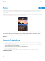
10 Themes..........................................................................................................................................................................................
Best practice: Designing themes..................................................................................................................................................
90
90
11 Icons and indicators....................................................................................................................................................................
Best practice: Designing icons and indicators............................................................................................................................
BlackBerry 6 theme icons and indicators....................................................................................................................................
Best practice: Designing icons and indicators for the BlackBerry 6 theme....................................................................
Dimensions for indicators on BlackBerry devices.......................................................................................................................
Default themes and dimensions for application icons on BlackBerry devices........................................................................
92
92
92
93
94
95
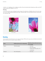
12 Sound.............................................................................................................................................................................................
Best practice: Implementing sound..............................................................................................................................................
96
96
13 Localization................................................................................................................................................................................... 97
Best practice: Designing applications for different languages and regions............................................................................ 97
Best practice: Coding for different languages and regions....................................................................................................... 98
Best practice: Writing for different languages and regions....................................................................................................... 100
14 Accessibility..................................................................................................................................................................................
Best practice: Designing accessible applications.......................................................................................................................
101
101
15 Glossary......................................................................................................................................................................................... 103
16 Provide feedback......................................................................................................................................................................... 104
17 Legal notice.................................................................................................................................................................................. 105
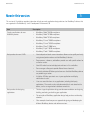
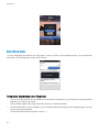
New in this version
UI Guidelines
New in this version
1
This version of UI guidelines provides information to help you make application design decisions for BlackBerry® devices that
are supported in the BlackBerry® Java® Development Environment 6.0.
Item
Description
Display specifications for new
BlackBerry devices
•
•
•
•
•
•
•
•
BlackBerry® Bold™ 9650 smartphone
BlackBerry® Bold™ 9700 smartphone
BlackBerry® Bold™ 9780 smartphone
BlackBerry® Curve™ 9300 smartphone
BlackBerry® Curve™ 9330 smartphone
BlackBerry® Pearl™ 9100 Series
BlackBerry® Style™ 9670 smartphone
BlackBerry® Torch™ 9800 smartphone
Best practices for new UI APIs
•
New trackpad and touch screen interactions allow users to quickly and easily
navigate and perform actions on their BlackBerry® devices.
Pop-up menus, submenus, and toolbars provide users with specific actions for
an item or screen.
New APIs make it easier to display text and icons in lists and tables.
Pane managers allow you to provide filtered views of content.
An activity indicator API allows you to show users that their BlackBerry devices
are performing an action.
A title bar API helps you orient users in your application and display
notifications to users.
Users can search for items in any application, including third-party
applications. The search can also include content that is not stored on the
device, such as an organization's database or web site.
•
•
•
•
•
•
Best practices for designing
applications
•
•
•
The four stages of application design provide recommendations on designing,
building, evaluating, and refining your application.
The principles of BlackBerry application design help you focus on three key
elements.
Clear examples show how you can approach designing and developing for
different BlackBerry devices and software versions.
5
New in this version
UI Guidelines
Item
Description
•
Changes to visual design
Change in version numbering
6
Additional guidelines for coding and designing applications focus on special
considerations for right-to-left and Asian languages.
The BlackBerry Torch 9800 smartphone introduces the BlackBerry® 6 theme.
This version of the UI Guidelines for BlackBerry Smartphones uses a numbering
system that matches the version number of the BlackBerry Java Development
Environment. For guidelines on developing applications using previous versions of
the BlackBerry Java Development Environment, refer to the UI Guidelines for
BlackBerry Smartphones version 2.5.
UI Guidelines
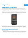
Getting started
Getting started
2
Designing applications for BlackBerry devices
As you start designing applications for BlackBerry® devices, think about how you can create rich, compelling, and personal
experiences for your users. Most users want applications to be intuitive and satisfying to use. Consider additional attributes that
are important to the majority of your users. For example, most game enthusiasts want to play entertaining, visually appealing,
and challenging games. Contrast these attributes with utility applications that need to focus on productivity and efficiency.
The design process involves evaluating choices and making decisions. As designers, you shape the user experience by balancing
user goals with the data, environment, and usability requirements of the application. The best way to find out if the application
successfully integrates the most important attributes and requirements is to evaluate it with users.
This section provides guidelines on how to approach application design, with specific considerations for BlackBerry devices. It
does not tell you how to build an application but it can help you move in the right direction. For information about developing
the UI for BlackBerry device applications, see the BlackBerry Java Application UI and Navigation Development Guide.
Best practice: Designing applications for BlackBerry devices
Consider the following guidelines:
•
Before you design your application, become familiar with other BlackBerry® applications. You can use the applications on
a BlackBerry device or the BlackBerry Smartphone Simulator. Note the behaviors that users expect in BlackBerry applications.
For example, if a phone number appears in a text field, users expect to be able to call the number by clicking it.
7
UI Guidelines
•
•
•
•
•
•
•
Three key principles of BlackBerry application design
Use BlackBerry UI components where possible so that your application can inherit the default behavior of the component.
Users are familiar with default behaviors and do not have to learn new behaviors for the components that you implement
in your application. Using BlackBerry UI components also makes the layout more extensible on BlackBerry devices with
different screen sizes. For more information, see the "Components" section.
Follow the standard interaction behaviors as closely as possible so that a particular user action produces a consistent result
across applications. For example, allow users to see the next or previous image by swiping across the screen. For more
information, see the "Interaction" section.
Provide an intuitive UI. An intuitive UI responds to the expectations of your users. Users form their expectations based on
their experience using BlackBerry device applications and general software UI conventions. For example, when users press
the Space key twice, they expect the BlackBerry device to insert a period and capitalize the next letter.
Design a UI that allows users to explore the application without fear. Allow users to change their minds and undo commands.
Be forgiving. Users sometimes click the wrong menu item or button accidentally. For example, use an alert dialog box to
notify users of a critical action such as deleting data from their BlackBerry devices.
Create a seamless experience for users by anticipating tasks that users might need to do next. Provide efficient ways for
users to access other features. For example, allow users to compose Facebook® and Twitter® messages (in addition to email
messages, PIN messages, and text messages) from the Messages menu.
Take advantage of known variables such as the location of the BlackBerry device. For example, when the device enters a
certain geographical area, you might be able to push an application or location-specific information to the device.
Early in the design process, consider whether your application requires localization. If your application does not require
localization now, consider designing your application so that it would be easy to localize it in the future. BlackBerry devices
are sold all over the world and BlackBerry device applications are translated into over 30 languages, including languages
that are not based on a Latin alphabet. Some BlackBerry devices also feature a localized keyboard. For more information,
see the "Localization" section.
Related topics
Components, 54
Interactions, 20
Localization, 97
Three key principles of BlackBerry application design
Informed
Active people rely on their BlackBerry® devices to keep them informed and up to date. Make sure that status, notifications, new
information, and frequently used actions and content are easily accessible.
•
•
•
•
Keep important information, such as status, visible so that users don't have to look for it.
Keep menus short and put infrequently used items in options.
Balance the information density on each screen.
Don't place frequently used items at the bottom of a list or out of view.
Confident
8
UI Guidelines
Three key principles of BlackBerry application design
Make users confident in the information that they receive when they use your application. When users know the status of
information, such as when a message is sent, they can feel confident that the application is doing what they want.
•
•
•
•
•
•
•
•
Keep all information and options for a required task visible.
Provide clear, concise information that helps users perform tasks.
Give users the freedom to explore by allowing them to undo and redo actions.
Provide feedback when the application performs what users request.
Don't allow dead ends. Users should always have a route forward or an alternate way of interacting with the application.
Design workflows to help users avoid errors. Provide confirmations for critical tasks.
Help users recognize, diagnose, and recover from errors by suggesting a solution.
Create Help that is easy to search, focused on user tasks, and lists concrete steps.
Approachable
Create applications that users are willing to use and try right away. Clean and organized layouts, appealing aesthetics, minimalist
design, and reduced complexity make applications more approachable. Since a wide range of people use BlackBerry® devices,
design your application to cater to both experienced and inexperienced users.
Make screens, layouts, and information easy to understand so that users can learn the application and get started right away.
Use real world concepts and metaphors to make your application easier to understand and learn. Handle complexity using
progressive disclosure so that users are not overwhelmed. Making the application look great and easy to understand gets people
using it.
Simplicity
•
•
•
•
•
Create a simple design that allows users to find what they want quickly and easily.
Reduce the number of steps that users need to take to achieve their goals.
Communicate clearly using concise, unambiguous labels and commands.
Place the most frequently used tasks on the screen. Include additional tasks in the menu or on subsequent screens.
Present information as users need it.
Aesthetics and minimalist design
•
•
Avoid visual clutter. Limit the use of color and use consistent geometry. Chunk large amounts of information by grouping
similar information.
Use animations and graphics to enhance user understanding and support the metaphors in your application.
Accessibility
•
•
Include accessibility requirements to support users with visual, hearing, or motor disabilities or impairments.
Make sure that your application scales properly when users change settings like font size.
9
Constraints of designing for mobile devices
UI Guidelines
Constraints of designing for mobile devices
Strive to provide a balance between the best possible user experience, a long battery life, and efficient connections to the wireless
network. When you design your BlackBerry® device application, consider the differences between mobile devices and computers.
Mobile devices have the following characteristics:
Characteristic
a smaller screen size that can display a
limited number of characters
Guideline
Stay focused on the user's immediate task. Display only the information that
users need at any one moment. For example, a customer relationship
management system can provide a massive amount of information, but users
only require a small amount of that information at one time. Design the UI so
that users can perform tasks easily and access information quickly.
one screen appears at a time
Allow users to switch between applications using the application switcher.
shorter battery life
Since a shorter battery life can impact the user experience, be aware that the
more efficiently that a device handles data, the less often it needs to turn on the
radio and the longer the battery life. For more information on maximizing battery
life, see the BlackBerry Java® Application Fundamentals Guide.
wireless network connections with a longer Longer latency periods for wireless network connections can influence how
latency period than standard LANs
quickly users receive information that is transmitted over the wireless network.
For more information on simplifying how an application creates network
connections, see the BlackBerry Java® Application Network Communication
Development Guide.
slower processor speeds
Slower processor speeds can affect how users perceive the responsiveness of an
application. Applications can use background threads to manage processorintensive tasks. For more information on using multithreading capabilities, see
the BlackBerry Java® Application Fundamentals Guide.
less available memory
Memory use also impacts the experience that users have with an application and
their BlackBerry devices. For more information on minimizing memory use, see
the BlackBerry Java® Application Fundamentals Guide.
10
UI Guidelines
Designing and developing for different BlackBerry devices and software versions
Designing and developing for different BlackBerry devices and software
versions
As you start designing an application, decide which BlackBerry® Device Software version to develop for. The version defines the
minimum set of features that you can use.
Applications are compatible with future software versions. For example, if you design an application for BlackBerry® Bold™ 9000
smartphones running BlackBerry Device Software 4.6, it can run on BlackBerry® Storm2™ 9550 smartphones running BlackBerry
Device Software 5.0. You should verify the layout of each screen since some adjustments might be required to the layout and
size of the UI elements.
After you decide which device software version to develop for, decide which devices to design for. If you are designing for more
than one device, design the UI to accommodate the different screen sizes and resolutions among BlackBerry devices. Use
BlackBerry UI components to help make the layout more extensible. You can also group BlackBerry devices according to screen
size and choose a reference device for each group. If you lay out the screens for each reference device, then you do not have to
design the screens for each device — but you can make adjustments if necessary.
Example 1: You choose the BlackBerry Storm2 9550 smartphone as the reference device. If you apply the layout to the BlackBerry®
Pearl™ Flip Series smartphone and the BlackBerry® Pearl™ 8100 Series smartphone, you keep the UI elements the same size
since there is not much difference in the resolution between the reference device and the other devices. However, you need to
adjust the layout of the UI elements (for example, by wrapping some content) since the screen sizes are different.
Example 2: You choose the BlackBerry® Curve™ 8300 smartphone as the reference device. If you apply the layout to the
BlackBerry Bold 9000 smartphone and the BlackBerry® Curve™ 8900 smartphone, you need to make the UI elements larger
since the resolution between the reference device and the other devices is different. However, since the screen sizes are similar,
you do not need to adjust the layout of the UI elements.
Verify the layout of each screen on each device that you are designing for. Try to create a UI that works the same on all of the
devices running a specific version of device software. Carefully consider compromises that are made to consistency for the sake
of simplifying development. Compromises should only be made when necessary.
Considerations for existing applications
If you have an existing application and you want to make it available on BlackBerry touch screen devices, you need to adjust the
layout to accommodate touch interactions and different size banners, background images, and icons. For more information on
touch interactions, see the "Touch screen" topic.
You also need to decide whether to display the application in portrait mode, landscape mode, or both. If you use BlackBerry UI
components, the orientation mode will be handled automatically. If you develop an application using a version of the BlackBerry®
Java® Development Environment earlier than version 4.7, the application runs in compatibility mode, which is designed to provide
an operating environment for applications that were not developed to support touch screens. For more information on
compatibility mode, see the Transitioning to Touch Screen Development Technical Note.
Related topics
Touch screen, 21
11
Display specifications and interaction methods for BlackBerry devices
UI Guidelines
Display specifications and interaction methods for BlackBerry devices
BlackBerry device model
Display screen size Pixels per inch
Dot pitch (mm)
Interaction method
BlackBerry® Bold™ 9650
smartphone
480 x 360 pixels
245
0.1035
trackpad
162
0.156
trackpad
360 x 400 pixels
238
0.1065
trackpad
360 x 400 pixels
196
0.129
trackpad
portrait view: 360 x
480 pixels
188
0.135
touch screen and trackpad
BlackBerry® Bold™ 9700
smartphone
BlackBerry® Bold™ 9780
smartphone
BlackBerry® Curve™ 9300 320 x 240 pixels
smartphone
BlackBerry® Curve™ 9330
smartphone
BlackBerry® Pearl™ 9100
Series
BlackBerry® Style™ 9670
smartphone
BlackBerry® Torch™ 9800
smartphone
landscape view: 480
x 360 pixels
Creating a UI that is consistent with standard BlackBerry UIs
You can use the standard MIDP APIs and the BlackBerry® UI APIs to create a BlackBerry® Java® Application UI.
The UI components in the BlackBerry UI APIs are designed to provide layouts and behaviors that are consistent with BlackBerry®
Device Software applications. Using these APIs not only allows you to use components that BlackBerry users are familiar with,
but it also saves you time since you don't have to create those components yourself.
•
12
Screen components can provide a standard screen layout, a default menu, and standard behavior when a BlackBerry device
user presses the Escape key, clicks the trackpad, or touches the touch screen.
UI Guidelines
•
•
Creating a UI that is consistent with standard BlackBerry UIs
Field components can provide the standard UI elements for date selection, option button, check box, list, text field, label,
and progress bar controls.
Layout managers can provide an application with the ability to arrange the components on a BlackBerry device screen in
standard ways, such as horizontally, vertically, or in a left-to-right flow.
You can use the BlackBerry UI APIs to create a UI that includes tables, grids, and other specialized features. You can use a
standard Java event model to receive and respond to specific types of events. A BlackBerry device application can receive and
respond to user events, such as when the user clicks the trackpad or types on the keyboard, and to system events, such as global
alerts, clock changes, and USB port connections.
13
UI Guidelines
Stages of application design
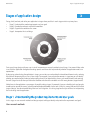
Stages of application design
3
Design, build, evaluate, and refine your application in stages where possible. In each stage, maintain a primary focus.
•
•
•
•
Stage 1: Understand the product requirements and user goals
Stage 2: Develop the concepts and build the workflow
Stage 3: Organize the content on the screen
Stage 4: Incorporate the visual design
During each stage, design with your users in mind. Incorporate user research methods at each stage. User research helps solve
issues with the application throughout the design process and the results help to identify whether the application meets user
expectations.
By designing and evaluating the application in stages, you can focus on and evaluate the foundational elements early, reducing
the chance of discovering those issues in later stages. For example, if you evaluate the concepts in stage two, you can identify
whether you need to iterate the design before moving ahead. If you were building a house, you would not want to be painting
the walls (stage four task) when you realize that the door and some of the windows are in the wrong location (stage two task).
Add richness to the application as you progress through the design stages. For example, if you are scheduling tasks and you plan
to add icons to some of the screens, you only need to provide placeholders for the icons in the first, second, and possibly the third
stages of design. You do not need to design the icons until stage four. It is during stage four that you will focus on incorporating
the visual design into the application.
Stage 1: Understanding the product requirements and user goals
In this stage, use user research methods and design outputs to help you identify and prioritize the requirements and goals.
User research methods
14
UI Guidelines
Stage 2: Developing the concepts and building the workflow
You can use the following types of user research methods to gather information about your users and the product requirements:
•
•
interviews and contextual field work (for example, observing users in their own environment, holding question and answer
sessions, or conducting ethnographic studies)
workshops with key stakeholders
Design outputs
With the information that you have gathered in your user research, you can create the following design outputs:
•
•
end-to-end scenarios (for example, outline what users need from start to finish to meet each of their goals)
major task flows (for example, capture the series of high-level actions that users need to perform to complete tasks associated
with each goal)
Best practice: Understanding the product requirements and user goals
Consider the following questions:
•
•
•
•
•
What problem does your application solve?
What goals do users want to accomplish? For example, if users bid in an online auction, they want to know when someone
has outbid them. When articulating goals, try explaining the goal without using terminology that is specific to BlackBerry®
devices. For example, use "share photos with friends" instead of "open the Media application and send photos to a group."
What are the top five features or outputs that users need from the application?
How does the mobile context affect user goals?
Are there cultural differences that are important to address? Consider differences by region, language, age, and corporate
culture.
Stage 2: Developing the concepts and building the workflow
Once you understand the product requirements and user goals, you can focus on designing an application that meets these
requirements and goals. In stage two, start defining the content and creating a workflow that meets user goals. The workflow
identifies how and when users see information. In this stage, your focus is on identifying the sequence of steps and any associated
dependencies. You might be tempted to focus on the details of the features and the capabilities of the application. Instead, stay
focused on user goals.
Consider using low fidelity prototypes such as paper sketches that are quick to create and can be revised easily. Sketches help
you visualize how users progress through tasks and help you identify task loops and dead ends. At this stage, the workflow does
not require all of the details for every scenario. You can create higher fidelity prototypes such as software based prototypes as
the design progresses.
Design outputs
You can create the following design outputs to help you explore concepts and build the workflow:
•
information architecture diagrams
15
Stage 2: Developing the concepts and building the workflow
UI Guidelines
•
•
wireframes of major tasks
prototypes
User research methods
User research methods typically involve meeting with users one-on-one or in very small groups. You can use the following types
of user research methods to help you build the workflow:
User research method
Purpose
fit/gap analysis
This type of analysis identifies how well the design outputs match user perspectives
of the workflow and allows you to identify and address unmet expectations.
This type of research method helps you understand how users categorize information.
This research is useful when you have a lot of information or options to group and
prioritize.
This type of research method demonstrates where the workflow breaks down. Use this
information to make decisions about the order, sequence, and priority of tasks.
card sorting
walkthrough of major tasks
Evaluating the workflow provides information to help you close the gap between your understanding of the workflow and your
users' understanding of the workflow. As you iterate the design, the gaps get smaller. If there are technical or design limitations,
try to address the gaps by using clear terminology, inline help, prompts, or visual cues.
Best practice: Developing the concepts and building the workflow
Consider the following questions:
•
•
•
•
What concepts need to be communicated between users and the application? Choose specific nouns and verbs to describe
each concept.
What does the application need to do and what do users need to do? Consider the tradeoffs. If the cognitive load is too high
for users, the application might be too difficult to use. For example, avoid forcing the user to remember too many things or
making them open other screens to find the information that they need.
What data is required to perform each task?
What are the relationships between tasks? If a task depends on the completion of another task, then you might want to
restrict users to completing tasks in a particular order.
Consider the following:
•
•
16
Define the major navigational pathways, staying focused on the user goals. Make navigation easy and provide cues so that
users always know where they are. Help users achieve their goals easily by allowing them to complete primary tasks from
the first screen of the application. Take advantage of the conventions of the Escape key and the Menu key.
Consider how you can integrate your application with other applications such as the phone, BlackBerry® Maps, camera, or
contacts. For example, if users click a contact in the application, retrieve the contact details from the Contacts application.
Stage 3: Organizing content on the screen
UI Guidelines
•
Decide what screen appears when users close the application.
Identify the importance of the following features to your users. These features represent some of the ways that users can interact
with the application to achieve their goals:
Feature
Example
typing text
If users need to type a lot in the application, make sure that you focus on layout to
make the typing experience smooth and efficient.
viewing text
If users need to view a lot of text, make sure that users can scroll through the text
efficiently and move to the top and bottom of the screen easily.
viewing images
Determine the best way to display images to users to meet their goals. For example,
if users need to browse through a related set of images such as featured items or a
photo album, use thumbnail images in a carousel view.
receiving notifications
Determine how the application notifies users and how often the application notifies
users.
personalizing the application
Identify the ways that users want to personalize the application. For example, allow
users to change their profile photo easily in social networking applications.
secure personal information and data If there are security risks associated with specific content, provide prompts to users.
searching the application
Identify the content that has value to users. Determine where the content resides and
provide search capabilities.
purchasing items
Make it easy for users to purchase items.
Consider the following guidelines:
•
•
•
•
Stay focused on user goals. Recognize that tasks might change but user goals are not likely to change.
If possible, sketch multiple workflows for the same task. If users don't understand a particular element of a task, then you
have another option to show them.
Evaluate all of the tasks from end to end. Users often experience issues in the steps between tasks.
Present your ideas to other designers to uncover any show-stopping issues or major design flaws. Then present your ideas
to some representative users. Even if you only approach a few users, observe, listen, and talk to them. Ask them what they
think and why. You might be surprised by their response.
Stage 3: Organizing content on the screen
During this stage, lay out the components on each screen. Make sure that the components are organized in a way that makes
sense to users. Make sure that the layout and behavior of each component helps users perform tasks quickly and easily. For
example, use spin boxes for a list of sequential items and drop-down lists for non-sequential items or items with irregular intervals.
Design outputs
17
Stage 3: Organizing content on the screen
UI Guidelines
You can create the following design outputs to help you organize content on the screen:
•
•
•
page layouts
detailed designs of task flows and navigation
a naming model for objects and actions in the UI
User research methods
You can use the following types of user research methods to help you organize content on the screen:
User research method
Purpose
usability evaluation of goal-based
tasks
terminology evaluation
After you evaluate high-level tasks, you can focus on evaluating the details of specific
tasks.
This type of evaluation provides feedback on the terms used across the application.
The information gathered in this stage can also help you make decisions about what development tasks need to be implemented.
For more information on tasks such as pushing screens and running applications in the background, see the BlackBerry Java®
Application UI and Navigation Development Guide.
Best practice: Organizing content on the screen
Consider the following guidelines:
•
•
•
•
•
•
•
•
•
Stay focused on users' immediate task. Display only the information that users need at any one moment.
If there are many components on a screen, group the components where possible.
Minimize the number of times that users need to click the trackpad or touch the screen to complete a task.
Use clear, concise labels that map to the naming model.
Leave enough space in your UI for translated text. The height and the width of text might expand when translated from
English to other languages.
Avoid overloading users. For example, allow users to select an item from a list instead of making users type the name of an
item.
Verify that the actions that are available in the menu are relevant to users' current context.
Address any physical challenges. For example, if the application displays a lot of content, avoid designing screens that
require users to repeatedly scroll to the top of the screen to initiate an action.
Try to reduce the amount of time between a user action and the desired result. If an operation takes longer than users
expect, provide a meaningful message. If you can determine the duration, display a progress indicator. Otherwise, display
an activity indicator.
If you follow the BlackBerry® platform conventions, users know what to expect from their BlackBerry devices.
•
18
Use BlackBerry UI components in consistent patterns and layouts. Even if you customize a component (for example, change
the color) the behavior and layout of the component should stay the same across applications.
Stage 4: Incorporating visual design
UI Guidelines
•
•
•
•
Make sure that the default menu item for each screen initiates the same action that occurs when users click a trackpad or
tap a touch screen. This approach keeps behaviors consistent across devices, including devices that have both a trackpad
and a touch screen.
Display the application name or screen title, and useful notifications, in the title bar.
Design for vertical scrolling. Avoid horizontal scrolling where possible.
Avoid making users scroll in dialog boxes.
Stage 4: Incorporating visual design
During this stage, focus on creating an application that is engaging and motivating to users. Add richness to the design.
Incorporate branding elements such as icons and colors.
Design outputs
You can create the following design outputs:
•
•
icons
visual designs
User research methods
You can use the following types of user research methods to help you test icons and visual designs:
User research method
Purpose
usability evaluation
If you have evaluated the usability of the application since stage one, consider
repeating the goal-based tasks. During this stage you can focus on identifying how
the visual design impacts the tasks.
These tests can help to identify the visual elements that users respond to positively.
comparative tests of icons
Best practice: Incorporating visual design
Consider the following guidelines:
•
•
•
•
Track the emotional responses that users have to the application and specific elements within the application.
Design visual resources that scale to accommodate different screen sizes.
Avoid changing the default font size. If you change the default font size, test the change on all BlackBerry® devices that
you are designing the application for.
Verify the layout of each screen on each device that you are designing for.
19
Interactions
UI Guidelines
Interactions
4
Trackpad
On most BlackBerry® devices, users use the trackpad to navigate and highlight text. On BlackBerry devices with a touch screen
and a trackpad, the trackpad gives users better control over the cursor or pointer and provides an unobstructed view of the screen.
In most cases, an action occurs when users release the trackpad, not when they click it. However, when users click and hold the
trackpad, the action occurs before users release the trackpad.
Users can perform the following actions with the trackpad:
User action
Function
Result
Click the trackpad.
navigationClick()
Click and hold the trackpad.
navigationClickHold()
Click the trackpad while pressing
the Shift key.
Click the trackpad while pressing
the Alt key.
Move a finger on the trackpad.
navigationClick()
Swipe across the trackpad.
touchEvent()
This action performs default actions. If there is
no default action and the item has multiple
actions, then this action opens the pop-up menu.
If a pop-up menu is available, this action opens
the pop-up menu.
This action highlights text or highlights
messages in a message list.
This action zooms in to a picture, map, web page,
or attachment.
This action moves the highlight, cursor, or
pointer.
This action moves the content on the screen
quickly in the opposite direction of the swipe.
navigationClick()
navigationMovement()
Best practice: Implementing trackpad actions
On most BlackBerry® devices with a trackpad, consider the following best practices:
•
•
Assign a default action when users click the trackpad.
Allow users to easily move from one item to another by swiping across the trackpad. For example, allow users to see the
next or previous picture in a collection of pictures.
On BlackBerry devices with a touch screen and a trackpad, consider the following best practices:
•
20
Allow movement between touch screen and trackpad interactions to flow seamlessly during a task.
Touch screen
UI Guidelines
•
•
Consider allowing touch screen and trackpad interactions to complement each other. For example, users can scroll to find
content using the touch screen and then use the trackpad to move the cursor to highlight a specific sentence.
Allow combined touch screen and trackpad interactions, where appropriate. For example, in a game, when users move over
an object using a finger on the touch screen, they can click the trackpad to shoot the object.
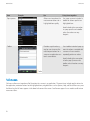
Touch screen
On BlackBerry® devices with a touch screen, users can navigate and type text using the touch screen.
In most cases, an action occurs when users lift their finger off the touch screen, not when they touch the screen. However, when
users touch an item or touch and hold a finger on an item, the action occurs before users lift their finger.
Users can perform the following actions on a touch screen:
User action
Event
Result
Tap the screen.
TouchGesture.TAP
Tap the screen twice quickly in
the same location.
TouchGesture.DOUBLE_TAP
Touch an item.
TouchEvent.DOWN
This action initiates an action. For example,
when users tap an email message in the
message list, the message opens. In most
cases, this action is equivalent to clicking the
trackpad.
This action fits the content in a picture, HTML
email message, web page, or attachment
into the dimensions of the screen.
This action highlights an item.
TouchEvent.UP
Touch and hold a finger on an
item.
Drag a finger vertically.
TouchGesture.HOVER
Drag a finger in any direction.
TouchEvent.MOVE
TouchEvent.MOVE
On a toolbar or the virtual keyboard, this
action displays a tooltip.
If a pop-up menu is available, this action
opens the pop-up menu.
This action scrolls and moves the content on
the screen. For example, on the Home
screen, users can move the rows of
applications up or down to display the
preferred number of applications on the
screen.
This action pans a picture, map, or web page.
21
Touch screen
UI Guidelines
User action
Event
Touch the screen in two locations TouchEvent.DOWN
at the same time.
TouchEvent.DOWN
Swipe across the screen.
TouchGesture.SWIPE
Pinch open or pinch close.
TouchGesture.PINCH_BEGIN
TouchGesture.PINCH_UPDATE
Result
This action highlights text or a list of items,
such as messages, between the two
locations.
This action moves the content on the screen
quickly in the direction of the swipe.
These actions zoom in to and out from an
item.
TouchGesture.PINCH_END
Best practice: Implementing touch screen actions
•
Respond to each touch action that you use in your application. For more information about how to respond to events created
by each action, see the BlackBerry UI and Navigation Development Guide.
Where possible, create a target area for user interface elements that is at least 6 mm.
Provide enough space around components so that users can easily touch the screen with their fingertips to initiate a specific
action.
If you want your application to work on BlackBerry® devices with a trackpad only, make sure that each touch screen event
has an associated trackpad function. Test your application on BlackBerry devices with a trackpad and without a trackpad.
The following information matches touch screen actions and trackpad actions:
•
•
•
Desired result
Touch screen action
Trackpad action
Initiate an action.
Scroll.
Tap the screen.
Drag a finger vertically on the screen.
Move to the next or
previous item.
Zoom.
Zoom to fit.
Pan a zoomed image.
Swipe across the screen.
Display a pop-up menu.
Touch and hold a finger on the screen.
Click the trackpad.
Move a finger on the trackpad to move the
highlight.
Swipe across the trackpad in the opposite
direction.
Click the trackpad.
Press the Menu key. Click Fit to Screen.
Move a finger on the trackpad in the opposite
direction.
Click and hold the trackpad.
22
Pinch open.
Tap the screen twice quickly.
Drag a finger on the screen.
UI Guidelines
Keyboard
Keyboard
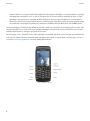
Users use the keyboard primarily to type text. Character keys send a character to the BlackBerry® device. A modifier key alters
the functionality of character keys. Modifier keys include the Shift key and the Alt key. When users press a modifier key, a typing
mode indicator appears in the upper-right corner of the screen.
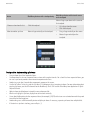
On BlackBerry devices with a trackpad only, users can also use the keyboard to move around a screen (for example, to move
around a map). However, navigation using the keyboard should always be an alternative to navigation using the trackpad.
On BlackBerry devices with a trackpad and a touch screen, a virtual keyboard appears when the slider is closed and users need
to type text. Users can hide the virtual keyboard by opening the slider or touching and moving the keyboard off the screen.
Most BlackBerry devices have either a full keyboard or a reduced keyboard. On BlackBerry devices with a touch screen, the full
keyboard always appears in landscape view. In portrait view, users can use the full keyboard or the reduced keyboard.
Related topics
Text fields, 54
Best practice: Designing applications for different types of keyboards
•
•
•
•
•
If you alter the functionality of a key, always return the key to its original state when users close the application.
Verify that your application is compatible with both full keyboards and reduced keyboards.
Support modifier keys where appropriate.
Make sure that users can undo commands easily. Typing can be challenging for new users.
Choose an appropriate field based on what you expect users to type. For example, if you expect users to type numbers, use
a field that accepts only numbers so that users can type numbers easily. Use the following information to determine which
input method to choose.
23
Keyboard
UI Guidelines
Full keyboard
The full keyboard provides users with a keyboard that is similar to the keyboard on a computer. Users type as they would on a
computer keyboard except that numbers and symbols are located in different places.
Users can perform the following actions to type numbers and symbols:
Action
BlackBerry devices with a physical keyboard BlackBerry devices with a touch screen
Type a number in a
number field.
Type a number in a text
field.
Type a common symbol.
Type other symbols.
Press the number key.
Press the number key.
Press the Alt key and the number key.
Press the 123 key.
Press the Alt key and the character key.
Press the Symbol key.
Press the Symbol key.
Press the Symbol key.
Type a capital letter.
Type an accented
character.
24
Users can touch and hold some letter keys to
access symbols. For example, users can touch
and hold the letter C to display © or the letter
R to display ®.
Press and hold the letter key.
Touch and hold the letter key.
Press and hold the letter key and move a finger Touch and hold the letter key.
to the left or right on the trackpad.
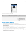
Keyboard
UI Guidelines
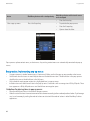
Full, physical keyboard
Full, virtual keyboard
Reduced keyboard
BlackBerry® devices with reduced keyboards use SureType® technology, which is designed to predict words as users type them.
Users can type text using the SureType input method or the multi-tap input method.
•
When users use the SureType input method, they press the letter key for each letter in a word once. For example, to type
run, users would press the ER key once, the UI key once, and the BN key once. As users type, a list of possible letter
combinations and words appears on the screen. SureType technology selects letter combinations or words from the list
25
Keyboard
UI Guidelines
•
based on context. If users type a word or letter combination (for example, a web address or an abbreviation) that SureType
technology does not recognize, users use the list that appears on the screen to build the word letter by letter. SureType
technology is designed to "learn" new words or letter combinations that users type and add them to a custom word list.
When users use the multi-tap input method, they press a letter key once to type the first letter on the key and twice to type
the second letter. For example, to type run, users would press the ER key twice, the UI key once, and the BN key twice.
SureType technology is the default input method for most fields. Multi-tap is the default input method for phone number fields
and password fields. If users switch from using SureType technology to using the multi-tap input method, the multi-tap input
method indicator appears in the upper-right corner of the screen.
Some languages, such as Simplified Chinese, have specialized input methods and do not use the SureType input method or the
multi-tap input method. For more information about specialized input methods for specific devices and languages, visit http://
na.blackberry.com/eng/support/docs/ to see the product documentation.
Reduced, physical keyboard
26
Keyboard
UI Guidelines
Reduced, virtual keyboard
Types of reduced keyboards
Reduced keyboards have either 20 keys or 14 keys. Users can perform the following actions using the SureType input method:
Action
20-key reduced keyboard
14-key reduced keyboard
Type a number in a number
field
Type a number in a text field
Type a common symbol
Type other symbols
Type a capital letter
Type an accented character
Press the number key.
Press the number key.
Hold the Alt key and press the number key.
Press the Symbol key.
Press the Symbol key.
Press and hold the letter key.
Press and hold the letter key and slide a finger
to the left or right on the trackpad.
When typing, press the Menu key.
Press and hold the number key.
Press 1.
Press the Symbol key.
Press the Shift key.
Press and hold the letter key and slide a
finger to the left or right on the trackpad.
Press the Shift key.
Switch input methods
Key functionality
In most cases, an action occurs when users press a key, not when they release a key. However, when users click and hold the
Menu key, the action occurs when users release the key.
Key
Use
Alt
Type the alternate character on a key on most BlackBerry® devices. The BlackBerry® Pearl™ 9105
smartphone does not have an Alt key.
27
Keyboard
UI Guidelines
Key
Use
Convenience
Users can perform the following actions:
•
•
End/Power
BlackBerry devices have a two-stage Convenience key. If you are developing an application, make
sure that the application opens when users press the Convenience key all the way down.
Users can perform the following actions:
•
•
Escape
•
•
•
Navigate to the previous screen or state. For example, pressing the Escape key dismisses the
current screen and displays the previous screen, dismisses a menu or dialog box, or zooms out
one level in a picture, map, web page, or attachment.
Stop an action or dismiss results. For example, pressing the Escape key stops loading a web
page in the browser, stops a search, or dismisses search results.
Close an application that has a screen with tabs. Pressing the Escape key does not display the
previous tabs.
Close the browser and media applications by pressing and holding the Escape key.
Avoid using the Escape key to allow users to clear the text in a field. Allow users to press the Shift
key and the Delete key to clear the text in a field instead.
Lock the keyboard or lock the screen on BlackBerry devices with a touch screen.
Users can perform the following actions:
•
•
•
•
28
End a call.
Press and hold the End/Power key to turn on or turn off most BlackBerry devices. The Power/
Lock key turns on or turns off BlackBerry® Storm2™ Series devices.
You can also use the End/Power key for navigation. For example, if users press the End/Power key
in an application, the Home screen displays. If users return to the application, the screen that
displayed before users left the application appears.
Users can perform the following actions:
•
Lock
Menu
Open an application.
Take a picture in the camera application.
Open the menu for a screen in an application.
Initiate an action when a menu item is highlighted.
Initiate an action when a button is highlighted in a dialog box.
Switch applications by pressing and holding the Menu key.
Keyboard
UI Guidelines
Key
Use
Mute
Users can perform the following actions:
•
•
Previous and Next
Send
Play the previous or next audio or video file on smartphones in the BlackBerry Pearl 9100 Series.
Users can perform the following actions:
•
•
•
Shift
Space
Symbol
Volume Down
Volume Up
Open the phone application.
Answer a call.
Call a highlighted phone number.
Highlight text by pressing the Shift key and moving a finger on the trackpad or touch screen.
Users can perform the following actions:
•
•
•
•
•
Speakerphone
Mute a call.
Pause and mute the sound from an audio or video file.
Type a space.
Select a radio button, check box, or drop-down list item.
Insert a period (.) when pressed twice in a text field.
Insert a period (.) in a web address field or an email address field.
Insert an at sign (@) in an email address field.
You can also use the Space key as a shortcut to move down a screen in an application.
Turn on or turn off the speakerphone during a call on BlackBerry devices. The BlackBerry Pearl 9105
smartphone does not have a speakerphone key.
Open the symbol list.
Users can perform the following actions:
•
•
•
•
Decrease or increase the volume.
Play the previous or next audio or video file.
Zoom in to or out from a subject before taking a picture.
Press and hold the Volume Down key to send an incoming call to voice mail when the
BlackBerry device is inserted in a holster.
Typing indicators
Typing indicators appear in the upper-right corner of the BlackBerry® device screen. Avoid displaying other information in the
upper-right corner of the screen because the typing indicators could obscure the information.
29
Keyboard
UI Guidelines
Indicator
Description
This indicator indicates that the BlackBerry device is in Alt mode. To enter this mode, users press the
Alt key.
On BlackBerry devices with a reduced keyboard, this indicator indicates that the BlackBerry device is
in multi-tap input mode.
This indicator indicates that the BlackBerry device is in number lock mode. On BlackBerry devices with
a full keyboard, users press the Alt key and the Left Shift key. On most BlackBerry devices with a
reduced keyboard, users press the Alt key and the Shift key. On BlackBerry devices with a virtual
keyboard, users press and hold the 123 key until the lock indicator appears on the key.
This indicator indicates that the BlackBerry device is in Shift mode. To enter this mode, users press
the Shift key.
This indicator indicates the typing input language.
Typing indicators for the BlackBerry Pearl 9105 smartphone
Users switch modes by pressing the Shift key.
Indicator
Mode
SureType® input mode
SureType Shift mode
SureType Shift-Lock mode
Multi-tap input mode
Multi-tap Shift mode
Multi-tap Shift-Lock mode
Shortcut keys
On BlackBerry® devices with a physical keyboard, shortcut keys provide users with direct access to common actions for a specific
screen. For example, users can use shortcut keys to compose an email message or add a bookmark in the browser. Users can
also use shortcut keys to access buttons in a dialog box. Some users rely on shortcut keys to perform some tasks without opening
the menu and to move around the screen quickly.
Menu items do not have shortcut keys assigned to them. After users open the menu, they can press the key for the first letter of
a menu item to highlight the menu item. To initiate the action associated with a highlighted menu item, users press the Enter
key or click the trackpad. If multiple menu items have the same first letter, users can continue pressing the key for the letter until
they highlight the menu item that they want.
30
UI Guidelines
Keyboard
As you create an application or add features to an application, think about the most common actions for each screen. Add shortcut
keys where appropriate.
Best practice: Implementing shortcut keys
•
•
•
•
•
•
Assign and document shortcut keys for common actions. For example, on BlackBerry® devices with a full, physical keyboard,
users can press "T" to move to the top of a list. Users can press "B" to move to the bottom of a list.
Use shortcuts keys to increase efficiency for users, but not as a primary means for users to interact with your application.
Users should be able to access all available actions from the menu.
Localize shortcut keys where possible for the French, Italian, German, Spanish, Hungarian, Czech, and Polish languages.
Use English shortcut keys for all other languages.
In dialog boxes, assign shortcut keys to all buttons.
In wizards, do not assign shortcut keys to buttons.
Avoid creating shortcut keys for destructive actions, actions that cannot be undone easily, or actions for which the
consequences might be unclear.
Guidelines for choosing shortcut keys
•
•
•
•
•
•
Use different shortcut keys for full keyboards and reduced keyboards. For example, to move to the top of a web page, users
can press one of the following letters:
•
"T" on full keyboards
•
"1" on 20-key reduced keyboards
•
"2" on 14-key reduced keyboards
For screens, use the first or most memorable character in an action for the shortcut key. For example, in a message list, the
shortcut key "R" represents "Reply" and the shortcut key "F" represents "Forward."
In dialog boxes, use the first character in the button label as the shortcut key.
For similar actions, use the same shortcut keys that are available in other applications . This approach creates consistency
for users.
Verify that custom shortcut keys do not overlap with existing reserved shortcut keys. For more information about existing
shortcut keys, visit http://na.blackberry.com/eng/support/docs/ to see the product documentation.
Avoid assigning different actions to well-known shortcut keys.
31
Strategies
UI Guidelines
Strategies
5
Setting focus and highlighting items
When an item on a screen is in focus, users can initiate an action on the item.
When users use a trackpad, they can move the highlight to set focus on an item. Then they can act on the highlighted item by
clicking the trackpad or using the menu. When users use a touch screen, they interact directly with items on the screen using a
finger. When users interact with an item, the highlight helps them identify the item that they are initiating the action on.
Cursors and pointers
When users use a trackpad, they can move a cursor or pointer to set focus on an item on a screen. The cursor or pointer icon can
change to indicate its current behavior.
The following cursors and pointers appear in BlackBerry® applications:
Cursor or pointer
Purpose
arrow
hand
magnifying glass
caret
text
The arrow pointer indicates the position of the cursor on a web page.
The hand pointer indicates the position of the cursor when users pause on a link.
The magnifying pointer indicates that users can zoom in to or out from a section on the screen.
The caret cursor indicates the position of the cursor in a text field that users can type in.
The text cursor indicates that the cursor is positioned over a text area in the browser.
32
Scrolling and panning
UI Guidelines
Best practice: Setting focus and highlighting items
•
•
•
•
In most cases, when a screen, dialog box, or menu opens, make sure that one item on the screen has focus. This practice is
important if users interact with items indirectly using a trackpad. Set focus on the primary item or action. For example, in
lists, set focus on the first item in the list. However, if users leave a screen, save the position of the focus so that if users
return to the screen, the last item in focus displays.
Avoid allowing focus on items that users cannot initiate an action on (for example, disabled components).
If you create custom UI components, choose a highlight color that has high contrast and clearly implies focus (for example,
white text on a blue background). Use the same highlight color for all UI components.
Avoid changing the font, font size, or font style for highlighted text or items.
Scrolling and panning
Scrolling
If content on a screen extends beyond the viewing area, scroll arrows appear. Users can scroll by moving a finger on the trackpad,
or, on BlackBerry® devices with a touch screen, users can scroll by dragging a finger vertically across the touch screen. When
users scroll, the movement of the content is proportional to the input rate of the motion. The quicker the motion, the faster the
content on the screen moves. If a highlighted item moves out of view, the highlighted item moves back into view as scrolling
decelerates.
Before scrolling using a trackpad
After scrolling using a trackpad
33
Zooming
UI Guidelines
Use the ScrollingManager class to implement scrolling. For more information about implementing scrolling, see the API
reference guide for the BlackBerry® Java® SDK.
Panning
Users can pan a picture, map, or web page by moving a finger on the trackpad, or, on BlackBerry devices with a touch screen,
users can use a finger to drag the content on the screen. The content moves in the same direction and at the same rate that
users move their finger.
Before panning
After panning
Zooming
Users can zoom in to or out from items such as images, web pages, HTML email messages, maps, and attachments to view the
details of the item or to scan specific sections of the item.
BlackBerry devices with a touch screen
and a trackpad
Action
BlackBerry devices with a trackpad only
Zoom in.
Click the trackpad.
•
•
•
Pinch open.
Click the trackpad.
Tap the screen twice quickly in the
same location.
Zoom out.
Press the Escape key.
•
Pinch close.
34
Displaying images
UI Guidelines
Action
BlackBerry devices with a trackpad only
BlackBerry devices with a touch screen
and a trackpad
•
•
Press the Escape key.
On zoomed in content, tap the screen
twice quickly in the same location.
Best practice: Zooming
•
•
•
Use the ZoomScreen class to allow users to zoom in to and out from item. For more information about zooming in to and
out from items, see the API reference guide for the BlackBerry® Java® SDK and the BlackBerry UI and Navigation
Development Guide.
On zoomed in content, allow users to fit the content into the dimensions of the screen by pressing the Escape key twice
quickly.
Assign shortcut keys for zooming in to and out from items. For example, in English, allow users to press "I" to zoom in and
"O" to zoom out.
Displaying images
Images can be displayed individually on the screen and as thumbnails in a table, list, or carousel.
Use the single image view to display a full-sized image. In this view, users can zoom in to and pan the image.
Use thumbnail images in a table to display several images at one time.
35
UI Guidelines
Displaying images
Use thumbnail images in a list to help users find an image quickly. The list displays smaller images than the table and includes
additional information, such as the name and date, for each image.
Use thumbnail images in a carousel view to allow users to browse through a related set of images such as featured items or a
photo album. This view requires less space and allows other items to appear on the screen at the same time.
36
Displaying images
UI Guidelines
Users can view more images by performing the following actions:
Action
BlackBerry devices with a trackpad only
View more thumbnail images in Move a finger vertically on the trackpad.
a table or list.
BlackBerry devices with a touch screen
and a trackpad
•
•
•
View more thumbnail images in Move a finger horizontally across the
a carousel view.
trackpad.
•
•
•
Drag a finger vertically on the touch
screen.
Swipe up or down on the screen.
Move a finger vertically on the
trackpad.
Drag a finger horizontally on the touch
screen.
Swipe across the screen.
Move a finger horizontally across the
trackpad.
Best practice: Displaying images
Guidelines for displaying thumbnail images
•
•
Use the same size for each thumbnail image in a particular view. Resize or crop images if necessary. If you must display the
original image without cropping it, create a box that is the same size as the other images and place the box behind the
image. Center-align the width or height of the image.
Do not distort the image proportions.
Guidelines for displaying images in a single image view, table, or list
37
Displaying information on a screen temporarily
UI Guidelines
•
•
•
Always provide a single image view so that users can zoom in to and pan images.
In a table, display four images in each row by default.
Use the GridFieldManager if the number of rows and columns in the table are fixed. Otherwise, use the
TableView class. For more information about placing images in a table, see the API reference guide for the BlackBerry®
Java® SDK and the BlackBerry Java Application UI and Navigation Development Guide.
If images take time to display, render the images in increments and provide placeholder images.
•
Guidelines for displaying thumbnail images in a carousel view
•
Use the PictureScrollField class to display images in a carousel view. For more information about displaying images
in a carousel view, see the API reference guide for the BlackBerry Java SDK and the BlackBerry Java Application UI and
Navigation Development Guide.
Avoid using a carousel view if the primary goal for users is to find a specific image. Use a table or list instead.
Display three to seven images on the screen at one time. The number of images to include on one screen varies depending
on the size of the thumbnail images and the width of the screen.
Display the total number of images and indicate the current position of the highlighted image.
If there are more images than can be displayed on the screen at one time, display a partial image or an arrow on the left or
right side of the screen. Include a scroll bar if it is important to show the beginning and the end of the images in the carousel
view.
If images have a specific order, provide users with an indication of the start and end of the set of images.
Assign shortcut keys for moving to the next or previous image. Where possible, in English, allow users to press "N" to move
to the next image and "P" to move to the previous image.
Avoid placing images in a carousel view near other components.
If you include labels, place the labels above the image on BlackBerry devices with a touch screen. This approach allows
users an unobstructed view of the label as they move through the images.
•
•
•
•
•
•
•
•
Displaying information on a screen temporarily
You can display information on a screen temporarily using a transparent overlay or an opaque overlay. For example, when users
view an image, you can display a description of the image along the top or bottom of the screen. You can define the amount of
time that the information appears on a screen.
Action
BlackBerry devices with a trackpad only
Display information
temporarily.
•
•
38
Move a finger on the trackpad.
Press a key.
BlackBerry devices with a touch screen
and a trackpad
•
•
•
Touch the screen.
Move a finger on the trackpad.
Press a key.
Screen transitions
UI Guidelines
Before information displays on a screen temporarily
When information displays on a screen temporarily
Best practice: Displaying information on a screen temporarily
•
•
•
Avoid displaying information or components that users require to complete a task. Display only secondary information, such
as descriptions or metadata, on a screen temporarily.
To avoid distracting users from their primary task, display temporary information judiciously.
Use the EyelidFieldManager class to display information temporarily. For more information about displaying
information temporarily, see the API reference guide for the BlackBerry® Java® SDK and the BlackBerry Java Application
UI and Navigation Development Guide.
Screen transitions
You can create a transition to apply a visual effect that appears when an application opens or closes a screen on a BlackBerry®
device. Creating transitions between screens helps users understand the structure of your application. Consider the following
guidelines when implementing screen transitions:
Transition
When to use
Details
Fade
The content is the same but users change their view of Set the duration of the fade to 150
the content (for example, switching between day and
milliseconds.
week view in a calendar or switching between viewing
a list of images and viewing the thumbnails of the same
images).
39
Screen transitions
UI Guidelines
Transition
When to use
Slide
Users move to an item at the same level in the navigation When users move to the next item, slide the
hierarchy (for example, from one message, photo, song, item in from the left to the right. When users
or contact to another).
move to the previous item, slide the item in
from the right to the left.
Users move to an item at a different level in the
Zoom in when moving from a parent item to
navigation hierarchy (for example, from a parent item to a child item. Zoom out when moving from a
a child item or a child item to a parent item).
child item to a parent item.
Zoom
Details
Users create a new item, send an item, or save an item. When users open the application from the
Home screen, zoom in from the center of the
The zoom transition is the most common type of
screen.
transition between screens.
Set the scale of the zoom to 110 percent.
Provide consistent transitions as users navigate the application. Use the TransitionContext class to implement a transition
between screens. For more information about implementing transitions between screens, see the API reference guide for the
BlackBerry® Java® SDK and the BlackBerry Java Application UI and Navigation Development Guide.
Related topics
Application screens, 41
40
Containers
UI Guidelines
Containers
6
Application screens
Multiple screens can be open on a BlackBerry® device at one time, but users can view only one screen at a time. When multiple
screens are open, they are organized in a stack. The screen at the top of the stack is the active screen. When an application
displays a screen, the BlackBerry® Java® Virtual Machine pushes it to the top of the stack. When a screen closes, the BlackBerry
Java Virtual Machine deletes the screen from the top of the stack and displays the next screen on the stack. The application
redraws the screen as necessary.
Users can perform the following common actions on screens:
Action
User interaction
Move around the screen.
Open the menu.
Invoke an action in the menu.
Move a finger on the trackpad or touch screen.
Press the Menu key.
•
•
Click or tap the item.
When an item is highlighted in the menu, press the Menu key.
Switch applications.
•
•
Press the Alt key and the Escape key.
Hold the Menu key.
Switch between portrait view and landscape view on
BlackBerry devices with a touch screen.
Close an application.
Return to the Home screen without closing the
application screen.
Turn the device sideways.
Click Close in the menu.
Press the End key.
Best practice: Designing application screens
•
•
•
•
•
Delete your application screen from the stack when users close a screen. If you use standard components, the BlackBerry®
device automatically deletes screens from the stack.
Repaint the screen judiciously. Your BlackBerry device application should not perform unnecessary screen repaints.
Use a limited number of nested layouts. The more nested layouts that you use to build your screen, the longer it takes for
the BlackBerry device to render the screen.
Prompt users with a dialog box to save any unsaved data before closing a screen.
Avoid hardcoding color values. The color values that you choose might not work with the theme that users have selected.
Guidelines for layout
41
UI Guidelines
•
•
•
•
•
•
•
Dialog boxes
Use a vertical layout for your application screens.
Consider arranging the UI components on application screens using the BlackBerry API layout managers. For more
information about arranging UI components, see the API reference guide for the BlackBerry® Java® SDK and the BlackBerry
Java Application UI and Navigation Development Guide.
On BlackBerry devices with a touch screen, verify that the screens display correctly in both portrait and landscape view.
Display the most important information at the top of the screen. For example, for contact information, display the name
first, followed by the email address and phone numbers. Display a field such as the Notes field last.
Limit the number of components that appear on the screen at one time.
Use line separators on a screen to separate components or to indicate a group of components.
Consider localization requirements as early in the design process as possible. Localization can affect the layout of screens.
Related topics
Display specifications and interaction methods for BlackBerry devices, 12
Dialog boxes
Use dialog boxes to perform the following actions:
•
•
•
Prompt users for information that is required to complete a user-initiated task.
Inform users of urgent information or the status of important actions.
Warn users of unexpected or potentially destructive conditions or situations.
Dialog boxes are modal; they interrupt the normal operation of the BlackBerry® device and are pushed to the top of the stack.
A dialog box includes a message, buttons that allow users to perform an action, and an indicator that indicates the type of dialog
box. The size of the dialog box depends on the size of the BlackBerry device screen. The theme that users select on their BlackBerry
device determines the visual style of the dialog box.
Best practice: Implementing dialog boxes
•
42
Use buttons to confirm or cancel actions in dialog boxes. Avoid using links or other components.
UI Guidelines
•
•
•
•
Dialog boxes
Use a standard indicator that is appropriate for the type of dialog box. Avoid using multiple indicators in a dialog box.
Try to avoid making users scroll in a dialog box. Include scroll arrows if your dialog box message or buttons cannot be
displayed fully on the dialog box. If you use standard components, scroll arrows appear automatically if necessary.
Always allow users to use the Escape key to close a dialog box. Avoid implementing another action when users press the
Escape key to close a dialog box. For example, if a dialog box allows users to change a setting, do not implement any changes
when users press the Escape key. If necessary, display the dialog box at a later time.
If users press the End/Power key when a dialog box appears on an application screen, display the Home screen or application
list. If users return to the application, display the dialog box again.
Guidelines for layout
•
•
•
•
•
•
•
•
Center the dialog box on the screen. If you use standard components, the BlackBerry® device automatically centers the
dialog box.
Create dialog boxes that are up to, but not greater than, 90% of the width and height of the screen. If you use standard
components, the BlackBerry device automatically calculates the appropriate size for dialog boxes.
Center the dialog box indicator vertically with the dialog box message.
Display messages to the right of the indicator and above any buttons for most languages.
Place buttons for confirmation actions first. For example, place "Save" before "Discard" or "Cancel."
Center buttons horizontally in dialog boxes.
Place buttons vertically in the dialog box. The vertical layout allows buttons to expand to accommodate localized button
labels.
If you include a check box, match the alignment of the check box with the alignment of the dialog box message. Place the
check box above the buttons. The check box should be checked by default, unless the dialog box displays a message with
critical information for users.
Guidelines for messages
•
•
Be specific. If possible, use one short sentence to clearly state the reason for displaying the dialog box and the actions that
can dismiss it.
Use complete sentences for messages where possible.
43
UI Guidelines
•
•
•
•
•
•
Dialog boxes
Use vocabulary that users understand. For example, use "The file could not be saved because the media card is full" instead
of "Error writing file to disk."
Use positive language where possible and avoid blaming the user. Never write messages that blame users for errors or
unexpected conditions. Instead, focus on the actions that users can take to resolve the issue.
Use the second person (you, your) to refer to users.
Use sentence case capitalization.
Avoid using exclamation points (!) in messages.
Avoid using an ellipsis (...) in messages unless you are indicating progress (for example, "Please wait...").
Guidelines for buttons
•
•
•
•
•
•
•
•
For the default button, use the button that users are most likely to click. Avoid using a button that is associated with a
destructive action as the default button. Exceptions to this rule are those cases where users initiate a minor destructive
action (such as deleting a single item) and the most common user action is to continue with the action.
Avoid using more than three buttons in a dialog box. If there are more than three, consider using an application screen
instead with radio buttons.
On BlackBerry devices with a physical keyboard, provide shortcut keys for buttons. Typically, the shortcut key is the first
letter of the button label.
Use clear, concise labels.
Use one-word labels where possible. The size of a button changes depending on the length of the label. If a label is too
long, an ellipsis (...) indicates that the text is truncated.
Avoid using the labels "Yes" and "No." Use verbs that describe the associated action (for example, "Cancel," "Delete,"
"Discard," or "Save"). This approach helps users quickly and easily understand what happens when they click the button.
If necessary, include more descriptive text elsewhere on the screen (for example, in an application message).
Avoid using symbols or graphics in labels.
Avoid using punctuation in labels. Use an ellipsis in a button label to indicate that additional information is required before
the associated action can be performed.
Related topics
Buttons, 66
Alert dialog boxes
Use alert dialog boxes to notify users of a critical action such as turning off the BlackBerry® device or an error such as typing
information that is not valid. An exclamation point (!) indicator appears in an alert dialog box. To close an alert dialog box, users
can click OK or press the Escape key.
44
UI Guidelines
Dialog boxes
Best practice: Implementing alert dialog boxes
•
•
•
•
Include only an OK button. This button should be highlighted by default. When users click the button, the dialog box should
close. To provide users with multiple buttons, such as an OK button and a Cancel button, use an inquiry dialog box instead.
Allow users to press the Escape key to close the dialog box.
Use a concise, descriptive message to explain the situation that prompted the alert.
Avoid phrasing messages as questions. Use statements instead.
Information dialog boxes
Use information dialog boxes to provide feedback about a user action. Information dialog boxes close automatically after a
predefined period of time, or users can close the dialog box by pressing the Escape key. An information indicator appears in an
information dialog box.
45
UI Guidelines
Dialog boxes
Best practice: Implementing information dialog boxes
•
•
•
•
•
Do not include buttons in information dialog boxes. To provide buttons, use another type of dialog box.
Allow users to press the Escape key to close the dialog box.
Set an appropriate timeout period for the dialog box based on the amount of time that is required for users to read the
message. If users require more than 10 seconds to read the message, consider using another type of dialog box.
If you do not want to allow users to perform any other actions while the dialog box appears on the screen, use a status dialog
box instead.
Avoid phrasing messages as questions. Use statements instead.
Input dialog boxes
Use an input dialog box when users must specify information such as a date or file name. After users type the required information,
they can press the Enter key to close the dialog box and save their changes. To close the dialog box without saving changes,
users can press the Escape key. You can include buttons on this type of dialog box.
Best practice: Implementing input dialog boxes
•
•
•
•
•
46
Allow users to press the Escape key to close the dialog box.
Use a concise, descriptive phrase for field labels.
Avoid stating in the message that users must provide information. Use the labels to imply that action is required.
If necessary, include hint text to provide guidance to users.
Punctuate field labels with a colon (:).
UI Guidelines
Dialog boxes
Inquiry dialog boxes
Use inquiry dialog boxes when users must confirm an action before continuing. A question mark (?) indicator appears in an inquiry
dialog box.
Best practice: Implementing inquiry dialog boxes
•
•
•
•
•
Use a concise, descriptive question for the message.
Always prompt users with an inquiry dialog box to save their changes when they attempt to close a screen with unsaved
changes.
Include a Cancel button so that users can close the dialog box without making changes.
Use verbs for labels that describe the associated action (for example, "Cancel," "Delete," "Discard," or "Save"). If necessary,
include more descriptive text elsewhere on the screen (for example, in an application message).
Avoid using the labels "Yes" and "No."
Reminder dialog boxes
Use reminder dialog boxes to remind users of time-sensitive activities such as appointments or tasks.
Include a Snooze button that users can click to receive another reminder at a later time and a Dismiss button to dismiss the
reminder. To dismiss the reminder, users press the Escape key. To close a reminder dialog box, users click a button or press the
Escape key. Reminder dialog boxes include an indicator that represents the application that generated the reminder.
47
UI Guidelines
Status dialog boxes
Use status dialog boxes to indicate to users that a process is occurring. When a status dialog box appears, users cannot perform
other actions. Status dialog boxes include a clock indicator.
Best practice: Implementing status dialog boxes
•
•
•
•
48
Use a status dialog box when you cannot determine the duration of an operation. If you can determine the duration of the
operation, use a progress bar instead.
Always indicate progress when the operation takes more than 1 second to complete.
Do not include buttons in a status dialog box. If users can perform other actions when the status dialog box appears, consider
using another type of dialog box.
Punctuate the dialog box message with an ellipsis (...).
UI Guidelines
Banner and title bars
Banner and title bars
The banner, which appears at the top of the Home screen, displays the following items:
•
•
•
•
•
•
date, time, and wireless service provider
application notifications, such as the alarm indicator, missed call count indicator, unopened message count indicator, and
third-party indicators
wireless connection indicators, such as the wireless coverage level, network coverage, Bluetooth® indicator, Wi-Fi®
connection indicator, and roaming indicator
battery power indicator
sound profile indicator
search icon
The theme that users select on their BlackBerry® device determines the design of the Home screen banner.
Although you cannot add a banner to your application, you can add an indicator to the banner to provide a notification or to
communicate important information about the status of your application. For example, you can include an unopened message
indicator and count to provide users with new message information.
You can add a title bar to the top of your application screens to help orient users. Most title bars contain only a title but title bars
can display the following items:
•
•
•
application icon, descriptive title, and time
application notifications, such as a new message indicator
wireless connection indicators, including the wireless coverage level, network coverage, GPS indicator, Bluetooth indicator,
and Wi-Fi connection indicator
49
UI Guidelines
•
•
Pane manager
battery power indicator
active call indicator
Related topics
Dimensions for indicators on BlackBerry devices, 94
Best practice: Implementing title bars
•
•
•
•
•
•
Use the TitleBar class to implement title bars. For more information about implementing title bars, see the API reference
guide for the BlackBerry® Java® SDK and the BlackBerry Java Application UI and Navigation Development Guide.
If you want to add an icon to the title bar, consider adding the icon only to the title bar that appears on the first screen in
an application. This approach allows you to add a branded element to the title bar as well as help users differentiate the
top screen in your application.
Include the time in title bars if users need to refer to the time often in order to use the application.
Include wireless connection indicators in title bars if the application requires a wireless connection.
Include application notifications and wireless connection notifications in title bars if users typically stay in the application
for a long period of time.
Consider including the battery power indicator in title bars if the application significantly impacts battery life. By default,
the battery power indicator displays only when the battery power level is low or the battery is charging.
Pane manager
The pane manager provides filtered views of content and allows users to navigate content without leaving the context of the
screen. You can filter content in two different ways.
50
Pane manager
UI Guidelines
In the scrollable view, users can move through each pane of content. Users can move through the panes continuously. Or, you
can set a start and end point so that users know when they reach the first and the last pane. You can add hint text or arrows to
the left side and the right side of the screen to indicate that other panes of content are available.
The first pane in a scrollable view
The second pane in a scrollable view
Note: The ability to expand and contract the size of the scrollable view is unique to the Home screen.
The tab view displays all available tabs on the screen. Users have immediate access to each tab.
You can also allow users to filter content within a specific pane. Users still have the ability to easily switch to other panes.
51
Pane manager
UI Guidelines
Users can perform the following action in a pane manager:
Action
BlackBerry devices with a trackpad only
BlackBerry devices with a touch screen
and a trackpad
Switch panes.
Move a finger horizontally on the trackpad.
•
•
•
Drag a finger horizontally on the
screen.
Swipe right or left on the screen.
Move a finger horizontally on the
trackpad.
Best practice: Implementing pane managers
•
•
•
•
Use a pane manager if users need to navigate filtered views of content frequently.
Use the PaneManagerView class to create scrollable views or tab views. For more information about implementing pane
managers, see the API reference guide for the BlackBerry® Java® SDK and the BlackBerry Java Application UI and
Navigation Development Guide.
Assign shortcut keys for switching to the next and previous panes. For example, in English, allow users to press "N" to switch
to the next pane and "P" to switch to the previous pane.
In most cases, allow users to close an application by pressing the Escape key. Do not display the previous pane. If users
filter content within a specific pane, then display all of the content in the pane when users press the Escape key.
Guidelines for scrollable views
•
52
Use a scrollable view to allow users to seamlessly navigate similar types of content. You can also use a scrollable view if
users need to view the same set of content in different ways.
UI Guidelines
•
•
•
•
•
Pane manager
In most cases, avoid providing more than seven panes of content. The more panes of content, the more difficult it becomes
for users to remember each pane. However, you can include more than seven panes if the panes are ordered in an obvious
way, such as by date, by number, or in an alphabetical list.
Add hint text to the left side and the right side of the screen to indicate that other panes of content are available. Use arrows
instead of hint text if there is a large number of panes or to indicate that users can navigate in increments, such as by date.
Allow users to scroll through the panes continuously if it is easy to distinguish the content in each pane. Otherwise, users
might get lost. If there are only two panes, do not allow users to scroll continuously through the panes.
Create a start and end point for the panes if the titles in each pane are similar or if the content in each pane is similar. A
fixed start and end point allows users to easily find the first pane and the last pane. It also allows users to learn the order
of the titles.
Avoid using icons in titles, except for branding purposes.
Guidelines for tab views
•
•
•
•
Use a tab view to display related but different types of content in the same view. Use a tab view if the types of content are
not expected to increase in number.
Show all tabs on the screen where possible. Avoid making users scroll to see additional tabs.
Avoid displaying tabs with dramatically different widths. Try to distribute tabs evenly across the screen.
If there is a limited amount of space at the top of each tab, use icons instead of labels.
53
Components
UI Guidelines
Components
7
Text fields
Labels
Use a label to display text that identifies a component.
Best practice: Implementing labels
•
Use the LabelField class to create labels. For more information about creating labels, see the API reference guide for
the BlackBerry® Java® SDK and the BlackBerry Java Application UI Quick Reference Guide.
Use clear, concise labels.
Group and order labels logically (for example, group related items together or include the most common items first). Avoid
ordering values alphabetically; alphabetical order is language specific.
Punctuate the label with a colon (:).
•
•
•
Text fields
Users can use a text field to type text.
Type of text field
Description
email
Users can insert an at sign (@) or a period (.) in an email address field by pressing the Space key.
54
Text fields
UI Guidelines
Type of text field
Description
date and time
Users can change the date or time on BlackBerry® devices with a trackpad using the keyboard or by
moving a finger vertically on the trackpad.
number
Users can change the date or time on BlackBerry devices with a touch screen by swiping up or down
on the screen.
When users need to type in a number field on a physical keyboard, the BlackBerry device switches
to number lock mode so that users do not need to press the Alt key to type numbers.
password
When users need to type in a number field on a virtual keyboard, the number keyboard appears.
When users type in a password field, asterisks (*) appear instead of text. Users cannot cut, copy, or
paste text or use AutoText in password fields.
phone number
On BlackBerry devices with SureType® technology, multi-tap is the default typing input method in
password fields.
When users type in a phone number field on a physical keyboard, the BlackBerry device switches to
number lock mode so that users do not need to press the Alt key to type numbers. You can also allow
users to perform the following actions in phone number fields:
•
•
•
•
•
Type the plus sign (+) for international phone numbers.
Type formatting characters such as the minus sign (-), period (.), parentheses (()), and spaces.
Type a number sign (#) or an asterisk (*).
Indicate a pause by typing a comma (,) or indicate a wait by typing an exclamation point (!).
Indicate an extension by pressing the Alt key and pressing E, X, or T.
When users need to type in a phone number field on a virtual keyboard, the number keyboard appears.
You can also allow users to perform the following actions in phone number fields:
•
•
•
text
web address
Type a number sign (#) or an asterisk (*).
Indicate a pause or an extension by holding the asterisk (*) key.
Indicate a wait or an extension by holding the number sign (#) key.
In text fields, users type text. Users can cut, copy, and paste text in text fields. When the cursor
reaches the end of a line of text, the text wraps to the next line.
In text fields, BlackBerry devices can also turn telephone numbers, web pages, and email addresses
into links automatically.
Users can insert a period (.) in an address field by pressing the Space key.
Related topics
55
UI Guidelines
Text fields
Keyboard, 23
Best practice: Implementing text fields
•
•
•
•
Use the TextField class to create text fields. For more information about creating text fields, see the API reference guide
for the BlackBerry® Java® SDK and the BlackBerry Java Application UI Quick Reference Guide.
Choose a type of text field based on what you expect users to type. Using the most appropriate text field is important so
that the appropriate typing indicator appears on the screen when users type text. For example, when users type text in a
phone number field, the number lock indicator appears in the upper-right corner of the screen. The field that you choose
also affects the default typing input method for the field on BlackBerry devices with SureType® technology.
Use or extend existing fields instead of creating custom fields where possible so that fields inherit the appropriate default
behavior.
If necessary, include hint text to provide guidance to users. Use hint text if space on a screen is limited and you cannot
include a label or instructional text. Hint text appears in the field and disappears when users type.
Guidelines for labels
•
•
•
•
Use concise, descriptive labels. Avoid labels that wrap.
Use title case capitalization.
Punctuate labels for fields with a colon (:).
If you use hint text, keep it concise. Use sentence case capitalization.
Search
Users can use the search field on the Home screen to search for items in any application on the device, including third-party
applications. The search can also include content that is not stored on the device, such as an organization's database or a web site.
Users can also use a search field in an application to search for items in that application. For example, users can search for an
email message in a message list, a song in the Media application, or a contact in the contact list. In some cases, you might want
to display search results from other applications.
56
Text fields
UI Guidelines
In some applications, the search field appears on the screen. In other cases, search is available from the full menu, the pop-up
menu, or the toolbar. As users type text in a search field, display the search results. If a large number of search results is returned,
you can allow users to narrow their search to a field or a group of fields. For example, if users search the message list, they can
use the drop-down list to the right of the search field to narrow their search to the To field or the Subject field. For more information
about adding a search field to your application, see the BlackBerry Java Application Integration Development Guide.
Users can perform the following actions in a search field:
Action
BlackBerry devices with a trackpad only
Open a highlighted item in the
search results.
•
•
Display a pop-up menu with
actions for a search result (for
example, call a contact)
Click and hold the trackpad.
Press the Enter key.
Click the trackpad.
BlackBerry devices with a touch screen
and a trackpad
•
•
•
Tap the screen.
Press the Enter key.
Click the trackpad.
•
Touch and hold a search result on the
screen.
Click and hold the trackpad.
•
You can register content in your application so that it can be included in search results. You can also register your application
as a way for users to extend a search. For example, if users search for a song in the Media application and do not find the song,
you can allow users to search your application as an alternative source of search results. For more information about registering
content or an application, see the BlackBerry Java Application Integration Development Guide.
57
Choice fields
UI Guidelines
Best practice: Implementing search
•
Use the net.rim.device.api.unifiedsearch package to implement search capabilities. For more information
about implementing search, see the API reference guide for the BlackBerry® Java® SDK and the BlackBerry Java Application
Integration Development Guide.
Be selective with the content that you register to be included in search results. Only register content that provides meaningful
search results for users.
Try to present the most relevant items at the beginning of the list of search results. For example, if users are looking for a
restaurant that has several different locations, display the restaurant that is closest to the user's location at the beginning
of the list of search results.
In the search results, bold the text that matches the text that users type. This approach helps users see why each item
appears in the list of search results.
If users need to search for a word on a screen (for example, in a message or on a web page), use the term "Find" in the Menu.
•
•
•
•
Implementing search fields
•
Set the default focus to the search field. When the search results appear, set the default focus to the first item in the list of
search results.
Use the term "Search" as hint text in the search field.
Do not make search fields case sensitive.
Place the search field below the title bar on an application screen.
Do not assign shortcut keys for a screen that includes a search field. If you want to use shortcut keys, provide alternative
search functionality. For example, allow users to search for messages in a message list using the menu.
•
•
•
•
Choice fields
Check boxes
Use check boxes for binary options that users can understand easily. For example, use a check box for an option that can be
turned on and off.
Users can perform the following action with a check box:
Action
BlackBerry devices with a trackpad only
Select a check box.
Press the Space key or click the trackpad.
58
BlackBerry devices with a touch screen
and a trackpad
•
•
•
Tap the item.
Press the Space key.
Click the trackpad.
UI Guidelines
Choice fields
Best practice: Implementing check boxes
•
•
•
•
•
Use check boxes when users can select multiple options.
Use the CheckboxField class to create check boxes. For more information about creating check boxes, see the API
reference for the BlackBerry® Java® SDK and the BlackBerry Java Application UI Quick Reference Guide.
Do not start an action when users select a check box. For example, do not open a new screen.
Align check boxes vertically.
Group and order check boxes logically (for example, group related options together or include the most common options
first). Avoid ordering check boxes alphabetically; alphabetical order is language specific.
Guidelines for labels
•
•
•
•
•
Use clear, concise labels. Verify that the label clearly describes what occurs when users select the check box.
Use positive labels where possible. For example, if users have the option of turning on or turning off a feature, use "turn on"
instead of "turn off" in the label.
Place labels on the right side of check boxes. On Option screens, place labels on the left side of check boxes.
Use sentence case capitalization.
Punctuate labels for check boxes with a colon (:).
Drop-down lists
Use drop-down lists to provide a set of mutually exclusive values.
Users can perform the following action with a drop-down list:
59
Choice fields
UI Guidelines
Action
BlackBerry devices with a trackpad only
Click a value from a drop-down Press the Enter key or click the trackpad.
list.
BlackBerry devices with a touch screen
and a trackpad
•
•
•
Tap the item.
Press the Enter key.
Click the trackpad.
Best practice: Implementing drop-down lists
•
•
•
•
•
•
Use a drop-down list for two or more choices when space is an issue. If space is not an issue, consider using radio buttons
instead so that users can view the available options on the screen.
Use the ObjectChoiceField or NumericChoiceField class to create drop-down lists. For more information about
creating drop-down lists, see the API reference for the BlackBerry® Java® SDK and the BlackBerry Java Application UI
Quick Reference Guide.
For the default value, use the value that users are most likely to click.
Use the highlighted option as the default focus when users scroll through the list.
If users are not required to click a value, include a "None" value in the drop-down list. Always place the "None" value at
the top of the list.
Group and order values logically (for example, group related values together or include the most common values first). Avoid
ordering values alphabetically; alphabetical order is language specific.
Guidelines for labels
•
•
•
60
Use clear, concise labels for drop-down lists and for the values in drop-down lists. Verify that the label clearly describes
what occurs when users click the value. The width of the drop-down list changes based on the length of the value labels.
If a label is too long, an ellipsis (...) appears to indicate that the text is truncated.
Avoid using the labels "Yes" and "No" as drop-down list values. Rephrase the option and use a check box instead.
Place the label on the left side of a drop-down list.
Choice fields
UI Guidelines
•
•
Use title case capitalization for drop-down list labels and values (unless the values read more like a sentence).
Punctuate labels for drop-down lists with a colon (:).
Radio buttons
Use radio buttons to indicate a set of mutually exclusive but related choices.
Users can perform the following action with radio buttons:
Action
BlackBerry devices with a trackpad only
Select a radio button.
Press the Space key or click the trackpad.
BlackBerry devices with a touch screen
and a trackpad
•
•
•
Tap the item.
Press the Space key.
Click the trackpad.
Best practice: Implementing radio buttons
•
•
•
•
•
Use radio buttons for two or more choices when space is not an issue. If space is an issue, consider using a drop-down list
instead.
Use the RadioButtonField class to create radio buttons. For more information about creating radio buttons, see the
API reference for the BlackBerry® Java® SDK and the BlackBerry Java Application UI Quick Reference Guide.
Verify that the content for radio buttons remains static. Content for radio buttons should not change depending on the
context.
Do not start an action when users select a radio button. For example, do not open a new screen.
Align radio buttons vertically.
61
Choice fields
UI Guidelines
•
Group and order values logically (for example, group related radio buttons together or include the most common values
first). Avoid ordering radio buttons alphabetically; alphabetical order is language specific.
Guidelines for labels
•
Use clear, concise labels. Verify that the label clearly describes what occurs when users select the radio button. If the labels
are too long, they wrap.
Place labels on the right side of radio buttons.
Use sentence case capitalization.
Do not use end punctuation.
•
•
•
Pickers
You can use pickers to help users choose an item from a list easily.
Type of picker
Description
File
This picker allows users to browse for files on their BlackBerry® devices.
Location
This picker allows users to choose a location from a list that you define. For example, you can
allow users to choose their GPS location or a previously selected location.
62
Choice fields
UI Guidelines
Type of picker
Description
Date
This picker allows users to choose a specific day, month, or year. For example, you can allow users
to choose a month and year to specify when their credit card expires.
Time
This picker allows users to choose a specific hour, minute, or second.
63
Choice fields
UI Guidelines
Type of picker
Description
Best practice: Implementing pickers
Use the FilePicker, LocationPicker, and DateTimePicker classes to create pickers. For more information about
creating pickers, see the API reference for the BlackBerry® Java® SDK and the BlackBerry Java Application UI Quick Reference
Guide.
Guidelines for file pickers
•
Specify a specific view to display the types of files that match the user's goal. For example, if a user is browsing pictures,
display pictures in the file picker.
Allow users to start browsing from an appropriate default folder if possible.
•
Spin boxes
Use a spin box to allow users to choose an item from an ordered list easily. For example, use spin boxes to allow users to find a
number or to change the day of the week.
Action
BlackBerry devices with a trackpad only
Find an item in the list.
Move a finger vertically on the trackpad.
64
BlackBerry devices with a touch screen
and a trackpad
•
•
•
Drag a finger vertically on the screen.
Swipe up or down on the screen.
Move a finger vertically on the
trackpad.
Choice fields
UI Guidelines
Action
BlackBerry devices with a trackpad only
BlackBerry devices with a touch screen
and a trackpad
Move a finger up or down on the screen or
the trackpad.
Choose an item from the list.
Click the trackpad.
•
•
Lift a finger from the screen.
Click the trackpad.
Move to another spin box.
Move a finger vertically on the trackpad.
•
•
Drag a finger vertically on the screen.
Move a finger vertically on the
trackpad.
Best practice: Implementing spin boxes
•
•
•
•
•
•
•
•
•
Use spin boxes for a list of sequential items.
Use drop-down lists for non-sequential items or items with irregular intervals. For a short list of non-sequential items, you
can use a spin box to provide a more interactive experience for users.
Avoid using a spin box if several other components appear on the screen.
Use the SpinBoxField class and the SpinBoxFieldManager class to create spin boxes. For more information about
creating spin boxes, see the API reference for the BlackBerry® Java® SDK and the BlackBerry Java Application UI Quick
Reference Guide.
Add spin boxes to dialog boxes instead of screens where possible.
When users highlight a spin box, display three to five items vertically.
Use an identifiable pattern for the sequence of items (for example, 5, 10, 15) so that users can estimate how much they need
to scroll to find the target item.
Avoid making users scroll horizontally to view multiple spin boxes. If necessary, separate spin boxes into multiple fields.
If the text in a spin box is too long, use an ellipsis (...).
65
Buttons
UI Guidelines
Tree views
Use a tree view to display objects, such as folders, in a hierarchical manner.
Objects in the tree view are nodes. The highest node is the root node. A node in the tree can have child nodes under it. A node
that has a child is a parent node.
Users can perform the following action in a tree view:
Action
BlackBerry devices with a trackpad only
Expand or collapse an object
Press the Space key or click the trackpad.
with a plus sign (+) or minus sign
(-) in a hierarchy.
BlackBerry devices with a touch screen
and a trackpad
•
•
•
Tap the object.
Press the Space key.
Click the trackpad.
Best practice: Implementing tree views
•
•
•
Use the TreeField class to create tree views. For more information about creating tree views, see the API reference for
the BlackBerry® Java® SDK and the BlackBerry Java Application UI Quick Reference Guide.
Provide a pop-up menu if users can perform multiple actions when they click a parent node.
Include a root node only if users need the ability to perform actions on the entire tree. Otherwise, exclude the root node.
Buttons
Use buttons to allow users to perform an action from a dialog box. Menus typically include actions that are associated with a screen.
66
Buttons
UI Guidelines
Users can perform the following actions with a button:
BlackBerry devices with a touch screen
and a trackpad
Action
BlackBerry devices with a trackpad only
Highlight a button.
Move a finger on the trackpad.
•
•
Touch the button lightly.
Move a finger on the trackpad.
Perform an action.
Click the trackpad or press the Enter key.
•
•
•
Tap the item.
Click the trackpad.
Press the Enter key.
Best practice: Implementing buttons
•
•
•
•
Avoid using buttons on an application screen. To provide actions that are associated with a screen, use the application menu
instead. On BlackBerry® devices with a trackpad, the menu is available to users immediately, regardless of the position of
the cursor on the screen. Buttons are static and require users to highlight a button to perform the associated action. If you
use buttons, include menu items for the actions in the application menu as well. On BlackBerry devices with a touch screen,
you can use buttons for critical actions.
Use check boxes for options such as turning on or turning off a feature.
Use the ButtonField class to create buttons. For more information about creating buttons, see the API reference for the
BlackBerry® Java® SDK and the BlackBerry Java Application UI Quick Reference Guide.
For the default button, use the button that users are most likely to click. Avoid using a button that is associated with a
destructive action as the default button.
Guidelines for labels
•
Use clear, concise labels.
67
Activity indicators and progress indicators
UI Guidelines
•
•
•
•
Use one-word labels where possible. The size of a button changes depending on the length of the label. If a label is too
long, an ellipsis (...) indicates that the text is truncated.
Use verbs for labels that describe the associated action (for example, "Cancel," "Delete," "Discard," or "Save"). If necessary,
include more descriptive text elsewhere on the screen (for example, in an application message).
Avoid using the labels "Yes" and "No."
Avoid using punctuation in a label. Use an ellipsis in a button label to indicate that users must perform another action after
they click the button.
Activity indicators and progress indicators
Activity indicators and progress indicators show users that their BlackBerry® devices are performing an action, such as searching
for items or removing languages.
Use an activity indicator if you want to show that the BlackBerry® device is working and you cannot determine the duration of
the action. You can add an activity indicator to any component, such as a screen, text field, or list item. You can also add text to
an activity indicator to describe the action.
An activity indicator in a field
An activity indicator with text
Use a progress indicator if you can determine the duration of an action. Progress indicators include a label to indicate what the
action is and a horizontal bar that fills from left to right as the action progresses. A percentage appears in the bar to indicate
how much of the action is complete.
68
UI Guidelines
Lists and tables
Best practice: Implementing activity indicators and progress indicators
•
•
•
•
•
•
Always indicate progress when an action takes more than 2 seconds to complete.
Use a progress indicator when you can determine the duration of an action.
Use an activity indicator when you cannot determine the duration of an action.
Use the ActivityIndicatorView class to create activity indicators. Use the ProgressIndicatorView class to
create progress indicators. For more information about creating indicators, see the API reference for the BlackBerry® Java®
SDK and the BlackBerry Java Application UI Quick Reference Guide.
Provide useful progress information. For example, if users are downloading an application to their device, indicate the
percentage of data that their BlackBerry® device has downloaded. Be as accurate as possible with the progress information.
Always allow users to use the End key to hide a progress indicator.
Guidelines for text
•
•
•
•
Use a concise, descriptive text (for example, "Loading data..." or "Building an application list...").
If an action is long and you want to communicate what is happening at each stage, provide text that describes each stage
(for example, "Downloading..." or "Installing...").
Use sentence case capitalization.
Punctuate the text with an ellipsis (...).
Lists and tables
Use lists and tables to display items that users can highlight and open. If the list is long, items are fetched and displayed in
batches. When users reach the last item in the list, the next batch of items displays at the end of the list.
Use a simple list to easily display text in rows.
69
UI Guidelines
Lists and tables
Use a rich list to easily display rows of text and icons. Currently, rich lists only display information and are not interactive.
If you want to present items in columns and rows, use a table.
70
Lists and tables
UI Guidelines
You can group items under headers to help users navigate through long lists. For example, you can create headers that collapse,
making it easier for users to find items in the list.
You can also group items under headers that always appear at the top of the list. For example, you can add a date as a header
and group messages received on that date under the header. Users can highlight a header to perform an action on the group of
items or they can use shortcut keys to move through the list.
Users can perform the following actions in lists and tables:
Action
BlackBerry devices with a trackpad only
Scroll through items in the list.
Move a finger vertically on the trackpad.
BlackBerry devices with a touch screen
and a trackpad
•
•
Drag a finger vertically on the screen.
Swipe up or down on the screen.
71
Lists and tables
UI Guidelines
Action
BlackBerry devices with a trackpad only
BlackBerry devices with a touch screen
and a trackpad
•
Move a finger vertically on the
trackpad.
Highlight an item in the list.
Move a finger vertically on the trackpad.
•
•
Touch the item lightly.
Move a finger vertically on the
trackpad.
Open an item in the list.
•
•
•
•
•
Tap the item.
Click the trackpad.
Press the Enter key.
Click the trackpad.
Press the Enter key.
Best practice: Implementing lists and tables
•
•
•
•
72
Use the SimpleList class to create a list with text. Use the RichList class to create a display-only list with text and
icons. Use the TableView class to create an interactive rich list with text and icons. For more information about creating
lists, see the API reference for the BlackBerry® Java® SDK and the BlackBerry Java Application UI Quick Reference Guide.
Use the TableView class to create a table with rows and columns. You can use the GridFieldManager if the number
of rows and columns in the table are fixed. For more information about creating tables, see the API reference for the
BlackBerry® Java® SDK and the BlackBerry Java Application UI Quick Reference Guide.
If the list is long and you want to display the items on separate screens, include Next and Previous buttons at the bottom
of the screen. Alternatively, if the list is very long (for example, thousands of items), provide screen numbers instead.
If you expect users to move through the items in the list (for example, in a message list or a feed), assign shortcut keys for
moving to the next or previous item in the list. Where possible, in English, allow users to press "N" to move to the next item
in the list and "P" to move to the previous item in the list.
Menus and toolbars
UI Guidelines
Menus and toolbars
8
You can use menus and toolbars to provide users with specific actions for a highlighted item or screen. The table below provides
a high-level overview of each type of menu and the toolbar and suggestions on how you can use these items together in an
application.
Item
Example
Use
Using items together
Full menu
Allows users to perform all
actions for a screen in an
application.
Group similar (but not critical)
menu items in a submenu to help
users find actions in the full menu
more easily.
Submenu
Allows users to find
frequently used items in the
full menu more easily.
Move related, less frequently used
menu items out of the full menu
into a submenu.
73
Full menus
UI Guidelines
Item
Pop-up menu
Example
Use
Using items together
Allows users to perform the
most common actions for a
highlighted item quickly.
Use a pop-up menu instead of a
toolbar for actions specific to a
highlighted item.
Avoid including the same action
in a pop-up menu and a toolbar
unless the actions are very
frequent.
Toolbar
Provides a quick and easy
way for users to access the
most frequent actions for a
screen or an application on a
touch screen device.
Use a toolbar instead of a pop-up
menu for actions associated with
a screen or if users need to
repeatedly perform an action.
Avoid including the same action
in both a pop-up menu and a
toolbar unless the actions are very
frequent.
Full menus
Full menus allow users to perform all of the actions for a screen in an application. The menu items include specific actions for
the application, contextual actions for the highlighted item, and global items such as Options, Help, and Close. When users press
the Menu key, the full menu appears in the lower-left corner of the screen. Scroll arrows appear if users need to scroll to view
more menu items.
74
Full menus
UI Guidelines
Action
BlackBerry devices with a trackpad only
Initiate the action associated
with a menu item.
•
•
•
Move to a specific menu item
quickly.
Close the full menu.
Press the first letter of the label for a menu
item.
Press the Escape key.
Click the trackpad.
Press the Enter key.
Press the Menu key.
BlackBerry devices with a touch screen
and a trackpad
•
•
•
•
Tap the menu item.
Click the trackpad.
Press the Enter key.
Press the Menu key.
Press the first letter of the label for a menu
item.
•
•
Press the Escape key.
Open or close the slider.
Best practice: Implementing full menus
•
•
•
•
•
•
Use the Menu class to create full menus. For more information about creating full menus, see the API reference guide for
the BlackBerry® Java® SDK and the BlackBerry Java Application UI and Navigation Development Guide.
In most cases, provide a full menu.
Set the menu item that users are most likely to choose as the default menu item. The default item in the full menu should
be the same as the default item in the pop-up menu.
Include all the actions that users can perform in the application, even actions that appear on the screen (for example, actions
in a toolbar).
Keep menus as short as possible. Use submenus to reduce the number of menu items in the full menu.
If an action involves choice, display the choices in a submenu. For example, if users can attach a picture, audio file, or video
file to an email message, provide an "Attach" menu item in the full menu and include the other items in a submenu.
75
UI Guidelines
•
Full menus
On BlackBerry® devices with a touch screen, create menu items that are 6 mm high.
Guidelines for placing items in full menus
•
•
•
•
•
•
•
•
Place contextual actions at the top of the menu and global actions at the bottom of the menu. Consistent item placement
makes it easier for users to find and recall actions across applications.
Place the "Options" and "Help" menu items at the bottom of the full menu, above the "Close" menu item.
Avoid placing the default menu item in a submenu.
Refer to the diagram below for more details on how to group and place items in a full menu:
Include settings and infrequent actions in "Options."
Group menu items according to common usage or common functionality, and where possible, test the groups with users.
If the number of items in a group is large (for example, more than seven), consider including an additional separator in the
group. However, maintain a balance between separating logical groups and designing an aesthetically pleasing menu.
Avoid adding separators manually. Display issues might occur if menu items change position. Separators are added for
every increment of 0x10000 in the menu positioning parameter if there are menu items on either side. Place each group
of menu items within the same range and make sure that the menu items that you want to be separate from the group have
a placement of at least 0x10000.
If specific menu items are similar and difficult to distinguish, avoid placing the menu items next to each other. For example,
do not place a "Reply" menu item next to a "Reply All" menu item. Users might choose the wrong menu item and not
recognize the difference.
Guidelines for labels
•
76
Use concise, descriptive labels. If a label is too long, an ellipsis (...) indicates that the text is truncated.
Submenus
UI Guidelines
•
•
•
•
•
•
In most cases, use verbs for labels.
Use title case capitalization for labels.
Use an ellipsis in a menu item label to indicate that users must perform another action after they click the menu item. For
example, if users click the "Select Calendar..." menu item in the calendar, they must specify a calendar on the screen that
appears.
Avoid using symbols such as an asterisk (*) in labels.
Use "Enable <mode>" to indicate that a specific state is turned on. Use "Disable <mode>" to indicate that a specific state
is turned off.
Verify that the menu item label matches the title of the associated screen where appropriate. For example, if users click
"Change Display Name" in the menu, then the title of the screen that appears should be "Change Display Name."
Submenus
A submenu is a group of related menu items that appears as a subset of a menu item in the full menu. By including items in a
submenu, users can find frequently used items or important items more easily in the full menu. Submenus typically include the
following types of actions:
•
•
•
sending items in multiple ways (for example, sending a picture in an email message, an MMS message, or as an audio
postcard)
sorting, searching for, finding, and filtering items in different ways (for example, filtering messages by sender or subject)
changing views (for example, day, week, or agenda view in a calendar)
Action
BlackBerry devices with a trackpad only
When a menu item is
highlighted in a full menu,
display a submenu.
•
•
Click the trackpad.
Move a finger to the right on the
trackpad.
•
•
Press the Menu key.
Press the Enter key.
Choose a menu item from a
submenu.
•
•
•
Close a submenu.
•
•
BlackBerry devices with a touch screen
and a trackpad
•
•
•
•
•
Tap the menu item.
Click the trackpad.
Move a finger to the right on the
trackpad.
Press the Menu key.
Press the Enter key.
Click the trackpad.
Press the Menu key.
Press the Enter key.
•
•
•
•
Tap the menu item.
Click the trackpad.
Press the Menu key.
Press the Enter key.
Move a finger to the left on the
trackpad.
Press the Escape key.
•
•
Tap outside the submenu.
Move a finger to the left on the
trackpad.
77
Submenus
UI Guidelines
Action
BlackBerry devices with a trackpad only
Close a submenu and a full
menu.
BlackBerry devices with a touch screen
and a trackpad
Press the Escape key twice.
•
Press the Escape key.
•
Tap outside the full menu and the
submenu twice.
Press the Escape key twice.
Open or close the slider.
•
•
An arrow appears when submenu items are available for an item in the full menu.
A full menu item with an arrow
A full menu and a submenu
Best practice: Implementing submenus
•
•
•
•
•
78
Use the Submenu subclass to create submenus. For more information about creating submenus, see the API reference
guide for the BlackBerry® Java® SDK and the BlackBerry Java Application UI and Navigation Development Guide.
Use submenus to reduce the number of menu items in the full menu. For example, if users have to scroll to see all the items
in a full menu, group some of the menu items in a submenu.
Group related items in a submenu. For example, if "Sort By" appears in the full menu, group "Date," "Name," and "Subject"
in a submenu.
Consider grouping advanced features in a submenu. For example, use "Additional Options" in the full menu and group the
options in the submenu.
Avoid using submenus for only one or two menu items.
Pop-up menus
UI Guidelines
•
•
•
•
If a submenu includes more than six items, consider grouping the items into two sections in the submenu. Place the menu
items that are frequently used at the top of the submenu, insert a separator, and then order the rest of the items alphabetically.
If a menu item requires users to do more than click the item (for example, if a user has to specify a date), open a dialog box.
Avoid including frequently used menu items or important menu items in submenus.
Avoid implementing a submenu from a submenu.
Guidelines for labels
•
•
•
•
•
In the full menu, use concise, descriptive labels that clearly define the action. Users should not have to open the submenu
to understand the meaning of the item in the full menu.
In the full menu, use verbs for labels. Use nouns only if the meaning is clear. For example, if "Email Accounts" appears in
the full menu, group each email account in a submenu.
Avoid repeating verbs in submenus. For example, avoid using "Sort By" in the full menu and "Sort By Date" and "Sort By
Name" in the submenu.
Use title case capitalization for labels. Capitalize the first word in the submenu even if it is a preposition. For example, use
"Send" > "As Email" instead of "as Email").
Avoid using the term "More" in the full menu unless the location of the menu item clearly indicates what "more" refers to.
For example, if "Inbox," "Outbox," and "More" appear between separators in the full menu, group additional options
associated with a mailbox in a submenu.
Pop-up menus
A pop-up menu provides users with a quick way to access the most common actions for a highlighted item. You can also use a
pop-up menu if a highlighted item has multiple actions associated with it or if a highlighted item does not have any primary
actions associated with it. You can create a pop-up menu that contains nine actions, six actions, or three actions.
BlackBerry devices with a touch screen
and a trackpad
Action
BlackBerry devices with a trackpad only
Open a pop-up menu.
•
•
Click the trackpad.
•
If a primary action has already been
•
assigned to an item (for example, open •
a message), users can click and hold
the trackpad to open a pop-up menu.
Tap the item.
Click the trackpad.
If a primary action has already been
assigned to an item (for example, open
a message), users can click and hold the
trackpad or touch and hold a finger on
the touch screen to open a pop-up
menu.
Choose an item from a pop-up
menu.
•
•
Click the trackpad.
Press the Enter key.
Tap the item.
Click the trackpad.
•
•
79
Pop-up menus
UI Guidelines
Action
Close a pop-up menu.
BlackBerry devices with a trackpad only
Press the Escape key.
BlackBerry devices with a touch screen
and a trackpad
•
Press the Enter key.
•
•
•
Tap outside the pop-up menu.
Press the Escape key.
Open or close the slider.
Pop-up menus replace context menus, or short menus. Any existing context menus are automatically converted into pop-up
menus.
Best practice: Implementing pop-up menus
•
•
•
•
Use pop-up menus instead of context menus (short menus). Make sure that the pop-up menu provides value to users.
Set the menu item that users are most likely to choose as the default menu item. The default item in the pop-up menu
should be the same as the default item in the full menu.
Only include the most common actions for a highlighted item in a pop-up menu.
Include an icon and a label for each item in the pop-up menu. Create icons with an average size of 33-by-33 pixels. These
icons appear on a 60-by-40 pixel canvas and should have some negative space.
Guidelines for placing items in pop-up menus
•
•
80
Place the default menu item in the center of the pop-up menu.
Order the rest of the items from most common to least common according to the numbered positions below. Try to leverage
users' muscle memory by making the order of actions consistent with the order of actions in other BlackBerry® device
applications.
Toolbars
UI Guidelines
•
•
•
If the positions are filled dynamically, do not display menu items that are unavailable. Allow the available menu items to
shift position.
If there are not enough actions to fill the menu, use a smaller menu. If one or two positions need to be filled, include useful
actions such as Copy or Search. If you do not fill a position, "Switch Application" or "Home" appears.
For more information about implementing pop-up menus, see the API reference guide for the BlackBerry® Java® SDK and
the BlackBerry Java Application UI and Navigation Development Guide.
Toolbars
Toolbars provide users with a quick and easy way to access frequent actions for an application or screen. Each toolbar consists
of a set of icons that appears along the bottom of the screen. Consider the following examples of typical toolbar actions:
•
•
•
Create a new item in a list screen.
Reply to an email message, forward an email message, and reply to all in an email message.
View the day, week, or month in a calendar.
You can also include frequent actions for an item in the toolbar. For example, you might want to include a Delete action in the
toolbar for list.
Only smartphones in the BlackBerry® Storm™ Series and BlackBerry® Torch™ 9800 smartphones use toolbars. In these cases,
shortcut keys are either not available or access to shortcut keys might not be readily available.
Users can perform the following actions with toolbars:
Smartphones in the BlackBerry Storm
Series
BlackBerry Torch 9800 smartphones
Perform the action associated
with an icon.
Click the icon.
Tap the icon.
Display a tooltip.
Touch the icon.
Users cannot interact with the toolbar using
the trackpad.
Touch the icon.
Action
81
Toolbars
UI Guidelines
Action
Smartphones in the BlackBerry Storm
Series
BlackBerry Torch 9800 smartphones
Users cannot interact with the toolbar using
the trackpad.
Best practice: Implementing toolbars
•
•
•
•
•
•
•
•
•
Use the ToolbarButtonField class and the ToolbarManager class to create toolbars. For more information about
creating toolbars, see the API reference guide for the BlackBerry® Java® SDK and the BlackBerry Java Application UI Quick
Reference Guide.
Use a toolbar to display frequent actions associated with the application or screen. Use a pop-up menu for actions associated
with the highlighted item. In some cases, such as deleting an item from a list, the same action could appear in the toolbar
and the pop-up menu.
Do not include the action that occurs when users click or tap the screen.
Place positive actions or actions associated with the screen, such as New, Send, and Save, at the far left of the toolbar.
Place more destructive actions at the far right of the toolbar. For example, if the screen displays a list of items that users
can delete, place Delete at the far right of the toolbar.
If an action appears on the screen (for example, Create a new contact), do not include the action in the toolbar.
If only infrequent actions are associated with a screen, do not include a toolbar (for example, the Options screen). An
application could have screens with a toolbar and screens without a toolbar.
If an action involves choice, display the choices in a dialog box. For example, if users can attach a picture, audio file, or video
file to an email message, provide an "Attach" icon in the toolbar and then display a dialog box to allow users to choose the
type of file to attach.
Include all actions in the toolbar in the full menu for the application.
Guidelines for icons
•
82
Provide a clear, concise tooltip for each icon. Use title case capitalization.
UI Guidelines
•
•
•
•
Toolbars
If an action is not possible for the current context but is possible for other items in the screen, dim the icon in the toolbar.
Include a maximum of five icons in a toolbar. If an application is available only in landscape view, you can add two additional
icons to the toolbar.
Create icons with an average size of 33-by-33 pixels. These icons appear on a 60-by-40 pixel canvas and should have some
negative space.
Use colors and shapes to differentiate similar icons. For example, use the BlackBerry® 6 theme colors to distinguish between
the arrows for replying to and forwarding an email message. Use shapes such as the number and direction of arrows to
distinguish forwarding an email message from replying to an email message and replying to all in an email message.
83
UI Guidelines
Text
Text
9
Fonts
The theme determines the default font for BlackBerry® devices. Users can change the font and point size.
A list of fonts and point sizes are available on BlackBerry devices and in the BlackBerry Smartphone Simulator. On the Home
screen, click the Options icon. Click Display. Click Screen Components.
Best practice: Fonts
•
•
•
•
•
•
•
•
•
Inherit the font from the theme where possible. The default settings are designed to make text easy to read on each
BlackBerry® device model. If you use another font or change the point size, verify that the text is readable on BlackBerry
devices.
Use the FontManager class to install custom fonts. For more information about installing custom fonts, see the API
reference guide for the BlackBerry® Java® SDK and the BlackBerry Java Application UI and Navigation Development Guide.
If you use multiple fonts in an interface, use fonts that are from the same font family.
Avoid using bold for emphasis.
Avoid using fixed font sizes and small font sizes.
Avoid using italic and underlined text. These font styles can make text difficult to read.
Avoid anti-aliasing small fonts. Anti-aliasing smooths the font edges, but with very small fonts anti-aliasing can make the
text appear blurry.
Verify that all UI elements are clearly visible in low lighting conditions.
Consider the legibility of the text. Text becomes illegible when it appears on a background of a similar color or brightness.
Writing conventions
Best practice: Punctuation
•
•
•
•
•
84
Be consistent with your use of punctuation.
Punctuate labels for lists, text fields, and search fields with a colon (:). Avoid using colons in button labels or menu item labels.
Avoid using colons in titles.
Use an ellipsis (...) in a button label or menu item label to indicate that users must perform another action after they click
the button or menu item (for example, "Go to Date..."). Ellipses also indicate truncated text.
Use double quotation marks ("") when you refer to an alias or user-defined name for an object. For example, when users
delete a bookmark, the name of the bookmark appears in double quotation marks (for example, "Are you sure you want to
delete "World News"?").
UI Guidelines
•
Writing conventions
Avoid using single quotation marks ('').
Guidelines for using end punctuation
•
•
•
•
•
Use end punctuation for complete sentences.
Insert one space following end punctuation if your application displays multiple sentences.
Punctuate questions with a question mark (?).
Avoid using exclamation points (!). Exclamation points can make users feel like you are shouting at them.
Use a serial comma (,) to separate the last item in a series of three or more items (for example, "Synchronize your contacts,
appointments, memos, and tasks").
Best practice: Capitalization
For title case capitalization, capitalize the first word, the last word, and all other words except articles or prepositions with fewer
than four letters. For sentence case capitalization, capitalize the first word and any other word that requires capitalization (such
as a proper noun).
•
•
•
•
•
Use sentence case capitalization for descriptions, dialog box messages, check boxes, and radio buttons.
Use title case capitalization for application names (unless the brand specifies otherwise), screen titles, menu items, buttons,
drop-down list labels and values (unless the values read more like a sentence), tooltips, and BlackBerry® device keys (for
example, "press the Escape key").
Use title case capitalization for links unless the link is within a phrase or sentence. In this case, use the capitalization and
punctuation of the text.
Use title case capitalization for RIM product names (for example, "BlackBerry® Enterprise Server") unless otherwise noted
in the RIM trademark and product name list. For more information about RIM product names, visit http://na.blackberry.com/
eng/legal/trademarks.jsp.
Avoid using uppercase capitalization for emphasis. Uppercase capitalization can make users feel like you are shouting at
them.
Best practice: Abbreviations and acronyms
Guidelines for abbreviations
•
•
•
•
Write out abbreviations where possible unless space is an issue. For instance, use "for example" instead of "e.g.".
Do not write out units of measure.
Use abbreviations that users are familiar with.
Use abbreviations consistently.
Guidelines for acronyms
•
•
Use acronyms that users are familiar with. Common acronyms include Wi-Fi®, PIN, MMS, and SMS.
Write out uncommon acronyms where possible unless space is an issue. For example, consider using the acronym in the
application menu instead of writing it out. If space is an issue and you use an uncommon acronym, provide the written out
version of the term elsewhere in the UI or in the product documentation.
85
Writing conventions
UI Guidelines
•
Write out all BlackBerry® product names unless otherwise noted in the RIM trademark and product name list. For example,
use "BlackBerry® Enterprise Server" instead of "BES." For more information about RIM product names, visit
na.blackberry.com/eng/legal/trademarks.jsp.
Use acronyms consistently.
Use uppercase capitalization for acronyms unless the acronym is a trademark and includes lowercase letters. For example,
use "PIN" or "Wi-Fi."
Use the article (a, an) that applies to the pronunciation of the first letter of an acronym. For example, use "an MMS text
message" or "a LAN."
Use a hyphen when an acronym is part of a compound modifier unless the acronym is a trademark. For example, use "USBcompatible port" or "PGP® protected message."
Pluralize acronyms as necessary. For example, use "ISPs."
Avoid the possessive form with acronyms. For example, use "ISP network " instead of "ISP's network."
•
•
•
•
•
•
Product names and trademarks
RIM trademarks
•
•
•
Do not alter trademarks (for example, use "BlackBerry" instead of "Blackberry" or "BB").
Do not use trademarks as nouns or verbs (for example, use "your BlackBerry device is . . ." instead of "your BlackBerry is . . .").
Do not use trademarks in plural or possessive form (for example, use "BlackBerry devices" instead of "BlackBerries").
To view a list of RIM trademarks, visit na.blackberry.com/eng/legal/trademarks.jsp.
BlackBerry smartphone product names
•
When you refer to a specific BlackBerry smartphone model, use the full product name at all instances (for example, use
"BlackBerry® Curve™ 8900 smartphone" instead of "BlackBerry Curve").
When you refer generally to BlackBerry smartphones or BlackBerry enabled devices, use "device" at all instances.
•
To view a list of BlackBerry smartphone product names, visit http://na.blackberry.com/eng/legal/product_names.jsp.
BlackBerry product names or component names
•
•
Use the full product name or component name at all instances.
When you refer to a specific version of a BlackBerry product, do not include "version" before version numbers (for example,
use "BlackBerry® Device Software 5.0").
To view a list of BlackBerry product names, visit http://na.blackberry.com/eng/legal/product_names.jsp#tab_tab_products.
Trademark symbols and UI elements
UI element
Convention
buttons
check boxes
Do not include trademark symbols.
Do not include trademark symbols.
86
Writing conventions
UI Guidelines
UI element
Convention
dialog boxes
fields
footers
links
logos
Include all appropriate trademark symbols at the first instance of a RIM trademark.
Do not include trademark symbols.
Include all appropriate trademark symbols.
Do not include trademark symbols.
If an application includes a logo with a trademark symbol, include the trademark
symbol again at the first instance of the term on the screen.
Include all appropriate trademark symbols at the first instance of a RIM trademark.
Do not include trademark symbols.
Include all appropriate trademark symbols at the first instance of a RIM trademark.
Do not include trademark symbols.
Include all appropriate trademark symbols. Include all appropriate trademark
symbols again at the first instance of the product name on the screen, on the web
page, in the dialog box, or in the wizard.
Include all appropriate trademark symbols at the first instance of a RIM trademark.
Include all appropriate trademark symbols at the first instance of a RIM trademark.
messages
radio buttons
screens
tabs
title bars
web pages
wizards
Logos
BlackBerry logos
•
Never typeset, recreate, or alter BlackBerry® logos.
Best practice: Terminology
•
•
•
•
•
•
•
•
Use terminology that your users are familiar with.
Avoid technical jargon, programming terms, and colloquialisms (for example, use "wireless calendar synchronization" instead
of "OTA calendar sync").
Be consistent with the use of terms in the UI and try to use terms that are consistent with other applications on the
BlackBerry® device.
Use terminology that is clear, natural, concise, and conversational.
Use everyday words when you can, especially if you are explaining a complex technical concept or action.
Avoid repetition.
Use American spelling.
Avoid using symbols to replace text (for example, use "and" instead of an ampersand (&)).
87
Writing conventions
UI Guidelines
Word list
Term
Comment
abort (v)
alert (n)
Use "end," "quit," or "stop" instead.
Use "indicator" instead to refer to an indicator.
alert (v)
allow (v)
caller ID (n)
carrier (n)
company (n)
corporation (n)
corporate (adj)
desktop (n)
desktop computer (n)
e-mail (n)
E-mail (n)
email program (n)
enable (v)
ensure (v)
erase (v)
friendly name (n)
hang (v)
keypad (n)
memory (n)
Use "message" instead to refer to a message.
Use "notify" instead.
Use only to refer to permissions. Otherwise, use "permit" or "turn on" instead where
possible.
Use "contact picture" instead.
Use "wireless service provider" instead.
Use "organization" instead.
Use "organization" instead.
Use "work" or "organization's" instead.
Use only to refer to the onscreen work area of a computer. Otherwise, use
"computer" instead.
Use "computer" instead.
Use "email message" instead.
Use "email message" instead.
Use "email application" instead.
Use "turn on" instead where possible.
Use "verify," "make sure," "provide," or "check" instead.
Use "delete" instead.
Use "display name" instead.
Use "stop responding" instead.
Use "keyboard" instead.
Use "memory" to refer to temporary storage (RAM or heap memory).
Use "application storage" to refer to persistent storage (flash memory).
Use "built-in media storage" to refer to a built-in media card.
Use "media card storage" to refer to a removeable media card.
To specify a file location, use "device" or "media card."
88
Writing conventions
UI Guidelines
Term
Comment
memory card (n)
nuke (v)
PIM application (n)
PIM data (n)
PIM synchronization (n)
radio (n)
ribbon (n)
reboot (v)
remove (v)
speaker (n)
terminate (v)
uncheck (v)
username (n)
voicemail (n)
website (n)
wireless PIM synchronization (n)
Use "media card" instead.
Use "delete" instead (for example, "delete all device data").
Use "organizer application" instead.
Use "organizer data" instead.
Use "organizer data synchronization" instead.
Use "wireless connection" or "wireless transceiver" instead where possible.
Use "Home screen"' instead.
Use "restart" instead.
Use only to refer to removing software. Otherwise, use "delete" instead.
Use "speakerphone" instead.
Use "stop" instead.
Use "clear" instead.
Use "user name" instead.
Use "voice mail" instead.
Use "web site" instead.
Use "wireless data synchronization" instead.
89
UI Guidelines
Themes
Themes
10
Themes determine the look and feel of BlackBerry® devices. A theme can change the appearance and structure of the Home
screen, the application list, the banner, dialog boxes, title bars, and other elements of the user interface such as fonts and
background colors.
The BlackBerry® Torch™ 9800 smartphone introduces the BlackBerry® 6 theme. This theme is characterized by fashionable and
stylistic design motifs that balance both functional and emotional elements.
Users can choose from themes that are preloaded on their BlackBerry devices, or they can download a theme in a .cod file format.
You can build your own theme using the BlackBerry® Theme Studio which includes BlackBerry® Theme Builder. For more
information about developing themes, see the BlackBerry Theme Builder User Guide.
Related topics
BlackBerry 6 theme icons and indicators, 92
Best practice: Designing themes
•
•
•
•
•
Limit the use of bright colors to icons and text. Use less saturated color for background images so that the background
images do not overpower icons or text.
Choose a highlight color that has high contrast and clearly implies focus (for example, white text on a blue background).
Use the same highlight color for all components.
Avoid changing the font, font size, or font style for highlighted text or items.
Limit the number of fonts that you use.
Make sure that any text in your UI is legible. Consider how font properties affect users' ability to read the text.
Guidelines for images
90
UI Guidelines
•
•
•
Best practice: Designing themes
Keep the size of your theme file small by reducing the size of the images and optimizing the images where possible. Large
theme files can affect the performance of BlackBerry® devices.
Create background images in a uniform color with subtle patterns so that the background images do not overpower the
text on controls such as menus, buttons, or dialog boxes.
Provide background images in the appropriate sizes for each BlackBerry device that supports the theme.
91
UI Guidelines
Icons and indicators
Icons and indicators
11
Icons and indicators are pictorial representations of objects. They can visually identify your application and also convey meaning
to users quickly.
Best practice: Designing icons and indicators
•
•
•
•
•
•
•
Use application icons and simple graphics that clearly represent the application, action, or component.
Use imagery that users are likely to recognize. For example, for an email message icon, users are more likely to recognize
a postage stamp than a rural mailbox. Be aware that graphics can have different meanings in different cultures.
Use a similar perspective to existing application icons. Align your application icon with other application icons.
Include negative space around each icon and indicator. For example, if the icon appears on an 80-by-80 pixel canvas, create
an icon object that is 68-by-68 pixels.
Limit the number of colors in your color palette.
Use colors consistently.
Avoid text and numbers in icons and graphics because they require localization.
BlackBerry 6 theme icons and indicators
The BlackBerry® 6 theme icons use a simple line form that maintains a 2-D orthographic view. Icons and color are functional;
the background provides the emotional impact. Compared to the Precision theme, the line weights are thinner and the corner
radius is larger, providing a friendlier-looking shape. Icons also have a sheen, giving a higher reflective polish.
Indicators are 2-D objects that appear straight on. You can include indicators in the banner, title bar, or in applications (for
example, message indicators in a message list).
92
UI Guidelines
BlackBerry 6 theme icons and indicators
Related topics
Themes, 90
Best practice: Designing icons and indicators for the BlackBerry 6 theme
•
•
•
•
•
Create icons that are consistent with the default icons in size, weight, and centering.
Create 32-bit .png files.
In toolbars and pop-up menus, create icons with an average size of 33-by-33 pixels. These icons appear on a 60-by-40
pixel canvas and should have some negative space.
For application icons, create an icon file that does not exceed 68-by-68 pixels. This size includes the canvas. Keep the
weight of icons inside a 49-by-49 pixels space. Smaller elements can extend beyond this size but icons should not exceed
55-by-55 pixels. If the icon within the canvas exceeds this size, it could be scaled down and upset the line weights and
gradients.
Create application icons with four components: base, line art, reflection, and bounce light.
Base properties
•
•
•
•
•
•
Color: Deep grey (hexadecimal color code 141414)
Gradient overlay: White from 15% to 0% opacity (bottom to top, position 0 to 50 on grad slider)
Drop shadow: 35% opaque. Use the Multiply setting.
Angle of light: 90 degrees
Shadow distance: 6 pixels
Shadow size: 15 pixels
Line art properties
•
•
•
•
•
Create line art with a white portion and a colored portion.
White portion: White (hexadecimal color code FFFFFF)
Gradient overlay: Black from 0% to 60% opacity (top to bottom)
Colored portion: Deep grey (hexadecimal color code 141414)
Gradient overlay: White from 15% to 0% opacity (bottom to top, position 0 to 50 on grad slider)
Reflection properties
•
•
•
Size: Approximately one-third the height of the object
Fill opacity: 0%
Gradient overlay: White from 35% to 5% opacity
Bounce light properties
•
•
Apply the bounce light to the white portion of the line art.
Fill opacity: 0%
93
Dimensions for indicators on BlackBerry devices
UI Guidelines
•
•
Gradient overlay: White from 40% to 0% opacity (bottom to top, position 0 to 16 on grad slider)
Use color to accent icons and indicators:
Base color
Hexadecimal color code
Top to bottom gradient
ff0000 at 100% opacity
ffb300 at 100% opacity
000000 from 25% to 0% (position 0 to position 70
on grad slider)
812e00 from 40% to 0% opacity
9600ff at 75% opacity
ff0084 from 65% to 0% opacity
e13d00 at 100% opacity
ff7800 from 100% to 0% opacity
0da400 at 100% opacity
000000 from 15% to 0% opacity
00e4ff at 100% opacity
0069ff from 70% to 0% opacity
Guidelines for shapes and lines
•
Use rounded rectangles, circles, pill shapes, arcs, and straight lines. Use circular arcs as transitions. Avoid using free-flowing
curves and specialized shapes.
For rectangular shaped icons, make each corner radius 6 pixels.
Use modifying objects to create new meaning or establish a relationship among a set of icons. Modifying objects are smaller,
secondary objects that overlay another object. For example, the icons in the Setup folder use a gear as a modifying object.
To add visual variety to icons, use two different line weights. Create one line weight that is 1.65 pixels thick and another
that is 0.8 pixels thick.
Use thick lines to identify primary features and thin lines to identify secondary features. Avoid using only thin lines for an
icon. Use only thick lines when the object is not detailed.
Create an ellipse with a minor axis length that is two-thirds the length of the major axis as an end-cap for lines.
•
•
•
•
•
Related topics
Default themes and dimensions for application icons on BlackBerry devices, 95
Dimensions for indicators on BlackBerry devices
The banner appears at the top of the Home screen. Title bars appear at the top of most application screens.
BlackBerry device model
Banner indicator size
Title bar indicator size
BlackBerry® Bold™ 9650 smartphone
25 x 22 pixels
19 x 19 pixels (allow 2 pixels of
padding on the top, left, and right
side of the indicator)
BlackBerry® Bold™ 9700 smartphone
94
Default themes and dimensions for application icons on BlackBerry devices
UI Guidelines
BlackBerry device model
Banner indicator size
Title bar indicator size
BlackBerry® Bold™ 9780 smartphone
BlackBerry® Curve™ 9300 smartphone
19 x 19 pixels
17 x 15 pixels (allow 1 pixel of
padding on the top, left, and right
side of the indicator)
19 x 19 pixels (allow 2 pixels of
padding on the top, left, and right
side of the indicator)
19 x 19 pixels (allow 2 pixels of
padding on the top, left, and right
side of the indicator)
19 x 19 pixels (allow 2 pixels of
padding on the top, left, and right
side of the indicator)
BlackBerry® Curve™ 9330 smartphone
BlackBerry® Pearl™ 9100 Series
25 x 22 pixels
BlackBerry® Style™ 9670 smartphone
25 x 22 pixels
BlackBerry® Torch™ 9800 smartphone
25 x 22 pixels
Default themes and dimensions for application icons on BlackBerry devices
BlackBerry® 6 is the default theme for BlackBerry devices using BlackBerry® Device Software 6.0.
BlackBerry device model
Application icon size for the default theme
BlackBerry® Bold™ 9650 smartphone
68 x 68 pixels
BlackBerry® Bold™ 9700 smartphone
BlackBerry® Bold™ 9780 smartphone
BlackBerry® Curve™ 9300 smartphone
44 x 44 pixels
BlackBerry® Curve™ 9330 smartphone
BlackBerry® Pearl™ 9100 Series
BlackBerry® Style™ 9670 smartphone
BlackBerry® Torch™ 9800 smartphone
63 x 63 pixels
63 x 63 pixels
68 x 68 pixels
95
UI Guidelines
Sound
Sound
12
Sound can be an effective method to communicate with users. For example, users are more likely to notice a notification if you
add a sound effect to it, especially if they are not looking at their BlackBerry® device when they receive the notification.
Users can use sound profiles to specify whether their BlackBerry device uses sound to notify them of events such as calendar
reminders or incoming calls. Users can change the sound profiles that are preloaded on their BlackBerry device, or they can
create new ones. Users can also use sound profiles to change their ring tone or adjust the volume for notification.
In your application, you can use sound for
•
•
•
•
notification (for example, using sound to notify users when new messages arrive)
feedback (for example, as users adjust the volume of a ring tone, the BlackBerry device plays the ring tone at the selected
volume to demonstrate the volume level)
branding (for example, playing a branded sound as your application starts)
entertainment (for example, using sound in a game to entertain users and enhance their experience)
Best practice: Implementing sound
•
•
•
•
•
•
•
•
•
96
Use sound judiciously. Sound demands attention and is hard to ignore. When in doubt, do not use sound.
Consider your users before adding sound to your application. If you add sound, choose a volume, duration, and frequency
that is appropriate for your users.
Allow users to control sound using their sound profiles.
Use sounds that are the same volume as other sounds on the BlackBerry® device.
Create notification tones that are audible from a distance. Notification tones should attract users' attention, even when
they are not using their BlackBerry device.
Use low frequency sounds and avoid piercing sounds.
Avoid using distracting sounds such as frequent, loud, or jarring sounds. Distracting sound should only be used to inform
users of useful notifications and feedback.
Avoid using sound as the only form of communication. Users might not hear a sound because of a hearing impairment, loss
of hearing, or a noisy environment. Use sound with other notification methods such as vibration or a flashing LED indicator.
Avoid using sound that requires localization. Sounds can have different meanings in different cultures. If possible, avoid
sounds that are culturally specific.
Localization
UI Guidelines
Localization
13
Localization is the process of adapting software to meet the requirements of local markets and different languages.
Internationalization is the process of designing an application so that it can be adapted to various languages and regions without
engineering changes. Localized applications should reflect correct cultural and linguistic conventions that the target market
uses. Localization and internationalization make it possible for you to create a localized version of your software.
BlackBerry® devices are sold all over the world and BlackBerry device applications are translated into over 30 languages, including
languages that are not based on a Latin alphabet. Some BlackBerry devices also feature a localized keyboard. Early in the design
process, consider whether your application requires localization. If your application does not require localization now, consider
designing your application so that it would be easy to localize it in the future.
Best practice: Designing applications for different languages and regions
Guidelines for layout
•
Leave enough space in your UI for translated text. The height and the width of text might expand when translated from
English to other languages. For labels and other short text strings, prepare for up to 200% expansion. For lengthy text (more
than 70 characters), prepare for up to 40% expansion. Where possible, place labels above the associated field. Leave blank
space at the end of each label.
Example text in English
•
Example text in German
Provide options for the direction that text appears. In some languages, such as Arabic and Hebrew, text displays from right
to left but numbers and words in other languages display from left to right. For example, users type passwords in English
so those characters display from left to right.
97
UI Guidelines
•
•
•
•
Best practice: Coding for different languages and regions
Make arrangements for displaying the position of a contact's title, full name, and address on a per-language basis. These
items display in a different order, depending on the language (for example, title, first name, last name, or last name, first
name, title). In some countries, the zip/postal code can appear before the name of the city and contain letters as well as
numbers.
If users have the option to change display languages, display the name of the language in that language. For example,
display "Italiano" instead of "Italian."
Test translated UI to verify the layout of the UI.
During testing, type a pangram in the target language. A pangram is a sentence that uses each character in the alphabet.
Pangrams are useful because they include diacritics which could appear above, below, or beside a character.
Guidelines for color and graphics
•
•
•
•
•
•
Be aware that colors, graphics, and symbols can have different meanings in different cultures. If you are designing an
application for a specific market, carefully consider the cultural implications of your design choices.
Avoid text and numbers in icons and images because they require localization.
If you include graphics in your application, make sure that the graphics are localized. For example, in Arabic, question mark
icons are mirror images of question mark icons used in English.
For languages that display from right to left, make sure that icons align along the right side of the screen.
Include tooltips for all icons. Even within one culture, some icons might not be recognized by everyone.
Avoid using national flags to identify languages, user IDs, or countries. Use text instead.
Best practice: Coding for different languages and regions
•
98
Store text strings in separate resource files and use unique identifiers to make use of the appropriate resource. Consider
using a utility class such as StringProvider to provide a placeholder for text that can be variable in length (for example,
translated text that does not fit the space allotted for the English text). For labels and other short text strings, text might
expand up to 200% . For lengthy text (more than 70 characters), prepare for up to 40% expansion. Make sure that text can
fit the allotted horizontal space or flow to the next line.
UI Guidelines
•
•
•
•
•
•
•
Best practice: Coding for different languages and regions
Avoid concatenating partial strings to form a sentence. When translated, the strings might not produce a logical sentence.
For example, avoid using displayName + "is away." Create a new string for the sentence instead.
If you use variables in a string, use variables with meaningful names. For example, use "instance <application 1> of <server2>"
instead of "instance %1 of %2." Meaningful names provide context for translators.
If a variable has multiple values, provide the translators with a list of the possible values. For example, translation accuracy
increases if translators know that the values could be singular or plural and masculine or feminine.
Avoid making part of a sentence into a link. When translated, the words in the link might appear in a grammatically incorrect
order. For example, use "For more information, click the following link: <link>" instead of "Click on <link> for more
information."
Avoid using a common string if the context of usage differs. Depending on the context, a word could require different
translations.
Avoid hard-coding spaces, punctuation marks, and words. Include these items in translatable strings instead. This approach
allows translators to make changes according to the rules for each language.
Avoid hard-coding strings, including weekdays and weekends. Verify that the start of the week matches the convention for
each locale.
Guidelines for numbers
•
•
•
•
•
•
Make arrangements for singular and plural nouns on a per-language basis. Nouns in some languages can have one form
for both singular and plural, one form for singular and another form for plural (for example, "1 day" and "2 days"), or multiple
forms, depending on the number of items (for example, one item, two items, a few items, and many items).
Avoid hard-coding number separators. For example, 1,234.56 appears in United States English but 1 234,56 appears in
French.
Avoid hard-coding the number of digits between separators. For example, 123,456,789.00 appears in the United States
but 12,34,56,789.00 appears in India.
Avoid hard-coding the display of negative numbers. For example, negative numbers can appear as -123, 123-, (123), or [123].
Provide options for currencies. For example, currencies can appear as $12.34, 12,34€, or 12€34. In addition, some currency
symbols require more space.
Verify that numbers, measurements, dates, and time formats reflect the locale of your users.
Guidelines for right-to-left and Asian languages
•
•
•
Consider the font size for languages such as Arabic and Thai. These languages use diacritics, which require more vertical
space. The diacritics are smaller than characters and might not appear clearly if the font size is small. Thai has stackable
diacritics which might increase the vertical spread of a string and exceed the pixel height of the font size.
Use FIELD_LEADING and FIELD_TRAILING to align the components along the appropriate side of the screen based
on the direction of the language. For example, in English a leading component aligns along the left side of the screen. In
Arabic, a leading component aligns along the right side of the screen.
When defining the width of components, try to use USE_ALL_WIDTH instead of USE_TEXT_WIDTH to allow components
to align along the right side of the screen.
99
Best practice: Writing for different languages and regions
UI Guidelines
Example alignment in English
Example alignment in Arabic
Best practice: Writing for different languages and regions
•
•
•
•
•
•
•
•
100
Include subjects where possible. For example, use "the list that appears when you type" instead of "the list that appears
when typing."
Include articles where possible. For example, use "press the Escape key" instead of "press Escape."
Use relative pronouns where possible. For example, use "the email address that you use" instead of "the email address you
use."
Be consistent with the use of terms in the UI and try to use terms that are consistent with other applications on the
BlackBerry® device. Using consistent terms improves the accuracy of the translations.
Avoid using slang, idioms, jargon, colloquialisms, and metaphors in your UI. These terms can be difficult for translators to
translate and for users to understand.
Avoid references to ethnicity, religion, culture, and gender.
For references to countries, use the political name of each country. For example, use "People's Republic of China" instead
of "Mainland China."
Verify that translated text uses local language conventions where possible.
UI Guidelines
Accessibility
Accessibility
14
You can help meet the needs of a diverse group of users by designing applications that people with disabilities or impairments
can use. In some cases, you might want to address specific accessibility needs of people with disabilities or impairments. For
example, you might want to develop an application that supports assistive technology, such as a screen reader. For information
about developing an application to address specific accessibility needs, see the BlackBerry Java Accessibility Development Guide.
In other cases, you might want to develop an application that can reach the widest possible audience. In this case, following the
best practices for designing accessible applications can benefit a broad range of users, including the typical users of your
application.
Best practice: Designing accessible applications
Guidelines for UI design
•
•
•
•
•
Stay focused on users' immediate task. Display only the information that users need at any one moment. For example,
simplify data selection and presentation by displaying information in a logical order.
Group components according to common usage or common functionality to minimize the cognitive load for users.
Provide enough space between components so that users can distinguish one control from another.
Use UI components consistently so that users can recognize common UI components easily. For example, use buttons to
initiate actions. Avoid using other components, such as hyperlinks, to initiate actions.
If you are designing an application that supports an assistive technology device, such as a screen reader, and you do not
use BlackBerry® UI APIs or support the Accessibility API, expose the unique UI components in your application
programmatically so that assistive technology can interpret the information.
Guidelines for navigation
•
•
•
•
•
•
Indicate clearly the UI component that has focus. For example, use white text on a blue background.
Where possible, allow users to use the keyboard to initiate the most frequently used actions in the application. For example,
allow users to press the Enter key to select a menu item.
Where possible, inform users of important events, such as calendar reminders, in multiple ways. For example, provide a
sound effect and a visual notification for the reminder.
Where possible, apply redundancy to provide users with multiple ways to interact with common actions. For example, use
the Menu key to allow users to access the full menu and a trackpad or touch screen to allow users to access the pop-up menu.
In each menu, set the default menu item as the item that users are most likely to select. The default item in the pop-up
menu should be the same as the default item in the full menu.
If a process or application requires users to complete a series of lengthy or complex steps, list all the steps or screens where
possible. Identify the steps that are complete, in progress, and not yet started. For example, include a table of contents in
wizards. If users close a wizard, they can use the table of contents to return to a specific location in the wizard.
Guidelines for text
•
Provide specific messages. To support error recovery, use one short sentence that states clearly the reason for displaying
the message and the actions that can dismiss it.
101
UI Guidelines
•
Best practice: Designing accessible applications
Where possible, inherit the font settings that the user has set.
Guidelines for color and images
•
•
•
•
102
Avoid using color as the only means of communication. For example, instead of using only red text to notify users of a critical
action, consider placing a red symbol, such as a red exclamation mark, beside the text instead.
Choose colors that have high contrast, such as black, white, navy blue, and yellow.
To help users to distinguish between adjacent UI components (such as alternating messages in an SMS text message thread)
and to distinguish between background and foreground colors, use colors that result in a contrast ratio of 7:1 or higher.
Add contextual information to images, such as the image name, to communicate the meaning and context of the images.
UI Guidelines
Glossary
Glossary
15
2-D
two-dimensional
GPS
Global Positioning System
LAN
local area network
LED
light-emitting diode
MMS
Multimedia Messaging Service
PIM
personal information management
PIN
personal identification number
SMS
Short Message Service
USB
Universal Serial Bus
103
UI Guidelines
Provide feedback
To provide feedback on this deliverable, visit www.blackberry.com/docsfeedback.
104
Provide feedback
16
UI Guidelines
Legal notice
Legal notice
17
©2010 Research In Motion Limited. All rights reserved. BlackBerry®, RIM®, Research In Motion®, and related trademarks, names,
and logos are the property of Research In Motion Limited and are registered and/or used in the U.S. and countries around the
world.
Facebook is a trademark of Facebook, Inc. Java is a trademark of Oracle America, Inc. PGP is a trademark of PGP Corporation.
Twitter is a trademark of Twitter, Inc. Wi-Fi is a trademark of the Wi-Fi Alliance. All other trademarks are the property of their
respective owners.
This documentation including all documentation incorporated by reference herein such as documentation provided or made
available at www.blackberry.com/go/docs is provided or made accessible "AS IS" and "AS AVAILABLE" and without condition,
endorsement, guarantee, representation, or warranty of any kind by Research In Motion Limited and its affiliated companies
("RIM") and RIM assumes no responsibility for any typographical, technical, or other inaccuracies, errors, or omissions in this
documentation. In order to protect RIM proprietary and confidential information and/or trade secrets, this documentation may
describe some aspects of RIM technology in generalized terms. RIM reserves the right to periodically change information that
is contained in this documentation; however, RIM makes no commitment to provide any such changes, updates, enhancements,
or other additions to this documentation to you in a timely manner or at all.
This documentation might contain references to third-party sources of information, hardware or software, products or services
including components and content such as content protected by copyright and/or third-party web sites (collectively the "Third
Party Products and Services"). RIM does not control, and is not responsible for, any Third Party Products and Services including,
without limitation the content, accuracy, copyright compliance, compatibility, performance, trustworthiness, legality, decency,
links, or any other aspect of Third Party Products and Services. The inclusion of a reference to Third Party Products and Services
in this documentation does not imply endorsement by RIM of the Third Party Products and Services or the third party in any way.
EXCEPT TO THE EXTENT SPECIFICALLY PROHIBITED BY APPLICABLE LAW IN YOUR JURISDICTION, ALL CONDITIONS,
ENDORSEMENTS, GUARANTEES, REPRESENTATIONS, OR WARRANTIES OF ANY KIND, EXPRESS OR IMPLIED, INCLUDING
WITHOUT LIMITATION, ANY CONDITIONS, ENDORSEMENTS, GUARANTEES, REPRESENTATIONS OR WARRANTIES OF
DURABILITY, FITNESS FOR A PARTICULAR PURPOSE OR USE, MERCHANTABILITY, MERCHANTABLE QUALITY, NONINFRINGEMENT, SATISFACTORY QUALITY, OR TITLE, OR ARISING FROM A STATUTE OR CUSTOM OR A COURSE OF DEALING
OR USAGE OF TRADE, OR RELATED TO THE DOCUMENTATION OR ITS USE, OR PERFORMANCE OR NON-PERFORMANCE
OF ANY SOFTWARE, HARDWARE, SERVICE, OR ANY THIRD PARTY PRODUCTS AND SERVICES REFERENCED HEREIN, ARE
HEREBY EXCLUDED. YOU MAY ALSO HAVE OTHER RIGHTS THAT VARY BY STATE OR PROVINCE. SOME JURISDICTIONS
MAY NOT ALLOW THE EXCLUSION OR LIMITATION OF IMPLIED WARRANTIES AND CONDITIONS. TO THE EXTENT
PERMITTED BY LAW, ANY IMPLIED WARRANTIES OR CONDITIONS RELATING TO THE DOCUMENTATION TO THE EXTENT
THEY CANNOT BE EXCLUDED AS SET OUT ABOVE, BUT CAN BE LIMITED, ARE HEREBY LIMITED TO NINETY (90) DAYS FROM
THE DATE YOU FIRST ACQUIRED THE DOCUMENTATION OR THE ITEM THAT IS THE SUBJECT OF THE CLAIM.
TO THE MAXIMUM EXTENT PERMITTED BY APPLICABLE LAW IN YOUR JURISDICTION, IN NO EVENT SHALL RIM BE LIABLE
FOR ANY TYPE OF DAMAGES RELATED TO THIS DOCUMENTATION OR ITS USE, OR PERFORMANCE OR NONPERFORMANCE OF ANY SOFTWARE, HARDWARE, SERVICE, OR ANY THIRD PARTY PRODUCTS AND SERVICES REFERENCED
HEREIN INCLUDING WITHOUT LIMITATION ANY OF THE FOLLOWING DAMAGES: DIRECT, CONSEQUENTIAL, EXEMPLARY,
INCIDENTAL, INDIRECT, SPECIAL, PUNITIVE, OR AGGRAVATED DAMAGES, DAMAGES FOR LOSS OF PROFITS OR REVENUES,
105
UI Guidelines
Legal notice
FAILURE TO REALIZE ANY EXPECTED SAVINGS, BUSINESS INTERRUPTION, LOSS OF BUSINESS INFORMATION, LOSS OF
BUSINESS OPPORTUNITY, OR CORRUPTION OR LOSS OF DATA, FAILURES TO TRANSMIT OR RECEIVE ANY DATA, PROBLEMS
ASSOCIATED WITH ANY APPLICATIONS USED IN CONJUNCTION WITH RIM PRODUCTS OR SERVICES, DOWNTIME COSTS,
LOSS OF THE USE OF RIM PRODUCTS OR SERVICES OR ANY PORTION THEREOF OR OF ANY AIRTIME SERVICES, COST OF
SUBSTITUTE GOODS, COSTS OF COVER, FACILITIES OR SERVICES, COST OF CAPITAL, OR OTHER SIMILAR PECUNIARY
LOSSES, WHETHER OR NOT SUCH DAMAGES WERE FORESEEN OR UNFORESEEN, AND EVEN IF RIM HAS BEEN ADVISED
OF THE POSSIBILITY OF SUCH DAMAGES.
TO THE MAXIMUM EXTENT PERMITTED BY APPLICABLE LAW IN YOUR JURISDICTION, RIM SHALL HAVE NO OTHER
OBLIGATION, DUTY, OR LIABILITY WHATSOEVER IN CONTRACT, TORT, OR OTHERWISE TO YOU INCLUDING ANY LIABILITY
FOR NEGLIGENCE OR STRICT LIABILITY.
THE LIMITATIONS, EXCLUSIONS, AND DISCLAIMERS HEREIN SHALL APPLY: (A) IRRESPECTIVE OF THE NATURE OF THE
CAUSE OF ACTION, DEMAND, OR ACTION BY YOU INCLUDING BUT NOT LIMITED TO BREACH OF CONTRACT, NEGLIGENCE,
TORT, STRICT LIABILITY OR ANY OTHER LEGAL THEORY AND SHALL SURVIVE A FUNDAMENTAL BREACH OR BREACHES
OR THE FAILURE OF THE ESSENTIAL PURPOSE OF THIS AGREEMENT OR OF ANY REMEDY CONTAINED HEREIN; AND (B)
TO RIM AND ITS AFFILIATED COMPANIES, THEIR SUCCESSORS, ASSIGNS, AGENTS, SUPPLIERS (INCLUDING AIRTIME
SERVICE PROVIDERS), AUTHORIZED RIM DISTRIBUTORS (ALSO INCLUDING AIRTIME SERVICE PROVIDERS) AND THEIR
RESPECTIVE DIRECTORS, EMPLOYEES, AND INDEPENDENT CONTRACTORS.
IN ADDITION TO THE LIMITATIONS AND EXCLUSIONS SET OUT ABOVE, IN NO EVENT SHALL ANY DIRECTOR, EMPLOYEE,
AGENT, DISTRIBUTOR, SUPPLIER, INDEPENDENT CONTRACTOR OF RIM OR ANY AFFILIATES OF RIM HAVE ANY LIABILITY
ARISING FROM OR RELATED TO THE DOCUMENTATION.
Prior to subscribing for, installing, or using any Third Party Products and Services, it is your responsibility to ensure that your
airtime service provider has agreed to support all of their features. Some airtime service providers might not offer Internet browsing
functionality with a subscription to the BlackBerry® Internet Service. Check with your service provider for availability, roaming
arrangements, service plans and features. Installation or use of Third Party Products and Services with RIM's products and services
may require one or more patent, trademark, copyright, or other licenses in order to avoid infringement or violation of third party
rights. You are solely responsible for determining whether to use Third Party Products and Services and if any third party licenses
are required to do so. If required you are responsible for acquiring them. You should not install or use Third Party Products and
Services until all necessary licenses have been acquired. Any Third Party Products and Services that are provided with RIM's
products and services are provided as a convenience to you and are provided "AS IS" with no express or implied conditions,
endorsements, guarantees, representations, or warranties of any kind by RIM and RIM assumes no liability whatsoever, in relation
thereto. Your use of Third Party Products and Services shall be governed by and subject to you agreeing to the terms of separate
licenses and other agreements applicable thereto with third parties, except to the extent expressly covered by a license or other
agreement with RIM.
Certain features outlined in this documentation require a minimum version of BlackBerry® Enterprise Server, BlackBerry® Desktop
Software, and/or BlackBerry® Device Software.
The terms of use of any RIM product or service are set out in a separate license or other agreement with RIM applicable thereto.
NOTHING IN THIS DOCUMENTATION IS INTENDED TO SUPERSEDE ANY EXPRESS WRITTEN AGREEMENTS OR WARRANTIES
PROVIDED BY RIM FOR PORTIONS OF ANY RIM PRODUCT OR SERVICE OTHER THAN THIS DOCUMENTATION.
Research In Motion Limited
295 Phillip Street
106
UI Guidelines
Legal notice
Waterloo, ON N2L 3W8
Canada
Research In Motion UK Limited
Centrum House
36 Station Road
Egham, Surrey TW20 9LF
United Kingdom
Published in Canada
107