1
TIBCO® Spotfire® DecisionSite® 9.1.1
Statistics - User's Manual
Important Information
SOME TIBCO SOFTWARE EMBEDS OR BUNDLES OTHER TIBCO SOFTWARE. USE
OF SUCH EMBEDDED OR BUNDLED TIBCO SOFTWARE IS SOLELY TO ENABLE
THE FUNCTIONALITY (OR PROVIDE LIMITED ADD-ON FUNCTIONALITY) OF THE
LICENSED TIBCO SOFTWARE. THE EMBEDDED OR BUNDLED SOFTWARE IS NOT
LICENSED TO BE USED OR ACCESSED BY ANY OTHER TIBCO SOFTWARE OR FOR
ANY OTHER PURPOSE.
USE OF TIBCO SOFTWARE AND THIS DOCUMENT IS SUBJECT TO THE TERMS AND
CONDITIONS OF A LICENSE AGREEMENT FOUND IN EITHER A SEPARATELY
EXECUTED SOFTWARE LICENSE AGREEMENT, OR, IF THERE IS NO SUCH
SEPARATE AGREEMENT, THE CLICKWRAP END USER LICENSE AGREEMENT
WHICH IS DISPLAYED DURING DOWNLOAD OR INSTALLATION OF THE
SOFTWARE (AND WHICH IS DUPLICATED IN TIBCO BUSINESSWORKS CONCEPTS).
USE OF THIS DOCUMENT IS SUBJECT TO THOSE TERMS AND CONDITIONS, AND
YOUR USE HEREOF SHALL CONSTITUTE ACCEPTANCE OF AND AN AGREEMENT
TO BE BOUND BY THE SAME.
This product includes software licensed under the Common Public License. The source code for
such software licensed under the Common Public License is available upon request to TIBCO
and additionally may be obtained from http://wtl.sourceforge.net/.
This document contains confidential information that is subject to U.S. and international
copyright laws and treaties. No part of this document may be reproduced in any form without
the written authorization of TIBCO Software Inc.
TIBCO, Spotfire, and Spotfire DecisionSite are either registered trademarks or trademarks of
TIBCO Software Inc. and/or subsidiaries of TIBCO Software Inc. in the United States and/or
other countries. All other product and company names and marks mentioned in this document
are the property of their respective owners and are mentioned for identification purposes only.
This software may be available on multiple operating systems. However, not all operating
system platforms for a specific software version are released at the same time. Please see the
readme.txt file for the availability of this software version on a specific operating system
platform.
THIS DOCUMENT IS PROVIDED “AS IS” WITHOUT WARRANTY OF ANY KIND,
EITHER EXPRESS OR IMPLIED, INCLUDING, BUT NOT LIMITED TO, THE IMPLIED
WARRANTIES OF MERCHANTABILITY, FITNESS FOR A PARTICULAR PURPOSE,
OR NON-INFRINGEMENT. THIS DOCUMENT COULD INCLUDE TECHNICAL
INACCURACIES OR TYPOGRAPHICAL ERRORS. CHANGES ARE PERIODICALLY
ADDED TO THE INFORMATION HEREIN; THESE CHANGES WILL BE
INCORPORATED IN NEW EDITIONS OF THIS DOCUMENT. TIBCO SOFTWARE INC.
MAY MAKE IMPROVEMENTS AND/OR CHANGES IN THE PRODUCT(S)
AND/OR THE PROGRAM(S) DESCRIBED IN THIS DOCUMENT AT ANY TIME.
Copyright © 1996- 2008 TIBCO Software Inc. ALL RIGHTS RESERVED.
THE CONTENTS OF THIS DOCUMENT MAY BE MODIFIED AND/OR QUALIFIED,
DIRECTLY OR INDIRECTLY, BY OTHER DOCUMENTATION WHICH ACCOMPANIES
THIS SOFTWARE, INCLUDING BUT NOT LIMITED TO ANY RELEASE NOTES AND
"READ ME" FILES.
TIBCO Spotfire DecisionSite is covered by U.S. Patent No. 6,014,661 and U.S. Patent No. 7,
216,116. Other patent(s) pending.
TIBCO Software Inc. Confidential Information
Table of Contents
Table of Contents
1
1.1
1.2
1.3
1.4
2
2.1
2.2
2.3
3
3.1
3.2
3.3
3.4
4
4.1
4.2
4.3
4.4
5
5.1
5.2
5.3
5.4
6
6.1
6.2
6.3
6.4
7
7.1
7.2
7.3
7.4
8
8.1
8.2
8.3
8.4
9
9.1
9.2
9.3
9.4
COLUMN NORMALIZATION ................................................................................... 1
Column Normalization Overview ...................................................................................................... 1
Using Column Normalization ............................................................................................................ 1
User Interface ................................................................................................................................... 3
Theory and Methods......................................................................................................................... 4
ROW SUMMARIZATION ......................................................................................... 6
Row Summarization Overview ......................................................................................................... 6
Using Row Summarization ............................................................................................................... 6
User Interface ................................................................................................................................... 8
HIERARCHICAL CLUSTERING ............................................................................ 10
Hierarchical Clustering Overview ................................................................................................... 10
Using Hierarchical Clustering ......................................................................................................... 10
User Interface ................................................................................................................................. 14
Theory and Methods....................................................................................................................... 22
SELF-ORGANIZING MAPS ................................................................................... 29
Self-Organizing Maps Overview ..................................................................................................... 29
Using Self-Organizing Maps ........................................................................................................... 29
User Interface ................................................................................................................................. 30
Theory and Methods....................................................................................................................... 32
K-MEANS CLUSTERING ...................................................................................... 38
K-means Clustering Overview ........................................................................................................ 38
Using K-means Clustering .............................................................................................................. 38
User Interface ................................................................................................................................. 39
Theory and Methods....................................................................................................................... 41
PRINCIPAL COMPONENT ANALYSIS ................................................................. 45
Principal Component Analysis Overview........................................................................................ 45
Using Principal Component Analysis ............................................................................................. 45
User Interface ................................................................................................................................. 47
Theory and Methods....................................................................................................................... 49
PROFILE SEARCH ................................................................................................ 52
Profile Search Overview ................................................................................................................. 52
Using Profile Search ....................................................................................................................... 52
User Interface ................................................................................................................................. 55
Theory and Methods....................................................................................................................... 58
COINCIDENCE TESTING ...................................................................................... 60
Coincidence Testing Overview ....................................................................................................... 60
Using Coincidence Testing ............................................................................................................. 60
User Interface ................................................................................................................................. 61
Theory and Methods....................................................................................................................... 61
DECISION TREE ................................................................................................... 65
Decision Tree Overview ................................................................................................................. 65
Using Decision Tree ....................................................................................................................... 65
User Interface ................................................................................................................................. 68
Theory and Methods....................................................................................................................... 73
iii
TIBCO Spotfire DecisionSite 9.1.1 Statistics - User's Manual
10
BOX PLOT ......................................................................................................... 77
10.1
10.2
10.3
10.4
Box Plot Overview .......................................................................................................................... 77
Using Box Plot ................................................................................................................................ 77
User Interface ................................................................................................................................. 81
Theory and Methods....................................................................................................................... 85
11
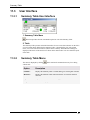
SUMMARY TABLE ............................................................................................ 88
11.1
11.2
11.3
11.4
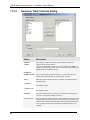
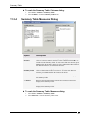
Summary Table Overview .............................................................................................................. 88
Using Summary Table .................................................................................................................... 88
User Interface ................................................................................................................................. 91
Statistical Measures ....................................................................................................................... 94
12
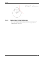
NORMAL PROBABILITY PLOT ........................................................................ 98
12.1
12.2
12.3
12.4
Normal Probability Plot Overview ................................................................................................... 98
Using Normal Probability Plots ....................................................................................................... 98
User Interface ............................................................................................................................... 100
Theory and Methods..................................................................................................................... 101
13
PROFILE ANOVA ............................................................................................ 102
13.1
13.2
13.3
13.4
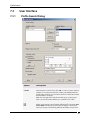
Profile Anova Overview ................................................................................................................ 102
Using Profile Anova ...................................................................................................................... 102
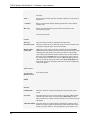
User Interface ............................................................................................................................... 103
Theory and Methods..................................................................................................................... 104
14
COLUMN RELATIONSHIPS ............................................................................ 107
14.1
14.2
14.3
14.4
Column Relationships Overview .................................................................................................. 107
Using Column Relationships ........................................................................................................ 107
User Interface ............................................................................................................................... 108
Theory and Methods..................................................................................................................... 112
15
INDEX ............................................................................................................... 118
iv
Column Normalization
1
1.1
Column Normalization
Column Normalization Overview
The Column Normalization tool can be used to standardize the values in selected columns using
a number of different normalization methods. For example, this can be useful if you plan to
perform a clustering later on.
1.2
1.2.1
Using Column Normalization
Normalizing Values in Selected Columns
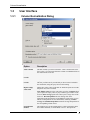
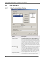
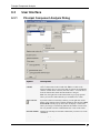
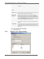
► To normalize columns:
1.
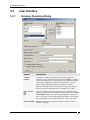
Select Data > Column Normalization....
Response: The Column Normalization dialog is displayed.
2. Select the Value columns that you want to normalize.
Comment: For multiple selection, press Ctrl and click on the desired columns or click
one column and drag to select the following ones.
3. Click a radio button to select whether to work on All records or Selected records.
4. Select a method to Replace empty values with from the drop-down list.
5. Select a Normalization method from the drop-down list.
6. Select the Overwrite previously added columns check box to overwrite columns
earlier added by this tool.
7. Click OK.
Response: The Column Normalization dialog is closed and the normalized columns
either replace the old columns or are added to the data set, depending on your selection
in the Overwrite check box.
Tip: You can also use the Column Normalization tool to replace empty values in columns
without performing any normalization.
1.2.2
Replacing Empty Values in Columns
If No normalization is selected as normalization method in the Column Normalization tool, you
can replace empty values in a data set with either a constant, averaged or interpolated values.
See Details on Interpolation for more information on how the interpolation option works for
row interpolation.
► To replace empty values in existing columns:
1.
2.
3.
4.
5.
6.
7.
Select Data > Column Normalization....
Response: The Column Normalization dialog is displayed.
Select the Value columns in which you want to replace the empty values.
Comment: For multiple selection, press Ctrl and click on the desired columns or click
one column and drag to select the following ones.
Click a radio button to select whether to work on All records or Selected records.
Select a method to Replace empty values with from the drop-down list.
Select No normalization as the Normalization method.
Select the Overwrite previously added columns check box to overwrite columns
created by this tool.
Click OK.
1
TIBCO Spotfire DecisionSite 9.1.1 Statistics - User's Manual
Response: The Column Normalization dialog is closed and data is added to the
previously empty fields of the columns in the data set according to the selected
replacement method.
1.2.3
Details on Interpolation
Empty values in the data set can be replaced with either a constant, averaged or interpolated
values. The row interpolation of the Column Normalization tool works like this:
If the first value is empty it is replaced with the first non-empty numerical value in the order the
columns were entered.
If the last value is empty it is replaced with the previous non-empty numerical value in the
order the columns were entered.
If an empty value is found between non-empty numerical values, the values are calculated as
the linear interpolation.
If all values in a row are empty, they will be replaced by zero.
Example:
A
null
null
1
1
1
1
null
C
2
null
null
null
2
2
null
Becomes:
A
C
2
2
3
3
1
2
1
2
1
2
1
2
0
0
2
B
3
3
3
null
null
3
null
D
4
4
4
4
4
null
null
B
3
3
3
3
3
3
0
4
4
4
4
4
3
0
D
Column Normalization
1.3
1.3.1
User Interface
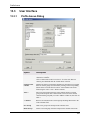
Column Normalization Dialog
Option
Description
Value columns
The data columns you want to normalize. Click a column name in the
list to select it. To select more than one column, press Ctrl and click on
the column names in the list.
Work on: All
records
All records in the value columns are included in the calculations.
Work on: Selected
records
Only the selected records are included in the calculations.
This lets you filter out any records that you do not want to include in
the calculations, using the query devices and zooming.
Replace empty
values with
Defines how empty values in the data set should be replaced. From the
drop-down list, select a method.
Note: Empty value leaves the value empty as before. Constant allows
you to replace the empty values by any constant (type a number in the
text box). Row average replaces the value by the average value of the
entire row. Row interpolation sets the missing value to the
interpolated value between the two neighboring values in the row (see
Details on interpolation for more information). Similarly, Column
average and Column interpolation return the average/interpolation of
the corresponding column values.
Normalization
method
The method to use for the normalization. For more information about
the available methods, see the methods overview. The option No
3
TIBCO Spotfire DecisionSite 9.1.1 Statistics - User's Manual
normalization gives you the opportunity to replace empty values in a
column.
Overwrite
previously added
columns
Select this check box if you want to replace any previously added
columns from the Column Normalization tool. Clear the check box if
you wish to keep the old columns.
Normalized columns will have the same name as the ones they are
based on, followed by "(normalized)". If several sets of normalized
columns are saved, they will also be followed by an index number, (1),
etc.
► To reach the Column Normalization dialog:
Select Data > Column Normalization....
1.4
1.4.1
Theory and Methods
Column Normalization Methods Overview
The following normalization methods are available in the Column Normalization tool:
• Z-score calculation
• Divide by standard deviation
• Scale between 0 and 1
1.4.2
Column Normalization - Z-score
Assume that there are n records with seven variables, A, B, C, D, E, F and G, in the data view.
We use variable E as an example in the expressions. The remaining variables are normalized in
the same way.
The normalized value of ei for variable E in the ith record is calculated as
where
If all values for variable E are identical — so that the standard deviation of E (std(E)) is equal to
zero — then all values for variable E are set to zero.
1.4.3
Column Normalization - Divide by Standard
Deviation
Assume that there are n records with seven variables, A, B, C, D, E, F and G, in the data view.
We use variable E as an example in the expressions. The remaining variables are normalized in
the same way.
The normalized value of ei for variable E in the ith record is calculated as
where
4
Column Normalization
If all values for variable E are identical — so that the standard deviation of E (std(E)) is equal to
zero — then all values for variable E are left unchanged.
1.4.4
Column Normalization - Scale Between 0 and 1
Assume that there are n records with seven variables, A, B, C, D, E, F and G, in the data view.
We use variable E as an example in the expressions. The remaining variables are normalized in
the same way.
The normalized value of ei for variable E in the ith record is calculated as
where
Emin = the minimum value for variable E
Emax = the maximum value for variable E
If all values for variable E are identical, so that Emin is equal to Emax, then all values for variable
E are set to zero.
5
Row Summarization
2
2.1
Row Summarization
Row Summarization Overview
The Row Summarization tool allows you to combine values from multiple samples into a single
column. Measures such as the average, median and standard deviation etc. of groups of
columns can be calculated. This can be used to summarize all experimental data or to generate
replicate averages and variability for subsets of the data. The resulting columns can be used in
subsequent analyses.
2.2
2.2.1
Using Row Summarization
Performing a Row Summarization
The Row Summarization tool allows you to combine values from multiple samples into a single
column.
► To use the Row Summarization tool:
1.
2.
3.
4.
5.
6.
7.
2.2.2
Select Data > Row Summarization....
Response: The Row Summarization dialog is displayed.
Move the desired value columns from Available columns to suitable groups in the
Grouped value columns list.
Comment: For example, to create a column containing the average per row of the
values in two old columns, first make sure that there is just one group in the Grouped
value columns list. Then click to select the two columns in the Available columns list
and click on Add >> to move the columns to the selected group. Several groups can be
summarized at the same time. The tool requires that each group has at least two
columns.
Select a group and click on Rename Group to edit the group name.
Comment: The names of the result columns will be the group names followed by the
chosen comparison measure within parentheses. Therefore, using meaningful group
names will prove valuable when interpreting the results later on.
Click a radio button to select whether to work on All records or Selected records.
Select a method to Replace empty values with from the drop-down list.
Select a Summarization measure from the list box.
Comment: For a mathematical description of the different measures, see Statistical
measures.
Click OK.
Response: New result columns are added to the data set. An annotation may also be
added.
Row Summarization Example
If you have performed multiple experiments on a number of different subjects and want to use
the average values of the measurements in your following data analyses, you can quickly create
new columns using the Row Summarization tool:
6
Row Summarization
ID:
A
A
B
B
1st value
2nd value
1st value
2nd value
Subject 1
0.5
0.6
20
18
Subject 2
1.0
0.8
25
27
Subject 3
0.25
0.15
42
44
By performing a row summarization using Average as the summary measure and naming the
Grouped value columns groups A and B, the new columns A (Average) and B (Average) are
added to the data set:
ID:
A
(Average)
B
(Average)
18
0.55
19
25
27
0.9
26
42
44
0.2
43
A
A
B
B
1st
value
2nd
value
1st
value
2nd
value
Subject
1
0.5
0.6
20
Subject
2
1.0
0.8
Subject
3
0.25
0.15
7
TIBCO Spotfire DecisionSite 9.1.1 Statistics - User's Manual
2.3
2.3.1
User Interface
Row Summarization Dialog
Option
Description
Available columns
The data columns that you can use in the calculation. Click a
column name in the list to select it, then click Add >> to
move it to the selected group in the Grouped value columns
list. To select more than one column, press Ctrl and click the
column names in the list, then click Add >>. You can choose
from any column that contains decimal numbers or integers.
Note: You can right-click on the Name header to get a popup menu where you can select other attributes you would like
to be visible.
Enter text here
Grouped value columns
8
If you have a data set with many columns, you can right-click
on the header of the columns in the Available columns list
box and select Show Search Field from the pop-up menu.
This will display a search field where you can type a search
string and limit the number of items in the list. It is possible
to use the wildcard characters * and ? in the search.
Displays the groups on which the calculation is performed.
You can add, delete or rename groups from the field by
Row Summarization
clicking on the corresponding buttons to the left of the field.
You move value columns between the fields using the Add
>> and << Remove buttons.
Add >>
Moves selected columns from the Available columns field to
a selected group in the Grouped value columns field. Click to
select the desired columns and the group that you want to add
the columns to, then click on Add >>.
<< Remove
Removes all columns from a selected group and brings them
back to the Available columns field. If a single column is
selected in the Grouped value columns field, it will be
removed from the group, while all other columns remain in
the group.
New Group
Adds a new group to the Grouped value columns field.
Delete Group
Deletes a selected group from the Grouped value columns
field. If the group contained any value columns they are
moved back to the Available columns field.
Rename Group
Opens the Edit Group Name dialog, where you can change
the name of the selected group. The names of the result
columns from a row summarization will be the group names
followed by the selected summarization measure within
parenthesis. Therefore, using meaningful group names will
prove valuable in the interpretation of the results later on.
Work on: All records
All records in the value columns are included in the
calculations.
Work on: Selected records
Only the selected records are included in the calculations.
This lets you filter out any records that you do not want to
include in the calculations, using the query devices and
zooming.
Replace empty values with
Defines how empty values in the data set should be replaced.
Empty value simply ignores empty values. Constant allows
you to replace the empty values by any constant (type a
number in the text box). Row average replaces the value by
the average value of the entire row. Row interpolation sets
the missing value to the interpolated value between the two
neighboring values in the row.
Summarization measure
The measure to present in the new columns: Min, Median,
Max, Sum, Average, Standard deviation or sample Variance.
For a mathematical description of the different measures, see
Statistical measures.
► To reach the Row Summarization dialog:
Select Data > Row Summarization....
9
Hierarchical Clustering
3
3.1
Hierarchical Clustering
Hierarchical Clustering Overview
The Hierarchical Clustering tool groups records and arranges them in a dendrogram (a tree
graph) based on the similarity between them.
3.2
3.2.1
Using Hierarchical Clustering
Initiating a Hierarchical Clustering
► To start a clustering:
1.
Select Data > Clustering > Hierarchical Clustering....
Response: The Hierarchical Clustering dialog is displayed.
2. Select the value columns on which to base the clustering from the Available columns
list and click Add >>.
Comment: For multiple selection, press Ctrl and click on the desired columns in the
Available columns list. Then click Add >> to move the selected columns to the
Selected columns list. You can sort the columns in the list alphabetically by clicking
on the Name bar.
3. Click a radio button to select whether to work on All records or Selected records.
4. Select a method to Replace empty values with from the drop-down list.
5. Select which Clustering method to use for calculating the similarity between clusters.
Comment: Click for information about available clustering methods.
6. Select which Similarity measure to use in the calculations.
Comment: Click for information about available similarity measures.
7. Select which Ordering function to use for displaying the results.
Comment: Click for information about available ordering functions.
8. Type a new Column name in the text box or use the default name.
Comment: Select the Overwrite check box if you want to overwrite a previously
added column using the same name. Clear the check box to keep old columns.
9. Select the Calculate column dendrogram check box if you want to create a column
dendrogram.
10. Click OK.
Response: The Hierarchical Clustering dialog is closed and the clustering is started.
The result is displayed according to your settings in the dialog.
3.2.2
Hierarchical Clustering on Keys
A structure key is a string that lists the substructures which form a compound. Clustering on
keys, then means grouping compounds with similar sets of substructures.
Clustering on keys is based only on the values within the key column, and not all the columns.
The key column should contain comma separated string values for all or some of the records in
the data set.
The procedure below only shows you how to cluster records based on a specific key column.
► To cluster on keys:
1.
10
If you have not already done it, you should first import the keys that you want to
cluster on into Spotfire DecisionSite.
Hierarchical Clustering
2.
3.
4.
5.
6.
7.
8.
9.
3.2.3
Select Data > Clustering > Hierarchical Clustering on Keys....
Response: The Hierarchical Clustering on Keys dialog is displayed.
Select the Key column on which to base the calculations.
Comment: The key column could be any string column in the data set.
Click a radio button to select whether to work on All records or Selected records.
Select which Clustering method to use for calculating the similarity between clusters.
Comment: Click for information about available clustering methods.
Select which Similarity measure to use in the calculations.
Comment: Click for information about available similarity measures.
Select which Ordering function to use for displaying the results.
Comment: Click for information about available ordering functions.
Type a new Column name in the text box or use the default name.
Comment: Select the Overwrite check box if you want to overwrite a previously
added column using the same name. Clear the check box to keep old columns.
Click OK.
Response: The Hierarchical Clustering on Keys dialog is closed and the clustering is
started. A heat map and a row dendrogram visualization is created and information
about the clustering is added to the visualization as an annotation.
Adding a Column from Hierarchical Clustering
The ordering column which is added to the data set upon performing a hierarchical clustering is
used only to display the row dendrogram and to connect it to the heat map. In order to compare
the hierarchical clustering results to those of a K-means clustering, you must first add a
clustering column to your data set.
A clustering column contains information about which cluster each record belongs to, and can
be used to create a trellis plot.
► To add a clustering column:
1.
2.
3.
4.
Perform a hierarchical clustering and locate the Row dendrogram which can be found
to the left of the heat map.
Comment: For more information on how to create the row dendrogram, see Initiating a
hierarchical clustering.
If the cluster line is not visible (a dotted red line in the row dendrogram), right-click
and select View > Cluster scale from the pop-up menu to display it.
Comment: The cluster line will enable you to see how many clusters you are selecting
in the dendrogram.
Click on the red circle on the cluster slider above the dendrogram and drag it to control
how many clusters you want to include in the data column. You can also use the left
and right keyboard arrow keys to step through the different number of clusters.
Response: All clusters for the current position on the cluster slider are shown as small,
red circles in the dendrogram.
Comment: If you position the red circle at its rightmost position on the cluster slider,
you get one cluster for each record. If you position it at its leftmost position, you get a
single cluster that includes all records. The number of clusters is displayed as a
ToolTip which is shown when clicking and holding the left mouse-button on the red
circle on the cluster slider.
Select Add Cluster Column from the row dendrogram menu.
Response: A column with information about which cluster each record belongs to, is
added to the data set.
Comment: Records in the data set that are not included in the row dendrogram will
have empty values in the new clustering column.
11
TIBCO Spotfire DecisionSite 9.1.1 Statistics - User's Manual
Tip: You can also click on the Add Clustering Column button,
column from the last row dendrogram.
3.2.4
, to add a clustering
Marking and Activating Nodes in the Dendrogram
Marking nodes
To mark a node, click just outside it and drag to enclose the node within the frame that appears
and then release. You can also press Ctrl and click on the node to mark it. To mark more than
one node, press Ctrl and click on all the nodes you want to mark. To unmark all nodes, drag to
select an area outside the dendrogram.
When you mark a node or a number of nodes, the marked parts of the dendrogram are shaded in
the color used for marked records, by default green as shown below. The corresponding records
are also marked in the heat map and other visualizations.
Note: It is only possible to mark nodes in the row dendrogram, not in the column dendrogram.
Activating nodes
To activate a node, click on it in the dendrogram. The node gets a black ring around it. Only
one node can be active at a time. The node remains active until another node is activated. It is
possible to zoom in on the active node in the dendrogram by selecting Zoom to Active from the
Hierarchical Clustering menu or from the dendrogram pop-up menu.
Highlighting nodes
Highlighting nodes in the dendrogram does not have any effect on the visualizations.
3.2.5
Zooming in the Dendrogram
You can zoom to a subtree in the row dendrogram, either by using the visualization zoom bar or
the Zoom to Active command in the pop-up menu. The pop-up menu is brought up by rightclicking in the dendrogram.
Double-clicking on a node will give the same results as the Zoom to Active command. Doubleclicking a white surface in the dendrogram (no node) will take back the zooming one step,
unlike the Reset Zoom command which takes you all the way back to the original zooming
position.
12
Hierarchical Clustering
The dendrogram can also be shown in log scale. This only affects the display of the
dendrogram. The numbers in the cluster slider are not transformed into log values. Select View
> Log Scale from the pop-up menu to view the dendrogram this way.
3.2.6
Resizing the Dendrogram
It is possible to adjust how much of the space in the visualization will be occupied by the
dendrogram. This can be especially useful if the heat map contains a single column and the
dendrogram structure is complex.
► To resize the dendrogram:
First click on the dendrogram to make sure it is in focus. Then, press Ctrl and use the left or
right arrow key on the keyboard to make the dendrogram slimmer or wider.
Comment: You cannot make the dendrogram or the heat map completely disappear by resizing
them in the visualization.
3.2.7
Exporting a Dendrogram
Note: The Hierarchical Clustering tool allows the dendrograms to be saved with the Analysis.
However, it is also possible to export the dendrograms separately and import them again via the
Hierarchical Clustering: Dendrogram Import dialog.
► To export a dendrogram:
1.
Perform a hierarchical clustering.
Comment: For more information, see Initiating a hierarchical clustering.
2. Locate the dendrogram(s) in the created heat map visualization.
3. Select Export > Row Dendrogram or Column Dendrogram from the menu in the
top left of the heat map visualization.
Comment: The command Export > Column Dendrogram is only available if you
selected to create a column dendrogram during the calculation.
Response: A Save As dialog is displayed.
4. Type a File name and save the file as a DND file.
Comment: The entire tree structure is saved even if only part of it is visible at the
moment of saving.
Tip: To save the dendrogram and heat map as an image, use one of the Reporting tools of
Spotfire DecisionSite: PowerPoint® Presentation, Word Presentation or Export as Web Page.
3.2.8
Importing a Dendrogram
Note: The Hierarchical Clustering tool allows the dendrograms to be saved with the Analysis.
However, it is still possible to save the dendrograms separately and import them again via the
Hierarchical Clustering: Dendrogram Import dialog.
► To import a saved dendrogram:
1.
2.
3.
4.
Select Data > Clustering > Hierarchical Clustering....
Response: The Hierarchical Clustering dialog is displayed.
Click Import....
Response: The Hierarchical Clustering: Dendrogram Import dialog is displayed.
Click the Browse... button by the Row dendrogram field.
Response: An Open File dialog is displayed.
Locate the previously exported Row dendrogram file (*.dnd) and click Open.
Comment: Only dendrograms associated with the active data set can be opened. If
there is a column missing in the data set, or if the names of the columns in the data set
13
TIBCO Spotfire DecisionSite 9.1.1 Statistics - User's Manual
5.
6.
7.
3.3
3.3.1
14
have been changed since the dendrogram was saved, an error message will appear and
no dendrogram can be displayed.
Decide if you want to open a corresponding column dendrogram or not. Browse to
locate the Column dendrogram file similarly to steps 3-4 above.
Type a Column name or use the default one.
Comment: Select the Overwrite check box to overwrite a column with the same name
in the data set.
Click OK.
Comment: The column containing the hierarchical clustering order of the dendrogram
is added to the data set. A heat map visualization is created with the dendrogram(s)
displayed on the side(s).
User Interface
Hierarchical Clustering Dialog
Option
Description
Available
columns
Displays all available data columns on which you can perform a
clustering. Click a column name in the list and click Add >> to move it
to the Selected columns list. To select more than one column, press Ctrl
and click the column names in the list, then click Add >>. You can
choose from all columns that contain real numbers or integers.
Note: You can right-click on the Name header to get a pop-up menu
Hierarchical Clustering
where you can select other attributes you would like to be visible.
Enter text here
If you have a data set with many columns, you can right-click on the
header of the columns in the Available columns list box and select Show
Search Field from the pop-up menu. This will display a search field
where you can type a search string and limit the number of items in the
list. It is possible to use the wildcard characters * and ? in the search.
Selected columns
Displays the currently selected data columns on which you want to
perform a clustering.
Add >>
Adds the highlighted data column to the list of selected columns.
<< Remove
Removes the highlighted data column from the list of selected columns
and places them back in the list of available columns.
Work on: All
records
All records in the value columns are included in the calculations.
Work on:
Selected records
Only the selected records are included in the calculations.
This lets you filter out any records that you do not want to include in the
calculations, using the query devices and zooming.
Replace empty
values with
Defines how empty values in the data set should be replaced in the
clustering. Constant allows you to replace the empty values by any
constant (type a number in the text box). Row average replaces the
value by the average value of the entire row. Row interpolation sets the
missing value to the interpolated value between the two neighboring
values in the row. Column average returns the average of the
corresponding column values.
Clustering
method
The clustering method to use for calculating the similarity between
clusters. Click here for a description of the available methods.
Similarity
measure
The similarity measure to use for the clustering. Click here for a
description of the available similarity measures.
Ordering
function
The ordering function to use for the clustering. Click here for a
description of the available ordering functions.
Column name
The name of the new columns containing the results from the
hierarchical clustering.
Overwrite
Select this check box if you want to replace a previously added column
and plot (with the same name as the one typed in the Column name text
box) when you add a new column. Clear the check box if you wish to
keep the old column and plot.
Calculate column Select this check box to calculate a column dendrogram during the
clustering.
dendrogram
Import...
Opens the Hierarchical Clustering: Dendrogram Import dialog where you
can import row and column dendrogram files.
► To reach the Hierarchical Clustering dialog:
Select Data > Clustering > Hierarchical Clustering....
15
TIBCO Spotfire DecisionSite 9.1.1 Statistics - User's Manual
3.3.2
16
Hierarchical Clustering on Keys Dialog
Option
Description
Key column
The data column on which to base the calculations. The key column
should contain comma separated string values for all or some of the
records in the data set.
Work on: All
records
All records in the value columns are included in the calculations.
Work on:
Selected records
Only the selected records are included in the calculations.
This lets you filter out any records that you do not want to include in the
calculations, using the query devices and zooming.
Clustering
method
The clustering method to use for calculating the similarity between
clusters. Click here for a description of the available methods.
Similarity
measure
The similarity measure to use for the clustering. Click here for a
description of the available similarity measures.
Ordering
function
The ordering function to use for the clustering. Click here for a
description of the available ordering functions.
Column name
The name of the new columns containing the results from the
hierarchical clustering.
Overwrite
Select this check box if you want to replace a previously added column
and plot (with the same name as the one typed in the Column name text
box) when you add a new column. Clear the check box if you wish to
keep the old column and plot.
Open...
Opens the Hierarchical Clustering: Dendrogram Import dialog where you
can open row dendrogram files. Column dendrograms are not available
when you are clustering on keys.
Hierarchical Clustering
► To reach the Hierarchical Clustering on Keys dialog:
Select Data > Clustering > Hierarchical Clustering....
3.3.3
Hierarchical Clustering Dendrogram Import Dialog
Option
Description
Row dendrogram Click on the Browse... button to display an Open File dialog, where you
can select the row dendrogram to open. Only row dendrograms directly
associated with the open data set can be opened.
Column
dendrogram
Click on the corresponding Browse... button to display an Open File
dialog, where you can select the column dendrogram to open. The
column dendrogram option is not available when you are accessing this
dialog from the Hierarchical Clustering on Keys dialog.
Column name
The name of the new columns containing the results from the
hierarchical clustering.
Overwrite
Select this check box if you want to replace a previously added column
(with the same name as the one typed in the Column name text box)
when you add a new column. Clear the check box if you wish to keep the
old column.
► To reach the Hierarchical Clustering: Dendrogram Import dialog:
1.
2.
3.3.4
Select Data > Clustering > Hierarchical Clustering....
Click on the Open... button in the lower left part of the dialog to display the
Hierarchical Clustering: Dendrogram Import dialog.
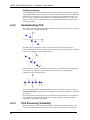
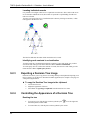
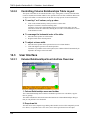
The Row Dendrogram
The row dendrogram shows the similarity between rows and shows which nodes each record
belongs to as a result of the clustering. An example of part of a row dendrogram is shown
below.
The vertical axis of the row dendrogram consists of the individual records, and the horizontal
axis represents the clustering level.
17
TIBCO Spotfire DecisionSite 9.1.1 Statistics - User's Manual
The individual records in the clustered data set are represented by the rightmost nodes in the
row dendrogram. Each remaining node in the dendrogram represents a cluster of all records that
lie to the right of it in the dendrogram. The leftmost node in the dendrogram is thus a cluster
that contains all records.
The row dendrogram is automatically displayed next to the heat map which is created upon
clustering. It can, however, be hidden or displayed by selecting View > Row dendrogram from
the Hierarchical Clustering menu.
3.3.5
The Column Dendrogram
The column dendrogram is drawn in the same way as the row dendrogram but shows the
similarity between the variables (the selected value columns). The variables in the clustered
data set are represented by the nodes at the lowest part of the column dendrogram.
To display the column dendrogram (if one has been calculated), select View > Column
Dendrogram from the Hierarchical Clustering menu. The column dendrogram can only be
displayed if it has been calculated (select this in the Hierarchical Clustering dialog).
Restricted functionality
The column dendrogram offers less interactivity than the row dendrogram. You cannot add the
results from the column dendrogram to the data set and so you cannot create visualizations
based on it. There is no cluster slider above the column dendrogram, no cluster line and no
horizontal zooming.
3.3.6
Row Dendrogram Menu and Toolbar
Toolbar
The row dendrogram toolbar is located directly above the row dendrogram. The row
dendrogram is automatically created upon clustering and it is located to the left of the heat map.
Click on the buttons in the toolbar to activate the corresponding functions.
Displays the Hierarchical Clustering menu.
Adds a new column to the data set with information about which cluster each record
belongs to. The position of the red circle on the cluster slider above the dendrogram
18
Hierarchical Clustering
controls the number of clusters. The column can be used to create a trellis plot of the
clusters.
Hierarchical Clustering menu
Option
Description
Zoom to Active
Zooms to the selected subtree so that the active node in the row
dendrogram is displayed to the far left of the visualization.
Reset Zoom
Resets the horizontal zooming to its original size so the full width of
the row dendrogram is visible.
View >
> Log Scale
Displays the dendrogram in log scale. Affects only the display of the
dendrogram and not the actual numbers of the calculated similarity
measures.
> Toolbar
Displays or hides the row dendrogram toolbar. If the toolbar has been
hidden, right-click on the row dendrogram and select View > Toolbar
from the pop-up menu to display it again.
> Cluster Scale
Displays or hides the cluster scale (and cluster line) above the row
dendrogram. The cluster scale must be displayed if you want to select
the number of clusters to be included in the added cluster column.
> Column
Dendrogram
Displays or hides the column dendrogram (if one has been created).
> Row
Dendrogram
Displays or hides the row dendrogram.
> Include Empty
Relevant only when you have performed a clustering using selected
records. This produces a Hierarchical Clustering (order) column with
empty values for all of the remaining records. By marking or clearing
the Include Empty option you can determine whether or not to display
the records that were not a part of the clustering calculation in the heat
map. Obviously, no dendrogram can be displayed for these rows.
Remove
Dendrograms
Removes the dendrograms permanently from the visualization.
Add Cluster
Column
Adds a new column to the data set with information about which
cluster each record belongs to. The position of the red circle on the
cluster slider above the dendrogram controls the number of clusters.
The column can be used to create a trellis plot of the clusters.
Overwrite
Selects whether or not to overwrite a Hierarchical Clustering (cluster)
column, when using the Add cluster column function.
Export >
> Row
Dendrogram
Opens a dialog where you can select a file name and save your row
dendrogram.
> Column
dendrogram
Opens a dialog where you can select a file name and save your column
dendrogram.
19
TIBCO Spotfire DecisionSite 9.1.1 Statistics - User's Manual
Note: The Hierarchical Clustering tool allows the dendrograms to be saved with the Analysis.
However, it is still possible to export the dendrograms separately and then import them from
within the Hierarchical Clustering: Dendrogram Import dialog.
3.3.7
Dendrogram Pop-up Menus
Right-click in the dendrogram to bring up the pop-up menu.
Row dendrogram pop-up menu:
Option
Description
Zoom to Active
Zooms horizontally so that the active node in the row dendrogram is
displayed to the far left of the visualization.
Reset Zoom
Resets the horizontal zooming to its original size so the full width of
the row dendrogram is visible.
View >
20
> Log Scale
Displays the dendrogram in log scale. Affects only the horizontal
distances in the dendrogram and not the actual numbers of the
calculated similarity measures.
> Toolbar
Displays or hides the row dendrogram toolbar. If the toolbar has been
hidden, right-click on the row dendrogram and select View > Toolbar
from the pop-up menu to display it again.
> Cluster Scale
Displays or hides the cluster scale (and cluster line) above the row
dendrogram. The cluster scale must be displayed if you want to select
the number of clusters to be included in the added cluster column.
> Column
Dendrogram
Displays or hides the column dendrogram (if one has been created).
> Row
Dendrogram
Displays or hides the row dendrogram.
> Include Empty
Relevant only when you have performed a clustering using selected
records. This produces a Hierarchical Clustering (order) column with
empty values for all of the remaining records. By marking or clearing
the Include Empty option you can determine whether or not to display
the records that were not a part of the clustering calculation in the heat
map. Obviously, no dendrogram can be displayed for these rows.
Remove
Dendrograms
Removes the dendrograms permanently from the visualization.
Add Cluster
Column
Adds a new column to the data set with information about which
cluster each record belongs to. The position of the red circle on the
cluster slider above the dendrogram controls the number of clusters.
The column can be used to create a trellis plot of the clusters.
Overwrite
Selects whether or not to overwrite a Hierarchical Clustering (cluster)
column, when using the Add cluster column function.
Hierarchical Clustering
Column dendrogram pop-up menu:
Option
Description
Zoom to Active
Zooms so that the active node in the column dendrogram is displayed at
the top of the visualization.
Reset Zoom
Resets the zooming to its original size so the full width of the row
dendrogram is visible.
View >
> Log Scale
3.3.8
Displays the dendrogram in log scale. Affects only the horizontal
distances in the dendrogram and not the actual numbers of the
calculated similarity measures.
Cluster Slider in Dendrogram
The scale above the row dendrogram is the cluster slider. The numbers above the scale refer to
the number of clusters at different positions in the dendrogram. The numbers below the scale
refer to the calculated similarity measures. When you move the cursor over the scale, the
number of clusters and the similarity measure at that position are given in a ToolTip.
Upper scale
The upper scale assists you in selecting the number of clusters before creating a new clustering
column. Click on the red circle on the cluster slider and drag it to the horizontal position you
want. The selected clusters are indicated as red circles in the dendrogram. The total number of
clusters is shown in a ToolTip as long as you hold down the mouse button.
Lower scale
The lower scale shows the calculated similarity measure in the dendrogram. The position of a
node along the scale represents the similarity measure between the two subnodes in that node
(there are always exactly two subnodes in each node). In the figure below, the similarity
measure between the two subnodes in the active node is indicated by the dotted orange arrow.
21
TIBCO Spotfire DecisionSite 9.1.1 Statistics - User's Manual
The vertical distance has no mathematical meaning in the dendrogram.
Note: There is no cluster slider above the column dendrogram. You cannot create clusters in a
column dendrogram and you cannot export information about the column dendrogram as a new
column.
Tip: The cluster slider can also be moved by using the left and right arrows on the keyboard.
This increases or decreases the number of clusters in a stepwise fashion.
3.4
3.4.1
Theory and Methods
Hierarchical Clustering Method Overview
Hierarchical clustering arranges objects in a hierarchy with a treelike structure based on the
similarity between them.
The graphical representation of the resulting hierarchy is called a dendrogram, or a tree graph.
This figure shows a small part of a dendrogram.
In Spotfire DecisionSite, the vertical axis of the dendrogram consists of the individual records
and the horizontal axis represents the clustering level. The individual records in the clustered
data set are represented by the rightmost nodes in the row dendrogram. Each remaining node in
the dendrogram represents a cluster of all records that lie below it to the right in the
dendrogram, thus making the leftmost node in the dendrogram a cluster that contains all
records.
Misapplication of clustering
Clustering is a very useful data reduction technique. However, it can easily be misapplied. The
clustering results are highly affected by your choice of similarity measure and other input
22
Hierarchical Clustering
parameters. You should bear this in mind when you evaluate the results. If possible, you should
replicate the clustering analysis using different methods. Apply cluster analysis with care and it
can serve as a powerful tool for identifying patterns within a data set.
3.4.2
Hierarchical Clustering Algorithm
The algorithm used in the Hierarchical Clustering tool is a hierarchical agglomerative method.
This means that the cluster analysis begins with each record in a separate cluster, and in
subsequent steps the two clusters that are the most similar are combined to a new aggregate
cluster. The number of clusters is thereby reduced by one in each iteration step. Eventually, all
records are grouped into one large cluster.
► This is how it works:
1.
2.
3.
4.
5.
3.4.3
The similarity between all possible combinations of two records is calculated using a
selected similarity measure.
Each record is placed in a separate cluster.
The two most similar clusters are grouped together and form a new cluster.
The similarity between the new cluster and all remaining clusters is recalculated using
a selected clustering method.
Steps 3 and 4 are repeated until all records eventually end up in one large cluster.
Required Input for Hierarchical Clustering
When you start a clustering you need to specify a number of parameters.
The parameters are set in the Hierarchical Clustering dialog that you reach by selecting
Clustering > Hierarchical Clustering from the Data menu.
You need to answer the following questions:
•
•
•
3.4.4
Which clustering method should be used to calculate the similarity between clusters?
Which similarity measure should be used to calculate the similarity between records?
Which ordering function should be used for drawing the dendrogram?
Hierarchical Clustering Ordering Function
The ordering function controls in what vertical order the records (rows) are plotted in the row
dendrogram. The two subclusters within a cluster (there are always exactly two subclusters) are
weighted and the cluster with the lower weight is placed above the other cluster. The weight can
be any one of the following:
• Input rank of the records. This is the order of the records during import to
DecisionSite.
• Average value of the rows. For example, a record a with 5 dimensions would have the
average (a1+a2+a3+a4+a5 )/5. The average for a record a with k dimensions is calculated
as
Calculating the weight of a cluster
To calculate the weight w3 of a new cluster C3 formed from two subclusters C1 and C2 with a
weight of w1and w2, and each containing n1 and n2 records, you use the following expression:
23
TIBCO Spotfire DecisionSite 9.1.1 Statistics - User's Manual
3.4.5
Hierarchical Clustering References
Hierarchical clustering
Mirkin, B. (1996) Mathematical Classification and Clustering, Nonconvex Optimization and Its
Applications Volume 11, Pardalos, P. and Horst, R., editors, Kluwer Academic Publishers, The
Netherlands.
Sneath, P., Sokal, R. R. (1973) Numerical taxonomy, Second Edition, W. H. Freeman, San
Francisco.
General information about clustering
Hair, J.F.Jr., Anderson, R.E., Tatham, R.L., Black, W.C. (1995) Multivariate Data Analysis,
Fourth Edition, Prentice Hall, Englewood Cliffs, New Jersey.
3.4.6
3.4.6.1
Similarity Measures
Similarity Measures Overview
Spotfire DecisionSite contains several tools which calculate the similarity between different
records (e.g., Hierarchical Clustering, K-means Clustering and Profile Search). Calculating
similarities can be useful if you want to create lists of similar records which may possibly be
treated as a group or if you want to find the record that is most similar to another record. The
following similarity measures can be used to calculate the resemblance between records:
• Euclidean distance
• Correlation
• Cosine correlation
• City block distance
• Tanimoto coefficient (only available for Profile Search and Hierarchical Clustering)
• Half square Euclidean distance (only available for Hierarchical Clustering)
Note: When used in clustering, some of the similarity measures may be transformed so that
they are always greater than or equal to zero (using 1 – calculated similarity value).
Dimensions
The term dimension is used in all similarity measures. The concept of dimension is simple if we
are describing the physical position of a point in three dimensional space when the positions on
the x, y and z axes refer to the different dimensions of the point. However, the data in a
dimension can be of any type. If, for example, you describe a group of people by their height,
their age and their nationality, then this is also a three dimensional system. For a record, the
number of dimensions is equal to the number of variables in the record.
3.4.6.2
Euclidean Distance
The Euclidean distance between two profiles, a and b, with k dimensions is calculated as
The Euclidean distance is always greater than or equal to zero. The measurement would be zero
for identical profiles and high for profiles that show little similarity.
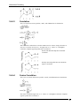
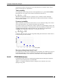
The figure below shows an example of two profiles called a and b. Each profile is described by
five values. The dotted lines in the figure are the distances (a1-b1), (a2-b2), (a3-b3), (a4-b4) and
(a5-b5) which are entered in the equation above.
24
Hierarchical Clustering
3.4.6.3
Correlation
The Correlation between two profiles, a and b, with k dimensions is calculated as
where
This correlation is called Pearson Product Momentum Correlation, simply referred to as
Pearson's correlation or Pearson's r. It ranges from +1 to -1 where +1 is the highest
correlation. Complete opposite profiles have correlation -1.
Profiles with identical shape have maximum
correlation.
Perfectly mirrored profiles have the maximum
negative correlation.
3.4.6.4
Cosine Correlation
The Cosine correlation between two profiles, a and b, with k dimensions is calculated as
where
The cosine correlation ranges from +1 to -1 where +1 is the highest correlation. Complete
opposite profiles have correlation -1.
25
TIBCO Spotfire DecisionSite 9.1.1 Statistics - User's Manual
Comparison between Cosine correlation and Correlation
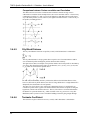
The difference between Cosine correlation and Correlation is that the average value is
subtracted in Correlation. In the example below, the Cosine correlation will be +1 between any
combination of profiles a, b, and c, but it will be slightly less than that between profile d and
any of the other profiles (+0.974). However, the regular Correlation will be +1 between any of
the profiles, including profile d.
3.4.6.5
City Block Distance
The City block distance between two profiles, a and b, with k dimensions is calculated as
The City Block distance is always greater than or equal to zero. The measurement would be
zero for identical profiles and high for profiles that show little similarity.
The figure below shows an example of two profiles called a and b. Each profile is described by
five values. The dotted lines in the figure are the distances (a1-b1), (a2-b2), (a3-b3), (a4-b4) and
(a5-b5) which are entered in the equation above.
In most cases, this similarity measure yields results similar to the Euclidean distance. Note,
however, that with City block distance, the effect of a large difference in a single dimension is
dampened (since the distances are not squared).
The name City block distance (also referred to as Manhattan distance) is explained if you
consider two points in the xy-plane. The shortest distance between the two points is along the
hypotenuse, which is the Euclidean distance. The City block distance is instead calculated as
the distance in x plus the distance in y, which is similar to the way you move in a city (like
Manhattan) where you have to move around the buildings instead of going straight through.
3.4.6.6
Tanimoto Coefficient
The Tanimoto coefficient between two rows, a and b, with k dimensions is calculated as
26
Hierarchical Clustering
The Tanimoto similarity measure is only applicable for a binary variable, and for binary
variables the Tanimoto coefficient ranges from 0 to +1 (where +1 is the highest similarity).
3.4.6.7
Half Square Euclidean Distance
The Half square Euclidean distance between two profiles, a and b, with k dimensions is
calculated as
The Half square Euclidean distance is always greater than or equal to zero. The measurement
would be zero for identical profiles and high for profiles that show little similarity.
The figure below shows an example of two profiles called a and b. Each profile is described by
five values. The dotted lines in the figure are the distances (a1-b1), (a2-b2), (a3-b3), (a4-b4) and
(a5-b5) which are entered in the equation above.
3.4.7
3.4.7.1
Cluster similarity methods
Cluster Similarity Methods
A hierarchical clustering starts by calculating the similarity between all possible combinations
of two records using a selected similarity measure. These calculated similarities are then used to
derive the similarity between all clusters that are formed from the records during the clustering.
You select one of the following clustering methods:
• UPGMA
• WPGMA
• Single linkage
• Complete linkage
• Ward's method
3.4.7.2
UPGMA
UPGMA stands for Unweighted Pair-Group Method with Arithmetic mean.
Assume that there are three clusters called C1, C2 and C3 including n1, n2 and n3 number of
records. Clusters C2 and C3 are aggregated to form a new single cluster called C4.
The similarity between cluster C1 and the new cluster C4 in the example above is calculated as
where
sim = the similarity between the two indexed clusters and
27
TIBCO Spotfire DecisionSite 9.1.1 Statistics - User's Manual
3.4.7.3
WPGMA
WPGMA stands for Weighted Pair-Group Method with Arithmetic mean.
Assume that there are three clusters called C1, C2 and C3 including n1, n2 and n3 number of
records. Clusters C2 and C3 are aggregated to form a new single cluster called C4.
The similarity between cluster C1 and the new cluster C4 in the example above is calculated as
where
sim = the similarity between the two indexed clusters.
3.4.7.4
Single Linkage
This method is based on minimum distance. To calculate the similarity between two clusters,
each possible combination of two records between the two clusters is compared. The similarity
between the clusters is the same as the similarity between the two records in the clusters that are
most similar.
3.4.7.5
Complete Linkage
This method is based on maximum distance and can be thought of as the opposite of Single
linkage. To calculate the similarity between two clusters, each possible combination of two
records between the two clusters is compared. The similarity between the two clusters is the
same as the similarity between the two records in the clusters that are least similar.
3.4.7.6
Ward's Method
Ward's method means calculating the incremental sum of squares. The similarity measure is
automatically set to Half square Euclidean distance when using Ward's method. This is not
configurable.
Assume that there are three clusters called C1, C2 and C3 including n1, n2 and n3 number of
records. Clusters C2 and C3 are aggregated to form a new single cluster called C4.
The similarity between cluster C1 and the new cluster C4 in the example above is calculated as
where
sim = the similarity between the two indexed clusters
28
Self-Organizing Maps
4
4.1
Self-Organizing Maps
Self-Organizing Maps Overview
A Self-Organizing Map (SOM) is a type of clustering algorithm based on neural networks. The
algorithm produces a Trellis profile chart, in which similar records appear close to each other,
and less similar records appear more distant. From this map it is possible to visually investigate
how records are related.
4.2
4.2.1
Using Self-Organizing Maps
Performing Clustering using Self-Organizing Maps
► To perform clustering:
1.
2.
3.
4.
5.
6.
7.
8.
9.
10.
11.
12.
13.
14.
Select Data > Clustering > Self-Organizing Maps....
Response: The Self-Organizing Maps dialog is displayed.
Select the value columns on which to base the clustering from the Available columns
list and click Add >>.
Comment: For multiple selection, press Ctrl and click on the desired columns in the
Available columns list. Then click Add >> to move the columns to the Selected
columns list. You can sort the columns in the list alphabetically by clicking on the
Name bar.
Click a radio button to select whether to work on All records or Selected records.
Select a method to Replace empty values with from the drop-down list.
Select a Normalization method from the drop-down list.
Comment: Self Organizing Maps offers three different Normalization methods: Zscore (subtract the mean and divide by standard deviation), Divide by standard
deviation, and Scale between 0 and 1. Each of these three methods apply normalization
to columns, but not to rows.
Enter the Grid size width and height.
Comment: This is the number of separate maps to be calculated. Entering large values
gives the map a better resolution, but makes the calculation slower. Entering small
values may result in dissimilar records being assigned to the same node.
If desired, click Advanced... to modify the calculation settings. If you do not want to
change the calculation settings, continue to step 14.
Select a Neighborhood function from the drop-down list.
Comment: For more information about the available methods, see Neighborhood
function.
Modify the Begin radius and the End radius according to your choice.
Select a Learning function.
Comment: For more information about the available methods, see Learning function.
Modify the Initial rate.
Comment: If you receive the message "Calculation error: Overflow in floating
numbers" upon calculation, you may have set the initial training rate too high. Try a
lower value.
Enter a Number of training steps or use the default setting.
Click OK.
Type a new Column name, or use the default name.
29
TIBCO Spotfire DecisionSite 9.1.1 Statistics - User's Manual
Comment: Select the Overwrite check box if you want to overwrite a previously
added column with the same name.
15. Select or clear the Calculate columns with similarity and rank to feature map
check box.
16. Click OK.
Response: The dialog is closed and the algorithm is started. The results of the
clustering are added as new data columns to the data set. You see a graphical
representation of the result in the trellised profile charts. Each profile chart represents a
node in the SOM.
4.3
4.3.1
30
User Interface
Self-Organizing Maps Dialog
Option
Description
Available columns
Lists all columns available for clustering. Click to select a column to be
used in the Self-Organizing Maps, then click Add >>. To select more
than one column at a time, press Ctrl and click the column names in
the list. All numerical columns in the data set are available as value
columns.
You can sort the columns in the list alphabetically by clicking on the
Self-Organizing Maps
Name bar. Click again to reverse sorting and once more to reset the sort
order.
Note: You can right-click on the Name header to get a pop-up menu
where you can select other attributes you would like to be visible.
Enter text here
If you have a data set with many columns, you can right-click on the
header of the columns in the Available columns list box and select
Show Search Field from the pop-up menu. This will display a search
field where you can type a search string and limit the number of items
in the list. It is possible to use the wildcard characters * and ? in the
search.
Selected columns
Lists the selected columns to be used in the calculation.
Add >>
Adds the columns selected in the Available columns list to the Selected
columns list.
<< Remove
Removes the selected columns from the Selected columns list.
Work on: All
records
All records are included in the calculations.
Work on: Selected
records
Only the selected records are included in the calculations.
This lets you filter out any records that you do not want to include in
the calculations, using the query devices and zooming.
Replace empty
values with
Defines how empty values in the data set should be replaced in the
clustering. Constant allows you to replace the empty values by any
constant (type a number in the text box). Row average replaces the
value by the average value of the entire row. Row interpolation sets
the missing value to the interpolated value between the two
neighboring values in the row. Column average replaces the value by
the average value of the entire column.
Normalization
method
Defines which normalization method to use in the calculation.
Grid size (width x
height)
The width and height of the map.
Entering large values gives the map a better resolution, but makes the
calculation slower. Entering small values may result in dissimilar
records being assigned to the same node.
Advanced...
Displays the Self-Organizing Maps: Advanced dialog.
Column name
The main name of the columns added to the data set. The columns
identifying the row and column index of the node to which each record
has been assigned are appended with (x value) and (y value).
Overwrite
Select the check box to overwrite previously added columns with the
same name.
Calculate columns
with similarity and
rank to feature
map
Select this check box to add extra columns to the data set.
The first column will contain the rank of the calculated similarity to
centroid values. This means that the rank column contains a numbered
list where 1 represents the record that is the most similar to its centroid.
The name of the added column will be the same as the one entered
under Column name, followed by (rank).
The second column will contain the calculated similarity of each record
to its centroid. The name of the added column will be the same as the
one entered under Column name, followed by (similarity).
31
TIBCO Spotfire DecisionSite 9.1.1 Statistics - User's Manual
► To reach the Self-Organizing Maps dialog:
Select Data > Clustering > Self-Organizing Maps....
4.3.2
Self-Organizing Maps Advanced Dialog
Option
Description
Neighborhood
Function
The method used to compute how the weight vector of a node should
be updated in each iteration. For more information about the available
methods, see Neighborhood function.
Radius (begin x
end)
The neighborhood radius begin and end values. For more information,
see Neighborhood function. The default value of the begin radius is 1/2
of the longer side of the grid. The end radius default value is 0.
Learning Function
The function which controls how learning decreases over time. Usually,
the Inverse is more efficient than Linear. For more information about
the available methods, see Learning function.
Initial rate
The initial learning-rate, see Learning function. Higher values are
recommended for coarse-adjustment and lower values for fineadjustments. The default value is 0.05.
Tip: If you receive the message "Calculation error: Overflow in
floating numbers" upon calculation, you may have set the initial
learning rate too high. Try a lower value.
Number of training The number of iterations of the algorithm. The default value is 500
times the number of nodes in the map.
steps
► To reach the Self-Organizing Maps: Advanced dialog:
1.
2.
4.4
4.4.1
Select Data > Clustering > Self-Organizing Maps....
Click Advanced... in the Self-Organizing Maps dialog.
Theory and Methods
Self-Organizing Maps Theory Overview
Self-Organizing Maps (SOMs) are a special class of artificial neural networks based on
competitive learning. The algorithm produces a two-dimensional grid, in which similar records
appear close to each other, and less similar records appear more distant. From this map it is
32
Self-Organizing Maps
possible to visually investigate how records are related. In this sense, SOMs provide a form of
clustering.
Misapplication of clustering
Clustering is a very useful data reduction technique. However, it can easily be misapplied. The
clustering results are highly affected by your choice of similarity measure and clustering
algorithm. You should bear this in mind when you evaluate the results. If possible, you should
replicate the clustering analysis using different methods. Apply cluster analysis with care and it
can serve as a powerful tool for identifying patterns within a data set.
4.4.2
Self-Organizing Maps Algorithm
The following is a non-mathematical introduction to Self-Organizing Maps (SOMs). For the
mathematical details, see Update Formula, and References.
The goal of the algorithm is to distribute records in a two-dimensional grid, such that similar
records appear close to each other, and less similar records appear more distant.
► This is how it works:
1.
2.
3.
4.
5.
6.
7.
4.4.3
Initialization. A two-dimensional rectangular grid is set up. Each node in the grid is
assigned an initial weight vector. This vector has the same number of dimensions as
the input data.
Sampling. A record is picked from the data set by random. This record is called the
input vector.
Similarity matching. The input vector is compared to the weight vector of each node,
and the node whose weight vector is most similar to the input vector is declared the
winner.
Updating. The weight vector of each node is modified.
Comment: Nodes close to the winner (in terms of their position in the grid, not their
weight vectors) have their weight vectors modified to approach the input vector, while
nodes far from the winner are less affected, or not affected at all. See Update formula.
Iteration. The algorithm is repeated from step 2.
Best match. After a number of iterations, the training ends. Each record in the data set
is assigned to the node whose weight vector most closely resembles it, using Euclidean
distance.
Visualization. Two new columns are automatically added to the data set, and a Trellis
profile chart is created.
Comment: In the SOM, a node is represented by an X and Y index denoting its
position in the grid. After the algorithm has been executed, each record in the data set
is given the indices of the node to which it was assigned (see step 6 above). This
means that two new columns are added to the data set. The result is visualized as a
number of profile charts, trellised by the two new columns such that each chart
represents a SOM node and the records assigned to it.
Self-Organizing Maps - Update Formula
The SOM algorithm is an iterative process (see Self-Organizing Maps algorithm). Each time an
input vector (a record picked by random from the original data set) has been selected and a
winning node appointed, the weight vectors of all the nodes in the grid are updated.
The new weight vector of a node wj is given by the equation:
wj(t+1) = wj(t) + a(t) * hj,i(x)(t) * (x(t) - wj(t))
where
33
TIBCO Spotfire DecisionSite 9.1.1 Statistics - User's Manual
t
= time, number of iterations so far
a
= learning-rate factor
h
= neighborhood function
x
= input vector (a record from the original data set)
wj
= weight vector of a node with index j
i(x)
= winning node for input vector x
In other words, the new weight vector is given by the old vector plus the product of learningrate factor, neighborhood function and distance to input vector.
4.4.4
Self-Organizing Maps - Initial Weight Vectors
In the initialization step of the SOM algorithm, each node is assigned an initial weight vector.
This vector has the same number of dimensions as the input vector, supplying a starting
configuration for the SOM.
By default, linear initialization is used. Under certain conditions this will fail, and in this case
random initialization will be used. If so, the algorithm is conducted in two phases: a rough
phase and a fine-tune phase.
Linear initialization
Linear initialization creates the most effective starting configuration, reducing the number of
iterations needed to reach a meaningful result.
Determine the two eigenvectors of the autocorrelation matrix of the training data x that have the
largest eigenvalues, and then let these eigenvectors span a two dimensional linear subspace. A
rectangular lattice is defined along this subspace, its centroid coinciding with that of the mean
of the x(t), and the main dimensions being the same as the two largest eigenvalues.
Random initialization
In random initialization, each weight vector w is populated with random values, such that for
dimension i:
wi = ri((max(xi) - min(xi)) + min(xi)
where
w
= weight vector
r
= random value and 0 <= r <= 1
i
= dimension (column)
x
= data set
Less formally, this means that the initial weight vectors are uniformly distributed within a space
bounded by the extreme values in the data set:
34
Self-Organizing Maps
Random initialization is not considered as effective as linear initialization. This is compensated
for by introducing a rough phase before the normal training. This means that the first 20% of
the assigned training length is carried out with an initial learning rate that is 10 times higher
than that which has been defined. The remaining 80% of the training is then carried out with
normal parameters.
4.4.5
Self-Organizing Maps - Similarity Matching
In the similarity matching step of the SOM algorithm, a winning node is selected by finding the
weight vector most similar to the input vector. Similarity is measured as Euclidean distance.
The winning node i(x) is selected using the following formula:
where
4.4.6
t
= time, number of iterations
wj
= weight vector of a node j
x(t)
= input vector at time t
Self-Organizing Maps - Neighborhood Function
The equation (see Update formula) for calculating how the weight vector of a node is modified
in each iteration includes a neighborhood function. This function takes into account the
Euclidean distance between a node and the winning node, as well as the time passed.
The tool provides two alternatives: the Bubble function and the Gaussian function. Both include
a parameter called effective radius which varies with time.
Effective Radius
The radius at step t is given by:
where
t
= time, number of iterations so far
k
= training length (set by user)
r(end)
= end radius (set by user)
r(begin)
= initial radius (set by user)
Less formally this means that as the training progresses, the radius goes from the initial value
down to the end value.
Bubble neighborhood function
The Bubble function affects all surrounding nodes equally up to a threshold radius. Beyond this
radius, nodes are unaffected.
The Bubble function for a node j and a winning node i(x) is defined as follows:
where
di,j = Euclidean distance between node and winning node
Gaussian neighborhood function
The Gaussian function is defined as follows:
35
TIBCO Spotfire DecisionSite 9.1.1 Statistics - User's Manual
4.4.7
Self-Organizing Maps - Learning Function
The Update formula includes a factor called the learning-rate factor. This parameter decreases
over time in accordance with a learning function. Two options are available: an inverse
function, and a linear function (the names describe how learning decreases with time). Which
function to use is selected in the Self-Organizing Maps: Advanced dialog.
Both functions initially take the value of the user-specified initial learning-rate. As the training
progresses, the functions approach zero.
Inverse learning function
The learning-rate factor at step t is given by:
where
t
= time, number of iterations
b
= training length / 100
= initial learning-rate (set by user)
Linear learning function
The learning-rate factor at step t is given by:
where
t
= time, number of iterations
trainlen
= training length (set by user)
= initial learning-rate (set by user)
4.4.8
Map Quality Measures
The quality of the created Self-Organizing Maps can be evaluated based on the mapping
precision and the topology preservation. This information is included as a plot annotation after
running the tool.
Mapping Precision
The average quantization error is calculated as follows:
where c is the best matching unit for the actual x.
Topology Preservation
The topographic error is calculated as follows:
36
Self-Organizing Maps
where u is 1 if the first and second best matching units are not in the near vicinity of each other,
otherwise u is 0.
4.4.9
Self-Organizing Maps References
Mirkin, B. (1996) Mathematical Classification and Clustering, Nonconvex Optimization and Its
Applications Volume 11, Pardalos, P. and Horst, R., editors, Kluwer Academic Publishers, The
Netherlands.
MacQueen, J. (1967). Some methods for classification and analysis of multivariate
observations. In Le Cam, L. M. and Neyman, J., editors, Proceedings of the Fifth Berkeley
Symposium on Mathematical Statistics and Probability. Volume I: Statistics, pages 281-297.
University of California Press, Berkeley and Los Angeles, CA.
37
K-means Clustering
5
5.1
K-means Clustering
K-means Clustering Overview
K-means clustering is a form of non-hierarchical clustering, which groups records into a
defined number of clusters based on their similarity.
5.2
5.2.1
Using K-means Clustering
Performing K-means Clustering
► To initiate a K-means clustering:
1.
2.
3.
4.
5.
6.
7.
8.
9.
5.2.2
Select Data > Clustering > K-means Clustering....
Response: The K-means Clustering dialog is displayed.
Select the value columns on which to base the clustering from the Available columns
list and click Add >>.
Comment: For multiple selection, press Ctrl and click on the desired columns in the
Available columns list. Then click Add >> to move the columns to the Selected
columns list. You can sort the columns in the list alphabetically by clicking on the
Name bar.
Click a radio button to select whether to work on All records or Selected records.
Select a method to Replace empty values with from the drop-down list.
Enter the Maximum number of clusters.
Comment: Since empty clusters are discarded at the calculation, the resulting number
of clusters may be less than what is specified in this text box.
Select a Cluster initialization method from the drop-down menu.
Comment: For more information about the available methods, see Initializing K-means
cluster centroids.
Select which Similarity measure to use for the clustering.
Comment: Click for information about the available similarity measures.
Type a new Column name in the text box or use the default name.
Comment: Select the Overwrite check box if you want to overwrite a previously
added column with the same name.
Click OK.
Response: The K-means Clustering dialog is closed and the clustering is started. You
see a graphical representation of the result in the visualizations created. The results of
the clustering are added as new data columns to the data set.
K-means Clustering - Finding Out Cluster
Belonging
► To find out which cluster a record belongs to:
1.
2.
3.
38
Perform a K-means clustering.
In any visualization (for example, a scatter plot or profile chart), click to activate the
record that you are interested in.
Look in the Details-on-Demand window and locate the number in the K-means
clustering column.
K-means Clustering
5.3
5.3.1
User Interface
K-means Clustering Dialog
Option
Description
Available
columns
Displays all available data columns on which you can perform a
clustering. Click a column name in the list and click Add >> to add it to
the Selected columns list. To select more than one column, press Ctrl
and click the column names in the list, then click Add >>. You can
choose from all columns that contain real numbers or integers.
Note: You can right-click on the Name header to get a pop-up menu
where you can select other attributes you would like to be visible.
Enter text here
If you have a data set with many columns, you can right-click on the
header of the columns in the Available columns list box and select Show
Search Field from the pop-up menu. This will display a search field
where you can type a search string and limit the number of items in the
list. It is possible to use the wildcard characters * and ? in the search.
Selected columns
Displays the currently selected data columns on which you want to
perform a clustering.
Add >>
Adds the highlighted data column to the list of selected columns.
39
TIBCO Spotfire DecisionSite 9.1.1 Statistics - User's Manual
40
<< Remove
Removes the highlighted data column from the list of selected columns
and places them back in the list of available columns.
Work on: All
records
All records in the value columns are included in the calculations.
Work on:
Selected records
Only the selected records are included in the calculations.
This lets you filter out any records that you do not want to include in the
calculations, using the query devices and zooming.
Replace empty
values with
Defines how empty values in the data set should be replaced in the
clustering. Constant allows you to replace the empty values by any
constant (type a number in the text box). Row average replaces the
value by the average value of the entire row. Row interpolation sets the
missing value to the interpolated value between the two neighboring
values in the row. Column average returns the average of the
corresponding column values.
Maximum
number of
clusters
The maximum number of clusters that you want to calculate (some may
turn out empty and will in that case not be displayed).
Cluster
initialization
Determines which method to use when initializing the clusters. For more
information about the available methods, see Initializing K-means cluster
centroids.
Similarity
measure
The similarity measure that you want to use for the K-means clustering.
For more information about the available measures, see Similarity
measures.
Column name
The name for the new columns containing the results from the K-means
clustering.
Overwrite
Select this check box if you want to replace a previously added column
(with the same name as the one typed in the Column name text box)
when you add a new column. Clear the check box if you wish to keep the
old column.
Calculate
similarity to
centroids
Select this check box to add an extra column to the data set. This column
will contain the calculated similarity of each record to its centroid. The
name of the added column will be the same as the one entered under
Column name, followed by (similarity).
Calculate
similarity to
centroids rank
Select this check box to add an extra column to the data set. This column
will contain the rank of the calculated similarity to centroid values. This
means that the rank column contains a numbered list where 1 represents
the record that is the most similar to its centroid. The name of the added
column will be the same as the one entered under Column name,
followed by (rank).
OK
Saves all your settings, launches the K-means clustering calculation and
closes the K-means Clustering dialog. A new bar chart visualization is
created with the bars colored according to which cluster they belong to.
A trellis profile chart visualization is also displayed. Clustering statistics
are added as an annotation connected to the visualizations. The
clustering statistics contains information about the clustering
initialization and results.
K-means Clustering
► To reach the K-means Clustering dialog:
Select Data > Clustering > K-means Clustering....
5.4
5.4.1
Theory and Methods
K-means Clustering Method Overview
K-means clustering is a method used for grouping data points into a predetermined number of
clusters based on their similarity. Before you start the clustering you must decide how many
clusters you want and how the centroids (the center points of these clusters) should be
initialized.
K-means clustering is a type of non-hierarchical clustering. It is an iterative process in which
each record is assigned to the closest centroid. The centroid for each cluster is then recomputed.
These steps are repeated until a steady state has been reached.
Misapplication of clustering
Clustering is a very useful data reduction technique. However, it can easily be misapplied. The
clustering results are highly affected by your choice of similarity measure and clustering
algorithm. You should bear this in mind when you evaluate the results. If possible, you should
replicate the clustering analysis using different methods. Apply cluster analysis with care and it
can serve as a powerful tool for identifying patterns within a data set.
5.4.2
K-means Clustering Algorithm
The K-means clustering algorithm is an iterative process. Each record is assigned to the closest
centroid. New centroids are calculated for the resulting clusters and the records are reassigned
to the closest centroid. The process automatically stops once a steady state has been reached.
► This is how it works:
1.
The similarity between each record and all centroids is calculated using a selected
similarity measure.
2. All records are assigned to the centroid that is most similar to them.
3. The new centroids for the resulting clusters are calculated according to a method
defined by the choice of similarity measure.
4. Steps 1 - 3 are repeated until a steady state is reached, or in other words when no
records any longer change cluster between two steps and the centroids no longer vary.
Note: If you are using Data centroid based search then the algorithm is slightly different.
5.4.3
Required Input for K-means Clustering
You have to specify the following before you can start a K-means clustering:
• Which similarity measure should be used?
• How many clusters do you want?
• How should the cluster centroids be initialized?
Similarity measures
Several different similarity measures are available to the K-means clustering tool. Similarity
measures express the similarity between records or profiles as numbers and thus make it
possible to rank the records according to their similarity. For information about the various
measures, go to the section called Similarity measures.
41
TIBCO Spotfire DecisionSite 9.1.1 Statistics - User's Manual
Initializing cluster centroids
When you start a K-means clustering, you have to decide how many clusters you want to use
and how the centroids of these clusters should be initialized.
The number of clusters should be based on a reasonable hypothesis of the distribution of the
data. If you have too few clusters, you may miss important details and if you have too many
clusters, you may end up with many empty clusters or clusters with only one record in them.
Click for information about the available methods for Initializing cluster centroids.
Calculating resulting cluster centroids
The centroids for the resulting clusters from each step in a K-means clustering are calculated
differently depending on which similarity measure you use. Click for information about
calculating resulting cluster centroids.
5.4.4
Initializing K-means Cluster Centroids
To initiate a K-means clustering, you have to decide which initial centroids to use. The
following methods are available:
• Data centroid based search
• Evenly spaced profiles
• Randomly generated profiles
• Randomly selected profiles
• From marked records
Data centroid based search
This method for initializing the centroids uses a slightly different algorithm compared to other
methods.
► This is how it works:
1.
2.
The first centroid is calculated as the average of all profiles.
The similarity between the centroid and all profiles is calculated using a selected
similarity measure.
3. The profile that is least similar to the first centroid is picked to be the second centroid.
4. The similarity between the second centroid and all remaining profiles is calculated.
5. The profiles that are more similar to the second centroid than the first centroid are
assigned to the second centroid and are then not investigated further.
6. Of the remaining profiles, the profile that is least similar to the first centroid is picked
to be the third centroid.
7. Steps 4 through 6 are repeated until the specified number of clusters is reached, or
until there are no more profiles left to assign.
If you run out of profiles before the specified number of clusters has been created, the
procedure is automatically repeated but with an adjusted requirement for assigning profiles to
the second centroid instead of the first centroid. In the first round, the requirement is that the
second centroid must be more similar to the profile than the first centroid. In the second round
we sharpen this requirement so that fewer profiles are assigned to the second centroid. If you
again run out of profiles before the specified number of clusters has been created, the
requirement is again adjusted using the same method.
Evenly spaced profiles
This method generates profiles to be used as centroids that are evenly distributed between the
minimum and maximum value for each variable in the profiles in your data set.
The example below shows how the initial centroids are derived. We have a total of three
profiles in the data set (the gray circles connected with lines). We have specified that we want
42
K-means Clustering
two clusters. The distance between the minimum and maximum value for each variable in the
profiles has therefore been divided into two parts (separated by the dashed black lines). The
centroids are the average values of each part between the minimum and maximum values (the
black squares connected with black lines).
In reality you would have many more than three profiles in your data set, but the example
shows the principle of how centroids are derived using the evenly spaced method.
Randomly generated profiles
In this method you generate new profiles to use as centroids from random values based on your
data set. Each value in the centroids is randomly selected as any value between the minimum
and maximum for each variable in the profiles in your data set.
The example below shows how the initial centroids are derived. We have a total of three
profiles in the data set (the gray circles connected with lines). The minimum and maximum
values are connected with the dashed black lines. Two examples of randomly generated profiles
are shown as the black squares connected with black lines. As can be seen from the figure, each
variable in the randomly generated profiles can assume any value between the minimum and
maximum value for that variable.
In reality you would have much more than three profiles in your data set, but the example
shows the principle of how centroids are randomly generated.
Randomly selected profiles
With this method, you use existing profiles that are randomly selected from your data set as
centroids.
From marked records
You import the currently marked profiles in your visualizations and use them as centroids. This
option is only available if there are any records marked when starting the tool.
43
TIBCO Spotfire DecisionSite 9.1.1 Statistics - User's Manual
5.4.5
Calculating Resulting K-means Cluster Centroids
After each step in a K-means clustering, the resulting centroid of each cluster is calculated. The
centroids are calculated differently depending on the similarity measure used for the clustering.
The new centroid cnew for a K-means cluster C with n records {ai} ni=1 and k dimensions is
calculated as shown below for the various similarity measures.
Correlation
where
Cosine correlation
where
Euclidean distance and City block distance
5.4.6
K-means Clustering References
K-means clustering
Mirkin, B. (1996) Mathematical Classification and Clustering, Nonconvex Optimization and Its
Applications Volume 11, Pardalos, P. and Horst, R., editors, Kluwer Academic Publishers, The
Netherlands.
MacQueen, J. (1967). Some methods for classification and analysis of multivariate
observations. In Le Cam, L. M. and Neyman, J., editors, Proceedings of the Fifth Berkeley
Symposium on Mathematical Statistics and Probability. Volume I: Statistics, pages 281-297.
University of California Press, Berkeley and Los Angeles, CA.
General information about clustering
Hair, J.F.Jr., Anderson, R.E., Tatham, R.L., Black, W.C. (1995) Multivariate Data Analysis,
Fourth Edition, Prentice Hall, Englewood Cliffs, New Jersey.
44
Principal Component Analysis
6
6.1
Principal Component Analysis
Principal Component Analysis Overview
Spotfire DecisionSite Statistics provides a simple but powerful data reduction tool called
Principal Component Analysis (PCA). The goal of PCA is to reduce the dimensionality of a
data set (describe the data set using fewer variables) without significant loss of information.
The PCA algorithm takes a high-dimensional data set as input, and produces a new data set
consisting of fewer variables. These variables are linear combinations of the original variables,
so it is often possible to ascribe meaning to what they represent.
6.2
6.2.1
Using Principal Component Analysis
Initiating a PCA Calculation
► To initiate a PCA calculation:
1.
2.
3.
4.
5.
6.
7.
Select Data > Clustering > Principal Component Analysis....
Response: The Principal Component Analysis dialog is opened.
Select the value columns on which to base the clustering from the Available columns
list and click Add >>.
Comment: For multiple selection, press Ctrl and click on the desired columns in the
Available columns list. Then click Add >> to move the columns to the Selected
columns list. You can sort the columns in the list alphabetically by clicking on the
Name bar.
Click a radio button to select whether to work on All records or Selected records.
Select a method to Replace empty values with from the drop-down list.
Type the number of Principal components that you want to calculate.
Comment: The number of principal components is the number of dimensions to which
you wish to reduce the original data. The PCA tool calculates the n best components,
where n is the same as the number of dimensions to which you are projecting.
Type a Column name for the resulting column or use the default name.
Comment: Select the Overwrite check box to overwrite an old column with the same
name.
Select whether to create a 2D or a 3D scatter plot showing the principal components.
Comment: Clear the Create Scatter Plot check box if you want to perform the
calculation without creating any new visualizations.
45
TIBCO Spotfire DecisionSite 9.1.1 Statistics - User's Manual
8.
Decide if you want to Generate HTML report or not, by selecting or clearing the
check box.
Comment: The PCA HTML report contains information about the calculation
presented as an HTML page.
9. Decide if you want to Launch DecisionSite with PCA report or not, by selecting or
clearing the check box.
Response: This launches a new session of DecisionSite containing a plot with the PCA
results. For more information on the results, see PCA HTML Report.
10. Click OK.
Response: The principal components are calculated and new columns containing the
results are added to the data set. If Create Scatter Plot has been selected, a new
scatter plot is created according to your settings (2D or 3D). If Generate HTML
report has been selected, then the PCA Result report is displayed in your default web
browser.
6.2.2
Interpreting PCA Results
When the PCA tool is executed, a Principal Component Analysis is performed on the current
data set. The result can be regarded as a new data set with fewer variables.
The results of a PCA calculation are often displayed in a scatter plot (scores plot) mapping the
principal component score of each projected record. Each point in the plot represents a record in
the original data set. The position along a certain axis represents the score of the record on that
principal component.
The PCA tool generates one or more principal components depending on the settings in the
Principal Component Analysis dialog.
An alternative way of studying the results of PCA is by showing to what extent each original
dimension (value column) has contributed to a certain principal component. If desired, you can
generate either a new DecisionSite session or a PCA HTML report containing an eigenvector
plot where you can directly see which column has contributed the most to a certain principal
component.
46
Principal Component Analysis
6.3
6.3.1
User Interface
Principal Component Analysis Dialog
Option
Description
Available
columns
Displays all available data columns which you can use in a calculation.
Click a column name in the list and click Add >> to add it to the
Selected columns list. To select more than one column, press Ctrl and
click the column names in the list, then click Add >>. You can choose
from all columns that contain decimal numbers or integers.
Note: You can right-click on the Name header to get a pop-up menu
where you can select other attributes you would like to be visible.
Enter text here
If you have a data set with many columns, you can right-click on the
header of the columns in the Available columns list box and select Show
Search Field from the pop-up menu. This will display a search field
where you can type a search string and limit the number of items in the
list. It is possible to use the wildcard characters * and ? in the search.
Selected columns
Displays the currently selected data columns that you want to use in the
calculation.
Add >>
Adds the highlighted data column to the list of selected columns.
<< Remove
Removes the highlighted data column from the list of selected columns
47
TIBCO Spotfire DecisionSite 9.1.1 Statistics - User's Manual
and places them back in the list of available columns.
Work on: All
records
All records in the value columns are included in the calculations.
Work on:
Selected records
Only the selected records are included in the calculations.
This lets you filter out any records that you do not want to include in the
calculations, using the query devices and zooming.
Replace empty
values with
Defines how empty values in the data set should be replaced. Constant
allows you to replace the empty values by any constant (type a number
in the text box). Row average replaces the value by the average value of
the entire row. Row interpolation sets the missing value to the
interpolated value between the two neighboring values in the row.
Column average returns the average of the corresponding column
values.
Principal
components
Enter the number of dimensions to which you wish to reduce the original
data. This is directly linked to preserved variability. This is also the
number of columns that will be exported to the data set.
Column name
The name of the columns containing the results from the principal
component analysis.
Overwrite
Select this check box if you want to replace a previously added column
(with the same name as the one typed in the Column name text box)
when you add a new column. Clear the check box if you wish to keep the
old column.
Create Scatter
Plot
Select whether to create a 2D or 3D plot showing the result of the
principal component analysis. Clear the check box if you do not want to
create a plot.
Generate HTML
report
Select this check box to generate an HTML report with the PCA results.
Note that the report is not saved automatically.
Launch
DecisionSite with
PCA report
Select this check box to start a new DecisionSite session containing a
plot with the PCA results. For more information on the results, see PCA
HTML Report.
► To reach the Principal Component Analysis dialog:
Select Data > Clustering > Principal Component Analysis....
6.3.2
PCA HTML Report
The PCA Result report contains all information about the calculation and results. It is displayed
as an HTML page in your default web browser. You decide whether or not you want to create a
PCA report by selecting or clearing the Generate HTML report check box in the Principal
Component Analysis dialog.
Note: The PCA Result report is not saved automatically. To keep the report, you have to save it
manually.
48
Option
Description
Number of
principal
components
The number of components that you selected to project your data to.
Principal Component Analysis
6.4
6.4.1
Variability
preserved
This is directly linked to the number of dimensions to project to (see
above). A value of 100% indicates that all variability of the original data
is preserved. See also Preserving variability.
Added scored
columns
Displays the names of the result columns added to the data set.
Value columns
included
Displays the names of the value columns that were included in the
calculation.
Eigenvalues
The Eigenvalues table presents the output of the PCA in a numerical
format. Each row is associated with a principal component. The columns
represent the following:
Principal Component: Identifies the principal component.
Eigenvalue: Informally, a measure of the amount of information
contained in that component.
Eigenvalue (%): Displays the eigenvalue as a percentage of the total of
all eigenvalues.
Cumulative Eigenvalue (%): The sum of the eigenvalues of this and
previous components, as a percentage of the total of all eigenvalues. The
cumulative eigenvalue of the Nth principal component is the same as the
variability preserved when projecting to N dimensions.
Eigenvalue plot
The Eigenvalues plot, found beside the Eigenvalues table, plots the
relative eigenvalue of each principal component, ordered by magnitude.
It is useful for rapidly discerning the number of components required for
preserving a reasonable amount of variability.
A sharp drop followed by a sequence of lower values indicates that the
first few components contain a large proportion of the information:
Eigenvectors
These figures indicate to what extent each column in the original data
set contributes to each principal component.
Theory and Methods
PCA Methods Overview
PCA transforms a set of correlated variables into a smaller set of uncorrelated variables called
principal components. It is therefore most useful for screening multivariate data in order to
• reduce the dimensionality of the data set
• identify new, meaningful underlying variables
• verify clustering
Reducing dimensionality
Strictly speaking, PCA does not reduce dimensionality, but reveals the true dimensionality of
the original data. Even though n variables have been measured, data can sometimes be plotted
in less than n dimensions without losing any significant information. PCA tells us if this is the
case, and which the principal components are.
Identifying new variables
PCA will always identify new variables - principal components. These are linear combinations
of the original variables, but are not necessarily meaningful. In some cases they can be
interpreted as parameters that can be measured experimentally, but usually they cannot. Even
so, principal components are often useful, for data screening, assumption checking, and cluster
verification.
49
TIBCO Spotfire DecisionSite 9.1.1 Statistics - User's Manual
Verifying clustering
Clustering algorithms are not without drawbacks. Several parameters, such as initial centroid
layout and distribution, affect the results of clustering. This means that we need an independent
mechanism for evaluating our results. Because we cannot look at a multi-dimensional (> 3D)
data set visually, PCA can be used to reduce the dimensionality of the data set. We can then
inspect it visually, and see if observable clusters correspond to the structure suggested by the
clustering algorithm.
6.4.2
Understanding PCA
PCA works on the assumption that the data is distributed in such a way that it can be reduced to
fewer dimensions. Consider the following:
The data set has two dimensions, and we cannot ignore one axis without losing a lot of
important information. However, the data seems to be linear. We therefore rotate the coordinate
system so as to maximize variation along one axis:
Seen in reference to the new coordinate system, we have a set of points that vary significantly
only along XI. We can therefore project the points onto this new axis, and ignore the
comparatively small variation along YI:
The vectors that define the remaining dimensions (in this case only XI) are what we mean by
principal components. The position of a point along a given principal component is referred to
as its score.
This example deals with the trivial case of two dimensions being reduced to one, in which case
data reduction is actually redundant. PCA becomes truly useful only with data sets that are
comprised of a large number of variables.
6.4.3
PCA Preserving Variability
When performing PCA, we can choose the number of dimensions to project the data to. We
want fewer variables than the original data set, but we also want to preserve as much of the
50
Principal Component Analysis
information as possible. The question is how many dimensions to include in order to find a
balance between these two requirements.
Total variability
If we add up the variance along each axis in the original data set, we get the total variability.
Informally, this is an estimate of the amount of information in the data set.
When the PCA algorithm rotates the coordinate system, variability remains unchanged.
However, when we select a subset of dimensions on which to project the data, we typically
reduce the total variability.
Preserved variability
When a coordinate system has been rotated, the new axes are ranked according to the variance
of the data along each new axis (which corresponds to the eigenvalue).
If we choose to project to one dimension, in other words the one with the highest variance, this
dimension will correspond to a certain proportion of the total variability, for instance 60%. The
second best dimension might contribute another 20%. This adds up to 80% preserved
variability. By including more dimensions, we can improve this value.
Eventually, due to the nature of the PCA algorithm, adding more dimensions will have little or
no effect on the preserved variability.
How many dimensions should I use?
It is common to set a limit for the acceptable preserved variability (for example 95%), however,
the limit depends largely on the type of data being analyzed. In most cases, it is desirable to
reduce the dimensionality to two or three axes, so that these can be investigated visually.
6.4.4
PCA References
For detailed accounts of the PCA methods and algorithms used in the Principal Component
Analysis tool, the following book is recommended:
Jolliffe, I., T., Principal Component Analysis, Springer Series in Statistics, New York,
Springer-Verlag, 1986.
51
Profile Search
7
7.1
Profile Search
Profile Search Overview
The Profile Search tool calculates the similarity to a selected profile for all records in the data
set and adds the result as a new column. The records are then ranked according to their
similarity to the master profile.
You can use an existing record from your data set or create an average profile from several
marked records. The built in profile editor makes it possible to edit the master profile.
7.2
7.2.1
Using Profile Search
Initiating a Profile Search
► To initiate a profile search:
1.
2.
3.
4.
5.
6.
7.
8.
9.
52
Click to activate the profile that you want to use as master profile in one of the
visualizations or mark a number of profiles on which to base the master profile.
Comment: You can always edit the active or marked profile to obtain a master profile
entirely by your choice.
Select Data > Pattern Detection > Profile Search....
Response: The Profile Search dialog is opened.
Select the value columns on which to base the clustering from the Available columns
list and click Add >>.
Comment: For multiple selection, press Ctrl and click on the desired columns in the
Available columns list. Then click Add >> to move the columns to the Selected
columns list. You can sort the columns in the list alphabetically by clicking on the
Name bar.
Click a radio button to select whether to work on All records or Selected records.
Select a method to Replace empty values with from the drop-down list.
Select whether to use profile from: Active record or Average from marked records.
This is only an option if you have both marked records and an active record to begin
with.
Response: The selected profile is displayed in the profile editor and the name of the
profile is displayed to the left above the profile in the editor.
Comment: You can edit the profile in the editor and type a new name for the edited
profile, if desired.
Select which Similarity measure you want to use for the profile search.
Comment: Click for information about the available similarity measures.
Type a Column name for the resulting column or use the default name.
Comment: Select the Overwrite check box to overwrite an old column with the same
name.
Click OK.
Response: The search is performed using the master profile displayed in the editor, and
the results are added to the data set as a new column. A new scatter plot is created
displaying the rank vs. the similarity, and an annotation containing information about
the calculation settings is added to the visualization.
Profile Search
7.2.2
Changing a Value in a Master Profile
Note: The starting profile does not restrict you in any way. You can easily change or delete
existing values in the profile to create any master profile of your choice.
► To change a value in a master profile:
1.
2.
Select the profile that you want to edit by activating a record in a visualization.
Select Data > Pattern Detection > Profile Search....
Response: The Profile Search dialog is opened. The active profile is displayed in the
profile editor.
3. Select the value columns on which to base the clustering from the Available columns
list and click Add >>.
Comment: For multiple selection, press Ctrl and click on the desired columns in the
Available columns list. Then click Add >> to move the columns to the Selected
columns list. You can sort the columns in the list alphabetically by clicking on the
Name bar.
4. Click Edit....
Response: The Profile Search: Edit dialog is opened.
5. Click directly in the editor to activate the variable that you want to change and drag the
value to obtain a suitable look on the profile.
Response: The new value is immediately displayed in the editor.
Comment: To set a value for a variable with a missing value, select the variable from
the Active column list and type a number in the Value text box.
6. Type a Profile name in the text box or use the default name.
7. Click OK.
Response: The Profile Search: Edit dialog is closed and the edited profile is shown in
the Profile Search dialog. The Edited radio button has been selected by default, but
you can return to the old profile by clicking Use profile from: Active record.
Tip: You can also use the fields below the editor to select an Active column in the profile and
edit its Value.
7.2.3
Removing a Value from Profile Search
► To remove a value from a master profile:
1.
2.
Activate the profile that you want to edit in a visualization.
Select Data > Pattern Detection > Profile Search....
Response: The Profile Search dialog is opened. The active profile is displayed in the
profile editor.
3. Click Edit....
Response: The Profile Search: Edit dialog is opened.
4. Click on the value that you want to remove and press Delete.
Response: The value for the variable is removed in the display.
Tip: You can also use the fields below the editor to select an Active column in the profile and
remove its Value by pressing Delete.
7.2.4
Interpreting the Results of Profile Search
When a profile search has been performed, the selected profiles or records in the data set have
been ranked according to their similarity to the selected master profile. The value of the
selected similarity measure is added to the data set as a new column.
53
TIBCO Spotfire DecisionSite 9.1.1 Statistics - User's Manual
A new scatter plot can be created (optionally) displaying the Similarity plotted against the
Similarity rank. This means that the record that is most similar to the master profile will be
displayed in the lower, left corner of the visualization.
7.2.5
Adjusting the Scale of the Profile Editor
► To adjust the scale of the editor:
1.
Click on the Fit profile to screen button,
, in the Profile Search: Edit toolbar.
, to reset the scale.
2. Click on the Reset original profile scale button,
Tip: You can also select Fit to screen or Reset original scale from the pop-up menu which is
displayed by right-clicking in the edit window.
54
Profile Search
7.3
7.3.1
User Interface
Profile Search Dialog
Option
Description
Available
columns
The data columns that you can include in the search. Click a column
name in the list to select it, then click Add >> to move it to the Selected
columns list. To select more than one column, press Ctrl and click the
column names in the list. You can choose from any column that contains
decimal numbers or integers.
Note: You can right-click on the Name header to get a pop-up menu
where you can select other attributes you would like to be visible.
Enter text here
If you have a data set with many columns, you can right-click on the
header of the columns in the Available columns list box and select Show
Search Field from the pop-up menu. This will display a search field
where you can type a search string and limit the number of items in the
55
TIBCO Spotfire DecisionSite 9.1.1 Statistics - User's Manual
list. It is possible to use the wildcard characters * and ? in the search.
Selected columns
Displays the currently selected data columns that you want to include in
the search.
Add >>
Moves selected columns from the Available columns list to the Selected
columns list.
<< Remove
Removes the selected columns and brings them back to the Available
columns field.
Move Up
Moves the selected columns up in the Selected columns list and
restructures the profile.
Move Down
Moves the selected columns down in the Selected columns list and
restructures the profile.
Work on: All
records
All records in the value columns are included in the calculations.
Work on:
Selected records
Only the selected records are included in the calculations.
This lets you filter out any records that you do not want to include in the
calculations, using the query devices and zooming.
Replace empty
values with
Defines how empty values in the data set should be replaced. Empty
value calculates the similarity between the two profiles based only on the
remaining part of the profile. The result is the same as if the missing
value in the profile had been identical with the value for that variable in
the master profile. Constant allows you to replace the empty values by
any constant (type a number in the text box). Row average replaces the
value by the average value of the entire profile. Row interpolation sets
the missing value to the interpolated value between the two neighboring
values in the profile.
Use profile from:
Active record
Click this radio button to use an active record as the master profile.
Use profile from:
Average from
marked records
Click this radio button to use an average calculated from marked profiles
as the master profile.
Use profile from:
Edited
Click this radio button to use an edited profile as the master profile.
Edit...
Opens the Profile Search: Edit dialog.
Similarity
measure
The similarity measure that you want to use when performing the search.
Column name
The name of the new columns containing the results from the profile
search.
Overwrite
Select this check box if you want to replace a previously added column
(with the same name as the one typed in the Column name text box)
when you add a new column. Clear the check box if you wish to keep the
old column.
Add rank column Select this check box to add a column containing the similarity rank to
the data set. In this column, the profile that is most similar to the master
profile is given the number 1, the second profile is given number 2, etc.
56
Profile Search
A new scatter plot can be created (optionally) displaying the Similarity
Create scatter
plot (similarity vs plotted against the Similarity rank. This means that the record that is
most similar to the master profile will be displayed in the lower, left
rank)
corner of the visualization.
► To reach the Profile Search dialog:
Select Data > Pattern Detection > Profile Search....
7.3.2
Profile Search Edit Dialog
Edit profile. Allows you to manually edit a single value in the active column by
clicking the value and dragging to the desired level.
Free hand drawing. Allows you to manually edit the values in the master profile by
clicking and dragging the values using the mouse pointer as a free hand drawing tool.
Fit profile to screen. Automatically adjusts the scale to show the entire profile in the
edit window.
Reset original profile scale. Resets the scale to the original value range. Variables
outside the range will no longer be visible in the editor.
Option
Description
Active column
Displays all columns available in the profile search.
Value
Displays the value of the active column. To change the value, type a
new number in the box.
Profile name
The name of the edited profile. The name is displayed in the top left
corner of the editorial window and it is also used in the default column
name for the result of the search.
57
TIBCO Spotfire DecisionSite 9.1.1 Statistics - User's Manual
► To reach the Profile Search: Edit dialog:
1.
2.
7.3.3
Select Data > Pattern Detection > Profile Search....
Click Edit... below the displayed profile.
Profile Search Edit Pop-up Menu
The pop-up menu in the profile search editor includes the following options:
Option
Description
Delete
Deletes the value in the active column from the master profile.
Insert
Inserts a new value in the active column at the point of the right-click.
This option is only available if there is a missing value in the master
profile.
Fit to screen
Automatically adjusts the scale to show the entire profile in the edit
window.
Reset original
scale
Resets the scale to the original value range. Variables outside the range
will no longer be visible in the editor.
► To reach the Profile Search Edit pop-up menu:
Right-click in the profile editor.
7.4
7.4.1
Theory and Methods
Profile Search Method Overview
In a profile search, all profiles (data points or table rows) are ranked according to their
similarity to a master profile. The similarity between each of the profiles and the master profile
is calculated using one of the available similarity measures. A new data column with the value
of the selected similarity measure for each individual profile is added to the original data set as
well as a similarity to master profile rank column.
7.4.2
Required Input for Profile Search
You have to specify the following before you can start a profile search:
• Which master profile do you want to use?
• Which similarity measure should be used?
• Should empty values be excluded from the search?
Master profile
You can use an existing (active) profile as master profile or construct a new master profile as
the average of several marked profiles. It is possible to edit the master profile using the built in
editor before you start the search.
Similarity measures
The Profile Search tool can use a variety of similarity measures. Similarity measures express
the similarity between profiles as numbers, thus making it possible to rank the profiles
according to their similarity. For information about the various measures, go to the section
Similarity measures.
58
Profile Search
Excluding empty values
The Profile Search tool can exclude empty values from the calculations. See Excluding empty
values for more information.
7.4.3
Excluding Empty Values in Profile Search
The Profile Search tool can exclude empty values from the calculations. When you calculate the
similarity between the master profile and a profile that has a missing value, the variable with a
missing value is excluded from the comparison. The calculated similarity between the two
profiles is then based only on the remaining part of the profile. The result is the same as if the
missing value in the profile had been identical with the value for that variable in the master
profile.
Similarity measures based on the profile gradient
If you are using a similarity measure that compares the gradients of the profiles, a missing value
means that two gradients are excluded from the comparison. If we take an extreme example of a
profile where every other value is missing, then there would be no gradients left in the profile to
base the comparison on. Since excluding a missing value has the same effect as setting the
value of the profile to the same value as in the master profile, the profile in this extreme
example would then have the highest possible similarity with the master profile.
Missing values in the master profile
Any missing values in the master profile are always excluded from the search. If, for example,
the second variable in the master profile has no value then this variable is always excluded in
the comparison with the other profiles, even if you have not specified that you want to exclude
empty values.
59
Coincidence Testing
8
8.1
Coincidence Testing
Coincidence Testing Overview
The Coincidence Testing tool can be used to investigate if values within two columns seem to
coincide or not. The results are presented using probability p-values.
8.2
8.2.1
Using Coincidence Testing
Testing if Groups of Identifiers Have Overlap
The coincidence testing can be used to assess whether or not different groups of identifiers have
a significant overlap. This is useful for comparing different clustering methods.
► To test if similarity is a coincidence:
1.
2.
3.
4.
5.
6.
Select Data > Pattern Detection > Coincidence Testing....
Response: The Coincidence Testing dialog is displayed.
Note: If you cannot find this tool in the Data menu, you probably need to acquire
another license.
Select the First category column.
Comment: If you are comparing clustering methods, then choose the results of the first
clustering tool here.
Select the Second category column.
Comment: If you are comparing clustering methods, then choose the results of the
second clustering tool here.
Select whether to work on All records or Selected records.
Type a Column name for the resulting column or use the default name.
Comment: Select the Overwrite check box to overwrite an old column with the same
name.
Click OK.
Response: A result column with p-values is added to the data set. An annotation may
also be added.
Coincidence Testing
8.3
8.3.1
User Interface
Coincidence Testing Dialog
Option
Description
First category
column
The first data column that you want to test.
Second category
column
The second data column that you want to test.
Work on: All
records
All records in the value columns are included in the calculations.
Work on: Selected Only the selected records are included in the calculations.
records
This lets you filter out any records that you do not want to include in the
calculations, using the query devices and zooming.
Column name
The name of the new column containing the results from the
calculation.
Overwrite
Select this check box if you want to replace a previously added column
(with the same name as the one in the Column name text box).
► To reach the Coincidence Testing dialog:
Select Data > Pattern Detection > Coincidence Testing....
8.4
8.4.1
Theory and Methods
Coincidence Testing Methods Overview
The Coincidence Testing tool calculates the probability of getting an outcome at least as
extreme as the particular outcome under the null hypothesis.
61
TIBCO Spotfire DecisionSite 9.1.1 Statistics - User's Manual
Example:
You have performed clustering using two different methods. You want to know how well the
two methods agree on the classification of each record. The table below shows the identifiers
and cluster classifications for some records. Performing a coincidence test on the two clustering
columns produces the Coincidence column:
Identifier Hierarchical
clustering
K-means
Coincidence
clustering
Interpretation
A
1
3
0.2
Good match
B
1
3
0.2
Good match
C
1
2
0.95
Worst match
D
2
2
0.2
Good match
E
2
2
0.2
Good match
F
3
1
0.166666...
Best match
The records for which the highest number of cluster classifications is similar will get the lowest
p-value in the coincidence test. This means that in this example the "group" with only record F
got the best match, but since there was only one record in the "group" this is rather irrelevant.
The group with records A and B and the group with records D and E showed quite good
matching. C received a low score since the clusterings disagree about the classification.
8.4.2
Description of the Coincidence Testing Algorithm
For any data set loaded into Spotfire DecisionSite, the Coincidence Testing algorithm may be
applied to any two columns A and B. The algorithm will calculate a “probability value” (pvalue) for each unique pair of values in A and B. The p-values can be used to identify value
pairs that are over represented in the data set, i.e., occur more frequently than could be expected
by pure chance, assuming no relationship between A and B. This information can be used to
discover interesting facts and create hypotheses about the actual relationship between A and B.
The algorithm:
In order to describe the algorithm, the following definitions will be used:
R = number of rows in the data set D
G = number of groups, i.e., unique value pairs, in columns A and B
If the groups are numbered from 1 to G, the following definitions will be used for the group
with index i:
Ki = number of rows belonging to group i
Mi = number of rows in D where the A value = the A value in group i
Ni = number of rows in D where the B value = the B value in group i
The p-value for the group with index i can then be calculated as follows:
Pi = P(X ≥ Ki | R, Ni, Mi) = ∑ P(X = x | R, Ni, Mi); x = Ki, ..., min(Ni, Mi)
where X is a random variable with a hypergeometric distribution. In probability theory, this
distribution describes the number of successes in a sequence of a certain number of draws from
a finite population without replacement.
This means that the probability formula can be written as follows:
where
62
Coincidence Testing
is the binomial coefficient of n and k.
Example:
Let us consider a data set D which contains information about the country of origin and the
number of cylinders for 18 different cars:
Model
Origin
Cylinders
VW 1131
EU
4
Saab 99
EU
4
Chevrolet Impala
USA
8
Pontiac Catalina
USA
8
Plymouth Fury
USA
8
Mercury Monarch
USA
6
Buick Century
USA
6
Audi 100
EU
4
Renault 12
EU
4
Mercedes 280
EU
6
Chevrolet Caprice
USA
8
Oldsmobile Cutlass
USA
8
Peugeot 604
EU
6
Pontiac Lemans
USA
6
Peugeot 504
EU
4
Dodge Colt
USA
4
VW Rabbit
EU
4
Ford Galaxie
USA
8
If we apply the Coincidence Testing algorithm described above to Origin and Cylinders, we
find that:
R = 18
G=5
The 5 groups (unique value pairs for Origin and Cylinders) are:
Group 1: Origin = EU; Cylinders = 4
Group 2: Origin = EU; Cylinders = 6
63
TIBCO Spotfire DecisionSite 9.1.1 Statistics - User's Manual
Group 3: Origin = USA; Cylinders = 4
Group 4: Origin = USA; Cylinders = 6
Group 5: Origin = USA; Cylinders = 8
Furthermore, for group 1 (Origin = EU; Cylinders = 4), we find that:
K1 = 6 (VW 1131, Sabb 99, Audi 100, Renault 12, Peugeot 504, VW Rabbit)
M1 = 8 (number of rows where Origin = EU, regardless of Cylinders)
N1 = 7 (number of rows where Cylinders = 4, regardless of Origin)
The p-value for this group of cars can be calculated as follows:
P1 = P(X ≥ 6 | 18, 7, 8) = 0.009049…
To find the most over represented groups of cars in the data set, we calculate the p-values for all
groups and sort the groups by ascending p-value:
P1 = 0.009049…
P5 = 0.011312…
P4 = 0.617647…
P2 = 0.774509…
P3 = 0.999748…
It should be noted that the largest groups are not necessarily the most over represented ones.
However, the low p-values for groups 1 and 5 show that, from a statistical point of view,
European cars with 4 cylinders and American cars with 8 cylinders are strongly over
represented in the data set. This information could perhaps be used to draw further conclusions
about the relationship between Origin and Cylinders.
8.4.3
Coincidence Testing References
Tavazoie, S., Hughes, J.D., Campbell, M.J., Cho, R.J., Church, G.M., Systematic determination
of genetic network architecture, Nature Genetics, 22 (3), 1999, pp 281-285
64
Decision Tree
9
9.1
Decision Tree
Decision Tree Overview
A decision tree is a way of explaining the behavior of one column (target variable) as a function
of other columns (source variables) in a data set.
The output takes the form of a tree structure, where each node represents the subset remaining
after a sequence of conditions has been applied. Pie slices represent the distribution of the target
variable at that node.
Decision Trees are useful for making predictions and classifying data. In the example described
here, we could gather a limited amount of data about animals, produce a decision tree, and then
use the rules to categorize other species.
If the source data consisted of historical information on stock market development, we could
use it to produce rules for predicting whether to buy or sell shares under various conditions.
9.2
9.2.1
Using Decision Tree
Launching a Decision Tree Analysis
► To launch a Decision Tree analysis:
1.
2.
3.
9.2.2
Select Tools > Decision Tree....
Response: The Decision Tree dialog is opened.
Adjust the settings in the Decision Tree dialog, then click OK to launch the
calculation.
Response: The algorithm is executed and a decision tree is shown.
Analyze the results of the calculation.
Navigating the Decision Tree
Activating a node
By activating a node, the records in that node can be analyzed further in the Detail Display:
To activate a node in a decision tree, click on a node at the desired
level.
65
TIBCO Spotfire DecisionSite 9.1.1 Statistics - User's Manual
Locating individual records
It is possible to investigate where in a tree a particular record occurs. Since each record occurs
in several nodes at different levels, the location is expressed as a path leading from the root
node to a leaf node.
To locate a record, activate it in a visualization (this is done by clicking on a marker). A blue
trail appears in the Decision Tree.
The blue line indicates the nodes which contain the active record.
Identifying node contents in a visualization
To mark records in a visualization based on the contents of a tree node, make sure you have
activated a node. Then go to the menu and select Tree > Mark in Visualization.
To set the query devices to reflect the contents of a node, first activate a node. Then go to the
menu and select Tree > Update query devices.
9.2.3
Exporting a Decision Tree Image
Decision Tree allows you to copy the tree as an image bitmap to the clipboard. Exporting a tree
this way allows you to add it to a document in another application, for example a web page or a
word processing document.
► To copy the Decision Tree image to the clipboard:
1.
2.
3.
9.2.4
Create a decision tree.
Adjust the appearance of the tree.
Select Tree > Copy image to clipboard from the Decision Tree menu.
Controlling the Appearance of a Decision Tree
Resizing the tree
•
•
66
To zoom in or out, click the plus or minus symbols by the
icon. The right and
left-hand symbols control width.
To control font size, click the plus or minus symbols by the A-icon.
Decision Tree
•
To control how size relates to number of records, select Options... from the Decision
Tree menu. Under Node size, select the desired setting.
Collapsing and expanding nodes
•
•
9.2.5
To expand or collapse an individual node, double-click on it.
To expand or collapse the entire tree, select Tree > Expand All Nodes or Collapse
All Nodes.
Exporting Decision Tree Rules as XML
The rules forming a decision tree can be expressed as XML. Rules exported as XML can be
loaded back into Decision Tree to recreate the tree, or to apply the rules to a new data set.
► To export XML:
1.
2.
3.
4.
9.2.6
Create a Decision Tree. (See Launching a Decision Tree analysis to see how.)
Select Save from the Decision Tree menu.
In the Save File dialog, select a folder and a file name for the new file.
Click OK.
Exporting Decision Tree Rules as IF-THEN-ELSE
Statements
The rules forming a decision tree can be expressed as a series of nested IF-THEN-ELSE
statements.
Rules exported as IF-THEN-ELSE statements are more readable than XML, but cannot be
loaded back into Decision Tree to recreate the tree.
► To export IF-THEN-ELSE statements:
1.
2.
3.
4.
5.
6.
9.2.7
Create a Decision Tree. (See Launching a Decision Tree analysis to see how.)
Select Options... from the Decision Tree menu.
Under Generated rules, select whether to export to a text file, or to open a text editor.
Click OK.
Select Export Rules > Leading to All Nodes or Export Rules > Leading to Marked
Nodes. The latter generates a more compact file.
Study the rules in the text editor, or select a file name and a folder for the generated
text file.
Using Generated Rules to Classify Data
Rules generated with a Decision Tree analysis can be applied to records where the target
variable is unknown. This means using results from one subset to predict values in another
subset.
► To predict an unknown target variable:
1.
2.
3.
4.
Use the DecisionSite query devices to select a representative subset of data.
Comment: These are the records Decision Tree will use to generate rules. For example,
you could deselect all records with empty values, and use the method described below
to create a column of suggested values for these.
Select Tools > Decision Tree....
Response: The Decision Tree dialog is displayed.
Select value columns.
Select Work on: Selected records.
67
TIBCO Spotfire DecisionSite 9.1.1 Statistics - User's Manual
5.
6.
7.
8.
9.
9.2.8
Select target column.
Click OK.
Response: The decision tree algorithm is executed and a decision tree is shown.
Select Tree > Add New Column from the Decision Tree menu.
Response: A new column is added to the data set. This column contains the values
predicted by the rules of the Decision Tree.
Reset all query devices, so that you can study the whole data set.
Analyze the results.
Comment: For the records that were used as basis for the rules, the new column can be
compared to the column that was used as target. If the analysis was successful, the
values in these two columns should match (although there might be discrepancies). For
records that were not included in the calculation, the new column constitutes suggested
values for the target column, based on the generated rules.
Using Continuous Target Variables
The Decision Tree tool permits only string variables as targets. However, some situations may
require numerical variables as targets. A questionnaire, for example, often contains questions of
the type "Rate NNN on a scale 1 to 5". Such a variable is categorical, and hence suitable as
target in a Decision Tree analysis, but since it is interpreted as numerical when loaded, you will
not be able to select it as target in the Decision Tree dialog.
To solve this problem, you can use the conversion function String in the New Column from
Expression tool (Data > New Column > From Expression) and create a string column that can
be used as a target column in the Decision Tree.
9.3
9.3.1
User Interface
Decision Tree User Interface
1. Decision Tree menu
The Decision Tree menu contains all commands required to work with Decision Tree.
68
Decision Tree
2. Decision Tree toolbar
Includes shortcuts for some of the most commonly used commands in the Decision Tree menu.
3. Tree view
The tree view is the graphic representation of the current Decision Tree analysis. The top node
represents the whole data set, while the leaf nodes represent groups of records that share the
same value in the target column.
4. Detail Display
The detail display presents the distribution of the target variable in the active node.
9.3.2
Decision Tree Menu
The Decision Tree menu is displayed by clicking
working with Decision Tree.
and contains all commands necessary for
Option
Description
Tree >
Commands relating to the current tree.
> Fit to Screen
Adjusts the size of the tree to the available surface.
> Mark in Visualization
Marks records in the visualizations according to the contents of
the active node in Decision Tree.
> Update Query Devices
Sets the query devices to match the content in the active node.
> Copy Image to
Clipboard
Copies the tree image to the clipboard.
> Add New Column
Creates a new column in the data set, containing the
classification of the target variable as dictated by the current set
of rules.
> Expand All Nodes
Expands all nodes in the tree.
> Collapse All Nodes
Collapses all nodes in the tree.
Options...
Opens the Options dialog.
View >
Commands for toggling the visibility of certain optional
information.
> Detail Display
Shows or hides the Detail display at the bottom of the window.
> Decision Information
Shows or hides the decision that is displayed by each node in
the tree.
Export Rules >
Exports the current set of rules as a series of nested If-ThenElse statements.
> Leading to Active Node Exports only the rules leading to the active node.
> Leading to All Nodes
Exports the entire set of rules of the tree.
Open
Opens an XML file with decision tree rules.
Save
Saves the current decision tree rules as an XML file.
69
TIBCO Spotfire DecisionSite 9.1.1 Statistics - User's Manual
Launches the online help system.
Help
9.3.3
Decision Tree Toolbar
This is the Decision Tree toolbar:
Click on the buttons on the toolbar to activate the corresponding functions.
Displays the Decision Tree menu.
Adjusts the size of the tree to the available surface.
Marks records in DecisionSite according to the contents of the active node in
Decision Tree.
Sets the query devices in DecisionSite to match the contents in the active node.
9.3.4
Decision Tree Pop-up Menu
Right-click in the tree to bring up the pop-up menu. The pop-up menu contains commands
relevant to the tree, as well as some commonly used functions.
Option
Description
Fit to screen
Adjusts the size of the tree to the available surface.
Mark in visualization
Marks records in the visualizations according to the contents of the
active node in Decision Tree.
Update query devices
Sets the query devices to match the content in the active node.
View >
Commands for toggling the visibility of certain optional
information.
> Detail Display
Shows or hides the Detail display at the bottom of the window.
> Decision Information Shows or hides the decision that is displayed by each node in the
tree.
Options…
9.3.5
Opens the Options dialog.
Decision Tree Detail Display
► To show or hide the Detail Display:
Select View > Detail Display from the menu.
The Detail Display supplies information on the active node:
Target
The selected target variable.
Decision
The source variable used in the subsequent split.
Class
The possible values of the target variable. The color refers to the color used for
that class in the nodes.
Distribution The frequency of each class in the current node as a fraction of the total
70
Decision Tree
number of records in the node.
9.3.6
%
As above but as a percentage.
Total
The number of records in the node as a fraction of the total number of records.
Decision Tree Dialog
Option
Description
Available
columns
Lists all columns on which you can base the decision tree. All the
variables that can be important to the decisions should be selected.
Click a column name in the list to select it, then click Add >>. To select
more than one column, press Ctrl and click the column names in the list.
You can sort the columns in the list alphabetically by clicking on the
Name bar. Click again to reverse sorting and once more to reset the sort
order.
Note: You can right-click on the Name header to get a pop-up menu
where you can select other attributes you would like to be visible.
Enter text here
If you have a data set with many columns, you can right-click on the
header of the columns in the Available columns list box and select Show
Search Field from the pop-up menu. This will display a search field
where you can type a search string and limit the number of items in the
list. It is possible to use the wildcard characters * and ? in the search.
Selected columns
Lists the selected source columns to be used in the decision tree.
71
TIBCO Spotfire DecisionSite 9.1.1 Statistics - User's Manual
Add >>
Adds the columns selected in the Available columns list to the Selected
columns list.
<< Remove
Removes the selected columns from the Selected columns list.
Work on: All
records
All records in the value columns are included in the calculations.
Work on:
Selected records
Only the selected records are included in the calculations.
This lets you filter out any records that you do not want to include in the
calculations, using the query devices and zooming.
Replace empty
values with
Defines how empty values in the data set should be treated in the
algorithm. From the drop-down list, select a method. Constant allows
you to replace the empty values by any constant (type a number in the
text box). Row average replaces the value by the average value of the
entire row. Row interpolation sets the missing value to the interpolated
value between the two neighboring values in the row.
Target column
Here you select the target column of the algorithm. This column should
not be included as a selected source column. Only string columns are
available.
Analysis depth
Analysis depth means the accuracy with which the algorithm locates the
best split for each node. Great depth means high accuracy, but slower
execution. Enter a value between 1 and 10, where a high number means
high accuracy.
► To reach the Decision Tree dialog:
Select Tools > Decision Tree....
9.3.7
72
Decision Tree: Options Dialog
Decision Tree
Option
Description
Generated rules:
Export to file
Makes the Export Rules command save rules as a text file.
Generated rules:
View rules in
external viewer
Makes the Export Rules command launch a text editor for viewing
rules.
Node size
Controls how the size of nodes is calculated.
Annotate classes
Edit the class names under Display as if you want to change the
labels shown on the leaf nodes of the decision tree.
► To reach the Decision Tree: Options dialog:
1.
2.
9.4
9.4.1
Select Tools > Decision Tree....
Click Menu > Options... in the Decision Tree window.
Theory and Methods
Understanding Decision Trees
Decision Trees work on the same principles as the children's game known as "Twenty
questions". One participant thinks of something, and the other participants must figure out what
by asking a series of questions that can only be answered with yes or no. (The rules of the game
permit "Animal, vegetable or mineral?" as a first question. In this example, we will assume the
answer to be "Animal".) The idea is to solve the puzzle with no more than twenty questions, for
example:
• "Do you have fur?" - "Yes"
• "Do you eat mice?" - "Yes"
• "Are you a wild animal?" - "No"
At this point, the set of possible answers is very limited - almost all creatures that comply to
these conditions are cats.
In Decision Tree terminology, we have investigated the three Boolean source variables
"Furry", "Eats mice" and "Wild animal", to gain information about the target variable
"Animal". The data set looks like this:
Source
Source
Source
Target
Furry
Eats mice
Wild
Animal
No
No
Yes
Lizard
Yes
No
No
Dog
Yes
Yes
No
Cat
Yes
Yes
Yes
Fox
The Decision Tree corresponding to the game described above looks like this:
73
TIBCO Spotfire DecisionSite 9.1.1 Statistics - User's Manual
However, this is not necessarily the most compact tree that we can build from our data. To
produce compact Decision Trees, Spotfire DecisionSite uses an algorithm designed to select
rules (questions) that maximize information gain at each level. This means that we know more
about the target variable the further down the tree we move, and that the tree becomes as small
as possible. Also, the algorithm can handle not only Boolean source variables as in the example,
but all common data types.
9.4.2
The Decision Tree Algorithm
When generating decision trees, Spotfire DecisionSite uses a modified version of an algorithm
called C4.5. It is based on the information gain ratio criterion, which essentially ensures that
the amount of information gained about a target variable is maximized at each split.
► The algorithm works as follows:
1.
2.
•
•
3.
9.4.3
The whole data set is designated to the root node.
If the node is homogeneous in terms of the target variable (that is, if all records in the
subset have the same value for the target variable), the node becomes a leaf node.
Otherwise, for each source variable:
If it is continuous, the algorithm tests each value in the set. It selects the value which,
when used as threshold value in a split, produces the highest information gain ratio.
This type of split always produces exactly two child nodes.
If it is discrete, each value or bin (a group of distinct values that somehow belong
together) is given a child node, and the information gain ratio is computed based on
this split.
Step 2 produces a list of potential information gain ratios, one for each source variable.
The split which produces the highest information gain ratio is selected, and the actual
split is performed, producing two or more subsets (child nodes).
Step 2 is repeated recursively for each child node.
Details of Information Gain Ratio
The following abbreviations are used:
74
S
= a set of cases
Ci
= case i in a set of cases
X
= a test
Decision Tree
Frequency
The frequency of a class Ci in a set of cases S is denoted
and refers to the number of cases in S that belong to class Ci.
Norm
The norm of a set of cases S is denoted
and refers to the total number of cases in S.
Information
The information stored in a set of cases S is
which is measured in bits.
Information after test
The information after a set of cases T has been partitioned by a test X
where n is the number of possible outcomes of the test.
Gain
The information gain
is the amount of information that is gained when the set T is partitioned by test X.
Split information
The split information
is a measure of the potential information generated by partitioning T into n subsets.
Gain ratio
The gain ratio,
is the proportion of information generated by the split by the test X that is useful, i.e., helpful
for classification.
75
TIBCO Spotfire DecisionSite 9.1.1 Statistics - User's Manual
Reference
For detailed accounts of the data processing methods and algorithms used in Spotfire
DecisionSite, the following book is recommended:
Quinlan, J.,R., C4.5: Programs for Machine Learning, The Morgan Kaufmann series in
machine learning. San Mateo, Calif., Morgan Kaufmann Publishers, 1993.
76
Box Plot
10
10.1
Box Plot
Box Plot Overview
Box plots are graphical tools to visualize key statistical measures, such as median, mean and
quartiles. The measures are always based on the records currently selected in the DecisionSite
visualizations (using the query devices, for example). Box Plots are persistent. If you save your
Analysis with a Box Plot open, the Box Plot and its settings is stored as a part of the Analysis.
When the Analysis is reopened, the Box Plot is opened as well.
A single box plot can be used to represent all the data. It is also possible to visualize separate
statistics for subsets by selecting a column for the X-axis.
10.2
10.2.1
Using Box Plot
Initiating Box Plots
► To perform a Box Plot analysis:
1.
2.
3.
4.
10.2.2
Select Tools > Statistics > Box Plot.
Response: A new window with a box plot is displayed.
Use the Y-axis selector to select the column you want to analyze.
If desired, select a column for representation on the X-axis. This should be a column
with few unique values.
Response: A separate box plot for each unique value in the category column (X-axis)
is displayed.
Analyze the results.
Displaying the Statistics Table
► To show or hide the statistics table:
1.
2.
3.
4.
5.
6.
7.
Click on
and select Properties.
Response: The Box Plot: Properties dialog is displayed.
In the Available measures list box, click to select the measures that you want to
display in the table.
Comment: For multiple selection press Ctrl and click on the desired measures, or use
the mouse to draw a rectangle around them.
Click Add >>.
Response: The selected measures are added to the Measures in table list box.
If desired, click on a measure and then click Move Up or Move Down to rearrange the
order of the measures in the table.
Select the Format that should be used to present the results.
Comment: Choose from General, Fixed or Scientific.
Select the number of significant Digits/Decimals to be displayed.
When you are finished with all settings in the Box Plot: Properties dialog, click OK.
Response: The dialog is closed and the visualization has been updated according to
your new settings. The settings are saved from session to session.
77
TIBCO Spotfire DecisionSite 9.1.1 Statistics - User's Manual
10.2.3
Showing Comparison Circles
► To show or hide the comparison circles in the box plot:
1.
Click on
and select Properties.
Response: The Box Plot: Properties dialog is displayed.
2. Select the Show comparison circles check box in the lower part of the dialog.
Response: The comparison circles are immediately shown to the right of the box plots.
3. If desired, change the Alpha level.
Comment: This is the level at which groups can be considered significantly different.
4. When you are finished with all settings in the Box Plot: Properties dialog, click OK.
Response: The dialog is closed and the visualization has been updated according to
your new settings.
Highlight a comparison circle by highlighting its box plot or vice versa. The highlighted
comparison circle is colored red. If a comparison circle has already been activated, highlighting
it will instead color the circle blue.
Activate a comparison circle by clicking on it, or by clicking on the box plot to go with the
specific circle. The activated comparison circle is colored in a bold green. A green, filled dot
labels the active box plot. Comparison circles corresponding to groups that are not significantly
different from the active one will also be colored green and unfilled dots will be present under
their corresponding box plots.
Tip: You can resize the area containing the comparison circles by placing the mouse pointer
over the vertical line separating the circles from the box plots and dragging the handle to the
desired position.
10.2.4
Showing Mean and Median
► To show or hide the symbols for mean and median in the box
plot:
1.
2.
3.
10.2.5
Click on
and select Properties.
Response: The Box Plot: Properties dialog is displayed.
Select the Show mean and/or Show median check box in the lower part of the dialog.
Response: The changes are immediately shown in the box plot visualization. The mean
is indicated with a black arrow and the median is indicated with a blue arrow.
When you are finished with all settings in the Box Plot: Properties dialog, click OK.
Response: The dialog is closed and the visualization has been updated according to
your new settings.
Showing Confidence Interval in Box Plots
► To show or hide the 95% confidence interval in the box plot:
1.
2.
3.
78
Click on
and select Properties.
Response: The Box Plot: Properties dialog is displayed.
Select the Show 95% confidence interval check box in the lower part of the dialog.
Response: The interval is immediately shown in the box plot visualization.
When you are finished with all settings in the Box Plot: Properties dialog, click OK.
Response: The dialog is closed and the visualization has been updated according to
your new settings.
Box Plot
10.2.6
Jittering in Box Plots
Jittering is used to displace markers horizontally by a random distance, so that overlapping
markers are revealed.
Example:
Before jittering:
Difficult to see the number of outside values.
After jittering:
Eleven outside values are visible.
► To jitter outside values:
1.
2.
3.
10.2.7
Click on
and select Properties.
Response: The Box Plot: Properties dialog is displayed.
Move the Outside values jitter level slider to a suitable level of jittering.
Response: The outside values in the visualization are immediately jittered, thus
making it possible for you to test how much jittering you want before closing the
dialog.
When you are finished with all settings in the Box Plot:Properties dialog, click OK.
Response: The dialog is closed and the visualization has been updated according to
your new settings.
Zooming Box Plots
► To zoom box plots horizontally:
Drag the yellow bar beneath the box plots to select which box plots to display. The statistics
table and comparison circles will be equally updated to reflect your selection. There will be no
zooming in any other visualizations outside the box plot window.
► To zoom box plots vertically:
Drag the yellow bar at the left of the box plots to zoom vertically.
10.2.8
Marking, Activating and Highlighting in Box Plots
The Box Plot tool allows you to mark, activate and highlight records in much the same way as a
bar chart visualization. See also How to mark, activate and highlight.
79
TIBCO Spotfire DecisionSite 9.1.1 Statistics - User's Manual
80
Do this in a Box Plot...
...which
...and this
corresponds to the happens in all
following in the
visualizations
comparison
circles...
Mark a range of values. This may
include outside values, boxes (or parts
of boxes), or both.
Nothing happens with the
comparison circles.
The corresponding
records are marked.
Activate an outside value.
Nothing happens with the
comparison circles.
The corresponding
record is activated.
Activate a box plot. (The active box
plot is labeled with a green dot if the
comparison circles are visible.)
The corresponding
Nothing happens in
comparison circle is
the visualizations.
colored green. Comparison
circles of groups that are
not significantly different
are also green, but with a
thin line.
Highlight an outside value.
Nothing happens with the
comparison circles.
The corresponding
record is highlighted.
Box Plot
Highlight a box plot.
The corresponding
Nothing happens in
comparison circle is
the visualizations.
colored red. If a
comparison circle has been
activated this will be
colored blue upon
highlighting.
/
If active highlighted / if not
active highlighted
10.3
10.3.1
User Interface
Box Plot User Interface Overview
81
TIBCO Spotfire DecisionSite 9.1.1 Statistics - User's Manual
1. Box plot menu
The Box Plot menu contains commands to copy the visualization and to set all
properties.
2.Box plot
A box plot displays statistical properties of the value column.
3. Axis selectors
The Y-axis selector controls the column that is currently being analyzed. The X-axis selector
controls by which variable the data are split into separate box plots.
4. Box plot table
Optional. Displays the statistical measures of your choice. Which measures should be shown
are selected in the Box Plot: Properties dialog.
5. Comparison Circles
Optional. Displays comparison circles according to Tukey-Kramer.
6. Zoom bars
Drag the bars to select which box plots to display.
82
Box Plot
10.3.2
Box Plot Properties Dialog
Option
Description
Available measures
Displays the statistical measures available for display in the box plot
table.
Measures in table
Displays the statistical measures currently selected for display in the
box plot table.
Add >>
Adds the selected measure to the list of measures to be displayed in
the box plot table.
<< Remove
Removes the selected measure from the list of measures to be
displayed in the box plot table.
Move Up
Moves the selected measure up one step, thus making it possible to
rearrange the order of the measures in the box plot table.
Move Down
Moves the selected measure down one step, thus making it possible to
rearrange the order of the measures in the box plot table.
Format
Sets the format of the statistics table to either General (displays the
values on a decimal format), Fixed (displays a fixed number of
decimals) or Scientific (displays a fixed number of decimals on the
form 1.1e-002).
83
TIBCO Spotfire DecisionSite 9.1.1 Statistics - User's Manual
Digits/Decimals
Select the number of significant digits or decimals that should be
displayed.
Jitter level of
outside values
Displaces outside values to reveal overlapping. Move the slider to
change the level of jittering.
Show comparison
circles
Select the check box to display comparison circles in the box plot
visualization.
Alpha level
The level at which the difference between groups would be
significant.
Show mean
Select the check box to display a representation of the mean value in
the box plot as a black arrow.
Show median
Select the check box to display a representation of the median value in
the box plot as a blue arrow.
Show 95%
confidence interval
Select the check box to display the confidence interval in the box plot
as a gray area.
► To reach the Box Plot: Properties dialog:
10.3.3
1.
Select Tools > Statistics > Box Plot.
2.
Select Properties... from the Box Plot menu,
Box Plot Menu
The Box Plot menu is displayed by clicking
for working with Box Plot.
10.3.4
.
and it contains all commands necessary
Option
Description
Copy
Visualization
Copies the current box plot visualization (including the statistics table) to
the clipboard as an enhanced metafile. The visualization may then be
pasted into any other application (e.g., Microsoft Word or PowerPoint).
Properties
Displays the Box Plot: Properties dialog where you can change the
settings of the Box Plot visualization (show comparison circles, mean
value, median value and/or confidence intervals) and determine which
statistical measures to display in a table.
Help
Launches the online help system.
Box Plot Symbols
The individual box plot is a visual aid to examining key statistical properties of a variable. The
diagram below shows how the shape of a box plot encodes these properties. The range of the
vertical scale is from the minimum to the maximum value in the selected column.
84
Box Plot
For details of each measure, see Statistical measures.
10.3.5
Box Plot Axis Selectors
The axis selectors control which column is mapped to which axis. They are located at the end of
each axis.
• The Y-axis selector allows only value columns, since this is the column on which the
statistical measures are based.
• The X-axis can be set to any column. However, since a separate plot will be drawn for
each unique value, the column should not contain too many unique values. To
summarize the data in a single plot, select (None).
10.4
10.4.1
Theory and Methods
Comparison Circles Algorithm
The drawing of comparison circles is a way to display whether the group means for all pairs are
significantly different from each other or not. Each group (each box plot) gets a circle, where
the center of the circle is aligned with the group mean value. The radius of the circle, ri, is
calculated as follows:
where
•
MSE is the pooled sample variance:
•
•
•
v is the degrees of freedom:
ni is the number of records in the group (count)
K is the number of groups
•
, where q is the upper alpha quantile of the Studentized range distribution
with K groups and v degrees of freedom, for details how this is calculated see HSU
(1996).
85
TIBCO Spotfire DecisionSite 9.1.1 Statistics - User's Manual
If the circles for different groups do not overlap (or that the external angle of intersection is less
than 90 degrees) the means of the two groups are generally significantly different. If the circles
have a large overlap, the means are not significantly different.
The explanation to why the overlap defines whether group means are significant or not can be
deduced to the Pythagorean Theorem.
Comparison circles
Mathematical
expression
Interpretation
The groups are
significantly different.
Borderline
significantly different.
86
Box Plot
The groups are not
significantly different.
10.4.2
Comparison Circles References
Hsu, J.C. (1996), Multiple Comparisons: Theory and Methods, London: Chapman & Hall.
Sall, J. (1992), "Graphical Comparison of Means" Statistical Computing and Statistical
Graphics Newsletter, 3, pages 27-32.
87
TIBCO Spotfire DecisionSite 9.1.1 Statistics - User's Manual
11
11.1
Summary Table
Summary Table Overview
The Summary Table is a tool that displays statistical information numerically. The information
is based on the data set in Spotfire DecisionSite. You can at any time choose which measures
you want to see (such as mean, median, etc.), as well as the columns on which to base these
measures. As you change the set of selected records in Spotfire DecisionSite (for example by
using the query devices), the Summary Table automatically updates the values displayed to
reflect the current selection.
11.2
11.2.1
Using Summary Table
Initializing the Summary Table
► To launch the Summary Table:
1.
2.
3.
11.2.2
Select Tools > Statistics > Summary Table.
Response: A new window appears, displaying a selection of statistics for the first ten
columns in the data set.
If you want to change the columns or measures shown, select Columns... or
.
Measures... from the Summary Table menu,
If required, organize the table by changing sort order, adjusting column width or
reordering measures horizontally.
Selecting Columns for the Summary Table
► To select which columns to display in the Summary Table:
1.
If the Summary Table tool is not already open, select Tools > Statistics > Summary
Table.
Response: The Summary Table window is displayed.
2.
On the Summary Table menu,
, select Columns....
Response: The Columns dialog is displayed.
Select each column for which you want to display statistics and click Add >>.
Comment: For multiple selection, press Ctrl and click on the desired columns or click
one column and drag to select the following.
If you want separate statistics for subsets of data, select the Group by check box and
choose a categorical column from the drop-down list. This column should not contain
a large number of unique values.
Click OK.
Response: The Columns dialog is closed and the Summary Table is updated with your
new selection of statistical measures.
3.
4.
5.
88
Summary Table
11.2.3
Selecting Statistical Measures in the Summary
Table
► To select measures for display in the Summary Table:
1.
If the Summary Table tool is not already open, select Tools > Statistics > Summary
Table.
Response: The Summary Table window is displayed.
2.
Select Measures... from the Summary Table menu,
.
Response: The Measures dialog is displayed.
Select the measures that you want to include and click Add >>.
Comment: For multiple selection, press Ctrl and click on the desired measures or click
one measure and drag to select the following. For a description of the available
measures see Statistical measures.
Click OK.
Response: The Measures dialog is closed and the Summary Table updated with your
new selection of statistical measures.
3.
4.
11.2.4
Grouping Columns in the Summary Table
Grouping, in this context, refers to the use of a categorical column (one with few unique values)
to split the data into subsets. With grouping it is possible to display more detailed statistics.
For example, consider the following data set:
Subject
Gender
Height
Income
1
Male
1.82
3000
2
Male
1.72
2800
3
Female
1.73
2900
4
Female
1.64
3100
In this case, Gender is a suitable column to use for grouping. By doing so, we can display not
just the overall mean of Height and Income, but also separate values for the groups Male and
Female.
► To use grouping in the Summary Table:
1.
2.
3.
4.
5.
6.
If the Summary Table tool is not already open, select Tools > Statistics > Summary
Table.
Select the required measures.
Select Columns... from the Summary Table menu.
Select the columns for which you want to calculate statistics.
Select the Group by check box and a suitable category column from the list.
Comment: The category column should contain relatively few unique values.
Otherwise the reliability of the statistical measures is reduced, and the information
presented in the Summary Table becomes difficult to grasp.
Click OK.
Response: The Columns dialog is closed and the Summary Table is updated to show
separate statistics for each group.
89
TIBCO Spotfire DecisionSite 9.1.1 Statistics - User's Manual
11.2.5
Controlling Summary Table Layout
The layout of the table can be controlled in three ways: sorting order (vertical), horizontal order
(order of columns) and column width.
► To sort by a statistical measure:
•
Click on the measure (in the table header) by which you want to sort the table.
Response: The table sorted in increasing order.
Comment: Click on the column heading again to toggle between increasing and
decreasing order. Note the small arrow beside the column title, showing the sort order.
► To rearrange the horizontal order of the table:
1.
2.
Place the mouse pointer on a measure name in the table header.
Drag the header to the desired position.
► To adjust column width:
1. Place the mouse pointer on the separator between two column headers.
2. Click-and-drag the separator to the desired position.
Tip: If you double click on the separator, the column width will automatically be adjusted to
the longest value in the table.
11.2.6
Exporting Summary Table Results
The measures displayed in the Summary Table can be exported to Excel, as a CSV file, or
displayed in HTML format in your browser. This allows you to share your results with
colleagues.
► To generate an HTML report from the Summary Table:
1.
Launch the Summary Table tool, and select the columns and measures that you want to
include.
2.
.
Select Export To > HTML from the Summary Table menu,
Response: The HTML report is displayed in your default browser.
If you want to save the report, select Save As... (or equivalent command) from the File
menu in your browser.
3.
► To export to Excel from the Summary Table:
1.
Launch the Summary Table tool, and select the columns and measures that you want to
include.
2.
.
Select Export To > Excel from the Summary Table menu,
Response: An Excel spreadsheet is displayed containing the Summary Table results.
If you want to save the Excel file, select Save As... from the File menu in Excel.
3.
► To export a CSV file from the Summary Table:
90
1.
Launch the Summary Table tool, and select the columns and measures that you want to
include.
2.
.
Select Export To > CSV from the Summary Table menu,
Response: A Save As dialog will appear, where you can name and save your file.
Summary Table
11.3
11.3.1
User Interface
Summary Table User Interface
1. Summary Table Menu
The menu provides all menu commands required to work with Summary Table.
2. Table
The Summary Table presents statistical information for one or more data columns. On the left is
a list of column names (defined in the Summary Table: Columns dialog). For each column
name, one or more statistical measures (chosen in the Summary Table: Measures dialog) are
displayed. The names of the measures are shown in the table header. You can control the layout
of the table.
11.3.2
Summary Table Menu
The menu is displayed by clicking
with the tool.
and it contains all commands necessary for working
Option
Description
Columns...
Displays the Summary Table: Columns dialog, for selecting data columns.
Measures...
Displays the Summary Table: Measures dialog, for selecting statistical
measures.
Export
Exports the table of statistics as a web page.
Help...
Launches this help system.
91
TIBCO Spotfire DecisionSite 9.1.1 Statistics - User's Manual
11.3.3
92
Summary Table Columns Dialog
Option
Description
Available
columns
The columns available for statistics. This includes all numerical
columns, but no string columns.
Click on a column name in the list to select it and then click Add>> to
include it in the Summary Table. To select more than one column, press
Ctrl and click the columns in the list.
Columns in
Summary Table
The columns selected for display in the Summary Table.
Click a column name in the list to select it. To select more than one
column, press Ctrl and click the column names in the list.
Add >>
Adds the selected column to the list of columns to be displayed in the
Summary Table.
<< Remove
Removes the selected column from the list of columns to be displayed in
the Summary Table.
<< Remove All
Removes all selected columns from the list of columns to be displayed in
the Summary Table.
Group by:
Select this check box if you want to use stratification. You must then
also select a categorical column (see below).
<drop-down list>
Select a column by which you want to stratify the table of statistics. This
means displaying separate statistics for each unique value in the chosen
column. This column should preferably contain categorical information,
since too many unique values will make the statistical measures less
valuable.
Summary Table
► To reach the Summary Table: Columns dialog:
1.
2.
11.3.4
Select Tools > Statistics > Summary Table.
Select Columns... from the Summary Table menu.
Summary Table Measures Dialog
Option
Description
Available
measures
All measures available for calculating and displaying statistics.
Click on a measure name in the list to select it and then click Add>> to
include it in the Summary Table. To select more than one measure, press
Ctrl and click the measures in the list. For a mathematical description of
the different measures, see Statistical measures.
Measures in
Summary Table
Measures selected for display in the Summary Table.
Click a column name in the list to select it. To select more than one
measure, press Ctrl and click the measures in the list.
Add >>
Adds the selected measure to the list of measures chosen for display in
the Summary Table.
<< Remove
Removes the selected measure from the list of measures chosen for
display in the Summary Table.
<< Remove All
Removes all selected measures from the list of measures chosen for
display in the Summary Table.
► To reach the Summary Table: Measures dialog:
1.
2.
Select Tools > Statistics > Summary Table.
Select Measures... from the Summary Table menu.
93
TIBCO Spotfire DecisionSite 9.1.1 Statistics - User's Manual
11.4
11.4.1
Statistical Measures
Statistical Measures Overview
Spotfire DecisionSite contains several tools which calculate various statistical measures. For a
description of each measure, see the corresponding section.
11.4.2
Count
The Count measure gives the number of values in a column, not counting empty values. In the
table below, Column A has a Count of 3, while Column B has a Count of 4.
Column A
Column B
1
4
7
11.4.3
8
3
9
6
Unique Values
The Unique Values measure gives the number of unique (distinct) values in a column. Empty
values are not counted.
11.4.4
Median
The median of a distribution is the value which, when the distribution is sorted, appears in the
middle of the list. If the number of values is even, the median is computed by taking the mean
of the two middle values.
The median is sometimes called the location of the distribution.
11.4.5
Mean
The mean, or average, is calculated as the sum of all values in the distribution divided by the
number of values.
The arithmetic mean value, , is calculated as:
11.4.6
Standard Deviation
The standard deviation (StdDev), s, is an indication of how dispersed the probability
distribution is about its center. It is computed as follows:
where
•
•
94
is the mean value of the group
n is the number of values in the group (Count)
Summary Table
11.4.7
Variance
The sample variance, s2, is an indication of how dispersed the probability distribution is about
its center. It is calculated as follows:
where
•
•
11.4.8
is the mean value of the group
n is the number of values in the group (Count)
Quartiles
The first quartile, Q1, is defined as the value that has an f-value equal to 0.25. The third
quartile, Q3, has an f-value equal to 0.75. The interquartile range, IQR, is defined as Q3-Q1.
► The quartiles are computed as follows:
1.
2.
3.
The f-value of each value in the data set is computed:
where i is the index of the value, and n the number of values.
The first quartile is computed by interpolating between the f-values immediately below
and above 0.25, to arrive at the value corresponding to the f-value 0.25.
The third quartile is computed by interpolating between the f-values immediately
below and above 0.75, to arrive at the value corresponding to the f-value 0.75.
95
TIBCO Spotfire DecisionSite 9.1.1 Statistics - User's Manual
Example:
11.4.9
Adjacent Values and Whisker Limits
Let IQR be the interquartile range.
The upper adjacent value (UAV) is the largest observation
that is less than or equal to the upper whisker limit (UWL),
which is the third quartile plus 1.5*IQR.
The lower adjacent value (LAV) is the smallest observation
that is greater than or equal to the lower whisker limit (LWL),
which is the first quartile minus 1.5*IQR.
Note: If, by the above definition, the UAV is such that it is
smaller than Q3, then it is set equal to Q3. Similarly, the LAV
is never allowed to be greater than Q1.
96
Summary Table
11.4.10
Confidence Intervals
Confidence intervals are calculated as:
where
•
•
•
11.4.11
is the mean value of the group
s is the sample standard deviation
n is the number of values in the group (Count)
Outside Values in Box Plot
Outside values are values beyond the upper and lower adjacent values. In other words, they
represent extreme values, or outliers. Not all distributions have outside values.
97
TIBCO Spotfire DecisionSite 9.1.1 Statistics - User's Manual
12
12.1
Normal Probability Plot
Normal Probability Plot Overview
Normal Probability Plots are used to investigate to what extent a data set exhibits normal
distribution, also known as "bell curve" or Gaussian distribution.
Knowing if a distribution is normal can be important in many situations. One of the advantages
of normally distributed data is that the mean value and the standard deviation can be sufficient
to summarize the complete set of data. Also, many statistical tools (such as Anova) assume a
normal distribution of the data and may not give satisfying results if the deviation from the
normal is too large.
12.2
12.2.1
Using Normal Probability Plots
Using Normal Probability Plot
The Normal Probability Plot tool is used to investigate if your data is normally distributed.
► To generate a Normal Probability Plot:
1.
2.
3.
4.
5.
12.2.2
Select Tools > Statistics > Normal Probability Plot....
Response: The Normal Probability Plot dialog is shown.
Select the value column that you want to investigate.
Optionally, select a category column.
Comment: If a category column is used, then a separate line will be plotted for each
unique value in the column.
Enter a name for the new column that will be generated, or accept the default name.
Click OK.
Response: A new scatter plot is created.
Normal Probability Plot Example
Consider the following data set, which lists a few attributes of a group of people:
eye color, gender, height (m), weight (kg), age
blue, female, 1.65, 62.7, 29
blue, female, 1.50, 57.0, 31
blue, female, 1.69, 64.2, 18
blue, male, 1.58, 63.2, 31
green, male, 1.76, 70.4, 44
green, male, 1.82, 72.8, 26
green, male, 1.92, 76.8, 33
green, female, 1.54, 61.6, 39
green, female, 1.76, 70.4, 22
brown, female, 1.67, 66.8, 34
brown, female, 1.47, 58.8, 41
brown, male, 1.69, 71.0, 23
brown, male, 1.78, 74.8, 35
brown, male, 1.83, 76.9, 20
98
Normal Probability Plot
► To determine whether the heights can be approximated by the
normal distribution:
1.
Select Tools > Statistics > Normal Probability Plot....
Response: The Normal Probability Plot dialog appears.
2. Select Height as value column.
3. Select no category column.
4. Click OK.
Response: A new scatter plot is created.
The values are more or less located on a straight line, which means that the distribution can be
approximated by the normal.
Note: In a real-life situation the number of records in the investigated data set should be much
higher than this example in order to obtain a reasonably accurate result.
12.2.3
Interpreting Normal Plots
The Normal Probability Plot tool calculates the normal quantiles of all values in a column. The
values (Y-axis) are then plotted against the normal quantiles (X-axis).
Things to look for:
Shape
(exaggerated)
Conclusion
Approximately normal distribution.
Less variance than expected. While this distribution differs
from the normal, it seldom presents any problems in statistical
calculations.
More variance than you would expect in a normal distribution.
Left skew in the distribution.
Right skew in the distribution.
99
TIBCO Spotfire DecisionSite 9.1.1 Statistics - User's Manual
Outlier. Outliers can disturb statistical analyses and should
always be thoroughly investigated. If the outliers are due to
known errors, they should be removed from the data before a
more detailed analysis is performed.
Note: Plateaus will occur in the plot if there are only a few discrete values that the variable may
take on. However, clustering in the plot may also be due to a second variable that has not been
considered in the analysis.
12.3
12.3.1
100
User Interface
Normal Probability Plot Dialog
Option
Description
Value column
The columns available for analysis. This includes all numerical columns,
but no string columns.
Select a column name from the drop-down list.
Categorical
column
Optional. Column used to categorize the data set. For each unique value
in the chosen column, a separate line will be drawn in the generated plot.
Select the check box and select a column from the drop-down list.
Work on: All
records
All records in the value columns are included in the calculations.
Work on:
Selected records
Only the selected records are included in the calculations.
This lets you filter out any records that you do not want to include in the
calculations, using the query devices and zooming.
Column name
The name of the new column generated by the Normal Probability Plot
tool.
Use the default name, or enter a new one.
Normal Probability Plot
Overwrite
Select this check box to overwrite any existing column with the same
name, and to replace the previous Normal Probability Plot with the new
one.
► To reach the Normal Probability Plot dialog:
Select Tools > Statistics > Normal Probability Plot....
12.4
12.4.1
Theory and Methods
The Normal Probability Plot Algorithm
The Normal Probability Plot tool calculates the normal quantiles of all values in a column. The
values and the normal quantiles are then plotted against each other.
► Normal quantiles are computed as follows:
1.
For each value, the f-value is calculated as:
2.
where i is the index of the value and n is the number of values.
The normal quantile, q(f), for a given f-value is the value for which
P[X <= q] = f
where X is a standard normally distributed variable.
Reference:
Rice, J., A., Mathematical statistics and data analysis / John A. Rice. 2nd ed. Belmont, CA,
Duxbury Press, 1995.
12.4.2
Quantiles and F-values
The concept of quantiles is important when you want to visualize distributions.
The f quantile, q(f), is a value along the measurement scale of the data where approximately a
fraction f of the data are less than or equal to q(f).
If there are n values in the record and i is an index number for the investigated value, the f-value
for each record is calculated as:
Example:
In the example below, the f value for the 8th position in the ordered list of values would be
calculated as 7.5/12=0.625, since the total number of values in the list is 12.
101
TIBCO Spotfire DecisionSite 9.1.1 Statistics - User's Manual
13
13.1
Profile Anova
Profile Anova Overview
Anova means Analysis of Variance. The Profile Anova tool provides a method for locating
records where there is a significant difference between one group of columns and another
group, such as in time-series data where experimental parameters change over time.
13.2
13.2.1
Using Profile Anova
Calculating Profile Anova P-values
The Profile Anova is used to determine if there are any differences between the values of
different groups in a row. The result is presented as a p-value, where a low p-value represents a
large difference.
► To calculate Profile Anova p-values:
1.
2.
3.
4.
5.
6.
102
Select Tools > Statistics > Profile Anova....
Response: The Profile Anova dialog is displayed and all available columns are listed in
the Value columns field.
Move and organize the desired value columns into two or more groups in the Grouped
value columns field.
Comment: Select columns and click on the Add >> button. The column will end up in
the selected group of the Grouped value columns field. Click New Group to add a
group, click Delete Group to delete a selected group. The tool requires at least two
columns in each group to be able to perform the calculations.
Click a radio button to select whether to work on All records or Selected records.
Optionally, select a method to Replace empty values with from the drop-down list.
Optionally, type a new Column name in the text box or use the default name.
Comment: Select the Overwrite check box if you want to overwrite a previously
added column with the same name. If you do not want to overwrite, make sure
Overwrite is cleared or type a unique name in the Column name text box.
Click OK.
Response: A new column that contains the p-values is added to the data set. A new
profile chart is created, with columns ordered by group. An annotation containing
information about which group each variable belongs to may also be added.
Profile Anova
13.3
13.3.1
User Interface
Profile Anova Dialog
Option
Description
Value columns
Data columns that you can use in the calculation. Only numerical
columns are available.
Click a column name in the list to select it. To select more than one
column, press Ctrl and click the column names in the list.
Grouped value
columns
Displays the groups on which the calculation is performed. You can add,
delete or rename groups from the field by clicking on the corresponding
buttons to the left of the field. You move value columns between the
fields using the Add >> and << Remove buttons.
Add >>
Moves selected columns from the Value columns field to a selected
group in the Grouped value columns field. Click to select the desired
columns and the group that you want to add the columns to, then click on
Add >>.
<< Remove
Removes all columns from a selected group and brings them back to the
Value Columns field.
New Group
Adds a new group to the Grouped value columns field.
Delete Group
Deletes a selected group from the Grouped value columns field. If the
103
TIBCO Spotfire DecisionSite 9.1.1 Statistics - User's Manual
group contained any value columns they are moved back to the Value
columns field.
Rename Group
Opens the Edit Group Name dialog, where you can change the name of
the selected group.
Work on: All
records
All records in the value columns are included in the calculations.
Work on:
Selected records
Only the selected records are included in the calculations.
This lets you filter out any records that you do not want to include in the
calculations, using the query devices and zooming.
Replace empty
values with
Defines how empty values in the data set should be replaced. Empty
value simply ignores empty values. Constant allows you to replace the
empty values by any constant (type a number in the text box). Row
average replaces the value by the average value of the entire row. Row
interpolation sets the missing value to the interpolated value between
the two neighboring values in the row.
Column name
The name of the new column containing the results from the Profile
Anova calculation. The Column name text box is not available when
performing Distinction/Multiple distinction calculations, since the names
of the result columns are then based on the group names.
Overwrite
Select this check box if you want to replace previously added columns
(with the same group names or the same name as the one typed in the
Column name text box) when you add new columns. Clear the check
box if you wish to keep the old columns.
► To reach the Profile Anova dialog:
Select Tools > Statistics > Profile Anova....
13.4
13.4.1
Theory and Methods
Profile Anova Method Overview
(For a mathematical description of Profile Anova, see The Profile Anova Algorithm.)
The Profile Anova tool requires that we divide the columns in the data set into at least two
groups. The tool then produces a new column, giving a p-value for each record. The p-value is
an indicator of how clearly the groups differ for a particular record.
Consider the following profile chart with four records:
104
Profile Anova
We are comparing two groups of columns, a1-a3 and b1-b3. Where there is minimal difference
between the groups (blue profile), the p-value is close to 1. Where there is a clear difference
(red profiles) the p-values approach zero.
13.4.2
Profile Anova Algorithm
The Profile Anova tool computes the difference between groups by comparing the mean values
of the data in each group. The results are obtained by testing the null hypothesis; the hypothesis
that there is no difference between the means of the groups. More formally, the p-value is the
probability of the actual or a more extreme outcome under the null-hypothesis.
► For each record, a p-value is computed as follows:
1.
2.
Values are grouped as selected in the Profile Anova dialog.
The total mean value of the record is computed.
3.
4.
The mean within each group is computed.
The difference between each value and the mean value for the group is calculated and
squared.
The squared difference values are added. The result is a value that relates to the total
deviation of records from the mean of their respective groups. This value is referred to
as the sum of squares within groups, or S2Wthn.
For each group, the difference between the total mean and the group mean is squared
and multiplied by the number of values in the group. The results are added. The result
is referred to as the sum of squares between groups, or S2Btwn.
5.
6.
7.
The two sums of squares are used to obtain a statistic for testing the null hypothesis,
the so called F-statistic. The F-statistic is calculated as:
where, dfB (degree of freedom between groups) equals the number of groups minus 1,
and dfW (degree of freedom within groups) equals the total number of values minus
the number of groups.
8. The F-value is distributed according to the F-distribution (commonly presented in
mathematical tables/handbooks). The F-value, in combination with the degrees of
freedom and an F-distribution table, yields the p-value.
The p-value is the probability of the actual or a more extreme distribution under the nullhypothesis. If the p-value is below a certain level (usually 0.05) it is assumed that there is a
significant difference between the group means.
13.4.3
Requirements on Input Data for Profile Anova
Experimental design
In this tool, a one-way layout of Anovas has been employed. This means that the experimental
design should be of the type where the outcome of a single continuous variable is compared
between different groups. The tool cannot be used to analyze experiments where two or more
variables vary together.
Distribution of data
The Anova comparison assumes the following:
105
TIBCO Spotfire DecisionSite 9.1.1 Statistics - User's Manual
• The data is approximately normally distributed.
• The variances of the separate groups are approximately equal.
If the data do not fulfill these conditions, the Anova comparison may produce unreliable results.
106
Column Relationships
14
14.1
Column Relationships
Column Relationships Overview
The Column Relationships tool is used for investigating the relationships between different
column pairs. The Linear regression option allows you to compare numerical columns, the
Anova option will help you determine how well a category column categorizes values in a
(numerical) value column, the Kruskal-Wallis option is used to compare sortable columns to
categorical columns, and the Chi-square option helps you to compare categorical columns.
For each combination of columns, the tool calculates a p-value, representing the degree to
which the first column predicts values in the second column. A low p-value indicates a probable
strong connection between two columns. The resulting table is sorted by p-value for the Anova,
Kruskal-Wallis and Chi-square calculations, and by p-value and RSq (squared correlation
value) for the Linear regression calculation.
14.2
14.2.1
Using Column Relationships
Calculating Column Relationships
The Column Relationships tool is used for investigating the relationships between numerical
and/or categorical columns using different statistical tests. For each combination of columns,
the tool calculates a p-value, representing the degree to which the first column predicts values
in the second column.
► To calculate Column Relationships:
1.
Select Tools > Statistics > Column Relationships....
Response: The Column Relationships dialog is displayed and all available columns are
listed in the Available columns field.
2. Select the comparison method you wish to use, depending on the type of columns that
you want to compare.
Comment: Choose from Linear regression (numerical vs numerical), Anova
(numerical vs categorical), Kruskal-Wallis (sortable vs categorical) and Chisquare (categorical vs categorical).
3. Move the desired columns into either of the two fields Y columns
(categorical/sortable/numerical) and X columns (categorical/numerical).
Comment: Select columns from Available columns and click on one of the Add >>
buttons. You must select at least one column for the Y-columns field and one for the
X-columns field. Click << Remove to move a column back to the list of available
columns.
4. Select whether to base the p-values on All records or Selected records only.
5. Click OK.
Response: The Column Relationships window is launched.
6. Click on the column pair you are interested in.
Response: A new visualization is created. If an Anova or Linear regression has been
calculated the result is a scatter plot. You may want to jitter the plot to reveal
overlapping markers. Use the Properties dialog in DecisionSite to do this. If two
categorical columns have been compared (Chi-square), the result is a pie chart
Tip: If you have a data set with many columns you can right-click on the header of the columns
in the Available columns list box (e.g., Name) and select Show Search Field from the pop-up
menu. This will display a search field where you can type a search string and limit the number
of items in the list. It is possible to use the wildcard characters * and ? in the search.
107
TIBCO Spotfire DecisionSite 9.1.1 Statistics - User's Manual
14.2.2
Controlling Column Relationships Table Layout
The layout of the table can be controlled in three ways: sorting order (vertical), horizontal order
(order of columns) and column width. It is also possible to show or hide calculation details such
as degree of freedom or certain statistics in the table. See Pop-up menu for more information.
► To sort by Y or X column, or by p-value:
•
Click on the column header by which you want to sort the table.
Response: The table is sorted in increasing order.
Comment: Click on the column heading again to sort in decreasing order. Note the
small arrow beside the column title, showing the sort order. Click a third time to return
to the default sort order.
► To rearrange the horizontal order of the table:
1.
2.
Place the mouse pointer on a table header.
Drag the header to the desired position.
► To adjust column width:
1.
2.
14.3
14.3.1
Place the mouse pointer on the separator between two column headers.
Click-and-drag the separator to the desired position.
Comment: If you double click on the separator, the column width will automatically be
adjusted to the longest value in the table.
User Interface
Column Relationships User Interface Overview
This is the Column Relationships main window:
1. Column Relationships menu and toolbar
The Column Relationships menu contains commands to perform a new calculation, copy the
table or get help.
The toolbar includes the menu and a button that launches the Column Relationships dialog so
that you can perform a new calculation.
2. Drop-down list
The latest list of each comparison type during a DecisionSite session will be temporarily stored
here. Hence, it is possible to have one Anova, one Linear regression and one Chi-square
108
Column Relationships
comparison active at the same time and change between the different comparisons without
having to recalculate the results.
3. Column Relationships table
This table displays a p-value for each combination of Y and X columns. A low p-value
indicates a probable strong connection between two columns.
Clicking on a column heading will sort the rows according to that column. By default, the table
is sorted according to increasing p-values for Anova and Chi-square calculations, and by pvalue and RSq for Linear regression calculations. Clicking on a row in the table will produce a
new scatter plot, or, in the case of Chi-square calculations, a pie chart.
It is possible to add more information to the table by right-clicking on any of the table headers
and selecting either of the available statistics. See Pop-up menu for more information.
4. Calculation information
This field will inform you of whether the current p-values are based on the currently selected
records in DecisionSite or not. If you filter your data using the query devices or zooming after
performing a column relationships calculation on selected records, the p-values in the table will
no longer reflect the current selection in your visualizations. To update the p-values, click on
the Refresh link in the orange field.
► To reach the Column Relationships window:
1.
2.
14.3.2
Select Tools > Statistics > Column Relationships....
Perform the calculation by making your selections and clicking OK in the Column
Relationships dialog. See also Calculating column relationships.
Column Relationships Menu
The Column Relationships menu is displayed by clicking
Relationships window and contains the following commands:
Option
in the Column
Description
New Calculation Launches the Column Relationships dialog where you can specify settings
for new column comparisons.
14.3.3
Copy
Copies the currently selected contents of the table to the clipboard as a tab
separated list, which can then be pasted elsewhere.
Help
Opens this help file to the Column Relationships overview topic.
Column Relationships Pop-up Menu
It is possible to display more information in the Column Relationships table than the default
columns Y (numerical/categorical), X (numerical/categorical), and p-value. Which items are
displayed is selected on the pop-up menu. To bring up the pop-up menu, right-click on any of
the table headers (e.g., Y (numerical)) in the Column Relationships window.
All calculations
Option
Description
Show Search Field
This will display or hide a search field where you can type a
search string and limit the number of items in the list. It is
possible to use the wildcard characters * and ? in the search.
109
TIBCO Spotfire DecisionSite 9.1.1 Statistics - User's Manual
Y (numerical/categorical)
The name of the Y column concerned.
X (numerical/categorical)
The name of the X column concerned.
p-value
The calculated p-value, representing the degree to which the
first column predicts values in the second column. A low pvalue indicates a probable strong connection between two
columns.
Linear regression
Option
Description
F-stat
The F-statistic calculated according to [Ref. Arnold].
RSq
The squared correlation value.
df
The degrees of freedom = the number of non-empty records in the column - 2.
Anova
Option
Description
F-stat
The F-statistic. See Anova algorithm for more information.
S2Btwn
The sum of squares between groups.
S2Wthn
The sum of squares within groups.
dfBtwn
The degree of freedom between groups.
dfWthn
The degree of freedom within groups.
Kruskal-Wallis
Option
Description
H-stat
The H-statistic. See Kruskal-Wallis algorithm for more information.
df
The degrees of freedom = k-1, where k is the number of categories.
Chi-square
14.3.4
Option
Description
Chi2-stat
The Chi2-statistic, which is a direct relationship between the observed and the
expected values. A high Chi2-value indicates that the observed values diverges
from the expected values.
df
The degrees of freedom = (I-1)(J-1) where I is the number of unique values in
the first column and J is the number of unique values in the second column.
Column Relationships Toolbar
The Column Relationships toolbar includes the following buttons. Click the button on the
toolbar to activate the corresponding function.
Displays the Column Relationships menu.
110
Column Relationships
Launches the Column Relationships dialog where you can perform a new
calculation and compare columns.
14.3.5
Column Relationships Dialog
Option
Description
Linear regression
(numerical vs numerical)
Use this option to compare numerical columns with one
another.
Anova (numerical vs
categorical)
Use this option to compare numerical columns with
categorical columns.
Kruskal-Wallis (sortable vs
categorical)
Use this option to compare ordered columns with categorical
columns.
Chi-square (categorical vs
categorical)
Use this option to compare categorical columns with one
another.
Available columns
The columns available for use in the calculation.
Click a column name in the list to select it. To select more
than one column, press Ctrl and click the column names in
the list. Use one of the Add >> buttons to send the selected
column to either the Y-columns or X-columns field, see
below.
Enter text here
If you have a data set with many columns, you can right-click
on the header of the columns in the Available columns list
box and select Show Search Field from the pop-up menu.
111
TIBCO Spotfire DecisionSite 9.1.1 Statistics - User's Manual
This will display a search field where you can type a search
string and limit the number of items in the list. It is possible
to use the wildcard characters * and ? in the search.
Y-columns
(categorical/numerical)
The selected dependent columns that you wish to compare
against the independent columns below.
X-columns
(categorical/numerical)
The selected independent columns. Categorical columns
should typically not contain too many unique values.
Add >>
Moves selected columns from the Available columns field to
the field next to the button.
<< Remove
Removes a column and brings it back to the Available
columns field.
Remove All
Removes all columns from the selected columns fields.
Base p-values on:
Choose whether to base calculations on the entire data set or
only the subset selected using the query devices and
zooming.
► To reach the Column Relationships dialog:
Select Tools > Statistics > Column Relationships....
14.4
14.4.1
Theory and Methods
Overview of Column Relationships Theory
The Column Relationships tool calculates a probability value (p-value) for any combination of
columns. This p-value can be used to determine whether or not the association between the
columns is statistically significant.
• Linear regression
• Anova
• Kruskal-Wallis
• Chi-square
Linear regression
(For a mathematical description of linear regression, see Column Relationships Linear
regression algorithm.)
The linear regression option is used to calculate an F-test investigating whether the independent
variable X predicts a significant proportion of the variance of the dependent variable Y.
Linear regression, or the "least squares" method, works by minimizing the sum of the square of
the vertical distances of the points from the regression line.
Anova
(For a mathematical description of Anova, see Column Relationships Anova algorithm.)
112
Column Relationships
Anova means Analysis of Variance. The Anova option is used for investigating how well a
category column categorizes a value column. For each combination of category column and
value column, the tool calculates a p-value, representing the degree to which the category
column predicts values in the value column. A low p-value indicates a probable strong
connection between two columns.
Consider the following scatter plot representing data about eight subjects: gender
(male/female), owns car (yes/no), income ($), and height (cm). Income is plotted on the
horizontal axis, and height on the vertical.
Blue markers represent car owners, red markers represent non-car owners. Squares represent
male subjects, circles female subjects. If we perform an Anova calculation with gender and car
as category columns, and income and height as value columns, the result will be four p-values
as follows.
Value column
Category column
p-value
Height
Car
0.00464
Income
Gender
0.047
Height
Gender
0.433
Income
Car
0.519
A low p-value indicates a higher probability that there is a connection between category and
value column. In this case, Height and Car seem closely related, while Income and Car are not.
We can verify this by examining the scatter plot.
See Requirements on input data for column relationships for more information about what data
to use with this tool.
Kruskal-Wallis
(For a mathematical description of the Kruskal-Wallis test, see Column Relationships KruskalWallis algorithm.)
The Kruskal-Wallis option is used to compare independent groups of sampled data. It is the
nonparametric version of one-way Anova and is a generalization of the Wilcoxon test for two
independent samples. The test uses the ranks of the data rather than their actual values to
calculate the test statistic. This test can be used as an alternative to the Anova, when the
assumption of normality or equality of variance is not met.
Chi-square
(For a mathematical description of the chi-square calculation, see Column Relationships Chisquare independence test algorithm.)
The chi-square option is used to compare observed data with the data that would be expected
according to a specific hypothesis (e.g., the null-hypothesis which states that there is no
significant difference between the expected and the observed result). The chi-square is the sum
113
TIBCO Spotfire DecisionSite 9.1.1 Statistics - User's Manual
of the squared difference between observed and expected data, divided by the expected data in
all possible categories. A high chi-square statistic indicates that there is a large difference
between the observed counts and the expected counts.
From the chi-square statistic it is possible to calculate a p-value. This value is low if the chisquare statistic is high. Generally, a probability of 0.05 or less is considered to be a significant
difference.
14.4.2
Column Relationships Linear Regression
Algorithm
The Linear Regression option calculates the p-value under the assumption that there are no
empty values in the data set.
Note: If there are empty values in the data set, the data set will first be reduced to the rows
containing values for both the first and the second column.
Let n be the total number of values and denote by (xi, yi), i = 1, ..., n the set of data points to fit
a straight line
.
The least square estimates of
and
are:
The p-value is then calculated from the F-distribution where the F-statistic is calculated with the
sum of squares between the estimated line and the total mean of the yi's having one degree of
freedom as numerator and the residual sum of squares divided by the number of degrees of
freedom (n-2) as denominator.
References
Arnold, Steven F., The Theory of Linear Models and Multivariate Analysis.
Rice, John A., Mathematical Statistics and Data Analysis, 2nd ed. pp 509.
14.4.3
Column Relationships Anova Algorithm
The Anova option computes the difference between groups by comparing the mean values of
the data in each group. The results are obtained by testing the null hypothesis; the hypothesis
that there is no difference between the means of the groups. More formally, the p-value is the
probability of the actual or a more extreme outcome under the null-hypothesis.
Note: If there are empty values in the data set, the data set will first be reduced to the rows
containing values for both the first and the second column.
► For each combination of category and value column, a p-value
is computed as follows:
1.
114
Records are grouped according to their value in the category column.
Column Relationships
2.
The total mean value of the value column is computed.
3.
4.
The mean within each group is computed.
The difference between each value and the mean value for the group is calculated and
squared.
The squared difference values are added. The result is a value that relates to the total
deviation of records from the mean of their respective groups. This value is referred to
as the sum of squares within groups, or S2Wthn.
For each group, the difference between the total mean and the group mean is squared
and multiplied by the number of values in the group. The results are added. The result
is referred to as the sum of squares between groups, or S2Btwn.
5.
6.
7.
The two sums of squares are used to obtain a statistic for testing the null hypothesis,
the so called F-statistic. The F-statistic is calculated as:
where, dfB (degree of freedom between groups) equals the number of groups minus 1,
and dfW (degree of freedom within groups) equals the total number of values minus
the number of groups.
8. The F-value is distributed according to the F-distribution (commonly presented in
mathematical tables/handbooks). The F-value, in combination with the degrees of
freedom and an F-distribution table, yields the p-value.
The p-value is the probability of the actual or a more extreme outcome under the nullhypothesis. If the p-value is below a certain level (usually 0.05) it is assumed that there is a
significant difference between the group means. The lower the p-value, the larger the
difference.
Note: A very small p-value may also arise if an effect is tiny but the sample sizes are large.
Similarly, a higher p-value can arise if the effect is large but the sample size is small.
14.4.4
Column Relationships Kruskal-Wallis Algorithm
The Kruskal-Wallis option calculates the p-value under the assumption that there are no empty
values in the data set.
Note: If there are empty values in the data set, the data set will first be reduced to the rows
containing values for both the first and the second column.
The Kruskal-Wallis test can be seen as the nonparametric version of a one-way Anova. The test
uses the ranks of the data rather than their actual values to calculate the test statistic. This test
can be used as an alternative to the Anova, when the assumption of normality or equality of
variance is not met.
For k groups of observations, all N observations are combined into one large sample, the result
is sorted from smallest to largest values and ranks are assigned, assigning ties (when values
occur more than once) the same rank.
Now, after regrouping the observations, the sum of the ranks are calculated in each group. The
test statistic, H, is then:
115
TIBCO Spotfire DecisionSite 9.1.1 Statistics - User's Manual
k = number of categories
N = number of cases in the sample
Ni = number of cases in the ith category
= average of the ranks in the ith category
Tj = ties for the jth unique rank
m = number of unique ranks
A p-value can be calculated from the test statistic by referring the value of H to a table with the
chi-square distribution with k-1 degrees of freedom. This can be used to test the hypothesis that
all k population distributions are identical.
Example:
For the following data set, the different parameters used in the test are as follows:
Data set
Category
Value
Rank
Ties
A
1
1
1
A
3
2.5
2
A
3
2.5
B
5
5.5
B
5
5.5
B
4
4
k=2
N=6
N A= 3
NB= 3
2
5
T1= 1
T2= 2
T3= 2
T4= 1
m=4
H = 4.091
116
Parameters
2
1
Column Relationships
14.4.5
Column Relationships Chi-square Independence
Test Algorithm
The Chi-square option calculates the p-value under the assumption that there are no empty
values in the data set.
Note: If there are empty values in the data set, the data set will first be reduced to the rows
containing values for both the first and the second column.
Let n be the total number of values and denote by I the number of unique values in the first
column and by J the number of unique values in the second column. Also for i = 1, ..., I let ni be
the number of occurrences of the ith unique value and for j = 1, ..., J, let nj be the number of
occurrences of the jth unique value. If we now let nij denote the number of rows containing the
ith unique value in the first column and the jth unique value in the second column, the Pearson's
chi-square statistic is:
with (I-1)(J-1) degrees of freedom.
The p-value is then calculated from the chi-square distribution with (I-1)(J-1) degrees of
freedom.
Reference
Rice, John A., Mathematical Statistics and Data Analysis, 2nd ed. pp 489-491.
14.4.6
Requirements on Input Data for Column
Relationships
Experimental design
In this tool, a one-way layout of Anovas has been employed. This means that the experimental
design should be of the type where the outcome of a single continuous variable is compared
between different groups. The tool cannot be used to analyze experiments where two or more
variables vary together.
Tip: You can create a new column using the Concatenate function (or '&') of the New Column
from Expression tool (Edit > New Column > From Expression...) if you want to analyze two
or more variables together.
Distribution of data
The Anova and Linear regression comparisons assume the following:
• The data is approximately normally distributed.
• The variances of the separate groups, or the variances of the errors in the case of linear
regression, are approximately equal.
If the data do not fulfill these conditions, the comparisons may produce unreliable results.
Note: If more than one test is performed at the same time, then it is more likely that there will
be at least one p-value less than 0.05 than in the case where only one test is performed. A
guideline of when to reject the hypothesis is then "Reject the hypothesis if the p-value is less
than 0.05 divided by the number of tests". This is called the Bonferroni method for multiple
tests.
117
TIBCO Spotfire DecisionSite 9.1.1 Statistics - User's Manual
15
Index
A
Activating
in Box Plots ......................................................... 79
nodes in Decision Trees ...................................... 65
nodes in dendrogram ........................................... 12
Adding new columns
from a normal probability plot ............................ 98
from hierarchical clustering................................. 11
Adjacent values ........................................................ 96
Algorithm
coincidence testing .............................................. 62
Column Relationships Anova............................ 114
Column Relationships chi-square ...................... 117
Column Relationships Kruskal-Wallis .............. 115
Column Relationships linear regression ............ 114
comparison circles ............................................... 85
decision tree .................................................. 73, 74
hierarchical clustering ......................................... 23
K-means clustering .............................................. 41
normal probability plot ...................................... 101
normalization......................................................... 4
profile Anova .................................................... 105
self-organizing map ............................................. 33
Analysis of Variance
Column Relationships tool ................................ 107
Profile Anova tool ............................................. 102
Anova
by column .......................................................... 107
by profile ........................................................... 102
overview .................................................... 102, 107
theory and methods ................................... 104, 114
Appearance
of Column Relationships ................................... 108
of Decision Tree .................................................. 66
of Summary Table ............................................... 90
Average
equation ............................................................... 94
representation in box plot .................................... 84
Axis
selectors in box plots ........................................... 85
B
Best matching unit ................................................... 35
Binning
example with decision tree .................................. 68
Bitmap ...................................................................... 66
Box plot
axis selectors ....................................................... 85
comparison circles ............................................... 87
confidence interval ........................................ 78, 84
initiating .............................................................. 77
jittering ................................................................ 79
launching ............................................................. 77
menu .................................................................... 84
118
outside values...................................................... 97
overview ............................................................. 77
Properties dialog ................................................. 83
symbols ............................................................... 84
theory .................................................................. 94
user interface ....................................................... 81
working with ....................................................... 79
zooming .............................................................. 79
Buttons
in Column Relationships ................................... 110
in Decision Tree .................................................. 70
in hierarchical clustering visualization ............... 18
in Profile Search Edit dialog ............................... 57
C
C4.5 ......................................................................... 65
Calculating
Box Plots............................................................. 77
Column Relationships p-values ........................ 107
Decision Trees .................................................... 65
hierarchical clustering ......................................... 10
K-means clustering ............................................. 38
Normal Probability Plot ...................................... 98
normalized columns .............................................. 1
principal components .......................................... 45
Profile Anova p-values ..................................... 102
resulting cluster centroids for K-means .............. 44
summary columns ................................................. 6
Centroids
calculating resulting K-means centroids ............. 44
initializing for K-means clustering ..................... 42
Changing
a value in a master profile for Profile Search ...... 53
axes in box plots ................................................. 85
Chi-square
algorithm ........................................................... 117
calculation ......................................................... 107
theory overview ................................................ 112
Circle
showing comparison circles in box plot .............. 78
City block distance .................................................. 26
Cluster centroids
calculating resulting K-means clustering centroids
....................................................................... 44
initializing for K-means clustering ..................... 42
Cluster line............................................................... 12
Cluster slider ............................................................ 21
Clustering
column dendrogram ............................................ 18
description of hierarchical clustering ............ 10, 22
description of Hierarchical Clustering dialog ..... 14
description of K-means clustering ................ 38, 41
description of K-means Clustering dialog .......... 39
description of self-organizing maps .................... 29
Index
description of Self-Organizing Maps dialog .......30
on keys ................................................................ 10
performing a hierarchical clustering .................... 10
performing a K-means clustering ........................ 38
performing a self-organizing maps clustering .....29
row dendrogram .................................................. 17
Clusters
calculating similarity between ............................. 27
Coincidence Testing
algorithm ............................................................. 62
dialog ................................................................... 61
launching ............................................................. 60
overview .............................................................. 60
theory .................................................................. 61
Column
from hierarchical clustering................................. 11
from K-means clustering ..................................... 38
normalizing ........................................................... 1
Column dendrogram ................................................ 18
Column Normalization
dialog ..................................................................... 3
launching ............................................................... 1
overview ................................................................ 1
theory ................................................................ 4, 5
Column Relationships
Anova algorithm................................................ 114
calculating ......................................................... 107
chi-square algorithm.......................................... 117
dialog ................................................................. 111
Kruskal-Wallis algorithm .................................. 115
linear regression algorithm ................................ 114
menu .................................................................. 109
overview ............................................................ 107
theory overview ................................................. 112
toolbar ............................................................... 110
user interface ..................................................... 108
Columns
dialog for Summary Table................................... 92
Comparison circles
algorithm ............................................................. 85
references ............................................................ 87
show or hide ........................................................ 78
Complete linkage ..................................................... 28
Confidence interval
calculation ........................................................... 78
equation ............................................................... 97
representation ................................................ 78, 84
Copying
a Decision Tree ................................................... 66
a dendrogram ....................................................... 13
box plot visualization .......................................... 84
column relationships table ................................. 109
Correlation
similarity measure for clustering ......................... 25
Cosine correlation .................................................... 25
Count ........................................................................ 94
D
Data normalization
dialog .................................................................... 3
overview ............................................................... 1
theory .................................................................... 4
Data reduction ......................................................... 45
Decision Tree
analysis ............................................................... 65
appearance .......................................................... 66
detail display ....................................................... 70
dialog ............................................................ 71, 72
exporting ....................................................... 66, 67
information gain.................................................. 74
launching............................................................. 65
menu ................................................................... 69
navigating ........................................................... 65
options ................................................................ 72
overview ............................................................. 65
pop-up menu ....................................................... 70
target variables .................................................... 68
theory ............................................................ 73, 74
toolbar ................................................................. 70
using continuous target variables ........................ 68
Degrees of freedom
displaying in Column Relationships table ........ 109
for chi-square .................................................... 117
for column Anova ............................................. 114
for comparison circles ......................................... 85
for linear regression .......................................... 114
Deleting
value in a master profile...................................... 53
Dendrogram
column dendrogram ............................................ 18
exporting ............................................................. 13
importing............................................................. 13
interaction with visualizations ............................ 12
menus .................................................................. 20
opening ............................................................... 13
resizing................................................................ 13
row dendrogram .................................................. 17
saving .................................................................. 13
zooming .............................................................. 12
Detail Display in Decision Tree .............................. 70
Displaying
Box Plots............................................................. 77
Normal Probability Plots .................................... 98
Distance
measures for clustering ....................................... 24
Distinct values ......................................................... 94
Distinction calculation
using.................................................................. 102
Distributions
location of ..................................................... 77, 94
shape of ............................................................... 77
spread of........................................................ 77, 94
Divide by standard deviation
description of normalization method .................... 4
119
TIBCO Spotfire DecisionSite 9.1.1 Statistics - User's Manual
E
Editing
master profile in Profile Search ........................... 53
Editor in Profile Search
adjusting the scale in profile editor ..................... 54
using the editor in Profile Search ........................ 57
Effective radius ........................................................ 35
Eigenvalue................................................................ 48
Empty values
excluding in profile search .................................. 59
replacement of ................................................... 1, 2
Euclidean distance.................................................... 24
Evenly spaced centroids ........................................... 42
Example
of decision trees................................................... 73
of normal probability plot ................................... 98
Excluding empty values in profile search ................ 59
Export
decision trees ................................................. 66, 67
dendrogram ......................................................... 13
summary table ..................................................... 90
F
Finding a record
in a decision tree.................................................. 65
F-value
in Column Relationships Anova........................ 114
in Column Relationships Linear regression....... 114
in Normal Probability Plot ................................ 101
in Profile Anova ................................................ 105
in Summary Table ............................................... 95
G
Grouping
columns in the Summary Table ........................... 89
testing if groups have overlap ............................. 60
GUI
for Box Plot ......................................................... 81
H
Half square Euclidean distance ................................ 27
Hierarchical Clustering
adding clustering column .................................... 11
dendrogram ....................................... 12, 13, 17, 18
dialogs ..................................................... 14, 16, 17
launching ............................................................. 10
marking nodes ..................................................... 12
menu .................................................................... 18
on keys ................................................................ 10
opening ................................................................ 13
overview .............................................................. 10
pop-up menu........................................................ 20
resizing ................................................................ 13
saving .................................................................. 13
theory ...................................................... 22, 23, 27
toolbar ................................................................. 18
zooming ............................................................... 12
Highlighting
in box plots .......................................................... 79
120
in dendrogram ..................................................... 12
Horizontal distance in dendrogram .......................... 21
Horizontal zooming in dendrogram ......................... 12
Hovering .................................................................. 79
HTML report
PCA report .......................................................... 48
Summary Table report ........................................ 90
I
Identifier
group overlap? .................................................... 60
Image
export decision tree as......................................... 66
Importing
dendrogram ......................................................... 13
Information
gain ratio ............................................................. 74
Initializing cluster centroids for K-means clustering42
Initiating
a Box Plot calculation ......................................... 77
a coincidence testing ........................................... 60
a column relationships calculation .................... 107
a decision tree analysis ....................................... 65
a hierarchical clustering ...................................... 10
a K-means clustering .......................................... 38
a Normal Probability Plot calculation ................. 98
a PCA calculation ............................................... 45
a profile search .................................................... 52
a Self-Organizing Map........................................ 34
the summary table ............................................... 88
Input
for hierarchical clustering ................................... 23
for K-means clustering........................................ 41
for profile search ................................................. 58
Interaction with visualizations
for box plots ........................................................ 79
for decision trees ................................................. 65
for dendrograms .................................................. 12
Interpolation
details on row interpolation .................................. 2
Interpreting results
of Normal Plots ................................................... 99
of PCA ................................................................ 46
of Profile Search ................................................. 53
Interquartile range.................................................... 95
J
Jittering
in box plots ......................................................... 79
K
K-means Clustering
dialog .................................................................. 39
launching............................................................. 38
overview ............................................................. 38
theory .................................................................. 41
Kruskal-Wallis test
algorithm ........................................................... 115
performing ........................................................ 107
Index
L
LAV (see Lower adjacent value) ............................. 96
Layout
of Column Relationships Table ......................... 108
of Summary Table ............................................... 90
Learning function ..................................................... 36
Learning rate ............................................................ 36
Legend
Decision Tree Detail Display .............................. 70
Linear
initialization in SOM ........................................... 34
regression using Column Relationships tool .... 107,
114
Location
of a distribution ............................................. 77, 94
Log scale in dendrogram .......................................... 12
Lower adjacent value ............................................... 96
Lower quartile .......................................................... 95
M
Manhattan distance .................................................. 26
Maps
Self-Organizing Maps ......................................... 29
Maps......................................................................... 30
Marking
in box plots .......................................................... 79
in decision trees ................................................... 65
in dendrogram ..................................................... 12
Master profile
changing a value in .............................................. 53
removing a value in ............................................. 53
using active profile .............................................. 52
Mean
equation ............................................................... 94
showing in Box Plot ............................................ 78
Measures
dialog in Summary Table .................................... 93
similarity ............................................................. 24
statistical .............................................................. 94
Median
equation ............................................................... 94
showing in Box Plot ............................................ 78
Menu
Box Plot............................................................... 84
Column Relationships ....................................... 109
Decision Tree ................................................ 69, 70
dendrogram pop-up ............................................. 20
Hierarchical Clustering ....................................... 18
Profile Search pop-up .......................................... 58
Summary Table ................................................... 91
N
Neighborhood function ............................................ 35
New
value in master profile ......................................... 53
New column
from Decision Tree.............................................. 67
from hierarchical clustering................................. 11
from K-means clustering..................................... 38
Nodes in dendrogram
activating............................................................. 12
description of ...................................................... 17
distance between ................................................. 21
highlighting ......................................................... 12
marking ............................................................... 12
Normal distribution.................................................. 98
Normal Probability Plot
analyzing ............................................................. 99
dialog ................................................................ 100
example ............................................................... 98
launching............................................................. 98
overview ............................................................. 98
theory ................................................................ 101
Normality test .......................................................... 98
Normalization
dialog .................................................................... 3
launching............................................................... 1
overview ............................................................... 1
theory .................................................................... 4
O
Opening
a dendrogram ...................................................... 13
Ordering function .................................................... 23
Outside values
in Box Plot .......................................................... 97
Overview
Anova........................................................ 102, 107
Box Plots............................................................. 77
Coincidence Testing ........................................... 60
Column Normalization ......................................... 1
Column Relationships ....................................... 107
Decision Tree ...................................................... 65
Hierarchical Clustering ....................................... 10
K-means Clustering ............................................ 38
Normal Probability Plot ...................................... 98
Normalization ....................................................... 1
Principal Component Analysis ........................... 45
Profile Search...................................................... 52
Row Summarization ............................................. 6
Self-Organizing Maps ......................................... 29
Similarity measures............................................. 24
Statistical measures ............................................. 94
Summary Table ................................................... 88
P
PCA
analyzing ............................................................. 46
dialog .................................................................. 47
launching............................................................. 45
overview ............................................................. 45
theory .................................................................. 49
understanding ...................................................... 50
Pearson's correlation ................................................ 25
Pop-up menu
in Column Relationships ................................... 109
in Decision Tree .................................................. 70
121
TIBCO Spotfire DecisionSite 9.1.1 Statistics - User's Manual
in dendrogram ..................................................... 20
in Profile Search Edit dialog ............................... 58
Profile Anova
dialog ................................................................. 103
launching ........................................................... 102
overview ............................................................ 102
theory ........................................................ 104, 105
Profile Search
dialogs ........................................................... 55, 57
editing.................................................................. 53
launching ............................................................. 52
overview .............................................................. 52
theory .................................................................. 58
Properties
Box Plot............................................................... 83
p-value
calculating Column Relationships p-values ...... 107
calculating Profile Anova p-values ................... 102
Column Relationships Anova algorithm ........... 114
Column Relationships Chi-square algorithm .... 117
Column Relationships Linear regression algorithm
...................................................................... 114
Column Relationships user interface ................. 108
Q
Quantiles ................................................................ 101
Quartiles ................................................................... 95
R
Random initialization ............................................... 34
Reducing dimensionality
overview .............................................................. 45
true dimensionality .............................................. 49
References
for box plot comparison circles ........................... 87
for chi-square calculations................................. 117
for coincidence testing ........................................ 64
for hierarchical clustering .................................... 24
for K-means clustering ........................................ 44
for linear regression calculations ....................... 114
for Self-Organizing Maps.................................... 37
on Decision Tree algorithms ............................... 74
on PCA ................................................................ 51
Regression
dialog ................................................................. 111
linear regression comparison ............................. 107
Removing
value in a master profile ...................................... 53
Replacing empty values
details on interpolation .......................................... 2
how to .................................................................... 1
Report
PCA HTML report .............................................. 48
Summary Table report ......................................... 90
Required input
for Column Anova............................................. 117
for hierarchical clustering .................................... 23
for K-means clustering ........................................ 41
for Profile Anova............................................... 105
122
for profile search ................................................. 58
Resetting
original scale in profile editor ............................. 57
zooming in dendrogram ...................................... 12
Resizing
Decision Trees .................................................... 66
dendrograms ....................................................... 13
Resulting centroids
calculating in K-means clustering ....................... 44
Rough phase ............................................................ 34
Row dendrogram ..................................................... 17
Row Summarization
dialog .................................................................... 8
example ................................................................. 6
launching............................................................... 6
overview ............................................................... 6
theory .................................................................. 94
Rules
exporting Decision Tree as IF-THEN-ELSE ...... 67
exporting Decision Tree as XML........................ 67
using to classify data ........................................... 67
S
Saving
a dendrogram ...................................................... 13
the PCA Report ................................................... 48
Scale
above the dendrogram ......................................... 21
of profile editor ................................................... 54
Scale between 0 and 1
description of method ........................................... 5
dialog for normalization ........................................ 3
normalizing by ...................................................... 1
Scores plot ............................................................... 46
Searching
for similar profiles .............................................. 52
Self-Organizing Maps
advanced dialog ............................................ 32, 37
dialog .................................................................. 30
launching............................................................. 29
map quality measures.......................................... 36
overview ............................................................. 29
references ............................................................ 37
theory .................................................................. 32
Shape of distribution ................................................ 99
Similarity
between clusters .................................................. 27
calculating cluster centroids ................................ 44
city block distance .............................................. 26
cosine correlation ................................................ 25
Euclidean distance .............................................. 24
half square decide ............................................... 27
matching in SOM ................................................ 35
measures overview .............................................. 24
Tanimoto coefficient ........................................... 26
Single linkage .......................................................... 28
Sorting
in Column Relationships table .......................... 108
Index
in Summary Table ............................................... 90
in the Self-Organizing Maps dialog .................... 30
Source variable......................................................... 73
Spread of a distribution ............................................ 94
Standard Deviation
division .................................................................. 4
Starting
a Box Plot calculation ......................................... 77
a hierarchical clustering ...................................... 10
a K-means clustering ........................................... 38
a Normal Probability Plot calculation ................. 98
a SOM clustering................................................. 29
Statistical measures
dialog in Summary Table .................................... 93
displaying in Summary Table.............................. 89
in tools ................................................................. 94
Summary Table
dialogs ........................................................... 92, 93
launching ............................................................. 88
overview .............................................................. 88
report ................................................................... 90
selecting columns ................................................ 88
selecting measures ............................................... 89
theory .................................................................. 94
user interface ....................................................... 91
Symbols
in box plots .......................................................... 84
T
Table
Column Relationships ....................................... 108
displaying statistics with Box Plot ...................... 77
Summary Table ............................................. 90, 91
Tanimoto coefficient ................................................ 26
Target variable ......................................................... 73
Theory
of Anova ............................................................ 114
of Box Plots ................................................... 85, 94
of Chi-square independence test........................ 117
of Coincidence Testing........................................ 61
of Column Normalization ...................................... 4
of comparison circles in box plots ....................... 85
of Decision Trees ................................................ 73
of hierarchical clustering ..................................... 22
of K-means clustering ......................................... 41
of Kruskal-Wallis test........................................ 115
of linear regression ............................................ 114
of Normal Probability Plots............................... 101
of Normalization ................................................... 4
of PCA................................................................. 49
of Profile Anova ................................................ 104
of Profile Search ................................................. 58
of Row Summarization ....................................... 94
of similarity measures ......................................... 24
of statistical measures ......................................... 94
of Summary Table .............................................. 94
Toolbar
in Column Relationships ................................... 110
in hierarchical clustering visualization ............... 18
in Profile Search Edit dialog ............................... 57
Tree
Decision Tree overview ...................................... 65
hierarchical clustering dendrogram ............... 17, 18
Tukey-Kramer
method ................................................................ 85
references ............................................................ 87
U
UAV (see Upper adjacent value) ............................. 96
Unique values .......................................................... 94
Update formula ........................................................ 33
UPGMA................................................................... 27
Upper adjacent value ............................................... 96
Upper quartile .......................................................... 95
User interface
for Box Plot......................................................... 81
for Column Relationships ................................. 108
for Decision Tree ................................................ 68
for Summary Table ............................................. 91
V
Values table
using the Box Plot tool........................................ 77
using the Normal Plot tool .................................. 99
Variability ................................................................ 50
Variance................................................................... 95
W
Ward's method ......................................................... 28
Web report
PCA report .......................................................... 48
Summary Table report ........................................ 90
WPGMA .................................................................. 28
X
XML
exporting Decision Tree rules ............................. 67
Z
Zooming
Box Plots............................................................. 79
dendrograms ....................................................... 12
Z-score
calculating z-score ................................................ 1
description of method ........................................... 4
123