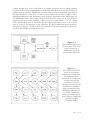
1
!
!
!
!
!
!
!
The Story of Story-Making
…
A Visual History of Printing in Europe
1450-1650
!
!
!
!
!
!
!
!
!
!
!
!
!
!
!
!
!
!
!
!
!
!
University of St Andrews
April 4th, 2014
!
!
!
!
!
!
James A. L. Anderson
!
!
Professor Aaron J. Quigley
!
!
!
SUPERVISOR
!
!
!
!
!
!
!
!
!
!
!
!
!
!
ABSTRACT
!
!
!
!
!
!
This report discusses in detail the design and implementation of a data
visualiser interface, created for the Project Staff and Research Staff of the
Universal Short Title Catalogue, a database of printing records through
European history. This project focusses on the history of printing in
Renaissance Europe, and aims at expanding the existing USTC web
interface to allow users to easily view trends in the data through time. This
report discusses the background to the project including project motivations
and a detailed context survey of visualisation, and gives a comprehensive
account of the project goals, design process and underlying implementation.
!
!
!
!
!
!
!
!
!
!
!
!
!
!
!
!
!
!
!
!
!
!
!
!
ACKNOWLEDGMENTS
!
I would like to thank my supervisor, Professor Aaron J. Quigley for his
guidance, support and encouragement through the past year with this
project, and for dedicating so much of his very valuable time to our
meetings.
!
I would like to thank Dr Graeme Kemp, the USTC Project Manager for his
enthusiasm, advice and time. I also would like to thank all the project staff
behind the USTC for access to their database that forms the foundation of
this project.
!
!
!
!
!
!
!
!
I would like to thank fellow student Gordon Coupar, who has a great deal of
web development experience, for taking the time to explain key Javascript
and PHP concepts to me during this project.
DECLARATION
!
I declare that the material submitted for assessment is my own work except
where credit is explicitly given to others by citation or acknowledgement. I
declare that all work submitted for assessment was performed within the
current academic year.
!
This main text of this project report is 14,758 words long, including project
specification and plan.
!
In submitting this project report to the University of St Andrews, I give
permission for it to be made available for use in accordance with the
regulations of the University Library. I also give permission for the title and
abstract to be published and for copies of the report to be made and
supplied at cost to any bona fide library or research worker, and to be made
available on the World Wide Web. I retain the copyright in this work.
!
!
!
!
!
!
James Anderson
!
!
!
!
Contents
!
!
I !
II
!
III
!
IV
!
V
!
VI
VII
VIII
!
IX
!
X
!
XI
!
Introduction 1
2
2
3
4
4
4
5
6
9
11
17
17
21
Requirements Engineering
Software Development An Account of Tools Used
25
26
26
Ethics and Data Handling
27
28
28
29
30
30
30
32
33
35
37
VIII i Evaluation and User Feedback
VIII ii Status and Future Development
39
39
Conclusion
I i
I ii
I iii
I iv
The Universal Short Title Catalogue Project Motivation
Project Summary
Report Summary
Objectives
II i
II ii II iii
Primary Objectives
Secondary Objectives
Tertiary Objectives
Context Survey
III i
III ii
III iii
III iv
Introduction to Visualisation
A Concise History of Visualisation An Assessment of Visualisation Techniques
An Account of Current Visualisation Tools
Requirements Specification
IV i IV ii
IV iii
Requirements Overview Initial Requirements
Final System Requirements Software Engineering Process
V i
V ii
V iii
Ethics VI i
Design & Implementation
VII i
VII ii
VII iii
VII iv
VII v
VII vi
VII vii
VII viii
VII ix
VII x
Design Overview
Server-side Design
Client-side Design
Implementation Overview
Implementation Stage 1 Implementation Stage 2 Implementation Stage 3 Implementation Stage 4 Implementation Stage 5 Implementation Stage 6 Evaluation and Critical Appraisal
40
41
43
Appendices
X i
User Manual
Bibliography Table of Figures
!
!
1.1
1.2
The USTC Search Interface The USTC Visualisation Interface 3.1
3.2
3.3
3.4
3.5
3.6
3.7
3.8
3.9
Exports and imports chart by W. Playfair Population chart of Sweden by L. Perozzo Napolean's march on Moscow by C. J. Minard
Chart creation in Microsoft Excel Visualisation in Processing by M. Plummer-Fernandez
North Sea fish stock chart in Nodebox 3 by K. Aro Global flightpaths map created in D3.js
Example visualisation created in Circos
Polar-clock created in Raphaël
6
7
8
11
12
13
14
15
16
7.1
7.2
7.3
7.4
7.5
7.6
7.7
Diagram of overall system architecture
Diagram of map-based data structure Diagram of map-based structure with distinct locations
Data structure as focus moves from map-based approach
Diagram of server updating and operation Diagram of first aggregate query oriented structure Diagram of final aggregate query oriented structure
31
31
33
34
35
36
37
!
!
!
!
!
!
!
!
!
!
!
!
!
!
!
!
!
!
!
!
!
!
!
!
!
!
!
!
!
1
3
!
!
!
!
!
!
!
!
!
!
!
!
!
!
!
!
!
!
!
!
!
"By visualising information, we turn it into a landscape that you can explore
with your eyes, a sort of information map. And when you're lost in
information, an information map is kind of useful."
-David McCandless
Part I !
!
Part I i
!
Introduction
The Universal Short Title Catalogue
The School of History at The St Andrews University has, as one of its projects and
areas of research, a database of printing records through European history dating from
the invention of printing in the early 15th Century through to the middle of the 17th
Century. This database is called The Universal Short Title Catalogue, or more
commonly The USTC.
!
The USTC began as a much smaller research project, intended to survey religious
printing in France, and to study changes in printed vernacular with regard to the
reformation. The size and scope of material surveyed grew slowly, and eventually the
project expanded its horizons to all printed material in Europe generally.
!
The information is catalogued, maintained and analysed by the USTC Project Staff, led
by the Project Director, Professor Andrew Pettegree. The database is administered by
the Project Manager, Dr Graeme Kemp, who is responsible for maintaining the server
technology and the web technology that allows access to the database.
!
!
!
Figure 1.1
The current USTC search interface allows users to query the database
with various different search terms. Shown above will return all entries in
the database printed in France after the year 1550.
!
!
Page 1" of 45
"
Part I ii
!
Project Motivation
The current search interface for the USTC is shown in Figure 1.1. This allows users to
input one or more search terms on various facets of the data, and to be returned a list of
all the entries in the database matching their input.
!
This interface is absolutely fantastic if the user knows the specific book or author they
are interested in investigating further. However, the search interface is limiting to users,
as they are unable to search for a range of database entries together, which will be
shown as part of a single coordinated response.
!
For example, users are unable to query the database in a way which will easily allow
them to view the spread of printing in a single language through time, or to view the
spread of a certain classification of printing through time in a specific country. Ideally,
users would be able to ask these very broad questions, and even to compare results from
individual questions in a single view.
!
The ability to view the information from multiple entries in a single view would be very
useful to historians studying the information of the USTC. It would allow them to view
not only the data that is contained in the sense of individual entries, but also to view
trends through history, and it is these trends that really reveal what was happening
during that period of time, making this type of query very valuable to historians.
!
The motivation for this project is to address this interface limitation, and create a search
mechanism that allows users to ask questions that reveal trends through time in the data,
and to create a mechanism to concisely and intuitively display the results.
!
!
Part I iii
!
Project Summary
A data visualiser has been implemented that successfully fulfils all primary and
secondary objectives, and realistically fulfils the tertiary objective as well. Users are able
to access the information of the USTC and construct and compare queries relating to
facets of the information. The results of these queries are plotted through a time period
that is specified by the user (see Figure 1.2). The service also provides users with a
'context' visualisation, showing them a range of information for the entire time period
they have selected.
!
This service is available as a web service, and so does not require downloading or use of
any special or third party software (with the exception of a modern web-browser). Much
of the data provided is stored and formatted in advance, to avoid all instances of the
web page requesting hundreds of pieces of information every second.
!
The project can be split into two distinct sections; Client side and Server side. Their
goals and implementations are discussed in Chapter 7 of this report.
!
To see a working version of the visualisation interface; go to
ja45.host.cs.st-andrews.ac.uk/ustc.html
!
!
!
!
Page 2" of 45
"
Part I iv
!
Report Summary
This report is structured as follows:
• Chapter 1 introduces the USTC in its current form and has outlined the motivation
for this project, as well as providing a brief summary of the project.
• Chapter 2 outlines the broad aims and objectives of the project, which are organised
by priority.
• Chapter 3 discusses the context for the project, and provides an overview of
visualisation as a field. It discusses the rise of visualisations and how they can be
categorised, this history of visualisations (focussing on graphic charts), how
visualisations can be assessed from both a technical and perceptual standpoint, and
gives an account of current visualisation tools, with 6 specific case studies.
• Chapter 4 provides formalised requirements for the project.
• Chapter 5 discusses the software engineering behind the project, including any
processes and tools used to facilitate software creation.
• Chapter 6 discusses the ethics of the project.
• Chapter 7 provides a detailed low level description of the current version of the
project, followed by a discussion of the project implementation, outlining the overall
project at each stage of development including how and why changes were made.
First the server-side of the project is discussed, followed by the client-side.
• Chapter 8 gives a critical evaluation of the project, drawing on my own interpretation
of the project and on feedback from the USTC Project Manager.
• Chapter 9 will provide a concluding summary of the project and this report.
Figure 1.2
A Screenshot of the USTC visualisation service. The slider at the top of
the page allows users to specify a time period for their queries, which are
entered into the grid structure underneath. Users can enter up to 5
queries, and the results of all their queries will be shown on the line graph
at the centre of the page. The pie charts at the left side of the page show
all printing during the period on the slider, divided by a number of facets.
Page 3" of 45
"
Part II
!
!
Project Objectives
This section details the original project objectives, as outlined in the Description,
Objectives, Ethics and Resources (DOER) form. These objectives were set out after
multiple discussions with my project supervisor and the USTC Project Manager, but
before any development began.
!
!
Part II i
!
Primary Objectives
• Users must be able to access the USTC data, and to construct search
queries that specify values in one or more facets of the data.
• Data must be displayed in an appropriate, clear and intuitive visualisation.
• Data must be stored in an intermediary cache system, so as to avoid
thousands of database queries per request.
!
!
Part II ii
!
Secondary Objectives
• Users must be able to interact with the data and visualisation, and change
search parameters dynamically.
• The service must be available through a website, and not require users to
download any special or third party software (excluding modern webbrowsers).
!
!
Part II iii
!
!
!
!
!
!
!
!
!
!
!
!
!
!
!
!
!
!
!
Tertiary Objectives
• The service should present users with some popular searches and search
formats to help new users understand what they are able to do.
Page 4" of 45
"
Part III Context Survey of Visualisation
!
!
Part III i Introduction to Visualisation
!
There is a romance in academia - an idea of areas of study that are just coming into the
academic consciousness, perhaps following some new invention or discovery, that are
followed and driven by only a small collection of dedicated academics, and that are still
far removed from entering the consciousness of the general public.
!
Visualisation is not one of these fields.
!
Visualisation is something that humanity has been doing, in a variety of forms, for
centuries. Our involvement with visualisation on a societal level (especially over the past
50 years) has been incredibly expansive, motivated by the rise in computing power and
data gathering techniques [1]. Visualisation is such a familiar and pervasive part of the
modern zeitgeist that we often do not realise its presence, and we are surrounded by
timetables, flowcharts, weather forecasts and infographics on a daily basis.
!
This rapid increase in the amount of data we visualise is not surprising; the amount of
data being gathered by companies all over the world has been rapidly rising as storage
ability has increased, but this huge quantity of stored data only takes on tangible value
when useful information can be derived from it. "A byproduct of the explosive growth in
the use of computing technology is that organisations are generating, gathering and
storing data at a rate which is doubling every year [..] Clearly this data is of little value
unless useful information and hence knowledge can be derived from it" [2]. This rise in
storage capacity has occurred in tandem with a rise in processing power, with computer
and network capabilities increasing rapidly over the same time period.
!
This rise in processing power has allowed us to consider and display these huge data
reserves in a meaningful and often beautiful way - and to capitalise on the interactivity
and accessibility that many technologies, especially the Internet, have brought about:
"The Internet, combined with the latest generation of browsers, gives us a fantastic
opportunity to take our urge to visualise to the next level: to create live, interactive
graphics that have the opportunity to reach millions" [3].
!
These developments together have created enormous capacity to display many different
types of information, and in many different ways, and the number of tools available to
aid with this process is staggering. Given this variety, visualisation can been divided into
three broad categories [4];
• Information Visualisation - the display of any organised abstract information, i.e. data
where no spatial representation is dictated by the nature of the data itself.
• Scientific Visualisation - the display of organised information where the spatial
representation is dictated [5], and is "primarily concerned with [..] 3D+ phenomena
(architectural, meteorological, medical, biological, etc.), where the emphasis is on
realistic renderings of volumes, surfaces, illumination sources, and so forth".
• Data Visualisation - the display of information which has been abstracted into a form
that lends itself to visualisations such as statistical graphics and thematic cartography.
This is possibly a subset of Information Visualisation.
!
!
Page 5" of 45
"
Part III ii
!
A Concise History of Visualisation
Humanity has been, in one way or another, devising methods to visualise information
for a very long time. To quote author and statistician Professor Edward Tufte of Yale
University in a video published by PBS, "the big steps in showing information began
with cartography about 6000 years ago [..] and that is now the most widely seen
visualisation in the world, which is Google Maps" [6]. It is very common to think that
the statistical graphs and visualisations of today that we use as reasoning and
observation tools are a recent invention - and this is not an unjustified assumption, since
they fit in with our understanding of modern day information gathering and analysis,
and the accessibility and power of these graphs appear to us in the context of modern
concerns and technologies, displaying information regarding such phenomena as 'the
rise of the internet' or 'the global credit crash'. But these visualisations have their
foundations in ancient concepts, with basic latitude and longitude style coordinate
systems being used by at least 200BC [1].
!
The rise of modern-day style statistical approaches from as far back as the 17th century
corresponds with the rise of economic theory and its increased application in commerce.
This period of time also witnessed the beginning of demographic statistics and political
arithmetics, used to help understand populations, land and taxes, and to create a more
reliable metric for assessing state wealth. Soon after this rise, a pattern of "thematic
mapping of physical quantities began to develop" [1], and some of the most famous
visualisations in history, along with the standard formats we regularly use today, were
created. Born in 1759, William Playfair is "widely considered the inventor of most of
the graphical formats widely used today" [1] and between 1786 and 1801 created the
line chart, the bar chart, the pie chart and the circle chart, which he used to great effect
in the fields of economic and political arithmetic (see Figure 3.1).
Figure 3.1
William Playfair's line chart used to illustrate the balance of trade between
Britain and Scandinavia through time, titled "Exports and Imports to and
from Denmark & Norway from 1700 to 1780". The resemblance with a
modern line graph is striking, a testament to how perfectly this invention
describes abstract information through time.
Page 6" of 45
"
Shortly after Playfair came Minard and Perozzo. Perozzo reimagined much of Playfair's
work, and expanded the basic graph forms in new and intriguing ways to create striking
graph visualisations which also allowed him to display more facets of the data than
would otherwise have been possible, including a three-dimensional stereogram of the
population of Sweden [7] (see Figure 3.2).
!
Figure 3.2
Luigi Perozzo's three-dimensional population graph of Sweden, titled
"Numero Assoluto die Nati Vivi Maschi e loro superstiti classificati per eta
secondo i risultati dei Censimenti in Svezia 1750-1875".
!
!
Page 7" of 45
"
Minard brought his own developments to the field of visualisation, and published many
works combining the basic graph structures of Playfair with cartographic data to display
changes in quantity across location in an incredibly effective and visually appealing
format. In his most famous work, he charts Napoleon Bonaparte's march on Moscow,
and is able to effectively display an impressive number of factors in a single visualisation
(see Figure 3.3). The chart shows;
• The number of troops in Napoleon's army through the campaign to Moscow and the
retreat from Moscow (which in turn displays notable battles).
• The route the soldiers took to and from Moscow (including latitude and longitude
coordinates).
• The climate during the retreat, which illustrated an incredibly severe winter.
!
As described by Michael Friendly, the graph "shows the catastrophic loss of life in
Napoleon’s Grand Army. The diminishing size of the army, initially 422,000 strong
(including conscripts from his empire), is shown by the width of a steadily diminishing
line, overlaid on the map of Russia, ending with 10,000 returning at the end of the
campaign. A subscripted graph of declining temperature over the Russian winter shows
the brutal conditions which accompanied the soldiers on their terrible retreat" [8] (see
Figure 3.3).
!
Figure 3.3
Charles Joseph Minard's "Carte figurative des pertes successives en
hommes de l’Armee Francais dans la campagne de Russe 1812-1813"
charts Napoleon's assault on Moscow. It combines many aspects of
visualisation into a clear and fascinating graphic, and has been described
by many as the best graphic ever made [8].
Page 8" of 45
"
!
Part III iii
!
An Assessment of Visualisation Techniques
As with most things visual, assessing the quality of a visualisation can be incredibly
difficult. Deciding in any objective way whether one layout, colour scheme or labelling
system is superior to another will often depend simply on opinions. This problem is
made worse by the fact the a visualisation's primary goal is to convey information, and
its ability to perform this function can also be difficult to quantify. Finding one particular
arrangement of factors on either a visual or technical level which make the visualisation
appealing and functional to one person, may well cause it to be neither appealing nor
functional to another person.
!
In an attempt to approach this problem objectively and methodically, Jarke J. van Wijk
decomposes assessment of visualisation into three separate perspectives [9];
• Technology - Visualisations can be viewed as a piece of technology for evaluation.
This approach is concerned with the technical structures underlying what the user
sees, and addresses questions concerning the efficiency of any algorithms and data
structures used, the appropriateness of the medium for that visualisation and its data,
etc.
• Art - Visualisations can be viewed as a piece of art. Visualisations become very
accessible when they are beautiful, and when they can be appreciated not only as a
tool by which to view data and draw conclusions, but also something to be appreciated
by merit of their visual appeal alone. Aesthetic criteria can also be very guiding during
the development process. If the visualisation is being created for a specific client, they
will often be much more satisfied with the final product if it is able to balance both
function and beauty. On this assessment, Tufte argues that the visual appeal of a
product should be second to its ability to convey accurate and enlightening
information - "Style and aesthetics cannot reduce failed content", "there are
enormously beautiful visualisations, but it is as a byproduct of the truth and the
goodness of the information" [6].
• Science - Visualisations can be viewed as part of a science for their evaluation. This
approach is concerned with the assessment of the visualisation in accordance with a
set of defined rules, theories and models, and includes a variety of technical and
perceptual metrics. It addresses concerns such as the ability of underlying models to
effectively produce predictive data, as well as conformity with established models of
visualisation perception, and stresses the importance of evaluation and validation in
the development process. This approach seems by far the superior assessment strategy,
but unfortunately many of the necessary models regarding perceptual metrics in
visualisations have yet to be created, and are only theorised here.
Ultimately, it seems that a combination of all of these assessment strategies is necessary
to create good visualisations, and factors from each are important. In Wijk's conclusion
he writes; "aim for provable effectiveness and efficiency, aim for elegance and beauty,
and aim at generic laws with predictive power" [9].
!
As technology advances, there is scope for us to create entirely new types of
visualisations, that would previously have not been possible, either due to increases in
processing power or advances in hardware capabilities. New visualisations can also be
motivated by new demands which force us to create new visual constructs to effectively
display data in an appropriate way. These changes force us to find new ways to assess the
visualisations we make, and often, the models and assumptions we have been using up
until that point are brought into question - "the need to draw evolving or dynamic
graphs has brought into question many of the assumptions, conventions and layout
Page 9" of 45
"
methods designed to date. For example, social scientists studying evolving social
networks have created a demand for visual representation of graphs changing over time"
[10]. Along with this, there is an ever increasing demand to display more and more
information, aggregated into a single visualisation. This trend is driven by the increases
in storage and computation ability discussed earlier - the more information a company
stores, the more information they will want to include in any visualisations, and the
more information they will want to contribute towards any predictions the visualisation
is making. This increase in the quantity of information to be shown in a single
visualisation has created four main areas of difficulty [2];
• Computation - more traditional visualisation techniques deal only with relatively small
graphs, and often are unable to scale when drawing for very large datasets. The
computation required to process and draw large datasets with these techniques is the
"primary bottleneck" [2] in the visualisation process.
• Rendering - as graphs increase in the amount of data they are displaying, effectively
rendering this data can become very difficult. Interactive charts with thousands or
millions of nodes and edges have to respond to user input and effectively render a
constant stream of changes.
• Screen Space - the problems of computation and rendering are exaggerated by the
need to make effective use of available screen space, and this extra parameter adds to
the computation required.
• Cognitive Load - even if all the problems of computation, rendering and screen space
are solved, this then leaves the viewer with a single display showing potentially millions
of data points. This can easily overwhelm the viewer, and can begin to make
deduction of useful knowledge from the visualisation harder than it would otherwise
be. It can be necessary to filter out or de-emphasise the least relevant data, or to
remove data based upon the granularity that is required at any point of the
visualisation.
The final point, cognitive load, is the most important. If cognitive load cannot be
controlled it will begin to undermine the basic functionality of the visualisation, and can
actually begin to adversely affect the conclusions that can be drawn - "A good visual
representation of a graph can effectively convey information to the user but a poor
representation can confuse or worse, mislead" [2].
!
!
!
!
!
!
!
!
!
!
!
!
!
!
!
!
!
!
!
!
Page 10
" of 45
"
Part III iv
!
An Account of Current Visualisation Tools
Visualisation is an enormously broad field, and two different visual graphics might be
dealing with entirely different types of data, might be displaying that data in
incomparably different ways, and might be trying to achieve completely distinct sets of
goals. To deal with this heterogeneity there is a huge variety of tools available. Some of
these tools try to allow for as broad a set of possibilities as they can, and others focus in
on very specific requirements. With a very small number of exceptions, the tools
available can be divided into either 'Desktop Applications' or 'Web Technologies'. Below
is a list of case studies, listing a selection of tools available from both categories;
!
!
Microsoft Excel
Desktop Application
!
Microsoft Excel is probably the most well known visualisation tool, although
it is not necessarily known for its ability to visualise. Excel and similar
spreadsheet applications allow users to input data, and to use this data to
create a wide variety of graphs and charts which can be edited by the user
after generation. This is by far one of the most accessible visualisation tools
from an ability perspective, as it requires no programming knowledge or
experience. From a financial point of view it is less accessible, and is sold in
the Microsoft Office package. Its visualisations are produced as static images
and so are not suitable for interactive display, but are certainly appropriate
for putting into a report or posting in situations where only static images are
needed.
Figure 3.4
Excel makes the movement from data to visualisation incredibly
simple, but at a cost of customisation and animation.
!
!
!
!
Page 11
" of 45
"
Processing
Desktop Application
!
Processing is a programming language and development environment that
allows for the creation of very advanced and interactive visualisations (see
Figures 3.5). Processing code is compiled to Java code, and so cannot be run
over the internet unless using a Java applet or using the sister project,
Processing.js. Processing is compatible with all major platforms and has a
very strong community of users, quoting from their website, "Initially
created to serve as a software sketchbook and to teach computer
programming fundamentals within a visual context, Processing evolved into
a development tool for professionals. Today, there are tens of thousands of
students, artists, designers, researchers, and hobbyists who use Processing for
learning, prototyping, and production" [11].
!
!
Figure 3.5
A tool by Matthew Plummer-Fernandez allowing users to create
3D models, add reversible damage to the model which can be
shared online, with codes distributed to selected recipients to
undo the damage.
!
!
Page 12
" of 45
"
NodeBox 3
Desktop Application
!
NodeBox 3 is similar to Processing in that its main goals are the creation of
advanced and powerful visualisations and animations, to be able to deal with large
amounts of data and to be able to run on many platforms. Its interface is very
different, however, as NodeBox 3 uses a very abstracted drag-and-drop style
programming interface. This makes the software much more accessible, as little or
no previous coding experience is necessary, and the learning curve for using the
software is much shallower. NodeBox 3 also prides itself on the creation of
beautiful visualisations (see Figure 3.6). Despite its accessibility, NodeBox 3 is
much less commonly used than Processing.
!
!
Figure 3.6
"The Stock of Fish in the North Sea from 1880 until
2010" by Katju Aro
!
!
!
!
!
!
!
Page 13
" of 45
"
D3.js
Javascript Library
!
D3.js is a very powerful open-source javascript library for web-based visualisations,
that allows users to display an enormously large spectrum of visual displays (see
Figure 3.7) by binding data to the Document-Object-Model of their web page,
and applying transformations to the page based on the data D3 processes. Its
visualisations are based on SVG graphics. D3 has a very strong and supportive
community of users, and has itself been used as the basis of many more
abstracted data processing and visualisation libraries, such as DC, NVD3 and
Ricksaw.
!
Figure 3.7
A visualisation created in d3 in February 2013,
shows flightpaths around the world on an interactive
globe. This is one example of a huge variety of web
!
!
!
!
!
!
!
!
!
!
!
!
!
Page 14
" of 45
"
Circos
Javascript Library
!
Originally created to help visualise the relationships between genomes, Circos is a
javascript library that is well suited to the display of any n-tuple data (see Figure
3.8). It does this by displaying all data in a circle and in connections between
points on the circle, quoting from their website - "Circos is unique in its
combination of circular data domain layout, support for a large number of diverse
data tracks, global and local length scale control, extensive customisation and
automation, and maintaining a high data-to-link ratio without sacrificing clarify of
presentation" [12].
!
!
!
Figure 3.8
A sample image for Circos' website showing data points
arranged around the outside of the circle, and link between
those points drawn in as connections between points on the
circle. The high level of customisation is also shown here, with
more data plotted as a bar chart on the very outer edge, and
more data still shown in partially filled inner circles.
Page 15
" of 45
"
Raphaël
Javascript Library
!
Raphaël, like D3.js allows binding to Document-Object-Model elements, but here
it achieves this mostly via javascript event handlers. It is a much smaller and less
powerful library than D3.js, and is much more aimed at simple SVG manipulation
and basic chart generation only (see Figure 3.9). This decrease in scope means that
Raphaël is much simpler to use than D3.js, and has a much shallower learning
curve, making it ideal for web development situations where only simple
interactive charts are required, and D3.js's broad visualisation capability is not
relevant. Raphaël prides itself on allowing users to create beautiful and functional
graphs easily and quickly. It is also one of the most capable tools when considering
support for older browsers, and is the only major visualisation library that supports
Internet Explorer 7, and even has some underlying support for Internet Explorer
6.
Figure 3.9
A polar-clock generated in Raphaël.
!
!
Page 16
" of 45
"
Part IV Requirements Specification
!
!
Part IV i Requirements Overview
!
Having outlined a set of objectives (as discussed in Chapter 2) with the help of the
USTC Project Manager and my Project Supervisor, more detailed requirements
elicitation was conducted in order to construct a set of formal requirements, and to
further my understanding of how this project can be useful to the historians that will be
using it.
!
To conduct this requirements elicitation, I joined the USTC Project Staff for their
weekly meeting, introduced myself, and presented the idea behind the project to them. I
asked them how they currently use the database, and why the information it contains is
important to them and their research. Most importantly, I tried to explain the idea of
broad queries, where an individual question can draw its answer from multiple results in
the database. I asked the staff what questions they would ask of the USTC if they were
able to ask these broad queries, and if they were able to easily compare the result of
multiple broad queries.
!
The results of this elicitation were very interesting and helpful, and it became
immediately obvious that different researchers have very different concerns when
looking through the USTC data. Some of the responses would unfortunately not be
possible to visualise, such as requests that depended upon information that was not
indexed in the database. However, for the most part, the feedback gave me a wide
variety of perspectives and approaches to consider when constructing requirements, and
greatly developed my own understanding of how my search interface would be useful.
!
!
Part IV ii
!
Initial Requirements
The requirements for the project changed during its development due to a variety of
factors. Below is the original set of requirements for the project with details of how or to
what extent each was achieved, and how and why the requirement developed and
changed during the course of the project. This is followed by the final set of
requirements that specify the project in its current form.
!
!
Requirement I
!
!
Non-Functional
High Priority
All user interaction must be implemented using solely web technology, or
otherwise be accessible through a modern browser. This will likely restrict
visualisation tools to javascript libraries, such as D3.js and Raphaël etc.
!
[This requirement was successfully implemented. All user interaction is done
via a web-page. Graphs are generated using Morris.js, a javascript library for
basic simple generation. This requirement did not change during the
project.]
Page 17
" of 45
"
!
Requirement II
!
Non-Functional
High Priority
!
Functionality must be compatible with all major modern browsers.
!
[This requirement was successfully implemented with all functionality
running successfully on all major modern browsers. This is with the
exception of a loading spinner which shows while the page is gathering
information. This spinner is currently only compatible with Firefox, but all
functionality behind the spinner works properly on all browsers. This
requirement did not change during the project.]
!
!
Requirement III
!
!
Functional
High Priority
The server-side of the system should gather data from the database at set
points in time, when traffic will be slow. This data will be used in
visualisations that are dependent on more than only a handful of requests,
so as to save the database from drowning in requests.
!
[This requirement was successfully implemented, but was later removed
from the project itself in favour of controlling its execution manually, or with
OS level scripting. The reasons for this decision are explained in Chapter 7.]
!
!
Requirement IV
!
!
Functional
Medium Priority
The server-side reserve of data should capture all of the database (or as
much as can be gathered from the USTC web-interface), to expand the
scope of what can be visualised by the user.
!
[This requirement changed dramatically as the project progressed as a more
solid picture began to emerge of what visualisations were going to be used
and to what purposes. Eventually, it made sense to dramatically reduce the
amount of data being stored in the cache system, as much of it would be
unnecessary. The process of gathering and serving data became much more
efficient as a result, as did the memory usage on the server.]
!
!
!
!
!
!
Page 18
" of 45
"
Requirement V
!
!
Functional
Medium Priority
Users must be able to view a political map of Europe for each year in the
database. That is, a map that will show shifting political boundaries through
time. This map should be able to display information about printing in each
location for each year.
!
[This requirement changed dramatically as the project progressed, and it
started to become clear that there were a number of problems with a map
based approach to visualising the data in the USTC.
!
First, the data of the USTC is organised by country and by city, with each
city in the database having been assigned to a single country. This has been
done despite the fact that many cities changed hands multiple times over the
period the USTC studies and, as a result, accurate representation of history
would require resolution of each city to a country for each year, with the
possibility of that country changing from one year to the next. This would
require a very complex internal data structure, and would most likely
investigate the data to a level of granularity where more problems appear
than are solved. Consider for example that entire countries have appeared
and fallen in the time period in question, and that it was common for
regions to be practically autonomous while still included in some broader
political entity. Resolving each city to a single country addresses this very
complex technical and historical question. However, it makes attempts to
accurately resolve cities to their respective countries for each year in the
visualisation even more difficult than it would otherwise have been, as this
data cannot be found from the database.
!
Secondly, to accurately display a political map of Europe at each point in
USTC history would require a resource of maps of Europe spanning 200
years, with an entire political map for every single year, each with a set of
SVG files where each file represents a single country. After a great deal of
research I was unable to find any such resource. The closest resource I found
was a software package 'Centennia', which allows users to scroll through
European history and view the political landscape changing. I made several
enquiries to the software's creator asking for permission to use his
information in this project, but did not receive any response.
!
Given these revelations, this requirement changed to specify traditional chart
based visualisations. These charts still allowed for queries based on location,
but avoided the use of maps. See the final system requirements for more
information.]
!
!
!
!
!
!
!
Page 19
" of 45
"
Requirement VI
!
!
Functional
High Priority
Users must be able to input queries to the web page that ask for data from
one or more of the facets the database stores.
!
[This requirement was successfully implemented, and did not change during
the project. It now helps to form the basis of the main visualisation process.]
!
!
Requirement VII
!
!
Functional
High Priority
The web page must be able to take user input queries, gather relevant data
(either live from the database or from a cache of pre-calculated values
depending on the type of query), and display the results of the query on a
line chart.
!
[This requirement was successfully implemented, and did not change during
the project. It now helps to form the basis of the main visualisation process.]
!
!
Requirement VIII
!
!
Functional
Medium Priority
The web page must be able to take multiple user input queries at once, and
display them on a single line chart.
!
[This requirement was successfully implemented, and did not change during
the project. It now helps to form the basis of the main visualisation process.]
!
!
Requirement IX
!
!
Non-Functional
Medium Priority
The visualisations generated by the web page must be interactive, to allow
users to easily understand the amounts being shown without overwhelming
them with information. Users should be able to scroll over data and see the
values they represent.
!
[While originally intended for application in the map visualisation, this
requirement was successfully implemented, and its specification did not
change during the project.]
!
Page 20
" of 45
"
Requirement X
!
!
Non-Functional
Low Priority
The visualisation must be presented as clean and concise. The colours used
must be easily differentiable, and the page must at no point become
cluttered or confusing, regardless of the amount of information the user
requests.
!
[This requirement was implemented to a good standard, although the
quality of colours used and clearness of display can be difficult to judge. At
the time of writing this I have already received feedback that some colours
should be changed. Please see Chapter 8 for more details. This requirement
did not change during the project.]
!
!
Part IV iii
!
Final System Requirements
Listed below are the requirements for the project in its current form. Many of these
requirements were not included in the initial requirements specification, as either they
had not been considered and were only found out to be problems or possibility during
development, or they represent an overall change in the goals of the project. All
requirements explicitly state wether or not they were included in the initial specification.
Requirements that were not in the original specification are followed by a brief
description of how they came to be included. All requirements are followed by an
assessment of to what extent they were fulfilled, and requirements that were not
completely fulfilled are followed by an assessment of why this was the case.
!
!
Requirement I
!
!
Non-Functional
High Priority
All user interaction must be implemented using solely web technology, or
otherwise be accessible through a modern browser. This will likely restrict
visualisation tools to javascript libraries, such as D3.js and Raphaël etc.
!
[This requirement was successfully implemented. The page uses
visualisations created in the javascript library Morris.js, which is based on
Raphaël.]
!
!
!
!
!
!
!
!
!
!
Page 21
" of 45
"
Requirement II
!
Non-Functional
High Priority
!
Functionality must be compatible with all major browsers.
!
[All basic functionality is compatible with all major browsers. As mentioned
above, this is with the exception of the loading spinner, which only appears
in Firefox.]
!
!
Requirement III
!
!
Functional
High Priority
The server-side of the system should, when executed, gather data from the
database which can then be used in visualisations, to save the need for
hundreds of requests to the live database.
!
[The requirement was successfully implemented.]
!
!
Requirement IV
!
!
Functional
High Priority
The server-side of the system should scrape the names of all countries,
languages and categories that are available through the USTC user
interface, and use this material to organise the cache data. These lists should
update with every time the program is executed, meaning that any new
entries to the interface will be reflected in the data.
!
[This requirement was successfully implemented.]
!
!
Requirement V
!
!
Functional
Medium Priority
The server-side cache of USTC data should be formatted in such a manner
as to allow quick navigation and aggregation into data structures that span
specific periods of time, and divide data for sessions of that time period by
it's various facets.
!
[This requirement was successfully implemented. The cached data is used to
calculate and display values in aggregated data chart, which are shown as
pie charts in the interface. For an in-depth explanation of how the data is
internally structured, please see Chapter 7.]
Page 22
" of 45
"
Requirement VI
!
!
Functional
Low Priority
The server-side program should output all of its data ( the USTC data cache
and the lists of countries, languages and categories) in JSON files, or straight
as Javascript variables. These should be printed to a location accessible by
the webpage.
!
[This requirement was successfully implemented.]
!
!
Requirement VII
!
!
Functional
High Priority
Users must be able to input queries to the web page that ask for data from
one or more of the facets that data stores.
!
!
[This requirement was successfully implemented, and users are able to
specify ad time period for their query, and any combination of location,
language and category to be considered as a single query and plotted
through time.]
Requirement VIII
!
!
Functional
High Priority
The web page must be able to take user input queries, gather relevant data,
and display this data on a line chart.
!
[This requirement was successfully implemented. Users are able to enter a
time period, and a set of up to five queries to compare on a line chart.]
!
!
Requirement IX
!
!
Functional
Low Priority
The web page must be able to display 'context' data to the users, such that
for any selected time period the user is shown all the data divided by
country, by language and by category, regardless of their search queries.
!
[This requirement has been successfully implemented.]
!
!
Page 23
" of 45
"
Requirement X
!
!
Functional
Low Priority
The web page should be able to cache queries, and be able to recognise if
the same query is entered twice or if the results on one query overlap with
the results of a second. This caches information should be used instead of
contacting the live database, as it will save time during data gathering.
!
[This requirement has yet to be implemented. Please see Chapter 8 for more
information.]
!
!
Requirement XI
!
!
Non-Functional
Low Priority
The visualisation must be presented as clean and concise. The colours used
must be easily differentiable, and the page must at no point become
cluttered or confusing, regardless of the amount of information the user
requests.
!
[This requirement was successfully implemented, though as discussed earlier,
the standard of its implementation is difficult to assess. Please see Chapter 8
for more information.]
!
!
Requirement XII
!
!
Functional
Low Priority
The web page must be able to supply users with some example
visualisations, so as to display what kind of queries and searches are possible
using the interface.
!
[This requirement was successfully implemented. When the page loads, an
example query is shown which compares all data for religious printing in
France in French and all data for religious printing in France in Latin
between the years of 1500 and 1600.]
!
!
!
!
!
!
!
!
Page 24
" of 45
"
Part V
!
!
Part V i
!
Software Engineering
Requirements Engineering
The initial requirements elicitation was conducted across two meetings with my project
supervisor and the USTC Project Manager. The results of these meetings would later be
used to generate the Project Objectives discussed in Chapter 2. During these meetings I
was introduced to Project Manager, and we discussed a number of important concerns.
These included (but were not limited to); the nature of the research being conducted by
the USTC Project Staff, the manner in which the data is used, the current search
interface, planned updates to the USTC in the near future, and the scope for the search
interface to be expanded via visualisation tools.
!
The results of these discussions were very promising, and it was clear that any tool that
would allow USTC users to more easily search for, observe and compare trends in the
data would be very beneficial. After formalising and submitting a project proposal to the
School of Computer Science, and having it accepted as my Senior Honours Project, I
was able to move forward with conducting more detailed requirements elicitation.
!
I was fortunate enough to be invited to the USTC Project Staff weekly meeting, where I
introduced myself, and gave a brief summary of the concepts behind the project so far. I
asked the staff how they currently use the database for their research, and asked how
they might like to be able to use the data in the USTC if they were given the tools to
easily view and compare results that draw data from hundreds or thousands of database
entries at a time. In short; 'if you could ask big questions, what would you want to ask?'.
The results of this meeting were incredibly productive, and helped shape the
requirements for the project throughout its development.
!
Being able to meet with all the staff involved with the USTC was fantastic for building
requirements for the project, as it allowed me to have almost all the system stakeholders
in a single room together, discussing what requirements matter to them, and how they
want to be able to use visualisation tools. This included the users of the system, which in
this system are the research staff, the system manager, here the Project Manager, and the
closest equivalent to a system owner, the Project Director. This avoided the situation of
having conflicting requirements from various parties involved, as any differences in
opinion could be talked about openly with all parties present.
!
I remained in contact with the Project Manager throughout the system development.
This was incredibly useful as he was able to answer any questions I had, provide me with
any files or information I needed during development or testing, and to provide
feedback on the overall direction of the project. I was eventually able to demonstrate a
prototype system to the Project Manager, and his feedback has been incredibly
encouraging and enlightening, and is mentioned in more detail in Chapter 8. I had
intended for this demonstration to be in person, but unfortunately due to illness this was
impossible. Instead I recorded and video of the system in action which included
instructions for him to access the visualisation.
!
!
!
!
Page 25
" of 45
"
Part V ii
!
Software Development
The software development pattern used during the development of this project was
iterative and fairly linear. The traditional development structure that it most resembles is
the Waterfall model, with tandem trains of engineering applied to the client-side and
server-side development, which did not interact for the majority of the project.
!
This model was adopted because the only factor likely to change the requirements of
the project was the development of my own understanding of the tools available and the
direction I wanted to the project to move in, rather than change caused by external
parties, such as new staff asking for a very different system from what was originally
specified.
!
While the flexibility of other methodologies such as Scrum is considerable, and I am
sure very valuable during projects with changing parameters and large development
teams, it seemed to bring an unnecessary overhead to the development of a solo project
with reasonably static requirements.
!
!
Part V iii
!
An Account of Tools Used
The tools used during the development of this project were fairly standard. This project
required the use of no special hardware or software that would not be familiar territory
to most developers.
!
All server-side programming was written in Eclipse. I used this due to its fantastic
autocompletion and error detection tools when writing Java. All client-side
programming was written in Sublime Text 2, I used this due to its clear and
customisable interface and text colouring, as well as its ability to perform text
highlighting in multiple languages for the same document. This is ideal for web
development, where HTML, CSS and Javascript can often be contained a single
document. During client-side development I also made heavy use of Chrome Developer
Tools, which allowed easy observation of Javascript processing and the web page in
general.
!
All version control was performed manually, with each incremental version being saved
on Google Drive. I chose this route instead of more traditional version control tools such
as Mercurial and Git primarily because I am already familiar with Google Drive, and
the benefits and functions of these version control mechanism seem less applicable to a
project with only one developer, and only a small set of files.
!
This report was written in Apple Pages, and all diagrams were (unless cited otherwise)
created in Omnigraffle Pro.
!
!
!
!
!
Page 26
" of 45
"
Part VI
!
!
Part VI i
!
Ethics
Ethics and Data Handling
There are no ethical concerns regarding this project, as there are no human participants
and the project does not require the gathering or storing of personal or identifying data.
!
The data in USTC is property of the School of History, and is sensitive in the capacity
that its application to research and the prominence of the USTC in this field of study
would be adversely affected by the mistreatment of the data, or publication of the files
outside of the USTC search interface. As I stated in the Description, Objectives, Ethics
and Resources (DOER) form, I would submit to the judgement of USTC Project Staff
regarding how the data should be used and stored.
!
I was given a copy of the database, and my instructions regarding its handling were
simply not to publicise it, and to delete it after the project was finished. I made sure to
comply with these requirements.
!
!
!
!
!
!
!
!
!
!
!
!
!
!
!
!
Page 27
" of 45
"
Part VII Design & Implementation
!
!
Part VII i
Design Overview
!
The design of the project falls easily into two separate categories; server-side design and
client-side design. Server-side design is broadly responsible for the gathering of data that
the client-side of the project won't be able to gather itself during execution, and for
making this information available in a directory that the client-side code can access. The
client-side design manages gathering of certain data during execution as well as creating
the user interface. Both are described in more detail below.
!
!
Part VII ii
!
Server-side Design
The server-side design manages the gathering of data that cannot be gathered during
execution of the client-side, and is responsible for making this data available in a
directory and format that the client-side can access. This process can be divide in three
general stages;
• List Generation. This stage begins with the program requesting the main search
interface page for the USTC, from which is scrapes the list of options users are given
during a manual search. These are organised into lists of all the languages, countries
and categories that the search interface currently supports. These lists form the basis
of the rest of the server-side implementation, and are updated at every execution,
meaning that if any countries, languages or categories are added to (or removed from)
the search interface, this change will be reflected in the data being stored, and the data
that is eventually passed to the client-side. This stage also reads in a list of all the cities
in the database, which has to be manually put in the same directory as this data is not
available from the search interface.
• Data Gathering. This stage revolves around the creation of the 'timeline' object. This
object is a list of year nodes, each of represents a period of time in the USTC data.
Each year node contains a starting year and a closing year, which together are the
upper and lower bound in time that this particular node represents. Each node also
stores a list of countries, languages and categories, each of which in turn stores a
name and an amount. For example, a year node with starting year 1550 and closing
year 1559 contains all the relevant data from the USTC for the period of time from
1550-1559. This node also contains a list of countries. An example node from this list
might have the name 'France' and the amount '3200'. This means that the USTC has
records of 3200 books being printed in France in the period of time from 1550-1559.
The lists for categories and languages work in exactly the same format. For every
country, language and category stored in this way, the program constructs a request to
gather the appropriate data from the USTC search interface. This is sent as a request
and the resulting page is scraped to find the number of prints made. This number is
stored in the 'amount' field of that node. If for any reason a request fails, the program
waits for ten seconds before re-attempting. This loops until the request is successful.
• Printing. This stage aims to output all the data generated and organised in the
previous two stages as variables that can be easily read in by the client-side program.
To do this, all lists and objects are stored in JSON structures, which are then printed
into javascript files with the necessary javascript notation to store them as JSON
variables. This system means that printed files only need to be included as a script in
the javascript to allow each list to be manipulated instantly as a JSON object.
Page 28
" of 45
"
Part VII iii
!
Client-side Design
The client-side manages the gathering of small data sets and the user interface. It works
entirely through a web page, an only requires users to have access to a modern browser.
!
On loading the page, a slider object and input table area created. The slider can be
moved by users to input the range of years they are interested in displaying, and the
table allows users to input sets of queries to the web page. Each query has a location,
category and language field that can be specified, although one or all of these fields can
be left empty. This table also allows users to add and remove queries very easily, by
clicking small buttons in the final column. A maximum of five queries can be specified.
This table was originally create used the library 'edittable.js' [13], which this has since
been edited to add an autocompletion feature. Both the slider and autocomplete feature
are created by the library 'jQuery-ui.js' [14].
!
The page also creates two data display areas. The first is shown on a left of the screen,
and contains three pie charts. These pie charts show, for the period of time selected on
the slider, all the USTC data divided by country, language and category. This data is
calculated using files output by the server-side of the project. This data is organised into
ten year divisions and, for any time period selected, the program will iterate over all the
data, select only the valid time periods, create an aggregate amount for each division in
each chart, and save this data to a global variable, which can be accessed by the pie
charts for display. This process is executed every time the value on the slider are
changed, and so the pie charts updated to show divisions of the data for the entire time
period live as the user interacts with the interface. The second display area is a line
chart. By default, this area has a set of data showing a comparison between the amount
of religious printing in France in Latin, and the amount of religious printing in France
in French between the years of 1500 and 1600. Users are able to update this graph by
entering queries into the input table as mentioned above, and clicking the button
labelled 'display'. Both the pie charts and line chart are created using the graphing tools
'Morris.js' [15].
!
When the display button is clicked, the program iterates over the table, as well as
drawing data from the sliders. This allows the page to build a set of requests where, for
each year to be displayed, the values for each query are specified. Each of these requests
is sent back to the server, where a PHP script forwards the constructed URL to the
USTC. The resulting page is sent back to the client-side, where it is scraped in order to
find the single value for that data point. Each of these data points is added into a data
structure that can easily be passed to the line chart. Once all the data has been gathered,
the line graph is drawn.
!
The result of these processes and visualisations together is a powerful tool that allows
users to interact with and display USTC data in an entirely new and intuitive format.
Users are able to easily view changes in single topics through time. These topics can be
very broad, such as a display of all printing in a single language through a time period,
or they can be very specific, such as a display of all printing in a single category, in a
single language, in a single city through a time period. Users are able to display and
compare both broad and specific queries in a single chart. This visualisation also gives
them a context to what they are viewing, and even a set of very specific queries will be
shown in the context of what was happening through all of Europe in that time period.
!
!
Page 29
" of 45
"
Part VII iv
!
Implementation Overview
During the development of this project, the goals and requirements changed a number
of times, both on a broad system-wide level and at a lower implementation level. These
changes occurred as my understanding of the tools available to me developed, and as a
clearer picture began to form of how the vast quantity of data in the USTC could be
effectively visualised to users. The implementation of the project can be split into six
reasonably distinct stages. Below, each stage is discussed, with an account of the overall
changes in direction of the project and the reasons for these, as well as details of what
implementation work was completed at each stage.
!
!
Part VII v
!
Implementation Stage 1
This stage of implementation marks the start of the project. This began with the initial
meetings between my project supervisor, the USTC Project Manager and myself, which
were used to generate the project objectives discussed in Chapter 2, and helped establish
that the project would be useful to researchers in the history department, and would
allow them to view their data in new and hopefully enlightening ways. Once it was clear
that I had the support of the Project Manager to use the USTC as the foundation of my
project, I submitted a project proposal to the Senior Honours Project Coordinator. After
slight alterations to the original document, my proposal was accepted. I was then able to
conduct a more detailed requirements elicitation, as discussed in Chapter 5.
!
This elicitation was used to generate the initial requirements specification as specified in
Chapter 4. It was conducted by meeting with the entirety of the USTC Project Staff,
including the Project Manager and the Project Director. I was fortunate in being able to
conduct elicitation in this manner as it allowed me to discuss use cases and potential
project requirements with all the project stakeholders in the same room together. This
meant that I was able to avoid situations where different parties requested entirely
different systems or specified contradictory requirements, making the initial
requirements specification much easier to formulate.
!
!
Part VII vi
!
Implementation Stage 2
It became immediately obvious that any visualisation system would require a huge
amount of data from the USTC, and it was unknown at the time whether I would be
allowed a local copy of the database for project development. As such, an intermediary
cache system was designed, which would be used to store large quantities of the USTC
in the form of pre-computed answers. These answer would be updated at set intervals
from the live database, and would allow the web page to display a reasonably accurate
version of the data without having to issue thousands of requests per query to the live
USTC database, and would dramatically reduce the risk of flooding the database with
requests, especially if multiple users were to be using the visualisation service at the same
time. The system would still allow requests to the live database for small queries, such as
requests for individual database entries (see Figure 7.1).
!
The initial concept was to use a map-based visualisation which would display cumulative
data for the amount of printing records for any given year. Here, users would choose a
year that they are interested in, and would be shown an interactive map of Europe for
that year, with each country labelled with its name and the amount of printing in that
Page 30
" of 45
"
country for that year. Users could click on a country and zoom in to see all the printing
locations in that country highlighted, each labelled with their name and the amount of
printing in that city alone. Finally they would be able to click on individual cities and see
the data divided by some facet of interest, from which they would be able to select
individual printing records. From here, users would be forwarded to the USTC page for
the individual record. This would rely on a data structure with a set of year nodes to
represent each year in the database, where every year node links to a set of country
nodes, which link to a set of city nodes. Each of these would link to a set of facet nodes
such as a list of all categories in the database, by which individual entries would be
organised (see Figure 7.2). All of these raw amounts would be stored in the cache server,
to reduce the number of requests necessary.
!
Figure 7.1
The physical architecture
of the system. The cache
server operates as a
middleware system in
most request situations.
Figure 7.2
The data structure that
was to be used in the
initial map visualisation.
This diagram shows
dissection of a single node
at each level, but the
overall tree structure
becomes very broad, and
would have contained a
huge amount of nodes.
Assuming 200 years, 15
countries, roughly 50
cities per country and 20
facets, the tree would have
contained roughly
3,000,000 nodes.
!
!
!
!
Page 31
" of 45
"
There were a lot of conceptual obstacles to overcome at this point, as the map-based
data structure posed some interesting technical and historical difficulties. Initially, my
intention had been to allow users to scroll through years in history, watching the political
landscape change, and how this mapped to changes in the quantity or type of books
being printed. This becomes a very complex task when considering a number of key
factors of European history;
• The political map of Europe changed enormously over the 200 years the project
spans. Entire countries and empires were created, expanded and collapsed within the
time period 1450 to 1650. This makes the data structure more complex, as it must be
able to have a different list of countries for certain years. It also must be able to store
relevant SVG images for each country. This becomes an enormous problem when
considering that should the database be expanded to capture a larger period of time,
and entirely new batch of SVG files will have to be created.
• Finding a resource of maps for this time period which is granular enough to consider
every year is very difficult. I was able to find only a small collection of such resources,
and those that make their material available often have very different interpretations
of what the world looked like at any given time. There are a variety of reasons for this,
but the most prominent that I found was related to issues regarding how we define a
country. Modern society has developed a (mostly) strict and clear definition of a
country, but this was not always the case in the past, and different maps will draw
individual political entities to varying levels of political unity (sometimes this will even
be done within the same map). Finding SVG images for each country in the database
is made even harder by this consideration.
• As political borders expanded and contracted, many cities changed hands between
these bigger political units, some many times over. This means that each city cannot
be resolved to a single country for every year, and so the internal data structure will
have to be able to change the cities within each country as time progresses.
!
The most damning obstacle to this approach came when I was given a copy of the
USTC database, and it became apparent that the USTC itself does not attempt to
resolve cities accurately to a country for each time period. Instead, they create broad
collective terms and assign each city to one political unit. For example, the period of
time 1450-1650 saw Italy divided into a set of distinct warring city-states, such as
Venice, Florence and Genoa, whose borders often changed enormously year-to-year.
However, the USTC classes all printing during this time in Italian cities and simply
happening in the 'Italian States'. The plans to resolve cities to their respective countries
for each year became less appropriate at this point, as clearly this approach is not an
accurate visualisation of the data of the USTC.
!
!
Part VII vii
!
Implementation Stage 3
To create an interactive map-based visualisation without having each city resolved to a
country for that time period poses an interesting conceptual dilemma. The hierarchy of
continent - country - city seems fairly intuitive, and constructing a system that would
display data for countries and cities but not use this structure took some time to
conceptualise. Eventually a structure was designed that would appear to users to be the
same, but would consider data very different internally.
!
This structure still used a list of year nodes to represent each period of time within the
database. Each year node, as before, contained a list of countries, each with a name and
the amount of material printed in that time period. Each year also contained a list of
Page 32
" of 45
"
cities that were printing at that time. Each city had a name and the amount of material
printed in that time period (see Figure 7.3). Here, users would be able to click on a
country and zoom in to it, where all cities would be loaded to the screen with their
information, regardless of wether they are inside of outside of the country. This would
allow users to view and interact with data both from a country and individual location
perspective, without relying on having those structures linked in any way.
Figure 7.3
The updated structure of the map-based
visualisation. Cities and countries are both stored,
but they are completely distinct.
!
During this stage in development I also was able to find the most promising resource of
maps that I would find during the entire development process, a software package called
Centennia. This package allows users to move through European history and watch as
the political landscape changes, and includes the range of years in the USTC database. I
made several enquiries to the software's creator asking for permission to use his
information in my project, as did my project supervisor, but unfortunately with no
response.
!
!
Part VII viii
!
Implementation Stage 4
In early December 2013, the USTC launched its updated user search interface. This is
the interface shown in Figure 1.1 in Chapter 1. This interface had been in development
for some time, but its official launch meant a lot of conceptual and structural changes to
the project. Firstly, it meant I could be sure I would not require a local copy of the
database to be held in the server-side of the project, as the server-side cache could be
updated from the live database during times of very low traffic. It also allowed very
simple faceted search functionality, where pages were requested using URLs containing
Page 33
" of 45
"
the search parameters, making the requesting of single data points within my data
structure very simple.
!
I had been waiting for a response from Centennia's creator for some time, and so
decided to move away from a map based visualisation towards a structure of
visualisation based primarily on line charts and pie charts. The primary query facet of
the underlying data structure was still to be location, and a new data structure was
created. This structure contained a list of year nodes, each containing four lists. The first
two, lists of languages and categories, stored the amounts of printing in all of Europe
for each division, for that time period. The other two list, a list of all the countries in the
database and a list of cities, which in turn each stored all the language and category
data for that location (see Figure 7.4).
Figure 7.4
The updated structure of the location oriented visualisation.
Each year contains data about all the printing for that year
divided by language and by category. Each country and
each town also hold this information.
This data structure worked well with a small set of town objects, but when using the full
list of 800 towns the process of updating the cache could take up to 48 hours to execute
and gather all the data, and the sheer quantity of information output was enormous.
While this system was successfully implemented and completed to print out according
JSON, it would still undergo considerable changes before becoming the version
currently in use.
!
The server for the project was also successfully implemented during this stage. This
server was tied into the same program as the server-side data gathering tools, to allow for
easy and efficient coordination between these separate functionalities. The server was
implemented to run the initial gathering of data as soon as it was executed, and then to
start a server as a thread. This thread was able to spin off more threads to deal incoming
requests. The server would wait until a pre-set time, at which point it would start the
gathering process again, and build a new timeline of data. Once this new structure was
Page 34
" of 45
"
complete, it would kill the old server thread and launch a new one, passing it the new
timeline object as a parameter (see Figure 7.5).
Figure 7.5
The initial gathering of data, normal server execution and
updating of material are shown here. Note that the first server
thread runs even when the gathering of data for the new server
has started, so that requests can always be facilitated.
!
!
!
Part VII ix
!
Implementation Stage 5
Given that the new search interface now allowed the system to easily request single data
points, it seemed appropriate to reduce the overall size of the data structure being saved,
as much of the information being stored now fell into the category of data that can be
requested by the client-side during use. This changed the project landscape very
positively, as much less data would need to be stored in the cache, meaning traversal of
the data would become easier, and storage, transmission and processing would become
more efficient.
!
I had been struggling throughout the project with constructing an interface that would
allow users to view data in the wide variety of ways that had been requested. a User
might want to view all the data for a certain area divided by some facet, but they also
might be interested in more specific queries. Now that I had moved away from the map
Page 35
" of 45
"
based approach to a more traditional chart based structure, I was able to separate user
interaction into two very distinct categories;
• Aggregate Visualisation. Here, users are able to specify some term under which they
are searching, and to see that data divided up into its component pieces. The data for
an aggregate view is the sum of the data through a specified period of time.
• Temporal Visualisation. Here, users are able to specify queries to be visualised through
time. That data sets used in temporal requests would be generally much smaller than
those used in aggregation, as not all data has to be traversed to find relevant
information and divide in by facet. As such, the cache of pre-computed answers no
longer focuses on supporting this kind of search.
This basic distinction was an incredibly important realisation during the project
development, and forms the basis of the client-side processing, interface and
visualisations. To accommodate for this, the data structure was re-designed to allow for
easier traversal of data (see Figure 7.6), and was no longer concerned with the caching
of data that would fall under temporal interaction.
Figure 7.6
A diagram showing the updated structure based on the traversal
of aggregate data. Each year contains a list of categories, and a list
of languages and countries. Each country and language contains
the associated data divided by the other two facets. This makes it
very easy to quickly work out the amount of printing for any year
divided by category, language or country, and to further divided
these language and country amounts by the other two facets.
(Note: in the diagram above, nodes 'K' are category).
Page 36
" of 45
"
Part VII x
!
Implementation Stage 6
At this point the server-side implementation of the system was nearing completion, and
could easily have its format changed while still performing the necessary functionality.
All the three main sections discussed in Chapter 7 part 2 (List Generation, Data
Gathering and Printing) were fully implemented and tested. The client-side of the
project so far had involved experimentation in D3.js, DC and cross filter, in which I was
able to take user input an successfully begin to plot line charts and pie charts with
relevant datasets, however these visualisations were difficult to make interactive and
animated, and updating them was ugly and slow. I began to investigate simple graph
creation tools that were available, as libraries like D3 and DC are obviously incredibly
powerful, but provide a huge amount of functionality that I don't require for simple
charts. I decided upon the javascript library Morris.js because of its clean, interactive
and animated charts that make generation and customisation of traditional graph
formats incredibly simple.
!
Through experimenting with the tools available, I was able to layout exactly how the
user interface should work, including both aggregate and temporal data and queries. In
the system implemented, users are able to move a slider at the top of the page to
communicate the range of time periods they are interested in. For that period, the pie
charts update to show all printing in the entire USTC divided by country, by language
and by category. This is the aggregate data visualisation, and while it allows users to
specify a time period of interest, it does not plot any information through time. This
information is calculated using the data output to the server by the server-side system.
Users are also able to input specific queries that will be loaded onto a line graph. These
are temporal visualisation queries, and they allow the user to specify a time period of
interest and have the results plotted through time. Data used in these visualisations is not
taken from the server cache, but is gathered during execution.
!
This finalised user interface mechanism allowed me to simplify the data structure being
used for the data cache, as I was able to say with certainty the level of granularity
required for each facet. The new structure is simply a list of year nodes, each with a list
of countries, categories and languages, which contain the information to display all the
data for that time period divided by each category (see Figure 7.7). This makes it easy to
calculate the amount of printing in any division of any facet of the data for the given
time period.
Figure 7.7
The most recent
incarnation of the
internal data structure.
Each year node contains a
list of countries,
languages and categories,
making calculations for all
printing in that time
period separated into
each division of each
facet very simple.
Page 37
" of 45
"
The web-server functionality, which had been one of the first implemented features of
the server-side system, was removed at this point in development, and instead the system
was hosted on a department server. Also, the timer functionality, which would instruct
the program to wait until set points in time to update the cached information was also
removed. The resulting server-side system is a much smaller and neater program, that
simply gathers all necessary data when executed. This decision to dramatically reduce
the size and scope of the server-side system was motivated by the amount of memory
used when running a Java program constantly in the background. I decided instead that
systems managers would be altogether in a better position were they simply to run the
program manually whenever an update to the cached data is necessary, as information is
only added every second week or so, and this negates the increased processing power
used by the system that would have occurred if operation required running a Java
program constantly in the background.
!
The closing stages in the development process saw the full and complete implementation
of all parts of the user interface, specifically the user input areas, the pie charts to
display the aggregate amount visualisations which update live as user input is entered,
and the line chart which is generated from user input queries, and gathers its data live
from the database.
!
The web page was then formatted using the javascript library Bootstrap [16] which
handles division of the page into columns and rows, and controls the ability of the page
to stack these divisions for smaller displays and during window resizing. The final
touches in the development stage involved the choice of a colour scheme, fonts and
similar aesthetic details.
!
Once implementation was completed I was able to demonstrate the project to the
USTC Project Manager. I had hoped to conduct this demonstration in person, but
unfortunately due to illness this was not an option. Instead, I recorded a video of the
software in action, including instruction of how to access the search interface, and the
Project Manager forwarded this video and information on to all the Project Staff behind
the USTC. Feedback that I have received so far has been incredibly enthusiastic about
the system, and has noted that after only a few minutes of using the interface,
unexpected and interesting trends through history that would otherwise have been
practically unobservable. This feedback is discussed in more detail in Chapter 8.
!
!
!
!
!
!
!
!
!
!
!
!
!
!
!
Page 38
" of 45
"
Part VIII Evaluation and Critical Appraisal
!
!
Part VIII i Evaluation and User Feedback
!
The system is able to present data to users in a clean, intuitive and simple display, and
allows users to search and interact with data in the USTC database in ways that were
previously impossible.
!
I hope and believe that this project has enormous capacity to change the manner in
which USTC research is conducted, both in the capacity to supplement traditional
research models and to allow speculative comparisons and investigations that would
previously have required hours of work.
!
The system has managed to fulfil all of the objective discussed in Chapter 2, and all the
final system requirements discussed in Chapter 4, with the exception of caching user
query results on the client-side.
!
User feedback that I received from staff involved in the USTC has so far been incredibly
positive. Researchers have been able to quickly and easily query on very specific topics,
and to observe changes through time that would have been difficult to gather and
organise manually.
!
Feedback received so far has been slightly critical of the colour scheme, stating that one
of the colours used is not easy to see against the white background. There has also been
a request for the system to be able to export the page and any plotted graphs as an
image, and for the page components to stack differently for smaller screens. All of these
request are very reasonable and, if the history department intends to use this
visualisation interface after this project is finished, I fully intend to implement these
changes to the best of my ability.
!
!
Part VIII ii
!
Status and Future Development
In the final days of this project I came across an unusual finding during my system
testing, where a different value was shown on the pie charts for a ten year period than
was given by the database. Originally I wondered if more data had been added since the
cache had been updated, but updating the cache did not remedy the situation. I realised
that there is a small discrepancy in the values shown because for any time period on the
slider, the pie charts will show data only in ten year amounts. This problem stems from
the fact that displaying information from, for example, 1500-1510 is displaying
information for a decade and one extra year, at 11 years in total, but the database
indexes years by ten year timespans. To overcome this issue, I intend to implement a
second list on the server, where each node represents only the values of each tenth year
(1550, 1560 etc). The upper most valid node will have its values added to the data to be
displayed.
!
When temporal queries are made, a spinner is loaded to the page to display to the user
that the page is gathering data. While all underlying functionality works properly, this
spinner is only displayed in the browser Firefox.
!
Page 39
" of 45
"
Part IX
!
!
Conclusion
This report has given a comprehensive account of the design and implementation of a
data visualiser for the Universal Short Title Catalogue, of the School of History at the
University of St Andrews.
!
This visualiser extends the exiting search interface, and allows users to view the data in a
variety of ways that are incredibly valuable to historians, and would have been
impossible to create using the previous interface.
!
However, the interface is not perfect yet. If the history department are enthusiastic to
continue with this project, I intend to improve the interface based on feedback I received
from the USTC Project Staff and to improve the underlying structure to ensure 100%
accurate representation of the database in aggregate searches which appear to the left of
the page, and give users a context to the time period they are interested in investigating.
!
I feel that this new search interface, specifically the temporal search feature, have the
potential to hugely change the way the database is used, and the service it can provide to
researchers. This visual data can be used to confirm hypotheses, to support other
research of simply as speculative investigation.
!
The user feedback I received from the USTC Project Manager and Project Staff has
been incredibly helpful and encouraging, and I would like to conclude by again
extending my sincere gratitude to everyone involved in the USTC, without whom this
project would not have been possible.
!
!
!
!
!
!
!
!
!
!
!
!
!
!
!
!
!
!
!
!
!
!
!
!
!
Page 40
" of 45
"
Part X
!
!
Part X i
!
Appendices
User Manual
To operate the USTC data visualiser service requires no specific software aside from a
modern browser installed on your machine. The web page has been tested to work on
all the browsers listed below;
!
Mozilla Firefox;
http://www.mozilla.org/en-US/firefox/new/
Google Chrome;
www.google.com/chrome
Apple Safari;
https://www.apple.com/uk/safari/
!
!
!
Microsoft Internet Explorer;
http://windows.microsoft.com/en-GB/internet-explorer/download-ie
I recommend using Firefox for this visualisation, as the loading spinner is able to render
only in this browser. That said, the underlying functionality and display works in every
browser.
!
——————————
Using the web interface.
!
The page can be split into three broad sections.
The first, at the centre top of the page has a slider bar and grid input area. Here, use the
slider to indicate the period of time you are interested in viewing. Moving the slider will
update the pie charts to the left of the page. These pie charts exist to give you context to
the period of time you are viewing, and allowing you to see the big picture of what was
happening throughout Europe at that time. These pie charts show you the bulk of
printing in Europe for that time period, divided by language, by country and by
category. Scroll your mouse over divisions in these pie charts to see which facet each
section represents, as well as the amount of material printed.
Then, notice the table under the slider. This table allows you to enter specific queries
that are of interest to you. For each query you can enter a location, category and
language, or any combination of those fields. The locations here also contain any value
from a list of the cities in the database. All rows in this table are complete with an
autocomplete function. You are able to input multiple queries at a time by pressing the
small green button in the final column of the table, and to remove any queries by
pressing the small red button. You are able to enter up to five queries at a time.
Once you have entered the details of the queries you want to see plotted through time,
click the display button. The page might take some time to gather all the associated
information, but once gathered a graph will be plotted showing an individual line for
each query entered.
!
!
!
Page 41
" of 45
"
——————————
Running the server-side cache.
!
To be able to use the web page, first the server-side cache system must be executed,
which needs to print files to where the web-page documents are stored. Firstly, go to the
file jsonBuilder.java, to lines 282 and 296. Both of these lines should contain the
address to where the web page is going to be stored. Then, open the terminal and
navigate to where the files are stored. enter;
!
!
javac -cp json-simple-1.1.1.jar *.java
!
!
java -cp json-simple-1.1.1.jar:. composer
This will compile all the files necessary for the server-side program to run.
Next, to run the program, enter;
This will execute the server-side program and begin the store of cache data to be
printed. Once this process is completed the web page will be operable. If at any point
the server-side cache needs to be updated, simply repeat these steps.
!
To see a working version of the visualisation interface; go to
ja45.host.cs.st-andrews.ac.uk/ustc.html
!
!
!
!
!
!
!
!
!
!
!
!
!
!
!
!
!
!
!
!
!
!
!
!
!
!
!
!
!
!
Page 42
" of 45
"
Part XI
!
!
!
!
!
Bibliography
Using IEEE Citation Standard
http://www.ijssst.info/info/IEEE-Citation-StyleGuide.pdf
Opening quote from David Mccandless during a TED talk given in July 2010.
Internet: http://www.ted.com/talks/
david_mccandless_the_beauty_of_data_visualization.
!
!
1
Michael Friendly.
"A Brief History of Data Visualisation".
Internet: http://www.datavis.ca/papers/hbook.pdf.
21st March 2006, [1st November 2013].
!
2
Aaron J. Quigley.
"Large Scale Relational Information Visualisation, Clustering and Abstraction".
Internet: http://aquigley.host.cs.st-andrews.ac.uk/aquigley-thesis-mar-02.pdf.
August 2001, [1st November 2013].
!
3
Mike Dewar (26th June 2012).
Getting Started with D3 (1st edition).
[On-line].
Available: http://it-ebooks.info/book/835/.
!
4
Michael Friendly.
"Milestones in the history of thematic cartography, statistical graphics, and data
visualisation".
Internet: http://www.math.yorku.ca/SCS/Gallery/milestone/milestone.pdf.
24th August 2009, [1st January 2014].
!
5
Tamara Munzner.
"Processes and Pitfalls in Writing Information Visualisation Research Papers".
Internet: http://www.cs.ubc.ca/labs/imager/tr/2008/pitfalls/pitfalls.pdf.
No date given, [1st March 2014].
!
6
Public Broadcasting Service, interviewing Edward Tufte.
"The Art of Data Visualisation".
Internet: https://www.youtube.com/watch?v=AdSZJzb-aX8.
9th May 2013, [1st March 2014].
Page 43
" of 45
"
7
Michael Friendly and Daniel J. Denis.
"Milestones in the History of Data Visualisation".
Internet: http://www.math.yorku.ca/SCS/Gallery/milestone/
Visualization_Milestones.pdf.
No date given, [1st March 2014].
!
8
Michael Friendly.
"Re-Visions of Minard".
Internet: http://www.datavis.ca/gallery/minard/minard.pdf.
7th October 1999, [1st March 2014].
!
9
Jarke J. van Wijk.
"The Value of Visualisation".
Internet: http://www.win.tue.nl/~vanwijk/vov.pdf.
No date given, [1st March 2014].
!
10
Michael Farrugia & Aaron Quigley.
"Effective temporal graph layout: A comparative study of animation versus display
methods".
Internet: http://www.cs.uml.edu/~grinstei/InfoVisJournal-2009-2011/Information
%20Visualization-2011-Farrugia-47-64.pdf.
13th September 2010, [1st November 2013].
!
11
Quoting from Processing website.
Internet: http://www.processing.org.
!
12
Quoting from Circos website.
Internet: http://circos.ca/guide/visual/.
!
13 !
14
!
15 !
16 !
!
!
!
!
!
!
!
!
!
Edittable library, accessible at: https://github.com/micc83/editTable
jQuery-UI library, accessible at: https://jqueryui.com
Morris.js library, accesible at: http://www.oesmith.co.uk/morris.js/
Bootstrap library, accessible at: http://getbootstrap.com
Page 44
" of 45
"
!
Image Sources
Figure 3.1
!
Figure 3.2
!
Figure 3.3
!
Figure 3.4
!
Figure 3.5
!
Figure 3.6
!
Figure 3.7
!
Figure 3.8
!
Figure 3.9
!
!
!
William Playfair's Line Chart
http://upload.wikimedia.org/wikipedia/commons/5/52/
Playfair_TimeSeries-2.png
Luigi Perozzo's Population Chart
http://data-art.net/images/Perozzo.jpeg
C. J. Minard's Chart of Napolean's March on Moscow
http://upload.wikimedia.org/wikipedia/commons/2/29/Minard.png
Microsoft Excel Chart Creation
http://office.microsoft.com/en-gb/excel-help/charts-i-how-to-createa-chart-RZ001105505.aspx?section=4
Matthew Pummer-Fernandez's work in Processing
http://www.plummerfernandez.com/Disarming-Corruptor
Katju Aro's Chart of Fish Stocks
http://nodebox.net/gallery/2014/01/worskhop-helsinki/
Chart of flight paths created using D3.js
http://bl.ocks.org/dwtkns/4973620
Example graphic created in Circos
http://circos.ca/images/img/circos-sample-25.png
Polar-clock created in Raphaël
http://raphaeljs.com/polar-clock.html
Page 45
" of 45
"