1
Dynamic analysis of in-plant logistics based on RFID data
Simon De Buyser
Promotor: prof. dr. ir. Hendrik Van Landeghem
Begeleider: ir. Ihsan Arkan
Masterproef ingediend tot het behalen van de academische graad van
Master in de ingenieurswetenschappen: bedrijfskundige systeemtechnieken en
operationeel onderzoek
Vakgroep Technische Bedrijfsvoering
Voorzitter: prof. dr. El-Houssaine Aghezzaf
Faculteit Ingenieurswetenschappen en Architectuur
Academiejaar 2010-2011
Acknowledgements
During this thesis I have received help and guidance from some people who I would like to thank.
I would like to thank my promoters, prof. dr. ir. Hendrik Van Landeghem and ir. Ihsan Arkan for
their time and patience. Especially ir. Ihsan Arkan, who, in spite of his own very busy schedule, still
found the time to assist me and guide me in finding the right approach for this thesis and for
motivating me to work it out.
Further I would also like to thank the people at HoWest that helped executing the tests and took
the time to explain the used software. Here I would also like to thank Tim Bouttelgier for
controlling the train and making the tests possible.
I would also like to say thanks to my family and friends for supporting me this year, and all the
years before and for offering the needed friendship, guidance and amusement. Last, I want to
thank my girlfriend for her patience and support during some of the busiest and most stressful
weeks of this year.
Simon De Buyser
i
“De auteur en de promotoren geven de toelating deze masterproef voor consultatie beschikbaar te
stellen en delen van de masterproef te kopiëren voor persoonlijk gebruik.
Elk ander gebruik valt onder de beperkingen van het auteursrecht, in het bijzonder met betrekking
tot de verplichting de bron uitdrukkelijk te vermelden bij het aanhalen van resultaten uit deze
masterproef.”
“The author and the promoters give the permission make this master dissertation available for
consultation and to copy parts of this master dissertation for personal use.
In case of any other use, the limitations of the copyright have to be respected, in particular with
regard to the obligation to state expressly the source when quoting results from this master
dissertation.”
Gent, juni 2011
The Promoters,
Prof. dr. ir. H. Van Landeghem
The Author,
I. Arkan
Simon De Buyser
ii
Overview
Dynamic analysis of in-plant logistics based on RFID data
Simon De Buyser
Summary:
The purpose of this thesis is to design and develop new dynamic analysis methods to monitor the
performance of the in-plant logistics vehicles. First a literature study is done, in which the in-plant
logistics and RFID technology are looked at. Some similar researches are also discussed in this
literature study. Then, by using the Performance Measurement Development System, a set of
metrics is defined. These metrics are then be used to design a dynamic dashboard which displays
the real-time performance of the logistics vehicles. Next, a test is done to evaluate the working and
real-time aspect of the designed dashboard. From the test, it is concluded that the performance of
the logistics vehicle can be displayed correctly and in real-time (a maximum update rate of one
update every two seconds is obtained, which is more than satisfying). The thesis concludes by
presenting some adjustments that can be made to the developed dashboard to make it accessible
for real-life cases.
Keywords:
In-plant logistics, Performance measurement system, Dashboard design, RFID data,
real-time analysis
Promotor: prof. dr. ir. Hendrik Van Landeghem
Begeleider: ir. Ihsan Arkan
Masterproef ingediend tot het behalen van de academische graad van
Master in de ingenieurswetenschappen: bedrijfskundige systeemtechnieken en operationeel
onderzoek
Vakgroep Technische Bedrijfsvoering
Voorzitter: prof. dr. El-Houssaine Aghezzaf
Faculteit Ingenieurswetenschappen en Architectuur
Academiejaar 2010-2011
iii
Extended abstract (Nederlands)
Dynamische analyse van interne logistiek op
basis van RFID data
Simon De Buyser
Promotor(s): H. Van Landeghem, V. Limère
Abstract: In deze thesis worden nieuwe dynamische analysemethodes voorgesteld om de prestatie van interne
logistieke voertuigen te meten. Eerst wordt er gebruik gemaakt van het ‘Performance Measurement Development
System’ om een set metrics te ontwerpen. Vervolgens worden de ontworpen metrics visueel gepresenteerd in een
dynamisch dashboard. De nauwkeurigheid en correctheid van de metrics en hun voorstelling in het dashboard
worden nadien getest, alsook de mogelijkheid om het dashboard in real-time te updaten. Hiervoor wordt een
testopstelling gebruikt die bestaat uit een speelgoedtrein die door middel van RFID technologie kan worden
gevolgd.
Keywords: In-plant logistics, Performance measurement system, Dashboard design, RFID data, Real-time analysis
I. INLEIDING
In de laatste jaren zijn meer en meer bedrijven begonnen
met het implementeren van lean principles op hun
bedrijfs-processen. Door het bevorderen van de flow van
producten doorheen de supply chain en het continue
verbeteren van de gebruikte productieprocessen kunnen
deze bedrijven hun positie in de markt verstevigen.
Naast het optimaliseren van de productieprocessen,
moet er ook aandacht besteed worden aan de interne
logistiek. Om de interne logistiek zo efficiënt mogelijk
te laten verlopen, is het noodzakelijk dat dit proces eerst
gevisualiseerd
wordt. Vervolgens kunnen de
verschillende vormen van waste gevonden worden en
nadien geëlimineerd worden. Om de interne logistiek te
visualiseren wordt een performance measurement
system opgesteld. Er wordt gebruik gemaakt van realtime analyse om zo goed mogelijk het complexe gedrag
van de interne logistiek te kunnen weergeven. Deze realtime analyse wordt mogelijk gemaakt door het gebruik
van RFID technologie. Elk gebruikt logistiek voertuig
wordt hierbij voorzien van een RFID tag die toelaat hun
beweging doorheen het bedrijf te volgen.
De rest van dit artikel is als volgt ingedeeld: Eerst
wordt een korte literatuurstudie gegeven waarin
gelijkaardige onderzoeken kort worden besproken.
Vervolgens wordt de ontwikkeling van de metrics
voorgesteld. Daarna wordt een dashboard ontworpen die
de metrics visueel presenteert. Uiteindelijk worden de
ontworpen metrics en het dashboard onderworpen aan
twee testen. Het artikel wordt afgesloten met een
algemeen besluit over het onderzoek.
II. LITERATUURSTUDIE
Drie gelijkaardige onderzoeken worden hier kort
uitgelegd. Chow et al. stelden een ‘RFID case-based
logistics resource management system’ (R-LRMS) voor
om de efficiëntie van order-picking operaties in een
warehouse the verhogen. Het voorgestelde systeem
berekent telkens het beste logistieke voertuig (qua
locatie en capaciteit) voor een bepaalde order, en bepaalt
de kortste route om dit order te vervullen [1].
Het tweede onderzoek (van Ludwig en Goomas) stelt
een systeem voor waarin de prestatie van vorklift
chauffeurs gemeten wordt en direct als feedback wordt
gegeven zodat ze hun prestatie rap kunnen bijsturen.
Hiervoor wordt de werkelijke duur van een order
vergeleken met de ‘standard time’. De standard time
wordt hier berekend op basis van de kortste route die
kan worden genomen (aan de ideale snelheid) en de
berekende tijden voor de meest efficiënte laad- en
ontlaadprocedures [2].
In het laatste onderzoek stellen Kootbally et al. het
‘PRIDE’-algoritme voor om AGVs te navigeren
doorheen een dynamische werkomgeving. Door
bestaande shortest path-algoritmes te combineren met
een actieve collision avoidance (‘botsing vermijding’)
kan de betrouwbaarheid en ook de totale prestatie van de
interne logistiek verbeterd worden [3].
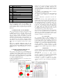
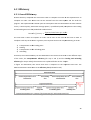
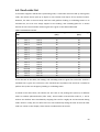
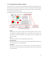
III. ONTWIKKELING VAN DE METRICS
Door gebruik te maken van het ‘Performance
Measurement Development System’ (PMDS), kan een
performance measurement system opgesteld worden.
Dit proces wordt gebruikt om een set van metrics te
ontwerpen voor de dynamische analyse van de interne
logistieke voertuigen. Uiteindelijk worden via deze
methode 19 metrics ontworpen, die logisch passen onder
4 Key Performance Areas (KPAs). Deze KPAs en de
bijhorende metrics zijn voorgesteld in de onderstaande
tabel.
Tabel 1: Ontworpen metrics
Nbr.
Metric
KPA: Visibility
1
Location of the vehicle
2
Status of the vehicle
3
Order list progress
KPA: Efficiency
4
Overall efficiency
5
Transportation efficiency
6
Average speed
7
Route efficiency
iv
8
Loading efficiency
9
Unloading efficiency
10
Load/Unload time variance
11
Overall Utilization
12
Percentage loaded
KPA: Reliability
13
Lost time percentage
14
Vehicle reliability
15
Mean time to repair
16
Route reliability
17
Picking reliability
KPA: Productivity
18
# orders picked / hour
19
# orders picked / Km
Een meer uitgebreide uitleg van het PMDS en de
verdere ontwikkeling van de ontworpen metrics kan
worden teruggevonden in de thesis die bij dit artikel
hoort: ‘Dynamic analysis of in-plant logistics based on
RFID data’.
IV. PRESENTATIE VAN DE METRICS
Om een doeltreffende performance measurement system
te bekomen, moeten de ontworpen metrics op een
duidelijke manier worden voorgesteld zodat de prestatie
van de interne logistiek gemakkelijk kan worden
afgelezen. Hierbij wordt een dynamisch dashboard
ontwikkeld omdat dit in staat is om de prestatie in realtime weer te geven. In de thesis wordt het ontwerp van
een dashboard die uit meerdere schermen bestaat,
besproken. Voor het ontwerp van dit dashboard en de
uitleg erbij wordt nogmaals verwezen naar de thesis
zelf.
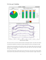
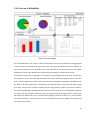
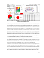
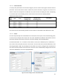
Naast het voorgestelde dashboard, wordt ook een
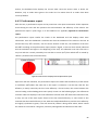
beknopter test-dashboard ontwikkeld in MS Excel. Dit
dashboard wordt verder gebruikt in de testen die hierna
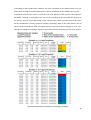
worden besproken. Het test-dashboard is te zien op
figuur 1.
V. TESTEN VAN HET DASHBOARD EN
BEKOMEN RESULTATEN
Twee testen worden gedaan om de nauwkeurigheid en
correctheid van de metrics te bepalen en om de real-time
capaciteiten van het dashboard na te gaan. Voor deze
testen wordt er gebruik gemaakt van een testopstelling
die bestaat uit een speelgoedtrein die gevolgd wordt
door middel van RFID technologie.
A. Test 1: Nauwkeurigheid en correctheid van de
voorgestelde metrics
Tijdens de test wordt de locatie van de trein continu
gemeten door middel van RFID technologie. De
verzamelde RFID data wordt nadien gekuist en in het
juist formaat geplaatst om dan ingevoerd te worden in
het dashboard.
De resultaten op het dashboard worden vervolgens
vergeleken met de werkelijke situatie.
Uit de test kan geconcludeerd worden dat het dashboard
de situatie correct analyseert en relevante data
presenteert.
B. Test 2: Real-time capaciteiten van het testdashboard
In deze test wordt nog steeds gebruik gemaakt van
dezelfde dataset als in de eerste test. In plaats van de
data in één keer in het dashboard te laden, wordt deze
hier dynamisch ingeladen. Door hierbij de update rate
van het dashboard te laten variëren, kan er nagegaan
worden hoe het dashboard reageert. Bij elke geteste
update rate wordt er gekeken hoe lang de update duurt
(de update heeft een zekere tijd nodig om alle
noodzakelijke berekeningen en functies uit te voeren) en
of het dashboard nog correct de data weergeeft.
Uit de test kan geconcludeerd worden dat een maximale
update rate van ‘één update elke twee seconden’ nog
steeds een goed resultaat weergeeft. Deze update rate is
zeker hoog genoeg om de prestaties van de interne
logistieke voertuigen correct weer te geven.
VI. CONCLUSIE
De voorgestelde metrics en hun presentatie in het
dashboard kunnen nuttige informatie verstrekken over
de geleverde prestaties van de logistieke voertuigen. Uit
de tests blijkt dat de metrics weldegelijk een correct
beeld geven van de realiteit en dat real-time analyse
mogelijk is. Voor verder onderzoek kunnen deze metrics
en het dashboard worden toegepast op reële
bedrijfssituaties om de prestatie van echte logistieke
voertuigen (zoals vorkliften, tugger trains en AGVs) te
meten.
REFERENTIES
[1] Chow, H., Choy, K. L., Lee, W. B., and Lau, K.C., (2005).
Design of a RFID case-based resource management system for
warehouse operations, Expert Systems with Applications, 30
(2006), p.561-576
[2] Ludwig, T., and Goomas, D., (2009). Real-time
performance monitoring, goal-setting, and feedback for forklift
drivers in a distribution centre, Journal of Occupational and
Organizational Psychology, 82 (2009), p.391-403
[3 Kootbally, Z., Schlenoff, C., Madhavan, R., (2009).
Performance assessment of PRIDE in manufacturing
environments,http://info.ornl.gov/sites/publications/files/Pub21
558.pdf
Gedurende de eerste test wordt de trein aangestuurd om
een vooropgestelde order lijst te vervullen.
Figuur 1: Ontwerp van het test-dashboard
v
Extended Abstract (English)
Dynamic analysis of in-plant logistics based
on RFID data
Simon De Buyser
Supervisor(s): H. Van Landeghem, V. Limère
Abstract: In this thesis new dynamic analysis methods are developed to monitor the real-time performance of inplant logistics vehicles. In first instance, a set of metrics is developed by using the Performance Measurement
Development System. A dashboard is then designed to dynamically present the defined metrics. The accuracy and
real-time aspect of the metrics and their presentation in the dashboard are then tested in a test setup which consists
of a toy train with an RFID tag attached to it. The results of the test prove that the dashboard is capable of
providing correct information about the performance of the vehicle and can do so in real-time.
Keywords: In-plant logistics, Performance measurement system, Dashboard design, RFID data, Real-time analysis
I. INTRODUCTION
During the last years, more and more companies started
applying lean principles on their business processes. By
constantly improving the used production methods,
companies can maintain their competitive advance.
Apart from optimizing the production methods, the inplant logistics also needs to be improved to increase the
general flow of products through the factory. To be able
to remove all the waste and find the improvement
possibilities, the in-plant logistics process first needs to
be visualized. For this reason, a performance
measurement system needs to be set up. Because of the
increasing complexity and fast-paced behavior of the inplant logistics, real-time analysis will be used to
correctly capture the performance. This real-time
analysis can be made possible by equipping the logistics
vehicles and products with RFID tags and monitoring
their movement through the factory.
The remainder of this paper is structured as following:
First, a short literature study is given in which some
similar researches are briefly discussed. Secondly, the
development of the metrics is described. Next, the
design of a dashboard is presented after which the
designed metrics are tested and the results are given.
The paper ends with the conclusion of the research.
II. LITERATURE STUDY
Three similar researches are mentioned in this literature
study. Chow et al. propose an RFID case-based logistics
resource management system (R-LRMS) to improve the
efficiency and effectiveness of order-picking operations
in a warehouse. This system automatically calculates the
most appropriate material handling equipment (=
logistics vehicle) for a certain order and determines the
shortest path to fulfill this order [1].
Ludwig and Goomas propose another system in which
the performance of forklift drivers is measured and
feedback is directly given to the driver so he can adjust
his behavior. The performance is here measured by
comparing the actual time it takes to complete an order
with the standard time. This standard time is calculated,
based on the shortest path that can be taken (at the ideal
speed), and the most efficient loading- and unloadingprocedures [2].
Lastly, Kootbally et al. present the ‘PRIDE’-algorithm
which can be used to navigate AGVs in a dynamic
manufacturing environment. By integrating existing
shortest path algorithms with active collision avoidance,
the reliability and the overall performance of the inplant logistics can be improved [3].
III. DEVELOPMENT OF THE NEEDED
METRICS
By using the Performance Measurement Development
System (PMDS), a performance measurement system
can be defined. This process is used to design a set of
metrics for the dynamic analysis of the in-plant logistics
vehicles. Eventually, 19 metrics are designed which fit
under 4 Key Performance Areas (KPAs). These KPAs
and the accompanying metrics are displayed in the table
underneath.
Table 1: Designed metrics
Nbr.
Metric
KPA: Visibility
1
Location of the vehicle
2
Status of the vehicle
3
Order list progress
KPA: Efficiency
4
Overall efficiency
5
Transportation efficiency
6
Average speed
7
Route efficiency
8
Loading efficiency
9
Unloading efficiency
10
Load/Unload time variance
11
Overall Utilization
12
Percentage loaded
KPA: Reliability
13
Lost time percentage
14
Vehicle reliability
15
Mean time to repair
16
Route reliability
vi
In this test, it is concluded that the monitored data in the
test-dashboard is indeed accurate and correct in
comparison with the real measured performance of the
trainB.
17
Picking reliability
KPA: Productivity
18
# orders picked / hour
19
# orders picked / Km
A detailed explanation of the PMDS and the further
development of the mentioned metrics can be found in
the accompanying thesis ‘Dynamic analysis of in-plant
logistics based on RFID data’.
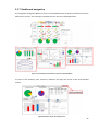
IV. PRESENTATION OF THE METRICS
The designed metrics alone are not enough to form an
effective performance measurement system. The metrics
need to be presented in a clear and concise manner so
the performance of the in-plant logistics vehicles can be
easily read. Because of the real-time aspect that needs to
be captured in this metric presentation, a dynamic
dashboard is designed. This dashboard consists of
graphs, bar charts, pie charts and other graphic
representations of the metrics which are updated
dynamically. In the accompanying thesis, the design of a
multi-screen dashboard is proposed. For the exact
design of this dashboard, I refer to the thesis itself.
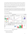
To perform the tests (as described in chapter V), a testdashboard was developed in MS Excel. This dashboard
is less extensive as it only consists of one screen. Figure
1 presents the design of this test-dashboard
V. TESTING OF THE DASHBOARD AND
RESULTS
Two tests are done to check the accuracy and
correctness of the displayed metrics and to check the
real-time aspect of the test-dashboard. For these tests, a
test setup at HoWest in Kortrijk is used. The test setup
consists of a toy train riding on a track. An RFID tag is
attached to the toy train and its movements can be
followed by four RFID readers that are placed around
the track.
A. Test 1: Accuracy and correctness of the displayed
metrics
In the first test, the train is ordered to fulfill a
predetermined order list. The RFID data is measured
during the test and is cleaned afterwards. The cleaned
RFID data is then loaded into the dashboard and the
results are compared to the actual performance of the
train during the test.
Test 2: Real-time capabilities of the testdashboard
The second test makes use of the same RFID data that is
gathered in the first test. However, instead of loading the
data in the dashboard all at one time, the data is
dynamically inserted into the dashboard. By changing
the update rate of the dashboard, its performance can be
checked for each possible update rate. For each update
rate, it is checked how long the update takes (for
calculating and executing the necessary functions to
adjust the graphs) and if the dashboard is still displayed
correctly.
The test concludes that a maximum update rate of ‘one
update every two seconds’ is still possible, which is
more than satisfying.
VI. CONCLUSION
The presented metrics and their presentation in the
dashboard can provide useful information about the
performance of the in-plant logistics vehicles. From the
tests, it can be concluded that the dashboard offers a
correct representation of the actual situation and that it
can be done in real-time. For further research, these
metrics and their presentation can be applied on real-life
cases to see the performance of actual logistics vehicles
(e.g. AGVs, forklifts and tugger trains).
REFERENCES
[1] Chow, H., Choy, K. L., Lee, W. B., and Lau, K.C., (2005).
Design of a RFID case-based resource management system for
warehouse operations, Expert Systems with Applications, 30
(2006), p.561-576
[2] Ludwig, T., and Goomas, D., (2009). Real-time
performance monitoring, goal-setting, and feedback for forklift
drivers in a distribution centre, Journal of Occupational and
Organizational Psychology, 82 (2009), p.391-403
[3 Kootbally, Z., Schlenoff, C., Madhavan, R., (2009).
Performance assessment of PRIDE in manufacturing
environments,http://info.ornl.gov/sites/publications/files/Pub21
558.pdf
vii
Figure 1: Design of the test-dashboard
Table of Contents
Acknowledgements ................................................................................................................................i
Overview .............................................................................................................................................. iii
Extended abstract (Nederlands) .......................................................................................................... iv
Extended Abstract (English) ................................................................................................................. vi
Table of Figures ................................................................................................................................... xii
List of Tables....................................................................................................................................... xiv
1
Introduction ..................................................................................................................................1
2
Literature study .............................................................................................................................2
2.1 In-plant logistics .......................................................................................................................2
2.1.1
Logistics vehicles .............................................................................................................3
2.2 RFID technology .......................................................................................................................6
2.2.1
Introduction to RFID technology .....................................................................................6
2.2.2
Dealing with massive RFID data sets ...............................................................................8
2.2.3
Dealing with the unreliability of RFID data .................................................................. 10
2.2.4
Current applications ..................................................................................................... 10
2.3 Applied methods for real-time analysis of in-plant logistics................................................. 11
3
2.3.1
Benefits of the use of RFID technology within in-plant logistics .................................. 11
2.3.2
Applications .................................................................................................................. 12
Design of a performance measurement system ........................................................................ 15
3.1 Measurement System Development Process ....................................................................... 15
3.1.1
Step 1: Define the need for measurement................................................................... 16
3.1.2
Step 2: Define what we do ........................................................................................... 17
3.1.3
Step 3: Define what we must excel at .......................................................................... 17
3.1.4
Step 4: Define how we know if we’re successful ......................................................... 18
3.1.5
Step 5: Implement the MS............................................................................................ 19
3.1.6
Step 6: Utilize the MS ................................................................................................... 19
viii
3.2 Hierarchy of the designed metrics ........................................................................................ 20
4
Metric development and programming..................................................................................... 21
4.1 Visibility ................................................................................................................................. 21
4.1.1
Location of the vehicle ................................................................................................. 21
4.1.2
Status of the vehicle ..................................................................................................... 23
4.1.3
Order list progress ........................................................................................................ 25
4.2 Efficiency ............................................................................................................................... 26
4.2.1
Overall Efficiency .......................................................................................................... 26
4.2.2
Overall utilization ......................................................................................................... 33
4.2.3
Percentage loaded........................................................................................................ 33
4.3 Reliability ............................................................................................................................... 33
4.3.1
Lost time percentage.................................................................................................... 33
4.4 Productivity ........................................................................................................................... 35
5
4.4.1
Number of orders picked / hour .................................................................................. 35
4.4.2
Number of orders picked / driven km .......................................................................... 35
Metric presentation ................................................................................................................... 36
5.1 Definition and key features of a dashboard.......................................................................... 36
5.2 Dashboard design.................................................................................................................. 37
6
5.2.1
Used timeframes .......................................................................................................... 37
5.2.2
Multi-screen design ...................................................................................................... 38
5.2.3
Screen 1: Summary view .............................................................................................. 38
5.2.4
Screen 2: Visibility ........................................................................................................ 40
5.2.5
Screen 3: Efficiency....................................................................................................... 41
5.2.6
Screen 4: Reliability ...................................................................................................... 44
5.2.7
Dashboard navigation .................................................................................................. 45
Test Setup HOWEST ................................................................................................................... 46
6.1 Details of the test setup ........................................................................................................ 46
6.1.1
Equipment used ........................................................................................................... 46
ix
6.1.2
Layout ........................................................................................................................... 48
6.2 Selection of the parameters and cleaning of the data.......................................................... 49
6.3 Defined zones........................................................................................................................ 52
6.4 Used order list ....................................................................................................................... 53
6.5 Progression of the test .......................................................................................................... 54
6.6 Results: Accuracy of the analysis .......................................................................................... 54
6.6.1
Dashboard output ........................................................................................................ 54
6.6.2
Performance report ...................................................................................................... 56
6.7 Results: Real-time performance of the dashboard ............................................................... 58
7
Design of the test-dashboard..................................................................................................... 61
7.1 Used metrics and adaptations .............................................................................................. 61
7.2 Graphic design....................................................................................................................... 62
7.3 Working of the test-dashboard ............................................................................................. 63
7.3.1
Structure of the Dashboard excel file........................................................................... 63
7.3.2
Adjustable parameters ................................................................................................. 64
7.3.3
Inputs of the test-dashboard........................................................................................ 66
7.3.4
Working of the dashboard-update ............................................................................... 70
7.4 Post-analysis.......................................................................................................................... 75
8
7.4.1
Performance report ...................................................................................................... 75
7.4.2
Route efficiency check.................................................................................................. 75
Expansion to a real-life case ....................................................................................................... 77
8.1 Differences between a real-life case and the test setup ...................................................... 77
8.2 Changes needed to the test-dashboard................................................................................ 78
9
Conclusions ................................................................................................................................ 79
10
References............................................................................................................................. 81
11
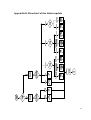
Appendices ................................................................................................................................I
11.1
Appendix A: Completed Metrics Development Matrix .......................................................II
Appendix B: Flowchart of the Status-update ...................................................................................III
x
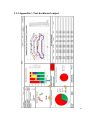
11.2
Appendix C: Test-dashboard output .................................................................................. IV
11.3
Appendix D: Performance report ....................................................................................... V
xi
Table of Figures
Figure 1: Forklift supply vs. mizusumashi supply ..................................................................................3
Figure 2: Standard forklift (Courtesy of Mitsubishi) .............................................................................3
Figure 3: Crane Attachment ..................................................................................................................3
Figure 4: Heavy duty forklift (Courtesy of Toyota)................................................................................4
Figure 5: Narrow aisle forklift (Courtesy of AisleMaster) .....................................................................4
Figure 6: Tugger train ............................................................................................................................4
Figure 7: Tow AGV with cart (optically guided) (courtesy of IntelliCart) ..............................................5
Figure 8: Fork AGV.................................................................................................................................5
Figure 9: Working of an RFID system (courtesy to Omicron)................................................................7
Figure 10: From left to right: a passive RFID tag, an active RFID tag and an RFID reader ....................7
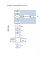
Figure 11: The six steps of MSDP ....................................................................................................... 16
Figure 12: Hierarchy of the designed metrics .................................................................................... 20
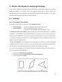
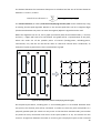
Figure 13: Format of the zones (the 3th shape is not convex, thus not allowed) ............................. 21
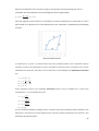
Figure 14: Example of a zone ............................................................................................................. 22
Figure 15: Interaction between the status-update and the needed information ............................. 24
Figure 16: Efficiency loss .................................................................................................................... 26
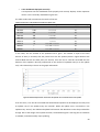
Figure 17: Average speed vs. ideal average speed ............................................................................ 28
Figure 18: Plant layout (left) and the accompanying network (right)................................................ 29
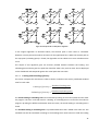
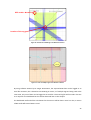
Figure 19: Example of the use of Dijkstra’s algorithm ....................................................................... 31
Figure 20: Working of the status-update in case of loading or unloading......................................... 32
Figure 21: Screen 1: Summary view ................................................................................................... 38
Figure 22: Screen 2: Visibility ............................................................................................................. 40
Figure 23: Screen 3: Efficiency ........................................................................................................... 41
Figure 24: Transportation efficiency: Situation A (left) and B (right)................................................. 42
Figure 25: Transportation efficiency: Situation C............................................................................... 43
Figure 26: Screen 4: Reliability ........................................................................................................... 44
Figure 27: Connection between the four screens of the dashboard ................................................. 45
Figure 28: Button 'Return to Summary view'..................................................................................... 45
Figure 29: Used equipment: RFID reader (left) and active RFID tag (right) (courtesy of Ubisense) .. 46
xii
Figure 30: Location of an RFID-tag in the Ubisense software ............................................................ 47
Figure 31: Trails of multiple tags in the Ubisense software ............................................................... 47
Figure 32: Layout of the train track with the four RFID readers ........................................................ 48
Figure 33: Tag range parameters - Selection of the QoS ................................................................... 49
Figure 34: Layout of the train track with the defined zones .............................................................. 52
Figure 35: Cropped test-dashboard output ....................................................................................... 55
Figure 36: Total lost time as displayed on the performance report .................................................. 56
Figure 37: Causes of the low efficiency (as indicated on the performance report) .......................... 57
Figure 38: Errors that occurred during the test ................................................................................. 58
Figure 39: Relationship between the number of updated rows and the duration of the update..... 59
Figure 40: Test-dashboard ................................................................................................................. 62
Figure 41: Tool to configure zones in the dashboard file .................................................................. 67
Figure 42: Node 1 and its connected nodes (0 and 2) on the train track layout ............................... 69
Figure 43: Locations of the used nodes ............................................................................................. 69
Figure 44: Buttons on the dashboard ................................................................................................ 70
Figure 45: Flowchart of the dashboard-update ................................................................................. 71
Figure 46: Route selection tool and input box ................................................................................... 76
Figure 47: Result in the route selection tool ...................................................................................... 76
xiii
List of Tables
Table 1: Developed metrics................................................................................................................ 19
Table 2: Indication of the progress in the order list........................................................................... 25
Table 3: Format of the logged (raw) RFID data .................................................................................. 50
Table 4: Useful part of the raw data .................................................................................................. 50
Table 5: Gaps in time in the logged RFID data ................................................................................... 51
Table 6: Format of the cleaned and smoothed RFID data ................................................................. 51
Table 7: Used order list in the test ..................................................................................................... 53
Table 8: Performance of the dashboard at different update rates ................................................... 59
Table 9: Adjustable parameters of the dashboard ............................................................................ 64
Table 10: Format of the Cleaned RFID data ....................................................................................... 66
Table 11: Format of the RFID data in the dashboard excel file.......................................................... 66
Table 12: Format of the Order list...................................................................................................... 67
Table 13: Format of the network data ............................................................................................... 68
Table 14: 'RFID-data'-sheet result after step 1 .................................................................................. 72
Table 15: 'RFID-data'-sheet result after step 2 .................................................................................. 72
Table 16: 'RFID-data'-sheet result after step 3 .................................................................................. 73
Table 17: 'RFID-data'-sheet result after step 4 .................................................................................. 73
Table 18: Update of the Error Event Manager when the status changes to 'Error' .......................... 73
Table 19: Update of the Error Event Manager when the error/problem is resolved ........................ 73
Table 20: Order list with filled in start- and end-time ....................................................................... 74
Table 21: Order list with actual and shortest possible distances ...................................................... 74
Table 22: Order list with filled in efficiencies ..................................................................................... 74
xiv
1 Introduction
To maintain their competitive advantage, companies need to make sure they excel in their business
processes. In the last few years, more and more companies have started implementing lean
principles on their production process. By implementing performance measurement systems, the
performance of the production can be continuously monitored and improved. However, the inplant logistics also requires attention and this can be a very time- and money-consuming task.
Nowadays, the performance of the in-plant logistics can already be measured, though this is mostly
done afterwards instead of during the performed logistics tasks. To keep up with the increasing
complexity and fast-paced behaviour of in-plant logistics, new dynamic analysis methods should be
developed.
The goal of this thesis is to develop new analysis methods so the performance of the in-plant
logistics can be monitored in real-time. The subject of the analysis will not be the entire in-plant
logistics but only the performance of the logistics vehicles. RFID technology will be used to acquire
the real-time locations of the logistics vehicles. Based upon this information and the taskdescription (order list) of a logistics vehicle, some metrics will be designed to measure its
performance. These metrics will then be used to develop a dashboard which will visually displays
the performance of the logistics vehicles.
First an overview of the used literature is given. Next, the development of a dynamic performance
measurement system is described, followed by the detailed working of the designed metrics and
their presentation in a dashboard. Then the designed metrics are tested by implementing a
dashboard on a test setup at HoWest. Finally the results of this test are discussed and some
remarks are given about the expansion to a real-life situation.
1
2 Literature study
First, a brief introduction to in-plant logistics is given. Here the purpose of in-plant logistics and also
the used logistics vehicles are described. In the second part of the literature study, the working of
RFID technology is briefly explained and it is described how RFID data can be cleaned and filtered
so it becomes useful for real-life applications. In the last part of the literature study, a summary is
given of current researches that use RFID data to provide real-time monitoring of the in-plant
logistics vehicles and to improve their performance.
2.1 In-plant logistics
In-plant logistics is the part of logistics that takes place within the walls of a company. Here the
transport and storage of products in the warehouse, the supermarket and at the border of line is
the subject of interest. Though transportation and storage are considered to be non value-adding
processes, they are still needed for the correct functioning of the plant ( = necessary non-value
adding processes).
Not only is the in-plant logistics necessary, it is in fact an important factor in the supply chain. Inplant logistics requires a lot of man-hours and materials, which brings a great cost with it. In order
to limit these costs, it is important that the in-plant logistics is performed as efficient and effective
as possible. Excellence would be obtained here by assuring that the logistics process is not a
limiting factor in the production and that every order is completed on time.
In the past, mainly forklifts were used to pick pallets from the warehouse and transport them
directly to the border of line where they were needed (traditional supply). Though a forklift is able
to pick pallets out of the high racks in the warehouse, these handlings take a lot of time and the
load capacity (number of pallets that can be carried at a time) of the forklift is rather limited.
Because of this limited load capacity, the forklift would need to make many trips between the
warehouse and the border of line to supply the necessary items.
With the increasing popularity of lean implementation and Total Flow Management (TFM), the
tendencies in internal logistics have changed. The use of forklifts to supply the border of line has
decreased because of its inefficiency (as described above). Instead of picking the orders out of
warehouses with high racks, supermarkets are now used (flow supply). These supermarkets are
designed to allow quick and easy order picking. All the needed items are now placed in low flow
racks or on wheeled bases. Forklifts are no longer needed because all the needed items can be
reached more easily. The items in the supermarket can be picked and transported to the border of
line by a so called mizusumashi. This is a logistics vehicle that supplies the border of line by driving
2
around in a fixed route with a fixed cycle time. Mostly, tugger trains or AGVs (automatic guided
vehicles) are used for this. These vehicles can tow multiple carts with items, so they don’t need to
make as many trips as would be needed with forklifts. Typically, a mizusumashi will pick up items at
the supermarket and then make multiple stops at different places to resupply the border of line.
(Coimbra, 2009)
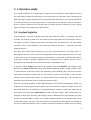
Figure 1: Forklift supply vs. mizusumashi supply
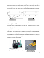
2.1.1 Logistics vehicles
Underneath, a brief description is given about the most commonly used logistics vehicles.
(Van Landeghem, 2008)
2.1.1.1
Forklifts
Though forklifts are not the most efficient means of transportation, they are still often used in the
in-plant logistics. They are well suited for the handling of materials because of their flexible design.
With their lift-mechanism they can pick products out of high racks (difficult to reach locations) and
also stack products on top of each other. Further, the spacing between the forks can be adjusted so
the forklift is able to handle a greater variety of products and several attachments can be added to
the forklift to handle more specific products.
Figure 2: Standard forklift (Courtesy of Mitsubishi)
Figure 3: Crane Attachment
(Courtesy of handlinggear.com)
3
Next to the standard forklifts, also many specialized forklifts exist to handle heavy or very big
products. As space is always a limiting factor, some warehouses use very narrow aisles. To handle
products in these warehouses, special forklift variants are also available for operating in narrow
aisles.
Figure 4: Heavy duty forklift (Courtesy of
Toyota)
2.1.1.2
Figure 5: Narrow aisle forklift (Courtesy of
AisleMaster)
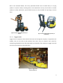
Tugger trains
Tugger trains are operator driven vehicles that tow carts through the company. As opposed to the
forklifts, they are not able to pick products from racks. They are however more suited for
transporting prepared kits from the supermarket to the border of line. Mostly the tugger trains will
be used as mizusumashi as described above.
Figure 6: Tugger train
(courtesy of K-Tec)
4
2.1.1.3
AGVs
Automated Guided Vehicles or AGVs can also be used to perform logistics tasks. As the name says,
these vehicles are not driven by operators but are automatically routed through the manufacturing
plant to pick up or drop off products.
AGVs can be subdivided according to the way they navigate through the plant. The guidance
system of an AGV can make use of some different technologies. In most cases, navigation is made
possible by using an optical, magnetic or wireless radio guidance system. The optical guiding
system requires lines to be placed on the warehouse or manufacturing floor. These lines are then
followed by an optical sensor in the AGV. The magnetic guiding system requires a cable that is
installed beneath the floor which is then followed similarly to the optical system. The wireless radio
guiding system uses high-frequency transmission to direct the AGV to the right path.
Many different sorts of AGVs exist, ranging from light to heavy duty AGVs. AGVs can also be
equipped with forks or can have a very specific task related design. They can also be used to tow
carts (like a tugger train).
Figure 7: Tow AGV with cart (optically guided) (courtesy
of IntelliCart)
Figure 8: Fork AGV
(courtesy of Egemin)
5
2.2 RFID technology
2.2.1 Introduction to RFID technology
2.2.1.1
Definition
RFID or Radio Frequency Identification is a technology that uses radio waves to indentify objects. It
enables identification from a distance and does not require a line of sight as opposed to other
similar technologies such as bar-code scanning. (Angeles, 2005; Want, 2006)
2.2.1.2
History
This technology first appeared during World War II and was used to identify approaching planes.
The British army developed an Identify Friend or Foe (IFF) system which works on the same basic
concept as RFID technology today. A transmitter was placed on each British plane and when it
received signals from radar stations on the ground, it responded with a signal that identified the
aircraft as friendly.
Over the years, extensive research was done in the field of RFID technology but there were not
many commercial applications until the late nineties because of the high cost of RFID systems. In
1999 the Auto-ID Center at the Massachusetts Institute of Technology (MIT) was founded. Here
research was done to make low-cost RFID tags and place these tags on products to track them
through the supply chain. The tags could be produced at a lower cost because they only needed to
store a serial number (and thus the needed memory capacity was very small). The data associated
with the serial number (name of the product, lot number, etc.) would now not be stored in the tag
but rather in an internet database.
This research changed the meaning of RFID technology in the supply chain. Because of the cost that
was now significantly reduced, the RFID technology became much more interesting. Three major
organisations that can be considered as the pioneers in the large-scale adoption of RFID technology
are Wal-Mart, Tesco and the US Department of Defense. Now an increasing number of companies
use RFID technology to track goods in their supply chain. (Want, 2006; Roberti, 2007)
2.2.1.3
Working
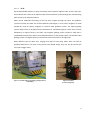
An RFID system consists of RFID tags that are fixed to the object that needs to be identified or
tracked and RFID readers that read the data from the tags. The readers communicate with the tags
through inductive coupling. The coiled antenna of the reader creates a magnetic field which
detects the presence of the tag. The tag subsequently draws energy from this magnetic field and
sends waves back through its own antenna. These waves are then interpreted by the reader and
6
transformed into digital information. This is how the EPC or Electronic Product Code of a tag can be
read, and the object (with the tag attached to it) can be identified.
Figure 9: Working of an RFID system (courtesy to Omicron)
In general, RFID systems can be divided into three classes: active, passive and semi-passive. The
difference between these three classes is the power supply of the tags.
Active RFID tags require an own power supply. This is needed to power the internal circuits and
also to broadcast radio waves to the RFID readers. The power supply can be provided by
connecting the tags to a powered infrastructure or by simply using an integrated battery. In this
last case, the lifetime of the tag is limited by the battery’s capacity. However, active tags do have
mechanisms that allow them to expand their lifetime: some active tags have the possibility to go
into sleep-mode when the tag is not moved for a certain duration so it can preserve its power (e.g.
Ubisense tags). Because active tags provide their own power to broadcast signals, the signal is
stronger and can be sent over longer distances in comparison with passive tags.
As opposed to active tags, passive tags don’t require a power source. In a passive system, the
readers also send out electromagnetic waves that can induce a current in the passive tag’s
antenna. This current is then used to power the tag so it can transfer its EPC back to the reader.
The last class uses semi-passive tags. These tags require an own power supply to power the
internal circuits, but use a combination of the EM waves sent by the reader and its own power to
broadcast its data. (Angeles, 2005; Want, 2006)
Figure 10: From left to right: a passive RFID tag, an active RFID tag and an RFID reader
(courtesy to Ubisense)
7
Next to the fact that RFID readers can receive the data stored on the tags in their proximity, they
can also determine the exact location of the RFID tags. By using multiple readers, the location of an
active tag can be calculated by using triangulation.
Further, modern RFID tags have increasing possibilities attached to them. One very interesting
aspect of modern RFID tags is that they can also convey information from onboard sensors they
contain next to their usual identification.
For example, a passive force sensor can be incorporated into an RFID tag. When the product with
the RFID tag attached to it, is dropped on the floor and the impact could have damaged the
product, the passive force sensor will supply one single bit, alerting the system about the problem.
Another example is an RFID temperature sensor which can be attached to perishable goods such as
meat or dairy products. Once a certain temperature is exceeded, the tag will give a warning that
the product is not fit for consumption anymore. (Want, 2006)
2.2.1.4
Challenges
Despite the advantages that RFID technology has to offer, some issues remain that are holding back
the widespread adoption of this technology. The three main issues here are the cost, design and
acceptance.
Currently RFID tags are available at low prices (around 13 cents per tag) but are still much more
expensive than printed labels. These prices are still decreasing as time goes by, but are not yet at a
price tipping point and therefore the use of RFID tags instead of bar codes is not yet profitable.
The second important issue that holds back the adoption of RFID technology is the design of the
tags and readers. Currently, RFID data can be fairly accurate but it still has a certain (in some cases
unacceptable) error margin. The reliability of the identification should be further improved before
widespread adoption will be obtained.
The third issue is the acceptance. There are some general concerns about the privacy of the
consumers. If every product were to be equipped with RFID-tags, the consumer could be tracked
by the tags on their bought products. In theory, vendors could use this information to analyse the
consumption behaviour of their customers. If the usage of RFID technology would be more
regulated to protect the customers rights, the general acceptance would be higher. (Want, 2006)
2.2.2 Dealing with massive RFID data sets
RFID systems are capable to generate huge amounts of data, a modest RFID system can generate
gigabytes of data per day. Though it can be useful to have as much data as possible, in most cases
not all the acquired data is needed. Further, this flood of data is very stressing for the used
8
technology infrastructure and can even exceed its capacity. Data filtering will be needed to extract
the useful information and remove the useless or redundant data.
To effectively deal with these huge data streams some general guidelines can be followed (Palmer,
2004):
•
•
•
To reduce the stress on the technology infrastructure as much as possible, the incoming
RFID-data should be digested close to the source. All the unnecessary data should be
removed and only the meaningful information should be sent to the central IT systems.
The incoming information needs to be turned into meaningful events. By analysing the
incoming data, specific patterns can be detected from which meaningful events can be
deducted (e.g. a vehicle drives to a loading-point, stops for an amount of time and then
drives away again the vehicle is performing a loading-action). By changing the gathered
RFID data in events, the data stream can be reduced.
The RFID data needs to be aged correctly. The gathered data doesn’t need to be stored
forever. As the data gets older, it will be less important (especially when the data is used to
measure the current performance) and the dataset can be reduced. The necessary data
stays available but useless information is removed from the dataset.
Next to these guidelines, other research has been done in the field of warehousing. When the RFID
technology is used to track items in the supply chain, the generated volume of information can be
enormous as each individual item leaves a trail of data as it moves through the plant. However, this
data can be compressed while still preserving all the important object transitions. This compression
can be obtained based upon the observation that items tend to move and stay together in large
groups through early stages in the supply chain (e.g. items are moved in batches, on pallets, and
are placed together on shelves) and though RFID data is registered per item, data analysis is usually
done for a group of items instead of doing so for each individual item separately.
Suppose each item movement is recorded by the RFID system in a tuple of the form (EPC, location,
time) where EPC is a unique identifier for each item, then the number of records that needs to be
stored can be significantly reduced by grouping information together. For example if an item
stands still on a shelf for an amount of time, then it is not useful to maintain a tuple for each single
second the item is there. Instead a tuple could be made that contains the EPC, the location and the
In_time and Out_time. Further reduction can be obtained by grouping information of items that
move together through the plant. Instead of having a single EPC in a tuple, a set of EPCs could be
stored (EPC_list, location, time). By logically reducing the number of needed records, all the
important information remains intact, and the useless data is removed. (Gonzalez et al., 2006)
In this thesis, the general guidelines will be followed, however because the thesis focuses on the
logistics vehicles rather than the flow of products through the supply chain, the research of
9
Gonzalez et al. cannot be applied directly. If in an expansion the products would also be tagged and
followed, then this filtering technique would become more interesting.
2.2.3 Dealing with the unreliability of RFID data
As mentioned before, one of the challenges RFID systems face, is the reliability of the system.
Because of the fact that RFID data is inherently unreliable, widespread adaptation of the RFID
technology is tackled. However, most RFID middleware systems take this into account and employ
a ‘smoothing filter’ to correct these errors as much as possible. This smoothing filter can be defined
as ‘a sliding-window aggregate that interpolates for lost readings’ (Jeffery, 2006).
The choice of the window size is however not a trivial task. If the window it chosen too small, the
systems reacts very heavily on errors. If the window is chosen too large, the system reacts sluggish
and might miss transitions of the tag going in or out of the range of the reader. The window size
should thus be adapted according to the behaviour of the data. For this problem Researchers at UC
Berkeley presented an approach to adapt the window size dynamically based on statistical
sampling: SMURF or Statistical sMoothing for Unreliable RFid data (Jeffery, 2006). This technique
could be used for cleaning and smoothing the raw RFID data that will be used in this thesis, but as
the cleaning is not part of the thesis itself, it will not be discussed further.
2.2.4 Current applications
RFID technology has been proven useful in many fields. Some examples of applications are given
below (Polniak, 2007) :
Animal identification:
One of the first applications of RFID technology was to identify cattle by implanting RFID tags under
their skin. Next to the identification, other data could be included on the tags, such as the age and
vaccination records. Now RFID tags are also being used to identify pets in case they have been lost.
Anti-theft systems:
A well know application is the use of RFID tags as anti-theft system. Here a tag is attached to the
product and RFID readers are placed at the exit of a store. When a product is brought to the
checkout counter, the tag is either removed from the product and reused, or in case of disposable
(passive) tags, destroyed by subjecting it to a strong electromagnetic field. If the product is
however not paid for, the RFID readers at the exit of the store will pick up the signal and trigger an
alarm.
10
Baggage handling:
Instead of using bar-coded labels, RFID stick-on labels can be used. The RFID readers are then
placed at various locations on the conveyor belts. The advantage is that many tags can be read at
one time and human error can be eliminated. This method of baggage handling is already applied
at the San Francisco International Airport amongst others.
Real Time Location Tracking Systems (RLTS):
RFID tags can be used to track people, vehicles or products within a company. This can be done by
placing RFID readers around the company that record all the tags in their vicinity. When a tag is
detected in a certain area, this information is transferred to a database so the location of the tag is
always known.
2.3 Applied methods for real-time analysis of in-plant
logistics
In this thesis RFID tags will be attached to logistics vehicles to measure their performance. Apart
from the examples given before, RFID technology also has some applications in the real-time
analysis of in-plant logistics. Some of the found research will briefly be discussed here.
2.3.1 Benefits of the use of RFID technology within in-plant logistics
First of all, some potential benefits of the usage of RFID technology in in-plant logistics are given.
(Tajima, 2007)
•
Reduced Loss of products:
Products can get lost within the supply chain, for example by misplacement, spoilage or by
theft. The capabilities of RFID technology can reduce this loss significantly. The goods can
be tracked through the company (countering misplacement and theft) and warnings can be
given when spoilable goods reach their expiration date.
•
Increased data accuracy:
By reducing the human errors, the inventory data will be much more accurate when using
RFID data. Not just the inventory data but also the shipment data can be more accurate by
using RFID. This in turn can improve the demand forecast and the production planning.
•
More efficient material handling:
RFID can effectively decrease the overall handling time needed. Its ability to identify
multiple products at once decreases the inventory counting time and receiving time.
Further, RFID data can be used to automatically determine a loading- or unloading-point
for a logistics vehicle and even choose the most efficient route.
11
•
Timely exception management:
By using RFID technology, unusual situations can be detected faster and responsive action
can be taken before the problem escalates. This aspect can also be automated by
generating warnings or alerts when an error or problem is detected. This is based upon the
real-time aspect of RFID technology.
2.3.2 Applications
Chow et al. researched the integration of RFID technology into existing Warehouse Management
Systems (WMSs). This would allow automatic and real-time data retrieval which increases the
overall accuracy by eliminating human errors. In their research they propose the use of an RFID
case-based logistics resource management system (R-LRMS). This system will improve the
efficiency and effectiveness of order-picking operations in a warehouse by using the real-time
aspect of RFID technology and case-based reasoning (CBR) as a decision support system.
The R-LRMS can be used to select the most appropriate material handling equipment for a certain
order (by using the CBR and looking at previous cases), and can then determine the shortest path
to fulfil this order. The logistics vehicle driver will then be directed to the correct picking route and
will also be alerted when a wrong route is taken or when his vehicle is standing still for too long.
In their research they also presented a case study in the company GSL. Here all forklifts and all
Stock Keeping Units (SKUs) were equipped with passive RFID tags. By placing multiple RFID readers
and antennae all over the plant, the location of each forklift and SKU could be determined. Then
for each order-picking operation, the closest forklift was automatically selected and the most
efficient route to pick up the needed SKUs was calculated. This information was then given to the
forklift driver so he could follow this route.
From this case study they concluded that the accuracy of the inventory data had increased
significantly: now the exact inventories were known as opposed to the previous situation in which
inventory data was recorded manually. The visibility of the warehouse was also improved: the
exact locations of the SKUs and the material handling equipment (the forklifts) are now known.
Further the job assignment process was now automatic and could be done in a much smaller
amount of time. (Chow et al., 2006; Poon et al., 2009)
Ludwig and Goomas researched the effect of real-time performance monitoring and feedback on
the efficiency of forklift drivers. Though this research is more about the psychological effects of the
real-time performance measurement, the implemented system is still interesting for this thesis
subject.
12
In this research, the performance of the forklift drivers was measured by comparing the actual time
they needed to fulfil an order to the standard time. This standard time could be calculated by
subdividing a task into its basic elements. By then performing work measurement techniques, the
needed time for each element could be calculated. These times were then added together and an
allowance for fatigue was also taken into account.
The standard times were calculated for the travel time and the loading and unloading times of the
vehicle. The travel time is based on the shortest distance between the start- and stop-point, taking
into account corners and passageways. The loading and unloading times can be divided into arm
lift and drop times (based on how high the fork needs to be lifted for the action), and pallet
retrieval and put away times (based on the type of product handled and the storage location).
The actual times were measured by the time-stamps provided by the wireless units attached to
each forklift.
The forklifts were then equipped with screens that displayed the time goal and also the
performance of the driver. By communicating this performance to the drivers immediately, the
performance increased according to a test case. (Ludwig and Goomas, 2009)
Another interesting application of RFID technology in the performance measurement of internal
logistics is the PRIDE framework as proposed by Kootbally et al.. PRIDE or Prediction In Dynamic
Environments provides an autonomous vehicle path planning system with collision avoidance.
In this research, PRIDE is used to navigate AGVs in a dynamic manufacturing environment. These
AGVs have to move around the plant between various loading- and unloading-points. To minimize
the time needed for this, shortest path algorithms such as Dijkstra’s algorithm can be used.
However, when another vehicle blocks this shortest path, the PRIDE algorithm will be used. This
algorithm calculates the shortest path but also provides collision avoidance between the different
logistics vehicles. First the importance or the role of the other vehicle is examined. If this vehicle
cannot be moved at that time (e.g. because it is lifting items from a rack) or has a higher priority,
the AGV’s shortest path will be recalculated but with the blocked lane removed from the possible
lanes. (Kootbally et al., 2009)
The collision avoidance described here could possibly be used as an expansion on this thesis when
multiple logistics vehicles are deployed in one area.
The applications that are described here, will be used as a guideline for the development of
performance measurement system in this thesis. In these three applications there is always a direct
13
performance feedback to the logistics vehicle. The performance is reported to the driver of the
vehicle and the instructions to perform the tasks are also given (e.g. the route that needs to be
taken, the order in which the products need to be loaded or unloaded). However, in the thesis
there will be no direct feedback to the logistics vehicle, the real-time performance will only be
communicated to the plant manager through a specially designed dashboard.
14
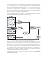
3 Design of a performance measurement system
To be able to measure the performance of the in-plant logistics first a Performance Measurement
System needs to be defined. This is a set of processes and tools that can be used to monitor the
working of a unit of interest such as the internal logistics department, allowing the user to draw
conclusions and (if necessary) take action(s) based upon this.
“An effective performance measurement system provides actionable information on a focused set
of metrics to provide a balanced view of the performance of the organizational unit of interest and
is used to make decisions to improve results.” (Van Goubergen, 2010)
Here, the Measurement System Development Process (developed at the EERL at Virginia Tech) will
be used as a guide to design the performance measurement system.
3.1 Measurement System Development Process
The Measurement System Development Process (MSDP) is a tool to analyse currently used
measurement systems and to improve these if needed or to develop and implement new ones. By
continually analysing the measurement system, it is assured that the system remains in line with
the business objectives (mission and vision) and that it is updated when the unit of analysis
changes.
The MSDP consists of 6 steps that that have to be executed in order to obtain a good measurement
system. As mentioned before, this process never ends, so after step 6, the cycle repeats itself and
the current measurement system is re-evaluated and if needed, updated.
The MSDP will be used as a guide to develop the measurement system for the real-time analysis of
the internal logistics. Not every step of the process is useful for this thesis, so some steps will not
be discussed in detail.
15
Figure 11: The six steps of MSDP
3.1.1 Step 1: Define the need for measurement
In the first step of the MSDP, the purpose of the measurement system is determined and also the
types of information that are needed for this.
Purpose of the measurement system:
•
•
•
•
Monitor the performance of the internal logistics
If multiple logistics vehicles are deployed at the same time, check if the workload is
equally divided amongst all the logistics workers.
Make the internal logistics process more visible.
Check for improvements in:
Work method:
Are the used work methods efficient?
Equipment:
Are there too many breakdowns due to bad equipment?
Layout:
Are there obstructions that can hinder the logistics vehicles
or are the distances between different areas too big?
Required information:
The more information that is available, the easier it will be to monitor the performance of the
internal logistics. However, the subject of this thesis is to develop new analysis methods for
internal logistics based upon RFID data. Therefore, the available information will be limited to the
RFID data and some other more important information.
The required (and available) information here is:
•
•
RFID data:
Order list:
Location of the vehicle(s)
Contains the details of the orders that need to be fulfilled
16
3.1.2 Step 2: Define what we do
In this step the unit of analysis is determined. Also the mission and the vision (why do we exist?)
are defined.
Here the unit of analysis is the in-plant logistics. In-plant logistics covers all the movement of goods
through the plant and their storage underway. Activities of the internal logistics include the storage
of the supplied goods in warehouses, supply to the border of line and reversed logistics within the
plant. More specific, in this thesis, the performance of the logistics vehicles is analysed.
The mission of the in-plant logistics defines why it exists. The mission here could be: ‘To provide
logistic services when needed, deliver on time and correct and maintain an efficient flow of goods
through the company.’
The vision of the internal logistics defines its desired future. Here the vision could be: ‘To become
the best in internal logistics by obtaining a stable and predictable flow of goods through the plant.
In this the efficiency and reliability of the internal logistics will be improved continually.’
3.1.3 Step 3: Define what we must excel at
This step is important for the development of good metrics. These metrics have to be aimed at the
most important areas of the in-plant logistics. First, there needs to be determined what these areas
are, or what the internal logistics department has to excel at. These important points are the Key
Performance Areas or KPAs. This is basically an area that is required for success. These KPAs can’t
be measured directly but are supported by several metrics which will be designed in the next step.
Further a good KPA should be aligned with the mission and vision of the business unit and only a
limited (focused) set of KPAs should be utilized.
Below, the chosen KPAs in this thesis are given:
•
Efficiency:
Increase the efficiency and keep the cost of the internal logistics to a
minimum.
•
Reliability:
Increase the reliability of the internal logistics and analyze the causes of
lost time.
•
•
Productivity:
Visibility:
Increase the productivity of the internal logistics.
Improve the visibility of the internal logistics process.
Though increasing the visibility is not really a KPA in itself, it is needed because it supports the
other KPAs. When the logistics process is better visualized, problems or inefficiencies can be
detected much faster and improvements can be implemented better.
17
3.1.4 Step 4: Define how we know if we’re successful
In this step, metrics are designed to measure the performance in each KPA. Here the complete
specifications of the metrics are determined, such as the way the metrics are portrayed and how
the data for the metrics is acquired. For this, the Metrics Development Matrix (MDM) can be used.
The MDM is a table in which the chosen metrics and their details need to be entered. At the same
time it can be seen as a checklist to determine if the metrics are useful (by asking for the purpose
of the metric), how they can be presented to the users, how the required data can be collected,
etc..
The details that need to be entered in the MDM are listed below:
•
•
•
•
Metric Specification:
Metric (name)
Operational definition and/ or formula
Purpose of the Metric
Metric owner
Portrayal Design:
Portrayal frequency
Type of data
Portrayal tool
Data Collection Plan:
Tracking tool
Data available?
Data collection responsibility
Data collection tool(s)
Data collection frequency
Utilization:
Implementation date
Metric goal
Some of these details are not really important for the right development of the metrics in this
thesis, so will not entered into the MDM (Metric owner, implementation date, etc.).
For the four KPAs, 19 metrics have been designed. These metrics were then entered into the MDM
and their details were added. Because of its large size, the Metrics Development Matrix cannot be
placed in this chapter, it is added in the appendices (Appendix A: Completed Metrics Development
Matrix). However, an overview of the 19 designed metrics is presented in table 1 on the next page.
18
Table 1: Developed metrics
Nbr Metric
KPA: Visibility
Operational Definition or Formula
1
Location of the vehicle
Coordinates + Area of location (= zone)
2
Status of the vehicle
The status can be: Driving, Waiting, (Un)Loading, Idle or Error
3
Order list progress
Display the current order and progress in the order
KPA: Efficiency
4
Overall efficiency
Actual total time per order / expected time per order
5
Transportation efficiency
Expected transportation time / Actual transportation time
6
Average speed
Average speed while status = ‘Driving’
7
Route efficiency
Length of the shortest possible route / Length of the actual route
8
Loading efficiency
Standard Loading Time / Actual Loading Time
9
Unloading efficiency
Standard Unloading Time / Actual Unloading Time
10
Load/Unload time variance
Loading time / Unloading time
11
Overall Utilization
Work time / Total time
12
Percentage loaded
Nbr of kms driven while loaded / total nbr of driven Kms
KPA: Reliability
13
Lost time percentage
Total lost Time / Total time
14
Vehicle reliability
Lost time due to Defects / Total time
15
Mean time to repair
Average duration of a defect
16
Route reliability
Lost time due to going ‘Off track’ / Total time
17
Picking reliability
Lost time due to wrong deliveries / Total time
KPA: Productivity
18
# orders picked / hour
Nbr of orders picked / hour
19
# orders picked / Km
Nbr of orders picked / Km
3.1.5 Step 5: Implement the MS
After the metrics have been chosen, an implementation plan needs to be made. Here the portrayal
tools and data collection tools are further developed and put in place. These tools were already
designed or chosen during the previous step and then entered into the Metrics Development
Matrix and now need to be implemented. This implementation of the measurement system can be
done by designing a clear dashboard (= portrayal tool) which presents the chosen metrics. The
design of this dashboard is quite extensive and will be discussed in ‘chapter 5: Metric presentation’.
3.1.6 Step 6: Utilize the MS
The last step is of course the utilization of the measurement system. The measurement system will
now be used to analyse the current performance and take actions based upon this to further
improve the working of the in-plant logistics. The measurement system will be used in a test setup
which is discussed later in ‘chapter 6: Test setup HoWest’.
19
3.2 Hierarchy of the designed metrics
The designed metrics can be calculated and displayed on different aggregation levels. Further, a
certain hierarchy can be formed amongst the metrics. This hierarchy needs to be kept in mind
when designing the dashboard and is displayed in figure 12. At the left side of the figure, the four
KPAs are presented. These KPAs are measured by the ‘End-Result
‘End Result Metrics’ which are placed
plac directly
next to the KPAs. The End--Result
Result Metrics can then also be linked to ‘Driver Metrics’ which are on
the right side of the figure.
Area of location
Detailed location
Change in
utilization
Visibility
Status division
per hour
Change in lost
time
Status division
during the last
hour
Current status
Details of the
order
Order list
progress
Current order
Process within
the order
Route selection
Transportation
efficiency
Overall
efficiency of the
vehicle
Efficiency
Average speed
Efficiency per
order
Loading and
Unloading
efficiency
Overall
utilization of the
vehicle
Load/Unload
time variance
Percentage
loaded
Details about
each defect
Vehicle reliability
MTTR
Reliability
Percentage of
lost time
Causes of lost
time
Route reliability
Nbr of orders
picked per hour
Productivity
Details about
each error
Loading accuracy
Picking accuracy
Nbr of orders
picked per
driven dist
Unloading
accuracy
Figure 12: Hierarchy of the designed metrics
20
4 Metric development and programming
In the previous chapter the development of a performance measurement system was described.
Based upon MSDP, a set of clear metrics was designed which will be used to monitor the
performance of the internal logistics. Here the proposed metrics will be described more in detail
and the required functions and formulas will be explained.
4.1 Visibility
4.1.1 Location of the vehicle
The location of the vehicle is considered on two aggregation levels:
•
•
Detailed location:
Area of location:
Current coordinates of the location of the vehicle
The area where the vehicle is driving in
(e.g. aisle 1 in the warehouse, hall x, department y, etc.)
The detailed location of the vehicle is always known due to the RFID-tag attached to it. The RFIDcoordinates are calculated by the used RFID-software or Real-Time Location System and are then
cleaned and smoothed before they are used as input for the dashboard. The X- and Y-coordinates
can directly be plotted in a scatter plot in excel, displaying the current (detailed) location of the
logistics vehicle in the plant layout.
For the area of location, zones are defined on the plant layout. These zones can either be defined
in the RFID-software itself or in excel. If the zones are defined in excel, the following method will be
used to construct the zones and to determine in which zone the vehicle is located:
First of all, some conditions are specified to keep the calculations simple. Here, the format of a
zone is constrained as described below:
•
•
•
Every zone is defined by four coordinates.
These four corners are connected to each other by straight lines.
Every zone has to be convex.
Figure 13: Format of the zones (the 3th shape is not convex, thus not allowed)
21
When the coordinates of the corners are given, the equations of the bordering lines can be
calculated. The basic equation of a line through two points is given below.
= +
− . ( − )
− After the equation of the each line is calculated, one needs to determine on which side of a line a
point needs to be placed to be in the defined zone. This calculation is explained by the following
example:
Figure 14: Example of a zone
To determine if a point is located within the zone presented above, four statements will be
checked. If each of the statements is correct, the point is within the zone. If however one or more
statements are incorrect, the point is not in the zone. In this example, the equations of the lines
are:
1. = 3 − 2
2. =
+
3. = 5 − 19
4. = 1
These equations lead to the following statements which must be fulfilled for a point with
coordinates (x1 , y1) to lie within the zone:
1. ≥
2. ≥
3. ≤
4. ≥ 1
This can now be extended to multiple zones, in which each of the statements will be checked. If the
data point is not within any of the defined zones, the point will be considered to be ‘Off track’. This
will further be explained later.
22
Each zone is identified by its descriptive name. This name is chosen so that it allows a quick
interpretation of the current location (e.g. aisle 1, hall 3, inbound, etc.). Next to the descriptive
names, the zones will also be given functional names. These names say something about the
purpose of each zones and will later be used as an input for the status-update of the vehicle. The
used functional zones here are:
•
•
•
•
•
Loading station:
Unloading station:
Driving lane:
Parking:
Off track:
Locations where the loading of the logistics vehicle will occur.
Locations where the unloading of the logistics vehicle will occur.
Locations which are only used as roads, but have no other function.
This location is meant as a parking place for idle vehicles.
Locations in a factory where the vehicle should not be.
Here it should be noted that the loading and unloading stations are not fixed. They are dependent
of the current order (and the progress in that order), and will be updated each time an order is
completed and a new one is begun. The parking is a predetermined area which will normally not be
changed and as mentioned before, the vehicle will be considered ‘Off track’ when it is not within
any of the defined zones. Here the purpose of this ‘zone’ will also be described as ‘Off track’.
4.1.2 Status of the vehicle
One of the most important metrics here for the real-time analysis of the in-plant logistics is the
status-update of the logistics vehicle. This metric looks at the current status of the vehicle and also
forms the basis for a lot of other used metrics and their accompanying formulas/functions. Here
the possible status-updates are :
•
•
•
•
Driving:
Loading:
Unloading:
Waiting:
•
Idle:
•
•
Defect/Error:
Off Track:
Driving around the plant in order to perform a given task.
Performing a manoeuvre to load an item on the vehicle.
Performing a manoeuvre to unload an item from the vehicle.
Standing still in the plant for a short period (e.g. to let another
vehicle pass).
Standing still on the parking because no work is given or during
breaks.
A problem occurs, causing the vehicle to stand still.
A problem occurs, causing the vehicle to go off track.
The status of the vehicle is determined based upon the following parameters:
•
•
•
•
•
Speed:
Direction:
The speed of the vehicle can be calculated from the RFID data.
This could be calculated if two RFID tags were attached to the
vehicle (one in the front and the other in the back of the vehicle)
Duration of standstill: How long has the vehicle been standing still.
Area of location:
This is the zone in which the vehicle is operating.
Order progress:
The current order that is being done and the progress within that
order.
23
The first three parameters are easily found by looking at the RFID data. The last two parameters
are a bit more complicated. The area of location and more important, the purpose of that location
can be calculated by using the functions described under ‘4.1.1. Location of the vehicle’. The order
progress will be determined by looking at the order list. Next to the fact that the status-update
depends on the order progress, the order progress itself is also derived from the status-update and
will also be updated accordingly, but this will be explained later.
On the following figure a schematic representation of the interaction between the status-update
and the needed data (RFID data, predefined data and order list) is given.
Figure 15: Interaction between the status-update and the needed information
The exact calculation of the current status also depends on the used vehicle and some other
defined parameters. For example, later in this thesis, a test-dashboard will be designed to use on a
setup consisting of a toy train on a track. In this test setup a loading- or unloading-action can be
seen as the vehicle will be standing still at a loading or unloading station for a specific amount of
time. Similar behaviour will also be seen when an AGV or a tugger train is analysed. However, as
opposed to the toy train, a forklift in a plant will not simply be standing still when it needs to load
or unload an item. It will instead perform a specific manoeuvre.
In the appendices, a flowchart of the status-update for the test setup can be found (appendix B:
Flowchart of the status-update).
24
Once the status of the vehicle is determined, this metric can be displayed on multiple aggregation
levels:
•
•
•
The current status can be displayed so errors or defects are quickly discovered.
The status division in the last hour can be displayed to indicate the occupancy and
performance of the vehicle.
The hourly occupancy ( = status division per hour) can be displayed to show possible
trends (e.g. changes in utilization or increase / decrease of defects)
4.1.3 Order list progress
This metric visualizes the progress in the order list. Not only the current order can be displayed but
also the progress within the order itself. As mentioned before (under ‘4.1.1. Location of the
vehicle’), the order list contains the zones which will be used as loading- and unloading-points.
Further it also contains the standard times for the loading and unloading, which will be needed
when calculating the loading and unloading efficiency.
As seen under ‘4.1.2. Status of the vehicle’, the status is partly determined by the information in
the order list because the purpose of the area depends on the location of the loading- and
unloading-points (see figure 15), which is determined by the order list. However, the order list in its
turn will also be determined by the status-update. For example, when the status changes to
‘Loading’, the order list will be updated and the progress within the current order will be changed
to ‘Loading’. Whenever the status changes again, the order list will be further updated and when
the ‘Unloading’ status ends, the current order will be considered as completed and a new order will
begin. The format of a used order list is displayed below.
Table 2: Indication of the progress in the order list
Order list details
Progress
Order
NBR
Load
zone
Unload
zone
Standard
Standard time
time Loading
Unloading
(sec.)
(sec.)
Drive to
loadingpoint
Load
1
Lane 2
Lane 5
10
10
2
Lane 7
Lane 3
10
3
Lane 4
Lane 8
10
Drive to
Unload Complete?
unloading-point
10
!
10
Here the green checkmark represents completed tasks, the orange exclamation point represents
tasks that are being handled, and the red cross represents tasks that are not yet started.
25
4.2 Efficiency
4.2.1 Overall Efficiency
Overall efficiency compares the actual time taken to complete an order to the expected time to
complete an order. The actual time can be derived from the status-update
update and the order list
progress. The expected time is based
based upon the assumption that the vehicle takes the most efficient
route ( = shortest path), at the ideal average speed ( = predefined speed) and performs the loading
and unloading actions at the predefined standard times.
time
!! ""#$#%$ =
&'$() (*( ! (#+ ' *)
,$(- ! (*( ! (#+ ' *)
The total time it takes to complete an order can be seen as the sum of the times it takes to
complete each step of the order. In general, four steps will have to be completed during an order:
1)
2)
3)
4)
Transportation to the loading point
Loading
Transportation to the unloading point
Unloading
Therefore, the overall efficiency can be subdivided in two metrics that focus on the
th different steps
of the order; the transportation efficiency (for step 1 and 3) and the loading and unloading
efficiency (for step 2 and 4).
4) These metrics are explained further in this chapter.
In figure 16 underneath, the actual total time is compared to
to the expected total time. The
difference between these times is the efficiency loss (indicated in red).
Figure 16: Efficiency loss
26
4.2.1.1
Transportation efficiency
The efficiency of the transportation of the logistics vehicle is measured here. This metric compares
the actual time it took to get from one point to another with the expected transportation time. The
expected transportation time is here calculated as the time needed to reach the endpoint while
driving at the ideal average speed and choosing the shortest possible route. As mentioned before,
an order usually consists of four steps. As there are two transportation steps (transportation from
current location to loading point and transportation from loading point to unloading point), this
metric will consider both steps together, and thus present the transportation efficiency for the
entire order.
. %/'. ""#$#%$ =
=
&'$() ( %/'. (#+
,$(- ! ( %/'. (#+
&'$() ( %/'. (#+0123 + &'$() ( %/'. (#+0123 ,$(- ! ( %/'. (#+0123 + ,$(- ! ( %/'. (#+0123 The actual transportation time can be obtained from the RFID data and the status-update by simply
subtracting the transportation start time from the end time.
For the value of the expected transportation time, two things need to be known; the ideal average
speed and the shortest possible route. The ideal average speed will be determined beforehand,
based upon the capacity of the logistics vehicle and (speed-)rules within the plant. The shortest
path will be determined by using shortest path algorithms.
4.2.1.1.1 Average speed
The actual transportation time depends on the chosen route (distance that has to be travelled) and
the average speed of the vehicle. The average speed can be considered as a metric because it gives
an indication of how well the vehicle is driving. This average speed can be compared to the ideal
average speed and conclusions can be drawn from this. If the vehicle drives much slower than the
ideal average speed, the transportation efficiency will always be low. The vehicle should thus drive
faster. If the vehicle drives much faster than the ideal average speed, this can be good for the
transportation efficiency (as the vehicle will always reach its destination quicker) but this could also
cause safety-issues. The speed of the vehicle should thus be moderated in order not to cause any
accidents.
27
Figure 17: Average speed vs. ideal average speed
The average speed can be easily calculated with the following formula:
, 4 /') =
1
89:;
∑<1
89=>9 6(1 − 1 ) + (1 − 1 )²
(01?3 − (01@A1
With tstart and tstop representing the respective start and stop times of the period over which the
average speed is calculated.
4.2.1.1.2 Route efficiency
The route efficiency metric can be calculated for every order on the order list from which the
loading- and unloading-points are known. As indicated by the name, this metric measures the
efficiency of the chosen route while fulfilling an order.
B*-( C!$(#*% =
Cℎ*(/( )#/( %$ E(F% /( ( − %) %)'*#%(
,$(- ! )#% )#/( %$
To be able to calculate this metric, the following information will be needed:
•
•
Actual driven distance between start- and endpoint
RFID data
Order list progress
Shortest distance/shortest path between start- and endpoint
Current location (coordinates/ zone) of the logistics vehicle
Location (coordinates/ zone) of the loading- and unloading-point
Layout of the plant (available aisles, intersections)
Shortest path algorithm
The actual driven distance can easily be derived from the cleaned RFID data and the order list
progress. From the order list progress, it can be seen when the vehicle begins a new order and how
it advances in this order. In the two transportation steps of the order, each time a start- and an
endpoint will be defined. These points are indicated by their start and stop times as tstart and tstop.
28
The distance between the consecutive data points is calculated and the sum of all these distances
between tstart and tstop is taken:
,$(- ! G#% G#/( %$ =
189:;
H
1<189=>9 I(1 − 1 ) + (1 − 1 )²
The shortest distance (in meters) and the accompanying shortest path can be calculated by using
an existing shortest path algorithm. Because in this shortest path there can be no negative edges
(the distance between two points can never be negative) Dijkstra’s Algorithm can be used.
Before the algorithm can be run, first a graph (or network) with all the needed nodes ( = vertices)
and arcs ( = edges) will have to be constructed. This graph will be a representation of the plant,
where the nodes are all the possible points of interest (loading-points, unloading-points,
intersections, etc.) and the arcs will be the aisles or roads that connect them. Underneath, an
example of a plant is given which is then translated into a graph.
Figure 18: Plant layout (left) and the accompanying network (right)
On the plant-layout above, a loading-point ‘L’ and unloading-point ‘U’ are marked. Between these
two points, the shortest path will be calculated. To make sure that this path corresponds to a
physically possible path (the vehicle can only move on the therefore intended roads), extra nodes
are placed on every intersection and corner of the layout (nodes 1 to 12). The vehicle can now
move on straight lines between the nodes to reach its goal. The physical layout is then removed
29
and the aisles or connections between the nodes are replaced by arcs (right side of the figure).
Each arc is here defined by its connected nodes and its length (or weight). If the coordinates of all
the nodes are known, the lengths of the arcs connecting them can be calculated. These lengths
have been displayed on the arcs.
Once the graph has been constructed, Dijkstra’s algorithm can be run to find the shortest path
between the start-point L (Loading-point) and the endpoint U (Unloading-point). The working of
Dijkstra’s algorithm is described below (Aghezzaf, 2009):
0.
•
•
•
•
•
•
•
Declarations of the parameters and variables:
Let G be a graph with known vertices v in V[G] and known edge weights w
F[-, ]
= weight of the edge connecting vertices u and v
/ ∈ N[O]
= Source vertex
P(/, )
= Length of the shortest path between vertices s and v
)[]
= Estimate of δ(s,v) and d[v] ≥ δ(s, v)
U[]
= Predecessor of vertex v
V
= set of vertices whose shortest path is known
1. Initialization:
• )[] = ∞
• U[] = Y#!
)[/] = 0
• V ={}
∀ #% N[O]
∀ #% N[O]
2. Build priority-queue Q from V[G]-K:
• - = ]#%(^)
• V = V ∪ {-}
3. Relax (u,v,w) for each v in Adj[u]:
• #" )[-] + F[-, ] < )[] (ℎ%
)[] = )[-] + F[-, ]
U[] = -
The distance to the source vertex is zero
The vertices are ordered by distance d[v]
Add vertex u to the set K
Perform relaxation for each vertex v adjacent to u
Update the estimation of the distance to vertex v
Remember the predecessor of vertex v
4. While Q is not empty repeat steps 2 and 3
A small example has been added to illustrate this algorithm (figure 19). A graph with five vertices is
given with the most left vertex (s) as the source. In the first step (second graph), the source vertex
is added to K (indicated by colouring the vertex grey) and the distances )[]and predecessors U[]
for each node have been added. Then the vertex with the shortest distance is added to the set K
and the entire process is repeated until every vertex is added to the set K and the shortest distance
to every vertex is known.
30
Figure 19: Example of the use of Dijkstra’s algorithm
In the original algorithm as described above, the shortest path to each vertex is calculated.
However not every distance needs to be known for the application here. When the shortest path to
the stop-point (unloading-point) is found, the algorithm can be ended so no extra calculation time
is lost.
The output of this algorithm gives the shortest possible distance between the loading- and
unloading-point and also gives the path that should be taken. This path can then also be displayed
on the dashboard and compared against the actual path that was taken.
4.2.1.2
Loading and unloading efficiency
This metric compares the actual time it takes to load or unload an item with a predefined standard
time for each order.
a* )#%4 ""#$#%$ =
b%!* )#%4 ""#$#%$ =
C( %) ) !* )#%4 (#+
,$(- ! !* )#%4 (#+
C( %) ) -%!* )#%4 (#+
,$(- ! -%!* )#%4 (#+
The actual loading or unloading time can be derived by looking at the status-update and the order
list progress. The start- and stop-time for a loading- or unloading-action is stored for the order list
progress. By taking the difference between these two times, the actual loading or unloading time is
found.
The standard loading or unloading time is a predefined duration that is added in the order list. This
standard time will be calculated according to the handlings that need to done to fulfil the loading
31
or unloading at the standard pace. However, the exact calculation of this standard time is not part
of the thesis and will not be described further. It will be assumed that this standard time is given.
It should be noted that this metric is constrained in value. Because of the way the status-update is
calculated, a loading- or unloading-action can only be considered to be valid when the duration of
the action is at least a given percentage of the standard time. Under this lower bound, the action
will be considered as ‘waiting’ instead of ‘loading’/‘unloading’. Next to this lower bound, also an
upper bound is determined. When this upper bound is reached, the status changes to ‘error’, thus
limiting the loading or unloading in duration. Figure 20 illustrates the working of this status-update.
Figure 20: Working of the status-update in case of loading or unloading
32
4.2.1.2.1 Load/Unload time variance
In this metric the loading and unloading times per order are compared. In normal circumstances,
these times should be more or less the same. When a great deviation between these two times is
measured, this can point to a problem in either the loading-area (e.g. the items are difficult to
reach) or the unloading-area.
a* )⁄b%!* ) (#+ # %$ =
,$(- ! !* )#%4 (#+
,$(- ! -%!* )#%4 (#+
4.2.2 Overall utilization
The overall utilization compares the time that the vehicle is working to the total time. Here the
vehicle is considered to be working when its status is either ‘Driving’, ‘Loading’, ‘Unloading’ or
‘Waiting’. The ‘Waiting’-status is considered as necessary (e.g. waiting for another vehicle to pass
or waiting for a port or door to open), and is thus still seen as ‘working’. This metric also gives an
indication to the total amount of idle and defect time.
!! -(#!#d (#*% =
.#+ /'%) )##%4, !* )#%4, -%!* )#%4 %) F #(#%4
.*( ! (#+
4.2.3 Percentage loaded
This metric looks at the percentage of the travelled distance that the logistics vehicle is loaded. This
gives an indication of how efficient the order list is set up to be. The more a vehicle is loaded, the
more efficient the order list, and thus the in-plant logistics.
e$%( 4 !* )) =
G#/( %$ ( !!) Fℎ#! !* ))
.*( ! ( !!) )#/( %$
The distance travelled while loaded can be calculated as the sum of the travelled distances
between each loading and unloading point.
The total travelled distance is then calculated as the sum of all the travelled distances.
4.3 Reliability
4.3.1 Lost time percentage
This metric gives an indication of how much time is lost due to various errors that could occur in
the in-plant logistics. It compares the lost time with the total time and obviously the lower the
value of this metric, the better the reliability of the system.
a*/( .#+ e$%( 4 =
a*/( .#+
.*( ! .#+
33
Though this metric already says something about the reliability of the system, it does not yet give a
clear indication about the real problem. To find the underlying cause of the lost time, the reliability
of the in-plant logistics is further measured with more specific metrics on a lower aggregation level.
These metrics each focus on a more specific type of error and are described further.
4.3.1.1
Vehicle reliability
Vehicle reliability focuses on the portion of lost time that is caused by defects of the vehicle.
Though it is hard to determine whether a vehicle is defect based only upon RFID data, a few
assumptions can be made that allow the system to detect abnormal situations. When a vehicle
stops in a place where it is not supposed to stop (e.g. in the middle of a hallway or corridor), and
stands still for a long time, this can be considered to be abnormal. Either the vehicle has become
non-responsive due to a defect of the vehicle or another problem related to the driver or the
environment has occurred, causing the vehicle to stop.
Nℎ#$! !# E#!#( =
a*/( .#+ )- (* )"$(/ *" (ℎ ℎ#$!
.*( ! .#+
The vehicle reliability depends on two factors; the quality and condition of the used logistics
vehicles and the efficiency of the maintenance department. The efficiency of the performed
maintenance can also be measured in the following metric; ‘Mean Time To Repair’.
4.3.1.1.1 Mean Time To Repair
The Mean Time To Repair (MTTR) measures the average time a vehicle remains out of order when
a defect occurs. This gives an indication of how fast maintenance can be done, or how serious the
defect is. A high value on this metric would indicate that improvement in the maintenance is
needed. MTTR can be determined by taking the average of the duration of every single vehicle
defect. This duration can be determined by looking at the status of the vehicle.
4.3.1.2
Route reliability
The route reliability focuses on the portion of lost time that is caused by the vehicle going ‘off
track’. ‘Off track’ here means that the vehicle is driving in places it should not be and corrective
action would be needed to get the vehicle back on track. This error could occur due to a mistake of
the driver, or due to problems within the plant infrastructure (e.g. blocked corridors, bad
signalisation, etc.)
Nℎ#$! !# E#!#( =
a*/( .#+ )- (* 4*#%4 ′"" ( $g′
.*( ! .#+
34
4.3.1.3
Picking reliability
Lost time can also be caused by inaccuracies of the loading- and unloading-actions. The wrong
items can be picked or the unloading can happen on the wrong place. This is however difficult to
measure with RFID data alone. Manual input will be needed here to indicate and explain the error.
However, other errors can also occur during the loading or unloading. The items that have to be
transported can be hard to reach (during the loading), or hard the place on the correct location
(during unloading). These errors can be detected if the loading or unloading action takes too long.
As mentioned under ‘4.2.1.2. Loading and unloading efficiency’, an upper bound for the loading
and unloading action is given. If this upper bound is exceeded, a picking error can be detected.
The picking reliability can be seen as the portion of lost time, caused by errors that occur during the
loading or unloading of a logistics vehicle.
e#$g#%4 !# E#!#( =
a*/( .#+ )- (* '#$g#%4 */
.*( ! .#+
4.4 Productivity
4.4.1 Number of orders picked / hour
As the name says, this metric simply looks at the number of orders picked per hour. This can give
an indication of how well the internal logistics is working. However, this metric can be misleading
as not every order has the same work content. Some orders require more time due to the greater
distance that has to be travelled, or the longer time that is needed to perform the (un)loading of a
certain item. If multiple orders with large work content have to be fulfilled after each other, the
value of this metric will be low, but this does not mean that the overall performance is worse than
before.
4.4.2 Number of orders picked / driven km
As the previous metric, this metric can also be misleading as some orders require greater distances
to be travelled. This metric does however give an indication of how well the layout of the plant is. If
this metric has a persistent high value, this could mean that the warehouse is situated too far from
the border of line, or the infrastructure is not efficient.
35
5 Metric presentation
The metrics, discussed in the previous chapters, now need to be presented in a way that is clear to
the user and that allows a fast interpretation of the performance of the in-plant logistics. Here the
design of a dashboard is described. First the concept of dashboards is explained and a set of
guidelines and design tips is given, which will be followed when designing the dashboard.
5.1 Definition and key features of a dashboard
A dashboard could be defined as an graphic interface which organizes and presents important
business information in a way so that it can easily be interpreted. It should have an intuitive design
and be tuned to fit the needs and expectations of the user.
To make the dashboard as clear as possible, a couple of guidelines have to be kept in mind (Van
Goubergen, 2010; Pureshare, -) :
•
Use intuitive colours and symbols to represent the data:
The goal of the dashboard is to provide as much information as possible at a glance. By
using intuitive colours (e.g. green for good situations, red for bad situations) data can be
interpreted more quickly. Further, symbols or indicators (such as arrows) can be used to
show the link between various graphs and bring structure in the entire dashboard.
•
Use the same kind of presentation for all related metrics:
The graphs or metric presentations should remain consistent. If a pie chart is used to
display the overall occupation of the internal logistics, then on another aggregate level
(occupation of one vehicle in the last hour) the metric should also be depicted with a pie
chart. This should be done to avoid confusion.
•
Visualize trends:
By displaying the performance over a few periods instead of just one, a trend can be
visualized. This trend can provide information about how the performance evolves through
time.
•
Give descriptive and clear titles and labels to all graphs:
A graph is only complete when it is accompanied by a clear title and labels. The title should
clearly describe the metric which is depicted underneath it. Labels can be added to give
extra information about the metric and its presentation.
•
Provide timestamps:
It is important that the user of the dashboard is aware of the update rate. The time of the
last update should be mentioned on the dashboard. This is to make sure that the user
36
bases his decisions or interventions on correct data (e.g. the user should not rush to the
site of an defect, when this defect occurred more than an hour ago).
•
Display goals and thresholds:
If the goal of a metric is determined, it can also be indicated on the dashboard. This
improves the legibility of the metric. The user can then clearly see if the performance is
good (the goal is reached) or if it is not good (the goal is not reached). The indication of the
goal can even be improved by using conditional make-up of the graphs. For example if a
metric is presented by a bar chart, the colour of the bars could change from red (to goal is
not reached) to green (the goal is reached).
Next to the goal, other thresholds can also be placed on the graph. These thresholds can
for example indicate ‘danger zones’ (when the performance is too low) and could also be
used to trigger specific messages as warning for the problem.
5.2 Dashboard design
Here the performance of in-plant logistics vehicles will be the subject of the dashboard. The user of
the dashboard is likely to be a plant manager, who wants to see how the logistics is currently
performing and how it can be improved. The dashboard should thus be designed to best fit the
needs and interests of the plant manager.
5.2.1 Used timeframes
The data that is displayed in the dashboard, is aggregated according to three different timeframes:
•
•
•
Current time
Last Hour
Last day
The ‘Current Time’ frame allow a quick interpretation of the current situation: Errors or problems
can be detected timely, the location of the logistic vehicles is always known and the work progress
is visualized.
Whereas the first timeframe only takes a snapshot of the current situation, the second timeframe
shows some more information about the immediate past. This can be useful to examine the
occupancy of the vehicle (how high is the utilization and what tasks has the vehicle performed in
the last hour?) and to examine its travelled path.
The third timeframe offers a summary of the performance during the entire day. In this timeframe
also the trends for the occupancy of the vehicle and the occurrence of defects are given. These
trends depict the performance of the internal logistics in timeslots of one hour. From it, the user
can place the data given in the other timeframes in a context (e.g. is the bad performance in the
37
last hour an indication that a coincidental error occurred, or is the performance always at this low
level?). As the purpose of this dashboard is to present the real-time performance, the used
timeframes are rather limited in length. The performance can be seen over each individual day, but
in the dashboard the performance per day cannot be compared. This can however still be done by
printing out a performance report each day, and comparing these reports with each other. This
performance report is basically a summary of the performance during one day.
5.2.2 Multi-screen design
The proposed dashboard consists of multiple screens. One central summary view will be used to
present some basic metrics for the overall performance of the internal logistics. Here the
information is given about every used logistics vehicle. To provide a more in-depth view of the
performance of each individual vehicle, links are added in the summary view to other more
detailed views. These extra views are subdivided in ‘Visibility’, ‘Efficiency’ and ‘Reliability’. As can
be noticed here, there is no separate screen that gives a more detailed view of the ‘Productivity’ of
the in-plant logistics. The reason for this is that the productivity metrics can easily be
misinterpreted (as described under ‘4.4 Productivity’). By displaying them on the dashboard, wrong
conclusions could be drawn. Each screen of the dashboard is discussed further in this chapter.
5.2.3 Screen 1: Summary view
Figure 21: Screen 1: Summary view
38
The summary view presents the performance for every used logistics vehicle. In the example
above, three vehicles (all forklifts), are used. For each vehicle a couple of metrics are displayed. The
performance can then be compared amongst the three vehicles. The used metrics fit into two
timeframes: current time and last day. As the purpose of the summary view is to allow a quick
overview of the performance (per day), the ‘last day’-timeframe is best fitted for this. However, in
case of errors, or just to see the progress in the order list, it is also useful to display the ‘current
time’-timeframe.
The summary can thus be divided into two parts. The upper part of the screen displays the current
information about the vehicles: current status, current location, current order, etc.. The lower part
of the screen displays the total efficiency, utilization and lost time over the entire day.
The current status of the vehicle is presented in the form of a green (= working), yellow (= idle) or
red (= defect) button. This does not yet describe the specific status of the vehicle (driving, loading
or unloading are all presented as a green button), but does offer a clear and simple view on what
the vehicle is doing. The location of the vehicle is presented in two ways. First of all, the name of
the current area is written underneath the status. This already gives an indication of where the
vehicle is active. Next to this area of location, also a map with the exact location and the direction
of the vehicle is presented. The direction of the vehicle is displayed because it can offer extra
information about the current task (e.g. if a vehicle is standing between racks, and is oriented
towards a rack, it would be performing a loading or unloading action). Further, the current order is
displayed, as well as the progress in that order and in the order list.
The total utilization and efficiency are displayed in gauge-meters. The colour-scale on the meter
indicates if the utilization or efficiency is good (green), low (yellow) or unacceptable (red). This
allows the dashboard user to quickly react when the utilization or efficiency goes into the dangerzone (yellow). The lost time is shown in a pie chart. This pie chart displays the working time (green),
the idle time (yellow) and the lost time (red). Underneath this chart, the percentage of lost time is
displayed to make it more clear.
39
5.2.4 Screen 2: Visibility
Figure 22: Screen 2: Visibility
This screen zooms in on the status and the location of the logistics vehicle. The status of the vehicle
is presented in two different timeframes: Occupancy during the last hour and during the last day.
In the pie chart, the occupancy of the last hour is given. This indicates which tasks the vehicle has
performed in the immediate past, and how busy it was (how much time the vehicle was actually
driving, loading or unloading).
The bar chart presents the occupancy per hour for the entire day. This view can be useful to detect
certain trends in the performance of the vehicle (e.g. the vehicle could have a higher utilization in
40
the morning because the shipments have arrived then). Underneath the bar chart, an indication is
given about the change in utilization and lost time during the last hour (in the example above, the
utilization and lost time are compared between 11:00 and 10:00. A positive change will be
indicated in green (the lost time was reduced with 3% which is good) and a negative change will be
indicated in red (the utilization has gone down by 3% which is bad). By using these colourindications the overall legibility of the dashboard improves.
The location of the vehicle is presented in the second timeframe (last hour). It is displayed in the
form of a spaghetti chart which consists of a line connecting all the locations the vehicle has been
to in the last hour. This spaghetti chart can be useful because it shows all the paths that have been
taken, and also the frequency in which a certain area has been visited (this can be seen because
more lines will overlap).
5.2.5 Screen 3: Efficiency
Figure 23: Screen 3: Efficiency
The efficiency screen is divided into two parts:
•
•
Efficiency of the current order
Efficiency of the previous orders
41
The efficiency of the current order is situated in the first two timeframes, current time and last
hour. However the second timeframe is not strictly followed as the performance is not measured
over the last hour, but rather over the duration of the current order (immediate past).
Besides the efficiency, this screen also displays some information about the current order progress.
This is displayed in the upper left corner. As described under ‘4.2.1. Overall efficiency’, an order can
be divided into four steps. Here the progress in the four steps is indicated by displaying the
percentage of completion or a green checkmark when a step is completed ( = 100%). The progress
of the entire order is also displayed as a meter filling up. This summarizes the progress that is
depicted above.
The overall efficiency of an order can be calculated as the weighted average of the transportation
efficiency and the load/unload efficiency. These metrics are displayed in the screen. The
transportation efficiency is displayed in a graph that presents the travelled distance against the
time. In this graph not only the actual travelled distance is shown (blue line), but also the ideal
situation (red line). This ideal situation occurs when the vehicle takes the shortest possible path
and drives at the ideal average speed. This graph is updated every second so that the progress of
the transportation can be seen. Based on the position of the blue line (actual distance/time)
against the position of the red line (ideal situation), some conclusions can be drawn. To better
explain this, the possible positions are displayed in the following figures:
Figure 24: Transportation efficiency: Situation A (left) and B (right)
When the blue line lies above the red line (situation A), it means that the vehicle is driving faster
than the ideal average speed and should reach its destination faster. If the blue line lies
underneath the red line (situation B), the vehicle is driving slower than the ideal average speed and
will need more time to complete the transportation.
42
Figure 25: Transportation efficiency: Situation C
Next to the information about the average speed of the vehicle, the graph also gives an indication
about the route efficiency. If the blue line goes higher than the maximum value of the red line on
the y-axis, it means that the vehicle has taken a route that is longer than the shortest path
(situation C). On the other hand, it will be impossible for the vehicle to find a route that is shorter
than the shortest path, so the blue line should always reach at least the same height as the red line.
To clarify this graph, also a gauge-meter is added which displays the average speed (during the
current order) and also indicates the ideal average speed. Further, the travelled path and the
proposed shortest path are displayed on the layout of the plant to indicate the route efficiency.
The load/unload efficiency is displayed in a bar chart on which the standard times are also
indicated as a green line. Underneath this bar chart the load/unload variance is also given as a
percentage.
The efficiency of the previous orders is situated in the last timeframe: last day. The performance
of each order is stored in a table and is visualized in a bar chart. The bar chart shows the duration
of each order and also their time goal. To make sure that the graph is easily read, the colour of the
bars is adjusted to the performance: a green bar means that the order was finished faster than the
goal time, a red bar means that the order was late.
43
5.2.6 Screen 4: Reliability
Figure 26: Screen 4: Reliability
The used timeframe in this screen is that of the last day. All the metrics used here are aggregated
to present the data measured during an entire day. This large timeframe was chosen because of
the fact that normally errors shouldn’t occur often. Because of this low occurrence, the smaller
timeframes (current time and last hour) would not be interesting to present the lost time.
The amount of lost time is presented in a pie chart as a percentage of the total time. A second pie
chart zooms in on the lost time and indentifies the causes and their respective share of the lost
time. In the top right corner of the screen, the ‘Error Event Manager’ is displayed. This table lists all
the errors and their details and is connected to the bottom left bar chart and the bottom right
error map. The bar chart is used to visualize trends during the day. All the errors that are listed in
the Error Event Manager contribute to this bar chart. The lost time per hour is displayed to indicate
the time of the errors and their duration. The error map in the bottom right corner is a map of the
plant layout on which every error is marked. By marking the location of each error, certain trends
can be visualized (e.g. if too many errors occur in one certain area, there might be a problem with
the infrastructure there).
44
5.2.7 Dashboard navigation
The navigation through the different screens of the dashboard can be done by the buttons that are
added in the screens. The connection between the four screens is displayed below.
Figure 27: Connection between the four screens of the dashboard
To return to the summary view, a button is added in the upper left corner of the three detailed
screens.
Figure 28: Button 'Return to Summary view'
45
6 Test Setup HOWEST
To analyse the working and the real-time aspect of the designed metrics and their presentation, a
test will be performed. For this research, a test setup at HoWest in Kortrijk will be utilized. This
setup consists of a toy train riding on a track with multiple sections. The train has an RFID-tag
attached to it which allows its movement to be monitored. A test-dashboard has been designed
that will be used to monitor the performance of the train.
In this chapter the test setup and the obtained results will be discussed. The design and working of
the used test-dashboard is described in chapter 7.
6.1 Details of the test setup
6.1.1 Equipment used
As mentioned before, in this test setup a toy train is monitored around a track by using RFID
technology. Here the equipment used in the test setup will be described. The following hardware is
used to measure the movement of the toy train:
•
•
One active RFID-tag attached to the train
Four sensors placed around the track (forming approximately an area of 16m2)
Figure 29: Used equipment: RFID reader (left) and active RFID tag (right) (courtesy of Ubisense)
Both the RFID-tags and the readers are products made by Ubisense. Also the software used is
provided by Ubisense. This software calculates the location of the used RFID-tags by performing
triangulation. Further the software is needed to configure the RFID-system and to select the
appropriate filtering options. The filtering options that were used in this test will be discussed later
in this chapter.
The Ubisense software allows the user to visually track the movement of the used RFID-tags. Not
only the current location of the tags but also their previous locations can be displayed in the form
of a trail (similar to a spaghetti chart).
46
RFID reader
Location of the tag
Figure 30: Location of an RFID-tag in the Ubisense software
Figure 31: Trails of multiple tags in the Ubisense software
By using software written by De Jaeger Automation, the acquired RFID data can be logged to an
excel file. However, this is limited to one RFID-tag at a time, so if multiple tags are being used at the
same time, only one of them can be logged to an excel file. This excel log file will be used in the test
as an input for the dashboard but this will be discussed later in this chapter.
The dashboard itself and all the calculations for the metrics will be done in excel. For this, a version
of Microsoft Office Excel 2007 is used.
47
6.1.2 Layout
The layout of the train track is displayed in figure 32. The train can reach every section of the track
by a series of sidetracks which are centrally controlled but can also be switched manually. The
RFID-readers are placed just outside the four corners of the train track (indicated in green), and
thus cover the entire area where the train can move (under normal circumstances). The size of this
area is approximately 25 m². For most of the test, only the upper section of the track is used. Later
also some other parts of the track are used to examine the ‘route efficiency’ of the vehicle.
Upper section
Figure 32: Layout of the train track with the four RFID readers
To interpret the movement of the train, the track is divided into several zones. However, the
declaration of these zones will be described later in this chapter.
48
6.2 Selection of the parameters and cleaning of the data
To get an accurate result for the metrics, the RFID data has to be filtered and cleaned before it can
be used. The Ubisense software allows the user to adjust some parameters to obtain the desired
accuracy of the acquired data. Here not all these parameters will be discussed, as the cleaning and
filtering is not really part of the thesis. However, a brief description will be given to demonstrate
how the raw RFID data is transformed into cleaned data.
The Ubisense software allows the user to choose the update rate of the measurements. This rate
determines how much data points (coordinates) are measured each second. This can be configured
by the Quality of Service (QoS) parameter (as can be seen in figure 33). This parameter is split into
two rates, a slower QoS and a faster QoS, which are separated by a speed threshold. If an RFID-tag
is moving with a speed higher than the defined threshold, the faster QoS will be used, otherwise
the slower QoS will be used. The reason for this separation between a faster and a slower QoS is
that a faster moving object requires more data points to correctly describe it.
Figure 33: Tag range parameters - Selection of the QoS
For this test, both rates have been given the same value: ‘One update every 8 timeslots’. One
timeslot is equal to 0.027 seconds, so the RFID tag location will be measured every 0.216 seconds.
With this setting almost five points are generated per second. (Ubisense,2009)
Though only one point per second is needed for the correct functioning of the metrics, this value
for the QoS-setting was chosen because of the imprecise scaling frequency. When the speed is
calculated between two consecutive data points, very high fluctuation can be seen because of this
imprecise scaling frequency. To make the resulted RFID data more accurate (and reduce the high
fluctuations in the calculated speed), a higher update rate (QoS) has be chosen so the median value
can be calculated over each second (Arkan, 2010). This high update rate can be more straining for
the system (and excel), but will give a more accurate location and speed of the RFID-tag.
Once the parameters are decided, the data can be logged to an excel file with the software written
by De Jaeger Automation. The format of the logged data is displayed in table 3.
49
Table 3: Format of the logged (raw) RFID data
Date
x
y
z
14:11:00
3,682304
4,681683
14:11:00
3,694071
4,677925
14:11:00
3,943779
14:11:00
Cell
TagID
Tagname
BatteryLevel
0,513881
020-000-118-099
Trein1
0
0,507248
020-000-118-099
Trein1
0
4,620492
0,620687
020-000-118-099
Trein1
0
4,072446
4,606907
0,944648
020-000-118-099
Trein1
0
14:11:00
4,073717
4,610288
0,950814
020-000-118-099
Trein1
0
14:11:01
4,080714
4,61588
0,95363
020-000-118-099
Trein1
0
14:11:01
4,211967
4,616945
0,724454
020-000-118-099
Trein1
0
14:11:01
4,219471
4,617785
0,709438
020-000-118-099
Trein1
0
14:11:01
4,237974
4,619946
0,688029
020-000-118-099
Trein1
0
14:11:02
4,266108
4,617431
0,667755
020-000-118-099
Trein1
0
14:11:02
4,302099
4,610484
0,65017
020-000-118-099
Trein1
0
14:11:02
4,344167
4,595333
0,63886
020-000-118-099
Trein1
0
The acquired data as presented here is still raw and needs to be cleaned before it can be used as
input for the dashboard. The cleaning of this data is described here in a couple of steps:
1) The first thing that needs to be done to clean the data, is to remove all the unnecessary
information. In the test, the train moves on a flat platform. Therefore, the z-coordinate is not
useful. Further, the raw RFID data contains a ‘Cell’ column. This column is empty because the test
setup only consists of one RFID system ( = one cell). This column can thus also be removed. The
‘TagID’ and ‘Tagname’ are also not needed because only one train will be used in the test. Though,
if multiple vehicles are monitored, this information would be needed. The last column contains the
‘BatteryLevel’ of the active RFID tag. Though this value is equal to zero in the entire column, the
real battery level was good (it was tested before and after the test). This column also has no
meaning for this test, so will be removed as well. The remaining raw data is displayed in table 4.
Table 4: Useful part of the raw data
Date
x
y
14:11:00
3,682304
4,681683
14:11:00
3,694071
4,677925
14:11:00
3,943779
4,620492
14:11:00
4,072446
4,606907
14:11:00
4,073717
4,610288
14:11:01
4,080714
4,61588
14:11:01
4,211967
4,616945
14:11:01
4,219471
4,617785
14:11:01
4,237974
4,619946
14:11:02
4,266108
4,617431
14:11:02
4,302099
4,610484
14:11:02
4,344167
4,595333
50
2) As can also be seen in the logged data an empty row is placed after every eleven rows (indicated
in red in table 4). These empty rows need to be removed from the dataset.
3) As mentioned before, the smallest time interval needed for the used metrics and their
accompanying functions is equal to one second. However, in the raw data multiple coordinates per
second are given (to counter the imprecise scaling frequency). A good approximation of the tag’s
location for each second can now be obtained by taking the median value of all the coordinates
measured during that second.
4) Further, due to the used technology (Ubisense’s active RFID-tags), gaps in time can appear in the
raw data (as shown in the table below).
Table 5: Gaps in time in the logged RFID data
Date
x
y
14:31:18
2,377452
5,626453
14:31:19
2,365974
5,628467
14:33:47
2,360700
5,626945
14:33:48
2,351197
5,621039
These gaps are caused by the fact that the active RFID-tags will go into sleep-mode once they have
stopped moving for a certain amount of time (a built-in motion sensor can trigger the sleep-mode).
The gaps can be detected easily and the data can be cleaned by simply adding the data points inbetween the gaps (the last known coordinates are copied).
5) The resulted data is now in the correct format. The speed is however further smoothed by
applying statistical control limits to get a better result. The exact method to obtain the corrected
speed will not be discussed here as it is not a part of the thesis and it would lead us too far. After
the corrected speed is calculated, the data is reversed (the newest data is placed at the top of the
file) and can now be used as input for the dashboard.
Table 6: Format of the cleaned and smoothed RFID data
Time
x
y
Speed
14:54:56
4,038
3,364
0,590
14:54:55
3,448
3,359
0,166
14:54:54
3,285
3,387
0,582
14:54:53
2,718
3,522
0,212
14:54:52
2,515
3,584
0,230
14:54:51
1,833
3,350
0,249
51
6.3 Defined zones
The train track is divided into different zones that will be used to indicate the location of the
vehicle and also the locations of loading- and unloading-points. Underneath, the layout of the train
track with the defined zones is displayed.
Figure 34: Layout of the train track with the defined zones
Three things should be noted here. First of all, not every part of the track has been enclosed by
zones. This is because some parts of the track will not be used in the test. It is thus unnecessary to
place zones on these locations.
It can also be seen that the zones do not enclose the track tightly. This is because the RFID data is
still not entirely accurate due to second latency errors or vectorial acceleration errors (Arkan,
2010). By making the zones tighter around the track too many points would be ‘Off track’ (= not in
any of the defined zones).
Finally, it was also noticed that the calculations intensify when more zones are defined, which
causes the dashboard to react slower.
52
6.4 Used order list
To simulate a logistics vehicle that is performing tasks, a small order list was made up. During each
order, the vehicle had to pick up an object on one location and drop it off on another location.
However, the train in the test setup could not really perform loading- or unloading-actions so to
simulate this, the train was simply stopped at the loading- and unloading-point for a certain
amount of time. The used order list during the test is given in the table underneath.
Table 7: Used order list in the test
Order
NBR
Load zone
Unload zone
Standard time Loading
(sec.)
Standard time Unloading
(sec.)
1
2
3
4
5
6
7
8
9
10
11
12
13
14
15
16
17
Lane 2
Lane 7
Lane 4
Lane 7
Lane 2
Lane 7
Lane 5
Lane 2
Lane 7
Lane 2
Lane 2
Lane 2
Lane 2
Lane 18
Lane 18
Lane 9
Lane 9
Lane 5
Lane 3
Lane 8
Lane 3
Lane 5
Lane 3
Lane 7
Lane 5
Lane 3
Lane 5
Lane 5
Lane 5
Lane 5
Lane 9
Lane 9
Lane 13
Lane 13
10
10
10
10
10
10
10
10
10
10
10
10
10
10
10
10
10
10
10
10
10
10
10
10
10
10
10
10
10
10
10
10
10
10
As can be seen in the table, the loading- and unloading-zones are given for each order. Further a
standard time is given for each action. This standard time represents the time that is needed to
perform the (in this case imaginary) loading- or unloading-action.
To obtain more divers data, the vehicle was also sent to the parking-zone (Lane 6) at different
times to simulate planned breaks (‘Idle’ time). These breaks occurred after orders 5, 7 and 9.
Further two ‘defects’ were simulated by stopping the train for roughly 20 and 30 seconds during
orders 6 and 7. Finally, also an ‘Off track’-error was simulated by taking the train of the track after
order 13. Further in this chapter, these events are indicated in the results.
53
6.5 Progression of the test
During the test at HoWest, the order list was fulfilled while the RFID data was recorded. However,
the dashboard was not used at that time so there was no dynamic analysis of the data. The reason
for this is that the acquired data was still raw at that moment and needed to be cleaned before it
could be used. While the test was being done, the correct parameters were determined for the
cleaning of the data. Afterwards, the entire dataset was cleaned so it could be used for the
dashboard.
Because of the fact that the data was analyzed to determine the right cleaning parameters and
because of small problems with some of the sidetracks of the train track (sometimes the sidetrack
could not be switched automatically and needed to be adjusted manually) the order list was not
followed exactly. All the orders have been fulfilled but during some of the orders, long
(unexpected) stops had occurred. These long stops will be considered as errors by the dashboard.
The resulted dataset contained 45 minutes of RFID data. This is of course a much smaller time
interval than would be expected in a real-life situation (where the duration of a shift is 8 hours). For
this reason some of the used metrics have been adjusted especially for the test setup. The details
of these adjustments are discussed in the following chapter under ‘7.1. Used metrics and
adaptations’.
After the RFID data is gathered and cleaned, it is loaded into the dashboard. Here two things will be
tested. First, the accuracy of the dashboard will be reviewed. Here it is checked if the dashboard
correctly displays the performance of the train during the test. Secondly, the real-time capabilities
of the dashboard will be tested. This will be done by dynamically loading the RFID data into the
dashboard.
6.6 Results: Accuracy of the analysis
In the first test, the entire gathered RFID dataset is loaded into the dashboard. The data is thus not
analysed in real-time, but afterwards. The goal is to find out if the situation is correctly analysed by
the dashboard. The results of this test will be depicted in the test-dashboard and also in a
performance report that can be generated after the test (this is one of the functions that is
included in the developed dashboard file).
6.6.1 Dashboard output
The resulted view can be seen on figure 35. However, due to the limited space here, the
dashboard-screen has been cropped to fit on this page. A larger and more clear figure of this
output is added in the appendices (appendix C: Test-dashboard output).
54
Figure 35: Cropped test-dashboard output
The first thing that can be noticed on the dashboard, is that a lot of lost time occurred during the
test. During the last 10 minutes of the test, the utilization had dropped to 33%. The status pie chart
verifies this; the vehicle was in error for 67% of the time while there was no idle time during the
last 10 minutes. The low utilization is thus caused by an unusually high error rate and not because
the vehicle was idle. The result that is depicted here is not incorrect. The huge amount of lost time
had also been noticed during the test. This lost time was mainly caused by stops between the
different orders in the test. As mentioned before, at certain moments the sidetracks needed to be
adjusted manually when switching from one section to another section of the track, during which
the train was standing still (but not in the parking zone). As the vehicle was standing still in places it
is not normally supposed to stand still, the vehicle was presumed to be defect.
In the upper right corner of the dashboard, a spaghetti-chart of the last 10 minutes is displayed.
Here also the locations of the errors are visible. As can be seen on the map, most errors occurred in
either Lane 5 (at the top of the map) or Lane 9 (in the middle of the map). These were also the
locations were the vehicle was standing still, while the sidetracks were being adjusted.
The status bar chart presents a clear trend of the utilization of the train. In the beginning (right side
of the bar chart), the utilization was high and the lost time due to errors was low. As the test
progressed, the utilization dropped and the reason is clearly the increasing amount of lost time due
to defects. In a real life situation, this would be an indication that there are too many problems
with the logistics vehicle and that an intervention will be needed to increase the utilization again.
55
Further, the dashboard also displays the current order. Here the current order is ‘Order 18’.
However, only 17 orders were given in the order list. This means that all 17 orders have been
correctly fulfilled.
6.6.2 Performance report
After the test, a performance report can be printed out. This report summarizes all the important
events during the test and also presents the total utilization and efficiency of the vehicle. The
performance report is quite large, as is thus added as an appendix (appendix D: Performance
report).
The performance report verifies the results in the dashboard and also displays some extra
information. From the dashboard it could be seen that the utilization of the vehicle in the last 10
minutes was only 33%. However, over the entire duration of the test, the utilization of the train
was 48% according to the performance report (which is logical, as the bar chart already indicated
that the utilization was higher in the beginning of the test). The utilization over the entire test is
very low and this is mainly caused by lost time due to errors (41%) from which 99% is caused by
‘defects’ (17.85 minutes of the total time).
Figure 36: Total lost time as displayed on the performance report
Apart from the low utilization, the performance report also shows that the efficiency of the vehicle
is insufficient (52%).When the order list in the report is reviewed, it can be seen that this low
efficiency is mainly caused by the low ‘route efficiency’ of most orders; the routes between the
various loading- and unloading-points were poorly chosen. On the following figure, the efficiencies
of all the orders are displayed. The route efficiencies of lower than 50% have been indicated in red,
as they are one of the most import factors of the low overall efficiency. In some orders it also
occurred that the overall efficiency is low, while the load/unload efficiency and the route efficiency
are high(er) (indicated in green). This was caused by ‘defects’ during those orders, which caused
the vehicle to stand still for a long time, and thus prolonged the total duration of the order.
56
Figure 37: Causes of the low efficiency (as indicated on the performance report)
Finally, some conclusions can be drawn from the errors in the Error Event Manager. In total, 22
errors occurred during the test. The planned errors (as described under ‘6.4. Used order list’) were
correctly analyzed by the dashboard and are indicated in blue on figure 38. In this figure the ‘Off
track’-error is also indicated on the spaghetti chart. The other ‘Defects’ are caused by stops that
lasted too long (as mentioned before). On the Error Event Manager, some other ‘Off track’-errors
can also seen. These errors are however not caused by the behavior of the vehicle, but by the
inaccuracy of the RFID data. This can be detected quickly as the errors due to inaccuracy only last
one or two seconds which is too short for a real error.
57
Figure 38: Errors that occurred during the test
6.7 Results: Real-time performance of the dashboard
The purpose of this second test is to see if the dashboard can keep up with the dynamic RFID
dataflow and can still present the metrics correctly. Here, the same dataset is used as in the first
test, but instead of loading it into the dashboard all in one time, the data is dynamically loaded into
the dashboard.
To be able to perform this test, the entire RFID dataset is copied to another excel file (Datafile.xlsx),
one row at a time, by a programmed macro. This new excel file is thus constantly updated as if the
RFID data is directly logged to this file and it will serve as input file for the dashboard.
To check the behaviour of the dashboard while analyzing this real-time data, the update rate of the
dashboard was varied between ‘updating every second’ and ‘updating every half hour’.
For each update rate two things were examined:
•
Duration of the update:
The calculations and functions that need to be done to make the dashboard work, require
a certain amount of time. This time is measured by programming the dashboard so it fills in
the start-time in excel, and when it is finished with the calculations it fills in the end-time of
the update.
58
•
Is the dashboard displayed correctly?:
It is important that the dashboard works properly and correctly displays all the important
metrics. This is manually checked during the test.
The table underneath summarizes the results of the test.
Table 8: Performance of the dashboard at different update rates
Update rate
Nbr of updated rows
Duration of the update
Dashboard is displayed correctly?
00:30:00
1800
29 seconds
Yes
00:20:00
1200
18 seconds
Yes
00:10:00
600
9 seconds
Yes
00:05:00
300
4 seconds
Yes
00:01:00
60
1 second
Yes
00:00:30
30
1 second
Yes
00:00:10
10
Less than 1 second
Yes
00:00:02
2
Less than 1 second
Yes
00:00:01
1
Less than 1 second
No
In this table, also the number of the updated rows is given. This number is equal to the total
amount of time (in seconds) that has passed since the last update (which is logical because the
cleaned RFID data has one data point per second). From this test it could be concluded that the
duration of the update is directly proportional to the number of updated rows (or to the update
rate). This relationship is shown in the graph underneath.
Figure 39: Relationship between the number of updated rows and the duration of the update
From the tests, it can also be concluded that the dashboard update can be displayed correctly until
an update rate of ‘one update every two seconds’. When the update rate is increased to ‘one
update every second’, the dashboard update fails because the RFID data cannot be provided fast
enough. Due to the design of the update function, the dashboard gives a warning that no new data
is available, and automatically stops updating.
59
Though it is possible to update the dashboard every two seconds, this is not recommended. During
the test, it was noticed that excel was very loaded and seemed to be a bit unstable. A larger update
rate is thus recommended.
Further it should also be noted that in this test, it was assumed that the raw RFID data could be
cleaned immediately. However, if this cleaning requires a certain amount of time, this should also
be kept in mind when determining the best possible update rate.
60
7 Design of the test-dashboard
The test that was described in the previous chapter is done with an own developed test-dashboard.
In this chapter, the design and the working of this dashboard is discussed. First the used metrics
and the needed adaptations for the test are described. Then the graphic design and the working of
the dashboard are explained. Finally, the post-analysis options are presented.
7.1 Used metrics and adaptations
The test-dashboard was already used in the previous chapter. From the used figures, it could be
seen that not all the designed metrics have been integrated in this dashboard. Here, the used
metrics are described. Some metrics have been adjusted to better fit the test setup and the used
timeframes have been changed to ‘Current time’, ‘Last 10 minutes’ and ‘Total time (last day)’
because of the relative short duration of the test (45 minutes). Further, the metrics are applied to
one single toy train. Though more trains and RFID-tags were available, it was impossible to log the
data of multiple RFID-tags to an excel file due to the used software.
Underneath, the used metrics and their adjustments for the test setup are given:
•
Visibility:
Area of location: The track has been divided into different zones and the current
zone is displayed in the dashboard.
Spaghetti chart: The movement of the train during the last 10 minutes (instead of
‘during the last hour’) is displayed on a spaghetti chart.
Current status: The current status is displayed by a ‘traffic-light’:
Green
= Working: driving, loading, unloading and waiting
Yellow
= Idle at the parking
Red
= An error occurred: ‘defect’ or ‘off track’
Status occupancy in the last 10 minutes: A pie chart displays the occupancy during
the last 10 minutes (instead of ‘during the last hour’)
Occupancy per 10 minutes: A bar chart shows the occupancy per 10 minutes
(instead of per hour)
Change in utilization/change in lost time: This gives the change of utilization and
lost time in percentage between the current period and the last period (linked to
the ‘Occupancy per 10 minutes’). A positive change is displayed in green, a
negative change is displayed in red.
Current order: The number of the current order is displayed.
Process within the order: The process within the current order is displayed in
several steps. A green checkmark means the step is completed, a yellow
exclamation point means the step is being executed, and a red cross means the
step has not yet been started.
61
•
•
•
Efficiency:
Overall utilization: The utilization is displayed by a gauge-meter with a colour-scale
showing the performance of the system. The utilization is measured as the useful
time (driving, loading, unloading, waiting) divided by the total time.
Reliability:
Lost time: The lost time is already displayed in the Status pie chart as described
above.
Causes of lost time: A second pie chart shows how much time is lost by ‘Defects’
and by the vehicle going ‘Off track’. Lost time caused by ‘Picking errors’ has not
been included in this test-dashboard, these errors are also considered to be
‘Defects’.
Details about the errors: An Error Event Manager shows the list of errors that
occurred, together with the time they occurred, the duration of the error and the
cause of the error (which can also be further specified by the user of the
dashboard).
Productivity:
No useful metrics that display the productivity of the system have been included in
this test-dashboard.
7.2 Graphic design
These metrics are now presented in a test-dashboard as displayed below. It has a more compact
design than the multi-screen dashboard that was described earlier, as it only consists of one single
screen.
Figure 40: Test-dashboard
62
7.3 Working of the test-dashboard
Behind the dashboard’s screen, the necessary calculations and functions are executed to assure
that the data is processed correctly and the presented graphs are updated accordingly. The
programming of these functions has been done in VBA (Visual Basics for Applications). The VBA
code will not be added in this thesis but some of the more important operational functions will be
explained by flowcharts. First, the structure of the used excel file will be explained. Then the
adjustable parameters and the needed inputs will be discussed. Finally the updating of the
dashboard is described step by step.
7.3.1 Structure of the Dashboard excel file
Though the actual test-dashboard only consists of one screen, multiple sheets are used in the excel
file. The function of each sheet will be explained briefly as this helps to clarify the working of the
dashboard.
Display
TestDashboard.xlsm:
•
used metrics.
•
Post-analysis
‘Dashboard’:
This sheet is, as the name says, the actual dashboard. It contains the presentations of the
‘CheckRoute’:
As part of the post-analysis, the efficiency of the used routes can be checked here. The
efficiency is visually presented in this sheet by comparing the actual route to the shortest
route on the layout of the train track.
•
‘Report’:
After the test is done, a report can be generated to display a summary of the occurred
events and the overall performance during the test. When the report is generated, it is
added as a new sheet with as name: ‘Report’ + the current date and time.
Supporting sheets
•
‘DashboardCalculation’:
Here the data for the pie charts, the utilization gauge-meter and the bar chart is stored.
The necessary calculations are done in VBA and the results are placed in this sheet.
•
‘ErrorEventManager’:
In this sheet, all the occurred errors are stored with all the important information about
each error.
•
‘ReportTemplate’:
This sheet contains the template that is used to generate the report.
63
•
‘Parameters’:
Various parameters in the dashboard can be adjusted by the user. These parameters are
stored in this sheet.
•
‘RFID-data’:
The cleaned RFID data is loaded into this sheet and the details of each data point are added
Input-sheets
when they are calculated (area of location, purpose of area, status and current order).
•
‘OrderList’:
The used order list has to be loaded into this sheet. After the performance of each order is
calculated, the results are also added here. The ‘OrderList’-sheet thus offers all the
interesting information about the executed orders.
•
‘Zones’:
The specific zones of the plant are declared in this sheet. Also the calculations for the ‘area
of location’ are done here.
•
‘ShortestPathCalculations’:
The necessary data for the shortest path calculation is stored in this sheet. It contains all
the required information about the plant’s layout (coordinates of the intersections and the
connections between them).
7.3.2 Adjustable parameters
Some parameters of the dashboard are adjustable and can be entered by the user. These
parameters are presented in the ‘Parameters’-sheet as explained before. Below, these parameters
are displayed (as in the dashboard excel file) and their purpose is described.
Table 9: Adjustable parameters of the dashboard
USED PARAMETERS
Location of the cleaned RFID data file (path) :
Name of the cleaned RFID data file
C:\Users\Simon\Desktop\Datafile.xlsx
Datafile.xlsx
Update rate (hh:mm:ss):
0:00:10
THRESHOLDS:
Speed Threshold (m/s) :
Lower Handling Time Threshold (%) :
Upper Handling Time Threshold (%) :
Error Threshold (hh:mm:ss) :
Ideal average speed (m/s) :
0,11
0,5
1,8
0:00:15
0,45
64
The first two parameters, ‘Location of the cleaned RFID data file’ and ‘Name of the cleaned RFID
data file’, are used to determine where the dashboard file gets its RFID data. Here the path and the
name of the excel file that contains the cleaned RFID data have to be entered.
The third parameter is the ‘Update rate’. With this parameter the user can determine how
frequently the dashboard should be updated. In the example above, the dashboard will be updated
automatically every 10 seconds.
The next four parameters are the thresholds that are needed to correctly calculate the status of the
logistics vehicle.
Due to the inaccuracy of the gathered RFID data, it is not always clear when the vehicle is
stationary or when it is moving (small fluctuations in the measured position can make it appear as
if the vehicle is moving very slowly in random directions). To counter this, a ‘Speed Threshold’ is
defined. When the speed is lower than this threshold, the vehicle is considered to have stopped
moving. In the table above, this threshold is set at 0.11 m/s. This value is used in the test setup as it
provides a good result.
The two ‘Handling Time Thresholds’ are used to determine the minimum and maximum duration
of a loading- or unloading-action. These thresholds are expressed as percentages of the standard
time of the specific action. This standard time is included in the used order list. To explain this
better, a short example is given:
Suppose an order is being executed and the vehicle has stopped to unload items. The standard
time for this unloading action is 10 seconds according to the given order list. The thresholds of the
previous table are used. Here the Lower Handling Time Threshold is set to 50% which means that
the vehicle has to stand still for at least 5 seconds (50% of the given standard time) before the
action will be considered as a valid unloading-action. The Upper Handling Time Threshold is set to
180%, meaning that the loading-action can take at the most 18 seconds. Once this threshold is
reached, the status will change from ‘Unloading’ to ‘Error’.
The ‘Error Threshold’ has a similar meaning, it determines how long a vehicle has to stand still
before it is considered to be defected.
The last parameter is the ‘Ideal average speed’. This parameter presents the ideal speed of the
vehicle. As mentioned before under ‘4.2.1.1. Transportation efficiency’, this ideal average speed is
based upon the speed-capacity of the vehicle and on the safety-rules within the plant (the vehicle
should drive at a safe speed to avoid accidents).
65
7.3.3 Inputs of the test-dashboard
When the dashboard is used, it dynamically extracts the cleaned RFID data from another excel file
(the ‘RFID data file’, as described under ‘6.4.2 Adjustable parameters’). Apart from the cleaned
RFID data, three more inputs are needed to assure that the situation is interpreted correctly. These
extra inputs are the order list, the used zones on the plant layout and the information about the
available routes and intersections.
The RFID data is loaded in the file while the dashboard is being used. As opposed to the RFID data,
the other three inputs need to be loaded into the dashboard before it can be used. All four inputs
are needed for the calculations of the metrics and have to be loaded correctly into the dashboardfile. Here the correct format of these inputs is described, as well as the way they are implemented
into the dashboard-file.
7.3.3.1
Cleaned RFID data:
The cleaned RFID data consists of a timestamp, X- and Y-coordinates and the corrected speed. This
data should be provided in an input file in the following format:
Table 10: Format of the Cleaned RFID data
Time
X
Y
Speed
14:54:56
4,038
3,364
0,590
14:54:55
3,448
3,359
0,166
14:54:54
3,285
3,387
0,582
14:54:53
2,718
3,522
0,212
14:54:52
2,515
3,584
0,230
14:54:51
1,833
3,350
0,249
14:54:50
1,655
3,176
0,665
As mentioned before, the cleaned RFID data is automatically taken from the excel file that is
referenced in the ‘Parameters’-sheet. This RFID data is then placed in the ‘RFID-data’-sheet and
completed by adding the calculated distance between the points. This is displayed below.
Table 11: Format of the RFID data in the dashboard excel file
Timestamp
(hh:mm:ss)
14:54:56
Coordinates
x
y
4,038
3,364
Distance
Speed
(m)
(m/s)
0,590
0,590
14:54:55
3,448
3,359
0,166
0,166
14:54:54
3,285
3,387
0,582
0,582
14:54:53
2,718
3,522
0,212
0,212
14:54:52
2,515
3,584
0,722
0,230
14:54:51
1,833
3,350
0,249
0,249
14:54:50
1,655
3,176
0,665
0,665
66
7.3.3.2
Used order list:
To analyse the performance of the internal logistics, first the tasks of the logistics vehicles need to
be known. These tasks and the order in which they need to be done, are given in the form of an
order list. Here the assumption is made that every tasks consists of loading one item, transporting
it to another place and unloading it there. The format of the order list is displayed below.
Table 12: Format of the Order list
Order
NBR
1
2
3
4
5
Load
zone
Unload
zone
Lane 2
Lane 7
Lane 4
Lane 7
Lane 2
Lane 5
Lane 3
Lane 8
Lane 3
Lane 5
Standard time
Loading (sec.)
10
10
10
10
10
Standard time
Unloading (sec.)
10
10
10
10
10
Description
Info
This order list has to be manually placed into the ‘OrderList’-sheet before the dashboard is used.
7.3.3.3
Zones:
The third required input for the dashboard is connected to the layout of the manufacturing plant,
or in this case, the layout of the train track. The track is divided into different zones which can then
be used to indicate the location of the train and of the loading- and unloading-points.
As mentioned under ‘4.1.1. Location of the vehicle’, each zone is defined by four coordinates ( =
the corners of the zone) that enclose a convex area. To insert new zones into the dashboard, a tool
was programmed in VBA. This tool helps the user add a new zone by asking for the coordinates of
the corners and the position of the four lines. The zone is then automatically configured and can be
used in the dashboard. This tool is displayed below.
Figure 41: Tool to configure zones in the dashboard file
67
The user must enter the name of the zone and the coordinates of the four corners. Then for each
bordering line, the user has to determine where the zone is located against the position of the line.
To facilitate this, the zone is displayed in a screenshot, and the current line is highlighted (in blue
on this screenshot). The instructions for the use of this tool are given in the lower left corner of the
window. In this example, the zone is located to the right of the current line, so the ‘greater than’
checkbox is chosen. This is repeated for the other three lines. Once all the steps in the tool have
been completed, the new zone is added to the ‘Zones’-sheet and can be used in the dashboard.
7.3.3.4
Available routes and intersections
This last input is also connected to the layout of the manufacturing plant, or in this test, the layout
of the train track. To be able to calculate the efficiency of the train, Dijkstra’s Shortest Path
algorithm needs to be calculated. For this algorithm, a network or graph with the enclosed nodes
and edges needs to be defined. As seen under ‘4.2.1.1.2 Route efficiency’, a plant layout can be
translated to a network by translating every point of interest (loading-points, unloading-points,
intersections, etc.) to a node, and defining the edges ( = roads) that connect each node.
The network data needs to be entered into the ‘ShortestPathCalculations’-sheet in the following
format:
Table 13: Format of the network data
Node
0
1
2
3
4
X
1,8
3,1
4,5
5,1
6
Y Name Nbr. Of Edges 1st connection 2nd connection 3th connection
5,7
2
1
15
5,7 Lane 5
2
0
2
5,7
2
1
3
5,3 Lane 4
2
2
4
4,7
3
3
5
22
Some explanation is given to clarify this format: Each used node in the network is placed in a
different row of the table and is uniquely identified by the number in the first column. The
coordinates of every node are added in the table, and a name can also be given if the node
represents a zone of interest. In the table above, node 1 represents ‘Lane 5’. This node is situated
in the middle of ‘Lane 5’ and can be used as a loading- or unloading-point. Further, the number of
connected edges is given, and the nodes connected to those edges. For example node 1 has two
connecting edges that lead to node 0 and node 2.
68
Figure 42: Node 1 and its connected nodes (0 and 2) on the train track layout
In this test, the network has been simplified a bit. Not every intersection and zone was translated
into a node, only the needed nodes were defined to show the capacities of the shortest path
calculation. In the figure underneath, the layout of the train track and the locations of every used
node is shown.
Figure 43: Locations of the used nodes
69
7.3.4 Working of the dashboard-update
Once the order list, the used zones and the network data are loaded into the dashboard, it can be
used for dynamic analysis of the train’s performance. Below the working of the dashboard-update
will be explained step by step. First an overall view is given of how the update cycle works and then
the used steps are discussed more in detail.
The dashboard contains four buttons that are required for its functioning:
Figure 44: Buttons on the dashboard
•
Update:
This button starts the automatic updating of the dashboard. When the button is pressed,
the dashboard is updated immediately and the timed update cycle will begin. The
dashboard will then be further updated at the ‘update rate’ that was specified in the
‘Parameters’-sheet.
•
Stop:
The automatic update cycle can be stopped by pressing this button.
•
Empty Dashboard:
This button allows the user to empty (and reset) the entire dashboard file in order for the
test to be restarted or a new test to be started.
•
Print Report:
After the test is done, the user can choose to print a report that summarizes the
performance of the system during the test. By pressing this button, the report is generated
in a new excel-sheet.
70
When the Update-button is pressed, the update cycle of the dashboard starts. The general working
of this update cycle is displayed in the flowchart underneath.
Figure 45: Flowchart of the dashboard-update
71
7.3.4.1
Step 1: Update of the RFID data
The first step of the dashboard-update is to check if there is new data available in the used RFID
data file (as entered in the ‘Parameters’-sheet). The timestamp of the last data point in the RFID
data file is compared to the last timestamp in the dashboard file. If these timestamps differ from
each other, it means that new data is available in the RFID data file. All the new data points are
then added to the dashboard file (in the ‘RFID-data’-sheet) and the distance between each
consecutive point is calculated (as described under ‘6.4.3.1. Cleaned RFID data’). If no new data
was detected, the dashboard generates a warning for the user and ends the update cycle.
The first three steps of the dashboard-update affect the data in the ‘RFID-data’-sheet. To visualize
the progress during these steps, the result is displayed in a small example at the end of the
explanation of each step.
Table 14: 'RFID-data'-sheet result after step 1
Timestamp
(hh:mm:ss)
14:12:07
7.3.4.2
Coordinates
x
y
4,401
5,757
Distance
Speed
(m)
(m/s)
0,143
Area
Purpose
Status
of area
0,143
Step 2: Calculation of the area of location
The area of location ( = zone) of each new data point is now calculated. These calculations are done
in the ‘Zones’-sheet. For every zone, four statements are checked (as described under ‘4.4.1.
Location of the vehicle’). If the vehicles location is not within any of the defined zones, it is
considered to be ‘Off track’.
Table 15: 'RFID-data'-sheet result after step 2
Timestamp
(hh:mm:ss)
14:12:07
7.3.4.3
Coordinates
x
y
4,401
5,757
Distance
Speed
(m)
(m/s)
0,143
0,143
Area
Purpose
Status
of area
Lane 5
Step 3: Calculation of the purpose of the area
The purpose of the area is needed to calculate the status of the vehicle. Under ‘4.1.1. Location of
the vehicle’, the purpose of the area was described as the ‘functional name’ of a zone (as opposed
to the ‘descriptive name’ of a zone that is used to identify the area).
In this step, the current area (‘Lane 5’ in the example) is compared with:
•
•
•
The loading- and unloading-zone of the current order
The predefined parking-area(s)
‘Off track’ locations
72
If the current area is none of the above, the purpose of the area will be ‘Driving lane’ by default. In
this case, ‘Lane 5’ is noted in the order list as the unloading-point for the current order.
Table 16: 'RFID-data'-sheet result after step 3
Timestamp
Coordinates
(hh:mm:ss)
14:12:07
7.3.4.4
x
y
4,401
5,757
Distance
Speed
(m)
(m/s)
0,143
0,143
Area
Purpose
Status
of area
Lane 5
Unloading station
Step 4: Calculation of the status of the vehicle
The calculation of the current status of the vehicle is a rather complex process. It can best be
explained by a flowchart. This extensive flowchart is added in the appendices at the end of the
thesis (see appendix B: Flowchart of the status-update).
Once the status is calculated, it is added in the ‘RFID-data’-sheet.
Table 17: 'RFID-data'-sheet result after step 4
Timestamp
Coordinates
(hh:mm:ss)
14:12:07
7.3.4.5
x
y
4,401
5,757
Distance
Speed
(m)
(m/s)
0,143
0,143
Area
Purpose
Status
of area
Lane 5
Unloading station
Driving
Step 5: Update of the Error Event Manager
Based upon the current status of the vehicle, the Error Event Manager can be updated. Every time
the status changes to ‘Error: Defect!’ or ‘Error: Off track!’, the error and its start-time are added to
the table. The coordinates of the error’s location and the zone are also added:
Table 18: Update of the Error Event Manager when the status changes to 'Error'
Error Event Manager
Nbr
1
Problem
Off track
Start-time
Duration
Location
X
1,459
14:11:20
Y
5,171
Zone
Lane 6
When the status changes again (the problem is resolved), the end-time of the error is known and
the duration of the error can be entered:
Table 19: Update of the Error Event Manager when the error/problem is resolved
Error Event Manager
Nbr
1
Problem
Off track
Start-time
14:11:20
Duration
0:00:01
Location
X
1,459
Y
5,171
Zone
Lane 6
73
7.3.4.6
Step 6: Update of the Order List
This step is also based on the current status. An order consists of a specific progression in the
status. The progress of an order being fulfilled is typically:
‘Driving’ ‘Loading’ ‘Driving’ ‘Unloading’ (apart from unexpected errors or waiting periods
in-between)
Every time the status changes to ‘Loading’ or ‘Unloading’, the start-time is recorded in the
‘OrderList’-sheet. When the loading- or unloading-action is finished, the end-time is also recorded.
This way, the progress of the order list can be followed in the ‘OrderList’-sheet.
Table 20: Order list with filled in start- and end-time
Order list details
Order
NBR
Load
zone
Unload
zone
1
Lane 2
Lane 5
Times (hh:mm:ss)
Standard
time Loading
(sec.)
10
Standard time
Unloading
(sec.)
10
Load
start-time
Load
end-time
Unload
start-time
Unload
end-time
14:11:48
14:11:57
14:12:11
14:12:23
Apart from the recorded times, the actual travelled distance, the shortest possible distance to a
loading-point and the shortest possible distance between the loading-point and the unloadingpoint are added in the table. The shortest possible distance is calculated by using Dijkstra’s
algorithm as described under ‘4.2.1.1.2 Route efficiency’.
Table 21: Order list with actual and shortest possible distances
Distances (m)
Order list details
Order
NBR
…
Ideal distance to
loading-point
Driven distance
to loading-point
1
…
2,47
16,04
Ideal distance to Driven distance
unloading-point to unloading-point
4,64
5,37
Once the times and distances have been entered, the efficiencies can be calculated as seen under
‘4.2 Efficiency’. The resulted efficiencies are then also added in the table.
Table 22: Order list with filled in efficiencies
Order list details
Order
…
NBR
1
7.3.4.7
…
Load
Efficiency
Unload
Efficiency
111%
83%
Efficiencies (%)
Route1
Route2
Efficiency
Efficiency
15%
86%
Total Route
Efficiency
Overall
Efficiency
33%
42%
Step 7: Update of the visual presentations
In this last step, the graphs on the dashboard are updated. The results of all the previous steps are
now used as inputs for the graphs, so the newest data can be displayed.
74
7.4 Post-analysis
The dashboard offers the user real-time information about the performance of the internal logistics
vehicles. However, after the data is gathered, it can be important to analyse this information so
that valid conclusions can be drawn and possible improvements can be worked out. Here two
forms of post-analysis are included in the dashboard.
7.4.1 Performance report
After the tests are run, the user can press the ‘Print report’ button on the dashboard. Then a report
is generated which contains all the important information about the performance during the entire
test. An example of this generated report is added in the appendices (appendix D: Performance
Report).
7.4.2 Route efficiency check
The route efficiency is calculated for every completed order. This data is not displayed in the
dashboard, but it is presented in the performance report. If the route efficiency is very low, this
would mean that the logistics vehicle has taken a much longer route than needed and that a great
improvement could be obtained if this shorter route was found. For this reason, a tool was added
to the dashboard file to allow the user to review the actual taken route and the shortest possible
route.
This is explained here by an example:
From the performance report (appendix D: Performance Report), it can be seen that the route
efficiency of order 6 is only 29%. The selected route of this order will be compared against the most
efficient route.
In figure 46 (next page), the route selection tool is displayed. This sheet consists of two screens
indicating the layout of the train track. On the left screen, the route to the loading-point will be
presented. On the right screen, the route between the loading-point and the unloading-point will
be presented.
75
Figure 46: Route selection tool and input box
Figure 47: Result in the route selection tool
In the figure above, the blue lines represent the actual route that was used to complete the order.
The red striped lines represent the shortest possible route. As can be seen here, the taken routes
clearly differ from the proposed routes. This explains the low efficiency that was seen in the
performance report.
76
8 Expansion to a real-life case
In this chapter, the expansion of the designed metrics and dashboard to a real-life scenario is
briefly discussed. Though no real-life case was covered in this thesis, a couple of remarks can be
made about the difference between the performed test setup and a real-life case and how to use
the gathered knowledge in a real situation.
8.1 Differences between a real-life case and the test setup
The purpose of this thesis was to develop new dynamic analysis methods for the internal logistics.
The proposed metrics and their presentations were tested by monitoring a toy train. Though this
test was useful to give an idea of how to measure the performance of a logistics vehicle, some
differences between the test setup and a real-life scenario do exist.
The first big difference is the scale. The test setup consisted of an area of approximately 25 m². In a
real-life situation, the used area would be the entire plant layout. This area is thus much larger
than the one used in the test. Some of the consequences of this larger scale are:
•
Blockage and interference of the RFID-tags will be more likely:
The vehicle will now be driving around in a real manufacturing plant, between racks and
machines. This can cause blockage or interference of the RFID-signals. Because of the
bigger size of the area, more RFID readers will have to be used to maintain a strong signal
over the entire plant.
•
Inaccuracy of the location and speed will be less significant:
During the test it was seen that the raw RFID could contain some inaccuracies which
caused the vehicle to appear ‘Off track’. Not all these inaccuracies could be fixed by
cleaning and smoothing the data. These inaccuracies were significant in the test because of
the small scale of the train and the train track. However, in a real-life situation, this
inaccuracy is relatively small in comparison to the big distances that have to be travelled by
the vehicle.
The second difference between a real-life situation and the test setup is the time over which the
performance is measured. During the test, 45 minutes of RFID data was acquired. This is a rather
limited dataset in comparison to the data that would be gathered in a real-life situation. If the
dashboard would be used in real internal logistics department, the performance would be
measured over an entire shift (8 hours). This is more than ten times the duration of the test.
Because of this huge amount of data, the dashboard would be more strained than during the test
and the performance of the dashboard could differ. To deal with this, the data needs to be aged (as
was described in the literature study). As all the RFID data is changed into meaning events (the
77
order list is entered and every error is noted in the Error Event Manager), the more detailed
information of the RFID tag’s location can be removed from the dataset when it reaches a certain
age.
The third difference is the overall behaviour of the vehicle. The behaviour of the used train in the
test could best be compared with that of an AGV or perhaps even a tugger train. The train drives on
fixed tracks and a loading-action or unloading-action can simply be recognized when the train is
stopped at a loading- or unloading-point. When this is however compared to the behaviour of a
forklift, it can be noticed that they differ entirely. A forklift does not drive on fixed paths and has a
higher mobility than the used train. Further, to load or unload, the forklift does not simply stop and
wait at the right location until the items are picked up or dropped off. Instead, the forklift performs
a specific manoeuvre to load or unload an item. To recognize this, the status-update as used during
the test, would need to be reprogrammed to fit the behaviour of the forklift.
A fourth difference that can be noted, is the presence of multiple vehicles. During the test only
one train was used (the reason for this was that only one RFID tag could be logged at a time due to
the used software). In a normal manufacturing plant, multiple logistics vehicles will be driving
around to fulfil orders. Special attention should be paid to make sure that the vehicles do not
interfere with each other’s work too much.
8.2 Changes needed to the test-dashboard
The test-dashboard that was designed in this thesis can also be used to analyse data from real-life
situations. As mentioned above, some differences exist between the test setup and a typical reallife situation. Here, a small summary is given of the needed changes to the test-dashboard for the
use on a real-life case.
•
•
•
•
Timeframes: The timeframes need to be changed to more meaningful durations (current
time, last hour, last day).
Inputs: The inputs need to be adjusted to the situation. The zones and the network data
need to be adapted to the layout of the plant. The order list will of course change,
depending on the tasks that need to be fulfilled.
Parameters: The defined parameters are dependent of the user’s preferences. For
example, if the user wants to detect defects very quickly, he should select a low ‘Error
Threshold’, if the vehicle however needs to make frequent stops and the duration can be
long, the ‘Error Threshold’ should be higher to avoid an overly sensitive reaction.
Status-update: The way the status is updated and which statuses exist, should be changed
according to the used vehicle. If the dashboard is used to monitor AGVs or Tugger trains,
the status-update can remain the same as in the test setup. When a forklift is monitored,
the status-update will need to be adapted to this.
78
9 Conclusions
The purpose of this thesis was to develop new dynamic analysis methods for the in-plant logistics
based upon RFID data. In particular, the performance of the in-plant logistics vehicles was
examined by equipping them with RFID tags and monitoring their movement through the plant or
warehouse.
In first instance, a literature study was done to examine similar cases, where RFID technology was
used to monitor or improve the performance of in-plant logistics vehicles. Then a performance
measurement system was developed by using the Measurement System Development Process
(MSDP). In this process, 19 metrics were eventually designed which can be grouped in four Key
Performance Areas (KPAs): Visibility, Efficiency, Reliability and Productivity. The needed functions
and formulas for the metrics were described and some presentation possibilities were proposed.
With the designed metrics, a multi-screen dashboard was developed. This dashboard presents the
important information about the performance of the logistics vehicles on a clear way so the user
can quickly assess the situation and act upon it.
To verify the working of the designed metrics, a test was executed. The test setup consisted of a
toy-train riding on a track. The train had an RFID tag attached to it and was monitored by four RFID
readers that were placed around the track. The measured RFID data was cleaned and put in the
correct format. Together with a made up order list and the needed information about the layout of
the train track, the RFID data was inserted into a specially designed test-dashboard. In the test, the
accuracy and correctness of the metrics were examined. The results that were presented in the
test-dashboard and in the performance report, were compared to the real situation. From this test,
it could be concluded that the used metrics and the test-dashboard give a good representation of
the actual performance of the vehicle.
A second test was also done to examine the real-time aspect of the dynamic analysis methods. In
this test, the update rate of the test-dashboard was varied and the performance of each update
rate was inspected. This test showed that a maximum update rate of ‘1 update every 2 seconds’
could be obtained while the dashboard still functions correctly. It also proved that the needed time
for the update (due to the functions and calculations that need to be done) is directly proportional
to the chosen update rate (or the time that has passed since the last update).
From the tests, it can be concluded that the designed metrics and their presentation in the
dashboard can offer a real-time view of the performance of the logistics vehicles.
Finally, some remarks can be made about the application of these metrics and the designed
test dashboard on real-life cases. The test-dashboard can be applied with only minor adjustments
79
when the performance of AGVs or tugger trains is measured. If the test-dashboard would however
be used to measure the performance of forklifts, further adjustments would be needed to better fit
the behaviour of a forklift (the status-update needs to be reprogrammed).
To increase the value of these designed metrics and the dashboard, an expansion is proposed here.
By providing direct feedback of the measured performance to the driver of the logistics vehicle, the
performance can be actively improved. The locations of the load- and unload-points could be
communicated and the shortest path could be visually proposed to the driver. This would increase
the overall efficiency of the in-plant logistics. By warning the driver about errors (e.g. the wrong
product has been loaded or the wrong route is taken), these errors can be resolved more quickly
and the reliability will also increase.
Overall, it can be concluded that the proposed analysis methods are useful to visualize the
performance of the logistics vehicles. A correct application on real-life cases could provide some
interesting information about the current situation and could help improve the overall
performance of the in-plant logistics.
80
10 References
Aghezzaf, E. H., (2009). Introduction to Operations Research, Industrial Management,
Faculteit Ingenieurswetenschappen, UGent, Chapter ‘Network problems’, 2-7
Angeles, R., (2005). RFID Technologies: Supply-chain applications and implementation
issues, Information Systems Management Journal, winter 2005, p.51-65
Arkan, I., (2010).Data analysis of a prototype RFID system and results, Industrial Management,
Faculteit Ingenieurswetenschappen, UGent
Chow, H., Choy, K. L., Lee, W. B., and Lau, K.C., (2006). Design of a RFID case-based resource
management system for warehouse operations, Expert Systems with Applications, 30
(2006), p.561-576
Coimbra, E. A., (2009). Chapters 9 and 10: Internal logistics flow, Total Flow Management:
Achieving Excellence with Kaizen and Lean Supply Chains, p.95-128, Zug, Switzerland,
Kaizen Institute Consulting Group Ltd
Few, S., (2006). Dashboard design for rich and rapid monitoring,
http://www.pmone.de/fileadmin/documents/studien/Dashboard_Design_for_Rich_and_R
apid_Monitoring.pdf
Gonzalez, H., Han, J., Li, X., and Klabjan D., (2006). Warehousing and analyzing massive
RFID data sets, www.cs.uiuc.edu/~hanj/pdf/icde06_whrfid.pdf
Jeffery, S. R., Garofalakis, M., and Franklin, M. J., (2006). Adaptive cleaning for RFID data streams,
Proceedings of the 32nd international conference on Very Large Data Bases, p.163-174
Kootbally, Z., Schlenoff, C., Madhavan, R., (2009). Performance assessment of PRIDE in
manufacturing environments, http://info.ornl.gov/sites/publications/files/Pub21558.pdf
Ludwig, T., and Goomas, D., (2009). Real-time performance monitoring, goal-setting, and
feedback for forklift drivers in a distribution centre, Journal of Occupational and
Organizational Psychology, 82 (2009), p.391-403
81
Palmer, M., (2004). Seven Principles of Effective RFID Data Management,
www.objectstore.com/docs/ articles/7principles rfid mgmnt.pdf.
Polniak, S., (2007). The RFID case study book: RFID application stories from around the
globe, Abhisam Software
Poon, T. C., Choy, K. L., Chow, H., Lau, H., Chan, F., and Ho, K. C., (2009). A RFID casebased logistics resource management system for managing order-picking operations in
warehouses, Expert Systems with Applications 36 (2009), p.8277-8301
Pureshare. Metrics dashboard design: designing effective metrics management dashboards,
http://www.pureshare.com/resources/resource_files/PureShare_Dashboard_Design.pdf
Roberti, M., (2007). The history of RFID technology, RFID Journal,
www.rfidjournal.com/article/print/1338
Tajima, M., (2007). Strategic value of RFID in supply chain management, Journal of
purchasing & Supply management, 13 (2007), p.261-273
Ubisense RTLS training,(2009). Location engine config user manual
Van Goubergen, D., (2010). Design of Manufacturing and Service Operations, Industrial
Management, Faculteit Ingenieurswetenschappen, UGent, p.59-85, p.113-132
Van Landeghem, H., (2008). Advanced Methods in Production and Logistics,
Industrial Management, Faculteit Ingenieurswetenschappen, UGent
Want, R., (2006). An introduction to RFID-technology, IEEE Pervasive Computing Magazine,
6, p.25-33
82
11Appendices
•
•
•
•
Appendix A: Completed Metrics Development Matrix
Appendix B: Flowchart of the status-update
Appendix C: Test-dashboard output
Appendix D: Performance report
I
Operational Definition and/or Formula
Purpose of Metric
Visualize the progress
Display the current order and progress in the
order
Status of the vehicle
Order list progress
Detect long inefficient unloading methods
Standard Unloading Time / Actual Unloading
Time
Loading time / Unloading time
Work time / Total time
Nbr of kms driven while loaded / total nbr of
driven Kms
Unloading efficiency
Load/Unload time variance
Overall Utilization
Percentage loaded
Lost time due to Defects / Total time
Average duration of a defect
Lost time due to going 'Off track' / Total time
Lost time due to wrong deliveries / Total time
Vehicle reliability
Mean time to repair
Route reliability
Picking reliability
-
-
-
-
-
Show quality of the used vehicles, quality of
maintenance
See if improvement in the maintenance
department / logistics department is
needed
Visualize problems and the places where
they occur
Show why mistake happens (no clear order,
confusion about the loading- and unloadingpoints)
Nbr of orders picked / hour
Nbr of orders picked / driven Km
# orders picked / hour
# orders picked / Km
-
-
-
-
-
Display reliability and show reasons of lost
time
-
-
Visualize the productivity of each logistic
employee / vehicle
Visualize the productivity of each logistic
employee / vehicle
Key Performance Area: Increase the productivity of the internal logistics
Total lost Time / Total time
Lost time percentage
Key Performance Area: Increase the reliability of the logistics system
Detect problems at the loading- or
unloading area
Show where utilization can be improved, if
too many vehicles are idle or if more
vehicles are needed
Discover if the vehicle is inefficiently driving
without load
Detect long inefficient loading methods
Standard Loading Time / Actual Loading Time
Loading efficiency
-
-
Display the speed efficiency
Visualize the optimality of the driving route
Average speed while Status = 'Driving'
Length of the shortest possible route / Length
of the actual route
-
-
Visualize the progress of each order,
compared to the expected progress at ideal
average speed
Average speed
Expected transportation time/ Actual
transportation time
Actual total time per order / expected time per Keep track of the overall efficiency of the
order
system
Route efficiency
Transportation efficiency
Overall efficiency
-
-
Visualize the occupancy of the vehicle; show
defects and other problems
The status can be: Driving, Waiting,
(Un)Loading, Idle or Error
Key Performance Area: Increase the efficiency and keep the cost to a minimum
-
Allow a quick view of location and route
efficiency
Coordinates + Area of location (= zone)
Metric
Owner
Location of the vehicle
Key Performance Area: Improve the visibility of the internal logistics process
Metric
Metric Specification
Hourly
Hourly
Each time a picking error
occurs
Each time a routing error
occurs
Each time an defect occurs
Each time an defect occurs
Hourly
Hourly
Hourly (or less frequent)
Every time an order is
completed
Every time an order is
completed
Every time an order is
completed
Every second (or 2)
Every order
Every second (or 2)
Every time an order is
completed
Each time an order is
completed
Every second / every hour
Every second
Bar chart showing the Utilization over x hours to visualize
trend
Objective
continuous
Objective
continuous
Objective
continuous
Objective
continuous
Objective
continuous
Objective
continuous
Objective
continuous
Objective
continuous
Graph showing the Nbr of orders picked against the driven
kms
Bar chart showing the trend over x hours
Excel
Excel
Excel
Excel
Gauge showing the Nbr of times vehicle goes off track, and a
colour-scale which shows performance level / "Off Track"
warning in status / visual in the spaghetti chart
Gauge showing the Nbr of wrong deliveries, and a colourscale which shows performance level
Excel
Yes
Yes
No, how to
measure?
Yes
No, measure
manually?
Yes
Graph showing the MMTR of the last x defects
Yes
Yes, but difficult
Yes
Yes
Yes
Yes
Yes
Yes
Yes
Standard time for
loading/ unloading
is needed
Yes
Excel
Excel
Excel
Excel
Excel
Excel
Excel
Excel
Excel
Excel
Yes
Yes
Data Available?
Gauge meter showing the Nbr of defects, and a colour-scale
which shows performance level / "Defect" warning in status / Excel
visual in spaghetti chart
Pie chart showing the percentage of lost time
Bar chart showing the percentage loaded for x hours to
visualize possible trend
Gauge showing the average speed compared against the ideal
average speed
Spaghetti chart showing the actual followed route vs. the
shortest path
Bar chart showing actual loading time vs. the standard time
for x hours to visualize trend
Bar chart showing actual unloading time vs. the standard time
for x hours to visualize trend
Bar chart showing the % difference for x orders to visualize
trend
Objective
continuous
Objective
continuous
Objective
continuous
Objective
continuous
Objective
continuous
Bar chart comparing actual total time against expected total
time for x orders to visualize a trend
Display current order as text / display progress in current
order
Graph meter showing the actual driven distance vs. the
expected driven distance against time
Objective
continuous
Tracking tool
Data Collection Plan
Spaghetti chart of the last hour / area of location of each
Excel
vehicle as text
Current status as text / Pie-chart which shows the division of
work time over the last hour / Bar chart of the occupancy per Excel
hour, showing the trend
Portrayal Tool
Objective
continuous
Objective
continuous
Objective
continuous
Objective
continuous
Objective
continuous
Type of Data
Metrics Development Matrix
Portrayal Frequency
Portrayal Design
-
-
-
-
-
-
-
-
-
-
-
-
-
-
-
-
-
-
-
Data Collection
Responsibility
RFID data, order list
RFID data, order list
RFID data, manual input
RFID data
RFID data, manual input
RFID data
RFID data
RFID data
RFID data, excel
RFID data, order list
RFID data, Shortest path
algorithm (excel)
RFID data, order list
(standard times)
RFID data, order list
(standard times)
RFID data
RFID data, Shortest path
algorithm (excel)
RFID data, order list
Order list, excel
RFID data, excel
RFID data
Data Collection Tool(s)
Each time an order
is completed
Each time an order
is completed
Every second
Every second
Every second
Every second
Every second
Every second
Every second
Every second
Every second
Every second
Every second
Every second
Every second
Every second
Each time an order
is completed
Every second
Every second
Data Collection
Frequency
-
-
-
-
-
-
-
-
-
-
-
-
-
-
-
-
-
-
-
Implementation Date
Utilization
TBD
TBD
TBD
TBD
TBD
TBD
TBD
TBD
TBD
TBD
TBD
TBD
TBD
TBD
TBD
TBD
n/a
n/a
n/a
Metric
Goal
11.1 Appendix A: Completed Metrics Development Matrix
II
Appendix B: Flowchart of the Status-update
III
11.2 Appendix C: Test-dashboard output
IV
11.3 Appendix D: Performance report
V
VI