1
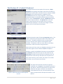
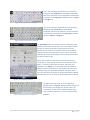
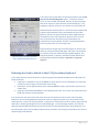
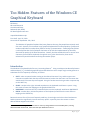
Too Hidden Features of the Windows CE Graphical Keyboard Bill Buxton Microsoft Research One Microsoft Way Redmond, WA, 98052 [email protected] Unpublished Manuscript First Draft: April 15, 2013 Current Draft: September 17th, 2013 The Windows CE graphical keyboard had some features that very few people knew existed, much less used. However, the increased use of graphical keyboards due to the popularity of slates and modern mobile devices makes these features worthy of reexamination. Underlying what follows is the belief that their lack of adoption had more to do with the implementation of the ideas, than with the quality of the ideas themselves. Overall, the ideas enabled the user to access more characters from the basic keyboard, through the use of short-hand strokes, than would otherwise be possible without increasing the number of keys. Introduction The Windows CE keyboard had a few very interesting features 1. Using a technique introduced by Buxton and Kurtenbach [1] , the default graphical keyboard enabled one to use simple single-stroke gestures as substitutes for four frequently used keys, as follows: SHIFT: make an upward stroke starting on the desired character’s key, and the upper-case character associated with that key would be entered, rather than the lower-case character that would result if the same key were tapped. Using this stroke saves having to make a separate tap on the SHIFT key. SPACE: a stroke to the right, initiated anywhere on the keyboard would enter a space. Using this stroke is faster than tapping on the graphical SPACE bar. BACKSPACE: a stroke to the left, initiated anywhere on the keyboard, would enter BACKSPACE. ENTER: a stroke down, initiated anywhere on the keyboard, would have the same effect as tapping on the ENTER key. Because these are four of the most frequently used keys, these single-stroke short-hand accelerators had the potential to significantly increase text entry speed – especially since the screens on these devices did not support multi-touch. 1 The discussion and images used in this note are from my vintage 2007 HTC Touch mobile phone, running Windows Mobile Professional, which was built upon Windows CE OS 5.2. 1|P age However, almost nobody knew about these accelerators, much less used them. Little wonder: on the device that I used, there was no mention of them whatsoever in the 154 page user manual that came with the device. There was nothing about this capability in the 60 page Quick Start guide. And, there was nothing in the keyboard UI, or the typical user’s previous experience that would lead them to discover this capability. In short, the time spent implementing this capability was a complete waste of developers’ time and the company’s money. That is too bad, since the capability had real potential value, the source of which I have only mentioned a part of. The Windows CE / Pocket PC graphical keyboard also included one other property that was, likewise, generally undocumented, unknown, undiscoverable, and perhaps most interestingly, counter-intuitive: there was an option that enabled the four keys that had short-hand stroke alternatives to be eliminated from the keyboard. One might wonder why eliminating four of the most frequently used keys might be considered a good idea. The start of an answer might lie in three additional questions: 1. Given that it is not possible to get the full character set on the small default graphical keyboard of a mobile device, and there is a fairly high cost in accessing the missing characters from a secondary keyboard, does it not make sense to consider sacrificing some learned technique for a new one, as this can be justified in terms of transaction cost? 2. If there is a redundant way to do something, one traditional and the other new, can there be a benefit in supporting the new one, if its efficiency is sufficiently high and initial skill acquisition sufficiently low? 3. If you choose to keep the more efficient stroke-shorthand, and eliminate the redundant traditional keys, how can you best utilize the keyboard real-estate that is freed up? From my perspective, the answers to each of these three questions are obvious, and land us on a spot where dropping the redundant keys enables missing characters typically found on a full QWERTY keyboard to be added to the main graphical keyboard. In the next section, we will see the specifics of how this was done in the old Windows CE / Pocket PC system. 2|P age The Windows CE / Pocket PC Keyboard This image shows the various options for text entry. Block Recognizer is essentially just another name for the Graffiti unistroke short-hand found on the Palm Pilot, for example. Letter Recognizer is for printed character recognition, while Transcriber does cursive script recognition. The currently selected technique is indicated by the black dot to the left of the list. Here, the Keyboard is selected. Symbol Pad supports the input of special symbols. The Options item at the top opens a panel that lets one set options for the currently selected input technique. The next three images are of the options menu for the keyboard technique. Figure 1: Keyboard Options This panel shows the result of selecting Large Keys option. The result is reflected by the keyboard layout in the lower half of the screen. The option enables the user to choose larger easier-to-tap keys at the expense of having fewer keys available. The penalty is that one must resort to secondary keyboards in order to access missing characters. Notice that not all how some non-alphabetic characters are not where they appear on the traditional QWERTY keyboard. Numbers, symbols, and additional accents are accessed from the [123] Key at the left of the top row, and accents by the Accent Key, second from the left key in the bottom row. The keyboard has 4 rows of keys, and each row has space for 12 keys (note some keys, such as Shift, Tab, CAP, etc. are wider than others, so not all rows have 12 keys.) Figure 2: Large Keys The Upper Case character set of the Large Keys keyboard seen in Figure 2. The alphabetic characters are obvious. Note that because the key-caps do not label both the upper and lower case characters associated with each key, the discoverability of the Figure 3: Upper-Case Characters of the Large Keys Keyboard upper case punctuation and special characters is suboptimal. 3|P age This is the secondary keyboard that is accessed by tapping on the [123] Key on the QWERTY keyboards. Few of the characters on this keyboard can be directly accessed on the Large Keys keyboard shown in Figure 2 andFigure 3. Figure 4: The [123] Secondary Keyboard This is the secondary keyboard that is accessed by tapping on the Accents Key on the QWERTY Keyboards. None of the characters on this keyboard can be directly accessed on the Large Keys keyboard shown in Figure 2 andFigure 3. Figure 5: The Accent Secondary Keyboard The Small Keys option is selected, and this is reflected in the keyboard in the lower half of the screen. This option enables the user to choose the benefit of having more keys, and therefore more characters, available on the main keyboard, without increasing the keyboard’s overall screen real-estate. However this comes at the expense of keys being smaller and therefore harder to tap. Due to the smaller key size, there are now 5 rows of keys, rather than 4. Each row has space for 14 normal keys rather than 12. Character placements for upper and lower case characters, (see Figure 7), are consistent with the standard QWERTY layout. The [123] key is still needed, since all of the characters from this secondary keyboard will not fit on the main one, but the need to go to it will be significantly reduced. Note that one still has need of the secondary accent keyboard. Figure 6: The Small Keys Keyboard Figure 7: Small Keys Keyboard Upper Case The Upper Case character set of the Large Keys keyboard seen in Figure 6. Notice that the [123] Key is still included, even though only all but 6 of the 46 characters from the [123] secondary keyboard are now included in either the 2 cases of the Small Keys keyboard. 4|P age In this panel we see the effect of selecting the poorly named Use gestures for the following keys option. I say poorly named since, as I have already mentioned, the four strokes are always able to be used as an alternative for the associated keys. This happens by default, and one is not able to turn the feature off. What this option actually does is: remove from the keyboard the graphical representation of keys associated with the stroke gestures, and use the space freed up to make additional keys accessible from the main keyboard. Because of this, only 14 keys of the 46 on the secondary [123] keyboard are not accessible from this keyboard, and this is accomplished while preserving the easier to access larger keys. Figure 8: Large Key Keyboard with SHIFT, SPACE, BACKSPACE & ENTER Removed Note also that the larger keys also afford space for the key-cap labels to include the associated upper and lower case character for each key, while still maintaining acceptable legibility. The keyboard’s power is, thereby, more discoverable than that of the Small Keys keyboard (compare Figure 8 with Figure 6 + Figure 7). Reducing the Need to Switch to the [123] Secondary Keyboard In the above we have seen that there are 3 primary graphical keyboards available on the Windows CE / Pocket PC device: 1. Large Keys: A reduced version of the QWERTY layout, with many non-alphabetic keys removed so that keys can be larger, and therefore easier to tap. 2. Small Keys: A close approximation to the standard QWERTY layout, which comes at the cost of smaller keys. 3. Large Keys with SPACE, BACKSPACE, SHIFT & ENTER removed: The screen real-estate freed up is filled with numbers and punctuation. In all three cases, there are some characters that can still only be accessed via the [123] secondary keyboard. Since switching between keyboards comes at a high transaction cost, the number of keys, and which keys, require the [123] keyboard, is important to understand in order to better appreciate the trade-offs in choosing amongst the three keyboard designs. In the three figures below, the red lines delineate the boundaries between keys that accessible on both keyboards (these are greyed out), and keys that require the [123] secondary keyboard to be accessed. Each image corresponds to one of the 3 keyboard types listed above. 5|P age Figure 9: Keys not on Large Keys Kbd Figure 10: Keys not on Small Keys Kbd The Large Keys keyboard will typically require the most switching back-and-forth to the [123] secondary keyboard. There are only 8 characters common to both: comma, period, colon, forward-slash, Tab, Space, Backspace, & Enter. Hence, there is a potentially high price for the benefit of the larger keys on the main keyboard. The Small Keys keyboard will require the least switching back-and-forth to the [123] secondary keyboard. There are only the 6 characters indicated in Figure 10 for which this is required. All others are accessible in either the lower or upper case of the main keyboard. In this regard, the additional cost of the small keys may be worthwhile, depending on what is being typed. The modified Large Keys keyboard, where the SPACE, SHIFT, BACKSPACE and ENTER keys have been replaced by gestures, is a compromise between the other two designs, and overall, is likely the most efficient of the three designs. Figure 11: Keys not on Modified Large Keys Kbd There are only 14 keys for which the user needs to go to the [123] secondary keyboard, but for most, these are not likely highly used. So, while there will be more overhead in switching to the [123] keyboard than with the Small Keys keyboard, the use of shorthand strokes for four of the most commonly used keys, the larger key size, and labeling both upper and lower case characters on the keycaps, all combine to possibly more than out-weigh the otherwise advantages of the Small Keys keyboard. Caveats, Comments and Observations In the above, I have tried to be careful in qualifying what I say through the judicious use of words such as, “generally”, “might”, “likely” etc. The point is, there are a lot of factors besides keyboard layout that affect performance, such as: Selection Tool: the keyboards discussed were primarily designed to be operated using a stylus rather than finger. Small Size: the screen on the device that I used was 4.5 cm x 5.5 cm, which means that the maximum width of the keyboard in portrait mode can only be about 80% of my current mobile. This is enough of a difference to impact design options, such as legibility of key-cap labels, and the ability to include both upper and lower case labels on the keys. Resistive Film Touch: the keyboards discussed were designed for use on a resistive touch screen, rather than capacitive. While the relatively small key size, relative to those on most modern phone touch screens, remember that with resistive screens (unlike capacitive), one can tap with one’s finger-nail, which is a finger-based pointer that can be much more accurate than the pad of a finger-tip. 6|P age Mono-Touch: the keyboards discussed were also designed for use with a mono-touch sensor which must also be factored into considering the applicability of any conclusions to the design of today’s mobile platforms. Conclusions and Summary While reviews of the literature are generally expected in the academic literature, reviews of commercial practice are much less common. As a result, much innovation is too little known, and/or lost from our collective consciousness. For that reason, reasonably detailed case studies are – to my mind – valuable. I believe it is fair to say – but admittedly without data beyond informal conversational surveys coupled with personal use at the time and since – most people who used the products employing the interface discussed had no idea that the stroke-shorthand existed, much less used it. Furthermore, even those who knew about the strokes, knew that the keys made redundant by them could be removed from the keyboard – thereby freeing up space for characters that would otherwise be missing from the main keyboard. Waste not, want not … On looking at the interface and the documentation, this is little wonder. The strokes are not discussed in the documentation at all, and the only indication that they exist is buried in the obscure Options menu, with no explanation. Likewise, the ability to remove the redundant keys is undocumented, and the labeling of the control that enabled is obscure at best, and misleading at worst. So, one of the take-away lessons from this study has to do with the discoverability of features: If you add capability that is not discoverable, and therefore unlikely to be used, then how can you justify the expense of the resources of designing, implementing, testing, and supporting the feature in the first place? The second take-away, which is a kind of corollary, is this: The more valuable the undiscoverable feature, the bigger the waste, and the bigger the loss to user and the share-holder. The importance of dual-case labeling of key-caps In terms of practical detailed lessons, the one thing that struck me the most in revisiting this implementation was the impact of key-cap labeling: Upper-Case vs Secondary Keyboard: From one perspective, the upper-case keyboard is just as much a secondary keyboard, relative to the lower-case keyboard, as is the special character [123] secondary keyboard. However, due to the acquired familiarity, coupled with the exact positional matching of keys, cognitively, the two are worlds apart. One take away is that – in general - starting from the default lower case mode, accessing a character from the upper case is significantly more efficient than accessing it from the secondary [123] keyboard. Dual-Case: The previous point motivates the view that all keys, not just alphabetic ones, should be dual case (with the obvious exceptions of Space, Backspace, …). Discoverability: if upper case non-alphabetic characters are not labeled in lower case mode, users will tend to go to the secondary [123] keyboard to access them, rather than the otherwise more efficiently access from the upper case. 7|P age Non-Standard Character Location: With small graphical keyboards, it is almost inevitable that some characters do not appear where they normally would on a standard QWERTY keyboard. Such characters accessed in the upper case mode are particularly susceptible to not being discovered if dual-case key-cap labeling is not supported. Dual-Case Key-Cap Labels: The previous points reinforce the need for dual-case labeling. The extended version of Large Keys, shown in Figure 8 makes a pretty good case that it is also possible. That is, compared to most of today’s mobile devices, one can render legible dual-case key-cap labels even on relatively small graphical key-caps. Alphabetic vs Non-Alphabetic Characters: Just for completeness, my comments about dualcase labeling apply only to non-alphabetic characters. This keeps the visual clutter to a minimum and makes scanning the keyboard simpler. Considering old trade-offs in terms of today’s technologies It is interesting to make two passes at analyzing the pros and cons of the three basic designs that we have covered, above: one in terms of then and the other in terms of now. Given its close consistency to the standard QWERTY layout, and the fact that it required the least amount of travel to the secondary [123] keyboard, the Small Keys layout might likely have been the preferred option at the time. Experience with physical keyboards would enable users to predict where characters would be found, even without dual-case labeling (but poor pity the hunt-and-peck typist), and the small key-caps were manageable when using a stylus. Furthermore, the ability to also employ the stroke-shorthand (if you discovered it) made things even better. On the other hand, with capacitive touch screens – which require fat fingers to operate – the larger keys of the modified Large Keys keyboard may prove a better option (at least amongst these three candidates). However, dual-case key-cap labeling likely becomes more important with this option. Lack of Data, Lack of Experience and the Value of History It is somewhat surprising to many that: these techniques were shipping as early as about 2005; that few know about them, much less that they shipped at all; that despite the size of the literature on graphical keyboards, there is little or no experimental data on the techniques used here; On the other hand, once one is aware of the existence of the resulting products, things like E-Bay become one of the most cost-effective prototyping tools. That is, for about the cost of a coffee or two, one can get a product quality working device that can serve as a communications tool, as well as prototype adequate to gain valuable personal experience that can feed into future designs. But at the same time, one would still like more: data. A knowledge of history, creativity and experience are all critical ingredients for successful innovation. However, while essential, they are not sufficient. To optimize innovation, one also needs models and theory. My hope here is that out of such case studies might emerge better insights as to where and how to direct our limited research resources. 8|P age References [1] W. A. S. Buxton and G. P. Kurtenbach.United States Patent 6,094,197, 17 May 1995. 9|P age