1
®
TIBCO Spotfire S+ 8.2
for Windows®
User’s Guide
November 2010
TIBCO Software Inc.
IMPORTANT INFORMATION
SOME TIBCO SOFTWARE EMBEDS OR BUNDLES OTHER
TIBCO SOFTWARE. USE OF SUCH EMBEDDED OR
BUNDLED TIBCO SOFTWARE IS SOLELY TO ENABLE THE
FUNCTIONALITY (OR PROVIDE LIMITED ADD-ON
FUNCTIONALITY) OF THE LICENSED TIBCO SOFTWARE.
THE EMBEDDED OR BUNDLED SOFTWARE IS NOT
LICENSED TO BE USED OR ACCESSED BY ANY OTHER
TIBCO SOFTWARE OR FOR ANY OTHER PURPOSE.
USE OF TIBCO SOFTWARE AND THIS DOCUMENT IS
SUBJECT TO THE TERMS AND CONDITIONS OF A LICENSE
AGREEMENT FOUND IN EITHER A SEPARATELY
EXECUTED SOFTWARE LICENSE AGREEMENT, OR, IF
THERE IS NO SUCH SEPARATE AGREEMENT, THE
CLICKWRAP END USER LICENSE AGREEMENT WHICH IS
DISPLAYED DURING DOWNLOAD OR INSTALLATION OF
THE SOFTWARE (AND WHICH IS DUPLICATED IN TIBCO
SPOTFIRE S+® LICENSES). USE OF THIS DOCUMENT IS
SUBJECT TO THOSE TERMS AND CONDITIONS, AND
YOUR USE HEREOF SHALL CONSTITUTE ACCEPTANCE
OF AND AN AGREEMENT TO BE BOUND BY THE SAME.
This document contains confidential information that is subject to
U.S. and international copyright laws and treaties. No part of this
document may be reproduced in any form without the written
authorization of TIBCO Software Inc.
TIBCO Software Inc., TIBCO, Spotfire, TIBCO Spotfire S+,
Insightful, the Insightful logo, the tagline "the Knowledge to Act,"
Insightful Miner, S+, S-PLUS, TIBCO Spotfire Axum,
S+ArrayAnalyzer, S+EnvironmentalStats, S+FinMetrics, S+NuOpt,
S+SeqTrial, S+SpatialStats, S+Wavelets, S-PLUS Graphlets,
Graphlet, Spotfire S+ FlexBayes, Spotfire S+ Resample, TIBCO
Spotfire Miner, TIBCO Spotfire S+ Server, TIBCO Spotfire Statistics
Services, and TIBCO Spotfire Clinical Graphics are either registered
trademarks or trademarks of TIBCO Software Inc. and/or
subsidiaries of TIBCO Software Inc. in the United States and/or
other countries. All other product and company names and marks
mentioned in this document are the property of their respective
owners and are mentioned for identification purposes only. This
ii
Important Information
software may be available on multiple operating systems. However,
not all operating system platforms for a specific software version are
released at the same time. Please see the readme.txt file for the
availability of this software version on a specific operating system
platform.
THIS DOCUMENT IS PROVIDED “AS IS” WITHOUT
WARRANTY OF ANY KIND, EITHER EXPRESS OR IMPLIED,
INCLUDING, BUT NOT LIMITED TO, THE IMPLIED
WARRANTIES OF MERCHANTABILITY, FITNESS FOR A
PARTICULAR PURPOSE, OR NON-INFRINGEMENT. THIS
DOCUMENT
COULD
INCLUDE
TECHNICAL
INACCURACIES OR TYPOGRAPHICAL ERRORS. CHANGES
ARE PERIODICALLY ADDED TO THE INFORMATION
HEREIN; THESE CHANGES WILL BE INCORPORATED IN
NEW EDITIONS OF THIS DOCUMENT. TIBCO SOFTWARE
INC. MAY MAKE IMPROVEMENTS AND/OR CHANGES IN
THE PRODUCT(S) AND/OR THE PROGRAM(S) DESCRIBED
IN THIS DOCUMENT AT ANY TIME.
Copyright © 1996-2010 TIBCO Software Inc. ALL RIGHTS
RESERVED. THE CONTENTS OF THIS DOCUMENT MAY BE
MODIFIED
AND/OR
QUALIFIED,
DIRECTLY
OR
INDIRECTLY, BY OTHER DOCUMENTATION WHICH
ACCOMPANIES THIS SOFTWARE, INCLUDING BUT NOT
LIMITED TO ANY RELEASE NOTES AND "READ ME" FILES.
TIBCO Software Inc. Confidential Information
Reference
The correct bibliographic reference for this document is as follows:
TIBCO Spotfire S+® 8.2 for Windows® User’s Guide TIBCO Software
Inc.
Technical
Support
For technical support, please visit http://spotfire.tibco.com/support
and register for a support account.
iii
TIBCO SPOTFIRE S+ BOOKS
Note about Naming
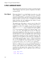
Throughout the documentation, we have attempted to distinguish between the language
(S-PLUS) and the product (Spotfire S+).
•
“S-PLUS” refers to the engine, the language, and its constituents (that is objects, functions,
expressions, and so forth).
•
“Spotfire S+” refers to all and any parts of the product beyond the language, including the
product user interfaces, libraries, and documentation, as well as general product and
language behavior.
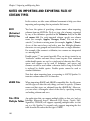
The TIBCO Spotfire S+® documentation includes books to address
your focus and knowledge level. Review the following table to help
you choose the Spotfire S+ book that meets your needs. These books
are available in PDF format in the following locations:
•
In your Spotfire S+ installation directory (SHOME\help on
Windows, SHOME/doc on UNIX/Linux).
•
In the Spotfire S+ Workbench, from the Help Spotfire S+
Manuals menu item.
•
In Microsoft® Windows®, in the Spotfire S+ GUI, from the
Help Online Manuals menu item.
Spotfire S+ documentation.
iv
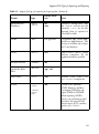
Information you need if you...
See the...
Must install or configure your current installation
of Spotfire S+; review system requirements.
Installtion and
Administration Guide
Want to review the third-party products included
in Spotfire S+, along with their legal notices and
licenses.
Licenses
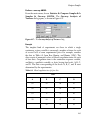
TIBCO Spotfire S+ Books
Spotfire S+ documentation. (Continued)
Information you need if you...
See the...
Are new to the S language and the Spotfire S+
GUI, and you want an introduction to importing
data, producing simple graphs, applying statistical
Getting Started
Guide
models, and viewing data in Microsoft Excel®.
Are a new Spotfire S+ user and need how to use
Spotfire S+, primarily through the GUI.
User’s Guide
Are familiar with the S language and Spotfire S+,
and you want to use the Spotfire S+ plug-in, or
customization, of the Eclipse Integrated
Development Environment (IDE).
Spotfire S+ Workbench
User’s Guide
Have used the S language and Spotfire S+, and
you want to know how to write, debug, and
program functions from the Commands window.
Programmer’s Guide
Are familiar with the S language and Spotfire S+,
and you want to extend its functionality in your
own application or within Spotfire S+.
Application
Developer’s Guide
Are familiar with the S language and Spotfire S+,
and you are looking for information about creating
or editing graphics, either from a Commands
window or the Windows GUI, or using Spotfire
S+ supported graphics devices.
Guide to Graphics
Are familiar with the S language and Spotfire S+,
and you want to use the Big Data library to import
and manipulate very large data sets.
Big Data
User’s Guide
Want to download or create Spotfire S+ packages
for submission to the Comprehensive S-PLUS
Archive Network (CSAN) site, and need to know
the steps.
Guide to Packages
v
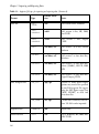
Spotfire S+ documentation. (Continued)
vi
Information you need if you...
See the...
Are looking for categorized information about
individual S-PLUS functions.
Function Guide
If you are familiar with the S language and
Spotfire S+, and you need a reference for the
range of statistical modelling and analysis
techniques in Spotfire S+. Volume 1 includes
information on specifying models in Spotfire S+,
on probability, on estimation and inference, on
regression and smoothing, and on analysis of
variance.
Guide to Statistics,
Vol. 1
If you are familiar with the S language and
Spotfire S+, and you need a reference for the
range of statistical modelling and analysis
techniques in Spotfire S+. Volume 2 includes
information on multivariate techniques, time series
analysis, survival analysis, resampling techniques,
and mathematical computing in Spotfire S+.
Guide to Statistics,
Vol. 2
CONTENTS
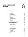
Chapter 1
Introduction
1
Welcome to Spotfire S+!
2
Help, Support, and Learning Resources
5
Typographic Conventions
Chapter 2 Working With Data
12
13
Introduction
14
Entering, Editing, and Saving Data
16
Viewing and Formatting Data
24
Manipulating Data
37
Libraries Included With Spotfire S+
52
Chapter 3
Exploring Data
53
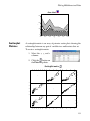
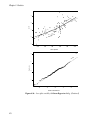
Introduction
54
Visualizing One-Dimensional Data
55
Visualizing Two-Dimensional Data
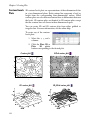
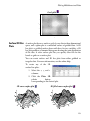
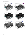
60
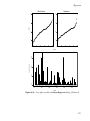
Visualizing Multidimensional Data
87
Chapter 4
Creating Plots
117
Introduction
119
Plotting One-Dimensional Data
122
Plotting Two-Dimensional Data
132
Plotting Multidimensional Data
144
vii
Contents
Trellis Graphs
Chapter 5
161
Introduction
162
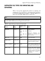
Supported File Types for Importing and Exporting
163
Importing From and Exporting to Data Files
168
Importing From and Exporting to ODBC Tables
179
Filter Expressions
187
Notes on Importing and Exporting Files of Certain
Types
190
Chapter 6
viii
Importing and Exporting Data
159
Statistics
195
Introduction
198
Summary Statistics
204
Compare Samples
213
Power and Sample Size
259
Experimental Design
264
Regression
270
Analysis of Variance
300
Mixed Effects
306
Generalized Least Squares
310
Survival
314
Tree
322
Compare Models
326
Cluster Analysis
329
Multivariate
340
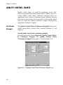
Quality Control Charts
346
Resample
351
Smoothing
355
Time Series
359
Contents
Random Numbers and Distributions
366
References
376
Chapter 7
Working With Objects and Databases
377
Introduction
378
Understanding Object Types and Databases
379
Introducing the Object Explorer
385
Working With Objects
396
Organizing Your Work
406
Chapter 8
Using the Commands Window
413
Introduction
415
Commands Window Basics
416
S-PLUS Language Basics
424
Importing and Editing Data
438
Extracting Subsets of Data
442
Graphics in Spotfire S+
446
Statistics
451
Defining Functions
457
Using Spotfire S+ in Batch Mode
459
Chapter 9 Using the Script and Report Windows
461
Introduction
462
The Script Window
464
Script Window Features
472
Time-Saving Tips for Using Scripts
475
The Report Window
480
Printing a Script or Report
482
ix
Contents
Chapter 10 Using Spotfire S+ With Other
Applications
483
Using Spotfire S+ With Microsoft Excel
484
Using Spotfire S+ With SPSS
503
Using Spotfire S+ With MathSoft Mathcad
509
Using Spotfire S+ With Microsoft PowerPoint
516
Chapter 11
521
Introduction
522
Changing Defaults and Settings
523
Customizing Your Session at Startup and Closing
550
Index
x
Customizing Your Spotfire S+ Session
553
INTRODUCTION
Welcome to Spotfire S+!
System Requirements
Running Spotfire S+
1
2
2
3
Help, Support, and Learning Resources
Online Help
Online Manuals
Tip of the Day
Spotfire S+ on the Web
Training Courses
Books Using Spotfire S+
5
5
8
9
9
9
10
Typographic Conventions
12
1
Chapter 1 Introduction
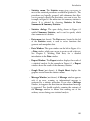
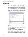
WELCOME TO SPOTFIRE S+!
Spotfire S+ is based on the latest version of the powerful, objectoriented S language originally developed at Lucent Technologies. S is
a rich environment designed for interactive data discovery and is the
only language created specifically for data visualization and
exploration, statistical modeling, and programming with data.
Spotfire S+ continues to be the premier solution for your data
analysis and technical graphing needs. The Microsoft Officecompatible user interface gives you point-and-click access to data
manipulation, graphing, and statistics. With Spotfire S+, you can
program interactively using the S-PLUS programming language.
In a typical Spotfire S+ session, you can:
System
Requirements
•
Import data from virtually any source.
•
View and edit your data in a convenient Data window.
•
Create plots with the click of a button.
•
Control every detail of your graphics and produce stunning,
professional-looking output for export to your report
document.
•
Perform statistical analyses from convenient dialogs in the
menu system.
•
Run analysis functions one at a time at the command line or
in batches using the Script window.
•
Create your own functions.
•
Completely customize your user interface.
For a list of system requirements, see the file INSTALL.TXT in the
installation directory.
Note
Spotfire S+ does not support Win32s (that is, Windows 3.1x), nor does it support Windows NT
3.51.
2
Welcome to Spotfire S+!
Running
Spotfire S+
•
Super VGA, or most other Windows-compatible graphics
cards and monitors with a resolution of 800x600 or better.
•
Microsoft mouse or other Windows-compatible pointing
device.
•
Windows-compatible printer (optional).
•
A connection to the Internet, including a Web browser.
The following list describes the ways that you can launch Spotfire S+
in Windows:
•
Start the Spotfire S+ for Windows Graphical User Interface
(GUI) from the Start menu.
•
Start the Spotfire S+ Workbench from the Start menu.
•
Start the Windows Console from the Start menu.
•
Start the Windows Console from a DOS command line for
interactive use.
•
Run the Console version from a Windows batch file using
"Sqpe infile outfile".
•
Run the Spotfire S+ GUI version from a Windows batch file
using "Spotfire S+ BATCH".
•
Run the Spotfire S+ GUI version from Automation via the
Excel add-in, SPSS add-in, or a custom Automation
®
application such as from PharSight .
•
Run the Spotfire S+ GUI version via DDE.
•
Run the Console version via Connect/C++ or Connect/Java.
You can run Spotfire S+ for 32-bit Windows on a 64-bit Windows
computer.
3
Chapter 1 Introduction
Important
Spotfire S+ for 64-bit Windows :
4
•
Includes support for Spotfire S+ Batch, the Spotfire S+ Console and the Spotfire S+
Workbench. It does not include the Spotfire S+ GUI.
•
Works only on computers running a 64-bit Windows operating systems. It does not work
on computers running 32-bit Windows.
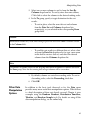
Help, Support, and Learning Resources
HELP, SUPPORT, AND LEARNING RESOURCES
There are a variety of ways to accelerate your progress with Spotfire
S+. This section describes the learning and support resources
available to Spotfire S+ users.
Online Help
Spotfire S+ offers an online HTML Help system to make learning
and using Spotfire S+ easier. Under the Help menu, you will find
help on how to use the Spotfire S+ graphical user interface. In
addition, an extensive Language Reference provides detailed help on
each function in the S-PLUS language. The Language Reference help
can also be accessed through the Commands window by typing
help() at the S-PLUS language prompt.
Context-sensitive help is available by clicking the Help button in
dialogs or the context-sensitive Help button on toolbars, as well as by
pressing the F1 key while Spotfire S+ is active.
HTML Help
HTML Help in Spotfire S+ is based on Microsoft Internet Explorer
and uses an HTML window to display the help files. To access
HTML Help, do one of the following:
•
From the main menu, choose Help Available Help TIBCO Spotfire S+ Help for help on the GUI.
•
From the main menu, choose Help Available Help Language Reference for help on the S-PLUS programming
language.
5
Chapter 1 Introduction
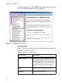
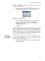
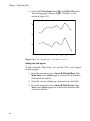
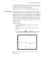
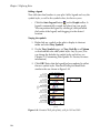
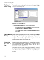
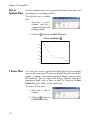
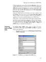
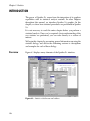
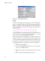
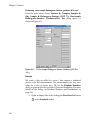
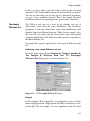
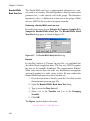
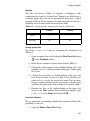
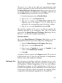
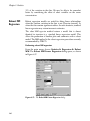
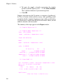
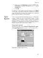
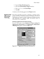
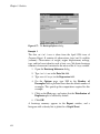
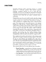
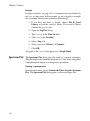
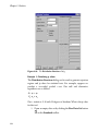
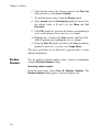
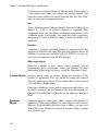
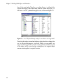
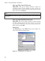
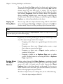
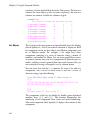
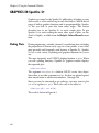
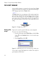
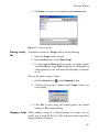
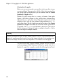
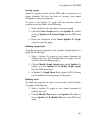
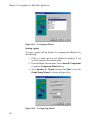
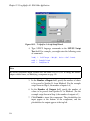
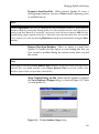
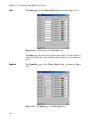
As shown in Figure 1.1, the HTML help window has three main
areas: the toolbar, the left pane, and the right pane.
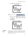
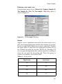
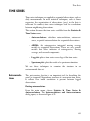
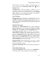
Figure 1.1: The Spotfire S+ help window.
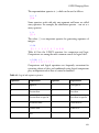
Using the toolbar
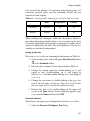
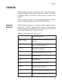
Table 1.1 lists the four main buttons on the help window toolbar (in
some cases, you may see more).
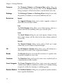
Table 1.1: Help window toolbar buttons.
6
Button Name
Description
Hide (or Show)
If the button is labeled Hide, it hides the
left pane, expanding the right pane to the
full width of the help window. If the button
is labeled Show, it shows the left pane and
partitions the help window accordingly.
Back
Returns to previously viewed help topic.
Forward
Moves to next help topic.
Help, Support, and Learning Resources
Table 1.1: Help window toolbar buttons. (Continued)
Button Name
Description
Print
Prints the current help topic.
Using the left pane
Like the help window itself, the left pane is divided into three parts:
the Contents tab, the Index tab, and the Search tab:
•
The Contents tab organizes help topics by category so that
related help files can be found easily. These categories appear
as small book icons, labeled with the name of the category. To
open a category, double-click the icon or label. To select a
topic within the category, double-click its question-mark icon
or the topic title.
•
The Index tab lists available help topics by keyword.
Keywords are typically function names for S-PLUS language
functions and topic names for graphical user interface topics.
Simply type in a keyword and HTML Help will find the
keyword that most closely matches it. Click Display (or
double-click the selected title) to display the help topic.
•
The Search tab provides a full-text search for the entire help
system. Simply type in a keyword, and all the help files
containing that keyword are listed in a list box. Select the
desired topic and click Display (or double-click the selected
title) to display the help topic.
Using the right pane
The right pane is where the help information actually appears. It
usually appears with both vertical and horizontal scrollbars, but you
can expand the HTML Help window to increase the width of the
right pane. Many help files are too long to be fully displayed in a
single screen, so choose a convenient height for your HTML Help
window and then use the vertical scrollbars to scroll through the text.
7
Chapter 1 Introduction
The right pane contains a search-in-topic feature. To use it:
1. Type CTRL-F to open the Find dialog (this dialog is a feature
of HTML Help inherited from Internet Explorer).
2. Type your search string in the text field labeled Find what.
3. Click Find Next.
Help in the
Commands and
Script Windows
When working in the Commands window, you can get help for any
command by using the ? or help function. For example, to open the
help file for anova, simply type:
> help(anova)
or
> ?anova
To get help for a command when working in a Script window, simply
highlight the command and press F1.
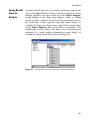
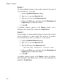
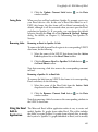
Online Manuals
For a list of available manuals, see the section TIBCO Spotfire S+
Books on page iv. To view a manual online, choose Help Online
Manuals from the main menu and select the desired title.
Note: Online versions of the documentation
The online manuals are viewed using Adobe Acrobat Reader, which can be installed as an
option during the installation of Spotfire S+. It is generally useful to turn on bookmarks (under the
View entry of the menu bar) while using Acrobat Reader, rather than rely on the contents at the
start of the manuals. Bookmarks are always visible and can be expanded and collapsed to show
just chapter titles or to include section headings.
8
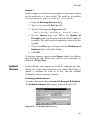
Help, Support, and Learning Resources
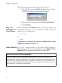
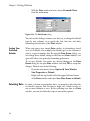
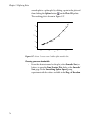
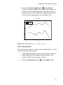
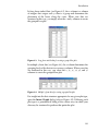
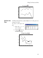
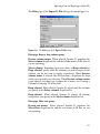
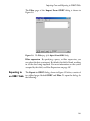
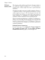
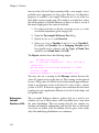
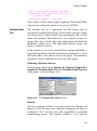
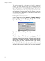
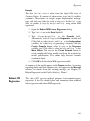
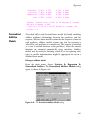
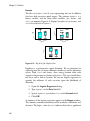
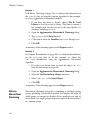
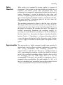
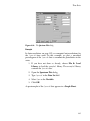
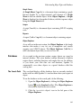
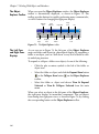
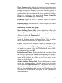
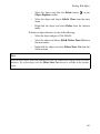
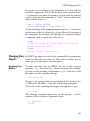
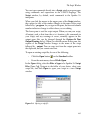
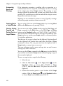
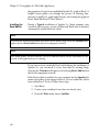
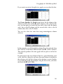
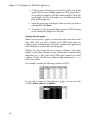
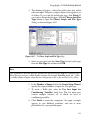
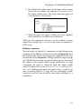
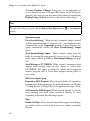
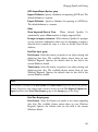
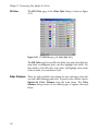
Tip of the Day
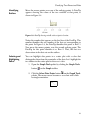
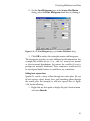
To help speed your progress in Spotfire S+, a handy Tip of the Day
appears by default each time you start the program. (See Figure 1.2.)
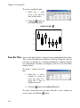
Figure 1.2: A Tip of the Day.
You can also access the Spotfire S+ Tips of the Day at any time by
choosing Help Tip of the Day from the main menu. If you prefer
to turn off this feature, simply clear the Show tips on startup check
box in the dialog.
Spotfire S+ on
the Web
Training
Courses
You can find Spotfire S+ on the TIBCO Web site at www.tibco.com.
In these pages, you will find a variety of information, including:
•
FAQ pages.
•
The most recent service packs.
•
Training course information.
•
Product information.
•
Information on classroom use and related educational
materials.
TIBCO Spotfire Educational Services offers a number of courses
designed to quickly make you efficient and effective at analyzing data
with Spotfire S+. The courses are taught by professional statisticians
and leaders in statistical fields. Courses feature a hands-on approach
to learning, dividing class time between lecture and online exercises.
All participants receive the educational materials used in the course,
including lecture notes, supplementary materials, and exercise data
on diskette.
9
Chapter 1 Introduction
Technical
Support
For technical support, please visit http://spotfire.tibco.com/support
and register for a support account.
Books Using
Spotfire S+
General
Becker, R.A., Chambers, J.M., and Wilks, A.R. (1988). The New S
Language. Wadsworth & Brooks/Cole, Pacific Grove, CA.
Burns, Patrick (1998). S Poetry. Download for free from http://
www.seanet.com/~pburns/Spoetry.
Chambers, John (1998). Programming with Data. Springer-Verlag.
Krause, A. and Olson, M. (1997). The Basics of S and S-PLUS.
Springer-Verlag, New York.
Lam, Longhow (1999). An Introduction to S-PLUS for Windows.
CANdiensten, Amsterdam.
Spector, P. (1994). An Introduction to S and S-PLUS. Duxbury Press,
Belmont, CA.
Data analysis
Bowman, Adrian and Azzalini, Adelchi (1997). Smoothing Methods.
Oxford University Press.
Bruce, A. and Gao, H.-Y. (1996). Applied Wavelet Analysis with S-PLUS.
Springer-Verlag, New York.
Chambers, J.M. and Hastie, T.J. (1992). Statistical Models in S.
Wadsworth & Brooks/Cole, Pacific Grove, CA.
Efron, Bradley and Tibshirani, Robert J. (1994). An Introduction to the
Bootstrap. Chapman & Hall.
Everitt, B. (1994). A Handbook of Statistical Analyses Using S-PLUS.
Chapman & Hall, London.
Härdle, W. (1991). Smoothing Techniques with Implementation in S.
Springer-Verlag, New York.
Hastie, T. and Tibshirani, R. (1990). Generalized Additive Models.
Chapman & Hall.
Huet, Sylvie, et al. (1997). Statistical Tools for Nonlinear Regression: with
S-PLUS. Springer-Verlag.
10
Help, Support, and Learning Resources
Kaluzny, S.P., Vega, S.C., Cardoso, T.P., and Shelly, A.A. (1997).
S+SpatialStats User’s Manual. Springer-Verlag, New York.
Marazzi, A. (1992). Algorithms, Routines and S Functions for Robust
Statistics. Wadsworth & Brooks/Cole, Pacific Grove, CA.
Millard, Steven (1998). User’s Manual for Environmental Statistics.
Compansion book to the S+Environmental Stats module. (The
S+Environmental Stats module is available through Dr. Millard.)
Selvin, S. (1998). Modern Applied Biostatistical Methods: Using S-PLUS.
Oxford University Press.
Venables, W.N. and Ripley, B.D. (1999). Modern Applied Statistics with
S-PLUS, Third Edition. Springer-Verlag, New York.
Graphical techniques
Chambers, J.M., Cleveland, W.S., Kleiner, B., and Tukey, P.A. (1983).
Graphical Techniques for Data Analysis. Duxbury Press, Belmont, CA.
Cleveland, W.S. (1993). Visualizing Data. Hobart Press, Summit, NJ.
Cleveland, W.S. (1994). The Elements of Graphing Data, revised edition.
Hobart Press, Summit, NJ.
11
Chapter 1 Introduction
TYPOGRAPHIC CONVENTIONS
Throughout this User’s Guide, the following typographic conventions
are used:
12
is used for S-PLUS expressions and code samples.
•
This font
•
This font is used for elements of the Spotfire S+ user
interface, for operating system files and commands, and for
user input in dialog fields.
•
This font is used for emphasis and book titles.
•
CAP/SMALLCAP letters are used for key names. For example,
the Shift key appears as SHIFT.
•
When more than one key must be pressed simultaneously, the
two key names appear with a hyphen (-) between them. For
example, the key combination of SHIFT and F1 appears as
SHIFT-F1.
•
Menu selections are shown in an abbreviated form using the
arrow symbol () to indicate a selection within a menu, as in
File New.
WORKING WITH DATA
2
Introduction
14
Entering, Editing, and Saving Data
Creating a Data Set
Entering and Editing Data
Saving Data
16
16
18
20
Viewing and Formatting Data
Displaying a Data Set
Selecting Data
Formatting Columns
Formatting Rows
24
24
28
30
36
Manipulating Data
Moving and Copying Data
Inserting Data
Deleting Data
Sorting Data
Other Data Manipulation Options
37
37
41
44
47
49
Libraries Included With Spotfire S+
52
13
Chapter 2 Working With Data
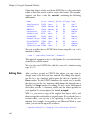
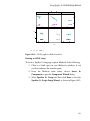
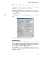
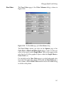
INTRODUCTION
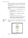
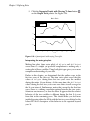
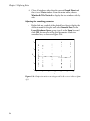
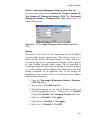
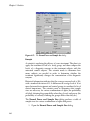
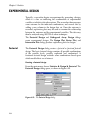
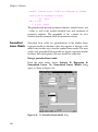
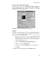
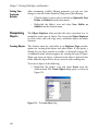
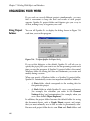
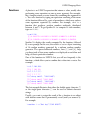
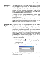
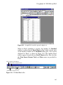
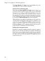
In Spotfire S+, the primary tool for viewing, editing, formatting, and
manipulating data is the Data window. It is similar to a spreadsheet
except that it is column-oriented rather than cell-oriented.
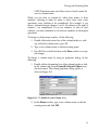
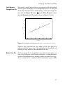
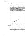
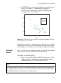
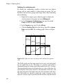
Figure 2.1 below shows the sample data set air displayed in a Data
window.
Figure 2.1: Sample data displayed in a Data window.
Note
Spotfire S+ ships with a number of sample data sets stored in internal databases. These data sets
are provided for your convenience while you are familiarizing yourself with Spotfire S+. To see
these sample data objects, do the following:
1.
Open the Object Explorer by clicking the Object Explorer button
Standard toolbar.
on the
2.
In the left pane of the Object Explorer, click the “+” sign to the left of the SearchPath
object to display the names of the databases in the search path.
3.
Click the icon to the left of a database name (for example, data) to display all the objects
contained in that database in the right pane.
For a complete discussion of the Object Explorer, see Chapter 7, Working With Objects and
Databases.
14
Introduction
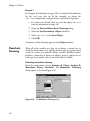
You can open any number of Data windows simultaneously to
display different data sets or to create concurrent views of a single
data set.
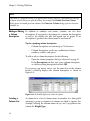
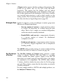
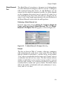
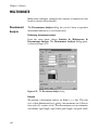
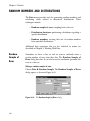
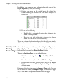
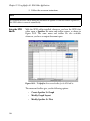
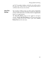
When you open a Data window, the Data window toolbar is
automatically displayed. The toolbar, shown in Figure 2.2, contains
buttons for quickly performing many frequently used editing
commands.
Align
Left
Align
Right
Remove
Column
Decrease Insert
Precision Column
Insert
Row
Clear
Row
Remove
current link
Increase
Width Spotfire S+
Sort
to Excel
Descending
link wizard
Convert Center Increase Change
Clear Remove
Sort
Decrease
to Data
Precision Data
Column Row Ascending
Width
Frame
Type [Column
Update
Width to
current link
Type
Fit Data
Selector]
Active Link
Figure 2.2: The Data window toolbar.
Note
For a complete discussion of the Excel section of the Data window toolbar, see Using the
Spotfire S+ to Excel Link Wizard on page 491.
In the following sections, we introduce the main features of the Data
window and provide step-by-step procedures for performing the most
common editing tasks.
15
Chapter 2 Working With Data
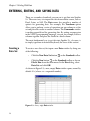
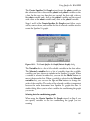
ENTERING, EDITING, AND SAVING DATA
There are a number of methods you can use to get data into Spotfire
S+. The easiest way is to import the data from another source, such as
Excel, Lotus, or SAS. The Data menu also provides a number of
options for generating data. For example, the Transform option
allows you to perform a series of operations on one column in a data
set and place the results in another column. The Commands window
is another powerful tool for generating data. By writing an expression
in the S-PLUS programming language, you can, for example, add two
columns together and place the results in a third column.
The most fundamental way to get data into Spotfire S+, of course, is
to simply type them in from the keyboard, the focus of this section.
Creating a
Data Set
To create a new data set, first open a new Data window by doing one
of the following:
•
Click the New Data Set button
on the Standard toolbar.
•
Click the New button
on the Standard toolbar or choose
File New from the main menu. In the New dialog, select
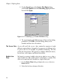
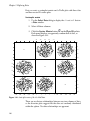
Data Set and click OK.
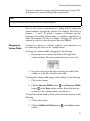
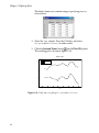
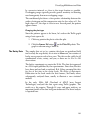
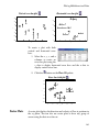
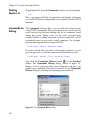
As shown in Figure 2.3, a new, empty Data window opens, named by
default SDFx (where x is a sequential number).
Figure 2.3: A new, empty Data window.
16
Entering, Editing, and Saving Data
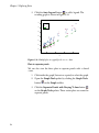
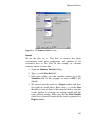
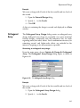
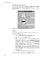
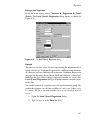
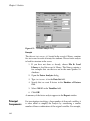
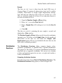
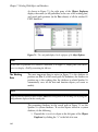
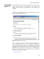
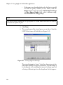
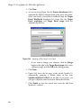
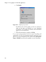
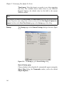
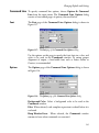
To give your new data set a more appropriate name, do the following:
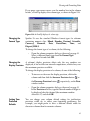
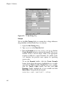
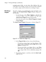
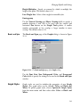
1. Double-click the top shaded cell in the upper left-hand corner
of the Data window. The Data Frame dialog opens, as
shown in Figure 2.4.
Figure 2.4: The Data Frame dialog.
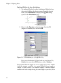
2. Type a new name in the Name text box and click OK.
Note
Valid data set names may include letters, numbers, and periods but must not start with a
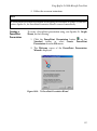
number. Extended ASCII characters are not permitted.
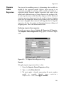
You can also create a new data set and rename it at the same time by
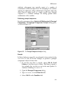
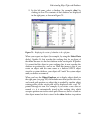
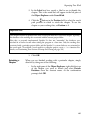
using the Data menu:
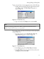
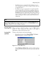
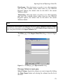
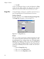
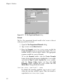
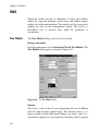
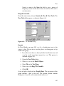
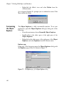
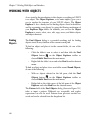
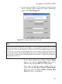
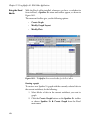
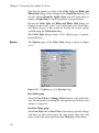
1. From the main menu, choose Data Select Data. The
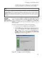
Select Data dialog opens, as shown in Figure 2.5.
Figure 2.5: The Select Data dialog.
2. In the Source group, click the New Data radio button.
3. In the New Data group, type a name for the new data set in
the Name text box and click OK.
17
Chapter 2 Working With Data
Entering and
Editing Data
Typing data into a Data window is easy—just do the following:
1. Click the cell in which you want to enter a data value.
2. Type the value.
3. Press ENTER or an arrow key to enter the data in the cell.
Pressing ENTER enters the value in the cell and moves the cursor to
the next cell; the Spotfire S+ “smart cursor” feature moves the cursor
in the direction of the last movement. If you press an arrow key after
typing a data value, the cursor moves in the direction of the arrow.
Note
Spotfire S+ requires the columns of a data set to be of equal length and thus pads any shorter
columns it encounters with NAs.
When you enter data into a new, empty column, Spotfire S+ assigns
the column a type that most closely matches the type of data you
enter. The default column type for new columns is double (for
floating-point, double-precision real numbers). If you type character
data into an empty column, Spotfire S+ creates a factor column (for
categorical data).
To change the default column type for character data from factor to
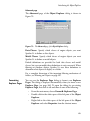
character, do the following:
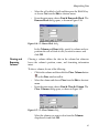
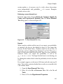
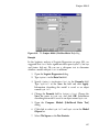
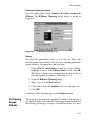
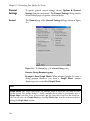
1. From the main menu, choose Options General Settings
to open the General Settings dialog.
2. Click the Data tab to display the Data page of the dialog.
18
Entering, Editing, and Saving Data
3. In the Data Options group, select character from the
Default Text Col. dropdown list and click OK.
Figure 2.6: Changing the default column type for character data.
After entering some values in a Data window, you may need to edit
them. To edit a value in a cell, do the following:
1. Click in the cell containing the value you want to edit.
2. Either press ENTER to go into edit mode or just start typing to
overwrite the current data.
To abandon your changes while typing, press ESC.
Undoing Actions
There are two levels of “undo” for the edits you make in a Data
window. You can either undo your most recent action or restore the
data set to its original state at the beginning of the session.
To undo your most recent action, do one of the following:
•
Press CTRL-Z or click the Undo button
toolbar.
•
From the main menu, choose Edit Undo.
on the Standard
19
Chapter 2 Working With Data
To restore a data set to its initial state, do the following:
1. Click the Restore Data Objects button
on the Standard
toolbar or choose Edit Restore Data Objects from the
main menu. The Restore Data Objects dialog opens, as
shown in Figure 2.7.
Figure 2.7: The Restore Data Objects dialog.
2. Select the data set from the list of objects displayed in the
dialog.
3. Click the Restore to Initial State radio button and then click
OK.
Note
You can also perform a single undo using the Restore Data Objects dialog. Simply select the
data set, click the Restore to Previous State radio button, and click OK.
To redo an undo, just perform one of the above procedures again.
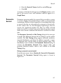
Saving Data
20
By saving your data in a special internal database, Spotfire S+
safeguards your data with no intervention required on your part. This
database, called the working data, is the database in which all the data
objects you create and modify, as well as all the functions you write in
the S-PLUS language, are automatically, and transparently, saved.
Entering, Editing, and Saving Data
You can easily view all the objects stored in your working data by
using the Object Explorer. For a complete discussion of the working
data and how to use the Object Explorer, see Chapter 7, Working
With Objects and Databases.
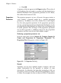
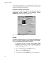
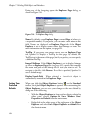
If you prefer more control over which new and modified data objects
you want Spotfire S+ to save, you can instruct Spotfire S+ to prompt
you with a dialog that gives you the opportunity to specify which
changes to keep and which to discard. This dialog appears when you
end your Spotfire S+ session.
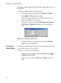
To set this preference, do the following:
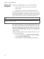
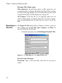
1. From the main menu, choose Options General Settings
to open the General Settings dialog.
2. In the Prompts Closing Documents group on the General
page of the dialog, select the Show Commit Dialog on Exit
check box and click OK.
Figure 2.8: The General page of the General Settings dialog.
21
Chapter 2 Working With Data
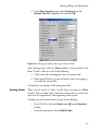
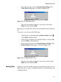
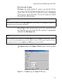
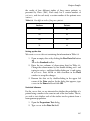
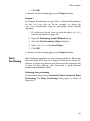
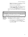
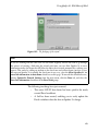
Setting this preference causes Spotfire S+ to automatically open the
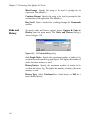
Save Database Changes dialog, shown in Figure 2.9, whenever you
end a session in which you have created or modified any data objects.
Figure 2.9: The Save Database Changes dialog.
By default, all the data objects created or modified during the current
session are selected in the Save Database Changes dialog. For each
data set in the list, do one of the following and then click OK:
•
To save a new data set or a changed version of an existing
data set, leave its name highlighted.
•
To discard a new data set or any changes made to an existing
data set, CTRL-click its name to deselect it.
Note
After setting this option in the General Settings dialog, you can later disable it by clearing the
Display Dialog On Exit check box in the Save Database Changes dialog.
Of course, you can remove a data object from your working data at
any time during a session by using the Object Explorer. For
complete details on using the Object Explorer, see Chapter 7.
Saving Your Data The easiest and most efficient way to save your data sets is to let
in External Files Spotfire S+ save them for you, as discussed above. Allowing Spotfire
S+ to store your data objects in the working data puts all the power of
the Object Explorer at your disposal.
22
Entering, Editing, and Saving Data
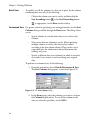
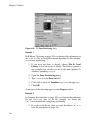
However, as with other standard Windows products, Spotfire S+ does
allow you to save your data sets in external (*.sdd) files by using the
File menu. Although we do not recommend this approach, if you
prefer to manage your data this way, you will need to reset some
option defaults, as follows:
1. Open the General Settings dialog to the General page, as
described above.
2. In the Prompts Closing Documents group, do the
following:
•
Select the Prompt to Save Data Files check box.
•
In the Remove Data from Database dropdown list,
select Always Remove Data.
3. Click OK.
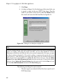
Setting these preferences causes Spotfire S+ to prompt you with the
following message whenever you close a Data window displaying a
new or modified data set:
Clicking Yes in the dialog opens the Save Data Set As dialog. To
save your data in a file, simply name the data set, navigate to the
desired folder, and click Save.
23
Chapter 2 Working With Data
VIEWING AND FORMATTING DATA
As mentioned earlier, Spotfire S+ ships with a large number of
sample data sets for your use in exploring Spotfire S+. You can
display any of these data sets, as well as any of your own data sets
stored in the working data, by using the Select Data dialog.
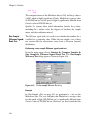
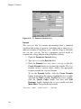
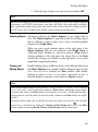
Displaying a
Data Set
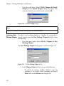
To display a data set stored in an S-PLUS database, do the following:
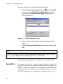
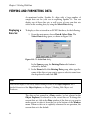
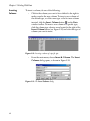
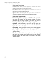
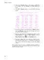
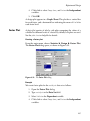
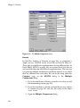
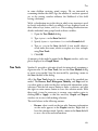
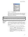
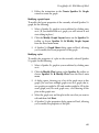
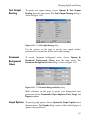
1. From the main menu, choose Data Select Data. The
Select Data dialog opens, as shown in Figure 2.10.
Figure 2.10: The Select Data dialog.
In the Source group, the Existing Data radio button is
selected by default.
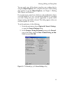
2. In the Name field of the Existing Data group, either type the
name of the data set you want to open or select its name from
the dropdown list and click OK.
Hint
You can also display a data set by double-clicking its name in the Object Explorer. For a
detailed discussion of the Object Explorer, see Chapter 7, Working With Objects and
Databases.
The data set last opened in a Data window (or last selected in the
Object Explorer) is referred to as the current data set. To change the
current data set, click in the Data window of the data set you want to
make current or select it from the list at the bottom of the Window
menu. When no data set is explicitly referenced in an operation, the
current data set is the default.
24
Viewing and Formatting Data
Opening
For large data sets, it is often convenient to display several different
Concurrent Views views of the data in separate Data windows.
of a Data Set
To open concurrent views of a data set, do the following:
1. Use the Select Data dialog to display the data in a Data
window.
2. From the main menu, choose Window New Window.
Note
You can edit your data in the original or any replicated Data window. Any changes you make
are immediately reflected in all the Data windows.
The name of the data set, as it appears in the title bar of the original
Data window, becomes temporarily appended with :1. In the second
Data window, the name is appended with :2. This temporary naming
convention continues as additional windows are opened. However,
when you close the replicated windows, the original name of the data
set is restored.
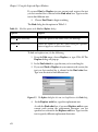
Navigating a Data Spotfire S+ provides a number of useful keyboard and mouse
shortcuts for quickly navigating a Data window. These shortcuts are
Window
listed in Table 2.1 below.
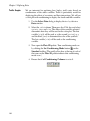
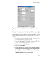
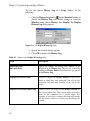
Table 2.1: Keyboard and mouse shortcuts for navigating a Data window.
Action
Keyboard
Mouse
Moves the screen left.
CTRL-LEFT ARROW
Click left scroll bar arrow.
Moves the screen right.
CTRL-RIGHT ARROW
Click right scroll bar arrow.
Moves to first column, first row.
CTRL-HOME
Drag sliders to top and left
arrows and click the cell.
Moves to last column, last row.
CTRL-END
Drag sliders to bottom and
right arrows and click the
cell.
25
Chapter 2 Working With Data
Table 2.1: Keyboard and mouse shortcuts for navigating a Data window. (Continued)
Action
Keyboard
Mouse
Moves to first column, same row.
HOME
Drag horizontal slider to left
arrow and click the cell.
Moves to last column, same row.
END
Drag horizontal slider to
right arrow and click the
cell.
Moves to first row, current column.
CTRL-PAGE UP
Drag vertical slider to top
arrow and click the cell.
Moves to last row, current column.
CTRL-PAGE DOWN
Drag vertical slider to
bottom arrow and click the
cell.
Selects a column.
CTRL-SPACEBAR
Click the column header.
Selects a row.
SHIFT-SPACEBAR
Click the row header.
Selects the entire Data window.
CTRL-SHIFT-SPACEBAR
or CTRL-A
Click the top cell in the
upper left-hand corner of the
Data window.
Puts cursor in selection mode and
moves cursor to make block
selection.
SHIFT-ARROW KEYS
Click and drag the mouse
across cells.
Displays online help.
F1
Displays the Go To Cell dialog.
F5
From the main menu,
choose View Go To Cell.
Puts cursor in edit mode to edit the
column name.
F9
Double-click the name box
of the column header.
26
Click the Help button
on the Standard toolbar
and then click in the Data
window.
Viewing and Formatting Data
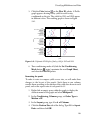
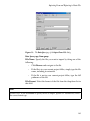
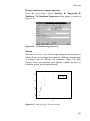
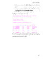
The Go To Cell dialog makes it easy to jump to a specific cell
location in a Data window.
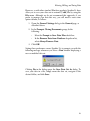
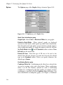
1. Press F5 or choose View Go To Cell from the main menu.
The Go To Cell dialog opens, as shown in Figure 2.11.
Figure 2.11: The Go To Cell dialog.
2. Select the column name and enter the row number of the cell
you want to jump to. To go to the last column/last row
position, type or select the special key word END in the
Column and Row fields.
3. Click OK.
The Go To Cell dialog is also useful for extending a cell selection. To
extend a selection from the active cell to the location specified in the
dialog, simply hold down the SHIFT key while clicking OK. For
example, if column 1, row 5 is the active cell and you specify column
5, row 5 in the Go To Cell dialog and press SHIFT-OK, the selection
is extended from column 1, row 5 to column 5, row 5.
Customizing a
Data Window
You can customize a Data window to fit your formatting preferences
by using the Data Frame dialog, as shown in Figure 2.12. To open
the dialog, do one of the following:
•
Double-click the top shaded cell in the upper left-hand corner
of the Data window.
27
Chapter 2 Working With Data
•
With the Data window in focus, choose Format Sheet
from the main menu.
Figure 2.12: The Data Frame dialog.
You can use this dialog to rename your data set, to change the default
type for new columns, or to specify the font, font size, and other
formatting characteristics of the Data window.
Setting Your
Preferred
Defaults
When you open a new, empty Data window, its formatting is based
on a set of defaults. For example, the default type for new columns is
double, a type of numeric data. By using the Data Frame dialog, you
can change these default settings so that any new Data windows you
open will reflect your particular formatting preferences.
To set new defaults, first make any desired changes in the Data
Frame dialog for an open Data window and click OK to accept the
changes. Then do one of the following:
Selecting Data
28
•
From the main menu, choose Options Save Window
Size/Properties as Default.
•
Right-click the top shaded cell in the upper left-hand corner
of the Data window and select Save Data Frame as default.
In order to format or manipulate data, you must first select the data
on which to operate. You can select a single cell, a block of cells, or
one or more columns or rows. By first selecting your data in a Data
window, you can also limit the scope of some menu options.
Viewing and Formatting Data
Selecting Cells
and Blocks
To select a single cell, click in the cell you want to select.
To select a block of cells, do one of the following:
•
Press and hold down the mouse button in the cell where you
want to begin the block selection and then drag the cursor to
increase or decrease the size of the highlighted block. When
the desired area is highlighted, release the mouse button.
•
Click in the cell where you want to begin the block selection
and then SHIFT-click in the cell whose column and row
positions describe the block you want to select.
Hint
You can extend a cell selection by holding down the SHIFT key while pressing one of the arrow
keys.
To select all the cells in a Data window, click in the empty, shaded
area in the upper left-hand corner of the Data window.
Selecting
Columns and
Rows
To select a single column or row, click in the column or row header.
To select a block of contiguous columns or rows, do one of the
following:
•
Click in the column or row header of the first column or row
to begin the selection and then SHIFT-click in the column or
row header of the last column or row describing the block you
want to select.
•
Press and hold down the mouse button in the column or row
header of the first column or row to begin the selection and
then drag the cursor across the columns or rows you want to
select and release the mouse button.
To select a group of noncontiguous columns or rows, or to select a
group of columns or rows in a special order, do the following:
•
CTRL-click in the header of each column or row you want to
select in the order in which you want to make the selection.
29
Chapter 2 Working With Data
Special note
The key characteristic of CTRL-click selection is that it imposes order on the selection process. By
contrast, when dragging the cursor or using SHIFT-click, the order of selection is interpreted by
default as left to right for columns or top to bottom for rows, no matter how the action itself is
actually performed. Therefore, when using these methods to select data, keep the following
points in mind:
•
You must use CTRL-click when you need to select noncontiguous columns or rows, but
be conscious of the order in which you make your selections.
•
You must use CTRL-click when you need to select a group of columns or rows in a
specific order even if the columns or rows are contiguous.
•
You can drag the cursor or use SHIFT-click to select blocks of contiguous columns or
rows as long as a left-to-right or top-to-bottom selection order is what you intend.
Formatting
Columns
A column in a data set is a vertical group of cells that typically
contains the data for a given variable. Because Spotfire S+ is columnoriented, formatting and data manipulation tools operate on a column
as a unit.
Spotfire S+ automatically numbers each column in a data set. The
column number is displayed in the column header and indicates the
column’s position in the Data window.
Changing a
Column Name
As soon as you enter a data value in an empty column, Spotfire S+
automatically gives the column a default name (Vx, where x is a
sequential number), which is displayed in the header beneath the
column number. You can use the default names to refer to your
columns, but it is usually better to replace them with names that are
more descriptive.
Tips for naming your columns
30
•
Column names must be unique within a data set.
•
Column names must start with a letter and may contain any
combination of letters, numbers, and periods. However,
column names may not include extended ASCII characters,
such as É.
Viewing and Formatting Data
•
S-PLUS function names and other reserved words cannot be
used as column names.
While you can refer to columns by either their names or their
numbers, referring to them by name is often easier since some
operations cause columns to be renumbered. For example, if you
insert a column between columns 5 and 6, all columns to the right of
column 5 are renumbered. If you use numbers to refer to your
columns, you must remember to use the new numbers in subsequent
operations.
To change a column name in place, do the following:
1. Double-click in the name box of the column header or, with
any cell in the column active, press F9.
2. Type a new column name or edit the existing name.
3. Press ENTER or click elsewhere in the Data window to accept
the changes.
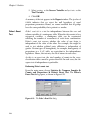
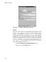
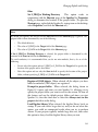
To change a column name by using its properties dialog, do the
following:
1. Double-click in the number box of the column header or click
in the column and choose Format Selected Object from
the main menu. The column properties dialog opens, as
shown in Figure 2.13.
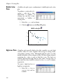
Figure 2.13: The Double Precision Column dialog.
2. In the Name text box, type a new column name or edit the
existing name and click OK.
31
Chapter 2 Working With Data
Note
The name of a properties dialog, as it appears in the dialog’s title bar, is determined by the type
of object selected when you open the dialog. For example, the Double Precision Column
dialog opens for double precision columns, the Character Column dialog opens for character
columns, etc.
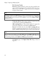
Adding or Editing In addition to numbers and names, columns can also have
descriptions. If you specify a description for a column, the description
a Column
is used as the default axis title and legend text in graphs. If no
Description
description is specified, the column name is used instead.
Tips for specifying column descriptions
•
Column descriptions can contain up to 75 characters.
•
Column descriptions can be any combination of letters,
numbers, symbols, and spaces.
To add or edit a column description, do the following:
•
Open the column properties dialog as discussed on page 31.
In the Description text box, type a new column description
or edit the existing description and click OK.
If you pause your mouse cursor over the name box in the column
header, a DataTip displays the column description, as shown in
Figure 2.14.
Figure 2.14: A DataTip displays the column description.
Creating a
Column List
32
A column list is a list of column names or numbers in a dialog field
specifying a group or sequence of columns on which to operate. For
example, selecting the column names Weight and Type produces the
column list Weight,Type.
Viewing and Formatting Data
To create a column list, simply select the column names (using CTRLclick if necessary) from the dialog field’s dropdown list.
Note
Dialog fields display only column names, not column numbers.
You can also create a column list in a dialog field by typing the
column numbers separated by commas. For example, 1,3,4 refers to
columns 1, 3, and 4. To specify a sequence of columns, type the
beginning and ending column names or numbers separated by a
colon. For example, 3:7 refers to columns 3 through 7. To specify all
columns in a data set, select the special key word <ALL>.
Changing the
Column Width
To increase or decrease a column’s width by visual inspection, you
can either drag the cursor or use a toolbar button.
To change the column width by dragging, do the following:
1. Position the cursor on the vertical line to the right of the
column heading. The mouse pointer becomes a resize tool.
2. Drag the resize tool to the right to increase the width of the
column (or to the left to decrease the width).
To change the column width using a toolbar button, do the following:
1. Click in the column.
2. Click the Increase Width button
or the Decrease Width
button
on the Data window toolbar. Each click increases
or decreases the column width by one character.
To adjust the column width to fit the widest cell in the column, do the
following:
1. Click in the column.
2. Click the Width to Fit Data button
toolbar.
on the Data window
33
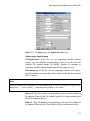
Chapter 2 Working With Data
If you need to set an exact column width, open the column properties
dialog and specify the width you want in terms of the number of
characters in the default font and point size.
Changing the
Data Type
A column’s data type determines the type of data you can enter in
that column. For example, a column of type character accepts only
character data, while a column of type integer accepts only integer
data.
The S-PLUS data types are character, complex, double, factor,
integer, logical, single, and timeDate. The two most commonly
used data types are double (for floating-point, double-precision real
numbers) and factor (for categorical data). For a detailed discussion
of the S-PLUS data types, see the Programmer’s Guide.
To change the data type of a column, do the following:
1. Click in the column and then click the Change Data Type
button
on the Data window toolbar or choose Data Change Data Type from the main menu. The Change Data
Type dialog opens, as shown in Figure 2.15.
Figure 2.15: The Change Data Type dialog.
2. In the Type group, select a new data type from the New
Type dropdown list and click OK.
34
Viewing and Formatting Data
If you pause your mouse cursor over the number box in the column
header, a DataTip displays the column type, as shown in Figure 2.16.
Figure 2.16: A DataTip displays the column type.
Changing the
Format Type
Spotfire S+ uses the standard Windows format types for columns
containing numeric data: Mixed, Number, Decimal, Scientific,
Currency,
Financial,
Date,
Date&Time,
Time,
and
Elapsed_H:M:S.
To change the format type of a column, do the following:
•
Open the column properties dialog as discussed on page 31.
Select a different format type from the Format Type
dropdown list and click OK.
Changing the
A column’s display precision affects only the way numbers are
Display Precision displayed; it has no effect on internal computations, which always use
the maximum precision available.
To change the display precision of a column, do one of the following:
•
To increase or decrease the display precision, click in the
column and then click the Increase Precision button
the Decrease Precision button
window toolbar.
•
Setting Your
Preferred
Defaults
or
, respectively, on the Data
Open the column properties dialog as discussed on page 31.
In the Precision text box, type the desired number of digits to
be displayed after the decimal (the maximum number
allowed is 17) and click OK.
You can change your column default settings for justification,
precision, width, etc. to reflect your formatting preferences. For
example, you might prefer to have a different default width for
character columns than for numeric columns.
35
Chapter 2 Working With Data
To set your preferred column defaults, do the following:
1. Open the column properties dialog as discussed on page 31.
2. Make any changes that you want to retain as your new default
settings and click OK.
3. Right-click in the column and select Save [Column Type]
Column as default from the shortcut menu.
Formatting
Rows
Spotfire S+ automatically numbers each row in a data set. The row
number is displayed in the row header and indicates the row’s
position in the Data window. Because Spotfire S+ is column-oriented,
most formatting options apply only to columns. You can, however,
add names to your rows.
Adding or
Changing a Row
Name
When used, row names are displayed in the header to the right of the
row numbers.
To add or change a row name, do the following:
1. Double-click in the name box of the row header.
2. Type a row name or edit the existing name.
3. Press ENTER or click elsewhere in the Data window to accept
the changes.
Creating a Row
List
36
A row list is a list of row numbers in a dialog field specifying a group
or sequence of rows on which to operate. To create a row list, type the
row numbers separated by commas. For example, 1,3,4 refers to rows
1, 3, and 4. To specify a sequence of rows, type the beginning and
ending row numbers separated by a colon. For example, 3:7 refers to
rows 3 through 7. To specify all rows in a data set, type the special key
word <ALL>.
Manipulating Data
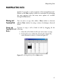
MANIPULATING DATA
Spotfire S+ provides a wide assortment of data manipulation tools.
Buttons on the Data window toolbar are convenient for performing
the most common tasks, but many more options are available
through the Data menu.
Moving and
Copying Data
You can move or copy data within a Data window or between
different Data windows by using a variety of techniques, discussed
below.
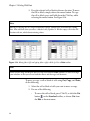
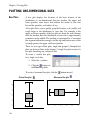
Moving and
To move or copy a cell or block of cells by dragging, do the
Copying Cells and following:
Blocks
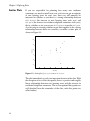
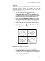
1. Select the cell or block of cells you want to move or copy.
2. Position the cursor within the selected cell or block. The
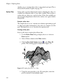
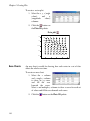
cursor becomes an arrow, as shown in Figure 2.17.
Figure 2.17: Selecting a block of cells in a Data window.
37
Chapter 2 Working With Data
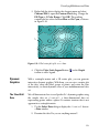
3. Drag the selected cell or block to the new location. To move
the cell or block, simply release the mouse button. To copy
the cell or block, press and hold down the CTRL key while
releasing the mouse button. See Figure 2.18.
Note
Moving or copying data to a target location that already contains data overwrites the existing
data. Also note that when you move a block of cells, Spotfire S+ fills the empty cells in the old
location with NAs, which denote missing values.
Figure 2.18: Moving (above left) and copying (above right) a block of cells in a Data window.
Hint
When you use drag-and-drop to move or copy data between Data windows, be sure to arrange
your windows so that you can see both the source and the target cell locations.
To move or copy a cell or block of cells using Cut, Copy, and Paste,
do the following:
1. Select the cell or block of cells you want to move or copy.
2. Do one of the following:
•
To move the cell or block, press CTRL-X, or click the Cut
button
on the Standard toolbar, or choose Cut from
the Edit or shortcut menu.
38
Manipulating Data
•
To copy the cell or block, press CTRL-C, or click the
Copy button
on the Standard toolbar, or choose
Copy from the Edit or shortcut menu.
3. Click the mouse in the new location in the Data window.
4. Press CTRL-V, or click the Paste button
on the Standard
toolbar, or choose Paste from the Edit or shortcut menu.
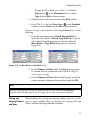
To move or copy a cell or block of cells using the Data menu, do the
following:
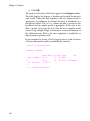
1. From the main menu, choose Data Move Block to
move the cell or block or Data Copy Block to copy the
cell or block. Depending upon your selection, either the
Move Block or Copy Block dialog opens, as shown in
Figure 2.19.
Figure 2.19: The Move Block and Copy Block dialogs.
2. In the Columns and Rows fields of the From group, specify
by column and row positions the cell or block of cells you
want to move or copy.
3. In the Columns and Rows fields of the To group, specify the
target location by column and row positions and click OK.
Hint
To move or copy the cell or block to another data set, select its name from the Data Set
dropdown list of the To group. To create a target data set, type a new name in this field.
Moving and
The procedures for moving and copying columns and rows are the
Copying Columns same as those outlined above for moving and copying cells and
blocks, with the following additional comments.
and Rows
39
Chapter 2 Working With Data
When you move or copy a column or row by dragging, note the
following:
•
To drag a column or row, position the cursor within the
selected column or row, not within the column or row header.
•
Spotfire S+ moves or copies the whole column or row as a
unit, including the name. Names of copied columns and rows
are appended with .1.
•
Moving or copying data to a target location that already
contains data overwrites the existing data.
When you move or copy a column or row using Cut, Copy, and
Paste, note the following:
•
Spotfire S+ moves or copies only the data values in the
column or row to the new location.
•
Moving or copying data to a target location that already
contains data overwrites the existing data.
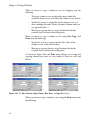
As shown in Figure 2.20, the Data menu dialogs for moving and
copying columns and rows are very similar to those for cells and
blocks.
Figure 2.20: The Move Columns, Copy Columns, Move Rows, and Copy Rows dialogs.
When you move or copy a column or row using the Data menu, note
the following:
40
Manipulating Data
•
Spotfire S+ moves or copies the whole column or row as a
unit, including the name. Names of copied columns and rows
are appended with .1.
•
By default, moving or copying data to a target location that
already contains data overwrites the existing data. However,
you can avoid overwriting your existing data by clearing the
Overwrite check box at the bottom of the dialogs. When you
clear this check box, Spotfire S+ shifts existing columns to the
right or existing rows down to make room for the moved or
copied data.
Hint
You can copy row names into and out of the shaded row names column in a Data window by
using the Copy Columns dialog—simply select the special key word <ROWNAMES> from the
Columns dropdown list in either the From or To group.
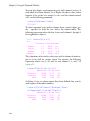
Inserting Data
When you insert a cell, block, column, or row in a Data window,
Spotfire S+ shifts existing cells down and/or to the right, as
appropriate, to make room for the new cells.
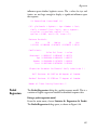
Inserting Cells
and Blocks
To insert a cell or block of cells, do the following:
•
From the main menu, choose Insert Block. The Insert
Block dialog opens, as shown in Figure 2.21.
Figure 2.21: The Insert Block dialog.
In the Columns and Rows fields, specify by column and row
positions the cell or block of cells you want to insert and click
OK.
41
Chapter 2 Working With Data
Inserting
Columns
To insert a column, do one of the following:
•
Click in the column you want to have shifted to the right to
make room for the new column. To insert a new column of
the default type, or of the same type as the last new column
inserted, click the Insert Column button
on the Data
window toolbar. To insert a new column of a specific type,
click the column type selector arrow located to the right of the
Insert Column button (see Figure 2.22) and select the type of
column you want to insert.
Figure 2.22: Inserting a column of a specific type.
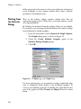
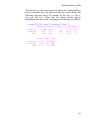
•
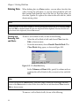
From the main menu, choose Insert Column. The Insert
Columns dialog opens, as shown in Figure 2.23.
Figure 2.23: The Insert Columns dialog.
42
Manipulating Data
Select the column you want to have shifted to the right to
make room for the new column from the Start Column
dropdown list. Type a name for the new column in the
Name(s) text box and click OK.
Hint
You can also use the Insert Columns dialog to insert multiple columns. Simply type the number
of columns you want to insert in the Count text box and a comma-delimited list of names in the
Names(s) text box.
Inserting Rows
To insert a row, do one of the following:
•
Click in the row you want to have shifted down to make room
for the new row and then click the Insert Row button
the Data window toolbar.
•
on
From the main menu, choose Insert Row. The Insert
Rows dialog opens, as shown in Figure 2.24.
Figure 2.24: The Insert Rows dialog.
In the Start Row text box, type the row number of the row
you want to have shifted down to make room for the new row
and click OK.
Hint
You can also use the Insert Rows dialog to insert multiple rows. Simply type the number of
rows you want to insert in the Count text box.
43
Chapter 2 Working With Data
Deleting Data
When deleting data in a Data window, you can either clear the data
values, leaving the cells intact, or you can remove both the cells and
their contents and shrink the size of the data set. Note that when you
clear data, Spotfire S+ replaces the values in the cells with NAs, which
denote missing values.
Note
When you clear a cell, block, column, or row by pressing the DELETE key or by choosing Clear
from the Edit or shortcut menu, the data are not placed in the clipboard. To erase the data and
place them in the clipboard, choose Cut instead.
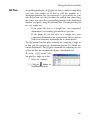
Clearing and
Removing Cells
and Blocks
To clear a cell or block of cells, do one of the following:
•
Select the cell or block of cells and choose Clear from the
Edit or shortcut menu.
•
From the main menu, choose Data Clear Block. The
Clear Block dialog opens, as shown in Figure 2.25.
Figure 2.25: The Clear Block dialog.
In the Columns and Rows fields, specify by column and row
positions the cell or block of cells you want to clear and click
OK.
Hint
To clear all the data in a Data window, click in the empty, shaded area in the upper left-hand
corner of the Data window to select all the data in the data set and then choose Clear from the
Edit or shortcut menu.
To remove a cell or block of cells, do one of the following:
44
Manipulating Data
•
Select the cell or block of cells and then press the DELETE key
or choose Cut from the Edit or shortcut menu.
•
From the main menu, choose Data Remove Block. The
Remove Block dialog opens, as shown in Figure 2.26.
Figure 2.26: The Remove Block dialog.
In the Columns and Rows fields, specify by column and row
positions the cell or block of cells you want to remove and
click OK.
Clearing and
Removing
Columns
Clearing a column deletes the data in the column but otherwise
leaves the column’s position, name, and formatting information
intact.
To clear a column, do one of the following:
•
Click in the column and then click the Clear Column button
on the Data window toolbar.
•
Select the column and choose Clear from the Edit or shortcut
menu.
•
From the main menu, choose Data Clear Column. The
Clear Columns dialog opens, as shown in Figure 2.27.
Figure 2.27: The Clear Columns dialog.
Select the column you want to clear from the Columns
dropdown list and click OK.
45
Chapter 2 Working With Data
Removing a column deletes the entire column and shrinks the size of
the data set.
To remove a column, do one of the following:
•
Click in the column and then click the Remove Column
button
on the Data window toolbar.
•
Select the column and then press the DELETE key or choose
Cut from the Edit or shortcut menu.
•
From the main menu, choose Data Remove Column.
The Remove Columns dialog opens, as shown in Figure
2.28.
Figure 2.28: The Remove Columns dialog.
Select the column you want to remove from the Columns
dropdown list and click OK.
Clearing and
Removing Rows
Clearing a row deletes the data in the row but otherwise leaves the
row’s position and name, if any, intact.
To clear a row, do one of the following:
46
•
Click in the row and then click the Clear Row button
the Data window toolbar.
on
•
Select the row and choose Clear from the Edit or shortcut
menu.
Manipulating Data
•
From the main menu, choose Data Clear Row. The
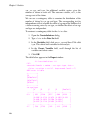
Clear Rows dialog opens, as shown in Figure 2.29.
Figure 2.29: The Clear Rows dialog.
Type the row number of the row you want to clear in the
Rows text box and click OK.
Removing a row deletes the entire row and shrinks the size of the data
set.
To remove a row, do one of the following:
•
Click in the row and then click the Remove Row button
on the Data window toolbar.
•
Select the row and then press the DELETE key or choose Cut
from the Edit or shortcut menu.
•
From the main menu, choose Data Remove Row. The
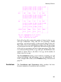
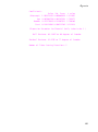
Remove Rows dialog opens, as shown in Figure 2.30.
Figure 2.30: The Remove Rows dialog.
Type the row number of the row you want to remove in the
Rows text box and click OK.
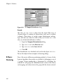
Sorting Data
Spotfire S+ provides toolbar buttons for performing quick sorts on
whole data sets, as well as a dialog that allows you to customize your
sorting parameters.
47
Chapter 2 Working With Data
Quick Sorts
To quickly sort all the columns of a data set in place by the column
containing the active cell, do the following:
•
Click in the column you want to sort by and then click the
Sort Ascending button
or the Sort Descending button
, as appropriate, on the Data window toolbar.
Customized Sorts For greater control in specifying your sorting parameters, use the Sort
Columns dialog available through the Data menu. The dialog allows
you to:
•
Specify whether to sort the entire data set or a subset of its
columns.
•
Select more than one column to sort by. When specifying
multiple columns to sort by, the data are first ranked
according to the first column selected. Then, in the case of
equivalent data, the column next selected determines the
ranking, and so on.
•
Specify a different data set or column(s) in which to store the
sort results if you want to avoid overwriting your original
data.
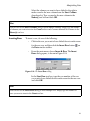
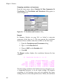
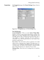
To perform a customized sort, do the following:
1. From the main menu, choose Data Restructure Sort.
The Sort Columns dialog opens, as shown in Figure 2.31.
Figure 2.31: The Sort Columns dialog.
2. In the From group, select the columns you want to sort from
the Columns dropdown list. To sort all the columns in the
data set, select the special key word <ALL>.
48
Manipulating Data
3. Select one or more columns to sort by from the Sort By
Columns dropdown list. To sort by more than one column,
CTRL-click to select the columns in the desired ranking order.
4. In the To group, specify a target destination for the sort
results:
•
To sort in place, select the same data set and columns
from the Data Set and Columns dropdown lists,
respectively, as you selected in the corresponding From
group fields.
Caution
Mismatched columns may result when sorting in place with fewer than <ALL> columns selected
in the Columns fields.
•
To send the sort results to a different data set, select a data
set from the Data Set dropdown list (or type a new name
in this field to create a data set) and select the desired
columns from the Columns dropdown list.
Note
The number of columns selected in the To group must match the number of columns selected in
the From group. Note also that existing data in target columns will be overwritten.
5. By default, columns are sorted in ascending order. To sort in
descending order, select the Descending check box.
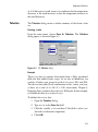
6. Click OK.
Other Data
Manipulation
Options
In addition to the basic tools discussed so far, the Data menu
provides many more useful data manipulation options. What follows
is a brief description of those not already covered. Chapter 6 gives
examples using the Random Numbers, Distribution Functions,
Tabulate, and Random Sample tools. For details on using all the
data manipulation dialogs, see the online help.
49
Chapter 2 Working With Data
Transpose
The Transpose Columns and Transpose Rows dialogs allow you
to convert columns to rows and vice versa. Use the Transpose Block
dialog to transpose a block of text (that is, turn the block on its side).
Exchange
The Exchange Columns and Exchange Rows dialogs let you trade
the positions of columns or rows between different data sets.
Restructure
Append
The Append Columns dialog can be used to append a column of
data to the end of another column.
Pack
The Pack Columns dialog allows you to delete missing values in a
column and shift the remaining values up to close the space.
Stack
The Stack Columns dialog lets you stack separate columns of data
into a single column, with the values in the other columns replicated
as necessary.
Unstack
The Unstack Columns dialog can be used to break up a single
column into several columns of specified lengths.
Fill
The Fill Numeric Columns dialog allows you to fill columns in a
data set with NAs or with a series of generated numbers.
Recode
The Recode dialog lets you recode all occurrences of a specific value
in specified columns to a new value.
Transform
The Transform dialog can be used to create a new variable based on
a transformation of other variables.
Create Categories The Create Categories dialog allows you to create new categorical
variables from numeric (continuous) variables or to redefine existing
categorical variables by renaming or combining groups.
Random Numbers The Random Numbers dialog lets you generate random numbers
from a specified distribution.
50
Manipulating Data
Distribution
Functions
The Distribution Functions dialog can be used to compute density
values, cumulative probabilities, and quantiles from a specified
distribution.
Split
The Split Data by Group dialog allows you to split a data set into
multiple new data sets based on the values of a splitting variable.
Subset
The Subset dialog lets you create a subset of a data set based on a
subsetting expression. While the dialog provides tools for helping you
write this expression, some knowledge of S-PLUS language syntax is
required.
Merge
The Merge Two Data Sets dialog can be used to combine data from
two data sets into a single data set.
Tabulate
The Tabulate dialog allows you to create a tabular summary of data
from a data set. Selected columns of the data set are identified as
variables, and the count of each combination of variable values is
returned. Numeric variables can be binned before the counting
occurs.
The table of the counts can be printed and also returned in a data set
suitable for multipanel conditioning plots. For statistics and other
summary information, choose Statistics Data Summaries Crosstabulations.
Expand Grid
The Expand Grid dialog lets you create a new data set containing all
combinations of sets of values in an existing data set. Each set of
values may be either all unique values in a column or a specified
number of equispaced values covering the range of values in a
column. This dialog is useful for producing columns representing a
grid of values over which to evaluate a function or obtain predictions
from a model.
Random Sample
The Random Sample of Rows dialog can be used to generate
random samples or permute the observations in a data set.
51
Chapter 2 Working With Data
LIBRARIES INCLUDED WITH SPOTFIRE S+
All data sets in Spotfire S+ are stored in libraries. When we speak of
“S-PLUS,” however, we usually mean the executable program and
the objects in the libraries that are attached automatically at startup.
The Spotfire S+ distribution contains additional libraries. To see a list
and a description of each, at the command prompt, type
library()
Your default text editor opens and displays the information.
You can attach a library from the main menu by clicking File Load Library, or by using the library() function from the
Commands window (see Chapter 8). Many of these libraries,
including the robust library and the libraries contributed by Frank
Harrell and Brian Ripley, include graphical user interfaces. Others,
such as the examples and example5 directories, contain simple
command-line functions.
Note
In addition to loading libraries from the menu or from the Commands window, you can find
and download packages. From the main menu, click File Find Packages, select the
repository (URL or local file path), and then from the list, select the package to download. You
can also get the latest versions of packages you have downloaded using the File Update
Packages menu command. See the Guide to Packages for more information about using packages.
As an example of what you can do with these libraries, attach the
maps library and try a few of its commands in the Commands
window:
>
>
>
>
>
library(maps)
map("county", "Washington") # Create a map of Washington
map() # Create a map of the USA with state boundaries
graphsheet()
usa() # Create a different map of the USA--compare
(The USA map created by map is superior to that created by usa.)
52
EXPLORING DATA
3
Introduction
54
Visualizing One-Dimensional Data
Exploratory Plots
55
56
Visualizing Two-Dimensional Data
Scatter Plots
Scatter Plots With Line and Curve Fits
Scatter Plots With Nonparametric Curve Fits
Line Plots and Time Series Plots
60
62
64
69
76
Visualizing Multidimensional Data
Scatter Plots and Scatterplot Matrices
Trellis Graphs
Three-Dimensional Plots
Dynamic Graphics
87
87
96
105
113
53
Chapter 3 Exploring Data
INTRODUCTION
In this chapter, we discuss the concept of exploratory data analysis
and introduce you to a variety of plot types for examining the
structure of your data. Our discussion here is devoted exclusively to
the use of plotting techniques as a means of examining your data.
However, Spotfire S+ also offers a wide assortment of options for
fully customizing your plots and transforming them into presentationquality graphics. These procedures are documented in the Guide to
Graphics, available from the Help Online Manuals menu in
Windows, or as graphics.pdf in your SHOME\help directory.
54
Visualizing One-Dimensional Data
VISUALIZING ONE-DIMENSIONAL DATA
A one-dimensional data object is sometimes referred to as a (single)
data sample, a set of univariate observations, or simply a batch of
data. In this section, we examine a number of basic plot types useful
for exploring the shape of the distribution of a one-dimensional data
object.
These visualization plots are simple but powerful exploratory data
analysis tools that can help you quickly grasp the nature of the
distribution of your data. Such an understanding can help you avoid
the misuse of statistical inference methods, such as using a method
appropriate only for a normal (Gaussian) distribution when the
distribution is strongly non-normal.
The Michelson
Data
The first step in creating a plot is creating or locating the data of
interest. For large data sets, you may prefer to store the data in a
database or a spreadsheet, such as Microsoft Excel. For smaller data
sets, it is convenient to directly enter the data into a Data window.
We begin this section by creating an example data set, the Michelson
data (exmichel).
In 1876, the French physicist Cornu reported a value of 299,990 km/
sec for c, the speed of light. In 1879, the American physicist A.A.
Michelson carried out several experiments to verify and improve on
Cornu’s value.
Michelson obtained the following 20 measurements of the speed of
light:
850
1000
740
980
900
930
1070
650
930
760
850 950 980
810 1000 1000
980
960
880
960
To obtain Michelson’s actual measurements in km/sec, add 299,000
km/sec to each of the above values.
The 20 observations can be thought of as observed values of 20
random variables with a common but unknown mean-value location
. If the experimental setup for measuring the speed of light is free of
bias, then it is reasonable to assume that is the true speed of light.
55
Chapter 3 Exploring Data
In this and subsequent sections, we examine the distribution of these
observations. In Chapter 6, Statistics, we pose some questions
regarding the mean of the data and perform various statistical tests to
answer the questions.
The data form a single, ordered set of observations, so they are
appropriately described as a data set with one variable. We will use a
Data window to create a new data set containing the 20 observations
listed above.
1. From the main menu, choose Data Select Data to display
the Select Data dialog.
2. In the Source group, click the New Data radio button to
select it.
3. In the New Data group, type exmichel in the Name field
and click OK.
4. Now enter the 20 data points in the first column.
5. Change the column (or variable) name from the default V1 by
double-clicking V1 and typing speed. Press ENTER or click
elsewhere in the Data window to accept the change.
Exploratory
Plots
To obtain a useful exploratory view of the Michelson data, create the
following plots: a box plot, a histogram/density plot, and a QQ
normal plot.
1100
sp ee d
1000
900
800
700
600
Figure 3.1: A box plot of the Michelson data.
56
Visualizing One-Dimensional Data
The box plot indicates that the median has a value of about 950 and
that the distribution is probably a bit skewed toward the smaller
values. It also indicates a possible outlier with a value of about 650.
0 .0 0 5
0 .0 0 4
0 .0 0 3
0 .0 0 2
0 .0 0 1
0 .0 0 0
600
700
800
900
1000
1100
speed
Figure 3.2: Density estimate with histogram of the Michelson data.
The data points in the QQ normal plot, shown in Figure 3.3, do not
fall particularly close to the straight line provided in the plot, which
suggests that the data may not be normally distributed.
1100
speed
1000
900
800
700
600
-2
-1
0
1
2
N o rm a l D is trib u tio n
Figure 3.3: QQ normal plot with reference line for the Michelson data.
57
Chapter 3 Exploring Data
Exploring QQ plots for other distributions
1. Try making QQ plots for other distributions. Right-click any
data point to display the shortcut menu. From the shortcut
menu, select Distribution to display the QQ Plot dialog
opened at the Distribution page.
2. Select t in the Function combo box, type 5 in the df 1
(degrees of freedom) box, and click OK.
Figure 3.4: The Distribution page of the QQ Plot dialog.
Does your t-distribution QQ plot look any more linear? Try
QQ plots for some other distributions, such as Uniform.
Keep in mind that the sample size is very small, and you may wonder
about the intrinsic variability of a normal QQ plot from sample to
sample. A useful exercise is to simulate samples of normal random
numbers with each sample having the same length as your data (20 in
58
Visualizing One-Dimensional Data
the case of exmichel), compute a QQ plot for each simulated normal
random vector, and observe the variability in the QQ plots.
Simulating random numbers is described in Chapter 6.
59
Chapter 3 Exploring Data
VISUALIZING TWO-DIMENSIONAL DATA
In the previous section, you learned how to make several types of
plots that provide quick, visual insight into the shape of the
distribution of one-dimensional data. In this section, you expand your
toolkit of visual exploratory data analysis tools by learning how to
make scatter plots, line plots, and some other types of plots of twodimensional data (2D plots).
Two-dimensional data are often called bivariate data, and the
individual, one-dimensional components of the data are often
referred to as variables. Two-dimensional plots help you quickly
grasp the nature of the relationship between the two variables that
constitute bivariate data. For example, is the relationship linear or
nonlinear? Are the variables highly correlated? Are there any
outliers? Are there any distinct clusters? When you couple 2D plot
visualization of your bivariate data with one-dimensional
visualizations of the distribution of each of the two variables (for
example, using box plots or histograms), you gain a thorough
understanding of your data.
The Main Gain
Data
The “main gain” data in Table 3.1 present the relationship between
the number of housing starts and the number of new main telephone
extensions. The first column, “New Housing Starts,” is the change in
new housing starts from one year to the next in a geographic area
around New York City, in “sanitized” units (for confidentiality). The
second column, “Gain in Main Residential Telephone Extensions,” is
the increase in main residential telephone extensions in the same
geographic area, again in sanitized units. In this section, we explore
the relationship between these two variables.
Table 3.1: Main gain data.
60
New Housing Starts
Gain in Main Residential
Telephone Extensions
0.06
1.135
0.13
1.075
Visualizing Two-Dimensional Data
Table 3.1: Main gain data. (Continued)
New Housing Starts
Gain in Main Residential
Telephone Extensions
0.14
1.496
-0.07
1.611
-0.05
1.654
-0.31
1.573
0.12
1.689
0.23
1.850
-0.05
1.587
-0.03
1.493
0.62
2.049
0.29
1.942
-0.32
1.482
-0.71
1.382
The data are best represented as a data set with two variables:
1. Click the New Data Set button
on the Standard toolbar.
2. Enter the 14 observations listed above. Change the column
(variable) names from the default V1 and V2 to diff.hstart
and tel.gain, respectively (double-click V1 and V2 to change
the variable names).
3. Rename the data set by double-clicking the top shaded cell in
the upper left-hand corner of the Data window, typing
exmain in the Name field, and clicking OK.
61
Chapter 3 Exploring Data
Scatter Plots
If you are responsible for planning how many new residence
extensions you need to install next year, and you can get an estimate
of new housing starts for next year, then you will naturally be
interested in whether or not there is a strong relationship between
diff.hstart (the increase in new housing starts each year) and
tel.gain (the increase in residence telephone extensions each year),
that is, whether or not you can use diff.hstart to predict tel.gain.
As a first step in assessing whether or not there appears to be a strong
relationship between these two variables, we make a scatter plot, as
shown in Figure 3.5.
2.0
te l.g a in
1.8
1.6
1.4
1.2
1.0
-0 .8 5
-0 .6 0
-0 .35
-0.1 0
0 .15
0.4 0
0 .65
d iff.h sta rt
Figure 3.5: Scatter plot of tel.gain versus diff.hstart.
The plot immediately reveals two important features in the data: With
the exception of two of the data points, there is a positive and roughly
linear relationship between new housing starts and the increase in
residential telephone extensions. The two exceptional data points are
well detached from the remainder of the data; such data points are
called outliers.
62
Visualizing Two-Dimensional Data
Identifying
Outliers
Move the mouse pointer over one of the outlying points. A DataTip
appears showing the values of the two variables at that point, as
shown in Figure 3.6.
Figure 3.6: DataTip showing variable values at pointer location.
Notice the number that appears on the first line of the DataTip. This
number identifies the row number of the data set corresponding to
the point. In Figure 3.6, the DataTip identifies this point as Row 1.
Now move the mouse pointer over the second outlying point. The
DataTip for this point identifies it as Row 2. Thus, the first two
observations in the data set are the outliers.
Selecting and
Highlighting
Points
You can highlight data points in a scatter plot with a color that
distinguishes them from the remainder of the data. Let’s highlight the
two outliers in the scatter plot for the exmain data.
1. Open the Graph Tools palette by clicking the Graph Tools
button
on the Graph toolbar.
2. Click the Select Data Points button
on the Graph Tools
palette. The mouse cursor becomes a cross-hair with a little
rectangle annotation.
63
Chapter 3 Exploring Data
3. Drag a rectangle around the two outliers to select them. They
now appear highlighted, in red by default. (You can highlight
additional points by pressing the CTRL key while releasing the
mouse button.)
Note
When you select points in a scatter plot, they are also selected in any Data window in which the
data are displayed.
4. Change the cross-hair mouse pointer back to the regular
mouse pointer by clicking the Select Tool button
Graph Tools palette.
on the
5. Close the Graph Tools palette when you are done. Click a
cell in the Data window to deselect all points.
Scatter Plots
With Line and
Curve Fits
64
You can fit a straight line to your scatter plot data and superimpose
the fit with the data. Such a fit helps you visually assess how well the
data conform to a linear relationship between two variables. When
the linear fit seems adequate, the fitted straight line plot provides a
good visual indication of both the slope of bivariate data and the
variation of the data about the straight line fit.
Visualizing Two-Dimensional Data
Least Squares
You can fit a straight line to the exmain bivariate data by the method
Straight Line Fits of least squares and display the result superimposed on a scatter plot
of the data. Proceed as above when making a scatter plot except this
time click the Linear Fit button
on the Plots 2D palette rather
than the Scatter button. The result is shown in Figure 3.7 below.
2 .0
tel.gain
1 .8
1 .6
1 .4
1 .2
1 .0
-0 .8 5
-0 .6 0
-0 .3 5
-0 .1 0
0 .1 5
0 .4 0
0 .6 5
d iff.h s ta rt
Figure 3.7: Scatter plot with least squares line of tel.gain versus diff.hstart.
Notice in the graph that the two outliers in the data appear to
influence the least squares line fit by pulling the line downward and
reducing its slope relative to the remainder of the data.
Robust Line Fits
The least squares fit of a straight line is not robust in that outliers can
have a large influence on the location of the line. A robust method is
one that is not influenced very much by outliers, no matter how large.
To fit a robust line by a method called least trimmed squares (LTS)
65
Chapter 3 Exploring Data
and display the result, select the data and click the Robust LTS
button
on the Plots 2D palette. The result is shown in Figure 3.8
below. Save your Graph Sheet as exmain.sgr.
2 .0
te l.g a in
1 .8
1 .6
1 .4
1 .2
1 .0
-0.8 5
-0.6 0
-0.3 5
-0.1 0
0.1 5
0.4 0
0.6 5
diff.hs tart
Figure 3.8: Scatter plot of tel.gain versus diff.hstart with robust LTS line.
Compare Figure 3.7 to Figure 3.8 and note how much the two outliers
influenced the least squares line.
Line fits with selected points deleted
Since the least squares line for the exmain data appears to be
influenced by the two outliers, it would be nice to see what the effect
is of making the least squares fit with these two points removed. This
is very easy to do:
1. Make a scatter plot with a least squares line of tel.gain
versus diff.hstart and select the two outliers as you did
before (see Figure 3.9). Remember to change the cursor back
66
Visualizing Two-Dimensional Data
to its regular form by clicking on the Select Tool button
on the Graph Tools palette after you have selected the
outlier data points.
2 .0
te l.g ain
1 .8
1 .6
1 .4
1 .2
1 .0
-0 .8 5
-0 .6 0
-0 .3 5
-0 .1 0
0 .1 5
0 .4 0
0 .6 5
d iff.h s ta rt
Figure 3.9: Scatter plot with least squares line, outlier points selected.
2. From the main menu, choose Format Exclude Selected
Points. This results in a new least squares line, which fits the
data without outliers quite well, as shown in Figure 3.10.
Notice that the vertical axis scale has changed and the two
removed outliers do not appear in the plot.
2 .1
tel.g ain
1 .9
1 .7
1 .5
1 .3
-0 .8 5
-0 .6 0
-0 .3 5
-0 .1 0
0 .1 5
0 .4 0
0 .6 5
d iff.h s ta rt
Figure 3.10: Scatter plot with least squares line, outlier points removed.
67
Chapter 3 Exploring Data
A hallmark of a good robust line fitting method is that it gives a
straight line fit that is close to that obtained with least squares when
the data do not contain outliers. You can check this out for the least
trimmed squares (LTS) robust line fit relative to least squares by
adding the LTS robust line to the graph you just made.
3. With the columns to plot selected, select the graph region,
on
press the SHIFT key, and click the Robust LTS button
the Plots 2D palette. The resulting graph, shown in Figure
3.11, reveals that the LS fit with outliers removed and the LTS
fit with outliers included are indeed rather close to one
another. Notice that the scatter plot now displays the original
axis ranges and that the two outliers removed from the LS fit
are displayed with the robust LTS line.
2 .0
te l.g ain
1 .8
1 .6
1 .4
1 .2
1 .0
-0 .8 5
-0 .6 0
-0 .3 5
-0 .1 0
0 .1 5
0 .4 0
0 .6 5
d iff.h s ta rt
Figure 3.11: Scatter plot with least squares fit (no outliers) and robust LTS lines.
4. Now that you have the LS fit for the data with the two outliers
excluded, you can easily add the points back in and see how
the line fits change. Just choose Format Include All Points
68
Visualizing Two-Dimensional Data
from the main menu, and you get the graph shown in Figure
3.12. All existing plots on the graph will be recalculated to
include all points.
2 .0
te l.g a in
1 .8
1 .6
1 .4
1 .2
1 .0
-0 .8 5
-0 .60
-0 .3 5
-0 .1 0
0 .1 5
0 .4 0
0 .65
diff.h sta rt
Figure 3.12: Scatter plot with least squares and robust LTS lines, outlier points
included.
Scatter Plots
With
Nonparametric
Curve Fits
In the previous section, we fit linear parametric functions to the
scatter plot data. Frequently, you do not have enough prior
information to determine what kind of parametric function to use. In
such cases, you can fit a nonparametric curve, which does not assume
a particular type of nonlinear relationship.
Nonparametric curve fits are also called smoothers since they attempt
to create a smooth curve showing the general trend in the data. The
simplest smoothers use a running average, where the fit at a particular
x value is calculated as a weighted average of the y values for nearby
points, with the weighting given to each point decreasing as the
distance between its x value and the x value of interest increases. In
the simplest type of running average smoother, all points within a
certain distance (or window) from the point of interest are used in the
average for that point.
The window width is called the bandwidth of the smoother. Making
the bandwidth wider results in a smoother curve fit but may miss
rapidly changing features. Making the bandwidth narrower allows the
smoother to track rapidly changing features more accurately but
results in a rougher curve fit.
69
Chapter 3 Exploring Data
More sophisticated smoothers add variations on this approach, such
as using smoothly decreasing weights or local linear fits. However, all
smoothers have some type of smoothness parameter (bandwidth)
controlling the smoothness of the curve.
The issue of good bandwidth selection is complicated and has been
treated in many statistical research papers. You can, however, get a
feeling for the practical consequences of varying the bandwidth by
actually using some smoothers on real data.
This section describes how to use three different types of smoothers—
kernel smoothers, spline smoothers, and loess smoothers—and select
their bandwidths to control the degree of smoothness of your curve fit
(or “smooths” of the data).
We will use the sample data set sensors, which contains the
responses of eight different semiconductor element sensors to varying
levels of nitrous oxide (NOx) in a container of air. The engineers who
design these sensors study the relationship between the responses of
these eight sensors to determine whether using two sensors instead of
one allows a more precise measurement of the concentration of NOx.
Prior investigation has revealed that there may be a nonlinear
relationship between the responses of the two sensors, but not much
is known about the details of the relationship.
Kernel Smoothers A kernel smoother is a generalization of local averaging in which
different weight functions (kernels) may be used to provide a
smoother transition between points than is present in simple local
averaging. The default kernel is a box, which provides the local
averaging approach described in the introduction.
We will make a scatter plot of sensor 5 versus sensor 6 and
experiment with the bandwidth of a simple moving-average smoother
(sometimes called a “boxcar” smoother). We begin by using the 2D
graph capabilities to simultaneously make the scatter plot and
superimpose a moving-average smooth with a default bandwidth
choice.
Boxcar smoother
1. From the main menu, choose Data Select Data.
2. In the Source group, ensure that Existing Data is selected.
70
Visualizing Two-Dimensional Data
3. In the Existing Data group, type sensors in the Name field
and click OK.
4. Select columns V5 and V6.
5. From the main menu, choose Graph 2D Plot to open the
Insert Graph dialog.
6. In the Plot Type list box, select Smoothing - Kernel Plot
and click OK, as shown in Figure 3.13.
Figure 3.13: The Insert Graph dialog.
This results in the plot shown in Figure 3.14, where a not-so-smooth
curve is produced that fits the data rather poorly. This is because the
smoothing bandwidth is too small for these data.
0 .8
V6
0 .6
0 .4
0 .2
0 .0
0 .3
0 .5
0 .7
0 .9
V5
Figure 3.14: Sensor 5 versus sensor 6 with a box kernel smoother line.
71
Chapter 3 Exploring Data
Experimenting with the bandwidth
1. Now right-click one of the points in the scatter plot (or the
curve fit line) and select Smooth/Sort from the shortcut
menu.
2. On the Smooth/Sort page of the Line/Scatter Plot dialog,
notice the default value for the smoother bandwidth (look in
the Bandwidth box of the Kernel Specs group). Experiment
with various bandwidth choices between 0.1 and 0.6 by
entering different numbers in the Bandwidth box and
clicking Apply (so that the Line/Scatter Plot dialog remains
open). Which bandwidth produces the best “by eyeball”
curve fit? The smoother with bandwidth choice 0.3 is shown
in Figure 3.15.
0 .8
V6
0 .6
0 .4
0 .2
0 .0
0 .3
0 .5
0 .7
0 .9
V5
Figure 3.15: Sensor 5 versus sensor 6 with a box kernel smoother line using
bandwidth 0.3.
Changing the kernel smoother type to Parzen smoother
•
72
With the Line/Scatter Plot dialog still open to the Smooth/
Sort page (open the dialog again if you closed it), select
Parzen from the Kernel pull-down list in the Kernel Specs
group and click Apply. (The Parzen kernel is a box
convolved with a triangle.) Experiment again with the choice
Visualizing Two-Dimensional Data
of bandwidth selection. Do you get a nicer smooth curve fit?
The Parzen kernel smoother with bandwidth 0.15 is shown in
Figure 3.16.
0 .8
V6
0 .6
0 .4
0 .2
0 .0
0 .3
0 .5
0 .7
0 .9
V5
Figure 3.16: Sensor 5 versus sensor 6 with a Parzen kernel smoother line using
bandwidth 0.15.
Spline Smoothers Cubic smoothing splines are computed by piecing together a
sequence of local cubic polynomials. Smoothness is assured by
having the value, slope, and curvature of neighboring polynomials
match where they meet. The “smoothing” parameter controls the
amount of curvature within the polynomials by governing the tradeoff between the degree of smoothness of the curve fit and fidelity to
the data values. The more accurately the cubic smoothing spline fits
the data values, the rougher the curve is, and conversely.
Spotfire S+ automatically chooses the smoothing parameter using a
theoretically justified technique based on the data values.
Alternatively, you can specify a smoothing parameter value to control
the smoothness of your spline smoother.
Fitting the spline smooth
•
Make a scatter plot of sensor 5 versus sensor 6 with the cubic
smoothing spline based on automatic bandwidth selection
superimposed on the plot. To do so, convert your kernel
73
Chapter 3 Exploring Data
smooth plot to a spline plot by clicking a point in the plot and
then clicking the Spline button
on the Plots 2D palette.
The resulting plot is shown in Figure 3.17.
0 .8
V6
0 .6
0 .4
0 .2
0 .0
0 .3
0 .5
0 .7
0 .9
V5
Figure 3.17: Sensor 5 versus sensor 6 with a spline smoother line.
Choosing your own bandwidth
•
74
From the shortcut menu for the plot, select Smooth/Sort, as
before, to open the Line/Scatter Plot dialog at the Smooth/
Sort page. In the Smoothing Spline Specs group,
experiment with the values available in the Deg. of Freedom
Visualizing Two-Dimensional Data
(degrees of freedom) pull-down list to control the smoothness
of the spline fit. The spline smoother result with 6 degrees of
freedom is shown in Figure 3.18.
0.8
V6
0.6
0.4
0.2
0.0
0 .3
0 .5
0.7
0.9
V5
Figure 3.18: Sensor 5 versus sensor 6 with a spline smoother line using 6 degrees of
freedom.
Loess Smoothers
The loess smoother, developed by W.S. Cleveland and co-workers at
Bell Laboratories, is a clever approach based on local linear or local
quadratic fits to the data.
75
Chapter 3 Exploring Data
Fitting the loess smooth
•
Click a point in the plot to select the plot and then click the
Loess button
on the Plots 2D palette to make a loess
curve fit to the sensors data and plot the curve fit with the
data. The result is shown in Figure 3.19.
0 .8
V6
0 .6
0 .4
0 .2
0 .0
0 .3
0 .5
0 .7
0 .9
V5
Figure 3.19: Sensor 5 versus sensor 6 with a loess smoother line using the default
bandwidth.
Varying the bandwidth of the loess smooth
•
Line Plots and
Time Series
Plots
76
Open the Line/Scatter Plot dialog to the Smooth/Sort
page. In the Loess/Friedman Specs group, notice the three
boxes labeled Span, Degree, and Family. Experiment with
Span values above and below 0.5 (the default value). This
number determines the bandwidth as a fraction of the range
of the x-axis values of the data (in this case, the range of the
sensor 5 values). Experiment also with a Degree box value of
2 instead of the default value of 1. This number determines
whether local linear or local quadratic fits are used.
Scatter plots are useful tools for visualizing the relationship between
any two variables, one against the other, regardless of whether there
is any particular ordering of the horizontal axis variable. On the other
hand, often one of the two variables you want to visualize in a scatter
plot is ordered, from smallest to largest, according to the row
numbers of the data set in which the data are stored.
Visualizing Two-Dimensional Data
Line plots are helpful visualizations of the relationship between two
variables, as we have seen when overlaying the values of a straight
line fit or a nonparametric curve fit on a scatter plot. In these cases, an
ordering of the x-axis values with corresponding y-axis variables is
automatically carried out behind the scenes in overlaying the line or
curve fit.
Another situation in which the ordering of your data is important is
time series data. Here, successive values are measured at successive
instants of time. With ordered data, it is useful to make a line plot in
which the successive values of your data are connected by straight
lines, rather than just making a scatter plot of the data. By using
straight line segments to connect the points, you can see more clearly
the overall trend or shape of your ordered data values.
We return to the variables tel.gain and diff.hstart contained in
the exmain data set introduced earlier in the chapter. Both are time
series of values recorded once per year on the first of January for the
14 years beginning in 1971. We will use these variables to make line
plots and time series plots.
Line Plots
The simple line plot
To make a line plot of the tel.gain variable:
1. Use the Data Select Data dialog to open exmain or create
the data set as described on page 60.
2. Select the tel.gain column.
77
Chapter 3 Exploring Data
3. Click the Line button
on the Plots 2D palette. The
resulting graph is shown in Figure 3.20.
2 .0
te l.g a in
1 .8
1 .6
1 .4
1 .2
1 .0
0
2
4
6
8
10
12
14
Figure 3.20: Line plot of tel.gain.
When you select a single variable to plot, Spotfire S+ assumes that
this variable is the y-axis variable and supplies, as the x-axis variable,
the integers 1, 2, …, n, where n is the length of your variable (that is,
the number of values in the variable). You will not get a meaningful
line plot if you select both tel.gain and diff.hstart, as Spotfire S+
then assumes the first variable you selected is the x-axis variable.
Line with points plot
To create a line plot with symbols superimposed:
1. Click the line plot to select it.
78
Visualizing Two-Dimensional Data
2. Click the Line Scatter button
on the Plots 2D palette.
The resulting graph is shown in Figure 3.21.
2 .0
te l.g a in
1 .8
1 .6
1 .4
1 .2
1 .0
0
2
4
6
8
10
12
14
Figure 3.21: Line with points plot of tel.gain.
Notice that the gains in new residence telephone extensions were at
their very lowest during the first two years of the 14-year span, that
they rose rapidly in the third year, and that the gain had increasingly
wide up and down swings starting in year 6.
Line with isolated points plot
To see the points more clearly, you can create a line plot with scatter
plot points isolated from the lines. To make this graph:
1. Click any point or line in the plot to select the plot.
79
Chapter 3 Exploring Data
2. Click the Isolated Points button
on the Plots 2D palette.
The resulting graph is shown in Figure 3.22.
2 .0
te l.g a in
1 .8
1 .6
1 .4
1 .2
1 .0
0
2
4
6
8
10
12
14
Figure 3.22: Line with isolated points plot of tel.gain.
Multiple line plots
Now that you have seen the time series behavior of tel.gain, you
may be interested in seeing that of diff.hstart as well, with the line
plots for the two time series in the same graph.
You can do this in one of two ways, as follows. The first way is
appropriate if you have already made one of the line plots and want
to add the second. The second way is appropriate if you want to make
both of the line plots at once.
Adding a second line plot
If you have already made the first line plot, as we did above, then you
can just add the second line plot in the usual way:
1. Click inside the graph region (but not on the plot) to select the
existing graph. Eight green boxes appear along the border of
the graph to indicate that the graph is selected.
2. Select the variable diff.hstart in the Data window.
80
Visualizing Two-Dimensional Data
3. While pressing the SHIFT key, click the Isolated Points
button
on the Plots 2D palette. The resulting graph is
shown in Figure 3.23.
2
1
0
-1
0
2
4
6
8
10
12
14
Figure 3.23: Line with isolated points plots of tel.gain and diff.hstart.
Using the Y Series Lines button
The previous example showed how to add a second line plot to an
existing graph. To create multiple line plots at once, we can use the Y
Series Lines button
on the Plots 2D palette:
1. Select tel.gain and diff.hstart (in any order) in the Data
window.
81
Chapter 3 Exploring Data
2. Click the Y Series Lines button
on the Plots 2D palette.
The resulting graph, shown in Figure 3.24 below, is very
similar to Figure 3.23.
2
1
0
-1
0
2
4
6
8
10
12
14
Figure 3.24: Y series lines plot of tel.gain and diff.hstart.
Adding titles and legends
To add a main title “Main Gain,” an x-axis title “Year,” and a legend
to the last graph:
1. From the main menu, choose Insert Titles Main. Type
Main Gain where @Auto appears in selected form and then
click outside the edit box.
2. Select the x-axis by clicking on a tick mark (not a tick label).
3. From the main menu, choose Insert Titles Axis. Type
Year where @Auto appears in selected form and then click
outside the edit box.
82
Visualizing Two-Dimensional Data
4. Now click the Auto Legend button
on the Graph
toolbar. A legend is automatically created and placed on your
graph. You can position the legend by selecting it (click just
inside the border of the legend) and dragging it to the desired
location. The resulting graph is shown in Figure 3.25.
M a in G a in
d iff.h s ta rt
te l.g a in
2
1
0
-1
0
2
4
6
8
10
12
14
Year
Figure 3.25: Formatted plots of tel.gain and diff.hstart.
Plots in separate panels
Since the two time series are scaled somewhat differently, it is useful
to look at them in separate panels:
1. Click inside the graph region (but not on the plot) to select the
graph. Eight green boxes appear along the border of the
graph to indicate that the graph is selected.
2. Click the Graph Tools button
on the Graph toolbar.
83
Chapter 3 Exploring Data
3. Click the Separate Panels with Varying Y Axes button
on the Graph Tools palette. See Figure 3.26.
M a in G a in
te l.g a in
d iff.h s ta rt
te l.g a in
1 .7
1 .1
d iff.h s ta rt
0 .5
-0 .3
0
2
4
6
8
10
12
14
Year
Figure 3.26: Separate panels with varying Y axes plot.
Interpreting the main gain plots
Making line plots (time series plots) of tel.gain and diff.hstart
versus time is a simple yet powerful complement to making only a
scatter plot of these variables. Using both plot types gives you a more
complete understanding of your data.
Earlier in this chapter, we determined that the outliers were in the
first two rows of the data set. The time series plots reveal that the
values of tel.gain during these first two years were the smallest
during the entire 14-year history. At the same time, the diff.hstart
values during the first two years were near their overall average for
the 14-year interval. Furthermore, notice that, except for the first four
years, there is a striking correlation pattern between the two series;
whenever one increases, so does the other. It appears that the relative
behavior of the two variables is different during the first 2–4 years
from that in the remaining years. This should make you feel more
justified in using either the LS fit with the first two years deleted or the
robust LTS fit as descriptors of the behavior to be expected beyond
year 14.
84
Visualizing Two-Dimensional Data
Time Series Plots Our line plot of the
exmain data would be much nicer if the actual
dates were printed on the x-axis (the time axis), instead of the rather
anonymous labeling using the integers 1, 2, …, 14. You can do this by
creating a third variable, Year, specifying the year in which each
observation was made.
Creating a dates variable
To create an integer variable named Year:
1. With the exmain Data window in focus, select the third (and
currently empty) column by clicking at the top of the column.
2. From the main menu, choose Insert Column to display the
Insert Columns dialog.
3. Type Year in the Name(s) text box and 1971:1984 in the Fill
Expression text box. Select integer as the Column Type
and click OK. (See Figure 3.27.)
Figure 3.27: The Insert Columns dialog.
85
Chapter 3 Exploring Data
The third column now contains integers specifying years as
shown below.
4. Select the Year column. Press the CTRL key and select
tel.gain and diff.hstart (in either order).
5. Click the Isolated Points button
on the Plots 2D palette.
The resulting plot is shown in Figure 3.28.
M a in G a in
d iff.h s ta rt
te l.g a in
2
1
0
-1
1970
1972
1974
1976
1978
1980
1982
1984
Year
Figure 3.28: Yearly time series plot of tel.gain and diff.hstart.
86
Visualizing Multidimensional Data
VISUALIZING MULTIDIMENSIONAL DATA
In the previous sections, we discussed visualizing simple one- and
two-dimensional data sets. With one- and two-dimensional data, all of
the basic information in the data may be easily viewed in a single set
of plots. Different types of plots (scatter plots, box plots, histograms)
provide different types of information, but deciding which plots to use
is fairly straightforward.
With multidimensional data, visualization is more involved. In
addition to one- and two-variable relationships, variables may have
interactions such that the relationship between two variables changes
depending on the values of the other variables. In this section, we
discuss both standard multidimensional visualization techniques and
novel techniques, such as Trellis graphics.
We begin with scatter plots and scatterplot matrices for
multidimensional data. Next, we describe Trellis graphics, which are
particularly useful for discovering higher-dimensional relationships in
data, and then we present plots designed for three-dimensional data.
Finally, we conclude with the brush and spin interactive dynamic
graphics tools.
Scatter Plots
and
Scatterplot
Matrices
We can use 2D scatter plots to view multidimensional data by varying
symbol attributes, such as color, style, and size.
The Fuel Data
The fuel.frame data set contains information on 60 makes of cars
taken from the April, 1990 issue of Consumer Reports. The variables
are:
Scatterplot matrices are powerful graphical tools that enable you to
quickly visualize multidimensional data. Often, when faced with the
task of analyzing data, the first step is to get familiar with the data.
Generating a scatterplot matrix greatly facilitates this process.
•
Weight:
Automobile weight
•
Disp.:
•
Mileage:
•
Fuel:
Engine displacement (6 liter, 8 liter, etc.)
Mileage in miles per gallon
100/mileage
87
Chapter 3 Exploring Data
•
Type: Category
Sporty, Van)
of vehicle (Large, Medium, Small, Compact,
How do these variables relate to each other?
Color Plots
First, let’s focus on the relationship between automobile weight,
mileage, and type of car. We will begin by generating a scatter plot
with symbol color varying based on type.
Generating a color plot with a legend
1. Use the Select Data dialog to display the fuel.frame data set
in a Data window.
2. Click Weight and then CTRL-click Mileage and Type.
3. Click the Color button
on the Plots 2D palette.
4. Click the Auto Legend button
on the Graph toolbar.
Varying the symbol style
To further highlight the different categories of vehicle, we can vary
the symbol style:
1. Right-click any of the plot symbols and select Vary Symbols
from the shortcut menu.
2. Change Vary Style By to z Column. (Verify, by looking in
the Data Columns group on the Data to Plot page of the
dialog, that Type has been specified as the z column.)
88
Visualizing Multidimensional Data
3. Click OK. (You can change the defaults for symbol styles and
colors; see Chapter 11, Customizing Your Spotfire S+
Session, for more information.) Figure 3.29 displays the
resulting color and symbol plot.
35
C o m pa ct
La rge
M ed iu m
S m a ll
S po rty
V an
M ile a g e
30
25
20
15
1 70 0
2 20 0
2 70 0
3 20 0
3 70 0
4 20 0
W e ig ht
Figure 3.29: Color plot of Mileage by Weight with color and symbol style varying
by Type for the fuel.frame data.
Notice that, over all cars, mileage tends to decrease as automobile
weight increases. However, the relationship varies between car types.
For example, Sporty cars have a wide range of weights and mileages.
Scatterplot
Matrices
Next, we will create a scatterplot matrix, viewing the relationships
between all the variables in the data set simultaneously.
Generating a scatterplot matrix
1. Since we want to plot all the variables in the data set, we select
all the variables by clicking in the upper left-hand corner of
the Data window (every column will turn black).
Note
The order in which you select the data columns determines the order in which they appear on
the scatterplot matrix. In the above case, we did not care about the order, but if we did, we could
CTRL-click the columns and select them in the desired order.
89
Chapter 3 Exploring Data
2. Click the Scatter Matrix
button on the Plots 2D palette.
The resulting scatterplot matrix is shown in Figure 3.30.
50 100 150 200 250 300
2 .5
3 .5
4 .5
5 .5
4000
3500
3000
W e ig h t
2500
2000
300
250
200
150
100
50
D is p .
35
30
M ile a g e
25
20
15
5 .5
4 .5
Fuel
3 .5
2 .5
6
5
4
3
2
1
T yp e
2000 2500 3000 3500 4000
15
20
25
30
35
1
2
3
4
5
6
Figure 3.30: Scatterplot matrix of the fuel.frame data. A number of strong relationships appears.
Examine the plot. You can immediately see a number of strong linear
relationships. For example, as might be expected, the weight of the
car and its fuel consumption have a positive linear relationship (as
Weight increases, so does Fuel). The scatterplot matrix gives you a
quick and concise overview of the more obvious two-variable
relationships in the data.
Adding histograms
Now let’s add histograms of the five variables displayed in Figure
3.30:
1. Right-click any data point to display the plot’s shortcut menu
and select Line/Histogram.
90
Visualizing Multidimensional Data
2. On the Line/Histogram page of the Scatter Plot Matrix
dialog, select the Draw Histograms check box by clicking it.
Figure 3.31: The Line/Histogram page of the Scatter Plot Matrix dialog.
3. Click OK to redraw the scatterplot matrix with histograms.
The histograms provide you with additional useful information. For
example, the variables Weight, Disp., and Fuel seem to have normal
or close-to-normal distributions. In contrast, the variable Mileage is
perhaps not normally distributed. These conjectures would need to
be investigated further before we could draw any conclusions.
Adding least squares lines
Spotfire S+ can fit a variety of lines through our scatter plots. We can
fit least squares, robust, kernel, loess, and smoothing splines through
the matrix plots. For example, to add least squares lines to Figure
3.30, do the following:
1. Right-click any data point to display the plot’s shortcut menu
and select Smooth.
91
Chapter 3 Exploring Data
2. On the Smooth page of the Scatter Plot Matrix dialog,
select Least Squares from the Smoothing Type pull-down
list and click Apply.
Figure 3.32: The Smooth page of the Scatter Plot Matrix dialog.
3. Try experimenting with different types of lines and smoothing
parameters. Click OK to close the dialog when you are
finished and then close all windows.
The Sensors Data As you will recall, the
data contain the responses of eight
different semiconductors designed to be responsive in different ways
to gases in the air, for example, for pollution monitoring. The data
contain 80 observations. The question is whether additional sensors,
beyond one, really improve pollutant detectability.
Bubble Color
Plots
sensors
We begin by creating a bubble color plot in which we use x value, y
value, symbol size, and symbol color to each display a variable. This
allows us to represent four variables in a single scatter plot.
1. Use the Select Data dialog to display the sensors data in a
Data window.
2. Select the first four columns of the data.
92
Visualizing Multidimensional Data
3. Click the Bubble Color button
on the Plots 2D palette.
As in a standard scatter plot, V1 will be used as the x-axis
values and V2 as the y-axis values. The size of the symbols will
vary with the value of V3. Similarly, the symbol color will vary
with the value of V4 (with lighter values when V4 is larger).
4. Now click the Color Scale Legend button
on the Graph
toolbar to add a legend relating the V4 value to the color of
each point. (You can modify symbol size and color ranges on
the Vary Symbols page of the Line/Scatter Plot dialog.)
The resulting plot is shown in Figure 3.33.
1.2
0 .85
1.0
0 .66
V2
0.8
0.6
0 .47
0.4
0 .28
0.2
0 .09
0.0
0.2
0 .4
0 .6
0 .8
V1
Figure 3.33: Bubble color plot of the sensors data.
In this data set, the four variables V1 through V4 tend to move
together. For example, as we move to the upper right of the plot, the
symbols are larger and lighter.
Multiple Plots in
a Graph
Another useful way to compare relationships is to create multiple
scatter plots in the same graph. This will plot multiple y variables
sharing the same x variable.
1. Select the first four columns of the sensors data.
2. Click the Scatter button
on the Plots 2D palette. Three
scatter plots are created on the same graph.
93
Chapter 3 Exploring Data
3. Click the Auto Legend button
to add a legend. The
resulting graph is shown in Figure 3.34.
1.2
1.0
V2
V3
V4
0.8
0.6
0.4
0.2
0.0
0.2
0.4
0.6
0.8
V1
Figure 3.34: Multiple plots in a graph for the sensors data.
Plots in separate panels
We can also view the three plots in separate panels with a shared
x-axis.
1. Click inside the graph (but not on a point) to select the graph.
2. Open the Graph Tools palette by clicking the Graph Tools
button
on the Graph toolbar.
3. Click the Separate Panels with Varying Y Axes button
on the Graph Tools palette. Three scatter plots are created in
separate panels.
94
Visualizing Multidimensional Data
4. Remove the legend by selecting it and pressing the DELETE
key. The resulting graph is shown in Figure 3.35.
V4 by V1
0 .8
0 .4
0 .0
V3 by V1
1 .0
0 .4
V2 by V1
1 .0
0 .5
0 .0
0 .2
0 .4
0 .6
0 .8
V1
Figure 3.35: Multiple plots in separate panels for the sensors data.
Notice that the relationship between V1 and V4 is very close. The
points fall almost exactly along a straight line. The relationships
between V1 and the other two variables (V2 and V3) show more
variation.
Scatterplot
Matrices
Now we will create a scatterplot matrix to view all of the variables.
1. Select all of the columns in the sensors data by clicking in the
upper left-hand corner of the Data window.
95
Chapter 3 Exploring Data
2. Click the Scatter Matrix button
on the Plots 2D palette.
The resulting graph is shown in Figure 3.36.
0 .0 0 .2 0 .4 0 .6 0 .8 1 .0 1 .2
0 .0
0 .2
0 .4
0 .6
0 .8
0 .0
0 .2
0 .4
0 .6
0 .8
0 .0 0 .2 0 .4 0 .6 0 .8
0 .8
0 .6
V1
0 .4
0 .2
1 .2
1 .0
0 .8
0 .6
0 .4
0 .2
0 .0
V2
1 .2
1 .0
0 .8
0 .6
0 .4
0 .2
0 .0
V3
0 .8
0 .6
V4
0 .4
0 .2
0 .0
1 .0
0 .8
V5
0 .6
0 .4
0 .2
0 .8
0 .6
V6
0 .4
0 .2
0 .0
0 .9
0 .7
V7
0 .5
0 .3
0 .8
0 .6
V8
0 .4
0 .2
0 .0
0 .2
0 .4
0 .6
0 .8
0 .0 0 .2 0 .4 0 .6 0 .8 1 .0 1 .2
0 .2
0 .4
0 .6
0 .8
1 .0
0 .3
0 .5
0 .7
0 .9
Figure 3.36: Scatterplot matrix of eight different pollution sensors.
Examine the plot. If the sensors vary in their ability to detect
pollution, we would expect to see some nonlinear relationships. Look
closely at the relationship between sensors 4 and 5, 5 and 6, 6 and 7,
and 7 and 8. Do you see the nonlinear relationships (the curve in the
lines)? It seems that some of these sensors vary in their ability to
detect gases, so adding more than one sensor may increase
detectability of the gases.
Trellis Graphs
96
Trellis graphs allow you to view relationships between different
variables in your data set through conditioning. Suppose you have a
data set based on multiple variables and you want to see how plots of
two variables change with variations in a third “conditioning”
Visualizing Multidimensional Data
variable. By using Trellis graphics, you can view your data in a series
of panels where each panel contains a subset of the original data
divided into intervals of the conditioning variable.
A wide variety of graphs can be conditioned using Trellis graphics.
The Ethanol Data The sample data set
contains measurements of pollutants in
automobile exhaust. Data were collected to analyze oxides of
nitrogen in the exhaust. An experiment was done on a one-cylinder
engine fueled by ethanol. Two engine factors were studied: the
equivalence ratio (E), a measure of the richness of the air and fuel
mixture, and the compression ratio to which the engine is set (C).
There were 88 runs of the experiment. Here we will examine the
relationship between the oxides of nitrogen (NOx) and the
compression ratio.
ethanol
Creating a loess plot
1. Use the Select Data dialog to open the ethanol data in a
Data window.
2. Select the C column. Press the CTRL key and select the NOx
column.
3. Click the Loess button
on the Plots 2D palette to create a
scatter plot with a loess smooth, as shown in Figure 3.37.
4
NOx
3
2
1
0
7
9
11
13
15
17
19
C
Figure 3.37: Compression ratio versus nitrogen oxide in the ethanol data set
(default smoothing).
97
Chapter 3 Exploring Data
4. Close all windows other than the current Graph Sheet and
the ethanol Data window. From the main menu, choose
Window Tile Vertical to display the two windows side by
side.
Adjusting the smoothing parameter
•
Right-click any symbol of the plotted loess line to display the
shortcut menu for the plot and select Smooth/Sort. In the
Loess/Friedman Specs group, type 1 in the Span box and
click OK. An increase in the span parameter results in a
smoother line, as shown in Figure 3.38.
4
NOx
3
2
1
0
7
9
11
13
15
17
19
C
Figure 3.38: Compression ratio versus nitrogen oxide in the ethanol data set (span
of 1).
98
Visualizing Multidimensional Data
There appears to be little dependence of the oxides of nitrogen on the
compression ratio. However, hidden from this scatter plot is the fact
that E is varying as we move from point to point. The next step is to
condition the plot on E to further examine the relationship.
1. Select the E column in the Data window. Move the cursor to
the middle of the column. Press and hold the mouse button.
While holding down the button, drag the cursor to the top of
the graph. As the cursor passes over the top of the graph, a
rectangular drop target appears.
2. Release the mouse button when the cursor is within the
rectangle. The graph is redrawn in panels representing the
different levels of E.
9
E : 0 .9 to 1 .1
13
17
E : 1 .1 to 1 .2
4
2
NOx
Trellis Graphs
E : 0 .5 to 0 .8
E : 0 .8 to 0 .9
0
4
2
0
9
13
17
C
Figure 3.39: Compression ratio versus nitrogen oxide conditioned on equivalence
ratio (defaults).
99
Chapter 3 Exploring Data
Modifying the conditioning rules
By default, the conditioning variable is broken into four disjoint
groups with an equal number of observations per group. We can
break the data into more groups and change other values controlling
the conditioning.
1. Right-click an empty space within the graph to display the
shortcut menu for the graph and select Multipanel.
2. In the Continuous Conditioning group, type 9 for # of
Panels and 0.25 for Frac. Shared Pts.
3. In the Layout group, type 2 for # of Rows.
4. Click the Position/Size tab of the dialog. Type 2.5 for Aspect
Ratio and click OK. The resulting graph is shown in Figure
3.40.
8
14
8
14
NOx
E : 1 .0 to 1 .1 E : 1 .0 to 1 .1 E : 1 .1 to 1 .2 E : 1 .2 to 1 .2
E : 0 .5 to 0 .7 E : 0 .7 to 0 .8 E : 0 .7 to 0 .8 E : 0 .8 to 0 .9 E : 0 .9 to 1 .0
4
2
0
8
14
8
14
8
14
C
Figure 3.40: Compression ratio versus nitrogen oxide conditioned on equivalence
ratio.
The Trellis graph now has nine panels in two rows, and each panel
has an aspect ratio of 2.5. The range of E used for each panel is
determined using the default equal-count method with a 25% overlap.
The algorithm picks interval end points that are values of the data; the
left end point of the lowest interval is the minimum of the data, and
the right end point of the highest interval is the maximum of the data.
The end points are chosen to make the counts of points in the
intervals as nearly equal as possible and the fractions of points shared
100
Visualizing Multidimensional Data
by successive intervals as close to the target fraction as possible.
Overlapping ranges typically provide greater sensitivity in detecting
non-homogeneity than non-overlapping ranges.
The conditioned plot shows a clear positive relationship between the
oxides of nitrogen and the compression ratio for low values of E. For
high values of E, the slope is close to zero. In each panel, the pattern
appears linear.
Changing the plot type
Since the patterns appear to be linear, let’s redraw the Trellis graph
using a least squares fit.
1. Click any point in the plot to select the plot.
2. Click the Linear Fit button
on the Plots 2D palette. The
graph is redrawn using a linear fit.
The Barley Data
The sample data set barley contains data from an agricultural field
trial to study the crop barley. At six sites in Minnesota, ten varieties of
barley were grown in each of two years. The data are the yields for all
combinations of site, variety, and year, so there are 6 x 10 x 2 = 120
observations.
The barley experiment was run in the 1930s. The data first appeared
in a 1934 report published by the experimenters. Since then, the data
have been analyzed and re-analyzed. R.A. Fisher presented the data
for five of the sites in his classic book, The Design of Experiments.
Publication in the book made the data famous, and many others
subsequently analyzed them, usually to illustrate a new statistical
method.
In the early 1990s, Bill Cleveland of AT&T (now Lucent
Technologies) analyzed the data again using Trellis graphics. The
result was a big surprise. Through 50 years and many analyses, an
important feature of the data had gone undetected. The basic analysis
is repeated here.
101
Chapter 3 Exploring Data
Trellis Graphs
We are interested in exploring how barley yield varies based on
combinations of the other variables. Trellis is particularly useful for
displaying the effects of covariates and their interactions. We will use
a color plot with conditioning to display the fourth and fifth variables.
1. Use the Select Data dialog to display the barley data in a
Data window.
2. Select the yield column. Then press the CTRL key and select
variety, year, and site. The order of the variables selected
determines how they will be used in the color plot. The first
variable (yield) will be used as x, the second (variety) as y,
and the third (year) to determine the color of the symbols.
The last variable (site) will be used as the conditioning
variable.
3. Now open the Plots 2D palette. Turn conditioning mode on
by clicking the Set Conditioning Mode button
on the
Standard toolbar. (The small yellow bars at the top of each of
the icons on the Plots 2D palette indicate that conditioning
mode is on.)
4. Ensure that # of Conditioning Columns is set to 1.
102
Visualizing Multidimensional Data
5. Click the Color button
on the Plots 2D palette. A Trellis
graph appears showing barley yield for each variety,
conditioned on the site. The yields for 1931 and 1932 appear
in different colors. The resulting graph is shown in Figure
3.41.
30
s ite : C ro o k s to n
s ite : W a s e c a
s ite : U n iv e rs ity F a rm
s ite : M o rris
s ite : G ra n d R a p id s
s ite : D u lu th
60
variety
T re b i
W is c o n s in N o . 3 8
N o. 457
G la b ro n
P e a tla n d
V e lv e t
N o. 475
M a n c h u ria
N o. 462
S v a n s o ta
T re b i
W is c o n s in N o . 3 8
N o. 457
G la b ro n
P e a tla n d
V e lv e t
N o. 475
M a n c h u ria
N o. 462
S v a n s o ta
T re b i
W is c o n s in N o . 3 8
N o. 457
G la b ro n
P e a tla n d
V e lv e t
N o. 475
M a n c h u ria
N o. 462
S v a n s o ta
30
60
yie ld
Figure 3.41: Unformatted Trellis plot of barley yields for 1931 and 1932.
6. Turn conditioning mode off (click the Set Conditioning
Mode button
again), maximize the new Graph Sheet,
and close the Plots 2D palette.
Formatting the panels
To make it easier to compare yields across sites, we will make three
changes to the layout of the panels: Stack them in one column,
reorder them according to the median of the yield data shown in each
panel, and set the aspect ratio of each panel to 0.5.
1. Right-click an empty space within the graph to display the
shortcut menu for the graph and select Multipanel.
2. In the Conditioning Columns group, set Order Type to
Median of X.
3. In the Layout group, type 1 for # of Columns.
4. Click the Position/Size tab of the dialog. Type 0.5 for Aspect
Ratio and then click OK.
103
Chapter 3 Exploring Data
Adding a legend
Now add some final touches to your plot: Add a legend and vary the
symbol styles, as well as the symbol colors, for the two years.
•
Click the Auto Legend button
on the Graph toolbar. A
legend is automatically created and placed on your graph.
You can position the legend by selecting it (click just inside
the border of the legend) and dragging it to the desired
location.
Varying the symbols
1. Right-click any symbol on the plot to display its shortcut
menu and select Vary Symbols.
2. On the Vary Symbols page, set Vary Style By to z Column
so that both the color and symbol styles vary by year. (You
can change the defaults for symbol styles and colors; see
Chapter 11, Customizing Your Spotfire S+ Session, for more
information.)
3. Click OK. Notice that the legend has been updated to reflect
the new symbol styles. Your final Trellis plot should look
similar to the one shown in Figure 3.42.
s ite : W a s e c a
T re b i
G la b r o n
N o. 475
S v a n s o ta
variety
T re b i
G la b r o n
N o. 475
S v a n s o ta
T re b i
G la b r o n
N o. 475
S v a n s o ta
T re b i
G la b r o n
N o. 475
S v a n s o ta
T re b i
G la b r o n
N o. 475
S v a n s o ta
s ite : C r o o k s to n
1932
1931
s ite : M o r r is
s ite : U n iv e r s ity F a r m
s ite : D u lu th
s ite : G r a n d R a p id s
T re b i
G la b r o n
N o. 475
S v a n s o ta
30
60
y ie ld
Figure 3.42: Formatted Trellis plot of barley yields for 1931 and 1932.
104
Visualizing Multidimensional Data
Now examine your graph to find the long-undetected discrepancy. It
appears in the Morris panel. For all other sites, 1931 produced a
significantly higher overall yield than 1932. The reverse is true at
Morris. But most importantly, the amount by which 1932 exceeds
1931 at Morris is similar to the amounts by which 1931 exceeds 1932
at the other sites. Either an extraordinary natural event, such as
disease or a local weather anomaly, produced a strange coincidence,
or the years for Morris were inadvertently reversed. More Trellis
graphics, a statistical modeling of the data, and some background
checks on the experiment led to the conclusion that the data are in
error. But it was a Trellis graphic, such as that created in Figure 3.42,
that provided the “Aha!” that led to the conclusion.
ThreeDimensional
Plots
The scatter plots, scatterplot matrices, and Trellis plots discussed in
the preceding sections may all be used to display three-dimensional
data. In addition, 3D scatter plots, surface plots, and contour plots are
available. These plots are particularly suited for plotting points in
three-dimensional space, including plotting one variable as a function
of the other two variables.
In Spotfire S+ we consider some plots to be 2D plots and others to be
3D plots. This distinction is based upon the type of axes used. This
section discusses:
•
3D scatter plots
•
Surface plots
•
Contour plots
The first two plots are considered to be 3D plots because they use 3D
axes to represent their points in three-dimensional space. The contour
plot is a 2D plot in which the third variable is represented by contour
lines or fill colors.
3D Scatter Plots
A 3D scatter plot displays the variable values as locations in threedimensional space.
Sliced ball data
We begin by examining a set of simulated data contained in the
sliced.ball sample data set. The points are uniformly distributed
within a sphere, with the exception of a structural feature that we will
attempt to discover.
105
Chapter 3 Exploring Data
First we create a scatterplot matrix and a Trellis plot with these data
and then create 3D scatter plots.
Scatterplot matrix
1. Use the Select Data dialog to display the sliced.ball data in
a Data window.
2. Select all three columns.
3. Click the Scatter Matrix button
on the Plots 2D palette.
Each panel displays an apparently random ball of data, as
shown in Figure 3.43.
-1 .0
-0 .5
-0 .0
0 .5
1 .0
1 .0
0 .5
-0 .0
V1
-0 .5
-1 .0
1 .0
0 .5
-0 .0
V2
-0 .5
-1 .0
1 .0
0 .5
V3
-0 .0
-0 .5
-1 .0
-1 .0
-0 .5
-0 .0
0 .5
1 .0
-1 .0
-0 .5
-0 .0
0 .5
1 .0
Figure 3.43: Scatterplot matrix of the sliced ball data.
There are no obvious relationships between any two columns of data,
so the bivariate plots suggest that the data are randomly distributed
within the sphere. No other relationships are apparent.
106
Visualizing Multidimensional Data
Trellis plot
The limitation of bivariate plots is that they do not allow us to look at
interactions between variables. For example, how does the
relationship between V1 and V2 depend on V3? We can use Trellis
plots to look for such interactions.
1. Turn on conditioning mode by clicking the Set
Conditioning Mode button
on the Standard toolbar.
(The small yellow bars at the top of each of the icons on the
Plots 2D palette indicate that conditioning mode is on.)
2. Ensure that # of Conditioning Columns is set to 1. With
these settings, multiple panels will be created with the data
grouped based on the values of the last selected column.
3. Select V1 and then CTRL-click to select columns V2 and V3.
4. Click the Scatter button
on the Plots 2D palette. The
resulting graph is shown in Figure 3.44.
-0 .7
V 3: 0 .0 to 0 .4
-0 .2
0 .3
0 .8
V 3: 0 .4 to 1 .0
0 .2
V2
-0 .9
V 3 : -0 .9 to -0 .4
V 3 : -0 .3 to 0.0
0 .2
-0 .9
-0 .7
-0 .2
0 .3
0 .8
V1
Figure 3.44: Trellis plot of the sliced ball data.
5. Turn conditioning mode off by again clicking the Set
Conditioning Mode button
on the Standard toolbar. (If
you skip this step, you may inadvertently have conditioning
mode on in the subsequent plot.)
107
Chapter 3 Exploring Data
The data points are divided into four groups. Data points with values
of V3 between -0.9 and -0.4 are shown in the lower left panel. Data
points with the next highest values of V3 are shown in the panel to the
right. Notice that there is a diagonal gap running through the data.
This is also evident in the upper left panel. This suggests that the data
are not, in fact, random throughout the sphere.
3D scatter plots
To explore further, we can create a 3D scatter plot. This is perhaps
the most natural plot to use for these data, since the data represent
points in three-dimensional space.
1. Select all three columns in the Data window.
2. Click the 3D Scatter button
on the Plots 3D palette. The
resulting graph is displayed in Figure 3.45.
Figure 3.45: Three-dimensional scatter plot of the sliced ball data.
Note that, unlike the previous plot, this plot uses 3D axes
reflecting the location of points in three-dimensional space.
Rotating 3D plots
A single 3D scatter plot gives one view on the point cloud. To gain an
understanding of the overall structure, it’s useful to look at the point
cloud from multiple viewing angles. We can rotate the axes to view
the points from a different angle.
1. Click an empty space within the graph region to select the 3D
workbox. Four green circles and a green triangle appear. (If
only a solitary green knob appears, you have clicked on the
plot rather than the workbox—try again.)
108
Visualizing Multidimensional Data
2. Drag horizontally on one of the green circles. A bounding
box will appear and rotate in the direction you drag the
mouse. When you release the mouse, the graph is redrawn at
the new perspective. The green triangle can be dragged up
and down to rotate the graph vertically. Experiment with
rotating the graph.
Multiple panels
It’s often useful to look at the point cloud from different angles
simultaneously. We can do this by using a multipanel plot with
different rotations of the data in each panel.
1. Click within the graph to select the graph region. Eight green
boxes appear along the border of the graph to indicate that
the graph is selected.
2. Click the 6 Panel Rotation button
on the Plots 3D
palette. The resulting graph is displayed in Figure 3.46.
X A n g le = 1 2 4
X A n g le = 1 8 4
X A n g le = 4
X A n g le = 6 4
X A n g le = 2 4 4
X A n g le = 3 0 4
Figure 3.46: Multiple panel 3D scatter plot of the sliced ball data.
The multiple panel 3D scatter plot is particularly clear in uncovering
the slice in the sliced ball data. Viewing the data in 3D allows us to
look at angles other than those displayed in the bivariate plots. This
helps us to discover higher-dimensional structure.
109
Chapter 3 Exploring Data
Another way to examine these data is using brush and spin. This is
discussed in Dynamic Graphics on page 113.
Surface Plots
Surface plots are three-dimensional surfaces reflecting the value of a
variable over different values of two other variables. Data used in a
surface plot are often over a grid of values. If the data available are
not on a grid, interpolation is used to fit a surface over a grid, which is
then plotted.
Example surface data
The sample data set exsurf contains two columns representing a grid
of values and a third column that is the value of a function over the
grid. The help file for exsurf describes the equation used.
Creating surface plots
First we will create a surface plot of these data.
1. Use the Select Data dialog to display the exsurf data in a
Data window.
2. Select all three columns in the Data window.
3. Click the Data Grid Surface button
on the Plots 3D
palette. The resulting graph is displayed in Figure 3.47.
Figure 3.47: Surface plot of the exsurf data.
4. Using the same procedure as for 3D scatter plots, rotate the
plot to examine it from multiple angles.
110
Visualizing Multidimensional Data
Creating a filled surface
Next we will create a filled surface.
1. Click a line in the 3D mesh to select the plot.
2. Click the 16 Color Surface button
on the Plots 3D
palette to convert the surface to a filled surface plot with color
varying by z value.
3. Click the Color Scale Legend button
on the Graph
toolbar to add a legend. The resulting graph is shown in
Figure 3.48.
Figure 3.48: Filled surface plot of the exsurf data.
Contour Plots
Contour plots are flat, two-dimensional representations of threedimensional data. They are often used for data collected on a grid. If
the data available are not on a grid, interpolation is used to fit
contours over a grid, which are then plotted.
Creating a contour plot
1. Select all three columns in the exsurf Data window.
111
Chapter 3 Exploring Data
2.
4
4 .0
2. Click the Contour button
on the Plots 2D palette. The
resulting graph is shown in Figure 3.49.
2 .4
2 .9
4 .0
3.
4
2 .9
2 .9
1
3.
0
5 .6
5 .1
4
2 .9
V2
6 .1
2 .9
3 .4
3.
4
4 .0
4.
5 .1
-1
5
4 .5
2 .9
4.0
1.
8
2 .4
3 .4
2 .4
2 .9
-1
0
1
V1
Figure 3.49: Contour plot of the exsurf data.
The lines on a contour plot indicate locations of equal magnitude.
Contour plots are read in the same manner as contour maps. They
point out minima and maxima, as well as the slope of the surface in
various regions.
Filled contour plots
A useful enhancement to a contour plot is to add color indicating the
magnitude of the z variable at each location.
1. Click any contour in the plot to select the plot.
2. Click the Filled Contour button
on the Plots 2D palette.
The plot is changed to a filled contour plot.
112
Visualizing Multidimensional Data
3. Right-click the plot to display the shortcut menu and select
Contour/Fills to open the Contour Plot dialog. Change the
Fill Type to 2 Color Range. Click OK. The resulting
contour plot has colors between Blue and Lt Cyan, as shown
in Figure 3.50.
.4
9
3.
4
2 .9
2 .9
1
3.
0
5 .6
5 .1
4
3 .4
2 .9
V2
6 .1
2 .9
3 .4
4 .0
4 .5
5 .1
-1
4 .5
2 .9
4.0
1.
8
2 .4
3 .4
2 .4
2.9
-1
0
1
V1
Figure 3.50: Filled contour plot of the exsurf data.
4. Click the Color Scale Legend button
toolbar to add a legend.
on the Graph
Dynamic
Graphics
With a scatterplot matrix and a 3D scatter plot, you can generate
interactive dynamic graphics. With them, you can view a matrix plot
of the data, select and label groups of points, and rotate the data
interactively, to obtain dynamic views of your multidimensional data
set.
The Sliced Ball
Data
We will demonstrate how to use Spotfire S+’s dynamic graphics using
the sample data set sliced.ball, a three-dimensional data set
representing points within a sphere. It contains structure that is not
apparent in a scatterplot matrix.
1. Use the Select Data dialog to display the sliced.ball data in
a Data window.
2. Examine the data. Do you see anything unusual?
113
Chapter 3 Exploring Data
3. Create a scatterplot matrix of the data. Again, do you see
anything unusual, any clear patterns or other distinguishing
features? Most people will see nothing unusual—the data seem
to be a cloud of random data points.
4. Now create a 3D scatter plot of the data.
Selecting Data
Points
1. Click the Select Data Points button
palette.
on the Graph Tools
2. Click and drag the pointer over some of the points in the 3D
scatter plot. A rectangular “lasso” appears as you drag. When
you release the mouse button, all the points inside the lasso
are highlighted.
3. Now click on the title bar of the scatterplot matrix Graph
Sheet to bring it into focus. Notice that the points you just
highlighted in the 3D scatter plot are also highlighted in each
of the matrix panels.
4. Click and drag the pointer to lasso an empty section in a
scatterplot matrix panel. The highlighting for the previously
selected points is turned off.
5. Experiment with the Select Data Points tool by selecting
and deselecting points.
It will be hard to find any kind of meaningful pattern in these data
using brushing. For some other data sets, brushing can be a very
useful exploratory data analysis tool.
Spinning Data
Now let’s examine the 3D scatter plot. Here we can rotate the data
interactively. This allows us to view the data from a variety of angles
and thus may help us to understand the data better.
1. Click an empty space within the graph region to select the 3D
workbox. Four green circles and a green triangle appear. (If
only a solitary green knob appears, you have clicked on the
plot rather than the workbox—try again.)
2. Now rotate the point cloud by dragging any of the circles (for
rotation about the vertical axis) or the triangle (for rotation
about the horizontal axis parallel to the screen). Examine the
114
Visualizing Multidimensional Data
cloud as you rotate it. After a few rotations, you will start to
notice something. As shown in Figure 3.51, there is a slice of
data missing in this seemingly random point cloud!
Figure 3.51: The sliced.ball data set rotated to reveal missing points.
Viewing the points in three dimensions allows you to discover
structure not apparent in any of the two-variable plots.
115
Chapter 3 Exploring Data
116
CREATING PLOTS
4
Introduction
The Plot Palettes
The Insert Graph Dialog
Plot Properties Dialogs
Structuring Your Data to Plot
119
119
120
120
120
Plotting One-Dimensional Data
Box Plots
QQ Plots
Probability Plots
Histogram/Density Plots
Pie Charts
Dot Plots
Bar Plots
Pareto Plots
122
122
123
125
125
127
127
128
130
Plotting Two-Dimensional Data
Scatter and Line Plots
Curve-Fitting Plots
Nonlinear Curve-Fitting Plots
Smoothing Plots
Text as Symbols Plots
Y Series Plots
XY Pairs Line Plots
Grouped Box Plots
Grouped Bar Plots
Stacked Bar Plots
Polar Plots
132
132
134
135
136
138
138
139
140
140
142
143
Plotting Multidimensional Data
3D Scatter and Line Plots
Bubble and Color Plots
Bubble Color Plots
High-Low Plots
144
144
145
146
146
117
Chapter 4 Creating Plots
Candlestick Plots
Error Bar Plots
Vector Plots
Area Charts
Scatterplot Matrices
Contour/Levels Plots
Surface/3D Bar Plots
Comment Plots
Smith Plots
Projection Plots
Trellis Graphs
118
147
148
149
150
151
152
153
155
156
158
159
Introduction
INTRODUCTION
You probably need to create graphics for a variety of purposes—some
“quick-and-dirty” for your own use in visually exploring your data or
evaluating a model, some for sharing informally with colleagues, and
some highly refined for publication in journals or marketing
materials. Spotfire S+ offers a tremendous variety of plot types for all
these uses. In this chapter, we present a pictorial overview of all the
various plots you can create.
The Plot
Palettes
The Plots 2D, Plots 3D, and Extra Plots palettes contain buttons for
quickly creating plots. (See Figure 4.1 below.) To create a plot, simply
select your data columns, either through the Data window or the
Object Explorer, and then click a palette button.
Figure 4.1: The Plots 2D, Plots 3D, and Extra Plots palettes.
The distinction between the 2D and 3D palettes is whether plots are
created with two axes or three. Many 2D plots, such as scatterplot
matrices, bubble color plots, and contour plots, can show data
representing more than two dimensions. In this chapter, we organize
the plots primarily by the dimensionality of the data.
119
Chapter 4 Creating Plots
The Insert
Graph Dialog
You can also create any plot type by selecting it in the Insert Graph
dialog, as shown in Figure 4.2.
Figure 4.2: The Insert Graph dialog.
To open the Insert Graph dialog, do one of the following:
•
From the main menu, choose Graph and select a graph type—
2D Plot, 3D Plot, or Multipanel Graph.
•
With a Data window open, choose Insert Graph from the
main menu.
Plot Properties
Dialogs
Double-clicking an existing plot, or creating a plot through the Insert
Graph dialog without first selecting your data, opens a plot properties
dialog specific to a particular group of plots. You can use these
dialogs to create or modify your plots. For a complete discussion of
the plot properties dialogs, see the online help.
Structuring
Your Data to
Plot
Because some plot types require data to be structured in a particular
way, in the sections that follow, a sample data set is shown for each of
the various plot types. For many plots, however, the data can be
formatted in a number of different ways.
For example, data for creating grouped box plots may be structured
in one of two ways: as long form stacked data or as multiple y form
data. Whichever form your data are in, the same grouped box plot is
produced.
120
Introduction
In long form stacked data (see Figure 4.3), the x column is a column
of integers that assigns each y value to a group and determines the
placement of the boxes along the x-axis. When your data are
structured in this way, you simply select the x and y columns to create
the grouped box plot.
Figure 4.3: Long form stacked data for creating a grouped box plot.
In multiple y form data (see Figure 4.4), the x column determines the
grouping levels of the data in two or more y columns. When your data
are structured in this way, you select the x, y1, y2, y3, y4, and y5
columns to create the grouped box plot.
Figure 4.4: Multiple y form data for creating a grouped box plot.
For insight into the data structure appropriate for any given plot type,
open the Insert Graph dialog (refer to Figure 4.2). Following each
plot type is a parenthetical listing of the various ways in which your
data may be structured to produce that particular plot.
121
Chapter 4 Creating Plots
PLOTTING ONE-DIMENSIONAL DATA
Box Plots
A box plot displays the locations of the basic features of the
distribution of one-dimensional data—the median, the upper and
lower quartiles, outer fences that indicate the extent of your data
beyond the quartiles, and outliers, if any.
A box plot allows you to quickly grasp the location, scale (width), and
rough shape of the distribution of your data. For example, if the
upper and lower quartiles of the box plot are about the same distance
from the median, then the distribution of your data is approximately
symmetric in the middle. The median is represented by a horizontal
line segment within the rectangle, and the top and bottom areas of the
rectangle portray the upper and lower quartiles.
There are two types of box plots: single and grouped. (Grouped box
plots are discussed later in this chapter.) A single box plot consists of a
box plot describing one column of data.
To create a vertical box plot
for a single set of data:
1. Select the y column.
2. Click the
button on
the Plots 2D palette.
To create a horizontal box plot, click the
button instead.
Horizontal box plot
Vertical box plot
26
y
21
16
11
6
5
10
15
20
y
122
25
30
Plotting One-Dimensional Data
QQ Plots
A quantile-quantile plot, or QQ plot for short, is useful for comparing
your data with another set of data or with the quantiles of a
distribution function that you conjecture is a good model for your
data. In the latter case, the plot shows the ordered data values along
the vertical axis versus the corresponding quantiles of the distribution
function you specify along the horizontal axis. You interpret the plot
in a very simple way:
•
If the points fall close to a straight line, your conjectured
distribution is a reasonably good model for your data.
•
If the points do not fall close to a straight line, your
conjectured distribution is not a good model, and you need to
look for an alternative distribution that is a better model.
The QQ normal with line plot is intended for comparing a single set
of data with the quantiles of a distribution function (by default, the
normal distribution). The QQ plot is intended for comparing two sets
of data and does not automatically display a distribution line.
To create a QQ normal with
line plot for a single set of data:
1. Select the y column.
2. Click the
button on
the Plots 2D palette.
123
Chapter 4 Creating Plots
To create the same plot without the distribution line, click the
button on the Extra Plots palette.
QQ normal with line plot
4000
y
3500
3000
2500
2000
-3
-2
-1
0
1
N o rm a l D istrib u tio n
2
To create a QQ plot
comparing two sets of data:
1. Select the y1 and y2
columns to plot y2
against y1.
2. Click the
button on
the Extra Plots palette.
QQ plot
1 .0
0 .8
y2
0 .6
0 .4
0 .2
0 .0
0 .0
0 .2
0 .4
0 .6
y1
124
0 .8
1 .0
Plotting One-Dimensional Data
Probability
Plots
A probability plot is similar to a QQ plot except that it compares your
data with the quantiles of a cumulative probability distribution
function. Probability plots can be created with or without a
distribution line.
To create a probability plot
with a distribution line for a
single set of data:
1. Select the y column.
2. Click the
button on
the Plots 2D palette.
To create the same plot without the distribution line, click the
button on the Extra Plots palette.
Probability normal with line plot
Probability plot
0 .8
0 .6
0 .6
y
y
0 .8
0 .4
0 .4
0 .2
0 .2
0 .55
0 .6 0
Histogram/
Density Plots
0 .6 5
0.70
N o rm a l P ro b ab ilitie s
0 .7 5
0 .8 0
0 .5 5
0 .6 0
0 .6 5
0 .7 0
N o rm a l P ro b a b ilitie s
0 .7 5
0 .8 0
A histogram displays a set of rectangular bars. The width of each bar
represents a range of values, and the height of the bar represents the
counts of observations that fall within a given range. A nonparametric
density estimate is an estimate of the probability density function (or
density, for short) of your data that does not assume any parametric
form for the density, such as a normal density with mean parameter and variance parameter σ 2 .
125
Chapter 4 Creating Plots
You can think of a nonparametric density estimate as a smooth
alternative to a histogram, with the shape of the density estimate
being similar to that of the histogram. Histogram/density plots are
powerful visualization tools without the considerable data reduction
produced by a box plot.
To create any of the
histogram/density plots for a
single set of data, select the x
column. Then:
•
To create a histogram,
click the
button on
the Plots 2D palette.
•
To create a density plot, click the
palette.
•
To create a histogram/density plot, click the
Plots 2D palette.
Histogram
Density plot
40
button on the Plots 2D
button on the
3
30
2
20
1
10
0
0
0 .1
0 .3
0.5
0 .7
x
126
0 .9
1 .1
0 .0
0 .2
0 .4
0 .6
x
0 .8
1 .0
Plotting One-Dimensional Data
Histogram/density plot
3
2
1
0
0 .1
0 .3
0 .5
0 .7
0 .9
1 .1
x
Pie Charts
A pie chart shows the share of individual values in a column relative
to the column sum.
To create a pie chart:
1. Select the x column.
2. Click the
button on
the Plots 2D palette.
Pie chart
3 .0
4 .0
2 .0
1 .0
5 .0
6 .0
Dot Plots
A dot plot plots independent data against categorical dependent data
using gridlines to mark the dependent levels.
127
Chapter 4 Creating Plots
To create a dot plot:
1. Either select a single x
column to plot its
values
along
the
horizontal axis against
an integer sequence
along the vertical, or select both x, the categorical data, and y
to plot y against x.
2. Click the
button on the Plots 2D palette.
y
Dot plot
9 .8
9 .3
8 .8
8 .2
7 .7
7 .2
6 .6
6 .1
5 .6
5 .0
4 .5
3 .9
3 .4
2 .9
2 .3
1 .8
1 .3
0 .7
0 .2
A
B
C
D
E
F
G
H
I
J
K
L
x
Bar Plots
A bar plot displays a bar of a height (or width, for a horizontal bar
plot) determined by its corresponding data value. A bar plot with
error displays an error bar on top (or at the end) of each bar.
To create a vertical bar (with
base at Y min) plot:
1. Either select a single
column to create a bar
plot of its values using
an integer sequence to
label the bars, or select both x and y to create a bar plot of y
using the x data to label the bars.
2. Click the
button on the Plots 2D palette. (If any of the
values in the column is negative, click the
128
button instead.)
Plotting One-Dimensional Data
To create a horizontal bar plot, select the columns in reverse order
and click the
button.
Vertical bar with base at Y min plot
Horizontal bar plot
L
K
0 .7
J
I
x
0 .6
G
F
E
D
0 .5
C
B
A
0 .4
A
B
C
D
E
F
G
H
I
J
K
L
0 .4 0
x
0 .4 5
0 .5 0
0 .5 5
0 .6 0
y
0 .6 5
0 .7 0
0 .7 5
Bar with base at zero plot
10
5
y
y
H
0
-5
-10
A
B
C
D
E
F
G
H
I
J
K
L
x
If your data set contains a z column of error values, you can create a
bar plot of y using the z data for the error bars.
To create a bar with error plot:
1. Select the x, y, and z
columns.
2. Click the
button on
the
Extra
Plots
palette.
129
Chapter 4 Creating Plots
For data arranged in multiple y columns, Spotfire S+ automatically
calculates and displays error bars. See the online help for details.
Bar with error plot
10
8
y
6
4
2
0
A
B
C
D
E
F
G
H
I
J
K
L
x
Pareto Plots
A Pareto plot is a bar plot sorted on the dependent variable combined
with a line plot displaying cumulative percentages of the categories
(bars). A histogram of descending percentages of each category is
plotted with a line plot displaying cumulative percentages. A Pareto
plot essentially combines the properties of a bar plot and a line plot.
To create a vertical Pareto
plot:
1. Select an x column of
categorical data and a y
column of values.
2. Click the
button on
the Plots 2D palette.
To create a horizontal Pareto plot, select the columns in reverse order
and click the
130
button on the Extra Plots palette.
Plotting One-Dimensional Data
Vertical Pareto plot
Horizontal Pareto plot
100
L a rg e
80
Van
60
x
y
S p o rty
S m a ll
40
M e d iu m
20
C om pact
0
C o m p a c t M e d iu m
S m a ll
S p o rty
x
Van
L a rg e
0
20
40
60
80
100
y
131
Chapter 4 Creating Plots
PLOTTING TWO-DIMENSIONAL DATA
Scatter and
Line Plots
Scatter and line plots are the most basic kinds of plots for displaying
data. You can use them to plot a single column of data or to plot one
data column against another.
To create any of the scatter/
line plots:
1. Select either the x or y
column to plot its
values
along
the
vertical axis against an
integer sequence along the horizontal, or select both x and y
to plot y against x.
2. Click the Plots 2D palette button corresponding to the
desired plot. (To create the high density line—Y zero plot,
click the
button on the Extra Plots palette.)
Line plot
0 .4 8
0 .4 8
0 .4 6
0 .4 6
0 .4 4
0 .4 4
y
y
Scatter plot
0 .4 2
0 .4 2
0 .4 0
0 .4 0
0 .3 8
0 .3 8
10
20
30
x
132
40
10
20
30
x
40
Plotting Two-Dimensional Data
Line with isolated points plot
0 .4 8
0 .4 8
0 .4 6
0 .4 6
y
y
Line with scatter plot
0 .4 4
0 .4 4
0 .4 2
0 .4 2
0 .4 0
0 .4 0
0 .3 8
0 .3 8
10
20
30
10
40
20
40
Horizontal step plot
0 .4 8
0 .4 8
0 .4 6
0 .4 6
0 .4 4
0 .4 4
y
y
Vertical step plot
0 .4 2
0 .4 2
0 .4 0
0 .4 0
0 .3 8
0 .3 8
10
20
30
10
40
20
30
40
x
x
Vertical high density line plot
Horizontal high density line plot
0 .4 8
0 .4 8
0 .4 6
0 .4 6
0 .4 4
0 .4 4
y
y
30
x
x
0 .4 2
0 .4 2
0 .4 0
0 .4 0
0 .3 8
0 .3 8
10
20
30
x
40
10
20
30
40
x
133
Chapter 4 Creating Plots
High density line—Y zero plot
0 .4
y
0 .2
0 .0
-0 .2
-0 .4
10
20
30
40
x
Curve-Fitting
Plots
A curve-fitting plot displays a regression line with a scatter plot of the
associated data points. Regression lines are generated using an
ordinary least-squares analysis to calculate y values for given values of
x, using a transformed model where appropriate.
To create any of the curvefitting plots:
1. Select the x and y
columns.
2. Click the Plots 2D
palette
button
corresponding to the desired plot.
Polynomial curve-fitting plot
0 .4 8
0 .4 8
0 .4 6
0 .4 6
0 .4 4
y
y
Linear least squares curve-fitting plot
0 .4 4
0 .4 2
0 .4 2
0 .4 0
0 .4 0
0 .3 8
0 .3 8
10
20
30
x
134
40
10
20
30
x
40
Plotting Two-Dimensional Data
Power curve-fitting plot
0 .4 8
0 .4 8
0 .4 6
0 .4 6
0 .4 4
0 .4 4
y
y
Exponential curve-fitting plot
0 .4 2
0 .4 2
0 .4 0
0 .4 0
0 .3 8
0 .3 8
10
20
30
40
10
x
20
30
40
x
Log base 10 curve-fitting plot
Log base e curve-fitting plot
0 .4 8
0 .4 8
0 .4 6
0 .4 4
y
y
0 .4 6
0 .4 4
0 .4 2
0 .4 2
0 .4 0
0 .4 0
0 .3 8
0 .3 8
10
20
30
x
40
10
20
30
40
x
Nonlinear
Curve-Fitting
Plots
Nonlinear curve fitting fits a user-defined model to a set of data
points. Because you must specify a model and initial values for every
parameter in the model, simply selecting your data and clicking the
plot button does not automatically generate the plot. Instead, a new
Graph Sheet is opened with a plot icon in the upper left-hand
corner. To generate the plot, double-click the plot icon to open the
Nonlinear Curve Fitting dialog and specify the required
information in the appropriate fields. For detailed information on
producing this type of plot, see the online help.
135
Chapter 4 Creating Plots
To create an NLS plot:
1. Select the x column as
the
independent
variable and the y
column
as
the
dependent variable.
2. Click the
help.
button on the Plots 2D palette. See the online
Nonlinear least squares curve-fitting plot
0 .4 8
y
0 .4 6
0 .4 4
0 .4 2
0 .4 0
0 .3 8
0
10
20
30
40
x
Smoothing
Plots
Scatterplot smoothers are useful for fitting arbitrary smooth functions
to a scatter plot of data points.
To create any of the smoothing
plots:
1. Select the x and y
columns.
2. Click the Plots 2D
palette
button
corresponding to the desired plot.
136
Plotting Two-Dimensional Data
Spline smoothing plot
0 .4 8
0 .4 8
0 .4 6
0 .4 6
0 .4 4
0 .4 4
y
y
Loess smoothing plot
0 .4 2
0 .4 2
0 .4 0
0 .4 0
0 .3 8
0 .3 8
10
20
30
40
10
x
20
30
40
x
Robust MM smoothing plot
0 .4 8
0 .4 8
0 .4 6
0 .4 6
0 .4 4
0 .4 4
y
y
Robust LTS smoothing plot
0 .4 2
0 .4 2
0 .4 0
0 .4 0
0 .3 8
0 .3 8
10
20
30
40
10
20
x
Kernel smoothing plot
40
Friedman super smoothing plot
0 .4 8
0 .4 8
0 .4 6
0 .4 6
0 .4 4
y
y
30
x
0 .4 4
0 .4 2
0 .4 2
0 .4 0
0 .4 0
0 .3 8
10
20
30
40
0 .3 8
10
20
30
40
x
137
Chapter 4 Creating Plots
Text as
Symbols Plots
A text as symbols plot is just a special kind of line/scatter plot, with
text strings used as plotting symbols.
To create the text as symbols
plot:
1. Select the x, y, and z
columns, with the z
column text used as the
plotting symbols.
2. Click the
button on the Plots 2D palette.
Text as symbols plot
A
0 .4 8
B
C
0 .4 6
F
y
D
E
0 .4 4
G
0 .4 2
I
H
J K
M
L
0 .4 0
O
N
P
Q R
0 .3 8
10
20
30
40
x
Y Series Plots
A Y series plot is just a special kind of line plot that plots multiple
series on the same graph. The data are plotted along the vertical axis
against a common, automatically-generated integer sequence along
the horizontal. You can replace the integer sequence with more
appropriate labels, such as times or dates, by using the X Axis
Labels dialog. For details, see the online help.
To create a Y series plot:
1. Select the y1 and y2
columns.
2. Click the
button on
the Plots 2D palette.
138
Plotting Two-Dimensional Data
Y series plot
2
1
0
-1
1993
XY Pairs Line
Plots
1994
1995
1996
1997
1998
1999
2000
An XY pairs line plot lets you plot multiple sets of x and y pairs on a
common set of axes.
To create an XY pairs line
plot:
1. Select the x1, y1, x2,
and y2 columns.
2. Click the
button on
the Plots 2D palette.
XY pairs line plot
0 .4 7
0 .4 3
0 .3 9
0 .3 5
5
10
15
20
25
30
35
139
Chapter 4 Creating Plots
Grouped Box
Plots
A grouped box plot consists of side-by-side box plots describing
multiple columns of data. The number of rows in the x column
determines the number of boxes, and the number of rows in the y
column must be evenly divisible by the number of rows in x.
To create a vertical grouped
box plot:
1. Select the x and y
columns.
2. Click the
button on
the Extra Plots palette.
To create a horizontal grouped box plot, click the
Vertical grouped box plot
button instead.
Horizontal grouped box plot
16
3
x
y
14
12
2
10
1
8
1
Grouped Bar
Plots
2
x
3
7
11
13
15
17
y
A grouped bar plot displays data as clusters of bars. The x values are
the labels. Multiple y columns determine the bar heights; that is, the
height of the first bar in each group is determined by the values in the
first y column, the height of the second bar in each group by the
values in the second y column, etc.
To create a vertical grouped
bar plot:
1. Select the x and
multiple y columns.
2. Click the
button on
the Plots 2D palette.
140
9
Plotting Two-Dimensional Data
To create a horizontal grouped bar plot:
1. Select the multiple y columns first, then CTRL-click to select
the x column last.
2. Click the
button on the Plots 2D palette.
Vertical grouped bar plot
Horizontal grouped bar plot
8
2000
6
x
y
1999
4
1998
2
1997
0
1997
1998
1999
2000
x
0
1
2
3
4
5
6
7
8
y
To produce a grouped bar with error plot using a palette button, you
must first stack all of your y data into a single column. Then create a z
column of the same length containing the values to use for the error
bars. Note that error bars cannot be automatically calculated for
grouped bar plots.
To create a grouped bar with
error plot:
1. Select the x, y, and z
columns.
141
Chapter 4 Creating Plots
2. Click the
button on the Extra Plots palette.
Grouped bar with error plot
8
y
6
4
2
0
1997
1998
1999
2000
x
Stacked Bar
Plots
A stacked bar plot displays data in stacks of bars. The x values are the
labels. Multiple y columns determine the bar segment heights; that is,
the height of the bottom segment in each stack is determined by the
values in the first y column, the height of the middle segment in each
stack by the values in the second y column, etc. Note that error bars
cannot be displayed in stacked bar plots.
To create a vertical stacked bar
plot:
1. Select the x and
multiple y columns.
2. Click the
button on
the Plots 2D palette.
To create a horizontal stacked bar plot:
1. Select the multiple y columns first, then CTRL-click to select
the x column last.
142
Plotting Two-Dimensional Data
2. Click the
button on the Plots 2D palette.
Vertical stacked bar plot
Horizontal stacked bar plot
15
2000
1999
y
x
10
1998
5
1997
0
1997
1998
1999
2000
0
2
4
6
Polar Plots
8
10
12
14
16
y
x
A polar plot displays data in polar coordinates.
To create a polar scatter plot:
1. Select the x (radius
values) and y (angle
values) columns.
2. Click the
button on
the Extra Plots palette.
To create a polar line plot, click the
button instead.
Polar scatter plot
1 .13
0 .75
0 .3 8
0 .3 8
0 .7 5
Polar line plot
1 .1 3
1 .13
0 .75
0 .3 8
0 .3 8
0 .7 5
1 .1 3
143
Chapter 4 Creating Plots
PLOTTING MULTIDIMENSIONAL DATA
3D Scatter and
Line Plots
3D scatter and line plots display multidimensional data in threedimensional space. 3D regression plots, which are just special kinds of
3D scatter and line plots, draw a regression plane through the data
points.
To create any of the 3D
scatter/line plots:
1. Select the x, y, and z
columns.
2. Click the Plots 3D
palette
button
corresponding to the desired plot.
144
3D scatter plot
3D line plot
3D line with scatter plot
3D scatter with drop line plot
Plotting Multidimensional Data
3D regression plot
Bubble and
Color Plots
3D regression with scatter plot
Bubble and color plots are scatter plots that let you represent an
additional dimension by varying the size or color of the plotting
symbol.
To create a scatter plot of y
against x with the z data
represented as bubbles of
varying size (bubble plot) or
bubbles of varying color (color
plot):
1. Select the x, y, and z columns.
2. For a bubble plot, click the
For a color plot, click the
button on the Plots 2D palette.
button.
Bubble plot
Color plot
0 .4 7
0 .4 7
0 .4 2
y
y
0 .4 2
0 .3 7
0 .3 7
0 .3 2
10
0 .3 2
10
20
30
40
20
30
40
x
x
145
Chapter 4 Creating Plots
Bubble Color
Plots
A bubble color plot is just a combination of a bubble plot and a color
plot.
To produce a scatter plot of y
against x with the z data
represented as bubbles of
varying size and the w data
represented as bubbles of
varying color:
1. Select the x, y, z, and w columns.
2. Click the
button on the Plots 2D palette.
Bubble color plot
0 .4 7
y
0 .4 2
0 .3 7
0 .3 2
10
20
30
40
x
High-Low Plots
A high-low plot typically displays the daily, monthly, or yearly high
and low values of a series, together with average or closing values,
and perhaps opening values. Meaningful high-low plots can thus
include from three to five columns of data. The first column selected,
containing the x data, is used to label the x-axis. The final two
columns represent the high and low data values. Average data, or
open and close data, should be selected as the y or y and z columns,
respectively.
To create a high-low-close or
high-low-average plot:
1. Select the x, close or
average, high, and low
columns.
146
Plotting Multidimensional Data
2. Click the
button on the Plots 2D palette.
High-low plot
2620
2580
2540
2500
1 /1 /0 0
1 /2 /0 0
1 /3 /0 0
1 /4 /0 0
1 /5 /0 0
1 /6 /0 0
1 /7 /0 0
To create a high-low-openclose plot:
1. Select the x, open,
close, high, and low
data (in that order).
2. Click the
button on
the Plots 2D palette.
High-low-open-close plot
2620
2580
2540
2500
1 /1 /0 0
Candlestick
Plots
1 /2 /0 0
1 /3 /0 0
1 /4 /0 0
1 /5 /0 0
1 /6 /0 0
1 /7 /0 0
A candlestick plot, a variation on the high-low-open-close plot,
displays the difference between the open value and the close value as
a filled rectangle. The color of the rectangle shows whether the
difference is positive or negative.
147
Chapter 4 Creating Plots
To create a candlestick plot:
1. Select the x, open,
close, high, and low
data (in that order).
2. Click the
button on
the Plots 2D palette.
Candlestick plot
2620
2580
2540
2500
1 /1 /0 0
Error Bar Plots
1 /2 /0 0
1 /3 /0 0
1 /4 /0 0
1 /5 /0 0
1 /6 /0 0
1 /7 /0 0
An error bar plot displays a range of error around plotted data points.
The x values determine the positions of the bars along the x-axis. If
your data set contains an x column and multiple y columns, Spotfire
S+ automatically calculates and displays error bars. See the online
help for details.
To create a vertical error bar
plot:
1. Select the x, y, and z
columns to create an
error bar plot of y
using the z data to
display error bars.
2. Click the
button on the Plots 2D palette.
To create a horizontal error bar plot, select the x and y columns in
reverse order and click the
148
button.
Plotting Multidimensional Data
Vertical error bar plot
Horizontal error bar plot
150
40
100
50
x
y
30
0
20
-5 0
10
-1 0 0
-1 5 0
0
10
20
30
0
-1 5 0
40
-1 0 0
-5 0
0
x
50
100
150
y
To create a plot with both
vertical and horizontal error
bars:
1. Select the x, y, z, and w
columns to create an
error bar plot using the
z data to display horizontal error bars and the w data to
display vertical error bars.
2. Click the
button on the Plots 2D palette.
Error bar—both plot
150
100
y
50
0
-5 0
-1 0 0
-1 5 0
0
10
20
30
40
50
x
Vector Plots
A vector plot displays the direction and velocity of flow at positions in
the x-y plane. You can also use vector plots to draw any group of
arrows using the data in a data set.
149
Chapter 4 Creating Plots
To create a vector plot:
1. Select the x, y, z (angle
values),
and
w
(magnitude
values)
columns.
2. Click the
button on
the Plots 2D palette.
Vector plot
1 .9
y
1 .4
0 .9
0 .4
-0 .1
0 .0
0 .5
1 .0
1 .5
2 .0
x
Area Charts
An area chart is useful for showing how each series in a set of data
affects the whole over time.
To create an area chart:
1. Select the x column
and a single y column
to draw an x,y curve
and fill the area
beneath the curve.
Select x and multiple y columns to draw a curve for each set
of values and fill the area beneath each curve.
2. Click the
150
button on the Plots 2D palette.
Plotting Multidimensional Data
Area chart
300
y
200
100
0
1994
Scatterplot
Matrices
1995
1996
1997
x
1998
1999
2000
A scatterplot matrix is an array of pairwise scatter plots showing the
relationship between any pair of variables in a multivariate data set.
To create a scatterplot matrix:
1. Select the x, y, and z
columns.
2. Click the
button on
the Plots 2D palette.
Scatterplot matrix
0 .2
0.4
0 .6
0 .8
1 .0
1 .2
1 .0
0 .8
x
0 .6
0 .4
0 .2
0 .0
1 .0
0 .8
y
0 .6
0 .4
0 .2
0 .9
0 .7
z
0 .5
0 .3
0 .0
0 .2
0 .4
0 .6
0 .8
1 .0
1.2
0 .3
0 .5
0 .7
0 .9
151
Chapter 4 Creating Plots
Contour/Levels
Plots
2D contour/levels plots are representations of three-dimensional data
in a two-dimensional plane. Each contour line represents a level or
height from the corresponding three-dimensional surface. Filled
contour plots use color between contour lines to differentiate between
the levels. 3D contour plots are identical to 2D contour plots except
that the contour lines are drawn in three-dimensional space.
You can create 2D and 3D contour plots from either gridded or
irregular data. For more information, see the online help.
To create any of the contour/
levels plots:
1. Select the x, y, and z
columns.
2. Click the Plots 2D or
Plots
3D
palette
button corresponding to the desired plot.
2 .9
2 .9
2 .4
4 .5
4 .0
2 .9
0
x
3D contour plot
1
4 .0
4
4 .0
-1
4 .5
4 .5
4.0
3 .4
2 .4
2 .9
-1
4
5 .1
5 .1
4 .5
3.
0
4 .0
-1
5.
6 .1 5 . 6 1
3 .4
2 .9
3 .4
2 .9
y
4
3.
2 .9
2 .9
3.
0
2 .4
2 .9
1
5.
6 .1 5 . 6 1
3 .4
y
1
152
4 .0
4
2 .9
3.
3 .4
2 .4
2 .9
2 .9
4 .0
Filled contour plot
4 .0
Contour plot
2 .4
2 .9
3 .4
2 .4
2 .9
-1
0
x
3D filled contour plot
1
Plotting Multidimensional Data
Levels plot
2
y
1
0
-1
-2
-2
Surface/3D Bar
Plots
-1
0
x
1
2
A surface plot draws a mesh or grid of your data in three-dimensional
space, and a spline plot is a smoothed surface of gridded data. A 3D
bar plot is a gridded surface drawn with bars; for two variables, a 3D
bar plot produces a binomial histogram showing the joint distribution
of the data. A color surface plot lets you specify color fills for the
bands or grids on a surface plot.
You can create surface and 3D bar plots from either gridded or
irregular data. For more information, see the online help.
To create any of the 3D
surface/bar plots:
1. Select the x, y, and z
columns.
2. Click the Plots 3D
palette
button
corresponding to the desired plot.
3D coarse surface plot
3D filled coarse surface plot
153
Chapter 4 Creating Plots
154
3D data grid surface plot
3D filled data grid surface plot
3D spline surface plot
3D filled spline surface plot
3D 8 color surface plot
3D 16 color surface plot
Plotting Multidimensional Data
3D 32 color surface plot
A comment plot plots character data on a graph and can be used with
all axes types. For a 2D comment plot, the x and y values specify the
x,y position of each comment, and the z values are the comment text.
If no z values are specified, the x,y coordinates are displayed on the
plot.
You can use comment plots to plot any character, or combination of
characters, as a symbol, to produce labeled scatter plots, to
automatically plot character data, and to create tables.
To create a comment plot:
1. Select the x, y, and z
columns.
2. Click the
button on
the
Extra
Plots
palette.
Comment plot
JAN
FEB
0 .4 8
0 .4 6
MAR
JU N
APR
y
Comment
Plots
3D bar plot
M AY
0 .4 4
NOV
JU L
0 .4 2
SEP
AUG
OCT
DEC
0 .4 0
5
10
15
20
25
30
x
155
Chapter 4 Creating Plots
Smith Plots
Smith plots, which are drawn in polar coordinates, are often used in
microwave engineering to show impedance characteristics. There are
three types of Smith plots: reflection, impedance, and circle. Only
reflection plots can be produced automatically by clicking a palette
button.
In the Smith—reflection plot, the x values are magnitudes, which must
range between 0 and 1. The y values are angles, measured clockwise
from the horizontal.
To create a Smith—reflection
plot:
1. Select the x and y
columns.
2. Click the
button on
the Extra Plots palette.
Smith—reflection plot
0 .15
1
0 . 35
0.
0.
4
20
0 .05
2
0.
5
0 .6
0. 7
0. 8
0 .40
0.9
0 . 10
0
0.4
5
0 .3
-- - >
0 .3
0.2
0 .1
10
5
2
0.5
0.4
0.3
0.2
0.1
T O W A R D LO A D -
GTH S
10
0 .1
< - --
W AV
E LE N
0 .25
0.0
10
0 .25
- W AV ELEN G TH
S TOW A
RD G
EN
ER A
TO R
5
5
0 .2
0 .3
0
0.
05
0.2
0
0 .45
0 .3
2
4
1
0 .1 5
0 .35
0 .8
0 .9
0. 7
0 .6
0.
5
0.
0 .10
0 .40
In the Smith—impedance plot, the x values are resistance data and the
y values are reactance data.
To create a Smith—impedance
plot:
1. Select the x and y
columns.
156
Plotting Multidimensional Data
2. Click the
button on the Extra Plots palette.
3. Right-click a plot element and select Options from the
shortcut menu.
4. In the Data Options group, select Impedance in the Data
Type field.
5. Click OK.
Smith—impedance plot
0 .15
1
0 . 35
0.
4
20
0 .0
0.
5
2
0 .5
0 .6
0. 7
0. 8
0 .40
0.9
0 . 10
0
0.4
5
0 .3
- -- >
0 .3
0.2
0 .1
10
5
2
0 .5
0 .4
0 .3
0 .2
0 .1
TO W AR D LO AD -
GTHS
10
0 .1
<---
W AV
ELEN
0 . 25
0 .0
10
0 . 25
- W A V E LE N G T H
S TOW A
RD G
EN
ERA
TOR
5
5
0 .2
0 .3
0
0.
05
0.2
0 .45
0 .30
2
4
1
0 .1 5
0 .35
0 .8
0 .9
0. 7
0 .6
0.
5
0.
0 .10
0 .40
In the Smith—circle plot, the x values, which must be positive, specify
the distance from the center of the Smith plot to the center of the
circle you want to draw. The y values are angles, measured clockwise
from the horizontal. The z values are radii and must also be positive.
To create a Smith—circle plot:
1. Select the x, y, and z
columns.
2. Click the
button on
the
Extra
Plots
palette.
3. Right-click a plot element and select Options from the
shortcut menu.
4. In the Data Options group, select Circle in the Data Type
field.
5. Click OK.
157
Chapter 4 Creating Plots
Smith—circle plot
0 .15
1
0. 35
0.
4
0.0
0 .20
5
2
0 .5
0 .6
0. 7
0.8
0 .40
0.9
0 . 10
0
0.4
5
0.3
- -- >
0 .3
0.2
0 .1
10
5
2
0 .5
0 .4
0 .3
0 .2
0 .1
TO W AR D LO AD GTHS
10
0 .1
<---
W AV
ELEN
0. 25
0 .0
10
0 . 25
- W A V E LE N G T H
S TOW A
RD G
EN
ERA
TOR
5
5
0.2
0 .3
0
0.
05
0.2
30
0 .45
0.
2
4
1
0 .1 5
0 .35
0 .8
0.10
0 .40
Projection
Plots
0 .9
0. 7
0.6
0.
5
0.
Most of the 2D plot types can be projected onto a 3D plane.
Projection plots are useful for combining multiple 2D plots in 3D
space and then rotating the results.
You can use either menus or drag-and-drop to create projection plots.
For details on creating projection plots, see the online help.
Projection plot
158
Trellis Graphs
TRELLIS GRAPHS
Trellis graphs let you view relationships between different variables in
a data set through conditioning. A series of panels is displayed, with
each panel containing a subset of the data divided into intervals of a
conditioning variable.
To create a scatter plot of y
against x conditioned on z:
1. Open the Plots 2D
palette and then click
the Set Conditioning
Mode button
on the
Standard toolbar. A yellow bar appears at the top of each
plot button in the palette.
2. Select the x, y, and z columns.
3. Click the
button on the Plots 2D palette.
Trellis graph
1000
z: 3 7 .8 to 9 8 .9
3000
5000
7000
z: 9 8 .9 to 9 9 .9
10
y
5
z: 0 .0 to 2 5 .0
z: 2 5 .0 to 3 7 .8
10
5
1000
3000
5000
7000
x
For more examples of Trellis graphs, see Trellis Graphs on page 96.
159
Chapter 4 Creating Plots
160
IMPORTING AND
EXPORTING DATA
5
Introduction
162
Supported File Types for Importing and Exporting
163
Importing From and Exporting to Data Files
Importing From a Data File
Exporting to a Data File
168
168
174
Importing From and Exporting to ODBC Tables
The ODBC Data Source Administrator
ODBC Drivers
Defining a Data Source
Importing From an ODBC Table
Exporting to an ODBC Table
179
179
180
180
181
183
Filter Expressions
Variable Expressions
Sampling Functions
187
187
189
Notes on Importing and Exporting Files of Certain Types 190
ASCII (Delimited ASCII) Files
190
dBASE Files
190
Files With Multiple Tables
190
Formatted ASCII (FASCII) Files
191
Informix Files
193
Lotus Files
193
Microsoft Access Files
193
Microsoft Excel Files
193
Oracle Files
193
SYBASE Files
194
161
Chapter 5 Importing and Exporting Data
INTRODUCTION
One easy method of getting data into Spotfire S+ for plotting and
analysis is to import the data from another source.
Spotfire S+ can read and write a wide variety of data formats, making
importing and exporting data easy. Spotfire S+ also supports the
Open DataBase Connectivity (ODBC) standard, allowing you to
import and export between Spotfire S+ and any ODBC-compliant
database.
You can also import data from the leading financial databases—
Bloomberg, FAME, and MIM—for statistical and graphical analysis.
To do this, you must load the financedb library from the main menu
by navigating to File Load Library or from the Commands
window:
> library(financedb)
This library contains all the relevant functions for importing and
exporting data, including customizing the dialogs. Help is available
for all the financial-related functions from the Commands window,
and you can also access help from the main menu by navigating to
Help Available Help financedb.
In this chapter, we discuss each of these import/export options in
turn.
162
Supported File Types for Importing and Exporting
SUPPORTED FILE TYPES FOR IMPORTING AND
EXPORTING
Table 5.1 lists all the supported file formats for importing and
exporting data. Note that Spotfire S+ both imports from and exports
to all the listed types with two exceptions: SigmaPlot (.jnb) files are
import only and HTML (.htm*) tables are export only.
Note
As of Spotfire S+ version 8.2, native database drivers are deprecated. In lieu of these drivers, you
should use JDBC/ODBC drivers for all supported database vendors.
Table 5.1: Supported file types for importing and exporting data.
Format
Type
Default Extension
Notes
ASCII File
"ASCII"
.csv
Comma delimited.
dBASE File
"DBASE"
DIRECT-DB2
"DIRECT-DB2"
DIRECT-ORACLE
"DIRECT-ORACLE"
DIRECT-SQL
"DIRECT-SQL"
.asc,
.prn
.csv,
.txt,
Delimited.
.asc,
.prn
.dat,
.txt,
Whitespace delimited; space
delimited; tab delimited; userdefined delimiter.
.dbf
II, II+, III, IV files.
DB2 database connection. No file
argument should be specified.
.ora
Oracle database connection. No
file argument should be specified.
Microsoft SQL Server database
connection. No file argument
should be specified. This option
is available only in Spotfire S+
for Windows.
163
Chapter 5 Importing and Exporting Data
Table 5.1: Supported file types for importing and exporting data. (Continued)
Default Extension
Format
Type
DIRECT-SYBASE
"DIRECTSYBASE"
Epi Info File
"EPI"
.rec
Fixed Format ASCII
File
"FASCII"
.fix, .fsc
FoxPro File
"FOXPRO"
.dbf
Gauss Data File
"GAUSS",
"GAUSS96"
.dat
Automatically reads the related
DHT file, if any, as GAUSS 89. If
no DHT file is found, reads the
.DAT file as GAUSS96. GAUSS96 is
available in Unix only.
HTML Table
"HTML"
.htm*
Export only.
Lotus 1-2-3 Worksheet
"LOTUS"
.wk*, .wr*
Matlab Matrix
"MATLAB"
.mat
File must contain a single matrix.
Spotfire S+ recognizes the file's
platform of origin on import. On
export, specify type="MATLAB" to
create a pre-MATLAB 7 version
file;
otherwise,
specify
type="MATLAB7" to export the
MATLAB 7 file format.
Minitab Workbook
“MINITAB”
.mtw
Versions 8 through 12.
Microsoft Access File
"ACCESS"
.mdb
Microsoft Access file. This file
type is available only in Spotfire
S+ for Windows.
164
Notes
Sybase database connection. No
file argument should be specified.
Supported File Types for Importing and Exporting
Table 5.1: Supported file types for importing and exporting data. (Continued)
Default Extension
Format
Type
Microsoft Excel
Worksheet
"EXCEL"
"EXCELX"
.xl?
.xlsx
Versions 2.1 through 2010. Note
that "EXCELX" and the new file
extension, ".xlsx" are for files
imported from or exported to
Excel 2007 or 2010.
ODBC
"ODBC"
Not applicable
For Informix (.ifx), Oracle (.ora),
and Sybase (.syb) databases. This
file type is available only in Spotfire S+ for Windows.
Oracle
"Oracle"
.ora
Same as "DIRECT-ORACLE". Oracle
database connection. No file
argument should be specified.
Paradox Data File
"PARADOX"
.db
QuattroPro Worksheet
"QUATTRO"
.wq?, .wb?
S-PLUS File
"SPLUS"
.sdd
Windows, DEC UNIX. Uses
data.restore() to import file.
STATA
“STATA”
.dta
Portable across platforms
(UNIX, Windows, and Mac).
Can import STATA files and
export STATA or STATASE.
“STATASE”
(export
only)
Notes
When exporting a STATA
dataset, you are limited to 2,047
characters. For larger STATA
datasets (up to 32,767 variables),
specify type="STATASE" .
165
Chapter 5 Importing and Exporting Data
Table 5.1: Supported file types for importing and exporting data. (Continued)
Default Extension
Notes
"SAS",
"SASV6"
.sd2
SAS version 6 files, Windows.
"SAS1",
"SAS6UX32"
.ssd01
SAS version 6 files, HP, IBM,
Sun UNIX.
"SAS4",
"SAS6UX64"
.ssd04
SAS version
UNIX.
"SAS7"
.sas7bdat, .sd7
SAS version 7 or 8 files, current
platform.
"SAS7WIN"
.sas7bdat, .sd7
SAS version 7 or later data files,
Windows.
"SAS7UX32"
.sas7bdat, .sd7
SAS version 7 or later data files,
Solaris (SPARC), HP-UX, IBM
AIX.
"SAS7UX64"
.sas7bdat, .sd7
SAS version 7 or later data files,
Digital/Compaq UNIX.
"SAS_TPT"
.xpt, .tpt
Version 6.x. Some special export
options may need to be specified
in your SAS program. We suggest
using the SAS Xport engine (not
PROC CPORT) to read and
write these files.
“SAS_CPORT”
.stc, .cpt
CPORT files created by SAS versions 7.01-9.01 can be imported.
SigmaPlot File
"SIGMAPLOT"
.jnb
Import only.
SPSS Data File
"SPSS"
.sav
OS/2; Windows; HP, IBM, Sun,
DEC UNIX.
Format
Type
SAS File
SAS Transport File
166
6
files,
Digital
Supported File Types for Importing and Exporting
Table 5.1: Supported file types for importing and exporting data. (Continued)
Format
Type
Default Extension
SPSS Portable File
"SPSSP"
.por
Stata Data File
"STATA"
.dta
Sybase
"SYBASE"
SYSTAT File
"SYSTAT"
Notes
Versions 2.0 and higher.
Same as "DIRECT-SYBASE". Sybase
database connection. No file
argument should be specified.
.syd, .sys
Double- or single-precision .sys
files.
Note
All imports from and exports to Informix, Oracle, and SYBASE databases are done using
ODBC so the various ODBC components must be properly installed. See Importing From and
Exporting to ODBC Tables on page 179.
167
Chapter 5 Importing and Exporting Data
IMPORTING FROM AND EXPORTING TO DATA FILES
Spotfire S+ provides convenient dialogs for importing and exporting
data. When importing most types of files, typically you only need to
specify the file’s name and type. By default, Spotfire S+ imports the
data into a new data set and displays it in a Data window.
Note
If you prefer not to have your imported data automatically displayed in a Data window, choose
Options General Settings from the main menu, click the Data tab, and clear the Show
Imported Data in View check box.
When exporting to most types of files, usually all you need to do is
specify the data set you want to export and the new file’s name and
type. By default, Spotfire S+ exports the data into a new data file
using default settings.
Importing
From a Data
File
168
The Import From File dialog, shown in Figure 5.1 below, consists of
three tabbed pages labeled Data Specs, Options, and Filter. To
open the dialog, do one of the following:
•
From the main menu, choose File Import Data From
File.
•
From the main menu, choose Data Select Data. In the
Source group of the Select Data dialog, click the Import
File radio button and then click OK.
Importing From and Exporting to Data Files
Figure 5.1: The Data Specs page of the Import From File dialog.
Data Specs page, From group
File Name Specify the file you want to import by doing one of the
following:
•
Click Browse and navigate to the file.
•
If the file is in your current project folder, simply type the file
name, including its extension.
•
If the file is not in your current project folder, type the full
pathname of the file.
File Format Select the format of the file from the dropdown list in
this field.
Hint
In most cases, if you use Browse to specify the file to import, Spotfire S+ automatically selects
the correct format type.
169
Chapter 5 Importing and Exporting Data
Data Specs page, To group
Data set By default, Spotfire S+ creates a new data set with the same
name as the file being imported. To override the default name, type a
different name in this field. To import the data into an existing data
set, type or select its name.
Note
If the name you specify in the Data set field is the name of an existing object, by default Spotfire
S+ prompts you for an overwrite confirmation. To turn off this feature, choose Options General Settings from the main menu, click the Data tab, and clear the Prompt on import
overwrite check box.
Create new data set When selected, Spotfire S+ creates a new data
set with the name specified in the Data set field.
Add to existing data set When selected, Spotfire S+ imports the
data into the existing data set specified in the Data set field.
Start col By default, when you select Add to existing data set,
Spotfire S+ appends the imported data to the end of the data set. To
specify a different starting column, type or select its name in this field.
Note
After you make your selections on the Data Specs page of the Import From File dialog,
Spotfire S+ has the basic information necessary to import a data file. For greater control over
your importing parameters, use the Options and Filter pages, discussed below.
The Options page of the Import From File dialog is shown in
Figure 5.2.
170
Importing From and Exporting to Data Files
Figure 5.2: The Options page of the Import From File dialog.
Options page, General group
Col names row If the file you are importing contains column
names, type the number corresponding to the row in the file that
contains the column names. By default, Spotfire S+ attempts to
formulate sensible column names from the first imported row.
Row name col If the file you are importing contains row names,
type the number corresponding to the column in the file that contains
the row names.
Note
Because the underscore character is a reserved character in S-PLUS, Spotfire S+ replaces the
underscore (“_”) with a period (“.”) when importing column or row names.
Start col Type the number corresponding to the first data column to
be imported from the file. By default, Spotfire S+ begins reading from
the first column in the file.
End col Type the number corresponding to the last data column to
be imported from the file. The default is the last column in the file.
171
Chapter 5 Importing and Exporting Data
Start row Type the number corresponding to the first data row to be
imported from the file. By default, Spotfire S+ begins reading from
the first row in the file.
End row Type the number corresponding to the last data row to be
imported from the file. The default is the last row in the file.
Options page, Additional group
Worksheet number When importing data from a spreadsheet such
as Excel or Lotus, specify the number of the worksheet you want to
import.
Strings as factors When selected, Spotfire S+ converts all character
strings to factor variables when the data file is imported. Otherwise,
character strings are imported with class character.
Sort factor levels When selected, Spotfire S+ (alphabetically) sorts
the levels for all the factor variables created from character strings.
Otherwise, the levels are defined in the order in which they are read
from the data file.
Labels as numbers When selected, SAS and SPSS variables that
have labels are imported as numbers. Otherwise, the value labels are
imported.
Century cutoff When importing an ASCII text file, this field
specifies the origin for two-digit dates. Dates with two-digit years are
assigned to the 100-year span that starts with this numeric value. The
default value of 1930 thus reads the date 6/15/30 as June 15, 1930,
while the date 12/29/29 is interpreted as December 29, 2029.
Options page, ASCII group
Format string This field is required when importing a formatted
ASCII (FASCII) text file. A format string specifies the data types and
formats of the imported columns. For more information on the syntax
accepted by this field, see Format Strings on page 191.
Delimiter Specify all characters used to separate elements in an
ASCII file. By default, Spotfire S+ uses the comma (“,”).
Separate Delimiters When selected, the separator is strictly a single
character; otherwise, repeated consecutive separator characters are
treated as one separator.
172
Importing From and Exporting to Data Files
Date format Select the format you prefer to use when importing
date data. The available choices mirror those in your Windows
Regional Options; the default value for this field is the current
Windows default.
Time format Select the format you prefer to use when importing
time data. The available choices mirror those in your Windows
Regional Options; the default value for this field is the current
Windows default.
Note
To change the default delimiter for importing ASCII files, choose Options General Settings
from the main menu and then click the Data tab. In the ASCII Import/Export Options group,
type your preferred default in the Import Delimiter field.
The Filter page of the Import From File dialog is shown in Figure
5.3.
Figure 5.3: The Filter page of the Import From File dialog.
Filter page, Columns to import group
Select Columns Specify the columns you want to import by clicking
the Show Names button and selecting the columns from the list in
this field.
173
Chapter 5 Importing and Exporting Data
Filter page, Filter columns group
Filter expression By specifying a query, or filter expression, you
can subset the data you import. By default, this field is blank, resulting
in all the data being imported. For more information on the syntax
accepted by this field, see Filter Expressions on page 187.
Alt col names If the data file you are importing either does not
contain column names or contains names that you want to replace,
type a comma-delimited list of names that you want to use in this
field.
Exporting to a
Data File
The Export To File dialog, shown in Figure 5.4 below, consists of
three tabbed pages labeled Data Specs, Options, and Filter. To
open the dialog, do the following:
•
From the main menu, choose File Export Data To File.
Figure 5.4: The Data Specs page of the Export To File dialog.
Data Specs page, From group
Data frame Type or select the name of the data set you want to
export.
174
Importing From and Exporting to Data Files
Data Specs page, To group
File Name By default, Spotfire S+ creates a new data file with the
same name as the data set being exported and saves it in your current
project folder. To save the file in a different location, click Browse
and navigate to the desired folder. You can also replace the default
file name with a different name.
Note
If the name you specify in the File Name field is the name of an existing file, Spotfire S+
prompts you for an overwrite confirmation.
Files of Type Select the desired format for the exported file from
the dropdown list in this field. The file extension is automatically
reflected in the File Name field.
Note
After you make your selections on the Data Specs page of the Export To File dialog, Spotfire
S+ has the basic information necessary to export a data set. For greater control over your
exporting parameters, use the Options and Filter pages, discussed below.
The Options page of the Export To File dialog is shown in Figure
5.5.
Figure 5.5: The Options page of the Export To File dialog.
175
Chapter 5 Importing and Exporting Data
Options page, General group
Column names When selected, Spotfire S+ includes the column
names of the data set as the first row in the file.
Row Names When selected, Spotfire S+ includes the row names of
the data set as the first column in the file.
Quotes When selected, Spotfire S+ exports factor and character
variables as character strings enclosed with quotation marks.
Options page, Formatting group
Format string When exporting to an ASCII text file, specify the
data types and formats for the exported columns. For more
information on the syntax accepted by this field, see Notes on
Importing and Exporting Files of Certain Types on page 190.
Delimiter When exporting to an ASCII text file, specify the
delimiter to use to separate the elements in the file. By default,
Spotfire S+ uses the comma (“,”).
Date format Select the format you prefer to use when exporting
date data. The available choices mirror those in your Windows
Regional Options; the default value for this field is the current
Windows default.
Time format Select the format you prefer to use when exporting
time data. The available choices mirror those in your Windows
Regional Options; the default value for this field is the current
Windows default.
176
Importing From and Exporting to Data Files
The Filter page of the Export To File dialog is shown in Figure 5.6.
Figure 5.6: The Filter page of the Export To File dialog.
Filter page, Keep or drop columns group
Preview column names When selected, Spotfire S+ populates the
Select columns dropdown list with the column names of the data set
you are exporting.
Select columns Depending upon your choice of Keep selected or
Drop selected, specify either the columns you want to export or the
columns you do not want to export, respectively. When Preview
column names is selected, this field becomes a dropdown list from
which you can make your selections. When Preview column names
is not selected, you must type a column list of names (see Creating a
Column List on page 32) in this field.
Keep selected When selected, Spotfire S+ exports only the columns
you specify in the Select columns dropdown list.
Drop selected When selected, Spotfire S+ exports all columns
except those you specify in the Select columns dropdown list.
Filter page, Filter rows group
Preview row names When selected, Spotfire S+ populates the
Select Rows dropdown list with the row names of the data set you
are exporting.
177
Chapter 5 Importing and Exporting Data
Select Rows Specify the rows you want to export in this field. When
Preview row names is selected, this field becomes a dropdown list
from which you can make your selections. When Preview row
names is not selected, you must type a row list of numbers (see
Creating a Row List on page 36) in this field.
Filter expression By specifying a query, or filter expression, you
can subset the data you export. By default, this field is blank, resulting
in all the data being exported. For more information on the syntax
accepted by this field, see Filter Expressions on page 187.
178
Importing From and Exporting to ODBC Tables
IMPORTING FROM AND EXPORTING TO ODBC TABLES
Applications such as Microsoft Access and Excel, as well as most
commercial databases (generically known as data sources), support
the Open DataBase Connectivity (ODBC) standard.
Designed to provide a unified, standard way to exchange data
Note
As of Spotfire S+ version 8.2, native database drivers are deprecated. In lieu of these drivers, you
should use JDBC/ODBC drivers for all supported database vendors.
between databases, ODBC has become widely supported. Each
application typically has an ODBC driver that allows the application
to accept or distribute data via the ODBC interface. Spotfire S+
supports ODBC versions 2.0 and 3.0.
Spotfire S+ provides convenient dialogs for importing data from and
exporting data to ODBC databases and applications that support the
ODBC specification. By default, Spotfire S+ imports an entire table
into an S-PLUS data frame and displays it in a Data window.
Similarly, Spotfire S+ exports an entire data set into an ODBC table
unless you specify otherwise.
Note
If you prefer not to have your imported data automatically displayed in a Data window, choose
Options General Settings from the main menu, click the Data tab, and clear the Show
Imported Data in View check box.
The ODBC Data
Source
Administrator
The ODBC Data Source Administrator manages database drivers
and data sources. You can find the ODBC Data Source Administrator
from the Windows Start menu. Click Control Panel Administrative Tools and look for the Administrator icon Data
Sources (ODBC).
179
Chapter 5 Importing and Exporting Data
ODBC Drivers
An ODBC driver is a dynamically linked library (DLL) that connects
an application or database to the ODBC interface. Applications call
functions in the ODBC interface, which are implemented in the
database-specific drivers. The use of drivers isolates applications from
database-specific calls in the same way that printer drivers isolate
word processing programs from printer-specific commands.
Spotfire S+ is automatically installed with an ODBC driver that
connects to Spotfire S+, but you must provide an appropriate ODBC
driver for your database. Contact your database vendor or a thirdparty ODBC driver vendor for assistance.
To determine which drivers are already installed on your computer,
start the Administrator and click the Drivers tab. The name, version,
company, file name, and file creation date of each ODBC driver
installed on the computer are displayed. To add a new driver or to
delete an installed driver, use the driver’s setup program.
Defining a
Data Source
A data source is a logical name for a data repository or database. It
points to the data you wish to access, the application that has the data,
and the computer and network connections necessary to reach the
data. Adding or configuring a data source can be done using the
Administrator or from within Spotfire S+ (see the online help).
To add a data source, open the Administrator by double-clicking the
Administrator icon in the Control Panel. If you are running
Administrator 3.0, you can then click the tab that corresponds to the
type of DSN (Data Source Name) you wish to create. The type of
DSN controls access to the data source you are creating, as follows:
180
•
User DSNs are specific to the login account that is in effect
when they are created. They are local to a computer and
dedicated to the current user.
•
System DSNs are local to a computer but not dedicated to a
particular user. Any user having login privileges can use a
data source set up with a System DSN.
•
File DSNs are file-based data sources that may be shared
among all users that have the same drivers installed. These
data sources are neither dedicated to a user nor local to a
computer.
Importing From and Exporting to ODBC Tables
Click the appropriate tab and then click the Add button. (If you are
running Administrator 2.0, you can create a User DSN by clicking the
Add button from the initial dialog. Or, to create a System DSN, click
that button and then the Add button in the subsequent dialog. File
DSNs are only available with Administrator 3.0.) The Create New
Data Source dialog appears.
Select the ODBC driver for the database you want to connect to and
click Finish. If the list of drivers in the Create New Data Source
dialog is empty or does not contain a driver for your database or
application, you need to install the database or its ODBC driver.
At this point, a driver-specific dialog should appear asking databaseand driver-specific information required to connect to the database.
Fill in the required fields and click OK. The new data source should
be visible the next time the Import From ODBC or Export to
ODBC dialogs are launched from Spotfire S+.
Importing
From an ODBC
Table
The Import From ODBC dialog, shown in Figure 5.7 below,
consists of two tabbed pages labeled ODBC and Filter. To open the
dialog, do the following:
•
From the main menu, choose File Import Data From
ODBC Connection.
Figure 5.7: The ODBC page of the Import From ODBC dialog.
181
Chapter 5 Importing and Exporting Data
ODBC page, From group
Data Source Select the desired data source from the dropdown list
in this field.
Note
A data source consists of the data you want to access, the application that has the data, and the
computer and network connections necessary to reach the data. If the desired data source does
not appear in the Data Source dropdown list, or if the list is blank, you may need to configure
one or more data sources. To do so, either use the ODBC applet available in the Control Panel
or click the Add Sources (or Modify Source) button in the Import From ODBC dialog. For
more information on adding or modifying data sources, see the online help.
Table Name Once you select a data source, the dropdown list in
this field is populated with table names. Select the table you want to
import. By default, the first table in the data source is selected.
SQL Query Specify any legal Structured Query Language (SQL)
statement in this field. When you select a table to import, a default
SQL query is generated for importing all the data in the table.
ODBC page, To group
Data frame By default, Spotfire S+ creates a new data set with the
same name as the table being imported. To override the default name,
type a different name in this field. To import the data into an existing
data set, type or select its name.
Start col By default, Spotfire S+ appends the imported data to the
end of the data set specified in the Data frame field. To specify a
different starting column, type or select its name in this field.
Insert at start col When selected, Spotfire S+ inserts the imported
data starting at the column specified in the Start col field.
Overwrite target When selected, Spotfire S+ overwrites any
existing data when importing.
Note
After you make your selections on the ODBC page of the Import From ODBC dialog, Spotfire
S+ has the basic information necessary to import an ODBC table. For greater control over your
importing parameters, use the Filter page, discussed below.
182
Importing From and Exporting to ODBC Tables
The Filter page of the Import From ODBC dialog is shown in
Figure 5.8.
Figure 5.8: The Filter page of the Import From ODBC dialog.
Filter expression By specifying a query, or filter expression, you
can subset the data you import. By default, this field is blank, resulting
in all the data being imported. For more information on the syntax
accepted by this field, see Filter Expressions on page 187.
Exporting to
an ODBC Table
The Export to ODBC dialog, shown in Figure 5.9 below, consists of
two tabbed pages labeled ODBC and Filter. To open the dialog, do
the following:
183
Chapter 5 Importing and Exporting Data
•
From the main menu, choose File Export Data To
ODBC Connection.
Figure 5.9: The ODBC page of the Export to ODBC dialog.
ODBC page, From group
Data frame Type or select the name of the data set you want to
export.
ODBC page, To group
Data Target Select the desired data target from the dropdown list in
this field.
Note
A data target is the counterpart when exporting to a data source when importing. If the desired
data target does not appear in the Data Target dropdown list, or if the list is blank, you may
need to configure one or more data targets. To do so, either use the ODBC applet available in
the Control Panel or click the Add Targets (or Modify Target) button in the Export To ODBC
dialog. For more information on adding or modifying data targets, see the online help.
184
Importing From and Exporting to ODBC Tables
Table Name By default, Spotfire S+ creates a new ODBC table with
the same name as the data set being exported. If you prefer, you can
replace the default table name with a different name.
Note
After you make your selections on the ODBC page of the Export To ODBC dialog, Spotfire S+
has the basic information necessary to export an ODBC table. For greater control over your
exporting parameters, use the Filter page, discussed below.
The Filter page of the Export to ODBC dialog is shown in Figure
5.10.
Figure 5.10: The Filter page of the Export to ODBC dialog.
Filter page, Keep or drop columns group
Preview column names When selected, Spotfire S+ populates the
Select columns dropdown list with the column names of the data set
you are exporting.
Select columns Depending upon your choice of Keep selected or
Drop selected, specify either the columns you want to export or the
columns you do not want to export, respectively. When Preview
column names is selected, this field becomes a dropdown list from
which you can make your selections. When Preview column names
is not selected, you must type a column list of names (see Creating a
Column List on page 32) in this field.
185
Chapter 5 Importing and Exporting Data
Keep selected When selected, Spotfire S+ exports only the columns
you specify in the Select columns dropdown list.
Drop selected When selected, Spotfire S+ exports all columns
except those you specify in the Select columns dropdown list.
Filter page, Filter rows group
Preview row names When selected, Spotfire S+ populates the
Select Rows dropdown list with the row names of the data set you
are exporting.
Select Rows Specify the rows you want to export in this field. When
Preview row names is selected, this field becomes a dropdown list
from which you can make your selections. When Preview row
names is not selected, you must type a row list of numbers (see
Creating a Row List on page 36) in this field.
Export Rownames When selected, Spotfire S+ includes the row
names of the data set as the first column in the ODBC table.
186
Filter Expressions
FILTER EXPRESSIONS
By including a logical expression in the Filter expression field of the
import/export dialogs, you can subset the data you import or export.
The filter expression must be written in terms of the original column
names in the file and not in terms of the variable names specified by
the Col names row field.
Note also that the filter is not evaluated by Spotfire S+, meaning that
expressions containing built-in Spotfire S+ functions (such as mean)
are not allowed. One special exception to this rule deals with missing
values—while you can use NA to denote missing values in logical
expressions, you cannot use NA-specific functions such as is.na and
na.exclude.
Variable
Expressions
To construct a variable expression, specify a single variable or an
expression involving several variables. In addition to the usual
arithmetic operators [+ - * / ()] that are available, Table 5.2 lists
the relational operators that are accepted by the Filter expression
field.
Table 5.2: Relational operators.
Operator
Description
==
Equal to
!=
Not equal to
<
Less than
>
Greater than
<=
Less than or equal to
>=
Greater than or equal to
&
And
187
Chapter 5 Importing and Exporting Data
Table 5.2: Relational operators. (Continued)
Operator
Description
|
Or
!
Not
For example, to select all rows that do not have missing values in the
id column, type
id != NA
To import all rows corresponding to 10-year-old children who weigh
less than 150 pounds, type
Age == 10 & Weight < 150
Note
When constructing a filter expression, be sure to type the variable name on the left side of the
relational operator. For example, type Age > 12, rather than 12 < Age.
You can also use the wildcard characters ? (for single characters) and
* (for strings of arbitrary length) to select subgroups of character
variables. For example, the expression
account == ????22
selects all rows for which the account variable is six characters long
and ends in 22. The expression
id == 3*
selects all rows for which id starts with 3, regardless of the length of
the string.
To import specific row numbers, use the built-in variable @rownum.
For example, the expression
@rownum < 200
imports the first 199 rows of a data file.
188
Filter Expressions
Sampling
Functions
Three functions that permit the random sampling of data are
available for use in filter expressions:
•
allows for simple random sampling. This function
accepts the single numeric argument prop, where 0 ≤ prop ≤
1. Rows are selected randomly with a probability equal to
prop.
•
samp.fixed selects a random sample of fixed size. This
function accepts two numeric arguments, sample.size and
total.observations. The first row is drawn with a
probability of sample.size/total.observations. The ith row
is drawn with a probability of (sample.size - i )/
(total.observations - i), where i = 1, 2, ..., sample.size.
•
samp.syst performs a systematic sample of every nth case
after a random start. This function accepts the single numeric
argument n.
samp.rand
Because expressions are evaluated from left to right, you can sample a
subset of rows in a data file by first subsetting and then sampling. For
example, to import a random sample of half the rows corresponding
to high school graduates, use the expression
schooling >= 12 & samp.rand(0.5)
The sampling functions use the S-PLUS random number generator to
create random samples. Therefore, you can use the set.seed function
in the Commands window to produce the same data sample
repeatedly. For more details, see the help files for set.seed and
.Random.seed.
189
Chapter 5 Importing and Exporting Data
NOTES ON IMPORTING AND EXPORTING FILES OF
CERTAIN TYPES
In this section, we offer some additional comments to help you when
importing and exporting data in particular file formats.
ASCII
(Delimited
ASCII) Files
You have the option of specifying column names when importing
columns from an ASCII file. To do so, type a list of names, separated
by any of the delimiters specified in the Delimiter field, in the Alt
col names field. For each imported column, specify one column
name (for example, Apples, Oranges, Pears). You can use an
asterisk (*) to denote a missing name (for example, Apples, *, Pears).
A row of data must always end with a new line. Multiple delimiter
characters are not grouped and treated the same as single delimiters.
For example, if the comma is a delimiter, two commas are interpreted
as a missing field.
Double quotes (“”) are treated specially. They are always treated as an
“enclosure” marker and must always come in pairs. Data contained
within double quotes are read as a single unit of character data. Thus,
spaces and commas can be used as delimiters, and spaces and
commas can still be used within a character field as long as that field
is enclosed by double quotes. Double quotes cannot be used as
standard delimiters.
Note that when importing from or exporting to ASCII, Spotfire S+
truncates column names to 256 characters.
dBASE Files
When importing dBASE and dBASE-compatible files, the file name
and file type are often the only things you need to specify. (Column
names and data types are obtained from the dBASE file.) However,
you can select a rectangular subset of the data by specifying starting
and ending columns and rows.
Files With
Multiple Tables
An application that can support multiple tables or data sets (such as
Informix, Microsoft Access, Microsoft SQL Server, Oracle, SAS,
SigmaPlot, SYBASE) will support exporting multiple tables or data
sets to a file. Spotfire S+ currently only supports importing the first
table from the file unless the file type is ODBC.
190
Notes on Importing and Exporting Files of Certain Types
Formatted
ASCII (FASCII)
Files
You can use FASCII import to specify how each character in the
imported file should be treated. For example, you must use FASCII
for fixed-width columns not separated by delimiters if the rows in the
file are not separated by line feeds or if the file splits each row of data
into two or more lines.
Column names cannot be read from a FASCII data file. If you want
to name the columns, type a list of names, separated by any of the
delimiters specified in the Delimiter field, in the Alt col names field.
For each imported column, specify one column name (for example,
Apples, Oranges, Pears). You can use an asterisk (*) to denote a
missing name (for example, Apples, *, Pears).
If each row ends with a new line, Spotfire S+ treats it as a single,
character-wide variable that is to be skipped.
If you want to import only some of the rows, specify a starting and
ending row.
Format Strings
Format strings are used when importing data from, or exporting data
to, fixed-format ASCII (FASCII) text files. A format string specifies
how each character in the imported file should be treated. You must
use a format string, together with the FASCII file type, if the columns
in the data file are not separated by delimiters.
Format strings for importing data
When importing data from a FASCII file, a valid format string
consists of a percent (%) sign followed by the data type for each
column in the file. Available data types are:
•
s, which denotes a character string,
•
f, which denotes a numeric value, and
•
the asterisk (*), which denotes a skipped column.
One of the characters specified in the Delimiter field must separate
each specification in the string. For example, the format string
%s, %f, %*, %f
imports the first column of the data file as type character and the
second and fourth columns as type numeric and skips the third
column altogether.
191
Chapter 5 Importing and Exporting Data
If you specify a variable to be type numeric and the value of any cell
cannot be interpreted as a number, that cell is filled with a missing
value. Incomplete rows are also filled with missing values.
Note
Some dates in text files may be imported automatically as numbers. After importing data that
contain dates, you should check the class of each column and, if necessary, change it to the
appropriate data type.
Format strings and field width specifications are irrelevant for regular
ASCII files and are therefore ignored. For FASCII files, however, you
can specify an integer that defines the width of each field. For
example, the format string
%4f, %6s, %3*, %6f
imports the first four entries in each row as a numeric column. The
next six entries in each row are read as characters, the next three are
skipped, and then six more entries are imported as another numeric
column.
Format strings for exporting data
When exporting data to a FASCII file, the syntax accepted by the
Format string field is similar to that for importing data. However, in
addition to the data type, the precision of numeric values can also be
specified. For example, the format string
%3, %7.2, %4, %5.2
exports the first and third columns as whole numbers of three and
four digits, respectively. The second and fourth columns each have
two decimal digits of precision.
If a precision value is not specified, it is assumed to be zero; if you
supply a precision value for a character column, it is ignored. Note
that when exporting row names, the first entry in the format string is
reserved for the row names.
Specifying a format string can potentially speed up the export of data
sets that have many character columns. If you do not include a format
string, Spotfire S+ must check the width of every entry in a character
or factor column and determine a width large enough for all values in
192
Notes on Importing and Exporting Files of Certain Types
the column. Since many of the supported file types use fixed widths,
considerable space can be saved by specifying a narrow width for
character columns that have many short values and only a few long
values. With this approach, the few long values are truncated.
Informix Files
All imports from and exports to Informix files are done using ODBC
so the various ODBC components must be properly installed.
Lotus Files
If your Lotus-type worksheet contains numeric data only in a
rectangular block, starting in the first row and column of the
worksheet, then all you need to specify is the file name and file type.
If a row contains column names, specify the number of that row in
the Col names row field (it does not have to be the first row). You
can select a rectangular subset of the worksheet by specifying starting
and ending columns and rows. Lotus-style column names (for
example, A, AB) can be used to specify the starting and ending
columns.
The row specified as the starting row is always read first to determine
the data types of the columns. Therefore, there cannot be any blank
cells in this row. In other rows, blank cells are filled with missing
values.
Microsoft
Access Files
All imports from and exports to Access files are done using ODBC,
so the various ODBC components must be properly installed.
Microsoft Excel
Files
If your Excel worksheet contains numeric data only in a rectangular
block, starting in the first row and column of the worksheet, then all
you need to specify is the file name and file type. If a row contains
column names, specify the number of that row in the Col names
row field (it does not have to be the first row). You can select a
rectangular subset of the worksheet by specifying starting and ending
columns and rows. Excel-style column names (for example, A, AB)
can be used to specify the starting and ending columns.
Note that when importing from or exporting to Excel, Spotfire S+
truncates column names to 256 characters.
Oracle Files
All imports from and exports to Oracle files are done using ODBC so
the various ODBC components must be properly installed.
193
Chapter 5 Importing and Exporting Data
When exporting to Oracle, table names and column names must be
in UPPERCASE.
SYBASE Files
194
All imports from and exports to SYBASE files are done using ODBC
so the various ODBC components must be properly installed.
STATISTICS
6
Introduction
Overview
Basic Procedure
Dialogs
Dialog Fields
Plotting From the Statistics Dialogs
Saving Results From an Analysis
198
198
200
200
201
202
203
Summary Statistics
Summary Statistics
Crosstabulations
Correlations
Tabulate
204
204
207
209
211
Compare Samples
One-Sample Tests
Two-Sample Tests
K-Sample Tests
Counts and Proportions
213
213
224
234
244
Power and Sample Size
Normal Mean
Binomial Proportion
259
259
261
Experimental Design
Factorial
Orthogonal Array
Design Plot
Factor Plot
Interaction Plot
264
264
265
266
267
268
Regression
Linear Regression
Robust MM Regression
Robust LTS Regression
270
271
280
281
195
Chapter 6 Statistics
Stepwise Linear Regression
Generalized Additive Models
Local (Loess) Regression
Nonlinear Regression
Generalized Linear Models
Log-Linear (Poisson) Regression
Logistic Regression
Probit Regression
196
283
285
286
288
292
294
295
297
Analysis of Variance
Fixed Effects ANOVA
Random Effects ANOVA
Multiple Comparisons
300
300
301
303
Mixed Effects
Linear
Nonlinear
306
306
307
Generalized Least Squares
Linear
Nonlinear
310
310
311
Survival
Nonparametric Survival
Cox Proportional Hazards
Parametric Survival
Life Testing
314
314
315
317
319
Tree
Tree Models
Tree Tools
322
322
323
Compare Models
326
Cluster Analysis
Compute Dissimilarities
K-Means Clustering
Partitioning Around Medoids
Fuzzy Partitioning
Agglomerative Hierarchical Clustering
Divisive Hierarchical Clustering
Monothetic Clustering
329
329
330
331
333
335
336
338
Multivariate
Discriminant Analysis
Factor Analysis
340
340
341
Principal Components
MANOVA
342
344
Quality Control Charts
Continuous Grouped
Continuous Ungrouped
Counts and Proportions
346
346
347
348
Resample
Bootstrap Inference
Jackknife Inference
351
351
353
Smoothing
Kernel Smoother
Local Regression (Loess)
Spline Smoother
Supersmoother
Examples
355
356
356
357
357
358
Time Series
Autocorrelations
ARIMA
Lag Plot
Spectrum Plot
359
359
361
363
364
Random Numbers and Distributions
Random Sample of Rows
Distribution Functions
Random Numbers
366
366
367
372
References
376
197
Chapter 6 Statistics
INTRODUCTION
The power of Spotfire S+ comes from the integration of its graphics
capabilities with its statistical analysis routines. In other chapters
throughout this manual, we introduce Spotfire S+ graphics. In this
chapter, we show how statistical procedures are performed in Spotfire
S+.
It is not necessary to read this entire chapter before you perform a
statistical analysis. Once you’ve acquired a basic understanding of the
way statistics are performed, you can refer directly to a section of
interest.
We begin this chapter by presenting general information on using the
statistics dialogs, and devote the remaining sections to descriptions
and examples for each of these dialogs.
Overview
Figure 6.1 displays many elements of the Spotfire S+ interface.
Figure 6.1: Statistics-related menus and windows.
198
Introduction
• Statistics menu: The Statistics menu gives you access to
most of the statistical procedures available in Spotfire S+. The
procedures are logically grouped, with submenus that allow
you to precisely specify the procedure you want to use. For
example, in Figure 6.1 the menu tree for summary statistics is
shown. It is selected by choosing Statistics Data
Summaries Summary Statistics.
• Statistics dialogs: The open dialog shown in Figure 6.1
entitled Summary Statistics, and is used to specify which
data summaries to calculate.
• Data menu (not shown): The Data menu, located to the left
of the Statistics menu, is used to access functions that
generate and manipulate data.
• Data Window: The open window on the left in Figure 6.1 is
a Data window, which you can use to create or edit a data set.
See Chapter 2, Working With Data, for a detailed
introduction to the Data window.
• Report Window: The Report window displays the results of
a statistical analysis. In the example in Figure 6.1, a Report
window shows the results of the summary statistics.
• Graph Sheet (not shown): A Graph Sheet displays the
graphics created from the statistics menus.
• Message Window (not shown): A Message window appears
only if an error, warning, or informational message is
generated by a statistics procedure. If you close a Message
window, it reappears the next time an informational message
is generated. You should regularly examine the contents of
the Message window to ensure that nothing out of the
ordinary occurs during your statistical analysis.
199
Chapter 6 Statistics
Basic
Procedure
The basic procedure for analyzing data is the same regardless of the
type of analysis.
1. Select the data you want to work with.
2. Choose the statistical procedure (summary statistics, linear
regression, ANOVA, etc.) you want to perform from the
Statistics menu. The dialog corresponding to that procedure
opens.
3. Select the data set, variables, and options for the procedure
you have chosen. (These are slightly different for each dialog.)
Click the OK or Apply button to conduct the analysis. If you
click OK, the dialog closes when the graph is generated; if
you click Apply, the dialog remains open.
4. Check for messages. If a message is generated, it appears in a
Message window. If no Message window opens, then no
message was generated.
5. Check the result. If everything went well, the results of your
analysis are displayed in a Report window. Some statistics
procedures also generate plots.
If you want, you can change the variables, parameters, or options in
the dialog and click Apply to generate new results. Spotfire S+ makes
it easy to experiment with options and to try variations on your
analysis.
Dialogs
Most of the statistical functionality of Spotfire S+ can be accessed
through the Data and Statistics menus.
The Data menu includes dialogs for tabulating data, calculating
distribution functions, and generating random samples and random
numbers. The Data menu also includes dialogs for manipulating
data, including sorting, stacking, and transforming data sets. See
Chapter 2, Working With Data for detailed information.
The Statistics menu includes dialogs for creating data summaries and
fitting statistical models. Many of the dialogs consist of tabbed pages
that allow for a complete analysis, including model fitting, plotting,
and prediction. Each dialog has a corresponding function that is
executed using dialog inputs as values for function arguments.
Usually, it is only necessary to fill in a few fields on the first page of a
tabbed dialog to launch the function call.
200
Introduction
Dialog Fields
Many dialogs include a Data Set field. This field is automatically
filled in with the name of the data set most recently opened with
either File Open or the Select Data dialog. To specify another
data set, you can either type its name directly in the Data Set field, or
make a selection from the dropdown list. The data sets that appear in
the dropdown list are limited to those that have been filtered by an
Object Explorer.
Most dialogs that fit statistical models include a Subset Rows field
that you can use to specify only a portion of a data set. To use a subset
of your data in an analysis, enter an S-PLUS expression in the Subset
Rows field that identifies the rows to use. The expression can
evaluate to a vector of logical values: true values indicate which rows
to include in the analysis, and false values indicate which rows to
drop. Alternatively, the expression can specify a vector of row
indices. For example:
•
The expression Species=="bear" includes only rows for
which the Species column contains bear.
•
The expression Age>=13 & Age<20 includes only rows that
correspond to teenage values of the Age variable.
•
The expression 1:20 includes the first 20 rows of the data.
To use all rows in a data set, leave the Subset Rows field blank.
Some dialogs have Variables fields. These fields are automatically
filled in with the column names in the data set you have selected.
Some dialogs require a Formula, which is automatically filled in if
you have selected columns of a data set. The first selected column is
the response, and the remaining columns are the predictors. If you do
not want the formula that automatically appears, you can type
another one directly in the Formula field, or click the Create
Formula button to bring up a dialog that builds a formula for you.
Some dialogs, such as the Generalized Additive Models dialog,
require special formulas; in these cases, the special terms available are
listed in the Formula Builder.
Most dialogs have a Save As field that corresponds to the name of
the object in which the results of the analysis are saved. This object
may be manipulated in the Object Explorer to obtain additional
summaries or plots after the model has been fit. Many of the
modeling dialogs also have one or more Save In fields. The Save In
201
Chapter 6 Statistics
field corresponds to the name of a data set in which new columns are
saved. Examples of new columns include fitted values, residuals,
predictions, and standard errors.
Plotting From
the Statistics
Dialogs
Most of the statistics dialogs produce default plots that are
appropriate for the analysis. Many have several plot options, usually
on a separate Plot tab.
By default, plots produced from the statistics dialogs are not editable.
If you prefer, you can change the default behavior for statistics dialogs
from traditional to editable graphics:
1. From the main menu, choose Options Graph Options.
The Graphs dialog opens, as shown in Figure 6.2.
2. Check the Create Editable Graphics option in the
Statistics Dialogs Graphics group.
3. Click OK.
Figure 6.2: The Options page of the Graphs dialog.
For faster performance, we recommend creating complicated plots
such as multipanel Trellis displays with traditional graphics. To
convert a non-editable graph into an editable one, right-click the data
part of the graph and select Convert to Objects from the context
menu.
202
Introduction
Saving Results
From an
Analysis
A statistical model object may be created by specifying a name for the
object in the Save As field of a dialog. Once the execution of a dialog
function completes, the object shows up in the Object Explorer.
Double-clicking on the object either displays results in a Data
window or prints a summary for the object. For model objects such as
the results from a linear regression, right-click context menus are
available. To display the related menus, right-click the model object
in the Object Explorer. Most menu choices correspond to the
tabbed pages from the dialog. This allows you to do plotting and
prediction for a model without relaunching an entire dialog. An
example for a linear model object is shown in Figure 6.3.
Figure 6.3: The right-click context menu shown for a linear model object.
203
Chapter 6 Statistics
SUMMARY STATISTICS
One of the first steps in analyzing data is to create summaries. This
can be done numerically through the Summary Statistics,
Crosstabulations, and Correlations and Covariances dialogs.
• Summary Statistics: calculates summary statistics, such as
the mean, median, variance, total sum, quartiles, etc.
• Crosstabulations: tabulates the number of cases for each
combination of factors between your variables, and generates
statistics for the table.
• Correlations: calculates correlations or covariances between
variables.
These three procedures can be found under the Statistics Data
Summaries menu. In addition, the Data Tabulate dialog provides
a tabular summary of data and also creates a data set convenient for
use in Trellis graphs.
Summary
Statistics
The Summary Statistics dialog provides basic univariate summaries
for continuous variables, and it provides counts for categorical
variables. Summaries may be calculated within groups based on one
or more grouping variables.
Computing summary statistics
From the main menu, choose Statistics Data Summaries Summary Statistics. The Summary Statistics dialog opens, as
shown in Figure 6.4.
204
Summary Statistics
Figure 6.4: The Summary Statistics dialog.
Example
We use the data set air. This data set measures the ozone
concentration, wind speed, temperature, and radiation of 111
consecutive days in New York. In this example, we calculate
summary statistics for these data.
1. Open the Summary Statistics dialog.
2. Type air in the Data Set field.
3. Select the variables you want summary statistics for in the
Variables field. For this example, we choose <ALL> (the
default).
4. We want to print the results in a Report window and store
the results in a model object. Enter summary.air in the Save
As field to create an object of this name in which to store the
results. Spotfire S+ overwrites any existing variable with this
name without warning. Make sure that the Print Results
check box is selected to ensure that the results are printed in a
Report window.
205
Chapter 6 Statistics
5. Click on the Statistics tab to see the statistics available. For
this example, select the Variance and Total Sum check
boxes.
6. Click OK. A Report window is created with the following
output:
*** Summary Statistics for data in:
Min:
1st Qu.:
Mean:
Median:
3rd Qu.:
Max:
Total N:
NA's :
Variance:
Std Dev.:
Sum:
7.
ozone radiation temperature
1.00
7.00
57.00
2.62
113.50
71.00
3.25
184.80
77.79
3.14
207.00
79.00
3.96
255.50
84.50
5.52
334.00
97.00
111.00
111.00
111.00
0.00
0.00
0.00
0.79 8308.74
90.82
0.89
91.15
9.53
360.50 20513.00
8635.00
air ***
wind
2.30
7.40
9.94
9.70
11.50
20.70
111.00
0.00
12.67
3.56
1103.20
If the above output is not displayed in a Report window,
check the Message window for error messages and correct
any problems that are reported.
8. To access the model object containing the results, use the
Object Explorer. To open the Object Explorer, click the
Object Explorer button
on the Standard toolbar.
9. Highlight the Data folder. In the right pane, double-click the
new data matrix called summary.air (the name we specified in
Step 7 above). This loads the summary statistics into a Data
window.
We are done. As you can see, calculating summary statistics is
straightforward. Other statistical procedures use the same basic steps
that we did in this example.
206
Summary Statistics
Crosstabulations
The Crosstabulations dialog produces a table of counts for all
combinations of specified categorical (factor) variables. In addition, it
calculates cell percentages and performs a chi-square test for
independence. The Crosstabulations dialog returns results in an
ASCII formatted table.
The chi-square test for independence is useful when the data consist
of the number of occurrences of an outcome for various combinations
of categorical covariates. It is used to determine whether the number
of occurrences is due to the marginal values of the covariates, or
whether it is influenced by an interaction between covariates.
To construct a table of counts for use in further analysis, use the
Tabulate dialog available from the Data menu.
Computing crosstabulations
From the main menu, choose Statistics Data Summaries Crosstabulations. The Crosstabulations dialog opens, as shown in
Figure 6.5.
Figure 6.5: The Crosstabulations dialog.
Example
Consider the data set claims, which has the components age,
car.age, type, cost, and number. The original data were taken from
8,942 insurance claims. The 128 rows of the claims data set represent
all possible combinations of the three predictor variables (columns)
207
Chapter 6 Statistics
age, car.age,
and type. An additional variable, number, gives the
number of claims in each cell. The outcome variable, cost, is the
average cost of the claims.
We can use a contingency table to examine the distribution of the
number of claims by car age and type. The corresponding test for
independence tells us whether the effect of age upon the likelihood of
a claim occurring varies by car type, or whether the effects of car age
and type are independent.
To construct a contingency table for the claims data:
1. Open the Crosstabulations dialog.
2. Type claims in the Data Set field.
3. In the Variables field, click on car.age and then CTRL-click
type. This selects both variables for the analysis.
4. In the Counts Variable field, scroll through the list of
variables and select number.
5. Click OK.
The table below appears in the Report window.
*** Crosstabulations ***
Call:
crosstabs(formula = number ~ car.age + type, data =
claims, na.action = na.fail, drop.unused.levels = T)
8942 cases in table
+----------+
|N
|
|N/RowTotal|
|N/ColTotal|
|N/Total
|
+----------+
car.age|type
|A
|B
|C
|D
|RowTotl|
-------+-------+-------+-------+-------+-------+
0-3
| 391
|1538
|1517
| 688
|4134
|
|0.0946 |0.3720 |0.3670 |0.1664 |0.462 |
|0.3081 |0.3956 |0.5598 |0.6400 |
|
|0.0437 |0.1720 |0.1696 |0.0769 |
|
-------+-------+-------+-------+-------+-------+
4-7
| 538
|1746
| 941
| 324
|3549
|
208
Summary Statistics
|0.1516 |0.4920 |0.2651 |0.0913 |0.397 |
|0.4240 |0.4491 |0.3472 |0.3014 |
|
|0.0602 |0.1953 |0.1052 |0.0362 |
|
-------+-------+-------+-------+-------+-------+
8-9
| 187
| 400
| 191
| 44
|822
|
|0.2275 |0.4866 |0.2324 |0.0535 |0.092 |
|0.1474 |0.1029 |0.0705 |0.0409 |
|
|0.0209 |0.0447 |0.0214 |0.0049 |
|
-------+-------+-------+-------+-------+-------+
10+
| 153
| 204
| 61
| 19
|437
|
|0.3501 |0.4668 |0.1396 |0.0435 |0.049 |
|0.1206 |0.0525 |0.0225 |0.0177 |
|
|0.0171 |0.0228 |0.0068 |0.0021 |
|
-------+-------+-------+-------+-------+-------+
ColTotl|1269
|3888
|2710
|1075
|8942
|
|0.14
|0.43
|0.30
|0.12
|
|
-------+-------+-------+-------+-------+-------+
Test for independence of all factors
Chi^2 = 588.2952 d.f.= 9 (p=0)
Yates' correction not used
Each cell in the table contains the number of claims for that car age
and type combination, along with the row percentage, column
percentage, and total percentage of observations falling in that cell.
The results of the test for independence indicate that the percentage
of observations in each cell is significantly different from the product
of the total row percentage and total column percentage. Thus, there
is an interaction between the car age and type, which influences the
number of claims. That is, the effect of car age on the number of
claims varies by car type.
The Crosstabulations dialog is most useful for examining row and
column percentages and performing a test for independence. To
create a simpler table of data, use the Tabulate dialog as discussed on
page 211.
Correlations
The Correlations and Covariances dialog produces the basic
bivariate summaries of correlations and covariances.
209
Chapter 6 Statistics
Computing correlations and covariances
From the main menu, choose Statistics Data Summaries Correlations. The Correlations and Covariances dialog opens, as
shown in Figure 6.6.
Figure 6.6: The Correlations and Covariances dialog.
Example
In Summary Statistics on page 204, we looked at univariate
summaries of the data set air. We now generate the correlations
between all four variables of the data set. Here are the basic steps:
1. Open the Correlations and Covariances dialog.
2. Type air in the Data Set field.
3. Choose <ALL> in the Variables field.
4. Click OK.
The Report window displays the correlations between the four
variables:
***
Correlations for data in:
air ***
ozone radiation temperature
wind
ozone 1.0000000 0.4220130
0.7531038 -0.5989278
radiation 0.4220130 1.0000000
0.2940876 -0.1273656
temperature 0.7531038 0.2940876
1.0000000 -0.4971459
wind -0.5989278 -0.1273656 -0.4971459 1.0000000
Note the strong correlation of 0.75 between ozone and temperature:
as temperature increases, so do the ozone readings. The negative
correlation of -0.60 between ozone and wind indicates that ozone
readings decrease as the wind speed increases. Finally, the correlation
210
Summary Statistics
of -0.50 between wind and temperature indicates that the temperature
decreases as the wind increases (or that the temperature increases as
the wind decreases).
Tabulate
The Tabulate dialog creates a tabular summary of data from a data
set.
Creating a table
From the main menu, choose Data Tabulate. The Tabulate
dialog opens, as shown in Figure 6.7.
Figure 6.7: The Tabulate dialog.
Example
The barley data set contains observations from a 1930s agricultural
field trial that studied barley crops. At six sites in Minnesota, ten
varieties of barley were grown for each of two years, 1931 and 1932.
The data are the yields for all combinations of site, variety, and year,
so there are a total of 6 × 10 × 2 = 120 observations. Chapter 3,
Exploring Data, examines these data in a Trellis plot. In this example,
we tabulate the data in a variety of ways.
To tabulate the barley data:
1. Open the Tabulate dialog.
2. Type barley in the Data Set field.
3. Click the variable yield and then CTRL-click to select year
(the order of selection is important).
4. Click OK.
211
Chapter 6 Statistics
The table below appears in a Report window.
*** Table of yield,year in barley ***
13.92000+
22.64667+
31.37334+
40.10002+
48.82669+
57.55336+
thru
thru
thru
thru
thru
thru
22.64667
31.37334
40.10002
48.82669
57.55336
66.28003
1932 1931
13
2
18
20
17
17
10
13
1
4
1
4
The yield has been divided into six “bins.” Note how the yield tends
to be higher in year 1931 than in year 1932.
More than two variables can be selected in the Tabulate dialog. For
example, try selecting yield, year, and variety (in that order) to
further subdivide the table into the ten varieties of barley.
212
Compare Samples
COMPARE SAMPLES
One-Sample
Tests
Spotfire S+ supports a variety of statistical tests for testing a
hypothesis about a single population. Most of these tests involve
testing a parameter against a hypothesized value. That is, the null
hypothesis has the form H 0 : Θ = Θ 0 , where Θ is the parameter of
interest and Θ 0 is the hypothesized value of our parameter.
• One-sample t test: a test for the population mean μ . We test
if the population mean is a certain value. For small data sets,
we require that the population have a normal distribution.
• One-sample Wilcoxon signed-rank test: a nonparametric
test for the population mean μ . As with the t test, we test if
the population mean is a certain value, but we make no
distributional assumptions.
• One-sample Kolmogorov-Smirnov goodness-of-fit test: a
test to determine if the data come from a hypothesized
distribution. This is the preferred goodness-of-fit test for a
continuous variable.
• One-sample chi-square goodness-of-fit test: a test to see if
the data come from a hypothesized distribution. This is the
preferred goodness-of-fit test for a discrete variable.
One-Sample
t Test
A one-sample t test is used to test whether the mean for a variable has a
particular value. The main assumption in a t test is that the data come
from a Gaussian (normal) distribution. If this is not the case, then a
nonparametric test, such as the Wilcoxon signed-rank test, may be a
more appropriate test of location.
Performing a one-sample t test
From the main menu, choose Statistics Compare Samples One Sample t Test. The One-sample t Test dialog opens, as
shown in Figure 6.8.
213
Chapter 6 Statistics
Figure 6.8: The One-sample t Test dialog.
Example
In 1876, the French physicist Cornu reported a value of 299,990 km/
sec for c , the speed of light. In 1879, the American physicist A.A.
Michelson carried out several experiments to verify and improve
Cornu’s value. Michelson obtained the following 20 measurements of
the speed of light:
850
1000
740
980
900
930
1070
650
930
760
850 950 980
810 1000 1000
980
960
880
960
To obtain Michelson’s actual measurements, add 299,000 km/sec to
each of the above values. In Chapter 3, Exploring Data, we created
an exmichel data set containing the Michelson data.
The 20 observations can be thought of as observed values of 20
random variables with a common but unknown mean-value location
μ . If the experimental setup for measuring the speed of light is free of
bias, then it is reasonable to assume that μ is the true speed of light.
In evaluating these data, we seek answers to at least four questions:
1. What is the speed of light μ ?
2. Has the speed of light changed relative to our best previous
value μ 0 = 299, 990 km/sec?
3. What is the uncertainty associated with our answers to (1) and
(2)?
4. What is the shape of the distribution of the data?
214
Compare Samples
The first three questions were probably in Michelson’s mind when he
gathered his data. The last two must be answered to determine which
techniques can be used to obtain valid statistical inferences from the
data. For example, if the shape of the distribution indicates a nearly
normal distribution without outliers, we can use the Student’s t tests
to assist in answering question (2). If the data contain outliers or are
far from normal, we should use a robust method or a nonparametric
method, such as the Wilcoxon signed-rank test. In this section, we use
Spotfire S+ to carefully analyze the Michelson data. Identical
techniques can be used to explore and analyze any set of one-sample
data.
Exploratory data analysis
To obtain a useful exploratory view of the Michelson data, create the
following four plots: a boxplot, a histogram, a density plot, and a QQ
normal plot. In Chapter 3, we created plots similar to the ones shown
in Figure 6.9 to graphically analyze the Michelson data.
1100
8
1000
speed
6
900
4
800
2
700
0
60 0
600
700
800
9 00
1 0 00
11 0 0
speed
Figure 6.9: Exploratory data analysis plots for the Michelson data.
215
Chapter 6 Statistics
1100
0 .00 4
1000
0 .00 3
900
speed
0 .00 5
0 .00 2
800
0 .00 1
700
0 .00 0
600
6 00
700
8 00
900
10 0 0
1 1 00
1200
-2
s pe e d
-1
0
1
2
N o rm a l D istrib u tio n
Figure 6.9: Exploratory data analysis plots for the Michelson data. (Continued)
We want to evaluate the shape of the distribution to see if our data are
normally distributed. These plots reveal a distinctly skewed
distribution toward the left (that is, toward smaller values). The
distribution is thus not normal and probably not even “nearly”
normal. We should therefore not use Student’s t test for our statistical
inference, since it requires normality for small samples.
The solid horizontal line in the box plot is located at the median of the
data, and the upper and lower ends of the box are located at the upper
and lower quartiles of the data, respectively. To obtain precise values
for the median and quartiles, use the Summary Statistics dialog.
1. Open the Summary Statistics dialog.
2. Enter exmichel as the Data Set.
3. Click on the Statistics tab, and deselect all options except
Mean, Minimum, First Quartile, Median, Third Quartile,
and Maximum.
4. Click OK. The output appears in the Report window.
***
Summary Statistics for data in:
Min:
1st Qu.:
Mean:
Median:
216
speed
650.000
850.000
909.000
940.000
exmichel ***
Compare Samples
3rd Qu.: 980.000
Max: 1070.000
The summary shows, from top to bottom, the smallest observation,
the first quartile, the mean, the median, the third quartile, and the
largest observation. From this summary, you can compute the
interquartile range, IQR = 3Q - 1Q. The interquartile range provides a
useful criterion for identifying outliers: any observation that is more
than 1.5 3 IQR above the third quartile or below the first quartile is a
suspected outlier.
Statistical inference
Because the Michelson data are probably not normal, you should use
the Wilcoxon signed-rank test for statistical inference, rather than the
Student’s t test. For illustrative purposes, we use both.
To compute Student’s t confidence intervals for the population
mean-value location parameter μ , we use the One-sample t Test
dialog. This dialog also computes Student’s t significance test p values
for the parameter μ 0 = 299, 990 .
1. Open the One-sample t Test dialog.
2. Type exmichel in the Data Set field.
3. Select speed as the Variable.
4. Suppose you want to test the null hypothesis value μ 0 = 990
(plus 299,000) against a two-sided alternative, and you want to
construct 95% confidence intervals. Enter 990 as the Mean
Under Null Hypothesis.
5. Click OK.
The results of the one-sample t-test appear in the Report window.
One-sample t-Test
data: speed in exmichel
t = -3.4524, df = 19, p-value = 0.0027
alternative hypothesis: true mean is not equal to 990
95 percent confidence interval:
859.8931 958.1069
sample estimates:
217
Chapter 6 Statistics
mean of x
909
The computed mean of the Michelson data is 909, and the p value is
0.0027, which is highly significant. Clearly, Michelson’s average value
of 299,909 km/sec for the speed of light is significantly different from
Cornu’s value of 299,990 km/sec.
Spotfire S+ returns other useful information besides the p value,
including the t statistic value, the degrees of freedom, the sample
mean, and the confidence interval.
One-Sample
The Wilcoxon signed-rank test is used to test whether the median for a
Wilcoxon Signed- variable has a particular value. Unlike the one-sample t test, it does
Rank Test
not assume that the observations come from a Gaussian (normal)
distribution.
Performing a one-sample Wilcoxon signed-rank test
From the main menu, choose Statistics Compare Samples One Sample Wilcoxon Signed Rank Test. The One-sample
Wilcoxon Test dialog opens, as shown in Figure 6.10.
Figure 6.10: The One-sample Wilcoxon Test dialog.
Example
In One-Sample t Test on page 213, we performed a t test on the
Michelson data. The test concludes that Michelson’s average value
for the speed of light (299,909 km/sec) is significantly different from
Cornu’s value of 299,990 km/sec. However, we have noted that the
218
Compare Samples
data may not be normal, so the results of the t test are suspect. We
now conduct a Wilcoxon signed-rank test to see if the two values for
the speed of light differ significantly from each other.
1. Open the One-sample Wilcoxon Test dialog.
2. Type exmichel in the Data Set field.
3. Select speed as the Variable.
4. Enter 990 as the Mean Under Null Hypothesis.
5. Click OK.
The Report window shows:
Wilcoxon signed-rank test
data: speed in exmichel
signed-rank normal statistic with correction Z = -3.0715,
p-value = 0.0021
alternative hypothesis: true mu is not equal to 990
You may also receive a warning message that there are duplicate
values in the variable speed. You can ignore this message. The
p value of 0.0021 is close to the t test p value of 0.0027 for testing the
same null hypothesis with a two-sided alternative. Thus, the
Wilcoxon signed-rank test confirms that Michelson’s average value
for the speed of light of 299,909 km/sec is significantly different from
Cornu’s value of 299,990 km/sec.
KolmogorovSmirnov
Goodness-of-Fit
The Kolmogorov-Smirnov goodness-of-fit test is used to test whether the
empirical distribution of a set of observations is consistent with a
random sample drawn from a specific theoretical distribution. It is
generally more powerful than the chi-square goodness-of-fit test for
continuous variables. For discrete variables, the chi-square test is
generally preferable.
If parameter values for the theoretical distribution are not available,
they may be estimated from the observations automatically as part of
the test for normal (Gaussian) or exponential distributions. For other
distributions, the chi-square test must be used if parameters are to be
estimated. In this case, the parameters are estimated from the data
separately from the test, and then entered into the dialog.
219
Chapter 6 Statistics
Performing a one-sample Kolmogorov-Smirnov goodness-of-fit test
From the main menu, choose Statistics Compare Samples One Sample Kolmogorov-Smirnov GOF. The One-sample
Kolmogorov-Smirnov Goodness-of-Fit Test dialog opens, as
shown in Figure 6.11.
Figure 6.11: The One-sample Kolmogorov-Smirnov Goodness-of-Fit Test
dialog.
Example
We create a data set called qcc.process that contains a simulated
process with 200 measurements. Ten measurements per day were
taken for a total of twenty days. We use the Random Numbers
dialog to generate the data set from a Gaussian distribution. For more
details on this dialog, see Random Numbers and Distributions on
page 366.
1. Open an empty data set by clicking the New Data Set button
on the Standard toolbar.
220
Compare Samples
2. Select Data Random Numbers from the main menu.
Verify that the name of the blank data set is in the Data Set
field. Note that the Distribution is normal by default. Type
10 for the Mean and leave the Std. Deviation as 1.
3. Type X for the Target Column and 200 for the Sample Size.
For reproducibility, we want to set the random number
generator seed: type 21 in the Set Seed with field. Click OK.
This step creates a column named X containing 200 elements
that are randomly sampled from a Gaussian distribution.
4. Select Data Fill from the main menu. Verify that the name
of the data set appears in the Data Set field. Type Day for the
Columns, 20 as the Length, and 10 as the number of
Replications. Select Grouped Sequence from the Content
list and click OK. This step creates a column named Day
containing the integers 1 through 20, each repeated 10 times.
The Day column represents the day on which the simulated
measurements were taken.
5. Rename the data set by double-clicking in the upper left
corner of the Data window. In the dialog that appears, type
qcc.process in the Name field and click OK.
We can use the Kolmogorov-Smirnov goodness-of-fit test to confirm
that qcc.process is Gaussian:
1. Open the One-sample Kolmogorov-Smirnov Goodnessof-Fit Test dialog. The Distribution is normal by default.
2. Select qcc.process as the Data Set.
3. Select X as the Variable.
4. Click OK.
A summary of the goodness-of-fit test appears in the Report window.
The p value of 0.5 indicates that we do not reject the hypothesis that
the data are normally distributed. The summary also contains
estimates of the mean and standard deviation for the distribution.
The Message window contains a warning indicating that the DallalWilkinson approximation used in this test is most accurate for
extreme p values (p values ≤ 0.1). Our actual calculated p value is
0.776, which is set to 0.5 in the summary to indicate that the null
hypothesis is not rejected, but our estimate of the p value is not highly
accurate.
221
Chapter 6 Statistics
Chi-Square
Goodness-of-Fit
The chi-square goodness-of-fit test uses Pearson’s chi-square statistic to
test whether the empirical distribution of a set of observations is
consistent with a random sample drawn from a specific theoretical
distribution.
Chi-square tests apply to any type of variable: continuous, discrete, or
a combination of these. If the hypothesized distribution is discrete
and the sample size is large ( n > 50 ), the chi-square is the only valid
test. In addition, the chi-square test easily adapts to the situation in
which parameters of a distribution are estimated. However, for
continuous variables, information is lost by grouping the data.
When the hypothesized distribution is continuous, the KolmogorovSmirnov test is more likely than the chi-square test to reject the null
hypothesis when it should be rejected. The Kolmogorov-Smirnov test
is more powerful than the chi-square test, and hence is preferred for
continuous distributions.
Performing Pearson’s chi-square test
From the main menu, choose Statistics Compare Samples One Sample Chi-square GOF. The One-sample Chi-Square
Goodness-of-Fit Test dialog opens, as shown in Figure 6.12.
222
Compare Samples
Figure 6.12: The One-sample Chi-Square Goodness-of-Fit Test dialog.
Example
In the previous section, we created a data set called qcc.process that
contains a simulated process with 200 measurements. Ten
measurements per day were taken for a total of twenty days. We can
use the chi-square goodness-of-fit test to confirm that qcc.process is
Gaussian:
1. If you have not done so already, create the qcc.process data
set with the instructions given on page 220.
2. Open the One-sample Chi-Square Goodness-of-Fit Test
dialog. The Distribution is normal by default.
3. Select qcc.process as the Data Set.
4. Select X as the Variable.
5. For the chi-square test, we must specify parameter estimates
for the mean and standard deviation of the distribution. Enter
10 as the Mean and 1 as the Std. Deviation. If you do not
know good parameter estimates for your data, you can use the
Summary Statistics dialog to compute them.
223
Chapter 6 Statistics
6. Since we are estimating the mean and standard deviation of
our data, we should adjust for these parameter estimates when
performing the goodness-of-fit test. Enter 2 as the Number of
Parameters Estimated.
7.
Click OK.
A summary of the goodness-of-fit test appears in the Report window.
Two-Sample
Tests
Spotfire S+ supports a variety of statistical tests for comparing two
population parameters. That is, we test the null hypothesis that
H 0 : Θ 1 = Θ 2 , where Θ 1 and Θ 2 are the two population
parameters.
• Two-sample t test: a test to compare two population means
μ 1 and μ 2 . For small data sets, we require that both
populations have a normal distribution. Variations of the twosample t test, such as the paired t test and the two-sample
t test with unequal variances, are also supported.
• Two-sample Wilcoxon test: a nonparametric test to
compare two population means μ 1 and μ 2 . As with the
t test, we test if μ 1 = μ 2 , but we make no distributional
assumptions about our populations. Two forms of the
Wilcoxon test are supported: the signed rank test and the rank
sum test.
• Kolmogorov-Smirnov goodness-of-fit test: a test to
determine whether two samples come from the same
distribution.
Two-Sample
t Test
224
The two-sample t test is used to test whether two samples come from
distributions with the same means. This test handles both paired and
independent samples. The samples are assumed to come from
Gaussian (normal) distributions. If this is not the case, then a
nonparametric test, such as the Wilcoxon rank sum test, may be a
more appropriate test of location.
Compare Samples
Performing a two-sample t test
From the main menu, choose Statistics Compare Samples Two Samples t Test. The Two-sample t Test dialog opens, as
shown in Figure 6.13.
Figure 6.13: The Two-sample t Test dialog.
Example
Suppose you are a nutritionist interested in the relative merits of two
diets, one featuring high protein and the other featuring low protein.
Do the two diets lead to differences in mean weight gain? Consider
the data in Table 6.1, which shows the weight gains (in grams) for two
lots of female rats under the two diets. The first lot, consisting of 12
rats, was given the high-protein diet, and the second lot, consisting of
seven rats, was given the low-protein diet. These data appear in
section 6.9 of Snedecor and Cochran (1980).
Table 6.1: Weight gain data.
High Protein
Low Protein
134
70
146
118
104
101
119
85
225
Chapter 6 Statistics
Table 6.1: Weight gain data. (Continued)
High Protein
Low Protein
124
107
161
132
107
94
83
113
129
97
123
The high-protein and low-protein samples are presumed to have
mean-value location parameters μ H and μ L , and standard deviation
scale parameters σ H and σ L , respectively. While you are primarily
interested in whether there is any difference in the mean values, you
may also be interested in whether the two diets result in different
variabilities, as measured by the standard deviations. This example
shows you how to use Spotfire S+ to answer such questions.
Setting up the data
The data consist of two sets of observations, so they are appropriately
described in Spotfire S+ as a data frame with two variables.
1. Open an empty data set by clicking the New Data Set button
on the Standard toolbar.
226
Compare Samples
2. Enter the nineteen observations listed in Table 6.1. Change
the column names by first double-clicking on V1 and typing in
gain.high, and then double-clicking on V2 and typing in
gain.low. Press ENTER or click elsewhere in the Data window
to accept the changes.
3. Rename the data set by double-clicking in the upper left
corner of the Data window. In the dialog that appears, type
weight.gain in the Name field and click OK.
Exploratory data analysis
To begin, we want to evaluate the shape of the distribution to see if
both our variables are normally distributed. To do this, create the
following plots for each of the variables: a boxplot, a histogram, a
density plot, and a QQ normal plot. You can create these plots by
selecting a column in the weight.gain Data window, opening the
Plots 2D palette, and clicking the appropriate plot buttons.
16 0
4
14 0
g a in .h ig h
3
12 0
10 0
2
1
0
80
80
100
1 20
14 0
160
1 80
g ain.h ig h
Figure 6.14: Exploratory data analysis plots for the high-protein data.
227
Chapter 6 Statistics
0 .02 0
16 0
14 0
g a in .h ig h
0 .01 5
0 .01 0
12 0
10 0
0 .00 5
80
0 .00 0
70
90
1 10
13 0
150
170
g a in.h ig h
1 90
-2
-1
0
1
2
N orm a l D is trib utio n
Figure 6.14: Exploratory data analysis plots for the high-protein data. (Continued)
The plots for the high-protein group are similar to the ones shown in
Figure 6.14. They indicate that the data come from a nearly normal
distribution, and there is no indication of outliers. The plots for the
low-protein group, which we do not show, support the same
conclusions.
Statistical inference
Is the mean weight gain the same for the two groups of rats?
Specifically, does the high-protein group show a higher average
weight gain? From our exploratory data analysis, we have good
reason to believe that Student’s t test provides a valid test of our
hypotheses. As in the one-sample case, you can obtain confidence
intervals and hypothesis test p values for the difference μ 1 – μ 2
between the two mean-value location parameters μ 1 and μ 2 . To do
this, we use the Two-sample t Test and Two-sample Wilcoxon
Test dialogs.
Each two-sample test is specified by a hypothesis to be tested, the
confidence level, and a hypothesized μ 0 that refers to the difference of
the two sample means. However, because of the possibility that the
two samples may be from different distributions, you may also specify
whether the two samples have equal variances. To determine the
correct setting for the option Assume Equal Variances, you can
either use informal inspection of the variances and box plots, or
conduct a formal F test to check for equality of variance. If the heights
228
Compare Samples
of the boxes in the two box plots are approximately the same, then so
are the variances of the two samples. In the weight.gain example, the
box plots indicate that the equal variance assumption probably holds.
To check this assumption, we calculate the variances exactly:
1. Open the Summary Statistics dialog.
2. Enter weight.gain as the Data Set.
3. Click on the Statistics tab, and select the Variance check
box.
4. Click OK.
The following output appears in the Report window:
***
Min:
1st Qu.:
Mean:
Median:
3rd Qu.:
Max:
Total N:
NA's :
Variance:
Std Dev.:
Summary Statistics for data in:
gain.high gain.low
83.00000 70.00000
106.25000 89.50000
120.00000 101.00000
121.00000 101.00000
130.25000 112.50000
161.00000 132.00000
12.00000 12.00000
0.00000
5.00000
457.45455 425.33333
21.38819 20.62361
weight.gain ***
The actual variances of our two samples are 457.4 and 425.3,
respectively. These values support our assertion of equal variances.
We are interested in two alternative hypotheses: the two-sided
alternative that μ H – μ L = 0 and the one-sided alternative that
μ H – μ L > 0 . To test these, we run the standard two-sample t test
twice, once with the default two-sided alternative and a second time
with the one-sided alternative hypothesis greater.
1. Open the Two-sample t Test dialog.
2. Type weight.gain in the Data Set field.
3. Select gain.high as Variable 1 and gain.low as Variable 2.
By default, the Variable 2 is a Grouping Variable check
box should not be selected, and the Assume Equal
Variances check box should be selected.
229
Chapter 6 Statistics
4. Click Apply.
The result appears in the Report window:
Standard Two-Sample t-Test
data: x: gain.high in weight.gain , and y: gain.low
in weight.gain
t = 1.8914, df = 17, p-value = 0.0757
alternative hypothesis: true difference in means is
not equal to 0
95 percent confidence interval:
-2.193679 40.193679
sample estimates:
mean of x mean of y
120
101
The p value is 0.0757, so the null hypothesis is rejected at the 0.10
level but not at the 0.05 level. The confidence interval is (– 2.2,40.2) .
In other words, we conclude at the 0.05 level that there is no
significant difference in the weight gain between the two diets.
To test the one-sided alternative that μ H – μ L > 0 , we change the
Alternative Hypothesis field to greater in the Two-sample t Test
dialog. Click OK to perform the test and see the following output:
Standard Two-Sample t-Test
data: x: gain.high in weight.gain , and y: gain.low
in weight.gain
t = 1.8914, df = 17, p-value = 0.0379
alternative hypothesis: true difference in means is
greater than 0
95 percent confidence interval:
1.525171
NA
sample estimates:
mean of x mean of y
120
101
230
Compare Samples
In this case, the p value is just half of the p value for the two-sided
alternative. This relationship between the p values holds in general.
You also see that when you use the greater alternative hypothesis,
you get a lower confidence bound. This is the natural one-sided
confidence interval corresponding to the “greater than” alternative.
Two-Sample
Wilcoxon Test
The Wilcoxon rank sum test is used to test whether two sets of
observations come from the same distribution. The alternative
hypothesis is that the observations come from distributions with
identical shape but different locations. Unlike the two-sample t test,
this test does not assume that the observations come from normal
(Gaussian) distributions. The Wilcoxon rank sum test is equivalent to
the Mann-Whitney test.
For paired data, specify “signed rank” as the type of Wilcoxon rank
test.
Performing a two-sample Wilcoxon rank test
From the main menu, choose Statistics Compare Samples Two Samples Wilcoxon Rank Test. The Two-sample
Wilcoxon Test dialog opens, as shown in Figure 6.15.
Figure 6.15: The Two-sample Wilcoxon Test dialog.
Example
In Two-Sample t Test on page 224, we conducted a test to see if the
mean weight gain from a high-protein diet differs from that of a lowprotein diet. The two-sample t test was significant at the 0.10 level
231
Chapter 6 Statistics
but not at the 0.05 level. Since normality holds, a two-sample t test is
probably most appropriate for these data. However, for illustrative
purposes we conduct a two-sample Wilcoxon test to see if the two
diets differ in mean weight gain. We conduct a two-sided test, where
the null hypothesis is that the difference in diets is 0; that is, we test if
the mean weight gain is the same for each diet.
1. If you have not done so already, create the weight.gain data
set with the instructions given on page 226.
2. Open the Two-sample Wilcoxon Test dialog.
3. Specify weight.gain as the Data Set.
4. Select gain.high as Variable 1 and gain.low as Variable 2.
By default, the Variable 2 is a Grouping Variable check
box should not be selected, and the Type of Rank Test
should be set to Rank Sum. Click OK.
The Report window shows the following output:
Wilcoxon rank-sum test
data: x: gain.high in weight.gain , and y: gain.low in
weight.gain
rank-sum normal statistic with correction Z = 1.6911,
p-value = 0.0908
alternative hypothesis: true mu is not equal to 0
You may also see a warning in the Message window because the
value 107 appears twice in the data set. The warning can be ignored
for now. The p value of 0.0908 is based on the normal approximation,
which is used because of ties in the data. It is close to the t statistic
p value of 0.0757. It therefore supports our conclusion that the mean
weight gain is not significantly different at level 0.05 in the high- and
low-protein diets.
KolmogorovSmirnov
Goodness-of-Fit
232
The two-sample Kolmogorov-Smirnov goodness-of-fit test is used to test
whether two sets of observations could reasonably have come from
the same distribution. This test assumes that the two samples are
random and mutually independent, and that the data are measured
on at least an ordinal scale. In addition, the test gives exact results
only if the underlying distributions are continuous.
Compare Samples
Perform a two-sample Kolmogorov-Smirnov goodness-of-fit test
From the main menu, choose Statistics Compare Samples Two Samples Kolmogorov-Smirnov GOF. The Two-sample
Kolmogorov-Smirnov Goodness-of-Fit Test dialog opens, as
shown in Figure 6.16.
Figure 6.16: The Two-sample Kolmogorov-Smirnov Goodness-of-Fit Test
dialog.
Example
The kyphosis data set has 81 rows representing data on 81 children
who have had corrective spinal surgery. The outcome Kyphosis is a
binary variable, and the other three columns Age, Number, and Start,
are numeric. Kyphosis is a post-operative deformity which is present
in some children receiving spinal surgery. We are interested in
examining whether the child’s age, the number of vertebrae operated
on, or the starting vertebra influence the likelihood of the child
having a deformity. As an exploratory tool, we test whether the
distributions of Age, Number, and Start are the same for the children
with and without kyphosis.
1. Open the Two-sample Kolmogorov-Smirnov Goodnessof-Fit Test dialog.
2. Type kyphosis in the Data Set field.
3. We perform separate tests for each of the three covariates, in
each case grouping by Kyphosis. Select Kyphosis as Variable
2. Select the Variable 2 is a Grouping Variable check box.
4. Select Age as Variable 1. Click Apply.
5. Select Number as Variable 1. Click Apply.
6. Select Start as Variable 1. Click OK.
233
Chapter 6 Statistics
A Report window appears with three goodness-of-fit summaries. The
p values for Age, Number, and Start are 0.076, 0.028, and 0.0002,
respectively. This suggests that the children with and without
kyphosis do not differ significantly in the distribution of their ages,
but do differ significantly in the distributions of how many vertebrae
were involved in the operation, as well as which vertebra was the
starting vertebra. This is consistent with the logistic regression model
fit to these data later, in Logistic Regression on page 295.
K-Sample Tests
Spotfire S+ supports a variety of techniques to analyze group mean
differences in designed experiments.
•
One-way analysis of variance: a simple one-factor analysis
of variance. No interactions are assumed among the main
effects. That is, the k samples are considered independent,
and the data must be normally distributed.
• Kruskal-Wallis rank sum test: a nonparametric alternative
to a one-way analysis of variance. No distributional
assumptions are made.
• Friedman rank sum test: a nonparametric analysis of means
of a one-factor designed experiment with an unreplicated
blocking variable.
The ANOVA dialog provides analysis of variance models involving
more than one factor; see Analysis of Variance on page 300.
One-Way Analysis The One-Way Analysis of Variance dialog generates a simple
analysis of variance (ANOVA) table when there is a grouping
of Variance
variable available that defines separate samples of the data. No
interactions are assumed among the main effects; that is, the samples
are considered to be independent. The ANOVA tables include
F statistics, which test whether the mean values for all of the groups
are equal. These statistics assume that the observations are normally
(Gaussian) distributed.
For more complex models or ANOVA with multiple predictors, use
the Analysis of Variance dialog.
234
Compare Samples
Perform a one-way ANOVA
From the main menu, choose Statistics Compare Samples k
Samples One-way ANOVA. The One-way Analysis of
Variance dialog opens, as shown in Figure 6.17.
Figure 6.17: The One-way Analysis of Variance dialog.
Example
The simplest kind of experiments are those in which a single
continuous response variable is measured a number of times for each
of several levels of some experimental factor. For example, consider
the data in Table 6.2 (from Box, Hunter, and Hunter (1978)). The
data consist of numerical values of blood coagulation times for each
of four diets. Coagulation time is the continuous response variable,
and diet is a qualitative variable, or factor, having four levels: A, B, C,
and D. The diets corresponding to the levels A, B, C, and D were
determined by the experimenter.
Table 6.2: Blood coagulation times for four diets.
Diet
A
B
C
D
62
63
68
56
60
67
66
62
63
71
71
60
59
64
67
61
65
68
63
235
Chapter 6 Statistics
Table 6.2: Blood coagulation times for four diets. (Continued)
Diet
A
B
C
D
66
68
64
63
59
Your main interest is to see whether or not the factor “diet” has any
effect on the mean value of blood coagulation time. Experimental
factors such as “diet” are often called the treatments.
Formal statistical testing for whether the factor levels affect the mean
coagulation time is carried out using analysis of variance (ANOVA).
This method needs to be complemented by exploratory graphics to
provide confirmation that the model assumptions are sufficiently
correct to validate the formal ANOVA conclusion. Spotfire S+
provides tools for you to do both the data exploration and the formal
ANOVA.
Setting up the data
We have one factor variable diet and one response variable time.
The data are appropriately described in Spotfire S+ as a data set with
two columns. The steps below create a data frame named blood
containing the data from Table 6.2.
1. Open an empty data set by clicking the New Data Set button
on the Standard toolbar.
2. Enter the four columns of observations listed in Table 6.2.
Change the column names by double-clicking on V1 and
typing in A, double-clicking on V2 and typing in B, and so on.
Press ENTER or click elsewhere in the Data window to accept
the changes.
236
Compare Samples
3. Select Data Restructure Stack from the main menu. In
the From group of fields, verify that the name of the data set
appears in the Data Set field. Select <ALL> in the Stack
Columns list.
4. In the To group of fields, type blood as the Data Set, time for
the Stack Column, and diet for the Group Column. Click
OK. This step creates a data set named blood containing the
data points from Table 6.2 in a two-column format.
5. Select Data Restructure Pack from the main menu.
Verify that blood appears in the Data Set field and select
<ALL> in the Columns list. This step removes all
observations with NAs.
Exploratory data analysis
Box plots are a quick and easy way to get a first look at the data.
Highlight the two columns, diet and time, in the blood Data
window. Open the Plots 2D palette and click the Box button
generate the box plots.
to
237
Chapter 6 Statistics
The resulting box plots are similar to those in Figure 6.18. This plot
indicates that the responses for diets A and D are quite similar, while
the median responses for diets B and C are considerably larger
relative to the variability reflected by the heights of the boxes. Thus,
you suspect that diet has an effect on blood coagulation time.
70
tim e
65
60
55
A
B
C
D
d ie t
Figure 6.18: Box plots for each of the four diets in the blood data set.
The one-way layout model and analysis of variance
The classical model for experiments with a single factor is
y ij = μ i + ε ij
j = 1, …, J i
i = 1, …, I
where μ i is the mean value of the response for the ith level of the
experimental factor. There are I levels of the experimental factor,
and J i measurements y i1, y i2, …, y iJ are taken on the response
i
variable for level i of the experimental factor. Using the treatment
terminology, there are I treatments and μ i is called the ith treatment
mean. This is often called the one-way layout model. For the blood
coagulation experiment, there are I = 4 diets, and the means μ 1 ,
238
Compare Samples
μ 2 , μ 3 , and μ 4 correspond to diets A, B, C, and D, respectively. The
numbers of observations are J A = 4 , J B = 6 , J C = 6 , and
JD = 8 .
You may carry out the analysis of variance using the One-way
Analysis of Variance dialog.
1. Open the One-way Analysis of Variance dialog.
2. Type blood in the Data Set field.
3. Select time as the Variable and diet as the Grouping
Variable.
4. To generate multiple comparisons in a later section, we save
the results by typing anova.blood in the Save As field.
5. Click OK to perform the ANOVA.
The results are displayed in the Report window:
***
One-Way ANOVA for data in time by diet ***
Call:
aov(formula = structure(.Data = time ~ diet, class =
"formula"), data = blood)
Terms:
Sum of Squares
Deg. of Freedom
diet Residuals
228
112
3
20
Residual standard error: 2.366432
Estimated effects may be unbalanced
Df Sum of Sq Mean Sq F Value
Pr(F)
diet 3
228
76.0 13.57143 0.00004658471
Residuals 20
112
5.6
The p value is equal to 0.000047, which is highly significant; we
therefore conclude that diet does affect blood coagulation times.
239
Chapter 6 Statistics
Kruskal-Wallis
Rank Sum Test
The Kruskal-Wallis rank test is a nonparametric alternative to a oneway analysis of variance. The null hypothesis is that the true location
parameter for y is the same in each of the groups. The alternative
hypothesis is that y is different in at least one of the groups. Unlike
one-way ANOVA, this test does not require normality.
Performing a Kruskal-Wallis rank sum test
From the main menu, choose Statistics Compare Samples k
Samples Kruskal-Wallis Rank Test. The Kruskal-Wallis Rank
Sum Test dialog opens, as shown in Figure 6.19.
Figure 6.19: The Kruskal-Wallis Rank Sum Test dialog.
Example
In One-Way Analysis of Variance on page 234, we concluded that
diet affects blood coagulation times. The one-way ANOVA requires
the data to be normally distributed. The nonparametric KruskalWallis rank sum test does not make any distributional assumptions
and can be applied to a wider variety of data. We now conduct the
Kruskal-Wallis rank sum test on the blood data set.
1. If you have not done so already, create the blood data set with
the instructions given on page 236.
2. Open the Kruskal-Wallis Rank Sum Test dialog.
3. Type blood in the Data Set field.
4. Select time as the Variable and diet as the Grouping
Variable.
5. Click OK.
The Report window displays the result:
Kruskal-Wallis rank sum test
240
Compare Samples
data: time and diet from data set blood
Kruskal-Wallis chi-square = 17.0154, df = 3,
p-value = 0.0007
alternative hypothesis: two.sided
The p value is 0.0007, which is highly significant. The Kruskal-Wallis
rank sum test confirms the results of our one-way ANOVA.
Friedman Rank
Test
The Friedman rank test is appropriate for data arising from an
unreplicated complete block design. In these kinds of designs, exactly
one observation is collected from each experimental unit, or block,
under each treatment. The elements of y are assumed to consist of a
groups effect, plus a blocks effect, plus independent and identically
distributed residual errors. The interaction between groups and
blocks is assumed to be zero.
In the context of a two-way layout with factors groups and blocks, a
typical null hypothesis is that the true location parameter for y , net of
the blocks effect, is the same in each of the groups. The alternative
hypothesis is that it is different in at least one of the groups.
Performing a Friedman rank test
From the main menu, choose Statistics Compare Samples k
Samples Friedman Rank Test. The Friedman Rank Sum Test
dialog opens, as shown in Figure 6.20.
Figure 6.20: The Friedman Rank Sum Test dialog.
Example
The data set shown in Table 6.3 was first used by Box, Hunter, and
Hunter in 1978. The data were collected to determine the effect of
treatments A, B, C, and D on the yield of penicillin in a penicillin
manufacturing process. The response variable is yield, and the
241
Chapter 6 Statistics
treatment variable is treatment. There is a second factor, blend, since
a separate blend of the corn-steep liquor had to be made for each
application of the treatments.
Our main interest is in determining whether the treatment factor
affects yield. The blend factor is of only secondary interest; it is a
blocking variable introduced to increase the sensitivity of the
inference for treatments. The order of the treatments within blocks
was chosen at random. Hence, this is a randomized block
experiment.
Table 6.3: The effect of four treatments on the yield of penicillin.
blend
242
treatment
yield
1
A
89
2
A
84
3
A
81
4
A
87
5
A
79
1
B
88
2
B
77
3
B
87
4
B
92
5
B
81
1
C
97
2
C
92
3
C
87
4
C
89
5
C
80
Compare Samples
Table 6.3: The effect of four treatments on the yield of penicillin. (Continued)
blend
treatment
yield
1
D
94
2
D
79
3
D
85
4
D
84
5
D
88
Setting up the data
We use the Factorial Design dialog to create a penicillin data set
containing the information in Table 6.3. For more information on this
dialog, see Factorial on page 264.
1. Select Statistics Design Factorial Design from the
main menu.
2. In the Levels field, type 5,4. This step specifies 5 levels for
the first column in our data set, and 4 levels for the second
column.
3. We now need to name the levels in our two factor columns. In
the Factor Names field, type the following expression:
c("Blend 1", "Blend 2", "Blend 3", "Blend 4", "Blend
5"), c("A", "B", "C", "D")
4. Type penicillin in the Save In field and click OK.
5. In the third column of the penicillin Data window, type the
twenty yield values from Table 6.3.
6. Rename the columns blend, treatment, and yield, so that
they match the names in the table.
Statistical inference
We use the Friedman rank test to test the null hypothesis that there is
no treatment effect.
1. Open the Friedman Rank Sum Test dialog.
2. Type penicillin in the Data Set field.
243
Chapter 6 Statistics
3. Select yield as the Variable, treatment as the Grouping
Variable, and blend as the Blocking Variable.
4. Click OK.
A summary for the Friedman test appears in the Report window. The
p value is 0.322, which is not significant. This p value is computed
using an asymptotic chi-squared approximation.
Counts and
Proportions
Spotfire S+ supports a variety of techniques to analyze counts and
proportions.
•
Binomial Test: an exact test used with binomial data to
assess whether the data come from a distribution with a
specified proportion parameter.
•
Proportions Parameters: a chi-square test to assess whether
a binomial sample has a specified proportion parameter, or
whether two binomial samples have the same proportion
parameter.
•
Fisher’s Exact Test: a test for independence between the
rows and columns of a contingency table.
•
McNemar’s Test: a test for independence in a contingency
table when matched variables are present.
•
Mantel-Haenszel Test: a chi-square test of independence for
a three-dimensional contingency table.
•
Chi-square Test: a chi-square test for independence for a
two-dimensional contingency table.
Binomial data are data representing a certain number k of successes
out of n trials, where observations occur independently with
probability p of a success. Contingency tables contain counts of the
number of occurrences of each combination of two or more
categorical (factor) variables.
Binomial Test
244
The exact binomial test is used with binomial data to assess whether the
data are likely to have come from a distribution with a specified
proportion parameter p . Binomial data are data representing a
Compare Samples
certain number k of successes out of n trials, where observations
occur independently with probability p of a success. Examples
include coin toss data.
Performing an exact binomial test
From the main menu, choose Statistics Compare Samples Counts and Proportions Binomial Test. The Exact Binomial
Test dialog opens, as shown in Figure 6.21.
Figure 6.21: The Exact Binomial Test dialog.
Example
When you play roulette and bet on red, you expect your probability
of winning to be close to, but slightly less than, 0.5. You expect this
because, in the United States, a roulette wheel has 18 red slots, 18
black slots, and two additional slots labeled “0” and “00.” This gives a
total of 38 slots into which the ball can fall. Thus, for a fair or perfectly
balanced wheel, you expect the probability of red to be
p 0 = 18 ⁄ 38 = 0.474 . You hope that the house is not cheating you
by altering the roulette wheel so that the probability of red is less than
0.474.
For example, suppose you bet on red 100 times and red comes up 42
times. You wish to ascertain whether these results are reasonable with
a fair roulette wheel.
1. Open the Exact Binomial Test dialog.
2. Enter 42 as the No. of Successes. Enter 100 as the No. of
Trials.
3. Enter 0.474 as the Hypothesized Proportion.
245
Chapter 6 Statistics
4. Click OK.
A summary of the test appears in the Report window. The p value of
0.3168 indicates that our sample is consistent with data drawn from a
binomial distribution with a proportions parameter of 0.474. Hence,
the roulette wheel seems to be fair.
Proportions
Parameters
The proportions parameters test uses a Pearson’s chi-square statistic to
assess whether a binomial sample has a specified proportion
parameter p . In addition, it can assess whether two or more samples
have the same proportion parameter. As the proportions parameters
test uses a normal approximation to the binomial distribution, it is less
powerful than the exact binomial test. Hence, the exact binomial test
is usually preferred. The advantages of the proportions parameters
test are that it provides a confidence interval for the proportions
parameter, and that it may be used with multiple samples.
Performing a proportions parameters test
From the main menu, choose Statistics Compare Samples Counts and Proportions Proportions Parameters. The
Proportions Test dialog opens, as shown in Figure 6.22.
Figure 6.22: The Proportions Test dialog.
Example
Sometimes you may have multiple samples of subjects, with each
subject characterized by the presence or absence of some
characteristic. An alternative, but equivalent, terminology is that you
have three or more sets of trials, with each trial resulting in a success
or failure. For example, the data set shown in Table 6.4 summarizes
246
Compare Samples
the results of four different studies of lung cancer patients, as
presented by Fleiss (1981). Each study has a certain number of
patients, and for each study a certain number of the patients were
smokers.
Table 6.4: Four different studies of lung cancer patients.
Smokers
Patients
83
86
90
93
129
136
70
82
Setting up the data
We create a cancer data set containing the information in Table 6.4.
1. Open an empty data set by clicking the New Data Set button
on the Standard toolbar.
2. Enter the two columns of observations listed in Table 6.4.
Change the column names by first double-clicking on V1 and
typing in smokers, and then double-clicking on V2 and typing
in patients. Press ENTER or click elsewhere in the Data
window to accept the changes.
3. Rename the data set by double-clicking in the upper left
corner of the Data window. In the dialog that appears, type
cancer in the Name field and click OK.
Statistical inference
For the cancer data, we are interested in whether the probability of a
patient being a smoker is the same in each of the four studies. That is,
we wish to test whether each of the studies involve patients from a
homogeneous population.
1. Open the Proportions Test dialog.
2. Type cancer in the Data Set field.
247
Chapter 6 Statistics
3. Select smokers as the Success Variable and patients as the
Trial Variable.
4. Click OK.
A summary of the test appears in the Report window. The p value of
0.0056 indicates that we reject the null hypothesis of equal
proportions parameters. Hence, we cannot conclude that all groups
have the same probability that a patient is a smoker.
Fisher’s Exact
Test
Fisher’s exact test is a test for independence between the row and
column variables of a contingency table. When the data consist of two
categorical variables, a contingency table can be constructed
reflecting the number of occurrences of each factor combination.
Fisher’s exact test assesses whether the value of one factor is
independent of the value of the other. For example, this might be
used to test whether political party affiliation is independent of
gender. Certain types of homogeneity, for example, homogeneity of
proportions in a k × 2 table, are equivalent to the independence
hypothesis. Hence, this test may also be of interest in such cases.
As this is an exact test, the total number of counts in the crossclassification table cannot be greater than 200. In such cases, the chisquare test of independence is preferable.
Performing Fisher’s exact test
From the main menu, choose Statistics Compare Samples Counts and Proportions Fisher’s Exact Test. The Fisher’s
Exact Test dialog opens, as shown in Figure 6.23.
Figure 6.23: The Fisher’s Exact Test dialog.
248
Compare Samples
Example
The data set shown in Table 6.5 contains a contingency table
summarizing the results of a clinical trial. Patients were divided into a
treatment group that received an experimental drug and a control
group that did not. These patients were then monitored for 28 days,
with their survival status noted at the end of the study.
Table 6.5: A contingency table summarizing the results of a clinical trial.
Control
Treated
Died
17
7
Survived
29
38
Setting up the data
We create a fisher.trial data set containing the information in
Table 6.5.
1. Open an empty data set by clicking the New Data Set button
on the Standard toolbar.
2. Enter the two columns of observations listed in Table 6.5.
3. Change the column names by first double-clicking on V1 and
typing in Control, and then double-clicking on V2 and typing
in Treated.
4. Change the row names by double-clicking in the gray box
next to the first entry in each row. Type Died for the first row
name and Survived for the second row name. You can resize
the gray column to better view the row names; to do this, drag
and drop the right border of the column to its desired width.
5. Rename the data set by double-clicking in the upper left
corner of the Data window. In the dialog that appears, type
fisher.trial in the Name field and click OK.
Statistical inference
We are interested in examining whether the treatment affected the
probability of survival.
1. Open the Fisher’s Exact Test dialog.
249
Chapter 6 Statistics
2. Type fisher.trial in the Data Set field.
3. Select the Data Set is a Contingency Table check box.
4. Click OK.
A summary of the test appears in the Report window. The p value of
0.0314 indicates that we reject the null hypothesis of independence.
Hence, we conclude that the treatment affects the probability of
survival.
McNemar’s Test
In some experiments with two categorical variables, one of the
variables specifies two or more groups of individuals that receive
different treatments. In such situations, matching of individuals is
often carried out in order to increase the precision of statistical
inference. However, when matching is carried out, the observations
usually are not independent. In such cases, the inference obtained
from the chi-square test, Fisher’s exact test, and Mantel-Haenszel test
is not valid because these tests all assume independent observations.
McNemar’s test allows you to obtain a valid inference for experiments
where matching is carried out. McNemar’s statistic is used to test the
null hypothesis of symmetry: namely, that the probability of an
observation being classified into cell [i,j] is the same as the
probability of being classified into cell [j,i] . The returned p value
should be interpreted carefully. Its validity depends on the
assumption that the cell counts are at least moderately large. Even
when cell counts are adequate, the chi-square is only a large-sample
approximation to the true distribution of McNemar’s statistic under
the null hypothesis.
250
Compare Samples
Performing McNemar’s test
From the main menu, choose Statistics Compare Samples Counts and Proportions McNemar’s Test. The McNemar’s
Chi-Square Test dialog opens, as shown in Figure 6.24.
Figure 6.24: The McNemar’s Chi-Square Test dialog.
Example
The data set shown in Table 6.6 contains a contingency table of
matched pair data, in which each count is associated with a matched
pair of individuals.
Table 6.6: Contingency table of matched pair data.
B,Survive
B,Die
A,Survive
90
16
A,Die
5
510
In this table, each entry represents a pair of patients, one of whom
was given treatment A while the other was given treatment B. For
instance, the 5 in the lower left cell means that in five pairs, the
person with treatment A died, while the individual the person was
paired with survived. We are interested in the relative effectiveness of
treatments A and B in treating a rare form of cancer.
A pair in the table for which one member of a matched pair survives
while the other member dies is called a discordant pair. There are 16
discordant pairs in which the individual who received treatment A
survived and the individual who received treatment B died. There are
five discordant pairs with the reverse situation, in which the
individual who received treatment A died and the individual who
251
Chapter 6 Statistics
received treatment B survived. If both treatments are equally
effective, then we expect these two types of discordant pairs to occur
with nearly equal frequency. Put in terms of probabilities, the null
hypothesis is that p 1 = p 2 , where p 1 is the probability that the first
type of discordancy occurs and p 2 is the probability that the second
type of discordancy occurs.
Setting up the data
We create a mcnemar.trial data set containing the information in
Table 6.6.
1. Open an empty data set by clicking the New Data Set button
on the Standard toolbar.
2. Enter the two columns of observations listed in Table 6.5.
3. Change the column names by first double-clicking on V1 and
typing in B.Survive, and then double-clicking on V2 and
typing in B.Die.
4. Change the row names by double-clicking in the gray box
next to the first entry in each row. Type A.Survive for the first
row name and A.Die for the second row name. You can resize
the gray column to better view the row names; to do this, drag
and drop the right border of the column to its desired width.
5. Rename the data set by double-clicking in the upper left
corner of the Data window. In the dialog that appears, type
mcnemar.trial in the Name field and click OK.
Statistical inference
We use McNemar’s test to examine whether the treatments are
equally effective.
1. Open the McNemar’s Square Test dialog.
2. Type mcnemar.trial in the Data Set field.
3. Select the Data Set is a Contingency Table check box.
4. Click OK.
A summary of the test appears in the Report window. The p value of
0.0291 indicates that we reject the null hypothesis of symmetry in the
table. This suggests that the two treatments differ in their efficacy.
252
Compare Samples
Mantel-Haenszel
Test
The Mantel-Haenszel test performs a chi-square test of independence
on a three-dimensional contingency table. It is used for a contingency
table constructed from three factors. As with McNemar’s test, the
returned p value should be interpreted carefully. Its validity depends
on the assumption that certain sums of expected cell counts are at
least moderately large. Even when cell counts are adequate, the chisquare is only a large-sample approximation to the true distribution of
the Mantel-Haenszel statistic under the null hypothesis.
Performing a Mantel-Haenszel test
From the main menu, choose Statistics Compare Samples Counts and Proportions Mantel-Haenszel Test. The MantelHaenszel’s Chi-Square Test dialog opens, as shown in Figure 6.25.
Figure 6.25: The Mantel-Haenszel’s Chi-Square Test dialog.
Example
The data set shown in Table 6.7 contains a three-way contingency
table summarizing the results from a cancer study. The first column
indicates whether an individual is a smoker. In the second column,
“Case” refers to an individual who had cancer and “Control” refers to
an individual who did not have cancer. The third column indicates
whether an individual is a passive smoker. A passive smoker is a person
who lives with a smoker, so it is therefore possible for a person to be
considered both a smoker and a passive smoker. The fourth column
indicates the number of individuals with each combination of Smoker,
Group, and Passive values.
253
Chapter 6 Statistics
Table 6.7: A three-way contingency table summarizing the results of a cancer study.
Smoker
Group
Passive
Number
Yes
Case
Yes
120
Yes
Case
No
111
Yes
Control
Yes
80
Yes
Control
No
155
No
Case
Yes
161
No
Case
No
117
No
Control
Yes
130
No
Control
No
124
Setting up the data
We use the Orthogonal Array Design dialog to create a
mantel.trial data set containing the information in Table 6.7. For
more information on this dialog, see Orthogonal Array on page 265.
1. Select Statistics Design Orthogonal Array Design
from the main menu.
2. In the Levels field, type 2,2,2. This step specifies 2 levels
each for the first three columns in our data set.
3. We now need to name the levels in our three factor columns.
In the Factor Names field, type the following expression:
c("Yes", "No"), c("Case", "Control"), c("Yes", "No")
4. Type mantel.trial in the Save In field and click OK.
5. In the fourth column of the mantel.trial Data window,
enter the eight Number values from Table 6.7.
6. Rename the columns Smoker, Group, Passive, and Number, so
that they match the names in the table.
254
Compare Samples
The mantel.trial data set has eight rows representing the eight
possible combinations of three factors with two levels each. However,
the Mantel-Haenszel Chi-Square Test dialog requires data to be in
its raw form and does not accept data in a contingency table. We can
use the Subset dialog to recreate the raw data as follows:
1. From the main menu, choose Data Subset.
2. Type mantel.trial in the Data Set field.
3. Type rep(1:8, Number) in the Subset Rows with field. This
replicates each of the integers 1 to 8 as many times as
indicated by the corresponding count in the Number column.
4. Type mantel.raw in the Save In field and click OK.
The first three columns of the mantel.raw data set represent the
unbinned equivalent to our contingency table. This is the format
expected by the Mantel-Haenszel Chi-Square Test dialog. We use
the mantel.raw data in the example analysis below.
Statistical inference
We use the Mantel-Haenszel Chi-Square Test dialog to test the
independence between cancer status and passive smoking status.
1. Open the Mantel-Haenszel’s Chi-Square Test dialog.
2. Type mantel.raw in the Data Set field.
3. Select Group as Variable 1, Passive as Variable 2, and
Smoker as the Stratification Variable.
4. Click OK.
A summary of the test appears in the Report window. The p value of
0.0002 indicates that we reject the null hypothesis of independence
between cancer status and passive smoking.
Chi-Square Test
The chi-square test performs a Pearson’s chi-square test on a twodimensional contingency table. This test is relevant to several types of
null hypotheses: statistical independence of the rows and columns,
homogeneity of groups, etc. The appropriateness of the test to a
particular null hypothesis and the interpretation of the results depend
on the nature of the data at hand. In particular, the sampling scheme
is important in determining the appropriate of a chi-square test.
255
Chapter 6 Statistics
The p value returned by a chi-square test should be interpreted
carefully. Its validity depends heavily on the assumption that the
expected cell counts are at least moderately large; a minimum size of
five is often quoted as a rule of thumb. Even when cell counts are
adequate, the chi-square is only a large-sample approximation to the
true distribution of chi-square under the null hypothesis. If the data
set is smaller than is appropriate for a chi-square test, then Fisher’s
exact test may be preferable.
Performing Pearson’s chi-square test
From the main menu, choose Statistics Compare Samples Counts and Proportions Chi-square Test. The Pearson’s ChiSquare Test dialog opens, as shown in Figure 6.26.
Figure 6.26: The Pearson’s Chi-Square Test dialog.
Example
The data set shown in Table 6.8 contains a contingency table with
results from Salk vaccine trials in the early 1950s. There are two
categorical variables for the Salk trials: vaccination status, which has
the two levels “vaccinated” and “placebo,” and polio status, which has
the three levels “no polio,” “non-paralytic polio,” and “paralytic
polio.” Of 200,745 individuals who were vaccinated, 24 contracted
non-paralytic polio, 33 contracted paralytic polio, and the remaining
200,688 did not contract any kind of polio. Of 201,229 individuals
256
Compare Samples
who received the placebo, 27 contracted non-paralytic polio, 115
contracted paralytic polio, and the remaining 201,087 did not
contract any kind of polio.
Table 6.8: A contingency table summarizing the results of the Salk vaccine trials.
None
Nonparalytic
Paralytic
Vaccinated
200,688
24
33
Placebo
201,087
27
115
When working with contingency table data, the primary interest is
most often determining whether there is any association in the form
of statistical dependence between the two categorical variables whose
counts are displayed in the table. The null hypothesis is that the two
variables are statistically independent.
Setting up the data
We create a vaccine data set containing the information in Table 6.8.
1. Open an empty data set by clicking the New Data Set button
on the Standard toolbar.
2. Enter the three columns of observations listed in Table 6.8.
3. Change the column names by double-clicking on V1 and
typing in None, double-clicking on V2 and typing in
Nonparalytic, and then double-clicking on V3 and typing in
Paralytic.
4. Change the row names by double-clicking in the gray box
next to the first entry in each row. Type Vaccinated for the
first row name and Placebo for the second row name.
5. Rename the data set by double-clicking in the upper left
corner of the Data window. In the dialog that appears, type
vaccine in the Name field and click OK.
Statistical inference
We perform a chi-square test of independency for the vaccine data.
1. Open the Pearson’s Chi-Square Test dialog.
257
Chapter 6 Statistics
2. Type vaccine in the Data Set field.
3. Select the Data Set is a Contingency Table check box.
4. Click OK.
A summary of the test appears in the Report window. The p value of
0 indicates that we reject the null hypothesis of independence.
Vaccination and polio status are related.
258
Power and Sample Size
POWER AND SAMPLE SIZE
When designing a study, one of the first questions to arise is how large
a sample size is necessary. The sample size depends upon the
minimum detectable difference of interest, the acceptable probability
of rejecting a true null hypothesis (alpha), the desired probability of
correctly rejecting a false null hypothesis (power), and the variability
within the population(s) under study.
Spotfire S+ provides power and sample size calculations for one and
two sample tests of normal means or binomial proportions.
Normal Mean
•
Normal power and sample size: computes sample sizes for
statistics that are asymptotically normally distributed, such as
a sample mean. Alternatively, it may be used to calculate
power or minimum detectable difference for a sample of a
specified size.
•
Binomial power and sample size: computes sample sizes
for statistics that are asymptotically binomially distributed,
such as a proportion. Alternatively, it may be used to calculate
power or minimum detectable difference for a sample of a
specified size.
The Normal Power and Sample Size dialog assists in computing
sample sizes for statistics that are asymptotically normally distributed.
Alternatively, it may be used to calculate power or minimum
detectable difference for a sample of a specified size.
Computing power and sample size for a mean
From the main menu, choose Statistics Power and Sample Size
Normal Mean. The Normal Power and Sample Size dialog
opens, as shown in Figure 6.27.
259
Chapter 6 Statistics
Figure 6.27: The Normal Power and Sample Size dialog.
Example
A scientist is exploring the efficacy of a new treatment. The plan is to
apply the treatment to half of a study group, and then compare the
levels of a diagnostic enzyme in the treatment subjects with the
untreated control subjects. The scientist needs to determine how
many subjects are needed in order to determine whether the
treatment significantly changes the concentration of the diagnostic
enzyme.
Historical information indicates that the average enzyme level is 120,
with a standard deviation of 15. A difference in average level of 10 or
more between the treatment and control groups is considered to be of
clinical importance. The scientist wants to determine what sample
sizes are necessary for various combinations of alpha (the probability
of falsely claiming the groups differ when they do not) and power (the
probability of correctly claiming the groups differ when they do).
The Normal Power and Sample Size dialog produces a table of
sample sizes for various combinations of alpha and power.
1. Open the Normal Power and Sample Size dialog.
260
Power and Sample Size
2. Select Two Sample as the Sample Type.
3. Enter 120 as Mean1, 130 as Mean2, and 15 for both Sigma1
and Sigma2.
4. Enter 0.025, 0.05, 0.1 for Alpha(s), and enter 0.8, 0.9 for
Power(s). We calculate equal sample sizes for all
combinations of these alpha and power values.
5. Click OK.
A power table is displayed in the Report window. The table indicates
what sample sizes n1 and n2 are needed for each group at various
levels of alpha and power. For example, the scientist needs 36
subjects per group to determine a difference of 10 at an alpha of 0.05
and power of 0.8.
1
2
3
4
5
6
Binomial
Proportion
*** Power Table ***
mean1 sd1 mean2 sd2 delta
120 15
130 15
10
120 15
130 15
10
120 15
130 15
10
120 15
130 15
10
120 15
130 15
10
120 15
130 15
10
alpha power n1 n2
0.025
0.8 43 43
0.050
0.8 36 36
0.100
0.8 28 28
0.025
0.9 56 56
0.050
0.9 48 48
0.100
0.9 39 39
The Binomial Power and Sample Size dialog assists in computing
sample sizes for statistics that are asymptotically binomially
distributed. Alternatively, it may be used to calculate power or
minimum detectable difference for a sample of a specified size.
Computing power and sample size for a proportion
From the main menu, choose Statistics Power and Sample Size
Binomial Proportion. The Binomial Power and Sample Size
dialog opens, as shown in Figure 6.28.
261
Chapter 6 Statistics
Figure 6.28: The Binomial Power and Sample Size dialog.
Example
Historically, 40% of the voters in a certain congressional district vote
for the Democratic congressional candidate. A pollster is interested in
determining the proportion of Democratic voters in an upcoming
election. The pollster wants to know how sizable a difference could be
detected for various sample sizes. That is, how much would the
proportion of Democratic voters in the sample have to differ from the
historical proportion of 40% to claim that the proportion is
significantly different from the historical norm?
1. Open the Binomial Power and Sample Size dialog.
2. Select Min. Difference as the value to Compute. Enter 0.4
as the Proportion and 100, 500, 1000, 5000 as the sample
sizes N1 to consider.
3. Click OK.
A power table is displayed in the Report window. The table indicates
the detectable differences delta for each sample size. For example,
with 1000 observations the pollster could determine whether the
proportion varies from 40% by at least 4.34%.
*** Power Table ***
p.null
p.alt
delta alpha power
262
n1
Power and Sample Size
1
2
3
4
0.4
0.4
0.4
0.4
0.5372491
0.4613797
0.4434020
0.4194100
0.1372491
0.0613797
0.0434020
0.0194100
0.05
0.05
0.05
0.05
0.8 100
0.8 500
0.8 1000
0.8 5000
263
Chapter 6 Statistics
EXPERIMENTAL DESIGN
Typically, a researcher begins an experiment by generating a design,
which is a data set indicating the combinations of experimental
variables at which to take observations. The researcher then measures
some outcome for the indicated combinations, and records this by
adding a new column to the design data set. Once the outcome is
recorded, exploratory plots may be used to examine the relationship
between the outcome and the experimental variables. The data may
then be analyzed using ANOVA or other techniques.
The Factorial Design and Orthogonal Array Design dialogs
create experimental designs. The Design Plot, Factor Plot, and
Interaction Plot dialogs produce exploratory plots for designs.
Factorial
The Factorial Design dialog creates a factorial or fractional factorial
design. The basic factorial design contains all possible combinations
of the variable levels, possibly replicated and randomized. A
fractional factorial design excludes some combinations based upon
which model effects are of interest.
Creating a factorial design
From the main menu, choose Statistics Design Factorial. The
Factorial Design dialog opens, as shown in Figure 6.29.
Figure 6.29: The Factorial Design dialog.
264
Experimental Design
Example
We create a design with 3 levels of the first variable and two levels of
the second.
1. Open the Factorial Design dialog.
2. Specify 3, 2 as the Levels.
3. Click OK.
A data set containing the design is created and displayed in a Data
window.
Orthogonal
Array
The Orthogonal Array Design dialog creates an orthogonal array
design. Orthogonal array designs are essentially very sparse fractional
factorial designs, constructed such that inferences may be made
regarding main (first-order) effects. Level combinations necessary for
estimating second- and higher-order effects are excluded in the
interest of requiring as few measurements as possible.
Generating an orthogonal array design
From the main menu, choose Statistics Design Orthogonal
Array. The Orthogonal Array Design dialog opens, as shown in
Figure 6.30.
Figure 6.30: The Orthogonal Array Design dialog.
Example
We create a design with 3 levels of the first variable and two levels of
the second.
1. Open the Orthogonal Array Design dialog.
2. Specify 3, 2 as the Levels.
265
Chapter 6 Statistics
3. Click OK.
A data set containing the design is created and displayed in a Data
window. In this simple example, the orthogonal array design is
equivalent to the factorial design created in the previous section.
Design Plot
A design plot displays a function of a variable for each level of one or
more corresponding factors. The default function is the mean.
Creating a design plot
From the main menu, choose Statistics Design Design Plot.
The Design Plot dialog opens, as shown in Figure 6.31.
Figure 6.31: The Design Plot dialog.
Example
The catalyst data set comes from a designed experiment. Its eight
rows represent all possible combinations of two temperatures (Temp),
two concentrations (Conc), and two catalysts (Cat). The fourth column
represents the response variable Yield. We are interested in
determining how temperature, concentration, and catalyst affect the
Yield. Prior to fitting an ANOVA model, we can use various plots to
examine the relationship between these variables. We start with a
design plot.
1. Open the Design Plot dialog.
2. Type catalyst in the Data Set field.
3. Select Yield as the Dependent variable.
266
Experimental Design
4. CTRL-click to select Temp, Conc, and Cat as the Independent
variables.
5. Click OK.
A design plot appears in a Graph Sheet. This plot has a vertical bar
for each factor, and a horizontal bar indicating the mean of Yield for
each factor level.
Factor Plot
A factor plot consists of side by side plots comparing the values of a
variable for different levels of a factor. By default, box plots are used.
See the plot.factor help file for details.
Creating a factor plot
From the main menu, choose Statistics Design Factor Plot.
The Factor Plot dialog opens, as shown in Figure 6.32.
Figure 6.32: The Factor Plot dialog.
Example
We create factor plots for the catalyst data set as follows:
1. Open the Factor Plot dialog.
2. Type catalyst in the Data Set field.
3. Select Yield as the Dependent variable.
4. CTRL-click to select Temp, Conc, and Cat as the Independent
variables.
267
Chapter 6 Statistics
5. Change the number of Rows and number of Columns to 2.
This specifies a 2 × 2 grid of plots.
6. Click OK.
A factor plot appears in a Graph Sheet. For each factor there is a set
of box plots for Yield, with a separate box plot for each factor level.
Interaction
Plot
An interaction plot displays the levels of one factor along the x-axis, the
response on the y-axis, and the points corresponding to a particular
level of a second factor connected by lines. This type of plot is useful
for exploring or discovering interactions.
Creating an interaction plot
From the main menu, choose Statistics Design Interaction
Plot. The Interaction Plot dialog opens, as shown in Figure 6.33.
Figure 6.33: The Interaction Plot dialog.
Example
We create interaction plots for the catalyst data set as follows:
1. Open the Interaction Plot dialog.
2. Type catalyst in the Data Set field.
3. Select Yield as the Dependent variable
4. CTRL-click to select Temp, Conc, and Cat as the Independent
variables.
268
Experimental Design
5. Change the number of Rows and number of Columns to 2.
This specifies a 2 × 2 grid of plots.
6. Click OK.
An interaction plot appears in a Graph Sheet. For each pair of
factors, a set of lines is created showing the mean of Yield for each
level of the second factor at each level of the first factor. If the lines in
a plot cross, it suggests that an interaction is present between the two
factors.
269
Chapter 6 Statistics
REGRESSION
Regression is the standard technique for assessing how various
predictors relate to a response. This section discusses the regression
techniques available from the Statistics Regression menu.
• Linear regression: Predicting a continuous response as a
linear function of predictors using a least-squares fitting
criterion.
• Robust MM regression: Predicting a continuous response
using an MM based robust fitting criterion.
• Robust LTS regression: Predicting a continuous response
using a least-trimmed-squares fitting criterion.
• Stepwise linear regression: Selecting which variables to
employ in a linear regression model using a stepwise
procedure.
• Generalized additive models: Predicting a general
response as a sum of nonparametric smooth univariate
functions of the predictors.
• Local (loess) regression: Predicting a continuous response
as a nonparametric smooth function of the predictors using
least squares.
• Nonlinear regression: Predicting a continuous response as a
nonlinear function of the predictors using least squares.
• Generalized linear models: Predicting a general response
as a linear combination of the predictors using maximum
likelihood.
• Log-linear (Poisson) regression: Predicting counts using
Poisson maximum likelihood.
270
Regression
• Logistic regression: Predicting a binary response using
binomial maximum likelihood with a logistic link.
• Probit regression: Predicting a binary response using
binomial maximum likelihood with a probit link.
Linear
Regression
Linear regression is used to describe the effect of continuous or
categorical variables upon a continuous response. It is by far the most
common regression procedure. The linear regression model assumes
that the response is obtained by taking a specific linear combination
of the predictors and adding random variation (error). The error is
assumed to have a Gaussian (normal) distribution with constant
variance, and to be independent of the predictor values.
Linear regression uses the method of least squares, in which a line is fit
that minimizes the sum of the squared residuals. Suppose a set of n
observations of the response variable y i correspond to a set of values
of the predictor x i according to the model ŷ = f ( x̂ ) , where
ŷ = ( y 1, y 2, …, y n ) and x̂ = ( x 1, x 2, …, x n ) . The ith residual r i is
defined as the difference between the ith observation y i and the ith
fitted value yˆi = f̂ ( x i ) : that is, ri = y i – ŷ i . The method of least
n
squares finds a set of fitted values that minimizes the sum
ri .
2
i=1
If the response of interest is not continuous, then logistic regression,
probit regression, log-linear regression, or generalized linear
regression may be appropriate. If the predictors affect the response in
a nonlinear way, then nonlinear regression, local regression, or
generalized additive regression may be appropriate. If the data
contain outliers or the errors are not Gaussian, then robust regression
may be appropriate. If the focus is on the effect of categorical
variables, then ANOVA may be appropriate. If the observations are
correlated or random effects are present, then a mixed effects or
generalized least squares model may be appropriate.
271
Chapter 6 Statistics
Other dialogs related to linear regression are Stepwise Linear
Regression, Compare Models, and Multiple Comparisons. The
Stepwise Linear Regression dialog uses a stepwise procedure to
suggest which variables to include in a model. The Compare
Models dialog provides tests for determining which of several models
is most appropriate. The Multiple Comparisons calculates effects
for categorical predictors in linear regression or ANOVA.
Fitting a linear regression model
From the main menu, choose Statistics Regression Linear.
The Linear Regression dialog opens, as shown in Figure 6.34.
Figure 6.34: The Linear Regression dialog.
Example
We examine the air pollution data in the example data set air. This is
a data set with 111 observations (rows) and 4 variables (columns). It is
taken from an environmental study that measured the four variables
ozone, solar radiation, temperature, and wind speed for 111
consecutive days. We first create a scatter plot of the temperature and
ozone variables in air, as shown in Figure 6.35.
272
Regression
5
ozone
4
3
2
1
50
60
70
80
90
100
te m p e ra tu re
Figure 6.35: A scatter plot of ozone versus temperature.
From the scatter plot, we hypothesize a linear relationship between
temperature and ozone concentration. We choose ozone as the
response and temperature as the single predictor. The choice of
response and predictor variables is driven by the subject matter in
which the data arise, rather than by statistical considerations.
1. Open the Linear Regression dialog.
2. Type air in the Data Set field.
3. Type ozone ~ temperature in the Formula field.
Alternatively, select ozone as the Dependent variable and
temperature as the Independent variable. As a third way of
generating a formula, click the Create Formula button and
select ozone as the Response variable and temperature as a
Main Effect. You can use the Create Formula button to
create complicated linear models and learn the notation for
model specifications. The online help discusses formula
creation in detail.
4. Go to the Plot page on the Linear Regression dialog and
check the seven main diagnostic plots.
5. Click OK to do the linear regression.
273
Chapter 6 Statistics
Spotfire S+ generates a Graph Sheet with seven diagnostic plots.
You can access these plots by clicking the seven page tabs at the
bottom of the Graph Sheet. The plots appear similar to those shown
in Figure 6.36. Spotfire S+ prints the results of the linear regression in
the Report window:
*** Linear Model ***
Call: lm(formula = ozone ~ temperature, data = air,
na.action = na.exclude)
Residuals:
Min
1Q Median
3Q
Max
-1.49 -0.4258 0.02521 0.3636 2.044
Coefficients:
(Intercept)
temperature
Value Std. Error
-2.2260
0.4614
0.0704
0.0059
t value Pr(>|t|)
-4.8243
0.0000
11.9511
0.0000
Residual standard error: 0.5885 on 109 degrees of freedom
Multiple R-Squared: 0.5672
F-statistic: 142.8 on 1 and 109 degrees of freedom, the
p-value is 0
The Value column under Coefficients gives the coefficients of the
linear model, allowing us to read off the estimated regression line as
follows:
ozone
= -2.2260 + 0.0704 × temperature
The column named Std. Error in the output gives the estimated
standard error for each coefficient. The Multiple R-Squared term tells
us that the model explains about 57% of the variation in ozone. The
F-statistic is the ratio of the mean square of the regression to the
estimated variance; if there is no relationship between temperature
and ozone, this ratio has an F distribution with 1 and 109 degrees of
freedom. The ratio here is clearly significant, so the true slope of the
regression line is probably not 0.
Diagnostic plots for linear models
How good is the fitted linear regression model? Is temperature an
adequate predictor of ozone concentration? Can we do better?
Questions such as these are essential any time you try to explain data
with a statistical model. It is not enough to fit a model; you must also
274
Regression
assess how well the model fits the data, and be prepared to modify the
model or abandon it altogether if it does not satisfactorily explain the
data.
2
77
R e s id u a ls
-1
0
1
23
45
2.0
2.5
3.0
3.5
4.0
4.5
4.0
4.5
Fitted : temperature
1 .4
77
1 .0
0 .8
0 .6
0 .2
0 .4
s q rt(a b s (R e s id u a ls ))
1 .2
23 45
2.0
2.5
3.0
3.5
fits
Figure 6.36: Seven plots created by the Linear Regression dialog.
275
ozone
1
2
3
4
5
Chapter 6 Statistics
2.0
2.5
3.0
3.5
4.0
4.5
Fitted : temperature
2
77
R e s id u a ls
-1
0
1
23
45
-2
-1
0
1
2
Quantiles of Standard Normal
Figure 6.36: Seven plots created by the Linear Regression dialog. (Continued)
276
Regression
1
0
-1
-1
0
oz one
1
2
Residuals
2
Fitted Values
0.0
0.2
0.4
0.6
0.8
1.0
0.0
0.2
0.4
0.6
0.8
1.0
f-value
77
0 .0 4
17
0 .0
0 .0 2
C o o k 's D is ta n c e
0 .0 6
20
0
20
40
60
80
100
Index
Figure 6.36: Seven plots created by the Linear Regression dialog. (Continued)
277
0
-2
-1
p a rtia l fo r te m p e ra tu re
1
2
Chapter 6 Statistics
60
70
80
90
temperature
Figure 6.36: Seven plots created by the Linear Regression dialog. (Continued)
The simplest and most informative method for assessing the fit is to
look at the model graphically, using an assortment of plots that, taken
together, reveal the strengths and weaknesses of the model. For
example, a plot of the response against the fitted values gives a good
idea of how well the model has captured the broad outlines of the
data. Examining a plot of the residuals against the fitted values often
reveals unexplained structure left in the residuals, which should
appear as nothing but noise in a strong model. The plotting options
for the Linear Regression dialog provide these two plots, along with
the following useful plots:
278
•
Square root of absolute residuals against fitted values. This plot is
useful in identifying outliers and visualizing structure in the
residuals.
•
Normal quantile plot of residuals. This plot provides a visual test
of the assumption that the model’s errors are normally
distributed. If the ordered residuals cluster along the
superimposed quantile-quantile line, you have strong
evidence that the errors are indeed normal.
Regression
•
Residual-fit spread plot, or r-f plot. This plot compares the
spread of the fitted values with the spread of the residuals.
Since the model is an attempt to explain the variation in the
data, you hope that the spread in the fitted values is much
greater than that in the residuals.
•
Cook’s distance plot. Cook’s distance is a measure of the
influence of individual observations on the regression
coefficients.
•
Partial residual plot. A partial residual plot is a plot of
r i = b k x ik versus x ik , where r i is the ordinary residual for
the ith observation, x ik is the ith observation of the kth
predictor, and b k is the regression coefficient estimate for the
kth predictor. Partial residual plots are useful for detecting
nonlinearities and identifying possible causes of unduly large
residuals.
The line y = ŷ is shown as a dashed line in the third plot of the top
row in Figure 6.36. In the case of simple regression, this line is
visually equivalent to the regression line. The regression line appears
to model the trend of the data reasonably well. The residuals plots
(left two plots in the top row of Figure 6.36) show no obvious pattern,
although five observations appear to be outliers. By default, the three
most extreme values are identified in each of the residuals plots and
in the Cook’s distance plot.
Another useful diagnostic plot is the normal plot of residuals (right
plot in the top row of Figure 6.36). The normal plot gives no reason to
doubt that the residuals are normally distributed. The r-f plot, on the
other hand (left plot in the bottom row of Figure 6.36), shows a
weakness in this model: the spread of the residuals is actually greater
than the spread in the original data. However, if we ignore the five
outlying residuals, the residuals are more tightly grouped than the
original data.
The Cook’s distance plot shows four or five heavily influential
observations. Because the regression line fits the data reasonably well,
the regression is significant, and the residuals appear normally
distributed, we feel justified in using the regression line as a way to
estimate the ozone concentration for a given temperature. One
important issue remains, however: the regression line explains only
279
Chapter 6 Statistics
57% of the variation in the data. We may be able to do somewhat
better by considering the effect of other variables on the ozone
concentration.
Robust MM
Regression
Robust regression models are useful for fitting linear relationships
when the random variation in the data is not Gaussian (normal), or
when the data contain significant outliers. In such situations, standard
linear regression may return inaccurate estimates.
The robust MM regression method returns a model that is almost
identical in structure to a standard linear regression model. This
allows the production of familiar plots and summaries with a robust
model. The MM method is the robust regression procedure currently
recommended by TIBCO.
Performing robust MM regression
From the main menu, choose Statistics Regression Robust
MM. The Robust MM Linear Regression dialog opens, as shown
in Figure 6.37.
Figure 6.37: The Robust MM Linear Regression dialog.
280
Regression
Example
The data set fuel.frame is taken from the April 1990 issue of
Consumer Reports. It contains 60 observations (rows) and 5 variables
(columns). Observations of weight, engine displacement, mileage,
type, and fuel were taken for each of sixty cars. In the fuel.frame
data, we predict Mileage by Weight and Disp. using robust MM
regression.
1. Open the Robust MM Linear Regression dialog.
2. Type fuel.frame in the Data Set field.
3. Type Mileage~Weight+Disp. in the Formula field.
Alternatively, select Mileage as the Dependent variable and
CTRL-click to select Weight and Disp. as the Independent
variables. As a third way of generating a formula, click the
Create Formula button, select Mileage as the Response
variable, and CTRL-click to select Weight and Disp. as the
Main Effects. You can use the Create Formula button to
create complicated linear models and learn the notation for
model specifications. The online help discusses formula
creation in detail.
4. Click OK to fit the robust MM regression model.
A summary of the model appears in the Report window. A warning
regarding initial and final estimates may also appear in the Message
window; for details about this warning message, see Chapter 11,
Robust Regression, in the Guide to Statistics, Volume 1.
Robust LTS
Regression
The robust LTS regression method performs least-trimmed-squares
regression. It has less detailed plots and summaries than standard
linear regression and robust MM regression.
281
Chapter 6 Statistics
Performing robust LTS regression
From the main menu, choose Statistics Regression Robust
LTS. The Robust LTS Linear Regression dialog opens, as shown
in Figure 6.38.
Figure 6.38: The Robust LTS Linear Regression dialog.
Example
In the fuel.frame data, we predict Mileage by Weight and Disp.
using robust LTS regression.
1. Open the Robust LTS Linear Regression dialog.
2. Type fuel.frame in the Data Set field.
3. Type Mileage~Weight+Disp. in the Formula field.
Alternatively, select Mileage as the Dependent variable and
CTRL-click to select Weight and Disp. as the Independent
variables. As a third way of generating a formula, click the
Create Formula button, select Mileage as the Response
variable, and CTRL-click to select Weight and Disp. as the
Main Effects. You can use the Create Formula button to
create complicated linear models and learn the notation for
model specifications. The online help discusses formula
creation in detail.
4. Click OK to fit the robust LTS regression model.
A summary of the model appears in the Report window.
282
Regression
Stepwise
Linear
Regression
One step in the modeling process is determining what variables to
include in the regression model. Stepwise linear regression is an
automated procedure for selecting which variables to include in a
regression model. Forward stepwise regression adds terms to the
model until additional terms no longer improve the goodness-of-fit.
At each step the term is added that most improves the fit. Backward
stepwise regression drops terms from the model so long as dropping
terms does not significantly decrease the goodness-of-fit. At each step
the term is dropped whose removal least degrades the fit. Stepwise
regression also has the option of alternating between adding and
dropping terms. This is the default method used.
Performing stepwise linear regression
From the main menu, choose Statistics Regression Stepwise.
The Stepwise Linear Regression dialog opens, as shown in Figure
6.39.
Figure 6.39: The Stepwise Linear Regression dialog.
Example
We apply stepwise regression to the air data.
1. Open the Stepwise Linear Regression dialog.
2. Type air in the Data Set field.
3. We must supply a formula representing the most complex
model
to
consider.
Specify
ozone ~ radiation +
temperature + wind as the Upper Formula.
283
Chapter 6 Statistics
4. We must also supply a formula representing the simplest
model to consider. Specify ozone ~ 1 as the Lower Formula.
The 1 indicates inclusion of just an intercept term.
5. Click OK.
Stepwise regression uses the Cp statistic as a measure of goodness-offit. This is a statistic which rewards accuracy while penalizing model
complexity. In this example, dropping any term yields a model with a
Cp statistic that is smaller than that for the full model. Hence, the full
model is selected as the best model.
The summary of the steps appears in the Report window.
*** Stepwise Regression ***
*** Stepwise Model Comparisons ***
Start: AIC= 29.9302
ozone ~ radiation + temperature + wind
Single term deletions
Model:
ozone ~ radiation + temperature + wind
scale:
0.2602624
Df Sum of Sq
<none>
radiation
temperature
wind
1
1
1
RSS
27.84808
4.05928 31.90736
17.48174 45.32982
6.05985 33.90793
Cp
29.93018
33.46893
46.89140
35.46950
*** Linear Model ***
Call: lm(formula = ozone ~ radiation + temperature + wind,
data = air, na.action = na.exclude)
Residuals:
Min
1Q
Median
3Q
Max
-1.122 -0.3764 -0.02535 0.3361 1.495
Coefficients:
Value Std. Error t value Pr(>|t|)
284
Regression
(Intercept) -0.2973
radiation 0.0022
temperature 0.0500
wind -0.0760
0.5552
0.0006
0.0061
0.0158
-0.5355
3.9493
8.1957
-4.8253
0.5934
0.0001
0.0000
0.0000
Residual standard error: 0.5102 on 107 degrees of freedom
Multiple R-Squared: 0.6807
F-statistic: 76.03 on 3 and 107 degrees of freedom, the
p-value is 0
Generalized
Additive
Models
Generalized additive models extend linear models by flexibly modeling
additive nonlinear relationships between the predictors and the
response. Whereas linear models assume that the response is linear in
each predictor, additive models assume only that the response is
affected by each predictor in a smooth way. The response is modeled
as a sum of smooth functions in the predictors, where the smooth
functions are estimated automatically using smoothers. Additive
models may be useful for obtaining a final fit, or for exploring what
types of variable transformations might be appropriate for use in a
standard linear model.
Fitting an additive model
From the main menu, choose Statistics Regression Generalized Additive. The Generalized Additive Models dialog
opens, as shown in Figure 6.40.
Figure 6.40: The Generalized Additive Models dialog.
285
Chapter 6 Statistics
Example
We fit an additive model for the air data.
1. Open the Generalized Additive Models dialog.
2. Type air in the Data Set field.
3. Specify ozone ~
as the Formula.
s(radiation) + s(temperature) + s(wind)
4. On the Plot page of the dialog, select the Partial Residuals
and Include Partial Fits check boxes. This indicates that we
want plots of the partial residuals and partial fits for each
predictor.
5. Click OK.
A summary of the additive model appears in the Report window. A
multipage Graph Sheet appears with one partial residual plot on
each page.
Local (Loess)
Regression
286
Local regression is a nonparametric generalization of multivariate
polynomial regression. It is best thought of as a way to fit general
smooth surfaces. A wide variety of options are available for specifying
the form of the surface.
Regression
Fitting a local regression
From the main menu, choose Statistics Regression Local
(Loess). The Local (Loess) Regression dialog opens, as shown in
Figure 6.41.
Figure 6.41: The Local (Loess) Regression dialog.
Example
The data set Puromycin has 23 rows representing the measurement of
initial velocity of a biochemical reaction for 6 different concentrations
of substrate and two different cell treatments. Nonlinear Regression
on page 288 describes these data in detail and discusses a theoretical
model for the data. Before fitting a theoretical model, we can use the
Local (Loess) Regression dialog to fit nonparametric smooth curves
to the data.
Our model consists of a separate curve for each treatment group. We
predict the response conc by the variables vel and state. Since state
is a factor, this fits a separate smooth curve in vel for each level of
state.
1. Open the Local (Loess) Regression dialog.
2. Type Puromycin in the Data Set field.
287
Chapter 6 Statistics
3. Type conc~vel+state in the Formula field. Alternatively,
select conc as the Dependent variable and CTRL-click to
select vel and state as the Independent variables. As a third
way of generating a formula, click the Create Formula
button, select conc as the Response variable, and CTRL-click
to select vel and state as the Main Effects. You can use the
Create Formula button to create complicated linear models
and learn the notation for model specifications. The online
help discusses formula creation in detail.
4. On the Plot page of the dialog, select Cond. Plots of Fitted
vs Predictors. This type of plot displays a separate plot in
one variable for different subsets of another variable. In our
case, it plots a separate curve for each level of state.
5. Click OK.
A summary of the loess model is presented in the Report window,
and a Graph Sheet displays the conditional plot.
Nonlinear
Regression
Nonlinear regression uses a specific nonlinear relationship to predict a
continuous variable from one or more predictor variables. The form
of the nonlinear relationship is usually derived from an applicationspecific theoretical model.
The Nonlinear Regression dialog fits a nonlinear regression model.
To use nonlinear regression, specify the form of the model in S-PLUS
syntax and provide starting values for the parameter estimates.
288
Regression
Fitting a nonlinear least squares regression
From the main menu, choose Statistics Regression Nonlinear. The Nonlinear Regression dialog opens, as shown in
Figure 6.42.
Figure 6.42: The Nonlinear Regression dialog.
Example
The data set Puromycin has 23 rows representing the measurement of
initial velocity of a biochemical reaction for 6 different concentrations
of substrate and two different cell treatments. Figure 6.43 plots
velocity versus concentration with different symbols for the two
treatment groups (treated and untreated).
200
untreated
treated
vel
150
100
50
0.0
0.2
0.4
0.6
0.8
1.0
1.2
conc
Figure 6.43: Scatter plot of the Puromycin data.
289
Chapter 6 Statistics
The relationship between velocity and concentration is known to
follow a Michaelis-Menten relationship:
V max c
V = -------------- + ε
K+c
where V is the velocity, c is the enzyme concentration, V max is a
parameter representing the asymptotic velocity as c → ∞ , K is the
Michaelis parameter, and ε is experimental error. Assuming the
treatment with the drug would change V max but not K , the
optimization function is:
S(V max, K) =
V max + ΔV max I { treated } ( state ) )c i 2
V – (--------------------------------------------------------------------------------- i
K+c
i
where I { treated } is the function indicating whether the cell was
treated with Puromycin.
We first fit the simpler model in which a single curve is fit for both
groups. We then add a term reflecting the influence of treatment.
In order to fit a nonlinear regression model, we must specify the form
of the nonlinear model, the name of the data set, and starting values
for the parameter estimates. Examination of Figure 6.43 suggests
starting values of V=200 and K=0.1, treating all observations as a single
group. We fit a Michaelis-Menten relationship between velocity and
concentration as follows:
1. Open the Nonlinear Regression dialog.
2. Type Puromycin in the Data Set field.
3. Type the Michaelis-Menten relationship vel~(Vm*conc)/
(K+conc) into the Formula field.
4. Type the parameter starting values Vm=200, K=0.1 into the
Parameters field.
5. Click OK.
The following results appear in the Report window.
*** Nonlinear Regression Model ***
290
Regression
Formula: vel ~ (Vm * conc)/(K + conc)
Parameters:
Value Std. Error t value
Vm 190.8050000 8.7644700 21.77030
K
0.0603863 0.0107682 5.60785
Residual standard error: 18.6146 on 21 degrees of freedom
Correlation of Parameter Estimates:
Vm
K 0.776
The printed results provide parameter estimates, standard errors, and
t values, as well as the residual standard error and correlation of
parameter estimates.
We now fit a model containing a treatment effect:
1. Open the Nonlinear Regression dialog.
2. Type Puromycin in the Data Set field.
3. Type the Michaelis-Menten relationship vel ~ ((Vm+delV *
into the
(state == "treated")) * conc)/(K + conc)
Formula field.
4. Figure 6.43 suggests starting values of Vm=160 and delV=40,
while the previous model suggests K=0.05. Type the starting
values Vm=160, delV=40, K=0.05 into the Parameters field.
5. Click OK.
The following results appear in the Report window.
*** Nonlinear Regression Model ***
Formula: vel ~ ((Vm + delV * (state == "treated")) * conc)/
(K + conc)
Parameters:
Value Std. Error t value
Vm 166.6010000 5.80726000 28.68840
delV 42.0245000 6.27201000 6.70032
K
0.0579659 0.00590968 9.80863
291
Chapter 6 Statistics
Residual standard error: 10.5851 on 20 degrees of freedom
Correlation of Parameter Estimates:
Vm
delV
delV -0.5410
K 0.6110 0.0644
The printed results provide parameter estimates, standard errors, and
t values, as well as the residual standard error and correlation of
parameter estimates. The magnitude of the t statistic for delV
confirms that the treatment affects the maximum velocity.
Generalized
Linear Models
Generalized linear models are generalizations of the familiar linear
regression model to situations where the response is discrete or the
model varies in other ways from the standard linear model. The most
widely used generalized linear models are logistic regression models
for binary data and log-linear (Poisson) models for count data.
Fitting a generalized linear model
From the main menu, choose Statistics Regression Generalized Linear. The Generalized Linear Models dialog
opens, as shown in Figure 6.44.
Figure 6.44: The Generalized Linear Models dialog.
292
Regression
Example
The solder data set contains 900 observations (rows) that are the
results of an experiment that varied five factors relevant to the wavesoldering procedure for mounting components on printed circuit
boards. The response variable skips is a count of how many solder
skips appeared in a visual inspection. We can use the Generalized
Linear Models dialog to assess which process variables affect the
number of skips.
1. Open the Generalized Linear Models dialog.
2. Type solder in the Data Set field.
3. Select skips as the Dependent variable and <ALL> in the
Independent variable list. This generates skips ~ . in the
Formula field.
293
Chapter 6 Statistics
4. Select poisson as the Family. The Link changes to log, which
is the canonical link for a Poisson model.
5. Click OK.
A summary of the Poisson regression appears in the Report window.
Log-Linear
(Poisson)
Regression
Count data are frequently modeled using log-linear regression. In loglinear regression, the response is assumed to be generated from a
Poisson distribution, with a centrality parameter that depends upon
the values of the covariates.
Fitting a log-linear (Poisson) regression
From the main menu, choose Statistics Regression Log-linear
(Poisson). The Log-linear (Poisson) Regression dialog opens, as
shown in Figure 6.45.
Figure 6.45: The Log-linear (Poisson) Regression dialog.
Example
In this example, we fit a Poisson regression to the solder data.
1. Open the Log-linear (Poisson) Regression dialog.
2. Type solder in the Data Set field.
294
Regression
3. Select skips as the Dependent variable and <ALL> in the
Independent variable list. This generates skips ~ . in the
Formula field.
4. Click OK.
A summary of the log-linear regression appears in the Report
window. The t values in the resulting table of coefficients are all fairly
large, indicating that all of the process variables have a significant
influence upon the number of skips generated.
Logistic
Regression
Logistic regression models the relationship between a dichotomous
response variable and one or more predictor variables. A linear
combination of the predictor variables is found using maximum
likelihood estimation, where the response variable is assumed to be
generated by a binomial process whose probability parameter
depends upon the values of the predictor variables.
Fitting a logistic regression
From the main menu, choose Statistics Regression Logistic.
The Logistic Regression dialog opens, as shown in Figure 6.46.
Figure 6.46: The Logistic Regression dialog.
295
Chapter 6 Statistics
Example
The data set kyphosis has 81 rows representing data on 81 children
who have had corrective spinal surgery. The outcome Kyphosis is a
binary variable, and the other three variables, Age, Number, and
Start, are numeric. Figure 6.47 displays box plots of Age, Number, and
Start for each level of Kyphosis.
Number
10
Age
120
5
10
absent
present
Kyphosis
Start
absent
present
Kyphosis
10
0
absent
present
Kyphosis
Figure 6.47: Box plots of the Kyphosis data.
Kyphosis is a postoperative spinal deformity. We are interested in
exploring how the covariates influence whether or not the deformity
occurs. Both Start and Number show strong location shifts with
respect to the presence or absence of Kyphosis. The Age variable does
not show such a shift in location. We can use logistic regression to
quantify the influence of each covariate upon the likelihood of
deformity.
1. Open the Logistic Regression dialog.
2. Type kyphosis in the Data Set field.
3. Specify Kyphosis~Age+Number+Start in the Formula field.
4. Click OK.
A summary of the logistic regression appears in the Report window.
The summary contains information on the residuals, coefficients, and
deviance. The high t value for Start indicates that it has a significant
296
Regression
influence upon whether kyphosis occurs. The t values for Age and
Number are not large enough to display a significant influence upon
the response.
*** Generalized Linear Model ***
Call: glm(formula = Kyphosis ~ Age + Number + Start,
family = binomial(link = logit), data = kyphosis,
na.action = na.exclude, control = list(
epsilon = 0.0001, maxit = 50, trace = F))
Deviance Residuals:
Min
1Q
Median
3Q
Max
-2.312363 -0.5484308 -0.3631876 -0.1658653 2.16133
Coefficients:
Value Std. Error
t value
(Intercept) -2.03693225 1.44918287 -1.405573
Age 0.01093048 0.00644419 1.696175
Number 0.41060098 0.22478659 1.826626
Start -0.20651000 0.06768504 -3.051043
(Dispersion Parameter for Binomial family taken to be 1 )
Null Deviance: 83.23447 on 80 degrees of freedom
Residual Deviance: 61.37993 on 77 degrees of freedom
Number of Fisher Scoring Iterations: 5
Probit
Regression
The Probit Regression dialog fits a probit response model. This is a
variation of logistic regression suitable for binomial response data.
Fitting a probit regression model
From the main menu, choose Statistics Regression Probit.
The Probit Regression dialog opens, as shown in Figure 6.48.
297
Chapter 6 Statistics
Figure 6.48: The Probit Regression dialog.
Example
In this example, we fit a probit regression model to the kyphosis data
set:
1. Open the Probit Regression dialog.
2. Type kyphosis in the Data Set field.
3. Specify Kyphosis~Age+Number+Start in the Formula field.
4. Click OK.
A summary of the model is printed in the Report window.
*** Generalized Linear Model ***
Call: glm(formula = Kyphosis ~ Age + Number + Start,
family = binomial(link = probit), data = kyphosis,
na.action = na.exclude, control = list(epsilon =
0.0001, maxit = 50, trace = F))
Deviance Residuals:
Min
1Q
Median
3Q
Max
-2.217301 -0.5440968 -0.3535132 -0.124005 2.149486
298
Regression
Coefficients:
Value Std. Error
t value
(Intercept) -1.063353291 0.809886949 -1.312965
Age 0.005984768 0.003507093 1.706475
Number 0.215179016 0.121687912 1.768286
Start -0.120214682 0.038512786 -3.121423
(Dispersion Parameter for Binomial family taken to be 1 )
Null Deviance: 83.23447 on 80 degrees of freedom
Residual Deviance: 61.0795 on 77 degrees of freedom
Number of Fisher Scoring Iterations: 5
299
Chapter 6 Statistics
ANALYSIS OF VARIANCE
Analysis of variance (ANOVA) is generally used to explore the
influence of one or more categorical variables upon a continuous
response.
Fixed Effects
ANOVA
The ANOVA dialog performs classical fixed effects analysis of
variance.
Fitting a fixed effects an ANOVA model
From the main menu, choose Statistics ANOVA Fixed
Effects. The ANOVA dialog opens, as shown in Figure 6.49.
Figure 6.49: The ANOVA dialog.
Example
In One-Way Analysis of Variance on page 234, we performed a
simple one-way ANOVA on the blood data set listed in Table 6.2.
These data give the blood coagulation times for four different diets. In
general, the ANOVA dialog can handle far more complicated
designs than the one-way ANOVA dialog. In addition, it generates
diagnostic plots and provides more information on the results of the
300
Analysis of Variance
analysis. We use the ANOVA dialog to reproduce the results of the
earlier example. We also generate some diagnostic plots to see how
well our model suits our data.
1. If you have not done so already, create the blood data set with
the instructions given on page 236.
2. Open the ANOVA dialog.
3. Enter blood as the Data Set.
4. Enter the formula time ~ diet for the one-way ANOVA we
are going to perform. Alternatively, select time as the
Dependent variable and diet as the Independent variable.
As a third way of generating a formula, click the Create
Formula button, select time as the Response variable and
diet as a Main Effect. You can use the Create Formula
button to create complicated linear models and learn the
notation for model specifications. The online help discusses
formula creation in detail.
5. Click on the Plot page and check all seven possible plots.
6. Click OK to do the analysis.
Spotfire S+ generates seven diagnostic plots. You can access these
plots by clicking the seven page tabs at the bottom of the Graph
Sheet. The plots do not reveal any significant problems in our model.
The Report window displays the results of the ANOVA.
Random
Effects ANOVA
Random effects ANOVA is used in balanced designed experiments
where the treatment effects are taken to be random. The model must
be balanced, and the model must be fully random. Only single strata
designs are allowed.
For mixed effect models, use the Linear Mixed Effects dialog.
Fitting a random effects ANOVA model
From the main menu, choose Statistics ANOVA Random
Effects. The Random Effects Analysis of Variance dialog opens,
as shown in Figure 6.50.
301
Chapter 6 Statistics
Figure 6.50: The Random Effects Analysis of Variance dialog.
Example
The pigment data set has 60 rows and 4 columns. The rows represent
15 batches of pigment for which 2 samples were drawn from each
batch, and 2 analyses were made on each sample. These data are
from a designed experiment of moisture content where samples are
nested within batch. We fit a random effects ANOVA model to assess
the within-batch and between-batch variation.
1. Open the Random Effects Analysis of Variance dialog.
2. Type pigment in the Data Set field.
3. Enter the following Formula:
Moisture ~ Batch + Sample %in% Batch
or click the Create Formula button and use the Formula
builder to construct the formula. Use the Special Terms
group with Term Category of nested effect to create the
term Sample %in% Batch.
4. Click OK.
A summary of the model is printed in the Report window.
302
Analysis of Variance
Multiple
Comparisons
Analysis of variance models are typically used to compare the effects
of several treatments upon some response. After an analysis of
variance model has been fit, it is often of interest to determine
whether any significant differences exist between the responses for
the various treatment groups and, if so, to estimate the size of the
differences. Multiple comparisons provides tests for equality of effects
and also estimates treatment effects.
The Multiple Comparisons dialog calculates simultaneous or nonsimultaneous confidence intervals for any number of estimable linear
combinations of the parameters in a fixed-effects linear model. It
requires the name of an analysis of variance model (aov) or linear
model (lm), and specification of which effects are of interest.
The multiple comparisons functionality is also available on the
Compare page of the ANOVA dialog.
Performing multiple comparisons
From the main menu, choose Statistics ANOVA Multiple
Comparisons. The Multiple Comparisons dialog opens, as shown
in Figure 6.51.
303
Chapter 6 Statistics
Figure 6.51: The Multiple Comparisons dialog.
Example
In One-Way Analysis of Variance on page 234, we performed a
simple one-way ANOVA on the blood data set listed in Table 6.2.
These data give the blood coagulation times for four different diets. In
Fixed Effects ANOVA on page 300, we revisited the blood data set
and concluded that diet affects blood coagulation times. The next step
is to generate multiple simultaneous confidence intervals to see which
diets are different from each other. We can do this using either the
Compare page on the ANOVA dialog or the Multiple
Comparisons dialog.
1. If you have not done so already, create the blood data set with
the instructions given on page 236.
2. If you have not done so already, perform the one-way analysis
of variance on page 235 and save the results in the object
anova.blood.
3. Open the Multiple Comparisons dialog.
304
Analysis of Variance
4. Select anova.blood as the Model Object from the pull-down
menu.
5. We want to compare the levels of diet using Tukey’s multiple
comparison procedure. Select diet from the pull-down menu
for Levels Of and set the Method to Tukey.
6. Click OK to generate the multiple comparisons.
The Report window displays the result:
95 % simultaneous confidence intervals for specified
linear combinations, by the Tukey method
critical point: 2.7987
response variable: time
intervals excluding 0 are flagged by '****'
A-B
A-C
A-D
B-C
B-D
C-D
Estimate Std.Error Lower Bound Upper Bound
-5.00e+000
1.53
-9.28
-0.725 ****
-7.00e+000
1.53
-11.30
-2.720 ****
-8.93e-014
1.45
-4.06
4.060
-2.00e+000
1.37
-5.82
1.820
5.00e+000
1.28
1.42
8.580 ****
7.00e+000
1.28
3.42
10.600 ****
From the above results and from the plot of the confidence intervals,
we can see that diets A and D produce significantly different blood
coagulation times than diets C and B.
305
Chapter 6 Statistics
MIXED EFFECTS
Mixed effects models are regression or ANOVA models that include
both fixed and random effects.
Linear
The Linear Mixed Effects Models dialog fits a linear mixed-effects
model in the formulation of Laird and Ware (1982), but allows for
nested random effects.
Fitting a linear mixed effects model
From the main menu, choose Statistics Mixed Effects Linear.
The Linear Mixed Effects Models dialog opens, as shown in Figure
6.52.
Figure 6.52: The Linear Mixed Effects Models dialog.
306
Mixed Effects
Example
The Orthodont data set has 108 rows and four columns, and contains
an orthodontic measurement on eleven girls and sixteen boys at four
different ages. We use a linear mixed-effects model to determine the
change in distance with age. The model includes fixed and random
effects of age, with Subject indicating the grouping of measurements.
1. Open the Linear Mixed Effects Models dialog.
2. Type Orthodont in the Data Set field.
3. Specify distance~age in the Formula field.
4. Select Subject as a Group Variable and age as a Random
Term. The Random Formula field is automatically filled in
as ~ age|Subject.
5. Click OK.
A summary of the model is printed in the Report window. If Spotfire
S+ recognizes the data set as a groupedData structure, the Formula
and Random Formula fields are filled in automatically by the
formula extractor for groupedData objects. For more details, see
Chapter 14, Linear and Nonlinear Mixed-Effects Models, in the Guide
to Statistics, Volume 1.
Nonlinear
The Nonlinear Mixed Effects Models dialog fits a nonlinear
mixed-effects model in the formulation described in Lindstrom and
Bates (1990), but allows for nested random effects.
Fitting a nonlinear mixed effects model
From the main menu, choose Statistics Mixed Effects Nonlinear. The Nonlinear Mixed Effects Models dialog opens, as
shown in Figure 6.53.
307
Chapter 6 Statistics
Figure 6.53: The Nonlinear Mixed Effects Models dialog.
Example
The Soybean data comes from an experiment that compares growth
patterns of two genotypes of soybeans. Variables include a factor
giving a unique identifier for each plot (Plot), a factor indicating
which variety of soybean is in the plot (Variety), the year the plot was
planted (Year), the time each sample was taken (time), and the
average leaf weight per plant (weight). We are interested in modeling
weight as a function of Time in a logistic model with parameters Asym,
xmid, and scal. These parameters have both fixed and random
effects. The grouping variable is Plot.
1. Open the Nonlinear Mixed Effects Models dialog.
2. Type Soybean in the Data Set field.
308
Mixed Effects
3. Type the following Formula:
weight ~ SSlogis(Time, Asym, xmid, scal)
This specifies that we want to predict weight by a function
SSlogis of the variables Time, Asym, xmid, and scal. The
SSlogis function is a self-starting function used to specify the
nonlinear model, as well as provide initial estimates to the
solver.
4. Specify starting fixed effect parameter estimates in the
Parameters (name=value) field:
fixed=c(18, 52, 7.5)
5. Specify that Asym, xmid, and scal are the fixed effects
variables by typing the following formula in the Fixed field
under Effects:
Asym + xmid + scal ~ 1
6. Specify that Asym, xmid, and scal are the random effects
variables and that Plot is the grouping variable by typing the
following formula in the Random field under Effects:
Asym + xmid + scal ~ 1 | Plot
7.
Click OK.
A summary of the fitted model appears in the Report window.
309
Chapter 6 Statistics
GENERALIZED LEAST SQUARES
Generalized least squares models are regression or ANOVA models
in which the residuals have a nonstandard covariance structure. The
covariance
structures
supported
include
correlated
and
heteroscedastic residuals.
Linear
The Generalized Least Squares dialog fits a linear model using
generalized least squares. Errors are allowed to be correlated and/or
have unequal variances.
Performing generalized least squares regression
From the main menu, choose Statistics Generalized Least
Squares Linear. The Generalized Least Squares dialog opens,
as shown in Figure 6.54.
Figure 6.54: The Generalized Least Squares dialog.
Example
The Ovary data set has 308 rows and three columns giving the
number of ovarian follicles detected in different mares at different
times in their estrus cycles. Biological models suggest that the number
of follicles may be modeled as a linear combination of the sine and
cosine of 2*pi*Time. We expect that the variation increases with Time,
310
Generalized Least Squares
and hence use generalized least squares with a Power variance
structure instead of standard linear regression. In a Power variance
structure, the variance increases with a power of the absolute fitted
values.
1. Open the Generalized Least Squares dialog.
2. Type Ovary in the Data Set field.
3. Enter the following Formula:
follicles ~ sin(2*pi*Time) + cos(2*pi*Time)
4. On the Options page of the dialog, select Power as the
Variance Structure Type.
5. Click OK.
A summary of the fitted model appears in the Report window.
Nonlinear
The Generalized Nonlinear Least Squares dialog fits a nonlinear
model using generalized least squares. The errors are allowed to be
correlated and/or have unequal variances.
Performing generalized nonlinear least squares regression
From the main menu, choose Statistics Generalized Least
Squares Nonlinear. The Generalized Nonlinear Least
Squares dialog opens, as shown in Figure 6.55.
311
Chapter 6 Statistics
Figure 6.55: The Generalized Nonlinear Least Squares dialog.
Example
The Soybean data comes from an experiment to compare growth
patterns of two genotypes of soybeans. Variables include a factor
giving a unique identifier for each plot (Plot), a factor indicating
which variety of soybean is in the plot (Variety), the year the plot was
planted (Year), the time each sample was taken (time), and the
average leaf weight per plant (weight). We are interested in modeling
weight as a function of Time in a logistic model with parameters Asym,
xmid, and scal. We expect that the variation increases with time, and
hence use generalized least squares with a Power variance structure
instead of standard nonlinear regression. In a Power variance
structure, the variance increases with a power of the absolute fitted
values.
1. Open the Generalized Nonlinear Least Squares dialog.
2. Type Soybean in the Data Set field.
3. Enter the following Formula:
weight ~ SSlogis(Time, Asym, xmid, scal)
The SSlogis function is a self-starting function used to specify
the nonlinear model, as well as provide initial estimates to the
solver.
312
Generalized Least Squares
4. On the Options page of the dialog, select Power as the
Variance Structure Type.
5. Click OK.
A summary of the fitted model appears in the Report window.
313
Chapter 6 Statistics
SURVIVAL
Survival analysis is used for data in which censoring is present.
Nonparametric
Survival
Nonparametric survival curves are estimates of the probability of survival
over time. They are used in situations such as medical trials where the
response is time to failure, usually with some times lost to censoring.
The most commonly used nonparametric survival curve is the
Kaplan-Meier estimate. The Nonparametric Survival dialog fits a
variety of nonparametric survival curves and allows the inclusion of
grouping variables.
Fitting a nonparametric survival curve
From the main menu, choose Statistics Survival Nonparametric Survival. The Nonparametric Survival dialog
opens, as shown in Figure 6.56.
Figure 6.56: The Nonparametric Survival dialog.
314
Survival
Example
The leukemia data set contains data from a trial to evaluate efficacy of
maintenance chemotherapy for acute myelogenous leukemia. We fit
a Kaplan-Meier survival curve to the full set of data.
1. Open the Nonparametric Survival dialog.
2. Type leukemia in the Data Set field.
3. Enter the Formula Surv(time,status)~1 or click on the
Create Formula button to construct the formula. The Surv
function creates a survival object, which is the appropriate
response variable for a survival formula.
To use the Formula builder, click the Create Formula
button. In the dialog that appears, highlight the time variable
and click the Time 1 button. Highlight the status variable,
click the Censor Codes button, and then click Add
Response. This generates the formula
Surv(time, status, type="right") ~ 1
By default, the censoring argument type is set to "right"
when only one time variable is given. Thus, this formula is
equivalent to Surv(time,status)~1.
4. Click OK.
A summary of the fitted model appears in the Report window, and a
plot of the survival curve with confidence intervals appears in a
Graph Sheet.
Cox
Proportional
Hazards
The Cox proportional hazards model is the most commonly used
regression model for survival data. It allows the estimation of
nonparametric survival curves (such as Kaplan-Meier curves) in the
presence of covariates. The effect of the covariates upon survival is
usually of primary interest.
Fitting a Cox proportional hazards model
From the main menu, choose Statistics Survival Cox
Proportional Hazards. The Cox Proportional Hazards dialog
opens, as shown in Figure 6.57.
315
Chapter 6 Statistics
Figure 6.57: The Cox Proportional Hazards dialog.
Example
We fit a Cox proportional hazards model to the leukemia data set
with group used as a covariate.
1. Open the Cox Proportional Hazards dialog.
2. Type leukemia in the Data Set field.
3. Enter the Formula Surv(time,status)~group or click the
Create Formula button to construct the formula. The Surv
function creates a survival object, which is the appropriate
response variable for a survival formula.
To use the Formula builder, click the Create Formula
button. In the dialog that appears, highlight the time variable
and click the Time 1 button. Highlight the status variable,
click the Censor Codes button, and then click Add
Response. Finally, highlight the group variable and click
Main Effect. This generates the formula
Surv(time, status, type="right") ~ group
By default, the censoring argument type is set to "right"
when only one time variable is given. Thus, this formula is
equivalent to Surv(time,status)~group.
316
Survival
4. Select the Survival Curves check box on the Plot page.
5. Click OK.
A summary of the fitted model appears in the Report window, and a
plot of the survival curve with confidence intervals appears in a
Graph Sheet.
Parametric
Survival
Parametric regression models for censored data are used in a variety
of contexts ranging from manufacturing to studies of environmental
contaminants. Because of their frequent use for modeling failure time
or survival data, they are often referred to as parametric survival models.
In this context, they are used throughout engineering to discover
reasons why engineered products fail. They are called accelerated
failure time models or accelerated testing models when the product is tested
under more extreme conditions than normal to accelerate its failure
time.
The Parametric Survival and Life Testing dialogs fit the same type
of model. The difference between the two dialogs is in the options
available. The Life Testing dialog supports threshold estimation,
truncated distributions, and offsets. In addition, it provides a variety
of diagnostic plots and the ability to obtain predicted values. This
functionality is not available in the Parametric Survival dialog. In
contrast, the Parametric Survival dialog supports frailty and
penalized likelihood models, which is not available in the Life
Testing dialog.
Fitting a parametric survival model
From the main menu, choose Statistics Survival Parametric
Survival. The Parametric Survival dialog opens, as shown in
Figure 6.58.
317
Chapter 6 Statistics
Figure 6.58: The Parametric Survival dialog.
Example
The capacitor data set contains measurements from a simulated
accelerated life testing of capacitors. It includes time to failure (days),
indicator of failure or censoring (event), and the voltage at which the
test was run (voltage). We use a parametric survival model to
examine how voltage influences the probability of failure.
1. Open the Parametric Survival dialog.
2. Type capacitor in the Data Set field.
3. Enter the Formula Surv(days,event)~voltage or click the
Create Formula button to construct the formula. The Surv
function creates a survival object, which is the appropriate
response variable for a survival formula.
To use the Formula builder, click the Create Formula
button. In the dialog that appears, highlight the days variable
and click the Time 1 button. Highlight the event variable,
click the Censor Codes button, and then click Add
Response. Finally, highlight the voltage variable and click
Main Effect. This generates the formula
Surv(days, event, type="right") ~ voltage
318
Survival
By default, the censoring argument type is set to "right"
when only one time variable is given. Thus, this formula is
equivalent to Surv(days,event)~voltage.
4. Click OK.
A summary of the fitted model appears in the Report window.
Life Testing
The Life Testing dialog fits a parametric regression model for
censored data. These models are used in a variety of contexts ranging
from manufacturing to studies of environmental contaminants.
Because of their frequent use for modeling failure time or survival
data, they are often referred to as parametric survival models. In this
context, they are used throughout engineering to discover reasons
why engineered products fail. They are called accelerated failure time
models or accelerated testing models when the product is tested under
more extreme conditions than normal to accelerate its failure time.
The Parametric Survival and Life Testing dialogs fit the same type
of model. The difference between the two dialogs is in the options
available. The Life Testing dialog supports threshold estimation,
truncated distributions, and offsets. In addition, it provides a variety
of diagnostic plots and the ability to obtain predicted values. This
functionality is not available in the Parametric Survival dialog. In
contrast, the Parametric Survival dialog supports frailty and
penalized likelihood models, which is not available in the Life
Testing dialog.
Performing life testing
From the main menu, choose Statistics Survival Life Testing.
The Life Testing dialog opens, as shown in Figure 6.59.
319
Chapter 6 Statistics
Figure 6.59: The Life Testing dialog.
Example
We use the Life Testing dialog to examine how voltage influences
the probability of failure in the capacitor data set.
1. Open the Life Testing dialog.
2. Type capacitor in the Data Set field.
3. Enter the Formula censor(days,event)~voltage or click the
Create Formula button to construct the formula. The censor
function creates a survival object, which is the appropriate
response variable for a survival formula. It is similar to the
Surv function, but provides more options for specifying
censor codes.
To use the Formula builder, click the Create Formula
button. In the dialog that appears, highlight the days variable
and click the Time 1 button. Highlight the event variable,
click the Censor Codes button, and then click Add
Response. Finally, highlight the voltage variable and click
Main Effect. This generates the formula
censor(days, event, type="right") ~ voltage
320
Survival
By default, the censoring argument type is set to "right"
when only one time variable is given. Thus, this formula is
equivalent to censor(days,event)~voltage.
4. Click OK.
A summary of the fitted model appears in the Report window.
321
Chapter 6 Statistics
TREE
Tree-based models provide an alternative to linear and additive
models for regression problems, and to linear and additive logistic
models for classification problems. Tree models are fit by successively
splitting the data to form homogeneous subsets. The result is a
hierarchical tree of decision rules useful for prediction or
classification.
Tree Models
The Tree Models dialog is used to fit a tree model.
Fitting a tree model
From the main menu, choose Statistics Tree Tree Models. The
Tree Models dialog opens, as shown in Figure 6.60.
Figure 6.60: The Tree Models dialog.
Example
The kyphosis data set has 81 rows representing data on 81 children
who have had corrective spinal surgery. The outcome Kyphosis is a
binary variable, and the other three columns Age, Number, and Start,
are numeric. Kyphosis is a post-operative deformity which is present
322
Tree
in some children receiving spinal surgery. We are interested in
examining whether the child’s age, the number of vertebrae operated
on, or the starting vertebra influence the likelihood of the child
having a deformity.
We fit a classification tree to the data, in which a tree structure is used
to classify individuals as likely or unlikely to have kyphosis based on
their values of Age, Number, and Start. The resulting classification tree
divides individuals into groups based on these variables.
1. Open the Tree Models dialog.
2. Type kyphosis in the Data Set field.
3. Specify Kyphosis~Age+Number+Start in the Formula field.
4. Type my.tree in the Save As field. A tree model object is
saved under this name, which we explore in a later example
using Tree Tools.
5. Click OK.
A summary of the model is printed in the Report window, and a tree
plot is displayed in a Graph Sheet.
Tree Tools
Spotfire S+ provides a rich suite of tools for interactively examining a
regression tree. To use Tree Tools, first use the Tree Models dialog
to create a tree model. Save the tree model by specifying a name in
the Save As field of the dialog.
All of the Tree Tools begin by creating a plot of the specified tree
model. The Browse, Burl, Histogram, Identify, and Snip tools let
you select splits or nodes on the plot, and provide information on the
selection. Click the left mouse button to make a selection, and click
the right or center mouse button to leave the selection mode. With
these tools, it may be necessary to arrange your windows prior to
clicking OK or Apply so that the necessary Graph and Report
windows are in view while making selections.
The tools behave in the following manner:
•
Browse: select a node on the tree plot. Summary information
on the node appears in the Report window. Right-click to
leave the selection mode. Specify a name in the Save As field
to save a list of the node information.
323
Chapter 6 Statistics
324
•
Burl: select a split on the tree plot. Plots appear under the tree
that display the change in deviance for all candidate splits.
The actual split has the largest change in deviance. These
plots are useful for examining whether other splits would
produce an improvement in fit similar to the improvement
from the actual split. Right-click to leave the selection mode.
Specify a name in the Save As field to save a list with
information on the candidate splits.
•
Histogram: specify variables for which to draw histograms in
the Hist Variables field. Select a split on the tree plot. Plots
appear under the tree that display histograms of the specified
variables, with separate histograms for the values in the two
nodes resulting from the split. Right-click to leave the
selection mode. Specify a name in the Save As field to save a
list of the variable values corresponding to the histograms.
•
Identify: select a node on the tree plot. The row names or
numbers for the observations in that node appear in the
Report window. Right-click to leave the selection mode.
Specify a name in the Save As field to save a list of the
observations in each node.
•
Rug: specify the variable to plot in the Rug/Tile Variable
field. A high-density plot that shows the average value of the
specified variable for observations in each leaf is plotted
beneath the tree plot. Specify a name in the Save As field to
save a vector of the average values. This tool is not interactive.
•
Snip: use this tool to create a new tree with some splits
removed. Select a node on the tree plot to print the total tree
deviance and what the total tree deviance would be if the
subtree rooted at the node were removed. Click a second time
on the same node to snip that subtree off and visually erase
the subtree. This process may be repeated any number of
times. Right-click to leave the selection mode. Specify a name
in the Save As field to save the snipped tree.
•
Tile: specify a variable to plot in the Rug/Tile Variable
field. A vertical bar plot of the variable is plotted beneath the
tree plot. Factor variables have one bar per level, and numeric
variables are quantized into four equi-sized ordered levels.
Tree
Specify a name in the Save As field to save a matrix of
frequency counts for the observations in each leaf. This tool is
not interactive.
Using the tree tools
From the main menu, choose Statistics Tree Tree Tools. The
Tree Tools dialog opens, as shown in Figure 6.61.
Figure 6.61: The Tree Tools dialog.
Example
In Tree Models on page 322, we fit a classification tree to the
kyphosis data. We can use a tree tile plot to see histograms of Age
within each group.
1. If you have not done so already, fit the classification tree and
save the results in an object named my.tree. This process is
outlined on page 322.
2. Open the Tree Tools dialog.
3. Select my.tree as the Model Object.
4. Select Tile as the Tool Type.
5. Select Age as the Rug/Tile Variable.
6. Click OK.
A tree tile plot is displayed in a Graph Sheet. The top portion of the
graph contains a plot of the tree. The bottom portion contains
histograms of Age for each terminal node in the tree.
325
Chapter 6 Statistics
COMPARE MODELS
In regression and ANOVA, the data analyst often has a variety of
candidate models of interest. From these models, the data analyst
usually chooses one which is thought to best describe the relationship
between the predictors and the response.
Model selection typically involves making a trade-off between
complexity and goodness-of-fit. A more complex model (one
involving more variables or interactions of variables) is guaranteed to
fit the observed data more closely than a simpler model. For
example, a model with as many parameters as observations would fit
the data perfectly. However, as the model grows more complex, it
begins to reflect the random variation in the sample obtained rather
than a more general relationship between the response and the
predictors. This may make the model less useful than a simpler one
for predicting new values or drawing conclusions regarding model
structure.
The general strategy in regression is to choose a simpler model when
doing so does not reduce the goodness-of-fit by a significant amount.
In linear regression and ANOVA, an F test may be used to compare
two models. In logistic and log-linear regression, a chi-square test
comparing deviances is appropriate.
The Compare Models dialog lets you compare the goodness-of-fit of
two or more models. Typically, the models should be nested, in that
the simpler model is a special case of the more complex model.
Before using the Compare Models dialog, first save the models of
interest as objects.
Comparing models
From the main menu, choose Statistics Compare Models. The
Compare Models (Likelihood Ratio Test) dialog opens, as shown
in Figure 6.62.
326
Compare Models
Figure 6.62: The Compare Models (Likelihood Ratio Test) dialog.
Example
In the kyphosis analysis of Logistic Regression on page 295, we
suggested that Start had a significant effect upon Kyphosis, but Age
and Number did not. We can use a chi-square test to determine
whether a model with just Start is sufficient.
1. Open the Logistic Regression dialog.
2. Type kyphosis in the Data Set field.
3. Specify Kyphosis~Age+Number+Start in the Formula field.
Type kyph.full in the Save As field and click Apply.
Information describing this model is saved as an object
named kyph.full.
4. Change the Formula field to Kyphosis~Start. Change the
Save As name to kyph.sub, and click OK. Information
describing this model is saved as an object named kyph.sub.
5. Open the Compare Models (Likelihood Ratio Test)
dialog.
6. CTRL-click to select kyph.full and kyph.sub in the Model
Objects list.
7.
Select Chi-Square as the Test Statistic.
327
Chapter 6 Statistics
8. Click OK.
The analysis of deviance table below appears in the Report window.
The table displays the degrees of freedom and residual deviance for
each model. Under the null hypothesis that the simpler model is
appropriate, the difference in residual deviances is distributed as a
chi-squared statistic. The Pr(Chi) column provides a p value for the
hypothesis that the simpler model is appropriate. If this value is less
than a specific value, typically 0.05, then the more complex model
causes a large enough change in deviance to warrant the inclusion of
the additional terms. That is, the extra complexity is justified by an
improvement in goodness-of-fit.
In our example the p value of 0.035 suggests that Age and/or Number
add extra information useful for predicting the outcome.
Analysis of Deviance Table
Response: Kyphosis
Terms Resid. Df Resid. Dev
Test
1 Age + Number + Start
77
61.37993
2
Start
79
68.07218 -Age-Number
Df Deviance
Pr(Chi)
1
2 -2 -6.692253 0.03522052
328
Cluster Analysis
CLUSTER ANALYSIS
In cluster analysis, we search for groups (clusters) in the data in such a
way that objects belonging to the same cluster resemble each other,
whereas objects in different clusters are dissimilar.
Compute
Dissimilarities
A data set for clustering can consist of either rows of observations, or
a dissimilarity object storing measures of dissimilarities between
observations. K-means, partitioning around medoids, and monothetic
clustering are all algorithms that operate on a data set. Partitioning
around medoids, fuzzy clustering, and the hierarchical methods take
either a data set or a dissimilarity object.
The clustering routines themselves do not accept nonnumeric
variables. If a data set contains nonnumeric variables such as factors,
they must either be converted to numeric variables, or dissimilarities
must be used.
How we compute the dissimilarity between two objects depends on
the data type of the original variables. By default, numeric columns
are treated as interval-scaled variables, factors are treated as nominal
variables, and ordered factors are treated as ordinal variables. Other
variable types should be specified as such through the fields in the
Special Variable Types group.
Calculating dissimilarities
From the main menu, choose Statistics Cluster Analysis Compute Dissimilarities. The Compute Dissimilarities dialog
opens, as shown in Figure 6.63.
329
Chapter 6 Statistics
Figure 6.63: The Compute Dissimilarities dialog.
Example
The data set fuel.frame is taken from the April 1990 issue of
Consumer Reports. It contains 60 observations (rows) and 5 variables
(columns). Observations of weight, engine displacement, mileage,
type, and fuel were taken for each of sixty cars. In the fuel.frame
data, we calculate dissimilarities as follows:
1. Open the Compute Dissimilarities dialog.
2. Type fuel.frame in the Data Set field.
3. Type fuel.diss in the Save As field.
4. Click OK.
The dissimilarities are calculated and saved in the object fuel.diss.
We use this object in later examples of clustering dialogs.
K-Means
Clustering
330
One of the most well-known partitioning methods is k-means. In the
k-means algorithm, observations are classified as belonging to one of
k groups. Group membership is determined by calculating the
centroid for each group (the multidimensional version of the mean)
and assigning each observation to the group with the closest centroid.
Cluster Analysis
Performing k-means clustering
From the main menu, choose Statistics Cluster Analysis K-Means. The K-Means Clustering dialog opens, as shown in
Figure 6.64.
Figure 6.64: The K-Means Clustering dialog.
Example
We cluster the information in the state.df data set. These data
describe various characteristics of the 50 states, including population,
income, illiteracy, life expectancy, and education.
1. Choose File Load Library to load the example5 library.
Highlight example5 in the Library Name list and click OK.
This library contains a few example data sets that are not in
the main Spotfire S+ databases, including state.df.
2. Open the K-Means Clustering dialog.
3. Type state.df in the Data Set field.
4. CTRL-click to select the Variables Population through Area.
5. Click OK.
A summary of the clustering appears in the Report window.
Partitioning
Around
Medoids
The partitioning around medoids algorithm is similar to k-means, but it
uses medoids rather than centroids. Partitioning around medoids has
the following advantages: it accepts a dissimilarity matrix; it is more
331
Chapter 6 Statistics
robust because it minimizes a sum of dissimilarities instead of a sum
of squared Euclidean distances; and it provides novel graphical
displays (silhouette plots and clusplots).
Performing partitioning around medoids
From the main menu, choose Statistics Cluster Analysis Partitioning Around Medoids. The Partitioning Around
Medoids dialog opens, as shown in Figure 6.65.
Figure 6.65: The Partitioning Around Medoids dialog.
Example 1
In K-Means Clustering on page 330, we clustered the information in
the state.df data set using the k-means algorithm. In this example,
we use the partitioning around medoids algorithm.
1. If you have not done so already, choose File Load
Library to load the example5 library. This library contains a
few example data sets that are not in the main Spotfire S+
databases, including state.df.
2. Open the Partitioning Around Medoids dialog.
3. Type state.df in the Data Set field.
4. CTRL-click to select the Variables Population through Area.
332
Cluster Analysis
5. Click OK.
A summary of the clustering appears in the Report window.
Example 2
In Compute Dissimilarities on page 329, we calculated dissimilarities
for the fuel.frame data set. In this example, we cluster the
fuel.frame dissimilarities using the partitioning around medoids
algorithm.
1. If you have not already done so, create the object fuel.diss
from the instructions on page 330.
2. Open the Partitioning Around Medoids dialog.
3. Select the Use Dissimilarity Object check box.
4. Select fuel.diss as the Saved Object.
5. Click OK.
A summary of the clustering appears in the Report window.
Fuzzy
Partitioning
Most clustering algorithms are crisp clustering methods. This means
that each object of the data set is assigned to exactly one cluster. For
instance, an object lying between two clusters must be assigned to one
of them. In fuzzy clustering, each observation is given fractional
membership in multiple clusters.
Performing fuzzy partitioning
From the main menu, choose Statistics Cluster Analysis Fuzzy
Partitioning. The Fuzzy Partitioning dialog opens, as shown in
Figure 6.66.
333
Chapter 6 Statistics
Figure 6.66: The Fuzzy Partitioning dialog.
Example 1
In K-Means Clustering on page 330, we clustered the information in
the state.df data set using the k-means algorithm. In this example,
we use fuzzy partitioning.
1. If you have not done so already, choose File Load
Library to load the example5 library. This library contains a
few example data sets that are not in the main Spotfire S+
databases, including state.df.
2. Open the Fuzzy Partitioning dialog.
3. Type state.df in the Data Set field.
4. CTRL-click to select the Variables Population through Area.
5. Click OK.
A summary of the clustering appears in the Report window.
Example 2
In Compute Dissimilarities on page 329, we calculated dissimilarities
for the fuel.frame data set. In this example, we cluster the
fuel.frame dissimilarities using fuzzy partitioning.
1. If you have not already done so, create the object fuel.diss
from the instructions on page 330.
334
Cluster Analysis
2. Open the Fuzzy Partitioning dialog.
3. Select the Use Dissimilarity Object check box.
4. Select fuel.diss as the Saved Object.
5. Click OK.
A summary of the clustering appears in the Report window.
Agglomerative
Hierarchical
Clustering
Hierarchical algorithms proceed by combining or dividing existing
groups, producing a hierarchical structure that displays the order in
which groups are merged or divided. Agglomerative methods start with
each observation in a separate group, and proceed until all
observations are in a single group.
Performing agglomerative hierarchical clustering
From the main menu, choose Statistics Cluster Analysis Agglomerative Hierarchical. The Agglomerative Hierarchical
Clustering dialog opens, as shown in Figure 6.67.
Figure 6.67: The Agglomerative Hierarchical Clustering dialog.
335
Chapter 6 Statistics
Example 1
In K-Means Clustering on page 330, we clustered the information in
the state.df data set using the k-means algorithm. In this example,
we use an agglomerative hierarchical method.
1. If you have not done so already, choose File Load
Library to load the example5 library. This library contains a
few example data sets that are not in the main Spotfire S+
databases, including state.df.
2. Open the Agglomerative Hierarchical Clustering dialog.
3. Type state.df in the Data Set field.
4. CTRL-click to select the Variables Population through Area.
5. Click OK.
A summary of the clustering appears in the Report window.
Example 2
In Compute Dissimilarities on page 329, we calculated dissimilarities
for the fuel.frame data set. In this example, we cluster the
fuel.frame dissimilarities using the agglomerative hierarchical
algorithm.
1. If you have not already done so, create the object fuel.diss
from the instructions on page 330.
2. Open the Agglomerative Hierarchical Clustering dialog.
3. Select the Use Dissimilarity Object check box.
4. Select fuel.diss as the Saved Object.
5. Click OK.
A summary of the clustering appears in the Report window.
Divisive
Hierarchical
Clustering
336
Hierarchical algorithms proceed by combining or dividing existing
groups, producing a hierarchical structure that displays the order in
which groups are merged or divided. Divisive methods start with all
observations in a single group and proceed until each observation is
in a separate group.
Cluster Analysis
Performing divisive hierarchical clustering
From the main menu, choose Statistics Cluster Analysis Divisive Hierarchical. The Divisive Hierarchical Clustering
dialog opens, as shown in Figure 6.68.
Figure 6.68: The Divisive Hierarchical Clustering dialog.
Example 1
In K-Means Clustering on page 330, we clustered the information in
the state.df data set using the k-means algorithm. In this example,
we use a divisive hierarchical method.
1. If you have not done so already, choose File Load
Library to load the example5 library. This library contains a
few example data sets that are not in the main Spotfire S+
databases, including state.df.
2. Open the Divisive Hierarchical Clustering dialog.
3. Type state.df in the Data Set field.
4. CTRL-click to select the Variables Population through Area.
5. Click OK.
A summary of the clustering appears in the Report window.
337
Chapter 6 Statistics
Example 2
In Compute Dissimilarities on page 329, we calculated dissimilarities
for the fuel.frame data set. In this example, we cluster the
fuel.frame dissimilarities using the divisive hierarchical algorithm.
1. If you have not already done so, create the object fuel.diss
from the instructions on page 330.
2. Open the Divisive Hierarchical Clustering dialog.
3. Select the Use Dissimilarity Object check box.
4. Select fuel.diss as the Saved Object.
5. Click OK.
A summary of the clustering appears in the Report window.
Monothetic
Clustering
When all of the variables in a data set are binary, a natural way to
divide the observations is by splitting the data into two groups based
on the two values of a particular binary variable. Monothetic analysis
produces a hierarchy of clusters in which a group is split in two at
each step, based on the value of one of the binary variables.
Performing monothetic clustering
From the main menu, choose Statistics Cluster Analysis Monothetic (Binary Variables). The Monothetic Clustering
dialog opens, as shown in Figure 6.69.
Figure 6.69: The Monothetic Clustering dialog.
338
Cluster Analysis
Example
The catalyst data set comes from a designed experiment. Its eight
rows represent all possible combinations of two temperatures (Temp),
two concentrations (Conc), and two catalysts (Cat). The fourth column
represents the response variable Yield. We are interested in
determining how temperature, concentration, and catalyst affect the
Yield. Before fitting a model to these data, we can group observations
according to the three binary predictors by using monothetic
clustering.
1. Open the Monothetic Clustering dialog.
2. Type catalyst in the Data Set field.
3. CTRL-click to highlight the Variables Temp, Conc, and Cat.
4. Click OK.
A summary of the monothetic clustering appears in the Report
window.
339
Chapter 6 Statistics
MULTIVARIATE
Multivariate techniques summarize the structure of multivariate data
based on certain classical models.
Discriminant
Analysis
The Discriminant Analysis dialog lets you fit a linear or quadratic
discriminant function to a set of feature data.
Performing discriminant analysis
From the main menu, choose Statistics Multivariate Discriminant Analysis. The Discriminant Analysis dialog opens,
as shown in Figure 6.70.
Figure 6.70: The Discriminant Analysis dialog.
Example
We perform a discriminant analysis on Fisher’s iris data. This data
set is a three-dimensional array giving 4 measurements on 50 flowers
from each of 3 varieties of iris. The measurements are in centimeters
and include sepal length, sepal width, petal length, and petal width.
340
Multivariate
The iris species are Setosa, Versicolor, and Virginica. The built-in
data frame iris.df, located in the example5 library, is a twodimensional version of iris.
1. Choose File Load Library to load the example5 library.
Highlight example5 in the Library Name list and click OK.
This library contains a few example data sets that are not in
the main Spotfire S+ databases.
2. Open the Discriminant Analysis dialog.
3. Type iris.df in the Data Set field.
4. Choose variety as the Dependent variable.
5. CTRL-click
to
iris.Petal.L.,
select iris.Sepal.L., iris.Sepal.W.,
and iris.Petal.W. as the Independent
variables.
6. Choose heteroscedastic as the Covariance Struct.
7.
Click OK.
A summary of the fitted model appears in the Report window.
Factor Analysis
In many scientific fields, notably psychology and other social
sciences, you are often interested in quantities like intelligence or
social status, which are not directly measurable. However, it is often
possible to measure other quantities that reflect the underlying
variable of interest. Factor analysis is an attempt to explain the
correlations between observable variables in terms of underlying
factors, which are themselves not directly observable. For example,
measurable quantities, such as performance on a series of tests, can be
explained in terms of an underlying factor, such as intelligence.
Performing factor analysis
From the main menu, choose Statistics Multivariate Factor
Analysis. The Factor Analysis dialog opens, as shown in Figure
6.71.
341
Chapter 6 Statistics
Figure 6.71: The Factor Analysis dialog.
Example
The data set testscores.df, located in the example5 library, contains
five test scores for each of twenty-five students. We use factor analysis
to look for structure in the scores.
1. If you have not done so already, choose File Load
Library to load the example5 library. This library contains a
few example data sets that are not in the main Spotfire S+
databases.
2. Open the Factor Analysis dialog.
3. Type testscores.df in the Data Set field.
4. Specify that we want 2 factors in the Number of Factors
field.
5. Select <ALL> in the Variables field.
6. Click OK.
A summary of the factor analysis appears in the Report window.
Principal
Components
342
For investigations involving a large number of observed variables, it
is often useful to simplify the analysis by considering a smaller
number of linear combinations of the original variables. For example,
Multivariate
scholastic achievement tests typically consist of a number of
examinations in different subject areas. In attempting to rate students
applying for admission, college administrators frequently reduce the
scores from all subject areas to a single, overall score. Principal
components is a standard technique for finding optimal linear
combinations of the variables.
Performing principal components
From the main menu, choose Statistics Multivariate Principal
Components. The Principal Components Analysis dialog opens,
as shown in Figure 6.72.
Figure 6.72: The Principal Components Analysis dialog.
Example
In Factor Analysis on page 341, we performed a factor analysis for the
data set. In this example, we perform a principal
components analysis for these data.
testscores.df
1. If you have not done so already, choose File Load
Library to load the example5 library. This library contains a
few example data sets that are not in the main Spotfire S+
databases, including testscores.df.
2. Open the Principal Components dialog.
3. Type testscores.df in the Data Set field.
4. Select <ALL> in the Variables field.
343
Chapter 6 Statistics
5. Click on the Plot tab and check the Screeplot box.
6. Click OK.
A summary of the principal components analysis appears in the
Report window, and a bar plot of eigenvalues for each principal
component is displayed in a Graph Sheet.
MANOVA
Multivariate analysis of variance, known as MANOVA, is the extension
of analysis of variance techniques to multiple responses. The
responses for an observation are considered as one multivariate
observation, rather than as a collection of univariate responses. If the
responses are independent, then it is sensible to just perform
univariate analyses. However, if the responses are correlated, then
MANOVA can be more informative than the univariate analyses, as
well as less repetitive.
Performing MANOVA
From the main menu, choose Statistics Multivariate MANOVA. The Multivariate Analysis of Variance dialog opens,
as shown in Figure 6.73.
Figure 6.73: The Multivariate Analysis of Variance dialog.
Example
The data set wafer has eighteen rows and thirteen columns, of which
eight contain factors, four contain responses, and one is the auxiliary
variable N . It is a design object based on an orthogonal-array design
for an experiment in which two integrated circuit wafers were made
for each combination of factors. On each wafer, the pre- and post344
Multivariate
etch line widths were measured five times. The response variables are
the mean and deviance of the measurements. As three of the wafers
were broken, the auxiliary variable N gives the number of
measurements actually made.
We are interested in treating the pre.mean and post.mean variables as
a multivariate response, using MANOVA to explore the effect of
each factor upon the response.
1. Open the Multivariate Analysis of Variance dialog.
2. Type wafer in the Data Set field.
3. Click the Create Formula button to open the Formula
builder.
4. While holding down the CTRL key, select pre.mean and
post.mean in the Variables list. Click the Response button
to add these variables to the Formula as the response.
5. Select maskdim. Scroll through the Variables list until
etchtime appears. Hold down SHIFT and select etchtime.
This selects all columns between maskdim and etchtime. Click
the Main Effect button to add these variables to the Formula
as predictors.
6. Click OK to dismiss the Formula builder. The Formula field
of the MANOVA dialog contains the formula you
constructed.
7.
Click OK.
A summary of the MANOVA appears in the Report window.
345
Chapter 6 Statistics
QUALITY CONTROL CHARTS
Quality control charts are useful for monitoring process data.
Continuous grouped quality control charts monitor whether a process is
staying within control limits. Continuous ungrouped charts are
appropriate when variation is determined using sequential variation
rather than group variation. It is also possible to create quality control
charts for counts (the number of defective samples) and proportions
(proportion of defective samples).
Continuous
Grouped
The Quality Control Charts (Continuous Grouped) dialog creates
quality control charts of means (xbar), standard deviations (s), and
ranges (r).
Creating quality control charts (continuous grouped)
From the main menu, choose Statistics Quality Control Charts
Continuous Grouped. The Quality Control Charts
(Continuous Grouped) dialog opens, as shown in Figure 6.74.
Figure 6.74: The Quality Control Charts (Continuous Grouped) dialog.
346
Quality Control Charts
Example
In Kolmogorov-Smirnov Goodness-of-Fit on page 219, we created a
data set called qcc.process that contains a simulated process with
200 measurements. Ten measurements per day were taken for a total
of twenty days. In this example, we create an xbar Shewhart chart to
monitor whether the process is staying within control limits. The first
five days of observations are treated as calibration data for use in
setting the control limits.
1. If you have not done so already, create the qcc.process data
set with the instructions given on page 220.
2. Open the Quality Control Charts (Continuous Grouped)
dialog.
3. Type qcc.process in the Data Set field.
4. Select X as the Variable.
5. Select Day as the Group Column.
6. Select Groups as the Calibration Type.
7.
CTRL-click to select 1, 2, 3, 4, 5 from the Groups list box.
8. Click OK.
A Shewhart chart of the X data grouped by Day appears in a Graph
Sheet.
Continuous
Ungrouped
The Quality Control Charts (Continuous Ungrouped) dialog
creates quality control charts of exponentially weighted moving
averages (ewma), moving averages (ma), moving standard deviations
(ms), and moving ranges (mr). These charts are appropriate when
variation is determined using sequential variation rather than group
variation.
Creating quality control charts (continuous ungrouped)
From the main menu, choose Statistics Quality Control Charts
Continuous Ungrouped. The Quality Control Charts
(Continuous Ungrouped) dialog opens, as shown in Figure 6.75.
347
Chapter 6 Statistics
Figure 6.75: The Quality Control Charts (Continuous Ungrouped) dialog.
Example
For this example, we ignore the fact that qcc.process contains
grouped data, and instead pretend that the 200 observations are taken
at sequential time points. We create an exponentially weighted
moving average Shewhart chart to monitor whether the process is
staying within control limits.
1. If you have not done so already, create the qcc.process data
set with the instructions given on page 220.
2. Open the Quality
Ungrouped) dialog.
Control
Charts
(Continuous
3. Type qcc.process in the Data Set field.
4. Select X as the Variable.
5. Click OK.
A Shewhart chart appears in a Graph Sheet.
Counts and
Proportions
348
The Quality Control Charts (Counts and Proportions) dialog
creates quality control charts for counts (number of defective samples)
and proportions (proportion of defective samples).
Quality Control Charts
Creating quality control charts (counts and proportions)
From the main menu, choose Statistics Quality Control Charts
Counts and Proportions. The Quality Control Charts (Counts
and Proportions) dialog opens, as shown in Figure 6.76.
Figure 6.76: The Quality Control Charts (Counts and Proportions) dialog.
Example
We create a Spotfire S+ data set, batch.qcc, that contains simulated
data representing the number of defective items in daily batches over
40 days. For the first 10 days the batches were of size 20, but for the
remaining 30 days batches of 35 were taken.
1. Open an empty data set by clicking the New Data Set button
on the Standard toolbar.
2. Enter the following forty numbers in the first column:
3
2
7
4
5
4
4
3
4
6
6
6
9 18
9
7 11 11
9
10 10 14
14
8
5 15 11 14 15 11 10
8 11 13 16 14 19 13 15 23
3. The first column represents the number of defective items in
the daily samples. Change the column name by doubleclicking on V1 and typing in NumBad. Press ENTER or click
elsewhere in the Data window to accept the change.
349
Chapter 6 Statistics
4. Select Data Transform from the main menu. Verify that
the name of the data set appears in the Data Set field, and
type NumSample in the Target Column field. Type the
command c(rep(20,10), rep(35,30)) in the Expression
field and click OK. This step creates a column named
NumSample containing 10 copies of the integer 20, followed by
30 copies of the integer 35. The NumSample column represents
the batch size of the simulated observations.
5. Rename the data set by double-clicking in the upper left
corner of the Data window. In the dialog that appears, type
batch.qcc in the Name field and click OK.
We create a Number (np) Shewhart chart for these data.
1. Open the Quality
Proportions) dialog.
Control
Charts
(Counts
and
2. Type batch.qcc in the Data Set field.
3. Select NumBad as the Variable.
4. Select NumSample as the Size Column.
5. Select Number (np) as the Chart Type.
6. Click OK.
A Shewhart chart of the NumBad data with group size indicated by
NumSample appears in a Graph Sheet.
350
Resample
RESAMPLE
In statistical analysis, the researcher is usually interested in obtaining
not only a point estimate of a statistic, but also the variation in the
point estimate, as well as confidence intervals for the true value of the
parameter. For example, a researcher may calculate not only a
sample mean, but also the standard error of the mean and a
confidence interval for the mean.
The traditional methods for calculating standard errors and
confidence intervals generally rely upon a statistic, or some known
transformation of it, being asymptotically normally distributed. If this
normality assumption does not hold, the traditional methods may be
inaccurate. Resampling techniques such as the bootstrap and
jackknife provide estimates of the standard error, confidence
intervals, and distributions for any statistic. To use these procedures,
you must supply the name of the data set under examination and an
S-PLUS function or expression that calculates the statistic of interest.
Bootstrap
Inference
In the bootstrap, a specified number of new samples are drawn by
sampling with replacement from the data set of interest. The statistic
of interest is calculated for each set of data, and the resulting set of
estimates is used as an empirical distribution for the statistic.
Performing bootstrap inference
From the main menu, choose Statistics Resample Bootstrap.
The Bootstrap Inference dialog opens, as shown in Figure 6.77.
351
Chapter 6 Statistics
Figure 6.77: The Bootstrap Inference dialog.
Example 1
The data set fuel.frame is taken from the April 1990 issue of
Consumer Reports. It contains 60 observations (rows) and 5 variables
(columns). Observations of weight, engine displacement, mileage,
type, and fuel were taken for each of sixty cars. We obtain bootstrap
estimates of mean and variation for the mean of the Mileage variable.
1. Open the Bootstrap Inference dialog.
2. Type fuel.frame in the Data Set field.
3. Type mean(Mileage) in the Expression field.
4. On the Options page, type 250 in the Number of
Resamples field to perform fewer than the default number of
resamples. This speeds up the computations required for this
example.
5. Click on the Plot page, and notice that the Distribution of
Replicates plot is selected by default.
6. Click OK.
A bootstrap summary appears in the Report window, and a
histogram with a density line is plotted in a Graph Sheet.
352
Resample
Example 2
In this example, we obtain bootstrap estimates of mean and variation
for the coefficients of a linear model. The model we use predicts
Mileage from Weight and Disp. in the fuel.frame data set.
1. Open the Bootstrap Inference dialog.
2. Type fuel.frame in the Data Set field.
3. Type the following in the Expression field:
coef(lm(Mileage ~ Weight+Disp., data=fuel.frame))
4. On the Options page, type 250 in the Number of
Resamples field to perform fewer than the default number of
resamples. This speeds up the computations required for this
example.
5. Click on the Plot page, and notice that the Distribution of
Replicates plot is selected by default.
6. Click OK.
A bootstrap summary appears in the Report window. In addition,
three histograms with density lines (one for each coefficient) are
plotted in a Graph Sheet.
Jackknife
Inference
In the jackknife, new samples are drawn by replicating the data,
leaving out a single observation from each sample. The statistic of
interest is calculated for each set of data, and this jackknife
distribution is used to construct estimates.
Performing jackknife inference
From the main menu, choose Statistics Resample Jackknife.
The Jackknife Inference dialog opens, as shown in Figure 6.78.
Figure 6.78: The Jackknife Inference dialog.
353
Chapter 6 Statistics
Example 1
We obtain jackknife estimates of mean and variation for the mean of
Mileage in the fuel.frame data.
1. Open the Jackknife Inference dialog.
2. Type fuel.frame in the Data Set field.
3. Type mean(Mileage) in the Expression field.
4. Click on the Plot page, and notice that the Distribution of
Replicates plot is selected by default.
5. Click OK.
A jackknife summary appears in the Report window, and a
histogram with a density line is plotted in a Graph Sheet.
Example 2
In this example, we obtain jackknife estimates of mean and variation
for the coefficients of a linear model. The model we use predicts
Mileage from Weight and Disp. in the fuel.frame data set.
1. Open the Jackknife Inference dialog.
2. Type fuel.frame in the Data Set field.
3. Type the following in the Expression field:
coef(lm(Mileage ~ Weight+Disp., data=fuel.frame))
4. Click on the Plot page, and notice that the Distribution of
Replicates plot is selected by default.
5. Click OK.
A jackknife summary appears in the Report window. In addition,
three histograms with density lines (one for each coefficient) are
plotted in a Graph Sheet.
354
Smoothing
SMOOTHING
Smoothing techniques model a univariate response as a smooth
function of a univariate predictor. With standard regression
techniques, parametric functions are fit to scatter plot data.
Frequently, you do not have enough prior information to determine
what kind of parametric function to use. In such cases, you can fit a
nonparametric curve, which does not assume a particular type of
relationship.
Nonparametric curve fits are also called smoothers since they attempt
to create a smooth curve showing the general trend in the data. The
simplest smoothers use a running average, where the fit at a particular x
value is calculated as a weighted average of the y values for nearby
points. The weight given to each point decreases as the distance
between its x value and the x value of interest increases. In the
simplest kind of running average smoother, all points within a certain
distance (or window) from the point of interest are weighted equally
in the average for that point. The window width is called the
bandwidth of the smoother, and is usually given as a percentage of the
total number of data points. Increasing the bandwidth results in a
smoother curve fit but may miss rapidly changing features.
Decreasing the bandwidth allows the smoother to track rapidly
changing features more accurately, but results in a rougher curve fit.
More sophisticated smoothers add variations to the running average
approach. For example, smoothly decreasing weights or local linear
fits may be used. However, all smoothers have some type of
smoothness parameter (bandwidth) controlling the smoothness of the
curve. The issue of good bandwidth selection is complicated and has
been treated in many statistical research papers. You can, however,
gain a good feeling for the practical consequences of varying the
bandwidth by experimenting with smoothers on real data.
This section describes how to use four different types of smoothers.
•
Kernel Smoother: a generalization of running averages in
which different weight functions, or kernels, may be used. The
weight functions provide transitions between points that are
smoother than those in the simple running average approach.
•
Loess Smoother: a noise-reduction approach that is based on
local linear or quadratic fits to the data.
355
Chapter 6 Statistics
Kernel
Smoother
•
Spline Smoother: a technique in which a sequence of
polynomials is pieced together to obtain a smooth curve.
•
Supersmoother: a highly automated variable span smoother.
It obtains fitted values by taking weighted combinations of
smoothers with varying bandwidths.
A kernel smoother is a generalization of running averages in which
different weight functions, or kernels, may be used. The weight
functions provide transitions between points that are smoother than
those in the simple running average approach. By default, the
bandwidth for the Spotfire S+ kernel smoother is 0.5, which includes
roughly half of the data points in each smoothing window.
The default kernel is a box or boxcar smoother, which weighs each point
within the smoothing window equally. Other choices include a
triangle, a Parzen kernel, and the Gaussian kernel. With a triangle
kernel, the weights decrease linearly as the distance from the point of
interest increases, so that the points on the edge of the smoothing
window have a weight near zero. A Parzen kernel is a box convolved
with a triangle. With a normal or Gaussian kernel, the weights decrease
with a Gaussian distribution away from the point of interest.
Local
Regression
(Loess)
Local regression, or loess, was developed by W.S. Cleveland and others
at Bell Laboratories. It is a clever approach to smoothing that is
essentially a noise-reduction algorithm. Loess smoothing is based on
local linear or quadratic fits to the data: at each point, a line or
parabola is fit to the points within the smoothing window, and the
predicted value is taken as the y value for the point of interest.
Weighted least squares is used to compute the line or parabola in
each window. Connecting the computed y values results in a smooth
curve.
For loess smoothers, the bandwidth is referred to as the span of the
smoother. The span is a number between 0 and 1, representing the
percentage of points that should be included in the fit for a particular
smoothing window. Smaller values result in less smoothing, and very
small values close to 0 are not recommended. If the span is not
specified, an appropriate value is computed using cross-validation.
For small samples ( n < 50 ), or if there are substantial serial
correlations between observations close in x value, a prespecified
fixed span smoother should be used.
356
Smoothing
Spline
Smoother
Spline smoothers are computed by piecing together a sequence of
polynomials. Cubic splines are the most widely used in this class of
smoothers, and involve locally cubic polynomials. The local
polynomials are computed by minimizing a penalized residual sum of
squares. Smoothness is assured by having the value, slope, and
curvature of neighboring polynomials match at the points where they
meet. Connecting the polynomials results in a smooth fit to the data.
The more accurately a smoothing spline fits the data values, the
rougher the curve, and vice versa.
The smoothing parameter for splines is called the degrees of freedom.
The degrees of freedom controls the amount of curvature in the fit,
and corresponds to the degree of the local polynomials. The lower
the degrees of freedom, the smoother the curve. The degrees of
freedom automatically determines the smoothing window, by
governing the trade-off between smoothness of the fit and fidelity to
the data values. For n data points, the degrees of freedom should be
between 1 and n – 1 . Specifying n – 1 degrees of freedom results in
a curve that passes through each of the data points exactly. Spotfire
S+ uses 3 degrees of freedom by default, which corresponds to cubic
splines.
Supersmoother
The supersmoother is a highly automated variable span smoother. It
obtains fitted values by taking a weighted combination of smoothers
with varying bandwidths. The smoothing parameter for
supersmoothers is called the span. The span is a number between 0
and 1, representing the percentage of points that should be included
in the fit for a particular smoothing window. Smaller values result in
less smoothing, and very small values close to 0 are not
recommended. If the span is not specified, an appropriate value is
computed using crossvalidation. For small samples ( n < 50 ), or if
there are substantial serial correlations between observations close in
x value, a prespecified fixed span smoother should be used.
357
Chapter 6 Statistics
Examples
The air data set contains 111 observations (rows) and 4 variables
(columns). It is taken from an environmental study that measured the
four variables ozone, solar radiation, temperature, and wind speed for
111 consecutive days. We create smooth plots of ozone versus
radiation.
1. Choose Statistics Smoothing Kernel Smoother. Type
air as the Data Set. Select radiation as the x Columns,
ozone as the y Columns, and then click OK. A Graph Sheet
is created containing a plot of ozone versus radiation with a
kernel smooth.
2. Choose Statistics Smoothing Loess Smoother. Type
air as the Data Set. Select radiation as the x Columns,
ozone as the y Columns, and then click OK. A Graph Sheet
is created containing a plot of ozone versus radiation with a
loess smooth.
3. Choose Statistics Smoothing Spline Smoother. Type
air as the Data Set. Select radiation as the x Columns,
ozone as the y Columns, and then click OK. A Graph Sheet
is created containing a plot of ozone versus radiation with a
smoothing spline smooth.
4. Choose Statistics Smoothing Supersmoother. Type
air as the Data Set. Select radiation as the x Columns,
ozone as the y Columns, and then click OK. A Graph Sheet
is created containing a plot of ozone versus radiation with a
supersmoother smooth.
358
Time Series
TIME SERIES
Time series techniques are applied to sequential observations, such as
daily measurements. In most statistical techniques, such as linear
regression, the organization of observations (rows) in the data is
irrelevant. In contrast, time series techniques look for correlations
between neighboring observations.
This section discusses the time series available from the Statistics Time Series menu:
• Autocorrelations: calculates autocorrelations, autocovariances, or partial autocorrelations for sequential observations.
• ARIMA: fits autoregressive integrated moving average
models to sequential observations. These are very general
models that allow inclusion of autoregressive, moving
average, and seasonal components.
• Lag plot: plots a time series versus lags of the time series.
• Spectrum plot: plots the results of a spectrum estimation.
We use these techniques to examine the structure in an
environmental data set.
Autocorrelations
The autocovariance function is an important tool for describing the
serial (or temporal) dependence structure of a univariate time series.
It reflects how much correlation is present between lagged
observations.
Plotting autocorrelations
From the main menu, choose Statistics Time Series Autocorrelations. The Autocorrelations and Autocovariances
dialog opens, as shown in Figure 6.79.
359
Chapter 6 Statistics
Figure 6.79: The Autocorrelations and Autocovariances dialog.
Example
4000
0
2000
lynx trappings
6000
The example data set lynx.df, located in the example5 library,
contains the annual number of lynx trappings in the Mackenzie River
District of northwest Canada for the period 1821 to 1934. Figure 6.80
displays the data.
1820
1840
1860
1880
1900
1920
year
Figure 6.80: Lynx trappings in the Mackenzie River District of northwest Canada.
360
Time Series
A definite cycle is present in the data. We can use autocorrelations to
explore the length of the cycle.
1. Choose File Load Library to load the example5 library.
Highlight example5 in the Library Name list and click OK.
This library contains a few example data sets that are not in
the main Spotfire S+ databases.
2. Open the Autocorrelations and Autocovariances dialog.
3. Type lynx.df in the Data Set field.
4. Select lynx as the Variable.
5. Click OK.
Figure 6.81 displays the resulting autocorrelation plot. The peaks at
10 and troughs at 5 reflect a ten-year cycle.
-0.5
0.0
ACF
0.5
1.0
Series : lynx.df[["lynx"]]
0
5
10
Lag
15
20
Figure 6.81: Autocorrelation plot of the lynx.df data.
ARIMA
Autoregressive integrated moving-average (ARIMA) models are useful for
a wide variety of time series analyses, including forecasting, quality
control, seasonal adjustment, and spectral estimation, as well as
providing summaries of the data.
361
Chapter 6 Statistics
Fitting an ARIMA model
From the main menu, choose Statistics Time Series ARIMA
Models. The ARIMA Modeling dialog opens, as shown in Figure
6.82.
Figure 6.82: The ARIMA Modeling dialog.
Example
In Autocorrelations on page 359, we computed autocorrelations for
the lynx.df time series. The autocorrelation plot in Figure 6.81
displays correlations between observations in the lynx.df data, with a
ten-year cycle to the correlations. We can model this as an
autoregressive model with a period of 10.
1. If you have not done so already, choose File Load
Library to load the example5 library. The example5 library
contains the lynx.df data.
2. Open the ARIMA Modeling dialog.
3. Type lynx.df in the Data Set field.
4. Select lynx as the Variable.
5. Specify an Autoregressive Model Order of 1.
6. Select Other as the Seasonality.
362
Time Series
7.
Specify a Period of 10.
8. Click OK.
Summaries for the ARIMA model are displayed in the Report
window:
***
ARIMA Model Fitted to Series lynx.df[["lynx"]] ***
Call: arima.mle(x = lynx.df[["lynx"]], model = model,
xreg = xreg, max.iter = nlmin.max.iter, max.fcal =
nlmin.max.fcal)
Method: Maximum Likelihood
Model : 1 0 0
Period: 10
Coefficients:
AR : 0.73883
Variance-Covariance Matrix:
ar(10)
ar(10) 0.004366605
Optimizer has converged
Convergence Type: relative function convergence
AIC: 1793.16261
Lag Plot
The Lag Plot dialog plots a time series versus lags of the time series.
Creating a lag plot
From the main menu, choose Statistics Time Series Lag Plot.
The Lag Plot dialog opens, as shown in Figure 6.83.
Figure 6.83: The Lag Plot dialog.
363
Chapter 6 Statistics
Example
In Autocorrelations on page 359, we computed autocorrelations for
the lynx.df time series. In this example, we use a lag plot to example
the correlation between observations at different lags.
1. If you have not done so already, choose File Load
Library to load the example5 library. The example5 library
contains the lynx.df data.
2. Open the Lag Plot dialog.
3. Type lynx.df in the Data Set field.
4. Select lynx as the Variable.
5. Select a Lag of 4.
6. Select a layout of 2 Rows by 2 Columns.
7.
Click OK.
A lag plot of the lynx.df data appears in a Graph Sheet.
Spectrum Plot
The Spectrum Plot dialog plots the results of a spectral estimation.
This plot displays the estimated spectrum for a time series using either
a smoothed periodogram or autoregressive parameters.
Creating a spectrum plot
From the main menu, choose Statistics Time Series Spectrum
Plot. The Spectrum Plot dialog opens, as shown in Figure 6.84.
364
Time Series
Figure 6.84: The Spectrum Plot dialog.
Example
In Autocorrelations on page 359, we computed autocorrelations for
the lynx.df time series. In this example, we plot a smoothed
periodogram of the lynx.df data to examine the periodicities in the
series.
1. If you have not done so already, choose File Load
Library to load the example5 library. The example5 library
contains the lynx.df data.
2. Open the Spectrum Plot dialog.
3. Type lynx.df in the Data Set field
4. Select lynx as the Variable.
5. Click OK.
A spectrum plot of the lynx.df data appears in a Graph Sheet.
365
Chapter 6 Statistics
RANDOM NUMBERS AND DISTRIBUTIONS
The Data menu provides tools for generating random numbers and
calculating values related to theoretical distributions. These
techniques include:
• Random sample of rows: sampling from a data set.
• Distribution functions: performing calculations regarding a
specific distribution.
• Random numbers: creating data sets of random numbers
from specified distributions.
Additional data operations that are less statistical in nature are
described in Chapter 2, Working With Data.
Random
Sample of
Rows
Sometimes we have a data set and we want to randomly select a
certain number of rows from that data. The Random Sample of
Rows dialog does this. It can also be used to randomize (permute) the
rows in a data set.
Taking a random sample of rows
Choose Data Random Sample. The Random Sample of Rows
dialog opens, as shown in Figure 6.85.
Figure 6.85: The Random Sample of Rows dialog.
366
Random Numbers and Distributions
Example
The data set fuel.frame is taken from the April 1990 issue of
Consumer Reports. It contains 60 observations (rows) and 5 variables
(columns). Observations of weight, engine displacement, mileage,
type, and fuel were taken for each of sixty cars. In the fuel.frame
data, we randomly sample 20 of these 60 cars and place them in a
new data set named exfuel20.
1. Open the Random Sample of Rows dialog.
2. Enter fuel.frame in the Data Set field.
3. Enter a Sample Size of 20 and type exfuel20 in the Save In
field.
4. Click OK.
The data set exfuel20 containing the new sample is created and
displayed in a Data window.
The Random Sample of Rows dialog can also be used to randomize
(permute) rows. To do this, set the Sample Size to be the number of
observations in the data set, and check the Sample with
Replacement option. All rows are included in the new data set, but
their order is randomly permuted.
Distribution
Functions
The Distribution Functions dialog computes density values,
cumulative probabilities, or quantiles from a specified distribution.
The purpose of this dialog is to generate distributional information
from data sets or sequences of numbers. We can use it to calculate
p values and rejection regions for our tests, or to plot and visualize a
variety of distributions.
Computing distribution functions
From the main menu, choose Data Distribution Functions. The
Distribution Functions dialog opens, as shown in Figure 6.86.
367
Chapter 6 Statistics
Figure 6.86: The Distribution Functions dialog.
Example 1: Calculating p values
The Distribution Functions dialog can be used to generate rejection
regions and p values for statistical tests. For example, suppose we
conduct a two-sided, pooled t test. Our null and alternative
hypotheses are as follows:
H0 : μ1 = μ2
H A :μ 1 ≠ μ 2
Our t statistic is -2.10 with 12 degrees of freedom. What is the p value
for this test?
1. Open an empty data set by clicking the New Data Set button
on the Standard toolbar.
368
Random Numbers and Distributions
2. Enter the values -2.10 and 2.10 in the first column. Since the
t distribution is symmetric about zero, we calculate
probabilities at both -2.10 and 2.10 to obtain values in both
tails.
3. Change the name of the first column to x.
4. Open the Distribution Functions dialog.
5. Verify that the name of the data set appears in the Data Set
field and select x as the Source Column.
6. To calculate p values, we leave the Probability result type
selected. Choose t from the Distribution pull-down menu,
and enter 12 in the Deg. of Freedom 1 field.
7.
Click OK.
A new column named Probability appears in the data set. The
column contains the cumulative probabilities 0.02877247 and
0.97122753, corresponding to the values in x. To see more decimal
places in the display, highlight the Probability column and click the
Increase Precision button
on the Data window toolbar.
To convert a computed probability into a p value, we calculate:
p = 2 ( 1 – Fv ( t ) ) .
We multiply our result by 2 because our alternative hypothesis is twosided. How we calculate p values from the cumulative probability
function always depends on our alternative hypothesis:
H A :μ 1 < μ 2 p value = F v ( t )
H A :μ 1 > μ 2 p value = 1 – F v ( t )
H A :μ 1 ≠ μ 2 p value = 2 ( 1 – F v ( t ) )
Here,
Fv ( t )
is the cumulative distribution function of the
t distribution with v degrees of freedom. For the t statistic of -2.10,
this gives us a p value of 2 ( 1 – 0.97122753 ) = 0.05754494 .
369
Chapter 6 Statistics
Example 2: Calculating rejection regions
Calculating a rejection region for a level α test is straightforward.
Suppose we are testing if the variance of one population is larger than
the variance of a second population. That is, the null and alternative
hypotheses are:
2
2
2
2
H0 : σ1 = σ2
HA : σ1 > σ2
Suppose we calculate an F statistic of f = 3.9 from the sample data,
and suppose that the two samples are of sizes m = 12 and n = 10 .
For a level 0.05 test, we reject the null hypothesis if
f ≥ F α, m – 1, n – 1 = F 0.05, 11, 9 . To find the rejection region, we must
calculate the quantile at 1 – 0.05 = 0.95 for the F distribution with
11 and 9 degrees of freedom.
1. Open an empty data set by clicking the New Data Set button
on the Standard toolbar.
2. Enter the value 0.95 in the first row of the first column.
Change the name of the first column to x.
3. Open the Distribution Functions dialog.
4. Verify that the name of the data set appears in the Data Set
field and select x as the Source Column.
5. To calculate quantiles, check the Quantile result type.
6. Select f from the Distribution pull-down menu. Enter 11 and
9, respectively, in the Deg. of Freedom 1 and Deg. of
Freedom 2 fields.
7.
Click OK.
A new column named Quantile appears in the data set. The column
contains the quantile 3.102485 corresponding to the value in x. Thus,
the rejection region for the F distribution with 11 and 9 degrees of
freedom at the 0.05 level is 3.102485. To see more decimal places in
the display, highlight the Quantile column and click the Increase
Precision button
370
on the Data window toolbar.
Random Numbers and Distributions
Since our calculated F statistic of 3.9 falls in our rejection region, we
reject the null hypothesis and conclude that the variance of
population 1 is greater than the variance of population 2. A similar
procedure can be used to calculate the rejection region of many
common tests.
Example 3: Plotting the normal distribution
The Distribution Functions dialog allows us to easily graph a
probability distribution, such as the normal distribution shown in
Figure 6.87.
0.4
Density
0.3
0.2
0.1
0.0
-4
-2
0
2
4
x
Figure 6.87: The normal distribution with mean 0 and standard deviation 1.
The following steps generate the plot of the normal distribution in
Figure 6.87:
1. Open an empty data set by clicking the New Data Set button
on the Standard toolbar.
2. From the main menu, choose Data Fill.
3. Type x in the Columns field and 100 as the Length. Specify a
Start value of -4 and an Increment of 0.0808.
4. Click OK. This generates a column named x containing 100
equispaced values between -4 and 4.
5. Open the Distribution Functions dialog.
371
Chapter 6 Statistics
6. Verify that the name of the data set appears in the Data Set
field and select x as the Source Column.
7.
To calculate density values, check the Density option.
8. Select normal from the Distribution pull-down menu. Note
the default values of 0 and 1 for the Mean and Std.
Deviation.
9. Click OK. Spotfire S+ generates the density corresponding to
each x value and places it in a new Density column.
10. Highlight the x column in the Data window, and then CTRLclick to simultaneously highlight the Density column.
11. Open the Plots 2D palette and click on the Line plot button.
Spotfire S+ plots Density versus x in a Graph Sheet.
The above procedure can be followed to generate plots of many
different distributions.
Random
Numbers
You can generate random numbers from a variety of distributions
using the Random Numbers dialog.
Generating random numbers
From the main menu, choose Data Random Numbers. The
Random Numbers dialog opens, as shown in Figure 6.88.
372
Random Numbers and Distributions
Figure 6.88: The Random Numbers dialog.
Example
One way to develop an intuitive sense for the shape of a distribution
is to repeatedly plot histograms of sampled data. Consider the shape
of the normal density in Figure 6.87. If we state that a population
distribution is normal, we are saying that the data have this shape. In
other words, if we sample 100 observations from the population and
generate a histogram from the data, we would expect the histogram to
look similar to Figure 6.89. Let’s test how well this works in practice.
373
Chapter 6 Statistics
12000
10000
8000
6000
4000
2000
0
-4.3
-3.1
-1.9
-0.7
0.5
1.7
2.9
4.1
5.3
Sample
Figure 6.89: A histogram of normal data.
1. Open an empty data set by clicking the New Data Set button
on the Standard toolbar.
2. Open the Random Numbers dialog.
3. Verify that the name of the data set appears in the Data Set
field.
4. Type Sample in the field for Target Column.
5. Enter a Sample Size of 100 and select normal from the
Distribution pull-down menu. Note the default values of 0
and 1 for the Mean and Std. Deviation.
6. Click Apply. Spotfire S+ generates the sample of random
numbers and places it in a Sample column of the data set.
7.
Highlight the Sample column in the Data window.
8. Open the Plots 2D palette and click the Histogram button
. Spotfire S+ plots a histogram of the 100 observations.
9. One aspect that might strike you about the histogram is how
much it does not look like Figure 6.87 or Figure 6.89. Since
the Random Numbers dialog is still open, you can generate
a new sample of data by simply clicking Apply again. A new
374
Random Numbers and Distributions
data set is generated, and the histogram is automatically
redrawn for the new data. Click Apply several times and
watch the histogram change.
10. Vary the Sample Size and notice how the histogram
changes.
The larger the sample size, the more likely the histogram is to look
like Figure 6.89. However, even for larger data sets, the histogram
rarely approaches the almost perfect look of Figure 6.89. For small
sample sizes, the shapes you see may not even resemble the normalshaped histogram we expect. Yet every single data set is normal: we
know this because we generated the data from a normal distribution.
The lesson in this example is that we should not be overly concerned
if we have a small data set and its histogram does not look exactly
normal. If we have reason to believe the data set is normally
distributed, the histogram needs to be very skewed for us to change
our mind. For large data sets, the normal curve should be more
evident in the histogram, but even then, we should not concern
ourselves too much by slight variations from the normal curve that we
expect to see.
Figure 6.89 was generated using 100,000 observations. Try plotting
some different distributions using large sample sizes (say 1,000 or
10,000 observations). Note the shapes of the different distributions.
375
Chapter 6 Statistics
REFERENCES
Box, G.E.P., Hunter, W.G., & Hunter, J.S. (1978). Statistics for
Experimenters. New York: Wiley.
Chambers, J.M., Cleveland, W.S., Kleiner, B. & Tukey, P.A. (1983).
Graphical Methods for Data Analysis. Belmont, California: Wadsworth.
Cleveland, W.S. (1979). Robust locally weighted regression and
smoothing scatterplots. Journal of the American Statistical Association, 74:
829-836.
Cleveland, W.S. (1985). The Elements of Graphing Data. Monterrey,
California: Wadsworth.
Fleiss, J.L. (1981). Statistical Methods for Rates and Proportions (2nd ed.).
New York: Wiley.
Friedman, J.H. (1984). A Variable Span Smoother. Technical Report
No. 5, Laboratory for Computational Statistics. Department of
Statistics, Stanford University, California.
Laird, N.M. & Ware, J.H. (1982). Random-Effects Models for
Longitudinal Data. Biometrics, 38: 963-974.
Lindstrom, M.J. & Bates, D.M. (1990). Nonlinear Mixed Effects
Models for Repeated Measures Data. Biometrics, 46: 673-687.
Snedecor, G.W. & Cochran, W.G. (1980). Statistical Methods (7th ed.).
Ames, Iowa: Iowa State University Press.
Venables, W.N. & Ripley B.D. (1999). Modern Applied Statistics with
S-PLUS (3rd ed.). New York: Springer.
376
WORKING WITH OBJECTS
AND DATABASES
7
Introduction
378
Understanding Object Types and Databases
S-PLUS Object Types
Databases
379
379
381
Introducing the Object Explorer
Inserting and Deleting Explorer Pages
Inserting and Deleting Folders
Customizing the Object Explorer
385
388
389
390
Working With Objects
Finding Objects
Filtering on Objects
Manipulating Objects
396
396
397
402
Organizing Your Work
Using Project Folders
Working With Chapters
Attaching a Chapter
406
406
407
408
377
Chapter 7 Working With Objects and Databases
INTRODUCTION
The Spotfire S+ environment is object-oriented, meaning everything
in Spotfire S+ is a distinct, editable object—from data sets, Graph
Sheets, and functions to menus, dialogs, toolbars, and toolbar
buttons. Some of these objects, such as data sets and functions, are
automatically stored by Spotfire S+ in internal databases. Other types
of objects, like Graph Sheets and scripts, exist only in the current
session and must be saved to disk to be permanently stored.
We begin this chapter by describing the three types of S-PLUS objects
and examine how they relate to databases and files. Next we take a
close look at the Object Explorer, a powerful interface for
manipulating and visually organizing your objects into a meaningful
structure. Finally, we end the chapter with a discussion of project
folders and chapters and describe how to use these tools to organize
your work into projects.
378
Understanding Object Types and Databases
UNDERSTANDING OBJECT TYPES AND DATABASES
S-PLUS Object
Types
Engine Objects
There are three basic types of objects in S-PLUS:
•
Engine objects, such as data frames, functions, and lists
•
Interface objects, such as menu items, toolbars, and dialogs
•
Document objects, such as Graph Sheets, reports, and scripts
Engine objects are created and used by the Spotfire S+ interpreter
during the execution of code. These types of objects are automatically
stored by Spotfire S+ in internal databases.
Vectors
A vector is the most basic object in S-PLUS. It is a one-dimensional
array of data values of a single mode, usually numbers. Vectors may
also contain other types of data, such as character strings and logical
variables. Some statistical techniques produce vectors, and they are
also useful in programming.
Matrices
Another important object in S-PLUS is the matrix, a rectangular, twodimensional array of data values in which all the elements are of the
same mode. Like vectors, matrices are produced by some statistical
techniques, and they too are useful in programming.
Data frames
In Spotfire S+, the primary structure for storing two-dimensional data
is the data frame.
Note
Throughout this User’s Guide, we have rather loosely referred to two-dimensional data as data sets.
However, in Spotfire S+ every object has a particular class, and the class of these objects is
data.frame.
Classes and methods play an important part in programming in Spotfire S+. For a thorough
treatment of these concepts, see the Programmer’s Guide.
379
Chapter 7 Working With Objects and Databases
A data frame can contain columns of differing mode. For example, in
a two-column data frame, one column can contain numeric data
while the second column can contain character data. In a data frame,
each row represents an experimental unit.
Lists
A list is the most general and most flexible object for holding data in
Spotfire S+. A list is an ordered collection of components. Each
component can be any data object, and different components can be
of different modes. For example, a list might have three components
consisting of a vector of character strings, a matrix of numbers, and
another list.
Functions
A function is an object containing Spotfire S+ interpreted code that
performs an analytical task using data and other function objects. In
addition to accessing the functions built into S-PLUS, you can also
write your own functions in the S-PLUS language.
Other engine objects
There are a number of more esoteric objects primarily used in
programming, such as expressions, names, and formulas. For more
information on these types of objects, consult the Programmer’s Guide.
Interface Objects Interface objects reside in memory during the execution of the
Spotfire S+ application. They are loaded at startup and archived
when the application is closed. These archived files can be found in
your preferences (.Prefs) folder.
Some types of interface objects, such as menu items and toolbars, can
be used to customize the user interface. For more information, see
Chapter 8, Extending the User Interface, in the Application Developer’s
Guide.
Document
Objects
380
Document objects are displayed as “child” windows of the Spotfire S+
application. Unlike engine objects, document objects are not saved in
databases. To permanently store these types of objects, you must save
them in files. Note that the file format of a document object is unique
to its particular type.
Understanding Object Types and Databases
Graph Sheets
A Graph Sheet (*.sgr file) is a document object containing a graph.
Because Spotfire S+ is object-oriented, each element of a Graph
Sheet is itself an editable object. In the Object Explorer, a Graph
Sheet is displayed in a hierarchical fashion, with the top-most object
being the Graph Sheet itself.
Scripts
A script (*.ssc file) is a document object containing S-PLUS scripting
code.
Reports
A report (*.rtf or *.srp file) is a document object containing output.
Object Explorer
As we will see in the next section, the Object Explorer is the handy
interface that makes it easy for you to manipulate and visually
organize your S-PLUS objects. The Object Explorer (*.sbf file) is
itself a document object that you can save in a file.
Databases
As we noted in the previous section, engine objects are stored in
internal databases. The system databases contain thousands of built-in
engine objects, including functions and sample data sets. In addition,
as you create your own data sets and functions, Spotfire S+
automatically saves these objects in a special database called the
working data.
The Search Path
The search path displays all the databases that are currently attached,
in the order in which Spotfire S+ searches them when you request an
object.
To see the databases in the search path, do the following:
1. Open the Object Explorer by clicking the Object Explorer
button
on the Standard toolbar. (The Object Explorer is
discussed in detail in the next section.)
2. Click the SearchPath object’s icon in the left pane of the
Object Explorer.
381
Chapter 7 Working With Objects and Databases
As shown in Figure 7.1, the right pane of the Object Explorer
displays the names (or full pathname, in the case of the working data)
and search path positions (in the Pos column) of all the attached SPLUS databases.
Figure 7.1: The search path displayed in the right pane of the Object Explorer.
Hint
If the name or pathname of a database is truncated, as in Figure 7.1, simply pause your cursor
over it to display a ToolTip containing the full text.
The Working
Data
The most important thing to notice in Figure 7.1 is the database in
position one (Pos 1) of the search path. By definition, the database in
position one is the working data, the database in which Spotfire S+
automatically saves all the data and function objects you create or
modify.
Note
You can find the Windows folder named .Data that corresponds to the working data by using the
full pathname displayed in the search path.
The remaining databases in the search path in Figure 7.1 are the
Spotfire S+ system databases. To see the objects stored in a system
database, do the following:
1. Expand the SearchPath object in the left pane of the Object
Explorer by clicking the “+” to the left of its icon.
382
Understanding Object Types and Databases
2. In the left pane, select a database (for example, data) by
clicking its icon. The contents of that database are displayed
in the right pane, as shown in Figure 7.2.
Figure 7.2: Displaying the contents of a database in the right pane.
When you request an object (for example, by using the Select Data
dialog), Spotfire S+ first searches the working data for an object of
that name because it is the first database in the search path. If Spotfire
S+ cannot find the object in your working data, it next searches the
database in position two, and so on. What this means is that if you
create an object with the same name as a built-in S-PLUS object
stored in a system database, your object will “mask” the system object
until you delete or rename it.
When you have the Object Explorer set to display object details in
the right pane (see page 391) that include more than just the data class
and search path position, an object that is masked by another object
existing earlier in the search path will be displayed with a red “X”
painted through its icon. For example, if you create a new data set
named air, it is automatically stored in the working data, which
occupies position one in the search path. However, there is a built-indata object named air that is stored in the data database in position
383
Chapter 7 Working With Objects and Databases
four of the search path. Therefore, your data object air will mask the
system data object of the same name, and the system data object air
will show a red “X” painted through its icon, as shown in Figure 7.3.
Figure 7.3: A red “X” painted through an object’s icon indicates it is being masked.
Note also that objects stored in databases other than the working data
are, for all practical purposes, read only. While you can modify any
object stored in any database in the search path, the modified version
of the object will be saved in the working data; the original object
remains unchanged in its original location.
384
Introducing the Object Explorer
INTRODUCING THE OBJECT EXPLORER
The Object Explorer is the simple but powerful interface both for
manipulating and for visually organizing your S-PLUS objects.
As shown in the example in Figure 7.4, the Object Explorer window
is split into two panes that provide different views of objects, their
components, and attributes.
Figure 7.4: The Object Explorer window.
The left pane of the Object Explorer represents a single Explorer
Page. The Object Explorer can contain any number of Explorer
Pages, each represented by a tab in the lower left-hand corner of the
window. Each Explorer Page, in turn, can contain any number of
folders, which themselves are used to contain references, or shortcuts,
to objects of various types.
Note
Unlike in Windows Explorer, Object Explorer folders do not reflect the locations where your
objects are actually stored. Rather, folders display shortcuts to objects, giving you a way to
visually organize them.
To open the Object Explorer, click the Object Explorer button
on the Standard toolbar. To close the Object Explorer, simply click
the button again.
385
Chapter 7 Working With Objects and Databases
The Object
Explorer Toolbar
When you open the Object Explorer window, the Object Explorer
toolbar is automatically displayed, as shown in Figure 7.5. The
toolbar provides buttons for quickly performing many common tasks,
as well as buttons for changing the right-pane display.
Expand
Item
Insert
Page
Find
Objects
Collapse
Item
Properties
New
Folder
Delete
Large
Icons
List
Small
Icons
Details
Figure 7.5: The Object Explorer toolbar.
The Left Pane
and Right Pane
Displays
As you can see in Figure 7.4, the left pane of the Object Explorer
maps out folders and objects in a hierarchical display. By expanding a
folder or an object, you can “drill down” to any level of detail to view
its underlying structure.
To expand or collapse a folder or an object, do one of the following:
•
Click the plus or minus symbol to the left of the folder or
object icon.
•
Select the folder or object and click the Expand Item button
or the Collapse Item button
toolbar.
•
on the Object Explorer
Select the folder or object and choose View Expand
Selected or View Collapse Selected from the main
menu.
When you select an object in the left pane of the Object Explorer,
the right pane displays its immediate components. You can choose
from among four right-pane views, as shown in Figure 7.6, by clicking
the corresponding button on the Object Explorer toolbar.
386
Introducing the Object Explorer
Large Icons
Small Icons
List
Details
Figure 7.6: Optional views in the right pane of the Object Explorer.
If the name of an object is truncated in the right pane display, simply
pause your cursor over it to display a ToolTip containing the full text.
ToolTips are displayed in both panes of the Object Explorer for any
object that cannot be fully displayed at the current column or pane
width.
387
Chapter 7 Working With Objects and Databases
In addition, you can resize any column in the right pane of the
Object Explorer by doing the following:
1. Position your cursor on the vertical line to the right of the
column heading you want to resize. The cursor changes to a
resize tool.
2. Do one of the following:
•
Double-click to automatically widen the column to the
width of its longest entry.
•
Drag the resize tool to the right to increase the column
width (or to the left to decrease the width).
To sort any column of information displayed in the right pane, simply
click the column’s header.
Inserting and
Deleting
Explorer Pages
As noted earlier, you can add any number of Explorer Pages to the
Object Explorer. To access a specific page, simply click its tab in the
lower left-hand corner of the Object Explorer window.
To insert an Explorer Page, do one of the following:
•
Click the Insert Page button
toolbar.
on the Object Explorer
•
From the main menu, choose Insert Explorer Page.
•
Right-click in the white space of either pane of the Object
Explorer and select Create Explorer Page from the
shortcut menu.
Doing any of the foregoing opens the Explorer Page dialog. You can
use this dialog to format your Explorer Pages, as discussed on page
393, or click OK to accept the defaults and insert the page.
388
Introducing the Object Explorer
To delete an Explorer Page, first click its tab and then do one of the
following:
•
With no objects selected in the left pane, click the Delete
button
•
Inserting and
Deleting
Folders
on the Object Explorer toolbar.
Right-click in the white space of the left pane of the Object
Explorer and select Delete Explorer Page from the
shortcut menu.
By populating your Explorer Pages with folders and tailoring each
folder’s filtering parameters, you can organize and display objects of
particular interest to you. Because filtering is such an important tool,
we devote a separate section to it later in the chapter—see Filtering on
Objects on page 397.
To insert a folder, do one of the following:
•
With no objects selected in the left pane, click the New
Folder button
on the Object Explorer toolbar or choose
Insert Folder from the main menu.
•
Right-click in the white space of the left pane of the Object
Explorer and select Insert Folder from the shortcut menu.
To insert a folder into an existing folder, do one of the following:
•
Select the folder into which you want to insert a new folder
and then click the New Folder button
on the Object
Explorer toolbar or choose Insert Folder from the main
menu.
•
Right-click the icon of the folder into which you want to insert
a new folder and select Insert Folder from the shortcut
menu.
Doing either of the foregoing inserts a new folder with the default
name Folderx (where x is a sequential number).
To delete a folder, do one of the following:
•
Select the folder and press DELETE.
•
Select the folder and click the Delete button
Object Explorer toolbar.
on the
389
Chapter 7 Working With Objects and Databases
•
Right-click the folder’s icon and select Delete from the
shortcut menu.
As a safeguard, Spotfire S+ prompts you to confirm the action. Click
Yes to delete the folder.
Customizing
the Object
Explorer
The Object Explorer is a fully customizable interface. To set your
preferences, open the Object Explorer dialog by doing one of the
following:
•
From the main menu, choose Format Object Explorer.
•
Double-click in the white space of the right pane of the
Object Explorer.
•
Right-click in the white space of the right pane of the Object
Explorer and select Explorer from the shortcut menu.
Explorer page
Doing any of the foregoing opens the Object Explorer dialog with
the Explorer page in focus, as shown in Figure 7.7.
Figure 7.7: The Explorer page of the Object Explorer dialog.
390
Introducing the Object Explorer
Name As with other document objects, the name of the Object
Explorer is the name of the file in which it is archived. If you want to
rename the Object Explorer, for example, to save it in a file, you can
type a new name in this field.
Note
When you click the Object Explorer button on the Standard toolbar, Spotfire S+ looks in the
.Prefs folder of your Spotfire S+ project folder for a file named Object Explorer.sbf. In general,
therefore, we advise not changing the name.
Description Enter a description for the Object Explorer, if desired.
File The pathname of the file is displayed if the Object Explorer
has been saved to a file.
Bitmap Tab Bar When selected, bitmap images are displayed on
the tabs for Explorer Pages in the lower left-hand corner of the
Object Explorer window. Clear the check box to label the tabs with
the names of the Explorer Pages instead. (See page 394 for
instructions on how to specify bitmaps and names for Explorer
Pages.)
Right Pane page
The Right Pane page of the Object Explorer dialog is shown in
Figure 7.8.
Figure 7.8: The Right Pane page of the Object Explorer dialog.
391
Chapter 7 Working With Objects and Databases
View Click one of the radio buttons to select your preferred rightpane display (refer to Figure 7.6). You can also change the view in the
right pane by clicking a button on the Object Explorer toolbar or by
choosing View from the main menu and selecting the desired view.
Right Pane page, Object Details group
If you select List Details for your right-pane display, this group of
options is enabled. Here, you can choose the type of detail you want
to view. For each check box you select, a column of information is
displayed in the right pane.
Listed below is a brief description of each option. For more
information, see the Programmer’s Guide.
Position Depends on what types of objects are listed in the column.
For an engine object, Pos shows the position in the search path of the
database where the object is stored. For an element of a list or data
frame, Pos displays its position within the parent object. For a toolbar
button or menu item, Pos shows its relative position on the toolbar or
menu, respectively.
Data Class The class of a data object, such as data.frame, design, or
lm.
Inheritance Refers to the data class of an object and any classes
from which it inherits.
Storage Mode The mode of a data object.
Dimensions The dimensions of an object—in the case of a vector, its
length; for a data frame or matrix, the numbers of rows and columns.
Date The date an object was last modified.
392
Introducing the Object Explorer
Advanced page
The Advanced page of the Object Explorer dialog is shown in
Figure 7.9.
Figure 7.9: The Advanced page of the Object Explorer dialog.
Data Classes Specify which classes of engine objects you want
Spotfire S+ to define as data objects.
Model Classes Specify which classes of engine objects you want
Spotfire S+ to define as model objects.
Default definitions are provided for both data classes and model
classes, but you can modify these definitions to suit your needs. When
filtering on database objects, Spotfire S+ uses these definitions to
determine what objects to display in a folder.
For a complete discussion of the important filtering mechanism of
folders, see Filtering on Objects on page 397.
Formatting
Explorer Pages
You can use the Explorer Page dialog to format your Explorer
Pages. The dialog is displayed automatically when you insert a new
Explorer Page (see page 388). To open the dialog for an existing
Explorer Page, first click its tab and then do one of the following:
•
From the main menu, choose Format Explorer Page.
•
Double-click in the white space of the left pane of the Object
Explorer.
•
Right-click in the white space of the left pane of the Object
Explorer and select Properties from the shortcut menu.
393
Chapter 7 Working With Objects and Databases
Doing any of the foregoing opens the Explorer Page dialog, as
shown in Figure 7.10.
Figure 7.10: The Explorer Page dialog.
Name By default, a new Explorer Page is named Page x (where x is
a sequential number). If you prefer, you can enter a new name in this
field. Names are displayed on Explorer Page tabs if the Object
Explorer is set to display names rather than bitmaps or icons. For
more information on this option, see page 391.
ToolTip If you pause your mouse cursor over an Explorer Page
tab, Spotfire S+ displays a ToolTip for that page. By default, the
ToolTip text is the name of the page, but if you prefer, you can specify
a different ToolTip.
Image FileName If the Object Explorer is set to display bitmaps
or icons on Explorer Page tabs (see page 391), specify the complete
file name and path of the bitmap file or icon you want to use. To
navigate to the file, click Browse. If no file is specified, Spotfire S+
uses a default image.
Display Search Path
When selected, a SearchPath object is
automatically inserted in the Explorer Page.
Setting Your
Preferred
Defaults
394
When you click the Object Explorer button
on the Standard
toolbar, the default Object Explorer is opened. After customizing the
Object Explorer, you can save your changes as the new default by
doing one of the following:
•
With the Object Explorer in focus and no objects selected in
either pane, choose Options Save Window Size/
Properties as Default from the main menu.
•
Right-click in the white space of the right pane of the Object
Explorer and select Save Object Explorer as default from
the shortcut menu.
Introducing the Object Explorer
•
Right-click in the white space of the right pane of the Object
Explorer and select Save from the shortcut menu.
•
From the main menu, choose File Save.
•
Click the close button
in the upper right-hand corner of
the Object Explorer window. When Spotfire S+ prompts
you to save the Object Explorer in a file, click Yes.
You can also customize a new Object Explorer that you created and
save it as your new default; simply use the first or second method
above.
Note
The Object Explorer is a document object, and the name of a document object is the name of
the file in which it is saved. Because Spotfire S+ looks for a file named Object Explorer.sbf
(found in the .Prefs folder of your Spotfire S+ project folder) to use as the default, you cannot
rename the Object Explorer and use your renamed version as the default.
Opening the
Object Explorer
at Startup
If you want to have Spotfire S+ automatically open the default
Object Explorer at startup, do the following:
1. From the main menu, choose Options General Settings.
2. Click the Startup tab in the General Settings dialog.
3. In the Open at Startup group, select the Object Explorer
check box and click OK.
395
Chapter 7 Working With Objects and Databases
WORKING WITH OBJECTS
As we stated in the introduction to this chapter, everything in S-PLUS
is an object. The Object Explorer, as its name implies, gives you a
way to explore the structure of your S-PLUS objects. The Object
Explorer is also a handy tool for finding objects stored in databases
and for organizing your objects by using the filtering mechanism of
your Explorer Page folders. In addition, you can use the Object
Explorer to create, select, view, edit, copy, move, and delete objects
and object shortcuts.
Finding
Objects
The Find Objects dialog is a powerful searching tool for finding
objects stored in any database in the current search path.
To find an object and place it in the current folder, do one of the
following:
•
Click the folder’s icon to select it and then click the Find
Objects button
on the Object Explorer toolbar or
choose Edit Find from the main menu.
•
Right-click the folder’s icon and select Find from the shortcut
menu.
To find an object and place it in a new folder named Found Objects,
do one of the following:
•
With no objects selected in the left pane, click the Find
Objects button
on the Object Explorer toolbar or
choose Edit Find from the main menu.
•
Right-click in the white space of the left pane of the Object
Explorer and select Find from the shortcut menu.
The Pattern field of the Find Objects dialog (shown in Figure 7.11)
takes as input a pattern. Wildcards are acceptable, and regular
expressions can also be used. Patterns from previous searches are
saved and can be selected from the dropdown list.
396
Working With Objects
Figure 7.11: The Find Objects dialog.
Spotfire S+ searches all the attached databases in the search path and
places shortcuts to all matching objects in the folder specified in the
Folder field. The Container field reflects the name of the Explorer
Page containing the results folder.
Note
The Find Objects feature only searches for interface objects and objects in attached databases. If
the database in which an object is stored is not in the search path, the object will not be found.
Filtering on
Objects
By using the unique filtering mechanism provided by folders, you can
restrict the types of objects displayed in a folder to those of particular
interest. In addition, organizing your objects with folders makes it
easier, for example, to perform a data analysis or statistical modelbuilding task.
To set the filtering properties of a folder, do one of the following:
•
Click the folder’s icon to select the folder and then click the
Properties button
on the Object Explorer toolbar.
•
Click the folder’s icon to select the folder and then choose
Format Selected Folder from the main menu.
•
Right-click the folder’s icon and select Folder from the
shortcut menu.
397
Chapter 7 Working With Objects and Databases
Folder page
Doing any of the foregoing opens the Folder dialog with the Folder
page in focus, as shown in Figure 7.12. The Folder page allows you to
set a very general level of filtering.
Figure 7.12: The Folder page of the Folder dialog.
Name The name of the folder. To change the folder’s name, type a
new name in this field.
Folder page, Data Objects group
The Data Objects group is for filtering on engine objects stored in
the database(s) you select on the Advanced page of the dialog (see
page 401).
Data If selected, the folder filters on data objects. Most of the data
objects you will be interested in are data frames (objects of type
data.frame) and sometimes matrices (matrix) and vectors (vector).
In general, data objects are, or are derived from, one of these classes
of objects.
398
Working With Objects
Models If selected, the folder filters on model objects. Most of the
model objects you will be interested in are derived from lists and
structures (objects of class list and structure, respectively).
Note
You can use the Advanced page of the Object Explorer dialog to explicitly specify what you
want Spotfire S+ to define as data and model objects. See page 393 for details.
Functions If selected, the folder filters on function objects. By
selecting your working data as the database to filter, you can display
functions you have written in the S-PLUS language or those you have
created by modifying the built-in functions.
Folder page, Documents group
The Documents group is for filtering on Graphs, Scripts, and
Reports currently open in your session (document objects are not
stored in databases). Select any or all of these check boxes, as desired.
Objects page
The Objects page of the Folder dialog, shown in Figure 7.13, lists the
objects that are exceptions to the folder’s filtering properties.
Figure 7.13: The Objects page of the Folder dialog.
399
Chapter 7 Working With Objects and Databases
Objects page, Objects Copied To Folder group
Object Paths This text box displays references to objects not
matching the folder’s filtering properties but whose shortcuts you
placed in the folder. To remove one of these object shortcuts from the
folder, select it and click Remove.
Note
Clicking Remove only removes the object’s shortcut from the folder; it does not delete the
object itself.
Objects page, Objects Excluded From Filter group
Object Paths This text box displays references to objects matching
the folder’s filtering properties but whose shortcuts you removed
from the folder. To add one of these object shortcuts back into the
folder, select it and click Add.
Advanced page
The Advanced page of the Folder dialog, shown in Figure 7.14,
allows you to refine your filtering criteria.
Figure 7.14: The Advanced page of the Folder dialog.
400
Working With Objects
Object Creation Select a default class for objects to be created in the
folder. Note that selecting a default class here does not restrict you to
creating only that class of objects in the folder; it merely provides a
handy menu selection on the folder’s shortcut menu. When you
create an object that does not match the classes of object the folder is
filtering on, a reference to it is placed in the Objects Copied To
Folder box on the Objects page of the dialog.
Documents Select the classes of document objects you want to
include in the folder.
Interface Objects Select the classes of interface objects you want to
include in the folder.
Advanced page, Database Filter group
Search Working Chapter Only If selected, Spotfire S+ filters only
the working data and no other databases in the search path. To filter
other databases, first clear this check box and then select the
databases to filter in the Databases field.
Databases Select the databases you want Spotfire S+ to search from
among the databases currently in the search path. Only the objects
that are found in these databases are displayed in the folder.
Classes Select the classes of objects to display in the folder. In this
field, your selections appear as a comma-delimited list. (The
selections you make in the Data Objects group of the Folder page
will modify the contents of this field.) To include all objects classes,
select the special key word (All).
Include Derived Classes If selected, objects that are derived from
the classes you specify in the Classes field are included. For example,
a design object is derived from a data.frame object. If you select this
option and the folder is set to filter on data.frame objects, design
objects are also displayed.
Archive Database Position Only Because database paths can be
specific to a particular machine, select this option if you want to be
able to share your Object Explorer files. If this option is not selected,
the paths to the databases that the folder is filtering are archived. In
this case, when the database paths are being read from file and a path
exists but is not currently in the search path, the user is prompted to
attach the database.
401
Chapter 7 Working With Objects and Databases
Setting Your
Preferred
Defaults
After customizing a folder’s filtering properties, you can save your
changes as the new folder default by doing one of the following:
•
Click the folder’s icon to select it and choose Options Save
Folder as Default from the main menu.
•
Right-click the folder’s icon and select Save Folder as
default from the shortcut menu.
Manipulating
Objects
The Object Explorer often provides the most convenient way to
manipulate some types of objects. You can use the Object Explorer
to create, select, view, edit, copy, move, and delete objects and object
shortcuts.
Creating Objects
The shortcut menu for each folder in an Explorer Page provides
options for creating both objects and other folders. If you specify a
default class for object creation in a folder, as discussed on page 401,
an additional menu selection appears for creating this type of object.
When you create an object, a shortcut to the object is placed in the
folder while the object itself is always stored in your working data.
To create an object, do the following:
1. Right-click the folder’s icon and select Insert from the
shortcut menu. The Create Object dialog opens, as shown in
Figure 7.15.
Figure 7.15: The Create Object dialog.
402
Working With Objects
2. Select the type of object you want to create and click OK.
Note
Because the working data is the first database in the search path, if you create an object with the
same name as an S-PLUS system object, your object will “mask” the system object. An object
that is masked by another object of the same name earlier in the search path is displayed with a
red “X” over its icon. To eliminate the conflict, simply rename the masking object.
Selecting Objects Selecting an object in the Object Explorer is easy—simply click its
icon. The Object Explorer is especially useful for selecting objects
that are difficult to select in other views, such as overlaid graphical
elements in a Graph Sheet.
When you select graph element objects in the right pane of the
Object Explorer, they are also selected in the Graph Sheet in
which they reside. Similarly, if a data set is open in a Data window,
selecting columns in the right pane also selects them in the Data
window. By selecting your columns in the right pane, you can then
graph them using the plot palettes.
Viewing and
Editing Objects
Double-clicking objects of different classes yields different behavior in
the Object Explorer. For example, double-clicking an object of class
data.frame or matrix launches the Data window while doubleclicking an object of class lm (an object constructed by the lm
function) displays a summary of the object in a Report window.
Note
Only certain column objects of class numeric, integer, character, logical, single, complex,
factor, and timeDate may be opened for editing in a Data window. Attempting to open objects
of certain other classes in a Data window causes Spotfire S+ to issue a warning that the object
will be opened in read-only mode. (In read-only mode, columns in the Data window are slightly
shaded.)
To convert such an object into an editable data frame, first open it in read-only mode and then
convert it to a data frame by clicking the Convert to Data Frame button
on the Data
window toolbar or choosing Data Convert to Data Frame from the main menu.
403
Chapter 7 Working With Objects and Databases
You can also launch the Data window for objects such as data frames
and matrices by right-clicking the object and selecting Edit from the
shortcut menu. To edit other types of objects, use the object’s
properties dialog. You can open the dialog by right-clicking the object
and selecting Properties from the shortcut menu. For properties
dialogs containing multiple pages, select the page’s name from the
shortcut menu. Note that any changes you make through the Object
Explorer are reflected immediately in the object.
Copying and
Moving Objects
You can copy and move object shortcuts using CTRL-C and CTRL-V
or by selecting the Cut, Copy and Paste commands on the Edit or
shortcut menu. You can also drag and drop objects between folders.
Hint
When you drag and drop an object within the Object Explorer window, the object is moved; to
copy the object, press CTRL while dragging.
In general, you can drag and drop just about any S-PLUS object onto
any other object and get results. For example:
Deleting Objects
and Object
Shortcuts
•
Dropping a data object onto a graph changes the data used in
the graph.
•
Dropping any object onto a Script window creates a script
that, when run, recreates the object.
•
Dropping an object onto a Report window produces a
summary of the object.
•
Dropping a folder or an Explorer Page onto a toolbar
creates a toolbar button for recreating the folder or Explorer
Page, respectively.
Deleting objects through the Object Explorer is particularly useful
for deleting multiple objects. For example, if you want to delete all the
arrows on a plot, it is much easier to select them in the Object
Explorer than to select them directly on the graph. It’s also easy to
delete columns from a data frame. Just select the columns you want to
delete in the right pane and press DELETE.
To delete an object from your working data, do one of the following:
•
404
Select the object and press DELETE.
Working With Objects
•
Select the object and click the Delete button
Object Explorer toolbar.
on the
•
Select the object and choose Edit Clear from the main
menu.
•
Right-click the object and select Delete from the shortcut
menu.
To delete an object shortcut, do one of the following:
•
Select the object and press CTRL-DELETE.
•
Select the object and choose Edit Delete Short Cut from
the main menu.
•
Right-click the object and select Delete Short Cut from the
shortcut menu.
Note
You can delete objects from your working data, but you cannot delete objects stored in system
databases. For system objects, only the Delete Short Cut selection is available on the shortcut
menu.
405
Chapter 7 Working With Objects and Databases
ORGANIZING YOUR WORK
If you work on several different projects simultaneously, you may
find it convenient to keep the data and results of each project
separate. Spotfire S+ project folders and chapters give you a way to
do that, making it easy to organize your work.
Using Project
Folders
You can tell Spotfire S+ to display the dialog shown in Figure 7.16
each time you start the program.
Figure 7.16: The Open Spotfire S+ Project dialog.
If you set this behavior as the default, Spotfire S+ will ask you to
specify the project folder you want to use for the upcoming session each
time you start the program. A Spotfire S+ project folder is the central
Windows folder for storing the data and documents you create and
modify during a session.
When you specify a Windows folder as a Spotfire S+ project folder,
Spotfire S+ automatically creates two important subfolders within it:
•
A .Data folder, which corresponds to the working data for
that particular project
•
A .Prefs folder in which Spotfire S+ saves your preferences
(for example, the selections you make in the General
Settings dialog) and customizations (for example, when you
save a new default Object Explorer)
In addition, the project folder becomes the default folder for saving
the document objects, such as Graph Sheets, reports, and scripts,
that you must manually save in files in order to permanently store.
Because each project folder has its own .Data and .Prefs folders and
406
Organizing Your Work
is the default folder for saving your document objects, project folders
provide a handy way to organize the work you do in Spotfire S+. By
making creative use of multiple project folders, you can structure
your work into distinct projects, keeping the data and documents for
each project separate.
Specifying a
Project Folder
If you choose (see Chapter 11, Customizing Your Spotfire S+
Session), the Open Spotfire S+ Project dialog will appear each time
you start the program, giving you the opportunity to specify which
project folder you want to use for the upcoming session.
Note
If you decide to use the same project folder each time you start Spotfire S+, you can turn off the
dialog prompt by selecting the Always start in this project check box in the dialog. To turn off
the dialog prompt from within Spotfire S+, choose Options General Settings from the main
menu, click the Startup tab, and clear the Prompt for project folder check box.
To specify your project folder, do one of the following and then click
OK in the dialog:
•
Accept the default project folder. The very first time you start
Spotfire S+, this is the system default located in the users
folder of the Spotfire S+ program folder. Thereafter, the
default is the project folder you used for the previous session.
•
Specify an existing project folder by typing its pathname in
the text box or clicking Browse and navigating to it.
•
Create a new project folder by typing a pathname in the text
box.
Note
For a folder to be used as a Spotfire S+ project folder, it must contain a .Data folder and a .Prefs
folder. When you create a new project folder using the Open Spotfire S+ Project dialog, these
folders are created for you automatically.
Working With
Chapters
In Spotfire S+, databases are associated with chapters. Each chapter
folder contains its own .Data folder for holding the database objects.
In addition to the working data (.Data folder) associated with a
407
Chapter 7 Working With Objects and Databases
particular project folder, you may have other databases that you
would like to access during a session. To access the objects contained
in a database, simply attach the database by attaching its chapter.
Attaching a
Chapter
To attach a chapter, or to simultaneously create and attach a new
chapter, open the Attach/Create Chapter dialog by doing one of
the following:
•
In the left pane of the Object Explorer, right-click the
SearchPath object’s icon or a database icon and select
Attach/Create Chapter from the shortcut menu.
•
From the main menu, choose File Chapters Attach/
Create Chapter.
The Attach/Create Chapter dialog opens, as shown in Figure 7.17.
Figure 7.17: The Attach/Create Chapter dialog.
1. In the Chapter Folder text box, do one of the following:
•
To attach an existing chapter, type the pathname of the
chapter folder containing the desired .Data folder or click
Browse and navigate to it.
•
To create and attach a new chapter (that is, a new .Data
folder within a new chapter folder), type the pathname of
a new chapter folder. At the confirmation prompt, click
OK.
2. To attach the chapter as read-only, select the Attach readonly check box.
408
Organizing Your Work
3. In the Label text box, specify a label to use to identify the
chapter. This is the name that will appear in the left pane of
the Object Explorer under SearchPath.
4. Click the
buttons in the Position field to select the search
path position in which to attach the chapter. To use the
chapter as your working data, set Position to 1.
Important Note
The chapter attached in position one of the search path must be a read-write chapter. Typically,
this database is the working data associated with the current project folder.
Note that, as presently implemented, Spotfire S+ does not “remember” the databases you
attached in an earlier session when starting the program at a later time. Only the working data
associated with a particular project folder and the Spotfire S+ system databases are reinstated in
the search path. (To establish a search path for a particular project, create a .First function. For
details, see Customizing Your Session at Startup and Closing on page 550.)
5. Click OK.
Detaching a
Chapter
When you are finished working with a particular chapter, simply
detach it by doing one of the following:
•
In the right pane of the Object Explorer, right-click the icon
of the chapter you want to detach and select Detach
Database from the shortcut menu. At the confirmation
prompt, click OK.
409
Chapter 7 Working With Objects and Databases
•
From the main menu, choose File Chapters Detach
Chapter. In the Detach Chapter dialog (see Figure 7.18),
select the database you want to detach and click OK.
Figure 7.18: The Detach Chapter dialog.
Note
Spotfire S+ prohibits you from detaching any of the system databases.
Selecting a New To select a new working chapter in a Spotfire S+ session that is
Working Chapter already running, open the New Working Chapter dialog by doing
the following:
•
From the main menu, choose File Chapters New
Working Chapter.
The New Working Chapter dialog opens, as shown in Figure 7.19.
Figure 7.19: The New Working Chapter dialog.
1. In the Chapter Folder text box, do one of the following:
•
410
To attach an existing working database, type the
pathname of the chapter folder containing the desired
.Data folder or click Browse and navigate to it.
Organizing Your Work
•
To create and attach a new working database (that is, a
new .Data folder within a new chapter folder), type the
pathname of a new chapter folder. At the confirmation
prompt, click OK.
2. In the Label text box, specify a label to use to identify the
database. This is the name that will appear in the Object
Explorer.
3. Click OK.
Note
If another chapter is currently attached in the default position one, the old chapter is moved to
position two and detached. The new working chapter is then attached in position one.
411
Chapter 7 Working With Objects and Databases
412
USING THE COMMANDS
WINDOW
8
Introduction
415
Commands Window Basics
Entering Expressions
Basic Syntax
Quitting Spotfire S+
Command Line Editing
Getting Help in Spotfire S+
416
416
417
420
420
421
S-PLUS Language Basics
Data Objects
Managing Data Objects
Functions
Operators
Expressions
Optional Arguments to Functions
424
424
429
431
432
434
436
Importing and Editing Data
Reading a Data File
Entering Data From the Keyboard
Reading an ASCII File
Editing Data
Built-In Data Sets
438
438
438
439
440
441
Extracting Subsets of Data
Subsetting From Vectors
Subsetting From Matrices
442
442
443
Graphics in Spotfire S+
Making Plots
Multiple Plot Layout
446
446
449
Statistics
Summary Statistics
451
451
413
Chapter 8 Using the Commands Window
Hypothesis Testing
Statistical Models
414
452
454
Defining Functions
457
Using Spotfire S+ in Batch Mode
459
Introduction
INTRODUCTION
S-PLUS is a rich language developed specially for exploratory data
analysis and statistics. The Commands window is a window on the
Spotfire S+ programming environment, giving you direct access to
interactive programming in the powerful S-PLUS language.
Note
Throughout this chapter, we use the term “Spotfire S+” to denote the product. We use “S-PLUS”
to denote the language.
In this chapter, we can only present a brief introduction to the SPLUS language. For a thorough treatment of both the language and
how to program in it, be sure to consult the Programmer’s Guide.
415
Chapter 8 Using the Commands Window
COMMANDS WINDOW BASICS
To open the Commands window, do one of the following:
Entering
Expressions
•
From the main menu, choose Window Commands
Window.
•
Click the Commands Window button
toolbar.
on the Standard
You use the Commands window by typing expressions at the
prompt and then pressing the RETURN key. Spotfire S+ responds,
typically with a value, although sometimes, as when creating graphics,
by simply returning a new prompt in the Commands window while
creating the graphic in a Spotfire S+ Graph Sheet.
Among the simplest S-PLUS expressions are arithmetic expressions,
such as the following:
> 3+7
[1] 10
> 3*21
[1] 63
The symbols “+” and “*” represent S-PLUS operators for addition
and multiplication, respectively. In addition to the usual arithmetic
and logical operators, S-PLUS also has special operators for special
purposes. For example, the colon operator (:) is used to obtain
sequences:
> 1:7
[1] 1 2 3 4 5 6 7
The [1] in each of the output lines is the index of the first element in
the S-PLUS return value. If S-PLUS is responding with a long vector
of results, each line is preceded by the index of the first response of
that line.
> 1:30
[1] 1 2 3 4 5 6 7 8 9 10 11 12 13 14 15 16 17 18
[19] 19 20 21 22 23 24 25 26 27 28 29 30
416
Commands Window Basics
The most common S-PLUS expression is the function call. An example
of a function in S-PLUS is the c function, used for “combining”
comma-separated lists of items into a single item. Functions calls are
always followed by a pair of parentheses, with or without any
arguments in the parentheses.
> c(3,4,1,6)
[1] 3 4 1 6
In all of our examples to this point, S-PLUS has simply returned a
value, which is printed in your Commands window. To reuse the
value of a S-PLUS expression, you must assign it with the <- operator.
For example, to assign the above expression to an S-PLUS object
named newvec, you’d type the following:
> newvec <- c(3, 4, 1, 6)
S-PLUS creates the object newvec and returns a prompt. To view the
contents of the newly created object, just type its name:
> newvec
[1] 3 4 1 6
Basic Syntax
This section introduces basic typing syntax and conventions in
Spotfire S+.
Spaces
S-PLUS ignores most spaces. For example:
> 3+
[1] 10
7
However, do not put spaces in the middle of numbers or names. Also,
you should always put spaces around the two-character assignment
operator <-; otherwise, you may perform a comparison instead of an
assignment.
Uppercase and
Lowercase
Unlike Windows and DOS, S-PLUS is case sensitive. All S-PLUS
objects, arguments, names, etc. are case sensitive. You will get an
error message if you do not type the name of an S-PLUS object
exactly, being careful to match all uppercase and lowercase letters.
For example:
> newvec
[1] 3 4 1 6
417
Chapter 8 Using the Commands Window
> NEWvec
Problem: Object "NEWvec" not found
Use traceback() to see the call stack
Dumped
Special
Characters
Table 8.1 lists some special characters for carriage control, obtaining
characters that are not represented on the keyboard, or delimiting
character strings.
Table 8.1: Special characters.
Character
Description
\t
Tab
\n
New line
\"
"
(double quotes)
\'
'
(apostrophe)
\\
\ (backslash)
\###
ASCII character as an octal number (that
is, # is in the range 0-7)
Any ASCII character may be represented as a three-digit octal
number. The character can be specified in S-PLUS by preceding the
octal representation with a backslash (\). So, for example, if you
didn’t have the vertical bar on your keyboard, you could specify it
using "\174". The ASCII character set with the octal representation
can be found in standard programming texts.
Continuation
418
When you press the RETURN key and it is clear to Spotfire S+ that an
expression is incomplete (for example, the last character is an
operator or there is a missing parenthesis), Spotfire S+ provides a
continuation prompt to remind you to complete the expression. The
default continuation prompt is +.
Commands Window Basics
Here are two examples of incomplete expressions that cause Spotfire
S+ to respond with a continuation prompt:
> 3*
+ 21
[1] 63
> c(3,4,1,6
+ )
[1] 3 4 1 6
In the first example, Spotfire S+ determined that the expression was
not complete because the multiplication operator * must be followed
by a data object. In the second example, Spotfire S+ determined that
c(3,4,1,6 was not complete because a right parenthesis is needed.
In each of the above cases, the user completed the expression after
the continuation prompt (+) and then Spotfire S+ responded with the
result of the evaluation of the complete expression.
Interrupting
Evaluation of an
Expression
Sometimes you may want to stop the evaluation of an S-PLUS
expression. For example, you may suddenly realize you want to use a
different command, or the output display of data on the screen is
extremely long and you don’t want to look at all of it.
To interrupt Spotfire S+, simply press the ESC key.
Error Messages
Don’t be afraid of making mistakes when typing commands in the
Commands window; you will not break anything by making a
mistake. Usually you get some sort of error message, after which you
can try again.
Here is an example of a mistake made by typing an “improper”
expression:
> .5(2,4)
Problem: Invalid object supplied as function
Use traceback() to see the call stack
Dumped
In this example, we typed something that Spotfire S+ tried to
interpret as a function because of the parentheses. However, there is
no function named “.5.”
419
Chapter 8 Using the Commands Window
Quitting
Spotfire S+
To quit Spotfire S+ from the Commands window, use the q function:
> q()
The () are required with the q command to quit Spotfire S+ because
q is an S-PLUS function and parentheses are required with all S-PLUS
functions.
Command Line
Editing
The Commands window allows you to recall and edit previously
issued S-PLUS commands. The up and down arrows can be used to
scroll backward and forward through the list of commands typed
during the session. Typing errors can be easily corrected using
standard Windows editing commands, and new commands can be
constructed based on previously issued commands. For example,
type the following expression and press ENTER:
> lm(Mileage ~ Weight, data=fuel.frame)
If you now decide that you want to add another predictor, you can
press the up arrow to recall the command and then edit it to read:
> lm(Mileage ~ Weight + Disp., data=fuel.frame)
Now click the Commands History button
on the Standard
toolbar. The Commands History dialog, shown in Figure 8.1,
displays a list of your previously issued commands and gives you
another way to edit them. Note that you can also use the Commands
History dialog for searching and executing your commands.
Figure 8.1: The Commands History dialog.
420
Commands Window Basics
Getting Help in
Spotfire S+
If you need help at any time during a Spotfire S+ session, you can
obtain it easily with the ? and help functions. The ? function has
simpler syntax—it requires no parentheses in most instances. For
example:
> ?lm
opens the lm help file shown in Figure 8.2 below. Both ? and help
display help files in HTML format.
Figure 8.2: Help file for the lm function.
The ? command is particularly useful for obtaining information on
classes and methods. If you use ? with a function call, Spotfire S+
offers documentation on the function name itself and on all methods
that might be used with the function if evaluated. In particular, if the
function call is methods(name), where name is a function name,
Spotfire S+ offers documentation on all methods for name available in
the current search list. For example:
> ?methods(summary)
421
Chapter 8 Using the Commands Window
The following are possible methods for summary
Select any for which you want to see documentation:
1: summary()
2: summary(<Default>)
3: summary(object=groupVecVirtual)
4: summary(object=numericSequence)
5: summary(object=seriesVirtual)
6: summary(object=timeDate)
7: summary(object=timeEvent)
8: summary(object=timeRelative)
9: summary(object=timeSequence)
10: summary(object=timeSpan)
11: summary(object=timeZoneC)
12: summary(object=timeZoneS)
Selection:
You enter the number of the desired method and Spotfire S+ displays
the associated help file, if it exists, in the Windows help system—the ?
command does not check for the existence of the help files before
constructing the menu. After each menu selection, Spotfire S+
presents an updated menu showing the remaining choices.
To get back to the Spotfire S+ prompt from within a ? menu, enter 0.
You call help with the name of an S-PLUS function, operator, or data
set as an argument. For instance, the following command displays the
help file for the c function:
> help("c")
(The quote marks are optional for most functions but are required for
functions and operators containing special characters, such as <-.)
Reading Spotfire
S+ Help Files
422
To get the most information from the Spotfire S+ help system, you
should become familiar with the general arrangement of the help
files, which are organized as follows (not all files contain all sections):
•
DESCRIPTION: A short description of the function.
•
USAGE: The function call with all of its arguments.
•
REQUIRED ARGUMENTS: Descriptions of arguments that
are required by the function.
•
OPTIONAL ARGUMENTS: Descriptions of arguments that
are optional.
Commands Window Basics
•
VALUE: The return value from the function.
•
SIDE EFFECTS: Side effects from the function.
•
GRAPHICAL INTERACTION: A description of graphical
interactions expected of the user.
•
CLASSES: A description of the classes the function is
applicable to, if it is a default method.
•
WARNING: Anything the user should be warned about
when using the function.
•
DETAILS: Descriptions of algorithmic details and
implementation issues.
•
BACKGROUND: Background information on the function
or method.
•
NOTE: Any information that does not fit into the above
categories.
•
REFERENCES: Available texts and papers the user can refer
to for additional information.
•
BUGS: Descriptions of known bugs in the function.
•
SEE ALSO: Links to related S-PLUS functions.
•
EXAMPLES: Coded Spotfire S+ examples.
•
Keywords: A list of keywords that place the help file in the
Contents topics of the help system.
423
Chapter 8 Using the Commands Window
S-PLUS LANGUAGE BASICS
This section introduces the most basic concepts you need in using the
S-PLUS language: expressions, operators, assignments, data objects,
and function calls.
Data Objects
When using Spotfire S+, you should think of your data sets as data
objects belonging to a certain class. Each class has a particular
representation, often defined as a named list of slots. Each slot, in turn,
contains an object of some other class. Among the most common
classes are numeric, character, factor, list, and data.frame. This
chapter introduces the most fundamental data objects; for more
information, see the Programmer’s Guide.
The simplest type of data object is a one-way array of values, all of
which are numbers, logical values, or character strings, but not a
combination of those. For example, you can have an array of
numbers: -2.0 3.1 5.7 7.3. Or you can have an array of logical
values: T T F T F T F F, where T stands for TRUE and F stands for
FALSE. Or you can have an ordered set of character strings: "sharp
claws", "COLD PAWS". These simple one-way arrays are called vectors
when stored in Spotfire S+. The class "vector" is a virtual class
encompassing all basic classes whose objects can be characterized as
one-way arrays. In a vector, any individual value can be extracted
and replaced by referring to its index, or position in the array. The
length of a vector is the number of values in the array; valid indices for
a vector object x are in the range 1:length(x). Most vectors belong to
one of the following classes: numeric, integer, logical, or
character. For example, the vectors described above have length 4,
8, and 2 and class numeric, logical, and character, respectively.
Spotfire S+ assigns the class of a vector containing different kinds of
values in a way that preserves the maximum amount of information:
character strings contain the most information, numbers contain
somewhat less, and logical values contain still less. Spotfire S+
coerces less informative values to equivalent values of the more
informative type:
> c(17, TRUE, FALSE)
[1] 17 1 0
> c(17, TRUE, "hello")
424
S-PLUS Language Basics
[1] "17"
Data Object
Names
"TRUE"
"hello"
Object names must begin with a letter and may include any
combinations of uppercase and lowercase letters, numbers, and
periods. For example, the following are all valid object names:
mydata
data.ozone
RandomNumbers
lottery.ohio.1.28.90
The use of periods often enhances the readability of similar data set
names, as in the following:
data.1
data.2
data.3
Objects and methods created with S-PLUS 6 and later often follow a
naming scheme that omits periods but adds capital letters to enhance
readability:
setMethod
signalSeries
Warning
You should not choose names that coincide with the names of S-PLUS functions. If you store a
function with the same name as a built-in S-PLUS function, access to the S-PLUS function is
temporarily prevented until you remove or rename the object you created. Spotfire S+ warns
you when you have masked access to a function with a newly created function. To obtain a list of
objects that mask other objects, use the masked function.
At least seven S-PLUS functions have single-character names: C, D, c, I, q, s, and t. You should
be especially careful not to name one of your own functions c or t, as these are functions used
frequently in Spotfire S+.
Vector Data
Objects
By now you are familiar with the most basic object in S-PLUS, the
vector, which is a set of numbers, character values, logical values, etc.
Vectors must be of a single mode: you cannot have a vector consisting of
the values T, -2.3. If you try to create such a vector, S-PLUS coerces
the elements to a common mode. For example:
> c(T,-2.3)
[1] 1.0 -2.3
425
Chapter 8 Using the Commands Window
Vectors are characterized by their length and mode. Length can be
displayed with the length function, and mode can be displayed with
the mode function.
Matrix Data
Objects
An important data object type in Spotfire S+ is the two-way array, or
matrix object. For example:
-3.0
2.5
7.0
5.3
2.1
-.5
10.0
-21.0
7.6
-2.6
16.1
-6.5
Matrices and their higher-dimensional analogues, arrays, are related
to vectors but have an extra structure imposed on them. Spotfire S+
treats these objects similarly by having the matrix and array classes
inherit from another virtual class, the structure class.
To create a matrix, use the matrix function. The matrix function
takes as arguments a vector and two numbers which specify the
number of rows and columns. For example:
> matrix(1:12, nrow=3, ncol=4)
[,1] [,2] [,3] [,4]
[1,]
1
4
7
10
[2,]
2
5
8
11
[3,]
3
6
9
12
In this example, the first argument to matrix is a vector of integers
from 1 through 12. The second and third arguments are the number
of rows and columns, respectively. Each row and column is labeled:
the row labels are [1,], [2,], [3,] and the column labels are [,1],
[,2], [,3], [,4]. This notation for row and column numbers is
derived from mathematical matrix notation.
In the above example, the vector 1:12 fills the first column first, then
the second column, and so on. This is called filling the matrix “by
columns.” If you want to fill the matrix “by rows,” use the optional
argument byrow=T to matrix.
For a vector of given length used to fill the matrix, the number of
rows determines the number of columns and vice versa. Thus, you
need not provide both the number of rows and the number of
426
S-PLUS Language Basics
columns as arguments to matrix; it is sufficient that you provide only
one or the other. The following command produces the same matrix
as above:
> matrix(1:12, 3)
You can also create this matrix by specifying the number of columns
only. To do this, type:
> matrix(1:12, ncol=4)
You have to provide the optional argument ncol=4 in name=value
form because, by default, the second argument is taken to be the
number of rows. When you use the “by name” form ncol=4 as the
second argument, you override the default. See Optional Arguments
to Functions on page 436 for further information on using optional
arguments in function calls.
The array classes generally have three slots: a .Data slot to hold the
actual values, a .Dim slot to hold the dimensions vector, and an
optional .Dimnames slot to hold the row and column names. The most
important slot for a matrix data object is the dimension slot .Dim. You
can use the dim function to display the dimensions of an object:
> my.mat <- matrix(1:8,4,2)
> dim(my.mat)
[1] 4 2
This shows that the dimension of the matrix my.mat is 4 rows by 2
columns. Matrix objects also have length and mode, which
correspond to the length and mode of the vector in the .Data slot.
You can use the length and mode functions to view these
characteristics of a matrix. Like vectors, a matrix object has a single
mode. This means that you cannot create, for example, a two-column
matrix with one column of numeric data and one column of character
data. For that, you must use a data frame.
Data Frame
Objects
S-PLUS contains an object called a data frame which is very similar to
a matrix object. A data frame object consists of rows and columns of
data, just like a matrix object, except that the columns can be of
different modes. The following object, baseball.df, is a data frame
427
Chapter 8 Using the Commands Window
consisting of some baseball data from the 1988 season. The first two
columns are factor objects (codes for names of players), the next two
columns are numeric, and the last column is logical.
> baseball.df
bat.ID pitch.ID event.typ outs.play err.play
r1 pettg001 clemr001
2
1
F
r2 whitl001 clemr001
14
0
F
r3 evand001 clemr001
3
1
F
r4 trama001 clemr001
2
1
F
r5 andeb001 morrj001
3
1
F
r6 barrm001 morrj001
2
1
F
r7 boggw001 morrj001
21
0
F
r8 ricej001 morrj001
3
1
F
List Objects
The list object is the most general and most flexible object for holding
data in Spotfire S+. A list is an ordered collection of components. Each
list component can be any data object, and different components can
be of different modes. For example, a list might have three
components consisting of a vector of character strings, a matrix of
numbers, and another list. Hence, lists are more general than vectors
or matrices because they can have components of different types or
modes, and they are more general than data frames because they are
not restricted to having a rectangular (row by column) nature.
You can create lists with the list function. To create a list with two
components, one a vector of mode numeric and one a vector of
character strings, type the following:
> list(101:119,c("char string 1","char string 2"))
[[1]]:
[1] 101 102 103 104 105 106 107 108 109 110 111 112 113
[14] 114 115 116 117 118 119
[[2]]:
[1] "char string 1" "char string 2"
The components of the list are labeled by double square-bracketed
numbers, here [[1]] and [[2]]. This notation distinguishes the
numbering of list components from vector and matrix numbering.
After each component label, Spotfire S+ displays the contents of that
component.
428
S-PLUS Language Basics
For greater ease in referring to list components, it is often useful to
name the components. You do this by giving each argument in the
list function its own name. For instance, you can create the same list
as above, but name the components “a” and “b” and save the list data
object with the name xyz:
> xyz <- list(a = 101:119,
+ b = c("char string 1", "char string 2"))
To take advantage of the component names from the list command,
use the name of the list, followed by a $ sign, followed by the name of
the component. For example, the following two commands display
components a and b, respectively, of the list xyz.
> xyz$a
[1] 101 102 103 104 105 106 107 108 109 110 111 112 113
[14] 114 115 116 117 118 119
> xyz$b
[1] "char string 1" "char string 2"
Managing Data
Objects
In S-PLUS any object you create at the command line is permanently
stored on disk until you remove it. This section describes how to
name, store, list, and remove your data objects.
Assigning Data
Objects
To name and store data in S-PLUS, use one of the assignment
operators <- or _. (Do not use the _ character in names!) For example,
to create a vector consisting of the numbers 4, 3, 2, 1 and store it with
the name x, use the c function and type:
> x <- c(4,3,2,1)
You type <- by typing two keys on your keyboard: the “less than” key
(<) followed by the minus (-) character, with no intervening space.
To store the vector containing the integers 1 through 10 in y, type:
> y <- 1:10
The following assignment expressions use the operator _ and are
identical to the two previous assignments above:
> x _ c(4,3,2,1)
> y_1:10
429
Chapter 8 Using the Commands Window
The <- form of the assignment operator is highly suggestive and
readable, so the examples in this manual use the arrow.
Storing Data
Objects
Data objects in your working directory are permanent. They remain
even if you quit Spotfire S+ and start Spotfire S+ again later.
You can also change the directory location where S-PLUS objects are
stored by using the attach function (or by using the Object
Explorer). See the attach help file for further information.
Listing Data
Objects
To display a list of the names of the data objects in your working
directory, use the objects function as follows:
> objects()
If you created the vectors x and y as described on page 429, you see
these listed in your working directory.
The S-PLUS objects function also searches for objects whose names
match a character string given to it as an argument. The pattern may
include wildcard characters. For instance, the following expression
displays all of your objects that start with the letter d:
> objects("d*")
See the help file for grep for information on wildcards and how they
work.
Removing Data
Objects
Because S-PLUS objects are permanent, from time to time you should
remove objects you no longer need. Use the rm function to remove
objects. The rm function takes any number of objects as its arguments
and removes each one. For instance, to remove two objects named a
and b, use the following expression:
> rm(a,b)
Displaying Data
Objects
430
To look at the contents of a stored data object, just type its name:
> x
[1] 4 3 2 1
> y
[1] 1 2 3 4 5 6 7 8 9 10
S-PLUS Language Basics
Functions
A function is an S-PLUS expression that returns a value, usually after
performing some operation on one or more arguments. For example,
the c function returns a vector formed by combining the arguments to
c. You call a function by typing an expression consisting of the name
of the function followed by a pair of parentheses, which may enclose
some arguments separated by commas. For example, runif is a
function that produces random numbers uniformly distributed
between 0 and 1. To get Spotfire S+ to compute 10 such numbers,
type runif(10):
> runif(10)
[1] 0.6033770 0.4216952 0.7445955 0.9896273 0.6072029
[6] 0.1293078 0.2624331 0.3428861 0.2866012 0.6368730
Spotfire S+ displays the results computed by the function, followed
by a new prompt. In this case, the result is a vector object consisting
of 10 random numbers generated by a uniform random number
generator. The square-bracketed numbers, here [1] and [6], help
you keep track of how many numbers are displayed on each line and
help you locate particular numbers.
One of the functions in S-PLUS that you will use frequently is the
function c, which allows you to combine data values into a vector. For
example:
> c(3,7,100,103)
[1] 3 7 100 103
> c(T,F,F,F,T,T)
[1] T F F F T T
> c("sharp teeth", "COLD PAWS")
[1] "sharp teeth" "COLD PAWS"
> c("sharp teeth", 'COLD PAWS')
[1] "sharp teeth" "COLD PAWS"
The last example illustrates that either the double-quote character (")
or the single-quote character (') can be used to delimit character
strings.
Usually, you want to assign the result of the c function to an object
with another name that is permanently saved (until you remove it).
For example:
> weather <- c("hot day","COLD NIGHT")
431
Chapter 8 Using the Commands Window
> weather
[1] "hot day" "COLD NIGHT"
Some functions in S-PLUS are commonly used with no arguments.
For example, recall that you quit Spotfire S+ by typing q(). The
parentheses are still required so that Spotfire S+ can recognize that
the expression is a function.
When you accidentally leave off the () when typing a function name,
the function text is displayed on the screen. (Typing any object’s
name causes Spotfire S+ to print that object; a function object is
simply the definition of the function.) To call the function, you need
to retype the function name with parentheses.
For instance, if you accidentally type q instead of q() when you want
to quit Spotfire S+, the body of the function q is displayed. In this
case, the body of the function is only two lines long.
> q
function(...)
.Internal(q(...), "S_dummy", T, 33)
>
No harm has been done. All you need to do now is correctly type q()
and you will exit Spotfire S+.
> q()
Operators
An operator is a function with at most two arguments that can be
represented by one or more special symbols appearing between the
arguments.
For example, the usual arithmetic operations of addition, subtraction,
multiplication, and division are represented by the operators +, -, *,
and /, respectively. Here are some simple calculations using the
arithmetic operators:
> 3+71
[1] 74
> 3*121
[1] 363
> (6.5 - 4)/5
[1] .5
432
S-PLUS Language Basics
The exponentiation operator is ^, which can be used as follows:
> 2 ^ 3
[1] 8
Some operators work with only one argument and hence are called
unary operators. For example, the subtraction operator - can act as a
unary operator:
> -3
[1] -3
The colon (:) is an important operator for generating sequences of
integers:
> 1:10
[1] 1
2
3
4
5
6
7
8
9 10
Table 8.2 lists the S-PLUS operators for comparison and logic.
Comparisons are among the most common sources for logical data:
> (1:10) > 5
[1] F F F F F T T T T T
Comparisons and logical operations are frequently convenient for
extracting subsets of data, and conditionals using logical comparisons
play an important role in flow of control in functions.
Table 8.2: Logical and comparison operators.
Operator
Explanation
Operator
Explanation
==
Equal to
!=
Not equal to
>
Greater than
<
Less than
>=
Greater than or equal to
<=
Less than or equal to
&
Vectorized And
|
Vectorized Or
&&
Control And
||
Control Or
!
Not
433
Chapter 8 Using the Commands Window
Expressions
An expression is any combination of functions, operators, and data
objects. For example:
x <- c(4,3,2,1)
is an expression that involves an operator (the assignment operator)
and a function (the combine function).
Here are a few more examples to give you an indication of the variety
of expressions you will be using in S-PLUS:
> 3 * runif(10)
[1] 1.6006757 2.2312820 0.8554818 2.4478138 2.3561580
[6] 1.1359854 2.4615688 1.0220507 2.8043721 2.5683608
> 3*c(2,11)-1
[1] 5 32
> c(2*runif(5),10,20)
[1] 0.6010921 0.3322045 1.0886723 0.3510106
[5] 0.9838003 10.0000000 20.0000000
> 3*c(2*x,5)-1
[1] 23 17 11 5 14
The last two examples above illustrate a general feature of Spotfire S+
functions: arguments to functions can themselves be S-PLUS
expressions.
Here are three examples of expressions that are important because
they show how arithmetic works in Spotfire S+ when you use
expressions involving both vectors and numbers. If x consists of the
numbers 4, 3, 2, 1, then the following operations work on each
element of x:
> x-1
[1] 3 2 1 0
> 2*(x-1)
[1] 6 4 2 0
> x ^ 2
[1] 16 9 4 1
Any time you use an operator with a vector as one argument and a
number as the other argument, the operation is performed on each
component of the vector.
434
S-PLUS Language Basics
Precedence
Hierarchy
The evaluation of S-PLUS expressions follows a precedence hierarchy,
shown below in Table 8.3. Operators appearing higher in the table
have higher precedence than those appearing lower; operators on the
same line have equal precedence.
Table 8.3: Precedence of operators.
Operator
Use
$
Component selection
[
[[
Subscripts, elements
^
Exponentiation
-
Unary minus
:
Sequence operator
%%
%/%
%*%
Modulus, integer divide, matrix multiply
*
/
Multiply, divide
+
-
Add, subtract
<>
<=
>=
==
!
&
Comparison
Not
|
&&
||
~
<<-
!=
And, or
Formulas
->
<- _
Assignments
435
Chapter 8 Using the Commands Window
Note
When using the ^ operator, if the base is a negative number, the exponent must be an integer.
Among operators of equal precedence, evaluation proceeds from left
to right within an expression. Whenever you are uncertain about the
precedence hierarchy for evaluating an expression, you should use
parentheses to make the hierarchy explicit. S-PLUS shares a common
feature with many computer languages in that the innermost
parentheses are evaluated first and so on until the outermost
parentheses are evaluated. For example, let’s assign the value 5 to a
vector (of length 1) called x:
> x <- 5
and use the sequence operator : to show the difference between how
the expression is evaluated with and without parentheses. In the
expression 1:(x-1), (x-1) is evaluated first with 4 being the result, so
Spotfire S+ displays the integers from 1 to 4:
> 1:(x-1)
[1] 1 2 3 4
With the parentheses left off, the expression becomes 1:x-1. Because
the : operator has greater precedence than the - operator, 1:x-1 is
interpreted by Spotfire S+ as meaning “take the integers from 1 to 5
and then subtract 1 from each integer.” Hence, the output is of length
5 instead of length 4 and starts at 0 instead of 1, as follows:
> 1:x-1
[1] 0 1 2 3 4
When using Spotfire S+, keep in mind the effect of parentheses and of
the default operator hierarchy.
Optional
Arguments to
Functions
436
One powerful feature of S-PLUS functions is considerable flexibility
through the use of optional arguments. At the same time, simplicity is
maintained because sensible defaults for optional arguments have
been built in and the number of required arguments is kept to a
minimum.
S-PLUS Language Basics
You can determine which arguments are required and which are
optional by looking in the help file in the REQUIRED
ARGUMENTS and OPTIONAL ARGUMENTS sections.
For example, to produce 50 random normal numbers with mean 0
and standard deviation 1, use the following:
> rnorm(50)
If you want to produce 50 random normal numbers with mean 3 and
standard deviation 5, you can use any of the following:
>
>
>
>
rnorm(50, 3, 5)
rnorm(50, sd=5, mean=3)
rnorm(50, m=3, s=5)
rnorm(m=3, s=5, 50)
In the first expression, you are supplying the optional arguments by
value. When supplying optional arguments by value, you must supply
all the arguments in the order they are given in the help file USAGE
statement.
In the second through fourth expressions above, you are supplying
the optional arguments by name. When supplying arguments by name,
order is not important. However, we recommend that for consistency
of style, you supply optional arguments after required arguments.
The third and fourth expressions illustrate that you can abbreviate the
formal argument names of optional arguments for convenience so
long as the names are uniquely identified. You will find that
supplying arguments by name is convenient because you can then
supply them in any order.
Of course, you do not need to specify all of the optional arguments.
For instance, the following are two equivalent ways to produce 50
random normal numbers with mean 0 (the default) and standard
deviation 5:
> rnorm(50, m=0, s=5)
> rnorm(50, s=5)
437
Chapter 8 Using the Commands Window
IMPORTING AND EDITING DATA
There are many kinds and sizes of data sets that you may want to
work on in Spotfire S+. The first step is to get your data into Spotfire
S+ in appropriate data object form. In this section, we show you how
to import data sets that exist as files and how to enter small data sets
from your keyboard.
Reading a Data
File
The data you are interested in may have been created in Spotfire S+
but more likely it came to you in some other form, perhaps as an
ASCII file or perhaps from someone else’s work in another software
package, such as SAS. You can read data from a variety of sources
using the S-PLUS function importData.
For example, say you have a SAS file named test.sd2 in your Spotfire
S+ working directory. To import that file using the importData
function, you must supply that function’s two required arguments:
file (the name of the file to read) and type (the type of file to read):
> myData <- importData(file="test.sd2", type="SAS")
When Spotfire S+ reads the data file, it creates the myData data frame
and displays it in a Data window.
Entering Data
From the
Keyboard
To get a small data set into Spotfire S+, create an S-PLUS data object
using the function scan() with no argument:
mydata <- scan()
where mydata is any legal data object name. Spotfire S+ prompts you
for input, as described in the following example. We enter 14 data
values and assign them to the object diff.hs. At the Spotfire S+
prompt, type the name diff.hs and assign to it the results of the scan
command. Spotfire S+ responds with the prompt 1:, which means
that you should enter the first value.
You can enter as many values per line as you like, separated by
spaces. When you press RETURN, Spotfire S+ prompts with the index
of the next value it is waiting for. In the following example, Spotfire
S+ responds with 6: because you entered 5 values on the first line.
438
Importing and Editing Data
When you finish entering data, press RETURN in response to the :
prompt, and Spotfire S+ returns to the Spotfire S+ command prompt
>.
The complete example appears on your screen as follows:
> diff.hs <- scan()
1: .06 .13 .14 -.07 -.05
6: -.31 .12 .23 -.05 -.03
11: .62 .29 -.32 -.71
15:
>
Reading an
ASCII File
Entering data from the keyboard is a relatively uncommon task in
Spotfire S+. More typically, you have a vector data set stored as an
ASCII file, which you want to read into Spotfire S+. An ASCII file
usually consists of numbers separated by spaces, tabs, newlines, or
other delimiters.
Let’s say you have a file called vec.dat in your working directory,
containing the following data:
62
63
88
56
60
67
66
62
63
71
71
60
59
64 65 66
67 68 68
61 63 64 63 59
You read the file vec.dat into Spotfire S+ by using the scan
command with "vec.dat" as an argument:
> x <- scan("vec.dat")
The quotation marks around the vec.dat argument to scan are
required. You can now type x to display the data object named x that
you have read into Spotfire S+ from the file vec.dat.
If the file you want to read is not in your working directory, you must
use the entire path name. So if the file vec.dat is in a directory with
path name c:\mabel\test\vec.dat, then type:
> vec.data <- scan("c:\\mabel\\test\\vec.dat")
(Note that you have to double the backslashes because Spotfire S+
treats the backslash as an escape character.)
439
Chapter 8 Using the Commands Window
Other data objects can be read from ASCII files as well, particularly
tables of data that can be used to create data frames. For example,
suppose you have a data file, auto.dat, containing the following
information:
Model
AcuraIntegra4
Audi1005
BMW325i6
ChevLumina4
FordFestiva4
Mazda929V6
MazdaMX-5Miata
Nissan300ZXV6
OldsCalais4
ToyotaCressida6
Price
11950
26900
24650
12140
6319
23300
13800
27900
9995
21498
Country
Japan
Germany
Germany
USA
Korea
Japan
Japan
Japan
USA
Japan
Reliab
5
NA
94
NA
4
5
NA
NA
2
3
Mileage
NA
NA
NA
NA
37
21
NA
NA
23
23
Type
Small
Medium
Compact
Medium
Small
Medium
Sporty
Sporty
Compact
Medium
You can read this into an S-PLUS data frame using the read.table
function as follows:
> auto <- read.table("auto.dat", header=T)
The optional argument header=T tells Spotfire S+ to use the first line
of the file for variable names.
You can also read ASCII files with the importData function using
type "ASCII".
Editing Data
After you have created an S-PLUS data object, you may want to
change some of the data you have entered. For editing data objects,
use the Edit.data function, which opens the data in a Spotfire S+
Data window. To edit S-PLUS functions, the easiest way to modify
the data is to use the Edit function, which dumps the function into a
Spotfire S+ Script window for editing. To use a more full-featured
text editor, use the fix function, which uses the editor specified in
your Spotfire S+ session options (by default, notepad).
With fix, you create a copy of the original data object, edit it, and
then reassign the result under its original name. If you already have a
favorite editor, you can use it by specifying it with the options
function. For example, if you prefer to use Microsoft Word as your
editor, you can set this up easily as follows:
> options(editor="c:\\Program Files\\Microsoft Office\\
440
Importing and Editing Data
+ Office\\winword")
Built-In Data
Sets
Spotfire S+ comes with a large number of built-in data sets. These
data sets provide examples for illustrating the use of Spotfire S+
without forcing you to take the time to enter your own data. When
Spotfire S+ is used as a teaching aid, the built-in data sets provide a
useful basis for problem assignments in data analysis.
To get Spotfire S+ to display a built-in data set, just type its name at
the > prompt. The built-in data sets in Spotfire S+ include data objects
of various types.
To find these built-in data sets, use the search function. It will return
a list of currently attached object databases:
> search()
[1] "C:\\DOCUME~1\\MYDOCU~1\\Spotfi~1\\Project1"
[2] "splus"
[3] "stat"
[4] "data"
[5] "trellis"
[6] "nlme3"
[7] "menu"
[8] "sgui"
[9] "winjava"
[10] "SPXML"
[11] "main"
441
Chapter 8 Using the Commands Window
EXTRACTING SUBSETS OF DATA
Another powerful feature of the S-PLUS language is the capability to
extract subsets of data for viewing or for further manipulation. The
examples in this section illustrate subset extraction for vectors and
matrices; similar techniques can be used to extract subsets of data
from other S-PLUS data objects.
Subsetting
From Vectors
Suppose you create a vector of length 5, consisting of the integers 5,
14, 8, 9, 5, as follows:
> x <- c(5,14,8,9,5)
> x
[1] 5 14 8 9 5
To display a single element of this vector, just type the vector’s name
followed by the element’s index within [] characters. For example,
type x[1] to display the first element and x[4] to display the fourth
element:
> x[1]
[1] 5
> x[4]
[1] 9
To display more than one element at a time, use the c function within
the [] characters. The following displays the second and fifth
elements of x.
> x[c(2,5)]
[1] 14 5
Use negation to display all elements except a specified element or list
of elements. For instance, x[-4] displays all elements except the
fourth:
> x[-4]
[1] 5 14
8
5
Similarly, x[-c(1,3)] displays all elements except the first and third:
> x[-c(1,3)]
[1] 14 9 5
442
Extracting Subsets of Data
A more advanced use of subsetting uses a logical expression within
the [] characters. Logical expressions divide a vector into two
subsets—one for which a given condition is true and one for which the
condition is false. When used as a subscript, the expression returns
the subset for which the condition is true.
For instance, the following expression selects all elements with values
greater than 8:
> x[x>8]
[1] 14 9
In this case, the second and fourth elements of x, with values 14 and
9, meet the requirements of the logical expression x > 8 and so are
displayed.
As usual in Spotfire S+, you can assign the result of the operation to
another object. For example, you could assign the above selected
subset to an object named y and then display y or use y in subsequent
calculations:
> y <- x[x>8]
> y
[1] 14 9
In the next section, you will see that the same principles also apply to
matrix data objects, although the syntax is a little more complicated
because there are two dimensions from which selections may be
made.
Subsetting
From Matrices
A single element of a matrix can be selected by typing its coordinates
inside the square brackets as an ordered pair, separated by commas.
We use the built-in dataset state.x77 to illustrate. The first index
inside the [] operator is the row index, and the second index is the
column index. The following command displays the value in the third
row, eighth column of state.x77:
> state.x77[3,8]
[1] 113417
443
Chapter 8 Using the Commands Window
You can also display an element using row and column dimnames, if
such labels have been defined. So, to display the above value, which
happens to be in the row named Arizona and the column named
Area, use the following command:
> state.x77["Arizona","Area"]
[1] 113417
To select sequential rows and/or columns from a matrix object, use
the : operator for both the row and/or the column index. The
following expression selects the first 4 rows and columns 3 through 5
for assignment to object x:
> x <- state.x77[1:4,3:5]
> x
Illiteracy Life Exp Murder
Alabama
2.1
69.05
15.1
Alaska
1.5
69.31
11.3
Arizona
1.8
70.55
7.8
Arkansas
1.9
70.66
10.1
The c function can be used to select rows and/or columns of matrices,
just as it was used for vectors, above. For instance, the following
expression selects rows 5, 22, and 44, and columns 1, 4, and 7 of
state.x77:
> state.x77[c(5,22,44),c(1,4,7)]
Population Life Exp Frost
California
21198
71.71
20
Michigan
9111
70.63
125
Utah
1203
72.90
137
As before, if row or column names have been defined, they can be
used in place of the index numbers:
> state.x77[c("California","Michigan","Utah"),
+ c("Population","Life Exp","Frost")]
Population Life Exp Frost
California
21198
71.71
20
Michigan
9111
70.63
125
Utah
1203
72.90
137
444
Extracting Subsets of Data
To select all rows, leave the expression before the comma blank; to
select all columns, leave the expression after the comma blank. The
following expression selects all columns for the rows California,
Michigan, and Utah. Notice that the closing bracket appears
immediately after the comma, meaning that all columns are selected:
> state.x77[c("California","Michigan","Utah"),]
Population Income Illiteracy Life Exp Murder
California
21198
5114
1.1
71.71
10.3
Michigan
9111
4751
0.9
70.63
11.1
Utah
1203
4022
0.6
72.90
4.5
California
Michigan
Utah
HS Grad Frost
Area
62.6
20 156361
52.8
125 56817
67.3
137 82096
445
Chapter 8 Using the Commands Window
GRAPHICS IN Spotfire S+
Graphics are central to the Spotfire S+ philosophy of looking at your
data visually as a first and last step in any data analysis. With its broad
range of built-in graphics functions and its programmability, Spotfire
S+ lets you look at your data from many angles. This section
describes how to use Spotfire S+ to create simple plots. To put
Spotfire S+ to work creating the many other types of plots, see the
Guide to Graphics, available from the Help Online Manuals menu
item.
Making Plots
Plotting engineering, scientific, financial, or marketing data, including
the preparation of camera-ready copy on a laser printer, is one of the
most powerful and frequently used features of Spotfire S+. Spotfire
S+ has a wide variety of plotting and graphics functions for you to
use.
The most frequently used S-PLUS plotting function is plot. When
you call a plotting function, a Spotfire S+ graphics window displays
the requested plot:
> plot(car.miles)
The argument car.miles is a built-in S-PLUS vector data object.
Since there is no other argument to plot, the data are plotted against
their natural index or observation numbers, 1 through 120.
Since you may be interested in gas mileage, you may want to plot
against car.gals. This is also easy to do with plot:
car.miles
> plot(car.gals, car.miles)
The result is shown in Figure 8.3.
446
250
100
150
200
car.miles
300
350
Graphics in Spotfire S+
10
15
20
25
car.gals
Figure 8.3: A Spotfire S+ plot.
You can use many S-PLUS functions besides plot to display
graphical results in a Spotfire S+ graphics window. Many of these
functions are listed in Table 8.4 and Table 8.5, which display,
respectively, high-level and low-level plotting functions. High-level
plotting functions create a new plot, complete with axes, while lowlevel plotting functions typically add to an existing plot.
Table 8.4: Common high-level plotting functions.
barplot, hist
Bar graph, histogram
boxplot
Boxplot
brush
Brush pair-wise scatter plots; spin 3D axes
contour, image,
persp, symbols
3D plots
coplot
Conditioning plot
dotchart
Dotchart
faces, stars
Display multivariate data
447
Chapter 8 Using the Commands Window
Table 8.4: Common high-level plotting functions. (Continued)
map
Plot all or part of the U.S. (part of the maps
library)
pairs
Plot all pair-wise scatter plots
pie
Pie chart
plot
Generic plotting
qqnorm, qqplot
Normal and general QQ-plots
scatter.smooth
Scatter plot with a smooth curve
tsplot
Plot a time series
usa
Plot the boundary of the U.S.
Table 8.5: Common low-level plotting functions.
448
abline
Add line in intercept-slope form
axis
Add axis
box
Add a box around plot
contour, image,
persp, symbols
Add 3D information to plot
identify
Use mouse to identify points on a graph
legend
Add a legend to the plot
lines, points
Add lines or points to a plot
mtext, text
Add text in the margin or in the plot
Graphics in Spotfire S+
Table 8.5: Common low-level plotting functions. (Continued)
Multiple Plot
Layout
stamp
Add date and time information to the plot
title
Add title, x-axis labels, y-axis labels, and/or
subtitle to plot
It is often desirable to display more than one plot in a window or on a
single page of hard copy. To do so, you use the S-PLUS function par
to control the layout of the plots. The following example shows you
how to use par for this purpose. The par command is used to control
and customize many aspects of Spotfire S+ plots.
In this example, you use par to set up a window or a page to have
four plots in two rows of two each. Following the par command, we
issue four plot commands. Each creates a simple plot with a main
title.
>
>
>
>
>
par(mfrow=c(2,2))
plot(1:10,1:10,main="Straight Line")
hist(rnorm(50),main="Histogram of Normal")
qqnorm(rt(100,5),main="Samples from t(5)")
plot(density(rnorm(50)),main="Normal Density", type="l")
449
Chapter 8 Using the Commands Window
The result is shown in Figure 8.4.
Histogram of Normal
10
6
0
2
5
4
1:10
8
15
10
Straight Line
4
6
8
10
-3
-2
-1
0
1
1:10
rnorm(50)
Samples from t(5)
Normal Density
2
3
0.6
0.4
0.2
0
0.0
-4
-2
rt(100, 5)
2
density(rnorm(50))$y
4
2
-2
-1
0
1
Quantiles of Standard Normal
Figure 8.4: A multiple-plot layout.
450
2
-3
-2
-1
0
1
density(rnorm(50))$x
2
3
Statistics
STATISTICS
S-PLUS includes functions for doing all kinds of statistical analysis,
including hypothesis testing, linear regression, analysis of variance,
contingency tables, factor analysis, survival analysis, and time series
analysis.
This section gives overviews of the functions that produce summary
statistics, perform hypothesis tests, and fit statistical models.
Summary
Statistics
S-PLUS includes functions for calculating all the standard summary
statistics for a data set, together with a variety of robust and/or
resistant estimators of location and scale. Table 8.6 gives a list of the
most common functions for summary statistics.
Table 8.6: Common functions for summary statistics.
cor
Correlation coefficient
cummax, cummin,
cumprod, cumsum
Cumulative maximum, minimum, product,
and sum
diff
Create sequential differences
max, min
Maximum and minimum
pmax, pmin
Maxima and minima of several vectors
mean
Arithmetic mean
median
50th percentile
prod
Product of elements of a vector
quantile
Compute empirical quantiles
range
Returns minimum and maximum of a vector
sample
Random sample or permutation of a vector
451
Chapter 8 Using the Commands Window
Table 8.6: Common functions for summary statistics. (Continued)
sum
Sum elements of a vector
summary
Summarize an object
var
Variance and covariance
The summary function is a generic function, providing appropriate
summaries for different types of data. For example, for an object of
class lm created by fitting a linear model, the returned summary
includes the table of estimated coefficients, their standard errors, and
t-values, along with other information. The summary for a standard
vector is a six-number summary of the minimum, maximum, mean,
median, and first and third quartiles:
> summary(stack.loss)
Min. 1st Qu. Median Mean 3rd Qu. Max.
7
11
15 17.52
19
42
Hypothesis
Testing
S-PLUS contains functions for doing classical hypothesis testing, as
shown in Table 8.7.
Table 8.7: S-PLUS functions for hypothesis testing.
452
Test
Description
t.test
Student’s one- or two-sample t-test
wilcox.test
Wilcoxon rank sum and signed-rank sum tests
chisq.test
Pearson’s chi square test for 2D contingency table
var.test
F test to compare two variances
kruskal.test
Kruskal-Wallis rank sum test
fisher.test
Fisher’s exact test for 2D contingency table
Statistics
Table 8.7: S-PLUS functions for hypothesis testing. (Continued)
Test
Description
binom.test
Exact binomial test
friedman.test
Friedman rank sum test
mcnemar.test
McNemar’s chi square test
prop.test
Proportions test
cor.test
Test for zero correlation
mantelhaen.test
Mantel-Haenszel chi square test
The following example illustrates how to use t.test to perform a
two-sample t-test to detect a difference in means. This example uses
two random samples generated from N(0,1) and N(1,1) distributions.
We set the random number seed with the function set.seed, so this
example is reproducible:
>
>
>
>
set.seed(19)
x <- rnorm(10)
y <- rnorm(5, mean=1)
t.test(x,y)
Standard Two-Sample t-Test
data: x and y
t = -1.4312, df = 13, p-value = 0.176
alternative hypothesis: true difference in means is not
equal to 0
95 percent confidence interval:
-1.7254080 0.3502894
sample estimates:
mean of x mean of y
-0.4269014 0.2606579
453
Chapter 8 Using the Commands Window
Statistical
Models
Most of the statistical modeling functions in S-PLUS follow a unified
modeling paradigm in which the input data are represented as a data
frame and the model to be fit is represented as a formula. Formulas
can be saved as separate S-PLUS objects and supplied as arguments
to the modeling functions.
A partial listing of S-PLUS modeling functions is given in Table 8.8.
Table 8.8: S-PLUS modeling functions.
454
Function
Description
aov, manova
Analysis of variance models
lm
Linear model (regression)
glm
Generalized linear model (including logistic and
Poisson regression)
gam
Generalized additive model
loess
Local regression model
tree
Classification and regression tree models
nls, ms
Nonlinear models
lme, nlme
Mixed-effects models
factanal
Factor analysis
princomp
Principal components analysis
pam, fanny,
diana, agnes,
daisy, clara
Cluster analysis
Statistics
In a formula, you specify the response variable first, followed by a
tilde (~) and the terms to be included in the model. Variables in
formulas can be any expression that evaluates to a numeric vector, a
factor or ordered factor, or a matrix. Table 8.9 gives a summary of the
formula syntax.
Table 8.9: Summary of the S-PLUS formula syntax.
Expression
Meaning
A ~ B
A
B + C
Include both B and C in the model
B - C
Include all of B except what is in C in the model
B:C
The interaction between B and C
B*C
Include B, C, and their interaction in the model
C %in% B
C
B/C
Include B and C %in% B in the model
is modeled as B
is nested within B
The following sample Spotfire S+ session illustrates some steps to fit a
regression model to the fuel.frame data containing five variables for
60 cars. We do not show the output; type these commands in your
Commands window and you’ll get a good feel for doing data analysis
with the S-PLUS language:
>
>
>
>
>
>
>
>
>
>
>
names(fuel.frame)
par(mfrow=c(3,2))
plot(fuel.frame)
pairs(fuel.frame)
attach(fuel.frame)
par(mfrow=c(2,1))
scatter.smooth(Mileage ~ Weight)
scatter.smooth(Fuel ~ Weight)
lm.fit1 <- lm(Fuel ~ Weight)
lm.fit1
names(lm.fit1)
455
Chapter 8 Using the Commands Window
>
>
>
+
>
+
>
>
+
>
>
>
>
456
summary(lm.fit1)
qqnorm(residuals(lm.fit1))
plot(lm.influence(lm.fit1)$hat, type="h",
xlab = "Case Number", ylab = "Hat Matrix Diagonal")
o.type <- ordered(Type, c("Small", "Sporty", "Compact",
"Medium", "Large", "Van"))
par(mfrow=c(1,1))
coplot(Fuel ~ Weight | o.type,
given.values=sort(unique(o.type)))
lm.fit2 <- update(lm.fit1, . ~ . + Type)
lm.fit3 <- update(lm.fit2, . ~ . + Weight:Type)
anova(lm.fit1, lm.fit2, lm.fit3)
summary(lm.fit3)
Defining Functions
DEFINING FUNCTIONS
S-PLUS is a powerful programming language that can be used to
design large, complex systems. As with any programming language,
the more you learn about the S-PLUS language, the more of its power
you’ll be able to harness. Unlike most programming languages,
however, Spotfire S+ lets you use many of its features right away. In
this chapter, we’ve seen a variety of functions for data generation,
data manipulation, and statistics. You may find yourself using some
combination of these functions repeatedly, sometimes typing a long
list of options over and over again. You can increase your
productivity and avoid typographical errors by incorporating these
repetitive tasks into a single function.
To define a new function, you type an expression of the following
form:
newfunction <- function(arguments){
body of definition
}
where newfunction is the name you’ve chosen for your new function,
arguments are the names of the arguments, if any, and body of
definition contains one or more valid S-PLUS expressions,
separated by semicolons or newlines.
For example, suppose you are obtaining weather information from
volunteer reporters. Each reporter sends you, once a month, a listing
of the daily high and low temperatures in his or her town. Since the
reporters are volunteers, they are less than perfect in making and
recording their observations. So most of your listings contain missing
values. You patiently enter all their observations, including the
missing values using the value NA, and then want to analyze the data.
You’d like to obtain mean temperatures for each location, and you
find that the mean function has an argument, na.rm, that you can use
to remove the NAs before computing the various means. But you have
twenty locations for which you want to compute the means; this can
quickly become tedious.
457
Chapter 8 Using the Commands Window
The following function supposes you will supply as the location
argument a data set containing one variable for each location. When
run, this function returns the mean temperature for each location.
temp.means <- function(location)
{
apply(location, 2, mean, na.rm=T)
}
The apply function here applies the function mean to the columns of
the data set provided as the argument location. (If we had used a “1”
instead of a “2” in the call, the function would be applied to the rows
instead.) The last argument to apply is the argument we want to
supply to mean, namely, na.rm.
458
Using Spotfire S+ in Batch Mode
USING SPOTFIRE S+ IN BATCH MODE
Once you’ve created a function to do a complicated analysis and
verified that it works, you may want to set it to work on a very large
data set. Complicated analyses on very large data sets can take a long
time, however. Detailed information on using the batch commands
for Windows and Unix can be found in Chapter 13, Verbose
Logging, of the Application Developer’s Guide.
Batch mode provides a way to perform intensive computations
without your constant attention. The SBATCH command has the
following form from a Command Prompt (sometimes called a DOS
Prompt):
Splus SBATCH [args] inputfile
where inputfile is the input file you create for use in the batch job.
Note that you must specify the command in uppercase letters.
To run theSBATCH command, do one of the following:
•
From within Windows, choose Run from the Start menu,
type your S-PLUS SBATCH command line in the dialog, and
click OK.
•
From a DOS prompt, type your S-PLUS SBATCH command
line and press ENTER.
For example, suppose you are studying the effects of a cancer
treatment on white blood count over time and each month you
receive a report in the form of an ASCII file from each of 14
hospitals. The ASCII file contains, for each patient in the study, the
name, age, gender, treatment type, white blood count, and other
information. You’ve developed a function, update.data, to read in
one of the reports and update the data for each patient listed. You use
this function exactly 14 times each month, when you read in each of
the monthly reports. It will save you time in the long run, and be
more convenient to use, if you create an input file update.dat
containing the following:
update.data("hospital.1")
update.data("hospital.2")
...
update.data("hospital.14")
459
Chapter 8 Using the Commands Window
Then, each month, copy each hospital’s report to the appropriately
numbered file (hospital.x). When all the reports are in, type
Splus SBATCH --logfile update.slg update.dat
The command reads input from the file update.dat (the last
argument entered) and writes output and errors to the logfile
update.slg.
If you want to save error messages in a separate file, you can specify
an error file. For example, to store errors from the update job in the
file update.txt, use the following command:
Splus SBATCH --logfile update.slg --output update.txt
update.dat
You can type your batch commands directly from the keyboard if
you specify stdin as the inputfile, as follows:
Splus SBATCH --output update.txt update.dat
460
USING THE SCRIPT AND
REPORT WINDOWS
9
Introduction
462
The Script Window
Working With Scripts
Using Find and Replace
Context Sensitive Help
464
464
469
471
Script Window Features
Automatic Matching of Delimiters
Automatic Insertion of Right Braces
Automatic Indentation
Modifying Script Window Settings
472
472
472
472
473
Time-Saving Tips for Using Scripts
History Log
Dragging Graph Objects Into a Script Window
Dragging Function Objects Into a Script Window
475
475
478
479
The Report Window
480
Printing a Script or Report
482
461
Chapter 9 Using the Script and Report Windows
INTRODUCTION
With the Script window, you can write scripts (programs) to
automate the more repetitive aspects of analyzing data and creating
graphs. You use a Script window to edit your scripts. Each Script
window has an output pane that displays output from the running
script and a program pane that is used to type in the commands that
make up the script. Scripts give you access to the S-PLUS
programming language. You can write commands to be executed to
import or export data, transform data, run analyses, and create,
modify, or print graphs, etc.
Figure 9.1: A Script window, showing the program pane (above) and output pane
(below).
You can execute scripts from within Spotfire S+ or from another
application (via DDE or by calling Spotfire S+ and passing the script
name on the command line).
When using the S-PLUS language, the Script window is an
alternative to the Commands window. The Commands window is
interactive—commands typed in the Commands window are
evaluated immediately through the interpreter with the output shown
below each command. The Script window, on the other hand, lets
462
Introduction
you type a set of commands and functions and evaluates them only
on demand. The script can be executed by clicking the Run button
on the Script window toolbar. If a section of the script is selected
(highlighted), only that selection will be executed. The output is
shown in the output pane and not below each command. The
Commands window is preferable for doing interactive exploratory
data analysis at the prompt, while the Script window is useful for
writing longer functions.
463
Chapter 9 Using the Script and Report Windows
THE SCRIPT WINDOW
Any executable statements or commands can be entered into a Script
window and executed. For example, you could enter the following SPLUS language expression in a Script window:
objects()
All Script windows have an output pane, which contains output from
print statements and information about warnings and error messages
that occur when running your script. The Script window program
pane contains a line and column number indicator in the upper left of
the window that helps you locate lines in your script when you are
editing.
Run
Find
Figure 9.2: The Script window toolbar.
Working With
Scripts
Scripts can be created or opened, edited, run, saved, and printed.
To create a new script, do the following:
1. From the main menu, choose File New or click the New
button
pops up.
on the Standard toolbar. A list of window types
2. Select Script File and click OK.
Figure 9.3: The New dialog can be used to create many file types, including scripts.
A new script is created and displayed in a window. New scripts are
given temporary default names.
464
The Script Window
You can type commands directly into a Script window program pane
using commands and expressions in the S-PLUS language. The
Script window, by default, sends commands to the Spotfire S+
interpreter.
When you click the mouse in the upper pane of the Script window,
the caption (or title) of the window changes to the name of the script
followed by - program. As you type in this pane, the line and column
number indicators change to reflect where you are editing.
The lower pane is used for script output. When you run your script,
all output, such as that from the print function, calls commands in
your script, and any warnings or errors, normally appears in this
output pane (this can be changed through the Options Text
Output Routing dialog). When you click the mouse in this pane, the
caption of the Script window changes to the name of the script
followed by - output. You can copy text from the output pane into
the clipboard, but you cannot enter text.
To open an existing script file, do one of the following:
•
Click the Open button
on the Standard toolbar.
•
From the main menu, choose File Open.
In the Open dialog, select the Files of type to be Spotfire S+ Script
Files (*.ssc; *.q). Navigate to the folder of your choice, select your
script file, and click Open to open your script in a new Script
window.
Figure 9.4: Opening a script file.
465
Chapter 9 Using the Script and Report Windows
Running a Script
From a Script
Window
You can use the Run button
your scripts.
or the Run menu option to execute
To run a script, do one of the following:
•
Click the Run button
on the Script window toolbar.
•
From the main menu, choose Script Run.
To run a portion of a script, do the following:
1. Select the lines in the script that you want to run.
2. From the main menu, choose Script Run or click the Run
button
on the Script window toolbar.
When you run your script, the Script window title changes to the
name of the script followed by running. When the script is stopped
or has ended execution, the title changes back to program.
To save a script in a script file, do the following:
1. Click the Save button
on the Standard toolbar or, from
the File menu, choose the Save or Save As menu item, or
type CTRL-S.
2. If you choose Save As, or if the Script window has never
been saved before, a browser window will appear.
3. Navigate to the folder of your choice and change the File
name text field to the file name of your choice, for instance,
savetrees.ssc.
466
The Script Window
4. Click Save to create a new script file named savetrees.ssc.
Figure 9.5: Saving a script file.
Printing a Script
File
To print the contents of a Script window, do the following:
1. Select the Script window to print.
2. From the File menu, choose Print Script.
3. Use the common Print dialog to specify your print options
and click OK (the actual Print dialog you see will depend on
which platform you use and which default printer is currently
in use).
You can also print a script as follows:
1. Click the Print button
on the Standard toolbar.
2. A dialog will pop up to confirm which Script window you
want to print:
3. Click Yes to print (using the default printer and default
settings) or No to abort printing.
Stopping a Script While running a script or a selected portion of a script, you can
usually stop it using the ESC key. This will prevent the script from
being evaluated any further.
467
Chapter 9 Using the Script and Report Windows
Interpreting
Errors and
Warnings
If the interpreter encounters a problem with an expression or a
command you enter in a script file, it will display an error or warning
in the output pane of the Script window. The warning or error
message explains the problem and, in some cases, likely causes of the
problem. You can then move to this line and edit the script to correct
the problem and rerun the script.
Warnings are not considered as serious as errors. Typically, warnings
will not stop script execution, whereas errors will.
Selecting Text in
a Script Window
You can select all the text in the Script window by choosing Select
All from the Edit menu or by pressing CTRL-A.
Clearing, Cutting,
Copying, and
Pasting Text in a
Script Window
You can move text within a Script window using the Cut, Copy, and
Paste commands in the Edit menu, or the Cut, Copy, and Paste
buttons on the Standard toolbar, or CTRL-X, CTRL-C, and CTRL-V.
You can use these commands to move and copy text within the same
Script window, to another open Script window, or between Spotfire
S+ and other applications.
Text that you cut or copy is placed on the clipboard. An item placed
on the clipboard will remain there until either the Cut or Copy
command is chosen. You can paste text from the clipboard into a
Script window as many times as you want.
The same techniques used to move and copy text are used to move
and copy any item or character.
You can use the Clear command in the Edit menu (or the DELETE
key) to delete text from the Script window without keeping a copy of
the text on the clipboard.
To move or copy text in a script, do the following:
1. Select the text.
2. Click the Cut button
or the Copy button
on the
Standard toolbar, or choose Cut (CTRL-X) or Copy
(CTRL-C) from the Edit menu. This places the text on the
clipboard.
3. Position the insertion point in a new location in the Script
window. Click the Paste button
on the Standard toolbar
or choose Paste from the Edit menu (CTRL-V).
468
The Script Window
Using Undo in a
Script Window
The Script window has its own Undo capability, which is separate
from the Undo used when working with Graph Sheets and Data
windows. While you edit a script, you cannot undo or redo any
actions for Graph Sheets and data objects. While editing scripts, you
can undo your typing changes by choosing Edit Undo from the
menus. As soon as you leave the Script window, your Undo queue
for Graph Sheets or Data windows is restored.
To undo the last change made in a Script window, click the Undo
button
on the Standard toolbar, or choose Undo from the Edit
menu, or type CTRL-Z.
The last change you made will be undone. If you need to restore the
Script window to its previous state before your last undo, you can
Undo again and the change you just undid will be restored.
Using Find and
Replace
To review or change text in a Script window, use the Find or
Replace options. You can use Find to locate specific occurrences of
text in your script. You can use Replace to locate the text and replace
it throughout your script. Find and Replace can be used for certain
words, phrases, or sequences of characters, such as whole commands.
Spotfire S+ will replace specified text throughout a script unless you
select a part of the script. It is a good idea to save your script before
you use Replace so that if you do not like the results, you can close
the Script window without saving the changes. You can also use
Undo to undo the last replacement made to the script.
To find text, do the following:
1. Click the Find button
on the Script window toolbar, or
choose Find from the Edit menu, or press CTRL-F. The Find
dialog will pop up.
2. In the Find what box, type the text you’re searching for.
Figure 9.6: The Find dialog will find a string of up to 255 characters; the text will
scroll horizontally as you type.
469
Chapter 9 Using the Script and Report Windows
If you used Find or Replace in your current work session, the text
you last searched for is selected in the Find what box. Type over the
text to find different text.
3.
Choose Find Next to begin searching.
The Find dialog has the options in Table 9.1.
Table 9.1: Check box options in the Find and Replace dialogs.
Option
Purpose
Match whole word only
Choose this option to find whole words, not substrings.
Match case
Choose this option to find only words having the specified
pattern of uppercase and lowercase letters.
To find and replace text, do the following:
1. From the Edit menu, choose Replace, or type CTRL-H. The
Replace dialog will pop up.
2. In the Find what box, type the text you’re searching for.
3. If you used Find or Replace in your current work session, the
text you last searched for is selected in the Find what box.
Type over the text to find different text.
Figure 9.7: The Replace dialog has the same text length limits as the Find dialog.
4.
In the Replace with box, type the replacement text.
As with the Find what box, if you used Replace with in your
current work session, the replacement characters you last
specified are selected in the Replace with box. Type over the
text to specify different replacement characters.
470
The Script Window
•
Choose Find Next to move the cursor to the next
occurrence of the word in Find what.
•
Choose Replace to replace the current occurrence of the
word in Find what with the word in Replace with.
•
Choose Replace All to replace all occurrences of the
word in Find what with the word in Replace with, with
no confirmation dialog.
You can also delete text with the Replace option. Follow the
steps above, but leave the Replace with box blank.
Context
Sensitive Help
If the cursor is at the beginning, in the middle, or at the end of a word
in a Script window, pressing the F1 key will pop up help for this
word. Specifically, if the word is the name of an S-PLUS function,
help will be shown for this function.
471
Chapter 9 Using the Script and Report Windows
SCRIPT WINDOW FEATURES
The Script window provides several features designed to simplify
typing S-PLUS functions. Each of these features can be enabled or
disabled independently of the others.
Automatic
Matching of
Delimiters
The Script window automatically matches braces ({}), parentheses
(()), brackets ([]), and single and double quotation marks ('' and "").
For example, whenever you type a right parenthesis, the editor
automatically highlights the matching left parenthesis. This behavior
is the same for braces, brackets, and quotation marks. Delimiter
matching helps you ensure that the matches are as you intended.
After you type, say, a right parenthesis, the cursor moves
automatically to the matching left parenthesis and highlights it for a
predetermined length of time (by default, 0.5 seconds or 500
milliseconds). The cursor then moves to the space following the right
parenthesis. Any intervening keystrokes are buffered so that no
keystrokes are lost if you keep typing while the matching parenthesis
is being highlighted. The length of time for highlighting can be
changed.
By default, the Script window searches through the entire script to
find an automatic match. Since this can be very time consuming for
large scripts, you can restrict the search to a specified number of
characters.
Automatic
Insertion of
Right Braces
When automatic insertion of right braces is enabled, pressing ENTER
after typing a left brace will result in the automatic insertion of a
matching right brace two lines below, and the cursor will be placed
on the intervening line.
Automatic
Indentation
When automatic indentation is enabled, the editor automatically
indents the bodies of function definitions, if statements, for
statements, and while statements. By default, the amount of
indentation is 4 spaces, but this value can be changed.
472
Script Window Features
The following sample function illustrates the indentation style that is
supported:
"test1"<function(x)
{
if(x > 0) {
for(i in 1:x) {
cat(i, "\n")
}
}
else {
i <- - x
while(i > 0) {
cat(i, "\n")
i <- i - 1
}
}
}
Modifying
Script Window
Settings
The default settings of the Script window can be changed by means
of the Script dialog, accessed by right-clicking in a Script window
and selecting Properties from the pop-up menu.
To disable any of the following properties, deselect the appropriate
check box:
•
Output Pane Word Wrap
•
Auto Match : {}, (), [], " " and ' '
•
Auto Indent
•
Auto Insert Right Brace
To change the Tab Size, enter the number of spaces desired in the
corresponding text box.
To change the amount of time that matching delimiters are
highlighted, change the value (shown in milliseconds) in the Match
Time (msec) text box.
To change the number of characters searched for an automatic match,
enter a value in the Match CharLimit text box. The default value -1
means to search from the cursor to the top of the file.
473
Chapter 9 Using the Script and Report Windows
The properties of a Script window can also be accessed from the
Object Explorer. To do this, right-click the appropriate script in the
right pane and select Properties from the pop-up menu.
To save the desired settings as defaults for future Script window
sessions, select Options Save Window Size/Properties as
Default.
474
Time-Saving Tips for Using Scripts
TIME-SAVING TIPS FOR USING SCRIPTS
Spotfire S+ provides several methods for writing scripts. The easiest is
to open a new Script window and type in commands and execute
them. Other ways to generate scripts include using the History Log
and the menus or dragging objects into a Script window to record the
commands that create or modify these objects. This section discusses
how to view the History Log, how to generate a given plot using SPLUS language commands, and how to edit an S-PLUS function’s
definition using a Script window. You can drag-and-drop other object
types from the Object Explorer into a Script window, including
toolbars, menu items, ClassInfo objects, and FunctionInfo objects.
History Log
Spotfire S+ keeps a continuous record, or history, of menu, toolbar,
and dialog operations. Visual edits, such as changing cells in Data
windows or repositioning an object on a Graph Sheet, are also
recorded, as are commands issued in the Commands window. The SPLUS programming language equivalents of these operations are
recorded in the History Log.
You can view the History Log in a Script window.
In order to record dialog operations in the History Log, you must
use the OK or Apply buttons in the dialog to accept your changes. If
you choose Cancel or press ESC from the dialog, the command that
corresponds to the dialog is not recorded in the History Log.
You can edit lines in the History Log just as you would any other
script. These edits do not modify the History Log itself; they only
modify the copy in this Script window. You can cut and paste parts of
the script into other scripts, execute portions of the script, execute the
entire script, and save the script to a file.
The maximum size of the History Log (the total number of
operations recorded) can be specified in the History Entries field of
the Undo & History dialog available through the Options menu.
475
Chapter 9 Using the Script and Report Windows
To view the current History Log in a Script window, do the
following:
1. Click the History Log button
on the Standard toolbar to
display the History Log with default settings or, from the
Window menu, choose History, then Display. The Display
History Log dialog appears.
Figure 9.8: The Display History Log dialog.
2. Specify any desired display options.
3. Click OK to display the History Log.
Table 9.2: Options in the Display History Log dialog.
Field
Description
Start with Entry
End with Entry
Specify the starting and ending entry numbers to be
displayed in the History Log. This lets you control the
number of History Entries and which ones get placed
in the History Log.
Display in Reverse Order
Choose to display the History Entries in the reverse
order in which they were generated. You will see the
command executed most recently at the top of the
script.
Display for Selected Object Only
Choose to have the script contain History Entries for
the selected object only. This is useful when you want to
focus on the commands for a specific object. For
example, if you select a symbol, the script will contain
all the entries related to creating and modifying the
symbol.
476
Time-Saving Tips for Using Scripts
Table 9.2: Options in the Display History Log dialog. (Continued)
Field
Description
Script Name
Specify a name for the script that will contain the
History Log. This is optional; the default script name is
History.
To execute recorded commands in the History Log:
1. Use the mouse to highlight the History Entries you want to
execute.
2. Click the Run button
on the Script window toolbar or
choose Run from the Script menu.
You can also cut, paste, and save these commands to another script
file.
You should clear the History Log before you start recording steps.
This will save editing time later and make it clearer what commands
were generated by the actions you made in the menus and dialogs. To
clear the History Log, from the Window menu, choose History,
then choose Clear from the submenu.
Condensed vs.
Full
By default, the History Log is written in a condensed form that shows
the main commands with required inputs and only those optional
inputs that differ from their default values. You can ask Spotfire S+ to
show a full history with each command and all its parameters,
including defaults. The full history is useful, for example, if you want
a record of exactly which options were used to create a specific plot.
If you are using the History Log to learn how to create Spotfire S+
graphics from a script or in the Commands window, the condensed
form will be more useful to you.
To choose the type of History Log, do the following:
1. From the main menu, choose Options Undo & History.
2. Select Condensed or Full from the History Type dropdown
list.
477
Chapter 9 Using the Script and Report Windows
Dragging
Graph Objects
Into a Script
Window
Another way to create scripts is to drag objects from a graph, such as
plots or extra symbols, into a Script window. If you want to know
which S-PLUS language commands are used to create or modify a
particular editable plot, you can drag it into a Script window, and the
S-PLUS command to create it will be written there automatically. You
can then run the generated script to create or modify the plot. This is
an alternative to using menu options and dialogs to create or modify.
To drag a graph object into a Script window, do the following:
1. Click the New button
on the Standard toolbar and select
Graph Sheet from the list.
2. Open the Annotation palette and drag a filled rectangle onto
your Graph Sheet.
3. Create a new Script window by clicking on the New button
on the Standard toolbar, this time selecting Script File
from the list.
4. You may want to vertically tile the Script window and the
Graph Sheet—this makes it easier to select and drag objects
between the two. To tile the windows, choose Window Tile
Vertical from the main menu.
5. Select the rectangle from the graph and drag it into the upper
pane (the program pane) of the Script window.
Note
As you drag the mouse, the cursor changes into a “drop” cursor. When the mouse is inside the
program pane, you will see a gray vertical marker line at the left-most edge of the line you are
over. This indicates where the commands will be inserted in the script when you release the
mouse. When you release the mouse, the commands will be written into the Script window,
starting at the line where you dropped the objects.
6. Delete the rectangle on your Graph Sheet.
7.
In your script, change the FillColor from "Red" to "Blue".
8. Press the Run button
on the Script toolbar. A rectangle
appears in your Graph Sheet, this time blue.
478
Time-Saving Tips for Using Scripts
For more information on programming editable graphics, see
Chapter 6, Editable Graphics Commands, in the Guide to Graphics.
Dragging
Function
Objects Into a
Script Window
If you drag an S-PLUS function object from an Object Explorer
window onto a Script window, the function definition is expanded in
the Script window. This is a very convenient shortcut to edit a
function’s body. If you want to test your changes, select Run in the
Script menu, or click the Run button
, and the new function
definition is automatically sent to the Spotfire S+ interpreter.
479
Chapter 9 Using the Script and Report Windows
THE REPORT WINDOW
The Report window is similar to the Script window. They both are
primarily text windows that can be opened and saved via the File
menu, and both are editable. Unlike the Script window, the Report
window does not deal with programs or scripts. The Report window
is a placeholder for the text output resulting from any operation in
Spotfire S+. (You must select the Report window as your preference
for text output. See the sections below on redirecting text output for
how to set this option.)
Text in the Report window is editable. The Report window toolbar,
shown in Figure 9.9, allows you to modify the size, font, and style of
text that appears in a Spotfire S+ report.
Figure 9.9: The Report window toolbar.
In addition to basic editing features such as cut, copy, and paste, the
Report window supports the following operations.
480
•
Typing from the keyboard, point-and-click, highlight-dragand-drop, etc.
•
Undo, Cut, Copy, Paste, Find, Replace, and so on are
supported via the Edit menu and context sensitive menu
(right-click).
•
Pasting from the clipboard (including graphics and other OLE
objects) is supported for RTF files only. In particular, if you
attempt to save the Report window as a text file and have
graphical images pasted in it, the graphics will not be saved
and you will not get an error message.
•
Fonts are supported via the context sensitive menu (rightclick) and the Format menu. Fonts are supported in RTF
mode only.
•
User input via the keyboard may go through the Report
window (trickling input).
The Report Window
The Report window is saved by default in Rich Text Format (.rtf).
Reports may also be saved in plain-text (.txt) format or with a .srp
extension (the extension that was used in earlier versions of Spotfire
S+).
Plain text can be used with the widest variety of programs and is
relatively fast; RTF has more capability, but RTF files are bigger and
slower than their plain-text counterparts.
•
To save a Report window, choose File Save or Save As
from the main menu.
•
To create a new Report window, choose File New from
the main menu, select Report File, and click OK. A new
Report window will appear.
•
To open an RTF file in a Report window, choose File Open from the main menu, select the desired file, and click
OK.
481
Chapter 9 Using the Script and Report Windows
PRINTING A SCRIPT OR REPORT
To print a Script or Report in Spotfire S+, you can use the Windowsstandard Print button
in the File menu.
or the Print Script or Print Report option
To print using the Print button, click the Print button
on the
Standard toolbar. A dialog appears asking you to confirm your print
choice.
To print using the Print dialog, do the following:
1. From the main menu, choose File Print Script or File Print Report. The Print dialog appears.
2. In the Print dialog, choose the options that you want. See the
online help for a description of the options.
3. Click OK to start printing.
482
USING SPOTFIRE S+ WITH
OTHER APPLICATIONS
10
Using Spotfire S+ With Microsoft Excel
Linking Data Between Excel and Spotfire S+
Using the Excel Add-In Application
484
484
495
Using Spotfire S+ With SPSS
503
Using Spotfire S+ With MathSoft Mathcad
509
Using Spotfire S+ With Microsoft PowerPoint
516
483
Chapter 10 Using Spotfire S+ With Other Applications
USING SPOTFIRE S+ WITH MICROSOFT EXCEL
There are two different ways in which you can use Spotfire S+ with
Microsoft Excel:
Linking Data
Between Excel
and Spotfire
S+
•
The Excel Link Wizards give you the ability to plot or analyze
data stored in an Excel worksheet from within Spotfire S+ by
establishing a link between the worksheet and an S-PLUS
data frame.
•
The Excel add-in application allows you to create and modify
Spotfire S+ graphs from within Excel.
If you have Microsoft Excel 2000 or later installed on your computer,
you can create, open, and save Excel worksheets from within Spotfire
S+. Then, by creating a link between a specific cell range in Excel
and a data frame in Spotfire S+, you can use the data stored in the
Excel worksheet to create graphics or perform statistical analyses in
Spotfire S+.
Creating or
To create an Excel worksheet from within Spotfire S+, do the
Opening an Excel following:
Worksheet
1. Click the New button
on the Standard toolbar or choose
File New from the main menu.
2. In the New dialog, select Microsoft Excel Worksheet and
click OK.
To open an Excel worksheet from within Spotfire S+, do the
following:
1. Click the Open button
on the Standard toolbar or choose
File Open from the main menu.
2. In the Open dialog, select Excel WorkSheets (*.xls or
*.xlsx) from the Files of type dropdown list, navigate to the
desired Excel file, and click Open.
When you create or open an Excel worksheet, it is displayed in a
window inside Spotfire S+, as shown in Figure 10.1. Because this
window is actually Excel embedded inside Spotfire S+, it gives you all
the functionality you expect in Excel.
484
Using Spotfire S+ With Microsoft Excel
Figure 10.1: A sample Excel worksheet opened in Spotfire S+.
When an Excel worksheet is in focus, the Spotfire S+ Standard
toolbar is replaced by the Excel Sheet toolbar, which contains most
of the buttons available on the Standard toolbar plus a new section
dedicated to Excel, as shown in Figure 10.2. The familiar Excel
toolbar appears beneath the new Excel Sheet toolbar. Note also that
the View, Insert, Format, Tools, and Data menus are provided by
Excel.
Excel to Spotfire S+ Link Wizard
Remove Excel to Spotfire S+ link
Active Link
Update Excel to Spotfire S+ link
Figure 10.2: The Excel Sheet toolbar.
485
Chapter 10 Using Spotfire S+ With Other Applications
Using the Excel
to Spotfire S+
Link Wizard
Before you can use Spotfire S+ to plot or analyze data stored in an
Excel worksheet, you must first get the data into an S-PLUS data
frame. This is done by using the Excel to Spotfire S+ Link Wizard
to establish a link from a region in an Excel worksheet to a data frame
in Spotfire S+.
To create a link from Excel to Spotfire S+, do the following:
1. Select the region in your Excel worksheet that you want to
plot or analyze in Spotfire S+. This region can contain data
only or can include column and/or row labels.
2. Click the Excel to Spotfire S+ Link Wizard button
on
the Excel Sheet toolbar or choose Links Link Wizard
from the main menu. The Excel to Spotfire S+ Link
Wizard opens, as shown in Figure 10.3.
Figure 10.3: The Excel to Spotfire S+ Link Wizard.
3. Click Next.
486
Using Spotfire S+ With Microsoft Excel
4. As you can see in Figure 10.4, the range you selected in the
Excel worksheet before starting the wizard automatically
appears in the Data Range field.
Figure 10.4: Specifying a data range in the wizard.
Hint
When your selection includes data only, Spotfire S+ tries to find suitable column and row labels
near the data region you select in your worksheet; you can modify or delete these if you wish.
Alternatively, if you use the CTRL key to select two or three noncontiguous regions in your
worksheet prior to starting the wizard, Spotfire S+ uses these additional regions for column and/
or row names. Finally, you can tell Spotfire S+ that all your selections will include column and/
or row names by specifying this as the default behavior. For details, see Chapter 11, Customizing
Your Spotfire S+ Session.
•
If you want to change your selection, click the Range
button to the right of the Data Range field, select a
different range, and click OK in the dialog prompt.
•
If the range you selected includes column and/or row
names, select the First Row Contains Column Names
check box and/or the First Column Contains Row
Names check box, as appropriate.
487
Chapter 10 Using Spotfire S+ With Other Applications
•
If the range you selected includes only data but you would
now like to specify column (or row) names, click the
Range button to the right of the Column Names Range
(or Row Names Range) field, select a different range,
and click OK in the dialog prompt.
Note
The wizard converts column labels to legal Spotfire S+ variable names. Row labels are used for
annotations in Spotfire S+ plots.
5. Click Next.
6. The second page of the wizard gives you an idea of what the
S-PLUS data frame will look like (see Figure 10.5).
Figure 10.5: Selecting a different column type.
The wizard attempts to “guess” what the column types in the
data frame should be. If a guess is incorrect, you can change it
by clicking the cell containing the incorrect column type and
selecting a different type from the dropdown list that appears.
488
Using Spotfire S+ With Microsoft Excel
Note
The wizard examines the first cell in a column to determine that column’s data type. If the first
cell in the column is #N/A or is empty, the wizard then loops over the rest of the column looking
for a real value. If such a value is found, its type becomes the data type for the column. If only
#N/A or empty cells are found, the wizard sets the column type to character.
Table 10.1 below lists the Excel data types alongside their
equivalents in S-PLUS.
Table 10.1: Excel data types and S-PLUS equivalents.
Excel Data Type
S-PLUS Equivalent
General
Character
Number
Complex
Currency
Currency
Accounting
Date
Date
Date & Time
Time
Decimal
Percent
Factor
Fraction
Financial
Scientific
Logical
Text
Mixed
Special
Number
Custom
Scientific
Time
489
Chapter 10 Using Spotfire S+ With Other Applications
7.
Click Next.
8. As shown in Figure 10.6, the final page of the wizard asks you
to specify a name for the new S-PLUS data frame. Type the
name of your choice in the text box and click Finish to close
the wizard and create the link from Excel to Spotfire S+.
Figure 10.6: Naming the new data frame in Spotfire S+.
Hint
If you are working with the same Excel worksheet regularly and do not want to go through the
process of creating a link using the wizard each time, you can allow Spotfire S+ to store
information in Excel that will allow the link to be recreated automatically each time you open
the Excel worksheet in Spotfire S+. This works by adding a comment to the top left cell of your
region (shown as a little red triangle in the upper right corner of the cell) and will not harm your
data. If you do not want Spotfire S+ to modify the Excel file in any way, clear the Allow
Spotfire S+ to store link information in Excel check box on this page. To turn off this default
behavior, choose Options General Settings from the main menu, click the Data tab, and
clear the Save link information check box in the Excel Link group.
The following two things have just occurred:
•
490
The data region you selected in Excel has been copied to an SPLUS data frame.
Using Spotfire S+ With Microsoft Excel
•
A link has been created, enabling you to easily update the
data frame in Spotfire S+ when the data in Excel change.
Hint
You can create a “quick link” without explicitly establishing a link using the Excel to Spotfire
S+ Link Wizard. To do so, simply click a button on a plot palette or choose an option from the
Statistics menu while your Excel worksheet is the active document and a range is selected.
Spotfire S+ automatically creates the link for you with a default name and default column and
row labels.
Using the
If you have data stored in an S-PLUS data frame that you would
prefer to store in an Excel worksheet but still be able to plot or
Spotfire S+ to
Excel Link Wizard analyze in Spotfire S+, you can use the Spotfire S+ to Excel Link
Wizard to establish a link from the data frame in Spotfire S+ to an
Excel worksheet.
To create a link from Spotfire S+ to Excel, do the following:
1. Create a new Excel worksheet from within Spotfire S+.
2. With the Data window displaying your S-PLUS data frame in
focus, click the Spotfire S+ to Excel Link Wizard button
on the Data window toolbar or choose Link Wizard from
the Edit or shortcut menu. The Spotfire S+ to Excel Link
Wizard opens, as shown in Figure 10.3.
Figure 10.7: The Spotfire S+ to Excel Link Wizard.
491
Chapter 10 Using Spotfire S+ With Other Applications
3. Click Next.
4. As you can see in Figure 10.8, the Source data.frame field is
automatically filled in with the name of the active data frame.
Select your newly created Excel workbook from the Target
Excel Workbook dropdown list; notice that the Target
Excel worksheet and Target Excel range fields are
automatically filled in.
Figure 10.8: Specifying an Excel target in the wizard.
•
If you want to change your selection, click the Range
button to the right of the Target Excel range field, select
a different range, and click OK in the dialog prompt.
5. Click Next.
6. Figure 10.9 shows the last page of the wizard. Spotfire S+
automatically generates a default name of the form
SplusBook1.Sheet1.A1.D111 for the link. If you prefer, you
can type a different name for the new link in the text box.
7.
492
Click Finish to close the wizard and create the link from
Spotfire S+ to Excel.
Using Spotfire S+ With Microsoft Excel
Figure 10.9: The final page of the wizard.
Hint
If you are working with the same S-PLUS data frame regularly and do not want to go through
the process of creating a link using the wizard each time, you can allow Spotfire S+ to store
information in the data frame that will allow the link to be recreated automatically each time you
open it. This works by adding an attribute to the data frame and will not harm your data. If you
do not want Spotfire S+ to modify the data frame in any way, clear the Allow Spotfire S+ to
store link information in data.frame check box on this page. To turn off this default behavior,
choose Options General Settings from the main menu, click the Data tab, and clear the
Save link information check box in the Excel Link group.
The following two things have just occurred:
•
The active S-PLUS data frame has been copied to the newly
created Excel worksheet.
•
A link has been created, enabling you to easily update the
Excel worksheet when the data in Spotfire S+ change.
493
Chapter 10 Using Spotfire S+ With Other Applications
Analyzing Excel
Data in Spotfire
S+
To analyze a region of Excel data that has been linked to a data frame
in Spotfire S+, do the following:
1. Select the Excel region you want to work with by selecting the
name of the S-PLUS data frame from the Active Link
dropdown list on the Excel Sheet toolbar.
2. Create a graph of the data by clicking a button on a plot
palette or perform a statistical analysis by choosing an option
from the Statistics menu.
Updating Linked
Data
Updating an S-PLUS data frame linked to an Excel worksheet
If the data in Excel change, the corresponding S-PLUS data frame is
not automatically updated to reflect those changes. You can force the
data to be recopied from Excel to Spotfire S+ by doing the following:
1. Select the name of the S-PLUS data frame from the Active
Link dropdown list on the Excel Sheet toolbar.
2. Click the Update Excel to Spotfire S+ Link button
the Excel Sheet toolbar.
on
Note
When you click the Update Excel to Spotfire S+ Link button, the Excel data are copied to the
S-PLUS data frame you specified, using the same data range, column headings, and data types as
you specified in the wizard. Note that if you change the dimensions of the Excel region (for
example, by adding extra columns and/or rows), you must update the link.
Updating an Excel worksheet linked to an S-PLUS data frame
If the data in Spotfire S+ change, the corresponding Excel worksheet
is not automatically updated to reflect those changes. You can force
the data to be recopied from Spotfire S+ to Excel by doing the
following:
1. Select the name of the Excel link from the Active Link
dropdown list on the Data window toolbar.
494
Using Spotfire S+ With Microsoft Excel
2. Click the Update Current Link button
window toolbar.
on the Data
Saving Data
When you close an Excel worksheet, Spotfire S+ prompts you to save
your Excel data in a file. In the case of Excel data linked to an SPLUS data frame, the data frame will be deleted automatically by
default, although it will be recreated when you next open the Excel
worksheet in Spotfire S+. If you prefer, you can change this default
behavior through the Data tab of the Options General Settings
dialog. For details, see Chapter 11, Customizing Your Spotfire S+
Session.
Removing Links
Removing an Excel to Spotfire S+ link
To remove the link from an Excel region to its corresponding S-PLUS
data frame, do the following:
1. Select the name of the S-PLUS data frame from the Active
Link dropdown list on the Excel Sheet toolbar.
2. Click the Remove Excel to Spotfire S+ Link button
the Excel Sheet toolbar.
on
Note that removing a link also removes the corresponding comment
in Excel.
Removing a Spotfire S+ to Excel link
To remove the link from an S-PLUS data frame to its corresponding
Excel worksheet, do the following:
1. Select the name of the Excel link from the Active Link
dropdown list on the Data window toolbar.
2. Click the Remove Current Link button
window toolbar.
on the Data
Note that removing a link also removes the corresponding attribute in
the S-PLUS data frame.
Using the Excel
Add-In
Application
The Microsoft Excel add-in application makes it easy to create and
modify Spotfire S+ graphs from within Excel. This add-in includes
the ability to create Spotfire S+ graphs from selected data, to modify
the layout of a Spotfire S+ graph embedded in Excel, and to modify
495
Chapter 10 Using Spotfire S+ With Other Applications
the properties of a plot in an embedded Spotfire S+ graph in Excel. A
helpful wizard guides you through the process of selecting data,
choosing a Spotfire S+ graph and plot type, and creating the graph in
Excel, much like Excel’s Chart Wizard.
Installing the
Excel Add-In
During a Typical installation of Spotfire S+, Setup examines your
system for the necessary version of Microsoft Excel and, if detected,
automatically installs the Excel add-in.
Note
To disable the automatic installation of the Excel add-in during Setup, choose the Custom install
option and clear Excel Add-in from the list of components to install.
Note
The menu options and user interface you see in Microsoft Excel will be determined by the
version of that application you are running.
If you choose not to install the Excel add-in during the installation of
Spotfire S+, you can install it at any later time by running Setup,
choosing the Custom install option, and selecting Excel Add-in from
the list of components to install.
If the Excel add-in is installed on your computer but the Spotfire S+
menu and toolbar do not appear in Excel, you can enable the add-in
from within Excel. To do so, follow these steps:
1. Start Excel.
2. Create a new worksheet if one does not already exist.
3. From the Tools menu, choose Add-Ins.
496
Using Spotfire S+ With Microsoft Excel
4. In the Add-Ins dialog, select the Spotfire S+ Add-In check
box, as shown in Figure 10.10, and click OK.
Figure 10.10: The Add-Ins dialog in Excel with the Spotfire S+ Add-In checked.
Removing the
Excel Add-In
If you choose to remove the Excel add-in, you can do so either by
running Spotfire S+ Setup or by removing the add-in from within
Excel.
To remove the Excel add-in using Spotfire S+ Setup, do the
following:
1. Run Spotfire S+ Setup, choosing the Modify option.
2. Select Excel Add-in from the list of components.
3. Follow the on-screen instructions.
Note
If you install the Excel add-in during the installation of Spotfire S+ and later remove Spotfire S+,
the Excel add-in is removed automatically.
To disable the Excel add-in from within Excel, do the following:
1. Start Excel.
2. Create a new worksheet if one does not already exist.
3. From the Tools menu, choose Add-Ins.
4. In the Add-Ins dialog, clear the Spotfire S+ Add-In check
box (see Figure 10.10.) and click OK.
497
Chapter 10 Using Spotfire S+ With Other Applications
Using the Excel
Add-In
With the Excel add-in installed, whenever you have a worksheet in
focus in Excel, a Spotfire S+ menu and toolbar appear, as shown in
Figure 10.11.
The menu and toolbar give you the following options:
•
Create Graph
•
Modify Graph Layout
•
Modify Plots
Figure 10.11: The Spotfire S+ menu and toolbar for the Excel add-in.
Creating a graph
To create a new Spotfire S+ graph with the currently selected data in
the current worksheet, do the following:
1. Select blocks of data in the current worksheet you want to
graph.
2. Click the Create Graph button on the Spotfire S+ toolbar
or choose Spotfire S+ Create Graph from the Excel
main menu.
498
Using Spotfire S+ With Microsoft Excel
3. Follow the instructions in the Create Spotfire S+ Graph
wizard to create the graph.
Modifying a graph layout
To modify the layout properties of the currently selected Spotfire S+
graph, do the following:
1. Select a Spotfire S+ graph in your worksheet by clicking once
on it. (If you double-click on a graph, you will activate it and
start editing in place.)
2. Click the Modify Graph Layout button on the Spotfire S+
toolbar or choose Spotfire S+ Modify Graph Layout
from the Excel main menu.
3. A Spotfire S+ Graph Sheet dialog opens in Excel, allowing
you to modify the layout properties of this graph.
Modifying a plot
To modify the properties of a plot in the currently selected Spotfire
S+ graph, do the following:
1. Select a Spotfire S+ graph in your worksheet by clicking once
on it.
2. Click the Modify Plots button on the Spotfire S+ toolbar or
choose Spotfire S+ Modify Plots from the Excel main
menu.
3. A dialog opens, showing you a list of the graph areas in this
graph (you can have multiple graph areas in a graph, that is,
one graph area might be 2D and another might be 3D in the
same graph) and, for each graph area, a list showing all the
plots in this graph area.
4. Select the graph area and the plot in this area that you want to
edit and then click Next.
5. A Spotfire S+ plot properties dialog opens in Excel, allowing
you to modify the properties of this plot.
499
Chapter 10 Using Spotfire S+ With Other Applications
Selecting data for graphs
Before you can create a graph, you must first select some data in your
current worksheet. You must select a block of data that is greater than
one cell in width or length before you can continue with the Create
Spotfire S+ Graph wizard.
Spotfire S+ plots accept data in a variety of formats. Some plots
require at least three columns of data, with the three columns being
interpreted as x, y, and z data values. Other plots require at least four
columns of data, with the four columns being interpreted as x, y, z,
and w data values. The list of plot types on the last page of the Create
Spotfire S+ Graph wizard indicates what kind of data specification
is required. If no x, y, z, or w specification is shown for a plot type in
the list, that means it accepts x single or multiple columns or x and y
data with single or multiple columns.
Warning
Typically you should not select an entire column in Excel as part of a data specification for a
Spotfire S+ graph because Excel sends all rows of this column to Spotfire S+ for graphing, even
if the rows are empty. This may cause errors in Spotfire S+ or a failure to create the graph.
The Excel add-in fully supports multiple column and row selections
and noncontiguous block selections in Excel to specify data for a
Spotfire S+ graph. For example, consider the following data in Excel:
500
Using Spotfire S+ With Microsoft Excel
If you want to create two line plots in a graph, you can select the data:
The Create Spotfire S+ Graph wizard treats the A column in this
selection as the x data and the B and C columns as the y data. In this
case, two line plots are created, the first with x data as the A column
and y data as the B column and the second with x data as the A
column and y data as the C column.
You can also select the same data using noncontiguous column
selection:
In this example, rows 1 through 6 in column A are first selected; then
the CTRL key is held down and the block from B1 to C6 is selected.
This selection produces the same graph with two plots as in the first
example.
If a plot expects only one column of data for a given dimension, such
as the x data for a line plot, and more than one column is included in
the selection, only the first column in the selection is sent to Spotfire
S+ to make the graph. For example, using the above data, you select
the blocks A1:B6 and C1:D6:
501
Chapter 10 Using Spotfire S+ With Other Applications
The Create Spotfire S+ Graph wizard sends A1:A6 as the x data
and C1:D6 as the y data to create two line plots.
Selecting data for conditioning graphs
When using the Create Spotfire S+ Graph wizard, in Step 2 you
can specify an Excel worksheet and data range to use for conditioning
the graph you are creating. A conditioned graph allows you to view
your data in a series of panels, where each panel contains a subset of
the original data. The subset in each panel is determined by the levels
of the conditioning data range you select. You can skip conditioning
by leaving the Conditioning Range field in this dialog blank.
When specifying a data range for conditioning, you may specify any
valid data range in normal Excel range syntax. For example, say you
specify the data range A1:B6 from the Sheet1 worksheet for the data
to plot in a Spotfire S+ graph. You can also specify the data range
C1:C6 from Sheet1 for the conditioning data. If a 2D line plot is
created, the plot is conditioned on the data in C1:C6.
Handling errors during graph creation
If Spotfire S+ encounters problems during the creation of a graph in
Excel, any error messages will appear in a modeless dialog box in
Excel. If errors occur, it might mean that invalid data were specified
for the plot created. It might also indicate another problem related to
the range or data type of the data specified. The graph may not be
created if errors occur.
502
Using Spotfire S+ With SPSS
USING SPOTFIRE S+ WITH SPSS
The SPSS add-in application works with SPSS to make it easy to
create and modify Spotfire S+ graphs from within SPSS. This add-in
includes the ability to create Spotfire S+ graphs from selected
variables in the SPSS data editor, to modify the layout of a Spotfire
S+ graph embedded in an SPSS output document, and to modify the
properties of a plot in an embedded Spotfire S+ graph in SPSS. A
helpful wizard guides you through the process of selecting variables,
choosing a Spotfire S+ graph and plot type, and creating the graph in
SPSS.
If you try to create a plot based on data that contains more than
100,000 rows using the SPSS add-in to Spotfire S+, you get an error.
There is a limit of 100,000 rows using the SPSS add-in.
Installing the
SPSS Add-In
During a Typical installation of Spotfire S+, Setup examines your
system for the necessary version of SPSS (Version 8.0 or higher) and,
if detected, automatically installs the SPSS add-in.
Note
To disable the automatic installation of the SPSS add-in during Setup, choose the Custom install
option and clear SPSS Add-in from the list of components to install.
If you choose not to install the SPSS add-in during the installation of
Spotfire S+, you can install it at any later time by running Setup,
choosing the Custom install option, and selecting SPSS Add-in from
the list of components to install.
Removing the
SPSS Add-In
To remove the SPSS add-in, do the following:
1. Run Spotfire S+ Setup, choosing the Modify option.
2. Select SPSS Add-in from the list of components.
503
Chapter 10 Using Spotfire S+ With Other Applications
3. Follow the on-screen instructions.
Note
If you install the SPSS add-in during the installation of Spotfire S+ and later remove Spotfire S+,
the SPSS add-in is removed automatically.
Using the SPSS
Add-In
With the SPSS add-in installed, whenever you have the SPSS data
editor open, a Spotfire S+ menu and toolbar appear, as shown in
Figure 10.12. The same menu and toolbar are also available
whenever you have an output document open.
Figure 10.12: The Spotfire S+ menu and toolbar for the SPSS add-in.
The menu and toolbar give you the following options:
504
•
Create Spotfire S+ Graph
•
Modify Graph Layout
•
Modify Spotfire S+ Plots
Using Spotfire S+ With SPSS
Creating a graph
Spotfire S+ graphs created with the SPSS add-in are placed in an
output document. You have the choice of creating a new output
document or using an existing one.
To create a new Spotfire S+ graph with the currently selected
variables in the data editor, do the following:
1. Select variables in the data editor you want to graph.
2. Click the Create Graph button on the Spotfire S+ toolbar
or choose Spotfire S+ Create Graph from the SPSS main
menu.
3. Follow the instructions in the Create Spotfire S+ Graph
wizard to create the graph.
Modifying a graph layout
To modify the layout properties of the currently selected Spotfire S+
graph, do the following:
1. Select a Spotfire S+ graph in your output document by
clicking once on it. (If you double-click on a graph, you will
activate it and start editing in place.)
2. Click the Modify Graph Layout button on the Spotfire S+
toolbar or choose Spotfire S+ Modify Graph Layout
from the SPSS main menu.
3. A Spotfire S+ Graph Sheet dialog opens in SPSS, allowing
you to modify the layout properties of this graph.
Modifying a plot
To modify the properties of a plot in the currently selected Spotfire
S+ graph, do the following:
1. Select a Spotfire S+ graph in your output document by
clicking once on it.
2. Click the Modify Plots button on the Spotfire S+ toolbar or
choose Spotfire S+ Modify Plots from the SPSS main
menu.
505
Chapter 10 Using Spotfire S+ With Other Applications
3. A dialog opens, showing you a list of the graph areas in this
graph (you can have multiple graph areas in a graph, that is,
one graph area might be 2D and another might be 3D in the
same graph) and, for each graph area, a list showing all the
plots in this graph area.
4. Select the graph area and the plot in this area that you want to
edit and then click Next.
5. A Spotfire S+ plot properties dialog opens in SPSS, allowing
you to modify the properties of this plot.
Selecting data for graphs
Before you can create a graph, you must first select some data in the
data editor. You can select variables in the SPSS data editor by
clicking on the column header where the variable name appears for
each variable you want to include in the graph.
Spotfire S+ plots accept data in a variety of formats. Some plots
require at least three columns of data, with the three columns being
interpreted as x, y, and z data values. Other plots require at least four
columns of data, with the four columns being interpreted as x, y, z,
and w data values.
For example, consider the following variables in SPSS:
If you want to create two line plots in a graph, you can select the
variables xdata, ydata1, and ydata2:
506
Using Spotfire S+ With SPSS
The Create Spotfire S+ Graph wizard treats the xdata variable in
this selection as the x data and the ydata1 and ydata2 variables as the
y data. In this case, two line plots are created, the first with x data as
the xdata variable and y data as the ydata1 variable and the second
with x data as the xdata variable and y data as the ydata2 variable.
Steps 1 and 2 of the Create Spotfire S+ Graph wizard allow you to
add to, remove from, and reorder the list of selected variables used to
create the Spotfire S+ graph.
Figure 10.13: The Create Spotfire S+ Graph (Data to Graph) dialog.
The Variables list is a list of all available variables in the data editor.
The Selected variables list is a list of variables from the available
variables you have chosen to include in the Spotfire S+ graph. When
a variable is selected in either list, you can use the Move buttons to
move it between the lists. When a variable is selected in the Selected
variables list, you can use the Up and Dn buttons to change the
order of the variables. The order of the selected variables is important
because the order determines how Spotfire S+ graphs the data. A
similar dialog allows you to select variables for conditioning the graph
you create.
Selecting data for conditioning graphs
When using the Create Spotfire S+ Graph wizard, in Step 2 you
can specify variables to use for conditioning the graph you are
creating.
507
Chapter 10 Using Spotfire S+ With Other Applications
Figure 10.14: The Create Spotfire S+ Graph (Conditioning) dialog.
A conditioned graph allows you to view your data in a series of
panels, where each panel contains a subset of the original data. The
subset in each panel is determined by the levels of the conditioning
data range you select. You can skip conditioning by leaving the
Selected variables list in this dialog empty.
Handling errors during graph creation
If Spotfire S+ encounters problems during the creation of a graph in
SPSS, any error messages will appear in a modeless dialog box in
SPSS. If errors occur, it might mean that invalid data were specified
for the plot created. It might also indicate another problem related to
the range or data type of the data specified. The graph may not be
created if errors occur.
508
Using Spotfire S+ With MathSoft Mathcad
USING SPOTFIRE S+ WITH MATHSOFT MATHCAD
The Spotfire S+ component for Mathcad makes it easy to create and
modify Spotfire S+ graphs from within the MathSoft Mathcad
application. The component includes the ability to create Spotfire S+
graphs from selected Mathcad variables and to modify the layout or
properties of a Spotfire S+ graph embedded in a Mathcad worksheet.
The graph wizard guides you through the process of choosing a
Spotfire S+ graph and plot type and creating the graph in Mathcad.
You can also use the S-PLUS script language to create and manipulate
data within Spotfire S+ and return the information to Mathcad. The
script wizard lets you enter S-PLUS language commands and specify
the number of inputs to be passed from Mathcad and the number of
outputs to be returned to Mathcad.
Installing the
Spotfire S+
Component for
Mathcad
During a Typical installation of Spotfire S+, Setup examines your
system for the necessary version of Mathcad (Version 8.02 or higher)
and, if detected, automatically installs the Spotfire S+ component for
Mathcad.
Note
If you have an earlier version of Mathcad, Setup warns you that Mathcad 8.02 is required and
tells you that it cannot install the Spotfire S+ Mathcad component.
Using the
Spotfire S+
Component for
Mathcad
With the Spotfire S+ component for Mathcad installed, you can use it
from any Mathcad worksheet by choosing Insert Component
from the Mathcad main menu. The Component Wizard appears as
shown in Figure 10.15.
The Component Wizard gives you two options:
•
Create a Spotfire S+ graph
•
Create and run an S-PLUS language script
Often, you will want to use both options in a single worksheet. You
might first use a script to create or modify some data in Spotfire S+
and then graph the data. Your Mathcad worksheet can display both
the data and the graph and an explanation of what you are hoping to
accomplish.
509
Chapter 10 Using Spotfire S+ With Other Applications
Figure 10.15: The Component Wizard.
Creating a graph
To create a graph with the Spotfire S+ component for Mathcad, do
the following:
1. Click in a blank space in your Mathcad worksheet. A red
crosshair indicates the insertion point.
2. From the Mathcad main menu, choose Insert Component
to open the Component Wizard dialog.
3. Select Spotfire S+ Graph and then click Next to start the
Graph Setup Wizard, as shown in Figure 10.16.
Figure 10.16: The Graph Setup Wizard.
510
Using Spotfire S+ With MathSoft Mathcad
4. The default plot type is a linear line-with-scatter plot, which
takes one input. This plots a single column vector against a set
of indices. If you want the default plot type, click Finish. If
you want to change the plot type, click the Choose Axis/Plot
Type button to open the Choose Graph and Plot Type
dialog, as shown in Figure 10.17.
Figure 10.17: The Choose Graph and Plot Type dialog.
5. Select an axis type from the Axes Type list and a plot type
from the Plot Type list and then click OK.
Note
The argument list after each plot type specifies how the data must be input for a particular type.
Many plot types accept a variable number of inputs. For example, Line Plot (x, y1, y2, ...) takes
a variable number of inputs, where the first is interpreted as the x value and the rest as y values.
6. In the Number of Inputs field in the Graph Setup Wizard,
specify the required number of inputs for your plot type.
7.
To create a Trellis plot, select the Use Last Input for
Conditioning Variables check box. The last input may
contain multiple columns, all of which are used as
conditioning variables.
8. Click Finish to insert the component. An empty rectangle
appears in your Mathcad worksheet, with one or more
placeholders for your specified inputs.
511
Chapter 10 Using Spotfire S+ With Other Applications
9. Specify appropriate inputs, and the plot appears.
As an example, suppose you want to create two linear fit scatter plots
with a single conditioning variable.
1. Define data points for variables x, y1, y2, and cond in your
Mathcad worksheet.
2. Insert a Spotfire S+ graph component.
3. From the Graph Setup Wizard, click the Choose Axis/Plot
Type button.
4. In the Choose Graph and Plot Type dialog, select Linear
in the Axes Type list and Fit-Linear Least Squares as the
Plot Type. Click OK.
5. In the Graph Setup Wizard, type 4 in the Number of
Inputs field and select the Use Last Input for Conditioning
Variables check box. Click OK.
6. Click in the input variable placeholders and enter your
variable names (x, y1, y2, and cond). Click out of the
component to activate the plot.
7.
Format the plot as you like by double-clicking in the graph
area of the component, bringing up the Spotfire S+ toolbars.
Figure 10.18 shows such a graph. In this example, we used the
sample data set where x is the Weight variable, y1 is
is Fuel, and cond are the codes of the factor variable Type.
The value 1 corresponds to the Compact type, 2 to Large, 3 to Medium,
4 to Small, 5 to Sporty, and 6 to Van.
fuel.frame
Mileage, y2
Note
If you change the number of inputs to a graph component, your existing plot will be deleted and
a new plot will be created but all your other settings will be saved. If you change the graph type,
however, everything will be deleted before a graph of the requested type is created; that is, all
your other modifications will be lost.
512
Using Spotfire S+ With MathSoft Mathcad
4 .0 0
5 .0 0
6 .0 0
30
10
1 .0 0
2 .0 0
3 .0 0
30
10
2100
3200
2100
3200
v a ls .1
( x y1
y2
cond )
Figure 10.18: A Trellis graph in a Mathcad worksheet.
Creating an S-PLUS script
To create a Spotfire S+ language script in Mathcad, do the following:
1. Click in a blank space in your Mathcad worksheet. A red
crosshair indicates the insertion point.
2. From the Mathcad main menu, choose Insert
Component to open the Component Wizard dialog.
3. Select Spotfire S+ Script and then click Next to start the
Spotfire S+ Script Setup Wizard, as shown in Figure 10.19.
513
Chapter 10 Using Spotfire S+ With Other Applications
Figure 10.19: The Spotfire S+ Script Setup Wizard.
4. Type S-PLUS language commands in the S-PLUS Script
Text field. For example, you might enter the following series
of commands:
lmobj <- lm(Mileage ~ Weight, data = fuel.frame)
out0 <- lmobj$fitted
out1 <- lmobj$resid
Note
By default, component output variables have the names out0, out1, etc. To change the default
output variable names, see Modifying a component on page 515.
5. In the Number of Inputs field, specify the number of values
to be passed to Spotfire S+ from Mathcad. (For the example
script shown in Step 4, the number of inputs is 0.)
6. In the Number of Outputs field, specify the number of
values to be passed from Spotfire S+ to Mathcad. (For the
example script shown in Step 4, the number of outputs is 2.)
7.
514
Click Finish to insert the component. The placeholders for
input appear at the bottom of the component, and the
placeholders for output appear at the top left.
Using Spotfire S+ With MathSoft Mathcad
8. Enter Mathcad variable names for the inputs and/or outputs
(if any). In our example, you might use fitted and resid as
the output variable names. The script component appears in
your worksheet as shown below:
9. When the input and output variables have been specified,
these variables are available for use in Mathcad.
Click out of the component and type or use the variables you have
defined. For example, type fitted= to see the results of running the SPLUS script.
Modifying a component
You can modify any Spotfire S+ component by right-clicking on the
component in the Mathcad worksheet and choosing Properties from
the shortcut menu. For the script component, right-click on the script
text and then choose Properties. Clicking outside the script text pops
up a different shortcut menu. A properties dialog appears, showing all
the options of the original script or graph wizard, plus, for script
components, the option to change the input and output variable
names. By default, these names are in0, in1, in2, in3, and out0, out1,
out2, out3. Modifying the input and output names is useful if you
have an existing Spotfire S+ script that uses meaningful variable
names and you don’t want to edit the script before including it as a
component.
515
Chapter 10 Using Spotfire S+ With Other Applications
USING SPOTFIRE S+ WITH MICROSOFT POWERPOINT
If you have Microsoft PowerPoint 7.0 or higher installed on your
computer, you can automatically create a PowerPoint presentation
using your Spotfire S+ Graph Sheets.
Installing the
PowerPoint
Presentation
Wizard
During a Typical installation of Spotfire S+, Setup examines your
system for the necessary version of PowerPoint and, if detected,
automatically installs the PowerPoint Presentation Wizard.
Note
To disable the automatic installation of the PowerPoint Presentation Wizard during Setup, choose
the Custom install option and clear PowerPoint Presentation Wizard from the list of
components to install.
Note
The menu options and user interface you see in Microsoft Powerpoint will be determined by the
version of that application you are running.
If you choose not to install the PowerPoint Presentation Wizard
during the installation of Spotfire S+, you can install it at any later
time by running Setup, choosing the Custom install option, and
selecting PowerPoint Presentation Wizard from the list of
components to install.
Removing the
PowerPoint
Presentation
Wizard
516
To remove the PowerPoint Presentation Wizard, do the following:
1. Run Spotfire S+ Setup, choosing the Modify option.
2. Select PowerPoint Presentation Wizard from the list of
components.
Using Spotfire S+ With Microsoft PowerPoint
3. Follow the on-screen instructions.
Note
If you install the PowerPoint Presentation Wizard during the installation of Spotfire S+ and later
remove Spotfire S+, the PowerPoint Presentation Wizard is removed automatically.
Creating a
PowerPoint
Presentation
To create a PowerPoint presentation using your Spotfire S+ Graph
Sheets, do the following:
1. Click the PowerPoint Presentation button
on the
Standard toolbar or select Create
PowerPoint
Presentation from the File menu.
2. The Welcome screen of the PowerPoint Presentation
Wizard is displayed.
Figure 10.20: The PowerPoint Presentation Wizard.
517
Chapter 10 Using Spotfire S+ With Other Applications
3. Click Next.
Figure 10.21: Selecting your Graph Sheets.
4. As shown in Figure 10.21, the first page of the wizard gives
you several options. By default, the Graph Sheets currently
open in your session are selected for the presentation.
However, you can change the selections by doing any of the
following:
518
•
Click the Add Graph button and navigate to a saved
Graph Sheet to add it to the presentation.
•
Select a Graph Sheet in the window and click the
Remove Graph button to delete it from the presentation.
•
Click the Load List button to load a previously saved
presentation list.
•
Click the Save
presentation list.
•
Click the Clear List button to reset the contents of the
presentation list.
List button to save the current
Using Spotfire S+ With Microsoft PowerPoint
To rearrange the order of your Graph Sheets, use the Up
and Dn buttons.
Note
If any of your Graph Sheets contain multiple pages, you can select any or all of the pages for
inclusion in your PowerPoint presentation.
5. Click Next.
Figure 10.22: Preparing to create the presentation.
519
Chapter 10 Using Spotfire S+ With Other Applications
6. Click Finish.
Figure 10.23: Completing the presentation.
PowerPoint starts and the graphs you chose are inserted as
slides, in the order you specified, in a new PowerPoint
presentation. As the graphs are inserted, status information
appears in a box in the wizard.
7.
When the presentation is complete, click Exit.
If you saved your presentation list in the wizard, PowerPoint will
automatically save the new presentation using the same name. If you
did not save your presentation list in the wizard and the Presentation
Name is Untitled, you will need to explicitly save it in PowerPoint.
520
CUSTOMIZING YOUR
SPOTFIRE S+ SESSION
11
Introduction
522
Changing Defaults and Settings
Object Defaults
General Settings
Command Line
Undo and History
Text Output Routing
Document Background Colors
Graph Options
Graph Styles
Color Schemes
Auto Plot Redraw
523
523
524
535
536
537
537
537
541
546
549
Customizing Your Session at Startup and Closing
Setting Your Startup Options
Setting Your Closing Options
550
550
552
521
Chapter 11 Customizing Your Spotfire S+ Session
INTRODUCTION
Spotfire S+ gives you many options for customizing your working
environment. In this chapter, we show you how to set your general
session preferences, as well as how to do the following:
•
Define your own defaults for S-PLUS objects.
•
Choose the font to be used in the Commands window.
•
Specify undo and history log preferences.
•
Control text output display.
•
Change the background color of the Object Explorer and
other windows.
•
Completely customize your graphs through various options,
styles, and color schemes.
•
Have Spotfire S+ automatically set certain options or perform
certain tasks each time you start or end a session.
You can even tailor the Spotfire S+ interface itself by using
customizable menus and toolbars. For more information on menus
and toolbars, see Chapter 8, Extending the User Interface, in the
Application Developer’s Guide.
522
Changing Defaults and Settings
CHANGING DEFAULTS AND SETTINGS
Object
Defaults
In Spotfire S+ you can define your own default for any type of object,
including symbols, plots, titles, Graph Sheets, and data objects. To
do so:
1. Select an object of the type for which you want to define the
default.
2. Modify the object’s properties to match the exact
specifications you want to save as the default for that type of
object.
3. Save your changes (for example, by clicking OK in a dialog).
4. Select the object, if it is not already selected.
5. Do one of the following:
•
From the main menu, choose Options Save [Object]
as Default.
•
Right-click the object and select Save [Object] as default
from the shortcut menu.
The actual name of the selected object replaces the word [Object] in
the menu option. For example, if you select the x-axis title on a graph
and change the font, the menu option reads Save X Axis Title as
Default. When more than one object is selected, the menu option
reads Save Selected Objects as Default.
The properties of the selected object are now saved as the default
values. The next time you create an object of this type, it will use
these new defaults.
523
Chapter 11 Customizing Your Spotfire S+ Session
General
Settings
To specify general session settings, choose Options General
Settings from the main menu. The General Settings dialog consists
of four tabbed pages of options, discussed below.
General
The General page of the General Settings dialog is shown in Figure
11.1.
Figure 11.1: The General page of the General Settings dialog.
Prompts Closing Documents group
Prompt to Save Graph Sheets When selected, Spotfire S+ issues a
dialog prompt whenever you close a Graph Sheet window
displaying a new or modified Graph Sheet.
Note
Graph Sheets, like scripts and reports, are transient document objects that exist only in your
current session. The prompt dialog is a handy reminder that in order to permanently store a
Graph Sheet, you must save it to an external (.sgr) file. Note that if you clear this check box,
you can still save your Graph Sheets by choosing File Save from the main menu before
closing the Graph Sheet window.
524
Changing Defaults and Settings
Prompt to Save Data Files When selected, Spotfire S+ issues a
dialog prompt whenever you close a Data window displaying a new
or modified data set.
Note
Unlike Graph Sheets, data sets are automatically and permanently stored in a special internal
database called the working data. Letting Spotfire S+ store your data for you is the easiest way to
manage your data. However, if you prefer, you can save your data sets as external (.sdd) files; the
prompt dialog simply reminds you to do so. Note that if you clear this check box, you can still
save your data sets as files by choosing File Save from the main menu before closing the Data
window.
Remove Data from Database Select an option to control how
Spotfire S+ handles the data objects in your working data that you
have created or modified during the current session when you end
the session.
Note
The default for this field is Never Remove Data. However, if you elect to store your data sets in
external files, you should probably select Always Remove Data to prevent conflicts with
database objects when you open these external files.
Show Commit Dialog on Exit When selected, Spotfire S+ displays
the Save Database Changes dialog, as shown in Figure 11.2, when
you exit Spotfire S+.
Figure 11.2: The Save Database Changes dialog.
525
Chapter 11 Customizing Your Spotfire S+ Session
The Save Database Changes dialog gives you an opportunity to
save or discard any new or changed data objects before closing the
program. Note that you can also turn off this feature by clearing the
Display Dialog On Exit check box at the bottom of the dialog.
Hint
To display this dialog at any time, click the Restore Data Objects button
toolbar.
on the Standard
Automation group
Echo ExecuteString() When selected, command strings executed
with the automation method ExecuteStrings() are displayed on the
command line in the Commands window, if open. Selecting this
option automatically enables the Show ExecuteString() output
option.
Show ExecuteString() output When selected, output from the
result of executing the string passed to ExecuteString() is displayed
in the output window specified in Text Output Routing (see page
537).
Send Missings as VT_ERROR When selected,
support sends missing values in data objects
VT_ERROR. This option is selected by default
because programs such as Visual Basic interpret
error values.
automation client
as variant type
and is important
missing values as
DDE Server Support group
Respond to DDE Requests When selected, Spotfire S+ responds to
Dynamic Data Exchange queries. For more information, see Chapter
7, Calling Spotfire S+ Using DDE, in the Application Developer’s Guide.
Old Format for DDE Request When selected, Spotfire S+ uses the
text formatting style from earlier versions of Spotfire S+ when
responding to Dynamic Data Exchange queries.
Other
Enable ToolTips When selected, button labels appear in small popup windows when you hover the mouse over toolbar and palette
buttons.
526
Changing Defaults and Settings
Color Toolbar When selected, toolbars are displayed in color.
Otherwise, they appear in black and white.
Large Buttons When selected, large toolbar buttons are displayed.
By default, Spotfire S+ displays small toolbar buttons.
Enable Graph DataTips When selected, data information appears
in small pop-up windows when you hover the mouse over data points
on a Graph Sheet.
Data
The Data page of the General Settings dialog is shown in Figure
11.3.
Figure 11.3: The Data page of the General Settings dialog.
Data Options group
Show Auto Created Data in View When selected, a new Data
window automatically opens to display a data object created through
one of the Data or Statistics dialogs. When this option is turned off,
the data object appears in the Object Explorer.
Autoload Data Sets When a Graph Sheet is created, Spotfire S+
automatically loads the corresponding data into a Data window when
this option is selected.
527
Chapter 11 Customizing Your Spotfire S+ Session
Enable DataTips When selected, column descriptions (if any)
appear in small pop-up windows when you hover the mouse over
column names in a Data window.
Enable Smart Cursor When selected, the cursor always moves in
the direction of the last movement when the ENTER key is pressed
while entering data in cells.
Buffer Data Entry When selected, a special buffer is used to speed
up data editing. It is recommended that you leave this option
selected.
Default Text Col. By default, Spotfire S+ creates a factor type
column when you type character data into an empty column in a
Data window. To create a character type column by default, select
character in this field.
Ragged data.frame By default, Spotfire S+ expects all columns in a
data set to be of equal length and will pad shorter columns with NAs to
even out the columns. To prevent this behavior, select this option.
Excel Link group
Save link information
When this option is selected, link
information is stored in the source object. If the source is an Excel
document, link information is written as a comment in the upper left
cell of the data range. If the source is an S-PLUS data frame, link
information is stored as an attribute of the data frame.
Prompt on overwrite When selected, Spotfire S+ issues a prompt
when overwriting data in either an Excel document or an S-PLUS
data frame, whichever is the target for the particular link.
Remove data on doc close
When selected, linked data are
removed when the current document is closed.
Remove data on link close
When selected, linked data are
removed when the current link is closed.
Selection includes col names
When selected, Spotfire S+
automatically interprets the first row in the selected data range as the
column names row.
Selection includes row names
When selected, Spotfire S+
automatically interprets the first column in the selected data range as
the row names column.
528
Changing Defaults and Settings
ASCII Import/Export Options group
Import Delimiter Specify a delimiter for importing ASCII text. The
default delimiter is a comma.
Export Delimiter Specify a delimiter for exporting to ASCII text.
The default delimiter is a comma.
Other
Show Imported Data in View
When selected, Spotfire
automatically opens a Data window to display imported data.
S+
Prompt on import overwrite When selected, Spotfire S+ prompts
you for overwrite confirmation when you are attempting to import a
data file that is named the same as a data set already stored in the
database.
Date/Time Input group
Date format Select the format you prefer to use when creating and
displaying date data. The available choices mirror those in your
Windows Regional Options; the default value for this field is the
current Windows default.
Time format Select the format you prefer to use when creating and
displaying time data. The available choices mirror those in your
Windows Regional Options; the default value for this field is the
current Windows default.
Note
The selections you make in the Date format and Time format fields persist only for the current
session. To preserve your settings from session to session, clear the Use Regional Options for
input check box in the Date/Time Formats group on the Startup page of the dialog.
Date/Time Output group
Date format Select the format you prefer to use when outputting
date data. The available choices mirror those in your Windows
Regional Options; the default value for this field is the current
Windows default.
529
Chapter 11 Customizing Your Spotfire S+ Session
Time format Select the format you prefer to use when outputting
time data. The available choices mirror those in your Windows
Regional Options; the default value for this field is the current
Windows default.
Note
The selections you make in the Date format and Time format fields persist only for the current
session. To preserve your settings from session to session, clear the Use Regional Options for
output check box in the Date/Time Formats group on the Startup page of the dialog.
Startup
The Startup page of the General Settings dialog is shown in Figure
11.4.
Figure 11.4: The Startup page of the General Settings dialog.
Open at Startup group
Choose whether to have Spotfire S+ automatically open at startup the
Select Data dialog, the Commands window, and/or the default
Object Explorer.
530
Changing Defaults and Settings
Other
Set S_PROJ to Working Directory
This option works in
conjunction with the Shortcut page of the Spotfire S+ Properties
dialog to determine the location of the project folder. (To open the
Shortcut page, right-click the Spotfire S+ startup icon on the desktop,
select Properties, and click the Shortcut tab.)
Note
By default, this option is not selected and the Start in field on the Shortcut page is ignored. The
project folder is then determined by one of the following:
•
The default behavior
•
The value of S_PROJ in the Target field of the Shortcut page
•
The value of S_DATA in the Target field of the Shortcut page
If Set S_PROJ to Working Directory is selected, the project folder is determined by the
contents of the Start in field on the Shortcut page.
To avoid confusion, it is recommended that you do not mix methods; that is, do one of the
following:
•
Do not select this option and use S_PROJ or S_DATA in the Target field to specify the
location of the project and/or data folder.
•
Select this option and use only the Start in field to specify the location of the project
folder, without specifying S_PROJ or S_DATA in the Target field.
Register all OLE objects When selected, all the objects you have
linked or embeded (OLE objects) are registered.
Prompt for project folder When selected, the dialog shown in
Figure 11.5 opens each time you start Spotfire S+, allowing you to
specify the project folder you want to use for the session. To turn off
this feature and use the default project folder each time you start
Spotfire S+, clear this check box or select the Always start in this
project check box in the dialog.
Load Bigdata library When selected, the bigdata library loads on
startup. If you work with a large data set, and you do not select this
option, you could see unexpected results when you try to perform
actions. If your projects typically include large data sets, then select
this option to always load the bigdata library when you start.
531
Chapter 11 Customizing Your Spotfire S+ Session
Figure 11.5: The Open Spotfire S+ Project dialog.
Show splash screen When selected, the Spotfire S+ splash screen
appears when you start Spotfire S+. To turn off this feature, clear this
check box.
Update project prefs This check box controls whether your
project’s .Prefs folder will be updated at startup to the latest version of
preferences installed in the \MasterPrefs folder of your Spotfire S+
program folder. When selected, a dialog prompts you if your .Prefs
folder needs to be updated. If you elect to update your files, a backup
folder is created and the original files are copied there before
updating.
Date/Time Formats group
Use Regional Options for input When selected, date/time formats
used when inputting data are reset to the current selections in your
Windows Regional Options. Clear this check box to preserve from
session to session the selections you make in the Date/Time Input
group on the Data page of the dialog.
Use Regional Options for output
When selected, date/time
formats used when outputting data are reset to the current selections
in your Windows Regional Options. Clear this check box to preserve
from session to session the selections you make in the Date/Time
Output group on the Data page of the dialog.
532
Changing Defaults and Settings
Computations
The Computations page of the General Settings dialog is shown in
Figure 11.6.
Figure 11.6: The Computations page of the General Settings dialog.
Error Handling group
System Debug Mode When you select System Debug Mode,
Spotfire S+ performs various internal checks during evaluation. This
option gives you more information about warning messages and
reloading and may help in tracking down mysterious bugs, such as
when Spotfire S+ terminates abnormally. Note that evaluation is
substantially slower with this option turned on, and at times it may
introduce strange behavior.
Error Action Select the function (with no arguments) to be called
when an error or interrupt occurs. Spotfire S+ provides dump.calls
and dump.frames to dump the outstanding function calls or the entire
associated frames. (For details on these functions, consult the online
help.) Setting the function to NULL eliminates all error actions.
Warning Action Select the level of warnings that you would like
reported.
533
Chapter 11 Customizing Your Spotfire S+ Session
Max Recursion Specify the maximum depth to which expressions
can be nested. This option exists primarily to catch runaway recursive
calls of a function to itself, directly or indirectly.
Output Page Size group
Values for these two settings apply to all output windows and persist
between Spotfire S+ sessions for the current project. By default,
Width and Length are automatically set to the dimensions of the
current output window (which includes Script and Report windows
as well as the Commands window), but you can override this default
behavior by entering your own values in these fields.
Miscellaneous group
Print Digits Specify the number of significant digits to use in print
(and, therefore, in automatic printing). Setting this value to 17 gives
the full length of double precision numbers.
Time Series Eps Specify the time series comparison tolerance. This
small number is used throughout the time series functions for
comparison of their frequencies. Frequencies are considered equal if
they differ in absolute value by less than the number specified here.
Tools group
Editor Specify the default text editor command to be used by the
function. Whatever editor you choose is invoked in the style of
Notepad, that is, by a command of the form Notepad filename,
followed by the reading of editing commands. Do not supply editors
that expect a different invocation or a different form of user
interaction.
edit
Pager Specify the default pager program to be used by the help and
is invoked as pager
page functions. Whatever pager you choose
filename and should read from filename.
534
Changing Defaults and Settings
Command Line
To specify command line options, choose Options Command
Line from the main menu. The Command Line Options dialog
consists of two tabbed pages of options, discussed below.
Font
The Font page of the Command Line Options dialog is shown in
Figure 11.7.
Figure 11.7: The Font page of the Command Line Options dialog.
Use the options on this page to specify the font, font size, color, and
styles to be used in the Commands window. To ensure proper
alignment of output, a fixed-width font, such as Letter Gothic or
Courier, is recommended.
Options
The Options page of the Command Line Options dialog is shown
in Figure 11.8.
Figure 11.8: The Options page of the Command Line Options dialog.
Background Color Select a background color to be used in the
Commands window.
Echo When selected, each complete expression is echoed before it is
evaluated.
Keep Window Focus When selected, the Commands window
remains in focus when commands are executed.
535
Chapter 11 Customizing Your Spotfire S+ Session
Main Prompt Specify the string to be used to prompt for an
expression. The default is >.
Continue Prompt Specify the string to be used to prompt for the
continuation of an expression. The default is +.
Key Scroll Select a method for scrolling through the Commands
window.
Undo and
History
To specify undo and history options, choose Options Undo &
History from the main menu. The Undo and History dialog is
shown in Figure 11.9.
Figure 11.9: The Undo and History dialog.
# of Graph Undos Specify the maximum number of undos to be
saved in the undo queue for graph objects. The higher the number of
undos, the more memory is used.
History Entries Specify the maximum number of entries to be
saved in the history log. The higher the number of entries, the more
memory is used.
History Type Select Condensed for a brief history or Full for a
more detailed history.
536
Changing Defaults and Settings
Text Output
Routing
To specify text output settings, choose Options Text Output
Routing from the main menu. The Text Output Routing dialog is
shown in Figure 11.10.
Figure 11.10: The Text Output Routing dialog.
Use the options on this page to specify your output window
preferences for normal text and for errors and warnings.
Document
Background
Colors
To specify document background colors, choose Options Document Background Colors from the main menu. The
Document Background Colors dialog is shown in Figure 11.11.
Figure 11.11: The Document Background Colors dialog.
Make selections on this page to specify your background color
preferences for the Commands, Object Explorer, Data, Script, and
Report windows.
Graph Options
To specify graph options, choose Options Graph Options from
the main menu. The Graphs dialog consists of three tabbed pages of
options, discussed below.
537
Chapter 11 Customizing Your Spotfire S+ Session
Options
The Options page of the Graphs dialog is shown in Figure 11.12.
Figure 11.12: The Options page of the Graphs dialog.
Graph Sheet Initialization group
Graph Style Select Color or Black and White for your graphs.
Default to Draft Mode
When selected, graphs are displayed
onscreen in draft mode, which speeds up redraw time dramatically.
Note that draft mode only affects screen resolution; printed output is
always publication-quality. To toggle this option on and off, click the
Set Draft Mode button
on the Standard toolbar or choose View
Draft from the main menu.
Default 2D Axes Select the type of 2D axes to be used as the
default. Note that the selection you make here becomes the default
type in the Standard toolbar. Unless you specify otherwise, the
default type is Linear.
Conditioning Options group
Condition Mode On Conditioning mode affects how selected data
are used in creating a plot with a plot button. When conditioning
mode is on, the last column(s) selected are used as conditioning
variables for a multipanel graph. The number of columns used for
conditioning is specified in the # Condition Vars field below. (For
more information on multipanel graphs, see Chapter 3, Traditional
538
Changing Defaults and Settings
Trellis Graphics, in the Guide to Graphics.) To toggle this option on
and off, click the Set Conditioning Mode button
Standard toolbar.
on the
# Condition Vars
Select the number of columns to use as
conditioning variables when conditioning mode is on. Note that the
selection you make here becomes the default value in the Standard
toolbar. However, you can change this number at any time by
selecting a different value from dropdown list.
Snap to Grid group
Grids per Inch Specify the number of invisible grid lines to use for
the Snap to Grid option. The default is 12 grid lines per inch, or 5
grid lines per centimeter. When Snap to Grid is enabled, objects will
“snap” to the closest intersection of these invisible horizontal and
vertical grid lines.
Traditional Graphics group
Auto Pages Select Within Expression to have pages automatically
added by default when a series of plots is created within an S-PLUS
function. Note that you can override this setting in the Page
Creation field on the Options page of the Graph Sheet dialog.
Create Editable Graphics When selected, plots created within SPLUS functions are translated into editable graphical objects when
placed in a Graph Sheet. Note that with this option on, creation of
graphs can be very slow. With this option off, a composite graph
object is placed in the Graph Sheet, but you can convert it into an
editable graphical object at any time by right-clicking and selecting
Convert to Objects from the shortcut menu.
Suppress Warnings When selected, all new graphsheets() created
by default set par(err=-1), which suppresses warnings such as
“points out of bounds” messages.
Use Printer Page Defaults When selected, printer page defaults are
used.
Statistics Dialogs Graphics group
Create New Graph Sheet When selected, a new Graph Sheet is
created when a plot is created using one of the statistics dialogs.
539
Chapter 11 Customizing Your Spotfire S+ Session
Create Editable Graphics When selected, a plot created using one
of the statistics dialogs is an editable graphic.
Resize with Graph group
Resize Fonts with Graph When selected, titles, comments, and
other text in a graph are resized when you resize the graph.
Resize Symbols with Graph When selected, symbols in a graph
are resized when you resize the graph. Note that shapes, such as the
open rectangle, filled rectangle, and oval, are always resized,
regardless of this setting.
Interactive
The Interactive page of the Graphs dialog is shown in Figure 11.13.
Figure 11.13: The Interactive page of the Graphs dialog.
Display Selected Points When selected, data points that you select
are highlighted in the Graph Sheet. You can select data points either
by selecting the desired rows in the Data window or by using the
Select Data Points tool on the Graph Tools palette. Use the options
in the next group to specify the appearance of selected points.
Selected Points group
Style Select a style from the dropdown list. If you select None, the
selected points are highlighted but not replaced by another style.
Color Select a color from the dropdown list.
540
Changing Defaults and Settings
Height Multiplier Specify an amount by which to multiply the
height of the point. The default value is 1.8.
Line Weight Incr. Select a line weight for nonsolid styles.
Panning group
Use the Vertical Overlap and Horiz. Overlap fields to specify a
number between 0 and .990 to be used with the vertical and
horizontal Pan buttons on the Graph Tools palette. A smaller
number corresponds to less overlap, a larger number to more
overlap. The default value is 0.15.
Brush and Spin
The Brush and Spin page of the Graphs dialog is shown in Figure
11.14.
Figure 11.14: The Brush and Spin page of the Graphs dialog.
Use the Font, Font Size, Background Color, and Foreground
Color fields to specify the settings to be used in the Brush and Spin
window.
Graph Styles
Graph styles are used to initialize the properties of new Graph
Sheets. Two graph styles can be defined: Color and Black and
White. To specify graph styles, choose Options Graph Styles
from the main menu and then select either Color or Black and
White.
541
Chapter 11 Customizing Your Spotfire S+ Session
Note that the options you select in the Color Style and Black and
White Style dialogs can be changed in the Graph Sheet dialog. You
can also choose Format Apply Style from the main menu to
modify a Graph Sheet to match a particular style specification.
Because the Color Style and Black and White Style dialogs are
identical except for the “colors” used (in the latter case, black, white,
and shades of gray), in this section we describe the various options
available using the Color Style dialog.
The Color Style dialog consists of five tabbed pages of options,
discussed below.
Options
The Options page of the Color Style dialog is shown in Figure
11.15.
Figure 11.15: The Options page of the Color Style dialog.
Basic Colors group
Select the User Colors and Image Colors schemes to be used for the
style. For information on editing the color palettes used in these color
schemes, see page 546.
Line Auto Change group
Select Line Style and/or Line Color to have these properties change
each time you add a line plot to the same graph. Line styles and
colors rotate in the order specified on the Lines page of this dialog.
542
Changing Defaults and Settings
Symbol Auto Change group
Select Symbol Style and/or Symbol Color to have these properties
change each time you add a plot with symbols to the same graph.
Symbol styles and colors rotate in the order specified on the Symbols
page of this dialog. If no rotation is specified, the first symbol style
and color are used by default.
Pie and Area Auto Change group
Select Fill Pattern, Pattern Color, and/or Fill Color to have these
properties change for each pie slice or area in a newly created pie or
area chart. Fill patterns, pattern colors, and fill colors rotate in the
order specified on the Pattern/Color and Fill Color pages of this
dialog. If no rotation is specified, the first fill pattern, pattern color,
and fill color are used by default.
Standard Bars Auto Change group
Select Fill Pattern, Pattern Color, and/or Fill Color to have these
properties change for each bar in a newly created standard bar chart.
Fill patterns, pattern colors, and fill colors rotate in the order specified
on the Pattern/Color and Fill Color pages of this dialog. If no
rotation is specified, the first fill pattern, pattern color, and fill color
are used by default.
Grouped Bars Auto Change group
Select Fill Pattern, Pattern Color, and/or Fill Color to have these
properties change for each bar in each group in a newly created
grouped bar chart. Fill patterns, pattern colors, and fill colors rotate in
the order specified on the Pattern/Color and Fill Color pages of this
dialog. If no rotation is specified, the first fill pattern, pattern color,
and fill color are used by default.
543
Chapter 11 Customizing Your Spotfire S+ Session
Lines
The Lines page of the Color Style dialog is shown in Figure 11.16.
Figure 11.16: The Lines page of the Color Style dialog.
The Lines page has ten style and ten color fields. Use these fields to
select line styles and colors in the order in which you want them to
cycle.
Symbols
The Symbols page of the Color Style dialog is shown in Figure
11.17.
Figure 11.17: The Symbols page of the Color Style dialog.
544
Changing Defaults and Settings
The Symbols page has ten style and ten color fields. Use these fields
to select symbol styles and colors in the order in which you want
them to cycle.
Pattern/Color
The Pattern/Color page of the Color Style dialog is shown in
Figure 11.18.
Figure 11.18: The Pattern/Color page of the Color Style dialog.
The Pattern/Color page has ten fill pattern and ten pattern color
fields. Use these fields to select fill patterns and pattern colors in the
order in which you want them to cycle.
545
Chapter 11 Customizing Your Spotfire S+ Session
Fill Color
The Fill Color page of the Color Style dialog is shown in Figure
11.19.
Figure 11.19: The Fill Color page of the Color Style dialog.
The Fill Color page has ten fill color fields, five strip color fields (for
strip labels in multipanel plots), and five highlight color fields. Use
these fields to select fill colors, strip colors, and highlight colors in the
order in which you want them to cycle.
Color Schemes
546
There are eight available color schemes for user and image colors that
are used when defining graph styles. To specify color schemes, choose
Options Color Schemes from the main menu. The Color
Schemes dialog consists of two tabbed pages of options, discussed
below.
Changing Defaults and Settings
User Colors
The User Colors page of the Color Schemes dialog is shown in
Figure 11.20.
Figure 11.20: The User Colors page of the Color Schemes dialog.
The User Colors scheme you select on the Options page of the
Color Style or Black and White Style dialog is used to set the user
colors in any newly created Graph Sheet. These colors appear in the
color lists for all of the graphical objects within the Graph Sheet as
User1, User2, etc.
Use the fields on the User Colors page to set the background color
for each of the eight color schemes. To modify the User Colors for a
color scheme, click the Edit Colors button and use the Color dialog
to edit the color palette.
547
Chapter 11 Customizing Your Spotfire S+ Session
Image Colors
The Image Colors page of the Color Schemes dialog is shown in
Figure 11.21.
Figure 11.21: The Image Colors page of the Color Schemes dialog.
Image colors are a series of fill colors that can be used for draped
surfaces, flooded contours, and levels plots. The specification of
image colors consists of up to sixteen core colors and a list defining
the number of shades or color gradations between each core color.
Use the fields on the Image Colors page to set the number of colors
and shades for each of the eight color schemes. To modify the Image
Colors for a color scheme, click the Edit Colors button and use the
Color dialog to edit the color palette for core image colors.
# of Colors Specify the number of core colors to use in the image
colors definition. Only the number of colors specified in this field will
be used in the image colors scheme.
# of Shades This field is defined by a list of numbers separated by
commas indicating how many shades to use between each core color.
For example, if you specify three core colors—black, red, and white—
548
Changing Defaults and Settings
and “5,15” for number of shades, a total of 23 colors will be used for
the image colors scheme—black, five shades between black and red,
and fifteen shades between red and white.
Auto Plot
Redraw
You can choose whether to have your plots redrawn automatically
after each change you make. This feature is turned on by default, but
you may want to turn it off to save redraw time for computationally
intensive or complicated plots.
The Auto Plot Redraw feature can be toggled on and off by
choosing View Auto Plot Redraw from the main menu. When
you have it turned off and want to redraw a plot, choose View Redraw Now from the main menu.
549
Chapter 11 Customizing Your Spotfire S+ Session
CUSTOMIZING YOUR SESSION AT STARTUP AND CLOSING
Setting Your
Startup
Options
If you routinely set one or more options each time you start Spotfire
S+, or you want to automatically attach library sections or S-PLUS
chapters, you can store these choices and have Spotfire S+ set them
automatically whenever the program starts.
When you start Spotfire S+, the following initialization steps occur:
1. Basic initialization brings the evaluator to the point of being
able to evaluate expressions.
2. Spotfire S+ then looks for the standard initialization file
%SHOME%/S.init. This is a text file containing S-PLUS
expressions. The default initialization file performs the
remaining steps in this list.
3. If your system administrator has performed any site
customization in the file %SHOME%/local/S.init, the
actions in that file are evaluated next. You can edit this to set
actions to be performed at startup for every project.
4. Spotfire S+ then determines your working data.
5. Spotfire S+ evaluates the customization file S.init if it is found
in the current folder. The S.init file is a text file containing SPLUS expressions that are executed at the start of your
session. Note that this file is different from %SHOME%/
S.init, which affects all users’ sessions.
6. Spotfire S+ evaluates the function .First.Sys, which includes
evaluating the local system initialization function
.First.local, if it exists.
7.
Spotfire S+ evaluates the environment variable S_FIRST, if
set, or the first .First function found in the search paths set
by steps 3–5.
In most cases, the initialization process includes only one of steps 7
and 9 above. Thus, you will probably use only one of the following
mechanisms to set your startup options:
•
550
Create an S-PLUS function named .First containing the
desired options.
Customizing Your Session at Startup and Closing
•
Create a text file of Spotfire S+ tasks named S.init in your
current folder.
•
Set the Spotfire S+ environment variable S_FIRST as
described below.
The .First function is the traditional Spotfire S+ initialization tool.
The .S.init file has the advantage of being a text file that can easily be
edited outside of Spotfire S+. The S_FIRST variable is a convenient
way to override .First for a specific Spotfire S+ session.
Creating the
.First Function
Here is a sample .First function that starts the default graphics
device:
> .First <- function() graphsheet()
After creating a .First function, you should always test it
immediately to make sure it works. Otherwise, Spotfire S+ will not
execute it in subsequent sessions.
Creating an S.init Here is a sample S.init file that sets the output width for the session as
well as the default displayed precision:
File
options(width=55, digits=4)
You can create an S.init file in any folder in which you want to start
Spotfire S+. Spotfire S+ checks the current folder to see whether this
initialization file exists and evaluates it if it finds it.
Setting S_FIRST
To store a sequence of commands in the S_FIRST variable, use the
following syntax on the Spotfire S+ command line:
SPLUS.EXE S_FIRST=Spotfire S+ expression
For example, the following command tells Spotfire S+ to start the
default graphics device:
SPLUS.EXE S_FIRST=graphsheet()
To avoid misinterpretation by the command line parser, it is safest to
surround complex S-PLUS expressions with a single or double quote
(whichever you do not use in your S-PLUS expression). For example,
the following command starts Spotfire S+ and modifies several
options:
551
Chapter 11 Customizing Your Spotfire S+ Session
SPLUS.EXE S_FIRST='options(digits=4);options(expressions=128)'
Due to operating system specific line length limitations, or for ease of
use, you can also place the commands in a file and put the filename
on the command line, preceded by the @ symbol:
Echo options(digits=4);options(expressions=128) >
c:\myInitialization.txt
SPLUS.EXE S_FIRST=@c:\myInitialization.txt
You can also combine several commands into a single S-PLUS
function and then set S_FIRST to this function. For example:
> startup <- function() { options(digits=4)
+ options(expressions=128)}
You can call this function each time you start Spotfire S+ by setting
S_FIRST as follows:
SPLUS.EXE S_FIRST=startup()
Variables cannot be set while Spotfire S+ is running, just at
initialization. Any changes to S_FIRST will only take effect upon
restarting Spotfire S+.
Setting Your
Closing
Options
When Spotfire S+ quits, it looks in your data folder for a function
called .Last. If .Last exists, Spotfire S+ runs it. A .Last function can
be useful for cleaning up your folder by removing temporary objects
or files. For example:
> .Last <- function () dos(paste("del", getenv("S_Tmp"),
+ "/*.Tmp, dep+""), Trans=T).
Note
If the .Last function contains errors, when you quit the Spotfire S+ GUI, these errors are
reported in a dialog box. Click OK to close the GUI, and then restart to correct the errors in
.Last.
552
INDEX
Symbols
.Data folders 406
.First function 550, 551
.Last function 552
.Prefs folders 406
Numerics
2D plots
scatter 87
least squares straight line
fits for 65
robust line fits for 65
selecting and highlighting
points in 63
3D line plots 144
3D plots 105
rotating 108
scatter 105
3D scatter plots 144
A
Access files
hints for importing and
exporting 190, 193
add-in applications
Excel 495
Mathcad 509
SPSS 503
agglomerative hierarchical method
335
analysis of variance (ANOVA) 234,
300
one-way 234, 238
random effects 301
Append Columns dialog 50
area charts 150
arguments
abbreviating 437
defaults for 436
formal 437
optional 436
required 436
supplying by name 437
supplying by value 437
ARIMA 361
arithmetic operators 187
ASCII files 439
hints for importing and
exporting 190
Attach/Create Chapter dialog 408
attach function 430
autocovariance/correlation 359
automatically filled in dialog fields
201
automatic delimiter matching 472
automatic indention 472
auto plot redraw 549
autoregressive integrated movingaverage (ARIMA) 361
B
background colors, document 537
553
Index
bandwidth 69, 355
barley data 101
bar plots 128
grouped 140
stacked 142
bar plots, 3D 153
batch command processing 459
binomial histogram 153
binomial power and sample size
259, 261
Binomial Power and Sample Size
dialog 259, 261
blood data 235
bootstrap 351
boxcar kernel smoothers 70
box plots 122
grouped 140
long form stacked data 121
multiple y form data 121
braces, right
automatic insertion of 472
brush and spin 541
brushing 114
spinning 114
bubble color plots 92, 146
bubble plots 145
C
candlestick plots 147
cells
copying
by dragging 37
using the clipboard 38
using the Data menu 39
inserting 41
moving
by dragging 37
using the clipboard 38
using the Data menu 39
selecting
a block of 29
all in a Data window 29
a single 29
extending a selection of 29
554
using Go To Cell
dialog 27
c function 431
Change Data Type button 34
Change Data Type dialog 34
chapter folders 407
chapters 378, 407
selecting working 410
character strings, delimiting 431
chi-square goodness-of-fit test 222
chi-square test 207, 255
class 424
Clear Block dialog 44
Clear Column button 45
Clear Columns dialog 45
clearing
columns 45
rows 46
Clear Row button 46
Clear Rows dialog 47
closing Spotfire S+, customizing 552
cluster analysis
agglomerative hierarchical 335
compute dissimilarities 329
divisive hierarchical 336
fuzzy analysis 333
k-means 330
monothetic 338
partitioning around medoids
331
coagulation data 235
Collapse Item button 386
color plots 88, 145
colors, document background 537
Color Scale Legend button 93
color schemes 546
column lists 32
columns
changing the width of
adjusting to widest cell 33
by dragging 33
using the toolbar 33
clearing 45
copying
by dragging 40
Index
using the clipboard 40
using the Data menu 40
data types of 34
changing 34
DataTips for 35
descriptions for
adding or changing 32
DataTips for 32
tips for 32
inserting 42
lists of 32
moving
by dragging 40
using the clipboard 40
using the Data menu 40
names of
changing
in place 31
using properties dialog
31
default 30
tips for 30
numbers of 30
numeric
display precision of 35
changing 35
format types for 35
changing 35
removing 46
selecting 29
contiguous 29
in a special order 29
noncontiguous 29
setting defaults for 36
sorting
customized 47, 48
quick 47, 48
command line editing 420
command line options 535
Commands window 413
editing command lines in 420
entering expressions in 416
opening 416
quitting Spotfire S+ from 420
comment plots 155
compute dissimilarities 329
concurrent views of a data set 25
continuous response variable 235
contour plots 111, 152
contour plots, 3D 152
conventions, typographic 12
Convert to Data Frame button 403
Convert to Objects 202
Copy Block dialog 39
Copy Columns dialog 40
copying
cells
by dragging 37
using the clipboard 38
using the Data menu 39
columns
by dragging 40
using the clipboard 40
using the Data menu 40
rows
by dragging 40
using the clipboard 40
using the Data menu 40
Copy Rows dialog 40
Correlations and Covariances
dialog 209
counts and proportions 244
Cox proportional hazards 315
Create Categories dialog 50
Create Object dialog 402
crosstabulations 207
Crosstabulations dialog 207, 209
cumulative probabilities 367
current data set 24
curve-fitting plots 134
D
data
built-in sets of 441
copying 37
deleting 44
all the data in a Data
window 44
in a block of cells 44
555
Index
in a cell 44
in a column 45
in a row 46
editing 19, 438, 440
using Edit.data function 440
entering
from the keyboard 16, 438
using Data menu options 16
using the Commands
window 16
using the scan function 438
exporting
to data files 168, 174
to ODBC tables 183
extracting subsets of 442
importing 16, 438
from data files 168
from ODBC tables 181
with importData function
438
long form stacked
for box plots 121
manipulation tools for 49
moving 37
multidimensional 87
multiple y form
for box plots 121
reading from a file 438, 439
sorting
customized 47, 48
quick 47, 48
types of 34
using read.table function with
440
databases 14, 381
attaching 408
creating 408
detaching 409
system 410
data frames
engine object type of 379
Data Set field 201
data sets
creating 16, 17
current 24
556
displaying concurrent views of
25
entering data 18
names, valid 17
renaming 17
restoring
to initial state 20
to previous state 20
saving 23
DataTips
for column description 32
for column type 35
Data window
navigating
keyboard shortcuts for 25
mouse shortcuts for 25
overview of 14
selecting data in
cells
a block of 29
all 29
a single 29
extending a selection of
29
columns
a single 29
contiguous 29
in a special order 29
noncontiguous 29
rows
a single 29
contiguous 29
in a special order 29
noncontiguous 29
Data window toolbar 15
dBase files
hints for importing and
exporting 190
Decrease Precision button 35
Decrease Width button 33
defaults, setting object 523
degrees of freedom 218
Delete button 389, 405
deleting
columns 46
Index
data
all the data in a Data
window 44
in a block of cells 44
in a cell 44
in a column 45
in a row 46
rows 47
delimiter matching, automatic 472
delimiters, character string 431
Density, Cumulative Probability, or
Quantile dialog 368, 371
density values 367
Details button 387
dialog fields, automatically filled in
201
distribution functions 368, 371
Distribution Functions dialog 51
divisive hierarchical method 336
document background colors 537
document objects 380
dot plots 127
drag-and-drop
in the Object Explorer 404
E
Edit.data function 440
editing data 19, 438
engine objects 379
environment variable, S_FIRST 551
error bar plots 148
error messages 419
ethanol data 97
evaluation
error messages during 419
interrupting 419
exact binomial test 244
examples
ANOVA of coagulation data
235
one-sample speed of light data
55, 214
two-sample weight gain data
225
exbarley data 211
ExceI files
hints for importing and
exporting 193
Excel add-in
creating graphs 498
disabling during Setup 496
disabling in Excel 497
enabling in Excel 496
error handling 502
installing
automatically 496
with Setup 496
menu for 498
modifying layout properties of
graphs 499
modifying plot properties of
graphs 499
overview of 495
removing
automatically 497
with Setup 497
selecting data 500
for conditioning graphs 502
toolbar for 498
Excel Link Wizards 484
Excel worksheet
creating in Spotfire S+ 484
opening in Spotfire S+ 484
Exchange Columns dialog 50
Exchange Rows dialog 50
Expand Grid dialog 51
Expand Item button 386
exploratory analysis, speed of light
data 216, 227
Explorer Pages
deleting 389
inserting 388
exporting data
to data files 168, 174
to ODBC tables 183
Export To File dialog 174
Export to ODBC dialog 184
expressions, multiple line 418
Extra Plots palette 119
557
Index
F
factor analysis 341
Factorial Design dialog 264
FASCII files
hints for importing and
exporting 191
Fill Numeric Columns dialog 50
filtering
using folders 397
saving as the default 402
Find button 469
finding objects 396
Find Objects button 396
Find Objects dialog 396
Fisher’s exact test 248
Folder dialog
Advanced page of 400
Folder page of 398
Objects page of 399
folders
collapsing 386
deleting 389
expanding 386
filtering with 397
saving as the default 402
inserting 389
formulas 201
freedom, degrees of 218
Friedman rank test 241
fuel.frame data 87
functions
arguments to
abbreviating 437
defaults for 436
formal 437
optional 436
required 436
supplying by name 437
supplying by value 437
attach 430
c 431
calling 417, 431
definition of 431
Edit.data 440
558
engine object type of 380
for hypothesis testing 452
for statistical modeling 454
for summary statistics 451
high-level plotting 447
importData 438
low-level plotting 448
objects 430
operators 432
arithmetic 432
comparison 433
exponentiation 433
logical 433
precedence hierarchy of
435
sequence 433
unary 433
par command 449
plot 446
qqnorm, for linear models 279
read.table 440
rm 430
scan 438, 439
fuzzy analysis 333
G
generalized models
linear 292
Go To Cell dialog 27
graph objects
dragging into a Script window
478
graph options 537
graphs
brush and spin
brushing 114
spinning 114
creating in Excel add-in 498
creating in Mathcad component
510
creating in SPSS add-in 505
multiple plots on 93
Trellis
introduction to 97
Index
Graph Sheet
document object type of 381
graph styles 541
grouped bar plots 140
grouped box plots 140
H
Help, online 5, 421
for methods 421
manuals 8
organization of 422
reading 422
help, online 8
high-low-open-close plot 147
high-low plots 146
histograms 125
History Log 475, 476
clearing 477
executing commands in 477
size of 475
starting and ending entries in
476
viewing in a Script window 475
hypothesis testing 452
inserting
cells 41
columns 42
rows 43
Insert Page button 388
Insert Rows dialog 43
interface objects 380
J
jackknife 353
joint distribution 153
K
kernel smoothers 70
boxcar 70
parzen 72
k-means method 330
Kolmogorov-Smirnov goodness-offit test 219, 232
Kruskal-Wallis rank sum test 240
Kruskal-Wallis Rank Sum Test
dialog 240
L
I
importData function 438
Import From File dialog 168
Import From ODBC dialog 181
importing data 16, 438
from data files 168
from ODBC tables 181
Increase Precision button 35
Increase Width button 33
indentation, automatic 472
Informix files
hints for importing and
exporting 190, 193
initialization of Spotfire S+ 550
Insert Block dialog 41
Insert Column button 42
Insert Columns dialog 42
Insert Graph dialog 120
Large Icons button 387
levels, experimental factor 235
levels plots 152
linear models
diagnostic plots for 274, 279
F-statistic for 274
multiple R-squared for 274
standard error for 274
line fits, with selected points deleted
66
line plots 76, 77, 132
3D 144
List button 387
list function 428
lists
components 428
engine object type of 380
loess (local) regression 286
559
Index
loess smoothers 75, 356
Lotus files
hints for importing and
exporting 193
M
MANOVA 344
Mantel-Haenszel test 253
manuals, online 8
masked objects 383, 384
matching, delimiter 472
Mathcad, component for
creating graphs 510
creating scripts 513
installing
automatically 509
Mathcad version required for
509
modifying components 515
overview of 509
matrices
engine object type of 379
subsetting from 443
matrix function 426
McNemar’s test 250
Merge Two Data Sets dialog 51
methods, obtaining help for 421
Michaelis-Menten relationship 290
Microsoft Access files
hints for importing and
exporting 190, 193
Microsoft ExceI files
hints for importing and
exporting 193
Microsoft PowerPoint 516
Microsoft SQL Server files
hints for importing and
exporting 190
missing value, or NA 38, 44
modeling, statistical 454
model objects 206
monothetic analysis 338
Move Block dialog 39
Move Columns dialog 40
560
Move Rows dialog 40
moving
cells
by dragging 37
using the clipboard 38
using the Data menu 39
columns
by dragging 40
using the clipboard 40
using the Data menu 40
rows
by dragging 40
using the clipboard 40
using the Data menu 40
multidimensional data 87
multipanel plots 109
multiple plot layout 449
multiple plots on a graph 93
multivariate analysis of variance
(MANOVA) 344
N
NA, or missing value 38, 44
New Data Set button 16
New Folder button 389
New Working Chapter dialog 410
NLS plots 135
nonlinear curve-fitting plots 135
Nonlinear Least Squares Regression
dialog 287, 288, 290, 291
nonlinear regression 288
nonparametric curve fits 69
nonparametric density estimates
125
normal distributions 371
normal power and sample size 259
Normal Power and Sample Size
dialog 259
O
object defaults 523
Object Explorer 14, 378
Index
automatically opening at startup
395
closing 385
customizing 390
default 394
document object type of 381
drag-and-drop in 404
elements of 385
Explorer Pages in
deleting 389
inserting 388
filtering
using folders 397
finding objects in 396
folders in
collapsing 386
deleting 389
expanding 386
filtering 397
saving as the default
402
inserting 389
left pane of 386
object shortcuts in
deleting 405
objects in
collapsing 386
copying 404
creating 402
deleting 404
dragging and dropping 404
editing 404
expanding 386
moving 404
selecting 403
viewing 403
opening 385
overview of 385
right pane of 386
changing the view in 392
resizing columns in 388
sorting columns in 388
Object Explorer button 385
Object Explorer toolbar 386
objects
assigning 429
collapsing 386
copying
using the Object Explorer
404
creating
using the Object Explorer
402
deleting
using the Object Explorer
404
displaying 430
dragging and dropping in the
Object Explorer 404
editing
using the Object Explorer
404
expanding 386
finding 396
listing 430
managing 429
model 206
moving
using the Object Explorer
404
objects function for 430
removing 430
search path for 381, 382, 383,
384, 396, 401
selecting
in the Object Explorer 403
storing 430
types of
document 380
Graph Sheets 381
Object Explorers 381
reports 381
scripts 381
engine 379
data frames 379
functions 380
lists 380
matrices 379
other 380
vectors 379
561
Index
interface 380
vectors
arithmetic for 434
viewing
using the Object Explorer
403
objects function 430
object shortcuts
deleting in the Object Explorer
405
ODBC
data source 180
Data Source Administrator 179
driver 180
ODBC tables
exporting 183
importing 181
one-sample tests 213
t-test 213
One-sample t Test dialog 213
One-sample t-Test dialog 217
One-sample Wilcoxon Test dialog
219
One-way Analysis of Variance
dialog 239
online help 8
Open Spotfire S+ Project dialog
406, 407
operators 432
arithmetic 187, 432
comparison 433
exponentiation 433
logical 433
precedence hierarchy of 435
relational 187
sequence 433
unary 433
Oracle files
hints for importing and
exporting 190, 193
Orthogonal Array Design dialog
265
562
P
packages
finding 52
Pack Columns dialog 50, 237
palettes
Extra Plots 119
Plots 2D 119
Plots 3D 119
par command 449
Pareto plots 130
partitioning around medoids 331
parzen kernel smoothers 72
pie charts 127
plot function 446
plot palettes
Extra Plots 119
Plots 2D 119
Plots 3D 119
plots
3D line 144
3D scatter 144
3D surface 153
area 150
bar 128
bar, 3D 153
box 122
box plot 122
bubble 145
bubble color 92, 146
candlestick 147
color 88, 145
comment 155
contour 111, 152
contour, 3D 152
creating 119
curve-fitting 134
diagnostic, for linear models
274
dot 127
error bar 148
for linear models 279
grouped bar 140
grouped box 140
high-level functions for 447
Index
high-low 146
high-low-open-close 147
histogram 125
in separate panels 94
levels 152
line 76, 77, 132
low-level functions for 448
multipanel 109
multiple 449
NLS 135
par command for 449
Pareto 130
pie chart 127
polar 143
probability 125
projection 158
quantile-quantile (QQ) 123
rotating 3D 108
scatter 62, 87, 105, 132
least squares straight line
fits for 65
nonparametric curve fits for
69
robust line fits for 65
selecting and highlighting
points in 63
scatterplot matrix 151
Smith 156
circle 157
impedance 156
reflection 156
smoothing 136
stacked bar 142
surface 110
text as symbols 138
time series 76, 85
Trellis 159
using statistics dialogs 202
vector 149
XY pairs 138
XY pairs line 139
Y series 138
Plots 2D palette 119
Plots 3D palette 119
polar plots 143
Powerpoint 516
PowerPoint presentation, creating
517
PowerPoint Presentation Wizard
creating a presentation 517
disabling during Setup 516
installing
automatically 516
with Setup 516
removing
automatically 517
with Setup 516
precedence of operators 435
principal components technique
343
probabilities, cumulative 367
probability distributions, skewed
216
probability plots 125
project folders 406, 407
projection plots 158
Properties button 397
proportions parameters test 246
p-values 368
Q
QQ plots 123
quantile-quantile (QQ) plots 123
quantiles 367
R
random effects analysis of variance
301
Random Number Generation
dialog 221, 372
random numbers, generating 221,
372
random numbers and distributions
366
Random Numbers dialog 50, 221
random sample generation 366
Random Sample Generation dialog
366
563
Index
Random Sample of Rows dialog 51
read.table function 440
read-only mode 403
Recode dialog 50
redraw, auto plot 549
regression 270
linear 271
local (loess) 286
nonlinear 288
regression line 279
rejection regions, calculating 370
relational operators 187
Remove Block dialog 45
Remove Column button 46
Remove Columns dialog 46
Remove Current Link button 495
Remove Excel to Spotfire S+ Link
button 495
Remove Row button 47
Remove Rows dialog 47
removing
columns 46
rows 47
reports
document object type of 381
Report window 461, 480
creating 481
saving 481
resampling
bootstrap 351
jackknife 353
residuals
definition of 271
normal plots 279
plotting in linear models 279
resources 5
Restore Data Objects button 20
Restore Data Objects dialog 20
restoring data sets
to initial state 20
to previous state 20
right braces, automatic insertion of
472
rm function 430
routing, text output 537
564
row lists 36
rows
clearing 46
copying
by dragging 40
using the clipboard 40
using the Data menu 40
inserting 43
lists of 36
moving
by dragging 40
using the clipboard 40
using the Data menu 40
names of 36
adding 36
changing 36
numbers of 36
removing 47
selecting 29
contiguous 29
in a special order 29
noncontiguous 29
Run button 466
S
S.init file 551
S_FIRST environment variable 551
sample data sets 14
SAS files
hints for importing and
exporting 190
Save As field 201
Save In field 201
SBATCH 459
scan function 438, 439
scatterplot matrices 87, 151
scatter plots 62, 87, 132
3D 144
least squares straight line fits for
65
nonparametric curve fits for 69
robust line fits for 65
selecting and highlighting
points in 63
Index
scripts
creating 464
document object type of 381
editing 465
moving and copying text in 468
opening 465
printing 467
running 466
errors and warnings in 468
portions of 466
with Run button 466
saving 466
stopping 467
undoing edits in 469
using find and replace in 469
Script window 461, 464
automatic delimiter matching in
472
automatic indention in 472
automatic insertion of rights
braces in 472
changing defaults settings of 473
dragging function objects into
479
dragging graph objects into 478
editing text in 468
output pane of 462, 464
overview of 462
program pane of 462, 464
savings settings as defaults for
474
selecting text in 468
using the Find button in 469
viewing the History Log in 475,
476
search path 14, 381, 382, 383, 384,
396, 401
displaying in the right pane 381
masked objects 383, 384
selecting
cells
a block of 29
all in a Data window 29
a single 29
extending a selection of 29
using Go To Cell
dialog 27
columns
a single 29
contiguous 29
in a special order 29
noncontiguous 29
rows
a single 29
contiguous 29
in a special order 29
noncontiguous 29
with CTRL key 29, 30
with SHIFT key 29, 30
sensors data 92
shortcuts, object 385
SigmaPlot files
hints for importing and
exporting 190
sliced.ball data 105
Small Icons button 387
Smith plots 156
circle 157
impedance 156
reflection 156
smoothers 69, 355
smoothing plots 136
Sort Ascending button 48
Sort Columns dialog 48
Sort Descending button 48
sorting
customized 47, 48
quick 47, 48
speed of light data 55, 214
exploratory analysis of 216
spline smoothers 73
Split Data by Group dialog 51
S-PLUS language
basics of 424
data objects in 424
S-PLUS syntax
basics of 417
case sensitivity in 417
continuation lines in 418
formulae in 455
565
Index
spaces, using 417
SPSS add-in
creating graphs 505
disabling during Setup 503
error handling 508
installing
automatically 503
with Setup 503
menu for 504
modifying layout properties of
graphs 505
modifying plot properties of
graphs 505
overview of 503
removing
automatically 504
with Setup 503
selecting data 506
for conditioning graphs 507
SPSS version required for 503
toolbar for 504
SQL Server files
hints for importing and
exporting 190
Stack Columns dialog 50, 237
stacked bar plots 142
starting Spotfire S+, customizing
550
statistical modeling 454
statistical techniques
analysis of variance
random effects 301
cluster analysis
agglomerative hierarchical
335
compute dissimilarities 329
divisive hierarchical 336
fuzzy analysis 333
k-means 330
monothetic 338
partitioning around
medoids 331
comparing samples
one-sample
566
chi-square goodness-offit test 222
Kolmogorov-Smirnov
goodness-of-fit test
219
t-test 213
Wilcoxon signed-rank
test 218
two-sample
Kolmogorov-Smirnov
goodness-of-fit test
232
t-test 224
Wilcoxon rank sum test
231
counts and proportions
chi-square test 255
exact binomial test 244
Fisher’s exact test 248
Mantel-Haenszel test 253
McNemar’s test 250
proportions parameters test
246
data summaries
crosstabulations 207
summary statistics 204
factor analysis 341
generalized linear models 292
k samples
Friedman rank test 241
Kruskal-Wallis rank sum
test 240
one-way analysis of
variance 234
multivariate analysis of variance
344
power and sample size
binomial 259, 261
normal 259
principal components 343
regression
linear 271
local (loess) 286
resampling 351
bootstrap 351
Index
jackknife 353
smoothing
supersmoother 357
survival analysis
Cox proportional hazards
315
time series
autocovariance/correlation
359
autoregressive integrated
moving-average 361
tree models 322
statistical tests
analysis of variance (ANOVA)
234, 300
one-sample 213
two-sample 224
statistics
dialogs for 200
Correlations and
Covariances 209
Crosstabulations 207, 209
Data Set field in 201
Density, Cumulative
Probability, or Quantile
368, 371
formulas in 201
Nonlinear Least Squares
Regression 287, 288, 290,
291
plotting from 202
Random Number
Generation 372
Random Sample
Generation 366
Save As field in 201
Save In field in 201
Summary Statistics 204,
216
Variables field in 201
distribution functions 368, 371
introduction to 198
normal distributions 371
p-values 368
random numbers, generating
372
random numbers and
distributions 366
random sample generation 366
regression 270
rejection regions, calculating
370
savings results from an analysis
203
Statistics menu for 199, 200
summary 204, 451
common functions for 451
tabular summaries 211
Statistics menu 199, 200
Student’s t confidence intervals 217
Student’s t significance test p-values
217
Student’s t-tests 215, 217, 228
Subset dialog 51
subsetting 442
from matrices 443
from vectors 442
summary statistics 204, 451
common functions for 451
Summary Statistics dialog 204, 216
supersmoother 357
surface plots 110
surface plots, 3D 153
survival analysis
Cox proportional hazards 315
SYBASE files
hints for importing and
exporting 190, 194
system databases 381, 382
T
tabular summaries 211
Tabulate dialog 51, 211
testing, hypothesis 452
text as symbols plots 138
text output routing 537
TIBCO Web site 9
time series
567
Index
autocovariance/correlation 359
autoregressive integrated
moving-average 361
time series plots 76, 85
Tip of the Day 9
ToolTips 382, 387
in the Object Explorer 382, 387,
394
training courses 9
Transform dialog 50, 350
Transpose Block dialog 50
Transpose Columns dialog 50
Transpose Rows dialog 50
treatment 236
ANOVA models 238
tree-based models 322
Trellis graphics 159
introduction to 97
two-sample tests 224
t-test 224
Two-sample Wilcoxon Test dialog
232
typographic conventions 12
U
undo and history options 536
Undo button 19
undoing actions 469
in a Data window 19
most recent 19
restoring
to initial state 20
to previous state 20
Unstack Columns dialog 50
Update Current Link button 495
568
Update Excel to Spotfire S+ Link
button 494
V
variable, continuous response 235
Variables field 201
vector arithmetic 434
vector plots 149
vectors
arithmetic for 434
creating with c function 431
engine object type of 379
subsetting from 442
viewing in a Script window 476
W
Web sites
TIBCO 9
weight gain data 225
Width to Fit Data button 33
Wilcoxon rank sum test 231
Wilcoxon signed-rank test 215, 218
working chapter, selecting 410
working data 20, 381, 382, 383, 384,
406
X
XY pairs line plots 139
XY pairs plot 138
Y
Y series plots 138