1
Food Photography:
From
Snapshots to
Great Shots
Nicole S. Young
Food Photography: From Snapshots to Great Shots
Nicole S. Young
Peachpit Press
1249 Eighth Street
Berkeley, CA 94710
510/524-2178
510/524-2221 (fax)
Find us on the Web at www.peachpit.com
To report errors, please send a note to [email protected]
Peachpit Press is a division of Pearson Education
Copyright © 2012 by Peachpit Press
Associate Editor: Valerie Witte
Production Editor: Becky Winter
Copyeditor: Scout Festa
Technical Editor: Rich Legg
Proofreader: Patricia Pane
Composition: Danielle Foster
Indexer: Valerie Haynes Perry
Cover Image: Nicole S. Young
Cover Design: Aren Straiger
Back Cover Author Photo: dav.d daniels
The illustration elements featured in this book are ©iStockphoto.com/Patrick Wong.
Notice of Rights
All rights reserved. No part of this book may be reproduced or transmitted in any form by any means,
electronic, mechanical, photocopying, recording, or otherwise, without the prior written permission of the
publisher. For information on getting permission for reprints and excerpts, contact [email protected].
Notice of Liability
The information in this book is distributed on an “As Is” basis, without warranty. While every precaution
has been taken in the preparation of the book, neither the author nor Peachpit shall have any liability to any
person or entity with respect to any loss or damage caused or alleged to be caused directly or indirectly by
the instructions contained in this book or by the computer software and hardware products described in it.
Trademarks
Many of the designations used by manufacturers and sellers to distinguish their products are claimed
as trademarks. Where those designations appear in this book, and Peachpit was aware of a trademark
claim, the designations appear as requested by the owner of the trademark. All other product names
and services identified throughout this book are used in editorial fashion only and for the benefit of such
companies with no intention of infringement of the trademark. No such use, or the use of any trade
name, is intended to convey endorsement or other affiliation with this book.
ISBN-13: 978-0-321-78411-7
ISBN–10:
0-321-78411-1
987654321
Printed and bound in the United States of America
DeDication
To foodies, food bloggers, home cooks, and chefs…and to anyone who craves a delicious
meal, chases beauty, and wants to make people hungry with their photographs.
acknowleDgments
The process of writing, editing, and publishing a book is, at times, overwhelming. It’s a creative challenge
to make the content work within the pages, teach the reader (as clearly as possible) about technique,
skill, vision, and creativity, and also stay true to the layout, flow, and structure of the book itself. My
name may be on the cover of the book, but I’m really only a part of the process, and there’s no way that
this book would be what it is without the guidance, hard work, dedication, inspiration, and motivation of
so many other people.
I wouldn’t be where I am today without the support and love from my family. They have always believed
in me and never doubted my ability to succeed at whatever I set my mind and heart to do, and because
of that I will be forever grateful. I love you guys!
I am blessed with an amazing group of friends, mentors, and colleagues. You all have opened my eyes
to things I couldn’t see without your guidance, and you have also been the voice of reason when I
stumbled. Thank you for your never-ending dedication, loyalty, and patience. Thank you also for your
wisdom, advice, and knowledge, and, even more importantly, thank you for giving me hope and
inspiring confidence.
I truly want to thank the Peachpit crew and the team involved in producing this book, and especially my
editor, Valerie. This road was a little bumpier than with previous projects, but we all seemed to make it
through unscathed. Thank you for your patience, flexibility, and teamwork while working on this book.
I am extremely thankful to my readers. It means so much to me when I get a note from someone thanking me for a book, a blog post, or a bit of knowledge that helped him or her become a better photographer. You, my readers, are the reason I wrote this book, and I, in turn, have learned so much from being
a part of an amazing, worldwide, kind, and generous community of creative and talented people.
And lastly, my faith has always been a very big part of my life. My passion for art and my talent for teaching and sharing my knowledge with others are gifts that I have been extremely blessed with, and I am so
grateful for having God in my life, which keeps my heart alive and refreshed each day.
Contents
vii
1
2
4
6
9
13
21
23
23
24
26
28
33
38
40
43
45
45
46
48
50
51
56
64
69
76
79
79
80
82
84
contents
v
86
89
94
106
113
115
vi
116
118
120
124
132
136
139
145
147
147
148
152
154
169
182
193
199
201
201
202
204
207
215
223
233
239
247
255
263
271
272
F o o D p h o t o g r a p h y : F r o m s n a p s h o t s t o g r e at s h o t s
Introduction
I had this book in my brain long before I started writing it. I love food and
I love photography, and it was just natural to blend the two together and
evolve into becoming a food photographer. I also know there are a lot
of other photographers and foodies who want to make their food look
gorgeous, too. Because of this, I felt a strong desire to write a book that
would help food lovers create images that truly expressed the beauty of
the food they wanted to photograph.
We all develop our own style of photography, but one thing rings true
when photographing food: It needs to look delicious. The purpose of
this book is to guide photographers at all levels to make their food look
as good as it tastes, and to do so as naturally, organically, and simply
as possible.
vii
Here is a quick Q&A about the book to help you understand what you’ll see in the
following pages:
q: what can i expect to learn From this book?
A: This book starts with the basics of photography (photographic fundamentals and
equipment) and works through the steps of lighting, styling, composing, and editing
the photographs. It shows how to present the food that you’ve cooked and prepared
and turn it into a mouthwatering photograph.
q: who is this book written For?
A: Ultimately, this book is for anyone who wants to create beautiful food photographs. I wrote it with food bloggers and home cooks in mind, but all of the techniques can be used by photographers, cooks, or chefs of any type or skill level in any
situation or environment.
q: Do i neeD a Fancy camera anD lighting equipment to get
gooD FooD photographs?
A: No! You can get great photographs by using a minimal amount of gear, and the
last thing you should do before learning any type of photography is to overspend
and buy gear that you think you will need. You will, of course, need a camera to
work with, but use what you have for now before running out and buying new
equipment. As you develop your photographic style and your skills evolve, it will be
easy to narrow down the gear that will help share your vision. This book does teach
how to light food with strobe (artificial) light, and I do think that it’s a very important skill to learn, since you may not always be able to find the right light to use for
a photograph. But if you have God-given, beautiful, diffused window light nearby,
there’s no need to spend money on strobe lights or flashes immediately. You’ll end up
saving money, and you can buy the proper gear later.
q: what are the challenges all about?
A: At the end of most chapters, I list a few exercises that will help you practice and
solidify some of the techniques and settings you learned about. Feel free to try
them out if you like, and if you do, be sure to check out the Flickr group and share
your photographs!
viii
F o o D p h o t o g r a p h y : F r o m s n a p s h o t s t o g r e at s h o t s
q: shoulD i reaD the book straight through or can i
skip arounD From chapter to chapter?
A: There’s really no set way to read the book. If you’re new to photography, however, I recommend that you read the first two chapters to get an understanding
of the basics and build a solid foundation of photography before diving in to the
lighting and food-specific information. If you’re a fairly seasoned photographer
who understands your camera and most of the basic techniques, then you can go
ahead and jump straight to the more food-specific chapters.
ix
1
Canon 7D
ISO 100
1/60 sec.
f/5.6
70–200mm lens
Photography
Fundamentals
Understanding the basics
of digital photography
When it comes to photographing food, the basics of digital photography
are really no different than those of other photographic genres. If you’re
new to photography in general or could use a refresher, then this chapter
is for you! It’s important to have a solid understanding of basics like file
formats, aperture, shutter speed, and white balance before venturing
into food photography—if you want your images to make mouths
water, that is.
1
poUringover
poring
overthe
thepictUre
pictUre
Extra sprigs of oregano
were added to the plate to
add color to the image.
I used a wide aperture
to blur the background.
Sometimes I get inspired to create a dish based on one ingredient,
and thanks to a few comments made by a friend, for this image
I wanted to create something with capers. I searched for a recipe and
found this very simple (and delicious!) entrée with halibut, tomatoes,
and of course, capers.
Canon 7D
ISO 100
1/125 sec.
f/5.6
70–200mm lens
poring over the pictUre
I wanted a very “clean”
look to this image, so
I chose a white plate
and table covering.
I saw this dish prepared on a TV show and
thought it not only looked delicious
but would also make a great
photograph! So I found the
recipe, cooked it up, and
styled it. To light the image,
I used diffused window light
coming from behind. The
image needed some additional
fill light, so I used a silver reflector on
one side and a large piece of white foam board
on the other to bounce some light to the front
and sides of the dish.
A few mint leaves were
added to the dish for texture,
color, and balance.
The focal point
was positioned in
the upper-right
third of the frame
for a pleasing
composition.
Canon 5D Mark II
ISO 100
1/30 sec.
f/4
TS-E 90mm
PEG
When photographing with a digital camera, you will usually have the option of using
one of two different file formats: RAW and JPEG. Some cameras will only create
JPEG images, but the majority of Digital Single Lens Reflex (DSLR) cameras—in other
words, cameras that use interchangeable lenses and allow you to see exactly what
you are photographing—will allow you to photograph in the RAW format. So, to
start, let’s get into the specifics of what each of these file types do, and also review
the advantages and disadvantages of each.
raW
The RAW file format is the preferred file type for most professional photographers. With
digital photography, when we create an image we are actually recording data to our
memory cards, and the RAW file format will save as much data as possible each time you
press the shutter button. This is extremely beneficial when it comes to processing the
images on your computer in programs like Adobe® Photoshop® Lightroom® or Adobe®
Photoshop®, since you can make essential nondestructive changes and edits to the image.
Now, RAW files do have their limits. You still need to do your best to get the image
as close to perfect in-camera as possible (always a good idea in general), but if your
exposure is off a little bit (the image is over- or underexposed) and you need to fix
the white balance or fill in the shadows, then you can make those changes easily and
without significant loss of quality to the photograph.
The RAW file type is often referred to as a digital negative. If you’re familiar with
film photography, you know that the negative is not a finished product but that
it contains as much visual information possible to create the finished product. In a
film negative, the dynamic range (the amount of detail contained in the shadows
and bright portions of the image) is significantly greater than with a finished photograph, and this is also true with a digital RAW file.
When you create an image using a RAW file, each camera brand will have its own
unique file extension. For example, a Canon RAW file is “.CR2” and a Nikon RAW file
is “.NEF”—but, deep in their core, they are all pretty much the same thing. You will
also need special software in order to make changes and edit RAW files, since your
final output will be a TIFF, a JPEG, or whatever file format is needed for your project
(remember: a RAW file is just a “negative”). Most cameras ship with brand-specific
software that you can use, but I prefer to use Lightroom or Adobe Camera RAW
(available with Photoshop) for editing my RAW files. (Please turn to Chapter 6 for
more information on processing and editing images.)
6
f o o d p h o t o g r a p h y : f r o m s n a p s h o t s t o g r e at s h o t s
When I photograph food, I use RAW one hundred percent of the time. I prefer this
file format for virtually all of my photography and really love the control it allows
when editing my photos. My goal with my food images is to make them as cleanlooking as possible, and RAW enables me to get the most out of my photographs
while editing.
dng
Another common type of RAW file is Adobe DNG, or Digital Negative. This nonproprietary format is typically not created in-camera but can be converted during postprocessing
using Adobe software. It is thought to potentially outlast some of the camera-specific/proprietary file types. I prefer this file type, and converting RAW files to DNG upon import to
my computer is part of my regular workflow.
advantages of raW:
• Wide dynamic range
• Ability to change white balance in editing
• Ease in making nondestructive edits
disadvantages of raW:
• Large file size
• Additional software and editing experience required
Who benefits from Using raW?
• Photographers who have large enough memory cards, want the best-quality
image they can create, and can take the time to edit each of their images on
their computer.
Jpeg
If your camera doesn’t write RAW files or you’re not quite comfortable with editing RAW, then you’ll still be just fine working with JPEG. A JPEG (Joint Photographic
Experts Group) is essentially a compressed version of a RAW file. Instead of holding
on to all of the extra data that a RAW file saves (what I like to call “editing wiggle
room”), a JPEG compresses all that data down to a very small file and discards the
extra information that isn’t actually visible in the image. Because of this, you lose the
ability to do any substantial edits without damaging the image’s pixels.
c h a p t e r 1 : p h o t o g r a p h y f U n d a m e n ta l s
7
Earlier I compared RAW files to film negatives. By contrast, think of a JPEG as a finished
print. Most of the dynamic range in the image is lost, so you basically get what you see.
You can, of course, make changes to the image in postprocessing, but you run the risk
of overprocessing the image and losing detail in the shadows or bright areas.
Another issue with photographing in JPEG is that you don’t have a lot of leeway
when it comes to white balance. The white balance (which is discussed in detail in
the next section) determines the majority of the color balance in your image. With a
RAW file you have complete control of the white balance while editing, so it really
doesn’t matter what it’s set to when you create the photograph. With a JPEG, however, whatever the white balance is set to while you’re making the image is what is
embedded into the final photograph. If it’s significantly off you may have no chance
of recovering the colors while editing, and you may run the risk of a huge loss in
image quality due to destructive editing.
The only reason I would suggest using JPEG is if you don’t want to edit RAW files or
have absolutely no desire to learn how. Now, I’m sure there are many photographers
who prefer to use JPEG all the time and are extremely successful with their images.
My personal opinion is that if your camera can be set to RAW, you have no problem
spending 30 seconds editing the RAW file, and you want to protect the quality of the
image as much as possible, don’t use JPEG.
advantages of Jpeg:
• Small file size
• Little editing required
disadvantages of Jpeg:
• Editing may cause loss in details and image quality
• Exposure and white balance must be extremely accurate in-camera
Who benefits from Using Jpeg?
• Photographers who need smaller files, can get their exposure and white balance close
to perfect in-camera, and want to do very little (if any) editing on their computer
8
f o o d p h o t o g r a p h y : f r o m s n a p s h o t s t o g r e at s h o t s
“lossless” and “lossy”
One of the main differences between RAW and JPEG is that RAW is considered lossless,
whereas JPEG is lossy. With a RAW file, you lose no data (lossless) when creating the
image and writing the data to your memory card. Also, once the image is on your computer you are able to edit the file, save it, re-edit it, save it, and so on, with no loss of data.
A JPEG, on the other hand, is considered lossy because it throws out a lot of information
when you create the image and write it to the card, and editing and saving over and over
causes even more compression and loss of quality to the file.
White balance
In the previous section I mentioned the term white balance a few times. This is a very,
very important fundamental to understand, especially with food photography, since
it deals with color balance in the image, and a food’s colors can greatly affect its
visual appeal. It’s called white balance because the overall intent is to make sure that
the whites are actually white and that the balance of color in the photograph is true
to its original color, depending on the type of light it was photographed in.
To get a bit deeper into understanding this (without going too geeky), I’ll start by
defining white balance and why we have it. Basically, different light sources give off
different temperatures of light, measured in Kelvin, and your camera has settings
that sync the two so that the color of your image is as true to its natural state as possible. The settings on digital cameras usually will say things like Cloudy, Daylight, or
Fluorescent (among a few other settings). Most of the time these are just averages
of what the color balances typically look like in each of these situations. There’s also
a setting on most cameras that lets you dial in the specific Kelvin temperature of the
light, if you know it. In Figure 1.1, I show the same scene photographed at different
white balance settings—it’s not too difficult to see which ones look best.
c h a p t e r 1 : p h o t o g r a p h y f U n d a m e n ta l s
9
Canon 7D
ISO 100
1/20 sec.
f/4
24–105mm lens
Daylight
Shade
Cloudy
Flash
Tungsten
Fluorescent
FIgurE 1.1
These images are of the same subject photographed at different white balance settings, using a mixture of natural light
and flash to light the scene. You can see that the Daylight, Shade, Cloudy, and Flash settings all produce decent results,
mostly because they are based on daylight-balanced light, and only slight adjustments would be needed when editing.
The Tungsten and Fluorescent results, however, are less than desirable.
10
f o o d p h o t o g r a p h y : f r o m s n a p s h o t s t o g r e at s h o t s
Here are the basic descriptions of standard white balance settings:
• Auto: The default setting for your camera—the camera determines the color temperature of each photo based on the available light coming through the lens.
• Daylight: Most often used for general daylight/sunlit photography.
• Shade: Used when working in shaded areas that are still using sunlight as the
dominant light source.
• Cloudy: The choice for overcast or very cloudy days. This and the Shade setting
will eliminate the blue colorcast from your images.
• Flash: Used whenever you’re using a flash with your photographs.
• Tungsten: Used for any occasion when you are using regular incandescent household-type bulbs as your light source. Tungsten is a very warm light source and will
result in a yellow/orange cast if you don’t correct for it.
• Fluorescent: Used to get rid of the green-blue cast that can result from using
regular fluorescent lights as your dominant light source. Some fluorescent lights
are actually balanced for daylight, which would allow you to use the Daylight
white balance setting.
When photographing food, the majority of the time you will probably be working in
daylight, whether it’s shaded sunlight or off-camera flash/strobe; if so, you could pick
from the Daylight, Shade, or Cloudy white balance settings and probably get pretty
close to a desirable color balance. If you were to ask me what I do, I’d tell you that
I usually just keep my white balance setting on Auto (shh, don’t tell anyone!). The
newer SLR cameras tend to do a very good job getting an accurate white balance,
often requiring only minor adjustments in the editing process.
Now if your camera is set to RAW, this is not going to be a big deal for you to worry
about while creating the image. As much as I loathe saying “you can fix it in Photoshop,” this is one of those settings that I really don’t sweat about until I’m sitting in
front of my computer, mostly because Auto white balance usually does a pretty good
job to begin with. It’s also something that I almost always adjust while editing, even
if the white balance was customized as I created the image in my camera. If you are
using JPEG, however, you’ll really want to make sure that this setting is as accurate as
possible, since you don’t have as much wiggle room to work with in postprocessing.
If you do want to achieve an accurate (or close to accurate) custom white balance setting, there are tools you can buy or create to get you pretty close. A simple gray card,
white piece of paper, disposable white plastic coffee lid, or a perfectly color-balanced
white balancing device can usually get your images close to where you want it. Consult
your camera’s user manual for more information on setting up a custom white balance.
c h a p t e r 1 : p h o t o g r a p h y f U n d a m e n ta l s
11
White balance and color temperatUre
When you select different white balances in your camera, you will notice that underneath several of the choices are numbers, for example, 5200K, 7000K, or 3200K. These
numbers refer to the Kelvin temperature of the colors in the visible spectrum. The visible
spectrum is the range of light that the human eye can see (think of a rainbow or the color
bands that come out of a prism). The visible spectrum of light has been placed into a scale
called the Kelvin temperature scale, which identifies the thermodynamic temperature of
a given color of light. Put simply, reds and yellows are “warm,” and greens and blues are
“cool.” Even more confusing can be the actual temperature ratings. Warm temperatures
are lower on the Kelvin scale, ranging from 3000 degrees to 5000 degrees, while cool
temperatures run from 5500 degrees to around 10,000 degrees. Take a look at this list for
examples of Kelvin temperature properties.
KElvIn TEMpErATurE prOpErTIES
Flames
1700K–1900K
Daylight
5000K
incandescent bulb
2800K–3300K
Camera flash
5500K
White fluorescent
4000K
Overcast sky
6000K
moonlight
4000K
Open shade
7000K
The most important thing to remember here is how the color temperature of light will
affect the look of your images. If something is “warm,” it will look reddish-yellow, and if
something is “cool,” it will have a bluish cast.
12
f o o d p h o t o g r a p h y : f r o m s n a p s h o t s t o g r e at s h o t s
ISO
To create a photograph you need light, and there are three camera settings that
need to balance in order to get a proper exposure: aperture, shutter speed, and ISO.
Your goal in using these elements is to find a good balance of light, depth of field,
and focus, and while there are some principles to understand and follow, there’s no
set of rules or presets that you can use to always get the correct exposure. The key is
to know how they work together so you can make your own creative decisions.
apertUre
The aperture is the element in a lens that allows the light to pass through it and into
the camera, ultimately reaching the sensor. Aperture controls two things: the amount of
light coming into the lens and depth of field. To control the light you change the physical
size of the aperture. It looks like a circle, but is actually made up of blades that fan in and
out to decrease and increase the aperture’s size. When opened wide the aperture lets a
lot of light in, and when tightened to be very small it lets very little light in. The actual
size limits of the aperture will depend on each particular lens’s capabilities.
When setting the aperture, you will be selecting an f-stop number—a smaller number
equals a wide opening, which means more light coming through the lens; a larger
number equals a smaller opening and less light coming through the lens (Figure 1.2).
The easiest way to remember this is to think of the numbers as fractions, where ƒ/2
is going to be bigger than ƒ/16, for example. A lens with an extremely wide opening
is considered a very “fast” lens and is typically more expensive, too. The benefits of
using fast lenses are that you not only have more light to work with, but you also
have enormous control over depth of field. A fast lens photographed at its widest
aperture will create a shallow depth of field, but will also allow you to tighten the
aperture if a wide aperture isn’t required (for example, to move from ƒ/2.8 to ƒ/8 or
smaller). Another great thing about fast lenses is that they give you flexibility in lowlight situations, especially when handholding your camera. You do need to be careful
when focusing a lens that is set to a wide aperture, however, since it’s likely that
much of the image will be out of focus.
c h a p t e r 1 : p h o t o g r a p h y f U n d a m e n ta l s
13
depth of field
Depth of field describes how much of your image is actually in focus. If an image has
great depth of field, the majority of the photograph is in focus. In an image with little (or
shallow) depth of field, there is usually a selective point of focus with the foreground and/
or background out of focus (or blurry); this is usually achieved with a combination of focal
length and a wide aperture. Controlling the depth of field in an image is a useful creative
tool and one that I consider extremely important in my own photography.
Canon 5D Mark II
ISO 100
1/30 sec.
f/4
70–200mm lens
Canon 5D Mark II
ISO 100
1 sec.
f/22
70–200mm lens
FIgurE 1.2
These two images show the difference in depth of field when using a wide aperture (f/4) and a
very small aperture (f/22). Both images were photographed on a tripod at ISO 100 at 200mm.
14
f o o d p h o t o g r a p h y : f r o m s n a p s h o t s t o g r e at s h o t s
sensor
The camera sensor is the light-sensitive area within the camera that converts the optical
signal of your image and turns it into digital data. If you’re familiar with film photography,
think of it as the piece of film that is exposed to create the negative.
shUtter speed
Before I get into defining shutter speed, first let’s discuss what the shutter does and
how it works inside the camera. In the previous section we discussed aperture, the
opening inside the lens that controls the amount of light entering the camera. Think
of the shutter as a door or curtain inside the camera, directly in front of a sensor, that
opens and closes to allow the light from the aperture to actually expose the sensor
and create the photograph.
When we set the shutter speed, we are literally determining how long the shutter
stays open. With a fast shutter speed, the shutter will be open for only a brief period
of time, thereby allowing very little light to hit the sensor. When opened for a longer
period of time, it allows more light to reach the sensor. A fast shutter speed will
“freeze” action and allow you to handhold the camera, whereas a long shutter speed
will capture movement in the frame (if there is any) and will almost always require
the camera to be on a tripod.
Shutter speed is measured in seconds and fractions of seconds. A fraction of a second
might seem pretty fast, and it is, but you’d be surprised at how much movement you
can introduce into images with settings like 1/15 and 1/30 of a second. With a nonmoving object, the shutter speed is really irrelevant as far as the final product is concerned, especially if you are using a tripod. But there may be times when you want to
add movement to your image (or prevent movement), so it’s important to understand
how shutter speed works.
When photographing food, it’s likely that you’ll be more concerned, creatively speaking, with the aperture setting to control depth of field, and that you’ll determine
the shutter speed by how much light is still required to properly expose the image.
With a typical SLR and a 50mm lens, you can safely handhold your camera at a shutter speed of 1/60 of a second, and maybe even 1/30 of a second, depending on how
steady your hands are. Anything longer than that will require a tripod, since handholding a long exposure can introduce camera shake and blurred movement that
you might not want to see in your image. Also, if you are using a lens with a longer
c h a p t e r 1 : p h o t o g r a p h y f U n d a m e n ta l s
15
focal length, you’ll have to increase this “base level” of handheld shutter speed, since
the longer the lens the more movement you can introduce in your image. A good
rule of thumb is to use the same shutter speed as your focal length—if you are using
a 100mm lens, then you should try to keep your shutter speed at or above 1/125
of a second (1/100 of a second isn’t an actual shutter speed). This, of course, will
depend on you and the type of light you are using. If you are using studio lights or
off-camera strobes, for example, then the shutter speed is dependent on the shutter sync speed of your camera (see Chapter 3 for more information on using lights
in food photography).
iso
The final element of exposure is ISO. ISO is an acronym for the International Organization for Standardization, and is used as a term to describe the sensitivity of the
camera’s sensor to light. ISO numbers usually start at 100 and can go up to 12,800 (or
even higher, depending on your camera). The lower the number is, the less sensitive
to light; the higher the number, the more sensitive to light. So, if you have your ISO
set to 100, you would need more light to create a proper exposure than you would
with a setting of ISO 800, for example.
Now, if you’re creating an image and have set your aperture and shutter speed,
but then realize you need more light, you may be tempted to just crank the ISO way
up so that the sensor is more sensitive, allowing you to create your photograph with
no other changes. Unfortunately, it’s not that simple. You see, there’s a disadvantage
to using an extremely high ISO—noise. With a low number, you’ll see very little noise;
however, the higher that number gets, the more noise you will see in your images
(Figure 1.3).
The amount of noise you actually see in your images will also be determined by the
final output of your photograph. If you plan to use your photos only as low-resolution digital images on a Web site, then you can probably get away with increasing
the ISO number, since the larger you view the image, the more clearly you will see
its noise, and Web images are typically small. Ultimately, the acceptable amount of
noise in your images is up to you. If you have the resources, light, and ability to create your images at a low ISO, that’s usually a good choice. But if you’re in an environment where you have no option but to increase the ISO, and the content of the
photograph is more important than the quality, then by all means, do what you have
to do to make the photograph. For my images, especially food photographs, I do
my best to photograph everything at ISO 100, the lowest native ISO level my camera
allows, to ensure a crisp, clean, noise-free image.
16
f o o d p h o t o g r a p h y : f r o m s n a p s h o t s t o g r e at s h o t s
FIgurE 1.3
These three images
show the same
subject photographed at different
ISO settings—100,
800, and 6400.
Canon 5D Mark II
ISO 100
1/30 sec.
f/4
TS-E 90mm
Canon 5D Mark II
ISO 800
1/250 sec.
f/4
TS-E 90mm
Canon 5D Mark II
ISO 6400
1/2000 sec.
f/4
TS-E 90mm
c h a p t e r 1 : p h o t o g r a p h y f U n d a m e n ta l s
17
calcUlating overall exposUre
As I mentioned at the beginning of this section, each of the components of the
exposure triangle—aperture, shutter speed, and ISO—need to be balanced to create a proper exposure. Now that you know what they are and how they determine
exposure, you might still be wondering where to start. How are you supposed to
know where to set each of the settings to create a properly exposed photograph?
The thing is, there’s no single way to create a photograph, and there’s definitely not
a right way. Creating a proper exposure is about balancing each of the elements to
get the look and feel you want out of your photographs.
To start, you’ll very likely be using the meter inside your camera. The overall goal of
this meter is to balance all of these elements so that what it sees, tonally speaking,
is gray. Here’s an easy way to test this out. Take your camera (make sure the flash is
turned off) and point it at a white wall. Don’t worry about the settings for now; just
set it to auto and take a photo. Now, look at the photo. Assuming there is nothing
off with your settings, the image of your once-white wall that you are previewing
on your camera is now very likely a muddy gray. That’s the camera’s meter at work. It
saw that white wall and tried to bring it back to a neutral gray. If you were to repeat
the same experiment with a black surface, you would get the same results.
As I mentioned earlier, there are many ways to create a proper exposure. Any single
setting is interchangeable with different settings to create the exact same exposure,
with what is called reciprocal exposures—that is, the images will look different in
regard to depth of field, motion, and noise levels, but the amount of light reaching
the sensor is the same. This means that if your camera is set one way, and you change
one of the settings but want to maintain the same amount of light reaching the
sensor, you would simply adjust the other two settings—whether aperture, shutter
speed, or ISO—to balance it out. It’s your job to adjust the settings to get the final
creative look you want to achieve.
rECIprOCAl ExpOSurES: ISO 100
18
F-stOP (aPerture) 2.0
2.8
shutter sPeeD
1/4000 1/2000
1/8000
4.0
f o o d p h o t o g r a p h y : f r o m s n a p s h o t s t o g r e at s h o t s
5.6
8
11
16
22
1/1000
1/500
1/250
1/125 1/60
Now that you know what your camera
is trying to do, it’s your job as a photographer to take back that control and
choose your own settings. There are
different ways to do this, and the most
obvious is to use the Manual setting on
your camera. Photographing in Manual
mode allows you full control of your
settings without letting the camera
choose anything for you. You can still
see the meter at work on your camera
but maintain control over aperture,
shutter speed, and ISO (Figure 1.4). Two
other camera modes, Aperture Priority
and Shutter Priority, allow you to select
the ISO and one of the settings (let’s use
aperture for this example), and the camera determines the other setting for you
(in this case, the shutter speed). You can
FIgurE 1.4
The circled area represents what a meter
looks like in the viewfinder. In this example,
the photograph is balanced perfectly, indicated by the meter mark/arrow centered on
the metering scale in the viewfinder. When
using a camera mode other than Manual,
you can adjust where the camera balances
exposure by moving the mark to the left (to
underexpose) or right (to overexpose).
still maintain control over the exposure
by adjusting the exposure compensation (by moving the center “dot” in the meter
to give it a new place to balance the light), which allows you to trick the meter into
over- or underexposing the image. Whichever method you use is up to you and completely depends on the method that best fits your style of photography. My advice?
Steer clear of any of the full-Auto modes. Please.
Many of us have our preferences and “looks” we are trying to achieve, and some
elements may be more important or more relevant than others. For example, if it’s
important to you to have a small amount of noise in your images, you might want to
set your ISO to 100 or 200. This means that the sensor is less sensitive to light and will
probably need a wider aperture and/or a longer shutter speed...or more light.
Mastering the relationship of these elements of exposure in your photographs is
the first step to understanding photography. If you can grasp the basics, the rest is
easy—it’s all just a matter of experimenting, playing around with your camera, and
discovering your style and preferences.
c h a p t e r 1 : p h o t o g r a p h y f U n d a m e n ta l s
19
camera modes
All cameras come with at least five basic modes: Program, Manual, Aperture Priority,
Shutter Priority, and some form of Auto mode. Along with other possible modes (such as
specific scene selections), you may have the Bulb mode on your camera as well. Here’s a
breakdown of what most of these camera modes do:
• Program (P): When your camera is set to Program mode, the camera determines both
aperture and shutter speed, and you select the ISO. You can often override these settings
and adjust the camera to a specific aperture while maintaining a reciprocal shutter speed,
and vice versa.
• manual (m): Manual mode offers you complete control over the camera’s settings. This
is a good choice when you don’t want the camera making any decisions for you, and it
is used often with studio lights or strobes. I use this mode regularly, especially when
photographing food.
• aperture Priority (a or av): Aperture Priority lets you set the aperture and ISO, and
the camera sets the shutter speed based on the available light. This is another setting I
use frequently, since I prefer to have full creative control of depth of field. You can still
completely control the exposure by adjusting the exposure compensation, allowing you
to trick the camera into over- or underexposing the photograph.
• shutter Priority (s or tv): With Shutter Priority, you select the shutter speed and ISO,
and the camera determines aperture. This is a good setting if you want to control the
amount of movement in your photograph and are not concerned with depth of field.
• auto: Most of the Auto modes will take complete control over the camera and leave you
no choice over any of your settings.
• Bulb (B): The Bulb mode controls the shutter speed, and you set the aperture and ISO.
With this mode, the camera’s shutter stays open as long as your finger stays on the
shutter button. It is often used in conjunction with a tripod and cable release, allowing
you to eliminate camera shake by remotely pressing the shutter. This is mostly used for
extremely long exposures, such as when creating star trails or photographing subjects
like lightning or fireworks.
20
f o o d p h o t o g r a p h y : f r o m s n a p s h o t s t o g r e at s h o t s
Chapter 1 Challenges
Understanding how to balance each of the basic elements—aperture, shutter speed, ISO, and
white balance—to create a beautiful photograph can take a bit of time and patience, but it’s
an extremely important step in learning photography. In fact, it’s probably one of the most
important steps.
White Balance
Find something to photograph, and try out each of the white balance settings on your
camera. Start with the obvious (for example, if you’re photographing in sunlight then pick
the Daylight setting), take a photo, and then pick a few random ones, too, like Fluorescent
or Tungsten, and take a photo with each setting. Scroll through the preview images on your
camera and compare the color differences. Lastly, set it to Auto, take a photo, and see how it
compares with the other settings.
Camera modes
Play around with the different camera modes on your camera. Start with Aperture Priority,
set the aperture as wide as it will go (smallest number), find a subject, get as close as possible, and take a photo. Next, decrease the size of the aperture (a larger number), take the
same photograph, and compare the two images. Do the same with Shutter Priority—starting
with a fast shutter speed, like 1/500 of a second, and moving to a slower shutter speed, like
1/15 of a second, watch how the different settings affect the movement in the images. Finally,
set the camera to Manual mode and use the camera’s meter to balance the exposure. You’ll
notice that each time you change one setting, you’ll need to balance it with another setting.
isO
To get a feel for how ISO works, start with your camera mode of choice, set the ISO to 100,
and take a photo. Next, increase the ISO to 1600 and watch the settings on the camera and
how they changed, or, if in manual mode, how the settings should be changed when looking
at the meter. Take another photo. Then zoom in to the preview images on your camera and
take a look at the noise level in each image. You’ll notice that there is very little noise in the
ISO 100 image when compared to the (noisy) ISO 1600 image.
Share your results with the book’s Flickr group!
Join the group here: flickr.com/groups/foodphotographyfromsnapshotstogreatshots/
21
2
Canon 7D
ISO 100
1/125 sec.
f/4
70–200mm lens
Photography
Equipment
Tools of The Trade
For photographers, gear is important. To create photographs, we will
use at the very least a camera, lenses, and light, and we will never get
around the fact that we need these essentials to do our work. There
are a lot of different tools available for creating food photographs,
and in this chapter I will discuss some of the basic types of photography
equipment you should know how to use in order to create deliciouslooking food photographs.
23
Poring over The PicTure
I found this recipe in an old cooking magazine and
really wanted to try it out. Scallops are one
of those food items that, in my opinion,
always photograph beautifully,
and this dish was
no exception.
The green color in the peas and the red
tones in the pancetta contrast nicely
with the lighter colors of the scallops.
24
f o o d P h o T o g r a P h Y : f r o m s n a P s h o T s T o g r e aT s h o T s
Backlighting was
used to bring out the
shine in the freshly
seared scallops.
Canon 5D Mark II
ISO 100
1/15 sec.
f/8
70–200mm
lens +1.4x
Poring over The PicTure
I tend to pick my food subjects because of their colors, textures, and
overall beauty, and salmon roe is one of those ingredients that looks
absolutely gorgeous in a photograph. I topped buckwheat blinis with
smoked salmon, crème fraiche, salmon roe, and chives to create a
delicious-looking hors d’oeuvre.
Small pieces of chive were
added to the plate to add
balance and continuity
to the photograph.
26
f o o d P h o T o g r a P h Y : f r o m s n a P s h o T s T o g r e aT s h o T s
Because these blinis were very
small, I added a 1.4 telephoto
extender to a 70–200mm lens on
a crop-frame camera to add extra
magnification, allowing me to
really get in close to the subjects.
Canon 7D
ISO 100
1/15 sec.
f/8
70–200mm
lens +1.4x
digiTal cameras
There are a lot of cameras out there. A LOT. New ones pop up on the market every
year, and the technology keeps improving and changing—sometimes so quickly that it’s
difficult to keep up with. The two types of cameras that you’re likely familiar with (and
might already own) are P&S (point-and-shoot) and Digital SLR (single lens reflex).
P&s vs. slr
The point-and-shoot camera is pretty much summed up by the name—“point-andshoot.” There are honestly too many on the market these days to count, and they’re
all different in their own unique ways. Some are very simple, with few options or
settings to choose from, and others are so complicated and advanced that they are
virtually on par with an SLR camera.
You may be wondering whether you can get a good photograph, more specifically,
a good food photograph, from a point-and-shoot. My answer is…maybe. On occasion
you can get a very similar photograph from a point-and-shoot when compared to an
SLR (Figures 2.1 and 2.2), but because of the nature of a P&S, you will have much less
control over the camera (specifically with depth of field) than you would with an SLR.
FIgure 2.1
This image was
photographed
with a digital
SLr camera.
Canon 5D Mark II
ISO 100
1/15 sec.
f/8
70–200mm
lens +1.4x
28
f o o d P h o T o g r a P h Y : f r o m s n a P s h o T s T o g r e aT s h o T s
The main reason that P&S cameras are so limited is that the lens is permanently
attached to the camera body. They also have a very small sensor, which can equate to
a lower-quality image when compared to an SLR. Another downside to P&S cameras
is that they typically give you very little control with your exposure, and possibly even
with your focus point. You’re usually limited to choosing among several different
“auto” modes that select your shutter speed and aperture—some cameras have some
of the manual and semi-manual modes, but many don’t offer those options.
The SLR camera, on the other hand, is the preferred camera of most serious photographers. SLR cameras offer the photographer an enormous amount of control with
exposure, focus point, and lens choice. What’s also great about them is that when
you look through the viewfinder, you are seeing the exact photograph you will be
taking. This may not be a big deal these days, however, since most digital cameras
offer live-view options that allow you to see through the lens by looking at an LCD
monitor on the back of the camera.
Another advantage to an SLR camera is its larger sensor size. Digital SLR cameras
come with either a full-frame sensor or a crop sensor—keep reading to learn the differences between the two different types of sensors available on today’s SLR cameras.
FIgure 2.2
Canon
PowerShot
SD780 IS
ISO 200
1/80 sec.
f/5.8
This is the same
scene as in Figure
2.1 but photographed with a
point-and-shoot
camera. There are
noticeable differences in the depth
of field, and if you
were to look closely
at the image on
a computer, you
would see a lot
more noise and
artifacting (which
looks like unsightly
jaggies and blotchy
pixels) than in the
photograph taken
with an SLr.
chaPTer 2: PhoTograPhY equiPmenT
29
full-frame vs. croP sensor
Digital SLR cameras typically have one of two different types of sensors: full-frame or
crop (Figure 2.3). All full-frame sensors have an area of 36 x 24 mm (the same size as
a 35mm negative). A crop sensor is approximately 23 x 15 mm (the exact dimensions
will differ based on camera brand and model).
FIgure 2.3
This is a representation of the
difference between
a full-frame sensor
camera (the entire
image) and a cropsensor camera
(the red square
in the center).
It’s important to understand the distinctions between these two types of sensors,
because there are significant differences in how each of the sensor sizes affects focal
length and even image quality. You see, when you use a 200mm lens on a full-frame
sensor, what you are seeing through the viewfinder is actually at 200mm (Figure 2.4).
When you use the same lens on a crop-sensor camera, you are seeing the equivalent
of a 320mm lens (Figure 2.5). So with a crop-sensor camera, you’re basically seeing a
“cropped-in” or “magnified” version of what you would see with a full-frame camera.
30
f o o d P h o T o g r a P h Y : f r o m s n a P s h o T s T o g r e aT s h o T s
Canon 5D Mark II
ISO 100
1/80 sec.
f/5.6
70–200mm lens
Canon 7D
ISO 100
1/80 sec.
f/5.6
70–200mm lens
FIgure 2.4
This image was
photographed on
a tripod with a
full-frame sensor
camera at a focal
length of 200mm.
FIgure 2.5
This is the exact
same setup as Figure 2.4 (on a tripod,
same position,
and at 200mm),
except this image
was photographed
with a cropsensor camera.
chaPTer 2: PhoTograPhY equiPmenT
31
As always, both cameras offer advantages and disadvantages. First of all, with a
full-frame camera you have a much larger angle of view, so you can capture more
information in your photograph—this is particularly useful with wide-angle lenses,
since you can get really wide when using these lenses. You’re also likely to have more
megapixels with full-frame cameras, and those megapixels are spread out over a
larger area, which can result in lower noise and higher image quality when you look
closely at the pixels.
With crop-sensor cameras, as I mentioned above, your area of view is “cropped in,” so
each lens you use has a higher effective focal length, or the focal length you’re actually
seeing through the lens. For example, if you were using a 100mm lens on a crop-sensor
camera with a crop factor of 1.6, its effective focal length would be 160mm.
I find them both useful, and different. For some photographers, the “advantages”
of the full-frame may seem like a disadvantage if they prefer tighter, more zoomedin crops of their images. Most of the “pro” camera bodies are full-frame, while the
entry-level and “semi-pro” bodies tend to be crop-sensor, but don’t let those labels
sway you when deciding what to use for your food photography.
WhaT camera should i BuY?
This is one of the questions most asked by new photographers. If you’re brand new
to this industry, you’re probably scratching your head with confusion— there are just
so many cameras to choose from! My advice would be to start small. If you have a
few requirements for a camera, then stick with those, but don’t spend money on the
most expensive camera on the market. Often those models are expensive for a few
specific features—such as high speed (the number of frames it can photograph in one
second) or the number of megapixels—features you may not even need.
On the other hand, if you definitely want an SLR, don’t buy a point-and-shoot camera just because it’s less expensive. Once you start really getting into photography,
you’ll slowly understand your photographic style and be able to tailor-fit a camera
that suits your specific needs.
It’s also important to understand that while you’ll probably go through several camera bodies in your lifetime as a photographer, you’re likely to keep the same lenses.
Good, quality lenses (also referred to as “glass”) are usually considered more important to photographers than the camera body they’re using. So read on for more
information on the different types of lenses and focal lengths you can use.
32
f o o d P h o T o g r a P h Y : f r o m s n a P s h o T s T o g r e aT s h o T s
lenses and focal lengThs
The lens is the “eye” of the camera—it determines the widest aperture you can use,
and the quality of the glass in the lens determines the sharpness and overall clarity of
your final image.
Lens choice is a personal decision, and lenses can often help photographers develop
their own unique style. I know that I have my favorites when it comes to food photography, but I also carry other lenses in my camera bag “just in case.”
Wide-angle
Wide-angle lenses have an extremely wide angle of view. They’re very popular in
landscape photography and on those occasions when you need to show a lot of
information in a scene. They cover a field of view from about 110 degrees to about
60 degrees; focal lengths of 35mm and smaller are considered to be “wide” lenses.
When it comes to food photography, I honestly don’t use wide-angle lenses very
often. You have to be extremely careful if you do, since wide-angle lenses can add
distortion to an image, an effect that is usually not pleasing with food (Figure 2.6).
Another consideration is that wide-angle lenses are going to have a greater depth
of field when compared to longer focal lengths. So if you’re going for a soft, background-out-of-focus look, then using these lenses is probably not your best choice.
FIgure 2.6
This is the same
food setup as in
Figure 2.1, but
this image was
photographed with
a much wider lens,
adding distortion to
the bowl of food.
Canon 5D Mark II
ISO 100
1/50 sec.
f/5.6
28mm lens
chaPTer 2: PhoTograPhY equiPmenT
33
FIgure 2.7
This image was
photographed with
a 50mm lens on a
full-frame camera.
34
f o o d P h o T o g r a P h Y : f r o m s n a P s h o T s T o g r e aT s h o T s
Canon 5D Mark II
ISO 100
1/125 sec.
f/4
50mm lens
normal
The focal length of a normal lens can be anywhere between 35mm and 80mm, with
50mm being the most common (Figure 2.7). The perspective you see with these lenses
is very natural and will introduce very little (if any) distortion to your photographs.
With normal focal lengths, you can usually create shallow depth of field to blur the
background, depending on the aperture setting and the distance between the subject and its background. I think that everyone should have at least one 50mm prime
lens in their camera bag—you can usually find a relatively inexpensive, wide-aperture
version that some people like to call the “nifty fifty” because of its cost and the
flexibility it offers in low light. It might not be the best-quality glass out there, but I
guarantee that it will be a useful lens.
Prime and Zoom lenses
A prime lens is a lens at a fixed focal length, like 50mm or 85mm. Some photographers
prefer to use only prime lenses, because they can create sharper focus points and are much
faster to focus. A zoom lens, on the other hand, is a lens that has a range of focal lengths,
like 18–55mm or 70–200mm. Because zoom lenses have more moving parts than prime
lenses, they can create a softer focus and may be slower. But on the flip side, their different
focal lengths offer a lot of flexibility.
macro lenses
Macro lenses are lenses that allow you to get very close to your subject, and they are
available at many different focal lengths. These are useful in food photography when you
are photographing small items and want them to “fill the frame,” or if you’re using a fullframe sensor camera and you need to get in a little bit closer.
chaPTer 2: PhoTograPhY equiPmenT
35
TelePhoTo
Canon 7D
ISO 100
1/13 sec.
f/8
70–200mm
lens +1.4x
Telephoto lenses are great when you
want to photograph something that is
far away but make it appear very close.
The focal lengths of these lenses usually
start at 100mm and go all the way up to
what is considered “super telephoto”—
300mm and beyond. Telephoto lenses are
popular in portrait, wedding, and nature
photography.
It’s very likely that you won’t have much of
a need for a super telephoto lens with food
photography, but you might find that a
lens at the lower telephoto range can add
a nice amount of blur to your photographs
because of the shallow depth of field they
can create (Figure 2.8). I photograph a lot
of my food at the 200mm range because I
love the compression—the ability to alter
the perspective of a photo and make the
background appear closer to the subject—
and blur that it adds to the backgrounds.
(See Chapter 5 for more information on
how to compress an image using a longer
focal length.)
To further increase the focal length of
a lens, you can also use a telephoto
FIgure 2.8
I used a telephoto zoom lens at 200mm on a crop-sensor camera to photograph this appetizer, and I added
a telephoto extender (1.4x) to add more magnification to the image and get in very close to the subject.
extender. This adds extra magnification to
your lens so that it will “reach” a little bit
further. Be aware that you might lose a
little bit of sharpness in your photograph,
and it also will change the maximum aper-
ture setting on your lens. For example, if you have a lens that opens up all the way
to ƒ/4 at the largest setting, adding a 1.4x converter to the lens will change it so the
widest aperture will be ƒ/5.6.
36
f o o d P h o T o g r a P h Y : f r o m s n a P s h o T s T o g r e aT s h o T s
sPecialTY lenses
Along with standard lenses, you can choose among a variety of “specialty” lenses
to add a unique twist to your images, especially when it comes to depth of field.
The following two lenses are both fun and can add some creative blur to your
food photography.
The first is a tilt-shift lens. This lens was created to correct distortion in images and
is widely used in architectural photography to keep the lines of buildings straight.
Another fun side effect of this lens is the unique blur it can add to photographs
when used at wide apertures. This lens is commonly used to create diorama (miniaturized) effects in photographs. When it comes to photographing food, I’ve definitely
enjoyed using this type of lens because of the different kinds of bokeh—the out-offocus areas and “fuzzy dots” in the background—that it can create (Figure 2.9). One
downside to this lens is its cost—they are pretty expensive, and because they’re very
specialized, you might not have as many uses for them as you would standard lenses.
FIgure 2.9
A tilt-shift lens can
add a unique blur to
a food photograph.
Canon 5D Mark II
ISO 100
1/125 sec.
f/2.8
TS-e 90mm lens
chaPTer 2: PhoTograPhY equiPmenT
37
Another fun lens that I like to use is the Lensbaby. This lens can mimic the effects
of a tilt-shift lens, but it also introduces a very unique blur to images. The Lensbaby
creates a “sweet spot” within the frame where the focus lies, and it then stretches
the blur across the rest of the image. The blur effect is more exaggerated the wider
the aperture gets. This can be a fun lens to experiment with in food photography
(Figure 2.10), and what’s great about it is that it’s very inexpensive when compared to
most specialty lenses.
FIgure 2.10
Canon 7D
ISO 100
1/125 sec.
f/4
Lensbaby
Composer lens
This image was
photographed with
a Lensbaby lens.
The focus is on the
small piece of lime
on the right side of
the photograph, and
the blur “stretches”
out from that point.
TriPods and accessories
With photography and camera gear, there will always be those “extra things” that
you’ll find useful when creating your photographs. Some of them are essential, and
others are just for fun. Here are a few that I use regularly when photographing food.
TriPods
The tripod is an invaluable piece of equipment with almost any type of photography.
Some photographers use them more frequently than others, and you’ll probably hear
other food photographers say that they use a tripod for most of their work. While
38
f o o d P h o T o g r a P h Y : f r o m s n a P s h o T s T o g r e aT s h o T s
I have been known to hand-hold my camera for some of my food photographs, I
almost always use my tripod when I’m working with diffused window light, since
the shutter speed will usually be too slow for handheld photography. A tripod is
also useful when you have a specific composition in mind and need to stage your
scene carefully.
There are many, many different types of tripods, all with different purposes. Some tripods are very heavy, some very light, and some of them fall in the middle. Just as you
would with a camera, you’ll want to determine what your specific needs are before
deciding what to get. The heavier the tripod, the more difficult it is to transport,
but it will also be a lot sturdier and will keep your photographs camera-shake free.
Lighter tripods, such as a very well-built carbon fiber tripod, can be handy when you
want to carry them around, but they will also be more expensive. However, tripods
that are very light (think “made of plastic”) are more likely to introduce camera
shake into images, and some are even too light to hold many of the large DSLR cameras and lenses that many photographers use.
My inventory of tripods consists of an extremely heavy tripod that pretty much stays
put and doesn’t get lugged around too often, unless it’s from point A to point B with
very little carry-time in between (in other words, I wouldn’t take it on a hike). I also
have a much lighter carbon-fiber tripod that I travel with a lot. I use both of them,
and I actually prefer the larger, heavier one for my food photography because of
its sturdiness.
TriPod heads
If you’re using a tripod, then you’re also going to need a tripod head. The tripod
head is an accessory that mounts to the top of the tripod and is the place where you
will actually attach your camera. As with everything else, a lot of options are available, and you usually get what you pay for. You can find them in many varieties—
ballheads, video heads, pan heads, and so on. I recommend stopping by your local
camera store to check them out and see how they all work.
I’ve found that although quality is an important consideration (you don’t want your
camera sliding around on its own!), ergonomics is almost equally important. You want
to find a tripod head that is easy for you to maneuver and position. My current favorite
is a three-way pan/tilt head that allows me to adjust each axis separately. This gives me
the exact control I need, especially when creating an intricate food setup.
chaPTer 2: PhoTograPhY equiPmenT
39
caBle releases
A cable release is a cord that attaches to your camera and allows you to trip the
shutter without actually touching the camera, a very useful tool when your camera
is attached to a tripod (Figure 2.11). When you’re using a slow shutter speed, just
pressing the shutter button can shake the camera enough to blur your photograph;
a cable release pretty much guarantees that this won’t happen. If you don’t have
one, you can always use your camera’s self-timer mode, but even though you have to
wait just a few seconds for each photograph, you’ll probably become impatient and
want to get a cable release. Plus that gorgeous food won’t look beautiful forever—
every second counts!
FIgure 2.11
A cable release is
a useful accessory
when photographing food from a
tripod. (Photo
by rich Legg)
t
Before we jump into how to light food, let’s go over a few of the basic pieces of
lighting equipment that can be used in food photography. Lighting food doesn’t
usually require a lot of equipment, but there are still some items that you’re going to
want to have (or at least know about) before you get started.
40
f o o d P h o T o g r a P h Y : f r o m s n a P s h o T s T o g r e aT s h o T s
reflecTors
A reflector is a very simple and basic, yet essential, piece of equipment that you
need to create your food photographs. The way it works is that a reflector bounces
light back onto your subject to add light into an area that is too dark or shadowed
(Figure 2.12).
FIgure 2.12
Canon 7D
ISO 100
1/50 sec.
f/4
24–105mm lens
The image on the
left was photographed without the
use of a reflector or
any fill light. For the
image on the right
I added a reflector, which eliminated the shadow
from the left side
of the glass.
The great thing about reflectors is that you don’t have to break the bank to get one
that does the job well. A “proper” reflector is not too expensive, but if all you need
is a shiny, bright reflective surface, why not make your own? Take a large piece of
cardboard and tape tinfoil around one side, and you end up with a bright, reflective
surface that will bounce a lot of light from it. You could also go to the craft store and
pick up some large pieces of white foam board, which will reflect a nice soft light in
your image.
chaPTer 2: PhoTograPhY equiPmenT
41
lighTs
There are two basic types of photographic lights: continuous and strobe. And lights,
like cameras, come in all shapes, sizes…and prices. If you’re considering using offcamera artificial light for your food photography, it’s a good idea to understand each
type of light and how it works. (More details on lighting food for photography are in
the next chapter.)
Let’s start with continuous lights. These are lights that are on all the time—pretty
simple, really. The upside to using these is that they are usually inexpensive, and
you can easily see how the light is affecting the subject (“what you see is what you
get”). The biggest downside is that some types of continuous lights can get really
hot, which isn’t ideal when photographing food. A hot light will make the food
you’re working with expire much more quickly, so you would have to photograph
your setup quickly. There are exceptions to this, such as LEDs and kits that use cool
fluorescent bulbs (see Chapter 3 for more information). Another important issue is
that their color temperatures will vary, depending on the type you get. This means
that you would need to adjust your white balance to whatever the appropriate color
temperature is for the bulb you’re using, and you will need to be wary of mixing
different types of lights in the same room when photographing food (for example,
using a tungsten continuous light setup in a room with overhead fluorescent lights).
Doing so might introduce strange colorcasts to your photograph, since you only have
the ability to adjust your camera’s white balance to one type of light source.
Strobes, by contrast, are reliable and easy to control. When connected to your camera
with a cable or radio, these lights will fire a flash each time the shutter button is
pressed. In fact, a pop-up or embedded flash on a camera is one type of strobe light
(although on-camera flash is generally not recommended for food photography).
Strobes stay cool, are color balanced to daylight, and allow you a lot of control over
your exposure and environment. However, strobe lights are generally more expensive
than continuous lights, and there is a bit of a learning curve with them, especially if
you’re new to photography. But if you ask me, it’s worth the time and effort if you
want to photograph your food with good-quality off-camera strobe lights. (For more
information on how to light a food photograph, please turn to Chapter 3.)
42
f o o d P h o T o g r a P h Y : f r o m s n a P s h o T s T o g r e aT s h o T s
Chapter 2 Challenges
As you may already know (or have recently discovered), there’s a lot of photography gear
you can use with food photography. The items listed in this chapter are just the tip of the iceberg—you’ll find out about even more tools and pieces of equipment on your own, and some
additional items are mentioned throughout the remainder of this book. You may be tempted
to get it all, but it’s always best to start small and build your inventory as you discover your
style and what tools you require to complete your vision.
P&S vs. SLR
If you happen to have both a point-and-shoot and an SLR, set up your own experiment to
compare their differences. Create a scene that you can easily photograph with your SLR
camera, and then try to create the same image with your P&S. Compare the images and note
the differences in depth of field, focal length, and image quality when examined closely on a
computer.
Using Different Lenses
If you have an SLR with more than one type of lens, pick a subject, get really close, and
photograph it with each lens (at the same aperture and shutter speed, if possible). Note the
differences in the depth of field (how much of the image is in focus), the distortion in the
subject, and how much the background changes with each lens.
Share your results with the book’s Flickr group!
Join the group here: flickr.com/groups/foodphotographyfromsnapshotstogreatshots/
43
3
Canon 5D Mark II
ISO 1001
60 sec.
f/5.6
50mm lens
Lighting
Techniques for LighTing food
Light is, hands down, the most important aspect of a photograph. The word
photography literally means “to draw with light,” so it won’t come as
much of a surprise when I tell you that this is probably the most important
chapter in this book. But just because it’s important doesn’t mean it has to
be overly complicated. I will often use a very basic, simple lighting setup
for my food photographs and make slight changes depending on the
texture, height, and angles of the food. Your goal is to make the food
stand out and look its best, so turn the page and keep reading to find
out more about lighting food for photography.
45
Poring over The PicTure
I broiled food in the oven for
a few minutes to crisp up
the edges of the prosciutto.
Asparagus is one of my
favorite vegetables, so I’m
always trying to come up
with ways to work it into my
meals (and my photography).
In the past I’ve wrapped
asparagus with bacon,
but I wanted to go with
something a little fancier
for a photograph, so I
decided to use prosciutto.
To prepare this dish, I blanched
the asparagus in boiling water,
wrapped them in thinly sliced pieces
of prosciutto, and then broiled
them in the oven for a few
minutes. To add flavor (and texture
for the photograph), I sprinkled
the dish with salt and pepper.
This image was backlit with a
very large North-facing window,
and reflectors were placed
in front of the dish to add fill
light to the front of the food.
Canon 7D
ISO 100
1/30 sec.
f/5.6
70–200mm lens
I added salt and pepper as
a finishing touch to provide
texture for the photograph.
Poring over The PicTure
My inspiration for the food I photograph comes from a lot
of different places, including the grocery store. One day
while I was shopping, I saw a package of ready-to-eat
crepes and decided to work them into a photo. I love
strawberries, and I thought that a sweet crepe
dessert would make a gorgeous photo. So I mixed
powdered sugar and freshly squeezed lemon
juice in with some cream cheese,
piped it into the crepe, and
topped it with strawberries
and mint.
A piping bag was used to place the
cream cheese inside the crepe to
make it look smooth and creamy.
I used a blue
tabletop to add a
contrasting color
to the scene.
Canon 7D
ISO 100
1/15 sec.
f/5.6
70–200mm lens
I added mint and lemon
as garnish for a splash
of color on the plate.
t
When you create a photograph, just as when you cook a meal, the better your ingredients are, the better your results will be. One of these ingredients is light, and if you
use high-quality light, you’re much more likely to get a beautiful photograph.
Lighting food for photography is not rocket science. If you’re new to photography,
this topic may seem daunting and confusing, but trust me … it’s not. At first the light
used in a photograph might be overlooked. Our eyes see light every day; we take it for
granted and don’t always pay attention to the shadows, direction, intensity, color, and
so on. Our brain fills in the details and makes everything look great, so we are likely to
miss things, like unwanted shadows and bright spots, when using our cameras.
The biggest step that I can remember taking as a photographer is when I actually
started to see light. I didn’t just notice the things it was lighting or how bright it
was—I could actually see where the light fell on people’s faces, which direction it was
coming from, how it faded and feathered the edges of shadows and reflected off
buildings. It felt like I was using my eyes for the very first time.
Once your eyes are trained to see light everywhere, lighting a photograph becomes
much less complicated and mysterious. You start seeing the golden glow that the “20
minutes before sunset” light can add to a person’s face, or the amazing amount of
light that exists in the shaded parts of a building. When you see light, “complicated”
techniques, such as coupling strobes with light ratios, seem less intimidating. When
light becomes a physical component in your image that you treat like a separate
entity, you will be able to take more control over the look of your photographs.
With food photography, just like with other types of photography, there are different styles and ways of lighting an image. In this chapter, I’m going to give you as
many tools as possible to take and use as you would like. My style for lighting food is
a very bright, clean look, but that doesn’t mean that you should light all of your food
exactly like I do. I’ve done a lot of experimenting to get to where I am right now,
and my style and lighting techniques are constantly changing and evolving. I highly
encourage you to do the same to create your own unique photographs.
50
f o o d P h o T o g r a P h Y : f r o m s n a P s h o T s T o g r e aT s h o T s
t
All light is not the same. The light you see in the middle of the day looks very different when compared to the warm sunlight that shines an hour before sunset. The
light coming from the fluorescent light bulb in your kitchen is not the same as the
light coming from the tungsten light bulb on your nightstand. Different light sources
create different colors, intensities, and moods.
Now, that doesn’t mean that one type of light is better than another, but it may
be true that certain light sources are better for certain types of photography. For
portrait and landscape photography, the first hour and last hour of sunset are ideal
times to create images outdoors, and studio photographers have ways of manipulating light with strobes to add drama or softness to their images. Each of these types of
light creates a different mood, which is often referred to as the “quality” of the light.
coLor
The color of light you use with food photography is extremely important. My advice
is to stick to anything that is daylight balanced, like sunlight or strobes. In Chapter 1,
I discussed how the “temperature” of light can affect the color and look of your
photograph and how you need to compensate by adjusting your white balance, or
by photographing in the RAW format and adjusting the white balance during editing
(Figure 3.1). If you’re using the JPEG file format, you need to be very careful of your
white balance setting. If the color is off, it’s likely that the orange-reddish cast from,
let’s say, a tungsten light source will remain, and a strange or unusual colorcast on a
food photograph is just not very appetizing. Using the most beautiful (and appropriate) quality of light coupled with a proper white balance will ensure that the color of
your photographs looks its best.
chaPTer 3: LighTing
51
FIgure 3.1
This photo was
taken in overhead
room light (tungsten) using the rAW
file format. The
image on the left
is what the photo
looks like when
set to the Tungsten
white balance setting, and the image
on the right is the
color-corrected
version using rAW
editing software.
Canon 5D
Mark II
ISO 100
0.3 sec.
f/5.6
70–200mm lens
When it comes to the color of light, keep in mind that you want only one type of
light in your photo. For example, if you’re using a window to light your food, but
you have another light nearby that’s bright—enough to “contaminate” the light in
the photograph—then you might get some funky colors going on that will be very
difficult to correct. Since you can set only one white balance in your camera, it’s best
to make sure only one color of light is shining on your food.
inTensiTY
When selecting a light source for your food images, be sure to consider the intensity
of the light you’re using. Some light sources are stronger than others, and it’s important to know how to work with the light you’re using.
If you’re photographing with diffused sunlight, you won’t really need to worry about
the intensity of the light, since the light is likely pretty soft. You will need to be
aware of this, however, when using studio (strobe) lights. If you go for the “biggest,
baddest, and most powerful” light you can find, you might realize that it’s too powerful if you are planning to use a wide aperture to blur your background. As you’ll
find out later in this chapter, strobe lights have a maximum shutter speed they can be
52
f o o d P h o T o g r a P h Y : f r o m s n a P s h o T s T o g r e aT s h o T s
set to (maxing out at around 1/250 of a second). If the light
is too strong at its lowest setting (and you’re already set to
ISO 100), then the only other setting you can change is your
aperture, and if your goal is to blur your background, you
won’t want to use an f-stop that is too small.
If you do happen to have a light that is too powerful, you
can soften it so that it works better for your food photographs. One way is to diffuse the light. You can do this by
using a modifier, like a softbox or shoot-through umbrella,
or by placing any type of white translucent substance in
front of the light source. If you happen to have a window
that has only harsh sunlight coming through, you could try
covering the window with something like white translucent
vellum paper, or you could use a scrim, which is basically just
FIgure 3.2
a piece of translucent fabric, to soften and block the harsh
When the outer fabric of this reflector (called
a “five-in-one” reflector) is removed, it
has a transparent white mesh inside that
can be used to diffuse harsh sunlight.
rays of the sun (Figure 3.2).
disTance
The location and distance of the light in relation to your subject will play a huge part
in determining the softness or harshness of the light. One basic principle is that the
bigger and closer the light is to your subject, the softer the light will be. If you want
soft shadows, you can make your light bigger by attaching modifiers, such as lightboxes and shoot-through umbrellas, to diffuse the light source. Then, when you bring
the nice big light close to your subject, you get a soft light with very few shadows.
The best way to understand this is to think of the sun. Now, the sun is a really, really
big light source, but it’s also very far away. Imagine it’s a sunny day at 1:00 and you’re
standing outside on the sidewalk. You look down at your shadow and what do you
see? A nice, crisp, dark shadow, right? Now picture that exact same scene but with an
overcast sky. What does your shadow look like now? If there is one at all, it’s probably faded and soft, but it’s also possible that your shadow is gone. Those clouds
basically made the sky into a giant softbox and diffused the light.
This is an extremely important concept to understand. If you want soft light with
minimal shadows, you’ll want to diffuse the light and get it as close to your subject as
possible, and you can still turn down the intensity of the light to balance the exposure. If you’re going for harsh shadows and intense, moody light, then all you have to
do is move the light farther away from your subject.
chaPTer 3: LighTing
53
WaTching The highLighTs
When photographing food, you want to be extremely careful not to clip or “blow out” any of
the areas of your image, especially on the food itself. If you’re trying to create a very “bright”
image with a lot of whites, it can be easy to overexpose the photograph and lose precious detail.
Make sure that your white areas are actually white, but don’t push the intensity of the light so
much that you also lose the shadow detail and depth in these bright areas of the image.
There are a few things you can do to avoid overexposure in your photographs. The first is
to set up your camera to enable a highlight alert (also known as “blinkies”) when you play
back your images on the LCD monitor. All cameras are different, but they pretty much all
have this feature. What this will do is blink in the pure white areas (255, 255, 255 on the RGB
color model) when you review or play back your images. Consult your camera manual (or a
helpful friend) to enable this feature.
Another option is to take a look at the histogram on the info screen of your LCD monitor.
If you have any clipped whites in the image, the histogram will be pushed all the way to the
right and will look like it’s going off the screen. Figure 3.3 shows the differences between
the histograms in an overexposed image with blown-out highlights and a properly exposed
photograph.
If you see that you have blown-out highlights in your scene, there are many things you can
do to bring back that detail: you can reduce the amount of light in the scene, make the aperture smaller, increase the shutter speed, or reduce your ISO. Choosing among these options
really depends on the type of light you’re using and, of course, your own creative vision of
what you want the photograph to look like.
54
f o o d P h o T o g r a P h Y : f r o m s n a P s h o T s T o g r e aT s h o T s
Canon 7D
ISO 100
1/15 sec.
f/5.6
70–200mm lens
Canon 7D
ISO 100
1/30 sec.
f/5.6
70–200mm lens
FIgure 3.3
Both of these photos were taken straight out of the camera, as is, with no postprocessing
done on the computer. The image on the left has blown-out highlights, indicated by the red
areas in the photo. By looking at the histogram in the upper right of this image, you can see
that the values are pushed all the way to the right and off the screen, indicating areas of complete white (255, 255, 255). These overexposed areas have lost all of their detail and likely
cannot be recovered. The photo on the right, however, has a balanced exposure with no loss
of detail. It is slightly dark but can be brightened easily by using photo-editing software.
chaPTer 3: LighTing
55
t
Most food photographers agree that the best light for food photography is backlight. To get a pleasing backlit look, place the light either directly behind your subject
(Figure 3.4) or in the back and off to the side (Figure 3.5).
sunLighT or sTroBe?
You may look at the photographs throughout this book and wonder what type of light was
used. For virtually all my food photographs, I use either sunlight or strobe lights (mostly
studio). But because I don’t include that information in every photo, here’s a clue to figure
it out on your own: look at the shutter speed. If it’s really slow (like 1/8 or even 1/30 of a
second), then it was probably sunlight. If it’s much faster (like 1/125 of a second or faster),
then chances are I used studio lights.
Backlight adds texture and depth to an image, and (my favorite) it rim-lights your
subject and brightens up certain food items like mint leaves or slices of citrus (Figure 3.6). Keep in mind that while it’s sometimes nice to keep your light soft, having
some shadows in your photo isn’t necessarily a bad thing. Don’t be afraid of a little
bit of contrast; just make sure you are constantly aware of how the light is affecting
your subject.
One important thing to keep in mind is that if you want your food photographs to
have substance and definition, please stay away from using any type of harsh frontlighting such as on-camera flash, which creates an extremely flat light
(Figures 3.7 and 3.8).
Regardless of what direction the light is coming from, it’s important to watch how it’s
affecting everything in your photograph. In Figure 3.9 I used a bamboo placemat to
add some texture, lines, and color to the background of the photograph. The main
light was placed behind and to the left of the food, and I noticed that it was adding
a lot of reflection in the bamboo. I played around with different angles and found
that just slightly rotating the placemat removed the unsightly reflection (Figure 3.10).
The same principle goes for dishes, silverware, and so on.
56
f o o d P h o T o g r a P h Y : f r o m s n a P s h o T s T o g r e aT s h o T s
Canon 5D Mark II
ISO 100
1/30 sec.
f/5.6
70–200mm lens
FIgure 3.4
Behind the scenes: Backlighting
A North-facing window,
diffused sunlight
B White foam board
C 42-inch silver reflector
D Canon 5D Mark II
A
B
C
D
chaPTer 3: LighTing
57
Canon 5D Mark II
ISO 100
1/30 sec.
f/5.6
70–200mm lens
FIgure 3.5
A
C
D
B
58
f o o d P h o T o g r a P h Y : f r o m s n a P s h o T s T o g r e aT s h o T s
Behind the scenes:
Back- and sidelighting
A North-facing window,
diffused sunlight
B 42-inch silver reflector
C White foam board
D Canon 5D Mark II
Canon 7D
ISO 100
1/40 sec.
f/5.6
70–200mm lens
FIgure 3.6
using backlighting in this image
helped make the
limes glow and
really stand out.
chaPTer 3: LighTing
59
FIgure 3.7
For this photograph
I used the Canon
7D’s pop-up flash,
which added a
lot of flat, harsh
light to the front
of the dish.
Canon 7D
ISO 100
1/10 sec.
f/5.6
50mm lens
FIgure 3.8
This photograph
was lit with diffused window
light (similar to
the behind-thescenes setup
in Figure 3.4).
Canon 7D
ISO 100
1/6 sec.
f/5.6
50mm lens
60
f o o d P h o T o g r a P h Y : f r o m s n a P s h o T s T o g r e aT s h o T s
FIgure 3.9
Canon 7D
ISO 100
1/125 sec.
f/5.6
70–200mm lens
A large studio
light to the left of
the dish lights up
the ridges in the
bamboo placemat.
Canon 7D
ISO 100
1/160 sec.
f/5.6
70–200mm lens
By changing the
angle of the bamboo placemat and
my position while
photographing the
dish, I was able to
remove the bright
light falling across
the bamboo.
FIgure 3.10
chaPTer 3: LighTing
61
BLocking LighT for ProPer exPosure
There may be times when the backlight you’re using is properly exposing the subject but is
too intense for the background. In these cases, you’ll want to find a way to partially block the
light to avoid overexposing the background.
In this example, I was using window light and two reflectors to fill the front of the food. In the
first photo (Figure 3.11), a lot of the image’s background was overexposed, so to balance out
the exposure and block some of the light, I used a piece of black foam board behind the subject
at the bottom part of the window. The final photograph (Figure 3.12) lost a little bit of light on
the subject, but by blocking out the light I was able to retain the detail in the background.
FIgure 3.11
The red areas in
the photo indicate the areas of
overexposure.
Canon 7D
ISO 100
1/13 sec.
f/5.6
70–200mm lens
62
f o o d P h o T o g r a P h Y : f r o m s n a P s h o T s T o g r e aT s h o T s
A
B
D
C
E
Canon 7D
ISO 100
1/13 sec.
f/5.6
70–200mm lens
FIgure 3.12
By placing a piece of black foam board at the base of the window, I was able to
block a lot of the intense light falling on the background of the photo.
Behind the scenes: Blocking light with black foam board
A North-facing window, diffused sunlight
B Black foam board
C White foam board
D 42-inch silver reflector
E Canon 7D
chaPTer 3: LighTing
63
t
Canon 7D
ISO 100
1/40 sec.
f/5.6
70–200mm lens
The great thing about lighting food for
still photography is that a basic, simple
lighting setup will create amazing results.
You don’t need a bunch of fancy or expensive equipment or an elaborate lighting
setup to create your photographs. Often,
just one light is all you need to beautifully
light a mouthwatering plate of food.
naTuraL LighT
Sunlight is, hands down, my favorite light
source when photographing food. It’s soft,
natural, clean, bright, free, and easy to
use. I use natural light as much as I can—
it really fits my style of food photography
well, and I love its simplicity (Figure 3.13).
If you want to try using this type of light,
the first thing to do is find a window with
indirect, diffused light coming in. By diffused, I mean light that is not brightly shining in through the window. A North-facing
window is great (if you’re in the Northern hemisphere), or even an East-facing
window (as long as you don’t photograph
when the sun is still shining through).
FIgure 3.13
This image was photographed with diffused sunlight coming from a large North-facing window in my living room.
You’ll just want to stay away from harsh
sunbeams shining in on your food.
As with everything, there are limitations
to using natural sunlight. First of all, you have only certain hours of the day that you
can utilize it, which can be inconvenient if you work a day job and come home just
before the sun goes down. Another “inconvenience” is that even though there might
be a lot of light coming in to light your food, there may not be enough for you to
handhold your camera, depending on your settings. I find that with a typical camera
setup (my lens set to ƒ/5.6 at ISO 100), when photographing with window light my
shutter speed is slow enough that I always have to use a tripod.
64
f o o d P h o T o g r a P h Y : f r o m s n a P s h o T s T o g r e aT s h o T s
using WindoW LighT in a resTauranT
There may be times when you’re in a restaurant and want to photograph the food you
ordered (Figures 3.14 and 3.15). If you’re lucky enough to be in a restaurant with window
light, here are a few tips to get some great photographs:
• Ask to sit by the window where there’s diffused light. It might not hurt to visit the restaurant when they’re not as busy, so you don’t have to wait too long for a table.
• Tell the server that you want to photograph your food—there’s a good chance that they’ll
pass the information on to the chef and make the food look extra pretty.
• Be aware of any other light sources lighting up the table. Another light source could
skew the white balance and make the colors look off.
• Instead of using a standard reflector, you can fill in the shadows with a napkin or even a
menu (like I did in these photos, since the napkins at the table were black).
Canon 60D
ISO 400
1/200 sec.
f/4
50mm lens
Canon 60D
ISO 400
1/200 sec.
f/4
50mm lens
FIgureS 3.14 AND 3.15
To get the best lighting that I could in this sushi restaurant, I found a
table next to a large window with diffused light coming in.
chaPTer 3: LighTing
65
sTroBe LighTs
While I use a lot of natural light with my food (mostly because it’s easy and I have a
nice setup), I do from time to time use studio lights. What’s great about photographing with artificial light is that it allows you a lot of flexibility in regard to when and
where you create your photographs. When you use sunlight, you obviously have to
create your photos sometime during the day in a location that has good-quality diffused sunlight, and you also will probably have to use a tripod. With strobe lights,
you have complete control of when and where you create your photographs, which
at times can be a necessity. Also, since you can usually use a faster shutter speed with
strobes, you have the flexibility of handholding your camera, which can be especially
useful if you like to experiment with different angles and compositions. This faster
shutter speed and burst of light can make for some interesting effects in your photographs, just like with this “cracking an egg” photo (Figure 3.16).
FIgure 3.16
This image was lit
with two large studio lights. A faster
shutter speed,
along with the pulse
of the light, allowed
me to partially
freeze the motion
of the egg as it fell
from the shell.
Canon 7D
ISO 100
1/160 sec.
f/4.5
70–200mm lens
There are two basic types of strobe lights: small flashes (Figure 3.17) and studio lights
(Figure 3.18). My preference is for studio lights, mostly because I’m more familiar with them and I always have them readily available. I also prefer their broader
options of modifiers (such as softboxes) that you can attach to diffuse the light. With
that said, small flashes can be just as powerful and can create a similar quality of light
66
f o o d P h o T o g r a P h Y : f r o m s n a P s h o T s T o g r e aT s h o T s
to a studio strobe. They are also portable and lightweight, and since they only use
batteries you don’t have to search for an outlet, making them useful when photographing outdoors or on location.
FIgure 3.17
FIgure 3.18
Canon 430eX Speedlite
AlienBees B800 Flash unit
sYnc sPeed
When using any type of strobe light (studio or small flash), you need to keep in mind that
its sync speed is limited to a maximum of about 1/250 of a second (this number can differ
depending on the brand and model of your camera). This means that you can’t set your camera’s shutter speed to be faster than whatever your sync speed is. If you were to accidentally set
it too fast, you would either get an underexposed image or most of your photo would be black.
chaPTer 3: LighTing
67
radio Triggers
You need to be able to connect your strobe light
to the camera so that the light knows when to
fire. With studio lights you can usually connect
a cable directly from the light to the camera,
but sometimes you will need (or want) to
attach a radio to both your camera and the light
so you can wirelessly trigger the light.
A popular brand of radio trigger is PocketWizard (Figure 3.19). However, there are
many different options, and some lights even
come with their own radio trigger already
installed. To use it, just connect one radio
to your camera and one to your light. When
you press the shutter button, it “talks” to
the light so that it fires at the same time.
These are very useful tools for anyone who
frequently photographs with studio lights.
FIgure 3.19
PocketWizard Plus II Transceiver
conTinuous LighTs
If you don’t have access to studio lights or diffused window sunlight, another option
is to use a continuous light. Continuous lights are easy to use in the sense that they
are a WYSIWYG (“what you see is what you get”) type of light. You can watch where
the light falls on your subject and where to place other accessories, like reflectors, to
fill in the shadows.
When using continuous lights, keep in mind that they can get very hot, which could
potentially heat up the food you’re photographing. Even if your food is hot to begin
with, there will likely be some items on the plate, such as fresh herbs or garnishes,
that will start to look bad when they get warm. The heat from the light will rapidly spoil the look of the food, so you’ll need to work quickly to get a fresh-looking
food photograph.
68
f o o d P h o T o g r a P h Y : f r o m s n a P s h o T s T o g r e aT s h o T s
Another thing to consider is the color of light created by continuous lights. If you
can find a daylight-balanced light, your chances of producing an image with proper
color balance are much greater than when using fluorescent or tungsten light bulbs.
See Chapter 1 for more information on selecting a proper white balance for your
food photographs.
LighTing modifiers and accessories
Whether you’re using sunlight or strobes, you’ll probably need a few extra items,
such as reflectors, softboxes, or umbrellas, to help light up your image. With food
photography, it’s very easy to keep things simple; you don’t have to go overboard
with accessories and gear to get a great photograph. Keep on reading to learn about
some useful tools you can use with your food photography.
refLecTors
If you had to choose only one accessory to use when
photographing food, I highly recommend a reflector (or two or three). A reflector is basically anything
that will reflect light. In photography they’re primarily used as fill lights to fill in areas that look dark or
overly shaded.
When you are photographing food and backlighting
your subject, you’ll probably place a reflector or two in
the front of the image. Just like with any type of light,
the closer your reflector is to your subject, the brighter
it will be, and the larger your reflector is, the softer
the light will be. Also, the color of your reflector is
extremely important, since that color will reflect back
onto your subject. I recommend using a silver or white
reflector to ensure that you don’t add any strange
colorcasts to your photograph.
I have a standard setup when using natural light with
FIgure 3.20
The Lastolite Trigrip reflector is one of my
favorite lighting accessories, because it
can be easily used with just one hand.
a reflector. I use a 42-inch silver reflector propped up
on a stand, and I lean it at an angle to fill in the top and side of the food I’m photographing. Also, since my camera is usually on a tripod and I’m using a cable release to
trip the shutter, I’ll often hold another reflector or piece of white foam board on the
opposite side to brighten up the food even more (Figure 3.20).
chaPTer 3: LighTing
69
The great thing about reflectors is that they don’t have to be fancy or expensive. I
use a lot of standard photographic reflectors with my food photography, but I also
find that simply using a large piece of white foam board that you find at any craft
store is an effective way to fill in the shadows with a nice, soft light. I like to take
the piece of foam board, cut it in half, and tape it back together to form a sort of
bookend that can be propped up on its own next to the food, as I did with the photo
in the behind-the-scenes setup in Figure 3.21.
Canon 7D
ISO 100
1/50 sec.
f/5.6
70–200mm lens
A
C
B
D
FIgure 3.21
The foam board bookend to the left of the crepe adds
a nice, soft, and diffused fill light to the food.
A North-facing window, diffused sunlight
B White foam board
C 42-inch silver reflector
D Canon 7D
70
f o o d P h o T o g r a P h Y : f r o m s n a P s h o T s T o g r e aT s h o T s
sofTBoxes
If you decide you want to use studio lights
or even small flashes for your food photography, I highly recommend adding a
softbox to your inventory of photography
equipment (Figure 3.22). Softboxes diffuse
the light so that it’s soft and can wrap
around your subject. They are a must if
your goal is to minimize the harsh shadows in your photographs.
The bigger the softbox, the softer the
light will be. When I photograph food
with a studio light, I use a very large
softbox placed behind the subject for soft
backlight (Figure 3.23). I’m typically going
for a diffused light with minimal shadows
(in an attempt to mimic natural light), so
the bigger the softbox I can use, the closer
I’ll get to the look I’m trying to achieve.
If you are using a small flash as your main
light source, it’s still possible to use a softbox. There are specially made softboxes
designed for flashes (Figure 3.24). They
do a great job of diffusing the light, and
they’re also very portable.
FIgure 3.22
AlienBees B800 Flash unit with medium octabox
chaPTer 3: LighTing
71
Canon 5D Mark II
ISO 100
1/125 sec.
f/5.6
70–200mm lens
A
C
B
FIgure 3.23
Behind the scenes: Softbox
A AlienBees ABr800 with 56-inch Moon unit
B White foam board
C 42-inch silver reflector
D Canon 5D Mark II
D
72
f o o d P h o T o g r a P h Y : f r o m s n a P s h o T s T o g r e aT s h o T s
FIgure 3.24
FIgure 3.25
Canon 430eX Speedlite with small softbox
Canon 430eX with white shoot-through umbrella
umBreLLas
If you don’t have a softbox, another good alternative would be to use an umbrella.
There are two basic types of umbrellas: reflective or shoot-through. A reflective
umbrella is angled so that the strobe is firing into the umbrella and the light bounces
back onto the subject. A shoot-through umbrella is set up so that the strobe fires
through an umbrella made of white, translucent material (Figures 3.25 and 3.26).
Figure 3.26 and Figure 3.27 show the different setups using shoot-through and reflective umbrellas.
chaPTer 3: LighTing
73
Canon 5D Mark II
ISO 100
1/125 sec.
f/5.6
70–200mm lens
D
B
A
C
FIgure 3.26
Behind the scenes: Shoot-through umbrella
A Canon 430eX Speedlite with shoot-through umbrella
B White foam board
C 42-inch silver reflector
D Canon 5D Mark II
74
f o o d P h o T o g r a P h Y : f r o m s n a P s h o T s T o g r e aT s h o T s
Canon 7D
ISO 100
1/125 sec.
f/4.5
70–200mm lens
C
B
A
FIgure 3.27
Behind the scenes: reflective umbrella
A Speedotron Brown Line flash with reflective umbrella
B Trigrip reflector
C Canon 7D
chaPTer 3: LighTing
75
Chapter 3 Challenges
Now that you’re familiar with many different ways to light your food photographs, here are a
few lighting challenges to try out on your own.
Colors of Light
To experiment with the different colors of light, create a basic tabletop setup (food or any
other small item) and photograph it in two different types of light, at least one of which is a
daylight-balanced light (such as window light or a flash). Then, photograph the same setup
with a tungsten or fluorescent light. Try setting your white balance to match the appropriate color temperatures, and then view them on your computer. Pay attention to the different
color hues in each photograph and how they compare to the actual colors of the item you were
photographing.
Using the Highlight Alert and Histogram on Your Camera
Use your camera’s user manual (or a helpful friend) to enable the highlight alert on your camera. Then, take a few different photographs of the same subject at different exposure settings,
doing your best to overexpose one photo and properly balance the exposure on another. Review
the images on your LCD monitor and see if there are any blinking areas in the overexposed
image. Next, take a look at the histogram of this photo and compare it with the histogram of
the properly exposed photograph. Notice how the tones in the histogram of the overexposed
photo are pushed far to the right (and probably clipped off at the edge), whereas the properly
exposed photo’s histogram shows the entire “mountain range” of tones.
Using a Reflector
Place an item near a window with diffused natural light, and set it up so that your subject is backlit with the light from the window. Then take a look at your scene and pay careful attention to the
amount of shadow in the front of your subject (just with your eyes—you won’t need a camera for
this first part). Next, use a reflector (or a large piece of white foam board) and place it in front of
your subject. Move it back and forth and watch how it fills in the shadows in the front.
Grab your camera and photograph the scene with a balanced exposure and your camera mode
set to Manual. First, take a photo without using the reflector. Then take another photo without
changing your settings, but this time use the reflector to fill in the front of your subject. Compare the two images on your LCD monitor and watch how the light comes and goes and how
adding a reflector fills in the front of the image to brighten up the shadows.
Share your results with the book’s Flickr group!
Join the group here: flickr.com/groups/foodphotographyfromsnapshotstogreatshots/
76
f o o d P h o T o g r a P h Y : f r o m s n a P s h o T s T o g r e aT s h o T s
This page intentionally left blank
4
Canon 7D
ISO 100
1/125 sec.
f/4
70–200mm lens
Styling & Props
The ArT of PresenTATion
One of the reasons I love food photography is that I truly enjoy styling and
crafting the food, and one of the biggest compliments I get from people
who see my images is that they made them hungry! When we eat food,
all of our senses are at work—we see, smell, touch, and taste the food—
but when we look at a photo, we can only use our eyes. Styling food is
one way to capture its flavors, aromas, and textures and to communicate
them to viewers. Creating an amazing-looking dish is an art, whether you
eat it or photograph it, and you can do a lot of little things to enhance
the look of the food and (hopefully) make people salivate when they
view your photographs.
79
Poring over The PicTure
The asparagus was blanched
in boiling water to bring out
its bright-green qualities and
add color to the photograph.
One of my favorite breakfast meals
is eggs benedict, so I decided to
cook it up and photograph it.
Instead of using Canadian bacon for
this dish, I used traditional bacon,
since that is how I like to prepare it.
I also added some bright, beautiful
asparagus to the background to
balance the colors of the eggs
benedict in the foreground.
For this photograph, I used a
white, textured tabletop, along
with a white plate and napkin
for a clean look. The white in the
scene also balances with the color
of the poached egg on the plate.
80
f o o d P h o T o g r A P h Y : f r o m s n A P s h o T s T o g r e AT s h o T s
Canon 7D
ISO 100
1/60 sec.
f/5.6
70–200mm lens
I let the hollandaise sauce drip
to the plate and then sprinkled
it with coarse-ground black
pepper for a finishing touch.
chAPTer 4: sTYling & ProPs
81
Poring over The PicTure
Fake ice was added to
this out-of-focus glass
in the background to
make it look like there
is water in the glass.
I used a large North-facing
window behind the dish
to light the photograph,
which added highlights
over the stew and gave a
nice glow to this bay leaf.
To add more texture
and color balance
to this photograph,
I placed a tan napkin
under the dish.
82
f o o d P h o T o g r A P h Y : f r o m s n A P s h o T s T o g r e AT s h o T s
Canon 5D Mark II
ISO 100
1/8 sec.
f/8
70–200mm lens
To add color to an otherwise brown
and boring meal, I blanched some
of the vegetables in boiling water
to make their color pop before
adding them to the finished dish.
I don’t use my slow cooker very often, but I decided to try it out on a
simple beef stew that I could photograph for this book. To add color
to the dish, I used brightly colored vegetables and placed them in the
bowl, and I added some pasta next to the stew to bring it all together.
chAPTer 4: sTYling & ProPs
83
sTYling considerATions
When we photograph our food, we want it to look beautiful, mouthwatering, and
delicious. But there are several issues to consider before you go full speed.
using A food sTYlisT
Food stylists are extremely talented artists, most often with a culinary background.
Their job is to make food look fresh and appetizing for the camera, so an understanding of how food acts and behaves is a must. They know all the tricks and techniques to create beautiful-looking dishes and use their skills to make the food look as
delicious as it tastes. But do I think that every food photographer needs to work with
a food stylist? My answer is: it depends.
If you are the photographer for a big production (one with a very large budget or for
a high-profile company), it’s necessary to have a stylist. Even if you have the chops to
style the food yourself, doing both the photography and the styling would be overwhelming. Styling food on set is a one- or maybe two-person job, so when you are
in an environment where time is limited (or there are several food items to style and
photograph), then you are probably better off working with a professional food stylist.
On the other hand, if you’re a food blogger or you just want to photograph food for
fun, then it’s likely you don’t have the budget to hire a bona fide food stylist. In that
case, it’s up to you to learn how to style your food and present it so that it not only
looks appetizing, but also looks good on camera.
eThicAl considerATions
When it comes to styling food, there are some “legal” restrictions that you must
adhere to, mostly when you’re photographing food for commercial purposes. The
basic guideline is that if you’re photographing food for advertisements (such as an
ice cream image for a specific brand of ice cream), then you need to photograph the
actual product, which in this case would be ice cream. You can’t photograph fake ice
cream and pass it off as the real thing.
But let’s say you are photographing the sprinkles and toppings that go on top of the
ice cream, and the product that is being advertised is not the ice cream itself. In this
case it should be OK to use fake ice cream, since ice cream is, after all, one of the
more difficult things to style and photograph. With all that said, I am not a lawyer,
so if you find yourself in an unclear situation, it’s best to seek legal advice.
84
f o o d P h o T o g r A P h Y : f r o m s n A P s h o T s T o g r e AT s h o T s
sTYling . . . vs. noT sTYling
So what exactly is food styling? If you ask me, it has a broad range of definitions.
Some people may consider food styling to encompass only the “weird” things that
can be done to food, such as using motor oil on pancakes or soap bubbles in coffee.
My own definition is much more liberal, since I think that we all style our food. Every
intentional adjustment you make to your dishes, whether it’s for food you’re going
to eat or to photograph, is styling. When chefs prepare meals at restaurants, they
also style their dishes. Presentation is extremely important with food, especially when
it’s going to be photographed; when you can’t smell the food, hear it sizzle, or hold
it in your hands, its appearance is everything.
You see, styling food doesn’t mean you need to compromise the integrity of the dish
and contaminate it with non-food items in order to create a stunning photograph. To
me, nothing is more beautiful than real food, but it still takes a bit of work to make
that food look good for a photograph (Figures 4.1 and 4.2). You can also create your
entire dish and do a bit of “editing” to the plate, which can be as basic as taking
what is in front of you and moving things around to make it look more appealing.
Canon 5d Mark II
ISO 100
1/125 sec.
f/5.6
70–200mm lens
Canon 5d Mark II
ISO 100
1/125 sec.
f/5.6
70–200mm lens
FIgure 4.1
FIgure 4.2
This food was cooked to be eaten and I did
no styling to the dish. While it doesn't look
bad or unappetizing, you can see a clear
difference between it and Figure 4.2.
The food in this photograph was fully
cooked, but it was styled and prepared to look bright and colorful.
chAPTer 4: sTYling & ProPs
85
The way you style and present your food is up to you, and the ultimate purpose of
your photograph will also play a role in the presentation. If you run a Web site that
showcases recipes and food, you might want to make your dish look as real as possible and only edit or style it so that you represent the recipe as truthfully as possible.
Or, if you just love food and want to create beautiful dishes for the love of photography, sneaking in a few “tricks” may not be such a bad thing. There’s no right or
wrong way to style food; just do what fits the purpose of your photography and
your personal style.
ty
When you cook a meal, you want to use quality ingredients to get the best flavors
possible, right? When photographing food, you want to make sure that you follow the
same principle, while ensuring that the way each ingredient looks is just as important
as its flavor. It’s simple, really—find only the most beautiful food to photograph.
using fresh ingredienTs
The key to achieving a high-quality look for the food in your photographs is to use
the freshest ingredients possible. Food doesn’t last forever, and its beauty usually dissipates before it spoils or loses flavor. Herbs and veggies sitting in a refrigerator have
a very limited lifespan, so make sure you plan your photographs in advance and buy
your food the day of or the day before it’s photographed.
To ensure that the quality of my food is up to par, I shop only at certain grocery
stores and markets. I know that some locations will have, for example, a really great
selection of seafood, so I go to one of those stores when I’m shopping for that ingredient. I also like to go to the local farmers market to buy seasonal produce and fruit,
and sometimes I’ll conceive the look of a dish based on the freshest ingredients I can
find while I’m shopping.
86
f o o d P h o T o g r A P h Y : f r o m s n A P s h o T s T o g r e AT s h o T s
I also prefer to use fresh food rather than canned food, especially when it comes to
vegetables (I will, from time to time, use frozen vegetables, as they hold their shape
and color well after being cooked). The guideline I use is that if I can buy it fresh (in
the produce section of the grocery store), then I buy it fresh and stay away from anything in a can. This also gives me a lot more control over the shape, color, size, and
texture of the food. I make exceptions to this, of course, such as when I want to use
something like canned mandarin oranges or water chestnuts. The bottom line is that
if the food looks good enough to photograph, whether it’s fresh or comes out of the
can/bag/jar, then go ahead and use it.
shoPPing smArTlY
When purchasing the ingredients for your dish, you need to be extremely selective.
Choosing the very best-looking ingredients (also referred to as the “hero” food) is
essential to a great-looking dish. It’s also a good idea to buy more than you need
(you can always eat the leftovers!). Having more than one of each item gives you
options for the look of the ingredient, and it’s also insurance in case anything goes
wrong with your first pick.
I think every department at my local grocery store knows by now that I’m a food
photographer. Each time I buy an item that needs to be packaged (like seafood or
sliced deli meat), I specifically tell them that the food is going to be photographed.
When I recently purchased some shrimp that was going to be the “star” of a photo, I
asked for only the shrimp with the most beautifully intact tails. I also spent what felt
like ten minutes searching through peppers to look for the perfect one (Figure 4.3),
and I’ve shopped at more than one store in one trip because the mint selection at the
first was old-looking and too crumply for a photograph. Never compromise the look
of an ingredient if you don’t have to.
With all of your handpicked ingredients in your basket, you’ll also want to be careful
when they are being bagged or boxed at the checkout. If you want to be über-gentle, bring a separate box for the items to prevent things squishing together in grocery
bags. Or you can do what I do and go through the self-checkout line. I still use bags,
but I’m careful with what goes where so nothing gets damaged.
chAPTer 4: sTYling & ProPs
87
FIgure 4.3
I spent several
minutes in the
produce section of
the grocery store
searching for this
chili pepper.
Canon 7D
ISO 100
1/125 sec.
f/5.6
70–200 mm lens
88
f o o d P h o T o g r A P h Y : f r o m s n A P s h o T s T o g r e AT s h o T s
food sTYling BAsics
There is no single right way (or wrong way) to style food, but there are some things
that many food stylists and photographers do to make the food look its best. Before
I get into the how, I’ll start with the what—in other words, some of the gadgets and
tools you can use to make it all happen (Figure 4.4).
gAdgeTs And Tools
I use a lot of little gadgets and tools when
styling food, and many of them are just
everyday kitchen utensils. Here is a list of
some of the basic tools I use often and
wouldn’t want to be without:
• Tweezers: I use tweezers to place
small items (such as mint leaves or
sesame seeds) or to reposition things
on the plate.
• Prep bowls or ramekins: These are
really useful for holding garnishes and
sauces near your dish or workspace.
You can also place them upside-down
in bowls to add bulk to foods.
• Plastic spoons: These are useful for
mixing and stirring, and also for applying things like sauces, sour cream, or
any kind of liquid. Because they are
extremely light and thin, I find that
they give me more control than using
metal spoons.
• Paper towels: I always have a full
roll of paper towels sitting near my
workspace when styling food. They’re
handy for cleaning drips on plates, and
if you’re styling food in the spot where
it will be photographed, you can place
FIgure 4.4
These are a few of the tools I use regularly when styling food.
them under the plate to catch accidental spills.
chAPTer 4: sTYling & ProPs
89
• Brushes: I often like to add shine to food items such as cooked veggies or meat, so
I’ll add some oil to a prep dish and use a brush to “paint on” the oil.
• Spray bottle: I have a little spray bottle filled with water to add mist to food like
salad or fresh fruits and vegetables.
• Grater and peeler: These are great for preparing garnishes, such as Parmesan
cheese or lemon zest.
using sTAnd-ins
If you’re familiar with movie or television production, you know that the lights need
to be set for each scene, which usually takes quite a while. So, instead of having the
main actors sit or stand on the set while the lights are being moved and measured,
“stand-ins” (people who have a similar look to the actors) take their place so the
actors can relax, have their makeup fixed, memorize their lines, or simply stay in character. A similar method is used in food photography.
Canon 5D Mark II
ISO 100
1/8 sec. at f/8
70–200mm lens
90
Canon 5D Mark II
ISO 100
1/8 sec. at f/8
70–200mm lens
FIgure 4.5
FIgure 4.6
This mint was bought the day it was photographed and is fresh out of the refrigerator.
This was photographed 30 minutes
after I photographed Figure 4.5.
f o o d P h o T o g r A P h Y : f r o m s n A P s h o T s T o g r e AT s h o T s
When you style and photograph food, you usually have to work very quickly so the
food stays fresh. All food has a limited lifespan, which is even more apparent when
you’re photographing it. Shiny food loses its luster, oils and sauces soak into cooked
meats, and foods such as herbs and lettuce wilt away very quickly (Figures 4.5, 4.6,
4.7, and 4.8).
When I photograph food, I always use a stand-in. I do this so I can set the lights,
composition, props, and so on ahead of time so the food doesn’t lose its luster by the
time everything is ready to go. I don’t even do any cooking, styling, or preparations
until the light is ready. That way, once the food is prepared I can drop it into place,
make a few minor adjustments, and start photographing within seconds of the food
being placed on set.
A stand-in can be anything. An extra piece of food that doesn’t require cooking
(such as a hamburger bun) usually makes a good stand-in. Or you could use something
Canon 5D Mark II
ISO 100
1/8 sec. at f/8
70–200mm lens
Canon 5D Mark II
ISO 100
1/8 sec. at f/8
70–200mm lens
FIgure 4.7
FIgure 4.8
This was photographed 45 minutes
after I photographed Figure 4.5.
This was photographed 1 hour after
I photographed Figure 4.5.
chAPTer 4: sTYling & ProPs
91
totally random that has similar tonal qualities as your prepared food will have
(Figure 4.9). Try to use something that is the same shape, width, or height so you can
set your composition in the camera (especially handy if you are using a tripod).
FIgure 4.9
Because their
color is similar to
the “hero” food, I
used a pile of small
sweet peppers
as the stand-ins
for this scene.
Canon 7D
ISO 100
1/250 sec.
f/5.6
70–200mm lens
Canon 7D
ISO 100
1/250 sec.
f/5.6
70–200mm lens
92
f o o d P h o T o g r A P h Y : f r o m s n A P s h o T s T o g r e AT s h o T s
mAinTAining A cleAn environmenT
When I’m preparing a plate of food for a photograph, I do most of the work away
from the location where it will be photographed, usually on my kitchen counter or
at a table that sits nearby. This is so I can get very close to the dish and have all of my
tools, food, and garnishes nearby, and it doesn’t matter if I make a mess.
There will be times, however, that you won’t be able to do all of your plating off set
and will need to style the dish as it sits in front of the camera. In those instances, you
need to be very careful to protect the environment from drips and spills. A perfectly
prepared photo setup can easily be tainted with an unwanted stain. The simplest
solution is to place a few paper towels around the area, which will likely save you
from having to quickly re-create your scene (Figure 4.10). This also allows you to
focus on the look of the food without worrying about making any messes.
FIgure 4.10
Before adding the final touches to these dishes, I placed paper towels under and
around the plates to catch any spills that would stain the tabletop and napkin.
sTYling from cAmerA view
When photographing food, the only area of the food that you need to really pay
attention to is the side that’s being photographed. It’s always best to put yourself in
the position of the camera and style the food from that perspective. If you’re photographing the front part of a dish, it doesn’t matter what the back of the dish looks
like, so long as it’s not in the image.
Another useful way to style food (and set up the overall scene, too) is to use the Live
View feature on your camera (most of the newer DSLR models will have this as a
standard feature). Using Live View makes it so easy to place things in the scene, add
garnishes, and even just frame and compose the photo. The downside to Live View
chAPTer 4: sTYling & ProPs
93
is that it drains the battery more quickly than just looking through the viewfinder.
It also will sometimes cause interference when firing strobes and flashes wirelessly.
If you run into that problem, you’ll need to turn off Live View temporarily to trip the
shutter and create the photograph.
following Your insTincTs
Overall, much of styling food involves using what works for your situation. There is
no one way to do everything, and, depending on how the food was prepared or how
you want it to look, you’ll probably have to get creative.
You also need to make sure that you are deliberate in your approach to creating
your food and developing its overall appearance. When I style food, everything that
ends up in the photograph is there because I want it to be there. A crumb that looks
like it landed naturally on the plate may have been placed with small tweezers, or it
crumbled off on its own and I just liked the way it looked. Often it’s the things that
may be considered small and unimportant that can actually take a photo from average to amazing.
sTYling TiPs And Tricks
There are a lot of techniques you can use when styling your food to enhance its
appearance. Here are some simple tips and tricks to help you make your food look
great when it’s being photographed.
Adding Bulk
When you place food in a bowl, often it will sink to the bottom and lie flat (especially with foods like pasta and chunky soups or stews). There are a few ways that
you can bulk up food in a bowl. The first is to take a dome of Styrofoam, set it in the
bottom of the bowl, and then place the food on top of it (Figure 4.11). This usually
works best for slippery foods that won’t stay put, but one downside is that if you’re
planning to eat the food after it’s photographed, you’re out of luck (unless you want
little bits of plastic foam in your meal). Another method is to take a smaller bowl,
such as a prep dish or small ramekin, and place it upside-down in the bowl and then
pile the food on top. This keeps your food fresh and does a really good job of adding
a little extra bulk.
94
f o o d P h o T o g r A P h Y : f r o m s n A P s h o T s T o g r e AT s h o T s
Canon 7D
ISO 100
1/100 sec.
f/4
70–200mm lens
FIgure 4.11
For these pasta dishes I used a dome of Styrofoam to bulk up the food. Pasta can be slippery,
so Styrofoam works well if I’m using the food only for photography (and not to eat afterward).
Another quick tip is that if you’re photographing a bowl of soup with ingredients
such as noodles, veggies, or meat, try adding a handful of decorative rocks to the
bottom of the bowl to push up all the tasty ingredients to the top. I prefer to use
clear rocks to avoid any potential colorcast in the image, especially in a clear or
broth-based soup. That way instead of being sunk to the bottom, they’re hanging
out at the top of the bowl in clear view of the camera (Figure 4.12).
chAPTer 4: sTYling & ProPs
95
FIgure 4.12
I used some clear
decorative rocks
at the bottom of
this bowl to push
the noodles and
vegetables to the
top of the dish.
Canon 7D
ISO 100
1/160 sec.
f/5.6
70–200mm lens
96
f o o d P h o T o g r A P h Y : f r o m s n A P s h o T s T o g r e AT s h o T s
If you’re photographing a sandwich, one easy way to keep the sandwich from looking flat is to place small pieces of cardboard or foam board between each layer. You
can also stick pieces of toothpicks into the cardboard to push up and heighten the
sandwich even more (Figure 4.13).
FIgure 4.13
By adding small
pieces of cardboard
and toothpicks
inside the sandwich, I was able
to bulk it up and
give it fullness
so that it looks
more appetizing.
Canon 7D
ISO 100
1/250 sec.
f/2.8
50mm lens
Canon 7D
ISO 100
1/320 sec.
f/2.8
50mm lens
chAPTer 4: sTYling & ProPs
97
using gArnishes
Adding a touch of color to a dish can do wonders, and I often do this by adding
garnishes such as fresh basil, cilantro, or any herb that is appropriate to the food and
its ingredients (Figure 4.14). This can make it look livelier and more appealing, just as
adding herbs and spices will enhance flavor when cooking the food.
FIgure 4.14
I used basil in
this dish when it
was cooked, but
I wanted to make
the colors more
pronounced. Adding
small basil leaves
to the bowl added a
color and vibrancy
that didn’t show
through in the
original photo.
98
Canon 5D Mark II
ISO 100
1/30 sec.
f/8
70–200mm lens
f o o d P h o T o g r A P h Y : f r o m s n A P s h o T s T o g r e AT s h o T s
This technique also helps create your point of focus. By adding a bright, colorful food
item to the dish, you will draw the viewer’s eyes to that location. And it’s the perfect
spot to focus on with your camera (there’ll be more on focus and composition in
Chapter 5).
keePing iT reAl
One thing to keep in mind when you’re creating your dishes is that they don’t always
have to look perfect. A few crumbs or drips to the side of the food, or even a dish
where the food has already had a fork dig into it, makes the food look more real and
attainable to the viewer (Figure 4.15). It can also add balance to the composition of
the photograph. A little mess is OK; just pay attention to your crumb placement so
that it still looks appealing and delicious.
Canon 5D Mark II
ISO 100
1/50 sec.
f/5.6
70–200mm
lens +1.4x
FIgure 4.15
I added a few crumbs
and berries to the side
of this yogurt parfait to
balance the dish and give
it a more natural look.
chAPTer 4: sTYling & ProPs
99
PuTTing iT on ice
I use fake ice in many of my photographs (Figure 4.16). In fact, any time there’s a
water glass in the frame (often in the out-of-focus background), I’ve also added some
fake ice to the cup, usually without even adding water. The reason that I use fake
ice so frequently is that real ice has two major flaws: it melts quickly, and it can look
very foggy when photographed (Figure 4.17). Fake ice, on the other hand, will hold
its shape and stay shiny and crystal clear (Figure 4.18).
FIgure 4.16
I used a drinking
glass with fake ice
in the background
of this photo.
Canon 5D Mark II
ISO 100
1/30 sec.
f/5.6
TS-e 90mm lens
100
f o o d P h o T o g r A P h Y : f r o m s n A P s h o T s T o g r e AT s h o T s
Canon 5D Mark II
ISO 100
1/30 sec. at f/8
70–200mm lens
Canon 5D Mark II
ISO 100
1/30 sec. at f/8
70–200mm lens
FIgure 4.17
FIgure 4.18
For this photo I used real ice, backlit with diffused
sunlight coming through a window.
For this photo I used fake ice, backlit with diffused
sunlight coming through a window.
While there are some places that create custom, very realistic (and expensive) acrylic
ice cubes, the ice I use is relatively inexpensive and purchased through an online
retailer. If you are creating photographs that require ice and you don’t have a big
budget, this is probably a good option for you as well.
chAPTer 4: sTYling & ProPs
101
fAking grill mArks And chArring food
If you want to add realistic grill marks on cooked food but don’t have the luxury of
owning a grill (or you just want the grill marks to look really good), another option is
to add them after the food is cooked. I like to use an electric charcoal starter, which
is a handheld device that has a big loop of metal attached to a handle (Figures 4.19
and 4.20). You could also use a grill pan with a ribbed bottom to get a similar effect.
Canon 5D Mark II
ISO 100
1/50 sec.
f/8
70–200mm lens
Canon 7D
ISO 100
1/125 sec.
f/5.6
70–200mm lens
FIgure 4.19
FIgure 4.20
By using a charcoal starter, I was able to add grill
marks to this already-cooked chicken breast.
I used the same method as in Figure 4.19 to
add grill marks to this piece of steak.
If you have food that is already cooked but needs a little more visible cooking to be
done on the surface, you can use a crème brûlée torch to “cook” specific areas of the
food (Figure 4.21). This is also handy if you want to add charring to a food item to give
it the appearance of being cooked, as I did to the asparagus in Figure 4.22.
102
f o o d P h o T o g r A P h Y : f r o m s n A P s h o T s T o g r e AT s h o T s
Canon 5D Mark II
ISO 100
1/125 sec.
f/8
70–200mm lens
FIgure 4.21
This Cornish hen
was fully cooked,
but it needed just a
bit more browning on the side
that was being
photographed.
chAPTer 4: sTYling & ProPs
103
FIgure 4.22
I used the crème
brûlée torch to char
the asparagus to
make it look as if it
had been grilled.
Canon 7D
ISO 100
1/125 sec.
f/8
70–200mm lens
104
f o o d P h o T o g r A P h Y : f r o m s n A P s h o T s T o g r e AT s h o T s
Adding sTeAm
Food looks tastier when it’s fresh, and if it’s hot, it is more appealing if you can see
that it’s hot. Food that is fresh out of the oven or right off the pan usually has steam
rising from it, but once it sits for a minute or two the steam dissipates. If you want to
keep that “freshly cooked” look, you can always add the steam yourself.
A fun (and easy) way to add steam to a food item is to use a hand steamer. They are
typically used for steaming and straightening clothes, but they work very well with
food photography. In Figure 4.23 (left), I show how I used a hand steamer to give this
shrimp the appearance that it is still hot and fresh, and after a few attempts I got the
perfect “steamy” look (Figure 4.23, right). (See Chapter 7 for a behind-the-scenes on
creating a similar “steam” photograph).
Canon 7D
ISO 100
1/125 sec.
f/8
70-200mm lens
FIgure 4.23
I used a portable hand steamer to add steam to this shrimp on a fork.
chAPTer 4: sTYling & ProPs
105
mAking vegeTABles BrighT
Canon 5D Mark II
ISO 100
1/8 sec.
f/8
70–200mm lens
If you want to give your vegetables a
burst of color, the best way to prepare
them for a photograph is to blanch them
in boiling water immediately before you
photograph them. Blanching is a cooking
method wherein food is boiled very briefly
(30 seconds to a minute or maybe more)
and then cooled in cold water to stop the
cooking process. When you blanch vegetables, you will end up with very bright
colors that photograph beautifully. This is
also a good way to add color to an otherwise boring-looking dish (Figure 4.24).
ProP sTYling
In really big food photography productions, along with a food stylist there is
likely to be a prop stylist. This person is in
charge of the plates, napkins, tablecloth,
and anything else added to the scene
that is not food. If you’re styling and
photographing your own food, then this
job falls on your shoulders. And though
it might not seem important at first, the
FIgure 4.24
props you use can really make or break a
On its own, this beef stew was colorless, since the meat and vegetables had turned brown during the cooking process. To liven it up,
I blanched some of the ingredients separately and placed them in
the dish to add color to an otherwise boring-looking dish of food.
food photograph.
How you style the area around your food
can greatly affect the mood and overall
impression of the photograph (Figure 4.25).
The props can suggest the location, time of day, season, and perhaps even who might
be about to enjoy the meal. All of this can be achieved through the colors, textures,
and shapes of your dishes, textiles, and props. The possibilities are endless.
106
f o o d P h o T o g r A P h Y : f r o m s n A P s h o T s T o g r e AT s h o T s
FIgure 4.25
To make this dish
appear as if it
were on a table at
a fancy restaurant
(or outdoors in a
romantic setting), I
added large stringlights to a black
background to
convey the sense of
a darkened room.
Canon 7D
ISO 100
1/250 sec.
f/5.6
70–200mm lens
relevAnce And simPliciTY
When adding props to a scene, imagine yourself sitting down at the table to eat the
meal you are photographing. Picture the utensils, food, and dishes that might be set
around you, things that you would actually use in real life. Then, take that information and apply it to your photograph.
Just remember, if it doesn’t add value to your image, it’s likely that it’s taking away
from your image. You want the props to be relevant, but you don’t want them to
draw attention away from your main subject. Keeping the scene uncluttered and
simple is usually a good start, since you want to showcase your main dish. Some
examples of appropriate props and additions to your scene might include silverware, prepared food (such as side dishes or ingredients from the main dish), drink
glasses, and napkins. Also, when photographing a finished, prepared meal it’s also
best to avoid placing in your scene unprepared food items, such as whole peppers, potatoes or onions. If it’s something you wouldn’t normally eat in its entirety
(or in an uncooked state), then it’s probably not going to seem very appetizing in
a photograph.
chAPTer 4: sTYling & ProPs
107
Canon 60D
ISO 800
1/60 sec.
f/4
50mm lens
dishes And Accessories
When selecting the plates and utensils
to use in your photograph, you want to
match them to your food. My general style
is to use a lot of white, clean dishes—the
meals I prepare tend to have a lot of color
in them, and I don’t want to compete with
the food with a bright or busy pattern on
the plate or bowl (Figure 4.26). However,
if the food is very basic and simple (like
mashed potatoes or a slice of cake), then
I would probably use a colored plate, or
maybe even something with a simple
pattern. There’s really no rule to this,
though—just go with what you think fits
your style and your food.
The size of the dish is also important. I collect a lot of smaller plates and bowls and
use them often in my photographs. Putting
food on a plate that is a little smaller than
one you might normally use to eat on gives
the appearance that there is more on the
plate and that the food item is larger than
it actually is. This also works well with
silverware—I will often use salad forks and
smaller spoons off to the side of my dishes
FIgure 4.26
Here is a sampling
of some of the
dishes I use for food
photography. As you
can see, I prefer
white or lightcolored dishes.
to give the appearance that the food is bigger than it actually is.
There are a lot of great places you can find dishes, cups, and utensils for your photographs. I like to shop at stores where I can buy individual items, instead of having
to buy an entire set (since I’m typically only using one or two of the same dish in a
scene). Thrift stores and yard sales are also good places to score unique dishes and
accessories for really great prices. Another place I like to shop is craft stores. They
often have interesting glassware and decorative items that are intended for other
purposes (candles, for example) but that can be used as cups or bowls in photographs. I’m also learning to create my own dishes, as you can see in Figure 4.27.
108
f o o d P h o T o g r A P h Y : f r o m s n A P s h o T s T o g r e AT s h o T s
FIgure 4.27
I’ve started to
create some of my
own dishes for food
photographs. Here
is an example of a
few of my pottery
creations.
Canon 7D
ISO 100
1/6 sec.
f/5.6
70–200mm lens
chAPTer 4: sTYling & ProPs
109
TexTiles And TexTures
Adding texture to a photograph is a good way to lend a sense of depth and realism to the scene, and there are many ways to add texture with food photography. I
do this by using textiles, such as napkins and tablecloths, and also creating my own
textured tabletops (Figure 4.28).
One way to create easy-to-use tablecloths for your scene is to take fabric, iron it out
so it’s nice and flat, wrap it around foam board, and then secure it with tape in the
back. This makes the tablecloths easy to store and transport without wrinkling.
Canon 5D Mark II
ISO 100
1/160 sec.
f/6.3
50mm lens
FIgure 4.28
Creating premade cloth tables is an easy way to keep them ironed and easy to use.
110
f o o d P h o T o g r A P h Y : f r o m s n A P s h o T s T o g r e AT s h o T s
Canon 5D Mark II
ISO 100
1/30 sec.
f/8
50mm lens
FIgure 4.29
I like to use boards and two-by-fours to paint my own unique tabletops for my food photographs.
If you want to use a textured tabletop, they are pretty easy to make on your own
(Figure 4.29). You just need a thin piece of wood big enough to cover the table, a
few different colors of paint, and some “crackle” paint (you can usually find all of
this at hardware or craft stores). Then just follow the instructions on the crackle paint
container to get a nice aged/distressed paint finish. You can also scour yard sales and
antique stores for old wooden doors, or just use any other type of old wood that you
can find lying around the house (Figure 4.30).
chAPTer 4: sTYling & ProPs
111
FIgure 4.30
These boards are
pieces of an old
fence a friend was
getting rid of. I
like to use them
for a rustic “picnic
table” look in my
photographs.
Canon 5D Mark II
ISO 100
1/100 sec.
f/4
50mm lens
112
f o o d P h o T o g r A P h Y : f r o m s n A P s h o T s T o g r e AT s h o T s
Chapter 4 Challenges
There are a lot of different ways you can add to the look of your food photographs through
styling and adding props, so here are a few challenges to get you started.
Styled vs. “Ready to Eat”
Cook up one of your favorite meals and prepare two servings. Style one of the servings so
that it looks really great (try using some of the tips in this chapter), and then take a photo
of it. Next, prepare the second serving in a dish as you would if you were going to eat it.
Photograph it in the same light and location as your first image. Compare the two and note
the differences.
Fake Ice vs. Real Ice
If you have some fake ice, this exercise is fun to try. Using a clear water glass, create two
photographs of the same glass filled with water—one with real ice and one with fake ice.
Compare the differences between the two images. Note the fogginess in the real ice compared to the clear shininess of the fake ice.
Creating Your Own Tabletops
If you want to use something other than your existing tabletop, use some of the techniques
in this chapter to create your own. Take foam board and a large piece of cloth to make a flattened tablecloth, or grab a big, flat piece of wood and some paint and get creative. Try adding
texture or using different colors on the same tabletop for a unique look.
Share your results with the book’s Flickr group!
Join the group here: flickr.com/groups/foodphotographyfromsnapshotstogreatshots/
113
5
Nikon D200
ISO 100
1/250 sec.
f/4.5
18–50mm lens
Framing &
Composition
Improve Your photos wIth sound
ComposItIonal elements
To make a beautiful food photograph, you need more than just
knowledge about your camera and what settings to use—you should
also have a good understanding of how to compose your images. Being
able to create beautiful compositions is an extremely useful skill and
is sometimes more important than the nitty-gritty technical aspects of
photography. Just knowing one or two tricks isn’t enough, but learning
several methods and piecing them together will help you to create great
food photographs. In this chapter, we will examine how you can add
interest to your photos by utilizing common compositional elements.
115
porIng over the pICture
Shrimp is one of my favorite foods to eat and photograph. I love their texture
and color and that there are so many different ways you can cook them. Often
I’ll add something blue to a shrimp photograph to balance out the bright reds,
and with this dish I did so with a light-blue placemat. I also added
several splashes of green and yellow in the scene, bringing
all of the colors together to create a nice balance.
Canon 7D
ISO 100
1/20 sec.
f/8
70–200mm lens
116
F o o d p h o t o g r a p h Y : F r o m s n a p s h o t s t o g r e at s h o t s
I wanted to add some
char to the green
onions, so I used a
crème brûlée torch
to make them look
more cooked.
Sliced lemons
were added to the
scene to add color
and texture to
the photograph.
I used a blue placemat under the plate
to balance the red
and orange colors
of the shrimp.
Chapter 5: FramIng & ComposItIon
117
porIng over the pICture
Simple foods can also be beautiful and mouthwatering—
even a basic meal like a peanut butter and jelly sandwich.
For this image, I wanted to add healthy finger foods that
not only taste good, but also have bright colors that work
well with the colors in the sandwich.
I selected a healthy
grain bread for this
sandwich to add
texture and color
to the photograph.
118
F o o d p h o t o g r a p h Y : F r o m s n a p s h o t s t o g r e at s h o t s
Canon 7D
ISO 100
1/10 sec.
f/8
70–200mm lens
Green grapes were
added to the plate
to balance the
orange, purple, and
reddish colors in
the sandwich and
cheese sticks.
I sliced the bread
and then added the
peanut butter and
jelly so they would
glop out and look
more satisfying.
Chapter 5: FramIng & ComposItIon
119
FIndIng BalanCe
There are really no solid rules when it comes to photography as a whole, but there are
standard techniques you can apply to a photograph to make it more attractive. When
I photograph food, I am always trying to find balance—this can be with the placement
of items within the frame, the angle of my lens, the distance I photograph from, and so
on. Here are a few basic guidelines that will work for many food photographs.
Canon 7D
ISO 100
1/30 sec.
f/5.6
70–200mm lens
the rule oF thIrds
One way to balance an image is to position a main focal point on a “third-line”
in the frame. The “rule of thirds” is a basic
composition principle that exists in all
forms of art, and using it can often result
in a pleasing, well-balanced image. To
picture what the rule of thirds is, imagine
a tic-tac-toe grid placed over your image.
“Proper” placement of your subject would
be along any of the lines in the image
(Figure 5.1) or on any of the four intersecting points within the frame (Figure 5.2).
Now, this doesn’t mean that putting the
food in the middle of the frame won’t
look good (Figure 5.3). Symmetry—as
well as asymmetry—can also be beautiful.
There is no right or wrong way to compose a photograph, but there are always
ways that will make a specific subject or
setup look better. Since all photos are
unique, it’s a good idea to experiment
with your subject to see what type of
framing works best.
FIGure 5.1
I placed the focus point along the lower third-line of this photograph.
120
F o o d p h o t o g r a p h Y : F r o m s n a p s h o t s t o g r e at s h o t s
FIGure 5.2
Canon 5D Mark II
ISO 100
1/8 sec.
f/8
70–200mm lens
The focus point
was along the left
side of the photo,
ultimately ending
on the upper-left
intersecting line
on the grid.
FIGure 5.3
Sometimes placing your subject
in the center of
the frame can
result in a pleasing composition.
Canon 5D Mark II
ISO 100
1/60 sec.
f/5.6
50mm lens
Chapter 5: FramIng & ComposItIon
121
BaCkground & Foreground
When composing your food photographs, don’t forget to pay careful attention to
the background and foreground elements. Items that are not featured or in focus
within the photograph can still have a significant impact, so it’s important that you
are aware of them. You not only want these items to look good; you also want to
make sure that their placement is appropriate and pleasing.
When placing the background or foreground elements in your photograph, one
thing to pay attention to is where these items are going out of the frame. I will often
move things around so that they are positioned in the corners of the image (Figure 5.4). I find that this gives balance to the main subject without drawing too much
attention to the background.
FIGure 5.4
I positioned the
glass of milk in the
upper-left corner
of the frame to
balance out the
photograph.
122
Canon 5D Mark II
ISO 100
1/30 sec.
f/5.6
70–200mm lens
F o o d p h o t o g r a p h Y : F r o m s n a p s h o t s t o g r e at s h o t s
usIng trIangles
Finding or adding triangles in a scene is another very simple way to add balance to
a food photograph. This doesn’t mean that you are actually adding triangle-shaped
items to your image, but that you are placing elements within the frame so that they
form a triangle shape when you “connect the dots.” This is easy to do when styling
your food, such as with a garnish, or even with the number of objects you are photographing, like muffins or pieces of fruit. You can even deliberately place small items, or
even crumbs and drips, on a plate to create subtle triangle shapes in your photograph.
The reason that triangles are pleasing in an image, regardless of how subtle they are,
is that they keep the viewer’s eyes on the photo, since in following a triangle with
their eyes, they are basically circling around the image, looking at all the elements.
In Figure 5.5 the basil leaves are the boldest color, so a person’s eyes will probably be
drawn to that part of the image first. By following their eyes from one basil leaf to
another, they are “fooled” into looking at the entire photo.
Canon 7D
ISO 100
1/15 sec.
f/5.6
24–105mm lens
FIGure 5.5
The basil leaves in
the pasta create
a triangle shape
when you connect
them, which balances the dish and
keeps the viewer’s
eyes on the subject.
Chapter 5: FramIng & ComposItIon
123
perspeCtIve & FramIng
Sometimes a well-lit scene and beautifully styled dish just aren’t enough—finding
the best position from which to photograph your food can make a big impact on the
look and feel of the image.
vertICal and horIzontal
There are two ways you can frame your photograph: vertically or horizontally. Most
types of foods photograph well both ways, especially if you’re photographing something on a plate or in a bowl (Figure 5.6). I experiment with different framing positions
for my images and usually end up finding several ways to photograph one setup.
Canon 5D Mark II
ISO 100
1/50 sec.
f/5.6
70–200mm lens
FIGure 5.6
This setup of eggs Benedict allowed me to photograph the scene both vertically and horizontally.
124
F o o d p h o t o g r a p h Y : F r o m s n a p s h o t s t o g r e at s h o t s
Canon 5D Mark II
ISO 100
1/50 sec.
f/5.6
70–200mm lens
Chapter 5: FramIng & ComposItIon
125
FIGure 5.7
The height of this
cup of tapioca
pudding made
photographing
it vertically the
best option.
Canon 5D Mark II
ISO 100
1/30 sec.
f/4
70–200mm lens
126
F o o d p h o t o g r a p h Y : F r o m s n a p s h o t s t o g r e at s h o t s
As a general rule, if I’m photographing something really tall it will end up being
vertical (Figure 5.7). And if I’m photographing something wide and want to capture
the entire object, I’ll photograph it horizontally (Figure 5.8). Yet there may be times
when you need to break the rules (perhaps when photographing for a cookbook or
magazine) and frame your food a specific way. This is when you’ll have to get creative with your perspective, positioning, and maybe even styling to ensure a working
setup for the framing of the final output.
FIGure 5.8
In order to photograph the entire
length of the corncob, I photographed
it horizontally.
Canon 5D Mark II
ISO 100
1/10 sec.
f/8
70–200mm lens
three-Quarters & level
The three-quarters angle is a very pleasing one for food. It’s similar to looking down
at food from the same angle you would if you were about to eat it, which is probably
why I use this perspective a lot—I find that it showcases the food well. Using a threequarters angle is almost necessary with food inside a bowl, or for any kind of dish
that has depth, because you want to be sure that the food is visible, and by partially
looking down on the dish you can see it clearly (Figure 5.9).
Another technique you can use is to position yourself at eye level to the table. This
angle works best when photographing very tall food items, and I will almost always
use this when I photograph beverages, since I want to showcase the height of the glass.
Chapter 5: FramIng & ComposItIon
127
Canon 7D
ISO 100
1/15 sec.
f/5.6
70–200mm lens
FIGure 5.9
Photographing this ramekin of crème brûlée at a three-quarters
angle allows you to see the food inside the dish.
128
F o o d p h o t o g r a p h Y : F r o m s n a p s h o t s t o g r e at s h o t s
overhead vIew
Using an overhead view, or photographing straight down on your subject, is a good
angle if you want to show a lot of things at once, like all the ingredients for a dish
or one of the steps of a recipe. This also works well with items that are short, since
having very little distance between the tops of your food and the other items means
you’re more likely to have everything in focus, even at a wide aperture (Figure 5.10).
Canon 5D Mark II
ISO 100
1/50 sec.
f/4
50mm lens
FIGure 5.10
even though I used
a wide aperture for
this photograph
(ƒ/4), the depth of
field is still great
enough to show
focus and detail in
the entire image,
because there
is little distance
between the top
of the food and
the tabletop.
usIng poInt oF vIew to Your advantage
The point of view in a photograph can really make an image unique. It can hide
unnecessary details or background elements, reveal characteristics of the subject, and
highlight certain aspects of the food. Just by slightly changing your angle, you can crop
out walls, reflectors, lights, parts of the background, and so on (Figures 5.11 and 5.12).
Through point of view, you can also add your own vision and style to a photograph.
Chapter 5: FramIng & ComposItIon
129
FIGure 5.11
In this photograph,
because of the
angle, you can
see the top edge
of the napkin that
the plate of pasta
is sitting on.
130
Canon 5D Mark II
ISO 100
1/15 sec.
f/5.6
70–200mm lens
F o o d p h o t o g r a p h Y : F r o m s n a p s h o t s t o g r e at s h o t s
Canon 5D Mark II
ISO 100
1/15 sec.
f/5.6
70–200mm lens
FIGure 5.12
By photographing
exactly the same
setup about one
foot higher than
in Figure 5.11, I
was able to hide
the background
and show only the
green napkin.
Chapter 5: FramIng & ComposItIon
131
FoCal length, lens CompressIon,
& depth oF FIeld
The choices you make regarding gear, settings, and so on have a great impact on the
composition of an image. One of these choices is focal length, since the lenses you
choose affect the look of the background elements of your photographs. Keep on
reading to learn how you can alter the composition and compress the background of
an image just by changing your focal length.
what Is lens CompressIon?
Lens compression is a way of distorting an image so that objects that are located
behind or in front of the main focal point appear to be closer and larger than they
really are. But don’t let the word “distortion” scare you away. It doesn’t distort the
actual subject you’re photographing, like a wide-angle lens would, but rather it
affects the background and foreground of your images by bringing them closer to
the main subject. Adding compression to food photographs is something I do all the
time, and it’s actually one of my favorite techniques in photography.
whY FoCal length matters
The focal length of your lens makes a big difference in the amount of lens compression you will see in a photograph. Basically, the longer the lens is, the more compression you can introduce.
As you can see in the overhead photo (Figure 5.13), I positioned the items in a line
so that there is 1 foot between each one and the next, for a total distance of 2 feet
between the apple and the orange. In Figure 5.14, I photographed the same setup
at four different focal lengths—28mm, 50mm, 100mm, and 200mm.The aperture
for each photograph is set to ƒ/16 so you can see the difference in the depth of field
between the four focal lengths. The orange in the photo taken at 28mm is very small
compared to the orange in the photo taken at 200mm. You can also see how the
foreground (the table) in the photo appears to get closer to the apple as the length
of the lens increases.
132
F o o d p h o t o g r a p h Y : F r o m s n a p s h o t s t o g r e at s h o t s
FIGure 5.13
This is the setup
for Figure 5.14.
Canon 5D Mark II
ISO 100
1/40 sec.
f/8
50mm lens
1 ft
1 ft
FIGure 5.14
Canon 5D Mark II
ISO 100
0.4 sec. at f/16
28mm lens
Canon 5D Mark II
ISO 100
0.4 sec. at f/16
50mm lens
Canon 5D Mark II
ISO 100
0.4 sec. at f/16
70–200mm lens
Canon 5D Mark II
ISO 100
0.4 sec. at f/16
70–200mm lens
There is a total of
two feet between
the apple and
the orange, and
each piece of
fruit remained in
this exact position for each of
these photos.
Chapter 5: FramIng & ComposItIon
133
You can also use lens compression to add creative flair to a photograph. When you
introduce compression to an image, you can significantly decrease the depth of field,
giving you a softer bokeh and beautifully out-of-focus background (Figure 5.15). The
easiest way to compress and blur the background in your images is to use a long focal
length coupled with a somewhat wide aperture (Figure 5.16). You should place a good
amount of distance between the camera and the subject, and between the subject and
its background, if you want to decrease your depth of field as much as possible.
FIGure 5.15
I used a long focal
length (200mm)
and a wide aperture
(ƒ/4) to achieve
a very blurred
background with
circular bokeh.
Canon 7D
ISO 100
1/40 sec.
f/4
70–200mm lens
134
F o o d p h o t o g r a p h Y : F r o m s n a p s h o t s t o g r e at s h o t s
FIGure 5.16
These photographs show how the background of an
image can drastically change just by using a different
aperture setting. For the background of these photographs, I used Christmas lights over a piece of orange
cloth. In the wider apertures the small lights seemed
to be very large, but as the aperture gets smaller you
can start to see the details of the lights more clearly.
Canon 7D
ISO 100
1/30 sec.
f/4
70–200mm lens
Canon 7D
ISO 100
1/15 sec.
f/5.6
70–200mm lens
Canon 7D
ISO 100
1/8 sec.
f/8
70–200mm lens
Canon 7D
ISO 100
1/4 sec.
f/11
70–200mm lens
Canon 7D
ISO 100
0.5 sec.
f/16
70–200mm lens
Canon 7D
ISO 100
1 sec.
f/22
70–200mm lens
Canon 7D
ISO 100
2 sec.
f/32
70–200mm lens
FoCus
Focus is a very important element in photography, yet with food photography it can
be tricky to know exactly where to focus your lens. This is even more critical to grasp
if you are using a wide aperture with a shallow depth of field, since much of the photograph will be out of focus, and the spot that is in focus will stand out even more.
In this section I discuss how to determine where to place your focus point, along with
some tips and tricks for focusing your lens to get very sharp, well-focused images.
FIndIng the Best FoCus poInt
It can be a challenge to decide where to put the focus point in your image. Often the
best placement for focus is on one of the intersecting points of the rule of thirds, but
this will vary from photo to photo. Some subjects will be trickier than others, so the
best advice I can give is to try a few different placements, and then take a look at
the photos to see which focus point works best. Viewing the image on a computer,
or even on the LCD monitor on your camera, can help determine where the focus
should be placed. Basically, if you’re looking at your photo and your eyes are drawn
to a certain point, that’s probably where the focus should be.
Another general rule to follow is to focus on something in the photo that is close
to you, as opposed to far away or in the middle of the dish. Even if there is a giant
garnish on the top of a dish that really stands out, it might be the smaller garnish
toward the front that our eyes are drawn to first (Figures 5.17 and 5.18). When I’m
styling my food, I usually place a garnish deliberately as a specific point of focus and
take a few photos with the focus on different areas around the dish just to make sure
I have a nice, in-focus image that doesn’t create too much tension for the viewer.
136
F o o d p h o t o g r a p h Y : F r o m s n a p s h o t s t o g r e at s h o t s
Canon 5D Mark II
ISO 100
1/30 sec.
f/8
70–200mm lens
Canon 5D Mark II
ISO 100
1/30 sec.
f/8
70–200mm lens
FIGure 5.17
FIGure 5.18
The focus for this image was placed on the
basil garnish at the top of the dish.
The focus for this image was placed on the basil garnish
in the front of the dish, nearest to the camera.
Chapter 5: FramIng & ComposItIon
137
FoCusIng tIps and trICks
When I’m using a tripod to photograph food, I always use the Live View feature on
my camera. This not only allows me to compose the image well; it also lets me zoom
in to an area and focus on that specific spot. I also use manual focusing when on a
tripod, because it allows me the most control.
Another thing you can do is tether your camera to a computer to ensure proper focus
(one of the many advantages of tethering). This allows you to preview your images in
full resolution, and when you view a photo on a larger screen you usually get a better feel for where your focus should be, so you can adjust it accordingly. On several
occasions, I’ve finished photographing a dish, imported the images to my computer,
and then discovered (much too late) that, while the image was in focus, I chose the
wrong spot to focus on.
tetherIng to a Computer
If you have a laptop, or your main computer is near the location you photograph your
food, then you should be able to tether your camera quite easily. Here’s what you’ll need to
tether your camera to a computer:
• USB interface cable: This usually comes standard with most DSLRs, or you can find
one at any store that sells electronics. It’s a good idea to get a long cable so you can set up
your computer at a comfortable distance from your camera.
• Tethering software: If your camera came with software, then you probably already
have software you can use to tether your camera to your computer. There are also thirdparty options, one of my favorites being Adobe Photoshop Lightroom. This software
works mainly with Canon and Nikon cameras, but it’s a great alternative to the camerabrand-specific software, and it’s very easy to use.
138
F o o d p h o t o g r a p h Y : F r o m s n a p s h o t s t o g r e at s h o t s
shapes, lInes, & Colors
The shapes and colors of the elements in your photograph are just as important as
the food itself. Being selective and aware of the types of dishes, napkins, garnishes,
and tabletops you use, along with the framing of your scene, can help improve the
overall look of your food photograph.
shapes
Paying close attention to the shapes in your image can help with your composition.
This is one reason that I prefer to use circular plates for most of my dishes (Figure 5.19).
I like the way the plate curves near the corners of an image, and you can more easily
frame and compose your photos when you don’t have to avoid the harsh corners of
square plates and bowls.
Canon 7D
ISO 100
1/20 sec.
f/8
70–200mm lens
FIGure 5.19
I use circular plates and dishes in many of my photographs.
Chapter 5: FramIng & ComposItIon
139
Canon 7D
ISO 100
1/60 sec.
f/4
70–200mm lens
FIGure 5.20
I intentionally used
many different
circles in this photo
of a cake pop.
Using repeating shapes in an image is another good way to bring the photo together.
In Figure 5.20, I created a cake pop, which is a cake molded into a small ball, placed
onto a lollipop stick, dipped in chocolate, and then decorated with circle-shaped sprinkles. I hung up Christmas tree lights in the background, and I used a very wide aperture
to blur the lights so that the bokeh was enlarged and resembled large circles.
lInes and Corners
As I mentioned earlier in the chapter, placing elements in the corners of your images
can help with the balance of the photograph. Watch for lines in your images and for
where they point and lead. It’s a good idea to point these lines toward the corners
of the dish. Lines may be created by the food, the silverware, or even the tabletop or
background elements (Figure 5.21).
140
F o o d p h o t o g r a p h Y : F r o m s n a p s h o t s t o g r e at s h o t s
FIGure 5.21
I angled the camera
so that the lines of
the tabletop
angled toward
the corners of
the image.
Canon 7D
ISO 100
1/160 sec.
f/5.6
70–200mm lens
Chapter 5: FramIng & ComposItIon
141
BrIght Colors
When we look at a photograph, our eyes are attracted to the brightest parts of the
image first, and then they navigate throughout the rest of the photo. When you’re
photographing food, you probably have a main subject that you want to highlight,
so it’s important to set up your photo so that your viewer’s eyes go straight toward
the food and are not distracted by anything else.
Here’s an example to explain my point. I cooked and photographed a very simplelooking dish, blueberry crème brûlée, and used white ramekins and plates for the
dishes. Because this food has a lot of whites and soft yellows, it might be tempting
to add color to other parts of the scene, such as with a brightly colored napkin (Figure 5.22). However, the napkin is so bright that it draws too much attention, leaving
the food (the main subject) secondary. By replacing the bright napkin with a subtle,
white napkin, you make the food the highlight of the photograph. Now the green
mint garnish and the yellows of the crème brûlée stand out among the whites of the
rest of the photograph (Figure 5.23).
Canon 7D
ISO 100
1/15 sec.
f/5.6
70–200mm lens
142
Canon 7D
ISO 100
1/15 sec.
f/5.6
70–200mm lens
FIGure 5.22
FIGure 5.23
The pink napkin is too bright for this setup
and distracts from the main subject.
using a neutral-colored napkin under
the ramekin draws more attention to the
yellow and purple in the crème brûlée.
F o o d p h o t o g r a p h Y : F r o m s n a p s h o t s t o g r e at s h o t s
ComplementarY Colors
If you have a photograph in which the colors weigh heavily to one color group and it looks like it still “needs
something,” a good way to balance it out is to add a
complementary color to the scene. A complementary color
is one that sits opposite a given color on a standard color
wheel (Figure 5.24). Using these opposite colors, even in
very small quantity, can liven up a photo and make it “pop”
(Figure 5.25).
You don’t have to stick to the exact opposite color on the
color wheel—staying within a general color group is a good
guideline. You also don’t even need to follow this at all.
FIGure 5.24
Using a contrasting color in your food image is usually best
when the image looks unbalanced, with one dominant color.
A color wheel is a useful tool when you
want to add color to a photograph.
Nikon D200
ISO 100
1/250 sec.
f/4.5
18–50mm lens
FIGure 5.25
In order to balance out the pinks and purples in this photograph, I
added small mint garnishes to the top of each fruit tart.
Chapter 5: FramIng & ComposItIon
143
repeatIng Colors
There might be times when you want to exaggerate the colors of your dish by adding
items of the same color around it. This could be done with silverware, tabletops, napkins,
drinks, garnishes in the dish, and so on. In Figure 5.26, I chose to enhance the greens of
the pesto pasta with green basil and a green napkin to bring it all together. The white
plate helps balance it out (I don’t think I would have used green dishes), but other than
that and the pine nuts, there aren’t really any other bright colors in this image.
FIGure 5.26
I wanted to enhance
the greens in this
pesto dish by using
a green napkin
under the plate
and adding a fresh
basil garnish to the
top of the pasta.
Canon 5D Mark II
ISO 100
1/10 sec.
f/5.6
70-200mm lens
144
F o o d p h o t o g r a p h Y : F r o m s n a p s h o t s t o g r e at s h o t s
Chapter 5 Challenges
Once you have a basic understanding of why an image looks good, you can apply that to
your own photographs. Using different angles, shapes, and colors in your food images can
enhance an already tasty-looking dish. Here are a few challenges to help you get started.
Finding and Creating Triangles
Cook up some food to photograph. As you are styling it, try to find triangle shapes while
looking at the image in the camera’s viewfinder. If you can’t find any, use garnish, drips,
crumbs, or any other elements in the scene to create triangles. Try taking before-and-after
photographs of your setup with and without triangles to see which one is more appealing.
Framing and Using Different Perspectives
Set up a plate of food and photograph it both vertically and horizontally, regardless of your
subject. Move things and position them on the table so that they look best for each setup. See
which one you like best.
Next, photograph the same setup from three different perspectives: overhead, three-quarters,
and eye level. Feel free to move the food or other items around to create balance. Watch how
the background changes as you change your position, and how each perspective changes the
overall feel of the photograph.
Using Lens Compression on an Image
If you have lenses of varying focal lengths, try creating your own versions of the compression examples I showed in Figure 5.16. Find two or more different items, place them on a
table, and photograph them with different lenses (it’s a good idea to use a tripod for this challenge). Try to keep the frontmost item the same size in the frame for each photo, which will
require you to move your position forward or backward, depending on which lens you are
using. Also, try keeping the aperture the same for each photograph so you can see how each
focal length affects depth of field.
Playing with Color
Create a dish that has one dominant color, use the color wheel to find its complementary
color, and then place something with that complementary color into the scene. Some examples of this would be adding cherry tomatoes to a green leafy salad, using a blue background
or napkin with cooked shrimp, or placing a sprig of mint on a strawberry dessert.
Share your results with the book’s Flickr group!
Join the group here: flickr.com/groups/foodphotographyfromsnapshotstogreatshots/
145
6
Canon 7D
ISO 100
1/30 sec.
f/4
24–105mm lens
Processing Images
®
with Adobe
®
Photoshop
Bringing Out the Best in
YOur PhOtOgraPhs
As digital photographers, we cannot avoid processing, or editing, our
photos. The good thing is that when editing food photographs, you
usually won’t use a lot of “flair” or crazy, off-the-wall editing techniques.
My philosophy is to keep my photographs clean and make them look
like they were not edited. Ironically, extensive editing can sometimes
make a photo look as if it hadn’t been edited, but I usually use simple,
basic techniques that I apply subtly.
While this entire chapter is about editing, and I included as much
information as I could, this is not an all-encompassing lesson on
Adobe Photoshop. It does, however, cover many of the basics specific
to editing food photographs. There is no right way to edit any given
image, but by using the techniques in this chapter you will be off to a
good start in developing your own style and overall editing workflow.
147
op
adOBe Camera raw®
Zoom Tool
Hand Tool
White Balance Tool
Color Sampler Tool
Targeted
Adjustment Tool
Crop Tool
Straighten Tool
Spot Removal
Red Eye Removal
Adjustment Brush
Graduated Filter
Open Preferences
Dialog
Rotate Tools
Image Preview
Zoom Levels
Click to Display
Workflow Options
Toggle Current/Original Settings
Toggle Full-Screen Mode
Histogram
Image
Adjustment Tabs
Adjustment Sliders
Camera Raw
Settings Menu
op
adOBe® PhOtOshOP® Cs5 extended®
Application Bar
(Mac OS)
Options Bar
(Mac OS)
Move Tool
Selection Tools
Crop
Eyedropper
Spot Healing Brush
Brush
Clone Stamp
History Brush
Eraser
Paint Bucket/
Gradient Tools
Blur/Sharpen Tools
Dodge/Burn Tools
Type/Vector/
Shape Tools
3D Tools
(Photoshop
Extended only)
Hand Tool
Zoom
Foreground/
Background Colors
Quick Mask
Image Window
Layers Panel
Navigator Panel
Histogram Panel
Adjustments Panel
History Panel
getting started
Before you jump in to editing your photos, there are a couple of things that you’ll
want to understand to make the editing process easier—monitor calibration and
photo-editing software.
CaliBrating YOur mOnitOr
If you plan to share your photos on the Internet or through any type of computer
interface, a color-calibrated monitor is essential to ensuring proper colors in your
images. When you calibrate your monitor, you are setting up your screen so that it
looks as balanced as possible. So if you edit a photo on your computer and post it
on the Internet, other people looking at it on calibrated monitors will see identical
colors and brightness in the image.
If you don’t calibrate your monitor, you run the risk of colors or brightness skewing
to one side of the spectrum. Things might appear normal on your screen, but they
won’t look the same on other computers.
The best way to avoid this is to use a display calibration device, which is a piece of
hardware that plugs in to your computer. You run its software and it makes all of the
adjustments for you (Figure 6.1). There are many different brands out there, with
different levels of calibration, but you don’t need to spend a lot of money to get one
that works well. If you’re serious about photography, it is a necessary investment.
FIGuRE 6.1
This is a screen
shot of the calibration software I use
for my monitors.
You don’t have to
break the bank
for a calibration
device—many of
them are relatively
inexpensive and
still do a good
job balancing the
colors and tones
of your monitor.
152
F O O d P h O t O g r a P h Y : F r O m s n a P s h O t s t O g r e at s h O t s
PhOtO-editing sOFtware
There are a few big players when it comes to editing photos on a computer. The
biggest one, and the one that will be demonstrated in this chapter, is Adobe Photoshop. Photoshop offers an enormous number of features and a lot of flexibility, and
it allows you to do nearly anything you can imagine with a photograph. Photoshop
is a pixel editor, meaning you can manipulate and change pixels, use layers, adjust
specific parts of an image, change sizes, create composites…the list goes on and on.
I use Photoshop nearly every day in my work, sometimes for simple, repetitive tasks,
but also to get deep into the details of a photo and do some serious editing.
Other programs that you might be familiar with are specific to editing and organizing RAW files. The two big ones are Adobe® Photoshop® Lightroom® and Apple®
Aperture®. These software programs allow you to edit and export your RAW files so
they can be viewed in other forms, such as JPEGs for use on a Web site. In this chapter
I’ll be doing the RAW editing in Adobe Camera Raw (also known as ACR), a program
that runs within Adobe Photoshop. Camera Raw has many of the same features and
functions as Lightroom and Aperture, so by learning the techniques in this book, you
should be able to transition to either of those programs with little difficulty if you
choose to use them for your RAW editing.
a nOte tO adOBe® PhOtOshOP® elements users
Adobe also offers a scaled-down, less expensive version of Adobe Photoshop called Adobe
Photoshop Elements. This software has some of the basic features of Photoshop and allows
you to edit photos easily without having to spend a lot of money on photo-editing software.
Throughout this chapter, Adobe Photoshop CS5 Extended is used, but in many cases you
can also achieve the same results using Elements. For a few techniques in this book, you
won’t be able to fully re-create the effects using Elements—for instance, when working
with the “Blend If” section in Layer Styles and for a few techniques in Camera Raw. To
make things simpler for you, I’ve added the icon ( PE ) next to the sections that are compatible with the Adobe Photoshop Elements software. Some of the specifics of the steps
might be different (such as menu locations and keyboard shortcuts), but the end results
are the same.
ChaPter 6: PrOCessing images with adOBe® PhOtOshOP®
153
wOrking with raw Files
In Chapter 1, I discussed the differences between using RAW files and JPEGs when creating food photographs. One of the biggest advantages to using RAW files is the flexibility you have when editing your photos, but there is a small learning curve before
you can take full advantage of photographing in the RAW format. This section will
address those issues and show you how to edit RAW files using Adobe Camera Raw.
I won’t get into every tab and adjustment setting in Camera Raw, just the basics that
are key to editing most food photographs. These are the settings I use on a daily basis.
PE
Before you can start editing your images, you’ll first need to know how to open RAW
files (and even JPEGs) in Camera Raw using Adobe® Bridge.
steP 1: adOBe Bridge
Photoshop comes installed with
a program called Adobe Bridge,
which is at its core a way to
view and organize your image
files (similar to Finder in Mac,
or Explorer in Windows). This
program is integrated with Photoshop and Camera Raw so that
they display image thumbnails
properly. Bridge also allows
you to interact with Photoshop
more easily. To open Bridge,
locate it on your computer
and double-click to launch the
application.
154
F O O d P h O t O g r a P h Y : F r O m s n a P s h O t s t O g r e at s h O t s
steP 2: adOBe Camera raw
To open a RAW file in Camera
Raw, select the image in Bridge
and go to File > Open. RAW
files should open in Camera
Raw by default, so you could
also simply double-click the
file, or select it and press the
Return or Enter key. Photoshop
will launch, and you’ll see your
image appear in the Camera
Raw window.
steP 3: OPening a JPeg
in Camera raw
You can also use Camera Raw to
edit JPEGs. You don’t retain the
same benefits of working with
a RAW file, such as changing
the white balance or limiting
the damage to pixels when
drastically changing settings,
but you still have most of the
same functionality.
To open a JPEG file in Camera
Raw, click the JPEG to select
it and then go to File > Open
in Camera Raw. You can also
right-click the JPEG and choose
Open in Camera Raw from the
context menu.
ChaPter 6: PrOCessing images with adOBe® PhOtOshOP®
155
steP 4: setting Camera
raw PreFerenCes
If the Open in Camera Raw setting is grayed out, go into the
Camera Raw Preference settings and enable JPEG support.
PE
When you create a photograph, you select the white balance, or maybe you just set it to Auto. Either
way, when you bring the image into Camera Raw it’s likely that you’ll want to make a few adjustments.
steP 1: white BalanCe
sliders
The white balance adjustments
are located in the Basic tab in
Camera Raw. There you’ll see
a drop-down menu where you
can pick your color balance settings (similar to the settings in
your camera), or you can set the
color temperature and tint on
your own using the sliders. The
sliders give you a visual representation of the adjustments to
your image. For example, if the
photo looks too yellow, slide the
Temperature slider to the left to
add blue and balance those colors.
156
F O O d P h O t O g r a P h Y : F r O m s n a P s h O t s t O g r e at s h O t s
steP 2: using autO
white BalanCe
For food photographs, select
the Auto setting from the
White Balance drop-down
menu. This will usually get you
to a good starting place, and
you can make small adjustments from there.
using live Preview in Camera raw
When editing in Camera Raw, it’s crucial that you watch the changes
take place in your photo as you make them. To ensure that you are seeing a live preview of your photograph, select the Preview check box.
ChaPter 6: PrOCessing images with adOBe® PhOtOshOP®
157
PE
Before getting started with basic adjustments, you need to check the clipping warnings that show which
areas of a photograph contain pure whites and pure blacks.
steP 1: viewing CliPPing
warnings
The first thing you should do
is click the triangles in the
upper-right and upper-left
corners of the histogram. This
will show you the areas in your
photograph that are clipped,
meaning that the whites are
pure white and the blacks are
pure black. These clipped areas
will be shown in the preview as
colors—bright red for clipped
whites, and bright blue for
clipped blacks. When you click
these triangles before editing,
you probably won’t see any
changes, but if you move the
Exposure slider to the right,
you’ll start seeing a bright red
color appear in the overexposed areas of the photo. (Note that this color won’t actually be in your photo; it’s just an overlay to
show you the areas of the photo that are clipped.)
158
F O O d P h O t O g r a P h Y : F r O m s n a P s h O t s t O g r e at s h O t s
steP 2: watChing the
histOgram
You should also pay attention
to the histogram itself. Notice
that the histogram is pushed all
the way to the right, showing
that there are clipped whites in
this photograph.
PE
The sliders beneath the white balance adjustments in the Basic tab are where most of the heavy editing
takes place. In this section, I’ll go through each of these settings from top to bottom.
steP 1: OPening a raw File
Now that you are set up and
ready, you can start adjusting
the tones in your image. Each
photo will need different levels
of adjusting, so let’s get familiar
with each of the sliders. Start by
opening a RAW file in Adobe
Camera Raw.
ChaPter 6: PrOCessing images with adOBe® PhOtOshOP®
159
steP 2: the autO ButtOn
Before getting into the details
of each of the sliders, a quick
word of caution: Stay away
from the Auto button. It tends
to underexpose the image, so
you’re better off making the
adjustments manually. With
that said, it doesn’t hurt to
give it a try. If you don’t like
the results, you can always
undo the changes by clicking
Command+Z (Windows: Ctrl+Z).
steP 3: exPOsure
The Exposure slider adjusts the
exposure of the image, making it brighter by sliding to the
right, or darker by sliding to the
left. It acts in the same way that
your camera would if it overexposed or underexposed a photograph (each whole number
on the slider acts as a “stop.”)
In this example, I increased the
exposure by one-half f/stop.
160
F O O d P h O t O g r a P h Y : F r O m s n a P s h O t s t O g r e at s h O t s
steP 4: reCOverY
The Recovery slider will recover
detail in the image in areas that
are overexposed. This is useful
when your exposure is close to
perfect, but a few spots in your
image are clipped. Notice how
moving the slider to the right
makes many of the clipped
whites disappear. My advice
for this slider is to not push
it too far to the right. Being
too aggressive with it can add
artifacts (ugly, blotchy pixels) to
your photograph.
steP 5: Fill light
The Fill Light slider adds soft
light to the dark areas of the
photo. This is similar to adding your own fill light while
photographing, such as with
a reflector or piece of white
foam board.
ChaPter 6: PrOCessing images with adOBe® PhOtOshOP®
161
steP 6: BlaCks
The Blacks slider intensifies the
black areas in the image and
adds contrast.
steP 7: Brightness and
COntrast
The Brightness and Contrast
sliders are self-explanatory. You
can use these in conjunction
with the other tonal adjustments, or you can stay away
from the other sliders altogether and just play with these.
They offer less control over the
tones in the image but still do a
pretty decent job of enhancing
the tonal quality if you need to
make only minor adjustments.
162
F O O d P h O t O g r a P h Y : F r O m s n a P s h O t s t O g r e at s h O t s
steP 8: ClaritY
The Clarity slider adds a bit of
contrast to the edges of an
image, which enhances the
image’s texture and gives it the
appearance of being sharpened.
steP 9: viBranCe
The Vibrance slider is a subtle
way to make the colors in your
photograph pop, because it
doesn’t over-intensify them.
ChaPter 6: PrOCessing images with adOBe® PhOtOshOP®
163
steP 10: saturatiOn
The Saturation slider boosts the
saturation in your image, making the colors exaggerated and
bold. You need to be careful
with this adjustment and not
push the slider too far to the
right, because you could end
up with clipped colors (as in
this example).
the adJustment Brush
There may be times when you want to adjust specific areas of your image while still in Camera Raw. In
these situations, the Adjustment Brush is an extremely useful tool.
steP 1: the adJustment
Brush tOOl
One of the drawbacks to some
of the Camera Raw sliders is
that they affect the entire
image. If you want to localize
an adjustment so it affects only
a specific area in the image,
the Adjustment Brush feature
might be a good solution. You
can access this tab by clicking
the brush icon in the top part
of the window or by using the
keyboard shortcut K.
164
F O O d P h O t O g r a P h Y : F r O m s n a P s h O t s t O g r e at s h O t s
steP 2: lOCalizing
adJustments
In this panel, you select your
adjustment on the right and
then paint with the brush wherever you want the adjustment
to appear. In this example, I
wanted to add some brightness
to the jelly in the sandwich, so I
increased the Exposure setting and painted over the jelly.
Selecting the Auto Mask check
box helps keep the adjustment
within the area I am painting.
resetting YOur adJustments
PE
If you find that you want to start over with the settings you had when
you opened the image in Camera Raw, all you have to do is hold down the
Option key (Windows: Alt), and the Cancel button becomes a Reset button. Click Reset to clear out all recent changes made in Camera Raw.
ChaPter 6: PrOCessing images with adOBe® PhOtOshOP®
165
sYnCing settings (aka BatCh editing)
There may be times when you want to edit more than one RAW file using all of the same adjustment
settings. This works well with a series of photographs of the same subject that were created in the same
lighting. Here are the steps to syncing your settings using Bridge and Camera Raw.
steP 1: OPening mOre
than One File in Bridge
To get started, select the
images you want to edit in
Bridge and go to File > Open
(or right-click, and select Open
from the context menu).
seleCting several Files in Bridge
To select more than one file at a time, you can click one photo, hold
down the Shift key, and then click another photo. Or, you can click one
photo, hold down the Command (Windows: Ctrl) key, and click other
individual files to select them.
166
F O O d P h O t O g r a P h Y : F r O m s n a P s h O t s t O g r e at s h O t s
steP 2: sYnChrOnizing
Files in Camera raw
When the Camera Raw window
opens, you’ll see a column of
photos on the left. Start with
the top image and apply the
necessary adjustments. When
you’re finished editing the file,
click the Select All button and
then click Synchronize. Select
the settings that you want to
sync, and click OK. Now all of
your images have the same
RAW edits applied to them.
wOrkFlOw OPtiOns
After you’ve completed your edits in Camera Raw, you’ll need to open the file in Photoshop. Then you
need to indicate what size and resolution (along with a few other settings) your image will be so that
Photoshop will display it to correspond to your preferences. Here’s how to make those changes.
steP 1: saving Changes
and exiting Camera raw
If you’ve finished editing your
RAW file and you want to
continue editing the photo in
Photoshop, click Open Image.
Or, to save your settings and
close the file, click Done. This
will exit you out of Camera Raw
into either Photoshop or Adobe
Bridge.
ChaPter 6: PrOCessing images with adOBe® PhOtOshOP®
167
steP 2: Changing the
wOrkFlOw OPtiOns
There are a few more settings
that you may want to change
before exiting Adobe Camera
RAW. If you click the blue text
below the image, you will be
taken to a new window called
Workflow Options. This section
allows you to set the default
color space, image size, and so
on for all images you open and
edit in Photoshop.
wOrkFlOw OPtiOns settings
Space: This setting changes the color space in which you edit the image in Photoshop. Without getting too technical, the color space I recommend editing with (and use every day) is the AdobeRGB space. sRGB is another
one you’ll use, as it’s the best color space to use for Web display, but not yet—it’s best to edit your photos using a
larger color space (like AdobeRGB) and then save a copy in a smaller space (like sRGB) when you are finished
with the editing process.
Depth: Bit depth describes the number of colors a photo has. Digital photos contain millions of colors, most of
which we can’t see. For editing, the more colors in the photo, the more quality you will retain in that image. A
16-bit file contains more colors and will therefore retain more quality than an 8-bit file.
Does that mean that you should always use the 16-bit setting? Not necessarily. For my food photographs (and most
of my other work), I use 8-bit. I’m not usually pushing the pixels too far beyond their capacity, and keeping the bit
depth lower means a smaller file size, which also means that Photoshop will run faster and smoother.
Size: This is the overall pixel dimension of your photo. By default it is set to the native resolution of your photograph, and it’s usually best to leave this setting alone.
Resolution: This setting determines the “pixels per inch/cm” of your photograph, and is mostly important
when you print your image. The default is 240, which is a common print resolution. There is no need to change
this default setting, since you can always lower it in Photoshop if you need to.
Sharpen For: This setting will apply sharpening to your photo upon export into Photoshop. Since we will be
adding our own sharpening in Photoshop, there’s no need to set this to anything other than None.
Smart Object: You can select this check box if you want your images to open as Smart Objects, allowing you to
go back and re-edit the files in Camera Raw even after opening them in Photoshop.
168
F O O d P h O t O g r a P h Y : F r O m s n a P s h O t s t O g r e at s h O t s
PhOtOshOP BasiCs
Before I discuss some of the more complicated editing techniques, I’ll need to cover the basics—the meat
and potatoes, so to speak—of Photoshop. Once you grasp some of the simple concepts of editing, the
rest is just piecing each of these small concepts together to create more elaborate, advanced techniques
that can enhance your photos and save you a lot of time.
PE
The ability to use layers is one of the most powerful features in Photoshop. Layers allow you to edit a
photo nondestructively, meaning that you can keep the original image untouched when working on it
but still make as many changes as you like.
steP 1: the laYers Panel
If you’re not familiar with how
layers work, let’s start by taking
a look at a typical file of mine
that’s been edited in Photoshop. You can see that the
Layers panel already contains
several layers. (To view the Layers panel, go to Window > Layers.) Don’t worry about what
each layer in this example is
right now—I’ll get to that later
in this chapter.
ChaPter 6: PrOCessing images with adOBe® PhOtOshOP®
169
steP 2: understanding laYers
To understand how each of these layers interacts with the image, imagine what the layers would look
like if they were pieces of paper stacked on top of one another—in this example I’m using gray layers
to represent each of the layers from the previous image. Each time you add a new layer, it is literally
layered on top of the original image (which in most cases is called the Background layer).
wOrk nOndestruCtivelY BY using laYers
When editing, you can work nondestructively with layers by retaining
the Background layer intact. Doing this allows you to retrace your steps
and make changes without affecting the original image. If you make a
mistake, you can fix it without having to start all over with the RAW file.
170
F O O d P h O t O g r a P h Y : F r O m s n a P s h O t s t O g r e at s h O t s
PE
Masking is another powerful Photoshop feature. It may seem like a complicated concept to grasp at first,
but once you understand how it works, you will discover how useful it can be.
steP 1: intrOduCtiOn
tO masking
I’m starting with a very basic
example. In the bottom layer
(the Background layer) I have
a photo of pasta, and to demonstrate how masking works
I’ve added a new layer above
it and filled it with the color
blue. You can’t see the pasta
photo because the blue layer
is hiding it.
steP 2: adding a
laYer mask
To add a mask to a layer, click
the “Add layer mask” icon at
the bottom of the Layers panel.
A white box will appear next to
your image in the Layers panel.
ChaPter 6: PrOCessing images with adOBe® PhOtOshOP®
171
steP 3: Painting with
BlaCk tO hide the
underlYing laYer
So, in this step I select the Brush
tool (keyboard shortcut: B), set
my foreground color to black,
make sure the layer mask is
selected (click the mask in the
Layers panel to make it active),
and then paint on the image.
steP 4: Painting with
white tO reveal the
underlYing laYer
Now, nothing appears to have
happened, and here’s why.
When you are using a layer
mask you need to remember
this simple phrase:
Black conceals, white reveals.
The entire layer mask you just
added is white; therefore, it is
revealing the entire layer. To
hide certain parts of the image,
all you have to do is add black
to the layer mask.
Compare the image with the
layer mask. Did you notice that the Background layer is showing through in the same area that the mask is
painted black? If you make a mistake or paint an area with black unintentionally, it’s a very simple fix. Just
paint with white over the areas you want to recover. You will see the changes in both the mask and your
image. You can paint with white and black as many times as you need to without losing image quality.
172
F O O d P h O t O g r a P h Y : F r O m s n a P s h O t s t O g r e at s h O t s
PE
Blending modes in Photoshop determine how a layer interacts with the layers below. All layers start out
in the Normal blending mode, which means that there is no effect applied and you see the layer as is.
steP 1: the nOrmal
Blending mOde
In this example, the bottom
layer is a photograph of chicken
curry, the top layer is filled with
the color pink, and the blending mode is set to its default
of Normal.
steP 2: Changing the
Blending mOde tO COlOr
If you change the blending
mode, you will immediately see
a change in your photograph.
In this example, I changed the
blending mode of the top layer
to Color, which tells the layer
to blend only the colors of
this layer through to the layer
below. Because the top layer is
filled with pink, it blends with
the layer below, making the
food look pink as well. Notice,
however, that the Background
layer in the Layers panel
remains unchanged.
ChaPter 6: PrOCessing images with adOBe® PhOtOshOP®
173
steP 3: CYCling thrOugh
laYer Blending mOdes
Some of the blending modes
are predictable, while others will give you unexpected
results. The best way to see
what they do is to experiment.
You can cycle through all of
the blend modes in the Layers panel quickly by using the
keyboard shortcuts Shift++
(plus sign) and Shift+- (minus
sign or hyphen). It’s best to be
in a “nonbrush” tool (such as
the Move tool or Crop tool) to use these keyboard shortcuts, or you will end up changing the blending
modes of the tool, like you would with the Brush or Clone Stamp.
PE
Making basic color and tonal adjustments in Photoshop is a very important skill to learn. Even if you
make adjustments in Camera Raw, you still might need to make a few changes in Photoshop.
steP 1: using the
adJustments Panel
There’s an entire menu dedicated to making adjustments
(Image > Adjustments), but
in the spirit of keeping your
images re-editable and nondestructive I’m going to use the
Adjustments panel to edit the
image with Adjustment Layers
(Window > Adjustments).
174
F O O d P h O t O g r a P h Y : F r O m s n a P s h O t s t O g r e at s h O t s
steP 2: adding a levels
adJustment laYer
This panel has a lot of different adjustments, but let’s focus
on the Levels adjustment.
Click the “Create a new Levels
Adjustment layer” icon in the
Adjustments panel. A new layer
appears above the previously
selected layer, and the Adjustments panel changes so you can
make adjustments on it.
steP 3: exPanding the
view OF the adJustments
Panel
When I use Adjustment layers,
I like to work with as large a
panel as possible. By default,
you’ll see the Adjustments
panel in “compact” view. To
increase the size of the panel,
select Expanded View from the
drop-down menu in the upperright corner.
ChaPter 6: PrOCessing images with adOBe® PhOtOshOP®
175
steP 4: inCreasing
Brightness with the
levels adJustment laYer
To increase brightness in the
image, move the white slider
tab to the left.
steP 5: inCreasing
BlaCks with the levels
adJustment laYer
To intensify the blacks in the
image, move the black slider
tab to the right.
176
F O O d P h O t O g r a P h Y : F r O m s n a P s h O t s t O g r e at s h O t s
steP 6: adding and
reduCing Fill light with
the levels adJustment
laYer
The gray slider tab will darken
the shadows in an image when
moved to the right, and it will
add fill light when moved to
the left.
steP 7: Changing the
levels adJustment
laYer’s Blending mOde
tO luminOsitY
So far you’ve made adjustments
only to the tonal quality of
the image, but making global
changes to an image with an
Adjustment layer affects not
only the luminosity (brightness
and contrast) of the layer, but
the colors of the image as well.
To demonstrate, this is an image
with some subtle adjustments
that were made using a Levels
Adjustment layer. Changing this
layer’s blending mode to Luminosity allows the adjustment to
affect only the brightness and
contrast in the photograph,
leaving the colors alone.
ChaPter 6: PrOCessing images with adOBe® PhOtOshOP®
177
steP 8: Changing the
levels adJustment
laYer’s Blending mOde
tO COlOr
You can also make adjustments to the colors in a photo
by using a Levels Adjustment
layer. Click the Levels icon in
the Adjustments panel, just
like you did in step 2. Then in
the Layers panel, change the
blending mode to Color.
steP 9: seleCting
Channels in the levels
adJustment laYer
Now you’ll need to determine
what colors need adjustment. In
the Levels adjustment, you can
select from one of four channels: RGB, Red, Green, and Blue.
When we made the luminosity
adjustments in the previous
steps you were working in the
RGB channel, but to localize the
color adjustments you’ll need to
be more specific.
178
F O O d P h O t O g r a P h Y : F r O m s n a P s h O t s t O g r e at s h O t s
steP 10: adJusting
COlOr with a levels
adJustment laYer
Each color has an opposite color:
Red/Cyan, Green/Magenta, and
Blue/Yellow. So, if you need to
add or subtract yellow from an
image, you would select the
Blue channel. To add yellow (or
subtract blue), drag the black
slider tab to the right. To subtract yellow (or add blue), drag
the white slider tab to the left.
(The adjustment in this example
is exaggerated for demonstration purposes.)
resetting YOur adJustments
If you need to reset the Levels adjustment back to its default setting,
click the “Reset to adjustment defaults” icon in the Adjustments panel.
ChaPter 6: PrOCessing images with adOBe® PhOtOshOP®
179
viewing CliPPing warnings in PhOtOshOP
In Camera Raw (and many other types of RAW editing software), you can easily view over- or underexposed areas of your photograph by way of clipping warnings. In Photoshop, the only tool immediately
available is the histogram, but that doesn’t mean you can’t make those trouble spots stand out like they
do in RAW editing software.
steP 1: viewing an
OverexPOsed histOgram
Let’s start with this image—you
can tell by how the histogram is
pushed all the way to the right
that the Levels Adjustment
layer I added to the image
overexposed it and clipped
the whites.
steP 2: adding a sOlid
COlOr Fill laYer
To highlight the overexposed
areas in the photograph, first
add a Solid Color fill layer. To
do this, click the Fill/Adjustment layer icon at the bottom
of the Layers panel and select
Solid Color. (If you have more
than one layer, make sure that
you add this layer to the very
top of the Layers panel for it
to work properly.)
180
F O O d P h O t O g r a P h Y : F r O m s n a P s h O t s t O g r e at s h O t s
steP 3: seleCting a
Bright COlOr
It’s best to select a bright color
(like a bright red) for this step
so the clipped areas really stand
out. Click OK.
steP 4: adding a
laYer stYle
Next you’ll add a Layer Style to
the red layer. Click the Layer
Style icon (fx) in the Layers
panel and select Blending
Options.
steP 5: mOving sliders in
the Blend iF seCtiOn
In the Blend If section at the
bottom of the panel, reverse
the black-and-white slider tabs
so the white tab is to the far
left and the black tab is to the
far right.
ChaPter 6: PrOCessing images with adOBe® PhOtOshOP®
181
steP 6: viewing the
CliPPed areas in
PhOtOshOP
Now you see all of the clipped
blacks and whites in your image
as bright red. To hide this layer,
click the eyeball icon next to
the layer. To delete the layer
altogether, click the trash can
icon in the Layers panel.
PhOtOshOP tiPs and triCks
Knowing the basics is great, but applying them to your photos is even better! Here are some tips and
tricks you can use to enhance the overall look of your food photographs.
Fixing CliPPed highlights
In the previous section, I showed you how to display clipped highlights in an image in Photoshop. In this
step, I show you how to add a Layer Style to an Adjustment layer, brighten it up, and remove the blownout highlights.
182
F O O d P h O t O g r a P h Y : F r O m s n a P s h O t s t O g r e at s h O t s
steP 1: adding a levels
adJustment laYer
Let’s start by adding a Levels
Adjustment layer to a photo in
Photoshop. In the Adjustments
panel, click the “Create a new
Levels Adjustment layer” icon.
steP 2: Brightening uP
the image with levels
Next, move the white slider
tab to the left to brighten up
the image. I usually just pay
attention to the food item (or
whatever the main subject is)
instead of the entire image
when making this adjustment
and ignore areas that become
overexposed (the background,
for example).
ChaPter 6: PrOCessing images with adOBe® PhOtOshOP®
183
steP 3: viewing the
CliPPed highlights
By adding a solid color Fill layer
and changing the Layer Style
to view the clipped areas, you
can see that the background in
this image is blown out. (Turn
back a few pages to the section
titled “Viewing Clipping Warnings in Photoshop” to learn
how to apply this effect.) Hide
this layer temporarily by clicking the layer visibility (eyeball)
icon next to the layer in the
Layers panel.
steP 4: adding a laYer
stYle tO the levels
adJustment laYer
In the Levels Adjustment layer,
double-click in the blank area
surrounding the text to bring
up the Layer Style window,
which defaults to the Blending
Options tab. You can also get
there by highlighting the Levels
layer and choosing Layer >
Layer Style > Blending Options,
or by clicking the “fx” icon at
the bottom of the Layers panel
and selecting Blending Options.
184
F O O d P h O t O g r a P h Y : F r O m s n a P s h O t s t O g r e at s h O t s
steP 5: viewing the Blend
iF seCtiOn in laYer stYles
Here’s where it gets exciting.
In the bottom of the Layer
Style window is a section called
Blend If. Use the Underlying
Layer slider to correct the overexposed whites in this image.
Moving the white slider tab to
the left tells the layer to reveal
the bottom layer (the Background layer) wherever the currently selected layer (the Levels
Adjustment layer) is pure white,
thereby hiding the overexposed
whites that the Levels adjustment created.
steP 6: revealing the
underlYing laYer
So let’s try it out. Move the
white slider tab to the left
until the overexposed whites
in the image are gone. You will
notice, however, that this adds
a strange effect to the image—
showing the harsh transition
between the bright whites of
the adjustment layer and the
background image. You’ll want
to soften this transition, which
you’ll do in the next step.
ChaPter 6: PrOCessing images with adOBe® PhOtOshOP®
185
steP 7: sPlitting the
white slider
To fix the harsh edges, hold
down the Option (Windows:
Alt) key and click and drag the
white slider tab all the way
back to the far right so that it
splits in two. You will now have
removed most (if not all) of the
overexposed whites and also
softened the harsh edges that
you saw in the previous step.
steP 8: vOilà! the image
is Fixed
If you go back to the Layers
panel and click the eyeball icon
next to the clipping warning
layer, you see that the image no
longer has any extreme overexposed areas, yet the Levels
adjustment still brightened up
other parts of the photograph.
186
F O O d P h O t O g r a P h Y : F r O m s n a P s h O t s t O g r e at s h O t s
op PE
Here’s a fun technique to enhance and saturate the colors in your images.
steP 1: duPliCating the
BaCkgrOund laYer
One trick I like to use in my
food photographs is to add a
subtle color pop to each image.
To create this effect, start by
duplicating the Background
layer by dragging it to the
“Create new layer” icon in the
Layers panel. Or you can select
the Background layer and press
Command+J (Windows: Ctrl+J).
steP 2: adding Blur tO
the duPliCate laYer
Next, choose Filter > Blur >
Gaussian Blur and add a good
amount of blur to the image.
Here I have set the Radius field
to 50 pixels.
ChaPter 6: PrOCessing images with adOBe® PhOtOshOP®
187
steP 3: Changing the
laYer’s Blending mOde
In the Layers panel, change
the blending mode to Overlay.
You’ll notice right away that
the image looks saturated and
glowing. To reduce this effect
and make it subtler, reduce the
opacity of this layer by clicking
the Opacity drop-down menu.
I usually set it to 20% or 30%.
PE
If there are specific areas in your photo that need to be darker or lighter, you might want to try dodging
and burning to lighten and darken the isolated areas.
steP 1: the dOdge and
Burn tOOls
Photoshop has dedicated
Dodge/Burn tools, which you
could use directly on the Background layer, but using those
tools will destroy pixels, and if
you make a mistake, it’s difficult to correct down the road.
188
F O O d P h O t O g r a P h Y : F r O m s n a P s h O t s t O g r e at s h O t s
steP 2: adding a new,
Blank laYer
Instead, try working nondestructively with our image. Start
by adding a new, blank layer
by clicking the “Create a new
layer” icon in the Layers panel.
steP 3: Filling the laYer
with 50% graY
Fill the layer with 50% Gray
by using the keyboard shortcut Shift+Delete (Windows:
Shift+Backspace) and selecting
50% Gray from the Contents
drop-down menu. Click OK.
ChaPter 6: PrOCessing images with adOBe® PhOtOshOP®
189
steP 4: Changing the
Blending mOde tO
OverlaY
Change the blending mode of
this layer to Overlay by clicking
the drop-down menu at the
top of the Layers panel. The
layer will seem to disappear in
the image—this is because the
Overlay blending mode makes
anything that is set to 50% gray
become transparent to the
layers below.
steP 5: Painting On the
laYer with white tO
inCrease Brightness
Select the Brush tool from
the tools palette, and change
its Opacity setting to 20%
(this setting is located in the
Options bar near the top of
your screen). You can paint
with either black (to make an
area darker) or white (to make
an area brighter). In this photo,
I selected white and painted
repeatedly over the jelly in the
sandwich to make it brighter.
190
F O O d P h O t O g r a P h Y : F r O m s n a P s h O t s t O g r e at s h O t s
PE
The Clone Stamp tool samples from an area near the trouble spot and then paints over the spot with the
area you sampled from. Let’s give it a try.
steP 1: zOOming in tO the
trOuBle sPOt
In this photo, there is a small
speck of dust that needs to
be removed from the side
of a bowl. First, zoom in to
the photo so that you are
viewing at 100% zoom. You
can get to this quickly by
using the keyboard shortcut
Command+Option+0 (zero)
(Windows: Ctrl+Alt+0). Then,
hold down the spacebar to use
the Hand tool to move your
view to the spot you need to
clone out.
steP 2: ClOning
nOndestruCtivelY On
a new, Blank laYer
To be sure we are working nondestructively (if you choose to
do so), add a new, blank layer
directly above the Background
layer. Then, click the Clone
Stamp tool in the tools palette,
or use the keyboard shortcut S.
In the Options bar at the very
top, make sure that Current &
Below is selected in the Sample
drop-down menu. This will
allow you to clone your image from a separate layer and easily go back and fix mistakes without affecting the original pixels on the Background layer.
ChaPter 6: PrOCessing images with adOBe® PhOtOshOP®
191
steP 3: samPling an
area with the ClOne
stamP tOOl
Before you start using the
Clone Stamp tool, make sure
that your Clone Stamp brush
is set to 0% hardness (you can
change this setting from the
brush-size drop-down menu
in the Options bar). This will
soften the transition between
the area you fix and the original image.
With the Clone Stamp tool
selected and the new blank
layer active, hold down the
Option (Windows: Alt) key and
click to sample an area that is
similar in color, texture, and
tone to the area you will be
covering up.
steP 4: Painting awaY the
trOuBle sPOt
Hover the mouse over the
trouble spot and slowly paint
it away. You’ll immediately see
the spot being covered by the
area it was sampled from.
192
F O O d P h O t O g r a P h Y : F r O m s n a P s h O t s t O g r e at s h O t s
Finishing tOuChes
Before you share your photos with the world, there are two last steps that you should follow. One of
them, sharpening, is usually the last thing you’ll do to a photograph when editing. And, of course, you’ll
have to save all that hard work you put into your image. In this section, I discuss the steps you can take
to sharpen and save your food photographs.
o PE
Photoshop offers several sharpening filters in the Filter menu that you can use to sharpen your images.
In the following steps, I cover, well, none of them. Instead, I’m going to walk through the steps that
cover a more hands-on, in-control, and nondestructive approach to sharpening images called High
Pass sharpening.
steP 1: duPliCating the
BaCkgrOund laYer
To get started, duplicate the
Background layer by clicking
the layer and using the keyboard shortcut Command+J
(Windows: Ctrl+J).
ChaPter 6: PrOCessing images with adOBe® PhOtOshOP®
193
steP 2: aPPlYing the high
Pass Filter
Choose Filter > Other > High
Pass. You want to set the radius
so the edges of the objects in
the photograph start to show
and become very pronounced.
I find that a setting of 5 pixels
is a good starting point, and I
change it from there as I need
to. (This setting will depend
on the megapixel size of your
photograph—a larger image
will require a higher setting,
and vice-versa.) When you’re
finished, click OK.
steP 3: Changing the
Blending mOde tO
OverlaY
In the Layers panel, change
this layer’s blending mode to
Overlay. This blending mode
will hide the gray in the layer
and make the dark and light
areas of the edges more
contrasty, making the image
appear to be sharpened. Click
the layer visibility (eyeball)
icon next to this layer to temporarily hide the layer, and then click it again to bring the layer back and see the changes more clearly. If
you like, you can scale down the effect by reducing the Opacity setting in the Layers panel. I usually set it
to around 30% for High Pass sharpening.
194
F O O d P h O t O g r a P h Y : F r O m s n a P s h O t s t O g r e at s h O t s
steP 4: using masking On
the sharPening laYer
The final step is to localize the
sharpening in one area so that
only the point of focus is sharpened, not the entire image.
To do this, we’ll use masking.
On the sharpened High Pass
layer, hold down the Option
(Windows: Alt) key and click
the “Add layer mask” icon in
the Layers panel. This will add
a black layer mask to the layer,
hiding it (for now).
steP 5: Painting with
white tO reveal the
sharPening laYer
Using the Brush tool (keyboard
shortcut: B), paint with white
over the areas of the image
that are most in focus. Make
sure your brush’s Opacity is set
to 100% (in the Options bar)
and the brush hardness is set to
0%. You will see a white area
appear in the layer mask, and
that specific area within the
image will now be sharpened.
In this example, I localized
the sharpening to the leaves
and raspberries on top of the
pudding.
ChaPter 6: PrOCessing images with adOBe® PhOtOshOP®
195
o PE
The last step in the photo-editing workflow is to save your file. There are several different formats you
can use, and in this section I discuss saving a Photoshop file (PSD) and a JPEG, and also saving a version
to use on the Internet.
steP 1: saving a
PhOtOshOP File
Once you are finished editing
your photo, it’s possible that
you have several layers with different adjustments. If you want
to save this file as is, with all
the layers intact, one solution
is to save the file as a PSD (Photoshop) file. This would allow
you to go back and re-edit the
image in the future, but one
downside is that the file will be
very large and take up space on
your hard drive.
To save a file as a PSD, go to
File > Save and select the location where you want to save
your file. Choose Photoshop
from the Format drop-down
menu, select the Layers check
box, and click Save.
196
F O O d P h O t O g r a P h Y : F r O m s n a P s h O t s t O g r e at s h O t s
steP 2: saving a JPeg
If you would also like to save this
file as a JPEG, which is a compressed, smaller file that does not
keep the layers intact (making the
layers uneditable in the future),
then go to File > Save As, select
JPEG from the Format drop-down
menu, navigate to the location
you want to save your file, and
click Save. (If JPEG is not an option
in the Format drop-down menu,
you need to click Cancel, go back
into the file, go to Image > Mode,
and make sure that 8 Bits/Channel
is selected.)
If after saving the JPEG version
you no longer wish to keep the
layered document, just close the image and, when it asks if you wish to save the changes, click the Don’t
Save button. Do this only if you’ve already saved another version of the file, or you’ll lose your work.
steP 3: resizing YOur
image FOr the weB
If you plan to share your images
on the Internet, such as on a
blog or food-sharing site, you
should save a copy of your files
specifically for the Web. This will
ensure that the size and color
profile is optimized for viewing on the Internet. You should
always do this after and in addition to saving a full-resolution
version of the photo, just as we did in steps 1 and 2.
Go to Image > Image Size and change the Width and Height settings to a smaller size. This will be the
largest size that the image will be on the Internet. I usually use a Width setting of 600 pixels for my blog,
but this will vary from person to person.
ChaPter 6: PrOCessing images with adOBe® PhOtOshOP®
197
steP 4: saving a weB
versiOn OF YOur
PhOtOgraPh
Next, go to File > Save for
Web and Devices. A new window will appear with several
options, but you only need
to pay attention to a few of
them. I like to save my files as
JPEGs, set the Quality to Maximum and 100%, and make
sure that the Convert to sRGB
check box is selected. Click the
Save button and select the
location you want to save your
image to. Using this process
for saving will also change
the resolution of your file to
a more suitable resolution for the Web, 72 ppi (which can also be changed in the previous step if you
prefer to do it manually). Your photo is now ready to upload and post to the Internet.
manuallY COnverting tO srgB
If you prefer to convert the color profile manually before saving your
Web version, you can go to Edit > Convert to Profile. Then select sRGB
from the Destination Space drop-down menu. Save a copy of your
image by selecting File > Save As.
198
F O O d P h O t O g r a P h Y : F r O m s n a P s h O t s t O g r e at s h O t s
Chapter 6 Challenges
The best way to learn how to edit photos using Photoshop is to jump right in and do it on
your own. Here are some challenges to help get you on the right track.
Edit a Photo Using Adobe Camera Raw
Locate a RAW file on your hard drive and open it in Camera Raw. Move the Temperature and
Tint sliders around until the white balance looks natural, and then work your way down the
rest of the adjustments in the Basic tab to make the brightness, contrast, and colors pop as
much as possible. Then, click Open Image to open the photo in Photoshop and continue with
the editing process.
Apply a Levels Adjustment Layer to a Photograph
Using the Adjustments panel, add a Levels Adjustment layer to your image to add brightness
and contrast in the RGB channel of the Levels Adjustment layer. Change this layer’s blending
mode to Luminosity. Then, add another Levels Adjustment layer, but this time change its
blending mode to Color and choose either Red, Green, or Blue from the Channel drop-down
menu. Make changes to the sliders and watch how the colors shift as you slide them around.
Save a Photo for the Web
Open a photo in Photoshop and, using the steps in this chapter, save it for the Web. First,
resize it so it will fit within the context you want to use it in (a blog, a gallery, and so on).
Then go to File > Save for Web and Devices, choose your settings, and save the image to
your hard drive.
Share your results with the book’s Flickr group!
Join the group here: flickr.com/groups/foodphotographyfromsnapshotstogreatshots/
199
7
Canon 5D Mark II
ISO 100
1/30 sec.
f/5.6
70–200mm lens
Behind the Scenes
Food PhotograPhy From Start to FiniSh
Seeing a finished photograph and looking at a lot of images of food are
great ways to learn how to improve your photography, or maybe just try
new things. But seeing how the images were made can be even more
helpful. In this chapter, we will go through the “behind the scenes” of
creating a food image, starting with the styling, props, and lighting, and
then going through the editing process in Adobe Photoshop.
201
Poring over the Picture
Parsley was sprinkled
on the dish as a
finishing touch to add
color and texture.
I chose a brown bowl
for this photograph
to blend well with
the darker colors
of the mussels.
s
I placed a dome of
Styrofoam underneath
the pasta to add bulk.
Mussels are one of those foods that I almost always order at
a restaurant when I see them on the menu. I thought that
since I like them so much that I would cook, photograph, and
eat them at home! I also find pasta to be a beautiful subject
to photograph, and adding the mussels just made it even
more gorgeous.
Canon 5D Mark II
ISO 100
1/160 sec.
f/5.6
70–200mm lens
Each mussel was
placed by hand to
ensure that they
were spaced evenly
throughout the bowl.
chaPter 7: Behind the SceneS
203
Poring over the Picture
Breakfast is definitely my favorite meal of the
day. I normally prefer bacon and eggs, but
French toast is my go-to breakfast when I want
something sweet. This dish was flavored with
orange zest and marmalade, giving the dish
flavor, color, and added texture.
I wanted to have small
scoops of margarine
on the French toast,
so I used a melon
baller to give them
a round shape.
s
I added fresh
mint leaves to
the dish to add a
splash of color.
Canon 5D Mark II
ISO 100
1/60 sec.
f/5.6
70–200mm lens
A knit placemat
was set under the
plate for extra
color and texture.
chaPter 7: Behind the SceneS
205
s
muSSelS with linguine
I love to photograph pasta—I think it’s because of the texture that the noodles add
to an image. I also love shellfish, and mussels are one of my favorite foods, which
made this a tasty image to create.
Styling and ProPS
To prepare the food, I cooked the pasta and mussels just like I would if I were going
to eat it (the leftovers were, after all, my dinner as well). I cut a Styrofoam ball in half
and placed it in the dish, then put the cooked pasta in the bowl by hand (Figures 7.1
and 7.2). I added the mussels one by one, strategically placing them on the dish so
they were spaced well and facing different directions (Figure 7.3). To finish it off, I
added some of the leftover parsley to the dish for extra color (Figure 7.4).
I decided to go with a brown bowl to complement the colors of the mussel shells. I
stuck with the earthtones theme by using cream-colored cloth underneath the dish.
I filled a small wine glass with white wine and set it in the background. I used a
simple fork and set it to the side of the bowl for many of the photos, but when I was
finished with the basic images and could mess up the pasta a bit, I stuck the fork in
the bowl and swirled some pasta around it to make it look like someone was digging
in (Figure 7.5).
chaPter 7: Behind the SceneS
207
FIgurE 7.1
I used a dome
of Styrofoam to
bulk up the pasta
and also to use
as a stand-in
to set lighting
and exposure.
FIgurE 7.2
First, I added
the cooked pasta
to the bowl and
some white wine
to the glass in the
background.
s
Canon 5D Mark II
ISO 100
1/160 sec.
f/5.6
70–200mm lens
Canon 5D Mark II
ISO 100
1/160 sec.
f/6.3
70–200mm lens
FIgurE 7.3
Canon 5D Mark II
ISO 100
1/160 sec.
f/5.6
70–200mm lens
Next, I added the
mussels and sauce
on top of the pasta.
Canon 5D Mark II
ISO 100
1/160 sec.
f/5.6
70–200mm lens
The last step was
to add parsley as a
garnish to add more
color to the dish.
FIgurE 7.4
chaPter 7: Behind the SceneS
209
FIgurE 7.5
I added the fork to
the bowl to make
it look like the
pasta was about
to be eaten.
s
Canon 5D Mark II
ISO 100
1/160 sec.
f/5.6
70–200mm lens
lighting SetuP
I had actually planned on using natural light with this dish, but my timing for
purchasing the mussels and the rest of the day’s work made the hours fly by and
prevented me from using window light. And, since I didn’t want to wait too long to
cook the mussels for fear of them going bad, I decided to go ahead and create the
photo with a studio light.
I used an AlienBees™ ABR800 light with a 56-inch Moon Unit, which is basically a
large softbox that fits on the light. I placed it at the back of the table to backlight the
food, and I set a piece of black foam board at the bottom to block some of the harsh
light from spilling onto the background of the photo. I also set the Lastolite TriGrip
diffuser in front of the light to diffuse the rest of the light coming from the softbox.
To fill in the front and top of the dish, I placed a piece of folded foam board on both
sides of the food, and I set a piece of foam board on top to bounce light in from
above (Figure 7.6).
FIgurE 7.6
B
A
C
Behind the Scenes:
Mussels with Linguine
A AlienBees ABr800
with Moon unit
B Lastolite
Trigrip diffuser
C White foam board
D Folded white
foam boards
E Canon 5D Mark II with
70–200mm lens
D
E
chaPter 7: Behind the SceneS
211
PoStProceSSing
Now let’s go through the steps to edit this photograph.
SteP 1: oPen the image in
camera raw
First I opened the RAW file in
Adobe Camera Raw.
SteP 2: edit camera raw
SettingS
The white balance in this photo
needed a bit of adjustment,
so I set the White Balance
drop-down menu to Auto and
slightly adjusted the Temperature setting by moving
the slider to the left. I added
to the Exposure, Recovery, and
Vibrance settings by moving the
sliders to the right to brighten
up the image and enhance
the colors. When I was finished, I clicked the Open Image
button to open the photo in
Photoshop.
s
SteP 3: edit in PhotoShoP
The colors and tones in the
image already looked good, so
I did very little to this image in
Photoshop. I added some color
pop on a separate layer, and I
added a High Pass sharpening
layer on the top and masked it
so that it was affecting only the
sharpest area of the image—in
this case, the mussel on top and
some of the pasta. Then I saved
the photo as a PSD file and
closed it.
ProceSSing imageS with adoBe PhotoShoP
For more detailed explanations on how to create the Photoshop editing effects seen in this chapter, please turn to Chapter 6, “Processing
Images with Adobe® Photoshop®.”
chaPter 7: Behind the SceneS
213
s
chocolate Fondue
I love playing with lights and creating images that are a bit of a challenge. This photo
was no exception—adding the string lights to the background was a good way to
add a mood to the scene, and the image was fun to create.
Styling and ProPS
In this image, I really wanted to show a
strawberry as if it had just been dipped
into the chocolate fondue. In order to
achieve this, I needed to position the
fondue fork in the air so it was hovering
over the pot. To set this up, I clamped a
Manfrotto™ Magic Arm (Figure 7.7) to the
side of the table and angled it over the
fondue pot. I used gaffer tape to secure
the fork to the Magic Arm.
Once the strawberry was stuck on the
fork, I lifted the chocolate-filled fondue
pot just until the chocolate covered the
strawberry and then placed the pot back
into position (Figure 7.8). I used this
method instead of moving the strawberry
down into the pot because it allowed me
to keep the strawberry in place and not
have to reposition the camera (which was
on a tripod). For a finishing touch, I added
chopped hazelnuts to the fondue pot and
stuck them on the strawberry one by one
(Figure 7.9).
FIgurE 7.7
Manfrotto Magic Arm.
chaPter 7: Behind the SceneS
215
FIgurE 7.8
I lifted the pot up
to the strawberry
instead of bringing the strawberry
down to the pot.
s
Canon 7D
ISO 100
1/5 sec.
f/5.6
70–200mm lens
Canon 7D
ISO 100
1/5 sec.
f/5.6
70–200mm lens
FIgurE 7.9
For a finishing
touch, I placed
chopped hazelnuts
both in the fondue
pot and on the
chocolate-covered
strawberry.
chaPter 7: Behind the SceneS
217
FIgurE 7.10
Behind the Scenes:
Chocolate Fondue
A White string
lights hanging
from background stands
B AlienBees
ABr800 with
Moon unit
C Manfrotto
Magic Arm
D Folded white
foam boards
E Canon 7D with
70–200mm lens
lighting SetuP
To light the strawberry, I used an AlienBees™ ABR800 ringflash with a 56-inch Moon
Unit placed behind and off to the left of the subject. I bounced light back onto the
strawberry with two folded white foam boards (Figure 7.10).
For the lights in the background, I used white string lights and hung them from a
background stand in front of a light-colored board. To make the lights large and
blurry, I used a long focal length (200mm) and a somewhat wide aperture (ƒ/5.6). I
also positioned the lights about 5 feet behind the strawberry, which added to the
compression effect, making the lights appear large. I used a slower shutter speed to
brighten up the background—since the strawberry was lit only by the strobe light,
this didn’t affect the main subject.
A
B
C
D
E
s
PoStProceSSing
Now let’s go through the steps to edit this photograph.
SteP 1: oPen the image
in camera raw
First I opened the RAW file in
Camera Raw.
SteP 2: edit camera raw
SettingS
I adjusted the white balance by
sliding the Temperature slider
slightly to the left. I increased
the Exposure and Recovery
settings by moving their sliders
to the right. I wasn’t concerned
with the overexposed areas in
the background because the
string lights were supposed to
be very bright.
chaPter 7: Behind the SceneS
219
SteP 3: uSing the
adjuStment BruSh in
camera raw
The front of the strawberry was
somewhat dark, so I used the
Adjustment Brush to add one
f/stop of exposure to the image.
I clicked the Adjustment Brush
tool at the top, moved the Exposure slider to the right, and then
painted over the strawberry.
When I was finished, I clicked
the Open Image button to open
the photo in Photoshop.
SteP 4: adding a levelS
adjuStment layer in
PhotoShoP
The first thing I did in Photoshop was to add a Levels
Adjustment layer to brighten
the image. I clicked Levels in
the Adjustments panel, then
moved the white slider to the
left. I renamed the layer and
changed its blending mode to
Luminosity.
s
SteP 5: changing the
Blend iF Setting
Because the previous Levels
adjustment made some of the
image too bright, I clicked
the fx icon in the Layers panel
to bring up the Layer Style
window. In the Blend If section,
while holding down the Option
(Windows: Alt) key, I clicked
the bottom white slider and
dragged it to the left to split
the slider. This brought back
some of the detail in the white
areas that were overexposed
because of the Levels adjustment.
SteP 6: FiniShing uP in
PhotoShoP
Lastly, I added some color pop
to the image on a new layer. I
also added a High Pass sharpening layer and masked the layer
so that only the strawberry was
sharpened. Then, I saved the
photo as a PSD file and closed it.
chaPter 7: Behind the SceneS
221
s
s
This photograph was one of those images that happened because I saw some gorgeous cherries at the grocery store and bought them to eat. Then, I decided to find
a way to photograph them (they also made it into the banana bread photograph in
this chapter). I ended up with two different images—one with a regular basket, and
another with a miniature shopping cart on a white background.
Styling and ProPS
To prep the cherries for this image, I washed them in a colander and put them in a
bowl so they would have a fresh look with water drops. I did my best to find nicelooking cherries to go near the top, which would be more visible in the photograph.
I stuffed some paper towels in the compartments in the basket so I could use all of
the cherries I had, yet still give them a lot of height and bulk (Figure 7.11). I also
found a group of three connected cherries, which I placed in front of the basket to
add some balance to the image (Figure 7.12).
For the props, I chose a black-and-white crackled tabletop and used a small piece of
blue knitted fabric under the basket for a splash of contrasting color. I also quickly
created a second setup by using a miniature shopping cart on a plain white background (Figure 7.13). To create this look, I moved the cherries to a new container (the
shopping cart) and placed one piece of white foam board underneath the cherries
and one in the background.
chaPter 7: Behind the SceneS
223
FIgurE 7.11
I stuffed paper
towels into the
basket to bulk up
the cherries.
Canon 5D Mark II
ISO 100
1/100 sec.
f/4.5
70–200mm lens
s
FIgurE 7.12
This is the finished
photograph—a
basket filled with
cherries along
with three cherries
placed in the front.
Canon 5D Mark II
ISO 100
1/40 sec.
f/5.6
70–200mm lens
chaPter 7: Behind the SceneS
225
FIgurE 7.13
To photograph the
cherries in a different setting, I put
them in a miniature
shopping cart and
placed white foam
board underneath
and behind them.
Canon 5D Mark II
ISO 100
1/30 sec.
f/5.6
70–200mm lens
s
lighting SetuP
I used a very basic North-facing window-light setup for the first image (Figure 7.14).
I placed folded foam board on either side of the cherries and diffused some of the
window light with a Lastolite™ TriGrip diffuser. I then used a small handheld reflector to bounce light directly on the front of the cherries.
A
B
C
D
E
FIgurE 7.14
Behind the Scenes: Cherries in a Basket
A North-facing window, diffused sunlight
B Lastolite Trigrip diffuser
C Folded white foam boards
D Handheld reflector
E Canon 5D Mark II with 70–200mm lens
chaPter 7: Behind the SceneS
227
For the second image, I placed a piece of white foam board underneath the shopping
cart and put another piece of foam board in front of the diffuser to give the illusion
of a seamless white background (Figure 7.15). By using a wide aperture (ƒ/5.6) and
a long focal length (185mm), I was able to blur the background enough to hide the
crease where the two pieces of foam board connected.
A
B
C
D
E
F
G
FIgurE 7.15
Behind the Scenes: Cherries in a Miniature Shopping Cart
A North-facing window, diffused sunlight
B Lastolite Trigrip diffuser
C White foam board for background
D Folded white foam boards
E Handheld reflector
F White foam board under cherries
G Canon 5D Mark II with 70–200mm lens
s
PoStProceSSing
Now let’s go through the steps to edit the photo of the cherries in the basket.
SteP 1: oPen the image in
camera raw
First I opened the RAW file in
Camera Raw.
SteP 2: edit camera raw
SettingS
I adjusted the white balance
and made it slightly warmer
by sliding the Temperature
slider to the right. I increased
the Exposure, Recovery, and
Vibrance settings by moving
their sliders to the right. When
I was finished, I clicked the
Open Image button to open the
photo in Photoshop.
chaPter 7: Behind the SceneS
229
SteP 3: editing in
PhotoShoP
The first thing that needed to
be done was to remove the
blemishes that are noticeable
on some of the cherries.
SteP 4: uSing the clone
StamP tool
To clean up the blemishes on
the cherries, I added a new,
blank layer and used the Clone
Stamp tool to remove the
bruises and spots.
s
SteP 5: adding a dodge &
Burn layer
To add some fill light to the
cherries, I added a blank layer,
chose Edit > Fill, filled the layer
with 50% gray, and clicked OK.
Then I changed the blending
mode of the layer to Overlay. I
used a soft brush and painted
with white at a low brush opacity (10%) over the cherries to
brighten them up.
SteP 6: FiniShing uP in
PhotoShoP
Lastly, I added some more
brightness to the image with a
Levels Adjustment layer, and I
added a High Pass sharpening
layer and masked it so that only
the cherries were sharpened.
I saved the photo as a PSD file
and closed it.
chaPter 7: Behind the SceneS
231
s
Banana Bread
I had a few bananas that were just sitting around getting old, so I decided that the
best use of them would be in some good old-fashioned banana bread. I added fresh
cherries to add some color and flavor to the bread, and I topped it off with a pat
of margarine.
Styling and ProPS
There really wasn’t too much styling involved with this food. I
had two loaves of the banana bread, so I cut several slices from
the better-looking loaf and picked out three pieces to use for the
photo. I stacked them so you could see the cherries and crumbs in
the front slice.
I put a slice of margarine on the bread (Figure 7.16) to add some
color to the image. I cut a few pats of the margarine to get one
that was a good size for the bread and then used my fingers to
smooth out the harsh edges. After placing it on the bread, I used
uSing margarine in
Food PhotograPhS
When you want to add butter to a
dish, it’s usually best to use margarine. Margarine has a nice deepyellow color to it, whereas real butter
can often end up looking washed out
or faded.
a hand steamer to slightly melt it, giving the impression that the
bread was fresh out of the oven and still warm (Figure 7.17).
I went with a white plate, a very subdued and soft-colored tabletop, and a hand-knitted, cream-colored placemat. For a splash of color, I placed a teacup with a pink-andwhite pattern off to the left in the background. I also added another plate of banana
bread to fill in the upper-right corner of the frame and balance the scene.
chaPter 7: Behind the SceneS
233
FIgurE 7.16
Placing a small
pat of butter on
the bread added
color and life
to the photo.
Canon 5D Mark II
ISO 100
1/20 sec.
f/5.6
70–200mm lens
FIgurE 7.17
using a hand
steamer, I was
able to control the
melting of the butter on the bread.
s
Canon 5D Mark II
ISO 100
1/30 sec.
f/5.6
70–200mm lens
Canon 5D Mark II
ISO 100
1/40 sec.
f/5.6
70-200mm lens
lighting SetuP
This was another simple natural-light setup (Figure 7.18). I used a North-facing window and placed folded white foam board on either side of the dish. I used a piece of
black foam board at the base of the window to block reflections from showing up in
the coffee.
A
B
C
D
FIgurE 7.18
Behind the Scenes: Banana Bread
A North-facing window, diffused sunlight
B Black foam board
C Folded white foam boards
D Canon 5D Mark II with 70–200mm lens
chaPter 7: Behind the SceneS
235
PoStProceSSing
Now let’s go through the steps to edit the photo.
SteP 1: oPen the image in
camera raw
First I opened the RAW file in
Camera Raw.
SteP 2: edit camera raw
SettingS
To adjust the white balance, I
selected Auto from the White
Balance drop-down menu.
The Auto setting warmed up
the image, and I didn’t need
to make any further changes.
I also increased the Exposure,
Recovery, Blacks, and Vibrance
sliders by moving them to the
right. When I was finished,
I clicked the Open Image
button to open the photo in
Photoshop.
s
SteP 3: adding a
dodge/Burn layer
The front of the bread needed
some selective brightness, so I
added a dodge/burn layer and
painted white over the areas
using a soft brush at a low
brush opacity (10%).
SteP 4: adding color PoP
Next I added some color saturation by adding a color pop
layer. To do this, I duplicated
the background and blurred
the layer using Filter > Gaussian
Blur. Then I changed the blending mode of the layer to Soft
Light and reduced the layer’s
opacity to 30%.
SteP 5: SharPen and Save
The last step was to add a High
Pass sharpening layer and mask
it so that only the front part of
the bread was sharpened. Then,
I saved the image as a PSD file
and closed it.
chaPter 7: Behind the SceneS
237
s
s
I saw a recipe for these spring rolls on a TV show and was intrigued. I had ordered
(and eaten) them several times at restaurants but never made my own. I decided to
give it a shot—not only did they look nice, but they tasted pretty good, too.
Styling and ProPS
I cooked, prepared, and rolled the spring
rolls, being careful to layer the vegetables
in between the shrimp and rice noodles
before rolling so that the color contrast
was more apparent. The actual plating of
the spring rolls was, at first, a challenge.
I had originally planned to create some
images of a plate full of uncut spring rolls,
but I just wasn’t happy with the results I
was getting (Figure 7.19).
So instead of showcasing more than one
spring roll, I cut just one and set it on a
small plate. I garnished the plate with
sprigs of Thai basil and a few wedges of
lime, both of which were seasoning ingredients in the rolls. I also added an uncut
piece of shrimp in the half of the spring
roll to the right.
On the tabletop, I used a subtle cream
cloth, and I used a green placemat under
the plate to complement the green in the
food. I started out with a darker plate, but
after doing a few test photos I switched
to a small white plate because I felt that
it better balanced with the food and
tabletop. I also added some chopsticks in
the scene and placed a small white dish of
sweet chili sauce in the upper-left portion
of the frame (Figure 7.20).
Canon 5D Mark II
ISO 100
1/30 sec.
f/10
70–200mm lens
FIgurE 7.19
This is one of the first photos from this set—I didn’t like the
way the uncut spring rolls looked here, so I decided to change
up the plating to get something I would be happy with.
chaPter 7: Behind the SceneS
239
FIgurE 7.20
This is the
finished photo
from this series.
s
Canon 5D Mark II
ISO 100
1/30 sec.
f/7.1
70–200mm lens
lighting SetuP
To light this dish, I used a North-facing window and placed folded white foam board
on either side of the dish (Figure 7.21). Because there was a lot of reflection coming
in from the window onto the sweet chili sauce, I placed a piece of black foam board
at the base of the window (Figure 7.22). I also used a handheld reflector to bring in
light to the very front of the spring rolls.
A
B
C
D
E
FIgurE 7.21
Behind the Scenes: Shrimp Spring rolls
A North-facing window, diffused sunlight
B Black foam board
C Folded white foam boards
D Handheld reflector
E Canon 5D Mark II with 70–200mm lens
chaPter 7: Behind the SceneS
241
Canon 5D Mark II
ISO 100
1/30 sec.
f/7.1
70–200mm lens
FIgurE 7.22
The image on the left has a significant amount of light reflecting on the dipping sauce in the background. In order to block
the light coming through the window, I placed a piece of black foam board at the base of the window (right image).
s
PoStProceSSing
Now let’s go through the steps to edit this photograph.
SteP 1: oPen the image in
camera raw
First I opened the RAW file in
Camera Raw.
SteP 2: edit camera raw
SettingS
I used the Temperature and
Tint sliders to adjust the white
balance in the image until it
looked right. The image was
a little bit dark, so I increased
the Exposure, Recovery, and
Vibrance settings by moving
the sliders to the right. When
I was finished, I clicked the
Open Image button to open the
photo in Photoshop.
chaPter 7: Behind the SceneS
243
SteP 3: adding a levelS
adjuStment layer
First I added a Levels Adjustment layer to the image. Then I
increased its brightness by dragging the white slider to the left.
SteP 4: Fixing cliPPed
whiteS
Because the Levels adjustment
was a bit too bright for the
overall image, I clicked the fx
icon in the Layers panel to open
the Blending Options settings in
the Layer Style window. Then,
in the Blend If section, I held
down the Option (Windows:
Alt) key and dragged the white
slider to the left, splitting it
into two. This removed some of
the overly bright areas of the
adjustment.
s
SteP 5: FiniShing uP in
PhotoShoP
I finished up by adding a color
pop layer. I selectively sharpened it using the High Pass filter, masking only the portion of
the image that was already in
focus. Then, I saved the image
as a PSD file and closed it.
chaPter 7: Behind the SceneS
245
s
French toaSt
I’m usually a bacon and eggs girl when it comes to breakfast, but when I get a sweet
tooth I often will default to making French toast. This dish is flavored with orange
zest, which also added color and texture to the photograph.
Styling and ProPS
I cooked three pieces of French toast and layered them on the plate, putting the
best-looking one in front (Figure 7.23). Then, because the French toast is flavored
with oranges, I garnished the plate with orange zest curls. I added some sprigs of
mint to the back of the plate and used a melon baller to scoop out two balls of soft
margarine and place them on the toast (Figure 7.24). I finished off the plating with
some orange marmalade (added carefully with a small plastic spoon) and a few more
sprigs of mint for color (Figure 7.25). Finally, I added some maple syrup and got a
photo of the syrup drizzling over the top of the French toast (Figure 7.26).
Since there were a lot of yellow and orange colors in the scene (the toast, butter, and
oranges), I wanted to balance them with an opposite color, so I added mint leaves
and a green placemat. I also added some oranges to the background to balance the
scene compositionally.
chaPter 7: Behind the SceneS
247
FIgurE 7.23
I started with three
pieces of French
toast layered
on the plate.
FIgurE 7.24
Next, I added some
mint and some
curls of orange zest
to the plate and
then used a melon
baller to scoop out
soft margarine to
add to the toast.
Canon 5D Mark II
ISO 100
1/40 sec.
f/9
70–200mm lens
Canon 5D Mark II
ISO 100
1/40 sec.
f/9
70–200mm lens
s
FIgurE 7.25
Canon 5D Mark II
ISO 100
1/60 sec.
f/5.6
70–200mm lens
I then added some
additional curls of
orange zest, a few
more sprigs of mint
for color, and some
orange marmalade.
Canon 5D Mark II
ISO 100
1/80 sec.
f/5.6
70–200mm lens
To finish it off,
I slowly poured
maple syrup over
the top of the
French toast.
FIgurE 7.26
chaPter 7: Behind the SceneS
249
lighting SetuP
I used a very simple natural-light setup for this image (Figure 7.27). I placed folded
foam board on either side of the French toast and diffused some of the window light
with a Lastolite™ TriGrip diffuser. I then used a small handheld reflector to bounce
light directly on the front of the food.
A
B
C
D
E
FIgurE 7.27
Behind the Scenes: French Toast
A North-facing window, diffused sunlight
B Lastolite Trigrip diffuser
C Folded white foam boards
D Handheld reflector
E Canon 5D Mark II with 70–200mm lens
s
PoStProceSSing
Now let’s go through the steps to edit this photograph.
SteP 1: oPen the image in
camera raw
First I opened the RAW file in
Camera Raw.
SteP 2: edit camera raw
SettingS
The white balance on this
image was perfect out of the
camera, so I left it as it was. The
image was a little bit dark, so I
increased the Exposure, Recovery, and Vibrance settings by
moving the sliders to the right.
When I was finished, I clicked
the Open Image button to open
the photo in Photoshop.
chaPter 7: Behind the SceneS
251
SteP 3: adding a levelS
adjuStment layer
First I added a Levels Adjustment layer to the image. I
increased its brightness by dragging the white slider to the left.
SteP 4: Fixing cliPPed
whiteS
Because the Levels adjustment
was a bit too bright for the
overall image, I clicked the fx
icon in the Layers panel to open
the Blending Options settings in
the Layer Style window. Then,
in the Blend If section, I held
down the Option (Windows:
Alt) key and dragged the white
slider to the left, splitting it
in two. This removed some of
the overly bright areas of the
adjustment.
s
SteP 5: FiniShing uP in
PhotoShoP
I finished up by adding a color
pop layer. I selectively sharpened it using the High Pass filter, masking only the portion of
the image that was already in
focus. Then, I saved the photo
as a PSD file and closed it.
chaPter 7: Behind the SceneS
253
s
s
Oftentimes I find myself cooking with the full intention of only eating the food, but
instead I end up setting it all up and photographing it, too. This was one of those
moments. I used a simple natural-light setup for the food, so it didn’t take too long
and left me enough time to enjoy my meal afterward.
Styling and ProPS
To make the wontons, I first prepared the
filling and then used a plastic dumpling
mold to fold and seal the wonton wrappers (Figure 7.28). This also gave them a
very pretty crimped look along the edges.
Then, I seared and steamed them in a pan,
and when they were ready, I piled them on
a small plate. To garnish, I sprinkled black
sesame seeds on top and placed sliced
green onions throughout the dish for color
(Figure 7.29).
I wanted to use darker colors for the props,
so I chose a bamboo placemat underneath
with a darker knit placemat on top. I set
the plate on a small wooden stand to give
the image some depth. I finished it off with
dark wooden chopsticks in the foreground
and a small dish of dipping sauce in the
background.
FIgurE 7.28
Dumpling mold.
chaPter 7: Behind the SceneS
255
FIgurE 7.29
I added sesame
seeds and green
onions to garnish
the dumplings
and give them
texture and color.
s
Canon 5D Mark II
ISO 100
1/30 sec.
f/5.6
70–200mm lens
lighting SetuP
I used a North-facing window for the main light and placed folded white foam board
on either side of the dish (Figure 7.30). The window was adding a lot of reflection to
the dipping sauce in the background, so I added a piece of black foam board to block
the light (Figure 7.31). To bring light in to the front of the dish, I used a small handheld reflector.
A
B
C
D
E
FIgurE 7.30
Behind the Scenes: Pork Dumplings
A North-facing window, diffused sunlight
B Black foam board
C Folded white foam boards
D Handheld reflector
E Canon 5D Mark II with 70–200mm lens
chaPter 7: Behind the SceneS
257
Canon 5D Mark II
ISO 100
1/50 sec.
f/5.6
70–200mm lens
Canon 5D Mark II
ISO 100
1/30 sec.
f/5.6
70–200mm lens
FIgurE 7.31
The image on the left has a significant amount of light reflecting on the dipping sauce in the background. In order to
block the light coming through the window, I placed a piece of black foam board at the base of the window (right).
s
PoStProceSSing
Now let’s go through the steps to edit this photograph.
SteP 1: oPen the image in
camera raw
First I opened the RAW file in
Camera Raw.
SteP 2: edit camera raw
SettingS
I set the White Balance to Auto
and left it there since it did
a good job warming up the
image. The image was a little
bit dark, so I increased the
Exposure and Recovery settings
and moved the Blacks slider
slightly to the right to bring out
some contrast. Then I decreased
the Brightness a bit and added
some Vibrance to boost the
colors. When I was finished,
I clicked the Open Image
button to open the photo in
Photoshop.
chaPter 7: Behind the SceneS
259
SteP 3: adding a color
PoP layer
To add some color to this image,
I duplicated the background
layer, chose Filter > Blur > Gaussian Blur, set the Radius field to
50 pixels, and clicked OK.
SteP 4: adjuSting
Blending modeS and
oPacity
Next, I changed the blending
mode to Overlay and set the
Opacity to 30%. I also renamed
the layer.
s
SteP 5: FiniShing uP in
PhotoShoP
I finished up by adding selective sharpening using the High
Pass filter and masking only the
portion of the image that was
already in focus. Then, I saved
the image as a PSD file and
closed it.
chaPter 7: Behind the SceneS
261
s
PaSta on a Fork
Most of the images I create are of food that I cook and eat, usually for lunch or dinner, with an extra plate set aside to photograph. This image, however, is more of
the “playing with light” variety—a fun way to work with leftover pasta and a hand
steamer to see what kinds of fun visuals I can create.
Styling and ProPS
To start off, I cooked pasta and mixed it with marinara sauce. I let the food cool
down while setting up the scene, and then I took a fork and twirled it in a big pile
of the pasta. I used my fingers to position some of it on the fork and then brought
it over to the set. I carefully attached the fork to the end of a Manfrotto Magic Arm
with gaffer tape and then moved the arm around to try a few different angles (Figure 7.32). To finish off the styling, I spooned some additional marinara sauce onto the
top of the pasta (Figure 7.33) and then placed a small sprig of oregano on the top for
some contrasting color (Figure 7.34). The pasta was constantly slipping toward the
end of the fork, so I had to carefully watch it so it didn’t slip off completely. I used
scissors to snip off some of the dangling strings of pasta so the entire image would fit
within the frame.
FIgurE 7.32
I started by adding
pasta to a fork,
then I attached the
fork to the Magic
Arm and moved
it into position.
Canon 7D
ISO 100
1/250 sec.
f/7.1
70–200mm lens
chaPter 7: Behind the SceneS
263
FIgurE 7.33
Next I added some
fresh marinara
sauce to the pasta.
Canon 7D
ISO 100
1/250 sec.
f/7.1
70–200mm lens
FIgurE 7.34
As a finishing touch,
I added a small
sprig of oregano
for some color.
Canon 7D
ISO 100
1/250 sec.
f/7.1
70–200mm lens
s
The props used in this photo were quite simple. I chose this specific fork because it
had a matte finish and was less reflective than a shiny fork. I used a piece of black
foam board in the background, and I used a hand steamer to add steam to the scene
(Figure 7.35).
Canon 7D
ISO 100
1/250 sec.
f/7.1
70–200mm lens
FIgurE 7.35
I used a hand steamer to add steam to the image, making it look like the pasta was still hot and fresh.
chaPter 7: Behind the SceneS
265
lighting SetuP
Backlighting was necessary in order to showcase the steam rising from the pasta. I
also needed a light bright enough so I could use a fast shutter speed to capture the
steam rising without it blurring. To do this, I decided to use a small flash. I placed the
flash at the end of the table and used a Lastolite TriGrip diffuser to soften and spread
out the light. I used a piece of black foam board as the background. I placed a folded
white foam board to the left, a small reflector to the right, and a piece of foam
board underneath to bounce light back onto the subject.
The final photo is actually two images combined into one (Figure 7.36). Before I took
each set of steam photos, I did a few “non-steam” images, and while photographing those I added some more reflection and light to the pasta and fork with another
piece of white foam board (Figure 7.37). The image without the steam has better
light, yet I still wanted to add steam, so I merged the photos. I demonstrate how I
combined these photos in the next section, “Postprocessing.”
FIgurE 7.36
This is the final
photograph, which
is actually two
images combined into one.
Canon 7D
ISO 100
1/250 sec.
f/7.1
70–200mm lens
s
A
B
D
C
F
G
H
E
FIgurE 7.37
Behind the Scenes: Pasta on a Fork
A Canon 430EX Speedlight
B Lastolite Trigrip diffuser
C Black foam board
D White foam board
E Folded White foam board
F Small reflector
G Manfrotto Magic Arm
H Canon 7D with 70–200mm lens
chaPter 7: Behind the SceneS
267
PoStProceSSing
Now let’s go through the steps to edit this photograph and merge the two images in Photoshop.
SteP 1: oPen the imageS in
camera raw
First I selected the two RAW
files I wanted to work with
and opened them both in
Camera Raw.
SteP 2: edit camera raw
SettingS
I made some minor adjustments
to the first image (Exposure,
Recovery, and Blacks) and still
needed to edit the second
image. Since they were from
the same series, I decided to
synchronize them. I clicked the
Select All button and then the
Synchronize button.
s
SteP 3: Syncing camera
raw SettingS
A new window popped up
asking me what I wanted to
synchronize. I made sure that
at least the three settings that
I changed (Exposure, Recovery,
and Blacks) were selected and
clicked OK. When finished,
I clicked the Open Images
button to open both photos
in Photoshop.
SteP 4: Putting Both
imageS in the Same
document
With both images open in
Photoshop, I needed to get
them into the same document.
Using the Move tool, I clicked
Pasta1, held the Shift key down,
and dragged the image over to
the Pasta2 document.
chaPter 7: Behind the SceneS
269
SteP 5: adding a layer maSk
Both images were on the same
document, but only the top
layer (the image with no steam)
was visible. Since I wanted to
show the steam from the bottom layer, I used masking. To
get started, I clicked the Add
Layer Mask icon at the bottom
of the Layers panel to add a
layer mask to the top layer.
SteP 6: layer maSking
Next I set a small brush to zero
hardness and painted with black
over the areas where the steam
would show through. This essentially “punches a hole” through
the top layer so that you can see
the layer beneath it.
SteP 7: the Final image
After I finished painting, I
ended up with a well-lit photo
of pasta on a fork with steam
rising from the top. Then, I
saved the image as a PSD file
and closed it.
s
Conclusion
When we are cooking, eating, serving, or just near food, there are a lot of senses at play. Not
only can we see the food, we can also smell, taste, touch, feel, and even hear it. A heaping plate
of something may not look appealing but can smell and taste so delicious that its looks don’t
matter. But when only looking at food, we have only our sense of sight to rely on. As photographers, it’s our job to stimulate all of the senses with one photograph and make the food look as
good (or better) than it tastes.
Although this is a technical, “how to” book on food photography, there is a lot more to photography than gear and technique. If you’re reading this book, especially if you’ve gotten this far,
then you no doubt love food and are passionate about sharing that love with others through
your photographs. Stay true to that love, let your passion drive you, and rely on your eyes to see
light, colors, and textures. In other words, don’t let your camera do all of the thinking for you.
It’s also important to understand that you will never, ever finish the learning process as a photographer. It’s so crucial to continually challenge yourself, test your limits, and try new things.
Find a style of learning that works for you—whether it’s reading books (like this one), watching
videos, hands-on doing, or doing a bunch of research online. The key is to keep on growing and
always move forward. Look at lots (and lots and lots) of beautiful food photographs and study
why you like them. Photographers aren’t photographers only when holding a camera, we are
constantly (and oftentimes subconsciously) searching for our next photograph. So, try to see
light even when you don’t have your camera—watch how it falls across objects, creates shadows, and changes colors during the different parts of the day.
The bottom line is that making beautiful photographs of food is what we ultimately set out to
do as food photographers, and I truly hope that this book is helpful to you in your journey. And
don’t forget that one of the biggest compliments you could ever receive about a food photograph is that it made people hungry. When people want to eat something because they saw it in
your image, then you’re on the right track.
So stay hungry, find and create beautiful light, keep cooking, and always keep a camera close
by—you never know when you’ll find something beautiful.
271
INDEX
A
A or Av (Aperture Priority) mode, 20
accessories, selecting, 108–109
Adjustment Brush, using, 220
Adobe Bridge
opening files in, 166
selecting files in, 166
syncing settings, 166
using, 154
Adobe Photoshop. See Photoshop
Adobe Photoshop Elements icon, 153
AlienBees™
ABR800 light, 211, 218
B800 flash unit, 67, 71
aperture
f-stop number, 13
settings, 13
Aperture Priority (A or Av) mode, 20
Aperture software, 153
asparagus, photographing, 104, 120
Auto mode, 20
B
B (Bulb) mode, 20
background
blurring, 134
changing, 135
considering, 122
shapes in, 140
Background layer, duplicating in Photoshop,
187, 193
backlight, using, 56–60
balance
background & foreground, 122
rule of thirds, 120–121
triangles, 123
banana bread
lighting setup, 235
postprocessing, 236–237
styling and props, 233–234
bananas, photographing, 70
basil leaves, using as garnish, 98, 123, 137
basket of cherries
lighting setup, 227–228
postprocessing, 229–231
styling and props, 223–226
beef stew photo, 106
berries, photographing, 34, 37, 99
bit depth, explained, 168
Blend If section
using, 221
viewing, 181, 185
blending mode
changing in Photoshop, 188
using in Photoshop, 173–174
blinkies, occurrence of, 54
bowls, using, 89
Bridge software
opening files in, 166
selecting files in, 166
syncing settings, 166
using, 154
bright colors, using, 142
brushes, using, 90
Bulb (B) mode, 20
bulk, adding, 94–97
Burn tool, using in Photoshop, 188
butter, using in photos, 234
C
cable releases, features of, 40
calibration software, using, 152
camera, angling, 141
camera modes
Auto, 20
B (Bulb), 20
M (Manual), 20
A or Av (Aperture Priority), 20
P (Program), 20
S (Shutter Priority), 20
Tv (Shutter Priority), 20
Camera Raw. See also Photoshop
Adjustment Brush, 164, 220
auto white balance, 157
bit depth, 168
changing color space, 168
changing workflow options, 168
Depth workflow option, 168
exiting, 167
histogram, 159
Live Preview, 157
localizing adjustments, 165
opening files in, 154–156
opening JPEG files in, 155
opening RAW files, 159
pixel dimension, 168
resetting adjustments, 165
Resolution workflow option, 168
saving changes, 167
setting preferences, 156
Sharpen For workflow option, 168
Size workflow option, 168
Smart Object workflow option, 168
Space workflow option, 168
synchronizing files in, 167
viewing clipping warnings, 158
white balance sliders, 156
Camera Raw Basic tab
Auto button, 160
Blacks slider, 162
Brightness slider, 162
Clarity slider, 163
Contrast slider, 162
Exposure slider, 160
s
Fill Light slider, 161
Recovery slider, 161
Saturation slider, 164
Vibrance slider, 163
camera sensor, explained, 15
cameras
buying, 32
crop sensor, 30–32
full-frame, 30–32
P&S vs. SLR, 43
point-and-shoot (P&S), 28–29
SLR (single lens reflex), 28–29
Canon 5D Mark II
backlighting example, 57–58
shoot-through umbrella, 74
softbox example, 72
Canon 7D
diffused fill light, 70
placement to block light, 63
reflective umbrella, 75
Canon 430EX Speedlite, 67, 73
charring food, 102
cherries
lighting setup, 227–228
postprocessing, 229–231
styling and props, 223–226
chili pepper photograph, 88
chocolate fondue
lighting setup, 218
postprocessing, 219–221
styling and props, 215–217
circular bokeh, 134
clipped highlights, fixing, 182–186
clipping warnings, viewing, 158, 180–182
Clone Stamp tool, using in Photoshop, 191–192,
230
Cloudy white-balance setting, 11
color pop, adding in Photoshop, 187–188, 237
color temperature, 12
color wheel, using, 143
colors
balancing, 143
bright, 142
complementary, 143
experimenting with, 145
repeating, 144
composition
background, 122
foreground, 122
rule of thirds, 120–121
triangles, 123
continuous lights, using, 42, 68–69
corn photo, 127
corners, considering, 140–141
Cornish hen, photographing, 103
.CR2 file extension, 6
crème brûlée
photos, 128, 142
torch, 102, 104
crop sensor cameras, 30–32
crumbs, adding to photos, 99
D
Daylight white-balance setting, 11
decorative rocks, using in bowls, 95–96
depth, adding to images, 56
depth of field
contrasting, 14
explained, 14
digital cameras
buying, 32
crop sensor, 30–32
full-frame, 30–32
P&S vs. SLR, 43
point-and-shoot (P&S), 28–29
SLR (single lens reflex), 28–29
dishes, selecting, 108–109, 139
DNG (Digital Negative) file format, 7
Dodge & Burn layer, adding, 231, 237
Dodge tool, using in Photoshop, 188
dumpling mold, using, 255
dust, cleaning up in Photoshop, 191–192
E
eggs, photographing, 66
exposure
calculating, 18–19
reciprocal, 18
exposure compensation, adjusting, 19
exposure triangle
aperture, 13
ISO, 16–17
shutter speed, 15–16
F
file types
JPEG, 7–8
RAW, 6–7
flash units, AlienBees B800, 67, 71
Flash white-balance setting, 11
Flickr group, joining, 21
Fluorescent white-balance setting, 11
foam board
black, 63
white, 57–58, 63, 70, 72
focal lengths
effective, 32
importance of, 132, 134
increasing, 36
normal, 35
focus point
creating, 99
finding, 136–137
focusing tips and tricks, 138
food
cooking areas of, 102
styling area around, 106–112
INDEX
273
food quality
ingredients, 86–87
shopping, 87
food styling, 85–86. See also prop styling;
styling and props
adding bulk, 94–97
adding steam, 105
brushes, 90
from camera view, 93–94
cleanliness, 93
ethical considerations, 84
garnishes, 98–99
grater, 90
grill marks, 102–104
instincts, 94
paper towels, 89
peeler, 90
plastic spoons, 89
prep bowls, 89
ramekins, 89
spray bottle, 90
tweezers, 89
using ice, 100–101
using stand-ins, 90–92
vegetables, 106
food stylist, using, 84
foreground, considering, 122
framing
horizontal, 124–127
overhead view, 129
point of view, 129
three-quarters & level, 127–128
vertical, 124–127
French toast
lighting setup, 250
postprocessing, 251–253
styling and props, 247–249
f-stop number, setting, 13
full-frame cameras, 30–32
G
garnishes, using, 98
grater, using, 90
green beans, photographing, 30, 100
grill marks, faking, 102
H
High Pass filter, using in Photoshop, 194
highlights, watching, 54–55, 76. See also
light quality
histogram
using, 54–55, 76
watching in Camera Raw, 159
horizontal framing, considering, 124–127
I
ice, using in photos, 100–101, 113
images, resizing for Web, 197
incandescent bulb temperature, 12
ingredients, choosing, 86–87
instincts, following, 94
ISO (International Organization for Standardization), 16–17, 21
ISO 100
f-stop, 18
shutter speed, 18
J
JPEG files
advantages, 8
benefits, 8
disadvantages, 8
opening in Camera Raw, 155
overview, 7–8
versus RAW, 8
saving, 197
K
Kelvin temperature properties
flames, 12
incandescent bulb, 12
moonlight, 12
white fluorescent, 12
L
Lastolite TriGrip
diffuser, 211, 227–228, 250, 267
reflector, 69
layer masks, adding, 171
layer styles, adding in Photoshop, 184
layers
adding in Photoshop, 189
filling with gray, 189
hiding, 172
painting on, 190
revealing underlying, 186
using in Photoshop, 169–170
lens compression
explained, 132
using, 134, 145
Lensbaby lenses, features of, 38
lenses
Lensbaby, 38
macro, 35
normal, 35
prime, 35
specialty, 37–38
telephoto, 36
tilt-shift, 37
using, 43
wide-angle, 33
zoom, 35
levels adjustment layers, 174–179, 220
light
artificial, 66
being aware of, 56
s
blocking, 62–63
diffusing with softbox, 71
flattening, 56, 60
natural, 64–65
seeing, 50
softening, 53
from windows, 65
light meter
using, 18
in viewfinder, 19
light quality. See also highlights
color, 51–52, 76
distance, 53
intensity, 52–53
lighting equipment
reflectors, 41, 69–70
softboxes, 71–73
umbrellas, 73–75
lighting setup
banana bread, 235
basket of cherries, 227–228
chocolate fondue, 218
French toast, 250
mussels with linguine, 211
pasta on a fork, 266–267
pork dumplings, 257–258
shrimp spring rolls, 241–242
Lightroom software, 153
lights
continuous, 42, 68–69
strobe, 42
strobes, 66–67
studio, 66
temperature of, 42
lines, considering, 140–141
linguine. See mussels with linguine; pasta photos
Live View feature, using, 93–94, 138
lossless versus lossy, 9
M
M (Manual) mode, 20
macro lenses, features of, 35
Manfrotto Magic Arm, using, 215, 218, 267
Manual (M) mode, 20
margarine, using in photos, 233
masking, using in Photoshop, 171–172
meter
using, 18
in viewfinder, 19
mint photograph, 90
monitor, calibrating, 152
Moon Unit, using, 211, 218
moonlight temperature, 12
mussels with linguine
lighting setup, 211
postprocessing, 212–213
styling and props, 207
N
napkins, including in photos, 142
natural sunlight, using, 64
.NEF file extension, 6
noise, occurrence of, 16
noodles, photographing, 61, 96
normal lenses, features of, 35
O
orange juice, photographing, 41
overexposure, avoiding, 54, 62
overhead view, using, 129
Overlay blending mode, using in Photoshop, 190,
194
P
P (Program) mode, 20
P&S (point-and-shoot) cameras, 28–29
paper towels, using, 89
pasta on a fork
lighting setup, 266–267
postprocessing, 268–270
styling and props, 263–265
pasta photos
backlighting, 57
bulking up, 95
Cloudy white-balance setting, 10
Daylight white-balance setting, 10
diffused window light, 60
Flash white-balance setting, 10
Fluorescent white-balance setting, 10
focus point, 137
mussels with linguine, 207–213
point of view, 130–131
pop-up flash, 60
repeating colors, 144
Shade white-balance setting, 10
triangle shape, 123
Tungsten white-balance setting, 10
white balance settings, 10
peeler, using, 90
peppers, photographing, 92
perspective
framing and using, 145
horizontal, 124–127
overhead view, 129
point of view, 129
three-quarters & level, 127–128
vertical, 124–127
photo-editing software, 153
photos, saving Web versions of, 198
Photoshop, 173–174. See also Camera Raw
adding blur to duplicate layer, 187
adjusting color, 179
Adjustments panel, 174–175
Blend If section, 181, 185
bright colors, 181
brightening images, 183
INDEX
275
Photoshop (continued)
Burn tool, 188
changing blending modes, 188
clipped areas, 182
clipped highlights, 180–182, 184
Clone Stamp tool, 191–192, 230
Color blending mode, 178
color pop, 187–188, 237
described, 153
Dodge & Burn layer, 231, 237
Dodge tool, 188
dodging and burning, 188–190
duplicating Background layer, 187, 193
fill light, 177
filling layers with gray, 189
fixing clipped highlights, 182–186
hiding underlying layers, 172
High Pass filter, 194
increasing blacks, 176
increasing brightness, 176, 190
layer masks, 171, 270
layer styles, 181, 184
layers, 170, 189
Layers panel, 169
levels adjustment layers, 174–179, 183, 220
Luminosity blending mode, 177
masking, 171
masking on sharpening layer, 195
overexposed histograms, 180
Overlay blending mode, 190, 194
painting on layers, 190
resetting adjustments, 179
revealing layers, 172
revealing sharpening layer, 195
revealing underlying layers, 186
saving photos, 196
saving PSD files, 196
sharpening photos, 193–195
Solid Color fill layer, 180
splitting white slider, 186
sRGB option, 198
working nondestructively, 170
Photoshop Elements icon, 153
plastic spoons, using, 89
PocketWizard Plus II Transceiver, 68
point of view, considering, 129–131
point-and-shoot (P&S) cameras, 28–29
pork dumplings
lighting setup, 257–258
postprocessing, 259–261
styling and props, 255–256
postprocessing
banana bread, 236–237
basket of cherries, 229–231
chocolate fondue, 218–221
French toast, 251–253
mussels with linguine, 212–213
pasta on a fork, 268–270
pork dumplings, 259–261
shrimp spring rolls, 243–245
prep bowls, using, 89
presentation. See food styling
prime lenses, features of, 35
Program (P) mode, 20
prop styling, 106–112. See also food styling; styling
and props
accessories, 108–109
dishes, 108–109
relevance, 107
simplicity, 107
textiles and textures, 110–112
PSD files, saving, 196
R
radio triggers, features of, 68
ramekins
photographing, 128
using, 89
RAW files
advantages, 7
benefits, 7
disadvantages, 7
versus JPEG, 8
opening, 154–156
opening in Camera Raw, 159
opening multiple, 166
overview, 6–7
reflectors
basket of cherries, 228
features of, 41
five-in-one, 53
French toast, 250
Lastolite TriGrip, 69
pork dumplings, 257
shrimp spring rolls, 241
using, 69–70, 267
using for backlighting, 57–58, 63
using with softboxes, 72
resizing images for Web, 197
ribs photo, 122
rocks, using in bowls, 95–96
rule of thirds, 120–121
S
S (Shutter Priority) mode, 20
salmon, photographing, 30, 100
sandwiches, photographing, 97
saving
JPEG files, 197
PSD files, 196
Web versions of photos, 198
scallops, photographing, 28–29, 33
sensors
explained, 15
types of, 30
Shade white-balance setting, 11
s
shadows, softening, 53
shapes, considering, 139–140
sharpening layer
revealing, 195
using masking on, 195
shopping for food, 87
shrimp photo, 105
shrimp spring rolls
lighting setup, 241–242
postprocessing, 243–245
styling and props, 239–240
shutter, tripping, 40
Shutter Priority (S) mode, 20
Shutter Priority (Tv) mode, 20
shutter speed
controlling, 20
measurement of, 15
settings, 15
slow, 40
sidelighting, using, 58
SLR (single lens reflex) cameras
full-frame vs. crop sensor, 30–32
vs. SLR cameras, 28–29
softboxes, using, 71–73
specialty lenses, features of, 37–38
Speedlite, Canon 430EX, 67, 73
spoons, using, 89
spray bottle, using, 90
sRGB option, choosing in Photoshop, 198
stand-ins, using, 90–92
steam, adding to images, 105, 265
string beans, photographing, 30, 100
strobe lights
small flashes, 66
studio lights, 66
vs. sunlight, 56
sync speed, 67
using, 42, 66–67
studio lights, using, 66
styling and props. See also food styling; prop
styling
banana bread, 233–234
basket of cherries, 223–226
chocolate fondue, 215–217
French toast, 247–249
mussels with linguine, 207–210
pasta on a fork, 263–265
pork dumplings, 255–256
shrimp spring rolls, 239–240
Styrofoam, using, 94–95
sunlight
vs. strobes, 56
using, 64
sweet peppers, photographing, 92
T
tabletops
considering, 111
creating, 113
telephoto lenses, features of, 36
tethering cameras, 138
texture, adding to images, 56, 110–112
three-quarters angle, considering, 127–128
tilt-shift lenses, features of, 37
triangles
finding and creating, 145
using, 123
tripods
choosing, 38–39
heads, 39
Tungsten white-balance setting, 11
Tv (Shutter Priority) mode, 20
tweezers, using, 89
U
umbrellas
reflective, 73
shoot-through, 73
using, 73–75
V
vegetables, brightening, 106
vertical framing, considering, 124–127
W
water glass, photographing, 101
Web
resizing images for, 197
saving photos for, 198
white balance, 21
adjusting in Photoshop, 156
Auto setting, 11, 157
Cloudy setting, 11
and color temperature, 12
Daylight setting, 11
defined, 9
Flash setting, 11
Fluorescent setting, 11
settings, 10
Shade setting, 11
Tungsten setting, 11
white fluorescent temperature, 12
white slider, splitting, 186
wide-angle lenses, features of, 33
window light, using, 65
Y
yogurt parfait photo, 99
Z
zoom lenses, features of, 35
INDEX
277
Unlimited online access to all Peachpit,
Adobe Press, Apple Traíning and New
Riders vídeos and books, as well as contení
from other leadíng publíshers ¡ncludíng:
O'Reilly Media, Focal Press, Sams, Que,
Total Traíning, John Wíley & Sons, Course
Technology PTR, Class on Demand, VTC
and more.
No time commitment or contract
required! Sign up for one month or
a year. All for $19.99 a month
SIGN UP TODAY
peachpit.com/creativeedge
creative
edge
Join the
PeachPit
AffiliAte teAm!
You love our books and you
love to share them with your colleagues and
friends...why not earn some $$ doing it!
If you have a website, blog or even a Facebook page,
you can start earning money by putting a Peachpit
link on your page.
If a visitor clicks on that link and purchases something
on peachpit.com, you earn commissions* on all sales!
Every sale you bring to our site will earn you a
commission. All you have to do is post an ad and
we’ll take care of the rest.
ApplY And get stArted!
It’s quick and easy to apply.
To learn more go to:
http://www.peachpit.com/affiliates/
*Valid for all books, eBooks and video sales at www.Peachpit.com


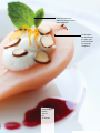

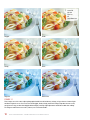


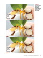


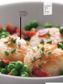

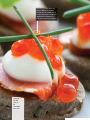
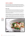

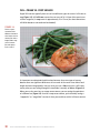

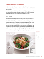


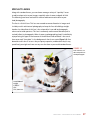


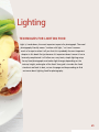
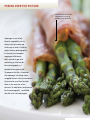
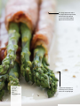


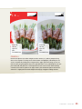


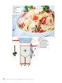
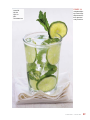
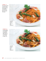
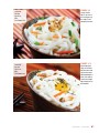

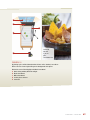
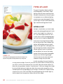

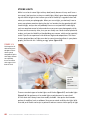
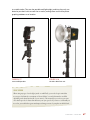
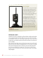


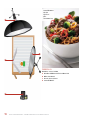
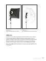


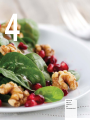
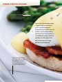
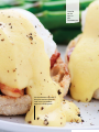
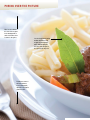
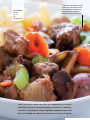

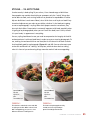
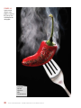

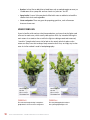
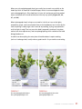
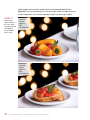


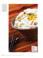

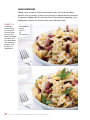
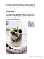
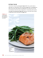
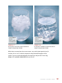


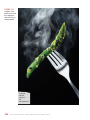

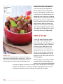


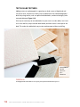
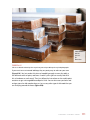

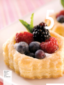
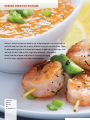


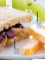
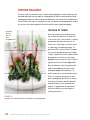
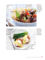
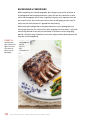
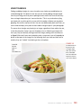


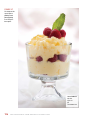
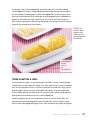
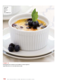

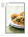
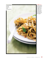

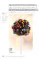


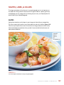
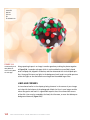
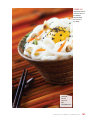

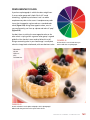


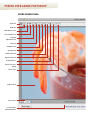
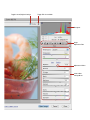
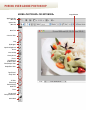

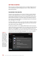
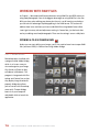
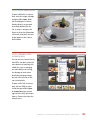
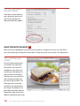
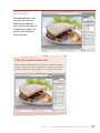
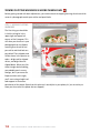
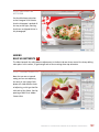

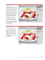
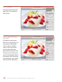
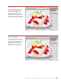
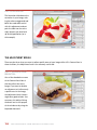
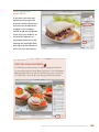
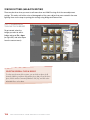

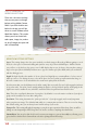


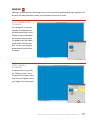
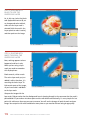
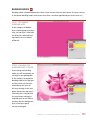

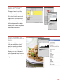
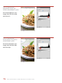
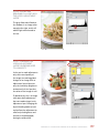


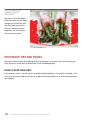
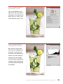
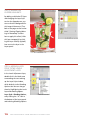


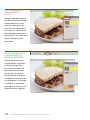


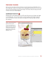
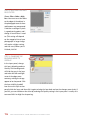
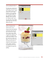

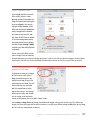
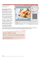


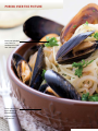

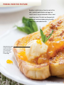
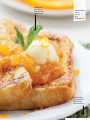
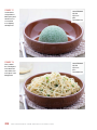
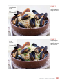

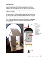
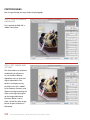
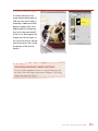
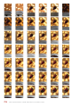
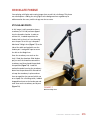


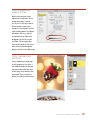


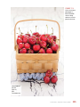


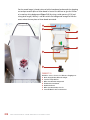


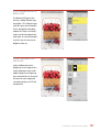

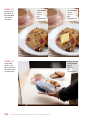


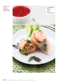
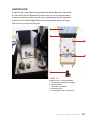
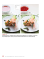
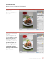
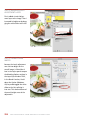
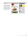
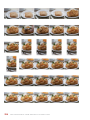


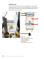

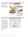
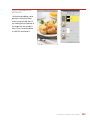

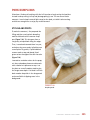


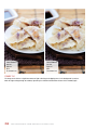
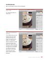

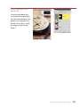
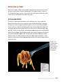
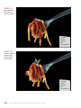


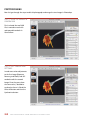


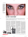


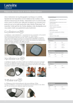
![4 Clique no botão [Seguinte].](http://vs1.manualzilla.com/store/data/006043744_1-f05b6736baef7db0e28ae667ea337dee-150x150.png)