1
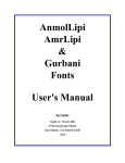
AnmolLipi
AmrLipi
&
Gurbani
Fonts
User's Manual
AUTHOR:
Kulbir S. Thind, MD
3724 Hacienda Street
San Mateo, CA 94403-4338
USA
2
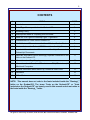
CONTENTS
#
TOPIC
PAGE
1.
Introduction
3
2.
List of Type-Faces provided on the Gurbani-CD
3
3.
Licensing Policy
3
4.
Assumptions Made for Preparing this Document
4
5.
What is a True Type or PostScript Type-1 Type-face?
4
6.
Characteristics of Fonts on the Gurbani-CD
4
7.
Useful Hints and Discussion on the Use of Gurbani & other Fonts
5
8.
How are fonts on the Gurbani-CD Different from Amrit-Lipi?
8
9.
Important Information about Conversion of Amrit-Lipi Documents to
GurbaniLipi Documents
9
10.
Important Information About Seemingly Duplicate Characters in the
fonts on the Gurbani-CD.
11
11.
Information about Key Mapping
12
12.
Information about Transfer of Files between PC (MS windows) &
Macintosh Computers
15
13.
General Information about Amrit-Lipi, Gurbani & other Fonts
15
14.
Disclaimer
16
15.
A Final Note
16
NOTE: This manual does not refer to the fonts included inside the "Ramingt_"
folder on the Gurbani-CD. The terms "fonts on the Gurbani-CD" or "fonts
included on the Gurbani-CD" are loosely used in this manual and do not relate to
the fonts inside the "Ramingt_" folder.
All rights are reserved by the author, Kulbir S Thind, MD, 3724 Hacienda Street, San Mateo, CA 94403, USA.
3
INTRODUCTION:
Information in this document is designed to help you successfully use the fonts
provided on the Gurbani-CD. This document is prepared with a number of fonts
including many from the Gurbani-CD. Thus, before attempting to read or print this
document the user should install the fonts provided on the Gurbani-CD by opening
"InstalTT.doc" document on the Gurbani-CD. This document may be printed for easy
reference.
This manual has information both for PC & Macintosh computers. Please use the
information that is appropriate for your computer.
List of Type-Faces provided on the Gurbani-CD (inside the “FONTS” folder):
1.
“AnmolLipi type-faces”, (AnmolLipi, AnmolLipiLight, AnmolLipiSlim, AnmolLipiBold, AnmolLipiThick, AnmolRaised, AnmolUbhri, AnmolKalmi) are a family of
Gurmukhi fonts with variations in display that are suitable for writing modern
Punjabi where international numbers are used as a routine. Classic Gurmukhi
number characters are also included in these fonts as symbols.
2.
“AmrLipi type-faces”, (AmrLipi, AmrLipiLight, AmrLipiSlim, AmrLipiHeavy,
AmrLipiThick etc.) are a family of Gurmukhi fonts with variations in display that are
suitable for writing Punjabi where classic Gurmukhi numbers are used as a routine.
3.
“GurbaniAkhar
type-faces”,
(GurbaniAkhar,
GurbaniAkharLight,
GurbaniAkharSlim & GurbaniLipiHeavy, GurbaniAkharThick etc.) are a family of
Gurmukhi fonts with variations in thickness that are optimized for writing text of
Shree Guru Granth Sahib in the customary format (i.e.; these fonts fulfill the
requirement of writing 19 lines of Gurbani text per page in the landscape page
orientation and with a decent font size). Most characters in these fonts have lesser
width than the AnmolLipi or AmrLipi family of type faces (due mainly to less of
white space around the characters). Additionally, in the GurbaniAkhar family of
type-faces more of space is given to the characters that fall below the base line.
These fonts have been further improved over GurbaniLipi fonts.
4.
“GurbaniLipi & GurbaniLipiLight”, along with their bold versions are a family of
Gurmukhi fonts with variations in thickness that are optimized for writing text of
Shree Guru Granth Sahib in the customary format.
5.
“GurbaniHindi, Guru Devan, ApniHindi, AmrHindi”, are Devanagari (Hindi)
fonts.
6.
“GurbaniRomanizing”, a font optimized for romanizing Gurbani (& Gurmukhi).
Many bitmap fonts are also included for the Macintosh computer.
All of the above fonts share similar (although not identical) key maps. Devanagari fonts
have many more characters than are available in Gurmukhi fonts.
All rights are reserved by the author, Kulbir S Thind, MD, 3724 Hacienda Street, San Mateo, CA 94403, USA.
4
Licensing Policy
Dr. Thind’s Type-faces are free but are licensed for use only. Users are not permitted to
illegally sell his type-faces or to modify the outlines for making profit or for other
purposes. They are also not to distribute copies of his type-faces to others, free or
otherwise. The distribution should be left to Dr. Thind and to individuals authorized by
him as there are many advantages in doing so. If you do want to give Dr. Thind’s fonts
to others, you must, first obtain permission from him.
Assumptions Made in Preparing this Document
It is assumed that the users of the fonts included on the Gurbani-CD fonts have
sufficient familiarity with MS Windows Operating System or Macintosh Operating
System and should be able to use at least some word processing programs (that run
under the system in question).
What is a True Type or PostScript Type-1 Type-face?
True Type or PostScript Type-1 type-faces are called outline type-faces. These consist
of mathematical descriptions of the outlines of characters. Such type-faces can be
scaled2 to any practical size for smooth display on the monitor or for printing on many
different printers (including postscript printers). However, these type-faces can only be
used with the help of a certain type of system software that is made to use these kind of
type-faces. All of presently sold Macintosh computers can use TrueType as well as
PostScript Type-1 fonts. MS Windows 95 or later versions of Windows can all use
TrueType fonts. MS Windows 2000 & XP can also use PostScript Type 1 fonts.
However, Adobe Type Manager software is required to use PostScript Type-1 fonts on
Windows 95, 98 & NT.
Characteristics of Fonts on the Gurbani-CD
1.
These fonts have a well thought character layout. These type-faces are expected
to be used on the computers with English keyboards. There are more than 125
working characters in each of these type-faces and 94 of those can be accessed
as upper and lower case characters. Devnagari type-faces have many more
characters to make it suitable for writing Hindi. GurbaniRomanizing type-face is
optimized for romanizing GurbaniLipi text with ease. Ease of remembering the
location of characters was one factor that played a major role in deciding mapping
of characters. However, many other issues such as convertibility of files between
the Macintosh and IBM compatible PCs were taken into consideration. The most
important characters are available as upper and lower case and are arranged in a
2
With the help of proper software, such type-faces can also be rotated and outlines of their characters
manipulated to produce many types of visual effects, such as skewing, stretching, compressing, twisting
and distributing. With these type-faces, you can routinely use effects such as bolding, underlining,
outlining, shadowing and italicizing.
All rights are reserved by the author, Kulbir S Thind, MD, 3724 Hacienda Street, San Mateo, CA 94403, USA.
5
way to make it easier to remember their arrangement. Please see more regarding
key mapping under “Information about Key Mapping.”
2.
Type-face size is balanced for esthetic mixing with the popular English type-faces
(without the need to change size).
Some useful Hints and Discussion on the Use of Fonts on the Gurbani-CD.
Which software can use these Fonts?
Once the fonts are installed into your computer’s system, those then become available
to any of the software that runs under that system. Almost all of the software designed
for the Macintosh computers is capable of using different fonts. The situation is very
much similar with most of the software made for MS Windows. A software that runs
under DOS but not under Windows can not make use of these type-faces (for example
“Microsoft Word for Windows” can make use of these type-faces but “Microsoft Word for
DOS” can not).
Typing Fonts Included on the Gurbani-CD
Assuming that the fonts are installed into your system and you are running an
appropriate software. To create a document using the Gurmukhi or Hindi fonts, you will
need to select the appropriate font from the "Fonts" menu and its intended size from the
font-size menu. To type the appropriate characters one needs to refer to the charactermap (character layout on the key board and ANSI numbers-in case of MS Windows
operating system). Memorizing the key map will help in gaining speed in typing these
Gurmukhi or Hindi fonts. With practice one can get used to the character map and to
other peculiarities of typing and editing Gurmukhi & Hindi fonts. Users should refer to
the character maps that are included on the Gurbani CD.
To achieve consistent results (especially for creating & using spell-checking dictionaries
and for “Find & Replace” functions) it is important to use a standard method of
sequencing the characters. Due to the existence of overlapping characters in the
Gurmukhi fonts this issue becomes too important to ignore. When two overlapping
characters are used one after the other it is hard to tell their sequence just by looking at
a word. Whenever it is necessary to type two overlapping characters, the
overlapping character at the bottom of the main character on the left should be
typed first. Thus, the word nUµ should be typed as “nUµ” (the ANSI number for µ is 181
and on the Macintosh computer this word is typed “Option M” for µ). Only in rare
instances two overlapping characters like in DR¨ fall beneath the character on the left. In
such situations proper sequence is usually obvious.
When writing “Gurmukhi” it is advisable that “AutoCorrect” feature of your Word
Processor be adjusted so that it may not correct two consecutive capitals in a
word and should not capitalize first letter of sentenses. In case of “Microsoft Word”
this feature can be adjusted by selecting the command “AutoCorrect” from the tools
menu and then deselecting “Correct TWo INitial CApitals” and "Capitalize First Letter of
Sentenses" in the dialogue that follows.
All rights are reserved by the author, Kulbir S Thind, MD, 3724 Hacienda Street, San Mateo, CA 94403, USA.
6
Viewing Fonts in Detail
It is important to emphasize the fact that even a good quality monitor will not display a
very small size of characters with clarity (and for a very small size of text, Windows
often will change the type-face to a proprietary one). This is mainly due to the limitations
of display resolution. Print quality depends to a great extent on the printer you use. A
good quality printer can print many times more dots per inch than what most of good
monitors can display. Commonly used laser printers print 300 dots per inch or 90,000
dots per square inch, whereas most of the computer monitors show about 75 dots per
inch or 5625 dots per square inch; the difference is 16 fold. However, most of the
computer monitors have one distinct edge over most of the printers. Computer monitors
can show many colors and each dot can display a color by picking among millions,
whereas dots in most of the printers are printed with one bit mode (like black or white)
and gray tones or colors are simulated by combining such dots.
To have a real (detailed) look of any character shape it is important to view the
character at a large point size. Most of present day word processors allow you to type
large size of text. Text at point size of 100 or above may be used for a detailed look. As
seen on the monitor, character shapes at small sizes are somewhat of a compromise,
although those will be printed perfect with a good quality printer. Slim versions of fonts
give a clearer view of the smaller point sizes of text on the monitor than medium or thick
versions of fonts. Depending on your printer, thinner versions of fonts will generally print
smaller sizes of text sharper than thicker fonts.
At certain point sizes, bolding of certain fonts (if you have installed bolder versions of
these fonts) may not be obvious on the monitor. It is because pixels (dots) on the
screen can not be divided into fractions. Under circumstances requiring pixel fractions
for bolding of the text, the computer may not add a visible thickness to make bolding
obvious. However, the text when printed with a good quality printer, will be perfectly
bold if there is a bold version of the font installed in the system. (Note: if there is no
installed bold version of a type-face then bolding is done by the software itself and is
almost always obvious on the monitor. However, the printed bold text in such cases is
not perfect like when a bold version of the font is available).
Experience indicates that the PostScript Type-1 fonts seem to give better results as far
as character clarity on the monitor is concerned and also to a good extent in printing.
Due to internal limitations, the True-Type fonts often do not print or display complex
characters well.
Accessing Characters
True Type type-face technology was originally designed by Apple for use on the
Macintosh. Microsoft also licensed & developed “TrueType” for the Windows. So far as
the use of the type-faces is concerned, presently there is not much difference between
these environments. However, it is much easier to access type-face characters on the
Macintosh that exceed the upper & lower case limit (94). It is due to the availability on
the Macintosh of ‘Command’, ‘Option’ & ‘Shift + Option keys’. By pressing one or a
All rights are reserved by the author, Kulbir S Thind, MD, 3724 Hacienda Street, San Mateo, CA 94403, USA.
7
combination of these keys, a full array of 47 more characters becomes easily
accessible, just as with the Shift key. In the Windows environment, a common way to
access the extra characters is to hold the Alt key in the pressed position and then type
on the numeric key pad a zero "0" followed by the ANSI number of the character. Some
of the software for the Windows environment also provide other means of accessing
characters in excess of upper & lower case (for example, MS Word for Windows has a
command named “Insert Symbol” which is very helpful in this regard). Version 6.0 or
later versions of MS Word allow one to allocate key combinations to insert such
characters with ease. With this facility, typing becomes as easy as on Macintosh.
Although the operating system of Windows itself does not provide the ease of accessing
more than 94 characters like the Macintosh environment does, something similar can
however be achieved by many of the working software. One of the ways the word
processors (and other software) achieve this is by allowing one to create macros. Short
of other means, the “Character Map” utility that comes with the Windows 95 or later
versions of Windows is helpful in providing some ease. Since “Windows” allows one to
run “Character Map” utility simultaneously with one’s working software, it is easier to
make use of this utility. It may be convenient to keep “Character Map” utility running
while typing Gurmukhi or Hindi fonts.
Editing Gurmukhi or Hindi Fonts
To help edit characters that overlap over or under the character on the left, such
characters are assigned a small width. While editing, it is always tricky to get the cursor
on the right side of such a character (with essentially no width) but it can be done if care
is exercised - just insert the cursor a little bit more to the right. The use of cursor arrow
keys is also very useful in this regard. Although generally not a problem, inserting the
cursor on the left side of an overlap character may also require precision. It may be
convenient to use bigger type-face size while typing the text. Upon completion of the
work (after all the text has been entered), the text size can then be reduced to the
desired level.
Use of Special Space Character (non-breaking space)
This paragraph describes the special “space” character (ANSI # 160 for MS Windows
and “Option Space” for the Macintosh) in the supplied and other fonts. This is different
from the regular space character that is typed with the space bar. A regular space
character separates the words but this “solid space” character behaves like other
characters and has width but no shape. When this non-breaking space character is
typed, it adds white space to words. This kind of space always behaves as a part of the
word and moves with it (unlike the space character typed with the space bar). This
character is useful in many situations. Here is a good example of its use. The
overlapping GurbaniLipi character “ y ” will be displayed when there is a character on
All rights are reserved by the author, Kulbir S Thind, MD, 3724 Hacienda Street, San Mateo, CA 94403, USA.
8
the left side.3 In this case a solid space character has been used (twice). In this
example therefore “ y ” behaves as one word.
How are Fonts on the Gurbani-CD Different from Amrit-Lipi?
Dr. Thind’s Amrit-Lipi fonts had a wide distribution before GurbaniLipi was made
available. “GurbaniLipi” is a special Gurmukhi font optimized for writing Guru Granth
Sahib. Since then other fonts included on the Gurbani-CD have been developed. The
following eleven characters previously not found in the Amrit-Lipi have been included in
the “GurbaniLipi and other fonts that followed.” (See acknowledgment at the bottom of
this page)**
@
´
ç
†
œ
˜
ü
¨Ú Ø
The areas are shaded simply to illustrate the relationships of characters to the
_______________________________________________________________
Shapes for ç † œ ˜ Í vary in different printed versions of Guru Granth Sahib and also
within the same edition. In the fonts included on the Gurbani-CD the characters ç † œ ˜
are open at the tops (as suggested by Dr. Kulwant Singh). The eleventh character
shown above is a dot character that can be used to put a bindi (dot) under any
character. This is essentially an extra character. The right upward sloped part of <>
is more sloped. There are two tippi characters in the Amrit-Lipi as well as in the
GurbaniLIpi fonts. However, the key map locations of these tippi characters is reversed
as compared to Amrit-Lipi. See details under “Important Information about Seemingly
Duplicate Characters in the Gurmukhi Fonts on the Gurbani-CD”.
The keyboard mapping of fonts on the Gurbani-CD is improved and allows one to create
and use the spell checking dictionaries. For the same reason, an extra character ~ that
is required after a is included in these fonts. See more regarding this under “Important
Information About Seemingly Duplicate Characters in the Gurmukhi fonts on the
Gurbani-CD.” Key maps of these fonts are easier to remember and make it possible to
access few more characters as upper and lower case.
Many a fonts of the Gurbani-CD have also been improved by modifying character
shapes so as to make characters more clear on the computer monitor (clarity problems
are only an issue at smaller sizes of text) and for low resolution printing.
It needs to be clarified that the minimum line spacing in the fonts on the Gurbani-CD is
more than in “Amrit-Lipi.” However, it is possible to adjust line spacing below the
minimum allowed in the font by using fixed spacing. But not all word processors allow
fixed spacing. Care should be exercised when using fixed line spacing as characters
3
Some of the software will display and print such characters regardless of whether there be a character
on the left or not.
**
The labor of searching all the special characters in Shri Guru Granth Sahib was done by Dr. Kulwant
Singh. Dr. Thind is grateful to him. The extra dot character is also included as per his suggestion.
All rights are reserved by the author, Kulbir S Thind, MD, 3724 Hacienda Street, San Mateo, CA 94403, USA.
9
between lines can overlap each other and in some cases may get cut depending upon
your computer/printer setup.
Important Information about Conversion of Amrit-Lipi Documents to Documents
Using fonts given on the Gurbani-CD
AnmolLipi, AmrLipi, GurbaniAkhar & GurbaniLipi, families of fonts have similar key
maps. However, these fonts have a somewhat different key map than the Amrit-Lipi
fonts. These fonts are not only good for writing Gurbani & modern Gurmukhi, but are
also nearly perfect for creating & using Gurmukhi dictionaries and for flexible “Find &
Replace” functions. Thus many of you may want to update your existing documents for
use with these fonts. This information is for those individuals who need to update their
old documents containing Amrit-Lipi fonts to those with GurbaniLipi or similar fonts.
However, there is a point of caution. The tables below ignore conversions for extra set
of numbers (the numbers in the natural number locations do not require any
conversions). Extra set of numbers are probably never used by most of individuals.
The documents prepared using Amrit-Lipi fonts can be converted to GurbaniLipi
documents (or those with other similar fonts) by using “Find & Replace” functions of
your word processor. If you prepared your documents by using Microsoft Word, you
may use a readymade macro from Dr. Thind to do the conversions with one command.
Otherwise use the “Find & Replace” functions of your word processor and follow the
sequence of replacements as outlined below.
To safeguard your document from possible blunders during the conversion
process the following “Find Replace” functions should be performed on a copy of
the original document. Before conversion do not add your written material
prepared with new fonts to your old documents before conversion.
As the first step change document fonts from Amrit-Lipi font to AnmolLipi with the “Find
& Replace” command.
Next step involves replacing each of the appropriate letters in a defined sequence as
shown in the tables. Make sure that you check “Match Case” but not “Whole Words
Only.” The font selection must be “AnmolLipi” font for “Find What” as well as for
“Replace With” (unless after font conversion the only font in your whole document is
AnmolLipi).
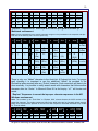
“Replace” Sequences for “Amrit-Lipi2 or Amrit-Lipi-Light to AnmolLipi” in MS
Windows environment.
Note: The numbers in the “Find What” or “Replace With” columns denote the ANSI number of the respective
character.
#
Find
What
Replac
e With
#
Find
What
Replace
With
#
1
W
\
7
@
`
13
Find Replace
What
With
E
A
#
Find
What
Replac
e With
19
nM
n+18
1
All rights are reserved by the author, Kulbir S Thind, MD, 3724 Hacienda Street, San Mateo, CA 94403, USA.
10
2
~
W
8
172
163
14
132
E
20
lM
l+181
3
|
[
9
229
<>
15
151
133
21
210
]
4
X
|
10
212
199
16
174
151
22
211
nU+181
5
w
X
11
171
162
17
181
M
6
`
w
12
A
132
18
kR
k+174
“Replace” Sequences for “Amrit-Lipi-M or Amrit-Lipi-Light-M to AnmolLipi” in
Macintosh environment.
Note: The key combinations for the specific characters are given in the parenthesis in the respective cells.(the
letter S is for the Shift key and O is for the Option key).
#
Find
What
Replace
With
#
Find
What
Replace
With
#
Find
What
Replace
With
#
Find
What
Replace
With
1
W
\
7
@
`
13
E
A
19
nM
nµ
(n+Om)
2
~
W
8
¬
(Ol)
£
(O3)
14
∂
(Od)
E
20
lM
lµ
(l+Om)
3
|
[
9
å
(Oa)
<>
15
—
(SO-)
…
(O;)
21
Ò
(SOl)
]
4
X
|
10
Ô
(SOj)
Ç
(SOc)
16
®
(Or)
—
(SO-)
22
Ó
(SOh)
5
w
X
11
«
(O\)
¢
(O4)
17
µ
(Om)
M
6
`
w
12
A
∂
(Od)
18
kR
k®
(k+Or)
nUµ
(n+U+Om)
There is only one “Adhak” character in the Amrit-Lipi & Gurbani-Lipi fonts. For proper
spell checking it is important to use the additional “Adhak” as provided in the
GurbaniLipi when required after any “Oorha” character. Such corrections will have to be
done manually. It is possible to easily search words with characters that follow another
character after the “Oorha.” In Microsoft Word 6.0 a find inquiry “ a?`” will locate such
words.
“Replace” Sequences to correct the improper character sequences in the MS
Windows environment.
Note: The numbers in the “Find What” or “Replace With” columns denote the ANSI number of the
respective character. The replace sequences listed in the table below are for frequently written material.
Many more sequences are possible in the text from Sikh scriptures. Interested individuals may contact
Dr. Thind for details.
#
Find
What
Replac
e With
#
Find
What
Replac
e With
#
1
Mu
uM
7
MU
UM
13
oR
14
OR
2
181+u u+181
8 181+U U+181
Find Replace
What
With
#
Find
What
Replac
e With
Ro
19
`R
R`
RO
20
MH
HM
All rights are reserved by the author, Kulbir S Thind, MD, 3724 Hacienda Street, San Mateo, CA 94403, USA.
11
3
`u
u`
9
`U
U`
15
yR
Ry
4
~u
u~
10
~U
U~
16
YR
RY
“Replace” Sequences to correct the improper character sequences in the
Macintosh environment.
Note: The key combinations for the specific characters are given in the parenthesis in the respective cells.(the
letter S is for the Shift key and O is for the Option key). The replace sequences listed in the table below are
for frequently written material. Many more sequences are possible in the text from Sikh scriptures.
Interested individuals may contact Dr, Thind for details.
#
Find
What
Replace
With
#
1
Mu
uM
7
MU
8
µU
2
µu
uµ
(Om+u) (u+Om)
Find What
Replace
With
#
UM
13
oR
14
Uµ
(Om+U) (U+Om)
Find Replace
What
With
#
Find
What
Replac
e With
Ro
19
`R
R`
OR
RO
20
MH
HM
3
`u
u`
9
`U
U`
15
yR
Ry
4
~u
u~
10
~U
U~
16
YR
RY
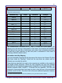
Important Information About Seemingly Duplicate Characters in the Fonts on the
Gurbani-CD.
Following table illustrates differences between double characters in the these fonts:
MS Windows environment:
Character Key or ANSI
#
Shape
Example
ANSI #181
M
µ
sM
sµ
isMG
plµG, nUµ
`
`
s`
s~
iv`c
au~cy
u
ü
su
sü
buD
dRügMDw
U
¨
sU
s¨
pUrw
DR¨
pING
AMDˆØI
ipRQvI
Shift M
Shift ` (~)
~
u
ANSI #252
Shift U
ANSI #168
ANSI #136
ˆ
sN
sˆ
Shift R
ªR
sR
Shift N
***
Placement
N
***
A Gurbani word that requires a bar character (ANSI#216) to be typed between bindee & biharee.
All rights are reserved by the author, Kulbir S Thind, MD, 3724 Hacienda Street, San Mateo, CA 94403, USA.
12
ANSI #174
ª®
s®
ik®pwl
Shape
Placement
Example
Macintosh environment:
Character Key
Option m
M
µ
sM
sµ
isMG
plµG, nUµ
`
`
s`
s~
iv`c
au~cy
u
ü
su
sü
buD
dRügMDw
U
¨
sU
s¨
pUrw
DR¨
pING
AMDˆØI
ipRQvI
ik®pwl
Shift m
Shift ` (~)
~
u
Option uu
Shift u
Shift Option u
Shift Option i
ˆ
sN
sˆ
Shif R
ªR
ª®
sR
s®
Shift N
Option r
N
***
The “double-dundee” characters with key map “]” & ANSI #210 (Shift Option l) are
different only in the amount of white space on their sides. The character with ANSI#210
(Shift Option l) has very little of white space on its sides. Such a character should only
be used with a space character on each side (such a combination is often useful in
achieving a different esthetic result).
Information about Key Mapping
If you are interested in knowing why the key maps of the fonts on the Gurbani-CD (other
than those inside the "Ramingt_" folder) are the way those are, please read on.
Otherwise you may skip this section.
These fonts are expected to be used on the computers as available on the market for
the English writing community. Almost all such computers are sold with standard
keyboards and are expected to use programs designed for the English language. The
standard keyboard called “QWERTY” is derived from the typewriter. The later was
designed to slow people down from typing too fast so that the keys of the mechanical
typewriter would not stick. Thus this is one of the most inefficient keyboards. However,
***
A Gurbani word that requires a bar character (ANSI#216) to be typed between bindee & biharee.
All rights are reserved by the author, Kulbir S Thind, MD, 3724 Hacienda Street, San Mateo, CA 94403, USA.
13
since most of the people are used to this keyboard, this has become a standard for the
computers as well. “Function Keys” & the “Numeric Key Pad” have been added to the
typewriter keyboard to make it suitable for the computers. Attempts by many in the
industry to introduce the most efficient keyboard called “DWARK” have not been
successful. We are therefore left with an inefficient English keyboard as the standard.
It is assumed that most users wishing to write Punjabi (& Hindi) will use the same
keyboard for English as well as for Gurmukhi writing. Thus they are not expected to put
Punjabi/Hindi labels on the keys. This requires that the Key Mapping for the
Gurmukhi/Hindi be such that it is easier to remember the key map. It is true that
frequent users can memorize any key map.
Computers do not behave as typewriters. A typewriter is a dumb mechanical machine
that types shapes on the paper in the sequence that we type in. For computers each
character has a meaning far beyond a simple shape. For example all the number
characters have numerical values attached to those. Similarly, during the “Spell Check”
and “Search & Replace” procedures some characters are not considered as part of the
words such as: . , ; : < > ( )[ ] { } - _ = + ! # % $ *. Computers actually do not associate
such values to the “characters shapes” but to the “character’s number value” in the
scheme as adopted by a given type of computer system. Thus, for example, if a
character looks like a number but is not located on the appropriate number key it will not
have the expected numerical value.
A regular computer font can have up to 224 working characters (plus 32 control
characters), but only 94 of these can be allotted upper & lower case positions on the
keyboard. The newer Unicode fonts can have up 64000 (approx) characters each.
Standard English alphabet characters are only 26 (plus 26 capitol characters). However,
many more characters & symbols are used in actual writing of English. That is why
many of the standard English fonts like Times & Helvetica have maximum characters
each. However, the characters (as shapes) available in excess of upper & lower case in
the MS Windows & Macintosh environments are not the same in similar fonts. This
poses very serious problems so far as file conversions from one computer to the other
are concerned. Making it more difficult is the fact that MS Windows & Macintosh
environments have adopted different character numbering schemes (yes, computers
remember every thing by numbers). However, the characters available as upper &
lower case on the keyboard are the same in both the environments. Those characters
that are in excess of upper & lower case on the keyboard are typed in different ways on
Macintosh verses IBM compatible (Windows) computers.
Consequently, there are many important issues that need to be considered
simultaneously in deciding key mapping. One requirement often poses conflict with the
other. Thus perfection is difficult to achieve. It is the balancing act that one has to
consider.
The following criteria have been given the utmost importance for key mapping:
All rights are reserved by the author, Kulbir S Thind, MD, 3724 Hacienda Street, San Mateo, CA 94403, USA.
14
(NOTE: The information that follows does not refer to the fonts inside the
"Ramingt_" folder which are mapped according to the Ramington type writer
key map that is in common use in India).
1.
Ease of Remembering the Gurmukhi Key Map on the Standard English Keyboard,
both for Macintosh and IBM compatible PCs: This is not simple to achieve. Making
it easier on one computer often makes it difficult on the other (for those characters
in access of upper & lower case). For the upper & lower case characters, Dr. Thind
adopted a technique that he calls “Phonetic Combining, Pairing & Associating.”
The characters are mapped in a way that it makes it easier to remember their
locations on the key map. Dr. Thind concludes from the received feed back, that
this technique is well accepted. This scheme is not necessarily the most efficient
for speed typing. However, most individuals are less concerned about designing
key map to improve typing speed because most of them can type at very good
speeds given any mapping. Experienced typists have no problem using the shift
key to type any character and do so with efficiency.
2.
Easy Transferability of Files between Macintosh and IBM compatible PCs: This
requirement limited Dr. Thind to use only certain character locations for characters
in access of upper & lower case.
3.
Spell Checking & Flexible Search & Replace Functions: As of now, there are no
Gurmukhi spell checking dictionaries available for the common user, something
worth achieving particularly for our future generations growing up in the western
part of the world. Thus, it is also important that character mapping be such that
intended Gurmukhi dictionary words are recognized by the computer software as
the dictionary characters. The key mapping for Amrit-Lipi has been somewhat
deficient in this regard. This situation has been improved in the Gurmukhi fonts on
the Gurbani-CD. Similar value has to be given to various “Search & Replace”
functions. Thus Dr. Thind has attempted to use natural locations for those
characters that also exist in the English fonts. Character locations for non
dictionary characters (such as . , ; : < > ( )[ ] { } - _ = + ! # % $ *) can not be used
for dictionary characters if Spell Checking and flexible Search & Replace functions
are to be done with a reasonable ease. (NOTE: Devanagari fonts have too many
characters making it difficult to achieve this goal).
4.
Issues of Quote Characters: Most people love to use smart or curly quote
characters (“ ” ‘ ’) instead of regular quote characters (" ') for English as well as for
Gurmukhi/Hindi writing. Most popular word processors have the option of
automatic insertion of curly quotes (‘’ & “ ”) when using those keys for straight
quotes. This is a function that most people love to use as it simplifies the use of
double or single curly/smart quote characters. By using this automation process,
one is able to use four of these curly quote characters with just one key with the
help of the shift key. Thus it will be a problem using this key location for any thing
All rights are reserved by the author, Kulbir S Thind, MD, 3724 Hacienda Street, San Mateo, CA 94403, USA.
15
else. Moreover, this key being a non-dictionary key location can not be used for the
dictionary characters.
5.
Issues of Numbers: Only the number characters at their normal locations carry
numerical values. The classic Gurmukhi numbers when used at locations other
that numbered keys behave only as symbols.
6.
Bindiwala Characters (characters having dots beneath them). Following Gurmukhi
characters are dictionary characters: S ^ Z z & L and can be written by
combining two characters (appropriate character + a dot character). However, the
“BINDI” will take up space under the character below the baseline making it difficult
to use u U (the bindiwala characters as designed by Dr. Thind have their dots
located above the base line). Here is what will happen if the dots are below the
baseline: sæu sæU Kæu KæU gæu gæU jæu jæU Pæu PæU . However, this can be corrected by using ü ¨
that are positioned lower than the Bindies. However, such a combination will not be
esthetically correct and will require use of two extra keys.
7.
“< >” Keys can only be used for non dictionary characters thus it is decided to use
these keys for < & > in most of the fonts on the Gurbani-CD.
Information about Transfer of Files between PC (MS windows) & Macintosh
Computers
Dr. Thind has used different names for different versions of his previous Gurmukhi typefaces such as “Gurmukhi”, “GurmukhiMac”, “GurmukhiPC”, GurmukhiTrue”,
“GurmukhiTwo” & “Guru-Script” etc. Name “Amrit-Lipi” was adopted in March 93.
Gurbani-Lipi was added to the Amrit-Lipi type-faces in October 93. Amrboli and
Amritboli have been given to other users in September 96. First GurbaniLipi fonts
were released in December 1994 (Note: GurbaniLipi is not same as Gurbani-Lipi
with dash). This document is being enclosed with revised versions of
GurbaniLipi. Other fonts included on the Gurbani-CD were developed subsequently.
Descriptive terms such as “Light, Slim & Heavy” are used to denote variations. In the
past the letter “M” was added to the names of all Amrit-Lipi & Gurbani-Lipi fonts for the
Macintosh, as in “Amrit-Lipi-M.” However, any fonts released after November 1994 have
identical names for the PC & Macintosh versions of fonts. Keyboard layout has evolved
to the present level of perfection over time. In deciding the keyboard layout, different
issues regarding the use of these on the Macintosh and the IBM compatible computers
(windows environment) were taken into account simultaneously. Files that use fonts
from the Gurbani-CD can be easily converted from Macintosh environment to the PC
(MS Windows) environment and vice versa.
It is hoped that the information given above will help the user become an expert
on the use of Dr. Thind’s Fonts. However, if you need further information or help
please feel free to contact him.
All rights are reserved by the author, Kulbir S Thind, MD, 3724 Hacienda Street, San Mateo, CA 94403, USA.
16
General Information about Dr. Thind’s Fonts
The Gurmukhi, Hindi & GurbaniRomanizing TrueType or PostScript Type-1 Type-faces
that Dr. Thind has developed as a service to the Punjabi/Hindi writing/reading
community, are available for the Macintosh and also for the IBM compatible computers
that use “MS Windows” operating system.
The creation and distribution of Dr. Thind's fonts is not being done as a business
venture. Although Dr. Thind has invested a huge amount of time and have incurred
significant costs in developing and distributing his type-faces, he has not as yet
accepted any money from any recipient of his type-faces (some individuals did mail
MOs or checks generally for ten dollars or so but all were returned). Dr. Thind has been
distributing his Gurmukhi type-faces free of charges for many years (Note: Some
individuals may have made profit without his knowledge). Please note that persons
authorized by Dr. Thind to distribute his typefaces are often permitted to charge a
reasonable fee for postage, handling and disk etc.
Disclaimer
All software/data provided on the Gurbani-CD including all type-faces is distributed "AS
IS". Author disclaims all warranties of the software, whether expressed or implied,
including but not limited to any implied warranties of merchantability, fitness for a
particular purpose, functionality or data integrity or protection. In no event shall the
author/authors be liable for any damages arising out of the use, or inability to use any of
the software provided on the Gurbani-CD.
A Final Note
Last but not the least, any good suggestions for the improvement of Dr. Thind’s fonts
are more than welcome. Please do communicate, preferably in writing, if you have any
good suggestions.
****
****
This manual was re-written on 1/2/98
All rights are reserved by the author, Kulbir S Thind, MD, 3724 Hacienda Street, San Mateo, CA 94403, USA.