1
MILES J. HART
10
Using the
framework
Although our main interest is designing good interactive devices, we don’t have
to work with conventional interactive gadgets; things can be very different—from
lightbulbs and microwave ovens to guns and fire extinguishers. Our first example
is an old puzzle—we hope that user interfaces to gadgets won’t be puzzles, unless
they are supposed to be!
10.1
The farmer’s problem
The farmer’s problem is an imaginary problem set in a far-off land, where goats
eat cabbages, rivers flow, and farmers work hard. Somehow, this farmer has got
a wolf, goat and cabbage stranded on one side of the river and wants to get them
across using the only boat they have—a flimsy canoe. If the farmer leaves the goat
and cabbage together unsupervised, the goat will eat the cabbage; if the farmer
leaves the wolf with the goat, of course the wolf will eat the goat. And for some
reason, the canoe is only big enough for the farmer and one other thing. Presumably, if the farmer is rowing the canoe, keeping a wolf or goat under control is hard
enough to do without having to stop the cabbage rolling away.
A farmer trying to get a cabbage, goat, and wolf across a river is really far too
silly a story to believe! Possibly the craziness helps people remember it, but the
story has the same structure as many other stories that are more plausible. The
structure is the same as the story of the farmer with a hen, bag of chicken feed,
and a dog—and a car instead of a canoe. When we explore the problem using a
computer we are only interested in its structure and what we can learn about the
structure of the problem, not whether we are dealing with hens or goats. As we
shall see, we aren’t at all interested in farming problems as such except that their
structure can be analyzed in exactly the same way as the structure of interactive
devices.
Like any interactive device, this problem has states, which correspond to various combinations of wolf, goat, cabbage, and farmer being on one side of the river
or the other, and it has actions, which correspond to the canoe carrying things
325
Chapter 10
Using the framework
across the river. You could imagine making an interactive game that simulated the
farmer’s problem, and then the farmer’s problem would be an interactive device.
To solve the problem requires two things: that the goat is never left alone with
the cabbage, and for the wolf never to be left alone with the goat—in either case,
something will get eaten! If the farmer is silly enough to leave the goat, wolf and
cabbage alone on the same side of the river, then the wolf will wait until the goat
has eaten the cabbage, thus becoming a fat goat, before eating it.
We first show this problem as a finite state diagram, with the states in a circle in
no particular order:
Start —
End —
It’s clearly got a lot more states than a lightbulb! In this diagram, the problem
has effectively been changed into finding a route following arrows from one circle
to another, starting at the circle labeled “Start” and going on to the finish of the
puzzle at the state “End.”
.
I wrote a program to generate the farmer’s graph, much like the program to
construct the drill in section 9.8 (p. 316). We don’t need it here, but the
program is available on the book’s web site, mitpress.mit.edu/presson.
Some, but not all, of the arrowed lines are one way: if you make a mistake, you
cannot get back. This corresponds to something irreversible happening, like the
wolf eating the goat if they are left alone with the farmer on the other bank of the
river.
If the farmer canoes across the river (following an arrow in the diagram), that
may create an opportunity for the goat to eat the cabbage or for the wolf to eat the
goat. If so, it is a one-way trip. Although the farmer can canoe back to the other
river bank, they can’t get back to the state they left.
326
10.2. Strong connectivity
You could imagine a gadget with eight labeled lights on it, representing all combinations of the presence or absence of cabbage, goat, wolf, and farmer on either
side of the river, and some buttons to choose what to take in the canoe. Thought
of like this, the farmer’s problem represents quite a hard-to-use interactive device.
Thinking about the farmer’s problem will help get us into useful ideas for interaction programming.
The farmer’s problem is just like the problem users have with devices: users
want to get devices into certain states that achieve their goals. The farmer wants
to get their stuff to the other side of the river with nothing missing. For both users
and farmers, the problem is to get from one state to another, usually in the fastest
possible way. This is merely a matter of finding the right path through a finite state
machine.
10.2
Strong connectivity
In a simple interactive device, a user can get from any state to any other state. Thus
whatever state a lightbulb is in, we can always get to any other state. Whether it is
off, on, or dim, we can always get it to be what we want without restriction. Once
we know it is possible, we can then worry about whether it is easy enough to get
from state to state; but first, designers should worry about whether it is possible
to do anything in principle.
A device that has the property that you can get anywhere from anywhere is
called strongly connected. See section 8.6.1 (p. 244).
The farmer’s problem makes an interesting problem primarily because it’s not
strongly connected. If the farmer makes a mistake solving the problem, you can’t
get back to a previous state (unless the farmer cheats). Some states cannot be
reached from other states: for instance, once the wolf has eaten the goat, the farmer
cannot go back to any states that represent the goat being alive. In particular, once
any of these “error” states have been reached, the farmer cannot possibly reach
the solution state, which requires both the cabbage and the goat to be available.
Even if a device is not strongly connected, there will usually be some states that,
considered in isolation, are strongly connected. The simplest case is a state having
an arrow to itself, in which case “getting anywhere from anywhere” is trivially
true of that single state alone.
There may be two states that have arrows each way between them: these two
states considered on their own would be strongly connected. Those two states
may be connected to a third, which is connected back. In general, the largest such
sets of states are called the strongly connected components. In a device that is
strongly connected, there will be one strongly connected component, namely, the
whole device.
.
On strongly connected components and other sorts of graph components, see
also section 8.6.4 (p. 249).
In an important sense, the strongly connected components are the “safe” parts
of a device. As long as the user stays within a strongly connected component, they
.
327
Chapter 10
Using the framework
can do anything because they can always get back to whatever they were doing
within that component.
It’s possible that a device has no strongly connected components. A very simple
example would be a sequence of states like a ! b ! c ! d. Here, we can get from
a to b, and from b to c, and so on, but we can never get back to a, or indeed never
back to any state once we’ve left it. This simple device is connected—if we start
in the right places, we can get anywhere—but it isn’t strongly connected—we can’t
get from anywhere to anywhere.
It would be very surprising if an interactive device was not connected—it would
mean that the designer had thought of and specified states that the user could
never get to—but there are times when it is useful for a device to be connected
but not strongly connected (otherwise known as weakly connected), and this usually happens when the world in which the device operates can change. In the
farmer’s problem, cabbages can get eaten and that is one sort of change—because
the farmer’s problem is a game, the changes are merely “interesting,” but we might
want to study devices like a missile launching controller, or a burglar alarm (so
far as a burglar is concerned, the device is connected—it can go from silent to
alarmed—but it is not strongly connected—the burglar cannot get it back to silent
once it has been triggered).
Now for some important points:
Strong connectivity and strongly connected components are important for
usability.
There are standard algorithms to find connected components, though we won’t
use them in this book as it is unusual for an interactive device not to be
strongly connected.
Neither users nor testing with users can establish such properties, because it is
generally far too hard to do humanly.
Other properties of interest to interaction programming are based on shortest
paths, section 9.6 (p. 297); see also figure 8.1 (p. 232) in chapter 8, “Graphs,”
for a brief summary. Shortest paths efficiently determines whether a graph is
strongly connected.
Given these points, designers have an obligation to do design analysis, and to use
programs to do it for them—they can do it; users can’t; and it’s worth doing.
The farmer’s problem (at least as we’ve represented it as a graph) has four
strongly connected components—the strongly connected component with everything; one with just the cabbage eaten; one with the goat eaten; one with both cabbage and goat eaten. These are the components in the farmer’s problem that you
can get to, once there you can move around freely, but if you leave—something
gets eaten—you can’t get back. The trick to solve the problem is never to leave the
original strongly connected component, which has everything in it and includes
both the initial and the final states.
One strongly connected component is the cabbage and goat having both been
eaten. This component contains everything that can be done by transporting the
.
328
10.2. Strong connectivity
wolf with the farmer, or the farmer alone across the river, but from any of these
states it isn’t possible to go back to any state where the eaten cabbage or the eaten
goat exists again. Below, we’ve summarized the four states of this strongly connected component, one state per line:
farmer
wolf
farmer, wolf
wolf
farmer, wolf
farmer
In this strongly connected component, two of the states are, in our technical
terms, pointless since there is only one thing that can be done, just for the farmer
to row across the river. When there is only one thing to do, we should consider
designing pointless states out of the device—in fact, we could redesign this part of
the device down to two states, depending on which side of the river we want the
wolf. And then in each of those two states, there’s now only one thing that can be
done (in each state, we eliminated one of the two choices because it was pointless),
so why do we still need them? And so on. In other words, identifying pointless
states is an iterative process; the designer stops when a “pointless” state actually
has some purpose for the user—or, as happens here, it becomes a terminal state.
In our usage, “pointless” is a technical term, which helps us critique design.
But we should talk to the user—in this case the farmer—to see whether what we
think is pointless is in fact so for them. Here, the farmer might like admiring the
wolf from either side of the river, if so, we would need all the states and they
wouldn’t be pointless—that is, provided the farmer has some reason to need the
states where there is only one choice. Indeed, once we start talking to the farmer,
we might discover that really there are two choices in each state here: the farmer
can stay or row across—we failed to consider the “choice” represented by the selfarrows.
.
Pointless states are discussed in section 6.3.3 (p. 184).
10.2.1
Redesigning devices
The farmer’s problem is tricky because sometimes cabbages or goats get eaten,
and there is then no going back. In the transition diagram of the full problem,
some paths are one way: if a canoe trip is taken that corresponds to one of these
paths, it is a one-way trip in terms of the states that can be reached. If the cabbage
gets eaten by the goat, states with cabbages are no longer accessible. If a PVR
was often like this, it would be tedious to use! Of course, PVRs do this when you
accidentally record over a favorite program.
We can write a program to automatically find the states that cannot be gotten
out of, delete them, and hence make a simpler design where nothing can go wrong.
The aim is to create “easy sets of states” that are all strongly connected, and allow
the problem to be solved easily. This idea can be expressed in graph theory terms:
If the graph is strongly connected, we can stop—the graph does not have the
problem we are trying to correct.
329
Chapter 10
F cgw
Using the framework
cw
F cw
Fg
g
c
F cg
F gw
w
w
F gw
F cg
c
g
Fg
F cw
cw
F cgw
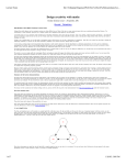
Figure 10.1: A subgraph of the farmer’s problem, namely the strongly connected
component containing the start and end states—all the possible states where nothing
gets eaten. As usual, we have not shown the self-arrows.
Find the strongly connected components (preferably using some library
routine).
If this strongly connected component does not include all states the user
requires for their task, the graph has other flaws in it that need correcting.
Doing this will reduce interest in the farmer’s problem as a puzzle, because it
will make it trivial—but if the farmer’s problem was an interactive device, we’ve
turned it from a hard thing to something that is far easier to use.
The graph of the strongly connected component, shown in figure 10.1 (p. 330),
for the farmer’s problem has a pleasing, elegant structure, and we derived it from
the full puzzle automatically. If we decide what criteria we want, we can redesign
anything automatically.
.
We will see this principle in action again, but with a PVR, in section 10.4.6
(p. 345).
The diagram in figure 10.1 (p. 330) was drawn automatically using the shortest
path code developed in the framework: each state is drawn at a position corresponding to the length of its shortest path from the start state, and its vertical position is chosen simply to be different for all other positions in the same column.
A little effort then centers the columns vertically along the row. The layout of the
graph is called a ranked embedding, and it has the useful property that you can
easily see how hard it is to get from the starting state to any other. Interestingly,
for this puzzle, the ranked embedding directly shows that solving the problem,
getting everything from one side of the river to the other, is in fact the hardest
thing the user can possibly be asked to do.
.
Programming shortest paths is discussed in section 9.6 (p. 297).
10.3
A recording device
After farming problems, let’s return to conventional interactive devices. We will
start with the JVC HR-D540EK. Video cassette recorders, VCRs, are (or almost are)
330
10.3. A recording device
Box 10.1 Why personal video recorders? Why do I keep mentioning video recorders when
everybody today uses DVDs or computers to watch and record their TV? I’m not just talking
about video cassette recorders (VCRs), which were the original mass-market personal video
recorders (PVRs). Or why does this book keep mentioning PVRs when the world is going
to fill up with robots and implants?
Video recorders suddenly got more complicated in the late 1980s when their mechanical
controls were replaced by embedded computer-based control. Suddenly the user interface
became cheap, little rubber buttons, and the computers could “do anything.” The designer
lost all affordance that the mechanical constraints had imposed.
As anything could happen, anything did. The PVRs became more complex and more
arbitrary from the user’s point of view. The user population had a lot of conceptual catching
up to do as the complexity initially overwhelmed them. Today not many people have problems
(or at least problems they admit to) using video recorders: we are all using MP3 players,
camera phones, PCs, and encounter complicated web sites everyday. That’s how it is.
Even though my first personal video recorder (the JVC model discussed in several places
in this book) has fewer than 30 main states, it still baffles me as a user. But more so it
baffles me why its designers hadn’t been able to structure its few states in a way that made
it easier to use.
Today I don’t think there is any immediate panacea: “this is how all PVRs (or whatever)
should be designed.” I think that analyzing their designs in the way this book promotes will
give designers the tools to build what they really want to build; they’ll be able to see how
to optimize and modify their designs to better support users’ tasks. And insights here are
going to help design all those robots and implants—they’ll still have states their users are
baffled by, and probably far more than 30.
obsolete, but I’ve used this example for very good reasons: see box 10.1, “Why personal video recorders?” (p. 331). A VCR is just a gadget that can record and playback media; it could be an MP3 player, a DVD recorder, a computer, or anything
yet to be invented—we are interested in the principles, not the specific product
(but it helps to have a specific product in mind). The preferred term is PVR, short
for personal video recorder—since we need an abbreviation that does not commit
us to a particular technology.
.
We mentioned this PVR in section 3.4 (p. 66), and section 5.4 (p. 145).
We first show this PVR state machine drawn as a circular graph. The advantage
of using a circular drawing is that no two lines between different states can ever
be drawn on top of each other (all lines must be at different angles), so we can
be certain that we are looking at everything (unless in some states more than one
button does the same thing, then their lines would be coincident). It helps to write
the names of the states too, but there are so many that the drawing gets quite
messy!
Even though the circular diagram in figure 10.2 (p. 332) is messy—and we haven’t
put the states in a useful order around the perimeter of the circle—you can see little design facts like the two states “on with tape in” and “off with tape in” seem
very easy to get to from almost anywhere—you can clearly see the cluster of arrow
heads hitting each of these states from almost every other state.
331
Chapter 10
Using the framework
off, tape out
on, tape in
on, tape out
off, tape in
fast forward
play forward
rewind tape
play pause
record tape
play rewind
record pause, stop in 240m
play tape
record pause, stop in 210m
record in 30m
record pause, stop in 180m
record in 60m
record pause, stop in 150m
record in 90m
record pause, stop in 120m
record in 120m
record pause, stop in 90m
record in 150m
record pause, stop in 60m
record in 180m
record in 210m
record pause, stop in 30m
record pause
record in 240m
Figure 10.2: Transition diagram for the JVC PVR drawn as a circle. Circular embeddings have the advantage that no lines coincide—they are unambiguous unless there
are several lines between the same pairs of states. Tools like Dot can be asked to try
to minimize line crossings, to draw neater diagrams.
An alternative way of drawing the same graph is to rank the states, using the
technique used in figure 10.1 (p. 330) for the farmer’s problem. Figure 10.3 (p. 333)
shows a ranked transition diagram for the JVC PVR. To draw it, we chose the initial state for the machine, which for this machine is off with the tape out, and drew
that state at the far left. Then each column of states drawn is the same distance,
that is, the same minimum number of button presses, from the initial state. Thus
the further right you go in this diagram, the harder things are to do starting from
the initial state. One could draw the ranked graph taking any state as the initial
state; it would then show the user effort getting to any state from that chosen state.
Indeed, we could use the shortest paths matrix to find the most eccentric state, and
hence draw (what for most users would be) the worst-ranked graph.
The long tail of states, each increasingly hard to get to, makes this JVC device
hard to use—or, rather, it makes doing some things hard to do. The very long tail
out to the right means that these states are unusually hard to get to.
This “stretching” of the device design may or may not make sense for a PVR,
depending on what those tail states are and how they relate to one another. Certainly, if this device were an airplane, you’d want the state “on the ground but
332
10.3. A recording device
Figure 10.3: A ranked embedding for the JVC PVR. Off with the tape out is at the
far left. State names and button names are not shown to avoid visual clutter. If you
want to avoid visual clutter and be more informative, make the diagram interactive
(e.g., use an HTML imagemap) and show the state names as the cursor is moved over
the picture.
with the wheels retracted” to be very difficult to get to, but I can’t see why a PVR
need be so lop-sided! Probably the designers never drew a ranked embedding and
therefore never noticed any such issues.
.
Figure 5.7 (p. 138) shows a ranked embedding for a Nokia mobile phone, like
figure 10.1 (p. 330), but rotated to go top down, rather than right to left.
10.3.1
Characteristic path lengths again
It’s interesting to look at the average length of shortest paths between any two
states—the average path length is so important it is called the characteristic path
length.
.
See section 9.6 (p. 297) for program code to work out shortest and average
path lengths; also, see section 8.9 (p. 264) which discussed characteristic path
lengths (average path lengths) in the context of scale-free networks.
Shortest paths represent the fastest way a user can get from one state to another
state. The average of all shortest paths is therefore an average measure of how
hard a device is to use—though of course bigger devices (devices with not enough
buttons to go round) will have longer path lengths.
For the same PVR (from the previous section), the characteristic path length is
3.9. This means that if you know how to use this device perfectly (and few people
do), on average to do anything will take at least 3.9 button presses.
It’s helpful to know what the hardest operations are. On this PVR, the hardest
operations all take 11 button presses, and are ones that end up with the PVR doing
something in 240 minutes. In fact, it is the state at the extreme right of the last
333
Chapter 10
Using the framework
diagram we drew, figure 10.3 (p. 333): it’s not only a long way from off, it’s as far
away as it could be from many states!
To get from this state
fast forward
off, with tape in
off, with tape out
on, with no tape
play a tape fast forward
pause playing a tape
play a tape fast backward
play a tape
rewind a tape
!
!
!
!
!
!
!
!
!
to this state
pause recording, but stop in 240 minutes
pause recording, but stop in 240 minutes
pause recording, but stop in 240 minutes
pause recording, but stop in 240 minutes
pause recording, but stop in 240 minutes
pause recording, but stop in 240 minutes
pause recording, but stop in 240 minutes
pause recording, but stop in 240 minutes
pause recording, but stop in 240 minutes
We can measure the average number of button presses to get from one state to
another; it’s 3.9. Given that one state seems to be out on a limb of length 11, it’s
interesting to work out what the best we could do is.
The PVR has 8 buttons and 28 states. One state (namely, the one you start from)
can be reached with 0 button presses, because you are already there; 8 more states
can be reached with 1 press, since we have 8 buttons available to get to different
states. In theory, in each of those 8 states, we could reach another 8 states—a total
of 64 states—in just one more press. Having accounted for 9 states in 0 or 1 presses,
it only leaves 19 states the PVR needs; and these can therefore all be reached in 2
presses.
The average cost is the total divided by the number of states, (0 ⇥ 1 + 1 ⇥ 8 +
2 ⇥ 19)/28 = 1.643. (A quick way to estimate this value is to calculate log8 of 28,
which is 1.602.) However we look at it, this is a lot less than the 3.9 the device
achieves.
We can conclude the device was not designed to minimize button presses to do
things. One would have expected some other advantage for the JVC design deci⇤
sions, such as the buttons more often meaning the same things, like ⇥Play always
meaning play.
10.3.2
Indicators
We can extend a device description to include indicators, descriptions of what
lights, indicators or words are shown to the user by the device in any state. For
example, the “on” light comes on in all states when the PVR is switched on, but
the “tape in” indicator is only shown when there is a tape in—and there can be a
tape in whether or not the device is on or off. Naturally, in its two off states the on
indicator will be off.
.
Indicators were introduced in chapter 8, “Graphs,” section 8.1.3 (p. 232), in the
context of coloring graphs.
Handling indicators allows us to do further sorts of insightful analysis. I didn’t
introduce indicators earlier because for simple devices, like lightbulbs and drills,
states and indicators are pretty much the same thing.
334
10.3. A recording device
When buttons are pressed, a device should give feedback that something has
happened. Typically, pressing a button not only changes the state, but it also
changes some indicator.
We can define an ambiguous transition as one in which no indicators change.
The user cannot be certain that they pressed the button hard enough—or, perhaps
worse, they cannot be certain that they understand the device, as it appears to
have done nothing when they thought it would do something.
The ambiguous transitions for the JVC PVR are shown below. For instance, if
the JVC model is on with a tape in and you make it go fast forward, it won’t tell
you anything has happened—but this is only one of several ambiguities.
fast forward ! on, with tape in
on, with tape in ! fast forward
on, with tape in ! rewind a tape
play a tape fast forward ! on, with tape in
play a tape fast backward ! on, with tape in
rewind a tape ! on, with tape in
To get these results, I added a new field indicators to the framework specification. Each state can now have various indicators, using descriptive JavaScript
strings such as "on" or "tape in".
.
If a device gives no feedback when a button is pressed—as in the six cases
above or even in very simple situations, as discussed in section 3.14 (p. 86), the
user may easily make an overrun error, a type of error discussed in
section 10.4.1 (p. 341).
There is no need for the indicators to be real indicators on the device. The PVR
has no special indicators for fast forward and rewind states, but you can hear the
PVR whirring madly as it does the fast rewind or fast forward actions, so it has
indicators of a sort. Whether you treat fast forward whirring as an indicator is
moot; we can tell from the table above that the basic device needs them.
More generally, indicators could be anything the designer is interested in. The
PVR has no indicator to say that it has a tape in that can be recorded on—the
user has to experiment to find out, but we could make this a conceptual indicator
in our device specification. Then if we find that users rely on this indicator, this
would suggest a good way of improving the design, namely, make the conceptual
indicator a device indicator.
The device specification needs extra stuff, so each state has a list of indicators
specified:
indicators: [["on", "tape"],
["tape"],
[],
["on", "tape"],
...
]
We can look at the way the device uses its indicators to find out how likely buttons are to change them. Do buttons consistently affect indicators? Some buttons
335
Chapter 10
Using the framework
⇤
⇤
have apparently helpful names like ⇥Operate and ⇥Play ; presumably, switching on
and off the On and Play indicators . . . well, let’s see.
A simple program running on the specification generates the following text:
For
⇤ device JVC HR-D540EK PVR
⇥Play , when it does anything, it always ensures: on, tape
and 7.69% of the time it ensures: record
⇤
Operate , when it does anything, 3.57% of the time it ensures: tape
⇤⇥
Forward , when it does anything, it always ensures: on, tape
⇤⇥
⇥⇤Rewind , when it does anything, it always ensures: on, tape
⇥Pause , when it does anything, it always ensures: on, pause, tape
and 8.33% of the time it ensures: record
⇤
⇥Record , when it does anything, it always ensures: on, tape
and 5.26% of the time it ensures: record
⇤
Stop/Eject , when it does anything, 3.85% of the time it ensures: on
⇥⇤
⇥tape in , when it does anything, it always ensures: on, tape
Analyses like these are easier to read when we use the descriptive fields already
in the framework; the first line say they are results for the JVC HR-D540EK PVR,
which is just the device.modelType text.
The words “record,” “on” and so on here are indicator lights (or words that light
up in the LED screen) on the actual device. Alternatively, we can do the same
analysis but use our own conceptual indicators. For example, although the PVR
does not say so, we know which states make the tape rewind; so we can invent an
indicator to mark those sets of states. Here is the sort of result we can get:
For device JVC HR-D540EK PVR (conceptual indicators)
⇤
⇥Play , when it does anything, it always ensures: on, tape
and 15.38% of the time it ensures: auto off record
⇤
⇥⇤Operate , when it does anything, 3.57% of the time it ensures: tape
⇥Forward , when it does anything, it always ensures: fast forward, on, tape
and 33.33% of the time it ensures: play
⇤
⇥Rewind , when it does anything, it always ensures: on, rewind tape
and 33.33% of the time it ensures: play
⇤
Pause
,
when it does anything, it always ensures: on, pause tape
⇥
and
8.33% of the time it ensures: record
⇤
Record
,
when
it does anything, it always ensures: on, tape
⇥
and
5.26%
of the time it ensures: record
⇤
⇥⇤Stop/Eject , when it does anything, 3.85% of the time it ensures: on
⇥tape in , when it does anything, it always ensures: on, tape
⇤
The table shows that when the ⇥Play button does something, it will leave the
PVR with the on and tape indicators on—we have the condition “when it does
anything” since if the device is off, it won’t do anything at all, and that usually
⇤
isn’t worth reporting! What ⇥Play does is not very surprising, but some of the other
button meanings are.
336
10.3. A recording device
⇤
Box 10.2 What “always” and “never” should mean “You can always press ⇥Home to get to
your home page”—that’s an instruction seen on Microsoft’s webTV, a domestic interactive
TV system; but it isn’t true that it always works. I needed to use the TV’s other remote
control as well to get to the home page!
It’s fine to write “always” in manuals and user help, and in principle if something is always
true, the device will be simpler. But make sure that you really do mean always. If so, it
simplifies the manuals and reassures the user; it makes everything easier. If something isn’t
“always” but is “almost always” the device will seem especially unreliable.
⇤
We can see that the ⇥Operate button makes the JVC device on only 44% of the
⇤
time—other times, indeed most of the time, ⇥Operate makes the device
inoperative!
⇤
Why does pressing ⇥Rewind sometimes cause the device to play? It’s because if
⇤
the device is already playing when ⇥Rewind is pressed, the device starts to play
backward (so-called review).
⇤
⇤
If ⇥Rewind sometimes leaves the device playing, why does ⇥Pause sometimes leave
it recording?
⇤
The ⇥Record button seems to make the device record hardly at all, only 5.26% of
the time it is used.
A designer should read a list of results like this carefully. Perhaps the designer
should also annotate the results table with the rationale for the interesting features
(such as the ones we picked out for comment above). A routine extension of the
framework could store the designer’s annotations and later report if a percentage changes—such a change would indicate the design had been altered and the
original rational needs reviewing.
⇤
One reason why ⇥Record doesn’t consistently make the device record is shown
in an answer to a user’s question, shown on p. 354. If a user wants to stop the
⇤
recording in 120 minutes, they should press the ⇥Record button 5 times. For none of
⇤
those presses, at least 5 states, does the ⇥Record button start recording.
⇤
. Box 9.2, “Button usage” (this page) explains the ⇥Record button usage further.
10.3.3
Beguiling behavior
Some of the properties we have found are only true some of the time; for instance
⇤
the ⇥Record button does something 5.26% of the time rather than all of the time (or
not at all). Suppose instead that a button did something, say, 99% of the time.
It’s very likely that the user would assume it did this all the time—the user is
unlikely ever to have experienced the 1% of times it doesn’t work as expected. If
so, the user will have been beguiled, and they will have misunderstood the way
the device works. Therefore it is especially important for the designer to identify
behaviors that are almost true.
337
Chapter 10
Using the framework
If we get some experimental data our information for the design can be much
more useful. When we said “44% of the time” (or whatever) we really meant in
44% of the states. Whether these states are used the same amount of time as other
states is, of course, unlikely, though a good first approximation. A device might
be off for most of its life, but a user will never use a device when it is off! Thus we
ought to collect some timings from real use so that our percentages give us data
about real use rather than guesses. Nevertheless, when we are designing a new
device, informed guesses are better than nothing.
More uses for weighting with experimental data are given below, in
section 10.7.5 (p. 358); in particular, we suggest comparing expert designers’
data with ordinary users’ data to see whether we can help users become more
proficient.
Beguiling behavior can be a way for manufacturers to make money. For example, a user may be lulled into thinking some behavior of the device is normal,
but very rarely it might imply some avoidable cost for the user. My car, a Land
Rover 90, is a case in point. It has a parking brake (hand brake) with a warning indicator. The warning light, which is a symbol of the parking brake mechanism, always
comes on when the parking brake is on and always goes off when the parking
brake is released. The user does not want to drive the car when the parking brake
is on or partially on, so this indicator light is a helpful warning. The light worked
like that for years, and it beguiled me into thinking that was exactly what it did.
Then, one day, it stayed on. Yet the parking brake still worked perfectly, so I believed it had to be an electrical fault. Indeed, we have had wiring faults before, so
we pretty much ignored it.
When we took the car for its service, it needed a new set of disk brakes (both
disks and pads)—a very costly repair. We now learned that what we thought was
the “parking brake” indicator is in fact a “general brake” warning light. In other
words, around 99.99% of the time it means nothing unusual but around 0.01%
of the time it means you have a serious problem that needs immediate attention.
Why doesn’t Land Rover use another indicator for this rare problem? Or why not
have some simple electronics (there’s plenty there already) to make the light flash
and maybe a noise too, so it clearly is a serious warning? Or, as there is a separate anti-lock brake system (ABS) warning light that is always a brake malfunction
warning light, why not use that for all brake failures? Why not have both lights
come on together? Why not an LCD text display? Or, thinking differently, why not
have the original indicator come on when any brake is used: then the user is also
trained the indicator refers to the main brakes as well, and the percentage 99.99%
changes dramatically—the issue of beguiling behavior disappears. Whatever solution is chosen, and there are many, it needs to be different from the light the user
has learned from long experience means something else.⇤
That last phrase, “the user has learned” needs rewriting: it should say, “what
the user has been trained by the design”—it’s a design issue, not a user issue. Here,
.
⇤ By design, Land Rover parking brakes are completely separate from the main brakes, so their failure modes are independent—they work on the prop shaft, not on the wheels. So why use the same
indicator?
338
10.4. Summarizing and comparing many properties
the car manufacturer saving the cost of installing a clear fault indicator ensures
that from time to time they will sell brake parts at significant profit. The way the
device has been designed, brake failure has—conveniently for the manufacturer—
become the user’s fault for not understanding a warning light the user manual
(but not the warning itself) explains.
.
The example in box 6.4, “Bad user interfaces earn money” (p. 191) is another
case of rare behavior—but behavior the designers of the device surely know
about—leading to surprising costs for the user.
10.4
Summarizing and comparing many properties
There are many properties that we may be interested in, and typically we will be
interested in certain critical properties and how they are affected by changes to a
device design or we may wish to compare several devices to one another and try
to learn which has the best features to copy.
We can write a simple program that summarizes all properties we are interested in. The first time we use the program in this book, we’ll get it to explain in
detail what every result means, but to save paper when we use it again we won’t
number all the items or reprint the brief explanations.
You might like to consider other properties we could work out that are of interest to designers and users.
1. Model: Simple microwave oven. The model type.
2. Number of states: 6. How many things can be done with this device?
3. Number of buttons: 5. How many buttons (or other actions) are available to access all the
states?
4. Number of edges (excluding duplicates): 22, which is 73.33% complete. In a complete
graph, you can do anything in one step, so if this figure is 100%, the device cannot be made
faster to use.
5. Number of self-edges: 7. A self-edge goes back to the same state; it corresponds to buttons
or actions that do nothing.
6. Number of duplicate edges (excluding self-edges): 5. Depending on the application,
duplicates are either wasteful or give the user choices and flexibility.
7. Probability a button does nothing: 0.23. Chance a random button press in a random state
does nothing. The larger this figure (to a maximum of 1), the safer—or more
frustrating!—the device will be to use.
8. This device is strongly connected. If the device is strongly connected, we can always get
anywhere to anywhere; if not, then there are some traps or irreversibilities that cannot be got
out of.
9. Average cost to get somewhere from anywhere else: 1.47. How many button presses,
on average, does it take to get anywhere?
339
Chapter 10
Using the framework
10. Average cost to get somewhere from anywhere, including the same place: 1.22. If
you include trying to get to the same place (which takes nothing to do) of course the average
cost is less.
11. Worst case cost: 3. The most difficult case of getting from anywhere to anywhere. In a
complete device, this worst case would be 1.
12. Average cost to recover from 1 button press error: 1.3. If in a random state a button is
pressed at random, how many button presses on average does it take to get back? Compare
this cost with the mean cost; if it is higher, most button presses are “one way.”
13. Worst case cost to recover from 1 button press error: 3. If in a random state a button is
pressed at random, what’s the worst number of button presses it takes to get back? If the
device has an undo key, this figure would be 1. If the device has an undo key, this figure
would be 1. Put another way, if you are in “the right place” but accidentally press a button,
this is the average cost of getting back.
14. Average cost to get anywhere after 1 random button press: 1.36. A random press can
give you a bit more information, but has it made your task (whatever it was) harder?
Compare this figure with the average cost between states; typically it will be higher, because
a random button press will tend to take you away from where you want to go.
15. Percentage of single-press errors that can be undone directly: 33.33%. If a button is
pressed by mistake, how often can you get back (undo the error) in just one step? If the
device has an undo key, this figure would be 100%
16. Average cost of an overrun error: 0.2. If the correct button is accidentally pressed twice
(not once), how hard is it to get back (undo the overrun error)? If the device has an undo key,
this figure would be less than 1; if the device was idempotent (when a button gets the device
to a state, it keeps you there), the figure would be 0.
17. Worst case overrun error cost: 1. If an overrun error occurs, what is the worst cost of
recovering?
18. Average cost of a restart recovery for overrun error: 1.4. If the correct button is
accidentally pressed twice (not once), how hard is it to get back (undo the overrun error) if
the user switches the device off first to restart it?
19. Worst case restart overrun error cost: 4. If an overrun error occurs, what is the worst cost
of recovering by restarting?
20. Independence probability: 0.33. The probability that a user requires more than one button
press to do anything. The smaller this number, the ‘’easier” or more direct the device is to
use.
All the above text was generated automatically, using the device specification
from our framework. The complete JavaScript code to do it is on the book’s web
site—for reasons of space (and boredom), we won’t give the full details of generating all this text here.
Many of the measures can be fine-tuned depending on exactly what a designer
wants. For example, the list above gives the percentage of single-press errors that
can be undone directly; this means that if the user presses a button by accident,
340
10.4. Summarizing and comparing many properties
a third of the time they can recover from this error in one more press. But this is
not counting pressing buttons by accident that do nothing, since this would not
cause an error that needs recovering from. We could count those cases as well, if
we wanted to, and then change the average accordingly.
10.4.1
Overrun errors
A new property we introduced in the list above concerns overrun errors. Imagine a
cheap gadget with nasty rubber keys that you are never sure you’ve pressed hard
⇤
enough. Suppose you press ⇥OFF but the device has not gone off. You are likely to
⇤
press ⇥OFF again. We will call this an overrun.
⇤
Another example of overrun is when you press the ⇥MUTE button on a device to
make it quiet. You press it again to make sure—but the device takes the second
⇤
press to restore the sound. So ironically pressing ⇥MUTE twice, which a human
might think of as emphasis (“I really want it to be muted”) is taken by the device
as a change of mind (“Although you’ve told me to be quiet twice, I think you want
me to be noisy!”). That’s an overrun error. We can easily find such potential errors
automatically and decide whether to fix them by redesigning.
Maybe the device is slow; maybe its lights tend to stay on for a bit; or maybe you
⇤
didn’t press the rubbery ⇥OFF button hard enough, and until you press it properly
it isn’t going to switch off. So you press it again.
We’ll explain how overrun errors are measured in detail. You can easily modify
the ideas to measure other properties that may be more relevant to your designs
than overrun errors. First, think of a likely user design issue, as here we thought of
overrun errors. Then we write some code that works out the costs of those errors,
analyses a design, and prints out the results.
An error occurs if the overrun does something unfortunate. On some devices,
⇤
pressing ⇥OFF twice switches the device back on again, which is not what was
intended.
We need the costs of all shortest paths, as we worked out in section 9.6 (p. 297):
var apsp = shortestPaths(device);
var cost = 0;
var worst = 0;
The variable name apsp stands for “all pairs shortest paths,” a mnemonic name
for this matrix. We’ve also initialized the two cost variables to zero.
Next, we run over all states (using the variable i in a for loop) and in each state
we run over all buttons (using the variable j).
for( var i = 0; i < n; i++ ) // over all states
for( var j = 0; j < b; j++ ) // over all buttons
{ var newState = device.fsm[i][j]; // button j pressed in state i
// press button j again, but now in the new state
var overrun = device.fsm[newState][j]; // state after an overrun
var c = apsp[overrun][newState];
cost = cost+c;
if( c > worst ) worst = c;
}
341
Chapter 10
Using the framework
Box 10.3 Handling infinity properly If a device is not strongly connected, some values in
the shortest paths matrix will be •. We have to be careful working out averages when this
is a possibility, because most programming languages don’t handle infinity correctly. In our
JavaScript, we used any value larger than n to represent •, so strictly the program code
given above needs tests to see whether apsp[i][j] > n, and if so, to drop out of the loop
and report an infinite result. Perhaps easier is to have a single check to determine whether
a device is strongly connected and, if it isn’t, to only report properties that make sense
(however, average costs of overrun errors do make sense even if a device is not strongly
connected).
Our definition of fsm gives us the next state when button j is pressed in state i,
so device.fsm[i][j] in the loop above gives us the new state we get to if we press
button j. We record this new state in the variable newState. But if we press button j
again—that’s the overrun—we would end up in state device.fsm[newState][j].
This is the state the user overruns to, and we record it in the variable overrun.
Then apsp[overrun][newState] will be the cost of getting back, which we add to
cost, so that in the end dividing cost by n*b will give the average.
After the two nested loops, we print out the answers:
document.write("Average cost of an overrun error: "+(cost/(n*b)));
document.write("Worst case cost of an overrun error: "+worst);
To find the cost of getting back to where we wanted to be is merely a case of
looking up the cost of the shortest route from overrun to newState: this is the
value in apsp[overrun][newState], which cost we can conveniently store in the
variable c. We then use c to add to the running cost and to keep the variable worst
tracking the worst value we’ve seen so far.
All the other code is similar. For example, to do an undo costing, we get the
costs of getting back from a button press. The inner loop would start with code
like this:
var newState = device.fsm[i][j];
var c = apsp[newState][i]; // cost of getting back to state i
This simply gets the costs of getting back to state i if button j has been pressed. The
two further lines we haven’t shown simply add the costs and find the maximum,
as before.
10.4.2
Restart costs
After making a mistake, how can the user be sure that a recovery from an error is
going to be successful? Many people will switch the device off and on again, to
start all over again, because this is a sure way to get back to where they wanted to
be. If you can switch off and on, this is probably a good strategy to recover from
errors. As designers, we are interested in the restart costs for errors.
We can easily assess the cost of restartig for any sort of error by modifying the
code to take the shortest path for the error recovery via the off state. In the overrun
342
10.4. Summarizing and comparing many properties
code, above, we simply took the shortest path, whereever it went. Now, if we want
to assess the cost to the user of recovering from an error by switching off and on,
we use the shortest path from the error to Off, and then from Off to where we
wanted to be. Here’s how to do it:
cost = 0;
worst = 0;
var offState = d.startState; // we could choose any state to be ‘off’
for( var i = 0; i < n; i++ )
for( var j = 0; j < b; j++ )
{ var newState = d.fsm[i][j]; // button j in state i gets to new state
var overrun = d.fsm[newState][j]; // the state after an overrun
var restartCost = apsp[overrun][offState]+apsp[offState][newState];
cost = cost+restartCost;
if( restartCost > worst ) worst = restartCost;
}
The code is exactly the same as before, except apsp[overrun][newState] is replaced by apsp[overrun][offState]+apsp[offState][newState], which is the
cost of going from the overrun state to newState, where you wanted to be, via the
state offState.
For the running example, the average restart cost is 5.75 and the worst case is
13 (and that it would be much larger than this in practice since this assumes that
the user makes no mistakes and knows the best way to do it); this is all very much
worse (as we expected) than trying to recover from an overrun by going “straight
back” rather than via Off. So it gives an indication of the extreme cost to the user
if they don’t know that.
10.4.3
Independence probability
The independence probability gives another example of how to work out device
properties. This probability is defined as the probability that the user has to do
more than press a single button to achieve what they want to achieve. All we do
is look at every state the device can be in, and everything the user might want to
do, counting how many times what the user might want takes more than a single
action. Finally, we divide the count by all the possibilities, which in this case is the
square of the number of states.
var apsp = shortestPaths(device);
var count = 0;
for( var i = 0; i < n; i++ )
for( var j = 0; j < n; j++ )
if( apsp[i][j] > 1 )
count++;
document.write("Independence probability: "+count/(n*n));
If we used this code along with working out other measures, we wouldn’t need
to work out the shortest path lengths more than once. I put the line var apsp =
shortestPaths(device) in to make the code above self-contained.
.
The independence probability is defined in section 8.6.3 (p. 247).
343
Chapter 10
10.4.4
Using the framework
Summarizing and overviewing a device
Here is a range of properties summarized for the JVC PVR. The overrun costs are
quite interesting.
Model: JVC HR-D540EK PVR
Number of states: 28
Number of buttons: 8
Number of edges (excluding duplicates): 134, which is 17.72% complete
Number of self-edges: 118
Number of duplicate edges (excluding self-edges): 0
Probability a button does nothing: 0.53
This device is strongly connected
Average cost to get somewhere from anywhere else: 3.87
Average cost to get somewhere from anywhere, including the same place: 3.73
Worst case cost: 11
Average cost to recover from 1 button press error: 1.78
Worst case cost to recover from 1 button press error: 11
Average cost to get anywhere after 1 random button press: 3.92
Percentage of single-press errors that can be undone directly: 16.96%
Average cost of an overrun error: 0.73
Worst case overrun error cost: 9
Average cost of a restart recovery for overrun error: 5.75
Worst case restart overrun error cost: 13
Independence probability: 0.83
The JVC PVR has some curious properties. If we have an overrun error (for
⇤
instance, we want to play a tape, but we press ⇥Play once too often, perhaps because
we didn’t notice when it had started to play—perhaps it is too slow or doesn’t
provide decent feedback), then it takes 2.3 presses on average to get back to where
we wanted to be (or 3.3 including the error). Yet to get from anywhere to anywhere
takes on average 3.9 presses: an overrun error on this JVC PVR is practically the
same as getting completely lost—an overrun error puts you about as far away on
average from where you want to be as you can be. Moreover, a completely random
button press only takes 1.8 presses to recover (on average)—or 2.8, including the
error. But this is easier than an overrun error! There are three main reasons for this:
(i) some random presses do nothing and therefore cost nothing to recover from;
(ii) most random presses don’t get you as far away as an overrun; (iii) if a button
worked to get you to this state, it is likely to work to get you away from it (in other
words, overrun errors are likely).
The remote control for this PVR is completely different from the unit itself. We
haven’t space to show it here, but it’s very obvious from any drawing of the transition diagram. Making it different doubles the learning the user has to do to make
good use of the device—and almost doubles the size of the user manual.
.
344
For a similar point on remote controls of televisions, see section 3.2 (p. 63).
10.4. Summarizing and comparing many properties
10.4.5
Random pressing
If you make a random press, you may find out more about the device.
.
You can hire gnomes to press buttons at random. Their effectiveness will be
explored in chapter 11, “More complex devices.”
It’s tempting to press buttons at random. You walk up to something. What does
it do? The only way to find out is to press a button and see what happens. On the
JVC, if you press a button at random you may have made it a little harder to get
anywhere. But the difference isn’t much, and if you can find out something useful
about where you are (that is, about what the device is doing) by pressing a button,
on the JVC this could be a good strategy to help you use the device better, even
though on average it will cost you more.
⇤
Sometimes pressing a button does nothing. For example, if you press ⇥Play when
it is playing, nothing happens. Suppose we modify the JVC so that a user can tell
if a button will do something. For example, each button might have a little light
that comes on only if the button works. These useful buttons would be easy to
find in the dark. Now if we press a button at random, it will always do something.
How does this change the numbers?
Here’s what the program would output to answer the question, in the same
style as before:
Average cost to get anywhere after a working random press is 4.04582
(excluding the press). Your random press will give you a bit more information, but
has it made your task any easier?
It’s worse! On the JVC you’re better off not playing with the buttons “to see
what they do.” But you’re only better off if you know what it is doing, and that
would require some indicator lights to tell you what it is doing.
On the JVC, then, the user is in a quandary: you can’t always tell what state it
is in, and experimenting to find out makes any task harder. Of course, to be fair,
once you’ve experimented and found out where you are, you can now use the JVC
properly, which you can’t do when you don’t know what it is doing.
.
Program code to do the random pressing is given in section 11.1.5 (p. 376).
10.4.6
Simplifying the PVR
Maybe we can redesign the JVC PVR to make it easier to use? We’ve already
pointed out how the “tail” of states on the JVC makes many things harder.
Let’s delete the hard-to-get-at states and see what happens; this is just a matter
of programming, to find and then remove them from the device (along with all
the button actions that went to them). This approach is a good example of using
JavaScript to define the state machine you’re interested in. Not all designs have to
be written out tediously, they can be defined in terms of other devices, and they
can be entirely or partly constructed automatically.
345
Chapter 10
Using the framework
off, tape out
off, tape in
on, tape in
fast forward
on, tape out
rewind tape
play forward
record tape
play pause
play rewind
record pause
play tape
Figure 10.4: Compare this simplified PVR diagram with the corresponding diagram,
figure 10.2 (p. 332) for the original design.
Note something very important here: we can prototype a device (let’s say, the
first JVC PVR), evaluate it, and see some design issues (such as the outlying states);
that we can then improve it automatically on the basis of our analysis (here, collapsing all those states).
The result, shown in figure 10.4 (p. 346), looks like an interesting improvement.
You can also see from the diagram that the device is “tighter” than the original, yet
it provides the same functionality but without all the timeouts. Whether it really is
an improvement for users we should leave to doing some experiments to establish.
For all I know, there are enough users who like delayed pauses—and few users
who get frustrated by their device not doing anything for 240 minutes, and then
surprising them. The point is, we’ve got two automatically-related designs, and
we can test them out. Moreover, if during tests we discover some new idea that
really has to be implemented, we can still have two designs: we can continue
regenerating the automatic variations. In a normal design process, without the
automatic support, as soon as you get a new idea, you have got a lot of work to do
to keep all the versions of the device consistent. In our approach, that consistency
comes for free.
10.4.7
More on overruns, and the farmer’s problem again
We return to the farmer’s puzzle again (section 10.1) for comparison with the “normal” interactive devices we’ve already explored.
Model: Farmer problem
Number of states: 28
346
10.4. Summarizing and comparing many properties
Number of buttons: 4
Number of edges (excluding duplicates): 92, which is 12.17% complete
Number of self-edges: 46
Number of duplicate edges (excluding self-edges): 0
Probability a button does nothing: 0.41
This device isn’t strongly connected.
Percentage of single-press errors that can be undone directly: 48.21%
Average cost of an overrun error: 0.59
Average cost of non-trivial overrun errors: 1
Worst case overrun error cost: 1
Worst case cost for restart after an overrun error: •
Independence probability: 0.88
There are lots of things to notice here. The framework program generating the text
was designed for describing ordinary interactive devices, so “button” is hardly
the right word to use. “Action” would be preferable or, better, the action string
should be used from the framework specification. The number of self-edges looks
very high: but most of them are actions that don’t do anything: for example, if
there is no cabbage left because the goat ate it, then the action “take the cabbage”
will do nothing because there isn’t a cabbage to take and it’s counted as a selfedge. Because this “device” is not strongly connected, many of the average and
maximum costs are infinity, and they are automatically not shown in the programgenerated summary of properties.
The probability (0.41 or 41% of the time) that a button does nothing means, in
effect, that if you shut your eyes and wished, “I want to take the goat across the
river,” then part of the time you couldn’t do it, for instance, because the goat was on
the other side, or was eaten—that something had gone wrong you hadn’t noticed
with your eyes shut. It seems a high probability, but the 41% assumes you are in
any state chosen with equal probability, but if you are trying to solve the problem
you are unlikely to be in a random state—ideally, you should be in a state in, or
close to, the strongly connected component that contains the solution. If you are
in that strongly connected component, nothing has been eaten, so the probability
a “button” does nothing would be lower than 41%. In other words, the moral of
this insight is that the probabilities (or percentages) would make better sense if the
states are weighted by how likely the user is to be in them. For this “device,” as it
happens, we can estimate those probabilities better than for most devices.
You might have expected the worst overrun error to be infinite, because once
something has gone wrong (like the goat being eaten) there is nothing the farmer
can do about it. Infinities seriously affect usability, but here the worst-case overrun
cost is only 1 and the average is only 0.59! These unexpected results come about
because the farmer’s problem has an interesting structure:
If the farmer’s action stays within the strongly connected component shown in
figure 10.1 (p. 330), then every action is reversible. Any overrun takes the
farmer back to the previous bank, and the overrun can be corrected simply by
doing the action again. In fact, this is true for any action within any strongly
connected component.
347
Chapter 10
Using the framework
If an action takes the system out of the component, immediately the action is
irreversible. For example, the cabbage is eaten. Another action the same, which
would be an overrun, returns the farmer to the same bank as before the
action—but without the cabbage. The overrun can be corrected by repeating
the action, as this takes the farmer back. Again, for this unusual “device,” this
happens to be true for any action leaving a strongly connected component.
Once the cabbage or goat are eaten, some actions, such as the farmer carrying
the cabbage in the canoe, will have no effect. These actions in these states are
self-loops. A self-loop overrun does nothing, so these overruns can be
corrected by doing nothing, 0 actions, thus the average cost of an overrun error
correction is less than 1.
The moral of this story is that analytic measurements, such as the cost of correcting
an overrun error, have to be interpreted carefully. Measurements that sound sensible are not sensible for all possible devices and user tasks. Moreover, devices that
are not strongly connected generally have special problems that need examining
very carefully.
10.5
Lots of properties
It’s informative to develop questions about the user and their tasks to see how to
answer these questions with graph theory, because you can then write programs
that work out the answers from the device specification.
I imagine a design tool, based on a framework like the one we have developed,
that provides a menu of properties, characteristic path lengths, and so on, so that
for any design, a designer can easily find out how the user will fare with certain sorts of task. Alternatively, in designing a particular device, maybe only one
or two properties are especially important, and just these important parameters
could be worked out and redisplayed (as numbers, diagrams, or graphs) whenever the device design is updated.
The following sections present a diverse list of illustrative things users will want
to do that designers should consider on their behalf—and hence build into their
design tools. For any particular device or tasks the designer is working toward
supporting, there will be lots of such questions. This list, then, is merely illustrative of the wide range of possibilities.
As usual, when an interactive system’s design is represented as a graph, we
can write programs to analyze the graph and give answers to all sorts of design
questions. Thus when we talk about “shortest path,” below, this is a simple matter
of running a shortest path algorithm on the design in question, such as the one we
discussed in chapter 9, “A framework for design.”
10.5.1
User knows everything: but how much is that?
In a graph, arcs take you from one vertex (state) to another. If you carry on following arcs, you are walking along a path. Usually there are many paths from one
348
10.5. Lots of properties
place to another, and of all the possible paths (some of which might be circuitous),
the user will generally be most interested in the shortest. The shortest path gives
you the minimum number of button presses to get from whatever the system is
doing to somewhere else. A skilled user needs to know (or nearly know) shortest
paths to use a system effectively.
10.5.2
User reads the manual: how long do they take?
If a user is to know the most efficient way of using a system, shortest paths are
appropriate. However, for almost every application, rather than finding shortest
paths for every pair of states, more manual structure will be required to ensure the
manual is not too long.
It’s possible that an emergency manual will make a trade-off preferring to be
longer so that it can give instructions in full for every emergency. But a long manual runs the risk of the user choosing the wrong instructions, whereas a more
“diverse” manual allows the user to change their mind along the way. In fact, the
manual itself becomes a “device” with its own usability issues—the table of contents, the index, and so on become “buttons” that a user uses, not to press, but to
turn to for information.
.
Features like tables of contents make books and manuals easier to use. We
reviewed the analogy—which works both ways—in section 4.2 (p. 96).
10.5.3
User is lost: how long does it take to recover?
Suppose the user has become lost but they still know what they want to do. They
are going have to start a search for it. If we work out the total cost of getting
anywhere from anywhere, on average a user will find what they want half way
through searching the entire thing (provided they get some feedback or indication
they have got to their goal), so half the number is the average time that a tireless,
error-free, user would take.
Usually the number is enormous, which goes to show that the user should always be provided with a better way of searching than just aimlessly rummaging.
⇤
For example, if there is a ⇥Cancel button, the user can get to a key state in one press,
and (if the system is designed sensibly) all states are on average closer to the key
state than to any random state where the user became lost.
10.5.4
How long does it take to learn a system?
How much does a user need to know in order to use a system? If we decide what
we mean by the “user learning a system,” then we can formalize the corresponding
design questions in precise terms:
If user learning a system means knowing every feature, then the traveling
salesman gives the least number of actions a user will take to know every
feature.
349
Chapter 10
Using the framework
If user learning a system means knowing what to do in every state, then the
Chinese postman tour gives the least number of actions a user will take to try
every action.
We want user manuals to be well written and easy to understand. If we
generate user manuals automatically from a device specification, then the
length of the manual is a good measure of how much a user needs to
know—and the time the user takes to learn a system will be proportional to
this.
The raw measures of the salesman or postman tours visit every feature, so typically both of these answers will be embarrassingly large numbers. A more realistic
measure can probably be obtained by first deciding what features the user needs to
know and only measuring those. Indeed, if the device is well structured, then the
user does not need to know it all, instead, they need to know the rules its design
is based on.
10.5.5
How do you crack a safe?
If the user is lost or doesn’t know what state the device is in, but they want to
search for the desired state, then they have the same problem as a safe cracker
who comes to a safe in an unknown state and wants to enter the right combination
code. The only difference is that a safe is designed to make this problem as hard
to solve as possible, whereas normally we want to help the lost user as much as
possible!
Superficially, it seems there are two sorts of safe, ones that require every code
⇤
the user is trying to start with ⇥Reset , and those that allow a user to enter a code at
any time: these are overlapping safes.
⇤
⇤ ⇤ ⇤ ⇤
Suppose the key is 7777. On a resetting safe, the user must press ⇥Reset ⇥7 ⇥7 ⇥7 ⇥7 ,
⇤ ⇤ ⇤ ⇤
but on an overlapping safe the user need only press ⇥7 ⇥7 ⇥7 ⇥7 , regardless of what
the last person did to it. Overlapping safes are easier to use—and easier to crack.
⇤
In fact, there is no reason to tell any potential thief which button the ⇥Reset button
is, and then the thief cannot tell whether this is a reset or overlap design, and that
uncertainty will make the job harder. (Unfortunately most thieves know a lot more
than we do about the weaknesses of safes, so this is false comfort.)
If the thief doesn’t know, they would be prudent to use a de Bruijn sequence,
which finds the shortest sequence of commands that covers all combinations. For
example, if there are four keys and the combination is two digits (such as 42), then
⇤ ⇤ ⇤ ⇤ ⇤ ⇤ ⇤ ⇤ ⇤ ⇤ ⇤ ⇤ ⇤ ⇤ ⇤ ⇤
the de Bruijn sequence is ⇥1 ⇥1 ⇥3 ⇥1 ⇥2 ⇥3 ⇥2 ⇥2 ⇥4 ⇥3 ⇥3 ⇥4 ⇥4 ⇥2 ⇥1 ⇥4 —which tries the
combinations 11, 13, 31, 12, 23 and so on in that order, finishing 21, 14. The thief
would therefore expect to take 8 key presses (they’d have to be unlucky to need
all 16 presses to try the last combination code), as opposed to the 24 that would be
expected if there was no overlapping allowed (or 13.5, if we hijack one of the four
⇤
buttons to be the ⇥Reset button).
. De Bruijn sequences are special cases of finding Chinese postmen tours on
special graphs that have Euler cycles. Chapter 8, “Graphs,” defines these terms.
350
10.6. Comparing designs
Property
Average distance between any pair of states.
Average cost of recovering from an overrun error. The
⇤
number would be 1.0 if there was an ⇥Undo button.
Worst overrun recovery cost.
Proportion of actions that have a direct undo. If the user
presses a button, how often can they get back by one more
button press?
Cost of correcting a random one-press error.
Probability that a random button press does nothing.
Length of a test sequence, to check the model is correct.
This is the length of a Chinese postman tour.
How many user manual structures are there to choose
from? This is a count of the number of spanning trees.
...
JVC model
3.73
Philips model
1.93
3.76
2.01
11
6
35.8%
55%
2.44
0.53
2.1
0.27
462
341
6 ⇥ 106
4 ⇥ 1010
...
...
Figure 10.5: More properties and figures, here helping compare two devices. As always,
all are generated by program from the device specifications. When you design systems,
you should work out what analyses you are interested in to help the device’s users do
(and enjoy doing) what they want to do. Obviously the tables you generate would be
filled with the numbers and comparisons that are relevant to your users and tasks.
10.6
Comparing designs
Figures in isolation do not mean very much. What does it mean to a user that 62%
of the time they press a button it does nothing? Does it matter? If it does nothing,
does the user ignore it, or do they panic?
Without doing user-based studies, raw numbers are not very informative. How
are we supposed to know what a “big” number is or a “worryingly big number”?
Instead, it is more useful to compare designs: a designer should have a good idea
that making numbers bigger or small is better or worse for the intended design
given what the user is going to do with it. By comparing designs, the designer
looking at the figures does not have to decide whether or not 62% is a good number, but they can decide whether increasing it or decreasing it is worthwhile.
In the table shown in figure 10.5 (p. 351), I’ve brought together some figures
measuring new and old interaction properties of the JVC PVR and a Philips VR502
PVR. Side-by-side the figures are now easy to compare. Typically, a designer
might compare a basic design with a slight variation and then generate a table like
this automatically, using a function written in the design framework. The designer
would then decide whether to go with the variation, retain the original design, or
make some other changes. In fact the JVC and Philips designs, summarized in the
table, are not slight variations of each other, so the figures are—not surprisingly—
wildly different.
351
Chapter 10
10.7
Using the framework
Putting analysis into products
So far I’ve painted the programming ideas as merely for simulation and analysis.
Using JavaScript and HTML (or any other web technologies) means that we can
build interactive web sites and then we can get all sorts of data from real users
anywhere in the world who use the web site. We can now recruit people to help
us find out how good a design is for certain tasks or for certain sorts of errors, such
as overrun errors. Whatever.
If this is all we were doing, we would probably write some program (as an
extension to our framework) to convert the finite state machine description into
something that worked directly on the product we are building: for example, to
generate Java or C code to run directly on a chip, rather than on the web.
A far more creative idea is to notice that we have found out all sorts of interesting
things that are helpful, so what would happen if a user had access to the same sorts
of insights about the design while they were using a device online?
10.7.1
Building a manual into a device
Conventional user manuals suffer from the synchronization problem: the user can
be reading one section of the manual, but that section may refer to a state of the
system different to the one it is really in. Almost certainly the user will make
mistakes. The synchronization problem is considerably worsened by timeouts in
the system, because these allow it to makes state changes without telling the user—
they will get left behind in the manual as the device turns to another page.
If, however, the manual is built into the device, then there is potentially no prob⇤
lem. We just add a button ⇥HELP , which for whatever state the device is in just
shows the corresponding text in the manual. For our JavaScript framework we
just need to say something like alert(device.manual[device.state]) to tell the
user what state the device is in.
10.7.2
“How to?” questions
Knowing what state the device is in is probably the least of the user’s worries.
It would be more useful to be able to find out how to use the device: that means
getting it to say how to get from where they are (the device’s current state) to some
desired goal state. We can call this a how-to question.
Here’s a brief example of how useful how-to questions, or rather their answers,
can be. I had been using my JVC PVR for two years when my framework analyses surprised me with a better way of getting a tape out and switching off when
playing a tape—better than I had ever tried. I thought I understood the device really well, as after all I had reverse-engineered it to get the specification! To get the
device off with the tape out, which I had done many times, I had always pressed
⇤
⇥Stop/eject to stop⇤ the tape playing and then a second time to eject the tape, then
finally pressed ⇥Operate to switch off.
352
10.7. Putting analysis into products
But my program’s two-press how-to answer was, “You are playing a tape. How
⇤
⇤
can you off with tape out? Press ⇥Operate . Press ⇥Stop/eject .” Easily generated and
ghastly English, maybe, but still insightful (we’ll see how to do it in a minute). If
the JVC is off when you eject the tape, it stays off, and switching the device off also
stops the tape playing. So you can do in two presses what I had always done in
three.
There are several ways to ask and answer how-to questions. We could require
an exact and detailed question, such as: “how do I get the PVR to auto-stop recording in 210 minutes?” Here, we would imagine the user selects the desired goal
state from a long list (a menu) of possible states. This sort of question does rather
beg another: if the user has to specify exactly what they want to do, why doesn’t
the device just do it, rather than working out what the user has to do? I suppose
it could be useful for training users who are supposed to know how to use the
device, or who want to use it faster than scrolling through a potentially long menu
of states, or most of the time (like a car driver) cannot take their eyes off what they
are doing to read a menu—they want to learn what buttons to press for next time.
Another way is to break the question down into “tasks.” This enables the user
to ask how to change part of the system’s state, such as: “how do I get the PVR
to pause (leaving whatever else it is doing as unchanged as possible)?” In this
example, the user would only select pause from the menu’s shorter list of choices.
The subtasks correspond to the indicators we introduced earlier. For a PVR, there
will be a pause indicator, and it will either be on or off. The user can now ask
the device, as it were, “How can I change the pause indicator from its current off
status to being on?”
This question then begs the question, why not redesign the device so that its
indicators are buttons? If the indicators tell the user what they want to know, why
not also make them controls so the user can do what they want to directly? Thus
⇤
the ⇥Pause button could have a light in it; pressing the button (generally) switches
the light on or off. Well, that’s a possibility we won’t explore here—but it’s a good
example of how working out how to help the user results in better, or at least
stimulating, design ideas.
In general, we won’t know whether the user wants to learn how to use a device
or really just wants to use the device. What does the user want when they ask a
how-to question? Do they really want to know how to do something—maybe so
that they can learn the answer and get more proficient at using the device—or do
they just want to get a job done?
Here is one solution, which works on a screen-based computer simulation (or
a web site): we display a dialog box that provides both options. Note how we’ve
summarized the question the user posed: it would just be compounding things if
the user made a mistake asking the question but didn’t notice they were given the
right answer to the wrong question!
353
Chapter 10
Using the framework
Goal
4
2
1
3
5
Figure 10.6: The user recently visited states 1–5, but they are really trying to get to an
intended goal state, shown top right in the diagram, as efficiently as possible. The user
wonders why they aren’t at the desired goal state already. What did they do wrong?
(For clarity, we aren’t showing all state transitions, except those along the user’s path.)
You have the PVR off, with no tape in it.
You asked: “How can I stop recording in 120 minutes?”
⇤
Press the ⇥Tape in button.
⇤
Press the ⇥Record button 5 times.
Do you want to do it now or continue?
⇤
⇤
⇥Do it now
⇥Continue
This answer, generated blindly by the program, has accidentally shown the “put
the tape in” action as if it was a button press. Oops! Notice, too, that some simple
programming ensures that if a button is to be pressed several times consecutively,
⇤
each press is not spelled out, but a repetition is used—as here, the ⇥Record button
is pressed “5 times.” And to generate the answer, all the program has to do is find
the shortest path from one state to the other.
10.7.3
“Why not?” questions
Then there are why-not questions. Maybe the user tried to do something and
failed. Why didn’t the device do what they wanted? As with the how-to questions, the user selects a goal to ask about, but now it’s one they had wanted to
achieve. Typical answers to why-not questions explain that the user has not yet
reached the goals (more needs to be done), or that pressing some button got them
further from the goal (they may have made earlier mistakes), or that a button press
had no effect. Another possibility is that the user is mistaken: they have, in fact,
reached the goal they say they wanted. The greater range of choices present a
more interesting programing challenge than the how-to questions.
Here is an example of a why-not question and its answer:
You asked: “Why isn’t it rewinding the tape?”
⇤
You tried pressing ⇥Rewind but it had no effect.
⇤
Instead of pressing ⇥Rewind before that,
⇤
you should have pressed ⇥Stop/eject .
Do you want to know how to rewind a tape now or continue?
354
⇤
⇥How
⇤
⇥Continue
10.7. Putting analysis into products
Goal
4
2
1
3
5
Figure 10.7: The shortest path from state 5 to the user’s goal is shown schematically
by the wiggly arrow—the shortest path may go via many other states. The user could
follow this arrow to get to their goal efficiently. (For clarity, we aren’t showing the other
states.)
If the user says that they do want to know how to do it now, we run the how-to
question answering program for them—because if they want to get to this state,
the how-to answer from the current state is the best way of doing it. Also, the user
is likely to be familiar with the how-to answers and the style of the dialog boxes
that they generate.
The idea works on the farmer’s problem—in fact, it’ll work on any problem.
Suppose the user has made a mistake trying to get everything to the righthand
bank, but the goat has been eaten by the wolf. The user asks why they haven’t
succeeded; on the next page, here’s a possible answer:
You asked: “Why aren’t they all safely on right bank?”
Instead of taking “cabbage,” you should have taken “goat.”
You cannot recover from this error without resetting.
Do you want to reset now or continue?
⇤
⇥Reset
⇤
⇥Continue
Here we can see one of the possible complications of answering questions is that
there may be no shortest path, and this needs to be clearly interpreted for the user.
Since the question and answer above is only running on a simulation of the real
problem, it is possible to provide a reset option, but that might not be possible on
some real devices.
While how-to questions are based on the shortest path from the current state to
the desired goal state—what’s the best way to get from one state to the other—
why-not questions are answered by reversing the user’s recent path they took to
the current state. The four figures 10.6–10.9 help explain the key points.
Figure 10.6 (p. 354) schematically illustrates how the user tries to reach the goal
they have in mind. In the figure, the user has most recently visited five states,
numbered 1–5, but they were trying to get to the goal state. Why aren’t they where
they want to be?
Finding the best answer to the why-not question means going back through earlier and earlier states along the user’s recent path, until the best answer is found.
There are many potential answers to a why-not question. Figures 10.7–10.9 show
schematically some of the different possibilities.
355
Chapter 10
Using the framework
Goal
4
2
1
3
5
Figure 10.8: Perhaps going to state 5 took the user further from the goal? A shorter
path to the goal was from state 4. This would certainly be the case if the last user
action had done nothing—simply taking the user back to state 4.
Of course, it isn’t obvious what “best” means for the user—generally, the best
answer won’t simply be the shortest path in terms of counting user actions. Answers could be weighted by how long the user took over each transition; the longer
the user takes the “harder” presumably the transition was for them, and so the
path through that transition should be considered to be longer. For example, an
answer that says, “instead of doing x you should have done y” isn’t very helpful if
x happened a year ago! To stop explanations reaching too far back into the distant
past, we can adjust weights so older actions count less in the scoring. This would
stop the user feeling reprimanded for making a mistake ages ago.
There is a big difference between answering the question and the user knowing
what to do next. The answer to a basic why-not question tells the user something
they should learn, or be aware of in the future. But knowing they should have
done something differently probably doesn’t help them enough to get to their
goal now. In the figures, I’ve shown the reverse steps along the user’s path as
if the user’s actions can be undone easily, but this isn’t always so. For example, if
it is hard to get back from state 5 to state 4, even if the shortest paths were from
earlier states, the best thing to do now is take the path from 5. Again, such considerations can be handled automatically by giving reverse paths different weights,
depending on what sort of answers the user wants or is expected to want.
A why-not answer for the user therefore includes the possibility that the user
might have been better off to have done something different earlier, rather than to
progress from where they are now in the current state.
There are many choices for weighting. I found by experimenting that weighting
the last action 1, and all earlier ones infinity gave adequate answers. At least these
weights ensured that the answers to why-not questions were brief.
10.7.4
356
Don’t be idle
Most interactive devices don’t have help systems at all, and those that do generally
aren’t as helpful as they could be. Many devices that have help systems have the
help as a menu item, and that makes it harder for the user to get help for other
menu items—the user cannot say “I want help on this menu item,” because to get
help they have to select another item. The simplest solution is to have a dedicated
⇤
⇥Help button—and this also has the advantage that it is always visible to the user,
which it might not be on a long scrolling menu list.
10.7. Putting analysis into products
Goal
4
2
1
3
5
Figure 10.9: Continuing figures 10.7–10.8, perhaps going to states 4 then 5 was a
diversion away from getting to the goal? Answering the why-not question goes back
over the user’s path, here finding that the shortest path to the goal was from state 3.
Having a dedicated button also encourages the interaction programmer to make
the button work all the time. In particular, if the help button is on a remote control, we can hope that the designer thinks to make the help text readable from the
distance the user will typically operate the remote control. Don’t show help text
on the video system’s little LCD panel, show it on the TV screen. (And therefore
think very carefully about the design of the system when the user is asking for
help on why the video output isn’t working!)
Typically, when a user wants help, they have to enter the help subsystem, find
what they want to know, learn it or print it (faxes and printers can easily print
⇤
their user manuals), and then do it. Why don’t devices have a ⇥Do it now button, like
our dialog boxes for how-to and why-not questions?
It is useful to have a concise way to criticize this sort of design issue: a device
that seems to know what the user wants to do but won’t do it for them is an idle
device. (What I’ve called idle devices may be useful in educational and training
situations, but generally they are frustrating for users.)
A help system that a user has told what they want to do, but then won’t do
it is certainly an idle help system. Device idleness appears in other guises too,
particularly in error recovery.
As a good interaction programmer, you will write code that detects error conditions in your device. After detecting an error, your program should report the
error condition, explain why they arise, and tell the user what to do. More strategically, you should write a program to check your program source code for all such
error messages, and then you should try to modify the design to eliminate the
need for the messages—your checking program will tell you what error reports
need fixing, and when you have finished removing all error reports.
.
This is something WAGN didn’t do with their ticket machine and its error
messages; see section 3.9 (p. 77).
It’s idle to report errors that the device itself could fix. Figure 10.10 (p. 358)
shows a Samsung NV3 camera telling the user to switch it off and on again. It’s
good that it is reporting an error and suggesting a solution—rather than just crashing and not saying anything to help the user. But it is idle, as the programmer
clearly knows the solution but isn’t going to do anything for the user. Why doesn’t
the device reboot itself? Why doesn’t the program do the switch-off-switch-on cycle itself? Maybe the hardware can’t do that, but if the hardware can’t do that, why
wasn’t it redesigned so that it could do a soft reset?
357
Chapter 10
Using the framework
Figure 10.10: An apparently-crashed Samsung NV3 camera just after a user switched
it on, saying “Turn off and on again.” The camera is telling the user how to recover from
some unexplained internal error. Why doesn’t the camera do a soft restart itself and
save the user the trouble? The camera is behaving as if it is idle. Certainly, the camera
seems idly designed: the message shows that the problem was known early enough in
the development cycle to have an error message written for it, yet the problem was not
fixed—other than by asking the user to do the work.
An error message is better than nothing. Even better is for the device to do itself
what it wants the user to do. It is idle to tell the user to do things that the device
itself can do, and it’s generally bad design—it’s certainly bad design if you haven’t
thought through the trade-offs.
10.7.5
Weighting answers
If the costs of user actions are going to be weighted, weights can be adjusted at
any time. Costs could suit the overall aim either of the system (some states are
worthwhile getting to quickly—for example, the most important thing for a fire
alarm is to get it set quickly if it needs setting) or costs could be chosen to help
answer specific questions, or the weights could change dynamically as the user
works with the device.
.
See also section 9.6.4 (p. 304), which considered different sorts of costs for the
shortest paths algorithm.
For example, if weights are reduced every time the user makes a state transition,
then the answers can be preferentially chosen to be expressed in terms of routes
with which the user is more familiar: the more often the user does something, the
more favorable its weights become, and so answers to questions tend to take the
better-weighted routes.
The ratio of repetition (for learning) to efficiency (for doing) could be varied to
suit the user or short- or long-term criteria for the device or its intended uses. The
automatically generated help answers can therefore be designed into a device to
358
10.7. Putting analysis into products
optimize the user’s performance for certain tasks: for learning or for action, reference, emergency response, fault diagnosis, or for machine-related criteria (such as
its long life)—depending on what cost factors the designer wants to build in.
It would even be possible for the program to work out several answers using
different weightings and, if they are different, to say things like, “The fastest way
to do that is to . . . , but you’re more familiar with doing . . . , which will also do
it, but not so quickly.” Or perhaps, “Although x is the preferred way, if it’s an
emergency do y, which is quicker.”
Another idea is for expert users to train the device (say by solving typical problems). The advice generated would teach the user solutions that are preferred
by experts. It would be interesting to do both: then the user could be told that,
whereas they have often solved the problem this way, an expert would have done
something else.
In fact, rather than wait for the user to ask an explicit question of the device, we
could wait until they had used it for a long period (all the while adjusting weights)
and then automatically look at every possible thing that can be done on the device.
We would then report back to the user (or their teacher) cases where the user has
taken non-expert paths.
10.7.6
Programming wizards
A wizard is told what the user wants to achieve and then takes the user through
the necessary steps to achieve that task. If, say, you were setting up your internet
configuration, there are lots of things to do, and a wizard can ensure that you do
everything right. Moreover, a good wizard will explain each step and how to find
the right information to fill in the details; a good wizard will also know that some
details are already somewhere on the system, and it can fill these details in so the
user doesn’t have to.
.
The how-to and why-not answers were in fact simple examples of wizards,
discussed in sections 10.7.2 (p. 352) and 10.7.3 (p. 354), respectively.
When a device is represented as a state machine, wizards are very easy to implement. First, identify all the states that represent useful goals for the user to
get to. Of course many states will not be interesting for a wizard; they are just
device-centered steps on the way to achieving user goals. So we need to extend
the device specification to allow useful goal states to be flagged in some way. Since
we already have an array of state names, we can easily give a list of state names of
interest to the wizard, something like this:
var device = {
...
stateNames: ["dim", "off", "on"],
wizardNames: [{name: "lit", states: ["dim", "on]},
{name: "off", states: ["off"]}
],
...
}
359
Chapter 10
Using the framework
⇤
The idea is that when the user presses the ⇥Wiz button, a choice of the states in the
wizardNames array will appear. If the state the device is in is one of the wizard
states, then it ought to be identified in the list, rather like a “you are here” marker.
(If the user selected this goal, the wizard is only going to sigh; we can’t automatically assume that the user knows they are there already—but we can be pretty
certain that a user would find it tedious to be given the current state as an option,
select it, and then be told they are already there.)
It does not matter whether we think of the wizard as a feature for the designer
or as a feature for the user. A user will obviously find a wizard useful for getting
through a sequence of steps to achieve goals; a designer will find a wizard useful
for learning how a user would have to use a device to achieve goals. A technical
author writing a user manual might like a wizard’s help for writing optimal instructions. One way gives direct help, another gives insight into the design, and
the third way gives insight into writing help.
Once a wizard goal is selected (possibly with a confirmation if we were worried
that some goals the user might choose are “dangerous”—this needs another array
like dangerousNames), the wizard works out all the shortest paths from the current
state to each of the goal states. In the simple lightbulb example, the wizard would
work out the paths to dim and on states if the user wanted to make the lightbulb
come on.
In general, there will be several paths from the current state to each of the wizard’s goals. In the lightbulb example, if the device is off, then there are two paths
from the current state (off) to the lightbulb being lit: it could be either dim or
on. The wizard automatically follows all paths while they are the same, changing
the device state as it goes. When it comes to a choice, it asks the user what their
preference is to do.
The lightbulb is simple enough to spell out all of the possibilities (without taking
up too much space) to see how the wizard would work:
Current state
Off
Dim
On
User asks
off?
lit?
off?
lit?
off?
lit?
Wizard’s response
Says it’s already off
Do you want it on or dim?
(does it)
Says it’s already lit
(does it)
Says it’s already lit
Whether you want the wizard to say it’s already lit when it is or to change to, or
offer to change to, the other lit state depends on what you want the device to do.
This simple example may or may not be doing what you think a wizard should
be doing, but it paints a persuasive picture. If you are building an interactive
system—no doubt far more complex that a three-state lightbulb—work out a systematic way of getting a wizard to work. Even if you don’t need a wizard in the
final, delivered product, you, as the designer, can use the wizard’s possible answers to help you check that the design of the device is sound.
You could easily write a bit of program that asks the wizard every possible question in every possible state. How long are its answers? Are their some exceedingly
long answers? If so, the device might be redesigned by adding some shortcuts.
360
10.7. Putting analysis into products
The wizard-checking program might work out the average and standard deviation of the its reply lengths and then present the designer with all questions that
got a reply more than, say, one standard deviation higher than the average. All
of the answers that are so long (however they are classified) then these indicate
issues the designer should reconsider.
How many “dangerous” states does a user risk wading through? Should the
designer reduce the dangers or make the dangerous states more remote (so wizard
answers don’t take shortest paths via these states)?
Or get the wizard to mark all states where users have choices to make in achieving their tasks: are these reasonably designed? Are the choices, and their impact,
clear to users from the device’s indicators?
A real advantage of building a wizard into a device framework is that once
you have programmed a wizard, it should work however a design is modified
or updated. Since wizards encapsulate the notion of useful tasks, a wizard can
help summarize the difference between its answers on the previous iteration of the
design and its new answers for an improved design. That is, run the wizard on all
possible user questions on Monday, and the wizard saves its answers. On Tuesday,
after having revised and improved the design in some way, run the wizard again;
it reports back to you the changes in its answers. This will be a focused summary
of how your revisions are affecting the tasks you expect the user to want to do.
Wizards are usually thought of as palliatives, features to help users cope with
complex systems. But they are helpful, probably more helpful, for getting designers to consider everything a user has to walk through with a design; they can help
compare the effectiveness of new versions of a design; and they can help the designer identify tedious or dangerous sequences of actions that the user has to do
to achieve their goals. Wizards as design aids are underrated!
There is certainly no excuse for a design to be released to users with a wizard
that can’t solve all problems that will be asked of it. There is no excuse, in fact, for
designers not to develop their own wizards to benefit from the wizards’ design
insights, whether or not any of those wizards are released in the device the users
finally get.
10.7.7
Dynamic checks
Many of the design checks we did in the framework can be done dynamically, that
is, while the user is interacting with a device.
As a device is used, the world changes, and some things become possible or
impossible, as the case may be. We want to ensure, despite any changes, that the
device still has all its required properties.
Unless it is something like a fire extinguisher that can only be used once, then
the device should always be strongly connected or at least warn users that they
are about to do something irreversible. Obviously whether you forbid, allow, or
warn about certain actions and their consequences depends on the purpose of the
device—but the warnings (or email reports to the product’s manufacturers) could
be done automatically.
361
Chapter 10
.
Using the framework
On dynamic checks as variations of drawing rules for finite state machines, see
section 6.3.9 (p. 189).
10.7.8
General help principles
All the examples above, help and wizards—putting analysis into products—are
specific techniques, and they may not work well on a particular device. Rather
than implement exactly what’s described here, it’s better to follow the general
principles:
Implement automatic help so that it is reliable.
Usually a user is reading help not because they want to learn something, but
because they want to do something. Allow the user to directly do what they
⇤
are reading: provide a ⇥Do it button.
In many devices, it will be tempting to provide help through a menu system.
Unfortunately, this makes help work at the wrong level—you don’t usually
need help about the menu, you want help about its menu items and help about
where menu items are. Help is so useful, especially when it is implemented
well, that it should be provided as its own button.
As your help will become a sophisticated system in its own right, provide a
way of navigating around it, so that the user doesn’t have to keep going in and
out of it when searching for things.
Print out all help text as a single document and proof read it carefully. Ideally
the help text and the printed user manual can be made to correspond, or one
can be derived automatically from the other. This way, as designer you have
half the work and double the quality.
10.8
Complex devices and product lines
The examples in this book are quite small, as I wanted to be able to draw pictures
of them and to talk about them more-or-less exhaustively to help illustrate design
principles. It would have been very difficult to have huge systems and make much
sense of them. Big devices have many more issues to talk about, and the book
would merely have been longer without being more insightful. Or I could use the
defense that since big, complex systems are hard to use, we don’t want a method
that scales up to handle them; instead, we want a design framework that helps
ensure devices are easy to use!
Yet, certainly, real devices are very complex. Fortunately, the techniques do scale
up to bigger systems. We just have to stop worrying about looking at the devices,
and instead rely on programs to do the analysis. Instead of looking at drawings
and spotting issues visually, we use programs to check details—or, better, we use
programs to build systems with the interaction properties we want to start with.
Here are several key approaches:
362
10.8. Complex devices and product lines
Figure 10.11: Programming complex devices takes careful planning. For this digital
multimeter, instead of having thousands of separate images, one for each possible state,
it is better to cut the image into slices and treat each slice as a separate indicator. The
location of the slice for the knob is shown by the square in the middle image above.
This slice shows different knob positions by displaying one of the seven different images
of the knob. (The knob is both an input device and a physical indicator: indicators do
not need to be lights—for this device they are a mixture of physical objects and the
icons on its LCD.) Ignoring the digits, which would anyway be best programmed as
graphics, the multimeter also needs the LCD to be cut into 15 slices that are either
blank or show an icon.
Many features are consistent across the device and do not need to be
represented explicitly. For example, if every state has a transition to Off, why
not write some program code so that this part of the design is constructed
automatically? A simple for loop can do this (running over each state); it will
⇤
simply set the ⇥OFF transition automatically and hence correctly.
The DeWalt DC925 cordless drill and the farmer’s problem are examples of
devices constructed entirely automatically, from JavaScript programs that
construct the finite state machine descriptions. The farmer’s problem has some
pointless states that we had to decide how to handle. A real farmer can see
separate states, such as leaving the goat and cabbage alone before returning,
when it will change to just a goat; but in our models we used in the book, the
goat eats the cabbage immediately, and the wolf eats the goat immediately, so
there are no separate states. I didn’t spot this “design decision” in the model
until I wrote the program to model the problem. Not that understanding the
farmer’s problem is going to help solve any real design problems, but the
insight illustrates the power of creating and analyzing device specifications
automatically.
.
The farmer’s problem was discussed in section 10.1 (p. 325) onwards; the
DeWalt DC925 drill was discussed in section 9.8 (p. 316);
Many features are consistent over parts of the device. For example, a menu tree
will probably have up, down, left, and right commands for each state, and
363
Chapter 10
Using the framework
again a simple piece of program code can add these features onto a simple tree.
Then all the designer does is specify the tree and its generic features; the
generic features are added automatically to each state in the tree.
The representation of finite state machines is all detail, and the wealth of detail
gets more obscure, the more states are needed. In fact, this is the problem that
statecharts addressed: so all we need to do is introduce program features to
build statecharts. These functions build the underlying finite state machine.
The designer then is dealing with program code that calls functions like
cluster to cluster states together—supporting all the features discussed in
chapter 7, “Statecharts,” and perhaps others that are useful for the application,
such as special forms of history.
Statecharts are only one possible way of representing more complex state
machines. They have the advantage of being very visual, but they are not the
only approach to simplifying handling large systems. Regular expressions
could be used, for instance. The programming languages CSP, Spin, and SMV
are examples of textual languages that basically define state machines. For
some applications, these languages will be much more convenient to use than
the more direct approach used in this book. Furthermore, these languages have
sophisticated features for specifying and checking properties of designs.
10.9
Conclusions
The previous chapter introduced a JavaScript programming framework to simulate and analyze devices; this chapter showed how the framework could be used
to measure how effective designs were, and to compare designs. We gave many
examples of interesting design properties that are easily measured.
The properties used in this chapter were trivial (from a programming point of
view) and very easy to work out. Had designers thought about states and actions,
and bothered to write decent programs that checked for sensible device properties, a lot of needlessly awkward gadgets would never have gone to market. The
point is that for any purpose we have in mind we can come up with relevant
properties—there are many you can think of for your problems that this book has
not space to explore—and then very easily work them out and see how a modified
or altered device design can improve on the measurements.
A particularly important idea was to take some of the design insights to provide
advice to the user. We showed two simple ways to do this: to answer questions
(such as the why-not questions) and to run wizards for the user. All approaches
work in a dual way: they provide immediate insight for designers and they can be
put into practical aids for users.
10.9.1
Further reading
Gow, J., Thimbleby, H. W., and Cairns, P., “Misleading Behaviour in Interactive
Systems,” in Dearden, A. & Watts, L., eds., Proceedings of HCI 2004: Design for
364
10.9. Conclusions
Life, volume 2, pp9–12. Research Press International, 2004. This paper
describes partial theorems as well as a powerful tool for handling device
specifications using matrix algebra. If you wish to follow up beguiling
behavior, this is the place to start.
Pemmaraju, S. V., and Skiena, S. S., Computational Discrete Mathematics,
Cambridge University Press, 2003 (successor to Skiena, S. S., Implementing
Discrete Mathematics, Addison-Wesley, 1990). This book provides lots of
algorithms for doing things with graphs, though the algorithms are coded for a
system called Mathematica: depending on your point of view this makes the
algorithms more accessible or more idiosyncratic.
The languages CSP, Spin, and SMV are described well in the following: Hoare,
C. A. R., Communicating Sequential Processes, Prentice-Hall, 1985; Holzmann, G. J.,
The Spin Model Checker, Addison-Wesley (2004); and Clarke, E. M., Model Checking,
MIT Press, 1999. The Spin and SMV books include key techniques, algorithms,
and tools for model checking; they can be used as introductions to the subject or
as reference books for their prize-winning systems, Prolema (the language behind
Spin) and SMV. Alloy is a completely different sort of system; it’s book gives a
very readable survey of alternative systems and the rationales behind them: see
Jackson, D., Software Abstractions, MIT Press, 2006.
All of these systems can be downloaded and tried out.
365