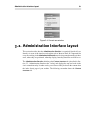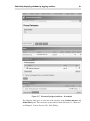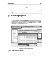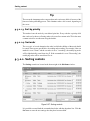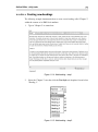
1
Bergfrid Marie Skaara eZ Publish Content Management Basics eZ Publish Content Management Basics by Bergfrid Marie Skaara Copyright © 2007 by eZ Systems AS. All rights reserved. Printed in the United Kingdom / United States. No part of this work may be reproduced or transmitted in any form or by any means, electronic or mechanical, including photocopying, recording, or by any information or retrieval system, without the prior written permission of the publisher. Electronic versions of this document will be distributed under more permissive terms. Please visit http://www.ez.no/ezpress for more details. eZ Press and eZ Publish are trademarks of eZ Systems AS. Other product and company names mentioned in this book may be the trademarks of their respective owners. We use trademark names in an editorial fashion to the benefit of the trademark holder; therefore, these names are not marked with trademark symbols. All terms known to be trademarks have been appropriately capitalized. We cannot attest to the accuracy of this usage, and usage of a term in this book should not be regarded as affecting the validity of any trademark or servicemark. While every effort has been made to ensure the accuracy of the contents of this book, the publishers and author assume no responsibility for errors or omissions, or for damages resulting from the use of the information in this book. The information is provided on an "as is" basis, with no express or implied warranty. Publisher: Jennifer Zickerman Editor and layout: Peter Keung Contributors: Balazs Halasy, Svitlana Shatokhina, Jostein Knudsen Illustrator: Thomas Hellstrøm Cover Design: Hansi Von Grenzfeldt Printing: Lightning Source International Standard Book Number (ISBN): 978-82-92797-05-1 First printing: May 2007 eZ Press, a division of eZ Systems AS Kverndalsgate 8, Postboks 253, N-3701, Skien, Norway Phone: + 47 35 58 70 20 Fax: + 47 35 58 70 21 Email: [email protected] http://www.ez.no Table of Contents Preface ................................................................................................... xvii 1. About eZ Publish .......................................................................... xvii 2. Target audience and usage .............................................................. xviii 2.1. Special in-depth material ....................................................... xix 2.2. Example strategies ............................................................... xix 3. Contents ....................................................................................... xxi 3.1. Reading suggestions ............................................................ xxii 3.2. How do I ... ....................................................................... xxiii 4. Typographical conventions ............................................................ xxvii 5. About eZ Systems ........................................................................ xxvii 5.1. Contact eZ Systems ........................................................... xxvii 6. Acknowledgments ....................................................................... xxvii 1. Introduction to eZ Publish Content Management ............................................. 1 1.1. Content management systems ........................................................... 2 1.2. Separation of content and design ....................................................... 2 1.2.1. Content - the data ................................................................. 3 1.2.2. Design - the presentation of data ............................................. 3 1.2.3. Webpage components ........................................................... 4 1.2.4. Website components ............................................................. 4 1.2.5. Benefits to separating content and design ................................. 5 1.3. eZ Publish from a non-technical perspective ........................................ 5 1.3.1. Siteaccesses ........................................................................ 5 1.3.2. Templates ......................................................................... 10 1.4. A quick introduction to content objects and the node tree ..................... 14 1.4.1. Objects ............................................................................ 14 1.4.2. Nodes .............................................................................. 15 1.5. User accounts .............................................................................. 15 1.5.1. Logging in ........................................................................ 16 1.5.2. Logging out ...................................................................... 18 1.6. Requirements ............................................................................... 18 1.6.1. Supported browsers ............................................................ 19 1.6.2. Installation and environment requirements for the Online Editor ............................................................................................ 19 1.7. Summary .................................................................................... 19 2. Front-end Editing - Website Interface .......................................................... 21 2.1. Website Interface .......................................................................... 22 2.1.1. Website Toolbar ................................................................. 23 2.2. Settings ...................................................................................... 25 2.2.1. User profile ....................................................................... 25 2.3. Managing content ......................................................................... 30 2.3.1. Edit mode ......................................................................... 30 2.3.2. Adding and editing content .................................................. 32 2.3.3. Basic management tasks ...................................................... 37 2.4. Webshop ..................................................................................... 39 iv eZ Publish Content Management Basics 2.4.1. About eZ Publish Webshop .................................................. 39 2.4.2. Product class ..................................................................... 41 2.4.3. Managing Webshop orders ................................................... 43 2.5. Versions and translations ................................................................ 44 2.5.1. Versioning system .............................................................. 44 2.5.2. Drafts .............................................................................. 45 2.5.3. Reverting content ............................................................... 47 2.5.4. Translating content ............................................................. 49 2.6. OpenOffice.org documents ............................................................. 50 2.6.1. Importing an OpenOffice.org document .................................. 50 2.6.2. Exporting to OpenOffice.org format ...................................... 53 2.7. Summary .................................................................................... 54 3. An Overview of the Administration Interface ................................................ 57 3.1. Accessing the Administration Interface ............................................. 58 3.1.1. User registration ................................................................ 59 3.2. Administration Interface layout ....................................................... 61 3.2.1. Main menu ....................................................................... 63 3.2.2. Path ................................................................................. 63 3.2.3. Secondary (left) menu ......................................................... 64 3.2.4. Main area ......................................................................... 64 3.2.5. Right area ......................................................................... 64 3.2.6. Search interface ................................................................. 65 3.3. Administration Interface tabs .......................................................... 65 3.4. Navigation .................................................................................. 66 3.4.1. Clicking around ................................................................. 67 3.4.2. Bookmarks ....................................................................... 68 3.4.3. Searching ......................................................................... 72 3.5. Menus and switches ...................................................................... 76 3.5.1. Context-sensitive pop-up menu ............................................. 77 3.5.2. Selectively displaying windows by toggling switches ................ 79 3.6. Summary .................................................................................... 83 4. Content Management Concepts - Objects and Nodes ...................................... 85 4.1. Object-oriented technology ............................................................. 86 4.1.1. Object orientation in eZ Publish ............................................ 86 4.2. Datatypes, attributes, classes and objects ........................................... 87 4.2.1. Datatypes ......................................................................... 88 4.2.2. Content classes and class attributes ........................................ 88 4.2.3. Content objects .................................................................. 91 4.3. Content nodes .............................................................................. 92 4.3.1. Encapsulation of content objects ........................................... 93 4.3.2. Content node tree ............................................................... 93 4.4. Summary .................................................................................... 99 5. Content Classes ..................................................................................... 101 5.1. Text input field types ................................................................... 102 5.1.1. Text line / block datatype - plain text format .......................... 102 5.1.2. XML block datatype - rich text format .................................. 103 v 5.2. Frequently used non-container content classes .................................. 5.2.1. Article class ..................................................................... 5.2.2. Image class ..................................................................... 5.2.3. File class ........................................................................ 5.3. Frequently used container content classes ........................................ 5.3.1. Folder class ..................................................................... 5.3.2. Frontpage class ................................................................ 5.4. Content relationships ................................................................... 5.4.1. Link class ....................................................................... 5.5. User interaction .......................................................................... 5.5.1. Comment class ................................................................. 5.5.2. Feedback form class .......................................................... 5.5.3. Forum-related classes ........................................................ 5.6. Information sharing ..................................................................... 5.6.1. Documentation page class .................................................. 5.6.2. Infobox class ................................................................... 5.6.3. Event calendar class .......................................................... 5.6.4. Gallery class .................................................................... 5.7. Multimedia classes ...................................................................... 5.8. Summary ................................................................................... 6. Content Structure Tab - Layout in Detail .................................................... 6.1. Secondary / left menu .................................................................. 6.1.1. Interactive tree ................................................................. 6.1.2. Width of the secondary menu .............................................. 6.1.3. Selected features of the pop-up menu ................................... 6.2. Main area .................................................................................. 6.2.1. Selected node content: always at the top ................................ 6.2.2. Preview window ............................................................... 6.2.3. Details window ................................................................ 6.2.4. Translations window ......................................................... 6.2.5. Locations window ............................................................ 6.2.6. Relations window ............................................................. 6.2.7. Sub items window - always at the bottom .............................. 6.3. Summary ................................................................................... 7. The Object Edit Interface ........................................................................ 7.1. Interface layout .......................................................................... 7.1.1. Bringing up the Object Edit Interface ................................... 7.2. Object information window ........................................................... 7.3. Current draft window ................................................................... 7.4. Translate from window ................................................................ 7.5. Section window .......................................................................... 7.6. Main edit window ....................................................................... 7.6.1. Send for publishing button ................................................. 7.6.2. Save draft button .............................................................. 7.6.3. Discard draft button .......................................................... 7.6.4. Translator mode ............................................................... 104 104 106 107 107 107 108 111 111 113 113 114 115 119 119 121 123 123 124 125 127 130 130 132 132 134 135 136 138 139 140 141 143 146 149 150 151 154 155 157 158 158 159 160 160 160 vi eZ Publish Content Management Basics 7.7. Version preview interface .............................................................. 160 7.7.1. View control window ........................................................ 162 7.8. Related objects window ................................................................ 163 7.8.1. Toolbar for managing related objects .................................... 164 7.9. Summary ................................................................................... 164 8. Versions, Translations and Multilingual Features ......................................... 167 8.1. Version control - the publishing life cycle ........................................ 169 8.1.1. Content versions - big picture ............................................. 169 8.1.2. Version history interface .................................................... 170 8.1.3. Version limitations ............................................................ 171 8.1.4. Version structure and status ................................................ 171 8.2. Multiple languages - understanding translations ................................ 182 8.2.1. Content translations - big picture ......................................... 182 8.2.2. Translation interface .......................................................... 183 8.2.3. Language concepts ........................................................... 184 8.2.4. Multilingual support ......................................................... 187 8.2.5. Multilingual features - overview .......................................... 187 8.3. Summary ................................................................................... 188 9. Content Structure Tab - Daily Editing ........................................................ 189 9.1. Creating objects .......................................................................... 191 9.1.1. Object creation ................................................................. 191 9.1.2. Related objects ................................................................. 194 9.2. Editing objects: writing and translating ........................................... 198 9.2.1. Smart editing using drafts .................................................. 198 9.2.2. Working with versions ....................................................... 200 9.2.3. Working with translations ................................................... 208 9.2.4. Editing conflicts ............................................................... 221 9.2.5. How to undo changes ........................................................ 227 9.3. Content manipulation .................................................................. 231 9.3.1. Previewing content ........................................................... 231 9.3.2. Sorting content ................................................................. 233 9.3.3. Moving content around ...................................................... 237 9.3.4. Copying content ............................................................... 239 9.3.5. Deleting content ............................................................... 242 9.3.6. Publishing at multiple locations ........................................... 245 9.4. Summary ................................................................................... 251 10. The Media Library Tab ......................................................................... 253 10.1. Contents of the media library ....................................................... 255 10.2. Accessing the contents of the media library .................................... 258 10.2.1. Protected areas ............................................................... 259 10.3. Usage of the media library .......................................................... 260 10.3.1. Navigation and structure .................................................. 260 10.3.2. Creating new content in the media library ............................ 262 10.3.3. Editing media library objects ............................................. 264 10.3.4. Relating media content to objects in the Content branch ......... 265 10.3.5. Media library and multiple locations ................................... 267 vii 10.3.6. Moving, copying and removing content of the media library ........................................................................................ 10.4. Media library example ............................................................... 10.5. Summary ................................................................................. 11. Content Editing ................................................................................... 11.1. Input validation ......................................................................... 11.1.1. Validation against web standards ........................................ 11.1.2. Input validation tied to datatype ......................................... 11.1.3. Input validation example .................................................. 11.2. Online Editor ............................................................................ 11.2.1. What is the Online Editor? ................................................ 11.2.2. Enabling and disabling the Online Editor ............................. 11.2.3. Troubleshooting the Online Editor ..................................... 11.2.4. Layout of Online Editor elements ...................................... 11.2.5. Formatted text in the Online Editor .................................... 11.2.6. Online Editor - daily tasks ................................................ 11.3. Manual editing with XML tags .................................................... 11.3.1. XML syntax .................................................................. 11.4. Information collection ................................................................ 11.4.1. What is information collection? ......................................... 11.4.2. Feedback form example ................................................... 11.4.3. Where does collected information end up? ........................... 11.5. Summary ................................................................................. Glossary ................................................................................................. Index ...................................................................................................... 267 268 284 287 289 289 290 290 292 292 295 295 297 305 312 353 354 362 363 363 365 366 369 389 List of Figures 1. Running tutorial website ........................................................................... xx 1.1. Content + design = webpage ..................................................................... 4 1.2. Siteaccess related to access rules and resources ............................................ 6 1.3. Website Interface .................................................................................... 8 1.4. Administration Interface ........................................................................ 10 1.5. Webpage with templates 1 ...................................................................... 11 1.6. Webpage with templates 2 ...................................................................... 12 1.7. Client - server cycle .............................................................................. 13 1.8. Content class ....................................................................................... 14 1.9. Website Interface login .......................................................................... 17 2.1. Public siteaccess - Anonymous site visitor ................................................. 23 2.2. Website Interface - after login ................................................................. 24 2.3. My profile page .................................................................................... 25 2.4. Change password page .......................................................................... 26 2.5. Edit user information page ..................................................................... 27 2.6. Notification settings page ....................................................................... 28 2.7. Keep me updated button ......................................................................... 29 2.8. Website Toolbar - create dropdown list ...................................................... 30 2.9. Edit mode ........................................................................................... 31 2.10. Add article - step 1 .............................................................................. 32 2.11. Add article - edit mode ......................................................................... 33 2.12. Add article - result ............................................................................... 34 2.13. Edit article - start ................................................................................ 34 2.14. Edit conflict - select version .................................................................. 36 2.15. Moving content - browse for location ...................................................... 38 2.16. Webshop components .......................................................................... 40 2.17. Webshop ........................................................................................... 41 2.18. Product - edit mode ............................................................................. 42 2.19. Product - Price attribute ........................................................................ 42 2.20. Product - Options attribute .................................................................... 43 2.21. Order history ...................................................................................... 44 2.22. Version overview page ......................................................................... 46 2.23. My drafts page ................................................................................... 47 2.24. Version overview page with archived content ............................................ 48 2.25. Version overview page after revert .......................................................... 49 2.26. OpenOffice.org import - start ................................................................ 51 2.27. OpenOffice.org import - interface .......................................................... 51 2.28. OpenOffice.org import - confirmation ..................................................... 52 2.29. OpenOffice.org import result - article full view ......................................... 52 2.30. Result of edited article after OpenOffice.org import ................................... 53 2.31. OpenOffice.org export ......................................................................... 54 3.1. Administration Interface login screen ....................................................... 58 3.2. User registration ................................................................................... 59 3.3. User registration - success ...................................................................... 60 x eZ Publish Content Management Basics 3.4. Current user window ............................................................................. 61 3.5. Areas of the Administration Interface ........................................................ 62 3.6. Navigation zones in the Administration Interface ........................................ 67 3.7. Bookmarks window .............................................................................. 68 3.8. Bookmarks window - disabled ................................................................ 69 3.9. Bookmarks interface ............................................................................. 69 3.10. Browse for item to add to bookmarks ...................................................... 70 3.11. Add bookmark through pop-up menu ...................................................... 72 3.12. Search interface .................................................................................. 72 3.13. Content structure to be searched ............................................................. 74 3.14. Search 1 - "Release" ............................................................................ 74 3.15. Context-sensitive pop-up menu .............................................................. 78 3.16. Horizontally-aligned switches - all disabled ............................................. 80 3.17. Horizontally-aligned switches - all enabled .............................................. 81 4.1. Class Edit Interface ............................................................................... 89 4.2. Datatypes, attributes, a content class and objects ......................................... 92 4.3. Object - node relation ............................................................................ 93 4.4. Objects, nodes and the content node tree ................................................... 96 4.5. Content node tree ................................................................................. 96 4.6. Objects, nodes and the content node tree - multiple locations ........................ 98 4.7. Content node tree with multiple locations .................................................. 98 5.1. Text line input field (article) .................................................................. 102 5.2. Text line and block input fields (feedback form) ........................................ 103 5.3. XML block input field ......................................................................... 104 5.4. Article - title and author input fields ........................................................ 105 5.5. Article - enable comments .................................................................... 105 5.6. Article - image ................................................................................... 106 5.7. File input fields .................................................................................. 107 5.8. Folder - show children ......................................................................... 108 5.9. Frontpage column ............................................................................... 109 5.10. Frontpage billboard attribute ................................................................ 110 5.11. Link in edit mode .............................................................................. 112 5.12. Article with comments ....................................................................... 114 5.13. Feedback form .................................................................................. 115 5.14. Forums page ..................................................................................... 116 5.15. Forum topics .................................................................................... 118 5.16. Single forum topic ............................................................................. 118 5.17. Folder page ...................................................................................... 120 5.18. Documentation page .......................................................................... 121 5.19. Infobox on Products page ................................................................... 122 5.20. Event calendar .................................................................................. 123 5.21. Image gallery ................................................................................... 124 6.1. Areas of the Administration Interface ...................................................... 128 6.2. Tree menu - first level only ................................................................... 131 6.3. Tree menu - single branch unfolded ........................................................ 131 6.4. Context-sensitive pop-up menu .............................................................. 133 xi 6.5. Main area with Locations switch active ................................................... 135 6.6. Preview window disabled ..................................................................... 136 6.7. Preview window enabled ...................................................................... 136 6.8. Preview window button bar - restricted .................................................... 138 6.9. Details window ................................................................................... 138 6.10. Translations window - one translation .................................................... 139 6.11. Translations window - several translations .............................................. 140 6.12. Locations window ............................................................................. 141 6.13. Relations window .............................................................................. 142 6.14. Sub items window ............................................................................. 143 6.15. Sub items window - thumbnail view ...................................................... 145 6.16. Sub items window - detailed view ......................................................... 145 7.1. Object Edit Interface ............................................................................ 151 7.2. Open Object Edit Interface from main area .............................................. 152 7.3. Open Object Edit Interface from pop-up menu .......................................... 153 7.4. Object information window ................................................................... 155 7.5. Current draft window ........................................................................... 156 7.6. Translate from window ........................................................................ 157 7.7. Translate from window - multiple translations .......................................... 157 7.8. Section window .................................................................................. 158 7.9. Main edit window ............................................................................... 159 7.10. Version preview interface .................................................................... 161 7.11. View control window ......................................................................... 163 7.12. Related objects window ...................................................................... 163 7.13. Relations window .............................................................................. 164 8.1. Version history interface ....................................................................... 170 8.2. Version number example ...................................................................... 172 8.3. Life cycle of a content object ................................................................. 174 8.4. New object ........................................................................................ 176 8.5. Draft object ....................................................................................... 176 8.6. Published object - first version ............................................................... 177 8.7. Published object - edit new draft ............................................................ 177 8.8. Published object - new draft version stored .............................................. 178 8.9. Published object - second version ........................................................... 179 8.10. Language selection interface ................................................................ 183 8.11. Translation interface .......................................................................... 184 9.1. Tools for creating objects ...................................................................... 191 9.2. Add article - step 1 .............................................................................. 193 9.3. Add article - edit mode ......................................................................... 194 9.4. Related objects window ........................................................................ 195 9.5. Object relation - add existing ................................................................. 196 9.6. Object relation - upload new object ........................................................ 197 9.7. Access My account tab ......................................................................... 199 9.8. Access My drafts ................................................................................ 200 9.9. Manage versions button ........................................................................ 201 9.10. Version history interface ..................................................................... 201 xii eZ Publish Content Management Basics 9.11. Compare versions - select ................................................................... 202 9.12. Compare versions - view ..................................................................... 203 9.13. Draft with higher version number than the published version ..................... 205 9.14. Version history - result ........................................................................ 206 9.15. Version history - initiate revert ............................................................. 207 9.16. Version history - result of revert ........................................................... 208 9.17. Translations window - select language ................................................... 210 9.18. Language selection interface ................................................................ 211 9.19. Context-sensitive pop-up menu - Edit in ................................................ 212 9.20. Preview window - Edit ....................................................................... 212 9.21. Translation interface (translator mode) .................................................. 214 9.22. Language selection interface - new translation ........................................ 215 9.23. Set main language ............................................................................. 217 9.24. Remove selected version ..................................................................... 218 9.25. Copy translation ................................................................................ 220 9.26. Copy translation - result ...................................................................... 221 9.27. Edit conflict warning .......................................................................... 222 9.28. Edit conflict warning - other users ........................................................ 224 9.29. Version history interface - resume draft .................................................. 226 9.30. Trash .............................................................................................. 228 9.31. Content hierarchy .............................................................................. 228 9.32. Confirm removal, move to trash ........................................................... 229 9.33. Content in trash ................................................................................. 229 9.34. Object retrieval window ...................................................................... 230 9.35. Result of trash retrieval ....................................................................... 230 9.36. Version preview interface .................................................................... 232 9.37. Sorting controls ................................................................................ 235 9.38. Locations window before move ............................................................ 238 9.39. Browse interface - select new location ................................................... 238 9.40. Locations window after move .............................................................. 238 9.41. Browse interface - copying .................................................................. 240 9.42. Tree menu ........................................................................................ 241 9.43. Details window - original location of object ............................................ 241 9.44. Details window - secondary location of original object ............................. 241 9.45. Details window - copy of original object ................................................ 242 9.46. Removal confirmation dialog ............................................................... 243 9.47. Remove displayed object through the Preview window ............................. 244 9.48. Remove multiple selected objects through the Sub items window ............... 244 9.49. Locations window - add location .......................................................... 246 9.50. Locations window in edit mode ............................................................ 248 9.51. Edit mode settings window ................................................................. 249 9.52. Delete selected location ...................................................................... 249 9.53. Kernel error - page cannot be displayed ................................................. 250 10.1. Media library tab ............................................................................... 253 10.2. Banners folder in media library ............................................................ 257 10.3. Site front page .................................................................................. 258 xiii 10.4. Media branch - section information ....................................................... 259 10.5. Content branch - section information ..................................................... 259 10.6. Access denied to media library ............................................................. 260 10.7. Browse interface ............................................................................... 261 10.8. Sub items window - select class ........................................................... 263 10.9. Edit mode - banner ............................................................................ 264 10.10. Destination objects for new relation .................................................... 266 10.11. Related objects window - Add existing and Upload new buttons ............... 266 10.12. Related objects window .................................................................... 267 10.13. Initial content structure ..................................................................... 269 10.14. View conference article ..................................................................... 269 10.15. Media library - Images folder ............................................................. 270 10.16. Edit mode article 1 ........................................................................... 271 10.17. View article 1 .................................................................................. 272 10.18. Preview article 1 .............................................................................. 273 10.19. Edit mode article 2 ........................................................................... 274 10.20. View article 2 .................................................................................. 275 10.21. View article 2 with embedded object ................................................... 276 10.22. Article 2 preview ............................................................................. 277 10.23. Resulting content structure ................................................................ 277 10.24. Image - green paint bucket ................................................................. 278 10.25. Image - matchbox ............................................................................ 279 10.26. Image - color pencil box ................................................................... 280 10.27. Image - Ferrari 1 ............................................................................. 281 10.28. Image - Ferrari 2 ............................................................................. 282 10.29. Image - Ferrari 3 ............................................................................. 283 10.30. Image - Ferrari 4 ............................................................................. 284 11.1. Validation error report - Administration Interface ..................................... 291 11.2. Edit mode with OE ............................................................................ 293 11.3. Edit mode without OE ........................................................................ 294 11.4. Set up OE extension ........................................................................... 296 11.5. OE components ................................................................................ 297 11.6. Pop-up menu for OE element ............................................................... 298 11.7. Modal dialog .................................................................................... 299 11.8. OE status bar - example 1 ................................................................... 300 11.9. OE status bar - example 2 ................................................................... 300 11.10. OE toolbar buttons ........................................................................... 301 11.11. Online Editor - active and inactive buttons ............................................ 302 11.12. Online Editor tooltips depend on current editing situation ........................ 302 11.13. Modal dialog for element properties .................................................... 312 11.14. Add heading - step 1 ......................................................................... 313 11.15. Add heading - step 2 ......................................................................... 313 11.16. Add heading - step 3 ......................................................................... 314 11.17. Change heading level - step 1 ............................................................. 315 11.18. Change heading level - step 3 ............................................................. 316 11.19. Set text style before writing - result ..................................................... 317 xiv eZ Publish Content Management Basics 11.20. OE when inside bold element ............................................................. 318 11.21. Bold carries on to new paragraph ........................................................ 318 11.22. Emphasize text - result ...................................................................... 319 11.23. OE modal dialog for inserting literal text .............................................. 320 11.24. Special input field for inserting literal text ............................................ 320 11.25. Create list - step 1 ............................................................................ 322 11.26. Create list - step 2 ............................................................................ 323 11.27. Select all list items to change list type .................................................. 324 11.28. Numbered list now converted to bulleted list ......................................... 324 11.29. Convert selected paragraph(s) to list items(s) ........................................ 325 11.30. Convert selected paragraph(s) to list items(s) - result .............................. 325 11.31. Convert list item(s) into paragraph(s) - result ......................................... 326 11.32. Convert list style for list item - six list items .......................................... 327 11.33. Convert list style for list item - independent list item numbering ............... 328 11.34. Add new text lines to a list item - six list items ...................................... 329 11.35. Add new text lines to a list item - new line within list item ....................... 330 11.36. Nested list ...................................................................................... 331 11.37. OE modal dialog for embed object ...................................................... 332 11.38. Object inline embedded .................................................................... 334 11.39. Modal dialog for insert link ............................................................... 335 11.40. Browse button for creating internal link ............................................... 336 11.41. Create a hyperlink from an embedded object ......................................... 338 11.42. Link object shown with frame ............................................................ 338 11.43. Modal dialog for inserting an anchor ................................................... 339 11.44. OE text area with inserted anchor icon ................................................. 339 11.45. Insert table - step 1 ........................................................................... 342 11.46. Modal dialog for insert table .............................................................. 342 11.47. New table with border width 0 ........................................................... 343 11.48. Table selected ................................................................................. 343 11.49. Table with header row ...................................................................... 344 11.50. Insert row - step 1 ............................................................................ 345 11.51. Insert row - result ............................................................................ 345 11.52. Delete a table row or column ............................................................. 346 11.53. Split table cell - step 1 ...................................................................... 347 11.54. Split table cell - result ....................................................................... 348 11.55. Modal dialog for table properties ........................................................ 349 11.56. Modal dialog for edit cell properties .................................................... 350 11.57. Nested tables .................................................................................. 351 11.58. Edit XML code directly .................................................................... 354 11.59. XML example 1 - heading, bold and italic ............................................ 356 11.60. XML example 2 - lists ...................................................................... 358 11.61. XML example 3 - embedded object ..................................................... 359 11.62. XML example 4 - embedded object with link ........................................ 361 11.63. Feedback form presented to site visitors ............................................... 364 11.64. Feedback form in edit mode ............................................................... 365 11.65. Collected information page ................................................................ 366 List of Tables 1. Overview of common procedures for both interfaces ................................... xxiv 2.1. Edit mode - involved interfaces ............................................................... 32 2.2. Edit mode toolbar functions .................................................................... 35 3.1. Administration Interface main menu tabs ................................................... 65 3.2. Context-sensitive pop-up menu functions .................................................. 78 3.3. Switches overview ................................................................................ 82 4.1. Commonly used built-in datatypes ........................................................... 88 5.1. Forum-related classes .......................................................................... 116 6.1. Object relation types ............................................................................ 142 7.1. Edit mode - involved interfaces .............................................................. 149 8.1. Actions on version states ...................................................................... 181 9.1. Publish at multiple locations or duplicate - overview .................................. 251 10.1. Media-related concepts ....................................................................... 255 11.1. Edit mode - involved interfaces ............................................................ 288 11.2. Main rules for block and inline elements ................................................ 310 11.3. Table-related OE buttons ..................................................................... 341 11.4. Bringing up the pop-up menu in the OE for different elements ................... 351 11.5. Parameters for the <embed> tag ........................................................... 358 Preface eZ Publish is an Open Source Enterprise Content Management System that is used to build powerful, flexible web solutions, enabling people and organizations to share their information. With more than 30,000 downloads per month (over 2 million in total), eZ Publish is trusted by enterprises and organizations around the world. This book was written to address the needs of end users, editors and content managers. We take a non-technical perspective and present everyday examples, illustrations and screenshots. Overall, this book provides a comprehensive introduction to writing, editing and managing content with eZ Publish. A considerable amount of material in this book was drawn from or based upon the eZ Publish technical and user manuals (http://ez.no/doc), which were written by Balazs Halasy and Svitlana Shatokhina. Material from the Website Interface manuals (http://ez.no/doc), originally written by Jostein Knudsen, was also included. 1. About eZ Publish eZ Publish is a highly flexible and customizable Content Management System (CMS). It can be used to build everything from personal home pages to multinational corporate web solutions with role-based multi-user access, online shopping, discussion forums and other advanced functions. Based on Open Source technologies and principles, it can be easily extended and customized to interact with other solutions. The following list presents a brief overview of the most important features and benefits of eZ Publish: • Dynamic and customizable content structure • Separation of content and design • Powerful web-based Administration Interface • Easy-to-use Website Interface for creating and updating content • Powerful and flexible template language • WYSIWYG Online Editor for text editing • Platform independence (UNIX/Linux, Windows, OS X and so on) • Flexible licensing (Open Source and Professional License options) • Built-in content versioning • Support for multiple languages, translations and locales xviii Preface • Built-in search engine • E-commerce / Webshop functionality • Built-in plug-in system • Role-based permission system • Built-in workflow system • Based on open and widely used standards (XHTML, XML, PDF, RSS, PHP, SQL, LDAP, WebDAV, SOAP and so on) The eZ Publish Website Interface is an extension to eZ Publish that makes it simple for users to create and maintain website content. The Website Interface integrates into the front-end of the website, making content management intuitive and easy to learn. Most of the basic content management tasks can be performed through the Website Interface. The Website Interface is implemented as a site package (called "ezwebin") that can be installed by the eZ Publish Setup Wizard. 2. Target audience and usage This book is mainly written for editors and content managers, with a light and easily comprehensible non-technical presentation. It is targeted at beginners who have little or no experience with eZ Publish. It attempts to ease people through the learning curve by providing a clear and well-structured overview of the system from an editor's point of view. It includes detailed descriptions, examples and how-to procedures of the various editing tasks. We provide a thorough description of the layout and functionality of the two main eZ Publish interfaces that are used to manage content - the Administration Interface and the Website Interface. The overall goal is to explain how to add, modify, reorganize and remove various types of content. Editors and content managers work alongside other users such as webmasters and system administrators. While most of the previous material on eZ Publish has focused on technical issues, this book is written for end users. These users' responsibilities are related to maintaining, updating and creating content on an eZ Publish site. This book will take you along the path to becoming an eZ Publish content manager. It is not assumed that the reader has prior knowledge related to web development, programming or object-oriented concepts. Where relevant, the necessary background information is provided. In those cases, the information is kept as simple as possible. Special in-depth material xix Throughout the book it is assumed that you are working with an existing eZ Publish installation. Installation, setup and technical material in general is covered in the book eZ Publish Basics. This book can be used in a self-study environment or as a supporting resource for eZ Publish courses and certifications. After the content listing below, we have included a section with reading suggestions for different editor groups. This book is compatible with eZ Publish version 3.9 and Website Interface version 1. At the time of publication, the latest versions were eZ Publish 3.9.1 and Website Interface 1.1. 2.1. Special in-depth material Due to the non-technical approach in this book, we have isolated some of the more technical material and presented it in In Depth blocks. These blocks provide more background information for interested readers, but can be skipped without interrupting the flow of the book or missing out on important concepts. 2.2. Example strategies This book makes extensive use of examples, screenshots and illustrations. It includes tips and tricks, real-life examples and a "running tutorial". That is, the examples assume a standard, default installation, and the examples build on each other, so that sometimes one example uses data entered in a previous example. xx Preface Figure 1. Running tutorial website The running tutorial is a multilingual site with three languages, a front-end interface to site visitors, a front-end interface for content management (the Website Interface) and a back-end interface for both content editing and site administration (the Administration Interface). The site has a Webshop, community forum, news article repository, image gallery and many other built-in eZ Publish features. The running tutorial initially contains only content included in the eZ Publish distribution, but throughout the book we will add additional content and modify existing content. You can follow the tutorial in your own installation of eZ Publish simply by installing eZ Publish and the ezwebin site package (which includes the Website Interface). Keep in Contents xxi mind that the buttons and interfaces, and the resulting screenshots and procedures, will vary from those found in this book if you use a version other than eZ Publish 3.9.1 and the Website Interface 1.1. In most cases these variations will be minor and we encourage you to work with the latest version in spite of the variations. A demo site installation is available at http://cmbasics.demo.ezpublish.no. To access the Administration Interface siteaccess, append "/ezwebin_site_admin" to the base address. The demo site corresponds to the completed running tutorial. In other words, this site is the end result if you were to install eZ Publish (as mentioned above) then follow, in order, all of the content modifications in the examples of this book. Explore the site as an Anonymous user or log in as an Editor or Administrator user to test the eZ Publish functionalities. Log in with the username "admin" and password "1234" to access the Administrator user account. Log in with the username "editor" and password "1234" to access to the Editor user account. All changes made by visitors to the demo site will be automatically reset every two hours. For clarity of presentation, we have made some minor changes, such as ensuring that all content types are shown in the secondary / left menu of the Administration Interface (restricted by default to enhance performance) and relaxing the access restrictions. 3. Contents The chapters are organized as follows: Chapter 1, Introduction to eZ Publish Content Management: background about eZ Publish features and concepts, including the separation of content and design, siteaccesses, the main interfaces for editing and managing content, templates, content objects and the node tree, user accounts, requirements and logging in and out. Chapter 2, Front-end Editing - Website Interface: the simplest approach to content editing with eZ Publish. It explains how to work with the front-end interface for managing content. The Webshop feature is also covered here. Chapter 3, An Overview of the Administration Interface: the advanced, back-end eZ Publish interface for adding and managing content and for performing many administration tasks. This chapter deals with layout, tabs, navigation, and menus. User registration is also discussed. Chapter 4, Content Management Concepts - Objects and Nodes: describes in more detail the content management concepts used for structuring and storing content in the system, emphasizing object-oriented features and the content node tree. Chapter 5, Content Classes: a walk-through of some of the default content classes in eZ Publish. These are the blueprints for the content you will be adding and editing. It also contains a discussion of the various text input fields available. xxii Preface Chapter 6, Content Structure Tab - Layout in Detail: describes in detail the layout of the Content structure tab of the Administration Interface, focusing on the secondary / left menu and main area. Chapter 7, The Object Edit Interface: a special-purpose interface embedded within the Administration Interface. The Object Edit Interface is where the actual editing of content objects takes place. Chapter 8, Versions, Translations and Multilingual Features: explains the built-in version control mechanism, as well as built-in support for multilingual content. It emphasizes version structure and the interfaces related to multilingual content. Chapter 9, Content Structure Tab - Daily Editing: outlines the common tasks performed by content editors in the Administration Interface. It is highly practical with step-bystep, illustrated walk-throughs. Chapter 10, The Media Library Tab: discusses the contents, access and usage of the media library, including a comprehensive example on content editing and management. Chapter 11, Content Editing: covers practical object editing, focusing mainly on the usage of the Online Editor in edit mode. Other topics include manual text editing with XML tags, input validation and information collection. 3.1. Reading suggestions Because the target audience includes editors working either within the Website Interface or the Administration Interface, or a combination of the two, we have compiled a list of reading suggestions tailored to different reader groups. The following chapters are relevant for all content editors: • Chapter 1, Introduction to eZ Publish Content Management: This is an overall introduction. • Chapter 4, Content Management Concepts - Objects and Nodes: You will find that eZ Publish becomes more accessible and useful if you develop an understanding of its underlying concepts and basic terms. • Chapter 5, Content Classes: This material is crucial in order to gain an understanding of the different content classes. • Chapter 11, Content Editing, Section 11.2, “Online Editor”: The Online Editor is very important for all content editors working with eZ Publish. It is applicable to both the Website Interface and the Administration Interface in edit mode. Chapter 2, Front-end Editing - Website Interface is written for content editors working with eZ Publish content through the front-end of their website. We recommend that front- How do I ... xxiii end editors read the following chapters in the order given, and supplement it with the reading tips given in those chapters. • Chapter 1, Introduction to eZ Publish Content Management • Chapter 2, Front-end Editing - Website Interface • Chapter 11, Content Editing • Chapter 4, Content Management Concepts - Objects and Nodes • Chapter 5, Content Classes We recommend that content editors using the Administration Interface read the entire book in the order it is written. The one exception is Chapter 2: although it deals with the Website Interface, it eases the learning curve before starting with the Administration Interface. It can be skipped without losing important information, except for the section about the Webshop. Chapters 1 through 8 deal mainly with concepts and interfaces, whereas Chapters 9 through 11 describe daily tasks and procedures. Tip Each chapter also has recall blocks in the introduction, so if you read chapters out of order, you will be reminded about the important background concepts and information relevant to each chapter. 3.2. How do I ... The following table presents an overview of how to perform common tasks in both the Website Interface and the Administration Interface. For readers who are already familiar with the basic terminology and eZ Publish in general, it can be used as a quick reference guide and also to compare the two interfaces. Beginner readers need not worry about the specific details in this table and can return to it later. xxiv Preface Table 1. Overview of common procedures for both interfaces Task Website Interface (WI) Administration Interface (AI) Get editorial access Acquire a valid user account from your site administrator and access the login page: click the Login link (top right corner), enter your username and password, and log in. See Section 1.5.1, “Logging in”. Same as for the WI except that you must access the AI siteaccess or mark the corresponding checkbox on the WI login page. Navigate Browse the front-end site as normal. Use the horizontally-aligned tabs, path, secondary / left menu, Bookmarks window and Sub items window. See Section 3.4, “Navigation”. View content Navigate to content. Locate the content in the secondary menu or main area. Click its name, or select "View" from the contextsensitive pop-up menu. Select the Preview switch. Preview content Click the Preview button on the Website Toolbar when in edit mode. Click the View button when in edit mode or select a version number or translation in the Version history interface. See Section 9.3.1, “Previewing content”. Enter edit mode Click the Edit button on the Website Toolbar when viewing content, or create new content. Locate content and select "Edit" from the pop-up menu, or click the Edit button in the main area. Alternatively, create new content. See Section 7.1.1, “Bringing up the Object Edit Interface”. How do I ... xxv Task Website Interface (WI) Administration Interface (AI) Create new content Navigate to the desired location and click the Create here button on the Website Toolbar. See Section 2.3.2.1, “Adding content”. Navigate to the desired location and click the Create here button in the Sub items window. Alternatively, select "Create here" from the relevant pop-up menu. See Section 9.1.1, “Object creation”. Input formatted text Edit the XML input field using the Online Editor or manually. See Section 11.2, “Online Editor”. Same as for the WI. Access my drafts Access your User profile page and click the My drafts link. See Section 2.2.1, “User profile”. Access the My account tab and click the My drafts link. See Section 9.2.1.2, “Continue editing a stored draft”. Undo changes When editing formatted text, use the Undo button in the OE toolbar. After saving a draft, delete the draft and restart editing. After publishing content, revert to a previous version. Same as for the WI. Copy Not available. Locate content and either click the Copy button for that item in the Sub items window or select "Copy" from the pop-up menu. See Section 9.3.4, “Copying content”. Move Locate content and click the Move button on the Website Toolbar. See Section 2.3.3.3, “Moving objects”. Locate content and either click the Move button for that item in the Preview window or select "Move" from the pop-up menu. See Section 9.3.3, “Moving content around”. xxvi Preface Task Website Interface (WI) Administration Interface (AI) Remove Locate content and click the Remove button on the Website Toolbar. See Section 2.3.3.4, “Removing and retrieving objects”. Locate content and either click the Remove button for that item in the Preview window or select "Remove" from the pop-up menu. See Section 9.3.5, “Deleting content”. Recover from trash Not available. Click the Trash link at the bottom of the secondary menu and select the items you want to recover. See Section 9.2.5.1, “Trash”. Solve an editing conflict Select an existing draft or create a new one. See Section 2.3.2.2.1, “Editing conflicts”. Same as for the WI, except that there is a different location to access drafts. See Section 9.2.4, “Editing conflicts”. Compare versions Bring up the Version history interface by clicking the Manage versions button on the Website Toolbar when in edit mode. Click the Manage versions button (in the Object Edit Interface), or select "Advanced - Manage versions" from the pop-up menu. See Section 9.2.2.2, “Comparing different versions”. Translate content Access the content in the siteaccess for the new language and click Edit on the Website Toolbar. See Section 2.5.4, “Translating content”. Enter edit mode as normal, except first choose a new language instead of an existing language. See Section 9.2.3, “Working with translations”. Sort content Not available. Specify the sort order and method for a container object either when creating the content or later using the Sub items window. See Section 9.3.2, “Sorting content”. Typographical conventions xxvii 4. Typographical conventions • Code samples, class names and XML tags and their parameters are printed in monospace font. • Filenames and paths are printed in monospace italic font. • Graphical user interfaces and their elements (such as button labels) are printed in bold font. 5. About eZ Systems eZ Systems is the creator of eZ Publish, an Open Source Enterprise Content Management System. eZ Systems was founded in 1999 with one simple and pragmatic idea: people working together, sharing experiences and ideas, can accomplish great things. With this simple idea, eZ has grown into a vibrant corporation with a thriving ecosystem of users, partners, customers and the “eZ crew” team members. As a company, we number 80 people with headquarters in Norway and offices in Germany, Ukraine, Denmark, Canada and France. The eZ community has thousands of members all over the globe. We support our vision with a business model that combines innovations from the Open Source software development world with proven strategies from traditional software enterprises. Working together with our community and our partners, we serve ventures worldwide, ranging from single-person web shops to multinational enterprises, from regional governments to global humanitarian organizations. 5.1. Contact eZ Systems Please visit our website at http://www.ez.no. Send questions, suggestions and comments to [email protected]. All books in the eZ Press series are available online at http://ez.no/store/books/ez_press. 6. Acknowledgments I would like to start by thanking Balazs Halasy (also know as Allman) for paving the ground for this book, doing the initial work of the documentation project at http://ez.no/doc, and writing the online User manual and the book eZ Publish Basics. Despite a high workload, he helped me get settled when I joined the eZ crew and was always helpful and shared his experiences as an author at eZ. A big thanks to the eZ Press team for professional support in creating this book. Jennifer Zickerman did an awesome job as project coordinator and motivator, reviewing and editing content, setting up my authoring environment and being so dedicated and fun to xxviii Preface work with. Thanks to Peter Keung for professional editing, questioning my ideas, keeping an open dialog and for being flexible with working hours, making it possible to cooperate even with a huge time-zone gap. I also would like to thank Aleksander Farstad and Bård Farstad for helping with initial project coordination and ideas. Also a big thank you to the eZ Knowledge Products team for discussing ideas, answering questions and being a positive collective motivator. Particular thanks to Svitlana Shatokhina for digging up technical information on features not yet documented at the time. She also wrote the Online Editor manuals and kept me updated on issues related to this book. Thomas Hellstrøm provided the illustrations in this book, which were reused from Balazs Halasy's book eZ Publish Basics. (Thomas did not receive credit for his work on eZ Publish Basics, an oversight for which the publisher apologizes.) I would like to thank Yelitza Jaramillo for invaluable discussions in the office, helping me to rethink concepts and always being willing to share information about system development and experience gained from working with customers and from training sessions. Thanks to Vidar Langseid, Jostein Knudsen, Ole Marius Smestad, Bjørn Reiten, Gunnstein Lye, Rune Langseid and the core support team for answering my tedious questions about technical features, releases and bug fixes. Thanks to Kristian Hole and Alexander Block for providing feedback from training sessions and for commenting on the initial content outline draft. Thanks to Hege Runge for being an efficient and patient administration manager. Thanks to André Rømcke for answering all those small practical questions that really make a big difference. Thanks to my co-workers at eZ Systems Nordic for being patient and understanding when I needed a quiet place to work. I would also like to thank Pedro Dias for being tolerant, flexible and understanding, for always being there to support me, and for providing honest feedback. Thanks also to my family and friends for their patience in stressful times. Bergfrid Marie Skaara Chapter 1. Introduction to eZ Publish Content Management This chapter introduces the eZ Publish content management system and defines some key concepts. It is written for everybody working with an eZ Publish website. In general, there are two different sets of interfaces used to edit and manage content on an eZ Publish site. These should not be confused with the front-end website as it is presented to visitors (called the public siteaccess), nor with the term "siteaccess" described later. The first set of interfaces is the Administration Interface, which includes the Object Edit Interface for content editing operations. This is the advanced back-end interface, used mostly by webmasters, site administrators and developers. The second interface set is the Website Interface, accessible through the front-end of the website and mostly used by content editors. This set includes the Content Editing Interface, which has the same purpose as the Object Edit Interface: that is, it is used for content editing operations. (Note that the Website Interface is an optional add-on package, and is not installed by default.) In other words, there is a front-end and a back-end content management interface, as well as some special-purpose sub-interfaces, such as those for managing content versions and translations. Everything that can be done in the Website Interface, plus a lot more, can be done in the Administration Interface. The Website Interface is a simplified interface set, designed specifically for content editors. The above interfaces will be introduced in this chapter and described in detail throughout the book. In this chapter you will also find information about: • Content management systems • The separation between content and design • Siteaccesses and their relationship with the Website Interface and the Administration Interface • The template system • Content objects and the node tree • eZ Publish user accounts 2 Chapter 1. Introduction to eZ Publish Content Management • eZ Publish access requirements The internal structure of eZ Publish (that is, the library, kernel and modules), the system's software layers and the directory structure are not described in this book. We take a largely non-technical perspective. Readers wishing to examine the more technical aspects of eZ Publish are referred to the eZ Publish technical manual (http://ez.no/doc/ez_publish/technical_manual) and the eZ Publish Basics book. You will get the most out of this book by studying the topics in the order they are presented. Learning the basic concepts and ideas will make subsequent chapters more comprehensible. Content editors working mainly in the Website Interface can consult Section 3.1, “Reading suggestions” in the Preface for a suggestion for an alternate reading order. 1.1. Content management systems The role of a content management system (CMS) is to organize and store content, regardless of type and complexity. Pieces of information in an eZ Publish installation are defined both by their content class (that is, the type of content, such as an image or an article) and their location in the content hierarchy (see Chapter 4 for information on the eZ Publish content structure). The main goal of such a system is to provide a well-structured, automated yet flexible solution, which allows information to be freely distributed and instantly updated across various communication channels (such as the internet, intranets and miscellaneous front- and back-end systems). In short, a CMS collects, manages and publishes content on various types of websites. Let us consider a scenario at a company that needs to store information about its employees. Most off-the-shelf content management systems will offer a selection of built-in content types. There might exist a "Person" type, consisting of fields like "name", "birthdate", "phone number" and so on. However, the custom employee data may not fit perfectly into this predefined model since it probably includes information that is specific to the company (for example, a department, internal phone number and so on). Even though some systems allow the creation of custom structures, the solution is often a complicated and time consuming process that requires both programming and manipulation of the database. In addition, once the solution is in use, future alteration of the structure itself becomes more complex. With eZ Publish, customization can be done both at the time of initial development and after the site has gone live (except for sites using eZ Network, which is an automatic maintenance service for eZ Publish where there are some customization restrictions). 1.2. Separation of content and design This section describes the concepts of content and design, how they relate, and how eZ Publish expresses the relationship between them. One of the keys to building a site that Content - the data 3 can be easily managed and maintained is knowing how to use the system to clearly separate data from presentation. 1.2.1. Content - the data Content is information that is organized and stored in a structured manner by eZ Publish. For example, content may be the components of a news article (title, introduction, body, images) or the properties of a car (make, model, year, color). All information that is stored for the purpose of later retrieval is referred to as content. 1.2.2. Design - the presentation of data The presentation of content is determined by the design of a site. While content refers to structured data, design refers to the way the data is visually presented. Design includes the things that make up a web interface: HTML, stylesheets (CSS), images that are not part of the content, typography, fonts, and so on. In Depth: Web markup standards This in-depth section is a quick introduction to the HTML, XML, XHTML and CSS web standards. The first three deal mainly with structural markup, whereas CSS adds styling. This introduction can be complemented with additional material from http://www.w3.org/ or similar web documentation. Hyper Text Markup Language (HTML) is the traditional language designed for the creation of webpages and other information viewable in a browser. HTML is typically used to structure information, such as headings, paragraphs, lists, images and so on. This is done with tags such as <p> and <li>. eXtensible Markup Language (XML) is a rich and highly portable format for defining complex documents and data structures. Some of the content you create in eZ Publish is stored as XML. eXtensible Hypertext Markup Language (XHTML) is a reformulation of HTML version 4.0 in XML 1.0. Whereas HTML applies relatively loose standards, XHTML is much stricter. Among other things, the strictness of XHTML results in a faster and more consistent display across different browsers. A Cascading Style Sheet (CSS) is a construct that is most commonly used with HTML and XHTML to provide more control over page display. CSS allows designers to create stylesheets that define how different elements (such as headers, links and images) should appear. The stylesheets can then be applied to any webpage. Modifying a stylesheet changes the display for all webpages that use the stylesheet. 4 Chapter 1. Introduction to eZ Publish Content Management To make a design, one only needs to know the components of the content. With an article, for example, it is enough to know that it has an introduction to decide whether it should be displayed in bold; designers do not need to see the actual text within the introduction. In other words, the components of design are layout and data markup. 1.2.3. Webpage components To sum up: while content deals with storing and structuring data, design dictates how the content should be presented. These elements combine to form a complete interface - a webpage - as illustrated in the following diagram. Figure 1.1. Content + design = webpage 1.2.4. Website components Now that we have looked at how content and design combine into a webpage, let us stop to consider the term "website", or simply "site". A website encapsulates and includes everything that belongs to a particular area on the web: • Configuration settings • A database containing the content structure and actual content • Content-related files • Design-related files You should note that we, in line with common web practices, distinguish between a website and a webpage: the former refers to the whole, for example http://www.ez.no/, while the latter refers to a specific part of it, for example http://ez.no/ez_publish. A website consists of a collection of webpages. Benefits to separating content and design 5 1.2.5. Benefits to separating content and design The ability to handle the distinction between structuring and displaying content is one of the key features of eZ Publish. The separation of content and design provides the following benefits: • Content editors and designers can work separately without conflicts • Content can be published easily in multiple formats • Content can easily be transferred and re-purposed • Global redesigns and changes can be applied with simple modifications 1.3. eZ Publish from a non-technical perspective Unlike many other content management systems, eZ Publish does not use a "one-sizefits-all" approach. Instead of trying to fit data into rigid and predefined structures, the system allows the creation of custom structures using an object-oriented approach. This approach allows for greater flexibility and ease of maintenance. The topics of siteaccess and templates presented below are only a brief introduction. Here, our goal is to establish some familiarity with the terms. Interested readers should refer to the eZ Publish documentation site at http://ez.no/doc for more information. 1.3.1. Siteaccesses The content of a site can be displayed (and modified) in various ways. This is possible through multiple site interfaces. At a minimum, each site has two site interfaces: the Administration Interface previously described as an interface set, and a public front-end interface for visitors. The latter can include the Website Interface, which is the front-end interface set for content management. A typical example would be that the site administrator uses the Administration Interface to build and modify the site. A content editor might use the more lightweight Website Interface to manage content. A site can also have several different interfaces in addition to these. To decide which site interface to display, eZ Publish uses a generic solution called a siteaccess. Siteaccesses basically define two things: 6 Chapter 1. Introduction to eZ Publish Content Management • How eZ Publish recognizes the site interface that is being accessed • Miscellaneous configuration settings that will override the defaults The most significant configuration overrides are the design settings and the database used. By adding siteaccesses, it is possible to create new sites and / or add new interfaces to an existing site. For example, if two small companies cooperate to put up a webserver with an eZ Publish installation, they can share the installation and still have their own content by having separate siteaccesses and databases. Another example is a corporation wishing to store public information and internal information in different databases, due to security and privacy policies. The following illustration shows how siteaccesses relate to other parts of the system. It is not expected that you understand the details; we include this here only for a general overview. Figure 1.2. Siteaccess related to access rules and resources One way to recognize a site interface is through the address (URL) in the browser. In other words, a site interface refers to the visual presentation whereas a siteaccess occurs at the system management level. For simplicity, the term "siteaccess" can be used to denote Siteaccesses 7 both. There is a one-to-one relationship between these two terms. The Administration Interface corresponds to the admin siteaccess, and the public front-end interface (possibly containing the Website Interface) corresponds to the public siteaccess. Multilingual eZ Publish sites usually also have different site interfaces for each of the available languages. Thus, they have multiple public siteaccesses, one for each available language. The term "public siteaccess" is in this case used to denote any of the languagespecific siteaccesses. As a content editor, you will not be working with setting up new siteaccesses, but some basic knowledge about them will help you to be more comfortable with your daily tasks. 1.3.1.1. Interface overview The introduction explained that there is a front-end and a back-end interface set for managing content: the Website Interface and the Administration Interface. 1.3.1.2. Website Interface Chapter 2 deals exclusively with the Website Interface. Here, we introduce it briefly to give you a sense of what distinguishes it from the Administration Interface. Most of the basic content management tasks can be performed through the Website Interface. It has a simpler graphical user interface (GUI) than the Administration Interface. One reason for this is that the Website Interface is embedded in the front-end of the site. As a result, you can navigate the site through familiar menus and links to locate content. The screenshot below shows the Website Interface. 8 Chapter 1. Introduction to eZ Publish Content Management Figure 1.3. Website Interface A second reason that the Website Interface is much simpler than the Administration Interface is the Website Toolbar, seen in the above screenshot. This provides easy access to content editing operations related to the content that is being viewed. The buttons and menus on the Website Toolbar change depending on the context. The Website Interface can only be accessed by users who are registered on the site and belong to the Editor or Administrator group. Therefore, site guests, even if they are registered, will see something similar to the above screenshot, but without the Website Toolbar. User groups are explained later in Section 1.5, “User accounts”. We will now take a look at the Administration Interface. Siteaccesses 9 1.3.1.3. Administration Interface Chapter 3 provides a complete overview of the Administration Interface. In this section we introduce it briefly to give you a sense of what distinguishes it from the Website Interface. The Administration Interface is the advanced back-end interface, providing powerful tools for content management and editing as well as site management, configuration, customization and development. In other words, you can change almost everything about a site in the Administration Interface, but many of these functions are only relevant to site administrators and developers. What makes the Administration Interface more advanced is not only what it enables you to do, but the interface itself. The visual presentation of content is stripped down, with all design elements, layout and styling pertaining to the public siteaccess removed. That said, the Administration Interface has its own layout, but it is restricted to structural organization of content, with navigation menus, access to management operations and special-purpose embedded interfaces (to manage content versions or create new user accounts, for example). The screenshot below shows the Administration Interface. 10 Chapter 1. Introduction to eZ Publish Content Management Figure 1.4. Administration Interface If you compare this screenshot to Figure 1.3, “Website Interface” you will see that the Content structure and Sub items windows in the Administration Interface contain the same elements as shown in the horizontal menu of the Website Interface. Also, notice that there are many more tools and operations available with the Administration Interface. 1.3.2. Templates Templates represent the fundamental unit of site design in eZ Publish. For example, a template might dictate that a page should appear with the site's title at the top and with the main content in the middle. When the page is accessed, the content management system places the content (the actual title and body text) into the appropriate locations in the template. Templates 11 We saw previously that the combination of content and design constitutes a webpage. Recall that a siteaccess dictates which design to use when displaying some content. More specifically, it specifies which set of design files (stylesheets, images, templates) to use. An eZ Publish template is a custom, extended HTML file that describes how particular types of content should be presented. For example, there is a template for viewing a folder and its contents, a news article, the contents of a gallery as thumbnails, media files as list items, forum posts and so on. In some cases, you can even have different article templates based on different kinds of articles or where they are located in the content hierarchy. In short, templates are the transforming unit that produces the site layout, either for an entire webpage or some part of that page. The following screenshots illustrate how different templates work together to produce a page. The main template dictating the overall layout is described in the in-depth section that follows. Figure 1.5. Webpage with templates 1 The above screenshot shows the "News and Events" section of the site, displaying a highlighted bar with the latest article followed by other articles. The templates dictate that the most recent article should have a different look. You might also have noticed 12 Chapter 1. Introduction to eZ Publish Content Management that the articles are displayed slightly different here than on the front page shown in Figure 1.3, “Website Interface” previously. Figure 1.6. Webpage with templates 2 The above screenshot shows the full view of the latest article. Notice that it takes up all but the navigation areas of the page, and that much more content is shown here compared to the previous figure. Here, a different template dictates that more of the information fields should be shown. Notice also the size and position of the first car image here, compared to previous figure. Templates 13 In addition to standard HTML syntax, it is possible to use eZ Publish-specific code in templates to, for example, extract and display content from other parts of the content hierarchy. In Depth: Page generation The eZ Publish template system is component-based. That is, in most cases, a webpage is created by combining several templates. At a minimum, eZ Publish always renders the main template, which is called the pagelayout. The pagelayout contains the html, head and body tags; together with the stylesheets (CSS) these dictate the overall look of a site. Among other things, it specifies the title, logo, menu and footer that will be presented for each webpage the system generates. The following illustration shows a simplified three-step explanation of how eZ Publish responds to requests. Such requests are mostly triggered by someone either clicking a link on a webpage or typing in a URL in the browser's address field. The request - processing - reply cycle is what brings information from the internet to the browser. Figure 1.7. Client - server cycle There are different types of templates in addition to the main template (pagelayout). Some are built in, while others are custom-made. The important thing to understand is that there are rules dictating how content is displayed, depending on the context, regardless of how content is structured and stored. Context can refer to a specific siteaccess or enclosing content element. For example, an image may be displayed differently in an article than in an image gallery. Second, content attributes are not necessarily displayed in a fixed order. For example, when you are creating a new article, the image upload field is commonly located near the bottom of the page; however, the image can be shown in the middle of the text when design is applied. Third, some content attributes may at times be hidden from view. For example, by default the author and creation time are not shown 14 Chapter 1. Introduction to eZ Publish Content Management when an information page for a company is displayed. Also, on a news page, you would probably prefer to view only a summary of the most recent news articles, rather than the entire text of every article. 1.4. A quick introduction to content objects and the node tree This section gives you a basic introduction to some key concepts related to content editing with eZ Publish. While a general idea of these concepts is helpful, you are not expected to gain an in-depth understanding yet. Chapter 4 covers this material in detail. Readers already familiar with these topics might find the presentation here a bit narrow and simplified. 1.4.1. Objects eZ Publish supports various types of content, such as images, articles, multimedia files, forums, feedback forms and so on. A content type is called a content class (or "class" for short), while a specific piece of content is called a content object (or "object" for short). A content class can be thought of as a structural blueprint for a particular type of content. The properties of that content are referred to as attributes. For example, the Article content class contains attributes like title, name of author, introduction text, the text of the article and so on. The following screenshot shows this. You will learn more about attributes in Chapter 4. Figure 1.8. Content class Content objects can be both individual objects and containers for content located beneath them in the content hierarchy. For example, one or more articles are generally stored beneath a folder. When the folder is displayed, it automatically displays a summary list of the articles stored beneath it. (This is part of the internal template for the Folder content class. Recall that templates control the display of content.) Nodes 15 Each content class has a different template for displaying objects of that class. Therefore, while a folder displays some attributes of the objects located beneath it in the hierarchy, an article will not necessarily do the same. In addition to the display characteristics defined by each content class's template, some content objects can display other objects located anywhere on the site. For example, an article will not automatically display an image located beneath it in the content hierarchy. However, you can embed objects in other objects. For example, images can be used as inline graphics in the text of an article in addition to the main Image attribute of that article. Embedding is covered in Chapter 11. 1.4.2. Nodes In eZ Publish, content objects are wrapped (or encapsulated) and structured using content nodes (or "nodes" for short). A node wraps a particular content object to provide a mechanism to access the data stored inside the object and display it on the website. Objects have no structural capabilities of their own. In other words, content objects cannot position themselves in relation to other objects. Wrapping a node around an object allows for this. In addition, nodes represent the published version of content objects. (You will learn more about the built-in versioning system in Chapter 8, Versions, Translations and Multilingual Features.) 1.4.2.1. Node tree: the content hierarchy Nodes are organized in a node tree. The tree is divided into three major branches: Content, Media and Users (and some other parts not frequently used by content editors). If you are using the Administration Interface, these parts will make more sense. Most of the time you will be working with the Content branch of the node tree. The node tree is also known as the content hierarchy, which is an important concept when creating new content. Just like you organize files on your computer in directories, content objects of the Article and Image classes can be organized with containers, such as objects of the Folder class. 1.5. User accounts The public siteaccess is available to all site visitors. Access to the Website Interface (used for adding and editing content) and the Administration Interface (used for advanced administrative tasks) requires a username and password. After logging in: • as an Editor, you can add and edit content • as an Administrator, you can add and modify user rights and other advanced settings, in addition to the Editor tasks 16 Chapter 1. Introduction to eZ Publish Content Management In Depth: User roles The ability to perform various tasks on the website (such as view hidden areas of the site, add or edit content, post to forums, modify the site settings and so on) depends on the group to which the user belongs, and the policies assigned to that group. Groups and policies are configured in the Administration Interface. Here is a list of the privileges provided by the different default roles. Note that some of the categories may not be available on your site. • Anonymous users: can access the public areas of the site with "read only" privileges. They have not logged in. • Member users: are anonymous users who have created their own account. Administrators can also create Member users. Self-registered users are automatically assigned to the Member group. They can create topics and replies in forums, and add comments whenever the comment functionality is enabled. They can also modify personal account information (such as email address and photo). This group of users was named Guests prior to eZ Publish 3.9. Currently, installations without the Website Interface also call this group Guests. • Partner users: are configured by the Administrator user and have access to hidden areas of the site. For example, a Partner might have access to a targetted "partner-only" news section. • Editor users: are configured by the Administrator user and provide access to add, edit, move and remove most content on the site. • Administrator users: can change the site settings and access the Administration Interface (and can thus carry out user management). These groups grant cumulative privileges by default. That is, an Editor can do everything a Partner, Member and Anonymous user can do. This also means that restrictions are highest for an Anonymous user and lowest for an Administrator. 1.5.1. Logging in To log in to either the Website Interface or the Administration Interface, you need to have a valid user account. To edit and manage content, your account must belong to the Editor or Administrator group. This book is intended for these two types of users. Site administrators assign users to groups. See Section 3.1.1, “User registration” for more information. To log in to the Website Interface, locate the Login link located by default in the top right corner of the site. Clicking this link will bring up the Login interface, shown in the following screenshot. Logging in 17 Figure 1.9. Website Interface login To log into the Administration Interface, access the URL for the administration siteaccess. This will display an almost identical Login interface to the one shown above. You can also log in to the Administration Interface through the login screen of the Website Interface as described below. This way, you will not have to remember the URL. The list below explains the input fields of the Website Interface login screen. The fields are also valid for the Administration Interface. • Username: The user's login name. The default username for the Administrator user is "admin". • Password: The user's password. The default password for the Administrator user is "publish". • Login button: Once a valid username and password have been entered, log in by clicking this button. • Sign Up button: Provides a mechanism that allows new users to register themselves on the system. Refer to Section 3.1.1, “User registration” for more information about this feature. • Log in to the Administration Interface checkbox: If checked, this will send you to the Administration Interface, as opposed to the Website Interface, after successful login. This option is not shown if you access the URL of the Administration Interface directly. Follow the steps below to log in via the Website Interface: 1. Open the Login interface by clicking the Login link in the upper right corner of the Website Interface. 2. Enter your username and password. 18 Chapter 1. Introduction to eZ Publish Content Management 3. Mark the checkbox if you want to be redirected to the Administration Interface. 4. Click the Login button. 5. This will reload the webpage with additional functionality depending on your user account type. If you leave the checkbox unchecked, you will now be looking at the Website Interface with the Website Toolbar showing. If you do check it, and your user account permits it, you will be looking at the Administration Interface. 1.5.2. Logging out eZ Publish stores information about the currently logged in user. In other words, you do not need to repeat the login process when moving between different pages of your site. However, we recommend that you make it a habit to log out when you are finished with your editing and site management tasks. This will prevent others from accessing your account through your computer without even needing your login details. Also, if you want to swap between different user accounts, (for example, between Editor and your regular user account), you have to log out before a new login can occur. Simply click the Logout link found in the top right corner of the Website Interface (see Figure 1.3, “Website Interface”), or in the Current user area on the right side of the Administration Interface (see Figure 1.4, “Administration Interface”). 1.6. Requirements The Website Interface and Administration Interface of eZ Publish can be accessed regardless of your physical location and / or operating environment as long as the following requirements are fulfilled: • The client machine must be able to access the eZ Publish server via the internet or internal network • The client machine must be equipped with a supported web browser In Depth: Web standards, technical requirements The Website Interface and Administration Interface use the XHTML 1.0 Transitional standard combined with Cascading Style Sheets. In addition, JavaScript (a lightweight programming language that extends the functionality of XHTML) is used to create a more user-friendly environment. Among other things, JavaScript is used to create an interactive tree-representation of content in the Administration Interface, and it enables the usage of context-sensitive pop-up menus and the Online Editor both in the Website Interface and Administration Interface. Supported browsers 19 Although JavaScript enhances the interfaces, the client does not need to have support for JavaScript enabled. Thus the interfaces will function correctly in non-JavaScript browsers, but will not be as feature-rich as intended. You can still access the same operations through other buttons and links. However, note that if JavaScript is disabled, the Online Editor will not be available. Instead, you will have to manually edit XML tags for the affected object attributes. 1.6.1. Supported browsers The Administration Interface and Website Interface are designed to work in all major browsers on all of the common operating systems. We test eZ Publish with the following browsers: • Internet Explorer 6 + (except with the Online Editor on Windows Vista) • Mozilla Firefox 1.5 + • Opera 8 + (except with the Online Editor) Note that the interfaces should work in any browser that is capable of rendering XHTML 1.0 Transitional and supports CSS. If CSS is not supported, the system will appear without any design or layout, but will still be accessible. At the time of publication, the Online Editor does not work with Internet Explorer on Windows Vista. The reason for this is that Microsoft removed the DHTML component from Windows Vista from Release Candidate 1 and later releases. The Online Editor depends on this component. Therefore, if you have Windows Vista, we recommend that you use Mozilla Firefox. The Online Editor also makes use of JavaScript technology (see the in-depth block above). This means that JavaScript must be installed and enabled in your web browser for it to be available. 1.6.2. Installation and environment requirements for the Online Editor The Online Editor is available for both eZ Publish 3 and eZ Publish 2.2. For version 4.0 of the Online Editor, eZ Publish version 3.5 or higher is required, as well as the PHP version indicated in the eZ Publish requirements for the specific version. 1.7. Summary In this chapter we introduced content management with eZ Publish, emphasizing the Website Interface and Administration Interface. We looked at the fundamental concepts 20 Chapter 1. Introduction to eZ Publish Content Management of eZ Publish, including content classes, objects and the node tree. We also discussed user accounts and described the login process. Below we have compiled a list of the most important concepts in this chapter. We encourage you to review this list and refer to the Glossary for a full listing and definitions of terms in this book. • Content management system (CMS): used for collecting, managing, and publishing content. • Content: information (actual data) organized and stored in a structure. • Design: visual presentation, layout and data markup. • Siteaccess: tells the system how to recognize the site interface that is being accessed. • Template: a custom HTML file that determines layout and design for a specific type of content. • Content object / class: A content type is called a content class (or "class" for short), while a specific piece of content is called a content object (or "object" for short). A content class can be thought of as a structural blueprint for a particular type of content. The properties of a class are referred to as attributes. • Content node: In eZ Publish, content objects are wrapped (or encapsulated) and structured using content nodes (or "nodes" for short). Nodes allow objects to be placed in the node tree. • (Content) node tree: Nodes are organized in a node tree divided into three major branches: the Content, Media and Users branches. The node tree is also known as the content hierarchy. • User account: To log in to either the Website Interface or Administration Interface, you need to have a valid user account. To edit and manage content, your account must belong to the Editor or Administrator group. Chapter 2. Front-end Editing Website Interface This chapter is a user guide to the eZ Publish Website Interface. It describes how to work with the interface to edit and publish content. The Website Interface provides reduced content management complexity and increased ease-of-use compared to the Administration Interface. This material is written for content editors working with eZ Publish content through the front-end of their website. It can also be read as an introduction for those who will use the Administration Interface. Recall from Chapter 1 that: • Content is information that is organized and stored (in a structured manner) by eZ Publish. For example, content might be a news article and its attributes (title, introduction, body, images). • Content object / class: A content type is called a content class (or "class" for short), while a specific piece of content is called a content object (or "object" for short). A content class can be thought of as a structural blueprint for a particular type of content. The properties of a class are referred to as attributes. • There is a front-end and a back-end interface set for managing content: the Website Interface (commonly used by content editors and managers) and Administration Interface (commonly used by webmasters, site administrators and developers). The Website Interface uses the Content Editing Interface to edit and add content, while the Administration Interface uses the Object Edit Interface to do the same. In addition, each set contains some special-purpose sub-interfaces, such as those for managing content versions and translations. • To edit content, you must log in with an account that belongs to the Editor or Administrator group. To log in to the Website Interface, begin by clicking the Login link located (in the default design) in the top right corner of the webpage. In this chapter, you will find information about: • The Website Interface and Website Toolbar • Editing user profiles • Managing content: basic management tasks such as adding and editing content • The Webshop and the Product content class 22 Chapter 2. Front-end Editing - Website Interface • Versions and translations, drafts, reverting content and multi-language content • Importing and exporting OpenOffice.org content This book does not cover the installation and customization of eZ Publish. As this chapter focuses specifically on the Website Interface, tasks requiring access to the Administration Interface will be discussed later in this book. Recall the browser requirements stated in Section 1.6.1, “Supported browsers”. Make sure to use a browser that is compatible with the Website Interface. We assume that you have some knowledge of basic eZ Publish concepts like "content", "object", "class" and "attribute". These were introduced in Chapter 1. For quick access to definitions, review the terms in Glossary. We recommend that you read at least the sections on the Website Interface, Settings and Managing content. Versions and translations and working with OpenOffice.org content are considered advanced topics. Also, if your site does not have a Webshop, the corresponding section can be skipped. 2.1. Website Interface The Website Interface integrates into the front-end of an eZ Publish website. This interface can be used for most editing tasks. These tasks can also be performed in the Administration Interface, which is discussed in Chapter 3. The public siteaccess displayed through the front-end to regular site visitors (Anonymous users) is shown in the screenshot below. Editors and Administrators must log in to access the Website Interface. Website Toolbar 23 Figure 2.1. Public siteaccess - Anonymous site visitor To log in, follow the procedure described in Section 1.5.1, “Logging in”. 2.1.1. Website Toolbar After a successful login with an Editor user account, your site will display the Website Interface: 24 Chapter 2. Front-end Editing - Website Interface Figure 2.2. Website Interface - after login Note especially the Website Toolbar. In the Website Interface, this will be your most important tool for editing and managing content. An important feature of the Website Toolbar is context sensitivity. This means that the buttons and options shown on the toolbar depend on the content currently displayed and the operations available under the given circumstances. For example, you may upload an image to an article, but attempting to put an article inside an image makes no sense (and is an illegal operation). Thus, you will not find a "create new article" option when viewing an image. Settings 25 2.2. Settings In general, there are two kinds of settings available: site settings and user profile settings. Site settings are only available to Administrator users, and can be accessed via the Site settings link in the top right corner. From there, you can edit information such as the company logo, data about the site (meta-data) and so on. For more information, see the Website Interface User Guide at http://ez.no/doc. 2.2.1. User profile The user profile is associated with each individual user account and is only accessible when the user is logged in. Here, you can change your password, update personal information, manage drafts and notifications and view Webshop order information (if your site has a Webshop). To access the User profile page, make sure you are logged in, then click the My profile link at the top right corner of the website (shown in Figure 2.2, “Website Interface - after login”). You will then be taken to a page that looks something like this: Figure 2.3. My profile page Drafts are covered in Section 2.5.2, “Drafts”. Webshop-related information is found in Section 2.4, “Webshop”. Below you will learn how to change your password, edit your personal information and manage notification settings. 26 Chapter 2. Front-end Editing - Website Interface 2.2.1.1. Changing your password The Change password link is found at the bottom of the User profile page shown in Figure 2.3, “My profile page” above. Clicking it will bring up the Change password page: Figure 2.4. Change password page Simply type in your old password followed by the new one, then click the OK button. If you do not want to change your password, simply go back by clicking the Cancel button. 2.2.1.2. Editing your profile To modify your personal information, click the Edit profile button at the bottom of the User profile page shown in Figure 2.3, “My profile page” above. The Edit user information page looks something like this: User profile 27 Figure 2.5. Edit user information page The following items can be edited: • First name • Last name • Password • Email address • Signature (used in forums) • Image (used in forums) 28 Chapter 2. Front-end Editing - Website Interface • Alternative image text (an accessibility standard requirement, but not a mandatory field). This text is displayed as a replacement for the image in cases where the image fails to load, or when images are omitted for visually impaired users. When finished, click the Send for publishing button to save your settings or the Discard button to go back to the site's main page. You can also store the changes as a draft; see Section 2.5.2, “Drafts” below. 2.2.1.3. Notifications To access the Notification settings page, click on the My notification settings link on the User profile page, shown in Figure 2.3, “My profile page” above. Figure 2.6. Notification settings page The email notification service sends an email to subscribed users every time a specific part of the website is changed. For example, users can get email notifications when forum topics are updated. To sign up for notifications, click the Keep me updated button when viewing a forum topic: User profile 29 Figure 2.7. Keep me updated button Alternatively, you may specify Notify me about updates when creating a new topic. Forums are described in more detail in Section 5.5.3, “Forum-related classes”. Another useful application of the notification system is to subscribe to notifications when content for which you are responsible changes. In other words, you can track activity that occurs on a particular topic (or other content) without having to review the site constantly. The Notification settings page is used to modify three aspects of this feature: the frequency of notifications; whether or not notifications are sent individually or combined into one digest; and removing the notifications setting from pages for which you previously requested notifications. The following settings can be modified: • Receive all messages combined in one digest: If this option is enabled, all your notifications will be combined into a single email. If you have notifications for more than one page, you will only receive a single email even if more than one page is modified during the notification period. • Time settings: Specify the frequency to receive notifications. Use the Time of day field to specify the time that the notification email will be sent. Use the "Daily", "Weekly" and "Monthly" fields to specify the frequency of notification emails. • Node notification: To stop receiving notifications for a particular node, mark the checkbox beside the corresponding node, then click the Remove button. When you are done with the notification settings, click the Store button at the bottom of the page to save your changes. 30 Chapter 2. Front-end Editing - Website Interface Tip Remember to remove notifications on material you no longer wish to be notified about, in order to avoid receiving unwanted emails. 2.3. Managing content Publishing content involves creating objects of different content classes. To display the available content classes, click the dropdown list on the Website Toolbar: Figure 2.8. Website Toolbar - create dropdown list The two most important tools for an Editor are the Website Toolbar and the Online Editor. The toolbar was introduced above, and we will examine it in more detail here. The Online Editor is described fully in Chapter 11. Here we only give a short overview. Make sure that you are using a browser listed in Section 1.6.1, “Supported browsers”, preferably with JavaScript enabled. 2.3.1. Edit mode You are working in edit mode when you are viewing some content in the Content Editing Interface. This usually means that either the Edit or Create here button has been clicked on the Website Toolbar. The screenshot below shows a typical view of edit mode. Edit mode 31 Figure 2.9. Edit mode Both the Content Editing Interface and its equivalent Object Edit Interface from the Administration Interface use a specialized application resource called the Online Editor. The WYSIWYG Online Editor facilitates the manipulation of content attributes. The table below shows the relationship between the interfaces and resources used in edit mode. 32 Chapter 2. Front-end Editing - Website Interface Table 2.1. Edit mode - involved interfaces Main interface Edit interface Resource Website Interface Content Editing Interface Online Editor Administration Interface Object Edit Interface Online Editor 2.3.2. Adding and editing content We will start with an illustrated step-by-step walk-through of how to add new content. Then, we will explain how to edit existing (and newly created) content. 2.3.2.1. Adding content When you are logged in as a user with Editor privileges, the Website Toolbar is displayed on each page of the site that contains editable content (that is, pages that are not automatically generated by eZ Publish, such as shopping cart pages). Follow the steps below to create new content: 1. Browse to the page under which you want to add the new content. For example, if you want to add a new article, browse to the folder container under which you want the article to appear. Figure 2.10. Add article - step 1 Adding and editing content 33 The screenshot above shows the "Press Releases" page currently listing some articles. We are going to add a new article here. 2. Select the desired content class (the Article class in this case) from the dropdown list in Website Toolbar. The different content classes are described in Chapter 5, Content Classes. 3. Click the Create button. 4. When you create a content object, fields are displayed where you enter data for the object's attributes (such as the title of the object and text content). Fill in the fields with the appropriate values (explained in Section 2.3.2.2, “Editing content”). Some fields are marked as required, while others are optional. Figure 2.11. Add article - edit mode 5. Click the Send for publishing button to add the newly created content to the system and make it visible on the site. Storing your changes without publishing is done through the draft mechanism, described later in Section 2.5.2, “Drafts”. 6. The new content object will be added to the node tree (also called the content hierarchy), below the page / object you were just viewing. 34 Chapter 2. Front-end Editing - Website Interface Figure 2.12. Add article - result 2.3.2.2. Editing content Editing content is similar to adding content, in that the same attributes are displayed, but they contain data from an existing object. Follow the steps below to edit content: 1. Browse to the page that you want to change. In other words, make sure you are viewing the page that directly has the content you wish to modify. We are going to work with the article shown in the screenshot below. Figure 2.13. Edit article - start Adding and editing content 35 2. Click the Edit button shown in Figure 2.13, “Edit article - start” to bring up the Content Editing Interface. 3. In edit mode, the following toolbar is displayed: This provides access to the functions listed in the table below. 4. When finished editing, choose either to publish your content (click the Send for publishing button) or to store the updated version as a draft without publishing it (click the Store draft button). Table 2.2. Edit mode toolbar functions Manage versions Used to view and reinstate previous versions of an object. Versions are described in Section 2.5, “Versions and translations”. Store and exit Used to store a draft of the object. Drafts are described in Section 2.5.2, “Drafts”. Preview Used to view the modified object as it would appear to site visitors. Language selection Used to specify a language for a translation. Translate Used to translate an object. Translations are described in Section 2.5.4, “Translating content”. 2.3.2.2.1. Editing conflicts Editing conflicts can be a challenge on sites with lots of content and / or multiple editors potentially working on the same content. Under some circumstances, there might be an editing conflict that needs to be resolved before you can continue to the edit page. Editing conflicts happen when several editors are editing the same content, making eZ Publish uncertain of which version of the content you want to edit. Do you want to edit the published version, or one of the drafts? Select the desired version of the content and click the Edit button. 36 Chapter 2. Front-end Editing - Website Interface Figure 2.14. Edit conflict - select version In the above screenshot you can see a good reason for creating a user account for each editor, instead of having everyone use the Administrator user account to edit content. The table lists several versions of an article, but since all have been created with the same account, you cannot see which versions belong to you. In addition to the above scenario, several other situations may cause an editing conflict. To understand more about editing conflicts, we recommend that you read Section 2.5, “Versions and translations” on the built-in version mechanism (including drafts) and supplement that with the more in-depth material in Chapter 8, Versions, Translations and Multilingual Features and Section 9.2.4, “Editing conflicts”. While those sections refer to the Administration Interface, the troubleshooting tips are applicable to all content editing. Keep in mind that drafts are found on the User profile page in the Website Interface. 2.3.2.3. Online Editor When editing content, you can use the Online Editor (OE) to apply formatting characteristics to text fields. You can perform actions such as creating links and inserting tables and lists. The Online Editor is shown in Figure 2.9, “Edit mode”. • Hover your mouse over the buttons in the OE Toolbar to display a tooltip that describes the button's function. • When a particular button is disabled, this means that the button's function is not applicable in the current context. The Online Editor is described in Chapter 11, with step-by-step guides, illustrations and examples for the majority of visual and structural styling (formatting) you can apply to XML text. XML text blocks are described in Chapter 5. Basic management tasks 37 2.3.3. Basic management tasks This section describes useful content management tasks beyond simply adding and editing content. For background, we will start with the concept of containers. 2.3.3.1. Containers - structuring Some content objects are of container classes and can contain (and display) other content objects below them in the content node tree. This works just like folders and files on your computer. The folders are containers for the items that are put in them. Only objects located directly beneath the container in the content hierarchy are displayed. For example, you can add article objects below folder objects in the content structure. By default, when viewing the folder, the list of articles is displayed. How the sub items are displayed is defined in the templates and settings for the container objects. In eZ Publish, the most commonly used container class is the Folder class. Other content container classes include the Gallery and Forum classes. 2.3.3.2. Sorting objects When you have several content objects in a certain content container, such as a folder, you may want to sort the objects in a certain order. By default, content is sorted from newest to oldest. To specify how this should be done for some particular container on your site, you have to access the Administration Interface. Refer to Section 9.3.2, “Sorting content” for more information. 2.3.3.3. Moving objects To move some content from one location to another on the site, use the Move button on the Website Toolbar. You can only relocate content to container objects. For example, you cannot place an article as a sub item of an image. Follow the steps below to move content. We will be using our newly created article as an example. 1. Browse to the page that you want to move. (See Figure 2.13, “Edit article - start”). 2. Click the Move button. 3. The site's content hierarchy is displayed. Browse the hierarchy by clicking links. The screenshot shows how the site's content structure is displayed when you are browsing for a container. 38 Chapter 2. Front-end Editing - Website Interface Figure 2.15. Moving content - browse for location Select the destination location for the content by clicking on the radio button next to the name. Click the container name to view the contents of the container and to continue browsing for the destination location. 4. After selecting the new location, click the Select button. Warning You should note that if you move a content container, the system will also move any content beneath that object. For example, if you move a folder containing articles from one location to another, the articles will also be moved. Depending on the number of sub items, this operation might be quite time- and resource-consuming. If there is a large amount of content to be moved, you should contact your webmaster or site administrator to check that this can be carried out safely without impacting site performance. 2.3.3.4. Removing and retrieving objects Deleting content on your site is an easy matter. You will be given a warning / confirmation request first, to prevent you from accidentally deleting material. By default, deleted content is moved to a trash container, and is not entirely deleted from the system. To bypass the trash in order to delete content permanently, uncheck the Move to trash checkbox in the confirmation window. Items in the trash can be retrieved through the Administration Interface. See Section 9.2.5.1, “Trash” for a detailed description of data recovery. Follow the steps below to remove some content. We will be using our newly created article as an example. Webshop 39 1. Browse to the page that you want to remove. In our example, view the article shown in Figure 2.13, “Edit article - start”. 2. Click the Remove button on the Website Toolbar (shown in Figure 2.13, “Edit article - start”). 3. Confirm or cancel the action by clicking the corresponding button. Warning Children objects in the content hierarchy will also be deleted. In other words, if you delete a folder, everything found beneath it will also be gone. If you do this on the top-level page on your site... let us hope your site administrator makes frequent backup copies of all content! In other words, make sure to read the confirmation text carefully before confirming a delete operation. Deleted objects also affect other objects. Objects that link to or embed the deleted content must be corrected for broken links. 2.4. Webshop This section is relevant only to sites having the Webshop functionality enabled and running (or that plan to do so). It is safe to skip this material if this does not apply to you. 2.4.1. About eZ Publish Webshop eZ Publish comes with an integrated shop mechanism for e-commerce that plugs directly into the content model. The Webshop functionality is built around the following components: • Products • Value Added Taxes (VATs) • Discount rules • Wishlists • Baskets • Orders The following illustration shows how the different components interconnect. 40 Chapter 2. Front-end Editing - Website Interface Figure 2.16. Webshop components An actual product is represented by a content object that contains information about the product itself along with a price. The price must be represented by an attribute that makes use of the built-in price or multi-price datatype. A datatype is the smallest entity of storage in eZ Publish and determines validation, storage and retrieval for the value held by the attribute. It can be considered the type of the attribute. The main difference between the price and multi-price datatypes is that the former allows you to specify only one price value for each object (simple price product) whereas the latter makes it possible to specify several price values in different currencies for each object (multi-price product). It is not recommended to use both price and multi-price datatypes on your site. The price can be affected by a value added tax and / or a discount rule. A discount rule can be configured to reduce the price of certain products by a specified percentage. Your Product class 41 daily work will probably be restricted to setting up and updating the values in attribute fields, as opposed to setting up the attribute fields themselves. The Webshop allows you to offer products to your visitors, and have them put the products into a virtual shopping basket. In the shopping basket, there is a link to the checkout process, where the customer enters identifying information that will be sent to a designated recipient (usually a sales person) via email. The screenshot below shows the Webshop section of our example site: Figure 2.17. Webshop 2.4.2. Product class To offer products to site visitors, use the Product class. The Product class is fairly advanced, allowing you to add options to a product that customers can choose, in order to increase revenue. We will walk through the attributes of a product by first looking at it in edit mode: 42 Chapter 2. Front-end Editing - Website Interface Figure 2.18. Product - edit mode The above screenshot displays several fields you should be familiar with: the Name, Short description and Description fields. What is new is the Product number field used to hold the number or model name for the product, as well as the Price attribute and some additional options (seen in the screenshots below). Figure 2.19. Product - Price attribute Managing Webshop orders 43 The Price attribute is a collection of elements related to the price. As you can see from the screenshot, it contains the product price, a checkbox for turning VAT on/off and a VAT type. To learn more about price and VAT features in eZ Publish, refer to the eZ Publish documentation at http://ez.no/doc. Figure 2.20. Product - Options attribute The additional options are for you (or a webmaster) to populate. They are for alternatives that the customer can buy with the product. You add option sets by clicking the button Add multioption, and add options within an option set by clicking the Add option button. To remove option sets, mark the set you want to remove then click the Delete selected button. If you want to remove an option within an option set, mark the checkbox and click the button associated with that option set. The components of an option set are: "option set name" (title), "name" and "options". "Options" holds the option text and price. You can also decide which option should be the default option. You can add and remove options and option lists with the associated buttons. 2.4.3. Managing Webshop orders If the website is configured to sell products via a Webshop, users can access their order history and current order status via the User profile page (see Section 2.2.1, “User profile”): 1. Access your user profile as described previously. 2. Click on the link My orders (see Figure 2.3, “My profile page”). 44 Chapter 2. Front-end Editing - Website Interface Users can view their order history and the status of any current order. The following screenshot illustrates this: Figure 2.21. Order history 2.5. Versions and translations Chapter 8 is dedicated to the topic of versions and translations. Here we give the topic a short introduction for content editors working with the Website Interface. We start by covering the basics of the versioning system. Then the concept of drafts (a very useful resource for content editors) is covered with some practical instructions and examples. Third, you will learn how to revert content (that is, bring back an older version). Finally, we explain how to proceed when translating content on a multilingual site. If your site only has a single language, this last section does not apply. 2.5.1. Versioning system The versioning feature makes it possible to have several versions of a content object. Generally, each time you click either the Create or Edit buttons on the Website Toolbar, a new version of the current content object is created and assigned a version number. Any previous versions of the object remain on the system. This is in contrast to simply overwriting (replacing) the attributes of the object with the new data. Drafts 45 This is how eZ Publish keeps track of changes made by various users. An accidental or unwanted change can thus be undone by simply reverting an object back to a previous version. In addition to saving the content, the system also saves information about the user who created the version, the time of the version and the status of the version. To learn more about version statuses, see Section 8.1.4.4, “Status”. The main statuses are Draft, Published and Archived. The version with the Published status is the one that is displayed to site visitors. The Draft status is described below. Archived versions represent old content that you can revert to when needed. 2.5.2. Drafts A draft contains content that has been saved but not yet published. Recall the Content Editing Interface from Section 2.3.1, “Edit mode”. At the bottom next to the Send for publishing and Discard buttons is a third button labeled Store draft. Let us now revisit the article we created earlier. Assume that it has been recovered from the trash and returned to its original location, as shown previously in Figure 2.13, “Edit article - start”. Navigate to the bottom of the page and click the Store draft button. Then, navigate to the top of the page and click the Manage versions button on the Website Toolbar. By examining the resulting page (shown in Figure 2.22, “Version overview page”) you can see that our article has two versions: the published version and the draft we just created. 46 Chapter 2. Front-end Editing - Website Interface Figure 2.22. Version overview page You can resume working on a draft at a later time. However, only the user who created the draft can resume working on it, unlike the situation with published versions, where any content editor can edit them. 2.5.2.1. Managing drafts Follow the steps below to view a list of your saved drafts and retrieve one for editing. 1. Access your User profile page (see Section 2.2.1, “User profile”). 2. Click on the My drafts link. 3. This will display a list of drafts belonging to you, as shown in the screenshot below. Our example user has two drafts: an article called "Fruits" and the folder called "Products". Reverting content 47 Figure 2.23. My drafts page 4. Click on the corresponding Edit button on the right to resume editing. You can also click on the name of a draft to bring up a preview, then click the Edit button on the Website Toolbar. This will bring up the Content Editing Interface. There, you can make any necessary edits, then publish or store the draft. If you choose to cancel the edit operation, no changes will be made on the system. You can also delete drafts. Select one or more drafts by marking the corresponding checkbox, then click the Remove button below the draft. To remove all drafts, simply click the Empty Draft button. The My drafts page will then show the text "You have no drafts". 2.5.3. Reverting content With the eZ Publish versioning system, you can revert an object from the current version to a previous version. Only a limited number of versions of each content object are stored in the database (to prevent the database from getting too large). This value is set as part of the system configuration, which is described in the documentation (http://ez.no/doc). Warning You should not confuse reverting to a previous version of content with recovering deleted content from trash. When deleting content, all versions of that content are removed and will vanish from the public siteaccess. Thus, there is no older version to go back to in this case. To revert to a prior version of an object, make sure you are logged in with your Editor (or Administrator) user account. We will be using our example article, assuming that it was saved with some incorrect information: 48 Chapter 2. Front-end Editing - Website Interface 1. Navigate to the page containing the content you wish to revert. 2. Click the Edit button. 3. Click the Manage versions button. 4. You will now have a page that looks something like this: Figure 2.24. Version overview page with archived content Click the Copy button next to the version to which you want to revert. The selected version will most likely have an Archived status. 5. Click the Edit button next to the newly created version (having the higher version number) to enter edit mode. 6. Click the Send for publishing button at the bottom of the page. (If you want, you can edit this version before publishing it.) The new version will replace the current version. The version of the object that you just replaced is still stored in the database and can be reinstated in the same way as it was Translating content 49 replaced. If we bring up the Version overview page once more, there is now one additional version (the new published version), while the replaced version now has an Archived status. Figure 2.25. Version overview page after revert 2.5.4. Translating content eZ Publish can be used to build websites with content in multiple languages. Site visitors can then choose from a list of languages in which to view a site. Contact your site administrator or webmaster about available languages and what has currently been set up for your site. If your site only has one language, feel free to skip this section. To translate content, access the site in the target language and follow the steps below. 1. Make sure you are logged in as Editor and are viewing the content you wish to translate in the target language. In our example, the article exists in English, which is the default language for the site. We want to translate it to French, so we access 50 Chapter 2. Front-end Editing - Website Interface the French version of the site (the French siteaccess) by clicking the "Fre" link in the top left corner of the page. 2. Click on the Edit button on the Website Toolbar. 3. Write the content in the new language, and click the Send for publishing button. The content now exists in an additional language. There are powerful translation management tools available through the Administration Interface. Refer to Chapter 8 to learn more. 2.6. OpenOffice.org documents eZ Publish can import and export text documents based on the OASIS Open Document Format (ODF). This word processing format is used and was originally created by OpenOffice.org Writer. OpenOffice.org is a multiplatform, multilingual, open source office suite. eZ Publish commonly refers to the OASIS Open Document Format as OpenOffice.org format. Note that there are other applications that support this format, such as StarOffice and NeoOffice. The Website Interface OpenOffice.org import/export feature enables you to take content offline to do any necessary work. As a result, there is no need to struggle with editing conflicts, slow network connections and other potential problems while you work on specific content objects. 2.6.1. Importing an OpenOffice.org document There are two basic things to know about importing OpenOffice.org documents: all imported documents are stored as objects of the Article class and documents can only be imported into content containers (such as folders). Follow these steps to import an OpenOffice.org document: 1. Make sure you are logged in to the Website Interface with an Editor (or Administrator) user account. 2. Browse to the location where you want to import the document. Make sure this is a container. We will be using the "Press Releases" folder that currently holds our "Fruit" article, as shown in the screenshot below: Importing an OpenOffice.org document 51 Figure 2.26. OpenOffice.org import - start 3. If the Import button on the Website Toolbar is disabled or not showing, this means that the import operation is not permitted at the current location. Make sure that you are viewing a container. Click on the Import button to bring up the OpenOffice.org import page: Figure 2.27. OpenOffice.org import - interface 4. Click the Browse button and select the document you wish to upload. Then click the Upload file button. 5. The system will upload and import the document to eZ Publish. When complete, it will display a page with a confirmation message and a link to the new article. The screenshot below shows the end result. 52 Chapter 2. Front-end Editing - Website Interface Figure 2.28. OpenOffice.org import - confirmation Click on the link to your new article, and you will be taken to your newly published article page: Figure 2.29. OpenOffice.org import result - article full view You can then edit or delete your newly imported article as usual. As you can see from the above screenshot, the title of the imported content is taken from the filename. Moreover, the body of the article contains the text found in the source document. By Exporting to OpenOffice.org format 53 default, the summary field is left empty. (Older versions of eZ Publish and installations without the Website Interface installed refer to this as the intro field.) In edit mode (after clicking the Edit button on the Website Toolbar, we can add content to the empty fields, edit the other fields, then save and publish a new version of the article. The result is shown below. Note the changed title and the bold summary changed from Figure 2.29, “OpenOffice.org import result - article full view” above. Figure 2.30. Result of edited article after OpenOffice.org import 2.6.1.1. Replacing objects The Replace button on the Website Toolbar has similar functionality to the Import button. However, instead of creating a new content object, it replaces the current object you are viewing with an uploaded file. The replace action is in fact a combined delete and import action. Because of this, the old content is overwritten and cannot be retrieved through the trash system. Therefore, be cautious when using this functionality and read the confirmation dialog carefully. 2.6.2. Exporting to OpenOffice.org format This section explains how to export site content to OpenOffice.org format. These exported documents can be read by any application that supports the ODF standard, such as OpenOffice.org Writer, StarOffice and NeoOffice, as mentioned previously. The exported document might not be 100% equal to the source, because there is not a complete one-to-one translation for all structural and visual formatting. 54 Chapter 2. Front-end Editing - Website Interface When you export a content object to OpenOffice.org format, only the current object, and not its children, is exported. For example, if you export a folder, only the content in the folder object, and not articles beneath the folder, is exported. Follow the steps below to export content to OpenOffice.org format: 1. Log in as Editor (or Administrator). 2. Browse to the content object you want to export. 3. Click the Export button on the Website Toolbar. 4. You will be prompted to either open the exported content or to save the content to a file, as illustrated in the screenshot below. Figure 2.31. OpenOffice.org export If you open the exported file in OpenOffice.org Writer, for example, you will see the eZ Publish footer with a logo and copyright information at the bottom of each page. 2.7. Summary In this chapter, we have looked at content editing in the Website Interface. Editors and Administrators must log in to access the Website Interface. The context-sensitive Website Toolbar is the most important tool for editing and managing content in the Website Interface. There are two groups of settings accessible through the Website Interface: user profile and site settings. You can change your password, update personal information, manage Summary 55 drafts and notifications and Webshop order information through the User profile page. Through the Site settings page, you can edit the company logo and other site information. You are working in edit mode when you are viewing some content in the Content Editing Interface. The most common way to enter edit mode is to click the Edit button on the Website Toolbar. eZ Publish has a built-in version system and supports multilingual sites. Both are accessible through the Website Toolbar. You can also import and export content in OpenOffice.org format. Chapter 3. An Overview of the Administration Interface The Administration Interface is the advanced, back-end eZ Publish interface used to add and manage content and to perform many administration tasks, such as configuring user accounts. This chapter provides an overview of the Administration Interface features that are most commonly used by content editors. The material in this chapter is introductory and covers some key principles for content editors, as well as the overall organization of the Administration Interface. Recall from Chapter 1 that: • Content is information that is organized and stored (in a structured manner) by eZ Publish. For example, content might be a news article and its attributes (title, introduction, body, images). • A content type is called a content class (or "class" for short), while a specific piece of content is called a content object (or "object" for short). A content class can be thought of as a structural blueprint for a particular type of content. The properties of a class are referred to as attributes. • There is a front-end and a back-end interface for managing content: the Website Interface (commonly used by content editors and managers) and Administration Interface (commonly used by webmasters, site administrators and developers). The Website Interface uses the Content Editing Interface to edit and add content, while the Administration Interface uses the Object Edit Interface to do the same. In addition, each set contains some special-purpose sub-interfaces, such as those for managing content versions and translations. • To be able to edit content, you must log in with an account that belongs to an Editor or Administrator group. In this chapter, you will gain an understanding of: • How to log in and access the Administration Interface (including user registration) • How the Administration Interface is organized • How to navigate around the Administration Interface • How to use the search functionality to locate content • The purpose and usage of the context-sensitive pop-up menus 58 Chapter 3. An Overview of the Administration Interface • How to selectively display detailed windows when examining / viewing content by using a menu of switches Note that the Administration Interface contains many elements, including multiple windows, interfaces and tabs. This chapter does not cover any advanced topics (except some in-depth sections for relevant topics), nor does it go into detail about the tabs. These are described in subsequent chapters. It is assumed that the reader is familiar with the separation of content and design (see Section 1.2, “Separation of content and design”) in eZ Publish, as well as the concepts of siteaccess (see Section 1.3.1, “Siteaccesses”) and modular design by templates (see Section 1.3.2, “Templates”). The Administration Interface by default uses the "admin" siteaccess. Note that some sites have a custom siteaccess for content editors and that some elements and functionality may have been removed from these custom setups. This chapter introduces some concepts that will be elaborated upon later in the book. For a definition of unfamiliar concepts and components, refer to the Glossary. 3.1. Accessing the Administration Interface The topic of logging into the Administration Interface was described in Chapter 1. Here, we provide a brief summary. The login screen shown below is the first page you encounter when you load the siteaccess for the Administration Interface. Alternatively, you could log in through the login page of site's public siteaccess and mark the Log in to the Administration Interface checkbox. Figure 3.1. Administration Interface login screen User registration 59 There are three ways to obtain an account to access the Administration Interface. First, a user can use the default Administrator user account (although it is preferable to use an account with more limited privileges). Second, the site administrator can create a user account for each content editor. Third, the content editor can register as a user as described below, then the site administrator can give Editor permissions to that account. Note that granting editing rights automatically to self-registering users jeopardizes the security of your site. 3.1.1. User registration The Register button on the login page (see Figure 3.1, “Administration Interface login screen”) invokes a web form that allows new users to register themselves on the system. In order to register, the user must fill out all required fields, then click the OK button. The following screenshot shows part of a completed registration form. Most of the fields are self-explanatory. Figure 3.2. User registration Here are a few general notes about the registration fields: • The User ID is generated by the system. • The username may contain any characters. This field is case insensitive. In other words, "TigerBoy" is the same as "tigerboy". 60 Chapter 3. An Overview of the Administration Interface • The password must be at least three characters long. This field is case-sensitive. In other words, "t-1000" is not the same as "T-1000". The system forces you to enter it twice in order to prevent the accidental registration with a mis-typed password. • The email address is used whenever eZ Publish attempts to communicate with the user (for example, by sending a registration confirmation). • The signature field can be used to enter additional information about the user to be displayed, for example, in forum posts. • The image field allows the user to upload an image of himself or herself. Interested readers should refer to the eZ Publish documentation at http://ez.no/doc for more details about user registration and management. In Depth: User email addresses Note that by default, email addresses must be unique within the system. If a person has multiple user accounts, he or she must have separate email accounts for each. This prevents multiple users from sharing a "dummy" email address. 3.1.1.1. Successful registration If all the fields have been filled out correctly, when the OK button is pressed the system will create a new user account. The following dialog will be displayed: Figure 3.3. User registration - success The newly generated user account will be disabled until the user clicks on the registration confirmation link in the registration email automatically generated by the system. Once this registration page is accessed, the account will be activated. If registration fails, the system will display an error message explaining what went wrong and what must be done to fix the problem. After logging in to the Administration Interface, a user can change all of the personal data entered during the registration phase (except their username and ID) by clicking the links in the Current user window on the right: Administration Interface layout 61 Figure 3.4. Current user window 3.2. Administration Interface layout This section describes how the Administration Interface is organized. Specifically we identify six areas of the interface and explain each of them in detail. It is important for everyone working in the Administration Interface to develop an understanding of these areas, where they are positioned, what they display, how they should be used and so on. The Administration Interface defaults to the Content structure tab (described in Section 3.3, “Administration Interface tabs” below) and displays the top-level node in the site's content hierarchy. In other words, you will most likely be shown the content from the index (front) page of your website. The following screenshot shows the Content structure tab. 62 Chapter 3. An Overview of the Administration Interface Figure 3.5. Areas of the Administration Interface As shown above, the interface can be divided into six areas. These areas are in fixed positions and will always be present. In addition, they are interactive and dynamic; there are links and buttons to access the different functionality and perform operations, and what is displayed in each area partially depends on the current context. Note that some areas will be automatically disabled when the user performs certain actions. For example, some parts of the interface do not respond during editing to prevent you from doing operations that are inappropriate for a given circumstance. Here is a list of the six areas: 1. Main menu 2. Path 3. Secondary menu 4. Main area 5. Right area Main menu 63 6. Search interface 3.2.1. Main menu The main menu (1) is a collection of tabs located below the eZ Publish logo and the Search interface (6). The secondary menu (3) (sometimes called the left menu) and the main area (4) display elements that belong to the selected tab. The path (2) is updated to reflect the current location. The right area (5), which contains the personal bar and the optional debug tools, is unchanged regardless of the selected tab. Note that the interface is identical for the first three tabs, because each tab merely accesses different parts of the node tree. The interface for the other tabs, however, is unique for each tab. The tabs are: • the Content structure tab • the Media library tab • the User accounts tab • the Webshop tab • the Design tab • the Setup tab • the My account tab An overview of the functionality of these tabs is given in Section 3.3, “Administration Interface tabs” (after the description of the remaining areas of the Administration Interface). The Content structure tab and the Media library tab are the ones most frequently used by content editors. Those tabs are described in depth in Chapter 6, Chapter 9 and Chapter 10. 3.2.2. Path The interactive path (2) is located below the main menu (1). The path shows the location of the current page within the content node tree, regardless of the current activity. The path is constructed from the names of higher levels in the content hierarchy, separated by slashes. All but the last element (which is the name of the current object) is a link. Therefore, you can use the path to navigate backwards and upwards through the hierarchy (independent of the navigation history in your browser). Navigation is discussed below in Section 3.4, “Navigation”. 64 Chapter 3. An Overview of the Administration Interface 3.2.3. Secondary (left) menu The secondary menu provides access to content and interfaces that are associated with the current tab. This menu is as shown in Figure 3.5, “Areas of the Administration Interface”, usually positioned on the left side of the Administration Interface, and is therefore also called the left menu. The secondary menus of the first three tabs (Content structure, Media library and User accounts) look and behave in the same way. These menus provide access to different parts of the node tree (see Section 1.4.2.1, “Node tree: the content hierarchy”). When the Content structure tab is selected, the secondary menu will give access to the Content branch; when the Media library tab is selected, the secondary menu will give access to the Media branch, and so on. Because of this, the secondary menu is even sometimes referred to as the tree menu. You will learn more about the node tree in Chapter 4. The secondary menus of the first three tabs can be hidden or displayed using the + and - buttons. The secondary menu for the remaining tabs behaves differently and gives access to interfaces specific to those tabs. Unlike the tree menus, these menus cannot be disabled and thus will always be displayed. 3.2.4. Main area The main area is the most dynamic and important part of the Administration Interface. It displays the actual content and interfaces that are associated with the current action, and is where most of the work is done. In the screenshot above (Figure 3.5, “Areas of the Administration Interface”) the main area displays the top-level node of the Content branch. 3.2.5. Right area The right area displays information specific to the user who is currently logged in. It does not change, regardless of what the user is doing. It displays the name of the user and provides links that can be used to change the user's account details. In addition, it also provides the Logout link to log the user out of the system. The bottom part of the right area is the Bookmarks window that contains a list of the current user's bookmarks. These are internal eZ Publish bookmarks that link to different nodes in the tree (not to be confused with web browser bookmarks). It also provides a button that can be used to bookmark the currently displayed node. The Bookmarks window can be displayed or hidden using the + and - buttons. Note that the lower part of the right area may also contain developer tools (in the case of a custom configuration). Search interface 65 3.2.6. Search interface The Search interface is located in the upper right corner of the Administration Interface. It is always present but is disabled when in edit mode. You are in edit mode whenever you are editing some content in the Object Edit Interface. (See Section 2.3.1, “Edit mode” for more information about edit mode.) The default behavior for the Search interface is for the system to search for the specified word(s) within the entire node tree. Performing searches is described below in Section 3.4.3, “Searching”. 3.3. Administration Interface tabs This section describes the main menu of the Administration Interface. Detailed descriptions of the Content structure tab are found in Chapter 6 and Chapter 9; a detailed description of the Media library tab is found in Chapter 10. In addition, readers will encounter the terms "node" and "node tree" in this material. These terms are covered in detail in Chapter 4, Content Management Concepts - Objects and Nodes. For a quick review, see Section 1.4.2, “Nodes” or the Glossary definition of Content node. The following table gives a brief overview of the main menu tabs. Table 3.1. Administration Interface main menu tabs Menu item tab Description Content structure Clicking the Content structure tab displays the top of the Content branch of the node tree. This is a tree-structure representation of (most of) the content that site visitors see. If the Content structure tab is selected, the secondary menu (3) will display an interactive tree containing the nodes that belong to the Content branch. The main area (4) displays information about the top-level node itself, followed by a list of the nodes that are directly below it. Media library Clicking the Media library tab displays the top node of the Media branch, another branch of the node tree. The Media branch can be used to store data that is frequently used by other nodes. It is typically used to store images, animations and documents that are related to nodes located in the Content branch. If the Media library tab is selected, the secondary menu (3) displays an interactive tree containing the nodes that belong to the Media branch. The main area (4) displays information about the top-level node itself, followed by a list of the nodes that are directly below it. 66 Chapter 3. An Overview of the Administration Interface Menu item tab Description User accounts Clicking the User accounts tab displays the top of the Users branch, another branch of the node tree. The purpose of this tree is to store users and user groups in a structured way. If this tab is selected, the secondary menu (3) displays an interactive tree containing the nodes that belong to the Users branch. The main area (4) will display information about the top-level node itself, followed by a list of the nodes that are directly below it. This book does not cover user management beyond what is described in this chapter and in Chapter 1. Interested readers should refer to http://ez.no/doc. Webshop Clicking the Webshop tab displays an area used to view and modify information that is related to the built-in e-commerce engine (the Webshop). This section should only be used if eZ Publish is set up to host a Webshop. The Webshop in the Administration Interface is beyond the scope of this book. Managing products through the Website Interface was covered in Section 2.4, “Webshop”. Interested readers should refer to the documentation at http://ez.no/doc for more information. Design Clicking the Design tab displays an area used to view and modify the visual elements and layout of the site. Refer to Chapter 1, Introduction to eZ Publish Content Management for a brief description of design issues. Beyond that, we do not deal with this tab in this book. Setup Clicking the Setup tab displays the main site configuration area. This area should only be used by advanced users and site administrators. The usage of this tab is described in the documentation at http://ez.no/doc and the book eZ Publish Basics. My account Clicking the My account tab displays the current user's "personal" area. This area provides access to user-specific data and configuration, such as access to the user's own drafts and user account information. This is explained in the documentation at http://ez.no/doc and the book eZ Publish Basics. Also, see Section 2.2.1, “User profile”. 3.4. Navigation This section describes various ways to navigate the Administration Interface. The two most common methods are clicking around and searching. You can also navigate to a specific node by clicking on your pre-configured bookmarks. Clicking around 67 3.4.1. Clicking around When you are looking for a specific piece of content (typically because you want to do something with it, like edit or move it), you can navigate the tree and examine the nodes. The frames in the following screenshot show the primary navigation zones (the areas that can be used to navigate the node tree). Figure 3.6. Navigation zones in the Administration Interface The most convenient method for navigating the tree is to use the secondary menu. This menu is used to explore the node tree by opening different branches just as you would do when navigating a local file system. The secondary menu for the first three tabs in the Administration Interface allow you to navigate the Content, Media and Users branches. The + and - buttons to the left of each node (not to be confused with the similar buttons used to hide or display the secondary menu itself) are used to unfold and fold the branches of the tree at any level. Note that if JavaScript is not enabled in your browser, the tree in the secondary menu is completely unfolded at all times. The tree can also be navigated using the path and the Sub items window (covered in Section 6.2.7, “Sub items window - always at the bottom”). In both cases, you click the 68 Chapter 3. An Overview of the Administration Interface text links that correspond to the node to which you wish to navigate. Note that this takes much more time than using the tree menu because every click forces the page to reload, while folding and unfolding the tree menu does not. For eZ Publish versions 3.8 and higher, the secondary menu only shows the main container nodes in the node tree. This is done in order to prevent a noticeable drop in performance when having to list all nodes on large sites. Thus, you will sometimes be forced to use the Sub items window together with the secondary menu in order to navigate to your desired location. 3.4.2. Bookmarks This section explains how to use bookmarks in the Administration Interface, and in particular how they aid navigation. The Bookmarks window is found in the right area (see Section 3.2.5, “Right area”). Figure 3.7. Bookmarks window The built-in bookmark mechanism allows each user to store links to different nodes. For example, this mechanism can be used to bookmark (and subsequently quickly access) pages that you frequently edit. To delete or edit bookmarks, use the Bookmarks interface described below. Recall from above that: • The Bookmarks window contains a list of the current user's bookmarks. • These bookmarks are specific to eZ Publish and should not be confused with the bookmark mechanism of your web browser. The Bookmarks window will not display any bookmarks from the browser, and the eZ Publish bookmarks will not be displayed in the bookmarks list in your browser menu. • The list of bookmarks can be enabled and disabled using the + and - buttons. The screenshot below shows the disabled state of the Bookmarks window. Figure 3.7, “Bookmarks window” above shows the enabled state. Bookmarks 69 • The Bookmarks window provides a button that can be used to bookmark the node that is currently being displayed. Figure 3.8. Bookmarks window - disabled The bookmarks feature is restricted to content nodes of eZ Publish, thus you cannot bookmark "special" items (for example an item in the Setup tab). You also cannot bookmark external pages located outside of the node tree. In Depth: My bookmarks The Bookmarks interface located in the My account tab is used to manage and organize your personal bookmarks (for example, to delete existing bookmarks and add new ones). The interface is accessed by either clicking the My bookmarks link in the My account tab or by clicking the Bookmarks link at the top of the Bookmarks window in the right area. Use this interface to remove or add multiple bookmarks at the same time. The following image shows this interface: Figure 3.9. Bookmarks interface 70 Chapter 3. An Overview of the Administration Interface Note the difference between the terms Bookmarks interface and Bookmarks window. You can perform the following tasks in the Bookmarks interface: • View a bookmarked node by clicking its name on the list. • Edit the nodes themselves by using the edit icons located to the right of the list. • Delete one or more bookmarks by marking the checkboxes and clicking the Delete selected button. Note that this operation will simply delete the bookmarks, not the actual nodes. • Access the context-sensitive pop-up menu (see Section 3.5.1, “Contextsensitive pop-up menu” below) by clicking on the icons in order to view or edit the node or to remove the bookmark itself. • Add nodes to the bookmark list by clicking the Add items button. After this button is clicked, you will be able to browse the conent node tree and select one or more nodes that should be bookmarked. Simply navigate the tree, select the nodes and click OK. The bookmark list will be updated and your new bookmarks will be available for use. The screenshot below shows the screen when you are browsing for an item to add to the bookmarks list: Figure 3.10. Browse for item to add to bookmarks 3.4.2.1. Adding bookmarks There are three ways to add bookmarks: • The Bookmarks window provides a button that can be used to bookmark the node that is currently displayed. Bookmarks 71 • The context-sensitive pop-up menu (see Section 3.5.1, “Context-sensitive pop-up menu” below) for each node has an option for adding a bookmark. • The Bookmarks interface (as described previously in "In Depth: My bookmarks") can be used to add one or more bookmarks. Note that if you attempt to add a bookmark that already exists, the request will silently be ignored. 3.4.2.1.1. Adding bookmarks via the Bookmarks window The following procedure explains how to add a bookmark using the Bookmarks window. 1. Navigate to the target node. In other words, display the content you want to bookmark. 2. Check that the Bookmarks window is expanded. If this is not the case, click the + button to display it. 3. Click the Add to bookmarks button in the Bookmarks window. An entry for the current node is added to the list of bookmarks. No confirmation message or page is displayed; instead, the current page is simply reloaded. 3.4.2.1.2. Adding bookmarks via the context-sensitive pop-up menu The following procedure explains how to add a bookmark using the context-sensitive pop-up menu. 1. Browse the node tree in the secondary menu by folding and unfolding the branches until you locate the target node. Alternatively, navigate to the parent node of the node you want to bookmark. Your target node should then be listed in the Sub items window at the bottom of the main area. 2. Click the icon to the left of the node either in the secondary menu or in the Sub items window and select "Add to my bookmarks" from the pop-up menu. 72 Chapter 3. An Overview of the Administration Interface Figure 3.11. Add bookmark through pop-up menu 3. You will now see an entry for the target node in the list of bookmarks. No confirmation message or page is displayed; instead, the current page is simply reloaded. 3.4.3. Searching A skilled content manager should know how to locate existing content quickly. The builtin search engine indexes almost everything that is added to the site. This section describes how to use the Search interface to find content. The Search interface is shown below: Figure 3.12. Search interface Searching is used in many settings, including assisting navigation, listing an overview of content with some common elements, identifying particular content, locating content (such as a page) that you want to edit, move or remove, and finding a place to publish some new content. Searching 73 Recall from the Administration Interface layout overview above (in Section 3.2, “Administration Interface layout”) that: • The Search interface is located in the upper right corner. • It is always present and can be used to search regardless of the part of the Administration Interface that is being accessed. • It is disabled whenever the Administration Interface is in edit mode (for example, when an object is being edited). • The default behavior is that the system will search for the specified word(s) within the entire node tree. The editing operations themselves are described in Chapter 9, Content Structure Tab Daily Editing. This section describes how to perform searches. However, when relevant, we will add a short description about how to continue from the Search interface to a specific task. In this section, you will find information about: • How to perform standard (as opposed to advanced) searches. • How to limit the content that gets searched. • Search troubleshooting, such as diagnosing the reason why the Search interface is disabled, or understanding why searches did not provide the expected results. Advanced search features are covered in the documentation on http://ez.no/doc. 3.4.3.1. How to perform standard searches Searching for content is done by entering text in the search field in the top-right corner of the Administration Interface. The built-in search engine integrates with the content structure. In other words, you may search everything that is published on your site: words, users, folder names and so on. If you have read Chapter 2, Front-end Editing - Website Interface, you will have some understanding about versions and drafts. If not, you will learn about them in Chapter 8, Versions, Translations and Multilingual Features. The node tree only holds the current and published version of content. Correspondingly, searches are performed only on published versions. You will not get any matches from archived versions or unpublished drafts. You may search for any content as long as it is indexable within the node tree. This means that the content that you are looking for must be marked as searchable. Content editors should not worry about this marking, as it is for webmasters, site administrators and developers to determine the searchable property for content when defining the content classes. You will learn more about this in Chapter 5. By default, the All content radio button is selected. With this setting, the system will search for the specified word(s) within the entire node tree. Matching is done on complete 74 Chapter 3. An Overview of the Administration Interface words and / or phrases. As an example, we will perform a search based on the content shown in the screenshot below: Figure 3.13. Content structure to be searched The figure below shows the results of a search for the term "Release". Note that the search is case insensitive, meaning that "release" and "Release" will both provide the same results. Figure 3.14. Search 1 - "Release" Searching 75 The search term is shown in the input field of the Search interface. Now look at the search results. We entered "Release", but both matches are lowercase, illustrating case insensitivity. What may at first appear more surprising is that the two folders "Product releases" and "Press Releases", seen near the top of the secondary menu (refer back to Figure 3.13, “Content structure to be searched”), are not included in the search result. This is because there is not an exact match between "release" and "releases". If instead you searched for "press" or "releases" you would get the "Press Releases" folder as a result. But, if you search for "press release", no match will be found. We encourage you to experiment with the Search interface and explore scenarios like this. A typical search procedure (that is, searching and then editing) is described below. 1. In the search field, enter the name or content phrase to search for. For example the word "release" is part of a name in our example above. 2. Click the Search button. 3. Matches will be displayed, as in Figure 3.14, “Search 1 - "Release"” above. Click on the name of the node in the list that you want to examine. The system will then display the node. Click the Edit button to edit it (see Section 9.2, “Editing objects: writing and translating”). 3.4.3.2. Limiting a search to the current location The Current location radio button makes it possible to limit a search to the node that is currently displayed and all the items below it. For example, you may want to only search the "Knowledge Base" folder in the Content branch, or the "Images" folder in the Media branch. Simply navigate to the folder in the content hierarchy, select the Current location radio button, and continue with the search as in the previous procedure. This option is only available when you are navigating the node tree from the Content structure, Media library or User accounts tabs. On the other tabs, the radio buttons are disabled. If you cannot select the Current location radio button, check which tab you are on. In particular, note that you cannot perform a limited search from the My drafts page in the My account tab. The search can be further limited by using the advanced search interface. Refer to the documentation at http://ez.no/doc for more details. 3.4.3.3. Troubleshooting In some situations, the Search interface might not behave as expected. Two common situations are that the Search interface is disabled, or that the search result is something other than what you expected (for example, the search returns no results). Both are described below with some common solutions. 76 Chapter 3. An Overview of the Administration Interface 3.4.3.3.1. Search interface disabled In some circumstances, the Search interface may be completely or partially disabled. If so, check the following: • Are you in edit mode? Recall that the Search interface is disabled whenever the Administration Interface is in edit mode. This prevents improper termination of the editing session. To perform the search, you should exit the Object Edit Interface by clicking the Send for publishing, Discard draft or Store and exit buttons. (You can also log in to the Administration Interface in a different browser window and perform the search there. This is only recommended for advanced users.) • Are the radio buttons disabled? Recall that the radio buttons can be used to limit a search only when one of the first three tabs on the main menu is selected. Otherwise, you can still perform a simple standard search, but you cannot limit the search to the current node (because you are not in the node tree). If you want to make use of the radio buttons to limit the search, simply navigate to one of the content tabs and try again. 3.4.3.3.2. Missing search results If your search yields no results, or results other than what you expected, the following situations may apply: • No content matches the search terms. This is a very obvious reason, but can be annoying if you expected to find content. It may indicate that the content you expected to find has been deleted, or has not yet been created. Recall that archived and draft content will not appear in the search results. Content versions are discussed in Chapter 8, Versions, Translations and Multilingual Features. • The search terms are misspelled. If your search terms do not match any content, your search terms (or the content that you expected to find) might be misspelled. Correct your spelling and retry, or try searching for alternate terms. • The search is too narrow. Check to see if the Current location radio button is selected. You might get better results by selecting the All content radio button and thus performing a broader search. • You have insufficient access permissions to the target content. See Section 1.5, “User accounts”. 3.5. Menus and switches Earlier, in Section 3.2.4, “Main area”, we briefly described the main area of the Administration Interface. This section describes the context-sensitive pop-up menu and the switches that are available in the main area. A detailed description of the main area can Context-sensitive pop-up menu 77 be found in Chapter 6, Content Structure Tab - Layout in Detail. The pop-up menu only functions if JavaScript is enabled in your browser, as described in "In Depth: Web standards, technical requirements" in Chapter 1. The terms "context-sensitive pop-up menu" and "pop-up menu" refer to the same thing and will be used interchangeably. Recall that: • The main area is the most dynamic and most frequently used part of the Administration Interface. • It displays the content and interfaces that are associated with the current selection. • The pop-up menu is only available when viewing content (as opposed to settings). In other words, it is only available in the Content structure, Media library and User accounts tabs. 3.5.1. Context-sensitive pop-up menu The pop-up menu contains functions that are specific to the item for which the menu was invoked. That is, the menu is context-sensitive, providing quick access to commonly used functions. In the node tree in the secondary menu, clicking the icon (with the left mouse button) to the left of the name of the node displays the pop-up menu. The following screenshot shows a pop-up menu. 78 Chapter 3. An Overview of the Administration Interface Figure 3.15. Context-sensitive pop-up menu This screenshot shows the pop-up menu in the Content structure tab. The title at the top of the menu is the name of the node or object that was clicked. In the example above, a node called "Press Releases" was clicked. The following shows the different menu items along with short descriptions. Table 3.2. Context-sensitive pop-up menu functions Item Description View Selects the current node. The selected node will be displayed in the main area. Edit Opens the node for editing. For multilingual sites, the text displayed here is "Edit in", and the sub-menu lets you select the language to use for editing. Selectively displaying windows by toggling switches 79 Item Description Copy Creates a copy of the object that is encapsulated by the current node (see the Glossary definition of Content node). You will be prompted to specify a location for the newly created node. Note that any children of the node will not be automatically copied. Copy subtree Similar to Copy, but creates a copy of an entire subtree, including all the content published below this node. Move Moves the node from one location to another. You will be prompted to specify a new location for the node. Remove Deletes the node. If the selected node is the only one referencing the object, then the object itself will also be removed. Advanced Refer to the documentation at http://ez.no/doc for a description of advanced features. Expand Unfolds the target node (if collapsed) displaying all the nodes that are below it. This feature can be used to explore a subtree without having to repeatedly click the + and - buttons. Note that folding and unfolding (parts of) the tree is only available with JavaScript support enabled in your browser (which we strongly recommend). Collapse The opposite of Expand, this function folds an open subtree. Add to my bookmarks Adds the node to your bookmarks. Bookmarks were described in Section 3.4.2, “Bookmarks”. Add to my notifications Adds the node to the list of pages that will generate email notifications when the page changes. The topic of notifications was briefly introduced in Section 2.2.1.3, “Notifications”. Refer to the documentation on http://ez.no/doc for more information. 3.5.2. Selectively displaying windows by toggling switches The horizontally-aligned switches at the top of the main area determine which windows (also called panels) are shown in the main area. A blue background indicates that a switch is on and thus the window containing the related information is currently being displayed. Figure 3.16, “Horizontally-aligned switches - all disabled” and Figure 3.17, “Horizontallyaligned switches - all enabled” show the main area when all switches are disabled and enabled. Due to print size limitations, Figure 3.17, “Horizontally-aligned switches - all 80 Chapter 3. An Overview of the Administration Interface enabled” is cropped to omit the Relations and Sub items windows below the Locations window. All of the main area windows should be shown. Figure 3.16. Horizontally-aligned switches - all disabled Selectively displaying windows by toggling switches 81 Figure 3.17. Horizontally-aligned switches - all enabled The following table gives an overview of the windows in the Content structure and Media library tabs. These windows are described in detail in Section 6.2, “Main area” and Chapter 9, Content Structure Tab - Daily Editing. 82 Chapter 3. An Overview of the Administration Interface Note that the User accounts tab has two additional switches (Roles and Policies). These are described in the user management section of the documentation located at http://ez.no/doc. Table 3.3. Switches overview Switch Description Preview Displays the contents of the object that is referenced by the selected node. Unlike the other windows, if this switch is disabled (as in Figure 3.16, “Horizontally-aligned switches - all disabled”) the corresponding window does not disappear completely. Instead, only the window's contents are hidden. When the window's contents are displayed, they show the attributes of the object, such as the title, intro and text body as seen in Figure 3.17, “Horizontally-aligned switches - all enabled”. Details The purpose of the Details window is to provide additional information about the selected node and the object that it encapsulates. Translations Displays the existing languages for the published version of the object that is being viewed. The currently selected translation is displayed in bold characters. This is not shown for single-language sites (see the Glossary definition of Single-language site). Locations Displays the nodes that are associated with the object that is being viewed. Recall that a node, among other things, represents a location for content within the node tree. In eZ Publish, each object is represented by at least one node within the tree (see Section 1.4.2.1, “Node tree: the content hierarchy”). The currently selected node is displayed using bold characters. Relations Displays information about objects that are either used by the current object or that make use of the current object. In eZ Publish, any object can be used by any other object (see the Object relation definition in the Glossary). This feature is typically useful for relating or reusing information that is scattered around in the system. You will learn more about these windows, what they represent and what you can do with them in Chapter 6, Content Structure Tab - Layout in Detail and the following chapters. If you feel a bit confused right now, do not worry, as this chapter is only intended to provide a basic overview. Summary 83 3.6. Summary In this chapter, we have looked at the organization and principles of usage of the Administration Interface. We began by looking at how to access the Administration Interface, including login and user registration. Thereafter, the six areas of the Administration Interface were described. Review Figure 3.5, “Areas of the Administration Interface” for a visual recall. The areas are: main menu, path, secondary (left) menu, main area, right area, and Search interface. The main menu is a collection of tabs located below the eZ Publish logo and the Search interface. The secondary / left menu and the main area display elements that belong to the selected tab. Each tab represents some subsection of the Administration Interface. For example, the Content structure tab gives access to view and manage most of the content that is published on your site. The path is a representation of your current position in the navigation hierarchy of the site. The last element shows the name of the content you are currently viewing, prefixed by links to the higher-level content you can use to back-trace navigation. The secondary menu provides access to content and interfaces that are associated with the tab that was selected from the main menu. If your browser has JavaScript support enabled, the secondary menu of the first three tabs is shown as an interactive tree. The main area displays the actual content and interfaces that are associated with the selected object. This is where most of the work is done. When viewing content here, you will see a row of switches at the top that are used for toggling information windows on and off. The right area of the Administration Interface displays information specific to the user who is currently logged in. Among other things, this is where you find the Bookmarks window. Searching for content is done by entering text in the search field in the top-right corner. In eZ Publish, default search behavior is case insensitive and matches exact words or phrases. The context-sensitive pop-up menu contains functions that are specific to the item from which the menu was invoked. Chapter 4. Content Management Concepts - Objects and Nodes We have already seen in Chapter 1, Introduction to eZ Publish Content Management how eZ Publish separates content and design, and how the system merges these components with templates to create webpages. You also got a quick introduction to some content management concepts. This chapter describes in more detail the content management concepts used for structuring and storing content in the system. Basically, content is stored as content objects, and these are organized in a tree structure of content nodes. In this chapter, you will learn about the relationship between datatypes, attributes, content classes, content objects and content nodes. You will find that eZ Publish becomes more accessible and useful if you develop an understanding of its underlying concepts and basic terms. Learning this common language will make it easier both to understand the documentation and to communicate with site administrators and developers when necessary. Recall from Chapter 1, Introduction to eZ Publish Content Management that: • The role of a content management system is to organize every element of content on a site, regardless of the type and complexity. • Content is information that is organized and stored (in a structured manner) by eZ Publish. For example, content may be the properties of a news article (title, introduction, body, images). • A content type is called a content class (or "class" for short), while a specific piece of content is called a content object (or "object" for short). A content class can be thought of as a structural blueprint for a particular type of content. The properties of that content are referred to as attributes. • Content objects are wrapped (or encapsulated) and structured using content nodes (or just "node" for short). Nodes can be thought of as pages or page elements on the site. They are structural wrappers for content, as they encapsulate objects for placement in the node tree. • Nodes are organized in a node tree. The tree is divided into the Content, Media and Users branches. The node tree is also known as the content hierarchy. In this chapter, you will learn about the following: 86 Chapter 4. Content Management Concepts - Objects and Nodes • Content objects and object orientation • The relationship between datatypes, attributes, classes and objects • How nodes structure content in a content node tree and represent the published versions of content More advanced discussion on the topics of this chapter can be found in the documentation at http://ez.no/doc. Class structure and section management (the segmentation of the node tree) are beyond the scope of this book. Version and translation management is described in Chapter 8. The content creation process through the Administration Interface is described in detail in the following chapters. For a more in-depth discussion on issues like architecture and structure, interested readers should refer to the book eZ Publish Basics. 4.1. Object-oriented technology The eZ Publish content structure is based on ideas borrowed from object-oriented programming languages like Java and C++. Superficially, object-oriented (OO) means looking at the world in terms of objects. In real life, people are surrounded by many objects: furniture, cars, pets, other people, and so on. Each of these objects has traits. This is also the way content is described and managed within eZ Publish: objects and attributes (traits). Creating an object is much like building a house; you make the outlines and define the properties (make a blueprint) before you start building the physical house. In short, this means that there is a distinction between the description of the object and the physical object itself. In OO terms, the former is referred to as a class, whereas the latter is referred to as an object (or instance). Once a class is defined, objects (or instances) of that class can be created. For example, after defining an Article class, you can create as many articles as you like based on that class. These articles will all share the same structure, but the actual contents will vary. Multiple objects belonging to the same class are used to store similar data. For example, multiple Article objects are used to store different articles, which all belong to the Article class. 4.1.1. Object orientation in eZ Publish The system provides a set of fundamental building blocks and mechanisms that combine to provide a flexible content management solution. From Chapter 1 you know that a data structure is defined by a content class, and a content class is made up of attributes. An attribute can be thought of as a field. For example, if you were to create a user through a form with input fields for name, age, email address and so on, the email address here is one of the attributes of the user (the class). When submitted, the form with your values Datatypes, attributes, classes and objects 87 becomes an object of that class. The characteristics of the attributes inside the class are determined by the datatypes (you might recognize the term from Section 2.4, “Webshop”). It is important to understand that a content class is just a definition of an arbitrary structure. In other words, the class itself does not store any actual data. To sum up our knowledge so far: once a content class has been defined, it is possible to create instances of that class. An instance of a content class is called a content object. Actual content is stored inside objects (for example, folders, articles, comments, employees, members and so on) in attributes. In Depth: Versions and translations A content object consists of at least one version. Every time you save changes to an object, a version is saved. If it the first time you save changes (compared to how the object displays on the website), a new version is created. Otherwise, an existing version will simply be updated. This additional layer makes it possible to have different versions of the same content. Each version further consists of at least one translation. The translation layer makes it possible to represent the same version of the same content in multiple languages. It is this final translation layer that holds the attributes of an object. These concepts are covered in Chapter 8. eZ Publish adds yet another layer of abstraction to classical object orientation through the node concept. Abstraction here refers to how the system allows you to think of a news article without knowing how it is internally handled. 4.2. Datatypes, attributes, classes and objects This section goes deeper into the content structure of eZ Publish. Recall that: • A content class is a blueprint - a structural description for a content object. • The properties of an object are defined by its attributes (and their datatypes). At the most basic level, content attributes and content objects have two properties in common: a name and an ID. The name is the human-readable means of referring to the attribute / object. The ID is used for the system's internal reference. To illustrate this, think of a person named Sara Smith. In most situations, it is most convenient to refer to her by her name; in fact, it would be rather awkward to refer to her in any other way. If you need to be more specific, you might add some information about who she is related to or where she works, for example "Sara Smith, my mother in law", or "Sara Smith, the 4th grade teacher". However, if you need to look her up in the public 88 Chapter 4. Content Management Concepts - Objects and Nodes hospital records, it is better to use her social security number (the ID, in this case) as there might be several Sara Smiths in the system. This also holds when working with content in eZ Publish. 4.2.1. Datatypes A datatype describes the type of value that can be stored in an attribute and is the smallest possible entity of storage. It determines how a specific type of information should be validated, stored and retrieved. eZ Publish comes with a collection of fundamental datatypes that can be used to build powerful and complex content structures. While these built-in datatypes are sufficient for most scenarios, custom datatypes can also be created if your site has specific needs. Creating a custom datatype requires PHP programming skills and some knowledge of the eZ Publish kernel (the core of the system). In Depth: Datatypes The following table provides an overview of the most commonly used built-in datatypes. Table 4.1. Commonly used built-in datatypes Datatype Description Text line Stores a single line of unformatted text Text block Stores multiple lines of unformatted text XML block Validates and stores multiple lines of formatted text Integer Validates and stores a numerical integer value Float Validates and stores a numerical floating-point value A complete list of datatypes can be found in the documentation at http://ez.no/doc/ez_publish/technical_manual. Some datatypes support validation in addition to just storing data. For example, XML is a formatting standard, thus XML blocks are checked for correct formatting before being stored in the system. Input validation is described in Section 11.1, “Input validation”. 4.2.2. Content classes and class attributes This section explains the content class and attributes. We will look at the description of the actual data structure, and how arbitrary and complex data structures can be built by combining attributes. Keep in mind that a class does not store any data. Content classes and class attributes 89 The figure below shows the Class Edit Interface for the Article class. As a content editor you will not be working with this interface; we have only included the screenshot for illustrative purposes. Figure 4.1. Class Edit Interface Notice the Name and Identifier input fields. There is one name / identifier pair at the top giving the name / identifier for the class. Then there are additional pairs for each attribute. The screenshot shows the Title attribute. The Name field is used for storing a user-friendly name for the attribute or class. For example, if a class defines a data structure for storing information about cooking recipes, the name of the class might be "Cooking recipes". This string will appear in various 90 Chapter 4. Content Management Concepts - Objects and Nodes places within the Administration Interface, and can contain spaces and special characters in addition to letters and digits. The Identifier field of an attribute or class is for internal use. In particular, attribute and class identifiers are used in configuration files, in templates and in PHP code. As a content editor, you will rarely, if ever, stumble across this field. Note that attribute and class identifiers are not the same as the IDs mentioned earlier. The former is usually a string without any spaces or special characters. The latter is an integer. Each attribute has a set of generic controls, regardless (but not independent) of the datatype that represents the attribute. These are represented by the row of checkboxes in the above screenshot. Controls can be enabled or disabled (checked / unchecked). As a content editor, you will notice the settings when editing objects. For example, they might affect what field values are mandatory in order to store an object. The screenshot shows the Title attribute as required, meaning that whenever you want to publish an article you must fill in some text in the title field. The controls are described in the in-depth block below. In Depth: Generic attribute controls Controls work as switches to turn a feature on or off. The Required control: if checked, the relevant attribute must be filled in before a content object can be saved. To illustrate, think of a web sign-up form; you are likely to have some input fields marked "required". Pressing the Submit button without filling in all the required fields results in a warning message asking you to fill them in. The Searchable control specifies whether the data stored for the attribute should be indexed by eZ Publish's built-in search engine. All content that has been indexed will be searched when you use the Search interface (located in the top right corner of the Administration Interface). Keep this mark-for-indexing feature in mind so that you may include appropriate keywords in fields you know will be searchable (if you plan to have search as a key feature on your site). If the Information collector control is checked, the attribute is most likely used as an input field in a web feedback form (see Section 5.5.2, “Feedback form class”), forum or other form of user interaction. This means that you should not add data to this attribute in the Administration Interface but leave it to the visitors of the site. In other words, when creating or editing content you skip the input fields that are marked "information collector". Dealing with attributes with this control set is described further in Section 11.4, “Information collection”. The Disable translation control toggles whether the value given for the attribute can be translated to additional languages or if it should be kept in the main language. For example, is it nice to be able to present the text of an article in mul- Content objects 91 tiple languages, but it makes no sense to translate the name and email address of the author. Multilingual content and translations are described in more detail in Chapter 8. Datatype-specific controls may be available for an attribute. For example, the built-in text line datatype provides two settings: default value and maximum length. Details about these controls will be provided as required in the relevant contexts. 4.2.3. Content objects We have now looked at the content class, its attributes and their datatypes. This section describes the content object. Recall that: • In programming terms, a content object is an instance of a content class. • While the content class defines the type and structure of the data, it is the content object that actually stores the data. • Inside a content object, all data is stored in one or more content object attributes. The following illustration summarizes and shows the relation between datatypes, attributes, content classes and content objects. The content objects are instances of the same content class, which means that they are of the same type but contain different data. 92 Chapter 4. Content Management Concepts - Objects and Nodes Figure 4.2. Datatypes, attributes, a content class and objects In Depth: Attribute instances Just as content objects are instances of content classes, object attributes are instances of class attributes. This is how eZ Publish handles, for example, different articles that have different titles, text bodies and so on. Details about object structure can be found in the documentation at http://ez.no/doc. Object versioning and translations are covered in Chapter 8. 4.3. Content nodes The above section described datatypes, attributes, content classes and content objects. Content nodes encapsulate content objects and structure content in a node tree. This section presents a more detailed explanation of content nodes, as they play a dominant role when you are working in the Administration Interface. Encapsulation of content objects 93 4.3.1. Encapsulation of content objects In eZ Publish, every object is usually represented (encapsulated) by one or more nodes. You may recall from Chapter 2, Front-end Editing - Website Interface that nodes represent the published version of an object. We shall see later that this has implications for the content node tree. Objects cannot just float around in space; they have to be organized in some way. But why do we need nodes? Why can we not skip the extra layer and just organize the objects themselves without the nodes? The following illustration shows a simplified example of a node and its encapsulated object as it would have been represented inside the system. Notice that both the object and node have their own IDs as explained in Section 4.2, “Datatypes, attributes, classes and objects” above, and that the ID of the object is listed inside the node. We will provide more details about these IDs in Section 4.3.2.2, “Node structure”. Figure 4.3. Object - node relation In Depth: Why the extra layer? You may ask, why does eZ Publish add the node layer to the object-oriented model? The main reason is to identify the location of objects. While content objects are containers for content, the node is the placement of the content. The main purpose of the node construct is to structure the content into a content node tree without affecting the content itself. And why did we separate the location from the content? This is because it allows one content object to have several placements / locations. While this is similar to symbolic links in Linux, and shortcuts in Windows, it is not exactly the same thing. In eZ Publish, when a content object (like a folder) has several locations, it can have different sub-content in each location. There are advantages and disadvantages to that, but that is beyond the scope of this book. 4.3.2. Content node tree The most significant parts of the node tree for content editors are the Content and Media branches. These branches correspond to the Content structure and Media library tabs presented in Chapter 3, An Overview of the Administration Interface. They will also be 94 Chapter 4. Content Management Concepts - Objects and Nodes exhaustively described in the following chapters, especially Chapter 6, Content Structure Tab - Layout in Detail and Chapter 10, The Media Library Tab. Because nodes have structuring properties, they can be hierarchically organized to enforce limits and control to content. For example, recall that the Users branch is one of the major branches of the node tree. Because this is a separate branch, access rules can be applied to restrict who can view and update information about user accounts. By default, user accounts are not shown to site visitors on the public siteaccess. Nodes also enable the ability to enforce access limitations to a sub-branch of a content branch, so that only members of a certain user group can view content published there. Another example of the purpose of nodes is a situation where users who are responsible for Webshop products are only able to update the product branch and the product release pages, while content editors are limited to publishing articles and cannot add or modify products. Usually, the larger the site, the more common it is to have fine-grained access limitations. Configuring these kinds of access rights is beyond the scope of this book. Interested readers should refer to the documentation at http://ez.no/doc. 4.3.2.1. Locations A node provides a location for a content object within the tree structure. A node refers to exactly one content object, as Figure 4.3, “Object - node relation” above illustrated. You will see a bit later that objects, on the other hand, can be referenced by more than one node. Only published objects appear in the content node tree, as a node by definition refers to a published object. Accordingly, if you are working on a news article for example, but have not yet published it (that is, it still has a Draft status), the article will not show in the node tree. Archived content objects will, for the same reason, also lose their nodes and thus disappear from the tree. After all, site visitors should not be able to view an article-in-progress or other objects that are not yet published. Drafts and other object statuses are described in Chapter 8, Versions, Translations and Multilingual Features. We now turn our attention to the mechanisms that hold the tree together. You will also learn how the same content can be referenced from multiple locations without having to duplicate it. 4.3.2.2. Node structure Explaining the node structure can easily become technical. We aim to keep this as simple and lightweight as possible. This material is useful when dealing with publishing at multiple locations and moving and deleting content, especially via the Administration Interface. Content editors satisfied with the basic idea of nodes as structural wrappers for published content may skip this section. Recall from Section 4.3.2.1, “Locations” that a node refers to exactly one content object. The usual case is that an object is referenced by only one node. Thus, there is normally a one-to-one relationship. However, see Section 4.3.2.3, “Content at multiple locations” Content node tree 95 below for a description of situations where there are multiple nodes that refer to the same content object. Because of the node encapsulation of objects, any content object can be placed anywhere in the tree as long as the object is placed in a container. A quick introduction to containers can be found in Section 2.3.3.1, “Containers - structuring”. Containers are discussed in more detail in Chapter 5, Content Classes. 4.3.2.2.1. Node ID Every node is automatically assigned a unique identification number, similar to the class and attribute IDs described previously (see Section 4.2, “Datatypes, attributes, classes and objects”). The Node ID numbers are used by the system to organize and keep track of the nodes. The Parent node ID reveals the node's superior node in the tree. 4.3.2.2.2. Object ID As with nodes, every object that exists in the system has a unique identification number. The Object ID in a node pinpoints the specific object that the node encapsulates. 4.3.2.2.3. Connecting the node tree At a minimum, the tree consists of one node, called the root node. This is the root folder under which all content is placed. Unlike all other nodes, the root node does not have a Parent Node ID, simply because it is at the top of the hierarchy. It is also not associated with a content object. Its only function is to be a parent node to the other content nodes, to hold the tree together. In other words, the root node is a virtual, empty construct without any content. You cannot navigate to it, cannot see it and cannot delete it. It simply exists. A node that is directly below the root node is called a top-level node. Each top-level node is the start of a node tree branch, for example the Content or Users branch. The number of levels in the tree is unlimited. This is an extremely flexible and generic solution that can be used to structure any kind of custom content. Node details (such as the Node ID) about top-level nodes are beyond the scope of this book. Interested readers may find information in the documentation at http://ez.no/doc. Each node, except the root node, has two associations: one to a parent node and one to a content object. Parent nodes must be containers so that they can have nodes located beneath them. Refer to Section 2.3.3.1, “Containers - structuring” for a description of container classes, which are also discussed in-depth in Chapter 5, Content Classes. These associations are established by the Parent Node ID and the Object ID described above. As mentioned previously, a node can only refer to one parent node and one content object, but a content object can be referred to by several nodes. This is because several nodes can have identical values for the Object ID. As a result, the same object can appear at different locations within the tree. 96 Chapter 4. Content Management Concepts - Objects and Nodes The following illustrations show a simplified example of how objects are referenced by nodes to make up a content node tree. The first shows the tree from a system perspective, whereas the others show the same scenario from a user perspective. Figure 4.4. Objects, nodes and the content node tree Figure 4.5. Content node tree Content node tree 97 4.3.2.2.3.1. Containers in the content node tree The content node tree reflects the overall site structure. A usual way of categorizing content within the tree is by making use of containers (for example, folders) under which relevant content objects are placed, roughly in the same way as on a file system. Choosing your categories and structure well will make it easier to navigate and locate content. The starting point for each branch or sub-branch is said to be the parent of the nodes in the branch. Underneath the parents are children. It can be argued whether the term "children" applies only to those nodes directly beneath a parent, or to the entire branch. We lean toward the former interpretation. 4.3.2.2.4. Sort method The sort method of a node determines how the children of the node should be sorted. By default, nodes are sorted and displayed based on creation time. It is common to override this behavior and set priority-based sorting through the Administration Interface. Refer to Section 9.3.2, “Sorting content” for more information about sorting. 4.3.2.3. Content at multiple locations In the previous section, we looked at parent and object associations. This section describes how content objects can exist at multiple locations within the node tree. A location is a synonym for a node. An object can thus be assigned to several nodes, thereby appearing at multiple locations in the content node tree. For example, this feature can be used to place a specific news article at two locations: the front page and the news archive. When an object has multiple locations (and is thus associated with more than one node), only one node can be considered the main node of the object. The main node usually represents the object's original location in the tree - where it was first put. The other nodes can be thought of as additional or secondary nodes (or locations). Among other things, the main node is used to avoid duplicate search hits and to allow you to set access permissions for different sections of the node tree. A search result returns only the main nodes. Sections are beyond the scope of this book; interested readers should refer to the documentation at http://ez.no/doc or the Glossary definition of Section. More details about publishing at multiple locations and hands-on descriptions are found in Section 9.3.6, “Publishing at multiple locations”. Objects that are published at multiple locations might call for extra attention in some editing operations. These issues will be described alongside the relevant editing operations in the upcoming chapters. The following illustrations show an example of a structure where an object has multiple locations in the tree. 98 Chapter 4. Content Management Concepts - Objects and Nodes Figure 4.6. Objects, nodes and the content node tree - multiple locations Figure 4.7. Content node tree with multiple locations Summary 99 Warning Note that a secondary location for a container object (such as a folder) will not duplicate the nodes below the container. If you have an image gallery with multiple locations, you will only see the actual images at the main location. It is therefore common practice that almost all objects published at multiple locations are not container objects. That said, there is no constraint against creating multiple locations for container objects; it is just not usually done. This procedure is described and illustrated in Section 9.3.6, “Publishing at multiple locations”. 4.4. Summary This section presented a brief overview suitable for those who only need a quick introduction to the concepts of datatypes, attributes, objects, classes and nodes. The eZ Publish content structure is based on ideas borrowed from object-oriented programming languages like Java and C++. There is a distinction between the description of the object and the object itself. The former is referred to as a class, whereas the latter is referred to as an instance (or object). A content class can be thought of as a structural blueprint for a particular type of content. The properties of that content are referred to as attributes. A datatype describes the type of value that can be stored in a attribute. Actual content is stored inside the attributes of content objects. Content objects are wrapped (or encapsulated) and structured using content nodes (or just "nodes" for short). Nodes are organized in a node tree, storing all published content in a hierarchy. An object can be assigned to several nodes, thereby appearing at multiple places in the node tree. Chapter 5. Content Classes This chapter is a walk-through of some of the default content classes in eZ Publish. Content classes are the blueprints for content you create on your site. This material is relevant for all content editors, as it will provide an understanding of the concepts and types of content classes. Recall from Chapter 1 and Chapter 4 that: • Content is information that is organized and stored (in a structured manner) by eZ Publish. For example, content includes the properties of a news article (title, introduction, body, images). • A content type is called a content class (or "class" for short), while a specific piece of content is called a content object (or "object" for short). A content class can be thought of as a structural blueprint for a particular type of content. The properties of that content are referred to as attributes. • A datatype describes the type of value that can be stored in an attribute and is the smallest possible entity of storage. • A usual way of categorizing content within the content hierarchy (or node tree) is by making use of containers (for example, folders) under which relevant content objects are placed, roughly in the same way as on a file system. In this chapter you will find information about: • The three types of text input fields for text datatypes • Built-in content classes, including frequently used container, non-container, user interaction, information sharing and multimedia classes • Content relationships, such as relationships in the content hierarchy and object relations The collection and description of the content classes in this chapter is not exhaustive. For full details, refer to the documentation on http://ez.no/doc. (The Product class was also described in Section 2.4, “Webshop”.) This material will give you an overview of the built-in classes, but will also provide you with a reference for when you are working with content on your site. The principle of "learning by doing" is particularly relevant for this material. 102 Chapter 5. Content Classes The classes are organized into six groups, based on common features or usage. Obviously, some classes will belong to more than one group. You may also find that your site uses some content classes differently than described here. Before discussing the different content classes, we will present an overview of the three main text datatypes. These are important for understanding content class attributes, and are involved in many of the illustrations throughout this chapter. 5.1. Text input field types Recall from Chapter 4 that a content class is made up of attributes, and that a datatype describes the type of value that is allowed in these attributes. When working with text, there are three relevant datatypes: the Text line stores a single line of unformatted text, the Text block stores multiple lines of unformatted text, and the XML block validates and stores multiple lines of formatted text. 5.1.1. Text line / block datatype - plain text format The only difference between the Text line and Text block datatypes is that the former contains only a single line, whereas the latter can contain multiple lines. Neither allow formatting. The screenshot below shows a Text line input field used as the title of an article. Figure 5.1. Text line input field (article) The next screenshot shows two input fields: a text line at the top and a text block at the bottom. The example shows the subject line and message body of a feedback form. Note the different heights of the two input fields. XML block datatype - rich text format 103 Figure 5.2. Text line and block input fields (feedback form) Text blocks are used "as is", since they do not permit formatting inside the text. Therefore, this kind of content is often referred to as plain text. This does not mean that text blocks as a whole cannot be styled (via CSS) for the public siteaccess. You might wonder why you would want multi-line text that is not formatted, when web standards like HTML and XML (see below) can make text look so much more fancy and stylish. One reason is that you usually do not want to give site visitors formatting control over the content they submit. For example, you would not want the comment to a news article to contain blinking pink text or links to external pages that advertise products. Another reason to restrict styling is that you might want to use consistent styling for attributes in content created by site editors. For example, you might want to make article author information consistently display in italics. 5.1.2. XML block datatype - rich text format In contrast to the plain text content you get from the text block (or line) datatype described above, the XML block datatype allows you to add formatting. Formatting can be as simple as marking a word to be shown in bold or italics, or more advanced like tables, lists, inline graphics, links and so on. This kind of content is often referred to as rich text. Formatting is achieved by using XML (Extensible Markup Language) - a feature-rich and highly portable format for defining complex documents and data structures. Chapter 11, Content Editing describes in detail how to add different XML stylings. Figure 5.3, “XML block input field” below shows an XML block input field (specifically, the Summary attribute of an article). You might recognize the Online Editor from Chapter 2. Note the toolbar that is used to apply formatting. 104 Chapter 5. Content Classes Figure 5.3. XML block input field 5.2. Frequently used non-container content classes This section describes frequently used content classes that are not containers: the Article, Image and File classes. Technically, objects of the Article class are containers but function more like non-containers. This oddity is explained at the end of the next section. 5.2.1. Article class The Article class is the most commonly used content class. The default Article class has seven attributes: Title, Short title, Author, Summary, Body, Enable comments and Image. The title of an article is shown at the top of article pages, and as linked text when the article is included in a list (such as when a group of articles is displayed in an object of the Folder class). The Short title attribute is by default only used within the Administration Interface and in places like the window title of a browser. Because of this, it should be kept short. The input fields for these attributes are shown in the screenshot below (Figure 5.4, “Article - title and author input fields”). Keep in mind that input fields represent attributes; for example, the Name field is where you enter the data for the Name attribute. Article class 105 Figure 5.4. Article - title and author input fields If the Author fields are filled in, the name and email address will be displayed under the title of the article, similar to a byline in a magazine. The Name field can also contain additional information, such as the author's title, for example "Bergfrid Skaara - Technical writer". The Summary and Body fields are self-explanatory. (Installations without the Website Interface refer to the Summary attribute as the Intro attribute.) You should note that these are XML text blocks, which means that you can add formatting as previously explained. By default, the system displays article summaries in bold as a separate paragraph at the top of the page. Figure 5.5. Article - enable comments Enable comments is a simple checkbox as seen in the above screenshot. If checked, site visitors can add comments (described below in Section 5.5.1, “Comment class”) to the article. The image input section looks like this: 106 Chapter 5. Content Classes Figure 5.6. Article - image You can upload a new image or replace an existing one. Note that the Article class only has one Image attribute. You might have noticed when browsing an eZ Publish site that many articles have more than one image. This is possible with the embedding feature, where you can insert images into XML block attributes such as the article body. We will return to the topic of embedded images in Section 6.2.6, “Relations window” and Section 11.2.6.4, “Uploading and embedding an image using the OE”. The Alternative image text attribute is used in the HTML markup for web usability reasons. This is explained further in the next section. 5.2.2. Image class The Image class holds more information than just the jpg or gif file. Images are content objects that contain both an actual image and a description. When creating an image, you give it a name, enter text in the Caption field, upload the image file itself and optionally fill out the Alternative image text field. You have probably viewed webpages with missing images (shown in the browser as squares with a red "x" inside). It is possible that the image was not found or the file format was not supported by your browser. It may also be the case that you are viewing the page on a device that strips images, or that you are using some web reading tool for visuallyimpaired users. In any of these cases, it can be beneficial to have some alternative text when the image is not displayed. File class 107 Web accessibility standards recommend using the "alt" attribute of the HTML image tag for this purpose. All images used in eZ Publish therefore contain the corresponding Alternative image text attribute. 5.2.3. File class The File class is very simple and holds a single file with its associated name and description. The input fields are similar to the ones for the Image class. The file upload section is shown below: Figure 5.7. File input fields File objects can be used, for example, in a download section of your site. Files can also be embedded in rich text content, described in Section 11.2.6.4, “Uploading and embedding an image using the OE”. 5.3. Frequently used container content classes This section describes frequently used container content classes: the Folder and the Frontpage classes. 5.3.1. Folder class The Folder class is similar to the Article class described previously, but it does not have the option to enable comments. Objects of the Folder class are also containers used to display collections of other objects, such as articles and images. To create a folder that is able to list its sub items (assuming that this behavior is allowed for in the templates), you only need to fill in the Name field and mark the Show children checkbox (as shown below). The Name attribute is the title of the folder and is shown on the website. The remaining attributes are optional. 108 Chapter 5. Content Classes Figure 5.8. Folder - show children The Short name attribute is used in the Administration Interface in the navigation tree structure. It is also displayed (if set) on the public siteaccess in places like the title of the browser window. Because of this, it should be kept short. The Description attribute is the body of the page, and can contain formatted text (because it is associated with an XML block datatype). The Summary attribute is an introduction for the page. (Installations without the Website Interface refer to this as the Short description attribute.) Like the article summary, this is displayed in bold as a separate paragraph at the top of the page. 5.3.2. Frontpage class The Frontpage class is a very flexible container class, and is used to present summaries of content in a more flexible manner than a folder. You can create any number of frontpages anywhere on your site just like any other class, as long as they are placed within other container objects. Thus, thinking of objects of this class as only being the main "front page" of your site is too narrow. The site of our running tutorial uses this content class both as the main index page and as the overview page of the "Community" part of the site. (See Section 2.2, “Example strategies” in the Preface on how to access the running tutorial demo site.) You can embed content from other locations in the content structure inside a frontpage. You can choose to always display the latest content compiled from several other objects, without having to manually update the frontpage. The only difference from the general embedding procedure is that for frontpages you usually do not upload new material, but instead browse for existing content. Frontpage class 109 Figure 5.9. Frontpage column The Frontpage class has four main sections, consisting of three column attributes (the Left column, Center column and Right column attributes) above a bottom area (the Bottom column attribute) that stretches across the width of the page. The three columns are very flexible, in that only the columns that contain content will be displayed, and those that are displayed will always use the entire available width of the page. For example, if you enter some content in the left and center columns, and nothing in the right column, the page will be rendered so that the center column is the width of two columns, occupying the available space from the "empty" right column. Due to its dynamic handling of empty content attributes, this is one of the most powerful content classes in the system. The Name attribute represents the name of the frontpage content. In addition, there is a Billboard attribute shown in the screenshot below, which is a banner image that will be displayed using the entire width of the page. The Banner class is further described in Chapter 10, The Media Library Tab. 110 Chapter 5. Content Classes Figure 5.10. Frontpage billboard attribute In Depth: Are objects of the Article class containers or not? This in-depth section refers to a few concepts explained later in this book. Interested readers not familiar with these concepts should refer to the Glossary for a quick introduction, or should re-read this in-depth material at a later time. The important issue here is that articles behave as non-containers, although articles are technically defined as containers. The class definition for an article states that it is a container. Because you can enable comments for an article, and these comments are placed beneath the article, the Article class needs to be able to have sub items. Related objects such as embedded inline graphics are also usually placed beneath the article as sub items. The Website Toolbar of the Website Interface (see Section 2.1.1, “Website Toolbar” and Section 2.3, “Managing content”) prevents users from creating content as sub items of an article. The Create here dropdown list and button are not shown when you are viewing an article in the Website Interface. You can however (if comments are enabled), add a comment by clicking the Add comment button at the bottom of an article. In the Administration Interface, this restriction still holds for Editor users as they cannot create content below an article through the context-sensitive popup menu. Also, when viewing the article in the main area, you will see that the Create here dropdown list at the bottom of the Sub items window contains "Comment" as the only option. In contrast, if you are logged in with an Administrator user account to the Administration Interface this restriction no longer applies. In fact, you can create any type of content below an article. For example, a new article or even a folder can be placed below an existing article. While this behavior might seem illogical (because if you exploit this behavior it might break a well-defined content hierarchy), it is unavoidable because articles are containers. The default templates for articles will not display anything but comments below the article itself. We therefore discourage Administrator users from performing Content relationships 111 a "create here" operation below articles. It is best to think of articles as noncontainers. 5.4. Content relationships A content relationship implies that there is some form of connection between different pieces of content. In eZ Publish, there are three ways to build content relationships: • As previously described, the content node tree ties all published content together in a content hierarchy. Content relationships here are between parent and children nodes. • Object relations are relationships between objects in eZ Publish. For example, an image can be embedded in the body of an article. The different object relation types are described in Table 6.1, “Object relation types”. • External links connect objects in eZ Publish to other webpages on the internet and are created by using the Link class (as described below), hyperlinks directly in attributes of the XML block datatype, or attributes of the URL datatype. Internal links connect objects within eZ Publish. They are a type of object relation and can only be used in attributes of the XML block datatype. Internal links are created by using the link tag in an XML block. Internal links use the "ezobject://" or "eznode://" prefix, rather than the "http://" prefix used for external links. They are then converted to the standard protocol links (such as "http:") when displayed on the site. The advantage of this is that these links will not break when the site structure is re-arranged or when an object is renamed since they use the static Object ID or Node ID. They will still break if you remove the object or node to which they link. Even if you link to pages on your own site (with the Link class or link tag, they are considered external links unless they use the "ezobject:" or "eznode:" link type. This is discussed further in Section 11.2.6.5, “Creating links to external and internal webpages”. 5.4.1. Link class Objects of the Link class function similarly to hyperlinks written directly into attributes of the XML block datatype, except that they are stored and structured as separate objects. Objects of the Link class can point to pages on the same site or to pages on an external site and are always considered external links (see the explanation above). In addition to the Name attribute, which holds the title of the link, links have two other attributes. The screenshot shows a link in edit mode. 112 Chapter 5. Content Classes Figure 5.11. Link in edit mode You should now be familiar with the Description field. The Location field consists of two sub items. The URL attribute specifies the location of the item the link is pointing to. For example, a link to the homepage of eZ Systems should read "http://ez.no". The Text attribute is the clickable string shown on the webpage that points to the page specified by the URL. In other words, clicking on the text will send the visitor to the URL. One typical placement for links is inside a content folder. When displayed, the folder will show a list of clickable hyperlinks. Depending on the template used to display the folder, the links will also be displayed with the name and description. User interaction 113 5.5. User interaction This section describes content classes commonly used for user interaction on the site. User interaction here refers to activities such as visitors submitting feedback, signing up for notifications, posting comments and participating in forum discussions. Usually the first two methods of interaction provide feedback to the webmaster, whereas the other two methods result in additional content published on the site. We will describe the Comment, Feedback form and Forum classes. Content editors manage these user interaction features both via the Website Toolbar and the Administration Interface. All user interaction occurs through the public siteaccess. (Intranets and other login-based sites can involve user interaction as well.) What distinguishes these classes from to the ones previously described is that content editors do not create the content. In edit mode it is only necessary to enter data in the input fields marked "information collector" if you want to supply default values. We will explain this more when discussing the specific classes. 5.5.1. Comment class A comment is short text that site visitors can append to site content. An object of this content class contains a subject, author and message. Note that the Author input field is only shown in edit mode; otherwise, the value for this field is extracted from the name of the currently logged-in user. When comments have been enabled (see Figure 5.5, “Article - enable comments” above) for an object (such as an article), logged-in users can post comments to that object. Your page may look something like the following screenshot, which shows an article with several comments: 114 Chapter 5. Content Classes Figure 5.12. Article with comments By clicking the Enable comments box while creating a content object, this functionality becomes available. Comments are not supported by all types of content. Usually, comments are added through the public siteaccess. While you can also create them in edit mode, most content editors find it more convenient to add comments through the public siteaccess (for example, to reply to a question posed in a previous comment). 5.5.2. Feedback form class The Feedback form class is typically used to add "Contact us" functionality, allowing visitors to send messages to a specified recipient through the website. For example, salesrelated feedback could be sent to [email protected], while requests for help would be sent to [email protected]. To visitors, a feedback form looks something like this: Forum-related classes 115 Figure 5.13. Feedback form In addition to writing a message and a corresponding subject, visitors must supply their names and email addresses so that you can reply to their messages if needed. When an Editor (or Administrator) user creates a feedback form, several additional fields must be specified. The Name attribute is used for the title of the feedback form and the Recipient email address attribute specifies where the feedback should be sent. If you enter some text in the four fields displayed to visitors, that text will be displayed as default text in the input fields. Users are free to modify or replace it. Feedback forms and the general topic of information collection is discussed in Section 11.4, “Information collection”. 5.5.3. Forum-related classes Discussion forums are often a popular user interaction feature on a website. In eZ Publish, this feature is created by using objects of up to four different content classes. These are listed in Table 5.1, “Forum-related classes” below. The classes are listed in the order they would normally occur in the content node tree. Note the difference between the Forums and Forum classes. 116 Chapter 5. Content Classes Table 5.1. Forum-related classes Class Description Forums A container that holds forums. Forum A container used to organize forum topics. Forum topic Defines the topic itself and contains the topic's replies. Forum reply An individual entry on a forum topic. Let us illustrate the relationship between these classes by looking at the forums page of our demo site (see Section 2.2, “Example strategies” in the Preface on how to access the running tutorial demo site): Figure 5.14. Forums page 5.5.3.1. Forums class - all the forums To ensure that your forums are presented in a way that is practical for this type of content, objects of a wrapping Forums container class (note the plural form in the class name) hold all forums on your site. In other words, objects of the Forums class are top-level containers for objects of the other forum-related classes (not to be confused with the site top-level containers for the Content, Media and Users branches). A typical forums page will appear similar to Figure 5.14, “Forums page”. It shows a listing with forums and the topic count, post count and information about the latest reply for each forum. Content editors will rarely create objects from the Forums class, as this is normally done during site implementation. You might however want to edit the text in the Title Forum-related classes 117 or the Description attributes. Content objects of this class serve only to display other content (objects of the Forum class). 5.5.3.2. Forum class - a single forum The Forum class is a container class made for organizing forum topics. Because of this, its objects only hold a few attributes to describe the forum and its purpose, including the Name attribute (used as the title of the forum) and the Description attribute (used as a description for the forum). To create forums (which will be displayed automatically as shown in Figure 5.14, “Forums page”), simply create objects of the Forum class from the forums page in the Website Interface or below the forums object in the content node tree in the Administration Interface. Because the Forums class is a container, its objects will automatically display information about their sub items. As content editor you might sometimes create a new forum, but this is not a frequent task. It is more likely that you would edit an existing forum's title or description. Like the Forums class, content objects of the Forum class only display other content (forum topics). Creating objects of the Forums and Forum classes might be disabled on your site. Warning If you delete a content object of the Forum class, all forum topics below it will also be deleted. If you delete a content object of the Forums class, all forum material published beneath it will also be deleted. 5.5.3.3. Forum topic class - a discussion thread We have so far seen that your site may have several forums and that they are organized in objects of a special Forums container class. We now turn to the forum elements that are directly involved in user interaction. Usually a website forum has multiple topic groups, with one forum content object for each group. A topic group is a collection of discussions. Each discussion is referred to as a thread. eZ Publish only supports single-threaded forums. This means that for each topic there is only one discussion thread to follow. In other words, the discussion is not permitted to branch into sub-topics. This means that in the content hierarchy, you create objects at different levels in the order given in Table 5.1, “Forum-related classes”. 118 Chapter 5. Content Classes Following from this, an object of the Forum topic class is a container that represents a thread. It is usually created when someone (a registered user) wishes to start a new discussion. The following screenshot shows the "General" forum containing three topics: Figure 5.15. Forum topics If we look closer at the topic with posted replies, you will see a page similar to the screenshot below: Figure 5.16. Single forum topic Information sharing 119 An Editor user can create a new forum topic by clicking the New topic button on the public siteaccess (like other registered users on the site), or through the Website Toolbar or the Administration Interface. A forum topic consists of several attributes. The Subject attribute is the topic you want to discuss. The Message attribute contains what the thread is about. The Sticky checkbox (see below) should be marked if you want the topic to remain at the top of the list of new topics. Whenever a new reply is added to a topic, that topic is "bumped" to the top of the topic list, but below any sticky topics. The last attribute is represented by the Notify me about updates checkbox, which should be marked if you want to receive an email every time the particular topic is updated (see Section 2.2.1.3, “Notifications”). In Depth: Sticky forum topics Forum topics that contain important information can be marked as sticky by Editor or Administrator users. Marking a topic is done in edit mode. Keep in mind that if too many topics are made sticky, this functionality loses value. 5.5.3.4. Forum reply class - a single post on a discussion thread Remember the Comment content class described earlier. A forum topic is like an article, and a forum reply is like a comment. An object of the Forums container class would then correspond to a folder, and the specific forum containers are like specific article folders (such as sports or news article folders). A forum reply contains only a Subject and a Message attribute, just like a comment. Forum replies are added through the public siteaccess by clicking the New reply button when viewing a forum topic / thread. If you have sufficient permissions, this can also be done through standard editing procedures. 5.6. Information sharing This section presents content classes that are commonly used to share information on the site without user interaction. The Article and Frontpage classes have already been described. 5.6.1. Documentation page class Objects of the Documentation page class are used to present reference information, such as a knowledge base or FAQ page. It is also useful for building online manuals and other reference documentation. It is a container class like the Folder class, and has a subset of similar attributes. 120 Chapter 5. Content Classes The primary difference between these two classes is the way that they are displayed. Compare the screenshots below showing the default view of a folder and a documentation page. Figure 5.17. Folder page Infobox class 121 Figure 5.18. Documentation page While they are both containers, an object of the Folder class is mainly used to organize other content, while an object of the Documentation page class contains its own information. 5.6.2. Infobox class Objects of the Infobox class are used to display small content entities on the right side of the webpage, as shown in the screenshot below. Note that the actual position of an infobox depends on your site design. 122 Chapter 5. Content Classes Figure 5.19. Infobox on Products page The above screenshot was taken when logged in as an Editor user. Note the icon at the bottom right corner of the infobox. Clicking this Edit button will put the infobox into edit mode. To delete the infobox via the Website Interface, you must be logged in with an Administrator account. You will then see an additional icon, the Remove button. When clicked, this will bring up a confirmation window. The most important attributes are Header, Content, Image and URL. The Content attribute works just like the body of an article (see Section 5.2.1, “Article class”). For details about the URL link properties, refer to Section 5.4.1, “Link class” and the documentation at http://ez.no/doc. Event calendar class 123 5.6.3. Event calendar class Objects of the Event calendar class are containers for events. It can also display a clickable calendar that allows users to browse events. During creation, an event calendar can be specified to either have a calendar view or a program view. The following screenshot shows the calendar view: Figure 5.20. Event calendar Most of the properties of the event calendar are pre-defined. You can only set and update the title fields and specify the view type. The Event class represents the sub items of the calendar. Events have an article-folder kind of relationship to event calendars. Like the calendar itself, an event has a short and full title. In addition, you can specify the start and stop time frame for the event, a descriptive text (summary) and optional keywords in the Category field. 5.6.4. Gallery class The integrated image gallery feature provided by the Gallery content class is mostly used as a container for images. A gallery will display a list of images represented by a thumbnail version of the image, with a link to a page with a larger image and a proper description. Galleries can also display other media, such as video files. Images were described in Section 5.2.2, “Image class” above, while the rest of the supported media content classes are explained in the following section. For now, we will assume that images are placed in the gallery. We have already seen that folders display the articles located directly beneath them in the node tree. Images within a gallery are also displayed according to some settings for the container. The following screenshot illustrates this: 124 Chapter 5. Content Classes Figure 5.21. Image gallery The only required attribute in the Gallery class is the Name. You can supply formatted text both in the Description and Short description fields as well. By default, both will be displayed when you view the gallery, as shown in Figure 5.21, “Image gallery”. However, a folder listing existing galleries will only use the short description. The Image attribute that is specified as part of the Gallery class is the large image on the gallery page, as opposed to the image objects located beneath the gallery in the content hierarchy (which are displayed as thumbnails). In other words, the Image attribute is an illustration image for the gallery itself, and not a piece of content published in the gallery. 5.7. Multimedia classes This section provides an introduction to content classes related to multimedia elements. For in-depth information, refer to the documentation at http://ez.no/doc/ez_publish/technical_manual. Above we saw that a gallery is a container class and thus gallery objects can hold images. In fact, most containers, like objects of the Gallery, Folder and Frontpage classes, Summary 125 can hold not only images, but also other media types like Flash, Quicktime, Real Video and Windows Media files. All these multimedia standards have a content class used to integrate these files into your webpage. They share some attributes, and have others that are specific to each class. The Name and Description attributes are the same as with other content classes. The File attribute has its own settings that must be specified. The Width and Height attributes specify the size of the box where the multimedia content is displayed. The Controls dropdown list lets you choose how the controls should be displayed. Finally, the Autoplay checkbox should be marked if you want the media to start playing automatically when the page is loaded. The class-specific attributes are: • Controller (Quicktime, Windows media classes): A checkbox that enables the visitor's ability to start / stop the video. • Loop (Flash, Quicktime classes): A checkbox that enables the endless replaying the file. • Quality (Flash class): You may tag Flash files with a quality identifier, with a tradeoff between high quality and fast loading speed. • Controls (Real video class): This setting determines how the controls are displayed and which controls are displayed. Examples of Real Video controls include a volume slider panel and the playback control panel (with the basic play, stop and start buttons). You should use multimedia components with care and keep basic usability concerns in mind. Relying too heavily on multimedia components can render your site inaccessible to some visitors who might not have the technical capabilities to view the files. When in doubt, refer to the site specification documents (if they exist) or contact your site administrator. 5.8. Summary This section summarizes the chapter but can also be read as a quick overview of the builtin content classes of eZ Publish. When working with text, there are three relevant datatypes: the Text line (that stores a single line of unformatted text), the Text block (that stores multiple lines of unformatted text), and the XML block (that validates and stores multiple lines of formatted text). The only difference between the Text line and Text block datatypes is that the former contains only a single line, whereas the latter can contain multiple lines. Still, neither of them allow for formatting. The XML block datatype allows you to add formatting. Formatting can be as simple as marking a word to be shown in bold or italics, or more advanced like tables, lists, inline graphics, links and so on. This kind of content is often referred to as rich text. 126 Chapter 5. Content Classes We presented groups of classes, based on common features or usage. Frequently used non-container content classes include the Article, Image and File classes. Frequently used container content classes are the Folder and the Frontpage classes. Note in particular that folders are commonly used to structure the content hierarchy of your site, while frontpages are used to gather and display content from other parts of the site. A content relationship implies that there is some form of connection between different pieces of content. In eZ Publish, there are three ways of building content relationships. First, the content node tree ties all published content together in a content hierarchy. Second, object relations of several types allow you to reuse content from within the system. Third, links connect your content both internally and externally. User interaction refers to site visitors submitting feedback, signing up for notifications, posting comments and participating in forum discussions. Usually the first two methods of interaction provide feedback to the webmaster, whereas the other two result in additional content published on the site. The most common content classes for user interaction are the Comment and Feedback form classes, as well as several classes for the forum feature. Forum topics are placed beneath forum content objects and contain individual discussion threads, including the original forum topic content and a series of forum reply content objects. The forums themselves are kept in objects of the Forums container class. Content classes that are commonly used to share information on the site include the Documentation page, Infobox, Event calendar and Gallery classes. Most containers can hold not only images, but also other media types like Flash, Quicktime, Real Video and Windows Media files. Each of these multimedia standards have a corresponding content class. Chapter 6. Content Structure Tab - Layout in Detail This chapter describes in detail the layout of the Content structure tab of the Administration Interface. We will focus on the secondary menu and the main area, which were both outlined in Chapter 3, An Overview of the Administration Interface. This material is relevant for everybody doing work in the Administration Interface. Recall from the previous chapters that: • Content is information that is organized and stored (in a structured manner) by eZ Publish. For example, content could be the components of a news article (title, introduction, body, images). • There is a front-end and a back-end interface for managing content: the Website Interface (commonly used by content editors and managers) and Administration Interface (commonly used by webmasters, site administrators and developers). The Website Interface uses the Content Editing Interface to edit and add content, while the Administration Interface uses the Object Edit Interface to do the same. In addition, each set contains some special-purpose sub-interfaces, such as one for managing content versions. • The Administration Interface is divided into six main areas shown below: 128 Chapter 6. Content Structure Tab - Layout in Detail Figure 6.1. Areas of the Administration Interface • The main menu (1) is a collection of tabs located below the eZ Publish logo and the Search interface. The secondary / left menu (3) and the main area (4) display elements that belong to the selected tab. Each tab represents some subsection of the Administration Interface. For example, the Content structure tab provides access for viewing and managing most of the content that is published on your site. • The main area displays the actual content and interfaces that are associated with the current action, and is where most of the work is done. When viewing content here, you will see a row of switches at the top used for toggling the display of windows within the main area. • The secondary menu provides access to content and interfaces that are associated with the current tab. It appears on the left of the Administration Interface. For the first three tabs (the Content structure, Media library and User accounts tabs), the secondary menu displays the node tree for either the Content, Media or Users branches. 129 • The context-sensitive pop-up menu contains functions that are specific to the item from which the menu was invoked, providing quick access to commonly used functions. The pop-up menu can be brought up by clicking one of the icons to the left of a node (in the tree menu or Sub items window), provided that JavaScript is supported and enabled in your browser. • A content type is called a content class (or "class" for short), while a specific piece of content is called a content object (or "object" for short). A content class can be thought of as a structural blueprint for a particular type of content. The properties of that content are referred to as attributes. • Content objects are wrapped (or encapsulated) and structured using content nodes (or "nodes" for short). Nodes can be thought of as pages or page elements on the site and are organized in a node tree. The node tree is also known as the content hierarchy. • Clicking the Content structure tab will bring you to the top of the Content branch. The main area will display information about the top level node itself along with a list of the nodes that are directly below it. In this chapter, you will find information about: • The secondary menu and the features provided by the pop-up menu • The layout of the main area • The six windows of the main area (the Preview, Details, Translations, Locations, Relations and Sub items windows) and their features We will present a walk-through of the important features available in the Content structure tab. Daily editing tasks are covered in Chapter 9, Content Structure Tab - Daily Editing. Moreover, the Object Edit Interface is described in Chapter 7. The Media library tab is discussed in Chapter 10. Readers interested in detailed information on the other tabs of the Administration Interface should refer to the documentation at http://ez.no/doc. Throughout this chapter, it is assumed that the Content structure tab is selected and that JavaScript is enabled in your web browser. If the Media library or User accounts tab is selected, most of the information here still applies. However, the remaining tabs behave differently, mainly because they are not related to content. This chapter contains many examples and is illustrated with screenshots. The chapter closes with a summary that can be used for quick reference, or to review the material without going into much detail. We recommend that you use this chapter to learn the locations of functions and what you can expect to encounter when editing content. 130 Chapter 6. Content Structure Tab - Layout in Detail Warning If you do not have JavaScript enabled in your browser, the secondary menu will at all times be a full tree menu, where each item is a link to content. To manage that content you need to first click the link, as the functionality provided by the pop-up menu is not available. In other words, the dynamic behavior is disabled. However, the windows of the main area will still behave the same. 6.1. Secondary / left menu This section describes the layout and features found in the secondary / left menu of the Administration Interface when the Content structure tab is active. Tip The secondary menu can be enabled and disabled using the + / - buttons. For the following explanations, we assume that it is enabled. 6.1.1. Interactive tree The secondary menu of the Content structure tab displays nodes representing content objects belonging to the Content branch of the content node tree. Here you will find most of the content that is published on your website. It will be structured and organized in a manner similar to your site structure. By default, not all kinds of content are included in the secondary menu. The content classes listed are folders, forums and galleries. User groups are also listed by default, but these are normally only kept in the Users branch and thus you will not see this in the Content branch. Content such as articles and images does not appear in the secondary menu. However, this behavior can be fine-tuned to the specific needs of your site. In fact, this has probably already been done by your site administrator or development team. If you think some content is missing in the menu, those are the people to contact. Our examples show a site where all content classes are displayed. The tree menu (see Section 3.2.3, “Secondary (left) menu”) in eZ Publish behaves very much in the same way as the interface of a typical file browser in a modern operating system. It allows you to view and explore the depths of the content node tree by folding and unfolding the different nodes. The screenshot below shows the tree menu with only one level unfolded. Note the + button to the left of the items. Interactive tree 131 Figure 6.2. Tree menu - first level only Imagine that you are going to add a new file for download, but you cannot recall the location in the content node tree where it should be stored. If you work your way down the items shown in the menu, you will find the "Downloads" folder under "Community". The screenshot below shows this part of the tree menu unfolded. Figure 6.3. Tree menu - single branch unfolded A node listed in the secondary menu can be selected by clicking on its name. Whenever a different node is selected, the interface will reload and the main area will display the selected node. This is in contrast to simply exploring the secondary menu by folding and unfolding the branches, which does not update the main area. Using the interactive tree to navigate is more efficient than using the Sub items window in the main area. However, 132 Chapter 6. Content Structure Tab - Layout in Detail since the tree menu does not always show all nodes, you will often have to use a combination of methods to navigate. Navigating the Administration Interface was described in Section 3.4, “Navigation”. 6.1.2. Width of the secondary menu The size of the secondary menu (both the tree and the tools at the bottom) can be customized to suit different users. You can, for example, change the width of the menu. Additional secondary menu settings are described in the in-depth block below. In Depth: Secondary menu settings The small / medium / large buttons shown at the bottom of the secondary menu will alter the horizontal size of the menu. The currently selected setting has a different background color. You can change the width of the secondary menu for the Content structure, Media library and User account tabs. This is handy when you are working with parts of the tree menu unfolded so that you can view the item names without having to scroll across. This feature can be especially useful if you are working without JavaScript, as the tree is fully unfolded at all times. The vertical size (height) of the menu cannot be adjusted. This is because the window automatically adjusts itself depending on the height of the tree that is being displayed. In addition to the width, we mentioned above that it is possible to configure which types of objects should be included in the menu. For large sites, displaying a lot of nodes in the menu is very demanding on the server. Therefore, from version 3.8 of eZ Publish onwards, the default configuration has been changed so that the tree only shows certain types of nodes. Interested readers should refer to the documentation at http://ez.no/doc/ez_publish/technical_manual for an explanation. 6.1.3. Selected features of the pop-up menu The context-sensitive pop-up menu is described in Section 3.5.1, “Context-sensitive popup menu”. Below, we give a summary of the most important features for content editors. To display the pop-up menu, click on one of the icons to the left of a node (in the tree menu or the Sub items window) using the left (or primary) button on your mouse or other pointer device. For example, the icon for a folder node would look like this: Selected features of the pop-up menu 133 Figure 6.4. Context-sensitive pop-up menu The content management procedure triggered by selecting a menu item is described in Chapter 9 in relation to the different editing tasks. For a quick overview, refer to Table 3.2, “Context-sensitive pop-up menu functions” or see the short list below. Remember that selecting from the pop-up menu will affect what is displayed in the main area (described next). • View: selects and displays the content of the node in the main area (see below). • Edit (in): brings up the Object Edit Interface (see Chapter 7, The Object Edit Interface) for the corresponding object. 134 Chapter 6. Content Structure Tab - Layout in Detail • Move: moves the node from current location to another location in the content hierarchy. (Locations are described in Section 4.3.2.1, “Locations”). • Add to my bookmarks: bookmarks were described in Section 3.4.2, “Bookmarks”. 6.2. Main area This section describes the overall layout of the main area and the various windows within it. Recall that: • The main area is the most dynamic and important part of the Administration Interface, because this is where the content editing takes place. • The information displayed in the main area depends on the current action, and will most likely change when you click on something outside this area. In other words, it displays information about the currently selected node. • The horizontally-aligned switches at the top of the main area determine which windows are shown in the main area. • A bluish background indicates that a switch is on and thus the window that it controls will be active / visible. A whitish background indicates the opposite. The screenshot below shows the main area for a single-language site with the Locations switch active. Selected node content: always at the top 135 Figure 6.5. Main area with Locations switch active If all switches are turned on at the same time, the windows will appear in the same order as the placement of the switches (left to right): Preview, Details, Translations (for multilingual sites only), Locations and Relations. The Sub items window will always be at the bottom. The following subsections describe these windows in the given order. 6.2.1. Selected node content: always at the top When viewing some content, the main area will at a minimum contain the row of switches in addition to two windows. While the top window displays the contents of the selected node, the bottom window (the Sub items window) shows the node's children. The top window is known as the Preview window, and it is associated with the Preview switch. Unlike the other windows, this window does not completely disappear after you deactivate the corresponding switch. Deactivating the switch will only hide the window's contents. The following screenshot shows the window in a deactivated / collapsed state: 136 Chapter 6. Content Structure Tab - Layout in Detail Figure 6.6. Preview window disabled When the window is activated, it will display the attributes of the object. The following screenshot displays the window in an active state: Figure 6.7. Preview window enabled The following section will give you a detailed walk-through of this window. 6.2.2. Preview window The purpose of the Preview window is, as explained above, to display the actual contents (the attributes) of the object that is referenced by the selected node. In its active state, this window has four parts: title bar, info bar, object attributes and button bar, as shown in Figure 6.7, “Preview window enabled”. 6.2.2.1. Title bar (1) The title bar (1) consists of three elements: Preview window 137 1. An icon indicating the object type. In the example above, it is a folder icon. Clicking on this icon brings up a pop-up menu. 2. The name of the object, in this example "News and Events". 3. The name of the class that the object is an instance of (in square brackets). Here the object is of the Folder class. 6.2.2.2. Information bar (2) The information bar contains information about the version and translation (see Chapter 8, Versions, Translations and Multilingual Features) that is being viewed. The left part of this area reveals when the object was modified, along with a link to the user who did the actual modification. The right area reveals the translation that is being displayed. This is shown independent of whether it is a multilingual or single-language site. Recall that each object has at least one translation. 6.2.2.3. Object attributes (3) The object attributes are displayed in the main area of this window in the order that is specified in the class definition (see Section 4.2.2, “Content classes and class attributes”). The attributes are styled using predefined rules (the standard view templates for the specific datatypes). 6.2.2.4. Button bar (4) The button bar is located at the bottom of the Preview window. At a minimum, the following buttons are shown: • Edit • Move • Remove These trigger exactly the same actions as the corresponding menu items that are found in the pop-up menu of the secondary menu. If you are logged in to the Administration Interface with an Editor user account, you might have certain permission restrictions. You might find that the Move and Remove buttons in this bar are disabled, as shown in the screenshot below. 138 Chapter 6. Content Structure Tab - Layout in Detail Figure 6.8. Preview window button bar - restricted 6.2.3. Details window The purpose of the Details window is to provide additional information about the selected node and the object that it encapsulates. The following screenshot shows the Details window. Figure 6.9. Details window As the screenshot indicates, this window reveals the following information: • The user who initially created the object ("Administrator User" in the Creator column). • The date and time when the object was initially created ("12/20/2006 08:56 am" in the Created column). • The section that the object belongs to ("Standard" in the Section column). • The number of versions that the object contains ("1" in the Versions column). • The number of translations that the current version contains ("1" in the Translations column). This information will be shown even if you have a single-language site. In that case, the value is always "1". • The Node ID ("72" in the Node ID column). • The Object ID ("70" in the Object ID column). The creation time is discussed further in Chapter 8, Versions, Translations and Multilingual Features. The Node and Object IDs were described in Chapter 4, Content Management Concepts - Objects and Nodes. We do not cover the topic of section management in this book. Interested readers should refer to the documentation at http://ez.no/doc for further details, or see the Glossary for a short definition. Translations window 139 6.2.4. Translations window This section only applies to multilingual sites, so content editors working with singlelanguage sites can skip this material and jump to Section 6.2.5, “Locations window”. The purpose of the Translations window is to show the languages that exist for the last published version of the selected object. The currently selected translation is displayed using bold characters. The following screenshot shows the Translations window with only one translation: Figure 6.10. Translations window - one translation As you can see from the screenshot above, the top of the window shows the number of translations, which is the same as shown in Figure 6.9, “Details window” above. The table provides the following information for each language / translation: • The language itself (this is the full language name). In our example it is "English (American)". • The locale of the language. In our example it is "eng-US". • Whether the language is the main language for the object. You will learn about locales and main languages in Chapter 8, Versions, Translations and Multilingual Features. Let us now look at an example with two translations. The screenshot below shows both the Details window and the Translations window. 140 Chapter 6. Content Structure Tab - Layout in Detail Figure 6.11. Translations window - several translations Notice that the translation count here is "2", and that there is an additional row listing the second translation: "German", "ger-DE". The English translation is selected as indicated by the bold font, and it is set as the main translation. You can edit a translation by clicking on the language's corresponding edit icon on the right: Clicking on a translation name, for example "German" in the above screenshot, will reload the page; the selected translation will be displayed in the Preview window. When either one or several languages are selected using the checkboxes on the left, the Remove selected button can be used to carry out the deletion of the selected translations. The Set main button can be used to change the main language. The main language cannot be removed. In Section 9.2.3.4, “Removing translations / versions”, we will show you how to work around this restriction. The basics about translations and languages are described in Chapter 8, Versions, Translations and Multilingual Features. 6.2.5. Locations window We saw in Section 4.3.2.1, “Locations” that a node provides a location for a content object within the content hierarchy. Each node refers to exactly one content object. The purpose of the Locations window is to reveal the different nodes (locations) that are associated with an object. In eZ Publish, each object is encapsulated by at least one node within the tree. The following screenshot shows the Locations window: Relations window 141 Figure 6.12. Locations window The screenshot above shows the locations of the "Home / News and Events" folder. Currently this has two locations. As in the Translations window, the currently selected node is displayed using bold characters. The table reveals the following information for each location / node: • The location itself (this is the actual node path). You will recognize the path format from file system and webpage URLs. You can use this information to navigate the tree menu, and to directly jump to higher nodes in the content hierarchy. This can be particularly useful for operations such as restructuring site content. • The number of items that exist beneath a certain node in the node tree. These sub items are also listed in the Sub items window found at the bottom of the main area. • The visibility of a node (visible, hidden, hidden by superior). Beside the status is a clickable link to alter the visibility. In the above screenshot, this is "Hide". Changing the visibility of a node is considered advanced content management. Information can be found in the documentation at http://ez.no/doc. • Whether the node is the main node. If the content object is published at only one location, this will always be the main location. It is possible to add and remove locations using the Add locations and Remove selected buttons. The Set main button can be used to change the main node. These work in the same way as for the Translations window described in the previous section. These content management actions are described in Chapter 9, Content Structure Tab - Daily Editing. 6.2.6. Relations window The purpose of the Relations window is to reveal information about other objects that either use the current object or that the current object currently uses. The following screenshot shows the Relations window. 142 Chapter 6. Content Structure Tab - Layout in Detail Figure 6.13. Relations window In eZ Publish, any type of object can be connected to any other type of object. This feature is typically useful in situations when there is a need to reuse information from elsewhere in the system. You might recall content relationships from Chapter 5. An object relation is a type of content relationship. Object relations can be set at the object or attribute level. For example, images can be added to articles by embedding them in the XML block that contains the body of the article, or by specifying them as Image attributes for the content object. If they are embedded, you have control over the position of the image. If they are specified as object attributes, they will be displayed according to the content class's template. See Section 11.2.6.4, “Uploading and embedding an image using the OE” on how to add object relations with the embedding feature. The following table gives an overview of the object relation types. The type is automatically set by the system based on how the object relation was created. Table 6.1. Object relation types Relation type Description Embedded (in XML block) This type is used when you embed an object (by using the embedding tool of the Online Editor or the embed XML tag) in an XML block. Linked (in XML block) The Linked relation type is used when you insert an internal link (by using the linking tool of the Online Editor or the link XML tag) in an XML block. (Note that Link content objects can also be embedded as described above.) See Section 5.4, “Content relationships” for a definition of internal and external links. Attribute (of content object) Some content classes allow other objects to be specified as attributes. For example, objects of the Article content class allow the specification of an Image object; the Image object is then an attribute of the Article object. Sub items window - always at the bottom 143 Relation type Description Common All the object relation types described above are displayed in the Relations window for each object. However, it is also possible to add an "ad hoc" relation - that is, a relationship to an object for an unspecified purpose. This is done via the Related objects window in the Object Edit Interface. Related objects specified in this manner are not displayed by default when the content object they are related to is displayed. The other relations types can also be added for related objects that are already of the Common relation type. 6.2.7. Sub items window - always at the bottom The Sub items window is always visible, as is the Preview window. It displays the node's children, meaning those that are beneath it in the node tree. Figure 6.14. Sub items window The primary purpose of this window, as shown in Figure 6.14, “Sub items window”, is to display information about the nodes that are located directly beneath the currently selected node. In addition, it allows the following functionality: • Creating new objects • Removing existing nodes • Editing existing objects 144 Chapter 6. Content Structure Tab - Layout in Detail • Configuring the selected node's sorting settings If you have a single-language site, the language selection dropdown list is not shown. It is also possible to access the context-sensitive pop-up menu described earlier by leftclicking the icons in the list. The following sections give an overview of the layout of the Sub items window. 6.2.7.1. Limitation links The limitation links ("10", "25", "50") in the top left corner control the number of nodes that will be displayed per page. The default selection is 25, which means that new pages will automatically be generated if there are more than 25 node children. 6.2.7.2. View mode selector The view mode selector at the top right makes it possible to choose between different view modes. There are three settings: • List: a simple list of nodes. This is shown in the previous screenshots. • Thumbnail: images are shown as thumbnails. See Figure 6.15, “Sub items window thumbnail view”. • Detailed: a detailed list for experienced users. See Figure 6.16, “Sub items window detailed view”. Sub items window - always at the bottom 145 Figure 6.15. Sub items window - thumbnail view Figure 6.16. Sub items window - detailed view 6.2.7.3. Node list The node list is the focus of the Sub items window, displaying all of the nodes that are located beneath the current one. The checkboxes on the left side (in default list view mode) can be used to select nodes for removal. Above the checkboxes, there is a button that can be used to invert the current selection. For example, if no nodes are selected, clicking this button will cause all nodes to be selected. 146 Chapter 6. Content Structure Tab - Layout in Detail 6.2.7.4. Removing nodes The removal of nodes, or more specifically the content objects they refer to, can be carried out on the selected nodes by clicking the Remove button. The remove / delete feature is described in Section 9.3.5, “Deleting content”. 6.2.7.5. Creating nodes Creating new objects is explained in Chapter 9, including step-by-step procedures. At the bottom left of the Sub items window, you can create new objects of different types. The dropdown list makes it possible to choose the content classes for new objects. Certain classes relating to users or setup might not be shown. Refer to Chapter 5, Content Classes or http://ez.no/doc for more information about content classes. The Create here button will display the Object Edit Interface (see Chapter 7, The Object Edit Interface). A new node will be placed below the current one. 6.2.7.6. Sorting controls The sorting controls are located in the lower right part of the Sub items window. These controls can be used to determine how to sort the nodes in the node list. Refer to Section 9.3.2, “Sorting content” for more information about sorting. 6.3. Summary This chapter explained the layout of the Content structure tab, focusing specifically on the secondary / left menu and the main area. The secondary menu of the Content structure tab displays nodes representing content objects belonging to the Content branch. This tree menu behaves very similar to the interface of a typical file browser in a modern operating system. To bring up a contextsensitive pop-up menu, click on one of the icons using the left (or primary) button on your mouse or other pointer device. Selecting an item on the pop-up menu will trigger a content management procedure. The main area will be reloaded as appropriate for the selected procedure. If all switches in the main area are turned on at the same time, the windows will appear in the same order as the placement of the switches (left to right): Preview, Details, Translations (multilingual sites only), Locations and Relations. The Sub items window will always be at the bottom. Unlike the other windows, the Preview window does not completely disappear after you deactivate the corresponding switch. Deactivating the switch will only hide the window's contents. When the Preview window is activated, it will display the attributes of the current object. Summary 147 The purpose of the Details window is to provide additional information about the selected node and the object that it encapsulates. The Translations window (for multilingual sites) displays the languages that exist for the published version of the selected object. The currently selected translation is displayed using bold characters. The Locations window reveals the different nodes (locations) that are associated with the current object. The Relations window reveals information about other objects that either use the current object or that the current object currently uses. The Sub items window displays the current node's children, meaning those that are beneath it in the node tree. You can also access some typical content management operations from the bar at the bottom of this window. Chapter 7. The Object Edit Interface The Object Edit Interface is a special-purpose interface embedded within the eZ Publish Administration Interface. The Object Edit Interface is where the editing of content objects takes place. In addition, from there you can access other content management interfaces for managing and previewing object versions. The interface is presented whenever you initiate an edit or create operation. This chapter is mainly written for content editors working in the Administration Interface. Basically, you can restructure and delete content through the standard Administration Interface, but without using the Object Edit Interface you cannot edit content. For example, you use the Object Edit Interface to correct a spelling error or re-write entire parts in an article. Recall that: • A content type is called a content class (or "class" for short), while a specific piece of content is called a content object (or "object" for short). A content class can be thought of as a structural blueprint for a particular type of content. The properties of that content are referred to as attributes. • You are working in edit mode when you are viewing some content in the Content Editing Interface (Website Interface) or the Object Edit Interface (Administration Interface). This usually means that either the Edit or Create button has been clicked. • The table below outlines the relationship between the interfaces in edit mode. Table 7.1. Edit mode - involved interfaces Main interface Edit interface Resource Website Interface Content Editing Interface Online Editor Administration Interface Object Edit Interface Online Editor • By default, the Object Edit Interface makes use of the Online Editor, a WYSIWYG editor integrated with eZ Publish. • A content object consists of one or more versions. This additional layer makes it possible to have different versions of the same content. 150 Chapter 7. The Object Edit Interface • Each version further consists of one or more translations. The translation layer makes it possible to represent the same version of the same content in multiple languages. A translation consists of attributes. In this chapter you will find information about: • The layout of the Object Edit Interface. • The features of the Object Edit Interface windows: the Object information, Current draft, Translate from, Main edit, Related objects and Section windows. This chapter aims to give you a descriptive and illustrated overview of the Object Edit Interface. However, it does not cover specific editing operations. These are found in Chapter 9, Content Structure Tab - Daily Editing, with step-by-step procedures, screenshots and examples. General issues are presented in the layout section, followed by dedicated explanations of the different windows that constitute the Object Edit Interface. The chapter closes with a summary. This material should give content editors valuable insight on the Object Edit Interface, and also provide you with a reference guide for working with daily editing tasks. 7.1. Interface layout The following screenshot shows how the Object Edit Interface is typically displayed. Bringing up the Object Edit Interface 151 Figure 7.1. Object Edit Interface The Object Edit Interface usually consists of six windows: 1. Object information window 2. Current draft window 3. Translate from window (shown even if you have a single-language site) 4. Main edit window 5. Related objects window (not shown in the screenshot, located at bottom of page) 6. Section window These windows are described in the sections that follow. Note that the windows in the right area, including the Bookmarks window, are disabled (grayed out). This is done to prevent users from navigating away without either properly saving, discarding or publishing an object. 7.1.1. Bringing up the Object Edit Interface There are five ways to access the Object Edit Interface from within the Content structure, Media library or User account tabs: 152 Chapter 7. The Object Edit Interface • Click the Create here button (found at the bottom of the main area when some content is viewed) to add new content. This is shown in Figure 7.2, “Open Object Edit Interface from main area”. • Click the Edit button in the Preview window (at the top of the main area when some content object is being viewed). This is shown in Figure 7.2, “Open Object Edit Interface from main area”. • Click one of the edit icons in the Sub items window (at the bottom of the main area when some content object is being viewed). This is shown in Figure 7.2, “Open Object Edit Interface from main area”. • From the context-sensitive pop-up menu (see Section 3.5.1, “Context-sensitive popup menu”) of the secondary menu, select either "Create here" or "Edit" / "Edit in". This is shown in Figure 7.3, “Open Object Edit Interface from pop-up menu”. Figure 7.2. Open Object Edit Interface from main area Bringing up the Object Edit Interface 153 Figure 7.3. Open Object Edit Interface from pop-up menu We have previously seen that when one of first three tabs is selected from the main menu, the secondary menu and the switches will affect what is displayed in the main area. Bringing up the Object Edit Interface will affect other areas and disable most of the other features. Specifically, the following changes occur (refer to Figure 7.1, “Object Edit Interface” above): First, the standard left menu is hidden. As shown (in Figure 7.1, “Object Edit Interface”), the left side of the screen displays instead the Object information, Current draft, Translate from and Section windows. In other words, you cannot browse the content node tree while editing an object. Second, the right area, Search interface, main menu (the menu of tabs) and path are all disabled (grayed out). 154 Chapter 7. The Object Edit Interface Finally, note that the Sub items window usually displayed at the bottom of the main area is not shown. Instead, the main area is occupied by the Main edit and Related objects windows. In Depth: Workaround for accessing elements disabled by edit mode It is possible to access (or search for) other content in a different browser window or tab while editing an object. However, throughout the book we strongly emphasize the importance of navigating properly through the Administration Interface. Clicking buttons such as Send for publishing or Discard draft to leave edit mode, instead of using the browser's Back button, is an integral part of good editing practice. Only when you are very comfortable with the Administration Interface should you use the method described in this section. Pay special attention to the URL listed near the top of your browser. If you have a bookmark in your browser to the starting page of the Administration Interface, simply use this. However, if you cut-and-paste whatever is in the address field of the current window to the new window, you have to remove the last part of the URL to avoid ending up in the Object Edit Interface again (and generating an editing conflict). Let us look at this through an example. Suppose that the URL of a page is "http://nemo/sandbox/index.php/back/content/edit/143/5/eng-US". When editing this page, you would likely have "content/edit" as part of the URL string. (It could also be "content/history" or "content/versionview", depending on what window you have accessed in the Object Edit Interface.) To cut and paste the address, simply omit everything after and including the "content" string. In other words, the correct URL to enter in the new browser window would be "http://nemo/sandbox/index.php/back/". If your browser automatically copies the URL when you open a new window, you can work around this simply by opening the extra window before you enter edit mode. Or, preferably, make a bookmark in your browser to the starting page of the Administration Interface and use this whenever needed. This way, you will not have to worry about getting the URL wrong or causing editing conflicts. 7.2. Object information window The Object information window displays information about the object that is being edited. The following image shows what this window looks like. Current draft window 155 Figure 7.4. Object information window The screenshot shows that the ID of the object being edited is "143". The object was initially created on the 22nd of December, 2006 at 08:53 AM by the Administrator user. The object was last modified by the same user on the 2nd of January, 2007 at 01:32 PM. The object exists in several versions and the fourth version is the published version. In other words, it is the fourth version that will be displayed when the object is being viewed by site visitors. The Manage versions button brings up the Version history interface, which makes it possible to display a list of the versions of the object that is being edited. Version management is described in Chapter 8. 7.3. Current draft window The Current draft window displays information about the version that is currently being edited. Drafts, in relation to the Website Interface, were described in Section 2.5.2, “Drafts”. Versions and drafts are covered in detail in Chapter 8. The Current draft window is shown in the screenshot below. 156 Chapter 7. The Object Edit Interface Figure 7.5. Current draft window This window displays the same properties as the Object information window, except that these are specific to the draft being edited. These properties include the date and time that the draft was originally created, the person who created it and the date and time when it was last modified. The window also shows the version number of the draft. In Depth: Versions and drafts Every time an object is created or edited, eZ Publish will automatically create a new draft (unless you resume editing a work-in-progress draft). If you are editing multilingual content, you should note that the Current draft window only contains the language that is currently being edited. The input fields of the Edit window in the main area are empty if you are creating a new object or translation. However, if you edit an existing translation of an object, the system will create a draft that contains the field values copied from the last published version. Note that the version number of the current draft differs from the version number of the published version (shown in the Object information window). This is so because you cannot edit the published version. You will learn more about this in Section 8.1.4.4.4, “Possible editing actions on versions”. At the bottom of the Current draft window are two buttons. The View button brings up the Version preview interface, which can be used to generate a preview of the content that is being edited (see Section 7.7, “Version preview interface”). When the Store and exit button is clicked, the system will save the draft and exit the Object Edit Interface. This will in most cases return you to the page from which you entered edit mode. If no specific reference exists, you will be returned to the top element of the content node tree branch associated with the selected tab. The newly saved draft Translate from window 157 will be available in the My drafts list located under the My account tab. It can be accessed to resume editing at any time. This is the same action as clicking the Save draft button at the bottom of the Main edit window except that the latter does not exit edit mode. See Chapter 9, Content Structure Tab - Daily Editing for a detailed description of the publishing process and smart editing using drafts. 7.4. Translate from window The Translate from window displays information about the existing languages and allows you to select the language on which the current translation will be based. Figure 7.6. Translate from window This window is shown for all sites, regardless of whether the site is single-language or multilingual. However, if you have a single-language site, this window will only contain one language, and if you click the Translate button you will get a message in the upper right corner of the Main edit window that says something like: "Translating content from English (American) eng-US to English (American) eng-US" (since you only have one language). Saving or publishing will simply update the existing contents of that object. Therefore, for single-language sites, you can ignore the Translate from window. For multilingual sites, the Translate from window might look something like this: Figure 7.7. Translate from window - multiple translations If you select a language using the corresponding radio button and click the Translate button, the Main edit window will switch to a special translator mode in order to make 158 Chapter 7. The Object Edit Interface it easier to translate an object from the selected existing language. Multilingual content is discussed in Section 8.2, “Multiple languages - understanding translations”. 7.5. Section window The Section window displays information about the section that the current object belongs to and allows you to change this. Sections are used to segment the content node tree. Then, you can, among other things, apply different access rules to them. The window is shown in the screenshot below: Figure 7.8. Section window Section management is an administrative task beyond the scope of this book. Interested readers should refer to the documentation at http://ez.no/doc/ez_publish/technical_manual. 7.6. Main edit window You can modify the contents of the attributes of the selected object in the Main edit window. For example, if an article object is being edited, this window will allow you to change the title of the article, the summary and the body. The attributes will be displayed in the same order as they were set up when the related class (which defines the actual data structure) was created. Required fields will be labeled as such. Content classes, attributes and the required properties were described in Chapter 4 and Chapter 5. You can edit almost everything in a content object. The exceptions are data generated by the system (not shown as input fields in the Object Edit Interface) and some fields related to user accounts. Both exceptions are covered in the documentation (http://ez.no/doc/ez_publish/technical_manual). The following screenshot shows what this window looks like when a documentation page is being edited. In this case, you can edit the Title, Body and Show children attributes. Send for publishing button 159 Figure 7.9. Main edit window 7.6.1. Send for publishing button After you click the Send for publishing button, if there are attributes with datatypes supporting validation in the object, the system will first attempt to validate the contents of those attributes. Then, if they validate, the system will publish the draft. Input validation is a feature of some of the built-in datatypes, and is used to ensure that the attribute is correctly formatted according to the corresponding standard. This is described in Section 11.1, “Input validation”. If there are problems, for example with invalid or missing data, the system will indicate this using a yellow frame above the Main edit window. If the data is successfully validated, the draft will become the current / published version for the object and the previously published version will become archived. Since the draft only contains data for one language, the system will copy the other translations from the 160 Chapter 7. The Object Edit Interface last published version of this object. You will learn more about this in Section 9.2.3, “Working with translations”. 7.6.2. Save draft button The Save draft button makes it possible to store the information that has been entered without making it "live" on your site. This button is particularly useful when you are working on something and want to save your work from time to time. In addition, since eZ Publish will attempt to validate the input as mentioned above (if the object has attributes with datatypes supporting validation), this button can also be used to verify that the inputted data is correct according to the datatype of the attribute. The published version of the object will not change when you click this button. 7.6.3. Discard draft button The Discard draft button deletes the draft that is currently being edited. The draft will not be validated or stored; it will simply be deleted. This does not affect any existing versions of the object. Tip If you accidentally enter edit mode (for example if you click the Edit button instead of the View button), simply click the Discard draft button to exit edit mode without storing any changes or saving a new draft. Do not use the Back button of your browser, because this will create a draft that might cause editing conflicts later. Editing conflicts are discussed in Section 9.2.4, “Editing conflicts”. 7.6.4. Translator mode As mentioned earlier in Section 7.4, “Translate from window”, the Main edit window is switched to a special translator mode when you are creating a new translation based on an existing translation. See Section 8.2.2, “Translation interface” for a more in-depth explanation. 7.7. Version preview interface The Version preview interface makes it possible to generate a preview of any object version on the system. This interface is typically used to create a preview of the draft that is currently being edited. It can be reached by clicking the View button in the Current draft window of the Object Edit Interface, or by following the version / translation links in the Version history interface. The following screenshot shows the Version preview interface. Version preview interface 161 Figure 7.10. Version preview interface Note that the Translate from and Section windows have been replaced by a new window, the View control window (described below). Moreover, the Current draft window has been replaced by a similar Version information window. The information here should be familiar from the Object information and Current draft windows. In particular, the Version preview interface is typically used to get an impression of how a page will look once it is published on the site. In other words, it shows you what site visitors will see. Different locations (if the object is encapsulated by multiple nodes) and siteaccesses can be applied to the preview. The Manage versions button will take you to the Version history interface. The Edit button will bring you to edit mode (the Object Edit Interface). A full-screen preview can be generated using the button located just above the preview area: In Depth: Version preview interface vs. Preview window The Version preview interface should not be confused with the Preview window described in the previous chapter (see Section 6.2.2, “Preview window”). The 162 Chapter 7. The Object Edit Interface former is a presentation of the content with design and layout included. The latter is simply a listing of object attributes. This is found at the top of the main area of the Administration Interface when you are viewing content. It is associated with the Preview switch. Remember eZ Publish's important separation between content and design. One difference between the Version preview interface and the Preview window is the design they apply. Also, note that the Version preview interface can be accessed for any existing version, even drafts, while the Preview window is limited to displaying the content node (the published version of the object). 7.7.1. View control window The View control window is part of the Version preview interface described above, and makes it possible to control which siteaccess should be used to generate the preview. In eZ Publish, different designs are associated with different siteaccesses. Refer to Chapter 1, Introduction to eZ Publish Content Management for information about design and siteaccesses. The Translation list can be used to see how the object appears when viewed with different translations. This list is not shown on single-language sites. If you have a multilingual site but the current version only contains one translation, the radio button will be preselected and disabled. The Location list can be used to see how the object appears when viewed at different locations (if it exists at different locations in the node tree). If the currently selected content object is published at only one location, the radio button will be pre-selected and disabled. As stated in the previous section, you can also select different siteaccesses to apply to the preview: Related objects window 163 Figure 7.11. View control window The Update view button simply re-generates the preview based on the selections made in the View control window. 7.8. Related objects window The Related objects window (see Figure 7.12, “Related objects window”) in the Object Edit Interface makes it possible to relate other objects to the one that is being edited. Figure 7.12. Related objects window 164 Chapter 7. The Object Edit Interface Recall from Section 6.2.6, “Relations window” that any type of object can be connected to any other type of object. This feature is typically useful in situations when there is a need to reuse information from elsewhere in the system. The screenshot indicates that the currently selected object is related to three other objects. Related images are displayed as thumbnails. Related files will be displayed with additional information (file type and size). All other objects will be displayed as shown in the screenshot above. The information shown in the Related objects window is a slightly more detailed view about the objects that can be seen in the Relations window from the main area (when the Relations switch is selected). However, reverse object relations are shown in the Relations window but not in the Related objects window. Figure 7.13. Relations window Note the additional XML code column in Figure 7.12, “Related objects window”. See Section 11.3, “Manual editing with XML tags” for more information. 7.8.1. Toolbar for managing related objects At the bottom of the Related objects window, there are three buttons that you can use to manage the related objects. The checkboxes and the Remove selected button can be used to remove relations of the Common type (see Table 6.1, “Object relation types”). The Add existing button allows you to browse the node tree and select multiple objects that should be related to the current one. The Upload new button makes it possible to upload new content to the system and automatically relate it to the object that is currently being edited. These buttons and their corresponding editing actions are described in Section 9.1.2, “Related objects”. 7.9. Summary The Object Edit Interface is a special-purpose interface embedded within the eZ Publish Administration Interface. You are in edit mode whenever you are in the Object Edit Interface. The Object Edit Interface usually consists of six windows: Summary 165 • Object information window: reveals information about the object that is being edited. The Manage versions button brings up the Version history interface, which makes it possible to display a list of the versions of current object. • Current draft window: displays information about the version that is currently being edited. • Translate from window (shown even if you have a single-language site): displays information about the existing languages and allows you to select the language on which the current translation should be based. You cannot use this window to add new translations, as that has to be specified before entering edit mode. • Main edit window: is where you can modify the contents of the different attributes of a selected object. • Related objects window: makes it possible to relate other objects to the one that is being edited and view existing relations for the current object. Any type of object can be connected to any other type of object. This feature is typically useful in situations where you want to reuse information from elsewhere on the site. • Section window: displays information about the section that an object belongs to and allows you to change the section. Chapter 8. Versions, Translations and Multilingual Features This chapter covers versions and translations, two topics that are tightly coupled in eZ Publish. The system comes with a built-in version control mechanism, as well as builtin support for multilingual content. A brief overview of these topics was given in Section 2.5, “Versions and translations” for content editors working with the Website Interface. This material is highly relevant for content editors working with the Administration Interface of eZ Publish. Moreover, content editors working with the Website Interface will find that this chapter can provide a deeper understanding of the topics, expanding upon the descriptions from Chapter 2. To help you develop good editing practice, we provide some background for important and frequently-used editing tasks. As a result, you will be less likely to make mistakes and run into problems in your work. You will also gain a deeper understanding of the draft concept, which can be a source of confusion and can cause editing conflicts. Recall that: • A content type is called a content class (or "class" for short), while a specific piece of content is called a content object (or "object" for short). A content class can be thought of as a structural blueprint for a particular type of content. The properties of that content are referred to as attributes. • A content object consists of one or more versions. This additional layer makes it possible to have different versions of the same content. • Each version further consists of one or more translations. The translation layer makes it possible to represent the same version of the same content in multiple languages. A translation is the final (or last) layer that actually holds the attributes. • Content objects are wrapped (or encapsulated) and structured using content nodes (or "nodes" for short). Nodes can be thought of as pages or page elements on the site and are organized in a node tree. The node tree is also known as the content hierarchy, and is divided into three major parts: the Content, Media and Users branches. • A node represents the published version of content objects. 168 Chapter 8. Versions, Translations and Multilingual Features • You are working in edit mode when you are viewing some content in the Content Editing Interface (Website Interface) or the Object Edit Interface (Administration Interface). This usually means that either the Edit or Create button has been clicked. • The Object Edit Interface allows you to edit content objects, manage the object's versions and preview the version that is being edited. In this chapter, you will learn about the following: • The version control mechanism • How to use the features available in the Version history interface • How versions are structured and their different statuses • The features of the translation layer • How to use the Translation interface • Important concepts related to languages in eZ Publish, including multilingual support and features This chapter does not cover issues related to the technical setup and configuration of languages. Specifically, you should refer to the documentation at http://ez.no/doc/ez_publish/technical_manual to find out more about the following topics: • Site language configuration • Site locale configuration • Managing translation languages This chapter covers the basics on versions and translations. It should be supplemented with the step-by-step editing procedures found in Chapter 9, Content Structure Tab Daily Editing. This chapter is divided into two major sections. The first describes issues related to the built-in version mechanism, and material presented there applies to all content editors. The second major section deals with multi-language issues and translations. Content editors with single-language sites can safely skip this material. The chapter closes with a summary that highlights the most important issues. Note that the book is based on the current major version of eZ Publish, which at the time of writing is 3.9. Version control - the publishing life cycle 169 8.1. Version control - the publishing life cycle This is the first of two main sections in this chapter. We will look deeper at the version control system for content objects in eZ Publish. In addition to creating new content (adding content to the site), maintaining and updating existing content is a major task for content editors. First, we pull together the information given in previous chapters about versions to show you the big picture. Then, we look at the Version history interface. Finally, we describe the version structure, emphasizing version statuses. 8.1.1. Content versions - big picture The first and most important concept to understand is that a content object consists of one or more versions. This additional layer makes it possible to have different versions of the same content. Versions are also known as the second dimension of content objects. If you look at the relationship between a content object and its versions from the opposite view, you will see that the different versions are encapsulated by the object itself. Second, remember how versions are created. Every time you click either the Create or Edit buttons, a new version of the content is automatically created by the system. (If the draft is discarded before it is stored, the new version is deleted.) Third, it is always the new version that is edited; old versions remain untouched. In other words, the version mechanism follows a "copy-and-edit" approach rather than an "overwrite / replace" approach. Fourth, the version history (which provides information about the versions of an object) is how eZ Publish keeps track of the changes made by various users. In the subsection below we list some of the common areas in the Administration Interface where version information is presented. 8.1.1.1. Viewing version information When viewing some content in the main area of the Administration Interface with the Details switch (see Section 6.2.3, “Details window”) activated, the Details window shows the number of versions that the object contains. When in edit mode, you will find version information in several of the windows of the Object Edit Interface. In particular, the Object information window (see Section 7.2, “Object information window”) will display the version that is published on the site. This window also contains the Manage versions button that brings you to the Version history interface (described below). The Current draft window shows information about the 170 Chapter 8. Versions, Translations and Multilingual Features version currently being edited. It also contains the View button, which you can use to bring up the Version preview interface (see Section 7.7, “Version preview interface”). 8.1.2. Version history interface The Version history interface makes it possible to view and manage the versions that belong to an object. It can be accessed by clicking the Manage versions button located inside the Object information window of the Object Edit Interface, or by selecting "Advanced - Manage versions" from the context-sensitive pop-up menu (see Section 3.5.1, “Context-sensitive pop-up menu”). The Version history interface is shown in the screenshot below. Figure 8.1. Version history interface In addition to providing an overview of an object's versions, the Version history interface makes it possible to remove, copy and edit existing versions. As the screenshot indicates, the interface shows the different version numbers, the edited language for each version, information about the version structure (see Section 8.1.4, “Version structure and status” below) and (for multilingual sites) a dropdown list containing the available translations for each version. Whenever a translation is updated or added, a new version is created; thus, each version contains only one edited / updated language. For example, if an article already exists in English (American), French and Hungarian, editing and updating the English (American) translation will create a new version. This new version would contain the edited English (American) translation and the existing French and Hungarian translations copied over from the previous version. Thus, the edited language for the new version is "English (American)". Translations and multilingual content are the topic of the second major section of this chapter. Version limitations 171 Version numbers and edited languages are represented as links. Clicking on these links will instruct the system to display the different versions / translations using the Version preview interface. Tip Content editors working with the Website Interface can access a similar interface by clicking the Manage versions button on the Website Toolbar. Daily version management tasks are described in Section 9.2, “Editing objects: writing and translating”. 8.1.3. Version limitations As every edit procedure results in the creation of a new version (unless the new version is discarded), the database can quickly become filled up. In order to prevent this problem, the versioning system can be limited to a maximum number of versions per object. This is described in the in-depth block below. In Depth: Upper limit to version count The default limitation on versions is 10 for all classes except Folder class, which is set to 5). This means that every object can have a maximum of ten versions of its content. When the maximum count is reached, the oldest version will be automatically deleted and thus a free slot will become available for the new one. If you leave edit mode without clicking either the Send for publishing, Save draft or Discard draft buttons, you will end up with a "stale draft". This occupies one of the ten versions allowed, but typically contains no changes from the previous version. Stale drafts can force the deletion of a more useful older version. Also, it will most likely contribute to editing conflicts (see Section 9.2.4, “Editing conflicts”). 8.1.4. Version structure and status A version contains the following elements: • Version number • Creation time • Modification time • Creator 172 Chapter 8. Versions, Translations and Multilingual Features • Status • Translations The following paragraphs describe these elements. 8.1.4.1. Version number Every version has a version number. This number is used by the system to organize and keep track of the different versions of an object. The version number is automatically incremented by one for each version that is created inside an object. You cannot change the version number. In Section 9.2, “Editing objects: writing and translating”, you will learn how to make use of these numbers in daily editing tasks. Because the number is fixed, it can be used as a stable and predictable reference to a specific point in some object's editing history. The following screenshot shows an article titled "Fruit" that has five versions: two archived, one published and two drafts. Figure 8.2. Version number example 8.1.4.2. Timestamps for creation and modification A version contains two timestamps (shown in the above screenshot) that record the exact date and time of its creation and last modification. Both timestamps are set by the system. The creation time specifies when the version was initially created. This value is fixed. The modification time specifies when the version was last modified. This information is set by the system every time the version is saved (as a draft), as well as when the version is finally published. Note that after a version is published, its modification time will no longer change. We will return to how and when timestamps are updated later when discussing the publishing process. Version structure and status 173 8.1.4.3. Creator You might recall the Created and Modified information shown in the Object information and Current draft windows. The version's creator displays the user who created the version, as shown in the previous screenshot. In other words, when you click the Edit button for some existing object, you become the creator of a new version of that object. Although a content object can only belong to a single user, each version can belong to a different user. The creator reference is set by the system when the version is created. It cannot be manipulated and will not change even if the user who created the version is removed from the system. As is noted in Section 9.3.5.2, “Alternatives to removing content” you should not delete users from your system. Instead, you should disable a user account when necessary. 8.1.4.4. Status This section describes the status and state related to both objects and versions. A brief overview of the concepts is provided at the end of the section. The life cycle of a content object consists of several object states. These are "Draft", "Published" and "Archived". The illustration below shows an object in various states, and the transitions between them. 174 Chapter 8. Versions, Translations and Multilingual Features Figure 8.3. Life cycle of a content object As can be seen from the figure, the object state has a direct relation to the object status. The object is in a published state, meaning that it will be displayed on the site and in the content node tree when its status is set to published. Version structure and status 175 Recall that versions are the second dimension of content objects, and that modifications are done to a specific version of an object. Following from this, transitions between object statuses are triggered by modifications to one or more of the object's versions (or by deleting the entire object). Content objects always have a status. You may think of an object status as a built-in attribute of content objects much like the title attribute of an article. The difference is that the status is handled by the system while attributes like article titles are handled by content editors. Let us now add versions to the picture. As seen in Figure 8.3, “Life cycle of a content object”, versions also have a status, the version status. Associated with each version status is a version state referring to a specific point in the version's time line. The oneto-one relationship between a version state and a version status is the same as between object state and object status. In fact, for content editors, object state and object status can be considered the same thing; likewise, version state and version status can be considered the same thing. There are five possible version statuses / states: • Draft • Published • Pending • Archived • Rejected The "Pending" and "Rejected" statuses are associated with the collaboration system described in the "In Depth: Collaboration system" section. Let us now take a detailed walk through these concepts with the previous illustration in mind (Figure 8.3, “Life cycle of a content object”). 8.1.4.4.1. A new object (draft status) When a new object is created (step 1), eZ Publish will also create a new draft version. Because the object has not been published yet, its status is set to draft and the current version of the object is unknown. The screenshot below shows in the Object information window that the system has not yet assigned a value to "Created", "Modified" or "Published version". If you look at the Current draft window, these values are set for the draft version. In other words, simply creating an object produces a version with draft status but it does not yet affect the object itself. 176 Chapter 8. Versions, Translations and Multilingual Features Figure 8.4. New object Storing the draft (steps 2a and 2b) will not change the status of the object. The only thing that will happen is that the contents of the draft will be stored in version 1. The draft version will become available on the My drafts page and is listed as "Status: Draft" when the version is previewed: Figure 8.5. Draft object The information shown in the Object information and Current draft windows remains the same as in Figure 8.4, “New object” above, except that the "Modified" timestamp is updated for the draft. If the draft (which is the only existing version) is discarded, the object is completely removed from the system (step 2c). Version structure and status 177 8.1.4.4.2. Published status When the draft version is published (step 2), both the version and the object status will be set to published. In addition, the object's current version will be set to "1", which indicates the published version of the object. Figure 8.6. Published object - first version When published (transition 2), the contents of the object can be viewed by others. Note that up until this point, the contents of the object are not visible on the public site or in the content node tree of the Administration Interface. If you edit the object (transition 3), the scenario may look something like this: Figure 8.7. Published object - edit new draft Here you can see that the information in the Object information window is the same. Note especially that the published version of the object is "1". Because of this, the object state and status are still "Published". 178 Chapter 8. Versions, Translations and Multilingual Features The Current draft window has however been updated. Both timestamps are the same, and are different from the "Modified" timestamp of the object. This is typical for a newly created but not yet stored draft. Secondly, note that the version of the current draft is "2". Discarding the draft (transition 4a) will preserve version "1" as the published one, and no updates will be made to the object. If you store the draft, with or without exiting edit mode (transition 4b or 4c), version "2" (which is still a draft) will be available on the My drafts page and will appear in the version history of the object. Also, the "Modified" timestamp of version "2" will change. These transitions do not affect the status of version "1" nor the object itself (except that the new version is associated with the object). The version history at this point may look like this: Figure 8.8. Published object - new draft version stored Compare this with Figure 8.6, “Published object - first version”. Note especially version "2" listed in the New drafts window after the update, and the values in the status column of the upper window. At this point, the status and state of the object is "Published", version "1" is also "Published", and version "2" is "Draft". If you then publish version "2" (transition 4), the scenario will change to the following: Version structure and status 179 Figure 8.9. Published object - second version The published version of the object is now "2". Moreover, the status of version "1" has changed from "Published" to "Archived", and the status of version "2" (that we published) has changed from "Draft" to "Published". There are no drafts at the moment (see the bottom window). The object status is "Published". As a result of this behavior, content editors can work on and make changes to content on a live site without having to worry about visitors seeing an "under construction" or half-finished page. In Depth: Collaboration system eZ Publish has a built-in collaboration system that is disabled by default. Ask your site administrator if you are unsure as to whether it is enabled. It is a system that defines an ordered sequence of actions to be executed after a content editor has published an object. For example, your site might have a restriction that all content has to go through an editor-in-chief before becoming available on the public siteaccess. The "Pending" and "Rejected" version statuses are used by the collaboration system. When a version is waiting to be approved by an editor, the status is set to "Pending". If the version is approved, it will be automatically published and thus the status will be set to "Published". On the other hand, if a pending version is rejected by the editor, the status will be set to "Rejected". Pending and rejected versions are much like drafts, as they can only be accessed by the user that created them (on the My drafts page). In addition, content editors responsible for approving pending versions are also given access to pending content. Refer to the documentation at http://ez.no/doc/ez_publish/technical_manual for more information on the eZ Publish collaboration system. 180 Chapter 8. Versions, Translations and Multilingual Features 8.1.4.4.3. Archived status We saw above in Figure 8.9, “Published object - second version” that once version "2" was published, the status of version "1" changed. Although an object can have many versions, there can only be one published version. The reason for this is that eZ Publish needs to know which version to display on the public siteaccess when the content object is accessed. The published version of an object is also referred to as the current version. All other versions are usually drafts or archived. Published versions are automatically archived when another version of the same object is published, since there can be at most one published version per object at a given time. There can be several archived versions. The object status can still be "Published" when some of its versions are "Archived". The situation is a bit more complicated when it comes to archived objects. Recall that available object statuses are "Draft", "Published" and "Archived", and that a status is associated with the object's life cycle. Following, the object status will only change in that order (and possibly repeat itself in a cycle). For example, the first status of an object may be "Draft", then it becomes "Published", then perhaps "Archived". (It is possible to skip the draft status and go directly to published if you click the Send for publishing button without storing version "1" as a draft first.) The removal of objects and the built-in trash system further complicate things. Recall that the first draft version of a content object can be discarded without leaving any impact on the system. A published object can be removed / deleted from the system (step 3a or 5a). When removed, the object's status will be set to "Archived" and thus it will be put in the trash (see Section 9.2.5.1, “Trash”). As the previous illustration shows (Figure 8.3, “Life cycle of a content object”), the status of the object's versions are not changed. As long as the object remains in the trash, it can be recovered to its previous status; the object status can be "Published" again. To be able to restore archived objects like this, versions inside the object remain untouched. Otherwise, eZ Publish would not know which version to display on the public siteaccess after recovery. 8.1.4.4.4. Possible editing actions on versions This section provides you with a brief overview of what you can and cannot do to a version, depending on its status. This is not exhaustive and does not cover all exceptions, but it gives a good overview of the most common actions and is intended to clarify as well as identify common misunderstandings and user errors. We do not cover statuses used by the collaboration system. Version structure and status 181 Tip As a rule of thumb, a version can only be edited if it is a draft and it can only be edited by the same user who initially created it. The table below shows available and non-available actions for versions. It is important to keep in mind that these pertain to version statuses, not object statuses. Recall that a published version is the one displayed by a published object, and that archived versions are not the same as archived objects. Table 8.1. Actions on version states Status Available Not available Draft can be edited (by the same user who initially created it) cannot be archived (without first being published) can be published (the previous published version will become archived) can be deleted / discarded can be stored for later will keep status if object is removed Published can be copied, becoming a new draft cannot be edited cannot become a draft can become archived when a more recent version is published will keep status if object is removed Archived can be copied, becoming a new draft cannot be edited will keep status if object is removed When a published or an archived version is copied, the status of the new version is set to "Draft" and thus it becomes editable. When and if the new draft is published, the system 182 Chapter 8. Versions, Translations and Multilingual Features automatically sets the status of the previously published version to "Archived" and the new draft will become the published version. When a version is published, the modification time of the object itself will be updated (it will simply be set to the same value as the modification time of the version that was published). For chronological listings of articles for example, the modification time of a version will affect the order in which the articles are displayed. 8.1.4.5. Translations A version can exist in multiple translations. A translation is a representation of content in a specific language. Therefore, the translation layer allows a version of the object's actual contents to exist in different languages. A version always has at least one translation. For example, a version written only in English has one translation, the main (and only) English translation. Even single-language sites have translations, but there will always be only one translation for each version, and the same language is used for all versions and objects. Multilingual content and translations are the topic of the following section. 8.2. Multiple languages - understanding translations This is the second of two major sections in this chapter. Earlier we looked at the built-in version control system. Now we will focus on multi-language issues. Content editors working with single-language sites can skip this section. The translation feature allows an object's contents to exist in several languages. We have already touched upon this topic several times in this book, and will start by outlining the big picture before looking at the details. 8.2.1. Content translations - big picture Recall that a content object consists of one or more versions. This additional layer makes it possible to have different versions of the same content. Versions are also known as the second dimension of content objects. Each version further consists of one or more translations. The translation layer makes it possible to represent the same version of the same content in multiple languages. Translations are also known as the third dimension of content objects. If you look at the relationship between a version and its translations from the opposite view, you will see that the different translations are encapsulated by the version itself. A translation consists of attributes. Recall that attributes are the entity that holds your actual content, such as the title of an article. When you translate content, attributes are represented by the values of the different input fields that you update in edit mode. Translation interface 183 A content object will always have at least one translation. Every time you edit an object in a new language (and store it), you add another translation to that object. If you are editing multilingual content, you should note that the Current draft window only contains the language that is currently being edited. The Translations window associated with the Translations switch in the main area (see Section 6.2.4, “Translations window”) displays the existing languages for the published version of the object that is being viewed. The currently selected translation is displayed in bold characters. To sum up: the actual content of a version is stored inside different translations, and a translation is a representation of content in a specific language. 8.2.2. Translation interface The Translation interface is a special-purpose mode of the Object Edit Interface (or Content Editing Interface if you are using the Website Interface) used when translating existing content to a new language. You might recall this from Section 7.6.4, “Translator mode”. When adding a new translation, it is possible to choose which existing translation it should be based on. This is done in the Language selection interface after selecting a language in the "Edit in" dropdown list for some content object. You can select one of the existing languages or choose "None": Figure 8.10. Language selection interface When a language is chosen instead of "None", the main part of the edit page will contain the Translation interface instead of the standard edit interface. The content of the selected existing language will be displayed above the corresponding attribute fields, for easy reference as you translate the draft: 184 Chapter 8. Versions, Translations and Multilingual Features Figure 8.11. Translation interface The Language selection interface (full or reduced) appears when you have to choose which translation you wish to edit or create. The language selection radio buttons are divided into two groups. The Existing languages group contains the languages that are already used by the object. The New languages group contains a list of available languages that are not yet used by the object. Tip You should not confuse the Translation interface with the Translations window. The interface is shown and used when you are adding a new translation. This is the translator mode of the Object Edit Interface or the Content Editing Interface. The window is shown when you are viewing some content and the Translations switch is selected. This window only displays information and provides access to view, edit and delete existing translations. 8.2.3. Language concepts This is a lightweight overview of some concepts related to the multi-language feature of eZ Publish. The aim is to provide enough background for content editors to understand Language concepts 185 the basics without being unnecessarily burdened by technical issues. A more detailed description can be found in the online manuals at http://ez.no/doc/ez_publish/technical_manual. 8.2.3.1. Locales A locale is a set of country-specific settings including language, character sets, number formats, currency format and date and time format. These settings will affect how content is displayed on the site, but you should not have to worry about configuring them as a content editor. These settings are defined in configuration files, and have standardscompliant identifiers like "eng-US" (English, USA) or "nor-NO" (Norwegian, Norway). Refer to the Configuring your site locale section in the online technical manual at http://ez.no/doc/ez_publish/technical_manual for more information. 8.2.3.2. Default language The default language is set in a configuration file. This setting should be relevant only to developers or programmers. 8.2.3.3. Translation languages It is possible to choose the languages in which to create and translate content. This set of languages is referred to as translation languages. These can be managed via the Administration Interface. The maximum number of languages that can be used simultaneously is 30. Content editors should be aware of the list of translation languages, as it affects the translation options for content. 8.2.3.4. Initial / main language An object can be created in any of the languages found in the translation languages list described above. When an object is created, its initial / main language will be set to the language that was used during creation. For example, if an article is created in Hungarian, its initial / main language will be set to Hungarian. A translation in the initial / main language cannot be removed from the object (see Section 9.2.3.3, “Changing the main language”). In Depth: Initial or main language? For you as a content editor, the terms "initial language" and "main language" mostly refer to the same thing. The former is used at the system level whereas the latter is used in the Website Interface and the Administration Interface. You will most likely see "main language" used in the graphical user interfaces, and we also adopt that approach in this book. However, other documentation material may refer to this as "initial language". 186 Chapter 8. Versions, Translations and Multilingual Features It is possible to change the main language if a content object contains multiple translations. Because of this, it is incorrect to say that initial language equals main language, but it is convenient to think that way. Consider the following scenario where a Hungarian article is later translated into English and French. You also have site material in several other languages. Due to new company policies, it is decided that English should be the default language across the site. In this case it makes sense to update the article so that the main language is now English, not Hungarian. Still, Hungarian will be the initial language for that content object at the system level, because it was introduced in the first version. 8.2.3.5. Site languages Starting from eZ Publish 3.8, you can specify the languages in which a site should be displayed. This set of languages is referred to as site languages. These languages can be controlled per siteaccess (see Section 1.3.1, “Siteaccesses”) in the configuration files by a prioritized list. The system will try to display content in the highest prioritized language first. If an object is not available in this language, the second prioritized language will be displayed, and so on. If an object does not exist in any of the site languages, it will not be shown unless it is configured to override this default behavior. In other words, this list will affect which translation of multilingual content is displayed on the site. The site administrator should be contacted concerning information about site languages set up for your specific page. Refer to the Configuring the site languages section of the online technical manual (http://ez.no/doc/ez_publish/technical_manual) for more information about site languages. 8.2.3.6. Always available objects Some content objects always need to be shown even if they do not exist in any of the languages that are configured for a siteaccess. Typical examples include user objects and container nodes (like folders). Because of this, it is possible to individually control the availability of the different objects by toggling the always available flag. This is done by the Use the main language if there is no prioritized translation checkbox. When an object does not exist in any of the site languages and it is always available, the system will use the object's main language to display its contents. This flag is most likely already set by the site administrator for the relevant objects. You should be aware of this option as it will be displayed in the Object Edit Interface when an object is created or edited. 8.2.3.7. Non-translatable attributes Recall from Chapter 4, Content Management Concepts - Objects and Nodes that the properties of attributes are dictated by datatypes. If an attribute is translatable, the system Multilingual support 187 will allow the translation of its contents when an object of that class is being edited. This is typically convenient when the attribute contains text, such as the title of an article or the text of a documentation page. However, some attributes are non-translatable by nature. This is typical for numbers, dates, email addresses and images without text. Such attributes can be made non-translatable and thus their contents will simply be copied from the main translation. The copied values cannot be edited. 8.2.4. Multilingual support Starting from eZ Publish 3.8, the primary language concept is gone, and objects can be created using different languages. Previously, if the primary language was set to "English", all content objects had to at least contain a translation in English. Content objects can now be created in any of the languages found in the translation languages list. This means that you can for example have an article available only in English and another article available only in Norwegian. However, if and when these articles are in fact displayed will depend on the site languages for the specific siteaccess. Recall that the site languages list specifies in which languages a site should be displayed. In other words, even if you create a new article in one of the translation languages, it might not appear on the public siteaccess. This would depend on how your multilingual site is set up. It is possible to translate an object into any of the translation languages. Recall that an object contains versions, which contain translations. Once an object is created (in its main language), multiple translators can work on the same object separately and simultaneously because they edit the translation itself instead of the entire version. This means that if you have written an article in English, different translators can add translations (in French, German and Norwegian for example) to the object simultaneously. They do not have to wait for each other in sequence. Whenever an object is published, the system automatically collects all the latest translations that the previous version(s) of the object contain(s) and puts them into the version being published. The result is a version that contains all of the latest translations. 8.2.5. Multilingual features - overview You can perform the following actions related to multilingual content: • Create a new object in one of the available translation languages (max of 30) • Change the main language for an existing object • Change an object's availability • Translate existing content objects • Add new languages to the translation list 188 Chapter 8. Versions, Translations and Multilingual Features • Add / remove languages from or re-order the priority list of available site languages • Have content displayed according to location-specific settings The first four actions on the list can be performed by content editors. These translationrelated topics are described in Chapter 9, Content Structure Tab - Daily Editing. Any changes related to the bottom three issues require some configuration, and you should contact your site administrator in those cases. 8.3. Summary A content object consists of one or more versions. Versions are also known as the second dimension of content objects. Every time you, or someone else with editing permissions, click either the Create or Edit buttons for some content, a new version is automatically created by the system. It is always the new version that will be edited; old versions remain untouched. In other words, the version mechanism follows a "copy-and-edit" approach rather than an "overwrite / replace" approach. The Version history interface makes it possible to view and manage the versions that belong to an object. It can be accessed by clicking the Manage versions button located inside the Object information window of the Object Edit Interface, or by selecting "Advanced - Manage versions" from the context-sensitive pop-up menu. A version contains the following elements: Version number, Creation time, Modification time, Creator, Status and Translations. The version number is automatically incremented by one for each version that is created inside an object. The life cycle of a content object consists of several object statuses. These are "Draft", "Published" and "Archived". The status of a content object depends on the combined statuses of its drafts and whether or not the object is currently located in the trash. Version control is enforced based on what action a user is permitted to do on a specific version of the object. For example, you cannot un-publish content already published, but you can copy that content into a new version to edit or revert content to a previous version. For an overview of permitted and unavailable actions, refer to Table 8.1, “Actions on version states”. A version can exist in multiple translations (languages): a translation is a representation of the information in a specific language. A version always has at least one translation of the content. When you translate content, attributes are represented by the values of the different input fields that you update in edit mode. The Translation interface is a special-purpose mode of either the Object Edit Interface (in the Administration Interface) or the Content Editing Interface (in the Website Interface) used when translating existing content to a new language. Chapter 9. Content Structure Tab - Daily Editing This chapter outlines the common tasks performed by content editors in the eZ Publish Administration Interface. It builds on the concepts that were covered in the previous eight chapters in order to detail daily editing and content management tasks. It is highly practical and provides hands-on explanations and illustrated walk-throughs. After you have gained a good understanding of the layout of the Administration Interface, this chapter is probably the most important part of the book. It will be a very handy reference in your day-to-day use of eZ Publish. Recall that: • Content is information that is organized and stored (in a structured manner) by eZ Publish. For example, it may be the components of a news article (title, introduction, body, images). • A content type is called a content class (or "class" for short), while a specific piece of content is called a content object (or "object" for short). A content class can be thought of as a structural blueprint for a particular type of content. The properties of that content are referred to as attributes. • A usual way of categorizing content within the content hierarchy (or node tree) is by making use of containers (for example, folders) under which relevant content objects are placed, roughly in the same way as on a file system. • A content object consists of one or more versions. Every time an object is created or edited, a new version is automatically created by the system. The Version history interface makes it possible to view and manage the versions that belong to an object. It can be accessed by clicking the Manage versions button located inside the Object information window of the Object Edit Interface, or by selecting "Advanced - Manage versions" from the context-sensitive pop-up menu. • A version can exist in multiple translations (the third dimension of content objects). A translation is a representation of the information in a specific language. The Translation interface is a special-purpose translator mode of the Object Edit Interface or Content Editing Interface. • A draft is a newly created version that has not yet been published. 190 Chapter 9. Content Structure Tab - Daily Editing • The Object Edit Interface is a special-purpose interface embedded within the eZ Publish Administration Interface. When it is accessed, you are in edit mode. The chapter provides step-by-step procedures in these main categories: • The different ways in which you can create objects, and the associated options • Features related to editing objects, with a focus on versions and translations • Manipulating content objects, including how to preview, sort, move, copy and delete objects and nodes, as well as publish at multiple locations We assume that you are familiar with the theoretical aspects of content objects and the node tree (see Chapter 4), as well as version control and translations (Chapter 8). Tasks that deal with the Online Editor can be found in Chapter 11, Content Editing. We also assume that you are working with the current major version of eZ Publish (3.9 at the time of writing), or at least a version not older than 3.8. You can find more information on advanced editing operations not discussed in this chapter by referring to the documentation at http://ez.no/doc. You might find it useful to refer to the Glossary and the chapters on the layout of the Administration Interface (Chapter 3, Chapter 6) and the Object Edit Interface (Chapter 7) while studying this material. The step-by-step procedures in this chapter will be your quick guide for solving problems when editing and managing content. For this reason, we have included an overview of these procedures in Section 3.2, “How do I ...” in the Preface. If you are unfamiliar with the running tutorial used here, review the information in Section 2.2, “Example strategies” in the Preface for a quick introduction. If you have read Chapter 2, Front-end Editing - Website Interface, you will see that some of the editing procedures in this chapter are not much different from the Website Interface procedures. In this chapter, where appropriate, we have included tips with short descriptions on how to perform the equivalent Website Interface tasks, as well as references to where the full descriptions can be found. Tip In this chapter we use a multilingual site for examples and screenshots. If you have a single-language site, the visual difference will mainly be that your windows and interfaces are slightly simpler. For example, the main area will not show the Translations switch and window or the language selection dropdown list. This was described in more detail in Chapter 8, Versions, Translations and Multilingual Features. Creating objects 191 Tip Unless otherwise specified, the descriptions in this chapter assume that you are logged into the Administration Interface with an account that has at least Editor user permissions. 9.1. Creating objects The first step in adding new content is to decide where to put it. Use one of the first three tabs, the secondary menu and the Sub items window to find the location where you want to add new content. You can use the Bookmarks window as well if the location has been bookmarked. Then, select the desired content class and language and click the Create here button located in the lower left corner of the Sub items window. In the screenshot below, frames are used to indicate these items: Figure 9.1. Tools for creating objects 9.1.1. Object creation Let us start our walk-through of object creation with an example. As the screenshot above shows, we have navigated into a folder called "Press Releases". There are two dropdown lists at the bottom left of the Sub items window. The first one allows you to select the 192 Chapter 9. Content Structure Tab - Daily Editing content class that should be created. Note that the available content classes depend on the permissions of the user who is currently logged in, the data structures that have been set up for the site, and the location in the content hierarchy. The second dropdown list allows you to select the language for the object. This list is not shown for single-language sites. In the screenshot above, "Article" is selected from the first dropdown list and "English (American)" is selected from the second one. When you click the Create here button, the system will create an article in English inside the "Press Releases" folder. You will then be presented with the Object Edit Interface for the purpose of entering data into that article. You can create any object under any other object as long as the content class of the parent object is configured as a container. The following list summarizes the steps to create new content: 1. Use the dropdown lists in the Sub items window to select the type of content you wish to add (and the desired language for this content). Click the Create here button. You can alternatively select "Create here" from the context-sensitive pop-up menu for the node where you want to place your new content. 2. Use the Object Edit Interface to add the content. 3. When you are done filling in all the necessary fields, click the Send for publishing button. Tip In the Website Interface, navigate to where you want to place new content, then click the Create here button on the Website Toolbar. See Section 2.3.2.1, “Adding content” for more information. 9.1.1.1. Multilingual content Content editors working with single-language sites may skip this section. The Administration Interface allows you to create content objects in any of the available site languages by using the dropdown list of languages located in the Sub items window, as shown in Figure 9.1, “Tools for creating objects” previously. Warning Creating new objects is not the same as translating existing content to a new language. The latter is described in Section 9.2.3.1, “Editing a translation”. Object creation 193 If the desired language is not listed in the dropdown list, contact your site administrator for support, or refer to the Managing the translation languages section in the documentation located at http://ez.no/doc/ez_publish/technical_manual. 9.1.1.2. Example - creating an article The following example demonstrates how to create and publish a content object of the Article class in a folder. 1. Navigate to the location (node) under which you want to add new content. For example, if you want to add a new article, browse to the container in which you want the article to appear. Figure 9.2. Add article - step 1 The screenshot above shows the "Press Releases" folder currently listing some articles. We are going to add a new article here. 2. Select the desired content class (the Article class in this case) from the dropdown list at the bottom of the Sub items window. The different content classes are described in Chapter 5. 3. Click the Create here button. 4. When you create a content object, fields are displayed where you enter data for the object's attributes (such as the title of the object and text content). Fill in the fields with the appropriate values (explained in Section 9.2, “Editing objects: writing and translating”). Some fields are marked as required, while others are optional. 194 Chapter 9. Content Structure Tab - Daily Editing Figure 9.3. Add article - edit mode 5. Click the Send for publishing button to add the newly created content to the system and make it visible on the site. Storing your changes without publishing is done through the draft mechanism, described later in Section 9.2.1, “Smart editing using drafts”. 6. The new content object will be placed in the node tree (also called the content hierarchy) below the node / object you were just viewing. 9.1.2. Related objects Recall from Chapter 6 that the purpose of the Relations window (inside the main area) is to display information about other objects that either use the current object or that the current object uses. The related object feature is used in situations when there is a need to use information from elsewhere in the content hierarchy. For example, the concept of related objects makes it possible to add images to news articles. Instead of using a fixed set of image attributes, the images are stored as separate objects outside the article. These objects can then be related to the article and used directly in attributes represented by the XML block datatype. See Section 11.2.6.4, “Uploading and embedding an image using the OE” for an explanation on how to work with object relations through the embedding feature. The Related objects window (see Section 7.8, “Related objects window”) in the Object Edit Interface makes it possible to relate other objects to the one that is being edited: Related objects 195 Figure 9.4. Related objects window You can do the following with related objects: • Use embed links to insert an object inside the content of the current object • Relate to an existing object (Add existing) • Relate to a new object (Upload new) • Remove related objects from the current object 9.1.2.1. Using the embed links The embed links can be copied and pasted into attributes that use the XML block datatype. For example, if you relate images to an article and would like to have them displayed somewhere in the text, you can just copy and paste the suggested links into the body of the article. This process becomes much more simple when the Online Editor (OE) is installed (see Chapter 11, Content Editing). 9.1.2.2. Adding existing objects The Add existing button is used to browse the node tree and select multiple objects to relate to the one that is currently being edited. Depending on your permissions, the browse functionality will allow you to select objects located in different parts of the system (the Content, Media and Users branches). The following image shows what happens when the Add existing button is clicked: 196 Chapter 9. Content Structure Tab - Daily Editing Figure 9.5. Object relation - add existing The image above shows the main area of the Browse interface. This interface makes it possible to select objects that have been placed somewhere in the node tree. In addition, it is possible to use the first three tabs (the Content structure, Media library and User accounts tabs), the path, the left menu and the Bookmarks window for navigation. When you add an object relation to an existing object as described here, the relation type will be set to "Common". See Table 6.1, “Object relation types” for more information. 9.1.2.3. Uploading new objects The Upload new button makes it possible to upload new content to the system and automatically relate it to the object that is currently being edited. For example, this button is useful to relate to an image that has not yet been added to the system. The following screenshot shows what happens when this button is clicked: Related objects 197 Figure 9.6. Object relation - upload new object • The Browse button is used to search the file system for a file to be uploaded. • The Location dropdown list is used to specify where the uploaded file should be placed in the node tree. The "Automatic" setting will let eZ Publish decide the location based on the extension and / or the MIME type (see the MIME type definition in the Glossary) of the uploaded file. You can also upload the new object beneath the node currently being edited (if it is a container) or to some folders in the media library. (Chapter 10, The Media Library Tab deals with the media library.) • The Cancel button aborts the operation and brings you back to the Object Edit Interface. When the Upload button is clicked, the file will be uploaded to eZ Publish. The system will create an object, and its content class will be determined using the extension and / or MIME type of the file. Finally, the object will be related to the one that is being edited and thus it will be visible in the Related objects window. 9.1.2.4. Removing object relations To remove an object relation of the Linked or Embedded type (see Table 6.1, “Object relation types”), remove the link or embedded object from the XML text input field (in edit mode). For relations of the Attribute type, click the Remove object button in edit mode. Only the relations are removed and not the objects themselves. For example, if 198 Chapter 9. Content Structure Tab - Daily Editing your news article embeds an image, and you do not want to use that particular image anymore, you can cancel the embedding but the image will not be deleted. This is done so that other relations involving this image will not be broken and so that it can be reused later. Use the checkboxes and the Remove selected button in the Related objects window to remove relations of the Common type. If a relation of the Common type is also of another type, only the Common type relation will be removed (the other relation type(s) must be removed individually). Removing content objects is described in the last part of this chapter. 9.2. Editing objects: writing and translating This section describes everyday editing tasks in the Administration Interface. Above, we looked at the object creation process and related objects. Here we present illustrated walk-throughs regarding drafts, version control, translating content, handling editing conflicts and undoing changes. The Object Edit Interface (see Chapter 7) is used to edit content. This is the same interface whether you start with a newly created object, select a stored draft (see below) or choose one of the existing objects in the node tree. In the latter two cases, you bring up the interface by clicking the Edit button. When done editing, you can either publish, store or discard the changes. Remember that when you are working in the Object Edit Interface, you are working in edit mode. Warning Make sure to exit the Object Edit Interface correctly to avoid stale drafts. In other words, always make sure to either publish, discard or store the draft, instead of just closing the window or pressing the Back button in your browser. Note that storing a draft is not the same as publishing it. See Section 8.1.4.4, “Status” for details about the life cycle of objects and version statuses. Publishing is illustrated later in Section 9.2.2.4, “Setting an existing version as published”. Let us revisit the idea of objects having three dimensions: the object itself, the version(s) and the translation(s). Recall that the actual content of your site is stored in attributes, inside translations, inside versions, inside objects and published at nodes. 9.2.1. Smart editing using drafts Have you ever experienced writer's block? Have you ever lost an article that you started because you had to leave the office for the night? Drafts can help in a lot of situations. Recall the following facts about drafts, as previously described in Chapter 8. Smart editing using drafts 199 • A draft is a newly created version that has not yet been published. • A version can only be edited if it is a draft and it can only be edited by the same user who initially created the draft. Following from this, nobody else can log in to the system and continue working on your draft (unless they have access to your account). However, they can create a new version based on your draft (or any other existing version) and edit and publish that. Your drafts are left undisturbed except by you. 9.2.1.1. Saving a working copy at any time You can save your working copy of an object, regardless of whether or not prior versions of that object have been published, at any time. Also, you can have several saved drafts at the same time for a particular object, and resume working on any of them whenever you choose. In the Object Edit Interface, you can save the draft in two ways: "save" or "save and exit". • Save: click the Store draft button at the bottom of the Object Edit Interface. You will then get the message: "input was stored successfully" (or an error message explaining what to do if something went wrong). You will remain in the Object Edit Interface. • Save and exit: In the Current draft window on the left, click the Store and exit button. The object will be saved and you will then be brought out of the Object Edit Interface. In this case, you will not receive a confirmation message when the object is successfully stored. Tip In front-end edit mode (the Content Editing Interface of the Website Interface), there is a panel of buttons at the bottom. Next to the Send for publishing and Discard buttons is a third button named Store draft (see Section 2.5.2, “Drafts”). On the Website Toolbar, click the Store and exit button to perform the save and exit operation. 9.2.1.2. Continue editing a stored draft To bring up a stored draft and continue editing it, follow these steps: 1. Click on the My account tab: Figure 9.7. Access My account tab 200 Chapter 9. Content Structure Tab - Daily Editing 2. Select My drafts from the left menu. Figure 9.8. Access My drafts 3. Select the draft you want to edit by clicking the Edit button at the right of the entry for that draft. Alternatively, you can open a preview of that draft by clicking the object name. Then, click the Edit button at the bottom of the preview. 4. Continue editing in the Object Edit Interface. Tip In the Website Interface, access the User profile page by clicking the My profile link in the top right corner. From this page, access the My drafts page, then choose a draft by clicking the Edit button at the right of the entry for that draft. This will bring up the Content Editing Interface. See Section 2.5.2.1, “Managing drafts” for more information. 9.2.2. Working with versions The principles of version control, the Version history interface and version status were described in Chapter 8. The most important thing to remember is that whenever you create a new draft, a new version is created for editing, while the old version(s) remain(s) untouched. Below we describe various tasks related to versions. We reference version numbers extensively in our examples. See Section 8.1.4.1, “Version number” to review version numbers. The topic of translations is covered in the next section. When you are finished managing versions, click the Back button in the Version history interface (see Figure 9.10, “Version history interface” below) to exit. Working with versions 201 9.2.2.1. Displaying an overview of existing versions To see an overview of all versions, bring up the Version history interface: 1. Select the object of your choice for editing in the Object Edit Interface. 2. In the Object information window on the left you will see the published version's version number. Click the Manage versions button at the bottom of that window: Figure 9.9. Manage versions button This button will open the Version history interface with a window titled Versions for xxx (name of object) that lists all the versions of the object you are working on: Figure 9.10. Version history interface The list displays the version number, status, language (translation), author, creation date and modification date for each version. 202 Chapter 9. Content Structure Tab - Daily Editing Tip You can also access the Version history interface by selecting "Manage versions" from the context-sensitive pop-up menu associated with the content object for which you want to view / manage versions. Recall that the pop-up menu is accessed through the left tree menu or in the Sub items window. This is how you can access the interface without first entering edit mode. Tip In the Website Interface, click the Manage versions button on the Website Toolbar when editing a content object. This will bring up the Version overview page (see Figure 2.22, “Version overview page”), which is very similar to the Version history interface. 9.2.2.2. Comparing different versions The following procedure shows how to compare two versions of the same content object. As an example, we will be using the "News and Events" folder shown above in Figure 9.10, “Version history interface”. 1. In the Version history interface, select the two versions you want to compare from the dropdown lists at the bottom right of the Versions for xxx window. In addition, for multilingual sites, select the language for which you want to examine changes: Figure 9.11. Compare versions - select 2. Click the Show differences button. The Version history interface will be reloaded to show the Differences between versions X and Y window below the Versions for xxx window: Working with versions 203 Figure 9.12. Compare versions - view 3. Use the toolbar of links (directly below the window title bar) to examine the versions. You can select Old version, Inline changes, Block changes and New version. The screenshot above has Inline changes selected. 4. If desired, select two other versions for comparing and repeat these steps. When done, click the Back to history button at the bottom of the window. 204 Chapter 9. Content Structure Tab - Daily Editing 9.2.2.3. Opening a current (published) version for editing Warning You cannot directly edit the published version of an object! Recall the permitted and prohibited actions listed in Table 8.1, “Actions on version states”. Because of the version control restriction, you must instead create a copy of the published version as a draft. The procedure below only applies if you initiate the operation from within the Version history interface. During normal editing (when you click the Edit button on some object), the system will automatically create the copy for you. To edit the published version from within the Version history interface, first click the Copy button next to the version: Then, click the Edit button next to the newly copied version: Now you can edit and publish the current version. You can also save it as another draft. When you have published the copied version, that version is set to be the current version and the status of the previously current version is set to "Archived". In the Object Edit Interface, you will find information about the version you are currently working on and how many versions exist for this object. The version count can also be seen in the Details window when the main area shows the content object in normal view mode (not edit mode, or another special-purpose interface). Tip In the Website Interface, click the Manage versions button on the Website Toolbar when editing an object. Then, perform the same copy and edit procedure as described above. 9.2.2.4. Setting an existing version as published There may be several reasons for assigning the "Published" status to another of the existing versions. This automatically happens when you click the Send for publishing button on a draft. There are two main scenarios related to reassigning the "Published" status: Working with versions 205 9.2.2.4.1. Publishing a version more recent than the current In this scenario you already have a more recent version (draft) and you can simply publish that: Figure 9.13. Draft with higher version number than the published version 1. Click the Edit button for that version. In the above screenshot, select either one of versions 3 to 5. Here we choose version 3 since that is the only one editable by the currently logged in user. 2. Click the Send for publishing button in the Object Edit Interface. In the Object information window (in the Object Edit Interface) you will see that the number of the published version has changed. The old current version is now archived and your target version is published. You can also use the Version history interface to verify the update: 206 Chapter 9. Content Structure Tab - Daily Editing Figure 9.14. Version history - result Tip In the Website Interface, the procedure is initiated from the Version overview page and works in exactly the same way, except that the Content Editing Interface is used for editing. 9.2.2.4.2. Publishing a version older than the current You might want to revert to an older version if you accidentally published a draft (instead of storing or discarding it) or if the published version no longer applies. We continue our above example and are going to revert back to version 2 from version 3 that we just published. 1. Locate the version and create a new draft with its contents by clicking the Copy button. Working with versions 207 Figure 9.15. Version history - initiate revert The screenshot shows the list of versions after version 3 has been copied. Version 6 holds the new copy. 2. Note that the Edit button (in the above screenshot) is disabled for versions with archived or published statuses. Click the Edit button for the copied version to bring up the Object Edit Interface. 3. In the Object Edit Interface, make any necessary edits, then click the Send for publishing button. You can verify the result in the Version history interface: 208 Chapter 9. Content Structure Tab - Daily Editing Figure 9.16. Version history - result of revert You must take the extra step to make a copy of the archived version because the direct transition from an archived to a published status is prohibited in the system. Refer to Table 8.1, “Actions on version states” for an overview of transitions / actions. Tip In the Website Interface, the procedure is initiated from the Version history page and works in exactly the same way, except that the Content Editing Interface is used for editing. 9.2.3. Working with translations This section describes and illustrates editing operations related to content translations. Content editors only working with single-language sites can skip this section. Translations are closely related to versions, so the use of the Version history interface plays an important role here. Content can be translated to any of the languages found in the list of translation languages (refer to Section 8.2.3.3, “Translation languages”). Recall that: Working with translations 209 • A version can be edited by clicking on its corresponding edit icon on the right in the Version history interface. • eZ Publish will only allow you to edit drafts. • Attributes can be marked as translatable or non-translatable by developers. You may encounter editing scenarios where some of the content is pre-entered and cannot be changed. • The Translations window (see Section 6.2.4, “Translations window”) in the main area of the Administration Interface displays the existing languages for the last published version of an object. The currently selected translation is displayed in bold characters. Tip Starting from eZ Publish version 3.8, when a user edits an object, it is no longer the entire version that gets edited. Instead, a combination of a version and a translation is edited. This approach avoids the locking of entire versions (along with all the translations) and thus it allows multiple translators to work with the same content in several languages at the same time. We will now discuss how to create, edit and remove object translations. In Depth: Access control for translations It is possible to control whether a user (or a group of users) should be able to translate content. For example, you may have permission to edit existing content, but not to translate it into a new language. Content editors should contact their site administrator for information about site policies. 9.2.3.1. Editing a translation If an object exists in several languages, you can choose which translation to edit. There are several ways to access the Object Edit Interface for translations. Tip The first step will always be to navigate the Administration Interface so that you are viewing either the object itself or its parent node. The procedures below only deal with editing an existing translation. Adding new translations is described later. 210 Chapter 9. Content Structure Tab - Daily Editing Tip To edit a translation in the Website Interface, navigate to the content using the siteaccess for the language you want to edit, then bring up the Content Editing Interface by clicking the Edit button on the Website Toolbar. 9.2.3.1.1. Using the Translations window to edit a translation 1. Make sure that the object is being displayed in the main area of the Administration Interface. 2. Make sure that the Translations window is visible. If it is not, activate it by clicking the corresponding switch: Figure 9.17. Translations window - select language 3. Locate the language that you wish to edit and click on the language's corresponding edit icon (on the right). The system will bring up the Object Edit Interface. 9.2.3.1.2. Using the Sub items window to edit a translation 1. Make sure that the object's parent node is being displayed in the main area of the Administration Interface. Working with translations 2. 211 Locate the object that you wish to edit in the Sub items window, and click on its corresponding edit icon (on the right). You will be taken to the Language selection interface (see Section 8.2.2, “Translation interface”): Figure 9.18. Language selection interface 3. Use the radio buttons to select the language that you wish to edit, then click the Edit button. 9.2.3.1.3. Using the left tree menu and the context-sensitive popup menu to edit a translation 1. Locate the object that you wish to edit in the tree menu on the left of the Administration Interface. 2. Click on the object's icon in order to bring up the context-sensitive pop-up menu. 3. Access the "Edit in" sub menu and select the language that you wish to edit: 212 Chapter 9. Content Structure Tab - Daily Editing Figure 9.19. Context-sensitive pop-up menu - Edit in After selecting a language, the system will display the Object Edit Interface. For editing an existing translation, do not choose "Another language", because this will add a new translation. 9.2.3.1.4. Using the Edit button to edit a translation 1. Make sure that the object is being displayed in the main area of the Administration Interface. 2. Use the dropdown list of languages located in the Preview window (at the top) to select the language that you wish to edit. Click the Edit button: Figure 9.20. Preview window - Edit The system will bring up the Object Edit Interface. For editing an existing translation, do not choose "Another language", because this will add a new translation. 9.2.3.1.5. Using bookmarks to edit a translation 1. Make sure that the Bookmarks window in the right area of the Administration Interface is expanded (use the + button to open the window). 2. Locate the bookmark of the object that you wish to edit and click on its icon to bring up the context-sensitive pop-up menu. 3. Continue as previously described for the pop-up menu. Working with translations 213 Tip Alternatively, when the Bookmarks window is open, click on the name of the bookmarked object you want to edit. This will display the contents of that object in the main area. Then, you can edit it as described in Section 9.2.3.1.4, “Using the Edit button to edit a translation”. 9.2.3.2. Adding a new translation You can translate an object into any of the available languages. There are several ways to add a new translation to an object, and they are all very similar to the ones previously described for editing an existing translation. Tip In the Website Interface, add a new translation by first accessing the siteaccess for the new language. Then, navigate to the content object in question and click the Translate button on the Website Toolbar, as described in Section 2.5.4, “Translating content”. Tip It is not possible to add new translations through the Translations window in the main area of the Administration Interface. This window (when the corresponding switch is selected and your site is multilingual) only displays information about existing translations and lets you access them. When adding a new translation, it is possible to choose an existing translation to base it on. You can select one of the existing languages or "None". When a language is chosen instead of "None", the main part of the edit interface will contain the Translation interface (see Section 8.2.2, “Translation interface”) instead of the standard edit interface (the Object Edit Interface will be in translator mode): 214 Chapter 9. Content Structure Tab - Daily Editing Figure 9.21. Translation interface (translator mode) In the Object Edit Interface, use the Translate from window on the left to change the language on which to base the current translation, and to turn translator mode on and off. You cannot add new translations in this window; that had to be done before entering edit mode. 9.2.3.2.1. Using the Sub items window to add a translation 1. Make sure that the object's parent node is being displayed in the main area of the Administration Interface. 2. Locate the object that you wish to edit in the Sub items window, and click on its corresponding edit icon (on the right). You will be taken to the Language selection interface: Working with translations 215 Figure 9.22. Language selection interface - new translation 3. Select the desired parameters and click the Edit button. The system will bring up the Object Edit Interface. 9.2.3.2.2. Using the left tree menu and the context-sensitive popup menu to add a translation 1. Locate the object that you wish to edit in the tree menu on the left of the Administration Interface. 2. Click on the object's icon in order to bring up the context-sensitive pop-up menu (see Figure 9.19, “Context-sensitive pop-up menu - Edit in” above). 3. Access the "Edit in" sub menu and select "Another language". You will be taken to the reduced Language selection interface. It contains a list of languages in which the object does not exist and a list of available languages that the new translation can be based on (see Figure 9.18, “Language selection interface”). 4. Select the language that you wish to add and optionally one of the existing languages on which to base the new translation. After the Edit button is clicked, the system will bring up the Object Edit Interface. If you selected a language on which to base the translation, you will be in translator mode. 9.2.3.2.3. Using the Edit button to add a translation 1. Make sure that the object is displayed in the main area of the Administration Interface. 216 Chapter 9. Content Structure Tab - Daily Editing 2. Use the dropdown list of languages located at the bottom of the Preview window and select "Another language". 3. Click the Edit button, as shown previously in Figure 9.20, “Preview window - Edit”. The system will display the reduced Language selection interface. Select the desired parameters and click the Edit button. The system will bring up the Object Edit Interface. 9.2.3.2.4. Using bookmarks to add a translation Use the Bookmarks window in the right area of the Administration Interface to locate the bookmark of the object that you wish to edit. Click on its icon to bring up the contextsensitive pop-up menu. Then, continue as previously described for using the pop-up menu (see Section 9.2.3.2.2, “Using the left tree menu and the context-sensitive pop-up menu to add a translation” above). 9.2.3.3. Changing the main language If an object exists in several languages, you can choose one of them to be the main language. This concept was described in Section 8.2.3.4, “Initial / main language”. Combined with site languages (see Section 8.2.3.5, “Site languages”), the main language is important to ensure (if desired) that objects will always default to a specified language when they do not exist in another language. You should also know how to change the main language because it is a required step when deleting the main language of an object, without having to delete the entire object itself. Tip This procedure only affects the object currently shown. Changing the overall site language(s) can only be done by the site administrator or developers. 1. Make sure that you are viewing the content object for which you wish to update the main language in the main area of the Administration Interface. 2. If needed, activate the Translations window by clicking the corresponding switch. 3. Select the desired translation in the Translations window using the corresponding radio buttons. Then, click the Set main button: Working with translations 217 Figure 9.23. Set main language Tip It is not possible to change the main language for a content object through the Website Interface. 9.2.3.4. Removing translations / versions The main translation (the translation with the Main language radio button selected) cannot be removed. However, if the object exists in several languages, you can first change the main language to a translation other than the one that you wish to remove. 1. Perform the steps described above to change the main language of an object. When finished, you will be viewing the object in the main area of the Administration Interface and the Translations window will be active / open. 2. In the Translations window, mark the checkbox corresponding to the translation you want to remove. Then click the Remove selected button. 3. This will bring up a Confirm translation removal window. You will then see the name of the selected language. Click the OK button to complete the removal. If this is not what you wanted, you can go back by clicking the Cancel button. Recall that a version holds one or more translations. Removing a translation, as described above, will remove that language from all versions of an object. All versions that contain only this language will, regardless of their status, be removed from the system. Let us illustrate this with an example. Suppose you have an object with several versions and several translations, and this object is shown in the main area of the Administration Interface with the Translations window active. Versions 1 and 2 are in English (engGB), and version 3 was translated to Norwegian (nor-NO). At this point, eng-GB is the 218 Chapter 9. Content Structure Tab - Daily Editing main language for the object. Looking at version 3, you can change the "main language" from eng-GB to nor-NO. Then, select the eng-GB translation and click the Remove selected button inside the Translations window. The eng-GB translation will be removed from all versions. This means that versions 1 and 2 have no translation at all, which is a paradox. So, to make sure the system is in a consistent state, versions 1 and 2 are completely removed from the system. After removing the eng-GB translation, the object will have one version, version 3. Version 3 contains the nor-NO translation, and is (as before) the published version. In some cases, you might want to simply remove an entire version. This will not affect the translations in the other versions. To remove a version, follow the steps below: 1. Navigate to the content object in question and bring up the Object Edit Interface. 2. Click the Manage versions button in the Object information window (top left of the Object Edit Interface) to bring up the Version history interface. Alternatively, select "Manage versions" from the context-sensitive pop-up menu to bring up the Version history interface. 3. Mark the checkbox(es) for the version(s) that you wish to remove, then click the Delete selected button. Figure 9.24. Remove selected version In contrast to the removal of translations, this removal is performed silently without any confirmation notice. Consequently, be extra careful when removing versions. Both archived and draft versions can be removed. The published version cannot be removed. Return to the Object Edit Interface by clicking the Back button (in the Version history interface, not your browser's Back button). If you accessed the interface from the popup menu, you will instead be returned to the page you were previously viewing. Working with translations 219 Warning If you are not already in edit mode (and do not need to edit an object's contents), we recommend that you use the context-sensitive pop-up menu to access the Version history interface. This is because the system creates a new draft whenever you enter edit mode. If you go directly to the Version history interface, you do not have to worry about leaving stale drafts. 9.2.3.5. Copying a translation from a version It is possible to copy a translation from any version regardless of the version's status (such as published, archived or draft). Note however, that starting from eZ Publish 3.8, there is only one "edited language" per version. Thus, the procedure for copying a translation is similar to copying a version (from Section 9.2.2.4.2, “Publishing a version older than the current”), unless you select a translation from the published version in the Published version window in the Version history interface. This is described below: 1. Navigate to the content object in question, and bring up the Object Edit Interface. 2. Click the Manage versions button in the Object information window (top left of the Object Edit Interface) to bring up the Version history interface. Alternatively, select "Manage versions" from the context-sensitive pop-up menu. 3. In the Versions for xxx window, click the Copy button for the version that contains the desired translation. Or, in the Published version window, select the desired translation from the dropdown list. Then, click the Copy button. 220 Chapter 9. Content Structure Tab - Daily Editing Figure 9.25. Copy translation 4. The generated copy is a draft containing only the copied translation: Editing conflicts 221 Figure 9.26. Copy translation - result When the draft is published, the system will copy all other languages from the last published version to this version. 9.2.4. Editing conflicts For some content editors, this section about editing conflicts will be a valuable troubleshooting guide. Hopefully, this material will also help you avoid some of the problems in the first place. The built-in version control mechanism alerts you when you trigger an editing conflict. This usually happens when two people are attempting to work on the same content object. Whatever the case, editing conflicts always involve unpublished drafts. Note that content editors do not have to be logged in to the system at the same time for editing conflicts to occur; editing conflicts are triggered whenever you try to edit an object where there is at least one unpublished draft in a more recent version than the published version. This topic was first introduced in Section 2.3.2.2.1, “Editing conflicts” when describing the Website Interface. In both the Website Interface and the Administration Interface, content editors will eventually encounter warnings titled "Possible edit conflict". The following section explains the possible conflicts, along with some solutions. 222 Chapter 9. Content Structure Tab - Daily Editing Tip The simplest way to solve an editing conflict is to decide whether you want to edit the published version or one of the drafts. Next, select the desired version and click the Edit button. Note, however, that this might only postpone the editing conflict until the other content editor resumes her work and re-triggers the same editing conflict. Therefore, we recommend that you examine the different scenarios described here and solve the conflict according to the specific type. Tip Drafts are unpublished versions of content objects, but editable only by the user that created the draft. Recall that you can view and manage all versions through the Version history interface. In addition, you can access your own drafts on the My drafts page, as described in Section 9.2.1.2, “Continue editing a stored draft” previously. 9.2.4.1. Unpublished draft, same user (you) Sometimes when editing an object, you might accidentally close the browser or simply click the Store and exit button (with the intent of resuming the edit process later). The object will then have an unpublished draft. The next time you try to edit the published version of the object, the system will warn you about this: Figure 9.27. Edit conflict warning Editing conflicts 223 The system is simply indicating that you have already started to edit this object, but have not published the (modified) content yet. Note that you might even have several drafts. If so, the window below the warning will list all your unpublished drafts for this object. 9.2.4.1.1. Possible solutions The possible solutions are given below. They refer to the warning page and the information and buttons displayed there. • You can select one of the drafts and edit it. This is the most commonly used approach since usually there is only one unpublished draft. If there are several unpublished drafts, you might want to remove them to avoid further conflicts. Usually, you should select the most recent draft for editing in order to continue working on the latest version. • You can create a new draft by clicking the New draft button. However, keep in mind that the new draft will be a copy of the published version. The draft that is causing the conflict may contain updated information. If you create a new draft, you should also make sure that you remove the one that is causing the conflict. • The Cancel button will simply cancel the entire edit operation and the system will be left in the same state as before. In other words, no changes will be made and you will still encounter an editing conflict the next time you try to edit the object. 9.2.4.2. Unpublished draft, different user Sometimes somebody else may be editing the same object that you wish to edit. It might be that the other person is editing it at the same time, or that the other person left an unpublished draft. When you try to edit the same object, the system will display a warning indicating that there is a conflict: 224 Chapter 9. Content Structure Tab - Daily Editing Figure 9.28. Edit conflict warning - other users The system is simply telling you that you should be careful, because somebody else is working on the same object. There might be several drafts in the list. However, the usual case is that there is just one. Unlike in the previous scenario, you cannot edit this draft because it belongs to a different user. 9.2.4.2.1. Possible solutions • You can create a new draft by clicking the New draft button. However, keep in mind that the new draft will be a copy of the published version. The draft that is causing the conflict may contain updated information. Before proceeding, you should contact the person that owns the existing draft! You might have login permissions for both users who have made drafts. For example, you might start to edit the object in the Website Interface with your Editor user account, then log into the Administration Interface as an Administrator user (to perform tasks that require Administration user permissions). If you then, as Administrator, attempt to edit the same object, you will trigger an editing conflict. You should return to the Website Interface as an Editor to either delete the draft or resume editing. • The Cancel button will simply cancel the entire edit operation and the system will be left in the same state as before. In other words, no changes will be made and you will still encounter an editing conflict the next time you try to edit the object. Editing conflicts 225 9.2.4.3. Unpublished draft, multiple users including you Sometimes somebody else may be editing the same object that you wish to edit (as in the previous scenario). In addition, there might be drafts that you have left on the system. In this case, the Administration Interface will display a warning that is similar to the ones from the previous cases. This is the worst-case scenario and you should definitely contact the other user(s) before doing anything else. You might also want to take the opportunity to sort through all of your other drafts. 9.2.4.4. Preventative measures Each content editor can help to reduce the number and frequency of editing conflicts by adopting some easy and basic editing routines. 9.2.4.4.1. Leaving the Object Edit Interface properly You should always exit the Object Edit Interface by clicking the Send for publishing, Discard draft or Store and exit button. If you choose the third option, pay special attention to the next issue below. Note that clicking the Store draft button will not end the editing session. Clicking the Back button of your web browser is a very common mistake, responsible for many stale drafts. Altering the URL in your current browser window is another source of trouble. Be very careful when altering URLs in the Administration Interface and always open a new window or tab if you need to do so. You will always find a button like Store and exit, Back or Cancel somewhere on the page (depending on which part / interface you are currently viewing) to take you to the previous page and eventually out of the Object Edit Interface. When previewing content, you should use the Edit button to exit the preview and return to the Object Edit Interface. Tip In short, you should follow the security tip commonly given on planes: "Look for the nearest exit, it may be located right behind you!" There will always be a button or link for you to exit properly, but it will not necessarily be named "Back". 226 Chapter 9. Content Structure Tab - Daily Editing 9.2.4.4.2. Can you resume editing the object without creating a new draft? When you wish to edit an existing content object, remember that there might be unpublished draft(s) on this content. You can select one of the drafts and edit it either from the My drafts page, the Version history interface, or from the list that displays when you trigger an editing conflict. This is the most commonly used approach since there is often only one unpublished draft. If there are several unpublished drafts, you should remove all but one of them in order to avoid further conflicts. In most cases you will resume editing a draft that is newer than the published version, because it usually does not make sense to edit outdated content. However, when working with translations, a new version may be published while you are editing a translation. If you store the draft version containing the translation, then resume editing and publish it, the Version history interface might look something like this: Figure 9.29. Version history interface - resume draft How to undo changes 227 In the above screenshot, the draft that you are returning to edit is version 11, and another user has published version 12 containing a different updated translation. In this case, there may not be anything to worry about, since you are returning to edit a different translation of the object. 9.2.4.4.3. Keeping your draft list tidy We encourage all content editors to regularly check the My drafts list in the My account tab. Remove any drafts that you do not intend to work on and that have become deprecated. In other words, clean up this list on a regular basis and aim to have it contain only your work-in-progress drafts. 9.2.5. How to undo changes There are several ways to undo changes, depending on the specific scenario. The built-in version management system makes it possible to revert the contents of an object to a previous version, as previously described in Section 9.2.2.4.2, “Publishing a version older than the current”. This technique works at the version layer, and is useful, for example, if you accidentally click the Send for publishing button instead of the Store draft button. You should note that if a version between the one you revert to and the new version you are about to publish introduced a new translation, this translation will be copied to the new version. Therefore, reverting to an older version does not remove a new translation. If you simply discover some typographical error in your published content, it is simpler to edit the object as usual to correct the mistake. If you added a new translation and stored that as a draft, you can undo this by deleting the draft. This will work as long as you have not published the version containing the new translation. However, if you have published it, you can remove that translation through the Translations window as described in Section 9.2.3.4, “Removing translations / versions”. If you are editing content using the Online Editor, there is a dedicated Undo button in the toolbar. This is described in Section 11.2.4.5.5, “Undo and Redo buttons”. Deleting content, whether it is a version, a translation, an entire content object or a secondary location of that object, calls for extra attention since some remove actions are irreversible. Procedures for removing objects are described later in this chapter. Before we move on to the third major section of this chapter, we will describe the eZ Publish trash system. 228 Chapter 9. Content Structure Tab - Daily Editing 9.2.5.1. Trash By default, deleted content is moved to a trash container, and is not entirely deleted from the system. You can access the trash through the link at the bottom of the secondary menu when viewing content: Figure 9.30. Trash Items in the trash can be retrieved only through the Administration Interface, not through the Website Interface. The following example describes how to delete a folder with several sub items. The sub items will be deleted as well. The screenshot below shows the folder object to be removed: Figure 9.31. Content hierarchy After clicking the Remove button in the Preview window of the main area, the following page appears: How to undo changes 229 Figure 9.32. Confirm removal, move to trash Click the OK button with the Move to trash checkbox marked to move the folder and its sub items to the trash. Open the trash by clicking the icon as shown in Figure 9.30, “Trash”. (To bypass the trash in order to delete content permanently, uncheck the Move to trash checkbox.) Figure 9.33. Content in trash 230 Chapter 9. Content Structure Tab - Daily Editing Notice the Original placement column. Here we have our 10 items that we just deleted, along with some additional items that were previously deleted. If you click the Empty trash button, everything listed here will be permanently deleted. You can alternatively delete some items by marking the corresponding checkboxes, then clicking the Remove selected button. To restore content to its original location, click the Edit button to the right of the item you want to restore. In our case, it is natural to start with the deleted folder before restoring its children. You will be sent to the Object retrieval window: Figure 9.34. Object retrieval window You can restore an object either to its original location, or to another location. In this example, we select "Restore at original location (below Downloads)". The screenshot below shows the content structure after the folder has been restored from the trash. Notice that the sub items are not automatically restored. We have to return to the trash and repeat the procedure for each of the folder's children. Figure 9.35. Result of trash retrieval Warning Make sure to read the removal confirmation request and check that this is in fact what you want to do. Your content is not completely lost, but it might be a tiresome and technically demanding task to recover it. Content manipulation 231 Tip The location memory feature was introduced in eZ Publish version 3.9. For older versions, you have to restore each location manually. 9.3. Content manipulation This is the third and final section in our chapter about everyday editing tasks in the Administration Interface. Above we looked at the object creation process and the usage of related objects, as well as editing procedures for drafts, versions and translations. We now turn to the following editing tasks: previewing, sorting, moving, copying, deleting and publishing at multiple locations. 9.3.1. Previewing content You can preview your content as it would display to site visitors, both before and after publishing it. More specifically, you can preview any content object version, including the published one. If the version has multiple translations, you can select the language in which to preview the content. The preview feature can be reached from both the Object Edit Interface and the Version history interface. In the Object Edit Interface it can be accessed by clicking the View button. In the Version history interface, it can be accessed by clicking the different version numbers and translations. The following screenshot shows the Version preview interface, first introduced in Section 7.7, “Version preview interface”. This interface is also commonly referred to as the Preview interface for short. You can also access the Preview interface by clicking on a version name or number in the draft (see Section 9.2.1, “Smart editing using drafts”) and trash (see Section 9.2.5.1, “Trash”) lists. 232 Chapter 9. Content Structure Tab - Daily Editing Figure 9.36. Version preview interface Warning The Version preview interface should not be confused with the Preview window! Tip To generate a full-screen preview, click on the icon located at the top of the Version preview interface: 9.3.1.1. Previewing the current version To preview content from edit mode, follow the steps below. We assume that you are in the Object Edit Interface. 1. Click the View button in the Current draft window. The system will bring up the Version preview interface. Sorting content 233 2. You can select different siteaccesses to change the layout of the preview. Refer to Chapter 1 for information about siteaccesses and design. If the object has multiple nodes / locations, you can also change the location to be represented in the preview. Click the Update view button to regenerate the preview. 3. Click the Edit button to return to the Object Edit Interface. Tip To preview content in the Website Interface, click the Preview button on the Website Toolbar. 9.3.1.2. Previewing a version You can view and manage all versions that belong to an object in the Version history interface. Because of this, you do not have to go through edit mode to preview a version. The procedure below assumes that you are already viewing the Version history interface. 1. Click on one of the version numbers or one of the translations. The system will bring up the Version preview interface. 2. Select a different siteaccess and click the Update view button to regenerate the preview as described in the above procedure. 3. Click the Manage versions button to go back to the Version history interface. Tip To preview any version of a content object through the Website Interface, access the Version history interface from the Website Toolbar for that object. Then, continue as described in the above procedure. 9.3.2. Sorting content eZ Publish allows you to sort content below container objects in many different ways including, but not limited to, by path, by publication date, by modification date and by priority. By default, content is automatically sorted in the order the content was published, with the newest material at the top. Sorting is managed through the Sorting controls in the Sub items window. This window is shown at the bottom of the main area when a content node is being viewed. 234 Chapter 9. Content Structure Tab - Daily Editing Tip You cannot sort content in the Website Interface. This has to be done through the Administration Interface. Recall from Section 4.3.2.2.4, “Sort method” that the sort method of a parent node determines how the children of the node are sorted. Here, we cover the timestamp and priority sorting criteria. (Interested readers should refer to http://ez.no/doc/ez_publish/technical_manual for more information on the other sorting criteria.) We then discuss the Sorting controls and the practical details on how to set priority levels. We close the section with some troubleshooting information. 9.3.2.1. Sorting criteria Recall from Chapter 4 that a node structure has the following properties: Node ID, Parent node ID, Object ID, Sort method, Sort order and Priority (see Section 4.3.2.2, “Node structure”). It is only possible to set sorting criteria for objects that are marked as containers. Warning Your site may be configured to use specific sorting criteria for specific content, regardless of what is set in the Administration Interface. See Section 9.3.2.5, “Troubleshooting” below for more information. 9.3.2.1.1. Sort by published timestamp This method sorts nodes by the creation time and date of the objects encapsulated by the nodes. In other words, children of a node are listed according to a timeline from the most recently to least recently published object (or the reverse). The timestamp is set when an object is published the first time, and will be almost the same as the modified time for the first version on the object. The order of this list will only change when nodes are added or removed from this list. In other words, once published, editing the corresponding object will not affect sorting. This is the default behavior if no sorting criteria are set. 9.3.2.1.2. Sort by modified timestamp This method sorts nodes by the modification time and date of the current versions of the objects encapsulated by the nodes. The timestamp is modified each time a new version of the object is published and a new current version is created. This value will be almost equal to the modified value from the current version. In other words, children of the node are listed according to a timeline from the most recently to least recently modified (or the reverse). The order of this list will change when a node is updated. Sorting content 235 Tip The reason the timestamp on the content object and version may differ is because of the time used in the publishing process. This sometimes takes a few seconds, depending on the server. 9.3.2.1.3. Sort by priority This method sorts the nodes by user-defined priorities. Every node has a priority field that can be set by the user, allowing nodes to be sorted in a custom order. This is the most common criteria to set when not using the default. 9.3.2.1.4. Sort order The sort order of a node determines the order in which the children of that node should be sorted. There are two possibilities: descending and ascending. For example, if the sort method is set to "Name" and the sort order is set to "Ascending", the underlying nodes will be alphabetically sorted from A to Z. If the sort method is set to "Descending", the underlying nodes will be sorted from Z to A. 9.3.2.2. Sorting controls The Sorting controls are located at the bottom right of the Sub items window: Figure 9.37. Sorting controls It is possible to control both the sort method and order with the dropdown lists. Click the Set button to store the new settings after they have been modified. 236 Chapter 9. Content Structure Tab - Daily Editing When the sort method is set to "Priority", the node list in the Sub items window will contain a column of input fields titled "Priority". In addition, the Update priorities button will become enabled. The input fields can be used to manually sort the nodes. It is possible to use both negative and positive integers (zero included). The Update priorities button must be clicked in order to store the new / changed priorities. Note that the sort order (ascending or descending) will still be controlled by the direction dropdown list. 9.3.2.3. Example - sort contents of a folder by priority The following example illustrates how to sort the contents of a folder, ordered by priority. We assume that the folder is already published and thus is located in the node tree. You may also set up sorting at the same time you create the folder. This is described in the following section. 1. Locate the (container) node for which you want to sort the contents. It should be displayed in the main area of the Administration Interface and you should see the Sub items window at the bottom. 2. Select "Priority" in the left dropdown list of the Sorting controls. You can optionally change the sort order in the right dropdown list. 3. Click the Set button to activate the changes. 4. The page, including the Sub items window, will be reloaded, and if you previously had a different sort method, the layout of the Sub items window will change to include the Priority column. Fill in the priority numbers and click the Update priorities button for the changes to take effect. For sort methods other than priority, this step is not needed. 9.3.2.4. Setting sort criteria at creation time Setting the sort method and order for a node at its creation time is almost identical to the procedure described above for existing nodes. However, when creating a new object it does not yet have any children. Thus, there are no entries in the Sub items window, and you cannot fill in exact priority values. It is common that the main containers of the content node tree are set up in advance with sort criteria, before other content (like articles and images) is entered into the system. Settings for these initial containers should rarely be changed by content editors. However, deeper in the node tree, you may find it useful to add subfolders to categorize and manage content. In those cases, you will have the freedom to set sort methods and orders. 9.3.2.5. Troubleshooting If the Sorting controls are not shown in the Sub items window, it is most likely because the current object is not configured to contain (or show) any children. In other words, Moving content around 237 the object might not be a container. Thus, you will not be able to set a sort method or order. Another reason might be that you have accessed one of the items inside a container instead of the container itself. If so, simply navigate one level up in the tree. Changing the sort method and / or order in the Administration Interface may not produce a visible result on the public siteaccess. The sort settings may not be used by the template that displays the content. This is completely up to the developer who created the view templates. For example, the template might dictate that regardless of the sort method, the content should be listed alphabetically from A to Z. This override can be useful if you want to ensure a specific sorting behavior, such as for an employee list. Content editors should contact their site administrator to obtain information about possible constraints related to sorting. The solution may be as easy as setting the sort method in the template to follow what is set in the Administration Interface. Reversing the order is also a trivial task, but it has to be set in the template by the administrator or an experienced eZ Publish developer. 9.3.3. Moving content around We now turn our focus toward tasks for the reorganization of material within the content node tree: moving, copying (duplicating) and deleting objects. Sometimes you might accidentally publish content at the wrong location, or you might simply want to relocate content. Moving content in eZ Publish means to alter an object's location in the node tree. To do this, you can either use the context-sensitive pop-up menu or the Move button in the Preview window of the main area. Warning Do not confuse moving content with publishing content at additional locations or changing an object's main location. The Locations window is used to publish content at multiple locations and does not deal with moving content from one place to another. Remember that a node represents the published version of a content object and is the access point for that object in the tree. In other words, moving an object is the same as changing where its translations and versions are located. 1. Access the content to be moved in the Administration Interface. In the Preview window, click the Move button. If the node you want to move is displayed in the node tree or the Sub items window, click the node's icon to bring up the context-sensitive pop-up menu and select "Move". The following screenshot shows the Locations window for the "News and Events" folder before initiating a move of its secondary location. 238 Chapter 9. Content Structure Tab - Daily Editing Figure 9.38. Locations window before move 2. The system will display the Browse interface where you select a new location for the node. You might have to use the up arrow to navigate to the desired new location: Figure 9.39. Browse interface - select new location 3. Mark the corresponding radio button for the destination location, then click the Select button. The node (and its underlying nodes) will be moved to the selected location. The result is shown in the screenshot below: Figure 9.40. Locations window after move Copying content 239 Note that if you move a node using this approach, the system will also move its children. For example, if you move a folder containing news articles from one location to another, the articles will also be moved. Tip You can move content in the Website Interface by clicking the Move button on the Website Toolbar when viewing the desired content. This is described in Section 2.3.3.3, “Moving objects”. 9.3.4. Copying content The Administration Interface allows you to copy content. Copy in this context means information duplication. In other words, if you edit the original object, the copy will not be updated and vice versa. Use the copy functionality carefully. The copy operation is normally initiated in the Administration Interface through the context-sensitive popup menu, so you need to have JavaScript support enabled in your browser. Alternatively, select the Detailed view in the top right of the Sub items window to display the Copy button. Tip You cannot copy content using the Website Interface. The following procedure explains how you can copy a single node from one location to another. In our example, we will make a copy of the "News and Events" folder in the "Company" folder. 1. Navigate the node tree until you find the node to be copied. If you are using the Sub items window, make sure that the target node is displayed in the list. 2. Click the node's icon (either in the tree menu on the left or in the Sub items window) in order to bring up the context-sensitive pop-up menu. 3. Select "Copy". The system will bring up the Browse interface. 4. Use the Browse interface to choose a location for the copy: 240 Chapter 9. Content Structure Tab - Daily Editing Figure 9.41. Browse interface - copying 5. Select the corresponding radio button for the destination location, then click the Select button. The node will be copied to the selected location. The instructions above will only make a copy of the selected node. Any additional nodes that are located below the selected node (its children) will not be copied. Tip The "copy subtree" option, available from the pop-up menu, will copy a node and its children. However, because of potential database and server load issues, this is considered an advanced content management topic. Also, it is not recommended that you use the Administration Interface to copy large subtrees. Contact your site administrator or see the documentation at http://ez.no/doc for more information on copying subtrees. The copy operation is intended for entire object copying. It should not be confused with copying content from a version or a translation. Node copying duplicates an object, and the new copy object will not be linked in any way to the old object. The screenshot below shows the current state of the tree menu in our example: Copying content 241 Figure 9.42. Tree menu In the screenshot you can see three occurrences of "News and Events". Notice that it is only the topmost occurrence that has sub items. Let us look at the difference between them by examining each of their Details windows: Figure 9.43. Details window - original location of object Above is the information for the "News and Events" folder, taken from the main original location. Note the Node ID and Object ID values. Figure 9.44. Details window - secondary location of original object 242 Chapter 9. Content Structure Tab - Daily Editing Above is the information for the "News and Events" folder, taken from the secondary location of the original object. Notice that it has its own Node ID but the same Object ID as in Figure 9.43, “Details window - original location of object” above. Figure 9.45. Details window - copy of original object Above is the information for the "News and Events" folder, taken from the newly created copy of the original object. Notice that it has its own Node ID as well as a different Object ID than the other two folders. To further illustrate the copy concept, consider another example. Think of a document on your computer containing the text for your next article. As you go about your editing tasks, you might cut and paste some content, mark and copy some important phrases to include in the summary and so on. Still, you are working with a single document. However, if you choose to save your document with a different name ("save as"), you will have two distinct documents in your directory. When comparing them, most likely the one with the new name holds the changes you made, while the older one does not. In this case, the duplicate was probably not a very good idea. But, if you are writing many articles of a similar structure, you might want to keep a template document with a common outline. Then, it makes sense to make a copy of that template document each time you start on a new article and subsequently give the new article its own title, introduction and so on. In this scenario, copying facilitates the editing process. There are times when it is more appropriate to publish an object at multiple locations rather than copying it. See Section 9.3.6, “Publishing at multiple locations” and Table 9.1, “Publish at multiple locations or duplicate - overview” for more information. 9.3.5. Deleting content This section describes how to remove content from your system. Content in this context refers to entire nodes or objects. This is different than removing single versions and translations from a content object. Instead, the object will be deleted and completely disappear from the content node tree. You can remove nodes from the system using several approaches. This operation works in a similar way as when you remove files and directories from a file system. If you remove a node that has children, those nodes will be removed as well. For example, if you remove a folder that contains several articles, both the folder itself and the articles in it will be removed. Deleting content 243 The system will always ask for confirmation and give you the option to keep the removed objects in the trash, as previously described in Section 9.2.5.1, “Trash”. The following screenshot shows the removal confirmation dialog. Figure 9.46. Removal confirmation dialog In the example above, we initiated the removal of the original occurrence of the "News and Events" folder from the previous section. As seen in Figure 9.42, “Tree menu”, this folder has several sub items, and the exact number is listed in the confirmation dialog. The following text explains different approaches for removing single or multiple nodes from the system. Tip You can remove content in the Website Interface by clicking the Remove button on the Website Toolbar when viewing the desired content. This is described in Section 2.3.3.4, “Removing and retrieving objects”. Tip Your Editor user account might not have sufficient permissions to remove objects. In this case, log in as an Administrator or contact the person responsible for managing user accounts on your site. 9.3.5.1. Procedures for removing content objects 9.3.5.1.1. Removing the node that is currently being viewed You can remove the node that is being viewed by clicking the Remove button in the Preview window at top of the main area: 244 Chapter 9. Content Structure Tab - Daily Editing Figure 9.47. Remove displayed object through the Preview window If your user account has insufficient permissions, this button is not shown or is disabled. 9.3.5.1.2. Removing a single node using the pop-up menu Another way to remove a single node is to use the context-sensitive pop-up menu. Simply click on a node's icon either in the tree menu or in the Sub items window and select "Remove". If your user account has insufficient permissions, this option will most likely still be shown in the menu, but selecting "Remove" will produce an error message. 9.3.5.1.3. Removing multiple nodes The Sub items window makes it possible to select and remove several nodes within the same operation. Here you can specify which sub items to remove (compared to automatically deleting all children, as in the previous two approaches). Use the checkboxes to select the nodes that you wish to remove, then click the Delete selected button: Figure 9.48. Remove multiple selected objects through the Sub items window Publishing at multiple locations 245 9.3.5.2. Alternatives to removing content Warning Do not delete users on your system! User management is usually not an everyday task for content editors, and it is not described in this book. Still, you should be aware that objects of the User class, as well as custom classes with similar properties, might be associated with other content. Removing the object representing a user will then leave other content in an inconsistent state. Let us illustrate this with an example. If your co-editor resigns and you delete her user account from the system, every piece of content she has created or edited will lose the reference in the object's created / modified information attributes. An article would then be displayed with "Author: [empty]". Also, if you have a list of user links, the links to deleted users will be broken. Recall that published content cannot be un-published. As long as the main node for a content object is located within the Content branch of the node tree, it will (by default) be displayed on the public siteaccess. In order to hide or remove it, the obvious solution would seem to be to delete that object. However, there are several things that you can do to prevent an object from being publicly viewed without having to actually delete the content. If properly set up, this does not need to be technically demanding for you as a content editor. One alternative is to have a dedicated archive folder (or hierarchy of folders) with additional access restrictions. Everything in that folder would be prevented from being viewed on the public siteaccess. Then, you could move content to that folder as needed. This requires that your site administrator has configured access restrictions for the dedicated folder and given your user account sufficient permissions to work with that folder (such as moving content into and out of it and viewing the folder in the Administration Interface). Another alternative is to use the show / hide feature. This is considered an advanced content management task and is not covered here in detail. Interested readers should refer to http://ez.no/doc. Your site administrator must have enabled this feature and given you permission to use it. The show / hide feature allows your content to remain at its location within the node tree, while giving you the ability to toggle its display on and off. We recommend that only experienced content editors use this feature, and only after first consulting the site administrator. 9.3.6. Publishing at multiple locations Recall from Section 4.3.2.1, “Locations” that a location is the same as a node and refers to where a content object can be found in the content node tree. A node refers to the 246 Chapter 9. Content Structure Tab - Daily Editing published version of an object, but objects can be referred to by several nodes. You might want to allow a content object to be accessed at multiple locations within the content structure. When an object has multiple locations, only one node can be considered the main location of that object. This is usually the original tree location for that object. The other locations are additional (or secondary) locations. You can either add a new location to an object that has already been published or you can publish an object at multiple locations at the same time. The following text explains both situations. 9.3.6.1. Adding a new location to a published object This approach allows you to publish an already published object at a new location in the content node tree. For example, if you have a news article that you wish to make available somewhere else on the site, you can simply assign it to an additional location. For this to work, you will need to enable the Locations window by toggling the corresponding switch in the main area of the Administration Interface. The following procedure describes how to add a secondary location to an article. 1. Access the desired content in the Administration Interface. Click the Add locations button in the Locations window: Figure 9.49. Locations window - add location The system will bring up the Browse interface. 2. Use the Browse interface to select other location(s) to publish the object. 3. Mark the corresponding checkboxes, then click the Select button. Note the path in the top left corner: "Home/Community/Downloads". If you do not mark any checkboxes, the object will be published in the currently shown container. In this case, you could have also navigated one level up in the tree, then marked the checkbox next to the "Download" folder. The object will be published at the selected location(s) and thus it should appear at multiple locations in the node tree. Publishing at multiple locations 247 Warning This feature only works with single nodes. If you add a new location for a folder that contains sub items, for example several news articles, the system will only make a new location for the folder itself but not the sub items (articles). In other words, adding a location to a content object does not affect its children. A common mistake when planning the structure of a site is to think of multiple locations as shortcuts or links on a file system. Unfortunately, this is not how the node tree works. When a new location is added to an object, eZ Publish will not go through and replicate the node structure below the object's original location. 9.3.6.2. Controlling locations before publishing You can also select multiple locations for an object before the content is published. In this way the content will appear at all the desired locations once it is published. For example, you could publish an article about some product release on the front page, in the Webshop, in the information pages for the community and in the company bulletin pages, all at the same time. The Object Edit Interface contains a special version of the Locations window at the bottom: 248 Chapter 9. Content Structure Tab - Daily Editing Figure 9.50. Locations window in edit mode Tip If this window is not available, go to the My account tab, and look at the Edit mode settings window at the bottom of the left column (shown in screenshot below). Make sure that "on" is highlighted for Locations. Publishing at multiple locations 249 Figure 9.51. Edit mode settings window You can use the Locations window to control where the object should be published and how it should be published (with sorting settings and visibility status). In order to avoid possible conflicts when an object is edited by multiple users at the same time, the system will only allow you to specify multiple locations in the Object Edit Interface when creating a new object, but not when editing an existing one. However, it is still possible to modify the location(s) of existing objects using the Locations window in the normal view of the main area, as described in the previous section. 9.3.6.3. Removing content published at multiple locations To remove a secondary location from a content object, make sure that you are viewing the content object and the Locations window is enabled. Then, follow the steps below: 1. Mark the checkbox to the left of a location, then click the Delete selected button: Figure 9.52. Delete selected location 250 Chapter 9. Content Structure Tab - Daily Editing Note that the checkbox associated with the main location cannot be selected. 2. Your selected location(s) will now be removed from the system. In other words, the node(s) representing the object at the given place(s) will disappear from the tree. If the selected location has sub items, you will be presented with a confirmation page, warning you about which additional nodes will be removed. Otherwise, the removal will be carried out silently. If you were viewing the object from the location that you deleted, this will trigger an error message similar to this: Figure 9.53. Kernel error - page cannot be displayed This is a natural consequence of the deletion of the location and you should not be alarmed. eZ Publish simply tries to reload the previous page after deleting the location. Because that node no longer exists, the attempted reload fails. Simply continue with your content management tasks by selecting content from one of the tabs or the left tree menu. Tip For structural reasons, you are not permitted to delete the main location of a content object. If for some reason you want to delete the main location and keep secondary location(s), you can solve this by first setting the main location to one of the other locations. Do this with care! 9.3.6.4. When to use multi-location publishing and when to use plain copying The table below shows an overview of different situations where either multi-location publishing or plain copying is appropriate. Summary 251 Table 9.1. Publish at multiple locations or duplicate - overview Situation Best alternative Using existing content as a template for new content Copy then modify Having the same content appear at multiple locations on your site Publish at multiple locations Solving a problem with inconsistent duplic- Publish at multiple locations ates of content across the site Quickly fill the content structure with large amounts of data for testing purposes Create a few content objects that form a hierarchy, then use the "Copy subtree" option in the context-sensitive pop-up menu to duplicate this hierarchy as many times as desired. For clarity, you should edit the titles of the copied content. This situation is normally only used by advanced content managers, site administrators and developers. 9.4. Summary This chapter described common tasks performed by content editors in the eZ Publish Administration Interface. Step-by-step procedures were given for creating, editing and managing content objects. Publishing in the Administration Interface is done by clicking the Send for publishing button in the Object Edit Interface. The list below gives an overview of the different scenarios leading up to the publishing process. • Create new content (using the dropdown lists and Create here button at the bottom left of the Sub items window or using the context-sensitive pop-up menu) when some content node is being displayed. • Add a new translation. • Resume working on a draft. Drafts can be found either in the My drafts section of the My account tab, from the list in the Version history interface or in the list of existing drafts if you happen to encounter an editing conflict. • Edit existing content. • Publish your content in additional locations. 252 Chapter 9. Content Structure Tab - Daily Editing From the Object Edit Interface you can, among other things, perform text editing, relate other objects to the one you are working with, manage versions and preview the current version. Most likely, the Online Editor is available and enabled on your site to assist text editing. Chapter 11 explains the Online Editor in detail. Some scenarios can trigger editing conflicts where the system does not know which version of some piece of content you wish to edit. This is caused by the existence of one or more unpublished drafts, either by you, some other editor, or a combination of both. The best solution is to adopt good editing and content management practices to reduce the number of possible editing conflicts. Most content management tasks are easily accessible through the context-sensitive popup menu. Simply locate the content in the secondary menu by folding and unfolding the branches of the content hierarchy, and bring up the pop-up menu by left-clicking on the corresponding icon. Remember that when you work with the secondary menu or some of the special-purpose windows in the main area when viewing content, you are working with the currently published version. When working inside the Version history interface, you target specific versions or translations. Therefore, if you remove a version or translation, the other versions and translations in the object remain intact. However, if you remove a node, the entire object is removed (unless it is only a secondary location to an object published elsewhere). Chapter 10. The Media Library Tab In the previous chapters we dealt extensively with the Content structure tab of the eZ Publish Administration Interface. The Media library tab is very similar in appearance and function to the Content structure tab, except that it deals with the Media branch of the content node tree. We commonly refer to content within the Media branch as the media library. The following screenshot shows the Administration Interface when the Media library tab is selected. Figure 10.1. Media library tab This chapter is written for content editors working with the Administration Interface. Specifically, we discuss issues that pertain to working with media content. Tip The contents of the media library are not directly accessible or manageable through the Website Interface. Content editors who need to work with media content must log in to the Administration Interface and follow the procedures given in this chapter. 254 Chapter 10. The Media Library Tab Recall that: • The overall organization of the Administration Interface is described in Chapter 3. The main area displays the actual content and interfaces that are associated with selected object. This is where most of the work is done. When viewing content here, you will see a row of switches at the top that are used for toggling information windows on and off. • The two most obvious strategies for locating content are clicking around and searching. In addition, you can navigate by using bookmarks. • A node is a location for the published version of a content object within the content node tree. When an object is published at multiple locations, this means that there are several nodes within the node tree that refer to the same object. • You can view and manage the locations for a content object in the Locations window. This window is shown in the main area when the corresponding switch is selected. • The content node tree has several branches, including the Content and Media branches. These branches are managed in the Content structure and Media library tabs. • The left menu provides access to different parts of the node tree. When the Content structure tab is selected, you will have access to the Content branch; when the Media library tab is selected, you will have access to the Media branch, and so on. • The context-sensitive pop-up menu contains functions that are specific to the item from which the menu was invoked. JavaScript is required in order to use the pop-up menu. • The Bookmarks window is found in the right area of the Administration Interface. The built-in bookmark feature is restricted to content nodes, and provides you with quick links assisting navigation in the three left-most tabs. • The Relations window (inside main area, associated with switch) reveals information about other objects that either use the current object or that the current object uses. We start with some general features in the Media library tab and move on to more specific issues. In this chapter, you will find information about: • The different types of content that can be found in the media library • How to access, navigate, edit and use the media library • The relationships between objects in the Content and Media branches of the content node tree The following table presents an overview of media-related concepts used in this chapter. Contents of the media library 255 Table 10.1. Media-related concepts Concept Description media content Content in general with media properties, including images, Flash videos, mp3 audio files, dvd clips and so on. There is no direct connection between media content properties and where the media is located in the content hierarchy. Media branch The branch of the content node tree with the Media top-level node as the parent. media library Another name for the Media branch. Media library tab One of several tabs that make up the main menu of the Administration Interface. It is associated with the Media branch. In this chapter we do not repeat in detail concepts that were already described for the Content structure tab. Instead, we identify the issues applicable to the Media library tab and point to the cases where the functionality and procedures deviate. This chapter contains practical step-by-step procedures similar to those in Chapter 9, Content Structure Tab - Daily Editing but that apply to managing the contents of the media library. It also contains a detailed example that pulls together content management issues from both this and previous chapters. 10.1. Contents of the media library Clicking the Media library tab will bring you to the top node of the Media branch (as shown in Figure 10.1, “Media library tab” above). Often this branch contains nodes representing content objects frequently used by other nodes. An example would be portrait images of article authors that are reused and embedded in the various articles. If enabled (and if JavaScript is supported and enabled in your browser), the left menu will display an interactive tree containing the nodes that belong to the Media branch. The main area will display information about the top level node itself along with a list of the nodes that are directly below it. Warning Content does not show up automatically in the media library just because it is used by some content (such as an article) in the Content branch. You have to explicitly add content to the media library (although in older versions of eZ Publish this was not the case). 256 Chapter 10. The Media Library Tab The media library is typically used to store different kinds of multimedia content, including images, animations, movies and other documents that are related to nodes of the Content branch. In other words, you may think of the media library as a repository of "frequently used attachments or embedded objects" for the content you have in the Content branch. Note that the related objects feature does not have to include the Content branch. You can have two objects both within the media library that are related to each other. However, the common case is that content within the Media branch is related to content in the Content branch. In Depth: Why not put everything in the content branch? Suppose that you are producing an article about Thanksgiving, and plan to reuse some image material from the previous year. Imagine the chaos if you have images from the past 2-3 years stored in a single folder. Most likely you will give up and just upload a new image because the existing image is too hard to find. Consequently, it is useful to store media in an organized fashion, separate from the other content. Object relations (see Section 6.2.6, “Relations window” and Section 7.8, “Related objects window”) allow you to reuse content. When uploading new content for a relation, you can choose where to put it. It might seem convenient to locate it directly below the content object it is related to. But for subsequent object relations, you would have to search the entire node tree to find where the object was first uploaded. This is not very intuitive and it would become tiresome to continually have to locate images scattered throughout the content hierarchy. Therefore, placing reusable content in a dedicated location is handy and convenient. For quick navigation and easy access, a location within the Content branch can be a good alternative. Unfortunately, this has some negative side effects. First, the default behavior of eZ Publish is to display all content within the Content branch on the public siteaccess. If you were to add a folder titled "Shared images" to this structure, the folder would automatically become a part of your site's main navigation (as an additional menu item), the site map and so on. To prevent this, developers would have to modify the templates regulating this display behavior. Second, when uploading new content for a new object relation (by clicking the Upload new button) you would not be able to select your custom folder. Consequently, you would have to upload it to some other location first, then move it to the desired location. This workaround is inefficient. As a result, we recommend that you use the media library to upload content intended for reuse. Contents of the media library 257 Tip Add bookmarks to content objects that you frequently access to avoid spending time searching for objects and navigating to their locations. Let us take a closer look at the Media library tab, as shown in Figure 10.1, “Media library tab”. At first glance, the only noticeable differences when compared to the Content structure tab are that "Media library" is highlighted in the main menu, the title of the left menu is "Media" and the folders shown in the tree menu are different. By default, the media library comes with these four folders: Banners, Files, Images and Multimedia. The Banners folder is relatively new to eZ Publish (introduced with the Website Interface 1.0), and requires some extra attention. The following screenshot shows the contents of the expanded Banners folder: Figure 10.2. Banners folder in media library If you examine the contents of this folder you will see that all items are of the Banner class. The main area shows a preview of the "Corporate banner" object. You might recognize this image from the site's front page: 258 Chapter 10. The Media Library Tab Figure 10.3. Site front page If you look closely at the Relations window in the main area of Figure 10.2, “Banners folder in media library”, you will see that this banner object has a reverse object relation, meaning that it is used by the "Home" content object as a Billboard attribute. Creating banners is described later in Section 10.3.2, “Creating new content in the media library”. 10.2. Accessing the contents of the media library You might recall from Section 4.3.2, “Content node tree” that the sections feature (see the Section definition from the Glossary) can be used to enforce limits and control to content. Unlike the Content branch, the nodes of the Media branch are not displayed by default on the public siteaccess. (This is also the case for user groups and accounts found in the Users branch.) Compare the following two screenshots illustrating the sections from the Media and Content branches: Protected areas 259 Figure 10.4. Media branch - section information Figure 10.5. Content branch - section information As the screenshots show, the section of the Media branch is "Media" while the section of the Content branch is "Standard". Section management is beyond the scope of this book. However, when working with the media library you have to be aware of the section to which a content object belongs, as it will have consequences regarding the accessibility of that object. 10.2.1. Protected areas By default, Anonymous users do not have access to anything within the "Media" section. In other words, the media library is a restricted and protected area of the site (unless your site administrator specifically grants read access for Anonymous users). If an Anonymous user attempts to access the media library, an error page will be displayed similar to the one below: 260 Chapter 10. The Media Library Tab Figure 10.6. Access denied to media library 10.3. Usage of the media library This section uses step-by-step illustrations to provide a good understanding of how the media library should be used together with the Content branch. The text is organized similarly to Chapter 9, Content Structure Tab - Daily Editing, according to different editing and management operations. 10.3.1. Navigation and structure Basic navigation of the Administration Interface of eZ Publish was described Chapter 3. The secondary menu, main menu tabs and Sub items window are used together to locate content. In addition, the bookmark and search features can help to make your work more efficient. 10.3.1.1. Navigating between different branches of the node tree If you are navigating through content with the Browse interface, for example when adding secondary locations or moving and copying content, the navigation process is slightly different than usual. Navigation and structure 261 Figure 10.7. Browse interface To navigate to a location in another branch of the content node tree using the Browse interface, you have to use the "up" arrow to go to the top of the node tree beyond the root of your current branch. Then, you can navigate down into your desired branch. This strategy is used for several of the editing operations described below. 10.3.1.2. Tips and tricks for working with the media library Here we will discuss some useful tips and tricks for working with the media library. Several of the tips also apply to content in general, and are not specific to the media library. Informative object names and image captions help when trying to locate content later with the search engine. For example, new product images with captions such as "Outside view of ElectricCar 2008 front side passenger door" and "ElectricCar 2008 lighted odometer" are much more useful than if they all have the same caption "New product photo". Consequently, you will more easily be able to get relevant search hits and thus locate content quicker. Also, good names allow you to spot desired content quicker by looking at the tree menu, without having to examine each object. In addition to using bookmarks and smart searching, you will benefit from using a welldefined, hierarchical structure in the media library. It is a common pitfall to put everything 262 Chapter 10. The Media Library Tab in a single folder (like an images folder). As the amount of content grows over time, it gets harder to locate specific objects. We illustrated this point in the in-depth block above. In Section 10.3.2, “Creating new content in the media library”, we describe how to add new content to the media library. With the Online Editor, new embedded images are automatically uploaded to the "Images" folder of the media library without any further structuring. To counter this, you could add the images to sub-folders below the "Images" folder first, then embed them. Alternatively, make it a habit to reorganize this folder regularly. Tip Organize your library content as if you are dealing with books in a public library. Use the same care as you would for the Content branch. Depending on the size and complexity of your site, it may be a good idea to have a content manager specifically responsible for the media library. 10.3.2. Creating new content in the media library Adding new content to the media library is done in the same way as in the Content branch: 1. Make sure that you are logged in to the Administration Interface. Use the Media library tab, the left menu and the Sub items window to find the container under which you want to add new content. 2. Use the dropdown list(s) in the Sub items window to select the type of media you wish to add (and the desired language for the content). Alternatively, bring up the context-sensitive pop-up menu for the container object under which you wish to add new content, then select the desired content class under the "Create here" menu item. 3. Click the Create here button. The system will bring up the Object Edit Interface (see Chapter 7). 4. Use the Object Edit Interface to add and edit the content as described in Section 9.1, “Creating objects”. 5. Click the Send for publishing button to publish the content within the content node tree. Alternatively, click the Store draft button to store it as a draft for later retrieval. By default, your newly added content will belong to the "Media" section, in contrast to the "Standard" content section that was used in the previous chapters. Creating new content in the media library In Depth: Banner class The banner is a graphic file that is used as a billboard object on a frontpage, as illustrated in Section 10.1, “Contents of the media library”. A banner can only be created through the Media library tab. First, select the Banner content class at the bottom of the Sub items window, then click the Create here button: Figure 10.8. Sub items window - select class The following screenshot shows the Object Edit Interface for a new banner: 263 264 Chapter 10. The Media Library Tab Figure 10.9. Edit mode - banner The Image map attribute uses a Text block datatype, not an XML block datatype. See Section 5.1, “Text input field types” for a description of the differences. Image coordinates are specified using common web standards. Refer to http://www.w3.org or similar web markup documentation for information on image map standards. 10.3.3. Editing media library objects Editing an object in the media library works just as described previously for the Content branch in Section 9.2, “Editing objects: writing and translating”. However, since there is a possibility that content stored in the media library is shared by multiple content objects elsewhere (by object relations), changes made to media library objects can affect several other objects. For example, if you change the uploaded image file inside an image object (by replacing the contents of the Image attribute), this will update the image for all articles (or other objects) that have embedded object relations to this image. Sometimes this is exactly what you want (for example, if you have acquired new portrait photos of the company managers). Relating media content to objects in the Content branch 265 However, sometimes changing an image (or any other attribute in the media content object) that is used by multiple content object can have effects outside of the intended context. This is not limited to media content. Suppose that you have a newsletter article about summer sports that embeds an image object containing the file summer.jpg, a photo of some people playing tennis next to a swimming pool. When creating another article, this time about summer vacation (specifically, sunbathing and swimming pools), you decide to reuse the summer.jpg image object. So far so good. However, you decide to update the summer sports newsletter to describe the activities of the year-round alpine center, replacing the old image with a snowy mountain scenario, summer_skiing.jpg. Because this image object is related to several articles, including the newsletter about summer vacation, the image is changed for that article as well. In other words, the summer vacation article now shows a snowy mountain image next to the description about sunbathing and swimming pools. Tip Whenever object relations are in use, content editors should be cautious about where content is applied and how it is modified. 10.3.4. Relating media content to objects in the Content branch The following procedure illustrates how to create an article in the Content branch that uses an image from the media library. We will use the related objects function and not the default image attribute of the article. In our example we use the images found in the "Cars" folder: 266 Chapter 10. The Media Library Tab Figure 10.10. Destination objects for new relation 1. Select the Content structure tab and navigate the Content branch to a location where you want to put your new article. 2. Create an article object by using the Create here button at the bottom of the Sub items window. This will bring up the Object Edit Interface for your new article. 3. Navigate to the bottom of the Object Edit Interface to the Related objects window. Click the Add existing or Upload new button, depending on whether or not the image is already in the system. Figure 10.11. Related objects window - Add existing and Upload new buttons Media library and multiple locations 267 Here we click the Add existing button and thus activate the Browse interface. Navigate to the Media branch as previously described in Section 10.3.1, “Navigation and structure”. Locate the image you want to include in the article, mark the corresponding checkbox, then click the Select button. 4. Repeat the above step to add additional images. All of the related objects will appear in the Related objects window: Figure 10.12. Related objects window 10.3.5. Media library and multiple locations You can easily add multiple locations for content in the media library and add secondary locations within the Media branch for objects published in the Content branch. The only changes from adding multiple locations to the Content branch is the small difference in using the Browse interface and the possibility of access restrictions. Adding secondary locations is trivial, and the procedure is found in Section 9.3.6.1, “Adding a new location to a published object”. You can also change the main location for a content object that has several locations, as described in Section 9.3.6.3, “Removing content published at multiple locations”. Note that this might update the section, and thus affect the access rights to the object. Removing locations is done through the Locations window, as for objects within the Content branch. 10.3.6. Moving, copying and removing content of the media library Moving or copying an object into the media library or between locations within it (internally) is done just as described in Chapter 9, Content Structure Tab - Daily Editing. Refer to Section 9.3, “Content manipulation” for detailed procedures. However, remember that 268 Chapter 10. The Media Library Tab if you move or copy some content into the media library you will most likely change the content's section to "Media", and thus also change the access permissions to that content. Removing an object from the media library is also done as described in Chapter 9. However, you should pay special attention to how the object you wish to remove is used by the system. The object might be used and shared by other content. Thus, removing it would affect other objects. For example, the same image could be embedded in several articles. When site visitors access the articles in question, the related images would be gone. You should therefore check the Relations window for the object you plan to remove. If the reverse related objects count is zero, this means that the current object is not in use by any other objects. You can assume that it is safe to remove such an object without affecting other objects. However, if this count is above zero, you should visit the listed object(s) to remove the references to this object. 10.4. Media library example This section contains a comprehensive example illustrating extensive usage of the media library as a repository for frequently reused material. It also provides a more in-depth visual description of the concept of related objects. This material does not introduce any new concepts or interfaces and can be skipped if you feel that you have a good understanding of the media library and of object relations. Tip If you follow this example in your own installation, make sure that the Preview, Details and Relations windows are active in the main area of the Administration Interface. Our starting point is the "News and Events" folder found below the "Company" folder in the content structure: Media library example 269 Figure 10.13. Initial content structure Notice that this folder currently holds one article titled "conference": Figure 10.14. View conference article We will now add several new articles to the "News and Events" folder, and examine information about their related objects. These objects will be images located within the 270 Chapter 10. The Media Library Tab "Images" container of the media library, added solely for this example. Currently, they are not used in any objects from the Content branch. Figure 10.15. Media library - Images folder We start by selecting "Article" from the dropdown list and clicking Create here in the Sub items window for our target folder. In edit mode, we title the article "January 2007 newsletter", supply some text and navigate to the bottom of Object Edit Interface to work with images and related objects: Media library example 271 Figure 10.16. Edit mode article 1 In Figure 10.16, “Edit mode article 1” we have uploaded an image of a matchbox to the Image attribute. This file will be stored in the file system and not in the database. Interested readers should refer to the documentation at http://ez.no/doc for additional information about how eZ Publish uses the database and file system for storage. 272 Chapter 10. The Media Library Tab The Related objects window in the screenshot above shows that the content object "Color pencil box" is related to this article. If we publish this article and exit edit mode, the view looks like this: Figure 10.17. View article 1 Note the matchbox image shown in the Preview window, and that only the color pencil box image is listed in the Relations window. Recall that the former image was uploaded directly into the Image attribute, while the latter was created by adding a relation to an existing content object. This explains why only the color pencil box image is listed in the Relations window. The relation type is "Common", meaning that the image has not yet been embedded in the article, and consequently it will not show when viewing the article: Media library example 273 Figure 10.18. Preview article 1 As expected, it is only the matchbox image that is shown here, and its position within the article is determined by the layout defined in the design templates. You must contact your site administrator to change the templates. We will now create another article, using the previous one as a starting point. From there, we will replace the related object and use the embedding feature. First, copy the "January 2007 newsletter" object, following the steps from Section 9.3.4, “Copying content”. In edit mode, we have replaced the title so that it now displays "February 2007 newsletter". We keep the matchbox image attribute, but update the related objects: 274 Chapter 10. The Media Library Tab Figure 10.19. Edit mode article 2 Above, the Related objects window shows two Ferrari images. Let us look at the published object after leaving edit mode: Media library example 275 Figure 10.20. View article 2 The Relations window has two entries, one for each related object, and their relation type is "Common". There are currently no major differences compared to the first January newsletter article (see Figure 10.17, “View article 1”). By re-entering edit mode and using the embed object feature of the Online Editor (see Section 11.2.6.4, “Uploading and embedding an image using the OE”), we have embedded one of the Ferrari images into the article summary: 276 Chapter 10. The Media Library Tab Figure 10.21. View article 2 with embedded object If you look closely at the Relations window and compare it with Figure 10.20, “View article 2” you will see that the first image has the relation type "Common, Embedded". This makes sense, since we first added the relation through the Add location button in the Related objects window in edit mode, then we used the embedding feature. The object is thus related to the article in two ways. Removing one of these relation types will not affect the other. Let us look at a preview of the second article: Media library example 277 Figure 10.22. Article 2 preview Above, the matchbox image is in the same location as in Figure 10.18, “Preview article 1”. However, the Ferrari image has been embedded inline in the summary XML. At this time, the content structure of the "News and Events" folder has been updated as follows: Figure 10.23. Resulting content structure With the three articles from this example in mind (Figure 10.14, “View conference article”, Figure 10.17, “View article 1”, Figure 10.20, “View article 2”), we will revisit the "Images" container of the media library (see Figure 10.15, “Media library - Images folder”) and examine the reverse object relations. We encourage you to revisit the previous screenshots to verify the reverse object relations. Let us start with the green paint bucket. This image object has no object relations, as shown by the count of zero in the Relations window: 278 Chapter 10. The Media Library Tab Figure 10.24. Image - green paint bucket This is correct since we have not used it in our example. However, we did use the matchbox image shown below, so you might expect to see some object relation entries here: Media library example 279 Figure 10.25. Image - matchbox This image is not part of any object relation. The reason is that it is not this image that we used for the image attributes in the articles! Recall that we uploaded the file into each attribute and mentioned that because of that it was stored in the file system. However, this is not the existing content object from the media library that happens to contain the same file. The January newsletter did have a relation to the color pencil box image object. If we examine this object, the Relations window reveals the following: 280 Chapter 10. The Media Library Tab Figure 10.26. Image - color pencil box The relations count is 1, and the Reverse related objects list contains an entry with the "January 2007 newsletter" article. We then navigate into the "Cars" container and look at the four Ferrari images there. The first image is used by two objects, the "conference" and "February 2007 newsletter" articles: Media library example 281 Figure 10.27. Image - Ferrari 1 The "February 2007 newsletter" also uses the second Ferrari image: 282 Chapter 10. The Media Library Tab Figure 10.28. Image - Ferrari 2 The "conference" article makes use of both of the following content objects: Media library example 283 Figure 10.29. Image - Ferrari 3 284 Chapter 10. The Media Library Tab Figure 10.30. Image - Ferrari 4 As Figure 10.29, “Image - Ferrari 3” reveals, this image is also used in an object relation at the attribute level for the parent object "Cars". This closes our extended example about the media library. 10.5. Summary The Media library tab makes it possible to browse and manage the nodes that belong to the "Media" top level node. This content is commonly referred to as belonging to the Media branch or media library. The media library is used for storing and organizing information that is frequently used by the Content branch. Most editing operations for the Media branch are identical to the ones described in the previous chapters for the Content branch. However, you should note the following three points: • Access permissions may change when content is put inside the media library. Summary 285 • When navigating to media content in the Browse interface of some editing operation, you need to use the "Up" arrow to go to the top of the node tree, beyond the root of the Content branch, and then back down into your desired location inside the Media branch. • Extra attention is needed when working with media objects that are used by other content objects. Use the Relations window to view and manage relations. Chapter 11. Content Editing This chapter covers practical object editing, focusing mainly on the usage of the Online Editor in edit mode. Other topics include manual text editing with XML tags, input validation and information collection. This material, especially the section about the Online Editor, is very important for all content editors working with eZ Publish. It is applicable to both the Website Interface and the Administration Interface edit mode. Recall that: • eZ Publish has a clear separation of content and design. Content is information that is organized and stored (in a structured manner) by eZ Publish. For example, it may be the components of a news article (title, introduction, body, images). The presentation of content is determined by the design of a site. While content refers to structured data, design refers to the way the data is visually presented • A content type is called a content class (or "class" for short), while a specific piece of content is called a content object (or "object" for short). A content class can be thought of as a structural blueprint for a particular type of content. The properties of that content are referred to as attributes. • A datatype describes the type of value that can be stored in an attribute and is the smallest possible entity of storage. An XML block is one of the built-in datatypes, and the one you will be working with in the Online Editor. • Attributes using the XML block datatype hold multi-line formatted text, and are commonly referred to as rich text content. This is in contrast to plain text content represented by the Text line or Text block datatypes, which do not support formatting. • A content object consists of one or more versions (the second dimension of content objects). Every time an object is created or edited, a new version is automatically created by the system. A version can exist in multiple translations (the third dimension of content objects). A translation is a representation of the information in a specific language. • A related object (see the Related object definition from the Glossary) is a content object that the current object uses. These are listed in the Relations window (see Section 6.2.6, “Relations window”) in the main area of the Administration Interface and in the Related objects window (see Section 7.8, “Related objects window”) at the bottom of the screen in the Object Edit Interface. Related objects are not directly manageable 288 Chapter 11. Content Editing through the Website Interface. The related object feature is used in situations when there is a need to reuse information from elsewhere in the content hierarchy. • The context-sensitive pop-up menu (see Section 3.5.1, “Context-sensitive pop-up menu”) contains functions that are specific to the item from which the menu was invoked. JavaScript must be enabled in your browser in order to access this menu. • You are working in edit mode when you are viewing some content in the Content Editing Interface (in the Website Interface) or the Object Edit Interface (in the Administration Interface). This usually means that either the Edit or Create button has been clicked. The table below outlines the relationship between the interfaces in edit mode. Table 11.1. Edit mode - involved interfaces Main interface Edit interface Resource Website Interface Content Editing Interface Online Editor Administration Interface Object Edit Interface Online Editor • The Object Edit Interface is a special-purpose back-end interface within the Administration Interface. It is where content is created and edited. When it is active, it takes total control of layout and functionality. • The Content Editing Interface is a special-purpose front-end interface within the Website Interface. It is where content is created and edited. In this chapter, you will learn about the following: • The description and purpose of input validation, and where it is used • The different features of the Online Editor, along with step-by-step instructions on how to use it • How to use XML tags and their relationship to the Online Editor • How to collect visitor information and where this information is stored This book aims to provide lightweight material with as little technical discussion as possible. This chapter is no exception. Therefore, installation and setup related to both the Online Editor and information collection is omitted. Interested readers should refer to the online manuals at http://ez.no/doc. Input validation 289 In this chapter, content editors who work mostly or only in the Website Interface should focus on the material on the Online Editor, and also aim for a basic understanding about input validation. We recommend that content editors using the Administration Interface read the entire chapter. Warning The Online Editor (OE) requires JavaScript to be enabled in your web browser. See Section 1.6.2, “Installation and environment requirements for the Online Editor” for more information. Following from this, you will also have the context-sensitive pop-up menu available whenever the OE is available. If you are prevented from working with the Online Editor, see Section 11.3, “Manual editing with XML tags”. For complete documentation on the Online Editor, see the OE manuals at http://ez.no/doc. You will also find an installation guide there, if for some reason the Online Editor is not included in your current installation. Contact your site administrator if in doubt. 11.1. Input validation Input validation exists to ensure that eZ Publish receives input in the correct format. If the input does not validate, eZ Publish will return feedback to the user on how to correct the input. Datatypes and content attributes were described in Chapter 5. There, we mentioned that some datatypes do more than just store data. For example, the XML block datatype supports validation. This section explains this further. 11.1.1. Validation against web standards Because of the validation rules, XML content received as input will be validated before it is stored in the database. In other words, the system will only accept and store data if it has valid XML structure. Three common scenarios leading to invalid XML code are: manual editing of tags in the XML block; deleting too much or too little of a structure (leaving orphaned tags); and inserting pre-marked-up material from another source (such as Microsoft Word) or the old HTML version of an article (when moving content from another system to eZ Publish). Input validation in eZ Publish is very strict, so input that was validated elsewhere might be invalid here. You might recall from Section 9.2.1, “Smart editing using drafts” that using the draft system effectively can be an important component of good editing. You can validate 290 Chapter 11. Content Editing your work-in-progress while you write by periodically clicking the Store draft button in edit mode. If there are validation errors, you can fix them immediately instead of waiting for them to accumulate. 11.1.2. Input validation tied to datatype As a content editor, you will most likely find that XML block datatype validation is a great advantage. For example, this validation ensures that large article bodies display correctly. Without validation, if you were to create a table inside a heading, forget to close tags or write incorrect tags, the resulting display would produce very odd formatting in the browser. The Integer datatype is another good example of input validation. You can type all kinds of values in the input field, but only true integer values will be accepted to be stored in the system. The Integer datatype will check if the value is numeric, if the value should only be from 0 to 100 and so on. Input validation is supported by most (but not all) of the built-in datatypes. This includes: • Email and URL • XML block • Image • Integer, float • Date, date and time, time • Useraccount • ISBN The validation feature of a datatype cannot be turned on or off. In other words, if a datatype supports validation, it will always try to validate the incoming data and the system will never allow the storage of incorrectly formatted input. This means that you must correct any identified errors before you can save or publish content (when you click the Send for publishing button, for example). 11.1.3. Input validation example Let us look at an edit mode example that will trigger a validation error. For illustrative purposes, we have disabled the Online Editor so that you can view the specific code. Input validation example 291 Figure 11.1. Validation error report - Administration Interface The above screenshot shows the error message at the top of the Object Edit Interface. The corresponding scenario for the Website Interface would look very similar. The message specifies the attribute(s) connected to the validation error: the summary, in this case. The input field for this attribute is highlighted in some way (such as with red text). The problem syntax is stated: here, a table header tag has not been closed. 292 Chapter 11. Content Editing 11.2. Online Editor The Online Editor simplifies the editing process by providing assisted text editing via a WYSIWYG interface. This means that you can format and work with content without having to deal with the code behind it. 11.2.1. What is the Online Editor? The eZ Publish Online Editor (OE for short) is an extension that allows you to create formatted pages using an intuitive interface. With the OE, you can easily format long passages of text for your articles, product descriptions, weblogs and so on. The OE interface is very similar to what you experience in modern word processors. There is no need to know XML or manipulate tags manually. When you click the necessary buttons, the OE will automatically convert your instructions into valid eZ Publish XML code. However, some basic understanding of XML standards can be beneficial when it comes to advanced text editing features like element properties. If this applies to you as a content editor, you should refer to Section 11.3, “Manual editing with XML tags”. Working alternately with the Online Editor enabled and disabled can also act as a self-study tool. The Online Editor is an integrated part of your eZ Publish content editing environment (the Content Editing Interface or Object Edit Interface). When enabled, it will appear every time you edit text that is stored using the XML block datatype. Warning The Online Editor is not a standalone text editor. In other words, you can only edit eZ Publish content with it, and only when you are logged into the system. Note that it is possible for anonymous users to access the OE if and only if special access privileges have been granted by the site administrator. This is, however, very uncommon. You can disable the Online Editor if you want complete control over content formatting. Toggling the OE on and off is described in Section 11.2.2, “Enabling and disabling the Online Editor” below. Manual editing without the OE is described in Section 11.3, “Manual editing with XML tags”. The illustrations in this chapter can be directly applied to the Object Edit Interface in the Administration Interface or the Content Editing Interface in the Website Interface since the OE behaves the same in either edit mode interface. You might want to review the section about text input fields in Chapter 5 first. Before we continue our description, we present an illustrated example. 11.2.1.1. Example: getting started with the Online Editor We will open a folder object for editing and take a closer look at how the Online Editor works. What is the Online Editor? 293 Tip For the Content Editing Interface, we assume that you are logged into the Website Interface with at least Editor permissions, and that you have some folder object available. You can easily edit an object by clicking the Edit button on the Website Toolbar. Tip For the Object Edit Interface, we assume that you are logged into the Administration Interface, that the Content Structure tab is selected, and that you have some folder object available. You will see an icon next to it: You can easily view and edit an object from the context-sensitive pop-up menu for that object. Alternatively, enter edit mode as described in Section 7.1.1, “Bringing up the Object Edit Interface”. Edit mode will look something like this: Figure 11.2. Edit mode with OE 294 Chapter 11. Content Editing Notice the XML input field for the Description attribute. When the OE is enabled, you should be able to see the OE toolbar above and the OE status bar below the OE text area. These components are described in the upcoming sections. XML blocks store your text together with the information regarding internal structure (headings, tables, lists and so on) in the form of XML code. The OE converts the XML code to a visual representation of the same data. For example, images will be shown as images, tables will be shown as tables and so on. If we temporarily disable the OE, the markup for the contents above (Figure 11.2, “Edit mode with OE”) will look like this: Figure 11.3. Edit mode without OE Note that the styling only includes logical structure; layout-related (design) issues are handled separately from content with templates and CSS. This is managed by your designers and developers. The Online Editor described in this chapter comes with its own stylesheets, meaning you will not see the raw text markup with the OE enabled, nor will you see the exact view as on the public siteaccess. To learn more about CSS, refer to "In Depth: Web markup standards" in Chapter 1 or web documentation such as http://www.w3.org/Style/CSS/learning. Enabling and disabling the Online Editor 295 11.2.2. Enabling and disabling the Online Editor The Online Editor can be turned on and off at two levels: overall availability for your site and temporary availability restricted to the current user. Overall availability means that the OE has been installed and set up for use on your eZ Publish site. This is done during development or by your site administrator. By default, the OE is enabled for all users. The OE can also be turned on and off by the logged-in user while in edit mode. You might want to disable it to see the XML code or in order to directly edit the XML tags. This can be done by clicking the Disable editor button located under one of the XML input fields (shown in Figure 11.2, “Edit mode with OE”), which will turn off the OE for all XML block attributes. This affects all content editing, but is restricted to the current user session. You can turn the OE back on by clicking the Enable editor button located under one of the XML input fields. This was shown in Figure 11.3, “Edit mode without OE”. 11.2.3. Troubleshooting the Online Editor If, for some reason, the Online Editor is not active when you are looking at an XML block attribute in edit mode or it is not behaving as expected, you should check the possible causes below. If the problem persists, contact your site administrator. • Are you using one of the supported web browsers and is JavaScript enabled? Check Section 1.6.2, “Installation and environment requirements for the Online Editor”. • Has the OE been installed and enabled on your site? Access the Administration Interface, navigate to the Setup tab, and click Extensions in the left menu shown in the screenshot below. If you cannot access this area, contact your site administrator. 296 Chapter 11. Content Editing Figure 11.4. Set up OE extension The resulting page (above) contains a list of available extensions. Look for the name "ezdhtml" in the right column. If it is there, the OE is installed. Then check if it is marked as active in the left column. If it is not marked, this means that the OE exists but is not currently enabled. If this is the case, you can either try to enable it yourself or contact your site administrator. If you feel up to the task of fixing it, follow the steps listed in the in-depth block below. Note that you must have sufficient access permissions. • The OE allows you to insert various objects into XML input fields. For example, you can embed photos in articles. In eZ Publish, images are usually stored as Image objects. To determine if the inserted object is an image or not, the OE checks the class identifier (see Chapter 5). The configuration for the OE may not contain the correct identifier, especially if you are using an enhanced image class on your site, and if so inserted images may not be recognized as images. Contact your site administrator to correct the problem. You may also refer to the online installation guide for the OE at http://ez.no/doc for more information. In Depth: Enabling the OE extension Follow the steps below to enable the Online Editor extension (ezdhtml), assuming that it has been installed on your system (in other words, it appears in the Available extensions window shown in Figure 11.4, “Set up OE extension”, but is not marked as active). Note that you need access to the Setup tab of the Administration Interface. 1. Make sure you are viewing the Available extensions window, accessed by selecting Extensions from the left menu of the Setup tab. 2. Select the "ezdhtml" item and click the Apply changes button. Layout of Online Editor elements 297 3. Clear all the eZ Publish caches by selecting Cache management from the left menu of the Setup tab, then click the Clear all caches button. This should only be done by advanced users and at times when the site is experiencing a relatively low load, as it temporarily impacts site performance. 4. Clear the browser caches. Browsers usually cache visited pages in a folder on the local file system. The next time the same pages are visited, they are loaded faster because some of the information already exists on the local file system. While this feature improves the speed with which pages load, sometimes it may cause problems when you are updating the Online Editor. The method for clearing the browser cache varies between different web browsers. For Internet Explorer, it is found under "Internet Options" in the "Tools" section of the main menu. In Mozilla-based browsers, it is usually somewhere under "Advanced Preferences". 11.2.4. Layout of Online Editor elements The Online Editor has five elements, three of which are shown in the screenshot below: Figure 11.5. OE components 1. OE text area 2. Context-sensitive pop-up menu (see Figure 11.6, “Pop-up menu for OE element”) 3. Modal dialogs (see Figure 11.7, “Modal dialog”) 298 Chapter 11. Content Editing 4. OE status bar 5. OE toolbar 11.2.4.1. OE text area Formatted text (see Section 5.1.2, “XML block datatype - rich text format” and the Rich text content definition in the Glossary) is placed into an editable multi-line text area, hereafter referred to as the OE text area. The OE text area contains an editable visualization of XML code as formatted text. 11.2.4.2. Context-sensitive pop-up menu The context-sensitive pop-up menu feature ("pop-up menu" for short) was described in Section 3.5.1, “Context-sensitive pop-up menu”, and its usage related to the left menu of the Administration Interface was explained in Chapters 6 through 9. With the Online Editor, the pop-up menu can be accessed by right-clicking anywhere in the OE text area. The following screenshot shows the context-sensitive pop-up menu for the OE in action: Figure 11.6. Pop-up menu for OE element This particular screenshot shows the pop-up menu for a link (part of the XML block contents) called "doc.ez.no". In addition to classic commands like undo, cut, copy and so on, the pop-up menu contains specific items that can be used to manipulate the selected / current element. In this case (when working with a link), "Remove link" and "Link Properties" are displayed. The items on the menu will vary based on what you are working on (hence the name "context-sensitive pop-up menu"). 11.2.4.3. Modal dialogs When some of the OE toolbar buttons or items in the context-sensitive pop-up menu are clicked, modal dialogs / windows will appear. A modal dialog provides access to Layout of Online Editor elements 299 additional editing tools depending on the current setting. It will take total control and thus not allow you to access the parent / main window. When a modal dialog appears, you must always close it before continuing work in the parent / main window. The following screenshot shows one of the modal dialogs: Figure 11.7. Modal dialog The modal dialog shown here is used to select and insert a special character. Other modal dialogs deal with inserting literal text, inserting a content object, inserting a link and inserting a table. The specific modal dialogs for these settings are described later in this chapter. Warning Mozilla-based browsers might not support modal dialogs correctly. You might be able to work with the parent / main window even if a dialog is being displayed. This should never be done! Whenever a modal dialog appears, it must be closed before the parent / main window is used. 11.2.4.4. OE status bar The OE status bar is located directly below the OE text area. It displays useful information about the element where the cursor is currently located. The following screenshots demonstrate typical scenarios. See the description below each screenshot for an explanation. 300 Chapter 11. Content Editing Figure 11.8. OE status bar - example 1 In the screenshot above, the cursor is placed inside an italic word "customized" (the current element). This word is also bold since it is a part of a bold phrase "professional, customized and dynamic" (its parent element). This phrase is part of a text paragraph (the parent element for both). The hierarchical structure is indicated in the OE status bar. A set of XHTML tags (in this example <p>, <b>, <i>) describe the current element together with its parent elements. The line "Class: italicRed" shows the class name of the current element. See Section 11.2.6.7, “Class parameter of general XML elements” for information about classes (not to be confused with content classes). If the current element is a custom tag (see Section 11.2.4.5.7, “Custom tag button”), this line will display the name of the custom tag. The OE status bar can also show some additional information, such as the URL that a link points to. Figure 11.9. OE status bar - example 2 In the screenshot above, the cursor is placed inside a link "eZ publish documentation" (the current element). It is located inside a paragraph (its parent element). The tags <p> and <a> describe the current element and its parent. The link does not have a class attribute. The line "http://ez.no/ez_publish/documentation" reveals the URL that the link points to. Layout of Online Editor elements 301 11.2.4.5. OE toolbar The OE toolbar contains tools for editing the content that is displayed in the OE text area. The buttons are very similar to those found in many word processors. For example, if you select a part of the text and click the Bold button, the selected text will become bold, and the OE will take care of inserting the corresponding XML tag. The following screenshot shows the different buttons: Figure 11.10. OE toolbar buttons The OE toolbar is located above the OE text area. It is divided into seven areas, as the previous illustration indicates: • Text Style • Actions (Undo and Redo) • Format (Bold and Italic) • Lists • Special Tools (Object, Link, Anchor, Custom tag, Literal text, Special character) • Tables • Help Tip When using Internet Explorer, you will see an additional button labeled Find text: Some of the buttons are described in the subsections below, while the others are covered in Section 11.2.5, “Formatted text in the Online Editor” and Section 11.2.6, “Online Editor - daily tasks” later. 11.2.4.5.1. Active and inactive buttons The OE toolbar buttons may be active or inactive. Active buttons allow you to perform an operation on the current element. A tooltip (see Section 11.2.4.5.2, “Tooltips”) is displayed when the mouse pointer hovers over an active button. 302 Chapter 11. Content Editing A button is usually inactive if its operation is not allowed for the current element. Inactive buttons have a grayed out background and do not respond when clicked. For example, the list buttons are inactive when you work with headings. The reason for this is that a heading can never contain a list item. Figure 11.11. Online Editor - active and inactive buttons The screenshot above shows a heading that is being edited. The cursor is placed inside the word "Documentation". Note that the buttons used for creating lists are inactive because these operations cannot be used with headings. The Bold and Italic buttons are also inactive because bold and italic formatting are not allowed for headings. 11.2.4.5.2. Tooltips Each button has a tooltip that is displayed when you hover the mouse over the button (provided that the button is active). Tooltips are used to give further information about the action that the button represents. Sometimes buttons have different tooltips depending on the current context. In other words, the tooltips for the same button may change depending on the current editing situation. For example, if the cursor is just blinking (and no text is selected), the tooltip for the Link button will say "Insert link" - which means that the button will trigger an action that allows you to create a new link at the current position. In that situation, you have to specify both the URL for the link as well as some text to be linked. However, if you have selected existing text, the button will convert the selected text into a link and hence the tooltip will read "Make link". This is shown in the screenshot below. Figure 11.12. Online Editor tooltips depend on current editing situation 11.2.4.5.3. OE Help button The Help button is located on the right of the OE toolbar, and looks like this: Layout of Online Editor elements 303 You can use this button in order to bring up the integrated help that accompanies the Online Editor. Note that the integrated help contains only a summary of the topics that are covered in the online documentation. For a full description, refer to http://ez.no/doc/extensions/online_editor/. 11.2.4.5.4. Find text button The Find text button is only available with Internet Explorer, and looks like this: When the Find text button is clicked, a standard search dialog will appear, and can be used to search for a word or phrase inside the OE text area. If the target search phrase is in another text area, you should use the built-in search feature of your browser. If you use a browser other than Internet Explorer, the browser's built-in search function can be used for all search tasks. 11.2.4.5.5. Undo and Redo buttons The Actions area of the OE toolbar contains buttons to undo or redo the last operations. These buttons work similarly to popular word processing applications. The Undo button can be used to reverse the last operation or to remove the last entry that was typed. Keep clicking this button to reverse multiple operations. The Redo button can be used to reverse (or restore) the last undo operation. Keep clicking this button in order to restore multiple operations. Warning Some operations cannot be reversed. In addition, the undo and redo functions work differently in Internet Explorer and Mozilla-based browsers. In general, Internet Explorer is a lot more permissive. Refer to the online OE manual at http://ez.no/doc for complete information on the undo and redo functions and a list of browser differences. 11.2.4.5.6. Special character button The Special character button is located in the Special Tools area of the OE toolbar and looks like this: 304 Chapter 11. Content Editing This button allows you to insert special characters that may not normally be found on your keyboard (such as the copyright symbol or characters from languages other than your system's default language). The modal dialog associated with this button was previously shown in Figure 11.7, “Modal dialog”. Below we outline how to insert a special character in the Online Editor. 1. Position the cursor at the location where you wish to insert a special character. 2. Click the Special character button. A modal dialog with a table of special characters will appear (see Figure 11.7, “Modal dialog”). 3. To insert a character, simply click on it inside the modal dialog. To view a larger version of a character, hover the mouse pointer over it and check the lower left corner of the dialog. Tip Special characters are inserted as is, without any XML tags. As such, they cannot be specifically classified. See Section 11.2.6.7, “Class parameter of general XML elements” for information about the class parameter. When the system generates the XHTML output, many of the special characters will be rendered as HTML entities. For example, the copyright symbol © will display as the character in your browser, but is represented by © in HTML. 11.2.4.5.7. Custom tag button It is possible to use custom tags in XML input fields. Custom tags allow you to create both block and inline elements (described below). There are five default custom tags available for use: • Factbox (block): used for additional facts that stand out from the rest of the text • Quote (block): used for quotations that stand out from the rest of the text • Strike (inline): text that is struck out • Sub (inline): subscript text • Sup (inline): superscript text The Insert custom tag button is located in the Special Tools area of the OE toolbar and looks like this (not to be confused with the similar Help button): Formatted text in the Online Editor 305 In Depth: XML block input validation for custom tags The strict validation rules of the tags of the XML block datatype make it easy to export data or redesign the site because of the separation of content and design (where design is changed via templates). While the ability to add customs tags can be useful, it moves aspects of design into the content itself. Code in custom tags is not validated by eZ Publish, and can make design changes and data export more complicated. Configuring custom tags is beyond the scope of this book. For more information, refer to the Custom tags subsection in the XML tags section of the Reference chapter of the documentation at http://ez.no/doc/ez_publish/technical_manual. 11.2.5. Formatted text in the Online Editor This section describes the general functionality of the Online Editor, and includes some particular usage principles. You will learn about formatted text (beyond what was described in Section 5.1.2, “XML block datatype - rich text format”), lines and paragraphs, block and inline elements and element properties. The class property (or parameter) is described in Section 11.2.6.7, “Class parameter of general XML elements”. We also discuss more about the buttons of the OE Toolbar. Practical step-by-step instructions for daily tasks are found in Section 11.2.6, “Online Editor - daily tasks” below. 11.2.5.1. Introduction to formatted text An XML block consists of various elements that are defined by the eZ Publish XML tags. The following elements are supported: • Headings (see Section 11.2.5.1.1, “Text Style tool” and Section 11.2.6.1, “Adding headers and formatting”) • Bold and italic text (see Section 11.2.5.1.2, “Text formatting - emphasizing text with Bold and Italic buttons” and Section 11.2.6.1.4, “Emphasizing text (bold and italic)”) • Lines and paragraphs (see Section 11.2.5.2, “Text formatting - line breaks and paragraphs”) • Numbered (ordered) / bullet (unordered) lists and list items (see Section 11.2.5.1.3, “Text formatting - numbered and bullet lists” and Section 11.2.6.3, “Working with lists”) • Embedded objects (usually images or other multimedia content) 306 Chapter 11. Content Editing (see Section 11.2.5.3.1, “Object button” and Section 11.2.6.4, “Uploading and embedding an image using the OE”) • Hyperlinks and anchors (see Section 11.2.5.3.2, “Hyperlinks and anchors” Section 11.2.6.5, “Creating links to external and internal webpages”) • Literal text (see Section 11.2.5.4, “Unformatted / literal text” and Section 11.2.6.2, “Literal: outputting text "as is"”) • Tables, table rows, table header cells and table cells (see Section 11.2.6.6, “Working with tables” ) • Custom tags (see Section 11.2.4.5.7, “Custom tag button”) Many of the elements include other elements. In other words, included elements are nested. For example, a table contains nested table rows, which contain nested table cells. A paragraph can contain emphasized text and links, among other things. As a content editor working with the OE, you should not worry much about what you can and cannot do. The OE will take care of this by disabling specific elements if they are not allowed in the current context (such as a table cell that is not nested in a table row). Moreover, if you manually insert markup (with the OE disabled) the input validation mechanism of eZ Publish will discover any errors and report them when you try to save or publish your content. The current element is determined by the cursor's position. Selected elements refer to highlighted (or otherwise selected) content. To perform an operation on the current or selected element, use the OE toolbar and the context-sensitive pop-up menu. The Online Editor allows you to specify the properties of elements. This can be done for all elements except for lines, list items and table rows. Most of the elements can be classified. This means that you can assign some value to the class parameter of the XML tags. This is described below in Section 11.2.6.7, “Class parameter of general XML elements”. Warning Note the usage of the term "attribute" when related to XML, XHTML and HTML tags. Here, an attribute refers to a property of a tag and will often be used interchangeably with the term "parameter". Do not confuse tag attributes with object and class attributes. Formatted text in the Online Editor 307 11.2.5.1.1. Text Style tool The Text Style tool is a dropdown list that allows you to create headings. The list of choices contains different text styles. While "Normal" means normal text, the other six styles are headings ranging from levels 1 to 6. Headings are incompatible with all other XML tags. This means that a heading cannot contain a link, nor can it be bold, italic and so on. In fact, the only things that headings can contain, other than normal text, are special characters. In Depth: OE heading levels versus XHTML <h> tags When generating XHTML code (which is the markup method for displaying pages), the system will produce <h2> tags for headings of level 1, <h3> tags for headings of level 2 and so on. This is done because the <h1> tag is usually used to display the name of the node being viewed and hence it is reserved and not available from within the Online Editor. This behavior can be changed by your site developers with custom templates (but this is not recommended). 11.2.5.1.2. Text formatting - emphasizing text with Bold and Italic buttons The Format area of the OE toolbar contains two buttons used for bold and italic text formatting, as explained in Section 11.2.4.5, “OE toolbar”. When generating XHTML code, the system will use <b> and <i> tags for bold and italic elements. This behavior is dictated by the template files. The Bold button will make the selected text bold. If the selected text is already bold, this button will remove the bold formatting. The Italic button will make the selected text italic. If the selected text is already italic, this button will remove the italic formatting. Tip It is possible to set the text style (bold / italic) before typing in the actual text. When your cursor is on a blank space or line, click the corresponding button to initiate the bold or italic text style, type some words, then click the button again to turn off the text style. 308 Chapter 11. Content Editing Warning Note that if no text is selected, the Bold and Italic buttons will change the word where the cursor is currently positioned. However, this feature is only available in Internet Explorer. In addition, Internet Explorer passes the formatting settings to the next line or paragraph. For example, if you are writing bold text and then press the "Enter" key, the new paragraph will be bold as well. 11.2.5.1.3. Text formatting - numbered and bullet lists When generating XHTML code, the system will use the <ol> tag for numbered lists, the <ul> tag for bullet lists and the <li> tag for list items. The output is controlled by templates. The Numbered list button allows you to create numbered (ordered) lists. The Bullet list button allows you to create bullet (unordered) lists. The Decrease indent button allows you to decrease the level of indentation for list items. The Increase indent button allows you to increase the level of indentation for list items. Note that the Decrease indent and Increase indent buttons are active only when the current or selected element is a list item. Tip It is possible to specify a class parameter for lists, but not for the list items themselves. See Section 11.2.6.7, “Class parameter of general XML elements” for more information. 11.2.5.2. Text formatting - line breaks and paragraphs In the OE text area you can create new lines and paragraphs. To create a new paragraph, position the cursor at a location where you wish to add a new text paragraph and press the "Enter" key. A new empty paragraph will be created. To create a new line, simply Formatted text in the Online Editor 309 hold the "Shift" key down and press the "Enter" key. A new empty line will be created, leaving a hard line break in the text. When the system is generating XHTML code (converting the contents of an XML block datatype into XHTML), it will use the <br> and <p> tags for lines and paragraphs. This is the default behavior. While paragraphs can be classified (see Section 11.2.6.7, “Class parameter of general XML elements”), lines cannot. Both lines and non-classified paragraphs are displayed in a natural way (without tags) when the OE is disabled. For classified paragraphs, the XML tag <paragraph> is displayed. 11.2.5.3. Block and inline elements The distinction between block and inline elements explains why some elements are displayed as they are. This section explain how these elements are handled differently. If you have no interest in this markup topic, you can safely skip to the next section without missing important OE information. A block element always begins on a new line when displayed. It exists in its own virtual box and is always followed by a carriage return (as when, in a word processor, you press the "Enter" key after typing in some text). There are 12 types of block elements: headings, numbered lists, bulleted lists, list items, embedded objects, literal text, tables, table rows, table header cells, table cells, paragraphs and block custom tags. An inline element becomes part of the text on the same line. There is no virtual box around inline elements. There are 6 types of inline elements: bold text, italic text, hyperlinks, anchors, lines and inline custom tags. In Depth: Rules for block and inline elements Block elements are represented by block-level tags in the resulting XHTML code, while inline elements are represented by inline tags. Because of this, there are two main rules for block and inline elements. 310 Chapter 11. Content Editing Table 11.2. Main rules for block and inline elements XHTML rule eZ Publish XML (Online Editor) rule Placing text or other inline tags directly within the <body> tag is not allowed. They should be surrounded by a block level tag. Text and / or inline elements are always encapsulated by a paragraph (you can see the <p> tag in the OE status bar, but note that the paragraph tags are not shown in the simplified XML when the OE is disabled). Text or inline elements inside table cells are encapsulated by paragraphs both in eZ Publish XML and the resulting XHTML. Text or inline elements inside block custom tags are also encapsulated by paragraphs. Block-level tags can contain inline tags but not vice versa. For example, a paragraph tag cannot be placed inside a bold tag. Block elements can contain inline elements but not vice versa. For example, if you select two paragraphs and click the Bold button, the OE will create two bold elements (one inside each paragraph). 11.2.5.3.1. Object button eZ Publish allows you to create relations between different objects. Working with related objects in the Administration Interface was described in Section 9.1.2, “Related objects”. For example, it is possible to relate an image object to an article. The Online Editor makes it possible to insert related objects into the XML structure so that they become embedded objects. This functionality can be used to embed any type of object in the XML field. The Object button allows you to embed objects and edit existing embedded objects. This button is located in the Special Tools area of the OE toolbar. By default, embedded objects are inserted as block elements, even though the OE sometimes displays images as if they were inline elements. However, you can also set embedded objects to be inline elements. Note that the system will use the <embed> XML tag for embedded objects. 11.2.5.3.2. Hyperlinks and anchors The Link button allows you to create and edit hyperlinks. This button is located in the Special Tools area of the OE toolbar. When generating XHTML code, the system will use the <a> tag for hyperlinks. Formatted text in the Online Editor 311 The Anchor button is located in the Special Tools area of the OE toolbar. Note that the anchor names must be unique within the same page / document / object. When generating XHTML code, the system will use the <a> tag for anchors. A hyperlink can refer not only to a whole document but also to a specific section within a document. You need to mark the section before you can link to it. To do this, insert an anchor at the beginning of the desired fragment. When creating a hyperlink referring to this fragment, append the hash character (#) and the anchor name to the URL. Step-bystep instructions for both hyperlinks and anchors are described in Section 11.2.6.5, “Creating links to external and internal webpages”. 11.2.5.4. Unformatted / literal text The Literal text button is located in the Special Tools area of the OE toolbar. This button can be used to create an area where you can input unformatted text such as program source code, HTML code and XML content. Everything that is inside a literal block will be rendered in the same way (character by character) when the final output (the XHTML code) is generated. The system will use the <pre> tag when rendering literal blocks. 11.2.5.5. Element properties The Online Editor allows you to modify the properties / attributes of elements. The attributes generally correspond to the parameters of the element's XML tag. For example, if a tag supports a parameter, then you will most likely be able to modify that parameter through the Online Editor. Note that lines, list items and special characters do not have any properties. To view and edit an element's properties, right-click on the element and choose the "Properties" item from the context-sensitive pop-up menu. The element's properties will be displayed using a modal dialog, as shown in the screenshot below for a paragraph tag: 312 Chapter 11. Content Editing Figure 11.13. Modal dialog for element properties To learn more about the properties of a particular element, refer to Section 11.3, “Manual editing with XML tags”. Warning You should not select any text before right-clicking, as the "Properties" menu item might thus not be available. 11.2.6. Online Editor - daily tasks This section is a practical step-by-step guide on how to carry out everyday text editing tasks (for XML block fields) with the Online Editor. 11.2.6.1. Adding headers and formatting First, we explain how to format text. Structural elements like lists and tables are covered later. You should note that we use both the term "header" and the term "heading". They have similar meanings, but you should be aware of a small practical difference. "Heading" is the name shown in the Text Style tool (see Section 11.2.5.1.1, “Text Style tool”) found in the OE Toolbar. "Header" corresponds to the resulting markup. Recall that a heading 1 (in eZ XML) corresponds to an <h2> XHTML tag (see "In Depth: OE heading levels versus XHTML <h> tags"). Online Editor - daily tasks 313 11.2.6.1.1. Creating new headings The following example demonstrates how to create a new heading called "Chapter 2" within the contents of an XML block attribute. 1. Type in "Chapter 2" as normal text. Figure 11.14. Add heading - step 1 2. Select the "Chapter 2" text, then click the Text Style tool dropdown list and select "Heading 1". Figure 11.15. Add heading - step 2 314 Chapter 11. Content Editing 3. "Chapter 2" will be displayed as a heading: Figure 11.16. Add heading - step 3 Tip To edit a heading tag manually, refer to Section 11.3.1.1, “Headings”. 11.2.6.1.2. Changing heading levels The following example demonstrates how to change the text style of the current element. We will change the style for "Documentation and guidance" from heading 1 to heading 3. 1. Place the cursor somewhere inside the target text (which becomes the current element). Alternatively, you can select the text so that it becomes a selected element. The <h1> tag will appear in the status bar and "Heading 1" will appear in the Text Style tool dropdown list. Online Editor - daily tasks 315 Figure 11.17. Change heading level - step 1 2. Access the dropdown list to see the available headings. The one that is currently selected will be displayed using a darker background. 3. Change the text style by selecting "Heading 3" from the list. The style of the text will change. 316 Chapter 11. Content Editing Figure 11.18. Change heading level - step 3 You can also select some existing paragraph text and convert it to a heading. Simply use the Text style tool dropdown list. Isolate the text on a separate line first, in order to avoid formatting the entire paragraph as a heading. You might only want to use the bold and / or italic buttons, depending on what you wish to achieve. 11.2.6.1.3. Setting the text style before writing The following example demonstrates how to set the text style before typing something in. Suppose that we want to write a "Chapter 3" heading and then type up a small paragraph of text. 1. Create a new paragraph (see Section 11.2.5.2, “Text formatting - line breaks and paragraphs”) at the location where you wish to add the new chapter. 2. Open the dropdown list of text styles and choose "Heading 1". The empty paragraph will be transformed into a heading. The <h1> tag will appear in the status bar. 3. Type in "Chapter 3". It will appear in accordance with the selected text style. 4. Press the "Enter" key to terminate the heading. At this point, the text style will be automatically set to "Normal" so that you can continue with writing normal text. The <p> tag will appear in the status bar. 5. Type in the paragraph for this chapter. The final result is show below. Online Editor - daily tasks 317 Figure 11.19. Set text style before writing - result Tip When using Internet Explorer, you have to place the cursor inside the new / empty heading (step 2) before typing the text. 11.2.6.1.4. Emphasizing text (bold and italic) The following example demonstrates how you can use the Bold and Italic buttons to emphasize text. These buttons were introduced in Section 11.2.5.1.2, “Text formatting - emphasizing text with Bold and Italic buttons”. 1. Select some text inside a paragraph and click the Bold button. The selected text fragment will become bold. 2. Select another part of the text and click the Italic button. The selected text fragment will become italic. 318 Chapter 11. Content Editing 3. Place the cursor inside some bold text. The Bold button will change its appearance to indicate that the text at the current position is bold. The <p> and <b> tags will appear in the status bar. Figure 11.20. OE when inside bold element If you place the cursor inside italic text, the Italic button will indicate that the text at the current position is italic. The <p> and <i> tags will appear on the status bar. 4. Select a piece of the bold text and click the Italic button. The selected text will become both bold and italic. 5. To create a new text paragraph starting with a bold sentence, press the "Enter" key to create a new empty paragraph, then click the Bold button. The Bold button will change its appearance because the bold formatting is currently switched on: Figure 11.21. Bold carries on to new paragraph 6. Type in a sentence and click the Bold button once again to switch the bold formatting off. Now you can continue typing in normal, unformatted text: Online Editor - daily tasks 319 Figure 11.22. Emphasize text - result Tip To edit a bold or italic tag manually, refer to Section 11.3.1.2, “Emphasized text”. 11.2.6.2. Literal: outputting text "as is" The Literal text button is found in the OE Toolbar, and the concept was introduced in Section 11.2.5.4, “Unformatted / literal text”. This section presents examples of how to insert and remove literal text. 11.2.6.2.1. Inserting literal text The procedure below shows how to insert literal text into your content. 1. Position the cursor at a location where you want to display some text as-is (such as a piece of source code). 2. Click the Literal text button. You can also right-click at the target location and choose "Insert literal text" from the context-sensitive pop-up menu. A modal dialog (see Section 11.2.4.3, “Modal dialogs”) will appear: 320 Chapter 11. Content Editing Figure 11.23. OE modal dialog for inserting literal text 3. If necessary, choose a class from the dropdown list. Click the OK button. A box with a shaded background will appear in the OE text area. 4. Type the text inside the box as shown in the screenshot below. Figure 11.24. Special input field for inserting literal text Online Editor - daily tasks 321 Tip To edit a literal tag manually, refer to Section 11.3.1.3, “Literal (unformatted) text”. 11.2.6.2.2. Removing literal text When using a Mozilla-based browser, you can simply click somewhere inside the area marking the literal block. You will then see two "x" elements near the borders. Click on one of the "x" elements to remove the literal block. Tip If you accidentally click the "x", simply click the Undo button to bring back the literal block. When using Internet Explorer, you can right-click on the box and select "Delete" from the context-sensitive pop-up menu. 11.2.6.3. Working with lists Using lists is a nice way to present material in a structured fashion. The operations are almost identical for ordered and unordered lists. The topic of lists was introduced in Section 11.2.5.1.3, “Text formatting - numbered and bullet lists”. 11.2.6.3.1. Creating a list The procedure below shows how to create a numbered list. For a bullet (unordered) list, simply use the Bullet list button instead of the Numbered list button. 1. Create a new empty paragraph and click the Numbered list button: 322 Chapter 11. Content Editing Figure 11.25. Create list - step 1 The empty paragraph will be transformed to an empty numbered list item. 2. Write text for the first list item and press the "Enter" key to create another empty list item. Continue adding new list items as required. Online Editor - daily tasks 323 Figure 11.26. Create list - step 2 3. To end a numbered list, press the "Enter" key inside an empty list item. Tip To edit a list tag manually, refer to Section 11.3.1.4, “Lists - bulleted and numbered”. 11.2.6.3.2. Changing the list type 1. Select all the list items: 324 Chapter 11. Content Editing Figure 11.27. Select all list items to change list type 2. Click the Bullet list button. The numbered list will be transformed into a bullet list: Figure 11.28. Numbered list now converted to bulleted list Click the Numbered list button. The bullet list will be transformed into a numbered list. Tip When using Internet Explorer, you can also put the cursor somewhere inside the list (or select only a part of the list) instead of having to select the entire list, then click the desired list button. Online Editor - daily tasks 325 11.2.6.3.3. Converting paragraphs into list items (and vice versa) To transform a paragraph into a numbered (or ordered) list item, follow the steps below. 1. Position the cursor inside the paragraph (or select multiple paragraphs). 2. Click the Numbered list button or the Bullet list button, depending on your desired list type: Figure 11.29. Convert selected paragraph(s) to list items(s) The result is shown below: Figure 11.30. Convert selected paragraph(s) to list items(s) - result To perform the opposite transformation (converting list items back to paragraphs), follow the steps below. 1. Position the cursor inside the list item (or select multiple list items). 2. Click the Numbered list button or the Bullet list button that corresponds to the current list type. This will remove the list formatting and make the list into a paragraph (or paragraphs). 326 Chapter 11. Content Editing Figure 11.31. Convert list item(s) into paragraph(s) - result If you compare this figure to Figure 11.29, “Convert selected paragraph(s) to list items(s)” in the previous procedure, you will see that we are now back to where we started before performing the conversion tasks. 11.2.6.3.4. Changing the list style for list items (Mozilla-based browsers only) 1. Position the cursor inside the list item (or select multiple list items). 2. Click the Numbered list button or the Bullet list button, depending on the desired list type (the type that is not currently in use). The following screenshot shows a numbered list containing six list items. Online Editor - daily tasks 327 Figure 11.32. Convert list style for list item - six list items Let us transform the third list item into a bullet list item. To do this, position the cursor inside the third list item and click the Bullet list button. The following three lists will be created as a result: • A numbered list containing two list items. • A bullet list containing only one list item. • A numbered list containing three list items. Note that these lists will be independent of each other (see the list item numbering in the screenshot below). 328 Chapter 11. Content Editing Figure 11.33. Convert list style for list item - independent list item numbering 11.2.6.3.5. List items with multiple lines To create a new text line inside a list item (without creating a new list item) hold down the "Shift" key and press the "Enter" key. The following screenshot shows a bullet list containing six list items: Online Editor - daily tasks 329 Figure 11.34. Add new text lines to a list item - six list items We will insert a few text lines into the second list item. To do this, position the cursor at the end of the second list item, hold the "Shift" key down and press the "Enter" key. A new empty line will be created inside the second list item: 330 Chapter 11. Content Editing Figure 11.35. Add new text lines to a list item - new line within list item Type in some text and continue adding new lines in the same way. Although headings are not allowed inside lists, you can use bold and italic formatting. 11.2.6.3.6. Nested lists The Decrease indent and Increase indent buttons allow you to decrease and increase the indentation level for the current list item. This makes it possible to create nested lists with sub lists and further modify their structure. The screenshot below shows an example of this. Online Editor - daily tasks 331 Figure 11.36. Nested list Tip The Decrease indent and Increase indent buttons are inactive until you position the cursor inside a list item or select one of the list items. 11.2.6.4. Uploading and embedding an image using the OE Images are the most common elements to embed in content. Other embedded content includes files, Flash videos and other media objects. The embedding feature for the OE was introduced in Section 11.2.5.3.1, “Object button”. 332 Chapter 11. Content Editing 11.2.6.4.1. Inserting an object Note that an image cannot be inserted on the same line as a heading. It is recommended that you create a new paragraph before inserting an image. Inline embedding is available in the most recent version of the Online Editor, as described in "In Depth: Built-in attributes" below. 1. Position the cursor at a location where you wish to add an image. Click the Object button. You can also right-click and choose the "Insert object" item from the contextsensitive pop-up menu. 2. You will see a modal dialog showing a list of related objects. If there are no relations, the list will be empty. Figure 11.37. OE modal dialog for embed object The screenshot above shows a modal dialog with a list of related objects at the top and a table of properties at the bottom. Note the "Related content" block below the "Related images" block with a documentation page object. The property table shows Online Editor - daily tasks 333 the default properties for embedding this image object. These properties generally correspond to the attributes / parameters of the <embed> tag. There are six builtin attributes: Size, Alignment, Class, View, Inline, and ID. These are described below in the in-depth block ("In Depth: Built-in attributes"). 3. If the desired object is not in the list of related objects, perform the instructions in Section 11.2.6.4.2, “Adding related objects to the list” below. Otherwise, select the desired object from the list and specify its embedding properties, as described in Section 11.2.5.5, “Element properties”. 4. Set the desired properties and click the OK button. The inserted object will appear in the OE text area. Image objects will appear as images, while all other objects will appear as special icons. Tip To edit an embed tag manually, refer to Section 11.3.1.5, “Objects (images) and embedding”. In Depth: Built-in attributes The Size attribute is available for image objects only. The default sizes are: reference (600x600 pixels), small (100x100 pixels), medium (200x200 pixels), large (300x300 pixels), rss (88x31 pixels) and original. If necessary, images are scaled down to fit the specified number of pixels. However, they are never scaled up, so images smaller than the specified number of pixels will display in the original size. The "Original" attribute will keep the image at its original size. Depending on your user permissions or the context of the current editing operation, you might see additional size options. These default sizes are specified in a configuration file and can be redefined. Ask your site administrator for more details. The Alignment attribute sets the position of the object ("center", "left" or "right"). The Class attribute allows you to specify a custom class that will be used for the embedded object. See Section 11.2.6.7, “Class parameter of general XML elements” for more information. You can choose the view to be used to render the embedded object. For example, if you insert an image object, the embed view will show the image along with its caption, while the full view will display additional information such as the object name and current version. If you select "embed-inline" from the view dropdown list, the Inline checkbox will be marked and the image will be shown in the text without a line break: 334 Chapter 11. Content Editing Figure 11.38. Object inline embedded Note that, as is the case in the above screenshot, you might get extra white space if the image is vertically bigger than the text line height. It is possible to assign a unique identifier to the embedded object. It will become the ID attribute in the resulting XHTML code, which is referenced in JavaScript code or stylesheets. In Depth: Placing a file in a document Use the Object button in the OE to embed other types of objects. The embed view template for that specific content class will determine how this object should be displayed. For example, if you embed a Flash element, you need an embed template for that content class. Contact your site administrator for more information about supported file formats on your site. 11.2.6.4.2. Adding related objects to the list If the needed object is not in the list of related objects, you should add it by using one of the two buttons located below the list itself. It is possible to either add an existing object or upload a new file and use that as a related object. The usage of the Upload new and Add existing buttons were described in Section 9.1.2, “Related objects”. 11.2.6.5. Creating links to external and internal webpages Adding links in your content improves the experience for site visitors. The link feature in the OE lets you add links both to external and internal webpages. In addition, you can add links within a single page so that visitors can jump back and forth without having to scroll and search for information. The Link button and the Anchor button were introduced in Section 11.2.5.3.2, “Hyperlinks and anchors”. Online Editor - daily tasks 335 11.2.6.5.1. Creating a hyperlink Follow the steps below to create a link: 1. Position the cursor at a location where you wish to add a hyperlink and click the Link button. You can also right-click and select "Insert link" from the contextsensitive pop-up menu. 2. You will see a modal dialog called "Insert link" with the link properties Text, Type, URL, Class, Open in new window, Title, and ID. The following screenshot shows this dialog: Figure 11.39. Modal dialog for insert link 3. Specify the link properties (see "In Depth: Link properties" below) and click the OK button. The inserted link will appear in the OE text area. Tip To edit a link tag manually, refer to Section 11.3.1.6, “Hyperlinks”. 336 Chapter 11. Content Editing Tip You can find the Object ID (see Section 4.3.2.2.2, “Object ID”) of a content object or its corresponding Node ID (see Section 4.3.2.2.1, “Node ID”) in two ways. First, when in edit mode using the Website Interface, the URL will contain a number behind "content/edit/", which is the Object ID. Using the Administration Interface, the Object information window and the URL will reveal this number. Second, when viewing content in the Administration Interface (while not in edit mode), position your mouse pointer over some object icon either in the left menu or main area, and a tooltip with the Node ID will appear. In Depth: Link properties The Text parameter is required, in order to provide text for the link itself. There are five possible protocol prefixes for external links (http, mailto, file, ftp, and https) and two special types for internal links (ezobject, eznode). The internal links make it possible to create links to objects and nodes that are in the system. After choosing a link type, the type will appear in the URL field (for example "http://"). If you have chosen "ezobject:" or "eznode:", a button labeled Browse will appear above the URL field: Figure 11.40. Browse button for creating internal link Clicking the Browse button will open another modal dialog that will allow the selection of objects that already exist in the system. This is very similar to the Online Editor - daily tasks 337 Browse interface, (see the Browse interface definition in the Glossary), except that it does not allow the selection of multiple items. Select the desired object and click the OK button. The address will appear in the URL field, for example "eznode://114". The Type dropdown list is optional; you can type the link address directly into the URL field. You have to specify a valid external or internal URL address (this is a required parameter). JavaScript is not allowed here for security reasons. You can specify a class that should be used when the link is rendered. See Section 11.2.6.7, “Class parameter of general XML elements” for more information. By default, the linked page will open in the current browser window (or tab). You can check the Open in new window box in order to have the link open in a new browser window (or tab). You can specify a short title text. It will appear as a tooltip when the mouse pointer is hovering above the link. The tooltips will be displayed on the site pages. Users of Mozilla-based browsers will also be able to see the tooltips inside the OE text area. You can assign a unique identifier to a link, as for embedded objects. It will become the ID attribute (used for JavaScript code or stylesheets) in the resulting XHTML code. Tip You can also select some text and click the Link button. It is also possible to right-click some selected text and choose the "Insert link" item from the context-sensitive pop-up menu. The dialog that was described above will appear and the Text field will contain the selected text fragment. 11.2.6.5.2. Removing a hyperlink To remove a link along with its text, simply delete the link text in the OE text area. If you want to keep the text but remove the link, right-click the link text and select the "Remove Link" item from the context-sensitive pop-up menu. 11.2.6.5.3. Objects as links An embedded object (see the Embed definition in the Glossary) can also be a hyperlink. If the object supports this feature, the link will be included in the resulting XHTML. For example, it is possible to create, manipulate and remove links from image objects. These features are explained in the following example procedure: 338 Chapter 11. Content Editing 1. Click on the embedded image object. It will become the selected element: Figure 11.41. Create a hyperlink from an embedded object 2. Click the Link button. You can also right-click on the image and choose the "Insert Link" item from the context-sensitive pop-up menu. 3. A modal dialog will be displayed (see Figure 11.39, “Modal dialog for insert link”). The Text and Class properties will be inactive. Choose "http:" from the dropdown list so that the "http://" notation appears in the URL field. Add "www.ez.no" to this notation in order to make a valid link. 4. Type in a tooltip text (such as "Link to eZ Systems") in the Title field and click the OK button. The image will become a link and it will be surrounded by a frame: Figure 11.42. Link object shown with frame 5. Select the image by clicking on it and then click the Link button (or right-click on the image and choose the "Link Properties" item from the pop-up menu). 6. You will see a modal dialog called "Link properties". It is very similar to the previous modal dialog. This dialog allows you to edit the link properties. For example, you Online Editor - daily tasks 339 can use it to change the link URL to "http://ez.no/doc". Then, click the OK button to apply the changes. 7. To remove the link from the image, right-click the image and select the "Remove Link" item from the context-sensitive pop-up menu. 11.2.6.5.4. Inserting an anchor Anchors are used for linking to a specific section of a page. Follow the steps below to set up anchor linking. 1. Position the cursor at a place where you wish to add an anchor and click the Anchor button. You can also right-click this location and choose the "Insert anchor" item from the context-sensitive pop-up menu. You will see a modal dialog called "Insert anchor", as shown in the screenshot below: Figure 11.43. Modal dialog for inserting an anchor 2. Specify the anchor name and click the OK button. The inserted anchor will appear as a special icon in the OE text area. The following image shows this icon: Figure 11.44. OE text area with inserted anchor icon 340 Chapter 11. Content Editing Tip To edit an anchor tag manually, refer to Section 11.3.1.6.2, “Anchors”. 11.2.6.5.5. Changing an anchor name Changing the name of an anchor is done by bringing up the modal dialog on an existing anchor. 1. Click on the anchor in the OE text area (see Figure 11.44, “OE text area with inserted anchor icon”) so that it is the selected element. 2. Click the Anchor button. The "Insert anchor" modal dialog will be displayed. You can change the anchor name using this dialog. Click the OK button when done. Tip You can also edit the anchor by right-clicking it and choosing "Properties" from the popup menu. 11.2.6.5.6. Using anchors together with internal links It is possible to link to a specific part of a content object with an internal link through either the "eznode://" or "ezobject://" notation. The following example explains how this is done. Suppose you have an anchor called "Steve" inside an article called "Apple". You can insert a link directly to the "Steve" position in the "Apple" article from another article called "Banana": 1. Open the "Banana" article for editing and create a link using either the Link button or the context-sensitive pop-up menu. 2. In the "Insert link" modal dialog, choose either "eznode:" or "ezobject:" and click the Browse button. Find and select the article called "Apple" and click the OK button. The address of the "Apple" article will appear in the URL field, for example: "eznode://113". 3. Modify the URL by appending the hash character (#) and the anchor name "Steve" to the address: "eznode://113#Steve". 4. Click the OK button to exit the dialog. The link will be created. When this is done, your visitor will be able to jump to the "Steve" position inside the "Apple" article from within the "Banana" article. Online Editor - daily tasks 341 Tip You can type the link address directly into the URL field without having to choosing a link type first. 11.2.6.6. Working with tables The Tables area of the OE toolbar contains seven buttons that allow you to create and manipulate tables in different ways. Table 11.3. Table-related OE buttons Button Description The Table button allows you to create tables. The Insert row button allows you to insert rows into a table. This button becomes active when a table cell is selected. The Insert column button allows you to insert columns into a table. This button becomes active when a table cell is selected. The Delete row button allows you to remove rows from a table. This button becomes active when a table cell is selected. The Delete column button allows you to remove columns from a table. This button becomes active when a table cell is selected. The Split cell button allows you to split a single table cell into two cells. This button becomes active when a table cell is selected. The Merge cell button allows you to merge several table cells into a single cell. This button becomes active when a table cell is selected. When generating XHTML code, the system uses the <table> tag for tables, <tr> for table rows, <td> for table cells and <th> for table header cells. 11.2.6.6.1. Creating a table The steps below describe how to create a table. 342 Chapter 11. Content Editing 1. Position the cursor at a location where you wish to insert a table. Notice that Insert table is the only active button in the Tables area at this point: Figure 11.45. Insert table - step 1 2. Click the Table button. You can also right-click and select "Insert table" from the context-sensitive pop-up menu. You will see a modal dialog called "Insert table": Figure 11.46. Modal dialog for insert table 3. Specify the number of rows and columns, the table width (either 0-100% or the number of pixels), the table border size (in pixels) and optionally choose a class using the dropdown list. Online Editor - daily tasks 4. 343 Click the OK button. The table will appear in the OE text area. If the table border is 0, the table will be displayed in the Online Editor with borders for easier visualization: Figure 11.47. New table with border width 0 5. Insert the desired content into the table cells. Tip To edit a table tag manually, refer to Section 11.3.1.7, “Tables”. Text and inline elements inside table cells will always be encapsulated by paragraphs and you will see the <p> tag in the OE status bar. Section 11.2.5.2, “Text formatting line breaks and paragraphs” explained how the OE visualizes paragraphs. However, the paragraph tags will not be shown when the Online Editor is disabled (when you are looking at the simplified XML; see Section 11.3, “Manual editing with XML tags”). 11.2.6.6.2. Selecting a table If you click on the table border, the table will become selected and you will see it in a rectangular frame: Figure 11.48. Table selected Tip When using a Mozilla-based browser, you can also click inside the table in order to select it. 344 Chapter 11. Content Editing 11.2.6.6.3. Removing a table When using Internet Explorer, you can remove an entire table by right-clicking on it and choosing "Delete" from the context-sensitive pop-up menu. When using a Mozilla-based browser, you can remove the entire table by deleting all of its rows and columns as described in Section 11.2.6.6.6, “Removing a table row or column”. 11.2.6.6.4. Creating a table header You can transform table cells into table header cells. This feature works differently in Internet Explorer than in Mozilla-based browsers. The former lets you do this for individual cells, while the latter applies the formatting to the entire row. 11.2.6.6.4.1. Creating table headers in Internet Explorer Internet Explorer allows you to transform single cells to header cells. Right-click somewhere inside the target cell and choose "TH" from the pop-up menu. The cell will become a header cell. If you want to transform it back to a normal cell, simply right-click inside the cell and select "TH". 11.2.6.6.4.2. Creating table headers in Mozilla-based browsers You cannot transform a single table cell into a table header cell with a Mozilla-based browser. Rather, the transformation will occur for all cells inside a row. Right-click on the target row and choose "Change To TH" from the pop-up menu. The row will become a table header row (containing all header cells): Figure 11.49. Table with header row If you want to change the row back to all normal cells, right-click on a table header and choose "Change To TD" from the context-sensitive pop-up menu. 11.2.6.6.5. Inserting a new row or column To insert a new row, position your mouse cursor inside one of the table cells and click the Insert row button: Online Editor - daily tasks 345 Figure 11.50. Insert row - step 1 A row will appear above the current cell: Figure 11.51. Insert row - result To insert a new column, position the cursor inside a table cell (as explained above) and click the Insert column button. A new column will appear to the left of the current cell. Tip You can insert a row or column by right-clicking on a table cell and choosing "Insert row" or "Insert column" from the pop-up menu. 346 Chapter 11. Content Editing Warning You cannot add a row to the bottom of a table in the Online Editor, since new rows are always added above the current row. Likewise, you cannot add a column to the right of a table in the Online Editor, since new columns are always added to the left of the current column. To do so, you must manually edit the XML tags with the Online Editor disabled (see Section 11.3, “Manual editing with XML tags”). Experienced content editors can apply a workaround technique in the Online Editor by first inserting a row above the current row, transferring all of the information on the bottom row to the second-from-bottom row, then entering the new information in the now-empty bottom row. A similar technique can be applied for inserting columns to the right of a table. 11.2.6.6.6. Removing a table row or column Follow the steps below to remove a table row or column. The only difference is the button to select. 1. Position the cursor inside a table cell (the OE status bar will show the tags for the current cell). 2. Click the Delete row or Delete column button (depending on your desired action): Figure 11.52. Delete a table row or column Online Editor - daily tasks 3. 347 The current row or column will be deleted. Tip You can also do this by right-clicking on a cell and choosing "Delete row" or "Delete column" from the pop-up menu. Tip In a Mozilla-based browser, you can also place the cursor inside one of the table cells; the OE status bar will show the tags for the current cell. There will be two "x" icons near the top and left borders of the current cell. Click on the "x" icon in the left border to delete the current row. Click on the "x" icon near the top border to delete the current column. 11.2.6.6.7. Splitting and merging table cells Splitting table cells is very easy, and works in the same way for both browser types. Merging, however, is slightly more difficult and browser-specific. We will start by explaining splitting. 1. Position the cursor inside the cell you want to split. 2. Click the Split cell button: Figure 11.53. Split table cell - step 1 The current cell will be divided into two cells: a new cell will appear to the right of the current cell. The contents of the original cell will stay in the original cell: 348 Chapter 11. Content Editing Figure 11.54. Split table cell - result 11.2.6.6.7.1. Merging table cells in Internet Explorer There are two ways to merge table cells: horizontally and vertically. Horizontal merging allows you to combine several table cells located in the same row. Vertical merging allows you to merge the current cell with its bottom neighbor (in the same column). To merge horizontally, follow the procedure below: 1. Click on the first cell. Then, hold the "Shift" key and click on the cell with which you wish to merge the first cell. To merge more than two cells, click on the leftmost or right-most cell with which to merge. 2. Click the Merge cell button. The selected cells will be merged into one cell containing all of the content. To merge vertically, right-click on a cell and select "Merge down" from the contextsensitive pop-up menu. The cell will be merged with the cell directly below it. The new, merged cell will contain the content of both cells. Tip You can also select the cells to merge (as described above), then right-click on the selected cells and choose "Merge Cells" from the pop-up menu. 11.2.6.6.7.2. Merging table cells in Mozilla In Mozilla-based browsers, you can only merge empty cells. If you wish to merge nonempty cells, you must temporarily move the text elsewhere and paste it into the new cell after merging. The procedure is the same for horizontal or vertical merges. 1. Select the empty cells you want to merge. This can be done in two ways. You can either click in the first cell, then hold the mouse down and drag across the cells to merge; or, you can click in the first cell, hold the "Shift" key, and click on the rightmost or left-most cell with which you wish to merge. To merge vertically, click on the top-most or bottom-most cell with which you wish to merge. Online Editor - daily tasks 2. 349 Click the Merge cell button. The selected cells will be merged into one cell. Tip You can also right-click on the selected cells and choose "Merge Cells" from the pop-up menu. 11.2.6.6.8. Table and cell properties In XHTML, tables and cells have adjustable properties that affect the visual layout. The Online Editor lets you edit these easily through modal dialogs. In other words, you need not to be an expert webmaster or designer in order to add some styling to your tables. The steps below show how to edit the table properties. 1. Right-click somewhere inside the table itself and select "Table Properties" from the context-sensitive pop-up menu. 2. You will see a modal dialog called "Table Properties": Figure 11.55. Modal dialog for table properties 350 Chapter 11. Content Editing You can use this dialog to change the width (either 0-100% or number of pixels), the border (pixels) and the class. The Rows and Columns fields are disabled, and only available when creating the table (see Figure 11.46, “Modal dialog for insert table”). If you need to change the number of rows and / or columns, you have to use the Insert row, Insert column, Delete row and Delete column buttons as described earlier. 3. Click OK when you are finished. The procedure below shows the corresponding steps to edit the properties of single cells. 1. Right-click somewhere inside a table cell and select "Cell Properties" from the popup menu. 2. You will see a modal dialog called "Edit Cell properties": Figure 11.56. Modal dialog for edit cell properties You can use this dialog to specify the width (either 0-100% or number of pixels) and the class for the current cell. It is also possible to apply the settings to all the cells in the current row or column. 3. Click OK when you are finished. 11.2.6.6.9. Nested tables It is possible to have tables inside other tables. This can be done by inserting a table into an existing table cell. The new table is referred to as a nested table or inner table. 1. Position the cursor inside the cell where you wish to insert a new table. Online Editor - daily tasks 351 2. Click the Table button (as in Section 11.2.6.6.1, “Creating a table”). You will see the "Insert table" modal dialog. 3. Specify the desired properties and click the OK button. A new table will appear inside the table cell: Figure 11.57. Nested tables 11.2.6.7. Class parameter of general XML elements The class parameter can assign a specific appearance or behavior to an element. In most cases, the value in this parameter corresponds to a specific CSS class used for styling. Therefore, your site's CSS and templates dictate how different classes are rendered. Contact your site administrator or see the online documentation at http://ez.no for more information on how classes are rendered. Here, we will describe the class parameter for the following elements: headings, emphasized text, paragraphs, links, literal text, lists, objects and table header cells. In general, the procedure of assigning classes in the Online Editor is very similar for most of the elements: 1. Right-click somewhere inside the desired element to bring up the pop-up menu. Be sure not to select any text first, as this will affect the items on the pop-up menu. The table below contains an overview of how to bring up the pop-up menu for elements in the Online Editor. Table 11.4. Bringing up the pop-up menu in the OE for different elements Element How to select Special remarks Headings Right-click somewhere inside the heading None 352 Chapter 11. Content Editing Element How to select Special remarks Emphasized text (bold / italic) Right-click somewhere inside the text None Paragraph Find some non-formatted text inside the paragraph and rightclick The "Properties" menu item will not be available if you first select or mark a part of the text and / or if you right-click on bold text, links and so on. Links Right-click somewhere inside the link For links, the desired menu item is called "Link Properties". Literal text Right-click on the box surrounding the text None Lists - bulleted and numbered Position your cursor somewhere inside an unformatted chunk of text and right-click None Objects Right-click on the object None Table header cells Right-click somewhere inside the header cell Only for Mozilla-based browsers. This functionality is not available when using Internet Explorer. 2. Select the "Properties" item from the pop-up menu. A modal dialog will appear depending on the type of your current item. 3. Select the desired class from the dropdown list in the modal dialog and click the OK button. For links, you can also modify other link properties in the modal dialog. For objects, the currently selected object will be highlighted in the list of related objects. You can make changes in the property table. You can also select another related object to insert instead of the current one. We assume that you are familiar with the corresponding modal dialogs from earlier in the chapter. For example, if you require additional information and tips about the modal dialog shown for literal text, refer to Section 11.2.6.2, “Literal: outputting text "as is"”. Manual editing with XML tags 353 Tip For embedded objects, you can also click on the embedded object so that it becomes the selected element (you will see that it is encapsulated in a rectangular frame). Then, click the Object button on the OE toolbar to bring up the corresponding modal dialog. 11.3. Manual editing with XML tags In the previous section, we went through the Online Editor in detail. If your browser does not meet the requirements to run the OE, or you simply prefer manual XML editing, this section will provide you with the necessary information to carry out your content editing tasks. Directly editing the tags that format eZ Publish content provides great power, but can be a more difficult and slower process. If you have a choice, think of manual editing as a valuable supplement to what the OE provides. Recall that: • Turning the OE on and off while in edit mode is done by clicking the Enable editor / Disable editor button located under one of the XML input fields. This will turn the Online Editor on or off for all XML block attributes. • Structured text is rendered as XHTML and the display is controlled through the template system of eZ Publish. When the Online Editor is disabled (see Section 11.2.2, “Enabling and disabling the Online Editor”), you will be able to view and edit the XML code directly, as shown in the screenshot below. Warning Note that the system will not display the final XML code that is stored in the database, only a simplified version. 354 Chapter 11. Content Editing Figure 11.58. Edit XML code directly Tip Pressing the "Enter" key once gives you a new line. Pressing it twice gives you a new paragraph. In Section 11.3.1, “XML syntax” below we will outline basic XML syntax for many page elements. Keep in mind that this is not a book about learning XML or XHTML. Interested readers should refer to other documentation such as www.w3c.org for more information about these markup languages. 11.3.1. XML syntax We will use standard writing styles for describing syntax. This may be a bit unfamiliar for some content editors, so let us introduce this with an example: <b [class=""]>Bold text.</b> The example above shows the writing style for the <b> tag that produces bold text. Note the opening and closing tags at the beginning and end of the line. Between these two tags is the actual text that is affected by the styling. The square brackets are used to denote XML syntax 355 that something is optional. There may be zero or more optional attributes for a tag. In the example above, we could thus write: <b>Bold text.</b> or <b class="red">Bold text.</b> For some elements you will also see that there are sets of matching tags within another tag set, for example list items within a list. The class parameter available for some tags is used to classify contents of that tag as described in Section 11.2.6.7, “Class parameter of general XML elements”. In eZ Publish, each tag has its own corresponding template dictating layout. Because this is a lightweight book for content editors, some technical issues have been purposely omitted. You may need to consult your site administrator for more information about what options are available for your specific site. 11.3.1.1. Headings Headings / titles inside XML block attributes (not to be confused with text line attributes holding only a title) can be added by making use of either the <h> or the <header> tag. The level parameter controls the depth of the heading and must be a number between 1 and 6 (see "In Depth: OE heading levels versus XHTML <h> tags"). The optional class parameter classifies the header as described in Section 11.2.6.7, “Class parameter of general XML elements”. <h [level=""] [class=""]>Example</h> or <header [level=""] [class=""]>Example</header> For example, <h level=1 class="red">Example</h>. Tip To edit a heading tag with the OE, refer to Section 11.2.6.1.1, “Creating new headings”. 11.3.1.2. Emphasized text Bold text can be achieved by using one of the following tags: <b>, <bold> or <strong>. The optional class parameter classifies the tag as described in Section 11.2.6.7, “Class parameter of general XML elements”. 356 Chapter 11. Content Editing <b [class=""]>Bold text.</b> or <bold [class=""]>Bold text.</bold> or <strong [class=""]>Bold text.</strong> Italic / emphasized text can be achieved by using one of the following tags: <i>, <em> or <emphasize>. The optional class parameter classifies the tag as described in Section 11.2.6.7, “Class parameter of general XML elements”. <i [class=""]>Emphasized text.</i> or <em [class=""]>Emphasized text.</em> or <emphasize [class=""]>Emphasized text.</emphasize> Tip To edit an emphasize tag with the OE, refer to Section 11.2.6.1.4, “Emphasizing text (bold and italic)”. The following screenshot shows an XML input field, with the OE disabled, containing a header and a few bold and italic tags: Figure 11.59. XML example 1 - heading, bold and italic XML syntax 357 11.3.1.3. Literal (unformatted) text The <literal> tag can be used to output unformatted text, such as source code. Everything that is inside a literal block will be rendered in the same way (character by character) as it is within the literal tags. (The text will be output using the HTML <pre> tag). The optional class parameter classifies the tag as described in Section 11.2.6.7, “Class parameter of general XML elements”. <literal [class=""]>Example</literal> Tip To edit a literal tag with the OE, refer to Section 11.2.6.2, “Literal: outputting text "as is"”. 11.3.1.4. Lists - bulleted and numbered To create lists in the same way as in HTML, use the <ol>, <ul> and <li> tags. Lists can be nested. The optional class parameter classifies the tag as described in Section 11.2.6.7, “Class parameter of general XML elements”. The following examples demonstrate the usage of ordered (numbered) and unordered (bulleted) lists. Tip To edit a list tag with the OE, refer to Section 11.2.6.3.1, “Creating a list”. 11.3.1.4.1. Ordered lists <ol [class=""]> <li>Element 1</li> <li>Element 2</li> <li>Element 3</li> </ol> 11.3.1.4.2. Unordered lists <ul [class=""]> <li>Element 1</li> <li>Element 2</li> <li>Element 3</li> </ul> 358 Chapter 11. Content Editing 11.3.1.4.3. Nested lists - example The following screenshot shows code for a nested bulleted list: Figure 11.60. XML example 2 - lists 11.3.1.5. Objects (images) and embedding The <embed> tag makes it possible to insert a content object directly in the XML block. It is most often used to embed images. Note that the XML syntax here is a bit complicated; we recommend that inexperienced editors use the Online Editor (if it is available) for this particular task. <embed href="" [view=""] [align=""] [size=""] [id=""] /> Tip To edit an embed tag with the OE, refer to Section 11.2.6.4, “Uploading and embedding an image using the OE”. Table 11.5. Parameters for the <embed> tag Parameter Description Required href The href parameter must be a valid link to either a node or an object using the same notation as for hyperlinks ("eznode://134", "eznode://path/to/some/node" and "ezobject://1024" for example). If the provided link is a link to a node, eZ Publish will use the object that is encapsulated by that node (since nodes are simply wrappers). Yes XML syntax 359 Parameter Description Required view The view parameter makes it possible to specify the No view to be used when the object is rendered (for example, "embed" and "embed-inline"). align The align parameter can be used to specify the posi- No tioning of the embedded object. Possible values are "left", "center" and "right". size The size parameter can be used to set the image size that should be used when an image object is included (for example, "small", "medium" and "large"). No id The id parameter makes it possible to assign a unique ID that will be the ID attribute in the resulting HTML. No The following screenshot shows code for an embedded object. Figure 11.61. XML example 3 - embedded object 11.3.1.6. Hyperlinks Hyperlinks can be inserted by making use of the <a> or <link> tags: <a href="" [target=""] [ class=""] [title=""] [id=""]>Example.</a> or <link href="" [target=""] [ class=""] [title=""] [id=""]>Example.</link> The href parameter is required and must be set to a valid address (either external or internal). The target parameter can be used to determine how the target URL should be opened (inside the active browser window or within a new window or tab). The class parameter classifies the link as described in Section 11.2.6.7, “Class parameter of general XML elements”. The title parameter can be used to specify a short description that will be shown when the mouse pointer is hovering over the link. The id parameter is for assigning unique identifiers that can for example be used by JavaScript code. 360 Chapter 11. Content Editing Tip To edit a link tag with the OE, refer to Section 11.2.6.5, “Creating links to external and internal webpages”. 11.3.1.6.1. Internal links It is possible to create internal links (to other nodes and objects) by making use of the "eznode://" and "ezobject://" notation. The internal links will be created dynamically based on the Node ID or Object ID. In other words, if a node is moved, existing links to that node will point to the new location and thus will not be broken. 11.3.1.6.1.1. Linking to a node A link to a node can be created by either specifying the target node's ID or the node path. The following examples demonstrate an internal link to a node numbered 128 (see the tip in Section 11.2.6.5.1, “Creating a hyperlink” on how to find a Node ID or Object ID). <a href="eznode://128">Example.</a> or <link href="eznode://128">Example.</link> The following examples demonstrate how an internal link can be created to a node located at "products/computers/example". <a href="eznode://products/computers/example"> Example.</a> or <link href="eznode://products/computers/example"> Example.</link> 11.3.1.6.1.2. Linking to an object The following examples demonstrate how an internal link can be created to object number 1024. <a href="ezobject://1024">Example.</a> or <link href="ezobject://1024">Example.</link> XML syntax 361 When object linking is used, the destination address will be generated using the target object's main node / location. The following screenshot shows how to make a link out of an embedded content object: Figure 11.62. XML example 4 - embedded object with link 11.3.1.6.2. Anchors The <anchor> tag makes it possible to insert HTML anchors inside the XML block. The inserted anchors will work like standard HTML anchors. <anchor name="" /> The name parameter must be set to a unique identifier for the anchor. Anchors can be referenced by appending the hash character (#), followed directly by the name of the anchor, for example "http://www.example.com/hobbies#music"). Tip To edit an anchor tag with the OE, refer to Section 11.2.6.5.4, “Inserting an anchor”. 11.3.1.7. Tables Tables can be created in the same way as in HTML using the <table>, <tr>, <th> and <td> tags. Tables can be nested. <table [class=""] [border=""] [width=""]> ... </table> The class, border and width parameters are optional. The class parameter classifies the tag as described in Section 11.2.6.7, “Class parameter of general XML elements”. The border parameter can be used to set a border (number of pixels). The width parameter can be used to control the table width (either 0-100% or number of pixels). 362 Chapter 11. Content Editing Tip To edit a table tag with the OE, refer to Section 11.2.6.6.1, “Creating a table”. 11.3.1.7.1. Table rows Table rows can be created in the same way as in HTML: <tr>Table row content goes here.</tr> 11.3.1.7.2. Table headers and cells Table headers can be created in the same way as in HTML: <th [class=""] [width=""] [rowspan=""] [colspan=""]>Example.</th> Table data / cells can be created in the same way as in HTML: <td [class=""] [width=""] [rowspan=""] [colspan=""]>Example.</td> All parameters are optional. The class parameter classifies the tag as described in Section 11.2.6.7, “Class parameter of general XML elements”. The width parameter can be used to set the width (either as percentage or number of pixels). The rowspan and colspan parameters are the same as in HTML. 11.4. Information collection The topic of information collection was introduced in Chapter 5 related to content classes used for user interaction. The Feedback form class is typically used to add "Contact us" functionality, allowing visitors to send messages to a specified recipient through the website. For example, sales-related feedback could be sent to [email protected], while requests for help would be sent to [email protected]. Information collection is about content management and not so much content editing. In fact, the editing part is done by the visitors of your site. The actions following content submission are taken care of by the system. This section is in-depth material for interested readers. It will provide you with some understanding of what is going on, and where the collected data ends up. Moreover, the examples and practical tips assume that you have access to the Administration Interface. Readers familiar with the contents of Chapter 4 should have sufficient knowledge to understand this presentation. What is information collection? 363 11.4.1. What is information collection? It is possible to gather user input when a node referencing an information collector object is viewed. This means that some part of the content on a specific page is set up to gather data. It is typically useful when it comes to the creation of feedback forms, surveys, polls and so on. With feedback forms, for example, collected information can be emailed to the site administrator (or to a specified address) once the form is submitted. When class attributes are marked as information collectors, those object attributes in instances of that class can collect information. This is done when the data structure (the content class) of the content object is defined, by checking the information collector switch associated with the attribute. The default view mode behavior results in the display of the information that was provided in edit mode. For example, when viewing a news article, the contents of the article are displayed but cannot be edited. However, if an attribute is marked as a collector, it will allow information to be input on the public siteaccess. When the object is viewed, each collector attribute will be displayed using the chosen datatype's data collector template. Instead of just outputting the attributes' contents, the collector templates provide interfaces for data input. The generated input interface depends on the datatype that represents the attribute. Information collection is only supported by a small set of the built-in datatypes. The datatypes that are capable of collecting information are: checkbox, email, selection (radio button, dropdown list) and text block / line. Of these, email is the only one that supports input validation. 11.4.2. Feedback form example The following example demonstrates how this feature can be used to create a basic feedback form with attributes that collect information. Suppose we have a content class called Feedback form (see Section 5.5.2, “Feedback form class”) using the following attributes: Name, Description, Sender name, Subject, Message, Email and Recipient. The Sender name, Subject, Message and Email attributes would be marked as information collectors. When an object of this class is viewed, the Sender name, Subject, Message and Email attributes will be displayed as input fields along with a Send form button: 364 Chapter 11. Content Editing Figure 11.63. Feedback form presented to site visitors Where does collected information end up? 365 Figure 11.64. Feedback form in edit mode 11.4.3. Where does collected information end up? The submitted data will be stored in a dedicated part of the database, separated from but related to the object itself. In addition, whenever the attribute collects any data, the in- 366 Chapter 11. Content Editing formation can be sent to a specified email address. The Collected information section within the Setup tab of the Administration Interface can be used to view and delete information that was collected through object attributes: Figure 11.65. Collected information page 11.5. Summary In this chapter, we looked at practical object editing with most of the attention directed at the usage of the Online Editor in edit mode. This WYSIWYG editor integrated with eZ Publish allows you to easily work with formatted content without knowing how to code XML. When installed and enabled, the OE is available for all XML block attributes when using both the Content Editing Interface from the Website Interface and the Object Edit Interface from the Administration Interface, and it requires JavaScript support in your browser to function. The Online Editor has five major parts. The context-sensitive pop-up menu is a familiar component from working in the Administration Interface. The OE text area contains an editable visualization of XML code as formatted text. The OE status bar is located directly below the OE text area and displays useful information about the element where the cursor is currently located. The OE toolbar contains tools for editing the content that is displayed in the OE text area. Its buttons are very similar to those found in many word processors. For example, if you select a part of the text and click the Bold button, the selected text will become bold, and the OE will take care of inserting the corresponding XML tag. When some of the OE toolbar buttons or items in the context-sensitive popup menu are clicked, modal dialogs (or windows) will appear, providing access to additional editing tools depending on the current setting. Styling in XML only includes logical structure; layout-related (design) issues are handled separately from content with templates and CSS. For more control with markup, as a self-study tool, or if you for some reason do not have the OE available, you can manually edit the XML tags. You may temporarily turn off the OE for all XML input fields by clicking the Disable editor button below one of the XML input fields. Working directly on the simplified XML markup can be a powerful tool, but is not recommended for content editors inexperienced with XML or web markup Summary 367 in general. To increase your familiarity with XML, you can disable and enable the OE to view the underlying code. When editing XML with the OE disabled, remember that a new line is created by pressing the "Enter" key once. To create a paragraph with the OE disabled, press the "Enter" key a second time. In the OE, hold the "Shift" key and press "Enter" to create a new line, and simply press "Enter" to create a new paragraph. Revisit the specific sections for detailed procedures related to other markup elements. Input validation is supported by some of the built-in datatypes, like the XML block. As a consequence, the system will only accept and store data if it has valid XML structure. This ensures that your webpages and content follow web standards, but also that your system does not contain markup errors that will break your site display. You can collect information from visitors on your site by using the information collection feature. During development, some content classes can be set up with attributes that collect content. The "Contact us" feedback form is a classic example of this, where visitors on the site can submit some comment to be emailed to a predefined email address. The collected information is also available in the Setup tab of the Administration Interface. Glossary A Access control In general, the term "access control" refers to the practice of granting rights to access data or perform actions based on the configuration of a user account. In eZ Publish, the public siteaccess is available to all site visitors by default. Access to the Website Interface (used for adding and editing content) and the Administration Interface (used for advanced administrative tasks) requires a username and password. Viewing specific content can be further restricted to registered users on the site. Access control can also be applied to creating translations of existing content. A user (or group of users) can be permitted to (or restricted from) edit and / or translate content into different languages. Administration Interface The Administration Interface is the back-end interface used for adding and managing content for your website and for performing general administration tasks such as configuring user accounts. It consists of six main components: main menu (top), path (breadcrumbs), secondary menu (left), main area, right area and Search interface. See Also: Siteaccess, Website Interface. Administrator user By default, a user belonging to the Administrator user group has unlimited access to manage the site and perform editorial tasks. The default username for the Administrator user is "admin". The default password for the Administrator user is "publish". See Also: User account. Always available Some objects need to be displayed even if they do not exist in any of the languages that are configured for a siteaccess. Such objects include user objects and containers like folders. See Also: Multi-language features, Content object. Anonymous user Anonymous users can access the public siteaccess of the site with "read only" privileges. They have not logged in. See Also: User account. Attribute See: Content object attribute. 370 Glossary B Bookmarks The Bookmarks window contains a list of the current user's bookmarks, and is located in the right area of the Administration Interface. These bookmarks are specific to eZ Publish and should not be confused with the bookmark mechanism of your web browser. In eZ Publish, you can bookmark content nodes, but not special items like the cache management page or external pages. Using bookmarks is an alternative way of navigating content. These bookmarks can be managed through the Bookmarks interface, accessed from the My account tab. Browse interface The Browse interface makes it possible to select objects that have been placed somewhere in the node tree for various content management tasks such as adding secondary locations, moving, copying, or creating object relations. C Class Edit Interface The Class Edit Interface is used mainly by web developers to modify and create content classes. In this interface you can edit class information such as the class name, attributes and whether or not the class is a container. See Also: Content class, Content class attribute. Class parameter The class parameter can assign a specific appearance or behavior to an element. In most cases, the value in this parameter corresponds to a specific CSS class used for styling. Therefore, your site's CSS and templates dictate how different classes are rendered. See Also: Online Editor, CSS. CMS A Content Management System (for example eZ Publish) is used to organize and store, collect, manage and publish website content. The main goal of such a system is to provide a well-structured, automated yet flexible solution that allows information to be freely distributed and instantly updated across various communication channels (such as the internet, intranets and miscellaneous front- and back-end systems). The system's ability to handle the distinction between structuring and displaying content (content vs design) is one of the key features of eZ Publish. See Also: Content, Design. Container Some content objects are of container classes and can contain (and display) other content objects below them in the content node tree. This works just like folders and files on your computer. The folders are containers for the items that are put in them. Only objects located directly beneath the container in the content hierarchy are displayed. For example, you can add 371 article objects below folder objects in the content structure. By default, when viewing the folder, the list of articles is displayed. How the sub items are displayed is defined in the templates and settings for the container objects. See Also: Content class, Content node tree. Content Content is information that is organized and stored in a structured manner by eZ Publish. For example, content may be the components of a news article (title, introduction, body, images) or the properties of a car (make, model, year, color). All information that is stored for the purpose of later retrieval is referred to as content. See Also: Design. Content class A content type is called a content class (or "class" for short), while a specific piece of content is called a content object (or "object" for short). A content class can be thought of as a structural blueprint for a particular type of content. The properties of the class are referred to as attributes. See Also: Content object, Content class attribute, Datatype. Content class attribute The properties of a content class are referred to as (class) attributes. A datatype describes the type of value that can be stored in a attribute and is the smallest possible entity of storage. Each attribute has a set of generic controls that are the same for each attribute, regardless (but not independent) of the datatype that represents the attribute. See Also: Content class, Content object, Datatype. Content diff See: Version history interface. Content Editing Interface The Content Editing Interface in the Website Interface has the same purpose as the Object Edit Interface in the Administration Interface: to edit content. When you are viewing content in the Content Editing Interface, you are in edit mode. You enter edit mode by clicking the Edit button on the Website Toolbar when viewing content on the site. See Also: Object Edit Interface, Website Toolbar, Online Editor. Content hierarchy See: Content node tree. Content node In eZ Publish, a content object is wrapped (or encapsulated) and structured using a content node (or "node" for short). Nodes are organized in a node tree. A content node represents the published version of a content object. It encapsulates a content object as a wrapper, and it provides a location for the content by adding structuring capabilities and binding it together with other content. A node has its own internal structure (ID, sorting of sub items, pointers to object / parent node). See Also: Content object, Content node tree, Content structure . 372 Glossary Content node tree The content node tree (or "node tree" for short) is a hierarchical tree structure built up of nodes. It is also known as the content hierarchy. The content node tree is the published version of your content hierarchically structured (including both published and hidden nodes). An object may be assigned to several nodes, thereby appearing at multiple places in the content node tree. The tree is divided into three major parts: the Content, Media and Users branches. See Also: Content node, Content object. Content object In eZ Publish, a content type is called a content class (or "class" for short), while a specific piece of content is called a content object (or "object" for short). A content object contains actual content (data) stored within its attributes. In object-oriented terms, an object is an instance of a certain class. See Also: Content object attribute, Content node, Content class. Content object attribute A content object attribute (or "attribute" for short) holds the actual data for a content object. These are the values you enter in the input fields when creating or modifying an object. In object-oriented terms, a content object attribute is an instance of a content class attribute. See Also: Content object, Datatype, Content class attribute. Content relationship A content relationship implies that there is some form of connection between different pieces of content. In eZ Publish, there are three ways of building content relationships. First, the content node tree ties all published content together in a content hierarchy. Second, object relations of several types allow you to reuse content from within the system. Third, links connect your content both internally and externally. See Also: Container, Embed, Object relation. Content structure A content structure can refer to several things in eZ Publish. First, it refers to the way material on your website is organized. Second, it refers to one of the tabs in the Administration Interface - the Content structure tab. This tab is associated with the Content branch of the node tree. See Also: Section, Content node tree. Context-sensitive popup menu The context-sensitive pop-up menu (or "pop-up menu") contains functions that are specific to the item from which the menu was invoked, providing quick access to commonly used functions. The pop-up menu can be brought up by clicking one of the icons to the left of a node (in the tree menu or Sub items window), provided that JavaScript is supported and enabled in your browser. See Also: JavaScript. CSS A Cascading Style Sheet is a construct that is most commonly used with HTML and XHTML to provide more control over page display. CSS allows designers to create stylesheets that define how different elements 373 (such as headers, links and images) should appear. The stylesheets can then be applied to any webpage. Modifying a stylesheet changes the display for all webpages that use the stylesheet. See Also: Design, Class parameter. Current Draft Window The Current draft window is a part of the Object Edit Interface and displays information about the version that is currently being edited. See Also: Object Edit Interface. D Datatype A datatype is the smallest entity of storage in eZ Publish and determines the validation, storage and retrieval for the value held by the attribute. See Also: Content object attribute, Input validation. Default language The default language for a siteaccess is set in a configuration file. See Also: Multi-language features. Design The separation of content and design is one of the key features of eZ Publish. Design deals with visual presentation of content, data markup and layout. Design includes the things that make up a web interface: HTML, stylesheets, images that are not part of the content, typography, fonts, and so on. See Also: Content, CSS, HTML, Template. Details window The Details window is shown in the main area of the Administration Interface when viewing some content (and when the corresponding switch has been selected). This displays additional information about the selected node and the object that it encapsulates. See Also: Main area. DNS A Domain Name System (or Service or Server) is an internet-based service that translates domain names (such as www.example.com) into IP addresses (for example, "60.70.12.130") and vice versa. While humans prefer to work with domain names, computers work with IP addresses; the DNS provides an interface between the two. Draft A draft is a newly created but not yet published piece of content stored in the system. Drafts are managed through the User profile page of the Website Interface or the My account page of the Administration Interface. See Also: Version, Content object. 374 Glossary E Editing conflicts Editing conflicts happen when several editors are editing the same piece content, making eZ Publish uncertain of which version of the content you want to edit. The three main scenarios that create an editing conflict are "Unpublished draft - same user", "Unpublished draft - different user", and "Unpublished draft - multiple users including you". Preventative measures include always exiting edit mode properly and regularly managing your drafts. See Also: Edit mode, Draft. Editor user By default, a user belonging to the Editor user group has access to add, edit, move and remove most of the content on the site. See Also: User account. Edit mode When you are viewing come content in the Content Editing Interface (in the Website Interface) or the Object Edit Interface (in the Administration Interface) you are in edit mode. You usually enter edit mode by clicking either the Edit or Create button. Embed Through the embedding feature you can insert images into the rich text XML block attributes (such as article bodies). Some content objects can be displayed within other content. For example, an image can be shown within an article. Related objects are displayed in edit mode with embed links that can be used to embed the object. See Also: Related object. Encapsulation All content objects are usually represented (encapsulated) by one or more nodes that represent the published version of that object. See Also: Content node. Extension An eZ Publish extension is an add-on that provides extra functionality to the system. An example is the Online Editor (ezdhtml). eZ Publish eZ Publish is a highly flexible and customizable content management system. It can be used to build everything from personal home pages to multinational corporate web solutions with role-based multi-user access, online shopping, discussion forums and other advanced functions. Based on Open Source technologies and principles, it can be easily extended and customized to interact with other solutions. See Also: CMS. 375 eZ Systems eZ Systems is the creator of eZ Publish. Based on a philosophy of openness and information sharing, eZ Systems combines enterprise software with open source code and total product responsibility. See Also: eZ Publish. F Formatted text Formatting can be as simple as marking a word bold or italic, or using more advanced elements such as tables, lists, inline graphics, links and so on. This kind of content is often referred to as rich text. Formatted text within XML block attributes is edited through the Online Editor or manually with XML tags. Front-end editing Content can be edited from the website's front-end through the Website Interface and its Website Toolbar (when logged in with an Editor or Administrator user account). G Gallery Objects of the Gallery content class are containers that can be used to organize content, usually images. See Also: Content class, Container. Group See: User group. H Help Usage assistance is available via mouse hover tooltips and through the Help button on the Website Toolbar and OE toolbar. HTML HyperText Markup Language is the language designed for the creation of webpages and other information viewable in a browser. HTML is typically used to structure information, such as headings, paragraphs, lists and images. This is done with tags such as <p> and <li>. HTTP Hypertext Transfer Protocol is the primary method used to transfer data between webservers and browsers. I Information collection The information collection feature makes it possible to gather user input when a node referencing an information collector object is viewed. This means that some part of the content on a specific page is set up to gather 376 Glossary data. It is typically useful when it comes to the creation of feedback forms, surveys and polls. Initial language See: Main language. Input validation Input validation is supported by most (but not all) of the built-in datatypes. The validation feature of a datatype cannot be turned on or off. If a datatype supports validation, it will always try to validate the incoming data and the system will never allow the storage of incorrectly formatted input. If there are any validation errors, you will be informed when attempting to store or publish a draft. See Also: Datatype. Interactive tree The left menu of the Administration Interface, shown when accessing the Content, Media or Users branch of the node tree, behaves in a similar way as the interface of a typical file browser in a modern operating system. It allows you to view and explore the depths of the tree by expanding the different nodes. A node is selected by clicking its name. Whenever a different node is selected, the interface will reload and the main area will display the selected node. This behavior is in contrast to expanding and collapsing the branches, which does not reload the main area. See Also: Content node tree, Tree menu. J JavaScript JavaScript is a lightweight client-side programming language that extends the functionality of HTML. It is used to create a more user-friendly environment in eZ Publish. Among other things, JavaScript is used to create an interactive tree-representation of content in the Administration Interface (in the tree menu), enables the usage of pop-up menus both in the Website Interface and Administration Interface and it is involved in important features of the Online Editor. L Language selection interface When adding a new translation, it is possible to choose an existing translation on which it will be based. This is done in the Language selection interface after selecting a language in the "Edit in" dropdown list; choosing "Edit in" from the pop-up menu; or clicking the Edit button for some content object. You can select one of the existing languages or choose "None". When a language is chosen instead of "None", edit mode will be transformed into a special translator mode. See Also: Translator mode, Translation. 377 LDAP Lightweight Directory Access Protocol is a relatively simple protocol for updating and searching directories running over TCP/IP. Left menu See: Secondary menu. Locale A locale is a set of country-specific settings like language, character sets, number formats, currency format, and date and time format. These settings will affect how some content is displayed on the site. See Also: Multi-language features. Location A node provides a location for a content object within the tree structure. A node refers to exactly one content object. See Also: Content node, Content object. Locations window The Locations window is shown in the main area of the Administration Interface while viewing content (and the corresponding switch is selected). The purpose of this window is to reveal the different nodes (locations) that encapsulate the current object. See Also: Main area. M Main area The main area is the most dynamic and important part of the Administration Interface, as it displays the actual content and / or interfaces that are associated with the current action. See Also: Administration Interface. Main edit window The main edit window in the Object Edit Interface is where you modify the attributes that make up the current object. See Also: Object Edit Interface. Main language An object can be created in any of the languages found in the list of translation languages. When an object is created, its main language is set to the language that was used during creation. The main language translation cannot be removed. At the system level, "initial language" is another term for main language. See Also: Multi-language features, Translation, Translation languages. Main menu The main menu of the Administration Interface is a horizontal group of tabs located below the eZ Publish logo and the Search interface. See Also: Administration Interface. Media library The Media library tab is one of the tabs in the Administration Interface. It is associated with the Media branch (also called the media library) and section of the node tree, which anonymous users cannot access by default. The media library is used to store media content (including images, animations, movies and documents) outside the Content branch. The media 378 Glossary library can be considered a repository for often reused material and material uploaded to the system through the Online Editor. See Also: Content structure , Section, Administration Interface. MIME type Multipurpose Internet Mail Extensions (MIME) is an internet standard that defines content types. Its purpose is to extend the format of emails. It is common to associate a MIME type with a file extension like ".jpg". Modal dialog When some OE toolbar buttons or context-sensitive pop-up menu items are clicked, modal dialogs / windows will appear. A modal dialog provides access to additional editing tools depending on the current setting. It will take control of the browser and thus not allow you to access the parent / main window until you close the modal dialog. See Also: Online Editor, Context-sensitive pop-up menu. Module A module offers an HTTP interface that can be used for web-based interaction with eZ Publish. eZ Publish comes with a collection of modules (custom modules can also be created) that cover the needs of typical everyday tasks. The requested URL tells eZ Publish about which module it should execute in order to process the request. A module consists of a set of views. See Also: View. MTA A Mail Transfer Agent is an application that sends and receives emails to and from the system on which it is installed. Multi-language features Starting from eZ Publish 3.8, the primary language concept has been removed, and objects can be created using different languages. Content can be translated into any of the installed languages. You can also display content according to location-specific settings. See Also: Translation. Multilingual site eZ Publish sites with more than one language configured / enabled are referred to as multilingual sites. My account tab The My account tab in the Administration Interface provides access to user-specific settings as well as a user's drafts. See Also: Administration Interface, User profile, Draft. N Node See: Content node. Non-translatable attributes Non-translatable attributes are marked as such in the class definition. When creating additional translations (beyond the main translation) the value will be copied to the new translation and it cannot be edited. This is useful for attributes such as email addresses, dates and numbers. 379 See Also: Multi-language features, Content class. Notification The email notification service sends an email to subscribed users every time a specific part of the website (as specified by each user) is changed. Notifications can be managed through the My account tab in the Administration Interface and the User profile page in the Website Interface. O OASIS The Organization for the Advancement of Structured Information Standards is a not-for-profit, international consortium that drives the development, convergence, and adoption of e-business standards such as the OpenDocument Format for Office Applications. Object See: Content object. Object Edit Interface The Object Edit Interface is a special-purpose interface within the Administration Interface where content is created and edited. When active, it disables / hides most of the areas and functionality of the Administration Interface. See Also: Content Editing Interface, Administration Interface. Object Information window The Object information window is a part of the Object Edit Interface and reveals information about the object that is being edited. It provides access to manage the object's versions. See Also: Object Edit Interface. Object Oriented technology The eZ Publish content structure is based on ideas borrowed from objectoriented programming languages like Java and C++. Superficially, objectoriented (OO) means looking at the world in terms of objects. Content is described and managed through abstraction and objects. A data structure is described using a content class made up of attributes. See Also: Content object, Content class. Object relation An object relation is an association between two content objects. Relations can be specified within XML blocks via the embed and link tags. Some content types also allow relations to be specified as attributes to content objects (such as the Image attribute for an article). The referred object is called a related object. See Also: Related object. OE status bar The OE status bar is located directly below the OE text area. It displays useful information about the element where the cursor is currently located. See Also: Online Editor. OE text area The OE text area is an editable multi-line text area showing a visualization of your content in the form of XML code as formatted text. 380 Glossary See Also: Online Editor. OE toolbar The OE toolbar contains tools for editing the content that is displayed in the OE text area. Its buttons are very similar to those found in many word processors. It is divided into seven areas: Text Style, Actions, Format, Lists, Special Tools, Tables and Help. See Also: Online Editor. Online Editor The Online Editor simplifies the editing process by providing assisted text editing with a WYSIWYG interface. When in edit mode you can use the Online Editor to apply formatting characteristics in the text fields for XML block attributes. You can also create links, insert tables and lists and so on. The formatting is based on XML. The Online Editor is an integrated extension to eZ Publish, meaning that it will automatically be displayed when editing attributes of the XML block datatype (unless the default behavior has been overridden). See Also: Datatype, XML, CSS, Class parameter, Content Editing Interface, Object Edit Interface, Edit mode, Administration Interface. Open Document Format This is an XML-based file format specification by OASIS for office applications. See Also: OASIS. OpenOffice.org OpenOffice.org is a multiplatform and multilingual office suite and an open-source project. Compatible with all other major office suites, the product is free to download, use and distribute. eZ Publish can import and export text documents based on the OASIS Open Document Format (ODF). This is the format used by OpenOffice.org Writer documents. Open source Open source refers to computer software that has publicly available source code (as opposed to proprietary programs where the source code is not available). Open source software is distributed under licenses that permit modification and re-distribution. P Path The interactive path in the Administration Interface is located below the tabs and shows the location of the current page within the content node tree, regardless of the current activity. Its main task is to aid navigation. The path is constructed from the names of higher levels in the content hierarchy, separated by slashes. The path is also known as breadcrumbs. See Also: Administration Interface. 381 PDF Portable Document Format is Adobe Systems' widely used file format that allows the electronic representation of documents in a paged form. It is supported on all major computer platforms. PHP PHP Hypertext Preprocessor is an open source, server-side HTML-centric scripting language that can be used to create dynamic webpages. See Also: HTML. Plain text content Attributes of the Text block / line datatype are shown "as is", since the datatype does not permit formatting to be specified inside the text. Therefore, this kind of content is often referred to as plain text. See Also: XML, Datatype, Rich text content. Policy A policy specifies access rules for content. It is part of the access control mechanism of eZ Publish. It is associated with a role, which again can be associated with a user or user group. See Also: Access control, Role. Pop-up menu See: Context-sensitive pop-up menu. Preview window The Preview window is shown at the top of the main area of the Administration Interface (below the horizontally-aligned row of switches) when viewing some content. This window displays the actual contents (the attributes) of the object referenced by the selected node. See Also: Main area, Administration Interface. R Related object Content objects can refer to other objects, called related objects. Related objects are listed in the Related objects window at the bottom of the Object Edit Interface and the Relations window near the bottom of the main area of the Administration Interface. See Also: Content object, Object relation. Relations window The Relations window is shown in the main area of the Administration Interface when viewing some content (and the corresponding switch is selected). The purpose of this window is to reveal information about objects that either use or are used by the object that is referenced by the selected node. See Also: Main area. Revert Reverting content means to go back to (and publish) an older version of some content object. This useful if you accidentally published a draft (instead of storing or discarding it) or if the published version is no longer valid. See Also: Undo. 382 Glossary Rich text content In contrast to the plain text content you get from the text block / line datatype, the XML block datatype allows you to add formatting. Formatting can be as simple as marking a word to be shown in bold or italics, or more advanced like tables, lists, inline graphics and links. This kind of content is often referred to as rich text. See Also: XML, Datatype, Plain text content. Right area The right area of the Administration Interface displays information specific to the user who is currently logged in. It does not change regardless of what the user is doing (although it can be disabled, when in edit mode for example). Role A role is a component of the access control mechanism, and is used together with policies to specify concrete access rules for some content to some users. See Also: Access control, Policy. S Search interface The Search interface is located in the upper right corner of the Administration Interface. It is always present and can be used to search regardless of the part of the site being accessed. However, it is disabled during edit mode. The default behavior is that the system will search for the specified word(s) within the entire node tree. You can limit a search by using the Current location radio button or by specifying advanced search criteria. Secondary menu The secondary menu (also called the left menu) of the Administration Interface provides access to content and / or interfaces that are associated with the tab that was selected from the main menu. When viewing content, this menu can be hidden or displayed using the + and - buttons. Section A section is a virtual collection of nodes that belong together, either conceptually or functionally. Using sections makes it possible, for example, to segment the node tree into different subtrees, set up custom template override rules, limit and control access to content and assign discount rules to a group of products. Send for publishing button When the Send for publishing button is clicked, the system will attempt to validate the contents of the attributes (if their datatypes support validation) and publish the draft. The draft will then become the current / published version of the object, and by default it will be viewable on the site. See Also: Draft. Single-language site eZ Publish sites with only one language configured or enabled are referred to as single-language sites. 383 Site A site (or "website") encapsulates and includes everything that belongs to a particular area on the web (for example http://ez.no). This includes: configuration settings, a database with content structure and actual content, content-related files and design-related files. See Also: HTML. Siteaccess The siteaccess tells the system how to recognize the site interface that is being accessed and miscellaneous configuration settings that will override the defaults. See Also: Site, Administration Interface. Site languages The site languages is a set specifying the languages in which the contents of a site should be displayed. It can be controlled per siteaccess based on a prioritized list. See Also: Multi-language features, Translation, Siteaccess. SMTP Simple Mail Transfer Protocol is a protocol used to send email messages between computers. SOAP SOAP is an XML-based lightweight protocol for exchanging information. Sort By default, content objects are automatically sorted in the order that they were published, with the newest material at the top. Sorting is managed through the Sorting controls in the Sub items window of the Administration Interface. See Also: Sub items window. Sub items window The Sub items window is shown at the bottom of the main area of the Administration Interface when viewing some content. This window displays a node's children (if there are any). See Also: Main area, Administration Interface. Switches The horizontally-aligned switches at the top of the main area of the Administration Interface determine which windows (also called panels) are shown in the main area. A blue background indicates that a switch is on and thus the window containing the related information is currently being displayed. For the Content structure tab, the switches are: Preview, Details, Translations, Locations and Relations. See Also: Administration Interface. T Tab The main menu of the Administration Interface is a collection of horizontally-aligned tabs. A tab is basically a menu item. As such, it gives access to content and / or interfaces. The main menu contains the Content 384 Glossary structure, Media library, User accounts, Webshop, Design, Setup and My account tabs. See Also: Administration Interface. Template An eZ Publish template is a custom HTML file that describes how some particular type of content should be visualized. It is also used for information extraction. The template system is component-based and the fundamental unit of site design. The main template is called pagelayout. See Also: Design, CSS, HTML. Translate from window The Translate from window is a part of the Object Edit Interface and displays information about the existing languages. It also allows you to select the language on which a new translation should be based. See Also: Object Edit Interface, Translation. Translation A translation is a representation of the information in a specific language. The one-to-one translation solution makes it possible to represent the exact same content in multiple languages. This mechanism is completely independent of the datatypes. Each version consists of at least one translation, which by default is the initial / main translation. Translations are also known as the third dimension of content objects. Translation languages The translation languages is a set of languages set up in a configuration file. This set identifies the languages in which content can be created and to which it can be translated. See Also: Multi-language features, Translation. Translations window The Translations window is shown in the main area of the Administration Interface when viewing some content and the corresponding switch is selected. The purpose of this window is to show the languages in which the published version of an object exists. You can access translation-related operations from this window. See Also: Main area, Administration Interface. Translator mode Translator mode is a special-purpose sub-mode of edit mode used for working with multilingual content and translations. If you select a language using the radio buttons located in the Translate from window and click the Translate button, the Main edit window will be switched to a special translator mode in order to make it easier to translate an object from the selected existing language. See Also: Translate from window, Object Edit Interface, Translation, Edit mode, Administration Interface. Trash By default, deleted content is moved to a trash container, and is not entirely deleted from the system. You can access the trash through the link at the bottom of the secondary menu when viewing content in the Administration Interface. 385 See Also: Undo, Secondary menu, Administration Interface. Tree menu The secondary menus of the first three tabs (Content structure, Media library and User accounts) look and behave in the same way. These menus provide access to different parts of the node tree. Because of this, the secondary menu is also referred to as the tree menu. See Also: Secondary menu, Administration Interface. U Undo Some content management tasks can be undone. Deleted items can be recovered from the trash, provided that they are still in the trash. Unwanted changes to content objects can be reverted by copying and re-publishing a previous version. Some text editing and formatting in the Online Editor can be undone through the integrated undo feature. See Also: Trash, Revert, Online Editor. Unicode Unicode is a 16-bit character encoding scheme that supports all languages (Western, Eastern, Cyrillic, Greek, Arabic, Hebrew, Chinese, Japanese, Korean, Thai, Urdu, Hindi and so on) within a single character set. In addition, the specification includes standard compression schemes and a wide range of typesetting information required for worldwide locale support. URL A Uniform Resource Locator is a way of specifying the location of something on the internet, for example http://www.example.com/hello.html. The part before the colon specifies the protocol; the part after the colon specifies a unique address. User account A user account represents a registered user on the system and is associated with a username and a password. Based on the group it belongs to, it provides access to privileged areas and operations. User group Registered users in the system belong to user groups. This concept is part of the access control mechanism and simplifies the task of managing users and assigning common privileges to multiple users. See Also: Access control, User account. User profile The user profile is tied to the individual user accounts. A specific user profile is only accessible when the user is logged in. See Also: User account. UTF-8 UTF-8 is an encoding scheme for storing Unicode code points in terms of 8-bit bytes. Characters are encoded using sequences of 1, 2, 3 or 4 bytes. Characters in the ASCII character set are all represented using a single byte. 386 Glossary V Version A content object consists of one or more versions. Versions are also known as the second dimension of content objects. Every time you, or someone else with editing permissions, click either the Create or Edit buttons for some content, a new version is automatically created by the system. It is always the new version that will be edited; old versions remain untouched. A version includes a version number used to identify it and a version status (draft, published, archived, pending or rejected). A version also contains at least one translation of its contents. See Also: Version number, Translation, Content object. Version history interface The Version history interface makes it possible to view and manage the versions that belong to the object that is being edited. It can be accessed by clicking the Manage versions button located inside the Object information window. Via this interface you can remove, duplicate and edit existing versions, as well as compare the differences between versions. See Also: Version, Object Information window. Version number Every version has a version number. This number is used by the system to organize and keep track of the different versions of an object. The version number is automatically increased for each version that is created inside an object. See Also: Version, Content object. Version preview interface The Version preview interface within the Object Edit Interface makes it possible to generate a preview of any version that exists on the system. In contrast to the Preview window that simply shows the attribute contents, this interface lets you view the contents with the design and layout of a particular siteaccess. See Also: Object Edit Interface, Administration Interface. Version status In addition to existing in several versions, each version of a content object is located somewhere in the publishing life cycle: at any given time, a specific version has a version status. The terms "state" and "status" are often used interchangeably. A newly created version has a "Draft" status, and this status will remain until that version is published. "Archived" is the status set for previously published versions that have been replaced by an update. As a rule of thumb, a version can only be edited if it is a draft and it can only be edited by the same user who initially created it. The "Pending" and "Rejected" statuses are used by the collaboration system. See Also: Version, Content object, Draft. 387 View A view can be thought of as an interface to a module. By using views, it is possible to reach various functions that a module provides. For example, among other things, the content module provides views for displaying, editing, searching and translating the contents of objects. The name of the view that should be accessed appears after the name of the module (separated by a slash) in the URL. See Also: Module. W WebDAV Web-based Distributed Authoring and Versioning is a set of extensions to the HTTP protocol that allow users to collaboratively view, edit and manage files on remote webservers. Webshop The system comes with an integrated shop mechanism for e-commerce that plugs directly into the object / node tree model. An actual product is represented by a (published) content object containing information about the product itself along with a price. Website Interface There is a front-end and a back-end interface set for managing content: the Website Interface (commonly used by content editors and managers) and the Administration Interface (commonly used by webmasters, site administrators and developers). The Website Interface integrates into the front-end siteaccess of an eZ Publish website. It includes the Website Toolbar, which is displayed to logged-in users who are members of the "Editor" or "Administrator" group. See Also: Website Toolbar, Administration Interface. Website Toolbar The Website Toolbar is a part of the Website Interface, but only available when logged in with at least Editor user privileges. This is the most important tool for editing and managing content through the front-end of the site. An important feature of the Website Toolbar is context sensitivity. This means that the buttons and choices shown on the toolbar depend on the content currently displayed and the operations available under the given circumstances. See Also: Website Interface, Editor user. X XHTML eXtensible Hypertext Markup Language is a reformulation of HTML version 4.0 in XML 1.0. Whereas HTML applies relatively loose standards, XHTML is much stricter. Among other things, the strictness of XHTML results in a faster and more consistent display across different browsers. 388 XML Glossary eXtensible Markup Language is a rich and highly portable format for defining complex documents and data structures. See Also: Rich text content. Index A Access control, xxi, xxiii, 94, 224 Cumulative privileges, 16 Login, 16 Media library, 258 Protected area, 245, 259 Roles and policies, 16 Translation, 209 User account, 15 User group, 16 Username / password, 15 Accessibility Web standards, 107 Administration Interface, xxiii, 1, 5, 9, 21, 21, 22, 57, 57, 86, 110, 127, 149, 167 Bookmarks, 68 Content structure tab, 127, 189 Daily editing, 189 Create content, 191 Edit content, 198 Edit mode, 287 Layout, 61 Left menu, 64, 130 (see also: Secondary menu) Login, 17, 58 Logout, 18 Main area, 64, 128, 134 Details window, 138 Locations window, 140 Preview window, 135, 136 Relations window, 141 Sorting controls, 235 Sub items window, 143 Translations window, 139 Main menu, 63, 65, 128 (see also: Tabs) Media library, 253 Menus and switches, 76 My account tab My drafts, 199 Navigation, 66 Object Edit Interface, 149 Organization, 61 Path, 63 Requirements, 18 Right area, 64 Search interface, 65 Secondary menu, 64, 130 (see also: Left menu) Tabs, 65 Translation management, 208 Version management, 200 Administrator User account, 16, 110 Alternative image text, 106 Anchor, 309, 310, 334, 339, 361 (see also: Hyperlink) Insert, 339, 340 Internal link, 340 Anonymous user, 16, 259, 292 Archived (status), 94, 180, 204 Article (class), 14, 104, 110, 119, 130 Alternative image text, 106 Enable comments, 114 (see also: Comment (class)) Attribute, 14, 85, 86, 101, 129, 149, 167, 182, 189, 287 Content class attribute, 88 Generic controls, 90 Datatype-specific, 91 Disable translation, 90 Information collector, 90 Required, 90 Searchable, 90 Instance, 92 Name and ID, 87 Non-translatable, 186, 209 Optional, 193 Required, 158, 193 Available extensions window, 296 B Back-end interface, xx (see: Administration Interface) Banner (class), 109, 257, 263 Image map attribute, 264 Billboard, 109 Block element, 309, 310 390 Bold text, 307, 309, 317 Bookmarks, 68, 212, 260, 261 Add, 70, 257 Add to my bookmarks, 78 Bookmarks interface, 69 Bookmarks window, xxiii, 68, 151, 196, 212, 216, 254 Breadcrumbs, 63 Browse interface, 196, 238, 246, 260, 267 Bulleted list, 321 Button Add existing, 195 Add location, 141, 246 Anchor, 311, 334 Bold, 307, 317 Browse, 197 Bulleted list, 308 Copy, 204, 219, 239 Create, 288 Create here, 32, 191 Decrease indent, 308 Disable editor, 295 Discard draft, 160 Edit, 137, 198, 212, 215, 288 Empty trash, 230 Enable editor , 295 Find text, 303 Help, 302 Increase indent, 308 Insert custom tag, 304 Insert literal text, 311 Insert object, 310, 332 Insert special character, 303 Italic, 307, 317 Link, 310, 334 Login, 17, 18 Manage versions, 155 Move, 37, 137, 237 New draft, 223 New reply, 119 New topic, 119 Numbered list, 308 Redo, 303 Remove, 137, 243 Remove selected, 140, 141, 197 Send for publishing, 159, 192, 290 Index Set, 235 Set main, 140, 141, 216 Show differences, 202 Sign up, 17 Store and exit, 156, 199 Store draft, 160, 199, 227, 289 Translate, 157, 213 Undo, 227, 303 Update priorities, 236 Update view, 163, 233 Upload new, 196, 256 View, 156, 160, 231 Button bar, 137 C Cache, 297 Browser, 297 eZ Publish, 297 Management, 297 Cascading Style Sheets, 3 Class (see: Content class) Class Edit Interface, 89 Class identifier, 296 Class parameter General elements, 351 Class structure, 86 Classified element, 306 CMS, xvii, 2, 85 Built-in content types, 2 Custom structures, 2 Collaboration system, 179 Comment (class), 110, 113, 113, 119 Concepts Media-related, 254 Configuration Edit mode settings, 248 Locale, 168 Overrides, 6 Settings, 25 Site language, 168 Site settings, 25 Sort settings, 144 Contact us, 114 Container, 14, 37, 95, 97, 101, 107, 110, 116, 117, 119, 123, 123, 189, 192, 236 Folder (class), 107 391 Forum (class), 115 Frequently used, 107 Frontpage (class), 108 Show children, 107 Content, 3, 21, 57, 85, 101, 127, 189, 287 Copy, xxiii, 78, 250, 267 Create, xxiii, 32, 78, 143, 191, 251, 262 Related object, 194 Draft, 45, 175, 198 Duplicate, 239 (see also: Copy) Edit, xxiii, 34, 78, 137, 143, 189, 198, 251, 264, 287 Draft, 198 Translation, 209 Embed, 108 Locate, 73, 75, 261 (see also: Search) Management, 30, 189, 231 Media library, 258 Move, xxiii, 78, 137, 237, 267 Multilingual, 156 Multiple languages, 192, 208 Multiple locations, 97, 245, 250 (see also: Main location) (see also: Secondary location) Organization (see: Content - Structure) Presentation, 3, 4 (see also: Design) Preview, xxiii, 160, 231 Remove, xxiii, 78, 137, 143, 180, 242, 249, 268 Reusable, 256 Revert, xxiii, 45, 47 Secondary location Set before publishing, 247 Separation from design, 2, 3, 5 Sort, xxiii, 233 Structure, 3, 86 vs display, 5 Translate, xxiii, 213 Translation, 49, 87, 167 Type of (see: Content class) Un-publish, 245 (see also: Visibility) Version, 44, 87, 167 View, xxiii, 78 Visibility Hide, 245 Show, 245 Content branch, 130 (see also: Content node tree) Content class, 2, 14, 21, 57, 85, 86, 88, 101, 101, 129, 149, 167, 189, 287 Article, 104 Banner, 257, 263 Class identifier, 296 Comment, 113 Container, 37, 107 Documentation page, 119 Edit interface, 89 Event, 123 Event calendar, 123 Feedback form, 114, 362 File, 107 Folder, 107, 121 Forum, 115, 117 Forum reply, 119 Forum topic, 117 Forums, 116 Frequently used, 104, 107 Frontpage, 108, 257 Gallery, 123 Generic attribute controls, 90, 209 Image, 106, 123 Infobox, 121 Information sharing, 119 Instance, 86 Link, 111 Multimedia, 124 Name, 137 Product, 41 Relationships, 111 Structure, 86 Attribute, 88 Container flag, 110 Identifier, 90 Name, 89 User interaction, 113 Content class attribute, 88 Datatype-specific controls, 91 Generic controls, 90 Information collector, 90 Required, 90 392 Searchable, 90 Translatable, 90 Identifier, 90 Information collector, 363 Name, 89 Content diff (see: Version management) Content editing, xxiii, 189, 198, 287 Concepts, 14 Conflict, 221 Prevent, 225 Copy, 239 Translation, 219 Version, 204 Create new, 191 Headings, 307 (see also: Text Style tool) Hyperlink, 334, 340 Anchor, 339, 340, 340 Input validation, 289 Insert file, 334 Lists, 321, 323 Change style, 326 Convert p to li, 325 Multi-line list item, 328 Nested, 330 Media library, 260 Online Editor, 292 Publish existing version, 204 Redo, 303 Resume, 226 Routines, 225 Store and exit, 156 Structure, 287 Table, 341, 341, 343 Cell, 347 Header cell, 344 Nested, 350 Property, 349 Remove, 344 Rows and columns, 344, 346 Translation, 140 Trash, 228 Undo, 227, 303 Version Edit published, 204 Reassign published status, 204 Index Revert to older, 206 Without OE, 353 Working with formatted text, 287, 305 XML, 353 Syntax, 354 XML block (datatype), 313, 314, 316, 317 Content Editing Interface, 1, 30, 127, 149, 168, 183, 189, 288 Content hierarchy, 2, 15, 95, 101, 111, 140 (see: Content structure) Content management, xxiii, 2, 5, 21, 30, 37, 85, 189, 231 Add location, 246 Change main language, 216 Combine content and design, 4 Concepts, 85 Content management system, 2 Context-sensitive pop-up menu, 77 Copy, 239 Translation, 219 Daily tasks, 231 Delete (see: Remove) Edit, 198 Translation, 209 Edit conflict, 221 Functions, 127 Media library, 260 Move, 37, 237 Object-oriented principles, 86 Preventative measures, 225 Preview, 231 Remove, 38, 242 Hyperlink, 337 Translation, 217 Version, 217 Sort, 37, 233 Tips and tricks, 261 Translate, 208, 213 Translation, 44, 49, 167, 209 Trash, 228 Troubleshooting Edit conflict, 221 Online Editor, 295 Search, 75 Undo, 227 Version, 44, 44, 167 393 Version control, 200 View collected info, 365 Webshop orders, 43 Website Interface, 37 Content management system, 1 Content manager, xviii Content node, 15, 85, 92, 93, 97, 129, 135, 167, 245 (see also: Content node tree) Encapsulation, 93 Location, 94 Main, 141 Node structure, 94 Node tree, 93 Path, 141 Sub items, 141 Top-level, 95 Visibility, 141 Content node tree, 15, 85, 93, 97, 111, 115, 129, 153, 167, 237, 245, 254 Content branch, 94, 130 Expand / collapse, 78 Media branch, 94, 253, 255 Root node, 95 Top-level node, 95 Users branch, 94 Content object, 14, 21, 57, 85, 91, 94, 97, 101, 129, 149, 167, 189, 198, 287 Archived, 180 Archived (status), 94 As link, 337 Attributes, 137 Container, 14 Create, 191 With sort criteria, 236 Creator, 138 Draft, 198 Edit, 198 Draft, 198, 199 Published version, 204 Translation, 209 Edit history, 172 (see also: Version history interface) Embed, 358 Encapsulation, 15, 93 Image, 331 Location, 97 Main, 97 Secondary, 97 Main location, 245 Name, 137 Name and ID, 87 Second dimension, 169 Store draft, 199 Third dimension, 182 Timestamp, 138 Translate, 213 Translation Add, 183 Version, 169 Compare, 202 Publish, 204 Revert, 206 Show, 201 Content object attribute, 289 Content relationship, 101, 111, 142, 256 Container, 111 Content structure, xvii, 15, 261 Reorganize, 237 Content structure tab, 93, 127, 129, 253, 257 Interactive tree menu, 130 Main area, 134 Details window, 138 Locations window, 140 Preview window, 135, 136 Relations window, 141 Selected node content, 135 Sub items window, 143 Translations window, 139 Secondary menu, 132 Content type (see: Content class) Content-sensitive pop-up menu, 254 Context-sensitive pop-up menu, 77, 110, 129, 152, 211, 215, 288, 298 Add to my bookmarks, 78, 134 Add to my notifications, 78 Content branch Tree menu, 132 Copy, 78, 239 Copy subtree, 240 Create, 78 Edit, 78, 211 394 Edit (in), 133 Items, 78 Manage versions, 201 Move, 78, 134 Remove, 78 Sub items window, 144 View, 78, 133 Copy, xxiii, 239, 267 Subtree, 240 Translation, 219 Create, xxiii, 146 Translation, 213 CSS, 3, 13 Class, 351 Current draft window, 151, 155, 183 Current version, 180 Custom XML tag, 304 D Daily tasks Overview, xxiii Data markup, 4 Data storage, 13 Data structure, 86 Attribute, 86 Content class, 88 Datatype, 87, 88 Translation, 87 Version, 87 Database, 2, 4, 6, 171 Datatype, 40, 87, 88, 101, 102, 186, 287, 289 Built-in, 88 Input validation, 290 Multi-price, 40 Price, 40 Text block, 102 Text line, 102 View template, 137 XML block, 88, 103 Input validation, 305 Datatype-specific controls, 91 Default language, 185 Delete (see: Remove) Design, 3, 287 Pagelayout, 13 Separation from content, 2, 5 Index Template, 10 Details switch, 138 Details window, 138, 169, 204 Discount rule, 40 Documentation page (class), 119 Draft, xxiii, 45, 94, 155, 156, 175, 189, 194, 198 Discard, 160 Manage list, 46, 227 Resume editing, 199, 226, 251 Stale, 198 Store, 160, 199 Unpublished, 222, 223 E e-commerce (see: Webshop) Edit, xxiii, 34, 158, 287 Add, 32 Conflict, 35 Front-end, 21 User profile, 26 Website Interface, 21 Edit button, 215 Edit conflict, 35, 171, 221 Prevent, 225 Unpublished draft, different user, 223 Unpublished draft, multiple users including you, 225 Unpublished draft, same user, 222 Edit mode, xxiii, 30, 113, 113, 149, 154, 168, 169, 190, 287, 288 (see also: Content Editing Interface) (see also: Object Edit Interface) Settings, 248 Edit mode settings, 248 Edit window (see: Main edit window) Editor User account, 16, 110, 137, 190, 243 Element properties, 306, 311 Email notification service, 28 (see also: Notifications) Embed, 15, 106, 108, 110, 142, 194, 262, 310, 332, 358 Flash, 334 Embed links, 195, 195 Embedded object, 101, 310, 331 Emphasize text, 307 Encapsulation, 93, 95, 140, 167 395 Event (class), 123 (see also: Event calendar (class)) Category, 123 Event calendar (class), 123 Calendar view, 123 Program view, 123 Extension, 295 Enable, 296 ezdhtml, 296, 296 Extension management, 296 eZ Network, 2 eZ Press, xxvii eZ Publish, xvii, xxvii, 5 About, xvii Architecture, 86 Built-in classes, 101 Built-in multilingual support, 49, 167, 182 Built-in search engine, 72 Built-in version system, 44, 167 Collaboration system, 179 Embed object feature, 310 Extension, 292 Installation, xx Key feature, 5 Node layer, 93 Object-oriented model, 93 Object-oriented principles, 86 Philosophy, xxvii Requirements, 18 Separation of content and design, 287 Structure, 86 Trash system, 228 User interaction, 113 Webshop feature, 39 eZ Publish features Built-in multilingual support, xvii Built-in plug-in system, xviii Built-in search engine, xviii Built-in version system, xvii Built-in workflow system, xviii Discussion forums, xvii Flexible licensing, xvii Online Editor, xvii, 292 Online shopping, xviii Role-based multi-user access, xviii Standards compliant, xviii eZ Publish training program, xix eZ Publish XML code, 292 eZ Systems, xxvii ezdhtml, 296 ezwebin, xx F Feedback form (class), 90, 102, 113, 114, 362 Default text, 115 Recipient email address, 115 File (class), 107 Folder (class), 37, 107, 130 (see also: Container) Container, 14 Formatted text, xxiii, 102, 298, 305, 305 Bold, 317 Emphasize, 317 Heading, 313, 314 Insert HTML code, 311 Insert program source code, 311 Insert XML content, 311 Italic, 317 Line break, 308 List, 308, 321 Nested, 330 Paragraph, 308 Set text style, 316 Table, 341 XML tags, 353 Syntax, 354 Formatting, 103 Forum, 113, 115 Create new topic, 119 Create reply, 119 Forum reply, 119 Forum topic, 117 Notify me about updates, 119 Sticky, 119 Sticky topic, 119 Thread, 117 Topic group, 117 Forum (class), 117 Forum reply (class), 119 Forum topic Create, 119 Forum topic (class), 117 396 Forums (class), 116, 130 Front-end editing, 21 Front-end interface, xx (see: Website Interface) Frontpage (class), 108, 119, 257 Billboard attribute, 109, 258 Column attributes, 109 G Gallery (class), 99, 123, 130 Generic controls, 90 H Header, 312 Heading, 307, 312 Help, 302, 303 HTML, 3, 103 HTTP Client-server cycle, 13 Request, 13 Hyperlink, 111, 309, 310, 334, 359 Properties, 336 Remove, 337 To anchor, 340 I ID, 87, 93 Image (class), 106, 130 Image map, 264 Infobox (class), 121 Information bar, 137 Information collection, 113, 362 Stored, 365 Information collector, 90 Information sharing, 119 Initial language, 185 Inline custom tag, 309 Inline element, 309 Inline graphics, 110 Input validation, 88, 159, 289, 306 Error, 290 Insert custom tag, 304 Insert special character, 303 Installation, xx, 288 Instance, 86, 91, 92 Integer (datatype), 290 Index Interactive tree (see: Content node tree) Interface, xviii, 7 Administration Interface, 9, 57 Browse interface, 196 Content Editing Interface, 30 Login interface, 17 Search interface, 65 Version preview interface, 160 Website Interface, 7, 22 Website Toolbar, 23 XML input field with OE, 297 Italic text, 307, 309, 317 J JavaScript, 129, 289 L Language Concepts, 184 Always available object, 186 Default language, 185 Initial language, 185 Locale, 185 Main language, 185 Non-translatable attribute, 186 Site languages, 186 Translation languages, 185 Default, 185 Initial, 185 Main, 185, 216 Translation languages, 185 Language selection dropdown list, 190 Language selection interface, 183, 211 Existing languages group, 184 New languages group, 184 Layout, 4, 355 Design, 3 LDAP, xviii Left menu, 254 (see: Secondary menu) License, xvii Limitation links, 144 Line, 309 Line break, 308 Link, 359 (see also: Hyperlink) 397 Link (class), 111, 111 URL, 112 List, 357 Bulleted, 308 Change list style for li, 326 Change type, 323 Convert paragraph to listitem, 325 Multi-line list item, 328 Nested, 330 Numbered, 308 Ordered, 308 Unordered, 308 Literal block, 311 Literal text, 311, 319, 357 Insert, 319 Remove, 321 Locale, xvii, 139, 185 Location, 93, 94, 94, 99, 140, 237, 245, 247, 254 (see also: Content node) (see also: Multiple locations) Add, 246 Main, 97, 245 Remove, 249 Secondary, 97, 245, 251 Set before publishing, 247 Location dropdown list, 197 Location list, 162 Locations switch, 140 Locations window, 140, 246, 254 Login, xxiii, 21, 57, 58, 224 as Administrator, 16 as Editor, 16 Valid user account, 16 Login interface, 17 Logout, 18 M Main edit window, 151, 158 Main language, 139, 185 Set, 216 Main location Remove, 250 Main node, 97, 141 Main translation (see: Main language) Manage Content, 2, 30, 189 Extensions, 296 Translation, 44, 167, 198 Users, 59 Version, 44, 167, 198, 200 Media library, 253 Contents, 255 Create content, 262 Edit content, 264 Navigation, 260 Repository, 268 Usage, 260, 268 Media library tab, 93, 129, 253 Member User account, 16 Merge Table cells, 347 MIME type, 197 Modal dialog, 298 Move, xxiii, 37, 237, 267 Move to trash checkbox, 229 Multi-price (datatype), 40 Multilingual content, 187 (see: Multiple languages) Multilingual site, xx, 5, 139, 157, 190 Multimedia, 124, 256 Autoplay, 125 Class-specific attributes Controller, 125 Controls, 125 Loop, 125 Quality, 125 Controls, 125 Flash, 125 Quicktime, 125 Real Video, 125 Windows Media, 125 Multiple languages, xvii, 5, 90, 192 Features, 187 Multiple locations, 93, 97, 249 Media library, 267 My account tab, 251 My bookmarks, 69 My drafts, 157, 199 My drafts, 199, 227, 251 My profile (see: User profile) 398 N Name, 87 Navigation, xxiii, 66, 154, 254, 260 Across node tree branches, 260 Bookmarks, 68 Clicking around, 67 Context-sensitive pop-up menu, 77 Left menu, 64 Main area, 64 Main menu, 63 Path, 63, 67 Right area, 64 Search, 72 Secondary menu, 64, 67 Sub items window, 67 Nested tags, 306 Nesting, 350 Node, 254 (see: Content node) Sort settings, 144 Node ID, 138, 234 Node list, 145 Node structure, 94 (see also: Content node tree) Node ID, 95 Object ID, 95 Parent node ID, 95 Sort method, 97, 234 Sort order, 235 Node tree (see: Content node tree) Non-translatable attribute, 186 Notifications, 28, 119 Add to my notifications, 78 Numbered list, 321 O OASIS Open Document Format, 50 Object (see: Content object) Always available, 186 State, 173 Status, 174 Object button, 310 Object Edit Interface, xxiii, 1, 127, 149, 168, 169, 183, 192, 198, 288 Current draft window, 155 Exit, 225 Index Layout, 150 Main edit window, 158 Object information window, 154 Preview content, 232 Related objects window, 163 Section window, 158 Translate from window, 157 Version preview interface, 160 View control window, 162 Object ID, 138, 155, 234 Object information window, 151, 154, 169 Object relation, 142, 163, 254, 256, 265, 310, 331 Add, 195 Relation type Common, 196, 272 Embedded, 276 Remove, 197 Upload new object, 196 Object relations, 111 Object retrieval window, 230 Object structure, 92 Object-oriented, xviii, 5, 86 Instance, 86 OE (see: Online Editor) OE status bar, 294, 299 OE text area, 294, 298 Current element, 306 OE toolbar, 294, 301 Actions area, 303 Active buttons, 301 Bold button, 317 Format area, 307 Help area, 302 Inactive buttons, 301 Italic button, 317 Link button, 310 Lists area, 321 Literal text button, 311, 319 Object button, 310 Special Tools area, 303 Special tools area, 304, 310 Tables area, 341 Text Style tool, 307 Online Editor, xvii, xxiii, 36, 103, 149, 227, 252, 262, 292, 292 Action availability, 301 399 Assisted text editing, 292 Bold text, 317 Button Anchor, 311 Bulleted list, 308 Decrease indent, 308 Find text, 303 Help, 302 Increase indent, 308 Insert custom tag, 304 Insert literal text, 311 Insert object, 310 Insert special character, 303 Link, 310 Numbered list, 308 Redo, 303 Undo, 303 Change heading level, 314 Create Formatted pages, 292 Heading, 313 Hyperlink, 334 Line break, 308 List, 321 New paragraph, 308 Custom tag, 300 Element class, 300 Embed object feature, 310, 331 Emphasize text, 317 Enable / disable, 295 For current user, 295 For entire site, 295 ezdhtml, 296 Find text, 303 Format text, 312 Help, 302 Insert custom tag, 304 Insert special character, 303 Integrated, 292 Italic text, 317 Layout, 297 Context-sensitive pop-up menu, 298 Modal dialog, 298 OE status bar, 299 OE text area, 298 OE toolbar, 301 List, 321 Literal text, 319 Redo, 303 Set text style before writing, 316 Table, 341 Create, 341 Delete column, 346 Delete row, 346 Header, 344 Insert column, 344 Insert row, 344 Nested, 350 Properties, 349 Remove, 344 Select, 343 Split and merge cells, 347, 347 Table cell Properties, 349 Tooltips, 302 Troubleshooting, 295 Undo, 303 Unformatted text, 319 Usage, 305 Open source, xvii, xxvii OpenOffice.org, 50 OpenOffice.org documents Export, 53 Import, 50 Replace, 53 OpenOffice.org Writer, 50 Ordered list (see: Numbered list) P Pagelayout, 13 Paragraph, 308 Parent node ID, 234 Partner User account, 16 Password, 17, 60 Change, 26 Path, 233, 246 PDF, xviii Pending (status), 179 PHP, xviii Plain text, 103 Policy, 16 400 Pop-up menu (see: Context-sensitive pop-up menu) Preview, xxiii, 225, 231 During edit, 232 Full-scale, 232 Version, 233 Preview interface (see: Version preview interface) Preview switch, xxiii, 136 Preview window, 136, 152, 161 Button bar, 137 Information bar, 137 Object attributes, 137 Title bar, 136 Price (datatype), 40 Discount rule, 40 Primary language (see: Translation languages) Product, 41, 101 (see also: Webshop) Protected area, 245, 259 Publish, 159, 247, 290 Additional location, 251 Show / hide, 245 Published (status), 177 R Redo, 303 Rejected (status), 179 Related object, 163, 194, 256, 265, 268, 287, 310, 331 Add, 195 Add to list, 334 Embed links, 195 Remove, 197 Upload new, 196 Related objects feature, 256 Related objects window, 151, 163, 194, 266 Add existing, 164 Remove selected, 164 Toolbar, 164 Upload new, 164 XML code column, 164 Relation type Attribute, 142 Common, 142, 196 Embedded, 142, 276 Linked, 142 Relations switch, 141 Index Relations window, 141, 194, 254, 258 Remove, xxiii, 146, 242, 244, 249, 268 Alternatives, 245 Displayed node, 243 Location, 249 Multiple objects, 244 Object relation, 197 Procedure, 243 Table, 344 Table row or column, 346 Translation, 217 Version, 217 Required, 90 Requirements, 18 JavaScript, 129 Online Editor eZ Publish version, 19 PHP version, 19 Supported browsers, 19 Supported browsers, 19 Web standards, 18 Revert, xxiii, 47, 206, 227 Rich text, 103 Role, xviii, 16 Root node, 95 RSS, xviii S Save (see: Store draft) Search, 65, 72, 97, 260, 261, 303 Current location, 75 Limited, 75 Standard, 73 Troubleshooting, 75 Interface disabled, 76 Missing search results, 76 Search interface, 65, 90, 128 Searchable, 90 Secondary location, 99 Remove, 249 Set before publishing, 247 Secondary menu, 128, 130, 132 (see also: Left menu) Displayed object types, 132 Enable / disable, 130 Horizontal size, 132 401 Interactive tree, 130 Vertical size, 132 Width, 132 Section, 97, 138, 158, 245, 258, 267 Create a protected area, 259 Media, 259 Standard, 259 Section management, 86, 158 Section window, 151, 158 Settings, 25 Default language, 185 Edit mode settings, 248 Locale, 185 Notifications, 28 Site settings, 25 User profile, 25 Edit, 26 Setup, 288 Setup tab, xxiii, 295 Extensions, 295 Shop related datatypes, 40 Single-language site, 157, 190 Single-threaded forums, 117 Site, 4 Configuration settings, 4 Content, 4 Design, 4 Site languages, 186 Site locale, 185 Site design, 10 Site interface, 5 (see also: Siteaccess) Site languages, 186, 192, 216 Prioritized, 186 Site locale, 185 Site management Cache, 297 Enable extension, 296 Site map, 256 Site settings, 25 Siteaccess, 1, 5, 11, 161 Admin, 5, 57 (see also: Administration Interface) Configuration overrides, 6 Select, 233 SOAP, xviii Sort, xxiii, 146, 233 By modified timestamp, 234 By priority, 235 By published timestamp, 234 Criteria, 234 (see also: Node sort method) Node sort method, 97, 234 Order, 235 Sorting controls, 235 Specify at object creation time, 236 Sort method, 97 Sort order, 235 Ascending, 235 Descending, 235 Sorting controls, 234, 235 Sorting criteria, 234 Split Table cell, 347 SQL, xviii Stale draft, 171, 198, 219 (see also: Draft) Status, 94, 200 Sticky, 119 Stylesheet, 103, 294 Sub items window, xxiii, 131, 135, 143, 152, 191, 210, 214, 262 Create, 146 Detailed list Copy button, 239 Limitation links, 144 Node list, 145 Remove, 146 Sorting controls, 146, 234, 235 View mode, 144 Detailed, 144 List, 144 Thumbnail, 144 Subtree copy, 240 Switches, 128 Details, 82, 138 Horizontally-aligned, 134 Locations, 82, 140 Preview, 82, 135, 136 Relations, 82, 141 Translations, 82, 139 Syntax, 354 402 T Tab Content structure, 65 Design, 65 Media library, 65, 253 My account, 65 Setup, 65 User accounts, 65 Webshop, 65 Table, 341, 361 Cell, 347 Nested, 350 Property, 349 Remove, 344 Width, 350 Table cell Property, 349 Table column, 344, 346 Table header, 344 IE, 344 Mozilla, 344 Table row, 344, 346 Template, xvii, 10, 15, 110, 137, 237, 294, 355 Component-based system, 13 For object creation, 242 Pagelayout, 13 Text Input field, 102 Text block, 102, 287 Text editing, 287 Text input field, 101 Text line, 102, 287 Text Style tool, 307 Thread, 117 Tooltips, 302 Top-level node, 95 Media, 253 Translate, xxiii, 192 Translate from window, 151, 157, 157, 214 Translation, xvii, 49, 87, 90, 137, 138, 150, 157, 167, 167, 182, 189, 208, 287 Access control, 209 Add, 49, 213, 251 Copy, 219 Disable, 90 Edit, 140, 209 Index Main language, 217 Translation interface, 183 Translation languages, 185 Translation interface, 183, 189, 214 Translation languages, 185, 187, 208 Manage, 168 Translation list, 162 Translation management, 44, 167, 198, 208 Translations switch, 139, 190 Translations window, 139, 183, 210 Translator mode, 157, 160, 183, 214 Trash, xxiii, 180, 228 Object retrieval window, 230 Original placement, 230 Tree menu, 130, 211, 215 Troubleshooting Editing conflict, 221 Online Editor, 295 Search, 75 Sort, 236 U Undo, xxiii, 303 Unformatted text, 102, 311, 319 Unordered list (see: Bulleted list) Usability OE help, 302, 303 OE tooltips, 302 User, 245 Account, 15 Registration, 17, 59 Success, 60 Role, 16 Self-registered, 59 User account, 8, 15, 94 User accounts tab, 129 User email address, 60 User group, 16 Default groups, 16 Administrator, 16 Anonymous, 16 Editor, 16 Member, 16 Partner, 16 User ID, 59 User interaction, 113, 362 403 Comments, 113 Feedback form, 114 Forum, 115 User management, 59, 245 Change password, 26 Registration, 59 Success, 60 User profile, 25, 200 Change password, 26 Edit, 26 Notifications, 28 Username, 17 V Validation, 102 (see: Input validation) Validation error, 290 VAT, 43 (see also: Webshop) Version, xvii, 44, 87, 137, 138, 149, 156, 167, 167, 169, 171, 189, 287 Access, 169 Archived, 45, 180 Compare, xxiii Create, 169 Draft, 45, 175, 198 Edit, 169, 180 History, 170, 201 Compare, 202 Manage, xxiii Management, 200 Translation, 208 Number, 200 Overview, 169 Preview, 233 Publish existing, 204 Published, 15, 45, 139, 177 Revert, 47 Status, 45, 173, 200 Structure, 171 Creator, 173 Status, 173 Timestamps, 172 Translations, 182 Version number, 172 Timestamps, 172 Translations, 182 Version number, 172 Version preview interface, 160 View, 169, 200 Version control, 169 (see: Version management) Upper limit, 171 Version history, 169, 169 Version history interface, xxiii, 155, 160, 169, 170, 189, 200, 201, 218, 226 Compare versions, 202 Preview, 233 Version information window, 161 Version management, xxiii, 44, 155, 167, 198, 200, 218 Compare versions, 202 Copy-and-edit approach, 169 Edit Published version, 204 Publish existing version, 204 Reassign published status, 204 Revert to older version, 206 Version history interface, 170, 201 Version number, 156 Version preview interface, 156, 160, 161, 170, 231 View control window, 162 View control window, 161, 162 Location list, 162 Translation list, 162 View mode, 144 W Web browser Clear cache, 297 Web interface (see: Webpage) Web standards, 3, 18 Cascading Stylesheets, 3, 18 (see also: CSS) HTML, 3 JavaScript, 18 Markup elements, 305 Rules for block and inline elements, 309 Validation, 289 XHTML, 3, 18 XML, 3 WebDAV, xviii Webpage, 4 Webshop, 39, 94, 101 404 Discount rule, 40 Orders, 43 Product, 41 Shop-related datatypes, 40 VAT, 40 Website (see: Site) Website Interface, xxii, 1, 5, 7, 21, 21, 22, 57, 86, 127, 149, 167, 190, 257 Content management, 30 Edit mode, 287 Log in to Administration Interface, 17 Login, 16, 23 Logout, 18 My drafts, 200 Requirements, 18 Settings, 25 Site settings, 25 Sort content (see: Sort) User guide, 21 User profile, 25 Edit, 26 Version management, 171 Version overview page, 202 Website Toolbar, 8, 23, 110 Website Toolbar, xxiii, 8, 23, 293 In edit mode, 35 Workflow, xviii X XHTML, xviii, 3 XML, xviii, xxiii, 3, 103, 103, 292, 353 Attribute, 311 Block and inline elements, 309 Markup (see: XML - Syntax) Syntax, 354 XML block (datatype), 88, 102, 103, 195, 264, 287, 287, 290 XML syntax a, 359 anchor, 361 b, 355 bold, 355 em, 355 embed, 358 emphasize, 355 Emphasized text, 355 Index eznode, 360 ezobject, 360 h, 355 header, 355 i, 355 li, 357 link, 359 List, 357 literal, 357 ol, 357 strong, 355 table, 361 td, 361 th, 361 tr, 361 ul, 357 XML tag, 305