1
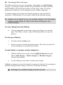
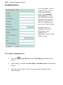
How to Contact Us
Our main office
(UK, Europe):
The Software Centre
PO Box 2000, Nottingham,
NG11 7GW, UK
Main:
(0115) 914 2000
Registration (UK only):
(0800) 376 1989
Sales (UK only):
(0800) 376 7070
Customer Service/
Technical Support:
www.serif.com/support
General Fax:
(0115) 914 2020
North American office
(USA, Canada):
The Software Center
13 Columbia Drive, Suite 5,
Amherst NH 03031, USA
Main:
(603) 889-8650
Registration:
(800) 794-6876
Sales:
(800) 55-SERIF or 557-3743
Customer Service/
Technical Support:
www.serif.com/support
General Fax:
(603) 889-1127
Visit us on the web at:
www.serif.com
Online
International
Please contact your local distributor/dealer. For further details please contact us
at one of our phone numbers above.
This User Guide, and the software described in it, is furnished under an end user License
Agreement, which is included with the product. The agreement specifies the permitted and
prohibited uses.
Portions images ©1997-2002 Nova Development Corporation; ©1995 Expressions
Computer Software; ©1996-98 CreatiCom, Inc.; ©1996 Cliptoart; ©1997 Multimedia
Agency Corporation; ©1997-98 Seattle Support Group. Rights of all parties reserved.
Digital Images ©2008 Hemera Technologies Inc. All Rights Reserved.
Digital Images ©2008 Jupiterimages Corporation, All Rights Reserved.
Digital Images ©2008 Jupiterimages France SAS, All Rights Reserved.
Content ©2008 Jupiterimages Corporation. All Rights Reserved.
Portions graphics import/export technology © AccuSoft Corp. &Eastman Kodak
Company& LEAD Technologies, Inc.
THE PROXIMITY HYPHENATION SYSTEM © 1989 Proximity Technology Inc. All rights
reserved.
THE PROXIMITY/COLLINS DATABASE © 1990 William Collins Sons & Co. Ltd.; ©
1990 Proximity Technology Inc. All rights reserved.
THE PROXIMITY/MERRIAM-WEBSTER DATABASE © 1990 Merriam-Webster Inc.; ©
1990 Proximity Technology Inc. All rights reserved.
The Sentry Spelling-Checker Engine © 2000 Wintertree Software Inc.
The ThesDB Thesaurus Engine © 1993-97 Wintertree Software Inc.
WGrammar Grammar-Checker Engine © 1998 Wintertree Software Inc.
Andrei Stcherbatchenko, Ferdinand Prantl
eBay © 1995-2008 eBay Inc. All Rights Reserved.
PayPal © 1999-2008 PayPal. All rights reserved.
Roman Cart © 2008 Roman Interactive Ltd. All rights reserved.
Mal's © 1998 to 2003 Mal's e-commerce Ltd. All rights reserved.
iTunes © 2000 to 2008 Apple Computer, Inc. All rights reserved.
YouTube © 2008 YouTube, LLC
phpBB © 2000, 2002, 2003, 2007 phpBB Group
FontForge © 2000,2001,2002,2003,2004,2005,2006,2007,2008 by George Williams.
Portions of this software are copyright © 2008 The FreeType Project (www.freetype.org).
All rights reserved.
ODF Translator © 2006-2008, Clever Age, DIaLOGIKa, Sonata Software Ltd. All rights
reserved.
Office Binary Translator to OpenXML Copyright © 2008-2009, DIaLOGIKa. All rights
reserved.
Anti-Grain Geometry - Version 2.4
Copyright © 2002-2005 Maxim Shemanarev (McSeem)
SlideShowPro © Dominey Design Inc. All rights reserved.
Clipart samples from Serif ArtPacks © Serif (Europe) Ltd. & Paul Harris
TrueType font samples from Serif FontPacks © Serif (Europe) Ltd.
Microsoft, Windows, and the Windows logo are registered trademarks of Microsoft
Corporation. All other trademarks acknowledged.
WebPlus is a registered trademark of Serif (Europe) Ltd.
© 2009 Serif (Europe) Ltd. All rights reserved. No part of this User Guide may be
reproduced in any form without the express written permission of Serif (Europe) Ltd.
Serif WebPlus X4 © 2009 Serif (Europe) Ltd.
Contents
Contents
1. Welcome .......................................................... 1
Welcome! .................................................................................. 3
Key features .............................................................................. 4
New features ........................................................................... 10
Installation ............................................................................... 14
2. Getting Started ............................................... 17
Startup Wizard ........................................................................ 19
Creating a site using a design template .................................. 20
Starting a site from scratch ..................................................... 24
Opening an existing site .......................................................... 25
Working with more than one site ............................................. 26
Saving your site ...................................................................... 26
3. Developing Sites and Pages .......................... 27
Understanding site structure and navigation ........................... 29
Understanding pages and master pages ................................ 32
Viewing pages ......................................................................... 33
Adding, removing, and rearranging pages .............................. 37
Adding navigation bars............................................................ 45
Using layout aids ..................................................................... 54
Setting site properties ............................................................. 59
Setting page properties ........................................................... 62
Using Site Manager ................................................................ 65
Access control ......................................................................... 67
Search engine optimization ..................................................... 77
Searching websites ................................................................. 83
Using the Gallery .................................................................... 85
Contents
Adding Google maps ...............................................................87
Adding advertising ...................................................................91
4. Working with Text........................................... 95
Importing text from a file ..........................................................97
Understanding text frames .......................................................98
Using artistic text....................................................................105
Putting text on a path .............................................................108
Editing text on the page .........................................................110
Using Find and Replace .........................................................114
5. Formatting Text ............................................ 117
Setting text properties ............................................................119
Using fonts .............................................................................119
Using text styles .....................................................................121
Creating a bulleted or numbered list ......................................125
6. Working with Tables ..................................... 129
Creating text-based tables .....................................................131
Inserting a calendar ...............................................................134
7. Editing Objects ............................................. 139
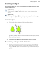
Selecting an object.................................................................141
Selecting multiple objects ......................................................142
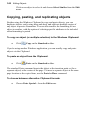
Copying, pasting, and replicating objects ...............................144
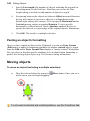
Moving objects .......................................................................146
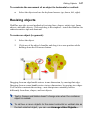
Resizing objects .....................................................................147
Rotating an object ..................................................................148
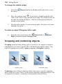
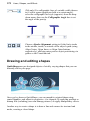
Cropping and combining objects ............................................150
Contents
Joining object outlines ........................................................... 153
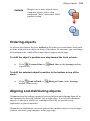
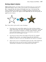
Ordering objects .................................................................... 155
Aligning and distributing objects............................................ 155
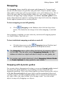
Snapping ............................................................................... 157
Attaching objects to text ........................................................ 159
Creating groups .................................................................... 162
Updating and saving defaults ................................................ 163
8. Lines, Shapes, and Effects ........................... 165
Drawing and editing lines ...................................................... 167
Setting line properties ........................................................... 170
Drawing and editing shapes .................................................. 172
Using 2D filter effects ............................................................ 175
Using 3D filter effects ............................................................ 179
Adding dimensionality (Instant 3D) ....................................... 181
Adding borders ...................................................................... 184
Using object styles ................................................................ 187
9. Images, Animation, and Multimedia ............. 191
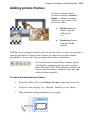
Adding picture frames ........................................................... 193
Importing images .................................................................. 195
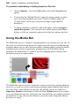
Using the Media Bar ............................................................. 200
Setting image export options................................................. 203
Importing TWAIN images ...................................................... 207
Applying PhotoLab filters ...................................................... 208
Using Image Cutout Studio ................................................... 215
Adding animation .................................................................. 220
Adding sound and video........................................................ 223
Using the Photo Gallery ........................................................ 229
Linking remote images .......................................................... 234
Contents
10. Colour, Fills, and Transparency ................... 235
Applying solid colours ............................................................237
Using colour schemes ............................................................239
Working with gradient and bitmap fills....................................245
Setting transparency ..............................................................246
11. Adding Hyperlinks and Interactivity .............. 249
Adding hyperlinks and anchors ..............................................251
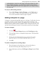
Adding hotspots to a page .....................................................255
Adding rollovers .....................................................................257
Rollover options .....................................................................258
Adding popup rollovers ..........................................................259
12. Adding Dynamic Content ............................. 265
Creating HTML pages ............................................................267
Attaching HTML code ............................................................269
Adding forms ..........................................................................275
RSS feeds and podcasts .......................................................289
E-Commerce ..........................................................................299
Smart objects .........................................................................305
13. Previewing and Publishing ........................... 315
Previewing your site ...............................................................317
Publishing to the web .............................................................319
Creating PDFs .......................................................................326
Using Serif web hosting .........................................................327
14. Index ............................................................ 329
1
Welcome
2 Welcome
Welcome
3
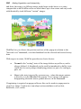
Welcome!
Welcome to WebPlus X4 from Serif—the easiest way to get your business,
organization, or household on the web!
To make life so much easier, WebPlus comes with an impressive selection of
design templates, page navigation bars, creative gallery content, and styles for
you to use. As a result, publishing to the web to a professional standard is easily
achievable for experienced and inexperienced users alike! You'll also be able to
reuse existing textual content by importing word processing documents.
To make the most of pictures in your site you can use Image Cutout Studio for
cutting pictures out and PhotoLab for powerful image adjustment and effect
combinations. You simply cannot afford to miss them!
WebPlus X4 doesn't just stop at "static" web publishing. The real power comes
when adding and managing dynamic content, such as blogs, forums, Content
Management Systems (CMS), counters, and more. You can even make use of
E-commerce tools for money-making shopping cart functionality.
Once you're happy with your WebPlus site, simply upload to your Serif
webspace (or equivalent ISP) to share with business colleagues, customers,
friends and family alike.
Upgrading?
If you've upgraded from a previous version, this new edition of WebPlus
includes a host of exciting new features (p. 10) which keeps WebPlus ahead of
its competitors and at a fraction of the price! We hope you also enjoy the
additional power and performance edge.
Registration
Don't forget to register your new copy, using the Registration Wizard, on the
Help menu. That way, we can keep you informed of new developments and
future upgrades!
4 Welcome
Key features
Before you get started with WebPlus, we recommend you take the opportunity
to familiarize yourself with WebPlus key features and capabilities.
Layout
•
Multipage Design Templates
Make "tailored" websites based on a chosen look and colour scheme in
an instant—choose design templates from Business, E-Commerce,
Personal, Entertainment, Email, and Interests categories, all packed
with royalty free images for you to use.
•
Professional layout tools
Movable rulers, guide lines and a dot grid, as layout aids, help you
position objects precisely; snapping jumps an object to guide or grid.
Use Sticky guides, a great way of moving (in bulk) all objects
snapped to your guide lines—move the guide and objects will follow!
•
Page control
Add and remove pages in just a few clicks of your mouse in the Site
tab. Drag and drop pages within the tab to reorder sequence. Assign
master pages to several site pages at once for time saving and greater
design consistency.
Website Essentials
•
Easy site structure
The hierarchical Site tab makes it easy to see the overall layout of
your site.
•
Navigation bars
Choose from an impressive selection of navigation bars, offering a
range of styles and designs to choose from.
•
Site Search Tool
Perform text searches throughout the entire site with the powerful
Site Search Tool.
•
Search Engine Optimization
Control how search engines index your website! Include or exclude
Welcome
5
pages from indexing by using search engine sitemap or robot files—
protect confidentiality while offering potential web visitors accurate
search results from your site.
•
Smart Objects
Serif Web Resources, Serif's Smart object hosting service, offers a
series of interactive site features:
•
Forum—Stimulates lively thread-based discussions in a fullsized window. Create multiple forums and manage independently
(moderate discussions and set up user login access).
•
User List—offers page or site access control by management of
"zonal" user groups (e.g., Personnel). Web visitors can selfregister via a site's user login (with optional email activation).
•
Analytics—collects and presents web page statistics related to
site visits, browser details, referrers, and search terms.
•
News—For simple news announcements such as website updates
or next club meeting dates.
•
Blogs—now add personal profiles, social bookmarking links
and use trackbacks for inter-blog cross-referencing. Change blog
appearance with different pre-defined Visual Styles (or use your
own!) Use Editor groups for multi-author article publishing.
•
Active Document Frames
Hyperlinks can open a page in a document frame on another page. Set
an Absolute URL for more accurate inter-frame navigation.
•
Site Management Tools
Manage all your Page/Master Page Properties, resources, fonts,
text, hyperlinks, and anchors—all from within WebPlus's Site
Manager. Powerfully manage web pages individually, by selection, or
apply to all pages. Site Checker detects Site Navigation, Text
Formatting, and Form/e-commerce problems and carries out automatic
fixes where possible.
6 Welcome
Pictures
•
Import Pictures
Import commonly-used standard file formats, including all the latest
RAW digital camera formats and Photoshop files. Import multiple
images and paste one by one!
•
More picture power with Media Bar
No more repetitive photo importing! Keep photo content to hand in the
new Media Bar—drag and drop from the Media Bar onto pictures to
replace! Search for pictures by their metadata. Control picture sizing
and alignment within its frame.
•
Stunning online Photo Galleries!
Wow your friends, family and colleagues with stunning Flash-based
photo galleries. Various gallery styles offer photo navigation by
selection from thumbnails, thumbnail rollovers, photo grid or photo
stack. Use the Autoplay feature for looping photo slideshows.
•
Image Adjustments
Apply adjustments (Brightness, Contrast, fix red eye, and more) or
use Edit in PhotoPlus, which accesses Serif's award-winning photoediting package (if installed).
•
A versatile Metafile Format
Import and Export Serif Metafiles (.SMF), a proprietary image format
with improvements to the Windows Metafile format (WMF). Better
line, fill, and text definitions make them ideal for sharing graphics
between Serif applications.
•
Popup Rollovers
Create your own simple photo gallery—show a larger version of a
picture on thumbnail hover over.
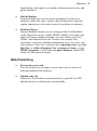
Media
•
YouTube® Videos
Pick your favourite YouTube® videos and include them on your web
page!
Welcome
•
7
Podcasts
Create your own podcast feeds and broadcast your own audio and
video episodes frequently and easily. Web visitors can subscribe with
all the most popular web browsers and via on-click subscription to
Google Reader®, My Yahoo!®, and Apple iTunes®.
Graphics
•
Drawing Tools
Design stunning vector graphics with Pencil, Pen and Straight Line
tools, and add line endings like arrowheads, diamonds, and quills.
Alternatively, the array of fully-customizable QuickShapes let you
quickly create outlines for your designs, while Convert to Curves,
Crop to Shape, and curve drawing offer complete flexibility for
creating any shape imaginable! Mesh warp envelopes add
perspective, slant, and bulge to any object.
•
Ready-to-use Styles
Choose various filter effects, glows, shadows, textures, and materials
from the Styles tab. Customize the preset styles or store your own!
•
Transparency
Add transparency to your backgrounds, text frames, tables, shapes and
text to achieve a truly professional look. As with colour fills, you can
apply solid, gradient, and bitmap transparencies—even create bitmap
transparencies from your own image collection.
•
Intelligent Colour Schemes
Choose from dozens of preset colour schemes to change the overall
appearance of your site with a single click.
•
New 2D/3D Filter Effects
Add stunning reflections of an object—great for web page titles and
pictures! Blur any object or stroke a coloured solid or gradient border
around object edges (stroke with a new Contour fill which applies
gradient fill from the inner to outer outline width). 3D effects are
boosted with realistic glass-like Transparency control of nonreflective/reflective surfaces and multiple separately coloured lights
for dramatic lighting effects. All filter effects can be applied in
preview mode or to the object on the page. Use the new Shadow Tool
for on-the-page shadow control.
8 Welcome
•
Instant 3D with On-screen Transforms
Transform 3D objects in-situ with 3D editing from a context toolbar.
Apply multi-coloured lighting effects (with directional control), along
with custom bevel and lathe effect profiles to create your very own
unique contours. Hardware-accelerated rendering boosts redraw
performance (hardware dependent).
Text
•
Artistic and frame text
Have complete control over your text with WebPlus’s DTP-style text
control. Artistic text can be used to give your websites high impact—
especially good for titling or adding to a drawn path. HTML text
frames allow you to remain HTML compliant whereas successive
Creative text frames can be filled automatically with text by
AutoFlow or manual text fitting. All text has editing capabilities
compatible with top of the range word processors!
•
Text Frames
Compose story text in HTML or Creative text frames then easily
position or size the frame to suit; connected Creative text frames host
the same story text and can be filled automatically by AutoFlow or
manual text fitting. Separate crop and wrap outlines mean you have
greater control over where text flows and how it appears. Import,
paste, export text in Unicode format... design with a foreign-language
or special fonts and characters. Text paths also benefit from intelligent
text fitting.
•
Fonts
Substitute missing fonts when opening third-party projects. View
your currently installed font set in the Fonts tab, including those most
recently assigned to text, favourite fonts, and those considered
Websafe. Hover over a listed font for an "in-situ" font preview of
your selected text—simply click to apply the new font if you like it!
Easily swap all selected instances of a common font for another font
in one fell swoop!
•
Tables and Calendars
Choose from a range of preset formats or design your own table. Use
the convenient Table context toolbar to sort data, format cells, and
choose from a wide range of functions for spreadsheet calculations
(use absolute cell references). Calendars are table-based for enhanced
Welcome
functionality, and support year update, inline personal events, and
public holidays!
•
Find & Replace
Search through story text for words and phrases but also text
attributes, particular fonts, colours, special characters (Unicode),
regular expressions, and words at specific positions in sentences.
•
Database Merge
Present database content on your web page from Serif databases
(.sdb), Microsoft Access (.mdb), dBASE, ODBC server data, and
other well known database formats, as well as Microsoft Excel,
HTML, and delimited text files. Product lists, mailing lists,
inventories, in fact any database information can be served to your
web audience. Place text or pictures into repeating areas, repeating
Buy Now or Add to Shopping Cart e-commerce forms, or even
HTML fragments. Create your own photo database (with EXIF
fields) for subsequent merging.
Web Publishing
•
Previewing your work
Test drive your new web page or your entire site in a choice of
different installed web browsers.
•
Publish your site
Publish to a local folder or upload directly to your ISP via FTP;
upload any new or edited pages incrementally.
9
10 Welcome
New features
•
Exciting new Navigation Bars (p. 45)
Use Flash or JavaScript-driven navigation bars for site-wide page
navigation. Flexible and user configurable, with a host of different
design styles to choose from—share styles for a common look
between navigation bars. You can also include forum, blog, and CMS
articles in dynamically changing navigation bar submenus.
Navigation Manager controls all navigation bars from one point.
•
Resource booking (p. 305)
Use calendar-based Resource booking to self-manage bookings for
accommodation, conference and meeting facilities, squash courts, and
more—by the hour or day, and as optional recurring bookings. Set
pricing levels easily.
•
Manage web content remotely (p. 305)
The new Content Management System (CMS) allows content
providers to add and update web content from anywhere, without
WebPlus and without the need to re-publish your site.
•
Website hosting with Serif (p. 327)
Publish your site with Serif! Combine simple sign-up, different levels
of service, and no-fuss publishing for the ideal hosting solution. Set up
via your Serif Web Resources account while managing access control,
forums, blogs, and other Smart objects at the same time.
More power
•
No more lost customers with Google Maps! (p. 87)
Embed a Google Map directly into your "Directions" web page. Add
your own multiple markers to pinpoint locations such as offices,
depots, places of interest, and events. Advanced mode offers a
JavaScript-driven API for an unlimited number of markers and
HTML-based marker labelling.
•
Track site usage anywhere (see online Help)
Sign up to Google Analytics for comprehensive tracking and
monitoring of your website's visitor data. Analyse data online at any
time with easy-to-interpret charts and maps.
Welcome
•
11
Earn money for your website with Google AdSense (p. 91)
Add Google-driven advertising space on your website, while Google
pays you... 24/7!
More creativity
•
Theme layout design templates (p. 20)
Choose a theme such as Arctic or Natural on which to base your site!
Each theme offers a choice of commonly used page types—choose
from About Us, Gallery, Products, and Contact pages, and many more.
Pick multiple layouts as your new pages, then simply fill picture
placeholders with your own pictures.
•
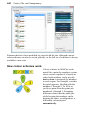
Colour Scheme Designer (p. 239)
Design your very own custom colour schemes using spreads based on
accepted colour theory (Monochromatic, Complementary, Triadic,
and more). Pick a starting base colour and choose from a range of
suggested and related colours—select individually or populate colours
automatically for a new scheme.
•
Photo-based borders (p. 184)
Exciting new ready-to-go borders can be applied around text frames,
tables and pictures alike. Create and save custom borders from your
own electronic border designs or scanned picture frames! The Gallery
tab's Picture frames have the same borders already applied.
•
Joining object outlines (p. 153)
Combine QuickShapes, drawn shapes and artistic text together to
create more complex outlined objects, which can still be edited
further. Use Add, Subtract, Intersect, and Exclude to produce
different and exciting results.
•
Create custom table and calendar AutoFormats (see online Help)
Customize a wide selection of attractive AutoFormats for your very
own table designs. From an easy-to-use table design environment, edit
a table's cell arrangement, and modify cell styles for header, row, or
footer areas. Once edited, save any AutoFormat for future use.
•
Use multiple master pages! (p. 43)
For more varied page design, apply multiple master pages to a specific
web page.
12 Welcome
Ease of Use
•
QuickBuilder Bar (p. 24)
The simple way to get started with WebPlus—drag pages, navigation
bars, text frames, images, Flash content, photo galleries, or Smart
objects directly onto the page for quick results with no prior
knowledge of the user interface.
•
Learn WebPlus (p. 19)
The Startup Wizard's new Learning Zone helps you get the very best
out of WebPlus. Tutorials, both PDF and video, are published along
with a host of other resources and product support details.
•
Quick Publish (p. 325)
Upload and view a currently displayed page—great for live
verification of individual pages as you build your website.
•
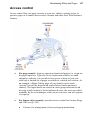
Access control (p. 67)
With a new, more intuitive workflow, access control now offers a
CAPTCHA security check at user registration. Passwords can be
created manually or regenerated. On sign up, web visitors can be
redirected to a specific published web page user sign ups can also be
switched on/off globally.
•
Stroke alignment (p. 170)
For precise positioning, align a shape or text's stroke to the inside,
outside, or centre of its path.
•
Dynamic guides (p. 157)
Align and resize objects with each other using dynamic guide
snapping, without the need for ruler guides or precise object
transforms.
Welcome
13
Pictures
•
Stunning Photo Galleries (p. 229)
Choose from three Photo Gallery types—powered by SlideShowPro™
(Flash), Flash, and JavaScript. Take advantage of caption support
(using EXIF data), and create and manage albums.
•
Non-destructive adjustment and effect filters (p. 208)
The powerful PhotoLab packs a punch with an impressive selection
of editable adjustments, creative, and artistic effects (pencil, water
colour, oil, and more). Use integrated Straighten, Crop, Red-eye, and
Spot-repair tools for easy retouching. Apply filters to selected areas
of your photo by using brush-based masking. Save adjustment/effect
combinations as favourites for future use.
•
Quick-and-easy Image Cutouts (p. 215)
Image Cutout Studio makes light work of cutting out your placed
pictures, directly in WebPlus. Use brushes to discard uniform
backgrounds (sky, walls, etc.) or keep subjects of interest (people,
objects, etc.).
•
New import and export image formats
Import Microsoft's HD Photo files or Serif's own metafile (.smf)
format. Use smf files for better line, fill, and text definitions
(compared to Windows Metafile format), making the format ideal for
sharing graphics between Serif applications.
Text
•
Import Word 2007 and Open Office text documents (p. 97)
Add word processing content to any text frame without fuss! Import
doesn't need the application to be installed locally! Use a choice of
import converters to optimize text import.
•
Text styles and formatting (p. 121)
View all current formatting—both paragraph and character styles, plus
local formatting. Delete multiple styles simultaneously.
•
Attach and position shapes and pictures to text (p. 159)
Control the positioning of shapes and pictures within your HTML or
Creative text frames (or in relation to artistic text titles).
14 Welcome
Installation
System Requirements
Minimum:
•
Pentium PC with DVD/CD drive and mouse
•
Microsoft Windows® XP (32 bit), Windows®Vista, or Windows® 7
operating system (32 or 64 bit)
•
512MB RAM
•
749MB free hard disk space (855MB with Resource CD installed)
•
1024 x 600 monitor resolution
•
Internet Explorer 5.5 (6.0 or above for Smart object use)
Additional disk resources and memory are required when editing large and/or
complex images.
Optional:
•
Windows-compatible printer
•
TWAIN-compatible scanner and/or digital camera
•
3D Accelerated graphics card with DirectX 9 (or above) or OpenGL
support
•
.NET 2.0 for text import filters (Word 2007 + OpenOffice) (installed
by default)
•
Internet account and connection required for Publishing to web and
accessing online resources
Welcome
15
First-time install
To install WebPlus, simply insert the Program CD into your DVD/CD drive.
The AutoRun feature automatically starts the Setup process. Just answer the onscreen questions to install the program.
Re-install
To re-install the software or to change the installation at a later date, select
Settings/Control Panel from the Windows Start menu and then click on the
Add/Remove Programs icon. Make sure the WebPlus X4 Program CD is
inserted into your CD/DVD drive, click the Install… button and then simply
follow the on-screen instructions.
16 Welcome
2
Getting
Started
18
Getting Started
Getting Started
19
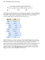
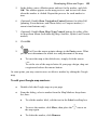
Startup Wizard
Once WebPlus has been installed, you'll be ready to start. Setup adds a Serif
WebPlus X4 item to the (All) Programs submenu of the Windows Start menu.
•
Use the Windows Start button to pop up the Start Menu, click on All
Programs and then click the WebPlus item.
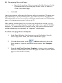
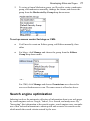
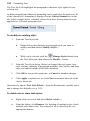
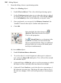
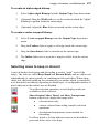
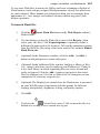
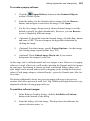
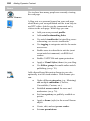
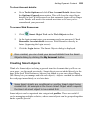
The Startup Wizard presents several choices:
The options are self explanatory, where site creation can be made from scratch
or from a pre-supplied design template. Previously saved sites can be opened or
non-WebPlus web pages can be imported into your site from file or URL.
•
Start New Site, to create your own site from scratch.
•
Use Design Template, to create an instant site from a pre-designed
template.
•
Open Saved Site, to open a previously saved WebPlus site.
•
Import Existing Site, to use an existing site as the basis for your new
site.
20
Getting Started
•
WebPlus hosting, to host your published WebPlus site with Serif.
•
Learning Zone, to access videos, tutorials, support information, and
more.
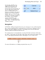
Use the Choose Workspace drop-down menu to choose your workspace
appearance (i.e., Studio tab positions, tab sizes, and show/hide tab status). You
can adopt the default workspace profile <Default Profile>, the last used profile
<Current Profile>, a range of profile presets, or a workspace profile you have
previously saved.
As you click on different profiles from the menu, your workspace will
preview each tab layout in turn.
The Startup Wizard is displayed by default when you launch WebPlus. You can
switch it off via the Don't show this wizard again check box on the Startup
Wizard screen, or on again via the Use Startup Wizard check box in
Tools>Options... (use Options>General menu option).
Creating a site using a design template
WebPlus comes complete with a whole range of categorized design templates
which will speed you through the creation of all kinds of websites. Template
categories range from Business and E-Commerce, to the more leisure-focused
Personal, Entertainment, and Interests.
Each template offers:
•
Complementary design—Professionally designed layout with highvisual impact.
•
Schemes—choose a named colour scheme to apply a specific look and
feel (e.g., Atlantis).
•
Page selection—select some or all template pages (e.g., Home,
Products, About Us, etc.) to base your new site on.
•
Ready-to-go navigation—JavaScript navigation bars are built into
your template design.
Getting Started
21
Design templates come in two types—theme layouts, where you pick your own
pictures, or ready-to-go templates which are already populated with pictures.
Theme layouts
These offer a choice of themes (e.g., Arctic) on which to base your site; you'll
get picture placeholders instead of actual pictures. Simply add your own pictures
to placeholders and personalize placeholder text, then publish.
Ready-to-go templates
These are categorized templates containing royalty-free pictures which can be
adopted to fast-track you to your completed website. You just need to
personalize placeholder text, then publish.
You can select from a greater range of many more design templates
if you've purchased the WebPlus X4 Resource CD.
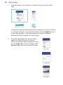
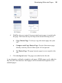
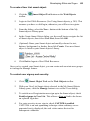
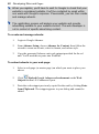
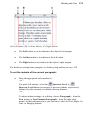
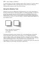
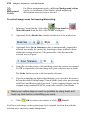
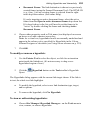
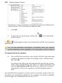
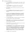
To create a site using a design template:
1.
Launch WebPlus, or choose Startup Wizard... from the File menu, to
display the Startup Wizard.
2.
Select Use Design Template.
22
Getting Started
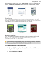
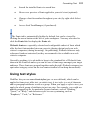
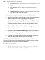
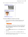
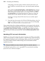
3.
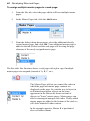
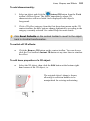
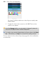
From the dialog, select a theme or template design from the main
pane.
Templates are grouped into subject-based categories; use the scroll bar
or collapse a category to reveal more options (click the button next
to the category name). The right-hand pane refreshes to display
thumbnails of that template's available pages.
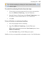
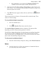
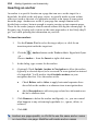
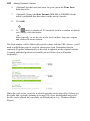
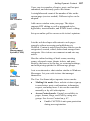
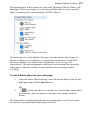
4.
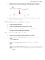
From the right-hand pane, decide which
pages you wish to be part of your site.
Check or uncheck under each page to select,
or click Select All to select all pages (click
Deselect All to clear the current selection).
Getting Started
23
5.
Pick a Colour Scheme from the drop-down list at the top of the dialog
(for theme layouts, the first three schemes are designed specifically for
that layout). The page thumbnails refresh to reflect the new page's
appearance. For a closer look, use the Zoom In/Zoom Out buttons or
Zoom slider at the bottom of the dialog.
6.
Click Open.
The site opens to the first (Home) page, with the Studio's Site tab displayed on
the right, showing the various pages that comprise the site in its Site Structure
tree.
As each template is colour schemed, you can swap the underlying
scheme, and the site's appearance, for another scheme at any time!
Notes
•
Some templates contain Smart objects (see p. 305) such as newsletter sign
ups and polls. As Smart objects are stored in Serif Web Resources they
have to be associated with a valid Serif customer account. If you want to
make use of the Smart object (if unwanted just delete them), double-click it
and login to Serif Web Resources; this will associate the object to your
account.
•
Once you're working in WebPlus you can easily adopt additional pages
from any template to add style variation to your site—for instance, you
could create web pages with a set look and feel, but a separate membersonly area could adopt a different look entirely by adding another templates'
pages. See Adding, removing, and rearranging pages on p. 37 for more
details.
24
Getting Started
Starting a site from scratch
Although design templates can simplify your design choices, you can just as
easily start out from scratch with a new, blank site.
To start a new site from scratch using the Startup Wizard:
•
Launch WebPlus, and select Create>Start New Site.
The new site opens with a blank page using default page properties.
If you click
Cancel (or press Escape) from the Startup Wizard,
you'll get the same result.
To start a new site during your WebPlus session:
•
Choose New from the File menu.
To help you quickly build a site from scratch, WebPlus offers the QuickBuilder
Bar. The tab hosts commonly used objects and features which can be introduced
onto your web page by drag-and-drop, avoiding the need to initially understand
the range of WebPlus toolbars.
Getting Started
25
Opening an existing site
You can open an existing WebPlus site from the Startup Wizard, via the
Standard toolbar, or via the File menu. It is also possible to Import Web Pages
from existing HTML websites via the Startup Wizard. (See online help or more
details.)
To open an existing WebPlus site (Startup Wizard):
1.
Select the Open Saved Site option. In the Documents pane of the
Open Saved Work dialog, you'll see either your computer's folder
structure for navigation to your sites (Folders tab) or a list of most
recently used sites (History tab). Preview thumbnails or site details can
be shown in the adjacent pane depending on your current view.
2.
Click a file name or sample, then click Open. The site opens to the
first (Home) page.
To open an existing WebPlus site (during WebPlus session):
1.
Click
2.
In the Open dialog, select the folder and file name and click the Open
button.
Open on the Standard toolbar.
To revert to the saved version of an open site:
•
Choose Revert from the File menu.
Font substitution
WebPlus supports automatic font substitution as you open a WebPlus site which
has fonts which are not stored on your computer. The dialog that shows also lets
you manually substitute a missing font if necessary. See online Help for more
details.
26
Getting Started
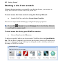
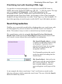
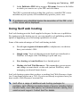
Working with more than one site
If you have multiple websites open at the same time it's easy to jump between
them using different methods.
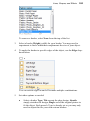
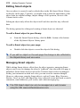
Click on a Window tab at the top of the workspace to make it active (e.g.,
Design657.wpp).
Alternatively, you can select the name of a
currently open site from the Window menu.
Unsaved websites are indicated by an
asterisk; the currently active site is shown
with a tick. In the example opposite, the
Design657.wpp site is active and also
unsaved.
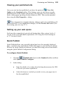
Saving your site
To save your work:
•
Click
•
To save under a different name, choose Save As... from the File menu.
Save on the Standard toolbar.
An unsaved site will have an asterisk after its name shown in either
its Window tab or on the Window menu.
3
Developing
Sites and Pages
28 Developing Sites and Pages
Developing Sites and Pages
29
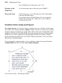
Understanding site structure and navigation
Unlike a printed publication, a website doesn't depend on a linear page
sequence. When designing a site, it makes more sense to think of the site in
spatial terms, with a structure like that of a museum which people will explore.
You can generally assume that your visitors will come in through the "front
door" (the Home page)—but where they go after that depends on the links
you've provided. These navigation pathways are like corridors that connect the
various rooms of the museum. It's up to you as the "architect" to develop a
sensible arrangement of pages and links so that visitors can find their way
around easily, without getting lost.
In WebPlus, you can use the Site Structure tree to visually map out the
structure of your site and then add navigation bars—that dynamically adapt to
the structure you've defined.
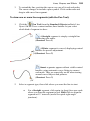
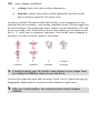
Site structure
Unlike the museum in our analogy, the "structure" of a website has nothing to do
with its physical layout, or where pages are stored. Rather, it's a way of logically
arranging the content on the site so that visitors have an easier time navigating
through it. One of the most useful organizing principles—which WebPlus
strongly reinforces—is an "inverted tree" structure that starts with the Home
page and then branches out to other pages. To the visitor navigating your site,
this arrangement presents your content in a familiar, hierarchical way, structured
into sections and levels.
•
A section is a content category, for example "Who's Who?,"
"Products," or "Links." The various major sections are typically listed
on the site's Home page in a navigation bar. Ideally, each page on the
site belongs to a particular section. And unless there's only one page in
a given section, the section will have its own main page, which usually
serves as a menu for subsidiary pages.
•
The level is the number of steps (i.e., jumps) a given page is removed
from the Home page. The Home page will always reside at Level 1,
normally along with main section menu pages. This allows navigation
bars to work easily and automatically. Pages one step "below" the
section menu pages reside at Level 2, and so on.
30 Developing Sites and Pages
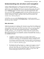
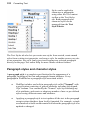
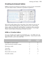
In WebPlus, the Site Structure tree (in the Site tab) provides a visual aid that lets
you organize the content on your site into sections and levels—in other words as
a hierarchy of parent pages branching to child pages. Here's how the same
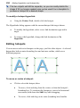
structure might appear in the WebPlus Site Structure tree:
The Site Structure tree makes it easy to visualize relationships between pages
and lay out your site in a way that makes sense for the content you have to offer.
Of course, a website is truly an interconnected web of pages, and the tree
structure doesn't prevent you from installing links between any two pages. But it
does expose the major pathways within your site—up, down, and sideways.
Logical section/level design makes your site easier to navigate, and WebPlus
makes it simple to create navigation bars that mirror your site structure and
help guide your visitors along those "main roads."
Developing Sites and Pages
31
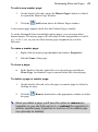
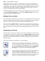
Incidentally, WebPlus also
supports HTML pages and
offsite links which can be
inserted into the Site Structure as
for any other page. Either page
entry is slightly different in
design to a standard web page to
indicate that it is based only on
HTML code (see p. 267) or that
it points to a location outside of
the website. As an example,
compare the HTML page
"Overview," the standard web
page "Sales," and the offsite link
"Member's forum."
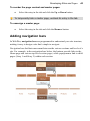
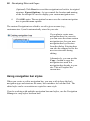
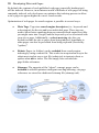
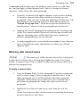
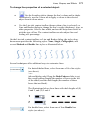
Navigation
In WebPlus, adding navigation between your web pages is easy with navigation
bars, each pre-programmed to understand your site structure, making it easy to
design a site that's simple to navigate. You simply select one from the Web
Objects toolbar and WebPlus does the rest!
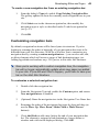
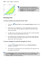
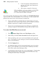
For example, here's a navigation bar we selected for the site shown in the main
tree above. The buttons provide links to the Home and section menu pages (all at
Level 1) and popup menus that link to child pages (Level 2 in this case).
For more information, see Adding navigation bars on p. 45.
32 Developing Sites and Pages
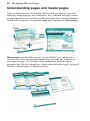
Understanding pages and master pages
Pages are the basic unit of web design. WebPlus lets you structure your site's
content by arranging pages into a branching "tree," which in turn helps visitors
navigate through the site. Looking at individual pages from a design standpoint,
each WebPlus page has a "foreground" page and a "background" master page.
Master pages are part of the structure of your WebPlus site, and provide a
flexible way to store background elements that you would like to appear on
more than one page—for example a logo, background, border design, or
navigation bar. The key concept here is that a particular master page is typically
shared by multiple pages, as illustrated below.
Developing Sites and Pages
33
By placing a design element on a master page and then assigning several pages
to use that master page, you ensure that all the pages incorporate that element.
Of course, each individual page can have its own elements.
The Studio's Site tab includes an upper Master Pages section with icons for each
master page, and a lower Site Structure in the Pages window that provides
feedback indicating which master page is being used by each of your web pages:
For more varied page designs across you site, you can apply multiple master
pages to each web page. For more details, see Adding, removing, and
rearranging pages on p. 37.
Viewing pages
The WebPlus workspace consists of a "page" area and a surrounding
"pasteboard" area.
The page area is where you put the text, graphics, and other elements that you
want to appear on your final web page. The pasteboard is where you generally
34 Developing Sites and Pages
keep elements that are being prepared or waiting to be positioned on the page
area. When you publish your site, anything which overlaps the page area
appears, while anything entirely on the pasteboard does not. The pasteboard is
shared by all pages and master pages, and it's useful for copying or moving
objects between pages.
To move or copy an object between pages via the pasteboard:
1.
Drag the object from the source page onto the pasteboard (hold down
the Ctrl key to copy).
2.
Display the target page (see Switching between pages below).
3.
Drag (or Ctrl-drag to copy) the object from the pasteboard onto the
target page.
WebPlus makes it easy to see exactly what you're working on—from a wide
view of a whole page to a close up view of a small region. For example, you can
use the scroll bars at the right and bottom of the main window to move the page
and pasteboard with respect to the main window. The view automatically recentres itself as you drag objects to the edge of the screen.
The View toolbar at the top of the screen provides the
Pan Tool as an
alternative way of moving around, plus a number of buttons that let you zoom in
and out so you can inspect and/or edit the page at different levels of detail.
If you're using a wheel mouse, spinning the wheel scrolls vertically.
Shift-spin to scroll horizontally and Ctrl-spin to zoom in or out!
Developing Sites and Pages
35
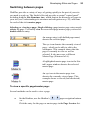
Switching between pages
WebPlus provides a variety of ways of getting quickly to the part of your site
you need to work on. The Studio's Site tab provides a central "control panel"
including both the Site Structure tree, which depicts the hierarchy of pages in
your site (see Understanding site structure and navigation on p. 29), and icons
for each of the site's master pages.
Selecting vs. viewing a page: Single-clicking a page/master page entry merely
selects the page. To actually view the associated page/master page you need to
double-click an entry.
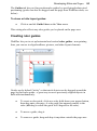
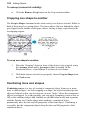
An orange entry (with bolded page name)
denotes the selected page.
The eye icon denotes the currently viewed
page—which you're able to edit in the
workspace. This example shows that the
page is currently in view as well as
selected. It also now uses a different
Master Page (B instead of A).
A highlighted master page icon in the Site
tab's upper window denotes the selected
master page.
An eye icon in the master page icon
denotes the currently viewed page. This
example shows a viewed (but unselected)
master page.
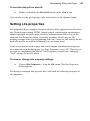
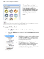
To view a specific page/master page:
Several methods can be used to view a page:
•
On the Hintline, use the Hintline's
page navigation buttons.
- or Click the entry for the page or master page in the Page Locator list.
36 Developing Sites and Pages
•
On the Studio's Site tab, double-click the entry for the page (or master
page) you want to view. The Site Structure window of the tab includes
a tree with entries for pages in the site, while the Master Pages
window shows only master pages as thumbnails. You may need to
click the Master Pages> button to display the master pages window.
•
Click the
Site Structure button on the Hintline or on the Site
tab's Page window. Select the page entry in the dialog's tree (doubleclick tree entries if necessary to expand each branch). Then click the
View Page button.
For master pages:
•
On the Studio's Site tab, click the Master Pages> button to reveal a
master page window. One or more master page icons will be
displayed.
•
Double-click the icon for the master page you want to view.
To switch between the current page and master page:
•
Click the
Page/Master Page button on the Hintline.
As a shortcut to view the site's Home page:
•
Click the
Home Page button on the Hintline.
Developing Sites and Pages
37
Adding, removing, and rearranging pages
Using the Studio's Site tab,
you can quickly add or delete
standard or HTML pages at
any level of your site structure,
and use drag-and-drop to
rearrange pages within the
structure as needed, add new
master pages, reassign pages
to particular master pages, and
add offsite links.
Use the upper Master Pages window of the Site tab to access master pages, and
the Pages window (tab's central Site Structure tree) to access pages. Pages (with
page content or blank) can also be added from multi-page templates (see p. 20).
Besides the Site tab, WebPlus offers a variety of other ways to manipulate
pages: the Site Structure dialog, the Master Page Manager, and both standard
and right-click (context) menus.
To add a new blank page:
1.
Click the down arrow on the
Add button directly above the
Site tab's Pages window. From the drop-down menu, choose New
Blank Page.
2.
In the New Page Properties dialog, specify options for the new page in
the Appearance tab (see Setting page properties on p. 62) as well as
options only available via this dialog:
•
Duplicate the design elements from an existing web page. Check
Copy objects from page and select the page in the activated list.
38 Developing Sites and Pages
•
3.
Specify the position of the new page in the Site Structure. In the
Placement section, insert the page Before, After, or make it a
Child of the named page.
Click OK.
A new page appears at the specified location in the site structure. The page uses
Site Properties (p. 59) for its dimensions. You can always move the page to a
different position or level, or switch to a different master page (see Rearranging
pages or Assigning master pages, both on p. 42).
While adding standard pages lets you start page design from scratch, you can
make life a little easier by adopting "ready to go" pages from supplied WebPlus
templates. To maintain the page's original design, any master page associated
with the added page can optionally be "imported" with the page.
To add a new page from a template:
1.
In the Pages Window (Site Structure tree) of the Studio's Site tab,
select a page after which you want to add the new page.
2.
Click the down arrow on the
Add button directly above the
Pages window. From the drop-down menu choose New Template
Page....
3.
From the Add New Page from Template... dialog, select a template
from the left-hand pane, and check the page for addition (check further
pages for inclusion if needed).
Developing Sites and Pages
4.
5.
39
WebPlus lets you control if an associated master page is copied with
the page. Pick from the top-left drop-down menu choosing one of:
•
Copy Master Page. To always copy the master page into your
site.
•
Compare and Copy Master Page. Checks if the master page
already exists in your site then copies it if not present.
•
No Master Page. The page's master page is never copied to the
site.
Click the Open button. The pages are added to the Site tab.
As an alternative to blank or template web pages, HTML pages can be added to
any Site tab's Site Structure. Such pages can be included in navigation as for
standard pages.
40 Developing Sites and Pages
To add an HTML page:
1.
In the Pages Window (Site Structure tree) of the Studio's Site tab,
select a page after which you want to add the new page.
2.
Click the down arrow on the
Add button directly above the
Pages window. From the drop-down menu choose New HTML Page.
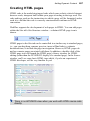
A new HTML page is added to the Site tab. See Creating HTML pages (p. 267)
for more information.
You can also add an offsite link to your site structure. Typically, this would be a
page or resource separate from your site that you wanted to include in your site's
navigation structure, e.g. blog, forum, or CMS. The offsite link appears in the
Site Structure tree and in navigation bars, so you can manipulate it just as if it
were a page in your site.
To add an offsite link:
1.
In the Pages Window (Site Structure tree) of the Studio's Site tab,
select a page after which you want to add the new page.
2.
Click the down arrow on the
Add button directly above the
Pages window. From the drop-down menu, choose New Offsite
Link....
3.
In the dialog, type a Menu name to identify the offsite link in the Site
Structure tree (the equivalent of its page name).
4.
Click to select the link destination type, and enter the specific offsite
hyperlink target (see Selecting a hyperlink target on p. 251), and the
window in which you want the target to appear. Keep Include in
Navigation checked if the link is to appear in site-wide navigation.
5.
•
Check Before and/or After to apply horizontal separator lines
above/below the page as a submenu item in navigation bars.
•
Add a Description to add extra page-related text information on
the bar's submenu item.
Click OK.
Developing Sites and Pages
41
To add a new master page:
1.
On the Studio's Site tab, ensure the Master Pages> button is clicked
to expand the Master Page Window.
2.
Click the
Add button above the Master Pages window.
A new master page appears in the Site tab's Master Pages window.
To easily distinguish between multiple master pages, you can assign them
distinct names. The master pages will still adopt a letter designation as a suffix,
e.g., A, B, C, etc. so you can check master page assignment in your Site
Structure.
To name a master page:
1.
Right-click the master page thumbnail and choose Properties....
2.
Edit the Name of the page.
To clone a page:
•
In the Studio's Site tab, right-click on a selected page and choose
Clone Page. An identical copy is inserted below the selected page.
To delete a page or master page:
1.
On the Studio's Site tab, select the page (or master page) to delete by
clicking its entry.
2.
Click the
the page.
Remove button above the appropriate window to delete
When you delete a page, you'll have the option to remove any
hyperlinks in your site that point to it, or redirect the hyperlinks to
another specified page (hyperlinks to anchors on the deleted page
can optionally be deleted).
42 Developing Sites and Pages
Rearranging pages
Besides using the Site Structure tree to add or delete pages, you can use it to
rearrange pages as needed. Using the parent/child structure, rearranging pages is
an intuitive process whether you use drag-and-drop or convenient buttons. You
can move a page:
•
To a different sequential position (up or down) at the same level of the
structure
•
To a higher (parent) level
•
To a lower (child) level
To move a page:
1.
Display the Studio's Site tab.
2.
Single-click to select the page in the Site Structure tree.
3.
(Using drag-and-drop) Drag the page entry up or down and drop it at a
new position in the tree. Watch the cursor for feedback on the new
position relative to that of the page just below the cursor:
moves the page to the same level as, and following, the
highlighted target page.
makes the page a child of the page below the highlighted target
page.
Assigning individual master pages
If you've defined more than one master page for your site, you can use a variety
of methods to reassign a specific master page to individual pages, one page at a
time. You can also set a page to use no master page—for example, if you import
an HTML page you may want to see only its original design elements without
adding others from a master page. (For an overview, see Understanding pages
and master pages on p. 32.)
Developing Sites and Pages
43
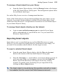
To assign an individual master page to a page:
•
On the Studio's Site tab, click on the master page thumbnail (in the
Master Pages section) and drag onto the page entry (in the tab's Site
Structure section).
Assigning multiple master pages
For pages with more design diversity, you can assign more than one master page
to each web page by using the Master Pages tab. As an example, let's say you
have two designs existing on two separate master pages—"Master A" and
"Master B." Using the Master Pages tab, you can place "Master B," containing
the IPSUM text, in front of the selected page, with Master A used as the page
background.
You'll need to create multiple master pages in advance of using the
Master Pages tab.
44 Developing Sites and Pages
To assign multiple master pages to a web page:
1.
From the Site tab, select the page which will have multiple master
pages.
2.
In the Master Pages tab, click the Add button.
3.
From the dialog's drop-down menu, select the additional already
created master page, and click OK. Your additional master page is
added to the tab (below) and the web page will be using the page
elements of the newly assigned master page.
The Site tab's Site Structure shows a web page with a plus sign if multiple
master pages are assigned (instead of A, B, C, etc.).
The Master Pages tab lets you control the order in
which the page and master page contents are
displayed on the page. In a similar way to layers in
an illustration program, objects on the entry
uppermost in the tab can be shown in front of
objects on "lower" master pages. Master pages can
also be rearranged amongst each other. Newly added
master pages are added to the bottom of the stack so
will show behind all other content.
In the example opposite, Master B is positioned
above all other content.
Developing Sites and Pages
45
To reorder the page content and master pages:
•
Select the entry in the tab and click the Up or Down button.
To temporarily hide a master page, uncheck its entry in the tab.
To unassign a master page:
•
Select the entry in the tab and click the Remove button.
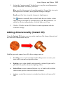
Adding navigation bars
In WebPlus, navigation bars are programmed to understand your site structure,
making it easy to design a site that's simple to navigate.
Navigation bars facilitate movement between the various sections and levels of a
site. For example, in the navigation bars below, the buttons provide links to the
Home page and various top-level section pages, while popup menus link to child
pages (Story 1 and Story 2) within each section.
46 Developing Sites and Pages
You can easily install navigation bars at any level of your site, reconfigure them
to link to a particular part of the site, change the appearance of the navigation
bar, and exclude particular pages from navigation as needed.
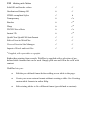
Navigation types
WebPlus offers various types of navigation bars depending on the level of
functionality and design you're looking for in your navigation bar. Navigation
bars use different technologies, specifically JavaScript or Flash. t
Navigation bar types
Use for:
Basic (JavaScript)
Text-based1 navigation bars without
backgrounds.2
Designer (JavaScript)
Text-based1 navigation bars with button and
bar backgrounds.
Miscellaneous (JavaScript)
Combo box, vertical site map, folding style,
or concertina (sliding image) navigation
bars.
Basic (Flash)
Flash navigation bars with animated hoverovers, pop-ups, and flyouts.2 3
Designer (Flash)
Flash navigation bars with professional
graphical effects (hover-overs, pop ups,
flyouts, and page curls).2 3
1
Created as searchable HTML text.
Horizontal and vertical navigation bars available.
3
Requires Flash player to be installed. You'll find a Flash Player in your WebPlus
installation folder.
2
Creating navigation bars
Navigation bars can be added to any page but are typically added to the master
page—as this saves you the trouble of pasting the same element to multiple
pages. A navigation bar on a master page behaves as if it's on each page—
consistent with the notion that its buttons and menus are relative to where each
page sits in the overall site structure.
Developing Sites and Pages
47
When adding a navigation bar, you can choose navigation Type, Options, and a
set Style. Once added, the bar can be edited at any time. New bars can be created
from any existing navigation bar in your site.
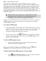
To add a navigation bar:
1.
Select the page (or master page).
2.
From the Web Objects toolbar, click
Insert Navigation Bar on
the Web Objects toolbar's Navigation flyout.
3.
From the dialog's Type tab, a default gallery of navigation bars
appears. For a different navigation type, select from the upper-right
Type drop-down menu.
The Navigation bar gallery lets you select a navigation bar of that
type.
4.
From the Navigation Type tab choose whether to base your
navigation bar directly on the site's Site Structure (enable Based on
site structure) or customize the navigation bar's options (enable
Custom; see Customizing navigation bars on p. 49).
For the former method:
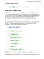
• Select which buttons should be included in the navigation bar: Top
Level, Parent Level, Same Level, Child Level, Home, Previous
and Next, Previous, Next, Up, Breadcrumb, Anchors, Back or
Custom.
48 Developing Sites and Pages
• Depending on the main selection, you can opt to include the child
page, anchors, home page, parent page, and/or Hide current
page.
• Check Don't use page names to use custom button names
(otherwise buttons will have functional names like "Previous" or
"Home").
• Set Target Frame/Window to change where the new page will
open. Choose from Same Window (most common), New
Window (useful for off-site pages), Top of Current Window,
Parent Frame, Named Window and Document Frame.
5.
(Optional; for JavaScript navigation bars only) From the Options tab
you can control how the navigation bar functions. You can change
alignment and pop-up/menu positioning options.
6.
(Optional) From the Style tab, you can select different coordinated
menu and submenu's object and text properties.
7.
Click OK. The navigation bar appears on your page.
When including anchors in navigation bars, you'll be able to navigate
between various sections of long pages or to repeating areas as
menu options.
At any time the navigation bar can be edited, either to adjust the navigation type,
its options or style.
To edit a navigation bar:
1.
Double-click the navigation bar (or right-click it and choose Edit
Navigation Bar...).
2.
Change settings available from the Navigation Type and Style tabs.
You can edit the chosen navigation bar but cannot change its type
(e.g., swap a basic JavaScript navigation bar for a Flash-based bar).
WebPlus also lets you base a new navigation bar on an existing one in your site,
rather than use one from the Navigation bar gallery. This saves having to
customize a navigation bar from the gallery again.
Developing Sites and Pages
49
To create a new navigation bar from an existing navigation bar:
1.
From the dialog's Type tab, enable Copy Existing Navigation Bar.
The gallery updates to show the currently used navigation bars in your
site.
2.
Click Select next to the chosen navigation bar, then modify the
navigation type or style as described under To add a navigation bar
(see p. 47).
3.
Click OK.
Customizing navigation bars
By default, navigation bar items will be based your site structure. If you're
looking to rearrange the order or hierarchy of your navigation bar items to be
different from your Site Structure, WebPlus will allow you to customize any
navigation bars by creating a custom navigation tree—you can also add, edit,
or delete elements which will access a range of link destination types (see
Adding hyperlinks and anchors on p. 251) just as in Site tab's Site Structure.
Once you're working with a custom navigation tree, the navigation
bar will no longer automatically update when new pages are added
to your site. If you still want this to happen, you'll have to base your
bar on the site's Site Structure.
To customize a selected navigation bar:
1.
Double-click the navigation bar.
2.
From the Navigation Type tab, enable the Custom option, and ensure
New navigation tree is enabled.
3.
(Optional) Name the navigation tree in the Navigation Tree Name box.
4.
Rearrange the order of the navigation bar items by drag and drop (or
use the Move Up, Move Down, Make Child or Make Parent
buttons).
5.
Click Add Link to add a new link to the end of your navigation bar
list. The element is assigned a link destination, a target frame or
window and a title in the displayed dialog. Click OK.
50 Developing Sites and Pages
(Optional) Click Reset to revert the navigation tree back to its original
structure. Export Options... let you control the location and naming
of the JavaScript file used to display your custom navigation tree.
6.
Click OK again. The navigation bar now uses the custom navigation
tree to present menu options.
The custom Navigation tree which is saved is given a name (e.g.,
customnavtree-1) and is automatically stored in your site.
If you plan to create more
navigation bars for your site,
you can reuse the same custom
navigation tree for your new
navigation bar by selection
from the dialog. Existing bars
can also be swapped to use the
new tree structure during
editing.
Alternatively, you can use the
Copy... button to copy the
navigation tree used in a
navigation bar already in your
site. This will replace the
current tree.
Using navigation bar styles
When you create or edit a navigation bar, you may wish to keep the bar's
navigation type and structure the same, but customize its look and feel. The
edited style can be overwritten or copied to a new style.
If you're working with multiple navigation bars and styles, use the Navigation
Manager to swap styles between bars.
Developing Sites and Pages
51
To edit a navigation bar style:
1.
From the Style tab, use the flyouts and drop-down menus to create a
unique style. Object colours, menu/submenu font properties, margins,
spacing, and button scaling options can be set.
2.
(Optional) Enter a different style Name. Names are based on the
original navigation bar name.
3.
Click OK. If you didn't rename the style, the original style is
overwritten using the same name. If you renamed, a new named style
is created.
Check Copy style to make a duplicate style entry.
- or 1.
Right-click the navigation bar on the page and select Edit Style....
2.
From the dialog, change the self-explanatory style settings..
3.
(Optional) Enter a different style Name.
4.
Click OK.
If you like your navigation bar style, either on creation or while editing the
navigation bar, you can reuse it in the future. Created style can be applied to
multiple navigation bars via the Navigation Manager.
Including/excluding pages in navigation
By default, all pages in the tree are included in navigation—that is, they can be
linked to by navigation bars. You can exclude certain pages (any but the Home
page) so they'll be ignored by navigation bars. For example, suppose you had a
section of reference or archival pages that you didn't want visitors to explore
top-down. Excluding the parent page for that section would remove it from the
navigation bar. Note that excluding the page from navigation doesn't remove it
from the site—the page will still appear in the Site Structure tree and you can
still install hyperlinks to it; it just won't show up in a navigation bar.
52 Developing Sites and Pages
To exclude a page from navigation:
•
On the Studio's Site tab, right-click the page in the Site Structure tree
and choose Page Properties.... Below the tree, uncheck Include in
Navigation.
•
Included pages show a mark in their page entry in the Site tab's Site
Structure tree, while excluded page entries lack the mark and appear
greyed out.
Using page separators in drop-down menus
For any page, offsite link, or anchor included in navigation (and appearing on a
submenu), their properties can be adjusted to control separators and supporting
page text within the submenu.
•
Check Before
and/or After to
apply horizontal
separator lines
above/below the
page as a submenu
item in navigation
bars.
•
Add a Description
to add extra pagerelated text
information under
the bar's submenu
item.
Developing Sites and Pages
53
Using dynamic navigation bars
Up to now, we've assumed that navigation bars are based on your site structure
and show static pages as menu items. However, for more dynamic navigation
bars, you can populate your navigation bar submenus with ever-changing forum,
CMS, and blog article titles—simply click a title to view the relevant article.
We'll assume you're using an offsite link to connect to your forum, CMS, and
blog, and that the offsite link is included in navigation.
To create a dynamic navigation bar:
•
Right-click the offsite link in Site tab and click Offsite Link
Properties....
•
From the Offsite Link dialog, change the drop-down menu in the
Smart Object Information section to add feed items (i.e., published
article titles) as children to the bar's submenu.
Each article title is clickable, launching the associated article in a
window, typically a separate window.
Checking your navigation bars
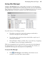
The Navigation Manager gives you an overview of all the navigation bars used
in your site from within the Site Manager.
To display the Navigation Manager:
•
Click
Site Manager on the Default context toolbar (or Hintline
at the bottom of your workspace), then choose Navigation.
- or Choose Site Manager>Navigation Manager... from the Tools menu.
The Site Manager is launched with Navigation Manager shown by
default.
54 Developing Sites and Pages
The Manager displays the bar's page location, names, its navigation tree, and
style, listed by page number.
Using layout aids
Layout guides are visual guide lines that help you position layout elements,
either "by eye" or with snapping turned on. When the snapping feature is turned
on, objects you create, move, or resize will jump to align with nearby, visible
layout guides. WebPlus provides a variety of layout guides to assist you: page
margins, row/column guides and ruler guides.
•
Page margin settings are fundamental to your layout, and usually are
among the first choices you'll make after starting a site from scratch.
Narrow margins around the perimeter are a good starting point for
clean page design. The page margins are shown as a blue box which is
actually four guide lines—for top, bottom, left, and right—indicating
the underlying page margin settings. If you like, you can set the
margins to match your current printer settings.
•
Row and column guides act as an underlying layout aid, separating
your page into multiple rows or columns shown with dashed blue
guide lines.
•
Ruler guides are free-floating "sticky" red guide lines that are great
for aligning objects vertically or horizontally.
To define layout guides:
•
Click
Layout Guides on the Default context toolbar.
The Margins tab lets you set guide lines for page margins, rows, and columns.
You can set the left, right, top, and bottom margins individually. The dialog also
provides options for balanced margins (left matching right, top matching
bottom).
Use the Row and Column Guides section to define guides for rows and
columns with an optional in-between gutter (gap). If you want rows or columns
of uneven width, first place them at fixed intervals, then later drag on the guides
to reposition them as required.
Developing Sites and Pages
55
The Guides tab lets you fine-position ruler guides by specifying absolute pixel
positioning (guides can also be dragged onto the page from WebPlus rulers; see
below).
To show or hide layout guides:
•
Click or unclick Guide Lines on the View menu.
This setting also affects any ruler guides you've placed on the page area.
Creating ruler guides
WebPlus lets you to set up horizontal and vertical ruler guides—non-printing
lines you can use to align headlines, pictures, and other layout elements.
Guides are by default "sticky" so that stuck objects can be dragged around the
page by their ruler guide—a great way to move previously aligned objects in
bulk and simultaneously.
•
To create a ruler guide, click on a ruler, hold down your mouse button,
then drag onto your page. A ruler guide line appears parallel to the
ruler (Alt-drag to create the guide at 90 degrees to the ruler).
•
To move a guide, drag it.
•
To remove a guide, drag and drop it anywhere outside the page area.
56 Developing Sites and Pages
•
To lock ruler guides, choose Tools>Options... and select the Layout
option, then check Lock guide lines.
•
For precise ruler guide placement, check Ruler marks in
Tools>Options>Layout to snap guides to ruler marks.
•
To unstick a selected object, click one of two small red triangular
markers shown at the point where the object is attached to the guide.
You'll see a link cursor ( ) as you hover over the sticky guide
marker.
Click red marker to make nonsticky
•
Markers become non-sticky
and change to black; object
and guide are unstuck and
either can then be moved.
To turn sticky guides on and off, check/uncheck Sticky Guides from
Tools>Options>Layout>Layout. Previously stuck objects will
remain sticky even after sticky guides are switched off—you'll have to
make them non-sticky manually.
Rulers
The WebPlus rulers mimic the paste-up artist's T-square, and serve several
purposes:
•
To act as a measuring tool.
•
To create ruler guides for aligning and snapping.
•
To set and display paragraph indents (see p. 112).
The actual interval size of the ruler marks depends on the current zoom
percentage. In zoomed-out view, for example at 50%, there's less distance
between ruler marks than when zoomed-in to 150%. To handle work where you
Developing Sites and Pages
57
want finer control or smaller snapping increments, click a zoom button to
magnify the page.
Adjusting rulers
By default, the horizontal ruler lies along the top of the WebPlus window and
the vertical ruler along the left edge. The default ruler intersection is the topleft corner of the pasteboard area. The default zero point is the top-left corner of
the page area, but this can be changed.
To define a new zero point:
•
Drag the tab marker on the ruler intersection to the new zero point on
the page or pasteboard. (Be sure to drag only the triangular marker!)
To move the rulers:
•
With the Shift key down, drag the tab marker on the ruler intersection.
Both horizontal and vertical rulers become free-floating and can then
be positioned at an area on the page. The zero point remains
unchanged.
•
Double-click on the ruler intersection to make the rulers and zero point
jump to the top left-hand corner of the page or, if selected, an object.
This comes in handy for measuring objects on the page.
58 Developing Sites and Pages
To restore the original ruler position and zero point:
•
Double-click the tab marker on the ruler intersection.
To lock the rulers and prevent them from being moved:
•
Choose Tools>Options>Layout and select the Rulers page, then
check Lock Rulers.
Rulers as a measuring tool
The most obvious role for rulers is as a measuring tool. As you move the mouse
pointer, small lines along each ruler display the current horizontal and vertical
cursor position. When you click to select an object, blue ruler regions indicate
the object's left, right, top, and bottom edges. Each region has a zero point
relative to the object's upper left corner, so you can see the object's dimensions
at a glance.
Using the dot grid
The dot grid is a matrix of dots or lines based on ruler units,
covering the page and pasteboard areas. Like ruler guides,
it's handy for both visual alignment and snapping.
Developing Sites and Pages
59
To turn the dot grid on and off:
•
Enable (or disable) the Dot Grid button on the View menu.
You can also set the grid spacing, style, and colour via the Options dialog.
Setting site properties
Site properties allow settings to be made which will be applied across the entire
site. Default page settings, HTML output control, search engine optimization,
author/copyright, and web usage statistical information can all be set via the
multi-tab Site Properties dialog. Generally speaking, decide on your Site
property settings when you are planning your site—once set, the settings do not
normally need to be modified (although you can at any time).
Some site properties such as page and search-engine optimization settings are
also mirrored on individual pages (via Page Properties; see p. 62). This lets you
override or complement the "global" Site Properties, respectively, and apply
"local" settings to specific pages.
To view or change site property settings:
•
Choose Site Properties... from the File menu. The Site Properties
dialog appears.
The dialog is arranged into separate tabs, with each tab reflecting an aspect of
site properties.
60 Developing Sites and Pages
Tab
Property
Options
(default)
Default page alignment
Lets you set a default width and height for web pages.
Default page size
Default Width and Height settings determine the dimensions of
new standard web pages or master pages.
Favourites
Set an icon file (a graphic) for the site which will show when a
web visitor bookmarks your website.
Default page file extension
The default extension for published pages is .HTML. Some
web servers require you to use a different extension.
Warn about upper case characters in filenames
When creating new pages, the user will be warned if upper
case characters are used when creating the page's file name.
Resource File Names
Controls the formatting of resource file names to allow
successful upload to ISPs which impose file naming
constraints.
Features
Google Maps
Use these options to set up Google maps (Advanced mode
only).
Serif Web Resources Scheme Matching
Applies your site's colour scheme to published Smart objects.
Navigation Tree
Specifies the script file used for tree control on navigation bars.
Graphics
Global image export options
Applies default format and resampling settings when exporting
graphics.
HTML
Output
HTML Output and Default HTML IDs
Control how your web pages are output by choosing from
different encoding methods and controlling which HTML IDs
are generated.
Page header
Add author details and copyright details to your site's page
headers.
Developing Sites and Pages
Publishing
61
Site URL
Defines the full URL address. This is a requirement for search
engine optimization with sitemaps or RSS feeds.
FTP account
Sets the default FTP account used for web publishing.
FTP account settings
Displays the default FTP account settings.
Search
Search engine descriptors
Include optional descriptive information and keywords for
your site.
Search
Engine
Sitemaps and robots
Informs search engines or robots if they can crawl, analyze and
index web pages in your site. A Sitemap file will include web
pages to be indexed whereas a Robots meta tag (or a robots.txt
file) controls which pages are to be excluded from indexing.
Statistics
Properties and statistics
View and change information for the current site.
Setting page size and alignment
Default site property settings for Width and Height determine the dimensions of
any new page or master page. A default site property setting for alignment
(either Left or Centred) determines how page content lines up in a browser.
One of the first things you may want to do, when creating a new site from
scratch, is to check the default dimensions and adjust them if necessary. You can
adjust the dimension settings at any time—but as a rule, make changes before
you've gone too far with laying out page elements!
In general, use a page Width setting that will fit on a standard monitor (750
pixels is usually safe) and won't force users to scroll horizontally.
For page dimension and alignment, you can override the site setting for a
particular page, as described in Setting page properties on p. 62.
62 Developing Sites and Pages
To set the site-wide page dimension settings:
•
On the dialog's Options tab, select different Width and/or Height
values to apply to master pages.
You can also change the default page alignment setting as a site property, or
override it for a given page.
To set the site-wide page alignment setting:
•
On the dialog's Options tab, select either "Left" or "Centred" in the
Default page alignment drop-down menu.
For more details on other tab settings, see online Help.
Setting page properties
Your WebPlus site has its own general framework, consisting of the site itself;
one or more master pages; and a number of individual pages. Each aspect of
the framework has various property settings that contribute to the look and
behaviour or your site when it's published. Whether you start with a WebPlus
template or from scratch, you can choose whether to stick with the default
property settings or alter them to suit your needs.
Page properties of individual pages can be viewed either via the Site tab, by
right-clicking on the active page in your workspace, or via the Site Manager.
The Site Manager offers a more powerful method of not just viewing but
modifying the properties of multiple pages at the same time—simply check your
chosen pages and alter one or more page properties. All checked pages will
adopt the new settings.
To view master page property settings:
•
Click the
Master Page Manager button above the Master Pages
window on the Site tab. The Master Page Manager appears.
To view normal web page property settings:
•
Right-click the page in the workspace and choose Page Properties....
The Page Properties dialog appears.
Developing Sites and Pages
Tab name
Property
Navigation
(default)
Page, title, and file name
Each page has a "visible" page name or file name shown in
Site tab's Site Structure tree. You can edit either, as well as
choose a title different from the page name.
63
Include in navigation
By default, all pages are included in navigation bars. Use this
option to exclude the page from navigation.
Separators and Description
If included in navigation, check Before and/or After to apply
horizontal separator lines above/below the page as a submenu
item in navigation bars. A Description box adds extra pagerelated text information under the bar's submenu item.
Active document frame
Pages can be opened in an active document frame if the frame
has been created previously.
Redirect
After a configurable time interval a web page is redirected to a
new hyperlink destination (another page, image, email, etc.).
Appearance
Page alignment
Alignment determines how the page content appears in a
browser. Use the Site's default page alignment setting (Use Site
setting), or choose Left or Centred as an override.
Width and Height
Each master page always determines the size of pages that use
it. For individual pages that don't use a master page you can set
custom page dimensions. For pages using a master page, only
the Height can be changed for the page. In the Master Page
Manager (Properties button), you can override the site setting
for a given master page.
Background
Master pages
Assign one or more master pages to a specific page, or set a
page to use no master page.
Use Colour Scheme Designer Settings
Adopts the site's current colour scheme settings for background
colours or uses a custom On-Page colour and/or Background
colour/image.
64 Developing Sites and Pages
Effects
Page Entry/Exit Transitions
Page entry and exit transitions can be applied as you navigate
from one web page to another.
Use Sound file
Choose a background sound to load and play automatically
when a specific page is first displayed.
Page Security
Page Security
Apply access control to your web page(s) by assigning the
page to a user group (via Serif Web Resources User List Smart
object).
Search
Search engine descriptors
Include optional descriptive information and keywords on
individual pages, which override the site's search engine
settings.
Search Engine Sitemaps and robots
Informs search engines or robots if they can crawl, analyze and
index the current page. A Sitemap file will include the current
page in indexing whereas a Robots meta tag (or a robots.txt
file) will exclude the page. These settings override the site's
search engine settings.
Developing Sites and Pages
65
Using Site Manager
WebPlus's Site Manager hosts a whole range of useful site-wide information
available from a single menu-driven dialog. The tool lets you view Page/Master
Page Properties, and pick from a selection of Management tools for viewing and
editing hyperlinks (see below), resources, text, fonts, and much more.
Powerful features of Site Manager include:
•
The ability to control the scope and to manage an individual, a
selection or all pages in your site equally.
•
Any column can be sorted up or down which offers a quick way of
reordering information.
•
Find and Replace. Where available, this is a powerful way of applying
text changes across all web pages simultaneously.
While most management tools are beneficial at any point in site development,
the management of resources and text, as well as use of the Site Checker, are
essential for checking your site just prior to web publishing.
To launch Site Manager:
•
Click
Site Manager on the Hintline at the bottom of your
workspace (or on the Pages context toolbar).
66 Developing Sites and Pages
A quick summary gives an indication of what each management feature can do
for you.
Type of
Management
Lets you...
Page/Master
Page Properties
Include pages in navigation (with separator control),
assign master pages, set page alignment and size,
rename pages, set a background, add sounds, optimize
pages for search engines, and apply redirections,
transitions, or access control.
HTML Page
Properties
View and edit HTML page names, file names (and
path), include pages in navigation (with separator
control).
Hyperlink
View and edit hyperlinks, jump to hyperlinks on the
page, find and replace destination links.
Anchor
View and edit anchor name and location, include pages
in navigation (with separator control), jump to anchors.
Navigation
Display the navigation bars used throughout your site.
Resource
View images, media, links, HTML code resources,
scripts, or applets in your site. Jump to each resource on
the page, swap between linked/embedded image status,
replace or resample images.
E-Commerce
View E-Commerce objects on pages across your site.
Text
View and edit text (in WritePlus), name stories,
reformat text, apply styles, convert creative frames and
tables to HTML-compatible text.
Font
View fonts and their availability, jump to fonts on the
page, and substitute fonts.
File
Display the site structure with page file names rather
than page names. Add files to your site. Rename and
move file locations.
Site checker
Display common layout problems discovered in your
site.
Developing Sites and Pages
67
Access control
Access control lets you apply security to your site, either to restrict access to
specific pages or to control user access to forums and other Serif Web Resource
features.
•
For page security: login to a password-protected page(s) or via an onthe-page login box. Typically of use in personal websites or small
enterprise websites, you can allow free access to most of your site,
with only a limited set of pages accessible to selected web visitors. As
an example, a Photo Gallery page of your family can be made
"private" but still be shared with your relatives (under password
control). The login details are stored in a user group associated with
the page which contains a list of authorized users; the users are added
manually by the web manager of the site or new users can self-register
via sign up.
•
For Smart object security: provides access control for forums, blogs,
and CMS (see p. 305).
•
Forums: for management of users and group moderation.
68 Developing Sites and Pages
•
Blogs: for adding and removing articles via an Editors group.
•
CMS: for managing articles in your CMS.
Access control is possible via Serif Web Resources by using a User List Smart
object, which can be created to manage user groups and users, and how users
sign in.
As a brief reminder, Serif Web Resources is a secure online service
hosted by Serif that stores Smart objects (see p. 305) and any
generated data. You can manage your User List Smart object, as for
any other Smart object, either from within WebPlus or via
www.serifwebresources.com at any time.
Successful establishment of access control on your website, is dependent on
following the steps below.
•
Setting up your User List Smart object
•
Adding users (manual or self-registration)
•
Enabling access control
•
Adding a login box
•
Advanced user control
Setting up your User List Smart object
You'll need to firstly create a User List Smart object then create one or more
groups connected to that Smart object. Normally, you'll just need one Smart
object per site—the individual groups can then be used to control access to
specific pages or Smart object resources.
Developing Sites and Pages
69
To create a User List smart object:
1.
Click the
toolbar.
Smart Object Tool button on the Web Objects
2.
Login to Serif Web Resources (See Using Smart objects; p. 305). This
assumes you have a valid login; otherwise you will have to register.
3.
From the dialog, select the New... button at the bottom of the My
Smart objects Library pane.
4.
In the Create Smart Object dialog, use the scroll bar to navigate the list
of Smart objects, then select User List, then click OK.
5.
(Optional) Name your Smart object and modify colours for text,
buttons, background, or border, then click Create. Your new Smart
object is listed in your Smart objects Library.
6.
Click Exit to logout of Serif Web Resources.
Once you've created your Smart object, you can create and associate user groups
to it using the Manage feature.
To control user signup and security:
1.
Click
Smart Object Tool on the Web Objects toolbar.
2.
With your User List Smart object selected, in the My Smart Objects
Library pane, click the Manage button to reveal the Users dialog.
3.
To switch on self-registration user sign up to the Smart object, check
Enable signups to User List. This allows a Sign up link to be shown
on a placed login box.
4.
For extra security at user sign in, check CAPTCHA enabled.
CAPTCHA is an anti-spamming technique where arbitrary servergenerated text is displayed; the web visitor enters the text for
subsequent validation.
70 Developing Sites and Pages
5.
Enter a redirect URL in the Redirect after login box if you want to
direct the user to a specific web page after successful login.
6.
Click Update.
To create a user group:
1.
From the dialog, click Groups from the top menu.
2.
From the Create New Group dialog, enter a Group Name; this should
reflect how the group is intended to be used, e.g., "Photoaccess".
3.
Click the Create Group button, verify dialog settings, then click
Done. The group will be added to the Group drop-down menu
To manage a user group:
•
Select the group name from the Group drop-down menu, then click
Manage Group.
From the dialog, you can rename the group and display the number of group
users. You can make changes by clicking the Update Group button, or remove
the group with the Delete Group button.
Developing Sites and Pages
71
Adding users (manual or self-registration)
adding users
manually
Typically, adding users manually is great for controlled
environments such as small businesses, organizations, or
clubs where users are "known."
For each user group that is created, a group of users can be
added to each user group by manual entry or import from a
comma-delimited text file by the web manager.
It's possible to use either one user login (everyone uses the
same login) or create a login per user for more user control
(e.g., for membership lists).
selfregistration
user sign up
Conversely, user sign up is intended for more public
access where controlling users is impractical—the user can
simply register then sign in using their login credentials.
The web manager still has the option to manage those
users within their groups via the User List Smart object.
This method requires an on-screen login box to be placed
on the page (normally a master page).
You can add more than one user to the same user group. The same
user can belong to multiple user groups.
To add a user manually:
1.
Click the
toolbar.
2.
With your User List Smart object selected in the My Smart objects
Library pane, click the object's Manage button to reveal the Users
dialog.
3.
From the Add New User section at the bottom of the dialog, enter the
user's email address in the Email box.
Smart Object Tool button on the Web Objects
72 Developing Sites and Pages
With Require activation checked, an activation link will be emailed
to the user along with an auto-generated password. When unchecked,
only an auto-generated password will be emailed.
With Email User checked, an email will be sent to the user; if
unchecked, no email is sent but the user is added. The password needs
to be communicated to the user via other means (telephone or
verbally).
4.
Click the Add User button. The user is added to the user list in the
Users section.
5.
To assign users to a group, click Groups from the top menu.
6.
Select the group from the Group drop-down list, then add the selected
user from the Users box to the Group box by clicking the Add button
(if adding all users, click Add All). The user will now belong to the
user group. To remove, use the Remove (or Remove All) buttons
from the group.
If configured, you can make users sign up by themselves, avoiding the need to
manually add and manage every user as described above. This is done via Serif
Web Resources.
Developing Sites and Pages
73
To enable self-registration user sign up:
This method requires a process requires a login box to be added to
the master page. A new visitor to the site can sign up to become a
registered user (by clicking the Sign up link on the login box).
1.
Click the
toolbar.
Smart Object Tool button on the Web Objects
2.
With your User List Smart object selected in the My Smart objects
Library pane, click the object's Manage button to reveal the Users
dialog.
3.
Click Groups from the top menu.
4.
From the dialog, select an existing group from the Group drop-down
list, and click Manage Group.
5.
Check Add new users on signup—the user's login details on sign up
will be added to the user group during registration. When checked, the
sign in process allows access to all groups that are "sign up enabled",
otherwise restricted pages will be protected.
6.
Click Update Group and then Done.
If you're creating a new group, remember to click Add new users
on signup in the Create New Group section.
Right-click an on-the-page login box and choose Manage Smart
object.
When users sign up via an on-screen login box they will appear in
every user group which is "user sign up enabled."
74 Developing Sites and Pages
Enabling access control
To enable access control on your web page:
1.
With the web page currently in view, click
Default context toolbar.
2.
Check Protect page with password to enable access control. You'll
notice that the Change/Manage button becomes active. Click this
button to reveal currently available user groups (in bold) and the User
List Smart object to which they belong.
3.
From the User Groups dialog, select the user group (e.g.,
Photoaccess), then click OK. Your page's Page Security tab should
show that the page is password protected and that the user group has
been assigned.
4.
Click OK, then OK again to exit the dialogs.
Page Security on the
You'll now notice the page in the Site tab showing a
symbol which indicates that page security is set.
key
Developing Sites and Pages
75
Adding a login box
WebPlus lets you add a login/logout
input box onto a page in your website.
This means that a registered web
visitor can gain access to any restricted
pages by signing in to the site.
The login box is actually a visual
representation of the User List Smart
object; it is placed on the page as well
as existing just in Serif Web
Resources.
Users can be added manually in Serif
Web Resources or via self-registration
user sign up.
Add the login box to the site's master page. Any web page using the
master page will then offer the user the opportunity to sign in to the
website.
To add a user login box:
1.
Follow the procedure under Enabling access control (see p. 67) but
instead of exiting the dialog, pick a page to place your login box, then
click the Insert button.
2.
Position the
Paste cursor where you want the user login box,
then click the mouse to insert the object at a default size.
3.
Enable self-registration user sign up as described previously (see
p. 73).
Advanced user control
Some additional features allow you to import/export, suspend, and ban/unban
users within user groups. A banned user is banned globally (access to all User
Groups is prevented).
76 Developing Sites and Pages
Any user can be deleted or temporarily suspended for breaking site rules (e.g.,
for posting defamatory statements on a hosted public forums). The next time the
user tries to log on the message "Your account has been suspended" is
displayed.
If more drastic action is required, a user's IP address can be banned from
accessing Serif Web Resource objects (e.g., forums, etc.). As a last resort, even
the ISP or organization to which the owner of the email address belongs to can
be banned from access. This latter option is not recommended normally but may
be necessary to prevent institutional malpractice such as professional spamming.
See online Help for more details.
Access control with forums, blogs, and CMS
To set up access control for forums:
1.
Select the already created User List Smart object for access control
when creating a forum.
WebPlus will automatically creates a user group, also called Golf
Forum, to allow self-registration user sign up and sign in. The forum
visitor will need to click the register link and sign up.
Developing Sites and Pages
2.
77
To set up a forum Moderator group, you'll need to create a moderator
group, add moderators manually, manage the forum, and choose the
group from the Moderated by Group drop-down menu.
To set up access control for blogs or CMS:
•
You'll need to create an Editors group, add Editors manually, then
either
•
For blogs, click Manage and choose the group from the Editors
Group drop-down menu.
- or For CMS, click Manage and choose Permissions once directed to
www.serifwebresources.com. The same menu is offered as above.
Search engine optimization
Indexing involves the automatic collection of information about your web pages
by search engines such as Google, Yahoo!, Live Search, and many more. By
"harvesting" this information at the search engine, search engine users can make
use of this indexed information to obtain quick and accurate site search results
which match the search criteria entered by the user.
78 Developing Sites and Pages
By default, the contents of each published web page (especially heading text)
will be indexed. However, in an Internet world of billions of web pages all being
constantly indexed, web developers can optimize this indexing process to allow
a site's pages to appear higher in a user's search results.
Optimization of web pages for search engines is possible in several ways:
•
Meta Tags: Tags store search engine descriptors (i.e., keywords and
a description) for the site and/or an individual page. These tags are
used to allow better matching between entered search engine text (like
you might enter into Google) and the keywords you've associated with
your site or page. Additionally, a robots meta tag also lets you
include/exclude the site or pages from being indexed; hyperlinks to
other pages can also be prevented from being explored (crawled by
"spiders)".
•
Robots: Pages (or folders) can be excluded from search-engine
indexing by using a robots file. This works in an equivalent way to the
robots meta tag but uses a text file (robots.txt) to instruct robots or
spiders what not to index. The file simply lists excluded site
page/folder references.
•
Sitemaps: The opposite of the "robots" concept; pages can be
included to aid and optimize intelligent crawling/indexing. site page
references are stored in a dedicated sitemap file (sitemap.xml).
Developing Sites and Pages
79
Whether you are using Meta tags, robots, or sitemaps independently or in
combination, WebPlus makes configuration simple. As these settings can be
established or modified for the whole site (Site Properties; Search Engine tab)
any newly created page will adopt site's search engine settings. If you change the
site settings, all web pages will update to the new settings automatically.
However, you can override the site's settings on a specific web page (Page
Properties; Search Engine tab) at any time. The page's override means that
subsequent changes to site settings will always be ignored.
Using search engine descriptor Meta Tags
Although they're optional, if you want to increase the likelihood that your
website will be "noticed" by major web search services, you should enter Meta
Tag search engine descriptors. Search services maintain catalogues of web
pages, often compiled through the use of "crawlers" or other programs that
prowl the web collecting data on sites and their content. By including descriptive
information and keywords, you'll assist these engines in properly categorizing
your site. You can enter descriptors for the site as a whole and/or for individual
pages. For example, for a simple ornithological site you could have the
following descriptors, reflecting the content of your site or page, e.g.
Site Properties
Page Properties
Description
American Birds Web
Egret and Heron species page
Keywords
Birds, America,
Audubon
Cattle Egret, Blue Heron, Greenbacked Heron
It's a good idea to plan which descriptors are used for the site and pages. If set, a
site's descriptors will complement page-specific descriptors.
To enter search engine descriptors:
1.
(For the site) Choose Site Properties... from the File menu.
- or (For a page) Right-click the page in the workspace or Site tab and
choose Page Properties... (or choose the item from the Edit menu).
2.
Click the dialog's Search tab.
3.
In the top window, type in a brief description of your site. Although
the description can be any length, the first ten words or so are the most
important.
80 Developing Sites and Pages
4.
In the next window, enter any number of keywords (separated by
commas) that you think fairly categorize your site. Put yourself in the
place of a potential visitor. What keywords might they enter if they
were searching for exactly what your site or page has to offer?
5.
Set a language code for your site from the drop-down menu to identify
your site's language use. Most user's Internet search engines will
permit language specific searches for web pages, so your site will
show in search results according to its language code setting.
Excluding pages from indexing (robots meta tags)
A robots meta tag can be used by search engine robots to control how they
access the site or page. The whole site (and pages) can be set to be indexed/not
indexed, page hyperlinks followed/not followed, or any combination thereof.
Site-wide settings are made by checking Index pages on this site and Follow
links from pages or as overrides on specific page properties.
To enable robot Meta Tag generation:
1.
(For the site) Choose Site Properties... from the File menu.
- or (For a page) Right-click the page in the workspace or Site tab and
choose Page Properties... (or choose the item from the Edit menu).
2.
Select the Search Engine tab and check the Create robots meta tags
option (for a page you'll need to override site-wide settings).
3.
(For the site) Use the two suboptions to allow or prevent search
engines indexing the entire site (check/uncheck Index pages on this
site option) or to allow or prevent indexing of all pages linked from an
indexed page (check/uncheck Follow links from pages option).
- or (For the page) Check Override site search engine settings and
Create robots meta tag, then check/uncheck the equivalent
suboptions for the specific page.
Developing Sites and Pages
81
Excluding pages from indexing (Robots file)
The objective of this method is the same as that for using a robots meta tag, but
instead a robots.txt file is created and no robots meta tag is included in web
pages. The robots.txt file is stored in the web site's root folder and can be viewed
in any text editor to verify the excluded pages and folders.
To enable a robots.txt file:
1.
Choose Site Properties... from the File menu.
2.
From the Search Engine tab, check the Create search engine robots
file option.
3.
(For the site) To allow or prevent search engines indexing the entire
site (check/uncheck Index pages on this site option).
- or (For a page) From page properties, to prevent search engines indexing
the page, check Override site search engine settings, then uncheck
the Index this page option.
Including pages in indexing
So far we've looked primarily at methods of excluding web pages from
indexing. Without these controls, web pages will be indexed by discovering
page hyperlinks and crawling through them, harvesting keywords, descriptions,
and page text to be indexed. However, this process may not be efficient as there
may be a limited number of inter-page hyperlinks present throughout your site.
As a result, a search engine sitemap file (sitemap.xml) can be created to act as a
local lookup for crawlers to begin investigating your site. The file simply lists
pages in your site that you've decided can be indexed. The file also indicates to
search engines when pages have been modified, informs when the search engine
should check the page and how "important" pages are in relation to each other.
The Sitemap method is especially good for "advertising" your site pages—with a
greater likelihood of your pages appearing high in a user's search results.
Just like the robots file, the setting of site and page properties creates the sitemap
file (this is published with your site); the file is stored in the root web folder
(perhaps alongside a robots.txt file).
82 Developing Sites and Pages
One requirement of using search engine sitemaps is the need to
declare an absolute URL. This allows the proper URL address (e.g.,
www.helloworld.com) to be indexed, allowing search engine users to
link through to your site from their search results.
To enable search engine sitemaps:
1.
Choose Site Properties... from the File menu.
2.
Check the Create search engine sitemap file option.
3.
(Optional) When the above option is checked, the default sitemap.xml
file can be renamed. Click the Change... button and edit accordingly.
4.
(For the site) To populate the sitemap file with a list of all the site's
web pages (for improved page "discovery"), the Index pages on this
site option is checked. Uncheck to create an empty sitemap.xml file.
- or (For a page) From page properties, to add the page to the sitemap file,
check Override site search engine settings, then check the Index
this page option. This assumes the site as a whole has not been listed
in the sitemap.xml file.
5.
Check/uncheck Sitemap settings including:
•
Page's last modified date and time.
•
Page change frequency (set drop-down menu to hourly, daily,
weekly, monthly, yearly, or never): This suggests to the search
engine how frequently the page is likely to change. The search
engine will decide how often to index the page on the basis of
this setting.
•
Page priority rating: 0.0 (lowest) to 1.0 (highest). Sets a page
priority relative to your other web pages by which search engines
are most likely to index. The default can be set on site properties
with specific page overrides setting a priority higher or lower
than the default.
Developing Sites and Pages
83
Prioritizing text with Heading HTML tags
It is possible to assign paragraphs (or text styles) in your HTML frame or
HTML table with a preferred HTML tags (H1, H2, .., to H6) for export. The tags
can be assigned from Paragraph... on the Text menu (choose the
Paragraph>HTML option); simply pick a preferred HTML tag for your
paragraph from the drop-down menu. An advantage of this is that paragraphs
assigned such tags take priority over other "body" tags (e.g., those using the <P>
tag) when appearing in search engine results (the H1 tag is the highest priority).
Searching websites
WebPlus uses a powerful search facility which matches user search terms with
text that appears in your site in artistic text, HTML/creative text frames or
tables. This makes it easy to retrieve content from any hosted web pages.
The search feature works by using the Site Search Tool and Site Search
Results Tool, both hosted on the Web Objects toolbar's Search flyout. Each
tool is used to create objects that work together in combination.
Site Search Results object—creates
a window in which the search results
are displayed. Typically, this is
placed and sized onto its own page,
and does not appear in the site
navigation structure.
You'll normally position the search
results box ahead of adding the Site
Search object.
Site Search object—the text box in
which users type the word or phrase
they want to search for. This text
box is usually added to a master
page and appears on all pages of the
site.
As an example, the above search term "vitae" could retrieve search results
showing web pages which contain the search term. The user clicks the Search
button to initiate any search.
84 Developing Sites and Pages
The search results show a hyperlinked page name heading plus associated web
page text for reference. Simply click the hyperlink to access the web page.
With respect to security, all web pages will be searchable by default. However,
password-protected pages will always be excluded from search results. See
Access control on p. 67 for more information on password protection.
To add Site Search Results:
1.
Click the
Site Search Results Tool on the Web Objects
toolbar's Search flyout.
2.
place cursor to a chosen position, then click and drag
Move the
to place your search results window.
To add the Site Search object:
1.
Click the
flyout.
2.
On the web page or master page, move the
place cursor to a
chosen position and click to place your Site Search object. Your
search object appears on the page.
Site Search Tool on the Web Objects toolbar's Search
Developing Sites and Pages
85
Add the search object to the top of your master page to allow sitewide access to the search feature.
Site search is useless without some means of displaying the search results to the
user. This is possible by using the Site Search Results object which, like the Site
Search object, can be placed on a web page under a place cursor. However, the
object is typically resized to full page size before placement (it needs to display
multiple web page hits consecutively).
Keep the search results on a separate, perhaps new, page which
can also have its own look and feel (double-click the object to alter
page appearance).
Using the Gallery
The Gallery tab serves as a container for storing your own design objects you'd
like to reuse in the same or different websites. Once you've copied a design to
the Gallery, it becomes available to any site—simply open the Gallery!
Additionally, the tab includes categorized pre-designed elements such as Flash
banners that you can customize and use as a starting point for your own designs
(you'll get even more design categories and elements if you purchase and install
the WebPlus X4 Resource CD).
The Gallery has two parts: an upper Categories drop-down menu and a lower
Designs window showing a list of thumbnails representing the designs in the
selected category. You can adopt a design by dragging the thumbnail onto the
page.
86 Developing Sites and Pages
The Gallery tab can store your own designs in the ready-to-go My Designs
category—the design is made available in any WebPlus site. When you first
install WebPlus, the My Designs gallery will be empty, ready for custom
designs to be added to it. New categories can be created at any time.
To further arrange your designs into logical groupings, you can add subcategories to My Designs or to any other custom or pre-defined category.
Designs can be added to any pre-supplied category; the My Designs
category exists simply for ease of use when storing your own
custom designs.
To use a design from the Gallery:
•
Click its thumbnail in the design category and drag it out onto the
page. The Gallery retains a copy of the design until you expressly
delete it.
To view your Gallery:
1.
Click the Studio's Gallery tab.
2.
Select a category from the drop-down menu. The items from the first
listed subcategory are displayed by default.
To add, delete, or rename custom categories:
1.
With the Gallery tab selected, click the
Tab Menu button and
choose Add category..., Delete category, or Rename category...
from the flyout menu.
2.
Use the dialog to enter and/or confirm your change.
If adding a category, you need to name the category in a dialog. For renaming or
deletion, simply pick the category in advance of picking the option.
All designs in a deleted category will also be lost.
Developing Sites and Pages
87
To add, delete, or rename custom sub categories:
•
To add, select a category and click Add Sub Category... from the
tab's Tab Menu button.
•
To delete or rename, select options from the
the sub category title bar.
drop-down button on
To move or copy an object into the Gallery:
1.
Using the Categories drop-down menu, select a category into which
you want to add the object. Scroll to reveal target sub-categories,
expanding them if necessary.
2.
Drag the object from the page and drop it onto the target category or
sub-category design window (drag onto an empty sub-categories title
bar to add). To copy, press the Ctrl key before starting to drag. A
thumbnail of the design appears in the Designs window.
To rename or delete a custom design from the Gallery:
•
Click on the
drop-down button in the bottom-right corner of a
thumbnail (shown by hover over) and choose from the menu.
Adding Google maps
Use embedded Google Maps in your web page if want to make sure that a client
can locate your headquarters, attendees can find that special meeting (or event),
or identify special interest locations. By embedding in a purposely designed
"Directions" web page, you'll be able to add the map and written supporting
directions to your site accordingly.
88 Developing Sites and Pages
Each map will allow up to 10 markers to be placed on the map to identify each
location.
A more advanced Map feature is also available for more complex mapping
requirements, including an unlimited number of markers and the ability to use
HTML as your marker text.
To add a simple Google map:
1.
Click
flyout.
2.
From the Configure Google Map dialog, enter your zip code, post
code, or address in the Search for a location field. As Google's
geolocator is being used, WebPlus will sense your locale, and display
local addresses preferentially.
3.
Navigate around the map using supporting panning and zoom
controls—drag the hand cursor to pan, the zoom slider and buttons to
magnify/zoom out. If you've got a mouse with a scroll wheel, check
the Enable mouse scroll wheel zoom for quicker map navigation.
4.
To add a marker, click Add, and then place the
chosen location, then click.
Insert Google Map on the Web Objects toolbar's Media
cursor over the
Developing Sites and Pages
89
5.
In the dialog, enter a Marker name and text for the marker, and click
OK. The marker appears on the map preview, and its text will show
when the marker is clicked. Repeat the process for each marker in
turn.
6.
(Optional). Enable Show Navigation Control buttons for either Full
(panning, Zoom buttons, and Zoom slider) or Compact modes (+/zoom in/out buttons only).
7.
(Optional). Enable Show Map Type Control buttons for either a Bar
or drop-down Menu (both showing Map, Satellite, Hybrid, and Terrain
modes).
8.
Click OK.
9.
You'll see the mouse pointer change to the Paste cursor. What
you do next determines the initial size and placement of the map.
•
To insert the map at the default size, simply click the mouse.
- or To set the size of the map to better fit your page design, drag out
a region and release the mouse button.
At some point, you may want to move or delete a marker by editing the Google
map.
To edit your Google map markers:
•
Double-click the Google map on your page.
•
From the dialog, select a marker from the Map Markers drop-down
list, then:
•
To edit the marker label, edit the text in the Label scrolling box.
•
To move the marker, click Move, then place the
the map again.
•
To delete the marker, click Remove.
cursor on
90 Developing Sites and Pages
Using Advanced Google Maps
Try the Advanced Google Maps if you've a need for greater than 10 map
markers and are interested in adding labelling and marker text that can contain
HTML code, with supporting hyperlinks and images.
You'll need to acquire a site-wide Google Maps key to enable this feature. Only
one key is allowed per site.
To enable Advanced Map mode:
1.
Check Use Advanced Maps.
You'll now need to register for a Google account and then obtain a
site-wide Google API key first!
2.
Click the Go to Google Maps website button to sign up for a key.
3.
Paste your copied key from the Google.com website into the dialog's
Google Maps key text box.
4.
To enter HTML code, type directly into the Label field. For more
advanced coding, consider copying and pasting HTML code into the
field which has been developed independently of the Google Maps
dialog.
5.
Click OK.
To see your changes, you'll have to publish your site (see p. 319).
Developing Sites and Pages
91
Adding advertising
Google Adsense is a free Google service which
allows you to place advertising space on your
web pages. Visitors to your pages will be
served adverts according to the type of content
your site is publishing—the visitor benefits
from easy access to tailored shopping
opportunities while you, as web developer, earn
money to offset the cost of hosting or to get rich
quick!
To advertise, web developers must have an approved Google Adsense account
(www.google.com/Adsense), where you'll be able to create and manage up to
three adverts per page, each advert being called a unit. You can copy and paste a
generated code snippet per unit from the Google Adsense website and paste it
into WebPlus's Google Adsense advertisement dialog.
Supported advert formats range from Leaderboard (728x90 pixel), Banner
(468x60), Half Banner (234x60), Button (125x125), to various Skyscraper,
square, and rectangular sizes.
Google Adsense also offers comprehensive usage reports, account management,
and supporting resources. For more information, visit www.google.com/adsense.
To log in to Google Adsense:
•
Visit www.google.com/adsense to sign up or sign in to Google
Adsense. Click the Sign Up Now button if you're a new user or simply
login using your existing user details; new users will be asked to enter
your site's URL, language, and agree to Google's terms and conditions.
92 Developing Sites and Pages
When you register, you'll have to wait for Google to check that your
website is considered suitable. You'll be contacted by email within
one week with Google's response. If successful, you can then create
and manage adverts.
The registration process will analyze your website and provide
advertising suitable to your website content. The web developer is
not in control of specific advertising content.
To create and manage adverts:
1.
Login to Google Adsense.
2.
From Adsense Setup, choose Adsense for Content, then follow the
wizard to create an ad unit, select its format, and colour style.
3.
Copy the generated Adsense unit code snippet provided for the ad
unit. You'll need this to paste into WebPlus.
To embed adverts in your web page:
1.
Select a web page (or master page) on which you want to place your
advert.
2.
Click
Embed Google Adsense advertisement on the Web
Objects toolbar's E-Commerce flyout.
3.
Paste the code snippet previously copied for the unit by clicking Paste
from Clipboard. The snippet appears in your dialog and cannot be
edited.
Developing Sites and Pages
4.
Click OK.
5.
You'll see the mouse pointer change to the
Paste cursor.
Position the cursor where you want to place the advert, then click to
insert the advert at its original size. The advert cannot be resized.
93
WebPlus lets you swap your advert for another of different format (i.e., size),
colour, font, or corner style.
To edit your advert:
1.
Change the format and colour of your ad unit from Adsense Setup on
the Google Adsense website, then copy the code snippet.
2.
Double-click the advert on your page.
3.
Paste the code snippet into the text box by clicking Paste from
Clipboard.
4.
Click OK.
94 Developing Sites and Pages
4
Working
with Text
96
Working with Text
Working with Text
97
Importing text from a file
Importing text from a word-processor file is a quick way to build up text content
for your site (but you can also create a story using WritePlus). If you use your
current word processor (such as Microsoft Word) to create the text files for your
site, you can import any number of files into one site.
As well as the WritePlus format (.stt), a range of popular word processing and
text formats can be imported, including:
ANSI text
.txt
Microsoft Word 2007
.docx/.dotx
Microsoft Word 2000/2003
.doc/.dot
MS Works
.wps
Open Office text
.odt
Rich Text Format
.rtf
Wordperfect
.wpd
Write
.wri
For Microsoft Word formats created in any Windows operating system you don't
need to have Microsoft Word installed locally. This means you can reuse thirdparty text content in WebPlus without the supporting application.
WebPlus will import text into either a new creative text frame (supports text
flow between frames) or into a selected HTML or creative text frame (HTML
frames do not support text flow) already on your web page. See Understanding
text frames on p. 98 for more information.
Tables cannot be imported.
To import text from a file:
1.
(Optional) If using an existing empty text frame, select the frame. If
inserting text into a populated text frame, click for an insertion point
(or select a portion of text to be replaced).
2.
Choose Text File... from the Insert menu.
98
Working with Text
3.
From the Open dialog, select the format of the source file to be
imported and locate the file itself. (See below for details on setting the
preferred text import format.)
4.
Check the Retain Format box to retain the source file's formatting
styles. Uncheck the box to discard this information. In either case,
WebPlus will preserve basic character properties like italic, bold, and
underline, and paragraph properties like alignment (left, centre, right,
justified).
5.
Check the Ignore Line Wrapping box to ignore returns in the source
text—that is, only if the file has been saved with a carriage return at
the end of every line, and you want to strip off these extra returns.
Otherwise, leave the box unchecked.
6.
Click Open.
7.
The text will be imported into the pre-selected text object or a new text
frame. If all of the imported text cannot fit into the active text frame
you'll be prompted via dialog. You can either create extra frames to
accommodate overflow text (click Yes) or just overflow the text into a
hidden overflow area (click No).
Understanding text frames
Typically, text in WebPlus goes into text frames, which work equally well as
containers for single words, standalone paragraphs, or multipage articles or
chapter text. You can also use artistic text for standalone text with special
effects, or table text (see Creating text-based tables on p. 131) for row-andcolumn displays.
What's a text frame?
A text frame is effectively a mini-page, with:
•
Margins and column guides to control text flow.
•
Optional preceding and following frames.
•
Text and optional inline images that flow through the frame (from the
previous frame and on to the next).
Working with Text
99
The text in a frame is called a story.
•
When you move a text frame, its story text moves with it.
•
When you resize a text frame, its story text reflows to the new
dimensions.
Frames can be linked so that a single story continues from one frame to another.
But text frames can just as easily stand alone. Thus in any site, you can create
text in a single frame, spread a story over several frames, and/or include many
independent frame sequences, e.g.
When you select a frame you'll see its bounding box (see Frame 1 above),
indicated by a grey border line plus corner and edge handles, and (if you clicked
with the Pointer Tool) a blinking insertion point in the frame's text. In this mode,
you can edit the text with the Pointer Tool. (For details, see Editing text on the
page on p. 110.)
100
Working with Text
HTML or Creative frames
Two types of frame can be added to the WebPlus page—the HTML text frame
and the Creative text frame. They can be compared easily in the following table.
HTML
frames
Creative
frames
Searchable by search engines
Script insertion for dynamic content
Margins and column guides
Breaks (column, page, and frame)
Resize/move frame
Crop frame
Rotate frame
1
Frame linking
Columns
Attach objects
Export as text
2
Copy and paste exported text
Solid fill and line colour
Gradient and bitmap fill
HTML-compliant Styles
Transparency
1
Borders
1
Warp
1
2D/3D Filter Effects
1
Instant 3D
1
1
2
If applied, will export frame as a graphic.
Only if rotate, crop, transparency, a border or a filter effect is not applied.
The above table relates to the frame as an object, and not to text contained
within. For text related information, see Setting text properties on p. 119.
Working with Text
101
So how do you tell the difference between an HTML and Creative frame?
Simply, HTML frames will always possess dark blue corner/edge handles when
selected, while a Creative frame's handles will show as grey.
Creating frames
You add frames to a page as you would any other object. You can select, move,
and resize any frame, but you cannot alter its basic shape.
To create a frame:
1.
Click either the
HTML Frame Tool or the
Creative
Frame Tool button from the Text Frames flyout on the Standard
Objects toolbar.
2.
Click on the page or pasteboard to create a new frame at a default size.
- or Drag out to place the text frame at your chosen dimensions.
To delete a frame:
•
Select the frame and press the Delete key. (If there's a selection point
in the text, pressing Delete will remove characters after the cursor.)
You can select, move, and resize text frames just like other objects. (See p. 141,
146, and 147, respectively.)
Putting text into a frame
You can put text into an HTML or Creative frame in one of several ways. For
HTML frames, text will be converted to compliant HTML code.
WritePlus story
editor:
With a selected frame, click
Frame context toolbar.
WritePlus on the
Importing text:
Right-click on a frame and choose Text File... (shortcut
Ctrl+T) to import text.
Typing into the
frame:
Select the Pointer Tool, then click for an insertion point
to type text straight into a frame, or edit existing text.
102
Working with Text
(See Editing text on the page on p. 110.)
Pasting via the
Clipboard:
At an insertion point in the text, press Ctrl+V.
Drag and drop:
Select text (e.g., in a word processor file), then drag it
onto the WebPlus page.
If you drop onto a selected frame, the text is pasted
inline after existing text. Otherwise, a new frame is
created for the text.
Creative frame setup and layout
The frame layout of a Creative frame controls how text will flow in the frame.
The frame can contain multiple columns. When a frame is selected, its column
margins appear as dashed grey guide lines when values for column blinds and
margins are defined. Note that unlike the page margin and row/column guides,
which serve as layout guides for placing page elements, the frame column
guides actually determine how text flows within each frame. Text won't flow
outside the column margins.
You can drag the column guides or use a dialog to adjust the top and bottom
column blinds and the left and right column margins.
(A) Column Guides; (B) Margin Blinds
Working with Text
103
To edit frame properties directly:
•
Select the frame, then drag column guide lines to adjust the boundaries
of the column.
(1)
(2)
(3)
The illustration above shows how the cursor will change when hovering over the
bounding box with Ctrl key pressed (1), after dragging inwards the column
margin can be adjusted (2), and after dragging downwards, the top margin blind
can be moved (3).
To edit frame properties using a dialog:
1.
Select the Creative frame and click the
the Frame context toolbar.
2.
From the dialog, you can change the Number of columns, Gap
distance between columns, Left Margin, Right Margin, and
enable/disable text wrapping around an object.
3.
To change the column widths and blinds (top and bottom frame
margins), click a cell in the table and enter a new value.
Frame Setup button on
Controlling overflowing text (in HTML frames)
As HTML frames have to comply with HTML standards, they are not capable of
linking stories (as for Creative frames). As a result, a decision has to be made
about what happens in the event of overflowing text. Overflowing HTML
frames are clearly indicated—when selected, the Link button at the bottom right
of the frame indicates
Overflow.
104
Working with Text
If you see this, you can choose to leave the text Hidden, let it Overflow, or let
all the text be viewable with the help of a scroll bar.
To control overflowing text:
1.
Select your overflowing HTML text frame.
2.
Right-click on your frame, and go to Text Format>Overflowing text
and choose:
•
Hidden - The frame as it is displayed on your page will be shown
in a browser. Text will continue to be hidden.
•
Overflow - The frame will overflow (be extended) to allow all
text within the frame to be shown.
•
Auto Scroll bar - A navigation scroll bar is displayed only when
text overflows the frame.
•
Fixed Scroll bar - A navigation scroll bar is displayed
permanently but will be greyed out if text does not overflow.
It's always a good idea to preview your HTML frames (via Preview in
Window or via your browser)—especially if Overflow is selected.
How a story flows through a sequence of Creative
frames
Stories cannot flow between HTML frames, as they do not support
linking (text can only overflow a single frame).
You can have just one Creative frame on its own, or you can have many frames.
Frames can be connected in linked sequences so that the story associated with a
given frame sequence flows through the first frame on to the next and keeps
flowing into frames in the link sequence.
A key difference from a word processor is that WebPlus does not normally add
or remove frames according to the amount of text. The text simply flows until
the text runs out (and some frames are left empty), or the frames run out (and
some text is left over).
Working with Text
105
•
If the text runs out before the last frame, you'll have some empty
frames. These frames will be filled with text if you add more text to
the story, or if you increase the size of the story text.
•
If there is still more text to go after filling the last frame, WebPlus
stores it in an invisible overflow area, remembering that it's part of
the story text. If you later add more frames or reduce the size of text in
a frame, the rest of the story text is flowed in.
WebPlus keeps track of multiple linked frame sequences, and lets you flow
several stories in the same site. The Site Manager's Text menu item (accessed
via the Tools menu) provides an overview of all stories and lets you choose
which one you want to edit.
On text overflow, the frame's
AutoFlow button can be used to create new
frames for the overflowed text. To control how the frame text is spread
throughout available frames, you can use Fit Text, Enlarge Text, or Shrink
Text. These options scale a story's text size.
Using artistic text
Artistic text is standalone text you type directly onto a page. Especially useful
for headlines, pull quotes, and other special-purpose text, it's easily formatted
with the standard text tools.
Here are some similarities between frame text and artistic text. Both text types
let you:
•
vary character and paragraph properties, apply named text styles, edit
text in WritePlus, and import text.
•
apply different line styles, fills (including gradient and bitmap fills),
and transparency.
106
Working with Text
•
embed inline images.
•
apply filter effects and rotate/flip.
•
use proofing options such as AutoSpell/Spell Checker, Proof Reader,
and Thesaurus.
•
manage their content and track font usage via the Site Manager.
And some differences:
•
You can initially "draw" artistic text at a desired point size, and drag it
to adjust the size later. Frame text reflows in its frame upon frame
resize.
•
Artistic text can be applied to a path but frame text cannot.
•
Artistic text won't automatically line wrap like frame text.
•
Artistic text doesn't flow or link the way frame text does; the Frame
context toolbar's text-fitting functions aren't applicable to artistic text.
To create artistic text:
Artistic Text Tool from the Tools toolbar's Text
1.
Choose the
flyout.
2.
Set initial text properties (font, style, etc.) as needed before typing,
using the Text context toolbar, Text menu, or right-click (choose Text
Format>).
3.
Click anywhere on the page for an insertion point using a default point
size, or drag to specify a particular size as shown here.
4.
Type directly on the page to create the artistic text.
Working with Text
107
Once you've created an artistic text object, you can select, move, resize, delete,
and copy it just as you would with a text frame. Solid colours, gradient/bitmap
fills and transparency can all be applied.
To resize or reproportion an artistic text object:
•
Drag the object's handles to resize it while maintaining the object's
proportions.
•
To resize freely, hold down the Shift key while dragging.
To edit artistic text:
•
Drag to select a range of text, creating a blue selection.
You can also double-click to select a word.
Now you can type new text, apply character and paragraph formatting,
edit the text in WritePlus, apply proofing options, and so on.
108
Working with Text
Putting text on a path
"Ordinary" straight-line artistic text is far from ordinary—but you can extend its
creative possibilities even further by flowing it along a curved path.
The resulting object has all the properties of artistic text, plus its path is a Bézier
curve that you can edit with the Pointer Tool as easily as any other line! In
addition, text on a path is editable in some unique ways, as described below.
To apply a preset curved path to text:
1.
Create an artistic text object.
2.
With the text selected, click the
Path flyout on the Text
context toolbar and choose a preset path.
The text now flows along the specified path, e.g. for "Path - Top Circle".
To add artistic text along an existing line or shape:
1.
Create a freehand, straight, or curved line (see Drawing and editing
lines on p. 167) or a shape (see Drawing and editing shapes on p. 172).
2.
Choose the
flyout.
Artistic Text Tool from the Tools toolbar's Text
Working with Text
109
3.
Bring the cursor very close to the line. When the cursor changes to
include a curve, click the mouse where you want the text to begin.
4.
Begin typing at the insertion point. Text flows along the line, which
has been converted to a path.
To fit existing text to an existing line or shape:
1.
Create an artistic text object.
2.
Create a freehand, straight, curved line or a shape.
3.
Select both objects. On the Tools menu, choose Fit Text to Curve.
The text now flows along the specified path.
To create text and path at the same time:
1.
Choose one of the Path Text tools from the Text flyout:
The Freehand Path Text Tool lets you sketch a curved line in a
freeform way.
The Straight Path Text Tool is for drawing a straight line.
The Curved Path Text Tool lets you join a series of line segments
(which may be curved or straight) using "connect the dots" mouse
clicks.
110
Working with Text
2.
Create a line on the page. Your line appears as a path with an insertion
point at its starting end (for a curved path you can either type directly
onto any part of the path or press Esc or double-click to get the
insertion point at the start of the path).
3.
Begin typing at the insertion point. Text flows along the path.
To remove the text path:
1.
Select the path text object.
2.
Click the
flyout.
Path-None button on the Text context toolbar's Path
The text remains as a straight-line artistic text object; the path is permanently
removed.
Editing text on the page
You can use the Pointer Tool to edit frame text, table text, or artistic text
directly. On the page, you can select and enter text, set paragraph indents and tab
stops, change text properties, apply text styles, and use Find and Replace (see
p. 114). For editing longer stories, and for more advanced options, choose
WritePlus (Edit Story… from the Edit menu).
Selecting and entering text
The selection of frame text, artistic text, and table text follows the conventions
of the most up-to-date word-processing tools. The selection area is shaded in
semi-transparent blue for clear editing.
Working with Text
111
Double-, triple-, or quadruple-click selects a word, paragraph or all text,
respectively. You can also make use of the Ctrl-click or drag for selection of
non-adjacent words, the Shift key for ranges of text.
To edit text on the page:
1.
Select the Pointer Tool, then click (or drag) in the text object. A
standard insertion point appears at the click position (see below).
- or Select a single word, paragraph or portion of text.
2.
Type to insert new text or overwrite selected text, respectively.
To start a new paragraph:
•
Press Enter.
To start a new line within the same paragraph (using a "line break"
or "soft return"):
•
Press Shift+Enter.
The following two options apply only to frame text. You can use these shortcuts
or choose the items from the Insert>Break submenu.
To flow text to the next column (Column Break) or frame (Frame
Break):
•
Press Ctrl+Enter or press Alt+Enter, respectively.
To switch between insert mode and overwrite mode:
•
Press the Insert key.
112
Working with Text
To repeat a text action:
•
Choose Repeat from the Edit menu, or press Ctrl+Y.
For example, if you've applied new formatting to one paragraph, you can click
in another paragraph and use the Repeat command to apply the same formatting
there.
To show special characters:
•
From the View menu, select Special Characters (paragraph marks
and breaks; see below) or Spaces (Show Special Characters plus tabs,
non-breaking spaces, hyphenation points, and "filled" normal spaces).
Copying, pasting and moving text
You can easily copy and paste text using standard commands; drag and drop of
text is also supported.
If you don't place an insertion point, the text can be pasted into a
new text frame directly.
Setting paragraph indents
When a text object is selected, markers on the horizontal ruler indicate the left
indent, first line indent, and right indent of the current paragraph. You can adjust
the markers to set paragraph indents, or use a dialog.
Working with Text
113
(A) Left Indent; (B) 1st Line Indent; (C) Right Indent.
•
The Left indent is set in relation to the object's left margin.
•
The 1st line indent is in relation to the left indent.
•
The Right indent is in relation to the object's right margin.
For details on setting frame margins, see Frame setup and layout on p. 102.
To set the indents of the current paragraph:
•
Drag the appropriate ruler marker(s).
- or Increase Level or
For quick left indents, select the
Decrease Level button to increase or decrease indent, respectively.
Indent is by the currently set default tab stop distance.
- or To adjust indent settings via a dialog, choose Paragraph... from the
Text menu (or Text Format>Paragraph... from the right-click
menu). In the Indentation box, you can enter values for Left, Right, 1st
Line, or Hanging indents.
114
Working with Text
Working with Unicode text
WebPlus fully supports Unicode, making it possible to incorporate foreign
characters or special symbols.
•
To paste Unicode text from the Clipboard to the page, use Edit>Paste
Special..., then select "Unformatted Unicode Text."
•
Insert Unicode characters directly into your text by typing your
Unicode Hex value and pressing Alt+X. The Alt+X keyboard
operation toggles between the displayed character (e.g., @) and its
Hex value (e.g., U+0040) equivalent.
•
To export text in Unicode format, use WritePlus.
Using Find and Replace
You can search site text for an extraordinary variety of items: not just words or
parts of words, but a host of character and paragraph attributes such as fonts,
styles, alignment, bullets and numbering, missing fonts, drop caps... even inline
graphics and more! Using the Find and Replace dialog—which remains open
without interrupting your work until you click its Close button—you can replace
globally, or on a case-by-case basis.
To use Find and Replace:
1.
Choose Find & Replace... from the Edit menu.
2.
In the dialog, type the text to be found in the Find box and its
replacement text (if any) in the Replace box. Click the down arrows to
view recent items. Click either box's button to use flyout menus to
select formats or special characters, or define a regular expression (for
a wildcard-type search).
3.
Select the Range to be searched: Current Story (just the currently
selected text object or story), or All Stories (all text), or Current
Selection (only used with the Replace All function to operate on the
currently selected text).
4.
Select Match whole word only to match character sequences that
have white space (space, tab character etc.) or punctuation at each
end, or which are at the start/end of a paragraph. Select Match case
Working with Text
115
for case-sensitive search. Select Regular expressions to treat the
contents of the Find box as an expression, rather than as a literal string
to be found.
5.
Click Find Next to locate the next instance of the Find text.
- or Click Select All to highlight all instances of matching text in your site
simultaneously.
6.
Click Replace if you want to substitute the replacement text.
Alternatively, click Find Next again to skip to the next matching text.
Continue using the Replace option as required until you reach the end
of your site.
- or Click Replace All to replace all instances of the Find text with the
replacement text at the same time. WebPlus reports when the search is
completed.
7.
Click Close to dismiss the Find and Replace dialog.
The Find and Replace dialog also lets you perform a wildcard-type search by
using a regular expression—a formula for generating a set of strings—to
specify complex search criteria. This is covered in more detail in the WebPlus
Help.
116
Working with Text
5
Formatting
Text
118
Formatting Text
Formatting Text
119
Setting text properties
WebPlus gives you a high degree of control over the fine points of typographic
layout, whether you're working with frame text, table text, or artistic text.
To apply basic text formatting:
1.
Select the text.
2.
Use buttons on the Text context toolbar to change text style, typeface,
point size, attributes, paragraph alignment, or level.
By default, text on your published web pages is set to vary in size depending on
the visitor's browser setting. If you wish, you can override this as a global option
in WebPlus, so that text will appear in the browser at exactly the same point
sizes used in your layouts. To check or change the setting, choose Site
Properties... from the File menu. On the Options tab, check Force absolute
text size to override the variable-text default.
To clear local formatting (restore plain/default text properties):
•
Select a range of text with local formatting.
•
Click on the Clear Formatting option on the Text context toolbar's
text styles drop-down list (or Text Styles tab).
Using fonts
One of the most dramatic ways to change your site's appearance is to change the
fonts used in your artistic text, frame text, or table text. Applying different fonts
to a character or entire paragraph can communicate very different messages to
your intended readership.
120
Formatting Text
Font assignment is very simple in
WebPlus, and can be done from the
Fonts tab, Text context toolbar, or
in the Character dialog (via rightclick, or from the Text menu).
The Fonts tab lets you:
•
Apply fonts easily without dialog navigation.
•
Assign fonts to be Websafe or favourites.
•
View most recently used, Websafe, and your favourite fonts
simultaneously.
•
Make a font rasterize on export or resolve its export in Site Checker.
Formatting Text
121
•
Search for installed fonts via search box.
•
Hover-over preview of fonts applied to your site's text (optional).
•
Change a font for another throughout your site (by right-click Select
All).
•
Access Serif FontManager (if purchased).
The Fonts tab is automatically hidden by default, but can be viewed by
clicking the arrow button at the left of your workspace. You may also need to
click the Fonts label to display the Fonts tab.
Websafe fonts are a specially selected and configurable subset of fonts which
offer the best font matches between your site (during design) and your web
visitors' computers (during browsing). On publishing, Websafe fonts are only
referenced (and not rasterized) as they are assumed to be available on a web
visitor's computer.
Generally speaking, it is advisable to keep to the standard list of Websafe fonts
shown in the Fonts tab unless you can be sure of font usage amongst your target
audience. These fonts are grouped together under the tab's Websafe category (an
equivalent category exists on the text context toolbar's Font drop-down menu).
Using text styles
WebPlus lets you use named text styles (pre- or user-defined), which can be
applied to frame text, table text, or artistic text. A text style is a set of character
and/or paragraph attributes saved as a group. When you apply a style to text, you
apply the whole group of attributes in just one step. For example, you could use
named paragraph styles for particular layout elements, such as "Heading,"
"Quote," or "Body," and character styles to convey meaning, such as
"Emphasis," "Code," or "Reference."
122
Formatting Text
Styles can be applied to
characters or paragraphs
using either the Text context
toolbar or the Text Styles
tab. Both paragraph and
character styles can be
managed from the Text
Style Palette.
The Text Styles tab also lets you create new styles from scratch, create named
styles from existing text properties, and swap a style for another across your site
in one operation. Any style can be previewed against any selected paragraph
directly on the page. See online Help for more details on these features.
Paragraph styles and character styles
A paragraph style is a complete specification for the appearance of a
paragraph, including all its font and paragraph format attributes. Every
paragraph in WebPlus has a paragraph style associated with it.
•
WebPlus includes one built-in paragraph style called "Normal" with
a specification consisting of generic attributes including left-aligned,
12pt Verdana. You can modify the "Normal" style by redefining any
of its attributes, and create or adopt any number of new or pre-defined
styles having different names and attributes.
•
Applying a paragraph style to text updates all the text in the paragraph
except sections that have been locally formatted. For example, a single
word marked as bold would remain bold when the paragraph style was
updated or changed.
Formatting Text
123
A character style includes only font attributes (name, point size, bold, italic,
etc.), and you apply it at the character level—that is, to a range of selected
characters—rather than to the whole paragraph.
•
Typically, a character style applies emphasis (such as italics, bolding
or colour) to whatever underlying font the text already uses; the
assumption is that you want to keep that underlying font the same. The
base character style is shown in the Text Styles tab (or palette) as
"Default Paragraph Font," which has no specified attributes but
basically means "whatever font the paragraph style already uses."
•
Applying the Default Paragraph Font option from the Text Styles tab
(or the Text context toolbar's Styles box) will strip any selected local
character formatting you've added and will restores original text
attributes (paragraph styles are not affected).
•
As with paragraph styles, you can define any number of new character
styles using different names and attributes (or adopt a pre-defined
character style).
Working with named styles
The named style of the currently selected text is displayed
in either the Text Styles tab or the drop-down Styles box on the Text context
toolbar. A character style (if one is applied locally) may be shown; otherwise it
indicates the paragraph style.
To apply a named style:
1.
Using the Pointer Tool, click in a paragraph (if applying a paragraph
style) or select a range of text (if applying a character style). If you
apply a paragraph style, it will be applied to the whole paragraph
regardless of the amount of text selected. If you've selected text in
more than one paragraph, the change takes place in all selected
paragraphs.
2.
Display the Text Styles tab and select a style from the style list.
- or On the Text context toolbar, click the arrow to expand the Styles dropdown list and select a style name.
124
Formatting Text
The Text Style tab highlights the paragraph or character style applied to any
selected text.
As both paragraph and character formatting can be applied to the same text, all
of the current text's formatting is displayed in the Current format box on the
tab. In the example below, currently selected text has a Strong character style
applied over a Normal paragraph style.
To modify an existing style:
1.
From the Text Styles tab:
•
Right-click on the character or paragraph style you want to
modify and then choose Modify <style>....
- or -
•
With a style selected, pick the
Manage Styles button from
the Text Styles tab, then choose the Modify... button.
2.
From the Text Style dialog, define (or change) the style name, base
style, and any character or paragraph attributes, tabs, bullets, and drop
caps you want to include in the style definition.
3.
Click OK to accept style properties, or Cancel to abandon changes.
4.
Click Apply to update text, or click Close to maintain the style in the
site for future use.
Alternatively, choose Text Style Palette... from the Text menu to modify styles
and to change text defaults (see p. 163).
To delete one or more text styles:
•
Right-click a text style and select Delete <style>....
•
From the dialog, click Remove. For deletion of multiple styles, check
multiple style names first. For removal of all or unused styles, use
appropriate buttons.
Formatting Text
125
Take care when deleting styles. Styles based on a checked
"parent" style will be checked for deletion.
Creating a bulleted or numbered list
For any text frame it's possible to apply bullets and numbering to lists and
paragraphs alike. Bullets are especially useful when listing items of interest in
no specific order of preference and numbered lists for presenting step-by-step
procedures (by number or letter). WebPlus lets you apply the list style to normal
text (as local formatting) or to text styles equally.
Within HTML text frames, basic
bullet icons, numbers (numeric
and Roman) and letters can be
applied.
However, if you're using Creative text frames you can adopt basic as well as
complex bulleted or numbered lists either by selecting presets (see below) or
creating your own custom list style (these let you select your own symbols,
numbers and letter formats). You then have the option of replacing an existing
preset with your own preset based on your custom list style.
Bulleted list
Numbered list
126
Formatting Text
To create a simple bulleted or numbered list:
1.
Select one or more paragraphs.
- or Click in a paragraph's text.
2.
Select
Bulleted List or
context toolbar.
Numbered List from the Text
The list style used is the first preset shown in the Bullets & Numbering dialog
described below.
To create a bulleted or numbered list (using presets):
1.
Select one or more paragraphs.
- or Click in a paragraph's text.
2.
Select Text>Bullets & Numbering... from the Text menu.
3.
From the Text Style dialog, either:
4.
•
For text in HTML text frames, click in a preset icon from the
dialog (see above).
- or -
•
For text in Creative text frames, pick Bullet or Number from the
Style drop-down menu, then select one of the preset formats
shown by default.
- or -
•
For a custom list, select a preset then click the Details button to
alter custom options.
Click OK to apply list formatting.
Each time you insert a following return, a new line will begin with the specified
symbol or number. In addition, typing two returns in a row (pressing Enter
twice) cancels bullets or numbers and resumes regular paragraph formatting.
Formatting Text
Turn off list formatting by clicking the Text context toolbar's
127
or
buttons again.
To restart list numbering (Creative frame text only):
1.
Click to place an insertion point in the list to set the restart position,
then select Bullets & Numbering... from the Text menu.
2.
From the Presets or Details page, check Restart Numbering to reset
the number or letter sequence back to 1 or A, respectively.
3.
Click OK.
To turn off bullets or numbering formatting:
1.
Select the paragraph with list formatting.
2.
Select Text>Bullets & Numbering... from the Text menu.
- or Right-click the paragraph and from the Text Format option, choose
Bullets & Numbering....
3.
In the Text Styles dialog, click the None preset option.
WebPlus also lets you assign bullets and numbers to styles. (See WebPlus help.)
128
Formatting Text
6
Working
with Tables
130 Working with Tables
Working with Tables
131
Creating text-based tables
Tables are ideal for presenting text and data in a variety of easily customizable
row-and-column formats, with built-in spreadsheet capabilities.
Each cell in a table behaves like a mini-frame. Like frame text you can vary
character and paragraph properties, apply named text styles, embed inline
images, apply text colour fills (solid, gradient, or bitmap), and use proofing
options such as Spell Checker, Proof Reader, and Thesaurus. Some unique
features include number formatting and formula insertion.
HTML or Creative tables
Two types of table can be applied to the WebPlus page—the HTML table and
the Creative table. These can be compared easily below—some features can be
applied to both, or just to one or the other.
HTML
tables
Creative
tables
Searchable by search engines
Script insertion for dynamic content
Resize/move table
Crop table
Rotate table
1
Rotate table text (in cell)
1
Sort table contents
132 Working with Tables
Solid fill and border colour
Gradient and bitmap fill
HTML-compliant Styles
Transparency
1
Borders
1
Warp
1
2D/3D Filter effects
1
Instant 3D
1
QuickClear/QuickFill/AutoFormat
Edit cell text in WritePlus
View cell text in Site Manager
Import of Excel and text files
1
If applied, will export table as a graphic.
Rather than starting from scratch, WebPlus is supplied with a selection of predefined table formats that can be used. Simply pick one and fill in the cells with
content.
WebPlus lets you:
•
Edit the pre-defined format before adding a new table to the page.
•
Create your own custom formats without creating a table. See Creating
custom table formats in online Help.
•
Edit existing tables to fit a different format (pre-defined or custom).
Working with Tables
133
To create a table:
1.
On the Standard Objects toolbar, choose either the
Table Tool or
HTML
Creative Table Tool from the Table flyout.
2.
Click on the page or pasteboard, or drag to set the table's dimensions.
The Create Table dialog appears with a selection of preset table
formats shown in the Format window.
3.
Step through the list to preview the layouts and select one. To begin
with a plain table, select (Default).
4.
(Optional) Click
format.
5.
Set the Table Size. This is the number of rows and columns that make
up the table layout.
6.
Click OK. The new table appears on the page.
if you want to further customize your chosen
To differentiate between table types on the page, HTML tables will
always possess dark blue corner/edge handles when selected, while
a Creative table's handles will show as grey.
To modify the structure and cell contents of HTML or Creative tables, please
see Manipulating tables in online Help.
134 Working with Tables
Inserting a calendar
The Calendar Wizard helps you design month-at-a-glance calendars for use on
your web page.
The calendar is created as a scalable text-based table so you can edit text using
the standard text tools. The properties of a selected calendar are similar to those
of a table, and can be modified identically. Like custom table formats you can
create your own custom calendar formats.
The wizard lets you set up the month/year and calendar style/format, and
controls the inclusion of personal events and/or public holidays. The Calendar
Event Manager lets you add personal events before or after adding a calendar
to the page.
For calendar-specific properties, a context toolbar lets you change an existing
calendar's month/year, modify calendar-specific properties, and manage
calendar events (both personal and public holidays).
At any time, you can update calendar details throughout your site via Set User
Details—in the same way that you'd set up the date (along with the time) on
some alarm clocks. This is especially useful if you want to update the year on a
year-to-view web page, composed of 12 monthly calendars—you only need to
change the year in one place.
Working with Tables
135
To insert a calendar:
1.
Click the Table flyout on the Standard Objects toolbar and
choose Insert Calendar.
2.
Click again on your page, or drag out to indicate the desired size of the
calendar.
3.
From the displayed Calendar Wizard, define options for your
calendar including setting the year and month, calendar style (square,
or in single or multiple column format), week start day, display
options, switching on personal events/holidays, and calendar format.
To have your country's public holidays shown, check Add public
holidays in the wizard and select a Region from the associated dropdown menu. To add personal events, check Add personal events
additionally.
4.
Click Finish to complete the wizard.
To view and edit a selected calendar's properties:
1.
Click the Edit Calendar button on the Calendar context toolbar.
2.
Choose an appropriate tab (Date, Style, Events, etc.) and make your
modification, then press OK.
Right-click (with the Calendar option selected) also lets you select, insert,
distribute, delete, and adjust widths/heights for rows (or columns), as well as
autofit to cell contents, but take care not to corrupt your table formatting!
To update calendar details globally:
1.
Select Set User Details... from the Tools menu.
2.
From the dialog's Calendars tab, select the Year that all your calendars
will adopt from the drop-down menu.
- or -
3.
In the Events section, check Show public holidays and/or Show
personal events if all calendars are to adopt the holidays and events
136 Working with Tables
already configured in the Calendar Event Manager (to modify personal
events, click the Events button).
Adding public holidays
When you create a calendar you can set up the appropriate public holidays for
the country you reside in. The holidays will show up in your calendar
automatically if Add public holidays is checked in Calendar Properties.
To enable public holidays:
1.
Select your calendar's bounding box, and click Edit Calendar on the
context toolbar.
2.
From the Events tab, check Add public holidays.
3.
(Optional) Swap to a different country's public holiday settings by
using the Region drop-down list.
4.
Click OK.
To display public holidays:
1.
Select your calendar's bounding box.
2.
Click Calendar Events on the context toolbar.
3.
Enable the Show public holidays option.
Adding personal events
You can complement your public holiday listings (e.g., Easter holidays) by
adding personal events such as birthdays, anniversaries, and bill payments
(unfortunately!) so that the events show up on your calendar—simply use the
Calendar Events button on a selected calendar's context toolbar. Events show
automatically on your calendar under the chosen date.
Working with Tables
137
To add an event:
1.
Select a calendar.
2.
Click Calendar Events on the context toolbar.
3.
(Optional) Check Show events by date to add, edit, or delete events
using a traditional calendar layout. Leave unchecked for a row-by-row
Date/Event listing. If using the latter method, enable the Show
personal events button.
4.
Click
5.
From the dialog, type, use the up/down arrows, or click the
Browse button to select a date.
6.
Enter your event text into the text input box—click to add an insertion
point, then begin typing. The entered text will display in your calendar
under the chosen date.
7.
If the event is a birthday or other annual event, check Event recurs
annually.
8.
Click OK.
9.
When you have finished adding events, click the Save button.
New event.
Use the
Edit Event or
delete an existing event.
Delete Event buttons to modify or
Remember to ensure that Add personal events is checked in
Calendar Properties.
138 Working with Tables
7
Editing
Objects
140 Editing Objects
Editing Objects
141
Selecting an object
Before you can change any object, you need to select it using one of these tools
from the Tools toolbar:
Pointer Tool
Click to use the Pointer Tool to select, move, copy, resize or rotate
objects.
Rotate Tool
Click to use the Rotate Tool to rotate an object around a rotation origin
(normally centred). See Rotating an object on p. 148.
To select an object:
•
Click on the object using one of the tools shown above.
The above example shows an unselected and selected object (showing
Move and Group buttons).
•
If objects overlap, Alt-click until the desired object is selected.
When selecting a text object with the Pointer Tool:
•
Clicking on a text object (artistic text or text frame) with the Pointer
Tool selects the object and also positions the blinking text selection
cursor within the object's text. In this mode, you can edit the text (see
p. 110).
142 Editing Objects
•
Double-, triple-, or quadruple-click to select a word, paragraph, or all
text.
•
To select only the text frame, click the frame's bounding box.
•
Clicking on a group selects the grouped object. Ctrl-click to select an
individual object within a group.
Selecting multiple objects
Selecting more than one object at a time (creating a multiple selection) lets you:
•
Position or resize all the objects at the same time.
•
Create a group object from the multiple selection, which can then be
treated as a single object, with the option of restoring the individual
objects later. See Creating groups on p. 162.
To create a multiple selection:
•
Drag a "marquee" box around the objects you want to select.
Editing Objects
143
Alternatively, hold down the Shift key and click each object in turn.
To add or remove objects from a multiple selection:
•
Hold down the Shift key and click the object to be added or removed.
To deselect all objects in a multiple selection:
•
Click in a blank area of the page.
To select all objects on the page (or master page):
•
Choose Select All from the Edit menu (or press Ctrl+A).
To select all objects of one type on the page (or master page):
•
Hold down the Ctrl key and double-click one object of that type.
- or -
144 Editing Objects
Click on an object to select it and choose Select Similar from the Edit
menu.
Copying, pasting, and replicating objects
Besides using the Windows Clipboard to copy and paste objects, you can
duplicate objects easily using drag-and-drop, and replicate multiple copies of
any object in precise formations. You can also transfer the formatting of one
object to another, with the option of selecting specific attributes to be included
when formatting is pasted.
To copy an object (or multiple selection) to the Windows Clipboard:
•
Click
Copy on the Standard toolbar.
If you're using another Windows application, you can usually copy and paste
objects via the Clipboard.
To paste an object from the Clipboard:
•
Click
Paste on the Standard toolbar.
The standard Paste command inserts the object at the insertion point or (for a
separate object) at the centre of the page. To insert a separate object at the same
page location as the copied item, use the Paste in Place command.
To choose between alternative Clipboard formats:
•
Choose Paste Special... from the Edit menu.
Editing Objects
145
To duplicate an object:
1.
Select the object, then press the Ctrl key.
2.
Drag the object via the
Move button to a new location on the page,
then release the mouse button.
3.
To constrain the position of the copy (to same horizontal or vertical),
press and hold down the Shift key while dragging. A duplicate of the
object appears at the new location.
Replicating objects
Duplicating an object means making just one copy at a time. The Replicate
command lets you create multiple copies in a single step, with precise control
over how the copies are arranged, either as a linear series or a grid. You can
include one or more transformations to produce an interesting array of rotated
and/or resized objects. It's great for repeating backgrounds, or for perfectlyaligned montages of an image or object.
To replicate an object:
1.
Select the object to be replicated and choose Replicate... from the
Edit menu. The Replicate dialog appears.
2.
To arrange copies in a straight line, select Create line. For an X-by-Y
grid arrangement, select Create grid.
146 Editing Objects
3.
Specify Line length (the number of objects including the original) in
the arrangement, or the Grid size. Note that you can use the Line
length setting to include an odd number of objects in a grid.
4.
Set spacing between the objects as either an Offset (measured between
the top left corners of successive objects) or a Gap (between the
bottom right and top left corners). You can specify Horizontal and/or
Vertical spacing, and/or an angular Rotation. To set a specific
horizontal or vertical interval, check Absolute; uncheck the box to
specify the interval as a percentage of the original object's dimensions.
5.
Click OK. The result is a multiple selection.
Pasting an object's formatting
Once you have copied an object to the Clipboard, you can use Paste Format
(Edit menu) to apply its formatting attributes to another selected object. Again
from the Edit menu, Paste Format Plus displays a "master control" dialog that
lets you select or deselect specific attributes to be included when formatting is
pasted. See Saving object styles on p. 189 for more dialog information.
Moving objects
To move an object (including a multiple selection):
•
Drag the selected object by using its
move cursor you can begin dragging.
Move button. Once you see a
To set exact horizontal and vertical positions, use the Transform tab.
Editing Objects
147
To constrain the movement of an object to horizontal or vertical:
•
Select the object and use the keyboard arrows (up, down, left, right).
Resizing objects
WebPlus provides several methods of resizing lines, shapes, artistic text, frame
objects, and table objects. Click-and-drag is the simplest—watch the Hintline for
context-sensitive tips and shortcuts!
To resize an object (in general):
1.
Select the object.
2.
Click one of the object's handles and drag it to a new position while
holding down the left mouse button.
Dragging from an edge handle resizes in one dimension, by moving that edge.
Dragging from a corner handle resizes in two dimensions, by moving two edges.
You can also constrain the resizing—note that pictures normally behave
differently from lines, shapes, and text objects.
Text in frames and tables doesn't change size when the container
object is resized.
To set two or more objects to the same horizontal or vertical size as
the last selected object, you can use Arrange>Size Objects....
148 Editing Objects
You can also make fine resizing adjustments from the Transform
tab.
To resize freely:
•
Drag from a corner (or line end) handle.
To constrain a shape, frame object, or table object when resizing:
•
Hold the Shift key down and drag from a corner (or line end) handle.
For shapes, this has the effect of keeping a square as a square, a circle as a
circle, etc.
For pictures, dimensions are constrained on dragging a corner
handle. Use Shift-drag to resize a picture freely.
Rotating an object
You can rotate single and multiple objects, including pictures, text objects, and
groups using the Rotate Tool.
To rotate an object:
1.
Select the
2.
Click to select the object, hover over one of its handles until you see
the rotate cursor (below).
Rotate Tool on the Tools toolbar.
Editing Objects
3.
149
Hold the mouse button down and drag the cursor in the direction in which
you want to rotate the object, then release (use the Shift key for 15°
rotation intervals).
The Pointer Tool can also be used to rotate objects in the same way (with the
cursor).
To unrotate (restore the original orientation):
•
Double-click the object.
•
To restore the rotated position, double-click again.
150 Editing Objects
To change the rotation origin:
1.
Select the
the object.
Rotate Tool on the Tools toolbar and click to select
2.
Move the rotation origin
away from its original position in the
centre of the object to any position on the page. The origin can also be
moved to be outside the object—ideal for rotating grouped objects
around a central point.
3.
Drag the rotate pointer to a new rotation angle—the object will rotate
about the new pivot.
To rotate an object 90 degrees left or right:
•
Select the object and choose the
Rotate Left or
Right command from the Arrange menu.
Rotate
Cropping and combining objects
Cropping means masking (hiding) parts of an object, for example to improve
composition or to create a special effect. The underlying object is intact. Two
types of cropping are possible—square cropping or irregular cropping.
square crop
irregular crop
Combining starts with more than one object, but creates a special composite
object with one or more "holes" on the inside where the component objects' fills
overlapped one another—useful for creating mask or stencil effects.
Editing Objects
151
To crop using the object's original outline:
1.
Select the object, then select the
Tools toolbar's Effects flyout.
2.
Drag one of its edge or corner handles inward for unconstrained
cropping. Press the Shift key while dragging for constrained cropping
(aspect ratio is maintained).
Square Crop Tool from the
To scale the object within the crop outline, Ctrl-drag either upwards
or downwards.
To crop by modifying the object's outline:
•
Select the object, then select the
Irregular Crop Tool from the
Tools toolbar's Effects flyout. The Curve context toolbar appears,
which lets you control the displayed nodes and connecting segments
that define the object's crop outline. See Editing lines on p. 170.
•
To move a node (control point) where you see the
drag the node.
•
To move a line segment (between two nodes) where you
see the cursor, drag the segment.
cursor,
To position a cropped object within its crop outline:
•
With either crop tool selected, click the object and drag its centre
(when you see the hand cursor).
To feather the crop outline:
•
With either crop tool selected, click the object.
•
From the Crop context toolbar, set a Feather value using the up/down
arrows, slider or by direct input. Feathering is applied outside the crop
outline by the set point size.
152 Editing Objects
To uncrop (restore full visibility):
•
Click the Remove Crop button on the Crop context toolbar.
Cropping one shape to another
The Crop to Shape command works with exactly two objects selected. Either or
both of these may be a group object. The lower object (the one behind the other)
gets clipped to the outline of the upper object, leaving a shape equivalent to the
overlapping region.
To crop one shape to another:
1.
Place the "clipping" object in front of the object to be cropped, using
the Arrange menu and/or Arrange toolbar as needed. In the
illustration above, a QuickShape is in front of a text frame.
2.
With both objects selected (or grouped), choose Crop to Shape from
the Tools menu.
Combining lines and shapes
Combining curves is a way of creating a composite object from two or more
lines or drawn shapes. As with cropping to a shape, the object in front clips the
object(s) behind, in this case leaving one or more "holes" where the component
objects overlapped. As with grouping, you can apply formatting (such as line or
fill) to the combined object and continue to edit individual nodes and segments
with the Pointer tool. Unlike those other methods, a combined object
permanently takes the line and fill properties of the front object. Combining is
reversible, but the component objects keep the line and fill properties of the
combined object.
Editing Objects
153
Combining is a quick way to create a mask or stencil cutout:
QuickShapes
Convert to
Curves
Combine
Curves
Drop Shadow
Added
To combine two or more selected lines or drawn shapes:
1.
Draw your two lines or QuickShapes.
2.
Place the "clipping" object in front of the object to be cut out, using
the Arrange menu and/or Arrange toolbar as needed.
3.
Select each object and choose Tools>Convert to Curves.
4.
Select both objects.
5.
Choose Combine Curves from the Arrange menu.
To restore the original shapes from a combined object:
•
Select the combined object and choose Split Curves from the
Arrange menu.
Joining object outlines
WebPlus includes some powerful tools to carve new shapes out of old
overlapping shapes. With add, subtract, intersect, or exclude commands you
actually produce a permanent new object (with a new outline) out of any
selected objects. The joined object can be further edited by adjusting nodes in
the new shape.
154 Editing Objects
To join outlines (selected via marquee selection):
•
Select from the Join Outlines submenu on the Arrange menu.
Add
Creates one new object that’s the sum
of any two selected objects.
Subtract Discards the overlap between the top and
bottom object. The bottom object is also
discarded.
Useful as a quick way of truncating
shapes and pictures with another object.
Intersect Retains the overlap and discards the rest.
Editing Objects
Exclude
155
Merges two or more objects into a
composite object, with a clear
transparent “hole” where their filled
regions overlap.
Ordering objects
As objects are created, they are stacked in the order you create them, from back
to front, with each new object in front of the others. At any time, you can change
the stacking order, which affects how objects appear on the page.
To shift the object's position one step toward the front or back:
•
Click
Forward One or
respectively.
Back One on the Arrange toolbar,
To shift the selected object's position to the bottom or top of the
stack:
•
Click
Send to Back or
toolbar, respectively.
Bring to Front on the Arrange
Aligning and distributing objects
Alignment involves taking a group of selected objects and aligning them all in
one operation by their top, bottom, left or right edges. You can also distribute
objects, so that your objects (as a multiple selection) are spread evenly
(optionally at spaced intervals).
Alignment or distribution can occur between the endmost objects on your page
(current selection), page margins, or the page edge.
156 Editing Objects
Alignment controls are available in either the Align tab or from Arrange>Align
Objects....
As other alignment options, tools such as rulers (p. 56) and the snapping grid
(p. 58) provide guides to assist you in placing objects on the page.
To align the edges of two or more objects in a selection:
1.
Using the Pointer Tool, Shift-click on all the objects you want to
align, or draw a marquee box around them, to create a multiple
selection.
2.
Select the Align tab.
3.
Select an option for vertical and/or horizontal alignment. Choose Top,
Bottom, Left, Right, Centre Horizontally or Centre Vertically.
To distribute two or more objects:
•
Choose
Space Evenly Across or
Space Evenly Down to
spread selected objects uniformly between endmost objects in the
current selection (horizontally or vertically, respectively) or by a set
measurement (choose Spaced and set a value in any measurement
unit).
Rather than work within the current selection area you can align or distribute to
page margins (if set) or page edge.
To align/distribute objects to page margins or edges:
•
Select from the Relative to dropdown menu to align the selected
object(s) within the page
Margins or Page edges then
choose an align or distribute
button described above.
Editing Objects
157
Snapping
The Snapping feature simplifies placement and alignment by "magnetizing"
moved or resized objects to grid dots and guide lines. Objects can also snap to
other guides on the page such as page margins, rows, and columns (see p. 54), as
well as the page edge, and page/margin centres (i.e., the centre of the page in
relation to the page edge or page margins). In addition, dynamic guides can be
used to align and resize objects to existing object edges and centres by snapping.
Guides appear dynamically as you drag objects.
To turn snapping on and off globally:
•
Click
Snapping on the Hintline (don't click the drop-down
arrow). The button has an orange colour when snapping is switched
on.
Once snapping is enabled, you can selectively switch on/off snapping options
(i.e., Ruler Guides, Dot Grid, etc).
To turn individual snapping controls on and off:
•
Click the down arrow on the
Snapping button (Hintline) and
check/uncheck a snapping option via the drop-down menu.
The Snapping menu option offers the full set of snapping options
for the user. You can also control Snapping Distance, i.e. the
distance at which an object will start to snap to a dot, guide, etc.
For precise ruler guide placement, check Snapping>Ruler Marks
in Tools>Options to snap guides to ruler marks.
Snapping with dynamic guides
For accurate object alignment and resizing, you can use dynamic guides instead
of setting ruler guides manually or performing selection, transform, and
alignment operations. These red-coloured guides are shown between the vertices
of the last three selected placed page objects and the manipulated object and
"visually suggest" possible snapping options such as snap to the placed object's
left, right, centre, top, right, bottom, or to the page centre. You can include
objects to snap to by dragging over objects.
158 Editing Objects
For alignment
For resizing
To switch on dynamic guides:
•
Click the down arrow on the
Snapping button (Hintline) and
click Dynamic Guides on the drop-down menu.
To snap to page centres as well, you must additionally check Page
centre in Tools>Options>Layout>Snapping.
Editing Objects
159
Attaching objects to text
WebPlus lets you position shapes, pictures, or gallery objects in relation to your
site's text (artistic or frame text) in one of two ways:
•
Float with text. This option is ideal for pictures and shapes, etc.
A shape attached
to artistic text such as titles
•
A picture within
a text frame
Position inline as character. The attached object is placed as a
character in the text and vertically aligned in relation to the text that
surrounds it.
A gallery object attached
to an artistic text title
A "Fun" gallery object
positioned inline within a text
frame
The advantage of both methods, is that the object associated with the text will
move as your text is moved. For frame text especially, when the text reflows as
new content is added to the frame, the attached object will move with the text.
To attach an object to text:
1.
Position the object over or close to the artistic text or text frame to be
attached to.
2.
Select Attach to Text... from the Arrange menu.
160 Editing Objects
3.
From the dialog, choose a positioning option:
Either, for a floating object:
1.
Enable Float with text. This is the default positioning option.
2.
Set the Position on text option to set where the object is placed
in relation to the artistic text or frame text. Select Left or Right,
or set an Indent by value to left-indent by a set pixel value.
3.
Once positioned, you can specify the Distance from text: the
"standoff" between the object's outline and adjacent text.
4.
Click OK.
Once attached, the object shows an
Attach to Text button under the object.
Click to edit properties.
Attach Point is a set location in the
The
artistic text or frame text from which the
object is positioned from. Drag to a different
position in the text to move the attach point
and object simultaneously.
Or, for an inline object:
1.
Enable Position inline as character.
2.
To set the object's vertical alignment with respect to adjacent
text, select an Align with text option. Text will not flow around
the attached object.
3.
(Optional) Enter a Offset by value to set the percentage to which
the object will be vertically offset in relation to its height.
4.
(Optional) Check Scale to to scale the object to a percentage of
the adjacent text point size. This keeps the same relative size if
the text size changes. 100% will scale precisely to current point
size.
Editing Objects
5.
161
Once positioned, you can specify the Distance from text: the
"standoff" between the object's outline and adjacent text.
4.
(Optional) Check Use these settings when pasting to update floating and
inline defaults. Any subsequent object pasting will adopt the settings saved
when the option was checked.
5.
Click OK. The object appears inline with text, and shows an
to Text icon.
Attach
Objects inserted into text frames will automatically be attached using "Float
with text" default settings.
To view attached object properties:
1.
Select an attached object.
2.
Click
Attach to Text shown under the object.
The Attached Object Properties dialog is displayed. The options differ
depending on which of the positioning options is enabled.
If you'd like to change the position of an attach point you can drag it anywhere
else in your text frame. Dragging to an area away from the artistic text/text
frame will disconnect your attached object. You can also disconnect the attach
point via the Attached Object Properties dialog.
To disconnect an attached object:
•
From the Attached Object Properties dialog, enable Detach from text.
Notes
•
Attached objects have all the same properties of unattached objects;
you can modify them whilst attached.
162 Editing Objects
Creating groups
You can easily turn a multiple selection into a group object. When objects are
grouped, you can position, resize, or rotate the objects all at the same time.
To create a group from a multiple selection:
•
Click the
button.
To ungroup (turn a group back into a multiple selection):
•
Click the
button. The group
turns back to a multiple selection.
Simply clicking on any member of a group selects the group object. In general,
any operation you carry out on a selected group affects each member of the
group. However, the objects that comprise a group are intact, and you can also
select and edit an individual object within a group.
Editing Objects
163
To select an individual object within a group:
•
Ctrl-click the object.
Updating and saving defaults
Object defaults are the stored property settings WebPlus applies to newly
created objects such as:
•
lines and shapes (line and fill colour, shade, pattern, transparency,
etc.)
•
frames (margins, columns, etc.)
•
text (i.e., font, size, colour, alignment, etc.). Defaults are saved
separately for artistic, shape, frame and table text.
You can easily change the defaults for any type of object via the Update Object
Default command or the Text Style Palette dialog.
Default settings are always local—that is, any changed defaults apply to the
current site and are automatically saved with it, so they're in effect next time you
open that site. However, at any time you can use the Save Defaults command to
record the current defaults as global settings that will be in effect for any new
site you subsequently create.
To set local defaults for a particular type of object:
1.
Create a single sample object and fine-tune its properties as desired—
or use an existing object that already has the right properties. (For
graphics, you can use a line, shape, or rectangle; all share the same set
of defaults.)
2.
Select the object that's the basis for the new defaults and choose
Update Object Default from the Format menu.
164 Editing Objects
Or, for line and fill colours, including line styles:
1.
With no object selected, choose the required line and/or fill colours
from the Colour or Swatches tab (see Applying solid colours on
p. 237). Use the Line tab to set a default line weight, style, and corner
shape.
2.
Draw your object on the page, which will automatically adopt the
newly defined default colours and styles.
To view and change default text properties:
1.
Choose Text Style Palette... from the Text menu.
2.
Click Default Text, then from the expanded list of text types, choose
an option (e.g., Artistic Text).
3.
Click Modify... to view current settings for the selected text type.
4.
Use the Text Style dialog to alter character, paragraph, and bullet/list
properties.
To save all current defaults as global settings:
1.
2.
From the dialog, check options to update specific defaults globally:
•
Document and object defaults - saves current site settings (page
size, orientation) and object settings (context toolbar settings).
•
Text styles - saves current text styles in the Text Style Palette.
•
Object styles - saves user-defined styles from Styles tab.
•
Table and calendar formats - saves custom formats saved in
Table Formats dialog.
Click Save to confirm that you want new publications to use the
checked object's defaults globally.
8
Lines, Shapes,
and Effects
166
Lines, Shapes, and Effects
Lines, Shapes, and Effects
Drawing and editing lines
WebPlus provides Pencil, Straight Line, and Pen tools for drawing freehand,
straight, and curved/straight lines, respectively.
The
Pencil Tool lets you sketch
curved lines and shapes in a freeform way.
The
Straight Line Tool is for
drawing straight lines; rules at the top
and/or bottom of the page; or horizontal
lines to separate sections or highlight
headlines.
The
Pen Tool lets you join a series of
line segments (which may be curved or
straight) using "connect the dots" mouse
clicks.
When selected, each line type shows square nodes which can be used for
reshaping lines.
167
168
Lines, Shapes, and Effects
Any curved line can be closed (by
joining line ends) to create a custom
shape (see Drawing and editing
shapes on p. 172 for details)
Drawing lines
To draw a freeform line (with the Pencil Tool):
1.
Click the
flyout.
2.
Click where you want the line to start, and hold the mouse button
down as you draw. The line appears immediately and follows your
mouse movements.
3.
To end the line, release the mouse button. The line will automatically
smooth out using a minimal number of nodes.
4.
To extend the line, position the cursor over one of its red end nodes.
The cursor changes to include a plus symbol. Click on the node and
drag to add a new line segment.
Pencil Tool from the Standard Objects toolbar's Line
To draw a straight line (with the Straight Line Tool):
1.
Click the
Straight Line Tool from the Standard Objects
toolbar's Line flyout.
2.
Click where you want the line to start, and drag to the end point. The
line appears immediately.
To constrain the angle of the straight line to 15° increments, hold
down the Shift key as you drag. (This is an easy way to make
exactly vertical or horizontal lines.)
Lines, Shapes, and Effects
3.
169
To extend the line, position the cursor over one of its red end nodes.
The cursor changes to include a plus symbol. Click on the node and
drag to add a new line segment.
To draw one or more line segments (with the Pen Tool):
1.
Click the
Pen Tool from the Standard Objects toolbar's Line
flyout. On the Curve context toolbar, three buttons let you select
which kind of segment to draw:
A Straight segment is simply a straight line
connecting two nodes.
(Shortcut: Press 1)
A Bézier segment is curved, displaying control
handles for precise adjustment.
(Shortcut: Press 2)
Smart segments appear without visible control
handles, using automatic curve-fitting to connect
each node. They are especially useful when tracing
around curved objects and pictures.
(Shortcut: Press 3)
2.
Select a segment type, then click where you want the line to start.
•
For a Straight segment, click again (or drag) for a new node
where you want the segment to end. Shift-click to align the
segment at 15° intervals (useful for quick right-angle
junctions).
170
Lines, Shapes, and Effects
•
For a Bézier segment, click again for a new node and drag
out a control handle from it. Click again where you want
the segment to end, and a curved segment appears. The
finished segment becomes selectable.
•
For a Smart segment, click again for a new node. The
segment appears as a smooth, best-fitting curve (without
visible control handles) between the new node and the
preceding node. Before releasing the mouse button, you can
drag to "flex" the line as if bending a piece of wire. If the
preceding corner node on the line is also smart, flexibility
extends back to the preceding segment. You can Shift-click
to create a new node that lines up at 15° intervals with the
previous node.
3.
To extend an existing line, repeat Step 2 for each new segment. Each
segment can be of a different type.
4.
To end the line, press Esc, double-click, or choose a different tool.
Editing lines
Use the Pointer Tool in conjunction with the Curve context toolbar to adjust
lines once you've drawn them. The techniques are the same whether you're
editing a separate line object or the outline of a closed shape.
See WebPlus help for information on editing lines.
Setting line properties
All lines, including those that enclose shapes, have numerous properties,
including colour, weight (width or thickness), scaling, cap (end), join (corner),
and stroke alignment. You can vary these properties for any freehand, straight,
or curved line, as well as for the outline of a shape (see Drawing and editing
shapes on p. 172). Text frames, tables, and artistic text objects have line
properties, too.
In WebPlus, you can control the position of the stroke (i.e., line width) in
relation to the object's path (the line that defines the boundary of the object).
Lines, Shapes, and Effects
171
To change line properties of a selected object:
•
Use the Swatches tab to change the line's colour and/or shade.
Alternatively, use the Colour tab to apply a colour to the selected
object from a colour mixer.
•
Use the Line tab, context toolbar (shown when a line is selected), or
Line and Border dialog to change the line's weight (thickness), type, or
other properties. Select a line width, and use the drop-down boxes to
pick the type of line. The context toolbar can also adjust line-end
scaling as a percentage.
On the Line tab, context toolbar, or Line and Border dialog, the styles dropdown menu provides the following styles: None, Single, Calligraphic, and
several Dashed and Double line styles as illustrated below.
Several techniques offer additional ways to customize lines:
For dotted/dashed lines, select from one of five line styles
(see above).
- or (tab and dialog only) Drag the Dash Pattern slider to set
the overall pattern length (the number of boxes to the left
of the slider) and the dash length (the number of those
boxes that are black).
The illustrations below show lines with dash lengths of (1)
4 and 2, and (2) 5 and 4:
For double lines, select from one of four Double line
styles (see above).
172
Lines, Shapes, and Effects
(Tab only) For calligraphic lines of variable width (drawn
as if with a square-tipped pen held at a certain angle),
select the calligraphic line style (opposite) from the dropdown menu, then use the Calligraphic Angle box to set
the angle of the pen tip.
Choose a Stroke Alignment setting to fit the line's stroke
to the middle, inside, or outside of the object's path (using
Align Centre, Align Inner, or Align Outer buttons,
respectively), allowing more precise object positioning via
guides or the Transform tab.
Drawing and editing shapes
QuickShapes are pre-designed objects of widely varying shapes that you can
instantly add to your page.
Once you've drawn a QuickShape, you can morph its original shape using
control handles, and adjust its properties—for example, by applying gradient or
bitmap fills (including your own bitmap pictures!) or apply transparency effects.
Another way to create a shape is to draw a line and connect its start and end
nodes, creating a closed shape.
Lines, Shapes, and Effects
173
QuickShapes
The QuickShape flyout contains a wide variety of commonly used shapes,
including boxes, ovals, arrows, polygons and stars. You might use the
QuickShape button for:
You can easily turn shapes into web
buttons by adding hyperlinks or
overlaying hotspots. The "QuickButton"
(indicated) is especially intended for
creating stylish button outlines!
It’s also possible to use the always-at-hand QuickShape context toolbar situated
above the workspace to swap QuickShapes, and adjust a QuickShape’s line
weight, colour, style, and more. New shapes always take the default line and fill
(initially a black line with no fill).
To create a QuickShape:
1.
Click the
QuickShape flyout on the Standard Objects toolbar
and select a shape. The button takes on the icon of the shape you
selected.
2.
Click on the page to create a new shape at a default size.
- or Drag across the page to size your shape. When the shape is the right
size, release the mouse button.
To draw a constrained shape (such as a circle):
•
Hold down the Shift key as you drag.
All QuickShapes can be positioned, resized, rotated, and filled. What's more,
you can morph them using adjustable sliding handles around the QuickShape.
Each shape changes in a logical way to allow its exact appearance to be altered.
174
Lines, Shapes, and Effects
To adjust the appearance of a QuickShape:
1.
Click on the QuickShape to reveal one or more sliding handles around
the shape. These are distinct from the "inner" selection handles.
Different QuickShapes have different handles which have separate
functions.
2.
To change the appearance of a QuickShape, drag its handles.
To find out what each handle does for a particular shape, move the
Pointer Tool over the handle and read the Hintline.
Closed shapes
As soon as you draw or select a line, you'll see the line's nodes appear. Nodes
show the end points of each segment in the line. Freehand curves typically have
many nodes; straight or curved line segments have only two (1). You can make a
shape by drawing a line between node end points (2), or by simply closing the
curve (3).
To turn a selected line into a shape:
•
Select the line with the Pointer Tool and click the
button on the Curve context toolbar.
Close Curve
You can go the other way, too—break open a shape in order to add one or more
line segments.
Lines, Shapes, and Effects
175
To break open a line or shape:
1.
With the Pointer Tool, select the node where you want to break the
shape.
2.
Click the
Break Curve button on the Curve context toolbar. A
line will separate into two lines. A shape will become a line, with the
selected node split into two nodes, one at each end of the new line.
3.
You can now use the Pointer Tool to reshape the line as needed.
See online Help for information on editing shapes.
Using 2D filter effects
WebPlus provides a variety of filter effects that you can use to transform any
object. "3D" filter effects let you create the impression of a textured surface and
are covered elsewhere (see p. 179). Here we'll look at 2D filter effects
exclusively. The following examples show each 2D filter effect when applied to
the letter "A."
Drop Shadow Inner Shadow Outer Glow
Inner Bevel
Outer Bevel
Emboss
Inner Glow
Pillow Emboss
176
Lines, Shapes, and Effects
Gaussian Blur Zoom Blur
Colour Fill
Feather
Radial Blur
Motion Blur
Outline
Reflection
The Studio’s Styles tab
offers a range of 2D filter
effects that are ready to use.
Its multiple categories each
offer a gallery full of
predefined effects, such as
shadows, bevels, reflections,
blurs, and more. Each
category offers subtle
variations of the category
effect. Click any thumbnail
to apply the effect to the
selected object.
WebPlus additionally provides the Shadow Tool for applying a shadow to an
object directly on your web page. Control handles let you adjust shadow blur,
opacity and colour.
Lines, Shapes, and Effects
177
To apply 2D filter effects:
Filter Effects button on the Tools
1.
Select an object and click the
toolbar’s Effects flyout.
2.
To apply a particular effect, check its box in the list at left.
3.
To adjust the properties of a specific effect, select its name and vary
the dialog controls. Adjust the sliders or enter specific values to vary
the combined effect. (You can also select a slider and use the keyboard
arrows.) Options differ from one effect to another.
4.
Click OK to apply the effect to the selected object, or Cancel to
abandon changes.
Creating reflections
A simple way to add creative flair to your page is to apply a vertical reflection
on a selected object. The effect is especially eye-catching when applied to
pictures, but can be equally impressive on artistic text, such as page titles or text
banners. A combination of settings can control reflection height, opacity, offset
and blurring.
Creating outlines
WebPlus lets you create a coloured outline around objects, especially text and
shapes (as a filter effect). For any outline, you can set the outline width, colour
fill, transparency, and blend mode. The outline can also take a gradient fill, a
unique contour fill (fill runs from the inner to outer edge of the outline width),
or pattern fill and can also sit inside, outside, or be centred on the object edge.
178
Lines, Shapes, and Effects
As with all effects you can switch the outline effect on and off. You'll be able to
apply a combination of 2D or 3D filter effects along with your outline, by
checking other options in the Filter Effects dialog.
Using the Shadow Tool
Shadows are great for adding flair and dimension to your work, particularly to
pictures and text objects, but also to shapes, text frames and tables. To help you
create them quickly and easily, WebPlus provides the Shadow Tool on the
Tools toolbar's Effects flyout. The tool affords freeform control of the shadow
effect allowing creation of adjustable basic or skewed edge-based shadows for
any WebPlus object.
Basic (left) and skewed shadows
(right) applied to a square
QuickShape.
Adjustment of shadow colour, opacity, blur, and scaling/distance is possible
using controllable nodes directly on the page (or via a supporting Shadow
context toolbar). Nodes can be dragged inwards or outwards from the shadow
origin to modify the shadow's blur and opacity. For a different colour, select the
Colour node then pick a new colour from the Colour or Swatches tab.
Depending on if a basic or skewed shadow is required, the origin can exist in the
centre (shown) or at the edge of an object, respectively.
Lines, Shapes, and Effects
179
Once you've created a shadow, you can also fine-tune it as needed using the
Filter Effects dialog.
Using 3D filter effects
3D filter effects go beyond 2D filter effects (such as shadow, glow, bevel, and
emboss effects) to create the impression of a textured surface on the object itself.
You can use the Filter Effects dialog to apply one or more effects to the same
object. Keep in mind that none of these 3D effects will "do" anything to an
unfilled object—you'll need to have a fill there to see the difference they make!
The Studio’s Styles tab is a good place to begin experimenting with 3D filter
effects. Its multiple categories each offers a gallery full of pre-defined mixed 2D
and 3D effects, using various settings.
180
Lines, Shapes, and Effects
There you’ll see a variety of
remarkable 3D surface and texture
presets in various categories
(Glass, Metallic, Wood, etc.).
Click any thumbnail to apply it to
the selected object. Assuming the
object has some colour on it to
start with, you’ll see an instant
result!
Alternatively, you can customize a Styles tab preset, or apply one or more
specific effects from scratch, by using Filter Effects.
To apply a 3D filter effect:
Filter Effects on the Tools toolbar's Effects flyout.
1.
Click
2.
Check the 3D Effects box at the left. The 3D Lighting box is checked
by default.
•
3D Effects is a master switch, and its settings
of Blur and Depth make a great difference;
you can click the "+" button to unlink them
for independent adjustment.
•
3D Lighting provides a "light source"
without which any depth information in the
effect wouldn't be visible. The lighting
settings let you illuminate your 3D landscape
and vary its reflective properties.
Lines, Shapes, and Effects
1.
181
Adjust the "master control" sliders here to vary the overall properties
of any individual 3D effects you select.
Blur specifies the amount of smoothing applied. Larger blur sizes give
the impression of broader, more gradual changes in height.
Depth specifies how steep the changes in depth appear.
The
button is normally down, which links the two sliders so that
sharp changes in Depth are smoothed out by the Blur parameter. To
adjust the sliders independently, click the button so it's up.
2.
Check a 3D effect in the 3D Effects list and experiment with the
available settings.
Adding dimensionality (Instant 3D)
Using the Instant 3D feature, you can easily transform flat shapes (shown) and
text into three-dimensional objects.
WebPlus provides control over 3D effect settings such as:
•
bevelling: use several rounded and chiselled presets or create your
own with a custom bevel profile editor.
•
lighting: up to eight editable and separately coloured lights can be
positioned to produce dramatic lighting effects.
•
lathe effects: create contoured objects (e.g., a bottle cork) with the
custom lathe profile editor and extrusion control.
•
texture: control how texture is extruded on objects with non-solid
fills.
182
Lines, Shapes, and Effects
•
viewing: rotate your object in three dimensions.
•
material: controls the extent to which lighting has an effect on the
object's surfaces (great for 3D artistic text!).
An always-at-hand 3D context toolbar hosted above your workspace lets you
configure the above settings—each setting contributes to the 3D effect applied to
the selected object. For on-the-page object control you can transform in 3D with
use of a red orbit circle, which acts as an axis from which you can rotate around
the X-, Y-, and Z-axes in relation to your page. Look for the cursor changing as
you hover over the red circles' nodes or wire frame.
X
rotation
Y
rotation
Z
rotation
X and Y
rotation
Transform about your 3D objects' axes instead of your pages' axes
by holding the Ctrl key down as you transform.
You can also adjust the angle and elevation of each "active" light on the page by
dragging the light pointer to a position which simulates a light source.
After any transformation, the underlying base object remains
editable.
Lines, Shapes, and Effects
183
To add dimensionality:
1.
Select an object and click the
Instant 3D button from the Tools
toolbar's Effects flyout. The object immediately adopts 3D
characteristics with a red orbit circle displayed in the object's
foreground.
2.
Click a 3D effect category from the first drop-down menu on the 3D
context toolbar; the bar's options change dynamically according to the
category currently selected. See online Help for more details.
Click Reset Defaults on the context toolbar to revert to the object
back to its initial transformation.
To switch off 3D effects:
•
Click the Remove 3D button on the context toolbar. You can always
click the Tool toolbar's Instant 3D button at any time later to reinstate
the effect.
To edit base properties of a 3D object:
•
Select the 3D object, then click the Edit button at the bottom righthand corner of the 3D object, i.e.
The original object's shape is shown,
allowing its selection handles to be
manipulated for resizing and rotating.
184
Lines, Shapes, and Effects
Adding borders
A border is a repeating, decorative
element that can be set to enclose
objects, such as text frames,
pictures, and tables.
WebPlus comes with an impressive
range of categorized picture-based
border styles for you to use.
However, if you'd like to create
your own custom borders you can
import a border design as a picture,
and save it for future use.
Edge selection lets you apply the
border effect to all sides, top,
bottom, left, right, or both top and
bottom (opposite).
The Picture Frames category in the Gallery tab offers the same set
of border styles but already applied to placeholder picture frames.
(See p. 85.)
To add a border to an object:
1.
Click
2.
To define the border, select the Border tab, then select a border preset
from the Style drop-down list. You can preview each border in the
window at the right as you scroll down the open list with your
keyboard up/down arrows.
Line/Border on the Tools toolbar's Fill flyout.
Lines, Shapes, and Effects
185
To remove a border, select None from the top of the list.
3.
Select a border Weight (width) for your border. You may need to
experiment to find a width that complements the size of your object.
4.
To apply the border to specific edges of the object, use the Edge dropdown menu.
You can switch edges on and off to make multiple combinations.
5.
Set other options as needed:
•
Select a border Type. Tile repeats the edge design, Stretch
simply stretches the design; Single scales the original picture to
fit the object. Each preset's Type is already set so you may only
need to adjust this for your own custom borders.
186
Lines, Shapes, and Effects
6.
•
Select an Alignment setting to fit the border to the Outside,
Inside, or Middle of the object's bounding box.
•
If Behind contents is checked, the inner half of the border
extends behind the object. If unchecked, the whole border
appears in front (the wider the border, the more it encroaches on
the filled region).
•
If Scale with object is checked, both border and object change
together when you resize the object. If unchecked, the border
weight remains constant during resizing.
•
If Draw centre is unchecked (the default), the inside areas of a
framed picture (used to create your new border) will be left
empty, so you won't need to manually remove unwanted image
centres. When checked, the area inside a populated custom frame
is repeated.
Click OK when you're done.
Use the Import button to base your borders on your own bordered picture
design.
Once you've optimized the design of your new border, you might like to save it
for future use. The border is stored globally so you can make use of it in other
publications.
To save your custom border:
1.
Click Save as...
2.
From the dialog, select a subcategory (e.g., Fun, Fabric, etc.) from the
drop-down list; alternatively, enter a new custom subcategory name in
the box.
3.
From the dialog, enter your custom border name. The new border
appears in the Line and Border dialog's Style drop-down list (and also
as a categorized bordered picture frame in the Gallery tab).
Lines, Shapes, and Effects
187
Using object styles
Object styles benefit your design efforts in much the same way as text styles
and colour schemes. Once you've come up with a set of attributes that you
like—properties like line colour, fill, border, and so on—you can save this
cluster of attributes as a named style. WebPlus remembers which objects are
using that style, and the style appears in the Styles tab, and can subsequently be
applied to new objects.
Here's how object styles work to your advantage:
•
Each object style can include settings for a host of object attributes,
such as line colour, line style, fill, transparency, filter effects, font, and
border. The freedom to include or exclude certain attributes, and the
nearly unlimited range of choices for each attribute, makes this a
powerful tool in the designer's arsenal.
•
Any time you want to alter some aspect of the style (for example,
change the line colour), you simply change the style definition.
Instantly, all objects in your site sharing that style update accordingly.
•
Object styles you've saved globally appear not only in the original site
but in any new site, so you can reuse exactly the same attractive
combination of attributes for any subsequent design effort.
188
Lines, Shapes, and Effects
The Styles tab contains multiple
galleries of pre-designed styles that
you can apply to any object, or
customize to suit your own taste!
Galleries exist in effect categories
such as Blurs, 3D, Edge, Warps,
Shadows, Materials (e.g., metals) and
more, with each category having
further subcategories.
To apply an object style to one or more objects:
1.
Display the Styles tab.
2.
Expand the drop-down menu to select a named style category (e.g.,
Blurs), then pick a subcategory by scrolling the lower window.
3.
Preview available styles as thumbnails (cog shapes are shown by
default) in the window.
4.
Click a style thumbnail to apply it to the selected object(s).
To remove an object style from a gallery:
•
Right-click the thumbnail and choose Delete.
To unlink an object from its style definition:
•
Right-click the object and choose Format>Object Style>Unlink.
If you've applied a style to an object but have lost track of the thumbnail—or
want to confirm which style is actually being used on an object—you can
quickly locate the thumbnail from the object.
To locate an object's style in the Styles tab:
•
Right-click the object and choose Format>Object Style>Locate in
Studio.
Lines, Shapes, and Effects
189
The Styles tab displays the gallery thumbnail for the object's style.
Normally, a site's object styles are just stored locally—that is, as part of that site;
they don't automatically carry over to new sites. If you've created a new style
you'll want to use in another site, you can save it globally so that it will appear in
the Styles tab each time you open a new site.
Saving Object Styles
To create a new object style based on an existing object's
attributes:
1.
Right-click the object and choose Format>Object Style>Create.
2.
The Style Attributes Editor dialog appears, with a tree listing object
attributes on the left and a preview region on the right (not shown).
3.
Click to expand or collapse sections within the attributes tree. Check
any attributes you want to include in the style definition, and uncheck
any you don't want to include.
4.
If you want to change any of the current object settings, double-click
an attribute (or select it and click the Edit button). This will bring up a
detailed dialog for the particular attribute.
5.
The Object pane in the preview region shows the currently selected
object after applying the defined style. Select the Artistic Text or
Frame Text tab to see the style applied to sample objects of those
types.
190
Lines, Shapes, and Effects
6.
Click the Browse... button to select the gallery category where you
want to locate the style thumbnail, and optionally, save to a different
Preview Type (Rounded Rectangle, Frame Text, or Artistic Text)
instead of the default cog shape.
7.
Type a name to identify the gallery thumbnail.
8.
Click OK. A thumbnail for the new object style appears in the
designated gallery.
Once an object style is listed in a gallery, you can modify it or create a copy (for
example, to define a derivative style) by right-clicking on its thumbnail and
choosing Edit... or Copy....
To save a site's object styles globally:
1.
Choose Save Defaults... from the Tools menu.
2.
From the dialog, check Object styles, then click Save.
9
Images, Animation,
and Multimedia
192 Images, Animation, and Multimedia
Images, Animation, and Multimedia
193
Adding picture frames
Not to be confused with a
decorative border, a picture
frame is a shaped container
similar to a text frame. You
can select either:
•
Bordered picture
frames from the
Gallery tab.
- or -
•
Borderless frames
from the Tools
toolbar.
WebPlus lets you import a picture directly into the frame or drag a picture into it
from the Media bar. Empty picture frames are shown as envelope-shaped
placeholders. At any time you can replace the picture in the frame.
All selected picture frames that contain a picture
will display a supporting Picture frame toolbar
under the frame. This offers panning, rotation (90
degrees anti-clockwise), zoom in, zoom out, and
replace picture controls).
To add a bordered picture frame:
1.
From the Gallery tab, select Picture Frames in the drop-down list.
2.
Scroll to a sub-category (e.g., Metallic, Natural) of your choice.
3.
Drag the frame design thumbnail to your page.
194 Images, Animation, and Multimedia
To add a borderless picture frame:
1.
For an empty square frame, choose Picture>Empty Frame... from the
Insert menu.
2.
The mouse pointer changes to the Picture Paste cursor. What
you do next determines the initial size and placement of the picture
frame.
3.
To insert the frame at a default size, simply click the mouse.
- or To set the size of the frame, drag out a region and release the mouse
button.
To add a picture to a frame:
•
From the Media bar's currently displayed album, drag and drop a
photo directly onto the picture frame.
- or Click
Replace Picture directly under the selected frame, locate
and select an image. Click Open.
Take advantage of the Gallery tab to drag and drop various
bordered and basic picture frames onto your page. Choose from
frames of different orientations and styles.
The picture is added to the frame using default Picture Frame properties, i.e. it is
scaled to maximum fit; aspect ratio is always maintained. However, you can
alter the picture's size, orientation and positioning relative to its frame.
To change picture size and positioning:
Select a populated picture frame, and from the accompanying Picture Frame
toolbar:
•
Click the
panning.
button to position the photo in the picture frame by
Images, Animation, and Multimedia
•
Click the
increments.
•
Click the
195
button to rotate the photo in 90 degree anti-clockwise
button to zoom in/out of the photo.
- or 1.
Right-click on a picture frame and choose Properties>Frame
Properties....
- or Select the picture frame and choose Frame Properties on the Picture
context toolbar.
2.
In the dialog, you can scale to maximum/minimum, Stretch to Fit, or
use the original image's size (No Scale).
3.
To change vertical alignment of pictures within the frames, select
Top, Middle, or Bottom.
4.
For horizontal alignment, select Left, Centre, or Right.
Importing images
WebPlus lets you insert images from a wide variety of file formats. Here's a
quick overview:
•
Bitmapped images, also known as bitmaps or raster images, are
built from a matrix of dots ("pixels"), rather like the squares on a sheet
of graph paper. They may originate as digital camera photos or
scanned images, or be created (or enhanced) with a "paint" program or
photo editor. Typical examples include gif, jpg, png, and .wdp.
•
Draw graphics graphics, also known as vector images, are resolutionindependent and contain drawing commands such as "draw a line from
A to B."
•
Metafiles are the native graphics format for Windows and combine
raster and vector information. Serif also has it own metafile format,
Serif MetaFile Format (SMF), which is optimized for image sharing
between Serif applications.
196 Images, Animation, and Multimedia
You can also acquire images directly from PhotoCDs or via TWAIN devices
(scanners or digital cameras).
Inserting images
There are several ways to bring an image into WebPlus. You can drag a file
from an external Windows folder directly onto your page, drag a thumbnail from
WebPlus's Media Bar (see p. 200), paste from the pasteboard, or import an
image as a file via a dialog.
•
Detached images float freely on a page, while inline images are
incorporated with the text flow in a text object.
•
Embedded images become part of the WebPlus site, while linking
places a reference copy of the image on the page and preserves a
connection to the original file. Each approach has its pros and cons
(see Embedding vs. Linking on p. 199).
WebPlus lets you place your image onto the page at its original size. The image
will be uncropped by default but you have the option to crop the image, and
adjust the image's picture frame properties with respect to image positioning and
scaling within the picture frame.
To add an image from the Media Bar:
•
Drag an image thumbnail onto the page from the currently displayed
album(s) shown in WebPlus's Media Bar (expand the Media Bar from
the bottom of your workspace). You can also drag onto an existing
image to replace it.
To import an image from a file:
1.
(Optional) If you want to place the image inline, click for an insertion
point in a text object. For a detached image, make sure text objects are
deselected.
2.
In the main window:
• Click the
Import Picture... button on the Standard Objects
toolbar's Picture flyout.
Images, Animation, and Multimedia
197
In WritePlus:
• Choose Picture File... from the Insert menu.
3.
Use the Import Picture dialog to select the image file to open.
4.
Select either Embed Picture or Link Picture. See Embedding vs.
linking on p. 199.
5.
Click Open.
If you've opened an image via the QuickBuilder Bar, the image will
automatically display on the page.
6.
If there's a text insertion point in the main window, you'll be prompted
whether to insert the image at the current cursor position. Click Yes if
that's what you want.
If there was no insertion point (or you answer "No" to the
insertion prompt), you'll see the mouse pointer change to the Picture
Paste cursor. What you do next determines the initial size and
placement of the detached image.
7.
To insert the image at its original pixel size, simply click the mouse.
- or To set the size of the inserted image, drag out a region and release the
mouse button. Use the Shift key for unconstrained placement (normal
operation is to maintain the image's aspect ratio).
For multi-image pasting, select multiple images in the Open dialog,
then paste each image one by one onto the page (by consecutive
clicks).
Replacing images
The replace picture option lets you swap an image at any time, especially useful
when you want to retain an image's position and dimensions on the page but
want to update the image itself. It can be used on any image (uncropped or
cropped).
198 Images, Animation, and Multimedia
To replace an image:
•
Click the
Replace Picture button directly under the selected
image, locate and select an image. Click Open.
To replace an image via Media Bar:
•
Drag an image thumbnail onto an existing image from the currently
displayed album(s) shown in WebPlus's Media Bar (expand the Media
Bar from the bottom of your workspace first).
Adjusting cropped images
WebPlus provides additional options for working with cropped images—either
pictures you've cropped with the Crop tools (Tools toolbar) or replaceable
pictures already present in design templates. For example, you can pan or zoom
to adjust the portion of the image that displays inside its "frame," or you can
change the way the image is scaled and aligned by adjusting its frame properties.
When you select a cropped image with the Pointer Tool, a control bar displays
below the image, offering panning, rotation, zoom in, zoom out, and replace
picture options.
•
To reposition a cropped image inside its "frame," click
click and drag on the image.
•
To rotate an image in 90° anti-clockwise increments, click the
button.
•
To zoom in or out of an image, click one of the
tools.
•
To replace an image, click
and click Open.
, and then
zoom in/out
, then browse to locate the new image
Images, Animation, and Multimedia
199
To alter frame properties:
1.
Right-click on a cropped image and choose Frame Properties....
- or Select the image and choose Frame Properties on the Picture context
toolbar.
2.
In the dialog, you can scale to maximum/minimum, Stretch to Fit, or
use the original image's size (No Scale).
3.
To change the vertical alignment of the image within the frame, select
Top, Middle, or Bottom.
4.
For horizontal alignment, select Left, Centre, or Right.
Embedding vs. linking
Embedding means the image in WebPlus is now distinct from the original file.
Embedding results in a larger WebPlus file, and if you need to alter an
embedded image you'll need to re-import it after editing. Still, it's the best choice
if file size isn't an issue and graphics are final.
Linking inserts a copy of the image file into the WebPlus site, linked to the
actual file so that any changes you later make to it in the native application will
be automatically reflected in WebPlus. Linking is one way of avoiding "bloat"
by limiting the size of your site. On the other hand, you'll need to manage the
externally linked files carefully, for example making sure to include them all if
you move the WebPlus file to a different drive.
Either option does not affect your published website, only your
WebPlus site.
By default, WebPlus prompts you to embed images that are <256 KB, by preselecting the "Embed Picture" option in the Insert Picture dialog (but you can
always select "Link Picture" instead). If you like, you can change the threshold
file size or even switch off the automatic selection.
You can change an item's status from linked to embedded via Site Manager.
For dragging images from the Media Bar, images <256 KB are embedded, while
images >256 KB are linked. However, you can change embed or link status with
the Shift key as you drag.
200 Images, Animation, and Multimedia
To preselect embedding or linking based on file size:
1.
Choose Options... from the Tools menu. Select the General menu
option.
2.
To preselect the "Embed Picture" option for images under a certain
size, select the threshold size in the "Embed if smaller than" list.
("Link Picture" will be pre-selected for images larger than the
threshold.)
3.
To choose whether to embed or link each image, uncheck Suggest
embed/link picture. You can still select either option in the import
dialog; it will now remember and preselect the last setting you used.
Using the Media Bar
The Media Bar acts as a "basket" containing photos for inclusion in your site. Its
chief use is to aid the design process by improving efficiency (avoiding having
to import photos one by one) and convenience (making photos always-at-hand).
For photo-rich websites in particular, perhaps based on a WebPlus design
templates, the Media Bar is a valuable tool for dragging photos directly onto
unwanted pictures to replace them.
The Media Bar can be used as a temporary storage area before placing photos in
your site, or it can be used to create more permanent photo albums from which
you can retrieve stored photos at any time. By default, photos are added to a
temporary album but remember to click the New Album button if you want to
save your album for later use. Each time you start WebPlus you simply load that
saved album (or any other saved album) or just work with a temporary album—
the choice is yours!
Images, Animation, and Multimedia
201
You can import an unlimited number of photos by file or by whole folders, and
whether photos are embedded or linked to your site in advance of photo
placement on the page.
For large photo collections, searching throughout albums for photos by file
name and EXIF, IPTC or XMP metadata is possible; even edit XMP metadata
from within WebPlus.
The currently loaded album shown on your Media Bar will remain
visible irrespective of which site you have open.
Thumbnails can be dragged from the Media Bar directly onto an existing picture
on your page, replacing it in the process. Alternatively, a picture can be added as
new, being placed at its original size.
To view the Media Bar:
•
Unless already displayed, click the
your workspace.
handle at the bottom of
To add photos to a temporary album:
1.
With the Media Bar visible and a temporary album loaded, click on
the Media Bar's workspace to reveal an Import Picture dialog.
2.
From the dialog, navigate to a folder, then select photo(s) for import.
Photos are linked by default.
3.
Click Open. Your photos appear as thumbnails in the Media Bar
workspace.
Unless you save it, the temporary album and its photo contents will
not be saved when you close WebPlus.
You can drag one or more files from any Windows folder directly
into the Media Bar window. If you right-click an image in the Media
Bar and choose Locate in Explorer you'll open the photo's folder
via Windows Explorer—great for drag and drop or just general file
management!
202 Images, Animation, and Multimedia
To save a temporary album to a named album:
1.
Click the down arrow on the
select New Album.
2.
In the New Album dialog, in the Album Name box, type a name to
identify your album in the future.
3.
(Optional) For any photo you can alter the resolution (native or 96
dpi), or embed/link status in advance of placement on your page—
click a photo's setting (DPI, Placement) and use the setting's dropdown menu to change. You can also change these settings during
drag/drop onto the page.
4.
Click OK.
Add To button. From the menu,
To include a temporary album's photos in an existing saved album, click the
Add To button and choose a named album from the menu.
To create a named album:
1.
Click the bar's
2.
In the dialog, in the Album Name box, type a name to identify your
album in the future.
3.
Click the
4.
In the dialog, navigate to a photo or folder and optionally choose
whether your photos are to be placed at native or 96 dpi, or embedded
or linked (embedding increases your file size significantly). Click
Open.
5.
The New Album dialog lists the files for inclusion. Optionally, alter
DPI and Embed options by clicking on each photo's setting, then
selecting from the drop-down menu.
6.
Click OK.
New Album button.
Add Image... or
Add Folder... button.
Images, Animation, and Multimedia
203
To load a saved album:
•
Select a saved album name from the bar's top-right drop-down menu.
The album's photos will display in the workspace.
A saved album can be selected as above and then modified via the
Manage button (only shown for existing saved albums). You can add
photos/folders, delete photos, change DPI, and alter embed/link status.
To rename or delete an album:
•
Right-click an existing album name in the top-right drop-down menu
and choose Rename Album or Delete Album.
To sort results from an album:
•
In the Sort By search box, choose Filename, Rating, or Date Taken to
reorder the photos accordingly to option.
Adding photos to the page
To add a photo to your page:
1.
Display the Media Bar's temporary album or load a saved album from
the top-right drop-down menu.
2.
Drag an album's photo thumbnail onto the page and release your
mouse button.
Setting image export options
When you publish your site, WebPlus applies certain global settings to
determine how each image—whether drawn, pasted in, or imported—ends up as
a separate bitmap displayed on the web page.
Here's a quick summary of the conversion settings as they're initially defined for
web publishing:
•
Each referenced image is exported as a separate file.
204 Images, Animation, and Multimedia
•
Any image you inserted as a GIF, JPEG, or PNG is exported as the
original file, using its original file name.
•
Inserted metafiles and all other graphics are regenerated as PNG
images.
You can alter these settings, but before doing so you should review the "logic"
WebPlus applies to publishing web graphics. First, WebPlus has one default
format to which all graphics will be converted on export—but you can make
exceptions to this rule by specifying that certain image types should remain as
their original file. Initially, PNG is the default format, but with overrides set for
GIFs and JPEGs. That's why, using the initial settings above, GIFs stay as they
are while all other graphics get converted to PNGs.
You can check and change these settings in the Site Properties dialog (File
menu). The settings there are global and apply to all graphics in the site—but
again you can make exceptions, in this case for individual graphics. To do so,
for a selected graphic you could:
•
Use the Image Export Options... (Format menu) or the Image
Export Manager (Tools menu) to set the export format of particular
images on a case-by-case basis.
- or Convert certain images to a specific format beforehand using the
Tools>Convert to Picture.
This combination of global and local settings gives you almost total control (if
you care to exercise it) over how your graphics make it onto your web pages!
Let's look first at how the global settings work.
To set global export options for web graphics:
1.
Choose Site Properties... from the File menu and select the Graphics
tab.
2.
In the Export File Format section, select a preferred export format.
This is the default format to which all graphics will be converted on
export unless you set overrides. For JPGs, you can set a compression
value. For PNGs, Use PNG transparency and Use compatibility
hack.. options allow PNG transparency and properly render PNG
alpha transparency (in Internet Explorer 5.5 and 6.0), respectively.
Images, Animation, and Multimedia
205
3.
In the Resampling section, choose a resampling method to give Best
Quality, Sharper, or Smoother images of any format; the better quality,
the slower the export. Check the Don't resample pictures... option to
avoid resampling on images when exported image size will be
approximate to original image size.
4.
For exporting original graphic file names, in the Naming section
check Use original names of picture files. Graphics will be stored in
the root of your published website.
5.
In the Optimization section, keep Combine overlapping graphics
into a single file checked to have WebPlus analyze the site and (where
a smaller file would result) output overlapping graphics as a single
graphic. Whether this option makes sense will depend on your
particular layout. Rather than use this global approach, you might
consider using Tools>Convert to Picture in specific cases.
Setting export options, title, and alternate text for
individual graphics
The Image Export Manager is a Wizard that lets you set the export file format
for individual graphics in the site, or for objects such as rotated text that will be
converted to images on export. These local, image-by-image settings override
the global settings (as set in File>Site Properties) which WebPlus uses to
determine the export format. You can run the Wizard to check a single selected
image, the current page, or the entire site. For each image, you can save it using
different methods. Either:
•
Choose a specific format (GIF, JPEG, or PNG) to export to (or just
defer to site default settings). For JPEG, you can choose a level of
compression.
- or -
•
Save the file to a chosen path and file name on export. Perhaps you
want to add more meaningful descriptive names to images on export
(especially useful when maintaining your website) instead of having
the images export with automatically generated image names.
Let your own eye be the judge. Your best bet is to retain the Use site default
settings option for all images to start with. Using the original global settings,
this means that GIFs, JPEGs, and PNGs will be exported as their original files,
while any others, including QuickShapes and closed shapes, will be published as
206 Images, Animation, and Multimedia
PNGs. Then preview your site and determine if you want to vary the global
settings or try a different output format for specific images.
Even if you don't change any format settings, you can set a picture title which
will normally appear as a tooltip when the image is moused over in a browser.
You can also enter alternate text (manually or automatically) for accessibility
reasons.
To set export format, title, and/or alternate text:
1.
If you're checking just a single image, you can select it first and
choose Image Export Options... from the Format or right-click
menu.
- or To review web export options for images throughout your site, choose
Image Export Manager... from the Tools menu.
2.
(Only if you're using the Image Export Manager) Select whether you
are checking a selected object, current page or entire site in the
Wizard, then click Continue. The Wizard cycles through graphics in
the specified range, and displays each one in turn along with the
Image Export Options dialog.
3.
In the dialog's Save Picture As section, you can choose to enable
either:
•
Save to a format and name chosen by WebPlus. The format of
the graphic is as defined in Site properties (Generated Graphics;
Default Format); the name is generated automatically, e.g.,
wp479d0ea6.
•
Save in this format with a name chosen by WebPlus.
Click a GIF, JPEG, or PNG radio button to specify the export
format for the current graphic. Enable Use site default settings if
the site's default format is to be maintained but named
automatically by WebPlus. If selecting JPEG, choose a
compression quality from the Compression drop-down menu.
•
Save to my chosen path and name.
Click the Choose File... button. The displayed dialog lets you
export with the original image file name (enable Use default
name) or choose a new image name (enable Choose name
button and enter a new file name). For either method, you can
Images, Animation, and Multimedia
207
navigate to the folder where you want to save the exported image.
The file format used will be that set in the site default settings.
You can still override the site default setting by altering the file
extension in the Choose name field, e.g., change .gif to .png.
4.
Check the Exclude this picture from optimization.. option if you
don't want the image to be combined into one exported image if
overlapping with another image in your site.
5.
(Optional) Choose from one of several resampling methods—WebPlus
can resample when needed, the file will always be resampled (e.g.,
when a JPG is resized) or will never be resampled (original image will
be used). Enable the appropriate radio button as needed. Changing the
format will always resample.
6.
To enter a title for a graphic, view the ALT and TITLE tab, and enter
the appropriate text. This is shown when hovering over an exported
image.
7.
In the same tab, assign an ALT text string to your image for web
accessibility. The string is read out by screen reader on hover over.
You can assign text by entry into the input box or you can check Use
default ALT text instead. For the latter, the image is exported as
follows:
8.
•
If the images is decorative (contains no text) it will have no ALT
text.
- or -
•
If the image is a clickable graphic such as a labelled button (e.g.,
Back, Forward, etc.), text on the image is automatically taken,
exported as ALT text (i.e., Back, Forward) and presented to a
screen reader. If a title graphic is specified, the title text is used as
the ALT text.
Click OK.
Importing TWAIN images
If your scanner or digital camera provides TWAIN support, you can scan
pictures directly into WebPlus using the TWAIN standard, or save the scanned
image and then import into WebPlus.
208 Images, Animation, and Multimedia
To set up your TWAIN device for importing:
•
See the documentation supplied with your scanner for operating
instructions
To import a scanned image:
•
Choose Picture from the Insert menu, then select TWAIN then
Acquire... from the submenus to open a file selection dialog.
If you have more than one TWAIN-compatible device installed, you may need
to select which source you wish to scan with.
To select a different TWAIN source for scanning:
1.
Choose Picture from the Insert menu, then select TWAIN then
Select Source... from the submenu.
2.
Identify the device you want to use as your TWAIN source.
Applying PhotoLab filters
Filters can be applied and managed in PhotoLab, a powerful studio for applying
adjustment and effect filters to pictures individually or in combination—all
instantly applied and previewed! PhotoLab offers the following key features:
•
Adjustment filters
Apply tonal, colour, lens, and sharpening filters.
•
Effect filters
Apply distortion, blur, stylistic, noise, render, artistic and various other
effects.
•
Retouching filters
Apply red-eye correction, spot repair, straightening, and cropping.
•
Non-destructive operation
All filters are applied without affecting the original picture, and can be
edited at any point in the future.
Images, Animation, and Multimedia
209
•
Powerful filter combinations
Create combinations of mixed adjustment, retouching, and effect
filters for savable workflows.
•
Selective masking
Apply filters to selected regions using masks.
•
Save and manage favourites
Save filter combinations to a handy Favourites tab.
•
Viewing controls
Compare before-and-after previews, with dual- and split-screen
controls. Use pan and zoom control for moving around your picture.
•
Locking controls
Protect your applied filters from accidental change, then optionally
apply them to other images on selection.
PhotoLab hosts filter tabs, a main toolbar, and applied filter stack around a
central workspace.
Pictures present in your publication will show in your Images tab (above) if the
tab is expanded. This tab is hidden by default in PhotoLab but can be viewed by
clicking the
button at the bottom of your workspace.
210 Images, Animation, and Multimedia
To launch PhotoLab:
1.
Select the picture that you want to apply a filter to.
2.
Click
PhotoLab on the Picture context toolbar.
Applying a filter
Filters are stored in
PhotoLab's Favourites,
Adjustments, and Effects tabs
which group filters logically
into categories (e.g., Quick
Fix for fast and commonly
used correction filters).
The Favourites tab offers
some commonly used filters
(individual and in
combination).You can
complement these with your
own user-defined filters.
To apply a filter with trialling:
1.
Click a filter thumbnail.
2.
As soon as a filter is selected it is temporarily added to Trial Zone
which lets you experiment freely with your own settings for that filter;
the picture automatically refreshes to preview your new settings.
Images, Animation, and Multimedia
3.
211
Adjust sliders (or enter input values) until your filter suits your
requirements. Some filters offer check boxes, drop-down menus, and
additional controls (e.g., Advanced settings).
Selecting a new filter always replaces the current filter.
Any filter can be temporarily disabled, reset, or deleted from the trial zone.
To disable:
Click
To reset:
Click
. Any changes to settings are reverted back to
the filter's defaults.
To delete:
Click
, then click
to enable again.
.
Once you're sure that you want to keep you filter, you'll need to commit the
filter to your filters stack.
To commit your filter:
•
Click
Commit to accept your changes. This adds the filter to the
right-most Filters stack where additional filters can be added and built
up by using the same method.
Adjustments are applied such that the most recently added filter
always appears at the bottom of the list and is applied to the picture
last (after the other filters above it).
212 Images, Animation, and Multimedia
To reorder filters:
•
Drag and drop your filter into any position in the stack. A dotted line
indicates the new position in which the entry will be placed on mouse
release.
To add a filter directly (without trialling):
•
Click
Add Quick Filter at the top of the Filters stack and choose
a filter from the flyout categories. The filter is applied directly to the
stack without trialling.
Retouching
PhotoLab offers some useful retouching tools on the main toolbar, each
commonly used to correct photos before applying colour correction and effects.
Selective masking
Rather than apply a filter to uniformly change the appearance of your picture,
you can change only selected regions instead. PhotoLab lets you mask picture
areas by painting areas to be either affected by filters or simply left alone.
Images, Animation, and Multimedia
213
To apply a mask:
1.
From the
2.
In the Tool Settings pane, select the
you to mask regions by painting.
3.
Adjust the settings to suit requirements, especially adjusting Brush
Size to paint larger or more intricate regions.
Mask drop-down menu, select New Mask.
Add Region tool to allow
Change the Mode drop-down menu from Select to Protect to
protect painted regions from masking (i.e., the inverse of the Add
Region option).
4.
Using the on-screen cursor, paint regions (in green for adding; red for
protecting).
If you've not been as accurate as you'd like while painting, you
can click Remove Regions then paint over the unwanted painted
regions.
5.
Click
to save your masking changes.
214 Images, Animation, and Multimedia
The mask button changes to yellow when a mask is applied (i.e.,
).
It's also possible to create additional masks for the same filter as above, and then
choose between masks accordingly. You can only have one mask applied at any
one time. By using the menu's New From> option you can also base the new
mask on another mask applied to the current or any other filter in the filter stack.
This is useful when using favourites containing multiple adjustments.
To edit a mask:
•
Click the down arrow on the
and select Edit Mask.
button, choose the mask name
Saving favourites
If there's a specific filter setting (or
combination of filters) you want to
keep for future use it's easy to save
it as a favourite. PhotoLab stores
all your favourites together in the
Favourites tab. You can even create
your own categories (e.g. My
Adjustments) within the tab.
To save filter(s) as a new favourite:
•
Click Save Filter.
•
From the dialog, enter a favourite name and pick a category to save
the filter to. (Click
to create new category)
Images, Animation, and Multimedia
215
If you want to further manage your favourites into user-defined categories, click
the option on the
Tab Menu.
Exiting PhotoLab
•
Click
OK.
Using Image Cutout Studio
Image Cutout Studio offers a powerful integrated solution for cutting objects
out from their backgrounds. Depending on the make up of your images you can
separate subject of interests from their backgrounds, either by retaining the
subject of interest (usually people, objects, etc.) or removing a simple uniform
background (e.g., sky, studio backdrop). In both instances, the resulting "cutout"
image creates an eye-catching look for your publication.
The latter background removal method is illustrated in the following multiimage example.
216 Images, Animation, and Multimedia
The white initial background is discarded, leaving interim checkerboard
transparency, from which another image can be used as a more attractive
background. A red tint on the second image's background is used to indicate
areas to be discarded.
To launch Image Cutout Studio:
1.
Select an image to be cut out.
2.
Select
Image Cutout Studio from the displayed Picture context
toolbar. Image Cutout Studio is launched.
Choose an output
It's essential that you choose an output type prior to selecting areas for
keeping/discarding. Either an alpha-edged or vector-cropped bitmap can be
chosen as your output type prior to selection. The choice you make really
depends on the image, in particular how well defined image edges are.
Zoom into your image to examine its edges; this may influence the
output type chosen.
Let's look at the output types and explain the difference between each.
Output Type
Description and use
Alpha-edged Bitmap
Use when cutting out objects with poorly defined
edges. Transparency and pixel blending are used at
the outline edge to produce professional results with
negligible interference from background colours.
The term "alpha" refers to a 32-bit image's alpha
transparency channel.
Vector-cropped
Bitmap
Use on more well-defined edges. A cropped image
with crop outline is created which can be later
manipulated with the crop tools. You can optionally
apply feathering to the image edge but will not
remove background colour.
Images, Animation, and Multimedia
217
To create an alpha-edged bitmap:
1.
Select Alpha-edged Bitmap from the Output Type drop-down menu.
2.
(Optional) Drag the Width slider to set the extent to which the "alpha"
blending is applied inside the cutout edge.
3.
(Optional) Adjust the Blur slider to smooth out the cutout edge.
To create a vector-cropped bitmap:
1.
Select Vector-cropped Bitmap from the Output Type drop-down
menu.
2.
Drag the Feather slider to apply a soft edge inside the cutout edge.
3.
Drag the Smoothness slider to smooth out the cutout edge.
4.
The Inflate slider acts as a positive/ negative offset from the cutout
edge.
Selecting areas to keep or discard
A pair of brushes for keeping and discarding is used to "paint" areas of the
image. The tools are called Keep Brush and Discard Brush, and are either used
independently or, more typically, in combination with each other. When using
either tool, the brush paints an area contained by an outline which is considered
to be discarded or retained (depending on brush type). A configurable number of
pixels adjacent to the outline area are blended.
To aid the selection operation, several display modes are
available to show selection.
Show Original, Show Tinted, and Show Transparent
buttons respectively display the image with:
•
•
•
selection areas only
various coloured tints aiding complex selection
operations
checkerboard transparency areas marked for
discarding.
For Show tinted, a red tint indicates areas to be discarded; a
green tint shows areas to be kept.
218 Images, Animation, and Multimedia
Background
Colour
For Show transparent mode, a different Background colour
can be set (at bottom of the Studio) which might help
differentiate areas to keep or discard.
To select image areas for keeping/discarding:
1.
In Image Cutout Studio, click either
Keep brush or
Discard brush from the left of the Studio workspace.
2.
(Optional) Pick a Brush size suitable for the area to be worked on.
3.
(Optional) Set a Grow tolerance value to automatically expand the
selected area under the cursor (by detecting colours similar to those
within the current selection). The greater the value the more the
selected area will grow.
4.
Using the circular cursor, click and drag across the area to be retained.
It's OK to repeatedly click and drag until your selection area is made.
The Undo button reverts to the last made selection.
5.
If you're outputting an alpha-edged bitmap, you can refine the area to
be kept/discarded within Image Cutout Studio (only after previewing)
with Erase and Restore touch-up tools. Vector-cropped images can be
cropped using standard WebPlus crop tools outside of the Studio.
Make your outline edge as exact as possible by using brush and
touch-up tools before committing your work.
6.
Click
OK to create your cutout, or click
Cancel.
You'll see your image on the poster page in its original location, but with the
selected areas cut away (made transparent).
Images, Animation, and Multimedia
219
Click
Reset if you want to revert your selected areas and start
your cutout again.
Refining your cutout area (alpha-edged bitmaps only)
If a vector-cropped image is created via Image Cutout Studio it's possible to
subsequently manipulate the crop outline using crop tools. However, for alphaedged bitmaps, Erase and Restore touch-up tools can be used to refine the cutout
area within the Studio before completing your cutout. The latter can't be edited
with crop tools.
The touch-up tools are brush based and are only to be used to finetune your almost complete cutout—use your Keep and Discard
brush tools for the bulk of your work!
To restore or remove portions of your cutout:
1.
With your cutout areas already defined, click
Preview (Output
settings tab). You can use the button to check your cutout as you
progress.
2.
Click the
Restore Touch-up Tool or
Erase Touch-up
Tool button from the left of the Studio workspace.
3.
Paint the areas for restoring or erasing as you would with the brush
tools.
4.
Click
OK.
If you've touched up part of your image between each preview,
you'll be asked if you want to save or discard changes.
220 Images, Animation, and Multimedia
Adding animation
WebPlus lets you add several varieties of eye-catching animation effects to any
web page: animated marquees, GIF animations (See online Help), and Flash
(.swf) files. For any of the animation effects, you can preview the animation
and/or customize the effect. Once placed into your site, the animations appear
static, but they will spring to life once the site has been exported and a visitor
views your page in a web browser.
Animated marquees
Animated marquees are an impressive way to add horizontally scrolling
motion to a headline or catch phrase. You can choose the background colour,
enter from one to three lines of text, define text properties (choose from any
installed font), scroll direction, speed and alignment for each line. If you like,
you can define any link destination type for the marquee (see Adding hyperlinks
and anchors on p. 251). For the most compelling effect, select two lines with
strongly contrasting text colours and opposing scroll directions.
Animated marquees appear as static graphics on the WebPlus page. You can cut,
copy, move, and resize them just like other graphics. They will animate when
previewed or viewed in a web browser.
To create an animated marquee:
•
Click the
Insert Animated Marquee button on the Web
Objects toolbar's Media flyout.
To edit an animated marquee you've already defined:
•
Double-click the marquee. The Insert Animated Marquee dialog
redisplays, with the current settings in place.
Flash files
A Flash (*.swf) file is a viewable movie using the Flash™ Player format. (Flash
is a vector-based program designed to create and display small files on the web.)
Flash files can be added to your page (much like an image) and will play within
your page view without the need for previewing in your browser (or WebPlus
preview window). You can cut, copy, move, and resize them just like other
graphics.
Images, Animation, and Multimedia
221
To see some Flash files in action, the Gallery tab hosts a stunning collection of
Flash banners (each with pre-assigned Flash parameters already set) which can
be easily adopted. These banners are designed to allow you to customize their
appearance (i.e., text, images, and scheme colours) without any prior Flash
design experience.
To insert a Flash file:
1.
Click the
Insert Flash file button on the Web Objects toolbar's
Media flyout.
2.
Use the dialog to select the Flash file to open (click Browse... then
select your .swf file). Click Export Options to optionally define a
different file name and/or file location. To keep the animation separate
from the WebPlus file (using a link to the source file) uncheck Embed
Flash file in site.
3.
(Optional) In the Parameters window, click the Add... (or Edit...)
button to add parameters as name/value pairs.
4.
(Optional) In the Additional Files window, build up a library of files
(e.g., images) which are used to make up your Flash movie. Think of
it as a local library in which supporting files are easily at hand and
easily referenced. Click the Add... button to navigate to then select
files for addition (use Ctrl-click or Shift-click for contiguous or noncontiguous file selection, respectively).
5.
(Optional) The Display box controls how the Flash movie is presented
on your WebPlus page. Experiment with the options for different
looping, transparency, alignment, scaling, and quality options.
6.
Click OK.
7.
You'll see the
Picture Paste cursor. Click to insert the file at a
default size or drag to set a custom size region.
222 Images, Animation, and Multimedia
To edit a Flash banner:
1.
Double-click your Flash movie.
2.
(Optional) Change Export Options... and whether you want to embed
the file in your WebPlus site.
3.
In the Parameters box select any parameter Name in the list and click
the Edit button (you don't need to use the Add... button when editing
Flash banners). Depending on the Flash banner chosen, you can edit
several types of parameter value, i.e.
•
Text values can be changed from their placeholder text, e.g., a
placeholder text value for "line 1" can be overwritten with your
own text (e.g., "Say it.."). You can equally use a token as a
replacement value (e.g., a token of %companyname% will
automatically show the company name set in User Details in your
banner—in this case "Flowers-2-Go").
•
Scheme values can be altered by again editing token values, e.g.,
to use your site's scheme colour 2 instead or scheme colour 1 you
can edit %scheme1% to be %scheme2%.
•
Parameter values for pictures work slight differently to text and
schemes. Flash banners are arranged in the Gallery tab in folders
representing the number of pictures used in the banner design, i.e.
"1 Image", "2 Image" and "3 Image". Each picture that makes up
your banner is referenced in the parameters list, e.g. for "3
Images, Animation, and Multimedia
223
Image" banners, Pic1URL, Pic2URL, and Pic3URL represents
the first, second and third pictures listed in the Additional Files
list. You can either reorder pictures in the Additional Files list
(not the Parameters list) using the Up or Down buttons to make
pictures appear in a different sequence or use the right-most
Add... button to add new files to the Additional Files list to
replace currently referenced pictures. There's no need to edit the
Parameter values at all—the key is to set the pictures and their
order in the Additional Files list only.
Remember to remove any unwanted pictures from the Additional
Files list.
4.
(Optional) Uncheck Embed files in site if you don't want additional
files to be included in your site.
5.
(Optional) The Display box controls how the Flash movie is presented
on your WebPlus page. Experiment with the options for different
looping, transparency, alignment, scaling, and quality options.
6.
Click OK.
The selected Flash banner is shown with any previously made edits applied.
If you experience any playback problems when Flash files are placed
on your page, it is possible to uncheck Load Flash previews in
Tools>Options (Layout menu option). Exported web pages
containing Flash files are unaffected.
Adding sound and video
WebPlus lets you augment your web pages with sound and video files in a
variety of standard formats, including both non-streaming and streaming
media. In addition, WebPlus lets you include third-party videos already hosted
on www.youtube.com.
224 Images, Animation, and Multimedia
Sound
•
There are actually two sound playback options—background sound,
where a sound loads and plays automatically when a specific page is
first displayed in the visitor's web browser, and linked sound,
triggered by a mouse click (for example on an icon or hyperlinked
object). The supported audio formats are .aiff, .au, .midi, .mp3,
RealAudio (.ra, .ram), and .wav.
Video
•
Linked video works like linked sound. Supported video formats are
.avi, QuickTime (.mov, .qt), MPEG (.mpg, .mpeg, .mpe, .mpv), and
RealVideo (.ram, .rv). (Non-streaming files must download in entirety
to a user's computer before they begin playing; streaming files require
a special player that buffers incoming data and can start playing before
the whole clip has arrived.)
•
YouTube videos which are already published on the Internet can be
included on your web page. Videos themselves are not be embedded
in your site; instead, just the unique YouTube video ID is embedded in
your page as you place the YouTube video on your page—a link is
created from your web page back to www.youtube.com. This lets you
add media content to your pages while avoiding uploading large
videos as part of your site.
With both background and linked sound (or video), you have the option of
embedding the source file in your site, as opposed to keeping it separate
(remember that YouTube videos cannot be embedded in your site). Although
embedding any file adds to the size of the site, it is the default option because
Images, Animation, and Multimedia
225
you'll no longer have to worry about juggling separate files or the chance of
accidentally deleting one of them. When you publish your site, WebPlus takes
care of exporting and copying both embedded and non-embedded files.
To add background sound to a page:
1.
Right-click the page in the workspace and choose Page Properties....
2.
From the Effects tab, check Use sound file, then from the Open
dialog, browse to the sound file you want to add. Once the file is
selected, click OK.
3.
If you do not wish to embed the file, uncheck the Embed sound file
in site option.
4.
To have the sound play back as a continuous loop, check Loop sound.
Otherwise, it will play just once.
5.
(Optional) Set Export Options... to define an exported file name and
physical location. (See Setting image export options on p. 203.).
6.
Click OK.
The sound file will download and play back when the web page displays in a
browser.
The basic question is how you want the visitor to be able to trigger the playback
of a given media file. WebPlus offers the same basic options for both kinds of
media:
•
From a hyperlinked object (or hotspot): You start with an existing
object in the site, and hyperlink it to the media file, or use a hotspot
over an image.
•
From a video thumbnail preview: You click on an embedded video
thumbnail which commences video playback (YouTube videos only).
•
From an icon: WebPlus provides an icon pre-linked to the media file.
You then position the icon on your page.
•
From a picture: You select an external picture file, which WebPlus
then imports and links to the media file.
226 Images, Animation, and Multimedia
•
Inline: A media "player" will be visible on your published web page
(rather than appearing after the user clicks a link, icon, or picture). In
WebPlus, you'll see a marker on the page where the player will appear.
With the first two options, the media file remains external and can't be
embedded in your site. Options 3 to 5 give you the choice of embedding the
media file.
To add linked sound or video to an object or hotspot:
1.
Select the object or hotspot and choose
Tools toolbar.
2.
In the dialog, select File to create a hyperlink to a sound file on your
hard disk.
3.
Click Browse, locate and select the media file, and click Open.
4.
If you do not wish to embed the file, uncheck the Embed picture file
in site option.
5.
(Optional) Set Export Options... to define an exported file name and
physical location. (See Setting image export options on p. 203.).
6.
A range of target windows or frames can be chosen depending on how
you want the link destination to be displayed. (See Adding hyperlinks
and anchors on p. 251.)
7.
Click OK.
Hyperlink from the
To embed a YouTube video:
1.
Open the www.youtube.com website in your browser, and choose the
YouTube video that you want to link to.
2.
Copy the URL address for the video (or embed code). This contains an
alphanumeric ID, e.g. ySnp4YXU6JQ, which uniquely identifies the
video clip.
3.
Click the
Insert YouTube Video button on the Web Objects
toolbar's Media flyout.
Images, Animation, and Multimedia
227
- or Choose Media from the Insert menu and select YouTube Video...
from the submenu.
4.
From the dialog, paste the video URL into the input box.
5.
(Optional) Check/Uncheck the boxes to enable/disable the following;
6.
•
Autoplay
Automatically plays the video once the page has loaded.
•
Loop
Continuously plays the video.
•
Show video info
Displays the title and star rating of the video.
•
Allow full screen mode
Adds a button to the video window so that the user can opt to
view the video in full screen mode.
•
Include related videos
(If Loop is checked, the Include related videos feature is
automatically disabled. If you want to enable this feature, you
will need to clear the Loop check box.) At the end of the video,
displays recommended videos related in content to the current
video playing on your page. Also displays a search bar so that
users can browse and play other videos from YouTube on your
site.
•
Play in HD
Plays the video in High-Definition, if the video itself has been
created for High-Definition playback.
•
Show Border
Adds a border around the video window. Click the two buttons to
access drop-down palettes and select up to two colours.
Click OK. Position the
Paste cursor where you want the topleft corner of your video to be placed.
228 Images, Animation, and Multimedia
7.
To insert the video at a default size, simply click the mouse.
- or To set the size of the inserted video, drag out the cursor and release the
mouse button. The video resizing will be unconstrained but you can
maintain the video's aspect ratio by pressing the Shift key as you drag.
Some websites may require their YouTube video(s) to be swapped for another
on an occasional or more regular basis. For example, the site may host a
regularly changing top 10 or videos with topical content. Either way, WebPlus
can replace videos without affecting their placement.
To swap your YouTube video for another, double-click an existing YouTube
video. From the dialog, paste a previously copied video URL into the input box.
To link from an icon, picture, or inline player:
1.
Click the
Insert Sound Clip or
Insert Video Clip button
on the Web Objects toolbar's Media flyout.
2.
Browse to locate the media file name.
3.
Select a link display option (icon, inline, or picture).
4.
If you do not wish to embed the file, uncheck the Embed picture file
in site option.
5.
Click OK to close the dialog, then click (or click and drag) with the
cursor to place the icon, picture, or marker on your page.
Images, Animation, and Multimedia
229
Using the Photo Gallery
The simultaneous expansion of digital camera usage and Broadband services has
created a fantastic opportunity for publishing photo collections on web pages.
There are a multitude of reasons for doing so but some common ones include:
•
hosting family photos for access by geographically distant relatives
•
Special occasions (parties, Christmas, meetings, holidays)
•
cataloguing collections (e.g., of animals, stamps, etc.)
In WebPlus you can add a Flash™- or JavaScript-based photo gallery to any
web page. By using the power of Flash you can also adopt some eye-catching
gallery styles, each offering different ways of cycling through photos. Photo
galleries let you navigate via a top or bottom control bar or, depending on
gallery style, by using:
•
thumbnail
rollovers
(opposite)
•
vertical
thumbnails
•
photo grids
•
photo
stacks
Photos can be imported by file or folder, or from a TWAIN device (digital
camera/scanner). By default, large photos imported into the gallery are
automatically resized and exported at the maximum resolution of 720 x 540
pixels. If photos are smaller than 720 x 540 pixels, they will remain unchanged.
230 Images, Animation, and Multimedia
During import, you have the option to manage multiple selected photos
simultaneously.
•
Reorder your photos into your preferred display order.
•
Perform bulk editing. You'll be able to caption, rotate*, and adjust
brightness, and contrast.
•
Assign EXIF tags and create custom captions.
•
Create and manage photo albums.
*Automatic rotation of digital camera photos (landscape to portrait) is possible
(if supported by camera)
Creating the Gallery
The Photo Gallery is inserted on the page, just like an individual photo, after
collecting your photos together from file, folder, camera, or scanner.
All the photos are output as JPGs regardless of the original photo
type and the settings in File>Site Properties>Graphics.
To insert a Photo Gallery:
1.
Click the
Insert Photo Gallery button on the Standard Objects
toolbar's Picture flyout.
2.
(Optional) Click Advanced to change default photo size and quality
settings.
3.
Select the type of photo gallery you want to use:
•
Professional Flash Photo Gallery
(Visitors to your site will require Flash 9 and above.)
•
Flash Photo Gallery
(Visitors to your site will require Flash 8 and above.)
•
JavaScript Photo Gallery
Images, Animation, and Multimedia
4.
231
Click Next. From the dialog, choose whether to:
•
Add individual files
Click the Add Files button to navigate to then select the photo
file(s) to open. Use Ctrl-click or Shift-click to select multiple
non-adjacent or adjacent files. Use the Preview window to
examine the photos as you add to your current selection.
- or -
•
Add all photos in a folder
Click the Add Folder button to navigate to a folder then select it
to add its contents.
- or -
•
Add from a digital camera or scanner
Click the Add TWAIN button. If needed, select your TWAIN
source in advance of the acquisition process via Select Source...
from the drop-down menu. You can also specify a folder in
which to save the photos to once they have been acquired via Set
Export Folder... from the drop-down menu. Click Acquire... to
get your photos.
•
To delete one or all thumbnails, select and click the Delete
button.
Your photos display as thumbnails in the Photo Gallery dialog.
5.
(Optional) Select one or more gallery thumbnails for manipulation;
•
To adjust photo order, use the
the bottom of the dialog.
- or Click
•
Up and
Down buttons at
Move to position and input a position number.
To rotate in 90° clockwise intervals, click the
Rotate
button.
- or Click the Rotate right column and select a rotation increment
from the drop-down.
232 Images, Animation, and Multimedia
•
To add a caption, click the Caption column and input text,
numbers and characters.
•
To create captions from Exif, IPTC and XMP photo tags,
click Format Captions. Select a tag type from the drop-down
and then click Add Tag. A preview will display in the Caption
Preview box. Select how to add the captions to any existing
ones—Add to start of caption, Add to end of caption or
Overwrite caption. Click OK.
•
To find and replace captions, click
•
(Professional Flash Photo Gallery only)
To organize photos
into albums, click Edit Albums. Check the Enable albums
within gallery box and select the number of albums you want to
use, up to a maximum of 24. Give your album(s) a Title,
Description and optionally assign Background music to play
while the album is running in the gallery. Click OK.
•
To adjust Brightness and Contrast, click the respective columns
and input values between 0 and 100.
•
To replace a photo, right-click the selected photo and then click
Replace image.
Find caption.
6.
To include selected photos within your site, check Embed Images. By
default, photos are kept separate from the WebPlus file (via a link).
7.
Click Next.
8.
Select a Gallery style from the Gallery Style pane running across the
top of the dialog. Each type offers a different style for photo
navigation—try each one out until you find one you like in the
accompanying Preview window. You'll notice a control bar on each
style which allows for user navigation of photos after publishing.
9.
(Optional) For the selected style, use the pane on the right to modify
various gallery-wide options (accompanying background music, font
colour, AutoPlay, etc.). Some options are specific to a gallery style
such as enabling/disabling thumbnail rollovers, number of thumbnails
shown, photos per stack, etc.
Images, Animation, and Multimedia
233
Blur amount controls how much blurring occurs between photos.
AutoPlay will automatically start photo display at a set but
configurable time interval (in seconds).
10. Click Finish.
11.
To insert the gallery at a default size, position the displayed
cursor where you want the gallery to appear on the page, then simply
click the mouse.
- or To set the size of the inserted gallery, drag out a region and release the
mouse button.
Editing the Photo Gallery
Once added to the web page, the Photo Gallery can be edited. Photos can be
added, removed, rotated, captioned, or adjusted via PhotoLab. You can also
swap your existing gallery style for another, change background music, caption
text colour, and set your gallery to autoplay (photos will automatically cycle).
To edit a Photo Gallery:
1.
Select a gallery already present on your web page.
2.
Double-click the gallery.
The Photo Gallery dialog is displayed. The options available are the same as
those available when the gallery was created.
Once a gallery is placed on the page it's also possible to drag a corner of the
gallery object to resize. Use the Ctrl key while dragging to maintain the aspect
ratio.
234 Images, Animation, and Multimedia
Linking remote images
It is possible to connect to any image currently available on the Internet.
However, to prevent copyright infringement it's advisable to use images from a
reliable image hosting service. Of course you may be able to "hotlink" to other
images (from a friend or colleague's site) where legal implications are not an
issue but it's only polite to ask for permission first!
To insert a remote image:
1.
Go to Insert>Picture>Remote link....
2.
In the dialog, enter the absolute URL for the image.
3.
Click OK.
4.
You'll see the mouse pointer change to the
Picture Paste
cursor. What you do next determines the initial size and placement of
the image.
5.
To insert the image at a default size, simply click the mouse.
- or To set the size of the inserted image, drag out a region and release the
mouse button.
10
Colour, Fills, and
Transparency
236
Colour, Fills, and Transparency
Colour, Fills, and Transparency
237
Applying solid colours
You can use the Colour tab,
Swatches tab or a dialog box
to apply solid colours to an
object.
The tabs' swatch buttons offer a number of ways to apply solid colours to
objects of different kinds:
•
You can apply solid colours to an object's fill or line. As you might
expect, QuickShapes and closed shapes (see Drawing and editing
shapes on p. 172) have both line and fill properties.
•
Freehand or curved lines can take line colours but also a fill colour
for creating closed shapes directly from the line.
•
Selected artistic and Creative frame text objects can take a
background fill, line, and a text colour. The text colour is the fill of
the text, the background fill is the area immediately behind the text.
HTML frame text only takes a background fill and text colour.
•
Text frames (shown) and table cells can have a background fill
independent of the characters they contain.
To apply a solid colour via the Colour tab:
1.
Select the object(s) or highlight a range of text.
2.
Click the Colour tab and select one of several colour modes (RGB,
CMYK, or HSL) from the drop-down list.
238
Colour, Fills, and Transparency
3.
Fill or
Line, or
Text button at the top of
Click the
the tab to determine where colour will be applied. The colour of the
underline reflects the colour of your selected object. For selected
frame text, the Fill will be the background text colour (but not the
frame's background colour).
4.
Select a colour from the colour spectrum or sliders depending on
colour mode selected.
In RGB colour mode, you can use hexadecimal colour coding by
selection from the Colour tab's
Tab Menu button.
To apply a solid colour via the Swatches tab:
1.
Select the object(s) or highlight a range of text.
2.
Click the Swatches tab.
3.
Click the
Fill or
Line, or
Text button at the top of
the tab to determine where colour will be applied.
4.
Select a colour swatch from the Publication Palette
(commonly used colours and those previously applied in your site) or
standard Palette (standard RGB or themed palette presets such as
WebSafe colours).
Alternatively, use Format>Fill... to apply colour via a dialog.
To change a solid colour's shade/tint (lightness):
1.
Select the object and set the correct Fill, Line or Text button in the
Colour tab.
2.
From the Colour mode drop-down menu, select Tinting.
3.
Drag the Shade/Tint slider to the left or right to darken or lighten your
starting colour, respectively. You can also enter a percentage value in
the box (entering 0 in the input box reverts to the original colour).
Colour, Fills, and Transparency
Object tinting can also be applied via the Swatches tab—adjust
via slider or direct input.
WebPlus automatically adds used colours to the
the Swatches tab.
239
Tint
Publication Palette in
To change the current palette:
•
Click the
Palette button to view and adopt colours from a
standard RGB, WebSafe, or selection of themed palettes. Colours can
be added, edited or deleted from the Publication Palette but not from
other palettes.
Using colour schemes
WebPlus offers an impressive selection of colour schemes that can be selected
when creating a site using a design template. If you choose a template-based
site, the selection of a colour scheme will set the look and feel of your site with
respect to colour, as all templates are already "schemed."
Websites created from a template can either use one of three colour schemes
designed specifically for that template design, or just use global colour schemes.
Websites created from scratch use globally available colour schemes—you can
still use any colour scheme but you'll have to assign scheme colour to objects as
they are created. This will allow dramatic colour change if you subsequently
change schemes.
The colour scheme can be changed at any time by using the Colour Scheme
Designer, which also lets you modify scheme colours and even create your own
custom colour schemes.
240
Colour, Fills, and Transparency
Schemes that have been modified are stored with the site, although custom
colour schemes can also be saved globally, so the full set of schemes is always
available to new sites.
How colour schemes work
Colour schemes in WebPlus work
much like a paint-by-numbers system,
where various regions of a layout are
coded with numbers, and a specific
basic colour is assigned (by number)
to each region. For example, consider
the petal opposite, labelled with the
numbers 1 through 5. To fill it in,
you'd use paint from the paint jars
numbered 1 through 5. Swapping
different colours into the paint jars,
while keeping the numbers on the
drawing the same, would produce a
differently coloured petal
automatically.
Colour, Fills, and Transparency
241
Each scheme also includes
adjunct colours which apply
specifically to hyperlinks
(default H, followed F, active
A, rollover R), off-page
window backgrounds (B), and
on-page colours (O).
Each site can have just one colour scheme active at any one time; this is called
the site colour scheme and is always shown in the Swatches tab. When you
save a site, its current colour scheme is saved along with the site.
To select a preset colour scheme:
1.
Click
- or -
Colour Scheme Designer on the default context toolbar.
Display the Swatches tab, to show the current colour scheme, e.g.,
Click the
2.
button.
From the dialog's Colour Schemes tab, double-click a different colour
scheme sample from the list (or select and click Load), then click OK.
Any regions in the site that have been assigned one of the five colour
scheme numbers are updated with the corresponding colour from the
new scheme; adjunct colours are also updated.
242
Colour, Fills, and Transparency
Adjunct colours
As well the five basic scheme colours, each
scheme includes six adjunct colours which
control colour in response to user hyperlink
interactivity; the colour of page and off-page
(window) backgrounds are also affected.
These can be modified as for scheme colours 1-5,
with Background colour/image and On-Page
colour being exceptions.
•
The Hyperlink colour (labelled H) applies to hyperlinked text before
it's been clicked on.
•
The Followed Hyperlink colour (labelled F), applies to hyperlinked
text after a visitor has clicked to "follow" the link.
•
The Active Hyperlink colour (labelled A), applies to hyperlinked text
when a visitor's mouse button is depressed. Typically this is the colour
shown after clicking and before the hyperlink's page is displayed.
•
The Rollover colour (labelled R), applies to hyperlinked text when a
visitor's mouse button rolls over it.
•
The Background (labelled B) applies to either an off-page
background colour or picture shown outside your web page if the user
resizes the browser's window to be larger than the web page
dimensions.
•
The On-page colour (labelled O), is used to fill the page's
background. If you make this transparent, the currently set underlying
background shows, making the page boundaries invisible (content is
still constrained to page dimensions).
Colour, Fills, and Transparency
243
Applying scheme colours to objects
If you create new objects in a web template site, or start a site from scratch, how
can you extend a colour scheme to the new objects? Although you'll need to
spend some time working out which colour combinations look best, the
mechanics of the process are simple. Recalling the paint-by-numbers example
above, all you need to do is assign one of the five scheme colour numbers to an
object's line and/or fill.
To assign a scheme colour to an object:
1.
Select the object and choose a
Fill,
Line, or
Text
button at the top of the Swatches tab depending on the desired effect.
2.
From the bottom of the Swatches tab, click on a scheme colour
(numbered 1 to 5) that you want to apply to the fill, line and text (or
you can drag the colour instead).
If an object's fill uses a scheme colour, the corresponding sample in Swatches
tab will be highlighted whenever the object is selected.
Modifying colour schemes
If you've tried various colour schemes but haven't found one that's quite right,
you can modify any of the colours in an existing scheme.
To modify a colour scheme:
1.
Click
2.
From the Colour Schemes tab, select the scheme to modify (doubleclick a scheme or select and click Load).
3.
From the dialog, each of the five scheme colour numbers (plus the
adjunct colours) has its own drop-down menu, showing available
colours in the WebPlus palette.
Colour Scheme Designer on the default context toolbar.
Click the scheme colour's
drop-down arrow and select a colour
from the menu (or click More Colours... for more colour choice).
244
Colour, Fills, and Transparency
The scheme is updated with the new colour. Repeat to modify other
scheme colours.
4.
To apply the scheme to the current site, click OK. The site colour
scheme is now updated.
From the Change button, you can select a "schemed" picture for
use as the off-page browser window background.
To create a new named scheme based on these colours, click Save
As.... Alternatively, use Save to overwrite the existing scheme.
For more advanced colour scheme design using suggested colour combinations,
see online Help.
Colour, Fills, and Transparency
245
Working with gradient and bitmap fills
Gradient fills provide a gradation or spectrum of colours spreading between two
or more points on an object. A gradient fill has an editable path with nodes that
mark the origin of each of these key colours. A bitmap fill uses a named
bitmap—often a material, pattern, or background image—to fill an object.
Linear
Elliptical
Conical
Bitmap
You can apply preset gradient and bitmap fills from the Swatches tab to shapes,
text frames, table cells, and to any artistic, creative frame, and creative table text
(but not to HTML frame text or HTML table text). Using the Fill Tool from the
Tools toolbar's Fill flyout (or from Format>Fill), you can vary the fill's path on
an object for different effects (see online Help).
Applying different transparency effects (using the Transparency tab)
won't alter the object's fill settings as such, but may significantly
alter a fill's actual appearance.
Applying a gradient or bitmap fill
There are several ways to apply a gradient or bitmap fill: using the Swatches tab,
Fill Tool, or a dialog.
The easiest way to apply a gradient or bitmap fill is to use one of a range of presupplied swatch thumbnails in the Swatches tab's Gradient or Bitmap palettes.
The Fill Tool and a Fill dialog are alternative methods for creating gradient fills
(these are covered in online Help).
To apply a gradient or bitmap fill using the Swatches tab:
1.
Click the Swatches tab and ensure the
Fill button is selected.
Note that the colour of the underline reflects the colour of your
selected object.
246
Colour, Fills, and Transparency
2.
For gradient fills, select Linear, Elliptical or Conical as the
gradient type from the Gradient button's drop-down menu.
- or For bitmap fills, select a drop-down menu category from the
Bitmap button.
3.
Select the object(s), and click the appropriate gallery swatch for the
fill you want to apply.
- or Drag from the gallery swatch onto any object and release the mouse
button.
4.
If needed, adjust the fill's Tint at the bottom of the tab with the tab
slider or set a percentage value in the input box.
See Updating and saving defaults on p. 163 for more details.
Setting transparency
Transparency effects are great for highlights, shading and shadows, and
simulating "rendered" realism. They can make the critical difference between
flat-looking illustrations and images with depth and snap. WebPlus fully
supports variable transparency and lets you apply solid, gradient, or bitmap
transparencies easily.
Colour, Fills, and Transparency
247
Transparencies work rather like fills that use "disappearing ink" instead of
colour. The more transparency in a particular spot, the more "disappearing"
takes place there, and the more the object(s) underneath show through. Just as a
gradient fill can vary from light to dark, a transparency can vary from more to
less, i.e., from clear to opaque, as in the illustration:
In WebPlus, transparency effects work like greyscale fills. Just like fills...
•
Transparency effects are applied from the Studio—in this case, using
the Transparency tab via solid, gradient, and bitmap galleries.
•
The Transparency tab's gallery has thumbnails in shades of grey,
where the lighter portions represent more transparency. To apply
transparency, you click thumbnails or drag them onto objects.
•
Most transparency effects have a path you can edit—in this case, with
the Transparency Tool.
Applying transparency
You can apply gradient and bitmap transparency from the Transparency tab to
shapes, text frames, table cells, and to any artistic, creative frame, and creative
table text (but not to HTML frame text or HTML table text).
To apply transparency with Transparency tab:
1.
With your object selected, go to the Transparency tab.
2.
Solid button and pick a
For solid transparency, select the
thumbnail from the solid transparency gallery. The lighter thumbnails
248
Colour, Fills, and Transparency
represent more transparency (expressed as percentage Opacity).
- or -
3.
For gradient transparency, choose the
your thumbnail.
- or -
Gradient button and pick
For bitmap transparency, choose the
thumbnail from a range of categories.
Bitmap button and pick a
The transparency is applied to the object(s).
Alternatively, drag the desired thumbnail from the gallery to an object, and
release the mouse button.
To apply gradient transparency with Transparency Tool:
1.
Select a coloured object.
2.
Click the
Transparency Tool button on the Tools toolbar's
Transparency flyout.
- or Select Format>Transparency....
3.
Drag your cursor across the object and release the mouse button. The
object takes a simple Linear transparency, grading from 100% opacity
to 0% opacity (fully transparent).
Setting the default transparency
The default transparency means the transparency that will be applied to the
next new object you create. Local defaults only affect objects in the current site.
For information on setting defaults in WebPlus, see Updating and saving
defaults on p. 163.
11
Adding Hyperlinks
and Interactivity
250
Adding Hyperlinks and Interactivity
Adding Hyperlinks and Interactivity
251
Adding hyperlinks and anchors
Hyperlinking an object such as a box, some text, or a picture means that a
visitor to your website can click on the object to trigger an event. The event is
most commonly a jump to one of the following:
•
site page
•
Internet page (somewhere on the web)
•
Email composition window
•
File on your local disk or network
•
Anchor (a designated target within a web page)
•
Smart object (specifically a forum, blog or CMS in Serif Web
Resources)
•
RSS feed or podcast
•
Shopping cart
•
Navigation bar
•
User Data
•
Picture
Well-designed hyperlinks are an important aspect of site structure. They help
visitors navigate through your site and serve as an important adjunct to logical
page relationships as shown in the Site Structure tree. (But don't overlook the
time-saving advantages of using navigation bars.)
You can manage all hyperlinks and anchors throughout your
site by using the Site Manager>Hyperlink Manager, accessible
from the Default context toolbar or Hintline.
252
Adding Hyperlinks and Interactivity
To add a hyperlink:
1.
Use the Pointer Tool to select the single or grouped object or
highlight the region of text to be hyperlinked.
2.
Click the
Hyperlink button on the Tools toolbar. The Hyperlinks
dialog appears.
3.
Click to select the link destination type, and enter the specific
hyperlink target, i.e., a site page, internet page, Smart object, email
address, etc.
4.
Depending on the link type, choose type-specific options.
5.
A range of target windows or frames can be chosen depending on how
you want the link destination to be displayed. The types (along with
expected results) are:
•
Same Window: the link destination is shown in the same
window from which the hyperlink was clicked.
•
New Window: A new window is used to display the link
destination whose properties (dimensions, position, or navigation
bar usage) can be defined via the Settings... button. The original
window will remain open.
•
Top of Current Window: the link destination is shown in the
top level window. Use for hyperlinks created within a frame on a
page (or for frames within frames).
•
Parent Frame: the link destination is shown in the Parent Frame
or Parent Window of the frame from which the hyperlink was
clicked. Use for hyperlinks created within a frame on a page (or
for frames within frames). (See online Help.)
•
Named Window: A custom window can be defined by entering a
new window name in the right-most drop-down menu. Its
properties (dimensions, position, and appearance) can be defined
via the Settings... button (check Use JavaScript popup code
first). You can also adopt an existing named window from the
same drop-down menu.
Adding Hyperlinks and Interactivity
•
253
Document Frame: The link destination is shown in a previously
created frame (using the Framed Document Tool). The HTML ID
(e.g., ifrm_1) of any existing frame is selected from the rightmost drop-down menu. (See online Help).
If you're targeting an active document frame, select the active
frame from the Open in active document frame drop-down list.
If it doesn't show in the list you'll need to set the frame to be
"active" by double-clicking the frame and checking Active
Document Frame.
6.
Choose other properties such as Title name (text displayed on-screen
on hover over) and a shortcut access key.
Note: As a visual cue, hyperlinked words are normally underlined and
appear in the colour you've specified for Hyperlinks in the Colour
Scheme Designer or elsewhere (see Using colour schemes on p. 239).
7.
Click OK.
To modify or remove a hyperlink:
1.
Use the Pointer Tool to select the object, or click for an insertion
point inside the linked text. (It's not necessary to drag over a
hyperlinked region of text.)
2.
Click the
flyout.
Hyperlink button on the Tools toolbar's Hyperlink
The Hyperlinks dialog appears with the current link target shown. If the link is
in text, the whole text link highlights.
•
To modify the hyperlink, select a new link destination type, target,
and/or options.
•
To remove the hyperlink, click No Hyperlink.
To view or edit existing hyperlinks:
•
Choose Site Manager>Hyperlink Manager... on the Tools menu to
view, rename, or remove hyperlinks.
254
Adding Hyperlinks and Interactivity
Inserting an anchor
An anchor is a specific location on a page that can serve as the target for a
hyperlink. Invisible to the web page visitor, it typically marks a point within
some text (such as the start of a particular section) or an image at some point
down the page. Anchors are useful if your page has enough content to be
divided into sections, but not enough to require carving up into separate pages.
These let the reader jump to related content without leaving the current page. In
the same way, keeping web visitors on the same page makes it less likely they'll
get "lost' while perusing the information on your site.
To insert an anchor:
1.
Use the Pointer Tool to select the target object, or click for an
insertion point inside the target text.
2.
Click the
Anchor button on the Tools toolbar's Hyperlink flyout.
- or Choose Anchor... from the Insert or right-click menu.
3.
In the dialog, type a name for the anchor.
4.
(Optional) Check Include Anchor in Navigation to allow the anchor
(typically a selected object) to be accessed via a navigation bar instead
of a hyperlink. You'll need to check Include anchors on your
navigation bar first. Give the anchor a title.
•
Check Before and/or After to apply horizontal separator lines
above/below the anchor as a submenu item in navigation bars.
•
Add a Description to add extra page-related text information on
the bar's submenu item.
5.
Click Remove to delete the anchor intelligently, i.e., you can control
what happens to any referencing hyperlinks (i.e., ignore, delete, or
redirect).
6.
Click OK.
Anchors are page-specific, so it's OK to use the same anchor name
on more than one page. WebPlus will create anchor names
Adding Hyperlinks and Interactivity
255
automatically in series for each page, and using prefixes for each
type of object. However, you may find it easier to keep track of
anchors throughout the site if you supply your own unique names—
it's up to you.
To view or edit existing anchors:
•
Choose Site Manager>Anchor Manager... on the Tools menu to
view, rename, or remove an anchor attached to a particular object.
You can also include the anchor in page navigation.
Adding hotspots to a page
A hotspot is a transparent hyperlink region on a web page. Usually placed on top
of graphics, hotspots act like "buttons" that respond when clicked in a web
browser. They are especially useful if you want the visitor to be able to click on
different parts of a picture (such as a graphic "menu" or map of your site). You
can draw and edit hotspots by hand, or create them to match an existing shape.
To draw a hotspot:
1.
Click the
2.
Click and drag to draw a rectangular hotspot region. The Hyperlinks
dialog appears.
3.
Click to select the link destination type, and enter the specific
hyperlink target (see Selecting a hyperlink target on p. 251).
4.
Click OK.
Insert Hotspot button on the Web Objects toolbar.
To match a hotspot to an existing shape:
1.
Draw the hotspot as described above, and create the shape as
described in Drawing and editing shapes on p. 172.
2.
Select both objects and choose Fit Hotspot to Shape from the Tools
menu.
256
Adding Hyperlinks and Interactivity
The two objects will still be separate, so you can easily delete the
shape if it's no longer needed once you've used it as a template to
produce a hotspot of a desired shape.
To modify a hotspot hyperlink:
•
Using the Pointer Tool, double-click the hotspot.
The Hyperlinks dialog appears with the current hotspot link target shown.
•
To modify the hyperlink, select a new link destination type and/or
target.
•
To remove the hyperlink, change the link destination to No
Hyperlink.
Editing hotspots
You can move and resize hotspots on the page, just like other objects. A selected
hotspot has both an outer bounding box and an inner outline, which serve
different purposes.
To move or resize a hotspot:
•
Click to select the hotspot, then:
•
To move, click and drag from the centre, or from the hotspot's
bounding box. To constrain the hotspot to vertical or horizontal
movement, hold down the Shift key while dragging.
•
To resize, click and drag on its outer (bounding box) handles.
Adding Hyperlinks and Interactivity
257
By editing the inner outline, you can convert rectangular hotspots into freeform
shapes that closely match the parts of the underlying graphic you want to be
"hot." To edit the outline, first move the mouse pointer over the hotspot's inner
outline until the cursor changes to indicate whether you're over a node or a line.
To create an extra node on a hotspot:
•
Click anywhere along the hotspot's outline when you see the
cursor.
To change the shape of a hotspot's outline:
•
Click and drag a node when you see the
cursor.
Adding rollovers
The term rollover refers to an interaction between a mouse and a screen object.
For example, you can point your mouse at a graphic on a web page, and see it
instantly change colour or become a different picture. In more detail, when you
point to a web page object, your mouse pointer physically enters the screen
region occupied by the object. This triggers an event called a "mouseover"
which can trigger some other event—such as swapping another image into the
same location. An object whose appearance changes through image-swapping in
response to mouse events is called a rollover graphic—the state of the graphic
changes in response to screen events.
You can directly import rollover graphics created in Serif DrawPlus. (See online
Help for more information.)
258
Adding Hyperlinks and Interactivity
Rollover options
Adding rollovers is basically a matter of deciding which rollover state(s) you'll
want to define for a particular object, then specifying an image for each state.
WebPlus provides several choices:
Normal State
Over State
Down State
is the "resting" state
of the graphic before
any rollover, and is
always defined.
is the state triggered
by a mouseover—
when the mouse
pointer is directly
over the graphic.
is triggered by a
mouse click on the
graphic.
Another state, Down+Over (not illustrated) implies a mouseover that occurs
when the graphic is already Down, i.e. after it's been clicked.
You can also specify a hyperlink event—for example, a jump to a targeted web
page—that will trigger if the user clicks on the object. And you can even group
buttons on a page so they work together—and only one button in the group can
be 'down' at any one time.
To create a rollover graphic:
1.
In a suitable image-editing program, create the variant source images
for each state you'll be defining. (See "Creating variant graphics"
below.)
2.
Click
flyout.
3.
Specify which rollover states (see above) you want to activate for each
graphic by checking boxes in the Rollover Graphic dialog. For each
one, use the Browse button to locate the corresponding source image
and specify Export Options for that image (see Setting image export
options on p. 203).
Insert Rollover on the Standard Objects toolbar's Picture
Adding Hyperlinks and Interactivity
259
4.
Check Embed files in site if you want to incorporate the image(s) in
the site.
5.
Check either Normal or Down as the button's initial rollover state.
6.
Click Set... to define a hyperlink target for the button.
7.
Check Radio button if you want to link all the buttons (on a given
page) that have this option checked, so that only one of them at a time
can be down.
8.
Click OK. The first time you define a rollover state, you'll see rollover
layers established in the document (see below).
WebPlus displays the image assigned to the Normal state. It's a good idea to
preview the page and test each rollover object, then return to WebPlus and
revise as needed. When you preview or publish the site, WebPlus takes care of
exporting one image file for each rollover state, and the HTML file for the
published page incorporates the JavaScript code for the rollover event trapping.
To edit a rollover graphic:
1.
Right-click (or double-click) the graphic and choose Edit Rollover....
2.
Make new selections as needed and click OK.
Creating variant source images
For each object with at least one activated rollover state, you'll need to provide a
source image. It's the often subtle differences between the Normal image and the
"variants" that make the object appear to switch from one state to another. For
example, if you've checked the "Over" state for an object, you need to include a
variant image that the web page can display when the button is moused over. If
you want the button's text to change from black to yellow, then the "Over" state
will need an image with yellow text.
Adding popup rollovers
The most common use for popup rollovers in WebPlus is to hover over a picture
thumbnail to show its larger representation, usually offset next to the thumbnail.
The feature is simple to use and works in a similar way to the more advanced
Photo Gallery. Popup rollovers have only two states (normal and hover over)
260
Adding Hyperlinks and Interactivity
and show the same or a different image made larger in the hover over state;
compare this with WebPlus rollovers which have up to four states and only work
with identically sized different "variant" images.
WebPlus lets you choose the position and size of the popup in relation to the
"hovered over" thumbnail; even the thumbnail can be selected and resized at any
time.
With respect to states, WebPlus provides two basic choices:
•
Normal is the "resting" state of the image before any rollover, and is
always defined. A thumbnail can be used but numbered or bullet icons
could also be used, perhaps identifying pictures as part of a catalogue,
quiz, etc.
•
Over is the state triggered by a mouseover—when the mouse pointer
is directly over the thumbnail the popup "Over" image will appear,
disappearing when the mouse pointer moves off the thumbnail.
If captioning is required on popup rollovers this can be made to popup next to
your Over image. Caption text can adopt various attributes such as font,
bold/italic, size, colour.
Adding Hyperlinks and Interactivity
261
To create a popup rollover:
1.
Click the
Popup Rollover button on the Standard Objects
toolbar's Picture flyout.
2.
From the dialog, for the Normal rollover image click the Browse...
button, and navigate to and select the image. Click Open....
3.
For the Over image, the previously chosen Normal image is used by
default (typically for photo thumbnails). However, you can Browse...
to use a completely different image.
4.
(Optional) To hyperlink from the Normal image, click the Set... button
and enter a URL. The user jumps to the hyperlink destination by
clicking the image.
5.
(Optional) For either image, specify Export Options... for that image
(see Setting image export options on p. 203).
6.
(Optional) Check Embed image files in site if you want to
incorporate the image(s) in the site.
At this stage you've defined normal and over images to use. However, for popup
rollovers to work effectively you'll need to position the Normal and Over images
on your page. Positioning is carried out from a dedicated dialog, where each
state image can be moved and resized by dragging (or by setting absolute pixel
values). Each image adopts a coloured border—green for Normal state, blue for
Over state.
The dialog additionally shows any previous popup rollovers in its preview
window, and offers previously used Left, Top, Width and Height values for easy
alignment with the existing popup rollovers.
To position rollover images:
7.
In the Rollover Graphic dialog, click the Set Rollover Position...
button at the bottom of the dialog.
8.
From the dialog, select an image. The drop-down list indicates the
current selection status, i.e.
262
Adding Hyperlinks and Interactivity
•
Normal Selection: a Normal image is selected and shows a green
border.
•
Over Selection: an Over image is selected showing a blue
border.
•
Caption Selection: caption text is selected showing a red border
(only shown with captioning enabled).
If you deselect an image, the drop-down list shows No Selection.
9.
Reposition selections by dragging and/or resize selections from corner
handles (aspect ratio is always maintained when dragging).
Alternatively, enter exact Left, Top, Width, and Height values in the
input boxes for fine positioning. The box down arrows offer a dropdown list showing the last three values used for Normal, Over, and
Captions (from top to bottom)—this lets you align images exactly.
10. (Optional) Check Position relative to Normal image to maintain the
Over image's position in relation to the Normal image (when the
Normal image is resized).
11. (Optional) Uncheck Maintain aspect ratio to allow your Normal or
Over image resizing to be unconstrained. You have to then use the
input boxes (not dragging) to affect unconstrained resizing.
12. Click OK. The Normal image will show on your page, but the Over
image will only popup after previewing or publishing.
By building up additional Normal images as separate popup rollovers on your
web page you can create a stylish popup gallery of images, with each Normal
image being part of a sequence of clickable thumbnails.
To edit a popup rollover:
•
Double-click the Normal image on the page, to display the Rollover
Graphic dialog. Modify settings as appropriate.
Adding Hyperlinks and Interactivity
263
To add captioning to Over images:
1.
In the Rollover Graphic dialog, check Display caption with Over
image.
2.
Enter your caption text in the Caption input box.
3.
Set the text attributes for the caption text using the Font and Size
drop-down lists, and the Bold and Italic check boxes. For applying
text colour, use the Text Colour drop-down gallery.
4.
Check Apply Background Colour to enable a colour to be selected
from the adjacent drop-down gallery.
5.
Click OK.
The caption text only shows on the Over image, so to position the text on your
Over image you'll need to double-click the Normal image on your page. From
the dialog, click the Set Rollover Position... button and reposition the text (as
you would for Normal and Over images). All selected caption text shows with a
red border during preview.
264
Adding Hyperlinks and Interactivity
12
Adding Dynamic
Content
266
Adding Dynamic Content
Adding Dynamic Content
267
Creating HTML pages
HTML code is the underlying tagged code which your website visitor's Internet
browser reads, interprets and formats your page according to the tags used. The
code and tags used are the instructions to which a page will be formatted, and as
such it is vital that the code is correctly structured and conforms to HTML
convention.
WebPlus supports the development of web pages in HTML. You can add pages
within the Site tab's Site Structure window—a distinct HTML page icon is
shown.
HTML pages in the Site tab can be controlled in a similar way to standard pages,
i.e., you can drag/drop, rename, preview, insert offline links to, estimate
download time, or include the page in navigation. However, HTML pages do
not have master pages associated with them, In addition, a double-click of the
HTML page icon will launch the HTML page's Source window for HTML
editing (rather than the WYSIWYG display of a standard page). In the Source
window you'll see some basic HTML tags which, if you're an experienced
HTML developer, will be very familiar to you!
There is no WYSIWYG view when you work with HTML source code
directly.
268
Adding Dynamic Content
From this point, editing of the "template" HTML structure is required.
Typically, text is inserted (by typing or pasting) between the opening <body...>
and closing </body> tags although the <head> section can also be edited; each
paragraph in the <body> section starts and ends with the <p> and </p> tags,
respectively. You can also insert annotation tokens into your HTML code (see
Attaching HTML code on p. 269) via right-click (pick Insert Token). The
remainder of the HTML code outside of the opening/closing body tags does not
need to be altered.
Editing HTML code requires prior understanding of HTML
language and its convention. Poor editing may result in
corruption of your code on the page or site level.
If you're new to HTML and need to start with the basics, it's best to search for
"HTML tutorials" in your favourite Internet search engine before tackling
HTML editing in earnest.
To create an HTML page:
1.
In the Pages Window (Site Structure tree) of the Studio's Site tab, select a
page after which you want to add the new page. A click on the page's entry
suffices to select the page (its page name will become bold); doubleclicking also displays the page in the workspace.
2.
Click the down arrow on the
Add button directly above the Pages
window. From the drop-down menu, choose New HTML Page to add a
page after the original page.
To edit an HTML page's source:
•
Double-click the HTML page (see above) in the Site tab's Site
Structure and edit the displayed code.
If you want to discard all changes to the HTML code, select
Changes on the context toolbar above the HTML window.
Clear
To Quick Publish the HTML page (for live checking):
•
Click
Quick Publish to Web on the context toolbar to publish
the current page via your default FTP account.
Adding Dynamic Content
269
To return to Design View:
•
Select
Design View on the context toolbar.
Attaching HTML code
In WebPlus, you can create pages in HTML (see Creating HTML pages on
p. 267). However, WebPlus also lets you attach code to your WebPlus objects
(e.g., in frames or table cells) and pages, primarily to expand the capabilities of
the objects (or the page), making them more intelligent and interactive. The
object or page can either dynamically generate content or can have its
appearance altered within its area as a result of embedded script content.
It's not possible to edit the HTML code itself (there's no real benefit in doing
so), but specific areas of the displayed code are editable for additional code to be
added, i.e. clearly identifiable placeholders (text surrounded by a white
highlight) will appear in your source tab's window.
These are just a few of the editable placeholders present in the source of an
HTML fragment, object or page (in fact differently named placeholders exist
depending on the type of element). For example, the last placeholder shown in
270
Adding Dynamic Content
the list above is unique to a page's source and won't appear for an object or
HTML fragment.
Any code can be inserted by cut and paste into any of the placeholder positions
but typically you can include tokens, HTML code or specific scripts, e.g.
JavaScript. This could be used to affect rollover behaviour on an object not
otherwise possible without scripting support, e.g. an image "on-click" handler.
Adding HTML
WebPlus also allows you to "view source" on a page—allowing extra HTML
code to be added to the page. Using this approach, you can include fragments
either copied from another web page, or perhaps written by yourself.
You can also import formatted HTML text from a browser or email program via
the Clipboard (for example with a browser's Select All and Copy commands),
using WebPlus's File>Paste Special... command.
Before you import your HTML code, WebPlus lets you position an HTML Code
Fragment window on your page. Since you won't be able to see the effect of the
HTML until you preview the site, be careful to place the window correctly.
You'll definitely want to check your web page in a browser! If there's a problem,
double-check the code you entered and its position on the WebPlus page
(resizing if necessary). If you have some grasp of HTML, examine the page
source in a text editor such as Notepad or use your browser's "View Source"
mode.
To add an HTML code fragment to a page:
1.
Copy the HTML code from its original source onto the Clipboard.
2.
Click the
toolbar.
3.
Click on the page or pasteboard to create a new HTML Code
Fragment window at a default size or drag to create a sized window.
4.
In the dialog, use the Paste to Head or Paste to Body button to insert
the clipboard text into the header of the file or into its body.
- or -
Insert HTML Code button on the Web Objects
Adding Dynamic Content
271
Use the scrollable code window. Enter one or more HTML code
fragments into the appropriate field.
5.
(Optional) If the code calls for external files, use the Add... button to
locate them. Click the Make Linked button if you want to keep the
file(s) separate from your site.
6.
Click OK to close the dialog. The code will appear on your page in
the HTML Code Fragment window.
Adding JavaScript
To source a vast array of JavaScript code, try searching for "javascript snippets"
in your favourite search engine. You should find many thousands of sites
hosting freely available code snippets. Most of these sites will clearly indicate
what the JavaScript will do for you—they'll also normally let you select the
JavaScript code and copy it for pasting into an HTML fragment's, object's or
page's Source window, HTML table cell or directly onto the page.
Here are some typical uses when applying code to your web pages:
•
Disable right-mouse click on page objects
•
Add a Print current page button
•
Add a date and time to your page
•
Change an object's colour when selected
Let's look at how to add some of JavaScript (sourced or written by yourself if
you've experience of JavaScript programming).
To illustrate, compare the two pieces of example code below. A very simple
JavaScript code snippet is added to the Source window which will display the
current date on your web page. The first section of code uses the last placeholder
in the above list (<!--Page Body Start-->), the second how the code looks after a
script has replaced the placeholder.
272
Adding Dynamic Content
Code showing placeholder
Code after added JavaScript
This example illustrates where simple code is placed in a source window.
Adding Dynamic Content
273
To attach code to an HTML fragment or object:
1.
Select an existing HTML fragment or object.
2.
From the Format menu, select Attach HTML....
- or Right-click on the object and choose the same option.
3.
In the dialog, scroll the source window to locate editable placeholders.
Which placeholder you choose depends on what you want to achieve.
4.
Select all of the placeholder and paste HTML, script or any other text
string to overwrite the placeholder text.
- or Select all of the placeholder and type directly in the placeholder's
location (again overwriting the placeholder text).
5.
Click the OK button to return to your normal page view.
You can make use of tokens to add a range of variables to your
HTML. Use for breadcrumb navigation that will update dynamically if
you add, remove or change pages within the site.
For more complex scripting, it may be necessary to add supporting files
(graphics, text files, etc.) that the inserted script may use—these can be either
embedded or linked. This means the files are either kept with the site
(embedded) or are referenced externally via a link (much like a hyperlink).
Consider your final site size when embedding several images.
To add supporting files:
1.
Click the Add... button.
2.
From the Open dialog, navigate to then select one or more files (use
Ctrl-click and Shift-click for non-contiguous or contiguous selection,
respectively). Click Open.
3.
The files are listed in the Files list and will be embedded in your site
by default. If you choose not to Embed files (making your site
smaller), then select each file and click the Make Linked button.
4.
Click OK.
274
Adding Dynamic Content
At any point, you can Add, Delete, and change Export Options for any file.
To attach code to a page:
1.
Click
2.
In the dialog, scroll the window to locate editable placeholders. Which
placeholder you choose depends on what you want to achieve.
3.
Select all of the placeholder and paste HTML, script or any other text
string to overwrite the placeholder text.
- or Select all of the placeholder and type directly in the placeholder's
location (again overwriting the placeholder text).
4.
To switch back to your normal page view, click the project tab at the
top of the source window.
Attach HTML on the Standard toolbar.
Using IDs
All objects in WebPlus are given unique alphanumeric IDs for referencing by
scripting languages. By default, ID generation is automatic for each object, text
column, table row and table cell. For example, a newly drawn QuickShape will
automatically be assigned an ID of "qs_1," a second QuickShape will be "qs_2,"
pictures could be "pic_1," "pic_2," etc.
It may be perfectly acceptable to utilize these automatic IDs in your scripts but if
you need to assign your own IDs, it's possible to turn off the site-wide automatic
generation of IDs in the HTML Output tab of the Site Properties dialog (select
Site Properties... from the File menu). Uncheck the option specific for object,
text column, table row and/or table cell and press OK. Your own replacement
IDs can instead be added in the available placeholder, i.e.
If the object is copied on the same page or to another website, the
ID number will be replaced by a new ID number.
Adding Dynamic Content
275
Any object ID can be edited once the object is on the web page. A different
name can be used or, if you don't want to show an object's ID (but want to keep
site-wide ID generation), you can prevent the ID from being shown in source
code
To edit an object ID:
1.
Right-click an object and select ID....
2.
In the dialog, modify the HTML ID value.
3.
(Optional) Choose whether to Write ID for this object. Selecting
"Use Site default" means that the setting in the HTML Output tab of
the Site Properties dialog is honoured—"Yes" or "No" means that the
object's ID is always shown or never shown irrespective of the site
default setting.
Tokens
WebPlus provides a range of grouped HTML annotation tokens which can be
attached to HTML fragments, objects or pages. They get replaced by appropriate
"real" values when you export to a file or preview your page.
Adding tokens is a simple case of inserting a token string, by copy and paste or
typing directly, into one of the placeholder positions in any HTML source.
A full list of such tokens is provided in online Help (search for tokens in the
Index).
Adding forms
Web-based forms allow information to be collected from visitors to your
website in an efficient and modern manner. In much the same way as traditional
paper forms are used to collect information, Web-based forms offer the same
form completion concepts, but take advantage of the Internet as a powerful
information conduit. Some common form types include request forms, feedback
forms, and guest books.
Form data can be collected in a variety of ways—by email, to a local/remote
script file, or via Serif Web Resources.
276
Adding Dynamic Content
Form Structure
The building blocks of a form comprise a mixture of text, graphics and form
controls. Form controls are intelligent as they collect web visitor data and can be
added, moved and modified in a similar way to familiar objects in WebPlus such
as graphics and table elements. A control can be a button, edit box, text area,
combo box, check box, radio button, CAPTCHA object, or File browser. A
typical form, perhaps a email feedback form, is made up of a combination of
some of these controls.
From the web visitor's perspective, information is typed into text boxes or
selected from check boxes, radio buttons, or drop-down boxes. The information
entered can be numeric, textual, or a mixture of both, depending on the type of
field. The tab order by which fields are to be completed is configurable, as is
validation of input data (see WebPlus help for more about tab order and
validation).
Each field has its own set of properties relating to its appearance, its value(s),
validation, or the action expected of the field.
A form's functionality only becomes active when your website is published (of
course you can still preview your forms from within WebPlus, see Previewing
your site on p. 317). When a web visitor enters data into, or selects a form
option, the data will be sent back to a chosen destination when the form is
submitted.
JavaScript can be used to allow interactivity in your web forms. It drives
formatting, validation, calculations, and actions—all key functions in Webbased form development.
Adding Dynamic Content
277
Where is data sent?
After submission, form data can be sent to one of the following:
•
an email address (of the web developer).
•
a script file (stored locally or remotely); this could write text to a text
file or into a server database.
•
Serif Web Resources; for transit of form data to your email (via Serif).
As is standard in web form management, it is possible to set the encoding type,
target window/frames, submission methods (POST or GET) can be used.
278
Adding Dynamic Content
Creating forms
Several methods exist for
creating forms: you can
create a pre-defined
ready-to-go standard
form (opposite), select
individual form controls
for your form, or create a
form from scratch; the
first two methods use an
easy-to-use Form Wizard.
Standard forms are
available for Contact
information, User
comments, CV
submission, Opinion, and
Address forms.
To create a standard form:
1.
Click the
flyout.
2.
In the dialog, click the Use and adapt a standard form icon and then
Next>.
3.
From the list of forms, select a form type while using the lower
Preview pane.
Form Wizard on the Web Objects toolbar's Form
Adding Dynamic Content
4.
Click Next>.
5.
In the next screen, choose to add, modify or delete controls.
279
•
To add, click a button in the Add box.
•
To modify a standard object, select an existing control in the
window and choose Edit Control.... See Editing form controls
on p. 284 for more information.
•
To delete a standard object, select an existing control in the
window and choose Delete (or press the Delete key).
•
To rearrange the control order, use the
Move Down buttons.
Move Up and
6.
After clicking Next>, choose a destination for your form data by
clicking a destination button. Select Finish to complete the wizard.
7.
To insert the form at a default size, position the form place
cursor and click the mouse.
If you're looking for design freedom, WebPlus provides a blank form and form
objects from which you can design your form from scratch. You can add form
controls or standard form objects, or both. See WebPlus help for more details.
280
Adding Dynamic Content
To create a custom form (via Form Wizard):
1.
Click the
flyout.
2.
In the dialog, click the Create a new form with the wizard icon and
then Next>.
3.
In the next screen, you need to add form controls that will make up
your form. In the Add box, either:
Form Wizard on the Web Objects toolbar's Form
•
For a ready-to-go form control, click the Pre-defined button, and
pick your chosen form control. You'll need to double-click the
new control in the window to name the control.
- or -
1.
Click on one of the other form controls to create from scratch.
See Form controls on p. 281 for a description of each control.
2.
In the dialog, use the internal name for the control (to uniquely
identify it), or edit it and enter a label to accompany the control
(this is shown on-screen). You can also edit the control by using
the Edit Control button. Editing a control allows validation,
control of form length, and other control attributes to be set. See
Editing form controls on p. 284 for more information. If you've
edited a value, click OK.
4.
Repeat the above for each chosen form control as needed. They will be
listed (in order of creation) in the upper window.
Before continuing, you have to add a Submit form control to your
form. This is vital to pass data to its destination. Click the Submit
Button to automatically add the button to your form. It is normal
practice to accompany this with a Reset Button, used to clear out
form fields of data not yet submitted. Click Next>.
5.
From the next dialog, choose a destination for your form data by
clicking a destination button for email, script file (local or remote) or
Serif Web Resources and a name to define the whole form. (See
Submission of forms on p. 284).
6.
Select Finish to complete the wizard.
Adding Dynamic Content
7.
281
To insert the form at a default size, position the form place
cursor where you want the form to appear on the page, then simply
click the mouse.
Form controls
Each form control is an "intelligent" object which differs from other WebPlus
objects. They are intelligent because they can store visitor input and pass it on to
a central location during form submission. Controls can be moved as for other
objects but cannot have colours or transparency applied, borders adjusted, or
resized.
A range of form controls are available from within the Form Wizard or directly
from the Web Objects toolbar's Form flyout. You assign an internal unique
name to each field and then set a variety of properties—each form control has its
own set which can be modified.
Icon
Name
When to use?
Form Button
Use when specifying an action that can be
triggered by a button click. A whole range of
buttons of varying design and function can
be created.
Submit and Reset buttons are
available in the Form wizard. They
perform form submission and clear
all form data, respectively.
Edit Box
Use for entering single-line text, numbers, or
a mixture of both. Someone's surname
would be a good example.
Text Area
Use for adding multi-line text, numbers or a
mixture of both. Generally used for entering
input, either textual or numerical, e.g. an
enquiry, recipe, or list of figures.
282
Adding Dynamic Content
Combo Box
For selection from a list of items in a dropdown menu where only one item can be
selected by default, e.g. a gender combo.
Combo boxes also allow for a scrollable list
of items; with optional support for multiple
selection. For example, to select
Afghanistan, Algeria, and Andorra, use
Ctrl-click on each item:
You can use Shift-click to group select a
range of items.
When designing multiple selection
combo boxes, drag the top or
bottom of the Combo box to allow
several items to be displayed by
default.
Check Box
Ideal when you want to select multiple items
displayed side by side. A good alternative to
a Combo Box if space allows. The web
visitor clicks once to select or deselect the
box, e.g.
Adding Dynamic Content
283
Would you like to be notified
of any upcoming events in the
near future?
Radio Button
Good for selection of a single mutually
exclusive item from a grouped subset of
choices. For example, a set of radio buttons
can be used to obtain gender information
from the web visitor.
File Browser
Use the File browser to have your web
visitors upload any file from their
computers. The visitor simply navigates via
a Browse... button and selects a local file of
their choice. Some examples include
uploading pictures, CVs, drawings and
instructions.
CAPTCHA
Use as a security check for protecting
against spamming. The form control offers a
random text string for the web visitor to
reproduce in a text box. Passing the check
initiates form submission, which can only be
via Serif Web Resources form submission.
Alternatively, enable the security
check during form submission
instead (see Submission of forms on
p. ??). Only use one method when
using forms.
284
Adding Dynamic Content
Hidden objects can be added as a form control if you use the Form Wizard.
Although the web visitor does not see the field, it is typically used by the web
developer to ensure the data collected has an identifiable string stored with the
visitor's data. An example could be a publish date relating to the web page—
useful for identifying incorrectly working pages.
In addition, hidden fields can be added by right-clicking on the entire form and
selecting Edit Form Properties.... The dialog's Hidden Fields tab allows for
input of any number of hidden fields.
Editing form controls
Each form control type (buttons, text field, etc.) has different characteristics and
therefore different values for editing. Values can be changed as you create the
form or at a later time after the control has been added to the form.
The Form Wizard's Edit Control... button lets you modify the control during
form creation. Alternatively, the control can be edited later by right-clicking on
the form control on the web page and choosing the Edit option, e.g. Edit Text
Box.
Submission of forms
All forms have one thing in common—they must be submitted to allow data to
be collected. To do this you can either create a Submit Button unaided or more
usually use the ready-made button in the Form Wizard. The button needs to be
present on the form and is typically used with a Reset button to clear all form
controls of data.
Form data submission is possible via several methods.
No action
email
address
Form data is not submitted. This option is useful if you
want to temporarily disable data collection or if you haven't
yet set up scripting or Serif Web Resources. At a later time
you can edit the form (right-click then choose Edit Form
Properties...) and select a valid submission method.
Use this option to bypass the usual POST/GET submission
methods. When the Submit button is pressed the web
visitor's default email program is launched. The form data
(passed in a single string) is added to the email body and is
ready to be sent to the configured email destination.
Adding Dynamic Content
285
Especially useful if there is no local or remote scripting in
place.
This is an unsecure submission method—any
private or confidential information will be not be
encrypted.
To set up email directly:
Serif Web
Resources
1.
With the icon enabled, add a Form name.
2.
Enter the destination Email address (or select an
already known email address from the drop-down
menu).
Not everyone will have access to or even want to operate
their own web server so, as an alternative to this, you can
use Serif Web Resources (see p. 285). This is a free web to
email gateway service which will transit valued form data
via Serif and send it to your personal email address(es)—
the service does require that you firstly have a Serif Web
resources login (for security reasons), which will allow you
to create, edit and delete your own email destinations; these
are called Form Email Targets.
To set up Serif Web Resources:
1.
With the Serif Web Resources icon enabled, add
a Form name.
2.
Click the Select button (log in to Serif Web
Resources if you're not already logged in).
3.
From the dialog, enter your target address details:
•
Enter a target email address in the Email
Address box.
•
Enter a Custom subject, the subject line
string that you'll see in your web visitor's
email, e.g. Email Submission from
286
Adding Dynamic Content
Rainbow_WWW: Contact Details.
•
Add a Confirmation message which will be
displayed to the web visitor after they click
their Submit button.
•
In the Language field set the language in
which the confirmation message will be
sent.
By creating an Edit Box form control for email
addresses only, you can also send confirmation
emails direct to the web visitor. You'll need to
ensure that SWR: Send confirmation email is
checked in the Edit Box properties.
Check Reply to me in the above dialog to make
the Reply-to field of the confirmation email set to
the web developer’s email. This allows the visitor
to contact the web developer directly via email.
4.
Click Add new. The email entry is created and
added to the Available Email Targets list. You'll
notice that the entry is classed as "Not
Confirmed." Before the service commences,
you'll get a email confirmation message sent to
your email address. By clicking the link, the
service will be activated and the entry will
change to "Confirmed."
5.
(Optional) Repeat the above procedure to add
further email targets, then select an email entry to
make it active.
6. Click OK to exit.
To enable CAPTCHA security on submission:
1.
Check Use CAPTCHA Gateway to enable a
security check as the web visitor submits the
form. This protects against spamming. A dialog
offers a random text string for the web visitor to
reproduce in an text box. Passing the check
Adding Dynamic Content
287
initiates form submission.
2.
Choose a submission method, encoding type, and
target window/frame.
Incidentally, the web visitor will receive a basic
confirmation page generated by Serif Web Resources to
acknowledge successful receipt of form data. As a useful
tip you can create and assign your very own
acknowledgement web page to be used instead of this basic
page. Your own page is just like any other web page so you
can add your own information, and design the page in the
same style and appearance as the rest of your site.
To add your own acknowledgement page:
1.
Right-click on the form (must submit data via
Serif Web Resources) and choose Edit Form
Properties....
2.
Switch to the Hidden Fields tab, click the Add...
button and add the word "redirect" to the Name
field and your intended target URL with http://
prefix (i.e., the web address of your own
acknowledgement page) in the Value field.
3.
Click OK. The new web page will display on the
next form submission.
288
Adding Dynamic Content
This option is for experienced web developers with
scripting expertise.
Script file
from my
hard drive
A Remote
script
To set up a local script file:
1.
With the Script file icon enabled, add a Form
name.
2.
Navigate to your local script file, typically a .cgi,
.pl, .dll, or .exe file with the Browse... button.
3.
Check Embed to include the script within the
site. If unchecked, the script file will be
unconnected to the site (any updates to the script
will be invisible to the site).
4.
Optionally, the Export Options... button lets you
define a web file name and folder for the script.
5.
Choose a submission method, encoding type,
target window/frame, and Character set.
Use if your ISP will not allow you to run your own scripts
on your ISP web space. Instead, your ISP may supply a
basic script file that can be linked to from your web page.
Typically, the script will send the form data back to your
email address (already setup with your ISP).
To set up a remote script file:
1.
With the Remote script icon enabled, add a
Form name.
2.
Enter a URL pointing directly to a script file,
typically a .cgi, .pl, .dll, or .exe file.
3.
Choose a submission method, encoding type,
target window/frame, and Character set.
Adding Dynamic Content
289
RSS feeds and podcasts
Really Simple Syndication (RSS) feeds are streams of constantly changing
news and information which are very popular on fast-paced websites. The
popularity of RSS feeds is evident if you use Internet-based news services
regularly.
You'll see RSS feeds indicated on websites by a
symbol—by
clicking the symbol the user may be able to manually or
automatically subscribe to that RSS feed via a RSS Reader.
Podcasts are syndication feeds just like RSS feeds but offer slightly different
options that reflect a podcast's use of digital media such as audio and video files.
Put simply, RSS feeds will publish articles, while podcasts will broadcast
information as episodes.
In WebPlus, you can create your own RSS feeds or podcasts that you can
frequently publish and update. In essence, you become the publisher (rather than
the reader) of one or more information services containing headlines, site
summaries or your very own articles. For podcasts, you broadcast media clips as
episodes.
The examples below show a constantly updating fictitious school's podcast with
clickable links to media (both audio and video).
290
Adding Dynamic Content
RSS feeds and podcasts can be configured in a very similar way in WebPlus. In
fact, the process for creating your own RSS feed or podcast utilizes the same
RSS Feed Tool within WebPlus.
If you want to reuse a third party RSS feeds/podcasts and add it to your own
web page, a reader can be embedded into your web page by using the RSS
Reader Tool.
Browser support for feeds
As an emergent technology, feeds will only be viewable in the latest versions of
Internet browsers. Here is a simple list outlining browsers and their versions
which can read a feed within its own browser (with no third-party plug-ins
required).
Adding Dynamic Content
•
Internet Explorer 7.0 (or later)
•
Mozilla Firefox (all versions)
•
Opera 8.0 (or later)
291
If you are using a previous version of the above don't worry! There are a range
of feed readers available via the Internet (type "RSS reader" into your favourite
search engine) which will work equally well.
Creating RSS feeds or podcasts
The RSS Feed Tool enables you to create one or more RSS feeds/podcasts from
which web visitors can subscribe via their standalone feed reader, web browsers
or Apple iTunes®. As you create a feed a series of settings can be applied to the
feed which relate to feed title/descriptions, associated images, copyright
information, categories, keywords, etc.
To insert an RSS feed or podcast:
RSS Feed Tool button on the Web Objects toolbar's
1.
Click the
RSS flyout.
2.
Click the Add RSS Feed or Add Podcast button to create a new RSS
feed or podcast entry. A new feed name called New RSS Feed or New
Podcast appears in the left-hand menu. With the entry selected, you'll
see a list of settings for the new entry which can be modified by
clicking in the Value column. Drop-down lists, dialog boxes or text
input boxes let you add, select or modify values for the feed.
For example, a podcast feed and listed episodes for a school's podcasting
service would look as follows:
292
Adding Dynamic Content
You'll notice a series of episodes listed under the podcast feed (Bluewood
School Podcast). We'll look at how to add these later.
3.
Click OK.
4.
To place the feed on the page, position the
click the mouse.
cursor and simply
A
or
button appears at the cursor position (for an RSS feed or podcast,
respectively).
For one-click automatic subscription of podcasts, label your podcast
symbol indicating which application the subscription will be made to.
To swap the feed for another:
•
Once an RSS feed or podcast exists, double-click the feed on the page
to redirect the button to another feed. Simply select a different entry
and click OK.
For podcasts, the dialog can also automatically subscribe the podcast
to the visitor's Google Reader, My Yahoo!, or iTunes application. Pick
from the Open Podcast with drop-down list. Otherwise, for manual
subscription of RSS feeds or podcasts, the RSS Standard option is
used.
Once the RSS feed or podcast is created, articles or episodes (respectively) can
be added to the feed and then published. Once updated, you'll need to republish
your web page (see Publishing to the web on p. 319).
Adding Dynamic Content
293
To add or update articles or episodes:
1.
Click the
toolbar.
2.
From the RSS Feed dialog, ensure the correct feed is selected, then
click the RSS Feed Manager button.
3.
At the right of the dialog, click the Add Article or Add Episode
button. This creates a new entry, provisionally titled New Article (for
an RSS feed) or New Episode (for podcast) under the selected feed.
4.
Edit your article/episode and its settings (see above). Drop-down lists,
dialog boxes or text input boxes let you add, select or modify values
for the feed.
RSS Feed Tool button on the WebPlus's Web Objects
Again, using the above school podcast example, the associated first episode
could have been added with the following settings.
5.
Click OK, then click OK again.
If you're broadcasting media files stored locally, you'll be prompted
to define the Site URL (see p. 59) during publishing. This makes
local files accessible to visitors.
294
Adding Dynamic Content
Submission of podcast feeds
For podcasts via iTunes, as a broadcaster you'll need to have your podcast
submitted to iTunes. The podcast feed has to be reviewed by iTunes staff to
check for technical problems, an acceptable login, inappropriate use of explicit
language, offensive material, and misuse of copyright material. This step means
that if your feed is approved, iTunes users will then be able to subscribe to your
podcast feed.
To submit a podcast feed to iTunes 7:
1.
Launch iTunes.
2.
Click on Podcasts in the LIBRARY section.
3.
Select the Podcast Directory button at the bottom of the iTunes
workspace.
4.
Scroll down to the bottom of the window and in the FOR
PODCASTERS box, click Submit a Podcast.
5.
In the next screen, paste your Feed URL into the Podcast Feed URL
box. Your Feed URL will be a URL with an xml file name (e.g.,
rss_1.xml) at its end.
6.
Click Continue.
Subscribing
Subscribing to RSS feeds and Podcasts
Web visitors can subscribe to these feeds by a variety of methods.
Subscription type
Method
manual
The visitor simply clicks on a diagnostic symbol
which indicates the type of feed, i.e.
For RSS Feeds
For podcasts
Adding Dynamic Content
295
Your published RSS feed or podcast offers a
clickable subscription button, e.g.
This lets you add the feed to your browser's
favourites.
automatic
(podcasts only)
An
icon (or associated hyperlink) is clicked
according to the visitor's preferred chosen
subscription. The podcast and reader is defined
explicitly, so subscription is automatic. An
example could be as follows:
Instead of a direct button, a hyperlink (see p. 251) can be created from anywhere
in your site which links directly to your new feed. A special link destination type
called RSS Feed is used.
Subscribing via iTunes
Once a broadcaster has submitted their feed to iTunes and had it approved, the
web visitor can subscribe to the podcast as follows:
1.
Launch iTunes.
2.
Click Subscribe to Podcast... from the Advanced menu.
3.
Enter the feed URL in the dialog's input box, then click OK. The
podcast appears as an entry in the window.
296
Adding Dynamic Content
New episodes can be downloaded via
GET or GET ALL buttons next to
each episode or feed, respectively
(you can also right-click on a feed
and choose Update Podcast. Media
files will then be downloaded and
will be available for playback
directly within iTunes.
To unsubscribe to the feed, use the
Unsubscribe button at the bottom of
the window.
Including third-party feeds
Instead of creating you own RSS feed or podcast you may wish to include an
RSS feed from another website on your own web page—a web page's content
can be boosted by inclusion of a feed from any popular news service (Reuters,
BBC News, sport, etc.) or other information service (e.g., financial). Many
major news and information services host lists of RSS feeds relating to specific
areas of interest (geographical, entertainment, political, music, etc.) so it's just a
case of copying the link for the website's RSS feed and pasting it into a dialog
shown when clicking the WebPlus's RSS Reader Tool. Please bear in mind any
terms and conditions in using a third-party RSS feed—these should be clearly
indicated on the originating website.
The addition of the RSS feed reader to your page automatically subscribes
yourself to the chosen RSS feed or podcast. There are other ways of subscribing
to RSS feeds or podcasts via web browsers and iTunes, but here we'll focus on
how to include the feed on your page and have it automatically receive articles
or episodes.
Adding Dynamic Content
297
Here's an example of a financial RSS feed added to a WebPlus web page:
To include an RSS feed or podcast on your page:
1.
Locate an RSS feed available on web pages of popular news and
information services. Look for one of the following distinctive
buttons, e.g.
2.
Copy and paste the Feed URL from a web page to the clipboard. For
Internet Explorer, you can right-click on a subscribe button/link and
choose Copy Shortcut. For Mozilla Firefox, choose Copy Link
Location via right-click.
3.
Click the
RSS flyout.
4.
In the dialog, paste the Feed URL into the RSS Feed URL field.
5.
(Optional) Select a different colour, font, font size, or font style for the
feed's Title, Headline, or Summary Colour.
RSS Reader Tool button on the Web Objects toolbar's
298
Adding Dynamic Content
6.
(Optional) Set the local time zone for your site in the Time Zone
drop-down list.
7.
(Optional) Change the Date Format (MM/DD or DD/MM) for the
article's published date that shows in the article's header.
8.
Click OK.
9.
A
cursor is displayed. To insert the feed in a window of default
size, simply click the mouse.
- or More typically, to set the size of the feed window, drag out a region
and release the mouse button.
The feed window will be filled with a peach colour with the URL shown—you'll
need to publish the page to view the current new feed. Remember that the
content will update automatically as the feed is updated on the original website.
A typical published podcast feed could look as follows (but will update
frequently):
When the web visitor views the feed each episode can be played by clicking on
the audio link, typically pointing to an mp3 file. Once downloaded and saved,
the file can be played on a currently set default player (e.g., Windows Media
Player).
Adding Dynamic Content
299
E-Commerce
Understanding e-commerce
E-commerce entails the buying and selling of goods on the Internet. It's difficult
to escape online retailing in any Internet session these days—you've more than
likely used some form of Internet shopping at some point, when buying online
CDs, books, holidays, etc. Any site that supports this kind of e-commerce
activity will typically make use of a shopping cart system and a payment
processing system. A shopping cart is a virtual basket (think of a supermarket
basket) which stores your chosen items and is used in conjunction with a
payment processing system (taking the place of the supermarket's checkout).
For major companies, the shopping cart technology is developed in-house
(maybe the payment processing is carried out by a third party company). For
smaller companies or organizations, the shopping cart is normally a brought-in
third-party solution due to the cost/resource limitations. There are many thirdparty shopping cart providers that can be used—all account-based and equipped
to accept credit cards instead of using a traditional payment gateway (e.g., by
phone).
So where does WebPlus fit into all this? Firstly, WebPlus allows you to choose
one of several specially chosen shopping cart providers and, secondly, it allows
you to connect to the shopping cart provider via a form or link on the WebPlus
page. Forms allow for buying options (colours, quantity) to be set, as well as
calculate tax rates, shipping, bulk items, etc. Links offer simple one-click
purchasing without buying options. The features are provider-specific and as a
result vary widely.
Configuring your shopping cart provider
A number of different shopping cart providers can be configured within
WebPlus. These are the most commonly used and some, like PayPal®, you may
have come across directly as an eBay® customer. The configuration process
directs you to the provider's own site from where you can sign-up as a registered
user.
Use the provider's website to find out more about unique shopping
cart features.
300
Adding Dynamic Content
To setup a shopping cart provider:
1.
Click the
Configure E-Commerce button on the Web Objects
toolbar's E-Commerce flyout.
2.
From the E-Commerce Configuration dialog, you have two options
depending on whether you are an existing or new user of one of the
shopping cart providers, i.e.
•
If you're a new user, choose a shopping cart provider by enabling
its radio button, then click the Sign Up Now button. The
provider's web site is shown in a new browser window from
where you can register with the shopping cart provider.
•
If you're an existing user, enable the button next to your chosen
provider, and click Next>. This option simply sets the default
provider for your site (rather than set up a provider account).
3.
The subsequent dialog is provider-specific and may show offline
testing options, window selection, store IDs, currency options and/or
tax choices.
4.
Click the Finish button to complete shopping cart configuration.
As an example, choosing PayPal lets you define an email address to receive
payments, or use a "Sandbox," a test tool, for trying out your shopping cart
before going live (otherwise you may start making money before you're ready!).
Click the Find Out More button to setup a separate Sandbox login in addition
to your "live" PayPal login.
Once you've configured the shopping cart, you'll need to Insert an e-commerce
form.
Inserting an e-commerce object (PayPal)
The creation of e-commerce objects within WebPlus takes a Wizard-based
approach. An e-commerce object can be added to the web page as a form or link
(i.e., a simple button or any object's hyperlink) by completion of a series of
dialogs. Whether you choose to use forms or links depends on the characteristics
of the items you are planning to sell, and how you want to sell your goods.
Adding Dynamic Content
301
For example, if you are a trader wishing to sell a quantity of bricks you could
create an E-Commerce button (as a Buy Now link). This option would make an
assumption about the potential transaction, i.e. that all the bricks are the same
style/colour and that the buyer would wish to purchase a fixed amount.
This is because a link is only a button and cannot host any "interactive" buying
options that would be need for more complex purchases. One buyer's click will
buy a standard product offering—nothing more. Useful in some situations but in
others completely inadequate.
More complex purchases using E-Commerce Forms offer user interactivity
coupled with flexibility. If we take the brick trader as an example again, a form
can be used to host quantity and brick style/colour options so that the customer
has control and can get what he/she wants!
Here the web visitor has chosen to buy 3600 bricks of style "Clamp - Orange."
For e-commerce scenarios, where many items are to be offered for sale, it's
possible to store items for sale in a Serif database (.sdb) specially structured for
use with e-commerce. By adding repeating forms (or areas) on your page, the
database items can be listed after database merging, and offered for sale. See
Using database merge with e-commerce in online Help.
The dialog that is displayed when you add an e-commerce object will entirely
depend on the currently enabled shopping cart provider (see Configuring your
Shopping Cart provider on p. 299).
The following procedures assume that PayPal is configured as your
shopping cart.
302
Adding Dynamic Content
To insert an e-commerce object:
1.
Click the
Insert an E-Commerce object button on the Web
Objects toolbar's E-Commerce flyout.
2.
In the Add PayPal Object dialog, pick the email address which is to
receive the payment information. WebPlus will already assume that
the email address set during shopping cart configuration is used.
Alternatively, uncheck the Use the site default account box and set a
different email address to override the site default.
3.
Pick an object type from the PayPal Form box. Select a "Form" radio
button if you want to create an E-Commerce Form which will
contain buying options (e.g., colour or quantity). If the product for sale
has no buying options then you can use a "Link" object (i.e., to create
a clickable E-Commerce Button). Repeating form and area options
let you add items from a database rather than defining them explicitly
in an Item Details dialog (see Using database merge with e-commerce
in online Help).
4.
(Optional). If a Form or Button is not what you are looking for, enable
the last option instead to paste code in a subsequent dialog. This
would be code generated from PayPal's website (look under Merchant
Tools). Click Next>.
5.
In the next dialog, define a button for use. It's possible to enable a
standard text button (when enabled, enter any text string), a standard
image button (when enabled, pick from an attractive selection of
presets in the scrollable window), or load an image button (when
enabled, use the Browse... button to navigate and select your image).
Images are embedded in your site by default; otherwise uncheck the
last option. Click Next>.
6.
Item identification, pricing, tax, and weight information can be
defined in the Item Details dialog. Options to be selected are:
•
Item Name: The item name for sale. Shown on the form and
shopping cart.
•
Allow customer to specify the item name: Check to swap the
above Item Name for a box in which the web visitor can enter
their own item name (also good for specifying donation details).
Adding Dynamic Content
303
•
Item ID: Add an easily identifiable string to track the item
through PayPal.
•
Currency: Set the currency in which the transaction will be made
in.
•
Price: The price for the item. Shown on-screen by default.
•
Allow customer to specify the amount: Check to swap the
above Price for a box in which the web visitor can enter their
own price. Use with donation forms, where the customer sets the
amount.
•
Override the tax settings..: Check to override provider's
profile's tax setting for the item. If checked, specify a flat tax rate
for the item, e.g. 0% for tax-free charitable donations.
•
Weight: Set an item weight if you're using weight-based shipping
(US only), set in your PayPal profile. Typically, pounds (lb) are
used as measurement, but kilograms (kg) can also be set if
needed.
Choose from the above settings and click Next>.
If you're using e-commerce database merging, this Item Details dialog
will instead let you choose an e-commerce database for use with your
chosen provider. Remember to set the currency you wish to trade in.
7.
For e-commerce forms only, two subsequent dialogs are shown:
•
The Item Description dialog lets you optionally include an image
(e.g., to preview the item for sale), and short and long
descriptions that will show in the form. Click Next>.
•
The Item Options dialog lets you create edit boxes, combo boxes,
radio buttons, and fixed names (up to 10 options can be selected
per form in PayPal; only one price-changing option) as
appropriate—you can design from scratch or use previously
saved options fields. Click Next>. Not shown for repeating
forms.
304
Adding Dynamic Content
8.
In the Item Details dialog, set a default quantity in the input box, or
check the box to let the user specify an amount at checkout (not shown
for repeating forms).
- or Set the Add Edit box option to let the customer define the quantity to
be ordered.
For shipping and handling associated with the order, enter a set
amount for Handling, Shipping, and Extra Shipping charges.
If left blank, the default PayPal's profile will be used instead. Not
shown for repeating forms. Click Next>.
9.
In the Extra Customer Information dialog, choose to prompt the
customer for an address, don't prompt, or require the customer to enter
an address. Optionally, ask a question of the customer in the text box.
Click Next>.
10. The Payment Pages dialog offers some payment settings, i.e.
•
Enter the name of your Checkout Page Style (if setup in advance
via your PayPal login).
•
Set a language for the PayPal login page. Pick for the drop-down
list.
•
Change the text for the Continue button on the Successful
Payment Page.
•
If needed, define Successful Payment Pages and/or Cancelled
Payment Pages. Enter the page's URL or select an entry from the
drop-down list.
11. For e-commerce forms only, choose a form layout from the Form
Layout dialog. Several check box options let you control what gets
shown on the form layout. You can disable price, and if repeating area
forms are used, hide/show the item image, short/long descriptions,
fixed options, and a dummy quantity edit box. Forms can be
reformatted with the Reformat form now check box.
12. Click Finish.
Adding Dynamic Content
13.
305
To insert the form or button, position the cursor where you
want it to appear on the page, then simply click the mouse.
To edit an e-commerce form or button:
1.
Select the form, right-click the form and choose Edit E-Commerce
Form....
- or Select the button, right-click the button and choose Edit E-Commerce
Button....
2.
Modify e-commerce settings screen-by-screen in the displayed dialog.
To convert to a standard form:
•
Right-click on the existing e-commerce form and choose Convert to
Form.
Smart objects
Using Smart objects
For modern interactive web features (counters, forums, blogs, resource booking,
and more), WebPlus uses server-sided Smart objects placed on the page. Smart
objects store gathered web visitor data on Serif's own secure server space. These
objects are available from Serif Web Resources, a secure online online service
for not just creating and inserting smart objects, but for storing and managing
object data once your site is published and live.
Let's look at each Smart object you'll find in Web Resources and what you can
do with them.
306
Adding Dynamic Content
Name
Use
Use to show how many people are currently viewing
the web page.
Active Viewers
Blog
A blog acts as a personal journal on your web page
which hosts your own published articles in an easy-touse RTF editor. Articles can be commented on by
visitors to the web page. With blogs you can:
•
•
•
Forum
Add your own personal profile.
Add social bookmarking links.
Use article trackbacks for inter-blog crossreferencing; use receive trackbacks.
•
Use tagging to categorize articles for easier
user access.
•
Enable users to subscribe to articles (most
recent articles/comments) via RSS feed
readers.
•
•
•
Enable CAPTCHA anti-spam protection.
Apply a Visual Styles (theme) to your blog.
Use Editor groups for multi-author article
publishing (see p. 76).
Add a thread-based discussion forum to your site,
optionally in a full-sized window. With forums you
can:
•
Under different categories (e.g., Motoring)
add multiple subforums (Classics,
Convertibles, Custom, etc.).
•
Establish access control for users and
moderators (see p. 76).
•
Set forum privacy as publicly readable or
private.
•
Apply a theme (style) to the overall forum
object.
•
•
Create, edit, and assign user ranks.
Set user permissions.
Adding Dynamic Content
307
Users can view number of topics, posts, and last post
submitted, and obviously post to the forum.
Hit Counter
News
A straightforward count of the number of hits on the
current page (reset as needed). Different styles can be
adopted.
Add a news window onto your page. The object
supports RTF editing as well as paragraph styles,
hyperlinks, inserted media, and HTML source editing.
Set up an online poll to canvass web visitor's opinions.
Poll
Content
Management
System (CMS)
Lets the web developer add content to web pages
remotely without accessing and publishing via
WebPlus. Content is article-based where articles can be
categorized, created, edited, deleted and arranged into
categories. Site visitors can comment on and rate any
article.
Resource
Booker
Host the online booking of hotel rooms, meeting
rooms, rehearsal rooms, theatre tickets, and more.
Book by the hour or by the day, as recurring bookings,
and with pricing options for different age groups.
Shout Box
Acts as an interactive chat window similar to Windows
Messenger. Let your web visitors chat amongst
themselves.
The User List Smart object operates in two modes:
•
Mailing List mode: Have website visitors sign up
to newsletters, party confirmations, information
request, and many more. Lists can be controlled
manually or by self-subscription.
•
Access Control mode: Control accessibility to
pages, forums, blogs, and CMS by using user
groups. See Access Control on p. 67.
User List
•
Enable CAPTCHA anti-spam protection
during user registration.
308
Adding Dynamic Content
Analytics
•
Create user groups (with optional user
sign-up, auto-login, and connection to
Smart objects).
•
Add, remove, suspend, or ban users.
Collect and display web usage statistics via Serif Web
Analytics. This is enabled via Site Properties (see
p. 59) and cannot be added to the page.
For security reasons, the objects are only available via a Serif Web Resources
login accessible from within WebPlus. If you don't have a valid username and
password you must create a Web Resources account first.
•
If your email address is already known to Serif (maybe you've just
registered or have registered previously) you'll be asked for a limited
number of questions to complete account registration.
•
If you're new to Serif and unregistered you'll have to complete full
security as required. Full instructions are provided on login screens.
To create a Serif Web Resources account:
1.
Click
Smart Object Tool on the Web Objects toolbar.
2.
In the dialog, click the Create Account link under the login boxes.
3.
In the next dialog, enter your current email address and a password
twice. You'll need to review and agree to Serif's terms and conditions
of use (via a check box).
4.
Click the Signup button.
5.
An additional dialog, will ask for personal details, plus a few check
boxes if you would like to receive the Serif Community newsletter,
Serif offers, and/or other third-party offers.
6.
A confirmation email will be sent to your email address. Click the link
in the email and you're ready to login to Serif Web Resources (by
clicking the Smart Object Tool again).
Adding Dynamic Content
309
To clear Account details:
•
Go to Tools>Options and click Clear Account Details shown from
the Options>General menu option. This will clear the stored login
details for Serif Web Resources so that automatic login will no longer
work. Details will need to be entered next time so be sure you've
remembered your password.
To access Web Resources:
1.
Click
Smart Object Tool on the Web Objects toolbar.
2.
At the login prompt enter your username and your password. Check
Remember account details to access Web Resources directly in
future (bypassing the login screen).
3.
Click the Login button. The Smart Objects dialog is displayed.
Once created, you can check your account details from the Smart
Objects dialog by clicking the My Account button.
Creating Smart objects
Think of a Smart object as being a general term for elements that you'll use on
your page—as discussed previously. Smart objects are not added directly to the
page from Serif Web Resources, but are first added to your own object library
(the library lets you manage and edit each object)—objects can then be added to
the web page immediately or at a later date.
Some Smart objects are conditional on another Smart object being
created first. An example is the Forum Smart Object which requires
the User List smart object to be created first.
Smart objects can be organized into categorized profiles. These are useful if
you're managing multiple websites, where smart objects can be grouped together
under a profile per site.
310
Adding Dynamic Content
To create Smart object profiles:
1.
From the main Smart Objects dialog, click the Manage Profiles
button at the bottom of the My Smart Objects Library pane.
2.
Click New profile, then enter a new Name in the text box.
3.
Click Save, then click Exit.
The profile is added to the top of the My Smart Object Library pane. You can
then add existing Smart objects into your new profile by drag and drop.
To add an object to the library:
1.
From the main Smart Objects dialog, click the New... button.
2.
In the Create Smart Object dialog, use the scroll bar to navigate the
list, then select a Smart object.
3.
(Optional) For your Smart object to operate in a language other than
English, select from the Language drop-down menu.
4.
Select OK. Depending on the type of object selected, a different
Create dialog will be displayed showing options specific to the Smart
object.
5.
From the dialog:
6.
•
Enter your own Name for the object.
•
(Optional) Select a Profile from the drop-down menu if created
previously.
•
(Optional) A Filter Offsite string (access to the object will be
restricted to the domain entered and will prevent the URL from
being copied).
•
(Optional) Change the object specific settings, e.g. for some
objects you can also set the titling, colours (for body, text and
border), and border thickness if appropriate.
Click Create.
Adding Dynamic Content
311
The named object will be shown in a list in the My Smart Objects Library lefthand pane. Here's an example of a selection of Smart objects, some grouped
under a custom profile named Rainbow WWW Objects.
All Smart objects can be added to the page, but some Smart object types (i.e.,
forums or blogs) are not added to a web page but instead access Serif Web
Resources directly (via offsite links or hyperlinks; see p. 40 or p. 251,
respectively). The main advantage is that there is no constraint by having the
Smart object contained within your page dimensions (avoiding window
scrolling).
To add a Smart object to your web page:
1.
From the Smart Objects dialog, select the chosen object from the lefthand pane and click the Insert button.
2.
To insert the object at a default size, position the cursor where
you want the object to appear on the page, then simply click the
mouse.
The Smart object will automatically preview on the page so you'll get a good
feel for how your published Smart object will look.
312
Adding Dynamic Content
Editing Smart objects
Once an object is created it can be edited either in the My Smart Object Library
or directly on the page. Typically, you might want to alter the appearance of the
object from its original settings, maybe change a Poll question, or reset a Hit
Counter back to zero.
Editing an object only affects the object itself and does not alter any collected
data.
The dialog options for editing and creating a Smart object are identical.
To edit a Smart object in your library:
•
From the Smart Objects dialog, click the Edit... button at the bottom
of the My Smart Objects Library pane.
To edit a Smart object on your page:
•
Double-click the object to reveal the object's Edit dialog.
If you edit an object on the web page the change is also reflected in
the Objects library and vice versa.
Managing Smart objects
While editing Smart objects affects how the object operates, managing Smart
objects can be used to manage the object's "gathered" data when the web page is
published. Some Smart objects such as Hit Counters don't need to be managed
as they just increment on each web visit (you can reset the counters though).
However, other more complex Smart objects, such as Forum, Blog, Resource
Booker, User List, Poll, and Shout Box store collected visitor data such as article
comments, email addresses, poll results, and a chat messaging log.
The CMS Smart object can only be managed via a web browser
using the URL www.serifwebresources.com.
Adding Dynamic Content
313
To manage a Smart object from your library:
•
From the Smart Objects dialog, click the Manage button at the bottom
of the My Smart Objects Library pane. The management options differ
for each Smart object type.
See online Help for an overview of management functions.
Some of the Smart objects such as forums and blogs take more time to set up
correctly. As a result, advanced help is available for each Smart object from
within Serif Web Resources. A help button is located next to each Smart object
in your Smart Objects Library.
To manage Smart objects directly over the Internet:
•
Login to www.serifwebresources.com to control all your Smart
objects independently of your WebPlus site. Use your usual Web
Resources login as before.
Exporting Smart objects
Smart objects you've created belong to your Serif Web Resources account.
However, you can export any Smart object to a different account simply. All
you need is the username (email address) for that target account.
To export a selected Smart object:
•
From the main Smart Objects dialog, click the Move to Account
button at the bottom of the My Smart Objects Library pane.
•
Enter the Username, i.e. email address, associated with the account. If
you're not sure of the exact username, you can click the Find User
button; Serif Web Resources will help you locate any existing
account. If a match occurs, the dialog lets you export the file by
clicking the Move Object button.
The Smart object is moved during this operation and will no longer
be available from the current Serif Web Resources account.
314
Adding Dynamic Content
Deleting Smart objects
To delete an object from the library:
•
Select the object's entry in the My Smart Objects Library pane and
click the Delete button. A confirmation message is displayed.
This will cause any uploaded web page which includes the object to display an
empty space until the object is removed from the corresponding WebPlus's web
page and the web page uploaded again.
To delete an object on your page:
•
Select the object and press the Delete key.
13
Previewing
and Publishing
316
Previewing and Publishing
Previewing and Publishing
317
Previewing your site
Previewing your site in a web browser is an essential step before publishing it to
the web. It's the only way you can see just how your site will appear to a visitor.
You can preview a page or site at any time, either within WebPlus (using an
internal window based on the Internet Explorer browser) or separately using any
browser installed on your system.
To preview your site:
1.
Click the down arrow on the
Standard toolbar.
2.
Select an option from the submenu:
•
Preview site button on the
Preview in Window (shortcut Alt+P) opens the site in a new
internal WebPlus window with its own tab for convenient
switching.
When previewing in a window, you can use the Preview context
toolbar to control the preview window. Click the toolbar buttons
to navigate Back and Forward, Refresh or Close Preview, and
redisplay the page at one of several standard or custom screen
resolutions (all from a drop-down menu).
•
Choose Preview Page... or Preview Site... to use an external
browser. The names will reflect which browsers are currently
installed, e.g. the entry may read "Preview Page in Internet
Explorer." If you have more than one browser installed, you can
select which browser(s) to display on the submenu. The page or
site is exported to a temporary folder and appears in the specified
browser.
To customize the list of browsers on the submenu:
1.
Choose Preview Site from the File menu (or from the Preview Site
flyout on the Standard toolbar) and select Browser Preview List...
from the submenu.
The dialog displays a list of browsers registered on your system. The
WebPlus Preview submenu will list these in the order they're shown
here.
318
2.
3.
Previewing and Publishing
Use the dialog to make changes as needed:
•
Click Auto Detect to refresh the list automatically, or click Add
to display a dialog that lets you locate a particular browser to
manually add to the list.
•
To delete an entry from the list, select it and click Remove.
•
You can rearrange the list by selecting an entry and clicking
Move Up or Move Down.
•
To change the entry's name on the submenu or its path, select the
entry and click Edit. For example, you could change "Internet
Explorer" to appear as simply "IE7."
Click OK to confirm any changes.
It is good practise to install several of the common browsers in
order to test how your site will look on an alternative system.
WebPlus allows you to view estimated download time for each page of your
site, and provides information such as the number of files on each page and the
total size of the files. This is useful in gauging how long it will take for each of
your pages to load in various browsers, and will help you to create a site that is
both quick and easy for users to navigate through.
To view estimated download time:
1.
Check that the currently displayed page is the page you want to view
estimated download time for.
2.
Click the down arrow on the
Preview site button on the
Standard toolbar and click Estimate download time.
3.
The Download Time Estimation dialog displays the following
information:
•
Page: (e.g., Article 02)
•
Number of files: (e.g., 15)
Previewing and Publishing
319
•
Total size: (e.g., 153 KB)
•
Download time on a 56k modem: (e.g., 40 seconds)
•
Download time on 512k ADSL broadband: (e.g., 4 seconds)
Publishing to the web
Publishing to the web involves uploading your completed site to your web host
provider, turning your site into a live website, viewable by the whole world!
You can specify that all web page are published or, if updating your site, only
pages changed since the last "publish."
Before publishing to the web, it is worth checking for potential problems by
running the Site Checker (Tools>Site Manager>Site Checker...).
Remember that you can publish to disk folder at any time, which
lets you test your website offline (and locally) before publishing to
web. See online Help for more details.
To publish your site to the web:
1.
Choose Site Properties... from the File menu and double-check
export settings, particularly those on the Graphics tab.
2.
Click the
Publish site button on the Standard toolbar (or choose
Publish Site from the File menu and select Publish to Web... from
the submenu).
If this is your first time publishing to the web, you'll see a Publish to Web
dialog without any account information present (you'll see your local site ready
to upload). You'll need to set up at least one FTP account with your chosen ISP
before you can proceed.
1.
Click the Accounts... button to display the Upload to Server dialog.
2.
Click Add...
3.
In the Account Details dialog, enter:
320
Previewing and Publishing
•
The Account name. This can be any name of your choice. You'll
use it to identify this account in WebPlus (in case you have more
than one).
•
The FTP address of your web host will be a specific URL
starting with "ftp://" as supplied by your service provider.
•
Port number: Unless directed by your provider, you can leave
this set at "21."
•
Leave the Folder box blank unless directed by your provider, or
if you want to publish to a specific subfolder of your root
directory.
•
You'll also need a Username and Password as pre-assigned by
the provider. Most likely these will correspond to email login
settings. Be sure to enter the password exactly as given to you,
using correct upper- and lower-case spelling, or the host server
may not recognize it.
•
Check Save password to record the password on your computer,
if you don't want to re-enter it with each upload.
•
Passive mode: Leave checked unless you have FTP connection
problems (check with your ISP). ISPs can operate passive or
active FTP modes of operation.
•
Web site URL: Set your site's URL. This allows you to view the
web site from a dialog after FTP upload.
•
In the Advanced box, you can optionally enable Secure FTP by
uploading using one of two encryption protocols—TLS 1.0 and
SSL 3.0. Check Encrypt connection, then choose the Protocol.
You'll need to confirm with your ISP whether encryption (and
which protocol) is supported, implied or otherwise. The SSL
Implied option makes the ISP's FTP server encrypt on initial
contact to default port 990 or a custom port (edit Port number).
•
Click OK to close Account Details.
Previewing and Publishing
321
You can also use the Upload to Server dialog at this point to Add... another
account, and Copy..., Edit or Delete an account selected from the drop-down
menu. It's a good idea to test your new or modified account by clicking the Test
button—if the test is successful a dialog will display stating that a connection
has been established.
You can choose to Save FTP account details either to your machine (account
details will be saved into WebPlus and won't be lost, even after Ctrl-Runup) or
into the current site.
4.
If you've set up at least one account and clicked the Update
Account... button, the Publish to Web dialog appears with the last
used account name shown in the drop-down menu and its settings in
subsequent boxes. The drop-down menu lets you swap to another
account. Select the account you want to use (if you've more than one).
5.
If your site is using a database, the Merge before publishing option is
checked. Clear this option only if you do not wish to merge changes
(the option will be greyed out if no database/changes are detected).
For more on database merge, see online Help.
6.
For the greatest control over the publishing, ensure that the
Unattended upload check box is cleared. This will allow you to
review the changes that will take place to your published website
before they are made. It will also give you the option to cancel the
upload if you discover a problem. (See Automatic Operation on p. 323
for more details on this feature.)
7.
Choose which pages you want to upload—check specific page(s) in
the window or Publish All Pages. Use the Toggle Select, Toggle
Branch and Select All buttons to aid page selection.
8.
To safeguard your WebPlus site, check the Backup the document to
the remote server option. If the site is unsaved you'll be prompted to
save it.
9.
Click OK. WebPlus seeks an Internet connection, then:
10. If uploading for the first time, selected files will be uploaded directly.
- or If uploading to an existing site, an Uploading Files dialog is displayed
showing local file action (whether files will be added (Add), will
replace the live file (Replace) or not updated (Leave)).
322
Previewing and Publishing
In the dialog, check the option to Delete unused remote files if you
want WebPlus to automatically remove any unused graphic and page
files.
Select either the Incremental Update or Full upload Button. Choose
the former to upload only files that have altered since the last upload.
When doing an incremental update, you can get WebPlus to Check
for missing files by checking the option box. However, as this can
dramatically slow the upload, this option is unchecked by default.
You'll see a message when all files have been successfully copied.
Click OK.
11. From the drop-down menu in the Website Publishing dialog, select the
browser in which you wish to view your live site and click View this
URL. You will now be able to view your live site.
If you rename/delete files and then republish one or a few pages to the web, the
old files are not deleted automatically so you'll need to delete these manually by
using Publish Site>Maintain Website... on the File menu. However, if you
republish the whole site to the web automatically (using Automatic Operation),
you can choose to delete any unused files; check the Delete unused files check
box.
Handling FTP account information
WebPlus gives the web developer the option of saving your FTP account details
either on your machine or in the current site, or both. Account details are kept on
the computer by default, but by saving details within your site you can transfer
your site to another machine without losing your account details and then
republish from there.
Password details are never stored in sites for security reasons.
An additional option allows you to export all FTP account details (including
passwords) onto a different computer.
Previewing and Publishing
323
To save FTP account details in your site:
1.
From the Publish to Web dialog, click Accounts....
2.
In the dialog's Save FTP account details section, check Into current
site.
3.
Click Update Account.
When the site is opened on another machine, the details will still only be stored
on the site. You can optionally check the On this machine option to store the
account details on the machine as well as in the site.
To export all FTP account details:
1.
From the Publish to Web dialog, click Accounts....
2.
In the dialog's FTP Account section, click Export All.
3.
Choose a location and file name for the registry file (.reg), then click
Save.
4.
Transfer the .reg file to a different computer, then double-click the
file.
Any existing FTP accounts on the target computer will be
overwritten.
Automatic Operation
If you have a very large website, you may want to use the Automatic Operation
feature. The actual process is virtually the same as Publish to Web but it allows
you to upload the site without having to "OK" each dialog that may appear. This
is especially useful if you are updating a site containing a large database with
images.
1.
Check Unattended upload. This also enables the following options;
•
Check Use incremental upload to only replace files that have
changed from the last upload (if you’ve already published the
website to the same FTP folder previously,) which is an efficient
method of uploading since there are less files to transfer.
324
Previewing and Publishing
With this enabled you can also select Check remote files to
prompt WebPlus to manually check each file before replacing it.
This decreases the speed of uploading compared to normal
operation but is a more thorough method of publishing.
•
Check Delete unused files to remove files from the FTP folder
that aren’t needed for the website you are publishing (e.g., this is
relevant when you upload a completely different website to your
FTP folder).
2.
Choose which pages you want to upload—check specific page(s) in
the window or Publish All Pages. Use the Toggle Select, Toggle
Branch and Select All buttons to aid page selection.
3.
To safeguard your site, check the Backup the document to the
remote server option. If the site is unsaved you'll be prompted to save
it.
4.
Click OK to begin the upload process. (Now is the time to get that cup
of tea...)
5.
Once the upload is complete, the Uploading files dialog will remain on
screen until you click Close.
6.
From the drop-down menu in the Website Publishing dialog, select the
browser in which you wish to view your live site and click View this
URL. You will now be able to view your live site.
Trouble Shooting
After publishing your website, you may find that some changes are missing.
Before you attempt to do another upload, try clearing the cache on your browser.
To clear the cache, press Ctrl+F5. This will often cure any problems relating to
the display of images and other objects.
If clearing the cache doesn't resolve the problems, you may need to manually
delete old image files or objects. See Maintaining your website in online Help
for details on how to do this.
Previewing and Publishing
325
Viewing your published site
Once your site has been published, you have the option to
View Site
Online on the Standard toolbar. This displays your site in its most recently
published state in the default web browser. The first time View site online is
used, a dialog pops up asking for the default site URL. This can be amended
later using the Site Properties... dialog.
It is important to remember that any changes made since publishing will
not be reflected. To see unpublished changes, use the Preview site button. (See
Previewing your site on p. 317.)
Setting up your web space
Serif provides competitively priced web hosting that offers various levels of
service to suit your individual requirements. See Using Serif web hosting on
p. 327 for more details.
Quick Publish
Quick Publish allows you to quickly upload and view the currently displayed
page—useful for live verification of individual pages as you build your website.
In order for Quick Publish to function, you must first setup your account details
using the Quick Publish Configuration dialog.
To configure Quick Publish:
1.
Click the
Publish Site flyout on the Standard toolbar and then
click Quick Publish Configure.
2.
In the dialog:
•
Enter the details of, or select from the drop-down menu, the URL
of the site you want to publish to.
•
Select the browser in which you wish to view your page once it
has been published.
326
Previewing and Publishing
•
Select the FTP account you want to use from the drop-down
menu. To update account settings, or add a new account, click
Manage Accounts.
It's a good idea to test your new or modified account by clicking the Test
button—if the test is successful a dialog will display stating that a
connection has been established.
3.
Click OK.
To Quick Publish to Web:
•
Click the
Publish site flyout on the Standard toolbar and then
click Quick Publish to Web.
- or Click File>Publish Site>Quick Publish to Web.
If you attempt to use Quick Publish without configuring your
account settings first, the Quick Publish Configuration dialog will
automatically open for you to do so.
The Uploading Files dialog briefly appears before your page is displayed in
your chosen browser.
Creating PDFs
WebPlus allows you to publish your entire site as a PDF and exports the site
structure as clickable bookmarks within the PDF document.
Publishing as a PDF is significantly useful for students who need to
submit their site(s) in document format to examination boards.
1.
Click the
Publish site flyout on the Standard toolbar and
select Export site as PDF...
- or Click File>Publish Site>Export site as PDF...
Previewing and Publishing
2.
327
In the Publish to PDF dialog assign a File name, browse to the folder
in which you want to save your PDF and click Save.
The PDF is generated and providing that you have a suitable PDF viewer
installed on your system, will automatically open for you to view.
If problems were identified during the generation of the PDF, a list
of the issues will be displayed.
Using Serif web hosting
Serif web hosting provides Serif-supplied web space for the user to publish to.
By signing up to the hosting service you can simplify web publishing with the
option of upgrading your web hosting capabilities over time.
Some of the main advantages of Serif web hosting include:
•
Use of a pre-registered domain suffix (.webplus.net) on which to
base your website's URL.
•
Simple setup. Your web hosting account details are transferred to
WebPlus in a single-click. Publishing is quick and easy.
•
Free hosting and email address for a limited period.
•
Hosting via Serif Web Resources. This means that you can access
and change account details via the web (and not WebPlus), while
managing your hosted Smart objects.
Serif web hosting requires that you have a working Serif Web Resources login
(see Using Smart objects on p. 305). If you're not already a registered user you
must create a Web Resources account first.
Serif offers a range of additional web hosting packages for
purchase, each offering increasing levels of service including higher
transfer limits, more disk spaces, unrestricted domain naming, and
email account support. Contact Serif for details.
328
Previewing and Publishing
To activate web hosting:
1.
Either:
1.
Click the
2.
In the dialog, click My Hosting.
Smart Objects Tool on the Web Objects toolbar.
- or -
2.
3.
1.
Click the
Publish site button on the Standard toolbar (or
choose Publish Site from the File menu and select Publish to
Web from the submenu).
2.
In the dialog, click WebPlus.net Hosting....
From the Serif Web Resources dialog, choose various hosting option
according to requirements:
•
Choose a password.
•
(Optional) Input your supplied Coupon code for your web
hosting package (if purchased as an upgrade).
•
Choose a Subdomain name, e.g. <mysite>.webplus.net, where
<mysite> is your chosen website name.
•
Select your Region (e.g., Europe, North America, etc.). This is
the region in which your website will be hosted, so if you're
targeting European users keep with the Europe option.
Click Create Hosting.
Your site can now be uploaded via Publish to Web or Quick Publish to Web
on the Standard toolbar.
If you have an FTP account already set up as default in WebPlus,
the new Serif web hosting account will become the new default. See
Setting site properties (Publishing tab) on p. 59.
14
Index
Index
Index
2D
filter effects, 175
3D
filter effects, 179
Instant 3D, 181
access control, 67, 307
adding users in, 71
for Smart objects, 76
signing up to, 73
user groups in, 70
Active Viewers (Smart object),
306
adjunct colours, 241, 242
adjustment (of pictures), 208
advertising (Adsense), 91
albums
in Media Bar
creating, 202
aligning
objects, 155
with grid or guides, 157
paragraphs, 119
Analytics, 308
Anchor Manager, 66, 255
anchors, 251, 254
hyperlinking to, 251
animation effects, 220
anti-spam (CAPTCHA), 285
artistic text, 105
on a path, 108
Artistic Text Tool, 106
attaching
HTML to objects, 273
objects to text, 159
audio files, 223, 225
automatic publishing, 323
Back One command, 155
background, 242
sound, 225
bevel effect, 175
bitmap
fills, 245
transparency, 246
Blog (Smart object), 306
accessing, via offsite links, 40
blur effect, 176
borders, 184
custom, 186
Bring to Front command, 155
browser preview, 317
bulleted lists, 125
cache
clearing, 324
Calendar Event Manager, 134
Calendar Wizard, 135
calendars, 134
events for, 136
inserting, 135
public holidays for, 136
CAPTCHA (anti-spam), 285
Choose Workspace, 20
Clear Formatting, 119
Clipboard
copying and pasting to or from,
144
CMS (Smart object), 307
Index
colour
gradient fill, 245
schemes, 239
solid fill, 237
tinting, 238
Colour Scheme Designer, 239
Colour Schemes
assigning, 243
modifying, 243
presets, 241
Content Management System. See
CMS
copying and pasting objects, 144
counters, 307
Creative Frame Tool, 101
Creative Table Tool, 133
Crop to Shape, 152
cropping objects, 150
Curved Path Text Tool, 109
defaults, 163
saving global, 164
updating, 163
design template, 20
digital cameras, 207
dimensionality (Instant 3D), 181
dot grid, 58
snapping to, 157
draw-type pictures
importing, 195
duplicating objects, 145
dynamic guides, 157
e-commerce, 299
adding forms and buttons
(PayPal), 300
configuration, 300
shopping cart
hyperlinking to, 251
E-Commerce Manager, 66
effects
2D filter, 175
3D filter, 179
outline, 177
pictures, 208
reflection, 177
shadow, 178
embedding vs. linking, 199
emboss effect, 175
events (calendar), 136
export options (pictures), 203
for individual graphics, 205
favourites
filter, 214
feather effect, 176
features
key, 4
new, 10
File Manager, 66
Fill Tool, 245
fills
bitmap, 245
gradient, 245
solid, 237
filter effects, 175, 179
filters (photo), 208
applying, 210
committing, 211
favourite, 214
masking with, 212
Find and Replace, 114
Index
Fit Text to Curve, 109
Flash
banners, 85
movies, 220
navigation bars, 46
Font Manager, 66
fonts, 119
setting, 119
WebSafe, 120
formatting text, 119
Paste Format for, 146
forms, 275
controls, 281
editing, 284
creating, 278
structure, 276
submission of, 284
acknowledging, 285
Forums (Smart object), 306
accessing, via offsite links, 40
Forward One command, 155
frame text, 98
frames (picture), 193
frames (text), 98
creating, 101
Creative, 100
HTML, 100
margins/columns of, 102
setting default properties, 163
snapping to, 157
Freehand Path Text Tool, 109
FTP
account details, 319
migrating, 322
FTP settings, 319
Gallery tab (Studio), 85
glow effect, 175
Google AdSense, 91
Google Analytics, 10
Google Maps, 87
gradient
colour fills, 245
transparency, 246
groups, 162
guides, 54
dynamic, 157
ruler, 55
snapping to, 157
sticky, 56
hexadecimal colour code, 238
Hit Counter (Smart object), 307
holidays (public), 136
home page, 29
hotlinking, 234
hotspots, 255
editing, 256
HTML, 267
adding code to Web pages, 269
attaching code as fragments,
273
creating pages in, 267
IDs, 274
tokens, 275
HTML Frame Tool, 101
HTML pages, 40
HTML Table Tool, 133
Hyperlink Manager, 66, 253
hyperlinks, 251
setting colour of, 242
Index
IDs
HTML, 274
Image Cutout Studio, 215
Image Export Manager, 204
importing
pictures, 195
text, 97
TWAIN images, 207
Include in Navigation, 52
indents, 112
inline pictures, 196
installation, 14
Instant 3D, 181
Internet Service Provider (ISP),
319
Irregular Crop Tool, 151
iTunes, 289
submission of podcasts to, 294
subscribing to, 294
JavaScript, 271
navigation bars, 46
joining outlines, 153
key features, 4
layout aids, 54
dot grid, 58
dynamic guides as, 157
ruler guides, 55
snapping, 157
sticky guides, 56
Learning Zone, 20
letter spacing, 119
lighting (3D), 181
linear fills, 245
linear transparency, 246
lines, 167
changing colour or shading, 237
drawing, 168
editing, 170
fitting text to, 108
resizing, 147
setting default properties, 163
setting properties, 170
linking vs. embedding, 199
lists
bulleted, 125
numbered, 125
mailing lists, 307
maps (Google), 87
marquees, animated, 220
masking (for picture
adjustment/effects), 212
master pages, 32
adding, 41
assigning, 42
multiple, 43
properties, 62
rearranging, 42
removing, 41
Media Bar, 200
metafiles, 195
multiple selections, 142
navigation, 31
and site structure, 29
bars
hyperlinking to, 251
excluding pages from, 51
navigation bars, 29, 45
adding, 47
checking, 53
creating, 46
Index
customizing, 49
dynamic, 53
editing, 48
styles, 50
Navigation Manager, 53, 66
new features, 10
News (Smart object), 307
numbered lists, 125
objects
aligning, 155
attaching code to, 269
combining, 152
copying, pasting, and
replicating, 144
cropping, 150
defaults for, 163
joining, 153
measuring, 58
moving, 146
ordering, 155
resizing, 147
rotating, 148
selecting individual, 141
selecting multiple, 142
snapping, 157
styles, 187
saving, 189
offsite links, 40
adding, 40
on-page colour, 242
opening an existing site, 25
outline effect, 177
outlines
joining, 153
Page Locator, 35
page margins, 54
page security, 64
pages
adding, 37
attaching code to, 269
background colour, 242
background sound, 225
caching problems, 324
cloning, 41
default size/alignment for, 61
hyperlinking to, 251
on-page colour, 242
optimizing, for search engines,
77
parent and child, 30
properties of, 62
rearranging, 42
security, 67
selecting and viewing, 35
setting size for, 62
switching between page and
master page, 36
viewing, 33
paint-type images, 195
importing, 195
Pan Tool, 34
paragraphs
alignment, 119
formatting, 119
parent/child pages, 30
Paste Format, 146
Paste Format Plus, 146
Paste in Place, 144
pasting objects, 144
path text, 108
Index
PayPal
adding forms and buttons to,
300
configuring, 299
PDF, 326
Pen Tool, 167
Pencil Tool, 167
Photo Gallery, 229
creating, 230
editing, 233
PhotoLab, 208
launching, 210
picture frames, 193
pictures
adjustments for, 208
borders for, 184
cropped
adjusting, 198
frame properties of, 199
effects for, 208
export options for, 203
hyperlinking to, 251
importing, 195
inserting, 196
via Media Bar, 203
linking remote, 234
Media Bar for, 200
optimizing, 203
popup, 259
replacing, 197
resampling, 207
podcasts, 289
adding episodes to, 292
adding to page, 297
creating, 291
hyperlinking to, 251
iTunes submission of, 294
subscribing to, 294
point size, 119
Pointer Tool, 141
Poll (Smart object), 307
popup rollovers, 259
previewing
customize browsers for, 317
sites, 317
profiles
Smart object, 310
workspace, 20
proofing tools
Site Manager, 65
properties
site, 59
publishing
to web, 319
Quick Publish, 325
to PDF, 326
to Web
automatic, 323
Quick Publish, 325
configure, 325
QuickShapes, 173
radial
gradient, 245
transparency, 246
raster images
importing, 195
reflection effect, 177
Registration Wizard, 3
remote images, linking to, 234
Replicate, 145
Index
resampling, 206
Resource Booker (Smart object),
307
Resource Manager, 66
retouching (pictures), 212
reverting to saved version, 25
robots, 78
using robots meta tag, 80
using robots.txt, 81
rollovers, 257
popup, 259
Rotate Tool, 148
rotating objects, 148
RSS Feed Manager, 293
RSS Feed Tool, 291
RSS feeds, 289
adding articles to, 292
adding to page, 297
creating, 291
hyperlinking to, 251
subscribing to third-party, 294
RSS Reader Tool, 296
ruler guides, 55
rulers, 56
saving a site, 26
scanned images
importing, 207
schemes (colour), 239
modifying, 243
search engines, 77
descriptors, 77
robots meta tag for, 80
robots.txt for, 81
sitemaps for, 81
searching websites, 83
selecting objects, 141
Send to Back command, 155
Serif web hosting, 327
Serif Web Resources, 285, 305
clearing account details, 309
creating account for, 308
login, 309
Shade/Tint slider, 238
Shadow Tool, 178
shapes
closed, 174
drawing and editing, 172
fitting text to, 108
gradient/bitmap fills for, 245
resizing, 147
setting default properties, 163
solid fills to, 237
transparency for, 246
Shockwave Flash movies, 220
shopping cart, 299
configuring, 299
Shout Box (Smart object), 307
signing in (access control), 75
signing up (access control), 73
Site Checker, 66
Site Manager, 65
site map (navigation), 46
Site Search Results Tool, 84
Site Search Tool, 84
site structure
and navigation, 29, 45
offsite links, 40
Site Structure tree, 29
Site tab (Studio), 30, 33
Index
sites
opening existing, 25
previewing, 317
properties of, 59
saving, 26
starting from scratch, 24
structure, 29
working with multiple, 26
size
of objects, 147
Smart Object Tool, 69
Smart objects, 305
access control for, 76
creating, 309
deleting, 314
editing, 312
exporting, 313
hyperlinking to, 251
managing, 312
profiles for, 310
security for, 67
snapping, 157
solid colours, 237
sound
adding, 224
adding to Web page, 225
hyperlinking to, 251
sound, 223
Square Crop Tool, 151
Startup Wizard, 19
sticky guides, 56
story text
flowing in frame sequence, 104
Straight Line Tool, 167
Straight Path Text Tool, 109
styles
font, 119
HTML-compliant, 83
object, 187
saving, 189
text, 121
Styles tab, 176
submission (of forms), 284
swf files, 220
system requirements, 14
tab
Transparency, 247
tables, 131
Creative, 131
HTML, 131
template (design), 20
adding pages from, 38
creating site with, 20
text
adding to text frame, 98
artistic, 105
attaching objects to, 159
bullets and numbering, 125
changing colour or shading, 237
creative text frames, 98
editing, 110
formatting, 119
frame, 98
HTML text frames, 98
importing from file, 97
on a path, 108
resizing, 147
setting default properties, 163
Index
special effects, 175, 179
Unicode, 114
using gradient and bitmap fills,
245
Text Manager, 66
text styles, 121
theme layouts, 20
tinting, 238
tokens
for HTML, 275
Tool
Artistic Text, 106
Creative Frame, 101
Creative Table, 133
Fill, 245
HTML Frame, 101
HTML Table, 133
Instant 3D, 183
Irregular Crop, 151
Pen, 167
Pencil, 167
Pointer, 141
Rotate, 148
RSS Feed, 291
RSS Reader, 296
Shadow, 178
Site Search, 84
Site Search Results, 84
Smart Object, 308
Square Crop, 151
Straight Line, 167
Transparency, 247
Transform tab (Studio), 146, 148
transparency, 246
Transparency tab, 247
Transparency Tool, 247
typeface, 119
User List (Smart object), 68, 307
vector images
importing, 195
video, 223
adding linked, 224
adding YouTube, 224
hyperlinking to, 251
view source, 270
View toolbar, 34
web hosting, 327
web pages
hyperlinking to, 251
WebPlus hosting, 20
WebSafe fonts, 120
Welcome, 3
Window tabs, 26
word processor files, 97
workspace profiles, 20
YouTube video, 224
zoom view options, 34