1
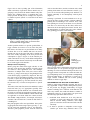
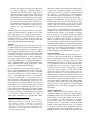
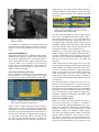
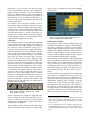
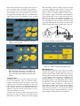
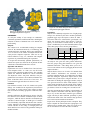
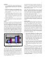
1
Don’t Click – Paint!
Applying the Painting Metaphor to Query Interfaces and
Personalization
Patrick Baudisch
Integrated Publication and Information Systems Institute (IPSI)
German National Research Center for Information Technology (GMD)
64293 Darmstadt, Germany
+49-6151-869-854
[email protected]
ABSTRACT
Many user interfaces, especially within the context of
query formulation and user profile editing, require a large
number of items to be selected or rated. To this purpose
toggle switches are often used. In this article we show
how to manipulate interfaces containing large numbers of
toggle switches in an efficient way. Because toggle
switches are functionally equivalent to black and white
pixels, interaction techniques from paint programs can be
adopted for manipulating toggle switches. A controlled
experiment shows that painting can significantly speed up
interfaces containing many toggle switches. To maximize
time savings, toggle switches should be laid out according
to frequency of co-occurrences between toggles.
The presented concept also leads to qualitative improvements. Since large numbers of toggles are rendered manageable using the toggle maps concept, new application
areas are opened. Applying the painting metaphor to a
segmented continuum such as time, for example, leads to
a very efficient timer dialog. By successively generalizing
the concept to fuzzy values and n-dimensional interfaces,
multi-dimensional query forms and interactive tree maps
can be implemented.
or search engines, or whether configuring personal user
profiles for long-term information systems, such as recommender systems, users need to describe what they are
looking for. A large variety of user interfaces supports
users in formulating queries [23] and defining user profiles. While many systems require textual input, another
important type of interfaces simplifies the task by generating sets of items that are then offered to the user. The
users’ task is then reduced to picking or rating these
items, usually a much simpler task then writing queries
from scratch. The whole refinement and relevance feedback idea is based on this interface concept [24], and
many personalizable systems offer this type of access to
the user profiles [18]. Figure 1 shows an example of a
refinement search.
Keywords
toggle map, toggle switch, painting, multiple select, user
interface, query, user profile, personalization
INTRODUCTION
Toggle switches are an integral component of modern
graphical user interface systems.1 Most people would
think that clicking is all users can do to toggle switches.
In this article we will show that toggle switches have a far
larger scope than would be assumed from their utterly
simple functionality. Efficient manipulation can not only
improve the performance of many of today’s interface
applications; it also opens new application areas.
The problem
Information systems involve query- and/or personalization tasks. Whether retrieving information from databases
1
Mary Valk, as well as Plaisant et al., have done interesting
work on the visual design of toggle switches [19, 20].
Figure 1: Query refinement applet of the web
search engine Alta Vista (www.altavista.com)
In interfaces of this type users have to provide information of the type “does this item represent my information
interest”, “do I like this item” or “how much do I like this
item”. In the shown example this feedback is provided
using toggle switches associated with the information
items. Each visible item hides a pull down menu, making
altogether more than a hundred items and toggle
switches.
However, setting a large number of toggle switches can
be time consuming. How can toggle switches be handled
in a way efficient enough to manage interfaces containing
hundreds of such switches? In the example shown in
2
Figure 1 this is done by hiding part of the information
within a hierarchy of pull down menus. But this way of
grouping is only useful if the header element really summarizes the contained objects—a condition that is not
always possible. Would you, for example, have expected
to find the keyword “jackets” as a sub-item of the menu
“shirts”?
order as described above, and the verb-noun order, called
painting. In the latter case some function is chosen, e.g. a
pen or an air brush (called painting tool) and then it is
applied continually to all subsequently selected pixels
(Figure 3).
Selecting is preferable if several methods are to be applied to the same, possibly complex, selection. Otherwise
painting has two advantages over selection. First, if the
same painting tool is used several times in a row, then the
tools has to be chosen only the first time, which saves
interactions in all subsequent paint actions. Second, since
the manipulation of painted items takes place immediately, painting gives better visual feedback.
Figure 2: Dialog allowing users to input their personal TV channel profile. Each TV channel name
is associated with a toggle switch.
Another possible solution is to provide good defaults, so
toggle switches do not have to be set in the first place.
But what to do if there are no good defaults or too many
of them? The set of TV channels that users can receive
depends not only on the carrier like cable or satellite, but
also varies widely depending on the local provider and
subscriptions to pay-TV (Figure 2). If the interface provided extra buttons for every useful default configuration,
the number of these buttons could easily exceed the number of actual toggles in the interface.
Multiple select and painting
Before going into detail about toggle switches we will
first take a look at how large numbers of interface items
are treated in other application areas. One technique
found here is multiple select: First, users select a subset
of items, e.g. using a mouse drag or using multiple mouse
clicks while keeping a qualifier key depressed. This way
they select cells in spreadsheet programs, icons in desktop GUIs, or pixels in paint programs. Then, users select
a method to be applied, e.g. clear the selected cells, move
the selected icons, or set the selected pixels to a specific
color.
This order (select items first, then select method) is called
noun-verb order [13]. It is appropriate especially if the
individual items provide different sets of methods: Once
the items are selected, the application program is able to
restrict the list of available methods to those methods that
are applicable to all items within the current selection.
The method “empty trashcan”, for example, will only be
available if the selected item is a trash can and if there is
something in it.
But paint programs offer more possibilities. Since painting programs deal with a single object type only, i.e. pixels, the noun-verb application order is not imperative.
Therefore paint programs provide both the noun-verb
(a)
(b)
Figure 3:
selecting (a) vs.
painting (b)
Painting toggle switches
Since a toggle switch is functionally equivalent to a black
and white pixel, we can perform on toggle switches all
the things we can do to black and white pixels. Since a set
of toggle switches corresponds to a black and white image, manipulating such a set is equivalent to manipulating
black and white images. As defined in [3], such a set of
toggle switches combined with one or more painting
methods is called a “toggle map”.
REQUIREMENTS FOR APPLYING TOGGLE MAPS
When are toggle maps applicable? Actually, they are always applicable. Today’s window management systems
do not provide any dragging functionality for toggle
switches. Defining such a function would therefore not
lead to any conflict, but would still enhance a number of
applications. However, for toggle maps to be power tools
the following requirements have to be met:
1.) Individual items should bear no or only short descriptions or names and should not require much
time for decision making. Otherwise, users might
prefer to release the mouse button and click switches
individually.
2.) It must be possible to manipulate several toggle
switches per mouse drag. Otherwise there is no
3
speed-up. This requires two things. First, there must
be a need to manipulate a significant number of
switches during individual sessions. Toggle maps are
therefore not useful as spatial menus, where usually
only a single item per usage is picked. Second, a significant frequency of co-occurrence between toggles
has to exist and to be reflected by the layout (see below) [9]. Preference dialogs, on the other hand, e.g.
for customizing printing options of a word processor,
usually lack such co-occurrence relations and are
therefore not a good application area for toggle
maps.
Both requirement are especially well met in cases where
toggles represent units from a continuum. In case of the
timer dialog (Figure 7), for example, individual items are
fully described by their position which makes recognition
of individual items very efficient. At the same time, the
frequency of co-occurrence between adjacent hours and
days is high, which allows efficient painting.
LAYOUT
The goal of toggle map layout is to maximize usage speed
by optimizing the factors stated in the requirements section above. To meet requirement 1, layout has to support
the recognition of individual buttons. This can usually be
done by grouping buttons of subjective similarity, so that
recognizing one button already provides information
about the neighboring buttons. To meet requirement 2,
layout has to support effective painting. This can be done
by grouping buttons that are frequently manipulated together. Common techniques to accomplish that are nonmetric multidimensional scaling and disjoint cluster
analysis, e.g. using bottom-up clustering [7].
In some applications, e.g. the timer dialog (Figure 7),
these two layout requirements can be met at the same
time. In other applications, the two goals are conflicting
and interface designers have to decide which one to prioritize.2 When making this decision, we can learn from
the layout of spatial menus, i.e. menus whose items are
laid-out in an area. Toggle map layout has much in common with the layout of spatial menus. In both cases, controls are placed in a two dimensional space; in both cases,
these controls are to be operated using a mouse; in both
cases, usage speed is determined by layout. See [10,
p. 261-280] for an excellent overview on layout of spatial
menus. During the late 1980s McDonald compared layout
by subjective similarity of items and layout by frequency
of co-occurrence between items within the context of
spatial menus. McDonald et al. concluded that “When
2
Similarity and frequency of co-occurrence are related in an
interesting way within the context of collaborative filtering.
Here, similarity is defined as frequency of co-occurrence
within user’s profiles [18, 2], i.e. two items are similar, if and
only if they occur within the same users’ profiles. Because both
requirements can be met at the same time this allows the creation of especially useful layouts.
tasks involve multiple-item selections and minimum taskexecution time is important, frequency of co-occurrence
offers greater efficiency” [8]. Kent L. Norman supports
this conclusion: “It is likely that in real-world applications menu layouts based on frequency of co-occurrence
are, in general, superior to layouts based on similarity. ...
Rating of item relatedness by the users may result in
structures that are in some sense meaningful, but not appropriate to the task at hand.” [10, p.272]. For the same
reasons, toggle map layout should generally prioritize
frequency of co-occurrence over subjective similarity.
But still, there are some application examples that require
compromises to be made. The layout of the channel profile dialog shown in Figure 2, for example, is a mixture
between layout by co-occurrence (Channels transmitted
by the same satellite are grouped together) and layout by
subjective similarity (sports channels are grouped together). If layout had only been based on frequency of
co-occurrence the cognitive effort for reading and recalling channel names might have exceeded the manual effort for painting. In situations like this, layout has to sacrifice part of its potential to the reduction of cognitive
effort. After all “...similarity-based layouts are more
common and appear more natural to users” [9, p.102].
Layout for painting
In the case of spatial menus, layout by frequency of cooccurrence reduces the manual effort for manipulating
items by reducing the distance by which users have to
move their hand or cursor. But toggle map layout is more
demanding then menu layout. In the case of toggle maps,
it is not sufficient to have co-occurring items in relative
proximity, they have to be adjacent. A paint interaction
using the pen tool (see below) is only possible, if a path
exists that connects toggles to paint without being
blocked by toggles that must not be painted. If the rectangle tool (see below) is to be used, then items to manipulate should be arranged in rectangles. In the case of
the rectangle tool, layout can make the difference in user
effort between a single mouse drag (for details see [5, 4])
and a large number of individual clicks. Other painting
tools require other, particular layouts. Depending on the
painting tool used in the application, a different layout
algorithm has to be found. Perfect algorithms are usually
np-complete.
Graphical highlighting
Another strategy for reducing cognitive effort is to
graphically emphasize the grouping of items. Graphical
highlighting can help users recognizing related items as a
group and thus choosing whole groups of items at once.
For experiments on using color-coding to highlight
groups of menu items see for example [9]. In Figure 1
grouping is done by using columns, and blocks within
columns. In the example shown in Figure 4; TV channels
are grouped according to their geographical locations.
The black line shows one possible path to activate the
highlighted switches with a single mouse interaction us-
4
ing a pen tool. To improve the visual clarification of the
toggle switches in this example we use a button-like design instead of the usual hook-in-a-box design used by
many of today’s operating systems. At the same time the
button design might be more inviting to try out sweeping
operation like painting. More ideas about the concept of
affordance can be found in [25, p. 105]. For details on
semantic space layout see [10, p. 269]. See the results
section at the end of this article for some unexpected results on the graphical highlighting of grouping.
Figure 4: Toggle map offering German TV
channels
grouped according to their
geographical
locations.
BUILDING TOGGLE MAP APPLICATIONS
Now that the requirements and layout have been stated,
we can take a look at how to build powerful and easy-touse toggle map applications.
Finding the right subset of functionality
It is possible to apply all manipulations from black and
white image processing to toggle maps including selecting and filtering, painting, and so on. Depending on the
application area it is not always necessary to provide users with such rich functionality. In this section we will
inquire into the usefulness of individual painting tools
and painting modes. The goal is to find a simple and
therefore easy-to-learn functional subset that is still powerful enough to accomplish the desired task efficiently.
Figure 5 shows a variety of black and white painting tools
from a commercial paint program (filled rectangle, pen,
rubber, line, paint bucket and copy stamp). These, like
any other painting tools, are directly applicable to toggle
switches. But different applications favor different painting tools. The pencil tool, for example, is most useful
with a rather small number of toggle switches laid out in
an irregular pattern (e.g. the German map shown in
Figure 4). The rectangle tool is especially effective if
there is a large number of toggle switches laid out in rectangular structures (e.g. the channel selector shown in
Figure 2, and, especially, the tree map example shown in
Figure 14). For our test applications there was always one
particular painting tool that seemed to be most appropriate and sufficient at the same time. For the sake of simplicity and learnability we decided to use only that single
tool which was automatically active at all times. More
complex future applications might provide a larger choice
of painting tools, available for example in a palette as
shown in Figure 5. For very complex tasks involving filtering, even selecting tools and filtering might be useful.
Figure 5: A selection of black and white painting
tools applicable to toggle maps [1].3
The painting mode defines how to manipulate paintedover toggles. Color paint programs usually use a palette
to allow users the selection of the color to apply. In the
case of pure black and white painting, i.e. for toggle
switch painting, there are simpler possibilities. In our
studies we tried out a number of painting modes including Xor-painting (inverting painted over toggles) and assigning set and reset to the two mouse buttons. The
method we found most useful was the painting mode used
in the black and white version of MacPaint [16]: Only the
first toggle switch is inverted; subsequent toggles are set
to the new state of the first toggle switch. In this mode
the rectangle tool, for example, paints rectangles of set
toggles if painting starts on an unset toggle, otherwise it
paints rectangles of unset toggles. This allows users to
over-paint fragmentized regions with a single mouse drag,
e.g. to set or reset a whole map4. Users easily understood
this mode for a number of reasons: First, this painting
mode is consistent with the behavior of individual toggle
switches, because painting a single toggle is equivalent to
clicking it. Second, since at least the first toggle is inverted, this mode always provides users with visual feedback simplifying trial-and-error learning. Another advantage is that all interactions can be triggered by a single
mouse button. This allows toggle maps using this painting
mode to be run on a single button mouse system or on
touchscreen-based systems such as palm-top computers
(Figure 6). Although this painting mode happened to be
very successful in our user tests, future applications (see
the sections on fuzzy maps below) might use other
mechanisms to select color and paint operations.
3
All icons except the left-most taken from Adobe Photoshop [1].
Reproduced with the kind permission of Adobe Systems Inc.
4
Actually, before painting an additional click on the starting
toggle can be required to switch to the desired set/reset mode.
5
toggle switches, on a higher level they behave like interval sliders. Intervals of set switches are labeled as single
intervals to reduce cluttering and to underline this high
level behavior.
a.
b.
c.
d.
Figure 8: Scaling a toggle map interval only requires painting the addition. Touching or overlapping intervals unite automatically.
Figure 6: Toggle maps application running on a
palmtop computer.
To summarize, a combination of rectangle painting tool
and invert-first painting method seemed to be most appropriate for most of the applications we have looked at
so far.
APPLICATION EXAMPLES
Toggle maps lead not only to a quantitative improvement.
Rendering large numbers of toggle switches manageable
they open new application areas. User interfaces that today are usually based on more complex components, such
as interval sliders or tree explorers can be replaced by
simpler and more efficient interfaces using nothing but
toggle switches. In the following we will give three examples to illustrate this claim.
Don’t move boundaries, paint areas!
When a continuous variable like time is segmented it can
be represented as a set of toggle switches. The toggle
switches in turn can then be manipulated as a toggle map.
The main conceptual difference between toggle map interval sliders and handle-based interval sliders, such as
those used by Plaisant et al [11, 12, p.214] is the same as
between painting and drawing. Toggle map sliders work
on segments while traditional interval sliders work on
boundaries. Painting deals with surfaces while drawing
deals with contours. More concepts and interfaces for
entering times and dates can be found in [22, 21].
Preliminary user tests showed that toggle map interval
sliders are highly efficient, especially when several intervals can be manipulated at once. Sweeping across several
days allows users to directly input quantified task descriptions like “For all days of the week... but Fridays and
Saturdays...”.
Unlike classical interval sliders toggle maps can do without any handles. Enlarging an interval only requires painting the addition. In a similar way intervals can be shortened or even divided. Furthermore, toggle map interval
sliders are especially easy to read, because a large share
of the screen surface is used for visual feedback. And
finally, like all toggle maps, they generate feedback on
every possible user interaction, which simplifies trial and
error learning.
The limited granularity of toggle maps may not be acceptable for some applications. To overcome this problem, again techniques from paint programs can be used:
Since time intervals and bitmap images are both digitized
continuums of limited resolution, zooming and scrolling
can be transferred from pixel painting to toggle maps.
Zooming-in magnifies pixels/toggles and thereby splits
them into several finer segments.
Interfaces for database queries
Figure 7: A toggle map timer interface. It allows
users to input intervals for a whole week.
Figure 7 shows a toggle map timer interface. Programming the shown state (e.g. controlling house lighting during absence) is possible with only three rectangle paint
operations. At the shown moment the time intervals for
the weekend are enlarged by adding the hours starting at
9 o’clock. When the mouse button is released old and
new intervals unite automatically. Figure 8 shows how
this works. Although the basic interface components are
When users retrieve data from databases they have to
describe the objects they are looking for. A number of
systems, such as the dynamic HomeFinder [12, p. 533],
allows users to define the desired objects by restricting a
number of attributes, e.g. using interval sliders. In the
HomeFinder example, the attributes contain distance
from some user defined locations, number of bedrooms
and price. But how much do I want to pay for a house?
The answer is “it depends”. On the one hand, there are
some hard constraints such as the amount of money I can
afford. On the other hand, there is the question of how
6
much money I want to invest. If the house has many
rooms and is situated near the place where I work, then I
might be willing to spend more money on it. What happens here is that the subjective values of individual attributes interact. The price I am willing to pay depends on
other attributes, such as the number of bedrooms. If attributes can only be entered individually, this interaction
can not be represented.
larger tool tip or a gradient tool will reach much higher
efficiency here. 5
One solution is not to decompose attributes. If two or
more variables interact strongly, they should be presented
to the user as a whole. The toggle map shown in Figure
10 allows users to select which computer monitor classified ads to retrieve. The two variables tube diameter and
screen resolution interact, i.e. the user’s preferences concerning screen resolution depend on the tube diameter.
By offering both variables as a two-dimensional field of
toggle switches decomposition is avoided.
Fuzzy maps
Some applications require entering more information than
can be expressed using toggle switches. User profiles can
contain several degrees of like and dislike (for example a
user profile of a music recommender system [18]); allergy tests result in skin reactions of different intensities;
multi-user calendars may work on probabilities of having
time. To reflect these requirements in a user interface,
pixel painting again delivers the metaphors. As black and
white pixels are similar to Boolean values, gray-scale
pixels are similar to fuzzy values. Replacing toggle
switches with elements that can represent multiple distinct values (such as click-through menus) turns toggle
maps into “fuzzy maps”. To manipulate fuzzy maps, the
described black and white painting tools can be complemented with the gray-scale painting tools shown in Figure
9. The airbrush, for example, works like a pencil but increases the value of fuzzy elements the longer they are
painted over. One possible painting mode for airbrush
painting is to incrementally paint with the left mouse button and to incrementally “erase” with the right mouse
button. The advantage of tools like the air-brush is that
they allow users to work on profiles as a whole instead of
adjusting individual elements.
Figure 9: Some additional painting tools for grayscale images (airbrush, gradient tool, sweep,
brush, sharpen, blur) [1] 3
Figure 10 again shows on example of a toggle map interface to classified ads. In the shown state the user is looking for a rather large screen with a high resolution
(probably for CAD applications). Toggles exists only for
existent feature combinations.
This application example contains slanted edges, which
makes a rectangle tool rather ineffective. A brush with a
Figure 10: Toggle map applet allowing users to
select computer monitor classified ads.
N-dimensional interfaces
If more than two variables interact strongly, toggle maps
of higher dimensionality are needed to avoid decomposition. Figure 11 and Figure 12 follow up on the computer
monitor example introduced in Figure 10 by successively
introducing two additional attributes (frame rate and interlace).6 N-dimensionality is the first extension that exceeds the original painting metaphor in that it requires
tools beyond the two-dimensionality of painting.
Before painting could be applied to n-dimensional toggle
maps, the problem of occlusion had to be solved. In the
shown examples we accomplished this by using what we
call explosion displays: Layers of toggles are spread, the
resulting gaps provide access to items in otherwise occluded layers. This way, toggles at any depth can be accessed directly with any 2D input device, such as a
mouse.
To allow efficient painting along all n axes the 2D painting tools have to be extended to n-D. The hypercube tool
for example is the extension of the two-dimensional rectangle tool, allowing the painting of hypercubes in any
dimensionality. Painting is done as follows: As with the
rectangle tool, the first and the last toggle switch of a
drag interaction define the paint area, the “paint cube”.
The difference is that the hypercube tool regards these
two toggle switches as diametrically opposed corners of a
hypercube. It therefore does not paint all toggle switches
that lie between the two toggles in the display plane, but
5
An alternative approach is to let users define the values of some
marker items only and to interpolate the value of all other
fuzzy switches dynamically using Gouraud shading [17, p. 598599, p. 736-737]
6
We are completely aware of the problems casual users have
with high dimensional spaces. We do not claim toggle maps of
a higher dimensionality than three to be easy to learn for casual
users.
7
those that lie between the two toggles in n-D. Figure 11
gives an example of how a 3D (hyper-) cube is painted.
The hypercube tool has most of the desirable properties
of the rectangle tool, e.g. it is possible to set or reset entire toggle maps efficiently with one or two interactions.
Other painting tools can be adapted to n-D in a similar
way.
them individually, whereas painting using the rectangle
tool allows toggling any node of the tree as well as any
subset of adjacent nodes with a single drag interaction.
Figure 13 gives an example structure of some TV program categories. Figure 14 shows the corresponding tree
toggle map that allows users to select their favorite categories, e.g. as part of a TV program recommender system. The nodes and leaves rendered in light gray in the
tree representation are the ones that are set in the shown
toggle map. Obtaining this state requires one click for the
single leaf drama and a single rectangle paint for the rest.
News
Report
Talk
shows
Shopping
Action
movies
Drama
Comedy
Tennis
Basketball
Football
Volleyball
Figure 11: A 3-dimensional toggle map. Currently
a (hyper-) cube is painted.
Figure 13: Example of a tree structure ...
Figure 14:...and the corresponding toggle tree map
Figure 12: One possible layout for a toggle map
that provides four dimensions. The legend in the
lower left shows the meaning of columns and
rows of the slanted 2x2 tables forming the small
clusters.
Toggle tree maps
Tree maps [14, 15] are a concept to represent tree structures in two dimensions. They are constructed from a
rectangle containing only the top node by successively
replacing nodes by list-like arrangements of their subnodes. Each level of the tree is arranged alternating in x
and y direction. The sizes of the individual items can be
adjusted to represent selected node properties, such as
node size or frequency of access.
Combining the concepts of toggle maps with tree maps
into toggle tree maps provides a very efficient means to
define subsets of the tree. Clicking items allows toggling
IMPLEMENTATION
The prototypes described in this article were implemented as Java applets. The applet parameter syntax was
derived from the calling format of html image maps [6],
in that position and size of the individual toggle switches
(i.e. the clickable areas) are passed as parameters. The
graphical appearance of a toggle map is determined by
two bitmap parameters: The background bitmap contains
the appearance of the map when all switches are unset;
the foreground bitmap contains the state when all
switches are set. Figure 15 gives an example. This imagebased approach allows more freedom in the graphical
design of the user interface. At the same time it allows
reuse of the Java classes without modification—only images and toggle switch regions have to be changed.
8
Figure 16: The same dialog as shown in Figure 2
using button-style toggle switches.
Figure 15: Background and foreground image of
the toggle map shown in Figure 4.
EXPERIMENT
To verify the validity of our concepts we conducted a
controlled experiment on different interfaces allowing the
selection of subsets of channels from a TV channel user
profile dialog.
Subjects
The subjects were 64 individuals working in computer
rooms at the Darmstadt University of Technology who
volunteered for the experiment. Subject ages ranged from
15 to 55 and 32% were female. All subjects had at least
some previous computer experience. There was no significant influence of age, sex, education and computer
experience on performance during the experiment.
To acquire the theoretically optimum performance, we
trained four expert users from our lab to perform all individual tasks on the different interface versions.
Apparatus and material
Experiments were run on Toshiba Tecra 740 CDT notebook computers with a 13.3 inch (33.8 cm) TFT color
display and an external two-button mouse. The operating
system was Microsoft Windows 95. Screen resolution
was adjusted to 1024 x 768 pixels. Interfaces were programmed in Java and were run on Microsoft Internet Explorer 4. Interfaces had a screen size of 24.5 cm x 12.5
cm. Individual toggle switches were 30 mm x 7 mm.
Interfaces
Four different versions of the TV channel user profile
dialogs were included in the experiment. The interfaces
were similar in several respects. They offered 61 channels receivable in Germany, grouped in a table-like interface.
Interfaces differed in the following two aspects. The first
two interfaces used switches in Windows-style as shown
in Figure 1, while the last two interfaces used button-style
switches as shown in Figure 16. Both types of switches
were functionally equivalent and had the same sensitive
regions. Interfaces one and three allowed manipulation of
several switches at once using a rectangle paint tool,
while interfaces two and four only permitted clicking individual switches.
Procedures
Subjects were randomly assigned to one of eight groups.
Groups were defined by the three variables paint/click,
graphical toggle style and layout as shown in Table 1.
The twelve items to be selected in the “good layout” condition were grouped in three larger blocks (= high frequency of co-occurrence between items). In the “poor
layout” condition they were more distributed (three single
items, three groups of two and one group of three).
“Good layout”
“Poor layout”
Paint
Click
Paint
Click
Button-Style
8
8
8
8
Windows-Style
8
8
8
8
Table 1: Numbers of subjects in the eight groups
All subjects were given the same general instructions.
The four groups using paint interfaces were given the
additional instruction “This dialog allows you to set or
reset several switches at once by dragging the mouse with
depressed button.”
Subjects had to select a set of twelve TV channels from
their interface. Performance was measured as time
needed to complete the task. To exclude times for reading
task lists during the experiment, subjects had to learn
channel lists by heart before using the interface. To exclude times for finding the right toggle switches, subjects
were given two trial uses on the actual interface, so that
in the actual experiment only the manual effort would be
measured. After each selection users had to reset all toggle switches. Times for resetting were recorded as well.
After the experiment subjects filled in a questionnaire on
their subjective satisfaction. Then they had an opportunity to try out the other three interface types (different
toggle switch style and/or different possibility to paint)
and selected which of the four interfaces they preferred.
The overall session lasted about 20 minutes.
Expert users did not participate in this conception. They
had to complete all sixteen tasks (the eight groups x two
different sets) in random order. They were given two trials on each interface to reduce the effect of outliers.
9
Hypothesis
1.
Users provided with a painting method should perform better than those clicking switches individually.
This should hold for first-time users as well as for
experts.
2.
Because more switches can be manipulated at once,
differences in performance between the paint group
and the click group should be higher in the “good
layout” condition.
3.
The button-style toggle switches should give better
optical feedback and allow for a better use of spatial
memory. Especially when entering the same set of
items a second time, button-style groups should
therefore perform better.
4.
Rectangle painting allows users to reset the whole
map so efficiently that a “reset all” button becomes
dispensable.
In all first-time and expert user groups, layout had a significant (p < 0.01) interaction with task completion time.
The performance gain was always highest in the “good
layout” groups, i.e. if more switches could be manipulated per mouse interaction.
When asked about their preference for any of the four
interfaces styles, 88% of all subjects chose an interface
providing a painting method. This ratio was independent
of the interface type used during the experiment. The
preference for interfaces with a painting method was especially high in the “good layout” groups.
Subjects using the button-style toggles did not perform
better than subjects using the Windows-style toggles. The
only advantage of the button-style toggles was that 78%
of all subjects subjectively preferred it. This style was
described as being easier to read and as providing a better
overview.
Lessons learned
Results
First-time users: Subjects of all different groups learned
to operate the interface pretty fast, so that two trial uses
were always sufficient. In the timed selection task the
speed-up of painting showed clearly. Figure 17 shows the
average task completion times. The left bars of each pair
show the task completion time for subjects using an interface supporting painting, the right bars show the times of
subjects provided with click-only interfaces. Differences
in the “good layout” condition are significant at p<0.001.
In the poor layout condition differences are not significant due to two outliers in the paint group that required
12 seconds more than the next fastest user in their group.
18
First-time users needed an average of 6.6 seconds to reset
maps, which was much longer than expected. This invalidates the fourth hypothesis with respect to first-time users. Expert users never needed more than a second to
reset the whole map. This enormous difference between
first-timers and expert users was caused by the fact that
only two out of the 37 first-timers provided with a painting method figured out how to reset whole sets with a
single paint interaction. Most first-time users reset the
map column by column; others reset the map in exactly
the same way they had set it. When we investigated this
phenomenon we determined:
1.
Users avoided painting over unset toggle switches,
because they expected them to become set when
painting over them (“Xor” paint mode). When discussing this effect after the experiment subjects rated
the actually implemented paint mode as more useful,
but stated that “Xor” paint mode would be more
common. Expectation of “Xor” paint mode was especially common among computer experts.
2.
The column layout of the channel selection applet
kept users from painting across columns. While the
columns helped group switches they kept users from
understanding the two-dimensional nature of the interface.
16,0
14,3
16
14
10,2
12
10
8
6,4
6
4
2
0
paint
click
good layout
paint
click
poor layout
Figure 17: Average task completion times in seconds for first-time users.
The results in the experts group showed the same trends
as the first-timers. In the “good layout” condition painting
users required an average of 1.97 seconds for task completion, which is more than twice as fast as the 4.1 seconds of the click-only group (significant at p < 0.001). In
the “poor layout“ condition paint users were, at 4.86 seconds, only slightly faster than the click-only group at 5.5
seconds (significant at p < 0.01).
The second finding was of even larger scope: Subjects
seemed to derive a mental model of possible interactions
from the first interaction they performed. Users who
could apply painting for their first interaction (that was
possible in the “good layout” conditions) were much
more likely to make use of the painting function during
the rest of the experiment. Users who started by clicking
were more likely to stick to clicking even when painting
could be usefully applied later. Some subjects even kept
on clicking to reset maps.
10
Can we keep first-time users from expecting a different
paint mode? Maybe it just takes some extra time for them
to examine their expectations and to discover the additional functionality hidden in the actually implemented
paint mode. Only an experiment containing a longer list
of tasks can clarify that. On the other hand, we surely
have to reconsider the misleading layout, i.e. the columns
in the presented example. To check the restricting influence of the column layout we added another reset task at
the end of the experiment. Before this task we gave subjects the hint “It is possible to paint across columns”
which caused 27 of 37 paint method users to discover the
optimum reset strategy and let the average task completion time drop to one third (2.12 seconds). Obviously
graphical highlighting of grouping should be used with
care.
CONCLUSIONS AND FUTURE WORK
Toggle maps profit from defining a drag method on toggle switches. Experimental results suggest that defining
such a drag method as toggle switch “painting” leads to
performance improvements and increased subjective satisfaction. Efficiency gains resulting from the paint
method result not only in faster performance, but also in
new application areas, especially the area of manual editing of user profiles.
To apply toggle maps successfully, layout requires additional attention. Relations within the set, above all frequency of co-occurrence, have to be determined and
translated into layout. Layout enhancements, such as
graphical grouping have to be considered carefully. They
can help users in reducing cognitive costs but can also
mislead users to restrict their interactions to the highlighted structures.
Future work will include automated toggle map layout,
applications on palm top computers and more controlled
experiments on the individual application areas. The next
step will be to integrate the toggle maps concept into a
larger framework of concepts and tools for manual user
profile editing.
So how far will we push the development of paint tools,
paint modes, filters and so on? Imagine an application
with a huge number of toggles (e.g. a form for inputting
users’ tastes about movies), and which is so complex that
you want to provide users with a rich set of different
painting tools. One possibility would be to implement
more and more tools, functions and filters, tool tips and
mask modes. But wouldn’t that mean the re-implementation of a painting program? In such a situation it might be
more appropriate to implement the form as an actual image, masked to expose only selected regions to painting
operations. Users can then use their own favorite painting
tool to fill in the image/form, which can then be evaluated
using image processing techniques.
Another interesting step would be to implement the basic
toggle map idea in one of today’s window management
systems. As mentioned earlier none of these systems define a drag operation on toggle switches. The input sequence mouse-down followed by mouse-move could easily be assigned toggle map functionality. This would instantly make all existing applications containing toggle
switches “paintable” without interfering with any existing
functionality. Having proven useful for a number of applications we looked at so far, a combination of rectangle
painting tool and invert-first painting method seems to be
a good choice for such an implementation.
All toggle map dialogs in this article were developed as
part of the TV-program recommender project at GMDIPSI [2]. They can be freely downloaded from
http://www
.darmstadt.gmd.de/~baudisch/Publications/ToggleMaps
ACKNOWLEDGEMENTS
I thank Dieter Böcker and Barbara Lutes for their support. Thanks to Tom Stölting for his contribution to the
graphical design of the applets shown in this article. Special thanks to my students Robert Werner and Matthias
Eilers, Mathias Kühn and Henning Meyer.
REFERENCES
1. Adobe Photoshop 4.0 User Manual, Adobe Systems
Incorporated, San Jose, CA, 1996
2. Baudisch, P. Recommending TV programs on the
Web: How far can we get at zero user effort, in Proceedings of Recommender Systems 98, Workshop
within AAAI 98, Madison, Wisconsin, 1998
3. Baudisch, P. Don’t click, paint! Using Toggle Maps to
Manipulate Sets of Toggle Switches. In Proceedings
of UIST ’98, San Francisco, pp. 65-66, 1998
4. Fitts, P.M., “The information capacity of the human
motor system is controlled by the amplitude of movement”, Journal of Experimental Psychology, 7 0, 93242, 1954
5. Gillian, D.J., Holden, K., Adam, S., Rudisill, M.,
Magee, L., How does Fitts’ law fit pointing and dragging?, CHI’90 Conference Proceedings: Human Factors in Computer Systems (p.227-234), New York,
ACM, 1990
6. Image Maps: Online documentation at http://theory.
lcs.mit.edu/~boyko/imagemap.html
7. Lindsey, P.H., and Norman, D.A., Human information
processing, New York: Academic Press, 1977
8. McDonald, J.E., Dayton, T., McDonald, D.R., Adapting menu layout to tasks (MCCS-86-78). Las Cruces,
NM: Memoranda in Computer and Cognitive Science,
Computer Research Laboratory, New Mexico, State
University, 1986
9. McDonald, J.E., Molander, M.E., and Noel, R.W.
Color coding categories in menus. CHI’88 Conference
Proceedings: Human Factors in Computer Systems
(p.101-106), New York, ACM, 1988
11
10.Norman, K. L., The Psychology of Menu Selection:
Designing cognitive control at the human/computer
interface, Norwood, New Jersey, Ablex, 1991
11.Plaisant, C., Shneiderman, B., Battaglia, J., Scheduling home control devices: A case study of the transition from the research project to a product, Technical
report 90-10, University of Maryland, 1995, available
online at http://www.cs.umd.edu/hcil
12.Shneiderman, B., Designing the User Interface:
Strategies for effective human-computer interaction,
Third edition, Reading MA: Addison-Wesley, 1998
13.D.C. Smith, C. Irby, R. Kimball, W. Verplank, and E.
Harslem, “Designing the Star User Interface”, Byte
7(4):242-282. Copyright © 1982, McGraw-Hill, Inc.
14.Turo, D. and Johnson, B. Improving the Visualization
of Hierarchies with Treemaps: Design Issues and Experimentation. In Proceedings of IEEE Visualization'92 (Oct 8-12, Boston, MA), IEEE Computer Society Press, 1992, pp. 124-131.
15.Shneiderman, Ben, Tree visualization with Tree-maps:
A 2D space-filling approach, ACM Transactions on
Graphics, p. 92-99, 11, 1, 1992
16.MacPaint
http://developer.apple.com/technotes/pt/pt_24.html,
http://www.micmac.com/archives/mm4/paint.html
17.Foley, James D.[Eds.]. Computer graphics: principles
and practice. Reading, Mass. Addison-Wesley , 1990.
18.Shardanand, U., and Maes, P. Social information filtering: Algorithms for automating "word of mouth", In
Proceedings of the 1995 ACM Conference on Human
Factors in Computing Systems. (1995) ACM, new
York, pp. 210-217
19.Plaisant, C., Wallace, D., Touchscreen Toggle Design,
CHI’92 Conference Proceedings: Human Factors in
Computer Systems (p.667-668), New York, ACM,
1992
20.Valk, A.M., An experiment to study touchscreen “button” design, Proceedings of the Human Factors Society, 29, 127-131, 1985
21.Norman, D.A., The Psychology of Everyday Things,
Basic Books, New York, 1988
22.Gould, J., Boies, S., Meluson, A., Rasamny, M., and
Vosburgh, A., Entry and selection methods for specifying dates, Human Factors, 1989, 31(2), 199-214
23.Shneiderman, B. A User-Interface Framework for
Text Searches, D-Lib Magazine, Jan 1997, available
online at http://www.dlib.org/dlib/january97/retrieval/
01shneiderman.html
24.Haines, D. and Croft, W. (1993) Relevance Feedback
and Inference Networks. In Proceedings of SIGIR '93.
Pittsburgh, PA: ACM Press. pp. 2-11.
25.Norman, D.A. Things that make us smart. Reading
MA: Addison Wesley, 1993.