1
WEBfactory 2010
Logging WhitePaper
Version 1.0
March 2012
www.webfactory-world.de
2
This whitepaper is a product of the company WEBfactory GmbH.
WEBfactory GmbH
Hollergasse 15
74722 Buchen
Germany
Tel: (+49) 6281 5233 0
Fax: (+49) 6281 5233 333
http://www.webfactory-world.de
© Copyright 2012, WEBfactory GmbH. All rights reserved.
No part of this user manual may be copied or forwarded in any other way without the explicit
written approval of WEBfactory GmbH.
All information and descriptions were selected with special care, following careful
investigations. However, application errors or changes leading to a series of changed
commands or other results may not be entirely excluded. WEBfactory GmbH cannot
undertake any legal or other liability for such changes or any errors deriving from them.
Microsoft® and MS -Internet Explorer® are registered trademarks, property of the Microsoft
Corporation. All other logos and product names are registered logos or trademarks of their
respective owners.
WEBfactory GmbH denies any liability for increased costs of phone calls as a consequence of
using the respective communications modules, even in the case of accidental connections.
WEBfactory GmbH has drawn up this user manual according to the most advanced
knowledge but it does not undetake any responsibility for the programs / systems generating
the results expected by the user.
WEBfactory GmbH reserves the right to make changes to the user manual without
undertaking the responsibility of informing third parties as to such changes.
We reserve the right to make technical changes!
3
1.
Introduction ......................................................................................................................... 7
2.
Trending workflow overview ............................................................................................... 8
3.
2.1.
Online state visual representation ............................................................................. 8
2.2.
Offline state visual representation ............................................................................. 9
2.3.
Used webservices and methods ................................................................................ 9
2.4.
Trendline Control online workflow ........................................................................... 10
2.5.
Trending control offline workflow ............................................................................. 10
Logging Setup .................................................................................................................. 11
3.1.
Logging Tab - Log Conditions ................................................................................. 11
3.1.1.
3.2.
Logging Tab - Logging ............................................................................................. 15
3.3.
Log Hysteresis ......................................................................................................... 18
3.4.
Exposed functionality ............................................................................................... 19
4.
The Trending Control at design time (Expression Blend). ............................................... 20
5.
The Trending Control at design time (Smart Editor). ....................................................... 26
6.
The Trending Control at runtime. ..................................................................................... 32
6.1.
7.
User Interface .......................................................................................................... 32
6.1.1.
The graph ........................................................................................................ 33
6.1.2.
The legend ....................................................................................................... 34
6.1.3.
The options bar ................................................................................................ 34
6.2.
4
Log Conditions Grid ......................................................................................... 12
Trending functionality............................................................................................... 35
6.2.1.
Changing settings ............................................................................................ 35
6.2.2.
Online mode .................................................................................................... 50
6.2.3.
Historical mode ................................................................................................ 51
6.2.4.
Save/Load Configuration ................................................................................. 54
DataTable control diagram ............................................................................................... 55
7.1.
Get logs ................................................................................................................... 55
7.2.
Write Logs ................................................................................................................ 56
8.
The DataTable control at design time .............................................................................. 57
8.1.
Expression Blend ..................................................................................................... 57
8.2.
Smart Editor ............................................................................................................. 59
9.
The DataTable control at runtime ..................................................................................... 61
9.1.
9.1.1.
Settings ............................................................................................................ 62
9.1.2.
Select Time Interval ......................................................................................... 67
9.1.3.
Print Data ......................................................................................................... 70
9.1.4.
Export Data ...................................................................................................... 73
9.1.5.
Load Configuration .......................................................................................... 74
9.1.6.
Save Configuration .......................................................................................... 75
9.1.7.
Editing logged values....................................................................................... 76
9.2.
DataTable main view ............................................................................................... 78
9.3.
DataTable navigation ............................................................................................... 79
10.
5
The options menu .................................................................................................... 61
Accessing the DataTable web services using HTML and JavaScript ......................... 80
6
1. Introduction
This whitepaper is intended for all the users of WEBfactory 2010 software and is designed to
facilitate the understanding of WEBfactory 2010’s approach on logging.
The document will present a Trending control overview as well as a guide through the
workflow and configuration of the logging system.
For a correct understanding of the following information, WEBfactory 2010 software and
additional modules must be installed on the operating machine.
For more information about installing WEBfactory 2010, system requirements, licensing and
release notes, please visit the WEBfactory Knowledge Base at:
http://webfactory-support.de/assets/documentation/Default.htm .
7
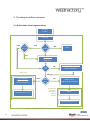
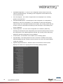
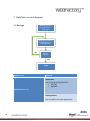
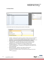
2. Trending workflow overview
2.1. Online state visual representation
Trendline
Control
Trendline
YES
Has
Server
YES
NO
Is
enabled
STOP
NO
Get Servers
Action.asmx
GetServers
NO
Has
Log
Single Tone
Read Historical
HistoricalData.asmx
ReadTrendingLogs
AddSignalValuesToChart
Read signal log information
Historical.asmx
ReadLogSignalList
YES
YES
Has
Log
NO
Update rate
defined in
WF Studio
Default
500 ms
WFConnector
RegisterSignalChanged
Update
AddSignalValueToChart
Update rate defined in WF Studio >= 1000 ms. Default 1000 ms
8
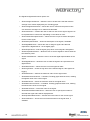
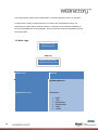
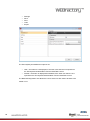
2.2. Offline state visual representation
Read Historical
HistoricalData.asmx
ReadTrendingLogs
AddSignalValuesToChart
2.3. Used webservices and methods
9
Webservice
Method
Action.asmx
GetServers
Historical.asmx
ReadLogSignalList
HistoricalData.asmx
ReadTrendingLogs
AddSignalValueToChart
2.4. Trendline Control online workflow
Step 1.
For each trendline, the Trendline control checks to see if it is enabled. If not
enabled, the process stops.
Step 2.
If the trendline is enabled, the servers are checked. If there are no servers, the
GetServers method from Action.asmx webservice is called. This method retrieves
the information about all the signals form the server.
Step 3.
When servers available, the log of the signal is checked. If the signal has no log,
ReadLogSignalList method from Historical.asmx webservice is called. The
ReadLogSignalList method returns the information for the verified signal.
Step 4.
The signal is checked for logging information again. If after ReadLogSignalList
the signal has logging information, the ReadTrendingLogs method from the
HistoricalData.asmx webservice is called. This method returns the trend data
from the logs. The AddSignalValuesToChart method is called to write the
historical values to the Trending control graphic.
If no logging information is retrieved after calling the ReadLogSignalList, the
RegisterSignalChanged method from WFConnector is called. This method
checks the value of the signal and updates it asynchronously. Again, the
AddSignalValueToChart method is called, to write the online values retrieved by
the WFConnector.
2.5. Trending control offline workflow
For each trendline, the ReadTrendingLogs method from HistoricalData.asmx is called,
retrieving the historical data for the signal. The AddSignalValuesToChart method is called to
write the values to the Trending control.
10
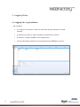
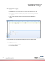
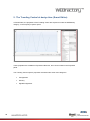
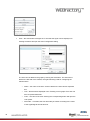
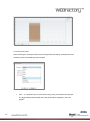
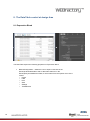
3. Logging Setup
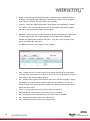
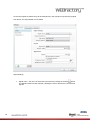
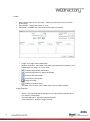
3.1. Logging Tab - Log Conditions
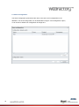
Log condition
11
is a criterion to be met in order to record the process values of a signal
variable.
is defined by means of signal variables, constants and criteria.
is linked to a signal variable in the Logging area.
can be individually defined for each parameterized WEBfactory server.
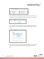
3.1.1.Log Conditions Grid
In the conditions table, logging conditions have already been set to a default state.
Define the log conditions.
directly in the conditions grid
in the Log condition details tab, under the conditions grid
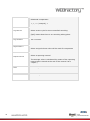
Option
Description
Condition Name
Change the name of the log condition.
Select a log condition.
Mode
Time triggered: Values are logged based on a the
time cycle.
Once on change: Values are logged if there is a
change in the process values.
Mean value (only time controlled): Calculate the
average value of the process values with the logging
and the reporting intervals as reference parameters
Counter mean value (only time controlled): Total
average values.
Log Mode
Parameters
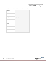
12
Signal value: Process value of the signal variable to
be recorded
Signal value 2: Process value of the signal variable
that is selected below
Constant value: constant
Relational comparators
<, >, <> (unequal), =
Log Interval
Select a time cycle for time-controlled recording.
[N/A] means that there is no recording taking place.
Log Constant
Set a constant.
Signal Value 2
Select a signal whose value will be used for comparison
Report Interval
Select a reporting interval
The average value is calculated by means of the reporting
interval and is issued at the end of the interval (as a
“report”)
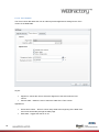
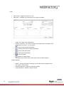
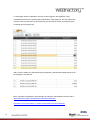
13
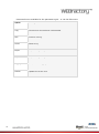
Save
Save changes.
Cancel
Discard changes.
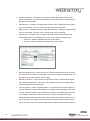
Editing the Conditions Grid - contextual menu or Edit menu:
14
Option
Description
Edit
Edits the current selected attribute.
Copy
Copy log conditions.
New
Create a new log condition.
Delete
Delete a log condition.
Log Condition Details
Hide/show the Log Condition Details.
Refresh
Update the current view.
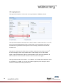
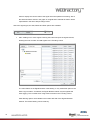
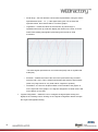
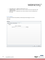
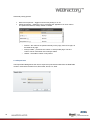
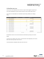
3.2. Logging Tab - Logging
A log defines a way to store data for a specific signal depending on a log
condition.
If the logging condition is fulfilled, the process values of the signal variable
are logged.
Logs can be individually defined for each parameterised WEBfactory
server.
In the parameters grid, logs that have already been set to the default values.
Edit logging parameters
15
directly in the parameters grid
in the Logging details
Logging parameters:
Option
Description
Active
Activate/deactivate log when the WEBfactory server is started.
Log Tag
Log name
Signal Name
Select an alarm signal whose values will be logged.
Description
Description of the signal whose values will be logged.
Condition
Name
Max. Days
Max. Number
Select an log condition.
Set the maximum number of days for storage of data records (a ring
buffer and/or the FIFO principle)
Set the maximum number of saved data (a ring buffer and/or the FIFO
principle)
The name of the database for data record storage
Log Database
16
No name: The data record is saved in the default
database.
Name: The data record is saved in a separate “Name”
database.
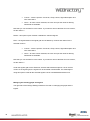
Contextual menu available for the parameters grid - or via the Edit menu:
17
Option
Description
Copy
The action for this selection is deactivated.
New
Create a new log.
Delete
Delete a log.
Export
Export the log configuration into a standard format XML file.
Import
Import the log configuration from a standard format XML file.
Logging Details
Hide/show the Logging details.
Refresh
Update the current view.
3.3. Log Hysteresis
The Log Hysteresis option can be found in the signal details in WEBfactory Studio.
The Log Hysteresis option allows the user to specify a static or relative value (e.g. 0.3 or 3%)
which is used when logging data in Float or Real format. The Log Hysteresis value will be
used when the log condition for that signal is set to On Change, and acts like a minimum
variation value.
This option is useful when the OPC Server is sending values with many decimals. If the 9
th
decimal is changing, when the log condition is set to On Change, the new value will be
logged. In this case, difference might not be relevant to the user. Using Log Hysteresis, the
user can define a value of minimum variation for the new value to be logged.
The Log Hysteresis value can be static – 0.3 or relative – 3%. If both static and relative values
are specified (eg. 0.3 AND 3%), the new value will be logged only if the change of value is
more than 0.3 AND 3% from the previous value.
18
3.4. Exposed functionality
The following methods are exposed by the Trending control so they can be used from code:
public void LoadConfiguration(string configuration)
loads the configuration named “configuration” and ConfigurationNamespace
(control property)
public void AddChannel(string name, Color color)
if the configuration has been loaded from code (using LoadConfiguration method), the
signals can be dynamically added to the Trending control, specifying the signal name
and the color to have in the Trending control.
public void StartQuery()
if the configuration has been loaded from code (using LoadConfiguration method), the
process of value updates can be started.
public void Dispose()
used to dispose objects and the resources used by the object.
public event EventHandler OnTrendconfigurationLoaded
event that triggers when the configuration is changed. The event raises
when:
when the control starts with ClientsideConfiguration or
InitialConfiguration;
when the configuration in changed using the Load Configuration
button;
19
when the LoadConfiguration method is used and it succeeds.
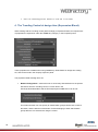
4. The Trending Control at design time (Expression Blend).
When working with the Trending control (WFTrending3) in Expression Blend, an important set
of properties are exposed in under the WEBfactory category, in the Properties panel.
These properties are available when using WEBfactory Smart Editor for design time editing
too, and can be found in the Property Inspector panel.
The properties listed at design time are:
ButtonsConfiguration – allows the user to set security authorizations for the options
bar buttons from the Trending control. For each button, the
SecurityAuthorizationName and the SecurityDenyAccessBehaviour can be set.
This means that the user can specify an authorization group that will have access to
the button, and the behavior of the button if users belonging to other authorization
groups than the one selected are using the control.
20
The buttons available for security access configurations are:
21
o
AddSignal
o
AxisConfiguration
o
CursorConfiguration
o
Export
o
Import
o
LegendConfiguration
o
Load
o
Print
o
RemoveSignal
o
Save
o
Settings
o
Start
o
TimeRange
ChartTheme – allows the user to select a visual theme for the Trending Control.
The available theme options are:
22
None – default theme is applied;
DuskBlue
DuskGreen
MediaPlayer
Office2003Blue
Office2003Classic
Office2003Olive
Office2003 Royale
Office2003Silver
Office2007Black
Office2007Blue
Office2007Silver
Vista
ClientSideConfiguration – if set to on, the configuration will be stored on the local
machine’s Isolated Storage. The loading of the configuration will be made from the
local Isolated Storage.
ConcurrentSignals – the number of signals that can be displayed in the Trending
graphic at the same time.
ConfigurationNamespace – the namespace of the configuration. A configuration is
defined by a name and a namespace. The combination of name and namespace
must be unique. If a namespace is defined in this option, the Trending control will only
be able to see the configurations that belong to this namespace, when loading them
from the database.
InitialConfiguration – the name of the configuration to be loaded by default. By
declaring the namespace of the configuration (in the previous option) and the name of
the configuration in the InitialConfiguration text field, the Trending control will load by
default the specified configuration from de database.
LineThickness – the thickness of the trendline in the Trending graphic.
PopupModality – this settings allows the user to choose the modality for the popup
windows displayed by the Trending control at runtime. The user can choose between
modal and modeless.
SignalConfigurationColumns – allows the user to choose which columns will be
displayed at runtime in the signal grid from the Change Settings window.
23
The SignalConfigurationColumns options are:
o
ShowAverageLineColumn – allows the user to enable a line that will mark the
average of the values displayed by the Trending graph.
o
ShowAveragePeriodColumn – allows the user to customize the period of time
over which the Average Line is visible and calculated.
o
ShowAxisColumn – enables the user to select an axis for the signal. Signals can
be represented on custom axis, depending on the values or units.
o
ShowCustomDescriptionColumn – allows the user to input a custom description
for the current signal.
o
ShowDescriptionColumn – shows the description of the signal, if available.
o
ShowDigitalBitColumn – allows the user to assign a signal value that will
represent the digital state of 1 in the digital graph.
o
ShowGroupColumn – lists the signal group which current signal is assigned to.
o
ShowInterpolationColumn – allows the user to set the algorithm used to draw the
line between points.
o
ShowInvertedColumn – allows the user to invert the digital representation of the
signal.
o
ShowDigitalColumn – allows the user to mark the signal to be represented in a
digital format.
o
ShowStaticColumn – allows the user to mark a signal as static.
o
ShowLogColumn – shows the log name of the selected signal, if the signal has
logging.
o
ShowMaxColumn – defines the maximum value for the signal value.
o
ShowMaximumLineColumn – if enabled, Trending graph will draw a line, marking
the highest value of the current signal.
o
ShowMinColumn – shows the minimum value for the signal value.
o
ShowMinimumLineColumn – if enabled, Trending graph will draw a line, marking
the lowest value of the current signal.
o
ShowNameColumn – shows the name of the signal.
o
ShowNumberOfDecimalsColumn – allows the user to specify the number of
decimals the signal value will be displayed with.
o
ShowOpcItemNameColumn – lists the OPC item name for the current signal.
o
ShowUnitColumn – shows the unit of measurement for the signal value, if
available.
24
TimeZone – allows the user to choose the time zone for the Trending Control at
runtime.
The options are:
o
ClientTime – the time zone of the machine where the visualization is running.
o
ServerTime – the time zone of the machine on which WEBfactory Server is
running.
o
25
UTCTime – the UTC time zone.
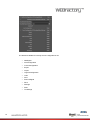
5. The Trending Control at design time (Smart Editor).
In Smart Editor, the properties of the Trending Control are exposed in under the WEBfactory
category, in the Property Inspector panel.
These properties are available in Expression Blend too, and can be located in the Properties
panel.
The Trending Control specific properties are listed under three main categories:
26
Configuration
Security
SignalConfiguration.
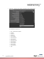
Configuration
ChartTheme – allows the user to select a visual theme for the Trending Control. The
available theme options are:
o
None – default theme is applied;
o
DuskBlue
o
DuskGreen
o
MediaPlayer
o
Office2003Blue
o
Office2003Classic
o
Office2003Olive
o
Office2003 Royale
o
Office2003Silver
o
Office2007Black
o
Office2007Blue
o
Office2007Silver
o
Vista
LineThickness – the thickness of the trendline in the Trending graphic.
ConcurrentSignals – the number of signals that can be displayed in the Trending
graphic at the same time.
ClientSideConfiguration – if set to on, the configuration will be stored on the local
machine’s Isolated Storage. The loading of the configuration will be made from the
local Isolated Storage.
ConfigurationNamespace – the namespace of the configuration. A configuration is
defined by a name and a namespace. The combination of name and namespace
must be unique. If a namespace is defined in this option, the Trending control will only
27
be able to see the configurations that belong to this namespace, when loading them
from the database.
InitialConfiguration – the name of the configuration to be loaded by default. By
declaring the namespace of the configuration (in the previous option) and the name of
the configuration in the InitialConfiguration text field, the Trending control will load by
default the specified configuration from de database.
TimeZone – allows the user to choose the time zone for the Trending Control at
runtime. The options are:
o
ClientTime – the time zone of the machine where the visualization is running.
o
ServerTime – the time zone of the machine on which WEBfactory Server is
running.
o
UTCTime – the UTC time zone.
PopupModality – this settings allows the user to choose the modality for the popup
windows displayed by the Trending control at runtime. The user can choose between
modal and modeless.
Security
ButtonsSettings – allows the user to set security authorizations for the options bar
buttons from the Trending control. For each button, the SecurityAuthorizationName
and the SecurityDenyAccessBehaviour can be set.
This means that the user can specify an authorization group that will have access to
the button, and the behavior of the button if users belonging to other authorization
groups than the one selected are using the control.
28
The buttons available for security access configurations are:
29
o
TimeRange
o
Start
o
Settings
o
Save
o
RemoveSignal
o
Load
o
LegendConfiguration
o
Import
o
Export
o
CursorConfiguration
o
AxisConfiguration
o
AddSignal
SignalConfiguration
Allows the user to choose which columns will be displayed at runtime in the signal grid from
the Change Settings window.
ShowAverageLineColumn – allows the user to enable a line that will mark the
average of the values displayed by the Trending graph.
ShowAveragePeriodColumn – allows the user to customize the period of time
over which the Average Line is visible and calculated.
ShowAxisColumn – enables the user to select an axis for the signal. Signals can
be represented on custom axis, depending on the values or units.
ShowCustomDescriptionColumn – allows the user to input a custom description
for the current signal.
30
ShowDigitalBitColumn – allows the user to assign a signal value that will
represent the digital state of 1 in the digital graph.
ShowGroupColumn – lists the signal group which current signal is assigned to.
ShowDigitalColumn – allows the user to mark the signal to be represented in a
digital format.
ShowInterpolationColumn – allows the user to set the algorithm used to draw the
line between points.
ShowMaxColumn – defines the maximum value for the signal value.
ShowMaximumLineColumn – if enabled, Trending graph will draw a line, marking
the highest value of the current signal.
ShowMinColumn – shows the minimum value for the signal value.
ShowMinimumLineColumn – if enabled, Trending graph will draw a line, marking
the lowest value of the current signal.
ShowOpcItemNameColumn – lists the OPC item name for the current signal.
ShowUnitColumn – shows the unit of measurement for the signal value, if
available.
ShowLogColumn – shows the log name of the selected signal, if the signal has
logging.
ShowNameColumn – shows the name of the signal.
ShowInvertedColumn – allows the user to invert the digital representation of the
signal.
ShowNumberOfDecimalsColumn – allows the user to specify the number of
decimals the signal value will be displayed with.
31
ShowDescriptionColumn – shows the description of the signal, if available.
ShowStaticColumn – allows the user to mark a signal as static.
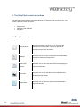
6. The Trending Control at runtime.
6.1. User Interface
The UI of the Trending Control is divided in three sections:
32
The graph
The legend
The options bar
6.1.1.The graph
The Trending Control displays data in a multi axes graphic environment, using colored
shapes for accurate data representation.
The two signals are displayed as lines, relative to values and timestamps. This section can be
configured at runtime using the Settings button from the options bar.
33
6.1.2.The legend
The legend is the part of the Trending Control that holds the details of the signals represented
in the graph part.
It can be configured at runtime using the Settings button from the options bar.
6.1.3.The options bar
Contains the all the possible options of the Trending control:
- the Pause/Run button
- the settings button, configures the trend display
- loads configuration from database
- saves configuration to database
- import trend data (from xml)
- export trend data (to xml)
34
- prints the Trending control, without including the options bar
- changes the time range
- adjusts the zoom level to normal
- move tool, useful to move while at high zoom
- zoom tool, zooms in the graph
- shift the timeline with one unit (hour/day/week/year) to the left. Available only in
historical view.
- shift the timeline with one unit (hour/day/week/year) to the right. Available only in
historical view.
6.2. Trending functionality
6.2.1.Changing settings
The base functionality of the Trending control can be adjusted using the Settings
button
from the option bar. Pressing the Settings button will open the Change Settings window,
which contains options to customize the core elements of the Trending control:
35
The possibility to add and manage signals
The axes setup
The legend configuration
The cursors configuration
The way a signal is represented
Managing the signals
The main part of the window is focused on signal management. It consists in a signal grid,
which lists the signals from the Trending control as well as their attributes (listed in the grids
columns).
The scroll bar at the bottom of the grid indicates that more columns are available. Setting
which columns should appear in the grid, and thus, which attributes of the signals should be
listed, is made at design time, in Smart Editor or Expression Blend.
In the above example, all the available columns are listed:
Active – contains a checkbox button toggling the shown/not shown state of the signal
in the Trending control.
Description – lists the description of the signal, if available. The signal’s description
can be set from WEBfactory Studio for each signal.
Color – contains a color picker, indicating the color of the trend line, and allows the
user to select a pre-defined color, or a custom color.
36
This color is randomly assigned when the signal is added with the signal Browser and
can be changed.
Name – displays the name of the signal.
Interpolation – allows the user to set the algorithm used to draw the line between
points.
37
The options are:
38
o
Straight line
o
Cubic Spline
o
Differential
Digital – marks the signal to be represented in a digital format. If a signal is marked
as digital, a new digital graph will appear in the trending control, if the “show digital
chart” option is checked. The base value is the Digital Bit.
Inverted – inverts the digital representation of the signal. If the Digital Bit, by default
the 1 state is set to a certain signal value, the inverted signal will display the signal
value as 0, thus inverting the graphic representation.
Digital Bit – allows the user to assign a signal value that will represent the digital state
of 1 in the digital graph. If the signal outputs the value stated in the Digital Bit
attribute, the digital graph will display the state 1. If any other value is output by the
signal, the digital graph will state 0.
The Digital Bit cannot have a negative value assigned.
Axis – enables the user to select an axis for the signal. Signals can be represented
on custom axis, depending on the values or units. The axes can be defined using the
Axes button in the Change Settings window.
Log – displays the log name of the selected signal, if the signal has logging. Logging
will enable the Trending control to fetch the data from the database, not from the
signal changed event, thus being able to optimize the data acquisition speed and to
display historical values.
39
Group – lists the signal group which current signal is assigned to.
OPC Item Name – lists the OPC item name for the current signal.
Unit – displays the unit of measurement for the signal value, if available.
Min – defines the minimum value for the signal value.
Max – defines the maximum value for the signal value.
Custom description – allows the user to input a custom description for the current
signal. This attribute can improve the filtering in some cases and the visualization on
the signals in the legends.
Minimum line – if enabled, Trending graph will draw a line, marking the lowest value
of the current signal. The color can be changed using the color picker.
Maximum line – if enabled, Trending graph will draw a line, marking the highest value
of the current signal. The color can be changed using the color picker.
Average Line – allows the user to enable a line that will mark the average of the
values displayed by the Trending graph. There are two types of average lines:
o
Absolute – states the absolute average of the values.
o
Moving – states the real time average value for the signal.
Moving Average Period – allows the user to customize the period of time over which
the Average Line is visible and calculated. The user can view the average value over
a timespan of specified minutes, hours or days.
Number of decimals – allows the user to specify the number of decimals the signal
value will be displayed with. If the value of this attribute is set to 0, the signal value
will be displayed with all its decimals.
Cyclic acquisition – marks a signal as static. For a signal that has a lower frequency
of value updates, this option will enable the Trending control to display the last value
until the next value update, even if between the updates no data has been retrieved.
The change of value will be visible marked in the graph. As an abrupt change,
meaning that the signal had that curtain value until that time and from that point on it
has a new value. At the start of the data acquisition faze the last know value for the
signal, prior to the start of the selected time interval, will be fetched from the server in
40
order to display the current value of the signal until new updates come along. Also if
the historical data is shown in the graph on a signal that is marked as static it will be
represented in the same abrupt change mode.
Above the signals grid, the Add, Delete and Filter options are available:
Add – adding one or more signals. Clicking the button will open the signal browser,
allowing the user to select and add signals to the Trending control.
The main feature of the Signal Browser is the filtering. A very useful filter option is the
Show Logs checkbox. If selected, the Signal Browser will list only the signals that
have logging. This is useful when using historical views in the Trending control.
Other filtering options are available in the bottom-left side of the Signals Browser
window. The further filtering can be made by:
41
Column - with the options: Connector, Group, Name, Signal Description and
OPC Item Name.
Value – for each column selected, the user can input the value for filtering.
Wildcards are available.
Note that you can set filter for each column. If you want to remove the filter from one column,
set the value to *.
Delete – this option is plain forward. It deletes the selected signals.
Filter – the signals listed in the signal grid can be filtered by columns and values for the
selected columns:
Column - with the options: Connector, Group, Name, Signal Description and
OPC Item Name.
Value – for each column selected, the user can input the value for filtering.
Wildcards are available.
Note that you can set filter for each column. If you want to remove the filter from one column,
set the value to *.
Under the signals grid are the Select All, Activate and Deactivate options. Like in the first
column of the signals grid, the signals can be activated or deactivated. The advantage of
using this options is that all the selected signals can be activated/deactivated at once.
Managing the trending graph and legend
The right side of the Change Settings window is focused on managing the graph and the
legend.
42
Axes – the Axes button manages the Y axes that the signal can be displayed on.
Clicking the button will open the Axes Configuration dialog.
The axes can be added to the graph by clicking the Add button. The axes will be
listed in the left side of the window, the right side being used for configuring the
selected axes:
o
Name – the name of the axes. It will be listed in the Axis column dropdown
box.
o
Title – the title will be displayed in the Trending control graph. Each axis can
have a representative title.
o
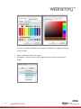
Color – the color of the axes. Clicking the corresponding button will open the
color picker.
o
Autoscale – if enabled, the axis will modify its values according to the value
of the signal/signals tied to this axis.
43
o
Fixed range – the axis will have a fixed value representation, using the values
specified below (from… to…). If the signal value goes over or below the
specified values, the trend line will be cut off the graphic.
o
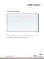
Logarithmic – makes the values of the trend line to pass through a
logarithmical function (ln) and then display the values on the chart. It can be
useful when dealing with signals representing sound levels or earth
movement.
*The same signal represented on a normal scale (blue) and on logarithmical
scale (red)
o
Scientific – enables the scale of the axis to be represented using scientific
format (3.42E + 001). This is useful when dealing with extreme signal values
(either very large values or very small values, negative or positive).
o
Orientation – the axis can be placed either on the left side of the graphic or
on the right side of the graphic. If no signal is assigned to a certain axes it will
not be drawn on the chart.
Legend configuration – allows the user to configure the legend (both analog and
digital) of the Trending control. Clicking on the Legend Configuration button will open
the Legend Configuration dialog.
44
This dialog allows the customization of the legend columns and its position:
o
Description column – displays the description of the signal in the
legend.
o
Name column – displays the name of the signal in the legend.
o
Group column – displays the signal group in the legend.
o
OPC Item Name column – displays the OPC item name in the
legend.
o
Min column – displays the minimum value of the signal.
o
Max column - displays the maximum value of the signal.
o
Unit column – displays the unit of the signal value.
o
Log column – displays the logging info of the signal.
o
Show current values – shows the current value of the signal if no
cursor is defined in the trending, or if the cursor is placed before the
last updated value. If the cursor is placed in a time range where the
charts has data, the current value will be the closest value to the
cursor position. This happens for all the trend lines.
o
o
Show signal information – shows more signal information, with the
ability to put different information on different lines (if more than one
information is displayed on the same line, it will be split with the
character ‘|’):
45
Signal name
o
Signal description
Show timestamp
Show current value
Legend position – allows the user to select the position of the legend
in the Trending control.
Cursors – manages the configuration of the graphic cursor. If clicked, the Cursor
Configuration window will open.
Cursors can be added and deleted using the Add/Delete buttons from the bottom-left
side. The main part of the window focuses on cursor customization:
o
46
Name – cursor name.
o
Use signal color – enables the cursor to use the signal color if it is attached to
one signal.
o
Color – allows the user to set a custom color for the cursor.
o
Signal – allows the user to attach the cursor to a signal.
o
Show in legend – displays the cursor information in the legend of the
Trending control.
Display information – this table consists in options that can be marked to be displayed
either in the tooltip of the cursor, the label of the cursor or both:
o
Cursor Name – the name of the cursor.
o
Signal name – the name of the attached signal.
o
Description – the description of the signal, if available.
o
Group – the signal group that the attached signal belongs to.
o
OPC Item Name – the OPC item name of the attached signal.
o
Min – the minimum value of the attached signal.
o
Max – the maximum value of the attached signal.
o
Unit – the unit of measurement of the signal’s value.
o
Tag – the tag of the signal.
o
Date – the current date stamp of the signal.
o
Time – the current timestamp of the signal.
o
CurrentValue - the current value of the signal if no cursor is defined in the
trending, or if the cursor is placed before the last updated value. If the cursor
is placed in a time range where the charts has data, the current value will be
the closest value to the cursor position. This happens for all the trend lines.
Below the main settings, the Cursors Configuration window displays two graphical
settings for the cursors:
o
Label background opacity – allows the user to set the percentage of opacity
of the label.
o
Show label border – displays a border around the label.
The signal of the cursor can be changed without the need to come to the
configuration dialog. If a curtain cursor is selected and the user clicks on a different
signal in the legend, the signal for that cursor will be changed along with its color.
Digital chart
47
The digital chart options are located below the Cursors options. These settings are useful
when dealing with signals marked as digital.
By enabling the Show digital chart option, a digital chard will be displayed below the main
graphic in the Trending control, if we have at least one signal set as digital.
Digital chart height – allows the user to set the desired height for the digital chart
along with the height of the digital legend.
Digital chart type – allows the user to choose between Area, Line and Line Fill types
of digital representation of the data.
* Area, Line and Line Fill types of digital graphic
Overview
This option works when using historical data only. This means that only signal with logs will
be displayed.
The Show overview option enables an overview graphic to be displayed above the main
graphic, when in historical view mode. When in online mode, the overview graphic is not
visible.
The overview graphic provides a quick and easy navigation through dense historical data,
allowing the user to extend/move the part that the main graphic displays, or focus the main
graphic view on different data.
48
When the main graphic is zoomed, the overview graphic allows the user to control the data
displayed in the main graphic, by moving or extending/shrinking the selection area in the
overview graphic.
Controlling the selection area is made by dragging the whole selection area or dragging the
left or/and right selection handles.
To move the selection area to a different location, click inside the selection area and drag it
somewhere else on the overview graphic. Notice that the main graphic will update its view.
To resize the selection area, drag the left or right handles and adjust it to fit the desired
portion of the overview graphic. Notice that the main graphic will update the view.
49
6.2.2.Online mode
The time range button
allows the user to switch from the online mode to the historical
mode. Historical mode means viewing logged data from the signals. This is why only signals
that have logging can be viewed in historical mode.
Clicking on the time range button will open the Range Selection dialog.
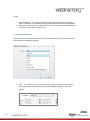
When online, the Range Selection dialog will display the options of viewing online data:
Display range – the time range of the graphic. It can be set to days, hours or minutes.
Start at now minus – sets the starting time of the graphic X minutes/hours/days after
the normal start point.
Get values for last – display the historical values for the last X minutes/hours/days
and continues with the online data.
Combined, this settings allow the user to see data progress so far and the current data in real
time.
50
6.2.3.Historical mode
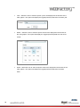
When selecting the Timespan option from the Range Selection dialog, the dropdown menu
will list the options for displaying historical data.
From…to - allows the user to select a time range using exact start and end points.
The logged data (historical data) from that period will be displayed in the main
graphic.
51
Year – allows the user to select a specific year to be displayed in the timeline of the
main graphic. This option will display the logged (historical) data from the whole year.
Month – allows the user to select a specific month to be displayed in the timeline of
the main graphic. This option will display the logged (historical) data from the whole
month.
Week – allows the user to select a specific week to be displayed in the timeline of the
main graphic. This option will display the logged (historical) data from the whole
week.
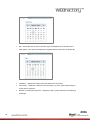
52
Day – allows the user to select a specific day to be displayed in the timeline of the
main graphic. This option will display the logged (historical) data from the whole day.
Online – the online mode.
Yesterday – displays the data from the day before the current day.
Current day – displays the data from the current day, up to the point representing the
current time of selection.
53
6.2.4.Save/Load Configuration
Loading and saving a configuration is done using the load (
) and save (
) buttons
from the options bar.
The configurations are written to the database, and loaded from there back. The name of the
configuration is case sensitive. If the name of the configuration already exists, the new save
will overwrite the old one.
If a Namespace is set in the Trending Control at design time, only the configurations
belonging to that namespace will be available to load from the database. Thus, a
configuration is uniquely defined by its name and/or namespace.
54
7. DataTable control diagram
7.1. Get logs
Getting Log ID’s
SignalsService.svc
GetLogIDs
Getting Log Values
SignalsService.svc
GetLogValues
No
All logs
retrieved
Yes
STOP
Webservices
Methods
GetLogIDs
List of SignalLogTagFilterDTO:
LogTag
SignalID
SignalsService.svc
GetLogValues
List of LogID’s and other parameters
55
The GetLogValues method returns paged data, in a determined period of time or elements.
If a page returns empty it means that there is no data in the requested time frame. The
GetLogValues method will be called for minimum 1 element from the left time (startDate) to
the end of the global time frame (endDate). Then the method will retrieve paged data until the
next empty frame.
7.2. Write Logs
SignalsService.svc
UpdateLogValues
Required
System Authorization
DataTable edit log values
Webservices
Methods
UpdateLogValues
SignalsService.svc
Parameters:
56
logID
Time
EditedValue
EditedValue2
Value
Value2
8. The DataTable control at design time
8.1. Expression Blend
The DataTable expose the following properties in Expression Blend:
57
ButtonsConfiguration – allows the user to input a username in the
SecurityAuthorizationName and an alternative behavior in the
SecurityDenyAccessBehavior field, for each button from the options menu of the
control:
o Export
o Load
o Print
o Save
o Settings
o TimeSelection
The SecurityDenyAccessBehavior options are:
o
o
Hide – the button is not displayed, if the other user than the one specified in
the SecurityAuthorizationName uses the DataTable control.
Disable - the button is displayed but disabled, if the other user than the one
specified in the SecurityAuthorizationName uses the DataTable control.
The ButtonsConfiguration also allows the user to select for each button whether to be
visible or not.
ClientSideConfiguration – if set to on, the configuration will be stored on the local
machine’s Isolated Storage. The loading of the configuration will be made from the
local Isolated Storage.
InitialConfiguration – this option allows the user to enter the name of a saved
configuration, this configuration being loaded as default configuration for the
DataTable control. The configuration can be later changed at runtime.
ShowPager – if on, this option will divide the DataTable entries in pages (the size of a
page can be specified in the Page size option) and activates the navigation.
PageSize – allows the user to select the maximum number of lines to be displayed in
one page. The maximum number of displayed lines per page at runtime is 100.
58
8.2. Smart Editor
The DataTable expose the following specific properties in Smart Editor:
59
PageSize – allows the user to select the maximum number of lines to be displayed in
one page. The maximum number of displayed lines per page at runtime is 100.
ShowPager – if on, this option will divide the DataTable entries in pages (the size of a
page can be specified in the Page size option) and activates the navigation.
InitialConfiguration – this option allows the user to enter the name of a saved
configuration, this configuration being loaded as default configuration for the
DataTable control. The configuration can be later changed at runtime.
ClientSideConfiguration – if set to on, the configuration will be stored on the local
machine’s Isolated Storage. The loading of the configuration will be made from the
local Isolated Storage.
ButtonsConfiguration – allows the user to input a username in the
SecurityAuthorizationName and an alternative behavior in the
SecurityDenyAccessBehavior field, for each button from the options menu of the
control:
o TimeSelection
o
o
o
o
o
Settings
Save
Print
Load
Export
The SecurityDenyAccessBehavior options are:
o
o
Hide – the button is not displayed, if the other user than the one specified in
the SecurityAuthorizationName uses the DataTable control.
Disable - the button is displayed but disabled, if the other user than the one
specified in the SecurityAuthorizationName uses the DataTable control.
The ButtonsConfiguration also allows the user to select for each button whether to be
visible or not.
60
9. The DataTable control at runtime
The DataTable control displays the logged values of the selected signal in a tabular way. The
control is divided in three main parts:
options menu
main view (grid of values)
navigation
9.1. The options menu
This button activates only when one or more lines are
Copy Selection
selected from the data table. Copying to clipboard in
Silverlight requires user permission.
Settings
control and customize its appearance.
Select time
Allows the user to select the time interval for displaying the
interval
data in the DataTable.
Print data
Export data
61
Allows the user to set up a configuration for the DataTable
Allows the user to print the data from the DataTable and
tweak the printing settings.
Allows the user to export the data from the DataTable to
various file formats.
Load
configuration
Allows the user to load a configuration from the database.
Save
Allows the user to save the current configuration to the
configuration
database.
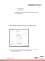
9.1.1.Settings
The Settings window is organized in three tabs:
Signal Columns
Time Columns
Common
9.1.1.1. Signal Columns
The signal management operation (add, delete, move up or down) are focused on the left
side of this window, the right side displaying the signal details.
Using the bottom-left buttons the user can add, delete or move signals in the DataTable.
62
As the new signals are added, they will be listed above in the signals list. By selecting a signal
from the list, the signal details can be edited.
Signal settings:
63
Signal name – the user can select the signal name by clicking the browse
button.
The Signal browser window will open, allowing the user to browse the connectors for
signals.
Signal description – the description of the signal can be added here.
Log name – the name of the log assigned to the selected signal.
Column caption – the tile of the column assigned to the signals value in the
DataTable.
Layout:
Alignment – allows the user to set the default text alignment throughout the table.
Column width – allows the user to set the default column width.
Appearance:
64
Digits – allows the user to select the number of digits for the signal values.
Automatic formatting – displays the values as they are stored in the data base.
Overrides the Digits option.
Scientific format – allows the user to select the scientific representation of the values.
Foreground color – enables the user to select a custom color for the foreground of the
control (text color).
Background color – enables the user to select a custom color for the background of
the control.
9.1.1.2. Time Column
The Time Column tab allows the user to make layout and appearance settings for the Time
column of the DataTable.
Layout:
Alignment – allows the user to select the alignment of the text inside the Time
column.
Column width – allows the user to select the width of the Time column.
Appearance:
65
Freeze time column – the time column stays fixed at the beginning of the table if the
user scrolls horizontally through the table page.
Show date – toggles the date on or off.
Show Milliseconds – toggles the milliseconds on or off.
Foreground color – enables the user to select a custom color for the foreground of the
control (text color).
Background color – enables the user to select a custom color for the background of
the control.
9.1.1.3. Common
The Common tab offers the possibility to edit the page size and toggle on or off the
DataPager.
66
Layout:
Show DataPager – if on, this option will divide the DataTable entries in pages (the
size of a page can be specified in the Page size option) and activates the navigation.
Page size – allows the user to select the maximum number of lines to be displayed in
one page. The maximum number is 100.
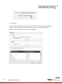
9.1.2.Select Time Interval
When selecting the Timespan option from the Time Interval dialog, the dropdown menu will
list the options for displaying the data.
From…to - allows the user to select a time range using exact start and end points.
The logged data (historical data) from that period will be displayed in the main
graphic.
67
Year – allows the user to select a specific year to be displayed in the timeline of the
main graphic. This option will display the logged (historical) data from the whole year.
Month – allows the user to select a specific month to be displayed in the timeline of
the main graphic. This option will display the logged (historical) data from the whole
month.
Week – allows the user to select a specific week to be displayed in the timeline of the
main graphic. This option will display the logged (historical) data from the whole
week.
68
Day – allows the user to select a specific day to be displayed in the timeline of the
main graphic. This option will display the logged (historical) data from the whole day.
Yesterday – displays the data from the day before the current day.
Current day – displays the data from the current day, up to the point representing the
current time of selection.
Number of measurements points – displays the last X (value specified in the field) log
recordings.
69
9.1.3.Print Data
The Print option allows the user to print the data content of the control, having the possibility
to apply custom headers and/or footers to the page. Also, the possibility of printing the
DataTable with column captions on each page is available.
70
Header:
Show column captions on every page – displays the titles of the column on each
printed page.
Show Header – toggles the header on or off.
Edit header – available only if the Show Header option in enabled.
o
o
Height - the height of the header/footer
Number of sections - the number of sections the header/footer is divided in. The
header/footer can have 1, 2 or 3 sections.
o
- inserts a page number placeholder
o
- inserts a total number of pages placeholder
o
- inserts a date placeholder
o
- inserts a time placeholder
o
- inserts an image
o
o
- deletes an existing image
The width of the sections can be either set on auto or edited manually
Image properties
o
o
o
71
Stretch - extends the image accordingly to one of the following settings: None,
Fill, Uniform, UniformToFill
Horizontal alignment - aligns the image horizontally
Vertical alignment - aligns the image vertically
Footer:
Show Footer – toggles the footer on or off.
Edit Footer – available only if the Show Footer option in enabled.
o
o
Height - the height of the header/footer
Number of sections - the number of sections the header/footer is divided in. The
header/footer can have 1, 2 or 3 sections.
o
- inserts a page number placeholder
o
- inserts a total number of pages placeholder
o
- inserts a date placeholder
o
- inserts a time placeholder
o
- inserts an image
o
o
- deletes an existing image
The width of the sections can be either set on auto or edited manually
Image properties
o
o
o
72
Stretch - extends the image accordingly to one of the following settings: None,
Fill, Uniform, UniformToFill
Horizontal alignment - aligns the image horizontally
Vertical alignment - aligns the image vertically
Advanced printing options:
Monochrome printout – toggles monochrome printing on or off.
Advanced printing – allows the user to customize the appearance of each column.
The options are Normal, Always Visible or Hidden.
o
o
o
Normal – the columns are printed normally on the page, from left to right, as
the table fits to page.
Always Visible – preserves the column on each printed page. The time
column can be useful when set to Always Visible.
Hidden – the hidden column is not printed.
9.1.4.Export Data
The Export Data dialog allows the user to export all or just selected data from the DataTable
control in several file formats: Excel, Excel XML, Word, Csv, Html.
73
9.1.5.Load Configuration
Load Configuration option allows the user to load an existing configuration from the database.
The Load Configuration dialog provides a simple filtering option, the Only show own
configurations. When enabled, the Load Configuration window will list only configurations
owned by the current user.
74
9.1.6.Save Configuration
The Save Configuration option allows the user to save the current configuration to the
database. The saved configuration can be loaded later using the Load Configuration option,
or can be set as default user configuration at design time.
75
9.1.7.Editing logged values
The DataTable control allows the user to edit the logged values if the user has the required
System Authorization – DataTable: Edit log values.
The Edit log values system authorization is granted Authorization Groups in WEBfactory User
Manager.
If the user belongs to an Authorization Group that has the DataTable: Edit log values System
Authorization, the DataTable values can be edited.
The edited values will not overwrite the log value, but they will be stored separately
(EditedLoggingValue if the value input can be converted to double or EditedLoggingValue2 if
the value cannot be converted to double).
The edited value will be visible in the DataTable control only, and will not affect the historical
data represented by the Trending control. The edited values will be marked by the symbolic
text FSN_DataTable_WFDataTable.editedLogValue, placed as a suffix.
76
To edit logged values in DataTable, the user must be logged in the application using
credentials that have the required system authorization. After logging in, the user will be able
to double-click any data cell from the DataTable grid and edit the values. The editing will be
confirmed upon pressing Enter.
After a value is edited, the suffix Edited (FSN_DataTable_WFDataTable.editedLogValue) will
be displayed in the data cell.
More information regarding the User Manager and System Authorizations can be found at
http://webfactory-support.de/assets/documentation/Default.htm.
Click here for more information on System Authorizations and User Manager.
77
9.2. DataTable main view
The main view of the DataTable control consists in a grid of values logged at a specific time.
The columns displayed by the grid of values are the time column and the signal columns.
The columns are customizable, the customization options being available in the Settings
dialog.
All DataTable’s columns can be sorted ascendant or descendant by clicking on the column
header.
The Index column marks the line number. The total number of lines displayed by the control is
listed at the bottom-right side of the main view.
The status indicator is displayed at the bottom of the main view.
78
9.3. DataTable navigation
The navigation controls of the DataTable are displayed only when the Show DataPager option
is enabled (Settings > Common).
The navigation controls are placed below the main view (the grid of values), and allow the
user to navigate through the DataTable pages.
79
10. Accessing the DataTable web services using HTML and
JavaScript
Accessing the webservices using HTML and JavaScript is possible by using additional scripts.
Follow this link to download the necessary scripts.
IMPORTANT: The jquery.ajaxdotnet.js script needs to be downloaded from our source. This
version has an error handling bug fix which is not available in the original version of the script.
IMPORTANT: In order to work, the HTML file and the scripts need to be accessed using IIS
and need to have the same protocol, host and port as the web services.
In order to access the scripts, the head of the HTML file must contain the links to the external
scripts:
<script
<script
<script
<script
<script
src="Scripts/jquery-1.5.1.min.js" type="text/javascript"/>
src="Scripts/json2.min.js" type="text/javascript"/>
src="Scripts/jquery.ajaxdotnet.3.js" type="text/javascript"/>
src="Scripts/knockout-2.0.0.js" type="text/javascript"/>
src="Scripts/helpers.js" type="text/javascript"/>
Besides the provided scripts, the HTML file must contain the actual code that will access the
web service and retrieve the data. The web service call can be wrapped inside a function for
easier usage:
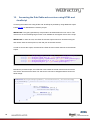
function GetLogValues(arguments, successCallback, errorCallback){
$.ajaxDotNet("/_WEBFACTORY/WebServices/WCF/SignalsService.svc/js/GetLo
gValues",
{
data: arguments,
success: function (data) {
successCallback(data.d);
},
error: function () {
errorCallback();
}
}
);
}
80
The above function calls the GetLogValues method from the SignalService web service.
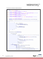
The GetLogValues function defined above will require additional filters in order to get the data
properly from the web service:
GetLogValues({
filter:{
LogIDs: ["299F590C-A740-4B7C-A762-802E3F208FA5"],
StartDate : {
DateTime: new Date(1900,0,0).toMsJson(),
OffsetMinutes: 0
},
EndDate : {
DateTime: new Date().toMsJson(),
OffsetMinutes: 0
},
MaxResults: 5,
SortOrder: 4
}
}
The values are written in the HTML table using JavaScript:
function(result){
for(var i = 0; i<result.length;++i){
var item = result[i];
var cells = "";
cells += "<td>"+item.EntriesDate+"</td>";
cells += "<td>"+item.Values[0].EditedValue+"</td>";
cells += "<td>"+item.Values[0].EditedValue2+"</td>";
cells += "<td>"+item.Values[0].Value+"</td>";
cells += "<td>"+item.Values[0].Value2+"</td>";
$(".logValues tbody").append("<tr>"+cells+"</tr>");
};
}
If the GetLogValues method fails to retrieve the correct data, the following function executed:
function(){
alert("Error");
}
81
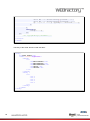
The Head of the HTML file should look like this:
<head>
<meta charset="utf-8" />
<script src="Scripts/jquery-1.5.1.min.js"
type="text/javascript"></script>
<script src="Scripts/json2.min.js" type="text/javascript"></script>
<script src="Scripts/jquery.ajaxdotnet.3.js"
type="text/javascript"></script>
<script src="Scripts/knockout-2.0.0.js"
type="text/javascript"></script>
<script src="Scripts/helpers.js" type="text/javascript"></script>
<script type="text/javascript">
function GetLogValues(arguments, successCallback, errorCallback){
$.ajaxDotNet("/_WEBFACTORY/WebServices/WCF/SignalsService.svc/js/GetLogVal
ues",
{
data: arguments,
success: function (data) {
successCallback(data.d);
},
error: function () {
errorCallback();
}
}
);
}
$(document).ready(function(){
GetLogValues({
filter:{
LogIDs: ["299F590C-A740-4B7C-A762-802E3F208FA5"],
StartDate : {
DateTime: new Date(1900,0,0).toMsJson(),
OffsetMinutes: 0
},
EndDate : {
DateTime: new Date().toMsJson(),
OffsetMinutes: 0
},
MaxResults: 5,
SortOrder: 4
}
},function(result){
for(var i = 0; i<result.length;++i){
var item = result[i];
var cells = "";
cells += "<td>"+item.EntriesDate+"</td>";
cells += "<td>"+item.Values[0].EditedValue+"</td>";
cells += "<td>"+item.Values[0].EditedValue2+"</td>";
82
cells += "<td>"+item.Values[0].Value+"</td>";
cells += "<td>"+item.Values[0].Value2+"</td>";
$(".logValues tbody").append("<tr>"+cells+"</tr>");
};
},
function(){
alert("Error");
});
});
/*ko.applyBindings(viewModel);*/
</script>
</head>
The body of the HTML file will contain the table:
<body>
<h1>Data Table</h1>
<table class="logValues">
<thead>
<tr>
<th>EntriesDate</th>
<th>EditedValue</th>
<th>EditedValue2</th>
<th>Value</th>
<th>Value2</th>
</tr>
</thead>
<tbody >
<tr>
<td />
<td />
<td />
<td />
<td />
<tr>
</tbody>
</table>
</body>
83