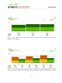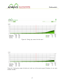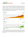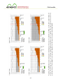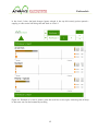
1
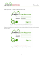
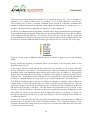
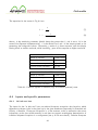
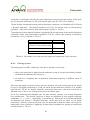
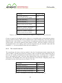
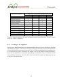
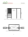
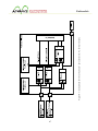
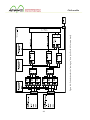
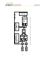
Project no.: 257398
Advanced predictive-analysis-based
decision-support engine for logistics
Project title:
Start date of project: 01.10.2010
Duration: 36 months
End date of project: 30.09.2013
7th FP topic addressed:
Challenge 4: Digital libraries and content: ICT-2009.4.3: Intelligent Information Management Objective
Small or medium scale focused research project (STREP)
D5.3: ADVANCE Live Reporter users’ manual
Document release
V1.0
Due date of deliverable
09/2013
Document Status
Final, evolving on demand
Abstract
This document covers the functionalities of the ADVANCE Live Reporter implementation complementing the OS release of teh ADVANCE
framework. An appendix explaining the numerical background of display
behaviour is added for readers wishing to gain a deeper understanding
of the Live Reporter’s behaviour.
Deliverable
Contents
Executive summary
5
1 Purpose and usage context of the ALR
6
2 Generic screens
7
3 Screens in “hub mode”
9
3.1
Common screen elements . . . . . . . . . . . . . . . . . . . . . . . . . . . . .
9
3.2
The Summary screen . . . . . . . . . . . . . . . . . . . . . . . . . . . . . . .
10
3.3
The Next days screen . . . . . . . . . . . . . . . . . . . . . . . . . . . . . . .
14
3.4
The During day screen . . . . . . . . . . . . . . . . . . . . . . . . . . . . . . .
16
3.5
Administrator functions . . . . . . . . . . . . . . . . . . . . . . . . . . . . . .
21
3.5.1
Setting business-as-usual scales . . . . . . . . . . . . . . . . . . . . . .
21
3.5.2
Shed layout editor . . . . . . . . . . . . . . . . . . . . . . . . . . . . .
21
4 Screens in “warehouse mode”
23
4.1
Common screen elements . . . . . . . . . . . . . . . . . . . . . . . . . . . . .
24
4.2
Level 1: global warehouse overview . . . . . . . . . . . . . . . . . . . . . . . .
25
4.3
Level 2: bay overview . . . . . . . . . . . . . . . . . . . . . . . . . . . . . . .
30
4.4
Level 3: bay details . . . . . . . . . . . . . . . . . . . . . . . . . . . . . . . .
34
3
Deliverable
Appendix A: Bars and colours in warehouse screens
36
A.1 Motivation . . . . . . . . . . . . . . . . . . . . . . . . . . . . . . . . . . . . .
36
A.2 Saturation in bar lengths . . . . . . . . . . . . . . . . . . . . . . . . . . . . . .
36
A.3 Generating colours . . . . . . . . . . . . . . . . . . . . . . . . . . . . . . . . .
37
A.3.1 Colour transitions . . . . . . . . . . . . . . . . . . . . . . . . . . . . .
39
A.3.2 Adjusting input sensitivity . . . . . . . . . . . . . . . . . . . . . . . . .
40
A.4 Inputs and specific parameters . . . . . . . . . . . . . . . . . . . . . . . . . . .
42
A.4.1 At hub now bars . . . . . . . . . . . . . . . . . . . . . . . . . . . . . .
42
A.4.2 Coming up bars . . . . . . . . . . . . . . . . . . . . . . . . . . . . . .
43
A.4.3 The overall state dot . . . . . . . . . . . . . . . . . . . . . . . . . . .
44
A.5 Putting it all together . . . . . . . . . . . . . . . . . . . . . . . . . . . . . . .
45
Appendix B: Consolidation of warehouse layouts and capacities
51
B.1 Motivation . . . . . . . . . . . . . . . . . . . . . . . . . . . . . . . . . . . . .
51
B.2 Merging warehouse layouts . . . . . . . . . . . . . . . . . . . . . . . . . . . . .
51
B.3 Handling capacities
54
. . . . . . . . . . . . . . . . . . . . . . . . . . . . . . . .
4
Deliverable
Executive summary
This supplement to D5.3 covers the functionalities of the ADVANCE Live Reporter as implemented to complement the OS release of the ADVANCE framework. Specifically, the following
areas are explained in detailed text and illustrations:
• Fundamental terms needed by all user groups to understand the interfaces;
• Hub user and administrator screens;
• Warehouse user screens.
An appendix is also included, explaining the mathematics behind various screens for advanced
users who wish to have an in-depth knowledge of the Live Reporter.
5
Deliverable
1
Purpose and usage context of the ALR
The purpose of the ADVANCE Live Reporter (ALR) is to provide an interface between the core
ADVANCE application and users taking part in logistics processes. The ALR interface is webbased, i. e., all user groups can access the interface views specific to their tasks through a web
browser, although the physical device actually used may vary (e. g., desktop computer, laptop, or
mobile device).
It may be of advantage for users to familiarise themselves with the design philosophy behind the
ALR screens, therefore, we give a brief summary of previous findings and design decisions at this
point.
During interviews and process surveys, it became clear that very often, communicating data
to users can present an information bottle-neck, while the required data are, in some form,
already present in the system. In order to improve this situation, the combination of ADVANCE
application plus ALR has to perform well in two aspects:
• Prepare data in a form useful for selected user types, and
• Present the right data in the right way to the user of a given type.
Often, it was found that current practice has little support for surveying a complex situation
where the right data have to be present simultaneously, side-by-side, for direct comparison or
gathering a global impression of the current situation. Therefore, ALR screens were designed to
• Collate all available information needed for the given perspective,
• Present data in forms that have been assumed most adequate for the given perspective
(e. g., colours, bar lengths or numbers), and
• Be arranged in a way that would facilitate efficient orientation for trained personnel.
The screens were designed with assumed observation and response times in mind, i. e., the
approximate time frame in which the user has to find relevant information in the screen and
react on it. Some of the screens are, therefore, optimised for quick response, aimed at delivering
relevant information with minimal interaction (i. e., seeing everything relevant without having to
click or scroll one’s way through). This is especially true for warehouse screens, as these are used
in possibly the busiest environment on site.
Other screens, on the other hand, are used in situations where more time is available to look
behind the scenes and explore the development of processes for a while. Here, users may feel an
overly simplified view as a restriction of their possibilities. Therefore, wherever this was feasible,
we tried to provide users with options of “drilling down”, looking at details that are present in the
data but are hidden in the “instant response” interfaces due to their lesser “immediate relevance”.
6
Deliverable
Ease of use was a leading point in the design of the ALR screens, and the interfaces were laid out
to be as much as possible in line with the user’s assumed picture of the processes. Usually, this is
perceived as intuitive, or self-explanatory. Nevertheless, there were cases where intuitiveness was
in conflict with efficient use (e. g., explanatory text having too large a footprint in an otherwise
valuable screen area, or wedged-in explanation obstructing easy visual orientation at first sight).
In such cases, efficiency of use was preferred over intuitiveness—we can assume that most of the
time, trained users will work with the ALR, who will orient themselves by routine and are unlikely
to “ask for directions”.
One of the keys to efficient support of routine activities is the provision of an environment that
remains consistent (over time as well), allowing a routine of interpretation to develop, and,
possibly, serve as a common ground of correct interpretation and mutual understanding among
ALR users. In support of consistency, we have applied the following measures wherever it was
assumed useful:
• Same scaling for same graph: we assume that consistent scaling for graphical display of
quantities facilitates a visual judgement to develop. Therefore, many diagrams use a socalled business-as-usual scale that can contain figures well within the same interval for the
majority of cases. Automatic stepwise scale-to-fit mechanisms would set in during rare
exceptions only, when the graph would stretch beyond the boundaries of business-as-usual
scaling.
• Same meaning for same colour: we keep to two fundamental colour schemes in all screens,
and for all user groups. These colours are:
– a discrete colour set for shipment status and inbound/outbound distinction, and
– a continuous colour chart for bay saturation (in general, for gradual transition from
“OK”, “critical”, and “over-critical” predicates of a situation—now used for bay loads
only).
• Same arrangement for same function/meaning: wherever possible, screen layouts were
designed in keeping with the same basic arrangement, as well as the same order of displayed
items, e. g., various service types.
• Persistence over time: wherever technically possible, ALR screens retain their settings (and
scroll position if there is any) until the next time they are visited. This facilitates, among
other things a “quick look” at another screen without having to struggle to restore the
perspective of the previous screen upon return.
2
Generic screens
The login screen is shared by all user groups, and requests a user name and a password to be
entered (see Fig. 1). A given user is assigned to one specific user group—this also determines
7
Deliverable
access rights as well as the set of screens the user will see.
Figure 1: ALR login screen with input fields filled out by user
Entering an invalid login and password pair clears the input fields and brings up a warning message
below the fields:
Figure 2: ALR login screen upon entering invalid input
8
Deliverable
3
Screens in “hub mode”
The “hub mode” screens are meant for users overlooking hub activities on hub level (i. e., not
going into details of individual warehouse bays, etc.). Hub-mode screens are designed for a
desktop computer with:
• adequate screen size and resolution, and
• a mouse or similar pointing device that allows hovering the cursor over screen elements.
In general, screens have been designed for minimal user interaction (clicking, scrolling, etc.)
where gaining a fast overview is of importance. Also, selected display options are preserved while
the user switches over to another screen.
3.1
Common screen elements
The header area of hub-mode screens has some common elements that are best explained beforehand (see also Fig. 3). These are:
• The Logout and Settings buttons in the top right corner. Clicking on the Logout button
returns the user to the login screen, while clicking on the Settings button opens a menu
with setting options. In the current ALR implementation, the following parameters can be
set by the user:
– Business-as-usual scale for the quantities currently displayed (separate scales can be
set for hub total, per-depot traffic, as well as each unit of measurement, i. e., price,
count of separate units, and occupied floorspace).
– Shed layout and link to warehouse-mode screens (currently for debugging, has to be
consolidated in later versions).
• Screen selector buttons at the left side of the header bring the user to one of the hub-level
screens—this can be interpreted as a main menu in hub mode.
• Display option buttons at the right side of the header control what amounts are displayed
and in what unit of measurement:
– The hub/depot selector specifies if the total traffic of the hub is displayed, or the
inbound and outbound traffic of a selected depot. Clicking on the triangle to the
right of the hub/depot selector opens a drop-down list from which the user can select
the hub or a specific depot. Depots are specified by their ID number, and the name
of the depot, e. g., “1, Depot 1”.
9
Deliverable
– The unit of measurement selector specifies what units the given traffic is displayed in.
In the current implementation, these can be price, number of separate shipping units,
and occupied floorspace.
Figure 3: Header and common controls for hub mode screens
3.2
The Summary screen
The Summary screen gives, roughly speaking, an overview of all shipments passing through the
hub in the current shift. The amounts are shown for the entire hub or for a selected depot (both
inbound and outbound in the latter case), in the unit of measurement selected by the user. The
screen shows the total amounts for all service types, as well as separate numbers for Standard,
Priority, and Special.
For the correct interpretation of the diagrams, it is vital to understand how shipment states are
defined. In a simplified approach, each shipment passes through following states (see Fig. 4 for
colours):
1. Created : the shipment is entered into the system (receives a unique identifier and becomes
visible to the system).
2. Scanned : the shipment is “scanned onto a vehicle” that will, at some point, depart form
the depot of origin.
3. Declared : once a shipment is known to be declared, the depot of origin guarantees that it
will depart for the hub. While shipments can physically leave for the hub on the day they
are declared, this is not absolutely guaranteed. Real-life processes remain to be investigated in this regard—nevertheless, we have set an expiry limit to keep declared shipments
from accumulating and distorting the figures. What is, then, displayed as declared is the
cumulative amount of declared shipments between the current time and an expiry limit.
4. At hub: in most application cases, this could actually mean “known to be on the floor in
one of the warehouses”. This is the amount of shipments warehouse personnel currently
have to deal with in terms of floorspace occupation.
5. Left hub: this should actually mean “known to be no longer on the floor”. Whatever
protocol is applied to dispatching of shipments, the hub no longer has to deal with the
pallet when this state is set for the given shipment.
10
Deliverable
The states listed above should be understood as successive stages, e. g., once a shipment is
scanned, it is no longer created ; once it is declared, it is no longer scanned or created, etc.
From another point of view: a scanned →declared status change of a shipment increments the
number of declared shipments as displayed, while registering its presence in a warehouse (i. e., a
declared →at hub transition) decreases the “declared” amount displayed.
In addition to numbers known to the system, the ALR adds a during-day prediction to the diagram.
The predicted number shows how much more can be expected by the end of the shift in addition
to the shipments already declared. On occasion, this can be less than the sum of created and
scanned shipments, and this may be very well in line with the reality of a given business case—not
all created or scanned shipments would actually get declared (at all, or by the end of the day).
Figure 4: Colour codes of different shipment states, as shown in legend areas of the Summary
screen.
Having clarified the meaning of shipment states, let us return to the diagrams shown in the
Summary screen (Fig. 5).
In the case of the hub overall, we see four compound bars, standing for all services, Standard,
Priority, and Special, respectively. The coloured areas of the bars correspond to shipment states
as defined above, with successive states moving from right to left. In addition to the graphical
display, the exact amounts are also shown in numbers in the legend, located to the right of each
compound bar. The prediction (how much more is to be expected than those already manifested)
is shown as a dashed outline, and may overlay or go beyond the scanned and created bars.
Two additional features support the user in relating bar lengths to numbers: rulers and pop-up
number boxes. For the hub overall view, two rulers are added to each compound bar. The top
ruler has its origin at the at hub→left hub transition, and helps the user in estimating how much
will be left until the end of the shift. The ruler below the compound bar has its origin at the
left edge of the left hub area, and supports the user in estimating the total throughput for the
entire shift (i. e., what has already been done and what still remains to be done). In addition to
the rulers, hovering the pointer over a given area brings up a text box with the exact number in
a tooltip-like fashion.
A closer look at the diagrams will also reveal that all compound bars (corresponding to different
service types) are aligned at the at hub→left hub transition. This is done on purpose, as this
transition separates the pallets the hub no longer has to handle from those that still mean work
to be done in the current shift.
11
Deliverable
Figure 5: Summary screen for hub overall
12
Deliverable
Switching over to a depot (i. e., selecting a depot with the hub/depot selector) brings up a similar
screen—however, with four pairs of compound bars, the top one in each pair standing for the
inbound (depot→hub), and the bottom one standing for the outbound (hub→depot) traffic, as
in Fig. 6. In other words, the top bar in the pair shows what comes in from the given depot, while
the bottom bar shows what the same depot takes from the hub. In addition to the double bars,
each pair has two legends showing inbound and outbound numbers, respectively.
Figure 6: Summary screen showing inbound and outbound pallets for one depot, from hub
perspective. Note the double bars (for inbound at top and outbound at bottom), and the
alignment remaining at the at hub→left hub transition.
13
Deliverable
3.3
The Next days screen
The Next days screen shows predicted total throughput for
• the current shift (left column), and
• the shifts beginning on the next two workdays after the start of the current shift (middle
and right columns).
The dates shown in the screen indicate the starting day of the shift, and the numbers below them
denote the throughput expected for the shift beginning on the given day (total, and each service
type). Vertical scaling of the bars follows the business-as-usual scheme. The service type names
to the left of all columns serve as a legend for the colour codes as well. Fig. 7 shows a next days
screen for the entire hub.
Predicted per-depot data, as in Fig. 8, distinguish between inbound (depot→hub) and outbound
(hub→depot) amounts, and use two separate sets of colour codes. The inbound colours derive
from the At hub status in the Summary screen, while the outbound (as well as the hub total)
colour set is based on the basic green used for Left hub and most other interface elements.
Observing the Next days screen prior to the next shift, one may find the numbers of the left
column fluctuating, and finally settling in by the time all pallets for the day are manifested. This
is due to the fact that the first column (or pair of columns for depot view) is calculated via
during-day prediction which takes into account changes of the given day to gradually refine the
prediction for the day. In contrast, all other columns (or pairs of columns) are calculated once
every day via another, day-by-day prediction method. In the latter case, gradual refinement would
not make much difference anyway, in view of the uncertainties for the subsequent days.
14
Deliverable
Figure 7: Next days screen for hub overall. Note the colour codes for different service types
explained in the legend.
Figure 8: Next days screen for a selected depot. Note that the outbound predictions use the
same colour codes as the hub overall, while inbound predictions receive a different set of colours.
15
Deliverable
3.4
The During day screen
The During day screen shows the development of declared shipments and their predicted final
amount for a time window preceding a hub shift. The screen serves two purposes:
• showing the development of declarations over time and providing a sampling tool for diagnostic purposes, and
• giving a graphical (and numerical) comparison of actual declarations and predicted final
amounts, supporting users in assessing the quality of during-day predictions made at different times of the day.
The screen gives the user the opportunity of comparing the latest numbers with those of an
earlier point of time within the window displayed. This can be done by clicking and dragging
the red highlight ruler to the desired point of time—note that the positioning of the highlighter
follows the discretised time steps (15 minutes in our case), and snaps to these points during
dragging. Observing the numbers below the graph, one can see that dragging the highlighter will
change the values in the selected columns to those found at the highlighted time, while the latest
column—standing for the latest known values—remains the same. If the end of the time window
has not yet been reached by the current time, the latest column will automatically change to new
values every 15 minutes, as new manifest data and predictions become known.
A useful feature of this screen is that the contribution of various service types can be hidden or
brought back again, by clicking on the visibility controls to the left of the service type legend
(compare Figs. 9 and 10). Hiding one or more service types sets the actual visible and predicted
visible numbers accordingly. Also, hiding service types results in two more lines appearing in the
graph: a dotted line showing predictions summed up for the visible service types only, as well as
a solid line for actual total, showing how much the sum of all service types would be.
16
Deliverable
Figure 9: During day screen for hub total
Figure 10: During day screen for hub total, with one of the service types (Premium, in our case)
marked invisible
17
Deliverable
Selecting a depot with the hub/depot selector brings up a similar diagram with one more option—
as in all other screens, inbound (depot→hub) and outbound (hub→depot) traffic are shown
separately, as in Fig. 11. In this case, a side-by-side view at the graphs could have been less
suggestive and cumbersome to compare. Therefore, another set of display option buttons has
been added to switch between inbound and outbound numbers. Note that scaling remains
the same, the highlighter bar remains at the same place, and service type visibility options are
preserved, facilitating the comparison of inbound and outbound graphs. Colour codes for inbound
graphs are consistent with those in the Next days screen.
Figure 11: Two different During day screens can be selected for a given depot, showing inbound
(top) or outbound (bottom) values. Note the additional inbound/outbound switch below the
unit selector buttons. Also note that switching between these two screens preserves the vertical
scaling of the graph to assist an inbound–outbound comparison by stepping between these views
back and forth.
18
Deliverable
Another feature—available for all during-day screens including the hub view—is the highlighting
of various actual values across the entire diagram. This is meant to facilitate a graphical check of
how predictions settle in towards the end of the relevant time period. This option can be turned
on by clicking on any of the actual values within the left-side legend (selected actual total, latest
actual total, selected actual visible, latest actual visible).
Once selected, the given value is highlighted with a green background, and a grey area stretches
across the entire diagram, up to the height corresponding to the given value. Clicking on any
other of the aforementioned four values changes the highlight (and the graph contents) in “radio
button” fashion.
The highlight can be removed altogether by clicking once more on the current highlight in the
legend. Fig. 12 shows the four possible configurations with the highlight turned on.
19
Figure 12: Highlighting various actual values in During day screens can be activated by clicking on the given number below the
graph. This helps the user in, e. g., checking how during-day predictions settle in towards the actual values by the end of the
prediction interval. The highlight can be removed altogether by clicking on the number already highlighted.
Deliverable
20
Deliverable
3.5
Administrator functions
Note: regard these functions, in their present form, as preliminary. User comments from field
tests are still welcome for these functionalities, and further changes may be carried out if they
are requested or justified by feedback.
Currently, the administrator acts as a hub user with special privileges (i. e., has access to hub
views and can change user and configuration settings). In its current version, the ALR offers the
following administrator-specific functions via the a drop-down menu (opened with the Settings
icon in the page header):
• Modification of business-as-usual scales for depots;
• Management of warehouse layout and bay capacity maps;
• User management.
3.5.1
Setting business-as-usual scales
Selecting the Business-as-usual scale option from the Settings menu opens a pop-up window that
allows the user to set the business-as-usual scale for the selected hub/depot and the selected unit
(price, count, floorspace).
Figure 13: Business-as-usual scale dialogue box
Care should be taken with choosing a value—if the scale is set to unrealistically high values
(much more than the actual business-as-usual scale), the readability of bay details in the Level 3
warehouse screens may suffer. Note that this option can be removed entirely once an automatic
mechanism is implemented that determines business-as-usual scales from historic data.
3.5.2
Shed layout editor
Clicking on Shed layout editor in the Settings menu opens a pop-up window with the warehouse
layout editor (Fig. 14). Here, the user can add or remove bays from a given warehouse of the
21
Deliverable
selected hub, modify floorspace capacities (in pallet footprint units), or change the physical order
of bays.
Mirrored warehouses are allowed to have different layouts, i. e., the user can enter a real-life
layout map (assuming that the bays allocated to a depot are not in disjoint sections of warehouse
floorspace). Nevertheless, it should be noted that warehouse screens will harmonise differences
between mirrored warehouses—while capacities will remain different in A and B, the presence
and sequence of bays will be brought to a uniform order to allow side-by-side comparison of bays
assigned to the same depot (see Appendix A.5 for more detail).
Figure 14: Shed layout editor window and functionalities of controls
22
Deliverable
4
Screens in “warehouse mode”
The warehouse-mode screens are meant to support warehouse operations on-site, especially decisions related to tipping and emptying bays. The screens provide quickly recognisable information
about warehouse and bay status, as well as amounts of upcoming shipments, at various levels of
detail:
• Level 1: general status of a given pair of mirrored warehouses, indicating average floorspace
usage, as well as bays with largest current load. Also, the amount of upcoming traffic and
progress status within the current shift are indicated.
• Level 2: concise view of bays within a given warehouse, or side-by-side comparison of a row
of bays in both mirrored warehouses.
• Level 3: detailed view of a selected bay number; floorspace utilisation is shown for both
warehouses.
Shed screens are optimised for use on a tablet device with an assumed resolution of 768×1024,
i. e., in portrait orientation. Also, the screens are designed to operate even if only tapping
and dragging (typical user controls for touch screens) are available to the user, although some
advanced or debugging functionalities are planned to be offered for desktop use (e. g., pop-up
information via cursor hovering).
It should also be noted that the warehouse screens represent a simplified picture of the world,
mainly for two reasons:
• A simplified model of perfectly identical warehouse layouts allows the same bays in different warehouses to be displayed side-by-side for quick visual comparison of their degree of
usage. This is meant to support the strategy of alternate filling and emptying as already
practised today. While the topology of the layout is constrained to be perfectly identical,
bay capacities can very well be adjusted to actual values (also with regard to economy and
premium usage of floorspace).
• Simplified mathematics behind colours and bar lengths indicating “severeness” of upcoming
traffic is due to the fact that detailed information on upcoming resources (e. g., trunking
schedule, vehicle capacities, vehicles on-site) is not yet sufficiently reliable for building a
consistent and more sophisticated model for judging a situation. The implementation of
the screens is, however, open for future additions, once more reliable data become available.
Shed screens represent, in their current form, an initial step in supplying warehouse personnel
with better information in a readily available form (i. e., extending the current possibilities of
on-site communication), and much practical experience will have to be gathered before moving
on to further functionalities, such as managing vehicles.
23
Deliverable
A note on units—everything in the warehouse screens is measured by footprint (and not billing
units or lifts), since floorspace occupation is the key concern when warehouse-level decisions are
met. This includes the capacity of bays which is also measured in shipment floorspace, even if
floorspace occupation is, in some cases, expressed relative to bay capacity.
4.1
Common screen elements
All warehouse screens share a common header or “switch board”—this is an area at the top of
the screen that remains in place even if scrolling or paging is enabled for the rest of the screen.
Certain controls may be blanked out or pinned down to a given setting in some screens, but the
same controls will appear consistently at the same place once they become active. The main
groups of switch board controls are:
• Level changer : this is a triangle pointing up or down, allowing the user to step between
levels if no specific target within the next level (e. g., a selected bay) is given. In Level 1,
the triangle points downward, as the only choice can be Level 2 with a warehouse overview.
In all other screens, the level changer points upward, allowing the user to step back to a
higher, less detailed, level.
• Shed selector : this specifies which pair of warehouses the user wishes to see (F or K).
The warehouse selector can be set in the Level 1 screen but is pinned down in all other
levels to protect the user from accidentally switching to the other pair of warehouses. This
mechanism is based on the assumption that one person is responsible for only one pair of
warehouses on site.
• Bay set selector : this control specifies the set of bays to be viewed in the Level 2 screen,
and partly in Level 3 as well. The bay set selector appears with all options (A, B, L, and
R) offered for Level 2, while for Level 3, only L and R are offered.
• Bay order selector : this sets the order in which bays are listed, both in Level 2 and Level
3. It is not active (and hidden) for Level 1.
Table 1 summarises the visibility and active/locked status of switch board controls in various
warehouse view levels, and Fig. 15 shows their location within the warehouse screen header.
Figure 15: Switchboard elements common to warehouse screens. Some of these elements may
be locked or hidden in certain warehouse screens.
24
Deliverable
L1
L2
L3
Level changer
visible, pointing down
visible, pointing up
visible, pointing up
Shed selector
visible, active
visible, pinned
visible, pinned
Bay set selector
hidden
visible, all options active
visible, L and R active
Bay order selector
hidden
visible, active
visible, active
Table 1: Status and visibility of switch board elements in various warehouse screen levels
4.2
Level 1: global warehouse overview
The Level 1 warehouse screen gives a concise summary of one pair of mirrored warehouses.
The warehouse selector is active and the user can switch the view between warehouse pairs (or
unpaired warehouses).
The area below the switch board shows a warehouse pair summary:
• Status summary of shipments known to pass through the given pair of warehouses during
the current shift (or have already done so),
• Floorspace occupation statistics on warehouse level, and for bays with the highest occupation percentage.
The above data are shown for:
• All service types altogether,
• Standard shipments (occupation percentage calculated specifically for Standard bays), and
• Priority and Special shipments (occupation percentage calculated specifically for Priority
bays).
As it can be seen, the display elements for the above three groups (all services, Standard, and
Priority+Special) have the same basic structure. This consists of:
• A compound progress bar showing the progress of shipments processed by the given pair
of warehouses, with a legend showing exact numbers. In this area, everything is expressed
in shipment floorspace, and ruler units are placed accordingly. The progress colours are the
same as in the hub-level summary screen, except that here, predictions are not displayed.
This part of the graph allows an estimation of overall progress (green area vs. orange, etc.),
which is useful when compared to the ratio of total vs. remaining shift time.
25
Deliverable
• Two pairs of floorspace occupation bars—one for warehouse A, and another for warehouse
B—showing current floorspace occupation relative to nominal capacity. All bars are orange,
since these refer to shipments in at hub status. Each pair contains two bars (see Table
2 for content) and a corresponding legend field (see Table 3 for content). Note that the
rulers are for relative nominal capacity—any bar reaching the “1” mark denotes that the
given warehouse or bay is nominally full, and anything beyond that means “overfilled”. It is
assumed that a bar going beyond 2× nominal capacity would signalise a severe situation and
get proper attention anyway, so that occupation bars are simply cropped beyond the second
capacity mark. The exact percentage of overfilling is, however, still displayed properly in
the legend.
In the Level 1 view, the level changer (green triangle in the top left corner) points downward—
tapping on this control, the Level 2 screen will open.
26
Deliverable
Figure 16: Level 1 view, covering one pair of warehouses. Note that some controls in the header
are hidden.
Figure 17: Compound progress bar in level 1 view and its recommended interpretation for estimation of overall progress
27
Deliverable
Figure 18: Floorspace occupation bars and their interpretation
Which bar
What is shown
Bar length relative to. . .
Top
Total warehouse occupation
Total warehouse capacity
Bottom
Occupation of bay w/ largest relative load
Capacity of this bay
Table 2: Content of graphical display in one pair of floorspace occupation bars. Each warehouse
in an A+B pair has one pair of floorspace occupation bars.
28
Deliverable
Which bar
Top
Bottom
Legend text
Left column
Middle column
Right column
Pallet
% of total
footprints
warehouse
occupied
capacity
# of bay
Pallet
% of total
with largest
footprints
bay
relative load
occupied
capacity
Shed . . . total
Shed . . . worst
Table 3: Content of the legend field for one pair of floorspace occupation bars. Each warehouse
in an A+B pair has its own legend field for its own pair of floorspace occupation bars.
Figure 19: Location of various data within the legend field
29
Deliverable
4.3
Level 2: bay overview
The Level 2 screen gives a—primarily graphical—overview of upcoming loads and current floorspace
occupation, either for all bays of a warehouse, or for the same row of bays in an A+B pair of
warehouses. In this screen, the F/K warehouse selector is already pinned down to prevent an
accidental switching-over to the other set of warehouses. The bay set selector buttons are all
active, offering the following options:
• A: all bays in warehouse A are shown.
• B: all bays in warehouse B are shown.
• L: the left row of bays is shown for both warehouses, for the A warehouse on the left, and
for the B warehouse on the right.
• R: the right row of bays is shown for both warehouses, for the A warehouse on the left,
and for the B warehouse on the right.
The last two options, L and R, allow a side-by-side comparison of the same bays in both warehouses, facilitating the established practice of filling up a bay in one warehouse while emptying
its counterpart in the other one.
In Level 2 view, the bay order selector is also active. With these buttons, the user can control
the order in which the bays are displayed:
• “=”: (quasi-)physical order. In this case, the bays are displayed in the order registered
in a simplified bay map. The latter is simplified in the sense that it keeps the order of
bays identical for both warehouses in the A+B pair. This allows seamless switch-over to
side-by-side comparison of the same row of bays in both warehouses (L and R options in
the bay set selector).
• “%”: sort bays by aggregated floorspace occupation and upcoming load. This measure is
calculated in a multi-step procedure for each bay, as described later on in further detail. If
L or R views are selected, the bays in both A and B rows are displayed in the same order.
In this case, the highest aggregated load for the given bay in both warehouses determines
the order.
• “#”: sort bays by number. Here, bays within the same row are simply sorted by their
number. It is unlikely that experienced users will use this option too often, and may be
replaced later on with some other option deemed more useful.
The state of each bay is displayed by a set of bars and coloured background fields. The arrangement of these is meant to reflect physical reality, in the sense that bays in the left row fill up
from the right, and bays in the right row fill up from the left. Therefore, the configuration of bay
status compounds is symmetrical—here, the example of a left-row bay will be explained.
30
Deliverable
Figure 20: Structure of header and bay status bar in the level 2 screen
• The rectangular field to the right stands for the shipments “coming up”. Here, a weighted
sum is calculated separately for the Standard, and for the Priority+Special shipments,
composed of manifested (but not yet tipped), scanned, and entered amounts. Manifested
amounts receive the strongest weight, and as we go towards “entered”, the weights decrease
(representing weaker certainty of the given shipment ending up at the hub in the current
shift). All calculations work with relative loads, i. e., aggregated floorspace divided by bay
capacity. Two white bars signalise the amounts with their length; the top bar stands for
Standard, while the bottom one represents Priority+Special. For large amounts, the bars
go into saturation, so that they never go beyond the border of their coloured background.
The latter signalises the magnitude of the expected load with its colour, ranging from
green (small) to red (large) and black (very large). In line with the worst-load philosophy
mentioned earlier, the colour is based on the maximum of Standard and Priority+Special
values. At the moment, a very simple method with fixed weights generates the colour, and
it is known that this is not the best choice for bays with outstanding turnover. Therefore,
the current implementation leaves the door open for further improvement upon a more
elaborate analysis of tipping and loading dynamics.
• The rectangular field to the left of the “coming up” bars shows the current floorspace
occupation relative to bay capacity. The white bars represent Standard (top) and Priority+Special (bottom) floorspace occupation, with the length of the bars going gradually
into saturation when overload occurs. With the current sensitivity settings, 100% bay occupation corresponds to 85% of maximal available bar length. As with the “coming up”
bars, the colour of the background rectangle shows the maximum of relative occupation
in the Standard and Priority+Special slots (either an Standard or a Priority+Special space
overfilled at 120% is more severe than both slots being, say, 75% full). Green corresponds
to an empty bay, red stands for 100% occupation, while overloaded bays gradually turn
31
Deliverable
black.
• Next to the “at hub now” field is the bay number, and a round dot representing the general
state of the bay with its colour. The latter is essentially a weighted sum of current and
upcoming values (i. e., the worst-load values determining the background colour of the
fields), with the current load receiving the strongest weight. It is this measure that forms
the basis for sorting bays with the “%” option.
The bay status bars are accompanied by a common header—in accordance with the symmetrical
arrangement of left and right bay rows, the structure of these also forms a pair of mirror images.
Here, the header of the left row is explained:
• Above the rightmost coloured field, “Coming up” signalises that this field is for shipments
that have not been tipped yet.
• “At hub now” stands above the field for current bay load.
• The warehouse name is shown above the bay number and the round dot for the general
bay state.
32
Deliverable
Figure 21: Example of a level 2 screen, showing all bays for a selected warehouse
33
Deliverable
In the Level 2 view, the level changer (green triangle in the top left corner) points upward—
tapping on this control will bring the user back to Level 1.
Level 3 view of a given bay can be opened by tapping on the number or the status dot of the
given bay.
4.4
Level 3: bay details
Level 3 shows details of floorspace occupation for a selected bay. In fact, the Level 3 screen
contains a long scrollable document positioned with the viewport showing one selected bay (either
picked before in Level 2, or brought into view by subsequent scrolling in Level 3 ).
The order of bays in the entire document is specified by the bay order selector—its setting is
preserved during switching between Level 2 and Level 3 in both directions, but can also be
changed by the user in any of these levels. If the latter happens in Level 3, the bay in focus
remains visibly in the same spot, but the other bays “shuffle around” in the background to match
the requested order.
Since the bay details shown are for both warehouses, the options A and B are blanked out in
the bay set selector. The remaining options, L and R, specify which row of bays is listed in the
long scrollable document currently displayed. Changing the L/R setting brings the user to the
document showing the other row of bays (again, in both warehouses), preserving the scrolling
position of the row previously shown (i. e., a change in the L/R setting does not open the new
list of bays at a forced first or last scrolling position).
The load details for each bay are shown as follows:
• A header identifies the bay by number, warehouse (F or K), and name of the corresponding
depot.
• Three sets of status bars and legends show progress of shipments in transit (top bar, with
the usual colours for manifested, scanned and entered shipments), bay occupation in the A
warehouse (middle), and the same for the B warehouse (bottom), repeated for all services,
Standard, and Priority+Special. Bar lengths are displayed relative to bay capacity (sum of
A and B for upcoming shipments, capacity in A for floorspace usage in A, and the same
again for B), while the legend shows the same amounts in (unscaled) shipment floorspace.
Figure 22: Status bars for all service types of a bay in a level 3 screen.
34
Deliverable
In the Level 3 view, the level changer (green triangle in the top left corner) points upward—
tapping on this control will bring the user back to Level 2.
Figure 23: Example of a level 3 screen—note the scroll bar to the right, indicating that all bays
in the same row can be browsed by scrolling.
35
Deliverable
Appendix A: Bars and colours in warehouse screens
A.1
Motivation
Shed overview screens have to provide easy-to-recognise status information within very limited
“display real estate”. Although a plain numerical display would be a very space-efficient solution,
this is certainly not favoured in the given application environment where fast orientation and
recognition of a critical situation is required “at a single glance”. Therefore, a system of bar
lengths and background colours was designed for the warehouse overview screens where bar
lengths stand for floorspace quantities per service type, while background colour signalises the
overall situation.
Certainly, a graphical display seems a straightforward choice, however, we have to keep in mind
that the available real estate for a given bar is limited, and the colour scale is finite, while there
is no (theoretical) limit to the amount of shipments or floorspace (over)utilisation in bays. This
calls for bar lengths and colour transitions that saturate and thus prevent “off the scale” display
states. Practically, this would mean that anything up to a nominal “100%” mark would be shown
in better detail, while anything over the limit would be gradually “compressed”, either in terms of
bar length, or in terms of background shading.
We chose a stepless approach, i. e., there is no distinct switching point at which saturation sets
in, but it is possible to set “corner points” and influence the sensitivity of the display both for
bar lengths as well as colours. This appendix is written for those who wish to have a detailed
understanding of the mathematics behind these graphical display elements, and relate the meaning
of sensitivity parameters to display behaviour.
It should be noted that we intend to provide consistent display behaviour (i. e., the same sensitivity parameters) to all users as this is expected to help them establish a “common ground” in
interpreting the screen, estimating the severeness of a situation in the warehouses and communicating these to other users on site. Nevertheless, if there is consensus that sensitivity parameters
differ notably from user expectations, this appendix can serve as a guide to correct adjustment
of these values.
A.2
Saturation in bar lengths
Displayed bar lengths are a hyperbolic function of inputs which are the occupied floorspace for “at
hub” bars or total footprint for “coming up” bars. In both cases, the inputs are, in fact, relative
values and should be understood as a percentage of a nominal 100% value (bay capacity in our
case—see also Tab. A 5 for details).
The idea is that an input of 100% would make the bar take up a certain part of the maximal
bar length (denoted as a sensitivity parameter s), and overfill/overload would be pressed into
the remaining space. This way, the bar would, theoretically, display any magnitude of overload
36
Deliverable
without going beyond the available bar space. The exact mathematical relationship of input and
displayed bar length is as follows:
c =
s
1−s
(1)
y =
cx
,
cx + 1
(2)
where s is the sensitivity parameter, x is the input (taking on 1.0
length (with 1.0 at full bar length). The behaviour of the bars for
shown in Fig. A 1, with some bar examples shown below the graph.
100% input and the horizontal red lines showing how much of the
by the bar at this input value.
A.3
for 100%), and y is the bar
different choices of s is also
Note the vertical red line at
maximal bar length is taken
Generating colours
The background colour of the “at hub” and “coming up” bars informs the user about the general
footprint situation for both services (in fact, it corresponds to the maximum of Standard and
Priority+Special values). The idea here is that the bar background would start from green (totally
empty), gradually change to red (100% occupation), and then turn to black (overfilling). These
would be, in fact, two colour transitions (empty to full, and full to overfilled) with end points
matched at the 100% mark (red), but with sensitivity characteristics that can be set separately.
In our implementation, we took a two-step approach to doing this:
• First, we set up both colour transitions with mathematical functions that accept an intermediate variable t, which is 0.0 at one end of the transition and 1.0 at the other end. What
t actually means depends on whether we are below or above 100% load.
• Next, we set up two functions that translate relative load into t. This is the point where we
can introduce sensitivity parameters. Also here, we will have two separate functions (with
independent sensitivities). Which one of these is actually used to calculate t will depend
on how the input relates to the 100% threshold.
As it can be seen, a switching between functions is required at the 100% limit, both for generating
the colours, and for calculating the colour control variable t. Next, we present the colour functions
and the control variable calculation separately—finally, Tab. A 1 at the end of this section (p. 42)
will summarise which functions are to be used in different cases.
37
Deliverable
Output: bar length in % of maximal bar length
100
90
80
70
60
50
Value of sensitivity
parameter s:
40
30
0.95
0.85
0.75
20
10
0
0
0.5
1
1.5
2
2.5
3
Input: footprint relative to nominal 100%
Displayed bar length with s =
Input
0.75
0.85
0.95
0.25
0.50
0.75
1.00
1.25
1.50
1.75
2.00
Figure A 1: Displayed bar length with various sensitivity settings
38
Intensity of colour component [%]
Deliverable
100
50
0
0
0.5
1
0.5
1
Input variable t
Red only
Green only
Red + green
0
Input variable t
Figure A 2: Colour transitions used for bar backgrounds
A.3.1
Colour transitions
The green to red transition can be specified by two functions of an input t, namely, one for red
intensity which is zero at t = 0, and reaches its maximum at t = 1, and another for green that
has its maximum at t = 0 and reaches zero at t = 1. We have to keep in mind that the bars in
front of the coloured areas will be white—therefore, the intermediate colour between green and
red should not be a glaring yellow but rather a “moderate” brown. Choosing a quadratic function
for both colour intensities can fulfil all these requirements. For red, we use
r = 1 − (t − 1)2 ,
(3)
g = 0.6(1 − t2 ).
(4)
while for green, we have
39
Deliverable
Fig. A 2 shows the intensity curves as functions of t, as well as colour samples for all t between
0 and 1.
For the red to black transition we can re-use equation (3) for the red component, and keep green
intensity at constant 0. Note that here, t = 1 means 100% load, and t gradually decreases (but
never reaches zero) as relative load goes further beyond 100%.
A.3.2
Adjusting input sensitivity
Relative loads under and over the nominal 100% mark are both transformed into the colour
control variable t with nonlinear functions that allow suppression or exaggeration of load status
as needed. Both functions have their own sensitivity parameters that will be explained in figures
and equations further below.
Let us first consider the “underfull” situation, i. e., where relative load is below 100%. If we set
the relative load equal to t, we would have a yellow background around 50% (see Fig. A 2 for an
illustration). Around 70–80%, the colour would very much turn red, even though, in practice,
a bay filled to three quarters of its capacity would be far from critical. Therefore, we need a
nonlinear function that keeps the colour green for most of the “underfull” load range, and makes
a faster transition to yellow and red towards the end. A sensitivity parameter p > 0.5 could then
express which input would generate an output of t = 0.5 (see also Fig. A 3).
1
Output: colour control variable t
0.9
Value of sensitivity
parameter p:
0.8
0.75
0.85
0.95
0.7
0.6
0.5
0.4
0.3
0.2
0.1
0
0
0.1
0.2
0.3
0.4
0.5
0.6
0.7
0.8
0.9
1
Input: footprint relative to nominal 100%
Figure A 3: Mapping of relative load to colour control variable t for loads less than nominal 100%
40
Deliverable
The equations for this mapping are:
a =
p
,
2p − 1
(5)
t =
(a − 1)x
,
a−x
(6)
where p is the sensitivity parameter (set to 0.85 in the current Live Reporter implementation), x is
the relative load, and t is the output passed on for generating the background colour. Decreasing
p makes the display respond sooner, with a slower transition to full red, while increasing p (not
going beyond 1.0) puts off the colour change to higher loads in turn for a more abrupt response
as 100% load is approached.
The requirements for the “overfull” range (load higher than 100%) are somewhat different, as
here, no theoretical upper load limit can be given. At 100% load, we start, therefore, out with
t = 1.0, and as the overload increases, t goes gradually to 0 but never reaches it. Here, we
can introduce a sensitivity parameter which specifies at what input the output t reaches some
relatively low threshold. We chose 0.1 as the latter threshold, as in the red-to-black transition
(see Fig. A 2), t = 0.1 is “reasonably close” to black.
1
Output: colour control variable t
0.9
Value of sensitivity
parameter q:
0.8
1.1
1.2
1.3
0.7
0.6
0.5
0.4
0.3
0.2
0.1
0
1
1.1
1.2
1.3
1.4
1.5
1.6
1.7
1.8
1.9
2
Input: footprint relative to nominal 100%
Figure A 4: Mapping of relative load to colour control variable t for loads over 100%
41
Deliverable
The equations for the curves in Fig. A 4 are:
b =
9
,
q−1
(7)
t =
1
,
b(x − 1) + 1
(8)
where q is the sensitivity parameter (should always be greater than 1, and is set to 1.2 in the
current Live Reporter implementation), x is the relative load, and t is the output passed on for
generating the background colour. Decreasing q results in a faster response, with the display
turning black at smaller overloads, while increasing q puts off the response to higher overloads.
Load < 100%
Name of variable
Formula used
Red colour component r
(3)
Green colour component g
(4)
Colour control variable t
(5)–(6)
Load > 100%
Name of variable
Formula used
Red colour component r
(3)
Green colour component g
constant 0
Colour control variable t
(7)–(8)
Table A 1: Formulae applied in underfull (top) and overfull (bottom) cases
A.4
Inputs and specific parameters
A.4.1
At hub now bars
The inputs for the “at hub now” bars are relative floorspace occupation data based on which
shipments are known to be in the given bay in the given warehouse (separately for Standard and
Priority + NextGen. Floorspace occupation is, at the moment, more an estimation than exact
information as the data model currently in use does not support unambiguous determination of
individual shipment footprints in a consignment (see p. 10 for more detail). Relative floorspace
42
Deliverable
occupation is calculated by dividing the actual floorspace occupation by the capacity of the given
bay (in the given warehouse, for the given service type—see also Tab. A 5 for details).
The bar lengths are determined using relative floorspace occupation, for Standard and for Priority
+ NextGen separately. The applied formulae are (1)–(2), the current choice of the sensitivity
parameter s (the same value for both service types) is given in Tab. A 2.
The background colour behind both bars is determined by the maximum of the relative floorspace
occupation values, using the formulae specified in Tab. A 1. Values used currently for sensitivity
parameters p and q are given in Tab. A 2.
Parameter
Current value
Bar length sensitivity s
(Same for both service types)
0.85
Underfull sensitivity p
0.85
Overfull sensitivity q
1.2
Table A 2: Parameters for at hub now bar length and background colour functions
A.4.2
Coming up bars
The coming up bars differ, technically, from the at hub bars in that they
• refer to the same bays in both mirrored warehouses as we do not yet know which particular
warehouse the shipments will end up in;
• are based on a weighted sum of shipments (estimated footprints) in different states of
processing.
Also here, the inputs are relative to bay capacity—however, since the coming up bars are meant
for bays in all eligible warehouses in a hub, we divide by the cumulative capacity of all suitable
bays (see also Tab. A 5 for details). Naturally, service type separation is the same as with the at
hub now bars, so we do not add capacities across all service types.
As for the aforementioned weighted sum, we take declared, scanned, and created shipments
into consideration. The relative footprints of these are multiplied by their specific weighting
coefficients wm , ws , and we , respectively, and summed up. Such sums are calculated separately
for Standard and Priority + NextGen shipments, which then serve as inputs for bar length
calculations. Similarly to the at hub now case, the maximum of these two sums is the input for
background colour calculations. Weighting and sensitivity parameters for coming up calculations
are summarised in Tab. A 3.
43
Deliverable
Parameter
Current value
Bar length sensitivity s
(Same for both service types)
0.85
Underfull sensitivity p
0.85
Overfull sensitivity q
1.2
Weight for “declared” shipments wm
(Same for both service types)
0.6
Weight for “scanned” shipments ws
(Same for both service types)
0.3
Weight for “created” shipments we
(Same for both service types)
0.1
Table A 3: Parameters for coming up bar length and background colour functions
A note on inputs for the weighted sums—these are, as everything else in the warehouse screens,
ignoring predicted values in the current implementation of the Live Reporter. Once the prediction
method proves to be reliable, it is planned that all warehouse screens will ignore scanned and
created states, and use the predicted value instead of these. Once this change is carried out,
the weighted sums in the coming up bars will be calculated using the declared values with the
coefficient wm , and the predicted values with the coefficient wp .
A.4.3
The overall state dot
The overall state dot (next to the bay number in the level 2 warehouse screens) summarises the
“state of affairs” regarding the given bay in general. Here, we take the inputs determining the at
hub now and coming up background colours (both being maxima of relative loads—a weighted
sum in the coming up case), and form their weighted sum using the coefficients wa and wc ,
respectively. This weighted sum is the input for the usual colour function. Weighting factors and
parameters for the overall state dot are listed in Tab. A 4.
Parameter
Current value
Underfull sensitivity p
0.85
Overfull sensitivity q
1.2
Weight for at hub now maximum wa
0.75
Weight for coming up maximum wc
0.25
Table A 4: Parameters for the colour of the overall state dot
44
Deliverable
Divide this footprint. . .
. . . by the sum of capacities is marked in this row
A, Standard
A, Priority
B, Standard
Standard, created
•
•
Standard, scanned
•
•
Standard, declared
•
•
B, Priority
Priority, created
•
•
Priority, scanned
•
•
Priority, declared
•
•
Standard, in warehouse A
•
•
Standard, in warehouse B
•
Priority, in warehouse A
•
Priority, in warehouse B
Table A 5: Prescaling guide for the level 2 warehouse screen inputs. Note that “Priority” actually
stands for “Priority + NextGen”.
A.5
Putting it all together
Having given a detailed description of calculations behind the level 2 screen, this section will show
how all these fit together. The various calculations making up the entire picture will be represented
as boxes following the same general structure. Fig. A 5 shows an elementary block representation
of an operation with inputs, parameters and outputs, and Fig. A 6 shows how several elementary
blocks can be assembled to a composite block. Using this formalism, Figs. A 7–A 9 show various
parts of display calculations, while Fig. A 10 shows how they fit together for displaying one row
in the level 2 warehouse view.
45
Deliverable
b
Name of
function
c
d
y
Inputs
x1
Output(s)
Parameters
a
x2
x3
x4
Figure A 5: Example of a block representation with inputs, parameters and outputs
Name of block
Input
Something
happens here
Figure A 6: Example of a composite block with inputs and outputs
46
Output
Figure A 7: Calculations for the “at hub now” bars (see Sec. A.4.1 for more detail)
Deliverable
47
Figure A 8: Calculations for the “coming up” bars (see Sec. A.4.2 for more detail)
Deliverable
48
Figure A 9: Calculations for the “overall state” dot (see Sec. A.4.3 for more detail)
Deliverable
49
Figure A 10: Relation of all bay status calculations and their relation to elements of the level 2 warehouse screen
Deliverable
50
Deliverable
Appendix B: Consolidation of warehouse layouts and capacities
B.1
Motivation
Generally, warehouse pairs are laid out to partition the existing bays, and A and B warehouses are
meant to be identical copies of each other. Exceptions, however, may occur to the congruence
of A and B:
• The order and location of bays may not be the same in A and B;
• Some smaller bays may be exclusive to either A or B;
• Capacities of the same bays may differ between A and B.
It is fairly easy to handle different capacities individually, but the warehouse topology (i. e., the
order of bays, and whether they are in the left or right row) needs to be consolidated into a
merged model to allow a side-by-side view of the same bays in A and B in the level 2 warehouse
view.
The warehouse layout editor (see Sec. 3.5.2, p. 21) allows differences between A and B, and a
consolidated layout, as used in the level 2 warehouse screens, is generated automatically. Next,
we take a closer look at how this unified layout is generated.
B.2
Merging warehouse layouts
Before looking at the layout merging algorithm, some definitions have to be made. As shown
in Fig. B 1, we look at the warehouse from the entrance, i. e., from the point of view of the
observation platform in the warehouse. This makes “left” and “right” unambiguous. Numbering
of bay positions begins at the “far end” (the exit side), and each row is numbered separately.
Now, let us take a look at Fig. B 2 and see how the merging algorithm works. We start out with
two warehouse layouts that are nearly identical but some deviations exist:
• Bays of the same number may occur in both rows of the same warehouse.
• Bays of the same number may occur in opposite rows in A and B, respectively.
• Bays may be exclusive to one warehouse in the A+B pair.
• Bays of the same number may be in the same row but at a different position in A and B
(i. e., the order of bays in the same row may be different).
51
Deliverable
Exit
First position in row
Left row
Right row
Entry
Figure B 1: Definition of positions in a warehouse
We have to deal with all these phenomena while assembling a consistent layout without bay
duplication, while sticking to the actual physical layout as much as possible. To this end, a
three-phase algorithm is run:
1. We go through both rows of the A warehouse, left row first, from first position to last.
If we encounter a new bay number, we append it to the appropriate row of the common
layout. Note that in Fig. B 2, warehouse A has two bays numbered 92 in opposite rows. By
the time the algorithm finds the second occurrence in the right row, it has already been
inserted into the common layout (first encounter counts), and is, therefore, omitted. Also,
note that the common layout records the position indices the given bays were first found
at (green numbers)—these will be needed in the final phase of the procedure.
2. Now, we go through both rows of warehouse B (again, left row first, from first position to
last), and append those bays that have not been found in warehouse A. Note that these
bays are all exclusive to warehouse B, otherwise they would have been already added to the
common layout and skipped by the algorithm in warehouse B. By the end of this phase, we
have a merged warehouse layout where B-only bays are at the end of the row where they
occur. This may be still far from physical reality—even a B-only bay at first position would
end up near the end of the row.
3. In order to approximate the actual layout with the order of the merged map, we have to
sort the bays within the merged rows by index. This is done in the last phase.
52
Deliverable
Figure B 2: Two-phase merging of layouts in mirrored warehouse pairs
53
Deliverable
B.3
Handling capacities
The handling of capacities needs to be addressed, as these can vary from warehouse to warehouse,
and are handled accordingly in level 2 and level 3 warehouse screens. Nevertheless, some simple
rules are enough to define the policies currently applied:
• Capacities of bays with the same number are added for all bay occurrences within the
same warehouse. For example, the capacity of bays 92 in Fig. B 2 would be added, and the
consolidated layout for warehouse A would show one bay 92 with the aggregated capacity
of all No. 92 bays in warehouse A.
• The warehouse layout model keeps track of capacities by service type, i. e., the capacities
are added separately for both service types.
• If a bay is exclusive to one warehouse, the consolidated layout still shows a “phantom bay”,
even in the warehouse where it is not really present. The capacity is mirrored as well, in
order to prevent division by zero in the level 2 warehouse diagrams. This is not expected
to cause confusion, as even new users can quickly learn those few bay numbers that are
unique to one warehouse in the A+B pair. It is, however, important to understand that the
capacity of a “phantom bay” does not add to the total capacity of all bays with the given
number. If, for example, there is a single bay of a given number in warehouse A, the total
capacity over all warehouses would be equal to the capacity of this single bay.
The use of these consolidated bay capacities is as follows:
Level 2 warehouse screen (see also Tab. A 5, reproduced here under Tab. B 1 for convenience):
• At hub—we take occupied footprints separately for each warehouse in the pair, and divide
these by the bay capacity in the given warehouse. This is done separately for each of the
two differentiated service types.
• Coming up—since we do not know which particular warehouse the shipments will go into,
we divide all footprints under “coming up” by the sum of bay capacities over all warehouses.
Again, this is done separately for each service type.
54
Deliverable
Level 3 warehouse screen (see also Tab. B 2):
• Displayed range and tick marks—Divide business-as-usual footprint by the sum of all bay
capacities in all warehouses for the given bay number. This will determine how many units
the scale will span. We have a business-as-usual scale for all service types only. Therefore,
the range calculated for “all services” will apply to the other two (“Economy” and “Premium
+ NextGen”) scales as well. This scale is fixed. If any bar goes beyond the scales shown,
it will be clipped—there is no practical difference between severe overload and more-thansevere overload (you have numbers in the legend field anyway). Tick marks on the graph
scales are interpreted without dimension, as these are in fact footprint/footprint.
• Bar lengths—Repeat the following steps for All services; Economy; Premium + NG:
– Coming up—Sum up all capacities for the given bay and for the given service type in
all warehouses. Divide the manifested, scanned, and entered footprints for the given
service type by this sum. You will get three dimensionless numbers. These tell you
how long the corresponding bars have to be in the top bar of your diagram.
– In warehouse A—Sum up all capacities for the given bay and for the given service type
in the A warehouse. Divide the “at hub” footprints for the given service type by this
sum. This will yield a dimensionless number that tells you how long the corresponding
bar has to be in the “in warehouse A” bar of your diagram.
– In warehouse B—Sum up all capacities for the given bay and for the given service type
in the B warehouse. Divide the “at hub” footprints for the given service type by this
sum. This will yield a dimensionless number that tells you how long the corresponding
bar has to be in the “in warehouse B” bar of your diagram.
55
Deliverable
Divide this footprint. . .
. . . by the sum of capacities is marked in this row
A, Economy
A, Premium
B, Economy
Economy, entered
•
•
Economy, scanned
•
•
Economy, manifested
•
•
B, Premium
Premium, entered
•
•
Premium, scanned
•
•
Premium, manifested
•
•
Economy, in warehouse A
•
•
Economy, in warehouse B
•
Premium, in warehouse A
•
Premium, in warehouse B
Table B 1: Prescaling guide for the level 2 warehouse screen inputs. Note that “Premium” actually
stands for “Premium + NextGen”.
Divide this. . .
. . . by the sum of what is marked in this row
A, Economy
A, Premium
B, Economy
B, Premium
Overall, coming up
•
•
•
•
Overall, in warehouse A
•
•
•
•
Overall, in warehouse B
Economy, coming up
•
Economy, in warehouse A
•
•
•
Economy, in warehouse B
Premium, coming up
•
Premium, in warehouse A
•
•
•
Premium, in warehouse B
Table B 2: Scaling guide for the level 3 warehouse screen diagrams. Note that “Premium” actually
stands for “Premium + NextGen”.
56