1
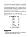
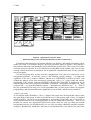
Can Humans Think?
The Ergonomics Society Lecture, 1991
HAROLD THIMBLEBY
Department of Computing Science, Stirling University, Scotland, FK9 4LA
Keywords:
design; multimedia (hypermedia, hypertext); user interfaces; video
recorders
For many years, computer scientists have been concerned with whether computers can
think. Considerable thought, therefore, goes into designing “thinking” computer
systems and into wondering whether they really can think or just pretend to. On the
other hand, it is “obvious” that humans can think, and therefore little thought has gone
into the related question, “can humans think?” This paper explores the ergonomic
implications of the affirmative answer.
Computers get better treatment than humans, yet humans are more than machines.
However not only do designers seem to forget this, but they don’t even treat users with
the same respect as they would a machine.
Thursday, October 1, 1998
2
1/10/98
The danger of the past was that men became slaves.
The danger of the future is that men may become robots.
Erich Fromm
The trouble with machines is people.
Edmund Murrow
Computers keep you honest.
Herbert Simon
Can a computer use it?
Harold Thimbleby
Introduction
Whether designers can think must be the central issue of ergonomics: designers tend to design
things for themselves to use, unless as good ergonomists, they are aware of the trap. But there is a
serious problem of positive feedback: the more one practises a particular form of design approach
(such as designing for yourself) the better you get at it, and the easier it seems to be to justify the
approach.
Users of computer programs are familiar with the problem: a colleague provides a program
that does not work as expected. On asking why he can’t do something, the complaining user is
told that the feature he wants is already there. He should press control twiddle while selecting the
third menu item. Didn’t he read the manual? Thus the designer can fool himself that there is no
problem with the design (why, he has no problem) and suppose the fault is entirely the user’s —
for not thinking.
The scenario worsens when the user pays for the program, since then his friendly colleague is
replaced by the probably expensive telephone help line to a national subsidiary of a foreign
software house that doesn’t plan to revise anything in the light of any evidence that it’s not good
enough, certainly not because of complaints from another country. The same happens with
domestic products: any one country is a small outlet for an international electronics corporation,
and complaints from somewhere like the UK may well be dismissed as national foibles. We are
all faced with poor design: you don’t need to be a computer user to wonder where technology has
hidden ergonomics.
Until the industrial revolution, animals and workers were no more than machines, though we
tend to romanticise and call some of those machines ‘craftsmen’. Industrialisation did not bring
exploitation of workers, as is commonly supposed — exploitation had been going on all along, for
millenia. In fact, what industrialisation did is make us aware of the exploitation: it enabled us to
see the enslavement that had been going on.
Modern interactive computer systems are bringing about another revolution. They certainly
intrude into people’s lives, and they are not as ‘easy to use’ as we might wish, but certainly a
major effect is to give us a better appreciation of what it is to be human. Already, the difficulties
with computers have highlighted the relevance of ergonomics.
Imagine a seriously physically handicapped person. Perhaps with his foot he can make a
pencil mark on paper (but maybe he can’t rub it out). But he’s been handicapped for a long time,
and is patient and able to concentrate more than any of the rest of us. What can he do? The
answer seems to be, if helpers give him enough paper, just to go on making marks on the paper.
If we want to interpret the marks — he might use Morse code or maybe we could somehow attach
1/10/98
3
a speech synthesizer — we might expect him to be able to write or say some very simple things.
A thoughtless obsever might think the handicapped person was stupid. But this is simply not the
case! We have forgotten that this human can think: he could, for example, be a leading physicist
or an outstanding poet. In short, his physical handicap bears no relation to his intellect.
Computer Scientists may have recognised that what I have described above is formally
equivalent to a Turing Machine; if the anthropomorphic terms (human, foot, etc) are removed, the
description is precisely that of a Turing Machine (Turing, 1950). A Turing Machine is a formal
computing conception (in fact it was invented before the age of electronic computers) that can do
anything that any computer can do, ‘up to representation’ — which means so long as we don’t
worry what it looks like or how long it takes. The marks on paper made by our imaginary
handicapped person might be binary symbols: as a computer, then, he could do anything. What
impresses you? Fly the space shuttle? Prove the four colour theorem? Send you a gas bill?
Write a book?
The point I am making is quite simple. If we respect users as sentient then they can certainly
do whatever a computer can do. This point of view is hardly contentious: people are at least
computers. (The fact that any person can — with sufficient patience! — simulate the behaviour of
a Turing Machine proves the point.) Conversely, and the central theme of this paper:
It is crippling to be treated as less than a computer.
Obviously this statement is rhetorical (it uses equivocation): the aim of this paper, now, is to argue
the case more thoroughly, indeed to show that it forms a constructive view of design. Specifically,
we know how to treat people at least like computers, and this paper will explore the idea, expressed
more precisely as:
User interfaces must support algorithms for their use.
This idea has also been developed elsewhere (Runciman and Hammond, 1986; Thimbleby,
1990), but we shall use it here to motivate the remainder of this paper. We will show, by using
examples over a range of present and future domestic systems, that the idea works.
Overview
The paper proceeds in two parts. First, we look at video recorders. Ergonomists already know
these to be poorly designed. We review some of the problems, and hint at the sorts of solutions
available from the computer science perspective: that is, assuming that users can think at least as
well as computers. Current designs clearly treat their users as less than automatons. Indeed,
people are being exploited in ways that computers would not — and cannot — tolerate.
Secondly, we turn to multimedia (interactive video, CD-I etc) by way of a quick history of
books and the problems of getting lost in multimedia. The approach advocated for ‘simple’ video
design transfers to this more general medium.
In conclusion, if we want people to be able to use systems well then it is necessary for
algorithms to be provided for using those systems.
Part I
I.1
Introduction to Part I
Video cassette recorders (VCRs) have poor user interfaces, and their user interfaces show no
improvement over the now considerable period of their development. The first part of this paper
explores the ergonomics of VCR design, with the particular goal of exhibiting the effective use of
computationally motivated design principles.
For convenience we will use the term ‘designer’, though in some contexts below ‘market
designer’ or ‘manager’ may be more appropriate.
4
1/10/98
I.2
Video recorders: an all too familiar example
Many VCR users don’t use the timer1 , and they don’t want to use it because they’ve found it far
too hard. Of course VCRs are complex, and maybe there is no way to make them really as
simple as we dream … but Apple Macintosh computers (for example) are far more complex, yet
they are also far easier to use. It is ironic that the remote controls of my VCR and TV have 105
keys between them, quite enough to operate any computer!
My own VCR (JVC, 1990) was advertised as “simple to use” (Robertson, 1990) and (on the
day of the Ergonomics Society Lecture) as having “easy armchair programming”2 (Dixons,
1991). A review called it, “the cheapest member in a family of good performers from the inventor
of VHS. It’s basic in dress and qualification but does what it sets out to do very well” (Hickey,
1991). I disagree with these claims, which are in fact typical of many advanced consumer
products.
There is no shortage of criticism of VCRs and other gadgets (see Norman, 1988 and
Thimbleby, 1991a, 1991b). But why do manufacturers keep on producing such awkward things
if the problems are so obvious? It’s not because of ‘rushing to market’ (i.e., to beat competitors,
rather than to help users) because VCRs have been around a long time now. What then? There
must be other excuses.
First, the problems we notice can’t be very significant to designers (or their managers). The
people who design VCRs are technical people and have been trained, over many years, to
understand such things. They add one or two features at a time in each model they design,
whereas you or I would be faced with all features at once — indeed, without the benefit of years of
technical training. And everyone of us has “20/20 hindsight”: if finding problems in a finished
product is easy, but by then it’s too late to fix the design. And while all manufacturers can get
away with difficult–to–use products, it isn’t worth any single manufacturer improving — the socalled tragedy of the commons. Finally, some manufacturers, such as Sony (1991), say they
concentrate on features rather than ease of use. But that begs the question: why not have features
that are easy to use?
There are basically two sorts of design guideline: specific and principled. We’ll deal with a
few specific ones first, then get on to some principles.
Example specific guidelines
Specific guidelines are best illustrated by instances of problems caused by not following the
guidelines.
Typical of specific problems are that the front panel display of the VCR should be big enough
to read from the distance that the remote controller is normally used. My VCR has text 2mm high
which is unreadable even at arm’s length — and my TV has a stand which is designed to place the
VCR so near the floor that you have to lie down to get close enough! (Note that shops display
VCRs with the equipment misleadingly placed near eye level.)
Most VCR buttons have labels written in capitals, although this is harder to read. Many use
abbreviations (such as ‘DPSS’) that are not particularly helpful. These are all simple problems
addressed by almost every text on user interface design (e.g., Shneiderman, 1987).
Rather than rely on guidelines (which may not relate well to the particular design problem), the
designer can try a prototype design out, and try it out on typical members of the public — not on
members of the development (or marketing) laboratory! Many design mistakes can be detected
1
2
A manufacturer’s survey of 1000 families found: 30% of people never set the VCR timer to
record or find it difficult to do so, rising to 38% for women and 40% for the over 45s
(Ferguson, 1991).
The “easy”, if an ergonomic comment, must refer to the armchair not the programming.
1/10/98
5
with very little effort with simple trials with real users, and these findings can be fed back into an
improved design. This is iterative design. However, there are several problems with user testing
and iterative design: it can be slow — it picks off one problem at a time, it can be expensive (you
have to get a system working first, you have to pay users, and so on), and it can produce
persuasive solutions to the wrong problems.
My remote control has its own clock (duplicating the clock in the VCR), perhaps suggested by
the need to know the date for setting-up same-day recordings, but the remote control’s clock has
its own problems that might have been avoided simply by not having one on it. Instead, iterative
design might easily have suggested ‘improving’ the way same-day recordings were done,
probably by adding ‘missing features’ to the clock. This sort of example suggests that principles
are generally required, and we elaborate some below.
Four example general principles
(i) Make frequent things easy, unlikely things harder
Most of the time my VCR (as typical of VCRs generally) looks nice and simple, with only
nine buttons. Pulling down the front panel reveals thirteen fiddly buttons on a secondary panel:
the additional complexity is concealed when you don’t want it. This arrangement means that little–
used features are harder to use by mistake, which is a good idea. This idea is sometimes called
Zipf’s Principle of Least Effort (Zipf, 1935), and for example is why the Morse code for E is a
single dot, but for an apostrophe is six dots and dashes: one wants to send E much more often
than apostrophes. In information theoretic terms, the number of symbols used to encode a
message (such as ‘E’) should be inversely proportional to the logarithm of the probability with
which that message is sent. (Regularly performed tasks can be more complex than a simple
application of this principle might suggest, since the user compensates by acquiring skill: see the
brief discussion in Section I.3, Tradeoffs.)
In opposition to the principle, my remote control has a single button that advances the clock by
one hour; however press the button for two seconds and it goes back an hour. These are facilities
that need only be used once a year each, and only in countries with summer time. But they are
‘easy to hit’ buttons! So it is no surprise that my remote control is often running several hours fast
because this button has been tapped by accident. Furthermore, the clock advance function is the
same button as the transmit button, which is used frequently for other purposes. But, on the other
hand, some facilities that are used far more often than once a year are designed to be much harder
to do, and involve complex button sequences. They may be hard to do by accident, but they are
unnecessarily hard to do deliberately!
It is interesting that the least effort principle automatically solves a problem of closure. If a
user sets the VCR up to record a programme at a later time it is necessary to press the TIMER
button to tell the VCR to enter timer mode; otherwise the VCR remains under direct control and
will not record the programme at the set time. This is a closure problem, since the user thinks they
have completed the task of programming on transmitting the time details to the VCR (i.e., they
have reached psychological closure). Thus, they may not think to press the TIMER button, and
there is no cue to prompt them to do so.
In least effort terms, the user is more likely to want the VCR in timer mode after entering
programme recording times than not. Thus the code for entering programme times and timer
mode should be shorter than for entering programme times and not entering timer mode. This
directly leads to a design where there is a button to be pressed to exit timer mode after transmitting
timer instructions.
Of course, one of the things everyone does often is make mistakes! So recovering from
mistakes should be easy, perhaps using a single button press. Not so on some VCRs: if you
press the timer button, whether you do it deliberately or by mistake, you have to set a programme
time — you cannot exit from an action once begun. This is especially stressful if you are trying to
6
1/10/98
record a programme that has only just started. And the stress helps you make more mistakes!
We will return to this point below.
(ii) Consistency
The first principle is make frequent (likely) things easy, but it’s not always obvious what
‘easy’ is. As a rule, consistency makes things easier because as more things can be done the same
way, less has to be learnt to do everything, and the user gains more practice with each method.
It is easy to give examples of inconsistency:
First, my VCR has 22 buttons against the remote control’s 55. That necessarily means that the
buttons on the VCR cannot be used in the same way, or that different features are available from
the VCR and its remote control. In fact: both! For example, the RECORD button on the remote
control does nothing unless it is pressed together with the PLAY button (and the VCR will only
start recording if it is in a mode where PLAY would have worked anyway). However the VCR
itself starts recording as soon as its RECORD button is pressed; there is no interlock with the
PLAY button. Furthermore, hitting the VCR’s front panel RECORD button twice enters so-called
Immediate Timer Record mode (an application of the principle of least effort: a briefer way to start
recording now), a mode that is inaccessible from the remote control. These are simple
inconsistencies. The fact that they exhibit different ‘solutions’ to the principle of least effort is a
further argument for principled design!
Secondly, pressing EJECT rapidly after REWIND ensures that the cassette ejects when the
rewind has completed; likewise, pressing ON/OFF rapidly after REWIND ensures that the VCR
switches off after the rewind has completed. However, pressing PLAY rapidly after REWIND
does not rewind the tape to the start and begin playing, as might be expected, but instead
immediately starts playing without any rewind.
There is no logical or technical reason for such inconsistencies. Indeed, if there is any special
argument for a feature to turn out one way on the VCR, the same argument probably applies with
equal force to the remote control. Why are the clocks on the VCR and remote control set in
different ways? The remote control could be the master clock, and changing it could automatically
correct the VCR’s clock. A notable benefit of making the remote control and the VCR consistent
— both their buttons and the displays — would be that (in my case) the user manual would be
approximately halved in size, and the user’s learning burden would be correspondingly reduced.
(iii) Reliable feedback
Whether buttons are consistent or not depends on what they seem to do. That brings us to the
third principle: every action should have a reaction. There has to be feedback — and it has to be
reliable. Without reliable feedback you cannot learn to do anything well. (Imagine trying to learn
chess with a blindfold on!) Using the VCR is sometimes a bit like that: it provides no feedback,
late feedback, or inconsistent feedback for many features. The more complex features are, the
more important rapid and clear feedback is.
My remote control has a symbol that flashes when it is transmitting to the VCR. It also
flashes (apparently) as a prompt to remind me to transmit to the VCR: in this case it flashes when
it is not transmitting. It also flashes when it is transmitting signals that cannot be received by the
VCR (e.g., signals intended for a second VCR and signals for a TV, etc): in this case, the flashing
provides gratuitous feedback.
Many video recorders have a scheme for setting UHF channels by pressing + or – buttons.3
One button increases the channel frequency, the other decreases it. If the buttons don’t give
feedback that the frequency is changing, you cannot tell whether the VCR has got stuck at the
3
So that, for example, UHF channel 23 (which might be the frequency used by BBC1 in that
region) can be called 1, and so on for the other TV channels.
1/10/98
7
highest or lowest frequency — and that you aren’t going to find any more programmes however
long you wait.
A so-called ‘real time goto’ facility allows you to rewind or fast-forward over so-many
minutes of tape. On my VCR, the sequence of operations is this: press the GOTO button; enter
time; choose direction. At this stage you might expect the VCR to start providing the feedback.
However, there is one more step: press PLAY, STOP or PAUSE,4 depending on what you want
the VCR to do when it has completed the goto. There is no feedback that you are doing the right
thing until after you have completed this step. (And if you look ‘real time goto’ up in the user
manual, the VCR will have timed-out by the time you know what to do!)
Indeed, many features time-out (variously in 2, 10 or 60 seconds in my case) without saying
so; that is, without giving feedback. Audible feedback, even a simple beep, would help more than
visual feedback here just in case the time-out occurs while the user is reading the manual and not
looking at the VCR. Better still, the converse of the feedback principle is that if no feedback is
give, then nothing should have happened; thus, since the VCR gives no feedback of timeouts,
there should be no timeouts.
There is a problem with ambiguous feedback. The VCR gives plenty of ambiguous feedback,
or certainly feedback whose interpretation requires a look in the user manual. As well as the red
pilot light (lit when the VCR is on), my VCR has a little green light that — so far — has always
been on. When, one day, it goes off, I will have forgotten what it is supposed to indicate. It’s
more a selling point than a usability point, since it provides such poor feedback for the user.
Feedback helps the user make fewer errors. It is even better if the VCR also provides feedback
when it detects an error itself. Almost all VCRs do nothing when the user makes a mistake. No
feedback! Typical errors that could very easily be detected are: that the user has tried to record two
programmes simultaneously; that the tape isn’t long enough for the planned recording; that a date
entered is unbelievably far into the future; and so on. In each case, a good VCR would give
feedback, preferably specifically identifying the problem. Since it is easy to make mistakes
entering dates, it helps to add redundancy: if the user is required to enter the date and the day of
week, the VCR has an even better chance of checking that the date is sensible and providing
helpful feedback if necessary.
A special case of feedback called prompting can be used. Here, the feedback given for
successful completion of one stage of a sequence of button presses is to tell the user what to do
next. For example, the feedback for pressing a PROGRAM button might be to display
“Programme channel?”, and the user should now hit a number. The feedback for (successfully)
hitting a channel number might be “Start time?” And so on.
Feedback helps the user see the success of each step of a sequence of actions, for example, the
sequence of RECORDs recording various programmes on a tape, or the sequence of button
presses to set the clock. If, furthermore, you can see all the steps at once (say, on the TV screen or
the remote control’s display) there are new possibilities. Rather like having a word processor
where you can always go back and change your first sentence, if you can see all of the feedback
you can in principle go back and change some of it. Ultimately, it wouldn’t matter what order you
pressed buttons — just as you could write a story backwards using a word processor if you were
so inclined. This is the basis of the last principle we’ll discuss.
(iv) Be free of history
On some VCRs you have to enter programme times in a particular, laid-down order: day of
month, month, daily or weekly, minutes, hours (for start time then stop time), and then the
programme channel. If you make a mistake, you have to work your way to the end, then start
over again (and make another mistake). On my VCR, however, there are two arrow keys (← and
4
PLAY, STOP and PAUSE are indicated by icons on the remote control, but by words and
icons on the VCR. Furthermore, STOP on the VCR also serves as EJECT as well.
8
1/10/98
→) so that you can, as it were, get back into the past and change the start time after you have set
the channel number. By being free of history, you can review what you have done, and change it
if it does not suit. The same principle can be powerfully applied to word processors (Bornat and
Thimbleby, 1989), both for design and use.
Being free of history is a good principle both from the user’s perspective (as we’ve just seen)
and from the VCR’s: my VCR tells me what day of the week it is (this is useful redundancy to
help confirm that dates are correct), but the day of the week is only shown correctly after certain
buttons are pressed. That is, only after certain buttons are pressed does it re-calculate the day
name. Whether the day name is correct depends on the recent history: have the right buttons been
pressed? In contrast, a so-called declarative system ‘declares’ (e.g., shows on a display)
everything that is relevant: in this case, it is simplest to ensure that the day name is always correct.
Finally, what have you recorded on the cassette tape itself? You need feedback to find out, and
PLAY, even with fast forward and automatic programme search (which some VCRs provide) is
rather slow. The Bang & Olufsen VCR (1989) can collect 4, 9 or 16 previews of programmes
recorded on the tape and edit them into a collage at the front of the tape for use as an index: this is
much better feedback. The Bang & Olufsen scheme means that the history of the video tape (that
is, what you have recorded on it), is all brought into a preview, a table of contents, at the start of the
tape: it frees the user from having to find out — by a laborious fast forward search — the detailed
history of a tape to see what is on it.
(Incidentally, the Bang & Olufsen indexing feature has a wonderful bug. Once an index has
been constructed, the first few seconds of the first programme become the index. Thus, making
an index on an already indexed tape puts the the original index into the first position of the new
index. This must be one of the easiest to use domestic fractal generators!)
I.3
Conclusions to Part I
We’ve seen that VCRs have design problems. We all knew that! But what may be interesting is
that the design principles suggested are common knowledge and routinely employed, though
evidently not for designing VCRs.
The principles are standard practice for use in the design of computer systems. If you want to
write a program to, say, control a printer or a disc drive, then the ideas of coding (expressed above
as the Zipf principle), ideas of consistency (i.e., invariants), feedback (such as handshaking
protocols), and being free of history (declarative programming) are obvious — and they are used.
Furthermore they are ‘good things’ that designers are keen to employ, experiment with and
develop. Thus, being free of history is declarative programming, and to a computer scientist needs
neither justification nor explanation … if he is designing for a computer. But if he is designing for
a human user, somehow the concept seems to become incomprehensible!
So the poor design of video recorders can be put down, as it were, to the fact that users of
VCRs are treated as less than computers. Computers get better treatment than humans, hence the
quote from Herbert Simon at the head of this paper: “computers keep you honest”.
There are many reasons for this, not least that humans will put up with (euphemistically,
‘adapt’ to) awful things, whereas computers simply crash. When a computer has problems the
designers have to sort the problems out; when a user has problems, it’s his fault (or he’s made to
believe it’s his fault). When a computer divides by zero, it’s obviously the designers fault, but
when a user deletes a day’s work, it’s the user’s fault, not the designer’s.
It is no surprise, then, that as users we have been collectively brain–washed into accepting
problems with user interfaces as our own fault. Further, we believe that children have no problem
with VCRs, therefore we must be too old! But that is not the point: VCRs are not sold as
children’s toys. There are, anyway many reasons why children don’t find VCRs difficult, like
they didn’t spend the £500, and they have more time available to play. Once allowance is made
for the fact that teenagers are more readily available, and can afford to spend longer understanding
1/10/98
9
a machine, it may be that the cognitive advantages in children, with respect to VCRs, are more
anecdotal rather than substantial. (It would be useful to see some evidence.)
Problems with VCRs can be presented as a huge joke, and the self-deprecating comparison
with children’s skills is ‘humorous’. Yet the same mentality that designs VCRs also makes car
radios, car telephones and even in-car entertainment systems remote controls. Such gadgets have
caused road accidents, and it is clearly time that their user interfaces were significantly improved.
Tradeoffs
A principle such as Zipf’s “least effort” suggests specific styles of design; it is also only one
principle amongst many. Thus, if rarely performed tasks are given longer codes (as suggested by
the principle), those codes — as a result of less user practice and hence less familiarity — will be
harder to do correctly. In this example, there is a tradeoff between the basic principle and
memorability. Similarly, even the four principles above may conflict over certain design issues.
But note that the existence of and possible problems with such tradeoffs are not an argument
against principles! The fact that tradeoffs become explicit is, in fact, a considerable advantage and
encourages a rational design process.
Part II
II.1 Introduction to Part II
Part I discussed the ergonomics of video recorders, and offered design principles motivated by a
computational perspective of interaction. If there is some merit in this approach we ought to be
able to discuss new design issues proactively; indeed, unless we can do so, we can only criticise
designs when it is too late. Hence we now turn from a critique of VCRs (which are now an
essentially stable technology) to more general forms of interactive information system that are still
being developed.
II.2
From manuals to books
Poor manuals are often blamed for the difficulty people have with VCRs. Of course good
manuals cannot be made for fundamentally flawed designs, but there is considerable room for
improvement in manuals even without solving the equipment’s design problems. Thus, existing
manuals are generally organised around the technical features provided by the technology, rather
than by the tasks the user is expected to perform. (The manual for my VCR has ‘search’ in seven
places in the table of contents, under four different headings, and there is no other index to
compensate.) If a programmer was to design a database (qua manual) for a computer, indices
would be provided to support the expected tasks of the computer. Why aren’t manuals for
humans — which indeed serve the same purpose as programs for computers — designed with the
same forethought? (Use of undeclared identifiers is a trap many manuals fall into!)
It is interesting that tables of contents, and multiple indices into manuals provide the user with
access to the manual’s contents ‘free of history’: without indices, the user has to read the manual
as a narrative; with indices the manual can be read in any order — in particular in the order most
appropriate to the user’s specific needs at the time.
Video tapes are sequential media, and therefore have to be viewed as narrative, though we have
already seen that some manufacturers provide indexing mechanisms to ameliorate this.
Marketing, however, exploits the concealment implicit in the narrative style: one often has to
purchase media (such as videos) without knowing what their contents are, indeed even such
simple but important facts as their length in minutes.
Current technology is moving away from sequential media like the tape to random access
media such as the interactive compact disc, CD-I. These new media free the user from any
10
1/10/98
preimposed narrative structure (and therefore normally require indices). It is interesting that the
modern transition from narrative (tape) to free of history (disc) recapitulates the earlier paper
transition from written narrative (e.g., Homer) to free of history (e.g., reference works).
Gutenberg’ printing press marked a turning point in civilisation, over the period 1440–50AD
(though the Chinese invented movable type much earlier in 600AD, but were less successful
mainly because of their enormous character set). The following major changes occurred as a result
of printing technology in just the following half century:
• The author wrote not for a particular dedicatee or patron, but for the public. Printing
gave a single author many readers, and the author’s income came from many readers
unknown to himself. (Note that Latin books had an enormous international market.)
• When texts had been copied by hand, pagination (itself a major invention) varied from
copy to copy, but now the same information in any copy of a book could be found in
the same place on the same page; hence a teacher could say to his students, “look at
page 4.” Tables of contents, indices and so on became practical propositions.
• Diagrams became usable; prior to printing, manual transcriptions of drawings made
them unreliable. Petrus Ramus exploited the reliable duplication of diagrams to
popularise his logic and analytical methods.5
• Books ceased to be meant to be read aloud from beginning to end as narrative, but
could be read in any order and browsed.
• Aldus Manutius brought out a series of cheap “pocket” books (which were widely
pirated). Books represented, for the first time, accessible, durable, portable and
personal information.
• Information became cheap; readers could annotate their own copies of books.
Knowledge could be questioned independently of the economic considerations of
having the knowledge at all! In the early 16th century, the Aldine Academy started to
revise standard books: a radical idea at the time!
• Personal knowledge—“education”—became not a matter based on rote use of aural
memory, but of flexible visual and spatial abilities.
• William Caxton in England, and his contemporaries on the continent, published all
they could of their national literature. In the process they helped define their own
languages.
And so on.
The improvements that Aldus Manutius and the others brought about in book technology in
the fifteenth century were essentially computational improvements. What distinguishes a modern
book from an ancient manuscript is that you can find your way around it: there are chapters,
headings, tables of contents, and so forth. Concepts may be arranged alphabetically,
chronologically, or topically for greater ease of lookup; there may be cross references. These are
computational devices that can be found as explicit algorithms in any elementary computer science
book. In other words, if you want to improve the medium — in this case books — treat the user
as a thinking being, and to do that you could do worse than treat the user as a computer. Readers
of books, it seems, had to wait for the appropriate algorithms to be provided as-it-were by
accident!
Printing itself was spread with missionary zeal — but as can be imagined from the enormous
political impact (merely hinted at in the list above) many attempts were made to suppress and
control the new technology. Such observations are reminiscent of the current assessment of
multimedia, even down to the problems of copyright and piracy. Is multimedia poised to be an
5
An interesting discussion of the sixteenth century author Petrus Ramus and his books can be
found in Ong (1974). See also Leith (1990).
1/10/98
11
information revolution, rather than just another way of packaging information? Or is it to become
a read-only, highly duplicated mass media: multimedia CD-roms for domestic television sets?
Are we set to become mindless automatons? Is the technology going to be ergonomic?
We are now at a turning point in information provision. Computers, in the form of
multimedia gadgets, will probably soon usurp books. So far, you can’t safely ‘read’ a computer in
the bath, nor can you scribble notes in its margins (at least, not usefully). And there are various
other cosmetic problems — for instance, all computers look the same, whereas books (again, as an
algorithmic technique, called hashing) mostly look different, since their covers are a function of
their contents. But soon today’s prototypes will be prevalent, in the same sort of way that personal
stereos have let anyone carry a complete orchestra around (at least that’s what our grandparents
would have thought of the achievement as).
Some recent work (Clarkson, 1991), with a so-called ‘Cognitive Coprocessor’, has
acknowledged as design progress that humans can now be treated as ‘real-time devices’ (in other
words, as fast peripherals). If this is progress, we still have a long way to go to treat users as
thinking, as at least computers.
II.3
Getting lost in information
Readers of early books had to read them sequentially, partly because books had no index or table
of contents, partly because such aids would not have helped because the author did not structure
his text to conform, and partly because the texts adopted entirely different strategies to the problem
(for example, poetry). Also, annotating a book (e.g., highlighting points of interest) would have
been unattractive because of the high value and almost irreplaceable nature of the book itself.
Likewise, a modern user of multimedia is reduced to local browsing — hill climbing, having no
overall view or plan of his activity — partly because multimedia have no appropriate indices, partly
because multimedia designers do not yet exploit the medium optimally with respect to the aids
available. Also, for technological and proprietary reasons, many multimedia systems are readonly, and the user’s annotation is simply impossible.
Most discussions of this navigation problem assume that the causes lie mainly in the special
nature of the user’s abilities and the failure of multimedia systems to properly address these
‘obviously’ cognitive, kinaesthetic and perceptual issues. Undoubtedly psychological mismatch
between the design and the user is serious; for example, information on a screen has a
homogeneous appearance, each fragment is seen in isolation and gives the user few redundant
cues.
A multimedia system, however, can be viewed as a mathematical structure called a graph, and
its user therefore embarks on a graph theoretic problem, of traversal, search or optimisation as the
case may be. Users may not see using multimedia as an exercise in graph theory, just as car
drivers may not see driving a car as obeying the laws of physics. When drivers try to disobey the
laws, or when designers ignore them, accidents are likely to happen! Likewise, multimedia
systems must be correctly designed with respect to graph theoretic considerations, whether or not
the user (or designer) views them in this light. (There are also non graph theoretic considerations,
of course, but these are beyond the scope of this brief paper.)
It is therefore instructive to consider the abstract computational issues as such. Briefly, one
should consider the properties of the graph, and what algorithms or heuristics would be
appropriate for the anticipated task constraints.
A program for, say, searching a graph developed in an ad hoc manner would be unreliable and
professionally unacceptable. Why should users get lower standards than expected for computers?
Correctly programmed computers don’t get ‘lost’ when searching graphs, indeed the concept is
faintly ridiculous!
It is notable that no production multimedia system to date provides the necessary
computational support (algorithms, heuristics) to stop the user getting lost.
12
1/10/98
When the Attic hero Theseus explored the Minotaur’s labyrinth he was guided out by a
thread.6 No multimedia systems provide comparable reliable mechanisms for threading. Indeed,
Tarry proved in 1895 necessary conditions for there being an algorithm to traverse a maze without
getting lost; it follows that without the system supporting algorithms such as Tarry’s (a so-called
colouring algorithm) the user will inevitably find navigation hard, if not impossible in practice. No
wonder people feel lost, ‘lost in hyperspace’ (Nielsen, 1990).
A typical domestic multimedia system will probably look rather like a VCR, except that it will
be much simplified, typically using a pointing device such as a thumbstick on a remote control
(e.g., Philips, 1990). The multimedia will be accessed either by disc (or equivalent) or via
telecommunications. The semantics of the user interface will be defined, not by the hardware
(ROM) as in a VCR, but by and as part of the media being viewed. Note that teletext is a trivial
form of multimedia already available (carried on TV broadcasts): however its user interface is
fixed and also suffers from the problems we are describing here.
Now consider HyperCard (Apple, 1987) as representative7 of modern multimedia systems
(though for general purpose computers rather than domestic use). HyperCard provides several
generally available navigational aids whereby certain menu items provide navigation by moving
the user to: first, last, previous, or next card; most recently visited card (‘back’); and any one of
a system-determined choice of cards (‘recent’). See Figures 1 and 2 respectively.
In graph theoretic terms, the cards (or screens, see Figure 3 for an example) are vertices, and
the navigational aids (menu entries, as shown in Figures 1 and 2, and buttons) are the edge
representations.
Figure 1. HyperCard’s standard ‘Go’ menu
6
7
Note that Theseus slew the Minotaur after dispatching Procrustes, the original purveyor of beds
‘to fit all sizes’.
A distinctive feature of HyperCard is that it is easily programmed; although this facilitated the
study described below, it is not otherwise relevant to the discussion.
1/10/98
13
Figure 2. HyperCard’s ‘Recent’ menu.
(Note that many icons are identical because of lack of resolution.)
It should be clear that these navigational aids have an arbitrary, and usually misleading, effect
on the user’s task. For example, the prev (previous) operation shown in Figure 1 may provide a
link between cards that is not intended to be provided by the specific task! The recent set of cards,
curiously selected as at most 36 to 42 of the most recently first-visited distinct cards (less if some
recently visited cards have been deleted), has no particular computational merit for any plausible
sort of navigation.
It is not surprising, then, at least from the computational view, that users experience severe
navigational problems; at best they can use a hill climbing (greedy) strategy — an approach,
regardless of the user’s cognitive abilities, known to be inadmissible in almost all cases, even
without the dangers of the user unwittingly getting into cycles (i.e., going round and round).
Incidentally, Tarry’s maze exploring algorithm is theoretically impossible to implement for an
arbitrary HyperCard system (because of dynamic evaluation). One might reasonably ask, “Why
is HyperCard — as a typical multimedia system — designed to be difficult to use?” or, “Why is
the user prohibited from using even trivial algorithms that, at least in the context of computer
programming (and of nineteenth century graph theory) are obvious, and obviously essential?”
A simple case study
As a feasibility study (Thimbleby, 1991c), a HyperCard system was developed that could rewrite
any other HyperCard system in order to provide the user of that system with a choice of standard
search heuristics. HyperCard is programmable in its language HyperTalk, and it is possible to
write programs that re-write existing programs in order to change their behaviour. Thus it was
possible to convert any appropriate HyperCard system from one only providing the default
navigational facilities (as described above) to one also providing additional standard computer
strategies. Breadth-first, depth-first, and least-cost search heuristics were chosen, but with effort
14
1/10/98
(possibly requiring reimplementation of the target multimedia system), any search strategies could
have been implemented.
It must be emphasised that the choice of these three simple heuristics was arbitrary, though
constrained by (bizarre!) limitations in the design of the programming language of HyperCard.
For instance, A* is a more appropriate heuristic for many sorts of multimedia problems (A* takes
advantage of the fact that the user need not be interested in the actual path taken to a solution: that
is, most multimedia graphs commute — the important thing for the user is generally not the routes
they take, but getting to destinations), but in HyperTalk there is no way to implement A* in a
general fashion without prior knowledge of the particular application and its structure. A survey of
heuristics can be found in (Pearl, 1984) and very many standard texts in AI (such as Winston,
1984).
Cost-based heuristics (in our case, least-cost) require a measure, an objective function. Again,
the choice was arbitrary even though for any particular multimedia application more appropriate
measures could readily be devised. In the present case, cost was the number of untried transitions
navigating within the current multimedia document.
In task-oriented terms, this particular cost function might be appropriate for systematic search
based on either of the following user questions: “Where is the place whose exploration I can most
quickly complete?” (i.e., with least cost) and “Where is the place that provides me with the greatest
choice?” (i.e., with greatest cost). Both alternatives were supported in the study. Note that these
questions, exactly as they stand, could usefully be asked by a designer (multimedia author)
systematically testing his multimedia.
A happy side-effect of the system was to provide an “untried routes” function: to highlight asyet unused transitions. Since an idiom in multimedia is to exploit concealed, invisible transitions
(for purely visual effect), this feature had an obvious user benefit (see Figure 3, which shows a
typical screen indicating only one transition (the arrow) but concealing many on the spacecraft). It
would also have been considered an essential feature for systematic search merely from the
computational view: how would a computer ‘know’ where the active regions of the picture were?
Furthermore, its provision alone permits the user to implement simple edge colouring algorithms
for systematic search.
1/10/98
15
Figure 3. A typical HyperCard card.
Where are the buttons to press (transitions to activate)?
(picture: NASA)
Bearing in mind that the decision to make a general tool necessarily lost opportunities for taskspecific optimisations (e.g., the technical term ‘least cost’ was not supposed to mean anything in
the user’s task domain language), the study can be considered a success. What it demonstrated
was that if the user is treated ‘as’ a computer, that is, treating the user interface as requiring the
design considerations normal for programming, then the user interface becomes far more
powerful. And easier to use.
One should conclude that at least the obvious graph traversal algorithms should be provided,
then it may be worth adding features. But at present designers work the other way around, and
with enough features the algorithmic problems of graph traversal themselves get lost.
II.4
Full circuit? Hypotheses for empirical study
We have seen how computer science can improve VCRs (but everyone knew VCRs needed
improving); we have now seen that computer science can improve multimedia systems and solve
the navigational problem.
Underlying these two apparently disparate areas is a common theory. Multimedia systems are
graphs, and their user interfaces can be improved by (even trivial!) application of elementary
concepts. Likewise, the user interface of a VCR can be viewed as a graph (e.g., as a finite state
machine): we are then led to ask, are the same computational concepts appropriate in this very
16
1/10/98
different representational domain? For example, Tarry’s paper (op. cit.) assumed the graph was
undirected: and this concept translates directly into user interfaces as an undo function.
A second area for study is the cognitive status of the Zipf principle. The principle of least
effort has been generally discredited as an intentional drive by the statistical explanation of
Mandelbrot (1952), though such an explanation does not distinguish rational from random
behaviour. However, in Section I.2(i), the principle coincidentally handled a closure problem: it
appears, if the argument generalises, that humans have, with respect to the principle, more to them
than stochastic processes — or conversely.
Lest it is forgotten, the central hypothesis of this paper is that a better way of designing
interactive systems is to base them on sound computational principles.
II.5
Conclusions to Part II
The user interface to a VCR is built into the hardware: this has two serious consequences. First, it
is fixed for the lifetime of the equipment; secondly it is fixed regardless of the content of the
media being viewed. Multimedia systems instead move the user interface on to the media — for
example, the CD-I disc — and simplify the hardware interface, typically to a single button mouse
or other pointing device (e.g., a remote control with a thumbstick). Hence, not only can user
interfaces be customised for each application, but users will be able to exercise discretion in
choosing interfaces, particularly since programmable interfaces are cheap to improve or replace.
From an economic point of view, then, there is hope for improved user interfaces. From a
technical point of view, also, there is hope since the underlying computational model is well
understood. It remains for it to be exploited.
Tacit psychological knowledge in programming
I argued that working computers are inevitably well programmed, because if they are not, they fail
(in contrast to humans who ‘cope’). But just what is good and bad programming? Plenty of
computer programs are “badly written” and may or may not work; most are manifestly
unreliable. When I suggest that users can be treated at least as well as computers, I do not want to
imply that they might also be badly programmed, and that that would be good enough! Like
computers, users should be properly ‘programmed’, that is given interfaces (and manuals) that
support good algorithms. There is of course a considerable literature on just what good
(computer) programming is; briefly, good programming practice (such as modularisation) is an
attempt to limit the possibilities for human error and misunderstanding arising during the
programming process.
Good programming practice therefore embeds a tacit psychological knowledge about
programmer’s skills, in particular concerning a programmer’s ability to manage complexity in
symbolic tasks. In some sense, then, the thrust of this paper has been to say, given the designer’s
tacit psychological knowledge (albeit coded for the purpose of programming, but certainly
concerned with humans in computer based tasks), why not direct them to recruit it to user interface
design? This is an implicit use of psychology that may appeal to their technical orientation, and
may be an effective way of improving user interface quality without making programmers feel
deskilled in the interface design process.
Cynical comments: where is ergonomics really needed?
Perhaps rather aggressively, I have claimed that many interactive systems are badly designed; it
may be that this is not the fault of designers. There is very little research on why systems turn out
as they do, and few accounts on how relevant design decisions are progressed. In some sense,
designers are caught up in development, and many crucial decisions are no doubt fixed despite
consideration for the user; on the other hand, such practice is borne of historical precedent, and
originally designers (if they were originally user-oriented) acquiesced for technical, commercial or
other reasons. More work needs to be done on the designer’s whole work environment, not just
1/10/98
17
on principles and the designer’s knowledge about them: how can the environment be made more
conducive to better, human-oriented design?
Graphs can represent decision making (e.g., decision trees). It is no surprise that VCRs and
other consumer items are designed with a bewildering variety of incomparable features in order to
thwart systematic comparison of competing goods. Where a company cannot excel on quality or
on any other obvious dimension, it can carve out a ‘fair’ fraction of the market by making its
products difficult to compare with its competitors’. Some manufacturers also provide the internal
equipment which is sold under various brand names: this marketing strategy increases market
penetration proportionately (and permits safe experiments in pricing policy).
If careful design results in better systems, possibly even standards for user interfaces, what
would manufacturers be able to sell us next year? It is in their interests to market suboptimal, hard
to use systems: they intend that we may be thereby tempted to believe that next year’s gimmicks
will help us. If the effort that goes into persuading us that children are good at working complex
gadgets (like VCRs) succeeds (and hence adults accept that user interface problems are their own
fault rather than the designers’) then we may expect consumer electronics being promoted by
mutant turtles.
General Conclusions
This paper explored the ergonomic consequences of assuming that users can think, indeed
conservatively treating them, in terms of thinking, as being no less capable than computers. In
brief: user interfaces should support algorithms for their use.
We’ve argued that designers don’t think of users as highly as computers. Certainly designing
interactive computer systems as if users could think (if only no better than computers) would
improve them, and we’ve given a conservative but general guideline for doing so (i.e., treat the
user at least as a computer). The question “Can humans think?” — as posed in the title of this
paper — can be taken two ways in the ergonomics context: “Can humans, as designers of
systems, think?” and “Can humans, as users of systems, think?” To answer: users of systems
can think, but designers don’t seem to have thought of this nor explored its implications. So,
almost by syllogism:
• Designers don’t often think
• Users do think
• Therefore employ iterative design (i.e., test designs with users) — make use of their
thinking during the design process!
It follows, too, that manuals (whether electronic, ‘online help’, prompting, or conventional paper)
are an essential part of the user interface, just as programs are essential parts of computers.
Manual design must be part of system design: in particular, if something is difficult to explain,
this is evidence that it is a bad idea. (We note in passing that few VCR manuals mention timeouts,
and wonder therefore whether timeouts are needed in the systems.)
Treating the user as a computer is, in itself, clearly a creative heuristic, for it recruits the entire
body of computational solutions and methods, both algorithmic and heuristic, to ergonomics. To
do less is to exploit the user. Furthermore, the Church-Turing Thesis suggests that this approach
is not optional but necessary, for VCRs, multimedia or whatever purpose (Thimbleby, 1990): if,
in principle, a computer cannot operate a user interface, then a human certainly cannot or could
only do so by trial-and-error.
We may be pessimistic about market forces dictating design: manufacturers are more
interested in selling than usability, and this results in difficult to use systems, such as VCRs. In
future, however, the user interface will move away from fixed implementation in the expensive
hardware to the cheap software packaged with the media (e.g., CD-I). It is then feasible to
program the user interface with the information: thus not only can the user interface be tailored to
the specific style required by the information, but the low cost of the medium will encourage its
18
1/10/98
evolution in the marketplace. When VCRs are expensive, people cannot replace bad designs even
if they want to. When user interfaces become so cheap and pervasive, consumer-based ‘natural
selection’ rather than marketing can lead innovation.
Addressing the various difficulties facing the user working with technology led to the
discipline of ergonomics. It is often easier to palliate problems rather than address fundamental
issues directly, particularly when the systems involved are computer–based (as in VCRs and
multimedia). Colour, menus, ‘help’ or expert systems and more features (and black buttons!) are
generally sweeteners rather than cures to computationally unusable interfaces. In brief, there will
only be a future for ergonomics when the user is held in at least as high regard as the technology
he uses. A first step is to treat the user at least as well as a computer. Put in the appropriate
technical terms from computer science, this makes user interfaces effective.
Acknowledgements
The author is grateful to the New Scientist for permission to reprint extracts from an article, to
Simon Turner and Phil Lloyd (Philips Research Laboratories), to Bob Stockwell (Bang &
Olufsen) for the generous loan of equipment.
Many people have given me extensive and very helpful comments on the content of this paper:
Jim Alty, Bruce Anderson, Rachel Birnbaum, Paul Booth, Donald Broadbent, Gary ChicoinePiper, Ian Clowes, Blaise Cronin, Steve Draper, Richard Ennals, Sara Fletcher, Saul Greenberg,
Lynda Hardman, Jim Howe, Patrick Jordan, Alistair Kilgour, Phil Lloyd, John Long, Alan
Newell, Colin Runciman, Nigel Seel, Mike Sharples, Paul Wilson and some others who,
unfortunately, gave me comments without their name.
References
APPLE COMPUTER INC. 1987, HyperCard User’s Guide (Cupertino, California).
BANG & OLUFSEN 1989, Beocord VX5000 Owner’s Manual (Gloucester, England).
BORNAT, R. and THIMBLEBY, H. W. 1989, The Life and Times of Ded, Text Display Editor, in
Cognitive Ergonomics and Human–Computer Interaction, pp225–255, LONG, J. B. and
W HITEFIELD, A., editors, Cambridge University Press.
CLARKSON, M. A. 1991, An Easier Interface, BYTE, volume 16, number 2, pp277–282.
DIXONS April 18, 1991, The Independent, p6.
FERGUSON Spring 1991, The UK Consumer Market Report (Enfield, Middlesex, England).
JVC (VICTOR COMPANY OF JAPAN LTD.) 1990, Instructions HR-D540EK Video Cassette
Recorder (London, England).
HICKEY, S. April 1991, What Video, p37.
LEITH, P. 1990, Formalism in AI and Computer Science, New York: Ellis Horwood.
MANDELBROT, B. 1952, An Informational Theory of the Statistical Structure of Language,
Proceedings of the London Symposium on Applications of Communications Theory, pp486–
502.
NIELSEN J. 1990, Hypertext and Hypermedia, Academic Press.
NORMAN, D. A. 1988, The Psychology of Everyday Things, New York: Basic Books.
ONG, W. J. 1974, Ramus: Method, and the Decay of Dialogue, Octagon Books.
PEARL, J. 1984, Heuristics, Addison-Wesley.
PHILIPS 1990, Interactive Media Systems: CDI 602: Professional CD-I System (Eindhoven, The
Netherlands).
ROBERTSON, G. December, 1990, Stirling Observer, p1.
RUNCIMAN, C. and HAMMOND, N. V. 1986, User Programs: A Way to Match Computer
Systems and Human Cognition, in Proceedings of British Computer Society Conference on
People and Computers: Designing for Usability, pp464–481, HARRISON, M. D. and M ONK,
A. F., editors, Cambridge University Press.
SHNEIDERMAN, B. 1987, Designing the User Interface, Addison-Wesley.
SONY 1991, personal communication.
1/10/98
19
TARRY, G. 1895, Le Problème des Labyrinthes, Nouvelles Annales de Mathématiques, volume 14,
number 3, pp187–190.
THIMBLEBY, H. W. 1990, User Interface Design, New York: ACM Press, Addison-Wesley.
THIMBLEBY, H. W. 1991a, Can Anyone Use the Video? New Scientist, volume 129, number
1757, pp48–51, 23 February, 1991.
THIMBLEBY, H. W. 1991b, The Undomesticated Video Recorder, Image Technology, Journal of
the British Kinematograph, Sound and Television Society (BKTS), volume 72, number 6,
pp214–216.
THIMBLEBY, H. W. 1991c (in press), Heuristic Strategies for HyperText, in Mindtools: Cognitive
Strategies for Modeling Knowledge, NATO ASI Series F, Proceedings NATO Advanced
Research Workshop on Mindtools and Cognitive Modelling, KOMMERS , P. A. M., JONASSEN,
D. H. and M AYES, J. T., editors.
TURING, A. M. 1950, Computing Machinery and Intelligence, Mind, volume 59, number 236,
pp433–460.
W INSTON, P. H. 1984 (second printing), Artificial Intelligence, Addison-Wesley.
Z IPF , G. K. 1935, The Psycho-Biology of Language, Houghton Mifflin Company.