1
Blueball Design
FreeStack Responsive
Add-Ons Pack #2
User Manual v1.0
9 awesome FreeStack Responsive stacks with cool helpful options
that make using the FreeStack Responsive theme even better!
©2014 Blueball Design LLC USA • All Rights Reserved • Page 1
Table of contents
Table of Contents ...................................................................................Pg 2
What’s included in your FreeStack Responsive Add-Ons Pack #2 ..... Pg 3
How to install the FreeStack Responsive Add-Ons Pack #2 stacks ... Pg 4
Rapidweaver and Stacks plugin requirements .....................................Pg 5
Browsers Supported .............................................................................. Pg 5
How to use the FreeStack Responsive Add-On Pack 2 Stacks
FreeStack R Hide-Show stack ............................................................... Pg 6 - 7
FreeStack R Hide stack .......................................................................... Pg 8
FreeStack R Image Float stack ............................................................. Pg 9 - 10
FreeStack R Image URL stack .............................................................. Pg 11 - 12
FreeStack R Reposition Alt stack ......................................................... Pg 13 - 14
FreeStack R Slider stack ....................................................................... Pg 15 - 16
FreeStack R Sticky Nav stack ............................................................... Pg 17 - 22
FreeStack R Sticky Nav 2 stack ............................................................ Pg 23 - 29
FreeStack R Sticky stack ....................................................................... Pg 30
FAQs and Tips ........................................................................................ Pg 31-32
License and Usage Details .................................................................... Pg 33 – 34
Legalese Stuff ........................................................................................ Pg 34
©2014 Blueball Design LLC USA • All Rights Reserved • Page 2
What’s Included In Your FreeStack Responsive
Add-Ons Pack #2 Stacks Bundle Download.
After downloading your file, double click on it to unzip your
Blueball FreeStack Responsive Add-Ons Pack 2 folder.
Inside your BBFreeStackR_AddOnsPack2_v1.0 folder you will find 9 Blueball
FreeStack Responsive Stacks with 1 detailed and easy-to-understand readme
manual PDF file.
Please look through the readme file to find helpful, simple, and
straightforward details and tips on how to use each of the 9 Blueball
FreeStack Responsive Add-Ons Pack 2 stacks on your FreeStack Responsive
theme site.
9 Blueball FreeStack Responsive Add-Ons Pack 2 Stacks are
included in your download:
• FreeStack R Hide-Show stack
• FreeStack R Hide stack
• FreeStack R Image Float stack
• FreeStack R Image URL stack
• FreeStack R Reposition Alt stack
• FreeStack R Slider stack
• FreeStack R Sticky Nav stack *
• FreeStack R Sticky Nav 2 stack *
• FreeStack R Sticky stack *
* NOTE: These stacks only work with the FreeStack Responsive theme!
©2014 Blueball Design LLC USA • All Rights Reserved • Page 3
How to install your Blueball FreeStack
Responsive Add-On Pack stacks into
Rapidweaver.
There are 2 ways to install your FreeStack Add-Ons Pack #2
stacks into Rapidweaver. Both are easy to do.
If you are using the current versions of Rapidweaver 5 and the Stacks 2 page
plugin, all you need to do is double click on each of the 9 FreeStack Responsive
Add-On Pack 2’s stack files. They will be placed into Rapidweaver’s Application
Support folder in the Stacks folder for you automatically. Then restart
Rapidweaver and begin creating your new Rapidweaver FreeStack Responsive
site.
You can also install the Blueball FreeStack Responsive Add-On Pack #2
stacks manually by going to Rapidweaver’s Application Support folder and
dragging the individual FreeStack Responsive Add-On Pack #2’s stack files into
the Stacks folder within it. This folder can be found here: User Library folder >
Application Support folder > Rapidweaver folder > Stacks folder. We recommend
using Rapidweaver 5’s built-in “Manage Themes and Plugins” menu command
function which will open up Rapidweaver’s Application Support window for you
when you select the command.
Then restart Rapidweaver and begin creating your Rapidweaver site.
After installing your FreeStack Responsive Add-On Pack #2 stacks and
restarting Rapidweaver, you’ll see the Blueball FreeStack Add-Ons Pack #2
stacks grouped together in the Stacks 2 Elements library window within a group
called “Blueball FreeStack Responsive Add-Ons”, making it easier to locate and
select the FreeStack Responsive Add-Ons Pack #2 stacks as you build your
FreeStack Responsive site pages with Rapidweaver and Stacks.
©2014 Blueball Design LLC USA • All Rights Reserved • Page 4
The Blueball FreeStack Responsive
Add-Ons Pack #2 stacks require the following
Rapidweaver and Stacks versions.
The Blueball FreeStack Responsive Add-Ons Pack #2 v1.0 stacks will
work best with Stacks v2.5 and above. Requires Stacks 2.
Rapidweaver version that works with Stacks 2.5+.
Rapidweaver v5.3 and above recommended for best results.
The Blueball FreeStack Responsive
Add-Ons Pack 2 stacks will work with
the following browsers:
Chrome
Firefox
Safari 5.1+
Internet Explorer 9, 10, and 11
iOS Safari 5+
Android
©2014 Blueball Design LLC USA • All Rights Reserved • Page 5
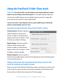
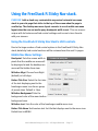
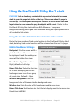
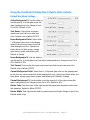
Using the FreeStack R Hide-Show stack.
PURPOSE: Very useful utility stack that allows you to display different content
within it on your desktop and mobile layouts. For example, display longer text
content with multiple images on your desktop layout, and only 1 image with
much shorter text content on your mobile layout.
You can also set it to just display content on your mobile layout and hide the
desktop content display, and vice verse.
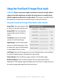
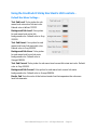
Using the FreeStack R Hide-Show Stack’s HUD controls.
Desktop Display: Selection specifies
whether desktop content area is
shown or hidden on desktop layout
display. Select from 2 options - Show
On Desktop or Hide On Desktop.
Mobile Display: Selection specifies
whether mobile content area is
shown or hidden on mobile layout
display. Select from 2 options - Show
On Mobile or Hide On Mobile.
Mobile Breakpoint: Sets the width in
pixels that the mobile layout content will be displayed at and the desktop layout
content will be hidden at.
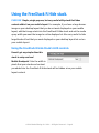
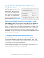
Adding content into the FreeStack R Hide-Show stack in edit
mode for desktop and mobile content.
When you select the FreeStack R Hide-Show stack in edit mode, you will see two
areas to add your stack content into. Drag your desktop layout stacks into the
top area where indicated (see image top of following page).
©2014 Blueball Design LLC USA • All Rights Reserved • Page 6
Then drag your mobile layout stacks into the bottom area where indicated and
set your media query width. That’s it, you’re done.
FreeStack R Hide-Show stack production tip:
If you are using images in your mobile layout, use smaller size images geared
specifically for mobile layouts and optimize them in your image editor for faster
load times on mobile devices.
©2014 Blueball Design LLC USA • All Rights Reserved • Page 7
Using the FreeStack R Hide stack.
PURPOSE: Simple, single purpose, but very useful utility stack that hides
content within it on your mobile layout. For example, if you have a large banner
image on your desktop layout that you do not want displayed on your mobile
layout, add that image stack into the FreeStack R Hide stack and set the media
query width you want the image to not be displayed at. Also very useful to hide
large blocks of text that you want displayed on your desktop layout but not on
your mobile layout.
Using the FreeStack R Hide Stack’s HUD controls.
Doesn’t get any simpler than this
stack to setup and use!
Mobile Breakpoint: Sets the width in
pixels that your stacks and content
you added into the FreeStack R Hide stack will be hidden at on your mobile
layout content.
©2014 Blueball Design LLC USA • All Rights Reserved • Page 8
Using the FreeStack R Image Float stack.
PURPOSE: Allows a responsive image to be floated to the left and right within a
column of text that repositions and scales the image down on a mobile layout
with the image above the text in a single column. The image is resizable in both
the desktop and mobile layouts using the built-in sizing hud controls.
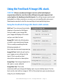
Using the FreeStack R Image Float Stack’s HUD controls.
Image Align: Sets your image to float
to the left or the right. Default is left.
Image Width: Sets your desktop
image width in pixels. Default is
200px.
Top Margin: Sets the top margin
amount on the floated image.
Right Margin: Sets the right margin
amount on the floated image. Leave
at default 0px value if floated image
is right aligned for best results.
Left Margin: Sets the left margin amount on the floated image. Leave at default
0px value if floated image is left aligned for best results.
Bottom Margin: Sets the bottom margin amount on the floated image.
Mobile Breakpoint: Sets the width in pixels that the mobile layout will be
displayed at. The floating image will display above the text in a single column at
the mobile image width specified in the hud control.
©2014 Blueball Design LLC USA • All Rights Reserved • Page 9
Mobile Image Width: Sets your mobile layout image width in pixels. Default is
200px. Make sure the mobile image width you set is not wider than the original
desktop image width is.
Adding your image and text content into the FreeStack R Image
Float stack in edit mode for desktop and mobile content.
When you select the FreeStack R Image Float stack in edit mode, you will see
two areas to add your stack content into.
At the top is the standard stack image arrow container where you drag and drop
your image into that you want to float within your text.
Below that is some placeholder text. Click in the placeholder text area to edit
the text, and replace it with your text you want to add into the stack.
Set your hud controls to suit your layout needs. Done.
©2014 Blueball Design LLC USA • All Rights Reserved • Page 10
Using the FreeStack R Image URL stack.
PURPOSE: Allows a warehoused image to be to be called and displayed
responsively within the stack that offers different sizing and alignment hud
control options for desktop and mobile layouts. By calling images warehoused
(uploaded) in a folder remotely on a server, you can significantly reduce your
Rapidweaver sandwich site file size resulting in faster publishing times.
Using the FreeStack R Image URL Stack’s HUD controls.
Edit Text: This is the text that initially
displays in the stack in Edit Mode.
Once you add in your Image URL,
your image will display in the stack
and you can hide this text.
Image URL: Add in the full absolute
url path to your warehoused image.
This is usually something like the
following example url:
http://www.domainname/imagename.jpg
Image Alt Text: Add in the alt text for
your image you are calling into the
stack. This is usually a short
descriptive sentence or description.
Image Align: Sets image alignment to
left, right or center (default).
Image Max Size: This is the
maximum width your image will display up to on your desktop layout. For the
best results, start with an image at 100% of the actual size you are planning on
using for your desktop layout.
©2014 Blueball Design LLC USA • All Rights Reserved • Page 11
Mobile Breakpoint: Sets the width in pixels that the mobile image size will be
displayed at.
Mobile Image Align: Sets mobile image alignment to left, right or center (default).
Mobile Image Max Size: This is the maximum width your image will display up
to on your mobile layout. For the best results, start with an image at 100% of the
actual size you are planning on using for your desktop layout and then size your
mobile image maximum display width accordingly. For example, a desktop
image that is 600px wide with a Mobile Image Max Size of 100% would display
up to 600px wide. This same image would display up to 300px wide on your
mobile layout if the Mobile Image Max Size is set to 50%.
Mobile Image Min Size: Just like the above Mobile Image Max Size except this
hud controls sets the Mobile Image Minimum Size that your image will display
at on your mobile layout. For example, if you set your original 600px wide image
to display at a mobile image minimum size of 25%, your mobile image would
display at a size no smaller than 150px in width. The Mobile Image Min Width
always need to be set less than the Mobile Image Max Size percentage amount
setting in order to display correctly.
Initial Edit Mode view
Edit Mode view after adding in image url.
©2014 Blueball Design LLC USA • All Rights Reserved • Page 12
Using the FreeStack R Reposition Alt stack.
PURPOSE: Very useful utility stack that allows you to set different margin and
padding amounts on it to position content within the stack separately for
desktop and mobile layouts using px or % or em settings. For example if you
have a stack that you need left and right padding amounts of 24px for your
desktop layout but want to use 5% left and right padding for your mobile layout,
you can easily do this with the FreeStack R Reposition Alt stack.
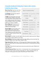
Using the FreeStack R Reposition Alt Stack’s HUD controls.
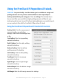
Desktop Units: Sets the measurement
you want used on your desktop
settings. Select from Percentage, Pixel,
or Em.
Top Padding: Sets the top padding
amount for desktop.
Right Padding: Sets the right padding
amount for desktop.
Bottom Padding: Sets the bottom
padding amount for desktop.
Left Padding: Sets the left padding
amount for desktop.
Top Margin: Sets the top margin
amount for desktop.
Right Margin: Sets the right margin
amount for desktop.
Bottom Margin: Sets the bottom margin
amount for desktop.
Left Margin: Sets the left margin amount for desktop.
©2014 Blueball Design LLC USA • All Rights Reserved • Page 13
Using the FreeStack R Reposition Alt Stack’s HUD controls...
Mobile Breakpoint: Sets the width in
pixels that the mobile layout padding
and margin settings will be displayed at.
Mobile Units: Sets the measurement
you want used on your mobile settings.
Select from Percentage, Pixel, or Em.
M Top Padding: Sets the top padding
amount for mobile layout.
M Right Padding: Sets the right padding
amount for mobile layout.
M Bottom Padding: Sets the bottom
padding amount for mobile layout.
M Left Padding: Sets the left padding
amount for mobile layout.
M Top Margin: Sets the top margin
amount for mobile layout.
M Right Margin: Sets the right margin
amount for mobile layout.
M Bottom Margin: Sets the bottom margin amount for mobile layout.
M Left Margin: Sets the left margin amount for mobile layout.
©2014 Blueball Design LLC USA • All Rights Reserved • Page 14
Using the FreeStack R Slider stack.
PURPOSE: Adds a contemporary simple-to-setup responsive slider stack to
your site page to showcase your images that just works. With a minimal amount
of customization controls to use to setup your image slideshow layout with, the
FreeStack R Slider stack has just what you need to make your slider standout
on your page layout. Scales down and displays great on desktop, tablet, and
mobile screen displays.
Using the FreeStack R Slider Stack’s HUD controls.
# of Slides: Sets the number of slides
(images) you will be using in your
slideshow. The default number is 4
and you can use up to 20.
Slideshow Auto: Select from having
your slideshow start automatically, or
to have it manually advance by the
viewer clicking on the navigation dots
under the slideshow or the next and
previous arrows. Default is set to
auto.
Slide Speed: Adjust the length of time
it takes your slide to display between
slide transitions. Default is set to 500
which equals half a second.
Slide Timeout: Sets the length of time each slide will display. Default is 4000
which equals 4 seconds.
Show Nav: Show or hide the desktop layout navigation options in the slideshow.
Show displays the navigation arrows in the left and right sides of each image
and the pagination dots under the slideshow itself.
©2014 Blueball Design LLC USA • All Rights Reserved • Page 15
Using the FreeStack R Slider Stack’s HUD controls...
Nav Arrow Image: Select from 4 navigation arrow image options. Default is
White Nav Arrows. These are displayed in the left and right sides of each image
in the slideshow.
Nav Dots Color: This is the color of the navigation dots that display below the
slideshow image area that will be shown as the slider moves from 1 image to
the next image. One dot will be displayed for each image in the slideshow in the
order the images are added into the FreeStack R Slider stack.
Nav Dot Current: This is the color of a navigation dot when its corresponding
image is the current image being displayed in the slideshow.
Show Mobile Nav: Show or hide the mobile layout navigation options in the
slideshow. Show displays the navigation arrows in the left and right sides of
each image and the pagination dots under the slideshow itself.
{ FreeStack R Slider stack production tips: }
IMPORTANT! All your images that you add into a single FreeStack R Slider stack
for your slideshow MUST BE THE SAME EXACT SIZE.
IMPORTANT! Your FreeStack R Slider stack and its slideshow images will
display the full width of the container div they are placed within. If you want
your slideshow to display the full width of the screen window, do not place it
into another stack. This will allow it to span the full screen window width.
If you need it to only span a set maximum width amount, add your FreeStack R
Slider stack into a FreeStack R Max Width stack. The slideshow image will
automatically adjust to fit and display responsively within the maximum width
set in the FreeStack R Max Width stack.
©2014 Blueball Design LLC USA • All Rights Reserved • Page 16
Using the FreeStack R Sticky Nav stack.
PURPOSE: Adds a sleek very customizable responsive horizontal nav menu
stack to your site page that sticks to the top of the screen when the page is
scrolled up. The desktop nav menu layout converts to a cool mobile nav menu
layout when the user set media query breakpoint width is met. This nav menu s
unique with its features and hud control settings and is sure to be a favorite
with your viewers.
Using the FreeStack R Sticky Nav Stack’s HUD controls.
Due to the large number of hud control options in the FreeStack R Sticky Nav
stack, details by hud control sections will be reviewed over the next 5+ pages.
Mobile Nav Menu Settings
Breakpoint: Sets the screen width in
pixels that the mobile nav menu will
be displayed at and the desktop nav
menu will be hidden from view.
M Button Align: Choose from Right
(default) or Left align.
Button Title Size: Select the font size
of the text displaying next to the
hamburger menu icon from a group
of preset sizes. Default is 16px.
M Button Background: Sets the
background color of the menu button
background area.
M Button Icon: Sets the color of the hamburger mobile menu icon.
Button Title Name: Add custom text for title that displays next to the menu icon.
Default text is MENU.
©2014 Blueball Design LLC USA • All Rights Reserved • Page 17
Using the FreeStack R Sticky Nav Stack’s HUD controls...
Mobile Nav Menu Settings...
M Button Title: Sets the color of the
title text next to the menu icon.
M Title Hover: Sets the hover color of
the title text next to the menu icon.
M Menu Font Size: Sets the font size
of the mobile nav menu links. Default
is 1.0 em.
M Font Weight: Sets the font weight
of the mobile nav menu links.
M Text Active: Sets the color of the
active state menu link text.
M Menu Background: Sets the color
of the mobile nav menu background.
M Text Hover: Sets the color of the
hover state menu link text.
M Background Hover: Sets the color
of the hover state menu link
background.
M Background Radius: Sets the corner radius amount of the hover state menu
link background. Default is 0px.
M Border Width: Sets the width of horizontal rule/line that separates the mobile
nav menu parent level link elements. Default is 0px.
M Border Color: Sets the color of the horizontal rule/line that separates the
mobile nav menu parent level link elements.
©2014 Blueball Design LLC USA • All Rights Reserved • Page 18
Using the FreeStack R Sticky Nav Stack’s HUD controls...
Sticky Nav Menu Settings.
Sticky Max Width: Sets the width of
your nav menu when it becomes
sticky and is attached/fixed to the
top of the screen window. Default is
set to 960px. For the best results,
match the max width you are using
for your page layout. See production
tip on at bottom of the page for
making the Sticky Max Width setting span the full screen width if needed.
Scroll Distance: Sets the distance you must scroll down your site page before
the FreeStack R Sticky Nav stack will become attached to the top of the
window. For example, if your FreeStack R Sticky Nav stack is positioned 200px
from the top of the window, set the scroll distance to be 200px or slightly less
for the best results and smooth transition as the nav menu becomes “sticky”.
Nav Opacity: Sets the opacity of the entire FreeStack R Sticky Nav Menu when it
is fixed to the top of the window.
{ FreeStack R Sticky Nav Menu stack production tip: }
If your FreeStack Responsive page layout spans the full width of the page and
you want your FreeStack R Sticky Nav stack to do the same in “sticky” mode
when the menu is attached to the top of the window, use the following custom
css code in the custom css area in RapidWeaver:
#stickynavbar.fixed {max-width: 100% !important; width:100%; left:0; right: 0;}
#stickynavbar.fixed ul {text-align: center !important;}
©2014 Blueball Design LLC USA • All Rights Reserved • Page 19
Using the FreeStack R Sticky Nav Stack’s HUD controls...
Default Nav Menu Settings.
Menu Font Size: Sets font size of the
nav menu link text. Default is 1.0 em.
Font Weight: Sets the font weight of
the nav menu link text.
Z-Index: Sets the z-index value of the
nav menu stack. Default is set to 999.
Very useful when using a lightbox stack
due to widely varying z-index values of
3rd party lightbox stacks now available.
Adjust it up or down as needed.
Menu Alignment: Select from Left
Align, Right Align, and Center Align.
Default is set to Left Align.
Border Radius: Use the slider to set a
border radius to the corners of the
parent menu level. Range is 0px up to
16px. Default is set to 0px. Note: Do not
use built-in Stacks “Round Corners” hud
control for this.
Menu Height: Use slider to set the
height of the nav menu’s parent menu level. Range is from 20px to 100px. Default is
set to 40px.
Menu Padding: Use slider to adjust the left and right padding on the parent level link
elements. Range is from 10px to 80px. Default is 14px.
Down Arrow Image: Select from 1 of 8 sub menu level indicator arrow images - White,
White 50%, Black, Black 50%, White Narrow, White Narrow 50%, Black Narrow and Black
Narrow 50%.
Text Color: Color picker for parent menu level sets active link text color. Default color
is White FFFFFF.
Background Color: Color picker for parent menu level active link background color.
Default color is Black 000000.
©2014 Blueball Design LLC USA • All Rights Reserved • Page 20
Using the FreeStack R Sticky Nav Stack’s HUD controls...
Default Nav Menu Settings...
Text Hover: Color picker for parent
menu level sets link hover state text
color. Default color is Gray 222222.
Background Hover: Color picker for
parent menu level sets link hover state
background color. Default color is
Orange EB8256.
Text Current: Color picker for parent
menu level sets link current state text
color. Default color is Gray 222222.
Background Current: Color picker for
parent menu level sets link current state
background color. Default color is
Orange EB8256.
Border Color: Sets the color of the right
border that separates the parent menu
level link elements.
Border Width: Sets right border width
on parent menu level links. Range is 0px
to 5px. Default width is 0px.
Sub Font Size: Sets font size of the nav menu Sub level link text. Default is 1.0 em.
Sub Menu Height: Sets the height of the sub menu level links. Range is from 20px to
100px. Default is set to 40px.
Sub Menu Width: Use slider to set the width of the sub menu levels. Range is from
100px to 400px. Default is set to 200px.
Sub Menu Padding: Use slider to adjust the left and right padding on the sub menu
level link elements. Range is from 0px to 80px. Default is 14px.
Sub Arrow Color: Select from 1 of 8 sub menu level indicator arrow images - White
Sub, White Sub 50%, Black Sub, Black Sub 50%, White Narrow Sub, White Narrow Sub
50%, Black Narrow Sub and Black Narrow Sub 50%.
©2014 Blueball Design LLC USA • All Rights Reserved • Page 21
Using the FreeStack R Sticky Nav Stack’s HUD controls...
Default Nav Menu Settings...
Text Sub Level: Color picker for sub
menu level sets active link text color.
Default color is White FFFFFF.
Background Sub Level: Color picker
for sub menu level active link
background color. Default color is Gray
252525.
Text Sub Hover: Color picker for sub
menu level hover link state text color.
Default color is Gray 252525.
Background Sub Hover: Color picker
for sub menu level hover link state
background color. Default color is
Orange EB8256.
Text Sub Current: Color picker for sub menu level current link state text color. Default
color is Gray 252525.
Background Sub Current: Color picker for sub menu level current link state
background color. Default color is Orange EB8256.
Border Sub: Sets the color of the bottom border line that separates the sub menu
level link elements.
©2014 Blueball Design LLC USA • All Rights Reserved • Page 22
Using the FreeStack R Sticky Nav 2 stack.
PURPOSE: Adds a sleek very customizable responsive horizontal nav menu
stack to your site page that sticks to the top of the screen when the page is
scrolled up. The desktop nav menu layout converts to a cool mobile nav menu
layout when the user set media query breakpoint width is met. Similar to the
FreeStack R Sticky Nav stack with one BIG difference - Transparent
backgrounds using preset rgba color selections along with opacity controls for
all the desktop link states.
Using the FreeStack R Sticky Nav 2 Stack’s HUD controls.
Due to the large number of hud control options in the FreeStack R Sticky Nav 2
stack, details by hud control sections will be reviewed over the next 5+ pages.
Mobile Nav Menu Settings
Breakpoint: Sets the screen width in
pixels that the mobile nav menu will
be displayed at and the desktop nav
menu will be hidden from view.
Menu Button Align: Choose from
Right (default) or Left align.
Button Title Size: Select the font size
of the text displaying next to the
hamburger menu icon from a group
of preset sizes. Default is 16px.
M Button Background: Sets the
background color of the menu button background area.
M Button Icon: Sets the color of the hamburger mobile menu icon.
Button Title Name: Add custom text for title that displays next to the menu icon.
Default text is MENU.
©2014 Blueball Design LLC USA • All Rights Reserved • Page 23
Using the FreeStack R Sticky Nav 2 Stack’s HUD controls...
Mobile Nav Menu Settings...
M Button Title: Sets the color of the
title text next to the menu icon.
M Title Hover: Sets the hover color of
the title text next to the menu icon.
M Menu Font Size: Sets the font size
of the mobile nav menu links. Default
is 1.0 em.
M Font Weight: Sets the font weight
of the mobile nav menu links.
M Text Active: Sets the color of the
active state menu link text.
M Menu Background: Sets the color
of the mobile nav menu background.
M Text Hover: Sets the color of the
hover state menu link text.
M Background Hover: Sets the color
of the hover state menu link
background.
M Background Radius: Sets the corner radius amount of the hover state menu
link background. Default is 0px.
M Border Width: Sets the width of horizontal rule/line that separates the mobile
nav menu parent level link elements. Default is 0px.
M Border Color: Sets the color of the horizontal rule/line that separates the
mobile nav menu parent level link elements.
©2014 Blueball Design LLC USA • All Rights Reserved • Page 24
Using the FreeStack R Sticky Nav 2 Stack’s HUD controls...
Sticky Nav 2 Menu Settings.
Sticky Max Width: Sets the width of
your nav menu when it becomes sticky
and is attached/fixed to the top of the
screen window. Default is set to 960px.
For the best results, match the max
width you are using for your page
layout. See production tip on at bottom
of the page for making the Sticky Max
Width setting span the full screen width
if needed.
Scroll Distance: Sets the distance you
must scroll down your site page before the FreeStack R Sticky Nav 2 stack will
become attached to the top of the window. For example, if your FreeStack R Sticky
Nav 2 stack is positioned 200px from the top of the window, set the scroll distance to
be 200px or slightly less for the best results and smooth transition as the nav menu
becomes “sticky”.
Sticky Background Color: Select from 1 of 8 preset rgba colors in the popup menu to
set your fixed position nav menu background color when it is attached to top of screen
window. Options are black, white, red, blue, green, orange, gray, brown, purple, and
yellow gold. Default is Black.
Sticky Background %: Use the slider to set the opacity % of the rgba fixed position nav
background color. Range is from 0% to 99%. Default is 0% opacity (transparent). This
opacity % is only applied to the background and not the other nav menu elements.
{ FreeStack R Sticky Nav 2 stack production tip: }
If your FreeStack Responsive page layout spans the full width of the page and you
want your FreeStack R Sticky 2 Nav stack to do the same in “sticky” mode when the
menu is attached to the top of the window, use the following custom css code in the
custom css area in RapidWeaver:
#stickynavbar.fixed {max-width: 100% !important; width:100%; left:0; right: 0;}
#stickynavbar.fixed ul {text-align: center !important;}
©2014 Blueball Design LLC USA • All Rights Reserved • Page 25
Using the FreeStack R Sticky Nav 2 Stack’s HUD controls...
Default Nav Menu Settings.
Menu Font Size: Sets font size of the
nav menu link text. Default is 1.0 em.
Font Weight: Sets the font weight of
the nav menu link text.
Z-Index: Sets the z-index value of the
nav menu stack. Default is set to 999.
Very useful when using a lightbox stack
due to widely varying z-index values of
3rd party lightbox stacks now available.
Adjust it up or down as needed.
Menu Alignment: Select from Left
Align, Right Align, and Center Align.
Default is set to Left Align.
Border Radius: Use the slider to set a
border radius to the corners of the
parent menu level. Range is 0px up to
16px. Default is set to 0px. Note: Do not
use built-in Stacks “Round Corners” hud
control for this.
Menu Height: Use slider to set the height of the nav menu’s parent menu level. Range
is from 20px to 100px. Default is set to 40px.
Menu Padding: Use slider to adjust the left and right padding on the parent level link
elements. Range is from 10px to 80px. Default is 14px.
Down Arrow Color: Select from 1 of 8 sub menu level indicator arrow images - White,
White 50%, Black, Black 50%, White Narrow, White Narrow 50%, Black Narrow and Balck
Narrow 50%.
Text Color: Color picker for parent menu level sets active link text color. Default color
is White FFFFFF.
Active Background Color: Select from 1 of 8 preset rgba colors in the popup menu to
set your nav menu active link state background color. Options are black, white, red,
blue, green, orange, gray, brown, purple, and yellow gold. Default is Black.
©2014 Blueball Design LLC USA • All Rights Reserved • Page 26
Using the FreeStack R Sticky Nav 2 Stack’s HUD controls...
Default Nav Menu Settings...
Active Background %: Use the slider to
set the opacity % of the rgba active link
state background color. Range is from
0% to 99%. Default is 99%.
Text Hover: Color picker for parent
menu level sets link hover state text
color. Default color is White FFFFFF.
Hover Background Color: Select from
1 of 8 preset rgba colors in the popup
menu to set your nav menu hover link
state background color. Options are
black, white, red, blue, green, orange,
gray, brown, purple, and yellow gold.
Default is Orange.
Hover Background %: Use the slider to
set the opacity % of the rgba hover link state background color. Range is from 0% to
99%. Default is 99%.
Text Current: Color picker for parent menu level sets link current state text color.
Default color is White FFFFFF.
Current Background Color: Select from 1 of 8 preset rgba colors in the popup menu
to set your nav menu current link state background color. Options are black, white, red,
blue, green, orange, gray, brown, purple, and yellow gold. Default is Orange.
Current Background %: Use the slider to set the opacity % of the rgba current link
state background color. Range is from 0% to 99%. Default is 99%.
Border Color: Sets the color of the right border that separates the parent menu level
link elements. Default is White FFFFFF.
Border Width: Sets right border width on parent menu level links. Range is 0px to 5px.
Default width is 0px.
©2014 Blueball Design LLC USA • All Rights Reserved • Page 27
Using the FreeStack R Sticky Nav 2 Stack’s HUD controls...
Default Nav Menu Settings...
Sub Font Size: Sets font size of the
nav menu Sub level link text. Default is
1.0 em.
Sub Menu Height: Sets the height of
sub menu level links. Range is from
20px to 100px. Default is set to 40px.
Sub Menu Width: Use slider to set the
width of the sub menu levels. Range is
from 100px to 400px. Default is set to
200px.
Sub Border Width: Sets bottom border
width on sub menu level links. Range is
0px to 5px. Default width is 1px.
Sub Menu Padding: Use slider to
adjust left and right padding on the sub menu level link elements. Range is from 0px to
80px. Default is 14px.
Sub Arrow Color: Select from 1 of 8 sub menu level indicator arrow images - White
Sub, White Sub 50%, Black Sub, Black Sub 50%, White Narrow Sub, White Narrow Sub
50%, Black Narrow Sub and Black Narrow Sub 50%.
Text Sub Level: Color picker sets sub menu level active link text color. Default color is
Gray 252525.
Active Sub Background: Select from 1 of 8 preset rgba colors in the popup menu to
set your nav menu sub level active link state background color. Options are black,
white, red, blue, green, orange, gray, brown, purple, and yellow gold. Default is White.
Active Sub Background %: Use the slider to set the opacity % of the rgba nav menu
sub level active link state background color. Range is from 0% to 99%. Default is 99%.
©2014 Blueball Design LLC USA • All Rights Reserved • Page 28
Using the FreeStack R Sticky Nav 2 Stack’s HUD controls...
Default Nav Menu Settings...
Text Sub Hover: Color picker for sub
menu level hover link state text color.
Default color is Orange FE7800.
Background Sub Hover: Select from 1
of 8 preset rgba colors in the popup
menu to set your sub menu hover link
state background color. Options are
black, white, red, blue, green, orange,
gray, brown, purple, and yellow gold.
Default is White.
Hover Sub Background %: Use the
slider to set the opacity % of the rgba
sub menu hover link state background color. Range is from 0% to 99%. Default is 90%.
Text Sub Current: Color picker for sub menu level current link state text color. Default
color is White FFFFFF.
Background Sub Current: Select from 1 of 8 preset rgba colors in the popup menu to
set your sub menu current link state background color. Options are black, white, red,
blue, green, orange, gray, brown, purple, and yellow gold. Default is Orange.
Current Sub Background %: Use the slider to set the opacity % of the rgba sub menu
current link state background color. Range is from 0% to 99%. Default is 90%.
Border Sub: Sets the color of the bottom border line that separates the sub menu
level link elements. Default is Light Gray EFEFEF.
©2014 Blueball Design LLC USA • All Rights Reserved • Page 29
Using the FreeStack R Sticky stack.
PURPOSE: Cool and very useful utility stack that makes any content (within
reason) placed within it become fixed/attached to the top of the window when
the FreeStack R Sticky stack reaches the top of the window while a page is
scrolled up. Perfect to use when you want to attach a page element to the top
of the window and keep it visible to your site viewers. For example a special
offer, email newsletter signup, banner image, etc.
Using the FreeStack R Sticky stack’s HUD controls.
Set Z-Index: Allows you to set a
custom z-index value to make sure the
content within the FreeStack R Sticky
stack will display above your other site
page content.
Mobile Breakpoint: Sets the screen
width in pixels that the mobile layout
will be displayed at.
Mobile Display: Select whether your
FreeStack R Sticky stack and its
content will be shown/visible on your
mobile layout. Default is set to Hide On Mobile.
{ FreeStack R Sticky stack production tip: }
Your FreeStack R Sticky stack is set to automatically attach itself to the top of
the screen window when the top of the stack reaches the top of the window.
You do not have to set anything on the stack for this to happen.
©2014 Blueball Design LLC USA • All Rights Reserved • Page 30
FAQ and Tips On Using The
FreeStack Responsive Add-Ons Pack 2 Stacks.
Below are some frequently asked questions and production tips to help
FreeStack Responsive users out.
FAQ #1: Can I use my FreeStack Responsive Add-Ons Pack 2 Sticky Nav stacks with
other Rapidweaver themes? Short answer is NO you cannot. The FreeStack
Responsive Nav stacks have been designed to work only with the FreeStack
Responsive theme.
FAQ #2: Do the FreeStack Responsive Add-Ons Pack 2 stacks work with other
Rapidweaver themes or just FreeStack Responsive? All the FreeStack Responsive AddOns Pack 2 stacks were designed primarily to work with the FreeStack Responsive
theme. That said 6 of the stacks should work ok with most other traditional responsive
RapidWeaver themes, and those are noted on page 3 of this readme file. You will need
to test them out with the responsive theme you are using to see if they will work as
expected with the theme on your RapidWeaver site.
FAQ #3: Why does the FreeStack Responsive Sticky Nav 2 stack use rgba background
colors for their link states? We did this because you can set opacity values for rgba
color backgrounds without affecting any other element’s opacity within the link li class
container. You cannot do this when using traditional color hexcode values for
background colors. Since the majority of sites will use either black 0, 0, 0, or white 255,
255, 255, for their transparent nav menu rgba color backgrounds, those are your first
choices and the default values, but we also gave users other choices too in case they
wanted alternatives that would be a better fit for their site layout designs.
Production Tip #1: DO NOT use the Compress CSS feature in Rapidweaver’s
Preferences window. Depending on your page layout and the stacks you are using on
your site page, using this option could cause significant display issues on your
FreeStack Responsive Stacks page(s) and with the FreeStack Responsive Nav Menu
©2014 Blueball Design LLC USA • All Rights Reserved • Page 31
stacks as well as other third party stacks, where CSS styling gets overwritten or
misapplied to stacks on your site pages.
Production Tip #2: DO NOT place your FreeStack Responsive Sticky Nav stacks at
the bottom of your site page. On these horizontal nav menu stacks, you must have
content below them in order for the sub menu levels to drop down and display
correctly. If you place them at the bottom of your page there is no where for the drop
down sub menu levels to display at on your screen window.
Production Tip #3: We recommend you DO NOT import the Sticky Nav and Sticky
stacks using the Global Content stack or Pluskit into a FreeStack Responsive site
page. Doing this could easily break the functionality of your FreeStack Responsive
Add-Ons Pack 2 Sticky Nav and Sticky stacks, especially the 2 FreeStack R Sticky Nav
stacks that use RapidWeaver’s %toolbar% macro to populate the nav menu ul and li
elements with.
©2014 Blueball Design LLC USA • All Rights Reserved • Page 32
Blueball FreeStack Responsive Add-Ons Pack 2
Stacks Bundle License and Usage details.
Attention Designers:
Please read this Usage License before incorporating any part of this Blueball
FreeStack Responsive Add_ons Pack 2 stacks bundle on your RapidWeaver site. By
Incorporating any part of these Blueball FreeStack Responsive stacks in your own
work, you are agreeing to be bound by the terms of this license listed below.
Licensing and Usage Rights:
This theme template and/or stack(s) were created by the designers at
blueballdesign.com and is copyright 2013-2014 Charles Lockhart, Blueball Design
LLC, USA with all rights reserved. You are licensed to use these Blueball FreeStack
Responsive stacks for your personal or business RapidWeaver site needs.
**NOTE: If you are a website designer you only have to purchase the Blueball
FreeStack Responsive Add-Ons Pack 2 stacks bundle once and you can use it as often
as you like, but if you have clients that want to use the Blueball FreeStack Responsive
theme and stacks along with the Blueball FreeStack Responsive Add-Ons Pack 2
stacks, to maintain and update their web site after you release it to them, then you will
need to purchase a copy of each item for them too.
Theme and Stacks Usage Restrictions:
Our RapidWeaver themes, style sheets, images, stacks, and related files may not be
resold, distributed or added to any type of digital collection by any means whatsoever.
They may not be offered for download or use from any website nor placed online for
promotional purposes whatsoever. Each Blueball RapidWeaver theme template and
stack must be used as supplied for its original intended purpose. This simply means
you may not select images or code from our Blueball RapidWeaver themes and stacks,
or style sheets to add to another application, theme, or stack, nor port our themes and
stacks for use with another application.
Image Credits and Usage:
Photo and Image Credits (headers, background images, navigation buttons, and other
graphics used by CSS): All images were created by blueballdesign.com designers or
were open source images that were downloaded and edited in Photoshop by Blueball
Design designers. Images, photos and graphics in our Rapidweaver themes and stacks
©2014 Blueball Design LLC USA • All Rights Reserved • Page 33
may not be used anywhere other than in sites developed from the RapidWeaver
themes and stacks you have purchased from Blueball Design.
Liability Limitations:
BlueballDesign.com RapidWeaver themes and stacks are provided "as is" without
warranty above and beyond updates, bug fixes or repairs. You may alter the
appearance of the theme and/or stack, or its graphics, but only for your personal use.
If you customize a Blueball Design theme or stack for a client, you must purchase an
additional Blueball theme or stack for your client if they plan to maintain their site
themselves before passing the customized Blueball Design RapidWeaver theme and/
or stack on to them for future use. Any modifications are at the sole risk of the user
and BlueballDesign.com does not guarantee the performance of any Blueball
Rapidweaver theme template or stack, and its files which have been altered or
modified. We also can not provide support for modified Blueball Design RapidWeaver
themes and stacks, or graphics. You are solely responsible for adding or editing your
Rapidweaver website's content. We do not provide training for RapidWeaver or the
Stacks page plugin.
Legalese Fine Print:
1. The CSS in this theme and stacks are the creative work of Blueball Design,
blueballdesign.com, and it's designers. Redistribution of this Rapidweaver theme
template and stacks is strictly prohibited.
2. All theme and stacks files including but not limited to CSS files, images files and
javascript are Copyright © 2013 blueballdesign.com, and Blueball Design LLC USA.
3. UNLESS OTHERWISE AGREED TO BY THE PARTIES IN WRITING, THIS DESIGN IS
OFFERED BY THE COPYRIGHT HOLDER AS-IS, AND ANY REPRESENTATIONS OR
WARRANTIES OF ANY KIND CONCERNING THE MATERIALS, EXPRESS, IMPLIED,
STATUTORY, OR OTHERWISE, INCLUDING, WITHOUT LIMITATION, WARRANTIES OF
TITLE, MERCHANTABILITY, FITNESS FOR A PARTICULAR PURPOSE,
NONINFRINGEMENT, OR THE ABSENCE OF LATENT OR OTHER DEFECTS, ACCURACY,
OR THE PRESENCE OR ABSENCE OF ERRORS, WHETHER OR NOT DISCOVERABLE,
ARE DISCLAIMED.
4. EXCEPT TO THE EXTENT REQUIRED BY APPLICABLE LAW, IN NO EVENT WILL THE
COPYRIGHT HOLDER BE LIABLE ON ANY LEGAL THEORY FOR ANY SPECIAL,
INCIDENTAL, CONSEQUENTIAL, PUNITIVE, OR EXEMPLARY DAMAGES ARISING OUT
OF THIS LICENSE OR THE USE OF THIS THEME OR STACKS, EVEN IF THE COPYRIGHT
HOLDER HAS BEEN ADVISED OF THE POSSIBILITY OF SUCH DAMAGES.
©2014 Blueball Design LLC USA • All Rights Reserved • Page 34