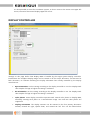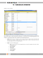
1
Graphical User Interface Tool for Embedded Systems User Manual Version 6.3.0 Revision A A product from IBIS Solutions ApS Torvevangen 24 DK-4550 Asnaes Denmark Phone: +45 7022 0495 Fax: +45 7023 0495 VAT No. DK-27 06 03 07 www.easygui.com [email protected] Copyright © 1999 - 2015 IBIS Solutions ApS. TABLE OF CONTENTS 1 PREFACE .............................................................................................................. 16 2 INSTALLATION .................................................................................................... 17 Installation ..................................................................................................................................... 17 easyGUI LICENSING ....................................................................................................................... 17 3 INTRODUCTION .................................................................................................. 19 How does it work? ......................................................................................................................... 19 The display ..................................................................................................................................... 20 Menus ............................................................................................................................................. 21 Basic file functions ............................................................................................................................. 22 Font functions ..................................................................................................................................... 23 Project functions ................................................................................................................................ 23 C code generation .............................................................................................................................. 23 Import / export ................................................................................................................................... 23 4 FONTS .................................................................................................................. 24 Font types ....................................................................................................................................... 24 Character modes ........................................................................................................................... 25 Text fonts........................................................................................................................................ 26 Character definition ........................................................................................................................... 26 Proportional writing ........................................................................................................................... 29 Fixed character width ........................................................................................................................ 30 Font style ............................................................................................................................................. 31 Font compression .......................................................................................................................... 31 Current fonts .................................................................................................................................. 32 5 FONT LIST WINDOW ........................................................................................... 34 6 FONT EDITING WINDOW .................................................................................... 36 Font setup....................................................................................................................................... 37 Font selection ................................................................................................................................. 39 View filter ............................................................................................................................................. 40 Copyright © 1999 - 2015 IBIS Solutions ApS 3 Font editing .................................................................................................................................... 41 Pixel editing ......................................................................................................................................... 41 PS mark editing ................................................................................................................................... 41 Editing many characters at once ...................................................................................................... 42 Editing commands ............................................................................................................................. 42 Font import .................................................................................................................................... 44 TTF font import ................................................................................................................................... 44 Binary font import .............................................................................................................................. 46 BDF font import .................................................................................................................................. 48 Common import parameters ........................................................................................................... 48 Character testing ........................................................................................................................... 49 7 PROJECT PARAMETERS WINDOW ...................................................................... 50 Basics .............................................................................................................................................. 51 Project panel ....................................................................................................................................... 51 Display panel....................................................................................................................................... 51 Display controller .......................................................................................................................... 53 Color ................................................................................................................................................ 55 Colors panel ........................................................................................................................................ 55 Color / Grayscale mode panel .......................................................................................................... 56 Color depth panel............................................................................................................................... 56 Palette handling.......................................................................................................................... 64 Color handling ............................................................................................................................ 68 RGB format.................................................................................................................................. 69 Simulated display .......................................................................................................................... 71 Compiler ......................................................................................................................................... 72 Type definitions panel ....................................................................................................................... 72 Constant declarations panel ............................................................................................................. 73 Special compiler settings panel ........................................................................................................ 73 Buffer sizes panel ............................................................................................................................... 74 Operation ....................................................................................................................................... 75 Text setup panel ................................................................................................................................. 75 Auto redraw panel.............................................................................................................................. 75 Cursor mode panel ............................................................................................................................ 76 Scroll mode panel............................................................................................................................... 76 Module selection panel ..................................................................................................................... 76 Structure editing panel ...................................................................................................................... 77 Paragraph panel ................................................................................................................................. 77 Bitmaps panel ..................................................................................................................................... 77 8 LANGUAGE TRANSLATION WINDOW ................................................................ 78 9 POSITIONS WINDOW .......................................................................................... 84 Copyright © 1999 - 2015 IBIS Solutions ApS 4 10 VARIABLES WINDOW .......................................................................................... 85 New/Edit Variable ............................................................................................................................... 86 Importing definitions .................................................................................................................... 87 Import setup ....................................................................................................................................... 87 Import type ................................................................................................................................. 88 Making the import .............................................................................................................................. 90 11 STRUCTURES WINDOW....................................................................................... 91 structures ....................................................................................................................................... 91 Classes ............................................................................................................................................ 91 Items ............................................................................................................................................... 93 Window layout ............................................................................................................................... 96 Structure management panel ...................................................................................................... 97 Item list panel ................................................................................................................................ 99 Item Panel .................................................................................................................................... 100 Structure hierarchy panel ............................................................................................................... 100 Navigation shortcuts ........................................................................................................................ 100 Item information panel ................................................................................................................... 101 Primary position panel .................................................................................................................... 101 Secondary position panel ................................................................................................................ 102 Radius / Corner panel ...................................................................................................................... 102 Alignment panel ............................................................................................................................... 103 Quarter circle/Ellipse panel ............................................................................................................. 103 Structure call panel .......................................................................................................................... 103 Default structure call panel............................................................................................................. 104 Conditional structure call panel ..................................................................................................... 104 Variable panel ................................................................................................................................... 104 Variable formatting panel ............................................................................................................... 104 Bitmap panel ..................................................................................................................................... 105 Line panel .......................................................................................................................................... 106 Rectangle panel ................................................................................................................................ 106 Active area panel .............................................................................................................................. 106 Clipping panel ................................................................................................................................... 107 Touch area panel .............................................................................................................................. 107 Text panel .......................................................................................................................................... 107 Paragraph panel ............................................................................................................................... 109 Foreground color panel ................................................................................................................... 109 Background color panel .................................................................................................................. 110 Miscellaneous panel ........................................................................................................................ 111 easyCOMP item panels .................................................................................................................... 114 Check box panel ............................................................................................................................... 114 Radio button panel .......................................................................................................................... 115 Button panel ..................................................................................................................................... 116 Copyright © 1999 - 2015 IBIS Solutions ApS 5 Panel panel ........................................................................................................................................ 118 Scroll box panel ................................................................................................................................ 118 Graph panel ...................................................................................................................................... 124 Graphics layer and filter panels ..................................................................................................... 128 Display panel ................................................................................................................................ 131 Use of Touch areas ...................................................................................................................... 138 1 - Touch interface hardware ......................................................................................................... 139 2 - Coordinate training ..................................................................................................................... 139 3 - Event handling ............................................................................................................................. 141 12 C CODE GENERATION WINDOW ...................................................................... 142 Destination setup ............................................................................................................................. 142 Code generation mode .................................................................................................................... 143 Language selection .......................................................................................................................... 143 Uncompressed font data ................................................................................................................ 145 External memory storage ................................................................................................................ 145 Compressed bitmaps ....................................................................................................................... 147 C and H file code generation .......................................................................................................... 147 Code size ........................................................................................................................................... 149 13 IMPORT / EXPORT WINDOW ............................................................................ 150 Current project panel .................................................................................................................. 150 External project panel ................................................................................................................. 151 Middle panel - controls and settings .........................................................................................152 14 HOW TO SET UP YOUR SYSTEM ........................................................................ 154 Minimum RAM and ROM requirements ....................................................................................154 Operating system ........................................................................................................................ 154 Which files to use ......................................................................................................................... 155 Setting up the system for easyGUI use .....................................................................................156 1 - Physical display connection ....................................................................................................... 157 2 - Setting up easyGUI for your display type ................................................................................ 157 3 - Display control functions ........................................................................................................... 158 Display initialization ................................................................................................................. 159 Selecting a display driver......................................................................................................... 159 Display writing .......................................................................................................................... 159 Bypassing the internal RAM display buffer ........................................................................... 162 Light and contrast control ....................................................................................................... 162 4 - Compiling the project ................................................................................................................. 162 5 - easyGUI interfacing..................................................................................................................... 163 GuiLib_Init.................................................................................................................................. 163 GuiLib_Refresh .......................................................................................................................... 164 Copyright © 1999 - 2015 IBIS Solutions ApS 6 GuiLib_ShowScreen.................................................................................................................. 164 Testing the system ...................................................................................................................... 165 1 - Establishing some kind of connection ..................................................................................... 165 2 - Turning on a single pixel ............................................................................................................ 165 3 - Showing the test pattern ........................................................................................................... 166 4 - Showing an easyGUI structure ................................................................................................. 168 15 HOW TO UTILIZE easyGUI - A TUTORIAL ......................................................... 169 Efficient learning ......................................................................................................................... 169 Item types..................................................................................................................................... 169 Viewing the structure ................................................................................................................. 171 Splash structure........................................................................................................................... 172 Structure details ............................................................................................................................... 173 Clearing the screen .......................................................................................................................... 173 Finding this and that item ............................................................................................................... 173 Drawing a logo .................................................................................................................................. 173 A centered, relative text .................................................................................................................. 175 PS - nice texts .................................................................................................................................... 175 Big texts - small texts ....................................................................................................................... 178 Showing variables ............................................................................................................................ 178 Config structure ........................................................................................................................... 179 Structure details ............................................................................................................................... 180 Don't forget the coordinates .......................................................................................................... 181 Using an indexed structure ............................................................................................................. 182 Utilizing a disappearing indexed structure ................................................................................... 184 An on/off text .................................................................................................................................... 185 Backgrounds are important ............................................................................................................ 186 The fine art of cursor fields ............................................................................................................. 188 Main Menu structure .................................................................................................................. 191 Better looking menu items ............................................................................................................. 191 Playing with cursor indices ............................................................................................................. 192 Flash structure ............................................................................................................................. 194 Mixing structures and plain graphics ............................................................................................ 194 Graphical items ............................................................................................................................ 195 easyCOMP components .............................................................................................................. 196 Advanced Configuration .................................................................................................................. 196 Displaying data in charts ................................................................................................................. 199 Let's scroll ..................................................................................................................................... 200 The Scroll box item........................................................................................................................... 200 Example variants ...................................................................................................................... 202 Function calls in the target system ........................................................................................ 205 Copyright © 1999 - 2015 IBIS Solutions ApS 7 Library functions ...................................................................................................................... 206 16 easyGUI LIBRARY FUNCTION REFERENCE....................................................... 210 GuiConst unit ............................................................................................................................... 211 Constants........................................................................................................................................... 211 GuiConst_ADV_FONTS_ON ...................................................................................................... 211 GuiConst_ALLOW_UPSIDEDOWN_AT_RUNTIME .................................................................. 211 GuiConst_ARAB_CHARS_INUSE .............................................................................................. 211 GuiConst_AUTOREDRAW_MAX_VAR_SIZE ............................................................................. 212 GuiConst_AUTOREDRAW_ON_CHANGE ................................................................................ 212 GuiConst_AVR_COMPILER_FLASH_RAM ................................................................................ 212 GuiConst_AVRGCC_COMPILER................................................................................................ 212 GuiConst_BIT_BOTTOMRIGHT ................................................................................................ 212 GuiConst_BIT_TOPLEFT............................................................................................................ 212 GuiConst_BITMAP_SUPPORT_ON ........................................................................................... 212 GuiConst_BLINK_FIELDS_MAX ................................................................................................ 213 GuiConst_BLINK_FIELDS_OFF ................................................................................................. 213 GuiConst_BLINK_LF_COUNTS ................................................................................................. 213 GuiConst_BLINK_SUPPORT_ON .............................................................................................. 213 GuiConst_BYTE_HORIZONTAL ................................................................................................ 213 GuiConst_BYTE_LINES .............................................................................................................. 213 GuiConst_BYTE_VERTICAL ....................................................................................................... 213 GuiConst_BYTES_PR_LINE ....................................................................................................... 213 GuiConst_BYTES_PR_SECTION ................................................................................................ 214 GuiConst_CHAR ........................................................................................................................ 214 GuiConst_CHARMODE_ANSI ................................................................................................... 214 GuiConst_CHARMODE_UNICODE........................................................................................... 214 GuiConst_CLIPPING_SUPPORT_ON ........................................................................................ 214 GuiConst_CODEVISION_COMPILER ........................................................................................ 214 GuiConst_COLOR_BYTE_SIZE .................................................................................................. 214 GuiConst_COLOR_DEPTH_1 .................................................................................................... 214 GuiConst_COLOR_DEPTH_2 .................................................................................................... 215 GuiConst_COLOR_DEPTH_4 .................................................................................................... 215 GuiConst_COLOR_DEPTH_5 .................................................................................................... 215 GuiConst_COLOR_DEPTH_8 .................................................................................................... 215 GuiConst_COLOR_DEPTH_12 .................................................................................................. 215 GuiConst_COLOR_DEPTH_15 .................................................................................................. 215 GuiConst_COLOR_DEPTH_16 .................................................................................................. 215 GuiConst_COLOR_DEPTH_18 .................................................................................................. 215 GuiConst_COLOR_DEPTH_24 .................................................................................................. 216 GuiConst_COLOR_MAX ............................................................................................................ 216 GuiConst_COLOR_MODE_GRAY ............................................................................................. 216 GuiConst_COLOR_MODE_PALETTE ........................................................................................ 216 GuiConst_COLOR_MODE_RGB................................................................................................ 216 GuiConst_COLOR_PLANES_1 .................................................................................................. 216 GuiConst_COLOR_PLANES_2 .................................................................................................. 216 GuiConst_COLOR_RGB_STANDARD ....................................................................................... 216 GuiConst_COLOR_SIZE ............................................................................................................. 217 GuiConst_COLORCODING_B_MASK ....................................................................................... 217 GuiConst_COLORCODING_B_MAX ......................................................................................... 217 Copyright © 1999 - 2015 IBIS Solutions ApS 8 GuiConst_COLORCODING_B_SIZE .......................................................................................... 217 GuiConst_COLORCODING_B_START ...................................................................................... 217 GuiConst_COLORCODING_G_MASK....................................................................................... 217 GuiConst_COLORCODING_G_MAX ......................................................................................... 217 GuiConst_COLORCODING_G_SIZE ......................................................................................... 218 GuiConst_COLORCODING_G_START ...................................................................................... 218 GuiConst_COLORCODING_MASK ........................................................................................... 218 GuiConst_COLORCODING_R_MASK ....................................................................................... 218 GuiConst_COLORCODING_R_MAX ......................................................................................... 218 GuiConst_COLORCODING_R_SIZE .......................................................................................... 218 GuiConst_COLORCODING_R_START ...................................................................................... 218 GuiConst_CONTROLLER_COUNT_HORZ ................................................................................ 218 GuiConst_CONTROLLER_COUNT_VERT ................................................................................. 219 GuiConst_CURSOR_FIELDS_OFF ............................................................................................. 219 GuiConst_CURSOR_MODE_STOP_TOP .................................................................................. 219 GuiConst_CURSOR_MODE_WRAP_AROUND......................................................................... 219 GuiConst_CURSOR_SUPPORT_ON ......................................................................................... 219 GuiConst_DECIMAL_COMMA .................................................................................................. 219 GuiConst_DECIMAL_PERIOD ................................................................................................... 219 GuiConst_DISPLAY_ACTIVE_AREA ........................................................................................... 219 GuiConst_DISPLAY_ACTIVE_AREA_CLIPPING ........................................................................ 220 GuiConst_DISPLAY_ACTIVE_AREA_COO_REL ......................................................................... 220 GuiConst_DISPLAY_ACTIVE_AREA_X1 ..................................................................................... 220 GuiConst_DISPLAY_ACTIVE_AREA_Y1 ..................................................................................... 220 GuiConst_DISPLAY_ACTIVE_AREA_X2 ..................................................................................... 220 GuiConst_DISPLAY_ACTIVE_AREA_Y2 ..................................................................................... 220 GuiConst_DISPLAY_BIG_ENDIAN ............................................................................................ 220 GuiConst_DISPLAY_BYTES ....................................................................................................... 220 GuiConst_DISPLAY_HEIGHT .................................................................................................... 221 GuiConst_DISPLAY_HEIGHT_HW ............................................................................................ 221 GuiConst_DISPLAY_LITTLE_ENDIAN ....................................................................................... 221 GuiConst_DISPLAY_WIDTH ...................................................................................................... 221 GuiConst_DISPLAY_WIDTH_HW .............................................................................................. 221 GuiConst_FLOAT_SUPPORT_ON ............................................................................................. 221 GuiConst_FONT_UNCOMPRESSED ......................................................................................... 222 GuiConst_GRAPH_AXES_MAX.................................................................................................. 222 GuiConst_GRAPH_DATASETS_MAX ........................................................................................ 222 GuiConst_GRAPH_MAX ............................................................................................................ 222 GuiConst_GRAPHICS_FILTER_MAX ......................................................................................... 222 GuiConst_GRAPHICS_LAYER_BUF_BYTES .............................................................................. 222 GuiConst_GRAPHICS_LAYER_MAX .......................................................................................... 222 GuiConst_ICC_COMPILER ........................................................................................................ 222 GuiConst_INT8S ........................................................................................................................ 223 GuiConst_INT8U ....................................................................................................................... 223 GuiConst_INT16S ...................................................................................................................... 223 GuiConst_INT16U ..................................................................................................................... 223 GuiConst_INT24S ...................................................................................................................... 223 GuiConst_INT24U ..................................................................................................................... 223 GuiConst_INT32S ...................................................................................................................... 223 GuiConst_INT32U ..................................................................................................................... 223 GuiConst_INTCOLOR ................................................................................................................ 224 Copyright © 1999 - 2015 IBIS Solutions ApS 9 GuiConst_ITEM_BUTTON_INUSE ............................................................................................ 224 GuiConst_ITEM_CHECKBOX_INUSE ........................................................................................ 224 GuiConst_ITEM_GRAPHICS_LAYER_FILTER_INUSE ............................................................... 224 GuiConst_ITEM_GRAPH_INUSE ............................................................................................... 224 GuiConst_ITEM_PANEL_INUSE ................................................................................................ 224 GuiConst_ITEM_RADIOBUTTON_INUSE ................................................................................. 225 GuiConst_ITEM_SCROLLBOX_INUSE ...................................................................................... 225 GuiConst_ITEM_STRUCTCOND_INUSE ................................................................................... 225 GuiConst_ITEM_TEXTBLOCK_INUSE ....................................................................................... 225 GuiConst_ITEM_TOUCHAREA_INUSE ..................................................................................... 225 GuiConst_KEIL_COMPILER_REENTRANT ................................................................................ 225 GuiConst_LANGUAGE_ACTIVE_CNT ....................................................................................... 226 GuiConst_LANGUAGE_ALL_ACTIVE ........................................................................................ 226 GuiConst_LANGUAGE_CNT ..................................................................................................... 226 GuiConst_LANGUAGE_FIRST ................................................................................................... 226 GuiConst_LANGUAGE_SOME_ACTIVE .................................................................................... 226 GuiConst_LANGUAGE_XXX ...................................................................................................... 226 GuiConst_LINES_PR_SECTION ................................................................................................. 226 GuiConst_MAX_BACKGROUND_BITMAPS ............................................................................. 227 GuiConst_MAX_DYNAMIC_ITEMS ........................................................................................... 227 GuiConst_MAX_PARAGRAPH_LINE_CNT ................................................................................ 227 GuiConst_MAX_TEXT_LEN........................................................................................................ 227 GuiConst_MAX_VARNUM_TEXT_LEN ...................................................................................... 227 GuiConst_MICRO_BIG_ENDIAN .............................................................................................. 227 GuiConst_MICRO_LITTLE_ENDIAN ......................................................................................... 227 GuiConst_MIRRORED_HORIZONTALLY .................................................................................. 228 GuiConst_MIRRORED_VERTICALLY ......................................................................................... 228 GuiConst_PALETTE_SIZE .......................................................................................................... 228 GuiConst_PICC_COMPILER_ROM ............................................................................................ 228 GuiConst_PIXEL_OFF ................................................................................................................ 228 GuiConst_PIXEL_ON ................................................................................................................. 228 GuiConst_PIXELS_PER_BYTE .................................................................................................... 228 GuiConst_PTR ............................................................................................................................ 228 GuiConst_REL_COORD_ORIGO_INUSE................................................................................... 229 GuiConst_REMOTE_BITMAP_BUF_SIZE .................................................................................. 229 GuiConst_REMOTE_BITMAP_DATA......................................................................................... 229 GuiConst_REMOTE_DATA ........................................................................................................ 229 GuiConst_REMOTE_DATA_BUF_SIZE ...................................................................................... 229 GuiConst_REMOTE_FONT_BUF_SIZE ...................................................................................... 229 GuiConst_REMOTE_FONT_DATA ............................................................................................ 229 GuiConst_REMOTE_ID .............................................................................................................. 230 GuiConst_REMOTE_STRUCT_BUF_SIZE .................................................................................. 230 GuiConst_REMOTE_STRUCT_DATA ........................................................................................ 230 GuiConst_REMOTE_TEXT_BUF_SIZE ....................................................................................... 230 GuiConst_REMOTE_TEXT_DATA .............................................................................................. 230 GuiConst_ROTATED_90DEGREE ............................................................................................. 230 GuiConst_ROTATED_90DEGREE_LEFT.................................................................................... 230 GuiConst_ROTATED_90DEGREE_RIGHT ................................................................................. 231 GuiConst_ROTATED_OFF ......................................................................................................... 231 GuiConst_ROTATED_UPSIDEDOWN ....................................................................................... 231 GuiConst_SCROLL_MODE_STOP_TOP.................................................................................... 231 Copyright © 1999 - 2015 IBIS Solutions ApS 10 GuiConst_SCROLL_MODE_WRAP_AROUND .......................................................................... 231 GuiConst_SCROLL_SUPPORT_ON ........................................................................................... 231 GuiConst_SCROLLITEM_BAR_NONE....................................................................................... 231 GuiConst_SCROLLITEM_BOXES_MAX ..................................................................................... 231 GuiConst_SCROLLITEM_INDICATOR_NONE .......................................................................... 232 GuiConst_SCROLLITEM_MARKERS_MAX................................................................................ 232 GuiConst_TEXT .......................................................................................................................... 232 GuiConst_TEXTBOX_FIELDS_MAX ........................................................................................... 232 GuiConst_TEXTBOX_FIELDS_ON ............................................................................................. 232 GuiConst_TOUCHAREA_CNT ................................................................................................... 232 GuiLib unit .................................................................................................................................... 233 Constants........................................................................................................................................... 233 GuiLib_ALIGN_CENTER ............................................................................................................. 233 GuiLib_ALIGN_LEFT .................................................................................................................. 233 GuiLib_ALIGN_NOCHANGE ..................................................................................................... 233 GuiLib_ALIGN_RIGHT ............................................................................................................... 233 GuiLib_BBP_BOTTOM .............................................................................................................. 234 GuiLib_BBP_LEFT ...................................................................................................................... 234 GuiLib_BBP_NONE.................................................................................................................... 234 GuiLib_BBP_RIGHT ................................................................................................................... 234 GuiLib_BBP_TOP ....................................................................................................................... 234 GuiLib_BUTTON_STATE_UP ..................................................................................................... 234 GuiLib_BUTTON_STATE_DOWN .............................................................................................. 234 GuiLib_BUTTON_STATE_DISABLED ........................................................................................ 235 GuiLib_CHECKBOX_OFF ........................................................................................................... 235 GuiLib_CHECKBOX_ON ............................................................................................................ 235 GuiLib_DECIMAL_COMMA ....................................................................................................... 235 GuiLib_DECIMAL_PERIOD ........................................................................................................ 235 GuiLib_FORMAT_ALIGNMENT_CENTER ................................................................................. 235 GuiLib_FORMAT_ALIGNMENT_LEFT ....................................................................................... 235 GuiLib_FORMAT_ALIGNMENT_RIGHT .................................................................................... 236 GuiLib_FORMAT_DEC ............................................................................................................... 236 GuiLib_FORMAT_EXP ................................................................................................................ 236 GuiLib_FORMAT_HEX ............................................................................................................... 236 GuiLib_FORMAT_TIME_MMSS ................................................................................................. 236 GuiLib_FORMAT_TIME_HHMM_12_AMPM ............................................................................ 236 GuiLib_FORMAT_TIME_HHMM_12_ampm ............................................................................ 236 GuiLib_FORMAT_TIME_HHMM_24.......................................................................................... 237 GuiLib_FORMAT_TIME_HHMMSS_12_AMPM ........................................................................ 237 GuiLib_FORMAT_TIME_HHMMSS_12_ampm ........................................................................ 237 GuiLib_FORMAT_TIME_HHMMSS_24 ..................................................................................... 237 GuiLib_LANGUAGE_TEXTDIR_LEFTTORIGHT ......................................................................... 237 GuiLib_LANGUAGE_TEXTDIR_RIGHTTOLEFT ......................................................................... 237 GuiLib_NO_COLOR ................................................................................................................... 237 GuiLib_NO_CURSOR ................................................................................................................. 238 GuiLib_RADIOBUTTON_OFF .................................................................................................... 238 GuiLib_NO_RESET_AUTO_REDRAW ........................................................................................ 238 GuiLib_PS_NOCHANGE ............................................................................................................ 238 GuiLib_PS_NUM ........................................................................................................................ 238 GuiLib_PS_OFF .......................................................................................................................... 238 Copyright © 1999 - 2015 IBIS Solutions ApS 11 GuiLib_PS_ON ........................................................................................................................... 238 GuiLib_RESET_AUTO_REDRAW ............................................................................................... 239 GuiLib_TEXTBOX_SCROLL_ABOVE_HOME ............................................................................. 239 GuiLib_TEXTBOX_SCROLL_AT_END ........................................................................................ 239 GuiLib_TEXTBOX_SCROLL_AT_HOME ..................................................................................... 239 GuiLib_TEXTBOX_SCROLL_BELOW_END ................................................................................ 239 GuiLib_TEXTBOX_SCROLL_ILLEGAL_NDX .............................................................................. 239 GuiLib_TEXTBOX_SCROLL_INSIDE_BLOCK ............................................................................ 240 GuiLib_TRANSPARENT_OFF ..................................................................................................... 240 GuiLib_TRANSPARENT_ON ...................................................................................................... 240 GuiLib_UNDERLINE_OFF .......................................................................................................... 240 GuiLib_UNDERLINE_ON ........................................................................................................... 240 GuiLib_VAR_BOOL .................................................................................................................... 240 GuiLib_VAR_DOUBLE................................................................................................................ 240 GuiLib_VAR_FLOAT ................................................................................................................... 241 GuiLib_VAR_SIGNED_CHAR ..................................................................................................... 241 GuiLib_VAR_SIGNED_LONG ..................................................................................................... 241 GuiLib_VAR_SIGNED_INT ......................................................................................................... 241 GuiLib_VAR_STRING ................................................................................................................. 241 GuiLib_VAR_UNSIGNED_CHAR ................................................................................................ 241 GuiLib_VAR_UNSIGNED_LONG ............................................................................................... 241 GuiLib_VAR_UNSIGNED_INT.................................................................................................... 242 Variables ............................................................................................................................................ 242 GuiLib_ActiveCursorFieldNo ................................................................................................... 242 GuiLib_CurStructureNdx ......................................................................................................... 242 GuiLib_DisplayUpsideDown .................................................................................................... 242 GuiLib_LanguageIndex ............................................................................................................ 242 GuiLib_RemoteDataReadBlock ............................................................................................... 243 GuiLib_RemoteTextReadBlock................................................................................................ 243 Functions ........................................................................................................................................... 243 GuiLib_AccentuatePixelColor .................................................................................................. 243 GuiLib_AccentuateRgbColor ................................................................................................... 243 GuiLib_BlinkBoxMarkedItem .................................................................................................. 244 GuiLib_BlinkBoxMarkedItemStop .......................................................................................... 244 GuiLib_BlinkBoxMarkedItemUpdate ..................................................................................... 245 GuiLib_BlinkBoxStart ............................................................................................................... 245 GuiLib_BlinkBoxStop ................................................................................................................ 245 GuiLib_BorderBox .................................................................................................................... 246 GuiLib_Box ................................................................................................................................ 246 GuiLib_BrightenPixelColor ...................................................................................................... 246 GuiLib_BrightenRgbColor ........................................................................................................ 247 GuiLib_Circle ............................................................................................................................. 247 GuiLib_Clear .............................................................................................................................. 248 GuiLib_ClearDisplay ................................................................................................................. 248 GuiLib_CosDeg .......................................................................................................................... 248 GuiLib_CosRad .......................................................................................................................... 248 GuiLib_Cursor_Down ............................................................................................................... 249 GuiLib_Cursor_End ................................................................................................................... 249 GuiLib_Cursor_Hide ................................................................................................................. 249 GuiLib_Cursor_Home ............................................................................................................... 250 GuiLib_Cursor_Select ............................................................................................................... 250 Copyright © 1999 - 2015 IBIS Solutions ApS 12 GuiLib_Cursor_Up..................................................................................................................... 250 GuiLib_DarkenPixelColor......................................................................................................... 251 GuiLib_DarkenRgbColor .......................................................................................................... 251 GuiLib_DegToRad ..................................................................................................................... 252 GuiLib_Dot ................................................................................................................................. 252 GuiLib_DrawChar ..................................................................................................................... 252 GuiLib_DrawStr ......................................................................................................................... 253 GuiLib_DrawVar ........................................................................................................................ 254 GuiLib_Ellipse ............................................................................................................................ 258 GuiLib_FillBox ............................................................................................................................ 258 GuiLib_GetBlinkingCharCode ................................................................................................. 258 GuiLib_GetBlueRgbColor ......................................................................................................... 259 GuiLib_GetCharCode................................................................................................................ 259 GuiLib_GetDot ........................................................................................................................... 260 GuiLib_GetGreenRgbColor ...................................................................................................... 260 GuiLib_GetRedRgbColor .......................................................................................................... 260 GuiLib_GetTextLanguagePtr ................................................................................................... 261 GuiLib_GetTextPtr .................................................................................................................... 261 GuiLib_GetTextWidth ............................................................................................................... 261 GuiLib_Graph_AddDataPoint .................................................................................................. 262 GuiLib_Graph_AddDataSet...................................................................................................... 262 GuiLib_Graph_Close ................................................................................................................. 263 GuiLib_Graph_DrawAxes ......................................................................................................... 263 GuiLib_Graph_DrawDataPoint ................................................................................................ 264 GuiLib_Graph_DrawDataSet ................................................................................................... 264 GuiLib_Graph_HideDataSet .................................................................................................... 264 GuiLib_Graph_HideXAxis ......................................................................................................... 265 GuiLib_Graph_HideYAxis ......................................................................................................... 265 GuiLib_Graph_OffsetXAxisOrigin............................................................................................ 266 GuiLib_Graph_OffsetYAxisOrigin............................................................................................ 266 GuiLib_Graph_Redraw ............................................................................................................. 267 GuiLib_Graph_RemoveDataSet .............................................................................................. 267 GuiLib_Graph_ResetXAxisOrigin............................................................................................. 268 GuiLib_Graph_ResetYAxisOrigin ............................................................................................. 268 GuiLib_Graph_ShowDataSet ................................................................................................... 269 GuiLib_Graph_SetXAxisRange ................................................................................................. 269 GuiLib_Graph_SetYAxisRange ................................................................................................. 270 GuiLib_Graph_ShowXAxis ....................................................................................................... 270 GuiLib_Graph_ShowYAxis ........................................................................................................ 271 GuiLib_GraphicsFilter_Init ....................................................................................................... 271 GuiLib_GrayScaleToPixelColor ................................................................................................ 272 GuiLib_GrayScaleToRgbColor ................................................................................................. 272 GuiLib_HLine ............................................................................................................................. 272 GuiLib_Init.................................................................................................................................. 272 GuiLib_InvertBox ...................................................................................................................... 273 GuiLib_InvertBoxStart .............................................................................................................. 273 GuiLib_InvertBoxStop .............................................................................................................. 273 GuiLib_IsCursorFieldInUse ...................................................................................................... 273 GuiLib_Line ................................................................................................................................ 274 GuiLib_LinePattern ................................................................................................................... 274 GuiLib_MarkDisplayBoxRepaint ............................................................................................. 275 Copyright © 1999 - 2015 IBIS Solutions ApS 13 GuiLib_PixelColorToGrayScale ................................................................................................ 275 GuiLib_PixelToRgbColor .......................................................................................................... 275 GuiLib_RadToDeg ..................................................................................................................... 275 GuiLib_Refresh .......................................................................................................................... 276 GuiLib_RemoteCheck ............................................................................................................... 276 GuiLib_ResetClipping ............................................................................................................... 276 GuiLib_ResetDisplayRepaint ................................................................................................... 276 GuiLib_RgbColorToGrayScale ................................................................................................. 277 GuiLib_RgbToPixelColor .......................................................................................................... 277 GuiLib_ScrollBox_Close ............................................................................................................ 277 GuiLib_ScrollBox_Down ........................................................................................................... 278 GuiLib_ScrollBox_End .............................................................................................................. 278 GuiLib_ScrollBox_GetActiveLine ............................................................................................. 278 GuiLib_ScrollBox_GetActiveLineCount .................................................................................. 279 GuiLib_ScrollBox_GetTopLine ................................................................................................. 279 GuiLib_ScrollBox_Home .......................................................................................................... 279 GuiLib_ScrollBox_Init ............................................................................................................... 280 GuiLib_ScrollBox_Redraw ........................................................................................................ 280 GuiLib_ScrollBox_RedrawLine ................................................................................................ 281 GuiLib_ScrollBox_SetIndicator ................................................................................................ 281 GuiLib_ScrollBox_SetLineMarker............................................................................................ 281 GuiLib_ScrollBox_SetTopLine.................................................................................................. 282 GuiLib_ScrollBox_To_Line ........................................................................................................ 282 GuiLib_ScrollBox_Up ................................................................................................................ 283 GuiLib_SetBlueRgbColor .......................................................................................................... 283 GuiLib_SetClipping ................................................................................................................... 283 GuiLib_SetGreenRgbColor....................................................................................................... 284 GuiLib_SetLanguage ................................................................................................................. 284 GuiLib_SetRedRgbColor ........................................................................................................... 284 GuiLib_ShowBitmap ................................................................................................................. 285 GuiLib_ShowBitmapArea ......................................................................................................... 285 GuiLib_ShowBitmapAreaAt ..................................................................................................... 286 GuiLib_ShowBitmapAt ............................................................................................................. 286 GuiLib_ShowScreen.................................................................................................................. 287 GuiLib_SinDeg ........................................................................................................................... 287 GuiLib_SinRad ........................................................................................................................... 287 GuiLib_Sqrt ................................................................................................................................ 288 GuiLib_StrAnsiToUnicode ........................................................................................................ 288 GuiLib_TestPattern ................................................................................................................... 288 GuiLib_TextBox_Scroll_Down.................................................................................................. 288 GuiLib_TextBox_Scroll_Down_Pixel ........................................................................................ 289 GuiLib_TextBox_Scroll_End ..................................................................................................... 289 GuiLib_TextBox_Scroll_End_Pixel ........................................................................................... 290 GuiLib_TextBox_Scroll_FitsInside ........................................................................................... 290 GuiLib_TextBox_Scroll_Get_Pos .............................................................................................. 290 GuiLib_TextBox_Scroll_Get_Pos_Pixel .................................................................................... 291 GuiLib_TextBox_Scroll_Home ................................................................................................. 291 GuiLib_TextBox_Scroll_Home_Pixel ....................................................................................... 291 GuiLib_TextBox_Scroll_To_Line .............................................................................................. 292 GuiLib_TextBox_Scroll_To_PixelLine ...................................................................................... 292 GuiLib_TextBox_Scroll_Up ....................................................................................................... 292 Copyright © 1999 - 2015 IBIS Solutions ApS 14 GuiLib_TextBox_Scroll_Up_Pixel ............................................................................................. 293 GuiLib_TouchAdjustReset ....................................................................................................... 293 GuiLib_TouchAdjustSet ............................................................................................................ 293 GuiLib_TouchCheck .................................................................................................................. 294 GuiLib_TouchGet ...................................................................................................................... 294 GuiLib_UnicodeStrCmp ........................................................................................................... 295 GuiLib_UnicodeStrCpy ............................................................................................................. 295 GuiLib_UnicodeStrLen ............................................................................................................. 295 GuiLib_UnicodeStrNCmp......................................................................................................... 296 GuiLib_UnicodeStrNCpy .......................................................................................................... 296 GuiLib_VLine .............................................................................................................................. 297 GuiDisplay unit ............................................................................................................................ 297 Functions ........................................................................................................................................... 297 GuiDisplay_Init .......................................................................................................................... 297 GuiDisplay_Lock........................................................................................................................ 298 GuiDisplay_Refresh .................................................................................................................. 298 GuiDisplay_Unlock.................................................................................................................... 298 17 easyTRANS ........................................................................................................ 299 Installation ................................................................................................................................... 299 Principles ...................................................................................................................................... 299 How to use .................................................................................................................................... 300 Working on the project while translating .................................................................................301 18 easySIM PC SIMULATION TOOLSET ................................................................. 302 Purpose ......................................................................................................................................... 302 Necessary files ............................................................................................................................. 302 Compilation .................................................................................................................................. 304 Hints .............................................................................................................................................. 305 Limitations ................................................................................................................................... 305 19 FURTHER READING AND SUPPORT.................................................................. 306 easyGUI support .......................................................................................................................... 306 Language support appendices ................................................................................................... 306 Copyright © 1999 - 2015 IBIS Solutions ApS 15 1 PREFACE Welcome to the easyGUI development system for fast and efficient creation of embedded graphical user interfaces. easyGUI is an application for defining user interfaces on embedded displays using graphical primitives. This manual covers all versions of the easyGUI package. Sections specific to one or the other are marked with: for the easyGUI Monochrome version. for the easyGUI Color version. for the easyGUI Unicode version. for the easyCOMP advanced components add-on module. The easyGUI Color version contains all functionality of the easyGUI Monochrome version, plus support for more than one bit per display pixel, i.e. color depths of more than two colors. Grayscale displays are handled just as color displays by easyGUI. The easyGUI Unicode version contains all functionality of the easyGUI Color version, plus support for 16 bit Unicode character codes. The easyCOMP add-on module includes a number of advanced components: • Check box component type. • Radio button component type. • Button component type. • Scroll box component type. • Panel component type. • Graph component type. • Graphics layer / Graphics filter component types. Furthermore, the various easyGUI add-ons and utilities are covered in this manual. For users with an old easyGUI version 5 license the use of the Scroll box component type is allowed, even if easyCOMP hasn't been purchased. This is to allow continued use of the scroll box component type, which was introduced in easyGUI version 5. Copyright © 1999 - 2015 IBIS Solutions ApS 16 2 INSTALLATION easyGUI can be installed on standard PC's running Windows 2000, Windows XP, Windows Vista and Windows 7. easyGUI will not function properly on Windows 95, Windows 98, Windows Me, or similar older operating systems. INSTALLATION Run the easyGUI installation program, following the instructions on screen. Several fonts are required: • Arial. Should be present in a standard Windows installation. • Arial Narrow. Is part of e.g. Microsoft Office. • Arial Unicode MS. The installation program installs these fonts, if needed. The fonts can also be found in the Fonts sub folder of the easyGUI installation folder. Several different easyGUI versions can be installed on the same PC without conflicts. This allows older versions to be kept for existing embedded projects, and the newest version to be installed for new projects. Just select different target folders during installation. All easyGUI application information is kept in the installation folder - no information is put in the Windows Registry. easyGUI LICENSING easyGUI is licensed and protected through the use of a USB dongle. You will initially be supplied with a temporary software license key, in order to get started while waiting for the dongle to arrive. When easyGUI is started for the first time it asks for license information. Enter the user name and temporary license key, as delivered with the package. easyGUI will now be fully functional for a limited amount of time (typically 14 days). When the dongle is received it is simply placed in a free USB connector on the PC, and easyGUI is restarted. easyGUI will then recognize the dongle. easyGUI may be installed on several PC's, and the dongle simply moved around to the desired PC. If it is necessary to run easyGUI concurrently on several PC’s, additional licenses must be purchased. A discount may be offered for multiple licenses. Please contact [email protected] for more information. The dongle must be mounted in the PC as long as easyGUI is running. After running easyGUI the dongle can simply be removed from the PC. Copyright © 1999 - 2015 IBIS Solutions ApS 17 Usually the dongle just works with the drivers found in Windows. If not, the official HASP dongle driver must be installed. It is located in the Dongle sub folder under the easyGUI installation folder. It can also be downloaded from the HASP site at (topmost item): www.aladdin.com/support/hasp/enduser.asp Should problems still arise you can contact [email protected]. Copyright © 1999 - 2015 IBIS Solutions ApS 18 3 INTRODUCTION HOW DOES IT WORK? The process of development when using easyGUI can be summed up as: • The easyGUI PC application is explained in detail in this manual. The major part of the work regarding the user interface takes place here, contrary to standard development work, where everything is done in the target system c code. • The easyGUI data files are generated by easyGUI, at the command of a button. Each time something has been changed in the user interface, and it is desirable to test it on the target system (or the PC simulation toolkit) the files must be re-generated. • An easyGUI library is delivered with the easyGUI package, in plain c code. This library must be linked into the target system application, just like the other modules making up the final system. • An easyGUI display driver must also be linked into the target system application. easyGUI is delivered with a number of display drivers. A suitable driver must be selected, and it's code adjusted for the target system hardware. Copyright © 1999 - 2015 IBIS Solutions ApS 19 • User c source code is the last part of the target system source code, containing all the working code necessary for the finished system, with calls to the easyGUI library, and other code related to e.g. hardware in the target system. This manual describes the various steps necessary to take, in order to use easyGUI as an efficiently tool for generating high quality user interfaces in embedded systems. As easyGUI is complex there will of course be a learning curve, as with all other advanced tools, but the reward will be reduced development time, and a better final product, when the easyGUI tool has been mastered. Take your time, start with simple problems, and gradually work your way through the system, using more and more advanced functions, as the needs arise. THE DISPLAY easyGUI treats the target system display as a graphical canvas, i.e. a drawing surface on which objects may be placed. All placements are free, so there are no predefined positions or grid which limits the artistic freedom. The coordinate system has origin (0,0) at the upper left corner, with X coordinates going towards the right, and Y coordinates going downwards. The coordinates are counted in display pixels, so the display sets the limits for the coordinate system. There is no formal limit on display size in easyGUI, but the vast majority of systems using easyGUI have display resolutions of 800×600 pixels or lower, with 320×240 pixels (quarter VGA) being a very popular resolution. easyGUI supports color depths ranging from simple monochrome systems (one bit per pixel) up to true color systems with a maximum of 32 bits per color. Copyright © 1999 - 2015 IBIS Solutions ApS 20 MENUS easyGUI is controlled through a number of windows, one for each main function. Selection between the main functions are done by using the hot-keys along the left edge, or function keys. One project can be loaded at a time. The project contains all fonts, screen structures, etc. for one display. If the target system utilizes several different displays a project should be created for each display. Several displays handled by the same µ-processor are not supported by easyGUI, albeit easyGUI can be used for one of the displays. The exception is if both displays are of the same type and resolution. easyGUI contains a number of main functions: • Basic file functions. • Font management (F3). • Font editing (F4). • Project parameters (F5). • Language support (F7). • Positions (F8). Copyright © 1999 - 2015 IBIS Solutions ApS 21 • Variables (F9). • Structures (screen designs) (F10). • C-source code generation (F11). • Import / export of data between easyGUI projects (F12). The individual items are explained in the following chapters. Basic file functions Project and application management: Handling of projects (open, close, save, recent files, etc.), plus About, Help and License keys. The nine projects last opened are remembered by the system for easy access. They are presented in the central list box. Selecting one of them corresponds to opening it normally with the Open command. Buttons: Open - Opens a project file. The ctrl + O command can be used. Save - saves changes to the project. The F2 key, or the ctrl + S command, can also be used. SaveAs - Saves the project under another name. The ctrl + A command can also be used. New - Creates a new project containing only basic data. The ctrl + N command can also be used. Close - closes the currently open project. The ctrl + F4 command can also be used. Help - displays this manual. The F1 key can also be used. About - displays information about the easyGUI program. The ctrl + I command can also be used. License - displays license data, allowing license key updating. The ctrl + L command can also be used. If a working dongle is attached the dongle ID will be shown. Exit - closes easyGUI. The ctrl + Q command can also be used. Save - saves changes to the project. The F2 key, or the ctrl + S command, can also be used. Copyright © 1999 - 2015 IBIS Solutions ApS 22 Font functions Font list - manages complete fonts. The F3 key activates this window. Font editing - edits a single font, selected in the font list. Manages font selection for the target system. The F4 key activates this window. Project functions Project parameters. Basic settings for the project, defining e.g. display size and display controller memory layout. The F5 key activates this window. Language translation - allows definition of languages in the project, and translation of texts. The F7 activates this window. Positions - manages fixed positions for screen structures. The F8 key activates this window. Variables - manages variables for dynamic screen structure control. The F9 key activates this window. Structures - the core function in easyGUI. Manages screen structures. The F10 key activates this window. C code generation C code generation - converts easyGUI data to c and h files for inclusion in the target system code. The F11 key activates this window. Import / export Import / export - moves data between easyGUI projects. The F12 key activates this window. Copyright © 1999 - 2015 IBIS Solutions ApS 23 4 FONTS FONT TYPES All characters and icons are organized into fonts. Fonts are divided into text fonts containing normal characters, and icon fonts containing graphical elements. A text font contains one set of characters in one size, covering one or more languages, e.g. both Western style and Asian style characters in the same font. All characters (or icons) in a font have the same basic parameters regarding height, style etc. Observe that bitmaps can also be displayed by using a bitmap item, this is unrelated to the fonts, and will be explained later. Fonts are by definition either monochrome or anti-aliased: • Monochrome font. Each character pixel is either on or off. If the character pixel is on easyGUI will paint it in the selected foreground text color. If the character pixel is off easyGUI will either paint it in the selected background text color, or if transparent writing is active, leave it untouched. An example of a monochrome text font is the ANSI 13 font: • Anti-aliased font. Each character pixel has one of 16 levels of grey. If the character pixel level is 15 (highest possible value) easyGUI will paint it in the selected foreground text color. If the character pixel level is in the range 1 - 14 easyGUI will combine the selected foreground text color with the selected background text color, or if transparent writing is active, combine it with the existing pixel color, in a ratio determined by the 1 - 14 pixel level. If the character pixel level is zero (lowest possible value) easyGUI will either paint it in the selected background text color, or if transparent writing is active, leave it untouched. An example of an anti-aliased text font is the ANSI 17AA font: Anti-aliased fonts looks much nicer on the target system display, but at the cost of added memory and processor power requirements. Use of anti-aliased fonts should thus be backed up with sufficient target system resources. Only systems with 4 bits per pixel or higher color depth can use anti-aliased fonts. Systems using palette based colors cannot use anti-aliased fonts. Copyright © 1999 - 2015 IBIS Solutions ApS 24 CHARACTER MODES There are two fundamental character modes in easyGUI: • ANSI mode. Each font can contain up to 224 primary characters (character codes 32 - 255). 8 bit character codes are used on the target system. • Unicode mode. Each font can contain up to 65504 characters (character codes 32 - 65535). 16 bit character codes are used on the target system. All Unicode fonts should as a principle include the basic Windows ANSI Western style character set in character codes 32 - 255. The International Unicode Consortium defines Unicode character codes. On their web page www.unicode.org can be found character code charts for a large portion of the worlds character sets. All easyGUI Unicode fonts conform to this standard, as this ensures easy compatibility with other IT systems, especially Windows, and thereby allows easy entry of characters in easyGUI. easyGUI supports 16 bit Unicode (basic multilingual plane), but not 24 bit / 32 bit (supplementary code planes). UTF-8 and UTF-16 variable length character coding is not supported. Only the version supports the Unicode character mode. This mode is necessary for target systems requiring more than one character set. On the downside a Unicode mode target system requires a little more memory than an ANSI mode system. The version also supports projects running in ANSI character mode. Each font in the system can support both character modes, but Unicode characters are only visible if the project runs in Unicode mode. Character codes in the 0 - 255 range are common to the two character modes: ANSI mode: 0 - 31 Unicode mode: 32 - 255 256 - 65535 Do not use Windows ANSI Unicode character codes above 65535 (24 bit / 32 bit character codes) are not supported by easyGUI. The character mode is selected in the Parameters window, on the Operation tab page, see later. Character codes 0 - 31 should never be used for font characters. While these character codes are not prohibited they are also used for other purposes, like e.g. line control in multi-line texts. Using them for characters can thus cause unpredictable behaviors. Copyright © 1999 - 2015 IBIS Solutions ApS 25 TEXT FONTS All original text fonts are made after these guiding lines: • Proportional writing. Fixed spacing fonts can also be made, but all original text fonts are proportional. • True hanging characters: The letter “g” is defined with the lower part going below the base line (“Eg”, not “Eg”). This is however not a requirement, any font style can be created. • ANSI/Unicode character codes as used in Windows. This makes it easy to both enter Unicode text into the system, and to exchange data between target system and Unicode aware systems. • All kinds of characters, like e.g. Western world, Cyrillic, Japanese, can be placed in the same font, but must adhere to the limits of the character mode in use (ANSI or Unicode). Character definition A character is defined in a matrix of fixed coordinates, common for all characters in a font. An 11×21 text font is used as an example in the following chapters. Each character is defined as a pixel pattern, e.g. a capital F: The character is placed according to certain fixed positions in the character cell. There are three horizontal and one vertical position: Copyright © 1999 - 2015 IBIS Solutions ApS 26 Top Line Mid Line Base Line Box Right Capital letters should generally go from Base Line to Top Line. Letters with accents and the like at the top (e.g. “Å”) utilizes the area above Top Line: Lower case letters are placed between Base Line and Mid Line: Lower case letters with hanging parts extends below the base line: Copyright © 1999 - 2015 IBIS Solutions ApS 27 A character does not need to fill the area between the left border of the character cell and Box Right fully, and if not doing so it can be centered horizontally: - or kept left adjusted. When easyGUI writes text in proportional mode the horizontal character placement inside the character cell doesn't matter. Only if writing with fixed spacing will the horizontal character placement be visible in the finished text. A character may go beyond Box Right, but should not touch the right border of the character cell, unless it is intentional that the character shall be a continuous part of a following character, the character only will be used on its own (e.g. icons), or the font will only be used for proportional writing: The various reference lines are only intended as guides developing the font, with the exception of the Base Line position which is the Y coordinates reference point used by easyGUI when rendering text. Copyright © 1999 - 2015 IBIS Solutions ApS 28 Proportional writing All fonts can be used for proportional writing. There are three styles of writing: • Fixed spacing. All characters are written with the same fixed width, equal to the font width (Courier style). • Proportional spacing. All characters are written with a width depending on the character size, and how it fits together with the previous character. • Numerical proportional spacing. As proportional writing, except that the characters “0” - “9”, "+", "-", "*", "/", "=" and " " (space) are written with fixed spacing. This writing style can be used when writing numerical values, especially in columns. For each character a number of proportional spacing marks are defined. These PS marks are used when calculating horizontal character placements in proportional writing style. E.g. a capital “F”: There are five horizontal pairs of PS marks, one on Top Line, one on Mid Line, one midway between Mid Line and Base Line, one on Base Line, and finally one pair 2/3 the way from Base Line to the bottom of the character cell. Each PS pair contains a left PS mark (>) and a right PS mark (<). The PS marks can be placed individually (horizontally) for each character in the font. When two characters shall be written next to each other proportionally the PS marks are used to calculate the distance between the characters. The characters are placed so that the left PS marks of the second character keep a minimum distance in pixels to the right PS marks of the first character. This minimum distance is common for all characters in the font, and is defined along with other basic font dimensions. The PS marks are not necessarily placed on the first or last used pixels in a pixel line. It is the overall shape of the character that determines where PS marks are placed. Proportional writing example: The text “Fg”. “F” and “g” has the following PS marks: Copyright © 1999 - 2015 IBIS Solutions ApS 29 and For this font the proportional distance is set to 2 pixels, so “g” is placed after “F” so that the two PS marks coming closest to each other maintains a horizontal distance of two pixels. In this example it is the PS marks midway between Base Line and Mid Line, indicated by stars: This system ensures nice proportional writing with a fast calculation routine, without demanding excessive resources from the target system by employing e.g. kerning tables. Fixed character width A special Fixed character width flag can be set individually for each character in the system. This can be used for characters with inherent fixed width, as used in e.g. some Asian fonts when writing Western style characters. The character width is then defined as the dimension from the leftmost PS mark to the rightmost PS mark. A text string starting with a fixed width character includes eventual whitespace in that character cell, as opposed to normal proportional writing, where eventual white space is disregarded for the initial character in a string, ensuring that the text always starts at the initial pixel position. Examples: The text "Inner" with two definitions of the "I" character, one with a normal "I": Copyright © 1999 - 2015 IBIS Solutions ApS 30 "I" character definition: Text rendering: - and one with a fixed width "I": "I" character definition: Text rendering: In the latter case the "I" character starts three pixels into the text field, because of the fixed width setting. Font style As the displays used in embedded applications usually have limited resolution, it is difficult to develop nice Serif fonts, especially in monochrome mode. The delivered fonts are therefore in Sans Serif style. Serif/Sans Serif: This is a Serif font: “Serif - Yes” (There are small attachments on the characters, e.g. the windows font “Times”), this is a Sans Serif font: “Serif - No” (e.g. the windows font “Arial”). If easyGUI is employed on a system with a bigger display resolution, or only limited amounts of text should be displayed, it is of course possible to use Serif fonts. FONT COMPRESSION Fonts are saved in the target system C code in compressed form, in order to save space. For each character the individual scan lines (horizontal rows of pixels) are uncompressed, but only scan lines differing from the previous scan line are stored in the C code. Furthermore empty scan lines at the top and bottom of a character, and empty space to the left and right of the character, are not stored. This system occupies a little more space for small fonts because of the scan line accounting, but a lot less space for large fonts. Another advantage is that decompression execution time is minimal, actually shorter than uncompressed font writing in some cases. Copyright © 1999 - 2015 IBIS Solutions ApS 31 CURRENT FONTS The following list of fonts shows what is currently in the easyGUI system. First text fonts are shown, then icon fonts: Font name Size in pixels Description ANSI 7 6×11 Monochrome sans serif font. Used as a normal font for most text on systems with moderate display resolution. The character sizes are approximately the same as in old displays run in character mode with 8×8 matrices, allowing more text horizontally (if proportional writing is selected), and a little less vertically, because the characters occupy more than 8 pixels in height. ANSI 7 bold 7×11 Monochrome sans serif bold font. Same height as ANSI 7, but with bolder characters. ANSI 7 condensed 5×11 Monochrome sans serif compressed font. Same height as ANSI 7, but with reduced character width. Should only be used if forced to do so, because it is a little hard to read, and does not have an appealing look. ANSI 9 9×14 Monochrome sans serif font. ANSI 11 9×17 Monochrome sans serif font. ANSI 11 condensed 8×17 Monochrome sans serif condensed font. Same height as ANSI 11, but narrower. ANSI 11 light 6×17 Monochrome sans serif compressed font. Same height as ANSI 11, but much narrower. ANSI 11AA 18×20 Anti-aliased sans serif font. ANSI 13 11×21 Monochrome sans serif font. ANSI 17AA 24×29 Anti-aliased sans serif font. ANSI 19 17×31 Monochrome sans serif font. ANSI 23AA 28×37 Anti-aliased sans serif font. ANSI 24 19×39 Monochrome sans serif font. ANSI 30 21×47 Monochrome sans serif font. Unicode 7/14 bold 15×16 Monochrome compressed Unicode font. Asian characters are held within a 14x14 box, causing some characters to lose details. Copyright © 1999 - 2015 IBIS Solutions ApS 32 Font name Size in pixels Description Unicode 9/15 17×19 Monochrome compressed Unicode font. Asian characters are held within a 15x15 box, causing a few characters to lose details. Unicode 11/16 18×20 Monochrome standard Unicode font. Asian characters are held within a 16x16 box, ensuring reasonably good readability. Icon 16x16 16×16 Icon font. Icon 32x32 32×32 Icon font. Icon 48x48 48×48 Icon font. Icon 72x72 72×72 Icon font. Icon 225x50 225×50 Icon font. Text fonts starting with "ANSI" contains only ANSI characters (character codes 32 - 255). Text fonts starting with "Unicode" contain both ANSI and Unicode. The number after "ANSI" designates the height in pixels of normal Latin capital letters, like e.g. an "E". For Unicode fonts there are two numbers in the font name. The first number is the same as for ANSI fonts, i.e. pixel height of capital letters, while the second is the height of Asian characters. Icon fonts simply state the font size in pixels after the "Icon" name. The icon fonts shown should merely be regarded as examples - icon fonts can be created in all sizes needed (up to the maximum possible 255x255 pixels), and named as desired. Copyright © 1999 - 2015 IBIS Solutions ApS 33 5 FONT LIST WINDOW A list of available fonts in the system is shown. New fonts can be created, existing fonts erased, fonts copied, and a font selected for editing. Double-clicking on a font starts editing, just like pressing the EDIT button. When creating a new font it should be decided if it should be a monochrome or an anti-aliased font. This distinction can however later be changed, but already defined characters would need extensive editing. The "In use" column indicates if the font is used in the project. Enabling just a single character for a font will show it as in use. Character enabling/disabling is done in the Font editing function. Two informational commands are available: • STRUCTURES USING FONT. A window appears, showing all structures using the highlighted font, if any. Double-clicking on a structure launches the Structure editor, with the first item in the structure which uses the font highlighted. • CHARACTER CODE INFO. Shows a window displaying a table with all possible Unicode characters (Unicode 32 - 65535) along the horizontal axis, and all existing fonts in the easyGUI project Copyright © 1999 - 2015 IBIS Solutions ApS 34 along the vertical axis. The table shows which fonts contain which characters. Observe that the function might take some time to show, as all fonts must be scanned completely. Copyright © 1999 - 2015 IBIS Solutions ApS 35 6 FONT EDITING WINDOW A single font is edited in this window: There is a fair amount of controls, which will be explained in detail below. The window is divided into three parts: Copyright © 1999 - 2015 IBIS Solutions ApS 36 Each panel handles a part of the editing process: 1 Commands. All commands for creating, handling, and selecting characters are placed here. Because of the number of commands the panel is subdivided into four tab pages: Setup, Selection, Editing, and TTF import. 2 Character set. Show all characters in the current font. Also show a test area, for checking proportional spacing in detail. 3 Single character. Show the currently selected character. FONT SETUP The basic properties of the font are handled on the Setup tab page in the Commands panel. The following parameters can be edited: • Name. Changes the font name. References to the font from structures in the project are not affected by a change of name, as the references are by internal pointers. Only deleting a font, and creating it again, will break the references. • Info. A description which will be included in the target system c/h files. Copyright © 1999 - 2015 IBIS Solutions ApS 37 • • Color mode. A font can be one of two modes: Monochrome for simple pixel on/off fonts. Anti-aliased for fonts with 16 shades of gray for each pixel. Type. A font can be one of two types: Text for normal character fonts. Icon for fonts containing icons. Internally the two font types are treated the same, the distinction is purely for convenience when presenting font lists. • Width of character cell. Characters can be (indeed, normally is) smaller than this width, and the value merely sets the maximum character width possible. Value can be 1 - 255. • Height of character cell. Characters can be (indeed, normally is) smaller than this height, and the value merely sets the maximum character height possible. Value can be 1 - 255. • Box right limit. Value can be between 1 and width of character cell. • PS num width. Value can be between 1 and width of character cell. This width denotes how much horizontal space each numerical character takes up, when writing in PS numerical style. The specified with is only used for characters not written proportional in the PS numerical style, i.e. characters “0” - “9”, "+", "-", "*", "/", "=" and " " (space). • Center X. Value can be between 1 and width of character cell. • Center Y. Value can be between 1 and height of character cell. • Top line. Value can be between 1 and height of character cell. • Mid line. Value can be between 1 and height of character cell. • Base line. Value can be between 1 and height of character cell. • Cursor top. Value can be between 1 and height of character cell. Not currently used. • Cursor bottom. Value can be between 1 and height of character cell. Not currently used. • Underline top. Value can be between 1 and height of character cell. • Underline bottom. Value can be between 1 and height of character cell. • PS space. Number of blank pixels between two adjacent characters when making proportional writing. Value can be between 0 and 99. The current values are shown in the first column, while the second editable column is for new, revised values. Only the parameters where changes are wanted needs filling out. Actual changes are made by pressing the APPLY button, which will check the entered values, and apply the changes. If the APPLY button is not pressed nothing changes. In the case of changes to the width and height of the font a couple of special consideration arises: • Width. Changes are made from the rightmost edge: Copyright © 1999 - 2015 IBIS Solutions ApS 38 • Widening the character cell adds blank pixels to the right. PS marks are not changed. Narrowing the character cell removes pixels from the right, potentially truncating characters. PS marks are pushed to the left, if needed. Height. A small dialog window asks if the changes should be made from the top or the bottom. The action then commences, depending on the circumstances: Enlarging the character cell adds blank pixels to the top or bottom, as selected. If changes are made to the top the Top line, Mid line, and Base line positions are shifted down accordingly. PS marks are not changed. Making the character cell smaller removes pixels from the top or bottom, as selected, potentially truncating characters. If changes are made to the top the Top line, Mid line, and Base line positions are shifted up accordingly. PS marks are not changed. If the desired operation is to enlarge or shrink the character cell evenly (or at some ratio) both at the top and bottom, it can be accomplished by making two height change operations. FONT SELECTION In order to save code space on the target system there is full control over which characters from which fonts will be included in the target system C code. This is handled on the Selection tab page in the Commands panel. Selection of characters can be done using four methods: • All characters in font. An easy way of selecting all characters at once (or none). Unicode character sets use a lot of memory, this option is not recommended if using Unicode on the target system. • Characters in use in structures. Only characters used in structures are selected. Characters used in structures refers only to fixed strings used in Text and Paragraph items (and their translations if available). Variable fields show strings in the same manner in the easyGUI preview window, but as they are variable items easyGUI will not include these characters as it cannot predict which characters the variables will need on the target system. • Numerical characters. Selects characters “0” - “9”, "+", "-", "*", "/", "=" and " " (space). • Manually selected characters. The selection state of each character can be set either by double-clicking on a character in the character set, which toggles its selection state, or by using the five manual selection buttons: SELECT / DESELECT CURRENT CHARACTER. Corresponds to double-clicking the current character in the character set. SELECT RANGE OF CHARACTERS. A small window allows setting the first and last character code to select. SELECT ALL CHARACTERS. A quick way of selecting everything, before possibly deselecting some characters. Copyright © 1999 - 2015 IBIS Solutions ApS 39 DESELECT RANGE OF CHARACTERS. A small window allows setting the first and last character code to deselect. DESELECT ALL CHARACTERS. A quick way of deselecting everything, before possibly selecting some characters. • JIS X 0208 characters. Characters included in the JIS X 0208 standard are selected. • shift-JIS characters. Characters included in the shift-JIS standard are selected. • Jōyō characters. Characters included in the Jōyō standard are selected. • Arabic characters. Arabic characters are selected. Selecting Arabic characters manually is difficult, as unlike other character sets Arabic characters are spread over several Unicode character ranges. Always use this check box when using Arabic characters. For further information see appendix E - Arabic character set. The methods are additive. If one of the methods selects a character, the character will be included in the target system data, no matter how the other methods threat the character. This means that selecting all characters through the All characters in font setting makes the other methods redundant. JIS X 0208, shift-JIS, Jōyō and Arabic character sets are listed in the character set appendices in a separate document accompanying this manual. If a character specified for writing isn’t defined in the font, or isn’t selected for the target system, it is shown as a filled-out block with the size of the font character cell. View filter In order to get an overview of the selection state, the characters shown in the character set can be filtered, using the settings in the Character view filter box: • All characters (no state indicators). Essentially a clean representation of all characters in the font. Best used when making basic font editing, like adding and editing individual characters. • All characters (with state indicators). Shows all characters in the font like the above setting, but with indicators showing the selection state of individual characters: White background character. The character is selected, and will be included in the target system data. Gray background character. The character is not selected, and will therefore be skipped when generating the target system data. Copyright © 1999 - 2015 IBIS Solutions ApS 40 Character with red cross. The character has been manually deselected, and will only be included in the target system data if selected by other means. The example shows a white character background, which shows that the character will in fact be included in the target system data. The opposite (grayed character with a red cross) is also possible. Character with green cross. The character is not used by any structures. The example shows a white character background, which shows that the character will in fact be included in the target system data. The opposite (grayed character with a green cross) is also possible. This view filter is best used when changing character selection. • Currently selected characters. Shows only the characters that will be included in the target system data. • All characters in use in structures. Shows only the characters that are used in at least one text in the structures. • Manually selected characters. Shows only the characters that have been manually selected. At the bottom of the font selection panel is a statistics box showing character counts using various criteria. FONT EDITING Creation, deletion, and editing of characters take place both on the Editing tab page in the Commands panel, and in the single character panel to the right. Pixel editing Pixels can be edited directly in the single character panel. For monochrome fonts clicking on a pixel toggles its color, white to black, or vice versa. Dragging with the mouse paints pixels as the mouse is moved, using the toggled color of the starting pixel. For anti-aliased fonts the paint color can be selected to the right of the character (16 shades of gray, from purely white to purely black). The currently selected color can be seen above the palette. PS mark editing PS marks are set by right-clicking in the left or right halves of a pixel. The PS marks can be moved by dragging horizontally. The vertical positions of PS marks are fixed, and defined as explained in the section on proportional writing above. Copyright © 1999 - 2015 IBIS Solutions ApS 41 By using the SET PS MARKS, RESET PS and HALF PS buttons all PS marks for a character can be moved at once, see command explanations below. Editing many characters at once Many of the commands can work on a range of characters. This is controlled in the Character range panel to the right: • Current char. Editing operations only work on the currently selected character, i.e. the character shown in the single character panel. • Range. Editing operations work on the range of character codes indicated just below. All characters existing within the range (range limits included) are affected by editing commands. • All characters. Editing operations work on all characters in the font. For the latter two options a small warning ( to the font. ) is shown, to remind of the potentially huge alterations The character range setting works on the editing functions indicated by the gray lines, going from command buttons to the Character range panel. An alternative is to select a range of characters in the character set panel. Several characters can be selected, by dragging the mouse in the character set panel (a block), clicking on a character while holding down the Shift key (extend/shrink block), or clicking on a character while holding down the Ctrl key (include/exclude single character). This method of data selection is common in Windows. Please observe that the Character range panel setting takes precedence, so a range of characters selected in the character set panel is only useful if the Character range panel is set to Single character. One character is always the active character (unless the font is empty). This character is shown in the single character panel. Editing commands A large number of commands are available in the Editing panel: • CREATE CHARACTERS. A small window appears, allowing selection of the range of characters to create. Eventual characters already existing in the selected range are not affected. New characters are created blank, i.e. with all pixels set to off (white). • DELETE CHARACTERS. A small window appears, allowing selection of the range of characters to delete. If a range of characters is currently selected they can be deleted instead. • CLEAR blanks the current character, i.e. with all pixels set to off (white). • UNDO reloads the character state from last time the project was saved. • INVERT toggles all pixels of the current character, i.e. white pixels get black, and vice versa. • HORIZONTAL MIRROR mirrors the current character horizontally. PS marks are not moved. Copyright © 1999 - 2015 IBIS Solutions ApS 42 • VERTICAL MIRROR mirrors the current character vertically. PS marks are not moved. • INSERT BITMAP shows a file box, allowing selection of a graphical file. The file types must be a Windows bitmap file (bmp). Pixels in the bitmap are treated as black or non-black, meaning that all pixels not purely black (RGB values = 0,0,0) are imported as white pixels. The imported bitmap can have any size, but easyGUI only uses the top left part matching the character size. • Clipboard COPY copies the currently selected characters to both the Windows clipboard as a 24 bit color bitmap containing only black and white pixels (active character only), and to the internal easyGUI clipboard, allowing the characters to be pasted into another font. • Clipboard PASTE imports the characters currently in the internal easyGUI clipboard. The imported characters can have any size, but easyGUI only uses the top left part matching the current font size. The check box KEEP OLD PIXELS pastes on top of already set pixels. The check box NO PASTING OVER EXISTING CHARACTERS only pastes character codes not found in the font, i.e. only adds new characters. The check box PASTE AT CURRENT AND FOLLOWING CHARACTERS pastes characters beginning at the current character, disregarding the character codes stored in the clipboard buffer. • Move UP, DOWN, LEFT, and RIGHT rolls the current character pixels in the direction selected, with pixels spilling over an edge reemerging at the opposite edge. PS marks rolls left and right, but stops at edges. • SET PS MARKS readjusts all PS marks so that they are touching the character. The function also takes pixel rows just above and below the PS row into consideration, in order to improve the selected PS mark positions. The PS marks can then be adjusted manually, if desired. • RESET PS moves all PS marks to the left and right edges of the character box. • HALF PS moves all left PS marks to the left edge, and all right PS marks to the X center position. This command is handy for setting PS marks for characters with fixed width. • FIXED CHARACTER WIDTH controls the PS mode for the character. The normal setting is unchecked, i.e. the character acts as a standard proportionally spaced character. For certain situations, like e.g. some Asian characters, it may be convenient to treat characters as having a fixed width. This is enabled by checking this setting. • CHECK WHITE SPACE controls the selected characters for sufficient white space at the edges of the character cell. This can be useful when creating large Asian fonts. In a quick action a range of characters can be checked for parts of characters extending out of the desired character box. Before starting the function the desired white space at the top, bottom, left and right edges is set, and it can be controlled where the test shall start from. When pressing the CHECK WHITE SPACE button easyGUI will show the first character in the range which violates the criteria, or show an Ok message, if all selected characters passed the test. Nothing is edited with this function. • REPORT WHITE SPACE reports how many pixels white space is present at the top, bottom, left and right edges. Nothing is edited with this function. • PREV selects the character just before the current character. Characters can also be selected using the arrow keys on the keyboard, by clicking in the character set, or by using the Search for character field just below the PREV and NEXT buttons (character codes, both in decimal and hexadecimal, and direct characters, can be entered). • NEXT selects the character just after the current character. Also see the PREV button above. Copyright © 1999 - 2015 IBIS Solutions ApS 43 FONT IMPORT Windows TTF fonts, binary fonts and BDF fonts can be imported on the Import tab page in the Commands panel. At the top is selected between the three basic font types which can be imported by easyGUI. Parameters for TTF font import are shown below, while parameters for binary and BDF font imports are shown in their own windows. Compliance with eventual copyrights of the original font creator should at all times be respected. IBIS Solutions ApS is not responsible for violations of such rights. TTF font import Several parameters must be selected before TTF font import can start: • Character range. Select the range of characters to import. Characters are created, if they don't exist already in the font. Only characters actually found in the selected TTF font will be created. • TTF font name. Press the SELECT TTF FONT button to display a standard Windows font dialog. Select the desired font and size. The selected font / size is shown below in the white box. • Black/White ratio. A Windows TTF font is vector based, and will be drawn using the full color depth of the Windows system. This results in many shades of gray being used to represent the individual character. As fonts in easyGUI are purely monochromatic (only two colors, or pixel states, on and off) or anti-aliased with 16 shades of gray some sort of conversion must be made, reducing the gray-scale Windows characters to the required easyGUI color depth. The black/white ratio slider determines how dark a pixel must be, in order for easyGUI to perceive it as black, and not white (monochrome fonts), or how much to darken/brighten the original pixel color (anti-aliased fonts). Some fonts are best imported with the slider near the middle position, while others will be better represented if the slider is pushed more toward darker or brighter. It is easy to experiment, because the import can be repeated again and again, using slightly different slider settings. If the import covers a very large range of characters a smaller subrange can be used when adjusting the slider, in order to speed up the response. Examples - Windows TTF Mistral font, 16pt, normal font style, monochrome font: ABC Windows: easyGUI import, 50% black/white ratio: easyGUI import, 70% black/white ratio: easyGUI import, 80% black/white ratio: In this example the best result is probably somewhere around 70% black/white ratio. • Sharpening can be enabled, and its strength set (1-10). Sharpening enhances character edges, in order to tighten up the appearance. However, on the downside, the sharpening will cause pixel defects, if used too much. • Horizontal placement. Two options are possible for the vertical placement of imported characters: Copyright © 1999 - 2015 IBIS Solutions ApS 44 Default from font. easyGUI does not make any adjustments to the horizontal character placement. Other X position. The horizontal placement can be selected manually. It is advisable to start with the first option, and then shift to the manual placement, if the result is not as desired. • Vertical placement. Two options are possible for the vertical placement of imported characters: At font baseline. easyGUI tries to place characters, so that capital letters are correctly placed at the font baseline. The letter "E" is used as a template. Other Y position. The vertical placement can be selected manually. It is advisable to start with the first option, and then shift to the manual placement, if the result is not as desired. • Only create characters existing in the font. If this setting is checked the importer will only create font characters already existing in the TTF font. If unchecked all font characters in the indicated range will be created, no matter if they exist in the TTF font or not. If importing e.g. Asian Unicode characters it is advisable to have this setting checked, as characters not existing in the TTF font are probably not usable in the Windows environment, and will therefore be difficult to enter in texts. • Do no overwrite existing characters. If an imported character is already presetnt in the easyGUI font it is skipped. The IMPORT FONT button executes the actual import / conversion process. It is best to import TTF characters into a font with generous pixel dimensions, so that nothing is clipped. Later, when the correct sizes and settings have been determined, the font can be cut down in dimensions to the minimum size needed. The final pixel dimensions of a font are not particularly important, if most text is written in transparent mode with proportional spacing. After import the various reference lines must be positioned correctly, PS marks must be set, and the font data controlled / adjusted as required. This is the same process as if the font was created from scratch in the font editor. The proper sequence for importing TTF font data is: 1 Start with an easyGUI font with more than anticipated font size, so that there is space for even the biggest characters of the font/character range, and then some. 2 Select import font characteristics (name, size, style). 3 Make repeated imports, while adjusting the various parameters, especially TTF font size, black/white ratio, and sharpening, until a satisfactory result is achieved. 4 Set all easyGUI reference lines (base line, top line, etc.). This is important for the easyGUI character generator and text writing routines in the easyGUI library, otherwise they will not function correctly. 5 Move characters up/down, and/or adjust the font baseline, so they are properly placed on the base line. This can be done en masse (i.e. use the character range panel on the Editing tab page). Copyright © 1999 - 2015 IBIS Solutions ApS 45 6 Control each imported character, and turn pixels on and off as necessary to improve the result. 7 Set PS marks en masse. 8 Control PS marks for each imported character, and adjust if needed. 9 Trim font size so that all characters are included without clipping. 10 Check all basic font dimensions, like reference lines, underline, etc. Binary font import The IMPORT FONT button opens a new window, where font file and a few other settings can be selected: The LOAD FONT FILE selects which binary file to import. The font contents are shown in the middle area, if the font is accepted. The binary font must adhere to a specific format: Copyright © 1999 - 2015 IBIS Solutions ApS 46 Header 128 bytes Character 1 data N bytes Character 2 data N bytes Character 3 data N bytes : : : : Last character N bytes Header data are organized as: Width in pixels 2 bytes Height in pixels 2 bytes Unused 124 bytes Character data are organized as: Character code 2 bytes Label (not used) 8 bytes Bitmap data X bytes Dummy (Y - X - 10) bytes - where: X = (Width + 7) / 8 * Height Y = 128 * ((10 + X) / 128 + 1) For each character the bitmap data are stored with leftmost pixel in each row in LSB of first byte. There are a few settings determining how to read the font: • Convert from JIS 0201/0208 character codes. Character codes in the binary import file are converted to Unicode. If this setting is not checked it is assumed the character codes in the import file are Unicode codes. • Big endian byte order in 16 bit values. This setting determines how 16 bit values in the import file are interpreted - as little-endian (LSB at first memory address) or big-endian (MSB at first memory address). The IMPORT FONT button executes the actual import / conversion process. Copyright © 1999 - 2015 IBIS Solutions ApS 47 BDF font import The IMPORT FONT button opens a new window, where font file and a few other settings can be selected: The LOAD FONT FILE selects which BDF font to import. The font contents are shown in the middle area, if the font is accepted. The IMPORT FONT button executes the actual import / conversion process. Common import parameters Below the TTF import parameters are a few settings common to both types of font import: • Only update existing easyGUI characters. This setting ensures that only characters already present in the easyGUI font will be imported, i.e. updated. Characters found in the import font, but not in the easyGUI font, will be ignored. • Do not overwrite existing characters. This setting ensures that characters already present in the easyGUI font will not be overwritten. Only characters found in the import font, but not in the easyGUI font, will be imported. Checking both Only update existing easyGUI characters and Do not overwrite existing characters options will prohibit any import. Copyright © 1999 - 2015 IBIS Solutions ApS 48 CHARACTER TESTING Either the character set or a test function can be shown, by selecting the Character set or the Character test tabs. The Character test tab page shows a number of fields and controls: In the edit box a simple text can be entered ("ABCdef123" in the example above), and the result inspected in the three representations below (one for fixed spacing writing, and two for each type of proportional writing), and in the character pair window at right. The character pair window also shows the PS marks of both characters of a character pair. The cursor position selects the starting character of the pair. The PS ON and PS NUM radio buttons selects one of the proportional writing styles for the character pair view. Underlining, reversed writing, and right-to-left writing can also be tested in detail. Copyright © 1999 - 2015 IBIS Solutions ApS 49 7 PROJECT PARAMETERS WINDOW This window defines basic parameters in a project, relating to display and compiler. The parameters are subdivided into six tabbed pages, grouping the parameters logically. The pages are explained in the following sections. A unit used extensively from this point is "bpp", or Bits Per Pixel. This parameter is a measure of the color depth of the display system. easyGUI can handle the following color depths: 1 bpp Monochrome Each pixel is either turned on or off. 2 bpp Grayscale 4 shades of gray. 4 bpp Grayscale / color 16 shades of gray, or 16 colors. 5 bpp Grayscale 32 shades of gray. A special mode currently only used by the ST7529 display controller. 8 bpp Grayscale / color 256 shades of gray, or 256 colors. 12 bpp Color 4096 colors. 15 bpp Color 32768 colors. 16 bpp Color 65536 colors. 18 bpp Color 262144 colors. 24 bpp Color 16777216 colors. Same as TrueColor in Windows. 32 bpp Color 16777216 colors, plus 256 levels of transparency. Transparency is a future option in easyGUI, but the 32 bit color depth is necessary for displays supporting an alpha channel (transparency). version handles only 1 bpp. Copyright © 1999 - 2015 IBIS Solutions ApS 50 BASICS Project panel • Project name. For informative purposes. It will be stated in the file header of all easyGUI generated c and h files. • File name. Cannot be edited. Display panel • Display width and height in pixels. Sets the basic dimensions of the target display. Only active pixels are counted, not border or overscan pixels. • Active area. This function can be turned on and off using the checkbox. Turning it on allows definition of a part of the display as the active area. The rest is marked as inactive in the Structure editor, but drawing is still possible in the inactive area. The function is intended for target systems where part of the display is inaccessible, e.g. because it is covered by cabinet parts. Examples: Copyright © 1999 - 2015 IBIS Solutions ApS 51 Normal mode (active area unchecked), 240×128 pixels color display: Settings: Display will look like: Activating the feature with the following parameters produces: Settings: Display will look like: On the target system the display will look like: - i.e. the inactive area of the display is clipped. Copyright © 1999 - 2015 IBIS Solutions ApS 52 It is also possible to move the coordinate system, so that it starts at the active area upper left corner, instead of the normal display upper left corner. DISPLAY CONTROLLER Settings on this page define how display RAM is handled by the target system display controller. Furthermore the complete display image can be rotated in all four major directions, and mirrored in both directions, to facilitate mounting the display otherwise than initially intended by the display manufacturer. • Byte orientation. Set this setting according to the display controller in use. For displays with color depths of 5 bpp or higher the setting is irrelevant. • Bit orientation. Set this setting according to the display controller in use. For displays with color depths of 5 bpp or higher the setting is irrelevant. • Color planes. Some display controllers operates with several color planes in display RAM, effectively treating each plane as a monochrome image. One and two color planes are supported. • Display orientation. The display contents can be oriented in the four primary directions: Normal, rotated 90° right, upside down, and rotated 90° left. This can be utilized when Copyright © 1999 - 2015 IBIS Solutions ApS 53 mounting the display in other orientations than the one intended by the display manufacturer. Because easyGUI uses the display in a purely graphical way this can be done without penalties, except for a very small speed penalty when selecting orientations differing from normal. Before deciding to use a display in abnormal orientations make sure that viewing of the display is satisfactory at the desired orientation. LCD displays can have very different contrasts when viewed from different directions. This can sometimes be used to advantage by rotating the display 180°, if the display is view from a direction not anticipated by the manufacturer. Conversely, this may prohibit e.g. 90° rotation of the display. • Mirroring. The display contents may be mirrored both horizontally and vertically. Selecting both mirroring options results in an upside down image. • Allow upside-down at run-time. This feature permits turning the complete display image up-side down at run-time. There is some speed penalty when enabling the feature, as font data can only be optimized for one of the orientations. The feature only work for monochrome (1 bpp) display color depth. At run-time the GuiLib_DisplayUpsideDown variable determine the drawing direction. If set to zero the display is drawn in the direction determined by the Display orientation selection (see above). If set to one the display is drawn 180° rotated from the selected orientation. Observe that a redraw of the display is necessary, the existing display contents is not rotated. • Display controller endian mode. Some color displays works in little-endian mode (LSB at first memory address), others in big-endian mode (MSB at first memory address). The setting is recognized by 4 bpp and higher color depths. Observe that also the micro controller endian mode can be set on the Compiler tab page. • No. of display controllers, horizontally. Some displays uses more than one display controller horizontally, splitting the display job between several display controllers. An example is the Hitachi HD61202 controller (a 64×64 pixel controller) when used with 128×64 pixel displays. • No. of display controllers, vertically. Some displays uses more than one display controller vertically, splitting the display job between several display controllers. Copyright © 1999 - 2015 IBIS Solutions ApS 54 COLOR The color page controls how the display controller handles color modes. Selecting the optimal color mode and color depth is a complex evaluation of needs in the user interface, capabilities of the selected display controller, available RAM and ROM, and processor power. Higher color depths puts increased demands on every aspect of the target system hardware, but also produces more pleasant results, increasing the quality feel of the product. Colors panel • Pixel On and Pixel Off colors. version: Used to make the display look like the real thing, when showing it in the easyGUI application. Has no influence on the target system. and versions: Defines which colors are to be used when specifying Pixel ON and Pixel OFF colors for structure items. Default is black for Pixel ON, and white for Pixel Off. These colors are also used on the target system. Copyright © 1999 - 2015 IBIS Solutions ApS 55 Color / Grayscale mode panel Only and by the display controller. Can be: versions. Defines the type of color management used • Gray scale. Can be used with from 1 bpp (2 colors) to 8 bpp (256 colors) color depths. No definition of how the colors are constructed is necessary for grayscale mode. easyGUI defines a range of gray colors ranging from purely white to purely black, with the number of colors defined by the next parameter, Color depth. Selecting Gray scale, and 1 bpp (2 colors) color depth, corresponds to a monochrome display with only Pixel ON and Pixel OFF capability. This is the native mode of easyGUI version. • Color via palette index. Can be used with 4 bpp (16 colors) and 8 bpp (256 colors) color depths. Each pixel on the display contains an index value, used by the display controller to look up the color in a palette table. easyGUI constructs the palette table based on the settings in this window, when generating c files for the target. The easyGUI palette table must be transferred to the display controller at target system startup. • Direct RGB color. Can be used with from 8 bpp (256 colors) to 24 bpp (16 million colors) color depths. Each pixel on the display contains a direct color value with RGB values (Red, Green, and Blue) for the color. Color depth panel Only Can be: and versions. Defines the number of colors on the display. • 1 bit (B/W). Monochrome display mode, with only Pixel ON and Pixel OFF capability. This is the native mode of easyGUI version. • 2 bit (4 gray levels). Can show white, light gray, dark gray, and black pixels. • 4 bit (16 palette entries / gray levels). Can show 16 shades of gray, ranging from white to black, or 16 colors via a palette, with each color freely selectable. • 5 bit (32 palette entries / gray levels). Can show 32 shades of gray, ranging from white to black. This mode is special to the ST7529 display controller. • 8 bit (256 palette entries / colors / gray levels). Can show 256 shades of gray, ranging from white to black, or 256 colors via a palette, with each color freely selectable, or 256 colors directly as RGB values. • 12 bit (4096 colors). Can show 4096 colors directly as RGB values. • 15 bit (32K colors). Can show 32768 colors directly as RGB values. • 16 bit (64K colors). Can show 65536 colors directly as RGB values. • 18 bit (256K colors). Can show 262144 colors directly as RGB values. • 24 bit (16M colors). Can show 16777216 colors directly as RGB values. Copyright © 1999 - 2015 IBIS Solutions ApS 56 • 32 bit (16M colors). Can show 16777216 colors directly as RGB values, and includes 256 level transparency (alpha channel). The type of display controller used on the target system determines which combinations of color modes and color depths can be used. Some controllers support only palette modes, some supports only 4 bpp and 8 bpp pixel color depths, etc. The possible combinations in easyGUI are: Support Gray scale Palette RGB 1 bpp (2 colors) Ok Not possible Not possible 2 bpp (4 colors) Ok Not possible Not possible 4 bpp (16 colors) Ok Ok Not possible 5 bpp (32 colors) Ok Not possible Not possible 8 bpp (256 colors) Ok Ok Ok 12 bpp (4096 colors) Not possible Not possible Ok 15 bpp (32K colors) Not possible Not possible Ok 16 bpp (64K colors) Not possible Not possible Ok 18 bpp (256K colors) Not possible Not possible Ok 24 bpp (16M colors) Not possible Not possible Ok 32 bpp (16M colors) Not possible Not possible Ok The various combinations have different strengths and weaknesses, when used for ordinary text, simple bitmaps icons with few colors, and continuous tone bitmaps: Copyright © 1999 - 2015 IBIS Solutions ApS 57 Text Simple bitmaps / icons Continuous tone bitmaps 1 bpp grayscale (2 shades) Medium Low Not suitable 2 bpp grayscale (4 shades) Medium Medium Low 4 bpp grayscale (16 shades) High High Medium 5 bpp grayscale (32 shades) High High Medium 8 bpp grayscale (256 shades) Excellent Excellent High 4 bpp palette (16 colors) Excellent Excellent Low 8 bpp palette (256 colors) Excellent Excellent Medium 8 bpp RGB (256 colors) Excellent Excellent Low 12 bpp RGB (4096 colors) Excellent Excellent Medium 15 bpp RGB (32K colors) Excellent Excellent Medium 16 bpp RGB (64K colors) Excellent Excellent Medium 18 bpp RGB (64K colors) Excellent Excellent High 24 bpp RGB (16M colors) Excellent Excellent Excellent 32 bpp RGB (16M colors) Excellent Excellent Excellent Quality As an example on continuous tone bitmap quality the following bitmap (150×95 pixels) - - is shown in the various color modes / depths: • 1 bpp grayscale (2 shades): Copyright © 1999 - 2015 IBIS Solutions ApS 58 All colors are converted to either black (<50% gray) or white. Another approach is to use an error diffusion raster: However, this technique is outside the scope of easyGUI, and must be handles by a dedicated graphical editing application. • 2 bpp grayscale (4 shades): With only four shades of gray (and the two of them black and white) the quality of the picture is not impressive. The palette is fixed as: • 4 bpp grayscale (16 shades): 16 shades of gray result in a much nicer bitmap. The palette is fixed as: Copyright © 1999 - 2015 IBIS Solutions ApS 59 • 5 bpp grayscale (32 shades): 32 shades of gray result make an even better bitmap. The palette is fixed as: • 8 bpp grayscale (256 shades): 256 shades of gray produce a high quality black & white bitmap. The palette is fixed as: Copyright © 1999 - 2015 IBIS Solutions ApS 60 • 4 bpp palette (16 colors): As only 16 colors are available for the entire color space the quality is not suited for continuous tone bitmaps. The palette used here is the standard easyGUI 16 color palette: The palette can be edited. The quality can be substantially raised by employing a palette specially suited for the bitmap: This changes the picture to: - but this approach is seldom practical, because a specialized palette is seldom useful for more than one image. An exception is when employing company logo colors for various graphical elements. • 8 bpp palette (256 colors): Copyright © 1999 - 2015 IBIS Solutions ApS 61 Still not a perfect bitmap, but much better than the 4 bpp mode with standard palette. The palette used here is the standard easyGUI 16 color palette: The palette can be edited. Again the palette can be optimized for this particular bitmap: Copyright © 1999 - 2015 IBIS Solutions ApS 62 - creating an almost perfect bitmap: • 8 bpp RGB (256 colors): This bitmap was created using 3 bits for red, 3 bits for green, and 2 bits for blue intensity. The actual assignment of bits depends on the display controller. • 12 bpp RGB (4096 colors): This bitmap was created using 4 bits for each of the RGB color intensities. • 15 bpp RGB (32K colors): This bitmap was created using 5 bits for each of the RGB color intensities. Copyright © 1999 - 2015 IBIS Solutions ApS 63 • 16 bpp RGB (64K colors): This bitmap was created using 5 bits for red, 6 bits for green, and 5 bits for blue intensity. Generally the green color should receive the most bits, if an even split between the three primary colors is not possible, because the human eye is most sensitive to yellow and green colors. One bit extra for green, compared with the 15 bpp example above might not seem like much, but it is visible in the example at the upper right corner, where the 16 bpp bitmap produces a more smooth transition than the 15 bpp bitmap. • 18 bpp RGB (256K colors): This bitmap was created using 6 bits for each of the RGB color intensities. The quality is now really good, but can still be improved. • 24 & 32 bpp (16M colors) RGB: This bitmap was created using 8 bits for each of the RGB color intensities. This is the highest quality handled by easyGUI. Palette handling Only and palettes (4 bpp palette shown as example): versions. Permits editing of the 4 bpp and 8 bpp Copyright © 1999 - 2015 IBIS Solutions ApS 64 The Index drop-down box allows selecting between several palettes. For 4 bpp palettes they are: • Factory 1 (Windows palette) • Factory 2 (RGB=4/2/2 levels) - i.e. all combinations of 4 red levels, 2 green, and 2 blue. • Factory 3 (RGB=2/4/2 levels) - i.e. all combinations of 2 red levels, 4 green, and 2 blue • Factory 4 (RGB=2/2/4 levels) - i.e. all combinations of 2 red levels, 2 green, and 4 blue • User defined 1. Any color can be assigned to any color index. Initially all colors are black. • User defined 2. Any color can be assigned to any color index. Initially all colors are black. • User defined 3. Any color can be assigned to any color index. Initially all colors are black. For 8 bpp palettes they are: Copyright © 1999 - 2015 IBIS Solutions ApS 65 • Factory 1 (RGB=6/6/6 levels + grayscale + spare) - i.e. all combinations of 6 red levels, 6 green, and 6 blue, a 32 shade gray scale section, and finally 24 spare color indices, which are initially black. • Factory 2 (RGB=8/8/4 levels) - i.e. all combinations of 8 red levels, 8 green, and 4 blue. Copyright © 1999 - 2015 IBIS Solutions ApS 66 • Factory 3 (RGB=8/4/8 levels) - i.e. all combinations of 8 red levels, 4 green, and 8 blue. • Factory 4 (RGB=4/8/8 levels) - i.e. all combinations of 4 red levels, 8 green, and 8 blue. • User defined 1. Any color can be assigned to any color index. Initially all colors are black. • User defined 2. Any color can be assigned to any color index. Initially all colors are black. • User defined 3. Any color can be assigned to any color index. Initially all colors are black. Each palette can be given a name, which is only for informational purposes. Copyright © 1999 - 2015 IBIS Solutions ApS 67 The DEFAULT PALETTE button replaces all colors with the standard easyGUI palette colors for the palette in question - for the user defined palettes all colors will be reset to black. Color handling Each color in easyGUI can be edited by double-clicking it. A single color editing window appears: The color can be edited in a number of ways: • Color mixer. Works by setting color based on hue, saturation, and brightness. Use the to select color saturation, and the (vertical direction). slider field to select hue (horizontal direction) and brightness • RGB values. The red, green, and blue intensities (0-255) are entered directly as numerical values. • HSB values. The hue (0-360), saturation (0-100), and brightness (0-100) are entered directly as numerical values. • Existing color. Shows the color as it was before editing started. • Edited color. Shows the current state of the color. • Edited color with palette resolution. Shows the current state of the color, using the current color mode and depth (bits per red, green and blue color shown in parenthesis). This field is only shown if applicable. Copyright © 1999 - 2015 IBIS Solutions ApS 68 • Table of user defined colors. These colors are 256 colors that can be easily used and copied across the system. To set the color being edited to one of the Table entry colors just doubleclick the Table entry. To set the Table entry color drag the color from the Edited color field just above the Table using the mouse. These colors need not be set to anything, they are just meant as an easy way of selecting the same color for many items. The Table colors can also be used as settings for colors throughout the easyGUI screens. Changing this table can then quickly change the color of many items at once. • Copy and Paste. Copies a color to the internal clipboard, and pastes it back in. RGB format Only and versions. Specifies how the target system display controller handles color information in display RAM. A window for color bit definitions is shown: Bits for the three primary colors red, green, and blue, can be placed in the RGB bytes. Three bytes are shown, but how many bytes are actually in use depends on color depth and display controller type. In the example above RGB coding for an 8 bpp display controller mode is shown. Three red, three green, and two blue color bits has been placed in the first RGB byte. The setup in this window is remembered for each combination of color mode and color depth where it is applicable (not gray scale modes). For palette modes the setup is used to define the layout of the palette table colors, while for RGB modes it is used for defining the actual pixel bytes in display RAM. A bit is set to a color by dragging from the bit legends at lower left to the desired bit with the mouse. Alternatively colors can also be dragged from bit to bit in the three display bytes. Dragging the same color to a second bit automatically fills out any intermediate bits with the same color, i.e. bits for a particular color are always consecutive. Color bits can be erased again by dragging from the Unused bits legend, or from a gray bit to the desired bit location. Copyright © 1999 - 2015 IBIS Solutions ApS 69 The number of display bytes in use does not necessarily correspond to the selected color depth. An example is: This particular display controller uses three bytes for each color, despite the fact that the color depth is only 12 bits (three each of red, green, and blue). In reality the display controller only has 4 bit registers for each color, but they are accessed as bytes on distinct addresses, and therefore are considered individual bytes by the microprocessor. A third example is: This display controller requires two bytes for the 16 bpp display depth shown, but the blue color is placed on the lowest bits, followed by the green and the red colors. How the colors are arranged in a particular display controller, operating at a particular color mode and color depth, must be found in the documentation for the display controller. Do not despair if your particular display controller is impossible to configure in easyGUI. The display industry is in continuous development, and it is therefore difficult to cover all possible setups. Contact easyGUI support if you encounter trouble in the setup process. Copyright © 1999 - 2015 IBIS Solutions ApS 70 SIMULATED DISPLAY Settings on this page only affect the visual representation of the display inside the easyGUI environment, in order to more accurately reflect the "real thing". The selections are not transferred to the target system. • Border color. Select between light and dark border. Most displays use light color for the border area (also called the overscan area), but some displays are dark in this area. Normally this is not user selectable, but depends on the technology used in the display. It is important to select the correct setting here, because a dark border makes it necessary for all dark text on light background to stay clear of the border with at least one pixel to avoid the text "gluing" to the border, where a light border does not have this problem. The border color thus somewhat affects the layout of the user interface. If light text on dark background is used the problem is of course reversed. • Display border width. The border area is the visible area around the active pixels in the display. Measured in pixels. A sensible value for most displays is 3 or 4 pixels. • Undrawn area color. Used by easyGUI to indicate areas of the display not touched by a particular screen structure. Set this color to a deviating color to enhance its visibility. In many instances it is nice to be able to see which areas of the display are drawn on by the structure. Without the Undrawn color area this is invisible, if drawing with the background color. Copyright © 1999 - 2015 IBIS Solutions ApS 71 COMPILER Settings on this page concerns the C compiler used on the target system. Unfortunately the various C compilers in use in the embedded world don't comply 100% to the same standard. Even if a particular compiler states that it adheres to the ANSI X3.159-1989 Standard C convention, it is not guaranteed to work without the need for some tweaks to these settings. It is therefore necessary for easyGUI to know the syntax for various subjects of the compiler. Furthermore, some buffer sizes are determined here. Type definitions panel • µ-controller endian mode. Some micro controllers work in little-endian mode (LSB at first memory address), others in big-endian mode (MSB at first memory address). Observe that also the display controller endian mode can be set independently on the Display controller tab page. • 8 bit char type. Default is char. • 8 bit signed type. Default is signed char. • 8 bit unsigned type. Default is unsigned char. • 16 bit signed type. Default is signed short. Copyright © 1999 - 2015 IBIS Solutions ApS 72 • 16 bit unsigned type. Default is unsigned short. • 24 bit signed type. The 24 bit variables are only used for compilers using a 24 bit addressing space (e.g. 8086 family processors). For other compilers the two 24 bit fields should just be left empty. Default is empty. • 24 bit unsigned type. Default is empty. • 32 bit signed type. Default is signed long. • 32 bit unsigned type. Default is unsigned long. • Pointer size. Can be set to 16 bit, 24 bit, and 32 bit pointers. Two additional choices are void * and void *const. Most compilers work best with the void * setting. It is however very important that this setting is correct. Constant declarations panel The prefix strings are inserted into the GuiStruct and GuiFont c & h files. The default values are: • Unsigned byte: const GuiConst_INT8U • Unsigned integer: const GuiConst_INT16U • Generic pointer: const GuiConst_PTR • Font structure: const GuiLib_FontRec • Font structure pointer: const GuiLib_FontRecPtr • Font pointer lists: Reasons for changing them can be e.g. special code for Flash RAM systems. The last setting is empty by default, but by setting it to "const" when using Keil compilers will force the placement of the font pointer list into Flash instead of RAM memory. All the settings can be reset to the default by pressing the DEFAULT COMPILER PREFIXES button. Special compiler settings panel • Normal ANSI compiler. This is the default setting, which shall be used for X3.159-1989 Standard C compliant compilers. • AVR compiler flash RAM operation. Use this setting if the AVR compiler is used, and RAM is of flash type. The flag sets some special settings in the easyGUI library, enabling use of flash RAM in the AVR development environment. • Microchip Pic-C compiler operation. Use this setting if one of the Microchip Pic-C compilers is used. The flag inserts rom qualifiers where needed in the easyGUI library. Copyright © 1999 - 2015 IBIS Solutions ApS 73 • Keil 8051 compiler reentrant keyword. Adds the keyword reentrant to all recursively called functions in the easyGUI library. If this setting is not used easyGUI will typically display graphics primitives and simple screen structures correctly, but fail to display complex screen structures. • Imagecraft compiler operation. Use this setting if one of the Imagecraft compilers is used. The flag inserts const qualifiers where needed in the easyGUI library. • CodeVision compiler operation. Use this setting if one of the CodeVision compilers is used. The flag inserts flash qualifiers where needed in the easyGUI library. • AVR GCC compiler operation. Use this setting if the GCC AVR compiler is used. The flag inserts PROGMEM qualifiers where needed in the easyGUI library. • AVR Studio 6+ compiler operation. Use this setting if the GCC Studio 6+ compiler is used. The flag inserts PROGMEM qualifiers where needed in the easyGUI library. • AVR GCC compiler operation. Use this setting if the GCC AVR compiler is used. The flag inserts PROGMEM qualifiers where needed in the easyGUI library. • Zilog compiler operation. Use this setting if a Zilog compiler is used. • Renesas far. Use this setting if a Renesas compiler is used, and far memory calls are employed. Buffer sizes panel • Max. text string length. Determines buffer size in the target code for text writing. Enlarging the buffer permits longer text to be handled by easyGUI, but consumes more memory. • Max. numerical variables string length. Determines buffer size in the target code for writing variables on screen. Enlarging the buffer permits longer variables (text representation) to be handled by easyGUI, but consumes more memory. • Max. No. of paragraph lines. Determines how many text lines a Paragraph item (multi-line text item) can handle. A higher number consumes more memory. • Maximum number of concurrent dynamic items. Cursor items and auto redraw items can change their appearance upon a call to GuiLib_Refresh. These items are considered to by dynamic and information about their state must be maintained in an intermediate buffer in the easyGUI library. This value determines how many dynamic items can be maintained on any particular screen. A higher number consumes more memory. • Max. No. of concurrent background bitmaps. Determines how many background bitmaps easyGUI can handle simultaneously. A higher number consumes slightly more memory. Copyright © 1999 - 2015 IBIS Solutions ApS 74 OPERATION Settings on this page determine miscellaneous parameters of the easyGUI library operational mode. Text setup panel • Character mode. Only version. Selects between ANSI mode (8 bit character codes) and Unicode mode (16 bit character codes). • Default font. All new text items in structures use this font, until something else is selected (something else than the "No change" setting). • Decimal point character. Used when displaying decimal numbers. Can be period (American style) or comma (Continental European style). Auto redraw panel • Continuous updating. All Auto redraw items are continuously updated, each time the GuiLib_Refresh function is called. This is the default setting, and the mode used by easyGUI before this Auto redraw mode parameter was implemented. Copyright © 1999 - 2015 IBIS Solutions ApS 75 • Update on changes. Auto redraw items are updated only if the controlling variable / variable to be displayed has changed, or if the item does not involve a variable (not very useful). Cursor mode panel • Stops at top/bottom. When navigating cursor fields on the target system it is not possible to jump from the last cursor field to the first, when issuing the cursor down command, and vice versa. In the Structure editor the selected cursor fields always wrap around when testing the visual behavior. • Wraps around. The opposite setting, when navigating cursor fields on the target system it is possible to jump from the last cursor field to the first, when issuing the cursor down command, and vice versa. Scroll mode panel Sets the default operation of scroll box items. Scroll box items are only included in the add-on module. • Stops at top/bottom. When navigating scroll boxes on the target system it is not possible to jump from the last scroll line to the first, when issuing the scroll down command, and vice versa. In the Structure editor the selected scroll line always wraps around when testing the visual behavior. • Wraps around. The opposite setting, when navigating scroll boxes on the target system it is possible to jump from the last scroll line to the first, when issuing the scroll down command, and vice versa. This setting can be overridden by changing the settings of each scroll box independently. Module selection panel Various parts of the easyGUI target library can be disabled out, by un-checking these checkboxes, in order to save code and memory space. Standard setup is all modules enabled. The modules, and the consequences of deselecting them, are: • Cursor support. Cursor fields cannot be used in the target code. Saves approximately 2kB of code. • Scroll support. Scroll boxes cannot be used in the target code. Saves approximately 5½kB of code. Scroll box items are only included in the add-on module. • Blink support. Blinking boxes (for e.g. blinking cursors) cannot be used in the target code. Saves approximately ½kB of code. Copyright © 1999 - 2015 IBIS Solutions ApS 76 • Clipping support. Clipping rectangles cannot be used in the target code. More important, drawing of objects (text, lines, etc.) outside the display area is no longer caught by the easyGUI library, and can potentially cause memory area violations. Saves approximately 3kB of code. Be careful if turning clipping support off. Any graphical component exceeding the display limits will cause memory corruption. Clipping support should only be turned off if limited memory is a serious problem. • Bitmap support. Bitmaps cannot be used in the target code. Not to be confused with icons in fonts, which can still be used. Saves approximately 2½kB of code. • Floating point support. Variables of types float and double cannot be used in the target code. The amount of code saved on the target system overall differs depending on the floating point library in the compiler in use, and more important, whether it is used by other parts of the target code. The amount of code saved in the easyGUI library is negligible. Only deselect modules if forced to do so by memory constraints. This saves troubleshooting, if a function using one of the de-selected modules is inadvertently used. When creating C files, easyGUI will raise warning messages if the structures require functions that have been deselected, e.g. a scroll box definition is met, with the scroll box module turned off. Structure editing panel • Colored backgrounds on item parameter panel. When enabled, all item parameter panels in Structure editor are displayed in various colors to distinguish between them visually. Paragraph panel • Include line feeds when counting characters. When enabled, line feeds are also included, when counting characters for blinking operations on marked items. Bitmaps panel • Use 16 bit words. Some microcontrollers require 16 bit words when reading bitmap data. Only applicable to color depths of 12 - 16 bits per pixel. Code size will increase slightly. Copyright © 1999 - 2015 IBIS Solutions ApS 77 8 LANGUAGE TRANSLATION WINDOW Displays a list of all texts in structures. The list in the left part of the window contains two columns of texts, a reference column and an editable column. The reference column is then set to the reference language (which doesn't have to be the primary language), and the editable column is set to one of the other languages in the project (German in this example). For the text selected in the right text column ("Manuelle Präparation" in this case) all structures containing this text are shown in the right half of the window (a single structure in this example). Each structure is shown in two versions, with the left one using the reference language (English here), and the right using the edited language (German here). At the top is a box CURRENT LANGUAGE for selecting the current language when editing structures. This setting has no immediate effect in the language window, but controls which language is used when showing structures in other windows in easyGUI. Next to this setting is the SETUP button, which shows a window with language definitions: Copyright © 1999 - 2015 IBIS Solutions ApS 78 • LANGUAGE SETUP. Individual languages can be added, removed, edited and moved up and down the list. The topmost language (index zero) is the primary language, which is automatically active at target code startup time (another language can be selected at run-time before anything is written on the display). The TEXT DIRECTION column selects the writing direction for the language, left-to-right or right-toleft. The DECIMAL POINT CHARACTER column selects the decimal point character for the language, period ("."), comma (","), or the same selection as in project setup (see Parameters window, Operation tab page). A project must always contain at least one language. Two buttons controls export / import operations for use with the easyTRANS utility: • EXPORT. Exports all text with associated fonts and structure information to a special file with egt filename extension. This file is used by the translate utility easyTRANS, used by exterior persons assigned to the task of translation. This utility can accomplish the same as the translation part of the Language window in easyGUI. • IMPORT. Imports data back from easyTRANS. Texts that were changed externally in easyTRANS are marked with a little red E (for Edited) to the left, until the project is saved. Copyright © 1999 - 2015 IBIS Solutions ApS 79 For more information on exporting and importing, see the easyTRANS chapter below. At the upper-right part of the panel there are four buttons for alternative types of export / import: • EXPORT TEXTS. Exports all texts data of the left part of the panel to a text file (.txt). • IMPORT TEXTS. Imports all texts data from a text file (.txt) to the left part of the panel. • EXPORT H FILES. Exports all texts data found in structures at the right part of the panel. A dialog box appears on the screen, where you should select the destination folder for exported files. A number of files with .h extension will be generated: The main Language.h file, containing all structures data: Copyright © 1999 - 2015 IBIS Solutions ApS 80 • A group of individual files for each defined language. The texts are exported as string arrays. Each string array contains texts from all structures with a common name: EXPORT SETUP. Defines texts export parameters: The following parameters can be set here: Use Unicode format in exported files. Selects between ANSI and Unicode character codes in the created h files. Copyright © 1999 - 2015 IBIS Solutions ApS 81 Main H file. File name for the main h file. Extension is fixed as ".h" and cannot be changed. Main H file fixed header & footer code. Shows a secondary window, allowing entry of a header and a footer text section for the main h file. The header/footer system is the same as used in the C Code Generation window (F11). Language H files fixed header & footer code. Shows a secondary window, allowing entry of a header and a footer text section for the language h files. All language h files will receive the same header/footer. Structure selection: All structures. No structure filter is applied. All structures in the project are scanned for texts. Only structures prefixed with. A structure name filter can be applied. All structures beginning with the specified prefix are scanned for texts. Other structures are ignored. Ignore these texts after structure name prefix. When determining the structure names, a part of the individual structure name can be ignored. Several texts can be entered, separated by semicolons: Only include texts marked for translation. Filters away all texts not marked for translation. String format. Selects between exporting strings as ordinary string values, or as arrays of character codes. Above the text columns are two settings boxes, and a number of buttons: • TEXTS IN LISTS. Switches between showing all texts, or only show texts selected for translation. Translation is elected for each text individually in the structure editor. Texts not marked for translation are omitted in the right text column, and replaced by a green box stating "No translation". • FONTS IN DISPLAYS. Switches between only allowing display of characters currently active in the project, or allowing display of all characters. Character and font selection is handled in the Font editor window. • SEARCH. A search window is shown, allowing search parameters to be set. A text search can be for either one or both text columns, and can be limited to case sensitive search, and search for words. • FIND NEXT. A previously started search operation is repeated, showing the next occurrence of the search text, if found. Copyright © 1999 - 2015 IBIS Solutions ApS 82 • COPY FROM LEFT TO RIGHT. This action can be used to reset the translation. When pressed easyGUI asks if selected texts, all texts, or only texts for which the corresponding right text column line is empty should be copied. Selected texts can be any continuous block of texts, selected by using the shift key and clicking. Eventual translations in the right text column are overwritten, if the line is selected for copying. • SHOW ALL TEXT LANGUAGES. Pressing the button shows a little window displaying all language texts for the active text line, not only the two visible in the left and right columns. This can be handy when checking other languages during translation. This dialog can also be invoked in the structure editor. Above the display representations are a number of settings controlling the visual appearance of the structures display: • DISPLAYS OFF disables the structures display. This is only necessary if using a slow computer, and the structures display takes too long to show up. • ZOOM determines how large the displayed structures are shown. • MARK TEXT shows the current text in red, highlighting what is being edited. • SHOW ACTIVE AREA determines if an additional rectangle shall be drawn around the active pixels in the display, marking the boundaries of active pixels, inside which text can be written. Copyright © 1999 - 2015 IBIS Solutions ApS 83 9 POSITIONS WINDOW Displays a list of coordinates: These coordinates can be used in structure editing, ensuring that related items are placed at the same position in different structures, e.g. the vertical position of headlines. easyGUI can be used without utilizing the position list, it is meant as an option. For each position an X, a Y, and an Alignment can be set. Additionally, an explanation can be made, for information purposes only. Copyright © 1999 - 2015 IBIS Solutions ApS 84 10 VARIABLES WINDOW Displays a list of variables: The variables can be used on the target system just as variables defined normally, but furthermore they can be used to control structures in structures, i.e. structures can be shown depending on the setting of a controlling variable. Each variable has the following properties: • Name. Must conform to standard C syntax. When used on the target system all variables will have the text “easyGUI_” added before the variable name, in order to make clear that this variable originates from the easyGUI system. • Type. One of the following types: bool. A special case of 8 bit unsigned which can only be assigned the values “false” (=0) and “true” (=1). 8 bit unsigned. 8 bit signed. 16 bit unsigned. 16 bit signed. Copyright © 1999 - 2015 IBIS Solutions ApS 85 32 bit unsigned. 32 bit signed. float. double. string. color. A special unsigned variable which can be used for setting the color fields of easyGUI structure items. Color variables are always 24 bit (RGB888) with Red in the LSB and Blue in MSB in easyGUI. Color fields in the library are 24 bit (for 24 or 18 bit color depth), 16 bit (for 16, 15 or 12 bit color depth) or 8 bit (for 8 bit or less color depth/grayscale/Monochrome). • Numerical value. The numerical value is only used inside easyGUI, it is up to the programmer to assign proper values on the target system. Has a special meaning for string type variables, where it defines the number of characters. • String value. Has only meaning for string type variables. • Explanation. Free text for information purposes only. Variables not in use anywhere in easyGUI are marked with a special background pattern (e.g. ). All values can be saved in a file, and later reloaded, using the SAVE VALUES and LOAD VALUES buttons. This can come handy when setting up a lot of variables controlling dynamic structures to show a specific situation in easyGUI. The save/load feature has no effect on target system code. When easyGUI generates the project C code, a VarInit.c file is included which contains C code to initialize all easyGUI variables to the same value as in the easyGUI Project. By pressing USED BY a list of structures referencing the currently selected variable is shown. Doubleclicking on one of the structures jumps directly to the structure editing window. New/Edit Variable New variables are added to the list using the “New” button which displays the new/edit variable window: Copyright © 1999 - 2015 IBIS Solutions ApS 86 The same new/edit window is shown when clicking the “Edit” button or double-clicking on a row in the variable table. IMPORTING DEFINITIONS Variable definitions can be imported from various file formats, using the IMPORT SETUP button to specify the import format, and the IMPORT VARIABLE DEFINITIONS button to execute the actual import. Import setup The import setup window contains a lot of settings: Copyright © 1999 - 2015 IBIS Solutions ApS 87 Import type First of all there is a selection between C style import or Delimited import: • C syntax. C style import follows standard C syntax, and tries to extract all variable definitions from the C code. Complex structures and arrays are skipped, as are constants. Variable types can both be standard C types, as defined in the Parameters window, Compiler tab page, Type definitions box (example): bool char signed char unsigned char signed short unsigned short signed long unsigned long float Copyright © 1999 - 2015 IBIS Solutions ApS 88 double - or they can be standard easyGUI variable types, like: GuiConst_CHAR GuiConst_INT8S GuiConst_INT8U GuiConst_INT16S GuiConst_INT16U GuiConst_INT32S GuiConst_INT32U GuiConst_TEXT GuiConst_CHAR Any mix of definition types is allowed. • Delimited. This format is for formalized, and is also known as e.g. comma-delimited text. The many parameters in the setup window allows for very flexible configuration of the import format. The following parameters can be edited: Delimiter. The character separating parameters in the import file. Most of the parameters are either column numbers, or keywords. Columns are divided by the delimiter character, and are numbered one, two, etc. in each imported text line. Variable identified column. The column containing the names of the variables. Data type column. Allows for variables to be divided between integral and enumerated variable definitions. If this division between types is not necessary the column index can be set to zero. Please observe that enumerated types are currently not supported by easyGUI, but that these variable definitions are imported as variables of type unsigned char. Integral keyword. The keyword to be found in the Data type column, if a variable definition is of integral type. Enumerated keyword. The keyword to be found in the Data type column, if a variable definition is of enumerated type. Enumerated types are always imported as 8 bit unsigned variables. Enumerations starts at column. For an enumerated variable type the first enumeration declaration is found in this column. The following columns are expected to contain additional enumerations, until the end of the line. Variable type boolean column. Boolean keyword. The underlying variable type for boolean is an unsigned char. Variable types integer column. 8 bit keyword. Copyright © 1999 - 2015 IBIS Solutions ApS 89 16 bit keyword. 32 bit keyword. Variable types floating point column. Float keyword. Double keyword. Variable type string column. String keyword. String length column. This column setting is to be used if the string length is specified in its own column, and not as part of the string keyword. If this feature is not necessary the column number can be set to zero. Signed/unsigned column. This column setting is to be used if the signed/unsigned choice for integer types is specified in its own column, and not as part of the integer keyword. If this feature is not necessary the column number can be set to zero. Signed keyword. Unsigned keyword. Variable value column. This column setting is to be used if values for variables are specified in their own column. If this feature is not necessary the column number can be set to zero - all variable values will then be set to zero/empty string. The columns for boolean, integer, float, etc. can be the same column, in fact this is often the case. Making the import When pressing the IMPORT VARIABLE DEFINITIONS button a dialog is shown, which permits selecting the desired import file. After pressing OK the import will start. All variable definitions accepted by the importer function are then created. Variables with names that already exist can be overwritten, skipped or made as a copy, depending on the setup. Corrupt or illegal syntax in the import file is simply skipped. Copyright © 1999 - 2015 IBIS Solutions ApS 90 11 STRUCTURES WINDOW Screen structures are the basic ingredient in easyGUI. Structures are simple or complex collections of text and graphical elements, which together comprises the visual part of a user interface. STRUCTURES A complete screen picture on the target machine is made up of one or more screen structures, shown successively on top of one another. Typically there could be separate structures for headline, menu commands, and main functionality of the screen, or one big structure covering the complete display, that is entirely up to the programmer to determine. Each structure is identified by a name and an index number (-1 to 65534). An index of -1 is intended to be the default version of that structure, when creating a new structure, the index is set by default to -1. The index number is used when calling indexed structures. These are structure calls based on a variable value that determines which structure of several with identical names should be called (i.e. displayed). An example could be: Two structures are made, each containing just one text, where the first structure has the name/index No. TempUnitStr [0] (index number always shown in [x] brackets after the name) and contains a text “°C”, while the second has the name/No. TempUnitStr [1] (same name, but differing index number) and contains the text “°F”. A structure wanting to display a temperature could display the numerical value itself, followed by an indexed structure call to one of the “°C” and “°F” structures, based on the value of a variable called e.g. TempUnit. The call would specify structure name TempUnitStr, and if the value of variable TempUnit is 0 structure TempUnitStr [0] will be shown, if the value is 1 structure TempUnitStr [1] will be shown, and if the value is something else nothing will be shown. The last situation is not illegal, but can be used to great advantage to include or exclude parts of a screen layout, based on variables. If only a structure named XXX [1] exists, but not structure XXX [0], setting the controlling variable to 0 will show the screen without structure XXX [1], and setting the controlling variable to 1 will show the screen with structure XXX [1]. A structure shown dynamically this way can itself contain calls to other dynamic (or static) structures, enabling complex systems to be made in easyGUI, controlled by only a few variables in the target system C code. The only limits are stack space considerations on the target system, and the ability of the programmer to keep a mental picture of the constructs. CLASSES Structures can be organized into classes, which are simply groups of structures. The Class concept is purely for easing the organization of structures, and its use is voluntary, i.e. all structures can belong to a single class, or any number of classes, each containing any number of structures, can be created. An example could be a class for primary structures, a class for sub-assembly structures used by primary structures, a class for single texts, etc. Copyright © 1999 - 2015 IBIS Solutions ApS 91 At least one structure class must be defined at any time. It is thus not possible to delete the last structure class. Structures with the same name, but differing index numbers, can only belong to one structure class. The structure name drop-down box in the upper left corner of the main structure editing window shows the classes in use, i.e. classes not containing any structures are not shown. When creating a structure the class can be assigned. When renaming a structure the class can be changed. When generating C code all structures are created in class order, with structures inside each class arranged alphabetically. Classes are managed through the CLASSES button, just below the structure name: In this window classes can be created, edited, and deleted: • Add. Creates a new class. • Delete. Destroys a class. Observe that structures belonging to the class are not deleted, but moved to another class of choice. • Edit. Each class has a number of associated parameters: Class name. The name appearing in the Structure editor window. Copyright © 1999 - 2015 IBIS Solutions ApS 92 C code identifier. An optional alternative C code class name, used when generating C code for the target system. This field might be left empty, the class name is then used instead. C code structure identifier mode. Specifies how the structure name is treated, when generating C code for the target system. Can be: Standard. GuiStruct_ is added as a prefix to the structure name. Insert. GuiStruct_ is added as a prefix to the structure name, followed by the class name (or C code identifier, if defined), and then the structure name. An underscore (_) is also added between the class name and the structure name. Replace. The class name (or C code identifier, if defined) is added as a prefix to the structure name. • Move up. Structure classes can be assigned in any order. This command moves the appointed class one position up in the class list. • Move down. This command moves the appointed class one position down in the class list. ITEMS Each structure contains a number of items (0-255). Each item can be one of the types: • Clear area Clears an area of the screen, or the complete screen, to a desired color. • Active area Defines an active area of the display. Display writing falling outside the active area is not prohibited, but can optionally be clipped. The coordinate system may optionally be transferred to the active area. The active area is in effect for all following items in the structure, or until another active area item is encountered. • Clipping rectangle Defines a clipping rectangle. All following items are drawn clipped to the specified rectangle. Can be cancelled by another clipping rectangle. • Text A single text string with associated parameters. • Paragraph A text box with associated parameters, where text is automatically divided into lines at word spaces and hyphen characters. • Formatter Sets variable formatting for numeric variables, no visible output. Has no effect on string variables. All following variables will use this format until another formatter item is encountered. • Variable Writes a variable according to current formatting settings. Copyright © 1999 - 2015 IBIS Solutions ApS 93 • Variable paragraph A variable string box with associated parameters, where text is automatically divided into lines at word spaces and hyphen characters. • Structure call Unconditional call of another structure, specified by both name and index number. • Indexed structure call Indirect call of another structure, specified only by name. Structure index number is specified dynamically at runtime through a specified variable. • Conditional structure call Indirect call of another structure, specified by name and index. The structure called is specified dynamically at runtime through a specified variable. • Pixel A single pixel. • Line A line segment, can be at any angle. • Framed rectangle A rectangle frame with specified thickness, optionally filled with another color. • Filled rectangle A filled rectangle without border. • Circle A circle, can be of any radius. • Ellipse An ellipse, can be of any shape and size of axes. • Framed rounded rectangle A “Framed rectangle” item with rounded corners. • Filled rounded rectangle A “Filled rectangle” item with rounded corners. • Quarter Circle A quarter of a “circle” item. • Quarter Ellipse A quarter of an “Ellipse” item. • Bitmap A bitmap file located outside the project file. The bitmap is shown in full color in easyGUI, but is reduced to the colors possible by the currently selected color mode and color depth on the target system. • Background bitmap A bitmap file located outside the project file. The bitmap can be used as a background canvas, with any number of dynamic overlapping items, which will correctly redraw the background bitmap when updated. • Touch screen area Defines an area of the display for the touch interface. The touch areas are individually numbered. There is no visual drawing associated with touch areas. • Position callback Reports back current drawing position at run-time, through a call-back function. Useful for situations where a position on the screen changes dynamically depending on the Copyright © 1999 - 2015 IBIS Solutions ApS 94 situation, and it is neede for further graphical operations. There is no visual drawing associated with position callbacks. The items “Structure call”, “Indexed structure call” and “Conditional structure call” are the ones that give easyGUI its dynamic properties, by enabling structures to be called from structures, either unconditionally, or controlled by a variable. When a structure is drawn, items are drawn sequentially, starting with item one. When encountering a structure call (child structure) the items of the child structure are drawn completely, before continuing with the rest of the parent structure items. The available items in easyGUI can be extended with the module. This pack adds to easyGUI the following items: add-on • Check box A check box is a control that has two states to represent a binary selection. • Radio button A radio button is a control that allows the selection of one out a number of options. • Button A button is a rounded rectangle with 3 states, normal, pressed and disabled. • Scroll box A scroll box is a complex control intended for the target system scroll routines. • Panel A panel is a background rectangle that allows easy segregation of the screen. • Graph A graph is a complex component to graphically display data. • Graphics layer A graphics layer, used in connection with the Graphics filter item type. Allows modifications at pixel level to an area of the screen. • Graphics filter A graphics filter, used in connection with the Graphics layer item type. Allows modifications at pixel level to an area of the screen. The Tutorial chapter. items are described in more detail further below, and in the Copyright © 1999 - 2015 IBIS Solutions ApS 95 WINDOW LAYOUT easyGUI structures are handled in this window: The window is rather complex, as it contains a lot of functionality, but breaking the window into its major panels shows the organization more clearly: Copyright © 1999 - 2015 IBIS Solutions ApS 96 Each panel handles a part of the editing process: 1 Structure management. Creates, deletes, copies, navigates etc. complete structures. 2 Item list. Shows all items of the currently selected structure. 3 Item. Shows all parameters for the currently selected item. 4 Target system display. Shows the end result for the currently selected structure. The panels are explained in the following chapters. STRUCTURE MANAGEMENT PANEL Inside this panel are a number of various commands controlling complete structures. At the top is a drop-down box containing all of the structures in the project. Right next to it is an index number box, showing the index number of the currently selected structure. The drop-down box and index number box are not editable. Below these boxes are four buttons allowing quick selection of previous and following structures, both based on name and index number. At the left are a number of buttons for managing structures: Copyright © 1999 - 2015 IBIS Solutions ApS 97 CLASSES Shows a window for managing structure classes. NEW Creates a new structure with no items in it. COPY Copies the current structure. The new structure can be given a new name and index number, or just a new index number, making it a sister to the current structure. DELETE Deletes the current structure. RENAME Renames the current structure, either by just changing the Index number, or by altering the name, or both. C Copies the structure name to the Windows clipboard, with the text GuiStruct_ added before it. This ensures easy pasting into target system C code. CLIPBOARD SETUP Determines how structures exported to the clipboard shall look. Border thickness, white space above and below the structure (to make it easier to insert the bitmap in Word), colors used, and clean/easyGUI style appearance can be set. CLIPBOARD COPY Copies the current structure to the Windows clipboard as a graphic. Can then be inserted directly into another application, e.g. Word or Corel Draw. Furthermore, the structure is copied into an internal easyGUI clipboard, allowing it to be pasted into another project, or another easyGUI database, as long as easyGUI is not closed down. CLIPBOARD PASTE Pastes a structure from the internal easyGUI clipboard. CLIPBOARD COPY TO FILE Copies the current structure to a .bmp bitmap file. In the middle of the panel is a history box showing the most recent structures selected for editing. A structure can be made current by clicking it. The topmost structure is the current structure, and nothing will happen if it is clicked. The buttons below the history box controls service functions: GENERATE STRUCTURE C CODE Presents itself as a shortcut. When pressing, it jumps to the C code generation window, generates the structure source and returns to the Structure window. GENERATE ALL C CODE A shortcut, generating the entire target system source (including fonts) at the C code generation window. To the right of the panel is an origin box, containing an X and a Y coordinate. These coordinates are only used in easyGUI, not on the target system. They determine where the first item of a structure is placed, if this item uses relative coordinates. This is usual practice for structures containing parts of a display layout, so these structures will never be shown on their own on the target system. If they are shown directly on the target system the origin is set to 0,0. In easyGUI it is practical to set origin to e.g. 20,20 to bring relative texts into view in the display panel. If origin is kept at 0,0 a relative text will only be partially visible at the top left corner of the display, very inconvenient. If the first item in a structure Copyright © 1999 - 2015 IBIS Solutions ApS 98 uses absolute coordinates the origin setting has no effect. The origin setting is individual for each structure. Below the original box is a single button: Shows a list of all structures calling the current structure, either directly or indexed. The list may be empty, but if not, one of the calling structures can be selected by clicking it. CALLED BY A warning button may be shown below the origin box, if easyGUI detects a possible error condition. Pressing it shows the relevant warning. The following warnings are possible: • Largest text is X characters in length, max. text length selected in Project parameters is Y characters. The maximum length should be increased, or alternatively, the item text made shorter or divided into two separate texts. • Largest numerical variable is X characters in length, max. string length selected in Project parameters is Y characters. The max length should be increased, or alternatively, the variable formatting changed. • No. of Dynamic items (cursor / auto redraw) in this structure is X, max. No. of Dynamic items selected in Project parameters is Y items. The maximum number of dynamic items should be increased, or alternatively, the number of auto redraw and/or cursor items should be reduced. • No. of Paragraph lines in an item in this structure is X, max. No. of Paragraph lines selected in Project parameters is Y lines. The maximum number of Paragraph lines should be increased. ITEM LIST PANEL The item list shows all items in the current structure. The list may be empty if no structure is currently selected (only possible if no structure exists at all), or if the current structure contains no items (not very useful...). The items are numbered from 1 to at most 256, always sequentially. Items can be added, copied and deleted using the buttons to the left of the list: NEW Creates a new item above the current one (or optionally below, if the last item is current). COPY Copies the current item (or items) to a position below the current one. DELETE Deletes the current item (or items). ITEM TYPE Selects/Changes the type of the current item. CLIPBOARD CUT Cuts (deletes) the current item (or items) from the structure and places it in an internal easyGUI clipboard, allowing it to be pasted into another structure, eventually in another project file, as long as easyGUI is not closed down. Copyright © 1999 - 2015 IBIS Solutions ApS 99 CLIPBOARD COPY Copies the current item (or items) to the internal easyGUI clipboard, allowing it to be pasted into another structure, as long as easyGUI is not closed down. CLIPBOARD PASTE Pastes the item (or items) from the internal easyGUI clipboard into the structure before the current item. If the current item is the last, a selection box is shown, offering the item(s) to be pasted before or after the last item. More than one item may be selected by dragging the mouse over the desired items (NOT in the grey area to the left of the item list). An item (or more items) may be moved to a new position in the item list by dragging in the grey area to the left of the list. The two last columns contain information about saved coordinate positions and special item attributes (e.g. cursor fields) making it easier to keep an overview of the situation. ITEM PANEL The actual item editing is made in this panel. It contains a number of parameter panels organized vertically. The number and type of panels depends on the item type, but their ordering is fixed. Item parameter panels can be displayed in color (configurable in the Parameters window, Operation tab page, Structure editing panel). The following parameter panels can be shown: Structure hierarchy panel All item types. The structure hierarchy panel allows quick movement to connected structures, either PARENT STRUCTURE or CHILD STRUCTURE. The PARENT STRUCTURE button is active if the current structure was selected as a child of another structure. The CHILD STRUCTURE button is visible if the current item calls another structure. These buttons don’t edit anything, they are just convenient ways of navigating between structures belonging to a common “family tree”. Navigation shortcuts All item types. Below this panel, and before the following panels, there is a small row of buttons that allow the user to quickly jump to the lower panels. All items include a “Top” button, to return to the top panel, the other navigation buttons vary depending on the item currently selected. Copyright © 1999 - 2015 IBIS Solutions ApS 100 Item information panel All item types. The first panel below the navigation shortcuts provides a simple text box where the user can write some information about this item. Writing content here is optional and is provided only to help users to record information about why an item has been added in order to help when returning to the item in the future. Primary position panel Item types: Clear area, Text, Paragraph, Pixel, Line, Framed rectangle, Filled rectangle, Framed rounded rectangle, Filled rounded rectangle, Circle, Ellipse, Quarter Circle, Quarter Ellipse, Bitmap, Background bitmap, Structure call, Indexed structure call, Variable, Variable paragraph, Check box, Radio button, Button, Panel, Graph, Scroll box, Active area, Clipping rectangle, Scroll box, Graphics layer, Touch area. Edits the primary coordinate pair (X1, Y1). Coordinates have (0,0) at the top left corner of the display, with X coordinates running to the right, and Y coordinates running down. The following parameters can be edited for each coordinate: • Coordinate value. 16 bit, can be negative. • Mode. Can be: Absolute. The coordinate value is used directly. Relative. The coordinate value is added to the calculated coordinate of the previous item. For item zero it is added to the origin coordinate value. Relative to start. The coordinate value is added to the starting coordinate of the previous item. This is e.g. the left edge of a text (or top in case of Y coordinate). This is not the same as the calculated coordinate of the previous item, if that item e.g. contains a centered text, the calculated coordinate would then be at the center of this text. Relative to end. The coordinate value is added to the starting coordinate of the previous item. This is e.g. the right edge of a text (or bottom in case of Y coordinate). • Table. Fetches a coordinate from the Position window. • Variable. Fetches a coordinate from a variable value. The variable must be of an integer type. The value can be edited using the small buttons below the variable box. • Memory load. Fetches a coordinate from a memory buffer. There are three memory locations, individually for X and Y. The memory values are only stored during the writing of one structure, including calls to child structures. When structure writing begins all memory buffers are reset to zero. • Memory save. Saves the current coordinate value in one of the three memory locations. The calculated coordinate is a sum of all contributions (previous coordinate, relative coordinate, etc.), the calculation can be viewed at the bottom of the panel. Copyright © 1999 - 2015 IBIS Solutions ApS 101 Secondary position panel Item types: Clear area, Paragraph, Line, Framed rectangle, Filled rectangle, Framed rounded rectangle, Filled rounded rectangle, Variable paragraph, Button, Panel, Graph, Active area, Clipping rectangle, Graphics layer, Touch area. Edits the secondary coordinate pair (X2,Y2). It is almost identical to the primary coordinate pair, except that relative coordinates are not relative to the previous item, but relative to the primary coordinate pair (handy for the size of boxes). Radius / Corner panel Item types: Framed rounded rectangle, Filled rounded rectangle, Circle, Ellipse, Quarter Circle, Quarter Ellipse, Button, Panel. Set the Radius for circle and ellipse drawing, or set the Radius for the rounded corners of rounded rectangles, buttons and panels. Each corner of a rounded rectangle, button or panel can be considered as a quarter of a circle with radius R. The principles of editing and the parameters set are equal to the above described in Primary position panel. A number of parameters displayed at the panel depend on the selected item: a single set for a circle/corner radius (R) and a double set for ellipse axes (Rx; Ry). The coordinates have (0,0) at the top left corner of the display. For an ellipse Rx runs to the right, and Ry runs down. For a circle or corner R runs in both directions simultaneously. The following parameters can be specified for each coordinate: • R or Rx/Ry. 16 bit radius value, can be negative. • Mode. Can be: Absolute. The radius value is used directly. Relative. The radius value is added to the calculated coordinate of the previous item. For item zero it is added to the origin coordinate value. Relative to start. The radius value is added to the starting coordinate of the previous item. This is e.g. the left edge of a text (or top in case of Y coordinate). This is not the same as the calculated coordinate of the previous item, if that item e.g. contains a centered text, the calculated radius would then be at the center of this text. Relative to end. The radius value is added to the starting coordinate of the previous item. This is e.g. the right edge of a text (or bottom in case of Y coordinate). • Table. Fetches a radius value (as coordinate) from the Position window. • Variable. Fetches a radius from a variable value. The variable must be of an integer type. The value can be edited using the small buttons below the variable box. • Memory load. Fetches a radius from a coordinate memory location. • Memory save. Saves the current radius value in one of the three memory locations. Copyright © 1999 - 2015 IBIS Solutions ApS 102 The calculated radius is a sum of all contributions (previous coordinate, relative coordinate, etc.), the calculation can be viewed at the bottom of the panel. Alignment panel Item types: Clear area, Text, Paragraph, Line, Framed rectangle, Filled rectangle, Framed rounded rectangle, Filled rounded rectangle, Circle, Ellipse, Quarter Circle, Quarter Ellipse, Bitmap, Background bitmap, Structure call, Indexed structure call, Variable, Variable paragraph, Check box, Radio button, Button, Panel, Graph, Scroll box, Active area, Clipping rectangle, Graphics layer, Touch area. Edits the horizontal alignment of the item. There are five alternatives: • No change. Keeps the alignment setting currently in use. (As previous item.) • Left adjust. The item is placed so that its left edge is at the calculated X coordinate. • Centre. The item is placed so that it is centered over the calculated X coordinate. • Right adjust. The item is placed so that its right edge is at the calculated X coordinate. • From X1 table. Takes the alignment defined in the Position function for the table position defined under coordinate X1. The vertical alignment cannot be freely selected. Texts are placed with their Base line over the calculated Y coordinate. Other objects have their top at the calculated Y coordinate. Quarter circle/Ellipse panel Item types: Quarter Circle, Quarter Ellipse. Selects one of four quadrants of a circle/ellipse to draw. Structure call panel Item types: Structure call and Indexed structure call. Selects a structure for calling, either by name and index number (direct structure call), or by name only (indexed structure call). The JUMP TO STRUCTURE button does exactly the same as the CHILD STRUCTURE button. If a selected structure does not exist (deleted after selection, or index doesn’t exist) a small warning ( ) is shown. This may not be an error, at least not if the structure call is indexed. A direct structure call displaying this warning certainly deserves attention. Copyright © 1999 - 2015 IBIS Solutions ApS 103 Default structure call panel Item types: Conditional structure call. Selects a structure for calling, by name and index number. The JUMP TO STRUCTURE button does exactly the ) is same as the CHILD STRUCTURE button. If a selected structure does not exist a small warning ( shown. This may not be an error, if you do not want a structure to be shown when the conditional variable is not set to a valid value. Conditional structure call panel Item types: Conditional structure call. Contains a table that allows the user to selects structures for calling, by name and index number, when the variable selected has the value specified in the INDEX VALUES: column. Additional structure calls are added to the table when pressing the NEW INDEX LINE button, structure calls can be removed from the table with the DELETE INDEX LINE button. The structure name and index is specified in the STRUCTURE TO CALL: column. A single clicking a cell in this column allows the user to manually enter/modify the structure name and index. Double-clicking a cell displays a dropdown list of all available structures. The JUMP TO STRUCTURE button does exactly the same as the CHILD STRUCTURE button for the row in the table that is currently highlighted. Variable panel Item types: Indexed structure call, Conditional Structure call, Variable, and Variable paragraph. Selects a variable for the indexed/conditional structure call or for displaying. The value can be edited using the small buttons below the variable box. The C button copies the variable name to the Windows clipboard, with the text GuiVar_ added before it. This ensures easy pasting into target system C code. Variable formatting panel Item types: Variable formatter. Determines formatting for numeric variables. The following parameters can be edited: • Field width. The number of digits allowed in the numeric representation of a variable. Zero indicates variable field width, i.e. the field width is made just sufficient to display the variable. • Decimals. Determines the number of decimals after the decimal point. The setting works for both integers and floats. For integers the decimal point ("." or ",") is simply inserted to display the number of decimals, e.g. two decimals shows the value 123 as "1.23". Zeroes are inserted if needed: The value 23 is shown as "0.23". The type of decimal point ("." or ",") is set in the Parameters window. Copyright © 1999 - 2015 IBIS Solutions ApS 104 • Alignment. Determines how the text is placed inside the field width. Can be left adjusted, centered, or right adjusted. Don't confuse this alignment with the normal alignment for texts, boxes, etc. The formatter alignment determines how the digits/characters are placed in the field width. With the field width set to zero (dynamic width) this setting has no effect. • Format. Can be: Decimal. Hexadecimal (1234h). Hexadecimal (0x1234). Hexadecimal (1234 - no pre-/postfix). Exponential. Time (MM:SS). Time (HH:MM 24 hour clock). Time (HH:MM:SS 24 hour clock). Time (HH:MM am/pm clock). Time (HH:MM:SS am/pm clock). Time (HH:MM AM/PM clock). Time (HH:MM:SS AM/PM clock). The exponential notation works only on float variables. The time format works only on integer variables, and uses the variable value as a minute or second count, depending on the chosen type - types displaying seconds expect time values measured in seconds. • Always show sign. If set it will always show the sign, even for positive values ("+123"). Zero is shown as "+0". Has no effect on unsigned variables. • Zero padding. Pads the value with leading zeroes. With the field width set to zero (dynamic width) this setting has no effect. Works only with alignment set to right adjusted. • Trailing decimal zeros. Pads the value with trailing zeroes, so that the number of decimals are always the same. • Thousands separator. Adds "." characters if decimal character is ",", or "," characters if decimal character is ".", at thousands positions, like in "1.000,00". The formatter parameters have no effect on string variables. Bitmap panel Item types: Bitmap, Background bitmap. Selects the bitmap file for display. The file can be specified with or without a path. Files without a path is read from the folder in which the project file (*.gui) resides. A partial path may also be entered, in which case it is taken as relative to the project file folder. Copyright © 1999 - 2015 IBIS Solutions ApS 105 The bitmap is not stored in the project file, only its path and filename. Changing the bitmap therefore influences how it looks in easyGUI. The path and filename can be edited directly, or selected by pressing the BROWSE button. The REFRESH button reads the bitmap again, and can be used to force a re-read, if the bitmap has been edited. Jumping to another structure, and back again, also forces a re-read. The REMOVE PATH button removes the file path from the bitmap file name, except for eventual sub-folders to the current project folder location. This means that by using this function the bitmaps can be contained in a project sub folder, and the project still made movable to another main folder, without disturbing the relative folder path. The size of the bitmap in pixels, and its filename without the path, is shown above the file name edit box. If the bitmap is not found a warning is shown, and the bitmap is drawn as a black rectangle with white fill, and a black cross covering it. On the target system, missing bitmaps are simply ignored, i.e. the black rectangle with black cross is not displayed. Parts of the bitmap can be made transparent by checking the TRANSPARENT BACKGROUND setting. A color must then be assigned as the Transparency reference color, i.e. the color which will be treated as transparent, when rendering the bitmap. Only one color value can be assigned as the Transparency reference color. It is assigned by either entering it directly through the RGB COLOR button, or by pointing it out in the bitmap through the FROM BITMAP button. Line panel Item types: Line. Lines can be drawn as full lines, or stippled. When stippling is enabled a pattern of 8 pixels can be set. This pattern is then repeated as needed, in order to draw the line. The pattern can be entered by clicking the eight boxes representing pixels, or as a single number (0 - 255). Rectangle panel Item types: Clear area, Framed rectangle, Filled rectangle, Framed rounded rectangle, Filled rounded rectangle. Displays rectangle size, based on the current coordinate settings. Framed rectangle items also show an edit box, allowing selection of border thickness in pixels. For Clear area items a checkbox allows selecting the complete display. Active area panel Item types: Active area. Copyright © 1999 - 2015 IBIS Solutions ApS 106 Contains a check box that determines if the coordinate system origin shall be moved to the active area upper left corner, or left as is. The coordinate move is only in effect for items following the active area item. Clipping panel Item types: Clipping rectangle, Active area. Contains a check box that determines if the clipping action is active. Touch area panel Item types: Touch area. The touch area number can be set. The allowed range is 0-65535. This number is used in the easyGUI library when referencing to individual touch areas. Any numbering scheme can be used, even several touch areas with the same number, if desired - however only the last touch field of several simultaneously using identical touch area numbers will be recognized. Text panel Item types: Text, Paragraph, Structure call, Indexed structure call, Conditional structure call, Variable, Variable paragraph, Scroll box. Controls the appearance of texts and variables. The following parameters can be set: • Text box (Text items only). The actual text. The button opens a small window allowing simultaneous editing of all languages in the project for the item, and furthermore allows selection of another language as the current. The on for button is only enabled if translation is this item. A tip "shift+Enter = hard line break" is shown above the text box for paragraph items. It denotes that a hard line break can be inserted into the paragraph text. To perform it, set the cursor into the required part of the text in the text box and press the key combination Shift+Enter. • Translation checkbox (Text items only). Determines if the text should be translated (all languages defined in the project) or only be kept in one version (the primary language, normally English) because the text is part of a service page not needing translation, for example. • Character set button (Text items only). Shows a window containing all available characters in the selected font. Select characters by double-clicking them. The character set window can also be used to see the character code for a specific character already in the text. Place the cursor just before the character in question, and invoke the CHARACTER SET button. The same character will be selected in the window, and its character code can then be inspected. Copyright © 1999 - 2015 IBIS Solutions ApS 107 • Font. Can be set to any font which has at least one character included in the project (through the font selection function), or can be set to “No change” meaning that the currently selected font is used. It is easier to later change a font if only the first of a number of contiguous items selects a specific font, while the rest has the “No change” setting. • Style. Select the writing style as: No change. Keeps the writing style currently in use. Fixed spacing. All characters occupy the same horizontal space (Courier style). Proportional. Normal proportional spacing is used. PS numerical. Special numerical proportional spacing is used, see Fonts chapter. • Underlining. Is selected in a checkbox. The size and placement of underlining is determined by font parameters. • Background box (not Paragraph items). A background box is a special kind of background drawing. A box is drawn in the background color with the width and height as specified. Background boxes are useful for e.g. menus arranged vertically, so that each menu item has the same background width when selected. Example: Two menu items arranged vertically (“Preparation” and “Configuration”) “Preparation” selected: “Configuration” selected: Both texts are centered, and have background box widths of 75 pixels. Another use is when dynamically changing texts are shown, e.g. by using an indexed structure call item, or for variables. To make sure the old text gets erased when displaying a new text in the same position the item can be supplied with a background box of sufficient size to cover the largest possible text. The individual texts in the called structures then only needs a foreground color, the background color should be set to "Transparent". This also avoids any unnecessary background drawing, i.e. drawing first a background box, and then a normal background in the same position, which would waste processor time. Parameters for the background box comprise of a checkbox (Background box on/off) and three edit boxes, specifying the background box width in pixels, background box height above text baseline in pixels, and finally background box height below text baseline in pixels. The two last parameters (background box heights) can be set to zero, in which case the height above and/or below the text baseline will be equal to normal background drawing. Background boxes are normally (but not necessarily) used in conjunction with centered texts, as in the above example. • Blinking text field. If checked the item can be “blinked” on the target system. An index number should be set to be able to uniquely identify this blink item in the target source code. Copyright © 1999 - 2015 IBIS Solutions ApS 108 Paragraph panel Item types: Paragraph, Variable paragraph. Selects special Paragraph settings regarding alignment and line height: • • • Horizontal alignment. There are three options: Left. All text lines start at the left edge of the paragraph box. Center. All text lines are centered between the left and right edges of the paragraph box. Right. All text lines end at the right edge of the paragraph box. Vertical alignment. There are three options: Top. The first text line is placed at the top of the paragraph box. Center. The text lines are centered between the top and bottom edges of the paragraph box. Bottom. The last text line is placed at the bottom of the paragraph box. Line height. Determines the distance between lines in the Paragraph box, and hence the number of lines visible in the box. Note: the Alignment panel described earlier is also visible for Paragraph items, but the alignment selected there only affects the positioning of the complete Paragraph box, not the placement of its contents inside the box. • Scrollable paragraph - index No. Enables vertical scrolling of a paragraph contents. An index number should be assigned to this paragraph for identification in the target system Foreground color panel Item types: Text, Paragraph, Pixel, Line, Framed rectangle, Filled rectangle, Framed rounded rectangle, Filled rounded rectangle, Circle, Ellipse, Quarter Circle, Quarter Ellipse, Structure call, Indexed structure call, Conditional structure call, Variable, Variable paragraph, Scroll box. Selects the foreground and bar foreground colors. There are seven options: • No change. Keeps the color currently on use. • Pixel ON. This color is set in the display parameters function. Normally it means a dark pixel in monochrome systems, but could mean the opposite in inversed systems (light text on dark background). • Pixel OFF. This color is set in the display parameters function. • Color. The color can be freely selected from the possible colors on the target system, depending on the currently selected color mode and color depth. Not relevant in monochrome target display systems. Copyright © 1999 - 2015 IBIS Solutions ApS 109 • Invert. Uses the current background color. • Table. Use the color specified in the table of user defined colors. • Variable. Uses the variable defined in the appearing dropdown box to determine the color. The C button copies the variable name to the clipboard to be easily used in the target code. The button is enabled when the color types “Color” or “Table” are selected. • If the type selected is “Color” then a color selection window is shown when clicking on this button. The color selection window format depends on the currently selected color mode and color depth in Project parameters. Information about how to use the color selection window is also explained there. • If the type selected is “Table” a table selection window is opened depending on the color mode currently in use. The number of table entries depends on the number of bits per pixel in use. Grayscale (including monochrome): Predefined gray colors (can’t be edited). Palette: Palette index (0-15 or 0-255). Palette can be edited as usual. RGB: User defined colors table window is displayed with 256 entries. The EDIT TABLE COLORS button at the button opens the color selection window and allows the user to modify the colors in the table. If the “Variable” color type is selected, only variables of type “color” can be selected. This is a special variable type that changes depending on the color mode and color depth set in the Project parameters. When setting the value of the variable, the user must take into consideration the color mode and color depth to work out the value required. The bar foreground color is used for cursor fields and scroll lines, when these are active, i.e. selected. If the item in question is not used in cursor fields/scroll lines the bar foreground color has no effect. Background color panel Item types: Clear area, Text, Paragraph, Framed rectangle, Framed rounded rectangle, Circle, Ellipse, Quarter Circle, Quarter Ellipse, Structure call, Indexed structure call, Conditional structure call, Variable, Variable paragraph, Graphics layer, Scroll box. Selects the background and bar background colors. There are eight options: • No change. Keeps the color currently on use. • Pixel ON. This color is set in the display parameters function. Normally it means a dark pixel in monochrome systems, but could mean the opposite in inversed systems (light text on dark background). • Pixel OFF. This color is set in the display parameters function. • Color. The color can be freely selected from the possible colors on the target system, depending on the currently selected color mode and color depth. Copyright © 1999 - 2015 IBIS Solutions ApS 110 • Invert. Uses the current foreground color. • Transparent. No background is drawn. • Table. Use the color specified in the table of user defined colors. • Variable. Uses the variable defined in the appearing dropdown box to determine the color. The C button copies the variable name to the clipboard to be easily used in the target code. The button shows a window for color selection, just like explained above for foreground color. The bar background color is used for cursor fields and scroll lines, when these are active, i.e. selected. In early versions of easyGUI the foreground and background colors were merely swapped, that corresponds to both foreground bar color and background bar color being set to Invert. If the item in question is not used in cursor fields/scroll lines the bar background color has no effect. The area controls the addition of an extra pixel row or column, to make the background more prominent, and to allow the background to fully contain e.g. a “g” letter, without the bottom of the “g” touching the background border. One or more of the four rectangles surrounding the “Border pixels” text can be clicked. If a rectangle is black it means that an extra pixel row/column is added on that side. Example: Normal setting ( ) - versus: Extra bottom row of pixels ( ) Border pixels also work for background boxes. Miscellaneous panel Item types: Text, Paragraph, Pixel, Line, Framed rectangle, Filled rectangle, Framed rounded rectangle, Filled rounded rectangle, Circle, Ellipse, Quarter circle, Quarter ellipse, Bitmap, Background bitmap, Structure call, Indexed structure call, Conditional structure call, Variable, Variable paragraph. Contains various special item flags: • Cursor field. If checked the item is considered a cursor field by the target system. The cursor number can be selected in an edit box to the right of the check box (only visible when the check box is checked). Cursor fields consume a sizeable amount of memory in the target, because a copy of the complete item with all parameters must be made. Cursor numbers do not need to be contiguous or start at zero, thereby allowing dynamic parts of the display containing cursor fields to be invisible without corrupting the cursor system. Multiple cursor fields may also have a single cursor number, so multiple items can be easily selected at once. Cursor field visibility can be checked in the left part of the display panel. Copyright © 1999 - 2015 IBIS Solutions ApS 111 Active cursors are drawn on the target system by reversing foreground and background colors. It is therefore essential not to make cursor fields transparent, i.e. without background. • Auto redraw. If checked instructs the target system to automatically refresh the item periodically. The timing is controlled by the target system, easyGUI keeps a copy of each Auto redraw item and inserts it in a list. Each time the target system GuiLib_Refresh function is called the Auto redraw items are checked, and maybe redrawn, depending on the setup described below. An Auto redraw item can be a single variable, or e.g. a structure call, consisting of perhaps a variable and its associated unit text. Another important thing to consider when designing structures with Auto redraw features is the fact that the Auto redraw item never gets recalculated, it is merely redrawn with the coordinates, colors, etc. calculated when its parent structure was initially displayed. So, if e.g. a coordinate is controlled by a variable it is not recalculated each time the GuiLib_Refresh function redraws the item. However, this fact can be circumvented, by making the Auto redraw item a structure call, which calls another structure containing e.g. variable controlled coordinates. This is because complete structures that are to be redrawn do get recalculated. It all stems from the fact that only the Auto redraw item is saved in the list of Auto redraw items, not its eventual underlying structures, which in principle could be a big construction of multi-level structures in structures. There are two fundamentally different ways of using the Auto redraw feature: Continuous updating. All Auto redraw items are continuously updated, each time the GuiLib_Refresh function is called. This is the default setting. Update on changes. Auto redraw items are updated only if the controlling variable / variable to be displayed has changed, or if the item does not involve a variable. The selection between these two methods is done in the Parameter window, under the Operations tab. If “Update on changes” has been selected as the Auto redraw controlling method there is an additional way of controlling Auto redraw items: This variable reference allows items not inherently using variables (all visible items except Indexed structure call and Variable items) to be controlled conditionally by a variable. A suitable variable is selected, and the Auto redraw item will then be updated each time the GuiLib_Refresh function detects that the variable value has changed. The selection of Auto redraw method should be determined based on the resource constraints of the target system and the type of items being redrawn. • “Continuous updating” requires more CPU resource as even items that do not need to be redrawn are redrawn. Copyright © 1999 - 2015 IBIS Solutions ApS 112 • “Update on changes” requires more memory, as the value of each variable needs to be stored with each item that is marked for auto redraw. The memory required can be calculated by multiplying the “Max. text string length” by the “Max. No. of auto redraw items”. These parameters are set in the Parameters window - Compiler tab. Copyright © 1999 - 2015 IBIS Solutions ApS 113 easyCOMP item panels The following panels are only seen with the items included with the add-on module. Check box panel Item types: Check box. Defines the parameters of a Check box item. This panel determines the appearance of the check box itself and the appearance of the check mark that will inidicate the the item is selected. The panel contains the following items: Check box style Determines the style of the checkbox from one of four options: Flat The check box is a simple square. The size of the square is determined by the Size selection box below the Check box style selection options. 3D The check box will be a square with a slightly thicker top and left border to the right and bottom to present a 3-dimensional appearance. The size of the square is determined by the Size selection box below the Check box style selection options. Icon The check box is displayed as the selected font character. Options to select the font character only appear when the Icon check box style is selected. Bitmap The check box is displayed as the selected bitmap image. One color in the bitmap can be selected as transparent. Options to select the bitmap file only appear when the Bitmap check box style is selected. None No check box is drawn, only the check mark is shown. Check mark style Determines the style of the check mark that will be displayed in the check box item when it is selected. It can be set according to one of five options: Checked The check mark will be a tick mark, ‘√’, centred in the check box. Crossed The check mark will be a cross, ‘X’, centred in the check box. Filled The check mark will be a filled square, centred in the check box. Icon The check mark is displayed as the selected font character. Options to select the font character only appear when the Icon check mark style is selected. Copyright © 1999 - 2015 IBIS Solutions ApS 114 Bitmap The check mark is displayed as the selected bitmap image. One color in the bitmap can be selected as transparent. Options to select the bitmap file only appear when the Bitmap check mark style is selected. Check mark color The color of the check mark is selected from one of seven options. See the foreground color panel description for details of what the color selections mean. This control is only displayed when the check mark style selected is Checked, Crossed, Filled or Icon. Radio button panel Item types: Radio button. Defines the parameters of a Radio button item. This panel determines the number of and the appearance of the Radio buttons. The panel contains the following items: Radio button style Determines the style of the radio buttons from one of four options: Flat The radio buttons are simple circles. The size of each circle is determined by the Radio button diameter selection box below the Radio button style selection options. 3D The radio buttons will be circles with a slightly thicker top left border to present a 3-dimensional appearance. The sizes of the circles are determined by the Radio button diameter selection box below the Radio button style selection options. Icon The radio buttons are displayed as the selected font character. Options to select the font character only appear when the Icon Radio button style is selected. Bitmap The radio buttons are displayed as the selected bitmap image. One color in the bitmap can be selected as transparent. Options to select the bitmap file only appear when the Bitmap Radio button style is selected. Count The number of radio icons to be included in this group. Inter distance the vertical distance between radio icons. Active radio button mark style Determines the style of the radio button that will be displayed in the active radio button. It can be set according to one of three options: Standard The mark will be a filled circle, centred in the radio button. Icon The mark is displayed as the selected font character. Options to select the font character only appear when the Icon mark style is selected. Copyright © 1999 - 2015 IBIS Solutions ApS 115 Bitmap The mark is displayed as the selected bitmap image. One color in the bitmap can be selected as transparent. Options to select the bitmap file only appear when the Bitmap mark style is selected. Mark color The color of the check mark is selected from one of seven options. See the foreground color panel description for details of what the color selections mean. This control is only displayed when the check mark style selected is Checked, Crossed, Filled or Icon. Button panel Item types: Button. Defines the parameters of a Button item. The panel determines the layout and appearance of the button and the content (text/glyph) of the button. The panel contains the following items: Button layout A dropdown control to select whether the button will be displayed with Text and/or a glyph. Body Determines the appearance of the body of the button. There are four options: Flat A 2 dimensional shape determined by the settings of the positioning panels and the radius panel. The button will have a border determined by the foreground color selected, and be filled according to the selected background color. 3D A 3 dimensional shape determined by the settings of the positioning panels and the radius panel. The button will have a border determined by the foreground color selected, and be filled according to the selected background color. The border will be thicker to the top and left to provide the appearance of a 3 dimensional shape. Icon The button appearance is displayed as the selected font character. Options to select the font character only appear when the Icon body style is selected. Bitmap The button is displayed as the selected bitmap image. One color in the bitmap can be selected as transparent. Options to select the bitmap file only appear when the Bitmap body style is selected. Text This part of the panel is only enabled if the Button layout includes text. It consists of a tab panel and a common panel. The tab panel has 3 tabs so that the text can be set independently depending on which of the three possible button states the button is in. The button states are Up (not pressed), Down (pressed) and Disabled. For each of the states the following settings are possible. Like ‘Button up’ text Check box available on the Down and Disabled tabs only that allow all three states to have the same text string. Copyright © 1999 - 2015 IBIS Solutions ApS 116 Button text Sets the text string to be shown in this button state. Like ‘Button up’ color & font Check box available on the Down and Disabled tabs that allow all three states to have the same color and font settings. Button text color Sets the font color of the text in this button state. The color is selected from one of seven options. See the foreground color panel description for details of what the color selections mean. Button text font • Font Sets the font to be used with this text using the drop down list of available fonts. A shortcut button to go to the font edit window is provided to the right. • Style Sets the style to No change (default), Fixed width, Proportional or PS numerical. • Underlining Check box to underline the text shown in the button. Common button text parameters These parameters are applied to all button states. • Translation Check this control if the button texts should be changed according to the language setting. • Text direction Set whether the text should be drawn Left to Right or Right to Left. By default, this is determined by the language in use. Glyph This part of the panel is only enabled if the Button layout includes a glyph. It consists of a common panel and a tab panel. The common part consists of the following options: Glyph Style Common to all 3 button states. The Style can be set to Icon (the glyph will be a font character) or bitmap. The tab panel has 3 tabs so that the glyph can be set independently depending on which of the three possible button states the button is in. The button states are Up (not pressed), Down (pressed) and Disabled. For each of the states the following settings are possible when the Icon glyph style is selected. Like ‘Button up’ glyph Check box available on the Down and Disabled tabs only that allow all three states to have the same icon and settings. Button glyph color Sets the icon color in this button state. The color is selected from one of seven options. See the foreground color panel description for details of what the color selections mean. Button glyph icon: • Char Select the font character that will be used as this glyph. Can be directly typed in the text box, or selected from all font characters by clicking the CHAR. SET button. Copyright © 1999 - 2015 IBIS Solutions ApS 117 • Font Select the font set from which the selected icon will be taken. • Icon offset X,Y Changes the position the icon in the button. Note that if the button layout includes Text, easyGUI moves the text when the icon is moved in order to maintain an even appearance. The following settings are available in the tab panel when the Bitmap glyph style is selected. Like ‘Button up’ glyph Check box available on the Down and Disabled tabs only that allow all three states to have the same bitmap and settings. Button glyph bitmap A bitmap file location should be defined in the File name field with the help of BROWSE button. If the bitmap is edited outside of easyGUI, the REFRESH button can be used to refresh the display. To make the project more portable, you can move the bitmap into the project directory, and a handy shortcut is provided with the REMOVE PATH button to quickly reload the bitmap from the project folder. Parts of the bitmap can be made transparent, using the TRANSPARENT BACKGROUND selection box. Bitmap offset X,Y Changes the position the bitmap in the button. Note that if the button layout includes Text, easyGUI moves the text when the bitmap is moved in order to maintain an even appearance. Panel panel Item types: Panel. Defines the parameters of a Panel item. This panel allows the Panel Style to be selected from the following options: • Flat The panel will be drawn as a standard Framed rounded rectangle. • 3D raised The borders will be drawn to show the panel as a Framed rounded rectangle that appears to come out of the screen. • 3D lowered The borders will be drawn to show the panel as a Framed rounded rectangle that appears to go into of the screen. • Embossed raised The border is drawn as a raised edge around the panel. Note that the embossed panel border cannot have rounded corners. • Embossed lowered The border is drawn as a lowered edge around the panel. Note that the embossed panel border cannot have rounded corners. Scroll box panel Item types: Scroll box. Copyright © 1999 - 2015 IBIS Solutions ApS 118 Defines the parameters of a Scroll box item. A scroll box is an extended functionality, which contains a complete scroll box feature in one single item. Typically it consists of the following parts: • Body - the essence of the scroll box, which presents itself an optional combination of visual items. • Scroll lines – a number of lines of the scroll box list. • Scroll line markers – colored markers of each scroll line in the box with an index. • Scroll bar – an optional element of scrolling, which typically consists of a framed rectangle, two arrows (bitmaps) and two horizontal lines separating these arrows. • Scroll bar markers – an element inside the scroll bar indicating the state of the scroll list (usually a bitmap in form of a small rectangle). • Indicator – an optional element for additional scroll line marking. • Indicator marker – an element inside the indicator pointing to one of the scroll lines, independently of currently selected scroll lines. There are two variants of creating these components: • The components may be drawn right in the scroll box item. • The components may be drawn separately in other structures and then composed together by means of indexed structure calls. The scroll box panel is the largest one among all the item types. However, its size may vary, depending on certain selected settings. The following groups of parameters can be set: • Basic parameters: Index No. Identifies the scroll box on the target system. Several scroll boxes can be active simultaneously, but they must then have different index numbers. If only one scroll box is visible at any time all defined scroll boxes can be given index 0, simplifying addressing them in the target system. Scroll box type. There are two different types of scroll boxes: Scroll box. List box. The list box does not have an active scroll line, only passive scroll line markers. Scroll line marker 0 is still obligatory, but is not treated specially. Initially no scroll line markers will be visible. The main difference between a scroll box and a list box is the way scrolling is performed each time a scroll command is issued (line up, line down, go to home, go to end, or go to line). For scroll boxes the primary scroll line marker Copyright © 1999 - 2015 IBIS Solutions ApS 119 (index 0) determines the scrolling. If this marker reaches the top or bottom of the scroll box it will scroll. For a list box any scroll command will cause a scroll. Makeup structure. Defines the scroll box body layout. Leaving it empty is allowed. The scroll box body can also be defined through individual items preceding the Scroll box item. Visible scroll line count. Defines, how many scroll lines are visible in the box. Vertical offset between scroll lines. Defines the vertical offset for scroll lines. Scroll line offset, X/Y. Defines the offset of the topmost scroll line, relative to the primary coordinates of the Scroll box item. Scroll line width/height. Defines the active area of each scroll line. All scroll line drawings will be clipped to within this area. This value should be smaller than the vertical offset between scroll lines. The value zero can be entered, meaning that the vertical offset between scroll lines value is used, i.e. scroll lines that precisely touch each other without overlaps or gaps. Scroll line structure. Defines the layout of a single scroll line. Not defining a scroll line structure is meaningless (but possible), as scroll lines will then only be single filled rectangles. Use relative coordinates for the scroll line structure - it is best to start with relative (0,0) for the first item in the scroll line structure. The Structure offset X/Y settings (see below) can then be used to place the scroll line structure correctly relative to the scroll line boundaries. Structure offset, X/Y. Defines the offset of the scroll line structure, relative to the primary coordinates of the Scroll box item. Scroll line background color. Selects background color for scroll lines. The alternatives and the principles are the same as above-described (see Background color panel). Wrap around mode. Selects between three modes of wrapping around, when scrolling reaches the ends of the scroll list: Stops at top/bottom. Wraps around. From Parameters setup (Parameters window, Operations tab page). The setting has no effect when testing in the structure editor. Only on the target system can the effects be observed. Scroll mode. Can be selecting between: Moving scroll line. This is normal scrolling, where the scroll line moves up and down, and the list scrolls if necessary, when the scroll line near the top or bottom of the visible window. A numerical value determines how close the Copyright © 1999 - 2015 IBIS Solutions ApS 120 scroll line can get to the top and bottom of the visible window before scrolling starts. • Fixed scroll line. The scroll line is at a fixed position, with the list scrolling up and down whenever the active scroll line index changes. A numerical value determines the placement of the scroll line inside the visible window. Scroll line markers. The scroll line marker section contains both commands for creating, ordering, and deleting scroll line marks, and a set of parameters for each scroll line marker. The creating, ordering, and deleting commands are: Scroll line marker index. Indicates for which scroll line marker parameters are shown. Below are the marker index management buttons: New. Creates a new scroll line marker as a copy of the current marker. The copy is then made the current marker. The new marker is inserted after the current marker. Delete. Deletes the current marker. Up. Moves the current scroll line marker one up, i.e. swaps it with the preceding marker. Is not allowed for scroll line marker 0. Down. Moves the current scroll line marker one down, i.e. swaps it with the succeeding marker. Is not allowed for the last scroll line marker. For each scroll line marker there are the following parameters: Scroll line marker structure. Defines the layout of a single scroll line, when selected by a scroll line marker. Use relative coordinates for the scroll line marker structure - just as for the scroll line structure (see above). Scroll line marker block background color. As an alternative to a structure call a simple color can be specified, which is used for a filled background rectangle. As the structure call and background color are mutually exclusive the background color parameter is only enabled if "No call" is selected in the structure call box. Scroll line / marker drawing order. Selects between three modes of drawing, deciding the drawing order of the scroll line, and its scroll line marker (structure or block, as decided above): Scroll line structure first. The scroll line structure (designated in the Basic parameters section above) is rendered before the marker structure/block. Marker structure/block first. The marker structure/block is rendered before the scroll line structure (designated in the Basic parameters section above). Copyright © 1999 - 2015 IBIS Solutions ApS 121 • Only scroll line structure. Only the scroll line structure (designated in the Basic parameters section above) is rendered - the marker structure/block is ignored. Only marker structure. Only the marker structure/block is rendered - the scroll line structure (designated in the Basic parameters section above) is ignored. Scroll bar. The scroll bar shows where in the scroll list the visible part belongs. A number of parameters define this: Scroll bar marker type. Selects the type of marker moving up and down in the scroll bar: None. Turns the scroll bar off. Icon. Shows a font character. Bitmap. Shows a bitmap. Block, fixed size. Shows a framed filled quadratic rectangle. Block, dynamic size. Shows a framed filled rectangle of varying height. The last two options use a filled rectangle with a one pixel border. The last option varies the block height, so that the relationship between visible scroll lines, and total scroll lines, can be seen (like in Windows). The minimum height of the dynamic block is four pixels. Scroll bar position, X/Y. Defines the scroll bar position, either relative to the primary coordinates of the Scroll box item, or as absolute coordinates. Scroll bar area. Defines the scroll bar area, i.e. the area covered by both passive and active parts of the scroll bar, within which the scroll bar marker moves. Scroll bar movement area offsets. Defines the scroll bar active area, as a subset of the total scroll bar area. The scroll bar marker moves within this area. When drawing it the area is clipped. Scroll bar structure. Defines the layout of the scroll bar. If no scroll bar structure is defined, a framed filled rectangle will be drawn instead. Use relative coordinates for the scroll bar structure - just as for the scroll line structure (see above). Scroll bar framed rectangle border color. Selects border color for a scroll bar. The alternatives and the principles are the same as above-described (see Background color panel). Shown only if scroll bar structure is not used. Scroll bar framed rectangle fill color. Selects fill color for a scroll bar. Shown only if scroll bar structure is not used. Scroll bar framed rectangle border thickness. Defines thickness of border for a scroll bar. Shown only if scroll bar structure is not used. Copyright © 1999 - 2015 IBIS Solutions ApS 122 • Scroll bar marker icon. The icon character, font, and offset can be specified. Shown only if the scroll bar marker is an icon. Scroll bar marker icon foreground color. Selects foreground color for a scroll bar marker icon. Shown only if the scroll bar marker is an icon. Scroll bar marker icon background color. Selects background color for a scroll bar marker icon. Shown only if the scroll bar marker is an icon. Scroll bar marker bitmap. A bitmap file location should be defined in the File field with the help of BROWSE button. Shown only if the scroll bar marker is a bitmap. Parts of the bitmap can be made transparent, using the same method as for a Bitmap item (see above). Scroll bar marker block border color. Selects border color for a scroll bar marker block. Shown only if the scroll bar marker is a fixed size or dynamic block. Scroll bar marker block fill color. Selects fill color for a scroll bar marker block. Shown only if the scroll bar marker is a fixed size or dynamic block. Scroll indicator. The scroll indicator can point out a specific scroll line. A number of parameters define this: Scroll indicator type. Selects the type of marker moving up and down in the scroll indicator: None. Turns the scroll indicator off. Icon. Shows a font character. Bitmap. Shows a bitmap. Scroll indicator position, X/Y. Defines the scroll indicator position, either relative to the primary coordinates of the Scroll box item, or as absolute coordinates. Scroll indicator area. Defines the scroll indicator area, i.e. the area covered by both passive and active parts of the scroll indicator, within which the scroll indicator marker moves. Scroll indicator movement area offsets. Defines the scroll indicator active area, as a subset of the total scroll indicator area. The scroll indicator marker moves within this area. When drawing it the area is clipped. Scroll indicator structure. Defines the layout of the scroll indicator. If no scroll indicator structure is defined a framed filled rectangle will be drawn instead. Use relative coordinates for the scroll indicator structure - just as for the scroll line structure (see above). Scroll indicator framed rectangle border color. Selects border color for a scroll indicator. Shown only if scroll indicator structure is not used. Copyright © 1999 - 2015 IBIS Solutions ApS 123 Scroll indicator framed rectangle fill color. Selects fill color for a scroll indicator. Shown only if scroll indicator structure is not used. Scroll indicator framed rectangle border thickness. Defines thickness of border for a scroll indicator. Shown only if scroll indicator structure is not used. Scroll indicator icon. The icon character, font, and offset can be specified. Shown only if the scroll indicator is an icon. Scroll indicator icon foreground color. Selects foreground color for a scroll indicator icon. Shown only if the scroll indicator is an icon. Scroll indicator icon background color. Selects foreground color for a scroll indicator icon. Shown only if the scroll indicator marker is an icon. Scroll indicator bitmap. A bitmap file location should be defined in the File field with the help of BROWSE button. Shown only if the scroll indicator is a bitmap. Parts of the bitmap can be made transparent, using the same method as for a Bitmap item (see above). Graph panel Item types: Graph. Defines the parameters of a Graph item. A graph item is a complex component that has a large number of configurable properties. These properties are joined in easyGUI into groups: Basic parameters, Graph X axis, Graph Y axis and Graph data sets. • • Basic parameters Index No. Identifies the Graph on the target system. Several Graphs can be active simultaneously, but they must then have different index numbers. If only one Graph is visible at any time all defined scroll boxes can be given index 0, simplifying addressing them in the target system. Origin offset X, Y. The space on the screen occupied by the Graph item is determined by the Primary and Secondary position panel settings. The Origin offset determines the position of the point (0,0) within that space, i.e. the point where the X and Y axes cross. The offset position is relative to the bottom left corner of the space Graph X axis. The easyGUI graph item supports multiple X axes definitions. This provides a powerful instrument to be able to show multiple data representations on a single chart, each axis can be displayed or hidden independently of all others. A graph must have at least 1 X axis. Four buttons are provided to control the X axes definitions: NEW, DELETE, UP and DOWN. X axis index. Identifies the X axis on the target system so that it can be referenced through the GuiLib API. This number cannot be set manually and is assigned when a new X axis is added using the NEW button. The identifier for an axis can be changed using the UP and DOWN buttons, but only within the range of the number of X axes currently defined. An X axis can be deleted using the DELETE button and the X axis Copyright © 1999 - 2015 IBIS Solutions ApS 124 identifiers of any following X axes will be decremented accordingly. If only one X axis is defined, the DELETE button is disabled. X axis offset from origin. This X axis can be moved up or down the chart by changing the offset from origin. X axis scale. Minimum value (at origin). The value of the axis where it starts (determined by Origin offset above). Maximum value (at axis end). The value of the axis at its end. Major step. Distance between major tick marks on the axis. (Major tick mark properties are defined below.) Minor step. Distance between minor tick marks on the axis. (Minor tick mark properties are defined below.) Scaling factor. Data values are inherently integers, but can be presented as any type of integer or floating number. The scaling factor is applied to the integer data values before presenting. Example: Data value is 23, scaling factor is 10, data will be presented as "2.3". Show X axis line. Display the axis as a horizontal line. If not checked, the line is not displayed. Show X axis between Y axes. If checked will continue the line between Y axes. Has no effect if only a single Y axis is used. Show X axis left of Y axes. If checked will continue the line to the left of all Y axes. Show X axis arrow. At the end of the axis display an arrow pointing right. If selected, the size of the arrow can be customized using the Length and Width controls provided. Show major ticks on X axis. Show a small line (tick) below the X axis at the intervals determined by the Major step setting above. If selected, the size of the tick can be customized using the Length and Width controls provided. Show minor ticks on X axis. Show a small line (tick) below the X axis at the intervals determined by the Minor step setting above. If selected, the size of the tick can be customized using the Length and Width controls provided. The Minor tick mark would typically be smaller than the Major tick marks. Show numbers on X axis. Show the value of the X axis at the Major tick marks. The distance of the values from the X axis is determined by the bottom of the Major tick marks and the Offset from X axis setting. Show ticks/number at origin. Turn on or off the tick mark and/or number at the start of the X axis. Copyright © 1999 - 2015 IBIS Solutions ApS 125 • Omit ticks/numbers at end of X axis. The setting here allows axis marks to be removed from the end of the axis. Graph Y axis. The easyGUI graph item supports multiple Y axes definitions. This provides a powerful instrument to be able to show multiple data representations on a single chart, each axis can be displayed or hidden independently of all others. A graph must have at least 1 Y axis. Four buttons are provided to control the Y axes definitions: NEW, DELETE, UP and DOWN. Y axis index. Identifies the Y axis on the target system so that it can be referenced through the GuiLib API. This number cannot be set manually and is assigned when a new Y axis is added using the NEW button. The identifier for an axis can be changed using the UP and DOWN buttons, but only within the range of the number of Y axes currently defined. An Y axis can be deleted using the DELETE button and the Y axis identifiers of any following Y axes will be decremented accordingly. If only one Y axis is defined, the DELETE button is disabled. Y axis offset from origin. This Y axis can be moved left or right along the chart by changing the offset from origin. Y axis scale. Minimum value (at origin). The value of the axis where it starts (determined by Origin offset above). Maximum value (at axis end). The value of the axis at its end. Major step. Distance between major tick marks on the axis. (Major tick mark properties are defined below.) Minor step. Distance between minor tick marks on the axis. (Minor tick mark properties are defined below.) Scaling factor. Data values are inherently integers, but can be presented as any type of integer or floating number. The scaling factor is applied to the integer data values before presenting. Show Y axis line. Display the axis as a vertical line. If not checked, the line is not displayed. Show Y axis between X axes. If checked will continue the line between X axes. Has no effect if only a single X axis is used. Show Y axis below X axes. If checked will continue the line below all X axes. Show Y axis arrow. At the end of the axis display an arrow pointing up. If selected, the size of the arrow can be customized using the Length and Width controls provided. Show major ticks on Y axis. Show a small line (tick) to the left of the Y axis at the intervals determined by the Major step setting above. If selected, the size of the tick can be customized using the Length and Width controls provided. Copyright © 1999 - 2015 IBIS Solutions ApS 126 • Show minor ticks on Y axis. Show a small line (tick) to the left of the X axis at the intervals determined by the Minor step setting above. If selected, the size of the tick can be customized using the Length and Width controls provided. The Minor tick mark would typically be smaller than the Major tick marks. Show numbers on Y axis. Show the value of the Y axis at the Major tick marks. The distance of the values from the Y axis is determined by the left edge of the Major tick marks and the Offset from Y axis setting. Show ticks/number at origin. Turn on or off the tick mark and/or number at the start of the Y axis. Omit ticks/numbers at end of Y axis. The setting here allows axis marks to be removed from the end of the axis. Graph data sets. The easyGUI graph item supports multiple data set definitions which allow the graph to show multiple results at once. A graph must have at least 1 data set. Four buttons are provided to control the data set definitions: NEW, DELETE, UP and DOWN. Data set index. Identifies the data set on the target system so that it can be referenced through the GuiLib API. This number cannot be set manually and is assigned when a new data set is added using the NEW button. The identifier for a data set can be changed using the UP and DOWN buttons, but only within the range of the number of data sets currently defined. A data set can be deleted using the DELETE button and the data set identifiers of any following data sets will be decremented accordingly. If only one data set is defined, the DELETE button is disabled. Data representation. This parameter determines how the data set will appear on the Graph. There are 5 options for how the data will be represented and 5 controls allow the representation to be adjusted to individual needs. The controls are Width, Height, Thickness Border color and Fill color, where a control is not applicable for the selected representation option, the control is disabled. The color control work exactly like the control defined in the Foreground color panel described previously. Dot. Each data point in the data set will be represented as a dot/circle. The diameter of each dot is determined by the value in the Width box. The dot has a border and is filled. The border color is set with the Border color control and the fill color is determined by the Fill color control. Line. A standard line graph, each data point is connected by a single pixel width line. The line is not smoothed in anyway, the data points are simply joined by the shortest path. The color of the line is determined by the Border color control. Bar. A standard bar chart. Each bar is drawn as a framed rectangle, the width of each bar is determined by the Width setting, the frame/border size is determined by the Thickness setting. The frame/border color is set with the Border color control and the fill color is determined by the Fill color control. Cross. Each data point in the data set will be represented as a straight cross i.e. ‘+’. The height and width of each cross is determined by the value in the Width box. The color of the cross is set with the Border color control. Copyright © 1999 - 2015 IBIS Solutions ApS 127 X. Each data point in the data set will be represented as a diagonal cross i.e. ‘x’. The height and width of each cross is determined by the value in the Width box. The color of the cross is set with the Border color control. Size. Determines size of data representations (Dot, bar, cross and X types only). Thickness. Determines size of data representations (Dot and bar types only). Border color. Determines the line color of data representations (All types. Fill color. Determines the fill color of data representations (Dot and bar types only). Graphics layer and filter panels Item types: Graphics layer / Graphics filter. Only systems with 5 bits per pixel or higher color depth can use Graphics layer/filter items. Defines the parameters of the Graphics layer and Graphics filter items. As these two item types are interconnected they are explained here in common. A Graphics layer/filter pair works by defining a part of the screen for pixel manipulations. The Graphics layer defines the screen area, and how to prepare it. The Graphics filter then defines how to blend pixel data from various layers, and where to put the result. There can be more than one Graphics layer item before a Graphics filter item, but at least one Graphics layer must be defined - otherwise the Graphics filter item does not make sense. Similarly, a Graphics filter item without a Graphics layer item is not meaningful. Each Graphics layer has its own drawing canvas in memory, separate from normal display buffer memory. Graphics layers can thus take up considerable amounts of memory. The memory layout of Graphics layer canvases is identical to normal display buffer memory - only the size may differ, depending on the definition of the Graphics layer areas. In the target system the pixel level manipulation is performed through a user-defined call-back function, which must be set up (library function GuiLib_GraphicsFilter_Init) before showing the structure containing the Graphics layer / filter items. The easyGUI library then calls the call-back function when executing the Graphics filter item. The call-back function may do anything to the graphical data in the assigned area of the screen, like e.g. combining data from the input and output layers, and/or manipulating the input layer data, before storing data in the output layer. Graphics layer parameters • Index No. Identifies the Graphics layer on the target system. Several Graphics layers can be active simultaneously, but they must then have different index numbers. If only one Graphics layer is used at any time all defined Graphics layers can be given index 0, simplifying addressing them. • Size. Defines the rectangle covered by the Graphics layer / filter operation. There are three alternatives: Copyright © 1999 - 2015 IBIS Solutions ApS 128 • Directly defined. (X1,Y1) ~ (X2,Y2) defines the size, like for other item types. Full screen. The complete screen area is covered by the Graphics layer. Current clipping rectangle. The currently active clipping rectangle is used for the Graphics layer dimensions. If no clipping rectangle is active the full screen will be used. Initialization. Defines how the Graphics layer canvas memory is initialized. There are three alternatives: No action. The Graphics layer canvas memory is left as it is. This of course means that it is in an undefined state, the following drawing commands should therefore completely cover the area. Background color. The Graphics layer canvas is filled with the background color. Copy current image. A copy of the current display image inside the defined Graphics layer area is copied to the Graphics layer canvas. Graphics filter parameters • Index No. Identifies the Graphics filter on the target system. Several Graphics filters can be active simultaneously, but they must then have different index numbers. If only one Graphics filter is used at any time all defined Graphics filters can be given index 0, simplifying addressing them. Index numbers of Graphics layers and Graphics filters are not related. • Input layer. Defines the source for the filter operation. There are several alternatives: Current layer. The latest defined Graphics layer is used as the input layer. Previous layer. The next to latest defined Graphics layer is used as the input layer. Base layer. The normal display buffer is used as the input layer. Layer index No. XX. A specific Graphics layer is used as the input layer. If no Graphics layer corresponding to the specification is found the base layer is used instead. • Output layer. Defines the destination of the filter operation. There are several alternatives: Current layer. The latest defined Graphics layer is used as the output layer. Previous layer. The next to latest defined Graphics layer is used as the output layer. Base layer. The normal display buffer is used as the output layer. Layer index No. XX. A specific Graphics layer is used as the output layer. If no Graphics layer corresponding to the specification is found the base layer is used instead. • Continue at layer. Defines the destination canvas of drawing commands issued after the Graphics filter item. There are several alternatives: Current layer. The latest defined Graphics layer is used. Previous layer. The next to latest defined Graphics layer is used. Base layer. The normal display buffer is used. Layer index No. XX. A specific Graphics layer is used. Copyright © 1999 - 2015 IBIS Solutions ApS 129 • Parameters. Ten parameters (index 0~9) are transferred to the user-defined call-back function at run-time. Each parameter can be a constant value, defined at design time, or a variable reference. Unused parameters can simply be left as constants set to zero. All parameters are by definition 32 bit signed integer values. For each parameter can be selected: Parameter mode. Select between constant and variable. Constant value (constants only). Variable reference. The variable must be created in the Variables window (F9). All numerical integer type variables can be selected. A common use of Graphics layer and Graphics Filter items is to define a Graphics layer, draw some components using the various item types, and then use a Graphics filter for manipulating the graphical canvas. The Graphics filter call-back function is defined as: void GraphicsFilter1(GuiConst_INT8U *DestAddress, GuiConst_INT16U DestLineSize, GuiConst_INT8U *SourceAddress, GuiConst_INT16U SourceLineSize, GuiConst_INT16U Width, GuiConst_INT16U Height, GuiConst_INT32S FilterPars[10]) - where the function name can be freely selected. The above example is initialized through this call: GuiLib_GraphicsFilter_Init(0,&GraphicsFilter1); - in this case linking the GraphicsFilter call-back function to Graphics layer index number 0. The Graphics filter call-back function has the following parameters: DestAddress Address of first byte of the output layer canvas. DestLineSize Size of each scan line in bytes of the output layer canvas. SourceAddress Address of first byte of the input layer canvas. SourceLineSize Size of each scan line in bytes of the input layer canvas. Width Width of canvas in pixels. Height Height of canvas in pixels. FilterPars Array of 10 parameter values. The very basic function of a Graphics filter call-back function is to copy data from the source layer canvas to the destination layer canvas: void GraphicsFilter1(GuiConst_INT8U *DestAddress, GuiConst_INT16U DestLineSize, GuiConst_INT8U *SourceAddress, GuiConst_INT16U SourceLineSize, GuiConst_INT16U Width, GuiConst_INT16U Height, GuiConst_INT32S FilterPars[10]) { GuiConst_INT16S X, Y; Copyright © 1999 - 2015 IBIS Solutions ApS 130 Y = Height; while (Y > 0) { memmove(DestAddress, SourceAddress, GuiConst_COLOR_BYTE_SIZE * Width); } } SourceAddress += SourceLineSize; DestAddress += DestLineSize; Y--; This example is of course not of much use, but it can be used as a skeleton for a more practical filter function. The example correctly traverses through all pixels in the Graphics layer. If the Output layer does not fully cover the area of the Input layer it is considered an error, and no filter action will be taken. DISPLAY PANEL The display panel shows a representation of the target system display, lacking only certain dynamic features, e.g. scroll box operation. All pixels drawn correspond 1:1 with the real display. A cursor cross is shown, whenever the mouse is over the display area. The coordinates of the cross are displayed at the bottom of the panel (138, 56 in the example). They can also be displayed next to the cross itself by activating the option “Show coordinates at crosshair” at the bottom of the panel, right under the coordinates. By default, the option is enabled. The panel zoom slider, displayed at the bottom (to the left of the coordinates), can be set to ¼x, ½x, ¾x, 1x, 1½x, 2x, 3x, 4x. The 1x setting map PC screen pixels directly as target system pixels, but in many instances will create a rather small display because of the high resolution of modern PC systems compared to the target system display. To the left of the target system display are a number of controls, allowing different views and help systems to be employed. They are divided into two tabs: Show and Test. Copyright © 1999 - 2015 IBIS Solutions ApS 131 Show tab presents itself a set of buttons, by means of which various parts of the display can be marked. This tab is subdivided into Show options and Highlight options. Show options panel contains the following display settings: • Display border. If pressed, a thin line is drawn around the active area of the display, making it easier to differentiate between active pixels and border area: Off: • On: Undrawn. Areas not touched by the current structure can be marked: Off: On: The color used for the unmarked areas is defined in the Parameters window, Simulated colors tab page. • Active area. Draws markings for areas of the display lying outside the active area. Both the general display active area (defined in the Parameters window, Basics tab page), and active areas defined through Active area items, are indicated. There are four different ways of indicators, with one pair using solid gray, and one pair using red hatching, and with one solid gray / red hatching pair showing behind the items, and one pair showing in front. The following example is a display, where a large part is physically masked out on the target system. The active area feature can therefore conveniently indicate the visible part of the display: Off: Copyright © 1999 - 2015 IBIS Solutions ApS 132 Red hatching, in front of items: Solid gray, in front of items: Red hatching, behind items: Copyright © 1999 - 2015 IBIS Solutions ApS 133 Solid gray, behind items: The small SELECT STYLE button next to the ACTIVE AREA button cycles through the four possible indicator styles, in the order shown above. • Outlines. Draws blue boxes around all items, a little dot at the calculated position for each item, and draws interconnecting lines between items connected by relative coordinates: Off: On: This structure starts with a white rectangle filling the entire display (in order to erase it), it can be seen as the outer thin rectangle with a little dot at the left top corner (The primary coordinate). The three middle texts (“Do NOT turn off”, “power during” and “flash programming”) are centered (note dots in the middle, at the Base lines), and the two lowest texts are placed relative to the top text (note interconnecting lines). Around each item is a box, surrounding all pixels belonging to the item. Note that the boxes around the three middle texts just grazes the character pixels, they doesn’t indicate background extents. This is because the texts are drawn transparent, i.e. with no background. If the three texts had background drawing enabled (Back ground color = Pixel OFF) they would look like: (look carefully, the differences are there!) The boxes overlap because the texts have been placed rather close to each other. In fact, without transparent writing the “g” at the end of the middle text is partly cut off by the last text! Highlight options panel contains the following settings: • Background box. Draws grey boxes around all background boxes, showing their extends: Copyright © 1999 - 2015 IBIS Solutions ApS 134 Off: • Current item. The current item (or items) is highlighted by a yellow box (Maybe difficult to see in the example, it is the top of the three middle texts): Off: • On: Translation. Every text selected for translation is highlighted by a brown box and shading: Off: • On: Auto redraw. Every auto redraw item is highlighted by a green box and shading: Off: • On: Cursor field. Every cursor field is highlighted by a purple box and shading, and a little number at the top left indicating the cursor number: Off: • On: On: Touch area. Every touch area is highlighted by an amber box and shading: Copyright © 1999 - 2015 IBIS Solutions ApS 135 Off: • On: Blink field. Every item marked as a blinking item is highlighted by a cyan box and shading: Off: On: Test tab presents itself a number of the display testing parameters. This tab is subdivided into Test cursor fields and Test scroll box. • Test cursor fields. One or all cursor fields can be shown inversed, as on the target system with the help of the following buttons: None. No cursor field is selected: Prev/Next buttons allow moving up and down the list selecting the required field. Example: cursor field 0 is selected: All. All cursor fields are selected: The radio button ALL CURSORS/IN THIS STRUCTURE allows switching between settings for cursors of all structures displayed on the panel or only of the currently selected structure. • Test scroll box. These settings are intended for testing of the scroll box item type display (for other item types they are disabled). The following parameters can be set here: Copyright © 1999 - 2015 IBIS Solutions ApS 136 Scroll box. Selects between scroll boxes available in the current structure. No. of scroll lines. Determines the number of scroll lines in the scroll list: Example: 5 scroll lines are specified: 7 scroll lines are specified: Copyright © 1999 - 2015 IBIS Solutions ApS 137 Marker/indicator position: Type. Selects between the scroll markers/indicator. Position. Determines the position of marker/indicator. The buttons and bottom of the scroll list correspondingly. the currently selected scroll allow jumping to the top and Count. (Only relevant for marker 1 and higher) Determines the number of scroll lines included into the marker. Auto increment of numerical variable. (Only relevant for marker 0) If the scroll line contains a numerical variable it can be automatically incremented for each line, in order for the lines to look different (like in the examples shown on these pages). It is purely for cosmetic reasons in the editor, and has no relevance for the target system appearance. Example: Position=2; Count=1: Position=3; Count=3 The above settings may be combined as desired, but setting too many options on will make the display rather unreadable. USE OF TOUCH AREAS easyGUI separates the tasks of handling the touch interface hardware, and the actual handling of touch events. easyGUI handles events from the touch interface, and handles eventual coordinate conversion from touch interface coordinates to display coordinates, should these differ. In the following it is assumed that activating the touch interface produces an event with a coordinate of the touch position. This coordinate need not coincide with the display coordinates, but easyGUI needs to know how to convert from touch interface coordinates to display coordinates. Copyright © 1999 - 2015 IBIS Solutions ApS 138 The proper sequence for implementing a touch interface is: 1 Touch interface hardware is tested and debugged. 2 easyGUI touch interface is trained in coordinate conversion, if needed. 3 Events from the touch interface hardware are fed to the proper easyGUI library routines, and easyGUI checks if any touch area falls under the position where a touch event happened. If so, the easyGUI library returns the touch area number, as set up in the Structure editor. 1 - Touch interface hardware The touch interface hardware is not controlled by easyGUI, and can therefore be implemented in any way found suitable. 2 - Coordinate training On systems where the touch hardware coordinates and display coordinates coincide by definition (typically touch hardware built into display), coordinate training is not necessary, and this section can therefore be skipped. The touch interface coordinate training only needs to be accomplished at system power on. Preferably the values should be stored, so that coordinate training can be reduced to a minimum. There are two variants of coordinate training: • Two diagonal corner coordinate positions. Correspondence between touch interface coordinates and display coordinates are defined for two diagonally opposing positions: P1 P2 The positions can occupy any two opposing corners. In this conversion mode coordinates are converted individually in the X and Y directions, i.e. X coordinate conversion is not affected by the Y coordinate, and vice versa. • Four corner coordinate positions. Correspondence between touch interface coordinates and display coordinates are defined for four positions, one near each corner: Copyright © 1999 - 2015 IBIS Solutions ApS 139 P1 P3 P4 P2 In this conversion mode when coordinates are converted the X conversion factor is affected by the Y coordinate, and vice versa. Four corner conversion mode therefore results in superior conversion accuracy, compared to two corner conversion mode. However, if it is guaranteed by the touch interface hardware that the X and Y coordinate directions are precisely as the display coordinate directions (i.e. no tilting), only two corner conversion mode is necessary. The positions should be placed as near the corners as possible. Supplying positions lying nearer to the display center will reduce coordinate conversion precision. Touch interface coordinates must lie in the range -32768 ~ 32767. The coordinate training is accomplished by calling the GuiLib_TouchAdjustReset and GuiLib_TouchAdjustSet functions. GuiLib_TouchAdjustReset resets any previous conversion setup, and should always be called before supplying coordinates for the conversion function. GuiLib_TouchAdjustSet is then called two or four times, depending on the desired conversion strategy. Two corner adjustment example: : GuiLib_TouchAdjustReset(); GuiLib_TouchAdjustSet( 12, GuiLib_TouchAdjustSet(230, : 13, 160, 11, 2240, 80); 40); The touch interface coordinates (160,80) corresponds to display coordinates (12,13), while touch interface coordinates (2240,40) corresponds to display coordinates (230,11), i.e. upper left and lower right corners have been specified. Four corner adjustment example: : GuiLib_TouchAdjustReset(); GuiLib_TouchAdjustSet( 12, 13, 16, 16); GuiLib_TouchAdjustSet(230, 11, 224, 8); GuiLib_TouchAdjustSet( 12, 119, 13, 115); GuiLib_TouchAdjustSet(233, 121, 236, 117); : The touch interface coordinates (16,16) corresponds to display coordinates (12,13), touch interface coordinates (224,8) corresponds to display coordinates (230,11), touch interface coordinates (13,115) corresponds to display coordinates (12,119), and finally touch interface coordinates (236,117) corresponds to display coordinates (233,121). The ordering of the GuiLib_TouchAdjustSet function calls is irrelevant. Copyright © 1999 - 2015 IBIS Solutions ApS 140 For a simple system where touch and display coordinates are always in agreement no touch adjustment routines need to be called. 3 - Event handling Each time the GuiLib_ShowScreen function is used to show an easyGUI structure the currently registered touch areas are lost. New touch areas found in the structure being displayed are remembered in a list. When an event from the touch interface hardware is detected the GuiLib_TouchCheck function must be called. It shall be supplied with the touch event coordinates for the event (in touch interface hardware coordinates). GuiLib_TouchCheck first converts the touch event coordinates to display coordinates, using the conversion strategy specified earlier (if needed). It then searches through the current list of touch areas, checking if the coordinate position lies inside one of the touch areas. The first touch area found to include the event coordinate is selected as a hit, and its touch area number is returned by the GuiLib_TouchCheck function. If GuiLib_TouchCheck did not find any touch areas at the touch event coordinates it returns -1. A slightly more advanced function is GuiLib_TouchGet, which performs the same action as GuiLib_TouchCheck, and additionally returns touch coordinates in display coordinates. The GuiLib_TouchGet function is thus only meaningful if touch adjustment is in action, i.e. if touch and display coordinates differ. GuiLib_TouchGet can also be useful for simply converting touch coordinates to display coordinates, thus ignoring the function result. Copyright © 1999 - 2015 IBIS Solutions ApS 141 12 C CODE GENERATION WINDOW The final stage in easyGUI is generation of actual target system C code. This is accomplished in the code generation window: Each of the three main types of data, fonts, structures, and variables, is placed in its own set of c and h files, called GuiFont.c and GuiFont.h, GuiStruct.c and GuiStruct.h, and finally GuiVar.c and GuiVar.h. A further file, GuiConst.h, contains configuration data, mostly from the settings made in the Parameters window. These files should all be included in the target system C compiler setup. An additional file is VarInit.c, which contains variable values for all variables defined in easyGUI. This file is optional. Using it will ensure the same state for all variables as set in easyGUI. It is simply used as an include file. It doesn't contain any definitions, only variable value assignments. Destination setup On the left the destination path can be set. A partial path may be entered, in which case it is taken as relative to the folder in which the project file (*.gui) resides. The path box may also be left empty, in which case all target system files are placed in the project file folder. The BROWSE button allows selection Copyright © 1999 - 2015 IBIS Solutions ApS 142 of any folder, while the INSERT PROJECT FILE PATH button simply inserts the path to the project file, making it easy to edit it. C file extension selects the file extension for C files. Most compilers use c, while some older C compilers use cpp. Interface files are always treated as having extension h. Keep old files if unchanged can be selected if overwriting files that have not changed is not desirable. Code generation mode A selection between normal mode and PC simulator mode can be made: • Target (normal). This setting is used for all normal C code generation for the target system. • PC simulator. This setting is for generating code for the easyGUI PC Simulation Toolset (see the easyGUI PC Simulation Toolset chapter). The setting overrides some of the compiler setup settings (see Parameters window, Compiler tab page), in order to easily produce code suited for PC usage. To make sure C code generating is not left in this setting when intending to generate C code for the target system a small warning ( ) is shown. The target system path can optionally be different for normal and PC simulator modes, which is often handy. Language selection Normally all defined languages are included in the C code. But if memory constraint makes it difficult to allow this languages can be divided into language sets. It will then be necessary to make several builds, each with a certain language set used. The same language can be included in several language sets, if desired. The button LANGUAGE SET SETUP control the manipulation of language sets. A window is then shown: Copyright © 1999 - 2015 IBIS Solutions ApS 143 Any number of language sets can be created, each including any desired sub-set of languages. The topmost language set is "ALL languages", which cannot be deleted. The selected language set at C code generation time is stated in the fixed file header of the generated files. To control which languages are actually present at run-time a number of arrays and constants can be evaluated: • The array GuiFont_LanguageActive in GuiFont.c contains the value 1 for included languages, and 0 for absent languages. • The array GuiFont_LanguageIndex in GuiFont.c contains indices to the active languages, starting with index 0 for the first included language. Absent languages have index 9999. • The constant GuiConst_LANGUAGE_CNT in GuiConst.h tells how many languages are defined (but not necessarily included in the build). • The constant GuiConst_LANGUAGE_ACTIVE_CNT in GuiConst.h tells how many languages are actually included. • The constant GuiConst_LANGUAGE_FIRST in GuiConst.h contains the index of the first language included. If all languages are included the index will be zero. • The compiler directive GuiConst_LANGUAGE_ALL_ACTIVE in GuiConst.h tells that all languages are included. • The compiler directive GuiConst_LANGUAGE_SOME_ACTIVE in GuiConst.h tells that some languages are absent. Copyright © 1999 - 2015 IBIS Solutions ApS 144 Uncompressed font data The Uncompressed font option instructs easyGUI to generate font data uncompressed, i.e. all characters in a font take up the same space. Normally this option should be left unchecked, ensuring that easyGUI will compress all font data as much as possible, saving considerable ROM space on the target system. The only reason for using uncompressed font data is if manual manipulation of font data is needed in the target system, e.g. when dynamically reading in font data during execution. External memory storage The font, structure and bitmap data, and various other minor data structures, are normally placed in the target system user interface as constant data. These data are usually placed in main memory space as ROM data. In order to put these data into external memory (e.g. SPI accessed Flash RAM), because of memory constraints, pointer references in ordinary ROM must be changed to external memory data offsets. Some ROM memory space is thus still needed, but the amount is greatly reduced. The data destined for external memory is generated as a GuiRemote.bin binary file. The following data sections can with advantage be moved to external memory: • Font data. • Structure data. • Structure Text Strings. Bitmap data. These three types of data take up a major part of the amount of easyGUI generated data. Any type of remote placement of data is possible, as long as the data can be accessed randomly, based on a memory offset and a memory block size. Observe that using external data can result in a significant speed penalty, as data now have to be fetched using the connection method to external memory, instead of simply being read from the ordinary memory bus. There are individual checkboxes for font, structure and bitmap data. If at least one of the checkboxes is set the binary data file GuiRemote.bin is generated. It is placed in the same folder as the normally generated c and h files. If Structure data is selected to be in external memory, an additional checkbox is enabled, - WITH SEPARATE TEXT FILE, which if checked will create an additional binary file GuiText.bin containing just the text strings used in the structures. The strings used in structures can then be edited outside of easyGUI. Note that any string edits in the file cannot be imported back to easyGUI. If - WITH SEPARATE TEXT FILE is left unchecked the strings are placed in the GuiRemote.bin file. The data in the binary files must be moved to external memory by some means. How this happens is irrelevant to easyGUI. Whenever external memory is enabled the following additions can be found in the generated data: Copyright © 1999 - 2015 IBIS Solutions ApS 145 • The following compiler directives are defined in GuiConst.h to indicate which remote data sections are used. The first compiler directive indicates that remote data of some type is in use. GuiConst_REMOTE_DATA GuiConst_REMOTE_FONT_DATA GuiConst_REMOTE_STRUCT_DATA GuiConst_REMOTE_TEXT_DATA GuiConst_REMOTE_BITMAP_DATA • The following constants are set in GuiConst.h to indicate the memory required for each of the intermediate buffers, assigned to hold remotely retrieved data from the binary data block. The first constant denotes the maximum buffer size. The other constants denote the necessary buffer size just big enough to retrieve the largest possible data block, for font, structure, text and bitmap data respectively. GuiConst_REMOTE_DATA_BUF_SIZE GuiConst_REMOTE_FONT_BUF_SIZE GuiConst_REMOTE_STRUCT_BUF_SIZE GuiConst_REMOTE_TEXT_BUF_SIZE GuiConst_REMOTE_BITMAP_BUF_SIZE These intermediate buffers are defined in GuiLib.c. It is necessary to have individual buffers for font, structure, text and bitmap data, as all types of data are used concurrently. The library only reads data into the buffer if the data previously loaded is different. These intermediate buffers operate as a cache and allow easyGUI to operate much faster than reading all data as needed from external memory. • A GuiLib_RemoteDataReadBlock function pointer is defined as: void GuiLib_RemoteDataReadBlock( GuiConst_INT32U SourceOffset, GuiConst_INT32U SourceSize, GuiConst_INT8U * TargetAddr) - with parameters descriptions: SourceOffset indicates offset into the binary data block for the first data byte to read. SourceSize indicates the number of bytes to retrieve. TargetAddr indicates where to put the retrieved data. The GuiLib_RemoteDataReadBlock function can use any method desired to retrieve data from the binary data block, the method used is irrelevant to the easyGUI library. The easyGUI library make as few data block retrievals as possible. Code in the target system must declare this function, and set up the GuiLib_RemoteDataReadBlock function pointer. An example is: void RemoteDataReadBlock( GuiConst_INT32U SourceOffset, GuiConst_INT32U SourceSize, GuiConst_INT8U * TargetAddr) { memmove(TargetAddr, &FormMain->pszBuffer[SourceOffset], SourceSize); Copyright © 1999 - 2015 IBIS Solutions ApS 146 } #ifdef GuiConst_REMOTE_DATA GuiLib_RemoteDataReadBlock = RemoteDataReadBlock; OpenBinaryData(); #endif This example is a file based data read, where the binary remote data is read directly from a RAM buffer (pszBuffer), previously filled with data from the binary file (OpenBinaryData() function call). Any method of data retrieval from the binary data file GuiRemote.bin is possible. In many cases the file would be uploaded to target system secondary memory in some suitable way, and then read via e.g. a serial data connection at run-time. If structure text strings are separately stored in external memory, a second function pointer shall be needed: GuiLib_RemoteTextReadBlock. This function pointer should be setup in exactly the same way as the GuiLib_RemoteDataReadBlock function pointer above. If desired a check can be made of the validity of the current GuiRemote.bin binary file. By calling the GuiLib_RemoteCheck() function the easyGUI library checks if the binary file matches the other easyGUI generated files. This will guard against running the target system application with a wrong binary file, which would probably lead to an application crash. Compressed bitmaps When Compressed bitmaps is enabled, the memory requirements for storing bitmaps can be significantly reduced. The level of compression depends on the color depth of the original bitmap, the color depth of the target system and the type of image depicted in the bitmap. Graphics images can be compressed by 50 -90%. Photographic images can be compressed by up to 70% if the target system is 8-bit RGB and the image is mostly a single color i.e. a lot of sky. 24-bit photographic images in general do not compress at all and enabling compression for such images can actually have a detrimental effect on the memory usage. C and H file code generation At the right are two panels named “Fonts” and “Structures & variables”, which controls the actual code generation. Under most circumstances only structure data, and perhaps variable data, has been edited, and generation of font data is therefore not needed, speeding up the file generation a little. For this the MAKE STRUCTURES SOURCE button can be used. Generating only font data can be done with the MAKE FONTS SOURCE button. To generate all files use the MAKE ALL SOURCE button. This should be used whenever changes have been made to the setup of the project, or if execution time is not a problem, each time changes have been made. Fixed code can be added to each file, by using the buttons FIXED CODE. The code could be compiler directives, include directives, copyright notices, etc. The code is saved in the easyGUI database. Custom content can be added to each file generated by easyGUI in three areas: Copyright © 1999 - 2015 IBIS Solutions ApS 147 • Header: This content is added to the very top of the file. This is typically where copyright headers would be added. • Fixed code: Area to add in static code or declarations. In header files this content is added before the closing #endif, to ensure that the code is only included once. • Footer: This content is added at the very bottom of the file. This may be used to add comments to close the file to comply with coding guidelines/standards that may need to be adhered to. The generated files can be viewed using the VIEW SOURCE buttons. Copyright © 1999 - 2015 IBIS Solutions ApS 148 Code size After generating the C source files, it is possible to view the data memory requirements of the easyGUI project by pressing the CODE SIZE button. The Code size info window provides a breakdown of where the data memory is used, for Fonts, Translations, Structures and Variables. The information can be copied from this window as a table that can be pasted into a document or spreadsheet, so easy comparison can be made when making changes to the easyGUI project. Note that this window does not include the size of the GuiLib internal memory usage and program memory. Copyright © 1999 - 2015 IBIS Solutions ApS 149 13 IMPORT / EXPORT WINDOW The import / export function allows the copying of data between easyGUI projects. The window is divided into three parts: On the left is the current project. In the middle are a number of controls and settings for the import / export process. On the right is the external project, closed in the above example. CURRENT PROJECT PANEL The current project panel is always open, and displays all components of the project as a tree: • Fonts. This branch can be expanded, showing each individual font in the project. • Parameters. Contains all basic project setup, like display size, compiler settings, etc. Copyright © 1999 - 2015 IBIS Solutions ApS 150 • Languages. Contains all defined languages. Only language setup is included, not translated texts. Texts are part of the structures. • Positions. This branch can be expanded, showing each individual fixed position in the project. • Variables. This branch can be expanded, showing each individual variable in the project. • Structures. This branch can be expanded, showing each individual structure in the project. • C-code setup. All fixed code, headers / footers, and other C-code generation setup. A single component (Parameters, a single font, etc.) is marked by clicking it. Several components are marked by holding the Ctrl button, and clicking the desired components. Fonts, positions, variables, and structures can be marked en masse, by clicking the root of the component type. EXTERNAL PROJECT PANEL The external project can be of two variants: • Project. Another project, just like the current project. • Temporary project. This is a special temporary holder of data, always present. Before importing or exporting can happen the external project must be opened, by pressing the OPEN PROJECT button. This sets up the right panel in the same way as the left panel: Copyright © 1999 - 2015 IBIS Solutions ApS 151 Only difference is that two buttons are present below the tree: • DELETE OBJECT deletes the selected object. • DELETE EVERYTHING deletes all objects. These two buttons are only relevant for the temporary project. They allow the temporary project to be cleaned for objects. Observe that Parameters and C-code setup cannot be deleted, these types of objects are always present in a project. The CLOSE PROJECT button at the top closes the project, and returns to the initial display, where selection between project / temporary project can be made. MIDDLE PANEL - CONTROLS AND SETTINGS The middle panel controls the importing / exporting. A number of controls and settings are available: • EXPORT OBJECT button starts exporting of objects marked in the left panel. Objects marked in the right panel are irrelevant. Copyright © 1999 - 2015 IBIS Solutions ApS 152 • Duplicates. Determines how duplicates are treated. They can be either overwritten, or skipped. This setting is irrelevant for Parameters and C-code setup, as these types of objects are always present in a project. • Font handling. When importing / exporting fonts either the complete font, or only a subset of characters, can be copied. • Structure handling. When importing / exporting structures it can be selected whether other structures used by the selected structures shall also be included in the copying. Furthermore, positions and variables used by the structures can also be included in the copying. • IMPORT OBJECT button starts importing of objects marked in the right panel. Objects marked in the left panel are irrelevant. Copyright © 1999 - 2015 IBIS Solutions ApS 153 14 HOW TO SET UP YOUR SYSTEM MINIMUM RAM AND ROM REQUIREMENTS Because easyGUI is a purely graphic system it must have access to a reasonable amount of RAM and ROM to function properly. How much RAM and ROM cannot be stated explicitly, because it depends on the complexity of the user interface build in easyGUI, but a couple of approximate levels can be stated: • RAM usage: 3KB + (Display width × Display height × Bits per color) / 8. Examples: • 128×64 pixels monochrome: 3KB + (128×64×1)/8 ≈ 4KB 240×128 pixels monochrome: 3KB + (240×128×1)/8 ≈ 7KB 320×240 pixels (QVGA) monochrome: 3KB + (320×240×1)/8 ≈ 13KB 128×64 pixels 4-bit color: 3KB + (128×64×4)/8 ≈ 5KB 240×128 pixels 8-bit color: 3KB + (240×128×8)/8 ≈ 34KB 320 x 240 pixels (QVGA) 24-bit color: 3KB + (320x240x24)/8 ≈ 228KB ROM usage: Program code + font data + structure data. Examples: Low complexity GUI (50 structures), 2 full text ANSI fonts, 1 partial big font, 2 icon fonts: 60KB~120KB depending on display size. Medium complexity GUI (250 structures), 2 full text ANSI fonts, 2 partial big fonts, 4 icon fonts: 180KB~300KB depending on display size. High complexity GUI (400 structures), 4 full text Unicode fonts, 2 partial big fonts, 6 icon fonts: 450~1200KB depending on display size. The program code size varies depending on which feature are in use. With all optional code disabled it is around 45KB. With all features included it will be up to 100KB. These sizes are by no means definitive, they are only meant as a rough guideline. When developing a project, the CODE SIZE button in the C code generation window can be used to get a more accurate figure. OPERATING SYSTEM easyGUI places only limited demands on the core of your target system. It can function with systems not having an operating kernel at all, up to systems employing a full-blown operating system. Its only demand is some kind of systematic calling based on a timer, to let easyGUI process the various kinds of dynamic operations: • Low level drawing. Copyright © 1999 - 2015 IBIS Solutions ApS 154 • High level structure drawing. • Auto updating of fields. • Cursor drawing. • Blinking items. • Scrolling. Your target system only needs to call a single easyGUI function regularly: GuiLib_Refresh(); This routine handles all the activities mentioned above in easyGUI. Calling the refresh function more often leads to a more responsive system, but above a certain point there is no further advantage in increasing the frequency of calling. In most systems it will suffice to call the refresh function 5 times a second, i.e. every 200ms. Do not call it more often than every 10ms, and only so often on powerful systems with lots of available resources. 5 times a second may sound slow, but this is often fast enough, and ensures that the user experiences an adequately responsive system. It is also feasible to call GuiLib_Refresh() on demand, e.g. after each new structure is displayed, and after any change of variables that affects structures. This is marginally quicker than the above described approach, but is not as elegant, and more error-prone. WHICH FILES TO USE The easyGUI library files are found in the Embedded library sub folder under the easyGUI installation folder (typically C:\Program files\easyGUI, but it depends on local Windows type or selected destination folder during installation). These files should be copied into your target system development folder, or a sub folder to this. The files are: • GuiLib.c/h Main library unit. • GuiLibStruct.h Basic easyGUI declarations. • GuiItems.c Include file with additional library routines. • GuiComponents.c Include file with additional library routines. • GuiDisplay.c/h Display driver unit. • GuiGraph.c Include file with general graphical routines. • GuiGraph1H.c Include file with graphical library for 1 bpp monochrome displays with horizontal display bytes. • GuiGraph1V.c Include file with graphical library for 1 bpp monochrome displays with vertical display bytes. Copyright © 1999 - 2015 IBIS Solutions ApS 155 • GuiGraph2H.c Include file with graphical library for 2 bpp grayscale displays with horizontal display bytes. • GuiGraph2V.c Include file with graphical library for 2 bpp grayscale displays with vertical display bytes. • GuiGraph2H2P.c Include file with graphical library for 2 bpp grayscale displays with horizontal display bytes, and two bit planes. • GuiGraph2V2P.c Include file with graphical library for 2 bpp grayscale displays with vertical display bytes, and two bit planes. • GuiGraph4H.c Include file with graphical library for 4 bpp grayscale/color displays with horizontal display bytes. • GuiGraph4V.c Include file with graphical library for 4 bpp grayscale/color displays with vertical display bytes. • GuiGraph5.c Include file with graphical library for 5 bpp grayscale displays. • GuiGraph8.c Include file with graphical library for 8 bpp grayscale/color displays. • GuiGraph16.c Include file with graphical library for 12/15/16 bpp color displays. • GuiGraph24.c Include file with graphical library for 18/24 bpp color displays. • GuiGraph32.c Include file with graphical library for 32 bpp color displays. version: Only the monochrome graphical library files (GuiGraph1H.c and GuiGraph1V.c) are part of the installation, not the 2 bpp and higher GuiGraphXX.c files. Only the GuiGraphXX.c file actually used in the target system project need to be copied. Which file to select depends on the color mode, color depth and display controller settings. The GuiDisplay unit contains all the display drivers currently available. It is advisable to delete all unused drivers in GuiDisplay.c, so that it is easier to maintain (explained in more detail below). SETTING UP THE SYSTEM FOR EASYGUI USE Before running the easyGUI library, your target system must be set up. The following items must be successfully implemented: 1 Physical display connection. 2 Setting up easyGUI for your display type. 3 Display control functions. 4 Compiling the project. 5 easyGUI interfacing. Copyright © 1999 - 2015 IBIS Solutions ApS 156 When these items are properly implemented you are ready to start developing your GUI - your very own Graphical User Interface. 1 - Physical display connection The display can be connected using port access, direct memory access, or a combination hereof. Most small displays are simply connected via a number of ports, but the most efficient connection depends on your actual hardware. It is irrelevant to easyGUI how this connection is made, as long as a single requirement is satisfied: easyGUI must be able to address individual pixels on the display, by sending display RAM contents from its own display buffer in normal system RAM to the internal display controller RAM buffer. It is beyond the scope of this manual to give details on how to make a proper connection of the display, so this issue will not be covered further. 2 - Setting up easyGUI for your display type It is essential that easyGUI is properly configured for your specific type of display and compiler. Enter the Parameters window: Copyright © 1999 - 2015 IBIS Solutions ApS 157 Enter proper values in the various parameter fields. The parameters are explained in detail in the Project parameters chapter. Observe that there are multiple tabs with parameters. After setting the values go into C code generation: - and select MAKE ALL SOURCE. The units GuiConst.h, GuiFont.c/h, GuiVar.c/h, GuiStruct.c/h and VarInit.c are created. The important unit initially is the GuiConst.h unit, which contains the basic easyGUI settings of your system. 3 - Display control functions The software must be able to control the display. This is done in the GuiDisplay unit. The following actions must be implemented: • Display initialization. • Display writing. • Light and contrast control. easyGUI does not require display reading. Copyright © 1999 - 2015 IBIS Solutions ApS 158 Display initialization The display must be properly initialized. This involves: • Setting up ports and/or addressing. • Enabling the display. • Selecting a purely graphics mode. • Select start address and address range. • Initializing display memory. These initial activities cannot be supplied by easyGUI in a ready-to-use form, as the actual routine depends on the type of display controller, the microprocessor and compiler tools. The supplied GuiDisplay unit in the easyGUI library folder must therefore be edited to fit the selected display controller in your target system. Make a copy of the supplied GuiDisplay unit into your target system source code folder, and make adjustments to the GuiDisplay_Init() function as required. Selecting a display driver At the top of GuiDisplay.c are a number of compiler directives. One of them should be activated, corresponding to the desired display driver. Each driver supports one or more display controllers, as many display controllers are marketed under different names and numerical codes, but are in fact identical. To find the correct driver you must search for your display controller type through the complete GuiDisplay.c file, e.g. "ST7920". Omit eventual characters after the number, as they often designate differences in e.g. housing, and it is not practical to mention all existing variants in the driver lists. If the desired display controller cannot be found you can contact easyGUI support at [email protected]. A suitable driver can then usually be made quickly. Or you can create the driver using one of the other drivers as a template. Each driver in GuiDisplay.c is described with the supported display resolution and color depth, the appropriate settings for easyGUI (set in the Parameters window, Display controller tab page), compatible display controllers (if any), and special features/precautions of this display controller type. Make a copy of the original GuiDisplay.c, delete unwanted display drivers, and add any other relevant or desired display functionality, like e.g. contrast control. New drivers are constantly added to GuiDisplay.c, so if your display controller of choice is not found in GuiDisplay.c it may have been included in an updated version. Contact easyGUI support at [email protected], and we will help you. Display writing The GuiDisplay_Refresh() function transfers data from easyGUI's internal display buffer in system RAM to the display controller's own internal RAM. This data transfer is kept at a minimum, because most display controllers are rather slow to access. easyGUI therefore checks which parts of the display have been altered since the last display data transfer, and then only transfers the altered data. This data checking is done on a scan line level, ensuring a very efficient system. Copyright © 1999 - 2015 IBIS Solutions ApS 159 The function must go through all scan lines (horizontal or vertical, depending on display controller type), and for each scan line transfer data from a starting position to an ending position, if anything has changed on that particular scan line. The basic skeleton of the function should therefore not be altered, only the actual display data writing. The skeleton looks like: void GuiDisplay_Refresh(void) { GuiConst_INT16S X,Y; GuiConst_INT16S LastByte; GuiConst_INT16U Address; // Lock GUI resources GuiDisplay_Lock (); // Walk through all lines for (Y = 0; Y < GuiConst_BYTE_LINES; Y++) { if (GuiLib_DisplayRepaint[Y].ByteEnd >= 0) // Something to redraw in this line { // Set address Pointer Address = Y * GuiConst_BYTES_PR_LINE + GuiLib_DisplayRepaint[Y].ByteBegin; : Some display controller specific code : // Write display data : Some display controller specific code : } } // Reset repaint parameters GuiLib_DisplayRepaint[Y].ByteEnd = -1; // Free GUI resources GuiDisplay_Unlock (); } Two parts of the routine are display controller specific, one that sets up the correct display controller RAM address, and one that writes display data to the display controller RAM. Some displays uses more than one display controller, a very widespread example is 128×64 pixels displays using the HD61202 display controller (or similar, a large number of variants exists). This display controller type can handle 64×64 pixels, and two display controllers are therefore employed. The GuiDisplay_Refresh() function then looks like: void GuiDisplay_Refresh(void) { GuiConst_INT16S LineNo; GuiConst_INT16S LastByte; GuiConst_INT16S N; // Lock GUI resources GuiDisplay_Lock (); // Walk through all lines Copyright © 1999 - 2015 IBIS Solutions ApS 160 for (LineNo = 0; LineNo < GuiConst_BYTE_LINES; LineNo++) { if (GuiLib_DisplayRepaint[LineNo].ByteEnd >= 0) // Something to redraw in this line { if (GuiLib_DisplayRepaint[LineNo].ByteBegin < GuiConst_BYTES_PR_SECTION) // Something to redraw in first section { // Select controller ControllerSelect(1); // Set address Pointer : Some display controller specific code : // Write display data : Some display controller specific code : } // Reset repaint parameters if (GuiLib_DisplayRepaint[LineNo].ByteEnd >= GuiConst_BYTES_PR_SECTION) // Something to redraw in second section GuiLib_DisplayRepaint[LineNo].ByteBegin = GuiConst_BYTES_PR_SECTION; else // Done with this line GuiLib_DisplayRepaint[LineNo].ByteEnd = -1; if (GuiLib_DisplayRepaint[LineNo].ByteEnd >= 0) // Something to redraw in second section { // Select controller ControllerSelect(2); // Set address Pointer : Some display controller specific code : // Write display data : Some display controller specific code : } } } // Reset repaint parameters GuiLib_DisplayRepaint[LineNo].ByteEnd = -1; // Finished drawing ControllerSelect(0); } // Free GUI resources GuiDisplay_Unlock(); Copyright © 1999 - 2015 IBIS Solutions ApS 161 The display data writing is divided into two parts, one for each controller, and the controller is selected by a ControllerSelect(char index) function, which sets some ports to enable and disable the controllers as required. Bypassing the internal RAM display buffer The internal display buffer in RAM can be bypassed if the display controller buffer is directly mapped into microcontroller memory space, and a significant amount of RAM thus saved. As the easyGUI internal display buffer is organized exactly as the display controller RAM it is possible to edit the easyGUI library so that the declaration for the internal buffer is placed at the display controller buffer RAM location (through e.g. a Pragma directive, the exact syntax depends on the compiler in use). The easyGUI internal display buffer called GuiLib_DisplayBuf is declared at the top of the GuiGraphXX.c file (XX depends on the color depth and byte orientation). The display driver update routine (GuiDisplay_Refresh in GuiDisplay.c) is then reduced to nothing, as there is no longer any data to transfer from internal buffer to display controller buffer. Observe however that the function should not be deleted, but merely made empty, as it is called from the easyGUI library. The reason for the intermediate buffer in easyGUI is two-fold. Both reasons are rooted in the fact that an easyGUI structure can consist of many parts, which more or less overlap, e.g. a box containing texts and other components. In fact, this is often the case. The reasons are: 1 Many display controllers are very slow to write to, either because of the display controller itself, or because of the way it is hooked to the micro controller (like e.g. port access). So, to speed up the system, the minimum amount of actual display writing is sought. 2 Writing overlapping parts directly to the display controller RAM can potentially result in flickering, because partial display images will be visible (albeit for very short times). The first reason is not that relevant with the newer color based, relatively high resolution, display controllers, which are far more efficient in moving around display data than older designs. Light and contrast control These topics are beyond easyGUI's control, but it is logical to put the routines for light and contrast regulation (if applicable) into the GuiDisplay unit. 4 - Compiling the project The next step is to compile you’re the easyGUI project without errors, and preferable, without warnings. Make sure to include the GuiLib, GuiDisplay, GuiFont, GuiVar and GuiStruct units into your project setup. OBS! Do not make the GuiItems.c, GuiComponents.c, GuiGraph.c and GuiGraphXX.c include files part of your project setup. These files are automatically included into GuiLib.c. Trying to compile them as separate C units will result in multiple compiler error messages. Compile and link, and make sure that everything works as intended. Copyright © 1999 - 2015 IBIS Solutions ApS 162 Although we have tested easyGUI on a large number of compilers, and with many different types of displays, it is impossible to test every possible product and combination on the market. However, it is our experience that if the compiler conforms to ANSI X3.159-1989 Standard C, the compiling and linking should proceed without problems. In case of problems try setting code optimization to a minimum, and then incrementing optimization one step at a time. It is especially important to make sure that code optimization is not applied to the GuiFont, GuiVar and GuiStruct units, because these units only contain constant declarations, which cannot be optimized. Some compilers misunderstand this, and apply various kinds of optimization to the constant declarations (with the best intentions!), making them unusable. C++ is not used in the easyGUI library, but C++ compilers can be used. 5 - easyGUI interfacing Interfacing easyGUI to your own target code is a fairly simple exercise. Three important function calls must be made for easyGUI to work at all: • GuiLib_Init which initializes easyGUI. Only to be called once. • GuiLib_ShowScreen which renders the easyGUI structure. • GuiLib_Refresh which executes easyGUI display writing. To be called every time a display refresh is desired. Furthermore, if your operating system uses pre-emptive execution, i.e. it interrupts tasks at random instances, and transfers control to other tasks, some functions in easyGUI must be protected from this, especially display writing. This is accomplished by writing code for the two protection functions: • GuiDisplay_Lock which must prevent the OS from switching tasks. • GuiDisplay_Unlock which opens up normal task execution again. If your operating system does not use pre-emptive execution, i.e. if you must specifically release control in one tasks in order for other tasks to be serviced, or if you don't employ an operating system at all, you can just leave the two protection functions empty. Failing to write proper code for the protection functions will result in a system with unpredictable behavior. GuiLib_Init This function must be called once, during system start up. Normally this call is done after low level system initialization, but the sequence of events depends on the nature of your system. GuiLib_Init performs the following actions: • Initializes the display by calling GuiDisplay_Init. • Reset display clipping to full screen. • Resets display drawing. • Clears the display. Copyright © 1999 - 2015 IBIS Solutions ApS 163 • Sets various easyGUI variables for normal display writing. • Selects language zero (reference language defined in easyGUI). GuiLib_Refresh The display is updated by the GuiDisplay unit regularly (function GuiDisplay_Refresh), based on markers that indicate which parts of the display needs updating. However, many other tasks are performed by easyGUI, when refreshing the system: • Auto redraw item updating. • Cursor field updating. • Scroll box updating. • Blink box updating. • Display updating. You should therefore only call GuiLib_Refresh, not GuiDisplay_Refresh. GuiLib_ShowScreen The final basic easyGUI function is GuiLib_ShowScreen, which displays a specific structure, just like it is displayed in the easyGUI editor. The normal syntax is: GuiLib_ShowScreen(GuiStruct_???_?, GuiLib_NO_CURSOR, GuiLib_RESET_AUTO_REDRAW); The first function argument ID's the structure to show (the ID's are defined in the GuiStruct.h file). The two other arguments specify that no cursor shall be shown, and that eventual auto redraw items from previously shown structures should be discarded. This setup is the most usual. Structures containing cursor fields will use the second argument to specify which cursor field to initially show, instead of stating GuiLib_NO_CURSOR. The last argument can be used if several structures are shown in succession, where auto redraw items from the first structure should be maintained even after displaying the second structure. This is done by specifying GuiLib_NO_RESET_AUTO_REDRAW instead of GuiLib_RESET_AUTO_REDRAW. The advanced components add-on module creates a number of internal structures to render the advanced components. These internal structures are defined in GuiStruct.h and have IDs that begin with GuiStructCOMP_. These structure IDs must never be used directly in calls to GuiLib_ShowScreen, doing so will cause undesirable results. For further information on the various easyGUI function calls, see the reference section. Copyright © 1999 - 2015 IBIS Solutions ApS 164 TESTING THE SYSTEM When the display controller specific code has been written, and the target system can be turned on without emitting smoke, it is time to verify that the display functions as intended. And it most certainly doesn't at the first try. So, how to test the display setup in the most efficient way? Do not start with a fine complex easyGUI structure, containing lots of text and icons, because probably nothing at all will be shown... Instead, use the following guidelines as an inspiration. They are not universally applicable, because of the diversity of target systems, but the guidelines are a result of considerable experience in the field, and could therefore spare you of some of your precious development time. The guidelines are intended to be used in the order stated: 1 Establishing some kind of connection. 2 Turning on a single pixel. 3 Showing the test pattern. 4 Showing an easyGUI structure. 1 - Establishing some kind of connection First item on the agenda is to verify that the contrast regulation is working properly. This of course only applies to LCD displays, but these are by far the most used in industry today. A common mistake is to save the contrast regulation for later, and concentrate on getting something on the display. This could be a big mistake, because a contrast setting at the lower limit will mask all attempts to write on the display. The contrast setting should be changed from minimum to maximum, and the display should correspondingly change from totally blank to rather dark. If not, something is wrong with the contrast regulating electronics (or controlling code). When seemingly working ok, set the contrast to a middle value, and proceed. 2 - Turning on a single pixel Write some code to turn on the top left pixel: GuiLib_Dot(0, 0, GuiConst_PIXEL_ON); This should turn on the upper left pixel. If nothing happens, try the opposite: GuiLib_Dot(0, 0, GuiConst_PIXEL_OFF); The last statement should normally not produce anything, but sometimes the meaning of black and white pixels are mixed up, because some display controllers use a zero bit as black, while others use a one bit (we are talking monochrome displays here). Copyright © 1999 - 2015 IBIS Solutions ApS 165 Next, make sure that the relevant GuiLib functions (GuiLib_Init() and GuiLib_Refresh()) are actually called at all. A little embarrassing if they are not, and if this is overlooked before proceeding with the next attempts, because then guaranteed nothing will show up on the display. Still no reaction: Time to recheck all settings, both easyGUI settings, and the display controller specific code written previously. If this doesn't help either, it is prudent to measure all signals to the display with an oscilloscope or similar equipment, and make sure that they look satisfactory, regarding levels, flanks, and timings. Last resort is to dig into the display controller data sheet, and double check if anything was overlooked, misunderstood, or misread. Bitter experience has shown that very carefully rechecking the above issues one by one normally ends with the proper result, albeit some times not after a certain amount of frustration... This, however, has nothing to do with easyGUI, but is the normal process necessary to get things working. 3 - Showing the test pattern As an extra help and control that things are set up correctly a test pattern can be generated in easyGUI. Just call the GuiLib_TestPattern function, and the following pattern should be shown in the top left corner of the display: The top and left long lines are 32 pixels in length. The short lines nearest the corner are 7 pixels long, while the lines farthest from the corner are 6 pixels long. There is one pixel of white space between the long and short horizontal lines, while there are 3 pixels between the long and short vertical lines. If nothing is shown at all go back to the previous step. If the pattern does not look like shown above (look very carefully!) there are several possibilities: Copyright © 1999 - 2015 IBIS Solutions ApS 166 The display uses horizontal display bytes, but they are reversed, i.e. bit zero is at left and should by at right, or vice versa. Change the bit orientation layout in Project parameters, generate C code, compile, and try again. The display uses vertical display bytes, but they are reversed, i.e. bit zero is at top and should by at bottom, or vice versa. Change the bit orientation layout in Project parameters, generate C code, compile, and try again. The display uses vertical display bytes, but horizontal bytes have been selected, or vice versa. Change the byte orientation layout in Project parameters, generate C code, compile, and try again. The display uses vertical display bytes, but horizontal bytes have been selected, or vice versa. Furthermore, bit zero is at top and should by at bottom, or vice versa. Change the byte orientation layout in Project parameters, generate C code, compile, and try again. Copyright © 1999 - 2015 IBIS Solutions ApS 167 Same as previous pattern. Same as previous pattern. 4 - Showing an easyGUI structure The first easyGUI structure to show should be simple - preferably just a single text. Normally this last test step doesn't pose problems. The difficult part is to get the display communication and addressing correct, and the previous items should have taken care of this by now. If problems arise, they are almost always connected with variable type declarations and pointer sizes, as set up in Project parameters. Most important is to make sure that the memory model selected for the processor corresponds to the pointer size set in easyGUI. Errors on this subject almost certainly results in a non-operating system. Other potential areas of trouble are stack sizes, and memory wrap-around, if the compiler only supports e.g. 64KB segments. Some linkers don't even warn on memory wrap-around. A final source of errors are the two task switching protection functions GuiDisplay_Lock and GuiDisplay_Unlock. Errors arising from improper code in these functions show up as periodical problems with garbled display contents. Copyright © 1999 - 2015 IBIS Solutions ApS 168 15 HOW TO UTILIZE easyGUI - A TUTORIAL A system with the complexity of easyGUI takes some time getting used to. The tutorial in this chapter walks you through the various aspects of structure editing, from the very simple to the more complex tasks. EFFICIENT LEARNING The tutorial is best read while running easyGUI. To achieve the quickest and most efficient learning easyGUI should be started, and the project file Tutorial.gui loaded. This project file is installed as part of the easyGUI system, and is found in the sub folder Manual under the folder containing easyGUI. If a standard install was performed it is found under C:\Program files\easyGUI\Manual. ITEM TYPES Let's start with reviewing the different types of items. Enter structure editing: - and select the Item demo [-1] structure using the drop down arrow in the top left combobox: Copyright © 1999 - 2015 IBIS Solutions ApS 169 The structure can now be viewed in the display panel: Observe that the bitmap with girl and bird is by external reference, and the corresponding Birdy nam nam.bmp file must be present along with the Tutorial.gui file, but in a standard installation this should be the case. This structure is used in the following sections, and is just a collection of various items, made for demonstration purposes. It demonstrates the following item types: • Pixel Draw a single pixel. • Line Draws a line. Three different types of lines are shown horizontal, vertical, and angled. • Framed rectangle Draws a rectangle frame - two are shown, one with a single pixel in border thickness, and one with two pixels. • Filled rectangle Draws a filled box. • Text Draws a text - several different text fonts are shown. • Icon Draws items just like texts - several different icons are shown. • Formatter A non-visible item that instructs following variables on how to format them. A formatter is valid until another formatter is stated, so one formatter can be common to a series of variables. Copyright © 1999 - 2015 IBIS Solutions ApS 170 Variable • Draws a string or numerical value, using the format set by the last formatter. Besides these item types there are many more, which are not shown. A complete list is covered in the Structure window section of this manual. Most of the additional items are covered in this Tutorial in the following sections. VIEWING THE STRUCTURE To the left of the display are a number of settings, controlling how the display is viewed in easyGUI. Let's investigate a few of them: • At the bottom is a zoom setting enabling enlargement of the display. • Next is a Show display border setting that determines if the active drawing area of the display shall be indicated. The active area is all addressable pixels, while the inactive area is the border around the edges of the display. The size and color of this border area can be set in the Parameters window. The border area has no effect on anything drawn by easyGUI, it is shown purely to make the display representation look more real, and to show if items drawn on the display collides with the border in an unpleasant way. The Item demo [1-] shows the difference clearly: Show display border on: Show display border off: • Next setting is Show undrawn area, which indicates with a special color the areas of the display not touched by the current structure. This is handy when checking where backgrounds are drawn. This setting should in most instances be left on. Again, the Item demo [-1] shows the difference: Show undrawn area on: Copyright © 1999 - 2015 IBIS Solutions ApS 171 Show undrawn area off: Observe that the white rectangle in the Colors line is only visible when Show undrawn area is on, i.e. it is then possible to view where this structure actually draws something. The other settings will be explained later, when a relevant situation arises. Another handy feature is the crosshair, which is shown when the mouse enters the display area. Besides the crosshair itself the position in pixels is shown. The coordinate system has (0,0) at the upper left corner. SPLASH STRUCTURE We won't go through the details of how the Item demo [-1] structure is build, but instead move on to a more practical example - a splash screen, or welcome screen. Select the Screen Splash [-1] structure: This structure shows a logo, some texts, and a version number, which is dynamic, i.e. its value is controlled directly from the embedded code, thereby avoiding the need to edit the structure each time the version number changes. Copyright © 1999 - 2015 IBIS Solutions ApS 172 Structure details Because this is the first "real" structure we will dissect it in details. It consists of eight items: Screen Splash [-1] 1 Filled rectangle Clears the screen 2 Text Actually an icon, showing the easyGUI logo 3 Text "Graphical User Interface Tool" 4 Text "for Embedded Systems" 5 Text "- making graphical user interfaces has never been easier" 6 Text "Version" 7 Formatter Determines the format for the next item 8 Variable Version number for the application Clearing the screen The first item (filled rectangle) is used to clear the screen, so it simply draws a white block with the same dimensions as the display (240x128 pixels in this case). Finding this and that item Next is the logo, item 2. Click on item 2 in the item list, so its properties are shown in the rightmost pane. Oh - what if we can't remember what number the item has? Don't just click on all the items until you happen to hit the right one, click instead on the display area, hitting the logo. This item will then be selected. Another handy thing is the other way around - hold the left mouse button depressed while clicking on one of the items in the item list - the corresponding item is then indicated by a flashing red rectangle around it. Drawing a logo Logos are shown just like normal text, but the font is a little special. We want to place the logo at a fixed position, so the coordinates are absolute. The logo should always be placed centrally in the horizontal direction, so to make things a little simpler the alignment is set to Center, Copyright © 1999 - 2015 IBIS Solutions ApS 173 - and the X coordinate is set to 119 (midpoint). This way the logo can change size, but will still be placed centrally. The logo is represented as the A character in the font Icon5, so Icon5 is selected as font, and A as text. Press the CHARACTER SET button just below the text field to view the icons in font Icon5. There is only one! More than one character can of course be entered in the text field, but for logos it is almost never practical to enter more than one character. Copyright © 1999 - 2015 IBIS Solutions ApS 174 A centered, relative text Items 3, 4 and 5 are simple texts. They are placed centered horizontally, just like the logo, so it would seen natural to use the same technique, i.e. absolute X coordinate 63, and centered alignment. But here another very useful feature of coordinate technique can be demonstrated: Relative coordinates. Both X and Y coordinates are selected as relative for the three text items, with X set to zero (keeping all items centered), and Y set to various values to ensure a nice separation between texts. The effect of this is that the icon now determines X and Y coordinates for itself and the three texts. This can be demonstrated by selecting item 2 (the icon) and experiment with changing the coordinates. Observe that the four items now move as a united entity. PS - nice texts One feature of the texts which is maybe not immediately apparent is its style. The texts are written in proportional writing, just like the text you are reading right now. That looks much nicer than text written with fixed spacing. Select item 3 (the "Graphical User Interface Tool" text), and try changing the Style setting: Copyright © 1999 - 2015 IBIS Solutions ApS 175 - to fixed spacing. The result is rather terrible: But look closer... Both texts ("Graphical User Interface Tool" and "for Embedded Systems") changed style, resetting to Proportional will bring both texts back to something a little more pretty: The reason for this can be found by inspecting item 4 (the "for Embedded Systems" text). Look at the Style setting for this item: Copyright © 1999 - 2015 IBIS Solutions ApS 176 It is set to "No change". This is a common feature of many settings in the property panel. Selecting "No change" means that the settings from the previous item is maintained. And what is this setting then? That is revealed by the small blue info texts right next to most of the properties: Proportional writing is one of the main advantages of using easyGUI - it assures a much more modern and professional looking user interface than can be achieved with traditional character based display modes, where all characters are placed at fixed coordinates (lines and positions): Copyright © 1999 - 2015 IBIS Solutions ApS 177 Big texts - small texts Our splash example uses two different text fonts: A fat one for the "Graphical User Interface ... " text, and a small compressed one for the "- making graphical ... ": Fonts can be mixed freely in each structure, but the memory requirements on the target system will of course rise if many different fonts are employed. Don't use too many different fonts, because that will only result in a messy user interface. It is better to select a specific font for headlines, one for normal text, and so on. Another good reason not to use overly many fonts is ROM memory usage - unless your resources are unlimited... Showing variables The version number in the lower left corner: - could of course just be written in plain text, but then it would have to be edited each time the source code receives a new version number. Better to just show the version number from the source code. In the example the version number is a simple 16 bit constant, set to 123. This number should be shown as "1.23", i.e. major and minor version number. Many other schemes can of course be employed, but this example shows a couple of things concerning formatting and display of variables. Item 7 is a formatter. The only properties for this type of item are: Copyright © 1999 - 2015 IBIS Solutions ApS 178 The properties are set to: Field width Zero, to indicate variable field width, i.e. the field width is just sufficient to contain the number in the selected style. Decimals Two - we want to show the value 123 as "1.23". Alignment Left adjusting. Don't confuse this alignment with the normal alignment for texts, boxes, etc, this alignment determines how the digits/characters are placed in the field width - but with the field width set to zero (dynamic width) this setting has no effect. Format Decimal. Other possibilities are hexadecimal, exponential, and time (HH:MM). Always show sign Off. Not relevant here. Zero padding Off. With the field width set to zero (dynamic width) this setting has no effect. Trailing decimal zeros Off. Not relevant here. Thousands separator Off. Not relevant here. All this results in the numerical value 123 being translated to "1.23". If no formatter preceded the variable it would be formatted with default settings. CONFIG STRUCTURE Our next example is the Screen Config [-1] structure, which shows a configuration screen containing three parameters: Copyright © 1999 - 2015 IBIS Solutions ApS 179 The first parameter is a language selection, where the language can be selected between five languages: English, German, French, Spanish, and Italian. The second parameter is optional, and shall only be shown in some instances. It is a Force Reduction on/off selection (whatever that is). The third parameter is a display contrast setting, going from 0-50. The intention is to let the user navigate the three parameters (or two) by using cursor fields, but more on that later. Structure details The Screen Config [-1] structure uses eight items: Screen Config [0] 1 Filled rectangle Clears the screen 2 Text Headline 3 Text Language explanation 4 Indexed structure Language parameter text 5 Indexed structure Force reduction line 6 Text Display contrast explanation 7 Formatter Formatting of display contrast number 8 Variable Display contrast number Like in the Splash structure the first item (filled rectangle) is used to clear the screen, by drawing a white block with the same dimensions as the display. Copyright © 1999 - 2015 IBIS Solutions ApS 180 Don't forget the coordinates The explanatory texts and the parameters in the Screen Config [-1] structure are aligned in two columns, a left-aligned for the explanatory texts, and a right-aligned for the parameters. It would be simple to just enter all X coordinates as absolute values, and tweak the whole thing until everything is nicely lined up. Fair enough if you never plan to alter anything, but real life is seldom that simple, so it would be nice if the leftmost and rightmost items were linked, so that moving the top item in a column horizontally moved the other two with it. Then use relative coordinates, what's the problem? Well, the problem is that we can't maintain two sets of relative coordinates, one for the left column, and one for the right column, when the items for the two columns are interspersed. The solution (of course there is a solution!) is to utilize the coordinate memory system. There are three coordinate registers for each of the X and Y coordinates, which are maintained across structures. At any time can a coordinate be saved in a coordinate register, or retrieved for use: This is utilized here, by saving the X coordinate for the left column in X coordinate register 1, and the X coordinate for the right column in X coordinate register 2. The following items retrieve the X coordinates again. To aid in controlling coordinate register usage it can be surveyed at a glance by looking at the item list: The small indicators show when a coordinate value is saved and retrieved. Copyright © 1999 - 2015 IBIS Solutions ApS 181 Using an indexed structure Items 3 and 4 constitute the language line. Item 3 is a simple explanatory text ("Language:"), while item 4 is more complex. It introduces the concept of indexed structures, which is without doubt the most important aspect of easyGUI display design. The task is to display a text based on a language setting. In this example we want to display the language designations with their native spelling/character set: English: "English" German: "Deutsch" French: "Français" Spanish: "Español" Italian: "Italiano" It should be fairly clear that just showing a text variable is a solution, but a rather restricted solution, because it forces us to do string manipulations on the target system, and it is far easier to do things in easyGUI, in the comfort of our PC environment. And here the concept of indexed structures comes in handy. A variable has been declared, called DiConfigLanguage. It is a numerical variable (8 bit unsigned, but that is not essential here), and the values 0-4 determines the language selection, with zero indicating English. Look at the structure, with item 4 selected: The two important properties in this discussion are Indexed structure call and Variable. Indexed structure call is set to LanguageText, and variable is set to DiConfigLanguage. This means that when easyGUI draws item 4, it first reads the variable value (Zero right now, look at the small blue text below the variable box), and then calls structure LanguageText with the index corresponding to the variable value. So the result here is that easyGUI displays structure LanguageText [0], if it exists (it does!). If the structure did not exist easyGUI would merely go on to the next item without drawing anything. And what does LanguageText [0] contain? Easy to see, just press the JUMP TO STRUCTURE button. Pressing the CHILD STRUCTURE button (at the top of the properties panel) does the same. Now easyGUI displays the LanguageText [0] structure, which is very simple, just a single text item. Note that the X and Y coordinates are merely set to relative and (0,0). This means that the position of the text is solely determined by the calling structure, which sets it to (176,45). The attentive reader has perhaps now noted that the text is not shown at (0,0), but rather some distance down and to the right. If it was displayed at (0,0) it would look like - Copyright © 1999 - 2015 IBIS Solutions ApS 182 - because Y=0 refers to the base line of the text, placing almost all of the text outside the display area. But instead it is shown as: Much more readable, but how? Well, easyGUI checks if the first item in a structure has relative coordinates. If so (as is the case here both for X and Y) it sets the starting coordinate value to the value defined in the Origin box, located in the top left panel: The values for this structure are (X,Y)=(20,20), which is a nice value, because it displays the item properly for view, but doesn't use up more display area than necessary, a bonus if the text is long. This coordinate value (20,20) is only used by the easyGUI PC program, it is not used by the target system. If the target system is forced to show a structure starting with relative coordinates (not a sensible thing to do) it uses (0,0) as the starting point. The structure is not shown at the (176,45) position specified by the calling structure (Screen Config [-1]), because easyGUI cannot know exactly which structure is calling LanguageText [0]. It could theoretically be any structure in the system. That was a little off topic, the main reason for looking at the LanguageText [0] structure was to inspect what it contains. To make the dynamic language text work another four structures (LanguageText [1] to LanguageText [4]) have been defined, each similarly containing a single text. Now, jump back to the calling structure (Screen Config [-1]) by pressing the PARENT STRUCTURE button at the top of the properties panel. We are now back at the calling structure, still with item 4 selected (easyGUI remembers the selected item individually for each structure in the system, a big advantage). Copyright © 1999 - 2015 IBIS Solutions ApS 183 Let's try to alter the DiConfigLanguage variable to something else. Press the small - and + buttons, and watch the variable value change, and more importantly, watch the language text change. Editing the variable value directly can be accomplished by pressing the EDIT button, which shows a little editing window. If the value is incremented past four, or below zero, easyGUI ascertains that no structure exists with e.g. the name LanguageText [5]: At the same time no language text is shown: In this situation it is clearly an error, but in the next section you will see that this feature can be used to your advantage. Main point is that easyGUI handles the situation gracefully, no error condition is entered. Utilizing a disappearing indexed structure The next line in our example structure is the "Force Reduction" line, which was supposed to disappear in some instances (perhaps for differently equipped systems?). The complete line is therefore moved to its own indexed structure, ConfigForceReduction [1]. Remark that the index is set to [1], not [0]. No ConfigForceReduction [0] structure exists, this is perfectly legal. The variable controlling the index structure is ForceReductFlag, and it is right now set to the value one. Try changing it to zero, and watch the indexed structure disappears: Copyright © 1999 - 2015 IBIS Solutions ApS 184 At this point it should be obvious what happens: ConfigForceReduction [0] doesn't exist, so nothing is shown. On the target system, all that needs to be done is making sure the ForceReductFlag variable has the correct value, before showing Screen Config [-1]. Easy! As a little bonus the third line, "Display Contrast", moved up on the position of the "Force Reduction" line. This only happens if the coordinates are carefully set, so that the "Force Reduction" line can be removed without upsetting the relative Y coordinates. It should be observed that the Y coordinate is placed inside the ConfigForceReduction [1] structure, not in the calling item. Otherwise, removing the "Force Reduction" line would leave an empty space between the two remaining lines, because the calling item is still there, but by now don't call anything. The indexed structure technique can be further refined, to show much more complex screen setups, with many parts of the display being dynamic, depending on the settings of variables. Not just for hiding parts of the display, but also for e.g. displaying different types of information in parts of the display. The latter concept will be demonstrated in our next example structure. An on/off text Turn the "Force Reduction" line on again, by setting the ForceReductFlag variable to one: The parameter text is an on/off text, controlled by another variable called ForceReduction. Jump into the ConfigForceReduction [1] structure: - and you will se that it consists of two items: Item 1 Text "Force Reduction". Item 2 Indexed structure "On"/"Off" text. It must be admitted that item 2 is virtually non-visible, this is because it reads the X coordinate from a coordinate register, which is not set up properly when looking directly at the structure. The second item is yet another indexed structure, controlled by the ForceReduction variable, which can adopt the values zero ("Off") and one ("On"). It calls the structure TxtOnOff [X]. By the way, the "On"/"Off" Copyright © 1999 - 2015 IBIS Solutions ApS 185 text is nearly invisible, that's because it uses X register 1 as a coordinate source, and its value is not set correctly inside this structure. This construction is an example of an indexed structure within an indexed structure: Screen Config [-1] 1 Filled rectangle 2 Text 3 Text 4 Indexed structure call: LanguageText [X] 1 5 Text Indexed structure call: ConfigForceReduction [1] 1 Text 2 Indexed structure call: TxtOnOff [X] 1 6 Text 7 Formatter 8 Variable Text Backgrounds are important There is another interesting thing about the on/off text. It is supposed to change during editing (sounds reasonable), and that shouldn't involve rewriting the entire config structure, although that would be a solution, but a very inefficient and perhaps slow one (depending on CPU resources in the target). There are two ways to get items redrawn, without redrawing everything: • Cursor fields • Auto redraw items Copyright © 1999 - 2015 IBIS Solutions ApS 186 The first approach is used here, but that is explained a little later. The second option will also be explained in due time. Suffice it to say that the item is redrawn. The interesting thing here is what happens when we redraw an already present item. Coordinates are no problem, easyGUI remembers the coordinates already calculated, and draws the item again in the same position. The problem can be the background. If no background is specified (transparent writing) the texts will pile up on each other, so changing Force Reduction from OFF to ON will change the display from: - to: This isn't visible in easyGUI, because the display is cleared each time a setting is changed, or another structure is selected, but on the target the above will happen. Not pretty, so something have to be done about the background. Changing the background from Transparent to Pixel Off should solve the problem. Indeed, going from ON back to OFF displays: - to: Very fine! Until you change the parameter to ON again: Copyright © 1999 - 2015 IBIS Solutions ApS 187 My my... What happened now? Invented a new word? No, the "ON" text was displayed correctly, but the first letter of the "OFF" text is still very much visible. So - another solution must be found. And this is a concept called a background box. It is situated in the Text part of the properties panel: Turning it on for an item will instruct easyGUI to draw a filled box in the background color with a height determined by the item (Text: Font height, Rectangle: Rectangle height), and a width set directly as a property (to the right of the Background box checkbox). In our example structure the background box is enabled for the indexed structure that calls the ON/OFF texts (ConfigForceReduction [1]). The net result is that a background of (in this case) 19 pixels width is drawn before the "ON" or "OFF" text is drawn, sufficiently wide to cover any pre-existing text. As a side product the background color of an item with background box drawing enabled is automatically set to transparent, to avoid drawing the background twice. The fine art of cursor fields We are not quite finished with the trusted and tried Screen Config [-1] structure. It is supposed to be navigated by using a cursor to point out the desired parameter, but so far, not a word about cursor fields (except for several promises to do it later), so now is the time! We want three cursor fields, one for Language, one for Force Reduction (optional), and one for Contrast. In the example they are of course already defined. Select Item 4 (the first indexed structure) in the Screen Config [-1] structure. Note the C0 in the item list, rightmost column: It indicates that a cursor field has been defined for this item (cursor field No. zero). The definition is done in the Misc. part of the property panel (at the bottom): Copyright © 1999 - 2015 IBIS Solutions ApS 188 Along with the checkbox for cursor field activation is an edit box where the cursor field index number can be selected. Cursor fields are normally indexed from zero and upwards, but this is not a requirement. Negative field indices however, are not allowed. In the easyGUI library is a number of routines for handling cursor fields, which can be called from the embedded code, when the user does something that shall change the active cursor field (normally a keyboard event of some kind). easyGUI then takes care of drawing the new active cursor field using inverted colors, and drawing the previous cursor field in normal appearance. This can be tested in easyGUI by using the Show cursor field box at the lower left corner (select the Test tab page): Try clicking the NEXT button, and see two things: • A zero appears in the middle box. • The "English" text is shown in inverted colors. Pressing NEXT twice more shows the next cursor fields: Copyright © 1999 - 2015 IBIS Solutions ApS 189 and Repeated clicks on NEXT just wraps around to the first cursor field. Clicks on PREV will of course traverse the cursor fields the other way around. Pressing NONE clears cursor field displaying, while clicking on ALL shows all cursor fields at once. A specific cursor field index can also be entered directly in the centre box. Another way to show cursor fields at a glance is to select the Cursor fields under Highlight options (select the Show tab page): Purple indicators are drawn around all cursor fields, and their indices are shown. This is a quick way to spot if the correct items are marked as cursor fields, and that their numbering is as desired. easyGUI doesn't check for numbering inconsistencies, like e.g. gaps in the numbering sequence, or duplicated cursor indices. It is legal to have gaps in the numbering sequence, and this situation is handled correctly by easyGUI. An example is the second cursor field in our test structure (Force Reduction ON/OFF). If the line containing it is not shown (ForceReductFlag = 0) the remaining cursor fields are 0 and 2: Copyright © 1999 - 2015 IBIS Solutions ApS 190 easyGUI still handles selecting the next and previous cursor field correctly, because it searches for the next/previous field, instead of just incrementing/decrementing the cursor index. On the target system the two remaining cursor fields still have the same indices, making code writing specific to a certain cursor field easy. Duplicated cursor indices are not very useful, but maybe a situation can be constructed where it could be advantageous. Anyway, duplicate indices are handled by ignoring all duplicates except the last one. MAIN MENU STRUCTURE The Screen Main [0] structure is included here to show an ordinary menu page with, in this case, three menu items: A couple of tricks have been used to enhance the look of the menu items. Better looking menu items Look carefully at the "Preparation" menu item. It is assumed that cursor field zero is selected, i.e. shown inverted, like in the above illustration. The inverted colors stretch beyond the text itself (this was also the case for the "Language" item in the previous structure). The purpose here is to make all three menu items look the same when inverted - best shown by enabling all three of them in easyGUI: This effect is achieved by defining a background box for all three menu items when the same width (90 pixels in this example). Another small feature which enhanced the look is much more difficult to spot. An extra line of dark pixels has been added to each menu item: Copyright © 1999 - 2015 IBIS Solutions ApS 191 - not This has the effect that the middle "p" in "Preparation" doesn't touch the bottom of the dark box. It looks just a little better. One extra pixel line can be added to any of the four borders, by using the Border pixels control at the right side of the Background color panel: In this example the bottom border has an extra line of pixels added, as indicated by the black box below the "Border pixels" text. Clicking on any of the four boxes around this text will toggle its status. Playing with cursor indices In the demo database are two main menus: and They are made in the same style, but don't contain exactly the same menu items. The purpose is to show once more, that cursor fields can be numbered rather freely: and Copyright © 1999 - 2015 IBIS Solutions ApS 192 In the left structure is three menu items (cursor fields): 0 Preparation 3 Manual preparation 4 Configuration - while the right one contains: 1 Single samples preparation 2 Sample holder preparation 3 Manual preparation 4 Configuration One of the two main menus is shown on the target system, depending on some kind of selection (a standard and a deluxe version perhaps?): if (machine_deluxe) GuiLib_ShowScreen(GuiStruct_Screen_Main_0, GuiLib_NO_CURSOR, GuiLib_RESET_AUTO_REDRAW); else GuiLib_ShowScreen(GuiStruct_Screen_Main_1, GuiLib_NO_CURSOR, GuiLib_RESET_AUTO_REDRAW); This code selects between the two structures. So, in this instance the index numbers of the two structures ([0] and [1]) are used manually, not for an indexed structure call, but that is of course just as legal. The two structures combined defined the menu items: 0 Preparation 1 Single samples preparation 2 Sample holder preparation 3 Manual preparation 4 Configuration Now, because we have used the cursor indices a little intelligent, life has become easier on the target system, where we now only have to assign some kind of action to the five cursor indices, disregarding which of the two structures is active. Copyright © 1999 - 2015 IBIS Solutions ApS 193 FLASH STRUCTURE The Screen Flash [-1] structure is an example of how to combine easyGUI structures and manual graphics. It looks like: Mixing structures and plain graphics The intention is to show a progress bar in the white rectangle at the bottom. The rectangle coordinates are defined using the position tables: Here a number of fixed positions have been defined, among others the two positions FlashProgress1 and FlashProgress2. Each of these defines a fixed X and Y coordinate. The first is used in the structure (look at item 8) for the upper left corner of the rectangle (X1,Y1), and the second is used for the lower right corner (X2,Y2): Copyright © 1999 - 2015 IBIS Solutions ApS 194 When the structure has been shown on the target system, the positions can be reused in the code, because they are exported as constants in the GuiVar.h file. The graphical primitives in the GuiLib unit can then be used for manual drawing, i.e. pixels, lines, boxes, etc. The advantage of the above procedure is that the position and size of the box can be adjusted in easyGUI by tweaking the values in the position tables, without touching anything on the target system, and it will still work. GRAPHICAL ITEMS Some graphics have already been touched in this tutorial, but to see all the graphical drawing capabilities of easyGUI it is useful to take a look at the Screen Basic Graphics[-1] structure. This structure shows a random sample of the different graphical elements in easyGUI and shows how to use the four rectangle types and the four circle types. Copyright © 1999 - 2015 IBIS Solutions ApS 195 easyCOMP COMPONENTS easyGUI with the add-on module supports a number of advanced components for creating advanced user interface designs even quicker. The following sections discuss how these components can be used to deliver really compelling GUI solutions rapidly. Advanced Configuration Say that an embedded system has 3 settings for the smoothness of its results. The system has some Flash memory where the settings can be stored, but the user can also make one time changes. So changing the smoothness setting should only be saved to Flash as an option. Once the user has selected the options it needs to be accepted to the system or rejected. Let’s see how that might look (structure Screen Advanced Config[-1]): This example shows the panel, button, radio button and check box advanced components. These items can, of course, all be created using lines and circles, rounded rectangles and icons. easyGUI with easyCOMP allows this screen to be created in just 9 steps. Copyright © 1999 - 2015 IBIS Solutions ApS 196 Screen Advanced Config [-1] 1 Background bitmap 2 Text 3 Panel 4 Paragraph 5 Radio button 6 Text 7 Check box 8 Structure call MessageBoxButton [1] 1 9 Button Structure call MessageBoxButton [2] 1 Button The important time savers here, (and memory savers too), are the Paragraph/Radio button pair and the structure calls to sub-structures containing just one item - the button. One Radio button item creates a group of radio icons, within the group only one (or none) of the icons can be selected at any one time. With one simple item addition, we have added in 3 evenly spaced circles within circles. But the real beauty here, is how it is controlled in the embedded code running on the target. The Radio button is assigned a variable by the easyGUI developer, in this case GuiVar_RadioControl. Set this value to 0, and next time GuiLib_Refresh is called, the selected icon will be the top one. Set it to 1 and it moves to the second icon and so on. A setting of GuiLib_RADIOBUTTON_OFF (-1) clears all radio icons. The target code can then use the same variable in the code logic to determine which option is currently the active one. The check box and button items are equally as simple to control. Checkboxes are set when the associated variable is set to GuiLib_CHECKBOX_ON and cleared when it is set to GuiLib_CHECKBOX_OFF. Buttons in easyGUI are tri-state, controlled by an associated variable which can take one of the following values: GuiLib_BUTTON_STATE_UP, GuiLib_BUTTON_STATE_DOWN and GuiLib_BUTTON_STATE_DISABLED. The Up state usually indicates that a button is not pressed, and the Down state indicates that the button is pressed. This provides comfortable feedback for touch screen users who can immediately see Copyright © 1999 - 2015 IBIS Solutions ApS 197 a response to their touch. Of course, these states are labeled Up and Down because when the button is styled as 3D that is how it looks in these states. There is no restriction placed by easyGUI on which of these states means pressed and which means not pressed. The disabled state is a special state that turns the button grey. Each state can have a different text, a different glyph and a different font. Making buttons a very simple way to create advanced functionality. By changing the values of two variables, (and calling GuiLib_Refresh) the appearance of both buttons can be rapidly changed. In the example below, the OK button is being pressed: Using a Paragraph item with a radio button, allows the text associated with each option to be set in one entry. This makes it easier to find all options for this radio button group in the list of translations. Now to the structure calls, the structure MessageBoxButton[x] contains just one item, a button. The first question may be, why not just add the button item directly to the structure? Well you can, but these sort of interfaces will have the same button used in multiple places. To maintain the look and feel across all structures, it is prudent to put such common buttons as OK and Cancel into separate structures. This has the following advantages. • It is guaranteed that this button will look identical on every screen it is used. • Making any change to the buttons appearance (size, color, font, text etc.) need only be made once. • The target system only needs to maintain the definition of this button once. If it is used in 15 structures, you still only have 1 button definition, and not 15. These buttons can also be used in indexed structure calls, for example a pop-up box may have just one button to close it, but the text of that button might change according to the content. Now, all we need to do is add in some touch screen interfaces, and this structure is ready to go. Due to the relative coordinate system, adding touch areas for radio buttons really is as easy as copypaste. Copyright © 1999 - 2015 IBIS Solutions ApS 198 Displaying data in charts easyGUI with the the Graph item. add-on module delivers a powerful charting tool, An example of the graph item can be viewed in the tutorial project (structure Screen Graph Demo[-1]) which displays a graph with two sets of data, one shown as a bar chart, the other as a line chart. The easyGUI graph item allows data to be displayed graphically very quickly with very little code on the target system. Each graph item can support multiple data sets, multiple X axes and multiple Y axes. In this way it is possible for one chart to show a lot of different data at once, but also to quickly hide data and show only the data the user wants to see. To use the graph on the target system, it is necessary to define a local buffer to hold all the data points that will be in this dataset. The easyGUI library must then be told where this buffer is with a call to GuiLib_Graph_AddDataSet. Data can be added to the data set by calling GuiLib_Graph_AddDataPoint with the X and Y coordinates of each new data point. A call to GuiLib_Graph_Redraw then causes the graph to be declared ready, so it is drawn to the screen on the next call to GuiLib_Refresh. This protects against incomplete data being displayed when GuiLib_Refresh is called from a timer. A simple example of code to initiate a graph is given below, as in the tutorial this example has two data sets. Copyright © 1999 - 2015 IBIS Solutions ApS 199 GuiLib_ShowScreen(GuiStruct_ScreenGraphDemo_Def, GuiLib_NO_CURSOR, GuiLib_RESET_AUTO_REDRAW); GuiLib_GraphDataPoint GraphDataLine[100]; GuiLib_GraphDataPoint GraphDataBar[100]; // Add a dataset to graph item 0, as data set 0 with 100 data points GuiLib_Graph_AddDataSet(0, 0, GraphDataLine, 100, 0, 0); // Add data points to graph item 0, GuiLib_Graph_AddDataPoint(0, 0, 12, GuiLib_Graph_AddDataPoint(0, 0, 20, GuiLib_Graph_AddDataPoint(0, 0, 25, GuiLib_Graph_AddDataPoint(0, 0, 52, GuiLib_Graph_AddDataPoint(0, 0, 82, data set 0 2); 14); 17); 47); 147); // Add a dataset to graph item 0, as data set 1 with 100 data points GuiLib_Graph_AddDataSet(0, 1, GraphDataBufBar, 100, 0, 0); // Add data points to graph item 0, GuiLib_Graph_AddDataPoint(0, 1, 10, GuiLib_Graph_AddDataPoint(0, 1, 20, GuiLib_Graph_AddDataPoint(0, 1, 25, GuiLib_Graph_AddDataPoint(0, 1, 52, GuiLib_Graph_AddDataPoint(0, 1, 82, data set 0 5); 24); 3); 57); 43); GuiLib_Graph_Redraw(0); GuiLib_Refresh(); The Graph item has a number of additional function calls available that allow more precise control over the display of the Axes and data sets. Refer to the function reference section of this manual for more information. LET'S SCROLL easyGUI with the add-on module supports scrolling information. A necessity when handling lists of data, because the relatively small displays used in most embedded applications don't allow much data to be visible at once. The Scroll box item All visual components of the scroll box are contained in the scroll box item, either directly as parameters, or through calls to other structures. The Screen Scroll demo [-1] structure is an example of using a scroll box item. The structure consists of only one scroll box item: Copyright © 1999 - 2015 IBIS Solutions ApS 200 It consists of a makeup structure (Scroll box makeup [0]), defining the surroundings: - a scroll line structure (Scroll box line [0]) determining the contents of individual scroll lines: - a scroll bar structure (Scroll box bar makeup [0]) determining the background of the scroll bar: - and finally a scroll indicator structure (Scroll box indicator makeup [0]) determining the background of the scroll indicator: Copyright © 1999 - 2015 IBIS Solutions ApS 201 The demo scroll box contains all elements, but it is completely selectable which elements to include in a scroll box, and the design of each element. Example variants The example scroll box has been prepared so that various different configurations can be tested. The default setup is: It has: • 20 scroll lines. • Scroll indicator type is Bitmap. • Scroll bar type is Bitmap. • Scroll line 0 is active (scroll line marker 0, yellow background). • Scroll lines 2~5 are marked (scroll line marker 1, cyan background). • Indicator is on line 5. Scrolling down (increasing scroll line marker 0 position) moves the yellow bar down, and then starts scrolling - line 1: line 2: line 3: line 4: Copyright © 1999 - 2015 IBIS Solutions ApS 202 line 5: line 6: line 7: line 8: - and so on. This can be tested in the Structures window, using the controls in the lower left corner, on the Test tab page. The scroll bar can be disabled completely, by selecting "None" as the scroll bar marker type: The scroll bar marker can be of several types. Changing to "Icon" will give: The icon is the letter "S" from font "ANSI 4". Not very pretty, surely a better icon can be found... Changing to "Block (fixed size)" looks like: Copyright © 1999 - 2015 IBIS Solutions ApS 203 - and finally, "Block, dynamic size" looks like: The size of the vertical scroll bar marker now reflects the ratio between visible and total scroll lines, 7/20 in this case. Raising the total number of scroll lines changes the vertical scroll bar marker size - 50 lines gives: 500 lines: There is a minimum size of the scroll bar marker, to ensure it doesn't disappear all together, at high line counts. The scroll indicator can also be turned off: Copyright © 1999 - 2015 IBIS Solutions ApS 204 Changing the scroll indicator type to "Icon" looks like: The icon is the character "*" from font "ANSI 2". Function calls in the target system A number of functions control Scroll box behavior in the easyGUI library. After issuing the usual GuiLib_ShowScreen( GuiStruct_ScreenScrollDemo_Def, GuiLib_NO_CURSOR, GuiLib_RESET_AUTO_REDRAW); GuiLib_Refresh(); - function call in order to display the Scroll box item structure it can be observed that nothing is painted! This is not an error. To paint the scroll box an additional function call must be used GuiLib_ShowScreen( GuiStruct_ScreenScrollDemo_Def, GuiLib_NO_CURSOR, GuiLib_RESET_AUTO_REDRAW); GuiLib_ScrollBox_Init(0, &DemoScrollLine, 20, 0); GuiLib_Refresh(); - in this case initializing scroll box No. 0 (index defined in the Structure editor) with a call-back function named DemoScrollLine, 20 lines in total, and line zero as the initially active line (-1 denotes a scroll box with invisible scroll line). And the call-back function? On the target system easyGUI must be told what to display in each individual scroll line. This is accomplished by defining a call-back function, which easyGUI can call each time it needs to render a scroll line. The function can be named freely, in this example it is called DemoScrollLine: void DemoScrollLine(GuiConst_INT16S LineIndex) { GuiConst_CHAR S1[GuiConst_MAX_TEXT_LEN+1]; GuiVar_ScrollLineNo = LineIndex; Copyright © 1999 - 2015 IBIS Solutions ApS 205 } sprintf(S1, "Scroll line item %d", LineIndex); strcpy(GuiVar_ScrollLineItem, S1); GuiVar_ScrollLinePrice = 100 * LineIndex; - or, if using Unicode character mode instead of ANSI mode: void DemoScrollLine(GuiConst_INT16S LineIndex) { GuiConst_CHAR S1[GuiConst_MAX_TEXT_LEN+1]; } GuiVar_ScrollLineNo = LineIndex; sprintf(S1, "Scroll line item %d", LineIndex); GuiLib_StrAnsiToUnicode(GuiVar_ScrollLineItem, S1); GuiVar_ScrollLinePrice = 100 * LineIndex; What's going on here? The function must have the parameters as shown above. It has a single 16bit signed parameter defining the scroll line index, with zero as the topmost line in the scroll box (the topmost absolute line, not the topmost visible line). A more realistic call-back function than in the above example will presumably retrieve data from some kind of source, like e.g. a string array, or a database retrieve call. Observe that not all scroll lines in a scroll box need to have the same layout. If an indexed structure call item is inserted into the scroll line structure more than one scroll line design can be used in a single scroll box. Only limitation is the scroll line height, which must be the same for all scroll lines in a scroll box. One application for this is a list of items, where headers and dividing lines can be inserted by defining indexed structures for each type of scroll line. The call-back function must set the controlling structure index variable in order to select the correct line type, and of course populate data as usual, if needed (some scroll line types could be e.g. a dividing line or other graphical component, with no data showing). More complicated scroll boxes using secondary line markers, and/or an indicator, will require additional function calls at initialization. An example is GuiLib_ShowScreen( GuiStruct_ScreenScrollDemo_Def, GuiLib_NO_CURSOR, GuiLib_RESET_AUTO_REDRAW); GuiLib_ScrollBox_Init(0, &DemoScrollLine, 20, 0); GuiLib_ScrollBox_SetLineMarker(0,1,2,4); GuiLib_ScrollBox_SetIndicator(0,5); GuiLib_ScrollBox_Redraw(0); GuiLib_Refresh(); - which will set scroll line marker 1 to line 2, with four lines marked, and set the scroll indicator to line 5 (like in some of the editor examples above). Observe that we also call GuiLib_ScrollBox_Redraw(0) to ensure the scroll box is redrawn using the specified line marker and indicator settings. Calling GuiLib_ScrollBox_Redraw(0) is not necessary when only using GuiLib_ScrollBox_Init. Library functions The scroll box functions are prefixed by "GuiLib_ScrollBox_". The functions are: Copyright © 1999 - 2015 IBIS Solutions ApS 206 GuiLib_ScrollBox_Init Initializes a scroll box. Input parameters: Scroll box index DataFuncPtr: Address of scroll line call-back function of type void F(GuiConst_INT16S LineIndex) NoOfLines: Total No. of lines in scroll box ActiveLine: Active scroll line, -1 means no bar Function result: 0 = Parameter error 1 = Ok GuiLib_ScrollBox_Redraw Redraws dynamic parts of scroll box. Input parameters: Scroll box index Function result: 0 = Parameter error 1 = Ok GuiLib_ScrollBox_RedrawLine Redraws single line of scroll box. Input parameters: Scroll box index Scroll line Function result: 0 = Parameter error 1 = Ok GuiLib_ScrollBox_Close Closes a scroll box. Input parameters: Scroll box index Function result: 0 = Parameter error 1 = Ok GuiLib_ScrollBox_Up Makes previous scroll line active, and scrolls list if needed. Input parameters: Scroll box index Function result: 0 = No change, list already at top 1 = Active scroll line changed GuiLib_ScrollBox_Down Makes next scroll line active, and scrolls list if needed. Input parameters: Scroll box index Function result: 0 = No change, list already at bottom 1 = Active scroll line changed Copyright © 1999 - 2015 IBIS Solutions ApS 207 GuiLib_ScrollBox_Home Makes first scroll line active, and scrolls list if needed. Input parameters: Scroll box index Text line Function result: 0 = No change, list already at top 1 = Active scroll line changed GuiLib_ScrollBox_End Makes last scroll line active, and scrolls list if needed. Input parameters: Scroll box index Function result: 0 = No change, list already at bottom 1 = Active scroll line changed GuiLib_ScrollBox_To_Line Makes specified scroll line active, and scrolls list if needed. Input parameters: Scroll box index New scroll line Function result: 0 = No change, list already at specified line 1 = Active scroll line changed GuiLib_ScrollBox_SetLineMarker Sets scroll marker position and line count. Scroll marker index 0 (active scroll line) can only cover 0 or 1 scroll line. Input parameters: Scroll box index Scroll marker index Start line Line count (clipped to a maximum of 1 for marker index 0) Function result: 0 = Parameter error 1 = Ok GuiLib_ScrollBox_GetActiveLine Returns a scroll marker position. Scroll marker index 0 (active scroll line) can only cover 0 or 1 scroll line. Input parameters: Scroll box index Scroll marker index Function result: Scroll marker position GuiLib_ScrollBox_GetActiveLineCount Returns a scroll marker line count. Scroll marker index 0 (active scroll line) can only cover 0 or 1 scroll line. Input parameters: Scroll box index Copyright © 1999 - 2015 IBIS Solutions ApS 208 Scroll marker index Function result: Scroll marker line count GuiLib_ScrollBox_SetIndicator Sets scroll indicator position. Input parameters: Scroll box index Indicator line Function result: 0 = Parameter error 1 = Ok GuiLib_ScrollBox_SetTopLine Scrolls so that indicated line is at the top of the visible window. Input parameters: Scroll box index Top line Function result: 0 = Parameter error 1 = Ok GuiLib_ScrollBox_GetTopLine Reports the top line of the visible window. Input parameters: Scroll box index Function result: Top line Copyright © 1999 - 2015 IBIS Solutions ApS 209 16 easyGUI LIBRARY FUNCTION REFERENCE There are five modules in the easyGUI system (each a c file with associated h file): • GuiLib Main library unit. • GuiDisplay Display driver unit. • GuiFont easyGUI font definitions. • GuiVar easyGUI user defined variable definitions. • GuiStruct easyGUI structure definitions. Most target system functions are found in the GuiLib unit (and its associated include files), the rest are in the GuiDisplay unit. The GuiLib unit uses a number of include and header files, in order to keep its size manageable: • GuiLibStruct.h Basic easyGUI declarations. • GuiItems.c Additional library routines. • GuiComponents.c Additional library routines. • GuiGraph.c General graphical routines. • GuiGraph1H.c Graphical library for 1 bpp monochrome displays with horizontal display bytes. • GuiGraph1V.c Graphical library for 1 bpp monochrome displays with vertical display bytes. • GuiGraph2H.c Graphical library for 2 bpp grayscale displays with horizontal display bytes. • GuiGraph2V.c Graphical library for 2 bpp grayscale displays with vertical display bytes. • GuiGraph2H2P.c Graphical library for 2 bpp grayscale displays with horizontal display bytes, and two bit planes. • GuiGraph2V2P.c Graphical library for 2 bpp grayscale displays with vertical display bytes, and two bit planes. • GuiGraph4H.c Graphical library for 4 bpp grayscale/color displays with horizontal display bytes. • GuiGraph4V.c Graphical library for 4 bpp grayscale/color displays with vertical display bytes. Copyright © 1999 - 2015 IBIS Solutions ApS 210 • GuiGraph5.c Graphical library for 5 bpp grayscale displays. • GuiGraph8.c Graphical library for 8 bpp grayscale/color displays. • GuiGraph16.c Graphical library for 12/15/16 bpp color displays. • GuiGraph24.c Graphical library for 18/24 bpp color displays. version: Only the monochrome graphical library files (GuiGraph1H.c and GuiGraph1V.c) are part of the installation, not the 2 bpp and higher GuiGraphXX.c files. OBS! Do not make the above include files part of your project setup. These files are automatically included into GuiLib.c. Trying to compile them as separate C units will result in multiple compiler error messages. GuiConst unit This unit is only an h file, containing definitions set up in easyGUI in the Parameters window. The constants unit should not be edited directly, instead the values are set from inside easyGUI. The following constants are defined in easyGUI (in alphabetical order): Constants GuiConst_ADV_FONTS_ON Purpose: At least one anti-aliased font is included. If no anti-aliased fonts are present this directive will not be present either, and some library code related to font rendering will be excluded. Full declaration: #define GuiConst_ADV_FONTS_ON GuiConst_ALLOW_UPSIDEDOWN_AT_RUNTIME Purpose: Defines that the display can be used in both normal orientation and 180° rotated upside-down at run-time. Full declaration: #define GuiConst_ALLOW_UPSIDEDOWN_AT_RUNTIME GuiConst_ARAB_CHARS_INUSE Purpose: At least one Arabic character is included in one or more fonts. If no Arabic characters are present this directive will not be present either, and some library code related to Arabic character handling will be excluded. Full declaration: #define GuiConst_ARAB_CHARS_INUSE Copyright © 1999 - 2015 IBIS Solutions ApS 211 GuiConst_AUTOREDRAW_MAX_VAR_SIZE Purpose: Size of biggest Auto redraw variable of all structures. Full declaration: #define GuiConst_AUTOREDRAW_MAX_VAR_SIZE XXX GuiConst_AUTOREDRAW_ON_CHANGE Purpose: Auto redraw items are updated only if the controlling variable has changed, or if the item does not have a controlling variable. If this directive is not present Auto redraw items will be continuously updated, each time the GuiLib_Refresh function is called. Full declaration: #define GuiConst_AUTOREDRAW_ON_CHANGE GuiConst_AVR_COMPILER_FLASH_RAM Purpose: Special flag for AVR compilers when using flash RAM. Full declaration: #define GuiConst_AVR_COMPILER_FLASH_RAM GuiConst_AVRGCC_COMPILER Purpose: Special flag for AVR GCC compilers. Replaces the keyword const with the keyword PROGMEM in all easyGUI generated c/h files. Full declaration: #define GuiConst_AVRGCC_COMPILER GuiConst_BIT_BOTTOMRIGHT Purpose: Defines that display bytes are oriented with bit zero at right (horizontal display bytes) or bottom (vertical display bytes). Full declaration: #define GuiConst_BIT_BOTTOMRIGHT GuiConst_BIT_TOPLEFT Purpose: Defines that display bytes are oriented with bit zero at left (horizontal display bytes) or top (vertical display bytes). Full declaration: #define GuiConst_BIT_TOPLEFT GuiConst_BITMAP_SUPPORT_ON Purpose: Bitmap module enabled. Full declaration: #define GuiConst_BITMAP_SUPPORT_ON Copyright © 1999 - 2015 IBIS Solutions ApS 212 GuiConst_BLINK_FIELDS_MAX Purpose: Defines highest blink field number currently in use. Full declaration: #define GuiConst_BLINK_FIELDS_MAX GuiConst_BLINK_FIELDS_OFF Purpose: No blink fields in use. If no items are marked as blink field this directive will not be present either, and some library code related to blink field handling is excluded. Full declaration: #define GuiConst_BLINK_FIELDS_OFF GuiConst_BLINK_LF_COUNTS Purpose: Line feeds are included, when counting characters for blinking operations on marked items. If not defined line feeds will not count. Full declaration: #define GuiConst_BLINK_LF_COUNTS GuiConst_BLINK_SUPPORT_ON Purpose: Blink module enabled. Full declaration: #define GuiConst_BLINK_SUPPORT_ON GuiConst_BYTE_HORIZONTAL Purpose: Defines that display bytes in the display controller are arranged in a horizontal manner. Full declaration: #define GuiConst_BYTE_HORIZONTAL GuiConst_BYTE_LINES Purpose: No. of byte lines in the display (vertical or horizontal). Full declaration: #define GuiConst_BYTE_LINES XXX GuiConst_BYTE_VERTICAL Purpose: Defines that display bytes in the display controller are arranged in a vertical manner. Full declaration: #define GuiConst_BYTE_VERTICAL GuiConst_BYTES_PR_LINE Purpose: Bytes per display line (horizontal or vertical). Copyright © 1999 - 2015 IBIS Solutions ApS 213 Full declaration: #define GuiConst_BYTES_PR_LINE XXX GuiConst_BYTES_PR_SECTION Purpose: Bytes per display line for each display controller. Only used if more than one display controller horizontally is used. Full declaration: #define GuiConst_BYTES_PR_SECTION XXX GuiConst_CHAR Purpose: Character definition (8 bit unsigned). Default char. Full declaration: #define GuiConst_CHAR XXX GuiConst_CHARMODE_ANSI Purpose: Character coding is ANSI, using 8 bit character size. Full declaration: #define GuiConst_CHARMODE_ANSI GuiConst_CHARMODE_UNICODE Purpose: Character coding is Unicode, using 16 bit character size. Full declaration: #define GuiConst_CHARMODE_UNICODE GuiConst_CLIPPING_SUPPORT_ON Purpose: Clipping module enabled. Full declaration: #define GuiConst_CLIPPING_SUPPORT_ON GuiConst_CODEVISION_COMPILER Purpose: Special flag for CodeVision compilers. Inserts flash keywords where appropriate in easyGUI code. Full declaration: #define GuiConst_CODEVISION_COMPILER GuiConst_COLOR_BYTE_SIZE Purpose: Size of color variables. Can be from 1 to 3 bytes in size. Full declaration: #define GuiConst_COLOR_BYTE_SIZE XXX GuiConst_COLOR_DEPTH_1 Purpose: Indicates a 1 bpp (monochrome) color depth. Copyright © 1999 - 2015 IBIS Solutions ApS 214 Full declaration: #define GuiConst_COLOR_DEPTH_1 GuiConst_COLOR_DEPTH_2 Purpose: Indicates a 2 bpp (grayscale) color depth. Full declaration: #define GuiConst_COLOR_DEPTH_2 GuiConst_COLOR_DEPTH_4 Purpose: Indicates a 4 bpp (grayscale or color) color depth. Full declaration: #define GuiConst_COLOR_DEPTH_4 GuiConst_COLOR_DEPTH_5 Purpose: Indicates a 5 bpp (grayscale) color depth. Full declaration: #define GuiConst_COLOR_DEPTH_5 GuiConst_COLOR_DEPTH_8 Purpose: Indicates a 8 bpp (grayscale or color) color depth. Full declaration: #define GuiConst_COLOR_DEPTH_8 GuiConst_COLOR_DEPTH_12 Purpose: Indicates a 12 bpp color depth. Full declaration: #define GuiConst_COLOR_DEPTH_12 GuiConst_COLOR_DEPTH_15 Purpose: Indicates a 15 bpp color depth. Full declaration: #define GuiConst_COLOR_DEPTH_15 GuiConst_COLOR_DEPTH_16 Purpose: Indicates a 16 bpp color depth. Full declaration: #define GuiConst_COLOR_DEPTH_16 GuiConst_COLOR_DEPTH_18 Purpose: Indicates a 18 bpp color depth. Full declaration: #define GuiConst_COLOR_DEPTH_18 Copyright © 1999 - 2015 IBIS Solutions ApS 215 GuiConst_COLOR_DEPTH_24 Purpose: Indicates a 24 bpp (truecolor) color depth. Full declaration: #define GuiConst_COLOR_DEPTH_24 GuiConst_COLOR_MAX Purpose: Defines the highest allowed color index (0~16777216). Full declaration: #define GuiConst_COLOR_MAX XXX GuiConst_COLOR_MODE_GRAY Purpose: Specifies grayscale color mode. Only applicable to 1 bpp, 2 bpp, 4 bpp, and 8 bpp color depths. Full declaration: #define GuiConst_COLOR_MODE_GRAY GuiConst_COLOR_MODE_PALETTE Purpose: Specifies palette based color mode. Only applicable to 4 bpp and 8 bpp color depths. Full declaration: #define GuiConst_COLOR_MODE_PALETTE GuiConst_COLOR_MODE_RGB Purpose: Specifies RGB color mode. Only applicable to 8 bpp or higher color depths. Full declaration: #define GuiConst_COLOR_MODE_RGB GuiConst_COLOR_PLANES_1 Purpose: Indicates a normal single bit plane color system. Full declaration: #define GuiConst_COLOR_PLANES_1 GuiConst_COLOR_PLANES_2 Purpose: Indicates a two bit plane color system, with a monochrome image in each plane, which combined gives a 2 bpp (grayscale) system. Full declaration: #define GuiConst_COLOR_PLANES_2 GuiConst_COLOR_RGB_STANDARD Purpose: Indicates that the system uses 24 bit color codes, (directly or via palette), with color bits organized as bits 0~7 red, bits 8~15 green, and bits 16~23 blue. Such a Copyright © 1999 - 2015 IBIS Solutions ApS 216 system is directly compatible with the internally used color system in the easyGUI library, and thus do not need conversion of color codes. Full declaration: #define GuiConst_COLOR_RGB_STANDARD GuiConst_COLOR_SIZE Purpose: Color depth in bits per pixel (1~24). Full declaration: #define GuiConst_COLOR_SIZE XXX GuiConst_COLORCODING_B_MASK Purpose: Bit mask for blue bits in color values. Indicated in hexadecimal value. Full declaration: #define GuiConst_COLORCODING_B_MASK XXX GuiConst_COLORCODING_B_MAX Purpose: Defines the highest allowed blue color index (1~255). Full declaration: #define GuiConst_COLORCODING_B_MAX XXX GuiConst_COLORCODING_B_SIZE Purpose: No. of bits with blue color information in palette/RGB entries. Full declaration: #define GuiConst_COLORCODING_B_SIZE XXX GuiConst_COLORCODING_B_START Purpose: First bit with blue color information in palette/RGB entries. Full declaration: #define GuiConst_COLORCODING_B_START XXX GuiConst_COLORCODING_G_MASK Purpose: Bit mask for green bits in color values. Indicated in hexadecimal value. Full declaration: #define GuiConst_COLORCODING_G_MASK XXX GuiConst_COLORCODING_G_MAX Purpose: Defines the highest allowed green color index (1~255). Full declaration: #define GuiConst_COLORCODING_G_MAX Copyright © 1999 - 2015 IBIS Solutions ApS XXX 217 GuiConst_COLORCODING_G_SIZE Purpose: No. of bits with green color information in palette/RGB entries. Full declaration: #define GuiConst_COLORCODING_G_SIZE XXX GuiConst_COLORCODING_G_START Purpose: First bit with green color information in palette/RGB entries. Full declaration: #define GuiConst_COLORCODING_G_START XXX GuiConst_COLORCODING_MASK Purpose: Bit mask for all bits in color values. Indicated in hexadecimal value. Full declaration: #define GuiConst_COLORCODING_MASK XXX GuiConst_COLORCODING_R_MASK Purpose: Bit mask for red bits in color values. Indicated in hexadecimal value. Full declaration: #define GuiConst_COLORCODING_R_MASK XXX GuiConst_COLORCODING_R_MAX Purpose: Defines the highest allowed red color index (1~255). Full declaration: #define GuiConst_COLORCODING_R_MAX XXX GuiConst_COLORCODING_R_SIZE Purpose: No. of bits with red color information in palette/RGB entries. Full declaration: #define GuiConst_COLORCODING_R_SIZE XXX GuiConst_COLORCODING_R_START Purpose: First bit with red color information in palette/RGB entries. Full declaration: #define GuiConst_COLORCODING_R_START XXX GuiConst_CONTROLLER_COUNT_HORZ Purpose: Indicates number of display controllers used horizontally, usually 1. Full declaration: #define GuiConst_CONTROLLER_COUNT_HORZ Copyright © 1999 - 2015 IBIS Solutions ApS XXX 218 GuiConst_CONTROLLER_COUNT_VERT Purpose: Indicates number of display controllers used vertically, usually 1. Full declaration: #define GuiConst_CONTROLLER_COUNT_VERT XXX GuiConst_CURSOR_FIELDS_OFF Purpose: No cursor fields in use. If no items are marked as cursor field this directive will not be present either, and some library code related to cursor field handling is excluded. Full declaration: #define GuiConst_CURSOR_FIELDS_OFF GuiConst_CURSOR_MODE_STOP_TOP Purpose: Indicates that cursor movement stops at the top/bottom cursor fields, i.e. no wrap around to the other end. Full declaration: #define GuiConst_CURSOR_MODE_STOP_TOP GuiConst_CURSOR_MODE_WRAP_AROUND Purpose: Indicates that cursor movement wraps around at the top/bottom cursor fields, going from top cursor field to bottom cursor field, and vice versa. Full declaration: #define GuiConst_CURSOR_MODE_WRAP_AROUND GuiConst_CURSOR_SUPPORT_ON Purpose: Cursor module enabled. Full declaration: #define GuiConst_CURSOR_SUPPORT_ON GuiConst_DECIMAL_COMMA Purpose: The decimal character for floating point variables is a comma (12,34). Full declaration: #define GuiConst_DECIMAL_COMMA GuiConst_DECIMAL_PERIOD Purpose: The decimal character for floating point variables is a period (12.34). Full declaration: #define GuiConst_DECIMAL_PERIOD GuiConst_DISPLAY_ACTIVE_AREA Purpose: Indicates that a general active area has been defined globally for the display. Copyright © 1999 - 2015 IBIS Solutions ApS 219 Full declaration: #define GuiConst_DISPLAY_ACTIVE_AREA GuiConst_DISPLAY_ACTIVE_AREA_CLIPPING Purpose: Indicates that clipping is enabled for the general active area. Full declaration: #define GuiConst_DISPLAY_ACTIVE_AREA_CLIPPING GuiConst_DISPLAY_ACTIVE_AREA_COO_REL Purpose: Indicates that the coordinate system origin is moved from the usual upper left corner of the display to the upper left corner of the general active area. Full declaration: #define GuiConst_DISPLAY_ACTIVE_AREA_COO_REL GuiConst_DISPLAY_ACTIVE_AREA_X1 Purpose: X1 coordinate of the general active area. Full declaration: #define GuiConst_DISPLAY_ACTIVE_AREA_X1 XXX GuiConst_DISPLAY_ACTIVE_AREA_Y1 Purpose: Y1 coordinate of the general active area. Full declaration: #define GuiConst_DISPLAY_ACTIVE_AREA_Y1 XXX GuiConst_DISPLAY_ACTIVE_AREA_X2 Purpose: X2 coordinate of the general active area. Full declaration: #define GuiConst_DISPLAY_ACTIVE_AREA_X2 XXX GuiConst_DISPLAY_ACTIVE_AREA_Y2 Purpose: Y2 coordinate of the general active area. Full declaration: #define GuiConst_DISPLAY_ACTIVE_AREA_Y2 XXX GuiConst_DISPLAY_BIG_ENDIAN Purpose: Uses Big Endian byte ordering (most significant byte in first address) for display memory. Full declaration: #define GuiConst_DISPLAY_BIG_ENDIAN GuiConst_DISPLAY_BYTES Purpose: No. of bytes for a full display image. Copyright © 1999 - 2015 IBIS Solutions ApS 220 Full declaration: #define GuiConst_DISPLAY_BYTES XXX GuiConst_DISPLAY_HEIGHT Purpose: Virtual height of display in pixels. This is the height seen by easyGUI when handling the display. Differs from the physical display height only if the display is rotated 90°. Full declaration: #define GuiConst_DISPLAY_HEIGHT XXX GuiConst_DISPLAY_HEIGHT_HW Purpose: Physical height of display in pixels. This is the height used by the display driver in GuiDisplay.c. Differs from the virtual display height only if the display is rotated 90°. Full declaration: #define GuiConst_DISPLAY_HEIGHT_HW XXX GuiConst_DISPLAY_LITTLE_ENDIAN Purpose: Uses Little Endian byte ordering (least significant byte in first address) for display memory. Full declaration: #define GuiConst_DISPLAY_LITTLE_ENDIAN GuiConst_DISPLAY_WIDTH Purpose: Virtual width of display in pixels. This is the width seen by easyGUI when handling the display. Differs from the physical display width only if the display is rotated 90°. Full declaration: #define GuiConst_DISPLAY_WIDTH XXX GuiConst_DISPLAY_WIDTH_HW Purpose: Physical width of display in pixels. This is the width used by the display driver in GuiDisplay.c. Differs from the virtual display width only if the display is rotated 90°. Full declaration: #define GuiConst_DISPLAY_WIDTH_HW XXX GuiConst_FLOAT_SUPPORT_ON Purpose: Float support module enabled. Full declaration: #define GuiConst_FLOAT_SUPPORT_ON Copyright © 1999 - 2015 IBIS Solutions ApS 221 GuiConst_FONT_UNCOMPRESSED Purpose: Indicates that all font data are uncompressed. Full declaration: #define GuiConst_FONT_UNCOMPRESSED GuiConst_GRAPH_AXES_MAX Purpose: Max. number of axes associated with all graph items, automatically calculated by easyGUI. Full declaration: #define GuiConst_GRAPH_AXES_MAX XXX GuiConst_GRAPH_DATASETS_MAX Purpose: Max. number of datasets used by graph items, automatically calculated by easyGUI. Full declaration: #define GuiConst_GRAPH_DATASETS_MAX XXX GuiConst_GRAPH_MAX Purpose: Max. number of Graph items, automatically calculated by easyGUI. Full declaration: #define GuiConst_GRAPH_MAX XXX GuiConst_GRAPHICS_FILTER_MAX Purpose: Max. number of Graphics filter field indices, automatically calculated by easyGUI. Full declaration: #define GuiConst_GRAPHICS_FILTER_MAX XXX GuiConst_GRAPHICS_LAYER_BUF_BYTES Purpose: Total number of bytes in all Graphics layer display buffers. The buffers are automatically declared in GuiConst.c. Full declaration: #define GuiConst_GRAPHICS_LAYER_BUF_BYTES XXX GuiConst_GRAPHICS_LAYER_MAX Purpose: Max. number of Graphics layer field indices, automatically calculated by easyGUI. Full declaration: #define GuiConst_GRAPHICS_LAYER_MAX XXX GuiConst_ICC_COMPILER Purpose: Special flag for Imagecraft compilers. Copyright © 1999 - 2015 IBIS Solutions ApS 222 Full declaration: #define GuiConst_ICC_COMPILER GuiConst_INT8S Purpose: 8 bit signed definition. Default signed char. Full declaration: #define GuiConst_INT8S XXX GuiConst_INT8U Purpose: 8 bit unsigned definition. Default unsigned char. Full declaration: #define GuiConst_INT8U XXX GuiConst_INT16S Purpose: 16 bit signed definition. Default signed short. Full declaration: #define GuiConst_INT16S XXX GuiConst_INT16U Purpose: 16 bit unsigned definition. Default unsigned short. Full declaration: #define GuiConst_INT16U XXX GuiConst_INT24S Purpose: 24 bit signed definition. Normally only used on systems with 24 bit addressing. Default undefined. Full declaration: #define GuiConst_INT24S XXX GuiConst_INT24U Purpose: 24 bit unsigned definition. Normally only used on systems with 24 bit addressing. Default undefined. Full declaration: #define GuiConst_INT24U XXX GuiConst_INT32S Purpose: 32 bit signed definition. Default signed long. Full declaration: #define GuiConst_INT32S XXX GuiConst_INT32U Purpose: 32 bit unsigned definition. Default unsigned long. Copyright © 1999 - 2015 IBIS Solutions ApS 223 Full declaration: #define GuiConst_INT32U XXX GuiConst_INTCOLOR Purpose: Specifies the type of color variables. Can be from 8 to 32 bits in size. Full declaration: #define GuiConst_INTCOLOR GuiConst_INTXXXU GuiConst_ITEM_BUTTON_INUSE Purpose: One or more Button items in use. If no Button items are present this directive will not be present either, and some library code related to button drawing is excluded. Full declaration: #define GuiConst_ITEM_BUTTON_INUSE GuiConst_ITEM_CHECKBOX_INUSE Purpose: One or more Check box items in use. If no Check box items are present this directive will not be present either, and some library code related to check box drawing is excluded. Full declaration: #define GuiConst_ITEM_CHECKBOX_INUSE GuiConst_ITEM_GRAPHICS_LAYER_FILTER_INUSE Purpose: One or more Graphics layer and/or Graphics filter items are in use. If no Graphics layer / filter items are present this directive will not be present either, and some library code related to Graphics layer / filter handling is excluded. Full declaration: #define GuiConst_ITEM_GRAPHICS_LAYER_FILTER_INUSE GuiConst_ITEM_GRAPH_INUSE Purpose: One or more Graph items in use. If no Graph items are present this directive will not be present either, and some library code related to graph drawing is excluded. Full declaration: #define GuiConst_ITEM_GRAPH_INUSE GuiConst_ITEM_PANEL_INUSE Purpose: One or more Panel items in use. If no Panel items are present this directive will not be present either, and some library code related to panel drawing is excluded. Full declaration: #define GuiConst_ITEM_PANEL_INUSE Copyright © 1999 - 2015 IBIS Solutions ApS 224 GuiConst_ITEM_RADIOBUTTON_INUSE Purpose: One or more Radio button items in use. If no Radio button items are present this directive will not be present either, and some library code related to radio button drawing is excluded. Full declaration: #define GuiConst_ITEM_RADIOBUTTON_INUSE GuiConst_ITEM_SCROLLBOX_INUSE Purpose: One or more Scroll box items in use. If no Scroll box items are present this directive will not be present either, and some library code related to scroll box drawing is excluded. Full declaration: #define GuiConst_ITEM_SCROLLBOX_INUSE GuiConst_ITEM_STRUCTCOND_INUSE Purpose: One or more Conditional structure call items in use. If no Conditional structure call items are present this directive will not be present either, and some library code related to Conditional structure calls will be excluded. Full declaration: #define GuiConst_ITEM_STRUCTCOND_INUSE GuiConst_ITEM_TEXTBLOCK_INUSE Purpose: One or more Paragraph items in use. If no Paragraph items are present this directive will not be present either, and some library code related to paragraph text drawing will be excluded. Full declaration: #define GuiConst_ITEM_TEXTBLOCK_INUSE GuiConst_ITEM_TOUCHAREA_INUSE Purpose: One or more touch areas in use. If no touch areas are present this directive will not be present either, and some library code related to touch area handling will be excluded. Full declaration: #define GuiConst_ITEM_TOUCHAREA_INUSE GuiConst_KEIL_COMPILER_REENTRANT Purpose: Special flag for Keil 8051 compilers when using recursive functions. Adds the keyword reentrant to all recursively called functions in the easyGUI library. If this setting is not used easyGUI will typically display graphics primitives and simple screen structures correctly, but fail to display complex screen structures. Full declaration: #define GuiConst_KEIL_COMPILER_REENTRANT Copyright © 1999 - 2015 IBIS Solutions ApS 225 GuiConst_LANGUAGE_ACTIVE_CNT Purpose: Count of languages included in the build. This might be lower than the total count of defined languages, if language subsets are used. Full declaration: #define GuiConst_LANGUAGE_ACTIVE_CNT XXX GuiConst_LANGUAGE_ALL_ACTIVE Purpose: Indicates that all defined languages are included in the build. Full declaration: #define GuiConst_LANGUAGE_ALL_ACTIVE GuiConst_LANGUAGE_CNT Purpose: Count of total number of defined languages. Full declaration: #define GuiConst_LANGUAGE_CNT XXX GuiConst_LANGUAGE_FIRST Purpose: Index of first included language. If all languages are included in the build the index will be zero. Full declaration: #define GuiConst_LANGUAGE_FIRST XXX GuiConst_LANGUAGE_SOME_ACTIVE Purpose: Indicates that not all defined languages are included in the build. Some languages are excluded, through the use of a language set. Full declaration: #define GuiConst_LANGUAGE_SOME_ACTIVE GuiConst_LANGUAGE_XXX Purpose: Defines a specific language. The XXX is the language name, taken from Language setup in easyGUI. The keyword is followed by the language index. All languages are defined in this way, also if they are not present in the build, because of the use of a language set. Full declaration: #define GuiConst_LANGUAGE_XXX XXX GuiConst_LINES_PR_SECTION Purpose: Display lines for each display controller. Only used if more than one display controller vertically is used. Full declaration: #define GuiConst_LINES_PR_SECTION XXX Copyright © 1999 - 2015 IBIS Solutions ApS 226 GuiConst_MAX_BACKGROUND_BITMAPS Purpose: Max. number of concurrent background bitmaps in use. Smaller values will conserve RAM space on the target system. Full declaration: #define GuiConst_MAX_BACKGROUND_BITMAPS XXX GuiConst_MAX_DYNAMIC_ITEMS Purpose: Max. number of concurrent dynamic (auto redraw and cursor) items. A large number will consume more RAM space on the target system. Each auto redraw item consumes approximately 60 bytes. Full declaration: #define GuiConst_MAX_DYNAMIC_ITEMS XXX GuiConst_MAX_PARAGRAPH_LINE_CNT Purpose: Max. number of scrollable paragraph lines, when displaying Paragraph items with scrolling enabled. Smaller values will conserve RAM space on the target system. Full declaration: #define GuiConst_MAX_PARAGRAPH_LINE_CNT XXX GuiConst_MAX_TEXT_LEN Purpose: Max. length of single text string, when displaying structures. Can be up to 255 characters. Smaller values will conserve RAM space on the target system. Full declaration: #define GuiConst_MAX_TEXT_LEN XXX GuiConst_MAX_VARNUM_TEXT_LEN Purpose: Max. length of numerical variable text representations, when displaying structures. Can be up to 255 characters. Smaller values will conserve RAM space on the target system. Full declaration: #define GuiConst_MAX_VARNUM_TEXT_LEN XXX GuiConst_MICRO_BIG_ENDIAN Purpose: Uses Big Endian byte ordering (most significant byte in first address) for micro controller memory. Full declaration: #define GuiConst_MICRO_BIG_ENDIAN GuiConst_MICRO_LITTLE_ENDIAN Purpose: Uses Little Endian byte ordering (least significant byte in first address) for micro controller memory. Full declaration: #define GuiConst_MICRO_LITTLE_ENDIAN Copyright © 1999 - 2015 IBIS Solutions ApS 227 GuiConst_MIRRORED_HORIZONTALLY Purpose: Indicates that the display output is mirrored horizontally. Full declaration: #define GuiConst_MIRRORED_HORIZONTALLY GuiConst_MIRRORED_VERTICALLY Purpose: Indicates that the display output is mirrored vertically. Full declaration: #define GuiConst_MIRRORED_VERTICALLY GuiConst_PALETTE_SIZE Purpose: No. of entries in the palette. Can be 16 or 256. Full declaration: #define GuiConst_PALETTE_SIZE XXX GuiConst_PICC_COMPILER_ROM Purpose: Special flag for Microchip PicC compilers when handling ROM. Full declaration: #define GuiConst_PICC_COMPILER_ROM GuiConst_PIXEL_OFF Purpose: Color of Pixel OFF pixels. Full declaration: #define GuiConst_PIXEL_OFF XXX GuiConst_PIXEL_ON Purpose: Color of Pixel ON pixels. Full declaration: #define GuiConst_PIXEL_ON XXX GuiConst_PIXELS_PER_BYTE Purpose: Number of pixels in each display buffer byte. Can be from 8 (monochrome) to 1 pixel per byte. For color depths higher than 8 (more than one byte per pixel) this constant is 1. Full declaration: #define GuiConst_PIXELS_PER_BYTE XXX GuiConst_PTR Purpose: Pointer size definition. Will be equal to GuiConst_INT16U, GuiConst_INT24U, GuiConst_INT32U, void *, or void *const. Copyright © 1999 - 2015 IBIS Solutions ApS 228 Full declaration: #define GuiConst_PTR XXX GuiConst_REL_COORD_ORIGO_INUSE Purpose: Indicates that either a globally defined active area, or at least one Active area item, is using relative coordinate system. Full declaration: #define GuiConst_REL_COORD_ORIGO_INUSE GuiConst_REMOTE_BITMAP_BUF_SIZE Purpose: Size of intermediate buffer, big enough to contain largest section of remote bitmap data. Full declaration: #define GuiConst_REMOTE_BITMAP_BUF_SIZE GuiConst_REMOTE_BITMAP_DATA Purpose: Bitmap data is placed in external memory. Full declaration: #define GuiConst_REMOTE_BITMAP_DATA GuiConst_REMOTE_DATA Purpose: Remote data system (placement of font, structure, and/or bitmap data in external memory) is in use. Full declaration: #define GuiConst_REMOTE_DATA GuiConst_REMOTE_DATA_BUF_SIZE Purpose: Size of intermediate buffer, big enough to contain largest remote data section. Full declaration: #define GuiConst_REMOTE_DATA_BUF_SIZE GuiConst_REMOTE_FONT_BUF_SIZE Purpose: Size of intermediate buffer, big enough to contain largest section of remote font data. Full declaration: #define GuiConst_REMOTE_FONT_BUF_SIZE GuiConst_REMOTE_FONT_DATA Purpose: Font data is placed in external memory. Full declaration: #define GuiConst_REMOTE_FONT_DATA Copyright © 1999 - 2015 IBIS Solutions ApS 229 GuiConst_REMOTE_ID Purpose: ID number for the binary remote data file (GuiRemote.bin). This ID number is unique for each generation of remote data. By using the library function GuiLib_RemoteCheck the target system can check that the binary remote data file and the generated c/h files are in sync. Full declaration: #define GuiConst_REMOTE_ID GuiConst_REMOTE_STRUCT_BUF_SIZE Purpose: Size of intermediate buffer, big enough to contain largest section of remote structure data. Full declaration: #define GuiConst_REMOTE_STRUCT_BUF_SIZE GuiConst_REMOTE_STRUCT_DATA Purpose: Structure data is placed in external memory. Full declaration: #define GuiConst_REMOTE_STRUCT_DATA GuiConst_REMOTE_TEXT_BUF_SIZE Purpose: Size of intermediate buffer, big enough to contain largest section of remote structure text data. Full declaration: #define GuiConst_REMOTE_TEXT_BUF_SIZE GuiConst_REMOTE_TEXT_DATA Purpose: Structure text is placed separately in external memory. Full declaration: #define GuiConst_REMOTE_TEXT_DATA GuiConst_ROTATED_90DEGREE Purpose: Defines that the display is used in a 90° rotated mode (either left or right). Full declaration: #define GuiConst_ROTATED_90DEGREE GuiConst_ROTATED_90DEGREE_LEFT Purpose: Defines that the display is used in a 90° rotated left mode. Full declaration: #define GuiConst_ROTATED_90DEGREE_LEFT Copyright © 1999 - 2015 IBIS Solutions ApS 230 GuiConst_ROTATED_90DEGREE_RIGHT Purpose: Defines that the display is used in a 90° rotated right mode. Full declaration: #define GuiConst_ROTATED_90DEGREE_RIGHT GuiConst_ROTATED_OFF Purpose: Defines that the display is used in a normal 0° rotation mode. Full declaration: #define GuiConst_ROTATED_OFF GuiConst_ROTATED_UPSIDEDOWN Purpose: Defines that the display is used in a 180° rotated upside-down mode. Full declaration: #define GuiConst_ROTATED_UPSIDEDOWN GuiConst_SCROLL_MODE_STOP_TOP Purpose: Indicates that scroll box navigation stops at the top/bottom scroll line, i.e. no wrap around to the other end of the scroll list. Full declaration: #define GuiConst_SCROLL_MODE_STOP_TOP GuiConst_SCROLL_MODE_WRAP_AROUND Purpose: Indicates that scroll box navigation wraps around at the top/bottom scroll line, going from top line to the bottom line, and vice versa. Full declaration: #define GuiConst_SCROLL_MODE_WRAP_AROUND GuiConst_SCROLL_SUPPORT_ON Purpose: Scroll module enabled. Full declaration: #define GuiConst_SCROLL_SUPPORT_ON GuiConst_SCROLLITEM_BAR_NONE Purpose: No Scroll box item scroll bars defined at all. If no Scroll box items contains scroll bars this directive will be present, and some library code related to Scroll box item scroll bar handling is excluded. Full declaration: #define GuiConst_SCROLLITEM_BAR_NONE GuiConst_SCROLLITEM_BOXES_MAX Purpose: Max. index of all Scroll box items, automatically calculated by easyGUI. Copyright © 1999 - 2015 IBIS Solutions ApS 231 Full declaration: #define GuiConst_SCROLLITEM_BOXES_MAX XXX GuiConst_SCROLLITEM_INDICATOR_NONE Purpose: No Scroll box item scroll indicators defined at all. If no Scroll box items contains scroll indicators this directive will be present, and some library code related to Scroll box item scroll indicator handling is excluded. Full declaration: #define GuiConst_SCROLLITEM_INDICATOR_NONE GuiConst_SCROLLITEM_MARKERS_MAX Purpose: Max. number of markers in a single Scroll box item, automatically calculated by easyGUI. Full declaration: #define GuiConst_SCROLLITEM_MARKERS_MAX XXX GuiConst_TEXT Purpose: Character definition. Will be equal to GuiConst_CHAR or GuiConst_INT16U, depending on the use of ANSI or Unicode character coding. Full declaration: #define GuiConst_TEXT XXX GuiConst_TEXTBOX_FIELDS_MAX Purpose: Max. number of scrollable Paragraph items, automatically calculated by easyGUI. Full declaration: #define GuiConst_TEXTBOX_FIELDS_MAX XXX GuiConst_TEXTBOX_FIELDS_ON Purpose: At least one scrollable Paragraph item detected. If no Paragraph items are marked as scrollable this directive will not be present either, and some library code related to paragraph scrolling is excluded. Full declaration: #define GuiConst_TEXTBOX_FIELDS_ON GuiConst_TOUCHAREA_CNT Purpose: Defines number of different touch area ID numbers currently in use. Full declaration: #define GuiConst_TOUCHAREA_CNT Copyright © 1999 - 2015 IBIS Solutions ApS 232 GuiLib unit This unit contains the core library for handling the easyGUI system. The unit should never by edited, as this will make updating to newer versions of the easyGUI library difficult. The unit must have the same version number as the easyGUI Windows application in use. The GuiLib unit includes one of the graphical library files GuiGraph1H.c, GuiGraph1V.c, GuiGraph2H.c, GuiGraph2V.c, GuiGraph2H2P.c, GuiGraph2V2P.c, GuiGraph4H.c, GuiGraph4V.c, GuiGraph5.c, GuiGraph8.c, GuiGraph16.c, or GuiGraph24.c, depending on the selected color and display controller setup. Furthermore GuiLib uses a number of include files, in order to keep the files down to manageable sizes. The following constants, variables and functions are available (in alphabetical order): Constants Constants only relevant internally between the easyGUI units are not mentioned. GuiLib_ALIGN_CENTER Purpose: Used in text formatting function calls. Text will be centered. Full declaration: #define GuiLib_ALIGN_CENTER 2 GuiLib_ALIGN_LEFT Purpose: Used in text formatting function calls. Text will be left aligned. Full declaration: #define GuiLib_ALIGN_LEFT 1 GuiLib_ALIGN_NOCHANGE Purpose: Used in text formatting function calls. Text will use same alignment as previously used. Full declaration: #define GuiLib_ALIGN_NOCHANGE 0 GuiLib_ALIGN_RIGHT Purpose: Used in text formatting function calls. Text will be right aligned. Full declaration: #define GuiLib_ALIGN_RIGHT 3 Copyright © 1999 - 2015 IBIS Solutions ApS 233 GuiLib_BBP_BOTTOM Purpose: Used in text formatting function calls. One extra pixel row will be added at the bottom edge of background painting rectangle. Full declaration: #define GuiLib_BBP_BOTTOM 8 GuiLib_BBP_LEFT Purpose: Used in text formatting function calls. One extra pixel column will be added at the left edge of background painting rectangle. Full declaration: #define GuiLib_BBP_LEFT 1 GuiLib_BBP_NONE Purpose: Used in text formatting function calls. No extra pixel columns/rows will be added to background painting rectangle. Full declaration: #define GuiLib_BBP_NONE 0 GuiLib_BBP_RIGHT Purpose: Used in text formatting function calls. One extra pixel column will be added at the right edge of background painting rectangle. Full declaration: #define GuiLib_BBP_RIGHT 2 GuiLib_BBP_TOP Purpose: Used in text formatting function calls. One extra pixel row will be added at the top edge of background painting rectangle. Full declaration: #define GuiLib_BBP_TOP 4 GuiLib_BUTTON_STATE_UP Purpose: Used in variables that control the state of a Button item to indicate the Button should be displayed in the Up state. Full declaration: #define GuiLib_BUTTON_STATE_UP 0 GuiLib_BUTTON_STATE_DOWN Purpose: Used in variables that control the state of a Button item to indicate the Button should be displayed in the Down state. Full declaration: #define GuiLib_BUTTON_STATE_DOWN 1 Copyright © 1999 - 2015 IBIS Solutions ApS 234 GuiLib_BUTTON_STATE_DISABLED Purpose: Used in variables that control the state of a Button item to indicate the Button should be displayed in the Disabled state. Full declaration: #define GuiLib_BUTTON_STATE_DISABLED 2 GuiLib_CHECKBOX_OFF Purpose: Used in variables that control the state of a Check box item to indicate the Check box should be displayed in the Unchecked state. Full declaration: #define GuiLib_CHECKBOX_OFF 0 GuiLib_CHECKBOX_ON Purpose: Used in variables that control the state of a Check box item to indicate the Check box should be displayed in the Checked state. Full declaration: #define GuiLib_CHECKBOX_ON 1 GuiLib_DECIMAL_COMMA Purpose: Indicates comma character usage in variable formatting routines for decimal part. Eventual thousands separator will use period character. Full declaration: #define GuiLib_DECIMAL_COMMA 1 GuiLib_DECIMAL_PERIOD Purpose: Indicates period character usage in variable formatting routines for decimal part. Eventual thousands separator will use comma character. Full declaration: #define GuiLib_DECIMAL_PERIOD 0 GuiLib_FORMAT_ALIGNMENT_CENTER Purpose: Used in variable formatting function calls. Variable text is centered within allocated text string. Full declaration: #define GuiLib_FORMAT_ALIGNMENT_CENTER 1 GuiLib_FORMAT_ALIGNMENT_LEFT Purpose: Used in variable formatting function calls. Variable text is left adjusted within allocated text string. Full declaration: #define GuiLib_FORMAT_ALIGNMENT_LEFT Copyright © 1999 - 2015 IBIS Solutions ApS 0 235 GuiLib_FORMAT_ALIGNMENT_RIGHT Purpose: Used in variable formatting function calls. Variable text is right adjusted within allocated text string. Full declaration: #define GuiLib_FORMAT_ALIGNMENT_RIGHT 2 GuiLib_FORMAT_DEC Purpose: Used in variable formatting function calls. Decimal format is used. Full declaration: #define GuiLib_FORMAT_DEC 0 GuiLib_FORMAT_EXP Purpose: Used in variable formatting function calls. Exponential format is used. Full declaration: #define GuiLib_FORMAT_EXP 1 GuiLib_FORMAT_HEX Purpose: Used in variable formatting function calls. Hexadecimal format is used. Full declaration: #define GuiLib_FORMAT_HEX 2 GuiLib_FORMAT_TIME_MMSS Purpose: Used in variable formatting function calls. "MM:SS" (minutes and seconds) time format is used. Full declaration: #define GuiLib_FORMAT_TIME_MMSS 3 GuiLib_FORMAT_TIME_HHMM_12_AMPM Purpose: Used in variable formatting function calls. "HH:MM am/pm" (hours and minutes) time format is used, with upper case "AM"/"PM" 12 hour indication. Full declaration: #define GuiLib_FORMAT_TIME_HHMM_12_AMPM 8 GuiLib_FORMAT_TIME_HHMM_12_ampm Purpose: Used in variable formatting function calls. "HH:MM am/pm" (hours and minutes) time format is used, with lower case "am"/"pm" 12 hour indication. Full declaration: #define GuiLib_FORMAT_TIME_HHMM_12_ampm Copyright © 1999 - 2015 IBIS Solutions ApS 6 236 GuiLib_FORMAT_TIME_HHMM_24 Purpose: Used in variable formatting function calls. "HH:MM" (hours and minutes) time format is used, in 24 hours style. Full declaration: #define GuiLib_FORMAT_TIME_HHMM_24 4 GuiLib_FORMAT_TIME_HHMMSS_12_AMPM Purpose: Used in variable formatting function calls. "HH:MM:SS am/pm" (hours, minutes and seconds) time format is used, with upper case "AM"/"PM" 12 hour indication. Full declaration: #define GuiLib_FORMAT_TIME_HHMMSS_12_AMPM 9 GuiLib_FORMAT_TIME_HHMMSS_12_ampm Purpose: Used in variable formatting function calls. "HH:MM:SS am/pm" (hours, minutes and seconds) time format is used, with lower case "am"/"pm" 12 hour indication. Full declaration: #define GuiLib_FORMAT_TIME_HHMMSS_12_ampm 7 GuiLib_FORMAT_TIME_HHMMSS_24 Purpose: Used in variable formatting function calls. "HH:MM:SS" (hours, minutes and seconds) time format is used, in 24 hours style. Full declaration: #define GuiLib_FORMAT_TIME_HHMMSS_24 5 GuiLib_LANGUAGE_TEXTDIR_LEFTTORIGHT Purpose: Used for text displaying. Text is shown with characters written from left to right (Western languages style). Full declaration: #define GuiLib_LANGUAGE_TEXTDIR_LEFTTORIGHT 0 GuiLib_LANGUAGE_TEXTDIR_RIGHTTOLEFT Purpose: Used for text displaying. Text is shown with characters written from right to left (Arabic languages style). Full declaration: #define GuiLib_LANGUAGE_TEXTDIR_RIGHTTOLEFT 1 GuiLib_NO_COLOR Purpose: Used in GuiLib_Circle and GuiLib_Ellipse function calls. For border color: Indicates that the border has same color as the interior part of the circle/ellipse. For interior filling color: Indicates that the interior is transparent. Full declaration: #define GuiLib_NO_COLOR 0x10000000 Copyright © 1999 - 2015 IBIS Solutions ApS 237 GuiLib_NO_CURSOR Purpose: Used in GuiLib_ShowScreen function call. No cursor should be displayed. Full declaration: #define GuiLib_NO_CURSOR -1 GuiLib_RADIOBUTTON_OFF Purpose: Used in variables that control the state of a Radio button item to indicate that none of the radio icons should be selected. Full declaration: #define GuiLib_RADIOBUTTON_OFF -1 GuiLib_NO_RESET_AUTO_REDRAW Purpose: Used in GuiLib_ShowScreen function call. Auto redraw items from previously shown structures shall be maintained. Full declaration: #define GuiLib_NO_RESET_AUTO_REDRAW 0 GuiLib_PS_NOCHANGE Purpose: Used in text formatting function calls. Text will be written using same proportional writing style as previously used. Full declaration: #define GuiLib_PS_NOCHANGE 0 GuiLib_PS_NUM Purpose: Used in text formatting function calls. Text will be written using numerical proportional writing style. Full declaration: #define GuiLib_PS_NUM 3 GuiLib_PS_OFF Purpose: Used in text formatting function calls. Text will be written using fixed spacing writing style (Courier style). Full declaration: #define GuiLib_PS_OFF 1 GuiLib_PS_ON Purpose: Used in text formatting function calls. Text will be written using normal proportional writing style. Full declaration: #define GuiLib_PS_ON 2 Copyright © 1999 - 2015 IBIS Solutions ApS 238 GuiLib_RESET_AUTO_REDRAW Purpose: Used in GuiLib_ShowScreen function call. Auto redraw items from previously shown structures shall be erased. Full declaration: #define GuiLib_RESET_AUTO_REDRAW 1 GuiLib_TEXTBOX_SCROLL_ABOVE_HOME Purpose: Used in GuiLib_TextBox_Scroll_Get_Pos_Pixel and GuiLib_TextBox_Scroll_Get_Pos function calls. Current vertical scroll position is above home position (some blank space shown above first text line). Full declaration: #define GuiLib_TEXTBOX_SCROLL_ABOVE_HOME 4 GuiLib_TEXTBOX_SCROLL_AT_END Purpose: Used in GuiLib_TextBox_Scroll_Get_Pos_Pixel GuiLib_TextBox_Scroll_Get_Pos function calls. Current vertical position is at end of text (last text line just shown). Full declaration: #define GuiLib_TEXTBOX_SCROLL_AT_END and scroll 3 GuiLib_TEXTBOX_SCROLL_AT_HOME Purpose: Used in GuiLib_TextBox_Scroll_Get_Pos_Pixel GuiLib_TextBox_Scroll_Get_Pos function calls. Current vertical position is at top of text (first text line just shown). Full declaration: #define GuiLib_TEXTBOX_SCROLL_AT_HOME and scroll 2 GuiLib_TEXTBOX_SCROLL_BELOW_END Purpose: Used in GuiLib_TextBox_Scroll_Get_Pos_Pixel and GuiLib_TextBox_Scroll_Get_Pos function calls. Current vertical scroll position is below end position (some blank space shown below last text line). Full declaration: #define GuiLib_TEXTBOX_SCROLL_BELOW_END 5 GuiLib_TEXTBOX_SCROLL_ILLEGAL_NDX Purpose: Used in GuiLib_TextBox_Scroll_Get_Pos_Pixel and GuiLib_TextBox_Scroll_Get_Pos function calls. The text box scroll index (function parameter) was illegal. Full declaration: #define GuiLib_TEXTBOX_SCROLL_ILLEGAL_NDX Copyright © 1999 - 2015 IBIS Solutions ApS 0 239 GuiLib_TEXTBOX_SCROLL_INSIDE_BLOCK Purpose: Used in GuiLib_TextBox_Scroll_Get_Pos_Pixel and GuiLib_TextBox_Scroll_Get_Pos function calls. Current vertical scroll position is in the middle of the text (some text above and below visible window of text). Full declaration: #define GuiLib_TEXTBOX_SCROLL_INSIDE_BLOCK 1 GuiLib_TRANSPARENT_OFF Purpose: Used in text formatting function calls. Text will be written with background painting disabled. Full declaration: #define GuiLib_TRANSPARENT_OFF 0 GuiLib_TRANSPARENT_ON Purpose: Used in text formatting function calls. Text will be written with background painting enabled. Full declaration: #define GuiLib_TRANSPARENT_ON 1 GuiLib_UNDERLINE_OFF Purpose: Used in text formatting function calls. Text will be written without underlining. Full declaration: #define GuiLib_UNDERLINE_OFF 0 GuiLib_UNDERLINE_ON Purpose: Used in text formatting function calls. Text will be written with underlining. Full declaration: #define GuiLib_UNDERLINE_ON 1 GuiLib_VAR_BOOL Purpose: Used in GuiLib_DrawVar function call. Variable to show is of type boolean (8 bit signed/unsigned, value zero regarded as false, all other values regarded as true). Full declaration: #define GuiLib_VAR_BOOL 0 GuiLib_VAR_DOUBLE Purpose: Used in GuiLib_DrawVar function call. Variable to show is of type double. Full declaration: #define GuiLib_VAR_DOUBLE 8 Copyright © 1999 - 2015 IBIS Solutions ApS 240 GuiLib_VAR_FLOAT Purpose: Used in GuiLib_DrawVar function call. Variable to show is of type float. Full declaration: #define GuiLib_VAR_FLOAT 7 GuiLib_VAR_SIGNED_CHAR Purpose: Used in GuiLib_DrawVar function call. Variable to show is of type signed char (8 bit signed). Full declaration: #define GuiLib_VAR_SIGNED_CHAR 2 GuiLib_VAR_SIGNED_LONG Purpose: Used in GuiLib_DrawVar function call. Variable to show is of type signed long (32 bit signed). Full declaration: #define GuiLib_VAR_SIGNED_LONG 6 GuiLib_VAR_SIGNED_INT Purpose: Used in GuiLib_DrawVar function call. Variable to show is of type signed int (16 bit signed). Full declaration: #define GuiLib_VAR_SIGNED_INT 4 GuiLib_VAR_STRING Purpose: Used in GuiLib_DrawVar function call. Variable to show is of type string (8 bit unsigned characters in ANSI mode, 16 bit unsigned characters in Unicode mode). Full declaration: #define GuiLib_VAR_STRING 9 GuiLib_VAR_UNSIGNED_CHAR Purpose: Used in GuiLib_DrawVar function call. Variable to show is of type unsigned char (8 bit unsigned). Full declaration: #define GuiLib_VAR_UNSIGNED_CHAR 1 GuiLib_VAR_UNSIGNED_LONG Purpose: Used in GuiLib_DrawVar function call. Variable to show is of type unsigned long (32 bit unsigned). Full declaration: #define GuiLib_VAR_UNSIGNED_LONG 5 Copyright © 1999 - 2015 IBIS Solutions ApS 241 GuiLib_VAR_UNSIGNED_INT Purpose: Used in GuiLib_DrawVar function call. Variable to show is of type unsigned int (16 bit unsigned). Full declaration: #define GuiLib_VAR_UNSIGNED_INT 3 Variables Variables only relevant internally between the easyGUI units are not mentioned. GuiLib_ActiveCursorFieldNo Purpose: Contains the currently active cursor field number, with zero being the first cursor field. Do not change it directly, but call functions GuiLib_Cursor_Select, GuiLib_Cursor_Up, or GuiLib_Cursor_Down instead. Full declaration: GuiConst_INT16S GuiLib_ActiveCursorFieldNo; GuiLib_CurStructureNdx Purpose: Contains the index number to the currently displayed structure. Is initially set to 1. After a call to the GuiLib_Clear function it is reset to -1. Full declaration: GuiConst_INT16S GuiLib_CurStructureNdx; GuiLib_DisplayUpsideDown Purpose: Selects between normal display orientation, and upside-down display orientation. Nothing happens until the display is redrawn. Setting GuiLib_DisplayUpsideDown = 0 selects normal display orientation, GuiLib_DisplayUpsideDown = 1 selects upside-down display orientation. Only relevant if the upside-down display at runtime feature is enabled in easyGUI (Parameters window, Display controller tab page). Full declaration: GuiConst_INT8U GuiLib_DisplayUpsideDown; GuiLib_LanguageIndex Purpose: Contains the currently selected language index, with index zero being the reference language. To change the language use the GuiLib_SetLanguage function. Full declaration: GuiConst_INT16S GuiLib_LanguageIndex; Copyright © 1999 - 2015 IBIS Solutions ApS 242 GuiLib_RemoteDataReadBlock Purpose: easyGUI data in remote storage: This buffer is used when retrieving data from remote storage. The buffer has a size just big enough to contain the largest existing lump of data. Full declaration: (*GuiLib_RemoteDataReadBlock) ( GuiConst_INT32U SourceOffset, GuiConst_INT32U SourceSize, GuiConst_INT8U * TargetAddr); GuiLib_RemoteTextReadBlock Purpose: easyGUI data in remote storage, with separate text data: This buffer is used when retrieving a text string from remote text storage. The buffer has a size just big enough to contain the largest existing text. Full declaration: (*GuiLib_RemoteTextReadBlock) ( GuiConst_INT32U SourceOffset, GuiConst_INT32U SourceSize, void * TargetAddr); Functions GuiLib_AccentuatePixelColor Purpose: Accentuates color in display controller color setup. Colors with less than 50% mean gray are made darker, otherwise brighter. Amount in ‰, 0‰ gives no change, 1000‰ gives pure black or white. Full declaration: GuiConst_INTCOLOR GuiLib_AccentuatePixelColor( GuiConst_INTCOLOR PixelColor, GuiConst_INT16U Amount); Input: Encoded pixel color value. Accentuate value, 0 ~ 1000‰. Output: Encoded pixel color value. Related functions: GuiLib_AccentuateRgbColor GuiLib_BrightenPixelColor GuiLib_BrightenRgbColor GuiLib_DarkenPixelColor GuiLib_DarkenRgbColor GuiLib_AccentuateRgbColor Purpose: Accentuates RGB color. Colors with less than 50% mean gray are made darker, otherwise brighter. Amount in ‰, 0‰ gives no change, 1000‰ gives pure black or white. Copyright © 1999 - 2015 IBIS Solutions ApS 243 Full declaration: GuiConst_INT32U GuiLib_AccentuateRgbColor( GuiConst_INT32U RgbColor, GuiConst_INT16U Amount); Input: 24 bit RGB color value. Accentuate value, 0 ~ 1000‰. Output: 24 bit RGB color value. Related functions: GuiLib_AccentuatePixelColor GuiLib_BrightenPixelColor GuiLib_BrightenRgbColor GuiLib_DarkenPixelColor GuiLib_DarkenRgbColor GuiLib_BlinkBoxMarkedItem Purpose: Sets parameters for blinking item. Remarks: Removed if blink support is disabled. Full declaration: void GuiLib_BlinkBoxMarkedItem( GuiConst_INT16U BlinkFieldNo, GuiConst_INT16U CharNo, GuiConst_INT16S Rate); Input: Blink item index number. Character number. If character zero is selected the entire text will blink. If character one or higher is selected only that single character will blink. Line feeds will be included in the count, if the Include line feeds when counting characters checkbox is checked (in Parameters window, Operations tab, Blinking box). Blinking rate, in multiples of GuiLib_Refresh refresh rate, valid range 0-255. Blinking rate = 255 disables blinking, but makes an initial marking of the character/text. Output: None. Related functions: GuiLib_BlinkBoxMarkedItemStop GuiLib_BlinkBoxMarkedItemUpdate GuiLib_BlinkBoxMarkedItemStop Purpose: Stops blinking of a marked blinking item. Remarks: Removed if blink support is disabled. Full declaration: void GuiLib_BlinkBoxMarkedItemStop( GuiConst_INT16U BlinkFieldNo) Input: Blink item index number. Output: None. Copyright © 1999 - 2015 IBIS Solutions ApS 244 Related functions: GuiLib_BlinkBoxMarkedItem GuiLib_BlinkBoxMarkedItemUpdate GuiLib_BlinkBoxMarkedItemUpdate Purpose: Updates blinking of a marked blinking item. This is necessary if the text contents change dynamically at run-time. Calling this routine ensures that the blink box position and size is synchronized with the text being displayed. Remarks: Removed if blink support is disabled. Full declaration: void GuiLib_BlinkBoxMarkedItemUpdate( GuiConst_INT16U BlinkFieldNo) Input: Blink item index number. Output: None. Related functions: GuiLib_BlinkBoxMarkedItem GuiLib_BlinkBoxMarkedItemStop GuiLib_BlinkBoxStart Purpose: Sets parameters for blinking box function. Remarks: Removed if blink support is disabled. Full declaration: void GuiLib_BlinkBoxStart( GuiConst_INT16S X1, GuiConst_INT16S Y1, GuiConst_INT16S X2, GuiConst_INT16S Y2, GuiConst_INT16S Rate); Input: Rectangle coordinates. Blinking rate, in multiples of GuiLib_Refresh refresh rate, valid range 0-255. Blinking rate = 255 disables blinking, but makes an initial inverting of the rectangle. Output: None. Related functions: GuiLib_BlinkBoxStop GuiLib_BlinkBoxStop Purpose: Stops blinking, both if started by a GuiLib_BlinkBoxStart call or a GuiLib_BlinkBoxMarkedItem call. Remarks: Removed if blink support is disabled. Full declaration: void GuiLib_BlinkBoxStop(void); Copyright © 1999 - 2015 IBIS Solutions ApS 245 Input: None. Output: None. Related functions: GuiLib_BlinkBoxStart GuiLib_BorderBox Purpose: Draws a filled rectangle with single pixel border. Full declaration: void GuiLib_BorderBox( GuiConst_INT16S X1, GuiConst_INT16S Y1, GuiConst_INT16S X2, GuiConst_INT16S Y2, GuiConst_INTCOLOR BorderColor, GuiConst_INTCOLOR FillColor); Input: Coordinates. Fill and border colors. Output: None. Related functions: GuiLib_Box GuiLib_FillBox GuiLib_Box Purpose: Draws a single pixel wide rectangle. Full declaration: void GuiLib_Box( GuiConst_INT16S X1, GuiConst_INT16S Y1, GuiConst_INT16S X2, GuiConst_INT16S Y2, GuiConst_INTCOLOR Color); Input: Coordinates. Color. Output: None. Related functions: GuiLib_BorderBox GuiLib_FillBox GuiLib_BrightenPixelColor Purpose: Brightens color in display controller color setup 0~1000‰, 1000‰ results in pure white. Full declaration: GuiConst_INTCOLOR GuiLib_BrightenPixelColor( GuiConst_INTCOLOR PixelColor, GuiConst_INT16U Amount); Copyright © 1999 - 2015 IBIS Solutions ApS 246 Input: Encoded pixel color value. Brighten value, 0 ~ 1000‰. Output: Encoded pixel color value. Related functions: GuiLib_AccentuatePixelColor GuiLib_AccentuateRgbColor GuiLib_BrightenRgbColor GuiLib_DarkenPixelColor GuiLib_DarkenRgbColor GuiLib_BrightenRgbColor Purpose: Brightens RGB color 0~1000‰, 1000‰ results in pure white. Full declaration: GuiConst_INT32U GuiLib_BrightenRgbColor( GuiConst_INT32U RgbColor, GuiConst_INT16U Amount); Input: 24 bit RGB color value. Brighten value, 0 ~ 1000‰. Output: 24 bit RGB color value. Related functions: GuiLib_AccentuatePixelColor GuiLib_AccentuateRgbColor GuiLib_BrightenPixelColor GuiLib_DarkenPixelColor GuiLib_DarkenRgbColor GuiLib_Circle Purpose: Draws a filled or framed circle with single pixel width border. Full declaration: void GuiLib_Circle( GuiConst_INT16S X, GuiConst_INT16S Y, GuiConst_INT16U Radius, GuiConst_INT32S BorderColor, GuiConst_INT32S FillColor); Input: Center coordinate. Radius. Border color, GuiLib_NO_COLOR means same color as fill color. Fill color, GuiLib_NO_COLOR means no filling. Output: None. Related functions: GuiLib_Ellipse Copyright © 1999 - 2015 IBIS Solutions ApS 247 GuiLib_Clear Purpose: Clears the screen. Clears flags for cursors, auto redraw items, and scrolling. Full declaration: void GuiLib_Clear(void); Input: None. Output: None. Related functions: GuiLib_ClearDisplay GuiLib_ClearDisplay Purpose: Clears the screen. Full declaration: void GuiLib_ClearDisplay(void); Input: None. Output: None. Related functions: GuiLib_Clear GuiLib_CosDeg Purpose: Calculates Cos(angle), where angle is in radians (factored). Full declaration: GuiConst_INT32S GuiLib_CosDeg( GuiConst_INT32S Angle); Input: Angle in degrees * 10 (1° = 10). Output: Cosine of angle in 1/4096 units. Related functions: GuiLib_DegToRad GuiLib_RadToDeg GuiLib_CosRad GuiLib_SinDeg GuiLib_SinRad GuiLib_CosRad Purpose: Calculates Cos(angle), where angle is in radians (factored). Full declaration: GuiConst_INT32S GuiLib_CosRad( GuiConst_INT32S Angle); Input: Angle in radians * 4096 (1 rad = 4096). Output: Cosine of angle in 1/4096 units. Related functions: GuiLib_DegToRad Copyright © 1999 - 2015 IBIS Solutions ApS 248 GuiLib_RadToDeg GuiLib_CosDeg GuiLib_SinDeg GuiLib_SinRad GuiLib_Cursor_Down Purpose: Makes next cursor field active, redrawing both current and new cursor field. Remarks: Removed if cursor support is disabled. Full declaration: GuiConst_INT8U GuiLib_Cursor_Down(void); Input: None. Output: 0: Cursor at end of range. 1: Cursor moved. Related functions: GuiLib_Cursor_End GuiLib_Cursor_Hide GuiLib_Cursor_Home GuiLib_Cursor_Select GuiLib_Cursor_Up GuiLib_IsCursorFieldInUse GuiLib_Cursor_End Purpose: Makes last cursor field active, redrawing both current and new cursor field. Remarks: Removed if cursor support is disabled. Full declaration: GuiConst_INT8U GuiLib_Cursor_End(void); Input: None. Output: 0: Cursor at end of range. 1: Cursor moved. Related functions: GuiLib_Cursor_Down GuiLib_Cursor_Hide GuiLib_Cursor_Home GuiLib_Cursor_Select GuiLib_Cursor_Up GuiLib_IsCursorFieldInUse GuiLib_Cursor_Hide Purpose: Hides cursor field. Remarks: Removed if cursor support is disabled. Full declaration: void GuiLib_Cursor_Hide(void); Copyright © 1999 - 2015 IBIS Solutions ApS 249 Input: None. Output: None. Related functions: GuiLib_Cursor_Down GuiLib_Cursor_End GuiLib_Cursor_Select GuiLib_Cursor_Up GuiLib_IsCursorFieldInUse GuiLib_Cursor_Home Purpose: Makes first cursor field active, redrawing both current and new cursor field. Remarks: Removed if cursor support is disabled. Full declaration: GuiConst_INT8U GuiLib_Cursor_Home(void); Input: None. Output: 0: Cursor at end of range. 1: Cursor moved. Related functions: GuiLib_Cursor_Down GuiLib_Cursor_End GuiLib_Cursor_Hide GuiLib_Cursor_Select GuiLib_Cursor_Up GuiLib_IsCursorFieldInUse GuiLib_Cursor_Select Purpose: Makes requested cursor field active, redrawing both current and new cursor field. Remarks: Removed if cursor support is disabled. Full declaration: void GuiLib_Cursor_Select( GuiConst_INT16S NewCursorFieldNo); Input: New cursor field No. Output: None. Related functions: GuiLib_Cursor_Down GuiLib_Cursor_End GuiLib_Cursor_Hide GuiLib_Cursor_Home GuiLib_Cursor_Up GuiLib_IsCursorFieldInUse GuiLib_Cursor_Up Purpose: Makes previous cursor field active, redrawing both current and new cursor field. Copyright © 1999 - 2015 IBIS Solutions ApS 250 Remarks: Removed if cursor support is disabled. Full declaration: GuiConst_INT8U GuiLib_Cursor_Up(void); Input: None. Output: 0: Cursor at end of range. 1: Cursor moved. Related functions: GuiLib_Cursor_Down GuiLib_Cursor_End GuiLib_Cursor_Hide GuiLib_Cursor_Home GuiLib_Cursor_Select GuiLib_IsCursorFieldInUse GuiLib_DarkenPixelColor Purpose: Darkens color in display controller color setup 0~1000‰, 1000‰ results in pure black. Full declaration: GuiConst_INTCOLOR GuiLib_DarkenPixelColor( GuiConst_INTCOLOR PixelColor, GuiConst_INT16U Amount); Input: Encoded pixel color value. Darken value, 0 ~ 1000‰. Output: Encoded pixel color value. Related functions: GuiLib_AccentuatePixelColor GuiLib_AccentuateRgbColor GuiLib_BrightenPixelColor GuiLib_BrightenRgbColor GuiLib_DarkenRgbColor GuiLib_DarkenRgbColor Purpose: Darkens RGB color 0~1000‰, 1000‰ results in pure black. Full declaration: GuiConst_INT32U GuiLib_DarkenRgbColor( GuiConst_INT32U RgbColor, GuiConst_INT16U Amount); Input: 24 bit RGB color value. Darken value, 0 ~ 1000‰. Output: 24 bit RGB color value. Related functions: GuiLib_AccentuatePixelColor GuiLib_AccentuateRgbColor GuiLib_BrightenPixelColor GuiLib_BrightenRgbColor Copyright © 1999 - 2015 IBIS Solutions ApS 251 GuiLib_DarkenPixelColor GuiLib_DegToRad Purpose: Converts angle from degrees to radians (factored). Full declaration: GuiConst_INT32S GuiLib_DegToRad( GuiConst_INT32S Angle); Input: Angle in degrees * 10 (1° = 10). Output: Angle in radians * 4096 (1 rad = 4096). Related functions: GuiLib_RadToDeg GuiLib_SinRad GuiLib_SinDeg GuiLib_CosRad GuiLib_CosDeg GuiLib_Dot Purpose: Draws a single pixel. Full declaration: void GuiLib_Dot( GuiConst_INT16S X, GuiConst_INT16S Y, GuiConst_INTCOLOR Color); Input: Coordinates. Color. Output: None. GuiLib_DrawChar Purpose: Draws a single character on the display. Full declaration: void GuiLib_DrawChar( GuiConst_INT16S X, GuiConst_INT16S Y, GuiConst_INT16U FontNo, GuiConst_CHAR Character, GuiConst_INTCOLOR Color); Input: Coordinates. Reference point is the leftmost pixel of the font baseline scan line. Font index. Character. Color. Output: None. Related functions: GuiLib_DrawStr GuiLib_DrawVar Copyright © 1999 - 2015 IBIS Solutions ApS 252 GuiLib_DrawStr Purpose: Draws a formatted string on the display. Full declaration: ANSI character mode: void GuiLib_DrawStr( GuiConst_INT16S X, GuiConst_INT16S Y, GuiConst_INT16U FontNo, GuiConst_INT8S CharSetSelector, GuiConst_TEXT *String, GuiConst_INT8U Alignment, GuiConst_INT8U PsWriting, GuiConst_INT8U Transparent, GuiConst_INT8U Underlining, GuiConst_INT16S BackBoxSizeX, GuiConst_INT16S BackBoxSizeY1, GuiConst_INT16S BackBoxSizeY2, GuiConst_INT8U BackBorderPixels, GuiConst_INTCOLOR ForeColor, GuiConst_INTCOLOR BackColor); Unicode character mode: void GuiLib_DrawStr( GuiConst_INT16S X, GuiConst_INT16S Y, GuiConst_INT16U FontNo, GuiConst_TEXT *String, GuiConst_INT8U Alignment, GuiConst_INT8U PsWriting, GuiConst_INT8U Transparent, GuiConst_INT8U Underlining, GuiConst_INT16S BackBoxSizeX, GuiConst_INT16S BackBoxSizeY1, GuiConst_INT16S BackBoxSizeY2, GuiConst_INT8U BackBorderPixels, GuiConst_INTCOLOR ForeColor, GuiConst_INTCOLOR BackColor); Input: Coordinates. Reference point is the starting pixel of the font baseline scan line. Font index. Character set selection. -1 selects the default character set, 0 selects the standard ANSI character set, >0 selects special national character sets. Only used in ANSI character mode. String. A zero terminated text string. Alignment. Can be: • GuiLib_ALIGN_LEFT starts text writing from the X coordinate. • GuiLib_ALIGN_CENTER centers text writing around the X coordinate. • GuiLib_ALIGN_RIGHT positions the text so that it ends on the X coordinate. Proportional writing. Can be: • GuiLib_PS_OFF turns off proportional writing. Copyright © 1999 - 2015 IBIS Solutions ApS 253 • GuiLib_PS_ON turns on proportional writing. • GuiLib_PS_NUM uses numerical proportional writing. Transparent. Can be: • GuiLib_TRANSPARENT_OFF turns transparent writing off, i.e. the background is painted. • GuiLib_TRANSPARENT_ON turns transparent writing on, i.e. only the text is painted. Underlining. Can be: • GuiLib_UNDERLINE_OFF. • GuiLib_UNDERLINE_ON. Background box size X. Determines the width of a background box. Zero means no background box. Background box size Y1. Determines the height of a background box, measured from the font baseline and up. Zero means same height as font height above the baseline. Background box size Y2. Determines the height of a background box, measured from the font baseline and down. Zero means same height as font height below the baseline. Border pixels for background box. One extra pixel can be added to the background box on each of its edges: • GuiLib_BBP_NONE. No extra pixels. • GuiLib_BBP_LEFT. One extra pixel on the left edge. • GuiLib_BBP_RIGHT. One extra pixel on the right edge. • GuiLib_BBP_TOP. One extra pixel on the top edge. • GuiLib_BBP_BOTTOM. One extra pixel on the bottom edge. The last four settings can GuiLib_BBP_TOP + GuiLib_BBP_BOTTOM. be combined, like e.g. Foreground color. Determines the text color. Background color. Determines the background color (if used, either for normal background (=non transparent) or background box). Output: None. Related functions: GuiLib_DrawChar GuiLib_DrawVar GuiLib_DrawVar Purpose: Draws a formatted variable on the display. Full declaration: ANSI character mode: void GuiLib_DrawVar( GuiConst_INT16S X, Copyright © 1999 - 2015 IBIS Solutions ApS 254 GuiConst_INT16S Y, GuiConst_INT16U FontNo, GuiConst_INT8S CharSetSelector, void *VarPtr, GuiConst_INT8U VarType, GuiConst_INT8U FormatterFormat, GuiConst_INT8U FormatterFieldWidth, GuiConst_INT8U FormatterAlignment, GuiConst_INT8U FormatterDecimals, GuiConst_INT8U FormatterShowSign, GuiConst_INT8U FormatterZeroPadding, GuiConst_INT8U FormatterTrailingZeros, GuiConst_INT8U FormatterThousandsSeparator, GuiConst_INT8U Alignment, GuiConst_INT8U PsWriting, GuiConst_INT8U Transparent, GuiConst_INT8U Underlining, GuiConst_INT16S BackBoxSizeX, GuiConst_INT16S BackBoxSizeY1, GuiConst_INT16S BackBoxSizeY2, GuiConst_INT8U BackBorderPixels, GuiConst_INTCOLOR ForeColor, GuiConst_INTCOLOR BackColor); Unicode character mode: void GuiLib_DrawVar( GuiConst_INT16S X, GuiConst_INT16S Y, GuiConst_INT16U FontNo, void *VarPtr, GuiConst_INT8U VarType, GuiConst_INT8U FormatterFormat, GuiConst_INT8U FormatterFieldWidth, GuiConst_INT8U FormatterAlignment, GuiConst_INT8U FormatterDecimals, GuiConst_INT8U FormatterShowSign, GuiConst_INT8U FormatterZeroPadding, GuiConst_INT8U FormatterTrailingZeros, GuiConst_INT8U FormatterThousandsSeparator, GuiConst_INT8U Alignment, GuiConst_INT8U PsWriting, GuiConst_INT8U Transparent, GuiConst_INT8U Underlining, GuiConst_INT16S BackBoxSizeX, GuiConst_INT16S BackBoxSizeY1, GuiConst_INT16S BackBoxSizeY2, GuiConst_INT8U BackBorderPixels, GuiConst_INTCOLOR ForeColor, GuiConst_INTCOLOR BackColor); Input: Coordinates. Font index. Character set selection. -1 selects the default character set, 0 selects the standard ANSI character set, >0 selects special national character sets. Only used in ANSI character mode. Variable pointer reference. Variable type. Can be: Copyright © 1999 - 2015 IBIS Solutions ApS 255 • GuiLib_VAR_BOOL boolean variable (8 bit signed/unsigned, zero value is regarded as false, all else is regarded as true). • GuiLib_VAR_UNSIGNED_CHAR 8 bit unsigned variable. • GuiLib_VAR_SIGNED_CHAR 8 bit unsigned variable. • GuiLib_VAR_UNSIGNED_INT 16 bit unsigned variable. • GuiLib_VAR_UNSIGNED_INT 16 bit unsigned variable. • GuiLib_VAR_UNSIGNED_LONG 32 bit unsigned variable. • GuiLib_VAR_UNSIGNED_LONG 32 bit unsigned variable. • GuiLib_VAR_FLOAT float variable. • GuiLib_VAR_DOUBLE double variable. • GuiLib_VAR_STRING string variable (8 bits per character in ANSI mode, 16 bits per character in Unicode mode). Variable format. Can be: • GuiLib_FORMAT_DEC decimal output format. • GuiLib_FORMAT_EXP exponential output format. • GuiLib_FORMAT_HEX hexadecimal output format. • GuiLib_FORMAT_TIME_MMSS time output format, MM:SS minutes and seconds style. • GuiLib_FORMAT_TIME_HHMM_24 24 hour time output format, HH:MM hours and minutes style. • GuiLib_FORMAT_TIME_HHMMSS_24 24 hour HH:MM:SS hours, minutes and seconds style. • GuiLib_FORMAT_TIME_HHMM_12_ampm 12 hour am/pm time output format, HH:MM hours and minutes style. • GuiLib_FORMAT_TIME_HHMMSS_12_ampm 12 hour am/pm time output format, HH:MM:SS hours, minutes and seconds style. • GuiLib_FORMAT_TIME_HHMM_12_AMPM 12 hour AM/PM time output format, HH:MM hours and minutes style. • GuiLib_FORMAT_TIME_HHMMSS_12_AMPM 12 hour AM/PM time output format, HH:MM:SS hours, minutes and seconds style. time output format, Variable format field width. Variable format alignment - can be: • GuiLib_FORMAT_ALIGNMENT_LEFT text is left aligned in the allocated space. • GuiLib_FORMAT_ALIGNMENT_CENTER text is centered in the allocated space. • GuiLib_FORMAT_ALIGNMENT_RIGHT allocated space. text is right aligned in the Variable format decimals. Copyright © 1999 - 2015 IBIS Solutions ApS 256 Variable format show sign (true or false). Variable format zero padding (true or false). Variable format trailing zeros (true or false). Variable format thousands separator (true or false). Alignment. Can be: • GuiLib_ALIGN_LEFT starts text writing from the X coordinate. • GuiLib_ALIGN_CENTER centers text writing around the X coordinate. • GuiLib_ALIGN_RIGHT positions the text so that it ends on the X coordinate. Proportional writing. Can be: • GuiLib_PS_OFF turns off proportional writing. • GuiLib_PS_ON turns on proportional writing. • GuiLib_PS_NUM uses numerical proportional writing. Transparent. Can be: • GuiLib_TRANSPARENT_OFF turns transparent writing off, i.e. the background is painted. • GuiLib_TRANSPARENT_ON turns transparent writing on, i.e. only the text is painted. Underlining. Can be: • GuiLib_UNDERLINE_OFF. • GuiLib_UNDERLINE_ON. Background box size X. Determines the width of a background box. Zero means no background box. Background box size Y1. Determines the height of a background box, measured from the font baseline and up. Zero means same height as font height above the baseline. Background box size Y2. Determines the height of a background box, measured from the font baseline and down. Zero means same height as font height below the baseline. Border pixels for background box. One extra pixel can be added to the background box on each of its edges: • GuiLib_BBP_NONE. No extra pixels. • GuiLib_BBP_LEFT. One extra pixel on the left edge. • GuiLib_BBP_RIGHT. One extra pixel on the right edge. • GuiLib_BBP_TOP. One extra pixel on the top edge. • GuiLib_BBP_BOTTOM. One extra pixel on the bottom edge. The last four settings can GuiLib_BBP_TOP + GuiLib_BBP_BOTTOM. be combined, like e.g. Foreground color. Determines the text color. Copyright © 1999 - 2015 IBIS Solutions ApS 257 Background color. Determines the background color (if used, either for normal background (=non transparent) or background box). Output: None. Related functions: GuiLib_DrawChar GuiLib_DrawStr GuiLib_Ellipse Purpose: Draws a filled or framed ellipse with single pixel width border. Full declaration: void GuiLib_Ellipse( GuiConst_INT16S GuiConst_INT16S GuiConst_INT16U GuiConst_INT16U GuiConst_INT32S GuiConst_INT32S Input: Center coordinate. X, Y, Radius1, Radius2, BorderColor, FillColor); Horizontal and vertical radii. Border color, GuiLib_NO_COLOR means same color as fill color. Fill color, GuiLib_NO_COLOR means no filling. Output: None. Related functions: GuiLib_Circle GuiLib_FillBox Purpose: Draws a filled rectangle. Full declaration: void GuiLib_FillBox( GuiConst_INT16S X1, GuiConst_INT16S Y1, GuiConst_INT16S X2, GuiConst_INT16S Y2, GuiConst_INTCOLOR Color); Input: Coordinates. Color. Output: None. Related functions: GuiLib_BorderBox GuiLib_Box GuiLib_GetBlinkingCharCode Purpose: Returns character code from a blinking item string. Copyright © 1999 - 2015 IBIS Solutions ApS 258 Remarks: Removed if blink support is disabled. Full declaration: GuiConst_TEXT GuiLib_GetBlinkingCharCode( GuiConst_INT16U BlinkFieldNo, GuiConst_INT16U CharNo, GuiConst_INT16U OmitCtrlCode); Input: Blink item index number. Character number. Index 1 is first character. OmitCtrlCode, if true hard and soft line breaks will be excluded in the character number count. Hard line breaks are 0x0A codes. Soft line breaks are space and "-" characters, if at the end of a line. Output: Character code. Related functions: None. GuiLib_GetBlueRgbColor Purpose: Extracts blue component from RGB color. Full declaration: GuiConst_INT8U GuiLib_GetBlueRgbColor( GuiConst_INT32U RgbColor); Input: 24 bit RGB color. Output: 8 bit blue color component. Related functions: GuiLib_GetGreenRgbColor GuiLib_GetRedRgbColor GuiLib_SetBlueRgbColor GuiLib_SetGreenRgbColor GuiLib_SetRedRgbColor GuiLib_GetCharCode Purpose: Returns character code from an item string. Full declaration: GuiConst_TEXT GuiLib_GetCharCode( const GuiConst_INT16U StructureNdx, GuiConst_INT16U TextNo, GuiConst_INT16U CharNo, GuiConst_INT16U OmitCtrlCode); Input: Structure ID. Text No. - 0 is first text in the structure, items other than Text and Paragraph are ignored. Character number. Index 1 is first character. OmitCtrlCode, if true hard and soft line breaks will be excluded in the character number count. Hard line breaks are 0x0A codes. Soft line breaks are space and "-" characters, if at the end of a line. Copyright © 1999 - 2015 IBIS Solutions ApS 259 Output: Character code. Related functions: None. GuiLib_GetDot Purpose: Returns the color of a single pixel. Full declaration: GuiConst_INTCOLOR GuiLib_GetDot( GuiConst_INT16S X, GuiConst_INT16S Y); Input: Coodinates. Output: Color. GuiLib_GetGreenRgbColor Purpose: Extracts green component from RGB color. Full declaration: GuiConst_INT8U GuiLib_GetGreenRgbColor( GuiConst_INT32U RgbColor); Input: 24 bit RGB color. Output: 8 bit green color component. Related functions: GuiLib_GetBlueRgbColor GuiLib_GetRedRgbColor GuiLib_SetBlueRgbColor GuiLib_SetGreenRgbColor GuiLib_SetRedRgbColor GuiLib_GetRedRgbColor Purpose: Extracts red component from RGB color. Full declaration: GuiConst_INT8U GuiLib_GetRedRgbColor( GuiConst_INT32U RgbColor); Input: 24 bit RGB color. Output: 8 bit red color component. Related functions: GuiLib_GetBlueRgbColor GuiLib_GetGreenRgbColor GuiLib_SetBlueRgbColor GuiLib_SetGreenRgbColor GuiLib_SetRedRgbColor Copyright © 1999 - 2015 IBIS Solutions ApS 260 GuiLib_GetTextLanguagePtr Purpose: Returns pointer to text in structure. Language of selected text can be freely selected, no matter what language is active. Full declaration: char *GuiLib_GetTextLanguagePtr( GuiConst_INT16U Structure, GuiConst_INT16U TextNo, GuiConst_INT16S LanguageIndex); Input: Structure ID. Text No. - 0 is first text in the structure, items other than Text and Paragraph are ignored. Language index. Output: Pointer to text based on structure, text No. and current language. Returns Nil if no text was found. Related functions: GuiLib_GetTextPtr GuiLib_GetTextWidth GuiLib_GetTextPtr Purpose: Returns pointer to text in structure. Full declaration: char *GuiLib_GetTextPtr( GuiConst_INT16U Structure, GuiConst_INT16U TextNo); Input: Structure ID. Text No. - 0 is first text in structure, Items other than texts are ignored. Output: Pointer to text based on structure, text No. and current language. Returns Nil if no text was found. Related functions: GuiLib_GetTextLanguagePtr GuiLib_GetTextWidth GuiLib_GetTextWidth Purpose: Returns width of text in pixels. Full declaration: GuiConst_INT16U GuiLib_GetTextWidth( char *String, GuiLib_FontRecConstPtr Font, GuiConst_INT8U PsWriting); Input: Pointer to text string. Pointer to easyGUI font. Proportional writing. Can be: • GuiLib_PS_OFF turns off proportional writing. Copyright © 1999 - 2015 IBIS Solutions ApS 261 • GuiLib_PS_ON turns on proportional writing. • GuiLib_PS_NUM uses numerical proportional writing. Output: Width of text in pixels, returns zero if an error is encountered. Related functions: GuiLib_GetTextLanguagePtr GuiLib_GetTextPtr GuiLib_Graph_AddDataPoint Purpose: Adds a data point to a data set. The data set must have sufficient space for the new data point. Nothing is drawn in this function. Remarks: Used only for Graph items. Full declaration: GuiConst_INT8U GuiLib_Graph_AddDataPoint( GuiConst_INT8U GraphIndex, GuiConst_INT8U DataSetIndex, GuiConst_INT32S DataPointX, GuiConst_INT32S DataPointY); Input: GraphIndex: Index of graph (index is zero based). DataSetIndex: Index of data set in the graph (index is zero based). DataPointX, DataPointY: The data point. Output: Returns zero if an error is encountered, otherwise 1. Related functions: GuiLib_Graph_AddDataSet GuiLib_Graph_DrawDataPoint GuiLib_Graph_DrawDataSet GuiLib_Graph_HideDataSet GuiLib_Graph_Redraw GuiLib_Graph_RemoveDataSet GuiLib_Graph_ShowDataSet GuiLib_Graph_AddDataSet Purpose: Adds a data set to a graph. The data set must be created in the structure, but is not shown before this function is called. Memory must be assigned independently for the data set. Nothing is drawn in this function. Remarks: Used only for Graph items. Full declaration: GuiConst_INT8U GuiLib_Graph_AddDataSet( GuiConst_INT8U GraphIndex, GuiConst_INT8U DataSetIndex, GuiConst_INT8U XAxisIndex, GuiConst_INT8U YAxisIndex, GuiLib_GraphDataPoint *DataPtr, GuiConst_INT16U DataSize, GuiConst_INT16U DataCount, GuiConst_INT16U DataFirst); Input: GraphIndex: Index of graph (index is zero based). Copyright © 1999 - 2015 IBIS Solutions ApS 262 DataSetIndex: Index of data set in the graph (index is zero based). XAxisIndex: Index of X-axis to use (index is zero based). YAxisIndex: Index of Y-axis to use (index is zero based). DataPtr: Pointer to an array of data points, where each data point is a 32 bit signed X, Y entity of type GuiLib_GraphDataPoint. DataSize: Maximum number of data points possible in the data set. DataCount: Number of active data points in the data set. DataFirst: Index of first active data point (index is zero based). Output: Returns zero if an error is encountered, otherwise 1. Related functions: GuiLib_Graph_AddDataPoint GuiLib_Graph_DrawDataPoint GuiLib_Graph_DrawDataSet GuiLib_Graph_HideDataSet GuiLib_Graph_Redraw GuiLib_Graph_RemoveDataSet GuiLib_Graph_ShowDataSet GuiLib_Graph_Close Purpose: Closes a graph, so that no further actions can be accomplished with it. Memory assigned to datasets must be freed independently. Remarks: Used only for Graph items. Full declaration: GuiConst_INT8U GuiLib_Graph_Close( GraphIndex); Input: GraphIndex: Index of graph (index is zero based). Output: Returns zero if an error is encountered, otherwise 1. GuiConst_INT8U Related functions: GuiLib_Graph_Redraw GuiLib_Graph_DrawAxes Purpose: Redraws the graph, including background and axes, but excluding data sets. Remarks: Used only for Graph items. Full declaration: GuiConst_INT8U GuiLib_Graph_DrawAxes( GraphIndex); Input: GraphIndex: Index of graph (index is zero based). Output: Returns zero if an error is encountered, otherwise 1. Related functions: GuiLib_Graph_HideXAxis GuiLib_Graph_HideYAxis GuiLib_Graph_OffsetXAxisOrigin GuiLib_Graph_OffsetYAxisOrigin GuiLib_Graph_Redraw GuiLib_Graph_SetXAxisRange Copyright © 1999 - 2015 IBIS Solutions ApS GuiConst_INT8U 263 GuiLib_Graph_SetYAxisRange GuiLib_Graph_ShowXAxis GuiLib_Graph_ShowYAxis GuiLib_Graph_DrawDataPoint Purpose: Draws a single data point in a data set. Remarks: Used only for Graph items. Full declaration: GuiConst_INT8U GuiLib_Graph_DrawDataPoint( GuiConst_INT8U GraphIndex, GuiConst_INT8U DataSetIndex GuiConst_INT16U DataIndex); Input: GraphIndex: Index of graph (index is zero based). DataSetIndex: Index of data set in the graph (index is zero based). DataIndex: Index of point in the data set (index is zero based). Output: Returns zero if an error is encountered, otherwise 1. Related functions: GuiLib_Graph_AddDataPoint GuiLib_Graph_AddDataSet GuiLib_Graph_DrawDataSet GuiLib_Graph_HideDataSet GuiLib_Graph_Redraw GuiLib_Graph_RemoveDataSet GuiLib_Graph_ShowDataSet GuiLib_Graph_DrawDataSet Purpose: Redraws a data set. Remarks: Used only for Graph items. Full declaration: GuiConst_INT8U GuiLib_Graph_DrawDataSet( GuiConst_INT8U GraphIndex, GuiConst_INT8U DataSetIndex); Input: GraphIndex: Index of graph (index is zero based). DataSetIndex: Index of data set in the graph (index is zero based). Output: Returns zero if an error is encountered, otherwise 1. Related functions: GuiLib_Graph_AddDataPoint GuiLib_Graph_AddDataSet GuiLib_Graph_DrawDataPoint GuiLib_Graph_HideDataSet GuiLib_Graph_Redraw GuiLib_Graph_RemoveDataSet GuiLib_Graph_ShowDataSet GuiLib_Graph_HideDataSet Purpose: Marks a data set as invisible. Nothing is drawn in this function. Copyright © 1999 - 2015 IBIS Solutions ApS 264 Remarks: Used only for Graph items. Full declaration: GuiConst_INT8U GuiLib_Graph_HideDataSet( GuiConst_INT8U GraphIndex, GuiConst_INT8U DataSetIndex); Input: GraphIndex: Index of graph (index is zero based). DataSetIndex: Index of data set in the graph (index is zero based). Output: Returns zero if an error is encountered, otherwise 1. Related functions: GuiLib_Graph_AddDataPoint GuiLib_Graph_AddDataSet GuiLib_Graph_DrawDataPoint GuiLib_Graph_DrawDataSet GuiLib_Graph_Redraw GuiLib_Graph_RemoveDataSet GuiLib_Graph_ShowDataSet GuiLib_Graph_HideXAxis Purpose: Marks an X-axis as invisible. Nothing is drawn in this function. Remarks: Used only for Graph items. Full declaration: GuiConst_INT8U GuiLib_Graph_HideXAxis( GuiConst_INT8U GraphIndex, GuiConst_INT8U AxisIndex); Input: GraphIndex: Index of graph (index is zero based). AxisIndex: Index of X axis in the graph (index is zero based). Output: Returns zero if an error is encountered, otherwise 1. Related functions: GuiLib_Graph_DrawAxes GuiLib_Graph_HideYAxis GuiLib_Graph_OffsetXAxisOrigin GuiLib_Graph_OffsetYAxisOrigin GuiLib_Graph_Redraw GuiLib_Graph_SetXAxisRange GuiLib_Graph_SetYAxisRange GuiLib_Graph_ShowXAxis GuiLib_Graph_ShowYAxis GuiLib_Graph_HideYAxis Purpose: Marks an Y-axis as invisible. Nothing is drawn in this function. Remarks: Used only for Graph items. Full declaration: GuiConst_INT8U GuiLib_Graph_HideYAxis( GuiConst_INT8U GraphIndex, GuiConst_INT8U AxisIndex); Input: GraphIndex: Index of graph (index is zero based). Copyright © 1999 - 2015 IBIS Solutions ApS 265 AxisIndex: Index of Y axis in the graph (index is zero based). Output: Returns zero if an error is encountered, otherwise 1. Related functions: GuiLib_Graph_DrawAxes GuiLib_Graph_HideXAxis GuiLib_Graph_OffsetXAxisOrigin GuiLib_Graph_OffsetYAxisOrigin GuiLib_Graph_Redraw GuiLib_Graph_SetXAxisRange GuiLib_Graph_SetYAxisRange GuiLib_Graph_ShowXAxis GuiLib_Graph_ShowYAxis GuiLib_Graph_OffsetXAxisOrigin Purpose: Adjusts the X-axis origin. Useful for dynamic graphs with moving X-axis. Nothing is drawn in this function. Remarks: Used only for Graph items. Full declaration: GuiConst_INT8U GuiLib_Graph_OffsetXAxisOrigin( GuiConst_INT8U GraphIndex, GuiConst_INT8S AxisIndex GuiConst_INT32S Offset); Input: GraphIndex: Index of graph (index is zero based). AxisIndex: Index of X axis in the graph (index is zero based). Index -1 will offset all defined X axes. This only makes sense if all X axes have identical scaling. Offset: Amount of movement of the X axis origin. Output: Returns zero if an error is encountered, otherwise 1. Related functions: GuiLib_Graph_DrawAxes GuiLib_Graph_HideXAxis GuiLib_Graph_HideYAxis GuiLib_Graph_OffsetYAxisOrigin GuiLib_Graph_Redraw GuiLib_Graph_ResetXAxisOrigin GuiLib_Graph_ResetYAxisOrigin GuiLib_Graph_SetXAxisRange GuiLib_Graph_SetYAxisRange GuiLib_Graph_ShowXAxis GuiLib_Graph_ShowYAxis GuiLib_Graph_OffsetYAxisOrigin Purpose: Adjusts the Y-axis origin. Useful for dynamic graphs with moving Y-axis. Nothing is drawn in this function. Remarks: Used only for Graph items. Full declaration: GuiConst_INT8U GuiLib_Graph_OffsetYAxisOrigin( GuiConst_INT8U GraphIndex, GuiConst_INT8S AxisIndex Copyright © 1999 - 2015 IBIS Solutions ApS 266 GuiConst_INT32S Offset); Input: GraphIndex: Index of graph (index is zero based). AxisIndex: Index of Y axis in the graph (index is zero based). Index -1 will offset all defined Y axes. This only makes sense if all Y axes have identical scaling. Offset: Amount of movement of the Y axis origin. Output: Returns zero if an error is encountered, otherwise 1. Related functions: GuiLib_Graph_DrawAxes GuiLib_Graph_HideXAxis GuiLib_Graph_HideYAxis GuiLib_Graph_OffsetXAxisOrigin GuiLib_Graph_Redraw GuiLib_Graph_ResetXAxisOrigin GuiLib_Graph_ResetYAxisOrigin GuiLib_Graph_SetXAxisRange GuiLib_Graph_SetYAxisRange GuiLib_Graph_ShowXAxis GuiLib_Graph_ShowYAxis GuiLib_Graph_Redraw Purpose: Redraws the complete graph, including background, axes, and data sets. Remarks: Used only for Graph items. Full declaration: GuiConst_INT8U GuiLib_Graph_Redraw( GuiConst_INT8U GraphIndex); Input: GraphIndex: Index of graph (index is zero based). Output: Returns zero if an error is encountered, otherwise 1. Related functions: GuiLib_Graph_Close GuiLib_Graph_RemoveDataSet Purpose: Removes a data set from a graph. Memory must be released independently for the data set. Nothing is drawn in this function. Remarks: Used only for Graph items. Full declaration: GuiConst_INT8U GuiLib_Graph_RemoveDataSet( GuiConst_INT8U GraphIndex, GuiConst_INT8U DataSetIndex); Input: GraphIndex: Index of graph (index is zero based). DataSetIndex: Index of data set in the graph (index is zero based). Output: Returns zero if an error is encountered, otherwise 1. Related functions: GuiLib_Graph_AddDataPoint GuiLib_Graph_AddDataSet GuiLib_Graph_DrawDataPoint Copyright © 1999 - 2015 IBIS Solutions ApS 267 GuiLib_Graph_DrawDataSet GuiLib_Graph_HideDataSet GuiLib_Graph_Redraw GuiLib_Graph_ShowDataSet GuiLib_Graph_ResetXAxisOrigin Purpose: Resets the X-axis origin to the original origin. Useful for resetting dynamic graphs with moving X-axis. Nothing is drawn in this function. Remarks: Used only for Graph items. Full declaration: GuiConst_INT8U GuiLib_Graph_ResetXAxisOrigin( GuiConst_INT8U GraphIndex, GuiConst_INT8S AxisIndex); Input: GraphIndex: Index of graph (index is zero based). AxisIndex: Index of X axis in the graph (index is zero based). Index -1 will reset all defined X axes. Output: Returns zero if an error is encountered, otherwise 1. Related functions: GuiLib_Graph_DrawAxes GuiLib_Graph_HideXAxis GuiLib_Graph_HideYAxis GuiLib_Graph_OffsetXAxisOrigin GuiLib_Graph_OffsetYAxisOrigin GuiLib_Graph_Redraw GuiLib_Graph_ResetYAxisOrigin GuiLib_Graph_SetXAxisRange GuiLib_Graph_SetYAxisRange GuiLib_Graph_ShowXAxis GuiLib_Graph_ShowYAxis GuiLib_Graph_ResetYAxisOrigin Purpose: Resets the Y-axis origin to the original origin. Useful for resetting dynamic graphs with moving Y-axis. Nothing is drawn in this function. Remarks: Used only for Graph items. Full declaration: GuiConst_INT8U GuiLib_Graph_ResetYAxisOrigin( GuiConst_INT8U GraphIndex, GuiConst_INT8S AxisIndex); Input: GraphIndex: Index of graph (index is zero based). AxisIndex: Index of Y axis in the graph (index is zero based). Index -1 will reset all defined Y axes. Output: Returns zero if an error is encountered, otherwise 1. Related functions: GuiLib_Graph_DrawAxes GuiLib_Graph_HideXAxis GuiLib_Graph_HideYAxis GuiLib_Graph_OffsetXAxisOrigin Copyright © 1999 - 2015 IBIS Solutions ApS 268 GuiLib_Graph_OffsetYAxisOrigin GuiLib_Graph_Redraw GuiLib_Graph_ResetXAxisOrigin GuiLib_Graph_SetXAxisRange GuiLib_Graph_SetYAxisRange GuiLib_Graph_ShowXAxis GuiLib_Graph_ShowYAxis GuiLib_Graph_ShowDataSet Purpose: Marks a data set as visible. Nothing is drawn in this function. Remarks: Used only for Graph items. Full declaration: GuiConst_INT8U GuiLib_Graph_ShowDataSet( GuiConst_INT8U GraphIndex, GuiConst_INT8U DataSetIndex); Input: GraphIndex: Index of graph (index is zero based). DataSetIndex: Index of data set in the graph (index is zero based). Output: Returns zero if an error is encountered, otherwise 1. Related functions: GuiLib_Graph_AddDataPoint GuiLib_Graph_AddDataSet GuiLib_Graph_DrawDataPoint GuiLib_Graph_DrawDataSet GuiLib_Graph_HideDataSet GuiLib_Graph_Redraw GuiLib_Graph_ShowDataSet GuiLib_Graph_SetXAxisRange Purpose: Changes an X-axis range. Nothing is drawn in this function. Remarks: Used only for Graph items. Full declaration: GuiConst_INT8U GuiLib_Graph_SetXAxisRange ( GuiConst_INT8U GraphIndex, GuiConst_INT8U AxisIndex GuiConst_INT32S MinValue, GuiConst_INT32S MaxValue); Input: GraphIndex: Index of graph (index is zero based). AxisIndex: Index of X axis in the graph (index is zero based). MinValue: Minimum limit of X axis range. MaxValue: Maximum limit of X axis range. Output: Returns zero if an error is encountered, otherwise 1. Related functions: GuiLib_Graph_DrawAxes GuiLib_Graph_HideXAxis GuiLib_Graph_HideYAxis GuiLib_Graph_OffsetXAxisOrigin GuiLib_Graph_OffsetYAxisOrigin GuiLib_Graph_SetYAxisRange Copyright © 1999 - 2015 IBIS Solutions ApS 269 GuiLib_Graph_ShowXAxis GuiLib_Graph_ShowYAxis GuiLib_Graph_SetYAxisRange Purpose: Changes a Y-axis range. Nothing is drawn in this function. Remarks: Used only for Graph items. Full declaration: GuiConst_INT8U GuiLib_Graph_SetYAxisRange ( GuiConst_INT8U GraphIndex, GuiConst_INT8U AxisIndex GuiConst_INT32S MinValue, GuiConst_INT32S MaxValue); Input: GraphIndex: Index of graph (index is zero based). AxisIndex: Index of Y axis in the graph (index is zero based). MinValue: Minimum limit of Y axis range. MaxValue: Maximum limit of Y axis range. Output: Returns zero if an error is encountered, otherwise 1. Related functions: GuiLib_Graph_DrawAxes GuiLib_Graph_HideXAxis GuiLib_Graph_HideYAxis GuiLib_Graph_OffsetXAxisOrigin GuiLib_Graph_OffsetYAxisOrigin GuiLib_Graph_SetXAxisRange GuiLib_Graph_ShowXAxis GuiLib_Graph_ShowYAxis GuiLib_Graph_ShowXAxis Purpose: Marks an X-axis as visible. Nothing is drawn in this function. Remarks: Used only for Graph items. Full declaration: GuiConst_INT8U GuiLib_Graph_ShowXAxis( GuiConst_INT8U GraphIndex, GuiConst_INT8U AxisIndex); Input: GraphIndex: Index of graph (index is zero based). AxisIndex: Index of X axis in the graph (index is zero based). Output: Returns zero if an error is encountered, otherwise 1. Related functions: GuiLib_Graph_DrawAxes GuiLib_Graph_HideXAxis GuiLib_Graph_HideYAxis GuiLib_Graph_OffsetXAxisOrigin GuiLib_Graph_OffsetYAxisOrigin GuiLib_Graph_SetXAxisRange GuiLib_Graph_SetYAxisRange GuiLib_Graph_ShowYAxis Copyright © 1999 - 2015 IBIS Solutions ApS 270 GuiLib_Graph_ShowYAxis Purpose: Marks a Y-axis as visible. Nothing is drawn in this function. Remarks: Used only for Graph items. Full declaration: GuiConst_INT8U GuiLib_Graph_ShowYAxis( GuiConst_INT8U GraphIndex, GuiConst_INT8U AxisIndex); Input: GraphIndex: Index of graph (index is zero based). AxisIndex: Index of Y axis in the graph (index is zero based). Output: Returns zero if an error is encountered, otherwise 1. Related functions: GuiLib_Graph_DrawAxes GuiLib_Graph_HideXAxis GuiLib_Graph_HideYAxis GuiLib_Graph_OffsetXAxisOrigin GuiLib_Graph_OffsetYAxisOrigin GuiLib_Graph_SetXAxisRange GuiLib_Graph_SetYAxisRange GuiLib_Graph_ShowXAxis GuiLib_GraphicsFilter_Init Purpose: Initializes a Graphics filter operation. Remarks: Used only for Graphics filter items. Full declaration: GuiConst_INT8U GuiLib_GraphicsFilter_Init( GuiConst_INT8U GraphicsFilterIndex, void (*FilterFuncPtr) (GuiConst_INT8U *DestAddress, GuiConst_INT16U DestLineSize, GuiConst_INT8U *SourceAddress, GuiConst_INT16U SourceLineSize, GuiConst_INT16U Width, GuiConst_INT16U Height, GuiConst_INT32S FilterPars[10])); Input: Graphics filter index. FilterFuncPtr: Address of Graphics filter call-back function of type: void FuncName (GuiConst_INT8U *DestAddress, GuiConst_INT16U DestLineSize, GuiConst_INT8U *SourceAddress, GuiConst_INT16U SourceLineSize, GuiConst_INT16U Width, GuiConst_INT16U Height, GuiConst_INT32S FilterPars[10])); Output: 0: Error in parameters. 1: Ok. Copyright © 1999 - 2015 IBIS Solutions ApS 271 GuiLib_GrayScaleToPixelColor Purpose: Translates from 0~255 gray scale value to display controller color setup. Full declaration: GuiConst_INTCOLOR GuiLib_GrayScaleToPixelColor( GuiConst_INT8U GrayValue); Input: Gray scale value, 0~255. Output: Encoded pixel color value. Related functions: GuiLib_PixelColorToGrayScale GuiLib_GrayScaleToRgbColor Purpose: Translates from 0~255 gray scale value to RGB color. Full declaration: GuiConst_INT32U GuiLib_GrayScaleToRgbColor( GuiConst_INT8U GrayValue); Input: Gray scale value, 0~255. Output: RGB color value (32 bit, 24 bits used, low byte = Red, middle byte = Green, high byte = Blue). Related functions: GuiLib_RgbColorToGrayScale GuiLib_HLine Purpose: Draws a horizontal line. Full declaration: void GuiLib_HLine( GuiConst_INT16S X1, GuiConst_INT16S X2, GuiConst_INT16S Y, GuiConst_INTCOLOR Color); Input: Coordinates. Color. Output: None. Related functions: GuiLib_Line GuiLib_LinePattern GuiLib_VLine GuiLib_Init Purpose: Initializes the easyGUI modules. Shall only be called once at application startup. Full declaration: void GuiLib_Init(void); Copyright © 1999 - 2015 IBIS Solutions ApS 272 Input: None. Output: None. GuiLib_InvertBox Purpose: Inverts a block. Full declaration: void GuiLib_InvertBox( GuiConst_INT16S X1, GuiConst_INT16S Y1, GuiConst_INT16S X2, GuiConst_INT16S Y2); Input: Coordinates. Output: None. GuiLib_InvertBoxStart Purpose: Sets parameters for inverted box function. Full declaration: void GuiLib_InvertBoxStart( GuiConst_INT16S X1, GuiConst_INT16S Y1, GuiConst_INT16S X2, GuiConst_INT16S Y2); Input: Rectangle coordinates. Output: None. Related functions: GuiLib_InvertBoxStop GuiLib_InvertBoxStop Purpose: Stops inverted box function. Full declaration: void GuiLib_InvertBoxStop(void); Input: None. Output: None. Related functions: GuiLib_InvertBoxStart GuiLib_IsCursorFieldInUse Purpose: Stops inverted box function. Full declaration: void GuiLib_IsCursorFieldInUse( GuiConst_INT16S AskCursorFieldNo); Copyright © 1999 - 2015 IBIS Solutions ApS 273 Input: Cursor field No. Output: True (1) if cursor field exists, else false (0). Related functions: GuiLib_Cursor_Down GuiLib_Cursor_End GuiLib_Cursor_Hide GuiLib_Cursor_Home GuiLib_Cursor_Select GuiLib_Cursor_Up GuiLib_Line Purpose: Draws a line. Lines with any slant are handled. Full declaration: void GuiLib_Line( GuiConst_INT16S X1, GuiConst_INT16S Y1, GuiConst_INT16S X2, GuiConst_INT16S Y2, GuiConst_INTCOLOR Color); Input: Coordinates. Color. Output: None. Related functions: GuiLib_HLine GuiLib_LinePattern GuiLib_VLine GuiLib_LinePattern Purpose: Draws a stippled line. Lines with any slant are handled. Full declaration: void GuiLib_Line( GuiConst_INT16S X1, GuiConst_INT16S Y1, GuiConst_INT16S X2, GuiConst_INT16S Y2, GuiConst_INT8U LinePattern, GuiConst_INTCOLOR Color); Input: Coordinates. Line pattern. A pattern of 8 pixels can be set. This pattern is then repeated as needed, in order to draw the line. Color. Output: None. Related functions: GuiLib_HLine GuiLib_Line GuiLib_VLine Copyright © 1999 - 2015 IBIS Solutions ApS 274 GuiLib_MarkDisplayBoxRepaint Purpose: Sets the repainting scan line markers, indicating that all pixels inside the specified rectangle must be repainted. The display bytes covering this rectangle will be sent to the display controller next time the display is refreshed. Full declaration: void GuiLib_MarkDisplayBoxRepaint( GuiConst_INT16S X1, GuiConst_INT16S Y1, GuiConst_INT16S X2, GuiConst_INT16S Y2); Input: Rectangle coordinates. Output: None. Related functions: GuiLib_ResetDisplayRepaint GuiLib_PixelColorToGrayScale Purpose: Translates from pixel value for display controller color setup to 0~255 gray scale value. Full declaration: GuiConst_INT8U GuiLib_PixelColorToGrayScale( GuiConst_INTCOLOR PixelColor); Input: Encoded pixel color value. Output: Gray scale value, 0~255. Related functions: GuiLib_GrayScaleToPixelColor GuiLib_PixelToRgbColor Purpose: Translates from pixel value for display controller color setup to RGB color. Full declaration: GuiConst_INT32U GuiLib_PixelToRgbColor( GuiConst_INTCOLOR PixelColor); Input: Encoded pixel color value. Output: RGB color value (32 bit, 24 bits used, low byte = Red, middle byte = Green, high byte = Blue). Related functions: GuiLib_RgbToPixelColor GuiLib_RadToDeg Purpose: Converts angle from radians to degrees (factored). Full declaration: GuiConst_INT32S GuiLib_RadToDeg( GuiConst_INT32S Angle); Copyright © 1999 - 2015 IBIS Solutions ApS 275 Input: Angle in radians * 4096 (1 rad = 4096). Output: Angle in degrees * 10 (1° = 10). Related functions: GuiLib_DegToRad GuiLib_SinRad GuiLib_SinDeg GuiLib_CosRad GuiLib_CosDeg GuiLib_Refresh Purpose: Refreshes variables and updates display. Full declaration: void GuiLib_Refresh(void); Input: None. Output: None. GuiLib_RemoteCheck Purpose: Checks if the binary remote data file (GuiRemote.bin) has correct ID. Full declaration: GuiConst_INT8U GuiLib_RemoteCheck(void); Input: None. Output: Check result - 0 = Illegal ID, 1 = ID accepted. GuiLib_ResetClipping Purpose: Resets clipping. Drawing can be limited to a rectangular portion of the screen, this routine resets the clipping limits to the entire screen. Remarks: Removed if clipping support is disabled. Full declaration: void GuiLib_ResetClipping(void); Input: None. Output: None. Related functions: GuiLib_SetClipping GuiLib_ResetDisplayRepaint Purpose: Resets the repainting scan line markers, so that no part of the image is marked. Therefore, next time the display is refreshed nothing is send to the display controller. Full declaration: void GuiLib_ResetDisplayRepaint(void); Copyright © 1999 - 2015 IBIS Solutions ApS 276 Input: None. Output: None. Related functions: GuiLib_MarkDisplayBoxRepaint GuiLib_RgbColorToGrayScale Purpose: Translates from RGB color to 0~255 gray scale value. Full declaration: GuiConst_INT8U GuiLib_RgbColorToGrayScale( GuiConst_INT32U RgbColor); Input: RGB color value (32 bit, 24 bits used, low byte = Red, middle byte = Green, high byte = Blue). Output: Gray scale value, 0~255. Related functions: GuiLib_GrayScaleToRgbColor GuiLib_RgbToPixelColor Purpose: Translates from RGB color to proper pixel value for display controller color setup. Full declaration: GuiConst_INTCOLOR GuiLib_RgbToPixelColor( GuiConst_INT32U RgbColor); Input: RGB color value (32 bit, 24 bits used, low byte = Red, middle byte = Green, high byte = Blue). Output: Encoded pixel color value. Related functions: GuiLib_PixelToRgbColor GuiLib_ScrollBox_Close Purpose: Closes a scroll box. Remarks: Used only for Scroll box items. Full declaration: GuiConst_INT8U GuiLib_ScrollBox_Close( GuiConst_INT16U ScrollBoxIndex); Input: Scroll box index. Output: 0: Error in parameters. 1: Ok. Related functions: GuiLib_ScrollBox_Init GuiLib_ScrollBox_Redraw GuiLib_ScrollBox_RedrawLine Copyright © 1999 - 2015 IBIS Solutions ApS 277 GuiLib_ScrollBox_Down Purpose: Makes next scroll line active, and scrolls list if needed. Remarks: Used only for Scroll box items. Full declaration: GuiConst_INT8U GuiLib_ScrollBox_Down( GuiConst_INT8U ScrollBoxIndex); Input: Scroll box index. Output: 0: No change, list already at bottom. 1: Active scroll line changed. Related functions: GuiLib_ScrollBox_End GuiLib_ScrollBox_Home GuiLib_ScrollBox_To_Line GuiLib_ScrollBox_Up GuiLib_ScrollBox_End Purpose: Makes last scroll line active, and scrolls list if needed. Remarks: Used only for Scroll box items. Full declaration: GuiConst_INT8U GuiLib_ScrollBox_End( GuiConst_INT8U ScrollBoxIndex); Input: Scroll box index. Output: 0: No change, list already at bottom. 1: Active scroll line changed. Related functions: GuiLib_ScrollBox_Down GuiLib_ScrollBox_Home GuiLib_ScrollBox_To_Line GuiLib_ScrollBox_Up GuiLib_ScrollBox_GetActiveLine Purpose: Reports topmost marked scroll line. Remarks: Used only for Scroll box items. Full declaration: GuiConst_INT16S GuiLib_ScrollBox_GetActiveLine( GuiConst_INT8U ScrollBoxIndex, GuiConst_INT16U ScrollLineMarkerIndex); Input: Scroll box index. Scroll marker index (0 = active scroll line, >0 = secondary line markers). Output: Index of topmost scroll marker line. Copyright © 1999 - 2015 IBIS Solutions ApS 278 -1: Error in parameters. Related functions: GuiLib_ScrollBox_GetActiveLineCount GuiLib_ScrollBox_SetIndicator GuiLib_ScrollBox_SetLineMarker GuiLib_ScrollBox_GetActiveLineCount Purpose: Reports number of marked scroll lines. Remarks: Used only for Scroll box items. For the active scroll line the count is always zero or one. Full declaration: GuiConst_INT16S GuiLib_ScrollBox_GetActiveLineCount( GuiConst_INT8U ScrollBoxIndex, GuiConst_INT16U ScrollLineMarkerIndex); Input: Scroll box index. Scroll marker index (0 = active scroll line, >0 = secondary line markers). Output: Count of scroll marker lines. -1: Error in parameters. Related functions: GuiLib_ScrollBox_GetActiveLine GuiLib_ScrollBox_SetIndicator GuiLib_ScrollBox_SetLineMarker GuiLib_ScrollBox_GetTopLine Purpose: Returns topmost visible scroll line. Remarks: Used only for Scroll box items. Full declaration: GuiConst_INT16S GuiLib_ScrollBox_GetTopLine( GuiConst_INT8U ScrollBoxIndex); Input: Scroll box index. Output: Index of topmost visible scroll line. -1: Error in parameters. Related functions: GuiLib_ScrollBox_SetTopLine GuiLib_ScrollBox_Home Purpose: Makes first scroll line active, and scrolls list if needed. Remarks: Used only for Scroll box items. Full declaration: GuiConst_INT8U GuiLib_ScrollBox_Home( GuiConst_INT8U ScrollBoxIndex); Copyright © 1999 - 2015 IBIS Solutions ApS 279 Input: Scroll box index. Output: 0: No change, list already at top. 1: Active scroll line changed. Related functions: GuiLib_ScrollBox_Down GuiLib_ScrollBox_End GuiLib_ScrollBox_To_Line GuiLib_ScrollBox_Up GuiLib_ScrollBox_Init Purpose: Initializes a scroll box. Remarks: Used only for Scroll box items. Full declaration: GuiConst_INT8U GuiLib_ScrollBox_Init( GuiConst_INT8U ScrollBoxIndex, void (*DataFuncPtr) (GuiConst_INT16S LineIndex), GuiConst_INT16S NoOfLines, GuiConst_INT16S ActiveLine); Input: Scroll box index. DataFuncPtr: Address of scroll line call-back function of type: void FuncName(GuiConst_INT16S LineIndex) NoOfLines: Total No. of lines in scroll box. ActiveLine: Active scroll line, -1 means no active scroll line. Output: 0: Error in parameters. 1: Ok. Related functions: GuiLib_ScrollBox_Close GuiLib_ScrollBox_Redraw GuiLib_ScrollBox_RedrawLine GuiLib_ScrollBox_Redraw Purpose: Redraws dynamic parts GuiLib_ScrollBox_Init. of scroll box. Remarks: Used only for Scroll box items. Full declaration: GuiConst_INT8U GuiLib_ScrollBox_Redraw( GuiConst_INT8U ScrollBoxIndex); Input: Scroll box index. Output: 0: Error in parameters. For complete redraw use 1: Ok. Related functions: GuiLib_ScrollBox_Close Copyright © 1999 - 2015 IBIS Solutions ApS 280 GuiLib_ScrollBox_Init GuiLib_ScrollBox_RedrawLine GuiLib_ScrollBox_RedrawLine Purpose: Redraws a single line of a scroll box. For redrawing all visible lines use GuiLib_ScrollBox_Redraw. Remarks: Used only for Scroll box items. Full declaration: GuiConst_INT8U GuiLib_ScrollBox_RedrawLine( GuiConst_INT8U ScrollBoxIndex, GuiConst_INT16U ScrollLine); Input: Scroll box index. Scroll line, index zero is first line in scroll box list. Output: 0: Error in parameters. 1: Ok. Related functions: GuiLib_ScrollBox_Close GuiLib_ScrollBox_Init GuiLib_ScrollBox_Redraw GuiLib_ScrollBox_SetIndicator Purpose: Sets scroll indicator position. Remarks: Used only for Scroll box items. Full declaration: GuiConst_INT8U GuiLib_ScrollBox_SetIndicator( GuiConst_INT8U ScrollBoxIndex, GuiConst_INT16S StartLine); Input: Scroll box index. Indicator line, -1 means no indicator. Output: 0: Error in parameters. 1: Ok. Related functions: GuiLib_ScrollBox_GetActiveLine GuiLib_ScrollBox_GetActiveLineCount GuiLib_ScrollBox_SetLineMarker GuiLib_ScrollBox_SetLineMarker Purpose: Sets scroll marker position and line count. Scroll marker index 0 (active scroll line) can only cover 0 or 1 scroll line. Remarks: Used only for Scroll box items. Copyright © 1999 - 2015 IBIS Solutions ApS 281 Full declaration: GuiConst_INT8U GuiLib_ScrollBox_SetLineMarker( GuiConst_INT8U ScrollBoxIndex, GuiConst_INT16U ScrollLineMarkerIndex, GuiConst_INT16S StartLine, GuiConst_INT16U Size); Input: Scroll box index. Scroll marker index. Marker start line, -1 means no marker. Marker line count (clipped to a maximum of 1 for marker index 0). Output: 0: Error in parameters. 1: Ok. Related functions: GuiLib_ScrollBox_GetActiveLine GuiLib_ScrollBox_GetActiveLineCount GuiLib_ScrollBox_SetIndicator GuiLib_ScrollBox_SetTopLine Purpose: Sets topmost visible scroll line. Remarks: Used only for Scroll box items. Display only changes after subsequent GuiLib_ScrollBox_Redraw call. If simultaneously setting line marker position make sure top line setting is last action before GuiLib_ScrollBox_Redraw call. Full declaration: GuiConst_INT8U GuiLib_ScrollBox_SetIndicator( GuiConst_INT8U ScrollBoxIndex, GuiConst_INT16S TopLine); Input: Scroll box index. Index of topmost visible scroll line. Output: 0: Error in parameters. 1: Ok. Related functions: GuiLib_ScrollBox_GetTopLine GuiLib_ScrollBox_To_Line Purpose: Makes specified scroll line active, and scrolls list if needed. Remarks: Used only for Scroll box items. Full declaration: GuiConst_INT8U GuiLib_ScrollBox_To_Line( GuiConst_INT8U ScrollBoxIndex, GuiConst_INT16U NewLine); Input: Scroll box index. Copyright © 1999 - 2015 IBIS Solutions ApS 282 New scroll line. Output: 0: No change, list already at specified line. 1: Active scroll line changed. Related functions: GuiLib_ScrollBox_Down GuiLib_ScrollBox_End GuiLib_ScrollBox_Home GuiLib_ScrollBox_Up GuiLib_ScrollBox_Up Purpose: Makes previous scroll line active, and scrolls list if needed. Remarks: Used only for Scroll box items. Full declaration: GuiConst_INT8U GuiLib_ScrollBox_Up( GuiConst_INT8U ScrollBoxIndex); Input: Scroll box index. Output: 0: No change, list already at top. 1: Active scroll line changed. Related functions: GuiLib_ScrollBox_Down GuiLib_ScrollBox_End GuiLib_ScrollBox_Home GuiLib_ScrollBox_To_Line GuiLib_SetBlueRgbColor Purpose: Sets blue component from RGB color. Full declaration: GuiConst_INT32U GuiLib_SetBlueRgbColor( GuiConst_INT32U RgbColor, GuiConst_INT8U BlueColor); Input: 24 bit RGB color. 8 bit blue color component. Output: 24 bit RGB color. Related functions: GuiLib_GetBlueRgbColor GuiLib_GetGreenRgbColor GuiLib_GetRedRgbColor GuiLib_SetGreenRgbColor GuiLib_SetRedRgbColor GuiLib_SetClipping Purpose: Sets clipping. Drawing can be limited to a rectangular portion of the screen, this routine sets the clipping limits expressed as two corner coordinates. Eventual Copyright © 1999 - 2015 IBIS Solutions ApS 283 drawing falling outside the clipping rectangle is ignored. Default for the clipping rectangle is the entire screen. Remarks: Removed if clipping support is disabled. Full declaration: void GuiLib_SetClipping( GuiConst_INT16S X1, GuiConst_INT16S Y1, GuiConst_INT16S X2, GuiConst_INT16S Y2); Input: Rectangle coordinates. Output: None. Related functions: GuiLib_ResetClipping GuiLib_SetGreenRgbColor Purpose: Sets green component from RGB color. Full declaration: GuiConst_INT32U GuiLib_SetGreenRgbColor( GuiConst_INT32U RgbColor, GuiConst_INT8U GreenColor); Input: 24 bit RGB color. 8 bit green color component. Output: 24 bit RGB color. Related functions: GuiLib_GetBlueRgbColor GuiLib_GetGreenRgbColor GuiLib_GetRedRgbColor GuiLib_SetBlueRgbColor GuiLib_SetRedRgbColor GuiLib_SetLanguage Purpose: Selects current language. Index zero is the reference language. Full declaration: void GuiLib_SetLanguage( GuiConst_INT16S NewLanguage); Input: Language index. Output: None. GuiLib_SetRedRgbColor Purpose: Sets red component from RGB color. Full declaration: GuiConst_INT32U GuiLib_SetRedRgbColor( GuiConst_INT32U RgbColor, Copyright © 1999 - 2015 IBIS Solutions ApS 284 GuiConst_INT8U RedColor); Input: 24 bit RGB color. 8 bit red color component. Output: 24 bit RGB color. Related functions: GuiLib_GetBlueRgbColor GuiLib_GetGreenRgbColor GuiLib_GetRedRgbColor GuiLib_SetBlueRgbColor GuiLib_SetGreenRgbColor GuiLib_ShowBitmap Purpose: Displays a stored bitmap. Remarks: Removed if bitmap support is disabled. Full declaration: void GuiLib_ShowBitmap( GuiConst_INT8U BitmapIndex, GuiConst_INT16S X, GuiConst_INT16S Y, GuiConst_INT32S TranspColor); Input: Bitmap index in GuiStruct_BitmapPtrList. Coordinates for upper left corner Transparent background color, -1 means no transparency Output: None. Related functions: GuiLib_ShowBitmapArea GuiLib_ShowBitmapAreaAt GuiLib_ShowBitmapAt GuiLib_ShowBitmapArea Purpose: Displays part of a stored bitmap. Remarks: Removed if bitmap support is disabled. Full declaration: void GuiLib_ShowBitmapArea( GuiConst_INT8U BitmapIndex, GuiConst_INT16S X, GuiConst_INT16S Y, GuiConst_INT16S AX1, GuiConst_INT16S AY1, GuiConst_INT16S AX2, GuiConst_INT16S AY2, GuiConst_INT32S TranspColor); Input: Bitmap index in GuiStruct_BitmapPtrList. Coordinates for upper left corner Copyright © 1999 - 2015 IBIS Solutions ApS 285 Absolute coordinates for upper left and lower right corner of displayed area Transparent background color, -1 means no transparency Output: None. Related functions: GuiLib_ShowBitmap GuiLib_ShowBitmapAreaAt GuiLib_ShowBitmapAt GuiLib_ShowBitmapAreaAt Purpose: Displays part of a bitmap located a specific address. Remarks: Removed if bitmap support is disabled. Full declaration: void GuiLib_ShowBitmapAreaAt( GuiConst_INT8U * BitmapPtr, GuiConst_INT16S X, GuiConst_INT16S Y, GuiConst_INT16S AX1, GuiConst_INT16S AY1, GuiConst_INT16S AX2, GuiConst_INT16S AY2, GuiConst_INT32S TranspColor); Input: Pointer to memory area. Coordinates for upper left corner Absolute coordinates for upper left and lower right corner of displayed area Transparent background color, -1 means no transparency Output: None. Related functions: GuiLib_ShowBitmap GuiLib_ShowBitmapArea GuiLib_ShowBitmapAt GuiLib_ShowBitmapAt Purpose: Displays a bitmap located a specific address. Remarks: Removed if bitmap support is disabled. Full declaration: void GuiLib_ShowBitmapAt( GuiConst_INT8U * BitmapPtr, GuiConst_INT16S X, GuiConst_INT16S Y, GuiConst_INT32S TranspColor); Input: Pointer to memory area. Coordinates for upper left corner Transparent background color, -1 means no transparency Copyright © 1999 - 2015 IBIS Solutions ApS 286 Output: None. Related functions: GuiLib_ShowBitmap GuiLib_ShowBitmapArea GuiLib_ShowBitmapAreaAt GuiLib_ShowScreen Purpose: Instructs structure drawing task to draw a complete structure. Full declaration: void GuiLib_ShowScreen( GuiConst_INT16U Structure, GuiConst_INT16S CursorFieldToShow, GuiConst_INT8U ResetAutoRedraw); Input: Structure ID. Active cursor field No. - enter GuiLib_NO_CURSOR if there is no cursor to show. Maintain or erase old auto redraw items - use GuiLib_NO_RESET_AUTO_REDRAW or GuiLib_RESET_AUTO_REDRAW. Output: None. GuiLib_SinDeg Purpose: Calculates Sin(angle), where angle is in radians (factored). Full declaration: GuiConst_INT32S GuiLib_SinDeg( GuiConst_INT32S Angle); Input: Angle in degrees * 10 (1° = 10). Output: Sine of angle in 1/4096 units. Related functions: GuiLib_DegToRad GuiLib_RadToDeg GuiLib_CosDeg GuiLib_CosRad GuiLib_SinRad GuiLib_SinRad Purpose: Calculates Sin(angle), where angle is in radians (factored). Full declaration: GuiConst_INT32S GuiLib_SinRad( GuiConst_INT32S Angle); Input: Angle in radians * 4096 (1 rad = 4096). Output: Sine of angle in 1/4096 units. Related functions: GuiLib_DegToRad GuiLib_RadToDeg GuiLib_CosDeg Copyright © 1999 - 2015 IBIS Solutions ApS 287 GuiLib_CosRad GuiLib_SinDeg GuiLib_Sqrt Purpose: Returns Square root of argument. Full declaration: GuiConst_INT32U GuiLib_Sqrt( GuiConst_INT32U X); Input: Argument. Output: Square root of argument. GuiLib_StrAnsiToUnicode Purpose: Converts ANSI string to Unicode string. Remarks: Only accessible in Unicode character mode. Unicode string must have sufficient space for converted string. Full declaration: void GuiLib_StrAnsiToUnicode( GuiConst_TEXT *S2, GuiConst_CHAR *S1); Input: ANSI and Unicode string references. Output: None. Related functions: GuiLib_UnicodeStrCmp GuiLib_UnicodeStrCpy GuiLib_UnicodeStrNCpy GuiLib_UnicodeStrLen GuiLib_UnicodeStrNCmp GuiLib_TestPattern Purpose: Shows the test pattern used for initial development of the display controller driver. See the chapter on how to set up the system. Full declaration: void GuiLib_TestPattern(void); Input: None. Output: None. GuiLib_TextBox_Scroll_Down Purpose: Scrolls text box contents one text line down. Remarks: Used for Paragraph and Variable paragraph items marked as scrollable. Full declaration: GuiConst_INT8U GuiLib_TextBox_Scroll_Down( Copyright © 1999 - 2015 IBIS Solutions ApS 288 GuiConst_INT8U TextBoxIndex); Input: Text box index. Output: 0: Error in parameters. 1: Ok. Related functions: GuiLib_TextBox_Scroll_End GuiLib_TextBox_Scroll_Home GuiLib_TextBox_Scroll_To_Line GuiLib_TextBox_Scroll_Up GuiLib_TextBox_Scroll_Down_Pixel Purpose: Scrolls text box contents one pixel position down. Remarks: Used for Paragraph and Variable paragraph items marked as scrollable. Full declaration: GuiConst_INT8U GuiLib_TextBox_Scroll_Down_Pixel( GuiConst_INT8U TextBoxIndex); Input: Text box index. Output: 0: Error in parameters. 1: Ok. Related functions: GuiLib_TextBox_Scroll_End_Pixel GuiLib_TextBox_Scroll_Home_Pixel GuiLib_TextBox_Scroll_To_PixelLine GuiLib_TextBox_Scroll_Up_Pixel GuiLib_TextBox_Scroll_End Purpose: Scrolls text box contents to the bottom. Remarks: Used for Paragraph and Variable paragraph items marked as scrollable. Full declaration: GuiConst_INT8U GuiLib_TextBox_Scroll_End( GuiConst_INT8U TextBoxIndex); Input: Text box index. Output: 0: Error in parameters. 1: Ok. Related functions: GuiLib_TextBox_Scroll_Down GuiLib_TextBox_Scroll_Home GuiLib_TextBox_Scroll_To_Line GuiLib_TextBox_Scroll_Up Copyright © 1999 - 2015 IBIS Solutions ApS 289 GuiLib_TextBox_Scroll_End_Pixel Purpose: Scrolls text box contents to the bottom. Remarks: Used for Paragraph and Variable paragraph items marked as scrollable. Full declaration: GuiConst_INT8U GuiLib_TextBox_Scroll_End_Pixel( GuiConst_INT8U TextBoxIndex); Input: Text box index. Output: 0: Error in parameters. 1: Ok. Related functions: GuiLib_TextBox_Scroll_Down_Pixel GuiLib_TextBox_Scroll_Home_Pixel GuiLib_TextBox_Scroll_To_PixelLine GuiLib_TextBox_Scroll_Up_Pixel GuiLib_TextBox_Scroll_FitsInside Purpose: Determines if a text fits completely inside a text box without scrolling. Remarks: Used for Paragraph and Variable paragraph items marked as scrollable. Full declaration: GuiConst_INT8U GuiLib_TextBox_Scroll_FitsInside( GuiConst_INT8U TextBoxIndex); Input: Text box index. Output: 0: No. 1: Yes. GuiLib_TextBox_Scroll_Get_Pos Purpose: Returns status of topmost visible text line of text box. Remarks: Used for Paragraph and Variable paragraph items marked as scrollable. Full declaration: GuiConst_INT8U GuiLib_TextBox_Scroll_Get_Pos( GuiConst_INT8U TextBoxIndex); Input: Text box index. Output: GuiLib_TEXTBOX_SCROLL_ILLEGAL_NDX: Illegal text box index. GuiLib_TEXTBOX_SCROLL_INSIDE_BLOCK: Text box scrolled mid way. GuiLib_TEXTBOX_SCROLL_AT_HOME: Text box scrolled to the top. GuiLib_TEXTBOX_SCROLL_AT_END: Text box scrolled to the bottom. GuiLib_TEXTBOX_SCROLL_ABOVE_HOME: Text box scrolled above the top. GuiLib_TEXTBOX_SCROLL_BELOW_END: Text box scrolled below the bottom. Copyright © 1999 - 2015 IBIS Solutions ApS 290 GuiLib_TextBox_Scroll_Get_Pos_Pixel Purpose: Returns status of topmost visible pixel position of text box. Remarks: Used for Paragraph and Variable paragraph items marked as scrollable. Full declaration: GuiConst_INT8U GuiLib_TextBox_Scroll_Get_Pos_Pixel( GuiConst_INT8U TextBoxIndex); Input: Text box index. Output: GuiLib_TEXTBOX_SCROLL_ILLEGAL_NDX: Illegal text box index. GuiLib_TEXTBOX_SCROLL_INSIDE_BLOCK: Text box scrolled mid way. GuiLib_TEXTBOX_SCROLL_AT_HOME: Text box scrolled to the top. GuiLib_TEXTBOX_SCROLL_AT_END: Text box scrolled to the bottom. GuiLib_TEXTBOX_SCROLL_ABOVE_HOME: Text box scrolled above the top. GuiLib_TEXTBOX_SCROLL_BELOW_END: Text box scrolled below the bottom. GuiLib_TextBox_Scroll_Home Purpose: Scrolls text box contents to the top. Remarks: Used for Paragraph and Variable paragraph items marked as scrollable. Full declaration: GuiConst_INT8U GuiLib_TextBox_Scroll_Home( GuiConst_INT8U TextBoxIndex); Input: Text box index. Output: 0: Error in parameters. 1: Ok. Related functions: GuiLib_TextBox_Scroll_Down GuiLib_TextBox_Scroll_End GuiLib_TextBox_Scroll_To_Line GuiLib_TextBox_Scroll_Up GuiLib_TextBox_Scroll_Home_Pixel Purpose: Scrolls text box contents to the top. Remarks: Used for Paragraph and Variable paragraph items marked as scrollable. Full declaration: GuiConst_INT8U GuiLib_TextBox_Scroll_Home_Pixel( GuiConst_INT8U TextBoxIndex); Input: Text box index. Output: 0: Error in parameters. 1: Ok. Related functions: GuiLib_TextBox_Scroll_Down_Pixel Copyright © 1999 - 2015 IBIS Solutions ApS 291 GuiLib_TextBox_Scroll_End_Pixel GuiLib_TextBox_Scroll_To_PixelLine GuiLib_TextBox_Scroll_Up_Pixel GuiLib_TextBox_Scroll_To_Line Purpose: Scrolls text box contents to a specific text line. Remarks: Used for Paragraph and Variable paragraph items marked as scrollable. Full declaration: GuiConst_INT8U GuiLib_TextBox_Scroll_To_Line( GuiConst_INT8U TextBoxIndex, GuiConst_INT16S NewLine); Input: Text box index. Text line. Output: 0: Error in parameters. 1: Ok. Related functions: GuiLib_TextBox_Scroll_Down GuiLib_TextBox_Scroll_End GuiLib_TextBox_Scroll_Home GuiLib_TextBox_Scroll_Up GuiLib_TextBox_Scroll_To_PixelLine Purpose: Scrolls text box contents to a specific pixel position. Remarks: Used for Paragraph and Variable paragraph items marked as scrollable. Full declaration: GuiConst_INT8U GuiLib_TextBox_Scroll_To_PixelLine( GuiConst_INT8U TextBoxIndex, GuiConst_INT16S NewPixelLine); Input: Text box index. Pixel line. Output: 0: Error in parameters. 1: Ok. Related functions: GuiLib_TextBox_Scroll_Down_Pixel GuiLib_TextBox_Scroll_End_Pixel GuiLib_TextBox_Scroll_Home_Pixel GuiLib_TextBox_Scroll_Up_Pixel GuiLib_TextBox_Scroll_Up Purpose: Scrolls text box contents one text line up. Remarks: Used for Paragraph and Variable paragraph items marked as scrollable. Copyright © 1999 - 2015 IBIS Solutions ApS 292 Full declaration: GuiConst_INT8U GuiLib_TextBox_Scroll_Up( GuiConst_INT8U TextBoxIndex); Input: Text box index. Output: 0: Error in parameters. 1: Ok. Related functions: GuiLib_TextBox_Scroll_Down GuiLib_TextBox_Scroll_End GuiLib_TextBox_Scroll_Home GuiLib_TextBox_Scroll_To_Line GuiLib_TextBox_Scroll_Up_Pixel Purpose: Scrolls text box contents one pixel position up. Remarks: Used for Paragraph and Variable paragraph items marked as scrollable. Full declaration: GuiConst_INT8U GuiLib_TextBox_Scroll_Up_Pixel( GuiConst_INT8U TextBoxIndex); Input: Text box index. Output: 0: Error in parameters. 1: Ok. Related functions: GuiLib_TextBox_Scroll_Down_Pixel GuiLib_TextBox_Scroll_End_Pixel GuiLib_TextBox_Scroll_Home_Pixel GuiLib_TextBox_Scroll_To_PixelLine GuiLib_TouchAdjustReset Purpose: Resets touch coordinate conversion. Full declaration: void GuiLib_TouchAdjustReset(void); Input: None. Output: None. GuiLib_TouchAdjustSet Purpose: Sets one coordinate pair for touch coordinate conversion. Must be called two times, once for each of two diagonally opposed corners, or four times, once for each of the corners. The corner positions should be as close as possible to the physical display corners, as precision is lowered when going towards the display center. Full declaration: void GuiLib_TouchAdjustSet( GuiConst_INT16S XTrue, Copyright © 1999 - 2015 IBIS Solutions ApS 293 GuiConst_INT16S YTrue, GuiConst_INT16S XMeasured, GuiConst_INT16S YMeasured); Input: XTrue,YTrue: Position represented in display coordinates. XMeasured, YMeasured: Position represented in touch interface coordinates. Output: None. GuiLib_TouchCheck Purpose: Returns touch area No. corresponding to the supplied coordinates. If no touch area is found at coordinates -1 is returned. Touch coordinates are converted to display coordinates, if conversion parameters have been set with the GuiLib_TouchAdjustSet function. Full declaration: GuiConst_INT32S GuiLib_TouchCheck( GuiConst_INT16S X, GuiConst_INT16S Y); Input: Touch position in touch interface coordinates. Output: -1: No touch area found. >=0: Touch area No. GuiLib_TouchGet Purpose: Performs the same action as GuiLib_TouchCheck, and additionally returns touch coordinates in display coordinates: Returns touch area No. corresponding to the supplied coordinates. If no touch area is found at coordinates -1 is returned. Touch coordinates are converted to display coordinates, if conversion parameters have been set with the GuiLib_TouchAdjustSet function. OBS: If no conversion parameters have been set with the GuiLib_TouchAdjustSet function the calculated touch coordinates in display coordinates will be TouchX = X, and TouchY = Y. Full declaration: GuiConst_INT32S GuiLib_TouchGet( GuiConst_INT16S X, GuiConst_INT16S Y, GuiConst_INT16S* TouchX, GuiConst_INT16S* TouchY); Input: X, Y: Touch position in touch interface coordinates. TouchX, TouchY: Addresses of the variables where touch coordinates converted to display coordinates will be stored. Output: -1: No touch area found. >=0: Touch area No. Copyright © 1999 - 2015 IBIS Solutions ApS 294 GuiLib_UnicodeStrCmp Purpose: Compares two Unicode strings. This function is equivalent to the ANSI character mode strcmp function. Remarks: Only accessible in Unicode character mode. Full declaration: GuiConst_INT16S GuiLib_UnicodeStrCmp( GuiConst_TEXT *S1, GuiConst_TEXT *S2); Input: Unicode string references Output: <0: S1 is less than S2 =0: S1 and S2 are equal >0: S1 is greater than S2 Related functions: GuiLib_StrAnsiToUnicode GuiLib_UnicodeStrCpy GuiLib_UnicodeStrNCpy GuiLib_UnicodeStrLen GuiLib_UnicodeStrNCmp GuiLib_UnicodeStrCpy Purpose: Copies from one Unicode string to another. This function is equivalent to the ANSI character mode strcpy function. Remarks: Only accessible in Unicode character mode. Full declaration: void GuiLib_UnicodeStrCpy( GuiConst_TEXT *S2, GuiConst_TEXT *S1); Input: S1: Unicode source string reference S2: Unicode destination string reference Unicode destination string must have sufficient space Output: None. Related functions: GuiLib_StrAnsiToUnicode GuiLib_UnicodeStrNCpy GuiLib_UnicodeStrCmp GuiLib_UnicodeStrLen GuiLib_UnicodeStrNCmp GuiLib_UnicodeStrLen Purpose: Calculates length of Unicode string. This function is equivalent to the ANSI character mode strlen function. Remarks: Only accessible in Unicode character mode. Copyright © 1999 - 2015 IBIS Solutions ApS 295 Full declaration: GuiConst_INT16U GuiLib_UnicodeStrLen( GuiConst_TEXT *S); Input: Unicode string reference. Output: Length in characters, excluding zero termination. Related functions: GuiLib_StrAnsiToUnicode GuiLib_UnicodeStrCmp GuiLib_UnicodeStrCpy GuiLib_UnicodeStrNCpy GuiLib_UnicodeStrNCmp GuiLib_UnicodeStrNCmp Purpose: Compares two Unicode strings, until the N'th character. This function is equivalent to the ANSI character mode strncmp function. Remarks: Only accessible in Unicode character mode. Full declaration: GuiConst_INT16S GuiLib_UnicodeStrNCmp( GuiConst_TEXT *S1, GuiConst_TEXT *S2, GuiConst_INT16U StrLen); Input: Unicode string references Character count to compare Output: <0: S1 is less than S2 inside the N characters =0: S1 and S2 are equal inside the N characters >0: S1 is greater than S2 inside the N characters Related functions: GuiLib_StrAnsiToUnicode GuiLib_UnicodeStrCmp GuiLib_UnicodeStrCpy GuiLib_UnicodeStrNCpy GuiLib_UnicodeStrLen GuiLib_UnicodeStrNCpy Purpose: Copies from one Unicode string to another. No more than source StrLen bytes are copied. Bytes following a source null byte are not copied. If needed target is padded with null bytes until reaching StrLen. This function is equivalent to the ANSI character mode strncpy function. Remarks: Only accessible in Unicode character mode. Full declaration: void GuiLib_UnicodeStrNCpy( GuiConst_TEXT *S2, GuiConst_TEXT *S1, GuiConst_INT16U StrLen); Input: S1: Unicode source string reference Copyright © 1999 - 2015 IBIS Solutions ApS 296 S2: Unicode destination string reference StrLen: Number of characters to copy Unicode destination string must have sufficient space Output: None. Related functions: GuiLib_StrAnsiToUnicode GuiLib_UnicodeStrCpy GuiLib_UnicodeStrCmp GuiLib_UnicodeStrLen GuiLib_UnicodeStrNCmp GuiLib_VLine Purpose: Draws a vertical line. Full declaration: void GuiLib_VLine( GuiConst_INT16S X, GuiConst_INT16S Y1, GuiConst_INT16S Y2, GuiConst_INTCOLOR Color); Input: Coordinates. Color. Output: None. Related functions: GuiLib_HLine GuiLib_Line GuiLib_LinePattern GuiDisplay unit This unit must be edited to suit the target system display controller, as described previously. The following functions are available (in alphabetical order): Functions GuiDisplay_Init Purpose: Initializes the display. Should never be called directly, because GuiLib_Init calls it as part of the easyGUI initialization process. However, GuiLib_Init must be called at some time during system startup. Full declaration: void GuiDisplay_Init(void); Input: None. Copyright © 1999 - 2015 IBIS Solutions ApS 297 Output: None. Related functions: GuiDisplay_Refresh GuiDisplay_Lock Purpose: Prevents the operating system from making task shifts. The contents of this function must be filled out by the programmer, because it is OS dependent - it is thus initially empty. If the target system does not make re-entrant calls to the GuiLib_Refresh function this function can be left empty. Full declaration: void GuiDisplay_Lock(void); Input: None. Output: None. Related functions: GuiDisplay_Unlock GuiDisplay_Refresh Purpose: Refreshes display controller RAM, based on the internal easyGUI display buffer and refresh flags. Should never be called directly, because GuiLib_Refresh calls it as part of the easyGUI refresh process. Full declaration: void GuiDisplay_Refresh(void); Input: None. Output: None. Related functions: GuiDisplay_Init GuiDisplay_Unlock Purpose: Allows normal operating system task shifting again. The contents of this function must be filled out by the programmer, because it is OS dependent - it is thus initially empty. If the target system does not make re-entrant calls to the GuiLib_Refresh function this function can be left empty. Full declaration: void GuiDisplay_Unlock(void); Input: None. Output: None. Related functions: GuiDisplay_Lock Copyright © 1999 - 2015 IBIS Solutions ApS 298 17 easyTRANS easyTRANS is a utility to aid in translating easyGUI structure texts. The utility is not strictly needed, because the complete translation job can be done inside easyGUI, in the Language window. However, if external translation is desired, easyTRANS comes handy, because it: • Hides the complexity of the easyGUI development environment from the Translator, which possibly is a non-technical person. • Prevents the Translator from changing anything else than the texts of a single language. • Avoids license key problems when using another PC, possibly at a remote location, for the translation work. It is part of the easyGUI package, and is found in the easyTRANS folder. INSTALLATION Run the easyTRANS installation program on the translators PC, following the instructions on screen. Several special fonts are required: • Arial. Should be present in a standard Windows installation. • Arial Narrow. Is part of e.g. Microsoft Office. • Arial Unicode MS. The installation program installs these fonts, if needed. The fonts can also be found in the Fonts sub folder of the easyTRANS install folder. The easyTRANS utility shows a warning message if one or more fonts are missing. PRINCIPLES easyTRANS functions by reading a special data file (*.egt) produced by easyGUI, containing all fonts, structures, variables, etc., in short, a complete copy of your project, with the master language texts, and the working language texts to be translated. But why the complete project, why not just the texts? This is to enable easyTRANS to show not only the texts, but also the complete structures containing these texts, just like in the Language window in easyGUI. This is a huge advantage when translating, as it enables the Translator to see the context of the texts, not just the bare texts. The Translator can thus make correct translations of pieces of text, and judge if the translated texts take up too much space. Remember that texts in easyGUI are proportionally spaced (unless otherwise instructed), and it is therefore not possible to set specific Copyright © 1999 - 2015 IBIS Solutions ApS 299 maximum number of characters for the texts to ensure that they keep inside the allotted limits. This method of visual feedback to the Translator has been proven in practice to produce translations with a very low number of errors. The only condition that must be met is that the Translator must initially learn to use this visual way of translating. When the Translator has finished the work the data file is returned to the developer, and read back into easyGUI. The Translator can only edit the working language texts, not the master language texts or anything else. HOW TO USE The procedure for using easyTRANS is as follows (it is assumed that easyGUI and easyTRANS has been correctly installed): 1 Make sure that all texts in the Structure window are marked/unmarked correctly for translation. The "Highlight translation" option in the lower left corner of the Structure window comes handy for this task. 2 In easyGUI, go to the Language window. 3 Select the master language in the left text column (usually the first language). 4 Select the language to be translated (called the working language) in the right text column. 5 Copy all non-translated texts from the master language to the working language, by pressing the COPY FROM LEFT TO RIGHT button, and selecting the "Copy only if right column is empty" option: This ensures that all texts to be translated are initially filled with a copy of the master language text, in many instances making it easier for the Translator to edit the text, because some texts will usually be quite alike in different languages. 6 Create a *.egt data file for easyTRANS by pressing the EXPORT TO FILE button, and selecting a suitable destination filename and folder. The filename is as default the language name. 7 Send the *.egt file to the Translator. The data file is compressed, so that it is easier to e.g. mail. 8 Do NOT make major edits to the structures while the texts are exported to the Translator. It is not an error to edit while text are "out of town", but it can obviously lead to some problems when importing texts back in. Copyright © 1999 - 2015 IBIS Solutions ApS 300 9 The Translator uses easyTRANS to edit texts. Texts are automatically saved when closing easyTRANS. 10 The *.egt file is returned from the Translator. 11 Read back the *.egt file into easyGUI by pressing the IMPORT FROM FILE button. easyGUI automatically selects the correct language before importing starts. Texts that were changed externally in easyTRANS are marked with a little red E to the left, until the imported data is saved. 12 Select the translated language as the current language. 13 Check all structures in the Structure window for correct appearance. Things to look for are texts that take up too much space, texts that overflow eventual background boxes, misunderstandings by the Translator, texts that were not marked for translation, or shouldn't have been marked for translation, etc. 14 Create C files for the target system, and check for correct function. WORKING ON THE PROJECT WHILE TRANSLATING When easyGUI imports a translate file coming back from a Translator all texts are checked one by one. If the text item exists in the project the text is updated with the translated string. If the text no longer exists (item has been deleted after the translate file was created) it is merely skipped. New items added after the translate file was created are of course missing translation, so typically it is normal procedure for the project to run through at least two sequences of translation, a main translation effort, and a follow up for the few things which are typically added or altered when wrapping up the project. One thing to avoid is to update easyGUI to a new version while translate files are out of house - this can lead to problems when importing the translate files, which would obviously still be of the old version. If this situation arises easyGUI support should be contacted. Copyright © 1999 - 2015 IBIS Solutions ApS 301 18 easySIM PC SIMULATION TOOLSET The easySIM PC simulation toolset is a special display driver that allows your target system code to run on a PC under the Windows environment. It is part of the easyGUI package, and is found in the easySIM folder. PURPOSE There are several interesting uses for easySIM: • Demonstration software. Can show the intentions of the user interface for e.g. sales staff, or potential customers, with the added bonus that the screen presentation can be made to look like the target system, or part of it. • Experimental parts of the user interface. It is generally much easier and faster to develop purely on the PC, than to download code into the target system, in order to test user interface specific items. • Development of the user interface before the actual target system hardware becomes available. Demonstrating the user interface as a Windows application developed with the PC simulator is far superior compared to using the easyGUI structure editor. This is especially true if the persons receiving the demonstration are not technically skilled. NECESSARY FILES In order for easySIM to work the following items is necessary: • A PC based compiler. easySIM is delivered in with support for the following development toolsets: Borland C++ Builder 6 for Windows. Embarcadero C++ Builder XE for Windows. Microsoft Visual Studio 2008/2010 for Windows. DEV C++ 4.9.9.2 GNU for Windows. This product is free, if used under the license rules of the GNU General Public License. Please look at http://www.bloodshed.net/devcpp.html for further information. The final executable will look almost 100% the same, no matter which development tools are used. If another toolset must be used some work must be anticipated on the visual components. • easySIM. For the Borland/Embarcadero C++ Builder version the important files are: Copyright © 1999 - 2015 IBIS Solutions ApS 302 Main.cpp and Main.h. The main Windows application source. As delivered Main.cpp does nothing more than contain a simple visualization of the target system display, and show a simple call to the GuiLib library. GuiLib.c and GuiLib.h library. These files are identical to the target system library files. GuiDisplay.cpp and GuiDisplay.h display control unit. These files are radically different from the normal GuiDisplay.c and GuiDisplay.h display control files of the easyGUI library. This is the Windows display driver, which is the core of easySIM. It uses the data from the GuiLib library in exactly the same way as the normal target system, i.e. GuiLib doesn't "know" that it is working in a Windows environment. GuiItems.c, GuiComponents.c, GuiLibStruct.h, GuiGraph.c, GuiGraph1H.c and GuiGraph1V.c include libraries. These files are identical to the target system library files. and versions: GuiGraph2H.c, GuiGraph2V.c, GuiGraph2H2P.c, GuiGraph2V2P.c, GuiGraph4H.c, GuiGraph4V.c, GuiGraph5.c, GuiGraph8.c, GuiGraph16.c and GuiGraph24.c include libraries. These files are identical to the target system library files. If they are not present in the delivered easySIM package they can be copied from the easyGUI installation. For the Microsoft Visual Studio version the important files are: WinSimulator.cpp. The main Windows application source. As delivered WinSimulator.cpp does nothing more than contain a simple visualization of the target system display, and show a simple call to the GuiLib library. GuiLib.c and GuiLib.h library. These files are identical to the target system library files. GuiDisplay.c and GuiDisplay.h display control unit. These files are radically different from the normal GuiDisplay.c and GuiDisplay.h display control files of the easyGUI library. This is the Windows display driver, which is the core of easySIM. It uses the data from the GuiLib library in exactly the same way as the normal target system, i.e. GuiLib doesn't "know" that it is working in a Windows environment. GuiItems.c, GuiComponents.c, GuiLibStruct.h, GuiGraph.c, GuiGraph1H.c and GuiGraph1V.c include libraries. These files are identical to the target system library files. and versions: GuiGraph2H.c, GuiGraph2V.c, GuiGraph2H2P.c, GuiGraph2V2P.c, GuiGraph4H.c, GuiGraph4V.c, GuiGraph5.c, GuiGraph8.c, GuiGraph16.c and GuiGraph24.c include libraries. These files are identical to the target system library files. For the DEV C++ version the important files are: GNUSimulator.cpp. The main Windows application source. As delivered GNUSimulator.cpp does nothing more than contain a simple visualization of the target system display, and show a simple call to the GuiLib library. GuiLib.c and GuiLib.h library. These files are identical to the target system library files. GuiDisplay.c and GuiDisplay.h display control unit. These files are radically different from the normal GuiDisplay.c and GuiDisplay.h display control files of Copyright © 1999 - 2015 IBIS Solutions ApS 303 the easyGUI library. This is the Windows display driver, which is the core of easySIM. It uses the data from the GuiLib library in exactly the same way as the normal target system, i.e. GuiLib doesn't "know" that it is working in a Windows environment. • GuiItems.c, GuiComponents.c, GuiLibStruct.h, GuiGraph.c, GuiGraph1H.c and GuiGraph1V.c include libraries. These files are identical to the target system library files. and versions: GuiGraph2H.c, GuiGraph2V.c, GuiGraph2H2P.c, GuiGraph2V2P.c, GuiGraph4H.c, GuiGraph4V.c, GuiGraph5.c, GuiGraph8.c, GuiGraph16.c and GuiGraph24.c include libraries. These files are identical to the target system library files. And finally, of course the normal GuiConst, GuiFont, GuiStruct, and GuiVar files generated by easyGUI. COMPILATION Because the PC environment is a 32 bit system easyGUI must be set accordingly, when generating C code. To make things easier easyGUI can remember the target system settings, and still generate C code for easySIM, by using the special easySIM setting in the C code generation window: Copyright © 1999 - 2015 IBIS Solutions ApS 304 This setting overrides some of the compiler setup settings, in order to easily produce code suited for PC usage. To make sure C code generating is not left in this setting when intending to generate C code for the target system a small warning ( ) is shown. HINTS The display area shown in the simulator is a standard Windows image component. It can be placed anywhere in the form, just like any other visual component. How this is done depends on which development system (C++ Builder, Visual Studio, etc.) is being using. The zoom ration of the simulated display can be changed, if desired. It is controlled by the DisplayZoom constant defined in GuiDisplay.cpp. As default it is set to 2 (i.e. each embedded display pixel is shown as a 2x2 square on the PC display), because pixels on a typical PC screen are much smaller than typical embedded display pixels. LIMITATIONS Simple target system applications can usually be run on the PC environment without major changes. However, hardware specific operations are of course not possible on the PC. If the goal is to run the complete target system on the PC for demonstration and/or simulation purposes it will therefore be necessary to mask out, or simulate, the action of hardware in the normal target system. This is most conveniently accomplished by the use of compiler directives in the target system source code. A well designed target system application, with simulation of hardware specific routines, can be a great asset when debugging and testing the target system, and for demo/evaluation purposes. Copyright © 1999 - 2015 IBIS Solutions ApS 305 19 FURTHER READING AND SUPPORT If you are unable to find the information that you need in this manual, there are some online resources available to help you get the most out of your easyGUI experience: • Visit our support page at www.easygui.com, where you can find compatibility information for using easyGUI with different display controller, microprocessors and compilers. • Visit our FAQ. easyGUI SUPPORT If you still cannot find the information you need, the easyGUI support team is available to help you. easyGUI support IBIS Solutions ApS [email protected] Phone +45 7022 0495 Fax +45 7023 0495 Please note that easyGUI is delivered with a 3-month support package included. Support plan extensions can be purchased via the easyGUI webshop. LANGUAGE SUPPORT APPENDICES A number of appendices covering various aspects of individual languages are found in the separate appendix document. It contains: • Appendix A - JIS X 0201 character set • Appendix B - JIS X 0208 character set. • Appendix C - shift-JIS character set • Appendix D - Jōyō character set • Appendix E - Arabic character set Copyright © 1999 - 2015 IBIS Solutions ApS 306