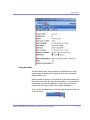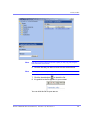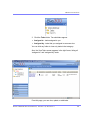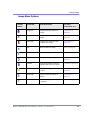
1
Ektron CMS200/300 User Manual Version 4.5, Revision 3 Ektron® Inc. 5 Northern Blvd., Suite 6 Amherst, NH 03031 Tel: +1 603-594-0249 Fax: +1 603-594-0258 Email: [email protected] http://www.ektron.com Copyright 2004 Ektron®, Inc. All rights reserved. EKTRON is a registered trademark of Ektron, Inc. Version 4.5, Revision 3, July 9, 2004 For updated versions of this manual, please visit: http://www.ektron.com/download_center.cfm EKTRON, INC. SOFTWARE LICENSE AGREEMENT ** READ THIS BEFORE LOADING SOFTWARE** YOUR RIGHT TO USE THE PRODUCT DELIVERED IS SUBJECT TO THE TERMS AND CONDITIONS SET OUT IN THIS LICENSE AGREEMENT. USING THIS PRODUCT SIGNIFIES YOUR AGREEMENT TO THESE TERMS. IF YOU DO NOT AGREE TO THIS SOFTWARE LICENSE AGREEMENT, DO NOT DOWNLOAD. CUSTOMER should carefully read the following terms and conditions before using the software program(s) contained herein (the “Software”). Downloading and/or using the Software or copying the Software onto CUSTOMER’S computer hard drive indicates CUSTOMER’S acceptance of these terms and conditions. If CUSTOMER does not agree with the terms of this agreement, CUSTOMER should not download. Ektron, Inc. (“Ektron”) grants, and the CUSTOMER accepts, a nontransferable and nonexclusive License to use the Software on the following terms and conditions: 1. Right to use: The Software is licensed for use only in delivered code form. Each copy of the Software is licensed for use only on a single URL. Each license is valid for the number of seats listed below (the “Basic Package”). Any use of the Software beyond the number of authorized seats contained in the Basic Package without paying additional license fees as provided herein shall cause this license to terminate. Should CUSTOMER wish to add seats beyond the seats licensed in the Basic Package, the CUSTOMER may add seats on a block basis at the then current price for additional seats (see product pages for current price). The Basic Packages are as follows: Ektron eMPower for ColdFusion -- Licensed for ten seats (10 named users) per URL. Ektron CMS100 -- Licensed for five seats (5 named users) per URL. Ektron CMS200 -- Licensed for ten seats (10 named users) per URL. Ektron CMS300 -- Licensed for ten seats (10 named users) per URL. Ektron eWebEditPro -- Licensed for ten seats (10 named users) per URL. Ektron eWebEditPro+XML — Licensed for ten seats (10 named users) per URL. Ektron eWebWP — Licensed for unlimited seats per URL. For purposes of this section, the term “seat” shall mean an individual user provided access to the capabilities of the Software. The CUSTOMER may not modify, alter, reverse engineer, disassemble, or decompiler the Software. This software product is licensed, not sold. 2. Duration: This License shall continue so long as CUSTOMER uses the Software in compliance with this License. Should CUSTOMER breach any of its obligations hereunder, CUSTOMER agrees to return all copies of the Software and this License upon notification and demand by Ektron. 3. Copyright: The Software (including any images, “applets,” photographs, animations, video, audio, music and text incorporated into the Software) as well as any accompanying written materials (the “Documentation”) is owned by Ektron or its suppliers, is protected by United States copyright laws and international treaties, and contains confidential information and trade secrets. CUSTOMER agrees to protect the confidentiality of the Software and Documentation. CUSTOMER agrees that it will not provide a copy of this Software or Documentation nor divulge any proprietary information of Ektron to any person, other than its employees, without the prior consent of Ektron; CUSTOMER shall use its best efforts to see that any user of the Software licensed hereunder complies with this license. 4. Limited Warranty: Ektron warrants solely that the medium upon which the Software is delivered will be free from defects in material and workmanship under normal, proper and intended usage for a period of three (3) months from the date of receipt. Ektron does not warrant the use of the Software will be uninterrupted or error free, nor that program errors will be corrected. This limited warranty shall not apply to any error or failure resulting from (i) machine error, (ii) Customer's failure to follow operating instructions, (iii) negligence or accident, or (iv) modifications to the Software by any person or entity other than Company. In the event of a breach of warranty, Customer’s sole and exclusive remedy, is repair of all or any portion of the Software. If such remedy fails of its essential purpose, Customer’s sole remedy and Ektron’s maximum liability shall be a refund of the paid purchase price for the defective Products only. This limited warranty is only valid if Ektron receives written notice of breach of warranty within thirty days after the warranty period expires. 5. Limitation of Warranties and Liability: THE SOFTWARE AND DOCUMENTATION ARE SOLD “AS IS” AND WITHOUT ANY WARRANTIES AS TO THE PERFORMANCE, MERCHANTIBILITY, DESIGN, OR OPERATION OF THE SOFTWARE. NO WARRANTY OF FITNESS FOR A PARTICULAR PURPOSE IS OFFERED. EXCEPT AS DESCRIBED IN SECTION 4, ALL WARRANTIES EXPRESS AND IMPLIED ARE HEREBY DISCLAIMED. NEITHER COMPANY NOR ITS SUPPLIERS SHALL BE LIABLE FOR ANY LOSS OF PROFITS, LOSS OF BUSINESS OR GOODWILL, LOSS OF DATA OR USE OF DATA, INTERRUPTION OF BUSINESS NOR FOR ANY OTHER INDIRECT, SPECIAL, INCIDENTAL, OR CONSEQUENTIAL DAMAGES OF ANY KIND UNDER OR ARISING OUT OF, OR IN ANY RELATED TO THIS AGREEMENT, HOWEVER, CAUSED, WHETHER FOR BREACH OF WARRANTY, BREACH OR REPUDIATION OF CONTRACT, TORT, NEGLIGENCE, OR OTHERWISE, EVEN IF COMPANY OR ITS REPRESENTATIVES HAVE BEEN ADVISED OF THE POSSIBILITY OF SUCH LOSS. 6. Miscellaneous: This License Agreement, the License granted hereunder, and the Software may not be assigned or in any way transferred without the prior written consent of Ektron. This Agreement and its performance and all claims arising from the relationship between the parties contemplated herein shall be governed by, construed and enforced in accordance with the laws of the State of New Hampshire without regard to conflict of laws principles thereof. The parties agree that any action brought in connection with this Agreement shall be maintained only in a court of competent subject matter jurisdiction located in the State of New Hampshire or in any court to which appeal therefrom may be taken. The parties hereby consent to the exclusive personal jurisdiction of such courts in the State of New Hampshire for all such purposes. The United Nations Convention on Contracts for the International Sale of Goods is specifically excluded from governing this License. If any provision of this License is to be held unenforceable, such holding will not affect the validity of the other provisions hereof. Failure of a party to enforce any provision of this Agreement shall not constitute or be construed as a waiver of such provision or of the right to enforce such provision. If you fail to comply with any term of this License, YOUR LICENSE IS AUTOMATICALLY TERMINATED. This License represents the entire understanding between the parties with respect to its subject matter. YOU ACKNOWLEDGE THAT YOU HAVE READ THIS AGREEMENT, THAT YOU UNDERSTAND THIS AGREEMENT, AND UNDERSTAND THAT BY CONTINUING THE INSTALLATION OF THE SOFTWARE, BY LOADING OR RUNNING THE SOFTWARE, OR BY PLACING OR COPYING THE SOFTWARE ONTO YOUR COMPUTER HARD DRIVE, YOU AGREE TO BE BOUND BY THIS AGREEMENT’S TERMS AND CONDITIONS. YOU FURTHER AGREE THAT, EXCEPT FOR WRITTEN SEPARATE AGREEMENTS BETWEEN EKTRON AND YOU, THIS AGREEMENT IS A COMPLETE AND EXCLUSIVE STATEMENT OF THE RIGHTS AND LIABILITIES OF THE PARTIES. Copyright 1999 - 2003 Ektron, Inc. All rights reserved. LA10031, Revision 1.4 Table of Contents Author’s Note .......................................................................i Introduction to Ektron CMS200/300...................................1 What is a Content Block? ........................................................... 1 Workflow in Ektron CMS200/300 ................................................ 2 Editing a Content Block .............................................................. 3 The Lifecycle of a Content Block ............................................... 4 Logging In and Out .............................................................6 Prerequisites ................................................................................ 6 Logging into the Sample Web Site............................................. 6 Site Preview.................................................................................. 8 Logging Out of the Sample Site ................................................. 9 The Button Menu ...............................................................11 Meaning of Border Color........................................................... 12 Preview ....................................................................................... 13 The Workarea.....................................................................14 Accessing the Workarea ........................................................... 14 Understanding the Smart Desktop ........................................... 15 Navigating Within the Smart Desktop...................................... 17 Workarea Toolbar....................................................................... 22 Working with Folders and Content Blocks .....................27 Viewing a Folder ........................................................................ 29 Viewing a Content Block ........................................................... 31 Adding a Content Block ............................................................ 36 Editing a Content Block ............................................................ 39 Deleting a Content Block .......................................................... 42 Adding Sub-Folders .................................................................. 43 Deleting Folders......................................................................... 46 Scheduling Content to Begin and End............................47 How Does It Work? .................................................................... 47 Setting a Start Date.................................................................... 47 Ektr on CM S2 00/30 0 U se r Man ual, Ver sion 4.5, Re vi sion 3 v Setting an End Date on a Content Block ................................. 50 Adding a Content Block Summary ..................................53 Creating Summaries .................................................................. 54 Adding or Editing Metadata..............................................59 What is Metadata? ..................................................................... 59 Approving/Declining Content Blocks..............................62 Approve/Decline One Content Block ....................................... 63 Approve Multiple Content Blocks ............................................ 66 Example of an Approval Chain ................................................. 68 Viewing and Restoring Previous Content Blocks ..........81 Comparing Versions of a Content Block.........................84 Introduction................................................................................ 84 When Can I Compare Content? ................................................ 84 The Compare Content Window................................................. 85 First Use of the View Content Difference Feature .................. 90 Content Workflow Reports ...............................................91 Accessing the Reports Folder .................................................. 91 Approvals Reports..................................................................... 95 Checked In Report ..................................................................... 96 Checked Out Report .................................................................. 97 New Content Report .................................................................. 97 Submitted Report....................................................................... 97 Pending Start Date..................................................................... 98 Expired Content ......................................................................... 98 Library Folder ....................................................................99 Terms Used in this Chapter ...................................................... 99 Accessing The Library ............................................................ 100 Searching the Library .............................................................. 102 Files........................................................................................... 104 Hyperlinks ................................................................................ 117 Images ...................................................................................... 117 Quicklinks................................................................................. 119 Working with Collections ...............................................121 Ektr on CM S2 00/30 0 U se r Man ual, Ver sion 4.5, Re vi sion 3 vi Finding Collections ................................................................. 122 Viewing a Collection ................................................................ 126 Creating a Collection ............................................................... 128 Editing Content Blocks in a Collection.................................. 136 Reordering Collections List .................................................... 137 Editing Collection Information ............................................... 138 Deleting a Collection ............................................................... 139 Working with Calendars .................................................140 Understanding Calendars ....................................................... 141 Accessing the List of Calendars ............................................ 143 Viewing a Calendar .................................................................. 147 Viewing a Calendar Event ....................................................... 149 Adding a Calendar Event ........................................................ 151 Adding a New Content Block for a Calendar Event.............. 156 Editing Calendar Events.......................................................... 159 Deleting Calendar Events........................................................ 161 Updating Your User Profile.............................................163 Viewing Your Profile ................................................................ 163 Accessing Online Help ...................................................167 Searching for Content.....................................................171 Search Options ........................................................................ 171 Managing Tasks...............................................................173 Accessing the Tasks Folder.................................................... 173 Creating a Task ........................................................................ 175 Viewing a Task ......................................................................... 177 Editing a Task........................................................................... 178 Adding Comments to Tasks.................................................... 179 Deleting A Task ........................................................................ 182 Attaching a Task to a Content Block...................................... 183 Task Module Toolbar ............................................................... 184 Introduction to eWebeditPro+XML ................................186 Using eWebeditPro+XML ...................................................................... 187 Organization of this Documentation ...................................... 187 Creating a Simple Web Page..........................................188 Ektr on CM S2 00/30 0 U se r Man ual, Ver sion 4.5, Re vi sion 3 vii Your Finished Web Page ......................................................... 188 Creating the Sample Web Page .............................................. 189 Toolbar Buttons...............................................................192 Selecting Text........................................................................... 192 Applying Formatting Attributes to Text ................................. 193 Table of Toolbar Buttons and Drop-Down Lists.................... 193 Customizing Your Toolbar ..............................................207 Removing Or Adding Menus .................................................. 208 Removing or Adding Menu Items........................................... 209 Restoring Toolbars .................................................................. 211 Rearranging the Menus on a Toolbar..................................... 211 Creating a New Menu .............................................................. 211 Moving a Menu Off the Toolbar .............................................. 213 Changing the Menu’s Orientation........................................... 213 The Context Sensitive Menu ..........................................215 Using eWebeditPro+XML’s Advanced Features ...........218 Copying from Other Applications....................................... 219 Finding and Replacing Text ................................................ 220 Finding Text.............................................................................. 220 Finding and Replacing Text .................................................... 220 Additional Options on the Dialog Box ................................... 221 Checking Spelling ................................................................ 224 Disabling Script Blocking ....................................................... 224 Checking Spelling as You Type .............................................. 224 Checking Spelling Upon Demand .......................................... 225 Setting Spell Check Options................................................... 227 Editing in Microsoft Word.................................................... 229 Uploading an Image in a Microsoft Word Document............ 230 Editing XML Documents.......................................................... 230 Inserting Images................................................................... 232 Using the First Picture Properties Dialog Box ...................... 233 Using the Second Media Selection Dialog Box..................... 237 Moving an Image to the Server............................................... 245 Deleting a Picture .................................................................... 246 Editing Images...................................................................... 247 Using WebImageFX ................................................................. 247 Toolbar Buttons and Menu Commands ................................. 249 Specifying Color Depth ........................................................... 279 Ektr on CM S2 00/30 0 U se r Man ual, Ver sion 4.5, Re vi sion 3 viii Introduction to Tables.......................................................... 280 Creating a Table ....................................................................... 281 Deleting a Table ....................................................................... 282 Inserting a Table within a Table .............................................. 282 Table Dialog Boxes and Menus .......................................... 284 The Insert Table Menu ............................................................. 284 The Table Properties Dialog Box............................................ 286 The Cell Properties Dialog Box .............................................. 288 The Table Context Sensitive Menu......................................... 290 Manipulating Your Table’s Format ...................................... 293 Choosing the Number of Rows and Columns....................... 293 Specifying Table Width............................................................ 295 Specifying Horizontal Alignment............................................ 299 Table Backgrounds.................................................................. 301 Setting Table Borders.............................................................. 304 Working with Table Cells ..................................................... 308 Specifying the Width of a Cell ................................................ 308 Inserting a Cell ......................................................................... 310 Deleting a Cell .......................................................................... 311 Setting a Cell’s Border Color .................................................. 312 Specifying a Cell’s Background Color ................................... 314 Specifying a Background Image for a Cell ............................ 315 Spanning Rows or Columns ................................................... 318 Aligning Text Within a Cell...................................................... 321 Splitting a Cell .......................................................................... 327 Merging Two Cells ................................................................... 328 Word Wrap................................................................................ 329 Setting Cell Padding and Spacing.......................................... 331 Using Bookmarks................................................................. 333 Creating a Bookmark............................................................... 333 Changing the Destination Window......................................... 335 Using Hyperlinks.................................................................. 337 Creating a Hyperlink ................................................................ 337 Testing a Hyperlink .................................................................. 340 Creating a Hyperlink to a Location Within a Web Page ....... 340 Editing a Hyperlink .................................................................. 342 Removing a Hyperlink ............................................................. 342 Preventing a URL from Becoming a Hyperlink ..................... 342 Working with HTML.............................................................. 343 Viewing and Editing HTML...................................................... 343 Inserting HTML......................................................................... 344 Cleaning HTML......................................................................... 345 Inserting Content from MS Office 2000.................................. 346 Ektr on CM S2 00/30 0 U se r Man ual, Ver sion 4.5, Re vi sion 3 ix Section 508 Compliance .................................................347 Moving the Cursor into eWebeditPro+XML ........................... 347 Using eWebeditPro+XML without a Mouse ........................... 348 Section 508 Tables................................................................... 350 Editing XML Web Pages .................................................354 A Typical XML Screen.............................................................. 354 Custom Tag Menu Options ..................................................... 356 Inserting XML Tags .................................................................. 356 The Custom Tag Attributes Dialog ......................................... 358 The Insert Custom Tag Dialog Box ........................................ 360 Using the Data Designer.................................................363 Introduction.............................................................................. 363 Differences in eWebeditPro+XML .......................................... 364 Design Mode vs. Data Entry Mode ......................................... 366 Designing a Screen ................................................................. 366 Inserting a Field Type .............................................................. 367 Sample Screen Design ............................................................ 369 Data Designer Field Types ...................................................... 375 Entering Comments ........................................................415 Appendix A: Content Statuses.......................................417 Active Content ......................................................................... 418 Checked-In Content................................................................. 418 Checked Out Content .............................................................. 421 Submitted Content................................................................... 421 Marked for Deletion Content................................................... 423 Pending Start Date Content .................................................... 424 Staged Content ........................................................................ 424 Ektr on CM S2 00/30 0 U se r Man ual, Ver sion 4.5, Re vi sion 3 x Author’s Note Author ’s No te This manual documents both Ektron CMS200 and Ektron CMS300. With the exception of a few features that are labeled CMS300 only, Ektron CMS300 and Ektron CMS200 have the same functionality. In this manual, some screens show CMS300 in the title bar, and some directory paths mention CMS300, such as C:/Program Files/Ektron/CMS300/Utilities/. If you are using CMS200, substitute 200 for 300 in these cases. Ektr on CM S2 00/30 0 U se r Man ual, Ver sion 4.5, Re vi sion 3 i Introduction to Ektron CMS200/300 Introduction to Ektron CMS200/ 300 Using Ektron CMS200/300 to manage Web content is easy once you know the basics of setting up and maintaining your site. This manual explains how to maintain an Ektron CMS200/300 site from a user’s point of view. By reading this manual, you will gain an understanding of how Ektron CMS200/300 works. This section introduces basic concepts that you should understand before beginning to work with Ektron CMS200/300. What is a Content Block? Any Web site consists of several pages. Each page is made up of one or more blocks of content. For example, the home page of the sample Web site that is installed with Ektron CMS200/300 is below. After you log in to Ektron CMS200/300, you will see that the page has three content blocks, each surrounded by a border. Ektr on CM S2 00/30 0 U se r Man ual, Ver sion 4.5, Re vi sion 3 1 Introduction to Ektron CMS200/300 Your system administrator controls the design of each page and determines which content blocks appear in which location. If granted permission by your administrator, you can create new content blocks, and edit or delete existing ones. Most of your work with Ektron CMS200/300 involves working with content blocks. Workflow in Ektron CMS200/300 Organizations typically want a Web site that is updated frequently with the latest information. They also want to decentralize the updating process, so that users with no technical background from any department can make changes. Further, organizations want oversight over those changes to ensure the accuracy of the information, that the content adheres to corporate guidelines, etc. Ektron CMS200/300 manages the lifecycle of a content block, from creation through approval and publication. It helps your organization set up a process for overseeing changes to a Web site, indicate a content block’s status within that lifecycle, and inform the next person on the list of approvers that it is their turn to review the content block. Ektr on CM S2 00/30 0 U se r Man ual, Ver sion 4.5, Re vi sion 3 2 Introduction to Ektron CMS200/300 Editing a Content Block Finding a Content Block A lot of your work involves editing existing content or creating new content. Ektron CMS200/300 provides three methods for finding content to be updated. You can use whichever method is easiest. • Navigate through your Web site to the content block you want to edit • Find the content block through the Workarea, which resembles Windows Explorer and lets you find a content block by navigating through a folder tree. See Also: ”The Workarea” on page 14 • Use the Search button ( ), which appears on many screens. When clicked, the search button displays a screen that prompts you to enter keywords and then finds content blocks that contain those keywords. See Also: ”Searching for Content” on page 171 The Editing Process After you find the content block, you click the Edit button ( ) to open it in an editor. Below is an example of a content block in the editor. Ektr on CM S2 00/30 0 U se r Man ual, Ver sion 4.5, Re vi sion 3 3 Introduction to Ektron CMS200/300 The editor resembles popular word processing software. You can enter text, then select it and click a button to change its display properties. For example, you can make text bold, change the color, or copy and paste it. You can also insert images, tables, links to other Web pages and check spelling, The Lifecycle of a Content Block After you edit the content block, you typically submit it for approval by one or more individuals who oversee changes to your Web site. These people can review, edit and approve the change. When the last approver signs off, the new content becomes available on the Web site. In some cases, you are one of the content approvers. In this case, you receive an email notifying you that a content block needs approval. You look it over, change it as needed, then pass it on to the next approver. If you do not agree with the changes, you can Ektr on CM S2 00/30 0 U se r Man ual, Ver sion 4.5, Re vi sion 3 4 Introduction to Ektron CMS200/300 decline the request. In this case, the user who made the edits is informed that the change is not approved. The following graphic illustrates the content approval cycle. To help track a content block’s position in this workflow, Ektron CMS200/300 assigns a status to each content block. The status determines what you can do with a content block, and indicates what must occur in order for it to get published to the web site. For more information, see ”Appendix A: Content Statuses” on page 417. Ektr on CM S2 00/30 0 U se r Man ual, Ver sion 4.5, Re vi sion 3 5 Logging In and Out Logging In and Out This section explains how to log in and out of Ektron CMS200/300, and to use the site preview feature. Prerequisites Once your Webmaster or administrator installs Ektron CMS200/ 300, you need the following items before you can use it. • URL (Web address) of Ektron CMS200/300 Web site • Username and Password Once you acquire both, you can log into Ektron CMS200/300 and begin managing your Web site content. NOTE This manual uses the Ektron CMS200/300 sample Web site to demonstrate the product. Logging into the Sample Web Site To access the Ektron CMS200/300 sample site: 1. In your Web browser, navigate to the URL of your Ektron CMS200/300 Web site. Your system administrator provides this. 2. Click Login at the top right corner of the screen. Ektr on CM S2 00/30 0 U se r Man ual, Ver sion 4.5, Re vi sion 3 6 Logging In and Out 3. The login screen appears. 4. Click the login button. 5. The login dialog box appears. 6. Enter your username and password. 7. Click the login button. 8. The Web page appears. You can navigate around your Web site as you could before signing in. But now, the content is surrounded by a colored box with small buttons in the top left corner (illustrated below). Ektr on CM S2 00/30 0 U se r Man ual, Ver sion 4.5, Re vi sion 3 7 Logging In and Out Site Preview While logged into Ektron CMS200/300, you can preview the Web site as it would appear to visitors, or view it in Ektron CMS200/300 view. Button Name Description Preview On Content blocks appear as last edited. Preview Off The most recently published versions of content blocks appear. In this mode, colored borders surround content blocks, allowing you to perform tasks on them. Toggling Site Preview To toggle site preview on and off, follow these steps. 1. Navigate to your login screen. 2. The logout, workarea, and preview buttons appear. Ektr on CM S2 00/30 0 U se r Man ual, Ver sion 4.5, Re vi sion 3 8 Logging In and Out 3. Click on the preview button. 4. The Web site is now in preview mode. 5. To turn preview mode off, click the ( login screen. ) button on the Logging Out of the Sample Site To log out of Ektron CMS200/300, follow these steps. 1. Click the Logout button ( ) in a content block’s button menu, or click the logout button ( Ektr on CM S2 00/30 0 U se r Man ual, Ver sion 4.5, Re vi sion 3 ). 9 Logging In and Out 2. The Logout confirmation box appears: 3. Click the logout button. 4. You return to the Web page from which you logged out. However, it is in standard view, not Ektron CMS200/300 view. Ektr on CM S2 00/30 0 U se r Man ual, Ver sion 4.5, Re vi sion 3 10 The Button Menu The Button Menu After you sign in to Ektron CMS200/300, you will notice a button menu in the top left corner of every content block (circled in red below). Use the button menu to perform tasks and display important information. The menu buttons change depending on the status of the content block or your permission level for the content block. See Also: ”Appendix A: Content Statuses” on page 417. NOTE Permissions are explained in the Ektron CMS200/300 Administrator manual. The following table describes each button that may appear. Button Name Description More Information Approve Approve or decline a request to publish or delete a content block ”Approving/Declining Content Blocks” on page 62 Assign Task Assign a task to a user ”Managing Tasks” on page 173 Delete Submit request to delete content block ”Deleting a Content Block” on page 42 Edit Check out content block for editing ”Editing a Content Block” on page 39 Ektr on CM S2 00/30 0 U se r Man ual, Ver sion 4.5, Re vi sion 3 11 The Button Menu Button Name Description More Information Logout Log out of Ektron CMS200/300 view of Web site ”Logging Out of the Sample Site” on page 9 Preview Preview content block before it is published ”Preview” on page 13 Properties Open content block’s View Content page ”Viewing a Content Block” on page 31 View Content Difference Display differences between a previous and published version of content block ”Comparing Versions of a Content Block” on page 84 View History Open View History area, where you can view previous versions of content block ”Viewing and Restoring Previous Content Blocks” on page 81 Workarea Opens Workarea, from which you can perform all Ektron CMS200/300 tasks. ”The Workarea” on page 14 Meaning of Border Color Each border color indicates the status of the content block. These colors are explained in ”Appendix A: Content Statuses” on page 417. To see a more detailed status of any Ektron CMS200/300 content block, hover your cursor over the properties button. If you do, the content block’s title and current status appear (illustrated below). Ektr on CM S2 00/30 0 U se r Man ual, Ver sion 4.5, Re vi sion 3 12 The Button Menu Preview The Preview button lets you preview the currently checked in content. When you click the button, a new window opens with the content block that has been edited but not yet published. You can see how the content block will appear on the Web site. You can only preview a content block that you checked in. Ektr on CM S2 00/30 0 U se r Man ual, Ver sion 4.5, Re vi sion 3 13 The Workarea The Workarea The Workarea is a central screen from which you can perform all activities within Ektron CMS200/300. From it, you can • access the Smart Desktop • view the system’s top level folders • navigate through the folder structure • perform tasks on content blocks within a folder Accessing the Workarea To access your workarea, follow these steps. 1. Click the workarea button at the bottom of the screen or click the workarea button ( menu. Ektr on CM S2 00/30 0 U se r Man ual, Ver sion 4.5, Re vi sion 3 ) in a content block’s button 14 The Workarea 2. The workarea appears. Closing the Workarea To close the workarea, click in the upper right corner of the window. When you close the workarea, you return to the Ektron CMS200/300 view of your Web site. You do not exit Ektron CMS200/300. Understanding the Smart Desktop Whenever you access your Workarea, the first screen to appear is the Smart Desktop. It consists of three main sections, illustrated below. Ektr on CM S2 00/30 0 U se r Man ual, Ver sion 4.5, Re vi sion 3 15 The Workarea • The right frame displays - Content awaiting approval - content blocks that you need to approve before they proceed to the next approver or be published if you are the final approver. See Also: ”Approvals Reports” on page 95 - Content currently checked out - all content in a checkedout status. This content cannot be edited by other users until the user who checked it out or the system administrator checks it in. See Also: ”Checked Out Report” on page 97 Ektr on CM S2 00/30 0 U se r Man ual, Ver sion 4.5, Re vi sion 3 16 The Workarea - A list of tasks assigned to you See Also: ”Managing Tasks” on page 173 NOTE The number to the right of each category lists the quantity of content blocks in that category for you. When you click an item, up to five content blocks in a category appear. To perform tasks on those content blocks, and to view additional blocks in that category, click the category. If you select a folder from the left frame, the right frame displays content blocks in that folder. If you select a content block from the list, information about it fills the right frame. • The top left frame displays the folder tree for the Smart Desktop folder, which has two sub-folders - Tasks (See ”Managing Tasks” on page 173) - Content Reports (see ”Content Workflow Reports” on page 91) • To bottom left frame displays the top-level folders in Ektron CMS200/300. Your display may be different depending on whether or not you are an administrator. - Forms folder - ”Working with Folders and Content Blocks” on page 27 - ”Library Folder” on page 99 - ”Modules Folder” on page 122 - Administrate folder, which includes ”Updating Your User Profile” on page 163 and ”Accessing Online Help” on page 167 Navigating Within the Smart Desktop Ektron CMS200/300’s top level folders appear in the lower left corner of the Smart Desktop. Use them to access all other folders. To open any top level folder, click it. When you do, it appears in the frame above. Typically, you would a click top-level folder to see its sub-folders, then click a sub-folder to see its content blocks. From the Smart Desktop, you can also: Ektr on CM S2 00/30 0 U se r Man ual, Ver sion 4.5, Re vi sion 3 17 The Workarea • ”Modify the Display of Top Level Folders” on page 18 • Use ”The Smart Desktop Button” on page 19 • ”Hide the Left Panel of the Workarea” on page 19 Modify the Display of Top Level Folders The display of top level folders can appear in two formats: • a full button with an icon and text ( ) • just an icon on the bottom of the left frame ( The full display is easier to see, but the icon format allows more space for the folder structure. You can decide which option best suits your needs. Switching Between Full Buttons and Icons By default, top-level folders appear as full buttons. To switch the display of all folders to icons, double click the down arrow circled below. To switch back to full buttons, double click the up arrow circled above. You can also switch the display of the folders one at a time by clicking the up or down arrow. As an alternative method of switching the display, you can Ektr on CM S2 00/30 0 U se r Man ual, Ver sion 4.5, Re vi sion 3 18 The Workarea 1. Place the cursor on the bar above the display of top-level folders. (The bar has several dots in the middle.) 2. When the cursor turns to a double headed arrow, drag it to the bottom bar. To return the display to full buttons, drag the same bar above. The Smart Desktop Button Click the button in the top left corner (circled below) to return to the Smart Desktop from wherever you are working in Ektron CMS200/ 300. Hide the Left Panel of the Workarea You can hide the left frame of the Workarea to provide more space for working in the right frame. Below is an example of the Workarea with a minimized left frame. Note that you cannot see the folder display in the left frame. Ektr on CM S2 00/30 0 U se r Man ual, Ver sion 4.5, Re vi sion 3 19 The Workarea To minimize the left frame, click the white X near the top of the left frame. The left frame remains minimized until you move the cursor to the left of the bar circled below. Ektr on CM S2 00/30 0 U se r Man ual, Ver sion 4.5, Re vi sion 3 20 The Workarea Using Auto Hide The Workarea screen also provides an autohide feature, which quickly switches between full right frame view and combination right-left frame view. When autohide is turned on, the left frame is minimized unless you place the cursor to the left of the bar circled above. If you place the cursor there, the left frame appears. As soon as you move the cursor back to the right frame, the left frame disappears. To turn on the autohide feature, click the push pin icon near the top of the left frame. Ektr on CM S2 00/30 0 U se r Man ual, Ver sion 4.5, Re vi sion 3 21 The Workarea When you do, the push pin turns 90 degrees to indicate autohide is on. To turn off autohide, move the cursor to the left frame and click the push pin icon. When you do, the push pin returns to its original position. Workarea Toolbar Throughout the workarea, a toolbar appears at the top of the screen and contains buttons for performing actions. This section explains the buttons’ functions to help you become more proficient with Ektron CMS200/300. Button Name Description Add Adds items in several places. Add Calendar Event Accesses the add calendar event screen in the workarea. See Also: ”” on page 124 Add Content Block In a content folder, opens the editor and allows you to create a new content block. See Also: ”Adding a Content Block” on page 36 Add Content Folder In a content folder, allows you to create a sub-folder to further organize your content blocks. See Also: ”Adding Sub-Folders” on page 43 Add Library Item In the library folder, allows you to upload an image or file, or add a hyperlink or quicklink to use in content. See Also: ”Library Folder” on page 99 Ektr on CM S2 00/30 0 U se r Man ual, Ver sion 4.5, Re vi sion 3 22 The Workarea Button Name Description Add Metadata Definition In the Metadata section of the workarea, allows you to add another metadata definition to your content block. See Also: ”Adding or Editing Metadata” on page 59 Add Task Assign task to a user. See Also: ”Managing Tasks” on page 173 Approvals View approval chain for folder or content block. See Also: ”Example of an Approval Chain” on page 198 Approve Approve content that awaits your approval. See Also: ”Preview” on page 13 Approve All In the approvals folder, approves all content awaiting your approval with one click. Back Return to previous screen. Calendar Lets you choose when content will go live. See Also: ”” on page 124 Cancel Cancels action you are performing without saving the information. Check-in Saves and checks in content block you are working on. See Also: ”Checked-In Content” on page 418 Check-out Checks out a content block to edit; prevents others from simultaneously working on it. ”Checked Out Content” on page 421 Collection Accesses the collection area for a content block; lets you create, edit, and delete collections. See Also: ”The screen is refreshed, and the content folder is deleted.” on page 46 Decline Declines an approval request submitted to you. Delete Deletes selected item. See Also: ”Preview” on page 13 Ektr on CM S2 00/30 0 U se r Man ual, Ver sion 4.5, Re vi sion 3 23 The Workarea Button Name Description Delete Content Deletes multiple content blocks at once. Delete Folder Deletes current content folder. Do Not Apply XSLT Removes XSLT applied to XML content viewed in the content history area. Edit Edits content or specific criteria in the workarea. See Also: ”Preview” on page 13 Edit Metadata Edits metadata for a content block. See Also: ”Adding or Editing Metadata” on page 59 Edit Summary Edits summary for a content block. See Also: ”Adding a Content Block Summary” on page 53 Insert Library Item Inserts selected library item into your content block. See Also: ”Library Folder” on page 99 Link Check Identifies any contenty blocks or assets with a hyperlink to the current content block. You would typically use this feature to remove the links before deleting a content block. If you do not remove the links, they will be inoperative after the content block is deleted. Overwrite Replaces an image or file with a newer version. See Also: ”Overwriting Files” on page 112 Preview Previews item that was or will be added. See Also: ”Preview” on page 13 Publish Save and publish the content block. Ektr on CM S2 00/30 0 U se r Man ual, Ver sion 4.5, Re vi sion 3 24 The Workarea Button Name Description Remove Removes items from folders and lists in the Workarea. Reorder Changes the sequence of links in a collection. See Also: ”The screen is refreshed, and the content folder is deleted.” on page 46 Restore Restores previously published content block. See Also: ”Viewing and Restoring Previous Content Blocks” on page 81 Save Saves content that was modified. Search Searches content and library folder screens. See Also: ”Searching the Library” on page 102; ”Searching for Content” on page 171 Show Calendar Displays the calendar in the workarea. See Also: ”” on page 124 Submit Saves and submits content to next approver in the approval chain. See Also: ”Example of an Approval Chain” on page 198 Update Changes are saved and content is updated. View Date View all calendar events for a selected day. See Also: ”” on page 124 View Difference Opens the View Content Difference feature. See Also: ”Comparing Versions of a Content Block” on page 84 View History View history of selected content block. See Also: ”Viewing and Restoring Previous Content Blocks” on page 81 Ektr on CM S2 00/30 0 U se r Man ual, Ver sion 4.5, Re vi sion 3 25 The Workarea Button Name Description View Published Displays currently published version of content block. View Staged Displays staged content. See Also: ”Staged Content” on page 424 Ektr on CM S2 00/30 0 U se r Man ual, Ver sion 4.5, Re vi sion 3 26 Working with Folders and Content Blocks Work i n g w i t h F o ld e rs a n d Content Blocks Every content block resides in the Content folder or one of its subfolders. So, to work with an existing content block or create a new one, you must first navigate to its folder. A typical content folder screen appears below. It consists of three sections: • The top left frame shows the folder structure. You can click any folder to display its content blocks in the right frame, while its sub-folders appear below it. • The right frame shows content blocks in the currently selected folder. Above the right frame is a toolbar of buttons that represent tasks you can perform on a selected content block. • The lower left frame shows Ektron CMS200/300’s top level folders Ektr on CM S2 00/30 0 U se r Man ual, Ver sion 4.5, Re vi sion 3 27 Working with Folders and Content Blocks In this chapter, you learn about adding, editing, publishing, and deleting content blocks through the following subtopics. (Permissions and Approvals are discussed in later chapters.) • ”Viewing a Folder” on page 29 • ”Viewing a Content Block” on page 31 • ”Adding a Content Block” on page 36 • ”Editing a Content Block” on page 39 • ”Deleting a Content Block” on page 42 • ”Adding Sub-Folders” on page 43 • ”Deleting Folders” on page 46 Ektr on CM S2 00/30 0 U se r Man ual, Ver sion 4.5, Re vi sion 3 28 Working with Folders and Content Blocks Viewing a Folder To view any folder under the content folder, follow these steps. 1. Access the Workarea as described in ”Site Preview” on page 8. 2. Click the content folder from the left lower side of the Workarea. 3. All content blocks in the content folder appear on the right side of the screen. The content folder’s sub-folders appear in the upper left frame. 4. To work with any folder or its content blocks, click the folder. When you do, its content blocks appear in the right frame, and its sub-folders appear in the upper left frame. NOTE You can only view folders for which your system administrator has granted permission. Ektr on CM S2 00/30 0 U se r Man ual, Ver sion 4.5, Re vi sion 3 29 Working with Folders and Content Blocks Each folder lists the following information about its content blocks. Field Description Title The name of the content block. ID The number assigned to the content block by Ektron CMS200/300. It is used to retrieve the content block from a database. Status The status of the content block. See Also: ”Appendix A: Content Statuses” on page 417 Date Modified The most recent date the content block was added, edited, or published. Last Editor The last user who accessed the content block. Each folder also provides the following toolbar options. Ektr on CM S2 00/30 0 U se r Man ual, Ver sion 4.5, Re vi sion 3 30 Working with Folders and Content Blocks NOTE Button Depending on your permissions, you may not see all toolbar buttons. Name Description More Information Add Content Opens the editor and creates a new content block in the current folder. ”Adding a Content Block” on page 36 Add Folder Adds a sub-folder to the current folder. ”Adding Sub-Folders” on page 43 Delete Folder Deletes the current folder. ”Deleting Folders” on page 46 Note: You cannot delete the Content folder. Collections Adds, edits, or deletes a collection from the content folder. Menus View and work with menus assigned to this content block Search Look for content in the folder. View Properties View the folder’s properties ”Working with Collections” on page 121 ”Searching for Content” on page 171 Viewing a Content Block You can view all content blocks that have been created in your Ektron CMS200/300 Web site. Viewing content blocks allows you to view the content, metadata, summaries, and other content block information. To view a content block in Ektron CMS200/300, follow these steps. Ektr on CM S2 00/30 0 U se r Man ual, Ver sion 4.5, Re vi sion 3 31 Working with Folders and Content Blocks 1. Navigate to the folder that contains the content block, as explained in ”Viewing a Folder” on page 29. 2. Click the content block. 3. The view content screen appears. Ektr on CM S2 00/30 0 U se r Man ual, Ver sion 4.5, Re vi sion 3 32 Working with Folders and Content Blocks The view content screen contains information about the content block, including: Field Description Content Title The title assigned to the content block Content ID The ID number assigned to the content block. The ID number is used to retrieve content from a database. Status The current status of the content block See Also: ”Appendix A: Content Statuses” on page 417 Last User to Edit The last user to edit this content block Last Edit Date When the content block was last edited Ektr on CM S2 00/30 0 U se r Man ual, Ver sion 4.5, Re vi sion 3 33 Working with Folders and Content Blocks Field Description Start Date When the content block will go live on the Web site End Date When the content will be removed from the Web site Date Created When the content block was created Approval Method Whether all approvers must sign off on content block before it is published; managed by your system administrator Approvals The users in the approval chain for this content block. See Also: ”Approving/ Declining Content Blocks” on page 62 XML Configuration The XML Configuration applied to the content block. This is typically managed by your system administrator. Path The folder path to the content’s folder. A slash (\) represents the Content folder. Content Searchable Yes appears if the content will be found when someone searches your Web site. See Also: ”Searching for Content” on page 171 History Comment Comment that was added when content block was created or edited Content The body of the content block 4. After you enter the content, you have the following options. NOTE Button Your options may vary according to your permissions and the status of the content block. Name Description For more information, see Edit Content Block Open content block for editing ”Editing a Content Block” on page 39 Ektr on CM S2 00/30 0 U se r Man ual, Ver sion 4.5, Re vi sion 3 34 Working with Folders and Content Blocks Button Name Description For more information, see Edit Summary Click this button to edit the summary for the content block ”Adding a Content Block Summary” on page 53 Note: You can only edit the summary if the new content has been saved. Edit Metadata Edit this content block’s metadata ”Adding or Editing Metadata” on page 59 See Also: ”Example of an Approval Chain” on page 198 View History View all available older versions of the content block; restore older version ”Viewing and Restoring Previous Content Blocks” on page 81 Submit Submit the content block into the approval chain. This action also returns the changed content to the database and exits the editor. See Also: ”Approving/Declining Content Blocks” on page 62 View Staged Displays staged content. ”Staged Content” on page 424 View Difference Compares current version with earlier version of content ”Comparing Versions of a Content Block” Delete Delete content block ”Deleting a Content Block” on page 42 Check for content linked to this content Identify all content blocks with quicklinks to this content block ”Checking for Broken Quicklinks” on page 43 Add Task Attach a task to a content block ”Attaching a Task to a Content Block” on page 183 Return Go back to previous menu Ektr on CM S2 00/30 0 U se r Man ual, Ver sion 4.5, Re vi sion 3 35 Working with Folders and Content Blocks Adding a Content Block If you have permission to add a content block to a folder, you can create content blocks for that folder. After you create the content block, your system administrator must insert in onto a page on your Web site. The following flowchart illustrates a typical sequence of events when working with content blocks. To add a content block, follow these steps. 1. Browse to the folder where you want to create the new content block. 2. Click the add button ( ). 3. The Add Content window opens. Ektr on CM S2 00/30 0 U se r Man ual, Ver sion 4.5, Re vi sion 3 36 Working with Folders and Content Blocks 4. Create content in the editor using the following table. Responding to the Fields on the Add Content Screen . Field Description Title Enter a title for the content block. Comment Briefly describe the content, or comment on changes made when editing a content block. The history comment appears on the View Content and Content History screens. Ektr on CM S2 00/30 0 U se r Man ual, Ver sion 4.5, Re vi sion 3 37 Working with Folders and Content Blocks Field Description Add to Quicklinks Table Check if you want to save a Quicklink to this content block. Content Searchable Check this box if the content should be found when someone searches your Web site. See Also: ”Searching for Content” on page 171 Start Date If the content block will not be submitted to the approval chain immediately, enter a date when it will be submitted. ”A quicklink is a special kind of hyperlink that jumps to another content block on your Web site. (A regular hyperlink jumps to a Web page on the internet.)” See Also: ”Scheduling Content to Begin and End” on page 47 End Date If appropriate, enter a date when the content will no longer be viewable on the Web site. See Also: ”Setting an End Date on a Content Block” on page 50 Body Text Insert content for the content block. For more information about using E kt r o n CM S 20 0 / 3 0 0 ’s editor, see ”Using eWebEditPro” on page 247. 5. After you respond to the above fields and enter the content, the following options are available. Toolbar Options on the Add Content Screen . Button Name Description Edit Summary Click this button to edit the summary for the content block Note: You can only edit the summary if the new content has been saved. See Also: ”Adding a Content Block Summary” on page 53 Ektr on CM S2 00/30 0 U se r Man ual, Ver sion 4.5, Re vi sion 3 38 Working with Folders and Content Blocks Button Name Description Edit Metadata Edit this content block’s metadata. Note: All required metadata needs to be added before the content block can be submitted into the approval chain. See Also: ”Adding or Editing Metadata” on page 59; ”Example of an Approval Chain” on page 198 Submit Submit the content block into the approval chain. This action also returns the changed content to the database and exits the editor. See Also: ”Approving/Declining Content Blocks” on page 62 Publish Publish the content to the Web site. Note: Only the last approver in the approval chain sees this button. See Also: ”Approving/Declining Content Blocks” on page 62 This action also returns the changed content to the database and exits the editor. Check In Save and check-in the document. This action returns the changed content to the database and exits the editor. It does not submit the content into the approval chain. Rather, it allows you and other users to continue changing it. Save Save the content without leaving the editor. It is a good idea to save your work frequently. Cancel Close the editor without saving changes. Editing a Content Block Ektron CMS200/300 content can be in any of several statuses, as described in ”Appendix A: Content Statuses” on page 417. You can only edit a content block for which you have permission and which is in one of the following statuses: • published • checked in • checked out by you Ektr on CM S2 00/30 0 U se r Man ual, Ver sion 4.5, Re vi sion 3 39 Working with Folders and Content Blocks • submitted for your approval NOTE Once you check out a content block, it cannot be checked out by other users until you check it in. Editing a Content Block 1. Access the view content screen for the content block you want to edit, as described in ”Viewing a Content Block” on page 31. 2. Click the edit button ( ). 3. The editor opens with the content block inserted. Ektr on CM S2 00/30 0 U se r Man ual, Ver sion 4.5, Re vi sion 3 40 Working with Folders and Content Blocks 4. From the edit content window, you can: • Edit content • Save changes • Check in the content • Create or edit a summary • Specify metadata for the content • Submit the content for approval • Publish a content block to the Web site • Access the Library 5. Make the necessary edits to the content block. For a description of the fields on the screen, see ”Responding to the Fields on the Add Content Screen” on page 37 Ektr on CM S2 00/30 0 U se r Man ual, Ver sion 4.5, Re vi sion 3 41 Working with Folders and Content Blocks 6. Choose a toolbar option from the top of the Edit Content window. These options are described in ”Toolbar Options on the Add Content Screen” on page 38. Deleting a Content Block NOTE The ability to delete a content block is a privilege granted by the system adminstrator. If you do not see a Delete button ( screen, you do not have permission to do so. ) on the View Content History The Delete command lets permanently delete content blocks that are no longer needed on your Web site. Just as in publishing a content block, a content block needs to go through the approval chain before it is removed. To delete a content block, follow these steps. 1. Access the view content screen for the content block you want to delete, as described in ”Viewing a Content Block” on page 31. 2. Click the delete button ( ). 3. The following message appears. 4. Click OK to delete the content block. 5. The screen is refreshed, and the updated content table appears. When the content block goes through the approval chain, it is deleted from Ektron CMS200/300. If you are the last approver in the approval chain, the content block is deleted immediately. See Also:”The Approval Chain on page 196 Ektr on CM S2 00/30 0 U se r Man ual, Ver sion 4.5, Re vi sion 3 42 Working with Folders and Content Blocks Checking for Broken Quicklinks The link checker button ( ) locates all content blocks that include a quicklink to the displayed content block. This feature is useful when deleting a content block, because it informs you of every content block that will include a “dead” link after you delete this content block. You should then edit those content blocks and remove or change the obsolete quicklinks. To use the link checker, follow these steps. 1. Access the View Content page, for the content block whose links you want check, as described in ”Viewing a Content Block” on page 31. 2. Click the Check Links button ( ). 3. A search results page lists each content block that links to the current content block. Click the title to access the view content page for the selected content block. From there, you can remove or change the quicklink. Adding Sub-Folders To further organize content in your Ektron CMS200/300 Web site, you can create sub-folders to store related content blocks. NOTE The ability to delete a content block is a privilege granted by the system adminstrator. If you do not see a Add Folder button ( Folder screen, you do not have permission to do so. ) on the View Contents of To add a sub-folder, follow these steps. Ektr on CM S2 00/30 0 U se r Man ual, Ver sion 4.5, Re vi sion 3 43 Working with Folders and Content Blocks 1. Navigate to and click the folder under which you want to create a sub-folder. 2. The contents of the folder appear in the main section of the Workarea. 3. Click the Add Folder button ( ). 4. The add sub-folder screen appears. Ektr on CM S2 00/30 0 U se r Man ual, Ver sion 4.5, Re vi sion 3 44 Working with Folders and Content Blocks 5. Enter the required information in the proper fields. Use the following table to assist you. Field Description Folder name Enter a name for the sub-folder. Style Sheet Specify the style sheet that the content in the folder will use. If left blank, the folder inherits the style sheet from the parent folder. Your system administrator should be able to assist you in choosing a style sheet. Ektr on CM S2 00/30 0 U se r Man ual, Ver sion 4.5, Re vi sion 3 45 Working with Folders and Content Blocks Field Description Template Specify a default template the content blocks in which the will be displayed. The default template is used when quicklinks are generated for the content in the content folder. If left blank, the template from the parent folder is inherited. Your system administrator should be able to assist you in choosing a template. 6. Click the save button ( ). 7. The screen is refreshed, and a new sub-folder is added to the Web site. Deleting Folders You can delete content folders that are no longer needed. NOTE The ability to delete a folder is a privilege granted by the system adminstrator. If ) on the View Contents of Folder you do not see a Delete Folder button ( screen, you do not have permission to do so. CAUTION! Deleting a content folder permanently deletes its content blocks, quicklinks and sub-folders. To delete a content folder, follow these steps. 1. Navigate to the content folder you wish to delete. 2. Click the Delete Folder button ( ). 3. A confirmation message appears. 4. If you are sure you want to delete the content folder, click OK. 5. The screen is refreshed, and the content folder is deleted. Ektr on CM S2 00/30 0 U se r Man ual, Ver sion 4.5, Re vi sion 3 46 Scheduling Content to Begin and End Scheduling Content to Begin and End Scheduling content lets you control when a content block becomes visible on the Web site. Similarly, you can remove a content block on a predetermined date and time. When used together, a start date and end date can relieve you of much work. You can automatically determine how long a content block is viewable on your Web site. How Does It Work? When you create a content block, or modify an existing one, you can select a go live date and time. If you do, Ektron CMS200/300 publishes the content block to the live site then. Below is an example. Your company is having a sale of the century in a month, and everything has been completed for the sale except the announcement. You decide to update your Web site to let the public know about it. With this feature, you can create the Web content now and set it to go live a week before the sale. Setting a Start Date To set a start date: 1. Access the editor by adding a new content block or editing an existing one. 2. If adding a new content block, enter a title, comment, and the body content. Ektr on CM S2 00/30 0 U se r Man ual, Ver sion 4.5, Re vi sion 3 47 Scheduling Content to Begin and End 3. Click the calendar button next to the start date field. 4. The Ektron CMS200/300 calendar pops up. Ektr on CM S2 00/30 0 U se r Man ual, Ver sion 4.5, Re vi sion 3 48 Scheduling Content to Begin and End 5. Select the date and time when the content will become visible on the Web site. 6. Click the Submit button. 7. Notice that the date and time are inserted into the start date field You can enter the date and time into the text field without using the calendar. If you do, use the following format DD-MMM-YYYY hh:mm:ss tt NOTE When you select a time for content to go live, that time depends on the server’s system clock. If the server’s system clock is incorrect, the content will not go live at the intended time. What Happens After I Set a Start Date? After you set a go live date and the content completes the approval chain, two scenarios may occur: • The content block is new Ektr on CM S2 00/30 0 U se r Man ual, Ver sion 4.5, Re vi sion 3 49 Scheduling Content to Begin and End • The content block already exists Each scenario is now explained. Setting the Go Live Date on New Content When you set a go live date on a new content block, the content becomes viewable on the specified date and time. If you view the page that contains the content before then, you only see the template. This occurs within Ektron CMS200/300 and when you view the content on the Web site. Setting the Go Live Date on Existing Content When you set a go live date on an existing content block, and it completes the approval chain, the content has a grey border within Ektron CMS200/300 until the date specified. When you view the content block on the Web site, you see the previously published version. When the go live date occurs, the new content replaces the previously published version, and the content block‘s status changes to Active. Setting an End Date on a Content Block To set an end date for a content block, follow these steps. 1. Access the editor by adding a new content block or editing an existing one. 2. If adding a new content block, enter a title, comment, and the body content. 3. Click the calendar button next to the End Date field. 4. A calendar pops up. Ektr on CM S2 00/30 0 U se r Man ual, Ver sion 4.5, Re vi sion 3 50 Scheduling Content to Begin and End 5. Select the date and time you want the content to be removed from the Web site. 6. Click the Submit button. 7. Notice that the date and time are inserted into the End Date field NOTE You can also enter the date and time without using the calendar. If you do, use the following format: DD-MMM-YYYY hh:mm:ss tt NOTE When you select a time for content to go live, that time depends on the server’s system clock. If the server’s system clock is incorrect, the content will not be removed at the intended time. What Happens After I Set an End Date? If you set an end date to a content block, and it gets published to your Web site, the content is visible on the Web site. When the end date and time occur, the content is hidden on the Web site. Ektr on CM S2 00/30 0 U se r Man ual, Ver sion 4.5, Re vi sion 3 51 Scheduling Content to Begin and End At this point, If a site visitor goes to the page containing the content, he sees the template without the content block. Because of this, Ektron recommends having another content block ready to replace the content block with the end date. Ektr on CM S2 00/30 0 U se r Man ual, Ver sion 4.5, Re vi sion 3 52 Adding a Content Block Summary Adding a Content Block Summary A summary provides a short description of a content block to supplement the title when displaying a list of content blocks on a Web page. When you create or edit a content block, you can create a summary. A good example of using a summary is a news Web site. A page on that site could list the top stories followed by a quick summary of each (illustrated below). TOP STORIES Ektron Named a Rising Star (08-15-2001) August 15, 2001, Amherst, New Hampshire, USA — Ektron, Inc., an innovator in Web content management and authoring, has been named a Rising Star as part of the prestigious New England Technology Fast 50 Program. Ektron Launches International Distribution Program (08-08-2001) August 8, 2001, Amherst, New Hampshire, USA — Ektron, Inc., an innovator in dynamic Web content authoring and management with over 350,000 users, today announced the launch of its international distribution program. The title of a summary is the title of the content block, and links to the page with the full article. Below the title is a brief description that grabs the reader’s attention. Like content blocks, summaries can include images and files as well as different font styles and sizes. This chapter explains how to create summaries and how they can help navigation within your site. Your system administrator determines how to display the summaries on your site. Ektr on CM S2 00/30 0 U se r Man ual, Ver sion 4.5, Re vi sion 3 53 Adding a Content Block Summary Creating Summaries There are two ways to create summaries: • for a new content block (see ”Creating a Summary on a New Content Block” on page 54) • for an existing content (see ”Creating a Summary for an Existing Content Block” on page 56) Creating a Summary on a New Content Block 1. Navigate through the content folders until you find a folder in which you want to create the content. 2. Click the Add Content button. The Add Content screen appears. 3. Insert a title, comment, and body text. See Also: ”Adding a Content Block” on page 36 4. Click the Save button ( ). 5. Click the Edit Summary button ( window. Ektr on CM S2 00/30 0 U se r Man ual, Ver sion 4.5, Re vi sion 3 ) to open the Edit Summary 54 Adding a Content Block Summary 6. Enter a summary for the content block you are creating. The summary can be as long as you want, and can include your favorite features like images, files, and hyperlinks. 7. Click the Save button ( ). 8. The Add Content window reappears, where you can finish adding your content. Below is a sample of a summary page on a Web site. Ektr on CM S2 00/30 0 U se r Man ual, Ver sion 4.5, Re vi sion 3 55 Adding a Content Block Summary Creating a Summary for an Existing Content Block In this example, we create a summary for the home page content block. 1. From the Workarea, Click the Content folder. 2. Navigate to the content block to which you want to add a summary. 3. From the View Contents of Folder screen, click the content block. Ektr on CM S2 00/30 0 U se r Man ual, Ver sion 4.5, Re vi sion 3 56 Adding a Content Block Summary 4. The following screen appears: 5. Click the Edit Summary button ( ). 6. The Edit Summary page appears. 7. Insert the text of the summary. You can include images, files, hyperlinks, and quicklinks through the Library. See Also: ”Library Folder” on page 99 8. Click the Save button ( ). 9. The view content page reappears. The status of the content block changed to “checked out” to you. Ektr on CM S2 00/30 0 U se r Man ual, Ver sion 4.5, Re vi sion 3 57 Adding a Content Block Summary NOTE When you enter or edit an existing content block’s summary, its status changes to checked out. After you create the summary, click the Check-In button to check the content block in. From that point, you need to submit or publish it. Ektr on CM S2 00/30 0 U se r Man ual, Ver sion 4.5, Re vi sion 3 58 Adding or Editing Metadata Adding or Editing Metadata What is Metadata? After you create or update a content block, it is typically published to the World Wide Web (WWW). Since the Web has millions of pages, Metadata makes it easier for people to find your content. Programs that search the Web (such as Google) look at the page’s title and metadata keywords to determine if it should return your Web page on its list of results. To improve search program results, Ektron CMS200/300 provides two fields within the Metadata feature. • Metadata Title - appears on the search results screen to further define your Web page (illustrated below - the content title is purple; the metadata title is black) • Metadata Keywords - are searched by leading search programs, along with the page’s title Editing Metadata NOTE You can only edit the metadata of content blocks that are published, checked in, or checked out by you. Also, all required metadata must be added before the content block can be submitted into the approval chain. To edit a content block’s metadata, follow these steps. Ektr on CM S2 00/30 0 U se r Man ual, Ver sion 4.5, Re vi sion 3 59 Adding or Editing Metadata 1. Access the view content screen for the content block whose metadata you want to edit, as described in ”Viewing a Content Block” on page 31. 2. Click the Edit Metadata button ( ). 3. The edit metadata screen opens with the current metadata displayed. NOTE Your screen may differ from the example below. Your system administrator determines the appearance of the Edit Metadata screen. 4. Edit the metadata. Note that • Required fields are marked with an asterisk (*). Someone must place at least one response in these fields before the content block can be approved. • Your system administrator may prevent you from editing a fields. In this case, the field has a gray background and you cannot place the cursor there. Ektr on CM S2 00/30 0 U se r Man ual, Ver sion 4.5, Re vi sion 3 60 Adding or Editing Metadata • Fields may appear in two columns, as illustrated in the Keywords field on the above screen. In this case, the system administrator is providing a list of terms that you can apply to the content block. You can only enter terms from the list -- you cannot enter free text as you can with the other fields. One column is labeled Not Included and the other Included. Move individual terms between lists by clicking the arrow (>> and <<). Or, move all terms from one list to the next by clicking the All >> arrow. 5. Click the save button ( ). 6. The view content screen reappears. Ektr on CM S2 00/30 0 U se r Man ual, Ver sion 4.5, Re vi sion 3 61 Approving/Declining Content Blocks Approving/Declining Content Blocks Your site administrator establishes an approval chain for each folder, or even specific content blocks. The approval chain is a list of people or user groups who must approve a new or edited content block before it is published to the Web site. If a user group is part of an approval chain, any member of the group can approve the content block to move it to the next approver. The administrator also determines the sequence of approvers in the approval chain. When a new or edited content block is submitted to the approval chain, it is reviewed by users who may • change it • approve or decline it • publish it to the Internet (it is published when the last user approves it) The flowchart below illustrates the steps in the approval process. Ektr on CM S2 00/30 0 U se r Man ual, Ver sion 4.5, Re vi sion 3 62 Approving/Declining Content Blocks You can approve and decline all content blocks that have been submitted to you from the approval folder. The steps shown below guide you through the approval or decline of these content blocks. Approve/Decline One Content Block 1. Click the Smart Desktop button (circled in red below). 2. Click Reports. Ektr on CM S2 00/30 0 U se r Man ual, Ver sion 4.5, Re vi sion 3 63 Approving/Declining Content Blocks 3. Click Approvals. 4. Click the title of the content block you want to approve or decline. 5. The View Content Awaiting Approval Screen appears. Ektr on CM S2 00/30 0 U se r Man ual, Ver sion 4.5, Re vi sion 3 64 Approving/Declining Content Blocks This screen displays the following information about the content block. Field This is the... Content Title Title given to content block. Content ID ID number assigned to content block by Ektron CMS200/300. Status Current status of content block. See Also: ”Appendix A: Content Statuses” on page 417 Submitted By User who submitted content block. Last Date Edited Date and time content was last edited. Start Date Date and time content will go live on Web site. End Date Date and time content will be removed from the Web site. Date Created Date and time content block was originally created. Approvals Current approval chain for content block. History Comment History comment that has been assigned to content block. Metadata Metadata assigned to content block. ”Adding or Editing Metadata” on page 59 Summary Summary created for content block. Content Body of content that has been submitted. A toolbar at the top of the screen lists tasks you can perform on the content. Button Name Result of Clicking Publish Accept changes to the content block and publish it to the site. Note: If there is another approver in the approval chain for the content, this is replaced by a SUBMIT button. Ektr on CM S2 00/30 0 U se r Man ual, Ver sion 4.5, Re vi sion 3 65 Approving/Declining Content Blocks Button Name Result of Clicking Decline Reject changes and keep current version of content block live on the Web site. Edit Check out content block and change it if desired. View Published/ Staged Toggle between the currently published version of content block and submitted version. This can help you compare differences between versions. See Also: ”Displays staged content.” on page 26 Back Return to previous screen. Approve Multiple Content Blocks The approvals table allows you to select some or all of the submitted content blocks, and submit them all together. Selecting Multiple Submitted Content Blocks To select multiple submitted content blocks: Ektr on CM S2 00/30 0 U se r Man ual, Ver sion 4.5, Re vi sion 3 66 Approving/Declining Content Blocks 1. Begin by accessing the checked in report table. 2. Check off the check boxes of the content blocks you want to approve. To select all the displayed submitted content blocks, click the “Select All” link at the top of the table. 3. If needed, remove the check mark from the check boxes of the content blocks you do not wish to approve. To clear all the selections, click the “Clear All” link at the top of the table. Ektr on CM S2 00/30 0 U se r Man ual, Ver sion 4.5, Re vi sion 3 67 Approving/Declining Content Blocks Approving Several Content Blocks To approve several submitted content blocks: 1. Select the submitted content blocks you want to approve as described in ”Selecting Multiple Submitted Content Blocks” on page 66. 2. Once selected, click on the approve all button in the toolbar at the top of the screen. The following message will be displayed. 3. To continue with the approval, click the OK button. 4. Once completed, the approved content blocks will either be submitted to the next publisher, published immediately to the Web site, or deleted, depending on the approval chain set for each of the content blocks. Example of an Approval Chain The approval chain begins when a content contributor submits a new or edited content block. If e-mail is enabled, an e-mail is sent to the next approver in the approval chain. The following example follows a typical content block from creation to publication. Three users make up this approval chain • Sports Writer - creates sports content • Sports Editor - edits and publishes all sports articles • Editor In Chief - edits and publishes all articles Each user has different permissions corresponding to their roles. Ektr on CM S2 00/30 0 U se r Man ual, Ver sion 4.5, Re vi sion 3 68 Approving/Declining Content Blocks Creating a Content Block The first step is to create a content block. To create a new content block: 1. Log in to Ektron CMS200/300 as a SportsWriter. 2. Navigate through the content folders in the Workarea until you find a content folder you have permissions for. If you have permission to add a content block, the Add Content Block button ( ) appears on the View Contents of Folder screen (illustrated below). Ektr on CM S2 00/30 0 U se r Man ual, Ver sion 4.5, Re vi sion 3 69 Approving/Declining Content Blocks If you have permission to edit a content block, the Edit Content Block button ( ) appears on the View Contents of Folder screen (illustrated below). 3. Click the Add Content or Edit Content button to invoke the editor. 4. Create or update content in the editor. Ektr on CM S2 00/30 0 U se r Man ual, Ver sion 4.5, Re vi sion 3 70 Approving/Declining Content Blocks 5. Click the submit button ( ) at the top of the window. 6. The content block is now in the approval chain. The first user in the approval chain receives an email saying the content block is ready for approval. Ektr on CM S2 00/30 0 U se r Man ual, Ver sion 4.5, Re vi sion 3 71 Approving/Declining Content Blocks NOTE Emails are only sent if your Administrator enables them. The content contributor, Sports Writer, has completed his role in the approval chain but continues to receive emails notifying him of changes in the status of the content block. First Approver After the Sports Writer submits the content block, the first user in the approval chain, Sports Editor, receives an email stating that a content block needs his approval. Ektr on CM S2 00/30 0 U se r Man ual, Ver sion 4.5, Re vi sion 3 72 Approving/Declining Content Blocks The first approver for this content block is Sports Editor. He can change and approve the content block or decline it. Sports Editor logs into Ektron CMS200/300, navigates to his desktop, where he sees a link Content Awaiting Approval. He clicks the link and sees all content blocks awaiting his approval. The approvals folder window displays information such as title, who submitted it, go live date, etc. The Sports editor clicks the submitted content block. Ektr on CM S2 00/30 0 U se r Man ual, Ver sion 4.5, Re vi sion 3 73 Approving/Declining Content Blocks The View Content Awaiting Approvals window appears. It displays all the information necessary to decide whether to approve or decline the content block, including: Field Description Content Title Title of the content block. Content ID ID number assigned to the content block by Ektron CMS200/300. Status Current status of the content block. See Also: ”Appendix A: Content Statuses” on page 417 Last User to Edit Name of user who last edited content block Last Edit Date When the content block was last edited. Ektr on CM S2 00/30 0 U se r Man ual, Ver sion 4.5, Re vi sion 3 74 Approving/Declining Content Blocks Field Description Start Date When the content block goes live on Web site, if specified by user when creating or editing content. End date When the content block becomes inactive on Web site, if specified by user when creating or editing content Date Created When the content block was originally created. Approval Method Set up by system administrator to determine approval chain. Approvals The approval chain for the content block. The current approver for the content block appears in red. History Comment A comment given to the content block by the editor. Content The body of the content block, which appears on the screen. At the approval window, the Sports Editor has several options. Button Description Approve Sends content to next approver in approval chain. Decline 1.Sends email to creator, notifying him/her that content was declined. 2. Removes content from approval chain. Edit Invokes the editor. The approver can make changes to content block. For demonstration purposes, we‘ll choose Approve. Second Approver After the content block is approved, the next approver in the approval chain receives an email saying that the content block is ready for approval. Ektr on CM S2 00/30 0 U se r Man ual, Ver sion 4.5, Re vi sion 3 75 Approving/Declining Content Blocks At this point, the following events have taken place. 1. Content was created and submitted by SportsWriter 2. An email was sent to SportsEditor notifying him of the content awaiting his approval 3. The content block was reviewed and approved by SportsEditor 4. An email was sent to EditorInChief notifying him of the content awaiting his approval 5. The content was submitted to EditorInChief for final approval and publication. Ektr on CM S2 00/30 0 U se r Man ual, Ver sion 4.5, Re vi sion 3 76 Approving/Declining Content Blocks EditorInChief logs in to Ektron CMS200/300 and accesses his workarea. The workarea has an Approval folder with the content that is awaiting his approval. EditorInChief navigates through the Approval folder until he finds the content block Red Sox win World Series. From this window, EditorInChief can view information about the content block, including title, go live date, user who created it, etc. Click the content that you want to approve. Ektr on CM S2 00/30 0 U se r Man ual, Ver sion 4.5, Re vi sion 3 77 Approving/Declining Content Blocks This window is similar to the previous approver’s but includes a Publish button at the top of the screen. The EditorInChief has a publish button (instead of a submit button) because he is the last approver in the approval chain. When he approves the content block, it is published to the Web site. Just like the previous user, the last user has the following options: Button Description Approve Sends the content to the next approver in the approval chain. Decline 1.Sends an email to the creator, notifying him/her that the content was declined. 2. Removes the content from the approval chain. Ektr on CM S2 00/30 0 U se r Man ual, Ver sion 4.5, Re vi sion 3 78 Approving/Declining Content Blocks Button Description Edit Invokes the editor. The approver can make changes to the content block. After reviewing the content, the EditorInChief decides that the content is great, and publishes the content block to the Web site. When the content block is published and becomes live on the Web site, the approval chain of the content is complete. The user who created the content block receives an email notifying him that it was published. Review Let’s review what happened during the life cycle of the content block. 1. The user, SportsWriter, created and submitted a new content block. 2. The first approver, SportsEditor, received an email informing him a content block was awaiting his approval. 3. SportsEditor reviewed and approved the content block. Ektr on CM S2 00/30 0 U se r Man ual, Ver sion 4.5, Re vi sion 3 79 Approving/Declining Content Blocks 4. The final approver, EditorInChief, received an email informing him of a content block awaiting his approval. 5. EditorInChief reviewed and published the content block to the Web site. 6. SportsWriter receives an email that the content block was published on the Web site. Ektr on CM S2 00/30 0 U se r Man ual, Ver sion 4.5, Re vi sion 3 80 Viewing and Restoring Previous Content Blocks Viewing and Restoring Previous Content Blocks Past revisions of published content blocks are available, unless your system administrator has purged the old versions. Your ability to view a content block’s history is determined by your user privileges. NOTE This section explains how to view and possibly restore older versions of a content block. To see a change-by-change comparison of two content blocks, use the View Content Difference feature, explained in ”Comparing Versions of a Content Block” on page 84. To view and restore a historical version of a content block, follow these steps. 1. Navigate to the content block whose history you wish to view. 2. Select the view history button ( ). 3. The content history window appears. Ektr on CM S2 00/30 0 U se r Man ual, Ver sion 4.5, Re vi sion 3 81 Viewing and Restoring Previous Content Blocks This window has two sides: • The left side, the Document History area, displays all published versions of the content block. Each version is indicated by the date when it was published. • The right side has information about the selected content block. 4. Click a date from the list. 5. Information about the content block appears on the right. Ektr on CM S2 00/30 0 U se r Man ual, Ver sion 4.5, Re vi sion 3 82 Viewing and Restoring Previous Content Blocks 6. To restore a content version, click the restore button ( NOTE ). The ability to restore a content block is a privilege granted by the system administrator. If you do not see a Restore button ( History screen, you do not have permission to do so. ) on the View Content 7. The historical version is placed in the approval chain. Upon approval, the historical version is published to the Web site. Ektr on CM S2 00/30 0 U se r Man ual, Ver sion 4.5, Re vi sion 3 83 Comparing Versions of a Content Block Comparing Versions of a Content Block Introduction The View Content Difference feature highlights changes that were made to a selected content block. Below is an example of the View Content Difference screen, showing both versions of a content block. The changes are indicated by redlining the deleted content and highlighting the added content in yellow. Within the View Content Difference feature, there are several tasks that you can perform, as well as view different versions of the content separately, or compared. When Can I Compare Content? The View Content Difference feature is only available when • you are viewing a historical version of a content block (See Also: ”Preview” on page 13) Ektr on CM S2 00/30 0 U se r Man ual, Ver sion 4.5, Re vi sion 3 84 Comparing Versions of a Content Block • a staged version of the content is available (See Also: ”Staged Content” on page 424.) The following table explains when you can use the feature, and which versions are compared. Content Block Status Compares current published version with Published Historical version stored in the content history area Checked-In Most recently checked-in version Submitted Submitted version Pending Start Date Scheduled version pending start date Checked Out Not available Content that is in a state where it can be compared with another version is denoted by the View Difference button ( ) in the content history area or on the Web page view. The Compare Content Window NOTE The first time the View Content Difference feature is opened, a simple installation program will be run. See ”First Use of the View Content Difference Feature” on page 90for additional information. As you can see, the Compare Content window is comprised of the following: • Toolbar • Content window Ektr on CM S2 00/30 0 U se r Man ual, Ver sion 4.5, Re vi sion 3 85 Comparing Versions of a Content Block • View content tabs Each area is explained in the following sections. Toolbar The content comparison toolbar contains five buttons, explained below. Button Name Description Print Sends content to local or network printer. Note: This option prints the content currently displayed, whether it is the compared content, published content, or staged content. Ektr on CM S2 00/30 0 U se r Man ual, Ver sion 4.5, Re vi sion 3 86 Comparing Versions of a Content Block Button Name Description Save Saves a copy in HTML format on your local machine or network. When saved as a physical file, the HTML may be edited. However, the changes are not saved to the Web Server. The save option saves the version of the content you are viewing. Setup Opens setup dialog box to configure the settings. Typically, only an administrator would use this. For more information, see ”Setup” on page 87. Help Displays additional information about using the compare feature. Exit Closes the window. Setup Click the Setup command ( ) to open the setup dialog box. Typically, only a system administrator would edit these settings. Ektr on CM S2 00/30 0 U se r Man ual, Ver sion 4.5, Re vi sion 3 87 Comparing Versions of a Content Block You may configure the setup options to better suit your needs. The following table explains each option. Option Description Compare Options Compare Visual Aspect Compares content as it would appear on a Web page. Compare Source Code Displays compared content as source HTML. Whitespace Options Ignore All All whitespace characters are ignored. Smart Detect One or more consecutive whitespace characters are treated as a single separation sequence. That is multiple whitespace characters are ignored. Detect All Blank (whitespace) characters are treated as any other character. Other Options Ignore Case Determines whether case sensitive or insensitive comparison is made. Ignore Format Attributes Specifies wether the control should ignore changes in text-formatting attributes (HTML Visual Analysis only). When you have completed updating your setup information, click OK to save any changes. Ektr on CM S2 00/30 0 U se r Man ual, Ver sion 4.5, Re vi sion 3 88 Comparing Versions of a Content Block Content Area The content area is the section that displays the content comparison. The following table describes the change indicators. Symbol Example Content state Plain Black Text Unchanged Yellow Highlighted Text Added Red, Struck-through text Deleted View Tabs When viewing content in the View Content Difference feature, there are three view modes, explained below. View Description Diff Compares published version of content to staged version Published Displays currently published version Ektr on CM S2 00/30 0 U se r Man ual, Ver sion 4.5, Re vi sion 3 89 Comparing Versions of a Content Block View Description Staged Displays the staged version of content. See Also: ”Staged Content” on page 424 To switch between views, click the respective tab. First Use of the View Content Difference Feature The first time the View Content Difference screen is used on a client machine, a simple installation program is performed. Click YES when the following screen appears. When the installation program completes, close and reopen the View Content Difference feature. Ektr on CM S2 00/30 0 U se r Man ual, Ver sion 4.5, Re vi sion 3 90 Administrator Workarea Content Wo rkflow Reports The reports folder contains several reports to help you manage the workflow of content blocks through Ektron CMS200/300. In most cases, you choose a report that corresponds to a content block status, then view all content blocks in that status. If appropriate, you can perform tasks on selected content blocks. For example, you can check in checked out content blocks. This chapter explains how to access the reports folder and how to use the reports. Accessing the Reports Folder To access the Reports folder, follow these steps. 1. Log in to your Ektron CMS200/300 Web site and access the Workarea. 2. By default, the Smart Desktop folder appears in the top left frame. If it does not appear, click the Smart Desktop button to display it. Ektr on CM S2 00/30 0 U se r Man ual, Ver sion 4.5, Re vi sion 3 91 Administrator Workarea 3. From the top left side of the Workarea, click the Reports folder. NOTE The Approvals and Checked Out Reports are also available from the Workarea. 4. The reports are described below. Report Displays content blocks in this status For more information, see Approvals Requiring your approval. ”Approvals Reports” on page 95 Checked In Content Checked in ”Checked In Report” on page 96 Checked Out Content Checked out ”Checked Out Report” on page 97 New Content New (that is, created and saved but never published) ”New Content Report” on page 97 Submitted Content Submitted ”Submitted Report” on page 97 Pending Content Approved and pending a start date ”Pending Start Date” on page 98 Expired Content Expired date has been reached ”Expired Content” on page 98 Ektr on CM S2 00/30 0 U se r Man ual, Ver sion 4.5, Re vi sion 3 92 Administrator Workarea Information on the Report Each report displays the following information about content blocks in the selected status. Field Description Title Title of content block. ID Internal number assigned to content block by E kt r o n C M S 20 0 / 3 0 0 . Date Modified If a Start Date was assigned to the content block, it appears here. Last Editor The user who last edited the content block. Path Folder location of content block. Sorting Options Upon viewing a report, you can sort its content blocks by any column. To do so, click the column heading. You can also restrict the display to content blocks in a specified folder. To do so, click a folder in the path column. When you do, the report limits its display to content blocks in that folder. Ektr on CM S2 00/30 0 U se r Man ual, Ver sion 4.5, Re vi sion 3 93 Administrator Workarea Viewing/Editing Content Blocks on the Report To view (and possibly edit) any content block on a report, click it. It appears on the View Content screen (illustrated below). The View Content screen provides several toolbar options that you can perform on the content block. These options are explained in ”Workarea Toolbar” on page 22. Selecting Content Blocks Some reports have toolbar options that let you perform tasks on the displayed content blocks. On these screens, you can select content blocks by checking the box next to a content block. Then, click a toolbar option to perform the selected task. To select all displayed content blocks, click Select All. Ektr on CM S2 00/30 0 U se r Man ual, Ver sion 4.5, Re vi sion 3 94 Administrator Workarea To deselect all content blocks, click Clear All. Approvals Reports This report lists every content block awaiting your approval. By acting as a central repository for these content blocks, you don’t need to search through folders to find them. To learn how to access, sort, view, edit and select content blocks on this report, see ”Accessing the Reports Folder” on page 91. The Approvals Report features two extra columns: Request Type - indicates the type of action to be performed when you approve the content block, either Publish or Delete. Submitted By - The user who placed the request for action. Ektr on CM S2 00/30 0 U se r Man ual, Ver sion 4.5, Re vi sion 3 95 Administrator Workarea Below is an example of the View All Content Awaiting Approval screen. From here, you can approve content blocks. To do so, select the content blocks then click the Approve All Selected Requests toolbar button ( ). If you want to decline a content block, click it from the Title column. It appears on the View Content Awaiting Approval screen, whose toolbar has a Decline ( ) button. Checked In Report The Checked In Content report displays all the content blocks currently in a checked in status. To learn how to access, sort, view, edit and select content blocks on this report, see ”Accessing the Reports Folder” on page 91. After selecting content blocks, use the submit toolbar option ( ) to submit them for approval or publication, depending on your position in the approval chain. See Also: ”Example of an Approval Chain” on page 198 Ektr on CM S2 00/30 0 U se r Man ual, Ver sion 4.5, Re vi sion 3 96 Administrator Workarea Checked Out Report The checked out content report displays all content blocks currently in a checked out status. To learn how to access, sort, view, edit and select content blocks on this report, see ”Accessing the Reports Folder” on page 91. After selecting content blocks, check them in using the Checkin toolbar option ( ). New Content Report The new content report displays all the content blocks that have been created and saved but never published. To learn how to access, sort, view, and select content blocks listed on this report, see ”Accessing the Reports Folder” on page 91. Submitted Report The submitted content report allows you to view all content blocks in a submitted status. To learn how to access, sort, view, edit and select content blocks on this report, see ”Accessing the Reports Folder” on page 91. Viewing Position in Approval Chain While viewing the submitted content report, you can view a content block’s position is its approval chain. Below is an example of the view content screen. The next approver in the approval chain is denoted by red text on the Approvals line. Ektr on CM S2 00/30 0 U se r Man ual, Ver sion 4.5, Re vi sion 3 97 Administrator Workarea . Pending Start Date The Pending Start Date report allows you to view all content blocks that have been approved, but whose start dates haven’t yet occurred. To learn how to access, sort, view, edit and select content blocks on this report, see ”Accessing the Reports Folder” on page 91. The Pending Start Date Report features an extra column: Start Date, which indicates when the content block is scheduled to go live. Expired Content The Expired Content Report displays all content blocks that are currently expired. To learn how to access, sort, view, edit and select content blocks on this report, see ”Accessing the Reports Folder” on page 91. The Expired Content Report features an extra column: End Date, which indicates when the content block is scheduled to become inactive. Ektr on CM S2 00/30 0 U se r Man ual, Ver sion 4.5, Re vi sion 3 98 Library Folder Library Folder The library folder stores images, files, quicklinks and hyperlinks that can be inserted into editor content. Before you can insert them into content, you must copy them from your computer to a larger, file server computer that everyone editing your site can access. This chapter explains how to copy such files and insert them into Web content. Terms Used in this Chapter • An image is any graphic file, which can include illustrations and photos. Common image file extensions are .gif., .jpg, .tiff, etc. • A file is type of computer file that can be launched from a browser, such as Internet Explorer. Examples include a Microsoft Word document and a .PDF file. • A hyperlink is a commonly used or hard to remember Web address (also known as a URL). After you add hyperlinks to the library, users can easily apply them to editor content. So for example, if the editor content is “Contact Ektron,” the user can select the text, click the library button, select hyperlinks to find the Ektron hyperlink, and apply that hyperlink to the text. Once the page is published, a person reading it can click the text to “jump” to the web address www.ektron.com. Ektr on CM S2 00/30 0 U se r Man ual, Ver sion 4.5, Re vi sion 3 99 Library Folder • A quicklink is a special kind of hyperlink that jumps to another content block on your Web site. (A regular hyperlink jumps to a Web page on the internet.) Whenever a content block is created, a quicklink is created for it. Accessing The Library 1. To access the library, click the Workarea button ( ) or icon. 2. Click the Library folder in the lower left corner of the Workarea. 3. The Library folder appears. Ektr on CM S2 00/30 0 U se r Man ual, Ver sion 4.5, Re vi sion 3 100 Library Folder 4. A list of the sub-folders appears. Also, a properties button on the toolbar lets you view any folder’s properties. (See Also: ”Library Folder Properties” on page 101) And a search button lets you look for library items. (See Also: ”Searching the Library” on page 102) Library Folder Properties To view a library folder’s properties, follow these steps. 1. Click the Properties button ( ). 2. The library management screen appears. From here, you can view all options for a folder. Ektr on CM S2 00/30 0 U se r Man ual, Ver sion 4.5, Re vi sion 3 101 Library Folder 3. The library properties screen displays the following settings. Field Description Image Extensions File extensions of images that can be copied to this library folder. For example, .gif and .jpg. Image Upload Path Server location to which images are copied. File Extensions Extensions of files that can be copied to this library folder. For example, .doc and .pdf. File Upload Path Server location to which files are copied. Your system administrator controls these settings. Searching the Library You can search the library for items to insert into the content. The search helps find an item when you only know some information Ektr on CM S2 00/30 0 U se r Man ual, Ver sion 4.5, Re vi sion 3 102 Library Folder about it. For example, you know that an image’s name includes Ektron but don’t know the exact name or its folder. To search the library, click the binoculars button from the library workarea (illustrated below). When you do, a search screen appears with several fields that let you narrow your search. The fields are described below. NOTE Some search field check boxes are circles while others are squares. If the box is a circle, you can only choose one option. If it is a square, you can select as many as you wish. Only library assets that satisfy all search criteria appear on the Search found screen. . Field Description Keywords Specify keywords that the search will use. A keyword can be a complete or partial name. The search looks for the keywords in the file’s internal name (for example, airplane.gif) or title The title is assigned by the user when the image is inserted into the library. All Types The search will include all library asset types. Images only The search only includes images. Quicklinks Only The search only includes quicklinks. Files Only The search only includes files. Hyperlinks Only The search only includes hyperlinks. Ektr on CM S2 00/30 0 U se r Man ual, Ver sion 4.5, Re vi sion 3 103 Library Folder Field Description Filename Search If you check this box, the search considers only the file name, not the title assigned by the user when the item is inserted into the library. Only search items last edited by myself The search only considers library assets that were last modified by you. Files For a definition of the term “files,” see ”Terms Used in this Chapter” on page 99. Files must be copied to the Ektron CMS200/300 library before users can insert them into content. To copy a file to the library, follow these steps. 1. In the Workarea, browse the library folder and select a subfolder to which you want to copy a file. NOTE When you copy a file to a folder, only users with permissions to that folder can insert the file into their content blocks. Ektr on CM S2 00/30 0 U se r Man ual, Ver sion 4.5, Re vi sion 3 104 Library Folder 2. Several sub-folders appear in the right frame. Click the files folder. 3. The main screen of the files folder appears with a table of copied files. Ektr on CM S2 00/30 0 U se r Man ual, Ver sion 4.5, Re vi sion 3 105 Library Folder 4. Click the Add Library button ( ). 5. The Add File screen appears. Ektr on CM S2 00/30 0 U se r Man ual, Ver sion 4.5, Re vi sion 3 106 Library Folder 6. Enter the necessary information according to the following table. Field Description Title Enter a title for the File to be copied Filename Enter the filename (location) of the file to be copied. Shown below is a description of the buttons on the screen. Button Name Description Browse Browse through the computer or network for the file. Ektr on CM S2 00/30 0 U se r Man ual, Ver sion 4.5, Re vi sion 3 107 Library Folder Button Name Description Preview View the file on your PC to make sure it’s the correct one before you upload it. Note: You need the file’s application installed to preview it. Save Add the file to the application. Back Return to the previous screen. After you enter the necessary information and click the Save button, the file is copied. Now, users with permissions to that folder can insert the file into their content. Viewing Files Once a file is copied to the library, you may preview it. To preview a copied file, follow these steps. 1. Navigate to the library folder to which the file was copied. 2. A table of files copied to that folder appears. Ektr on CM S2 00/30 0 U se r Man ual, Ver sion 4.5, Re vi sion 3 108 Library Folder 3. Click the file you want to preview. 4. The view file screen appears. Ektr on CM S2 00/30 0 U se r Man ual, Ver sion 4.5, Re vi sion 3 109 Library Folder The table below describes each field on the screen. Field Description Title Title assigned by user who copied or edited it. Filename Filename and location on the server. Library ID ID number assigned by Ektron CMS200/300 when file was originally copied. Parent Folder File’s parent folder. Users need permissions to this folder to insert the file into content. Last User to Edit Last user who changed file. Last Edit Date When file was last edited. Date Created When file was originally copied to library. 5. To view the file, click the Preview link at the bottom of the screen. 6. The application used to open the selected file type launches and displays the file. Ektr on CM S2 00/30 0 U se r Man ual, Ver sion 4.5, Re vi sion 3 110 Library Folder NOTE You may need to download some files before you can be view them (for example, .mdb, .mp3, .zip, etc.). 7. To close the preview window, click the close button in the top right corner of the window. Editing a File’s Title You can edit the title of a file that has been copied to the library. To edit a file, follow these steps. 1. Access the view file screen, as described in ”Viewing Files” on page 108. 2. Click the Edit button ( ). 3. The edit file screen appears. 4. Change the title of the file. 5. Click the Update button ( Ektr on CM S2 00/30 0 U se r Man ual, Ver sion 4.5, Re vi sion 3 ) to save the changes. 111 Library Folder Overwriting Files If a library file becomes out of date, or if the wrong version was copied, you may replace it with a new version. Overwriting files allows you to minimize disk space and the number of library files. NOTE The ability to overwrite a library file is a privilege granted by the system administrator. If you do not see an Overwrite button ( ) on the View Library Item in Folder screen, you do not have permission to overwrite. To overwrite a file, follow these steps 1. Navigate to the view file screen for the file you want to overwrite, as described in ”Viewing Files” on page 108. 2. Click the Overwrite button ( ) 3. The overwrite file screen appears. 4. Click the Browse button ( ). 5. A window opens that lets you locate the new file. 6. Click the file, then click the Open button. Ektr on CM S2 00/30 0 U se r Man ual, Ver sion 4.5, Re vi sion 3 112 Library Folder 7. You return to the overwrite file screen with the path to the new file in the text field. 8. To preview the file before you copy it, click the Preview button ( ). The file is previewed in a separate window. Click the X button in the top right corner of the screen to close it and return to the workarea. 9. If you are sure that you want to overwrite the current version of the file with this version, click the update button ( ). 10. The following message appears. 11. To overwrite the file, click OK. Adding a File to Your Content After a file is copied to the library, users can add it to a content block. To add a file to a content block, follow these steps. Ektr on CM S2 00/30 0 U se r Man ual, Ver sion 4.5, Re vi sion 3 113 Library Folder 1. Invoke the editor by adding or editing a content block in Ektron CMS200/300. 2. Click the library button ( ). 3. The library opens. 4. Navigate to the folder that contains the file you want to insert. Ektr on CM S2 00/30 0 U se r Man ual, Ver sion 4.5, Re vi sion 3 114 Library Folder 5. Click a files folder on the right side of the library to display the files copied to that folder. Ektr on CM S2 00/30 0 U se r Man ual, Ver sion 4.5, Re vi sion 3 115 Library Folder NOTE If the file you want to insert has not been copied, you may copy it by using the lower left section of the screen. 6. Click the file that you want to insert into the content block. NOTE You may preview the file by clicking the preview button. 7. Click the insert button ( ) to insert the file. 8. A hyperlink to the file appears in your content. You can click the link to open the file. Ektr on CM S2 00/30 0 U se r Man ual, Ver sion 4.5, Re vi sion 3 116 Library Folder Hyperlinks For a definition of the term “hyperlinks,” see ”Terms Used in this Chapter” on page 99. Adding Hyperlinks To add a hyperlink to editor content, follow the procedure described in ”Files” on page 104. The only difference is that you add a hyperlink instead of a file. Viewing Hyperlinks To view a hyperlink, follow the procedure described in ”Viewing Files” on page 108. The only difference is that you view a hyperlink instead of a file. Editing Hyperlinks To edit a hyperlink, follow the procedure described in ”Editing a File’s Title” on page 111. The only difference is that you edit a hyperlink title instead of a file title. You can also edit the URL. Adding Hyperlinks to Your Content Once a hyperlink is added to the library, users can add the hyperlink to their content blocks. To add a hyperlink to a content block, follow the procedure described in ”Adding a File to Your Content” on page 113. The only difference is that you add a hyperlink instead of a file. Images For a definition of the term “images,” see ”Terms Used in this Chapter” on page 99. Uploading Images You must copy images to the library before content creators can insert them into content blocks. To copy an image to the library, follow the procedure described in ”Files” on page 104. The only difference is that you add an image instead of a file. Ektr on CM S2 00/30 0 U se r Man ual, Ver sion 4.5, Re vi sion 3 117 Library Folder Viewing Images To view an image, follow the procedure described in ”Viewing Files” on page 108. The only difference is that you view an image instead of a file. Editing Image Titles To edit an image’s title, follow the procedure described in ”Editing a File’s Title” on page 111. The only difference is that you edit an image’s title instead of a file title. Overwriting Images When an image in the library becomes out of date, or if the wrong version of an image was copied, you may overwrite that image with a new or correct version. Overwriting images minimizes disk space and the number of copied library images. NOTE Overwriting images is an advanced permission that you may or may not have. To overwrite an image, follow the procedure described in ”Overwriting Files” on page 112. The only difference is that you overwrite an image instead of a file. NOTE You can only overwrite an image with another image of the same extension. (that is, .gif > .gif, not .jpg > .gif) Adding Images to Your Content Once an image is added to the library, users can add it to a content block. To add an image to a content block, follow the procedure described in ”Adding a File to Your Content” on page 113. The only difference is that you add an image instead of a file. The image is placed into the picture properties dialog box, where you can change it before inserting it. For information about the picture properties dialog box, see ”The Picture Properties Dialog Box” on page 271. Ektr on CM S2 00/30 0 U se r Man ual, Ver sion 4.5, Re vi sion 3 118 Library Folder Quicklinks For a definition of the term “quicklinks,” see ”Terms Used in this Chapter” on page 99. Adding a Quicklink to Content After a new content block is created, users can insert a quicklink to it into any other content block. To do so, follow the procedure described in ”Adding a File to Your Content” on page 113. The only difference is that you add a quicklink instead of a file. Be sure to place the cursor where you want the quicklink to appear before inserting it. When the quicklink is inserted, the title of the “jumped to” content block appears in the content. You can double click the link to test it. When the page is published, a reader can click the link to jump to the quicklink page. Viewing Quicklinks To view a quicklink, follow the procedure described in ”Viewing Files” on page 108. The only difference is that you view a quicklink instead of a file. The table below describes each field on the quicklinks display. Field Description Title Title given to the hyperlink by the user who added it, or last edited it. URL Link URL link for the quicklink. Library ID ID number assigned automatically by Ektron CMS200/300 when the quicklink was originally added. Parent Folder Parent folder that the quicklink belongs to. Users need permissions to this folder to be able to access the quicklink. Last User to Edit Last user that made changes to the quicklink. Ektr on CM S2 00/30 0 U se r Man ual, Ver sion 4.5, Re vi sion 3 119 Library Folder Field Description Last Edit Date The date the quicklink was last edited. Date Created The date and time the quicklink was originally added to the Ektron CMS200/ 300 library. To preview a quicklink, click the link at the bottom of the view quicklink page. Ektr on CM S2 00/30 0 U se r Man ual, Ver sion 4.5, Re vi sion 3 120 Administrator Workarea Working with Collecti ons A collection provides a list of content blocks that can be placed on a Web page to offer readers a list of links to relevant content blocks. In the following illustration, the circled content is an example of how a collection appears on a Web page. This section explains how to create collections. Your system administrator would then set up content blocks to display the collections on your Web site. This section explains how to find, create, and manage collections through the following subtopics. • ”Finding Collections” on page 122 • ”Viewing a Collection” on page 126 Ektr on CM S2 00/30 0 U se r Man ual, Ver sion 4.5, Re vi sion 3 121 Administrator Workarea • ”Creating a Collection” on page 128 • ”Editing Content Blocks in a Collection” on page 136 • ”Reordering Collections List” on page 137 • ”Editing Collection Information” on page 138 • ”Deleting a Collection” on page 139 Finding Collections Every collection is assigned to a folder. If you want to find the collections assigned to any folder, navigate to it and click the Collection button ( ). For more information, see ”Finding a Collection by Navigating to its Content Folder” on page 122. Since collections can be assigned to several content folders, the Modules folder provides a central Collections folder, which displays all collections on one screen, regardless of their content folder. You can perform all collection tasks from the Collections folder except creating a new collection. To create a new collection, you must first access its content folder. For more information, see ”Finding a Collection Using the Collections Folder” on page 124. Finding a Collection by Navigating to its Content Folder To access collections for a content folder, follow these steps. 1. Click the content folder that contains the collection. 2. The content blocks in the folder appear in the right frame. 3. Click the Collections button ( ). 4. The View Collections screen appears. Ektr on CM S2 00/30 0 U se r Man ual, Ver sion 4.5, Re vi sion 3 122 Administrator Workarea The screen displays each collection created for the folder. The following table explains each column. Column Description Title The title assigned to the collection by the creator. ID The ID assigned to the collection by Ektron CMS200/ 300. This number is used to store and retrieve the data to/from the database. Date Modified When the collection was last edited. URL The default template used to display the content. To learn more about a collection and perform tasks on it, proceed to ”Viewing a Collection” on page 126. Ektr on CM S2 00/30 0 U se r Man ual, Ver sion 4.5, Re vi sion 3 123 Administrator Workarea Finding a Collection Using the Collections Folder To access the Collections screen that displays all collections in all content folders, follow these steps. 1. From the top-level folders in the lower left frame of your Workarea, click Modules. 2. Click the Collections folder. Ektr on CM S2 00/30 0 U se r Man ual, Ver sion 4.5, Re vi sion 3 124 Administrator Workarea 3. The Collection Report screen appears. The screen has four columns. The following table describes each column. Column Title Description Title Title given to collection by user who created, or last edited, it. ID ID number assigned by Ektron CMS200/300. (Developers use this number to reference the collection in ecmCollection custom function.) Description Description given to collection by user who created, or last edited, it. Path Folder location of the collection. Ektr on CM S2 00/30 0 U se r Man ual, Ver sion 4.5, Re vi sion 3 125 Administrator Workarea To learn more about the collection and perform tasks on it, proceed to ”Viewing a Collection” on page 126. Viewing a Collection To view a collection, follow these steps. 1. Select a collection using the procedure described in ”Finding a Collection by Navigating to its Content Folder” on page 122 or ”Finding a Collection Using the Collections Folder” on page 124 2. Click the collection. 3. The view collection screen appears. Ektr on CM S2 00/30 0 U se r Man ual, Ver sion 4.5, Re vi sion 3 126 Administrator Workarea The screen displays the name of each collection in your Ektron CMS200/300 system. To learn more about any collection, click More Info. When you do, the lower section of the screen displays the following information about the collection. • title • description • ID number • template • last user who edited it • last date when it was edited • date it was created • whether or not the content folder’s sub-folders can be included • for each content block in the collection - a link to the block (click this to view and edit the block) - ID number - internal URL link to the block Collections Toolbar The following table describes the Collections toolbar buttons. Button Name Description More Information Add Add items to a collection. ”Creating a Collection” on page 128 Remove Remove items from a collection. ”Removing Content Blocks from the Collection” on page 136 Reorder Reorder items in a collection. ”Reordering Collections List” on page 137 Ektr on CM S2 00/30 0 U se r Man ual, Ver sion 4.5, Re vi sion 3 127 Administrator Workarea Button Name Description More Information Edit Edit collection information. ”Editing Collection Information” on page 138 Delete Delete a collection. ”Deleting a Collection” on page 139 Back Return to previous screen. Creating a Collection Creating a collection involves two steps: • ”Adding a Collection” on page 128 • ”Assigning Content Blocks to the Collection” on page 131 The following sections explain each step. Adding a Collection NOTE You cannot add a collection from the Modules > Collections folder. You must access the content block then click the Collections button to add a collection. To add a new collection, follow these steps. Ektr on CM S2 00/30 0 U se r Man ual, Ver sion 4.5, Re vi sion 3 128 Administrator Workarea 1. Access the View Collection Screen, as described in ”Viewing a Collection” on page 126. 2. Click the Add button ( ). 3. The Add Collection screen appears. Ektr on CM S2 00/30 0 U se r Man ual, Ver sion 4.5, Re vi sion 3 129 Administrator Workarea 4. Complete the screen using the following table. Field Description Title Assign a unique title to the collection. Template Enter the default template for the collection. This template is used to display the content of the links generated if no template is assigned in the custom function. If left blank, the links use their respective quicklinks. See Also: ”Default Template vs. Quicklinks” on page 130 Description Add a more detailed description for the collection. Include Sub-folders Check if you want to add to the collection content blocks in sub-folders of the content folder. 5. Click the Save button ( ). You can now assign content blocks to the collection. See ”Assigning Content Blocks to the Collection” on page 131. Default Template vs. Quicklinks You can specify a template that determines the screen display for a collection when it is published on a Web page. (See your system administrator for more information about Ektron CMS200/300 templates.) Or, you can disable the template and, instead, cause the collection to use quicklinks to determine the display when the collection is published. (See Also: ”Quicklinks” on page 119) Here is an example of links using a template. Ektr on CM S2 00/30 0 U se r Man ual, Ver sion 4.5, Re vi sion 3 130 Administrator Workarea Here is an example of links using quicklinks. To toggle between a default template and quicklinks, follow these steps. 1. Access the Edit Collection screen for the collection you wish to edit. 2. Remove the template from the Template field. 3. Click the save ( ) button. Assigning Content Blocks to the Collection After a collection is created, your next step is to assign content blocks to it. To do so, follow these steps. Ektr on CM S2 00/30 0 U se r Man ual, Ver sion 4.5, Re vi sion 3 131 Administrator Workarea 1. Access the collections screen for the content folder in which you want to add the collection, as described in ”Finding a Collection by Navigating to its Content Folder” on page 122. 2. Access the View Collection Screen, as described in ”Viewing a Collection” on page 126. 3. Click the collection to which you want to assign content blocks. 4. The View Collection screen appears. 5. Click the add button ( ). 6. The Add Items to Collection screen appears, displaying content blocks in the selected folder that are not part of the collection. Ektr on CM S2 00/30 0 U se r Man ual, Ver sion 4.5, Re vi sion 3 132 Administrator Workarea Ektr on CM S2 00/30 0 U se r Man ual, Ver sion 4.5, Re vi sion 3 133 Administrator Workarea 7. Check boxes next to content blocks that you want to link to from the collection. You can only add content blocks that exist in the selected folder or possibly its sub-folders. (sub-folders are available if the Include subfolders field was checked when the collection was created or last edited.) If a collection includes sub-folders, you can add content blocks from the sub-folders. On the View Collection screen, click a sub-folder to view its content blocks. (To return to the parent folder, click the folder with the up arrow ( )). 8. Check off boxes next to the content blocks whose links you want to add to the collection. NOTE If you select a content block from a sub-folder, click the add button to add the selected content to the collection. Navigating between sub-folders deselects content blocks. 9. Click the add button ( ). Creating a New Content Block for a Collection You can create a new content block while adding content block links to a collection. To add a content block, follow these steps. 1. Access the collections screen for the content folder in which you want to add the collection, as described in ”Finding a Collection by Navigating to its Content Folder” on page 122. 2. Access the View Collection Screen, as described in ”Viewing a Collection” on page 126. Ektr on CM S2 00/30 0 U se r Man ual, Ver sion 4.5, Re vi sion 3 134 Administrator Workarea 3. Click the add button ( ). 4. The Add Items to Collection screen appears. 5. If your collection includes sub-folders and you want to add the content block to one of them, navigate to that sub-folder. Otherwise, proceed to the next step. 6. Click the Add Content button ( ). 7. The add content screen appears. 8. Create the content block. NOTE Refer to ”Adding a Content Block” on page 36 for additional information for creating new content blocks. 9. Click a workflow option in the Add Content screen. 10. The Add Content screen closes, and the new content block link appears in the list of links available to the collection. Ektr on CM S2 00/30 0 U se r Man ual, Ver sion 4.5, Re vi sion 3 135 Administrator Workarea 11. Check off the content block link you created as well as any other content blocks. 12. Click the add button ( collection. ) to add the content block links to the Editing Content Blocks in a Collection After a collection is created, you can add or remove content block links to and from it. Adding Content Blocks to the Collection For information about adding content block links to a collection, see ”Assigning Content Blocks to the Collection” on page 131. Removing Content Blocks from the Collection To remove a content block link from a collection, follow these steps. 1. Access the collections screen for the content folder in which you want to add the collection, as described in ”Finding a Collection by Navigating to its Content Folder” on page 122. 2. Access the View Collection Screen, as described in ”Viewing a Collection” on page 126 3. Click the Remove button ( ). 4. The Delete Items from Collection screen appears. Ektr on CM S2 00/30 0 U se r Man ual, Ver sion 4.5, Re vi sion 3 136 Administrator Workarea 5. Click boxes next to links that you want to delete. Click Select All to select all boxes. Click Clear All to remove all check marks. 6. Click the delete button ( ). Reordering Collections List After a collection is created, and more than one content block is assigned to it, you can reorder the collections list. To do so, follow these steps. 1. Access the collections screen for the content folder in which you want to add the collection, as described in ”Finding a Collection by Navigating to its Content Folder” on page 122. 2. Access the View Collection Screen, as described in ”Viewing a Collection” on page 126 3. Click the Reorder button ( ). 4. The reorder collection screen appears. Ektr on CM S2 00/30 0 U se r Man ual, Ver sion 4.5, Re vi sion 3 137 Administrator Workarea 5. Click the content block link whose order you want to change. 6. Click the up or down arrow to move the content block link in either direction. 7. Repeat steps five and six until you set the desired order. 8. Click the Update button ( ). Editing Collection Information To edit information about a collection, follow these steps. 1. Access the View Collection Screen, as described in ”Viewing a Collection” on page 126. 2. Click the collection whose information you want to change. 3. Change any of the field values. For documentation of the fields, see ”Complete the screen using the following table.” on page 130. Ektr on CM S2 00/30 0 U se r Man ual, Ver sion 4.5, Re vi sion 3 138 Administrator Workarea Deleting a Collection When you no longer want a collection, you can delete it. To delete a collection, follow these steps. 1. Access the View Collection Screen, as described in ”Viewing a Collection” on page 126. 2. Click the Delete button ( ). 3. A confirmation message appears. 4. Click OK to proceed. Ektr on CM S2 00/30 0 U se r Man ual, Ver sion 4.5, Re vi sion 3 139 Administrator Workarea Working with Calendars Calendars in Ektron CMS200/300 perform the same function as a paper calendar: they keep one or more users informed about upcoming events. However, they can be shared with all visitors to your Web site, and any authorized user can add events to a calendar. Typical calendar events could include • company meeting • reserving a conference room for an interview • company holidays • deadlines These are only a few uses of calendar events. Calendars are very versatile and can easily meet all of your calendar needs. A sample calendar appears below. Ektr on CM S2 00/30 0 U se r Man ual, Ver sion 4.5, Re vi sion 3 140 Administrator Workarea Understanding Calendars Before you begin working with calendars, you should understand the following key points. • Ektron CMS200/300 supports several calendars at one time. There might be a site-wide calendar, and other calendars for special interests, such as an athletic events calendar. • Each calendar displays one month of dates at a time. Each date can display several events. • Only system administrators can create a calendar. • Each calendar is assigned to a content folder (See Also: ”Working with Folders and Content Blocks” on page 27). You can view and (if granted permission to edit the calendar’s folder) add, edit and remove calendar events. • The following illustrates the workflow of calendar tasks. Ektr on CM S2 00/30 0 U se r Man ual, Ver sion 4.5, Re vi sion 3 141 Administrator Workarea Understanding Event Types Your system administrator can set up types of calendar events. For a personal or workgroup calendar, examples might be staff meetings, employment interviews, conference calls, etc. For an educational institution, examples might be academic deadlines, sporting events, and tuition due dates. Ektr on CM S2 00/30 0 U se r Man ual, Ver sion 4.5, Re vi sion 3 142 Administrator Workarea If you assign a type to an event while creating it, you can later display only events of that type. This feature lets you temporarily suppress unwanted events. As a result, the display is cleaner, and it is quicker to find relevant information on the calendar. Organization of this Chapter This chapter explains all of the tasks you can perform with calendars through the following subtopics. • ”Accessing the List of Calendars” on page 143 • ”Viewing a Calendar” on page 147 • ”Viewing a Calendar Event” on page 149 • ”Adding a Calendar Event” on page 151 • ”Adding a New Content Block for a Calendar Event” on page 156 • ”Editing Calendar Events” on page 159 • ”Deleting Calendar Events” on page 161 Accessing the List of Calendars To access the calendar screen, follow these steps. 1. Access the Modules folder, which appears in the lower left corner of the Workarea. 2. Click the Calendars folder. Ektr on CM S2 00/30 0 U se r Man ual, Ver sion 4.5, Re vi sion 3 143 Administrator Workarea 3. The Calendar Modules screen appears. It lists all calendars currently in the system. NOTE Only system administrators can create a new calendar. 4. Click any calendar. Ektr on CM S2 00/30 0 U se r Man ual, Ver sion 4.5, Re vi sion 3 144 Administrator Workarea 5. The View Calendar screen appears, showing information about the selected calendar. Ektr on CM S2 00/30 0 U se r Man ual, Ver sion 4.5, Re vi sion 3 145 Administrator Workarea The following table explains the fields on the View Calendar screen. Field Description Title Title given to the calendar. ID ID number automatically assigned to calendar. This is used to display the calendar on a Web page. Description Description given to the calendar. Location Label Label for the calendar’s location information. This label appears on the calendar when a location is assigned to a calendar event. Start Time Label Label for the calendar’s start time. This appears on the calendar when a start time is assigned to a calendar event. End Time Label Label for the calendar’s end time data. This appears on the calendar when an end time is assigned to a calendar event. Cell Height Height of cells in the calendar. Helps determine the size of each calendar date’s block. Cell Width Width of cells in the calendar. Helps determine the size of each calendar date’s block. Display Weekends A green check ( ) means the calendar displays weekends. A red X ( calendar does not. Ektr on CM S2 00/30 0 U se r Man ual, Ver sion 4.5, Re vi sion 3 ) means the 146 Administrator Workarea Field Description Event Types Indicates if event types are assigned to this calendar. Event Type Event Types Available Event Types Required Folder Name See Also: ”Understanding Event Types” on page 142 Name of content folder to which the calendar is assigned for permission purposes. You can only add, edit or delete events for calendars in folders to which you have been granted permissions. Folder Path Complete folder path of content folder to which calendar is assigned. The view calendar screen may contain the following toolbar buttons that let you perform other tasks. Button Name Description More Information View Calendar Shows calendar in the workarea. ”Viewing a Calendar” on page 147 Back Return to previous screen. Viewing a Calendar To view a calendar, perform the following steps: 1. Access the view calendar screen for the calendar you want to see, as described in ”Accessing the List of Calendars” on page 143. 2. Click the View Calendar ( Ektr on CM S2 00/30 0 U se r Man ual, Ver sion 4.5, Re vi sion 3 ) button. 147 Administrator Workarea 3. The calender appears. 4. If you want to view only events of a certain type, click the Filter by Event Type button (illustrated below). Then, select the type of events you want to view. See Also: ”Understanding Event Types” on page 142 The page is refreshed, and the calendar only displays events of that type. Ektr on CM S2 00/30 0 U se r Man ual, Ver sion 4.5, Re vi sion 3 148 Administrator Workarea NOTE The style sheet applied to the calendar in the workarea is different from the one applied to the calendar on the sample Web site. From here, you can perform the following tasks. Note that the Add and View buttons appear on each calendar day, while the Return button is on the toolbar at the top of the screen. Click on Event title within calendar (sample below) Action More Information Add Calendar Event ”Adding a Calendar Event” on page 151 View Calendar Events ”Viewing a Calendar Event” on page 149 Return to Previous Screen Return to previous screen Jump to calendar event’s Web page (if available) Viewing a Calendar Event Once events are added to a calendar, you can easily view them. To view a calendar event, follow these steps. Ektr on CM S2 00/30 0 U se r Man ual, Ver sion 4.5, Re vi sion 3 149 Administrator Workarea 1. Access the show calendar screen for the calender that contains the event you want to view, as described in ”Viewing a Calendar” on page 147. 2. Place the cursor on the event you want to view. 3. Click the View Date ( ) button. 4. The view events screen appears listing all calender events for that date. From the view calendar events screen, you can perform the following functions: - Add a new calendar event - View, edit, and delete an existing calendar event Ektr on CM S2 00/30 0 U se r Man ual, Ver sion 4.5, Re vi sion 3 150 Administrator Workarea Adding a Calendar Event NOTE You can only add a calendar event if you have add permission for the folder to which the event is assigned. To add a calendar event, follow these steps. 1. Access the calendar to which you want to add an event, as described in ”Viewing a Calendar” on page 147. NOTE You can also add a calendar event after viewing the View Events screen. See Also: ”Viewing a Calendar Event” on page 149 2. Navigate to the month and day for which you want to add a calendar event. To proceed to the month prior to the current display, click the month’s name in the top left corner (see illustration). To proceed to the month following the current one, click the month’s name in the top right corner. 3. Click the Add Event ( ) button. 4. The add calendar event screen appears. Ektr on CM S2 00/30 0 U se r Man ual, Ver sion 4.5, Re vi sion 3 151 Administrator Workarea NOTE Folder information only appears at the bottom of the screen if the folder has subfolders or content blocks under it. 5. Respond to the fields using the following table as a reference. Field Description Event Title Enter a title for the calendar event. Event Location If desired, enter a location for the event (for example, Conference Room 1 or Cafeteria). One Time/ Recurring If you want to enter a one-time only event, continue reading. If you want to add a recurring event, see ”Adding a Recurring Event” on page 154. Date Click the calendar button ( ) to display a calendar. From it, select a start date. Ektr on CM S2 00/30 0 U se r Man ual, Ver sion 4.5, Re vi sion 3 152 Administrator Workarea Field Description Start Time Enter a starting time for the event. You can enter as few characters as needed. For example, to specify one o’clock, you can enter 1. End Time Enter an ending time for the event. Display times for the event Check this box if you want the calendar to display the event’s start and end times (illustrated below). Hyperlink You can link a Web page to this calendar event. The Web page could contain more information about the event, directions to it, etc. If you link a Web page, when this event appears on the calendar, the reader can click the event to jump to that page. To enter any page on the internet, enter its Web address here. For example, www.ektron.com. To link to a content block on your Web site, click the library button ( ). (This type of link is known as a quicklink.) The Quicklinks dialog appears, and you can navigate to that content block. Note: You can add a new content block from the Quicklink dialog. See ”Adding a New Content Block for a Calendar Event” on page 156 Make the Hyperlink Active Check this box to activate the link assigned in the Hyperlink field. If you do, when a user views the calendar, he can click the event to “jump” to the specified Web page. Launch link in a new browser Check this box if you want the Web page specified in the Hyperlink field to appear in a new browser window when someone clicks it. Ektr on CM S2 00/30 0 U se r Man ual, Ver sion 4.5, Re vi sion 3 153 Administrator Workarea Field Description Event Types Note: This field only appears if your system administrator has set up one or more event types for this event. See Also: ”Understanding Event Types” on page 142 To apply an event type to this event, click an available Event Type in the column on the right. Then, click the Right Arrow ( ) to move the event type to the Selected column. Repeat for each event type you want to assign to the event. NOTE For information about adding a new content block while adding a calendar event, see ”Adding a New Content Block for a Calendar Event” on page 156. 6. Click Save ( ). Adding a Recurring Event You can assign an event to occur multiple times on a calendar. To do so, follow these steps. 1. Add a calendar event (as described in ”Adding a Calendar Event” on page 151) or edit one (as described in ”Editing Calendar Events” on page 159). 2. Click the Recurring tab to assign the event for more than one day. Ektr on CM S2 00/30 0 U se r Man ual, Ver sion 4.5, Re vi sion 3 154 Administrator Workarea 3. Refer to the table below to respond to the Recurring fields. Field Description Start Date Enter the date on which the calendar event first appears. End Date Enter the date on which the calendar event stops displaying. Number of events to be created (Display only field) The number of times the event will occur. This value changes as you modify the Event Will Occur field values, below. Event will occur Select the frequency of the event from among the choices. Event times Select the start and end times for the events. Display the times for the event Check this box if you want the calendar to display start and end times (illustrated below). Ektr on CM S2 00/30 0 U se r Man ual, Ver sion 4.5, Re vi sion 3 155 Administrator Workarea 4. Finish your edits. For documentation of See Hyperlink ”Hyperlink” on page 153 Make Hyperlink Active ”Make the Hyperlink Active” on page 153 Launch Link in New Browser ”Launch link in a new browser” on page 153 Event Types ”Event Types” on page 154 5. Click the Save button ( ). Adding a New Content Block for a Calendar Event While adding a new event to a calendar, you can add a new content block to the Web site. You might use the new content block to supply additional information about the event. To do so, follow these steps. 1. Access the Add Calendar event screen, as described in ”Adding a Calendar Event” on page 151. 2. The content folder tree, at the bottom of the Add Calendar Event screen, defaults to the calendar’s content folder. Ektr on CM S2 00/30 0 U se r Man ual, Ver sion 4.5, Re vi sion 3 156 Administrator Workarea 3. Navigate through the folder tree to the content folder that will store the new content block. 4. Click the Add Content ( Ektr on CM S2 00/30 0 U se r Man ual, Ver sion 4.5, Re vi sion 3 ) toolbar button. 157 Administrator Workarea 5. The add new content screen appears. 6. Enter information for the new content block and click on a workflow button from the toolbar at the top of the screen. For more information about creating a content block, see ”Adding a Content Block” on page 36. 7. The content is saved, the window closes, and the add calendar event screen appears with the new content block added to the content tree. 8. Click the title of the new content block. Ektr on CM S2 00/30 0 U se r Man ual, Ver sion 4.5, Re vi sion 3 158 Administrator Workarea 9. The title and quicklink fields are populated with information about the selected content block. 10. Make changes to the displayed fields using the table described in ”Respond to the fields using the following table as a reference.” on page 152as a reference. 11. Click Save ( ). Editing Calendar Events NOTE You can only edit a calendar event if you have edit permission for the folder to which the event is assigned. Once a calendar event has been added for a calender, you may edit it to change the title, location, times, etc. To edit a calendar event, perform the following steps: Ektr on CM S2 00/30 0 U se r Man ual, Ver sion 4.5, Re vi sion 3 159 Administrator Workarea 1. Access the view calender events screen for the date that contains the event you wish to edit, as described in ”Viewing a Calendar Event” on page 149. 2. Click the event you wish to edit. 3. The Edit Calendar Event screen appears. 4. Make changes to the displayed fields using the table described in ”Respond to the fields using the following table as a reference.” on page 152as a reference. 5. Click Save ( ). Ektr on CM S2 00/30 0 U se r Man ual, Ver sion 4.5, Re vi sion 3 160 Administrator Workarea Deleting Calendar Events NOTE You can only delete a calendar event if you have delete permission for the folder to which the event is assigned. You can easily delete calendar events that are no longer needed, or do not belong to the calendar they were added to. To delete a calendar event, follow these steps. 1. Access the view calender events screen for the date that contains the event you wish to delete, as described in ”Viewing a Calendar Event” on page 149. 2. Click the event you want to delete. 3. The edit calendar event screen appears. Ektr on CM S2 00/30 0 U se r Man ual, Ver sion 4.5, Re vi sion 3 161 Administrator Workarea 4. Click Delete ( ). 5. A confirmation message appears. 6. Click OK. Ektr on CM S2 00/30 0 U se r Man ual, Ver sion 4.5, Re vi sion 3 162 Updating Your User Profile Updating Yo ur User Profile When a new user is added to an Ektron CMS200/300 Web site, the administrator sets up a personal profile for him. It contains information such as password and e-mail address. You can update some of your personal profile information when needed. This section explains how to modify your personal profile. Viewing Your Profile Before changing your personal profile, you must view it. To do so, follow these steps. Ektr on CM S2 00/30 0 U se r Man ual, Ver sion 4.5, Re vi sion 3 163 Updating Your User Profile 1. Access your Smart Desktop. See Also: ”Understanding the Smart Desktop” on page 15 2. From the lower left frame, click Settings. Ektr on CM S2 00/30 0 U se r Man ual, Ver sion 4.5, Re vi sion 3 164 Updating Your User Profile 3. From the top left frame, click User Profile. 4. Your user profile appears. 5. Click the edit button ( ) in the top left corner. Ektr on CM S2 00/30 0 U se r Man ual, Ver sion 4.5, Re vi sion 3 165 Updating Your User Profile 6. The Edit User Information screen appears. The following table explains the fields on it that you can edit. Field Description Password If desired, enter a new password into this field. If you change your password, you do not need to log out then log back in. However, the next time you log in, you must use the new password. Confirm Pwd Confirm your new password by retyping it into this field. User Language Select a new language in which to view the Ektron CMS200/300 Web site. Click the black down arrow on the right (circled below) to see a list of choices. E-mail Address Enter a new valid e-mail address. Notification e-mails are sent to this e-mail address unless the Disable Email Notification field is checked. To understand how email notification operates within the content workflow, see”Example of an Approval Chain” on page 198. Disable Email Notification Check this box if you do not want to receive notification e-mails. 7. Click the update button ( Ektr on CM S2 00/30 0 U se r Man ual, Ver sion 4.5, Re vi sion 3 ). 166 Administrator Workarea Accessin g Online Help The help folder provides access to important and useful information about using Ektron CMS200/300. It gives you a library of all manuals plus links to relevant pages on Ektron’s Web site. We provide this information to make it easier to learn about our Content Management system. To access the help folder, follow these steps. Ektr on CM S2 00/30 0 U se r Man ual, Ver sion 4.5, Re vi sion 3 167 Administrator Workarea 1. Access your Smart Desktop. See Also: ”Understanding the Smart Desktop” on page 15 2. From the lower left frame, click Settings. Ektr on CM S2 00/30 0 U se r Man ual, Ver sion 4.5, Re vi sion 3 168 Administrator Workarea 3. From the top left frame, click Help. 4. The help screen appears in the right frame. 5. Click on a link to open the manual or Web page. Ektr on CM S2 00/30 0 U se r Man ual, Ver sion 4.5, Re vi sion 3 169 Administrator Workarea NOTE Your computer requires an internet connection to access the online resource links. Ektr on CM S2 00/30 0 U se r Man ual, Ver sion 4.5, Re vi sion 3 170 Searching for Content Searching fo r Content Some Ektron CMS200/300 Web pages include a search window. To use this window, enter one or more words into the text box provided, select search options, then click the Search button. Ektron CMS200/300 then searches all searchable content blocks on the Web site and displays a list of blocks that contain those words. You can click a content block to view its content. NOTE When a content block is being created or edited, the Content Searchable field lets the user decide to include or exclude that content block from the search. The search ignores content blocks that are not searchable. Search Options Before you select a search option, it is helpful to understand each one. To explain how each works, assume you enter these words into the search text field: • Partners • Content • Monday • Employee • Green Now let’s look at the results of each option. Ektr on CM S2 00/30 0 U se r Man ual, Ver sion 4.5, Re vi sion 3 171 Searching for Content All the Words If you select All the Words, your search only finds content blocks that include all words entered in the search text field. NOTE This works like an AND function. It returns all content blocks that have the words Partners AND Content AND Monday AND Employee AND Green. Any of the Words The Any of the Words option is almost the opposite. This option returns all content blocks that include at least one of the words entered in the search text field. NOTE This works like an OR function. It returns content blocks that include the words Partners OR Content OR Monday OR Employee OR Green. Exact Phrase If you select Exact Phrase, the search only finds content blocks that have all five words in the order specified in the search text field. A better example would be the phrase, “Content Management Solution.” The search would yield only content blocks that include that phrase. Match Partial Words Although you cannot search for wild cards, the “Match Partial Words” option does almost the same. For example, enter “at” into the search text field, then check the “Match Partial Words” box. When you run the search, it returns all content blocks with the letters “at”. This search could find words such as At, Bat, Chatter, Atoll, ATM, etc. Note that, unlike the other search options, you can include or exclude the partial word option in addition to the other three options (All the Words, Any of the Words, Exact Phrase). Ektr on CM S2 00/30 0 U se r Man ual, Ver sion 4.5, Re vi sion 3 172 Administrator Workarea Man agin g Tasks NOTE This feature is only available with Ektron CMS300. If you are using CMS200 and want to upgrade to CMS300, please contact your Ektron sales representative at [email protected]. A task is a request from one user to another to perform an action within Ektron CMS200/300. Examples of a tasks include: • updating content • publishing a content block • updating an image • reordering a collection The Tasks folder displays all tasks that are either assigned to you or that you assigned to another user or user group. You can also assign tasks to yourself. A task may or may not be related to a specific content block. If it is, you can access a content block then “attach” a task to it. This kind of task is managed just like the other tasks, but you can also view and update it via the attached content block. For more information, see ”Attaching a Task to a Content Block” on page 183. This chapter explains how to create, edit, and view tasks. Accessing the Tasks Folder To access the Tasks folder, follow these steps. 1. Access your Smart Desktop, as explained in ”Understanding the Smart Desktop” on page 15. 2. The Smart Desktop folder hierarchy appears in the top left frame. Ektr on CM S2 00/30 0 U se r Man ual, Ver sion 4.5, Re vi sion 3 173 Administrator Workarea 3. Click the Tasks folder. Two subfolders appear: • Assigned to - tasks assigned to you • Assigned by - tasks that you assigned to someone else You can click any folder to view only tasks in that category. Also, the View Tasks screen appears in the right frame, listing all “assigned to” and “assigned by” tasks. From this page, you can view, update, or add tasks. Ektr on CM S2 00/30 0 U se r Man ual, Ver sion 4.5, Re vi sion 3 174 Administrator Workarea Sorting Tasks To sort the information on the View Tasks screen, click any column to sort tasks by that column. For example, if you click Priority, all High priority tasks appear first followed by Normal then Low Priority items. Creating a Task To create a task, follow these steps. 1. Access your Tasks folder, as described in ”Accessing the Tasks Folder” on page 173. 2. Click the Add button ( ). 3. The Add Task screen appears. 4. Enter information for the task using the following table. Field Description Title Enter a title for the task (for example, Update Content). The title appears in the left column of the View Tasks screen. Assigned To Your user name appears, followed by Select User or Group. To assign the task to yourself, proceed to the next field. To assign the task to someone else, click Select User or Group and choose a user or group. When you complete the screen, an email is sent to the selected user or user group informing him of the assigned task. Email is only sent to the user or user group if email notification is enabled for E k tr o n C M S 2 00 / 3 0 0 . Priority Select the priority of the task. Your choices are High, Normal and Low. The priority appears on the View Tasks screen. A user can sort tasks on the screen by priority if desired. Ektr on CM S2 00/30 0 U se r Man ual, Ver sion 4.5, Re vi sion 3 175 Administrator Workarea Field Description Status Choose a status for the task. Your choices are: • • • • • Not Started In Progress Completed Waiting on Someone else Deferred The status appears on the View Tasks screen. A user can sort tasks on the screen by status if desired. Due Date Using the calendar button, choose the date by which the task needs to be completed. The due date appears on the View Tasks screen. A user can sort tasks on the screen by due date if desired. Start Date Using the calendar button, choose a start date for the task. The start date appears on the View Tasks screen. A user can sort tasks on the screen by start date if desired. Ektr on CM S2 00/30 0 U se r Man ual, Ver sion 4.5, Re vi sion 3 176 Administrator Workarea Field Description Description Add additional information to describe the task. The description appears on the View Task screen (circled below). 5. Click the Save button ( ). 6. If email notification is enabled, an email is sent to the user/user group the task has been assigned to. Viewing a Task Once a task is added, (with the exception of Administrators) only the user who assigned the task and those to whom the task was assigned can view it. To view a task, follow these steps. 1. Access the Tasks module folder as described in ”Accessing the Tasks Folder” on page 173. 2. A list of tasks assigned to or by you appears in the right frame. Ektr on CM S2 00/30 0 U se r Man ual, Ver sion 4.5, Re vi sion 3 177 Administrator Workarea 3. Click the task that you want to view. 4. The View Task screen appears. From the view task page, you can perform these tasks. • ”Editing a Task” on page 178 • ”Deleting A Task” on page 182 • ”Adding Comments to Tasks” on page 179 Editing a Task You can change task information, such as • Title • Assigned to • Priority Ektr on CM S2 00/30 0 U se r Man ual, Ver sion 4.5, Re vi sion 3 178 Administrator Workarea • Status • Due Date • Start Date • Description To edit a task, perform the following steps: 1. Access the view task page for the task, as described in ”Viewing a Task” on page 177. 2. Click the Edit button ( ). 3. The Edit Task screen appears. 4. Edit the task. 5. Click the Update button ( ) to save the changes. Adding Comments to Tasks You can add comments to an assigned task if you want to provide additional information about its status. For example, if you update a task’s status from In progress to Waiting on Someone Else, you can use a comment to describe details behind the status change, such as: left voice mail with John with questions about his changes to the home page Comments appear at the bottom of the View Tasks screen (Illustrated below). Ektr on CM S2 00/30 0 U se r Man ual, Ver sion 4.5, Re vi sion 3 179 Administrator Workarea Several comments can be added to a task to record its progress from assignment to completion. To add a comment to a task, follow these steps. 1. Access the View Task screen for the task, as described in ”Viewing a Task” on page 177. 2. Click the Add Comment button ( ). 3. The Comments window appears. Ektr on CM S2 00/30 0 U se r Man ual, Ver sion 4.5, Re vi sion 3 180 Administrator Workarea 4. Enter your comment in the editor. Note that you can format and spell check the text using the toolbar buttons. 5. Click the Insert button ( ). 6. The View Task screen reappears with the comment at the bottom of the page. Updating Comments To update a comment, follow these steps. 1. Access the View Task screen that contains the comment you want to update, as described in ”Viewing a Task” on page 177. 2. Click the comment’s Date/Time link (illustrated below). Ektr on CM S2 00/30 0 U se r Man ual, Ver sion 4.5, Re vi sion 3 181 Administrator Workarea 3. The Comments window opens with the comment displayed. 4. Update the comment. 5. Click the Update button ( ). Deleting A Task You can easily delete a task that is no longer needed. For example, the user who assigned a task would typically delete it when it is completed. To delete a task, follow these steps. 1. Access the View Task screen for the task, as described in ”Viewing a Task” on page 177. 2. Click the Delete button ( ). 3. A confirmation message appears. Ektr on CM S2 00/30 0 U se r Man ual, Ver sion 4.5, Re vi sion 3 182 Administrator Workarea 4. Click OK. Attaching a Task to a Content Block The above section of this chapter describes assigning tasks with no relationship to a content block. However, if appropriate, you can “attach” a task to a content block. You would typically do so if the task involved only one content block. If you “attach” a task to a content block, the task appears on both the View Tasks screen and the View Content Block screen of the “assigned to” and “assigned by” users. The following graphic illustrates the Create Task and View Task buttons on the View Content screen. From either screen, if the user clicks on the task, the View tasks screen appears and you can perform all functions Assigning a Task from the View Content Screen To assign a task from the view content page, follow these steps. Ektr on CM S2 00/30 0 U se r Man ual, Ver sion 4.5, Re vi sion 3 183 Administrator Workarea 1. Access the View Content page for the content block to which you want to “attach” in a task, as described in ”Viewing a Content Block” on page 31. 2. Click the Add Task button ( ). 3. Follow the directions in ”Creating a Task” on page 175. The only differences are • the default “assigned to” user is All Authors of the content block. In other words, if you do not assign the task to a user or group, any user who edits this content block automatically becomes an “assigned to” user. The task appears on that user’s “assigned to” task list. • The content block’s ID number and title appear on the Add task screen Viewing a Task from the View Content Screen To view a task from the View Content screen, follow these steps. NOTE After viewing a task, you can edit, delete or add comments to it. 1. Access the View Content page for the content block to which you want to “attach” in a task, as described in ”Viewing a Content Block” on page 31. 2. Click the View Task button ( ). 3. Follow the directions in ”Viewing a Task” on page 177. Task Module Toolbar The following table explains the toolbar buttons available while managing tasks. Button Name Description More Information Add Comment Lets you add a comment to the task. ”Adding Comments to Tasks” on page 179 Ektr on CM S2 00/30 0 U se r Man ual, Ver sion 4.5, Re vi sion 3 184 Administrator Workarea Button Name Description More Information Add Task Access the Add Task screen from the View Content page. ”Attaching a Task to a Content Block” on page 183 Add Task Access Add Task screen from task module folder. ”Creating a Task” on page 175 Back Returns to previous page. Calendar Open a calendar to allow you to select a date. Delete Task Deletes a task. ”Deleting A Task” on page 182 Edit Task Allows you to edit a task. ”Editing a Task” on page 178 Save Save task information. Update Save task information. View Task Views task information. Ektr on CM S2 00/30 0 U se r Man ual, Ver sion 4.5, Re vi sion 3 ”Viewing a Task” on page 177 185 Introduction to e We b e d i t P r o +X M L eWebeditPro+XML is a browser-based, Web content editor designed for dynamic Web sites. It lets you create and publish your own Web content in any language supported by the operating system and your Web site. More specifically, eWebeditPro+XML lets you perform Web page editing functions, such as • copy content from any Windows-based application • use Microsoft Word to edit Web content • cut, copy, and paste • find and replace text • check spelling • edit an image • change font style, size, attributes (bold, italics, underline), and color • begin lines with bullets or numbers • adjust indentation • right, center, or left justify text and images • add a bookmark, hyperlink, image, or table • view your text as WYSIWYG or HTML code • insert or clean HTML code You gain access to these functions either from the toolbar at the top of the editor window or from a menu that appears when you right click the mouse inside the editor. E kt ron CM S 200/ 300 U s er Manual, Version 4.5 , R evision 3 186 Introduction to eWebeditPro+XML Using eWebeditPro+XML eWebeditPro+XML is like many other word processing applications. You type text and then use toolbar buttons (illustrated below) and menu options to change the text’s appearance or perform functions on it, such as spell checking. Organization of this Documentation The next section, “Creating a Simple Web Page” on page 188, walks you through the steps required to create a simple Web page. The following section, “Toolbar Buttons” on page 192, explains • each toolbar button • functions that appear when you right click the mouse Many of these functions are simple and require only a brief explanation. The last section, “Using eWebeditPro+XML’s Advanced Features” on page 218, explains how to use the more advanced features. Ektr on CM S2 00/30 0 U se r Man ual, Ver sion 4.5, Re vi sion 3 187 Creating a Simple Web Page This section walks you through the process of creating a simple Web page, using only a few of the many features available. Later sections explain all of the features and how to use them. Your Finished Web Page When you finish this exercise, your simple Web page will look like this. Notice that this page has the following elements. • The second sentence includes bold, italic and underlined text. • The third sentence includes a hyperlink, text that will jump to another Web page when the user clicks on it. • The fourth sentence begins with a bullet. E kt ron CM S 200/ 300 U s er Manual, Version 4.5 , R evision 3 188 Creating a Simple Web Page • The last sentence has some very large (18 point) text. Creating the Sample Web Page To create this page, follow these steps. Enter the First Two Sentences 1. Open eWebeditPro+XML. (Your Webmaster installs eWebeditPro+XML on your computer and determines which fonts and sizes are available. Your system may not match the example below.) 2. Type the first two sentences. This is some sample content. You can make text bold, italic and underlined with the push of a button. 3. Double click the word “bold” to select it. Then, click the Bold button ( ) to apply bold to the word. 4. Double click the word “italic.” Then, click the Italic button ( apply italic to the word. ) to 5. Double click the word “underlined.” Then, click the underline button ( ) to underline the word. Creating a Hyperlink 1. Type You can also easily add hyperlinks. 2. Double click the word hyperlinks so that it becomes selected. 3. Click the Hyperlink button ( ). 4. The hyperlink dialog box appears. Ektr on CM S2 00/30 0 U se r Man ual, Ver sion 4.5, Re vi sion 3 189 Creating a Simple Web Page 5. In the Link field, after http://, enter www.ektron.com. 6. Click OK. Notice that the word hyperlink now appears in a different color. When you save this Web page and a user views it, if the user clicks hyperlink, a new Web page will display Ektron’s home page. NOTE If your computer has an internet connection, you can double click the hyperlink to test it. Applying a Bullet to a Line of Text 1. Press <Enter> to move the cursor down to the next line. 2. Type You can begin a line with bullets. 3. Click the bullet button ( ). 4. Notice that the line is indented and now begins with a bullet. Changing the Size of Text 1. Press <Enter> to move the cursor down to the next line. 2. Type Finally, you can change the font to a large size. 3. Select the words large size. Ektr on CM S2 00/30 0 U se r Man ual, Ver sion 4.5, Re vi sion 3 190 Creating a Simple Web Page 4. Click the down arrow to the right of the font size list. When you do, the list of available fonts appears. 5. Click 5 (18 pt). 6. Notice that large size is now much larger than the other text. Congratulations! You have just created your first Web page with eWebeditPro+XML. You have learned how to apply bold, italic, and underlining, create a hyperlink, add a bullet to a line, and change the size of the text. This sample used only a few of the many features available. The following sections explain the rest of the details about using the product. Ektr on CM S2 00/30 0 U se r Man ual, Ver sion 4.5, Re vi sion 3 191 Toolbar Buttons This section explains how to use the buttons and drop-down lists on the toolbar. (The toolbar is the row of buttons across the top of the editor window, illustrated below.) The buttons let you perform functions such as cutting and pasting text, inserting images, and creating tables. All buttons may not appear. Your Webmaster determines which buttons appear on your toolbar. Also, you can customize your toolbar so that it contains only the buttons you use (See “Customizing Your Toolbar” on page 207). This section explains • Selecting Text • Applying Formatting Attributes to Text • Table of Toolbar Buttons and Drop-Down Lists Selecting Text You select text before performing an action on it, such as copying it. • To select all information on a page, press Ctrl+A. • To select a portion of the information on a page, you have two choices. - Hold down the left mouse button and drag the cursor across the data you want to select. - Hold down the Shift key and the right arrow key ( ) until the desired data is selected. E kt ron CM S 200/ 300 U s er Manual, Version 4.5 , R evision 3 192 Toolbar Buttons • To select a single word, place the cursor on the word and double click the mouse. Selected text has different background and foreground colors, as illustrated below. Applying Formatting Attributes to Text Several buttons apply formatting attributes to text, such as bold and italics. There are two ways to apply these attributes. • Enter the text. Then, select the text and press the toolbar button. The button is now in a “pressed in” condition, and the text has the formatting attribute. • Press the toolbar button. Then, begin typing the text. As you type, the formatting is applied. To stop applying the formatting, press the button again. This action changes the button to a “pressed out” condition and terminates the formatting. Table of Toolbar Buttons and Drop-Down Lists The following table explains each toolbar button and drop-down list. Ektr on CM S2 00/30 0 U se r Man ual, Ver sion 4.5, Re vi sion 3 193 Toolbar Buttons Button Equivalent Keystroke Function For more information, see (Internet Explorer only) Cut Ctrl+X Remove selected text and graphics. Place that data into temporary memory, also known as the “clipboard.” (If you later cut or copy more information onto the clipboard, the new information overwrites the original information.) Copy Ctrl+C Copy selected text and graphics into temporary memory. Leave selected data where it is. “Copying from Other Applications” on page 219 (If you later cut or copy more information into memory, the original information is lost.) Paste Ctrl+V Insert the most recently cut or copied text and graphics at the current cursor location. Paste the contents of the clipboard as plain text. That is, all HTML tags (including images) are not pasted. Paste Text This button is helpful when you want to eliminate the HTML formatting of the text being copied. Replace Find Next Print Undo Redo Launches the Search and Replace dialog box. The dialog searches for (and lets you optionally replace) text that you specify. “Finding and Replacing Text” on page 220 Find next occurrence of the string entered into the Find What field of the Search and Replace dialog box. “Finding and Replacing Text” on page 220 Ctrl+P Print the editor content. Ctrl+Z Reverse the most recent action, as if it never occurred. You can undo as many actions as you wish. Ctrl+Y Reverse the undo action. Ektr on CM S2 00/30 0 U se r Man ual, Ver sion 4.5, Re vi sion 3 194 Toolbar Buttons Button Equivalent Keystroke Function For more information, see Begin spell checker. “Checking Spelling Upon Demand” on page 225 Turn on or off spell check as-you-type feature. “Checking Spelling as You Type” on page 224 Create a bookmark. “Using Bookmarks” on page 333 Change information about a hyperlink. “Using Hyperlinks” on page 337 Remove a hyperlink. “Removing a Hyperlink” on page 342 (Internet Explorer only) Spell Check (manual) Spell Check (automatic) Bookmark Edit Hyperlink Remove Hyperlink Horizontal Line Insert a horizontal line. Insert a picture. “Inserting Images” on page 232 Edit an image. ”Editing Images” on page 247 Insert or edit a table. “Introduction to Tables” on page 280 Edit content in Microsoft Word. ”Editing in Microsoft Word” on page 229 Insert Comment Insert a comment into the content (eWebEditPro+XML only) ”Entering Comments” on page 415 Upload Files Upload any external files (such as images) to the server. ”Moving an Image to the Server” on page 245 Picture Image Editor Table Edit in Microsoft Word Ektr on CM S2 00/30 0 U se r Man ual, Ver sion 4.5, Re vi sion 3 195 Toolbar Buttons Button Equivalent Keystroke Function For more information, see Upload the content currently in the editor to the server. "Content Upload" n the Developer’s Reference Guide Switches to Data Design Mode. ”Design Mode vs. Data Entry Mode” on page 366 (Internet Explorer only) Upload Content Data Design Mode Button only appears when e We b e d i t P ro +X M L configuration enables the Data Designer feature. Data Design Mode Switches to Data Entry Mode. ”Design Mode vs. Data Entry Mode” on page 366 Button only appears when e We b e d i t P ro +X M L configuration enables the Data Designer feature. View as WYSIWYG View as HTML Number Display the page content as WYSIWYG (What You See Is What You Get). WYSIWYG is the ability to see in the editor what will appear when user views the Web page. Display the page content as HTML. Begin the line on which the cursor rests with a number. If the line above this line is • • Bullet Indent “Viewing and Editing HTML” on page 343 not numbered, assign this line 1 numbered, assign a number one more than the line above Begin the line on which the cursor rests (or all selected lines) with a bullet ( ). Increase or decrease the current line’s distance from the left margin. Ektr on CM S2 00/30 0 U se r Man ual, Ver sion 4.5, Re vi sion 3 196 Toolbar Buttons Button Equivalent Keystroke Function For more information, see (Internet Explorer only) Align paragraph so that it is arranged • Left, Center, and Right Justify evenly on the left side (uneven on the right) •in the center of each line •evenly on the right side (uneven on the left) • About e We b e d i t P ro +X M L Remove Style evenly on right and left side Display a dialog box that shows your version of eWebeditPro+XML and your license keys. Remove all style information applied to selected text. (You apply styles using the Style dropdown list.) For example Before <P class=note>This is initial content. </P> After <P>This is initial content.</P> Style Display a list of styles. Users can select from the list to apply a style to selected text. Note that the list can change depending on the formatting of the selected line. Your Webmaster determines which styles are available. Heading Size Change the heading size. Your Webmaster determines which heading sizes are available. Ektr on CM S2 00/30 0 U se r Man ual, Ver sion 4.5, Re vi sion 3 197 Toolbar Buttons Button Equivalent Keystroke Function For more information, see (Internet Explorer only) Change the font style. Your Webmaster determines which fonts are available. Font Style Note: If more than one font appears in a selection, the browser on the reader’s PC tries to display text using the first font. If the browser cannot find that font, it tries to use the second, etc. Change the font size. Your Webmaster determines which font sizes are available. Font Size Change the font color. Font Color Change the background color of the text. Background Color Note: To remove background color from selected text, click the Normal button ( Bold Italic Underline Normal nbsp Ctrl+B Make the text bold. Ctrl+I Make the text italic. Ctrl+U Make the text underlined. ). Remove all formatting from selected text. Insert a blank space character. Although you can add spaces in the editor using the <space> bar on the keyboard, those spaces are ignored when the content appears by a browser. Ektr on CM S2 00/30 0 U se r Man ual, Ver sion 4.5, Re vi sion 3 198 Toolbar Buttons Button Equivalent Keystroke Function For more information, see (Internet Explorer only) Insert copyright symbol. Copyright Insert registered trademark symbol. Registered Trademark TM Insert trademark symbol. Insert special characters (such as from a drop down list. and Special Characters ) To view the list, click the black down arrow. The Data Designer feature also has a toolbar. For information, see ”Using the Data Designer” on page 363. Position Objects Options These buttons let you absolutely position elements (pictures, tables, etc.) anywhere on a page. WARNING! Button Some older browsers (for example, Netscape 4) do not display absolutely positioned elements. Absolute position uses the style attribute. If you use this feature, the content is not compatible with all browsers. Function Position Lets you move selected table or image anywhere on the screen. Lock “Locks” selected table or image at its current screen position. Nothing can move a locked object. To move the object, unlock it by clicking this button again. Move to Front If two or more images overlay each other, moves the selected image in front of the others. Ektr on CM S2 00/30 0 U se r Man ual, Ver sion 4.5, Re vi sion 3 199 Toolbar Buttons Button Function Move to Back If two or more images overlay each other, moves the selected image behind the others. Move Forward If two or more images overlay each other, moves the selected image one level closer to the front. Move Backward If two or more images overlay each other, moves the selected image one level closer to the back. Above Text Below Text If text overlays an image, move the image in front of the text. If an image overlays text, move the text in front of the image. Text Direction Options The text direction menu options ( ) allow bidirectional editing of text, which is useful for Arabic, Farsi and Hebrew. The client computer must also support the language. The text buttons determine the editing direction, while the edit buttons determine the side of the editor that displays the scroll bar. For right-to left languages, such as Arabic, Farsi and Hebrew, the text editing would be “right to left”, and the scroll bar would be on the left side. For western European languages, the text editing would be “left to right”, and the scroll bar would be on the right side. Button Left-Right Text Right-Left Text Function Text is entered left to right. Text is entered right to left. Ektr on CM S2 00/30 0 U se r Man ual, Ver sion 4.5, Re vi sion 3 200 Toolbar Buttons Button Function Left-Right Edit The vertical scroll bar appears on the right side of the window. Right-Left Edit The vertical scroll bar appears on the left side of the window. Form Elements Toolbar This toolbar lets you insert the elements of an HTML form into the editor. You begin by clicking the Forms button ( ). Next, add the fields and buttons that make up your form. The buttons are described in ”Buttons of the Form Elements Toolbar” on page 202. NOTE This documentation does not explain how to create HTML forms. Many books and Web sites are dedicated to this subject, such as http://www.w3schools.com/html/ html_forms.asp. Updating Form or Element Information If you want change a form or an element, click the form or element within the editor then click the element’s toolbar button. For example, to update the textarea field in the illustration below, click the field then click the text area button (circled in red below). Ektr on CM S2 00/30 0 U se r Man ual, Ver sion 4.5, Re vi sion 3 201 Toolbar Buttons When you do, a dialog appears with the element’s information. Update as needed. Replacing Form or Element Information To replace a form element with another, follow these steps. 1. Click the element to be replaced. 2. Click the new element’s toolbar button. 3. Complete the dialog that appears. When you close the dialog, the new element and its information replace the old element. Buttons of the Form Elements Toolbar Button Form Function Inserts opening and closing form tags. For example: <form name="Test" action="http://localhost/ewebeditpro4/ formtest.htm" method="post"> </form> When you click this button, a dialog box prompts you to enter the following information for the form: • • • • Name Action page Method Encode Type Inserts a button. For example: Button <input type="button" value="Test Button" name="Test" /> When you click this button, a dialog box prompts you to enter the following information for the button: • • Name Button caption Ektr on CM S2 00/30 0 U se r Man ual, Ver sion 4.5, Re vi sion 3 202 Toolbar Buttons Button Function Inserts a submit button. For example: Submit button <input type="submit" value="Submit" /> When you click this button, a dialog box prompts you to enter the following information for the submit button: • Button caption Inserts a reset button. For example: Reset button <input type="reset" value="Reset Page" /> When you click this button, a dialog box prompts you to enter the following information for the reset button: • Button caption Inserts a hidden text field. For example: Hidden text field <input type="hidden" value="This is initial content" name="mycontent" /> When you click this button, a dialog box prompts you to enter the following information for the hidden text field: • • Name Value Inserts a text field. For example: Text field <input size="15" value="This is initial content" name="mycontent" /> When you click this button, a dialog box prompts you to enter the following information for the text field: • • • Name Value Size (the number of characters in the field. If a user’s entry exceeds the size, the field scrolls to the right.) Ektr on CM S2 00/30 0 U se r Man ual, Ver sion 4.5, Re vi sion 3 203 Toolbar Buttons Button Function Inserts a password field. For example: Password <input type="password" value="" name="mypassword" /> A password differs from a free text field in that the user entry appears as asterisks (*), not to the actual characters. This is done to prevent an onlooker from seeing the password. When you click this button, a dialog box prompts you to enter the following information for the password field: • • • Name Value Size (the number of characters in the field. If a user’s entry exceeds the size, the field scrolls to the right.) Inserts a textarea field. For example: Textarea field <textarea name="mycontent" rows="5" cols="40">This is initial content</textarea> When you click this button, a dialog box prompts you to enter the following information for the textarea field: • • • • Name Value Columns Rows Inserts a radio button. For example: Radio button <input type="radio" checked="checked" name="mybutton" /> When you click this button, a dialog box prompts you to enter the following information for the textarea field: • • • Name Value Default is Checked Ektr on CM S2 00/30 0 U se r Man ual, Ver sion 4.5, Re vi sion 3 204 Toolbar Buttons Button Function Inserts a check box. For example: Check box <input type="checkbox" checked="checked" name="mycheckbox" /> When you click this button, a dialog box prompts you to enter the following information for the check box: • • • Name Value Default is Checked Inserts a selection box. For example: Select box <select multiple="multiple" size="25" name="myselectbox"> <option value="option1">option1</option> <option value="option2">option2</option> </select> When you click this button, a dialog box prompts you to enter the following information for the select box: • • Name • Allow multiple (determines if a user responding to this selection box can choose more than one option) • • Option name (the internal value assigned to this option) Size (the number of characters in the field. If a user’s entry exceeds the size, the field scrolls to the right.) Display name (the user sees this text in the selection box) This dialog also has three buttons, described below. Add - lets you add a new option to the selection box Change -lets you change the selected option’s option name or display name Delete - removes option from selection list Note that you can place a check mark next to an option to specify that option as a default value on the form. If you place a check mark next to an option, the user only needs to press <Tab> to select the option, as opposed to placing the cursor next to the option and clicking the mouse. Ektr on CM S2 00/30 0 U se r Man ual, Ver sion 4.5, Re vi sion 3 205 Toolbar Buttons Button Function Inserts a File Upload field and a Browse button. For example: File Upload <input type="file" size="10" name="Save" /> When you click this button, a dialog box prompts you to enter the following information for the File Upload: • • Name Size (the number of characters in the field. If a user’s entry exceeds the size, the field scrolls to the right.) Ektr on CM S2 00/30 0 U se r Man ual, Ver sion 4.5, Re vi sion 3 206 Customizing Your Toolbar The eWebeditPro+XML toolbar consists of one or more menus. Each menu has one or more buttons. You can recognize the beginning of a menu by the double vertical bars (circled in the illustration). This sample toolbar has four menus. Your Webmaster determines • which menus are available to you • which buttons appear on each menu, and the sequence in which they appear initially • whether or not you are authorized to customize your toolbar. If you are not authorized, your edits are not saved when you leave the eWebeditPro+XML screen. If you are authorized to customize your toolbar, there are six ways to do so. You can • remove or add available menus • remove or add toolbar buttons • rearrange menus on a toolbar • create a new menu • move a menu off the toolbar • rearrange the buttons on a menu Each procedure is explained below. E kt ron CM S 200/ 300 U s er Manual, Version 4.5 , R evision 3 207 Customizing Your Toolbar Removing Or Adding Menus To remove or add a menu, follow these steps. 1. Place the cursor on the toolbar. 2. Right click the mouse. 3. A dropdown list appears. It displays all menus available to you and the Customize option. NOTE If Customize does not appear on the menu, you are not authorized to customize the toolbar. Menus that are checked appear on your toolbar. In the above example, the Special Characters, View As, Format, and Paragraph Format menus appear. The Table, Position Objects and Text Directions menus, which are not checked, are available but do not currently appear on the toolbar. 4. To add a menu to your toolbar that appears on the list but is not currently checked, place the cursor on the menu name and click the mouse. A check mark appears, and the menu appears on the toolbar. To remove a menu from your toolbar, place the cursor on the menu name and click the mouse. The check mark disappears, and the menu no longer appears on the toolbar. Ektr on CM S2 00/30 0 U se r Man ual, Ver sion 4.5, Re vi sion 3 208 Customizing Your Toolbar Removing or Adding Menu Items 1. Place the cursor on the toolbar. 2. Right click the mouse. 3. A dropdown list appears. Click Customize. NOTE If Customize does not appear on the menu, you are not authorized to customize the toolbar. 4. The Toolbar Customization dialog box appears. Ektr on CM S2 00/30 0 U se r Man ual, Ver sion 4.5, Re vi sion 3 209 Customizing Your Toolbar 5. Click the menu that you want to edit. 6. Click the Commands tab. A new screen appears. Using the Customize Toolbar Dialog Box The left half of the Commands screen lists the buttons in the sequence in which they appear on the menu. The right half of the screen lists available buttons that do not currently appear on the menu. To add a button to the toolbar, drag it from the right side of the screen to the location on the left side where you want it to appear. (You can also click a button then click <--Add. This action places the button at the bottom of the list.) To remove a button from the toolbar, drag it from the left side of the screen to the right. (You can also click a button then click Remove->.) The Move Up and Move Down buttons let you to move any button up or down one slot within the list of buttons. Rearranging the Items on a Menu 1. Click the button you want to move Ektr on CM S2 00/30 0 U se r Man ual, Ver sion 4.5, Re vi sion 3 210 Customizing Your Toolbar 2. Click Move Up and Move Down to move the button up or down one slot for each click. Restoring Toolbars If you remove all toolbars from your menu, and then want to restore the menus but do not have the Customize menu option, follow these steps. 1. Place the cursor in the editor. 2. Right click the mouse. 3. A menu appears with a Redisplay toolbars option. 4. Click this option to restore all menus. Rearranging the Menus on a Toolbar To move a menu to a different toolbar location, follow these steps. 1. Place the cursor on the double vertical bars that indicate the beginning of the menu. 2. Click the mouse. 3. Hold down the mouse button and drag the menu to the new location. You can move the menu anywhere else on the toolbar. Note that your Webmaster can define a menu so that it cannot reside on the same row with another menu. If you move such a menu, it will not remain on a row with another menu. Instead, it will move down to the next row. 4. After you place the menu where you want it, release the mouse button. Creating a New Menu 1. Place the cursor on the toolbar. 2. Right click the mouse. 3. A dropdown list appears. Click Customize. Ektr on CM S2 00/30 0 U se r Man ual, Ver sion 4.5, Re vi sion 3 211 Customizing Your Toolbar 4. The Toolbar Customization dialog box appears. 5. Click New. 6. A new menu appears on the left side of the window, above the existing menus. The default name of the new menu is Custom 0. 7. To rename the menu, place the cursor in the field that displays the new menu and enter the new name. Ektr on CM S2 00/30 0 U se r Man ual, Ver sion 4.5, Re vi sion 3 212 Customizing Your Toolbar NOTE If you click outside the toolbar name field, you cannot later change the menu’s name. 8. To have the menu appear on your toolbar, click in the small box to the left of the menu name. 9. Click the Commands tab. 10. Add buttons to the menu, following the procedure described in “Using the Customize Toolbar Dialog Box” on page 210. Moving a Menu Off the Toolbar You can move a menu from the toolbar to anywhere else on the screen, even if eWebeditPro+XML does not occupy the entire screen. You can also change the orientation of a menu that is not on the toolbar from a horizontal to vertical. To move a menu, follow these steps. 1. Place the cursor on the double vertical bars that indicate the beginning of the menu. 2. Click the mouse. 3. Hold down the mouse button and drag the menu to the new location. You can move the menu anywhere on the screen. 4. After you place the menu where you want it, release the mouse button. Changing the Menu’s Orientation To change the menu’s orientation, follow these steps. 1. Drag the menu from the toolbar. 2. Move the cursor to the bottom of the menu until it becomes a double-headed arrow (illustrated below). Ektr on CM S2 00/30 0 U se r Man ual, Ver sion 4.5, Re vi sion 3 213 Customizing Your Toolbar 3. Drag the cursor to the lower left. As you do, the menu’s orientation changes from horizontal to vertical (illustrated below). Ektr on CM S2 00/30 0 U se r Man ual, Ver sion 4.5, Re vi sion 3 214 T he Context Sen sitive Menu This section explains the functions available on the menu that appears when you right click the mouse within the eWebeditPro+XML editor. You can also access this menu by pressing the application key ( ). Because this menu can change depending on what you are doing, it is called a context-sensitive menu. NOTE A different context-sensitive menu is available when your cursor is within a table. That menu is described in “The Table Context Sensitive Menu” on page 290. The following table lists the menu options and where to get more information on each. E kt ron CM S 200/ 300 U s er Manual, Version 4.5 , R evision 3 215 The Context Sensitive Menu Menu Option Lets you For more information, see Menus View all toolbar menus. “Using eWebeditPro+XML without a Mouse” on page 348 Cut Remove selected text and graphics. Place that data into temporary memory. If you later cut or copy more information into memory, the information in memory is lost. Copy Copy selected text and graphics into temporary memory. Leave selected data where it is. (If you later cut or copy more information into memory, the original information is lost.) Paste Insert the most recently cut or copied text and graphics at the current cursor location. Paste Text Paste the contents of the clipboard as plain text. That is, all HTML tags (including images) are not pasted. “Copying from Other Applications” on page 219 This button is helpful when you want to eliminate the HTML formatting of the text being copied. Select All Select all information on your page. After you select it, you can cut it, copy it, etc. Clean HTML Remove unnecessary HTML tags “Cleaning HTML” on page 345 Hyperlink Create a link to another Web page or a spot within the current page “Using Hyperlinks” on page 337 Edit HTML Edit your page’s HTML “Editing a Section of a Page” on page 344 Insert HTML Insert HTML onto the page at the cursor location. “Inserting HTML” on page 344 Ektr on CM S2 00/30 0 U se r Man ual, Ver sion 4.5, Re vi sion 3 216 The Context Sensitive Menu Menu Option Lets you For more information, see Check Spelling Compare words in the editor to Microsoft WORD spelling list. “Checking Spelling” on page 224 View as WYSIWYG/HTML View and edit your page’s HTML “Viewing and Editing HTML” on page 343 Picture Insert a picture “Inserting Images” on page 232 These options only appear if your site is using eWebEditPro+XML: Work with XML tags ”Editing XML Web Pages” on page 354 only available in the eWebEditPro+XML User Guide Insert Custom tag, tag name tag Attributes, tag name tag Properties Ektr on CM S2 00/30 0 U se r Man ual, Ver sion 4.5, Re vi sion 3 217 Usin g eWebeditPro+XML’s Advanced Features Most of eWebeditPro+XML’s features are easy to learn. For example, to make your text bold, you select the text, and click the bold button ( ). However, some of eWebeditPro+XML’s features are more complex. For example, when creating a table, you must make several decisions: the number of rows and columns, the size of the border, the spacing between cells, etc. E kt ron CM S 200/ 300 U s er Manual, Version 4.5 , R evision 3 218 Copying from Other Applications You can copy information from most other Windows applications into eWebeditPro+XML and retain the formatting from the original application. In general, copying from another application involves these steps. 1. Sign on to the application in which the information resides. 2. Select the information to be copied. 3. Press <Ctrl>+<C>. 4. Go to eWebeditPro+XML. 5. Press <Ctrl>+<V> to paste the selected information. Note that you can only copy content, not background information that generates content. So, for example, you can copy the values in a spreadsheet but not the formulas used to generate those values. Also, copying dynamic fields from Microsoft WORD would retrieve the current value of the fields but not the variables that generate those values. It’s a good idea to experiment with copying from different sources to test the results. Ektr on CM S2 00/30 0 U se r Man ual, Ver sion 4.5, Re vi sion 3 219 Finding and Replacing Text To find (and optionally replace) text on your Web page, click the Replace button ( dialog box appears. ). When you do, the Find and Replace You can use this dialog box to simply find text, or to find text and replace it with other text. Each option is explained below. NOTE You can also use this dialog to delete text that appears repeatedly. To do so, follow the directions in ”Finding and Replacing Text” on page 220 and enter nothing in the Replace With field. Finding Text 1. In the Find What field, type the text that you want to find in the content. 2. Set dialog box options (see ”Additional Options on the Dialog Box” on page 221). 3. Click Find Next to find the next occurrence of the “find” text. Finding and Replacing Text 1. In the Find What field, type the text that you want to find. Ektr on CM S2 00/30 0 U se r Man ual, Ver sion 4.5, Re vi sion 3 220 Finding and Replacing Text 2. In the Replace With field, type the text to replace the “find” text. 3. Set dialog box options (see ”Additional Options on the Dialog Box” on page 221). 4. If you want to - replace all occurrences of the “find” text with the “replace” text, click Replace All. NOTE You can undo replacements one at a time using the Undo button ( ). - replace only the highlighted term with the “replace” text, click Replace. - find the next occurrence of the “find” text (and optionally replace it with the “replace” text), click Find Next. - change the highlighted term using the editor, exit the Find and Replace dialog, move to the term and edit as needed. To restart the search, press the Find Next button ( ). 5. Continue to find and optionally replace or edit until you reach the end of the text. Additional Options on the Dialog Box The dialog box also lets you specify • a search direction • if the search considers the case (upper or lower) of the search term • whole word match Specifying a Search Direction The search begins where the cursor is when you click Find Next. To make sure you locate every occurrence of a term, place the cursor at the top of the content before beginning the search. If you begin the search from somewhere other than the top of the page, use the Direction field to search from the current location to the top or bottom of the file. Ektr on CM S2 00/30 0 U se r Man ual, Ver sion 4.5, Re vi sion 3 221 Finding and Replacing Text To search from the cursor location to the Click this option in the Direction field end of the page Down top of the page Up Considering the Case of a Search Term By default, the search ignores the case (upper or lower) of a search term. In other words, if you enter Bob in the Find What field, the search finds bob, Bob, BOB, etc. If you want the search to be case sensitive, use the Match case check box on the Find window. If you enter Bob in the Find What field and place a check in the Match case box, the search only stops at Bob, not bob or BOB. Ektr on CM S2 00/30 0 U se r Man ual, Ver sion 4.5, Re vi sion 3 222 Finding and Replacing Text Whole Word Match By default, the search finds any occurrence of the text that you type into the Find what field. For example, if you enter the, the search finds the word the, as well as those letters embedded in other words, such as others and theater. If you want the search to find only whole word occurrences of the text you type into the Find what field, click the Match whole words only box in the Find dialog box. Ektr on CM S2 00/30 0 U se r Man ual, Ver sion 4.5, Re vi sion 3 223 Checking Spelling The eWebeditPro+XML editor can check your spelling as you type or whenever you want to check it. The rest of this section explains • Disabling Script Blocking • Check Spelling as You Type • Checking Spelling Upon Demand • Spell Checking Selected Text • Setting Spell Check Options Disabling Script Blocking If Norton Antivirus TM 2001 is installed on your computer, you need to disable script blocking in order to use the spell checker. If you do not disable script blocking, an error message will appear whenever you check spelling. To do this, follow these steps. 1. Launch Norton Antivirus TM 2001. 2. From the first window, click Options. 3. On the next window, click Script Blocking. 4. On the script blocking window, uncheck Enable Script Blocking. 5. Press OK. Checking Spelling as You Type You can have the editor check spelling as you type. To turn on the spell-check-as-you-type feature, click the automatic spell check button ( ). E kt ron CM S 200/ 300 U s er Manual, Version 4.5 , R evision 3 224 Checking Spelling When you click the button, the spell checker reviews every word in the file. A wavy red line ( ) appears under any word whose spelling is not found in the system’s dictionary. The spell checker continues to review each word as you type it, marking any words not in the dictionary. NOTE Depending on the speed of your computer, there may be a short delay between the time you type an incorrect word and when the wavy red line appears. Also, the spell check does not check a word until you enter a space character after the word. Fixing Spelling Errors There are two ways to fix a spelling error (indicated by a wavy red line). • Click the misspelled word and then right click. A menu displays words that are similar to the misspelled word. Click the correct word. • If you know the correct spelling, type the correction. Checking Spelling Upon Demand If you do not want to use the spell-check-as-you-type feature, you can begin spell checking whenever you wish. To do this, click the spell check button ( ). When you do, the system checks each word in the file. If the spell check finds a word in none of the dictionaries, it displays the Spelling dialog box. Ektr on CM S2 00/30 0 U se r Man ual, Ver sion 4.5, Re vi sion 3 225 Checking Spelling The Spelling Dialog Box The Spelling dialog box displays • the word not in the dictionary (in the Not in Dictionary field). • suggested spellings for the word (in the Suggestions field). The most likely replacement is selected at the top of the list. • buttons that let you ignore the word, change the word, or exit. If you want to Do this Replace the word with one of the suggestions and continue spell checking the page. 1. Click the suggested word. 2. Click Change. Replace every occurrence of the word with one of the suggestions and continue spell checking the page. 1. Click the suggested word. 2. Click Change All. Correct the spelling of the word by typing it and continue spell checking the page. 1. Click in the Not In Dictionary field. 2. Correct the spelling. 3. Click Change. Leave the word as is; continue spell checking the page. Click Ignore. You would normally do this if a word (such as a company name) is spelled correctly even though it is not in the dictionary. Leave the word as is; continue spell checking the page, ignoring all other occurrences of the word. Click Ignore All. Stop spell checking. Click Cancel. Spell Checking Selected Text To check the spelling for a single word or a group of words, follow these steps. 1. Select the text that you want to spell check. 2. Press the manual spell check button ( Ektr on CM S2 00/30 0 U se r Man ual, Ver sion 4.5, Re vi sion 3 ). 226 Checking Spelling 3. The spell checker reviews the words in the selected text and stops at any word not in the dictionary. For documentation of options when a misspelled word is found, see “The Spelling Dialog Box” on page 226. 4. When the spell checker finishes reviewing the words in the selected text, it displays the following message Finished checking selection. Do you want to check the rest of the document? Click Yes to spell check the rest of the document (including text above the selected text). Click No to stop the spell checker. Setting Spell Check Options eWebeditPro+XML can use Microsoft Word’s spell checking feature (your Webmaster makes this decision). If your installation uses Word, Word’s Spelling & Grammar window (available from the Tools - > Options menu) has settings that affect the operation of the spell check. Ektr on CM S2 00/30 0 U se r Man ual, Ver sion 4.5, Re vi sion 3 227 Checking Spelling Specifically, you can set the spell check feature to check or ignore • words in UPPERCASE (for example, XYLOGIC) • words with numbers (for example, mp3) • Internet and file addresses (for example, http://www.ektron.com/ ) As an example, if you check the box to the left of Ignore Words in UPPERCASE, eWebeditPro+XML’s spell check does not consider words in all uppercase characters. You also use the custom dictionary section of the screen to identify custom dictionaries for the spell check to reference. The spell check feature does not use the other fields on this screen. Ektr on CM S2 00/30 0 U se r Man ual, Ver sion 4.5, Re vi sion 3 228 E d i t i n g i n M i c r o s o ft Wor d If your computer has Microsoft Word 2000 or greater, you can edit content within Word. You may prefer to do this because of familiarity with Word’s user interface, and to use additional functionality available in Word. NOTE Some Word formatting may not be compatible with HTML and, as a result, not be transferred to eWebeditPro+XML. To edit with Word, follow these steps. 1. Open eWebeditPro+XML. 2. Press the Word toolbar button ( ). 3. The following dialog may appear, warning you that some Word formatting may not be transferred back to eWebeditPro+XML. Press Yes if you still want to edit in Word. 4. Microsoft Word opens. Any content that was in eWebeditPro+XML when you pressed the Word button is copied to Word. 5. Edit content as desired. 6. Press File -> Close. 7. Another warning like the one in Step 3 may appear. Press Yes to copy the edited content back to eWebeditPro+XML. 8. When done, return to eWebeditPro+XML and press the Word toolbar button again. E kt ron CM S 200/ 300 U s er Manual, Version 4.5 , R evision 3 229 Editing in Microsoft Word 9. If you change your mind and decide to restore the content to the way it was before you edited it in Word, press the undo button ( ). If you want to restore the Word changes after pressing Undo, press the redo button ( ). Uploading an Image in a Microsoft Word Document If you insert an image into the Word content and then paste that content or save it, the following dialog box appears. The box lists all images in the content and asks if you want to copy them from your computer to your organization’s Web server. If you are ready to publish your Web content and want to display the image, click Update Now. If you plan to add more content later, you can click Upload Later and upload all images at that time. Editing XML Documents If your organization has implemented eWebEditPro+XML, you cannot edit XML documents using Microsoft Word. This is because Word does not support XML editing. If a full XML document is loaded, the Word button ( ) is disabled. Ektr on CM S2 00/30 0 U se r Man ual, Ver sion 4.5, Re vi sion 3 230 Editing in Microsoft Word If a Word document includes some custom/XML tags, the following dialog appears, warning you about the problem. You can proceed and edit using Word or decide not to edit using Word. Ektr on CM S2 00/30 0 U se r Man ual, Ver sion 4.5, Re vi sion 3 231 Inserting Images To insert a picture into the editor, place the cursor where you want the image to appear and click the Insert Picture button ( ). When you click the button, one of the two Picture Properties dialog boxes illustrated below appears, depending on how your Webmaster has set up your system. The dialog boxes are very similar, with the only difference being that the Select Server File button only appears on the second dialog box. E kt ron CM S 200/ 300 U s er Manual, Version 4.5 , R evision 3 232 Inserting Images You can also access this dialog box to modify a picture after you insert it. To do this, follow these steps. 1. Click the picture. 2. Right click the mouse. 3. Click Picture from the menu. If you see the first dialog box, proceed to “Using the First Picture Properties Dialog Box” on page 233. If you see the second dialog box, proceed to “Using the Second Media Selection Dialog Box” on page 237. Using the First Picture Properties Dialog Box When the first Picture Properties dialog box appears, click the Select New File button. When you do, the Insert Media Item dialog box appears. This box and lets you insert a picture from your computer (and any network folder available to your computer), or from the Web server Ektr on CM S2 00/30 0 U se r Man ual, Ver sion 4.5, Re vi sion 3 233 Inserting Images to which your computer is connected. Both choices are described below. Inserting a Picture from the Server The top left corner of the dialog box (Illustrated below) lists the pictures on the Web server. Ektr on CM S2 00/30 0 U se r Man ual, Ver sion 4.5, Re vi sion 3 234 Inserting Images Pictures that you previously inserted appear on this list, as do pictures inserted by other users connected to that server. To insert a picture from the server, follow these steps. 1. Click the picture from the To Select an Existing File field that you want to insert. 2. Information about the picture’s file size, width and height appears in the upper right corner of the dialog box. 3. If you want to view a picture before inserting it, click Preview (on the right side of the dialog box). 4. Click OK. 5. The Picture Properties dialog box reappears. Here, you can change the properties of the picture. For more information, see •“Adjusting a Picture” on page 238 •“Setting a Border” on page 240 •“Aligning the Picture” on page 241 •“Adding Space around the Picture” on page 243 6. Click OK to insert the picture into the editor. Deleting a Picture from the Server To delete a picture from the server, select the picture and click the Delete button. Inserting a Picture from Your Computer Use the lower left corner of the dialog box to insert pictures from your computer (and any network folder available to your computer) into the editor. Ektr on CM S2 00/30 0 U se r Man ual, Ver sion 4.5, Re vi sion 3 235 Inserting Images NOTE You can only select files in the To Select a Local File: field if your computer has permission to upload files to the server. To insert a picture from your computer, follow these steps. 1. Click the Browse button. 2. Navigate to the file that you want to insert and press Open to insert it. Your Webmaster can set a maximum size (in kilobytes) for images. If you select an image that exceeds the maximum, an error message appears and you cannot insert it. Your Webmaster can also restrict the type of image file you can insert. For example, if your Webmaster does not authorize you to insert bitmap (.bmp) files and you try to do so, an error message lists valid file extensions, and you cannot insert the image. 3. Click in the Enter a description for the file field. Enter a title to describe the file. 4. After you insert the picture, the title appears in the dialog box’s top left corner to identify the picture to you and all users connected to the same Web server. Ektr on CM S2 00/30 0 U se r Man ual, Ver sion 4.5, Re vi sion 3 236 Inserting Images NOTE The title is also the alt text for the image. The alt text appears in place of the image on the Web page if the image itself cannot display for any reason. 5. Information about the picture’s file size, width and height appears in the upper right corner of the dialog box. 6. If you want to view a picture before inserting it, click Preview (on the right side of the dialog box). 7. Click OK. 8. The Picture Properties dialog box reappears. Here, you can change the picture’s properties. For more information, see •“Adjusting a Picture” on page 238 •“Setting a Border” on page 240 •“Aligning the Picture” on page 241 •“Adding Space around the Picture” on page 243 •“Editing the Picture’s Title” on page 244 9. Click OK to insert the picture into the editor. Using the Second Media Selection Dialog Box When using the second Media Selection dialog box, you can insert a picture from any folder available to your computer (whether the folder is on your computer or a remote computer) or from the Web server. Your Webmaster determines which pictures are available on the Web server. To insert a picture from • a folder available to your computer, click Select New File, navigate to the file of interest, and click OK. • the Web server, click the Select Server File button.You are prompted to enter a User Name and Password. Your Webmaster assigns these codes to you, which are needed to copy the file to the Web server. Next, the Image Explorer dialog appears (illustrated below). Navigate through the folder structure until you find the image. Then click OK to insert the image into eWebeditPro+XML. Ektr on CM S2 00/30 0 U se r Man ual, Ver sion 4.5, Re vi sion 3 237 Inserting Images The Picture Properties Dialog Box You can also use the Picture Properties dialog box to • adjust the picture’s width, height, border thickness, and alignment • reset the image’s properties width, height, border thickness, and alignment to their original specifications • set spacing between the picture and surrounding information on the page • enter or edit the picture’s title • view technical information about your connection Adjusting a Picture The layout area of the Picture Properties dialog box lets you adjust a picture’s width, height, border thickness, and alignment. Ektr on CM S2 00/30 0 U se r Man ual, Ver sion 4.5, Re vi sion 3 238 Inserting Images You can use the following fields to adjust the picture before inserting it into the editor. To make this change Use this field The width of the picture, in pixels Width The height of the picture, in pixels Height Add a border around the picture Border Thickness For more information, see “Setting a Border” on page 240 Adjust the alignment of the picture Alignment For more information, see “Aligning the Picture” on page 241 WARNING! If you substantially adjust the picture’s height and/or width, the picture may be distorted when users view your Web page. Pixels A pixel is a single point in a graphic image. Computer monitors display pictures by dividing the screen into thousands of pixels, arranged in rows and columns. The pixels are so close together that they appear connected. Below is an image shown at regular size and then enlarged so you can see the pixels that make up the picture. Ektr on CM S2 00/30 0 U se r Man ual, Ver sion 4.5, Re vi sion 3 239 Inserting Images regular size enlarged to show pixels Setting a Border To add a border around a picture, enter the border’s thickness in pixels in the Border Thickness field on the Picture Properties dialog box. Here is a picture with a 1 pixel border. Here is the same picture with a 10 pixel border. If the picture is not a hyperlink, its border is black. If the picture is also a hyperlink, the border is the same color as a hyperlink (for example, blue or purple if visited). Ektr on CM S2 00/30 0 U se r Man ual, Ver sion 4.5, Re vi sion 3 240 Inserting Images Aligning the Picture To align a picture, use the Alignment field on the Picture Properties dialog box. When deciding how to align a picture, you need to become familiar with these terms. • baseline of text - the imaginary line on which the text lies. Some letters (such as g, p and y) have descenders, segments of letters that extend below the baseline • bottom of text - the lowest section of a line to which a descender extends • top of text - the highest spot of a line to which any segment of a letter extends • vertical center - the midpoint between the top and bottom of the line The following table lists your alignment choices. Ektr on CM S2 00/30 0 U se r Man ual, Ver sion 4.5, Re vi sion 3 241 Inserting Images To align Click this in the Alignment field The picture on the left margin, allowing subsequent text to wrap around it Left The picture on the right margin, allowing subsequent text to wrap around it Right The top of the picture with the top of the text Text Top, Top The vertical center of the picture with the baseline of the text Middle The vertical center of the picture with the vertical center of the text AbsMiddle The bottom of the picture with the baseline of the text (This is the default alignment) Bottom, Baseline The bottom of the picture with the bottom of the text AbsBottom Illustration Resetting Width, Height, Border Thickness, and Alignment If you adjust the picture’s width, height, border thickness, and/or alignment and later want to restore all of those settings to their original values, click the Reset button. Ektr on CM S2 00/30 0 U se r Man ual, Ver sion 4.5, Re vi sion 3 242 Inserting Images Note that you cannot selectively restore some settings -- the Reset button automatically restores all of them. Adding Space around the Picture On the Picture Properties dialog box, you can use the Spacing fields (Horizontal and Vertical) to add space around the picture. You enter a number of pixels to determine spacing value. Ektr on CM S2 00/30 0 U se r Man ual, Ver sion 4.5, Re vi sion 3 243 Inserting Images The following graphic illustrates the effect of adding spacing to a picture. Editing the Picture’s Title The title that you entered in the Insert Media Item dialog box defaults into the Title field of the Media Selection dialog box. You can edit the title in this field if desired. NOTE The title is also the alt text for the image. The alt text appears in place of the image on the Web page if the image itself cannot display for any reason. The Options Button When you click the Options button on the File Properties dialog box, the options dialog box appears. The box displays information about your connection to the Web server. Ektr on CM S2 00/30 0 U se r Man ual, Ver sion 4.5, Re vi sion 3 244 Inserting Images For information about these settings, see “Uploading Images” in the eWebeditPro+XML Developer’s Reference Guide. Moving an Image to the Server If you insert an image from your computer into eWebeditPro+XML content, that image must be moved to the server when you save the content. The image can only appear on Web pages that display it after you move it to the server. When you save content that incudes an image you inserted, the following dialog appears. All inserted files appear in the dialog, which also estimates how long it will take to move the files to your server. If you do not want to wait that long to upload the files, click Upload Later. If you do this, the images will not appear on the published Web content until you move them to the server. You can also enter a Title for the image near the bottom of the screen. If you do, this text appears when the user reading the Web pages moves the cursor over the image. Ektr on CM S2 00/30 0 U se r Man ual, Ver sion 4.5, Re vi sion 3 245 Inserting Images Deleting a Picture If you want to delete a picture, follow these steps. 1. Move the cursor over the picture. 2. Click the mouse to select the picture. 3. Click the Cut button ( ). Ektr on CM S2 00/30 0 U se r Man ual, Ver sion 4.5, Re vi sion 3 246 E d i t i n g I ma g es WebImageFX lets you select an image from the content, edit that image, and then insert the updated image into the content. Editing consists of several functions available on the toolbar, such as • brightening • rotating • changing the color depth • inserting text This section explains WebImageFX. Important! WebImageFX is an external, add-on product available from Ektron. Using WebImageFX Choosing the Image If you double click an image, it appears within WebImageFX. You can also right click the mouse and choose Image Editor from the menu that appears. E kt ron CM S 200/ 300 U s er Manual, Version 4.5 , R evision 3 247 Editing Images WebImageFX looks similar to eWebeditPro+XML but has different menu and toolbar buttons. Ektr on CM S2 00/30 0 U se r Man ual, Ver sion 4.5, Re vi sion 3 248 Editing Images If the Image Edit button ( ) appears on your toolbar, you can click it to open WebImageFX. If no image is selected when you press the button or click the menu command, a blank editor appears, and you can use the File -> Open command to choose an image. Once the image is in WebImageFX, you can use the buttons and menu options to edit it. The rest of this chapter describes those buttons and menu options. Saving the Image When you finish editing the image, you can insert it into the content by pressing the Exit button ( ). Alternatively, you can save the image to a local or network folder using the Save button ( ). When you insert the image into the content, WebImageFX checks the file extension. If the image is a .gif file, it is saved as a .png file in your temporary directory. For example test.gif is saved as C:\Documents and Settings\your user name\Local Settings\Temp\test.png. Any other file type is saved in your temporary directory without changing the file extension, unless you use the Save As option. For example, you save test.jpg as test.png. Assigning a Name to a New Image If you create an image in WebImageFX, and then exit WebImageFX and return to eWebeditPro+XML, the system assigns the image a random name, such as WIF50A.jpg. If you want to assign a different name and/or folder to the image, use the Save as command. See Also: ”Save As” on page 272 Toolbar Buttons and Menu Commands The following tables list each toolbar button and menu command. They are followed by a more detailed description of each function. Ektr on CM S2 00/30 0 U se r Man ual, Ver sion 4.5, Re vi sion 3 249 Editing Images File Menu Options Toolbar Button Command Brief Description For more information, see Create New Creates a new image. ”Create New” on page 259 Open Selects an image to edit. ”Open” on page 265 Save Saves changes to an image. ”Save” on page 271 Save As Saves the current image under a different name or format. ”Save As” on page 272 Performs a single page scan. ”Twain Acquire” on page 277 Twain Acquire Before scanning, you must select a source using the Twain Source command. Twain Source Allows the user to select a source for acquiring an image, such as a scanner or digital camera. ”Twain Source” on page 277 Exit Save changes and return to e W eb ed i t P r o +X M L . ”Exit” on page 261 Exit without save Ignore changes; return to e W eb ed i t P r o +X M L . ”Exit without Save” on page 262 Thumbnail Creates a thumbnail of the current image. ”Thumbnail” on page 276 Note: A thumbnail is a miniature display of an image. Thumbnails allow fast browsing though images. Ektr on CM S2 00/30 0 U se r Man ual, Ver sion 4.5, Re vi sion 3 250 Editing Images Edit Menu Options Toolbar Button Command Brief Description For more information, see copy Copies a selected area of an image. ”Copy” on page 259 paste as new image Inserts copied image or area into a new file. ”Paste as New Image” on page 267 undo Reverses the most recent action. ”Undo” on page 278 redo Reapplies the changes from the command that occurred before you pressed Undo. ”Redo” on page 269 select Selects an area of an image. You can then perform actions on the area, such as blur and delete. ”Select” on page 273 crop Removes everything outside of selected area of an image. ”Crop” on page 259 delete Deletes selected area of an image. ”Delete” on page 260 Command Brief Description For more information, see reset zoom ratio Displays image at full size. ”Reset Zoom Ratio” on page 270 zoom in Increases an image’s magnification. ”Zoom In” on page 278 zoom out Decreases an image’s magnification. ”Zoom Out” on page 279 View Menu Options Toolbar Button Ektr on CM S2 00/30 0 U se r Man ual, Ver sion 4.5, Re vi sion 3 251 Editing Images Image Menu Options Toolbar Button Command Brief Description For more information, see image info Displays information about an image. ”Image Info” on page 263 dimensions Modifies an image’s width and height. ”Dimensions” on page 260 color depth Changes the number of colors available to an image. ”Color Depth” on page 257 blur Blurs or softens an image. ”Blur” on page 253 sharpen Sharpens edges within an image. ”Sharpen” on page 273 brightness Changes an image’s brightness. ”Brightness” on page 254 contrast Changes the difference between light and dark areas of an image. ”Contrast” on page 258 horizontal flip Reverses an image horizontally left to right. ”Horizontal Flip” on page 263 vertical flip Flips an image vertically top to bottom. ”Vertical Flip” on page 278 rotate Turns an image a specified number of degrees. ”Rotate” on page 270 Ektr on CM S2 00/30 0 U se r Man ual, Ver sion 4.5, Re vi sion 3 252 Editing Images Annotation Menu Options Toolbar Button Command Brief Description For more information, see pointer selection Click an annotation to select it. ”Pointer Selection” on page 267 choose color Sets the color for an annotation before you insert it. ”Choose Color” on page 255 choose font Sets the color of text before you insert it. ”Choose Font” on page 256 freehand Draws a line in any shape that you want. ”Freehand” on page 262 line Draws a straight line. ”Line” on page 264 oval Draws an oval. ”Oval” on page 266 polygon Draws a polygon (a closed figure surrounded by straight lines). ”Polygon” on page 268 rectangle Draws a rectangle. ”Rectangle” on page 269 text Inserts text. ”Text” on page 274 Blur Standard Toolbar Button Description Blurs or softens an image. You can select a level of blur, from 0 through 4. Ektr on CM S2 00/30 0 U se r Man ual, Ver sion 4.5, Re vi sion 3 253 Editing Images If you select an area of the image, the command only changes that area. Dialog Box Brightness Standard Toolbar Button Description Increases or decreases an image’s brightness. You can select a brightness level from 32 (brightest) through -32 (darkest). If you select an area of the image, the command only changes that area. NOTE You cannot adjust brightness if the image’s bit depth is 8 or fewer. See Also: ”Specifying Color Depth” on page 279 Dialog Box Ektr on CM S2 00/30 0 U se r Man ual, Ver sion 4.5, Re vi sion 3 254 Editing Images Choose Color Standard Toolbar Button Description Lets you choose the color of an annotation before you insert it. To change an annotation’s color after inserting it, place the cursor on the annotation and press the right mouse button to display the Attributes menu. Ektr on CM S2 00/30 0 U se r Man ual, Ver sion 4.5, Re vi sion 3 255 Editing Images Dialog Box Choose Font Standard Toolbar Button Description Lets you choose the color of annotation text before you insert it. To change an annotation’s color after inserting it, place the cursor on the annotation and press the right mouse button to display the Attributes menu. Dialog Box Ektr on CM S2 00/30 0 U se r Man ual, Ver sion 4.5, Re vi sion 3 256 Editing Images Color Depth Standard Toolbar Button Description Changes an image’s color depth. See Also: “Specifying Color Depth” on page 279 Dialog Box Ektr on CM S2 00/30 0 U se r Man ual, Ver sion 4.5, Re vi sion 3 257 Editing Images Contrast Standard Toolbar Button Description Increases or decreases an image’s contrast (that is, the difference between light and dark areas of an image). You can select a contrast level, from 10 through -10. If you select an area of the image, the command only changes that area. Dialog Box Ektr on CM S2 00/30 0 U se r Man ual, Ver sion 4.5, Re vi sion 3 258 Editing Images Copy Standard Toolbar Button Description Copies a selected area of an image. After you copy an image, you can paste it using the paste command. See Also: ”Paste as New Image” on page 267 To select an area of an image, use the Select command. See Also: ”Select” on page 273 If you do not select an area, the entire image is copied. Create New Standard Toolbar Button Description Lets you create a new image. If you are editing an image when you press this command, you are asked if you want to save changes to it first. By default, a new image’s bit depth is 24, but you can change it if desired using the color depth command. See Also: ”Color Depth” on page 257 Crop Standard Toolbar Button Description Ektr on CM S2 00/30 0 U se r Man ual, Ver sion 4.5, Re vi sion 3 259 Editing Images Keeps selected area of an image; removes everything outside that area. To use the Crop command, follow these steps. 1. Select an area of an image that you want to keep. 2. Press the Crop button ( ). 3. Everything outside the selected area is removed. Delete Standard Toolbar Button Description Removes a selected area of an image. You must select an area before you delete it. The deleted area is not saved for later pasting. In contrast, if you use the Cut command, you can later paste the cut area. Dimensions Standard Toolbar Button Description Lest you change an image’s width and/or height, which are defined in pixels. Maintaining Aspect Ratio Use this check box to change an image’s size while maintaining its aspect ratio. Ektr on CM S2 00/30 0 U se r Man ual, Ver sion 4.5, Re vi sion 3 260 Editing Images Aspect ratio is the ratio of an image’s width to height. For example, if a graphic has an aspect ratio of 2:1, its width is twice as large as its height. If you check the Maintain Aspect Ratio box, just specify a new width -- the height is calculated automatically. Dialog Box Exit Standard Toolbar Button Description Save the change in the WebImageFX and return to eWebeditPro+XML, where the updated image appears. Ektr on CM S2 00/30 0 U se r Man ual, Ver sion 4.5, Re vi sion 3 261 Editing Images Exit without Save Standard Toolbar Button Description Ignore changes made to the image in WebImageFX. Return to eWebEditPro+XML. Freehand Standard Toolbar Button Description Lets you draw a line in any shape that you want, similar to using a pen on paper. To use this command, click the freehand command, drag the line, and release the mouse. To change the line’s size or color, place the cursor on the line and press the right mouse button to display the Attributes menu. Dialog Box Ektr on CM S2 00/30 0 U se r Man ual, Ver sion 4.5, Re vi sion 3 262 Editing Images Horizontal Flip Standard Toolbar Button Description Reverses an image horizontally left to right. Click this command again to reverse the image horizontally right to left. Image before horizontal flip Image after horizontal flip Image Info Standard Toolbar Button Ektr on CM S2 00/30 0 U se r Man ual, Ver sion 4.5, Re vi sion 3 263 Editing Images Description Displays information about an image: • image name • height and width in pixels • bit depth (See Also: ”Specifying Color Depth” on page 279) • file format Line Standard Toolbar Button Description Draw a straight line. To change a line’s size or color, right click it after drawing it. To use this command, click the line command, drag the line, and release the mouse. To change the line’s size or color, place the cursor on the line and press the right mouse button to display the Attributes menu. Dialog Box Ektr on CM S2 00/30 0 U se r Man ual, Ver sion 4.5, Re vi sion 3 264 Editing Images Open Standard Toolbar Button Description Select an image for editing. The image can be on your computer or a local area network. Dialog Box Ektr on CM S2 00/30 0 U se r Man ual, Ver sion 4.5, Re vi sion 3 265 Editing Images To change the type of file that appears in the window, click the down arrow (circled above) to the right of the Files of type field. Your system administrator determines which types of files you can edit. Oval Standard Toolbar Button Description Draws an oval. To use this command, click the oval command, drag the line, and release the mouse. To change the oval’s line size or color, place the cursor on the line and press the right mouse button to display the Attributes menu. Dialog Box Ektr on CM S2 00/30 0 U se r Man ual, Ver sion 4.5, Re vi sion 3 266 Editing Images Paste as New Image Standard Toolbar Button Description After you copy or cut an image or an area of an image, use paste as new image to insert it into a new file. Before creating a new file, WebImageFX asks if you want to save changes to current file. Pointer Selection Standard Toolbar Button Description Click an annotation to select it. After you select an annotation, you can perform functions on it, such as delete it. This command is a toggle, which means the the first time you click it, it is on, and the next time you click it, it is off. Ektr on CM S2 00/30 0 U se r Man ual, Ver sion 4.5, Re vi sion 3 267 Editing Images Polygon Standard Toolbar Button Description Draws a polygon (that is, a closed figure surrounded by straight lines). To use this command, follow these steps. 1. Click the polygon command. 2. Drag the line in one direction as far as you want. 3. Drag the line in the other directions to complete the polygon. 4. Double click the mouse to terminate the polygon. 5. To change the polygon’s line size or color, place the cursor on the line and press the right mouse button to display the Attributes menu. Dialog Box Ektr on CM S2 00/30 0 U se r Man ual, Ver sion 4.5, Re vi sion 3 268 Editing Images Rectangle Standard Toolbar Button Description Draws a rectangle. To use this command, click the rectangle command, drag a rectangle, and release the mouse. To change the rectangle’s line size or color, place the cursor on the line and press the right mouse button to display the Attributes menu. Dialog Box Redo Standard Toolbar Button Description Ektr on CM S2 00/30 0 U se r Man ual, Ver sion 4.5, Re vi sion 3 269 Editing Images If you use the Undo command and then decide that it was a mistake, use this command. It re-applies the changes from the command that occurred before you pressed Undo. See Also: ”Undo” on page 278 Reset Zoom Ratio Standard Toolbar Button Description Displays image at full size. See Also: ”Zoom In” on page 278; ”Zoom Out” on page 279 Rotate Standard Toolbar Button Description Turns an image a specified number of degrees. Note that the dialog box lets you rotate the image • left or right • 90, 180, or 270 degrees • any number of degrees between 1 and 359 Dialog Box Ektr on CM S2 00/30 0 U se r Man ual, Ver sion 4.5, Re vi sion 3 270 Editing Images Save Standard Toolbar Button Description Save changes to an image. If required information is missing, such as the image name, you are prompted for this information. Ektr on CM S2 00/30 0 U se r Man ual, Ver sion 4.5, Re vi sion 3 271 Editing Images Dialog Box NOTE The dialog box only appears the first time you save the image. If you later want to save it to a different folder, or under a different name or file type, use the Save As command. Save As Standard Toolbar Button Description Save the current image under a different name or format. For example, you might save mypicture.gif as mypicture.jpg. Your system administrator determines which file formats are available. Dialog Box Ektr on CM S2 00/30 0 U se r Man ual, Ver sion 4.5, Re vi sion 3 272 Editing Images See ”Save” on page 271 Select Standard Toolbar Button Description Selects an area of an image. You can then execute other commands on the selected area, such as blur, sharpen, cut, and delete. NOTE Once you press the Select command, it remains selected and continues to be active until you press it a second time. Sharpen Standard Toolbar Button Description Sharpens edges within an image. You can select a level of sharpness, from 1 through 5. Sharpening brings an image into better focus and increases the detail. If you select an area of the image, the command only changes that area. Dialog Box Ektr on CM S2 00/30 0 U se r Man ual, Ver sion 4.5, Re vi sion 3 273 Editing Images Text Standard Toolbar Button Description Places text on an image. You can also change the text’s size, font, color, and attributes (bold, italic, etc.). To use the Text command, follow these steps. 1. Click the Text button ( ). 2. Move the cursor to where you want to place the text. 3. Click the mouse button and drag a rectangle in which to insert the text. NOTE Make sure the rectangle is large enough to accommodate your text. The rectangle disappears after you enter text. 4. Type the text. 5. Click outside the rectangle to close it. 6. To change the text or its font, size, style, color, etc., place the cursor over the text and right click the mouse. The text attributes dialog appears. Ektr on CM S2 00/30 0 U se r Man ual, Ver sion 4.5, Re vi sion 3 274 Editing Images Dialog Box The following table lists functions you can perform with this dialog. To change this Use this tab/field font Font Attributes/Font font size Font Attributes/Size font style (bold, italic, etc.) Font Attributes/Style underlining Font Attributes/Underline strikeout (for example, sample) Font Attributes/Strikethrough font color Color Attributes/Primary Color text Text Attributes/white box if text wraps when it reaches the end of a line Text Attributes/ Wrap Ektr on CM S2 00/30 0 U se r Man ual, Ver sion 4.5, Re vi sion 3 275 Editing Images Thumbnail Standard Toolbar Button Description Create a thumbnail of the current image. A dialog box prompts you to define the thumbnail. Dialog Box To create a thumbnail, follow these steps. 1. Define the size of the thumbnail. 100 x 100 pixels is the standard size, but you can change it. 2. Assign the thumbnail a name and folder location using the Save Thumbnail As field. To change the default name, you can either type the new file name into the field or click the button with the three dots (circled above) and navigate to a different folder. 3. Click Create. When you do, the image appears in the Preview box so that you can see what it will look like. Ektr on CM S2 00/30 0 U se r Man ual, Ver sion 4.5, Re vi sion 3 276 Editing Images Twain Acquire Standard Toolbar Button Description Perform a single page scan from a previously selected source. See Also: ”Twain Source” on page 277 Importing Scanned Images WebImageFX lets you acquire images from a scanner or digital camera that supports the Twain standard. You select the source (using Twain Source) and do a quick acquire from that source (using Twain Acquire). Limitations • You can only acquire one page at a time • Few digital cameras support twain. Usually, digital cameras resemble a hard drive or use proprietary software to extract images. Ektron does not support an interface to proprietary software. • Not all scanners support the twain standard Twain Source Standard Toolbar Button Description Lest you select a source for acquiring an image, such as a scanner or digital camera. See Also: ”Twain Acquire” on page 277 Ektr on CM S2 00/30 0 U se r Man ual, Ver sion 4.5, Re vi sion 3 277 Editing Images Undo Standard Toolbar Button Description Reverses the most recent commands within the current editing session. You can undo several commands at once by pressing the undo command repeatedly. The first time you press the command, the most recently completed command is “undone.” The next time, the second most recently completed command is “undone”, etc. See Also: ”Redo” on page 269 Vertical Flip Standard Toolbar Button Description Flips an image vertically top to bottom. Click this command again to reverse the image vertically bottom to top. Image before vertical flip Image after vertical flip Zoom In Standard Toolbar Button Ektr on CM S2 00/30 0 U se r Man ual, Ver sion 4.5, Re vi sion 3 278 Editing Images Description Increases an image’s magnification. You can press this command several times to continue to increase magnification. See Also: ”Zoom Out” on page 279; ”Reset Zoom Ratio” on page 270 Zoom Out Standard Toolbar Button Decrease an image’s magnification. You can press this command several times to continue to decrease magnification. See Also: ”Zoom In” on page 278; ”Reset Zoom Ratio” on page 270 Specifying Color Depth To specify an image’s color depth (that is, the number of colors available to an image), specify a bit depth. The color depth is derived from the bit depth. Here are the bit depth values. Bit depth Color depth 1 2 colors 4 16 colors 8 256 colors 24 16M colors Ektr on CM S2 00/30 0 U se r Man ual, Ver sion 4.5, Re vi sion 3 279 I n t ro d u c t i on to Tab le s Sometimes, the information on your Web page looks better when displayed on a table. Here is an example. City Baseball Team Hockey Team Boston Red Sox Bruins New York Yankees / Mets Rangers Chicago White Sox / Cubs Black Hawks This section explains • Creating a Table • Deleting a Table • Inserting a Table within a Table See Also: “Table Dialog Boxes and Menus” on page 284, “Manipulating Your Table’s Format” on page 293, “Working with Table Cells” on page 308 and ”Section 508 Tables” on page 350 E kt ron CM S 200/ 300 U s er Manual, Version 4.5 , R evision 3 280 Introduction to Tables Creating a Table To create a table, click the table button ( ) then click Insert Table from the menu. When you do, the Insert Table dialog box appears. You can also access this dialog box after you insert it. You would do this if you wanted to edit any of the information entered in the dialog. To access this dialog after insertion, follow these steps. 1. Click the table. 2. Right click the mouse. 3. Click Table Properties from the menu. When creating a table, you can specify the • number of rows and columns Ektr on CM S2 00/30 0 U se r Man ual, Ver sion 4.5, Re vi sion 3 281 Introduction to Tables • width • horizontal alignment on the page • background color or background picture • border size and color For more information about managing tables, see “Manipulating Your Table’s Format” on page 293. For more information about managing individual cells within a table, see “Working with Table Cells” on page 308. Deleting a Table To delete a table, follow these steps 1. Move the cursor over the table until the cursor becomes a fourheaded arrow ( ). 2. Click the mouse button. The table becomes selected (small squares appear around it). 3. Press <Delete>. Inserting a Table within a Table You can insert a table within a table. You might want to do this to arrange text in columns. Ektr on CM S2 00/30 0 U se r Man ual, Ver sion 4.5, Re vi sion 3 282 Introduction to Tables NOTE HTML does not let you use tabs or spaces to align text in columns. You must use a table to align columns. You can remove the table’s border, so that no lines appear between the columns and rows. To insert a table within a table, follow these steps. 1. Place the cursor in the cell into which you want to insert a table. 2. Click the Insert Table button ( ). 3. Click Insert Table from the menu. 4. The Insert Table dialog box appears. 5. Edit the fields in the dialog box as needed. Then, click OK. Ektr on CM S2 00/30 0 U se r Man ual, Ver sion 4.5, Re vi sion 3 283 Table Dialog Boxes an d Menus This section explains the menu options and dialog boxes you use to manipulate tables and cells. In most cases, you are referred to another section that describes the feature in more detail. This section explains • The Insert Table Menu • The Table Properties Dialog Box • The Cell Properties Dialog Box • The Table Context Sensitive Menu The Insert Table Menu You access the Insert Table menu by clicking on the Insert Table button ( NOTE ) while the cursor is inside a table. Before you click the button, make sure the table is not selected (that is, the table is not surrounded by small boxes). When you do, the following menu appears. E kt ron CM S 200/ 300 U s er Manual, Version 4.5 , R evision 3 284 Table Dialog Boxes and Menus The following table lists the menu options and where to get more information on each. Menu Option Description For more information, see Insert Table Inserts a new table where the cursor is currently resting “Creating a Table” on page 281 Insert Row Creates a new table row above the row in which the cursor is currently resting “Adding or Removing Rows and Columns” on page 294 Insert Column Creates a new table column next to the column in which the cursor is currently resting “Adding or Removing Rows and Columns” on page 294 Insert Cell Inserts a cell to the left of the cursor in a table Delete Rows Deletes table row in which the cursor is currently resting “Adding or Removing Rows and Columns” on page 294 Delete Column Deletes table column in which the cursor is currently resting “Adding or Removing Rows and Columns” on page 294 Delete Cells Deletes the selected cells Merge Cells Combines the contents of two or more selected cells into one Ektr on CM S2 00/30 0 U se r Man ual, Ver sion 4.5, Re vi sion 3 “Merging Two Cells” on page 328 285 Table Dialog Boxes and Menus Menu Option Description For more information, see Split Cell Divides a cell into two. Each cell occupies one half the size of the original cell. “Splitting a Cell” on page 327 Table Properties Displays and lets you edit table properties, such as the number of rows and columns, cell padding, and borders. “The Table Properties Dialog Box” on page 286 Cell Properties Displays and lets you edit cell properties, such as width and alignment “The Cell Properties Dialog Box” on page 288 The Table Properties Dialog Box The Insert Table dialog box lets you manipulate most elements of a table‘s appearance. Ektr on CM S2 00/30 0 U se r Man ual, Ver sion 4.5, Re vi sion 3 286 Table Dialog Boxes and Menus The following table lists the fields on this dialog box and refers you to the section that explains each field. Field(s) Lets you specify For more information, see Size: Rows, Columns The number of rows and columns in the table “Choosing the Number of Rows and Columns” on page 293 Layout: Width Table width “Specifying Table Width” on page 295 Layout: Horizontal Alignment The table’s alignment across the Web page “Setting Horizontal Alignment” on page 321 Background Color The background color of the table “Specifying a Table’s Background Color” on page 301 Background Image A background image for the table “Specifying a Background Image for a Table” on page 302 Borders: Use Default Color Whether or not to use the default color (gray) for table borders Border Color If you do not use the default, the color of the table border “Assigning Border Color” on page 304 Border Size The size of the table border “Assigning Border Size” on page 306 Cell Padding The space (in pixels) between the cell text and a cell’s border “Assigning Cell Padding” on page 331 Cell Spacing The space (in pixels) between a cell and surrounding cells “Assigning Cell Spacing” on page 332 Ektr on CM S2 00/30 0 U se r Man ual, Ver sion 4.5, Re vi sion 3 287 Table Dialog Boxes and Menus The Cell Properties Dialog Box The Cell Properties dialog box lets you manipulate most elements of a cell‘s appearance. The following table lists the fields on this dialog box and refers you to the section that explains each field. Field(s) Lets you specify For more information, see Rows Spanned If the cell spans two or more rows “Spanning Rows or Columns” on page 318 Columns Spanned If the cell spans two or more columns “Spanning Rows or Columns” on page 318 Width The minimum cell width “Specifying the Width of a Cell” on page 308 Ektr on CM S2 00/30 0 U se r Man ual, Ver sion 4.5, Re vi sion 3 288 Table Dialog Boxes and Menus Field(s) Lets you specify For more information, see Word Wrap Whether text moves down to the next line when it reaches the specified width of a cell “Word Wrap” on page 329 Horizontal Alignment The alignment of data across a cell “Setting Horizontal Alignment” on page 321 Vertical Alignment The alignment of data up and down within a cell “Setting Vertical Alignment” on page 324 Background Color The cell’s background color, if you want it to be different from the table’s background color “Specifying a Cell’s Background Color” on page 314 Background Image A background image for the cell “Specifying a Background Image for a Cell” on page 315 Use Default Color Apply the table border color to this cell border Border Color Apply a color other than the table border color to this cell border Ektr on CM S2 00/30 0 U se r Man ual, Ver sion 4.5, Re vi sion 3 “Setting a Cell’s Border Color” on page 312 289 Table Dialog Boxes and Menus The Table Context Sensitive Menu The following menu appears when you right click the mouse while the cursor is in a table. The following table lists the menu options and where to get more information on each. Menu Option Description For more information, see Menus Displays toolbar menus. Click a menu to display it options. Then, click a menu option to perform its function, such a copying text. “Using eWebeditPro+XML without a Mouse” on page 348 Ektr on CM S2 00/30 0 U se r Man ual, Ver sion 4.5, Re vi sion 3 290 Table Dialog Boxes and Menus Menu Option Description Cut Removes selected text and graphics. Places that data into temporary memory, also known as the “clipboard.” For more information, see (If you later cut or copy more information onto the clipboard, the new information overwrites the original information.) Copy Copies selected text and graphics into temporary memory. Leaves selected data where it is. (If you later cut or copy more information into memory, the original information is lost.) Paste Inserts the most recently cut or copied text and graphics at the current cursor location. Select All Selects all information on your page. After you select it, you can cut it, copy it, etc. Clean HTML Removes unnecessary HTML tags “Cleaning HTML” on page 345 Hyperlink Creates a link to another Web page or a spot within the current page “Using Hyperlinks” on page 337 Insert HTML Inserts HTML onto the page at the cursor location. “Inserting HTML” on page 344 Edit HTML Edits your page’s HTML “Editing a Section of a Page” on page 344 Insert Table Inserts a new table where the cursor is currently resting “Creating a Table” on page 281 Insert Row Creates a new table row above the row in which the cursor is currently resting “Adding or Removing Rows and Columns” on page 294 Insert Column Creates a new table column next to the column in which the cursor is currently resting “Adding or Removing Rows and Columns” on page 294 Insert Cell Inserts a cell to the left of the cursor in a table “Inserting a Cell” on page 310 Ektr on CM S2 00/30 0 U se r Man ual, Ver sion 4.5, Re vi sion 3 291 Table Dialog Boxes and Menus Menu Option Description For more information, see Delete Row Deletes table row in which the cursor is currently resting “Adding or Removing Rows and Columns” on page 294 Delete Column Deletes table column in which the cursor is currently resting “Adding or Removing Rows and Columns” on page 294 Delete Cell Deletes the selected cells “Deleting a Cell” on page 311 Merge Cells Combines the contents of two or more selected cells into one “Merging Two Cells” on page 328 Split Cell Divides a cell into two. Each cell occupies one half the size of the original cell. “Splitting a Cell” on page 327 Table Properties Displays and lets you edit table properties, such as the number of rows and columns, and their width “The Table Properties Dialog Box” on page 286 Ektr on CM S2 00/30 0 U se r Man ual, Ver sion 4.5, Re vi sion 3 292 M a n i p u l a t i n g You r Tab l e ’s F o rm at This section explains how to manipulate your table’s format by specifying • a number of rows and columns • a width • horizontal alignment • a background color or image • border color and size NOTE You can also apply most of these properties to individual cells within a table. See “Working with Table Cells” on page 308 for details. Choosing the Number of Rows and Columns Use the Size section of the Insert Table dialog box to specify the number of rows and columns in the table. E kt ron CM S 200/ 300 U s er Manual, Version 4.5 , R evision 3 293 Manipulating Your Table’s Format A row is a horizontal series of cells, while a column is a vertical series. If you know how many rows and columns the table will be, enter those numbers. If you don’t know the number of rows and columns you need when you create the table, estimate how many you need. You can add or remove rows and columns later. Placement of Inserted Row or Column If you add a row, it appears above the row in which the cursor was resting when you pressed Insert Row. If you add a column, it appears on the left side of the table. Adding or Removing Rows and Columns To add or remove rows and columns after you create the table, follow these steps. 1. Place the cursor in the cell from which you want to add or delete. Ektr on CM S2 00/30 0 U se r Man ual, Ver sion 4.5, Re vi sion 3 294 Manipulating Your Table’s Format 2. Right click the mouse. A menu appears. 3. Click the appropriate action from the menu. For example to add a row, click Insert Row. NOTE If you are working with nested tables, and you add or remove a column then undo that action and redo it, you must press the redo button once for each cell in the row or column. Specifying Table Width When you create a table, you can set its width by specifying one of the following: • percentage of the window: the table’s width varies as a user adjusts the browser size • fixed number of pixels, the table’s width stays the same as a user adjusts the browser size You can also not set a width but instead let information you enter into the table’s cells determine its width. Ektr on CM S2 00/30 0 U se r Man ual, Ver sion 4.5, Re vi sion 3 295 Manipulating Your Table’s Format NOTE To set the width of a table column, adjust the width of one of the cells within the column (as described in “Specifying the Width of a Cell” on page 308). Usually, this change affects all other cells in the column. Specifying Table Width by Percentage Specify table width by percentage if you want the table to be resized as the user resizes the browser. NOTE In order for the table to resize with the browser, the Word Wrap attribute must be turned on in all of a table’s cells. For details, see “Word Wrap” on page 329. For example, if you specify that a table is 100% wide, and your browser displays 14 inches across when it is maximized, the table fills the screen (except for the browser border). If you resize the browser to half the screen, the table will be about 7” wide. You still see both columns, but some of the data is moved Ektr on CM S2 00/30 0 U se r Man ual, Ver sion 4.5, Re vi sion 3 296 Manipulating Your Table’s Format down. Setting Table Width by Percentage To specify table width by percentage, choose Percent in the layout section of the Insert Table dialog box. Then, specify the percentage at the Width field. Ektr on CM S2 00/30 0 U se r Man ual, Ver sion 4.5, Re vi sion 3 297 Manipulating Your Table’s Format Specifying Table Width by Pixels Specify table width by pixels if you want the table to remain the same size if a user resizes the browser. For example, if you specify that a table is 610 pixels wide, and the user’s browser is set to low resolution (640 x 480 pixels), the table occupies the full width of the browser when it is maximized. If the user resizes the browser so that it only occupies the left half of the screen, only the left half of the table appears. A scroll bar appears at the bottom of the browser. The user must move the scroll bar to see the rest of the table. If you set table width by pixels, do not set it to more than 610 pixels. Otherwise, the table will not fully display on a monitor set to low resolution (640 x 480). Setting Table Width by Pixels Ektr on CM S2 00/30 0 U se r Man ual, Ver sion 4.5, Re vi sion 3 298 Manipulating Your Table’s Format To specify table width by pixels, choose Pixels in the layout section of the Insert Table dialog box. Then, specify the number of pixels at the Width field. Specifying Horizontal Alignment You can specify your table’s horizontal alignment (left, right, or center) within the browser. Alignment Example left right Ektr on CM S2 00/30 0 U se r Man ual, Ver sion 4.5, Re vi sion 3 299 Manipulating Your Table’s Format Alignment Example center If you specify right or left justify, you can wrap text around the table. To do this, move the cursor to the right or left of the table and begin typing. Specify the table alignment at the Horizontal Alignment field on the Layout area of the Insert Table dialog box. Ektr on CM S2 00/30 0 U se r Man ual, Ver sion 4.5, Re vi sion 3 300 Manipulating Your Table’s Format Table Backgrounds You can specify a background color or image for your table. Specifying a Table’s Background Color You can assign a background color to a table to make it more pleasing to the eye. Here is an example. NOTE If you apply a dark background color to a table, you may want to apply a light foreground color to the text. Use the font color button ( color. ) to change the text To assign a background color to your table, click the Background Color field on the Insert Table dialog box. When you click that field, a color dialog box appears. Click the color that you want to apply to the background of the table. Follow these steps to get help on how to use the color box. 1. Click the question mark in the top right corner. Ektr on CM S2 00/30 0 U se r Man ual, Ver sion 4.5, Re vi sion 3 301 Manipulating Your Table’s Format 2. A large question mark appears next to your cursor. 3. Drag the question mark to the area of the dialog box that you want to learn about. 4. Click the mouse button. A box appears with instructions for that area. Deleting a Table’s Background Color To delete a table’s background color, click the Unassigned box in the Custom Background area of the Insert Table dialog box. Specifying a Background Image for a Table If you want a background image to appear in all table cells, use the Background Image field of the Insert Table dialog box. Ektr on CM S2 00/30 0 U se r Man ual, Ver sion 4.5, Re vi sion 3 302 Manipulating Your Table’s Format Your Webmaster determines which images are available to you. To insert a background image 1. Click the down arrow to the right of (Select Image). A list of background images appears. 2. Click the image of your choice. 3. Click OK. Note that when you apply a background image to a table • it applies to the entire table, including the borders. • if the table is larger than the image, the image repeats until it fills the table. • if the image is larger than the table, the top left corner of the image aligns with the top left corner of the table. The rest of the image fills as much of the table as possible. • you can also apply an image to individual cells (see “Specifying a Background Image for a Cell” on page 315). • make sure that the image does not obscure user’s ability to read the table text. Deleting a Background Image 1. Move the cursor to any cell on the table and right click the mouse. Ektr on CM S2 00/30 0 U se r Man ual, Ver sion 4.5, Re vi sion 3 303 Manipulating Your Table’s Format 2. Click Table Properties from the menu. 3. Select the value in the Background Image field and press <Backspace>. 4. Click OK. Setting Table Borders You can specify a border color or size for your table. Assigning Border Color A table border is the line that separates the table from the rest of your Web page. By default, table borders are gray. You can change the color of table borders. Ektr on CM S2 00/30 0 U se r Man ual, Ver sion 4.5, Re vi sion 3 304 Manipulating Your Table’s Format If you want a table’s border to “disappear,” set it to the same color as the page’s background color. This technique is often used to format text on a Web page. Assigning a Cell Border Color Each cell also has a border that separates it from the other cells and the table border. By default, a cell’s border color matches the table border. However, you can individually change a cell border color (see “Setting a Cell’s Border Color” on page 312). To assign a color to your table’s border, click the Border Color field on the Insert Table dialog box. When you click that field, a color selection box appears. Click the color that you want to apply to the table’s border. Follow these steps to get help on how to use the color box. 1. Click the question mark in the top right corner. Ektr on CM S2 00/30 0 U se r Man ual, Ver sion 4.5, Re vi sion 3 305 Manipulating Your Table’s Format 2. A large question mark appears next to your cursor. 3. Drag the question mark to the area of the dialog box that you want to learn about. 4. Click the mouse button. A box appears with instructions for that area. Assigning Border Size You can also adjust the size of a table border. Size is measured in pixels. To assign a border size to your table, enter a number of pixels into the Border Size field on the Insert Table dialog box. Ektr on CM S2 00/30 0 U se r Man ual, Ver sion 4.5, Re vi sion 3 306 Manipulating Your Table’s Format If you set a table’s border size to zero (0) but wish to view the table’s boundary lines while you are editing it, select the table and click the border button ( ). Boundary lines will appear while you are editing but disappear when a user views the page. Ektr on CM S2 00/30 0 U se r Man ual, Ver sion 4.5, Re vi sion 3 307 Work ing with Table C ells Along with functions for managing tables (described in “Introduction to Tables” on page 280 and “Manipulating Your Table’s Format” on page 293), eWebeditPro+XML also lets you perform actions on individual cells within a table. You can perform the following actions on individual table cells. • Specify a width. • Insert or delete cells. • Specify a border color. • Specify a background color or image. • Have a cell span two or more columns or rows. • Specify horizontal and vertical alignment of the data within the cell. • Split a cell into two cells. • Merge two cells into one. • Turn word wrap on or off. • Set cell padding and spacing. NOTE HTML does not allow you to adjust the width of a cell’s border. You can also select several cells or a row of cells and change them as described above. However, you cannot select and change a column of cells. Specifying the Width of a Cell As described in “Specifying Table Width” on page 295, there are several ways to set the width of a table. Within a table, you can also specify the width of an individual cell. E kt ron CM S 200/ 300 U s er Manual, Version 4.5 , R evision 3 308 Working with Table Cells When you set a cell width, there is no guarantee that the cell will occupy that width when displayed in a browser. This is because the cell is part of a column, and changes to other cells in the column can affect the cell whose width you set. Setting cell width only guarantees that the cell will not be less than the width you specify. If you want to ensure that a cell’s size does not change, set all cells in a column to that width. To specify a cell’s width, follow these steps. 1. Place the cursor in the cell whose width you want to set. 2. Right click the mouse. 3. Click Cell Properties from the menu. Ektr on CM S2 00/30 0 U se r Man ual, Ver sion 4.5, Re vi sion 3 309 Working with Table Cells 4. The Cell Properties dialog box appears. 5. In the layout section of the dialog box, enter the cell width at the Width field. You can enter the width in pixels or percentage. These choices are explained in “Specifying Table Width” on page 295. 6. Click OK. Inserting a Cell To insert a cell, follow these steps. 1. Move the cursor to the right of where you want the new cell to appear. 2. Right click the mouse. 3. Click Insert Cell from the menu. The new cell appears to the left of the cell in which the cursor resides when you click Insert Cell. The cursor cell and all cells to its right shift right to make room for the new cell. In this example, the cursor was in cell “b” when the user clicked Insert Cell. Ektr on CM S2 00/30 0 U se r Man ual, Ver sion 4.5, Re vi sion 3 310 Working with Table Cells Before After Deleting a Cell To delete one or more cells, follow these steps. 1. Move the cursor to the first cell you want to delete. 2. To delete only that cell, proceed to the next step. To delete several contiguous cells, select them. Contiguous cells can cross rows. 3. Right click the mouse. 4. Click Delete Cells from the menu. Any cells to the right of the deleted cells shift left to occupy the vacant space. In this example, the cursor was in cell “b” when the user clicked on Delete Cells. Before Ektr on CM S2 00/30 0 U se r Man ual, Ver sion 4.5, Re vi sion 3 311 Working with Table Cells After Setting a Cell’s Border Color A cell border is the line that separates it from other cells. By default, the color of a cell’s border matches the color of the table border. However, you can change the color of any cell border individually. NOTE When viewed in Netscape Navigator, cell borders are gray, regardless of any change you make on the Cell Properties dialog box. This example illustrates the effect of different cell border colors within a table. If you want a cell’s border to “disappear,” set it to the same color as the table’s background color. To change the color of a cell’s border, follow these steps. 1. Move the cursor to the cell and right click the mouse. 2. Click Cell Properties from the menu. Ektr on CM S2 00/30 0 U se r Man ual, Ver sion 4.5, Re vi sion 3 312 Working with Table Cells 3. Click the Border Color field on the Cell Properties dialog box. 4. When you click that field, a Windows Color selection box appears. Click the color that you want to apply to the cell border. See Also: “Using the Color Box” on page 317 Ektr on CM S2 00/30 0 U se r Man ual, Ver sion 4.5, Re vi sion 3 313 Working with Table Cells Specifying a Cell’s Background Color “Specifying a Table’s Background Color” on page 301 explains how to apply a background color to a table. You can also apply a background color to a cell. To apply a background color to a cell, follow these steps. 1. Move the cursor to the cell and right click the mouse. 2. Click Cell Properties from the menu. 3. Click the Background Color field on the Cell Properties dialog box. 4. When you click that field, a Windows Color selection box appears. See Also: “Using the Color Box” on page 317 Ektr on CM S2 00/30 0 U se r Man ual, Ver sion 4.5, Re vi sion 3 314 Working with Table Cells 5. Click a color to apply to the background of the cell. Deleting a Cell’s Background Color To delete a cell’s background color, click the Unassigned box in the Custom Background area of the Cell Properties dialog box. Specifying a Background Image for a Cell “Specifying a Background Image for a Table” on page 302 explains how to apply a background image to a table. You can also apply a background image to a cell. Your Webmaster determines which images are available. Ektr on CM S2 00/30 0 U se r Man ual, Ver sion 4.5, Re vi sion 3 315 Working with Table Cells To insert an image into a cell, follow these steps. 1. Move the cursor to the cell and right click the mouse. 2. Click Cell Properties from the menu. 3. Move the cursor to the Background Image field of the Cell Properties dialog box. 4. Click the down arrow to the right of (Select Image). A list of background images appears. 5. Click the image of your choice. 6. Click OK. Note that when you apply a background image to a cell • If the cell is larger than the image, the image repeats until it fills the cell. • If the cell is smaller than the image, the top left corner of the image appears in the top left corner of the cell. The rest of the image fills as much of the cell as possible. • Make sure the image does not obscure a user’s ability to read the cell text (if any exists). Deleting a Background Image 1. Move the cursor to the cell and right click the mouse. 2. Click Cell Properties from the menu. Ektr on CM S2 00/30 0 U se r Man ual, Ver sion 4.5, Re vi sion 3 316 Working with Table Cells 3. Select the value in the Background Image field and press <Backspace>. Using the Color Box Follow these steps to get help on how to use the color box. 1. Click the question mark in the top right corner. Ektr on CM S2 00/30 0 U se r Man ual, Ver sion 4.5, Re vi sion 3 317 Working with Table Cells 2. A large question mark appears next to your cursor. 3. Drag the question mark to the area of the dialog box that you want to learn about. 4. Click the mouse button. A box appears with instructions for that area. Spanning Rows or Columns You can create a table cell that stretches across more than one row or column. In the following table, notice how the row that contains “Sports Teams” spans three columns. Sports Teams City Baseball Team Hockey Team Boston Red Sox Bruins Ektr on CM S2 00/30 0 U se r Man ual, Ver sion 4.5, Re vi sion 3 318 Working with Table Cells Sports Teams City Baseball Team Hockey Team New York Yankees Rangers Chicago White Sox Black Hawks You can also create a column that spans several rows, as illustrated below. Notice that Boston spans three rows. Colleges City Name Boston Boston College Northeastern University Boston University New York Columbia University Spanning More than One Row or Column To have a table cell span more than one row or column, follow these steps. 1. Place the cursor in the cell that will span rows or columns. 2. Right click the mouse. 3. Click Cell Properties from the menu. Ektr on CM S2 00/30 0 U se r Man ual, Ver sion 4.5, Re vi sion 3 319 Working with Table Cells 4. The Cell Properties dialog box appears. In the Rows Spanned or Columns Spanned field, enter the number of rows or columns that you want this cell to span. 5. Click OK. Ektr on CM S2 00/30 0 U se r Man ual, Ver sion 4.5, Re vi sion 3 320 Working with Table Cells Effect of Spanning a Cell When you set a cell to span rows or columns, the editor does not remove the cells that are in the way. Instead, it moves those cells across or down to the next available position. For example, the following table has two rows and two columns. If you set cell A to span two rows, note that cell C moves across to make room for cell A. This action pushes cell D to the next column. Aligning Text Within a Cell Within a cell, you can specify how your text aligns horizontally and vertically. Setting Horizontal Alignment In the Cell Properties dialog box, you can specify the horizontal alignment of a cell. You have set the alignment to left, center, or right, or • left • center • right Ektr on CM S2 00/30 0 U se r Man ual, Ver sion 4.5, Re vi sion 3 321 Working with Table Cells • justify - the text is justified down both left and right edges. Many books use this alignment style. (This alignment is not supported by all browsers.) This example illustrates these choices. To set horizontal justification of a table cell, follow these steps. 1. Place the cursor in the cell that you want to edit. 2. Right click the mouse. 3. Click Cell Properties from the menu Ektr on CM S2 00/30 0 U se r Man ual, Ver sion 4.5, Re vi sion 3 322 Working with Table Cells 4. The Cell Properties dialog box appears. Click the down arrow to the right of the Horizontal Alignment field. Ektr on CM S2 00/30 0 U se r Man ual, Ver sion 4.5, Re vi sion 3 323 Working with Table Cells 5. Click your choice from the list and click OK. Setting Vertical Alignment In the Cell Properties dialog box, you can specify the vertical alignment of a cell. You have four choices. • top • middle • bottom • along the baseline of the first line of text (the term “baseline” is defined in “Aligning the Picture” on page 241) Ektr on CM S2 00/30 0 U se r Man ual, Ver sion 4.5, Re vi sion 3 324 Working with Table Cells This example illustrates the choices. To set vertical justification for a table cell, follow these steps. 1. Place the cursor in the cell that you want to edit. 2. Right click the mouse. 3. Click Cell Properties from the menu. Ektr on CM S2 00/30 0 U se r Man ual, Ver sion 4.5, Re vi sion 3 325 Working with Table Cells 4. The Cell Properties dialog box appears. Click the down arrow to the right of the Vertical Alignment field. Ektr on CM S2 00/30 0 U se r Man ual, Ver sion 4.5, Re vi sion 3 326 Working with Table Cells 5. Click your choice from the list and click OK. Splitting a Cell You can divide a cell into two. If you split a cell, each cell occupies one half the size of the original cell. Row before split Row after split To split a table cell into two cells, follow these steps. 1. Place the cursor in the cell that you want to split. Ektr on CM S2 00/30 0 U se r Man ual, Ver sion 4.5, Re vi sion 3 327 Working with Table Cells 2. Right click the mouse. 3. Click Split Cell from the menu. 4. Two cells now appear where only one appeared before. Merging Two Cells You can merge two cells into one. If you merge two cells, the new cell contains all of the information from both. The new cell’s width equals the sum of the two cells that were merged. Cells Before Merge Ektr on CM S2 00/30 0 U se r Man ual, Ver sion 4.5, Re vi sion 3 328 Working with Table Cells Cell After Merge To merge two or more cells, follow these steps. 1. Select the cells that you want to merge. 2. Click the Insert Table button ( ). 3. Click Merge Cells from the menu. Word Wrap Word Wrap is a text formatting feature of tables. It causes text to move down to the next line when the width of the characters on a line equals the column width. For example, if you set column width to 50%, with word wrap turned on, a table looks like this. If you turn Word Wrap off for the same table, you get this result. If Word Wrap is turned off, text stays on one line until the user entering table text presses <Enter>. That keystroke causes text to move down to the next line. By default, all cells have the Word Wrap feature turned on. Ektr on CM S2 00/30 0 U se r Man ual, Ver sion 4.5, Re vi sion 3 329 Working with Table Cells To turn Word Wrap on or off for a cell, follow these steps. 1. Place the cursor in the cell that you want to edit. 2. Right click the mouse. 3. Click Cell Properties from the menu. 4. The Cell Properties dialog box appears. Click or off the Word Wrap checkbox and click OK. Ektr on CM S2 00/30 0 U se r Man ual, Ver sion 4.5, Re vi sion 3 330 Working with Table Cells Setting Cell Padding and Spacing Cell padding is the space between a cell’s data and its border. Cell spacing is the space between a cell and surrounding cells. Assigning Cell Padding To assign cell padding to your table, click the Cell Padding field on the Insert Table dialog box. Enter the number of pixels. Ektr on CM S2 00/30 0 U se r Man ual, Ver sion 4.5, Re vi sion 3 331 Working with Table Cells Assigning Cell Spacing To assign cell spacing to your table, click the Cell Spacing field on the Insert Table dialog box. Enter the number of pixels. Ektr on CM S2 00/30 0 U se r Man ual, Ver sion 4.5, Re vi sion 3 332 U s i n g B o o kma rk s Use a bookmark to let a user “jump” from any word, phrase, or image to another place in a file. On your Web page, text appears in a different color to indicate that additional information is available at the bookmark’s location. For example, if your Web page includes meeting minutes, the top of the page could list the meeting dates. You could then assign a hyperlink to each date and a bookmark to each set of minutes. The user sees that a date is in a different color, so clicks the date to “jump” to the bookmark that marks the location of the meeting minutes. “Creating a Bookmark” on page 333 describes how to set up a hyperlink to a bookmark within a file. You can also set up hyperlink to • another Web page. This procedure is described in “Using Hyperlinks” on page 337. • a bookmark within another Web page. This procedure is described in “Creating a Hyperlink to a Location Within a Web Page” on page 340. This section explains • Creating a Bookmark • Changing the Destination Window Creating a Bookmark When creating a bookmark, you must specify a • source, the text or image that the user clicks to move to the bookmark E kt ron CM S 200/ 300 U s er Manual, Version 4.5 , R evision 3 333 Using Bookmarks • bookmark, the place to which the cursor jumps when the user clicks the source To continue with the above example, a meeting date is the source, and the meeting minutes are the bookmark. To create a bookmark, follow these steps. 1. Select the bookmark text or image. 2. Click the Bookmark button ( ). 3. The Bookmark dialog box appears. Enter the name of the bookmark. The bookmark can include the following nonalphabetic characters: ; / ? : @ & = + $ , - _ . ! ~ * ' ( ). 4. Click Add. 5. The editor screen returns. (The bookmark does not appear on the page.) Select the source text or image. 6. Click the Hyperlink button ( ). 7. The Hyperlink dialog box appears. 8. Click the down arrow to the right of the Quick Link field and click the bookmark you created in Step 3. Ektr on CM S2 00/30 0 U se r Man ual, Ver sion 4.5, Re vi sion 3 334 Using Bookmarks 9. If desired, you can use the Target Frame field to change the window in which the destination text appears. For details, see “Changing the Destination Window” on page 335. If you leave the Target Frame field blank, the new window replaces the current window. 10. Click OK. Changing the Destination Window While defining hypertext, you can use the Target Frame field on the Hyperlink dialog box to change the window in which the destination page appears. Ektr on CM S2 00/30 0 U se r Man ual, Ver sion 4.5, Re vi sion 3 335 Using Bookmarks The possible values that you can enter into the Target Frame field are explained below. If you want the destination page to appear Click this in the Target Frame field In a new browser window, on top of the current browser. New Window(_blank) In the same position within the browser window. The new window replaces the current one. Same Window(_self) If your page contains frames, in the frame that contains the frame with the hyperlink. Parent Window(_parent) If your page contains frames, in the full display area, replacing the frames. Browser Window(_top) If your page contains frames, in the frame with the specified name. Enter the name of the frame. Ektr on CM S2 00/30 0 U se r Man ual, Ver sion 4.5, Re vi sion 3 Note: this is the default. 336 U s in g H y p e rlin k s Use hyperlinks to let a user “jump” from any word, phrase or image to another Web page. The page can be within your network (that is, on an intranet) or anywhere on the internet. NOTE If you want to create jumps within a file, see “Using Bookmarks” on page 333. For example, if your Web page includes a jump to the Ektron Web site, you would enter the text to indicate the jump (for example Ektron Web Site), then create a hyperlink to www.ektron.com. When users see Ektron Web Site in a different color, they can click the text to “jump” to the site. Although most jumps go to the top of another Web page, you can also jump to a bookmark within a Web page. This section explains • Creating a Hyperlink • Testing a Hyperlink • Creating a Hyperlink to a Location within a Web Page • Editing a Hyperlink • Removing a Hyperlink • Preventing a URL from Becoming a Hyperlink Creating a Hyperlink When creating a hyperlink, you must specify a • source, the text or image the user clicks to move to the destination • destination, the Web page to which the display moves when the user clicks the source E kt ron CM S 200/ 300 U s er Manual, Version 4.5 , R evision 3 337 Using Hyperlinks To continue with the above example, Ektron Web Site is the source, and the Web page available at www.ektron.com is the destination. To create a hyperlink, click the Hyperlink button ( ). When you do, the Hyperlink dialog box appears. From there, you can select from a list of Web pages (also known as Quick Links). Or, if the page you are jumping to is not on the list, enter the url address of the destination Web page. Each choice is described below. Using a Quick Link Your Web master can add to the Hyperlink dialog box any number of Quick Links, that is, Web addresses that you can link to simply by selecting an item from a drop down menu. Quick links are “quick” because you do not need to enter or know the url of the destination Web page -- your Web master has already stored that information for you. To apply a Quick Link, follow these steps. 1. Select the source text or image. Ektr on CM S2 00/30 0 U se r Man ual, Ver sion 4.5, Re vi sion 3 338 Using Hyperlinks 2. Click the Hyperlink button ( appears. ). The Hyperlink dialog box 3. Click the down arrow to the right of the Quick Links field. A list of Web pages that your Web master has pre-loaded appears. 4. Click an item from the list to select it. 5. If desired, you can use the Target Frame field to change the window in which the destination text appears. For details, see “Changing the Destination Window” on page 335. If you leave the Target Frame field blank, the new window replaces the current window 6. Click OK. Entering a Hyperlink Manually To create a hyperlink, follow these steps. 1. Select the source text or image. Ektr on CM S2 00/30 0 U se r Man ual, Ver sion 4.5, Re vi sion 3 339 Using Hyperlinks 2. Click the New Hyperlink button ( appears. ). The Hyperlink dialog box 3. Click in the Link field after http://. Then, enter the address of the destination Web page. For example, to enter a hyperlink to the ektron Web site, enter www.ektron.com. 4. If desired, you can use the Target Frame field to change the window in which the destination text appears. For details, see “Changing the Destination Window” on page 335. If you leave the Target Frame field blank, the new window replaces the current window 5. Click OK. Testing a Hyperlink Within the eWebeditPro+XML editor, you can test a hyperlink. To do this, double click it. That action launches the Web page assigned to the hyperlink. Creating a Hyperlink to a Location Within a Web Page Sometimes, the destination Web page contains bookmarks, and you want to jump from your page to a bookmark on another page. (Bookmarks are described in “Using Bookmarks” on page 333.) Ektr on CM S2 00/30 0 U se r Man ual, Ver sion 4.5, Re vi sion 3 340 Using Hyperlinks To create a hyperlink that jumps to another page’s bookmark, follow these steps. 1. Go to the destination Web page. 2. Click the bookmark that you want to jump to. For example, on the illustration below, the text Benefits to Partners jumps to a bookmark further down on the page. 3. When you click the bookmark, its full address appears in your browser’s address bar. This bookmark’s address looks like this. http://www.ektron.com/single.cfm?doc_id=35#Benefits2 4. Click the address bar. The address is selected. Press <Ctrl>+<C> to copy the address into the Windows clipboard. 5. Go to eWebeditPro+XML. 6. Select the text or image from which you want to jump to the bookmark. 7. Click the Hyperlink button ( appears. ). The hyperlink dialog box 8. Move the cursor to the Link field. 9. Press <Ctrl>+<V> to paste the address you copied in Step 4 into the Link field. 10. Click OK. Ektr on CM S2 00/30 0 U se r Man ual, Ver sion 4.5, Re vi sion 3 341 Using Hyperlinks Editing a Hyperlink If you need to change a hyperlink’s destination Web page or target frame, follow these steps. 1. Click the Hyperlink button ( appears. ). The hyperlink dialog box 2. Edit the Link or Target Frame field as needed. 3. Press OK. Removing a Hyperlink If you want to remove the hyperlink from text or an image, select the text or image and press the Remove Hyperlink button ( ). Preventing a URL from Becoming a Hyperlink If you enter a URL or an email address into eWebeditPro+XML, it automatically becomes a hyperlink. To prevent this, enter an extra space in the URL or address. For example, instead of entering [email protected], enter sales<blank>@ektron.com. Ektr on CM S2 00/30 0 U se r Man ual, Ver sion 4.5, Re vi sion 3 342 Work ing with H TML eWebeditPro+XML creates pages for display on the World Wide Web or an intranet. These pages use HTML (hypertext markup language) to format text and images for display in a browser. You do not need to know HTML to use eWebeditPro+XML. However, if you know HTML, you can view, insert or edit your Web page’s HTML code. Viewing and Editing HTML When you choose to view your page as HTML, the editor cleans the content using a method determined by your Webmaster. (For more information, see “Cleaning HTML” in the eWebeditPro+XML Developer’s Reference Guide.) To view your page’s HTML, follow these steps. 1. Click the View as HTML button ( ), or right click the mouse and click View as HTML from the menu. 2. The HTML code appears. While viewing the code, you can edit it using editor functions such as Cut, Copy, Paste and Replace. To select all content, press <Ctrl>+<A>. You can also set default values for the style, size and color in which the HTML appears. To do this, right click the mouse and click Preferences. When you do, a dialog box E kt ron CM S 200/ 300 U s er Manual, Version 4.5 , R evision 3 343 Working with HTML appears in which you can enter formatting information about the HTML code. These settings will be used whenever you view as HTML. The settings are ignored when you view the page in WYSIWYG mode and when the user views the page. 3. To return to normal view, click the View as WYSIWYG button ( ) or right click the mouse and click View WYSIWYG. Editing a Section of a Page If you want to edit only a section of the HTML on your Web page, follow these steps. 1. Select the portion of your Web page that you want to edit. 2. Right click the mouse. 3. Click Edit HTML from the menu. The HTML code appears. 4. Edit the HTML code as desired. 5. Click OK. Inserting HTML If you want to insert HTML code into your Web page, follow these steps. 1. Place the cursor at the spot on the page where you want to insert the HTML. 2. Right click the mouse. Ektr on CM S2 00/30 0 U se r Man ual, Ver sion 4.5, Re vi sion 3 344 Working with HTML 3. Click Insert HTML from the menu. 4. The Insert HTML dialog box appears. Paste or type your HTML code. 5. Click OK. Cleaning HTML eWebeditPro+XML lets you “clean” the HTML code for your Web page. You would typically use this feature after entering HTML text or pasting HTML code into eWebeditPro+XML from another application. The Clean HTML option removes unnecessary HTML tags, ensures that all tags begin and end properly, and maximizes the page for efficiency. As a result, the page should be error-free and load more quickly in a browser. Also, the appearance of clean HTML is more consistent when viewed in different browsers. To clean your HTML, follow these steps. 1. Right click the mouse. Ektr on CM S2 00/30 0 U se r Man ual, Ver sion 4.5, Re vi sion 3 345 Working with HTML 2. Click Clean HTML code from the menu. 3. eWebeditPro+XML cleans your Web page’s HTML content. Inserting Content from MS Office 2000 If you paste text into eWebeditPro+XML from a Microsoft Office 2000 application, such as Microsoft Word, the following window appears. For best results, click Yes. Ektr on CM S2 00/30 0 U se r Man ual, Ver sion 4.5, Re vi sion 3 346 Section 508 Compliance This section explains how eWebeditPro+XML complies with Section 508 of the Rehabilitation Act (a law enacted by the United States government that requires Federal agencies to make their electronic and information technology accessible to people with disabilities). Specifically, this section explains how to • move the cursor into the eWebeditPro+XML editor • use eWebeditPro+XML without a mouse • work with Section 508 tables Moving the Cursor into eWebeditPro+XML Using Internet Explorer If the eWebeditPro+XML editor is one of several fields on a page, and your browser is Internet Explorer, move to eWebeditPro+XML by pressing <Tab> until the cursor lands in the editor. To move from the editor to the next field, press <Ctrl>+<Tab>. Using Netscape If the eWebeditPro+XML editor is one of several fields on a page, and your browser is Netscape, your Webmaster needs to create custom toolbar buttons that let you move into and out of the editor. (This procedure is described in the eWebeditPro+XML Developer’s Reference Guide.) E kt ron CM S 200/ 300 U s er Manual, Version 4.5 , R evision 3 347 Section 508 Compliance Using eWebeditPro+XML without a Mouse As explained in ”Customizing Your Toolbar” on page 207, the eWebeditPro+XML toolbar consists of one or more toolbar menus. Menus have buttons that you click with the mouse to perform actions, such as copying text. This section explains how to perform those actions without using the mouse. 1. With the cursor in the eWebeditPro+XML editor, press the application key ( ). 2. A menu appears. 3. Press the down arrow key ( )to select Menus. Menus becomes highlighted. 4. Press <Enter>. A new menu lists all toolbar menus available to you. Ektr on CM S2 00/30 0 U se r Man ual, Ver sion 4.5, Re vi sion 3 348 Section 508 Compliance If your Webmaster has given you access to all standard toolbar menus, the menu looks like this. 5. Press the down arrow key ( )to select the toolbar menu that has a button that you want to use. 6. A new menu appears, listing all options on the selected menu. The following menu displays what might appear if you select the Edit Menu. (Your Webmaster determines which menu options are available to you). Ektr on CM S2 00/30 0 U se r Man ual, Ver sion 4.5, Re vi sion 3 349 Section 508 Compliance 7. Press the down arrow key ( ) until the desired option is highlighted. Then, click the option to perform the action. Section 508 Tables You cannot create Section 508 compliant tables using the standard Table Properties dialog box. Specifically, the dialog does not let you define a caption, summary, and table heading. To define these elements (needed for Section 508 compliant data tables), use the Section 508 Table option of the Table menu (illustrated below). WARNING! The Section 508 Table Properties dialog only works with Internet Explorer version 5.0 or higher. It does not work with Netscape. Ektr on CM S2 00/30 0 U se r Man ual, Ver sion 4.5, Re vi sion 3 350 Section 508 Compliance WARNING! Even if you change no values on the screen, you must open this dialog box whenever you modify a table (for example, add a new row). The table’s properties, required for Section 508, are generated when you click OK to close the dialog box. To create a 508 compliant table, follow these steps. 1. Create a table, as explained in ”Introduction to Tables” on page 280. 2. Select the table by moving the cursor to a table border until you see a four headed arrow (illustrated below). When a table is selected, small squares surround it. 3. Click the Tables button ( ) then select Section 508 Table. Ektr on CM S2 00/30 0 U se r Man ual, Ver sion 4.5, Re vi sion 3 351 Section 508 Compliance 4. The Section 508 Table Properties dialog box appears (illustrated below). Respond to the fields in the dialog. They are described below. Field Description Heading Rows If you want your table to have a horizontal header, enter the number of rows that it should occupy. Beginning with the top, all cells in the specified number of rows are designated as table headers. Heading Columns If you want your table to have a header, enter the number of columns that it should occupy. Beginning with the left column, all cells in the specified number of columns are designated as table headers. Summary If desired, enter the table summary. Non-visual browsers can use the summary to explain the contents of the table. Caption If desired, enter the table caption. The caption appears centered below the table when viewed. Ektr on CM S2 00/30 0 U se r Man ual, Ver sion 4.5, Re vi sion 3 352 Section 508 Compliance Field Description Horizontal Caption Alignment If desired, enter the caption’s horizontal alignment: Vertical Caption Alignment • • • center left right If desired, enter the caption’s vertical alignment: • • bottom top After you complete the Table Properties dialog, click OK to make the table comply with Section 508. Ektr on CM S2 00/30 0 U se r Man ual, Ver sion 4.5, Re vi sion 3 353 Editing XML Web Pages NOTE This feature is only available with Ektron CMS300. If you are using CMS200 and want to upgrade to CMS300, please contact your Ektron sales representative at [email protected]. Your Web developers have a lot of flexibility in how they implement eWebeditPro+XML. As a result, this documentation cannot describe exactly how your system works. This section explains the screens, menus and dialog boxes that you will likely encounter when working with eWebeditPro+XML. This section describes the following topics. • A Typical XML Screen • Custom Tag Menu Options • Inserting XML Tags • The Custom Tag Attributes Dialog • The Insert Custom Tag Dialog Box A Typical XML Screen The following screen, a sample that Ektron provides with eWebeditPro+XML, has features that may appear within your browser. The screen consists of XML tags and fields into which you can insert tag values. (Tags are elements that collect XML content, such as Author and Book Title in the screen below.) E kt ron CM S 200/ 300 U s er Manual, Version 4.5 , R evision 3 354 Editing XML Web Pages Types of Tags Here is some information about the types of tags that can appear on an eWebeditPro+XML screen. • Some tags accept text, such as . • Some tags accept a check mark if the condition is true, and no check mark if it is false. For example, . • Some tags provide a list of choices. To view the list, click the down arrow to the right of the tag (circled in the illustration below). Scroll through the list until you find the correct choice. Then, click it to enter it. For example: Ektr on CM S2 00/30 0 U se r Man ual, Ver sion 4.5, Re vi sion 3 355 Editing XML Web Pages These tags can provide a most likely “default” value, which is the value of the tag when you first see it. Custom Tag Menu Options If you move the cursor to an area of the screen where you can insert XML tags and right click the mouse, three new menu options appear: • Insert Custom Tag • (tag name) Tag Attributes • (tag name) Tag Properties For example: The Insert Custom Tag option is explained in ”Inserting XML Tags” on page 356. The (tag name) Tag Attributes option is explained in ”The Custom Tag Attributes Dialog” on page 358. The (tag name) Tag Properties option is intended for developers, so is not explained in this documentation. This option is documented in the Developer’s Reference Guide section “Custom XML Dialog Boxes.” Inserting XML Tags Some XML screens let you insert additional XML tags at certain locations. If you move the cursor to a location where you can insert Ektr on CM S2 00/30 0 U se r Man ual, Ver sion 4.5, Re vi sion 3 356 Editing XML Web Pages tags and right click the mouse, the Insert Custom Tag option appears. When you click Insert Custom Tag, another menu appears. The top of the menu may list tags that can be inserted at your cursor’s location, according to the XML schema or DTD being used. (A schema or DTD describes the hierarchy of tags in XML.) For example: In the above illustration, the first three menu options (Author, Book Title, and Description) are tags that can be inserted. When you click a tag to insert it, the Custom Tag Attributes dialog box appears. For more information, see ”The Custom Tag Attributes Dialog” on page 358. After you finish working with the Custom Tag Attributes dialog box, the selected tag is inserted at the location of the cursor. Additional tags and/or attributes may be inserted at the same time if your developer has set up the selected tag to do so. You may also be able to insert a tag whether or not it can be inserted at the cursor location. If you click Insert Custom Tag from the above menu and the following dialog box appears, you can insert any tag on the list. Ektr on CM S2 00/30 0 U se r Man ual, Ver sion 4.5, Re vi sion 3 357 Editing XML Web Pages The Custom Tag Attributes Dialog XML tags can have attributes, which are used to further define an XML tag. For example (in which "importance" is the attribute): <element importance="high">Text</element> The Custom Tag Attributes dialog box appears when you • insert a new tag, or • place the cursor in an XML tag that does not show attributes, right click the mouse, and choose Custom Tag Attributes from the menu. The dialog box allows you to • view attributes that are assigned and that can be inserted • remove assigned attributes • add available attributes • add new attributes • enter or modify an attribute’s value Ektr on CM S2 00/30 0 U se r Man ual, Ver sion 4.5, Re vi sion 3 358 Editing XML Web Pages Removing an Attribute To remove an assigned attribute, follow these steps. 1. Click the attribute within the Used Attributes column. 2. Click Remove -->. 3. Press OK to close the dialog box and remove the selected attribute. Inserting an Available Attribute To insert an attribute that can be inserted at the cursor location, follow these steps. 1. Click the attribute from the Offered Attributes column. 2. Click <--Add. 3. Press OK to close the dialog box and insert the attribute. Inserting a New Attribute To insert an attribute that does not appear in the Custom Tag Attributes dialog box, follow these steps. 1. Click New. 2. A new line is added to the top of the Used Attributes column to make room for the new attribute. 3. Enter the attribute into the new line (circled in the illustration below). Ektr on CM S2 00/30 0 U se r Man ual, Ver sion 4.5, Re vi sion 3 359 Editing XML Web Pages 4. Press OK to close the dialog box and insert the attribute. Entering or Modifying an Attribute Value To modify or enter an attribute value, the attribute must be in the Used Attributes column. To change or enter the value, follow these steps. 1. Click the attribute. 2. Change or enter the text in the Value field (circled in the illustration below). 3. Press OK to close the dialog box and change the attribute value. The Insert Custom Tag Dialog Box Use this dialog box to insert a custom tag that may or may not be available at the cursor location, according to the schema or DTD. Ektr on CM S2 00/30 0 U se r Man ual, Ver sion 4.5, Re vi sion 3 360 Editing XML Web Pages NOTE Because the Properties button on this dialog box is intended for developers, it is not explained in this documentation. The Custom Tag Properties dialog box is documented in the Developer Reference Guide section “Custom XML Dialog Boxes.” Inserting an Available Tag To insert any tag from the current schema or DTD, follow these steps. 1. Click the tag from the Tags column. 2. Click Insert. 3. The Custom Tag Attributes dialog appears. To learn how to use that, see ”The Custom Tag Attributes Dialog” on page 358. Inserting a New Tag To insert a new tag, follow these steps. 1. Click New. 2. A new line is added to the top of the Tags column to make room for the new attribute. Ektr on CM S2 00/30 0 U se r Man ual, Ver sion 4.5, Re vi sion 3 361 Editing XML Web Pages 3. Enter the attribute into the new line (circled in the illustration above). 4. Press Insert to close the dialog box and insert the tag. NOTE If you insert some new tags to this screen and then decide you do not want to insert one of them, click the unwanted tag and press the Delete button to remove it from the list. Ektr on CM S2 00/30 0 U se r Man ual, Ver sion 4.5, Re vi sion 3 362 Usin g the Data Designer NOTE This feature is only available with Ektron CMS300. If you are using CMS200 and want to upgrade to CMS300, please contact your Ektron sales representative at [email protected]. Introduction eWebeditPro+XML’s Data Designer feature lets you design a screen that collects information from users and stores it as XML data. Creating the screen is simple and requires no knowledge of XML. NOTE When using the Data Designer feature, the following browsers are supported: Netscape 6.2 or later; Internet Explorer 5.5 or later. For example, you may create the following screen. This screen can store information entered by a user as the following XML. <address> <street>123 Sesame St.</street> <city>New York</city> <state>NY</state> </address> E kt ron CM S 200/ 300 U s er Manual, Version 4.5 , R evision 3 363 Using the Data Designer Note that the street and city fields accept text, while the state field accepts a pre-defined value (a state). NOTE The samples installed with eWebeditPro+XML provide a good example of using the Data Designer. To try them out, click the Windows Start button (lower left corner of the screen) and follow this path: Start > Programs > Ektron > eWebEditPro4 > Samples > ASP > Data Design > ASP Data Design Sample. This section explains how to use the Data Designer feature through the following topics. • ”Differences in eWebeditPro+XML” on page 364 • ”Design Mode vs. Data Entry Mode” on page 366 • ”Designing a Screen” on page 366 • ”Inserting a Field Type” on page 367 • ”Sample Screen Design” on page 369 • ”Data Designer Field Types” on page 375 Differences in eWebeditPro+XML When you use the Data Designer, eWebeditPro+XML changes in the following ways. NOTE The design toolbar and the design mode and Data Entry mode buttons appear only if your site administrator has defined them in the configuration data. • two toolbars appear, illustrated below. The toolbar buttons let you design the data entry screen. Each button represents a different kind of field. Ektr on CM S2 00/30 0 U se r Man ual, Ver sion 4.5, Re vi sion 3 364 Using the Data Designer Both toolbars provide mostly the same buttons. The major difference between them is how you use the button to add a field to the screen. If you are using the horizontal toolbar, place the cursor where you want field, and click the toolbar button. When using the drag and drop toolbar, drag a button to desired screen location. Note that a context-sensitive menu, available by right clicking the mouse, is also available to perform the commands. You can right click the mouse then select Insert Field to display a context-sensitive menu of all commands. To edit the properties of any field already on the screen, select the field, right click the mouse, and select Field Properties. • two buttons appear on the regular (Edit) toolbar: Design mode and Data Entry mode. (For more information, see ”Design Mode vs. Data Entry Mode” on page 366.) The Data Entry mode button lets you preview the screen being created. • several regular toolbar buttons are grayed out because they do not work with Data Designer Ektr on CM S2 00/30 0 U se r Man ual, Ver sion 4.5, Re vi sion 3 365 Using the Data Designer Design Mode vs. Data Entry Mode The Data Designer feature supplies two "modes," which make it easier for you to design screens: • Data Design mode - lets you insert and remove fields from the data entry screen • Data Entry mode - simulates the screen’s appearance during data entry Two toolbar buttons let you switch between modes. The buttons are located on the Edit toolbar. When you begin to create a data entry screen, you are in design mode. To test the screen as the user will see it, click the Data Entry button ( ). To switch back to Data Entry mode and modify the data entry screen, click the Data Designer button ( ). Designing a Screen To design a screen that captures XML data, you 1. Ask your system administrator to enable a version of eWebeditPro+XML that includes the Data Designer. (The administrator should refer to the Data Designer chapter of the Developer’s Reference Guide.) 2. For each field on the screen, select a field type, and place it on the screen. ”Inserting a Field Type” on page 367 explains the kind of field that each button represents. You can also use eWebeditPro+XML’s rich formatting capabilities to design the screen. For example, you can format text, and use tables, images and hyperlinks to guide the user through the data entry process. Below is a sample screen created with the Data Designer. Ektr on CM S2 00/30 0 U se r Man ual, Ver sion 4.5, Re vi sion 3 366 Using the Data Designer Inserting a Field Type eWebeditPro+XML provides several options that let you insert or edit fields in the editor. Each field type is described below. Field type Group Box Butto n Description For more information, see Groups related fields, which can be surrounded by a box and have a caption ”Group Box ()” on page 375 Ektr on CM S2 00/30 0 U se r Man ual, Ver sion 4.5, Re vi sion 3 367 Using the Data Designer Field type Butto n Description For more information, see Checkbox User’s response is either checked or unchecked ”Checkbox ()” on page 378 Plain Text Free text field; user cannot format text ”Plain Text()” on page 379 Rich Area Free text field; user can format text using the editor ”Rich Area ()” on page 384 Choices Several choices appear on screen. User checks appropriate boxes. All user choices are inserted as values within single XML tag. ”Choices ()” on page 386 List Same as Choices except options appear in a drop-down box ”Select List ()” on page 389 Calculated Performs calculations using other fields on the screen ”Calculated Field ()” on page 391 Calendar Lets user insert a date by clicking a calendar ”Calendar Field ()” on page 401 Image Only Lets user insert an image ”Image Only Field ()” on page 403 File Link Lets user insert a link to a file, such as a PDF document ”File Link Field ()” on page 405 Field Properties Lets you change the properties of any field. Select the field then click this button. This option is also available on the right click menu, but not available on the drag and drop toolbar Deleting a Field from the Screen To remove a field from the screen, follow these steps. Ektr on CM S2 00/30 0 U se r Man ual, Ver sion 4.5, Re vi sion 3 368 Using the Data Designer 1. Move the cursor to the field. 2. When the cursor changes to a four-headed arrow, click the mouse. 3. Small boxes surround the field. 4. Click the cut button ( ) to remove the field. Usually, the field label is not deleted when you delete a field. To delete the label, use standard eWebeditPro+XML editing buttons. Sample Screen Design This section provides a brief overview of designing a screen, so that you can learn how the pieces fit together. Let’s assume you want the screen to look like this. NOTE The following example helps you understand how to create a simple data entry screen. It does not explain how to save a screen so that a user can enter data into it. You can access a good sample by navigating to Start > Programs > Ektron > eWebEditPro > Samples > ASP > Data Design > ASP Data Design Sample. When you are ready to create an actual screen, ask your system administrator to help determine a method for saving the screen and making it available to users for data entry. To create such a screen, follow these steps. Ektr on CM S2 00/30 0 U se r Man ual, Ver sion 4.5, Re vi sion 3 369 Using the Data Designer 1. Sign on to eWebeditPro+XML in Data Designer mode. (Ask your system administrator how to do this. The Developer’s Reference Guide (version 4.0 and higher) provides details.) 2. Since you want to surround the data entry fields with a box and a caption, drag the Group Box button ( ) from the drag and drop toolbar onto the screen. Then, complete the dialog as shown below. NOTE Later in the section, documentation is supplied for each field on the dialog box. Since this section is providing an overview, it does not delve into those details. At this point, the screen looks like this. Ektr on CM S2 00/30 0 U se r Man ual, Ver sion 4.5, Re vi sion 3 370 Using the Data Designer 3. Select Address then apply bold and the custom color shown above. Now the screen looks like this. 4. The next field, street, should let the user enter text. So, drag the plain text field button ( ) into the space below Address. Then, complete the dialog as shown below. Ektr on CM S2 00/30 0 U se r Man ual, Ver sion 4.5, Re vi sion 3 371 Using the Data Designer Now, the screen looks like this. Note that the Street field is not wide enough. To widen it, click the field, move the cursor until you see a two-sided arrow, and drag the arrow to the right. Ektr on CM S2 00/30 0 U se r Man ual, Ver sion 4.5, Re vi sion 3 372 Using the Data Designer 5. The next field, City, should also let the user enter text. Assume that you want City to appear in the line below Street. To make room for City, move the cursor to the end of the Street field and press <Enter> to create a new line. Next, drag the plain text field button ( ) into the line below Street. Then, complete the dialog as shown below. Now, the screen looks like this. Ektr on CM S2 00/30 0 U se r Man ual, Ver sion 4.5, Re vi sion 3 373 Using the Data Designer 6. The next field, State, should let the user choose from several states. Assume that you want the state to appear to the right of City. Move the cursor to the end of the City field and drag the Select List Field field button ( ) into that space. Then, complete the dialog as shown below. NOTE The above screen has three selection items. However, there is no limit to the number of items you can enter. Now, the screen looks like this. Ektr on CM S2 00/30 0 U se r Man ual, Ver sion 4.5, Re vi sion 3 374 Using the Data Designer The above example is very simple and does not use some of the Data Designer’s more powerful and flexible features. To learn more about Data Designer, read the rest of this chapter. Data Designer Field Types To help you use all of the Data Designer’s capabilities, this section explains each field type you can insert. As you will see, they are very flexible and should accommodate all of your needs when designing a data entry screen. Group Box ( ) A Group Box field lets you group related fields together on a screen by surrounding them with a box and optionally placing a caption above them. After you insert a Group Box field, to insert other kinds of fields within the box, • drag the fields into the box (if you are using the drag and drop toolbar) or • place the cursor inside the box then select a field type button (if you are using the horizontal toolbar) Ektr on CM S2 00/30 0 U se r Man ual, Ver sion 4.5, Re vi sion 3 375 Using the Data Designer Advantages of Grouping Fields An advantage of grouping fields is that you can allow the user in Data Entry mode to add groups as needed. For example, if a screen collects several fields of information about each telephone call, the user could simply click the Insert Below button to insert a new group of fields, ready to collect information about the next call. Dialog Box Fields on the Group Box Dialog Ektr on CM S2 00/30 0 U se r Man ual, Ver sion 4.5, Re vi sion 3 376 Using the Data Designer Field Description Name Enter the name of this field. Note that you cannot enter spaces nor most special characters (!@#$%^&*()+=<>,.:;'"{}[]\|`~) into this field. The Name Field’s Default Value By default, the Data Designer assigns a name made up of Field followed by the next available number. So, the first field’s default name is Field1, the second field’s default name is Field2, etc. You can change the default if you want. Display Name Enter the text that appears when a user hovers the cursor over this field. Use See ”The Use Field” on page 407 Allow See ”The Allow Field” on page 408 Appearance Click Show border and caption if you want to surround the fields in this group with a box. You can also create a caption to appear in the top line of the box. Click No border if you do not want to surround the fields in this group with a box. Caption If desired, enter text to describe this group of fields on the data entry screen. For example After you insert this field onto the screen, you can use e W eb ed i t P ro +X M L ’s formatting capabilities to modify its size, font, color, and other attributes. Note: The Caption field only appears on this dialog when you create the Group Box field. If you later try to edit the field, the Caption field is not on the dialog. However, you can edit the Caption text within the editor. Ektr on CM S2 00/30 0 U se r Man ual, Ver sion 4.5, Re vi sion 3 377 Using the Data Designer Checkbox ( ) A Checkbox field is only one character wide and accepts one of two possible values: checked or unchecked. For example Dialog Box Fields on the Checkbox Dialog Field Description Name Enter the name of the field. Note that you cannot enter spaces nor most special characters (!@#$%^&*()+=<>,.:;’"{}[]|‘~) into this field. See Also: ”The Name Field’s Default Value” on page 377 Indexed Check if you want to index this field. For more information, see "Indexing the Fields of a Data Design Document" in the Supporting the Data Designer chapter of the Developer Reference Guide. The Indexed field may not appear, depending on how your administrator set up your system. Ektr on CM S2 00/30 0 U se r Man ual, Ver sion 4.5, Re vi sion 3 378 Using the Data Designer Field Description Display name Enter text that appears when a user hovers the cursor over this field (circled in red below). Default value If you want this field to be checked when the screen first appears, click True. Otherwise, click False. Caption Enter text to guide the user’s response to this field. To continue the above example, the caption would be Check if you are over 65. After you insert this field onto the screen, you can use e W eb ed i t P ro +X M L ’s formatting capabilities to modify its size, font, color, and other attributes. Note: The Caption field only appears on this dialog when you create the Check Box field. If you later try to edit the field, the Caption field is not on the dialog. However, you can edit the Caption text within the editor. Plain Text( ) Use a plain text field when you want the user to enter an unformatted, free text response. NOTE If a plain text field tries to perform a numerical calculation with a value that is blank or contains letters, NaN appears in the field. (NaN stands for "not a number.") If a plain text field tries to divide by zero, Infinity appears. Plain Text Field vs. Rich Area Field The following capabilities are available with a plain text field but not a rich area field. Ektr on CM S2 00/30 0 U se r Man ual, Ver sion 4.5, Re vi sion 3 379 Using the Data Designer • You can validate the user response. For more information, see ”Validation” on page 383. • You can adjust the field’s width by dragging it. See ”Resizing a Plain Text Field” on page 384. • The text can be read-only or hidden The following capability is available with a rich area field but not a plain text field. • In Data Entry mode, the user can change the text’s format, size, style, etc. along with adding hyperlinks, using eWebeditPro+XML’s formatting capabilities. • You can enter custom tags. Dialog Box Fields on the Plain Text Dialog Ektr on CM S2 00/30 0 U se r Man ual, Ver sion 4.5, Re vi sion 3 380 Using the Data Designer Field Description Name Enter the name of this field. Note that you cannot enter spaces nor most special characters (!@#$%^&*()+=<>,.:;'"{}[]\|`~) into this field. See Also: ”The Name Field’s Default Value” on page 377 Indexed Check if you want to index this field. For more information, see "Indexing the Fields of a Data Design Document" in the Supporting the Data Designer chapter of the Developer Reference Guide. The Indexed field may not appear, depending on how your administrator set up your system. Display name Enter the text that appears when a user hovers the cursor over this field. Default Value If you want to set a default value for this field, enter that value here. The default value appears in Data Entry mode, where the user can accept, change, or delete it. For example, if this field collects a city, and most users enter New York, enter New York as the value. Use See ”The Use Field” on page 407 Allow See ”The Allow Field” on page 408 Ektr on CM S2 00/30 0 U se r Man ual, Ver sion 4.5, Re vi sion 3 381 Using the Data Designer Field Description Options Allow multiple lines - Check here to let this text box expand to accommodate the user’s input. If you do not check this box, a single line input box appears on the data entry screen to accept user input. Invisible - Check here to make this field hidden in Data Entry mode. This option lets you store unseen information in each XML document. An example might be putting a version number for the data design so that XML documents can be upgraded to newer versions using an XSL transform. A field can be either invisible or cannot be changed - it cannot be both. Cannot be changed - Check here to make this field read-only. That is, the user cannot insert data into it in Data Entry mode. You might use this option to provide user instructions for completing the screen. Ektr on CM S2 00/30 0 U se r Man ual, Ver sion 4.5, Re vi sion 3 382 Using the Data Designer Field Description Validation Select the kind of validation to apply to this field. Your choices are: • • • No validation - the user’s response is not checked • Non-negative whole number (required) - the user must enter a positive whole number • Decimal number or blank - must be a decimal number (for example, 12.345 or 12) or blank. A leading minus sign "-" is allowed. The decimal point must be a period (.), even in locales that normally use a comma (,). Cannot be blank - the user must enter a response Non-negative whole number or blank - the user must enter a positive whole number or no response Decimal numbers include whole numbers because the decimal point is implied. That is, 12 is 12.0000. • Decimal number required - must be a decimal number (it cannot be blank) of none, one, or two decimal places. A leading minus sign "-" is allowed. The decimal point must be period (.), even in locales that normally use a comma (,). • Percent: (0-100) required - the user must enter a whole number from 0 to 100 • Zip code (US only) - the user’s response must consist of 5 (nnnnn) or 9 digits separated by a dash after the fifth (nnnnn-nnnn) • Social Security number (US only) - the user’s response must consist of nine digits in this pattern: nnn-nn-nnnn • Custom - You can create custom validation. For more information, see ”Custom Validation” on page 409. If you assign to this field any value other than No validation, the field is initially surrounded by red dashes in Data Entry mode. If the user’s response does not meet the validation criterion, the field remains surrounded by red dashes. The system administrator determines whether or not the user can save an invalid document. Ektr on CM S2 00/30 0 U se r Man ual, Ver sion 4.5, Re vi sion 3 383 Using the Data Designer Field Description Caption Enter text to describe this field on the data entry screen. It appears to the left of the field. After you insert this field, you can use e W eb ed i t P ro +X M L ’s formatting capabilities to modify its size, font, color, and other attributes. Note: The Caption field only appears on this dialog when you create the Plain Text field. If you later try to edit the field, the Caption field is not on the dialog. However, you can edit the Caption text within the editor. Resizing a Plain Text Field If you insert a plain text field and its width is too small or too large, you can easily resize it. To do so, follow these steps. 1. Place the cursor over the field and click. The cursor changes to a four-headed arrow, and small boxes surround the field. 2. Move the cursor to the far right of the field. (See illustration below). The cursor turns into a two-headed arrow. 3. Drag the arrow to adjust the field width as desired. Rich Area ( ) Use a rich area field to let a user enter a free text response that can be formatted using the editor buttons. See Also: ”Plain Text Field vs. Rich Area Field” on page 379 TIP! Unlike many other fields, the Rich Area dialog box does not prompt for a field caption. You can still enter text describing the field on the editor screen before or after you insert a Rich Area field. Adjusting the Width of a Rich Area Field Ektr on CM S2 00/30 0 U se r Man ual, Ver sion 4.5, Re vi sion 3 384 Using the Data Designer Note that, unlike a plain text field, the width of a rich area field cannot be adjusted. It occupies the entire screen width. If a user enters more text than fits on one line, the rich area field automatically adds more lines. To limit the width of a rich area field, place it in a table cell. In this case, the field is as wide as the cell. If you want to insert default text into a rich area field, insert it after you place the field in the editor. Dialog Box Fields on the Rich Area Dialog Field Description Name Enter the name of the field. Note that you cannot enter spaces nor most special characters (!@#$%^&*()+=<>,.:;'"{}[]\|`~) into this field. See Also: ”The Name Field’s Default Value” on page 377 Indexed Check if you want to index this field. For more information, see "Indexing the Fields of a Data Design Document" in the Supporting the Data Designer chapter of the Developer Reference Guide. The Indexed field may or may not appear, depending on how your administrator set up your system. Ektr on CM S2 00/30 0 U se r Man ual, Ver sion 4.5, Re vi sion 3 385 Using the Data Designer Choices ( Field Description Display name Enter the text that appears when a user hovers the cursor over this field. Use See ”The Use Field” on page 407 Allow See ”The Allow Field” on page 408 ) Use the Choices field when you want to give the data entry user several choices. For example, you could create a Choices field named Interests that lists these options. • music • art • sports The data entry user could check the first two and leave the third blank. Choices Field vs. Select List Field The following capabilities are available with a Choices field but not a Select List field. • You can limit the user’s choice to one item or many. • All items appear on the screen, arranged horizontally or vertically The following capabilities are available with a Select List field but not a Choices field. • The user can only select one item. • Only the default item appears on the screen. To the right of the field, a black down arrow appears (circled in red below). The user must click the arrow to display all items and select one. Ektr on CM S2 00/30 0 U se r Man ual, Ver sion 4.5, Re vi sion 3 386 Using the Data Designer Dialog Box Fields on the Choices Dialog Field Description Name Enter the name of the field. Note that you cannot enter spaces nor most special characters (!@#$%^&*()+=<>,.:;'"{}[]\|`~) into this field. See Also: ”The Name Field’s Default Value” on page 377 Ektr on CM S2 00/30 0 U se r Man ual, Ver sion 4.5, Re vi sion 3 387 Using the Data Designer Field Description Indexed Check if you want to index this field. For more information, see "Indexing the Fields of a Data Design Document" in the Supporting the Data Designer chapter of the Developer Reference Guide. The Indexed field may or may not appear, depending on how your administrator set up your system. Display name Enter the text that appears when a user hovers the cursor over this choice list. Allow selection Click More than one to allow the data entry user to select more than one item on the data entry screen. Otherwise, click Only one. For example, if you click More than one, and the choices are: music, art, sports, the user could select all three choices. If you click Only one, the user could only select one choice. Appearance Click Vertical List to arrange the choices vertically. Click Horizontal List to arrange the choices horizontally. Ektr on CM S2 00/30 0 U se r Man ual, Ver sion 4.5, Re vi sion 3 388 Using the Data Designer Field Description Item List This section of the screen displays the items that you enter in the Value and Text fields. Buttons near the bottom of the screen let you remove items from this list as well as rearrange them. Place a check in the box of any item to be checked by default on the data entry screen. If you do, the user can accept the default or uncheck the item by clicking in the checkbox. Note that if Only One is selected under Allow selection (above), only one item can be selected. Value Enter the value that is collected when the data entry user selects this item. For example, if Interests appears in the Name field, and you want music to be collected when the data entry user selects this item and saves the page, enter music here. Caption Enter text to describe this item on the data entry screen. After you insert this field onto the screen, you can use e W eb ed i t P ro +X M L ’s formatting capabilities to modify its size, font, color, and other attributes. Note: The Caption field only appears on this dialog when you create the Choices field. If you later try to edit the field, the Caption field is not on the dialog. However, you can edit the Caption text within the editor. Select List ( ) A Select List field is similar to a Choices field. The biggest difference is that the responses appear in a drop-down box instead of being listed separately. To see the choices, click the down arrow on the right side of the box (circled below). See Also: ”Choices Field vs. Select List Field” on page 386 For example: Ektr on CM S2 00/30 0 U se r Man ual, Ver sion 4.5, Re vi sion 3 389 Using the Data Designer Dialog Box Fields on the Select List Field Dialog Field Description Name Enter the name of the field. Note that you cannot enter spaces nor most special characters (!@#$%^&*()+=<>,.:;'"{}[]\|`~) into this field. See Also: ”The Name Field’s Default Value” on page 377 Ektr on CM S2 00/30 0 U se r Man ual, Ver sion 4.5, Re vi sion 3 390 Using the Data Designer Field Description Indexed Check if you want to index this field. For more information, see "Indexing the Fields of a Data Design Document" in the Supporting the Data Designer chapter of the Developer Reference Guide. The Indexed field may not appear, depending on how your administrator has set up your system. Item List This section of the screen displays the items that you enter in the Value and Text fields. Buttons let you remove items from this list as well as rearrange them. Place a check in the box of any item to be checked by default on the data entry screen. If you do, the user can accept the default or uncheck the item by clicking in the checkbox. Value Enter the value that is collected when the data entry user selects this item. For example, if Interests appears in the Name field, and you want music to be collected when the data entry user selects this item and saves the page, enter music here. Text Enter text to describe this item on the data entry screen. After you insert this field onto the screen, you can use e W eb ed i t P ro +X M L ’s formatting capabilities to modify its size, font, color, and other attributes. Caption Enter text to guide the user’s selection. For example, if the user needs to select an area of interest, the caption could be Choose your interests. Note: The Caption field only appears on this dialog when you create the Select List field. If you later try to edit the field, the Caption field is not on the dialog. However, you can edit the Caption text within the editor. Calculated Field ( ) Use a calculated field to perform a calculation based on values in other fields. For example, if your screen collects mortgage information, you could create one field to collect the mortgage and interest payment and another to collect taxes and insurance. The Ektr on CM S2 00/30 0 U se r Man ual, Ver sion 4.5, Re vi sion 3 391 Using the Data Designer calculated field could sum those two numbers and display the monthly payment. You can validate a calculated field. For example, you can require a positive number between 100 and 1,000. Calculated fields are display only -- users cannot edit them. IMPORTANT! If a field will be referenced in a calculation, use the validation feature to require a value for that field. This forces the user to enter a number to be used in the calculation. Dialog Box Fields on the Calculated Field Dialog Ektr on CM S2 00/30 0 U se r Man ual, Ver sion 4.5, Re vi sion 3 392 Using the Data Designer Field Description Name Enter the name of the field. Note that you cannot enter spaces nor most special characters (!@#$%^&*()+=<>,.:;'"{}[]\|`~) into this field. See Also: ”The Name Field’s Default Value” on page 377 Indexed Check if you want to index this field. For more information, see "Indexing the Fields of a Data Design Document" in the Supporting the Data Designer chapter of the Developer Reference Guide. The Indexed field may or may not appear, depending on how your administrator has set up your system. Display name Enter the text that appears when a user hovers the cursor over this field. Calculation Use this area of the screen to define the calculation that this field will perform. Formula Enter the calculation that this field will perform. See Also: ”Using the Formula Field” on page 394 Select Field Click this button to select a field to reference in the calculation. For more information, see ”Using the Formula Field” on page 394. Examples Click the down arrow to the right of this field to see examples of calculations you can perform. When you select an example, it is copied into the Formula field. Your system administrator can customize the examples. Instructions are provided in "The <cmddsgcalc> Command" in the Data Designer chapter of the Developer Reference Guide. See Also: ”Explanation of Examples” on page 396 Ektr on CM S2 00/30 0 U se r Man ual, Ver sion 4.5, Re vi sion 3 393 Using the Data Designer Field Description Validation Select the kind of validation to apply to this field. Your choices are: • • No validation - the user’s response is not checked • Custom - You can create custom validation. For more information, see ”Custom Validation” on page 409. Non-negative number (required) - the result of the calculation must be a positive number If you assign to this field any value other than No validation, the field is surrounded by red dashes in Data Entry mode. If the user’s response does not meet the validation criteria, the field remains surrounded by red dashes. Your system administrator determines if a user can save a screen with invalid data. Caption Enter text to describe this item on the data entry screen. After you insert this field onto the screen, you can use e W eb ed i t P ro +X M L ’s formatting capabilities to modify its size, font, color, and other attributes. Note: The Caption field only appears on this dialog when you create the Calculated field. If you later try to edit the field, the Caption field is not on the dialog. However, you can edit the Caption text within the editor. Using the Formula Field You can copy a sample calculation into the Formula field by clicking the Examples field and selecting an operation from the drop down list. For example, if you click on Examples Add two numbers (X+Y), {X}+{Y} appears in this field. Ektr on CM S2 00/30 0 U se r Man ual, Ver sion 4.5, Re vi sion 3 394 Using the Data Designer Next, replace the variables with fields on the screen. Be sure to select the curly brackets ({}) as well as the letter between them. Then, when the user enters data into those fields, the calculation is performed using the current field values. If a calculated field tries to perform a numerical calculation with a value that is blank or contains letters, NaN appears in the field. (NaN stands for "not a number.") If a calculated field tries to divide by zero, Infinity appears. WARNING! If the user does not replace all variables with a field or a number, when the content is validated, validation will fail. To do this, follow these steps. 1. Select the first variable to replace. To continue the example, select {X}. 2. Click the Select Field button. A screen appears listing appropriate fields on the Data Design screen. 3. Select a field to replace {X}. When you do, the field name replaces {X} in the Formula field. WARNING! If a variable appears more than once in a formula (for example, {X} * number( {X} <= {Y} ) + {Y} * number( {X} > {Y}), you only need to replace the first occurrence it - eWebeditPro+XML will replace the subsequent occurrences for you. Ektr on CM S2 00/30 0 U se r Man ual, Ver sion 4.5, Re vi sion 3 395 Using the Data Designer 4. Continue replacing all variables in the formula. Notes • If an XML document contains several occurrences of a field that is referenced in a formula, the value is derived as follows: - When using the XPath functions sum() and count(), all values with the field name are considered. For example, a document includes three books whose prices are $10, $20 and $30. In this case, sum’s value is $60. - When using all other functions, the first value is used. For example, a document includes three books whose prices are $10, $20 and $30. If a calculation formula refers to <price>, its value is $10. • You can replace a variable with a number instead of a field. For example, replace {X} * {Y} with ../price * 1.15. • The expression can be complex, such as (round(Field1 * 0.80) + (1 div Field2)) - 2. • You can use a string expression that creates a text message. For example, to calculate a full name from its parts: concat( which could produce "Dr. Jonathan Smythe". title, ' ', givenname, ' ', familyname), Referencing Other Calculated Fields A calculated field can only reference other calculated fields that appear before it in a document. For example, a document collects a series of numbers. • One calculated field counts the number of numbers. • Another totals their values. • A third computes the average by dividing the total by the count. In this example, you must place the third field below or to the right of the first two fields. Calculated fields that are defined later in a document do not appear in the Select Field or Group dialog. Explanation of Examples The following table explains the standard examples that appear in the Examples drop-down list of the Calculated Field dialog. Note Ektr on CM S2 00/30 0 U se r Man ual, Ver sion 4.5, Re vi sion 3 396 Using the Data Designer that your system administrator can customize the list, so it may not match what is below. Example Field Text Example Field Formula Description Add two numbers {X} + {Y} Add the value in the first field (X) to the value in the second field (Y). Subtract two numbers {X} - {Y} Subtract the value in the second field (Y) from the value in the first field (X). Multiply two numbers {X} * {Y} Multiply the value in the first field (X) by the value in the second field (Y). Divide two numbers format-number( {X} div {Y} ,'0.###') Divide the value in the first field (X) by the value in the second field (Y). Format as a percentage format-number({X} div {Y} ,'#0%') Determine what percentage one number (X) is of another (Y). For example, if {X}=10 and {Y}=100, the result of the calculation is 10%. Absolute value of a number {X} * (number({X} > 0)*2-1) The number regardless of the sign (negative or positive). Minimum of two numbers {X} * number( {X} <= {Y} ) + {Y} * number( {X} > {Y}) The smaller of two field values. Maximum of two numbers {X} * number( {X} >= {Y} ) + {Y} * number( {X} < {Y}) The larger of two field values. Zero if subtraction is negative ({X} - {Y}) * number(({X} - {Y}) > 0) Subtract one number (Y) from another (X). If the difference is less than zero, insert zero. Ektr on CM S2 00/30 0 U se r Man ual, Ver sion 4.5, Re vi sion 3 397 Using the Data Designer Example Field Text Example Field Formula Description Multiply by another number if checkbox is checked {X} * ( {Y} * number( {Z} ='true') + number( {Z} !='true')) X is a numeric field. Y is another numeric field to multiply by X if a checkbox is checked. Z is the checkbox. For example, {X}=2 and {Y}=3 • if the checkbox is checked, the result is 2 * 3, which is 6 • If the checkbox is not checked, the result is 2 Round a decimal number round({X}) Rounds the number to the nearest integer. For example, round(3.14). The result is 3. Round up a decimal number ceiling({X}) Returns the smallest integer that is greater than the number. For example, ceiling(3.14). The result is 4. For negative numbers: ceiling(-3.14) = -3 Round down a decimal number floor({X}) Returns the largest integer that is not greater than the number argument. . For example, floor(3.14). The result is 3. For negative numbers: floor(-3.14) = -4 Format decimal number 0.00 format-number( {X} ,'0.00') Rounds a value either up or down to the hundredth place. As examples, 100 becomes 100.00, and 3.14159265 becomes 3.14. Total numeric values from multiple fields sum( {X}[text()] | {Y}[text()] | {Z}[text()] )) Add the values in all referenced fields. Only elements that contain a value are summed. Empty elements are excluded. Ektr on CM S2 00/30 0 U se r Man ual, Ver sion 4.5, Re vi sion 3 398 Using the Data Designer Example Field Text Example Field Formula Description Total a list of numeric values sum( {X}[text()] ) Total all values in a single repeating field. Here’s an example. Plain Text Field properties Name: Miles Allow: more than one Validation: non-negative whole number XML Data <root> <Miles>89</Miles> <Miles>12</Miles> <Miles>23</Miles> <Miles>19</Miles> </root> sum(Miles) equals 89+12+23+19=143 Only elements that contain a value are summed. Empty elements are excluded. Ektr on CM S2 00/30 0 U se r Man ual, Ver sion 4.5, Re vi sion 3 399 Using the Data Designer Example Field Text Example Field Formula Description Average a list of numeric values format-number(sum( {X}[text()] ) div count( {X} ),'0.###') Calculate the average of all values in a single repeating field. To continue the example from the Total a list of numeric values field (above): Plain Text Field properties Name: Miles Allow: more than one Validation: non-negative whole number XML Data <root> <Miles>89</Miles> <Miles>12</Miles> <Miles>23</Miles> <Miles>19</Miles> </root> Average=89+12+23+19=143 divided by the number of values (4)= 35.75 Only elements that contain a value are summed. Empty elements are excluded. Count the number of values in a list count( {X} ) Calculate the number of values in a single repeating field. To continue the example from the Total a list of numeric values field (above): Plain Text Field properties Name: Miles Allow: more than one Validation: non-negative whole number XML Data <root> <Miles>89</Miles> <Miles>12</Miles> <Miles>23</Miles> <Miles>19</Miles> </root> Count = 4 Ektr on CM S2 00/30 0 U se r Man ual, Ver sion 4.5, Re vi sion 3 400 Using the Data Designer Example Field Text Example Field Formula Description Lowercase text translate( {X} ,'ABCDEFGHIJKLMNOPQRST UVWXYZ','abcdefghijklmnopqrs tuvwxyz') Replace all uppercase characters with the lowercase version of that character Uppercase text translate( {X} ,'abcdefghijklmnopqrstuvwxyz',' ABCDEFGHIJKLMNOPQRSTU VWXYZ') Replace all lowercase characters with the uppercase version of that character Remove extra spaces normalize-space( {X} ) Remove extra space characters from content\ Concatenate text concat( {X} , ', ' , {Y} ) Link text strings together into a single string. For example, concat('The',' ','XML') yields The XML. Size of a text string string-length( {X} ) Count the number of characters in a selected field’s value. For example, if the referenced field’s value is Hello, string-length = 5. Calendar Field ( ) Insert a calendar field when you want the end user to enter a date. The user must click a date from an online, interactive calendar. Because users cannot enter digits, a standard date format is ensured. Ektr on CM S2 00/30 0 U se r Man ual, Ver sion 4.5, Re vi sion 3 401 Using the Data Designer The date is stored as a standard XML date (in the format yyyy-mmdd), and localized to the computer of the user viewing it. Dialog Box Fields on the Calendar Field Dialog Field Description Name Enter the name of the field. Note that you cannot enter spaces nor most special characters (!@#$%^&*()+=<>,.:;'"{}[]\|`~) into this field. See Also: ”The Name Field’s Default Value” on page 377 Indexed Check if you want to index this field. For more information, see "Indexing the Fields of a Data Design Document" in the Supporting the Data Designer chapter of the Developer Reference Guide. The Indexed field may or may not appear, depending on how your administrator has set up your system. Display name Enter the text that appears when a user hovers the cursor over this field. Ektr on CM S2 00/30 0 U se r Man ual, Ver sion 4.5, Re vi sion 3 402 Using the Data Designer Field Description Default value If you want this screen to have a default date when the user first sees it, click the calendar button to the right and select a date. The user can change the date in Data Entry mode. Note: If you enter a default date, you cannot later remove it. You can change it. If necessary, you can delete the field and enter a new one. Use See ”The Use Field” on page 407 Allow See ”The Allow Field” on page 408 Caption Enter text to describe this item on the data entry screen. After you insert this field onto the screen, you can use e W eb ed i t P ro +X M L ’s formatting capabilities to modify its size, font, color, and other attributes. Note: The Caption field only appears on this dialog when you create the Calendar field. If you later try to edit the field, the Caption field is not on the dialog. However, you can edit the Caption text within the editor. Image Only Field ( ) Use an ImageOnly field to place an icon on the screen, which the user in Data Entry mode can click to insert an image into the Web content. You can insert a default image if desired. To let the user insert any file, such as a Microsoft Word document, use a File Link field. See Also: ”File Link Field ()” on page 405 Using a Image Only Field in Data Entry Mode In Data Entry mode, the image’s caption appears, followed by a default image (if you specify one) and this icon: . When the user clicks the icon, this screens described in ”Inserting Images” on page 232 appear. See that section for more information. Ektr on CM S2 00/30 0 U se r Man ual, Ver sion 4.5, Re vi sion 3 403 Using the Data Designer NOTE The user can only insert a file whose extension is defined within the <validext> element of the configdataentry.xml file. Your system administrator can help you do this. Dialog Box Fields on the Image Only Dialog Field Description Name Enter the name of the field. Note that you cannot enter spaces nor most special characters (!@#$%^&*()+=<>,.:;'"{}[]\|`~) into this field. See Also: ”The Name Field’s Default Value” on page 377 Indexed Check if you want to index this field. For more information, see "Indexing the Fields of a Data Design Document" in the Supporting the Data Designer chapter of the Developer Reference Guide. The Indexed field may or may not appear, depending on how your administrator has set up your system. Ektr on CM S2 00/30 0 U se r Man ual, Ver sion 4.5, Re vi sion 3 404 Using the Data Designer Field Description Display name Enter the text that appears when a user hovers the cursor over this field. Use See ”The Use Field” on page 407 Allow See ”The Allow Field” on page 408 Default Image Location If desired, you can insert a default image, which might be the most common image or simply a reminder that an image needs to be inserted. To help find the image, click the From File button and navigate to image file. You can only insert an image file whose extension appears between the <validext> tags in the configdatadesign.xml file. For example: <validext>gif,jpg,png,jpeg,jpe,doc,txt </validext> File Link Field ( ) Use a File Link field to place an icon on the screen which the user in Data Entry mode can use to link to any file, such as a Microsoft Word document or a .gif image file. (You can also use an Image Only field to let the user insert an image. See Also: ”Image Only Field ()” on page 403) Using a File Link Field in Data Entry Mode In Data Entry mode, the file link field’s caption appears, followed by this icon: . When the user clicks the icon, this screen prompts the user to specify a file and a caption for it. NOTE The user can only insert a file whose extension is defined within the <validext> element of the configdataentry.xml file. Your system administrator can help you do this. Ektr on CM S2 00/30 0 U se r Man ual, Ver sion 4.5, Re vi sion 3 405 Using the Data Designer Dialog Box Fields on the File Link Field Dialog Field Description Name Enter the name of the field. Note that you cannot enter spaces nor most special characters (!@#$%^&*()+=<>,.:;'"{}[]\|`~) into this field. See Also: ”The Name Field’s Default Value” on page 377 Ektr on CM S2 00/30 0 U se r Man ual, Ver sion 4.5, Re vi sion 3 406 Using the Data Designer Field Description Indexed Check if you want to index this field. For more information, see "Indexing the Fields of a Data Design Document" in the Supporting the Data Designer chapter of the Developer Reference Guide. The indexed field may or may not appear, depending on how your administrator has set up your system. Display name Enter the text that appears when a user hovers the cursor over this field. Use See ”The Use Field” on page 407 Allow See ”The Allow Field” on page 408 Default File Location If desired, you can insert a default link, which can be the most common link or simply an example. To help find the link, click the From File button and navigate to file. You can only insert a file whose extension appears between the <validext> element of the configdatadesign.xml file. For example: <validext>gif,jpg,png,jpeg,jpe,pdf,doc </validext> Default File Description If desired, enter text that the user will be able to click on to access the linked file. Caption Enter text to describe this item on the data entry screen. After you insert this field onto the screen, you can use e W eb ed i t P ro +X M L ’s formatting capabilities to modify its size, font, color, and other attributes. Note: The Caption field only appears on this dialog when you create the File Link field. If you later try to edit the field, the Caption field is not on the dialog. However, you can edit the Caption text within the editor. Fields that Appear on Several Dialogs The Use Field Click May not be removed if this field must be included on the screen. Otherwise, click May be removed. Ektr on CM S2 00/30 0 U se r Man ual, Ver sion 4.5, Re vi sion 3 407 Using the Data Designer If you check May be removed, when this field appears on a data entry screen, an icon ( ) appears to the left of the field. If the user clicks the icon, a dropdown menu provides an option to remove the field, as shown below. If the user removes the field, add field display name replaces the field on the data entry screen to indicate that the field was removed and can be added if necessary. For example, if the field’s display name is street address, and the user removes the field, field. NOTE appears in place of the The menu icon ( ) can also indicate that the user can add instances of a field (see the Allow field, below). So, if a field is required, the icon could appear but omit a Remove option. The Allow Field Check more than one if you want to let the user entering data add instances of this field. Otherwise, check only one. For example, if a screen is collecting names and addresses and you want to let the user enter several of them, check more than one. Ektr on CM S2 00/30 0 U se r Man ual, Ver sion 4.5, Re vi sion 3 408 Using the Data Designer If you check more than one, when this field appears in Data Entry mode, appears to the left of the field, as shown below. If the user entering data clicks , a menu appears (shown above), which lets the user add instances of the field to the screen. NOTE The menu icon ( ) can also indicate that the user can remove a field (see the Use field, above). So, even if a field allows only one instance, the icon could appear but the menu would only display Remove. Custom Validation The Plain Text and Calculation field dialogs feature a validation section (illustrated below). You can use the validation feature to ensure the following about the user’s input. • The data type - the default types are - text - URL Ektr on CM S2 00/30 0 U se r Man ual, Ver sion 4.5, Re vi sion 3 409 Using the Data Designer - whole number - decimal number - floating point number (Floating point includes scientific notation, so is appropriate for scientific numbers. Decimals usually suffice for business numbers.) NOTE Your system administrator may customize the choices. • The field value has one of the following relationships with another field, a number, or an expression - the default expressions are - between two values (either another field or a number that you specify) - less than - equal to - not equal to - maximum length (usually for text responses) NOTE Your system administrator may customize the choices. If the user’s response fails to meet the criteria, you can compose an error message that appears when the data does not satisfy the criterion. Your system administrator determines if a user can save the invalid data. When the Custom Validation button is clicked, the Custom Validation dialog appears. Ektr on CM S2 00/30 0 U se r Man ual, Ver sion 4.5, Re vi sion 3 410 Using the Data Designer • The Data Type field is the value’s basic type, for example, text number or URL. • The Condition field displays the validation logic. • The Examples drop-down list shows validation expressions that the data design creator can apply to the field. • Any Error Message displays in Data Entry mode when the user inserts an invalid value. When the Select Field button is clicked, the Select a Field or Group dialog appears. Ektr on CM S2 00/30 0 U se r Man ual, Ver sion 4.5, Re vi sion 3 411 Using the Data Designer This dialog displays fields that can be inserted into the Condition field. Some field types, like the RichArea field, are not listed. See Also: ”Referencing Other Calculated Fields” on page 396 Example of Creating Custom Validation As an example of custom validation, assume that a field collects telephone numbers, and you want to make sure the user enters 10 digits. To accomplish this, follow these steps. 1. Click the Plain Text Field dialog and complete the screen. 2. In the validation section, click Custom Validation. The Custom validation screen appears. Ektr on CM S2 00/30 0 U se r Man ual, Ver sion 4.5, Re vi sion 3 412 Using the Data Designer 3. In the Data Type field, select Whole Number from the drop down list. This ensures that the user can only enter digits. 4. Click the down arrow to the right of the Examples field to see sample logic. 5. Click Maximum text length... . This option lets you specify the length of the user’s response. 6. string-length(.) <= {X} appears in the Condition field. Ektr on CM S2 00/30 0 U se r Man ual, Ver sion 4.5, Re vi sion 3 413 Using the Data Designer 7. Since you want the user’s input to equal 10, remove the less than sign (<) from the calculation. Now it looks like this: stringlength(.) = {X}. 8. Replace the X with 10. Now, it looks like this: string-length(.) = {10}. 9. Move the cursor to the Error Message field and compose a relevant error message. For example: must be 10 digits. 10. Your screen should look like this. 11. Press OK and return to the Plain Text field dialog. 12. Press OK to save that dialog and test the validation on the phone number field. To do this, switch to Data Entry mode and enter more or fewer than 10 digits, as well as non-digit characters to verify that validation works as expected. Ektr on CM S2 00/30 0 U se r Man ual, Ver sion 4.5, Re vi sion 3 414 Entering Comments NOTE This feature is only available with Ektron CMS300. If you are using CMS200 and want to upgrade to CMS300, please contact your Ektron sales representative at [email protected]. eWebeditPro+XML’s comment feature lets you leave notes within the text as a reminder to yourself or other users. For example, you could insert a comment explaining why you are using a certain style class. After you enter a comment, an icon appears in the text to indicate it (see illustration below). Other users editing that content will see the icon, and can click it to view and possibly update the comment. When the content is published, the comment is invisible. E kt ron CM S 200/ 300 U s er Manual, Version 4.5 , R evision 3 415 Entering Comments To enter a comment, follow these steps. 1. Move the cursor to text that needs a comment. 2. Click the comment toolbar button ( ). 3. An editor pops up to accept the comment. Enter the comment and click OK. Ektr on CM S2 00/30 0 U se r Man ual, Ver sion 4.5, Re vi sion 3 416 Appendix A: Content Statuses Appendix A: Content Statuses The table below describes all possible content statuses. The rest of this appendix explains each status in more detail. Letter Border Color Meaning Content state More Information A green Approved Through the workflow and published on the Web site. ”Active Content” on page 418 O red Checked Out Currently being edited. Has not been checked in. ”Checked Out Content” on page 421 I green Checked In Checked in for other users to edit. ”Checked-In Content” on page 418 S yellow Submitted for Approval Saved and submitted into the approval chain. ”Submitted Content” on page 421 See Also: ”Approving/Declining Content Blocks” on page 62 M yellow Marked For Deletion Requested for deletion ”Marked for Deletion Content” on page 423 P grey Pending Go Live Date Approved but the Go Live date hasn’t occurred yet ”Pending Start Date Content” on page 424 Ektr on CM S3 00 U ser Manual, Version 4.5, R evision 3 417 Appendix A: Content Statuses Active Content If a content block has a green border, it is live on the Web site. When content is active, you can perform the following actions on it, depending on your permissions. The content block’s status remains active until it is checked out and changes are made to it. Button Name Description For more information, see Edit Check-out the content block to change it. ”Editing a Content Block” on page 39 Edit Summary Edit the brief summary used to describe the content. ”Adding a Content Block Summary” on page 53 Edit Metadata Change the content block’s metadata. ”Adding or Editing Metadata” on page 59 Delete Submit a request to delete the content. If you are the last or only approver, the content is immediately deleted. ”Deleting a Content Block” on page 42 See Also: ”Example of an Approval Chain” on page 198 Back Go to the previous window. Checked-In Content If a content block has a green border, it could mean that the content block is checked in. A checked-in content block is one to Ektr on CM S3 00 U ser Manual, Version 4.5, R evision 3 418 Appendix A: Content Statuses which changes were made, after which it was checked in instead of being submitted or published. When a content block is checked in, it is accessible to all users who have permissions to edit it. They can check it out and change it. Keep in mind that the content seen on the template is not the same as the content in the editor view. See Also: ”Example of an Approval Chain” on page 198 Listed below is a description of each option that you may perform on a checked in content block. Button Name Description For more information, see Edit Check-out the content block to change it. ”Editing a Content Block” on page 39 Edit Summary Edit the brief summary used to describe the content. ”Adding a Content Block Summary” on page 53 Edit Metadata Change the content block’s metadata. See Also: ”Adding or Editing Metadata” on page 59 ”Adding or Editing Metadata” on page 59 Ektr on CM S3 00 U ser Manual, Version 4.5, R evision 3 419 Appendix A: Content Statuses Button Name Description Submit/Publish Submit the content block into the approval chain. For more information, see If you are the last approver in the approval chain, the publish button appears. If you click it, the content is immediately posted to the Web site. View Staged/ Published Click the View Staged button to view the content that has not yet been published. See Also: See Also: ”Staged Content” on page 424 Click the View Published button to view the content that is live on the Web site. See Also: ”Displays staged content.” on page 26 Delete Submit a request to delete the content into the approval chain. If you are the last or only approver, the content is immediately deleted. See Also: ”Example of an Approval Chain” on page 198 Back Go to the previous window. Ektr on CM S3 00 U ser Manual, Version 4.5, R evision 3 420 Appendix A: Content Statuses Checked Out Content If a content block has a red border, its status is checked out, which means another user is editing it. While in this status, no other users may edit the content. The content block remains checked out until it is checked back in by the checking out user or your system administrator. Each option you may perform on a checked out content block is listed below. Button Name Description Check In Check in the content block. View Staged/ Published Click the View Staged button to view the content that has not yet been published. Click the View Published button to view the content that is live on the Web site. See Also: ”Displays staged content.” on page 26 Back Go to the previous window. Submitted Content A yellow border shows that a user has submitted the content block into the approval chain. The content border remains yellow until Ektr on CM S3 00 U ser Manual, Version 4.5, R evision 3 421 Appendix A: Content Statuses the content is published or declined. While the content is in the approval chain, no user can check it out to make changes. See Also: ”Example of an Approval Chain” on page 198 Listed below are descriptions of each toolbar button. Button Name Description Submit Submit the content block into the approval chain. See Also: ”Example of an Approval Chain” on page 198 Publish Approve and publish the content block to the Web site. NOTE: You have this option only if you are the last approver in the chain. See Also: ”Example of an Approval Chain” on page 198 Decline Refuse to publish the submitted content block, and place the content into a checked-in status. Ektr on CM S3 00 U ser Manual, Version 4.5, R evision 3 422 Appendix A: Content Statuses Button Name Description Edit Check-out the content block and make changes to it. NOTE: If you edit the content block, you need to re-submit it to the approval chain. View Staged/ Published Click the View Staged button to view the content that has not yet been published. Click the View Published to view the content that is live on the Web site. See Also: ”Displays staged content.” on page 26 Back Go to the previous window. Marked for Deletion Content Content that is Marked for Deletion has been requested to be removed from the Web site by a user. When a content block is marked for deletion, it goes through the same approval chain that a content block that is submitted to be published goes through. If the content makes it through the entire approval chain, the content is deleted from the Web site. See Also: ”Example of an Approval Chain” on page 198 The table below describes each of the toolbar buttons. Button Name Description Delete Approve the deletion request. NOTE: If you are the last user in the approval chain, the content is deleted when you click this. Ektr on CM S3 00 U ser Manual, Version 4.5, R evision 3 423 Appendix A: Content Statuses Button Name Description Decline Refuse the deletion request. This sends the content block back into a checked-in status. Back Go to the previous window. Pending Start Date Content Content that is pending a Go Live date has been approved, but the date and time when it is scheduled to go live has not occurred yet. You cannot perform any action on a content block that is pending a start date. Staged Content A staged version is a version of a content block that is not published. It can be a content block that is checked in, or one that is approved but has a pending a start date. Staging lets you make changes to an existing (or new) content block, but keep it private from the web site until you are ready to publish it. Ektr on CM S3 00 U ser Manual, Version 4.5, R evision 3 424