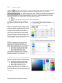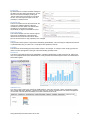
1
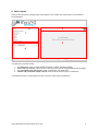
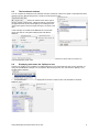
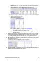
Swing/Quickstep user manual
This manual is intended both for the first time user and for reference purposes. It describes the main structure and
functionalities of Swing as presented through the Quickstep browser-based interface.
It does not describe the architecture of Swing, nor the administrator’s interface and procedures; these are covered
in separate documentation.
Contents
0.
Basic layout ........................................................................................................................................ 2
1.
The theme tree ................................................................................................................................... 3
2.
Period and area selectors ................................................................................................................. 5
2.1
Period selector ............................................................................................................................... 5
2.2
Region selector .............................................................................................................................. 5
2.3
The benchmark selector ................................................................................................................. 6
2.4
Displaying sub-areas: the ‘Splitup to’ box....................................................................................... 6
3.
The presentation area and controls ................................................................................................. 7
3.1
The display type selector................................................................................................................ 7
3.2
Display options ............................................................................................................................... 8
3.2.1
3.2.2
4.
Calculation options .......................................................................................................................... 9
Layout options ............................................................................................................................... 11
Variable and presentation output controls .................................................................................... 13
4.1
The Variables tab ......................................................................................................................... 13
4.2
The Presentations tab .................................................................................................................. 13
Swing-Quickstep user manual 2013-02-19.docx
1
0. Basic layout
When you first start Swing a largely empty screen appears. This contains four panels used to control selection
and presentation.
2
1
3
4
In logical order, the panels contain:
1.
2.
3.
4.
The theme tree, where you select predefined reports or specific variables to display
Period and area selectors, which you use to restrict the time periods and geographical areas to display
The presentation area and controls, where you determine your display form
Variable and presentation output controls, used to build and save or export a presentation.
In the following sections we will explore how each of these is used to build a presentation.
Swing-Quickstep user manual 2013-02-19.docx
2
1. The theme tree
We use the theme tree to select specific reports or variables. You can expand or collapse part of the theme tree
with
and . The theme tree contains several types of object:
1. Predefined reports or displays, including:
1
a. Dynamic reports: these are predefined reports for which you may be able to choose some
parameters. The example in the demo ( Fact sheet population) allows selection of a
geographical area (e.g. a local authority) and an area against which to benchmark, e.g. region
or another local authority.
b. Predefined displays, e.g. the example
Pyramid: Population pyramid in the demonstration.
We recommend that you start by exploring some of the predefined reports and displays; these are
indicated by a symbol other than a check box, e.g.:
2. Variables that can be selected or combined to create a custom display,
e.g.
; selecting the tick box
next to one of these indicates that the variable is to
be displayed in a table, graph or map, and causes a default display to appear in panel 3 at the right.
Moving the cursor above a variable will cause a hyperlink to appear. Clicking on this hyperlink will activate a popup window with information about the variable, e.g.:
1
Setting up predefined reports is an administrator task
Swing-Quickstep user manual 2013-02-19.docx
3
A search box appears above the theme tree. Typing text into this box will cause Swing to search for variables
containing that text, e.g. “65”:
Clicking the hyperlink
at the top right below the search box returns you to the theme tree.
Swing-Quickstep user manual 2013-02-19.docx
4
2. Period and area selectors
When one or more variables are selected, several choices appear at the top right of the screen in panel 2, e.g.
2.3
2.1
2.2
2.4
Using these choices you can determine what time periods (2.1) and geographical area (2.2) your display will
cover, whether you want one or more benchmark areas (2.3) and whether your chosen area should be displayed
as sub-areas (2.4). Making a choice may influence the type of display that appears; Swing will only show possible
combinations and possible display forms. The following paragraphs describe how to use these controls.
2.1
Period selector
Clicking the small arrow at the right of the field reveals a list of check boxes as
shown at the right. These check boxes work as follows:
1. All periods: checking this box this will cause all available periods to be
selected for display. Clearing this will cause all available periods to be
deselected.
2. Most recent: checking this box will cause only the most recent period to
be selected for display.
3. By checking or clearing the boxes for specific periods, a custom
selection can be made.
2.2
Region selector
These two boxes select the geographical area or areas to be displayed. Clicking
the arrow at the right of the top box reveals a list of geographical level types:
The selection made here determines what geographical level type appears in the lower selector below it. Here we
will use the example Regions. Clicking the arrow at the right of the lower box now yields the following:
This box determines the geographical area or areas to be displayed. It is possible to select only one area by
clicking it, multiple areas using ‘control + click’ or all areas by checking the ‘all geo items’ box. You can search for
a specific area in a long list using the search box at the top right.
For the remainder of this example we will select the region West Midlands.
Swing-Quickstep user manual 2013-02-19.docx
5
2.3
The benchmark selector
You can compare the variables for the selected area with ‘benchmark’ values for a higher or equivalent level area.
Checking the box “Benchmark geo item” reveals a new drop-down list box:
Clicking the selector arrow at the right of
this box reveals a dialogue box. Initially this will only show higher
geographical levels (in this case England), but checking the box
“Show other regions” shows the region list again, as shown at the
right.
In this example, we will select East Midlands as a benchmark
region and click OK. This yields a display that looks like the
following:
This example is trivial, but we will later explore functionality that shows how it can be used, for instance, to
contrast population growth rates.
2.4
Displaying sub-areas: the ‘Splitup to’ box
Checking the ‘Splitup to’ box enables us to display data from a lower level within the area we have selected. So,
using our West Midlands example, if we uncheck the ‘Benchmark geo item’ box and check the ‘Splitup to’ box,
another selector appears:
If we now select Local Authorities, the display below shows the values for all Local Authorities in the West
Midlands region:
Swing-Quickstep user manual 2013-02-19.docx
6
3. The presentation area and controls
The large area at the lower right of the screen contains the presentation area and controls. At the top of this are
two rows of icons:
Left: display type selector
Right: display options
The icons actually displayed are determined by the choice of data to be displayed. Controls appear only if they
are valid for the data selected.
3.1
The display type selector
Table: this option always appears. A table can be created from any combination of variables, periods
and areas, up to a maximum of 32,000 columns.
Statistical table: this is possible for one variable and one or more periods, or one period and one or
more variables, in combination with one or more areas and one or more benchmark areas. The rows
show statistical parameters for the selected variables, such as maximum, minimum and average.
Profile table: this appears only when the benchmark selector (“Benchmark geo item”) is checked. The
areas to be compared appear in columns and the variables to be compared appear in rows. The last
2
column contains a comparison graphic , e.g.:
Map: only available for a single variable and a single time period. This can be created for one or more
geographical areas. At least one map must be available in your instance of Swing that covers the areas
chosen. The map is coloured or shaded according to the values of the variable in each area. If point
data are available in your instance of Swing, these can be superimposed on the map.
Column in map: used to present the values of 2-8 variables in 1-60 map areas using small column
graphs. Can also be used for a single variable and 2-8 time periods. At least one map must be available
in your instance of Swing that covers the areas chosen.
Pie in map: used to present the values of 2-9 variable categories with the same unit (e.g. age cohorts)
in 1-60 map areas for a single period using small pie charts. At least one map must be available in your
instance of Swing that covers the areas chosen.
Flow in map: shows flows between up to 750 areas. Flows are shown using arrows whose breadth is
determined by the size of the flow. This display is only available for a single time period and a single
variable.
Line chart: used to graph up to 12 variables (with the same unit) or areas over 2 or more time periods.
Area chart: used to graph up to 12 variables (with the same unit) or areas over 2 or more time periods.
The values are stacked.
Column chart: used to graph up to 80 columns in a maximum of 24 groups. Can be rotated to show a
bar chart using the
option, see below.
Stacked column: can show up to 24 stacked bars. This is useful for comparisons of distributions
between areas or time periods. Can be rotated to show a stacked bar chart using the
below.
option, see
2
The length of each bar is determined by the Z-score (the number of standard deviations above or below the
mean). Bars for values with a Z-score of +2.5 are truncated to +2.5.
Swing-Quickstep user manual 2013-02-19.docx
7
Mirrored column: used to graph comparisons (benchmarks) between two areas or time periods. Can
be rotated to show a mirrored bar chart using the
option, see below.
Profile bar chart: compares 1-100 variables for an area against a reference area, e.g. for a local
authority against a region or the country as a whole. Values for the selected area appear as markers,
values for the reference area as background bars. This option appears only in the benchmark selector
(“Benchmark geo item”) is checked.
Pie chart: this option appears when at least 2 areas, periods or (complementary) variables are
selected. A maximum of 4 pies with a maximum of 14 segments each can be displayed.
Scatter (XY) chart: plots two numerical variables against one another for 1-750 areas. A regression line
appears by default.
Pyramid: this is a special form of a mirrored bar chart used for demographic displays. It requires
variable categories ‘male’ and ‘female’ couples with age cohorts (e.g. “Males % age 5-9”) to be
selected. It can graph up to 4 time periods.
Radar chart: this allows 3-8 variables with the same units to be graphed. The lines in the chart may
show up to 8 different time periods or areas, depending upon the data selections made.
3.2
Display options
The display options controls enable further tailoring of the chosen display, The options that appear are dependent
on the data selection and the display chosen. The icons that may appear in this row are:
Calculation options include taking percentages, transformations as well as the display of total and
averages; see below for a detailed description of the dialogue box that appears.
Layout options: see below for a detailed description of the dialogue box that appears.
Turn map layers on and off.
Switch columns and rows
Switch between a (vertical) column display and a (horizontal) bar display.
Switch dimensions displayed.
Show bars in a table.
Turn ‘display in black and white’ on or off. This is useful when producing a report that may be printed in
black and white. Graphs appear in black and white patterns instead of colours.
Show area names in a map.
Show values in a graph or map.
Save presentation (see section on “Variable and presentation output and controls” below)
Print presentation
Save presentation image (not for tables)
®
®
Export to Microsoft Excel (.xls).
Export to Open Document spreadsheet (.ods).
Export to XML (tables only).
Show basic on-line help.
Swing-Quickstep user manual 2013-02-19.docx
8
3.2.1
Calculation options
Clicking the
button reveals a dialogue box that looks
similar to the picture at the right: The dialogue box contains a
series of options. Which options are shown depends on the
characteristics of the data set that has been selected for
display. The possible options are as follows:
1. Taking percentages: this may offer the following
options:
a. Off: the absolute values selected are shown
b. Variable: shows the percentage for each
subdivision of the variable selected of the
total for each geographical area displayed,
e.g.:
c.
2.
Geographic:shows the percentage for each geographical area displayed of the total for the
subdivision of the variable(s) selected, e.g.:
Transformation: this may offer the following options:
a. Off: the absolute values selected are shown
b. Growth values: shows the growth values of each subdivision of the variable selected
expressed as a percentage relative to the value for a base period; an additional option will
appear allowing you to select the base period to be used. It is possible to use the previous
period as a base period.
c. Growth values absolute: as b but shows the absolute values instead of percentages.
d. Average growth: as b but shows the average growth over all periods since the base period.
(The option “previous period” as a base period does not appear as this would be trivial.)
e. Index value: shows each value as an index relative to the value in the base period, which is
treated as index value 100; e.g. growth of 12% since the base period would give an index value
of 112.
Swing-Quickstep user manual 2013-02-19.docx
9
3.
4.
5.
f.
Cumulative value: shows a cumulative value (usually a sum), starting from the base period,
e.g.:
g.
Z-score: shows the z-score (the number of standard deviations from the population mean) for
the values chosen, e.g.:
Which population is available for use depends on the benchmark setting:
i. If no benchmark area is selected or more than one benchmark area is selected, the
total population of the areas being displayed is used;
ii. If the areas in question are being benchmarked against a single geographical area, the
user is presented with an additional possibility, to use the population of the benchmark
area (“geocompare”).
Confidence: if the presentation contains (sample) variables for which confidence values are available,
these can be selected and displayed using this option. It is possible that more than one option appears,
depending on what confidence data have been loaded into the database. Typical values are 95% and
90%. Confidence values are displayed as hi-lo markers (hairs) on bar, column and column-in-map
presentations; where they appear as text in a table or graph they are shown in square brackets after the
value.
Show averages: used in combination with the benchmark option, this option shows average values for
the chosen benchmark areas, e.g.
shows that within local authorities in the East Midlands on average 190 dwellings were started in 2011.
If possible show totals: controls the display of row or column totals in tables for variables, periods and
geo items. If a total cannot be calculated a dash (-) is shown.
Swing-Quickstep user manual 2013-02-19.docx
10
3.2.2
Layout options
Clicking the
icon reveals a dialogue box that controls presentation layout options with several tabs. The tabs
displayed are determined by the type of display. At the bottom of the dialogue box is a row of buttons:
. The “Default settings button” returns all settings to the default for the presentation
chosen; this is particularly useful when trying out alternative designs for a complex display. The tabs that may
appear are described below; not all of these will appear in every case. The first tab is dependent on the type of
presentation selected, and its contents fall into one of the following categories:
1. Map
2. Pyramid
3. All other graph types (bar/column, line, area, radar, scatter plot etc.)
4. Table
For category 4 (table) no options are available, the
other three are described in the first three sections
below.
Map
The user can determine how many classes are used
in the map, what boundary values are used and how
classes are coloured. A typical example is shown at
the right. Advanced colouring options include
changing the colour template used and selecting a
custom colour gradient. The switch ‘manual labels’
permots entry of a manual label for each class; the
switch ‘manual borders’ allows manual entry of class
boundaries. The switch ‘equal classes’ adjusts the
class boundaries so that (as nearly as possible) there
is an equal number of areas in each class.
Pyramid
The user can determine the colours used in the
pyramid, how the categories are labelled, and
whether the Y-axis appears at the left or in the
middle. Clicking a colour reveals a ‘colour picker’ that
allows a colour to be selected in one of four ways:
a. By clicking it using the coloured panels;
b. By entering hue/saturation/value codes;
c. By entering red/green/blue codes
d. By entering a hex (web) colour code
The labels can be changed by using the manual
options under categories, for instance to change the
default label ‘females’ to ‘girls’ or ‘women’.
Bar (all variants)/ Line/ Area/ Pie/ Radar/ Pyramid
The user can change each colour that appears in the
graph. Clicking a colour reveals a ‘colour picker’ that
allows a colour to be selected in one of four ways:
a. By clicking it using the coloured panels;
b. By entering hue/saturation/value codes;
c. By entering red/green/blue codes
d. By entering a hex (web) colour code
If more than two colours appear in the graph a
‘gradient’ option is also given. The user can choose
the first and last colour in the gradient, and optionally
also a middle colour (e.g. for ‘traffic light’ displays: redyellow-green).
Swing-Quickstep user manual 2013-02-19.docx
11
Vertical axis
By default this box contains automatic settings for
the title and for the vertical axis divisions. An axis
title can be entered manually by clicking the
‘manual’ radio button and entering a new title in
the box. The axis range and steps can be set
manually in a similar manner.
Horizontal axis
This box is similar to that for the vertical axis, but
contains one additional setting to alter the
orientation of the axis labels. The default label
orientation is horizontal; this changes
automatically to diagonal if the labels do not fit.
Parts of the image
This controls whether, and how, the title, legend
and source are displayed. It also allows the
default colours for lines and text used in these
parts of the chart and in a map (if present) to be changed,
General
This provides various options to adjust the automatically generated title. This can simply be replaced with free text
or parameterised using %-codes The %-code options are explained in the tab.
Variables
This allows the automatically generated variable names to be changed. To change a name, simply type the new
name in the box that appears to the right of the automatically generated name.
Benchmark
This allows a geographical area to be highlighted in a graphical presentation or table using lines, fill, pattern and
text. The examples shown below illustrate this for County Durham benchmarked against other Local Authorities in
North-East England.
Additional Lines
Line, bar or column charts may contain two additional lines, “trend” and “average”. These only appear in graphs
with a single data series. Similarly, a scatter plot (XY-plot) may contain a regression line as well as average lines
on both axes. This tab allows the visibility and colour of these lines to be set:
Swing-Quickstep user manual 2013-02-19.docx
12
4. Variable and presentation output controls
The small panel at the bottom left of the screen has two tabs: Variables and Presentations. These have different
purposes.
4.1
The Variables tab
A common requirement when browsing with Swing is to focus down on fewer variables than initially selected. For
instance, one might wish to focus on age groups 45+. Any variables selected appear in the Variables tab. Clicking
the red cross removes a variable; in this example we remove three:
Clicking the red cross in the top right hand corner of this panel removes all variables from the selection, but does
not change any selection of periods and/or areas that may have been made. This enables different variables
to be selected for the periods and/or areas already chosen
To remove all selections and start afresh, use the
4.2
symbol at the top of the theme tree.
The Presentations tab
Tables, graphs and maps (“presentations”) displayed in panel 3 can be saved to be recalled later in a session or
exported in several popular formats. The first time the tab is selected during a Swing session it will appear like
this:
Clicking the green cross
adds the table, graph or map currently displayed in panel 3 to the presentation list.
This enables the presentation to be recalled later in the session after making other selections.
If several presentations are added, symbols appear next to the list:
The red cross next to each item
down in the list. The red cross
removes an item from the list; the green arrows
and
move an item up or
at the top right removes all items from the list.
The stored presentations can be exported in any of several popular formats. Clicking the
menu to appear with the following possibilities:
Swing-Quickstep user manual 2013-02-19.docx
button causes a
13
Clicking a radio button and then OK will cause a standard ‘file save’ dialogue to appear. What this looks like
depends on your operating system.
The option Swing worksheet saves the presentation list as a so-called Swing worksheet (.swx). This enables the
results of a session to be saved for later use, for instance for further work later or for an interactive presentation.
The
button is used to recall a saved presentation and causes the following dialogue to appear:
The tick box controls whether the contents of the worksheet replace the current list or are added to it.
Swing-Quickstep user manual 2013-02-19.docx
14