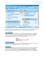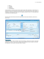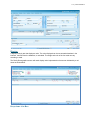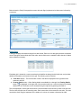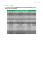
1
Crossroads WIC Training Overview Page 1 of 2 v 1.0 - posted 07/05/2014 Home | Training User Manuals | Training User Manuals Overview Training User Manuals Overview This section aids WIC personnel in learning about the function and use of the Crossroads WIC application. Major functions of the Crossroads WIC application include the following: Manual Content This section includes the following components organized in the order indicated: z z z z Table of Contents - Lists every functional screen in the application and every training scenario available. The TOC is organized in roughly the same way as the application, with content grouped together by application area. Use the TOC to look up topics that cover application screens and common scenarios, and browse by application area. Training Manual Overview - Outlines the content of this manual and explains how this manual can be used. It includes information about the general structure of this manual and tips to help you get the most out of it. Main Body - Covers the screens available within the application and describes the screen elements available on those screens. The Main Body of this manual functions as a software manual and user reference. If you need to know the purpose of a specific screen or screen element, what screen to use for a specific task, or how a specific screen element is used, reference the main body of this manual. Training Scenarios - Covers situations that one might encounter in an average day at a clinic. Each scenario walks you through an entire process. Scenarios connect the individual tasks necessary to complete a process. The scenarios were written and organized to facilitate an instructor-led training session, but the scenarios can be used as reference guides after your training is complete. Conventions and Features This section follows certain conventions that make it easy for you to use the materials presented and includes the following features that make it easy for you to identify similar information from one topic to another: z z z Each chapter groups topics together by application area, so you'll know what you can expect to see. Each screen topic and training scenario begins by explaining what it covers, so you'll know from the start what you'll be learning. Each screen element (an object or control displayed on an application screen is referenced with bold, blue lettering to help it stand out on the page, so that you can identify it more easily. Pictures of application screens are included throughout this section. The pictures are included for your reference, to help familiarize you with the screens. Any data displayed in the pictures is irrelevant and can be ignored. Navigational icons are displayed in the left-hand margin of the manual to help you find specific types of information quickly. The icons and their definitions are displayed below: Screen Access Icons The application-screen-and-green-arrow icon displays to the left of paragraphs that provide information about how to access a specific application screen. These paragraphs inform you where you can access the application screen and what steps must be taken to display it. This type of information is included immediately after the introduction in topics that cover a specific application screen. Note Icons https://crossroads.nutritionnc.com/CrossroadsHelp/Crossroads_WIC_Training_Overview.... 6/25/2014 Crossroads WIC Training Overview Page 2 of 2 v 1.0 - posted 07/05/2014 The notepad-and-pencil icon displays to the left of paragraphs that provide additional, and usually more detailed, information about the application. Sometimes the notes give you additional information about the screen you're working with, and sometimes the notes inform you where to find additional information elsewhere within this help file. Either way, it is well worth your time to watch for these helpful icons. Pay attention to the navigational icons as you read through this manual, and they'll help you locate important details that you might otherwise overlook. What's more, after you've completed the training, the icons will serve as signposts, quickly guiding you to the information you need. https://crossroads.nutritionnc.com/CrossroadsHelp/Crossroads_WIC_Training_Overview.... 6/25/2014 v 1.0 - posted 07/05/2014 G ETT ING ST ART ED USER M ANUAL Prepared By: CSC 7701 College Blvd Overland Park, KS 66210 Prepared For: Crossroads Staff Submitted To: Crossroads Staff v 1.0 - posted 07/05/2014 THIS PAGE INTENTIONALLY LEFT BLANK v 1.0 - posted 07/05/2014 DOCUMENT INFORMATION Document Information Document Title Getting Started User Manual Project Name Getting Started Document Version 2.0 Author CSC Training Staff Contract Number 02476-09 Document Creation Date 08/08/2012 Document Current Version Date 01/09/2013 Purpose of Document User Manual v 1.0 - posted 07/05/2014 DOCUMENT REVISION HISTORY Document Revision History Version Date Author Description 1.0 08/08/2012 CSC Training Staff First Draft 2.0 01/09/2013 CSC Training Staff User Acceptance Testing (UAT) Training Version v 1.0 - posted 07/05/2014 TABLE OF CONTENTS 1- GETTING STARTED ............................................................................................... 1-1 Overview ................................................................................................................ 1-1 2- LOGGING INTO CROSSROADS ............................................................................. 2-1 Downloading Application Information ................................................................... 2-1 3- FAMILY HEADER ................................................................................................... 3-1 4- SCREEN ATTRIBUTES........................................................................................... 4-1 Title Bar.................................................................................................................. 4-1 Menu Bar ................................................................................................................ 4-2 Status Bar .............................................................................................................. 4-4 5- COMMON FUNCTIONS........................................................................................... 5-1 Address.................................................................................................................. 5-1 Auto Populating City, State, and County Information by ZIP Code....................... 5-1 Availability of Cancel Buttons ............................................................................... 5-1 Comment Launch Button....................................................................................... 5-1 Current Audit Information Bubble ......................................................................... 5-2 Adjustable Fields and Containers ......................................................................... 5-2 Error Indicators...................................................................................................... 5-4 Field Auto-advance ................................................................................................ 5-4 Help System ........................................................................................................... 5-4 Sample Help System Topic.................................................................................... 5-6 Keyboard Focus..................................................................................................... 5-6 Override of Field-level Edits .................................................................................. 5-7 Placement of Screen Progress Buttons ................................................................ 5-7 Printing Screens .................................................................................................... 5-7 Processing Indicator.............................................................................................. 5-7 Required Information Icon ..................................................................................... 5-8 Social Security Number Validation ........................................................................ 5-8 Status Message Bubble ......................................................................................... 5-8 Tabbing .................................................................................................................. 5-8 Tab Order ............................................................................................................... 5-9 Telephone Number Validation ............................................................................... 5-9 Tooltip .................................................................................................................... 5-9 v 1.0 - posted 07/05/2014 Warning Indicators ...............................................................................................5-10 ZIP Code Validation ..............................................................................................5-10 Inactive Field Availability ......................................................................................5-10 6- CONFIRMATION, ERROR, AND STATUS POPUP MESSAGES .............................. 6-1 Confirmation Message Popup ............................................................................... 6-1 Error Validation Summary Popup .......................................................................... 6-1 Status Message History Popup ............................................................................. 6-2 7- COMMON BUTTONS .............................................................................................. 7-1 Save and Cancel Button ........................................................................................ 7-1 Push Button ........................................................................................................... 7-1 Command Link....................................................................................................... 7-2 Fields ..................................................................................................................... 7-3 Check Box.............................................................................................................. 7-3 Date Picker ............................................................................................................. 7-4 Display ................................................................................................................... 7-8 8- CONTAINERS ......................................................................................................... 8-1 Carousel................................................................................................................. 8-1 Content Container.................................................................................................. 8-2 Content Flipper (Flippy) ......................................................................................... 8-3 Data Grid ................................................................................................................ 8-5 Group Box.............................................................................................................. 8-6 9- REPORTS MENU.................................................................................................... 9-1 10- SPECIAL KEYS .....................................................................................................10-1 11- SPECIAL BUTTONS/ICONS ..................................................................................11-1 12- GLOSSARY OF ACRONYMS AND TERMS............................................................12-1 v 1.0 - posted 07/05/2014 1- GETTING STARTED Ov erv iew Welcome to the Crossroads WIC system. The Crossroads WIC application is a comprehensive solution that supports the Women, Infants and Children program in providing services to WIC clients. Major modules of the Crossroads WIC application include the following: Family Services Scheduling Vendor Operations Finance Administration Food Maintenance Caseload Redemption Help S tate-Specific Functionality The Crossroads WIC System requires some initial setup before you can use it. It is important to review state-specific features and functionality in each user manual's Overview, in the State-Specific Functionality section. Getting S tarted S ections This document consists of the following sections: Overview Logging Into Crossroads Family Header Screen Attributes Common Functions Confirmation, Error, and Status Popup Messages Common Messages Reports Menu Special Keys Special Buttons / Icons Glossary of Acronyms and Terms v 1.0 - posted 07/05/2014 THIS PAGE INTENTIONALLY LEFT BLANK v 1.0 - posted 07/05/2014 2- LOGGING INTO CROSSROADS Do wnloadi ng Applic ation Inform ation The Downloading Application Information screen displays when the URL for the Crossroads WIC System is accessed. It shows the downloading progress for the system, and if the system is successfully downloaded, the Downloading Application Information screen is dismissed, and the Login screen displays. If the Cancel button is clicked before the download process is complete, the download process is canceled, the Crossroads WIC System is not accessed, and the Login screen is not displayed. Log In The Log In screen is the first screen displayed when the Crossroads WIC System is successfully downloaded from the URL. It is also displayed when a user clicks the Logout button on the menu bar. The Log In screen validates a user's credentials and, if a valid user ID and password combination is supplied, allows the user to access the Crossroads WIC System. It is positioned vertically and horizontally within the content area of the interface when the Crossroads WIC System is initially loaded. v 1.0 - posted 07/05/2014 S creen-level V alidation and Processing Screen-level validation and processing occurs when the following controls are clicked: Forgot Your Password? (hypertext link): If a valid user ID is provided, the Verify Security Question screen displays when the link is clicked. Login (button): If a valid user ID and password are provided, when the button is clicked, the User ID value is validated to ensure that it exists within Crossroads WIC System and the Password value is validated to ensure that it matches the password defined for the user ID specified. • • If the User ID or Password value is invalid, a Validation Summary popup is displayed with an appropriate message. If the User ID and Password values are successfully validated, the system begins loading. v 1.0 - posted 07/05/2014 3- FAMILY HEADER The family header is an integral part of the Crossroads WIC application, which displays in Family Services. Located at the top of the page, the header lists one woman participant (and categorizes her as a pregnant, a breast-feeding or a non-breast feeding participant) and her children. The Crossroads WIC application is family-centric, which means that one family record contains all the participants within the family. Anywhere within the clinic module, simply click on the icon to add, edit, or review information about the woman, child or infant. You can also view basic information about the participant by hovering your cursor over the icon. Letters next to the images in the Family Header designate the following: Buttons/Icons No Image Definition Applicant Expired; previously enrolled; not in current certification Active; enrolled; currently in valid certification period Terminated Foster Child Dirty Data Indicator; Page not saved On the Waiting List Deceased v 1.0 - posted 07/05/2014 High Risk Food Issuance dots represent the following: Blue: Food benefits have been issued for a particular period(s) Green: Food benefits are available for a particular period(s) Red: Food benefits awaiting signature; certification not complete; unknown issue No Dots: Food benefits not available v 1.0 - posted 07/05/2014 4- SCREEN ATTRIBUTES The primary parts of the screen are the title bar, the menu bar, the content area, and status bar. The following subsections describe the features of each. T itle Bar The title bar displays information about the system, the current screen, and the logged in user. It is positioned at the top of the interface. The following subsections describe its features. S creen Indicator The Screen Indicator, identifies the module and the specific screen active in the content area of the interface. It is positioned at the right end of the title bar. It includes an icon unique to the active module on the left and the name of the screen on the right. Logged In User Indicator The Logged In User Indicator identifies the user logged into the system. It is displayed while a user is logged in to the system, and it is not displayed if a user is not logged in. When displayed, it is positioned at the right end of the title bar to the right of the Screen Indicator. It includes a user icon on the left and the first and last name of the logged in user on the right. v 1.0 - posted 07/05/2014 Dirty Data Indicator The Dirty Data Indicator identifies that data has been added or modified on the screen but has not been saved. It is displayed when data has been added or modified on the active screen but has not been saved. When displayed, it is positioned at the right end of the title bar above the Logged In User Indicator. M enu Bar The menu bar provides the primary way to navigate the Crossroads WIC System. It is displayed only while a user is logged in to the system. When displayed, it is positioned at the top of the interface below the title bar. The following subsections describe its features. Menus The menus included in the menu bar vary depending on security permissions granted to the logged in user. They are positioned at the left end of the menu bar. The menus displayed when a user logs in depend on the security permissions granted to the user. Only the Home and Help menus are available for all users. The menu above includes all available menus—one for each system module. Hovering the pointer over a menu displays its drop down with the command links and sub-menus available. Clicking a menu displays the dashboard for the system module if a dashboard exists; otherwise, it displays the menu's drop down with the command links and sub-menus available Pressing the Alt key gives the menu bar keyboard focus and selects the Home menu. Once the menu bar has keyboard focus, the following actions are available: To select the menu to the right of the selected menu, press the Right-arrow key. (If a sub-menu is selected but not displayed, pressing the Right-arrow key displays the sub-menu instead.) To select the menu to the left of the selected menu, press the Left-arrow key. (If a sub-menu is displayed, pressing the Left-arrow hides the sub-menu instead.) To display the selected menu, press the Up-arrow or Down-arrow key. (The command link at the top of the menu is selected by default.) To display the selected menu or the dashboard for the system module, press the Enter key. To select a menu item below a selected item, press the Down-arrow key. To select a menu item above a selected item, press the Up-arrow key. To display a selected sub-menu, press the Right-arrow key. To hide a displayed sub-menu, press the Left-arrow key. v 1.0 - posted 07/05/2014 When the menu bar has keyboard focus, pressing the Alt key returns keyboard focus to the screen or popup in the content area. The command links and sub-menus available on each menu's drop down depend on what screen is active in the content area of the interface and, in some cases, the type of information being managed. Hom e M enu The Home menu does not include command links or sub-menus. It is positioned to the left of all other menus. Clicking the menu displays the Home screen, also known as the system dashboard. Help M enu The Help menu includes one command link—Crossroads WIC Help—and no sub-menus. It is positioned to the right of all other menus. It does not include a dashboard. Crossroads WIC Hel p The Crossroads WIC Help command link provides access to the help system. Clicking the command link displays a Crossroads WIC Help window with the Crossroads WIC Help Overview topic displayed. Logout Button The Logout button provides a way to log out of the system. It is positioned at the right end of the menu bar. Click the button to log a user out of the Crossroads WIC System. v 1.0 - posted 07/05/2014 Content Are a The content area is where the active screen for the selected module is displayed. It is located below the title bar and if the menu bar is displayed, below the menu bar. The default screen displayed after login is complete is the Home screen, also known as the system dashboard. Additional screens can be displayed in various ways (e.g., selecting a menu or a command link on a menu, selecting a command link in a content container, or selecting a button. A vertical scroll bar is included at the right side of the content area if the content area is not tall enough to display the entire contents at the same time. A horizontal scroll bar is included at the bottom of the content area if the content area is not wide enough to display the entire contents at the same time. Status Bar The status bar displays information about the status of the Crossroads WIC System and functions available for most modules and screens throughout the system. It is positioned below the Content Area, at the bottom of the interface. The following subsections describe its features. Data S ynchroniz ation Mode Indicator The Data Synchronization Mode Indicator shows the current mode of operation for the system--either connected or disconnected. When the system is operating in connected mode, it communicates with the central application and database servers, and the indicator displays nothing. When the system is operating in disconnected mode, it communicates with a local disconnected server, and the indicator displays the text, "Disconnected". The indicator is positioned at the left end of the status bar. S oftw are Version Indicator The Software Version Indicator displays the version of the Crossroads WIC System. It is positioned at the left end of the status bar to the right of the Data Synchronization Mode Indicator. S creen Indicator The Screen Indicator displays the unique number that identifies the screen active in the content area of the interface. It is positioned at the left end of the status bar to the right of the Software Version Indicator. Location Indicator The Location Indicator displays the location to which the user is logged in. It is positioned in the center of the status bar to the left of the Change Location button. Change Location Button The Change Location button provides a way to change the location in which the user is working. It is positioned in the center of the status bar to the right of the Location Indicator. Click the button to display the Change Location screen. v 1.0 - posted 07/05/2014 E rror V alidation Summ ary Button The Error Validation Summary button provides a way to view the number of errors identified on the screen or popup active in the content area of the interface. The number displayed on the button indicates the number of errors identified. It is displayed when an error screen is minimized, and it is not displayed when the error screen is restored or the errors identified by the error screen are corrected. It is positioned at the right end of the status bar to the left of the Tab Mode button. Click the button to restore the error screen (The shortcut for the button is Ctrl+Alt+E). Tab Mode Button The Tab Mode button provides a way to change the buttons, fields, and content containers included in the tab order of a screen or popup displayed in the content area of the interface. It is positioned at the right end of the status bar to the left of the Status Message History button. Clicking the button cycles through the following tab modes: Standard Tab Mode – All active buttons, fields, and content containers on the screen or popup are included in the tab order. When this mode is selected, the text displayed on the button is "TAB." The shortcut to select this tab order is Ctrl+Shift+T. This is the default tab mode for all screens and popups. Required Information Tab Mode – Only buttons, active fields that are required to complete the screen or popup, and content containers are included in the tab order. When this mode is selected, the text displayed on the button is "REQ." The shortcut to select this tab order is Ctrl+Shift+R. Error Tab Mode – Only buttons, active fields that are in error, and content containers are included in the tab order. When this mode is selected, the text displayed on the button is "ERR." The shortcut to select this tab order is Ctrl+Shift+E. S tatus Message History Button The Status Message History button provides a way to view all status messages generated during the current session. It is positioned at the right end of the status bar to the left of the Zoom Slider. Click the button to display the Status Message History popup. The shortcut for the button is the Esc key. Zoom S lider The Zoom slider provides a way to change the magnification of the screen active in the content area of the interface. It is positioned at the right end of the status bar. It includes a display on the left with the current zoom magnification in the format, "###%", and a slider button on the right. The default value for the Zoom slider is "100%". Drag the handle of the slider to the left to reduce the zoom magnification and v 1.0 - posted 07/05/2014 drag it to the right to increase the zoom magnification. Double-click the handle to restore the default value of "100%". v 1.0 - posted 07/05/2014 5- COMMON FUNCTIONS Functions and behaviors common throughout the Crossroads WIC System are not specific to a particular module. Addres s When a physical or mailing address is collected within the system, the following information is included in the indicated order: Address (Line 1 & 2) ZIP Code City State County Auto Popu lating City , State, and Cou nty Information by Z IP Code When a valid ZIP Code is entered as part of an address and keyboard focus is removed from the ZIP Code field, the associated City, State, and County fields are automatically populated with values that correspond to the Zip code specified. A value that is automatically populated can be changed unless its field is disabled or read-only (this is true for values that are manually populated too). Av ailability of Cancel Button s Every screen or popup that allows data entry or initiates a process must include a button to cancel the changes to the data or the initiated process. Comment L aunch Button A comment launch button ( ) is used to display and hide a floating comment (sticky note) popup. Clicking the button displays the associated sticky note. While the sticky note for a specific comment launch button is displayed, the button image changes to include the letters "A" and "B" ( ). If text is added to the note, the icon retains the letters after the sticky note is minimized. The information collected using a floating comment popup is saved as part of the screen on which the comment launch button that displayed the popup is located. When multiple comment launch buttons exist on the same screen, the comment text collected on each floating comment popup is associated with the part of the screen on which the button is located. v 1.0 - posted 07/05/2014 Current Audit Inform ation Bubble A Current Audit Information bubble displays audit information for the data collected and displayed within a content container. The audit information includes when the data was first collected and by whom, and when the data was last modified and by whom. It is displayed when the pointer is hovered over an Audit Trail icon ( ). Adjust able Fi elds and Contain ers The placement of fields within containers and containers within the content area of the interface are adjustable. One example is resizing of the browser window, which causes the fields and containers in the content area to move around for the best fit. v 1.0 - posted 07/05/2014 Another example is changing the magnification of the content area using the Zoom Slider in the status bar, which also causes the fields and containers in the content area to move around for the best fit. v 1.0 - posted 07/05/2014 Warning: This feature can cause buttons, fields, and containers to become obscured and inaccessible if the zoom magnification is set too high or too low, or if the browser window is sized too small. Error Indicators Fields for which an error exists are haloed in red and display a red exclamation point icon ( ) to the right. An error identifies a value outside of acceptable bounds (an impossible value) and prevents information on a screen or popup from being saved to the database. The indicated error must be corrected before the information on the screen or popup can be saved. Field Auto-adv ance Keyboard focus automatically advances to the next field when the maximum number of characters has been entered in a text box and data validation has successfully completed. Help Sy ste m The help system is designed to assist users with the functions and uses of the Crossroads WIC System. The help system is accessible from any screen or popup. It can be displayed using the Help button included on some content containers or the Crossroads WIC Help command link on the Help menu. Below shows a Crossroads WIC Help window with the Crossroads WIC Help Overview topic displayed. v 1.0 - posted 07/05/2014 The interface includes the following features: Contents – The table of contents lists every functional screen in the application and every training scenario available. It is organized in roughly the same way as the application, with content grouped together by application area. To access the table of contents, click the Contents button displayed on the left side of the interface. The Contents panel is positioned on the left side of the interface when it is displayed. Index – The index lists every functional screen in the application and every training scenario available. In many cases, the Index lists topics more than once, with several alternate entries for each topic. The alternate entries make the Index a powerful tool for finding information quickly and easily. To access the index, click the Index button displayed at the top of the interface on the left side. The Index panel is positioned on the left side of the interface when it is displayed. Search – The search function allows a search of the help system for all help topics that include the key words provided. To access the search function, click the Search button displayed at the top of the interface on the left side. The Search panel is positioned on the left side of the interface when it is displayed. A simple version of the search function is available at the top of the interface on the right side. Print – The print function allows a topic to be printed. To access a standard Print dialog, click the Print button displayed at the top of the interface on the left side. When the Print dialog is displayed, select a printer and click the Print button to send the topic to the selected printer. Over 250 help topics are included, which can consist of the following content: Bread Crumbs Topic Title Topic Introduction Step-by-step Instructions (at the screen level) Sample Screens v 1.0 - posted 07/05/2014 Field Definitions Links to User Manuals and Automated Training Tool The following support topics are also included: Crossroads WIC Help Overview – The Crossroads WIC Help Overview topic describes the help system and explains how to use it. It defines the general structure of the help system and provides tips to help users get the most out of it. To access the Crossroads WIC Help Overview topic, click Crossroads WIC Help Overview under Introduction in the table of contents. The Crossroads WIC Help Overview topic is displayed by default when the help system is accessed using the Help menu. Glossary – The glossary lists particularly difficult or specialized words used in this help file along with their definitions. To access the Glossary of Acronyms and Terms topic, click Glossary of Acronyms and Terms under Index in the table of contents. Sample Hel p Sy stem T opic The sample screen shown below calls out the location of the contents, the topic introduction, the sample screen, the field information table, and the bread crumbs. Key board Focus Keyboard focus refers to the field, button, or content container receiving keyboard input. There can be only one element on the whole desktop that has keyboard focus. Within the Crossroads WIC System, keyboard focus is initially positioned in the active field, button, or container nearest the top-left corner of a screen or popup when it is displayed. Keyboard focus can be moved by tabbing or by clicking the field, button, or content container for which focus is desired. v 1.0 - posted 07/05/2014 Ov erride of Field-lev el Edits The system allows limited override of field-level edits for screens and popups. When a field's value is outside of acceptable limits (an impossible value), an error is generated the first time an attempt is made to save the information collected on the screen or popup, and the information is prevented from being saved until each value for which an error was generated is corrected. When a field's value is outside of normal limits (an implausible value), a warning is generated the first time an attempt is made to save the information collected on the screen or popup, but the information can be saved without correcting each value for which a warning was generated. Pla cem ent of Scree n Progress Button s Buttons that control progress through a process or validation are grouped together and positioned in the bottom-right corner below all other content. Such buttons include but are not limited to OK, Cancel, Next, and Previous. The default button must be the left-most button in the group. The sample below shows a Save button and a Cancel button at the bottom-right corner of a screen. Printing Scr eens Any screen can be printed by using the print facility provided by the Web browser used to access the Crossroads WIC System. (For information about printing a webpage, refer to the help system for the Web browser.) Proc essing Indicator The Processing Indicator is displayed when the system is processing information. It is centered both vertically and horizontally within the content area. The indicator is animated and appears to spin in a clockwise direction. When processing completes, the indicator is dismissed. v 1.0 - posted 07/05/2014 Required Informatio n Icon The Required Information icon identifies information that is required by the Crossroads WIC System to complete a task or function. The icon is displayed when a piece of information is required in an individual field, or when a row of information is required in a data grid. If the display identifying a field or container is positioned above the field or container, the icon is positioned to the right of the display. If the display identifying a field or container is positioned to the left of the field or container, the icon is positioned to the right of the field or container. Social Se curity Number V alidation Social Security numbers are validated using the following parameters: The value must follow the format <aaa>–<bb>–<cccc>. • • • • All values must be numeric. <aaa> cannot be the following values: "000", "666", "773"-"899", "900"-"999". <bb> cannot be the value "00". <cccc> cannot be the value "0000". Status M essage Bubble The Status Message bubble displays messages about system activity. Status messages inform the user whether an initiated action succeeded or failed, and when uninitiated events occur. They display for a few seconds before they are automatically closed. After a Status Message bubble is closed, the status message can be viewed on the Status Message History popup. The layout of the bubble includes a title bar and a content area. The title bar displays the title of the bubble on the left and a Close button on the right. Clicking the Close button ( ) dismisses the status message. If the message type is "Informational", the message includes an information icon ( ). If the message type is "Warning", the message includes a warning icon ( ). T abbing Tabbing refers to the action of moving keyboard focus around a screen or popup using the Tab key. The path keyboard focus follows on a screen or popup is determined by the tab order. Pressing the Tab key moves focus to the next field, button, or content container in the tab order. When the active field, button, or container nearest the bottom-right corner of the screen or popup has focus, pressing the Tab key returns focus to the active field, button, or container nearest the top-left corner. v 1.0 - posted 07/05/2014 Pressing the Shift+Tab keys moves focus to the previous field, button, or content container in the tab order. When the active field, button, or container nearest the top-left corner of the screen or popup has focus, pressing the Shift+Tab keys moves focus to the active field, button, or container nearest the bottom-right corner. T ab Order The tab order for a screen or popup determines the path keyboard focus follows when tabbing through the fields, buttons, and containers on a screen or popup. Tab order generally flows from left to right and from top to bottom on each screen and popup. However, the flow can differ depending on the way in which controls relate to each other and the way in which they are grouped. The fields included in the tab order depend on the tab mode, which is controlled by the Tab Mode button. T elephone Numb er Validation Telephone numbers are validated using the following parameters: The value must follow the format: (<aaa>) <bbb>–<bbbbb> • • • All values must be numeric. <aaa> cannot begin with a zero (0) or a one (1). <aaa> cannot be the following values: "388", "555", "900", "911", "979", or "991". T ooltip A tooltip is displayed when the pointer is hovered over a button or a field. It is positioned left aligned with the button or field and does not cover the button or field itself unless unavoidable. It includes text that describes the button or field and may suggest a required action. For each error indicated for a field, a tooltip includes a red exclamation icon ( describing the nature of the error. ) followed by text For each warning indicated for a field, a tooltip includes a yellow exclamation icon ( describing the nature of the warning. ) followed by text v 1.0 - posted 07/05/2014 Warning Indic ators Fields for which a warning exists are haloed in yellow and display a yellow exclamation point icon ( ) to the right. A warning identifies a value outside of normal bounds (an implausible value) and does not prevent information on a screen or popup from being saved to the database. After a warning is identified, the second attempt to save the information on a screen or popup for which a warning is displayed is accepted. Z IP Code Valid ation Zone Improvement Plan (ZIP) codes are validated using the following parameters: The value must follow the format <aaaaa> or <aaaaa>–<bbbb>. • • • All values must be numeric. <aaaaa> must exist in the Zip Code lookup table. <aaaaa> cannot be the following values: "00000" or "99999". Inactiv e Field Av ailability When the value of a field is dependent on the value of a key field, the dependant field is inactive (disabled) until a value has been provided or a specific value has been provided in the key field. v 1.0 - posted 07/05/2014 6- CONFIRMATION, ERROR, AND STATUS POPUP MESSAGES Common popup messages are not part of a specific module, but are available as part of the Crossroads WIC System interface. Confirmation M essage Popu p A confirmation message popup is used to display confirmation messages for the current screen or popup. Confirmation messages are used to confirm actions at the time they are initiated. The layout of the popup includes a title bar and a content area. The title bar displays the title of the popup on the left. The content area includes a question mark icon and confirmation text with a Yes button, a No button, and a Cancel button positioned below. The following actions are possible: Clicking the Yes button allows the action identified by the confirmation text to be completed. Clicking the No button prevents the action identified by the text from being completed. Clicking the Cancel button cancels the action that triggered the confirmation popup. Regardless of which button is clicked, the popup is dismissed, and focus is returned to the screen from which it was called. Error Validation Summ ary Popup An error validation summary popup is used to display error messages for the current screen or popup. The error messages inform the user of fields that require the user's attention. Error messages display for these common reasons: No entries in a required field An unacceptable (i.e., out of range) numerical value An unacceptable formatting entry (i.e., date) The layout of the popup includes a title bar and a content area. The title bar displays the title of the popup on the left and a Minimize button on the right. The Minimize button ( ) can be clicked to minimize the popup to the Error Validation Summary button on the status bar of the system interface (The shortcut for the button is Ctrl+Alt+E). The content area includes an exclamation point icon and a list of all error messages for the current process. v 1.0 - posted 07/05/2014 Status M essage History Pop up The Status Message History popup displays a list of status messages presented to a user through a status message bubble during the current session. Status messages from previous sessions are not retained. The popup can be accessed by clicking the Status Message History button on the status bar of the system interface. The layout of the popup includes a title bar and a content area. The title bar displays the title of the popup on the left and a Minimize button on the right. The Minimize button ( ) can be clicked to minimize the popup to the Status Message History button on the status bar of the system interface (The shortcut for the button is the Esc key). The content area includes a data grid that displays the status messages. It includes the following columns: Time – Displays the time at which the message was generated. Message Type – Displays the message type. The two message types are "Informational" and "Warning." Message – Displays the message text. The following sections describe each button, field, and container type in detail. v 1.0 - posted 07/05/2014 7- COMMON BUTTONS Buttons and fields allow users to interact with the system. Fields can display data or accept data entry. Buttons are used to trigger actions such as completing a process, canceling a process, or displaying a screen. Fields and buttons are grouped in and organized by containers. The containers are also used to group and organize other containers within the content area of the interface. Common buttons trigger processing and navigation. Buttons can be activated by clicking them or by giving them keyboard focus and pressing the Enter key. If a default button is defined for a screen or popup, pressing the Enter key activates the button unless another button or field that utilizes the Enter key has keyboard focus. This section covers the functionality of button types used in the Crossroads WIC System interface. Sav e and Canc el Button The Save button captures and records (saves) new and edited screen entries. When you click Save, you will either 1) stay on the current screen, 2) advance to the next screen, or 3) return to the main screen, depending on your location in the application. Please note that if you are viewing a screen only, do not click the Save button; instead, select a location from the Quick Links navigational pane. The Cancel button clears your entries, enabling you to start over on the current screen. When you click Cancel, the system displays a confirmation prompt with the text, "Are you sure?" Click Yes to clear your entries, or No to retain your entries. Pus h Button A push button is generally represented as rectangular, includes text positioned in the center of the button that identifies it, and includes a border around the outside to show its boundaries. However, a button may include an image (or icon) to identify the button instead of text. And, in some instances, the image (or icon) may be the only thing shown because the button does not include a border. In all cases, push buttons include tooltips that identify the button. The Log In screen with the push button implemented on that screen indicated by a red arrow is shown below. v 1.0 - posted 07/05/2014 Command Link A command link is represented as bold text displayed in the color defined for command links. Command links do not include tooltips, but when the pointer is hovered over one, the command link changes to the color defined for a command link with a pointer hovered over it. The Log In screen with the command link implemented on that screen indicated by a red arrow is shown below. v 1.0 - posted 07/05/2014 Fields Fields display data or accept data entry. This section covers the functionality of fields used in the Crossroads WIC System interface. Check Box Check boxes are used to represent one or more choices that are not mutually exclusive. A check box has two main states: selected and unselected. The selected state is represented by a box with a check mark in it and indicates a yes/on/true response. The unselected state is represented by an empty box and indicates a no/off/false response. Clicking a check box changes its state and gives it keyboard focus. When a check box has keyboard focus: Pressing the Spacebar changes the state of the check box. If the check box is unselected, pressing any of the following selects the check box: • • • • Plus (+) Ctrl+Plus Shift+Plus Ctrl+Shift+Plus If the check box is selected, pressing any of the following deselects the check box: v 1.0 - posted 07/05/2014 • • • • Minus (-) Ctrl+Minus Shift+Minus Ctrl+Shift+Minus In some instances, a check box may be used to select a range of other check boxes. In these cases, it is possible for a check box to display a third intermediate state. The intermediate state, neither selected nor unselected, indicates that some check boxes in the range are selected but not all. The intermediate state is identified by its shaded background. The New Family screen with each check box implemented on that screen indicated by a red arrow is shown below. Date Pi cker A date picker is used to collect a full date in the format mm/dd/yyyy. A date picker combines a drop-down calendar and an edit box. The drop-down calendar presents dates that the user can select, and the edit box displays the current selection and allows a date to be typed. v 1.0 - posted 07/05/2014 Clicking the edit box gives it keyboard focus. When the edit box has focus: It accepts the entry of numeric characters and the following special characters: dash (-) and slash (/). Pressing Ctrl+Shift+T populates the box with the current date. If a value is typed, it must follow the format: <mm>/<dd>/<yyyy> • • • <mm> must be a number between 1 and 12. <dd> must be a number between 1 and 31. <yyyy> must be a value between 1 and 9999 When the box is populated with a valid date value, • • Pressing the Up-arrow key increases the day by one. Pressing the Down-arrow key decreases the day by one. Pressing Ctrl+C displays the Monthly Calendar drop down. Clicking the Calendar button ( drop down. ) gives the edit box keyboard focus and displays the Monthly Calendar When the Monthly Calendar drop down is displayed: The current system date is initially selected. (The selected date is highlighted with a solid background color.) The following options are available using the pointer: v 1.0 - posted 07/05/2014 • • • • Click the Next button ( ) to display the following month. Click the Previous button ( ) to display the previous month. Click a day to select it and dismiss the Monthly Calendar drop down. The edit box is populated with the day, month, and year selected. Click the name of the month to display the Months drop down for the selected year. The month is initially selected on the Months drop down. The following options are available using the keyboard: • • • • • • • • • • Press the Left-arrow key to move the selection to the previous day. Press the Right-arrow key to move the selection to the following day. Press the Up-arrow key to move the selection to the day six days prior. Press the Down-arrow key to move the selection to the day six days later. Press the Home key to move the selection to the first day of the month. Press the End key to move the selection to the last day of the month. Press Ctrl+Page Up to move the selection to the closest day in the previous month. Press Ctrl+Page Down to move the selection to the closest day in the following month. Press Ctrl+Up-arrow to display the Months drop down for the selected year. The month is initially selected on the Months drop down. Press the Enter key to accept the selected date. The Monthly Calendar drop down is dismissed and the edit box is populated with the day, month, and year selected. When the Months drop down is displayed: The month from the Monthly Calendar drop down is initially selected. (The selected month is highlighted with a solid background color.) The following options are available using the pointer: • • • • Click the Next button ( ) to display the months for the following year. Click the Previous button ( ) to display the months for the previous year. Click a month to select it and dismiss the Months drop down. The Monthly Calendar drop down is displayed for the selected month. Click the year to display the Years drop down for the 10-year range that includes the selected year. The year is initially selected on the Years drop down. The following options are available using the keyboard: v 1.0 - posted 07/05/2014 • • • • • • • • Press the Left-arrow key to move the selection to the previous month. Press the Right-arrow key to move the selection to the following month. Press the Home key to move the selection to the first month of the year. Press the End key to move the selection to the last month of the year. Press Ctrl+Page Up to move the selection to the same month in the previous year. Press Ctrl+Page Down to move the selection to the same month in the following year. Press Ctrl+Up-arrow to display the Years drop down for the 10-year range that includes the selected year. The year is initially selected on the Years drop down. Press the Enter key to accept the selected month. The Months drop down is dismissed and the selected month is displayed on the Monthly Calendar drop down. When the Years drop down is displayed: The year from the Months drop-down is initially selected. (The selected year is highlighted with a solid background color.) The following options are available using the pointer: • • • The Next button ( ) can be clicked to display the following 10-year range. The Previous button ( ) can be clicked to display the previous 10-year range. Click a year to select it and dismiss the Years drop down. The Months drop down is displayed for the selected year. The following options are available using the keyboard: • • • • • • • Press the Left-arrow key to move the selection to the previous year. Press the Right-arrow key to move the selection to the following year. Press the Home key to move the selection to the first year in the 10-year range. Press the End key to move the selection to the last year in the 10-year range. Press Ctrl+Page Up to move the selection to the same year in the previous10-year range. Press Ctrl+Page Down to move the selection to the same year in the following 10-year range. Press the Enter key to accept the selected year. The Years drop down is dismissed and the selected year is displayed on the Months drop down. When a date picker loses keyboard focus, it applies the valid format to the value it contains. If it cannot, the field is identified as being invalid. This screen shows the New Family screen with each date picker implemented on that screen indicated by a red arrow. v 1.0 - posted 07/05/2014 Displ ay A display is simply text that displays a value. The value displayed can be one entered elsewhere in the interface, retrieved from the database, or calculated. The weight and color of the font used can vary according to need. The Family Demographics screen with each display value implemented on that screen indicated by a red arrow as shown below. Drop-down List Box v 1.0 - posted 07/05/2014 A drop-down list box is used to present a simple list from which an option can be selected. A drop-down list box combines a list and a selection box. The list presents the options that a user can select, and the selection box displays the current selection. A vertical scroll bar is included at the right side of the list if it is not long enough to display all list items at one time. Clicking the selection box gives it keyboard focus. Clicking the down-arrow button displays the list of options and gives the selection box keyboard focus. The selected option is highlighted with a solid background color. While the selection box has keyboard focus: When the list is not displayed: • • • • • Typing selects the list option that most closely matches the value typed. Pressing the Delete key clears the selection box. Pressing the Down-arrow key selects the next item in the list. Pressing the Up-arrow key selects the previous item in the list. Pressing Alt+Down-arrow displays the list. When the list is displayed: • • • • • • • • The value displayed in the selection box is initially selected in the list. Typing selects the list option that most closely matches the value typed. Pressing the Down-arrow key selects the next item in the list. Pressing the Up-arrow key selects the previous item in the list. Pressing the Page Down key displays the next page of list items. Pressing the Page Up key displays the previous page of list items. Pressing the Enter key confirms the selection and closes the list. Pressing Alt+Up-arrow hides the list. If a list option is selected, it is accepted and displayed in the selection box. When keyboard focus is removed from the selection box, the last matching list option is accepted. The New Family screen with each drop-down list box implemented on that screen indicated by a red arrow as shown below. v 1.0 - posted 07/05/2014 Multiselect List Box A multiselect list box is used to present a list from which one or more options can be selected. A vertical scroll bar is included at the right side if the box is not tall enough to display all list options at one time. A horizontal scroll bar is included at the bottom if the box is not wide enough to display the longest list option. Selected options are highlighted with a solid background color. The position of the cursor within the list is highlighted with a dotted line around an option. Clicking a list box gives it keyboard focus. Clicking a list option selects the option, positions the cursor on the option, and gives the list box keyboard focus. While the list box has keyboard focus: The following options are available using the pointer: • • • • Click an option to select it (if it is unselected), position the cursor on it, and clear all other selections. Ctrl+click an unselected option to select it without clearing any other selections and position the cursor on it. Ctrl+click a selected option to deselect it and position the cursor on it. Shift+click an option to select all options from the last option selected or cleared to the option clicked, inclusive. The following options are available using the keyboard: v 1.0 - posted 07/05/2014 • • • • • • Press the Up-arrow key to move the cursor to the previous option. Press the Down-arrow key to move the cursor to the next option. Press the Spacebar to select the option highlighted by the cursor and clear all other selections. Press Ctrl+Spacebar to select the option highlighted by the cursor and without clearing any other selections. Press Shift+Spacebar to select options from the last option selected or cleared to the option on which the cursor is positioned, inclusive. Press Ctrl+A to select all options. Multiselect S lider A multiselect slider is used to manage a set of options. A multiselect slider combines two multiselect list boxes—a "source list" and a "destination list"—and a set of buttons to manage the list options. The destination list and one or more slider buttons ( ) with arrows pointing outward are initially displayed. The slider buttons can be positioned at the top, bottom, left, or right side of the slider. When a multiselect slider is closed, pressing Ctrl+Shift plus the arrow key pointing the same direction as a slider button or clicking the slider button ( ) opens the multiselect slider. When a multiselect slider is open, press Ctrl+Shift plus the arrow key pointing the same direction as the slider button on the open side or clicking the slider button ( ) closes the multiselect slider. When a multiselect slider is open, the source list is displayed along with the following buttons: Move All – The button can be clicked to move all items in the source list to the destination list. The shortcut for the button is Ctrl+Shift+M. Select – The button, represented by an arrow pointing to the destination list, can be clicked to move items selected in the source list to the destination list. Remove – The button, represented by an arrow pointing to the source list, can be clicked to move items selected in the destination list to the source list. Clear All – The button can be clicked to move all items in the destination list to the source list. The shortcut for the button is Ctrl+Shift+C. v 1.0 - posted 07/05/2014 When a multiselect slider is open, the following options are available using the keyboard: Press Ctrl+Shift+T to position keyboard focus on the destination list. Press Ctrl+Shift+S to position keyboard focus on the source list. The Health Information screen with each multiselect slider implemented on that screen indicated by a red arrow is shown below. Radio Button Group Radio buttons (also called option buttons) are used to present a choice of two or more mutually exclusive options. Each radio button consists of a round button and a display that indicates a choice the user can make by selecting the button. A radio button has two main states: selected and unselected. It is standard practice to position radio button groups in group boxes to organize and label them. It is also standard practice to select the first option in a group by default. Selecting an option clears other options in the group. The Health Information screen with the radio button group implemented on that screen indicated by a red arrow is shown below. v 1.0 - posted 07/05/2014 Text Box A text box allows the entry of data. Clicking a text box gives it keyboard focus. When a box has keyboard focus, typing fills the box with text. Text boxes can accept letters, numbers, punctuation, and other symbols, but some text boxes restrict input to specific characters, and some even enforce a specific format. When input is restricted to specific characters, pressing keys for unaccepted characters has no affect. For example, a text box that collects a Social Security number would only accept the numbers one through nine and zero. Pressing the key for any other character would not add that character to the text box. When a specific format is enforced, content is formatted automatically as keys are pressed. For example, a text box that collects a Social Security number would display a dash that separates the first three characters typed from the second two characters and the last three characters. Some text boxes accept multiple lines of text. In such cases, when typed text reaches the right side of the box, it wraps to a new line. A vertical scroll bar is included at the right side of the text box if the box is not tall enough to display its entire contents. The New Family screen with each text box implemented on that screen indicated by a red arrow is show below. v 1.0 - posted 07/05/2014 T ime Picker A time picker is used to collect a time in the format hh:mm (AM/PM). A time picker combines a drop-down list with an edit box. The drop-down list includes times that can be selected, and the edit box displays the current selection and allows a time to be typed. If a value is typed, it must follow the format: <hh>:<mm> ["a.m."/"p.m."] <hh> must be a number between 1 and 12. <mm> must be a number between 0 and 59. ["a.m."/"p.m."] must be either the literal value "a.m." or "p.m.". If the user clicks the clock button ( ) a list of times displays, and a value can be selected. Once a valid time is either typed or selected, the following actions are possible: Press the Up-arrow key to move up the list of times. Press the Down-arrow key to move down the list of times. When a time picker loses keyboard focus, it applies the valid format to the value it contains. If it cannot, the field is identified as being invalid. The Maintain Outreach Organization screen with each time picker implemented on that screen indicated by a red arrow is shown below. v 1.0 - posted 07/05/2014 v 1.0 - posted 07/05/2014 THIS PAGE INTENTIONALLY LEFT BLANK v 1.0 - posted 07/05/2014 8- CONTAINERS Containers are components on a screen that can contain other components inside itself. They can contain fields and buttons. They are used for grouping and organizing fields on a screen or popup. This section covers the functionality of containers used in the Crossroads WIC System. Carousel A carousel is a scrolling list that can contain multiple buttons. The first object in the list is initially displayed at the left end of the carousel content area and is selected. Subsequent buttons are displayed in sequential order to the right. Below is an example of a carousel with five simple buttons (simply the letters A through E) with the first object in the list selected. When a carousel includes more buttons than can be displayed, those buttons that cannot be displayed are not displayed. For example, if the carousel in the previous image included the letters A through Z, the letters F through Z would not be displayed because the carousel is only wide enough to display five buttons at a time. Each carousel includes a Previous button on the left end of the carousel. It is enabled when the left-most object contained in the carousel is not displayed. Clicking the button when it is enabled scrolls the content of the carousel to the left. Each carousel also includes a Next button on the right end of the carousel. It is enabled when the rightmost object contained in the carousel is not displayed. Clicking the button when it is enabled scrolls the content of the carousel to the right. A carousel includes the following functionality: The left-most list object is initially selected. Only one list object can be selected at time. One list object must always be selected. An object can be selected by clicking it. Buttons contained in the carousel can have the following properties: They can be any shape or size. They can be aligned with the top edge, the bottom edge, or the center. They can include multiple text and image components. They can include hover text functionality (i.e., a tooltip is displayed when the pointer is positioned above the object). v 1.0 - posted 07/05/2014 Below is the Family Demographics screen with the carousel implemented on that screen indicated by a red arrow. Content Container A content container is a rectangle that contains a set of fields. It includes two distinct areas: the title bar and the content area. The title bar includes title text that identifies the purpose or association of the fields in the container. The content area is where the fields are positioned. The purpose of a content container is to organize fields related by a common purpose (usually indicated by the text in the title bar). The title bar can include any of the following additional elements: Expander Button – An Expander button ( ) is used to expand and collapse the container. When included, it is positioned to the left of the title text. When a container is collapsed, only the title bar is displayed, and the arrow on the expander button points toward the title text to its right. When a v 1.0 - posted 07/05/2014 container is expanded, content area is displayed in addition to the title bar, and the arrow on the expander button points in the direction to which the content area expanded, which can be either up or down. Comment Launch Button – A Comment Launch button ( ) is used to launch a floating comments popup. It is positioned on the right side of the title bar. Audit Trail Icon – An Audit Trail icon ( ) is used to display audit details. It is positioned on the right side of the title bar. When the pointer is hovered over the icon, a Current Audit Information bubble displays. Help Button – A Help button ( ) provides access to the system help. It is positioned on the right side of the title bar. Clicking the button displays a Crossroads WIC Help window with the topic assigned to the screen or popup in the content area displayed. The shortcut for the button is the F1 key. Below shows the Family Demographics screen with the content container implemented on that screen indicated by a red arrow. The container includes an Expander button, a Comment Launch button, an Audit Trail Icon, and a Help button. Content Flipper (Flippy ) A content flipper (flippy) groups multiple panels of related information together. Each panel includes two distinct areas: a title bar and a content area. The title bar for the primary panel is always displayed on the left side of the flippy, and its content area is initially displayed. The title bars for additional panels are initially displayed on the right side of the flippy, and their content areas are not initially displayed. The content area of each panel can include any number and combination of fields and buttons. v 1.0 - posted 07/05/2014 When a title bar on the right side of the flippy is clicked, it flips to the left and reveals its content area. When a title bar on the left side of the flippy (other than the title bar for the displayed panel) is clicked, it flips to the right and reveals the content area of the panel on its left. When a flippy is collapsed, pressing Ctrl+Shift+Right-arrow displays the next panel, and pressing Ctrl+Shift+Left-arrow displays the previous panel. Title bars include title text, and if collection of the information on a panel is optional, it includes a check box. A check box can be selected to enable buttons, fields, and content containers included in the content area of the panel. A check box can be deselected to disable buttons, fields, and content containers included in the content area of the panel. Once the information on an optional panel has been completed and saved, the selected check box becomes an indication that there is information to view. If a panel is not optional (does not include a check box in its title bar), the only way to determine whether information exists on the panel is to display it. When a title bar has keyboard focus, pressing Ctrl+Shift+X selects or deselects its check box, if one exists. The title bar for the primary panel also includes an Expander button ( ) that can be clicked to expand the flippy to full size, displaying all panels at once. Once a flippy is expanded, the Expander button ( ) can be clicked to collapse the flippy to normal size, displaying only the primary panel. When a flippy is collapsed, it can be expanded by pressing Ctrl+Shift+Down-arrow. When a flippy is expanded, it can be collapsed by pressing Ctrl+Shift+Up-arrow. v 1.0 - posted 07/05/2014 Below shows the Family Demographics screen with each flippy implemented on that screen indicated by a red arrow. Data G rid A data grid displays information arranged in a table format. Each row of a data grid represents a separate record. Data grids include fields within their cells, and the fields can be enabled to allow data to be added and modified as necessary. Each data grid is located in a content container that identifies the data grid with its title text, and provides additional information and functions for the grid. The following can be included: Total Items display – The total number of rows in the table is displayed on the right side of the container's title bar. Floating Details button – When floating details are available for a data grid, the Floating Details button ( ) is displayed on the right side of the container's title bar. It can be clicked to turn floating details on or off. The button can be accessed using the keyboard by pressing Ctrl+Shift+V. The rows displayed in a data grid can be sorted. Click the header of the column by which to sort the rows. The first click sorts the rows in ascending order. Each consecutive click reverses the sort order. The rows can also be sized. Drag the separator for the header of a column to increase or decrease its width. v 1.0 - posted 07/05/2014 In a data grid that allows the addition of rows, the Enter key must be pressed to validate and commit a new row. If the Enter key is not pressed, the row is not added, and all data entered in the row will be lost when the screen or popup on which the data grid is located is closed. A data grid can include columns of buttons. The following are standard buttons that can be included: Edit button – In a data grid that allows records to be edited, a row can be edited by clicking the Edit button ( ) for the row. When the button is clicked or the row is double clicked, a screen or popup displays to facilitate editing. View button – In a data grid that allows records to be viewed, the details of a row can be viewed by clicking the View button ( ) for the row. When the button is clicked, a screen or popup displays to facilitate viewing. If the row does not include an Edit button, double-clicking the row also displays a screen or popup to facilitate viewing. Delete button – In a data grid that allows records to be deleted, a row can be deleted by selecting it and pressing the Delete key. They can also be deleted by clicking the Delete button ( ) for the row. A vertical scroll bar is included at the right side of the data grid if it is not tall enough to display all rows at the same time. A horizontal scroll bar is included at the bottom of the data grid if it is not wide enough to display the entire length of the rows at the same time. Data grids often include a Selected Row Details content container positioned below the data grid that can be expanded to show details about a row selected in the grid. Below is the Family Search screen with the data grid implemented on that screen indicated by a red arrow. G roup Box A group box is a rectangle that surrounds a set of fields. Its purpose is to organize buttons, fields, and containers related by a common purpose. It is standard practice to include a text value in the upper left corner of each group box to identify the common purpose of buttons, fields, and containers it groups. v 1.0 - posted 07/05/2014 When buttons and fields grouped by a group box are used to add and edit records in a data grid, an icon is included to the left of the group box's identifying text value. When the fields are set for the addition of a new record, the icon displayed is a pencil with a red asterisk ( ). When the fields are set for the modification of an existing record, the icon displayed is simply a pencil ( ). Below is the Participant Demographics screen with each group box implemented on that screen indicated by a red arrow. v 1.0 - posted 07/05/2014 THIS PAGE INTENTIONALLY LEFT BLANK v 1.0 - posted 07/05/2014 9- REPORTS MENU This screen appears in all the major modules. Use this screen to generate reports based on your reporting parameter criteria. Below is a sample of the screen(s) for this topic: 1. Locate the report from the list of reports in the left navigational pane. 2. Single click on the report. Report selection criteria displays in the main body of the screen. 3. Select the criteria you wish to use to generate the report. 4. Click View Report to generate the report based on the chosen criteria. v 1.0 - posted 07/05/2014 THIS PAGE INTENTIONALLY LEFT BLANK v 1.0 - posted 07/05/2014 10- SPECIAL KEYS You may use special keystroke combinations throughout the Crossroads WIC application for various purposes, which we have listed below: v 1.0 - posted 07/05/2014 THIS PAGE INTENTIONALLY LEFT BLANK v 1.0 - posted 07/05/2014 11- SPECIAL BUTTONS/ICONS Buttons/Icons Definition Processing icon (or spinner) displays when you are transitioning from one screen to another, or if you are performing saving or printing activities. Prolonged non-spinning may indicate a system-related issue. The Dirty Data Indicator identifies that data has been added or modified on the screen but has not been saved. It is displayed when data has been added or modified on the active screen but has not been saved. When displayed, it is positioned at the right end of the title bar above the Logged In User Indicator. The gold star icon indicates required information. On the Certification Summary screen, it indicates that the certification process is incomplete and requires additional information. Show-all button that displays additional fields within a given screen. Click this button to expand/collapse these fields. The edit button allows you to edit information within a field. The add button allows you to add information. This button changes to "edit" once the information is added. The delete button allows you to remove an individual field of information. The post-it note allows you to add free-form information to a screen. A post-it note with content. This button closes a popup screen. Hint buttons suggests shortcuts or time-saving suggestions. During the certification process, a green check mark icon appears on the Certification Summary screen when the system deems the applicant eligible for that portion of the process. During the certification process, this icon appears on the Certification Summary screen to show that the item is optional. v 1.0 - posted 07/05/2014 Calendar button displays current month. Within the calendar, you may toggle between months using the directional icons. Master Calendar icons: house - reload calendar; green arrows: refresh data; white arrow: return to previous screen Click this button to print the associated field. Click this button to search for a family. Infants -- boy and girl Children -- boy and girl Participant v 1.0 - posted 07/05/2014 12- GLOSSARY OF ACRONYMS AND TERMS A ACH - See Automated Clearing House (Transaction) ADA - See Americans with Disabilities Act Active Participant Pregnant women, breastfeeding women, postpartum women, infants and children who are receiving supplemental foods or food instruments under the program, and the breastfed infants of participant breastfeeding women. Address All data fields for address include Address Line #1, Address Line #2, City, County, State, and Postal Zip Code+4. Address lines to support PO Box, Suite, etc. If mailing and physical addresses are the same, auto-populate one field based on the other as indicated by the WIC staff, applicant or participant. Adjunct Eligibility Participants that are eligible for WIC services based on their participation in other government programs. Appeals As it applies to vendors and participants. Applicant A pregnant woman, postpartum woman, fully breastfeeding woman, partially breastfeeding woman, fully formula fed infant, partially breastfed infant, fully breastfed infants, or children applying to receive WIC benefits. Applicants include individuals who are currently participating in the program but are re-applying because their certification period is about to expire. Americans with Disabilities Act (ADA) The Americans with Disabilities Act became effective on January 26, 1992. Title II of the ADA prohibits discrimination against qualified individuals with disabilities in all programs, activities, and services of public entities. It applies to all state and local governments, their departments and agencies, and any other instrumentalities or special purpose districts of state or local governments. Application Program Interface A formal specification of a collection of procedures and functions available to a client application programmer. These specifications describe the available commands, the arguments (or parameters) that must be provided when calling the command, and the types of return values when the command execution is completed. Appointment A specific day and time slot associated with a participant service. Appointment No Show Rate Percentage of total appointments in a given time period that were not kept. ARU - See Automated Response Unit As Applicable v 1.0 - posted 07/05/2014 Phrase used to indicate state specific items (i.e., according to state policy whether or not the function or process will be implemented by one or more of the states). Authentication The process of verifying the identity of an internal or external user logging onto a state’s network. Passwords, digital certificates, smart cards and biometrics can be used to prove the identity (credentials) of the client to the network. Passwords and digital certificates can also be used to identify the network to the client. Authorization The right or permission to use a system resource; the process of granting specific access (as in a rolebased model) to various WIC systems’ resources. Auto Dialer An electronic device that uses a computer file of names and telephone numbers to leave a recorded message, often as a reminder of an upcoming appointment. Automated Clearing House (Transaction) A method for transferring funds from one bank account to another. Automated Response Unit A designated system for answering telephone calls and providing information to callers via recorded messages, or transferring calls to a customer service center. An automated telephone answering system can provide voice answers to questions using data from the WIC information system. For example, it can be used to remind clients of appointments, respond to client inquiries, and record problem inquiries. The technology is easily adaptable to multi-language use. B Backspend A financial management strategy that supports prior year over-expenditures with the use of current year funds. BIV - See Biologically Implausible Value Biologically Implausible Value A data value outside of a biologically plausible range. BMI - Body Mass Index C Caseload The number of WIC participants that can be supported by a given food grant amount. Generally, caseload management processing includes the translation of food grant dollars into caseload estimates, the collection and storage of information on caseload allocations to local agencies, and the tracking of actual participation against assigned caseloads. Caretaker An individual who has the same rights as a parent/guardian although they do not have legal custody of the child. v 1.0 - posted 07/05/2014 Cash-value Voucher A fixed dollar amount check, voucher, electronic benefit (accessed via EBT card) or other document which is used by a participant to purchase authorized fruits and vegetables. Category/Subcategory Table A table that contains the category and subcategory codes used for identifying foods. The category/sub category is a convenient way to electronically identify generic types of food items and link them to specific-vendor supplied UPC codes. For example, 18 ounces of Jif Peanut Butter would be category Legumes (Category 06), subcategory Peanut Butter (Subcategory 002), and size 18 ounces. FNS has defined a national category/subcategory table and code structure. CDC - Centers for Disease Control and Prevention Centralized Processing A data processing architecture in which the mechanism for processing data (i.e., the Central Processing Unit (CPU)) is located in a single, central environment such as a data center. Typically, various PCs are used to access the processing capability maintained in the central location. The geographically dispersed PCs collect data/transactions locally but send these transactions over a network to be processed by the central CPU. No processing is performed locally on the PC. Certification The implementation of criteria and procedures to assess and document each applicant's eligibility (i.e., categorical residential, income, including adjunct or automatic income eligibility, and nutritional risk) for the Program. Civil Money Penalties State agencies may assess claims for misuse of program funds against vendors. Monetary payments received from vendors because of assessed sanctions by the vendor management or program integrity staff may be used for food or NSA expenditures. Client Terminology also used to define a participant. Client Services Module The areas of the application used to capture data collected at the clinic site to include applicant and participant processing, appointment scheduling and food benefit issuance. Clinic A facility in which applicants are certified to participate in the WIC program. Clinic Flow Functional path an applicant/participant follows during a WIC appointment, often described in terms of the order in which participant is seen by WIC staff. CMP - See Civil Money Penalties Comments Additional information that needs to be documented in a participant’s record, can be in free form text. Compliance Monitoring v 1.0 - posted 07/05/2014 The investigation of WIC vendors to ensure that they adhere to WIC regulations. Compliance monitoring may include compliance buys, routine monitoring visits, and vendor record reviews. Conversions If approved by FNS, the use of food funds for NSA costs. A State agency may also use NSA funds for food funds at any time. Corporate/Parent Office Office providing managerial oversight of a group of stores. WIC, in some situations, may choose to communicate directly with the corporate or parent office rather than the individual store. Cross-Field Edit Identification and verification by the system to enforce policy and implausible situations. This involves editing values from more than one field for the edit. CPA - Competent Professional Authority CPU - Central Processing Unit CSFP - Commodity Supplemental Food Program CSR - See Customer Service Representative Customer Service Representative Customer Service Representatives are responsible for taking telephone calls and providing information and services to clients as needed. CVV - See Cash-value Voucher D Data Mart A database, or collection of databases, designed to help managers make strategic decisions about their business. Whereas a data warehouse combines databases across an entire enterprise, data marts are usually smaller and focus on a particular subject or department. Some data marts, called dependent data marts, are subsets of larger data warehouses. Data Warehouse A data warehouse is a collection of data in support of management’s decision-making process that is subject-oriented, integrated, time-variant, and non-volatile. A data warehouse is generally focused on a business concept (for example, claims statements) rather than a business process (for example, paying claims), and contains all the relevant information on the concept gathered from multiple processing systems. This information is collected and presented at consistent periods of time, and is not changing rapidly (except that new data is added). A data warehouse is a copy of transaction data specifically structured for query and analysis. Date of Birth The format for the presentation of date of birth is to be month (2 digits)/day (2 digits)/year (4 digits). Demographics Common characteristics of a family such as address and telephone number. v 1.0 - posted 07/05/2014 Digitized Signature A written signature that has been read by a computer scanner and converted into digital data. It is a capability for recording signatures on an electronic device in a digital format. The most common publicly visible use at present is in capturing signature images for credit card purchases in retail stores. More expensive units can be used as one means of electronic identification. Disconnected Solution A technology used for WIC EBT in which participants’ WIC prescriptions are stored directly on the EBT card in the memory of an integrated silicon chip, or smart card. All transaction processing occurs at the vendor location. The participant’s WIC prescription is obtained directly from the client’s card during transaction processing, and information regarding the transaction is stored onsite on a server within the vendor location. The remaining balance on the participant’s WIC EBT card is updated following the completion of the transaction. Documentation Proof Evidence of income, residence, and/or categorical eligibility. Dual Enrollment A participant who is enrolled in the WIC program in multiple clinic locations but has not received food instruments. Dual Participation Simultaneous participation in the WIC Program in one or more WIC clinic, or participation in the WIC Program and in the CSFP during the same period of time. E EBA - See Electronic Benefit Account Electronic Benefit Account Combined food items for an individual or family’s benefit period. EBT - See Electronic Benefits Transfer EBT System For the purposes of the FReD, the term “the EBT system” has been used as a generic, technology neutral description to represent the specific system, module, component, API, or contracted processor that the State agencies use to support EBT account management, card management, transaction processing, and settlement. EDD - Estimated Date of Delivery EFNEP - Expanded Food and Nutrition Education Program Electronic Benefits Transfer The use of electronic mechanism to transfer value from a program to a benefit recipient. Electronic Cash Register (ECR) System A system used in retail stores to perform transactions. A typical ECR is composed of various component parts and is networked to a central server maintained at the store or in another location for the chain. The v 1.0 - posted 07/05/2014 system electronically scans items for purchase, obtains the UPC code and price for the item, adds the item to the cash register receipt, and totals the entire purchase to arrive at a purchase total. Encryption The method used to protect PIN data by transforming it into cryptographic form. The translation of data by hardware devices or software programs that renders transmitted data unintelligible, thereby protecting the privacy of information. Enrollee An applicant who has been certified as eligible for WIC benefits, but to whom food benefits have not yet been issued. EPSDT - Early and Periodic Screening, Diagnosis, and Treatment Program External User Users which access the Crossroads WIC system outside of a state’s internal network though the Internet. F Family An adult assigned to the family/household that is typically the main point of contact. This may be a participant, caregiver, or proxy. Family Income Period The time period for which intervals of pay are used to assess income (e.g., weekly, monthly, annually). Family Issuance Date Date on which the first participant in a family is issued a food instrument and is used for all subsequent issuance for all family members. This date remains the same unless changed by the WIC staff and starts the participants rolling month benefit period. Federal Processing Standards (“regulatory scheduling criteria”) A defined time frame within which any applicant must be notified of his/her eligibility or ineligibility for the WIC program. Applicants who are pregnant women, breastfeeding women, infants younger than six months, homeless applicants, and members of migrant farm worker families who plan to move soon, must be notified within 10 days. All other applicants must be notified within 20 days. File-based Interface An application or system that imports to or exports from the Crossroads WIC system using a standard formatted file. FDTS - First Day to Spend The first day a food instrument is valid for redemption. FDPIR – Food Distribution Program on Indian Reservations FI - See Food Instrument FNS - Food and Nutrition Service FNS-798 v 1.0 - posted 07/05/2014 The WIC Financial Management and Participation Report (FNS-798) is a report submitted from State agencies to FNS on a monthly basis and for the fiscal year closeout. For closeout, the State agency must report its spending option elections (spendforward/backspend) and also provide a report on categories of NSA expenditures. The data needed for the FNS-798 involves the food and NSA grants, food budget obligation, and food and NSA expenditures. In essence, the data that FNS requires is the same data the State agency needs to manage its funds throughout the year. The FNS-798 report provides FNS with the data needed to calculate unspent funds for reallocation to State agencies and prepare infant formula allocations. FNS needs this data to be on time and accurate to assure that all State agencies receive funding as quickly as possible; otherwise, funding for all State agencies is compromised. Food Benefit Prescription The specific set of foods prescribed by a nutritionist for an individual WIC participant for a specified period of time. Food Category and Food Subcategory Each type of authorized food is assigned a food category, such as milk is category ‘1’. Each specific form of that food is put into a subcategory such as whole milk is subcategory "01." Food Item and Food Item Description A food item is the specific food product that has met the federal WIC requirements for a WIC product and has been selected to be authorized in the state. The Food Item Description is contained on the food instruments and the authorized food database in each state (Food Category and Subcategory Data base) and defines the food item (GM Cheerios cereal). Food Instrument The printed paper vouchers or food checks documenting specified WIC foods and amounts of these foods for a specified period of time that have been prescribed for a WIC participant and can be redeemed at an authorized WIC vendor. Food Instrument Issuance Audit Log The means of tracking system generated food instruments whose receipt is acknowledged by an electronic signature. Food Instrument Issuance Date The date when a food instrument is issued to the participant. Food Instrument Pick Up Date The date when a food instrument is picked up or distributed. Food Instrument Printed Date The date when a food instrument is printed by the system. Food Instrument Register The log used to track hand-written signatures when the electronic signature pad is unavailable. Food Package v 1.0 - posted 07/05/2014 The set of foods recommended for specific categories of WIC participants and/or risk factors. Food packages may be adjusted for individual participants because of special nutritional needs, incomplete benefit periods, etc. Food Prescription A group of food items provided to the participant based on WIC participant category and nutritional need. Allowable foods are defined by USDA. Specific allowable foods are defined by each state. An individual’s food prescription is defined by a competent professional authority. The food prescription includes the food types and maximum allowable quantities. Force Pay This is a food instrument generated at the State WIC Office which is used to reimburse a vendor, for up to twenty previously issued food instruments, which have been presented on appeal by the vendor, due to a fatal edit rejection by the banking contractor. FReD - Functional Requirements Documents FSP - Food Stamp Program FTE - Full Time Equivalent G Geographic Area A state defined area, such as county or region, used for planning activities and statistical analysis. Geographic Information System A system that processes geographic information such as mapping of geographic points or areas or using mathematical algorithms for measuring distance. GIS - Geographic Information System Graphical User Interface A user interface to a computer that is graphics-based, rather than textual or command-based. GUI - Graphical User Interface H HL-7 Standards (Health Level Seven Standards) A standard-developing organization accredited by ANSI that develops standards for the exchange, management, and integration of data to support the management, delivery, and evaluation of health care. High Risk Participant A WIC participant whose medical and/or nutritional needs are assessed to be more complex or serious than other participants’ needs. Such participants require a care plan and may require special formulas/nutritional products and/or longer and more frequent nutrition counseling appointments. High Risk Vendor A vendor identified as having a high probability of committing a vendor violation through application of the criteria established in Sec. 246.12(j)(3) and any additional criteria established by the State agency. v 1.0 - posted 07/05/2014 I IHS - Information Handling System If Applicable The function may exist in the system in all four states but may not be activated in a particular situation. Immunization Status Yes up-to-date or not up-to-date when assessing if a WIC participant two years or less has received the required DTaP immunizations. Income Table Annually updated guidelines that are used to determine a family’s income eligibility for WIC. Infant A person under one year of age. Information System The information system is the software application that automates WIC processing. Input A data element, manually input by WIC staff, applicant, participant or vendor; or imported from another source, to be used by the WIC application to complete the sub-function. Inputs identified may not be used by all four states and may be modified based on the DD&I proposed solution. Integrated Circuit Chip/Smart Card A card into which one or more integrated circuits is inserted. A smart card with an integrated circuit chip is able to perform data processing such as calculations or data storage and retrieval on-board the card. Item Quantity Unit of Measure Using the standard unit of measure of the container size for a specific product. For example, 1 gallon of milk (item quantity unit of measure) is equivalent to 4 quarts (standard unit of measure). Interface The means by which bidirectional communication with an external entity and the WIC system is provided. This may be retrieval of data from an external system and display of data in Crossroads WIC system. Or the interface maybe the retrieval of data from external system and then populates the WIC Crossroads system. Additionally the interface may be an inquiry and retrieval of data from WIC Crossroads system. Internal User Users which access the Crossroad WIC system within a state’s internal network or intranet. Issuance Frequency The number of months a participant’s benefits are issued at one time. Generally, issuance frequency is for three months of benefits. However, clinic staff may issue bimonthly or month-to-month benefits. IS - Information System K Kiosk v 1.0 - posted 07/05/2014 A public access terminal, located at various locations within the community, at which users may access one or more computer applications. The kiosk may provide access to an application housed in a central data processing facility, based on the Internet, or residing locally in the central processing unit of the kiosk. A kiosk typically has an enclosure with light box, a touch screen display, a printer, a PIN pad, card reader (if used for a card application), a CPU or PC, and a power supply. Both freestanding and desktop versions may be used. Often touch-screen technology is used, prompting the client to select a function by touching an option displayed on the screen. To be effective, kiosk applications must be straightforward. L Last Day to Spend The last day a food instrument is valid; 30 days after the first day to spend. LPAD - See Lightweight Directory Access Protocol LMP - Last Menstrual Period Link and Display To minimize data entry and storage, data is to be entered and stored once but displayed in other areas as appropriate. Lightweight Directory Access Protocol LDAP is an emerging software protocol for enabling anyone to locate organizations, individuals, and other resources such as files and devices in a network, whether on the Internet or on a corporate intranet. LDAP is a “lightweight” (smaller amount of code) version of DAP (Directory Access Protocol), which is part of X.500, a standard for directory services in a network. Local Agency (a) A public or private, nonprofit health or human service agency which provides health services, either directly or through contract, in accordance with Sec. 246.5; (b) an IHS service unit; (c) an Indian tribe, band or group recognized by the Department of the Interior which operates a health clinic or is provided health services by an IHS service unit; or (d) an intertribal council or group that is an authorized representative of Indian tribes, bands or groups recognized by the Department of the Interior, which operates a health clinic or is provided health services by an IHS service unit. M Magnetic Ink Character Recognition Ink that has a magnetic content used on documents that can be scanned into a reader to recognize characters. For example, used on personal checks and food instrument checks/vouchers. Magnetic Stripe Cards Consists of a card, usually with human-readable characters and/or imprinted characters on the front and a machine-readable magnetic stripe on the back. The magnetic stripe usually contains identification and security information. Sometimes also contains other very limited information. Normally requires that the card device have real-time access to a host system if it is to function properly. Credit cards are the most commonly seen form. Master Calendar Type Template v 1.0 - posted 07/05/2014 A defined calendar template that reflects a standard clinic schedule. MDS - Minimum Data Set MICR - See Magnetic Ink Character Recognition N Name All data fields for name always equals first name, middle name, last name, and suffix. National Food Category and Subcategory Database National Standard WIC Food Categories and Subcategories Data Base is the national model list of WIC foods grouped into category and subcategory and contains associated units of measure. This model will assist in recording the size of each food product to be placed into the database. Normal System Operations Operations and processes that occur during normal business hours. This does not include operations and processes that involve system hardware and software maintenance or updates. NTE (Not To Exceed) WIC food item price edit of the maximum redemption price allowed for an individual food item. Nutrition Education Nutrition education means individual or group education sessions and the provision of information and educational materials designed to improve health status, achieve positive change in dietary habits, and emphasize relationships between nutrition and health, all in keeping with the individual’s personal, cultural, and socioeconomic preferences. Nutrition Education Topic/Subject Available nutrition education topics/subjects determined by each state, local agency, and/or clinic. Nutrition Education Status The result by the participant of the nutrition education contact (i.e., kept, completed, missed). Nutrition Education Type The means by which nutrition education is provided (i.e., class, individual, kiosk, Web-based). Nutrition Services and Administration (NSA) Costs Those direct and indirect costs, exclusive of food costs, which state and local agencies determine to be necessary to support program operations. O OLAP - See Online Analytical Processing Online Analytical Processing Technologies that allow the user to construct queries “on-the-fly” that build upon preceding queries and are modified in real time depending on the results of the previous analysis. Online v 1.0 - posted 07/05/2014 A technology used for WIC EBT in which the WIC prescription is stored in a household account in a central database (the EBT host system). A magnetic stripe card, similar to a debit card, is issued to the participant to access their account balance on the EBT host system online, in real-time while in the checkout lane. To complete a purchase transaction, UPCs, quantities, and prices of food items being purchased are transmitted to the EBT host system, where the processing occurs. Because of the complex nature of a WIC transaction, several messages between the card reader and the host occur as part of the completion of a single purchase transaction. Online WIC EBT transactions require a telecommunications connection between the store and the host system at the time of the transaction. Open Access Scheduling A procedure for scheduling appointments within a short time of a request, often the same day. Open Systems Architecture An architecture or design in which the components of a system, both hardware and software, are characterized by specifications that are open as opposed to proprietary. Open system components (i.e. interfaces, protocols, and languages) are widely used, well defined, and ratified/adopted by industry recognized standards bodies (e.g. IEEE, ANSI, etc.) containing explicit provisions for modification, expansion, and upgrading with minimal impact on the system. Output A screen display, notification or data file generated by the system. Overall No Show Rate Percentage of enrolled clients versus those actually participating (receiving food benefits). Overbook Slots Ability for the clinic to schedule appointment slots in excess of the number available for a specific day or time. P PAN - See Primary Account Number Parent/Guardian An individual who has legal custody of the child. Parental Indicator Identifies the parent used in determining a specific nutrition risk for a participant. Participant Pregnant woman, breastfeeding woman, postpartum woman, infant, or child who is receiving supplemental foods or food instruments under the Program; the breastfed infant of a participating breastfeeding woman; and a breastfeeding woman who did not receive supplemental foods or food instruments but whose infant received supplemental foods or food instruments. Participant Care Plan An individualized plan set up for each WIC participant that tracks health and nutrition goals, suggested nutrition education, and desired outcomes from the WIC program for individual participants over time. v 1.0 - posted 07/05/2014 Participant Sanctions Punitive action imposed on participants who attempt to fraud the WIC program. A participant may be removed from the program and/or asked to pay a fine. Participant Violations Any intentional action of a participant, parent or caretaker of an infant or child participant, or proxy that violates federal or state statutes, regulations, policies, or procedures governing the program. Password Confidential authentication information, composed of a string of characters used to provide access to a computer resource. Patient Flow Analysis An analysis of participant flow data to identify problems in clinic flow, determine staffing and space needs, or track clinic costs per participant visit. Using quantitative flow data may result in reduced waiting time in the clinic, more equitable distribution of staff workload, ability to serve more caseload, improvement in the quality of services provided, or reduced operating costs. PC Report Federal Participant Characteristics Report that is prepared every two years from a Minimum and Supplemental data set transmitted by the State agency to FNS. The data set contains a census of specific participant data items for the month of April. PedNSS Pediatric Nutrition Surveillance Systems. A CDC system to which participant data is transmitted. Peer Group A classification of authorized vendors into groups based on common characteristics or criteria that affect food prices, for the purpose of applying appropriate competitive price criteria to vendors at authorization and limiting payments for food to competitive levels. PFA - See Patient Flow Analysis PIN - See Personal Identification Number Personal Identification Number The number or code that a cardholder must type in to confirm that he or she is the genuine cardholder. PLU - Price Look Up Code Point of Sale Terminal An electronic hardware device used at the retail point of sale and designated to accept cards, that, when activated by a cardholder through use of an EBT card, is capable of initiating a request for authorization of a purchase or balance inquiry from a WIC EBT card or account. POS - See Point of Sale Terminal Post-edit A method for screening redeemed food instruments for validity in which a screening is performed after the vendor is paid. If errors are found, the vendor is billed for any food instruments that are deemed to be invalidly transacted or, when the NTE has been exceeded, for the amount in excess of the NTE. v 1.0 - posted 07/05/2014 Potentially Eligible A person that may be eligible to participate on WIC. PP - Postpartum Woman Pre-book Slots Appointments which are made in advance of an applicant/participant request. Pre-edit A method for screening redeemed food instruments for validity in which the screening is usually performed before the vendor is paid, and the vendor is only paid for valid food instruments. In cases where the NTE has been exceeded, the vendor typically is paid for the food instrument, but only up to the NTE amount. The vendor is notified of any food instruments that were not paid and the reason, and given an opportunity to resubmit the food instrument with an explanation. Price Edit The not-to-exceed (NTE), maximum allowable price (MAP), maximum allowable reimbursement (MAR) or other edit established based on a category of food or a food instrument. Price Limitation Data The data used to establish vendor price edits. Primary Account Number A unique identifying number used to reference a financial account. Priority A classification of a participant/enrollee that is based on the participant/enrollee’s assigned nutrition risk(s). Projected Food Sales When actual food sales are not available for statistical analysis, the state WIC program may require estimated or projected sales be calculated based on historical data. Proration The reduction in food benefits determined by relationship between actual pick up date and family issuance date. Proxy Any person designated by a woman participant, or by a parent or caretaker of an infant or child participant, to obtain and transact food instruments or to obtain supplemental foods on behalf of a participant. Parents or caretakers applying on behalf of child or infant participants are not proxies. Proxies must be designated consistent with the State agency's procedures established according to the WIC Program regulations. R RD - Registered Dietician Rebate v 1.0 - posted 07/05/2014 A discounted amount of the purchase price for a WIC item that is returned to the State Agency on each item for which there is a rebate contract in place with a given manufacturer. The State Agency bills the manufacturer either for the estimated or actual amount of rebated products purchased (usually monthly), depending on the capabilities of the WIC information system. Race/Ethnicity Demographic characteristics used to identify the race and ethnicity of a participant. Real Time Interface An application or system which shares data with the Crossroads WIC system without the use of file or batch transfers. Redeemed Date The date the vendor deposits the food instrument in the bank. Regional Office (regarding Vendors) Corporate offices may group their stores by region of the state or country and thus may maintain an office to manage that region’s stores. Regional Office (regarding WIC States’ Management) State WIC programs are under the management of one of eight different regional offices. Of the Crossroads states, Alabama and North Carolina are under the guidance of the Southeast Region and Virginia and West Virginia are under the guidance of the Mid-Atlantic Region. Report A standard or ad hoc document generated by the system based on search parameters selected by the WIC staff to display on screen, in hard copy or saved to a file. Reporting Server A server that contains a snapshot of a production database or databases for use in the construction of queries or reports. Resources that would be done normally on the production database(s) are relegated to a reporting server. Resource Type An inanimate object such as a room or equipment, or interpreter. Rolling Month A method for tracking dates in the system (such as certification period or food benefit availability dates) in which the period starts on any date of the month and continues through to the same or similar (depending on the number of days in the month) date the next month. S Sanction An action taken against a party (vendor or participant) who is not in compliance with WIC regulations. S&B - Salaries and Benefits Satellite Clinic Site v 1.0 - posted 07/05/2014 A site where WIC benefits are issued. The site may or may NOT have connectivity. The site may be either a temporary or permanent site. SAM - State Agency Model SDS - Supplemental Data Set SCHIP - State Children's Health Insurance Program Smart Card/Integrated Circuit Chip A card into which one or more integrated circuits is inserted. A smart card with an integrated circuit chip is able to perform data processing such as calculations or data storage and retrieval on-board the card. SNP - Special Nutrition Programs SOAP - Subjective, Objective Assessment Plan Spendforward A financial management strategy that supports current year expenditures by using prior year unspent funds. State Defined Criteria The details by which the process will be completed as defined by each state. State specific (IS) Data element required for submission to CDC. Denotes the state from which the file is sent Standard Unit of Measure The food item category amount defined by the National WIC Model. For example, milk’s standard unit of measure is a quart. Static Month A method for tracking dates in the system (such as certification period or food benefit availability dates) in which the period starts on the first of the month each month. Status (Participant) An individual’s status (i.e., active, terminated, wait listed, etc.) in the WIC program. T TANF - Temporary Assistance for Needy Families TIP Report The Integrity Profile, an annual report about WIC vendors required by FNS that includes vendor characteristics, training, compliance activities, and sanctions. U Unit of Measure A standard unit size measure of product defining the size of foods in the category subcategory listing. (Milk is category 01, skim milk is subcategory 03 and the unit of measure for this category and subcategory is quart; therefore a gallon is 4 units of measure.) v 1.0 - posted 07/05/2014 Universal Product Code (UPC) A national code associated with a specific product and product size. The National UPC database tracks to a 17 digit UPC. User Credentials The means by which an individual is authenticated by providing some credentials, usually in the form of a username (or email) and password. User Profile A set of characteristics or qualities that identify an individual that will use the system. V Vendor A retailer authorized by the WIC program to sell WIC foods and redeem WIC food benefits. Vendor Sanctions Punitive action imposed on a Vendor who attempts to fraud the WIC program. Vendor sanctions may include assessing of fines, removal from the program for a specified period of time or mandatory training. Vendor Slot Selected states limit the number of stores that can be on as WIC authorized vendors. Only when a place or “slot” is available can a store apply for that slot. Vendor Violations Any intentional or unintentional action of a vendor’s current owners, officers, managers, agents or employees (with or without the knowledge of management) that violates the vendor agreement or federal or state statutes, regulations, policies, or procedures governing the program. Verification of Certification A VOC is a paper or electronic document that carries a participant’s certification data to be used to verify that the participant has already been certified by another local agency when the participant moves to a new location. A VOC provides proof of certification so that the new local agency can immediately serve the participant until the end of his/her certification period. VOC - See Verification of Certification W Walk-in A WIC applicant/participant who presents at a clinic without an appointment and requests to be seen. Web-Based Data Collection A computer application that presents a data entry form via the Internet. A web browser is used to present the web page containing the data collection form to the user who can then enter data directly into the form displayed on the web page. The data collected through this form can be reformatted or translated and transmitted via a network to other data processing systems. WIC Special Supplemental Nutrition Program for Women, Infants and Children. v 1.0 - posted 07/05/2014 WIC IS The information system used to support the WIC program. WIC Participation The sum of the number of persons who have received supplemental foods or food instruments or special formula transactions during the reporting period, the number of infants breastfed by participant breastfeeding women (and receiving no supplemental foods or food instruments), and the number of breastfeeding women who receive no supplemental foods or food instruments but whose breastfed infant(s) receives supplemental food or food instruments. WIC A50 Vendor Vendors whose WIC sales are more than 50 percent of their total food sales. v 1.0 - posted 07/05/2014 S Y S T E M A DMINIS T R A T IO N U S E R MA N U A L P repared B y: CSC 7701 College Blvd Overland Park, KS 66210 P repared F or: Crossroads Staff S ubmitted T o: Crossroads Staff v 1.0 - posted 07/05/2014 THIS PAGE INTENTIONALLY LEFT BLANK