1
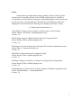
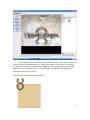
Gump Studio 1.7 User Manual + Simple Tutorial:
-- Index -1.
2.
3.
13.
15.
16.
About
User Interface
Tutorial 1 - Inserting and Manipulating Objects
- Inserting an Object
3
- Manipulation With X, Y
4
- Plugin Control
11
- Exporting RunUO
12
Toolbox Elements & Properties
Tips & tricks
Changes
About:
Gump Studio was designed and written by Bradley Uffner in 2004. It makes
extensive use of a modified version of the UOSDK written by Krrios, available at
www.RunUO.com. The RunUO community contributed Melanius created artwork, and
several more ideas. Special thanks go to DarkStorm of the Wolfpack emulator for
helping me to decode unifont.mul, allowing me to displaying UO fonts correctly.
====Plugin Specific Information====
Gump Exporter: Exports a given design to a usable script in various formats.
Author: Daegon / Eric Brown ([email protected])
Version: 1.0
RunUO Import: Imports a RunUO Gump script into a Gump studio file.
Author: Bradley Uffner ([email protected])
Version: 1.0
POLExporter: Exports the Gump into a Hesinde (POL alternative Distribution) script.
Author: Panos L. ([email protected])
Version: 0.1
SnapToGrid: Allows elements to be snapped to a grid.
Author: Bradley Uffner ([email protected])
Version: 1.1
WallPaper: Displays a solid color, or image as the background in Gump Studio.
Author: Bradley Uffner ([email protected])
Version: 1.0
WolfpackExporter: Allows the user to export a gump to a Wolfpack compatible script.
Author: Sebastian Hartte ( [email protected])
Version: 1.0
1
User Interface:
I will be referring to each individual object in the latter part of this
document. This will just be a quick conventional label for each item displayed
below. Please read this, as I will be referring it later.
1. File descriptor bar with document title.
2. Various file control elements, explained more in depth later.
3. Object Insert Bar: Allows for insert of object and so forth.
4. Selector Pane: Can select single items even if hidden by another object.
5. Sorting Buttons: For easier access to properties in a long list.
6. Property Pane: For editing and selecting an objects action and coherent property.
7. Property Descriptor: For a little more insight on what property you are working
with. Just incase you forget ☺.
8. Work Table: Worktable where objects will be manipulated. (W/O Grid)
2
Tutorial 1 - Inserting and Manipulating Objects:
This first small tutorial will show you the basics of Gump Studio 1.7. You will
learn the following task.
Inserting an object.
Manipulating the object on an X, Y grid.
Saving the object.
Using the plug in manager.
Loading the object.
Exporting the object.
Lets start by opening Gump Studio from now on referred to as GS. You will be
presented with the interface shown above. Lets start by adding a background. Click the
button labeled background and you will be presented with something that looks like this.
Notice how the background is - yes its dull - but more importantly how it was
created at the top left-hand corner of our workspace. This is where the gump will create
itself when called in game. We want to change three properties here.
Location - Size - Gump ID
Note: The top hand corner of the workspace is (0,0) on the X, Y grid; more information
later on this grid.
3
To change the location is the same as moving the top left hand corner of the
background to a single point on a grid. Think of GS like a small grid with the top left
hand corner of the workspace being 0,0. Since most users have their UO screen set to
640x480, it is not a good idea to make a gump larger than this. So the bottom right hand
numbers on the (x,y) grid will be (640x480). GS can actually make a very large gump.
This is a good standard size to go with.
Example of Grid:
The origin is where our editing begins in gump studio. The top left hand most part
of the workspace is 0,0. If you click on your background that you created not to long ago
and look in the property inspector, you will see that 'Location' has 0,0 beside it. Lets
change location to 120,120.
Click somewhere in the blank black space and bam, it moved. The reason you had
to click for the second number to take effect, GS does not set a number until another
action is performed.
You just set 120 X and 120 Y. This means that when a user opens this gump in
game it will start at the same location you just set it. This gump is a little too small for
our needs though.
4
When you select your background you will notice a set of buttons appear around
the object. By clicking and dragging these buttons you can easily set the size. Drag the
buttons around a bit and watch the numbers change in the property inspector. For this
tutorial we want a size of 200,200.
Click the + sign beside the word 'Size' it should expand and you will see 'Width
and Height'.
Change both width and height to 200. This will expand your gump to a new size. I
have to admit, I really just do not like this background for a gump. It is boring and old. I
personally want something a bit fresher and newer. So lets change it. Now there are two
ways to do this. If you know the exact ID of the background you would like you can just
type it in GumpID or you can select it from a picture list. By clicking in the GumpID
number box, in this example 9200 a browse button will show itself. Click it and you will
see something like this…
5
This is important. Notice how 9200 is selected only but the rest of the gump is
below it. The reasoning here is a very nice automatic gump selection feature. Instead of
having to select each and every piece then put them together one by one you select the
top most left hand corner of gump and it will assemble it for you. It must be the top left
hand corner of the gump and not the middle or any other piece because it will not
assemble it and just return an error.
Scroll down and select 9300, this is the top left hand corner of the parchment
gump that we will use as a background for our end product. Then hit the 'OK' button.
Now to the toolbox…
6
Hit the 'Image' button, this will create something like this. Don't get to exited, this
did not eat your gump background, we simply just created an image that we can use in
our gump. The same way we browsed the gump ID we are going to browse for another
picture, now you can browse for it or just type 9000 in 'GumpID'. Then change the
location for this picture to 85,55.
You will have something that looks like this.
7
That is a sweet gump you may say. Do you? No really it is a sweet gump. It needs
content, a reason one might argue. No matter how good your gumps are you need to get
an idea of what you need them to do, what will access them and how they may be abused.
Here we are going to make a simple help gump. It will be really simple. I am
going to use RunUO for the following tutorial mainly because of recent insight but more
specifically, everyone seems to use this emulator.
You could have it accessed when a player types '[help' or double-clicks a 'HelpGuide' there are an unlimited amount of uses for gumps. So lets add the content.
First click label. In the property inspector change 'Text' to 'Player Commands' and
change the location to 180,105.
Notice at the top you will see a tab that says '0', this means we are on page 0.
Anything on page 0 stays on page 0. If you put it there, it is permanent. This way we can
define our background and images that we want to stay.
This is our page tab, every time you add or clear a page one of these boogers
will appear or disappear. We are now going to make the first page.
At the top in file control elements, click 'page' then 'add page' a new tab will
appear. This is a new page, more specifically page 1.
Make sure you have page 0 selected at the top. We are going to put buttons on
page zero that, when clicked, will change the content of the windows above by switching
pages. So lets make a button for page 0, remember this button will always be seen and
selectable.
1. Click 'Button' in the toolbox.
2. Now we are going to change the id of the button when it is alone and its image when
pressed. Move over to the property inspector and change 'NormalID' to 1209 and
'PressedID' to 1210.
3. For location move it to 100,305.
4. Make another label. Have it say, 'Chat' and change its location to. (120,205)
5. The button needs to move to page 1 when pressed so, select the button again. Under
the property inspector click 'ButtonType' and switch it to 'Page'.
6. In the 'Param' box type 1. Now you just told the button it is a page switcher and to
switch to page 1. When all is finished you should have something that looks like this.
I left the button selected so you can see my settings. If you want to try different
buttons or backgrounds be my guest.
8
Now to finish off this gump, I said it was simple. Click the tap at the top to switch
to page 1, notice how page 0 stuff is still there.
This next element is my favorite element. It can be changed with a text file or
internally. Ours will be internal. I am talking about the 'HTML' button in our good ol'
toolbox.
Click this button and set the following properties, they pretty well explain
themselves.
Location
ShowBackground
ShowScrollbar
Size
107,165
False
False
185,125
You will notice all elements have a 'Name' property that you can change, this is
very handy. You can change this name and later in your scripts you can easily see what
you are looking at. The name does not affect the script in any way.
9
HTML stands for 'Hyper Text Markup Language', this is the language the Internet
generally uses. We are not going to use any tags for this example but they are easy and
handy to learn. For example, if you want bold text you would encase the words you want
bold with '<b>My Words</b>' My Words would be bold.
Click the HTML box in the property inspector and another one of those browse
buttons will appear. Clicking it this time will open an editor.
This is your simple text editor. In this
case we could input html, if we changed
the type to localized, we could have UO
packet messages inserted instead. We
are going to use HTML for now because
it is the most customizable.
In the text editor put 'This command will allow to broadcast a message to every
player online.' Without the quotes of course. Then hit the ok button. Switch between the
pages with the tabs, notice how everything on page 0 stays and everything on page 1
disappears.
Next we will deal with the plugin editor. This will allow us to enable and disable
certain features of GS. A very handy feature.
To save our current project click 'file' then 'save' or hotkeys 'ctrl+s'. This is not a
useable gump yet but instead a gump that you can share with your friends, to have a
usable RunUO gump we have to export that.
10
Plugins:
Plugins are a very handy feature that expands GS further than what we could ever
hope to achieve. With Plugins we can control a variety of features turning them on and
off to configure GS just the way we want it.
Make sure you save your progress then proceed to the next step, after changing
Plugins you have to restart the program. Now click 'Plugins' then 'Manager' you will get
something that looks like this.
On the left we have the Plugins that are already loaded, on the right we have the
Plugins that we can load. For example, if we wanted to have a grid in our work area
accessible we would click 'SnapToGrid' then click the arrow pointing left. Now it will be
loaded. If we wanted to get rid of 'WolfpackExporter' we would click it and click the
arrow pointing right. Do this now if you will.
Also go ahead and select RunUO and put that on the left hand side. This will
make sure we can export RunUO code. Click ok and it will ask you to restart the app.
11
Load your gump back up by clicking 'file' then 'load' navigate to wherever it is
that you save things and it will pull back up. To activate you grid click, 'Plugins', 'Snap
To Grid' and 'Show Grid' you can also configure the size of each grid space from here.
We now want to test out our awesome gump, right? We need to export it into
code that RunUO can recognize. Click 'file', 'export' and click 'RunUO' or just hit hotkey
'Ctrl+E'. You will be presented with a box that looks like this.
Let me explain Gump Options
here, the X and Y is where the
gump will appear on screen. But
Sean, you said earlier that
wherever the location is, is where
is will appear. With the RunUO
export we get a few more options.
Also the Server.Gumps is where
Gumps are handled in RunUO and
MyGump is the name for the
gump we made so go ahead and
export this somewhere by clicking
generate.
Violas, you now have a gump that is compatible with RunUO. I will explain in
later tutorials how to insert and work with gumps in the client. That way we can put them
to use.
For your convince I have included a list of every tool in your tool box, every
property in the property inspector and a few tips with some rather nice tricks that were
not explained in the tutorial.
12
Label: For adding text labels that can be user defined or localized.
-- Properties -Font
Hue
Text
- For changing the relative size of the font.
- Used for changing the color of the font, not used by all emulators.
- Whatever the label says, or if localized, the string.
Image: For inserting an image such as the UO symbol used in the example above.
-- Properties -GumpID
Hue
- Id for the picture used.
- Same as font, the color of the picture.
Tiled Image: Tiles a specific image for the size determined.
-- Properties -GumpID
Hue
Size
- Id for he picture tiled.
- Hue for the tiled picture.
- Size for the tiled picture image.
Background: Backgrounds used with gumps, like a tiled picture only composed of
different pictures.
-- Properties -- The Id for the gump itself, only the top left corner of the set can be
GumpID
selected though.
Alpha Area: Is the area for background positioning, there can be blank spaces in gumps
but without alpha area you can not drag the gump by clicking these blank spaces, with it,
you can more easily grab the gump.
Checkbox & Radio Button: Creates a checkbox.
-- Properties -- Whether the box starts checked or not.
Checked
CheckedID - Picture ID of the box when checked.
UnCheckedID - Picture of the box when unchecked.
Group
- The return number for the script when checked.
13
Item: You can insert object items with this. For example, I can insert a deer.
-- Properties -ItemID
Hue
- The item Id of the graphic used.
- The color of the item.
Text Entry: The area in which text can be entered by players, staff or whatever accesses
the gump.
-- Properties -Hue
ID
InitialText
- Color of the text.
- The number returned to the script.
- Text pre-typed in the box.
Button: A button added with a normal ID and a pressed ID.
-- Properties -ButtonType - A page button will change the page to the type specified and a reply
button will return a specified number.
Code
- A script you can have execute when the button is pressed.
- The button when it is not being pressed.
NormalID
- The button when it is being pressed.
PressedID
- the page number if the button type is page and the number returned if it
Param
is a reply button.
State
- Whether the button will start pressed or not.
HTML: Html that can be inputted into gumps.
-- Properties -CliLocID
client code.
HTML
ShowBG
ShowSB
TextType
- If the tag is set to localized instead of HTML this will be the localized
- The HTML being displayed. Can be remote also.
- Will or will not show the white background of the HTML box.
- Will or will not show the scroll bar.
- Whether localized or HTML.
14
Tips & Tricks:
Alpha Area - If you have a small gump, use a little alpha area on page 0 around the
gump, it makes it easier to grab.
Buttons - If you want buttons not to have a pressed graphic effect, just make the button
graphics the same for pressed and normal.
Dynamic - For gumps that need to have constant update of info either make a script that
every five seconds closes the gump and re-opens it every quickly or have a refresh button
that just is a page button set to open the same page.
HTML - For quick updating, like MOTD, have the HTML in a separate text file.
Graphics - For best compatibility make sure that you use graphics that everyone has, if
you use ML graphics people playing a non-patched version of AOS will see blanks.
Z Setting - To place certain object 'behind' others, change the Z setting lower. IE: You
have two backgrounds; you want background one with a Z setting of 0 to be higher than
background 2 with a Z setting of 3. Just set BG 1's setting higher than BG 2. In this case
the Z setting for BG 1 would be 4.
Hidden Objects - If you cannot select something because it is behind another object or
'hidden' just use the object selector.
^ Object selector as seen on TV. ^
15
I apologize for the abruptness of this document; I am preparing to write a fiftypage tutorial on the new Gump Studio 2.0 coming soon. For now I leave you with recent
fixes.
1/2/04 - version 1.7
-This is mainly a maintence release to fix some long standing bugs while the next major release is still being worked on.
-Fixes
-Art browser should no longer hand when searching for an item that does not exist.
-The "DEL Key Patch" plugin is no longer needed, the problem has been corrected in the core.
-Chanes
-There may be slight changes to the interface that are not functional yet. These were made in preperation for
some new funcations that have instead been moved into the next code base.
-There may be other changes or bug fixes not mentioned in this file. It's been a long time since the last release and I
can't remember everything that I changed.
5/7/04
- version 1.6
-Fixes
-SnapToGrid crash bug has been fixed.
-Static, and Gump Art browser cache crashes have been fixed. (I hope)
-Changes
-The main focus of this release is to add full Undo / Redo Support. Currently Gump Studio is setup with 25
levels of undo, In a future release I plan to make this number configurable.
-More drawing optimizations.
4/10/04 - version 1.5
-Fixes
-Lots of memory leaks throughout the program have been patched.
-The drawing optimizations in the CPU patch released a few weeks ago have been included.
-The crash bug when rebuilding the art cache has been fixed.
-Changes / Additions
-New Static Art Browser, in the style of Inside UO!
-Hues may now be entered in Hexadecimal by prefixing them with 0x, ex. 0xFF for 255.
-There has been a slight change in the plug-in API, all existing plug-ins that I know of have not been affected.
-Added a new item under the Page menu for clearing the current page.
3/12/04 - version 1.4
-Fixes
-The canvas auto scroll bug has been fixed.
-The SnapToGrid Plugin no longer crashes when tryign to resize the form.
-Text Entry elements now display thier text with the selected Hue. (Thanks Atomic)
-Fixed more spelling mistakes
-Changes
-If your plugin needs to check if the canvas has focus, you should check the "CanvasFocus" control for focus.
CanvasFocus is actually a hidden text box that acts as a focus surogate for the canvas object because giving foucus to the canvas was
causing some odd bugs.
3/7/04 - version 1.3
-Fixes
-Temporarily disabled Scrolling in the canvas. It is relation to a fairly serious bug that I'm not sure how to
correct yet.
-A few other things that I've forgotten about.
-Additions
-I have included a 70% project for an Import from RunUO Script plug-in. If anyone wants to finish it up, you
are welcome to use my code for it, and put your own name on it. As it is now the new plug-in works fairly well, but needs some
tweaking.
-Changes
-A few methods have been added / changed in the designer code to accommodate the new plug-in, this should
not break any other plug-ins. As always, if you are working on a plug-in that needs access to something not provided / public in the
designer, let me know and I will see what I can do to add what you need.
-Spell checked the changelog this time :)
16
2/27/04 - Version 1.2
-Fixes
-All menus are now public for plug-ins.
-Plug-in assemblies that contain virtual classes derived from BasePlugin will correctly load.
-Additions
-Controls now have Left, Top, Right, and Bottom resize handles in addition to the corners.
-Properties now have descriptions in the property browser.
-The dialog that is displayed when a plug-in fails to load is now more specific about which plug-in failed, and
why.
-Added "Cut" to the edit menu
-Edit menu is now displayed in the right-click context menu.
-The right-click context menu is now displayed even if the user did not click on an element.
2/24/04 - Version 1.1
-Fixes
-Crashing bug fixed when searching for a static item that did not exist.
-The odd behavior when resizing the window and adjusting the divider between the Editing area and the
property editor has been fixed.
-The crash when trying to paste items from the clip board when no items were in the clipboard is fixed.
-The issue with the window losing part of its title when loading a Gump has been fixed.
-The Updated Export.dll plug-in that fixes the button issues is included in this version.
-Additions
-I added a new "Large Text Property Editor" to elements such as HTML and Buttons that have properties that
can contain large amounts of text. I eventually want to expand this for the HTML editor to include inserting supported tags around
selected text
2/22/04 - Version 1.0 - Initial Release
17