1
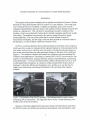
ARI Research Note 2007-08
Heuristic Evaluation of a User Interface
for a Game-Based Simulation
Christian J. Jerome
U.S. Army Research Institute
Amanda M. Howey
University of Central Florida
Consortium Research Fellows Program
Deborah R. Billings
University of Central Florida
Consortium Research Fellows Program
Simulator Systems Research Unit
Stephen L. Goldberg, Chief
September 2007
United States Army Research Institute
for the Behavioral and Social Sciences
Approved for public release: distrihitinn ic iinlimitari
20080114248
U.S. Army Research Institute
for the Behavioral and Social Sciences
A Directorate of the Department of the Army
Deputy Chief of Staff, G1
Authorized and approved for distribution:
MICHELLE SAMS, Ph.D
Director
Research accomplished for
the Department of the Army
Technical review by
Michael J. Singer, U.S. Army Research Institute
NOTICES
DISTRIBUTION: Primary distribution of this Research Note has been made by ARI.
Please address correspondence concerning distribution of reports to: U.S. Army
Research Institute for the Behavioral and Social Sciences, Attn: DAPE-ARI-MS,
2511 Jefferson Davis Highway, Arlington, Virginia 22202-3926.
FINAL DISPOSITION: This Research Note may be destroyed when it is no longer
needed. Please do not return it to the U.S. Army Research Institute for the Behavioral
and Social Sciences.
NOTE: The findings in this Research Note are not to be construed as an official
Department of the Army position, unless so designated by other authorized documents.
REPORT DOCUMENTATION PAGE
1. REPORT DATE (dd-mm-yy)
2. REPORT TYPE
3. DATES COVERED (from... to)
September 2007
Final
March 2007-September 2007
5a. CONTRACT OR GRANT NUMBER
4. TITLE AND SUBTITLE
Heuristic Evaluation of a User Interface for a Game-Based
Rimi intinn
5b. PROGRAM ELEMENT NUMBER:
622785
6. AUTHOR(S)
5c. PROJECT NUMBER:
Christian J. Jerome (U.S. Army Research Institute), Amanda
Howey and Deborah R. Billings (University of Central Florida)
A790
5d. TASK NUMBER:
294
5e. WORK UNIT NUMBER:
H01
8. PERFORMING ORGANIZATION REPORT NUMBER
7. PERFORMING ORGANIZATION NAME(S) AND ADDRESS(ES)
U.S. Army Research Institute for the Behavioral and Social
Sciences
ATTN: DAPE-ARI-IF
12350 Research Parkway, Orlando, FL 32826-3276
10. MONITOR ACRONYM
9. SPONSORING/MONITORING AGENCY NAME(S) AND ADDRESS(ES)
ARI
U.S. Army Research Institute for the Behavioral
and Social Sciences
Arlington, VA 22202-3926
11. MONITOR REPORT NUMBER
ARI Research Note 2007-08
12. DISTRIBUTION/AVAILABILITY STATEMENT
Approved for public release; distribution is unlimited.
13. SUPPLEMENTARY NOTES
Subject Matter POC: Christian Jerome
14. ABSTRACT (Maximum 200 words):
This research sought to estimate the level of usability, to identify any problem areas, and to provide redesign
recommendations that may improve the usability of future designs of Forterra's Online Interactive Virtual Environment
(OLIVE) system as a training tool. Game interface usability might have an effect on the success of game-based
simulation training programs. Three usability researchers performed a usability heuristic evaluation, documenting each
problem identified, as well as the recommended solution to these problems. Three areas out of the ten usability
heuristics were identified as potentially problematic: User Control and Freedom Recognition, Recognition Rather than
Recall, and Help and Documentation. A number of design recommendations have been identified which should improve
usability and task performance using these systems. The data can serve to enhance the existing software by
incorporating additional program requirements, and can also provide an easy-to-use checklist for DoD personnel, private
contractors, and researchers interested in the design and testing of game-based simulation for team training.
15. SUBJECT TERMS
Usability, game-based simulation, interface, heuristic evaluation
SECURITY CLASSIFICATION OF
16. REPORT
Unclassified
17. ASTRACT
Unclassified
19. LIMITATION
OF ABSTRACT
20. NUMBER
OF PAGES
18. THIS PAGE
Unclassified
Unlimited
17
21. RESPONSIBLE PERSON
Ellen Kinzer
Technical Publication Specialist
703/602-8047
ii
HEURISTIC EVALUATION OF A USER INTERFACE FOR A GAME-BASED
SIMULATION
EXECUTIVE SUMMARY
Research Requirement:
The purpose of this research was to evaluate Forterra's Online Interactive Virtual
Environment (OLIVE) version 0.9.2 based upon ten well established design principles in
an effort to identify usability strengths and weaknesses. This method requires no users
and can be done in a relatively short period of time. However, the value of this technique
is great in that it can quantify usability, identify general problem areas, and guide future
usability efforts.
Procedure:
Three human factors trained professionals performed the usability heuristic
evaluation, documenting each problem identified, as well as the recommended solution to
these problems. They rated OLIVE on ten different aspects of the interface drawn from
Nielson (1993). Each researcher was asked to rank each aspect on a scale of 1 (not an
issue) to 5 (severe issue, needs to be resolved). After each researcher independently
preformed their evaluation, the results were discussed and consensus was reached.
Findings:
Although positive aspects of the system were revealed during the evaluation, three
general areas could potentially benefit from further analysis and/or change. User Control
and Freedom Recognition, Recognition Rather than Recall, and Help and Documentation
were the usability categories that showed high priority levels, indicating the need for
further attention.
Based on these results, it is recommended that (a) there should be a clear exit from
chat mode in the chat window and an undo/redo option for actions in progress, (b) there
should be a dropdown menu with a list of all available commands and actions, (c) there
should be a visible menu option for help, and (d) the chat window should blink or
illuminate so that the user will be cued to look at crucial information contained within the
window.
Utilization and Dissemination of Findings:
The format and approach used for these heuristic evaluations can provide an easy-touse checklist for DoD personnel, private contractors, and researchers interested in the
design and testing of game-based simulation for team training. The data can serve to
enhance the existing software by incorporating additional program requirements.
iii
The approach and results of this research will be of most use to interface designers,
and specifically the interface designers at Forterra. The recommendations relate to the
current state of the OLIVE interface, so that this report might not be accurate after its
next release. However, the methods and results might reveal common problem areas in
game-based simulation interfaces (e.g., lack of help) and could provide an otherwise
unknown means to quantify, investigate, and improve interfaces in general.
iv
HEURISTIC EVALUATION OF A USER INTERFACE FOR A GAME-BASED
SIMULATION
CONTENTS
Page
Intro du ctio n .........................................................................................................................
1
M eth o d s ...............................................................................................................................
3
R e su lts .................................................................................................................................
3
Summary and Recommended Next Steps ......................................................................
8
C o n clu sio n ..........................................................................................................................
8
Referen ces .........................................................................................................................
11
LIST OF FIGURES
FIGURE 1. SCREENSHOTS OF THE OLIVE INTERFACE ......................................
I
LIST OF TABLES
TABLE 1. ATTRIBUTES OF POTENTIAL OLIVE USERS ......................................
2
TABLE 2. RESULTS OF THE EXPERT ANALYSIS (HEURISTIC
EVA LUA T IO N ) .....................................................................................................
5
TABLE 3. USABILITY SCORE ....................................................................................
8
TABLE A-1. USABILITY SPECIFICATION MATRIX ...........................................
A-1
V
vi
Heuristic Evaluation of a User Interface for a Game-based Simulation
Introduction
The purpose of the present evaluation was to perform an analysis of Forterra's Online
Interactive Virtual Environment (OLIVE) version 0.9.2 user interface. The overall goal
was to estimate the level of usability, to identify any problem areas, and to provide
redesign recommendations that may improve the usability of future designs of the OLIVE
system as a training tool. This was done by conducting a heuristic evaluation of the
interface, which was conducted by human factors trained researchers and did not include
user testing. The problems were scored with a priority rating followed by design
recommendations. The area of the system that is covered include all areas of
functionality and display, and the range of actions taken include an evaluation based on
the heuristics, or rules of thumb, outlined by Nielson (1993).
OLIVE is a software platform where online persistent environments can be created in
which users have avatars (or characters) that represent themselves in the simulated world.
The online world is one in which the user can interact with objects and other people via
their avatar, and where they can make permanent changes to the state of the world (See
Figure 1). The interface's displays and controls are consistent with most standard MS
Windows based applications. According to Forterra (2007), OLIVE can be used for "the
purposes of communication, training, rehearsal, analysis, experimentation, socialization,
and entertainment." US Army Research Institute (ARI) is interested in OLIVE, as well
as other game-based simulators, as a means to conduct research into the provision of
training in a relatively efficient and inexpensive way, and also in a way that may be
slightly more intrinsically motivating and familiar to the users than other training
methods.
n
gn
Figure 1. Screenshots of the OLIVE interface. The left panel shows a user's avatar
interacting with an automobile. The right panel shows a user's avatar interacting with
another avatar in the environment.
Based on information gathered from previous research and observations made from
the OLIVE system, user profiles and contextual task analyses were developed for each
I
user group (Orvis, Orvis, Belanich, & Mullin, 2005). The usability attributes, which
would define the goals for (future) user testing, are summarized in a Usability
Specification Matrix in Appendix A.
Table 1
Attributes of PotentialOLIVE Users
User
User
Characteristics
Gaming Novice
Environments
Computer
workstation
Important
Usability Attributes
Movement
• Walk
• Run
• Turn
Head movement/eye gaze
movement
•
*
Learnability
Ease of use
Usefulness
•
Satisfaction
•
*
Communication
• Talk/chat
* Read/listen to incoming
message
Gaming Expert
Computer
workstation
Control of tools/weapons
• Toggle what you are holding
* Pick up object
• Drop object/put away object
* Aim weapon
* Shoot weapon
Movement
• Walk
• Run
• Turn
Head movement/eye gaze
movement
•
Communication
" Talk/chat
" Read/listen to incoming
message
Control
*
*
*
*
*
of tools/weapons
Toggle what you are holding
Pick up object
Drop object/put away object
Aim weapon
Shoot weapon
2
Ease of use
0
T
Flexibility
0
Satisfaction
Usefulness
Methods
Three human factors trained researchers performed heuristic evaluations on the
OLIVE system. The interface was assessed against ten design principles that are well
established to lead to highly usable designs (Nielson, 1993):
*
*
*
*
*
*
*
*
•
*
*
Visibility of system status
Match between system and the real world
User control andfreedom
Consistency and standards
Errorprevention
Recognition ratherthan recall
Flexibility and efficiency of use
Aesthetic and minimalistdesign
Help users recognize
Diagnose, and recoverfrom errors
Help and documentation
Each researcher was asked to evaluate the display interface for each design principle
listed above. Based on the researchers experience with the interface for one hour, each
design principle was rated on a scale from I (not an issue) to 5 (severe issue, needs to be
resolved). After each researcher independently preformed their evaluation, the results
were combined and discussed. If one researcher found a problem that the other two
researchers did not find, it was discussed until all agreed. If all did not agree, the
problem would be rejected; however, this did not happen with this evaluation.
Another goal of this evaluation was to assign a usability score to the current interface.
This score can be compared with other interfaces using similar methods. The candidate
interfaces could then be compared to one another to determine which is more or less
usable. This quantification could also be used in other analyses like standard correlation
and multiple regression. The usability score was determined by simply adding up the
priority scores for each heuristic category. A score of 3 was considered a low priority
(good or high usability) and not in need of change. Scores from 4 to 5 indicated medium
priority and not requiring change, but further analysis should be done. Scores of 6 and
above are identified as high priority (low usability) and further analysis and system
change is recommended.
These non-empirical methods were used to estimate the usability level, identify
general problem areas, and guide future usability efforts. The results of this analysis are
presented in Table 2. Based on the usability evaluation, several areas in need of
improvement are revealed.
Results
Basic observations reveal that OLIVE's interface is fairly straightforward and easy to
use for novices and experts. Although the control panel was simple and easy to learn,
3
potential problems were uncovered through observations using usability heuristics (or
general rules of thumb). Table 2 outlines both the major positive aspects of the OLIVE
interface as well as the major areas in need of improvement. The general heuristics
analyzed are listed in the first column of Table 2, followed by the impact on user
performance (Priority), the specific problems as well as some positive comments in the
next column (Comments), and finally recommended solutions to the problems are listed
in the last column. The priority ratings for these problems dictate the necessity of
redesign recommendations, with a rating of 5 (High) suggesting that the specified
weakness would greatly impact user performance. User testing was not performed in this
evaluation. Therefore, the expected impact of the system on user performance is merely
projected. As such, the outcomes of this evaluation should be utilized to help guide the
user tasks when performing user testing.
4
Table 2
Results of the Expert Analysis (HeuristicEvaluation)
Evaluators: Christian Jerome, Amanda Howey, and Deborah Billings
Comments
Priority
Heuristic
Recommendation
1 thru 5
Visibility of
system status
Evaluator A:2
While in lst person view, you get no
feedback for gestures
Evaluator B: I Features included: Compass, actions are
in real-time, arrow for actions that use a
drop down menu (getting into a car),
differentiation between healthy, injured
(shot once), and dead.
Give an indication
that a gesture is in
progress and
possibly a way to
cancel (or stop) a
gesture in progress
Evaluator C: 1 More buttons appear when user is able
to perform actions, options change
according to situations
Match
between
system and the
real world
User control
and freedom
Evaluator A:2
Some computer/programmer jargon in
chat window
Evaluator B: 2
Need for arrow and drop down menus
for some actions (getting into a car), for
other actions you have to learn
commands/short cuts
Evaluator C: 1 Good match b/w system and real world
Evaluator A:3 Stuck in chat mode. How do you get
out?
Evaluator B: 2
No undo/redo, but only 2 menus and
easy to find to switch back to previous
view
Evaluator C: 1 After perform action, you are given
option to put away
Eliminate language a
user would not
understand
Have a clear exit to
chat mode in the
chat window and
make it clear that
you are IN the chat
window when you
are.. .darker
background,
blinking, etc.
Have an undo/redo
option for actions in
progress
Consistency
and standards
Evaluator A: I
Evaluator B: I
Error
prevention
Evaluator C: I All wording seems to be fairly consistent
Evaluator A: 1
Evaluator B: 1
Evaluator C: 2
You can see options when scroll over
with mouse (before you click)
5
Have a slight pause
when scroll over
before menu appears
Table 2 (continued)
Priority
Heuristic
1 thru 5
Evaluator A: 1
Recognition
rather than
Evaluator B: 2
recall
Evaluator C: 4
Flexibility and
efficiency of
use
Evaluator A:2
Comments
Recommendation
Basic commands/actions along bottom.
Other commands need to be
remembered.
Provide a dropdown
help menu with a list
of all commands and
actions that can be
accessed with either
a mouse click or a
key press.
Some critical options are neither
intuitive nor listed on the screen (e.g.
crouch, jump, crawl)
Views & Controls have no accelerators
for experts
Evaluator B: 1 Short cut keys, commands are user's
preference
Aesthetic and
minimalist
design
Help users
recognize,
diagnose, and
recover from
errors
Help and
documentation
Evaluator C: 1 Necessary actions can be done via
keyboard or mouse, and some of these
appear at bottom of screen
Some commands always visible
Evaluator A:3
Provide a toggle for
visible controls
Evaluator B: I Menus appear/disappear when should
Evaluator C: I Only relevant objects populate scenario
Evaluator A: 1
Evaluator B: I
Evaluator C: 2
Evaluator A:5
Error messages sometimes appear in
chat window, but is not very obtrusive or
obvious that it is an error caused by your
actions
No help menu option
Evaluator B: 3 No help function on the screen, but user
manual helps. All basic controls that are
needed are on screen when appropriate.
No option for help by a list of steps to
complete actions/tasks.
Evaluator C: 5 No key to bring up help menu, nor any
Note, Priority Zey:help option in the system itself.
Note. Priority Key:
1=
2=
3 =
4=
5=
Provide short cut
keys for all buttons
and menu options
for expert use
no identified problems
low priority; change suggested, but not necessary
medium/low priority; change recommended
medium/high priority; change recommended, change pressing
high priority, urgent, change necessary
6
Display error
messages in the chat
window more
obtrusively so the
error is noticed and
can be corrected
Provide a visible
menu option for help
for instances when
manual is not readily
available
The major usability observations of this evaluation revealed both positive aspects of
the system and areas that could potentially benefit from further analysis and/or change.
User Control and Freedom was one usability category that showed high priority levels,
indicating the need for further attention. On the positive side, most options change
consistently with user actions and there are few menus and easy to find options.
However, users can get stuck in chat mode and there are no undo or redo menu options to
allow users to return to a previous condition if they accidentally choose the wrong menu
option. Recognition Rather than Recall was another usability category that showed high
priority levels. On the positive side, most basic commands/actions are displayed along
the bottom of the interface. Also, there is a recurring and easily recognizable icon that
indicates you can perform an action. However, higher level commands/actions need to
be remembered and some critical options are neither intuitive nor listed on the screen
(e.g. crouch, jump, and crawl). Help and Documentation was another usability category
that showed high priority levels. On the positive side, there is a good user manual
available on the internet. However, there is no help menu option on the interface for
users to easily find help without exiting the system. Also, help text and other important
information may appear at times within the chat window, but it is not clear when the user
should focus attention on the window and therefore it regularly goes unnoticed.
The results of the usability level quantification can be seen in Table 3. Four heuristics
scored very well; visibility of system status, error prevention, flexibility, and recover
from errors. Since these were not flagged as problem areas, users are not expected to
have many problems associated with them. Three other heuristics did not score very
well; user control and freedom, recognition, and help. Since these areas scored high and
problems were identified, users might be expected to have problems associated with
them.
7
Table 3
Usability Score
Usability Heuristic
Usability Score
Visibility of system status
4
Match between system and the real world
5
User control and freedom
6
Consistency and standards
3
Error prevention
4
Recognition rather than recall
7
Flexibility and efficiency of use
4
Aesthetic and minimalist design
5
Help users recognize, diagnose, and recover from errors
4
Help and documentation
13
Grand Total
55
Summary and Recommended Next Steps
The goal of the current work was to perform a heuristic evaluation to identify any
problem areas existing in the interface design of OLIVE. It should be noted, however,
that only three usability evaluators were used for this effort. There is no guarantee that
all usability problems will be uncovered. Nielson (1993) recommends about five
usability evaluators be used to identify around 75% of the total usability problems. Three
evaluators can be expected to find 60% of the total usability problems. Therefore, it is
recommended that for this and future heuristic evaluations, more usability evaluators be
used to uncover a larger proportion of the problems, consequently moving on to more
empirical usability evaluations. Additionally, it is important to note that the
recommendations highlighted in this evaluation are not guaranteed to provide perfect
solutions to existing issues. Moreover, future designs based on these recommendations
should undergo iterative user testing and redesign to ensure that usability standards are
met and additional usability concerns have not developed.
Conclusion
Based on the results and priority ratings, specific areas of improvement should be
considered. It is recommended that (a) there should be a clear exit from chat mode in the
8
chat window and an undo/redo option for actions in progress, (b) there should be a
dropdown menu with a list of all available commands and actions, (c) there should be a
visible menu option for help, and (d) the chat window should blink or illuminate so that
the user will be cued to look at crucial information contained within the window.
The heuristic evaluation conducted on Forterra's OLIVE system interface revealed the
potential for becoming a viable training tool for the military. Specifically, the control and
display interface for a computer training device is consistent with other computer
interfaces and easy to use for novices and experts. The current simulator interface is
simple and straightforward but could benefit from a number of specific changes. These
changes have been identified through a heuristic analysis but do not guarantee that the
recommended changes will improve the overall usability of the system. Further analysis
must be performed to assess the extent to which the changes have positive effects, and it
is strongly recommended that user testing be conducted, as well as a redesign of the
interface incorporating the recommended changes summarized in this research note.
To conclude, many usability problems may be identified using general rules of thumb
developed for product design usability. The process can be carried out quite simply and
quickly and provides information that can help the designers know what areas of the
design are problematic, and it can also guide any further usability testing the evaluators
may need to conduct.
9
10
References
Forterra (2006, November 30). Forterra's On-Line Interactive Virtual Environment
OLIVETM 1.0 Platform - Ready For Prime Time. Retrieved March 29, 2007 from
http://www. forterrainc.com/news/press_olive-launch.html
Nielson, J. (1993). UsabilityEngineering. Academic Press, San Diego, CA.
Orvis, K.A., Orvis, K.L., Belanich, J., & Mullin, L.N. (2005). The influence of trainee
gaming experience and computer self-efficacy on learner outcomes of videogamebased learning environments. (ARI Technical Report #1164). Alexandria, VA:
U.S. Army Research Institute for the Behavioral and Social Sciences.
Wixon, D., & Wilson, C. (1997). The usability engineering framework for product design
and evaluation. In Helander, M. G., Landauer, T. K., & Prabhu, P. V. (Eds.),
Handbook of human-computer interaction. 2nd ed. Amsterdam, The Netherlands:
North-Holland
11
12
Appendix A
Usability Specification Matrix
Table A-1
Usability Specification Matrix
Attributes
Measuring
Instrument
Measuring
Method
Product was
intuitive
Average
7 point Likert scale
(1are-7>43to
rating
(1 agree - 7
Product was
easy to
use/understand
7 point Likert scale
(1 easy - 7
difficult)
Average
Product was
useful to user
7 point Likert scale
(Iuseful - 7 not
Average
rating
7 point Likert scale
(1 agree - 7
f disagree)
7 point Likert scale
User was
(1 efficient - 7 not
efficient when
using product
efficient)rating
User was
7 point Likert scale
effective when (1 effective - 7 not
effective)
using product
User was
7 point Likert scale
satisfied with
(1 satisfied 7 frustrated)
product
7 point Likert scale
Support
provided was
(1 support
provided- 7 no
hpd w
helpful
support provided)
Average
rating
Total time to
perform
scenario task
Average
All tasks
Number of
experimenter
interventions
All tasks
Product was
flexible to use
Unacceptable
Level*
Minimum
Level*
4
rating>
Planned
Level*
2<
Best Case
Level*
2
4
3 to 4
<2
>4
3 to 4
2<
2
>4
3 to 4
2<
2
>4
3 to 4
2<
2
>4
3 to 4
2<
2
>4
3 to 4
Average
Average
rating
rating
Average
rating
rating
Average
rating
<2
5:01 - 6
3<-m5
minutes
minutes
3 to 2
1
< 3 minutes
> 6 minutes
time
Average
number of
>3
intervention
s per subject
19% to
Average
Time in
>30%
30% to 20%
errors/Total
All tasks
percentage
10%
time (%)
% of
Successful
N/A
N/A
100%
completion of
All tasks
successes
task
* Performance levels defined by Wixon & Wilson, 1997
Best case level: ideal performance, achieved under ideal circumstances
Planned level: target to determine usability success; if level attained, no further testing required
Minimum level: worst acceptable performance; additional testing should be conducted
Unacceptable level: performance is unacceptable; additional testing and/or redesign required
**Performance ratings are predicted values
A-1
<I
<10%
N/A