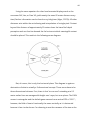
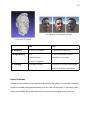
1
Visual Design Methods for Virtual Reality
Mike Alger
MA Moving Image
September 2015
Abstract: This paper presents some pre-visualization design methods for volumetric user
interfaces and experiences within the larger scope of a virtual reality operating system.
!2
Initial Manifesto:
(11:05)
https://vimeo.com/116101132
Final Summary:
(17:47)
https://vimeo.com/141330081
!3
Table of Contents
4
Introduction
4
Personal Motivation
6
Primary Question
7
Research Process
9
Context
15
17
19
Opportunity for the Workplace
Theory
Input
21
26
Input UI
Content
27
Environment
29
Icons
31
Buttons
36
Content Zones
51
Practical Application
53
Use Case: Animation Prototyping
59
Use Case: Zone and Environment Prototyping
61
Adding Depth to Monoscopic Photo Spheres
66
Putting these Concepts Together for a VR OS Design
75
Prototype and Evaluation
76
What’s Next?
76
Conclusion
79
References
90
Appendix: Avatars
92
Avatar Creation Methods
92
3D Modelling
93
Photogrammetry
95
3D Scanning
97
Hybrid Solutions
!4
Introduction
Personal Motivation
I find myself sitting cross-legged, zipping around on a golden cloud above a small
sand island with a single building. Godzilla emerges from the water and joins
several characters, mostly from pop culture, either standing on the island or flying
on their own clouds. Most of them are laughing and commenting on how ridiculous
the oversized Iron Giant looks perched cross-legged on his own floating yellow poof.
Their accents are Dutch, French, British, and American. As a group, we’ve come here
through a portal from one world and will depart through another when we get
bored.
It’s “virtual reality,” or colloquially, VR. In actual reality, I’m sitting at my desk
holding a game controller. My hearing is replaced by the sound of headphones and
my sight is replaced by the light of a head mounted display. I’m playing what is
essentially a first-person-shooter video game connected with people online, except
the “shoot” function is replaced by “talk.” The application is called VR Chat and each
week a group of people will log on to see the latest avatars and tour the latest
worlds created by each other (Gaylor and Joudrey, 2015). There are other social VR
applications such as ConVRge and AltSpace, but as Virtual Reality as a medium is
still in its infancy, only regaining popularity in recent years (Nelson, 2013), the
attendance tends to be between ten and twenty weekly.
Each participant is interested in consuming or contributing in their own way
and many have their own projects. Gunter, for example, leads the tours and hosts a
weekly podcast interviewing VR content creators (Gunter, 2015). Tom creates
!5
avatars and worlds heavily themed with the cross section of biblical and digital
concepts (Tom23, 2015). Ggodin develops an application that allows people to use
their Windows interface in another environment (Godin, 2015). Jesse and Graham
are the creators of VR Chat itself (Gaylor and Joudrey, 2015). But what do I do?
In the past, I have focused on digital media with an emphasis on video
production and graphic design. The marriage of these mediums is motion graphics
or motion design - my favorite area. As I continued to create videos and design
websites, I couldn’t help but feel that I was producing content that would soon
become irrelevant, lost forever in the ether with the myriads of preceding films and
designs. I yearned to be part of the creation of something larger, something with a
more significant and lasting impact on mankind. It would seem that thing could be
virtual reality.
As a medium, there are very few existing standards, protocols, and
workflows. It’s like participating in film before cinematography had shot names, or
like participating in the internet before “web designer” was a position. The things
you do and techniques you use to do them for virtual reality can become the
standards that people later think of as commonplace. Although a fairly weak and
still fleeting form of immortality, participating in the developmental stages of a
medium with such potential makes me feel like I’m contributing to something that
will have a lasting impact, for worse and better. Deciding to work with the human
perception of the moving image as it relates to virtual reality led me to ask “how can
I contribute?”
!6
Primary Question
It would seem that a large portion of virtual reality content being produced
currently is intended purely for consumption (Bye, 2015). Very few virtual reality
experiences allow the user to create something with it. I initially thought it was
strange that developers would write code, pull the headset down over their eyes to
test it, take it off to adjust their work, put it back on to test again… it seemed that
this all should be done with the headset on. If it is such a powerful and versatile
medium, why not use it to build the experiences themselves?
Even as the concept is suggested, the worms start to exit the can. Creating a
game, for example, may require 3D modeling, image editing, and coding. While
each have tools on traditional 2D computer screens, no interfaces have been
created that are designed for these tasks in the volume of virtual reality. A user
can’t even see their keyboard to type. They’re now moving their body in ways that
weren’t the case with the previous mouse and keyboard system. It would seem
initially that everything we know about digital interaction design is thrown out the
window as the majority of our current interfaces are perceived as the two
dimensional screens of computer monitors and smartphone screens. This thought
process led me to my initial question:
How can the two dimensional paradigm of operating systems be most
ergonomically redesigned for head mounted displays?
One of the interesting caveats of this question is the prospect of design. It proposes
the creation of workflow - to design a process for design. In order to create this new
medium of interaction, a method of creation must first be invented.
!7
Research Process
Virtual reality is currently a very fast evolving topic, seeming to change by the week.
There are several research methods I have adopted so as to attempt a well-rounded
approach. While traditional methods of reading books and papers is necessary and
helpful, many of the concepts described in older publications have evolved in
recent years. In order to remain up to date, it is necessary to subscribe to blogs and
discussions online and read the problems and findings of developers as they
experience and document them. These sources are, of course, typically anecdotal
and purely qualitative without controlled studies or quantitative rigor. There remain
many guidelines that are generally agreed upon by the VR community without
particular proof from a study, but are apparent in practice. This is one of the
reasons that my research process has also included trying out as many experiences
as possible for myself, allowing me to form my own opinions about the validity and
effectiveness of techniques and implementations. Making my own experiences and
testing them as well as showing them to other people has been another part of my
research process. Understanding what other people are thinking and feeling about
VR is helpful for the user experience design process for obvious reasons. Another
part of this has been my participation in meetups, hackathons, and game jams physical gatherings where groups discuss and create content. I have also been
giving talks presenting my own findings along the way at such events
(documentation of these events can be found here: (Alger, 2015a,b,c,d)). Another
source of information for me has been to ask questions and interview experts via
email, video conference, or even in virtual reality itself. Participating in social VR
applications has also afforded me the opportunity to converse with the spectrum of
!8
developers and hobbyists participating in the medium first-hand. As a result of
these research practices, many of my resources come from recent years and
internet-available resources, which to me seems appropriate to me for a digital
information age.
As I have progressed through the discovery and understanding process of
virtual reality’s current state and potential, I have found myself pursuing and
answering tangential questions to my original focus. For example, I have found
myself interested in the avatar as it relates to identity and visual representation of
self, for which I present a few thoughts and methods for creation of personalized
avatars in the Appendix. Within the original question, however, I found that I would
first need to create methods and guidelines for VR design. I found that I needed to
start with ergonomically responsible zones for content mixed with design
workflows modified from existing mediums. It is this process that this manuscript
intends to describe.
!9
Context
When attempting to understand and develop relevant ideas for subjects, it’s
necessary to reiterate our understanding of their current definitions and historical
context. With regard to virtual reality, one of the basic things to consider is the way
that our senses serve as the input our brain uses to construct an understanding of
the world around us. Sight, hearing, touch, smell, and taste are the most widely
accepted set of external stimulus that the human body perceives (Sense, 2015).
These senses and our reactions to them are the result of millennia of natural
selection (Darwin, 1859)* and there are several consequences of this built into our
instinct. This is all relatively common knowledge and seems like it may not need to
be reiterated here, but the important thing is to state that we, as humans, have
certain predictable outputs based on certain sets of inputs. Essentially, it’s instinct.
Human nature. Certain behaviors are hard-wired into us from our ancestors as
much as a dog wants to dig and a bird wants to migrate.
A common word in interface design is “intuitive:” basically, knowing
something without having to be told (Intuitive, 2015). Interfaces are praised for
being intuitive because people will know how to use them without any time or
energy spent on training. Often, “intuitive” interfaces rely on some aspects of
human instinct. A planned exhibition may use light, motion, sound, and space to
draw a person’s attention through an area. A well designed website will similarly
use color, distance, and typography to clearly communicate a purpose and often
persuade some sort of action. Contrasting elements of sight like light, color, and
motion naturally draw our attention because they were necessary for our own
survival as animals, whether we were hunting or avoiding being killed ourselves.
!10
The same applies for contrast in sound, touch, smell, and taste. The process of
design is often the creation of methods to coax an automatic response from end
users by way of these natural tendencies (Sundstrom 2015; Alger 2015e).
The evolution of the graphical user interface (GUI) for computers is an
interesting vignette in the enormous subject of visual design. The GUI evolved as a
solution to understand the data and processes taking place in a computer’s system.
By visually representing programs and information using text and shapes, an
“interface” is created. Its medium allows input and output that the computer
understands, but also that a human can understand, though typically with some
amount of training. The first graphical user interface to use the now-common
desktop concept was created by Xerox PARC and set the precedent for desktop
metaphors that are still used today (Thacker et al., 1979; Koved and Selker, 1999).
The main 2D analogy was a desktop with pieces of paper sitting on top of each
other and consisted of the now common elements of windows, icons, menus, and
pointer (Preece et al. 1994; Hinckley 2002). This same structure has proven useful in
personal computing for decades now, based on rectangle sections of content within
a rectangle screen. Of course, several other GUIs now exist like iPods or ATMs... the
most widely adopted of which recently may be the multitouch smartphone. Each of
these has a tailored user interface to accept physical input from a human and
display feedback clearly to complete tasks.
Of course, this is all mentioned to come back to virtual reality and the way we
can interact with it. There are several forms of virtual reality including the “cave”
with projections on walls (Cruz-Neira et al., 1992; 1993) and the “workbench” with
stereoscopic desk projections (Kreuger et al., 1994; 1995). This paper relates to
virtual reality through head mounted displays (HMD). An HMD is like headphones
!11
for your eyes. Headphones give your ears artificial sounds, HMDs give your eyes
artificial light (Shibata, 2002). Just like headphones can be designed to block out
outside sound, HMDs can either let light through or replace your vision entirely. At
the time of this writing, replacing vision entirely is referred to as virtual reality (VR),
while mixing real light with artificial is referred to as augmented reality (AR)
(Agarwal and Thakur 2014). Head mounted displays for VR and AR, like other forms
of virtual reality, work by presenting stereoscopic images to each eye and updating
those images as the user moves their head (Cakmakci and Rolland, 2006). As long
as the hardware are software are performing their tasks correctly, virtual objects
appear to remain in a fixed position relative to the user.
What is particularly impressive in use are the illusions of scale, space, and
depth that naturally occur with HMDs. The way we perceive the world optically can
be defined by a few variables describing the way our eyes receive light in what is
called the plenoptic function (Adelson and Bergen, 1991). We are accustomed to
moving through and perceiving light fields as light will be entering our pupils from
every direction no matter where we place our head. Our degrees of freedom to
perceive a scene can be defined by 10 variables: x, y, and z position; pitch, yaw, and
roll rotation; distance, horizontal, and vertical position to the point of convergence
and focus; and the size of the pupil’s aperture (McGinity, 2014). Virtual reality head
mounted displays are currently able to replace 8 of these convincingly: The 3
position, 3 rotation, and 2 convergence variables. As the user moves and rotates
their head while looking around a scene, the image is updated for each eye
accordingly. However, the final two variables are not typically accounted for in VR
systems: focus and aperture. The eyes experience some strain over time as they
attempt to focus as they normally would by compressing/expanding in accordance
!12
with their convergence (Hoffman et al., 2008). The 2D display screen doesn’t allow
for this, though. Displays are also currently restricted to a dynamic range dictated
by their electronics, and don’t afford the high dynamic ranges of light found in the
real world that would affect the pupil’s aperture normally (Reinhard et al., 2010). In
the future, plenoptic lenses (Lanman and Luebke, 2013), light field tensors
(Wetzstein et al., 2012), and high dynamic range screens (Seetzen et al., 2004) may
solve these problems, but they are not currently consumer product solutions. Even
still, the effect of perception to the user with current HMDs is enough to convince
them of the spatial location and scale of a virtual object.
This is where a few common buzzwords of virtual reality come in: immersion
and presence. With mediums of entertainment like theater or cinema, there is a
certain suspension of disbelief afforded by an audience participant. The viewer can
choose to accept the presented reality as plausible for the sake of the experience.
This may even reach visceral level in which the body’s subconscious reactions are
triggered based on human nature: jumping, screaming, laughing, crying, etc.
Because the user of VR appears to be surrounded by the virtual objects and
environment, it is much easier for them to accept these surroundings as fact, both
consciously and subconsciously (Abrash, 2014). While the terms “immersion” and
“presence” are increasingly used for hype and marketing purposes, I personally like
the way that Michael Abrash describes presence as it relates to virtual reality. He
describes the human perceptual system through the use of optical illusions, in
which our understanding of raw image data is clearly being fooled. He describes
that our other systems (hearing, proprioception, touch, etc.) are also susceptible to
illusions. It is this fooling of these subconscious perceptual systems that he defines
!13
as presence. Immersion is being presented only with data from a false
environment, but presence is having your body believe it on a fundamental level.
It is now that all of those millennia of evolution finally come into play with
computers. It is now that the human perceptual system and the graphical user
interface really meet. What’s particularly interesting here is that virtual reality as a
technology is actually older than the graphical user interface. Ivan Sutherland
created the first virtual reality and augmented reality head mounted displays in the
late 1960s (Sutherland, 1968). The first GUIs were created by Xerox in the early
1970s (Thacker et al., 1979). However, shortcomings of technological capabilities
prevented the adoption of head mounted displays for consumers. In order to
maintain the illusion of a presented reality, an image must be updated a minimum
of about 75 times per second (Oculus, 2015a). Others may describe it as a 20
millisecond motion-to-photon latency, where the time between a user’s head
movement and the updated image must meet that benchmark (Abrash, 2013).
Valve requires a frame rate of 90 frames per second for their Vive system (Faliszek,
2015). Resolution of screens for HMDs also must be extremely high to not be
noticeable/distracting; higher than high definition television packed into the size of
a smartphone screen (Forums.oculus.com, 2015). The processing and rendering
power required to meet these requirements with quality experiences was
unavailable or unaffordable in previous decades. Lower frame rates result in
nausea for users. The brain senses a mismatch between the optical and vestibular
systems, assumes the body has been poisoned, and makes the user ill to eject
whatever substance has been consumed (Kennedy and Frank, 1985). Many
attribute the commercial failure of virtual reality as a consumer industry in the
1990s to the fact that computers were not fast enough to overcome this obviously
!14
serious problem (Barras, 2014). However, the advance of Moore’s law (Moore, 1965)
in conjunction with the proliferation of the smartphone market has facilitated the
creation of small, fast computers with extremely high resolution displays including
miniaturized accelerometers and gyroscopes (Poeter, 2015). This allows us to create
high quality environments capable of rendering in real-time to be experienced in
head mounted displays.
That doesn’t mean there aren’t still limitations. In order to maintain an
acceptable frame rate, developers must budget the number of polygons, scripts,
materials, etc. used in their scenes. The resolution of the displays have reached a
level that I would personally say appears like illuminated sand, but that’s still not
particularly clear for reading small or far away text. There are also differing
opinions on solutions to user movement and text input. A user’s viewpoint cannot
rotate or accelerate independently from their head without risking some degree of
motion sickness (Oculus, 2015a). Each of these are challenges to be aware of and
worked around or solved in the design process of individual experiences.
At the time of this writing, there are a few existing and announced consumer
head mounted displays and input devices that can be targeted for development.
The community tends to categorize these as being either virtual reality or
augmented reality, but as time goes on it becomes clear that there will be no
hardware distinction between the two eventually. Putting a camera (or two) on a VR
headset makes it AR. Covering the whole field of view with pixels in an AR device
makes it VR. So, from the design perspective of a graphical user interface, many of
the same tactics can be applied to both. Many elements of an operating system
interface design for the Oculus Rift or Valve Vive could be used with the Microsoft
Hololens. The methods and types of input would be the main things that would
!15
change the interface’s design, but most seem to be adopting some form of motion
controllers for both hands in 3D space. So, while I will more often use the term
“virtual reality” throughout this manuscript, the same principles will typically be true
for augmented reality.
As a summary of the concepts introduced so far: we try to design interfaces
for humans that will be easy to use based on their instincts. Virtual reality interfaces
with the human perceptual system to a more intense degree, providing a more
effective opportunity for computer to human communication. By designing
interfaces appropriately, we now have the opportunity to facilitate more robust
human computer interaction.
Opportunity for the Workplace
A well designed operating system specifically for virtual reality has the potential to
be revolutionary for the digital workplace. There are droves of people who go to
work and sit in front of a computer screen. They use their operating systems to
complete tasks throughout the day. In traditional two dimensional computer
interfaces, screen space is flat and fairly limited. This means users must spend
some of their brain power navigating the abstraction between tasks that is inherent
to the display method (Medich, 2015). The interruption of doing this breaks thought
continuity and decreases productivity (Shamim, Islam and Hossain, 2012). One way
people deal with this is by getting multiple monitors. The increased screen space
“real estate” of larger monitors or multiple monitors serves to diminish navigational
interruptions and increase productivity (NEC, 2010; Ball and North, 2005; Kang and
Stasko, 2008). That is to say, when you don’t have to organize windows on top of
each other, you can get more done. The immersive volume of virtual reality entirely
!16
surrounding the user 360° seems a natural inevitability for a maximized working
canvas. That canvas has the added benefit of z-depth. In addition to this, letting
users spatially organize their tasks can lead to an increase in productivity upwards
of 40% (Colgan, 2015). And if that weren’t enough, workers in more pleasant
surroundings tend to be happier (Fisher, 2010; Gallagher, 2007) and users have the
ability to customize their environment in virtual reality, like one customizes a
desktop background on their computer. The combination of an infinite working
volume with spatially organized tasks in an ideal environment results in people
being both happier and more productive.
!17
Theory
In order for any of this to be effective, reasonable design principles need to be both
implemented and discovered. There are several existing principles for design which
can be translated from other mediums. Print design, web design, architecture,
interior design, theater, motion graphics, etc. all have elements that can be seen as
relevant and adopted. At the same time, the medium of virtual reality has
properties, like the ability for content to intersect, that are unique.
I decided that it would be necessary to define some common user tasks. I
thought the easiest way to figure out what people want to do with their computers
would be to look at what the most common applications and websites are currently,
and what their primary tasks are.
Looking at Alexa (Alexa, 2015) for the most visited websites and online lists for the
most popular mobile and desktop applications, I compiled this list, organizing them
by task genre according to my own understanding of each:
Task Genre
Example Services
Status Indicators
time, battery, wifi strength, bluetooth
Schedule Planning
calendar, alarms, weather, event notifications, flights, Fandango
Note Taking
Notepad, Textedit, Evernote, stickies
Reference
Google, Wikipedia, IMDb, Ask, Yelp, Wikia, recipes
Calculation
calculator, unit converstion, stopwatch, timer
Watching Video
youtube, Netflix, Amazon Prime, twitch, QuickTime, VLC, Windows Media Player, Plex
Listening to Audio
Pandora, Spotify, Soundcloud, Vevo, iTunes, audiobooks, Podcasts
Shopping
Amazon, Taobao, Tmall, Apple, Craigslist, Flipkart, Adobe, eBay, Etsy, Walmart, Ikea
Email
mail, Outlook, Gmail, Thunderbird
Instant Message
WhatsApp, Facebook Messenger, iMessage, MSN
!18
Audio/Video Chat
Skype, FaceTime, Google Hangout
File Management
Windows Explorer, Finder, iPhoto, Dropbox, Google Play, App Store, iTunes Store, zip
extractors, Contacts
Computer Management
System Preferences, Microsoft System Center, Symantec, McAfee, Remote Desktop,
1Password
Finance
Quicken, stocks, online banking, BankofAmerica, Chase, WellsFargo, Mint, TurboTax,
currency conversion
Location Finding
Google Maps, Yelp, Apple Maps
Games
Steam, Candy Crush, Angry Birds, Temple Run, Bioshock, Solitaire, Portal 2, Counter-Strike,
Skyrim, Half-Life, GTA V, Minecraft, Sims, World of Warcraft, etc.
Reading
Adobe Reader, Kindle, Preview, Document Reader
Pornography
xvideos, xhamster, pornhub, redtube, youporn, webcam sites
Talking to Strangers
forums, Tinder, MMO games, Match, OkCupid
Capturing Pictures/Video
camera, Photo Booth
Development
MySql, stackoverflow, github, text apps, dreamweaver, OS X server, Unity
Contacts
Linkedin, Salesforce
Training
Youtube, Adobe, Lynda
Money Making
Swagbucks, Ibotta, Stock portfolio managers
Word Processing
Word, Pages, Google Docs, Open Office, DayOne, Adobe Acrobat
Data Analysis/Visualisation
Excel, Fitbit, Google Analytics, Mint
Presentations
Powerpoint, Keynote, Presi, Google
Image Creation
Photoshop, Gimp, Lightroom, Aperture, Illustrator
Audio Creation
Garage Band, Logic, ProTools, FruityLoops
3D Creation
Maya, 3DSMax, Cinema4D, Zbrush, Blender, CAD
Video Creation
Final Cut Pro, Premiere, After Effects
Viewing subscribed content
Specific News
Cnet, ESPN, the Verge, Wired, Engadget
General News
Yahoo, Live, Bing, MSN, BBC, Xinhua, NYtimes, HuffingtonPost
Friends/Contacts
Facebook, Twitter, Instagram, Snapchat, LinkedIn, Tumblr, Blogspot, Wordpress,
Livejournal, Google Plus, Vine
Content Discovery
youtube, Reddit, Pinterest, Imgur, Diply, Youkou, Tudou, Vimeo, DeviantArt, Buzzfeed
!19
What surprised me in doing this practice was that, even though they are my
own categories, I could only come up with these 35. There weren’t any other things
that I could think of that people use computers for on a regular basis. Based on
this, it seems like you could provide an operating system that does everything
someone would want to do by designing 35 applications thoughtfully and
comprehensively. At the same time, I understand that designing any one of these to
that level is a large task and people may want to do entirely different things in
virtual reality that have yet to be invented. I tried starting with some of the things I
thought might be easier first:
■ A media viewer for basic content like documents, images, video, & audio
■ status indicators
■ a calendar with weather and alarms.
But how are video and audio represented in 3D? Where do status indicators go that
they can be checked at a glance? Can a calendar communicate more information in
a 3D design than its traditional 2D form? How would one interact with it? It became
very quickly clear that there were some much more basic questions to answer
before individual applications could be designed. Namely, where to put content and
how to interact with it. I was going to have to start at square one and think about
the basics of layout and design workflows repurposed for three dimensions.
Input
One of the first questions for interface design is how the user is going to be giving
information back to the system. This is typically dictated by the hardware available.
!20
The mouse, keyboard, joystick, ATM buttons, iPod clickwheel, etc. all suggest
different types of interaction and the feedback represented on screen will change
accordingly. The most common interface for personal computing is the keyboard
and mouse combination. Before touch screens, the mouse provided a way for users
to indicate an X and Y location on a screen using a cursor to choose and modify
items. The keyboard, adopted from the typewriter, provided a familiar text input
method. As developers created applications, the functionality of the keyboard
expanded to include hotkeys to choose tools and perform actions quickly as well as
modifiers like the “control” or “alt” keys. This allows users to use both hands: one
modifying the tools while the other performs the tasks.
The virtual reality community remained undecided on an input
standardization for a very long time and is still arguably unsettled. Google
Cardboard uses a single button on the side of the handheld viewing box (Google,
2015). Gear VR uses a trackpad and “back” button (Samsung, 2015). Recently, both
Valve’s Vive and Oculus’ Rift HMDs have been announced to have separate motion
tracked controllers (Valve, 2015; Oculus, 2015b). Development kits of the Oculus Rift
headset had no input solution so developers mostly relied on existing keyboards,
mice, trackpads, and game controllers. In the absence of inputs in the beginning,
several startup companies offered solutions including their own motion tracked
controllers, omnidirectional treadmills, and hand tracking (VRWiki, 2015). Hands
seem like a particularly ideal solution because anecdotally, people tend to put on a
VR headset and raise their hands automatically in my experience and those I have
talked to. I have witnessed many people try to touch invisible things and have been
guilty several times myself of attempting to touch or lean on non-existent objects.
However, for detailed and intricate tasks, hand tracking and gesture recognition
!21
technology is often still too primitive to use consistently without becoming
frustrated (Plafke, 2013). There is also no haptic feedback for hands in space. For
these reasons, motion tracked controllers, or “wands,” have gained preference.
They provide normal range of movement and rotation for hands as well as physical
buttons to press.
A hybrid solution may be an option in the future. Just as the left hand used a
keyboard while the right hand used a mouse, a final solution might be to have a
controller in the left hand while the right hand is tracked in space. Or a wand in the
right hand as the mouse cursor while the left hand presses modifier buttons using
a multitouch surface. These systems would be inherently more ambidextrous than
the current solutions, which are optimized for right-handed users. Left-handedness
is a supportable setting in a virtual interface. With any solution, there must be
minimal motion to avoid fatigue. Also, if we have an opportunity to eradicate carpal
tunnel, we should take it by designing inputs to ergonomically account for repeated
use over years. For this project, I will assume the case of a motion tracked controller
in the dominant hand with a free tracked non-dominant hand. This will allow design
and analysis for each.
Input UI
As virtual reality has existed for nearly fifty years, several interaction interface
concepts have already been created. One is to cast a ray like a laser pointer for a
cursor (Sherman and Craig, 2003). It can be difficult to hit a target at a distance, so
sometimes a cone is introduced, becoming larger as the ray extends.
Menus in the past have often mimicked the 2D dropdown style, but radial
designs are also becoming more common. Which choice is best tends to depend on
!22
where the menu is originating from. Options around a hand will often be radial
because they can be accessed quickly and with muscle memory.
An existing way to customize and interact with an environment is the “World
in Miniature” (Stoakley, Conway, and Pausch, 1995). Instead of traveling to or
directly affecting objects at a distance, the user has a small map of the
environment. Object properties in the larger world and the world in miniature are
bound such that changing things on the map changes them in the larger
environment as well.
Some of the less solved problems are locomotion and text input. Several
hardware and software strategies for moving a user through an environment in
virtual reality have been presented, but none of them have been standardized by
unanimous or even majority adoption. The major problem is the previously
mentioned simulator sickness. The experience’s view can’t appear to accelerate
differently from the user’s head without risking the possibility of vestibulo-ocular
mismatch, and therefore nausea (Yao, 2014). Many experiences will just ignore this
and allow users to walk their game view in a first-person-shooter style. Others
attempt to mitigate the problem through the use of a cockpit, occluding a portion of
the view with more static surroundings. Variations of teleportation are also used,
either moving the user to another location very quickly or immediately. Finally, the
last way to solve abstracted locomotion is to ignore it altogether and only allow the
user to navigate the area they have available for tracking, “one-to-one” as it is called.
This particular solution would be fine for a room-scale tracking system like Valve’s
“lighthouse” in an office space which is both physical and virtual, in my opinion.
Text input remains another unsolved mystery. Like the other user interfaces,
some solutions have been created already. Every solution relies on input method,
!23
however. The best user to keep in mind is probably a code writing developer,
because they rely on text input. The main goals of text input would be accuracy,
speed, and comfort. If a proposed text input solution is less accurate, slower, or less
comfortable than current keyboards, people will prefer to go back. A physical
tracked keyboard can be represented in the virtual space so that the user can
touch-type as they currently do on real buttons (Sleight, 2014). The same could be
done with a multitouch surface like an iPad. But if the user is carrying a motion
controller or two, switching back and forth will not be as simple as moving from a
mouse to the keyboard as I think putting down the controllers would be annoying.
Voice recognition is possible, though not yet accurate enough for a task like coding
as I imagine saying “slash, colon, bracket” wouldn’t be ideal. Writing letters in the air
would also be possible, but not as fast as 60 words per minute (Brown, 1988). Hand
and gesture tracking is also not robust enough to recognize sign language at that
speed. Another text input would be to use the controller’s buttons and analog sticks
or trackpads like the Steam Controller interface (Plunkett, 2015). One solution is to
provide both hands with radial menus. If each hand has six options, rotating the
wrists in combinations makes 36 possible entries. These can be added to with
depth of multiple rings and modified with controller buttons or gestures. It would
require significant training as keyboarding does currently. Someone typing would
look like they were twitching their wrists.
!24
a radial typing interface concept
Another text input solution may be what I think of as an orchestra “conductor”
interface. Using the primary hand as a raycast cursor, the user could swipe the
beam through a virtual keyboard, similar to the “Swype” keyboard style (Swype Inc.,
2015). The keyboard mode and beam on/off could be controlled by the left hand,
with buttons on a motion tracked controller or simple gestures with a tracked hand.
“conductor” typing interface concept
!25
These are some of the text input options I’ve considered, but more are sure to
appear over time.
Tool shortcuts and modifiers can also be useful for virtual reality. Currently
you may hold the Shift key while dragging to keep alignment or hold the Alt key to
maintain symmetry in some applications. These same tool modifications could be
applied either as buttons on a motion controller or gestures with a tracked hand,
like the text input. Simple gestures like a “C” symbol, pointing, or extended thumb
would be most reliable and allow a user to modify their tools and actions on the fly.
Many of our interaction design processes include contact with a surface.
Objects intersecting or users intersecting with objects is sometimes seen as a
mistake, but this behavior can be embraced as a part of the medium’s strength. For
example, the slider is a common user interface, allowing a user to adjust a variable
within a range, like volume. In reality, it is typically a knob, either rotating or in a
slot. In 2D and touch interfaces, this is represented somewhat skeuomorphically
with an icon that can be dragged through a range. In virtual reality, the zone can be
represented as a cylinder. The user can intersect their hand at whatever value they
want.
types of range selection “sliders”
!26
Content
Let’s build an image of what the things in a virtual reality operating system might
look like. At first, I made a concept art illustration to communicate the idea:
Initial conceptual illustration
It depicts a user standing in a beach environment using their arms in space as
applications and icons surround them. As I continued through the design process, I
realized this concept has some major fallacies. For one, if this is an operating
system designed for a work environment, 40 hours per week is an awfully long time
to be standing. It’s also a lot of time to be raising and moving your arms. This would
be uncomfortable after just two hours. The initial concept also places all content at
the same distance from the user, foregoing the opportunity to use z-depth for
hierarchical understanding in a volumetric interface.
I realized that a primarily seated experience with minimal wrist movement in
an interface volume would be preferable. That doesn’t mean users are prohibited
from standing up or using their arms more, just that they aren’t required to. In fact,
!27
I think that room scale tracking has opened up the opportunity for the virtual office
space where you can stand up and walk around your customized environment if
you want to. This is probably good as either sitting or standing for long periods
becomes uncomfortable.
Virtual reality may also not be the best medium yet for many types of
content. Low resolution makes text difficult to read at a distance and, as mentioned
before, vergence-accommodation conflict causes eye strain and fatigue over time.
For these reasons, mobile and PC will still be preferable for tasks like reading emails
or books. Extruding text to make it 3D doesn’t help with the silhouette recognition
of letters, so text would remain an inherently 2D medium even in VR, anyway.
What VR would be a better medium for, rather, are the types of content that
are inherently 3D, but are traditionally abstracted to 2D forms out of display format
necessity. Blueprints would be a classic example of this. Buildings are 3D forms, but
we have to communicate their design in 2D mediums using flat blueprints. Medical
imaging, ski resort maps, mechanical schematics, and geology lessons all have 3D
content that we attempt to communicate with 2D mediums. It is in the
consumption and creation of these content types that virtual reality would be the
arguably better format, with stereoscopic spatial presentation. This eliminates the
abstraction of 2D diagrams and maps trying to describe 3D forms, which can be
advantageous (SpaceX, 2013).
Environment
The most obvious 3D content initially may be the environment that you are in. As
stated, the user has the ability to customize their environment like a current user
can change their PC’s desktop background. However, the types of customization
!28
available in VR are different. Any type of 2D or 3D content can be placed in the
environment around the user. They can sit underwater, atop a skyscraper, on the
moon, in a Frank Lloyd Wright building, or amidst fields of abstract color and
particles. The environment can also be from a spherical panorama (like Google
Maps’ street view photos) or use elements from real life scanned objects using laser
scanners or photogrammetry.
Users also have the ability to place content within their environment, which
brings up an interesting design point. In physical reality, all objects must exist in a
single instance taking up space in an actual physical location. If you have a
document that is a piece of paper, it will exist somewhere and you will have to go to
that place if you want to retrieve that document. In traditional computer interfaces,
files and applications tend to remain hidden until summoned or navigated to
through the folder structure. The only persistent objects are those which are
located on the desktop, either as their original file or as a shortcut pointing to the
actual file’s location. A common science fiction representation of virtual reality is to
have the user walking or flying through interconnected systems, locating a file by
traversing distance to its location. This concept is not particularly practical for an
actual file system or database of any realistic size.
Consider the hypothetical prospect of digitizing items in a museum exhibit.
By doing so, the exhibit space can be recreated and the museum’s experience is
available to people worldwide. You can walk around the virtual space and find the
piece you are looking for. The concept is such a success that the entire museum’s
collection is digitized. You can now virtually walk through the entire museum, but it
takes several minutes to get from one end to the other to find a desired piece. This
is virtual reality, however, so naturally flying or teleportation become part of the
!29
navigational interface. Finally, every museum participates. The Smithsonian, Louvre,
MoMA… all museums have their entire collections digitized making a virtual reality
super-museum. At this point the concept of physically navigating to the correct
location to find a piece is obviously unsustainable. It will be much easier to find an
object based on name, date, collection, medium, artist, or any dimension of
searchable criteria. What you have is a database of content with metadata. You
don’t go to the content, you bring the content to you.
Thus you end up naturally with the same kind of paradigm as the current PC
desktop. Things that the user wants immediately visible or accessible exist as
physically located objects in the environment around them. Everything else exists in
an immediately accessible, though not persistently visible file system. The location
and placement of these things is decided by the user, and I would expect that some
people would prefer as little as possible while others prefer what amounts to
clutter in the physical world… very much like the differences seen in both physical
desk spaces and computer desktops currently. This also lends itself to the spatial
cognition I’m sure we’ve all heard referred to: “I have it how I like it! I know where
everything is!”
Icons
What do those objects look like, though? Initially, the GUI relied on icons: thumbnail
images to represent file types. This has largely remained the case, but content types
like images and video will now offer a thumbnail preview of their actual content in
more recent operating systems. It would make sense to quickly find an image
visually this way in virtual reality, too. But at the same time, two-dimensional
symbolic icons are more quickly recognized than three-dimensional realistic icons
!30
(Smallman et al. 2000). The styles of icons will likely need to be reimagined to
represent the newer content types. Images, for example, can be monoscopic or
stereoscopic and intended for mapping to a plane, cube, sphere, or mesh. Video
can be all the same. Essentially, they are all textures for models. Models could be
displayed without texture, but textures can’t be displayed without some sort of
model. Some sort of iconography is still necessary for abstract content types like
applications or project files. In these cases, understandable silhouettes and colors
would be most helpful for quick identification.
The size of icons and objects is another interesting opportunity. Currently,
computer interfaces typically show all file types as the same visual size, regardless
of their size on the disk. When manually cleaning up a hard drive, finding the larger
files or sections is more difficult without a data visualization program. One idea for
a virtual reality operating system would be to have a view mode where files’
volumes are actually representative of their physical disk space. In thinking about it,
though, this probably wouldn’t be good as the default view because a text
document might appear physically tiny compared to a body scan. But it would be a
good mode to have as data visualization for disk space management.
!31
Buttons
Buttons allow a user to initiate an action. Typically, a label accompanies the button
indicating its function.
examples of physical buttons
Buttons have been implemented digitally in many forms. Most obviously, they are
represented as labeled regions with beveled skeuomorphic lighting. Recently, the
design trend has favored minimalism and simple text or colored regions (Turner,
2014). In order to communicate their functionality to users more effectively,
additional visual states were created like “hover” and “pressed.” These tell the user
that it is an interactable button and simulates the z-depth action of pressing it.
examples of two dimensional buttons
!32
Button style for VR depends on the interaction method. A raycast cursor pointing at
a button in the distance will need different feedback from a button being pressed
by a finger using motion tracking. I decided to design a button intended to be
placed within arm’s reach and physically pressed. The implementation would be
either in the area of a console around the user, or attached to the user’s arms or
controllers.
I began with some visual style mockups. A button would need to be easily
legible whether showing text or a symbol. It would need to be opaque for this
legibility as the background is unknown. It would also need to communicate its
functionality as press-able and not just an image or text region. Initially, I created
these prototype 2D images.
initial button style concepts
The last two seemed legible while communicating the functionality simply. Next I
thought it would be necessary to communicate the states of the button to the user.
There is no haptic feedback, but visual cues and sound can be triggered. In fact,
sound may help users feel like they have touched something when they actually
haven’t through synesthesia (Ward, 2007). To visualize different options, I created
several animations in After Effects. I purposely simulated the finger going beyond
the bounds of the button, intersecting it to see how this might be perceived. The
main states to communicate were:
!33
i. The finger’s distance to the button
ii. When they have contacted the button
iii. When they have pressed the button to become active
iv. When the button is reset and again press-able
still frames from button test animations
By seeing the finger go through the button, we are reminded that this isn’t entirely
unnatural. It looks like a finger dipping into water. This seemed like an opportunity
to incorporate the concept of human nature in the computer interface. I decided to
design the button to mimic the act of submersion. The user pushes it through a
faux-liquid surface and the state changes are inspired by such.
First, I would need a color palette to represent these elements. Because the
ethos was human nature, I decided to sample images of things found in nature that
may inspire some sort of instinctive reaction. The sight of blood is naturally
alarming, while campfires and sunsets are naturally calming, in my opinion. Purple
rarely occurs naturally and draws a lot of attention when it does. I created this
sample set of images with descriptors and subsequent palette:
!34
color palette influences
With the hope of inspiring some amount of intimacy with the interface for
the user, I chose the skin on the palms of hands as the main influence for the color
of touched surfaces. It was the combination of this and the water color that I used
to create some new button designs:
!35
button design exploration based on natural palette
I then tested several more animations based on the concept of submersion.
Animated versions can be seen at http://aperturesciencellc.com/vr/buttoniteration2.gif and http://aperturesciencellc.com/vr/button-iteration4.gif:
still frames from iterative button animations
!36
I think the final iteration serves as a good simple example of a
communicative button for a hand tracked interface. It’s legible, it communicates its
functionality and states to the user, and it feels natural because it’s based on
nature.
Content Zones
The areas in space to put menus and content becomes another question. As an
example, video editors have “title safe” and “action safe” zones to make sure their
content would be seen on older screens (NAB, 2010). Theater employs the use of
foreground, midground, and background areas for artistic purposes and to help
audiences understand zones of action (Malloy, 2014). With the assumption that the
virtual reality operating system is being designed as a seated experience, we can
define some guideline zones for types of content. Nuances of the zones’
measurements will, however, be variable based on the specifications of the device.
For this practice, I am defining zones based on the Oculus Rift Developer Kit 2 (DK2)
(Oculus, 2015c). These zones will assume the user to be in a non-rotating chair
because HMDs like the Rift and Vive have wires that a user will get wrapped up in if
they rotate.
Firstly, we can define the field of view if the user is looking straight forward.
The DK2’s horizontal field of view is 94.2°, based on the camera settings of Oculus’
Unity assets (Oculus, 2015d). Alex Chu of Samsung research gave some useful
measurements related to the perception of depth at different distances in VR (Chu,
2014). Your eyes strain more to focus on objects as they get closer to your face until
you are eventually cross-eyed. The distance that he gives where this starts to
become noticeable is about 0.5 - 1 meters. Oculus recently began to recommend a
!37
minimum distance of 0.75 meters (Oculus, 2015e). Between there and 10 meters is
a strong sense of stereo depth and separation between elements. This gradually
fades off and is less noticeable up to 20 meters away. After 20 meters, the stereo
separation is essentially imperceptible, partially due to the resolution of the screen.
As objects approach infinite distance, they approach a limit at which the two
screens would be identical, pixel for pixel. Infinite distance is, essentially
monoscopic. I will explain the mathematical reasoning for this far depth horizon
soon, but this diagram illustrates the perception of depth as it relates to the DK2’s
field of view, based on Alex Chu’s presented measurements:
Field of view and depth perception in Oculus DK2
According to that same presentation, people can comfortably rotate their heads
horizontally 30° from the center and have a maximum rotation of 55°. I concluded
that rotation of 30° combined with the device’s field of view gives an area in which a
user can comfortably rotate their head and see elements, 77° to the side (94°/2 +
!38
30°). Beyond that, combining the maximum rotation of 55° with the field of view
gives an additional area where people can strain to see things in their peripheral,
but persistent content would not be comfortable to see on a regular basis, 102° to
the side (94°/2 + 55°). After that, content behind the user could only be seen if they
physically rotate their body, likely out of curiosity about the environment. By
combining all of these measurements, we can begin to create a diagram of content
“zones.”
Left: Seated angles of neck rotation
Right: Combining rotation with FOV results in beginning zones for content
!39
Because persistent content begins to be uncomfortable at distances less than 0.5
meters, that radius around the user can be deemed as an area devoid of
permanent interface elements. While it is actually something of a gradient of
discomfort which increases closer to the user, 0.5 meters is chosen as an easily
understood measurement. I’ve labeled it somewhat unscientifically the “no-no
zone.”
The “no-no zone” comprises the area directly around the user’s head at a radius of ~0.5
meters
!40
The far boundary for content can be determined by the physical properties of the
head mounted display. The convergence angle of the eyes is a primary reason for
the perception of stereoscopic depth (Banks et al., 2012). As objects appear farther
away from the observer, the angle to which the eyes must rotate inwards for that
convergence becomes more discreet.
Perceived distance is directly correlated to convergence rotation angle
!41
Head mounted displays have exact resolutions, so each pixel represents a fixed
incremental change in rotation degree. Near the center of the display, where the
image is most clear, the incremental angle of rotation can be estimated by dividing
a single eye’s horizontal field of view by the number of horizontal pixels
encompassed within it. In the case of the DK2, the horizontal resolution of 1920 can
be divided by two to get 960 pixels per eye. Dividing the field of view of 94.2° by the
960 pixels distributed through it yields a rotation of approximately 0.1° per pixel, on
average.
Eye rotation per pixel near the center of the display can be estimated
based on the field of view and device resolution
!42
The degree of convergence rotation for the eye is directly related to an object’s
distance, so we can trigonometrically calculate a perceived distance based on that
rotation using the inter-pupillary distance. Using a fairly standard inter-pupillary
distance of 63mm (Dodgson, 2004), we get an asymptotic curve relating rotation
angle to perceived distance, where a rotation angle of 90° (eyes straight forward)
approaches a perceived distance of infinity. It is at this infinite distance that both
left and right eye displays render the exact same image pixel for pixel, being
essentially monoscopic.
Left: Equation to calculate distance as a function of IPD and convergence rotation angle
Right: Graph of asymptote approaching infinite distance at 90° rotation. All distances
beyond 1 meter are perceived within two degrees of rotation.
By subtracting the average rotation angle of a single pixel, we can estimate the
maximum perceivable depth for a head mounted display. In the case of the DK2,
subtracting 0.1° yields a perceived distance of 20.34 meters for this inter-pupillary
!43
distance. The IPD range of 52mm to 78mm yields perceived distances of 14.9 to
22.3 meters, respectively.
Left: A pixel rendered at the same coordinates for each eye is perceived at an infinite distance
Right: Moving the pixel inward by one increment yields a maximum perceivable distance of
~20 meters for this device
By combining the equations of depth calculation and resolution as it relates to field
of view, we can create a comprehensive equation to quickly estimate the maximum
perceivable distance for any given head mounted display. In this equation, the
device’s resolution is treated as the full resolution across both eyes, assuming no
pixels are either shared or wasted.
Equation for estimating the maximum perceivable distance for a head mounted display
!44
Using the same equation for other head mounted displays such as the
consumer Rift, Vive, or Gear VR, yields nearly the same 20 meter distance every
time (Further information can be found on my blog here: (Alger, 2015f)). All other
distances exist within the anti-aliasing and interpolation of a single pixel. Content
beyond this distance of approximately 20 meters loses the benefit of depth
perception and can thus be deemed the far horizon at which meaningful content
should be placed. This results in the following zones diagram:
But, of course, this is only the horizontal plane. This diagram is again an
abstraction of what is actually a 3-dimensional concept. These zones have to be
three dimensional volumes. First, there is that “no-no zone” extending at a 0.5
meter radius from an average adult height user’s eyes, but as a sphere. The DK2’s
screen is rectangular and the default game camera has a vertical FOV of 106.1°;
however, the field of view is functionally the same vertically as it is horizontal
because it has circular lenses. I’m choosing to use the narrower of the two as the
!45
safer measurement. Vertical head movement upwards is 20° comfortably with a 60°
maximum, as per Mr Chu’s presentation. Downwards is less with 12° comfortably
and 40° maximum because our necks get in the way. In 3D, that zone between 0.5
and 20 meters looks like this:
Office ergonomics with relation to computers has been around long enough
for some more clearly defined numbers to emerge. The recommended angle of
viewing for longer working periods tends to be between 15°-50° downwards and at
a distance outside of 0.6 meters as is illustrated in the diagram on the following
page from Dennis Ankrum’s “Visual Ergonomics in the Office” (Ankrum, 1999). We
can slice that section out of our content zone to get an area most comfortable for
permanent content. Text for longer reading would be most comfortably placed in
this area at a distance that matches the focal distance of the device’s lenses. This
would be 1.3 meters for the DK2 and likely 2.5 meters for future devices
(Answers.oculus.com, 2014).
!46
We now have zones for content surrounding the user. Next we will define
zones of touchable interaction. This would only be useful for interface elements
that are meant to be “touched” with hand tracking or motion controllers using
collisions of some sort. They would naturally be within arm’s reach. If the solution
were one tracked hand and one motion controller, then the reaching area of the
tracked non-dominant hand is the one touch buttons would be used for. Reaching
the arms to their full extent on a regular basis would likely result in fatigue, we we’ll
reduce it to a two-thirds extension. By subtracting the “no-no zone” again, where
persistent content would be uncomfortable, we are left with an area ideal for touch
interaction.
!47
The touch UI zone is comfortably reachable without causing eye strain
This zone interestingly includes the user’s thighs. With body or surface tracking,
virtual interface elements could be placed on a user’s thighs in addition to the
hands or arms. Actual physical controllers could be placed there as well like buttons
or multitouch surfaces. The same can be applied to the user’s forearms. This is
currently possible with hand tracking, but not with motion controllers because the
position of the elbow is unknown. For tracked hands, the area just outside of the
silhouette is available for interface elements, but intersecting the silhouette causes
!48
interference and compromises the input, based on my own experience. An example
of UI just outside the arm can be seen in Leap Motion’s Planetarium application
(Planetarium, 2015). For motion controllers, the area immediately around them is
available, though the radius of that is likely a design decision. An example of this is
the Tilt Brush interface for the Vive (Tiltbrush, 2015).
Left: Hand tracking can use the areas around the hand and forearm silhouette as long as
the left and right silhouettes don’t intersect.
Right: Motion controllers can have UI all around them
By combining all of the zones together, I was able to create a 3D template,
useable as a guide for VR applications. The asset can be imported and dropped into
a project and interface elements can be placed in the zones. Then the guide can be
hidden or deleted for the project’s export.
In order to gauge the viability of this concept, I added signs at various
distances color coded with the zones’ labels, paying attention to the extremities
where they would be less likely to work. I also added several at varying distances
beyond 20 meters to test the maximum distance for depth separation.
!49
Left: Template 3D file for placing content and UI. Content and workspace zones are shown
for areas of “strong 3D” between 0.5 and 10 meters.
Right: Testing zones applicability with multiple labels at varying locations for each
I found that there may be some caveats. The angles of the content, peripheral, and
curiosity zones seem appropriate. However, I could tell that the nearer labels at 20
meters were closer than others. This is probably because in the testing done by
Samsung, the compared elements occluded the same area regardless of distance
(Chu, 2014). Distances were easier to see in this application because my signs were
the same size but extending into the distance with perspective, getting smaller. I
also noticed that the hand UI zone occludes a main portion of the workspace zone that is to say, your buttons could get in the way of the thing you’re trying to look at.
Depending on the nature of the UI, having an overlaid element may actually be of
use, but more likely, designers would usually avoid this corner of the zone.
Another caveat to this method of zones is the existence of a floor. Users feel
off balance if they appear to be floating, but floor beneath them and a static
!50
horizon line help stop this from happening (Ludwig, 2013; Cleworth, Horslen and
Carpenter, 2012; Messing and Durgin, 2005). Adding a floor that extends from the
user’s feet to the horizon turns the entire sphere to a dome and cuts off most of the
workspace zone. The result is the user looking directly at the virtual floor in front of
you with only small elements existing in the workspace. One possible solution is to
design the working environment to have the user on a peak, slope, or cliff of some
sort, extending to the horizon. This would likely be uncomfortable for people with a
fear of heights without conditioning, though (Opdyke, Williford and North, 1995).
Having the slope angle at 50° downward to match the bottom of the main content
zone may be the best middle-ground, though I haven’t tested this yet.
These zones presented are specifically for a non-rotating, seated design with
the Oculus Rift DK2. Changing the criteria results in different zones. If the user is
intended to be able to rotate all the way around in a swivel chair, then the content
zones will wrap all the way around, and the main content zone will exist as a ring. If
the device is a later model with higher resolution, the 20 meter maximum for depth
!51
information may increase. Obviously this also changes dramatically for a roomscale walking experience or for social multi-person implementations. I do believe
that creating a starting point for content zone guidelines for this application is
helpful, though, particularly with regards to an operating system interface.
Practical Application
Outside of the operating system concept, I have tried putting some of these
principles into application for various projects. The primary usefulness for this is
that I have come up with some design workflows that others may be able to utilize.
Building assets and coding virtual reality experiences takes a lot of time. If it is done
without planning or pre-visualization, unexpected challenges are likely to arise. It is
the same case with workflows for other designed digital mediums, especially those
with interface elements. The now common design to development workflow of
websites is a good example of this. It is a method of prototyping. The design can
then be refined and tweaked before a lot of valuable time is spent in development.
Of course, these design workflows either haven’t been standardized or don’t exist
for virtual reality.
Some designers have talked about their processes. In Alex Chu’s talk, he talks
about the system of “greyboxing” when designing for the Gear VR headset (Chu,
2014). He places primitive polygon shapes without textures in the environment and
tests how their placement and size feel in VR. Josh Carpenter of Mozilla described
his process of designing an interface for WebVR (Carpenter, 2015). He designs the
layout as a flat 360cm x 90cm Illustrator canvas, intended to be put on a cylinder
!52
surface with a 0.5m radius around the user. He keeps the background transparent
with a blurred image of the VR environment to see legibility. While these are
possible design practices, I thought it would be appropriate to create a workflow
that incorporated my personal background and understanding. I can create
animated mockups to show motion design in interfaces as well as test the
previously mentioned content zones using video production tools.
As mentioned, designs depend entirely upon input methods and distribution
platform. The example I will describe as well as case studies I include in Appendices
III and IV were for the Google Cardboard, Oculus Rift Developer Kit 2 with Leap
Motion controller, and Vive. Google Cardboard is a handheld VR device where a
user puts their smartphone into a cardboard box with lenses (Google, 2015). The
image is updated using the gyroscope and accelerometer information from phone
and the user can press one button. Google Cardboard has rotation tracking, but no
position tracking. The Rift DK2 was introduced earlier in this manuscript as a head
mounted display. Its position is tracked within the range of a camera facing the
user. The Leap Motion controller is a hand tracking input device that uses infrared
to track hands’ silhouettes (Leapmotion.com, 2015). By mounting the controller to
the front of an HMD, hands can be presented in the virtual world, as long as the
silhouette remains recognizable by the software. Vive is a virtual reality system
developed by Valve Software and manufactured by HTC (htcvr.com, 2015). It uses a
head mounted display and two motion controllers which are tracked in a roomscale volume by two laser emitters in the room’s corners (Valve, 2015). This means
users can walk across the floor within the boundaries of the room.
Designing for these devices is interesting because the distribution medium is
very different from the creation medium. For example, when creating a painting,
!53
you make it on a canvas and it will be seen on that canvas. When designing a
website, you create it on a 2D screen and it is experienced on a 2D screen. But with
VR, robust creative tools don’t yet exist within the medium itself. We have to design
on a 2D screen what will be experienced in a volume. That is to say, we have to use
existing creative technologies to design the next creative technology.
Use Case: Animation Prototyping
I did VR interface design work for a Berlin based virtual reality company. Their
intention is to create a mobile application for Google Cardboard. This application
will allow the creation and customization of environments to be viewed and
navigated between with a VR interface. Environments are based on spheres
because the primary content is photos and videos captured with smartphones.
Features of the application are similar to YouTube, with custom content uploading,
viewing, commenting, sharing, categorization, etc. but there are other features like
multiplayer shared viewing and talking. I am not at liberty to divulge the final
concepts, methods, or interfaces currently as the application is still in development.
I will instead describe the workflow process of rapid prototyping an animated UI.
My involvement in the design process began with a weekend “hackathon” to
create a browsing interface. I worked with Chris Mansfield to brainstorm and create
options to prototype. Google Cardboard as a delivery device has fairly limited
inputs. There is the yaw, pitch, and roll rotations, and a single button. This
interaction can be expanded slightly by considering that the user can do things with
the button like holding or double “clicking.” A “knock” on the device could also be
picked up by the accelerometers. We began with typical design processes of
!54
brainstorming and sketching ideas. We used the greyboxing technique, creating
simple scenes quickly to test our impression of them when experienced with depth.
Initial media browsing interface prototypes
After establishing some spatial interaction guidelines using greyboxing, I moved on
to create another prototyping method for visualizing the interface as an animated
video mockup. To do this, I used After Effects because it is useful for animating
motion graphics quickly. After effects is a compositing program in which two
dimensional assets can be placed and animated in either a two or three
dimensional space (Brinkmann, 1999). It does not do vertex and polygon 3D
rendering of meshes. It can, however, link with Cinema 4D which is a full 3D
modeling and rendering application (Kopriva, 2013). To create this animation, I
began by creating 3 compositions to represent the foreground, midground, and
background; again borrowing from the popular concept in theater and cinema.
Each composition was intended to be wrapped around the user on a sphere, so I
set the width-to-height ratio to 2:1 for equirectangular mapping. Design guidelines
!55
often reference the use of a grid to align elements (Müller-Brockmann, 1996). I
created a grid with vertical and horizontal lines for the sphere to represent every 5°
around the user, 360° around and 180° vertically. For the actual visualization
composition, I intended to mimic the delivery screen, which is typically around a
16:9 ratio, like the HD standard resolution of 1920x1080. I divided the width in half
because it is separated between the two eyes, and it’s much quicker to simulate one
for a 2D mockup, giving a resolution of 960x1080. I embedded the three
compositions within this final composition. I applied the CC Sphere effect to all of
them, changing the settings to render only the inside and removing lighting effects.
The “midground” composition had a radius such that the angle of the sphere that
was visible matched the HMDs field of view. This can be seen with the grid in place,
since every line represents 5°. The “foreground” had a slightly smaller radius and
the “background” slightly larger. When all three spheres are rotated together, this
offset gives a sense of parallax in the 2D video which helps viewers understand the
depth relationships better. I also added a vignette to simulate the falloff in field of
view toward the edges.
!56
Left: Equirectangular grid with each line representing 5° rotation
Right: Spheres with different radius represent foreground, midground, and background
Composition settings with sphere placement
!57
Something I realized was that the angles of the content zones can be directly
translated to 2D areas on the grid. These grid and area guides can be turned on and
off for quick reference by showing and hiding the layers in their compositions.
Zone angles applied to an equirectangular grid
Using this template, I was able to simulate a hypothetical user navigating through
hypothetical content with interface elements and animations. Individual elements
like colors, fonts, and animation speeds remain changeable to test different styles.
The interface design is based on a locked reticle following the user’s rotation.
The user can point their head at different options and a clear hover state is shown
for selectable elements, similar to the Oculus Home application for the Gear VR
HMD (Oculus Home, 2015). The user can press the button once to bring up a
content browsing menu, or hold the button down to bring up another radial
navigation interface. Letting the button go then chooses the option the user’s reticle
is “hovered” on. There are several other aspects of the interface that the creators
have asked me not to share yet because it’s not out yet, so they’ve been omitted.
!58
To communicate nuances of the interface not understandable from the video
by itself, I made another composition with a section for notes to the side. It has a
representation of the Google Cardboard’s button. This allows me to show when the
button is being pressed/held and leave notes for the developers about what is
happening. These are some example screenshots of the still in-process mockup:
Still frames from animated pre-visualization
Animated pre-visualization with button indication and notes for developers
!59
Use Case: Zone and Environment Prototyping
The Ravensbourne postgraduate students were expected to showcase their inprogress works for an event in June 2015 called “Utopia.” Because most people
haven’t experienced virtual reality, I decided to showcase some of the technology’s
simple but impressive capabilities while testing some environment design
workflows. I chose to create a simple button pressing interface using hand tracking.
The interface elements’ positions would be based on testing the content zones
template previously described. Users could toggle environments, 3D models, and a
text document to look at by compressing buttons in the touch interface zone in
front of them. Video of the interface can be found at http://bit.ly/1KNctRT.
Left: Screenshots from within application
Right: Demonstration environment at Utopia exhibition
In use, I noticed some caveats of the tracked hand button interface. For one,
the user’s head has to be pointed in the direction of the button they are pressing.
The hand tracking device is mounted to the front of the HMD, so it can’t track
!60
something outside of its own infrared cameras’ field of view. My demonstration had
an option to turn on a chair mesh with a button. Some people would look behind
themselves at the chair’s location and use their proprioception to press in the air
where they remembered the button to be, in the opposite direction. The action
wouldn’t take place and they would appear disappointed or confused. I also saw in
my own testing and with other people that it is a bad idea to have buttons of this
style aligned vertically. In order to press the button, many users would swing their
arm downward through it. There’s no normal force to stop their hand or give
feedback, so their arm would continue in an arc through the motion past the
button. If there was another button beneath, it would often be triggered, too. Again,
the extra result would appear to confuse the user.
One of the items the users could toggle on and off was a scaled down
photogrammetric scan of the Ravensbourne building (This was as asset from a
hackathon project called “Museum of Lies” for which the summary can be seen
here: (Alger, 2015c)). I purposely placed this within the “no-no zone” near the users’
face. Not unexpectedly, it’s appearance was startling to many. Some attempted to
lean back away from it immediately. What was unexpected was how much people
liked to put their head inside of it. Similar to the “world in miniature” concept, this
appeared to be a miniature building model that they could go into and enjoyed.
One part of the process while making this experience was my use of
skyspheres and skydomes. The environments that users could switch between in
this experience were primarily equirectangular photos. The simplest way to display
these in virtual reality is to map them to either a cube “skybox” or a sphere with
normals facing the user. Single equirectangular panoramas are monoscopic by
nature and typically captured by taking photos in every direction from around a
!61
single point. Besides the lack of stereoscopic depth, these images suffer from
distortions in perception of scale when viewed in virtual reality. Objects nearer to
the camera appear too large. This is because they take up a certain angle in the
field of view which is also typically associated with a certain convergence related to
the object’s distance. When the eyes are viewing a monoscopic equirectangular
photo on a sphere, they are converging at the same distance for every point in the
photo. If the skybox is set to render at an infinite distance, objects in the scene will
appear to be the correct scale as their actual distance approaches infinity. Objects
that are closer to the camera will look too big as they take up a wider field of view
but also appear to be at infinite distance. This is particularly obvious often when
looking down at the ground below the photo’s capture position. It will appear to be
far away with large features.
Size distortion in monoscopic photo spheres. Objects appear larger as the field of view angle
is preserved but their distance is increased to infinity. Decreasing the sphere’s radius results in
the opposite effect - far objects appear too small.
!62
One way to mitigate this is to move the geometry of the sphere closer to the user
for specific locations in the photo. This brings the convergence back to the correct
depth and eliminates the disproportionate scale illusion. I tested this by creating a
dome mesh for some of the photos to be mapped to. In order for the photo to
appear correctly, the texture’s UVs must remain at the same viewing angle from the
user while moving closer to the eyes. One way to do this is to select the vertices to
be transformed and scale them downward toward the point of origin at the center
of the sphere. I tried this with a flat ground only, assuming the camera’s distance to
the ground during capture to be 1.6 meters.
By moving points closer to the user, but keeping their angle, we can both reintroduce
convergence and reduce the size distortion. This diagram shows how it can be applied to
only the ground extending to the horizon. This doesn’t account for other objects besides
ground and sky, though.
!63
The main problem with this that I encountered in testing was UV mapping artifacts.
As the mesh gets pulled, the squares become trapezoids and the texture, mapped
to triangles, is distorted across the hypotenuse. This can be mitigated by modifying
the shader (Northway, 2013) or more clearly defining the texture space coordinates
(Everitt, 1997). One way to try to work around it is to increase the polygons. This
doesn’t actually solve the problem, but makes it less noticeable.
Top: Low and high poly dome mesh
Bottom: With resulting texture distortion from spherical UV mapping
View from inside the dome comparing low and high poly UV distortion. While increasing the
geometry helps, it doesn’t solve the problem and a custom shader to eliminate the artifact is
a better solution.
!64
For the exhibition, I had environment photos mapped to both spheres and
domes. People who were afraid of heights were often uncomfortable with the
spheres because the ground appeared far away. Some would pull their feet up or
brace themselves when saying they didn’t like it. They would often quickly switch
the environment back to one of the dome options. The dome solution was clearly
imperfect for many types of photographic content, however. For example, a beach
scene has palm trees extending from the sand. While the sand and ocean appear to
correctly map into the distance, the palm trees do not. They extend across the
ground to the horizon where they then move up the sky, again looking too large.
Ideally, every pixel of the photo would be mapped to its correct depth. The
current polygon sphere model is not ideal for this because one vertex per pixel
would be millions of faces and far too many for a VR experience to process fast
enough. Software could be written to display each pixel at a stereoscopic
convergence depth according to a depth map channel on the image, though.
Capturing the depth map would be a matter of 3D scanning techniques like infrared
or laser distance measurement (Bernardini and Rushmeier, 2002), or parallax
analysis of multiple photos using photogrammetry (Walford, 2007; Matthews, 2008).
!65
Left: Equirectangular photo sphere
Right: Depth map. White is 0 distance, black is infinite distance. It’s a bit difficult to see, but
the nearest lamp post is the closest distinguishable feature.
The problem with this solution is that it lacks the occluded stereo parallax
information where one eye would be seeing things that the other cannot because
of its positional distance. So, where a pixel’s position was shifted to accommodate
for convergence, its original position would be left blank. There would appear to be
a “shadow” tear between every near object and its backdrop. Repeating the further
pixels for one eye would be possible, but not ideal as it’s not the true information
from the environment. Capture methods incorporating lateral movement for stereo
information such as photogrammetry and light fields remain ideal (Wilburn et al.,
2005).
!66
Putting these Concepts Together for a VR OS Design
This manuscript has presented several guidelines and workflows related to virtual
reality experience and interface design. The larger goal was to apply these methods
to the use of an operating system environment. This concept can easily become
one of hypothetical futurism based on conceptual software and hardware
technologies. It would be possible, for example, to implement several Microsoft
Kinects in a room to build an augmented reality system with a consumer version
Oculus Rift and Touch controller mounted with a Leap Motion version 2 hand
tracker (Kreylos, 2014; Bedikian, 2015). It would also be possible for the software
content to include 3D mesh video (Collette et al., 2015) or a multi-user shared
working environment (Underkoffler, 2010). However, to avoid assumptions, I will
only present a concept for an operating system for a simple hardware setup using
only existing content.
The example I will present is a distributable operating system design for the
Vive system in an office workplace. To recap, Vive is a head mounted display with
two motion controllers tracked in a room-scale space of up to approximately
4.5x4.5 meters (Htcvr.com, 2015). This concept would work exactly the same with
the Oculus Rift and Touch controllers because it is also capable of room-scale
tracking (Lang, 2015); however, I haven’t yet had the opportunity to try the
consumer Oculus headset or controllers myself, so I am opting to use the system
with which I have more experience for this thought experiment. I will also present
this as a hypothetical environment where the user has one motion controller in
their dominant right hand and a tracked left hand as mentioned before. This way, I
can show interaction methods for both at the same time.
!67
The hypothetical user has a business that provides 3D scanning services for
museums. She has an office space with a chair, in which the Vive’s lighthouse
tracking system has been set up. Her current task is researching a 3D scanner to
see if her business should invest in it. Wearing the headset, she watches a 2D video
explaining the project. She is in the VR equivalent of “Full screen” mode, with just
the video and controls. The video itself is taking up 54° of her horizontal viewing
angle, the same as a standard movie theater (Imax, 2013), and it is at a distance of
20 meters, the distance described earlier at which stereoscopy is negligible.
!68
She scrubs ahead in the video by intersecting her hand with a cylinder representing
the video’s timeline. Removing her hand from the cylinder resumes the video
playback from the exit point.
She presses the pause button, which is near her left hand and styled as described
earlier. She exits out of full screen by pressing a button floating next to her
controller.
!69
The video returns to a smaller size amidst her customized environment and
applications. She now appears to have a mountain valley in front of her. To her
sides are some of her favorite sculptures and paintings in and on a partial building.
She points the motion controller’s cursor at the scanner’s user manual document,
represented as a preview thumbnail of its content. When hovered, its name appears
and the thumbnail edges glow. She presses the thumbpad button to “open” it and
its position and scale transform to the ideal content area for reading: 1.3 meters
away between 15° and 50° downward.
!70
Using the thumbpad on the controller, she scrolls through the document. She
selects a point with the trigger, scrolls ahead, and makes a gesture, pointing her left
thumb to the side while selecting the second point. This is akin to holding the “shift”
key while clicking on a computer. When the gesture is recognized, the cursor
pointer changes shape. The gesture modifies the cursor’s action, highlighting the
text between the first and second points.
!71
She brings up the document’s menu by squeezing the controller. The radial menu
protrudes from the space around it. She selects a sub-menu by moving the
controller into the correct options and releasing the squeeze, choosing the option
to “speed read.”
The words flash rapidly one at a time, and she adjusts the speed using the haptic
thumbpad on the motion controller. While this is going on, a radial light begins to
pulse in her peripheral vision. It is an alarm she had set earlier as a calendar alert to
remind her to meet with a prospective client in an hour. She stops the speed
reading function by pressing a button with a “stop” icon similar to the video pause
earlier. Looking in the direction of the alarm’s beacon reveals its title and time, as
well as options for “dismiss” (left), “snooze” (right), or “details” (down). Pointing the
raycast cursor at it, she pulls the trigger and swipes it to the left, dismissing it.
!72
She looks at her left wrist, which has the current time. Her forearm shows the
currently allocated resources per application, and the back of her hand shows her
wifi connectivity, bluetooth status, and peripheral device battery charge levels.
She’ll need to grab lunch before the meeting. She turns to a personal assistant
application, similar to the concepts of Apple’s Siri or Microsoft’s Cortana. Because
artificial intelligence assistance is often incorrect, the virtual representation, while
still minimalistic, has elements inspired by the proportions of human children. The
!73
goal of this is to reduce user frustration for unexpected responses. Upon directing
her gaze at it, two dash icons widen to simulate eye contact showing that the
application is now listening to the microphone. She says “Where’s a good place to
eat near the Museum of Art?” and the words she speaks appear above the assistant
as they are recognized.
The assistant replies “Here’s restaurants with more than five stars near Museum of
Art.” and a list appears. The user says “Show them on a map.” Again, the words
appear above the animated assistant icon. A 3-dimensional map of the museum’s
neighborhood appears with location indicators for points of interest. The higher
rated restaurants’ labels are displayed at a higher altitude. She points the raycast
cursor at it and pulls the trigger, holding the map as she repositions it. While she
holds it, moving her left hand further left scales it larger, and towards and away
from her rotates it. She selects a restaurant by pointing her cursor at it and
“clicking.” It shows further information like descriptions, reviews, and photos.
!74
Each time she interacts with content, the button interface in front of her changes to
the relevant application. She presses a button with her hand to get directions. The
map displays a path from her office to the restaurant. She presses another button
to send the directions to her smartphone. Removing the head mounted display, she
now has the mobile directions to use for her drive.
!75
What I have just described is one potential solution for this series of tasks.
There is a huge number of changeable variables involved, and the proposed
methods I depicted may not be, and indeed very likely aren’t the most ideal. Even
changing individual aspects of the narrative alters the probable interface elements.
For example, a multi-touch surface tracked in the environment instead of hand
tracking would mean all touched elements being constrained to that surface. This
narrative thought experiment simply serves as a starting point from which user
experience testing and iteration can begin. There is no doubt that unexpected
caveats and best practices would emerge from repeated meaningful feedback.
Prototype and Evaluation
As a personal starting point for the evaluation and progressive iteration of these
concepts, I have created my own beginning prototypes with the equipment
available to me. The prototype application which is intended to accompany this
paper is a modified extension of the interaction application used for the Utopia
exhibition. Its purpose is to illustrate the concepts described in this document
within the medium itself. This is available for download at http://
aperturesciencellc.com/vr/application.zip.
What’s good about this is that several of the concepts I describe are
volumetric and three dimensional by nature. Viewing them in virtual reality as 3D
objects makes them more understandable. It’s quite obviously a far shout from the
robust narrative just described, though. Hand tracking using the current Leap
Motion controller is not accurate enough for raycasting cursors without frustration,
for example. As a user experiences the project, they will undoubtedly understand
!76
the concepts with greater depth by feeling the interactions that they find more and
less comfortable.
With a mass of resources and time including teams of developers, I have no
doubt that a full virtual reality operating system could be created using existing
technology. This prototype and the concepts described and illustrated are merely a
small stone near the beginning of a path. It’s just the beginning, but it is a solid
start, I believe.
What’s Next?
The most obvious next step is testing and adjustment for each element as it is
implemented. The goal would be to build applications that I would want to use.
Where and how to do that are unknowns. It does seem to me that positions like
graphic designer, web designer, or game designer will be joined by “VR Designer.”
Elements of user interface are only small parts of the larger and more important
user experience. The design process for head mounted displays is particularly
important because of the immense power the designer wields to create
experiences that are magical, that reshape a user’s view of the world, or that can
literally make a user ill.
Conclusion
Throughout this manuscript I have explained why virtual reality harbors a
promising opportunity for human productivity. I explained what types of content it
is best suited for and the most likely ideal locations for that content, both
ergonomically and understandably. I have also detailed workflow methods through
!77
which we can design interfaces to interact with and modify that content using
existing technology, expounded upon significantly in the appendices of this
manuscript.
On a personal note, I do hope that this work will prove useful to others. I
explained in the introduction that I have a desire to work on something with a more
lasting application and value. I also explained that virtual reality is a rapidly evolving
topic, changing frequently. It is very possible that much of these concepts and
workflows will be rendered obsolete within even a year’s time. But it does seem that
concepts like ergonomic considerations for zones of content will be necessary, even
as the borders of those zones change depending on the hardware specifications
and use cases.
For a year, I wasn’t sure if evolving personally from a focus in motion design
to virtual reality would be a wise decision. After spending hundreds of hours
reading, experiencing, creating, and talking to others about and in virtual reality, I
still wasn’t completely sold myself on a career shift. It was at a weekend game jam
using the Vive system that my mind was made up. This was the first time I used a
consumer resolution display, room-scale tracking, and motion controllers. Walking
around the digital objects that we had just created I couldn’t help but gain a sense
of boundless creativity. Experiencing the polished demos of professional teams
really hit home the concept of the most powerful and versatile storytelling medium
ever created.
What’s particularly interesting about this section of time is that digital
volumetric interfaces do not yet have established conventions. Where writing, film,
television, radio, theater, graphic design, etc. have expected elements, head
mounted displays remain conceptually open-ended. As a community, we are
!78
discovering the medium’s unexpected strengths and weaknesses. In coming years
the consumer market will run virtual reality through the refining crucible of ethics,
etiquette, and social acceptance. Rating systems, legislation, and standards
committees will form to ensure the mitigation of social risks. We will soon see the
first VR related death, claims of head mounted displays causing cancer, blaming the
medium for causing violence, social detachment, psychologically or physically
melting the brains of its users. Alongside this will be the immersive storytelling,
compelling experiences, and discussions of human bodily transcendence by way of
technological augmentation. And, of course, there is the prospect of heightened
productivity and happiness which I so editorially focused on in context of
opportunity for the workplace.
It is VR’s medium defining process.
It’s going to be interesting, and I’m going to be there.
!79
References
Aberdeen Group (2013). Co-Browsing in Customer Service: The Path to Just-in-Time
Customer Engagement. [online] Available at: http://www.oracle.com/us/products/
applications/aberdeen-cobrowse-2348021.pdf
Abrash, M. (2013). Why Virtual Reality Is Hard (and where it might be going). Game
Developers Conference 2013 [presentation] Available at: http://
media.steampowered.com/apps/abrashblog/MAbrash%20GDC2013.pdf
Abrash, M. (2014). Oculus Connect Keynote. [presentation] Available at: https://
www.youtube.com/watch?v=knQSRTApNcs
Adelson, E. and Bergen, J. (1991). The Plenoptic Function and the Elements of Early
vision. Computational Models of Visual Processing. Cambridge, MA: MIT Press.
pp. 3-20.
Agarwal, C. and Thakur, N. (2014). The Evolution and Future Scope of Augmented
Reality. IJCSI International Journal of Computer Science Issues. Volume 11, Issue
6, No 1. pp. 59.
Agisoft (2015). PhotoScan. v 1.1.6. [software] Available at: http://
www.agisoft.com/
Alexa (2015). The Top 500 Sites on the Web. [website] Available at: http://
www.alexa.com/topsites
Alger, M. (2015a). Designing VR for Humans. C-Base Raumstation, Berlin,
Germany. [presentation] Available at: http://www.meetup.com/Berlin-VirtualReality-Meetup/events/220294981/
Alger, M. (2015b). Take Care of Your Humans (with Virtual Reality!). Hemnes, Warsaw,
Poland. [presentation] Available at: http://www.meetup.com/GoMobile-withDesign/events/220210315
!80
Alger, M. (2015c). Museum of Lies. [video] Available at: https://vimeo.com/
130581302
Alger, M. (2015d). Insider Notes from the HTC Vive VR Jam at London’s Playhubs.
[online] Road to VR. Available at: http://www.roadtovr.com/insider-notes-fromthe-htc-vive-vr-jam-at-londons-playhubs/
Alger, M. (2015e). VR Interface Design Manifesto. 1:15 - 2:30 [presentation]
Available at: https://vimeo.com/116101132
Alger, M. (2015f). HMD resolution and maximum depth perception. [blog] Available
at: http://mikealgermovingimage.tumblr.com/post/127113260256/hmdresolution-and-maximum-depth-perception
AltspaceVR, Inc. (2015). AltspaceVR. [software] Available at: http://altvr.com/
Ankrum, D. R. (1999). Visual Ergonomics in the Office - Guidelines. Occupational
Health & Safety. pp. 68.
Answers.oculus.com (2014). How do I find a comfortable distance "zone of comfort"
in VR?. [online] Available at: https://answers.oculus.com/questions/41/how-do-ifind-a-comfortable-distance-zone-of-comfo.html
Autodesk (2015a). 123D Catch. [software] Available at: http://www.
123dapp.com/catch
Autodesk (2015b). Maya. [software] Available at: http://www.autodesk.com/
products/maya/overview
Ball, R., North, C. (2005). Effects of tiled high-resolution display on basic visualization
and navigation tasks. CHI '05 Extended Abstracts on Human Factors in
Computing Systems. pp. 1196-1199.
Banks, M., Read, J., Allison, R. and Watt, S. (2012). Stereoscopy and the Human
Visual System. SMPTE Motion Imaging Journal, 121(4), pp.24-43.
!81
Barras, C. (2014). How Virtual Reality Overcame its 'Puke Problem'. BBC. [online]
Available at: http://www.bbc.com/future/story/20140327-virtual-realitys-pukeproblem
Bedikian, R. (2015). AR Screen hackathon project. [video] Available at: https://
www.youtube.com/watch?v=zxM4vN_4jJY
Bernardini, F. and Rushmeier, H. (2002) The 3D Model Acquisition Pipeline.
Computer Graphics Forum. Vol. 21, No. 2. pp. 149-172.
Brinkmann, R. (1999). The art and science of digital compositing. San Diego: Morgan
Kaufmann.
Brown, C. M. (1988). Human-computer interface design guidelines. Norwood, NJ:
Ablex Publishing.
Bye, K. (2015). VRJam Submissions - Unofficial List by Voices of VR Podcast. [online]
Available at: https://docs.google.com/spreadsheets/d/
1mPtT7ZBeK4VANtKwHIFCJY_N3BSYeptC3yy3nlnZCoc/edit#gid=1077132853
Cakmakci, O., and Rolland, J. (2006). Head-Worn Displays: A Review. Journal of
Display Technology. Vol. 2, No. 3. pp. 199-216.
Carpenter, J. (2015). UI/UX design for WebVR with Josh Carpenter. SFHTML5.
[presentation]
Chu, A. (2014). VR Design: Transitioning from a 2D to a 3D Design Paradigm.
Samsung Developer Conference. [presentation] Available at: http://alexchu.net/
Presentation-VR-Design-Transitioning-from-a-2D-to-a-3D-Design-Paradigm
Cleworth, T., Horslen, B. and Carpenter, M. (2012). Influence of Real and Virtual
Heights on Standing Balance. Gait & Posture. 36(2), pp.172176.
Colgan, A. (2015). Designing VR Tools: The Good, the Bad, and the Ugly. Leap Motion.
[online] Available at: http://blog.leapmotion.com/designingvrtoolsgoodbadugly/
!82
Collet, A., Chuang M., Sweeney P., Gillett D., Evseev D., Calabrese D., Hoppe H.,
Kirk A., Sullivan. S. (2015). High-quality streamable free-viewpoint video. ACM
Transactions on Graphics. 34(4).
Cruz-Neira, C., Sandin, D. and DeFanti, T. (1993). Surround-screen projection-based
virtual reality. Proceedings of the 20th annual conference on Computer graphics
and interactive techniques - SIGGRAPH '93.
Cruz-Neira, C., Sandin, D., DeFanti, T., Kenyon, R. and Hart, J. (1992). The CAVE:
audio visual experience automatic virtual environment. Communications of the ACM,
35(6), pp.64-72.
Darwin, C. (1859). On the Origin of Species. London: John Murray.
*Note: I hope citing Darwin is more humorous than necessary.
Dodgson, N. (2004). Variation and Extrema of Human Interpupillary Distance.
Proceedings of SPIE: Stereoscopic Displays and Virtual Reality Systems XI. Vol.
5291. pp. 36-46.
Everitt, C. (1997). Getting to know the Q texture coordinate. [online] Available at:
http://www.xyzw.us/~cass/qcoord/
Faliszek, C. (2015). Vive Game Jam. Playhubs, London. [in person] 11 July 2015.
Fisher, C. (2010). Happiness at Work. International Journal of Management
Reviews, 12(4), pp.384-412.
Forums.oculus.com, (2015). 1080p is not enough. [online] Available at: https://
forums.oculus.com/viewtopic.php?t=3552
G. Wetzstein, D. Lanman, M. Hirsch, R. Raskar. (2012). Tensor Displays:
Compressive Light Field Synthesis using Multilayer Displays with Directional Backlighting.
Proc. of SIGGRAPH 2012. ACM Transactions on Graphics 31, 4. Available at:
http://web.media.mit.edu/~gordonw/TensorDisplays/TensorDisplays.pdf
!83
Gallagher, W. (2007). The Power of Place. New York: Harper Perennial.
Gaylor, G. and Joudrey, J. (2015). VR Chat. v 0.8.7. [software] Available at: http://
www.vrchat.net
Godin, G. (2015). Virtual Desktop. [software] Available at: http://
www.vrdesktop.net
Google (2015) Google Cardboard. [website] Available at: https://www.google.com/
get/cardboard/
Gunter, (2015). Gunters Universe. [online] Available at: http://
guntersuniverse.com
Hinckley, K. (2002). Input Technologies and Techniques. The human-computer
interaction handbook: fundamentals, evolving technologies and emerging
applications. pp. 151-168.
Hoffman, D., Girshick, A., Akeley, K. and Banks, M. (2008). Vergenceaccommodation conflicts hinder visual performance and cause visual fatigue. Journal
of Vision, 8(3), pp.33-33.
htcvr.com (2015). HTC Vive. [website] Available at: http://www.htcvr.com/
Imax (2013). IMAX 101: Theatre Geometry. [online] Available at: http://
www.imax.com/community/blog/imax-101-theatre-geometry-video/
Infinite-Realities (2015). [website] Available at: http://ir-ltd.net/
Intuitive. (2015). In: Merriam-Webster [online] Available at: http://www.merriamwebster.com/dictionary/intuitive
": having the ability to know or understand things without any proof or
evidence"
!84
Kang, Y. and Stasko, J. (2008). Lightweight task/application performance using single
versus multiple monitors: a comparative study. Proceedings of Graphics Interface
2008. pp. 17-24.
Kennedy, R. and Frank, L. (1985). A Review of Motion Sickness with Special Reference
to Simulator Sickness. Westlake Village, CA: Canyon Research Group Inc.
Kopriva, T. (2013). Details of Cinema 4D Integration with After Effects CC (12.0).
Adobe. [online] Available at: http://blogs.adobe.com/aftereffects/2013/04/
details-of-cinema-4d-integration-with-after-effects.html
Koved, L. and Selker, T. (1999). Room With a View (RWAV): A metaphor for interactive
computing. Yorktown Heights, N.Y.: IBM T.J. Watson Research Center.
Kreuger, W. and Foechlich, B. (1994). The Responsive Workbench. IEEE Computer
Graphics and Application. Vol. 14, No. 3. pp. 12-15.
Kreuger, W. Bohn, C., Froehlich, B., Schueth, H., Strauss, W., and Wesche, G.
(1995). The Responsive Workbench: A Virtual Work Environment. IEEE Computer. Vol.
28, No. 7. pp. 42-48.
Kreylos, O. (2014). 3D Video Capture with Three Kinects. Doc-Ok.org [online]
Available at: http://doc-ok.org/?p=965
Lang, B. (2015). Oculus Demonstrates Their Own ‘Room-scale’ Tracking Capability at E3
2015. Road to VR. [online] Available at: http://www.roadtovr.com/oculus-riftroom-scale-tracking-volume-e3-2015-oculus-touch/
Lanman, D. and Luebke, D. (2013). Near-Eye Light Field Displays. NVIDIA Research.
Available at: https://research.nvidia.com/sites/default/files/publications/NVIDIANELD_0.pdf
Leapmotion.com (2015). Leap Motion for Virtual Reality. [website] Available at:
https://www.leapmotion.com/product/vr
!85
Lee, H., Whiting, S. (2015). ConVRge. [software] Available at: http://
www.convrge.co/
Lessig, L. (1999). Code and Other Laws of Cyberspace. New York: Basic Books.
Ludwig, J. (2013). Lessons Learned Porting Team Fortress 2 to Virtual Reality. Game
Developers Conference. [presentation]
MakeHuman (2015). v 1.0.2. [software] Available at: http://
www.makehuman.org/
Malloy, K. (2014). The Art of Theatrical Design: Elements of Visual Composition,
Methods, and Practice. Hoboken; Taylor and Francis. pp. 53-55.
Matthews, N. (2008). Aerial and Close-Range Photogrammetric Technology: Providing
Resource Documentation, Interpretation, and Preservation. Technical Note 428. U.S.
Department of the Interior, Bureau of Land Management, National Operations
Center. Denver, Colorado. 42pp.
McGinity, M. (2014). Presence, immersion and the panorama - a theoretical, technical
and artistic inquiry into the nature of presence and immersion in virtual reality. Ph.D.
College of Fine Arts, UNSW. pp. 61-69.
Medich, J. (2015). What Would a Truly 3D Operating System Look Like?. Leap Motion.
[online] Available at: http://blog.leapmotion.com/truly3doperatingsystemlooklike/
MeshLab (2015). v 1.1.3. [software] Available at: http://
meshlab.sourceforge.net/
Messing, R. and Durgin, F. (2005). Distance Perception and the Visual Horizon in
Head Mounted Displays. TAP, 2(3), pp.234-250.
Moore, G. (1965). Cramming More Components onto Integrated Circuits. Electronics.
pp. 114-117.
!86
Müller-Brockmann, J. (1996). Grid Systems in Graphic Design. Sulgen: Verlag Niggli.
NAB (2010). Television Safe Areas Redefined. TV TechCheck. [online] Available at:
http://www.nab.org/xert/scitech/pdfs/tv031510.pdf
NEC, (2010). Monitor Size and Aspect Ratio Productivity Research. [presentation]
Nelson, N. (2013). Is Virtual Reality Gaming Destined For A Comeback?. All Tech
Considered. NPR. Available at: http://www.npr.org/sections/alltechconsidered/
2013/06/12/191067676/is-virtual-reality-gaming-destined-for-a-comeback
Northway, C. (2013). Drawing a Trapezoid with Stage3d. Northway Games. [online]
Available at: http://northwaygames.com/drawing-a-trapezoid-with-stage3d/
Oculus (2015a). Oculus Best Practices. [online] pp. 15-16. Available at: http://
static.oculus.com/documentation/pdfs/intro-vr/latest/bp.pdf
Oculus (2015b) Oculus Rift. [website] Available at: https://www.oculus.com/enus/rift/
Oculus (2015c). Oculus Rift Development Kit 2. [website] Available at: https://
www.oculus.com/en-us/dk2/
Oculus (2015d). Oculus Utilities for Unity 5. [website] Available at: https://
developer.oculus.com/downloads/game-engines/0.1.0-beta/
Oculus_Utilities_for_Unity_5/
Oculus (2015e). Oculus Best Practices. [online] Available at: https://
developer.oculus.com/documentation/intro-vr/latest/concepts/bp_app_ui/
Oculus Home (2015). Oculus VR. [software]
Opdyke, D., Williford, J. and North, M. (1995). Effectiveness of computergenerated
(virtual reality) graded exposure in the treatment of acrophobia. A JP. 152(4), pp.626628.
!87
Plafke, J. (2013) Leap Motion review: Is it time to replace the mouse?. Extreme Tech.
[online] Available at: http://www.extremetech.com/extreme/161813-leapmotion-review/3
Planetarium (2015). Leap Motion. [software] Available at: https://
developer.leapmotion.com/gallery/planetarium
Plunkett, L. (2015). Valve Thinks It's Cracked Typing With A Controller. Kotaku.
[online] Available at: http://kotaku.com/valve-thinks-its-cracked-typing-with-acontroller-1709175825
Poeter, D. (2015). How Moore's Law Changed History (and Your Smartphone). PC
Mag. [online] Available at: http://uk.pcmag.com/cpus-components-products/
41195/news/how-moores-law-changed-history-and-your-smartphone
Preece, J., Rogers, Y., Sharp, H., Benyon, D., Holland, S., Carey, T. (1994). HumanComputer Interaction, Addison Wesley.
Reinhard, E., Ward, G., Pattanaik, S., Debevec, P., Heidrich, W., Myszkowski, K.
(2010). High Dynamic Range Imaging. Burlington, MA: Morgan Kaufmann/Elsevier.
pp. 239.
Romo, E. (2015). Altspace VR. [interview] 5 February.
Samsung (2015) Samsung Gear VR. [website] Available at: http://
www.samsung.com/global/microsite/gearvr/
ScanLab (2015). [website] Available at: http://www.scanlab.ca/about/
Seetzen, H., Heidrich, W., Stuerzlinger, W., Ward, G., Whitehead, L., Trentacoste,
M., Ghosh, A. and Vorozcovs, A. (2004). High Dynamic Range Display Systems. TOG,
23(3), p.760.
!88
Sense. (2015). In: Merriam-Webster [online] Available at: http://www.merriamwebster.com/dictionary/sense
": one of the five natural powers (touch, taste, smell, sight, and hearing)
through which you receive information about the world around you"
Shamim, S., Islam, M. and Hossain, M. (2012). A study on unplanned interruptions
in software development. [online] https://novicearshad.wordpress.com/
2012/01/24/unplannedinterruptionsinsoftwaredevelopment/
Sherman, W. and Craig, A. (2003). Understanding Virtual Reality. San Francisco, CA:
Morgan Kaufmann, pp.310-325.
Shibata, T. (2002). Head Mounted Display. Displays. 23. pp. 57-64.
Sleight, L. (2014). VRO (VR Objects). AnyAll. [website] Available at: http://
www.anyall.net/#!vro/c1igr
Smallman, H., John, M., Oonk, H. and Cowen, M. (2000). When Beauty is Only Skin
Deep: 3-D Realistic Icons are Harder to Identify than Conventional 2-D Military Symbols.
Proceedings of the Human Factors and Ergonomics Society Annual Meeting,
44(21), pp.3-480-3-483.
Space X (2013). The Future of Design. [video] Available Online: https://
www.youtube.com/watch?v=xNqs_S-zEBY
Stoakley, R., Conway, M., Pausch, R. (1995). Virtual Reality on a WIM: Interactive
Worlds in Miniature. University of Virginia.
Sundstrom, M. (2015). Immersive Design. Backchannel. [online] Available at
https://medium.com/backchannel/immersive-design-76499204d5f6
Sutherland, I. E. (1968). A head-mounted three dimensional display. In Proceedings
of the December 9-11, 1968, fall joint computer conference, part I, pp. 757-764.
ACM.
!89
Swype Inc. (2015). Swype. [software] Available at: http://www.swypeinc.com/
Thacker, C., McCreight, E., Lampson, B., Sproull, R. and Boggs, D. (1979). Alto: A
personal computer. Computer Structures: Principles and Examples, second
edition, pp.549-572.
Tiltbrush (2015). [software]. Available at: http://www.tiltbrush.com/
Tom23, (2015). Tom23DigitalLife. [online] Available at: http://worlds.vrchat.net
Turner, A. (2014). The History of Flat Design: How efficiency and minimalism turned the
digital world flat. The Next Web. [online] Available at: http://thenextweb.com/dd/
2014/03/19/history-flat-design-efficiency-minimalism-made-digital-world-flat/
Underkoffler, J. (2010). Pointing to the Future of UI. TED. [presentation] Available
online: http://www.ted.com/talks/
john_underkoffler_drive_3d_data_with_a_gesture?language=en
Valve (2015) Steam VR. [website] Available at: http://store.steampowered.com/
universe/vr
VRWiki (2015) Input Controllers. [website] Available at: http://
vrwiki.wikispaces.com/Input+controllers
Walford, A. (2007). What is Photogrammetry?. [online] Available at: http://
www.photogrammetry.com/
Ward, J. (2007). Acquired Auditory-Tactile Synesthesia. Annals of Neurology. Vol. 62,
No. 5. pp. 429-430.
Wilburn, B., Joshi, N., Vaish, V., Talvala, E., Antunez, E., Barth, A., Adams, A.,
Horowitz, M., Levoy, M. (2005). High Performance Imaging Using Large Camera
Arrays. ACM Transactions on Graphics. Vol. 24, No. 3. pp. 765-776
Yao, R. (2014). The Human Visual System and the Rift. Oculus Connect.
[presentation]
!90
Appendix: Avatars
I’m going to change gears to talk about avatars. An avatar in virtual reality is a
representation of the user (Lessig, 1999). This is usually for the purpose of
representing the user to other participants in a multiplayer setting, but it can also
just be the body or reflection the user sees as belonging to themselves. An avatar
isn’t necessary and many experiences choose to forego the representation of the
user’s body in order to avoid another perceptive conflict called proprioceptive
disparity (Romo, 2015). This is the mismatch of signals to the brain between the
internal sense of knowing where the body parts are not matching up with where
they look like they are. Most systems don’t track the whole user’s body, so an avatar
won’t be moving in unison with the user. Multiplayer experiences still need to
represent the user, though, so different applications address this to varying
degrees. VR Chat allows any kind of avatar (Gaylor and Joudrey, 2015). ConVRge
allows a single object that rotates with the user’s head motion (Lee and Whiting,
2015). AltSpace only allows their own avatars which will only represent the aspects
that are known (AltspaceVR Inc., 2015). For example, if the user has eye tracking,
eye representations are shown. If they have hand tracking, hands are shown,
otherwise they are not. By default, the avatars are all similar looking torsos with
heads inspired by the Eve character from Wall-E (Romo, 2015).
Within the concept of an operating system, multiple users is an interesting
prospect. Multiple people can be in the same space working on the same content at
the same time. This does already exist in 2D. For example, support services may use
a remote desktop functionality to control a client’s computer and shared web
navigation is already called co-browsing (Aberdeen Group, 2013). Users in these
!91
situations are shown as cursors… essentially their avatar. In virtual reality, the
representation tends to be more robust.
The concepts of self identity and social representation of self are interesting
to me, personally. I find it interesting that our identities are completely independent
of our physical appearances and we choose to represent ourselves outwardly in
certain ways. One could write thousands of papers on the topic and indeed
thousands may have been written, but virtual reality provides a particularly
interesting niche for this.
Participating in the VR Chat community, it would seem like every day was
Halloween; Like every gathering is a low-key masquerade. Each user can choose any
name they want and don any appearance they want. A majority of users then
choose the appearance of favorite characters from pop culture, video games, comic
books, television, and movies. While most of these are humans, there are currently
no restrictions of any kind on the types of avatars allowed. A miniature cartoon
rabbit with a rainbow trail will jump around the feet of a 20 meter tall giant. One
user stuck to the identity of “Mr. Whiskers,” a black cat who never says anything, but
will meow or hiss and defecate on things he doesn’t like. He hasn’t broken character
once in the months I’ve seen him. Another would switch rapidly in sessions
between being Batman, a human centipede zombie, a blaze of flame, Mario, a
honking van with headlights, being completely invisible, or even being an entire
room himself.
What I found in returning to talk to these people each week was that I could
remember people I had met more easily if they had the same name and
appearance. This may seem obvious, but while most people keep the same name,
they change what they look like on a regular basis. The experience would be
!92
analogous to attending a party where everyone wears nametags. You meet people,
have conversations, and relationships are established. The next week, you go back
to the same party with the same people, but they’ve switched skin. The personality
is attached to the nametag and not the person’s appearance. You could imagine
how you would have a more difficult time remembering who someone was,
particularly if someone else now looks like they used to. Basically, the continuity of
relationships is more difficult to maintain. I realized this was the case for me, too, as
people wouldn’t remember me as much if I switched avatars. I decided it would be
necessary, therefore, to have a single identity. It would also make sense to
represent myself in a way that people could maintain their relationship continuity
with me outside of VR. Representing myself as I actually appear in reality makes
sense as the option that fulfills the criteria.
Avatar Creation Methods
I tried out three methods for avatar creation from actual humans: 3D Modeling,
photogrammetry, and 3D scanning. The purpose of each here is to obtain geometry
and textures which can be viewed and animated in a game engine. Each option has
pros and cons and I will describe my conclusions on the strengths and weaknesses
as I encountered them in the process.
3D Modelling
Basic 3D modelling is the first option. I used a free program called MakeHuman to
begin (MakeHuman, 2015). It allows a user to use sliders to modify a character’s
features. Using reference photos, I attempted to get the model as close as I could.
Then, after exporting the result, I used Maya to tweak vertices and Photoshop to
!93
edit textures, but the same tasks could likely be completed with free softwares like
Blender and Gimp. The main problem with this method, in my opinion, is my own
inability to be objective. We tend to see and process humans, and especially faces,
and even more especially our own faces with distinct scrutiny and replicating their
exact image requires skilled artists. This was the process and result:
Photogrammetry
The second option is photogrammetry. This method uses several traditional 2D
photos taken around a subject at varying angles (Walford, 2007). Detail points are
then analyzed for differences between images and a point cloud is generated from
their parallax. This point cloud then is used to create a mesh and the original
photos are applied as the texture. Agisoft’s Photoscan and Autodesk’s 123D Catch
are examples of programs that can do this (Agisoft, 2015; Autodesk, 2015a). I tested
the ability of 123D Catch to generate a mesh of my face using only a smartphone
camera and app. While it would also need some mesh and texture cleanup, it
provided a very good starting point, particularly having originated solely from
“selfie” style photos with a smartphone pointed at myself.
!94
“Selfie” style scanning using 123D Catch smartphone app
I continued to test the viability of photogrammetry by having a subject stand in a Tpose for an attempt at a full body scan. I took photos all around the subject, again
using only a smartphone to see if it would be an easy consumer solution with a
fairly uncontrolled environment. After running those photos through the Photoscan
analysis process, the results had quite a few problems.
Full body photogrammetry results from a smartphone in a purposely non-ideal environment
- testing for consumers since most would not have a custom studio
!95
Entire sections of geometry are missing where photo edges cropped the subject.
The partially translucent clothing isn’t understandable by the software, as it can
only determine a single face of geometry in a plane. The legs were also not well
determined by the software because they were not far apart and there was very
little contrast provided by the dynamic range of the camera. In order to have the
best tracking, camera settings like exposure need to be constant between photos.
The environment tested here had a high dynamic range that caused the
smartphone camera to automatically adjust. All of these issues can be remedied by
controlling the environment and taking photos carefully. Including the whole
subject in every photo with a high resolution camera locked at a specific exposure,
and having the subject wear opaque clothing in an evenly lit environment with legs
and arms apart would be ideal. It is no surprise, then, that this is the process for
professional photogrammetry studios (ScanLab, 2015; Infinite-Realities, 2015). You
can pay to have a photogrammetric scan or use these techniques to do it yourself.
3D Scanning
The third option is 3D scanning using computer peripherals. The scanners I used for
this were the Artec MH-T, Eva, and Spider. The first problem with these is that they
are cost-prohibitive for home or hobby use. They are very detail accurate, though.
The post-process of aligning scans, forming meshes, and texturing takes a
considerable amount of time, to the order of several hours or days depending on
the computing power. The scans yielded these results.
!96
3D scan data, point cloud, and mesh.
To test avatar creation from the scan, I isolated the head to create an object for use
with ConVRge. I used a free program called Meshlab to reduce the geometry in
steps using the “quadratic edge collapse decimation” command (MeshLab, 2015).
Many of the UVs needed to be adjusted so the texture would look more correct.
Then, using Maya, I created a normal map of the high-poly model for the low-poly
version (Autodesk, 2015b). I created a custom reflectivity map for unity that mimics
the increased specularity of eyes, lips, forehead, nose, cheeks and hairs. The final
product seems acceptable.
Albedo (color), normal (bump), and metallic (specular) maps
!97
Pros
Cons
3D Modelling
Some free softwares
Subjective and inaccurate
Photogrammetry
Free
Prone to anomalies without
Relatively easier
controlled environment
Common equipment
3D Scanning
Extremely accurate
Expensive, uncommon equipment
Long post-processing workflow
Hybrid Solutions
Solutions that combine these methods would also be viable. For example, the body
could be created photogrammetrically and the face 3D scanned. Or the body could
be a customizable 3D model that users can attach a photogrammetry scan to.
Thanks for checking this paper out. Here’s a bonus silly illustration (or as is its
scientific name: a sillustration) about VR design. If you want to talk about the things
in this paper or anything at all, feel free to email me:
✉
[email protected]